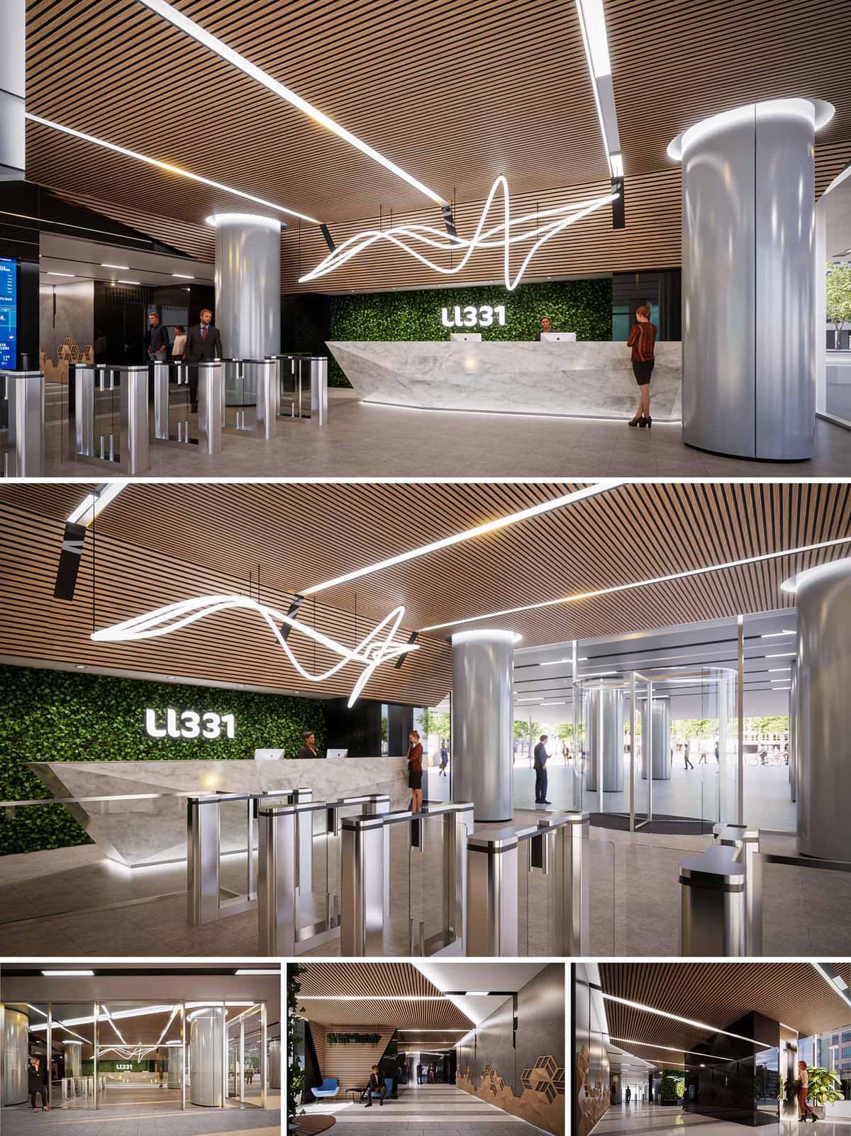
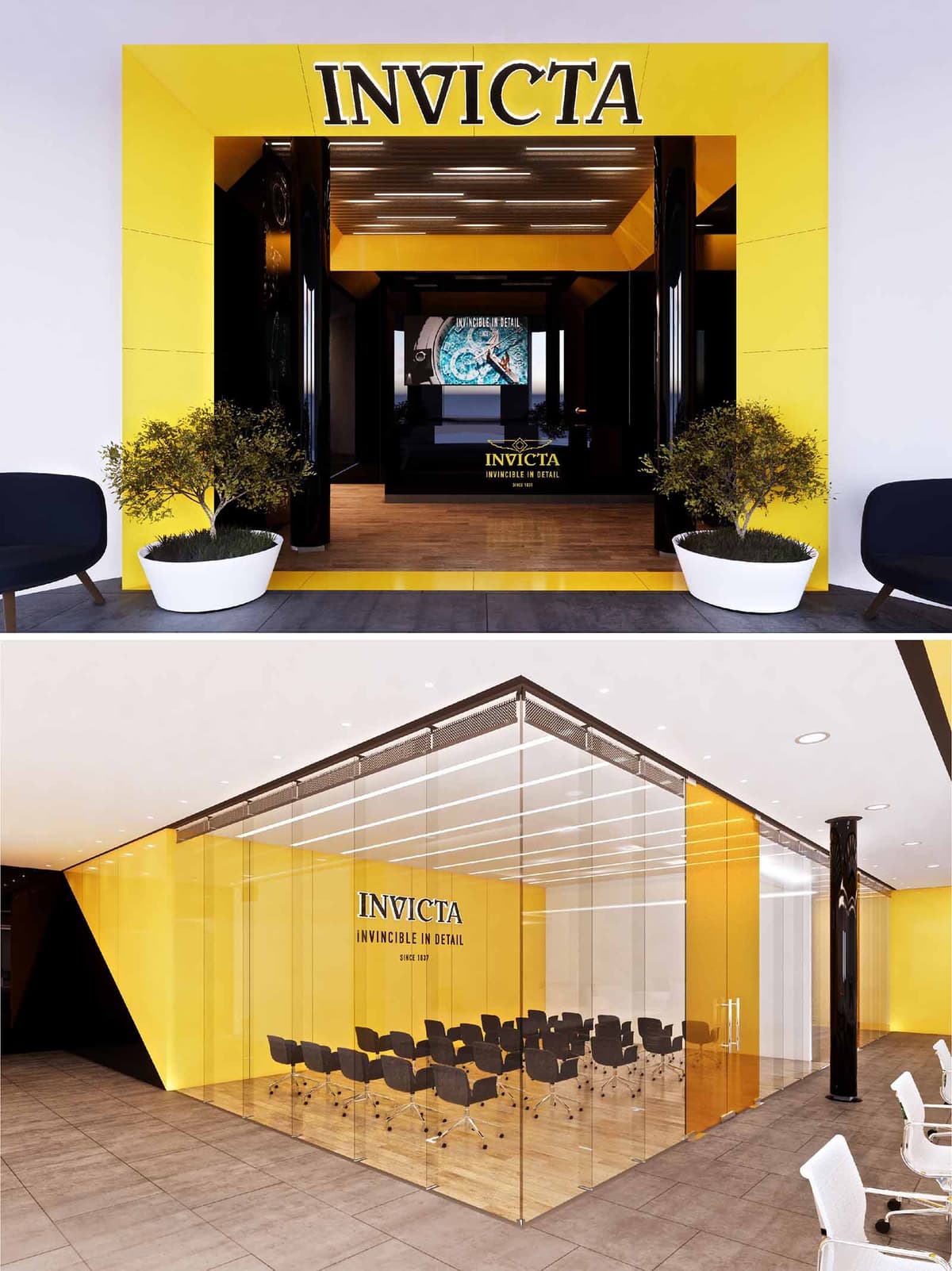
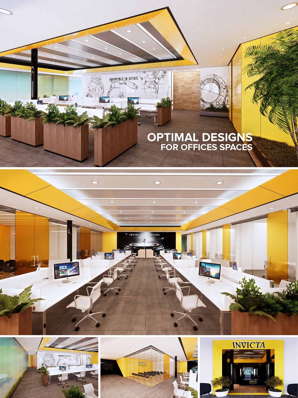
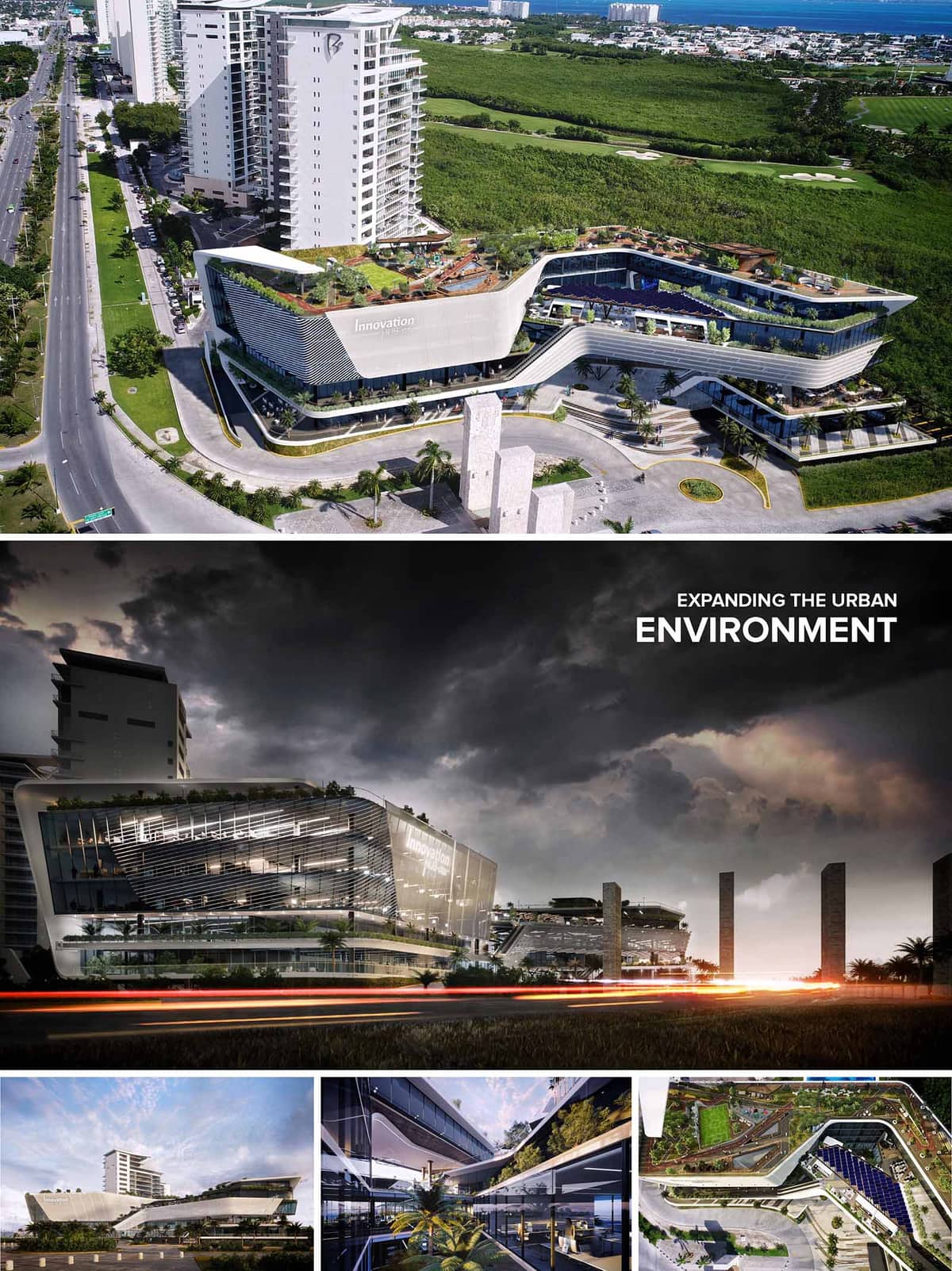
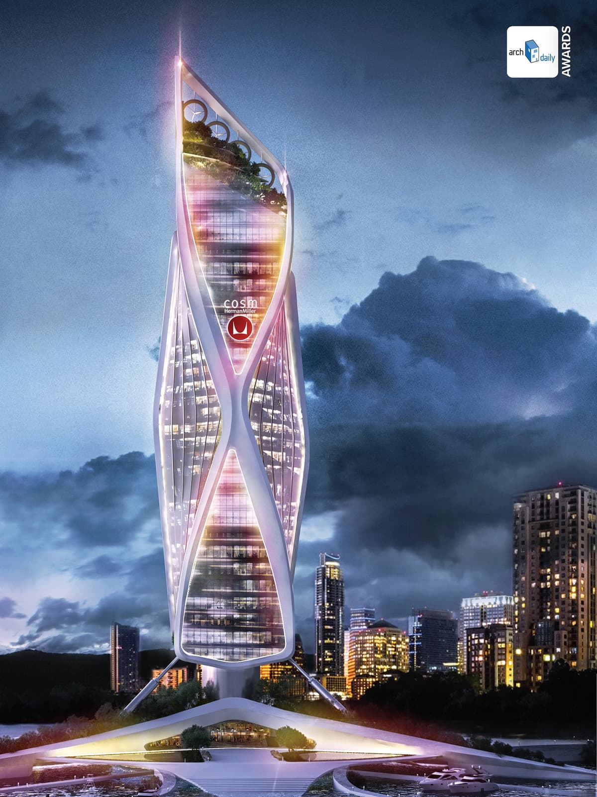
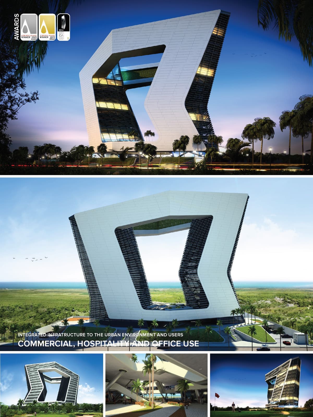
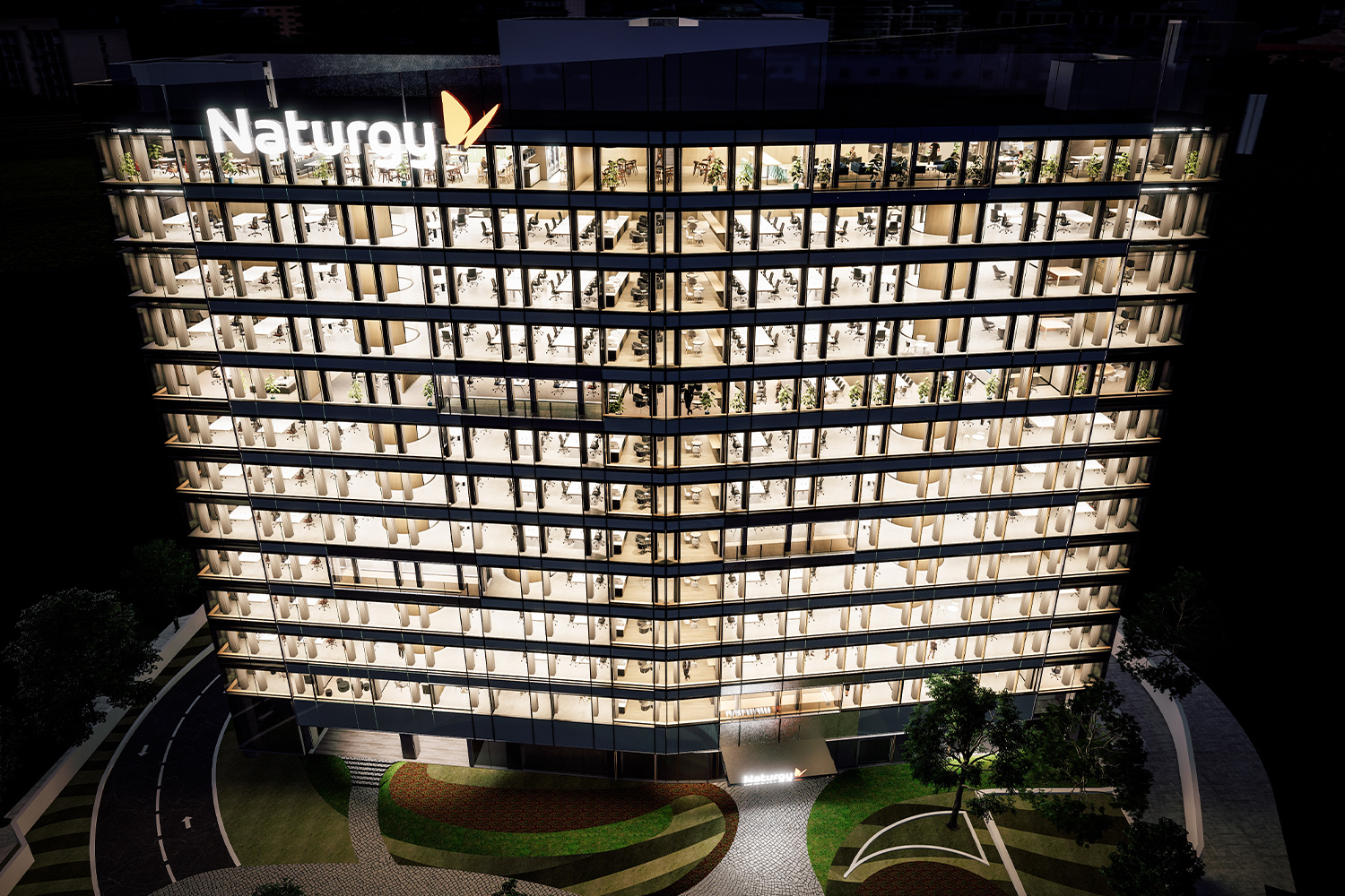
Lorem ipsum dolor sit amet, consectetur adipiscing elit. Suspendisse varius enim in eros elementum tristique. Duis cursus, mi quis viverra ornare, eros dolor interdum nulla, ut commodo diam libero vitae erat.
Nuestro Departamento de Diseño de Restaurantes y F&B está comprometido con el diseño de restaurantes, bares y lounges donde la atmósfera, el flujo operativo y la narrativa de marca trabajan juntos para llenar mesas. De Lavazza y PAUL en España a Carl's Jr, Big Chicken y STK en México y Estados Unidos, creamos cada espacio en torno a la experiencia del comensal. Tu restaurante se convierte en mucho más que un lugar donde comer: es el escenario donde tu marca cobra vida, transformando primeras impresiones en reservas y visitas puntuales en clientela fiel. Este entorno estratégico influye directamente en la percepción, la permanencia y los ingresos, impulsando un crecimiento sostenido.
ARQUITECTURA
Arquitectura estratégica para restaurantes: fachadas, terrazas y volúmenes que capturan la atención, marcan el tono y crean una primera impresión inolvidable.
INTERIORISMO
Interiores con atmósfera propia, donde materiales, iluminación y acústica cuentan la historia de tu marca y mantienen al comensal más tiempo en la mesa.
Asegúrate de que tu local no solo sea eficiente, sino verdaderamente inolvidable. Un restaurante bien diseñado es una poderosa herramienta de marketing: define el recorrido del comensal, despierta el deseo de compartirlo y construye fidelidad antes de que llegue el primer plato. Cada detalle, de la fachada al back-of-house, debe reflejar un compromiso con la calidad. Apuesta por un diseño que llene tu sala noche tras noche.
Hemos diseñado +300 proyectos de restaurantes y F&B para +100 marcas en Europa, América y Oriente Medio.
A lo largo de los años hemos participado en numerosos proyectos en distintas fases, desde la concepción hasta la entrega. Algunos no pueden mostrarse en nuestro portafolio por confidencialidad con nuestros clientes, pero todos han enriquecido nuestra experiencia. A continuación, una lista de proyectos en los que hemos participado en distintas capacidades.
• LAVAZZA, Multiple Locations, Spain
• PAUL, Multiple Locations, Spain & Portugal
• FARINE, 15 Projects in Multiple Locations, Chile, México, Perú, Portugal, Spain & USA
• DOBEL TEQUILA, 4 Projects in Multiple Locations, México
• DELI CORNER, 38 Projects in Multiple Locations, Spain
• CARL'S JR, 11 Projects in Multiple Locations, México & USA
• LA PAUSA, 16 Projects in Multiple Locations, Spain, Portugal, Chile & México
• EXPLORING THE WORLD, 7 Projects in Multiple Locations, Spain
• CORONA, 4 Projects in Multiple Locations, México, Spain & USA
• COCINA URBANA, Guadalajara, México
• BEST END BREWING COMPANY, Atlanta, USA
• DELI & CIA, 8 Projects in Multiple Locations, Spain, Portugal, Chile & México
• GASTROHUB, 6 Projects in Multiple Locations, México, Spain & USA
• LA PLACE, Multiple Locations, Spain & Portugal
• HALF MOON EMPANADAS, Miami, USA
• COMMUNITY KITCHEN, Baltimore, USA
• BOUT TIME PUB & GRUB, Salt Lake City, USA
• BIG CHICKEN, Miami, USA
• CAFE CAFE, 8 Projects in Multiple Locations, Spain
• EL XIRINGUITO DEL CASTELL, Castelldefels, Spain
• DOT'S BAKERY, 10 Projects in Multiple Locations, Spain & Portugal
• MAHOU SPORT BAR, 4 Projects in Multiple Locations, Spain
• ASIAN STREET FOOD, Los Cabos, México
• COMO, 5 Projects in Multiple Locations, Spain & Portugal
• CARTE D'OR, 7 Projects in Multiple Locations, Spain
• MAS Q MENOS, BCN, PMI, AGP & Sevilla, Spain
• DELTA CAFE, 3 Projects in Multiple Locations, Portugal
• BURGER KING, 11 Projects in Multiple Locations, Spain & Portugal
• EATING POINT, Santiago, Chile
• CALIFORNIA PIZZA KITCHEN, Tijuana, México
• EXKI, Barcelona, Spain
• PIZZA'N CO, Multiple Locations, México & Spain
• KIREI BY KABUKI, Madrid & Málaga, Spain
• ALDO'S GELATO, 13 Projects in Multiple Locations, México
• CASA DEL AGUA, Playa del Carmen, México
• RUSH LOUNGE BAR, Cancún, México
• MAX BURGER, Doha, Qatar
• PIZZA JARDÍN, Madrid, Spain
• STK, Multiple Locations, México & USA
• RUTH'S CHRIS STEAKHOUSE, Cancún, México
Experimenta la amplitud de nuestras capacidades y la profundidad de nuestra dedicación recorriendo nuestro Portafolio de Proyectos Publicados. Aquí no solo mostramos proyectos: te invitamos a descubrir la pasión y la precisión que ponemos en cada diseño que creamos.
The Lavazza project in Spain is conceived as a scalable family of coffee spaces that can inhabit very different host environments while maintaining a clear and recognizable brand identity. The design language is based on a balance between Italian café tradition and contemporary airport and mall ergonomics, translating the ritual of coffee into a series of architecturally coherent kiosks, corners and full restaurants. Warm wood finishes, clean volumetry and the iconic blue brand color compose a common grammar that adapts in size and geometry according to the location.
Each unit acts as an urban micro‑landmark inside transit interiors, generating a sense of place in otherwise transient contexts. The modules are designed to be instantly legible from a distance, with a strong horizontal canopy line, illuminated signage and an open display of products that celebrates craftsmanship and freshness. The architecture frames the act of ordering and enjoying coffee as a fluid, informal experience, where circulation, visibility and comfort are carefully orchestrated.
The layouts are organized around a linear service counter that concentrates preparation, display and payment into a single, highly efficient strip. This counter operates as both a functional backbone and a visual stage, allowing customers to read the offer at a glance while staff work within a clear back‑of‑house logic. Geometry remains intentionally orthogonal to optimize modular furniture and refrigeration units, but is softened by rounded corners and setback plinths that ease movements around the bar.
Customer flow typically follows a frontal approach: entry from the circulation corridor, alignment along the counter, and dispersion towards different seating typologies. In larger locations, perimetral booth seating defines a protected inner zone, while high tables and freestanding islands mediate with surrounding public space. In kiosk versions, perimeter counters and stool lines transform the stand itself into a 360‑degree object, accessible from several sides and integrated with adjacent seating fields of the host building.
The material palette combines horizontally grained light wood laminates with neutral solid surfaces in white and cream, producing an atmosphere that is simultaneously warm and easy to maintain. Vertical slatted timber elements crown the façades and canopies, providing depth and a sense of crafted detail while concealing technical elements such as lighting tracks and signage fixings. Flooring is generally kept in robust porcelain or terrazzo‑like finishes selected according to each host building, ensuring continuity with existing circulation areas.
The brand’s deep blue operates as an accent, concentrated on front panels, under‑counter plinths and graphic bands, where it contrasts with the warm timber and the metallic frames of shelving systems. Black and dark grey elements, particularly in suspended ceiling grids and structural columns, provide a visual anchor, framing the lighter planes and contributing to a more architectural reading of what might otherwise be purely commercial furniture.
Lighting is based on a combination of diffuse ambient illumination from host spaces and focused, warm‑tone fixtures integrated into the Lavazza modules. Recessed downlights provide overall luminance, while linear LED strips under shelves and counter overhangs highlight products and emphasize horizontal lines. Decorative pendant lamps introduce a residential touch in seating zones, differentiating the café environment from the more generic public halls.
The color temperature is intentionally warm to enhance the appearance of coffee and baked goods, in contrast to the typically cooler lighting of transit environments. This duality generates a visual threshold: crossing into the Lavazza area means entering a more intimate, human‑scaled atmosphere, even when located in large open halls or airports.
Furniture solutions are standardized but flexible. Upholstered benches with high backs create acoustic buffers along perimeters, while loose chairs and small circular tables offer reconfigurable arrangements for different user groups. High communal tables with stools address short‑stay customers and solo travelers, encouraging social interaction without compromising circulation. All worktops and seating heights are calibrated to universal ergonomic standards, with accessible counter segments for users with reduced mobility.
Display units are designed as open shelving and refrigerated vitrines that align visually with the counter datum, ensuring a coherent horizon line. Storage is discreetly integrated below counters and within thicker wall panels, maintaining uncluttered customer areas and reinforcing the architectural clarity of the ensemble.
The system is conceived as a kit of parts, enabling rapid deployment in multiple Spanish locations with varying footprints and technical constraints. Structural independence of the kiosks minimizes interventions on host buildings, simplifying approvals and enabling future relocation or reconfiguration. Repetition of modules and details reduces manufacturing waste and ensures durability through tested, robust solutions.
Sustainability is addressed through material selection and technical integration. Preference is given to certified timber products, low‑VOC finishes and high‑efficiency LED lighting with programmable scenes to reduce energy consumption during off‑peak hours. Where possible, equipment with optimized energy ratings is specified, and the open layouts encourage natural light penetration from surrounding façades, reducing the need for artificial lighting during daytime. This approach balances brand consistency and operational efficiency with a responsible environmental footprint across the network of Lavazza spaces.
© 2021 by sanzpont [arquitectura] . Webpage by sanzpont [digital] . Innovative Digital Experiences
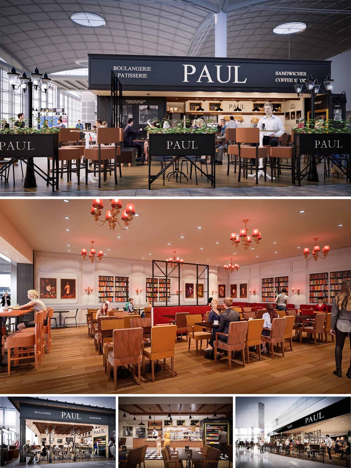

The PAUL spaces in Spain and Portugal interpret the traditional French boulangerie as a contemporary travel lounge. The concept juxtaposes an elegant, almost Parisian street façade with a warm, library-like interior, creating a recognizable identity across multiple transport hubs. The design aims to slow down the rhythm of passage, offering an atmosphere of cultivated calm within highly dynamic airport environments.
Clear brand visibility governs the architectural composition: a strong black cornice with bold typography frames the open café volume, while interior spaces are defined by refined paneling, curated artwork and bookshelves. This duality between open public plaza and intimate salon informs the spatial and material strategy.
The restaurant functions as an island pavilion within the concourse, with permeable edges that invite circulation from all sides. Planters and light metal screens delineate the seating boundary without creating a visual barrier, maintaining transparency to the terminal while defining a recognizable dining precinct. The main service counter is positioned centrally at the rear, anchoring the space and optimizing visibility of the product display.
Inside, the layout is organized in longitudinal bands: perimeter seating against walls and façades, central table clusters for flexible occupancy, and carefully aligned circulation aisles guaranteeing efficient service and comfortable movement with luggage. Different seating typologies—standard tables, banquettes and high tables—support both quick consumption and longer stays, maximising the operational capacity of relatively compact footprints.
The interior adopts a classic French brasserie language, reinterpreted with a contemporary clarity. Timber flooring with a warm tone sets a domestic base, complemented by paneled walls painted in a soft, light shade that enhances brightness. Built-in bookshelves and framed artworks provide depth and narrative, recalling a Parisian salon and reinforcing the brand’s cultural and artisanal positioning.
Upholstered banquettes in rich red fabric introduce a strong chromatic accent, contrasted with leather or faux-leather chairs in natural brown and camel hues. This palette mediates between the dark exterior branding and the luminous interior shell, creating a sophisticated yet approachable environment suited to a wide range of users and times of day.
The material strategy balances durability with tactile comfort. Solid or engineered timber floors, robust metal framing, and high-performance upholstery are specified for intensive airport use, while decorative elements such as chandeliers and sconces employ traditional forms in updated finishes. The counter area combines warm wood with black metal and glass, ensuring hygienic work surfaces and clear product visibility.
Lighting is layered: warm, low-level luminaires—classical chandeliers with red shades—create an intimate ambiance in the salon area, while recessed downlights deliver uniform functional illumination. At the façade, lantern-style fixtures and the illuminated signage band strengthen the street-like character and ensure legibility from a distance. Brand integration is architectural rather than merely graphic, with the PAUL identity embedded into cornices, planters and metalwork.
Sustainability is addressed through material selection, energy performance and operational planning. Preference is given to long-life, low-maintenance finishes that reduce replacement cycles, such as durable timber products, metal structures and high-resistance floor finishes. Where possible, regionally sourced materials and suppliers in Spain and Portugal support shorter transport chains and local economies.
LED lighting with warm color temperature minimizes energy consumption while maintaining the desired atmosphere. The open pavilion typology takes advantage of the terminal’s existing daylight and climate control, avoiding redundant enclosures and mechanical systems. Furniture is designed for modularity, allowing reconfiguration and reuse across different locations in the network, thereby extending product life and reducing waste over time.
© 2021 by sanzpont [arquitectura] . Webpage by sanzpont [digital] . Innovative Digital Experiences
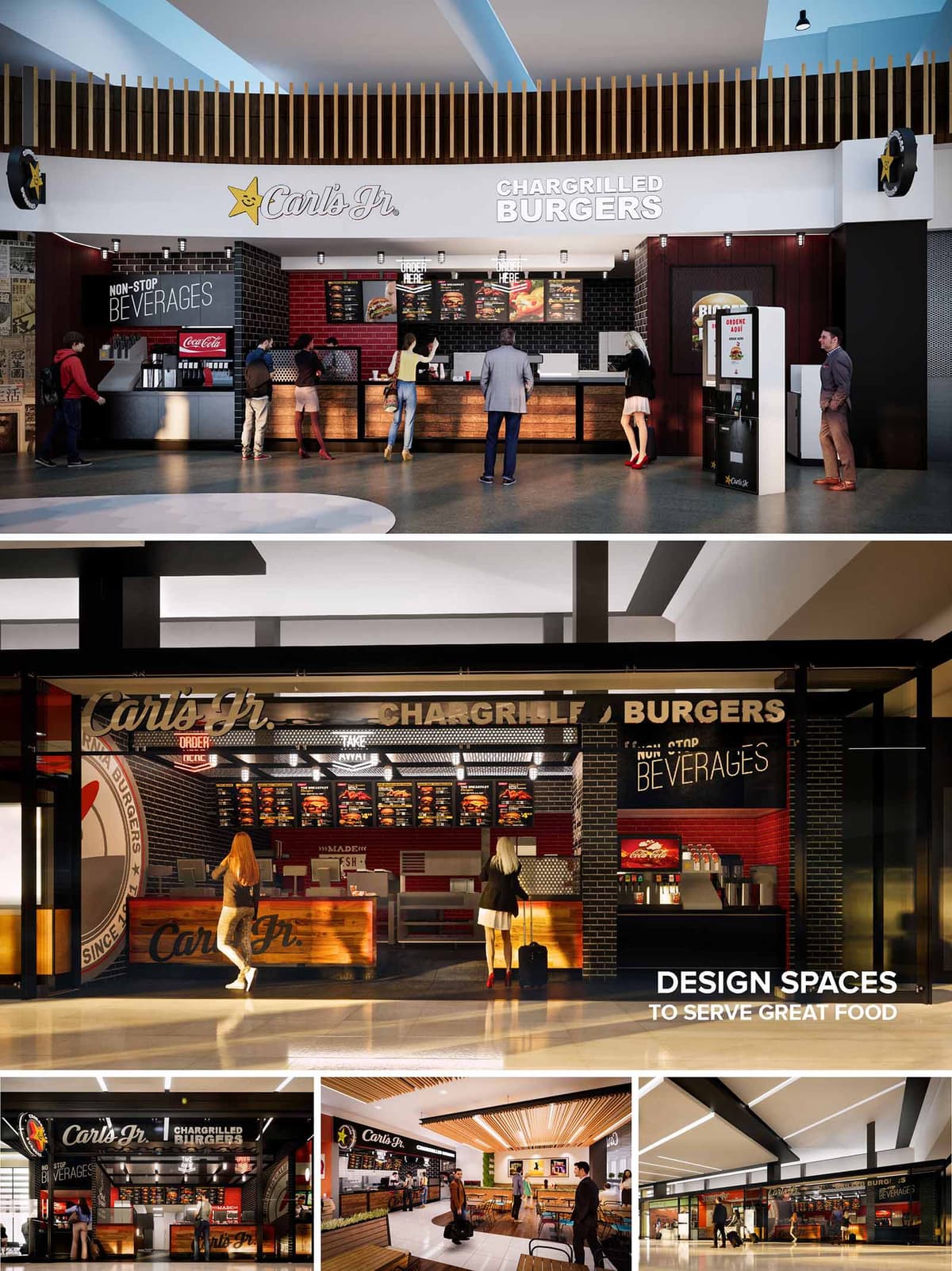

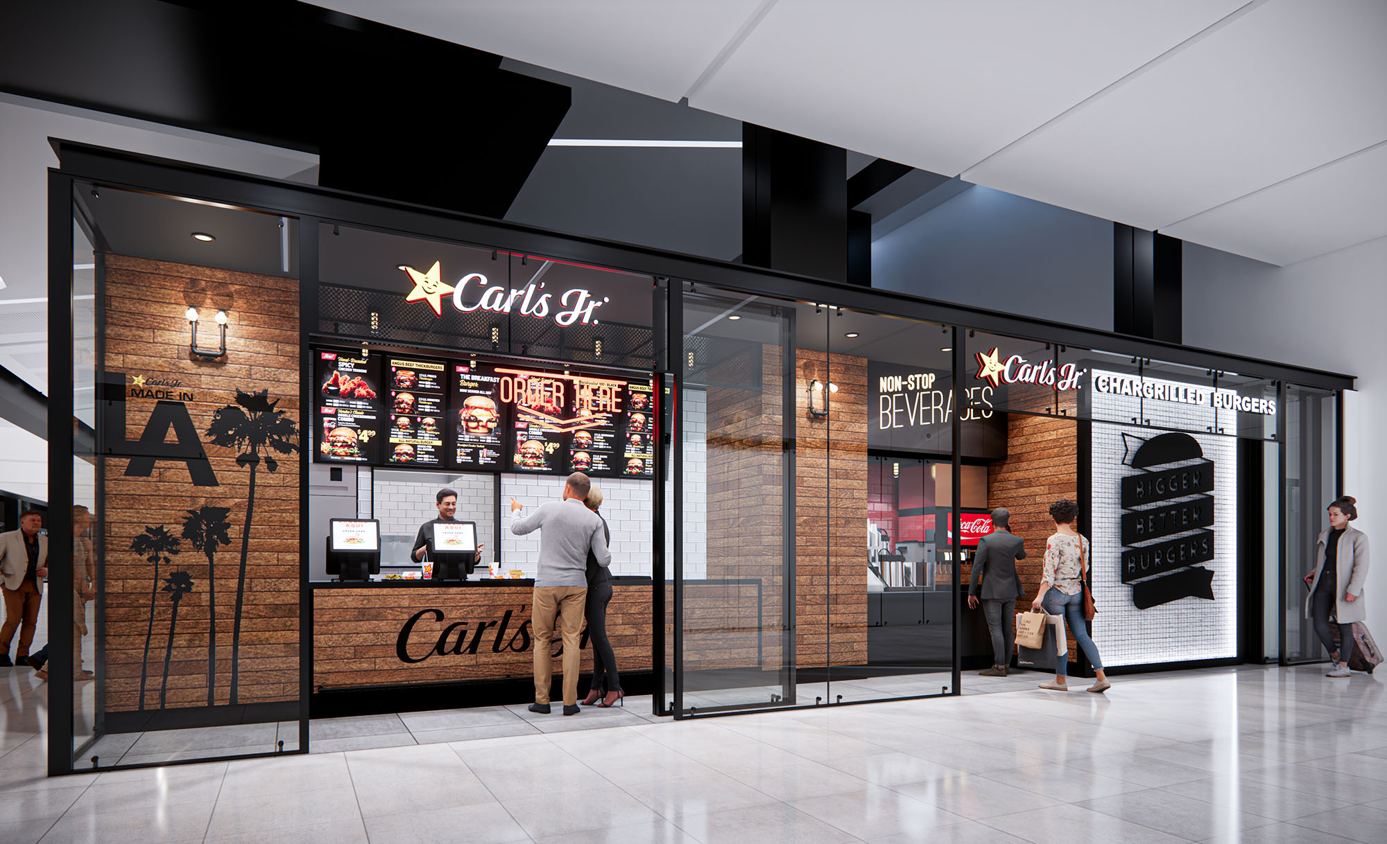
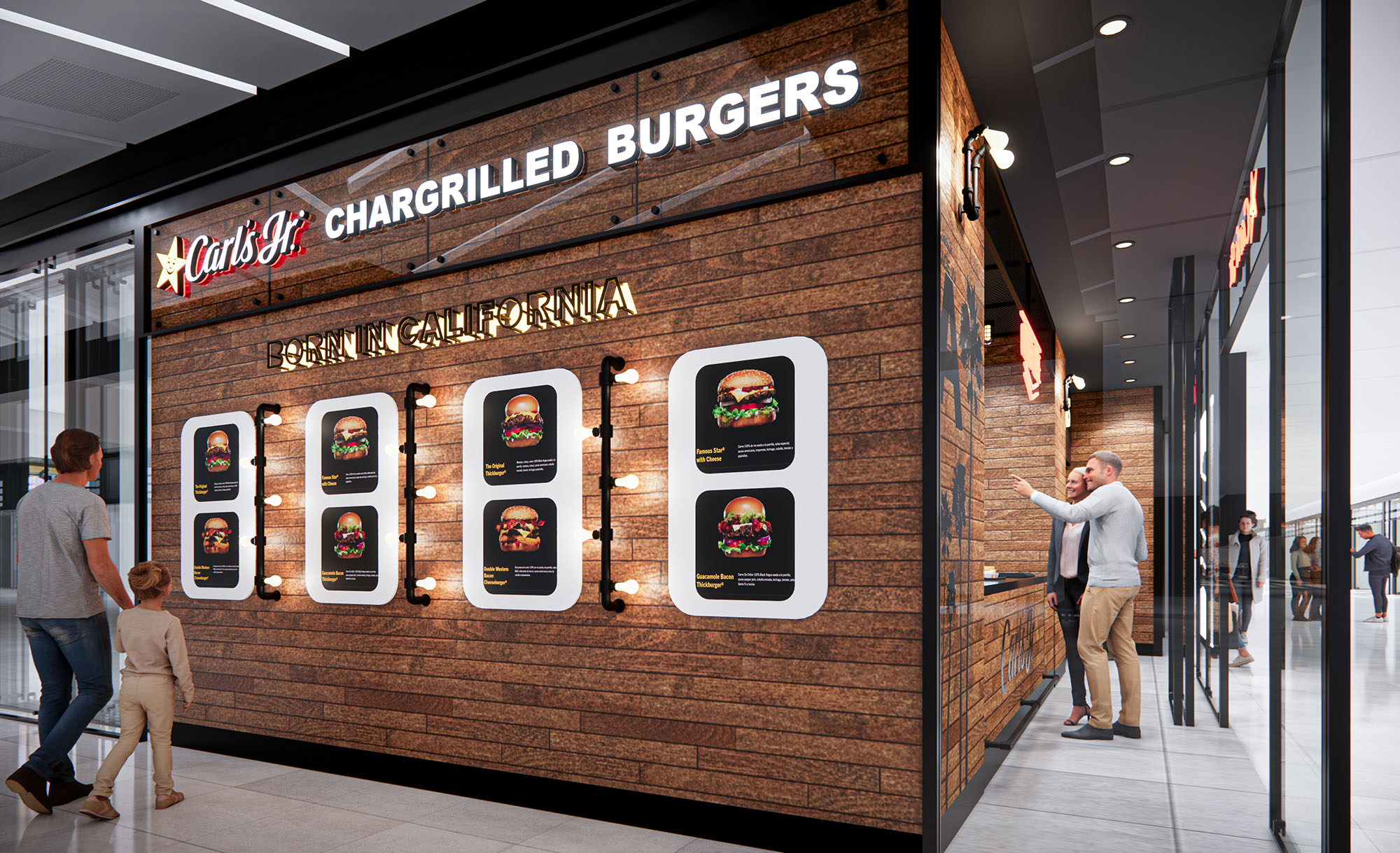
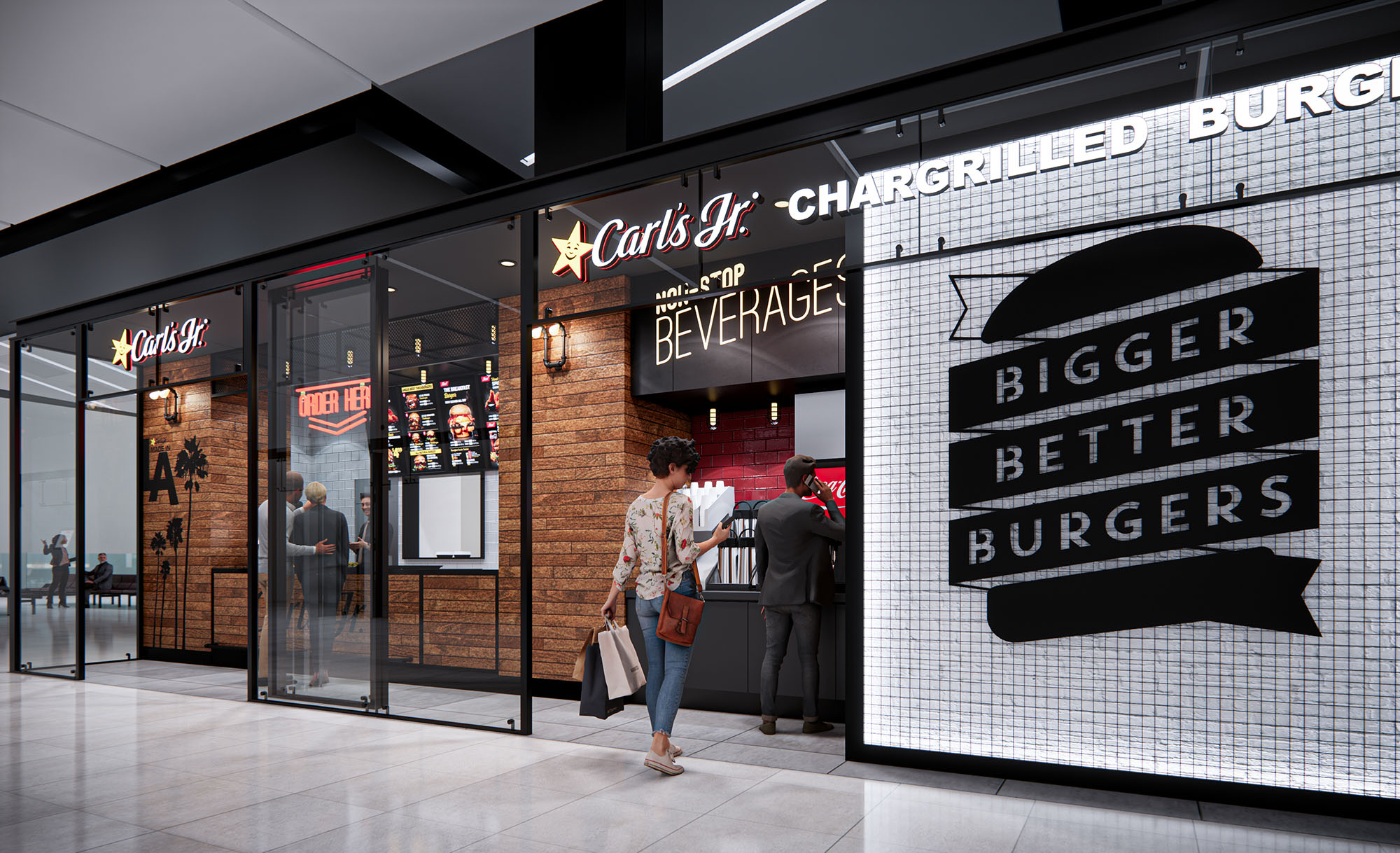
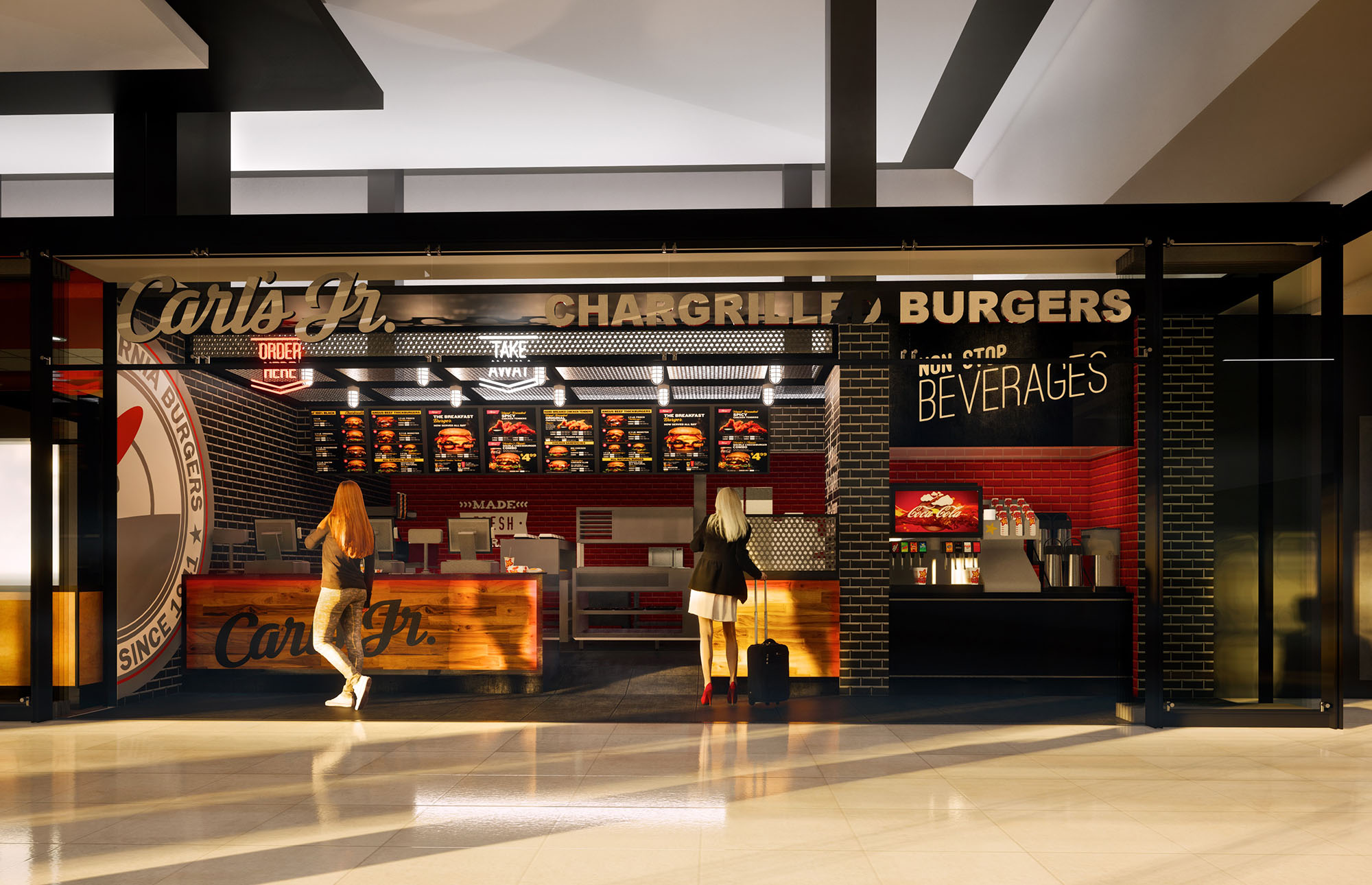
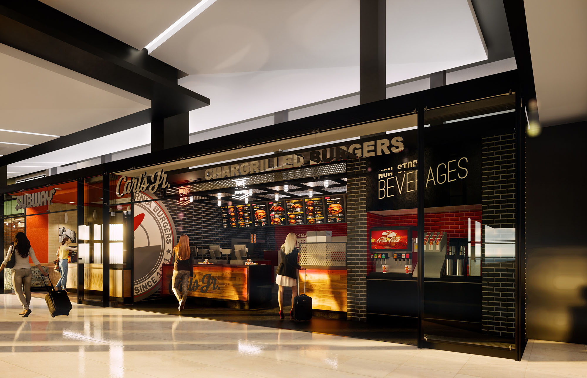
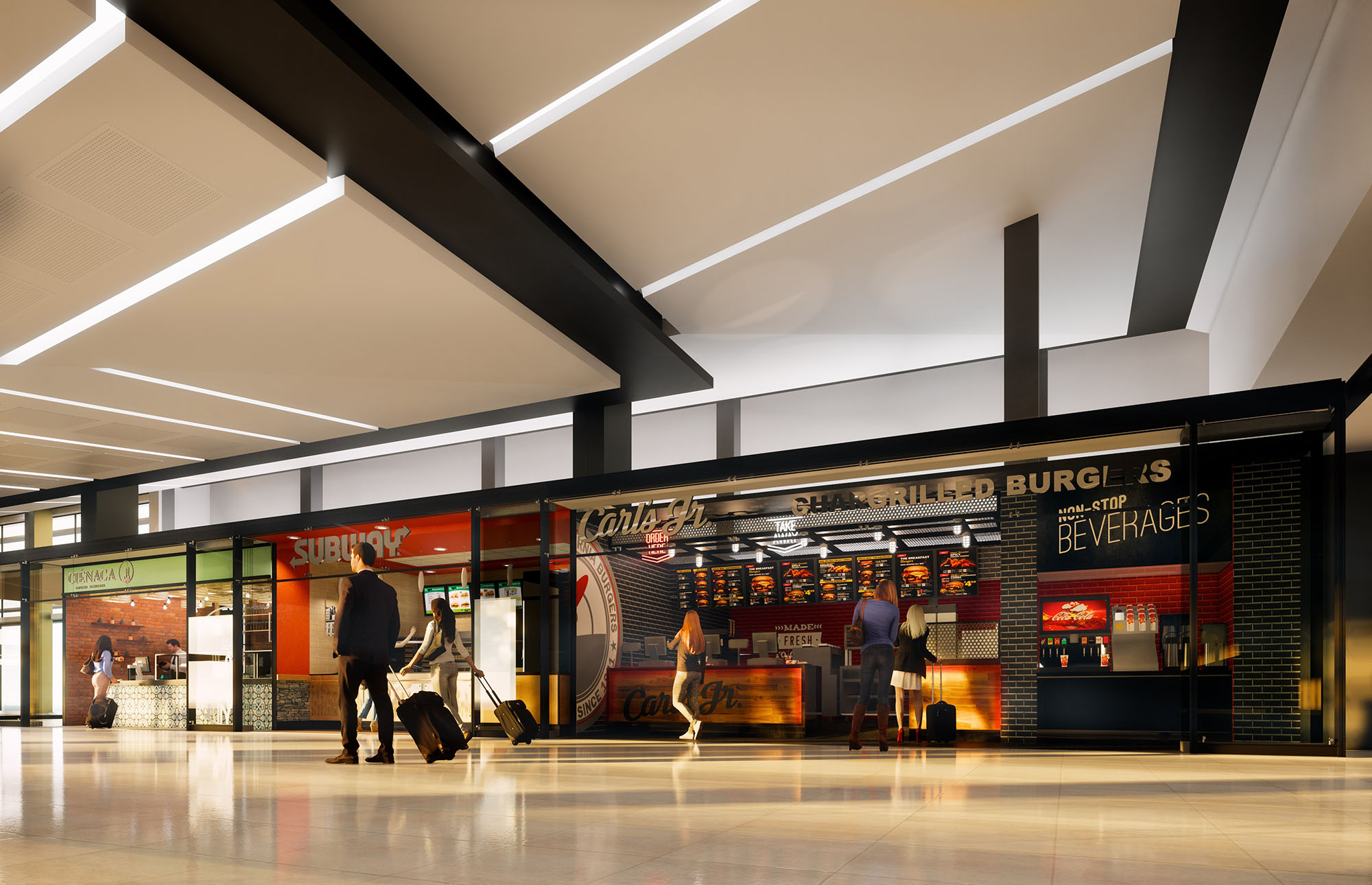
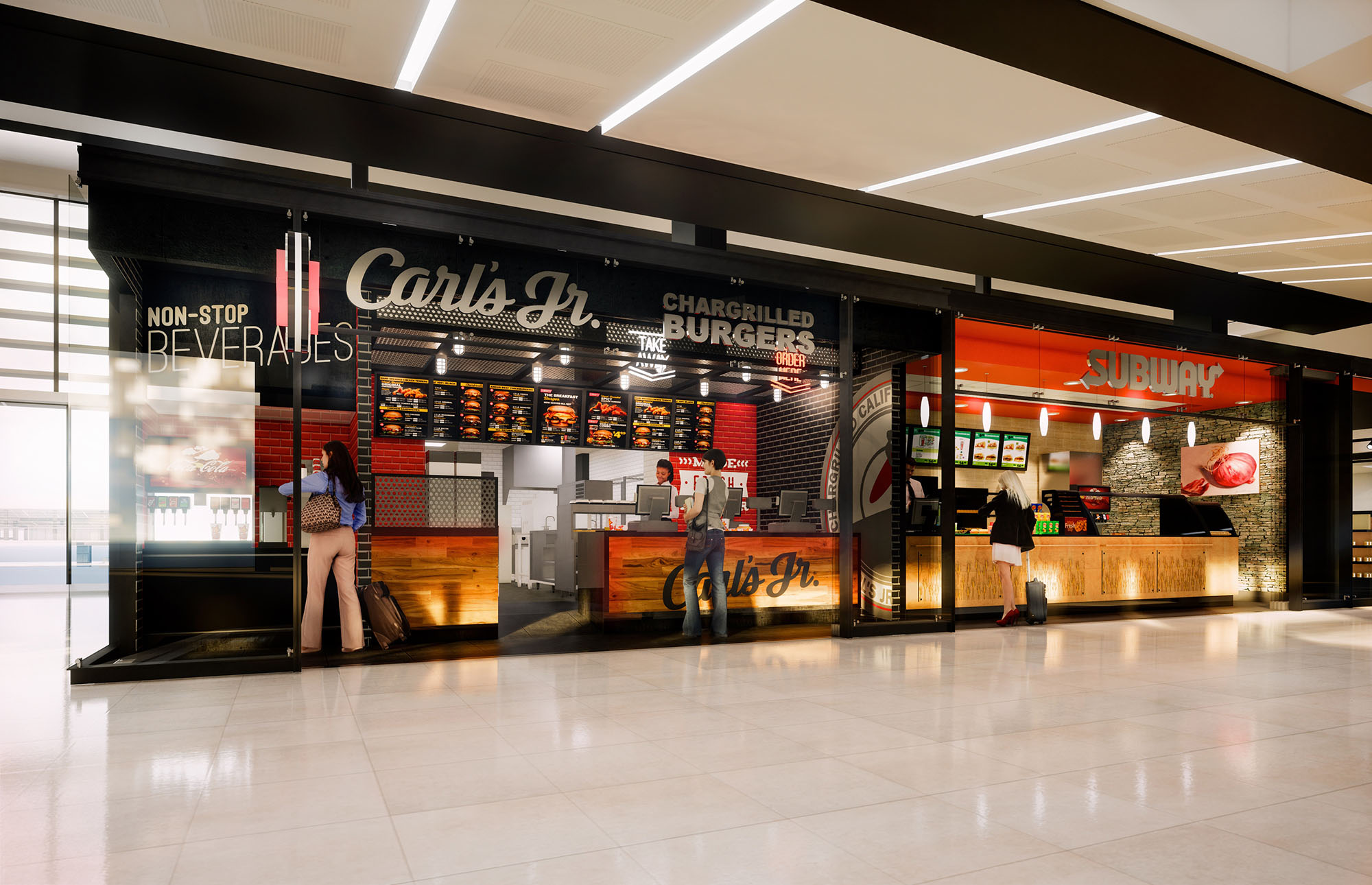
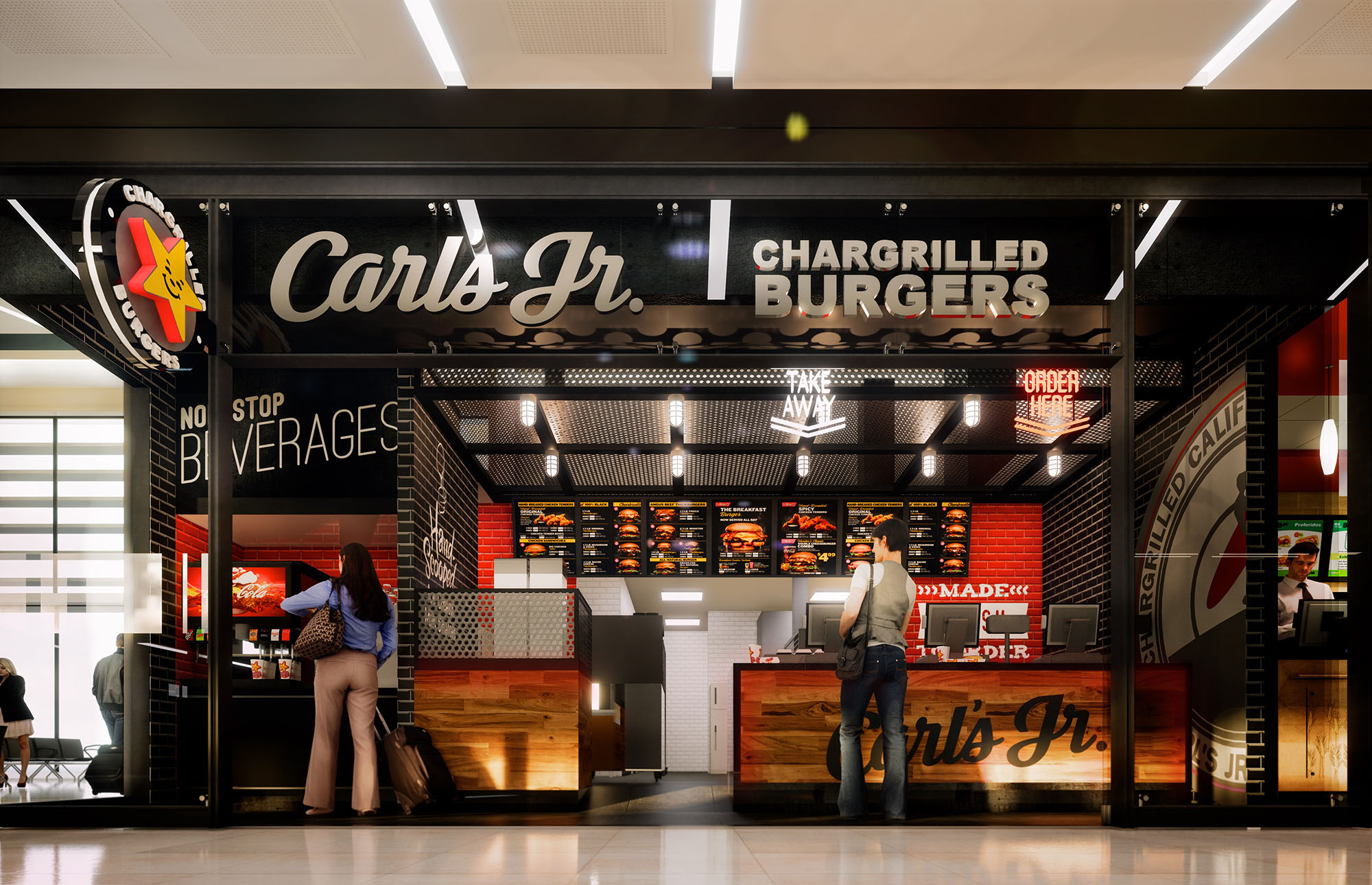
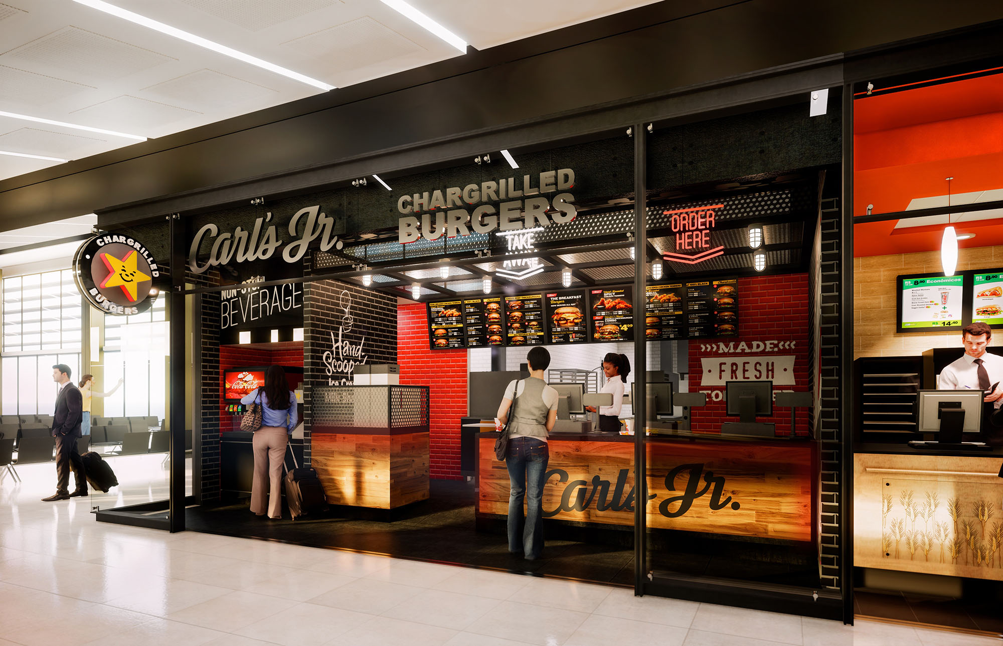
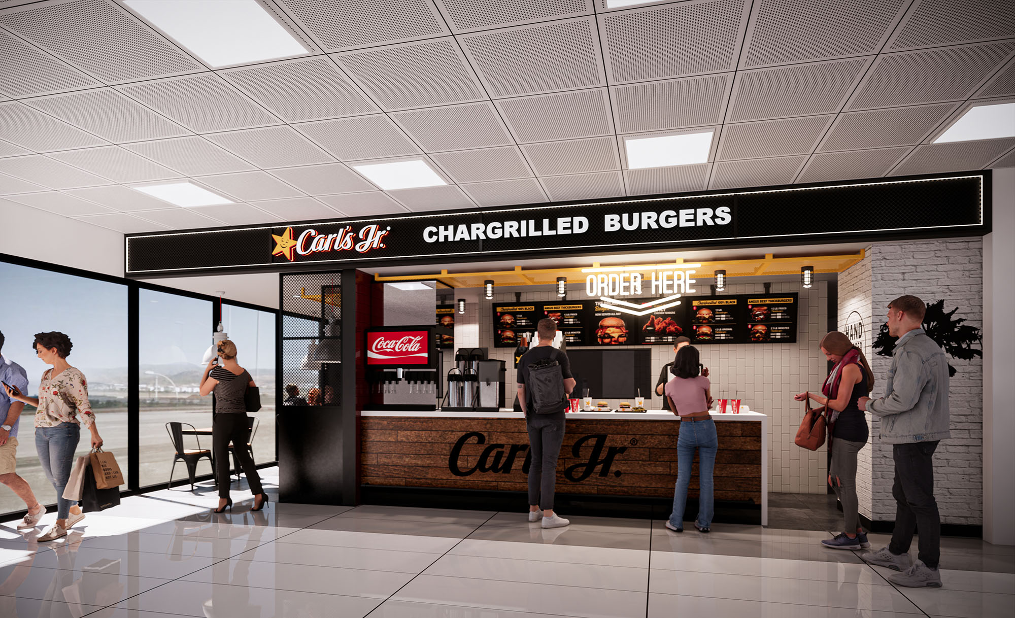
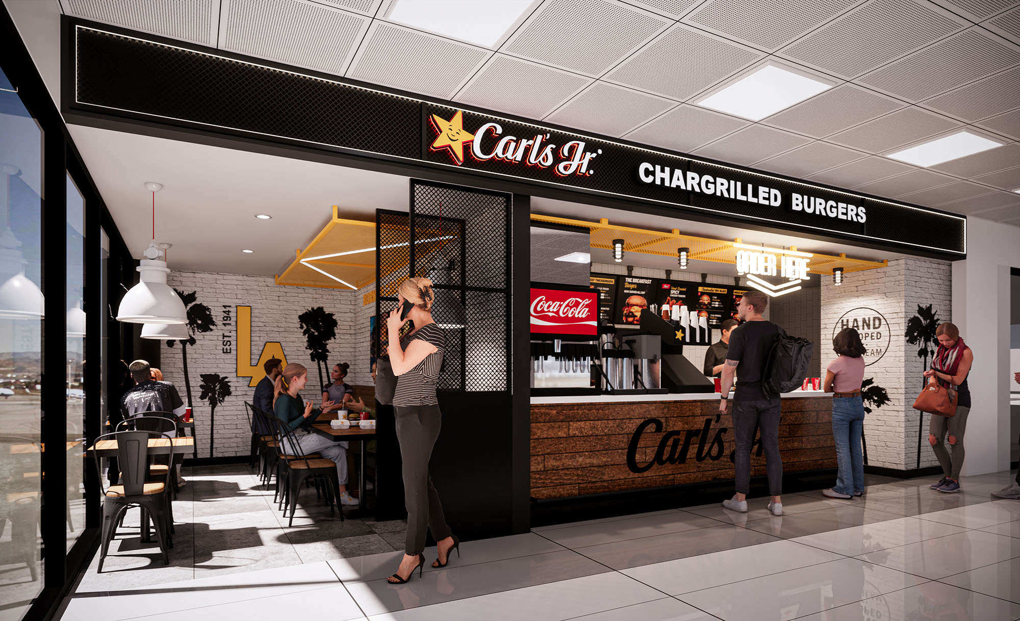
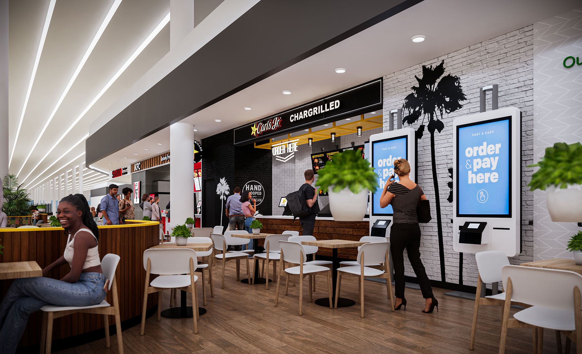
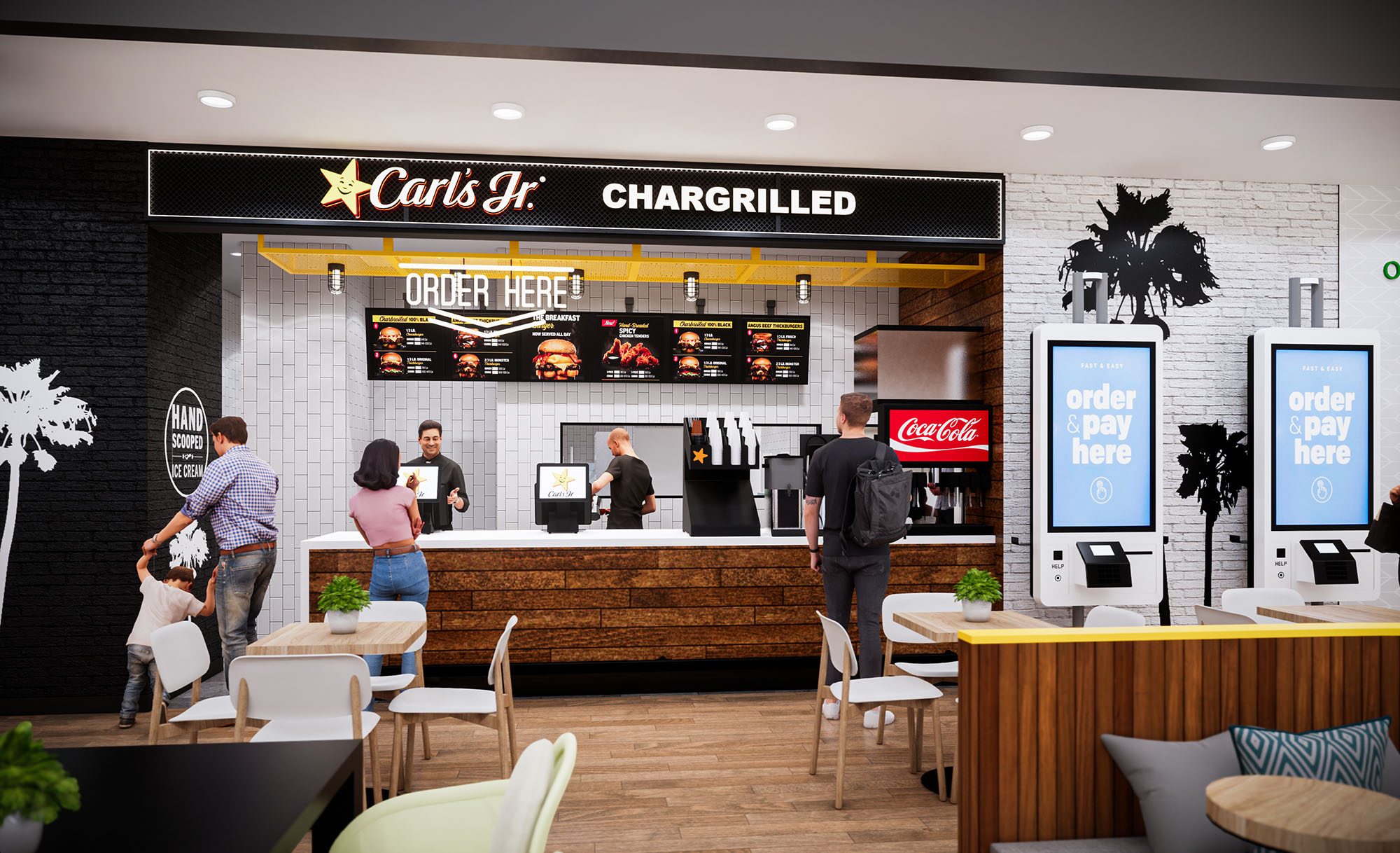
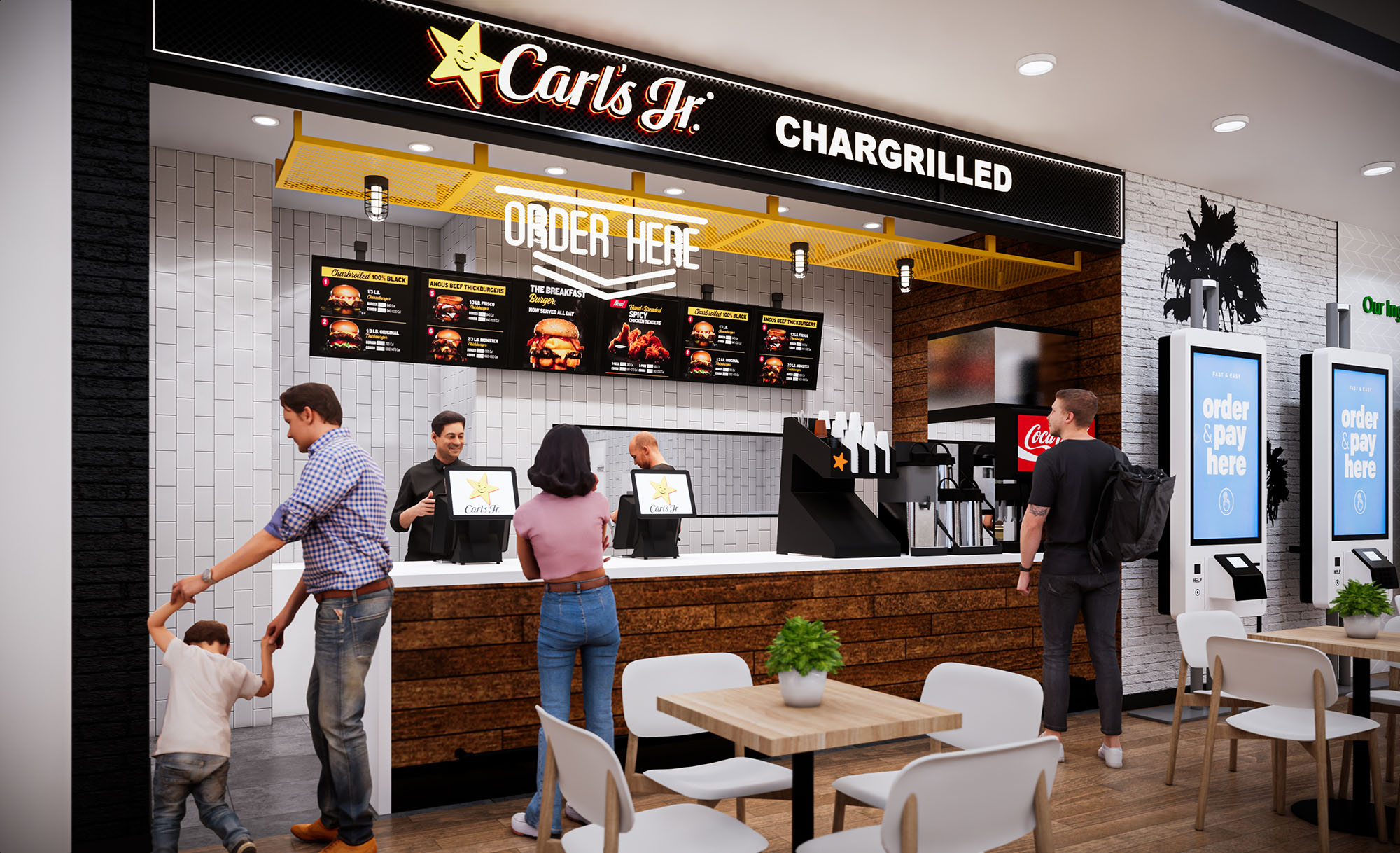
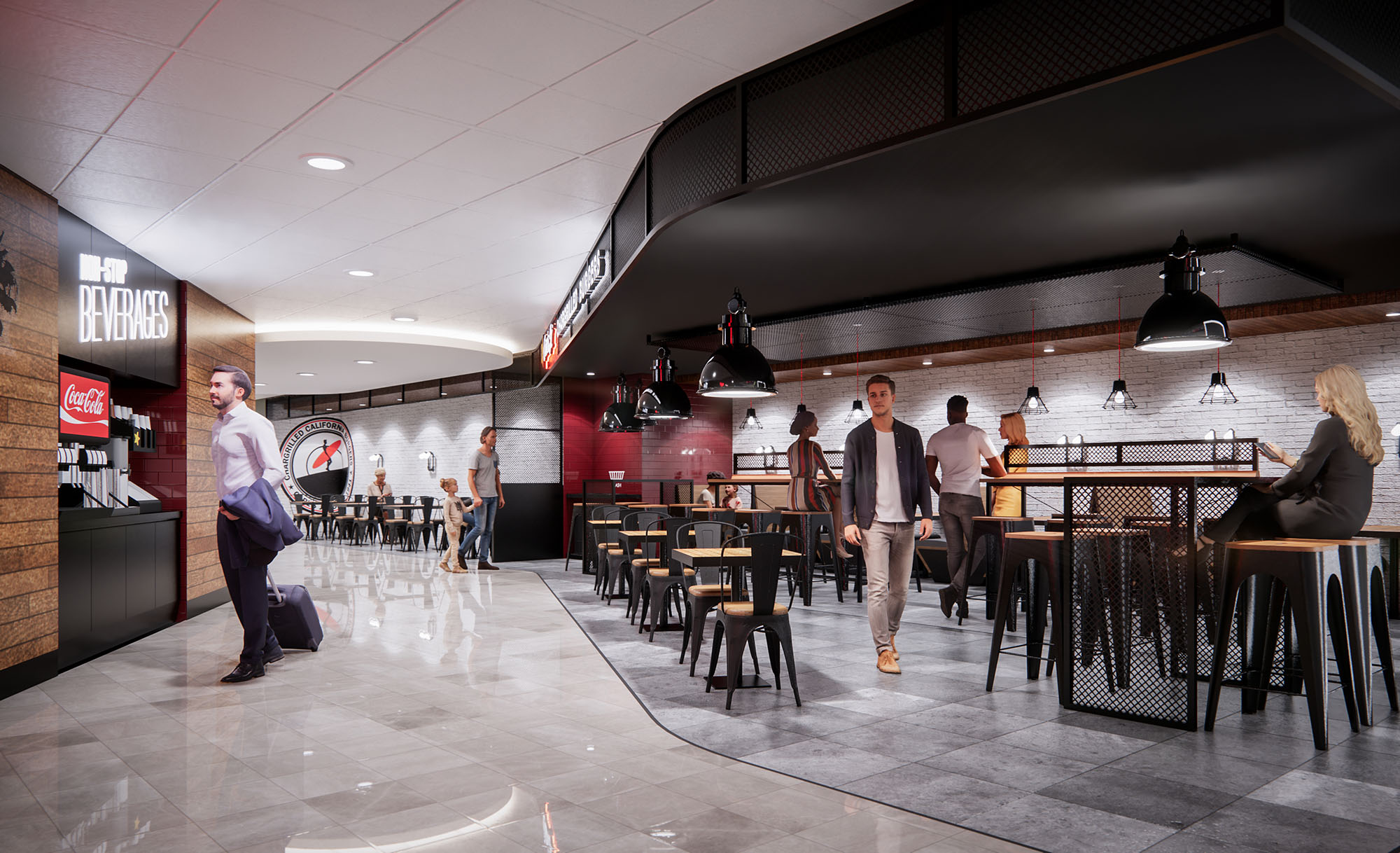
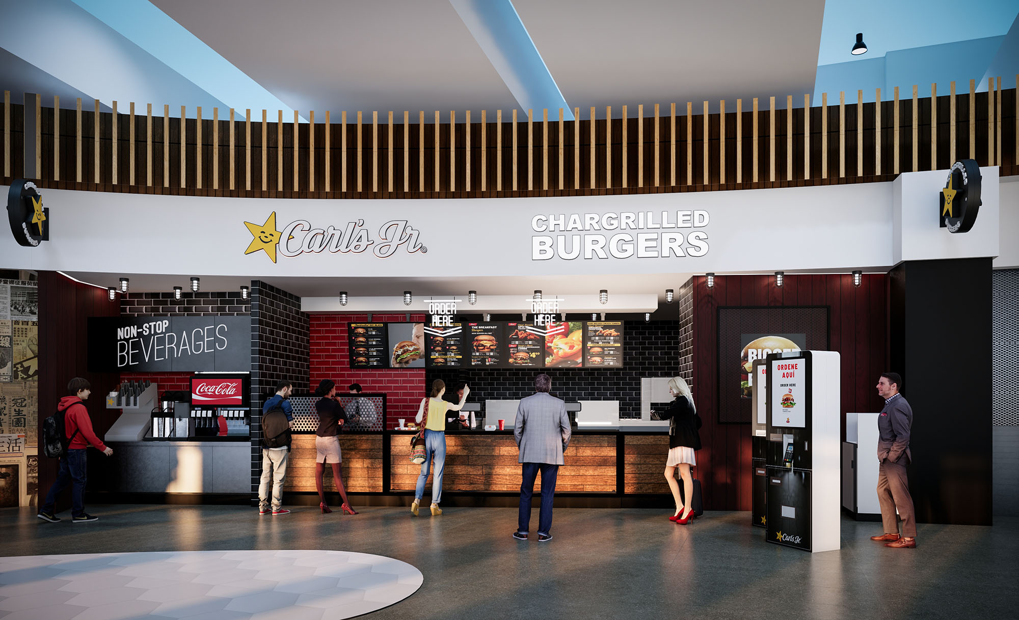
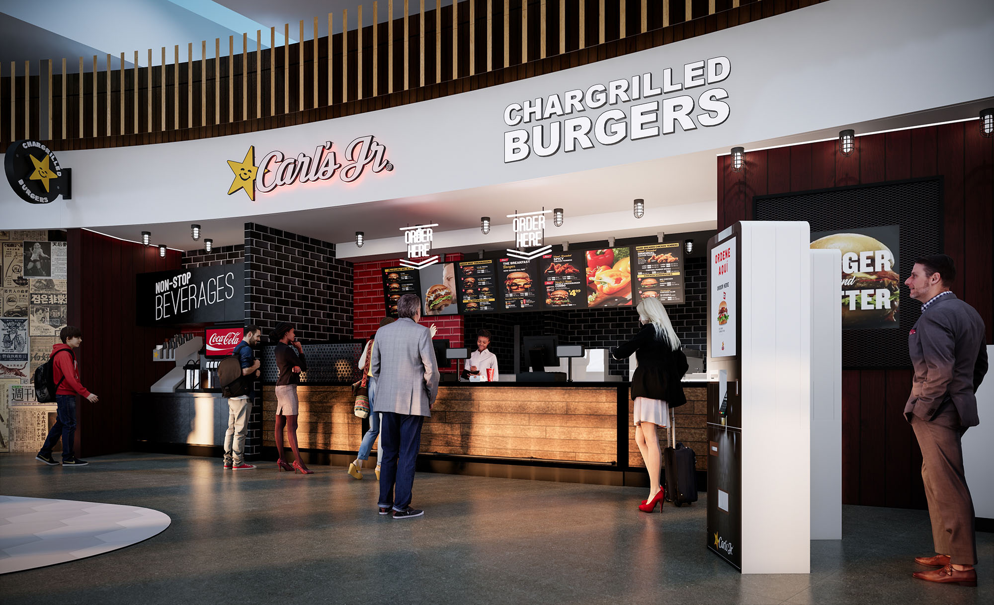
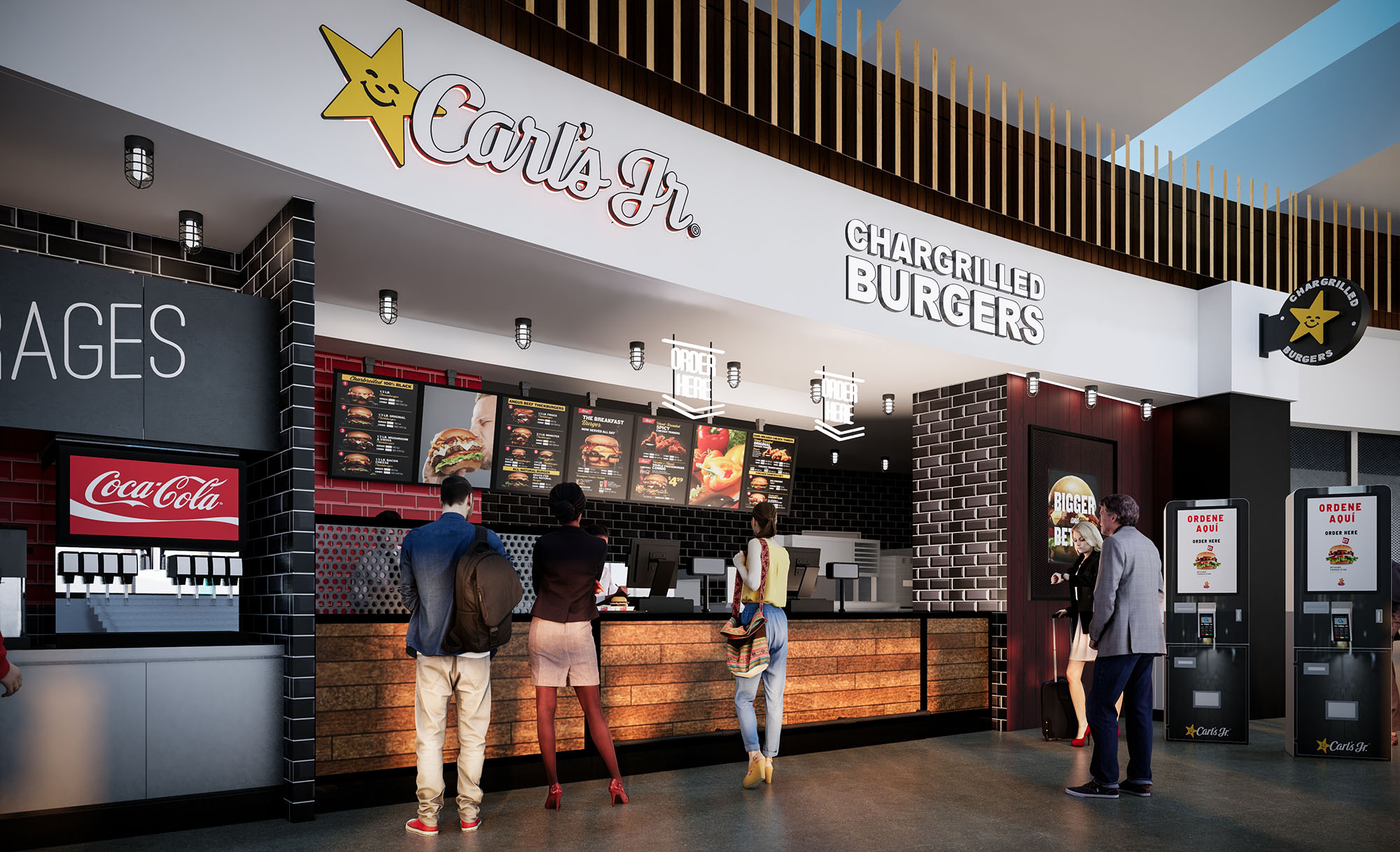
The architectural concept for Carl’s Jr. across these multiple locations is based on a contemporary reinterpretation of the classic American burger joint, translated into a clear and repeatable brand experience. The design combines industrial aesthetics with warm natural textures to communicate a chargrilled, handcrafted food offer while ensuring strong visual recognition in high-traffic environments such as malls and airports. Each unit acts as a highly visible “food stage,” where preparation, menu and brand graphics become the main façade.
The concept balances flexibility and consistency. A robust design language—defined by color, materials and lighting—adapts to varying footprints and ceiling heights while preserving a unified identity in Mexico and the USA. The goal is to create an immediate reading of the brand from a distance and a comfortable, efficient environment at close range.
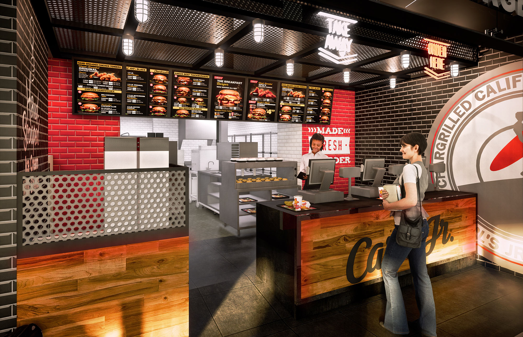
The plan organizes the restaurants around a linear service counter that concentrates ordering, payment and pickup. This clear axis directs customer movement from entrance to menu reading, ordering and beverage refill, minimizing cross-traffic and congestion during peak hours. Visual references—suspended menus, illuminated signage and contrasting back walls—guide the user intuitively without relying on excessive wayfinding graphics.
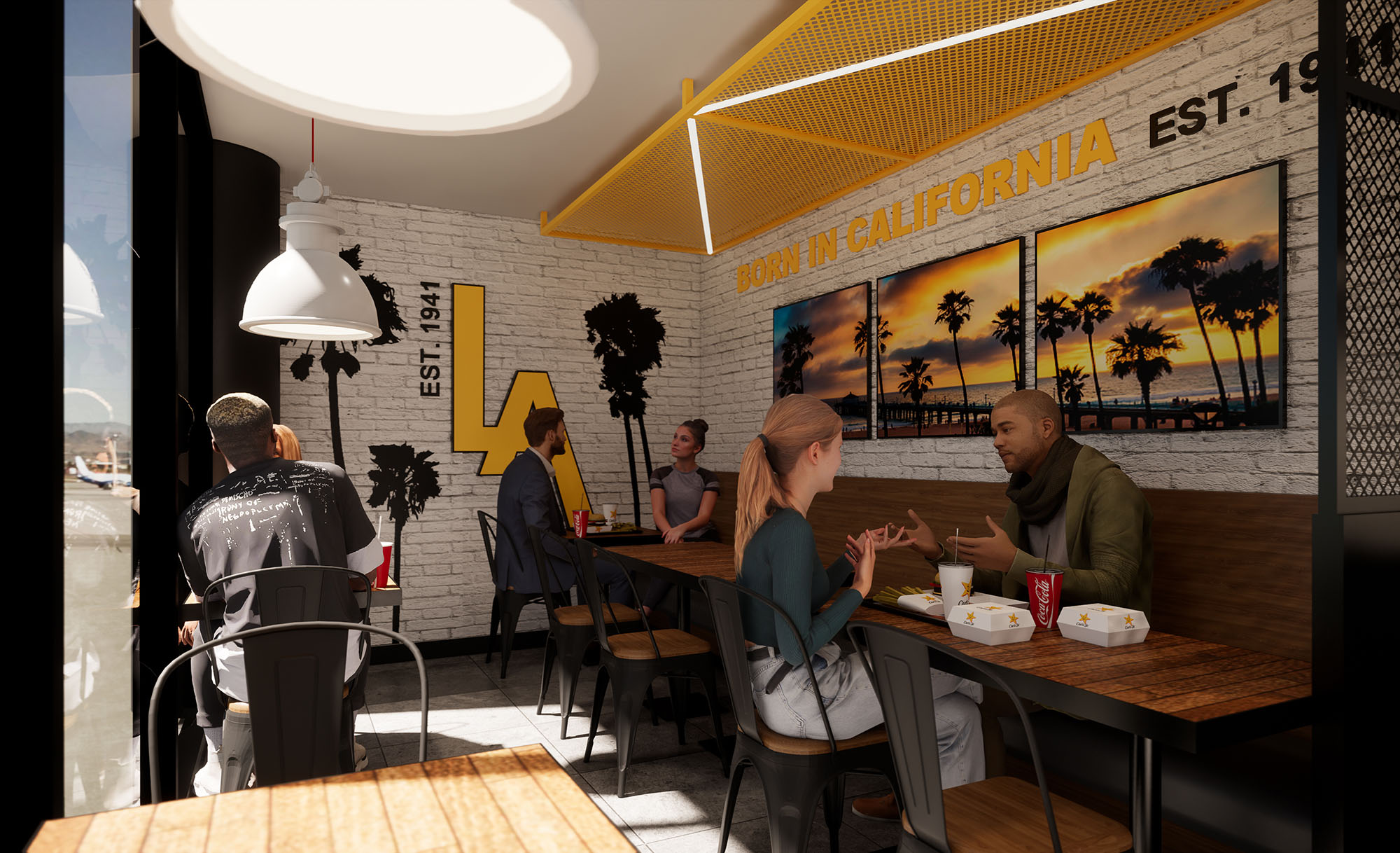
Back-of-house areas are compact and placed directly behind the counter, shortening production lines and allowing quick communication between kitchen staff and front-of-house. In food-court configurations, the design maximizes frontal visibility while maintaining a shallow depth. In standalone or larger footprints, the counter becomes the threshold to a dining area where seating is distributed in clusters, combining individual tables, banquettes and communal options for different user profiles.
The interior palette is anchored in the brand’s signature colors—black, red and yellow—balanced with timber and neutral finishes. Black brick tiles and dark metal frames convey an urban, industrial character that enhances the perception of flame-grilled cooking. Red is applied to selective planes—backsplashes, feature walls and menu backgrounds—to emphasize the food offer and create focal points.
Warm wood in counters, soffits and some wall claddings softens the environment and introduces a handcrafted feel. The use of horizontal wooden slats in ceilings and screens adds texture while visually lowering large volumes, making double-height or open-mall spaces feel more intimate. Durable surfaces such as quartz or high-pressure laminates are specified for worktops and tray slides, ensuring resistance to heavy use and ease of cleaning.
Lighting design plays a strategic role in reinforcing the brand. Linear LED fixtures and spotlights above the counter create a bright, high-contrast band that highlights menus and food preparation. The perimeter and dining zones employ warmer, more diffuse lighting to encourage dwell time and comfort. Accent lighting on signage and logos guarantees strong visibility even in environments with abundant ambient light.
Brand integration is achieved architecturally rather than superficially. Logos, slogans and menu systems are embedded into the architecture through backlit boxes, perforated metal panels and integrated graphic walls. Repetitive elements—star icons, typographic bands, and “chargrilled burgers” messaging—generate a coherent visual rhythm that unifies the different locations.
Sustainability strategies focus on operational efficiency and material performance across the 11 locations. LED lighting with high efficacy reduces energy consumption, while lighting levels are carefully calibrated to avoid over-illumination. Where possible, luminaires are paired with control systems to adapt intensity to natural light conditions in malls and airports.
Finishes are selected for longevity and low maintenance, reducing the need for frequent replacement and associated waste. Non-porous surfaces and modular cladding panels simplify cleaning and allow partial repairs instead of full refurbishment. In some units, open ceilings reduce the amount of suspended ceiling material, and exposed structures are painted rather than fully clad, lowering material use. Beverage and condiment stations are designed for efficient self-service, contributing to reduced staff movement and shorter customer waiting times, which in turn optimizes energy use in back-of-house equipment and improves the overall sustainability of the operation.


The architectural concept for Carl’s Jr. across these multiple locations is based on a contemporary reinterpretation of the classic American burger joint, translated into a clear and repeatable brand experience. The design combines industrial aesthetics with warm natural textures to communicate a chargrilled, handcrafted food offer while ensuring strong visual recognition in high-traffic environments such as malls and airports. Each unit acts as a highly visible “food stage,” where preparation, menu and brand graphics become the main façade.
The concept balances flexibility and consistency. A robust design language—defined by color, materials and lighting—adapts to varying footprints and ceiling heights while preserving a unified identity in Mexico and the USA. The goal is to create an immediate reading of the brand from a distance and a comfortable, efficient environment at close range.
The plan organizes the restaurants around a linear service counter that concentrates ordering, payment and pickup. This clear axis directs customer movement from entrance to menu reading, ordering and beverage refill, minimizing cross-traffic and congestion during peak hours. Visual references—suspended menus, illuminated signage and contrasting back walls—guide the user intuitively without relying on excessive wayfinding graphics.
Back-of-house areas are compact and placed directly behind the counter, shortening production lines and allowing quick communication between kitchen staff and front-of-house. In food-court configurations, the design maximizes frontal visibility while maintaining a shallow depth. In standalone or larger footprints, the counter becomes the threshold to a dining area where seating is distributed in clusters, combining individual tables, banquettes and communal options for different user profiles.
The interior palette is anchored in the brand’s signature colors—black, red and yellow—balanced with timber and neutral finishes. Black brick tiles and dark metal frames convey an urban, industrial character that enhances the perception of flame-grilled cooking. Red is applied to selective planes—backsplashes, feature walls and menu backgrounds—to emphasize the food offer and create focal points.
Warm wood in counters, soffits and some wall claddings softens the environment and introduces a handcrafted feel. The use of horizontal wooden slats in ceilings and screens adds texture while visually lowering large volumes, making double-height or open-mall spaces feel more intimate. Durable surfaces such as quartz or high-pressure laminates are specified for worktops and tray slides, ensuring resistance to heavy use and ease of cleaning.
Lighting design plays a strategic role in reinforcing the brand. Linear LED fixtures and spotlights above the counter create a bright, high-contrast band that highlights menus and food preparation. The perimeter and dining zones employ warmer, more diffuse lighting to encourage dwell time and comfort. Accent lighting on signage and logos guarantees strong visibility even in environments with abundant ambient light.
Brand integration is achieved architecturally rather than superficially. Logos, slogans and menu systems are embedded into the architecture through backlit boxes, perforated metal panels and integrated graphic walls. Repetitive elements—star icons, typographic bands, and “chargrilled burgers” messaging—generate a coherent visual rhythm that unifies the different locations.
Sustainability strategies focus on operational efficiency and material performance across the 11 locations. LED lighting with high efficacy reduces energy consumption, while lighting levels are carefully calibrated to avoid over-illumination. Where possible, luminaires are paired with control systems to adapt intensity to natural light conditions in malls and airports.
Finishes are selected for longevity and low maintenance, reducing the need for frequent replacement and associated waste. Non-porous surfaces and modular cladding panels simplify cleaning and allow partial repairs instead of full refurbishment. In some units, open ceilings reduce the amount of suspended ceiling material, and exposed structures are painted rather than fully clad, lowering material use. Beverage and condiment stations are designed for efficient self-service, contributing to reduced staff movement and shorter customer waiting times, which in turn optimizes energy use in back-of-house equipment and improves the overall sustainability of the operation.
© 2021 by sanzpont [arquitectura] . Webpage by sanzpont [digital] . Innovative Digital Experiences
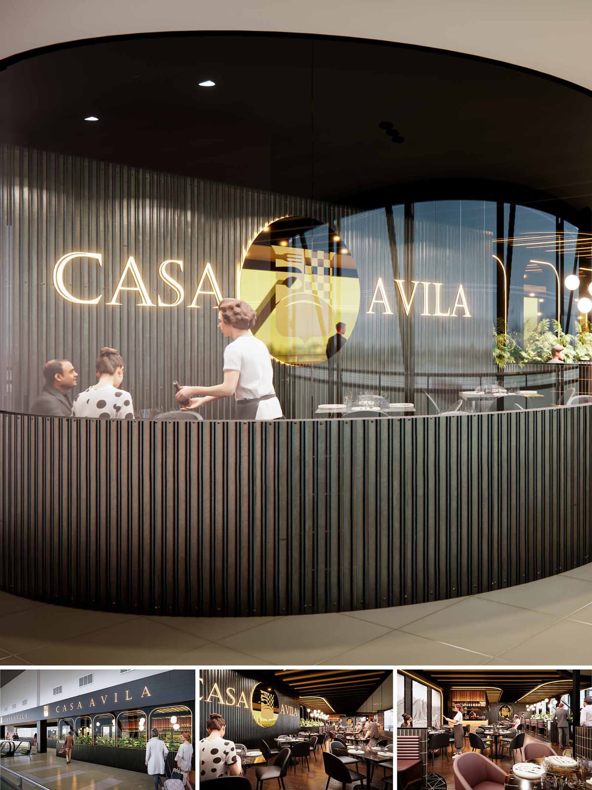
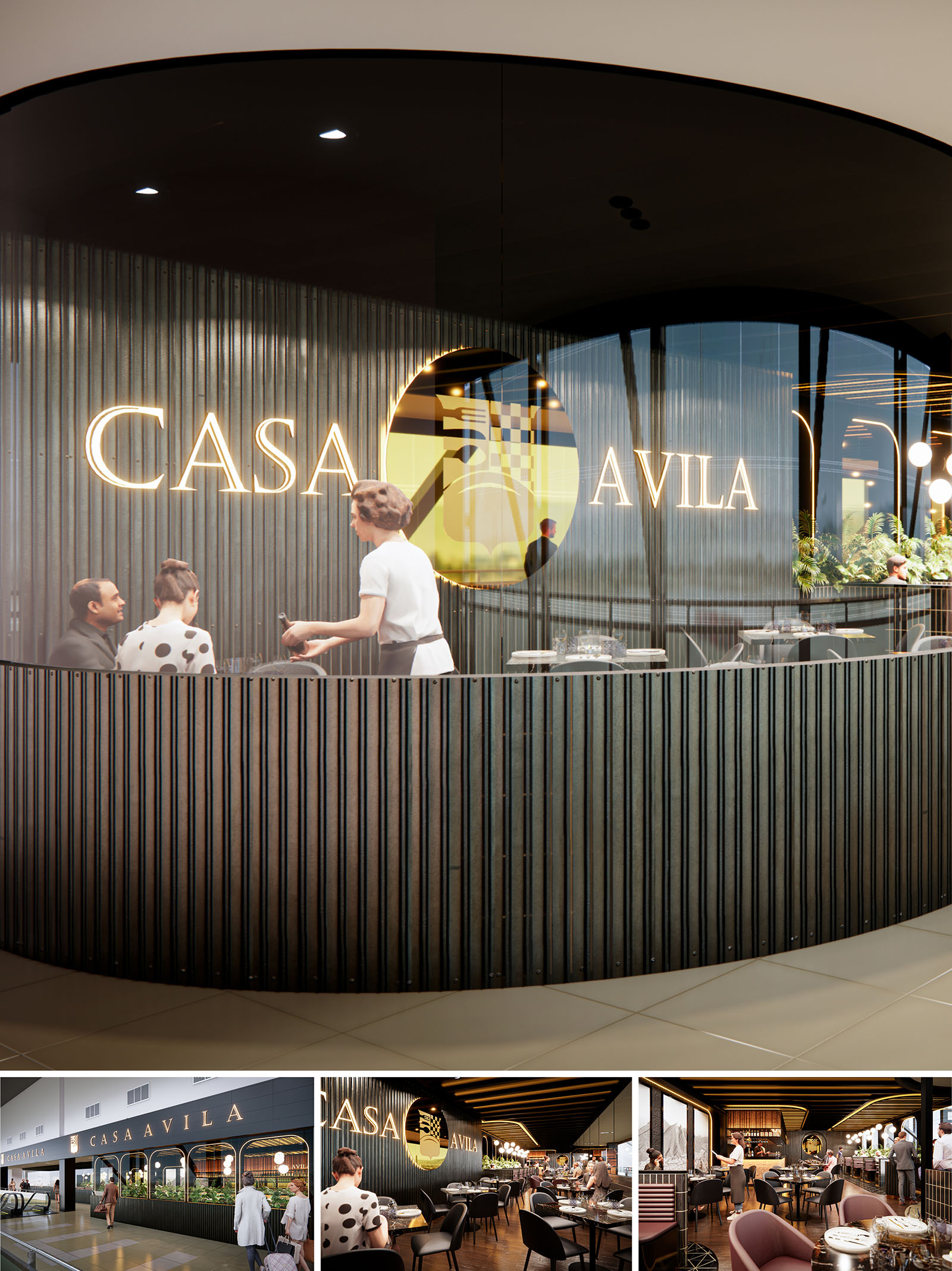
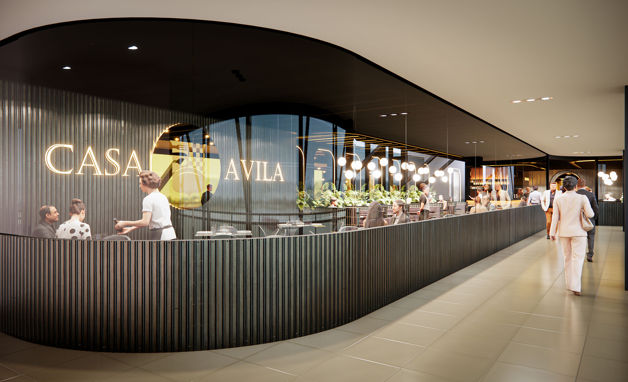
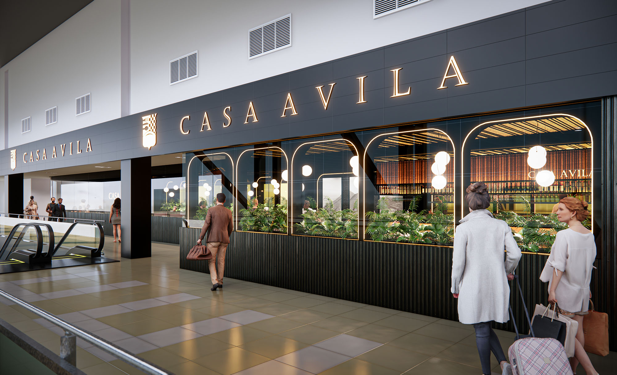
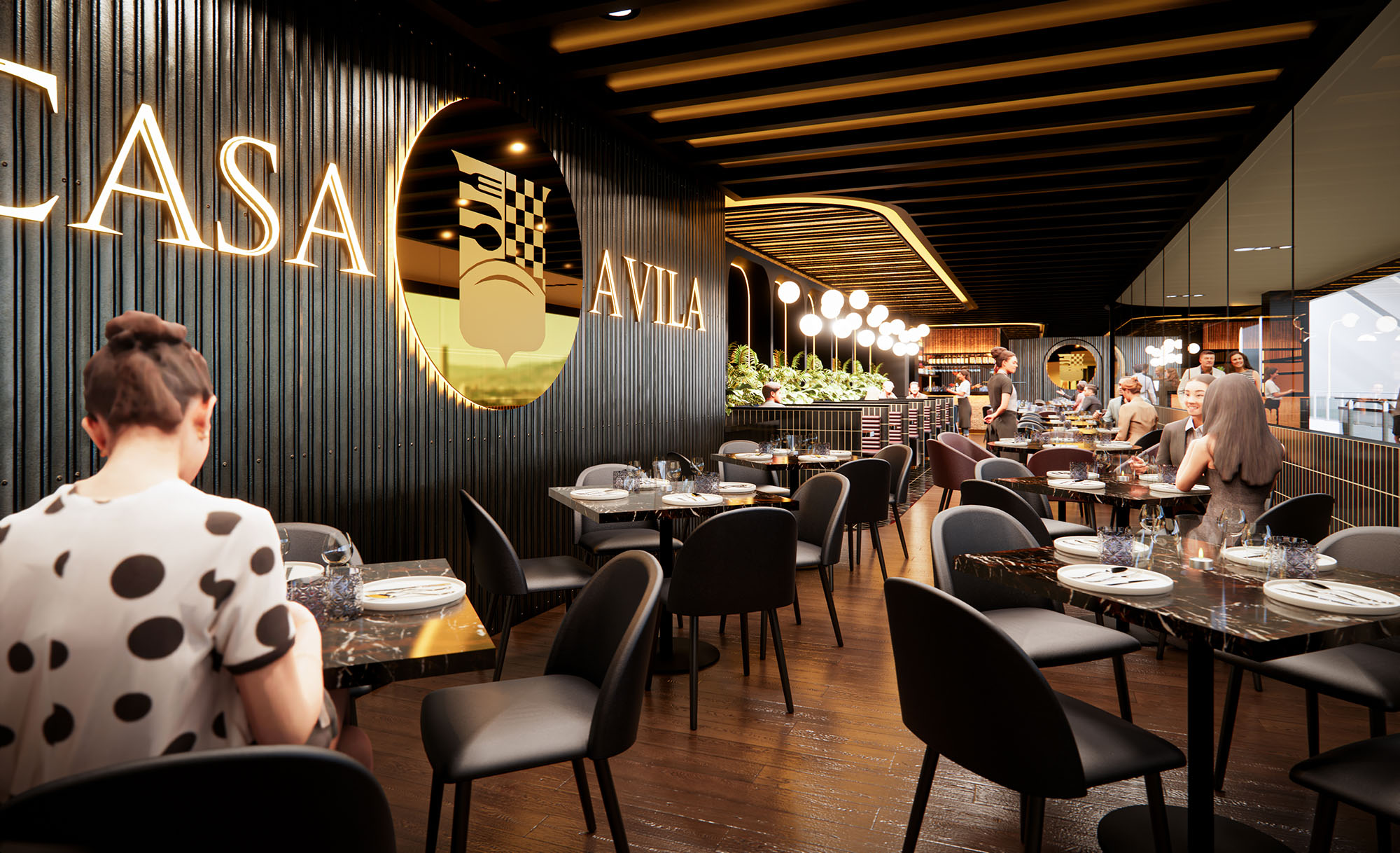
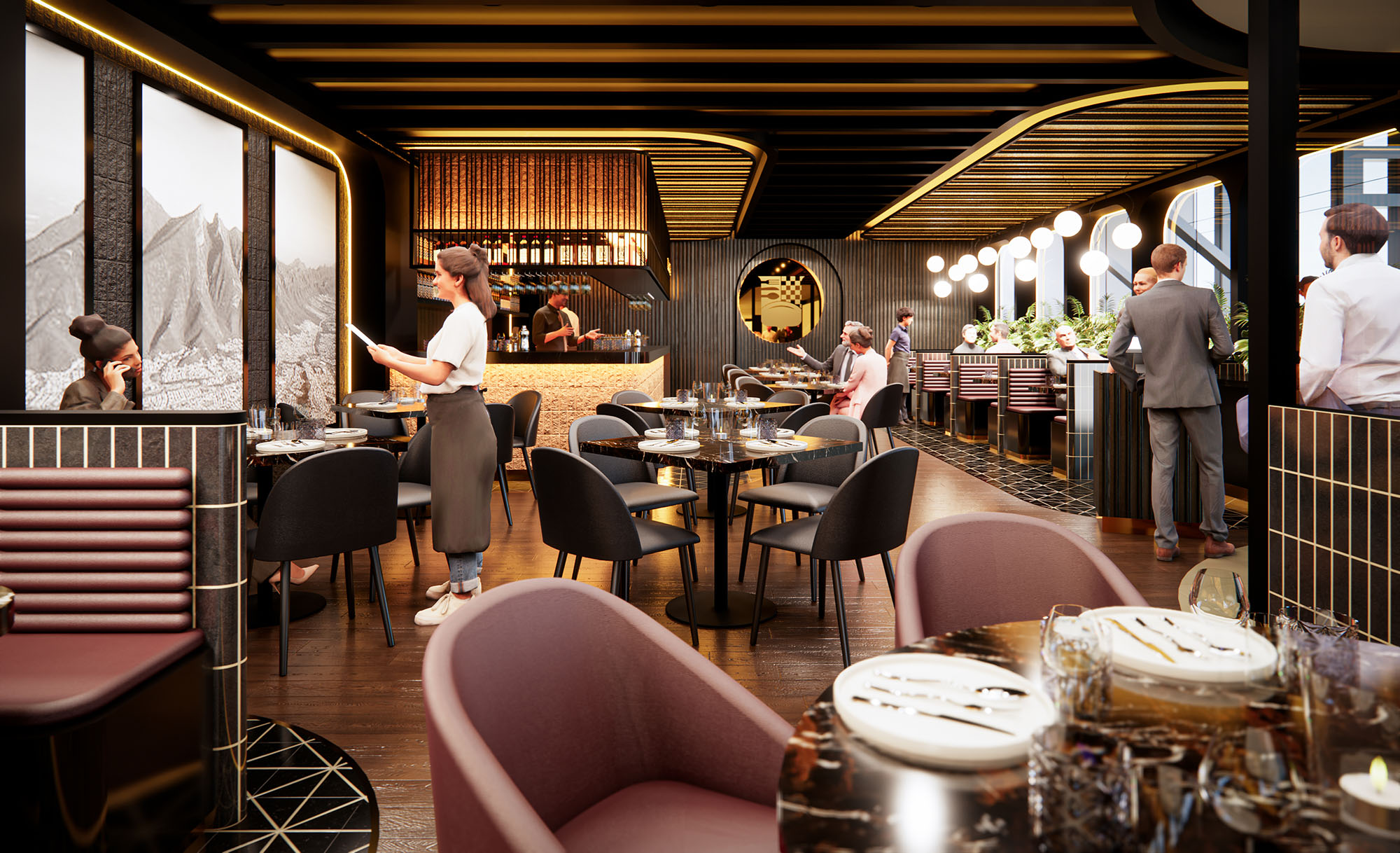
Casa Ávila is conceived as an urban refuge within the dynamic context of an airport terminal in Monterrey. The design creates a clear visual and spatial threshold between the public concourse and an interior atmosphere of calm, warmth and sophistication. The envelope works as a continuous façade that unifies branding, enclosure and interior ambience, turning the restaurant into a recognizable landmark in the circulation flow of the terminal.
The concept draws on contemporary interpretations of classic brasserie language: rhythmic vertical elements, warm metallic highlights and carefully modulated lighting. These resources communicate a sense of permanence and quality while remaining light and open, appropriate to a high-traffic, transient environment.
The exterior façade is structured as a gently curved, dark ribbed screen that defines the boundary with the terminal. Slender vertical fins generate depth and shadow, providing privacy to diners while maintaining controlled visual permeability. This linear texture gives the front a strong tectonic reading and a refined, almost architectural scale within the commercial corridor.
Branding is seamlessly integrated through a large illuminated logotype and a circular emblem that pierces the vertical grid. The backlit letters and logo act as a lantern, visible from long distances in the terminal. The circular opening frames partial views of the interior, offering a curated glimpse of the atmosphere while functioning as a focal point that organizes the façade composition.
The interior is arranged as a longitudinal nave parallel to the concourse, optimizing frontage and maximizing the number of seats with exterior visibility. Seating typologies are layered from the façade inward: small tables for two along the edge, more generous groupings in the central zone, and lounge-style settings near the bar. This gradation of densities allows for both fast, individual service and longer, social stays.
Circular circulation is ensured by a clear spine connecting entry, bar and kitchen. Service paths run along the perimeter of the bar and between seating bands, minimizing interference with the guest experience. The plan supports high turnover at peak hours while maintaining an orderly, legible space.
The material palette balances dark, textured surfaces with warm accents. The exterior ribs appear to be finished in a deep charcoal or bronzed tone, complemented by metallic details in brass or gold at the logo and lighting fixtures. Inside, timber or wood-look flooring adds warmth and continuity, while upholstered chairs in muted rose and earth tones introduce softness and tactility.
Ceiling elements follow the linear expression of the façade, with dark beams or slats directing perspective toward the bar and logo wall. Lighting is layered through indirect cove washing on the ceiling, integrated strip lighting in the logo and warm, spherical pendants that echo classic hospitality design. The overall luminous environment is intimate but sufficiently bright for an airport context, using warm color temperatures to counteract the cooler ambient light of the terminal.
Furniture is specified with slender metal legs and refined profiles to keep the visual field light despite the dark palette. Tabletops in stone or high-performance composite materials provide durability and a sense of solidity. Curved banquettes and upholstered armchairs contribute ergonomic comfort during longer waits between flights, while their rounded forms soften the rigorous vertical and linear geometry of the shell.
Planters integrated into the façade and interior partitions bring greenery into the space, softening the boundary with the concourse and introducing biophilic elements. Detailing in joints, edges and transitions between materials is deliberately minimal, reinforcing a contemporary aesthetic that privileges continuity over ornament.
Although located in a controlled airport environment, the project addresses sustainability through material selection, lighting design and operational efficiency. The predominant use of durable finishes such as metal, composite cladding and engineered wood reduces the need for frequent replacement, extending the life cycle of the fit-out. Upholstery fabrics and finishes can be specified with high recycled content and low-VOC emissions, improving indoor air quality for both staff and guests.
Lighting is based on LED technology with directional and dimmable fixtures, reducing energy consumption while allowing adaptation to different times of day and levels of natural light in the terminal. The vertical façade not only provides identity but also acts as a passive filter, reducing glare and improving visual comfort. The compact, linear layout concentrates service areas and shortens routes, contributing to more efficient operations and lower resource use over time.
© 2021 by sanzpont [arquitectura] . Webpage by sanzpont [digital] . Innovative Digital Experiences
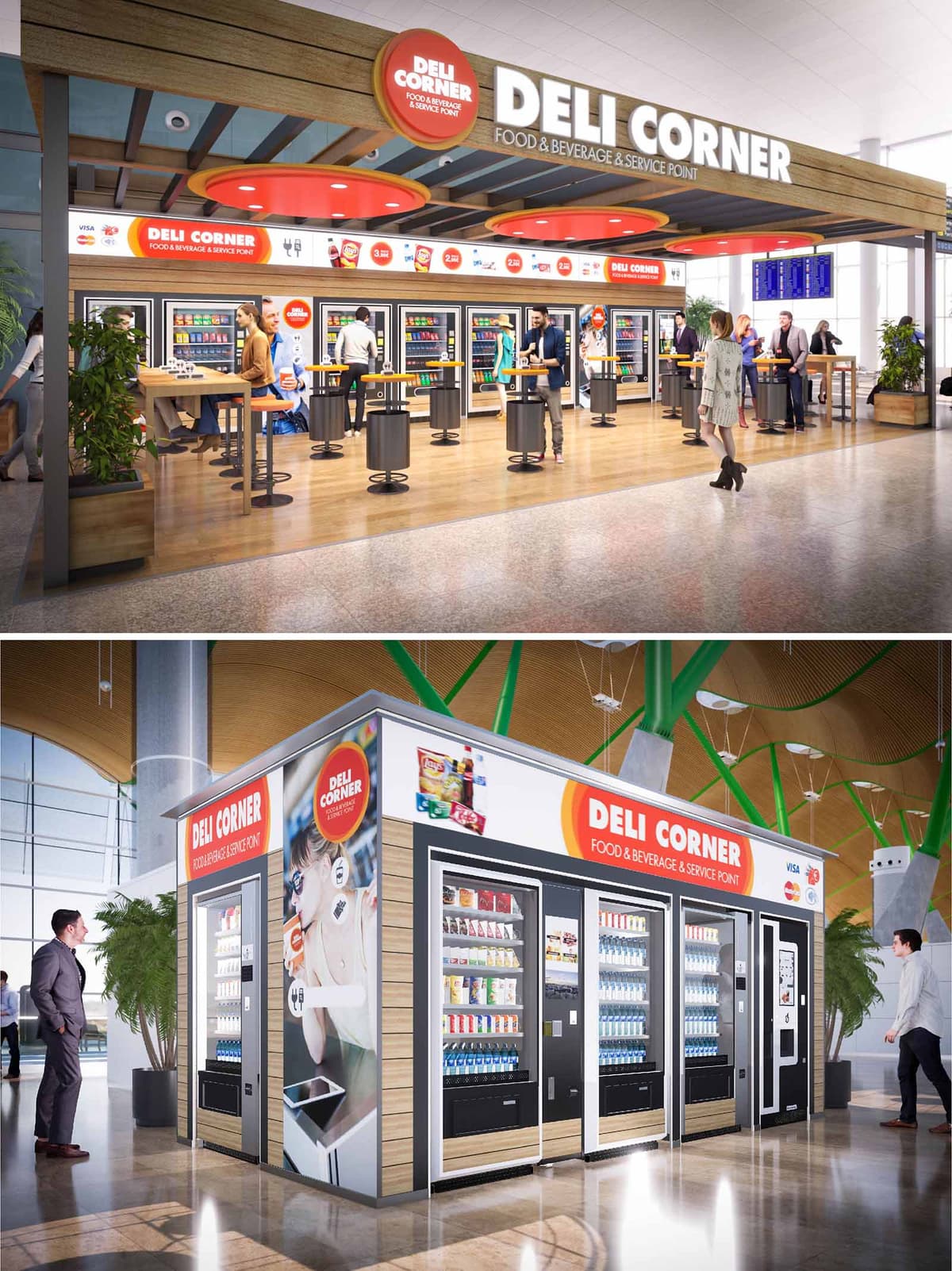
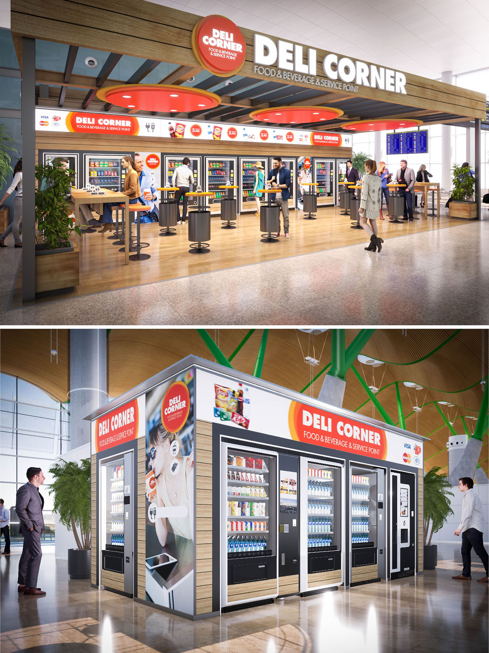
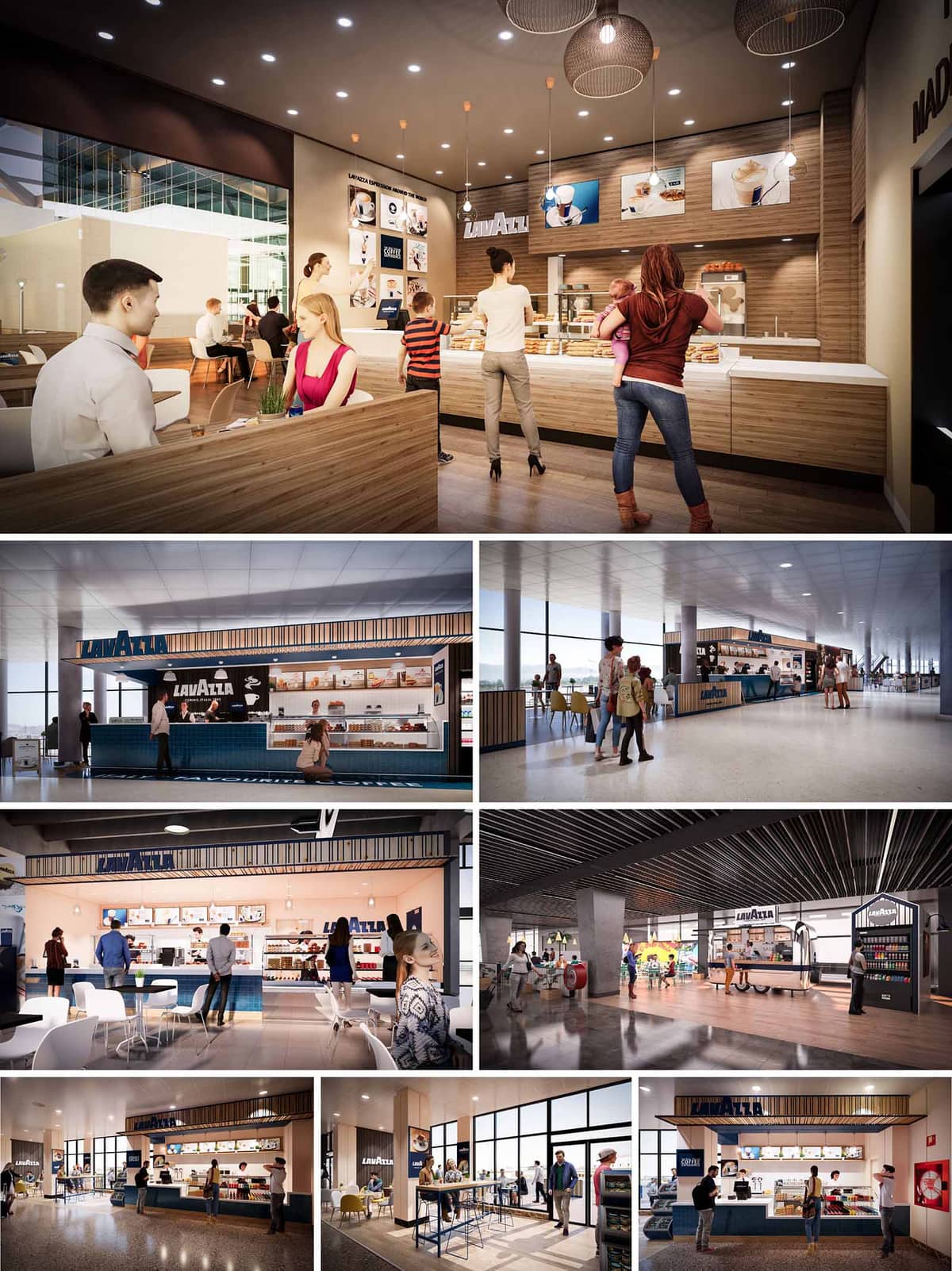
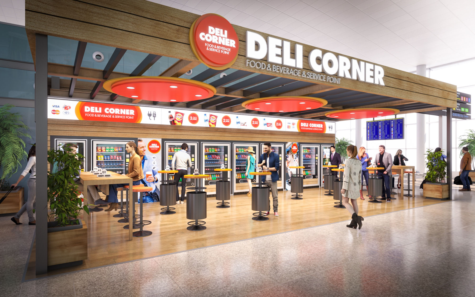
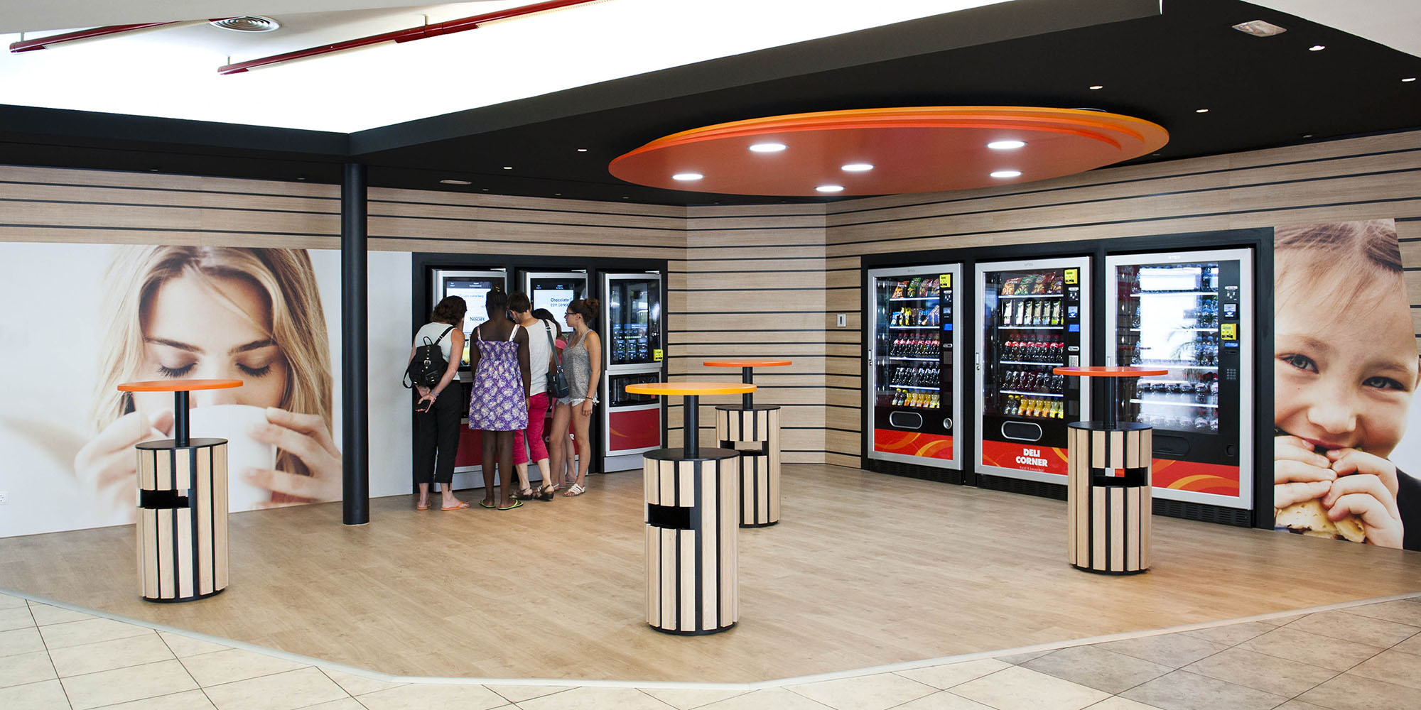
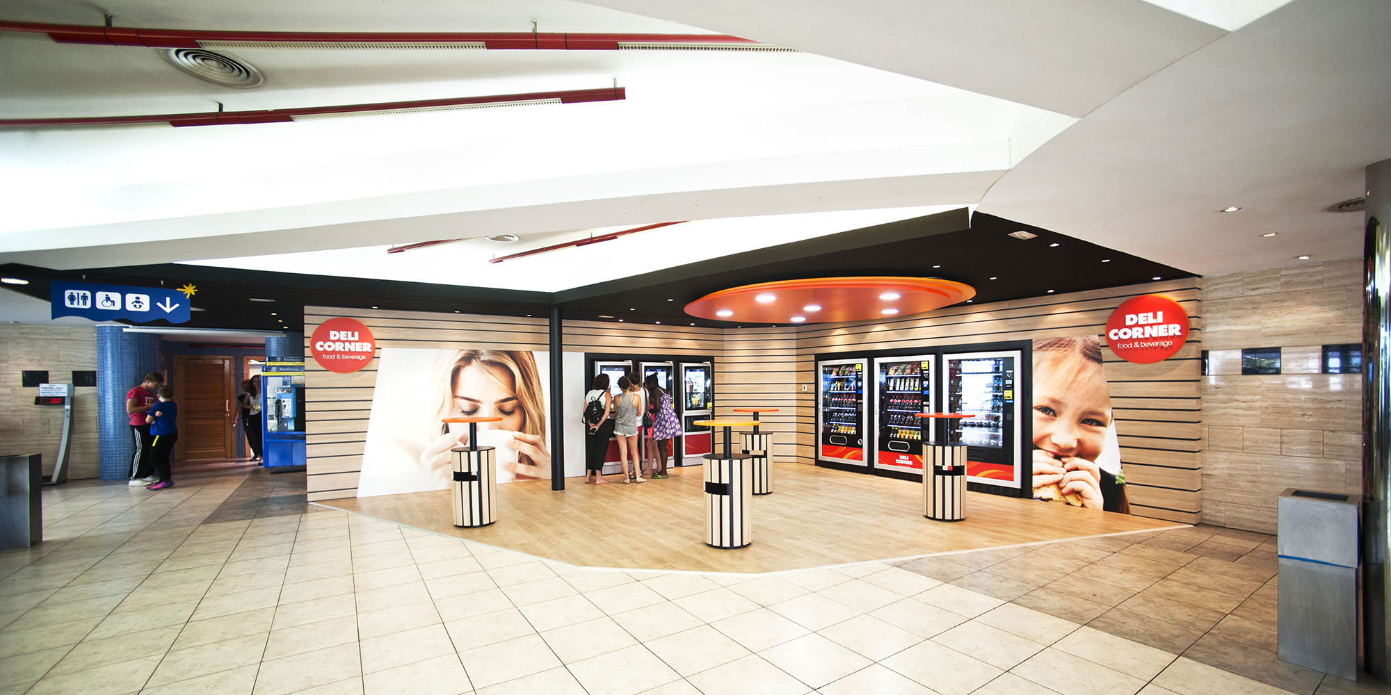
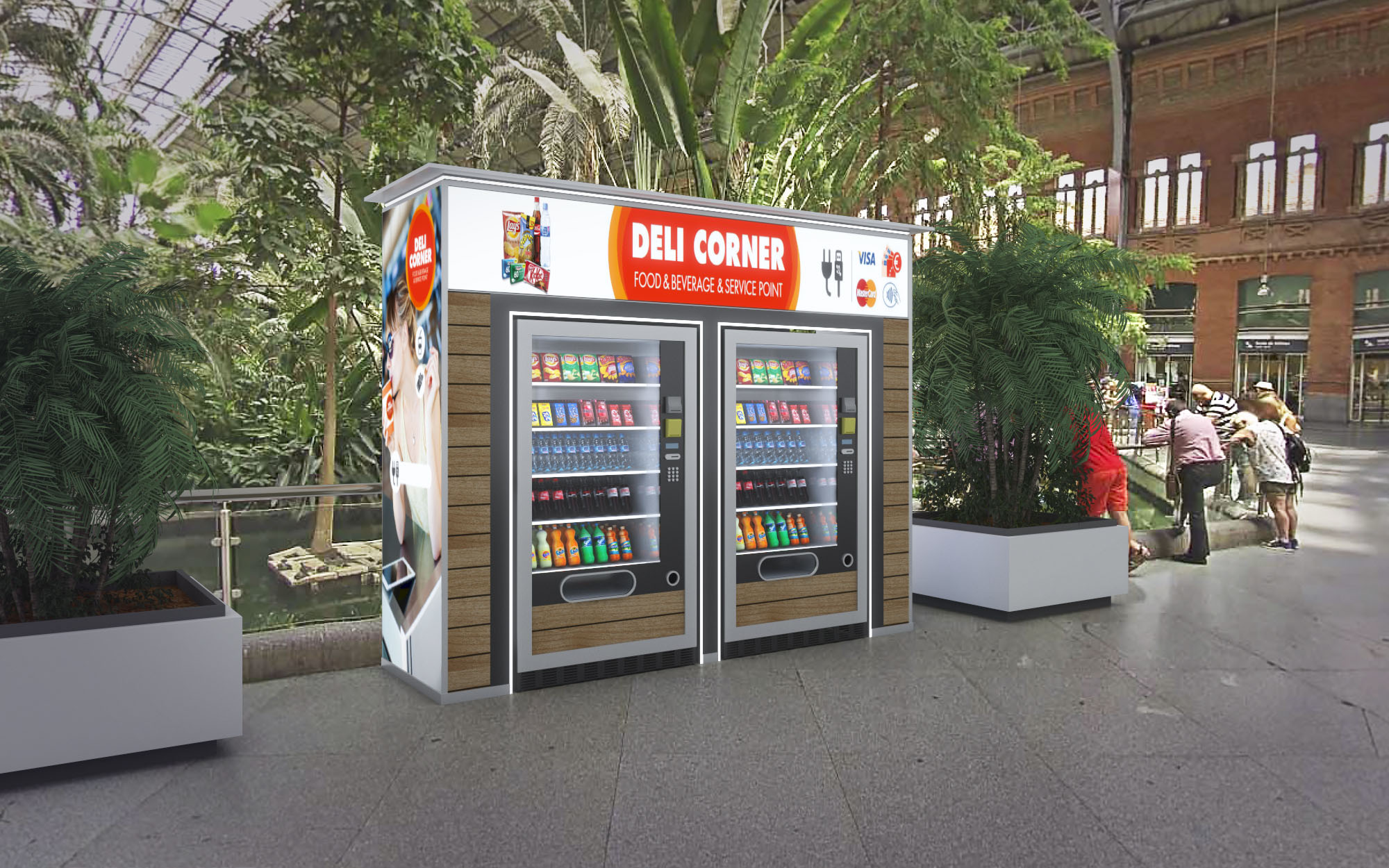
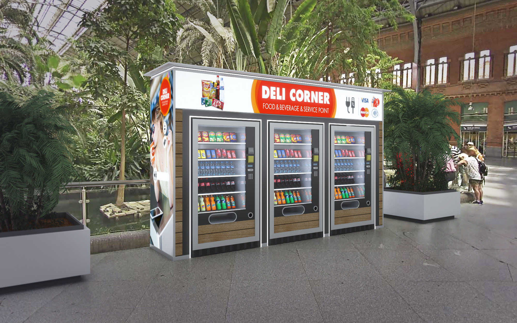
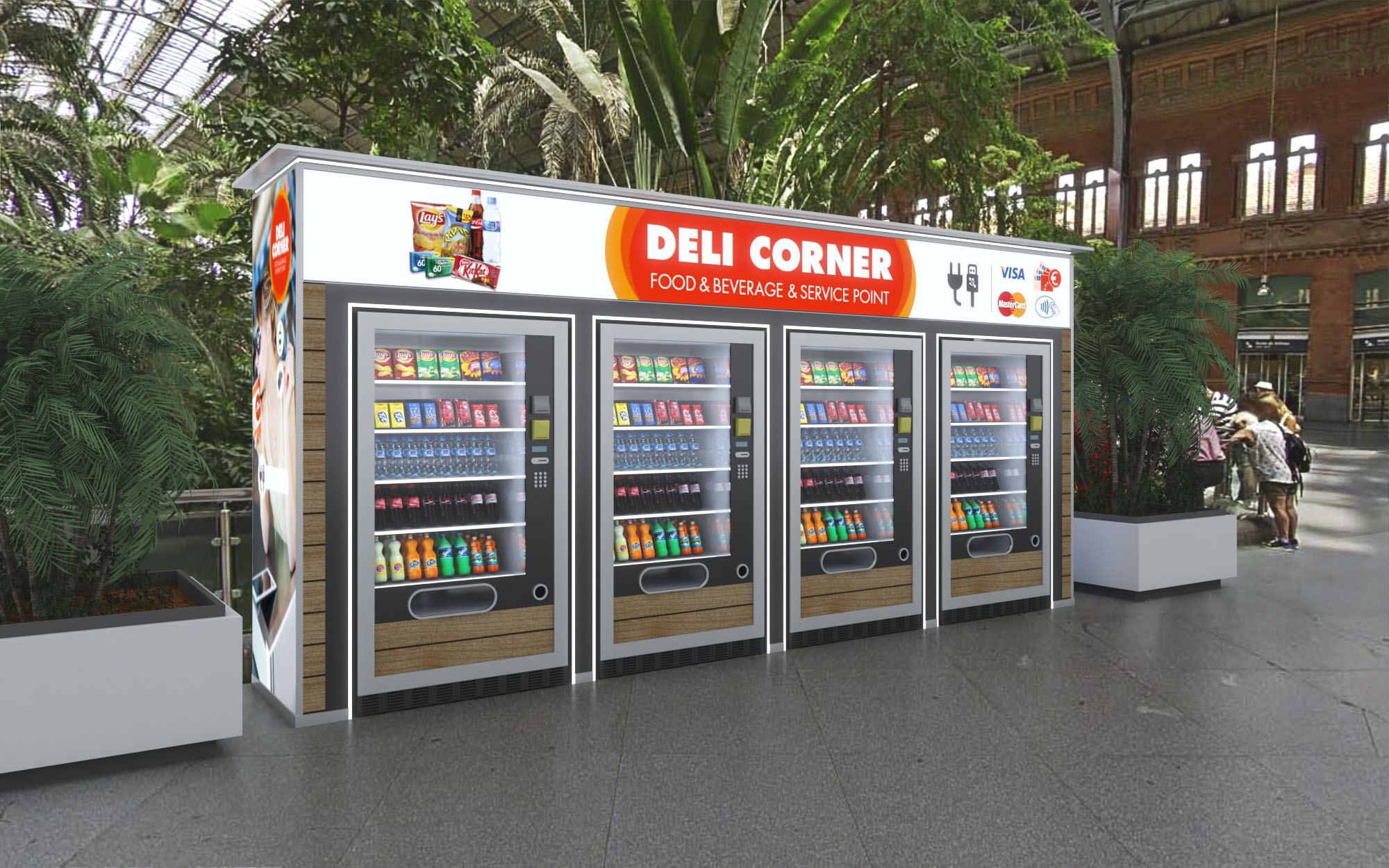
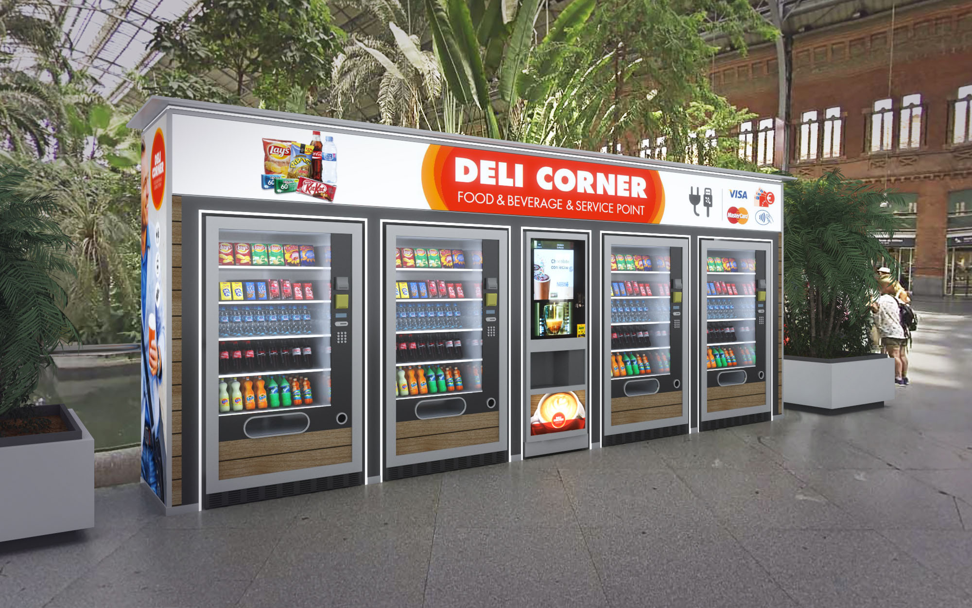
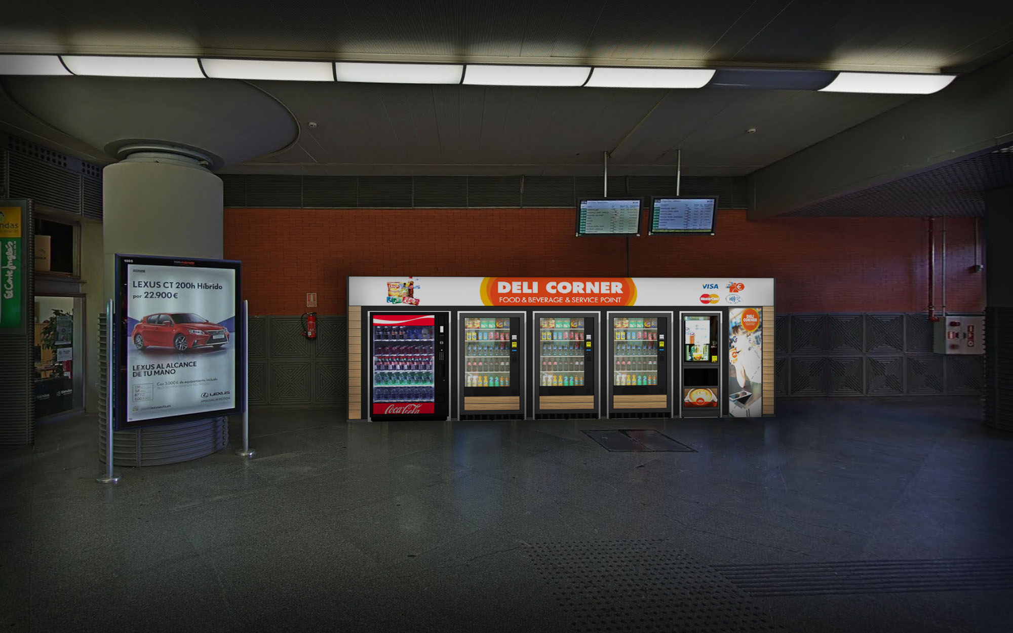
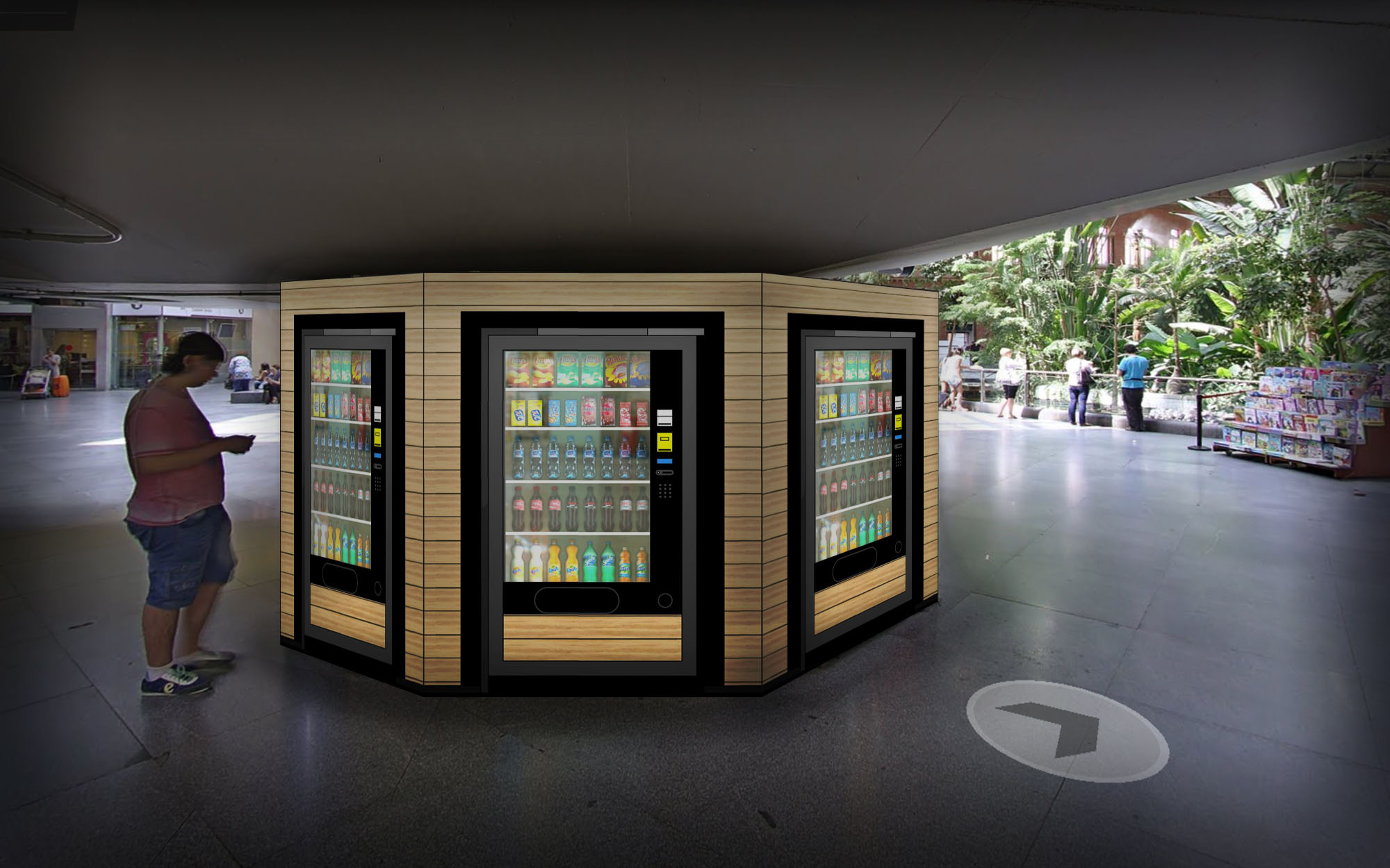
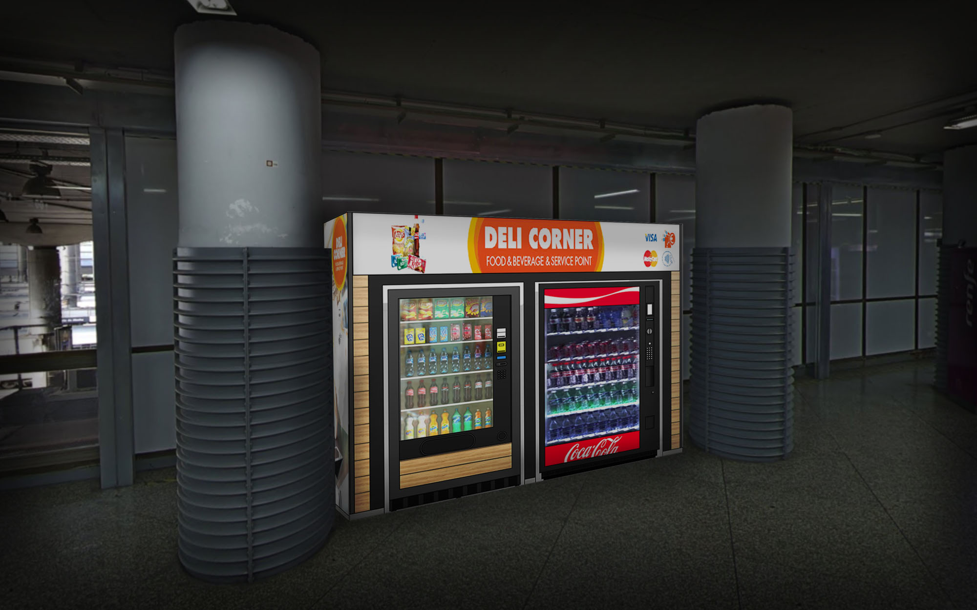
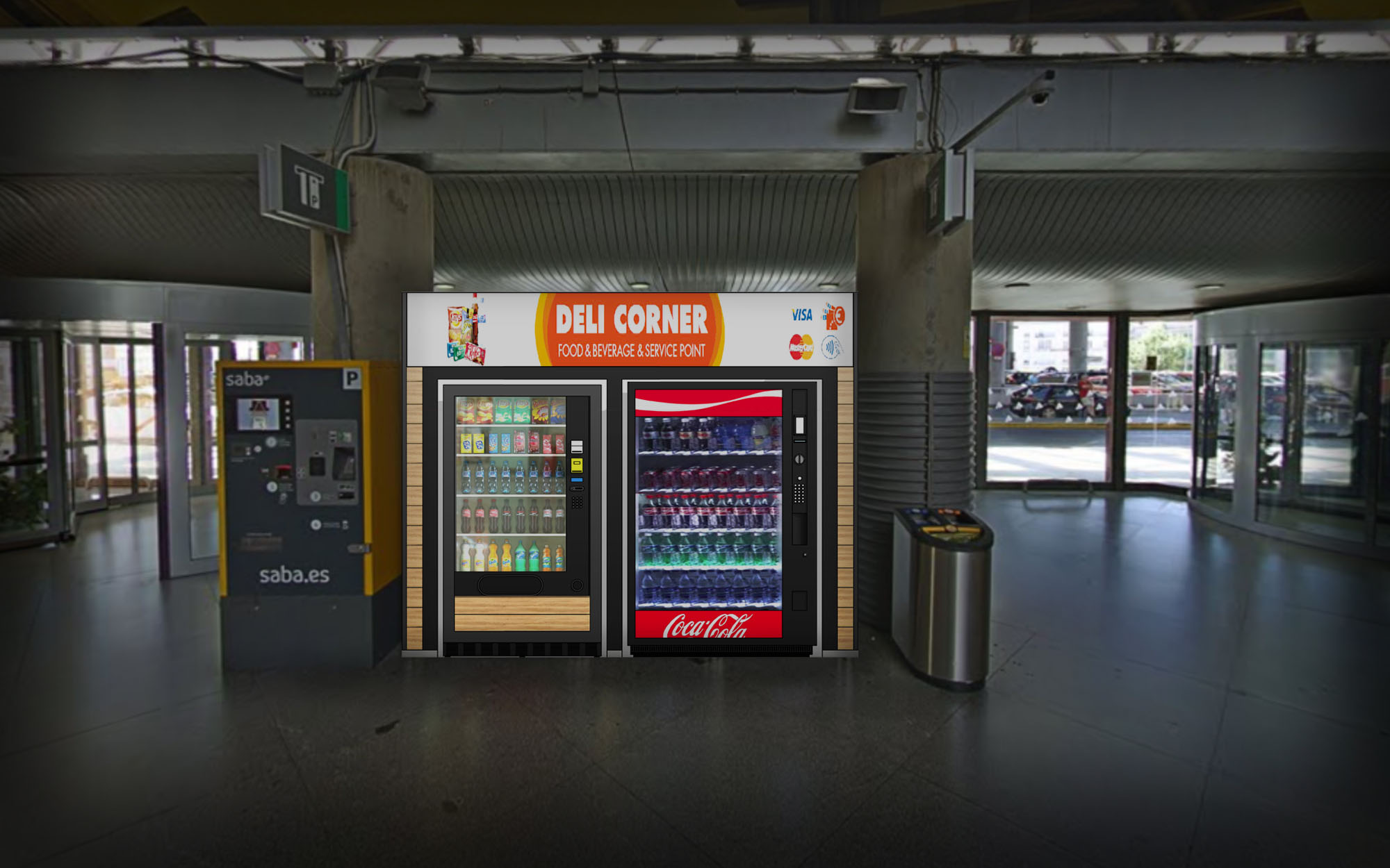
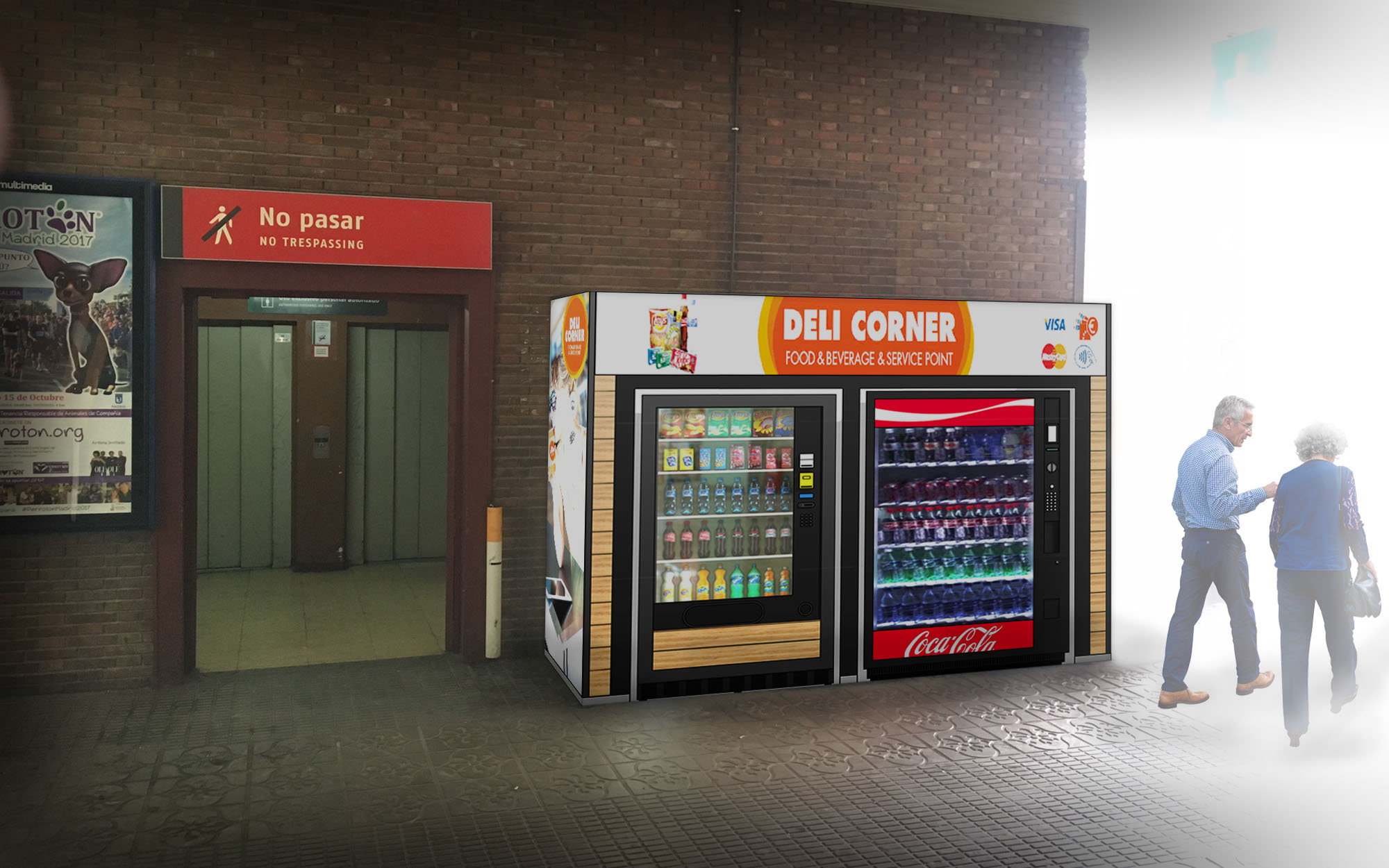
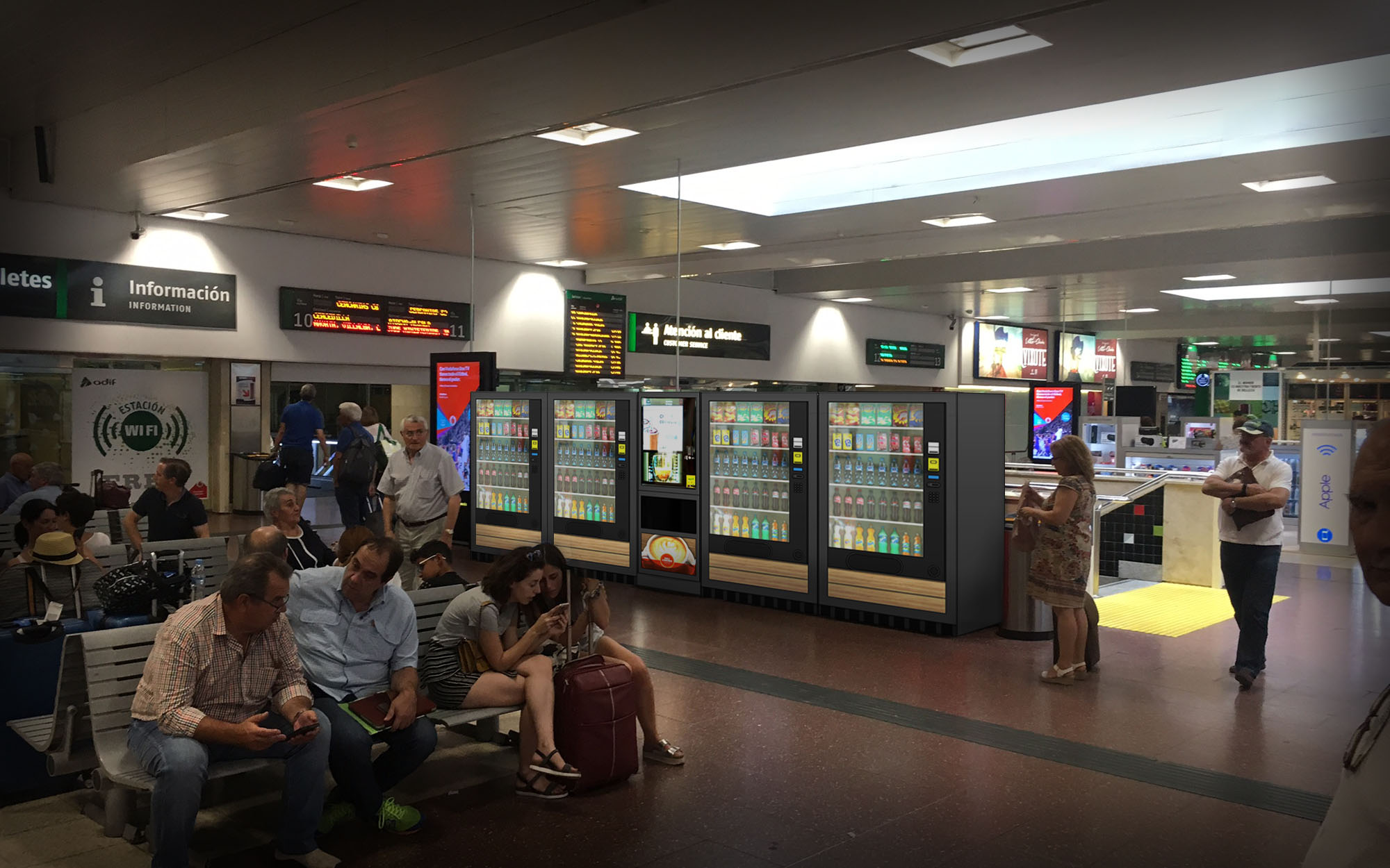
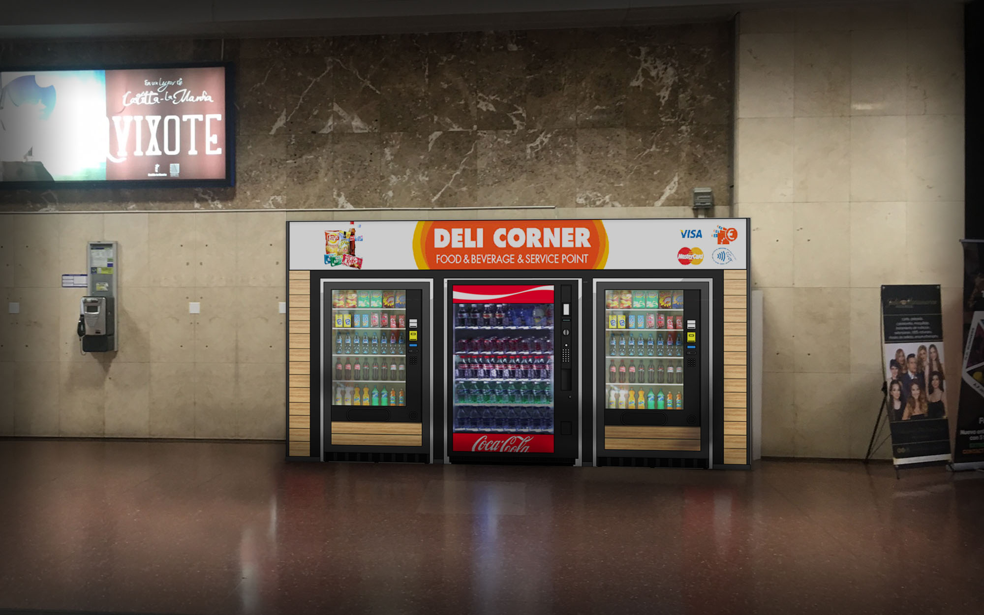
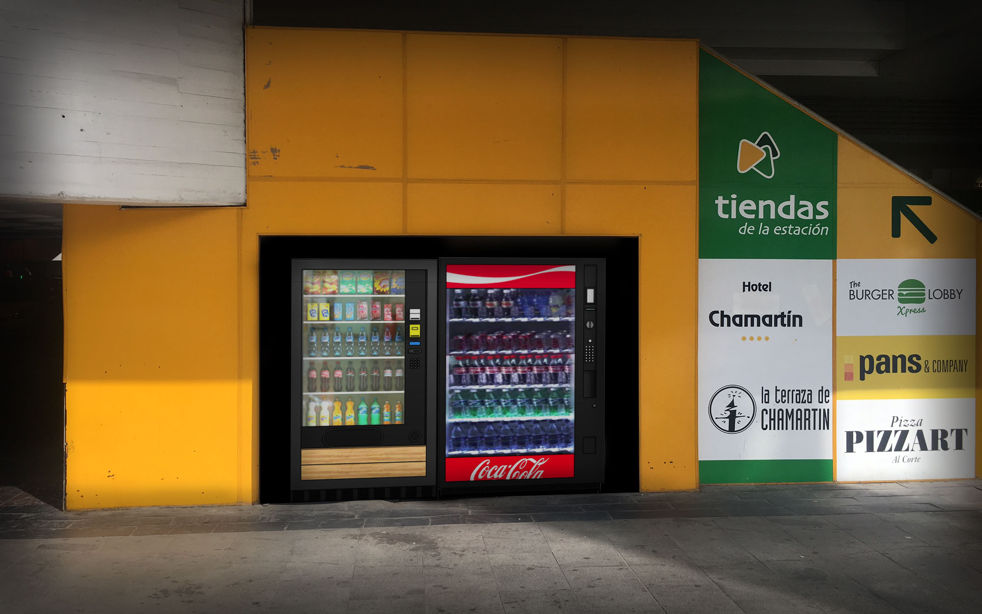
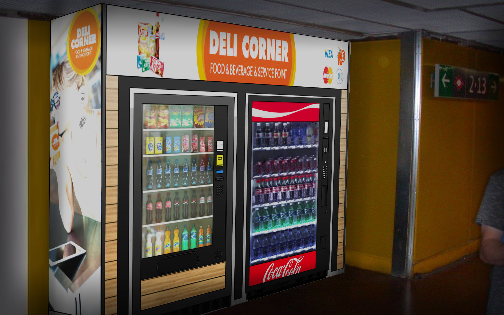
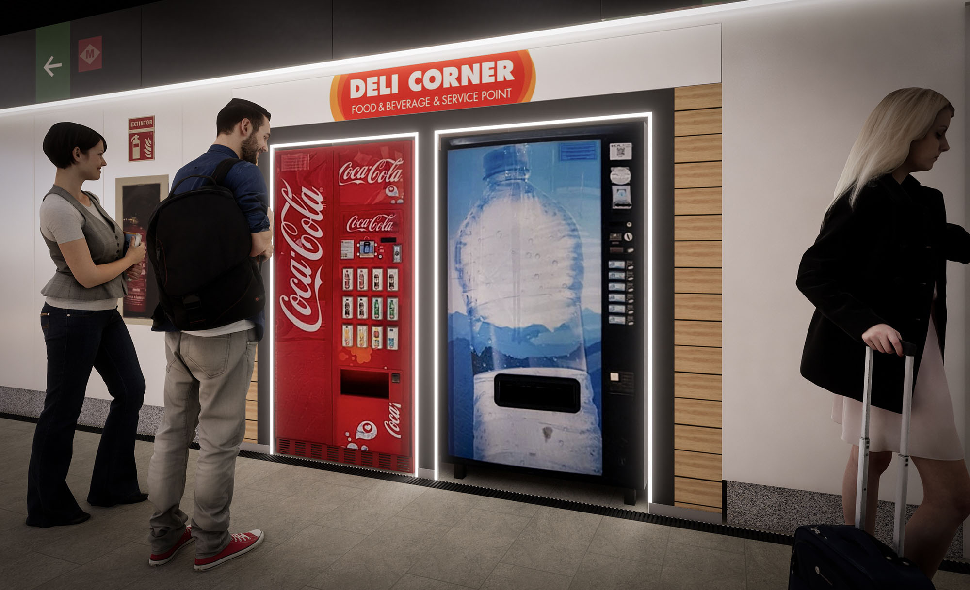
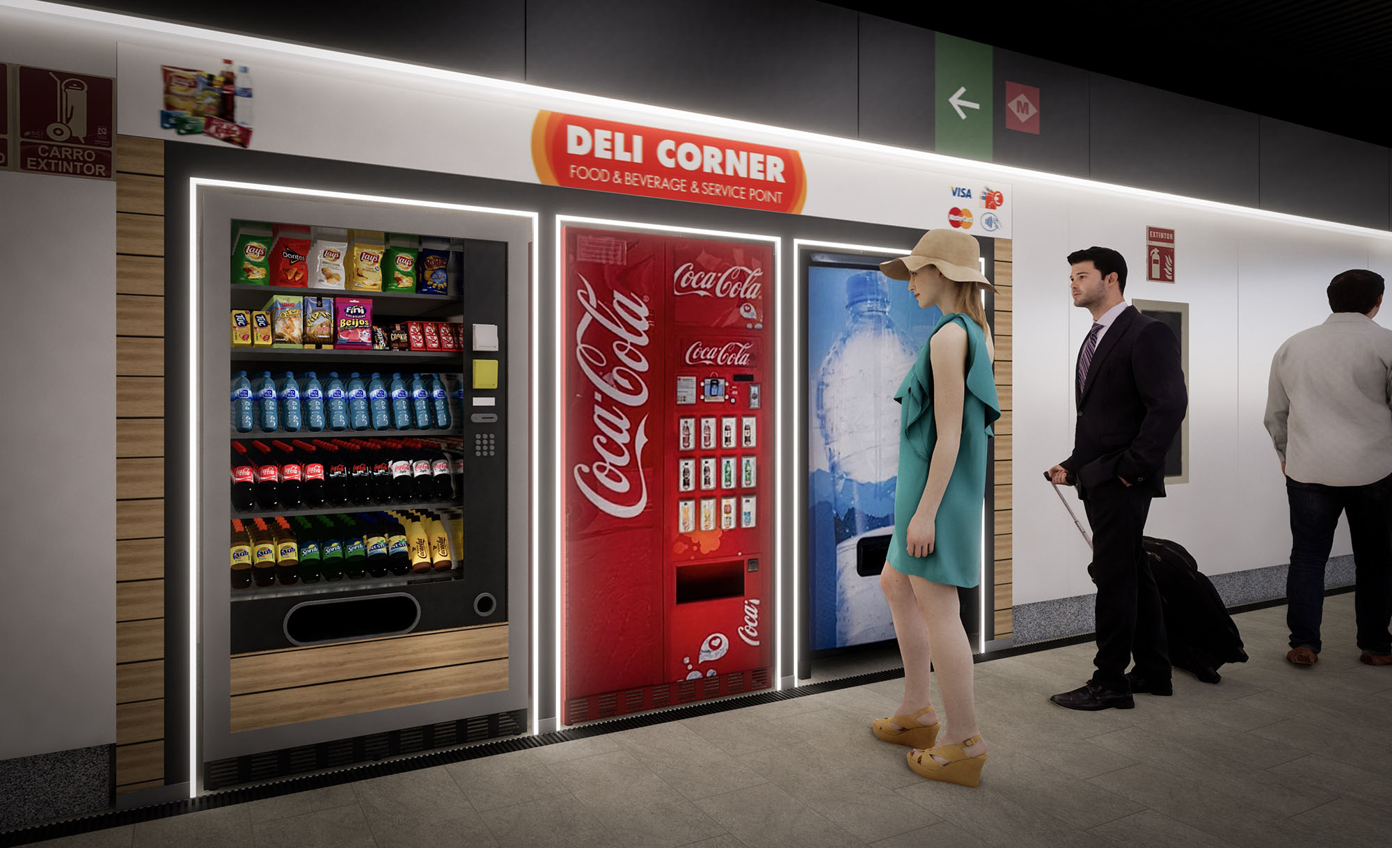
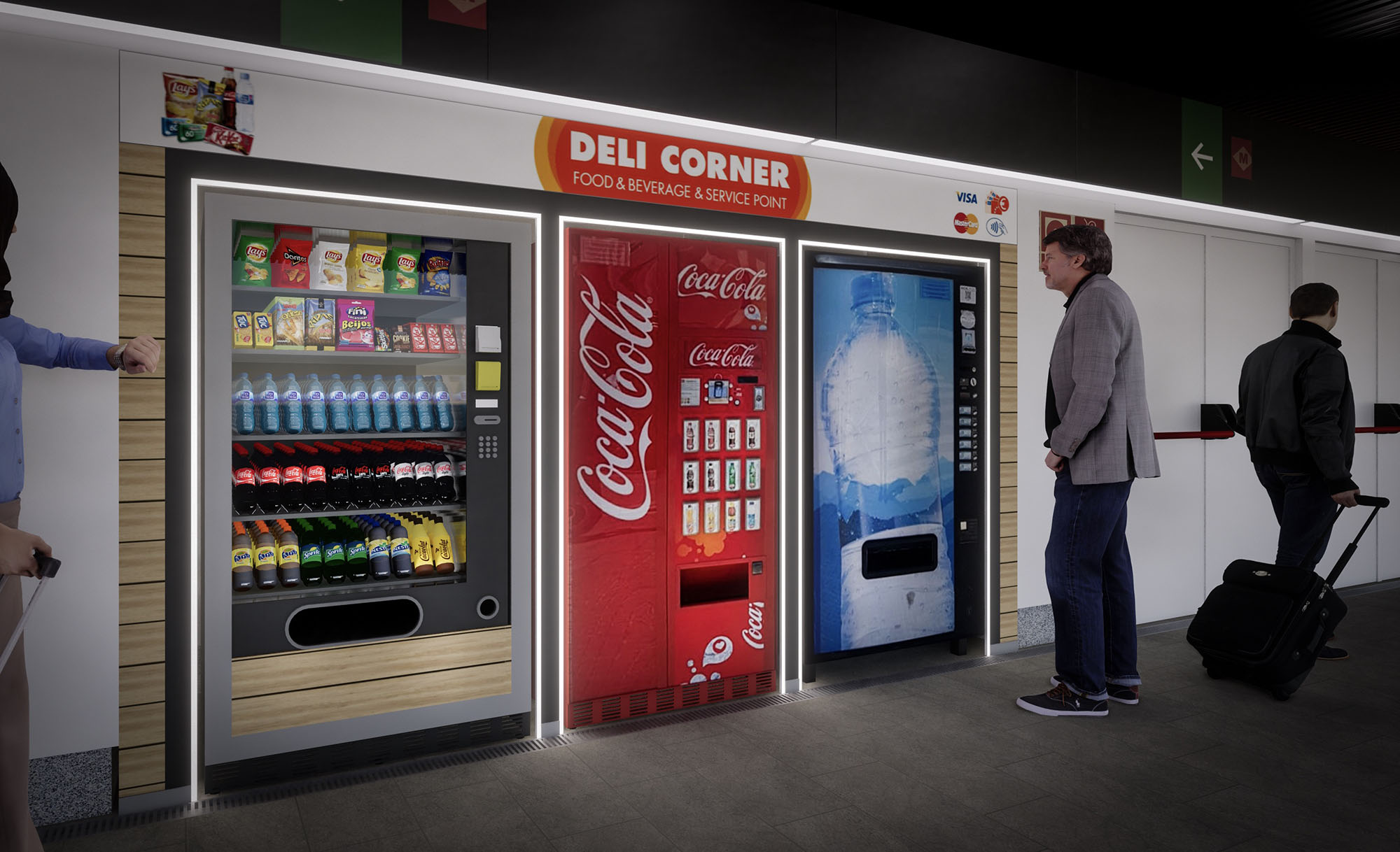
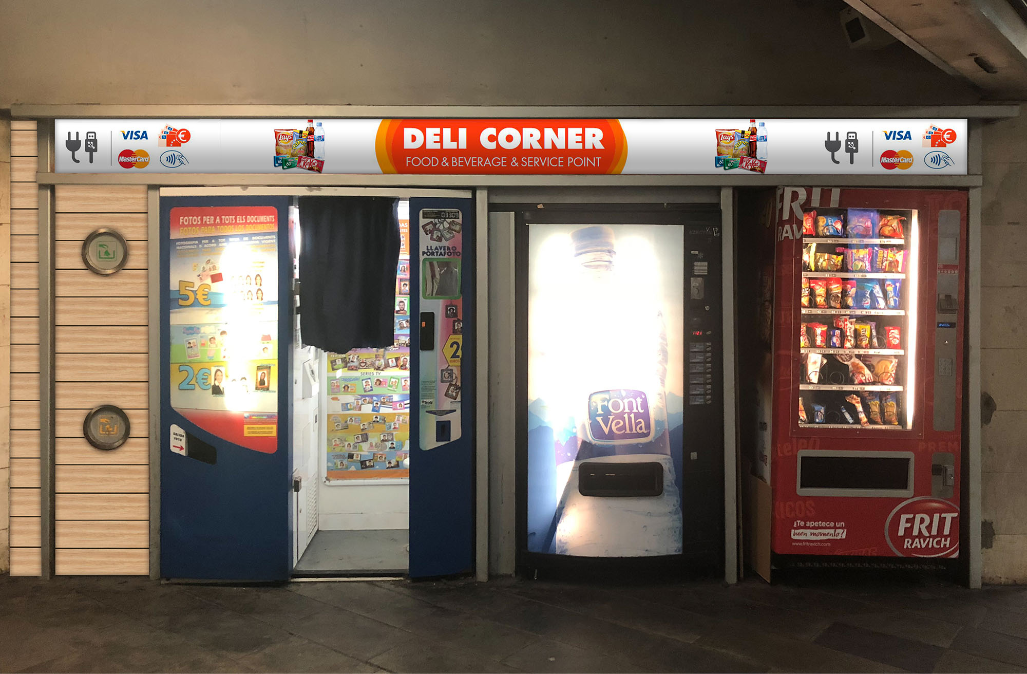
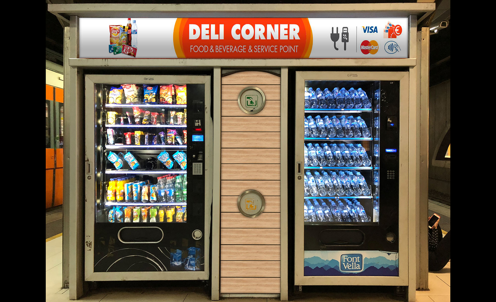
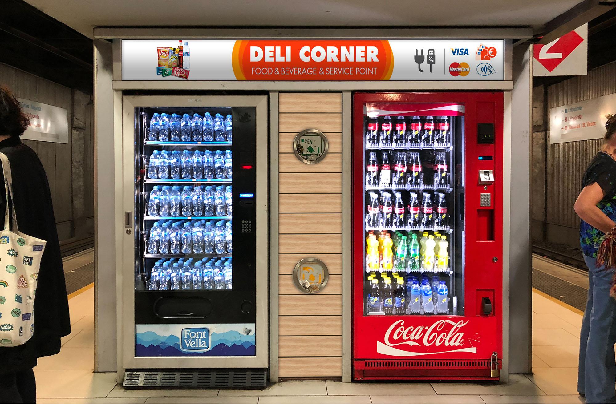
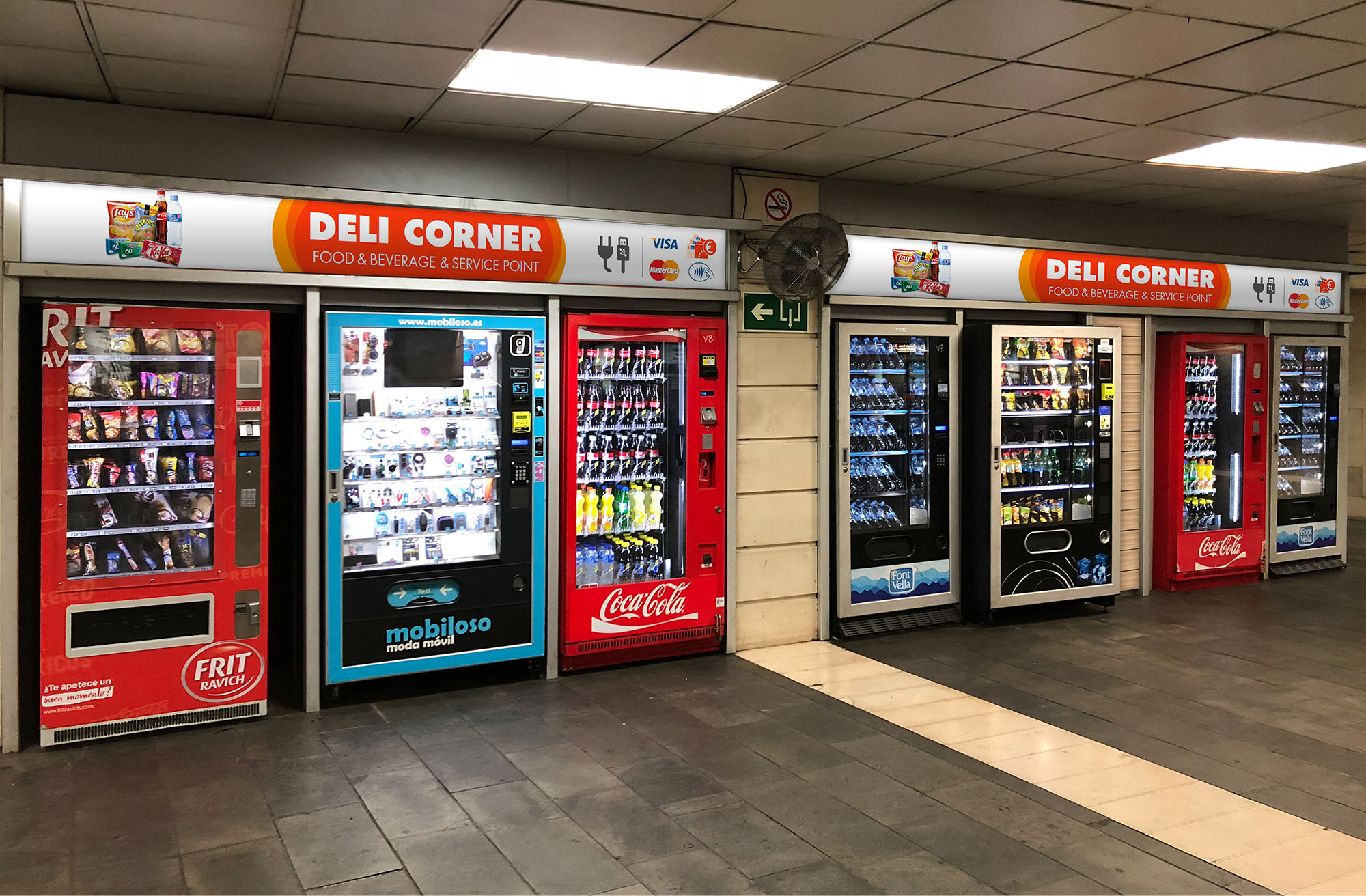
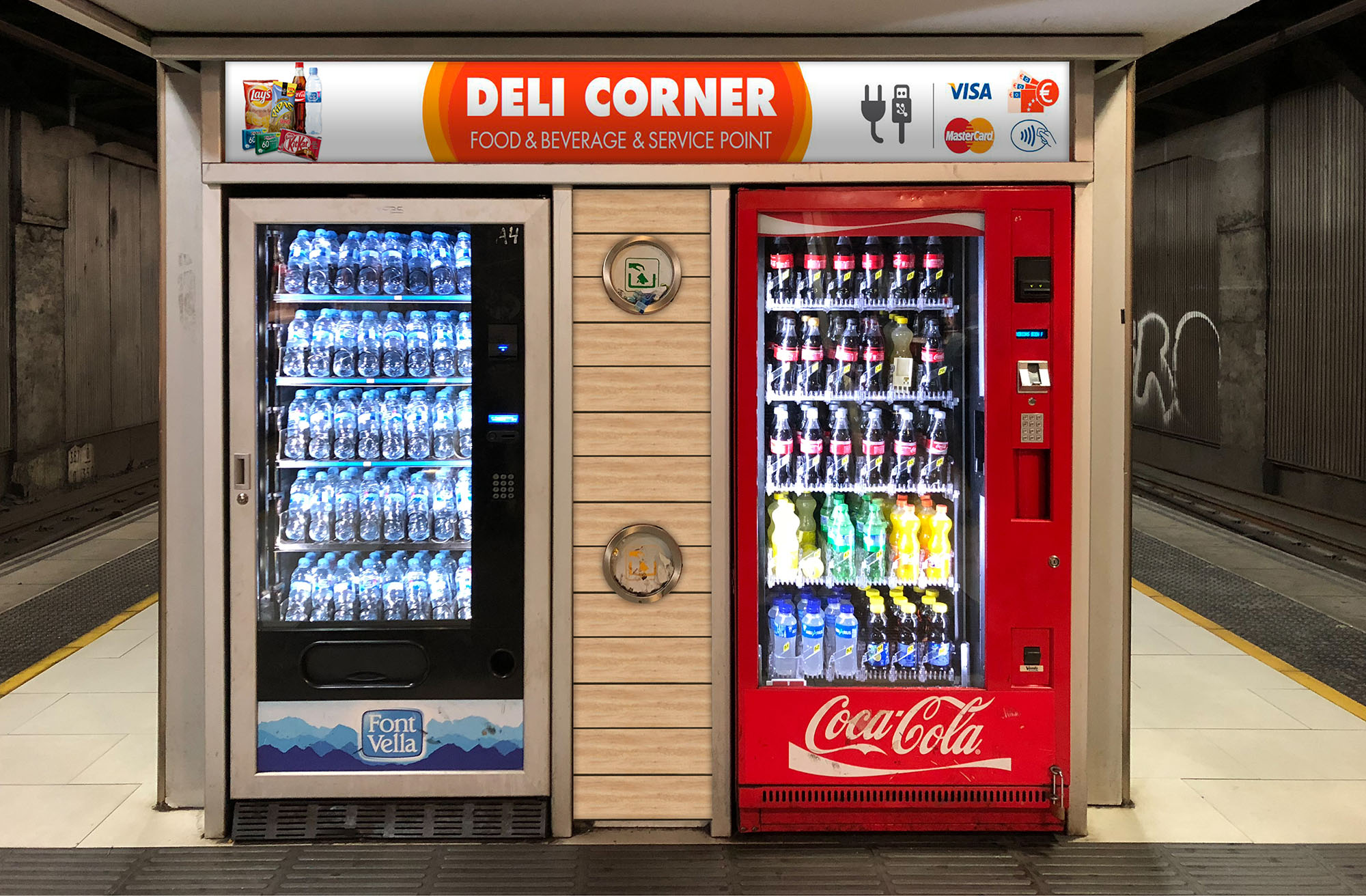
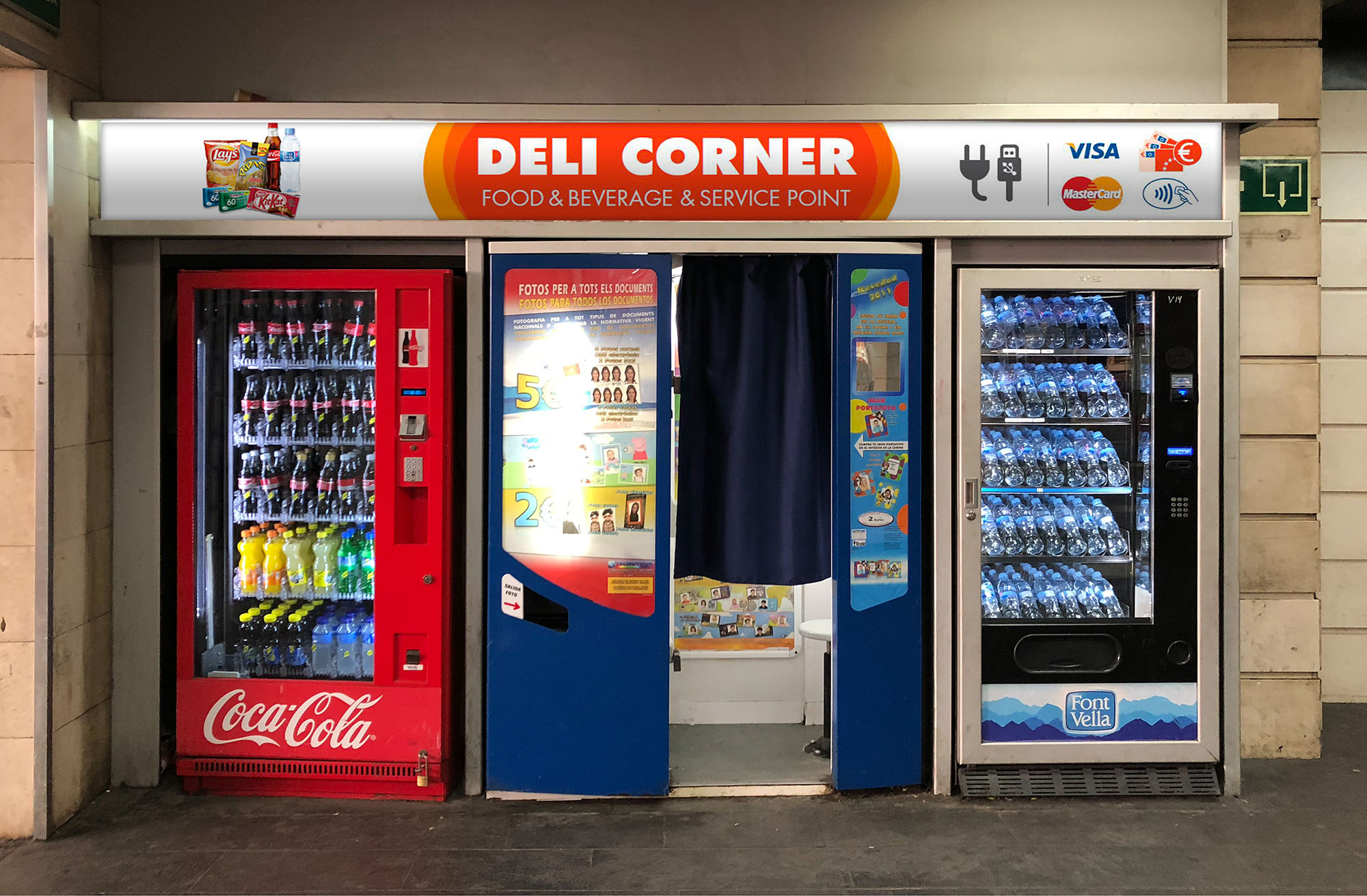
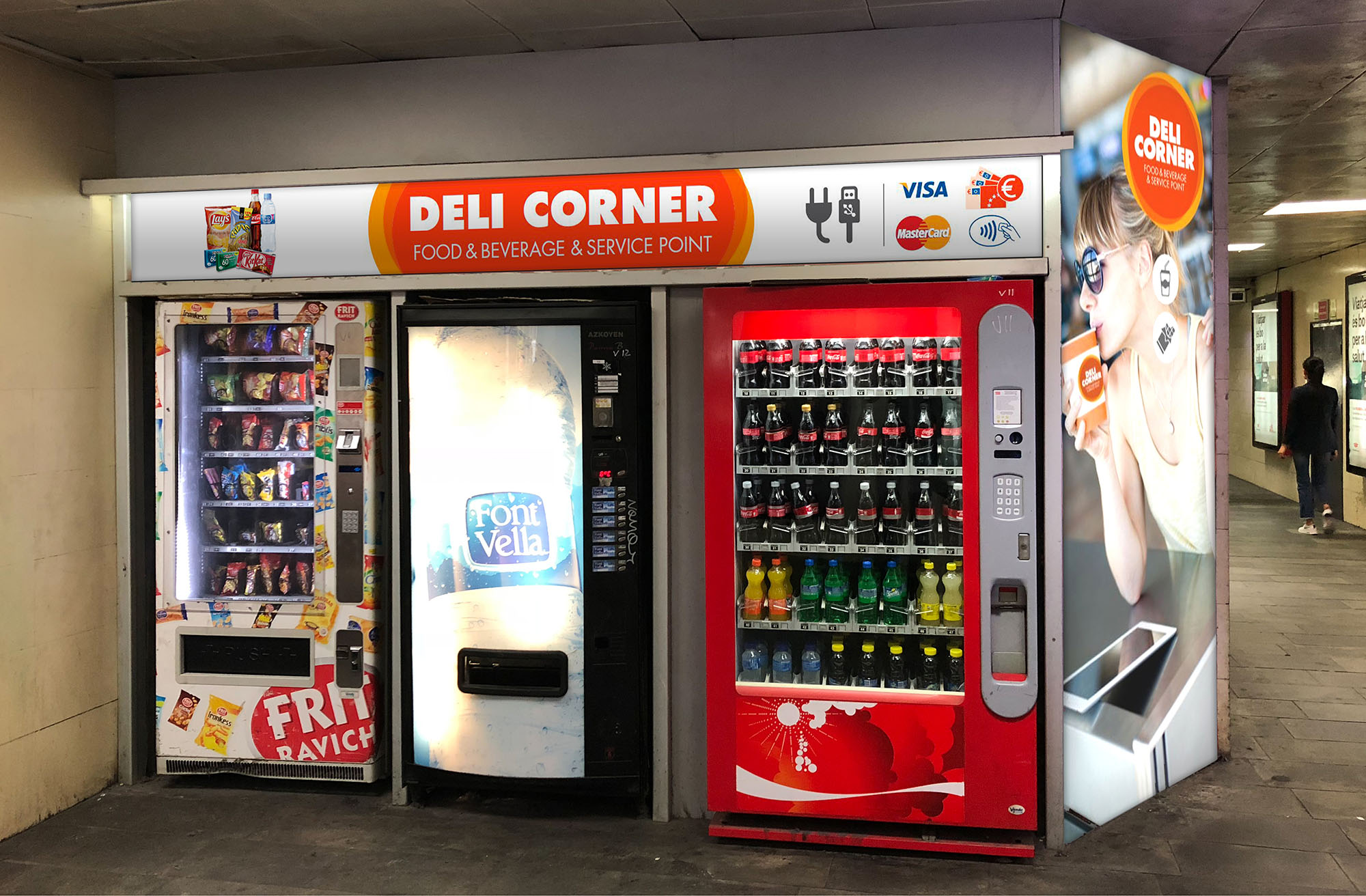
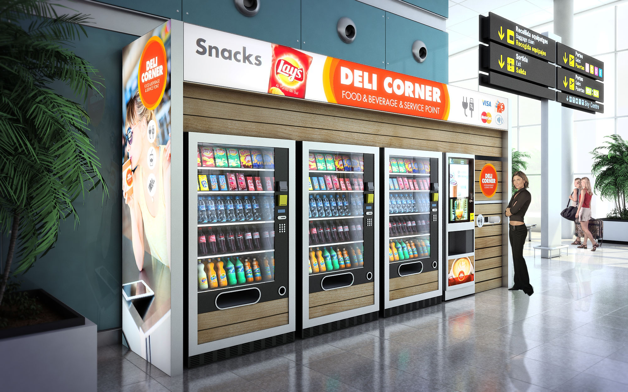
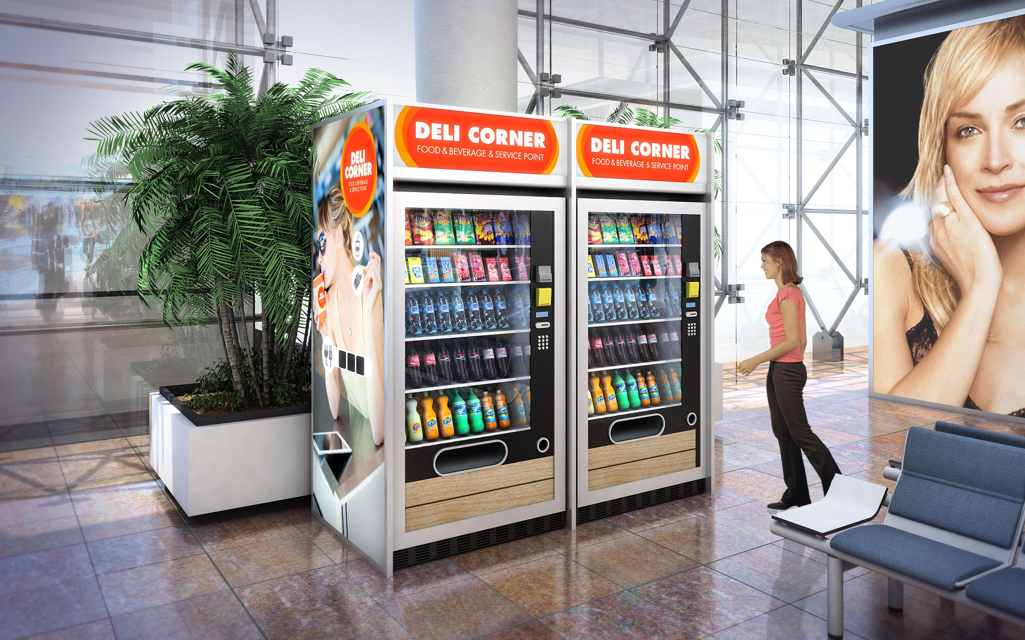
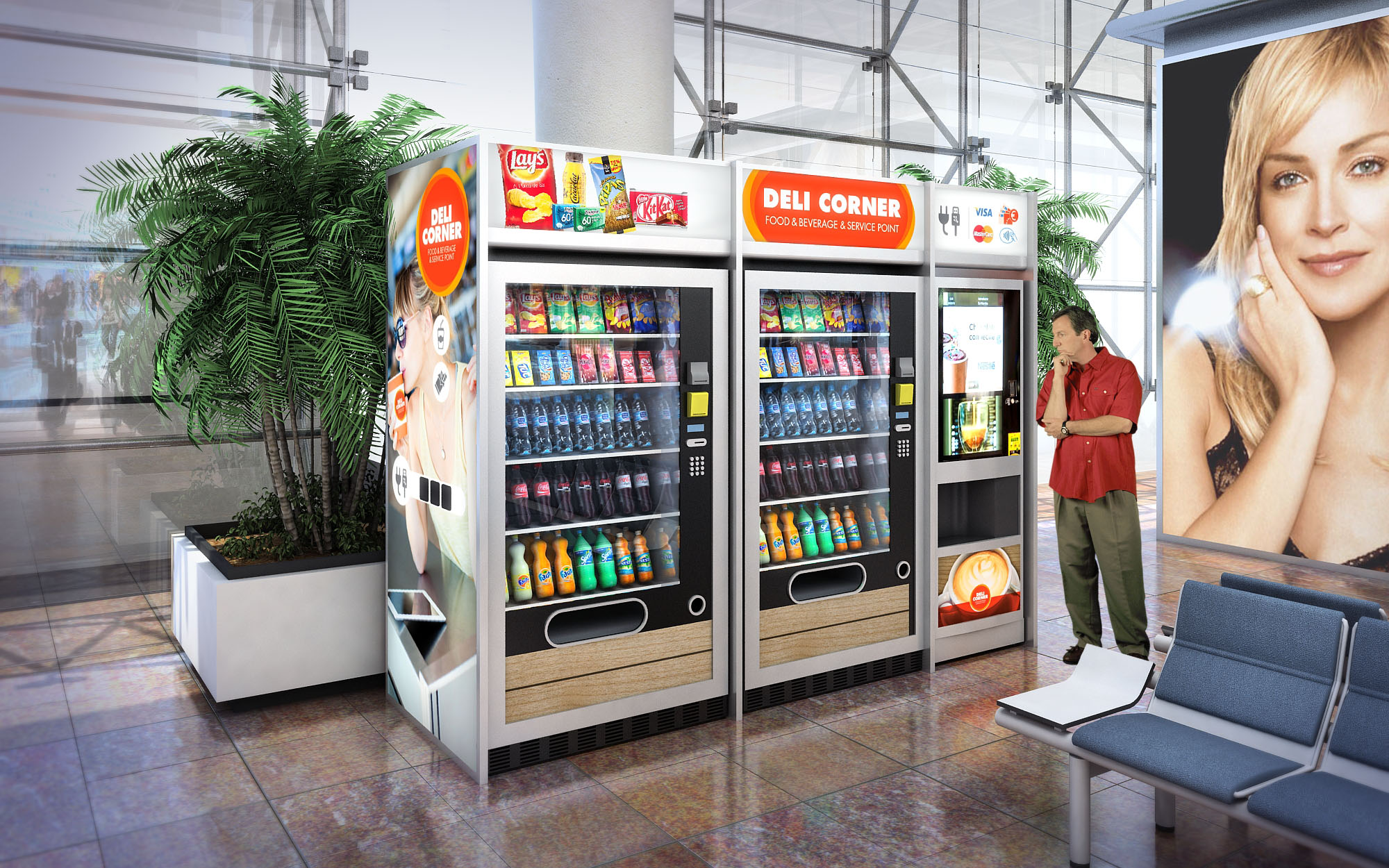
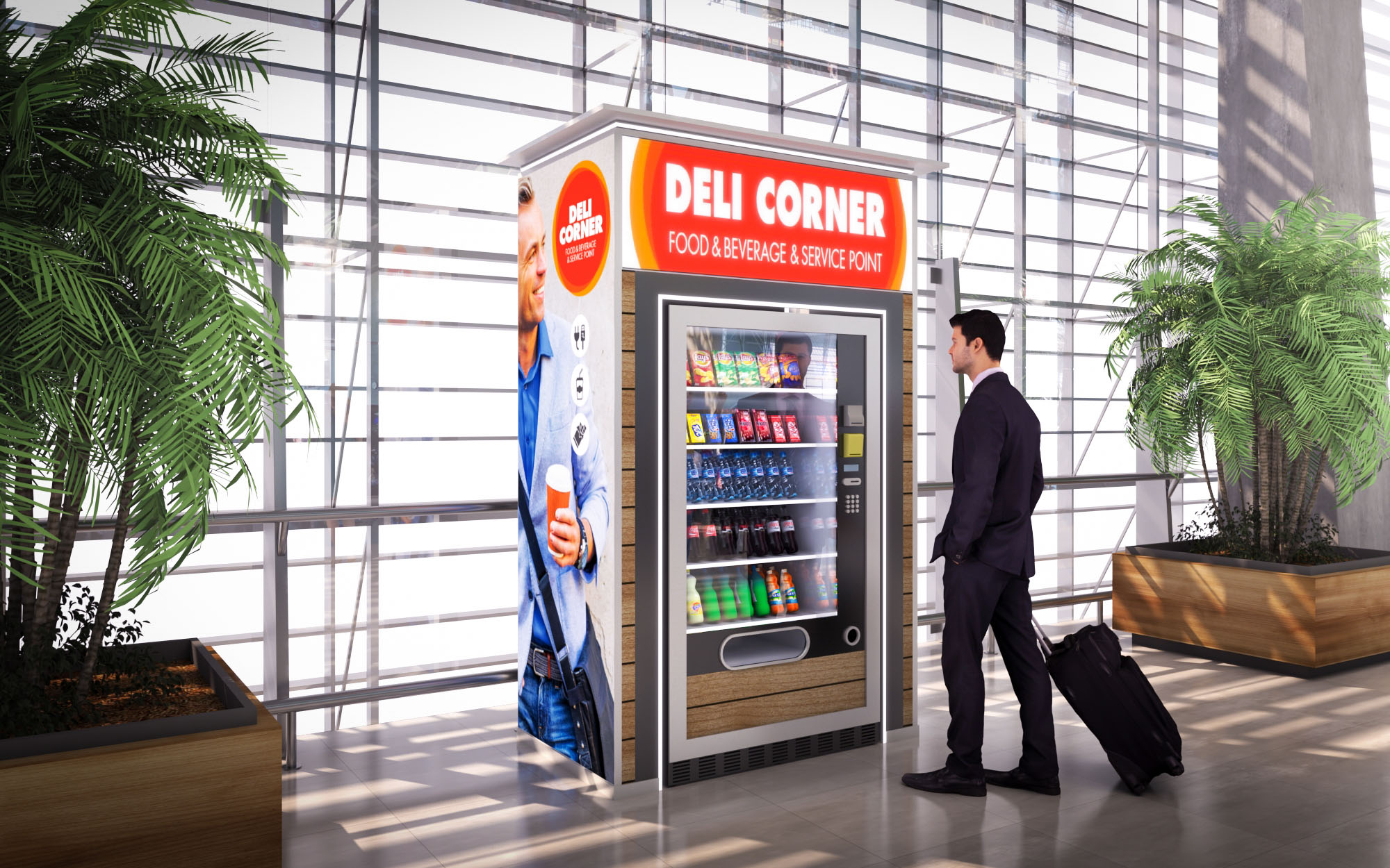
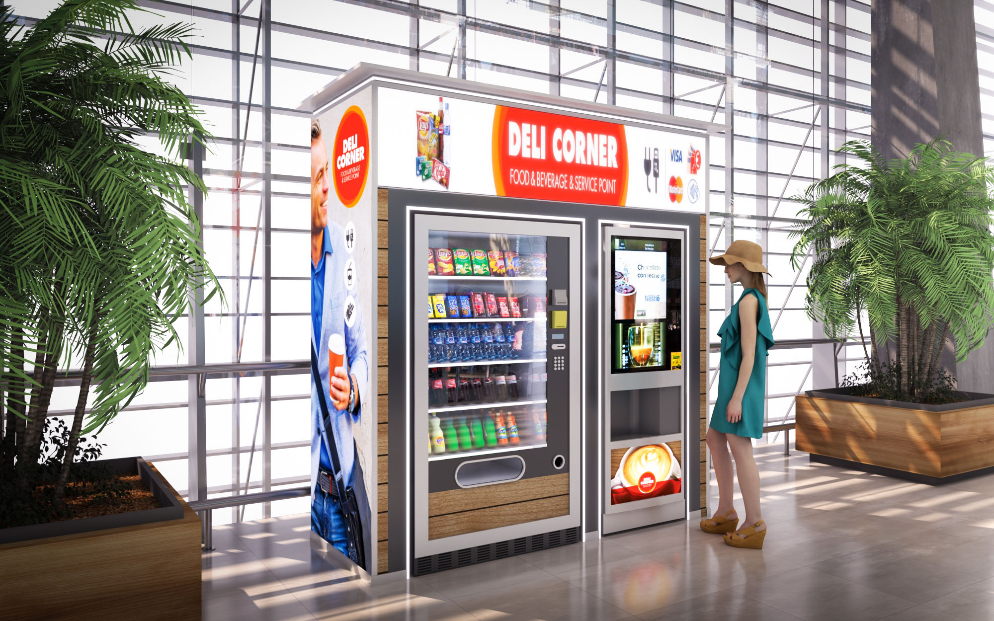
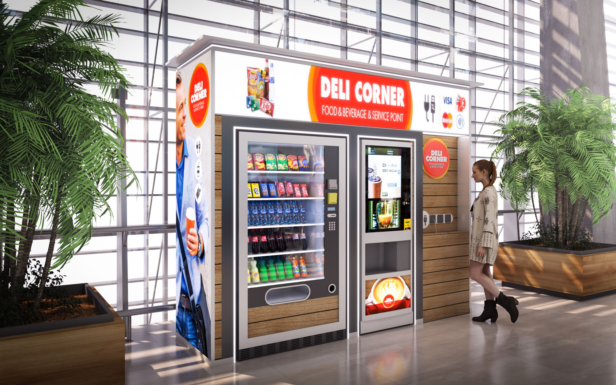
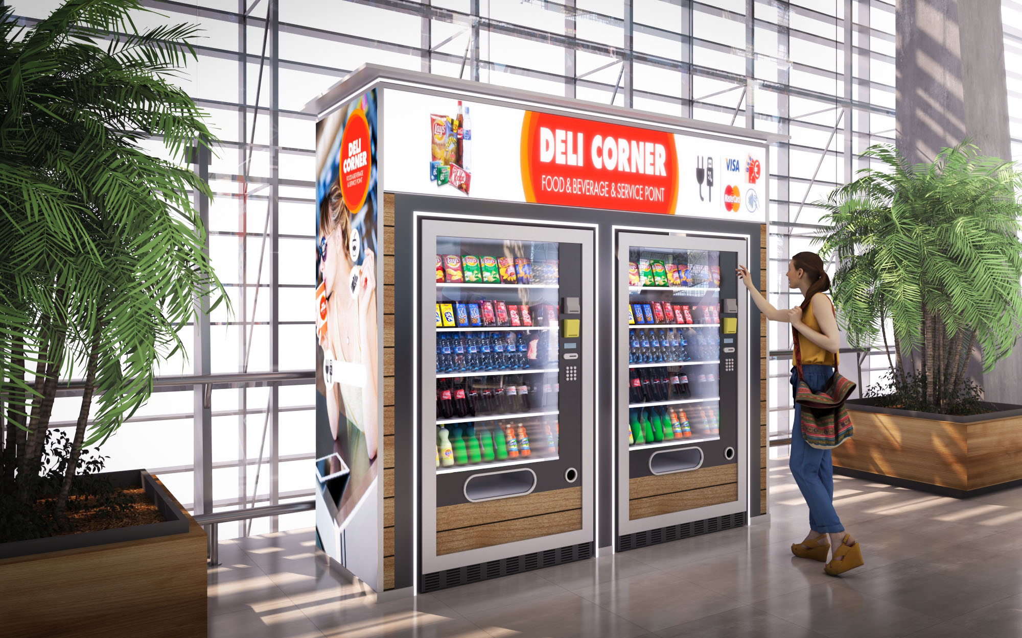
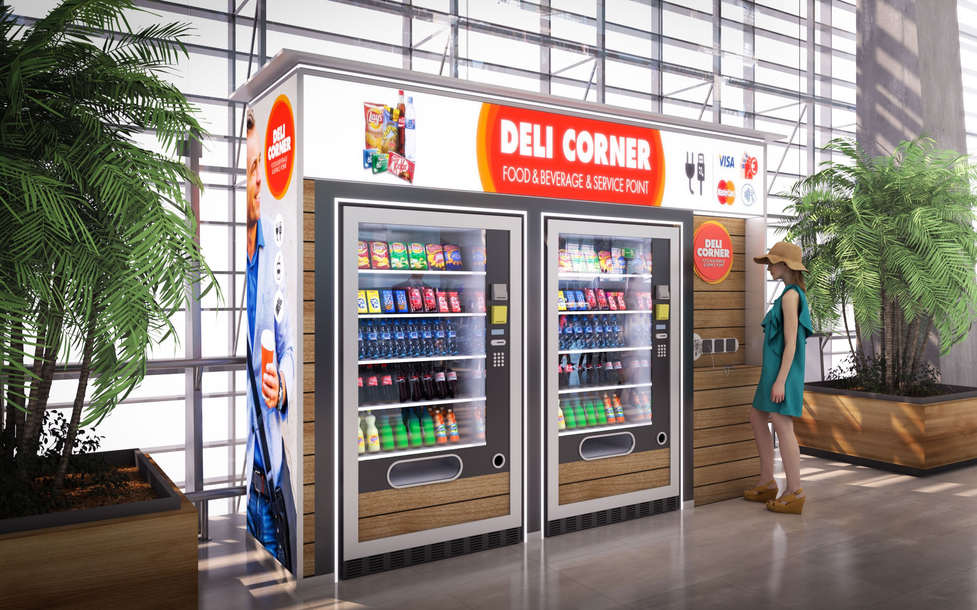
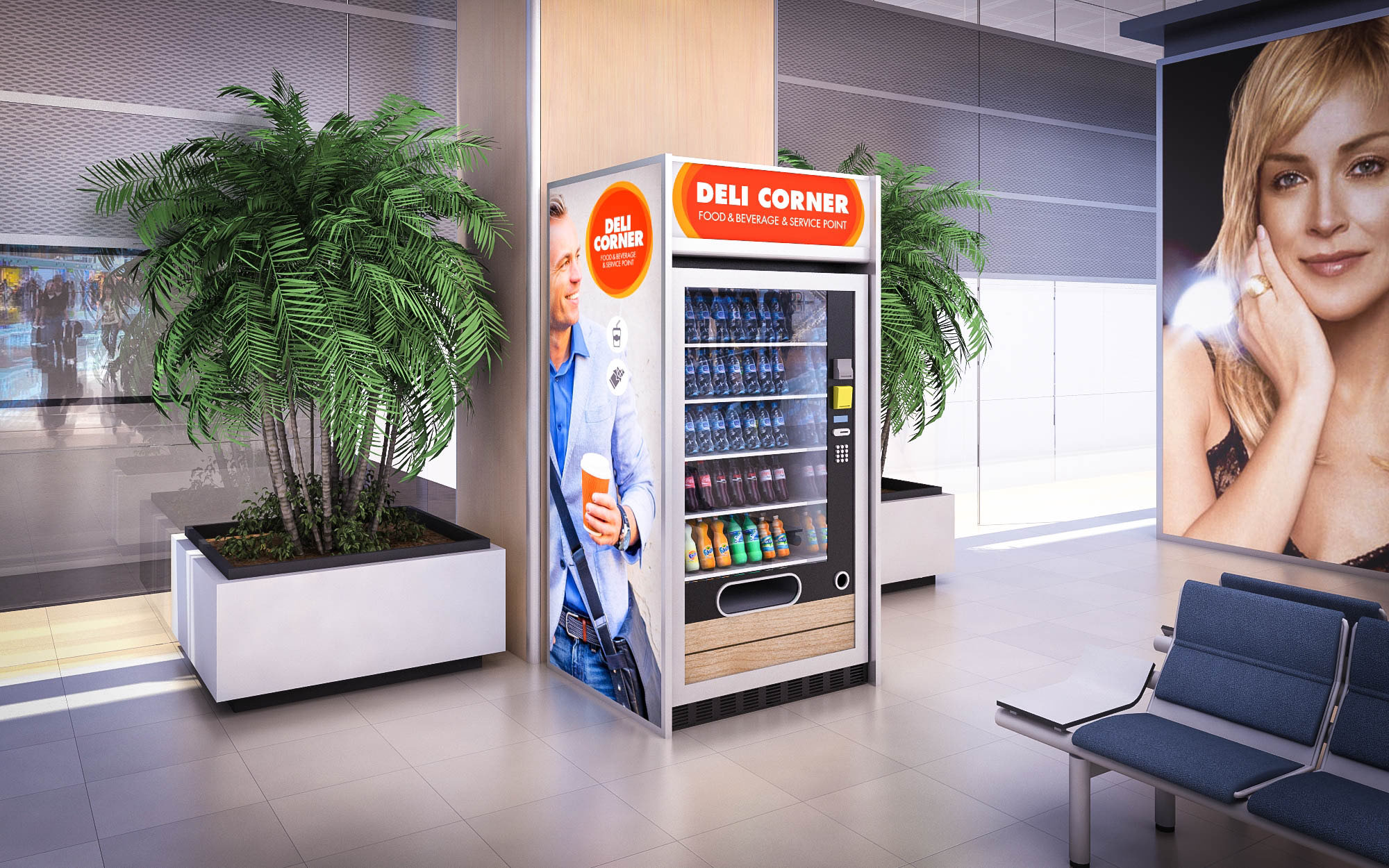
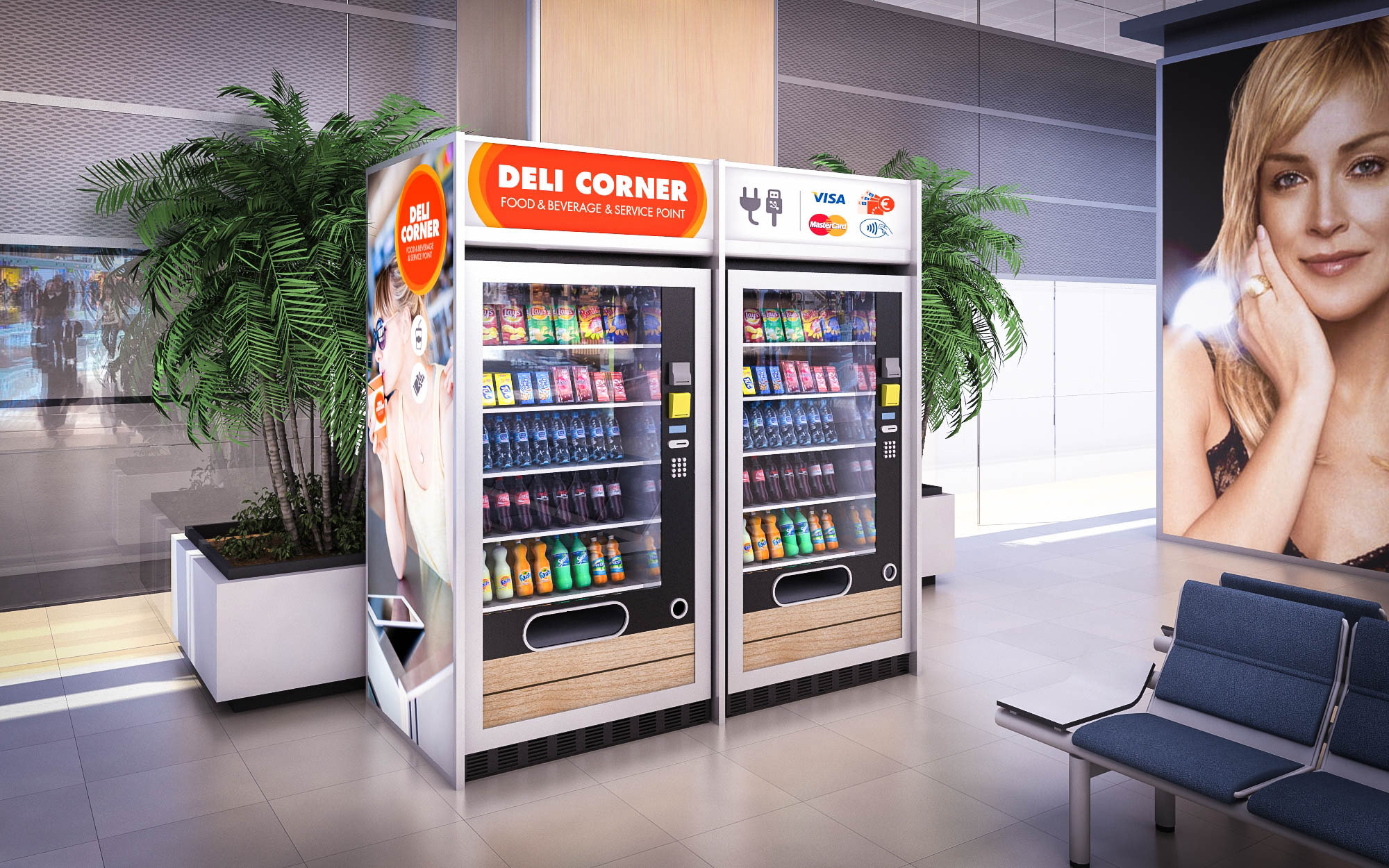
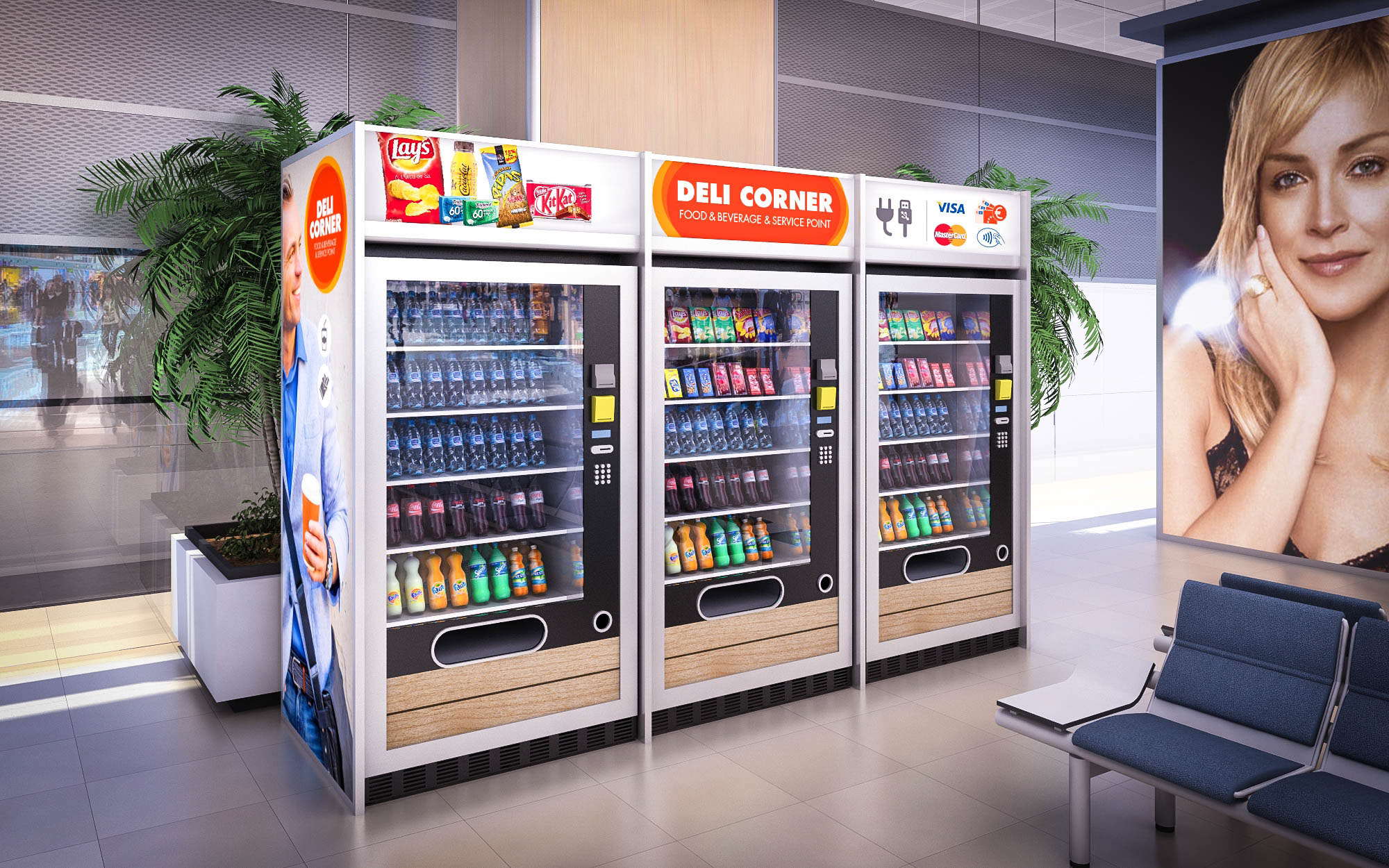
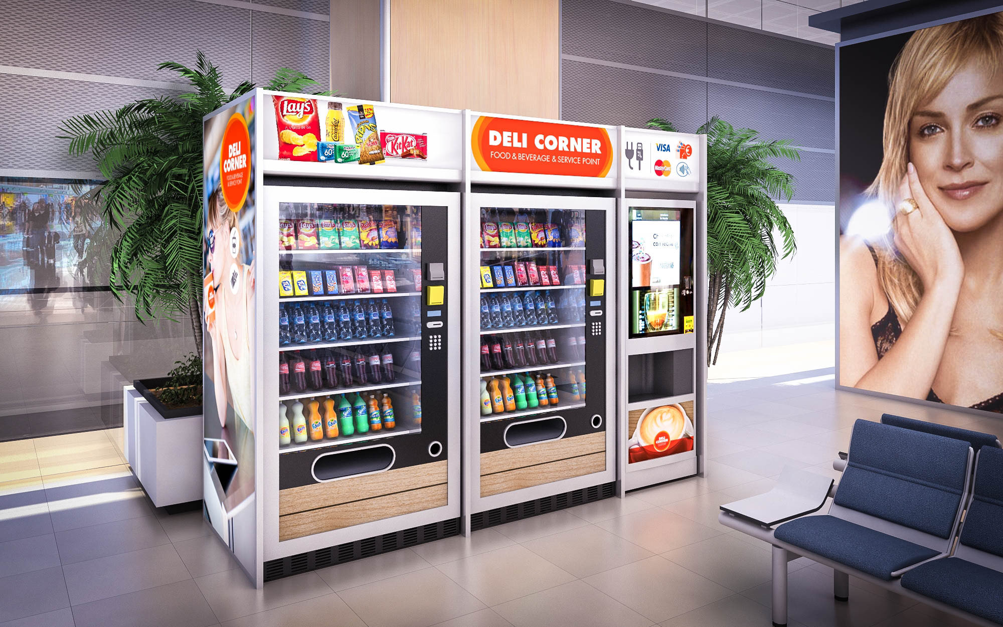
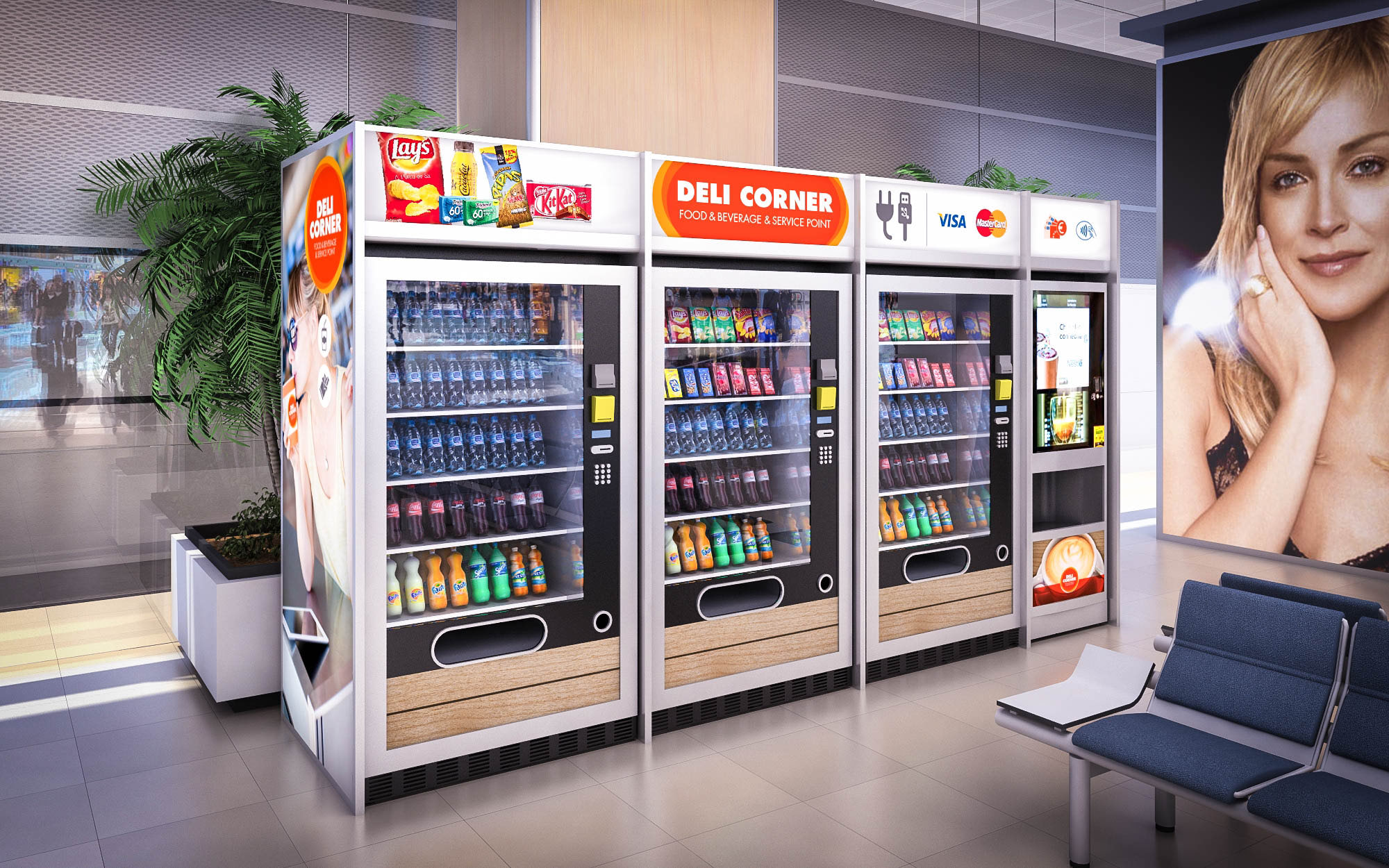
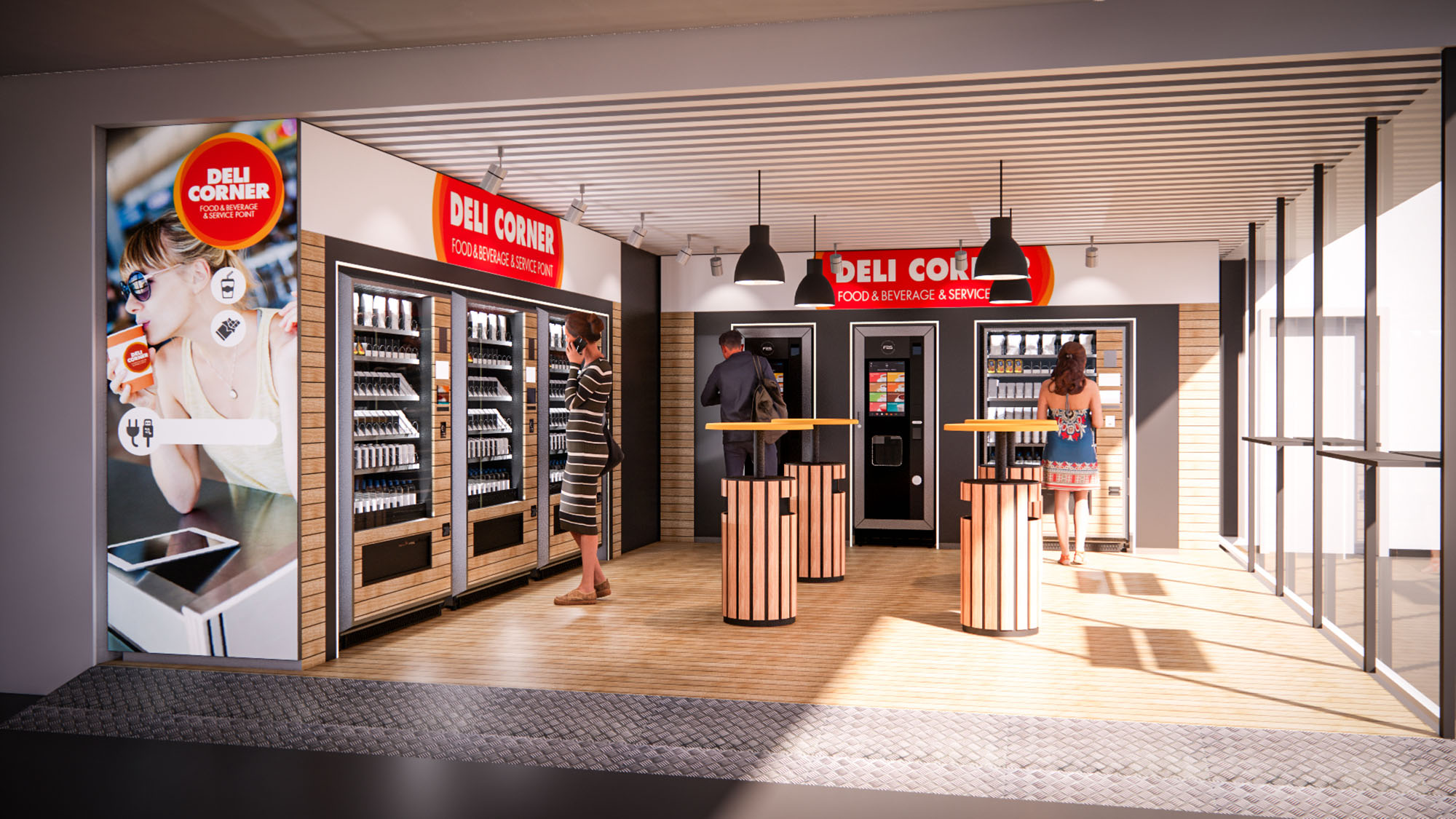
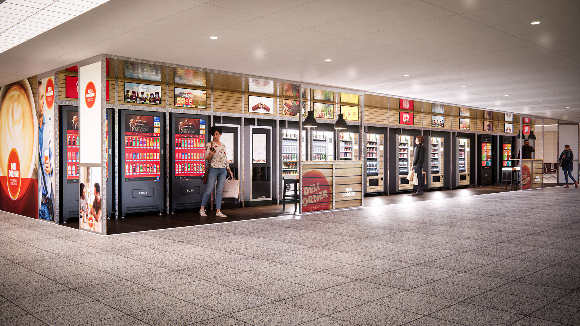
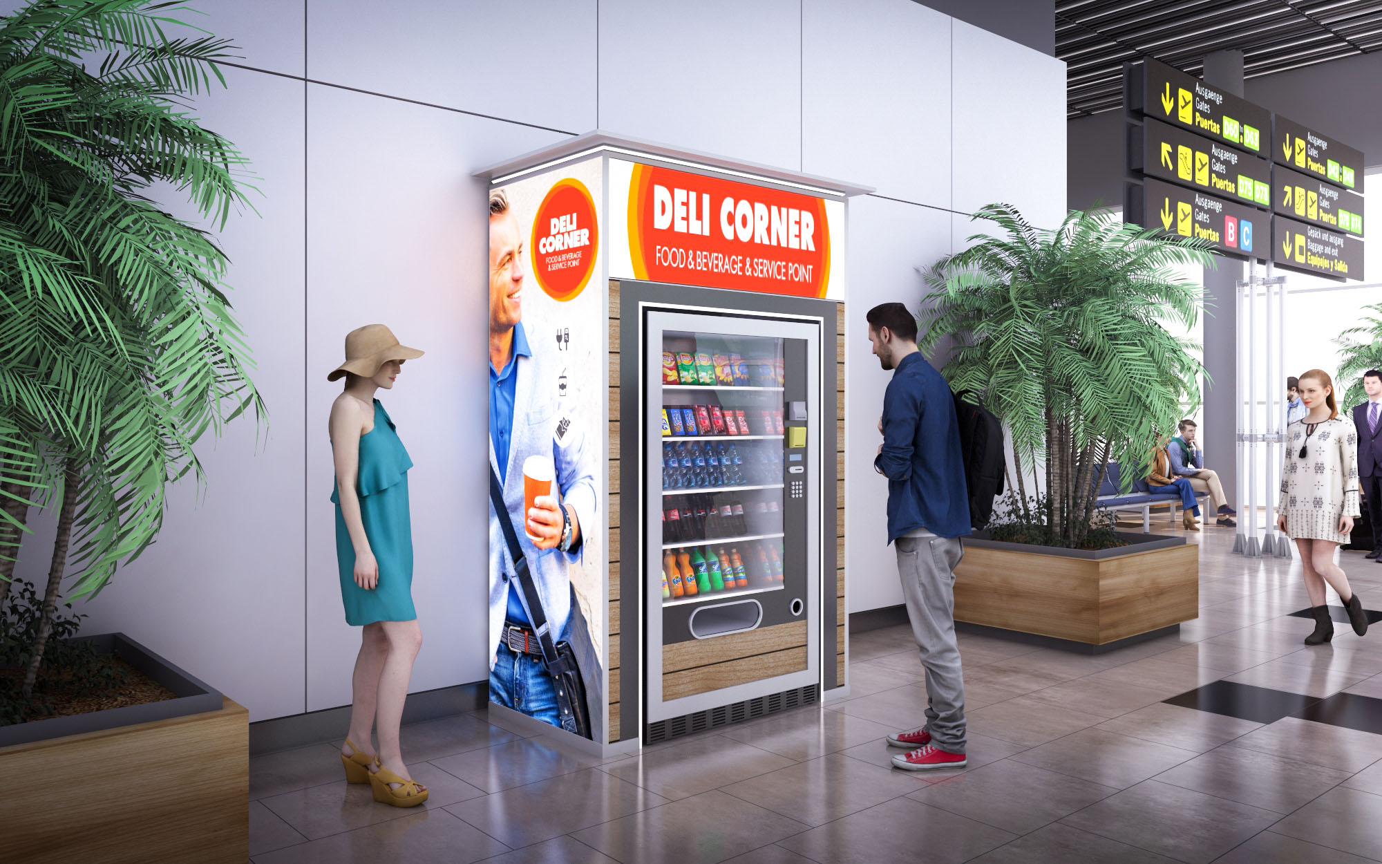
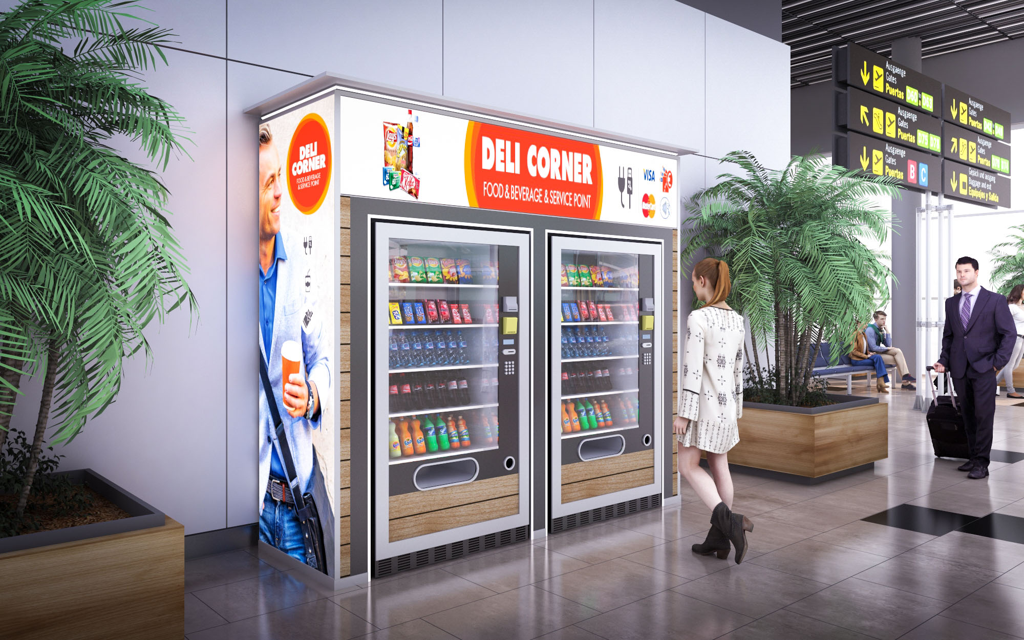
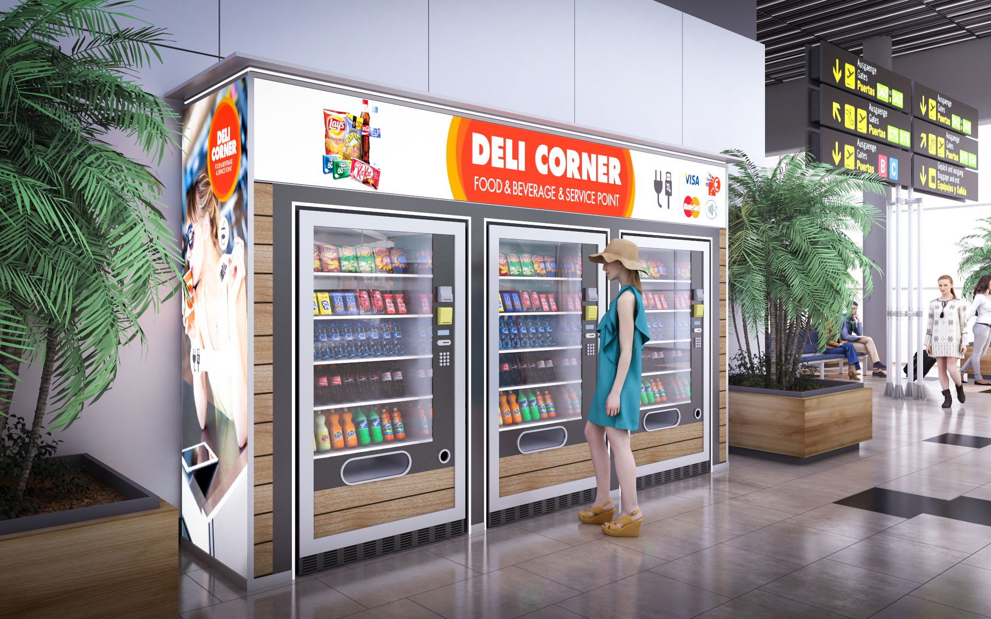
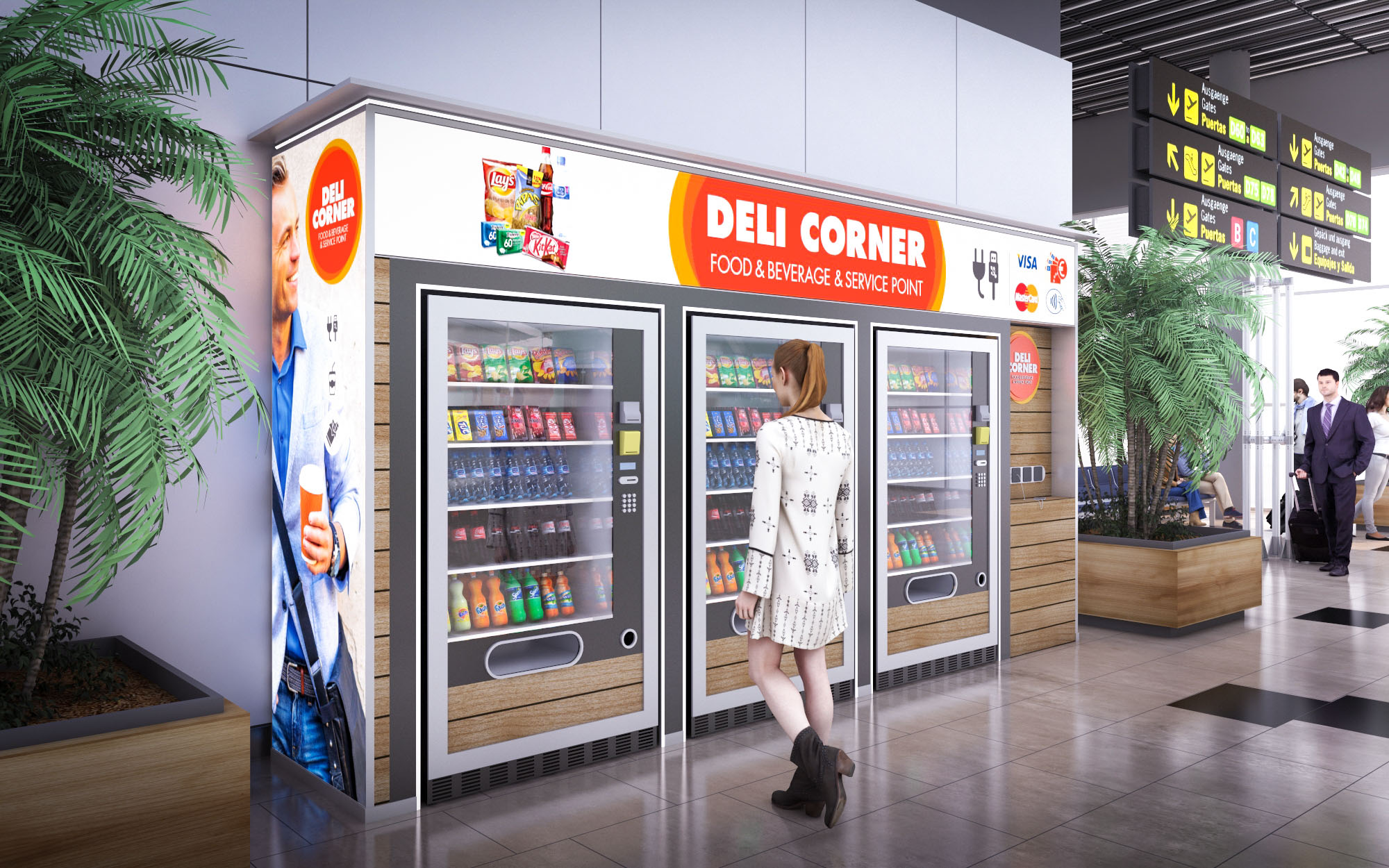
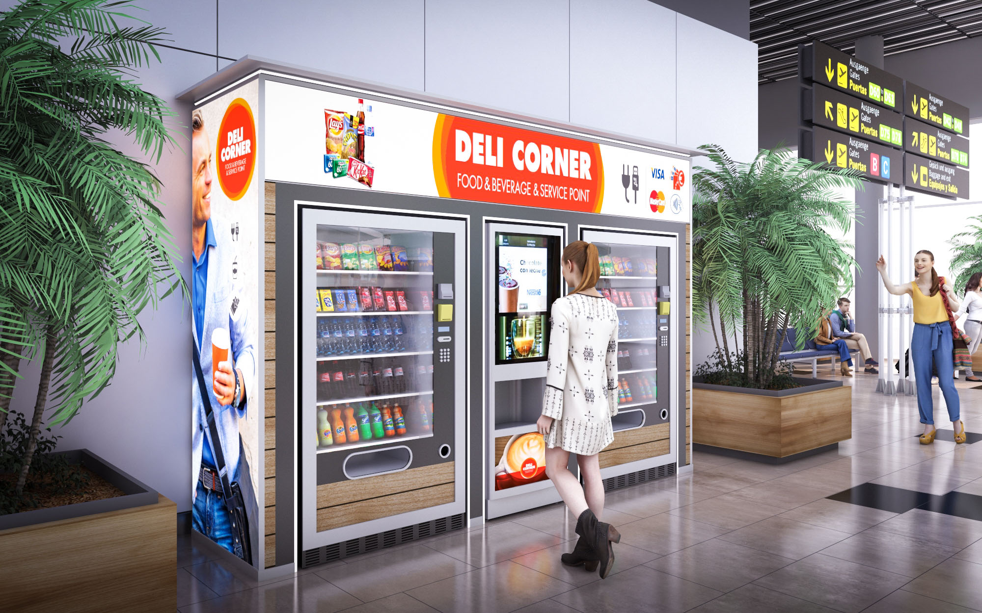
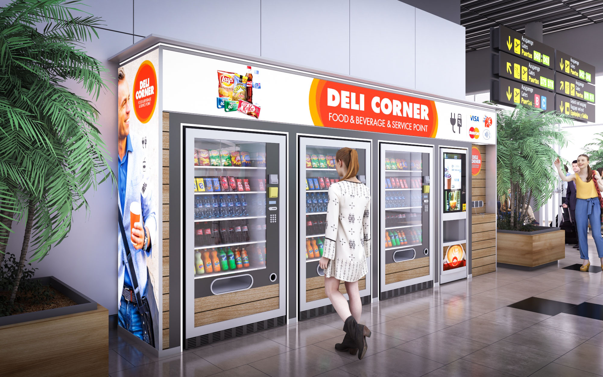
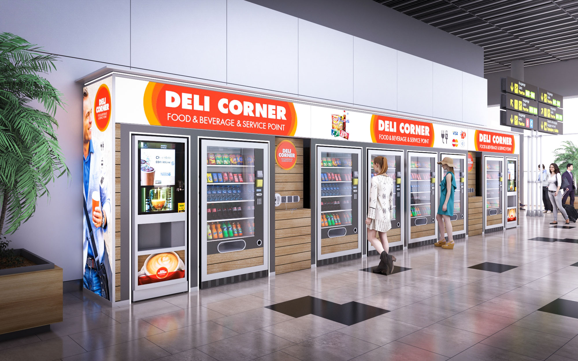
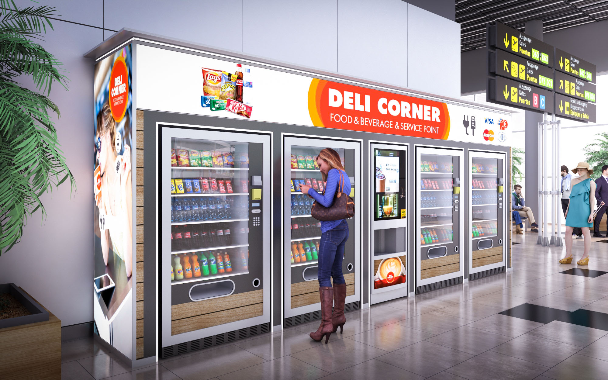
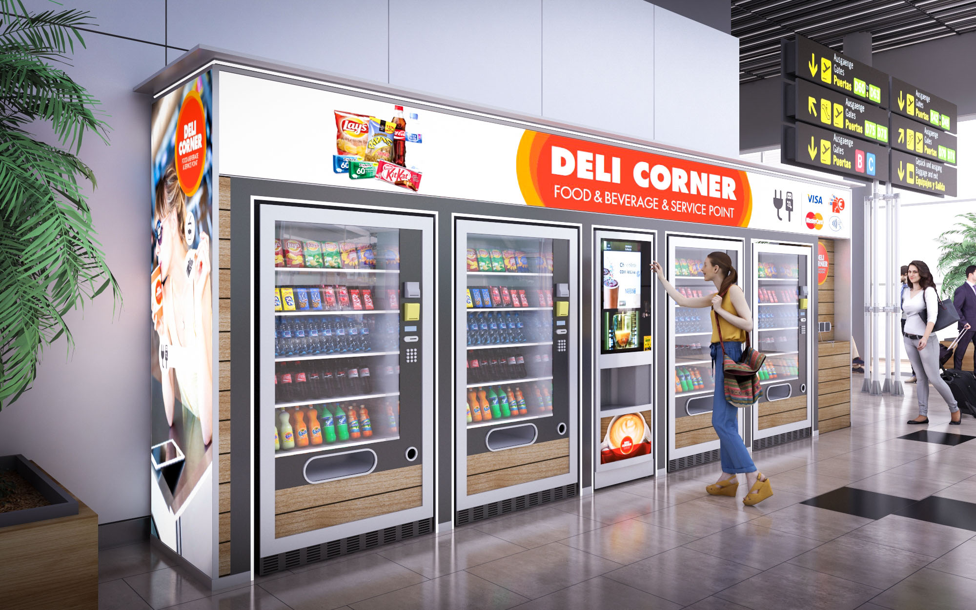
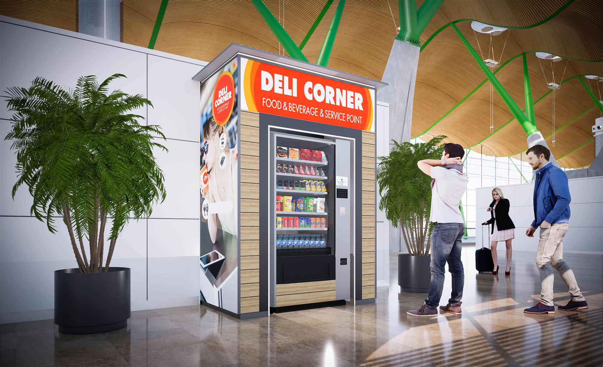
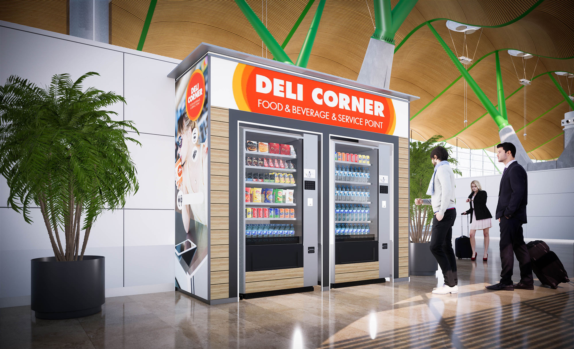
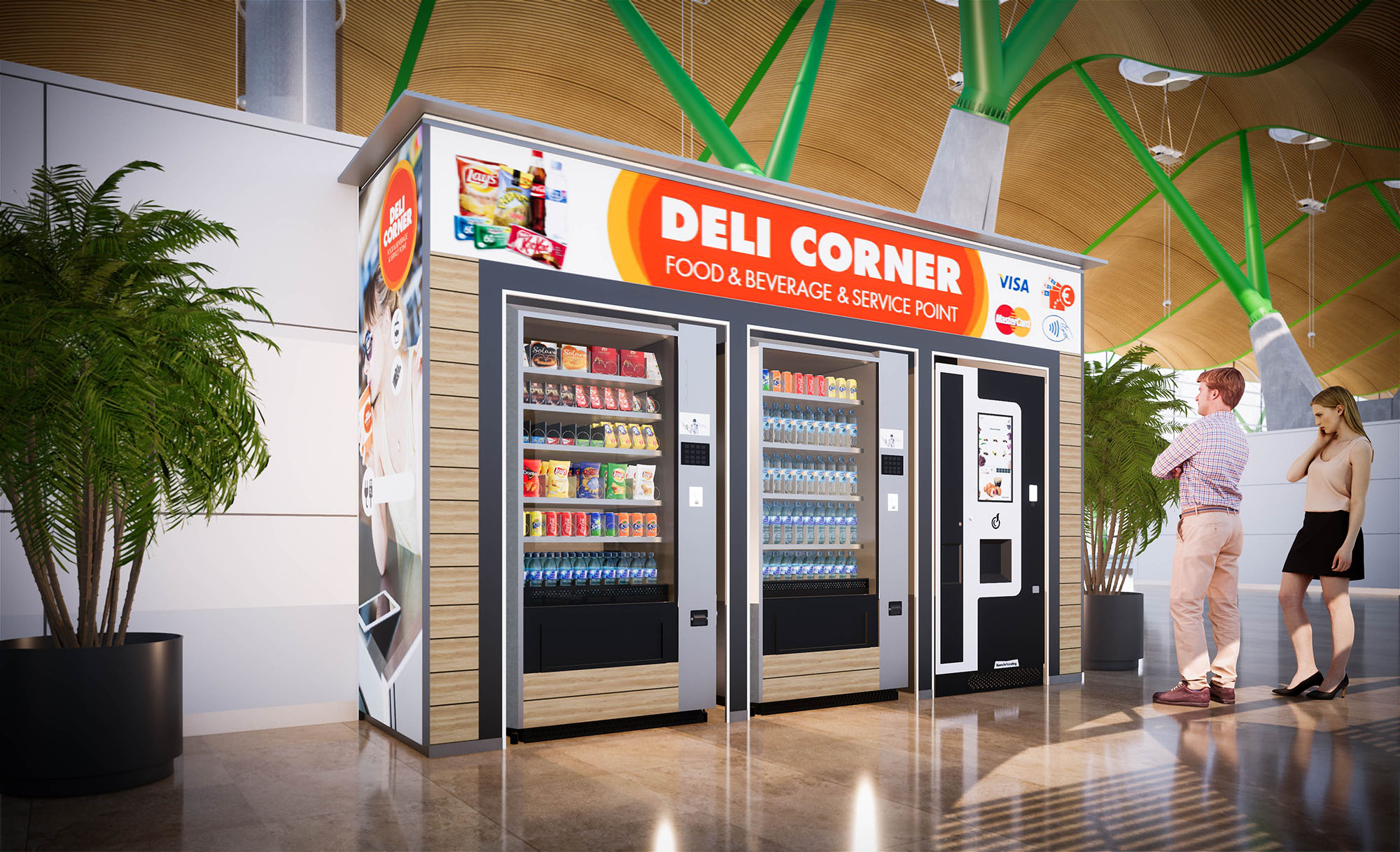
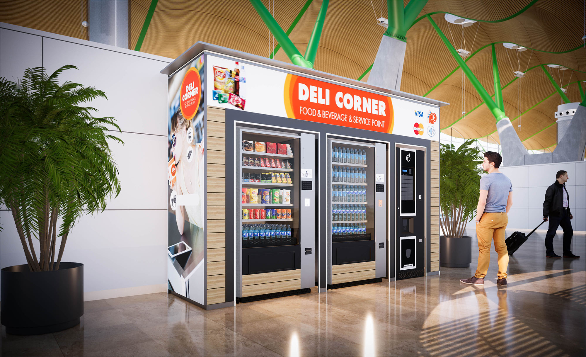
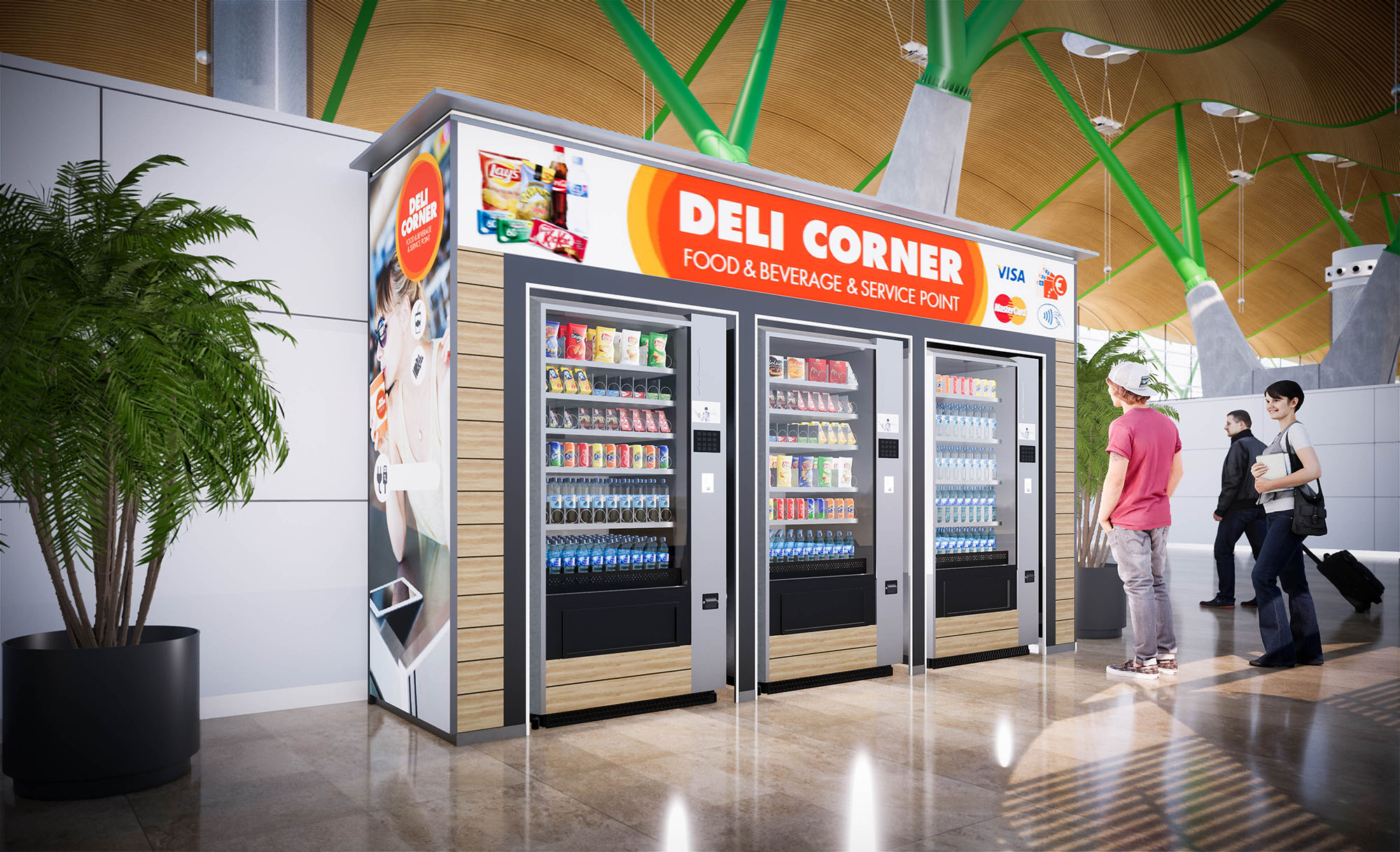
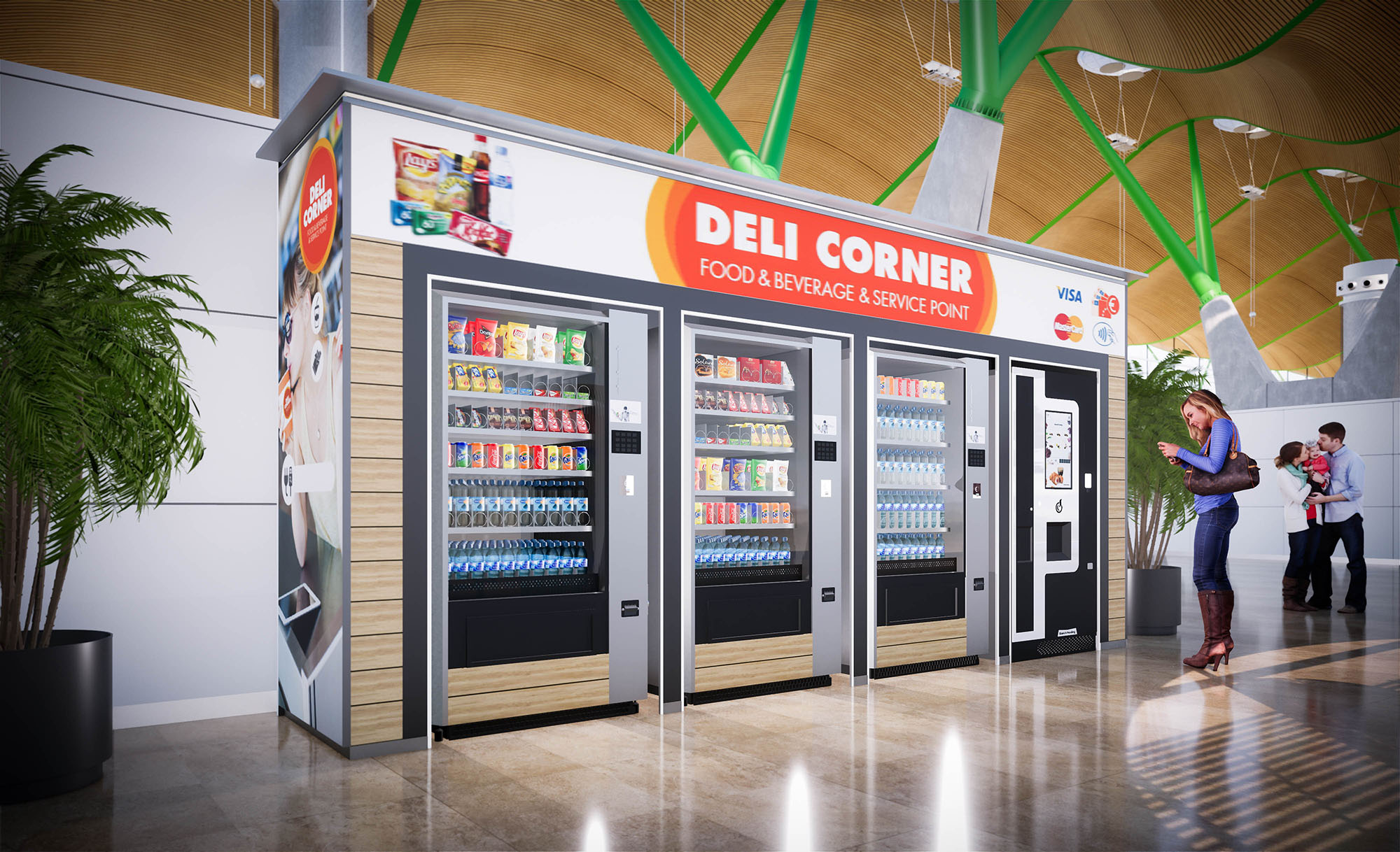
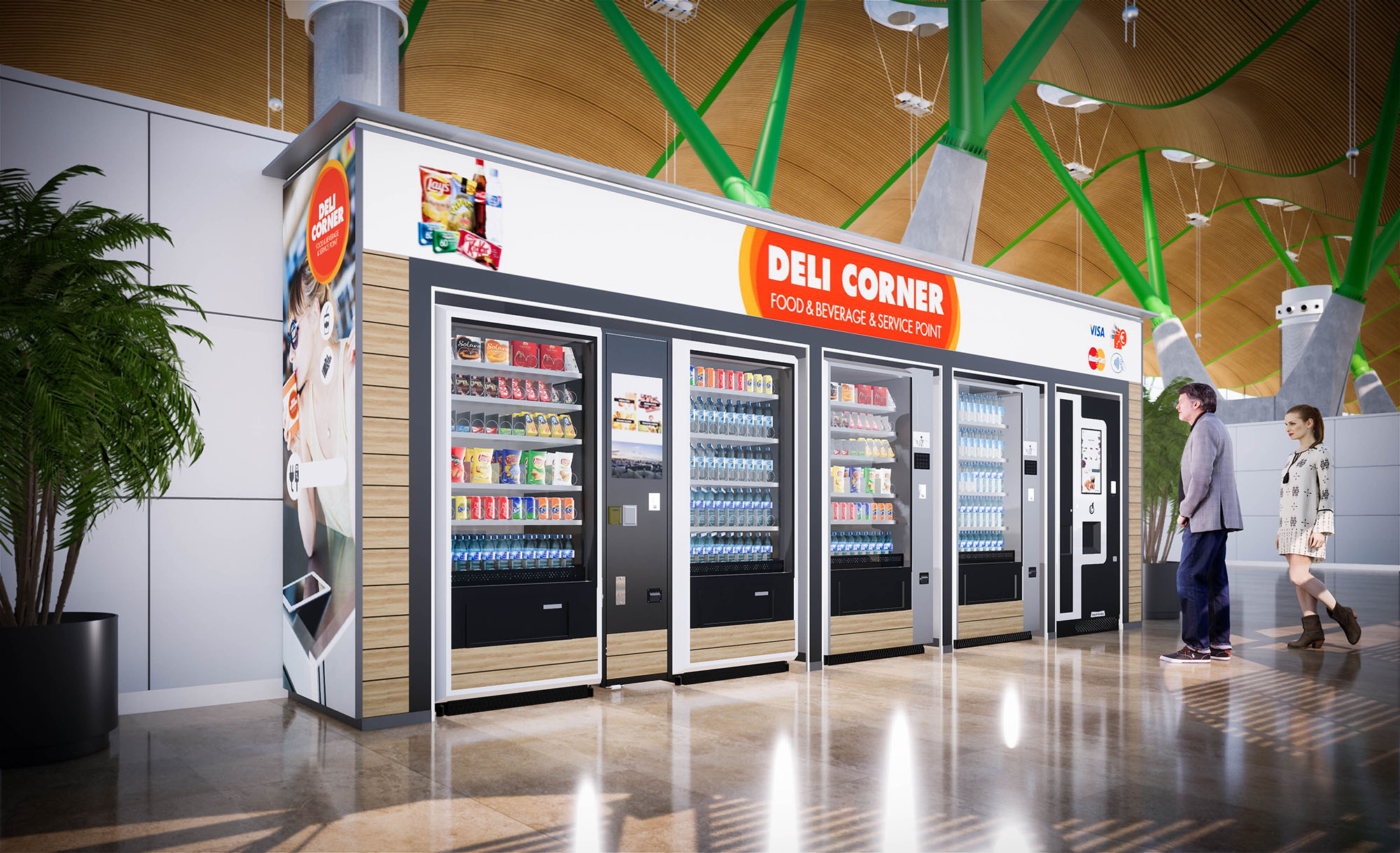
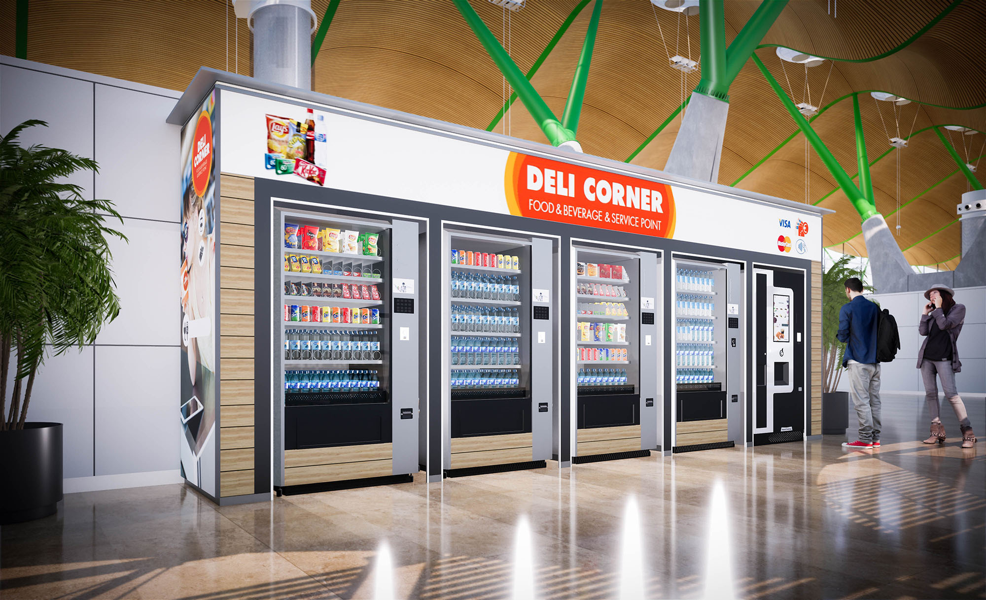
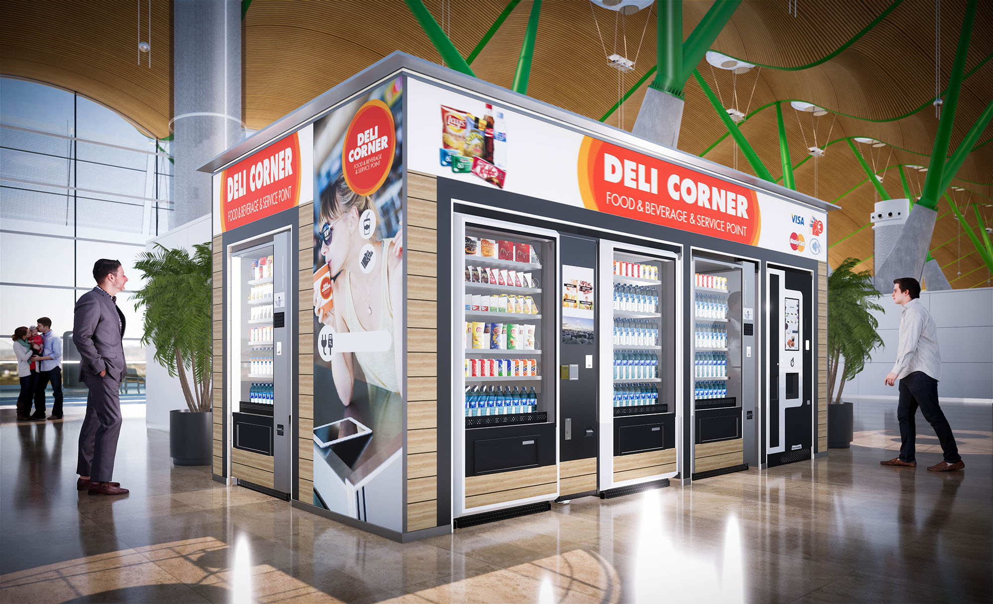
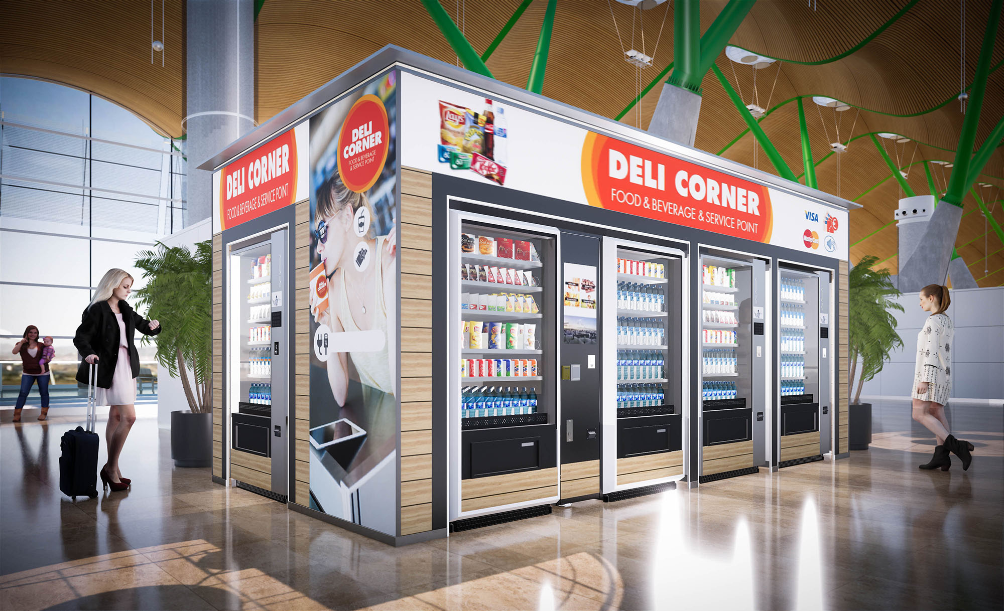
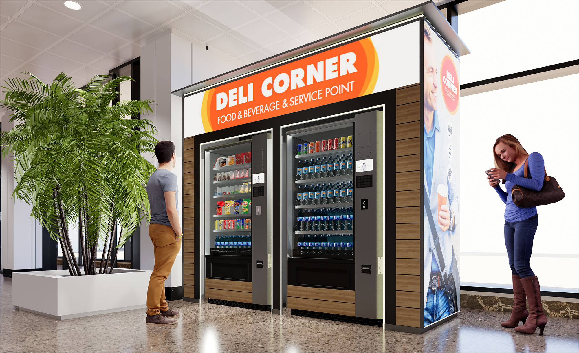
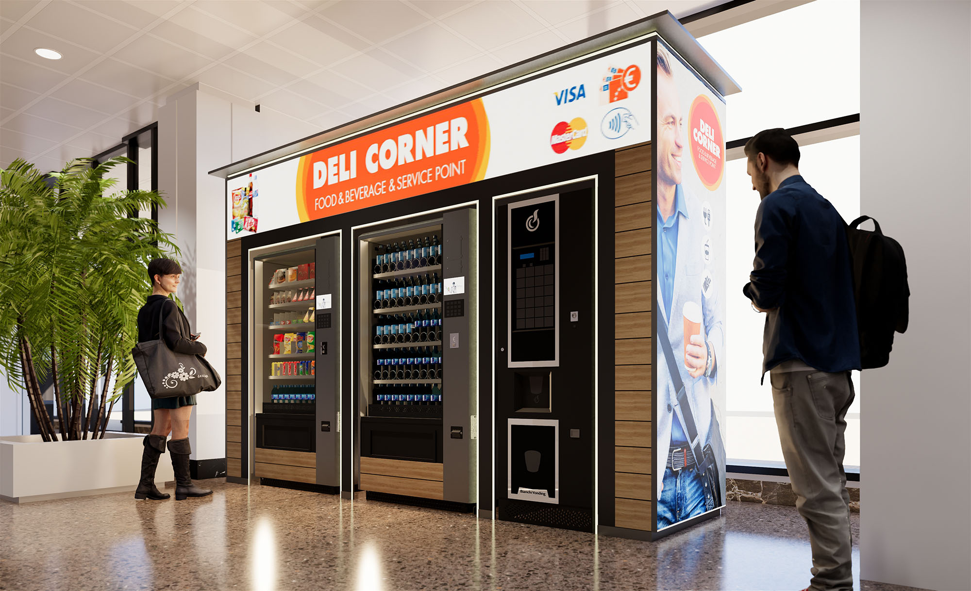
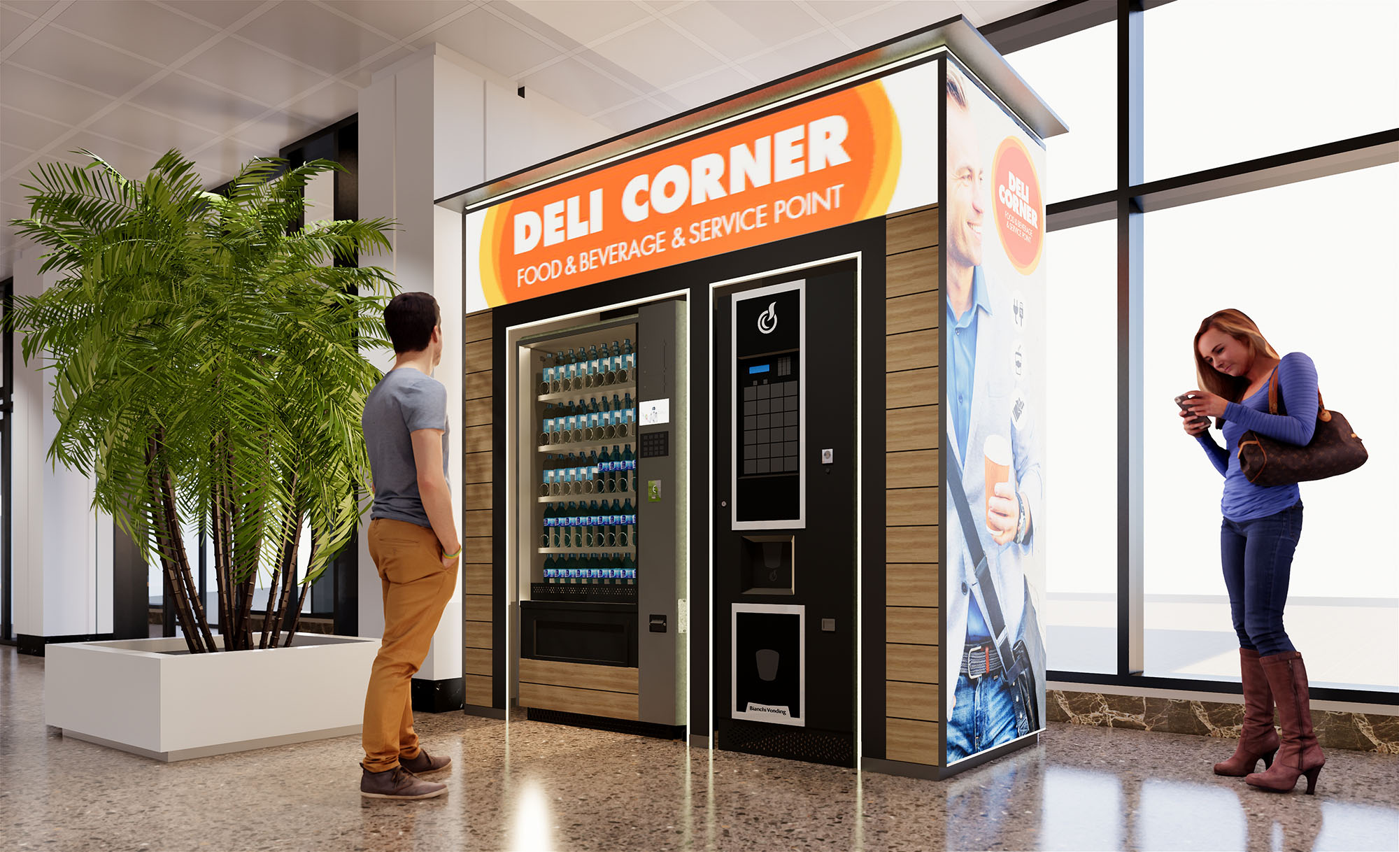
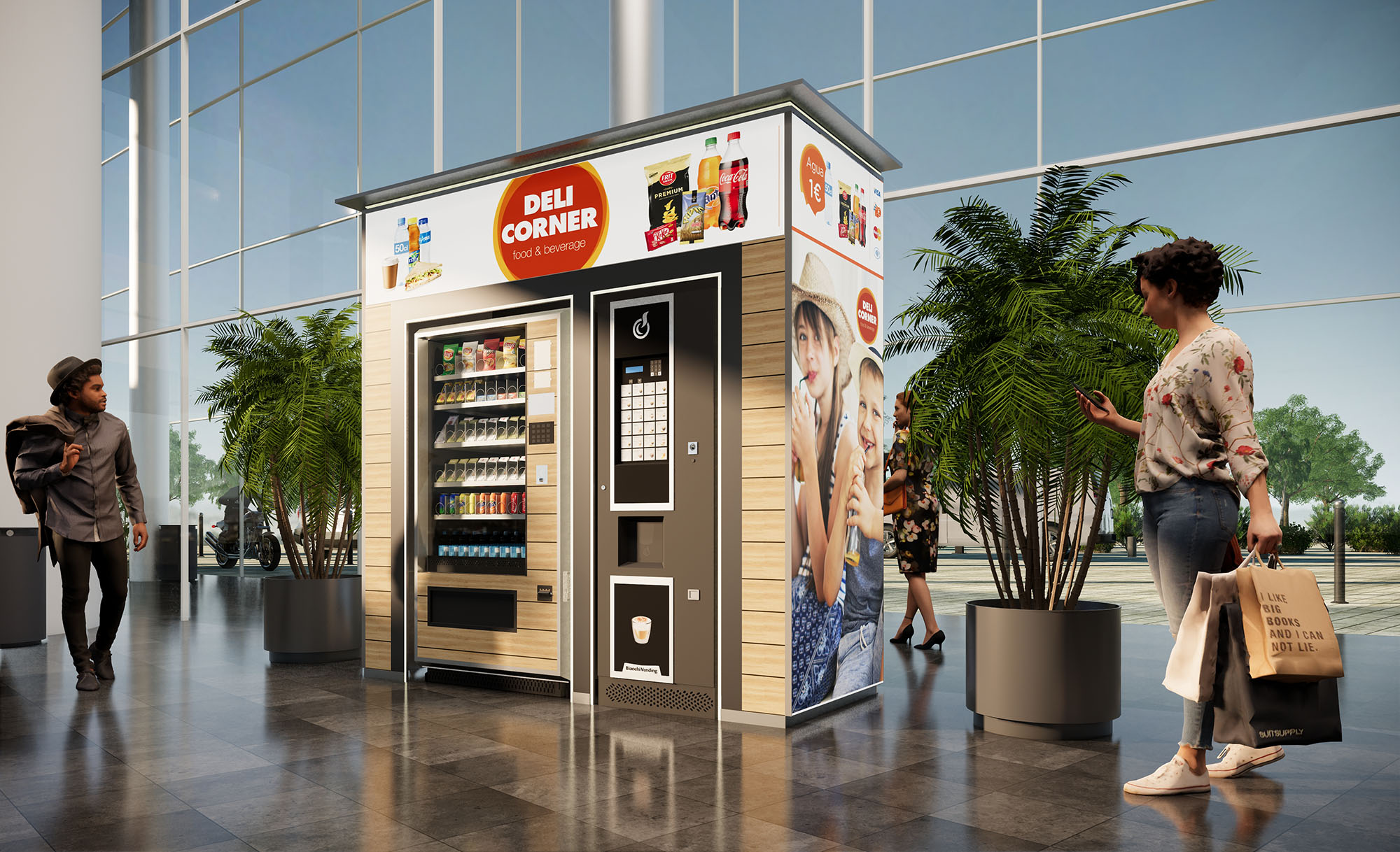
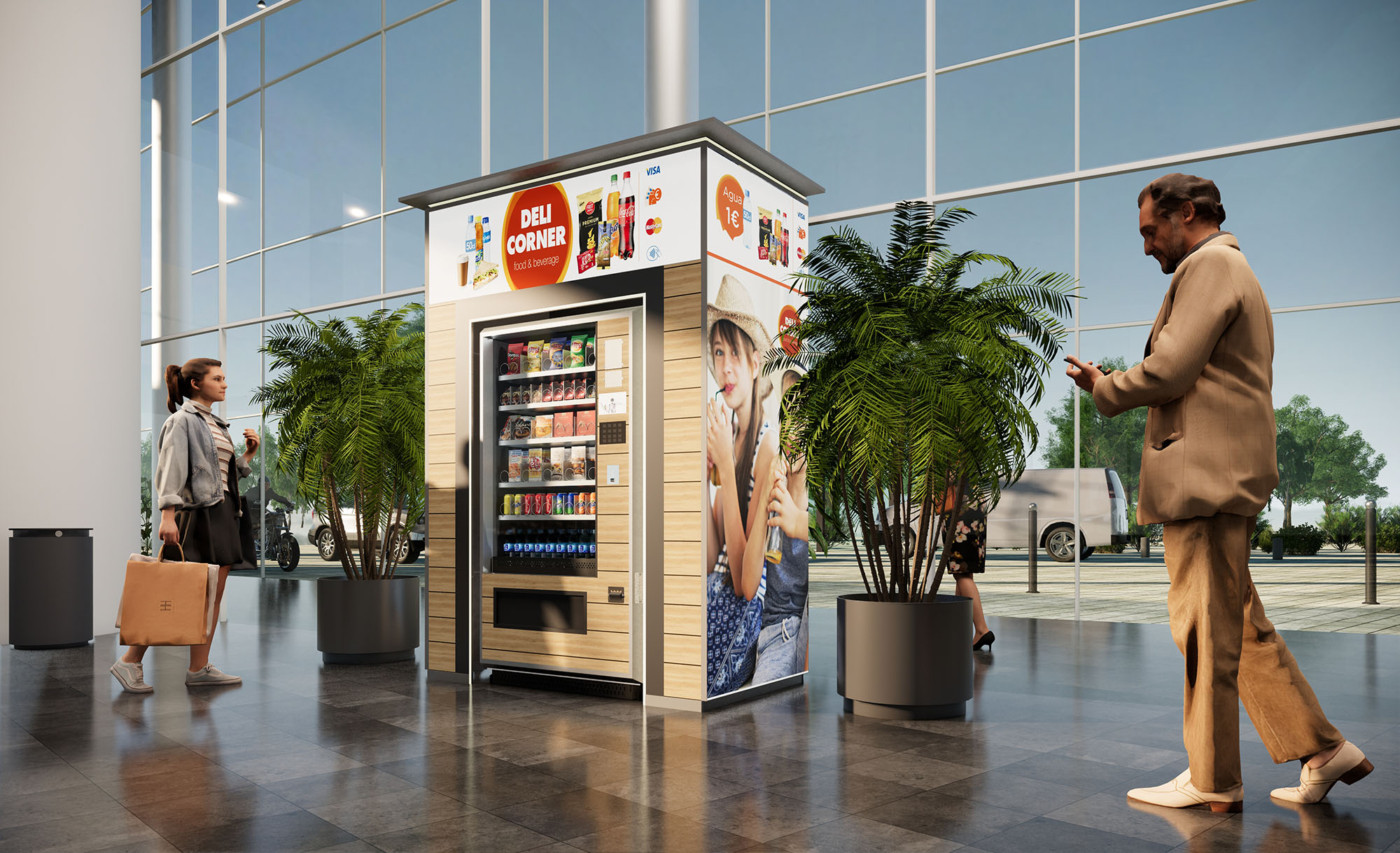
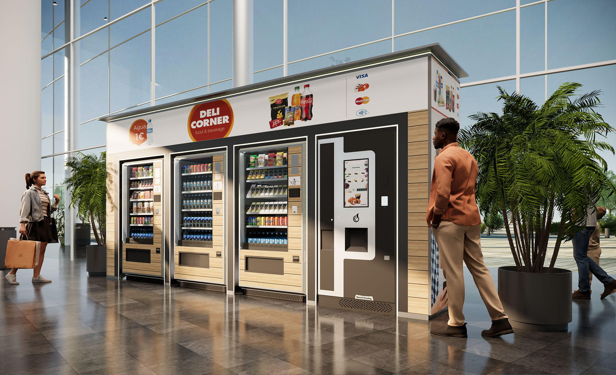
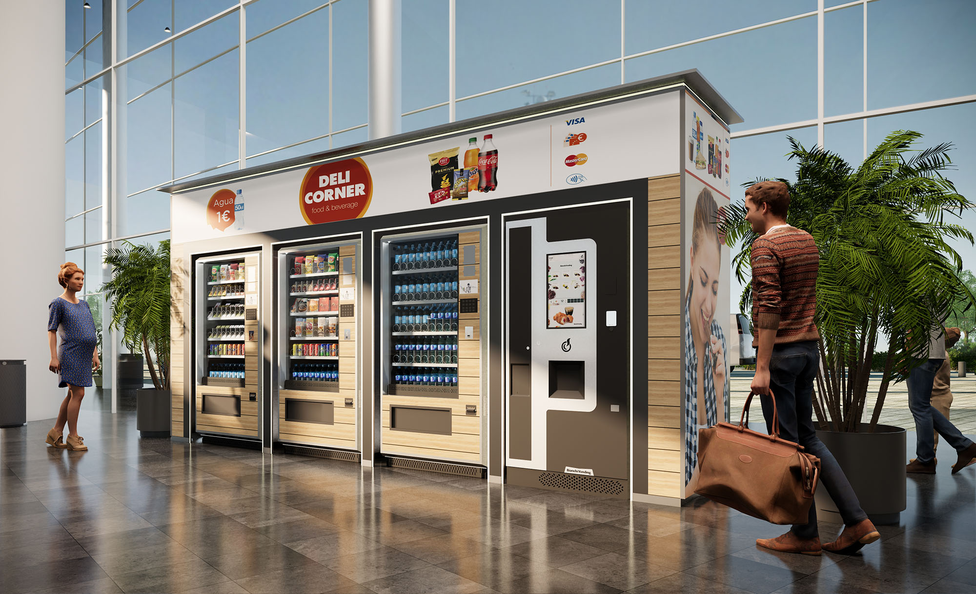
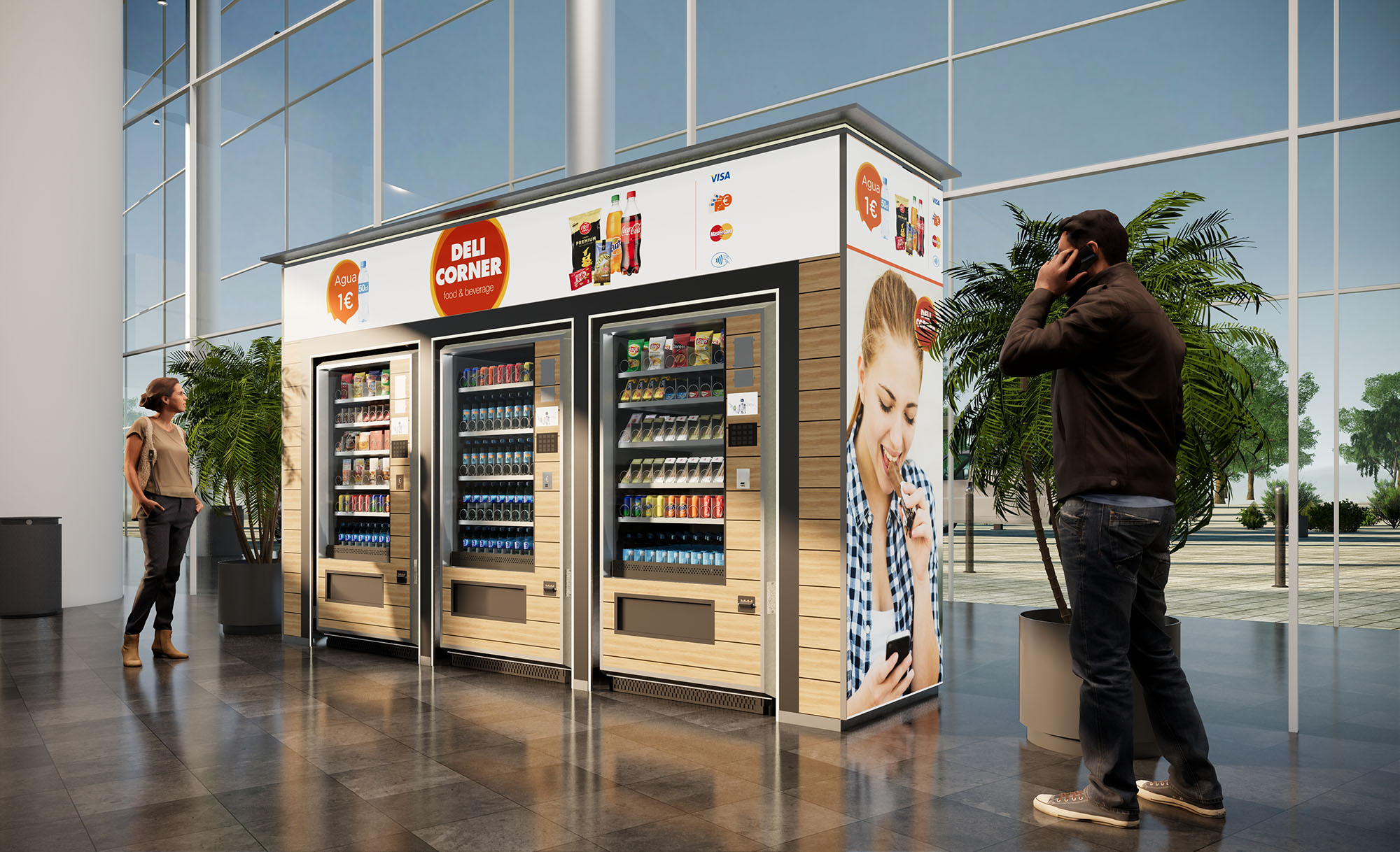
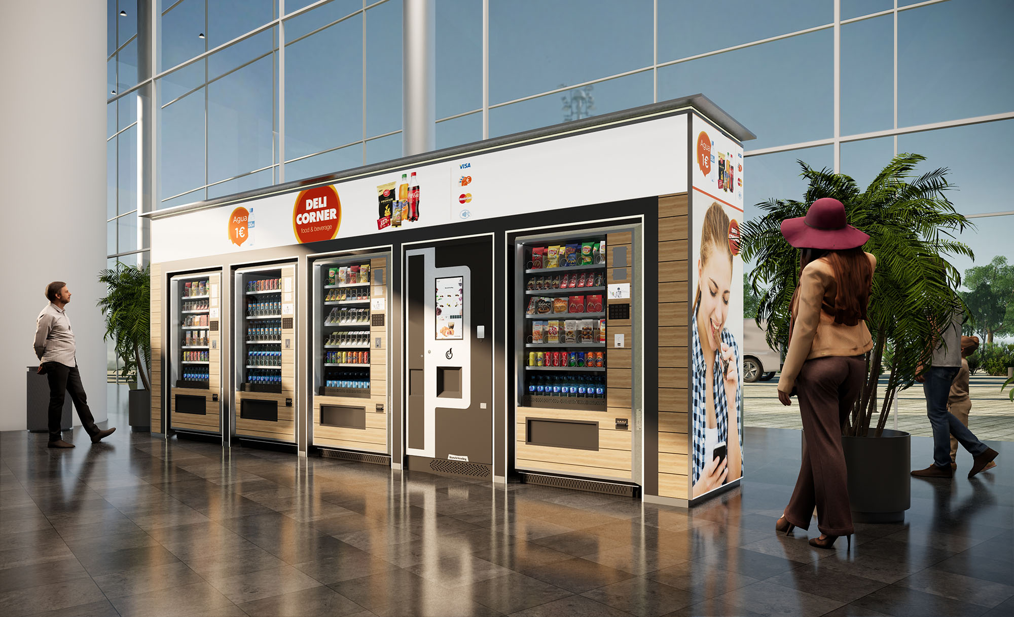
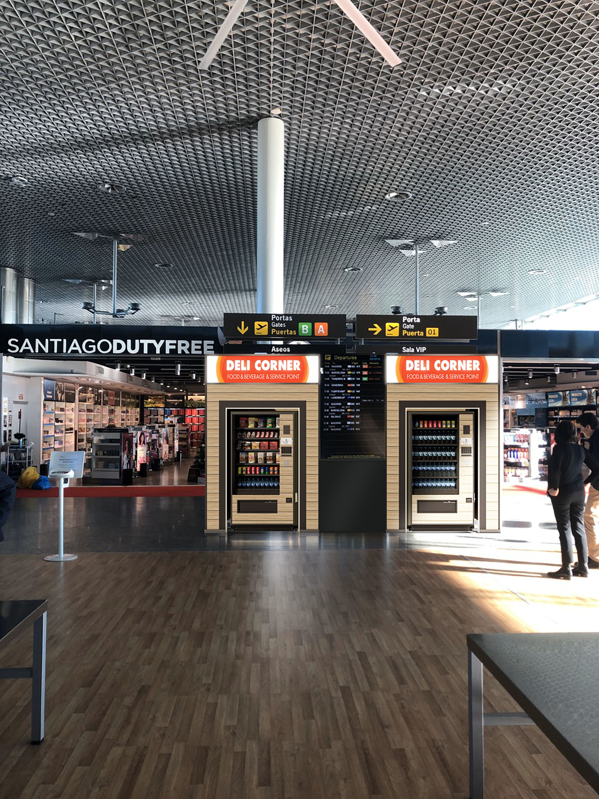
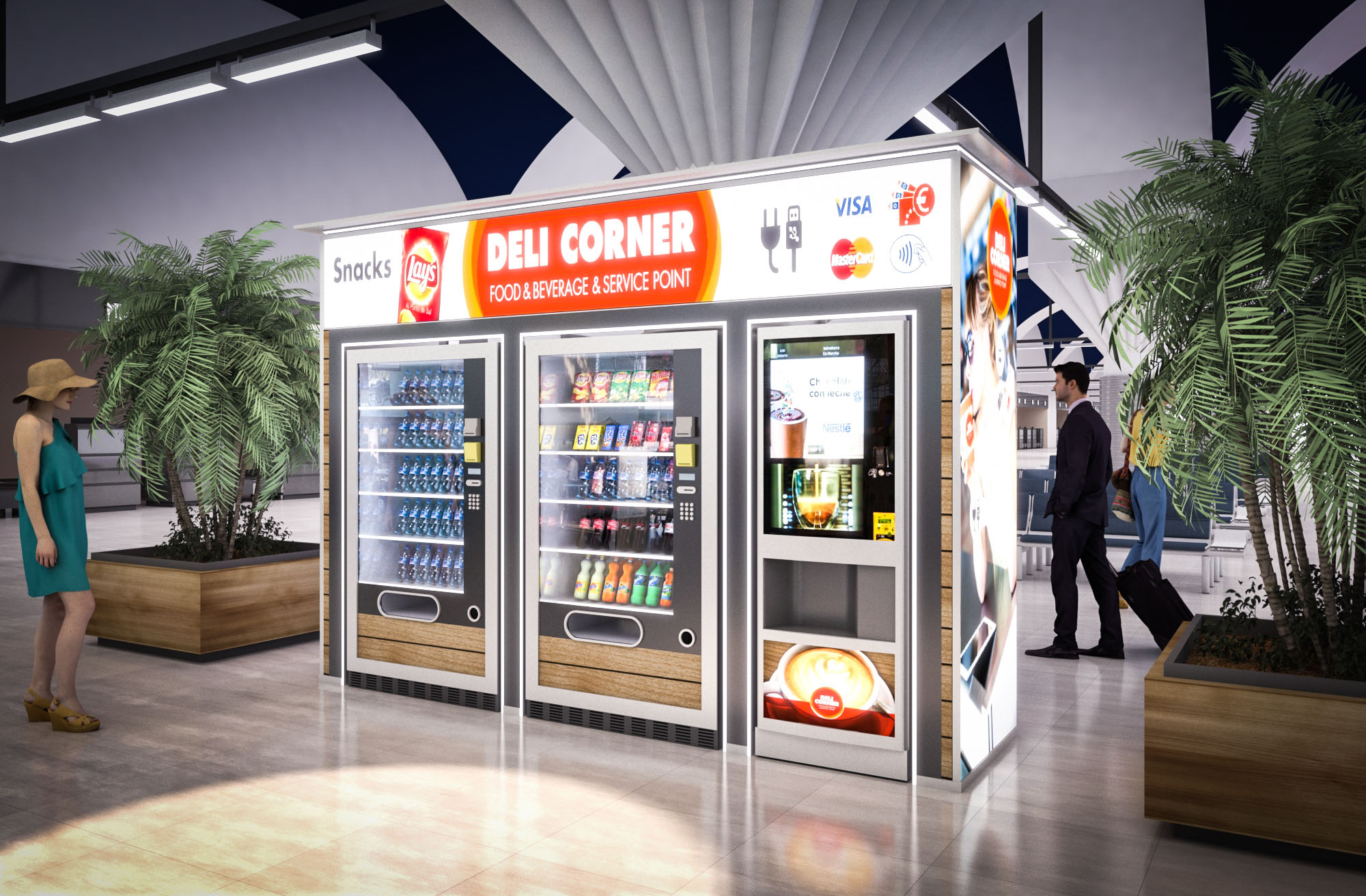
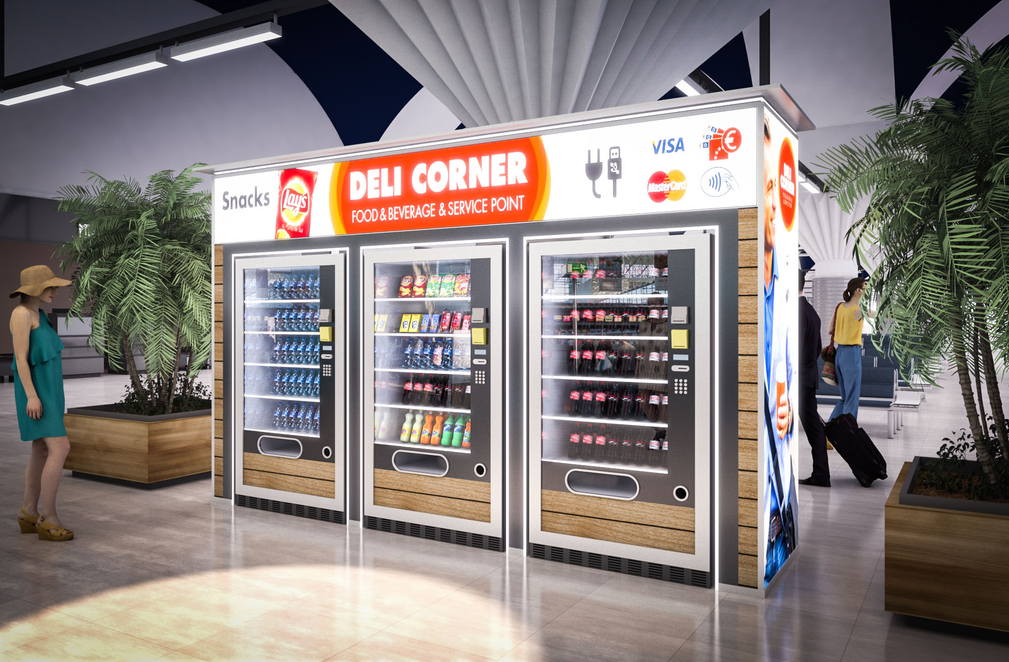
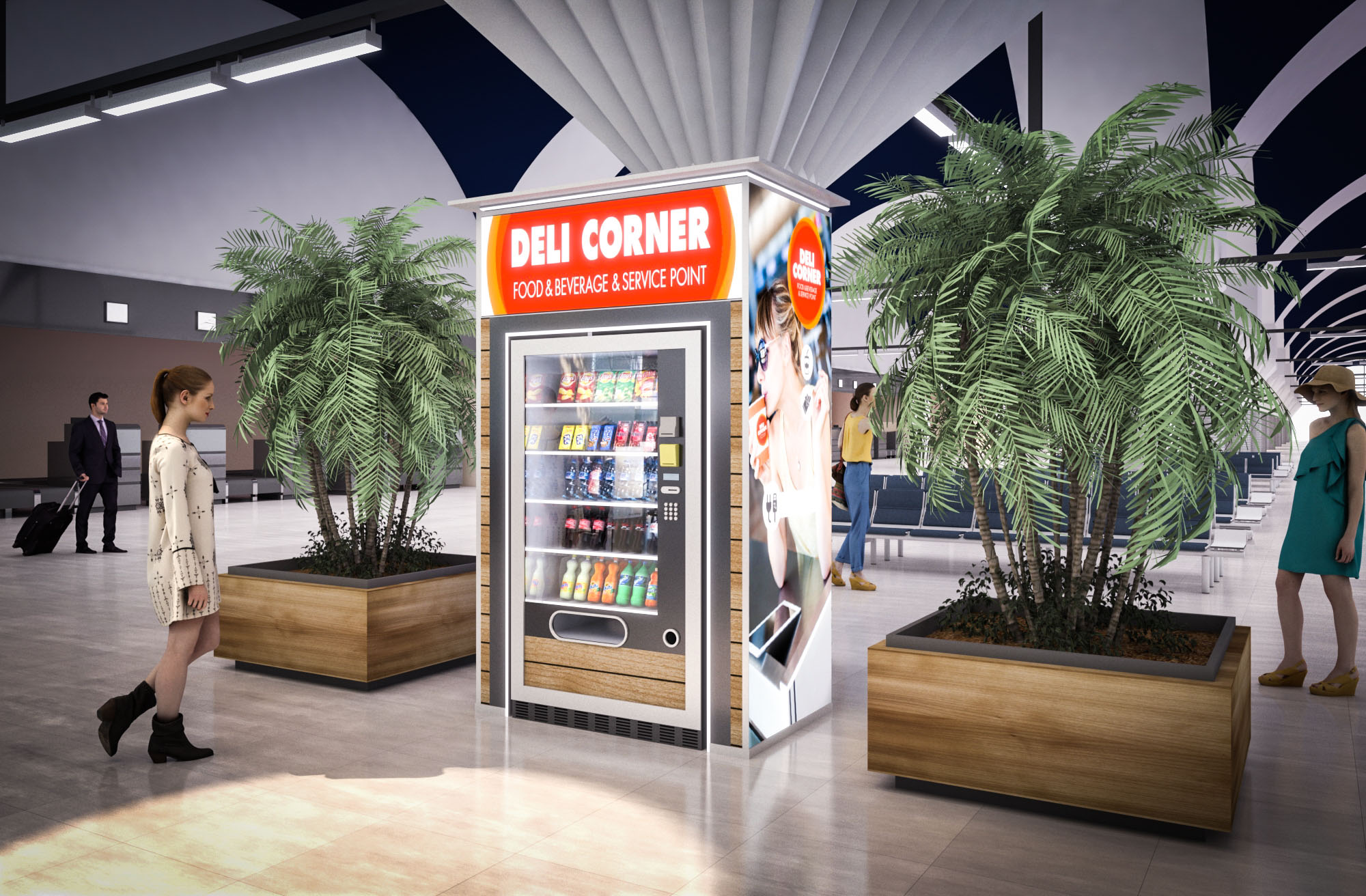
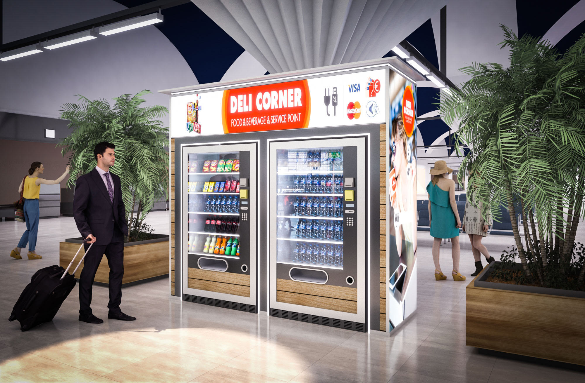
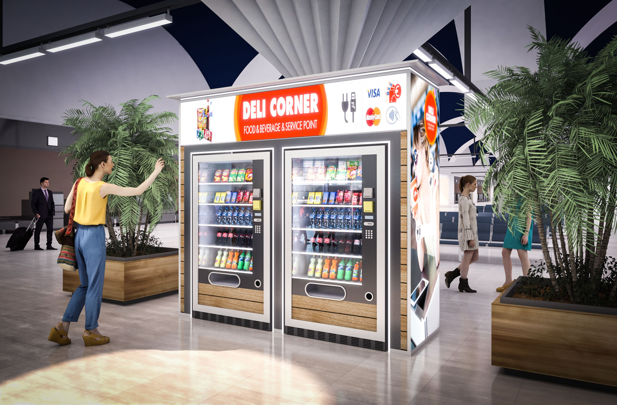
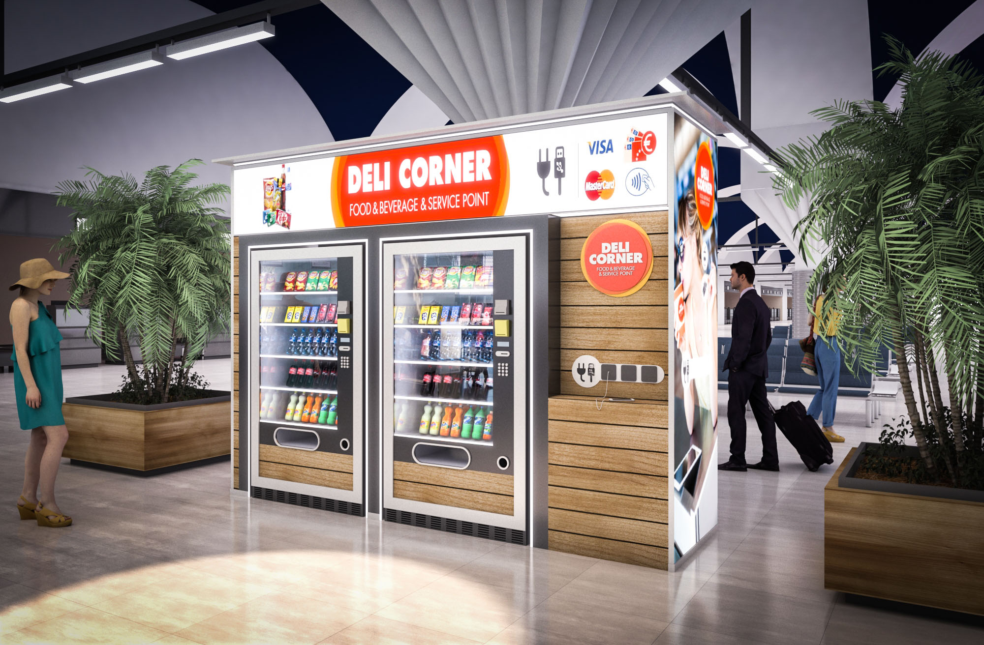
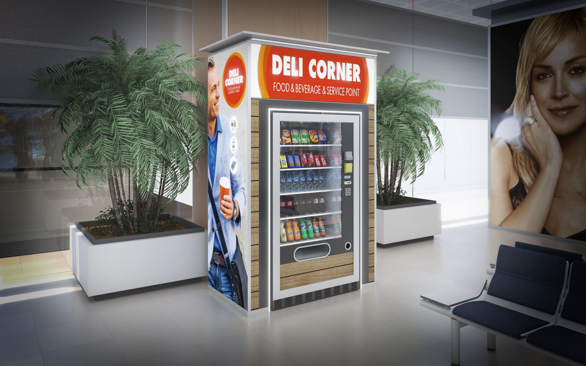
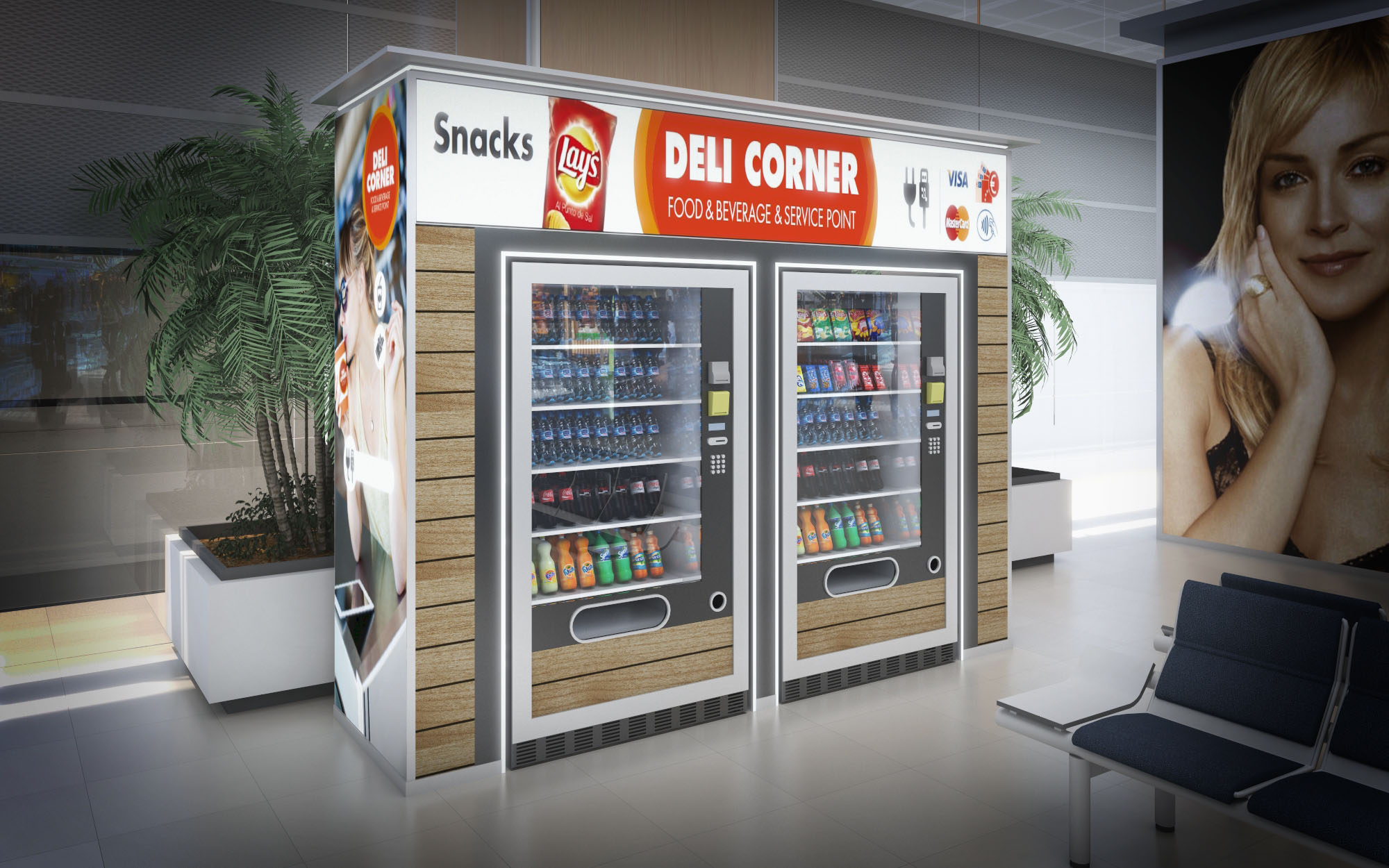
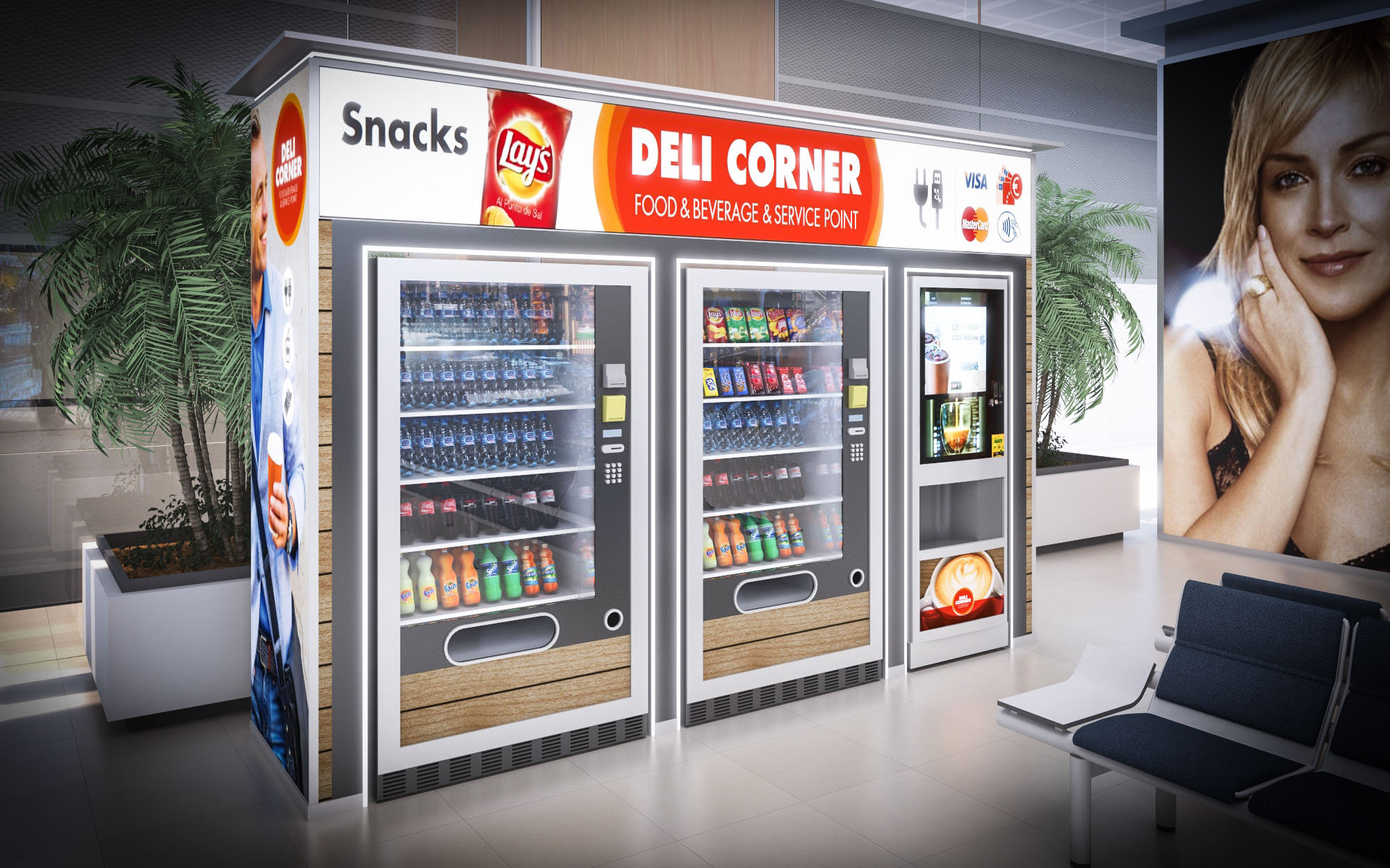
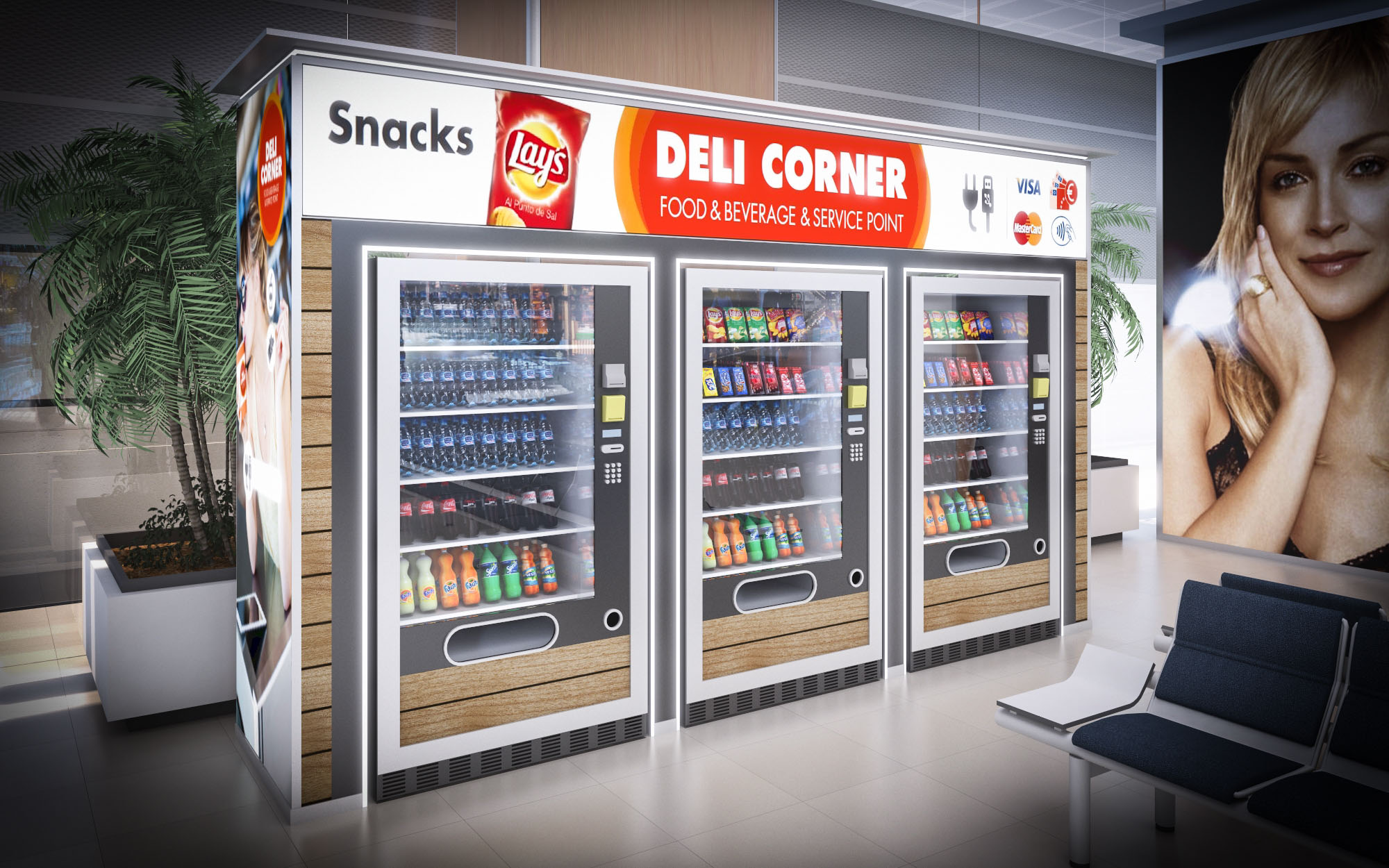
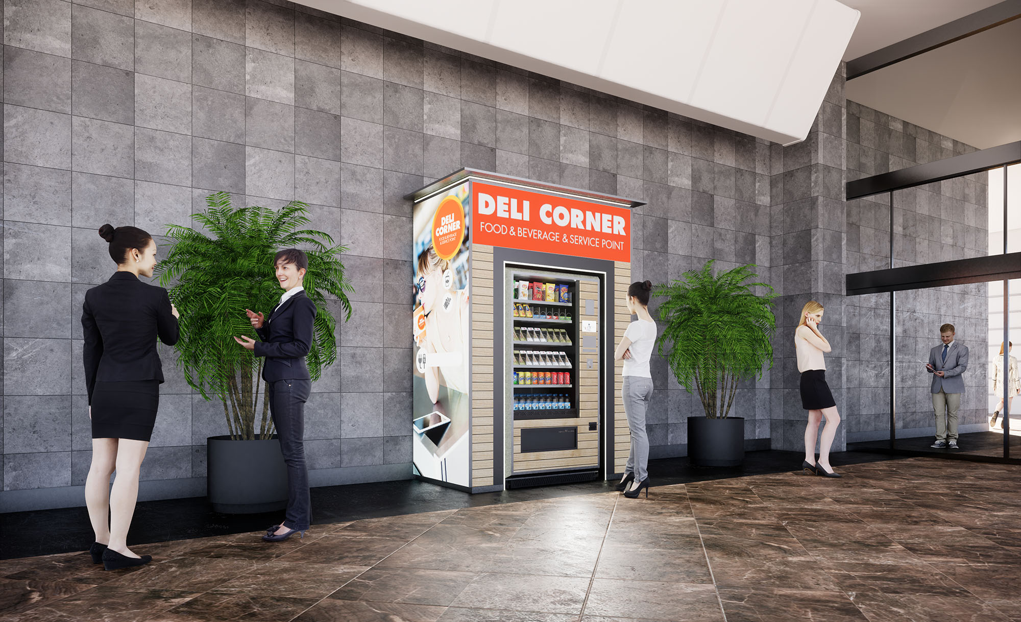
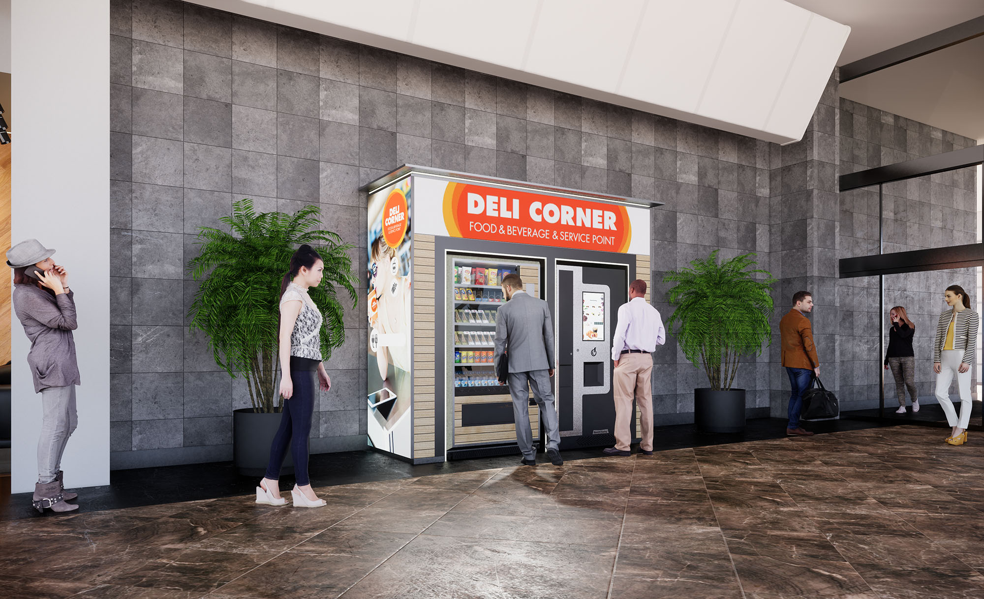
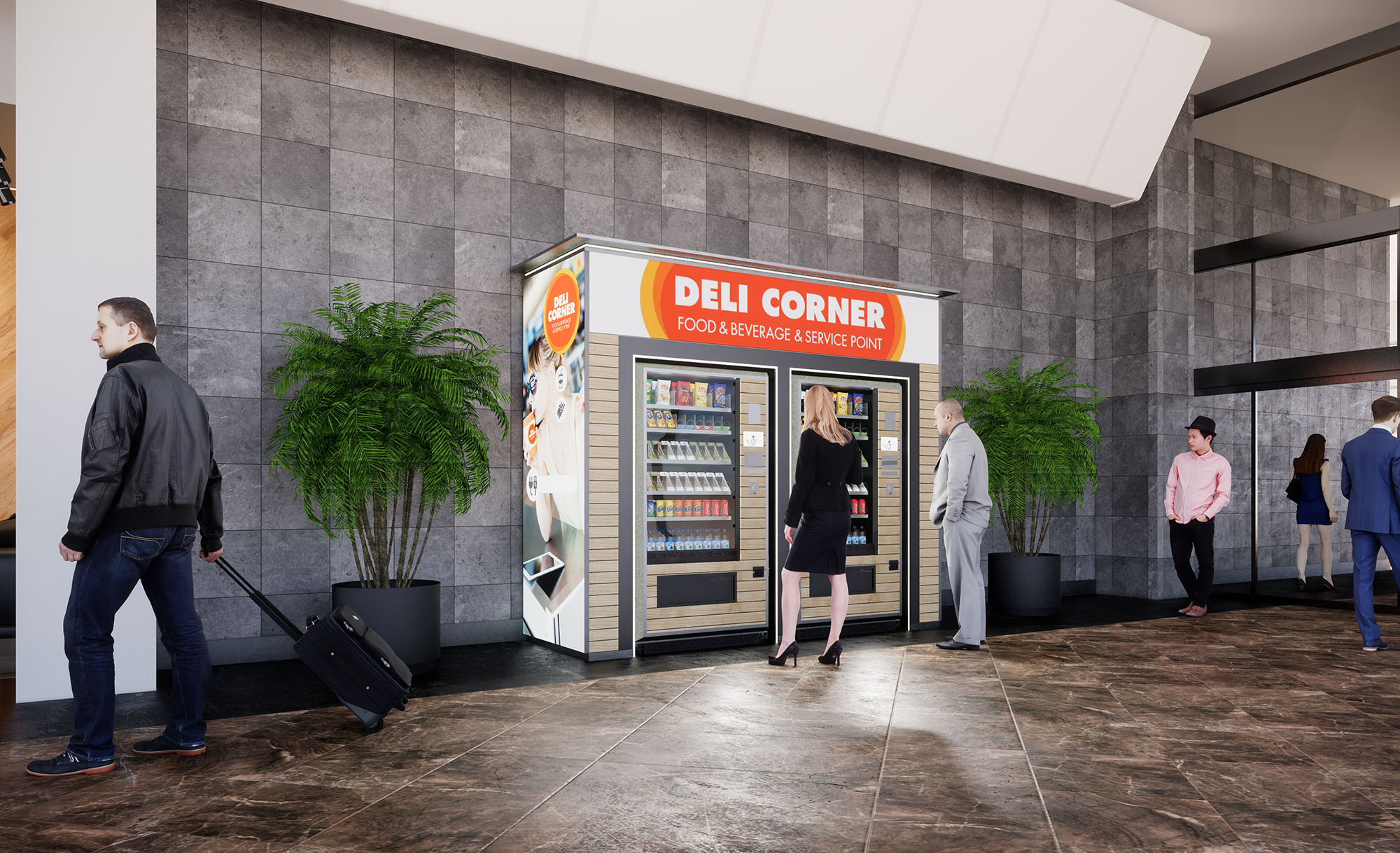
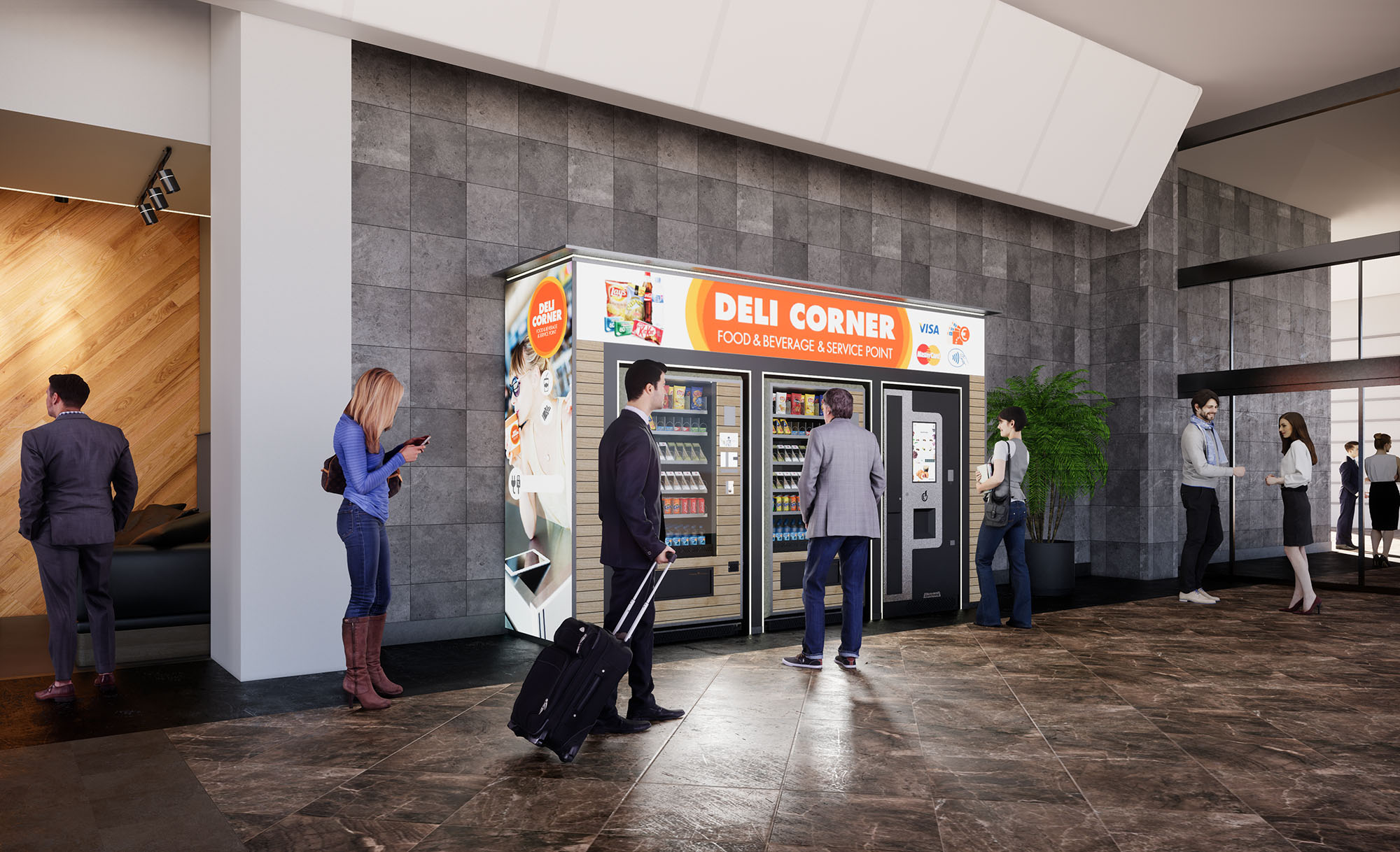
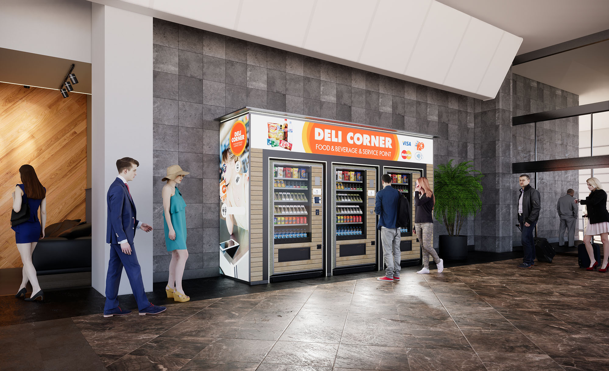
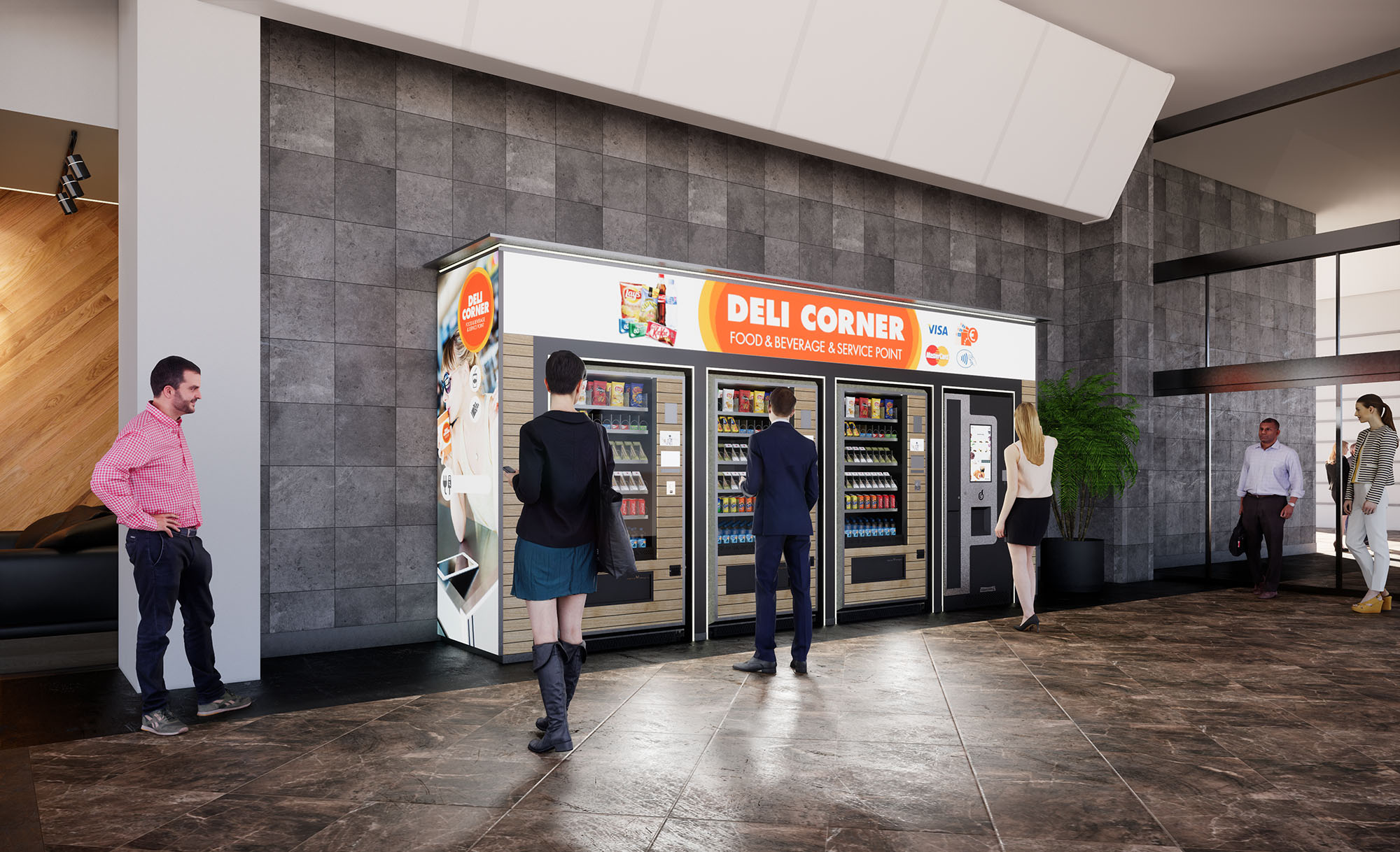
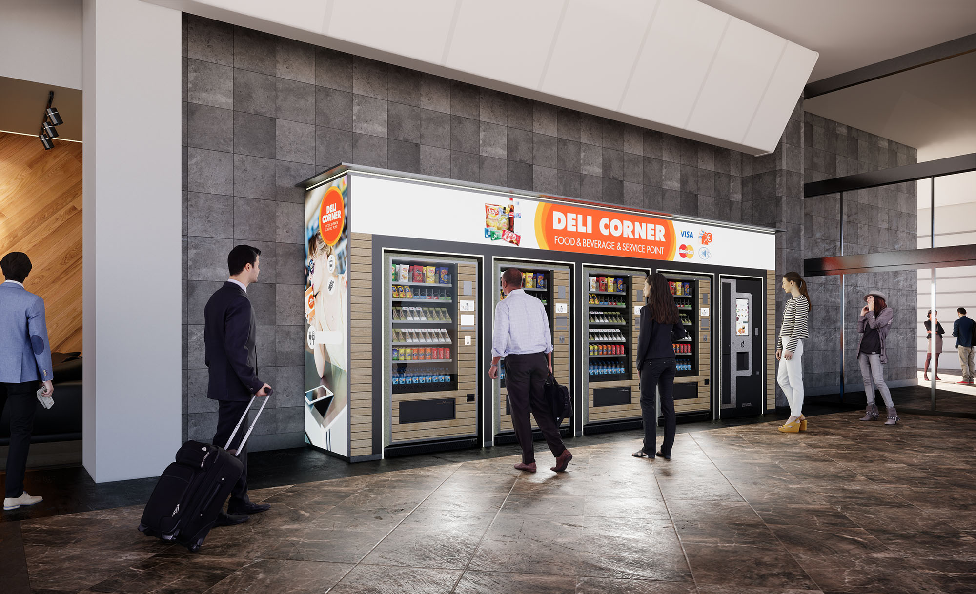
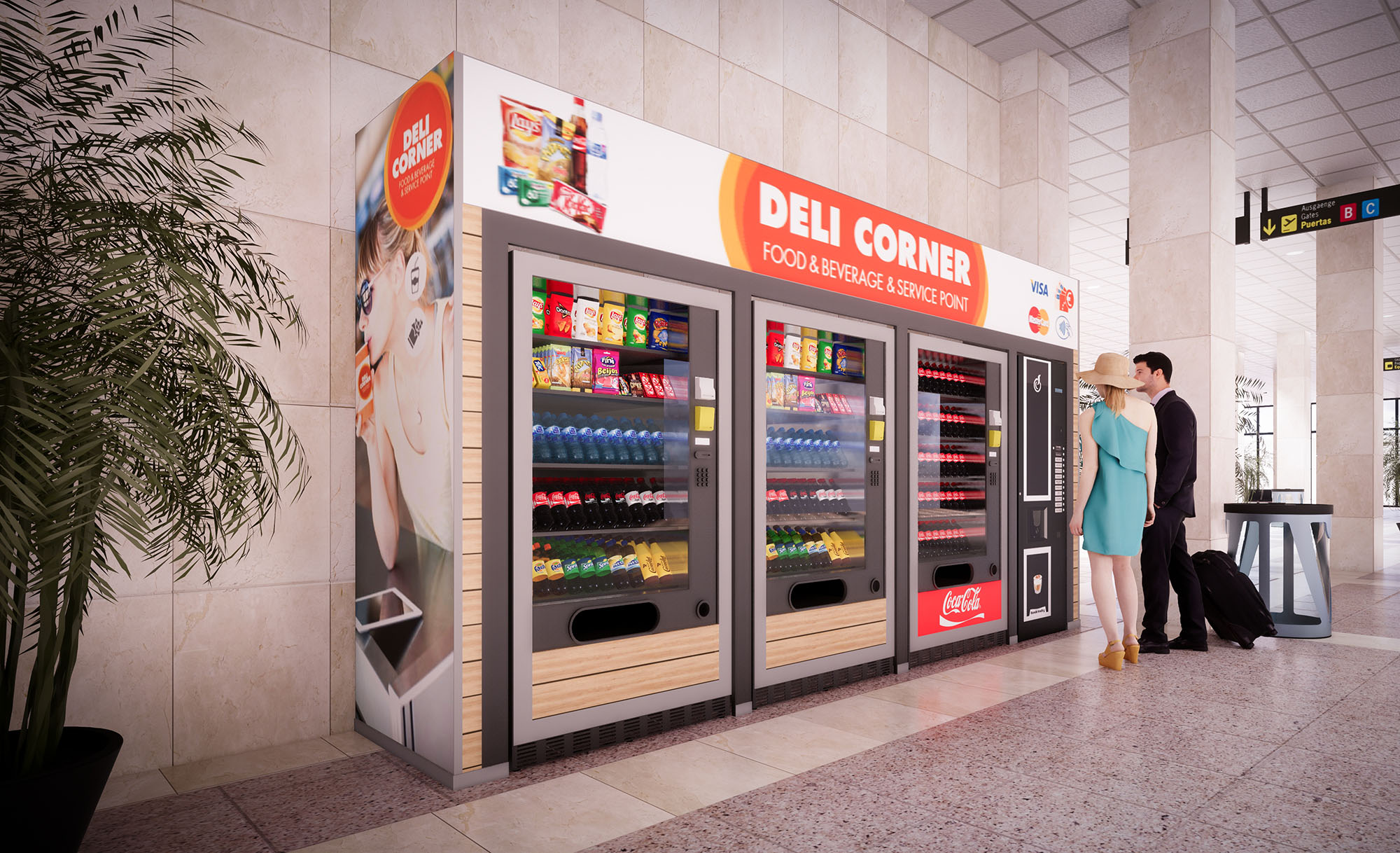
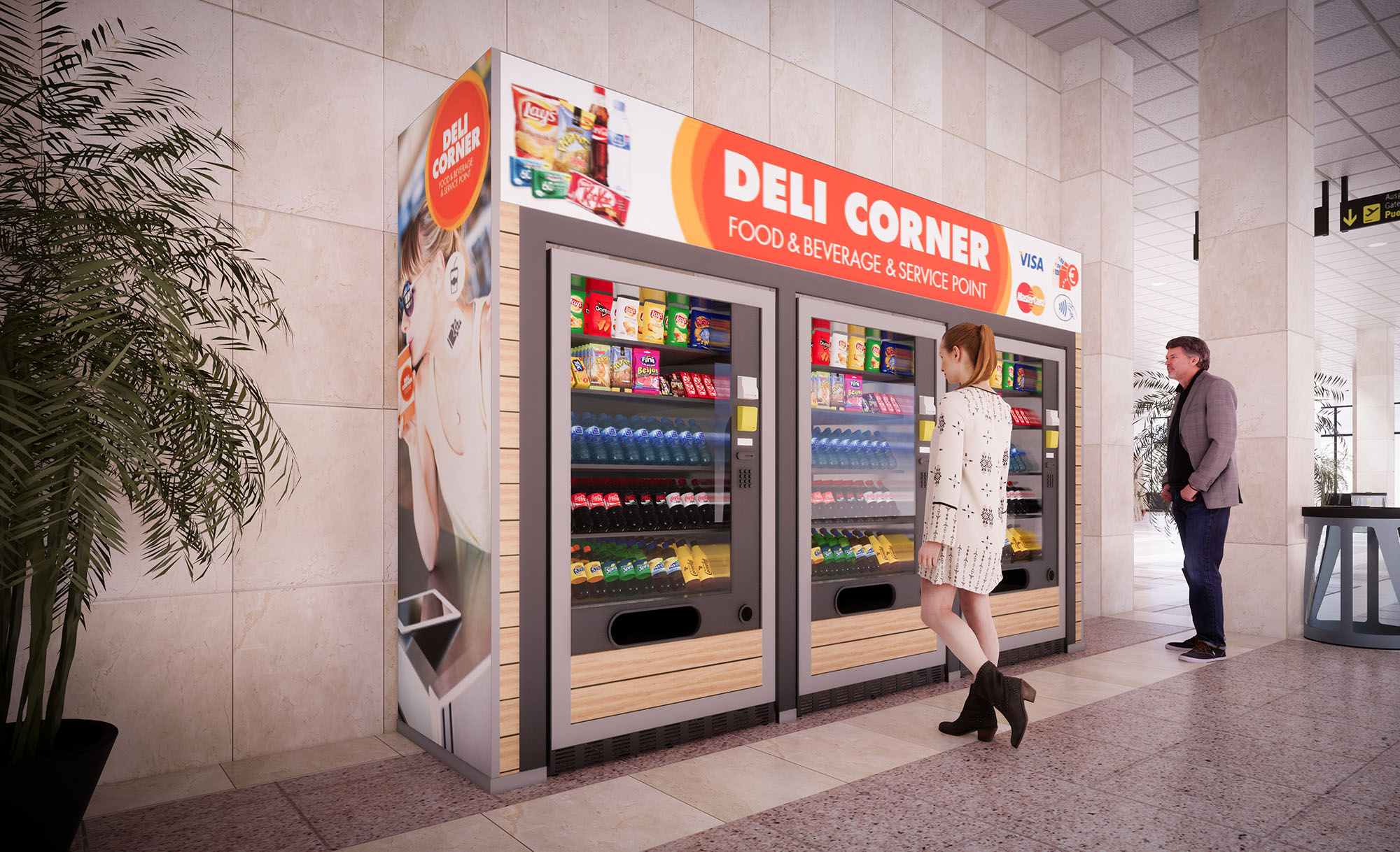
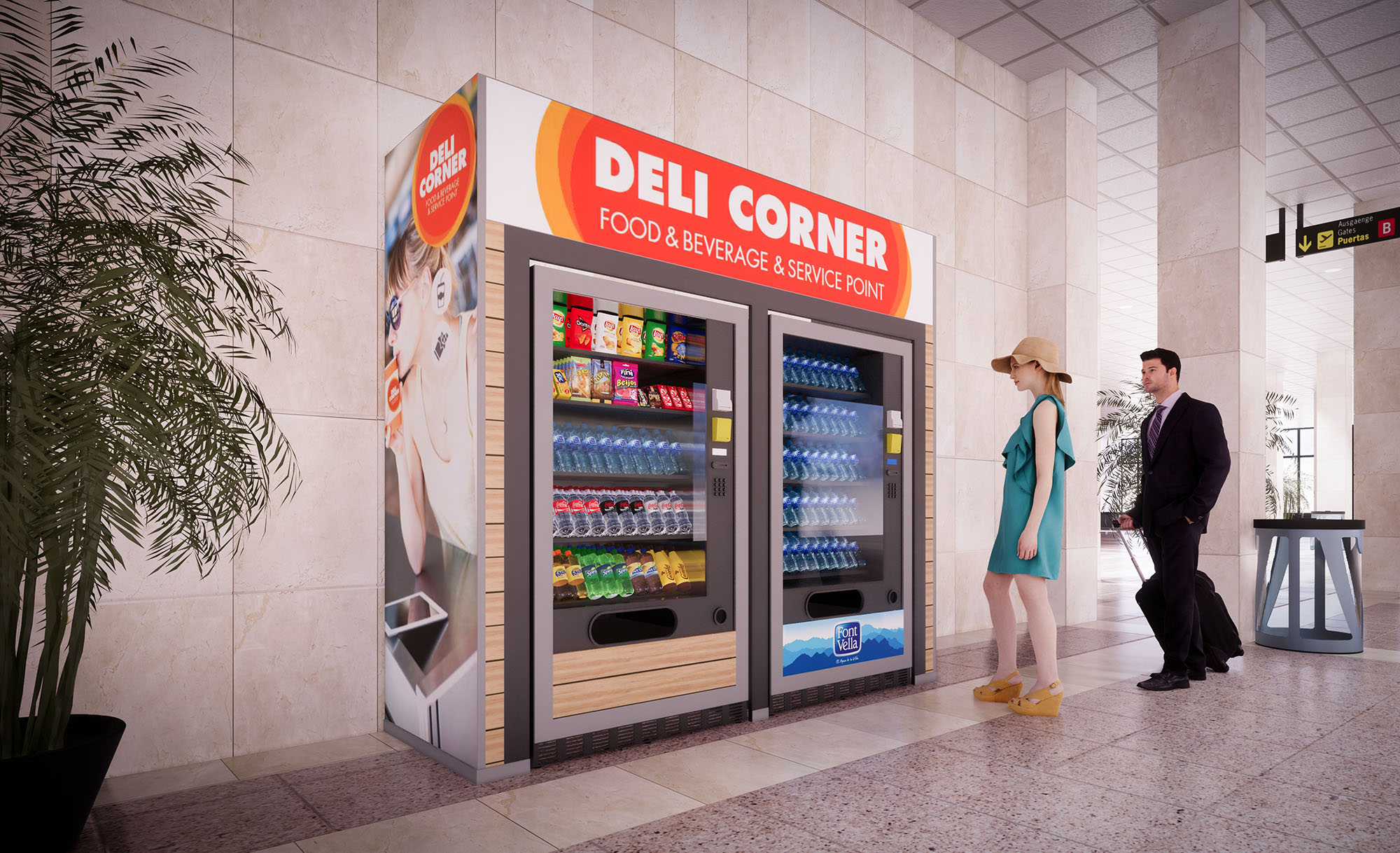
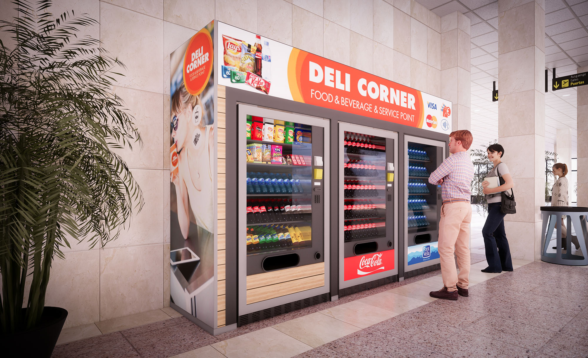
Deli Corner is conceived as a flexible, self-service food and beverage platform tailored to high-traffic transport hubs across Spain. The design responds to the rapid tempo of contemporary travel, offering an intuitive, automated service point that maintains the spatial quality and comfort of a traditional café. Architecturally, the concept operates as a lightweight architectural “plug-in” that can be inserted into existing concourses with minimal disruption, combining vending technology with a recognizable, cohesive brand environment.
The project is structured around two typologies: an open pavilion with an integrated seating area and a compact, fully enclosed vending module. Both share a consistent visual identity based on clarity, legibility and speed of use, ensuring that travelers can locate, understand and operate the service at a glance, regardless of the specific airport or station.
The open pavilion version defines a porous rectangular bay under a timber and metal canopy. The perimeter is lined with vending fronts, while the interior is furnished with high tables and stools that encourage short-stay consumption. Circulation is deliberately radial: users approach from the concourse, select products along the linear façade of machines, then move inward to the central standing area. This separation of procurement and consumption reduces congestion, even during peak hours.
The compact unit is conceived as a freestanding kiosk with all façades active. Machines are arranged in a continuous linear band, allowing simultaneous use by multiple customers. Corners are rounded visually through large-scale graphics, softening the volume and guiding movement around the perimeter. Both formats are designed to be barrier-free, with generous clearances and level thresholds, ensuring accessibility for users with reduced mobility and luggage.
The material palette balances robustness with a warm, approachable character. Structural frames and machine surrounds are expressed in dark metallic finishes, providing durability and a clear technical language for the equipment. In contrast, horizontal surfaces and soffits are clad in wood-effect panels, introducing a domestic warmth that differentiates Deli Corner from the typically hard, infrastructural environment of airport concourses.
The chromatic strategy is driven by the brand identity: vivid red signage bands punctuated by white typography secure high visibility from long distances, while neutral grays and timber tones form a calm background for the colorful product displays. Lighting is integrated into linear coves above the vending fronts, creating uniform vertical illumination that enhances product legibility and emphasizes the continuity of the service line.
Furniture is optimized for short, transient use. High communal tables sit on central steel columns with circular footrests, allowing passengers to stand, lean or use stools depending on dwell time. The height ensures comfortable use while standing with luggage and facilitates quick turnover. Edge detailing is rounded to reduce impact and wear, and finishes are selected for resistance to staining and easy cleaning.
All touchpoints—from payment terminals to trash receptacles—are consolidated into robust, clearly signposted elements. The close integration between vending equipment and architectural cladding ensures a seamless appearance, minimizing visual clutter and simplifying maintenance operations. Interfaces are positioned at ergonomic heights to accommodate a wide range of users.
Branding is treated as an architectural layer rather than a mere application. Continuous fascia bands crown both the pavilion and kiosk typologies, acting as illuminated beacons within the terminal. Large photographic graphics humanize the offer, communicating freshness, convenience and digital payment options. Wayfinding icons for credit cards, Wi-Fi or 24/7 service are integrated into the fascia, making operational information immediately readable.
Artificial lighting reinforces the perception of safety and cleanliness. Warm-white LED fixtures wash the timber soffits and highlight customer areas, while cooler, more neutral tones illuminate the product faces within the machines to render colors accurately. This dual temperature strategy subtly differentiates the consumer zone from the technical display area, while maintaining overall visual coherence.
Deli Corner is designed as a modular system capable of being replicated across 38 locations with minimal adaptation. Structural frames, cladding panels and signage elements are standardized, enabling off-site prefabrication and rapid on-site assembly. This approach reduces construction time, limits interference with airport operations and improves quality control.
Sustainability is addressed through both construction and operation. The use of lightweight metal structures and high-pressure laminates optimizes material efficiency and facilitates disassembly or relocation, extending the lifecycle of each unit. LED lighting, motion and presence sensors, and high-efficiency vending equipment contribute to reduced energy consumption. Finishes are selected for longevity and low maintenance, minimizing the need for replacement and associated waste. Where possible, wood-effect surfaces are achieved with laminates or veneers from certified sources, providing the warmth of timber while respecting responsible resource management.


.jpg)
.jpg)
.jpg)
.jpg)
.jpg)
.jpg)
-cafe.jpg)
.jpg)
.jpg)
-c.jpg)
-cafe.jpg)
-cafe-c.jpg)
.jpg)

.jpg)
.jpg)
.jpg)
.jpg)
.jpg)
.jpg)

Deli Corner is conceived as a flexible, self-service food and beverage platform tailored to high-traffic transport hubs across Spain. The design responds to the rapid tempo of contemporary travel, offering an intuitive, automated service point that maintains the spatial quality and comfort of a traditional café. Architecturally, the concept operates as a lightweight architectural “plug-in” that can be inserted into existing concourses with minimal disruption, combining vending technology with a recognizable, cohesive brand environment.
The project is structured around two typologies: an open pavilion with an integrated seating area and a compact, fully enclosed vending module. Both share a consistent visual identity based on clarity, legibility and speed of use, ensuring that travelers can locate, understand and operate the service at a glance, regardless of the specific airport or station.
The open pavilion version defines a porous rectangular bay under a timber and metal canopy. The perimeter is lined with vending fronts, while the interior is furnished with high tables and stools that encourage short-stay consumption. Circulation is deliberately radial: users approach from the concourse, select products along the linear façade of machines, then move inward to the central standing area. This separation of procurement and consumption reduces congestion, even during peak hours.
The compact unit is conceived as a freestanding kiosk with all façades active. Machines are arranged in a continuous linear band, allowing simultaneous use by multiple customers. Corners are rounded visually through large-scale graphics, softening the volume and guiding movement around the perimeter. Both formats are designed to be barrier-free, with generous clearances and level thresholds, ensuring accessibility for users with reduced mobility and luggage.
The material palette balances robustness with a warm, approachable character. Structural frames and machine surrounds are expressed in dark metallic finishes, providing durability and a clear technical language for the equipment. In contrast, horizontal surfaces and soffits are clad in wood-effect panels, introducing a domestic warmth that differentiates Deli Corner from the typically hard, infrastructural environment of airport concourses.
The chromatic strategy is driven by the brand identity: vivid red signage bands punctuated by white typography secure high visibility from long distances, while neutral grays and timber tones form a calm background for the colorful product displays. Lighting is integrated into linear coves above the vending fronts, creating uniform vertical illumination that enhances product legibility and emphasizes the continuity of the service line.
Furniture is optimized for short, transient use. High communal tables sit on central steel columns with circular footrests, allowing passengers to stand, lean or use stools depending on dwell time. The height ensures comfortable use while standing with luggage and facilitates quick turnover. Edge detailing is rounded to reduce impact and wear, and finishes are selected for resistance to staining and easy cleaning.
All touchpoints—from payment terminals to trash receptacles—are consolidated into robust, clearly signposted elements. The close integration between vending equipment and architectural cladding ensures a seamless appearance, minimizing visual clutter and simplifying maintenance operations. Interfaces are positioned at ergonomic heights to accommodate a wide range of users.
Branding is treated as an architectural layer rather than a mere application. Continuous fascia bands crown both the pavilion and kiosk typologies, acting as illuminated beacons within the terminal. Large photographic graphics humanize the offer, communicating freshness, convenience and digital payment options. Wayfinding icons for credit cards, Wi-Fi or 24/7 service are integrated into the fascia, making operational information immediately readable.
Artificial lighting reinforces the perception of safety and cleanliness. Warm-white LED fixtures wash the timber soffits and highlight customer areas, while cooler, more neutral tones illuminate the product faces within the machines to render colors accurately. This dual temperature strategy subtly differentiates the consumer zone from the technical display area, while maintaining overall visual coherence.
Deli Corner is designed as a modular system capable of being replicated across 38 locations with minimal adaptation. Structural frames, cladding panels and signage elements are standardized, enabling off-site prefabrication and rapid on-site assembly. This approach reduces construction time, limits interference with airport operations and improves quality control.
Sustainability is addressed through both construction and operation. The use of lightweight metal structures and high-pressure laminates optimizes material efficiency and facilitates disassembly or relocation, extending the lifecycle of each unit. LED lighting, motion and presence sensors, and high-efficiency vending equipment contribute to reduced energy consumption. Finishes are selected for longevity and low maintenance, minimizing the need for replacement and associated waste. Where possible, wood-effect surfaces are achieved with laminates or veneers from certified sources, providing the warmth of timber while respecting responsible resource management.
© 2021 by sanzpont [arquitectura] . Webpage by sanzpont [digital] . Innovative Digital Experiences
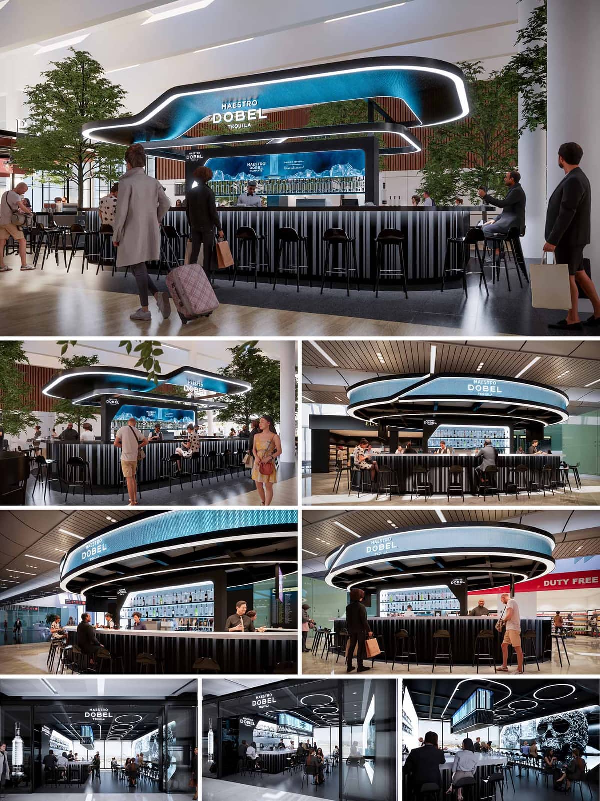

The Maestro Dobel Tequila bar concept is a dynamic fusion of brand identity and architectural innovation, designed to function as a high-impact space within transit-oriented environments such as airports. The core idea was to translate the premium essence of the tequila into a sculptural, immersive environment that enhances brand storytelling while offering a modern hospitality experience. The design articulates fluidity and movement—echoing the essence of tequila's distilled refinement—while attracting passersby with a captivating and futuristic form.
At the heart of the space is a sculptural bar canopy that doubles as a branding element and spatial anchor. Its sweeping curves and floating appearance create a sense of dynamism, drawing the eye and inviting circulation from all directions. The bar is designed as an open island, encouraging interaction from every angle and maximizing accessibility in a high-traffic environment. The perimeter seating wraps organically around the structure, allowing for both social and individual seating configurations. High stools and varied counter heights accommodate short stops as well as longer visits.
A refined palette combines dark vertical ribbed cladding at the base with high-gloss black finishes and illuminated linear accents. The primary feature—an illuminated, ribbon-like LED fascia—functions as a digital display and sculptural element. It reinforces the brand’s contemporary image while providing adaptive lighting that transitions from ambient glow to vibrant visual content. Behind the bar, a backlit bottle display wall adds depth and visual rhythm, with clear emphasis on showcasing the tequila selection. The lighting design uses concealed sources to accentuate textures and guide visual focus without glare.
Brand identity is not merely applied but integrated architecturally. The Maestro Dobel logo is embedded within the light feature and mirrored in the digital content, ensuring brand recall without overwhelming the spatial experience. The layout prioritizes operational efficiency: bartenders benefit from a centralized workflow with integrated storage, refrigeration, and display systems. Digital menus and branding are harmonized into the architectural shell, allowing for real-time content changes and promotions. These elements ensure both an elevated user experience and a highly functional hospitality setting.
Designed to perform within airport terminals or mall concourses, the space is conceived as a freestanding pavilion that creates a micro-environment within a transient context. The use of planters with integrated trees softens the high-tech aesthetic, providing visual balance and encouraging biophilic comfort. Sustainability is addressed through the modular construction of the bar, which allows disassembly and reuse in different locations, reducing material waste. LED lighting throughout ensures energy efficiency, while durable materials such as metal and engineered surfaces are selected for longevity and ease of maintenance in high-use areas.
The spatial experience is intentionally theatrical—visitors are drawn in by the contrast of dark, tactile materials and the animated glow of the canopy. The bar functions both as a social anchor and a brand stage, blending hospitality and retail cues. Ambient acoustics and seating orientation create zones of calm within bustling environments. The inclusion of glass partitions in certain variations creates a semi-enclosed lounge that offers visual connectivity while providing acoustic separation and a sense of exclusivity.
© 2021 by sanzpont [arquitectura] . Webpage by sanzpont [digital] . Innovative Digital Experiences
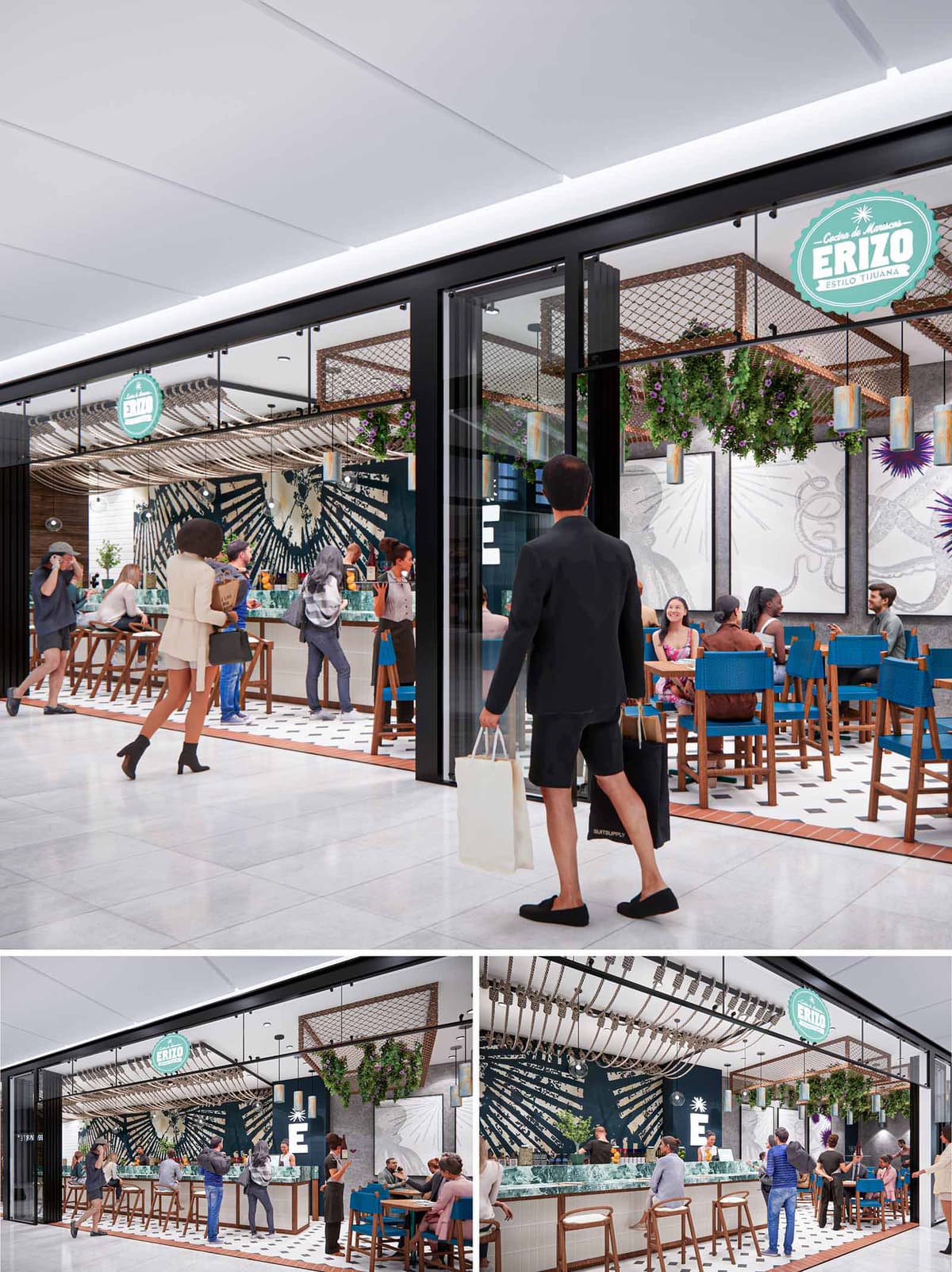

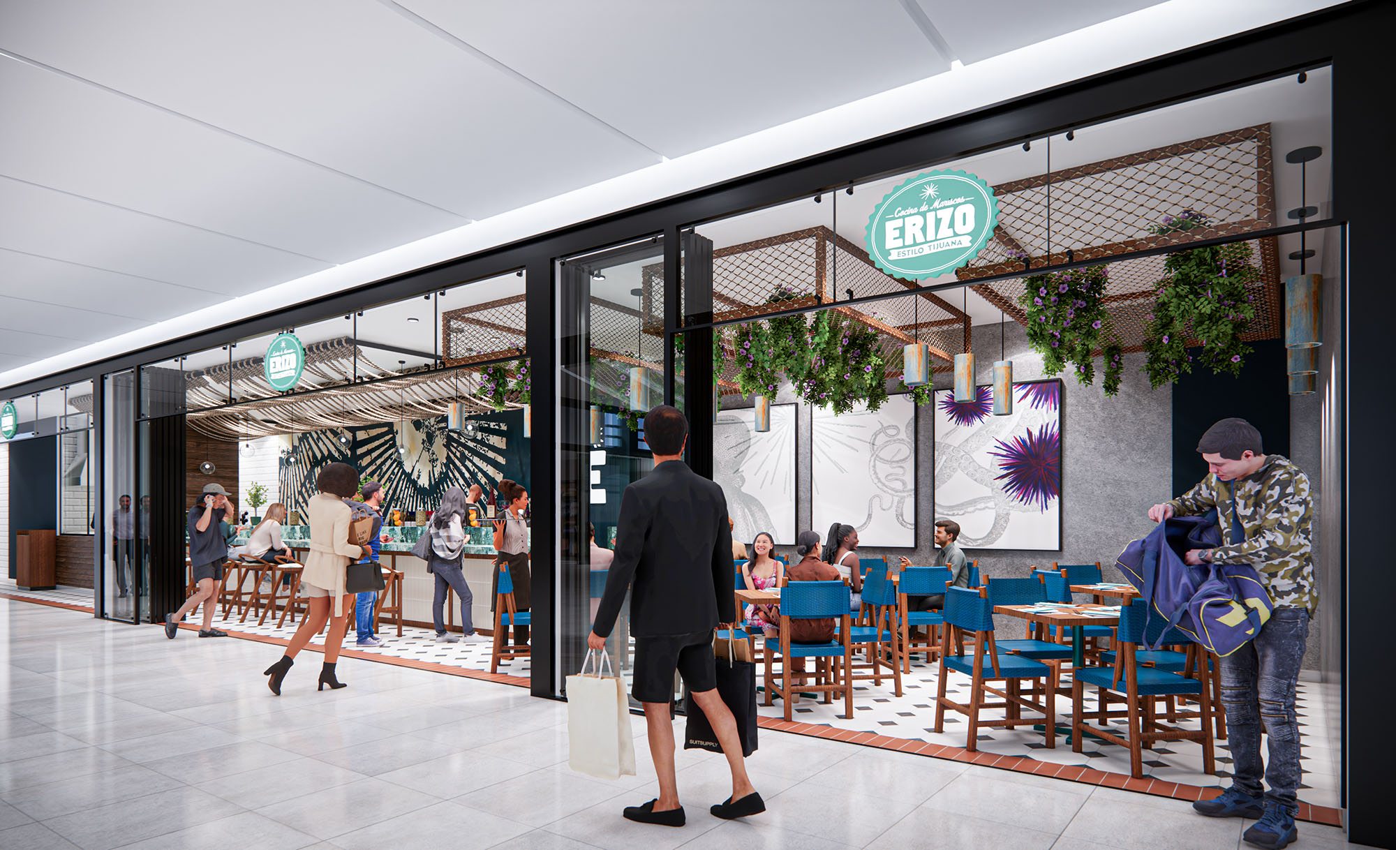
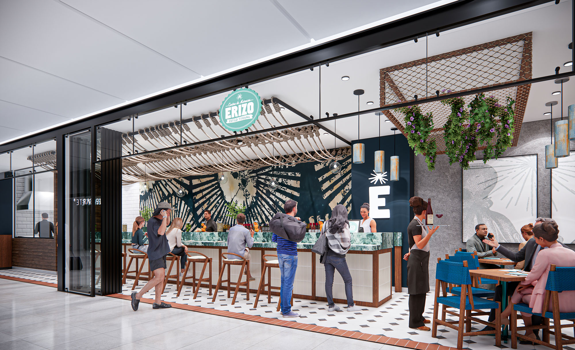
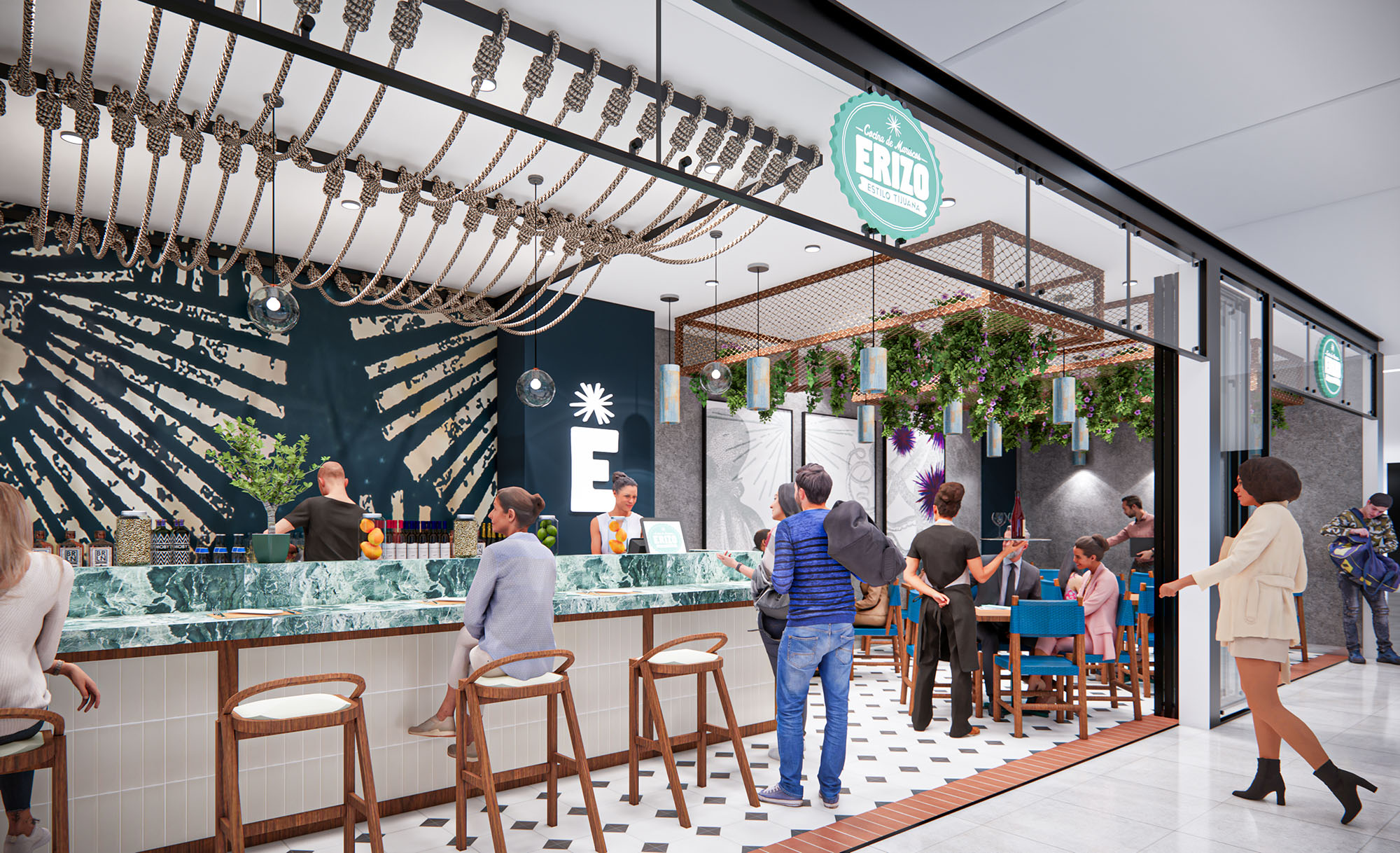
ERIZO is conceived as an open, extroverted seafood bar that brings the atmosphere of Tijuana’s coastal street food into the interior of a contemporary shopping center. The design blurs the boundary between corridor and restaurant, transforming the façade into a permeable threshold where the activity at the bar becomes a visual attractor for pedestrians. The space operates as a linear pavilion, emphasizing horizontality and transparency while celebrating local culinary culture.
The concept is organized around a central bar as the main stage, with the remaining program wrapping around it in a U-shaped configuration. This creates a continuous social perimeter where diners maintain direct contact with the preparation of food and drinks, reminiscent of mercado stalls and marisquerías typical of northern Mexico.
The layout is deliberately compact and efficient. A generous bar fronts the circulation axis of the mall, functioning as both façade and interior element. High stools along the bar cater to quick, informal service, while standard-height tables in the back half of the premises offer a more relaxed dining experience. This duality allows the restaurant to respond to different user profiles, from passersby to destination guests.
Sliding or retractable glazed panels define the front boundary, enabling maximum openness during operation and an unobstructed visual connection. Circulation is intuitive, with direct access from the corridor into the bar zone, and a secondary flow that guides guests around the perimeter to the dining area. Service routes remain compressed behind the bar, securing optimal interaction between kitchen, bar and waitstaff.
The material palette combines fresh, maritime references with the robust character of Tijuana’s urban landscape. Warm-toned woods are used for bar fronts, stools and chair structures, introducing tactility and a sense of craftsmanship. These are contrasted with a stone or quartz bar top in greenish tones, evoking sea colors and providing a durable, hygienic working surface.
The flooring articulates the transition between mall and restaurant through patterned tiles, using black and white geometry to frame the bar as a central rug, while a slim border in terracotta visually anchors the area. Walls incorporate textured plaster and murals in neutral hues, allowing the deep navy backdrop of the bar and the turquoise accents to stand out. The chromatic composition of blue seating upholstery, white bases and dark background surfaces creates a strong identity aligned with a coastal theme.
The ceiling is a key expressive element. A suspended installation of parallel rods or tubes extends above the bar, echoing fishing gear and marine structures while providing rhythm and depth. This sculptural canopy also helps visually lower the height over the counter, generating a more intimate scale inside the otherwise open mall volume.
Lighting is stratified: pendant fixtures with cylindrical shades mark the longitudinal axis of the bar and dining area, while integrated linear lighting in the soffit and perimeter ensures uniform ambient levels. Accent lights highlight the mural and branding elements, increasing visibility from the corridor. The warm color temperature of the luminaires softens the crisp palette and enhances the perceived warmth of the wooden surfaces.
The storefront operates as a transparent frame. Slender black metal profiles outline large glass panels, generating a clean, contemporary façade that contrasts with the vibrant interior. Graphic elements, including the circular ERIZO logo and large-scale wall art, are carefully positioned to be legible from a distance, reinforcing recognition along the mall’s circulation spine.
An overhead mesh structure near the entry accommodates hanging planters, introducing greenery as a soft filter between corridor and dining space. This vegetal layer tempers the hard surfaces and contributes to a relaxed, informal atmosphere reminiscent of outdoor patios, despite the fully indoor context.
Although located within a conditioned mall environment, the project incorporates several strategies to improve environmental performance and durability. The compact footprint and central bar configuration minimize internal travel distances for staff, improving operational efficiency and reducing energy use associated with food handling and refrigeration logistics.
Material selection prioritizes longevity and low maintenance: high-resistance tile flooring, treated woods, and durable composite stone surfaces reduce the need for frequent replacement. The extensive use of LED lighting and targeted accent fixtures lowers electrical consumption, while hanging vegetation contributes to acoustic absorption and enhances indoor environmental quality. The open, non-enclosed façade allows visual permeability and shared ambient lighting with the mall, reducing the need for excessive artificial illumination within the restaurant.
© 2021 by sanzpont [arquitectura] . Webpage by sanzpont [digital] . Innovative Digital Experiences
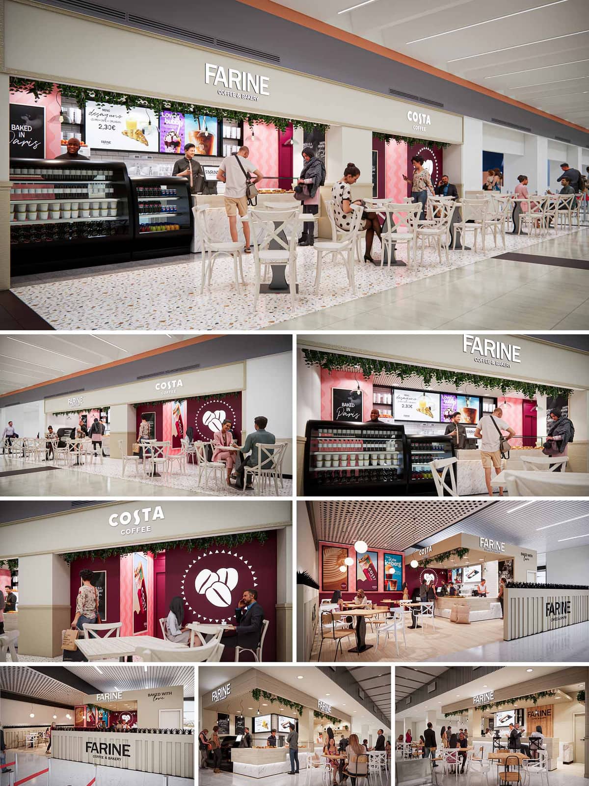

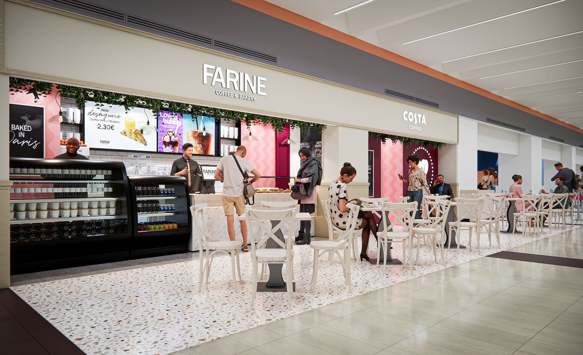
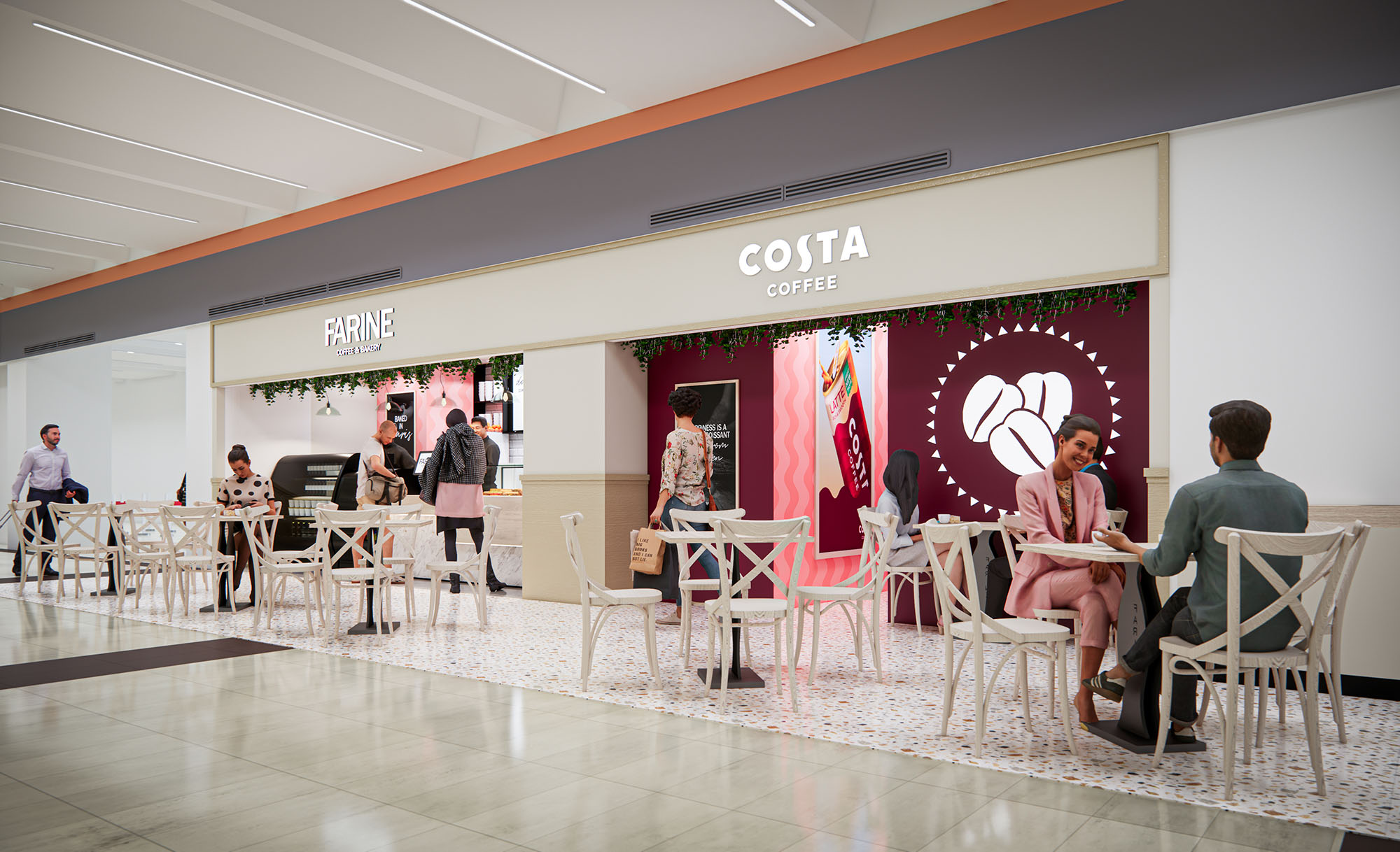
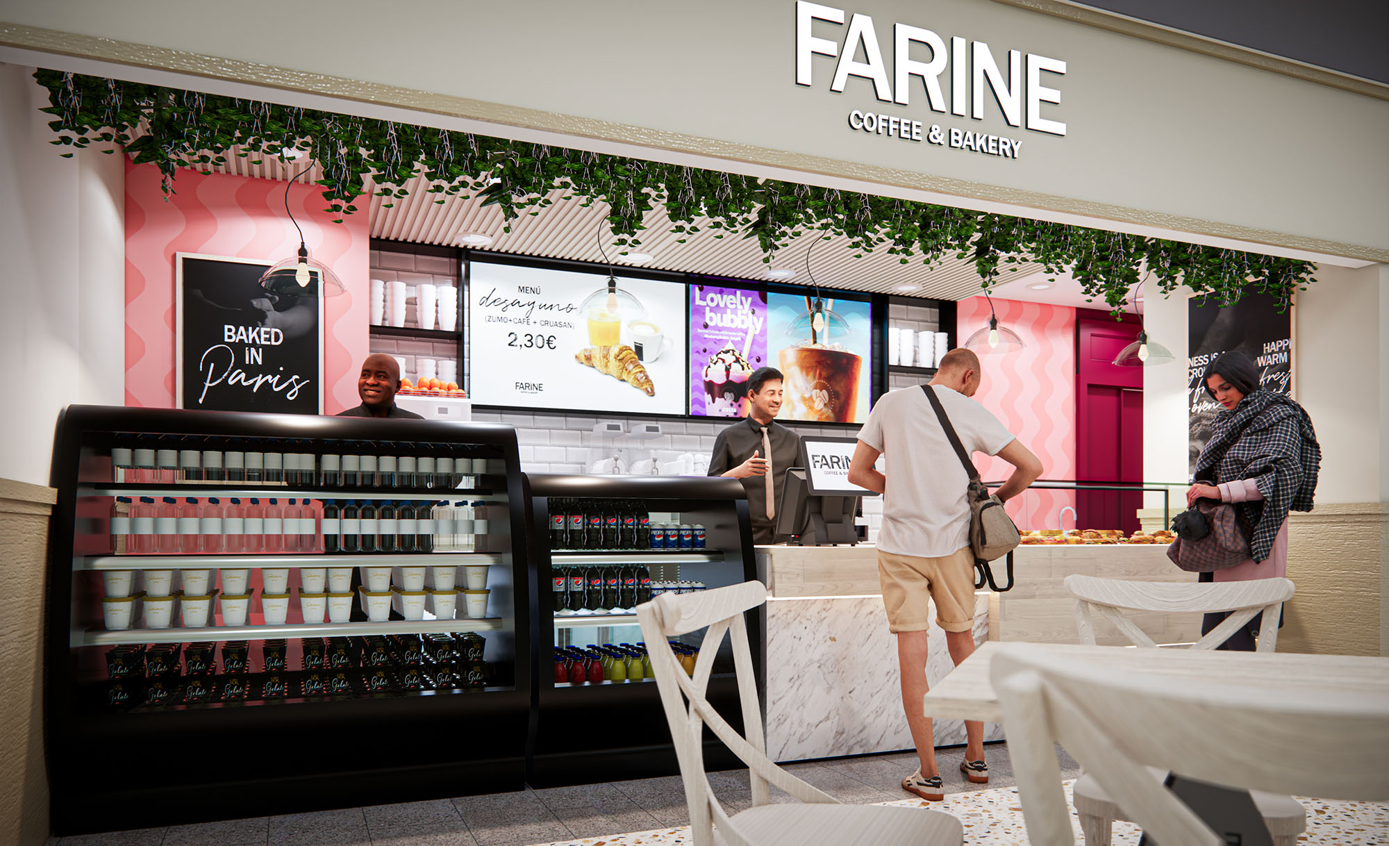
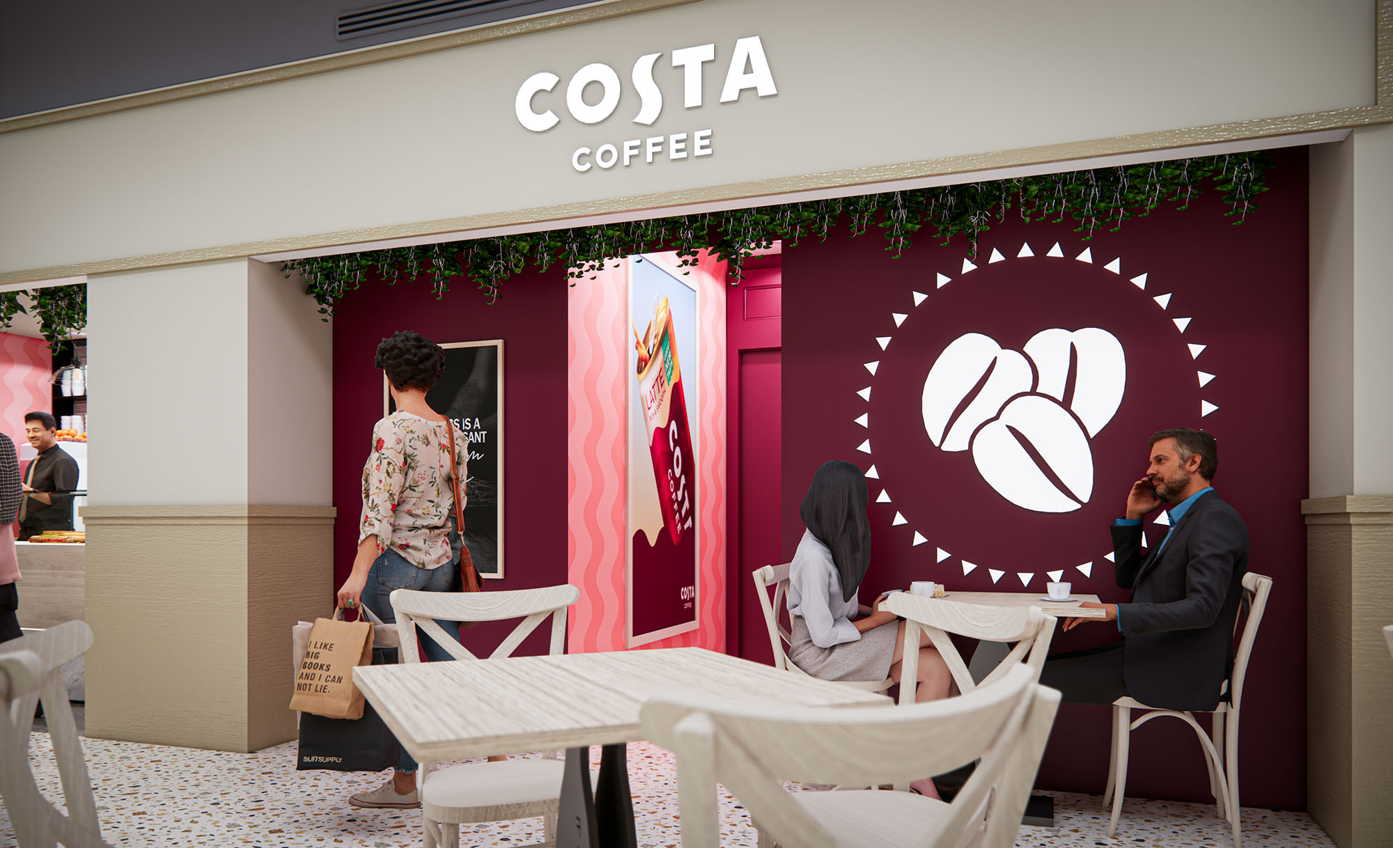
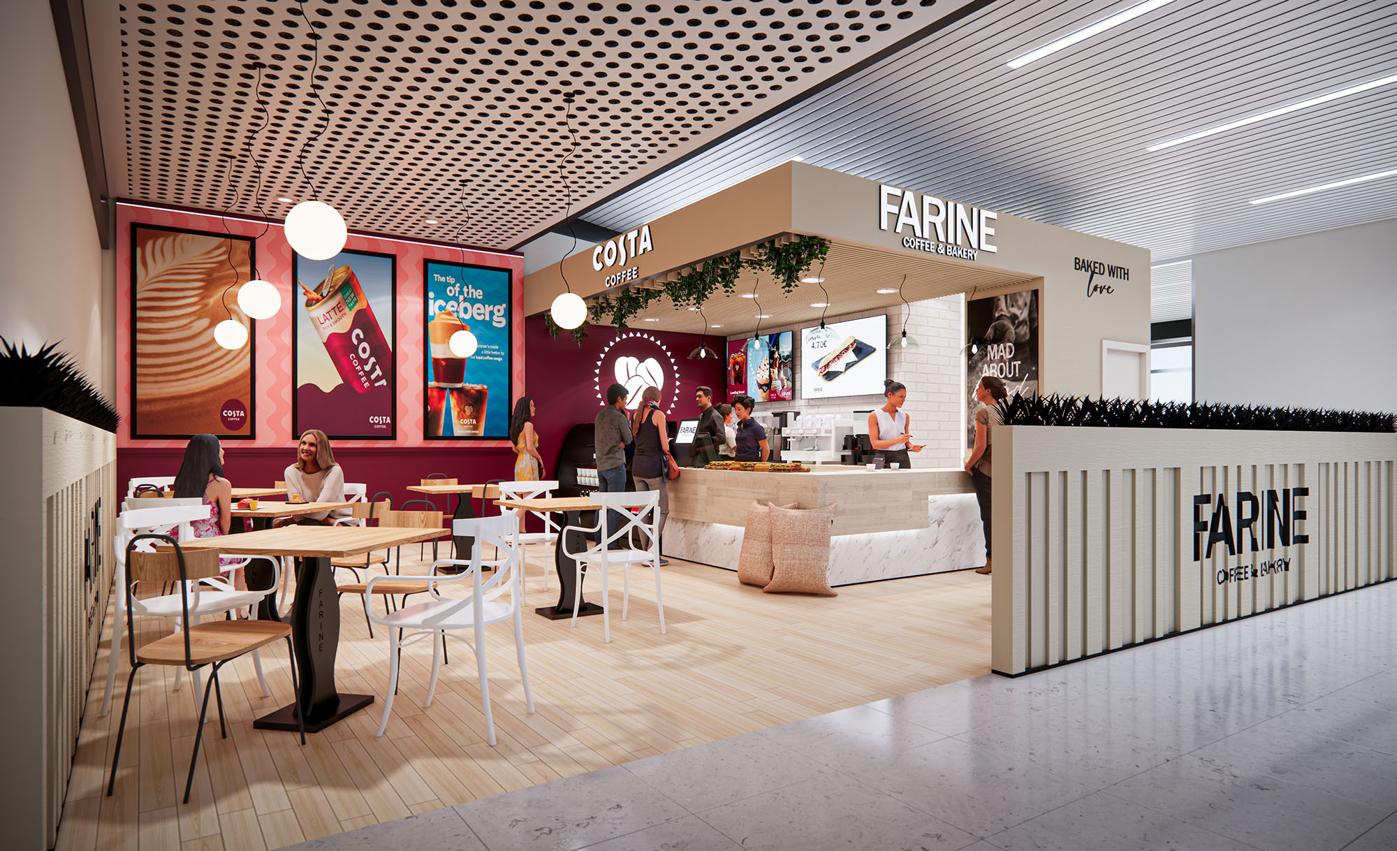
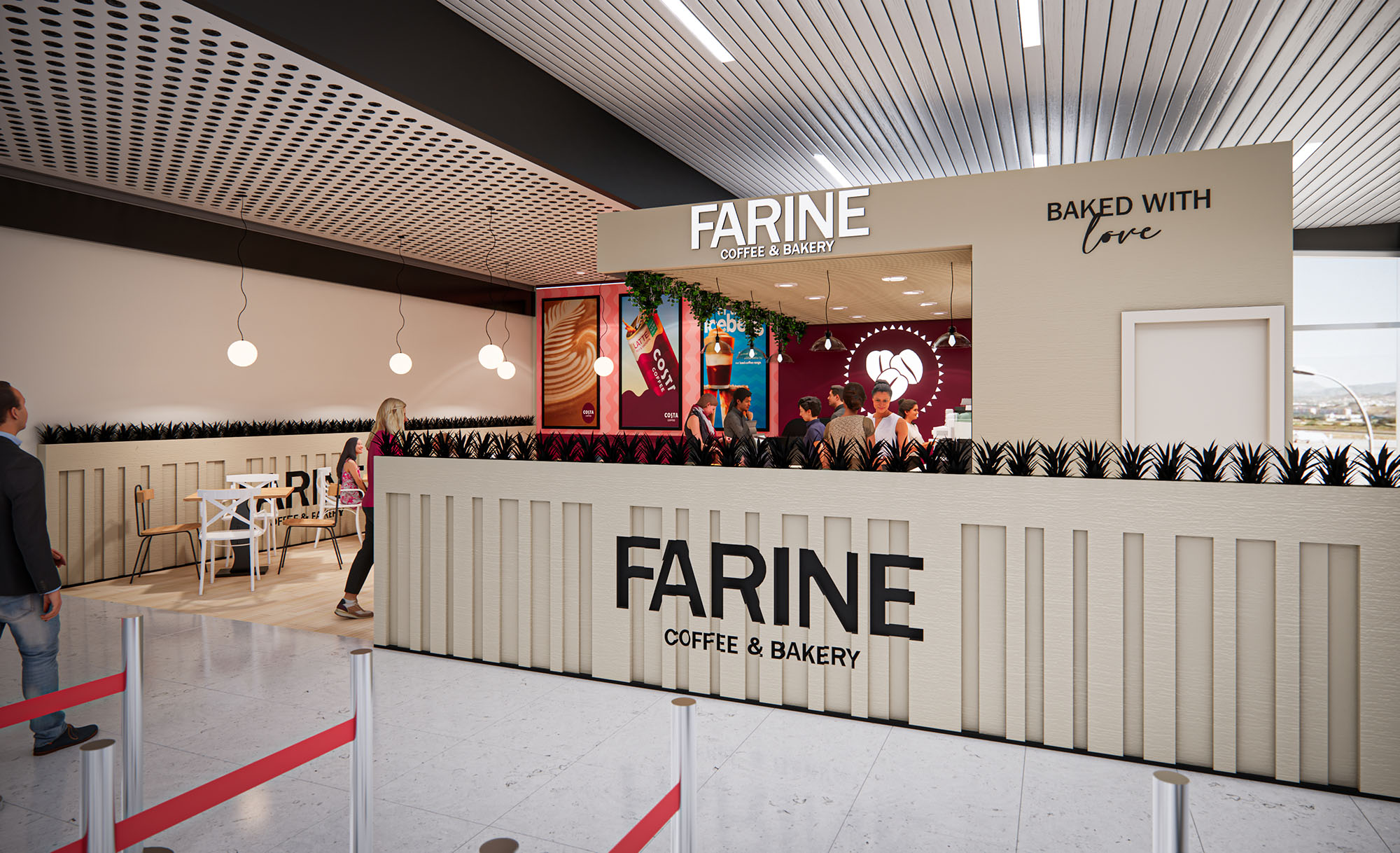
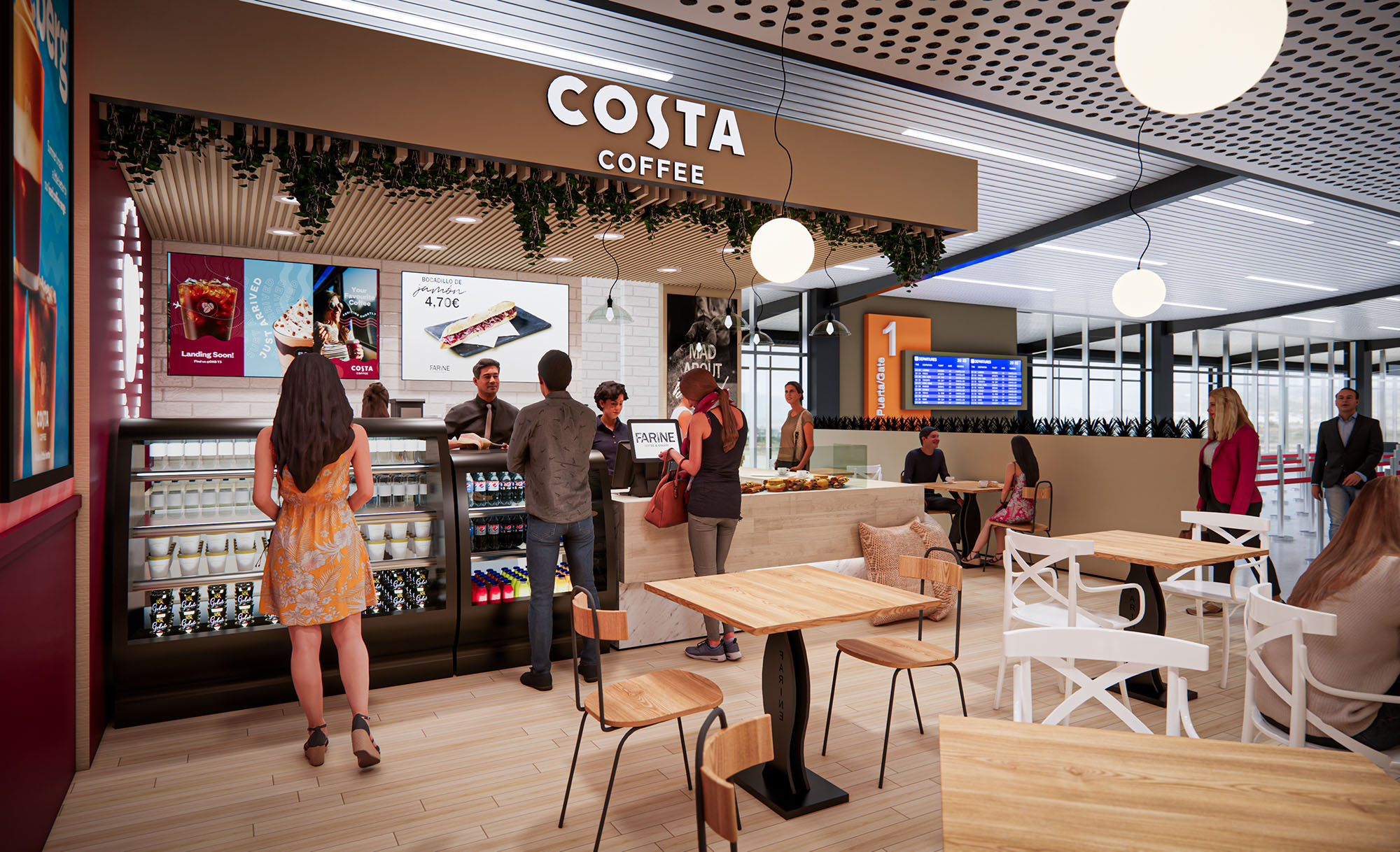
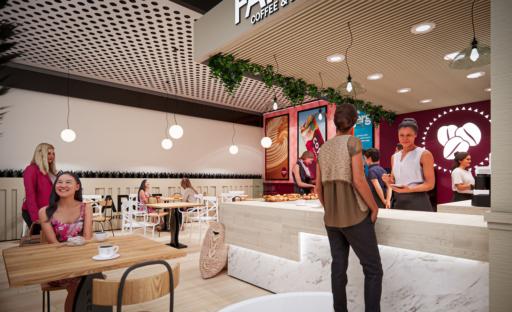
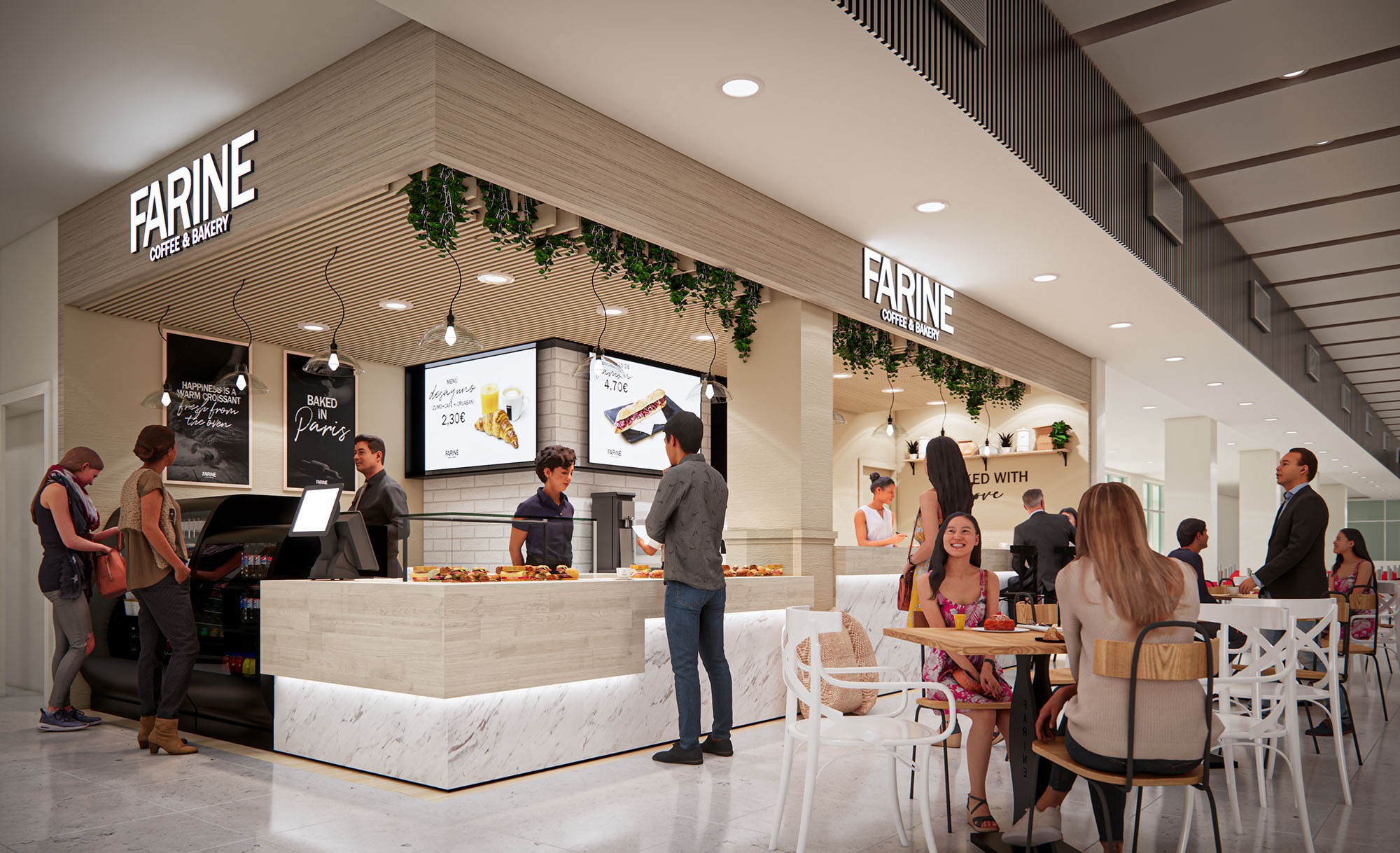
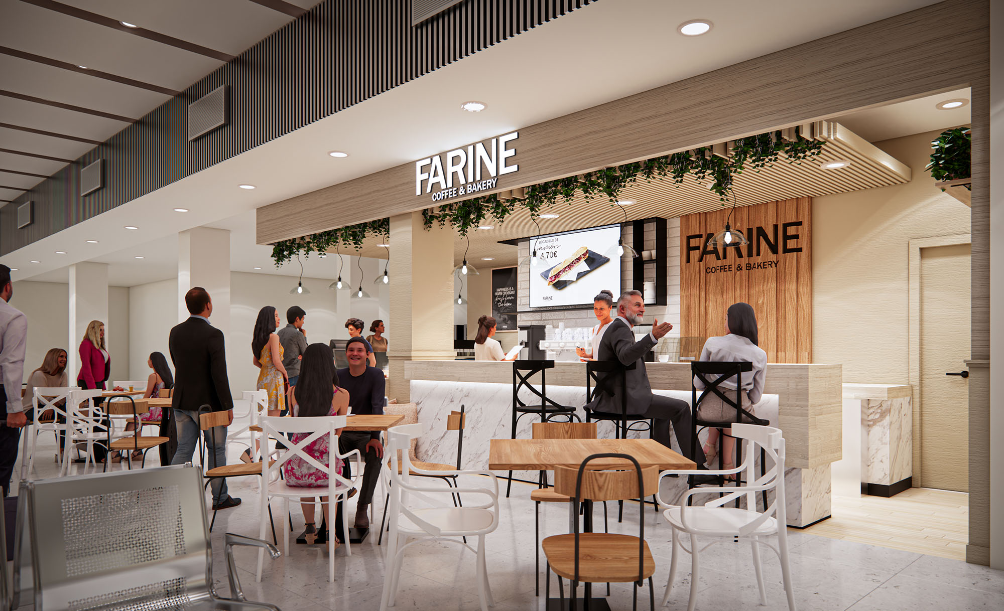
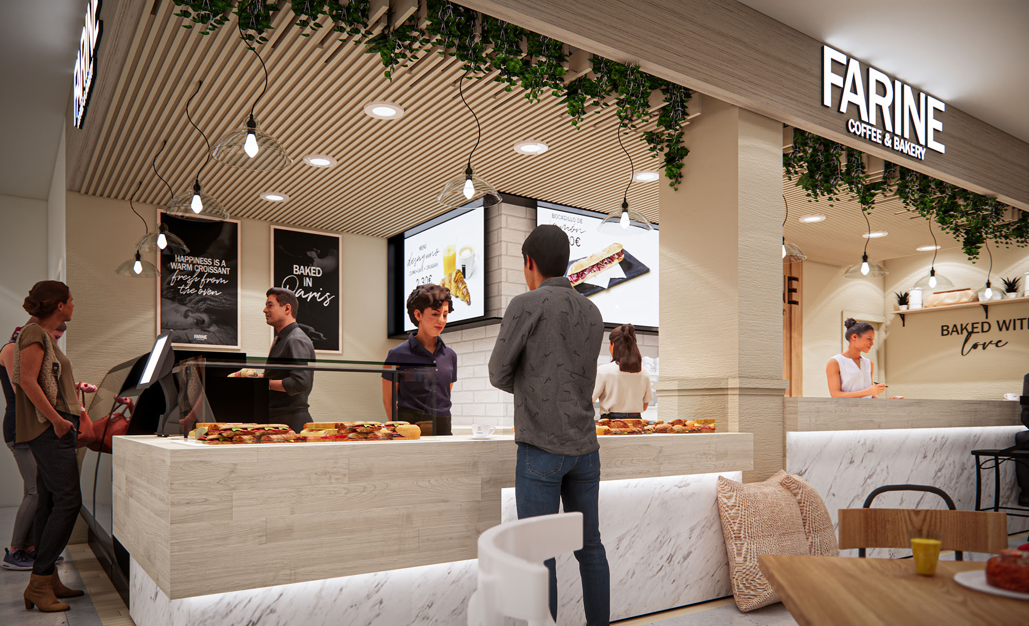
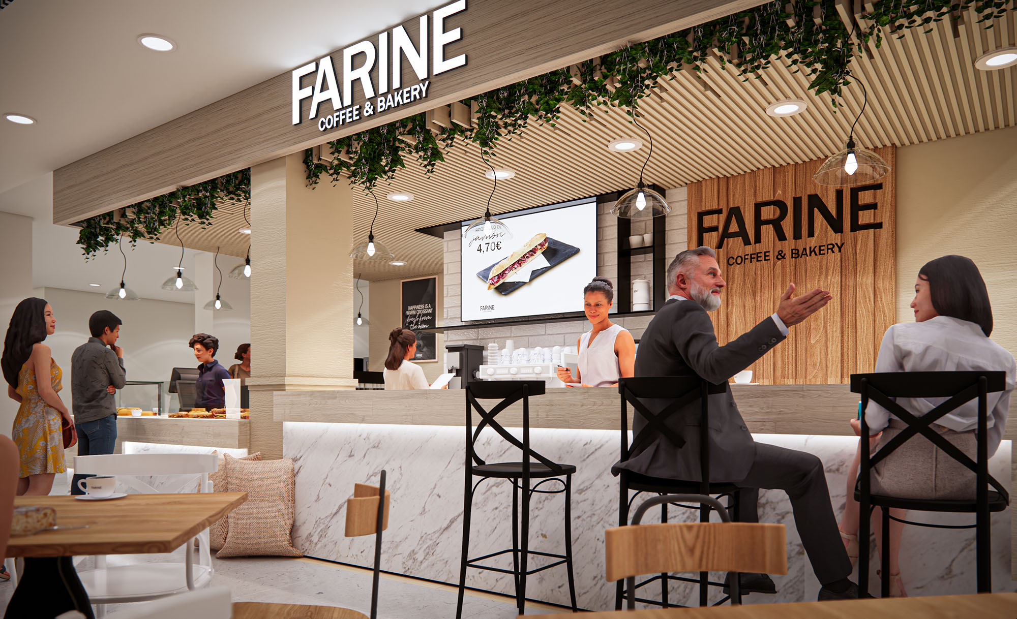
The FARINE concept is conceived as a contemporary coffee and bakery experience that synthesizes European café culture with the fluidity of high-traffic commercial spaces. The design operates as a soft, luminous “island” within shopping centers and transit nodes, drawing attention through warm materials, restrained branding, and an open interface to the public realm. The project is replicable across multiple countries, yet calibrated to remain visually light, easy to install, and highly adaptable to differing mall envelopes.
The architectural language blends a refined urban café identity with subtle references to craft and artisanal baking. Clear volumetric frames, generous façades, and integrated greenery are employed to create a recognizable visual signature while preserving sightlines and permeability. FARINE and Costa Coffee coexist in a coordinated dual-brand strategy, articulated through complementary color fields and shared furniture typologies that maintain a coherent spatial narrative.
The spatial layout is characterized by a linear service front coupled with an open seating field that spills into the circulation areas of the host building. The counter line is anchored by refrigerated displays and a central preparation zone, ensuring direct visual contact between baristas and customers. This arrangement optimizes queuing, impulse purchasing, and operational efficiency while keeping back-of-house components compact and concealed.
Seating is configured as a flexible grid of two- and four-person tables, allowing rapid reconfiguration for different user groups and peak hours. Peripheral benches and low partitions subtly define the café boundary without creating hard enclosures, encouraging visual continuity and an inviting atmosphere. Circulation is intuitive, with clear access to ordering points, pick-up zones, and transitional seating for short stays.
The material palette balances durability with a soft, welcoming tactility. Terrazzo-effect flooring delineates the café area and introduces a playful yet robust surface suitable for high traffic. Vertical planes combine light neutral cladding with warm beige wainscoting, reinforcing a sense of cleanliness and brightness. Timber tones in tabletops and some seating elements provide warmth and a subtle artisanal character.
Brand identity is expressed through controlled accent colors: warm burgundy panels signal the Costa Coffee component, while soft creams and muted pinks identify FARINE’s bakery dimension. These chromatic fields appear on wall backdrops, menu bands, and graphic panels, providing legibility without visual overload. Black framed refrigerated units and discreet metallic trims lend technical precision and highlight the freshness of the products.
Lighting is conceived as a key tool to differentiate the café from the surrounding mall environment. Integrated linear luminaires in the ceiling soffit and under the main signage band provide uniform, glare-free illumination of the counter and seating areas. This consistent brightness emphasizes cleanliness and product visibility while reinforcing the horizontal geometry of the façade.
Accent lighting is introduced through spot fixtures and decorative pendants in selected zones, creating focal points over key display areas and seating clusters. The combination of warm white color temperature and matte reflective surfaces avoids harsh contrasts, resulting in a comfortable, domesticated atmosphere that contrasts with the more generic commercial lighting of adjacent corridors.
Brand visibility is achieved through large, backlit logotypes positioned on a continuous fascia that unifies the different fronts. Graphic panels with product photography and concise messages punctuate the back wall, functioning both as signage and atmospheric backdrop. These panels are modular, enabling easy adaptation to local promotions and seasonal campaigns.
Greenery integrated along the upper edge of the counter façade introduces a subtle biophilic element, softening the transition between the built frame and the open void of the mall. Furniture details, such as cross-back chairs and light metal bases, contribute to a recognizable identity while remaining neutral enough to coexist with both brands. All fixtures are designed as repeatable modules, controlling costs and ensuring consistency across multiple international locations.
Sustainability is addressed through both material choices and operational logic. The project privileges durable, low-maintenance finishes that extend lifecycle and reduce replacement frequency, such as composite terrazzo flooring and laminated work surfaces. Modular counters and furniture are designed for disassembly, allowing components to be reused or reconfigured when units relocate or undergo refurbishment.
Integrated LED lighting throughout the scheme reduces energy consumption and minimizes heat gain in already conditioned mall environments. Open layouts without full-height enclosures leverage existing HVAC systems, avoiding redundant air-conditioning installations. Where possible, specifications favor FSC-certified wood elements and recyclable metal frames, while the transparent merchandising strategy supports reduced waste by aligning production volumes with clearly observable customer demand.
© 2021 by sanzpont [arquitectura] . Webpage by sanzpont [digital] . Innovative Digital Experiences
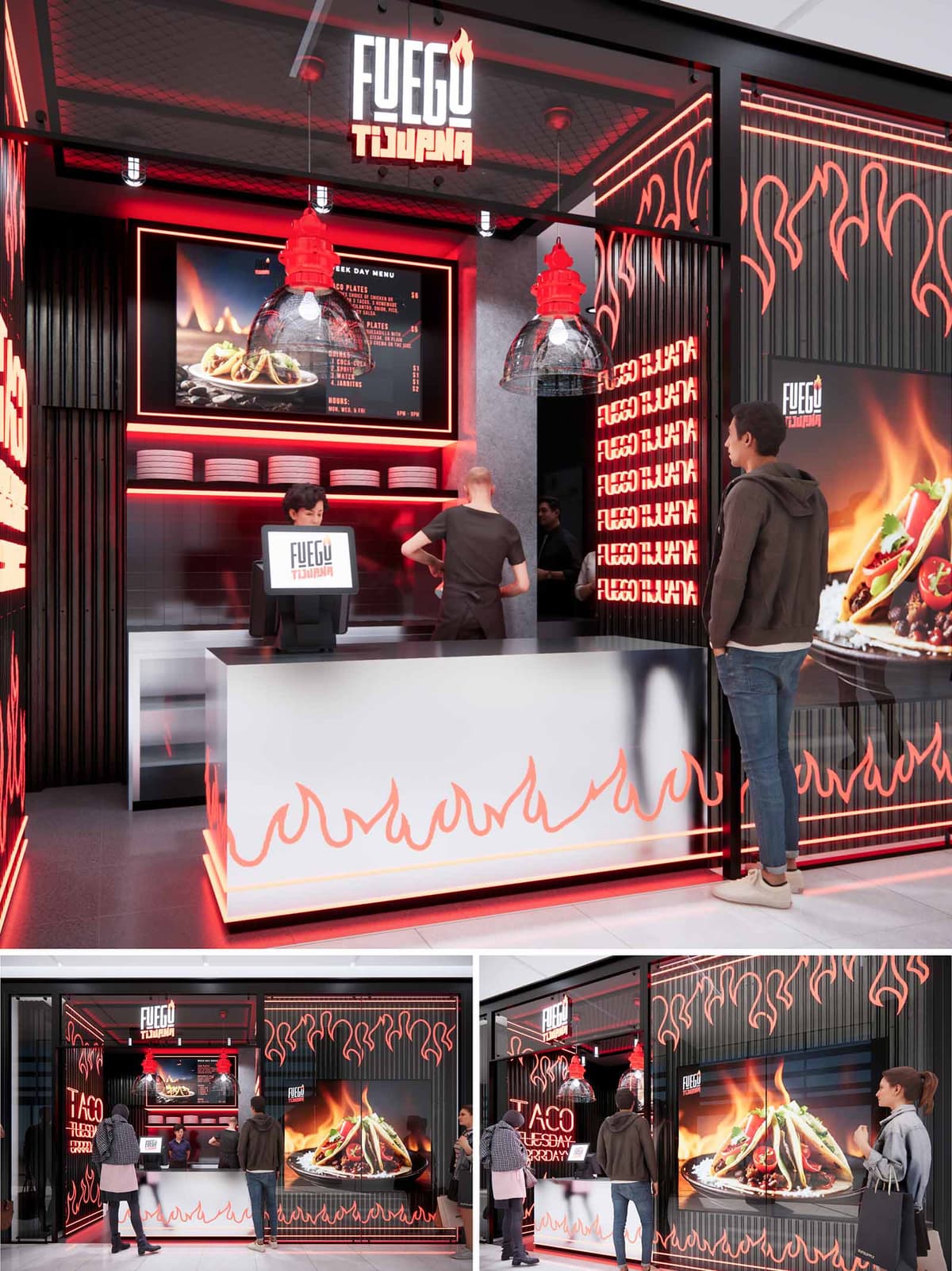

FUEGO is conceived as an urban food counter that translates the intensity of open flame cooking into a compact architectural statement. The design uses light, color, and graphics to evoke heat and movement, projecting the gastronomic experience directly onto the shopping mall corridor. The goal is to create a recognizable visual icon that communicates speed, freshness, and bold flavor within a minimal footprint.
The architectural language is based on clear, rectilinear volumes that act as a neutral framework for a vibrant graphic layer. Dark, almost monolithic surfaces form the backdrop, while luminous red lines and flame silhouettes appear to float over them, generating depth and visual rhythm. This contrast allows the brand to be legible from a distance and positions the kiosk as a dynamic focal point within the commercial environment.
The plan is organized around a frontal service counter that occupies the full width of the local, ensuring maximum exposure and intuitive access. Customers approach a single, linear counter where ordering, payment, and pick-up are aligned to reduce cross-traffic and waiting time. The generous counter depth provides sufficient staging space for packaging and plating, maintaining a clear and tidy visual field towards the corridor.
The kitchen and preparation zone are placed directly behind the counter, partially visible through the service opening. This proximity shortens internal circulations, enhances operational efficiency, and reinforces the connection between fire, preparation, and delivery. Vertical storage niches below the menu display enable quick access to plates and utensils while integrating seamlessly into the graphic composition of the back wall.
The material palette is deliberately concise: black ribbed cladding, satin metallic finishes, and high-resistance solid surfaces form the base layer. These materials offer durability and ease of cleaning, critical for a high-turnover restaurant environment, while providing a sophisticated neutral background for the brand’s chromatic accents. The black vertical slats add texture and a sense of height, visually stretching the compact space.
The counter front is defined by a smooth, light-toned surface that reflects the red LED illumination, creating a subtle gradient effect. Over this plane, stylized flame graphics are applied as a continuous frieze, unifying the lower band of the façade and reinforcing brand recognition. Large-format digital screens act as both menu and façade cladding, merging communication and architecture in a single luminous element.
Lighting is the primary generator of atmosphere. Linear red LEDs run along the perimeter of the opening and the counter base, outlining the geometry and simulating the glow of embers. The ceiling integrates a more neutral, diffused light to ensure accurate color rendering of food while maintaining comfortable brightness for staff and customers.
Suspended dome luminaires with red upper housings introduce a sculptural element above the service area, anchoring the visual axis of the kiosk. The signage, with its flame-shaped accent, is framed by a luminous box that ensures perfect readability under different mall lighting conditions. Repeated logo patterns on side walls and the backlit flame crown create a continuous, immersive brand environment without relying on additional decorative elements.
The proposal incorporates sustainability criteria through the selection of long-life, low-maintenance materials and the intensive use of LED technology. LED strips and backlit panels significantly reduce energy consumption compared to conventional lighting, while offering flexibility to adjust intensity and programming according to operational schedules.
The compact layout minimizes construction materials and optimizes conditioned volume, reducing the energy required for ventilation and refrigeration. Non-porous surfaces and modular cladding systems are specified to extend service life and facilitate replacement of individual components, supporting a circular approach. Digital menu boards replace printed signage, lowering paper use and enabling agile updates that reduce waste associated with rebranding or seasonal changes.
© 2021 by sanzpont [arquitectura] . Webpage by sanzpont [digital] . Innovative Digital Experiences
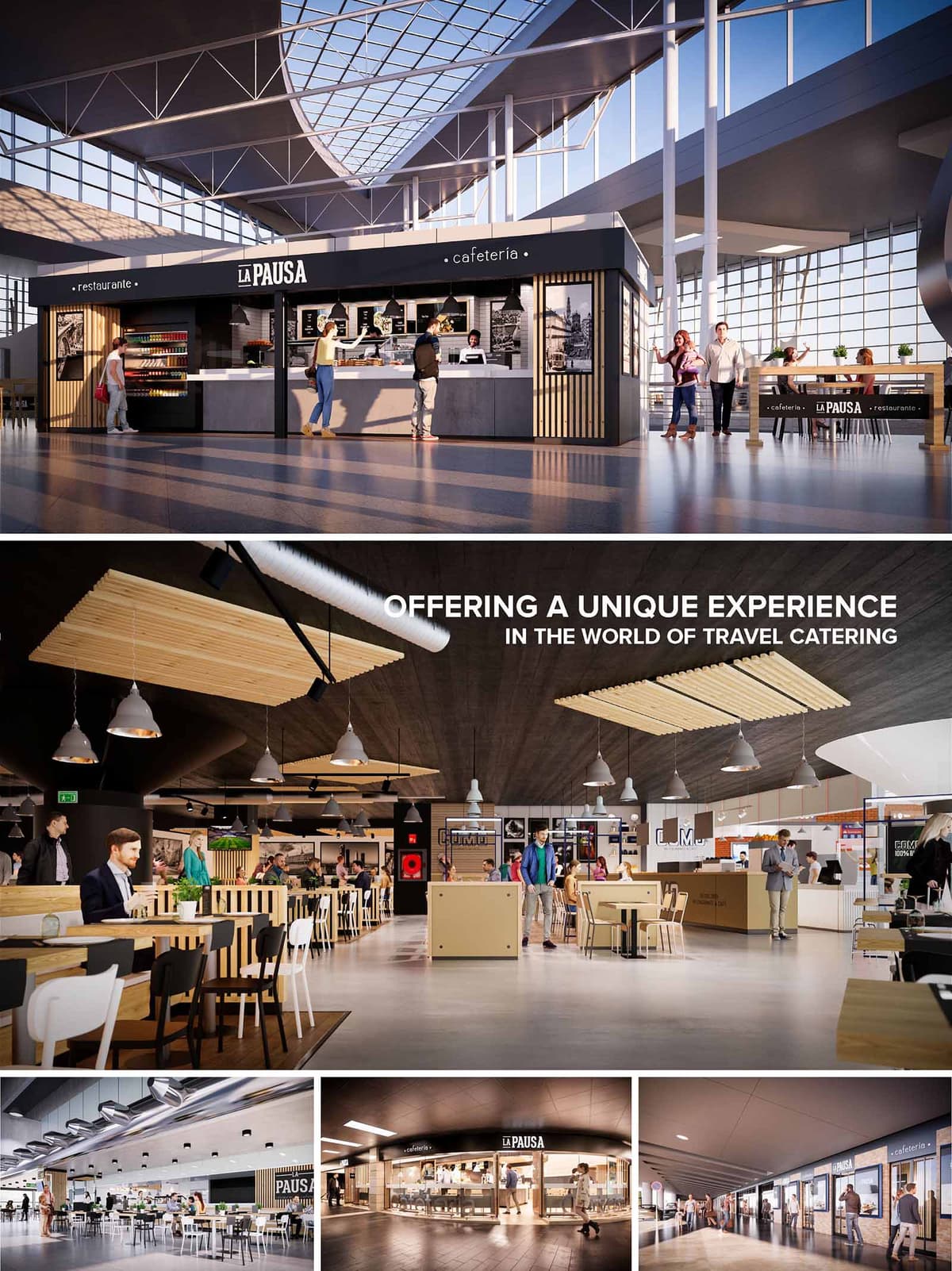

LA PAUSA is conceived as a contemporary travel‑catering brand that transforms waiting time into a calm, pleasurable interlude. Across multiple airports in Spain, Portugal, Chile and Mexico, the concept establishes a clear, easily recognizable identity that can adapt to different terminal geometries while maintaining a coherent architectural language. The design balances speed of service with a more relaxed, lounge‑like ambience, inviting passengers to slow down without losing visual contact with the flows of the terminal.
The architecture is based on simple, rectilinear volumes inserted as light “pavilions” within the large infrastructural shells of airports. These recognizable boxes frame the gastronomic offer and organize circulation: fast, linear fronts for grab‑and‑go functions and more porous edges where dining zones dissolve gradually into the public concourse.
The typical layout is structured around a frontal service counter aligned with the main passenger flow, optimizing visibility and impulse access. Behind this counter, a compact production core integrates bar, kitchen and storage, allowing efficient operations with reduced back‑of‑house area. To each side, filtered entrances lead towards the seating areas, which extend either as open islands in the terminal or as semi‑enclosed dining rooms defined by low partitions.
Seating typologies are diversified to respond to different travel profiles: high stools for quick stops, standard tables for families and small groups, and communal tables that maximize density during peak hours. Circulation paths remain generous and orthogonal, ensuring clear sightlines to departure gates and flight information while avoiding bottlenecks at the counter. This rational zoning supports modular replication across the 16 locations, allowing each unit to be scaled while preserving operational logic.
The material palette combines warm natural finishes with precise, graphic elements that reinforce brand legibility. Light woods in slats and panels provide a domestic warmth that softens the often‑technical character of airport halls. These are contrasted with dark framing in metal and lacquered surfaces, which clearly delineate the brand envelope and highlight openings, counters and signage bands.
The color strategy is deliberately restrained: neutral greys on floors and counters, black for structural and graphic elements, and the natural tone of timber as the main chromatic accent. This controlled palette makes the illuminated menu boards and refrigerated displays stand out as focal points while maintaining a calm visual background in environments typically saturated with commercial stimuli.
Lighting design plays a key role in generating a distinct micro‑atmosphere within the open airport context. In units exposed to abundant natural light, the structures are conceived as lightly shaded kiosks, using overhanging fascias and vertical slats to reduce glare on the counter. In more enclosed terminals, suspended luminaires and integrated linear lighting define a warm, intimate ceiling plane that visually lowers the large heights and anchors the dining area.
Clusters of pendant lamps emphasize the different seating zones and create gradients of brightness, from the more intense illumination at the service front to softer, more comfortable levels in the seating. The combination of decorative fittings with efficient LED lines ensures both visual comfort and energy performance, while the glow of the counter front becomes an orientating beacon within the concourse.
The architectural envelope works closely with graphic design to articulate a strong, consistent identity. Continuous black sign bands with the LA PAUSA logotype form a clear horizontal datum line, visible from long distances within the terminal. Below this band, changeable menu displays and back‑lit merchandising niches allow local adaptation of offers without altering the core image.
Large‑scale photographic panels and subtle wayfinding graphics are embedded into wall claddings and partitions, adding depth and narrative while avoiding visual clutter. The repetition of key elements—slatted timber, dark frames, and the characteristic counter configuration—creates an immediate association with the brand across different countries and cultural contexts.
The project prioritizes a dry, modular construction system to ensure rapid installation within operational airports and to minimize waste. Prefabricated metal frames, standardized counter modules and repeatable timber slat panels can be assembled and disassembled with minimal intervention in the existing terminal structures, facilitating future relocations or reconfigurations.
Material selection favors durable, low‑maintenance surfaces to extend life cycles and reduce replacement needs: high‑pressure laminates, compact surfaces for worktops, and sealed woods from certified sources. Efficient LED lighting, demand‑controlled ventilation in kitchen areas and optimized refrigeration equipment contribute to reducing energy consumption. The open layout, with visual permeability and shared lighting with the terminal, avoids unnecessary enclosure and allows the restaurants to benefit from existing environmental systems, aligning the concept with contemporary sustainability criteria for high‑traffic infrastructures.
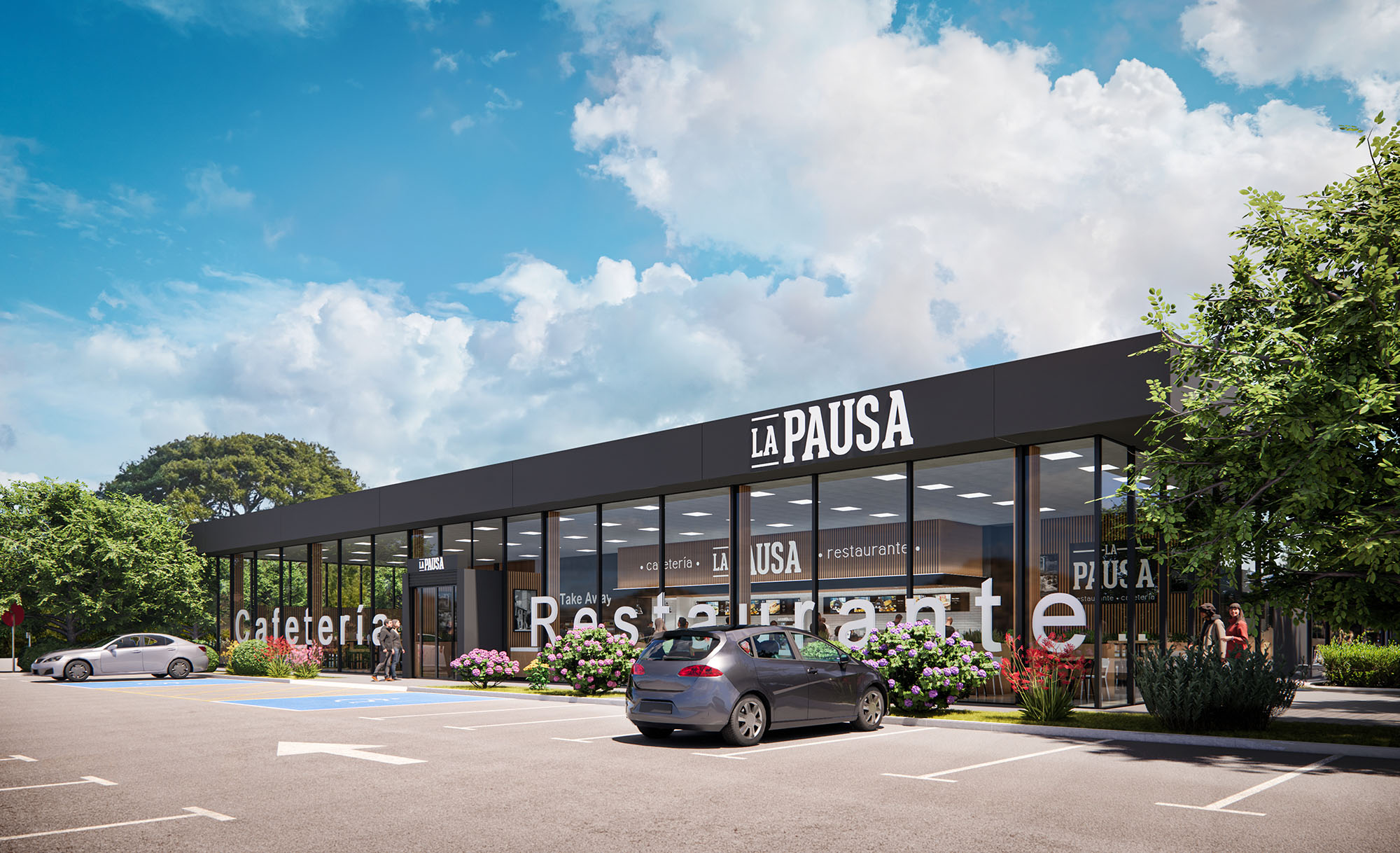
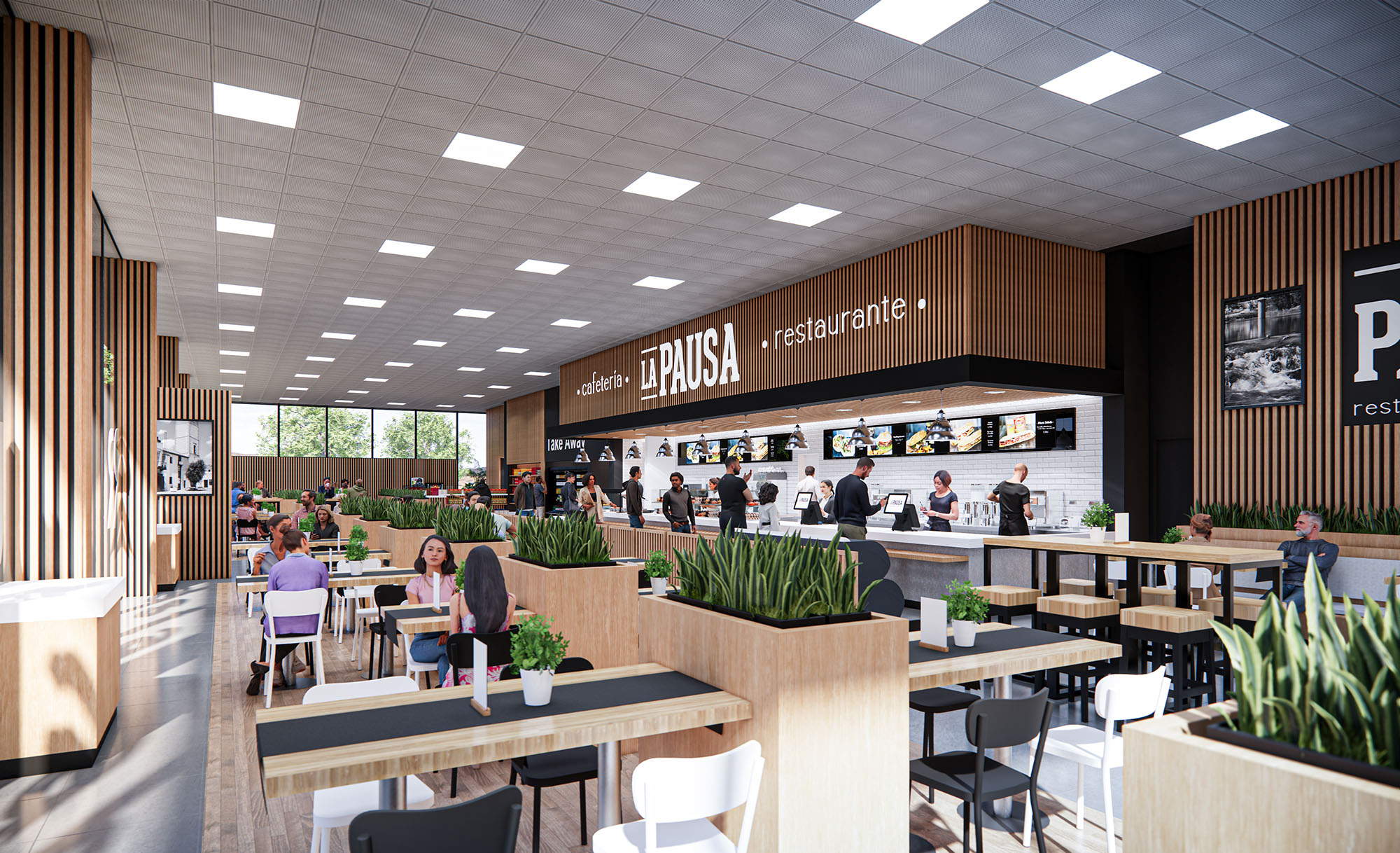
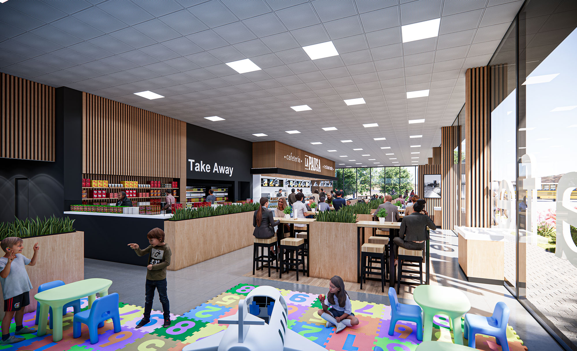
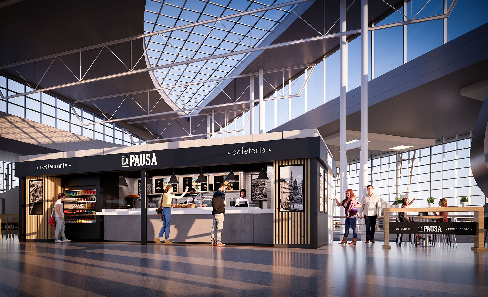
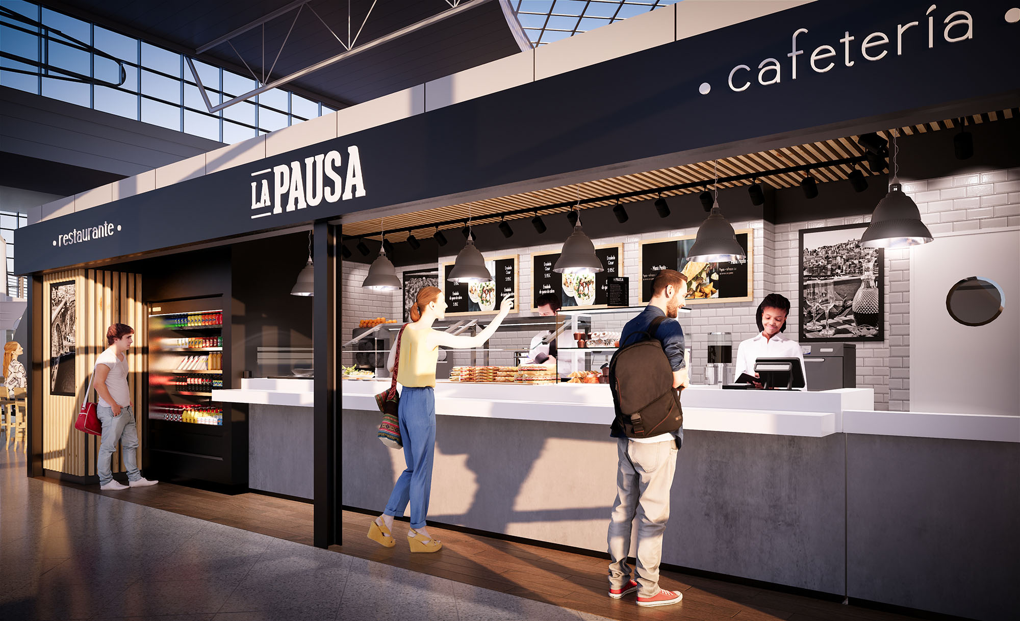
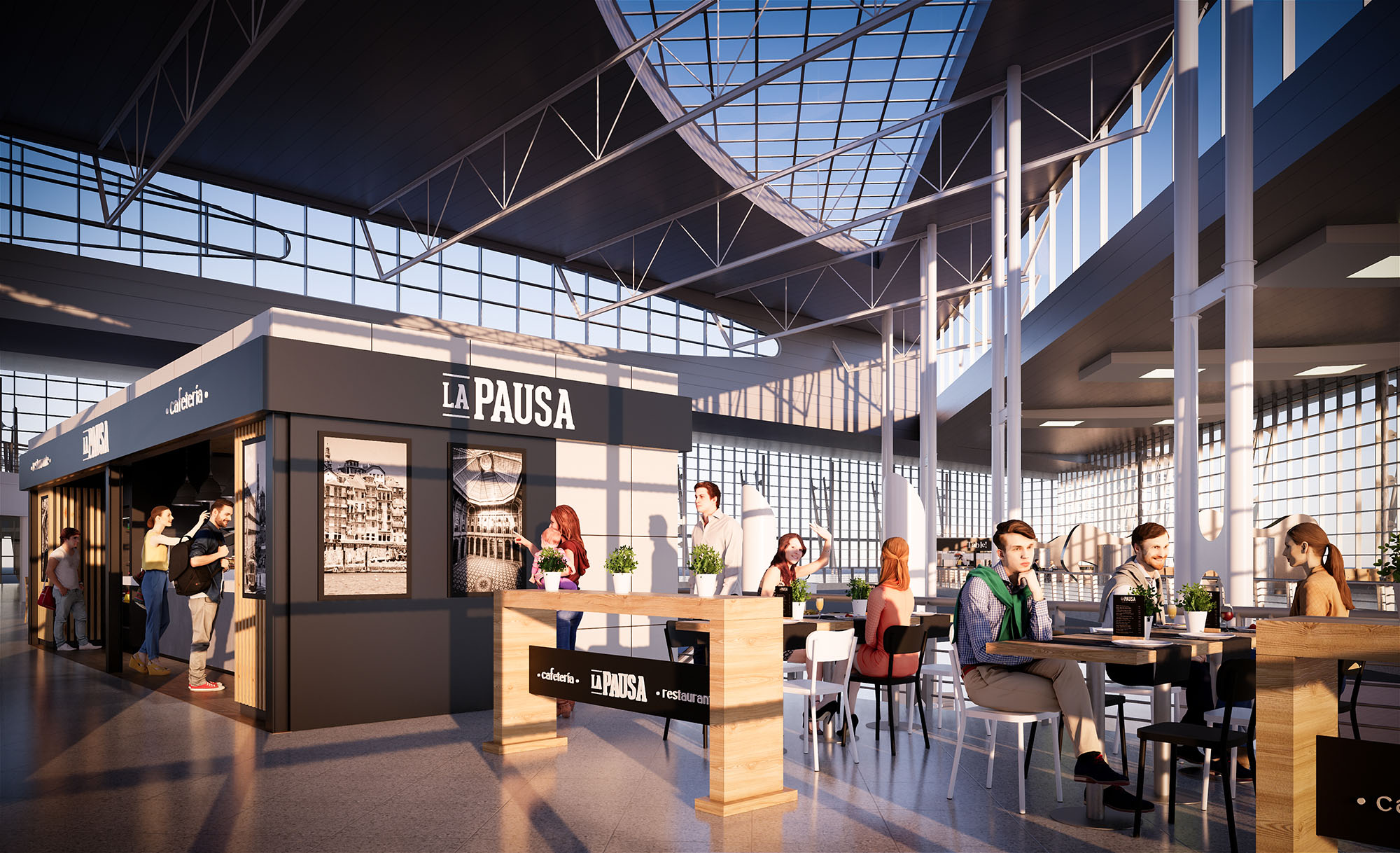
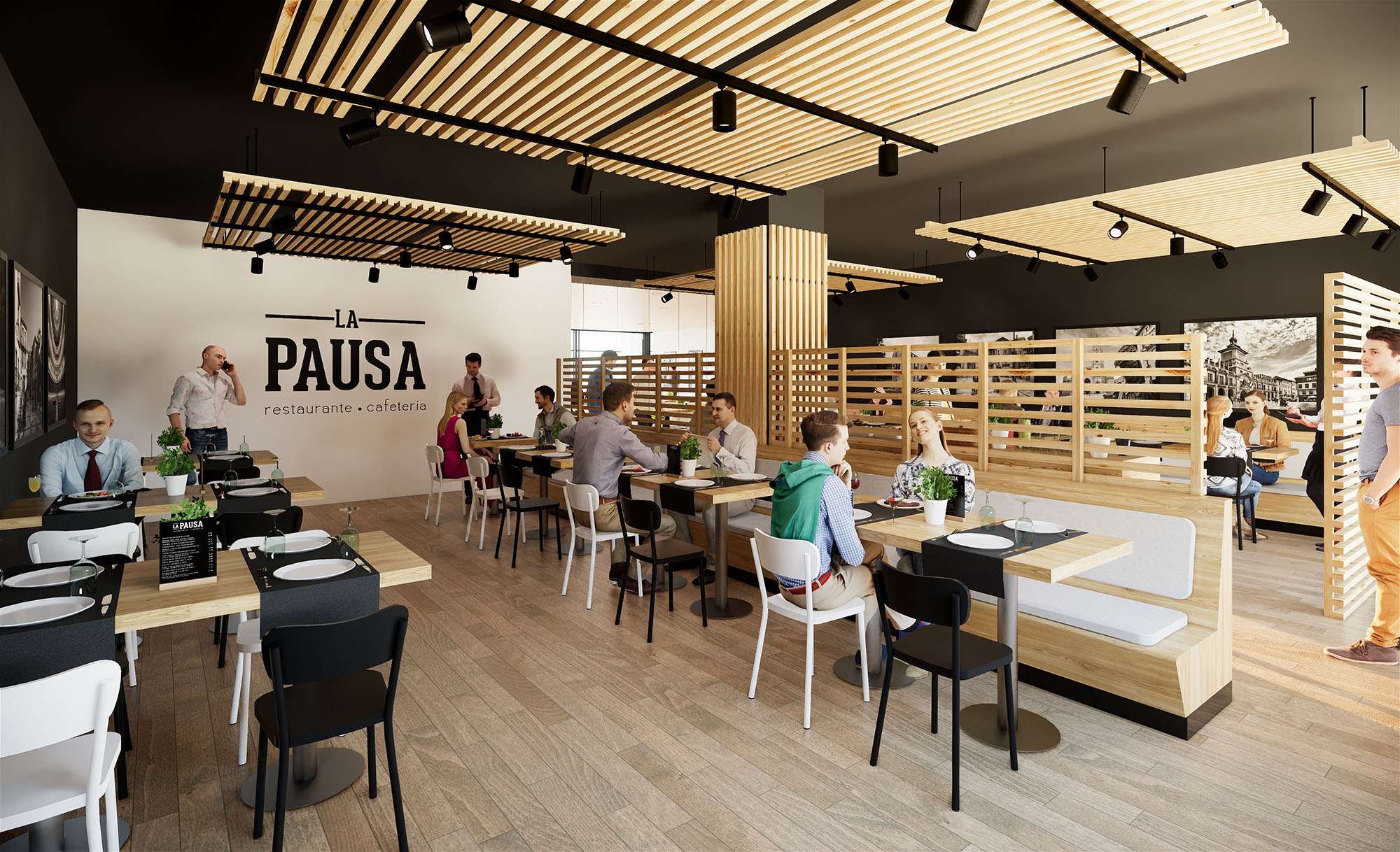
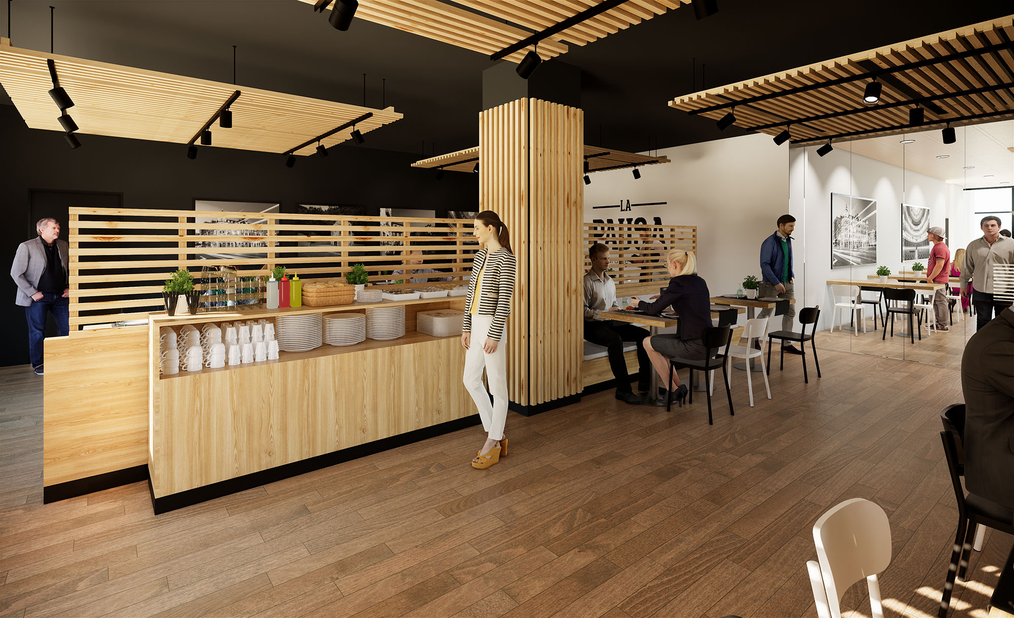
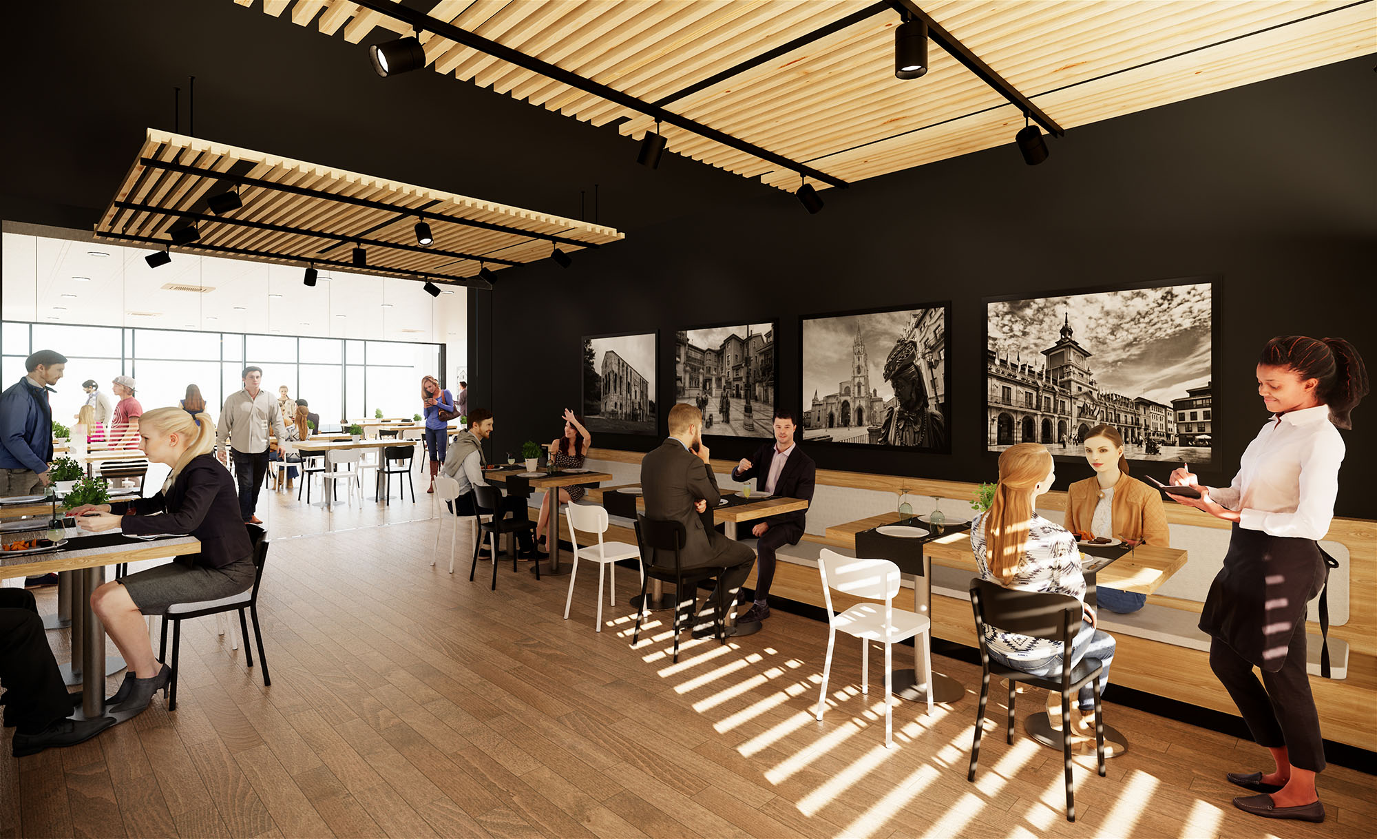
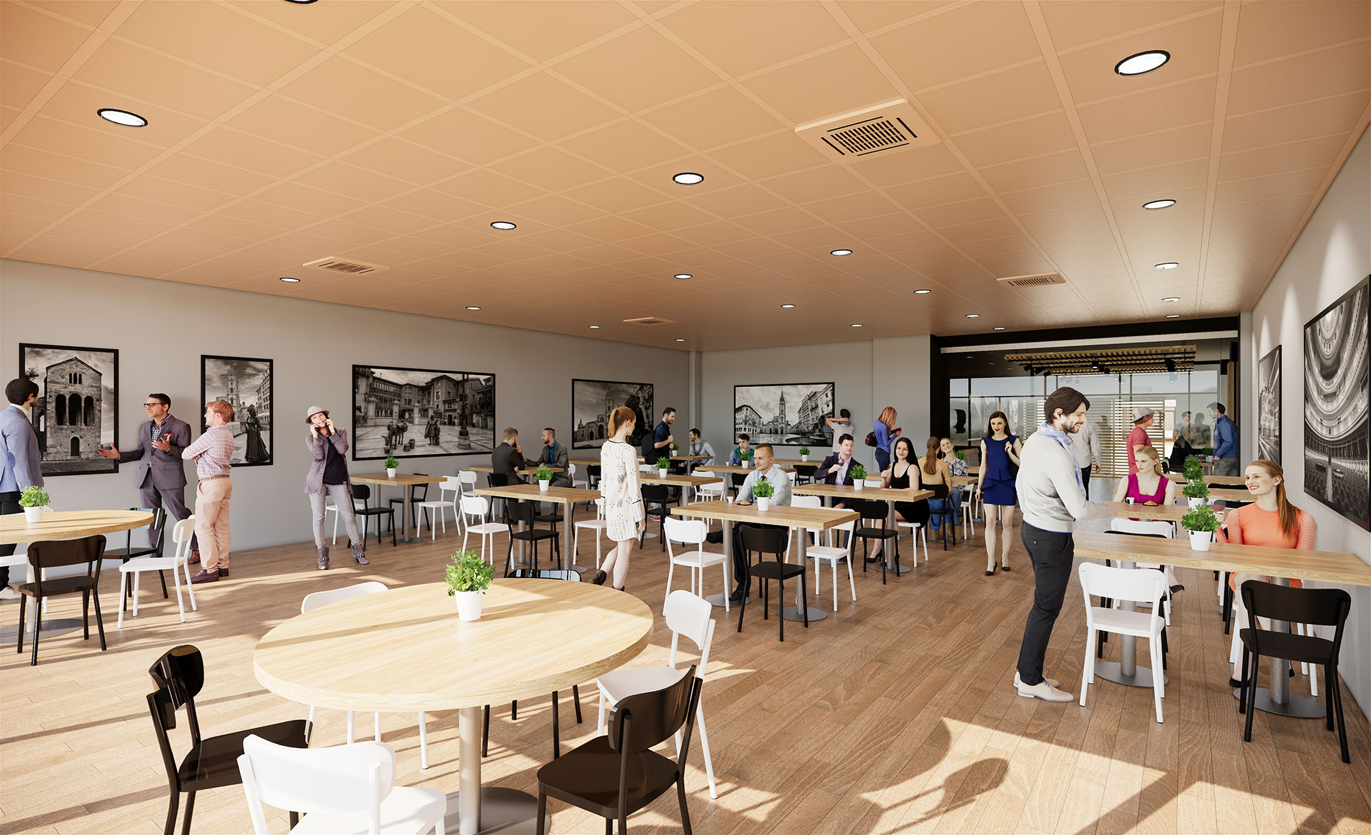
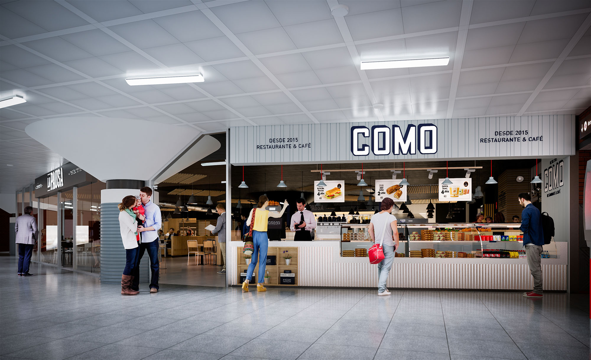
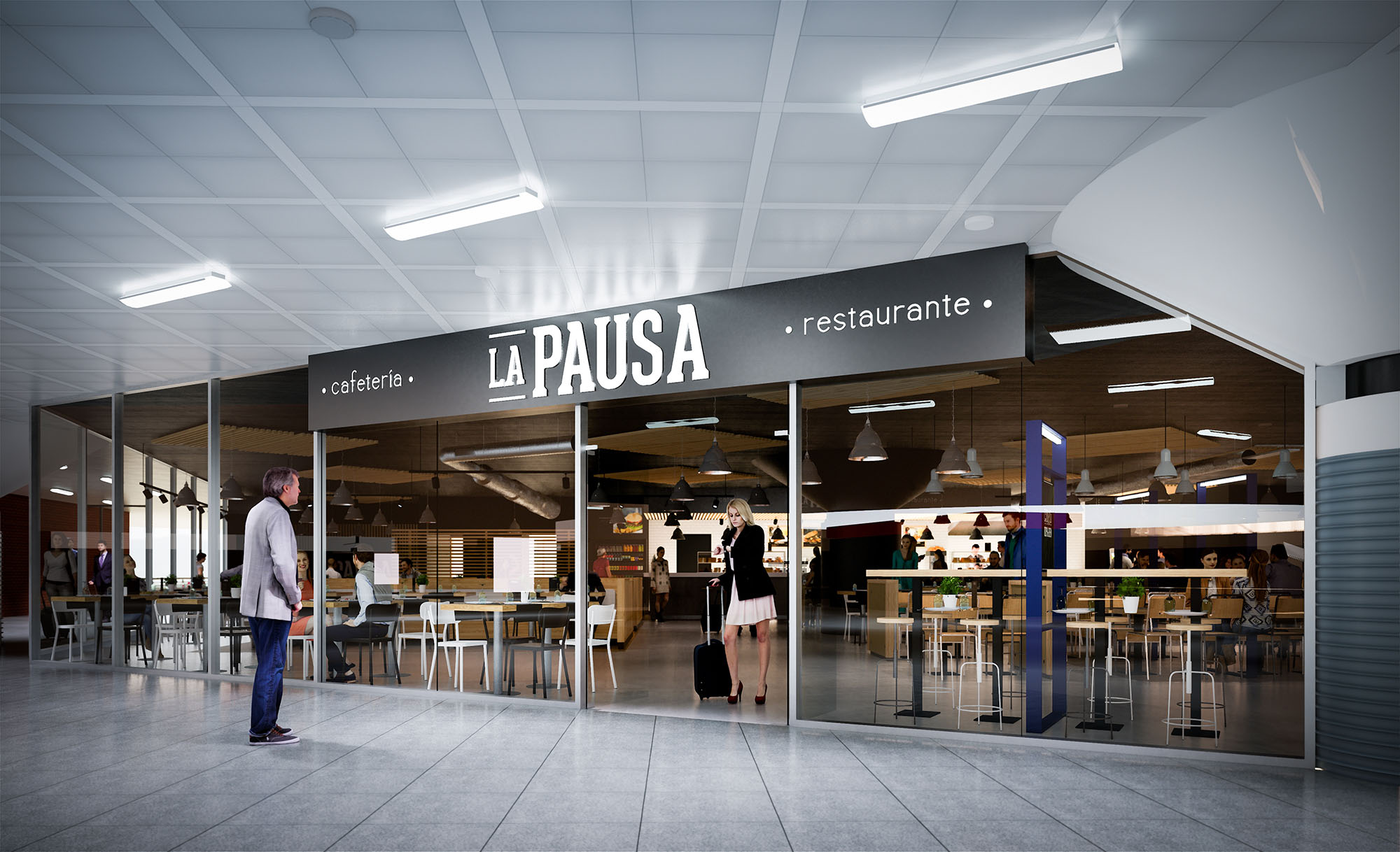
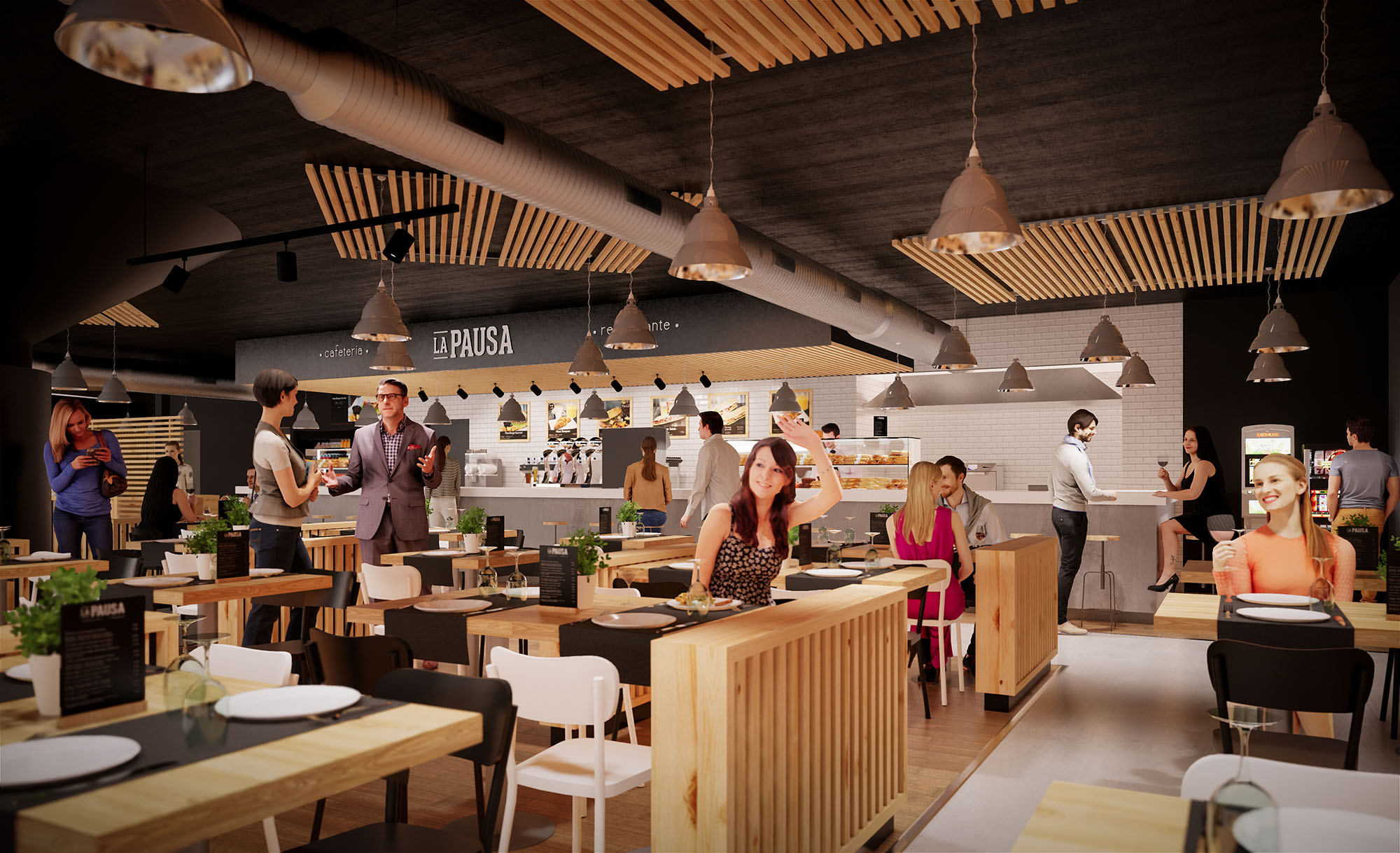
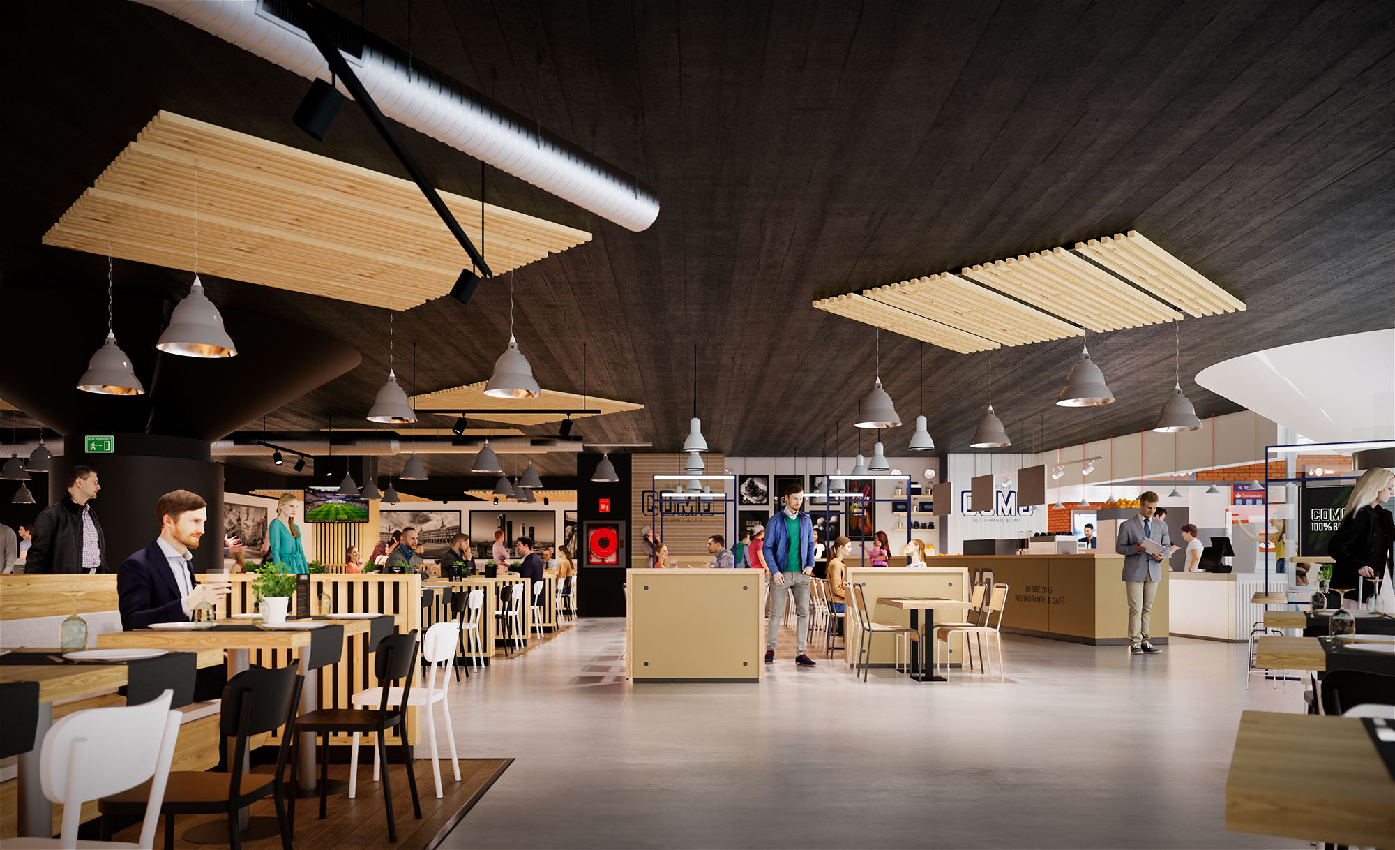
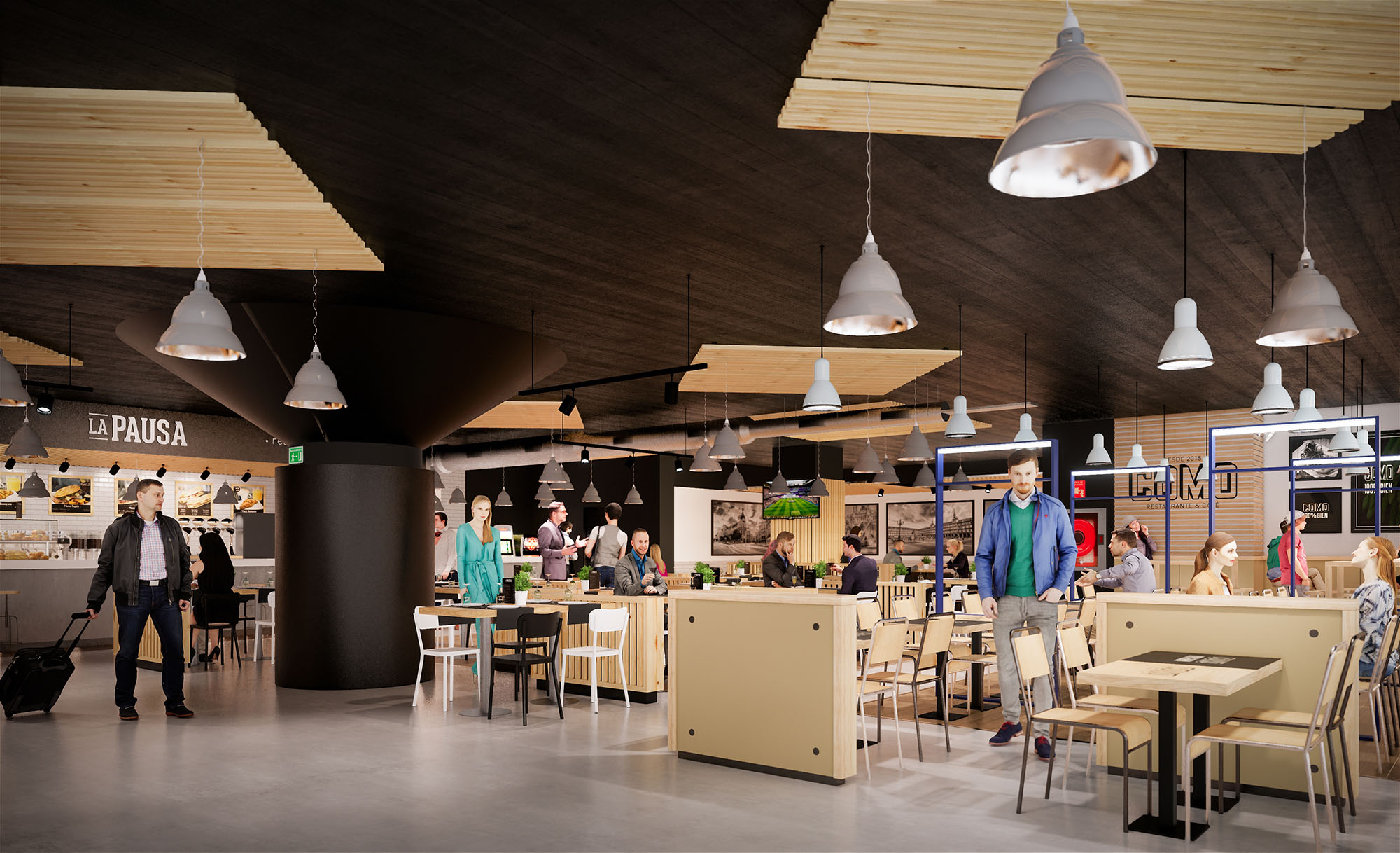
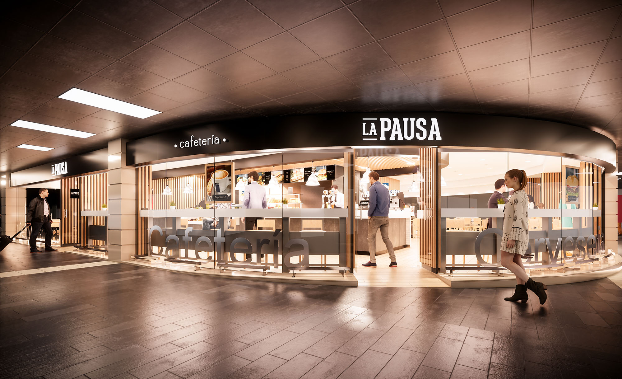
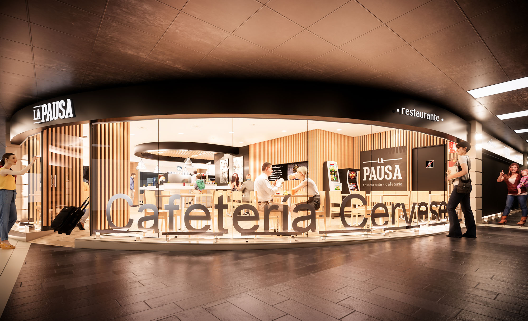
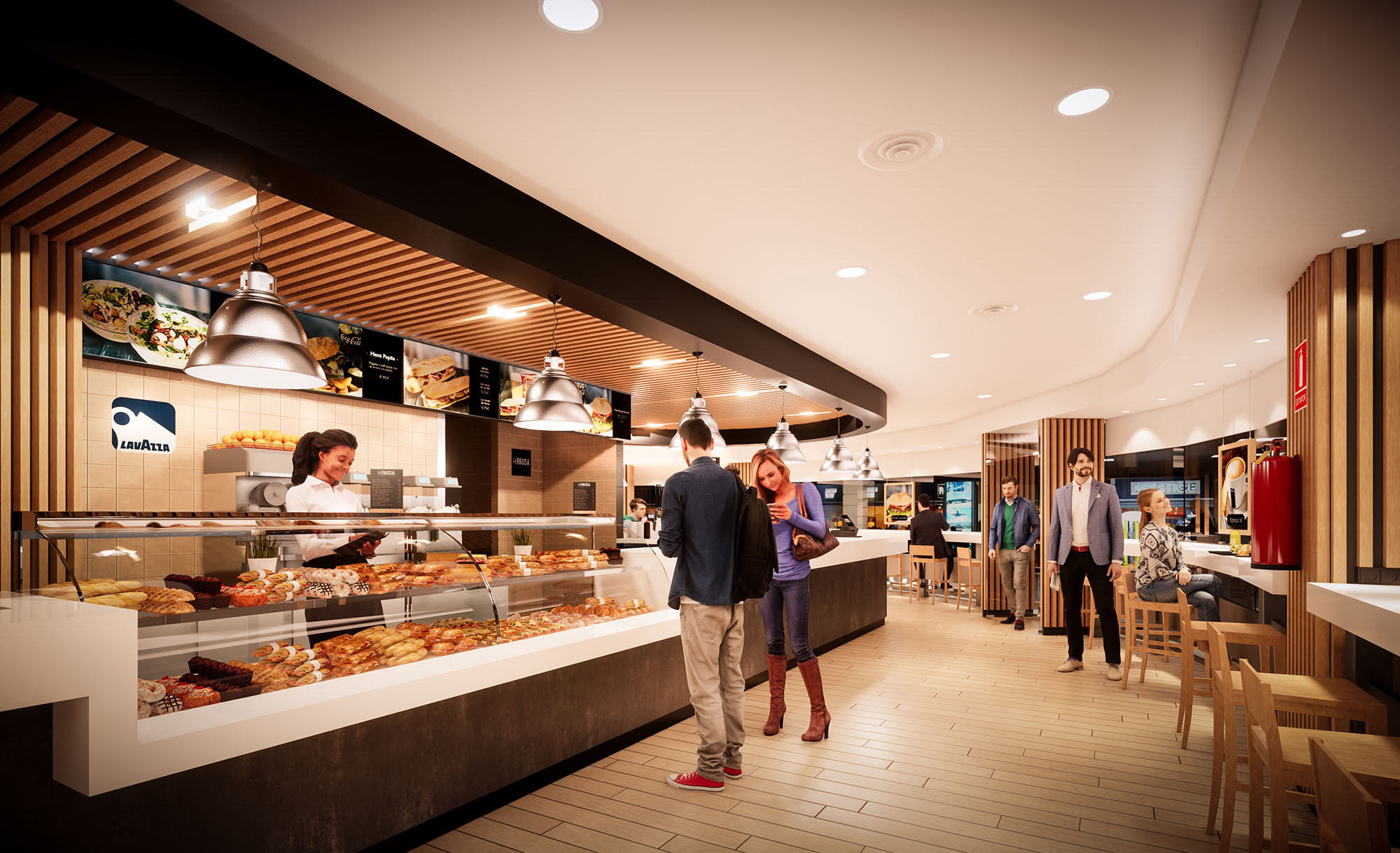
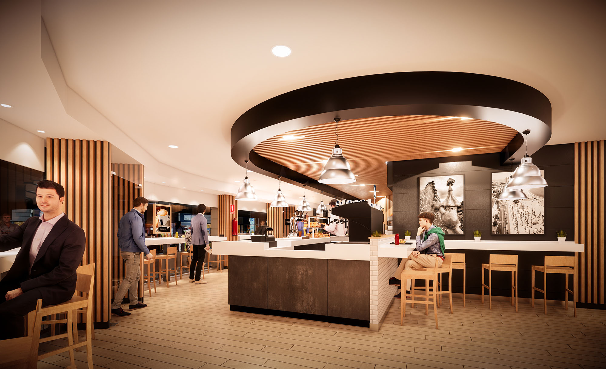
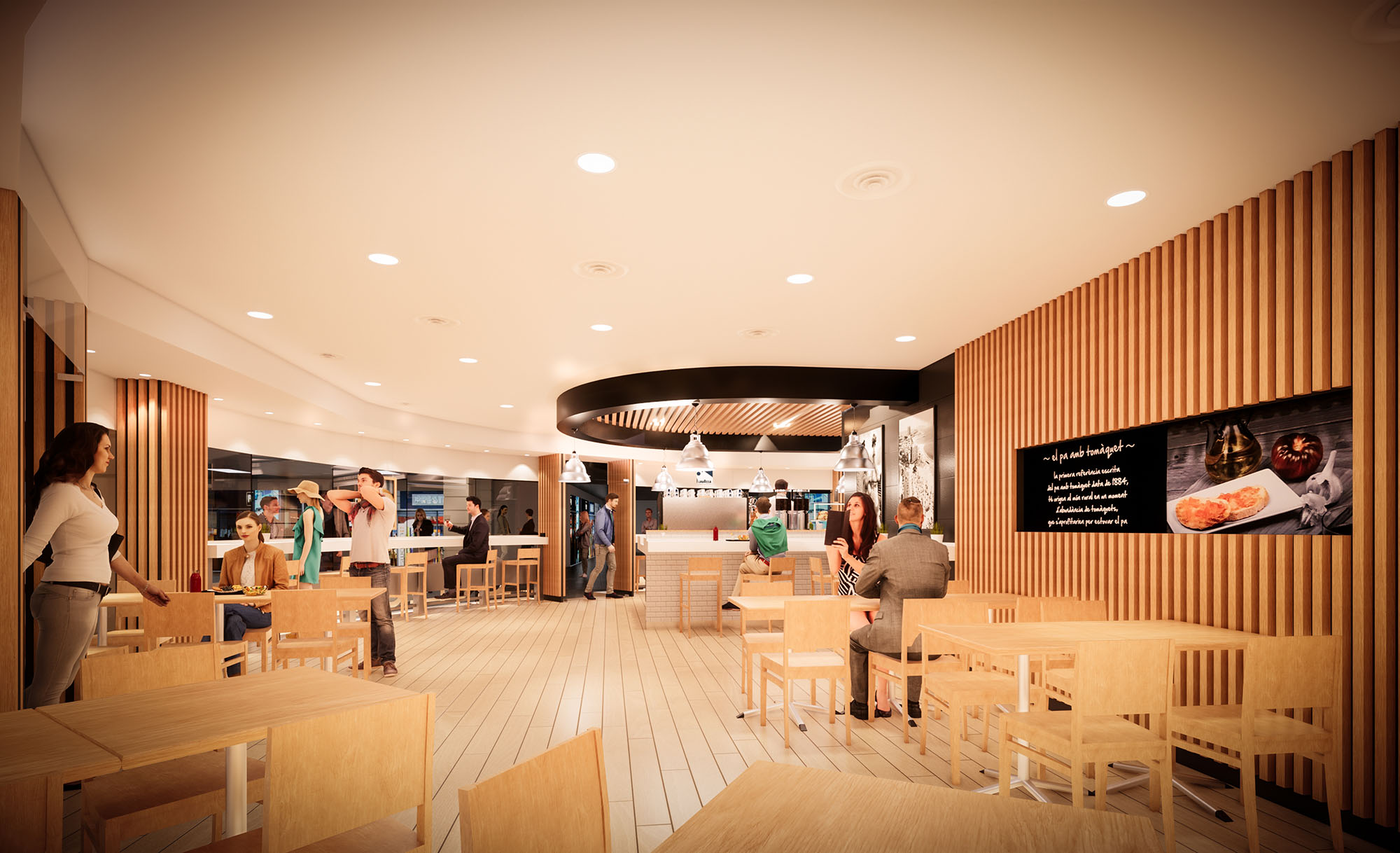
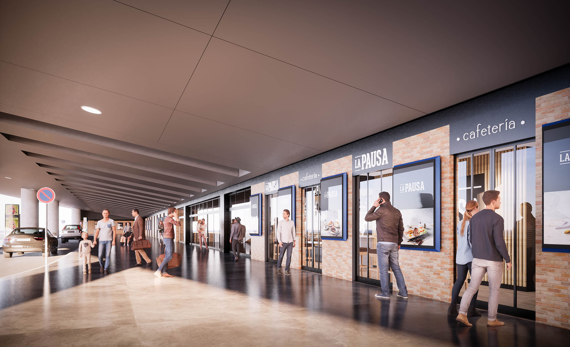
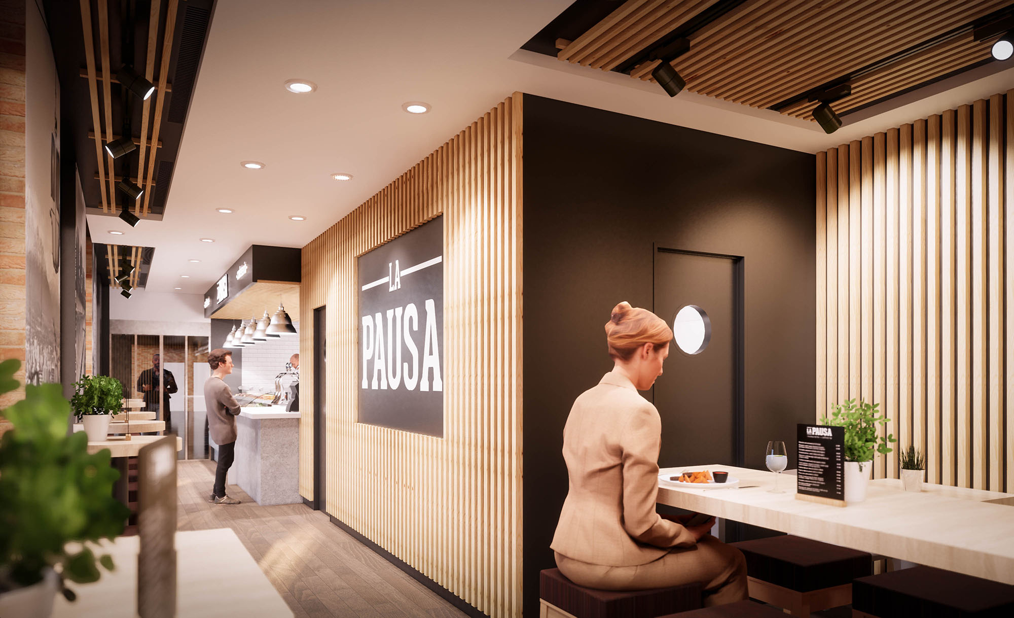
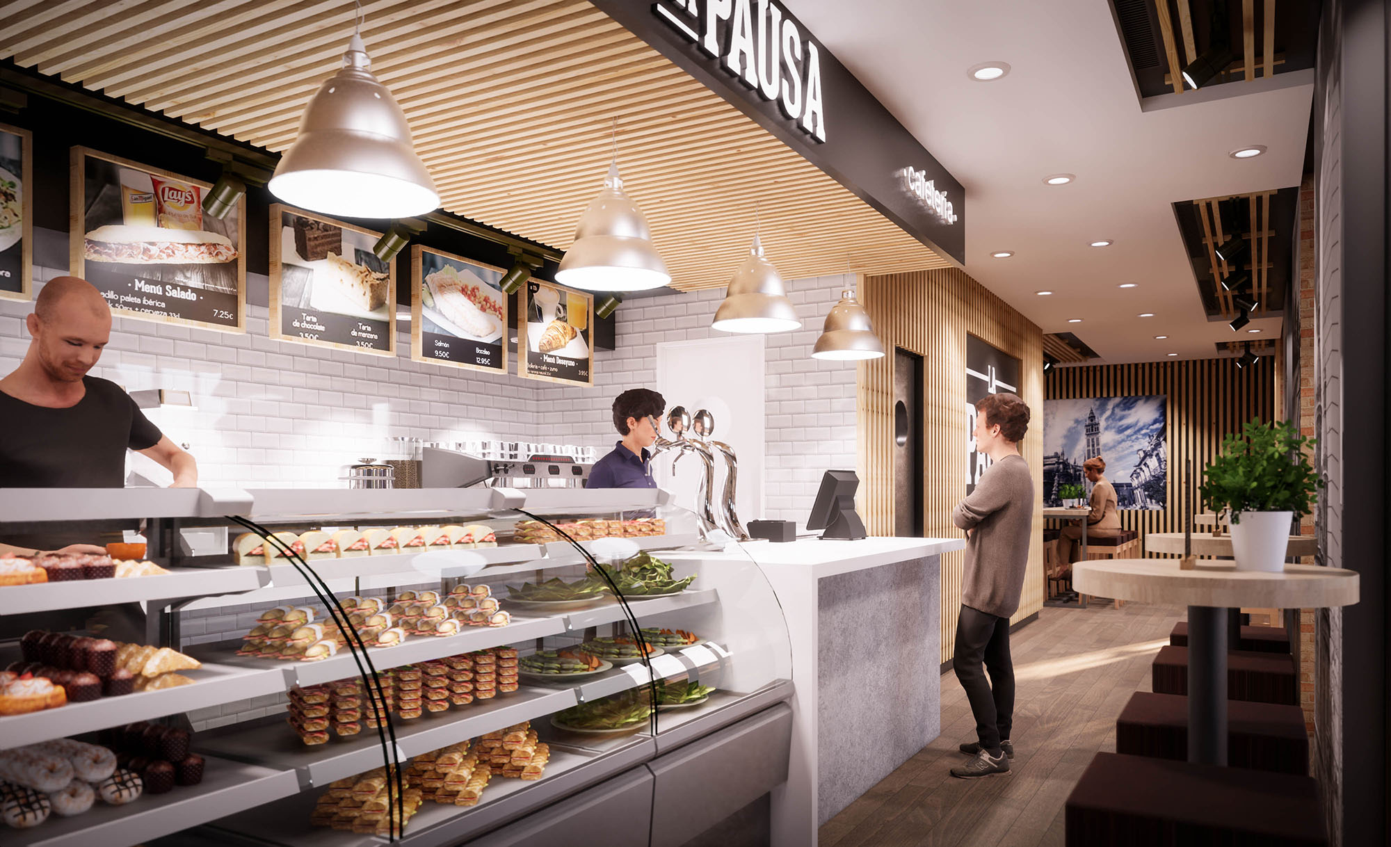
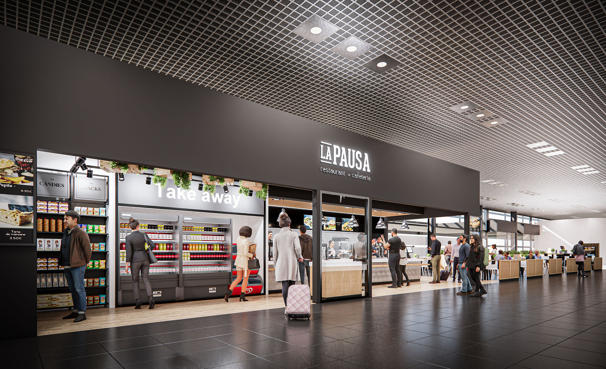
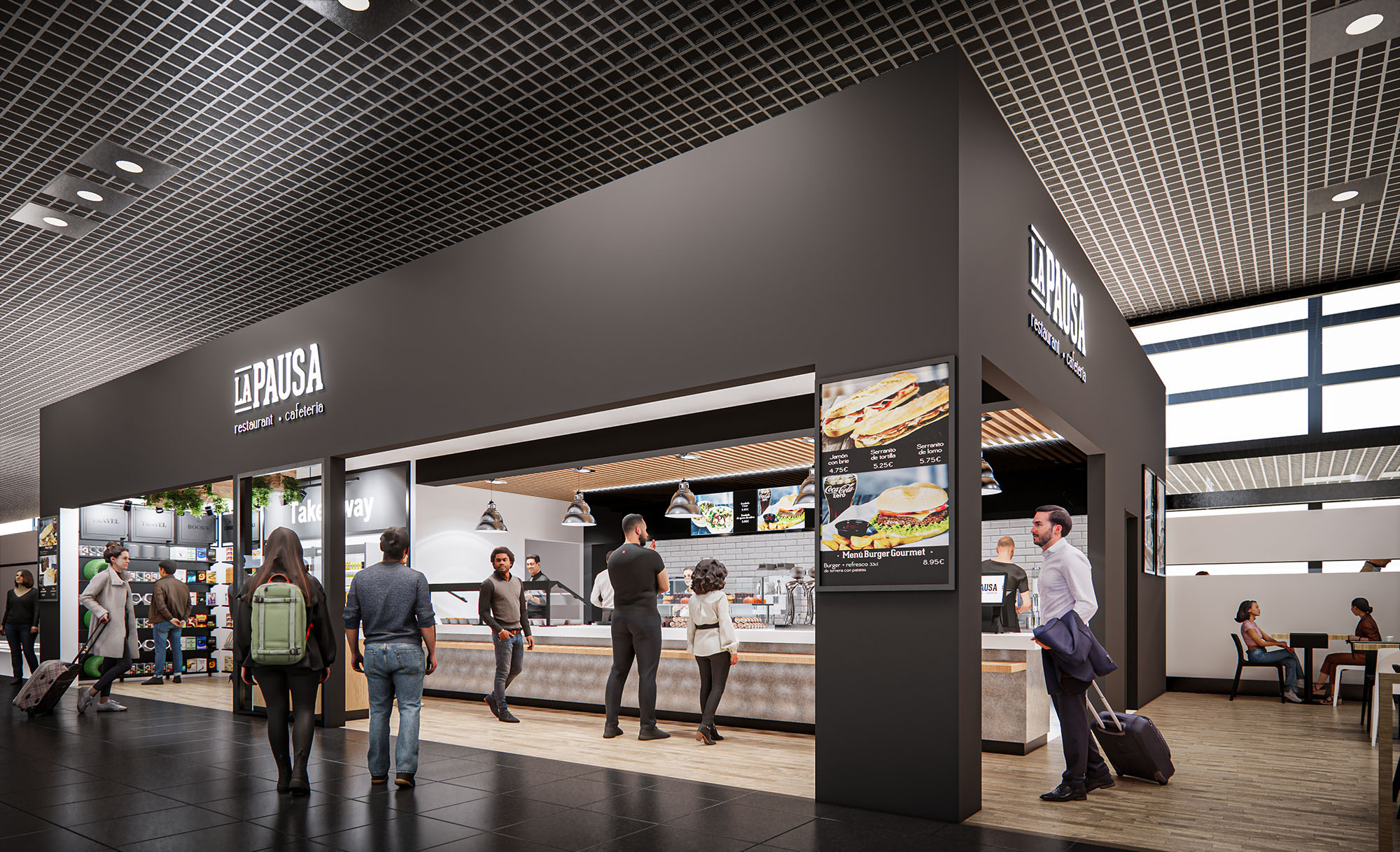
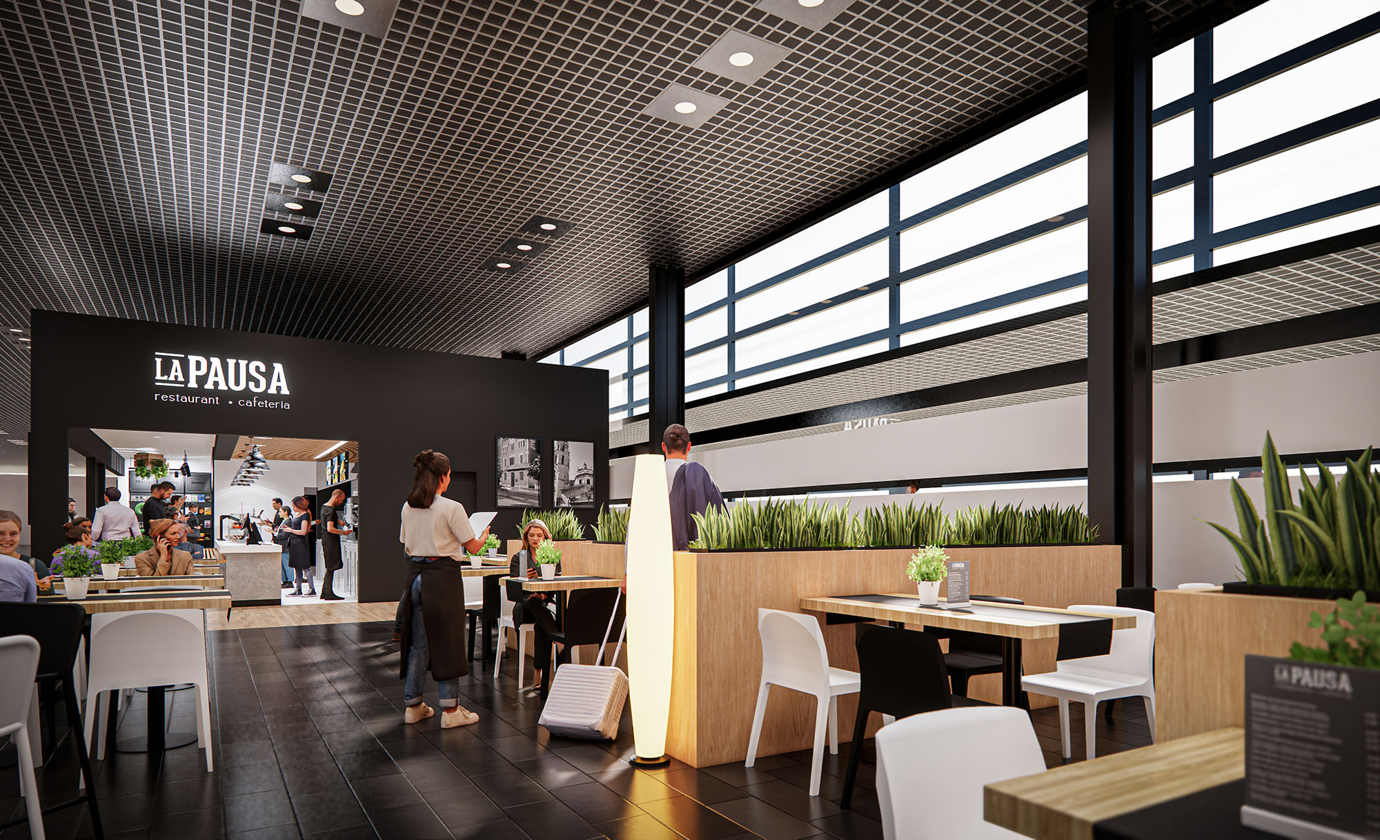
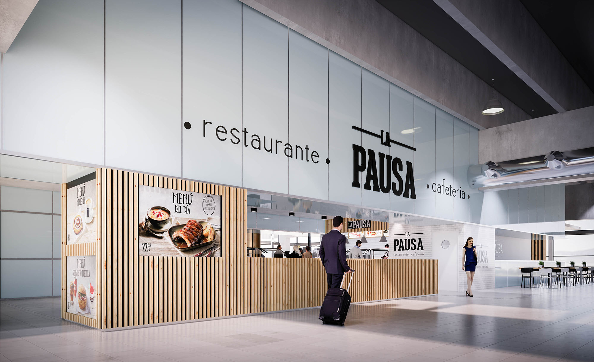
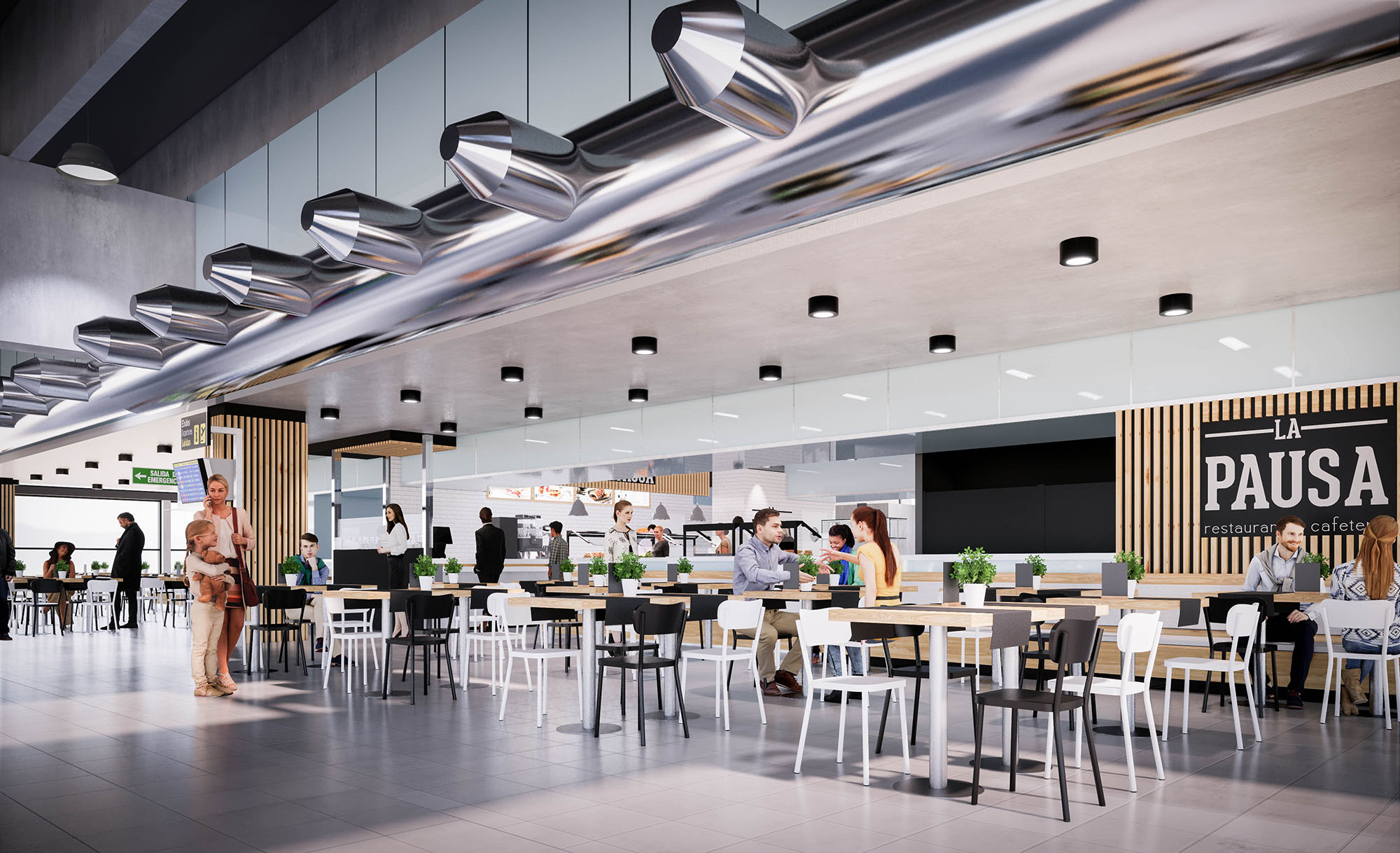
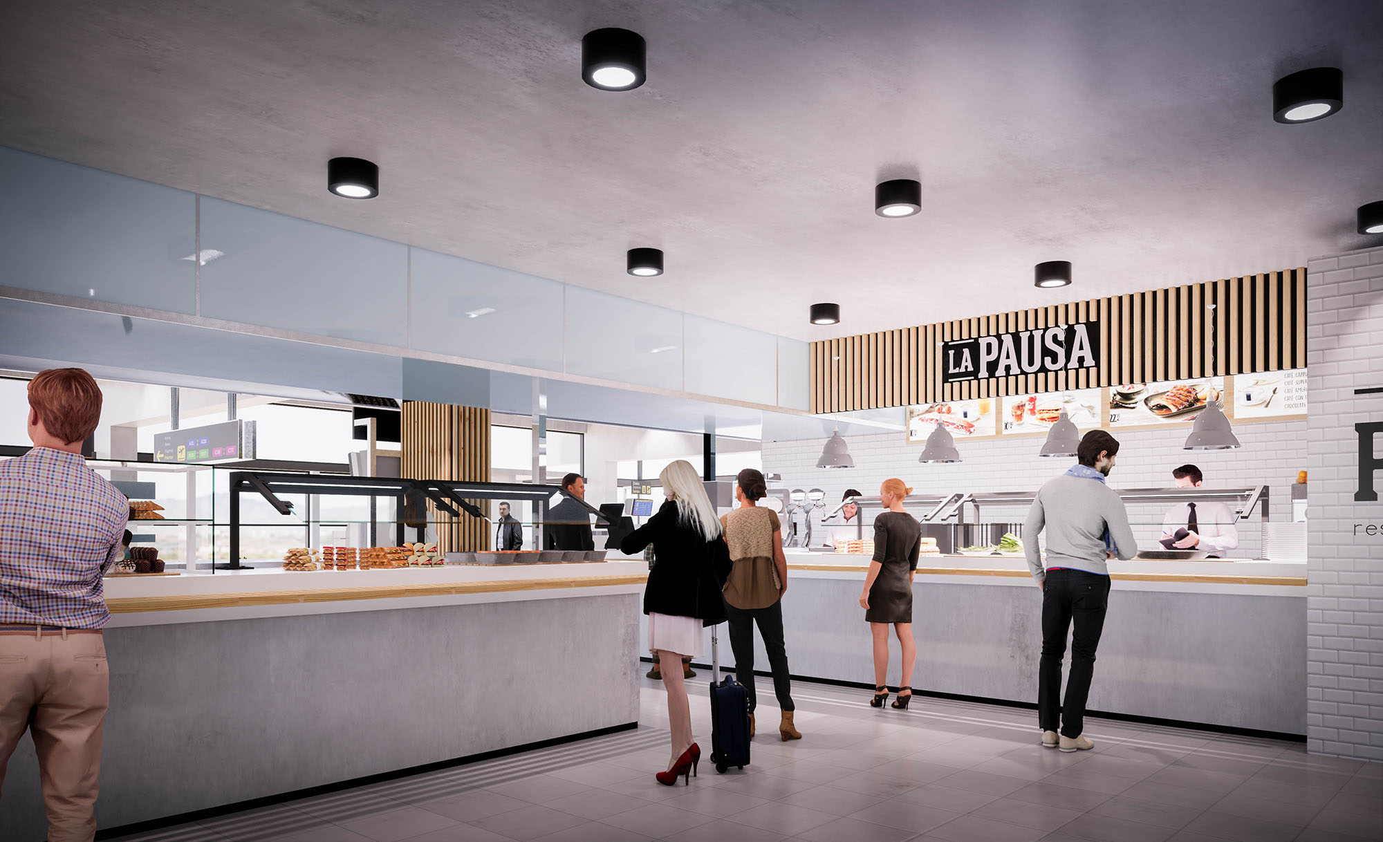
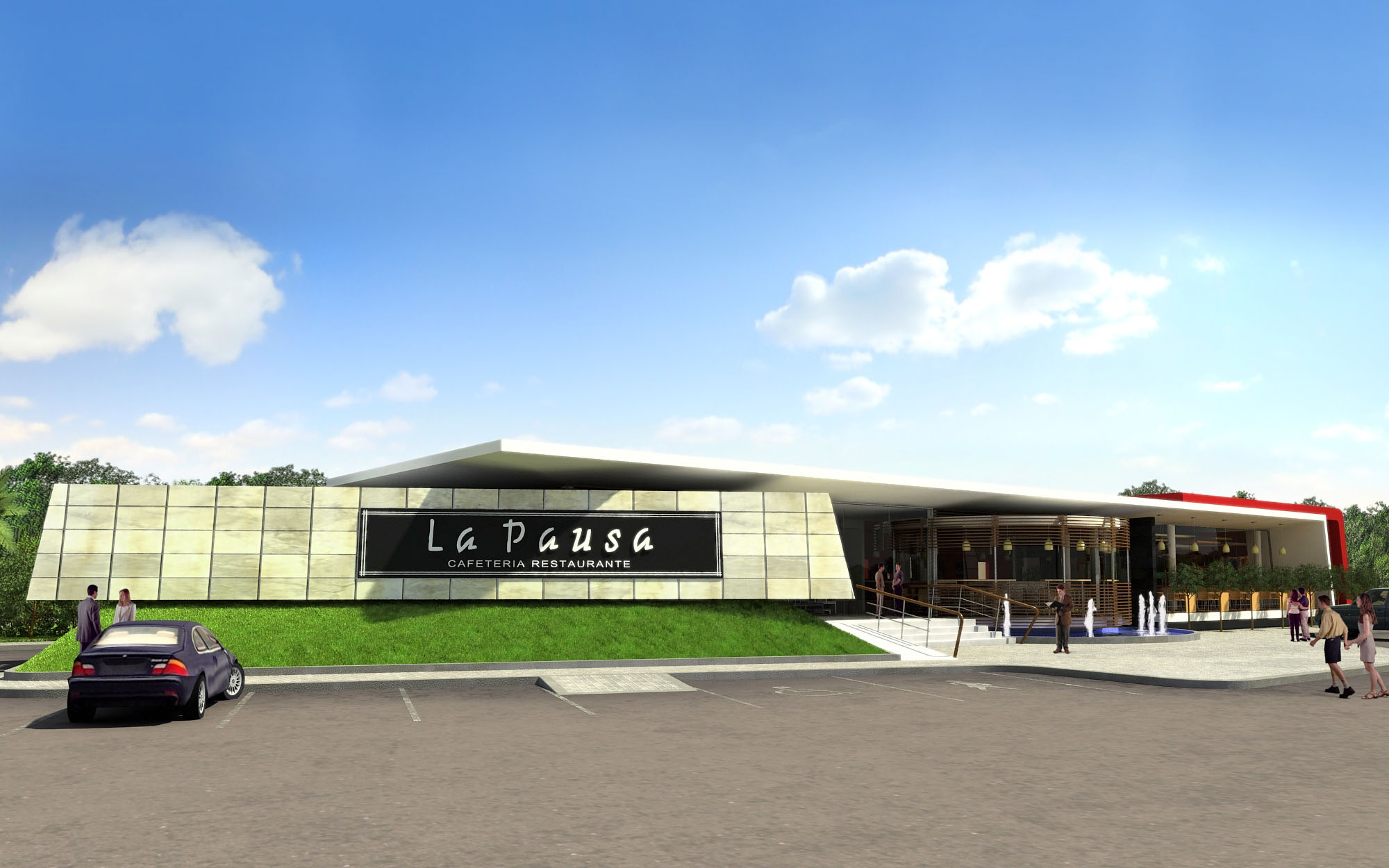
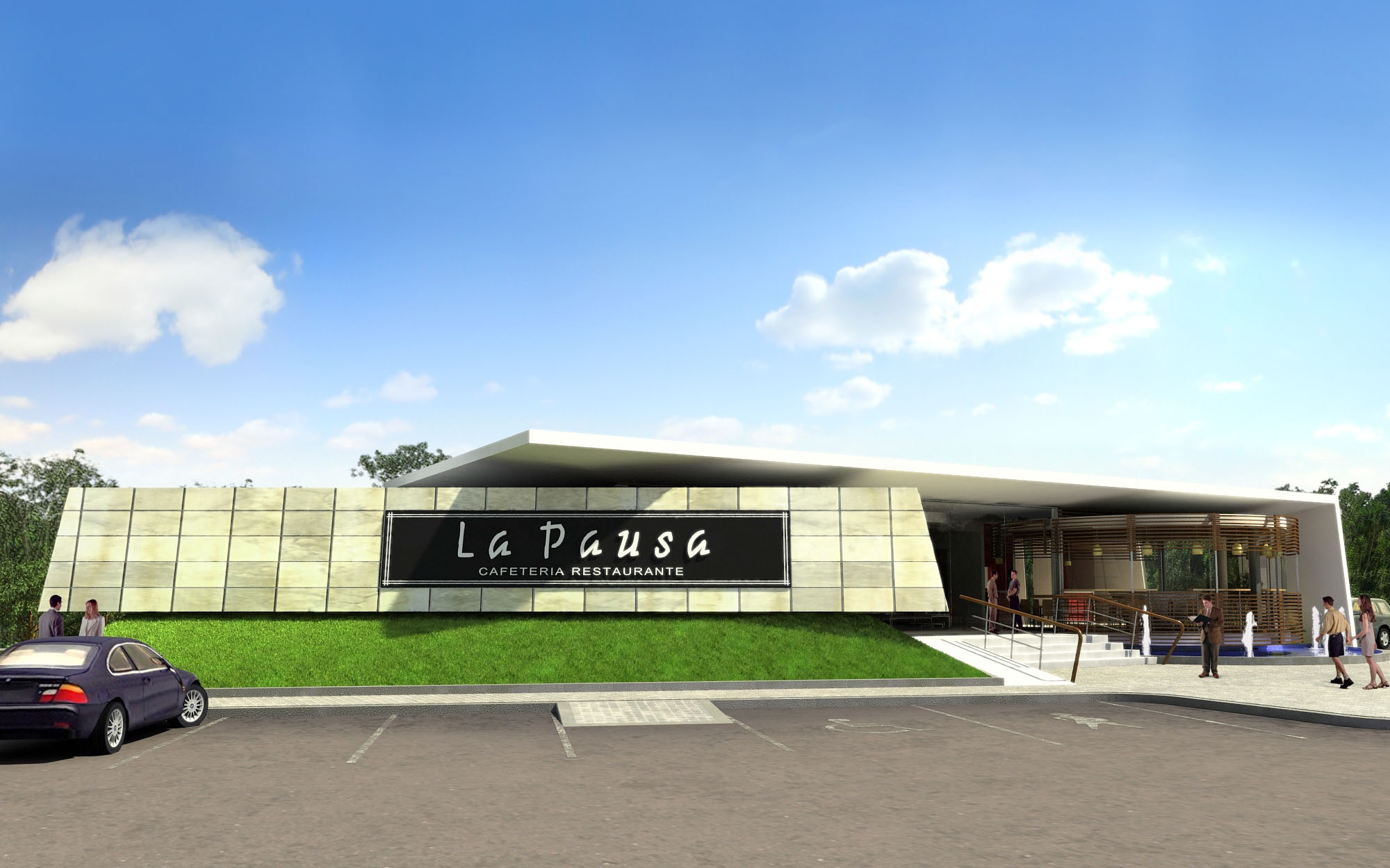
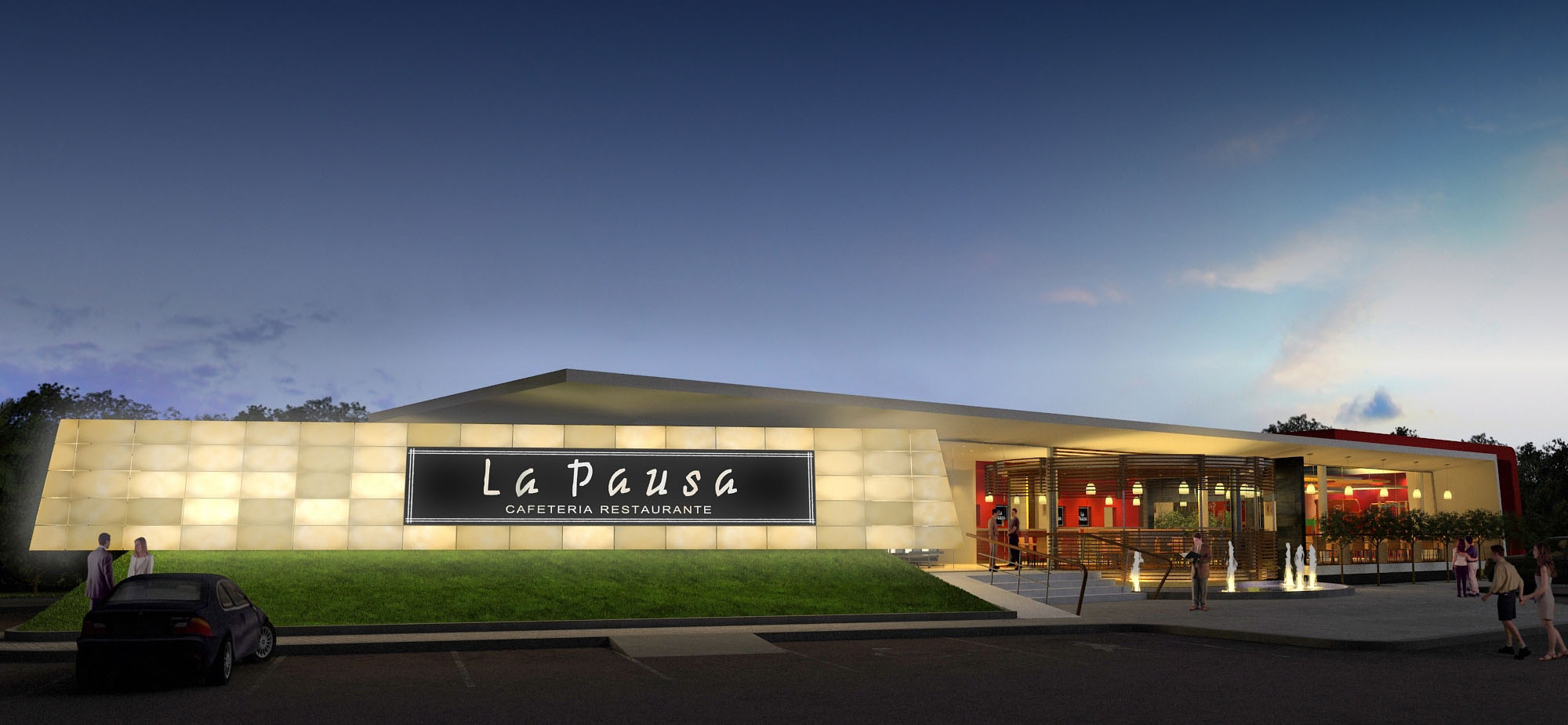
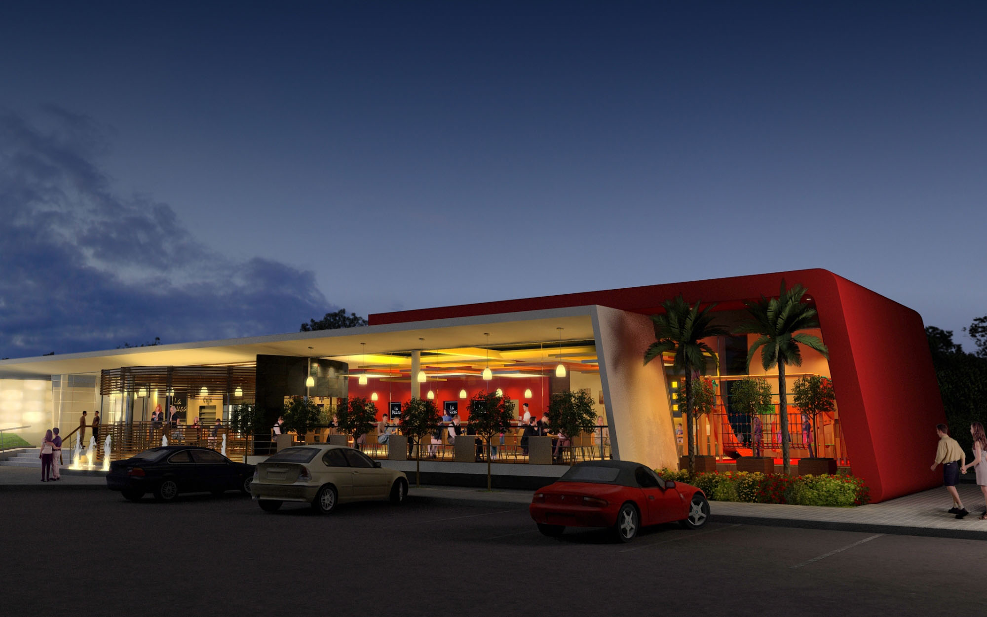
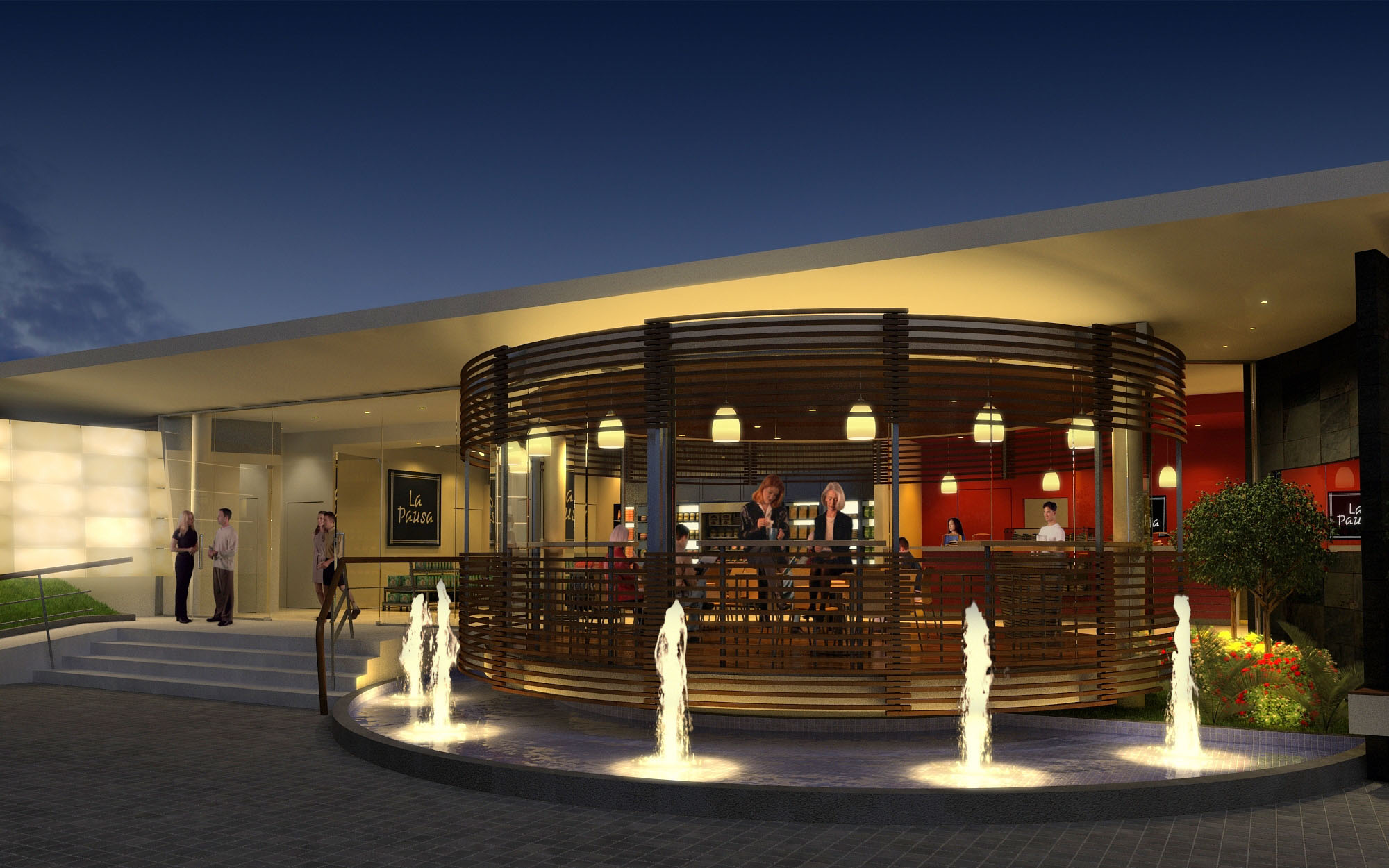
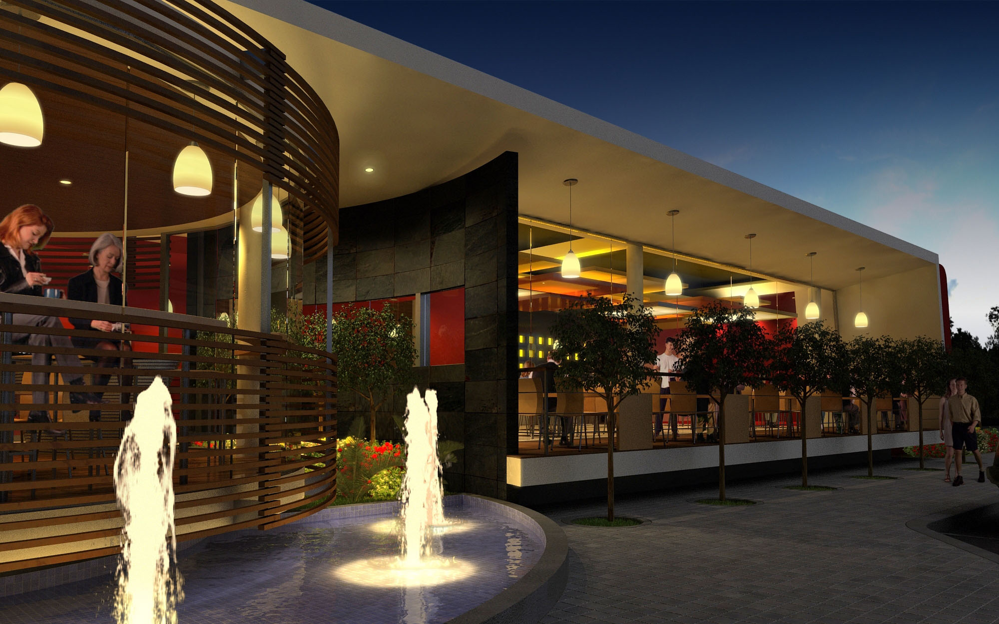
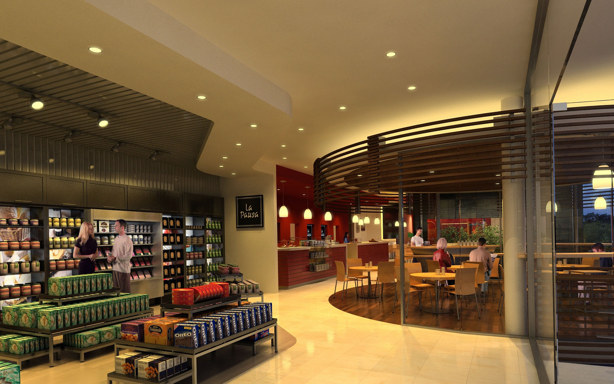
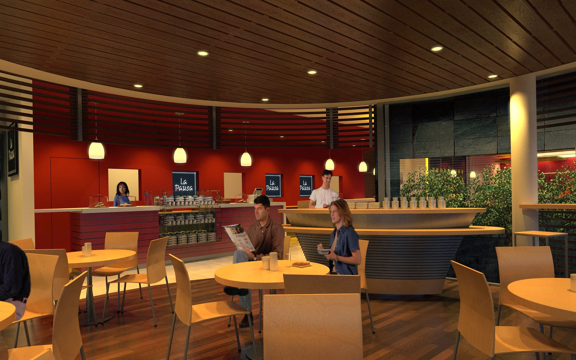
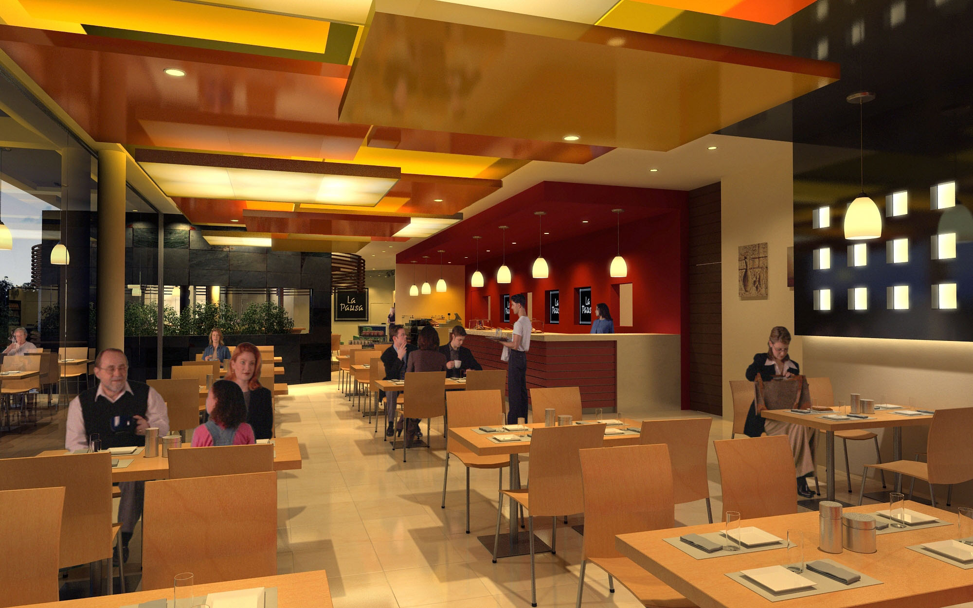
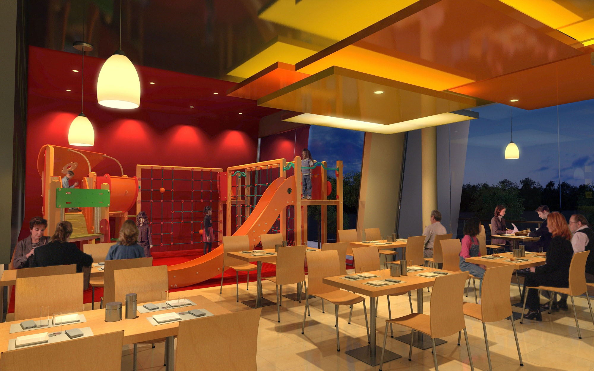
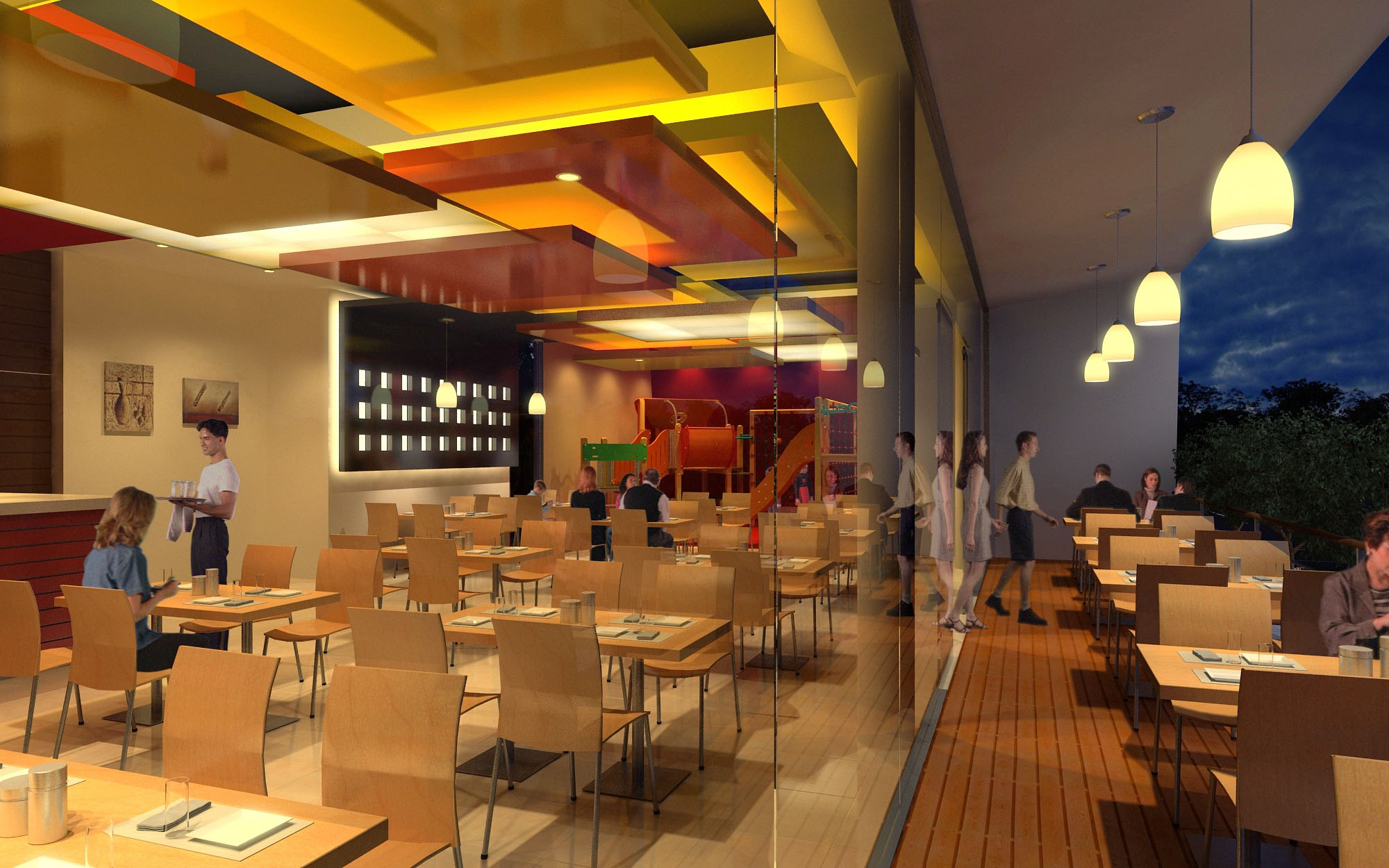
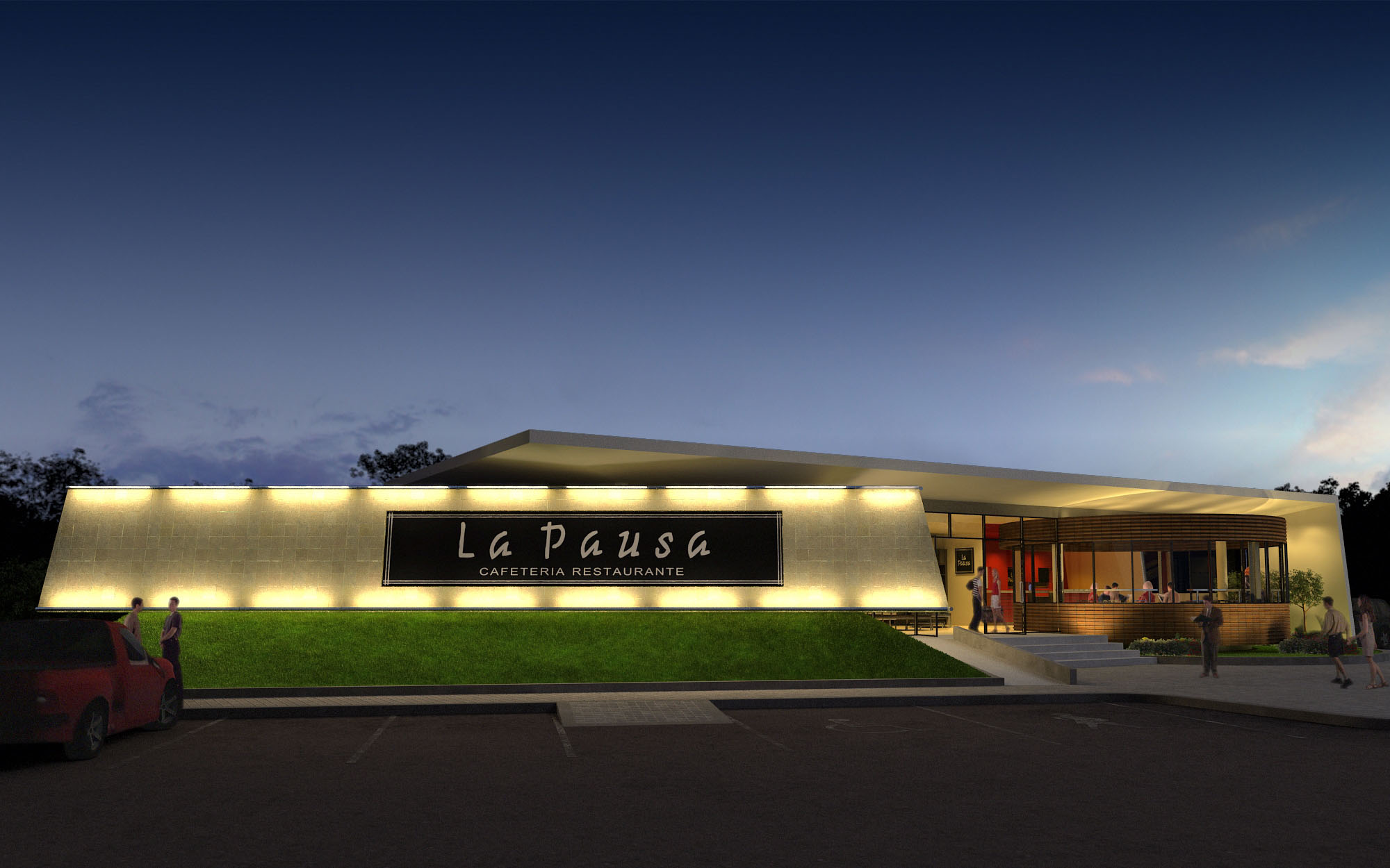
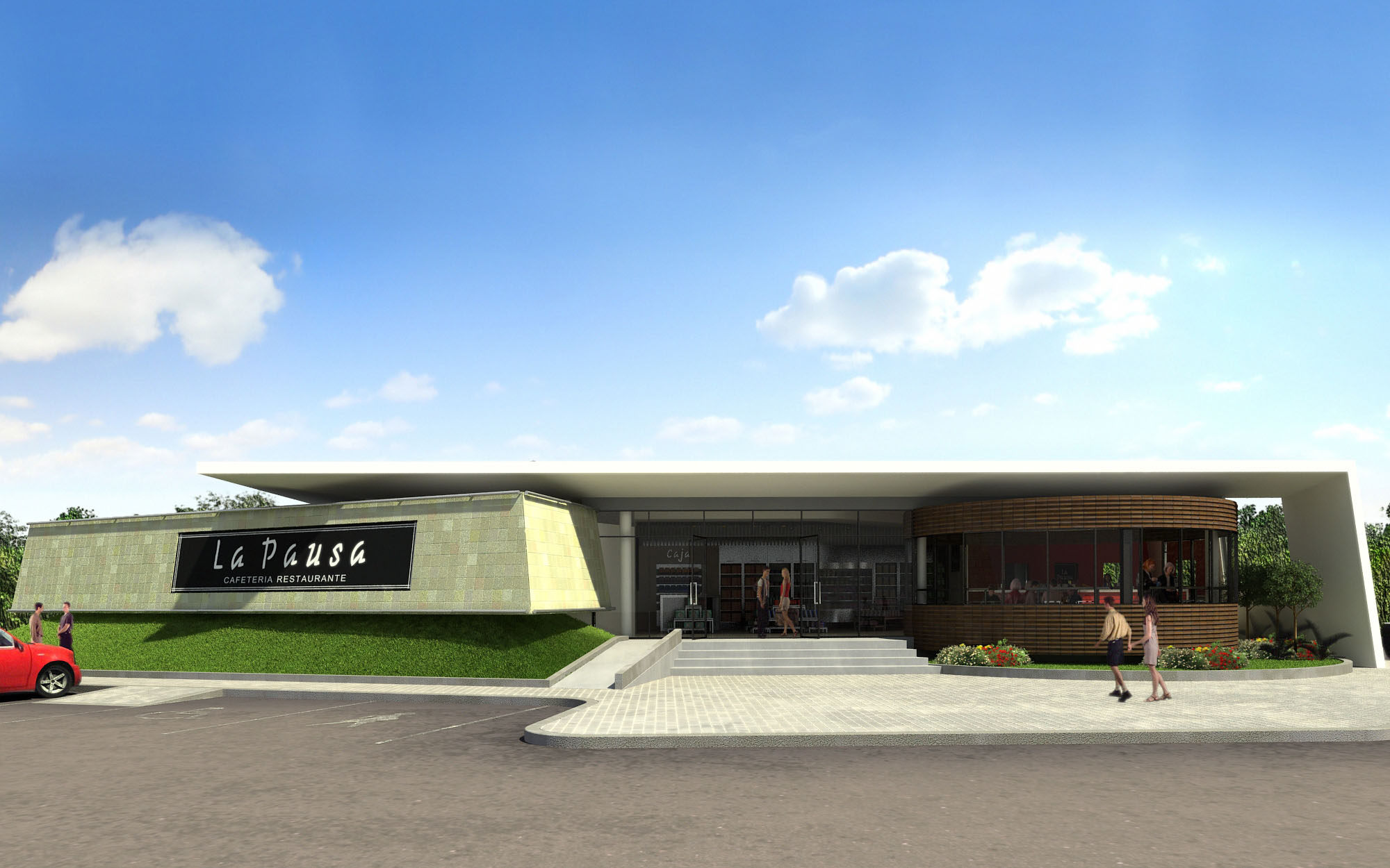
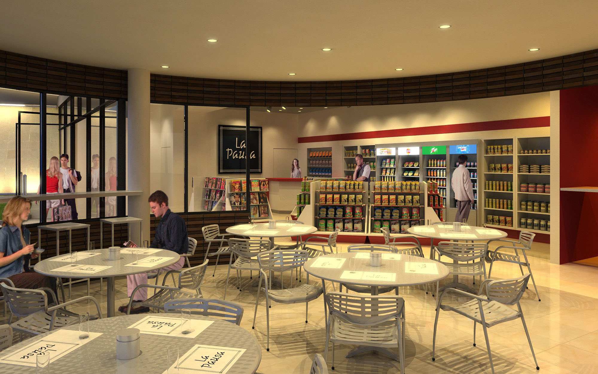
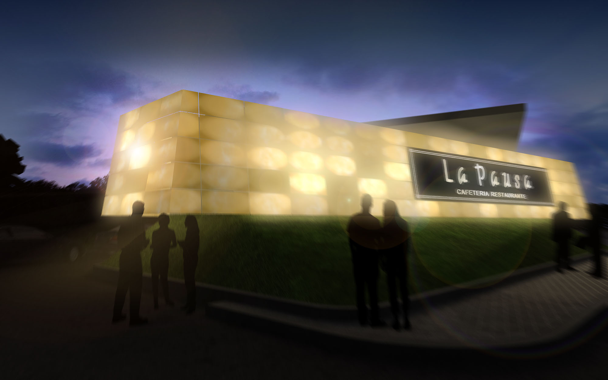
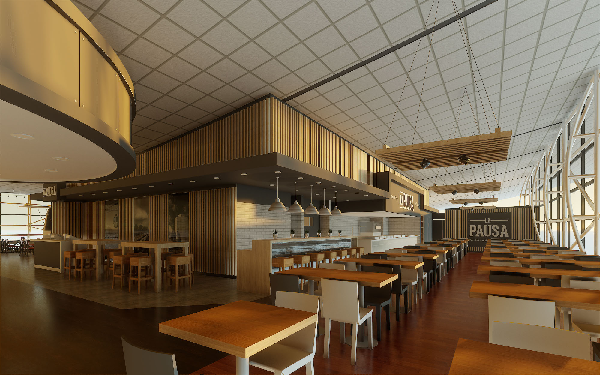
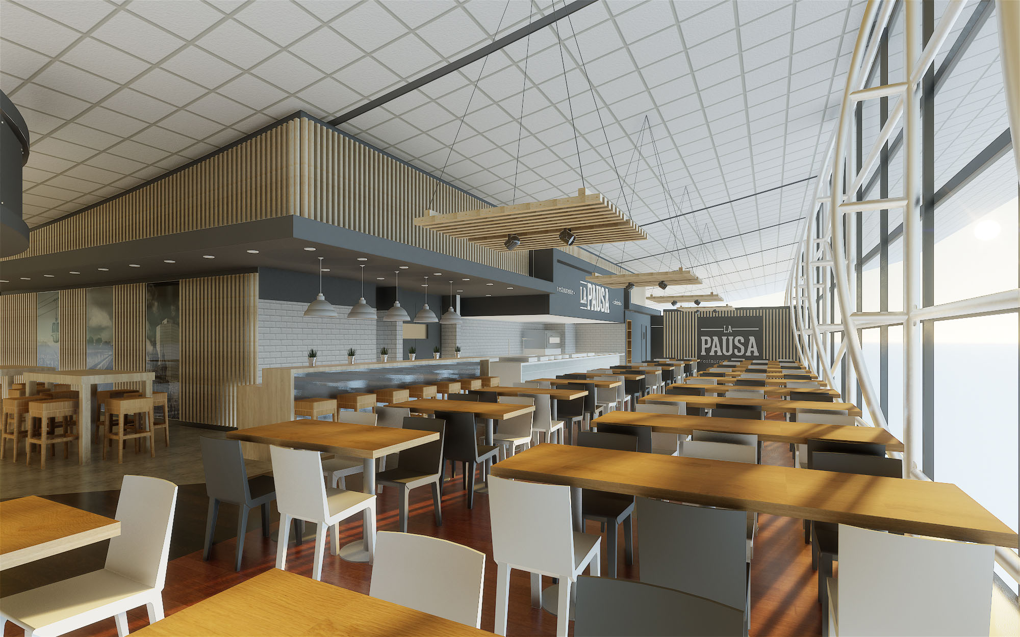
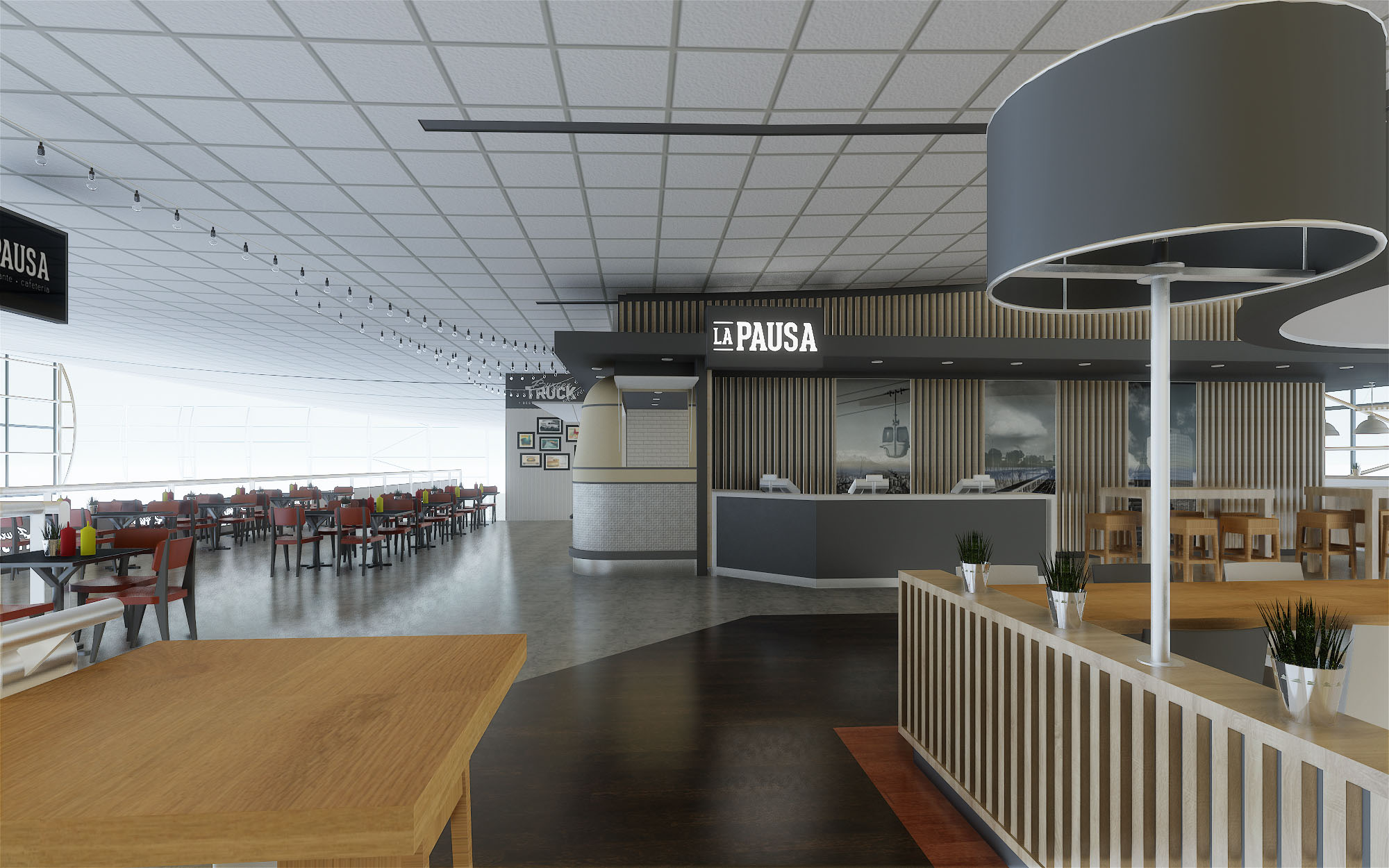
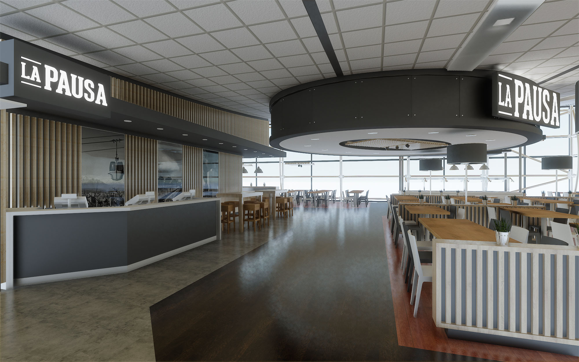
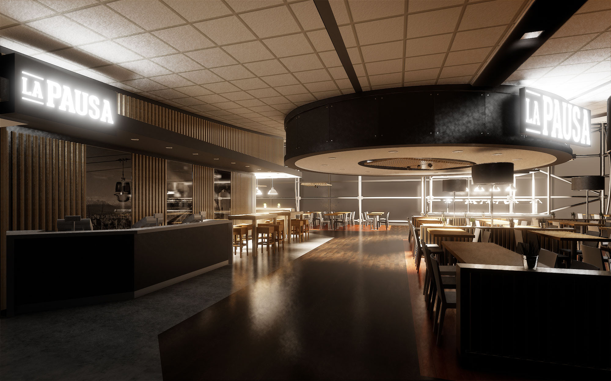
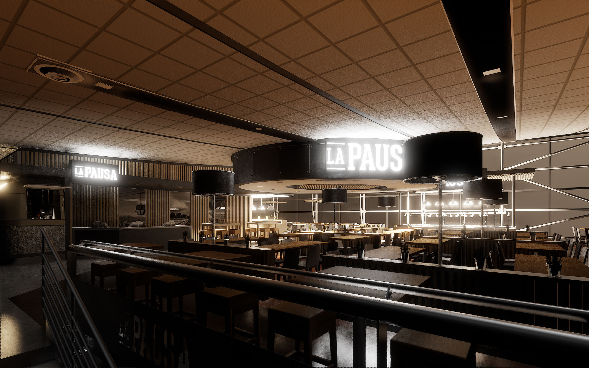
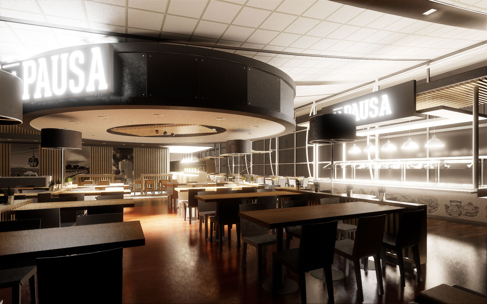
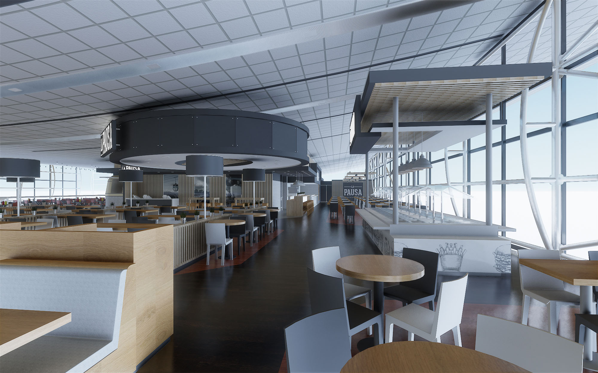
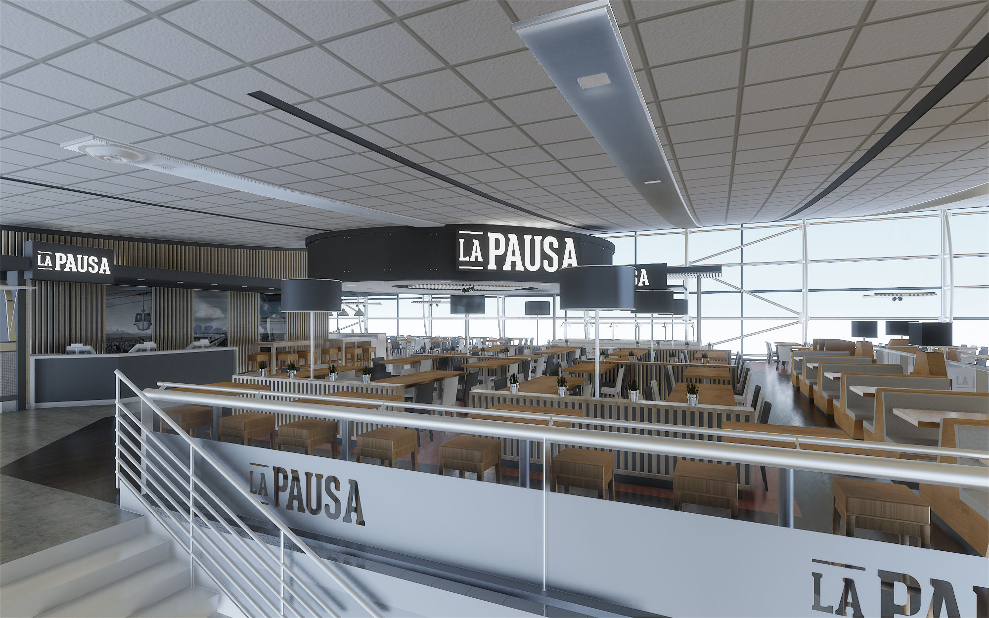
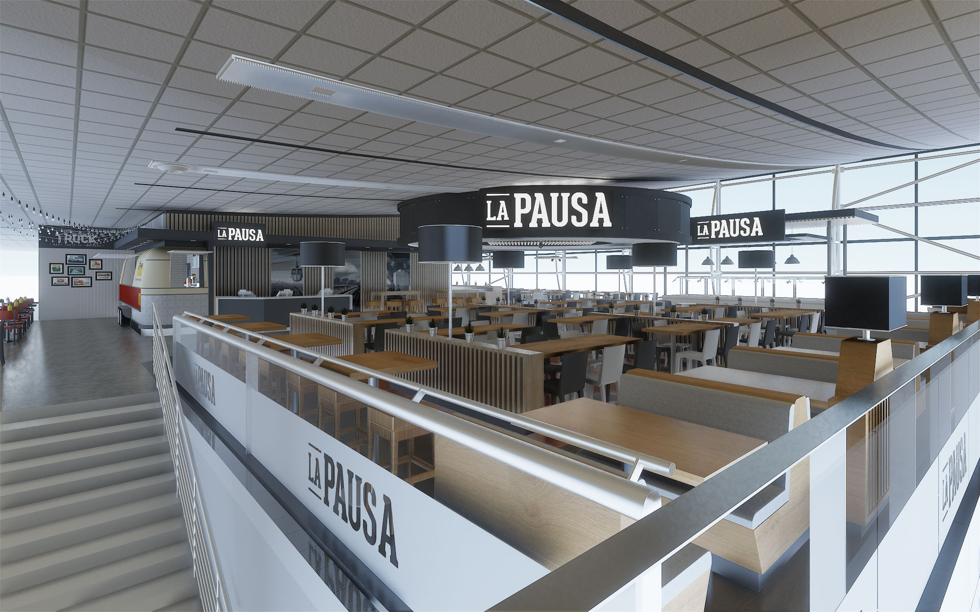
© 2021 by sanzpont [arquitectura] . Webpage by sanzpont [digital] . Innovative Digital Experiences
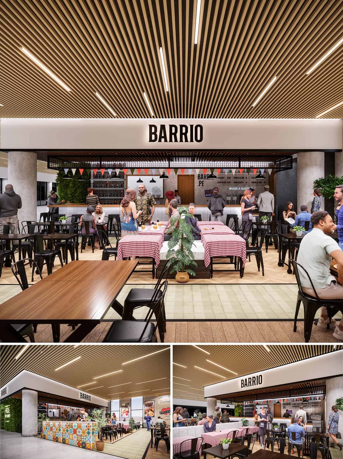
BARRIO is conceived as an open, informal urban dining space that evokes the atmosphere of a traditional Lima neighborhood within the controlled environment of a shopping mall. The project merges the spontaneity of street food and local markets with a clear, contemporary architectural language. The design prioritizes visual permeability, a festive character, and a sense of collective table, making the food court stall read as a small plaza rather than a closed restaurant.
The architectural strategy is based on a simple rectilinear volume that frames the service core and defines a generous frontal terrace. This terrace operates as an extension of the public circulation, dissolving boundaries between passerby and diner, and inviting users to approach the counter, share long tables, and participate in the social dynamic of the “barrio.”
The layout is structured around a central bar–kitchen front that concentrates service, bar seating, and visual activity. Behind this line, the production area is organized in a compact, efficient strip, ensuring direct contact between staff and customers while keeping back-of-house functions discreetly integrated. The frontal bar anchors the space, allowing for linear circulation and clear orientation from any point in the mall corridor.
The dining area extends on both sides of a central axis, articulated by long communal tables covered with checkered tablecloths and complemented by smaller perimeter tables for more intimate groups. This arrangement fosters flexibility, accommodating varied group sizes while maintaining high density. The layout favors diagonal views across the entire premises, reinforcing the sense of a lively, continuous interior street.
The material palette balances warm, familiar finishes with robust, low-maintenance surfaces. A suspended ceiling of linear wooden slats provides warmth, acoustical absorption, and a strong visual identity, contrasting with the neutral envelope of the mall. The floor combines wood-look surfaces with pale ceramic tiles that visually define the restaurant’s footprint without the need for physical barriers.
The counter volume introduces a key chromatic accent through patterned tiles inspired by Peruvian vernacular façades and markets. These multicolored pieces create a direct cultural reference while resisting wear in a high-traffic zone. Black metal chairs and table bases add an industrial note, ensuring durability and visual coherence with the pendant luminaires and shelving structure.
Lighting is designed to reinforce the ceiling’s linear rhythm and to create a warm, welcoming ambience. Integrated linear fixtures between wooden slats provide homogeneous ambient light, suitable for the mall’s extended operating hours. Over the bar and central tables, black pendant lamps generate more intimate light cones, focusing attention on the food and encouraging longer stays.
Additional decorative elements, such as small festival pennant strings, introduce a festive, temporary quality reminiscent of neighborhood celebrations. This layered lighting strategy ensures visual comfort, highlights key areas, and accentuates textures and colors throughout the project.
The BARRIO brand is integrated architecturally through a bold, monochrome fascia that runs along the perimeter of the stall. The logo, centered and backlit, reads clearly from a distance, functioning as a horizontal urban sign. This white band contrasts with the wood ceiling and the colorful tile, reinforcing a clean, legible identity.
Inside, graphic applications on walls complement the physical architecture, referencing local slang and neighborhood culture. These graphics are applied over a neutral backdrop, avoiding visual saturation while maintaining a strong narrative link to Lima’s everyday life.
Strategic use of vegetation softens the hard surfaces and introduces a biophilic component essential in an interior mall environment. Potted plants define micro-borders between circulation and dining areas, while a vertical green wall near the bar functions as a living backdrop, improving air quality perception and adding visual freshness.
Sustainability criteria inform the selection of materials and systems. The predominance of wood and metal allows for high durability and potential recyclability at the end of the project’s life cycle. LED lighting minimizes energy consumption, and the open layout relies on the mall’s existing HVAC systems, reducing the need for additional mechanical equipment. Furniture with stackable metal frames optimizes maintenance and facilitates reconfiguration, prolonging the useful life of the space and supporting an adaptable, resource-conscious operation.
© 2021 by sanzpont [arquitectura] . Webpage by sanzpont [digital] . Innovative Digital Experiences
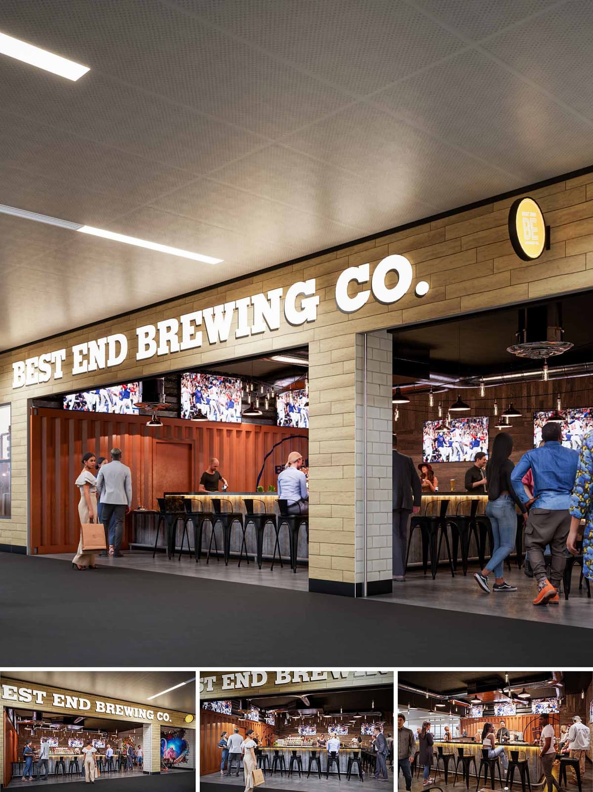

BEST END BREWING COMPANY at Atlanta Airport is conceived as an urban microbrew hub that brings the character of Atlanta’s West End warehouse district into the terminal. The design merges industrial authenticity with the efficiency and clarity required in a high-traffic transportation environment. A strong, linear bar anchors the space, while large-format signage and open sightlines transform the venue into a glowing landmark along the concourse.
The concept celebrates the craft of brewing and the culture of game-day gatherings. Warm, robust materials, exposed structure, and container-inspired elements evoke the language of production spaces, while integrated media walls and generous standing areas support the social, energetic atmosphere of a sports-focused taproom.
The bar occupies an open-front bay directly off the circulation spine of the airport, functioning almost as an interior streetscape façade. A wide, column-free opening invites direct entry from multiple approach angles, minimizing congestion and allowing easy visual orientation for passing travelers.
Inside, a single continuous bar forms a shallow U-shaped plan addressing both seated guests and transient visitors who pause briefly. Circulation is organized along the concourse edge, keeping the main terminal flow uninterrupted, while bar stools and leaner counters step back into the space. This strategy maximizes visibility of the tap wall and media screens, ensuring that activity within the bar animates the concourse.
The interior language draws from industrial typologies: corrugated cladding elements recall repurposed shipping containers, and dark metal bar stools and fixtures reinforce a workshop aesthetic. The bar front is highlighted by a warm, illuminated stone or composite surface, creating a tactile, inviting counterpoint to the rugged shell.
The perimeter walls employ a mix of textured panels and dark finishes that visually recede, allowing the amber-lit bar and bright digital screens to become the primary focal points. The flooring is durable and continuous from concourse to interior, reinforcing a seamless threshold and facilitating maintenance in the high-traffic setting.
The exterior façade is composed of horizontally laid light-toned cladding that frames the opening like an urban storefront. Bold, three-dimensional “BEST END BREWING CO.” lettering, internally lit for legibility, establishes a strong brand presence visible from a distance in the terminal. A circular projecting sign reinforces recognition along the passenger flow.
Lighting is layered to articulate both architecture and atmosphere. Linear ceiling fixtures in the concourse ceiling lead the eye toward the bar, while within the venue, pendant luminaires, exposed bulbs, and under-counter lighting create a warm, golden glow evocative of beer hues. Reflected light on the bar surface and container panels brings depth and emphasizes the crafted nature of the space.
High-top stools and standing-height counters are selected to accommodate short dwell times typical of airport users, while still offering a sense of place and comfort. The bar’s generous depth supports both service efficiency and guest interaction, with clear zones for ordering, pickup, and casual conversation.
Multiple large-format screens wrap the interior, orchestrated as a continuous media band that delivers sports content and ambient imagery. This creates a cohesive visual field that unifies the space and supports a shared experience, even for guests seated at the edges. The ambiance balances the buzz of a game-day bar with controlled acoustics and lighting appropriate to an airport environment.
Sustainability is addressed through the strategic use of robust, long-life materials and efficient building systems. The predominant use of metal, engineered panels, and durable flooring reduces replacement cycles and life-cycle impacts. Where possible, finishes are selected with recycled content and low-VOC specifications suitable for interior air quality in a sealed terminal environment.
LED lighting with dimmable controls minimizes energy consumption while allowing the bar to modulate its atmosphere from early-morning calm to peak event times. The open, low-partition layout maximizes borrowed light from the concourse, reducing the need for excessive internal illumination. Fixtures and surfaces are detailed for ease of cleaning and maintenance, which extends the life of the installation and lowers operational resource use over time.
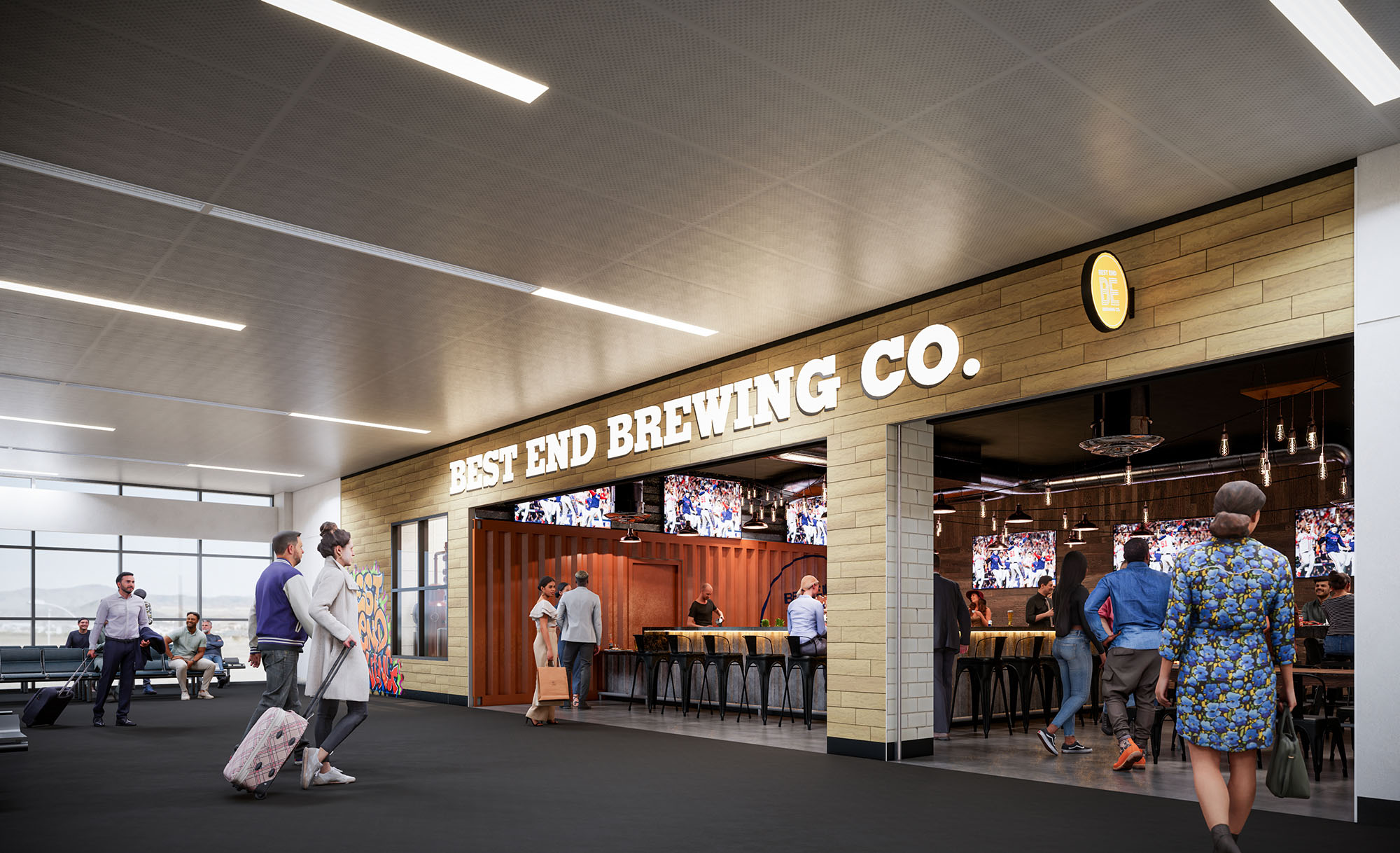
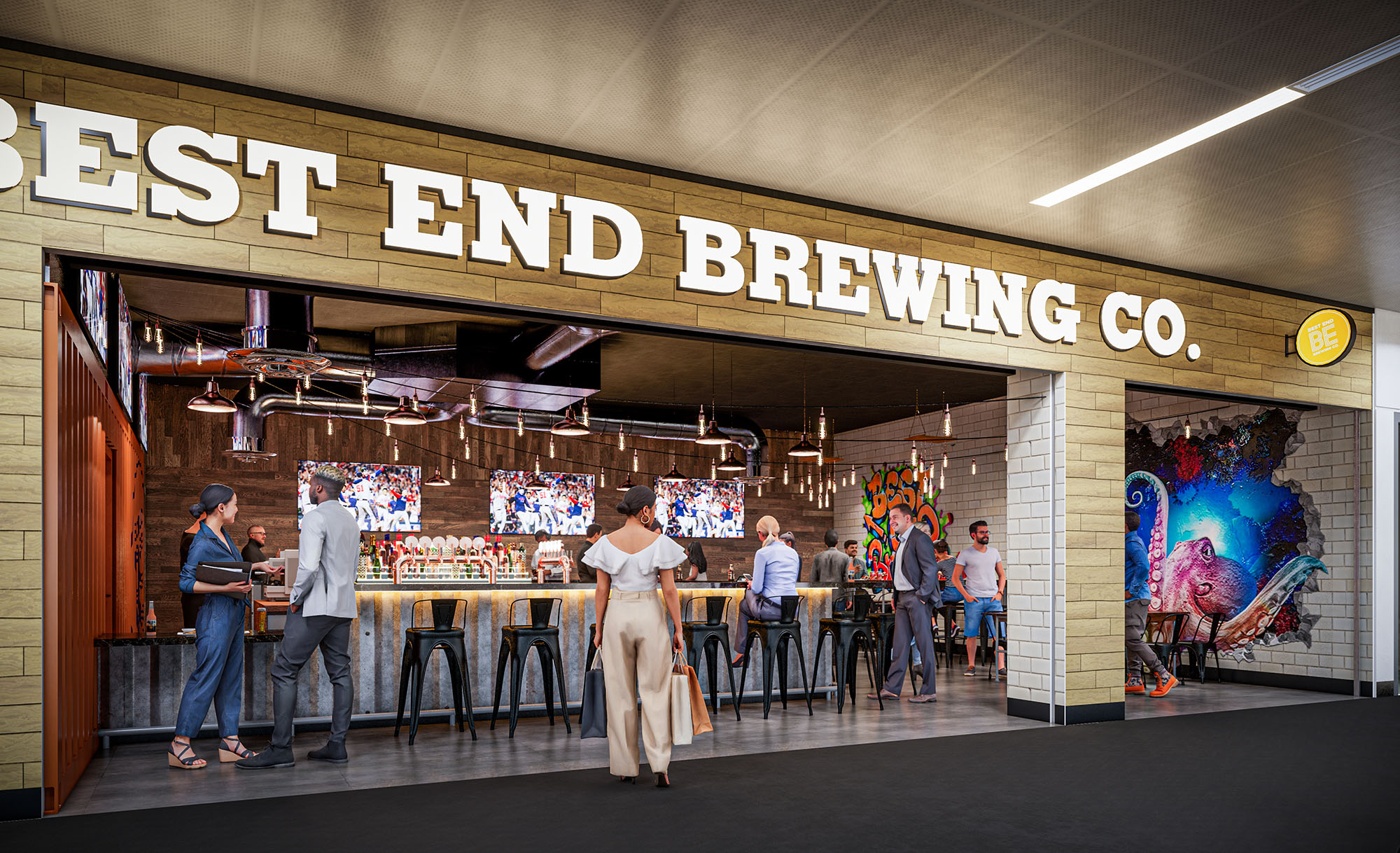
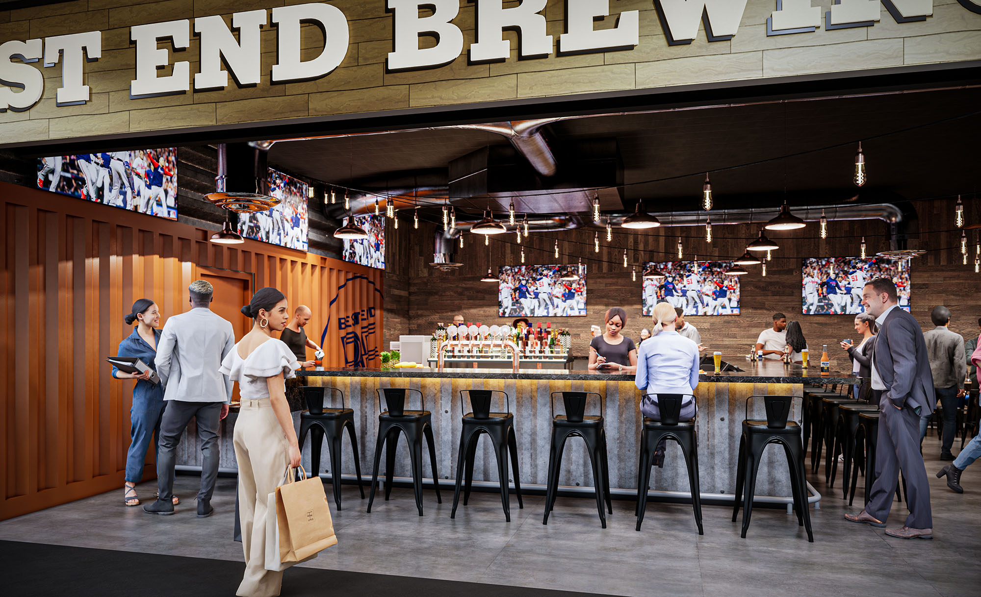
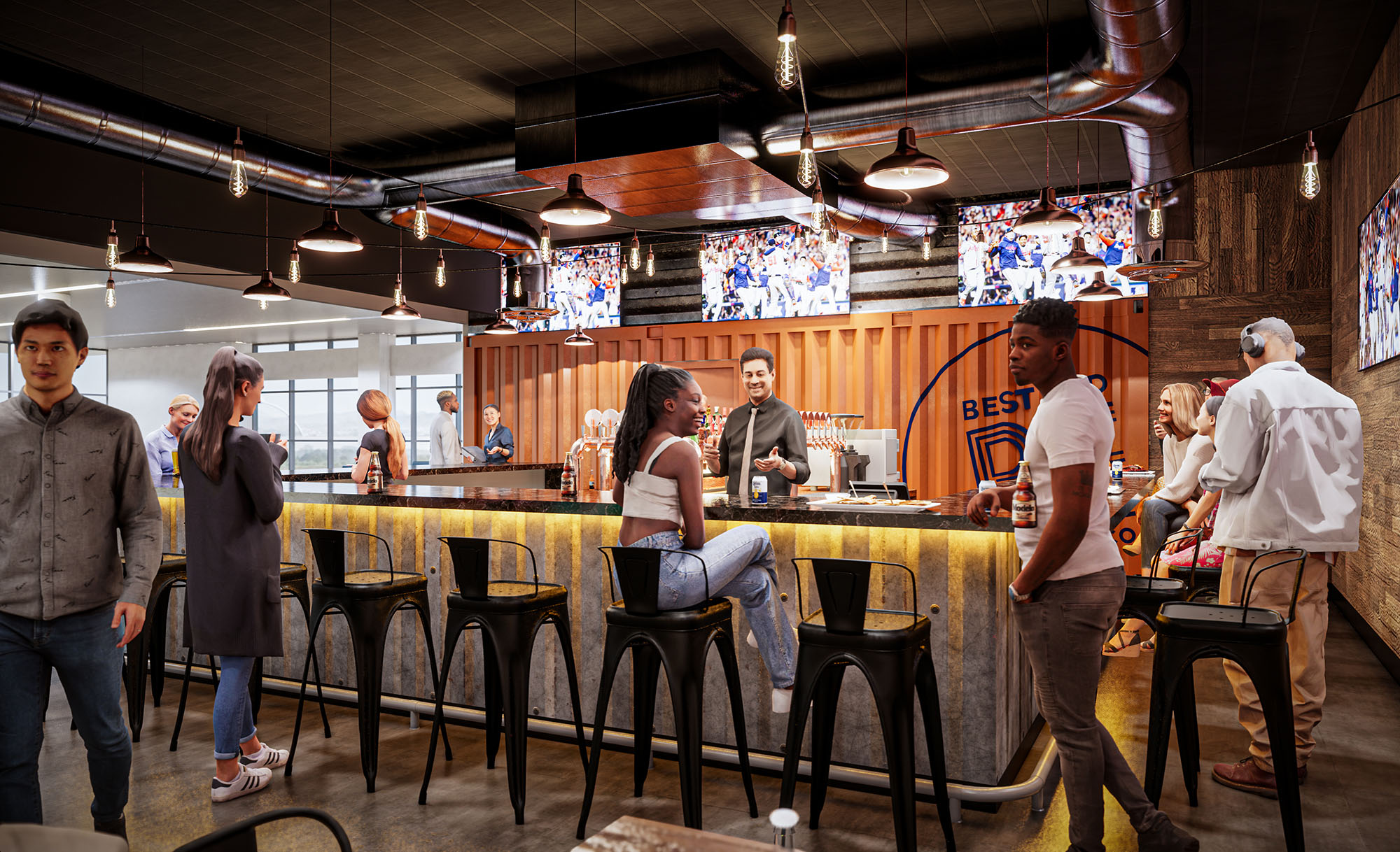
© 2021 by sanzpont [arquitectura] . Webpage by sanzpont [digital] . Innovative Digital Experiences
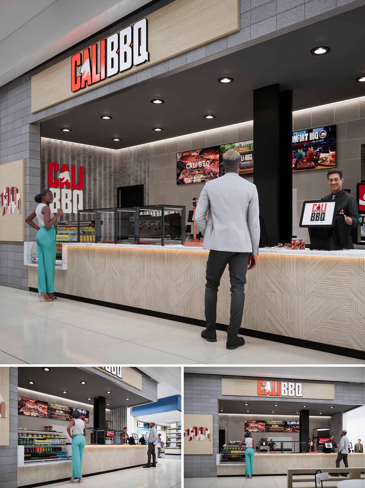
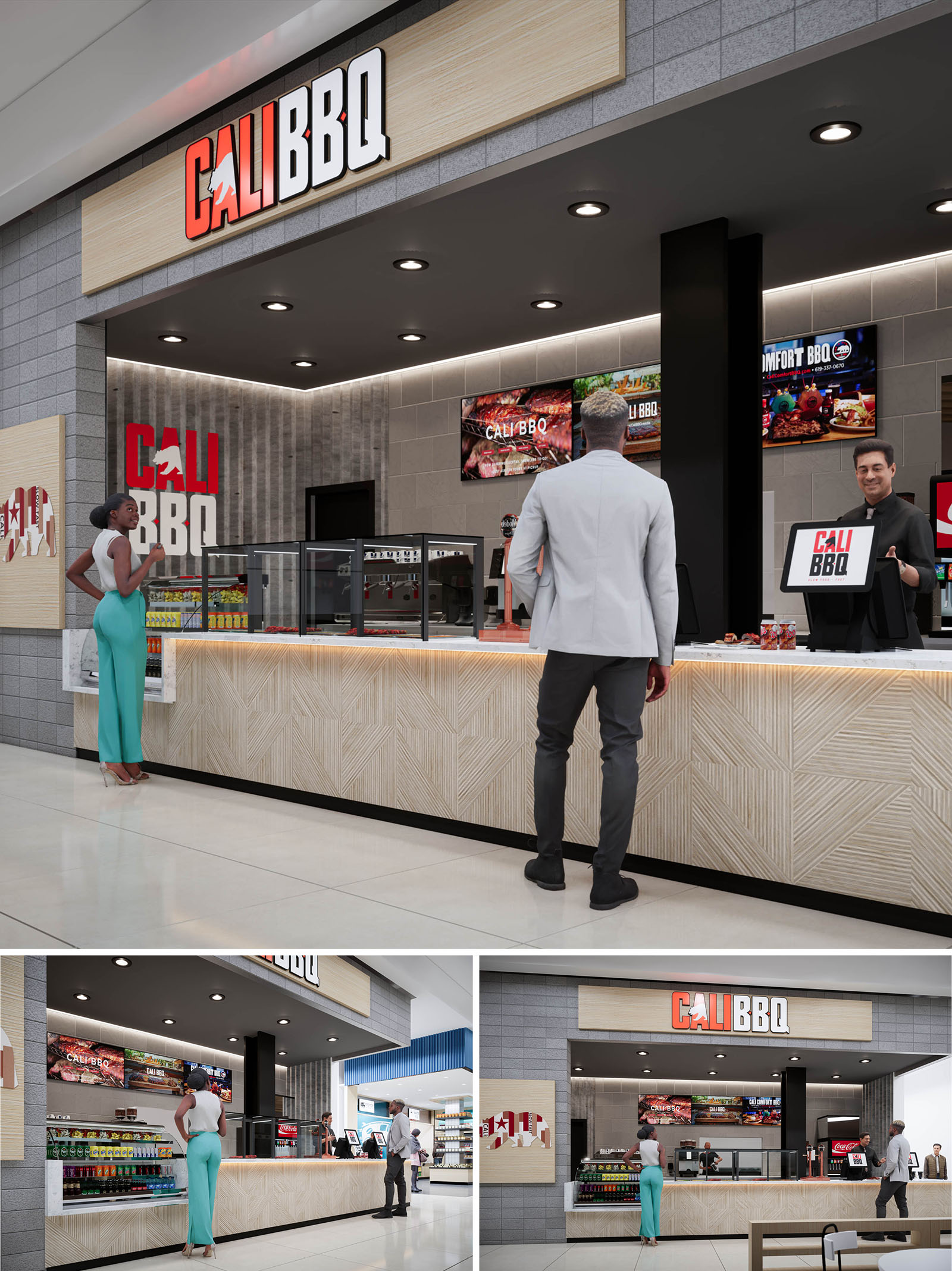
The design of CALI BBQ translates the casual, sun-driven spirit of Southern California into a compact, high-efficiency quick-service format. The concept emphasizes transparency and speed, using a clean, linear counter layout that exposes the full preparation and serving area to the customer. The brand identity is anchored in a bold red-and-white logo, contrasted with a neutral architectural envelope of light woods and gray masonry. This creates an immediately recognizable storefront within the larger retail environment while remaining visually calm and ordered.
The overall composition is based on strong horizontal bands: the illuminated sign canopy, the service counter, and the integrated product shelving. These bands guide the customer’s eye and intuitively organize circulation, queuing and pick-up points without the need for excessive signage. Warm accent lighting, combined with a restrained material palette, evokes the glow of a barbecue grill in a contemporary, urban expression.
The space is planned as an open-front kiosk with a clear frontal engagement to the mall corridor. The counter extends nearly the full width of the lease line, maximizing serving frontage and allowing for simultaneous order-taking, self-service drinks, and grab-and-go items. Transparent refrigerated and ambient display units are positioned at the customer side to encourage impulse purchases while maintaining visual openness.
Behind the counter, a linear back-of-house zone organizes cooking, assembly, and handoff in a straightforward sequence. The central structural column is absorbed into the design as a dark, monolithic element that visually anchors the point-of-sale stations. Digital menu boards are aligned above the preparation line, ensuring legibility from distance and supporting quick decision-making during peak times.
The material palette balances robustness with a light, approachable character. The main counter is clad in pale wood panels with a geometric, routed pattern that creates subtle texture and depth without overcomplicating the surface. This tactile detail adds craft and warmth, referencing the grain of cutting boards and smokehouse timbers in an abstract way.
The wall surfaces are composed of modular gray tiles resembling concrete block, providing an industrial yet refined backdrop that enhances brand graphics. A black soffit above the counter visually lowers the ceiling plane, framing the service area and integrating recessed downlights for focused illumination. Red brand elements, including the CALI BBQ wordmark and iconographic graphics, punctuate the neutral tones and reinforce the energetic identity.
Lighting is layered to accentuate both the architecture and the food. Recessed ceiling downlights provide uniform task lighting across the counter, while an LED strip beneath the countertop edge creates a floating effect and highlights the patterned wood panels. This warm under-counter glow is reminiscent of embers, subtly reinforcing the barbecue narrative.
Large digital menu boards function as dynamic branding surfaces, displaying vivid food imagery that contrasts with the restrained surroundings. The primary sign band above the opening uses backlit channel letters mounted on a light wood fascia, ensuring clear visibility across the concourse. Secondary branding elements, such as the circular wall graphic, help extend the identity laterally and make the kiosk legible from oblique angles.
Durability and low maintenance guided the material and systems selection, supporting both operational efficiency and environmental responsibility. High-traffic surfaces, including floor tiles and wall cladding, are specified in hard-wearing, easy-to-clean finishes that extend lifecycle and reduce replacement frequency. The routed wood front is designed as a modular panel system, allowing localized replacement rather than full counter reconstruction, minimizing waste over time.
Energy-efficient LED lighting is deployed throughout, reducing power consumption and heat load while providing consistent color rendering for food display. The open-front layout leverages ambient mall conditioning, limiting the need for additional mechanical equipment within the kiosk. Where possible, finishes are chosen in light colors to enhance reflectance, reducing the quantity of artificial lighting required to achieve the desired brightness level.
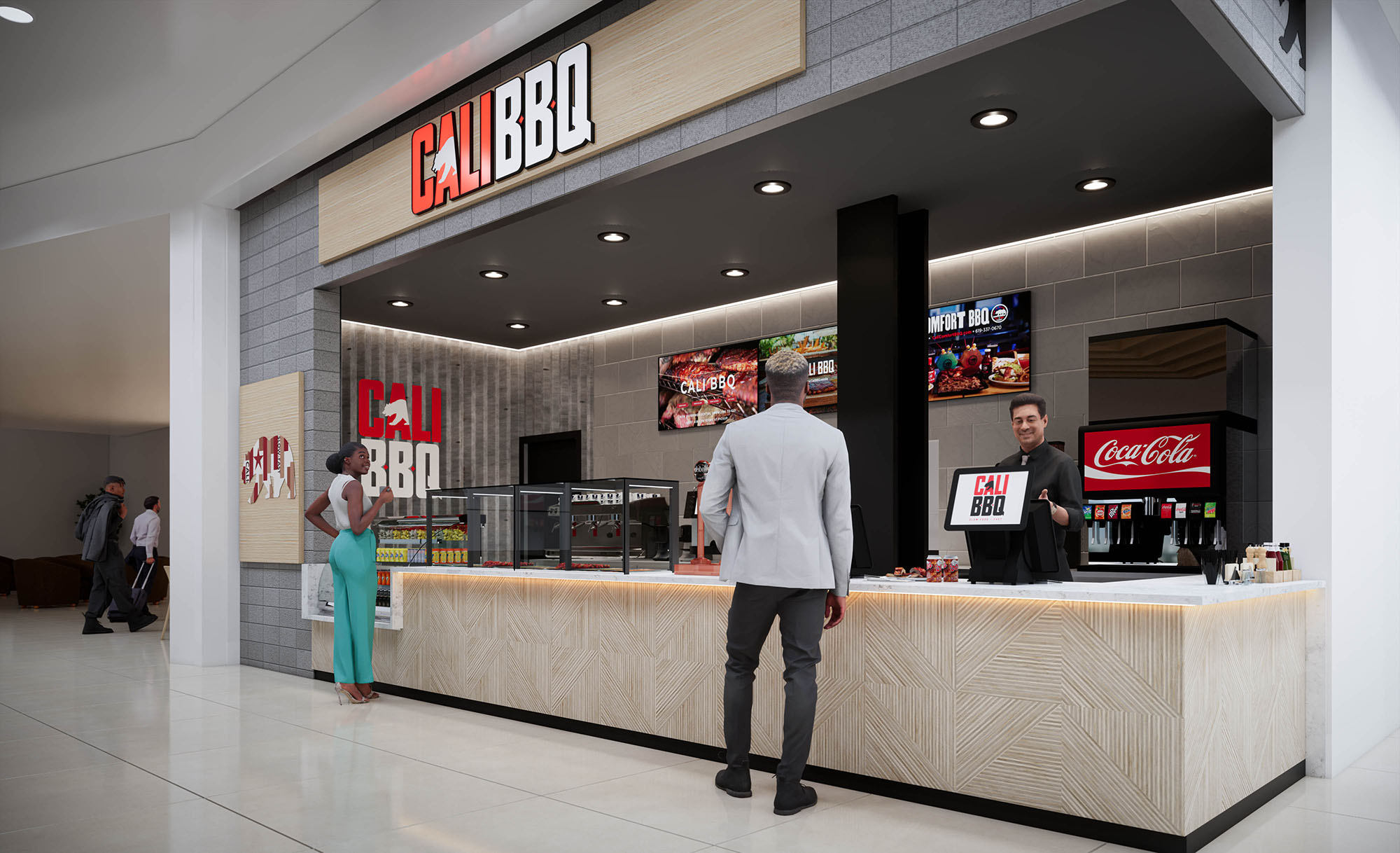
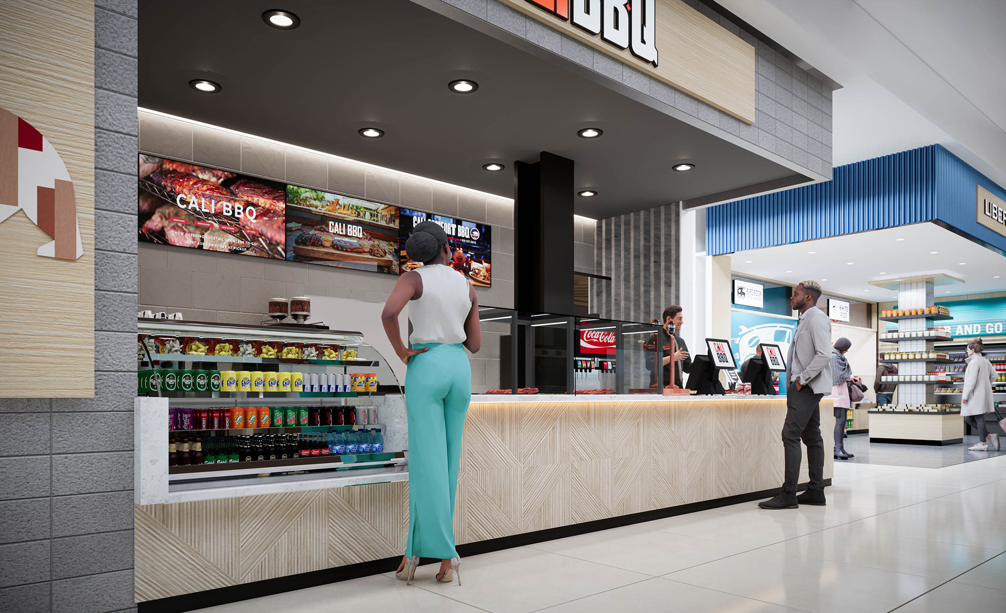
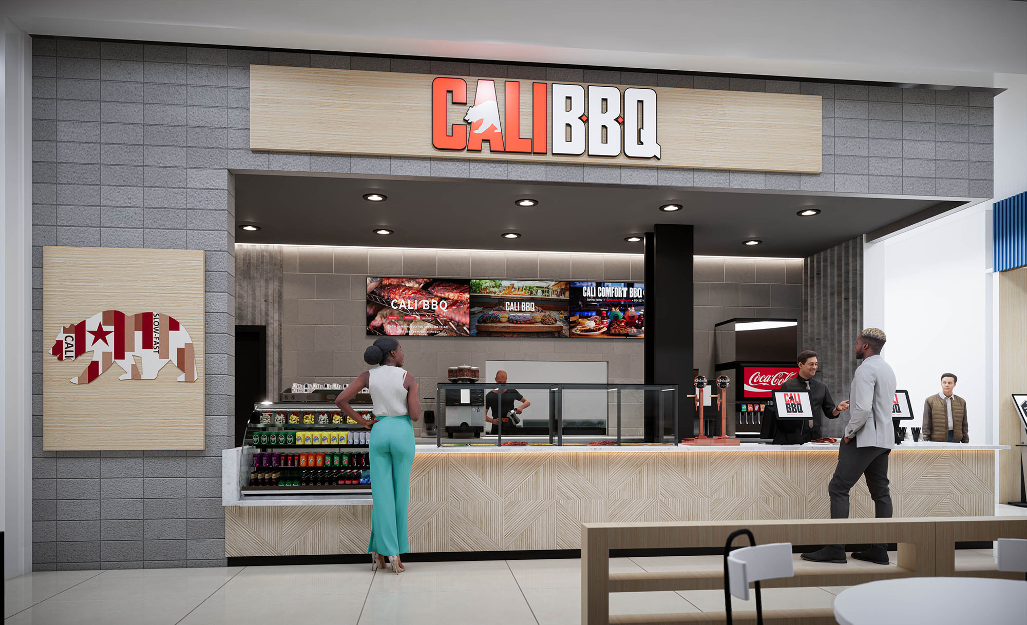
© 2021 by sanzpont [arquitectura] . Webpage by sanzpont [digital] . Innovative Digital Experiences
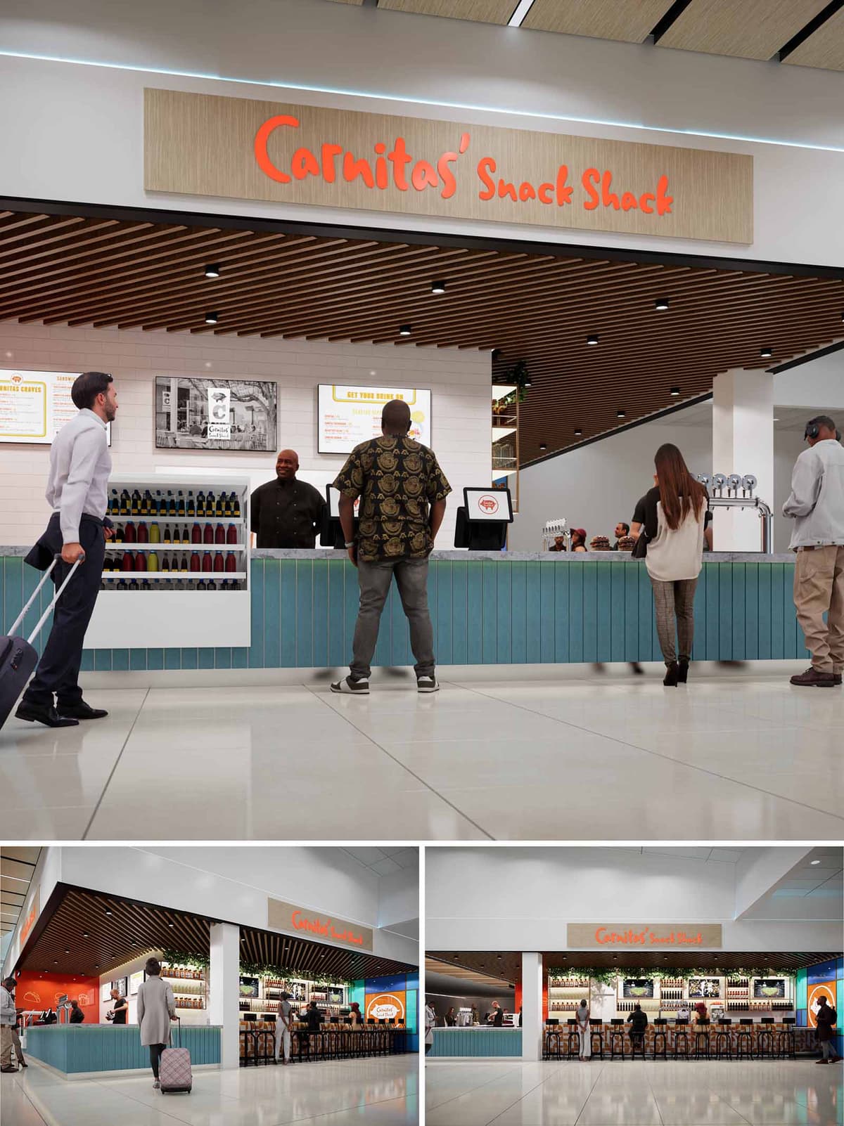
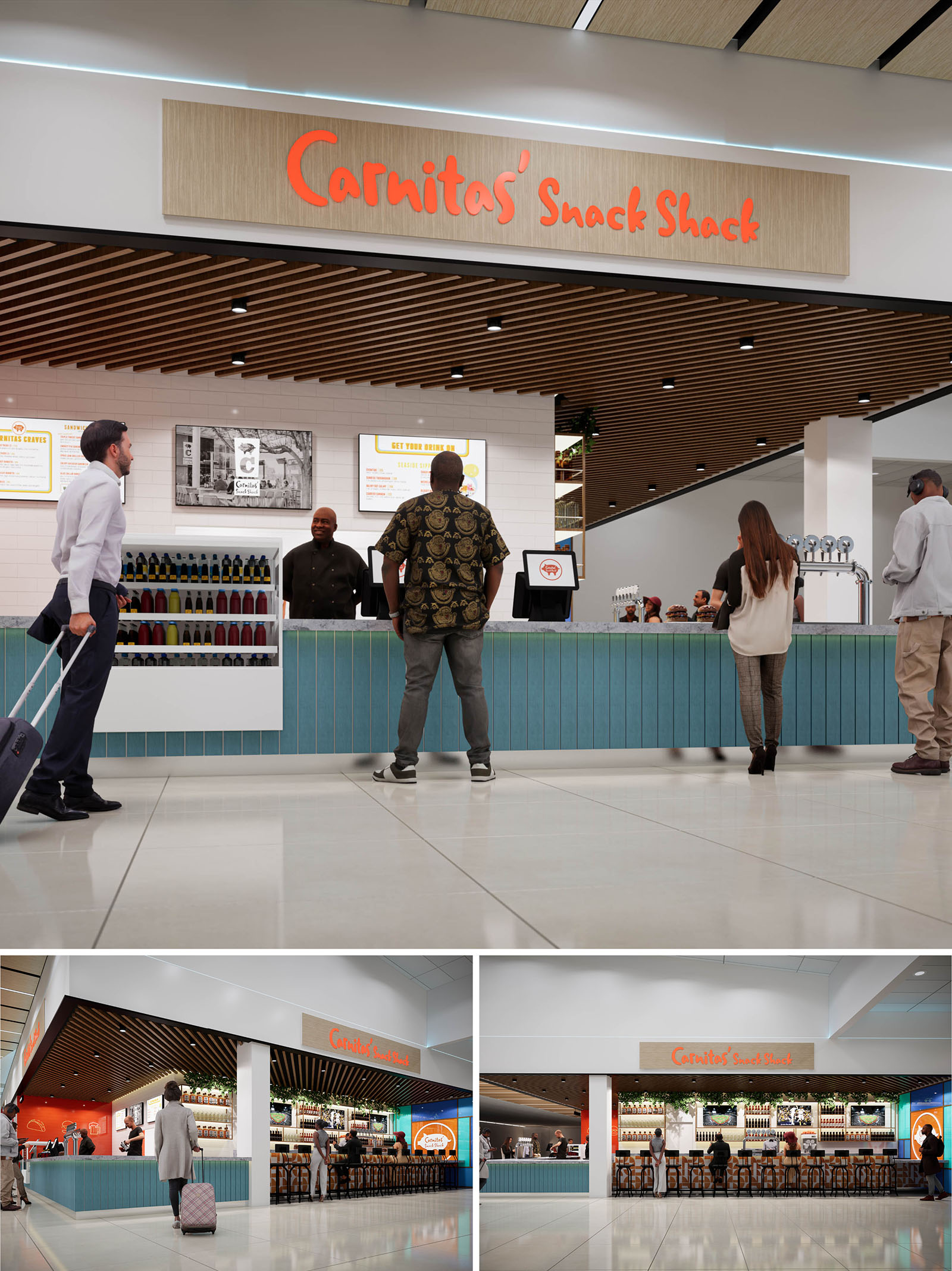
The design of Carnitas Snack Shack translates a beloved local brand into an airport setting by merging casual street-food energy with a refined, transit-friendly environment. The concept is built around openness and visibility, turning the corner tenancy into a porous, welcoming pavilion rather than a closed storefront. The architecture emphasizes horizontality, with a strong canopy line and continuous counter that guide passengers along the façade and intuitively organize queuing, ordering, and dining zones.
Brand character is expressed through a calibrated use of color and graphics that remain legible from long airport sightlines. The glow of the linear bar, the bold orange signage, and a warm timber ceiling create a recognizable beacon within the terminal while maintaining a balanced, uncluttered composition that respects the surrounding concourse architecture.
The layout is organized as a U-shaped service bar that wraps the corner, combining quick-service counter, beverage station, and seated bar into a continuous element. This configuration maximizes frontage to passenger flows on both sides, capturing cross-traffic and providing clear wayfinding from multiple approach angles. The back-of-house is compressed into a linear zone behind the counter, optimizing operational efficiency and minimizing visual clutter.
Queuing is handled directly along the primary counter, where integrated under-counter lighting and a change in materials subtly mark the customer zone without the need for barriers. The bar seating frames the open interior and acts as a soft edge between circulation and dining, allowing guests to observe terminal activity while remaining psychologically anchored within the restaurant environment.
The material palette balances durability with a relaxed, coastal character appropriate to San Diego. A slatted wood ceiling visually lowers and warms the volume, contrasting with the otherwise bright, neutral terminal shell. Below, the bar face is finished with vertically oriented blue paneling, recalling boardwalk cladding and providing rhythm and texture at the human scale. The countertop appears to be a composite or quartz surface, selected for resilience to heavy airport traffic and ease of maintenance.
Walls behind the counter are clad in white tile with clean, rectified joints, creating a sanitary backdrop and enhancing the legibility of menus and brand graphics. The main sign panel uses a light wood veneer and dimensional orange lettering, tying into the ceiling finish while emphasizing the visual hierarchy of the branding. Accent lighting along the shelving and under the counter adds depth and highlights product displays, contributing to merchandising effectiveness.
Lighting strategy combines integrated ambient, task, and accent lighting to support both operational needs and brand atmosphere. Recessed downlights within the slatted ceiling provide even illumination over the bar and queuing areas, carefully spaced to maintain a clean grid that aligns with the slat rhythm. Linear LEDs wash the counter front, generating a subtle glow that attracts attention from the concourse and reinforces the perception of cleanliness and modernity.
Backlit menu boards and illuminated shelving ensure high visibility of offerings, critical in an environment where passengers make rapid decisions. Warm color temperatures are used at the bar and signage to create contrast with the cooler general terminal lighting, giving the space a hospitable, lounge-like character while still feeling bright and efficient.
The bar stools feature slim metal frames and timber seats, echoing the ceiling and sign materials while remaining visually light to preserve transparency across the façade. Their repetitive alignment strengthens the linear geometry of the bar and contributes to a sense of order within the open plan. Bottle displays and tap handles are arranged with a strong horizontal datum, reinforcing the architectural lines and allowing the product itself to become part of the aesthetic composition.
Brand graphics are handled with restraint: large-scale logo panels are concentrated at key sightlines, while secondary graphic elements and historic imagery animate the interior without overwhelming it. This balance maintains visual clarity in a busy terminal context and ensures that operational information, such as menus and wayfinding, remains primary.
Sustainability is addressed through both material choices and operational planning. The extensive use of wood elements is conceived with responsibly sourced or FSC-certified products, combined with high-durability finishes that extend lifecycle and reduce replacement frequency. Hardwearing tile, composite counters, and metal furniture minimize maintenance and support long-term performance in a high-traffic environment.
Energy-efficient LED lighting is deployed throughout, with focused task lighting reducing the need for excess ambient illumination. The open pavilion layout leverages existing terminal HVAC and natural light from adjacent concourse areas, minimizing the need for additional mechanical interventions. Compact kitchen planning shortens service lines and reduces wasted movement, supporting lower energy use and faster turnover, which in turn optimizes resource consumption while maintaining a high-quality guest experience.
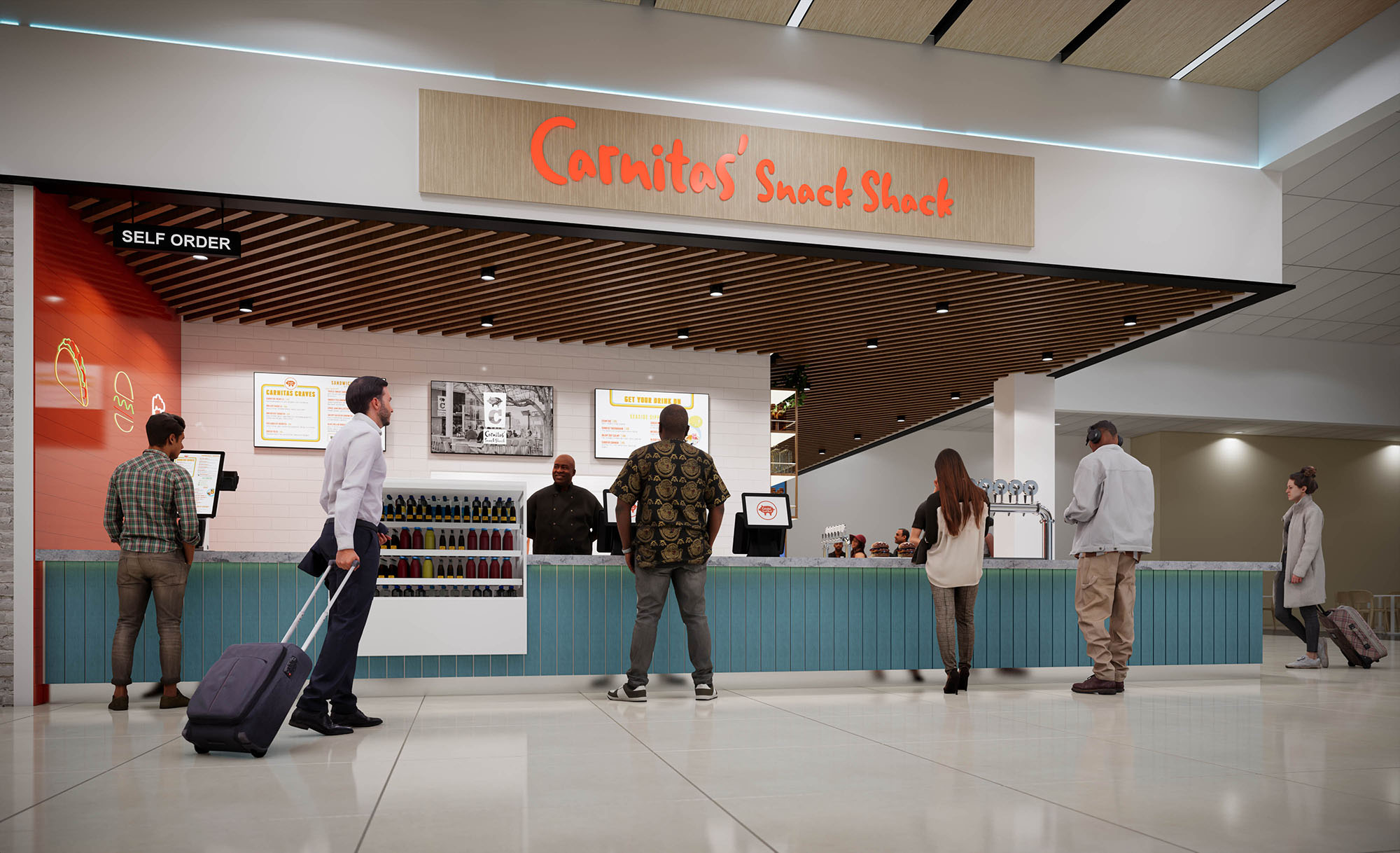
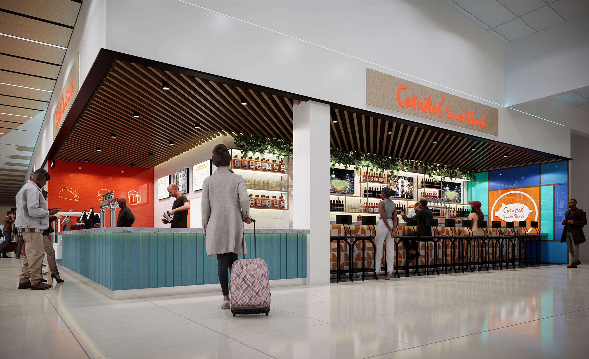
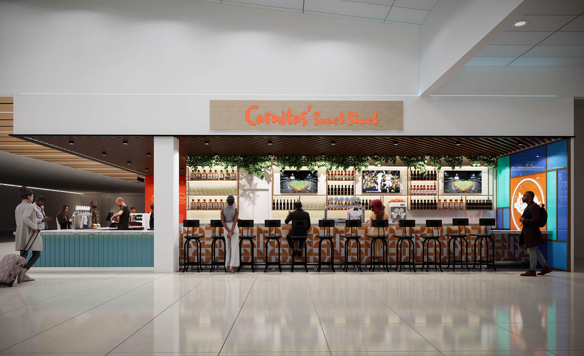
© 2021 by sanzpont [arquitectura] . Webpage by sanzpont [digital] . Innovative Digital Experiences

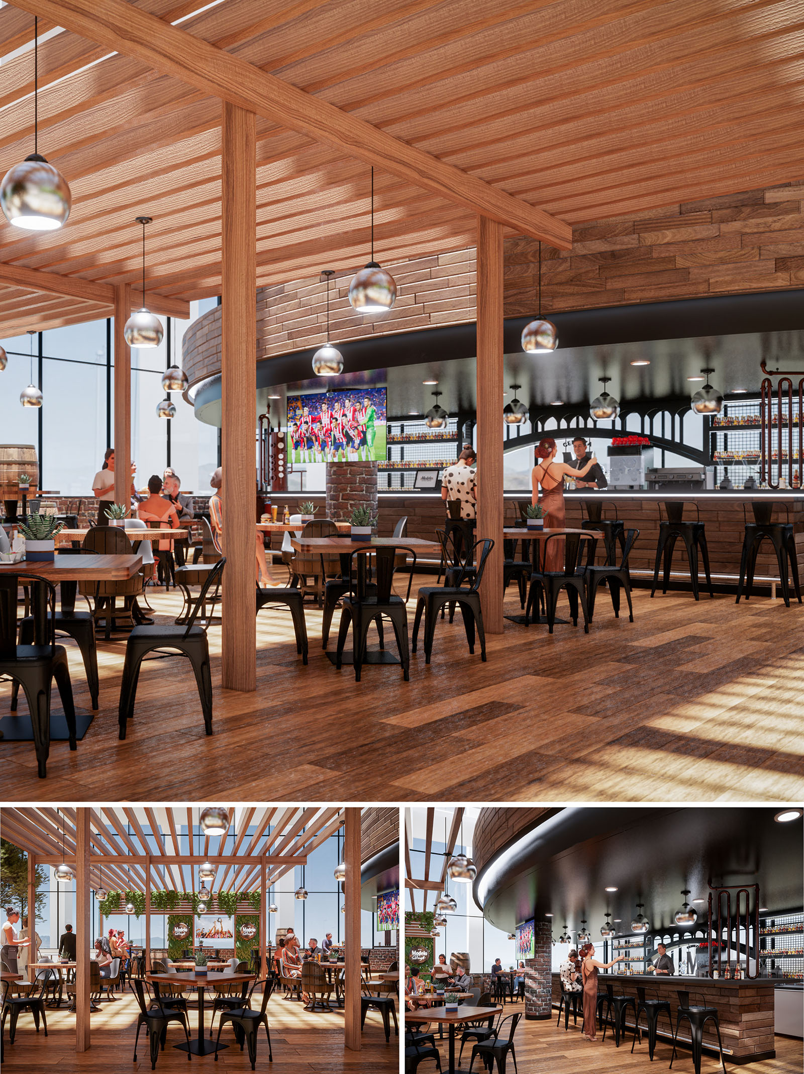
COCINA URBANA is conceived as an elevated urban terraza that merges the warmth of a traditional Mexican cantina with the openness of a contemporary rooftop pavilion. The design prioritizes visual porosity, social interaction and a direct relationship with the surrounding skyline of Guadalajara. A continuous wooden canopy, open yet strongly defined, frames the dining area and creates a recognizable architectural identity from both inside and outside the space.
The project organizes atmosphere rather than strict rooms: a fluid interior-exterior gradient where bar, dining and lounge zones overlap. This porosity supports different uses throughout the day, from casual meals to sports-viewing gatherings, always maintaining visual continuity and generous natural light.
The layout is structured around a central nave aligned with the bar, which acts as the main spatial anchor and social focus. Linear rows of structural wooden posts define subtle bays, guiding circulation while maintaining open sightlines toward the screens, façade and views. These bays accommodate flexible table arrangements that can adapt from small groups to larger communal settings without altering the spatial logic.
Perimetral seating is oriented toward the exterior glazing, privileging views and maximizing daylight. The open pergola transitions toward the outer edge, blurring the limit between interior and terrace. The bar volume, with its curved back wall, softens the geometry and creates a visual counterpoint to the strong linearity of the canopy and floor pattern.
Material selection emphasizes warmth and tactility, with wood as the protagonist across floor, ceiling and vertical cladding. Variations in tone and grain on the flooring generate a dynamic yet subtle pattern, reinforcing directionality and adding depth to the large surface. The ceiling pergola uses solid timber members, leaving controlled gaps that modulate natural light and cast changing shadows throughout the day.
Exposed brick and dark metal elements introduce an industrial vocabulary that resonates with the “urbana” concept, while remaining balanced by the more domestic warmth of wood. Black metal chairs and structural bases ground the space visually, providing contrast against the lighter timber. The bar front and surrounding walls employ horizontal wooden slats and masonry to create a textured backdrop for the bottle display and equipment.
Lighting is conceived as a suspended landscape of metallic globe pendants hanging at regular intervals along the pergola grid. These luminaires provide both functional illumination and a reflective, festive character, echoing the social nature of the space. Recessed lighting under the curved soffit above the bar enhances the sense of depth and emphasizes the bar as a glowing focal line at night.
Furniture is intentionally robust and archetypal: square and rectangular wooden tables paired with black metal chairs capable of intensive use and easy reconfiguration. The integration of small planters on tables introduces greenery at eye level, softening the industrial tones and referencing the outdoor condition of the terrace.
Sustainability is embedded primarily through passive design. The open pergola and extensive glazing harness natural light to reduce dependence on artificial lighting during the day, while the overhead structure provides partial shading, controlling glare and solar heat gain. Cross-ventilation is favored by the terrace configuration, reducing the need for constant mechanical cooling in Guadalajara’s climate.
The predominant use of timber, specified from responsibly managed sources, significantly lowers the embodied carbon compared to more intensive materials. Modular furniture and standardized structural bays facilitate future reconfiguration or partial reuse of components, extending the lifecycle of the fit-out. Incorporating indoor plants contributes to improved air quality and reinforces the user’s connection with nature in an urban context.
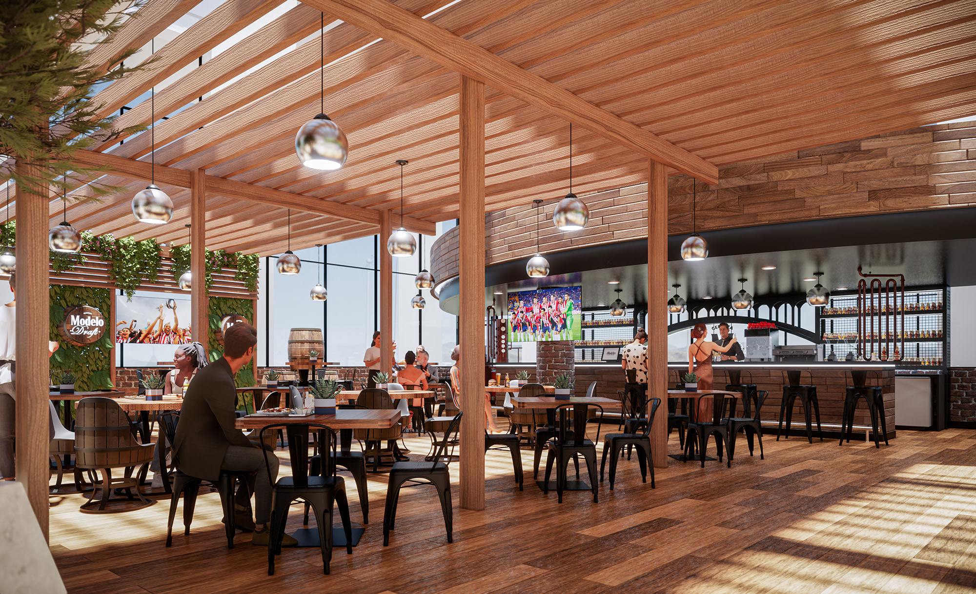
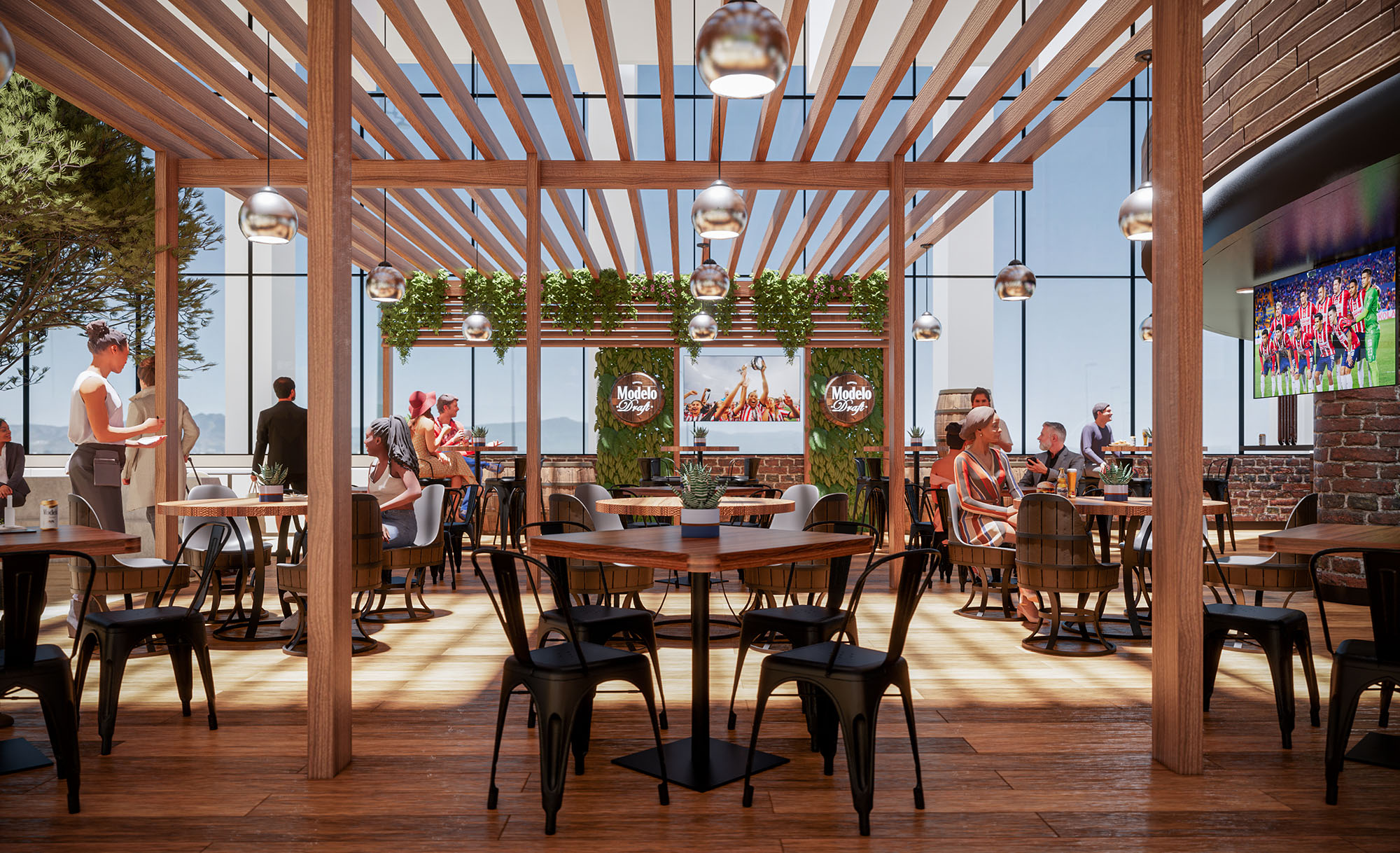
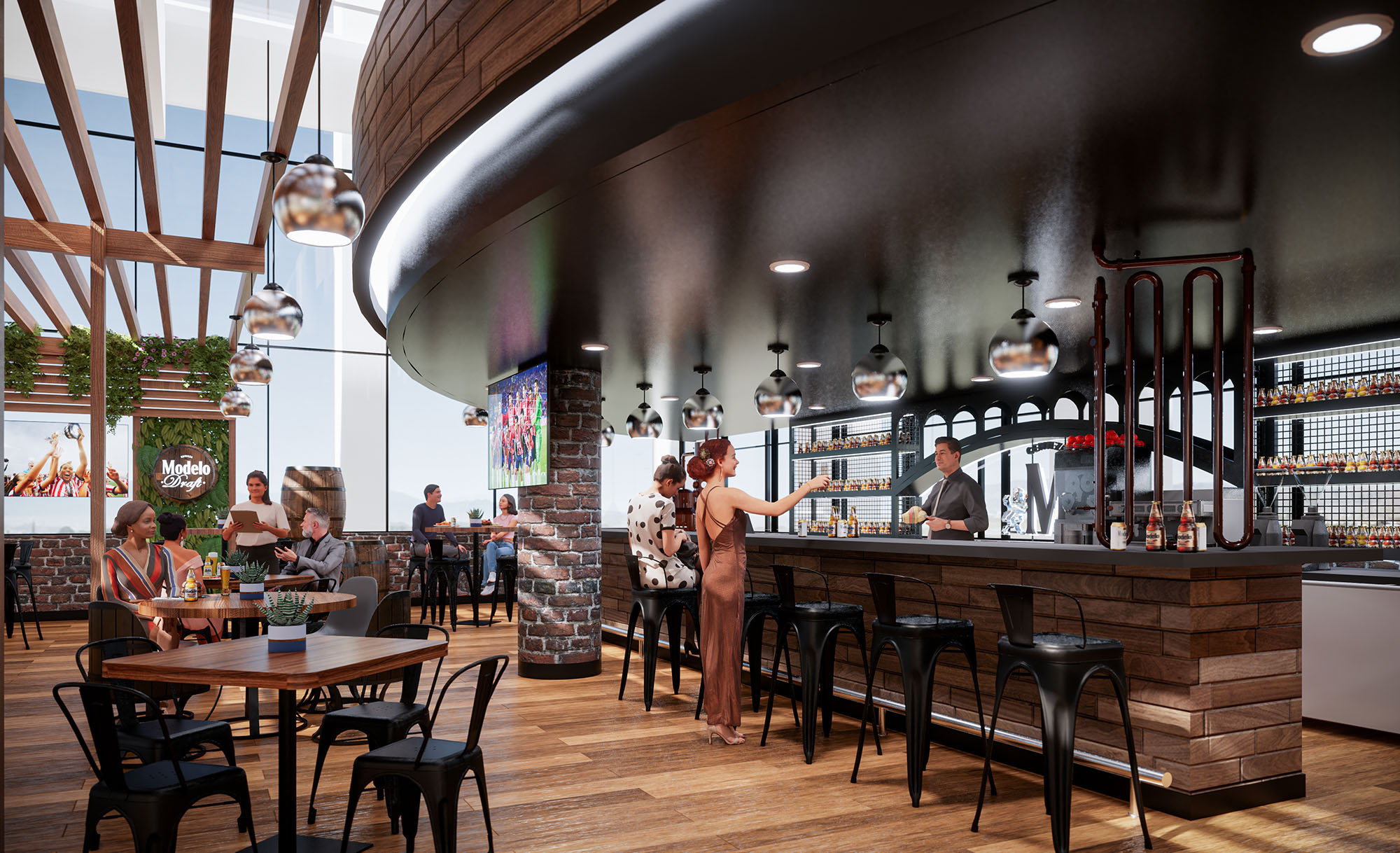
© 2021 by sanzpont [arquitectura] . Webpage by sanzpont [digital] . Innovative Digital Experiences
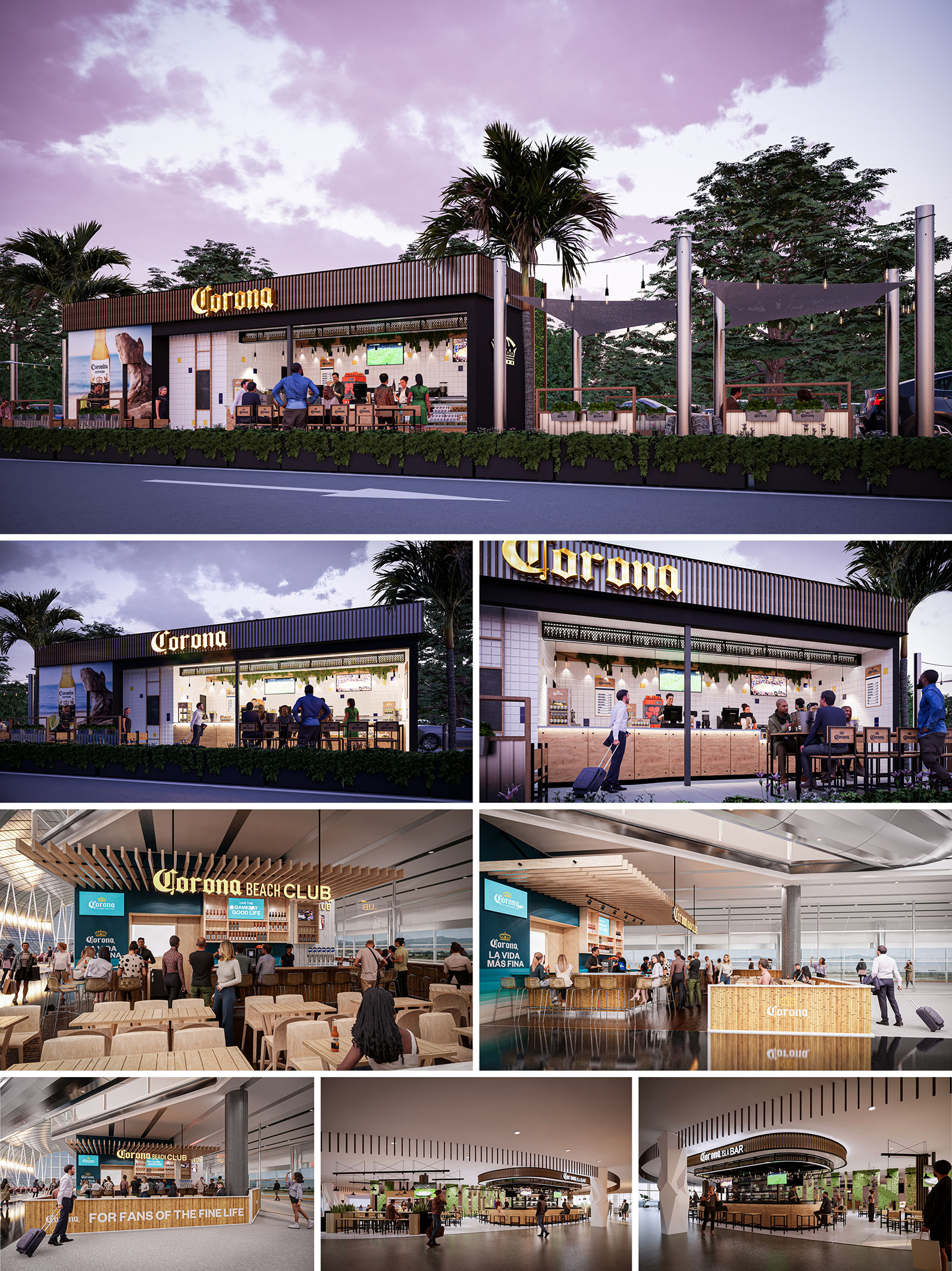
The CORONA project establishes a unified architectural language for a family of bar and restaurant formats deployed across Mexico, Spain and the USA. The concept translates the brand’s beach heritage into a contemporary, modular system capable of adapting to roadside locations, airport terminals and interior commercial settings. Each venue is conceived as an open, permeable pavilion that blurs the boundary between bar, street and concourse, promoting visual connection and a relaxed, resort-like atmosphere within urban and transit environments.
The design narrative is built around three core ideas: an honest expression of materials, a clear and legible façade that functions as large-scale signage, and a flexible interior landscape where bar, kitchen and seating can reconfigure according to local requirements. This combination allows the image of a beach club to be consistently recognizable while remaining sensitive to different scales and contexts.
The roadside typology is conceived as a linear bar volume with a strong street-facing elevation. A deep canopy and a fully openable front façade create a shaded transitional terrace, functioning as an intermediate zone between the interior counter and the exterior seating. The bar line runs parallel to the façade to maximize visibility of preparation areas and product displays from the road, turning the service zone into a dynamic, animated showcase.
In airport locations the layout becomes insular and radial. Bars are often positioned as islands within the concourse, with 360-degree visibility and multiple approach points, or as open-fronted units anchored to a linear storefront. Seating radiates outward in concentric bands of high stools at the bar, communal tables and then more relaxed perimetral seating. This hierarchy ensures efficient circulation around the unit while maintaining clear sightlines to departure gates and wayfinding elements.
The material palette is deliberately warm and tactile, dominated by light-toned woods, white ceramic tiles and black metal framing. Timber is used for bar fronts, soffits, ceiling slats and loose furniture, evoking beach deck structures and boardwalks. White tiling provides a clean, hygienic backdrop for the preparation areas, enhancing brightness and reflecting natural and artificial light deep into the space. Black steel profiles frame openings and signage, adding precision and durability.
The color strategy centers on the brand’s iconic tones: sandy neutrals, turquoise accents and signature yellow logotypes. Illuminated signage is carefully integrated into the architecture, often floating above the bar in three-dimensional letters or embedded into linear canopies. Large-scale graphic panels and digital screens provide flexibility for campaigns while maintaining a consistent visual identity. The result is an environment that reads simultaneously as a recognizable brand space and as a coherent piece of interior architecture.
The interior design emphasizes informality and sociability. Furniture is predominantly loose and modular, with a mix of high communal tables, individual stools and more intimate two- and four-top settings. Simple timber chairs and stools with metal bases are chosen for robustness and ease of maintenance, while their repetition across locations reinforces the family identity. Bar counters are expressed as solid, monolithic volumes with clear working fronts and recessed toe spaces for ergonomic comfort.
Lighting plays a key role in generating atmosphere. Warm, low-glare pendant fixtures and integrated linear LEDs beneath shelves and canopies create a golden, sunset-like ambience that contrasts with the often neutral lighting of airport concourses. In outdoor venues, string lights and minimal pole-mounted luminaires articulate terraces and emphasize the evening character of the spaces. Illuminated backbars highlight product displays, turning bottles into luminous vertical textures that act as both décor and signage.
In exterior formats, landscaped planters define the edge between public road or parking areas and the bar terrace, acting as both protective buffer and biophilic element. Shade is provided by tensile fabric sails and extended canopies, reducing direct solar gain and increasing user comfort in warm climates. The terraces remain deliberately permeable, enabling natural cross-ventilation and maintaining visual continuity with surrounding greenery.
Sustainability criteria inform material selection and operational strategies. Preference is given to durable, easily replaceable components arranged in modular systems, which facilitates maintenance and reduces waste across multiple locations. Timber elements are designed for repeatable fabrication, optimizing cutting patterns and minimizing offcuts. LED lighting and energy-efficient equipment are specified to reduce operational consumption, while the open layouts maximize the use of natural light and ventilation wherever climate allows, decreasing reliance on mechanical conditioning.
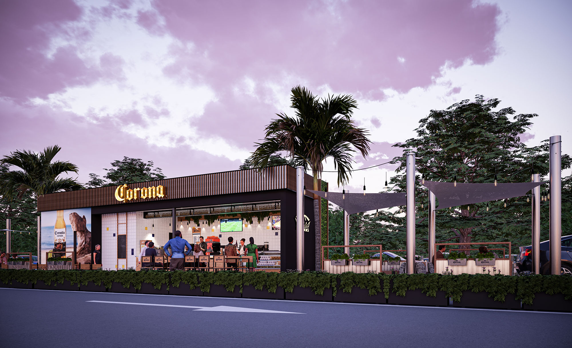
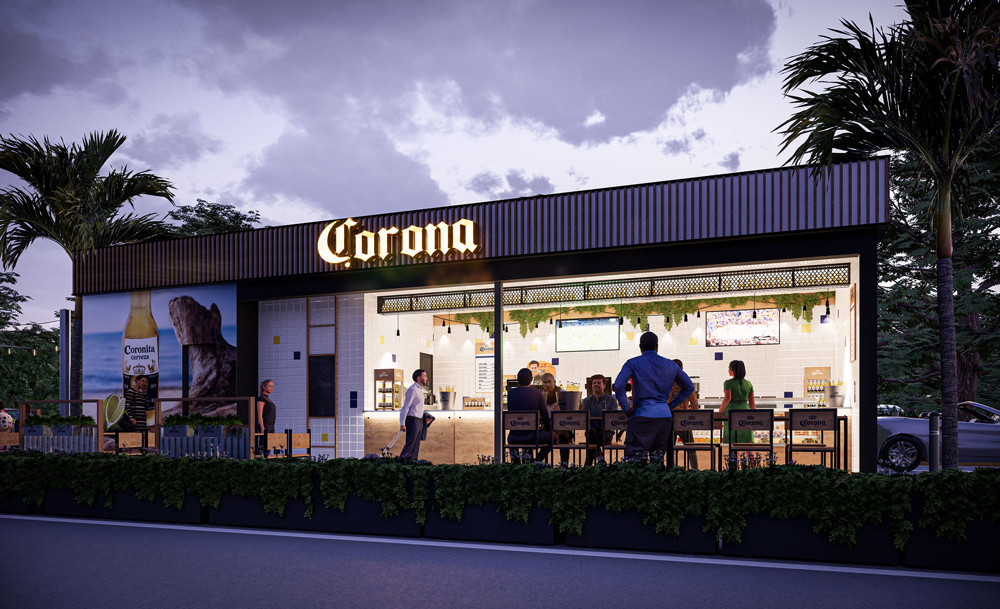
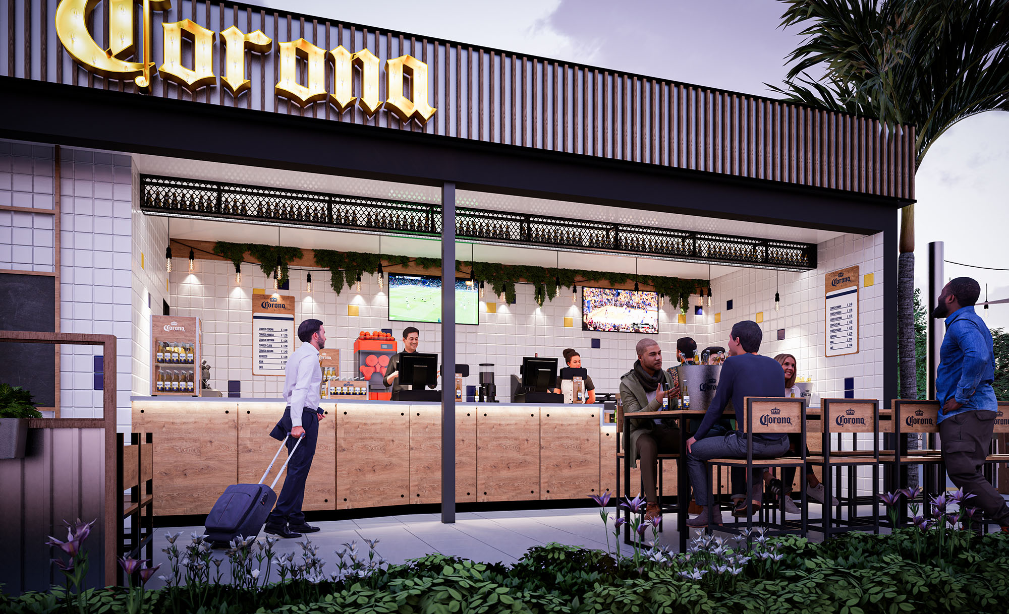
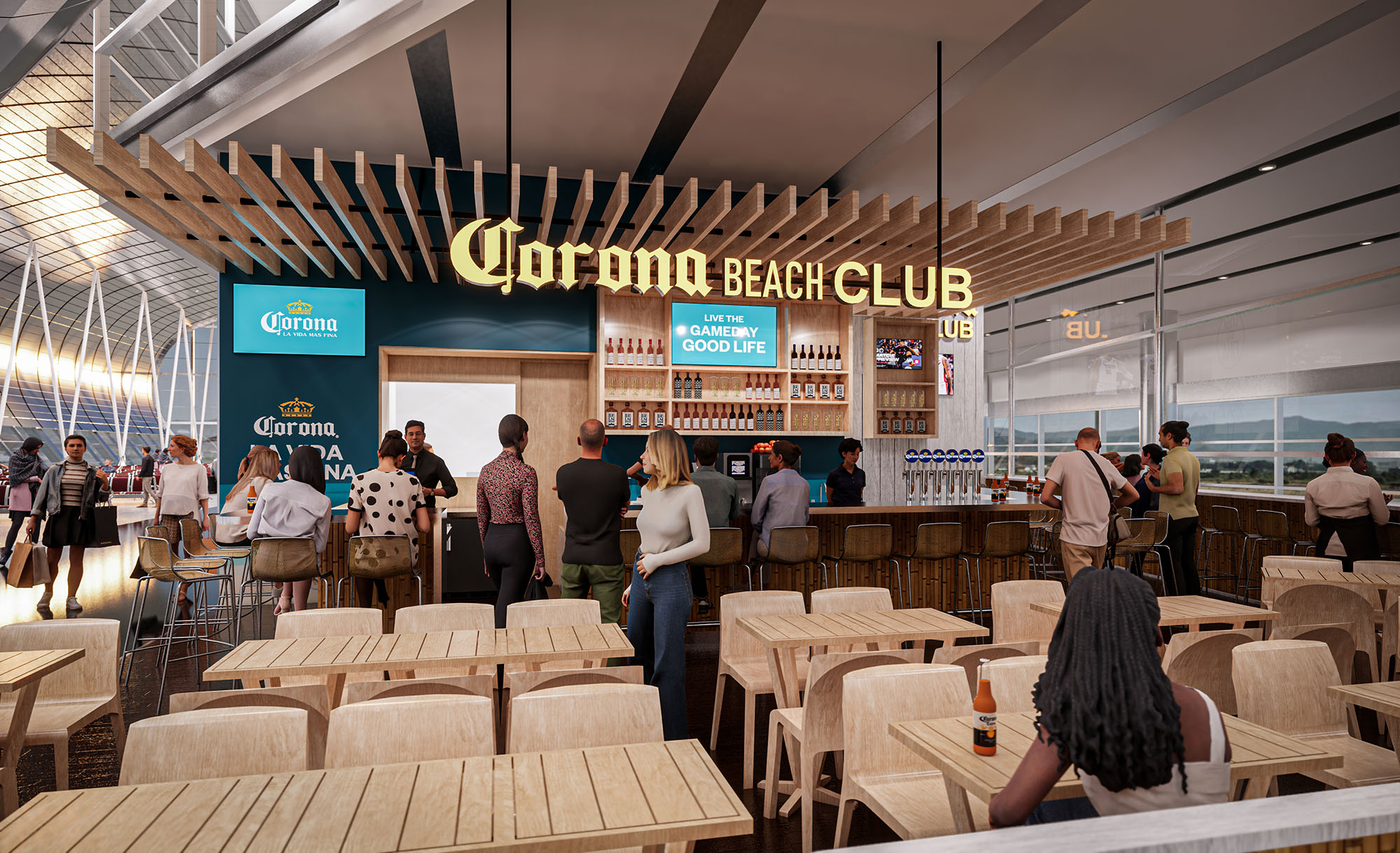
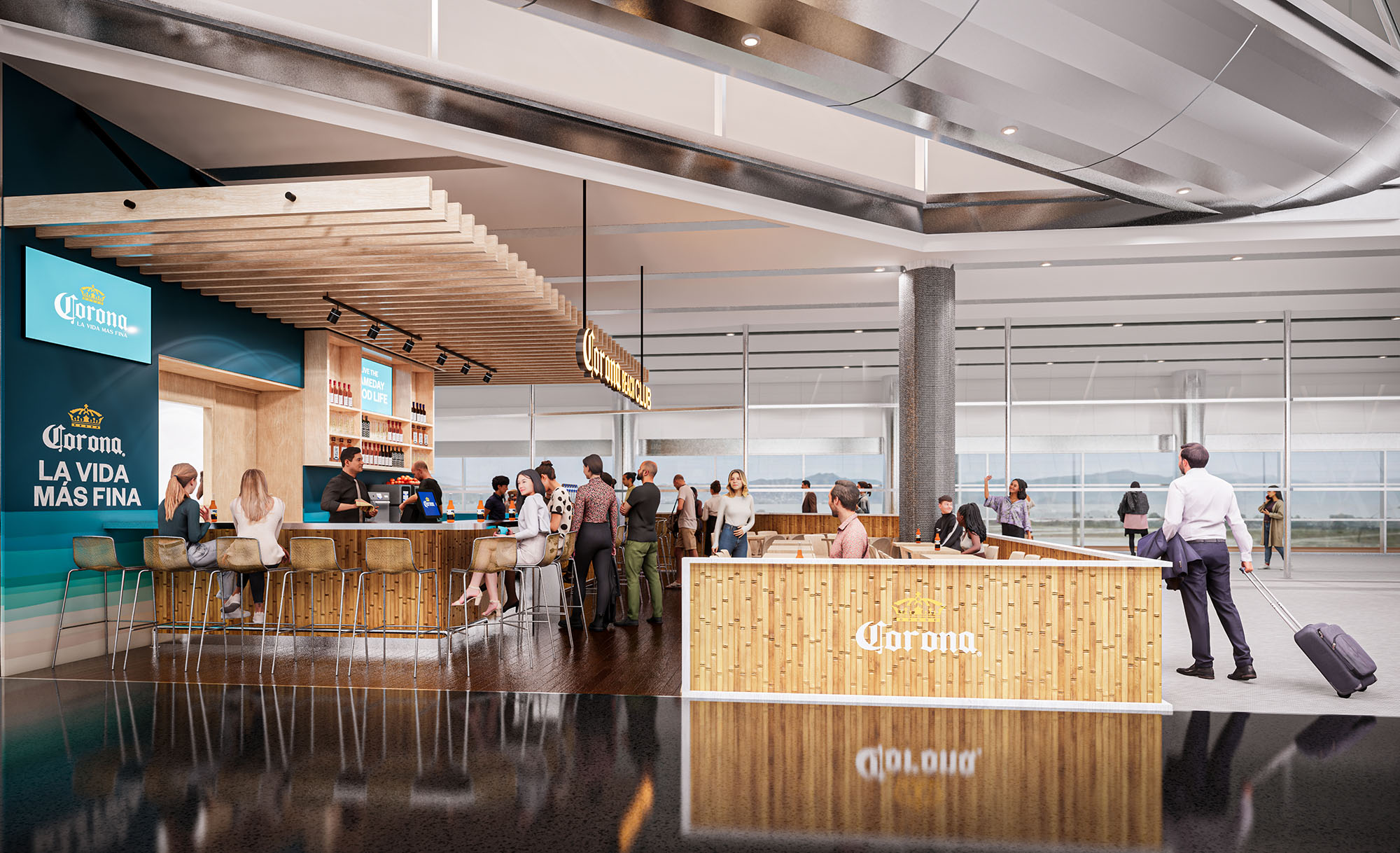
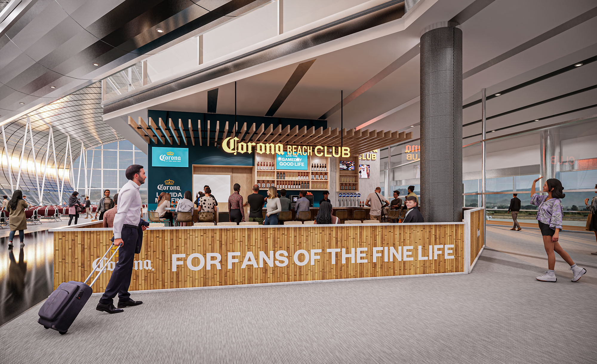
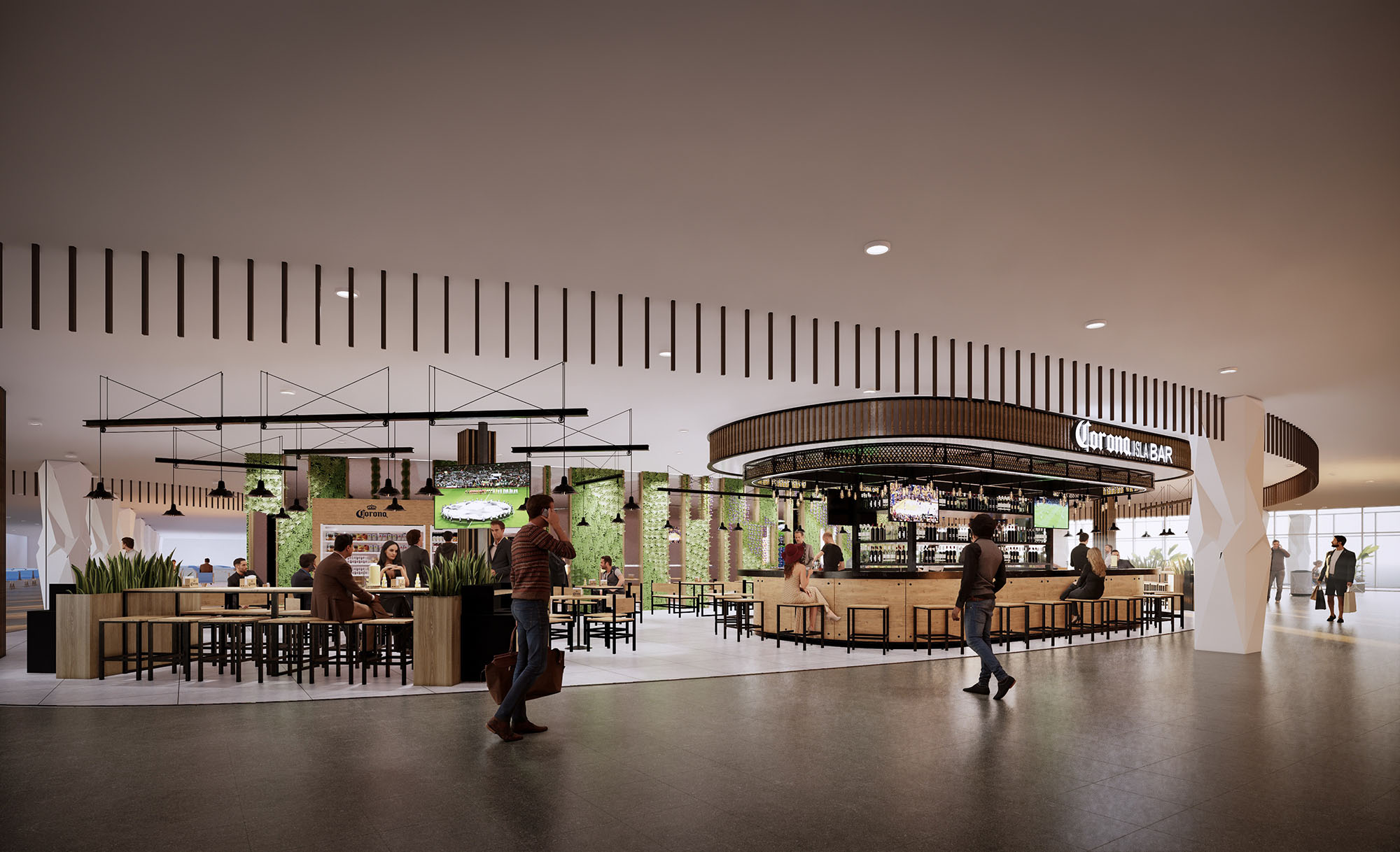
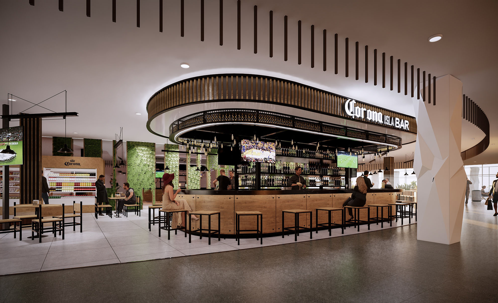
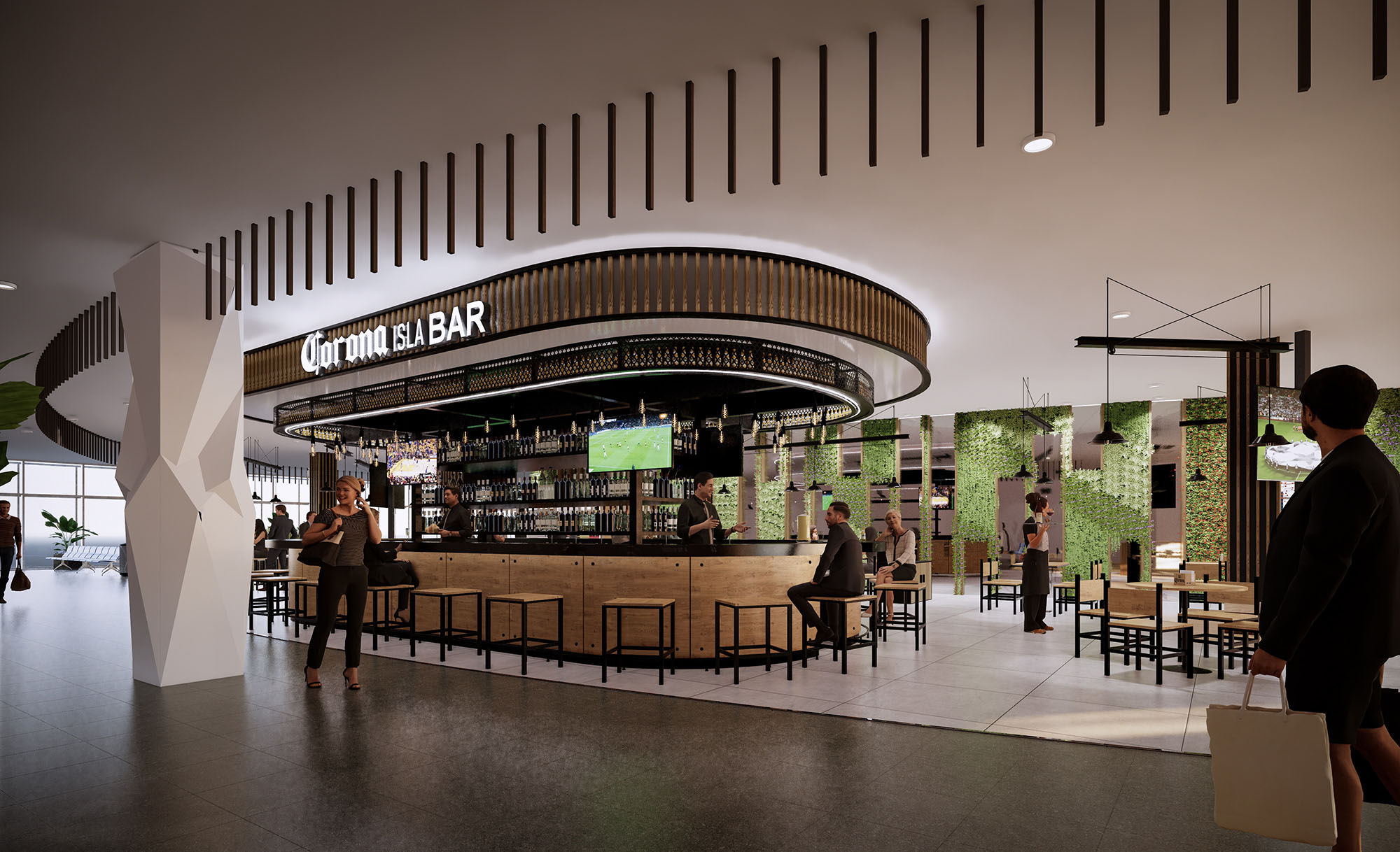
© 2021 by sanzpont [arquitectura] . Webpage by sanzpont [digital] . Innovative Digital Experiences
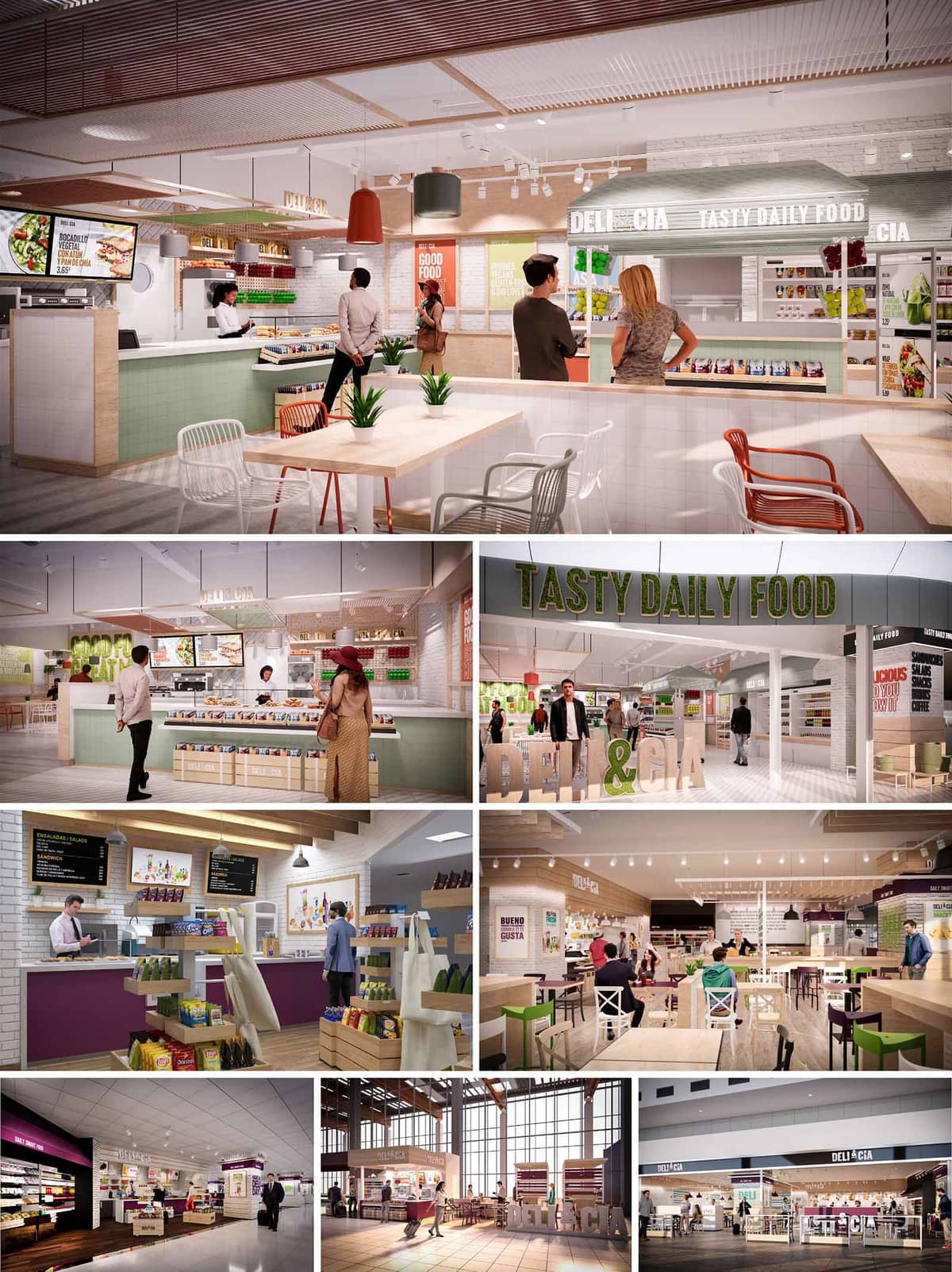
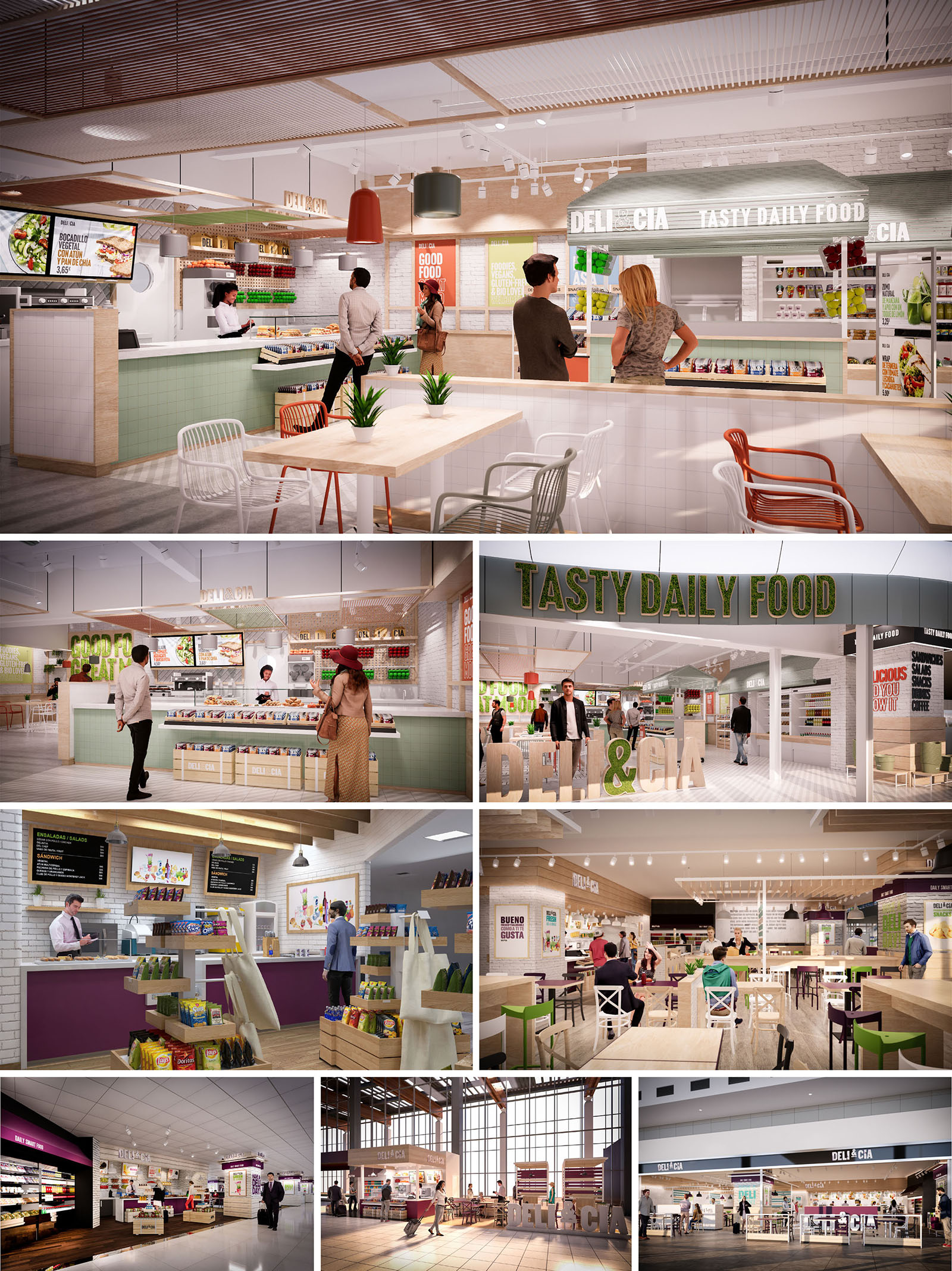
DELI & CIA is conceived as a contemporary fast-casual food concept that combines the spontaneity of grab-and-go with the warmth of a neighborhood deli. Across the different locations in Spain, Portugal, Chile and México, the design language remains consistent: a fresh, luminous environment that communicates transparency, health and everyday accessibility. The space is organized as an open market counter wrapped by islands of product display and casual seating, dissolving the boundary between kitchen, retail and dining.
The brand identity is translated into architecture through clear, legible signage and volumetric elements that float above the counters. Generous visual connections between preparation areas, self-service lines and eating zones emphasize an honest, “nothing to hide” attitude, reinforcing trust in the food offer and encouraging intuitive circulation.
The interior layout is based on a linear service counter that anchors the space and guides customers from menu selection to payment and pick-up. This counter is complemented by freestanding merchandise displays that create soft partitions without obstructing views. The sequence allows for high throughput during peak hours, while maintaining a relaxed, open ambience.
Seating zones are strategically located at the perimeter and in central islands, offering both quick-stop tables and more comfortable areas for longer stays. Mixed-height furniture, from bar counters to standard tables, generates a varied landscape that adapts to solo travelers, couples and small groups. Wayfinding is intuitive, with clear visual cues from color-coded areas and suspended signage indicating food stations and self-service points.
The material palette balances the cleanliness required for food environments with a domestic, approachable character. Light ceramic tiles and white brick cladding provide a hygienic and easily maintainable base, while natural or light-toned woods introduce warmth and tactility in counters, shelving and tabletops. Metal structures and wire shelves add robustness and an industrial-refined touch.
Color plays a strategic role in brand differentiation. Soft greens, warm oranges and purples are applied in measured accents on counters, chairs and graphic elements, reinforcing the visual identity without saturating the space. White ceilings and pale floors amplify natural and artificial light, ensuring a bright atmosphere even in interior airport or mall locations.
The lighting design layers functional and ambient illumination to support both product display and spatial comfort. Linear LED tracks provide uniform general lighting, while pendant fixtures over counters and communal tables create focal points and a more intimate scale. Warm color temperatures are selected to enhance the appearance of fresh food and make the environment feel welcoming rather than purely technical.
In locations with double-height spaces or large façades, natural light is maximized through generous glazing, reinforcing the sense of openness and transparency. At night or in windowless terminals, the internal lighting concept reproduces this daylight quality, ensuring consistency of brand experience across all sites.
Brand messages such as “Tasty Daily Food” are integrated three-dimensionally into the architecture via large-scale letterings, backlit panels and volumetric logos placed above entrances and counters. Graphic panels in vivid colors communicate menu items, nutritional messages and promotions, acting as both signage and decorative layer.
The furniture is deliberately simple, stackable and robust, with metal chairs in white and accent colors paired with wooden or laminate tabletops. This combination allows for high flexibility in reconfiguring seating according to different footprints and passenger flows, while maintaining a coherent aesthetic family across all eight projects.
Sustainability is addressed through the selection of durable, low-maintenance materials that extend the lifecycle of the fit-out and reduce replacement needs. Where possible, certified wood products are used for furniture and shelving, and finishes are chosen with attention to low-VOC content to improve indoor air quality for both staff and customers.
Energy-efficient LED lighting, integrated with smart controls and zoning, minimizes electricity consumption while ensuring appropriate illumination for each functional area. The open-plan layout optimizes air circulation and reduces the need for compartmentalized climate control. Modular furniture and display systems facilitate adaptation over time, supporting evolving menus and operational changes without requiring resource-intensive refurbishments, thus contributing to a more sustainable long-term model for the brand.
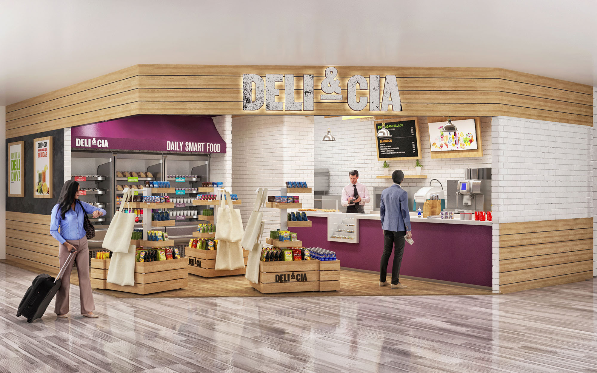
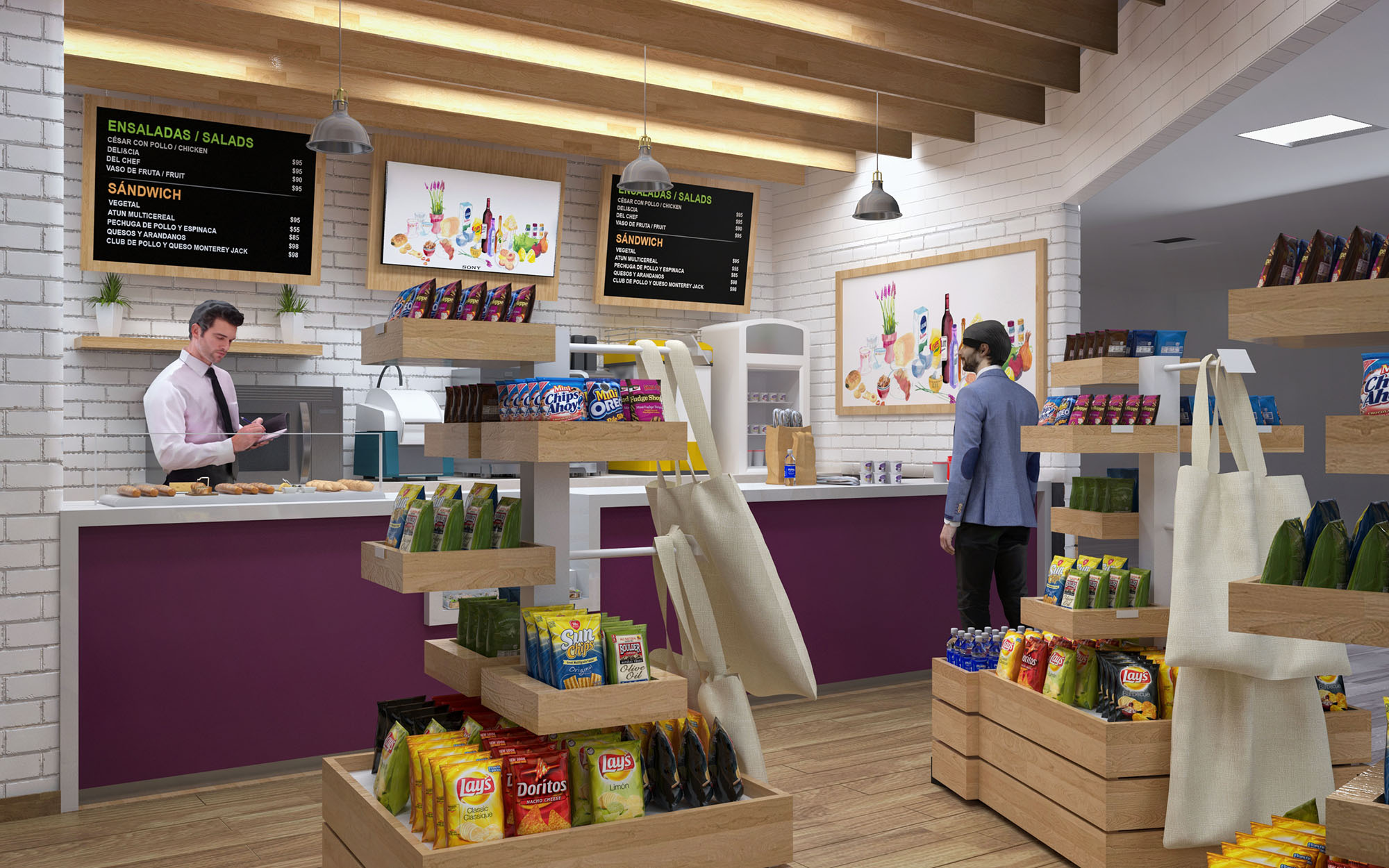
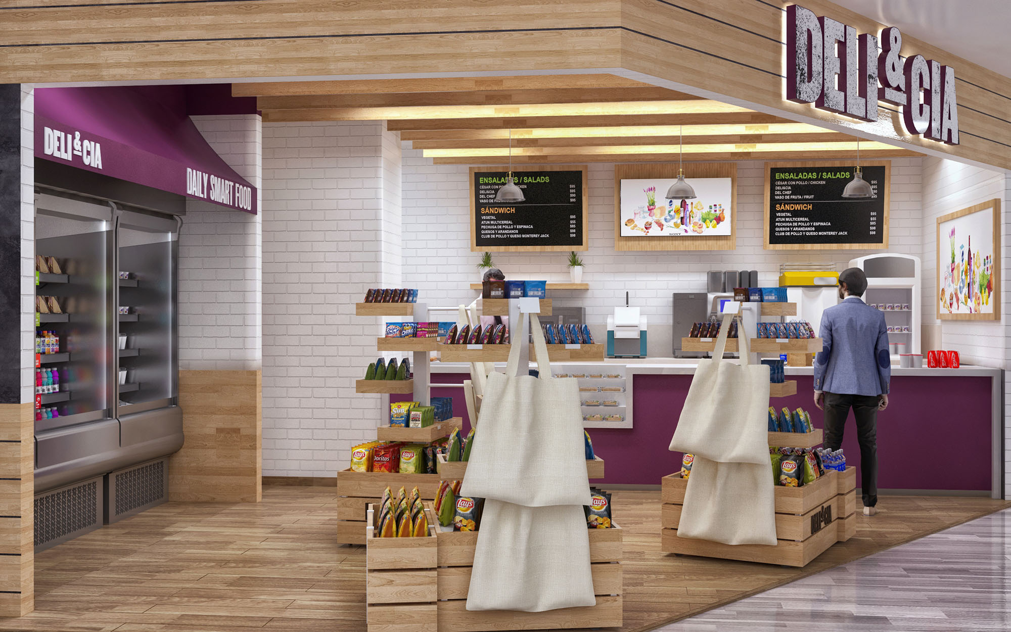
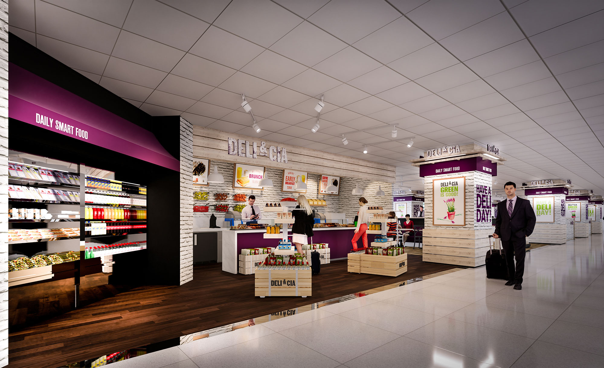
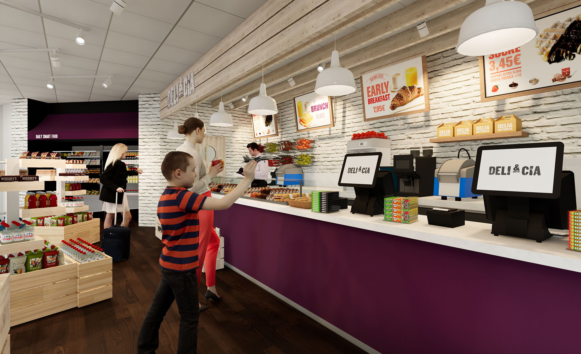
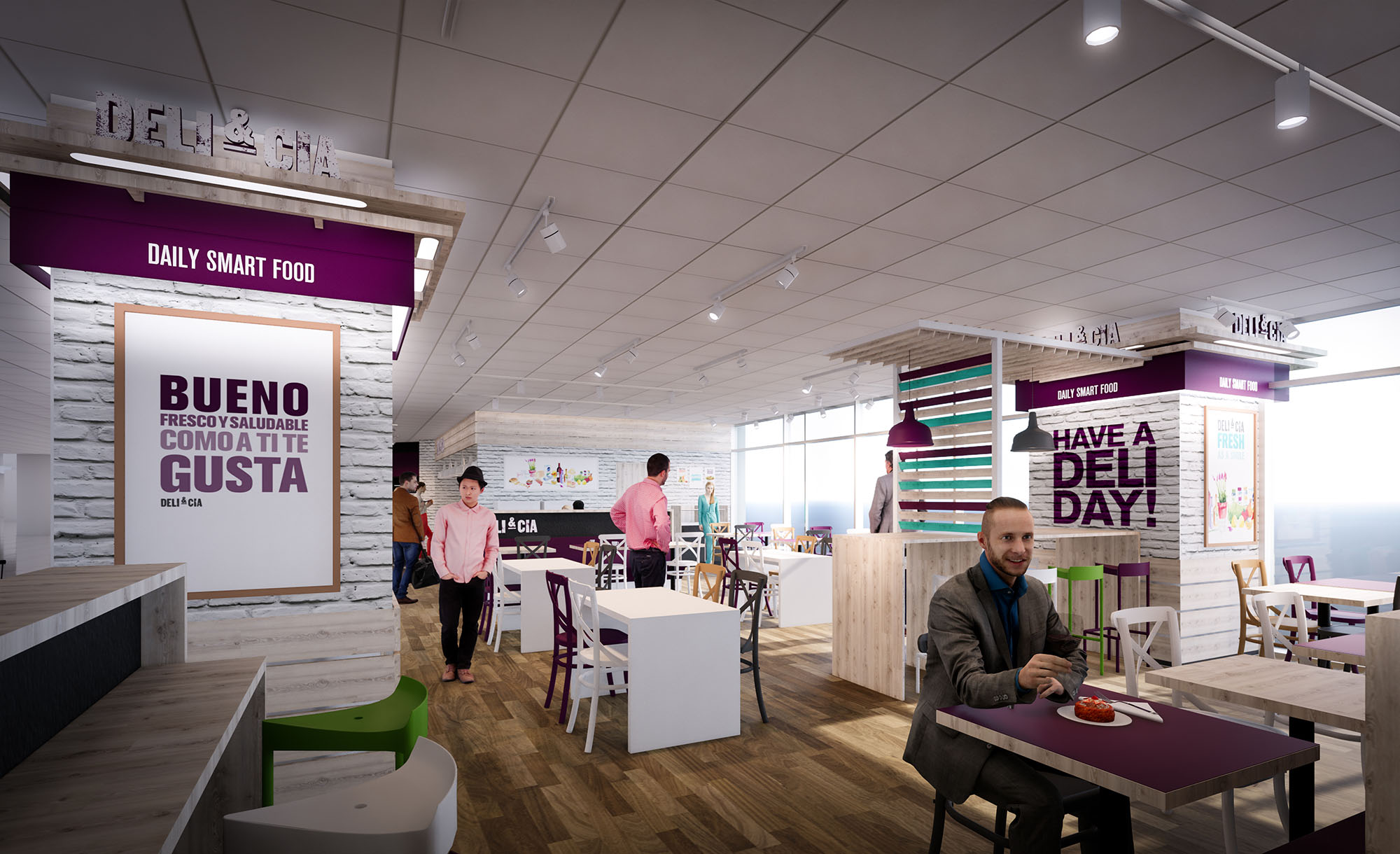
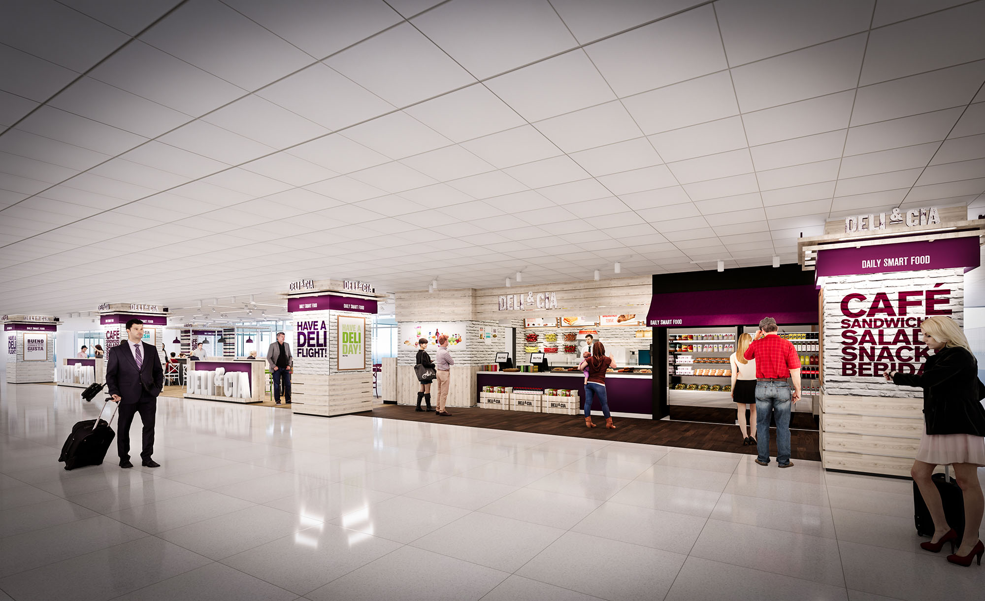
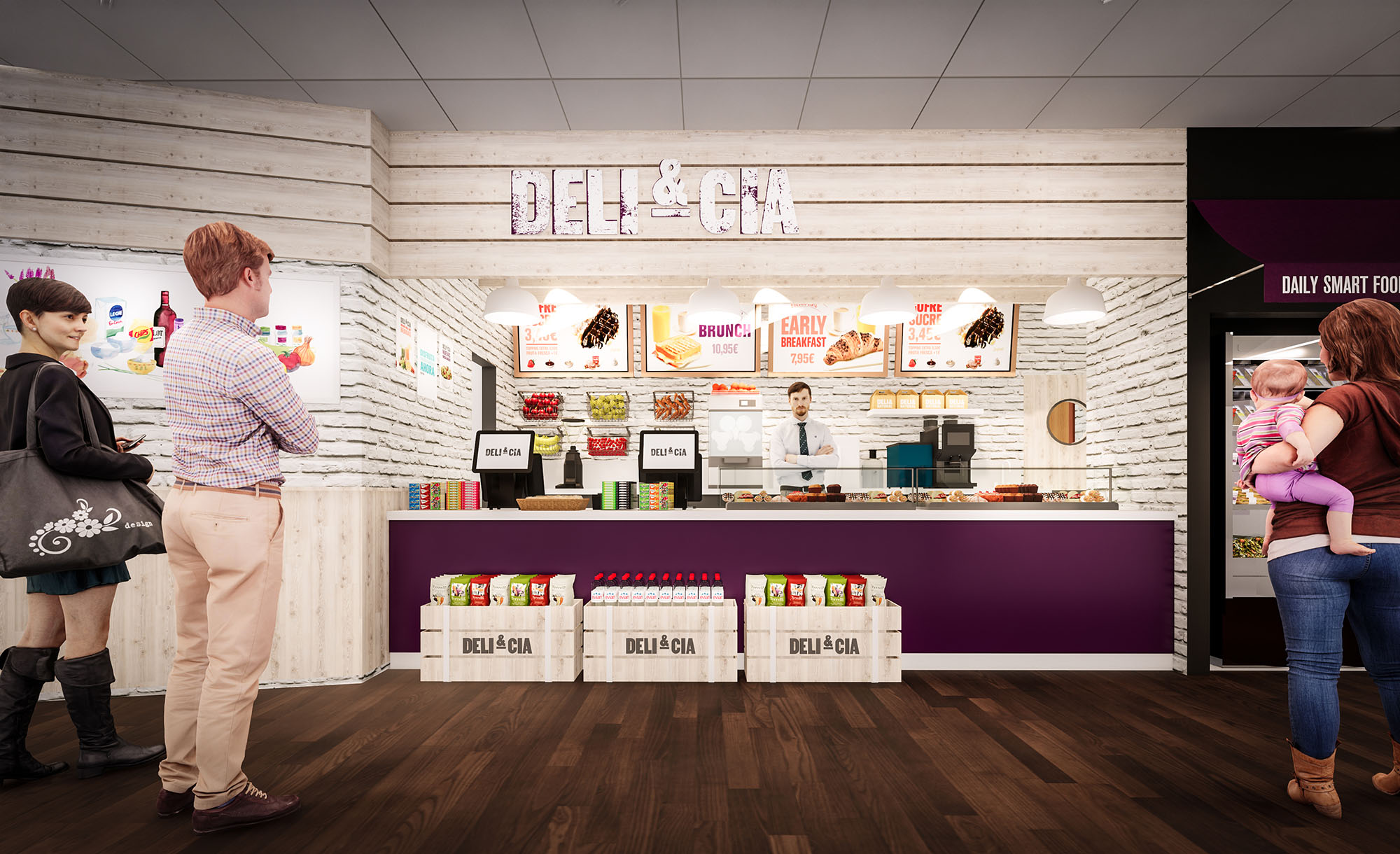
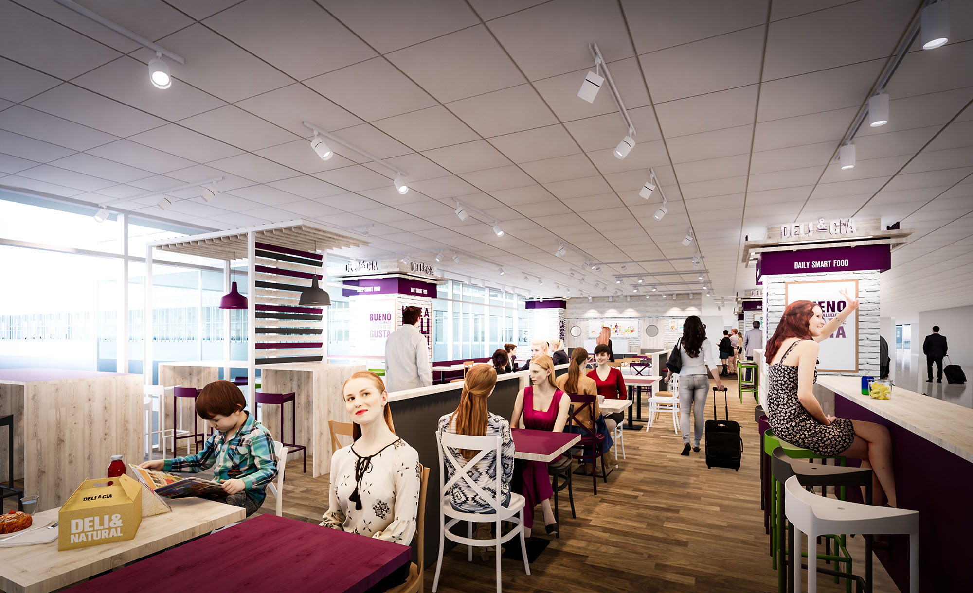
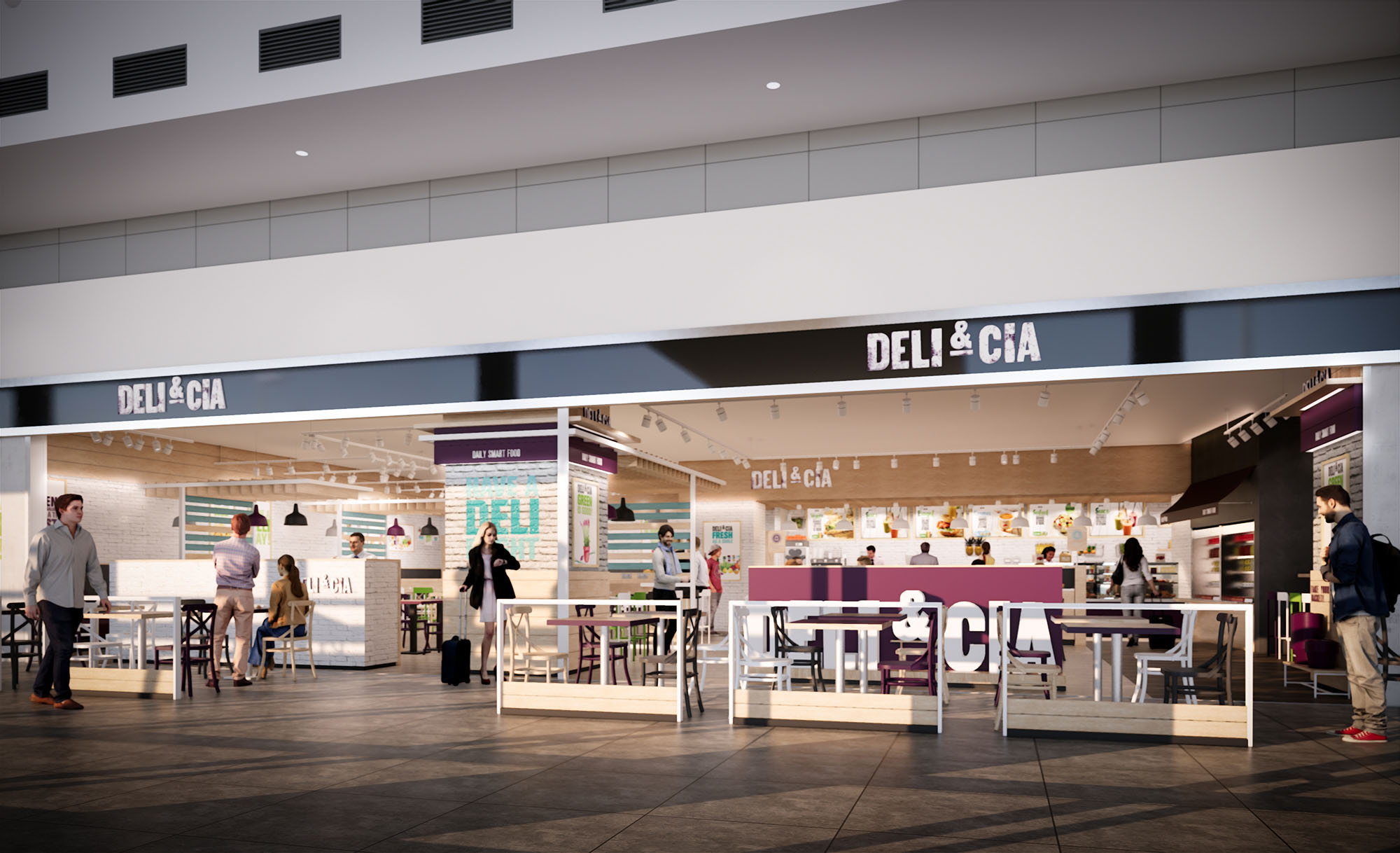
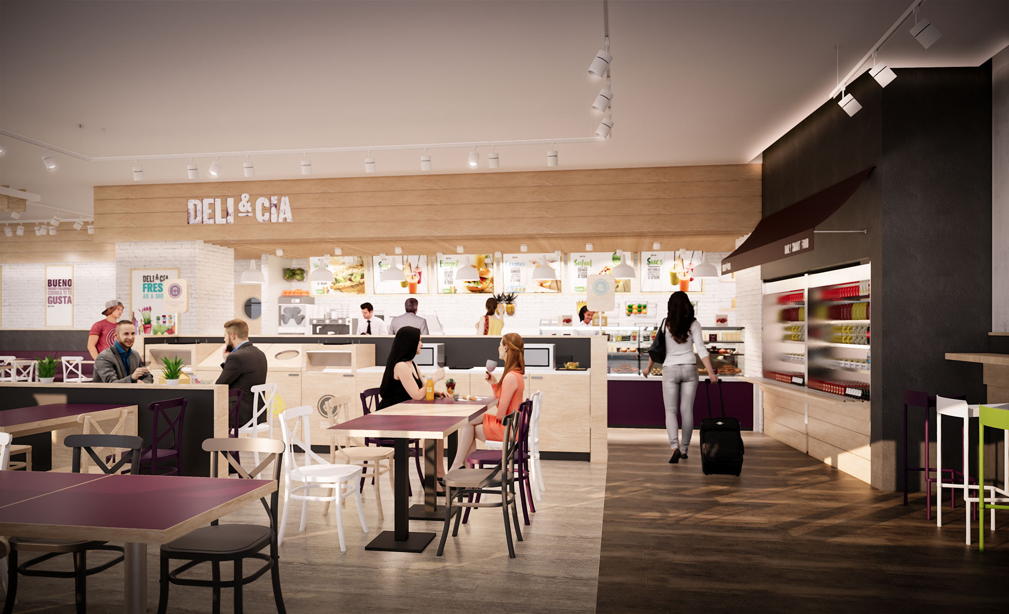
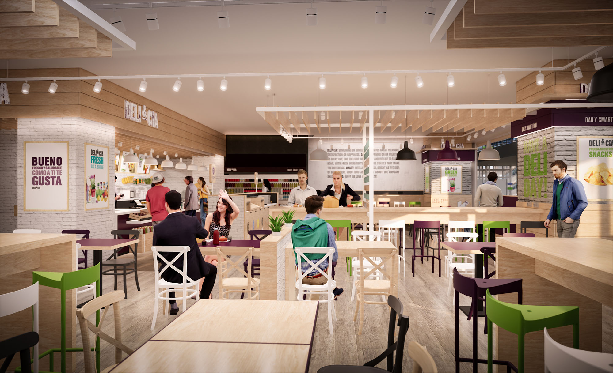
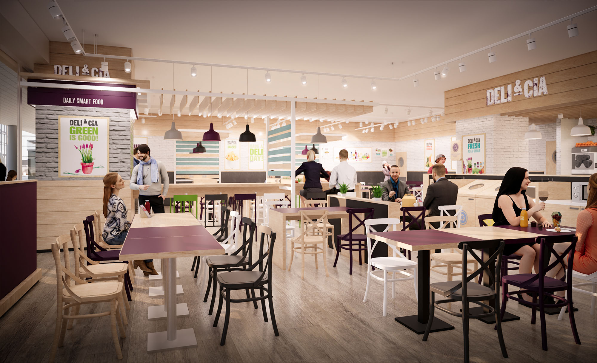
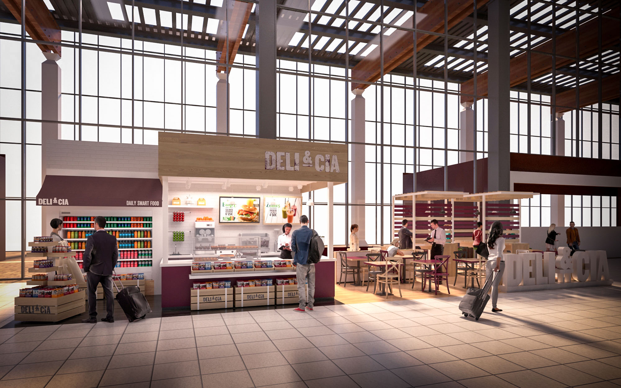
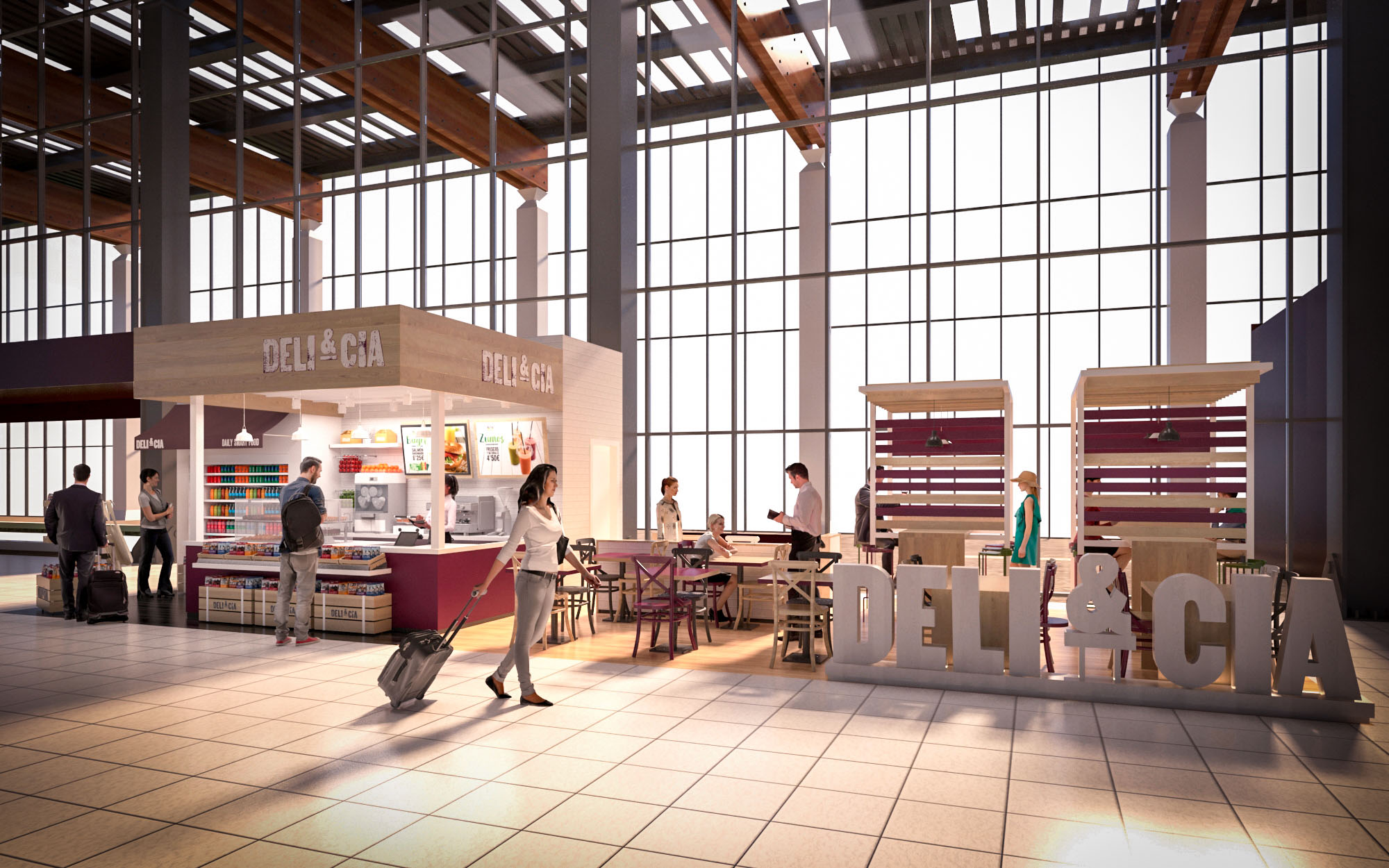
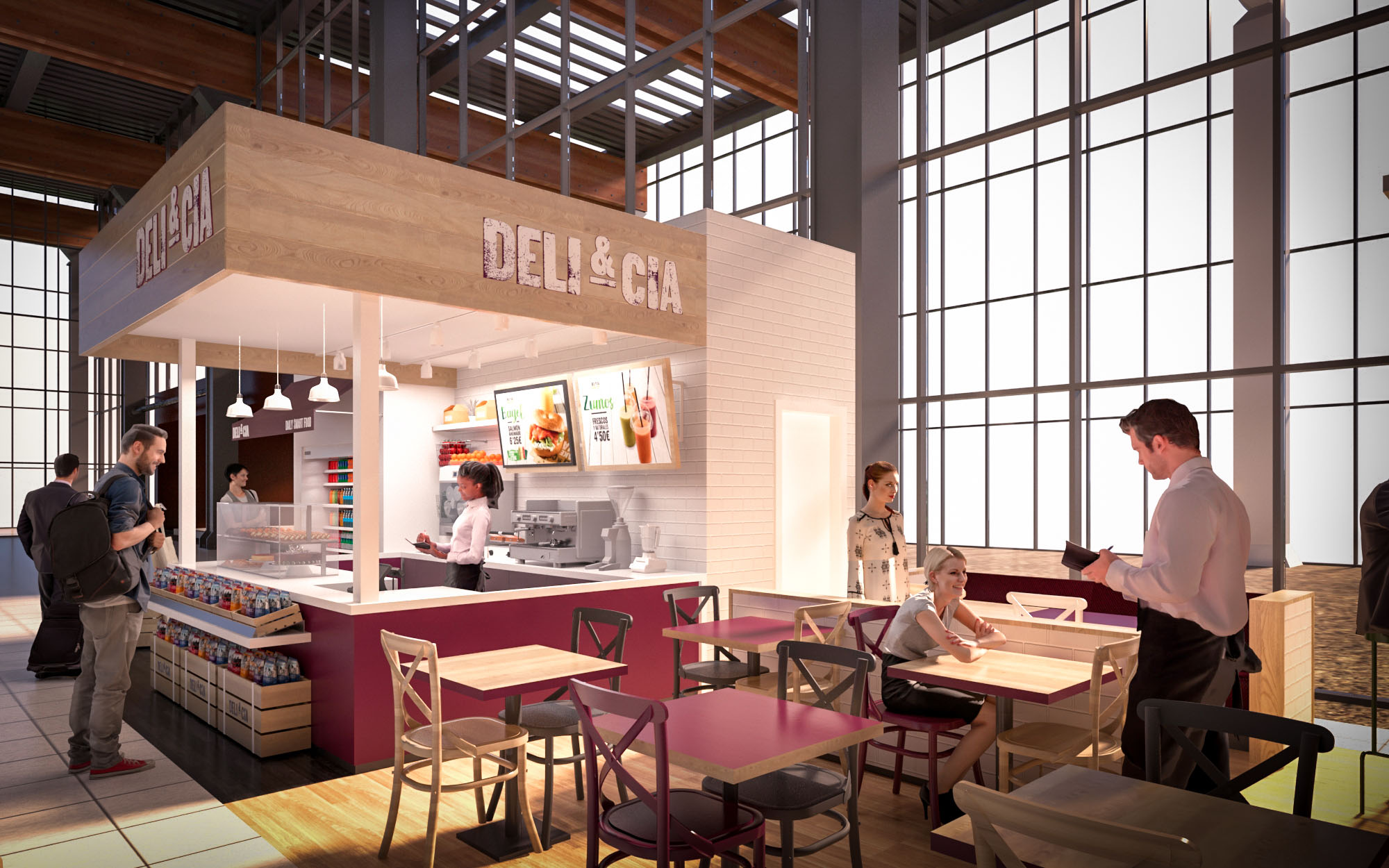
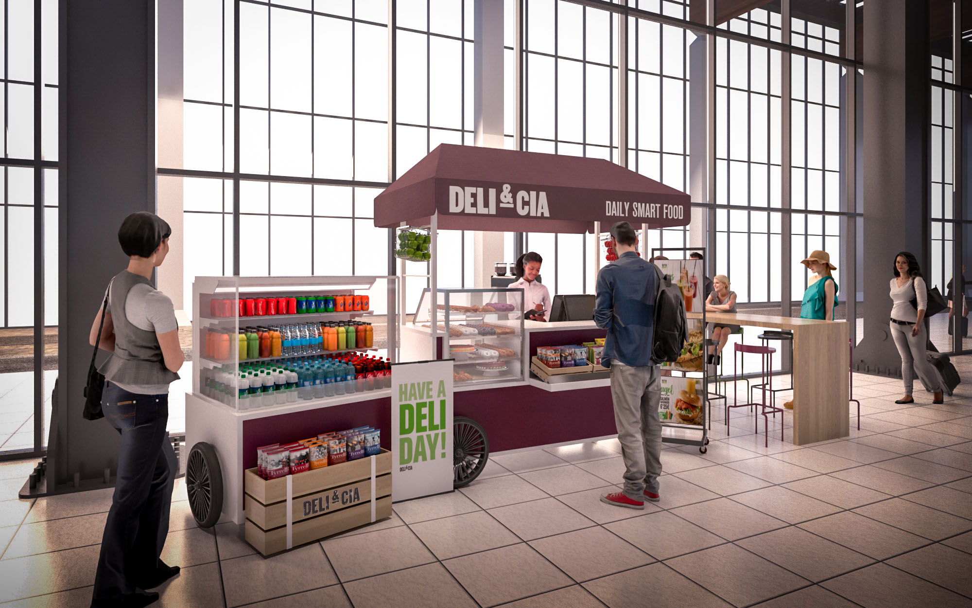
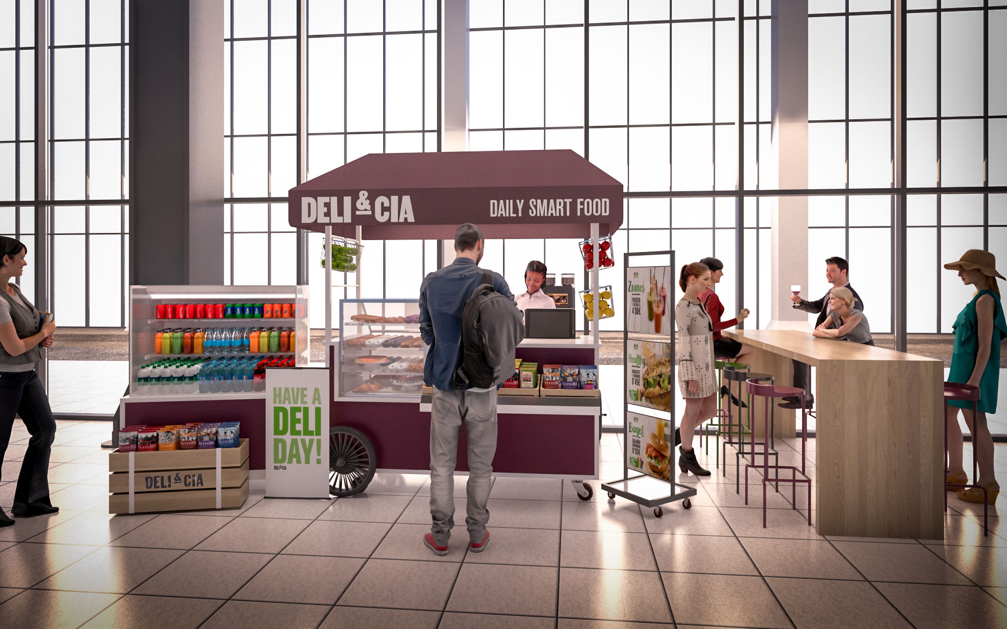
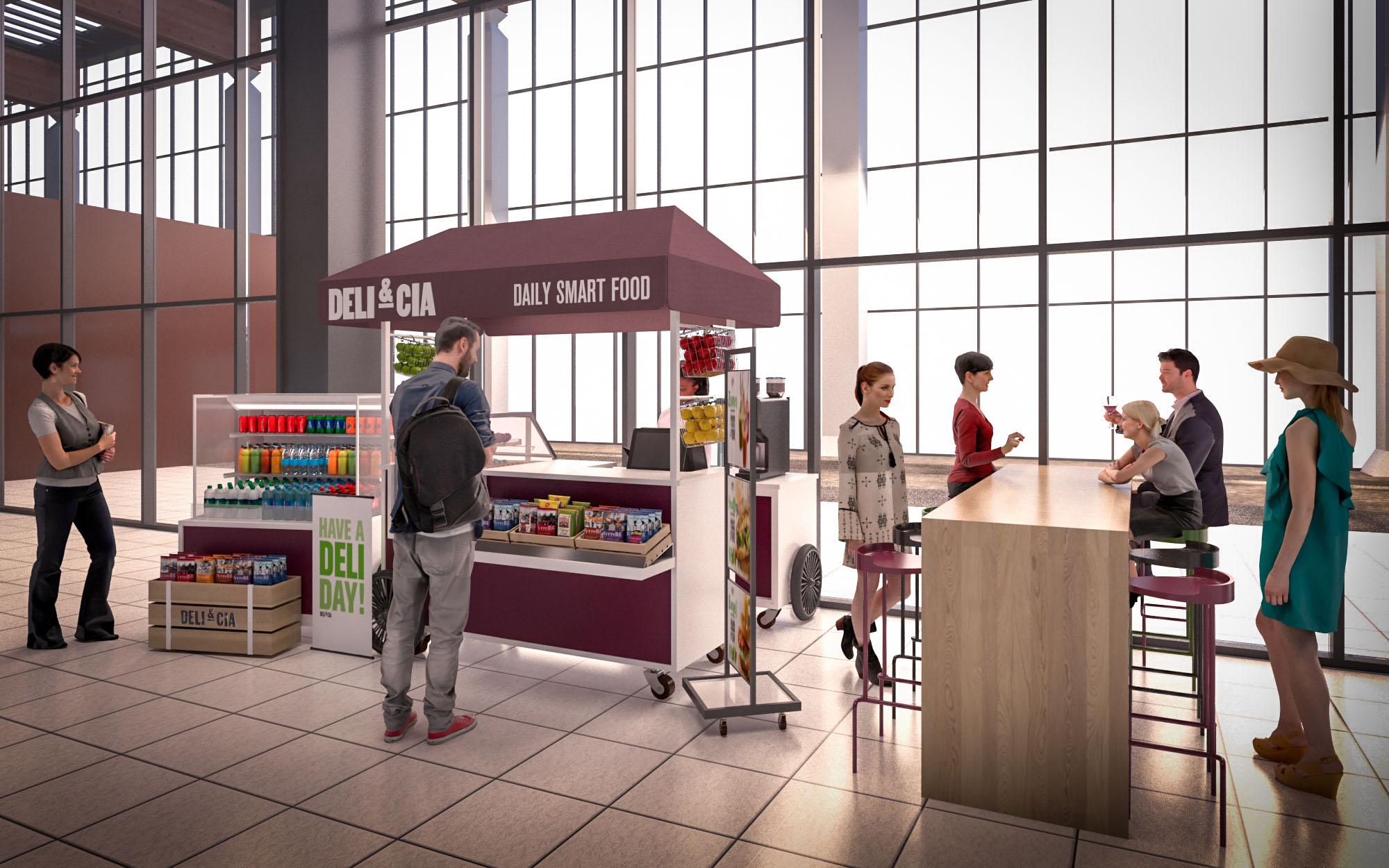
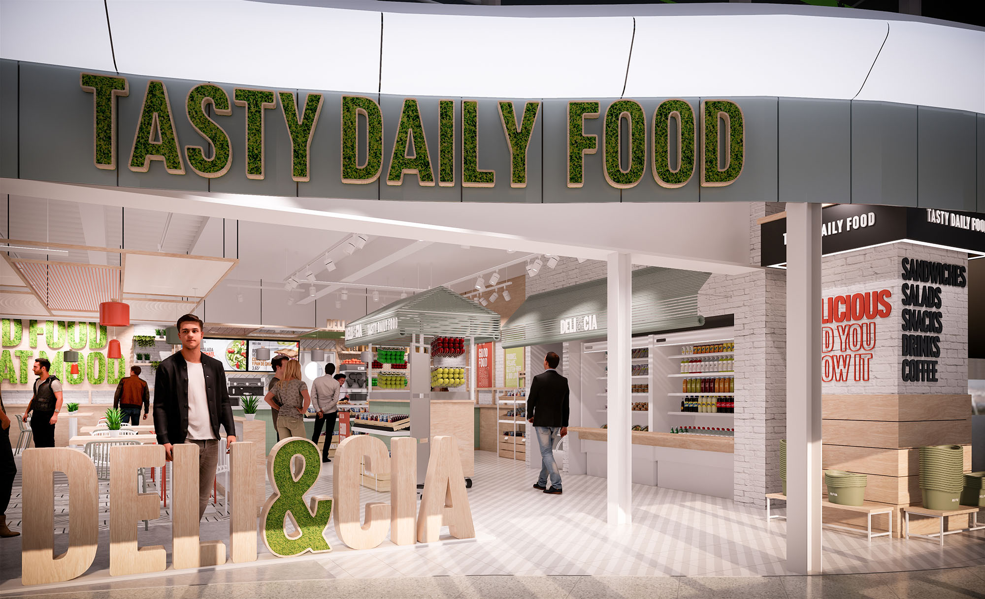
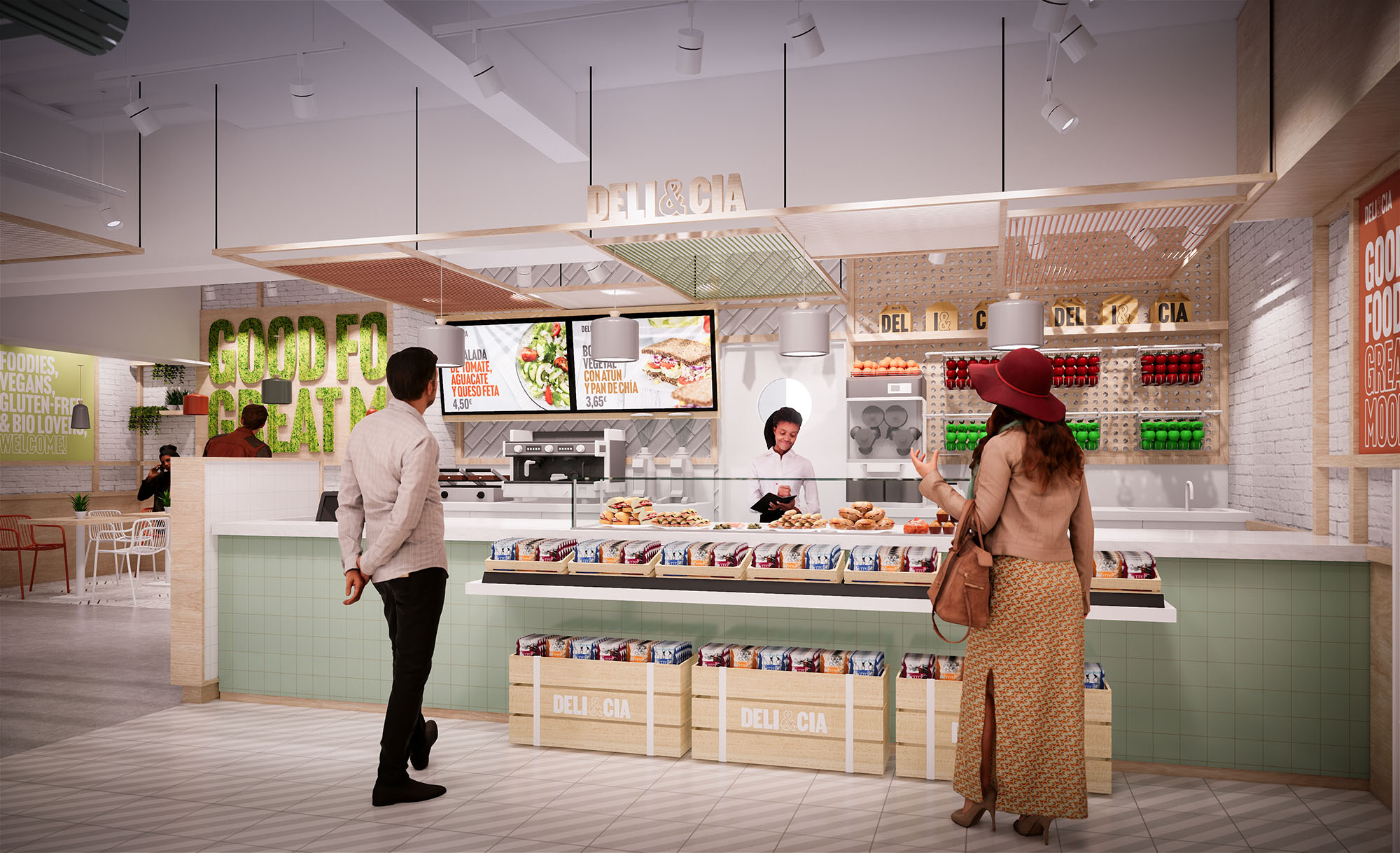
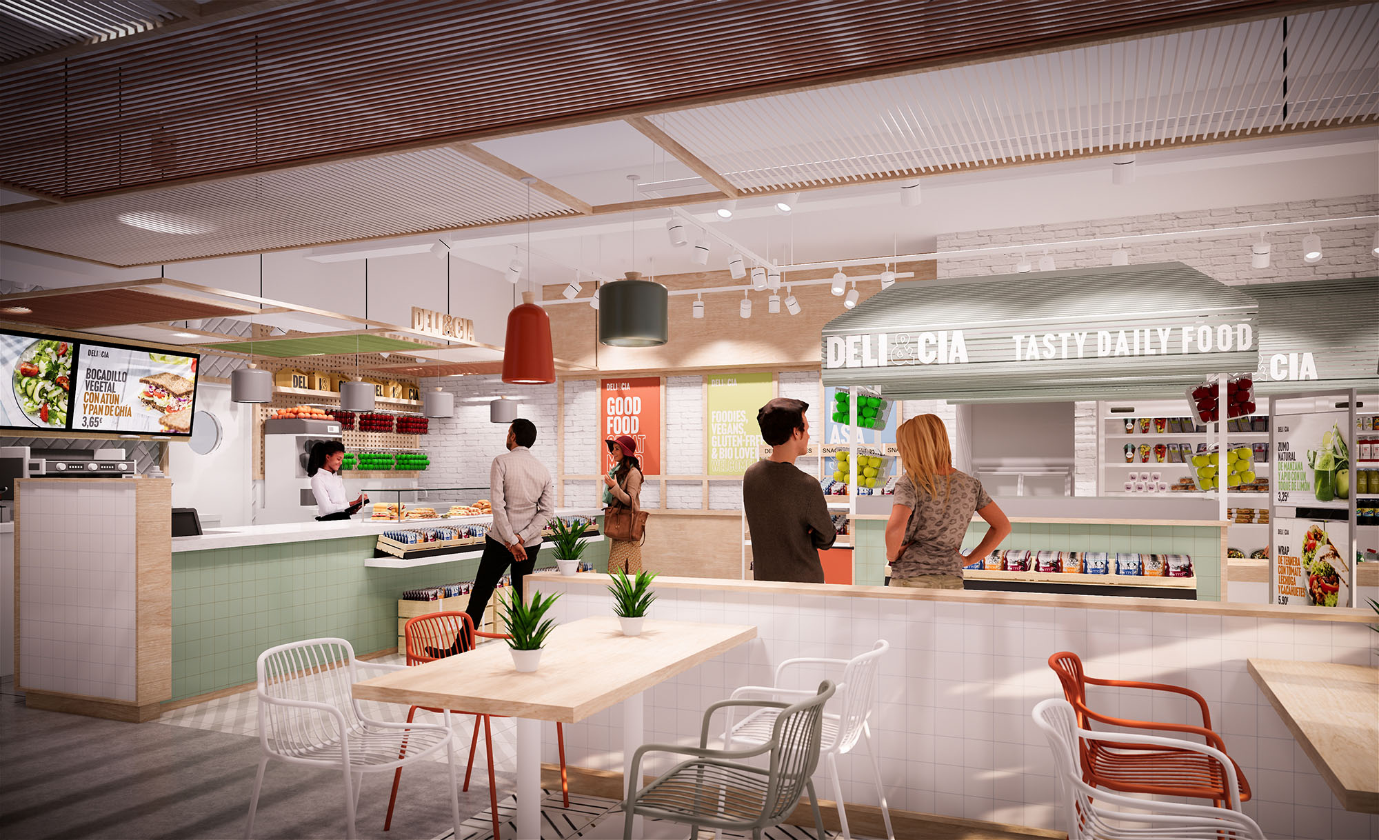
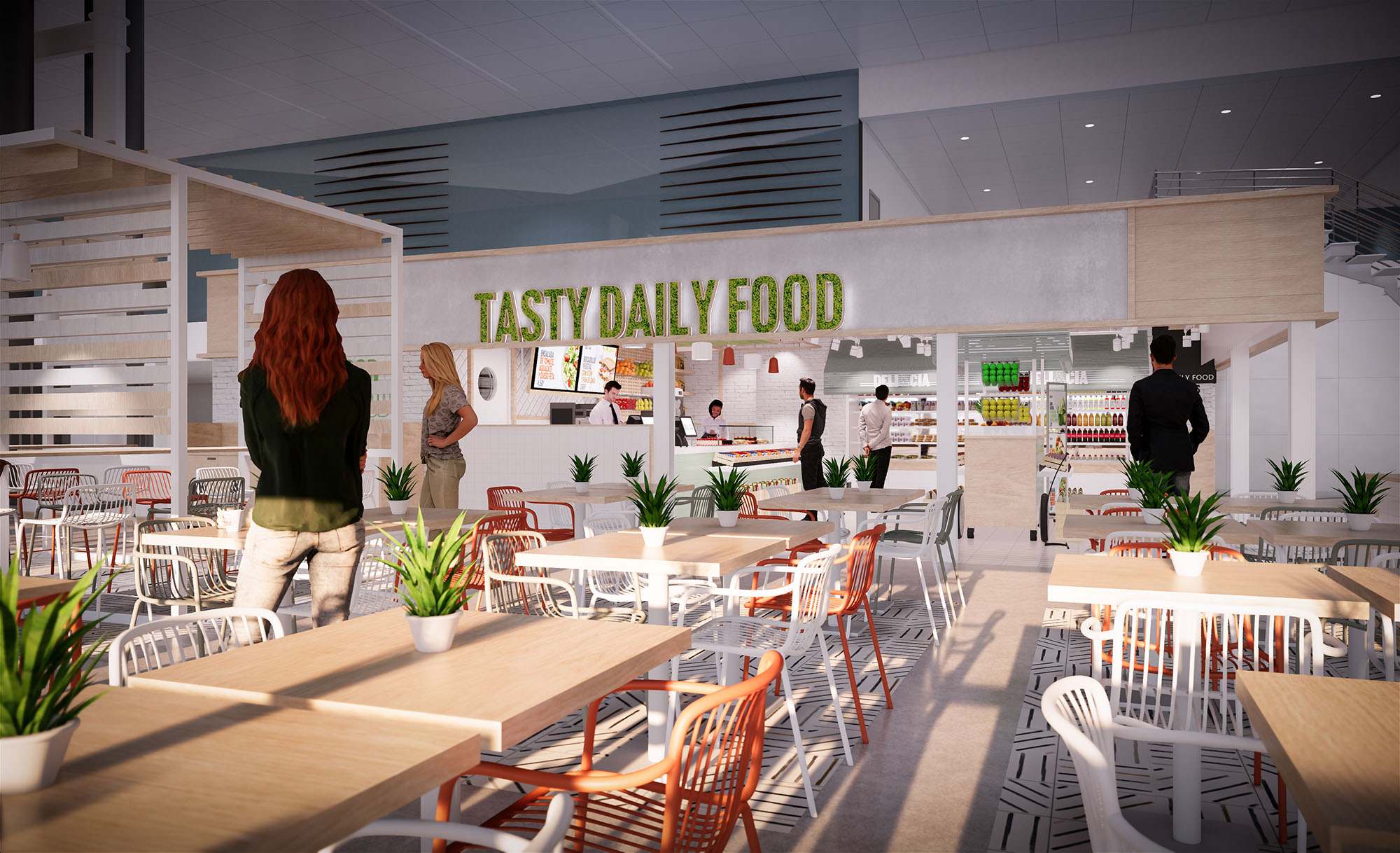
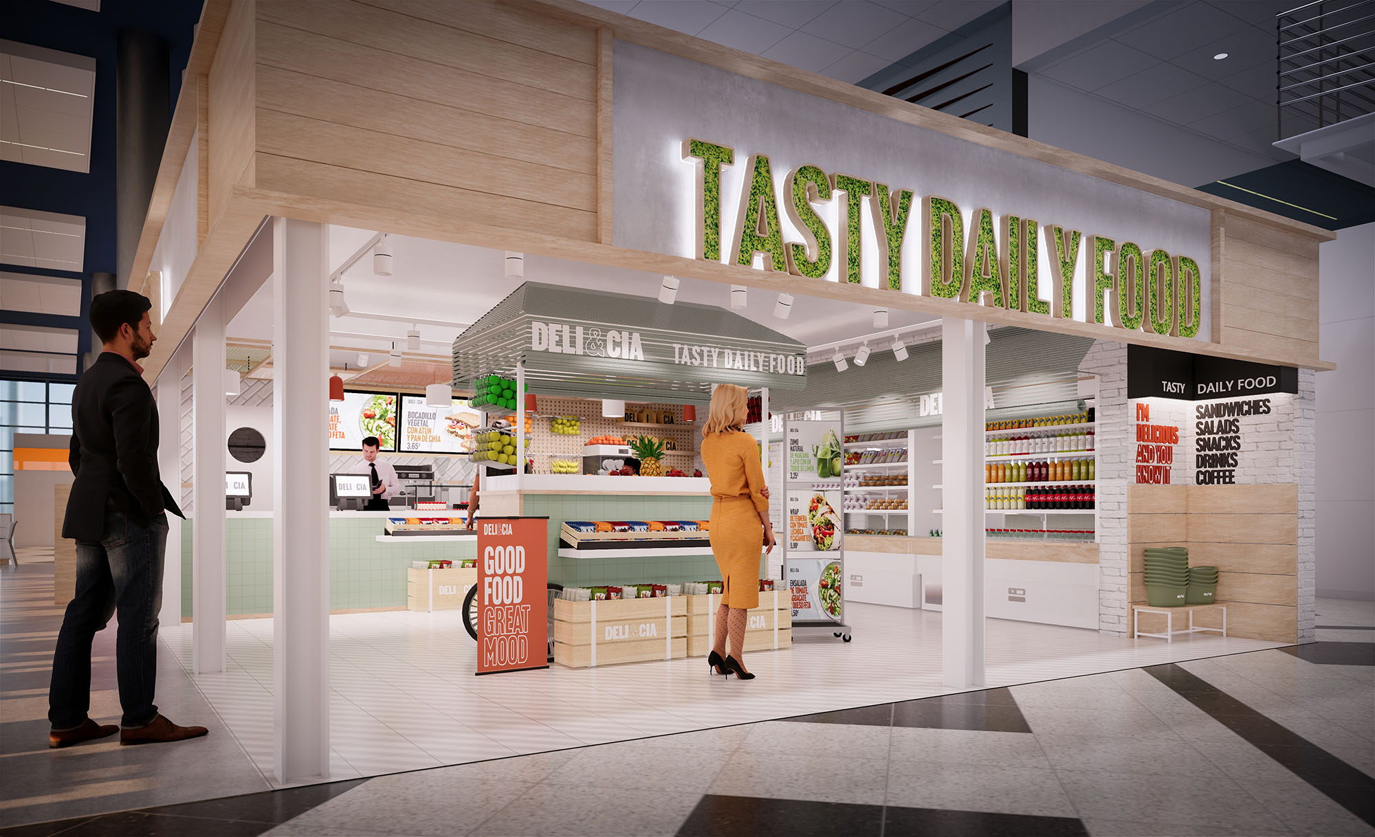
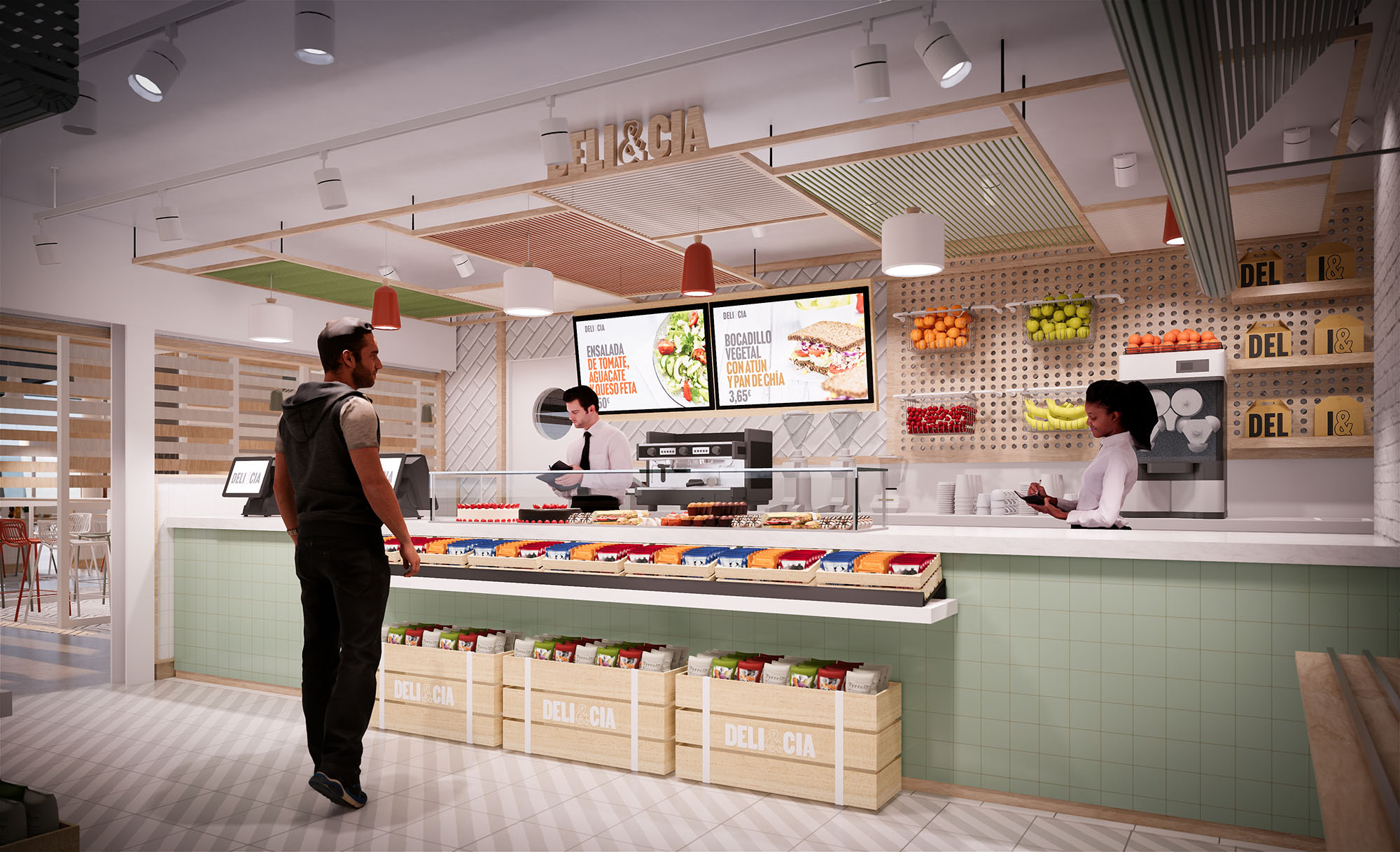
© 2021 by sanzpont [arquitectura] . Webpage by sanzpont [digital] . Innovative Digital Experiences

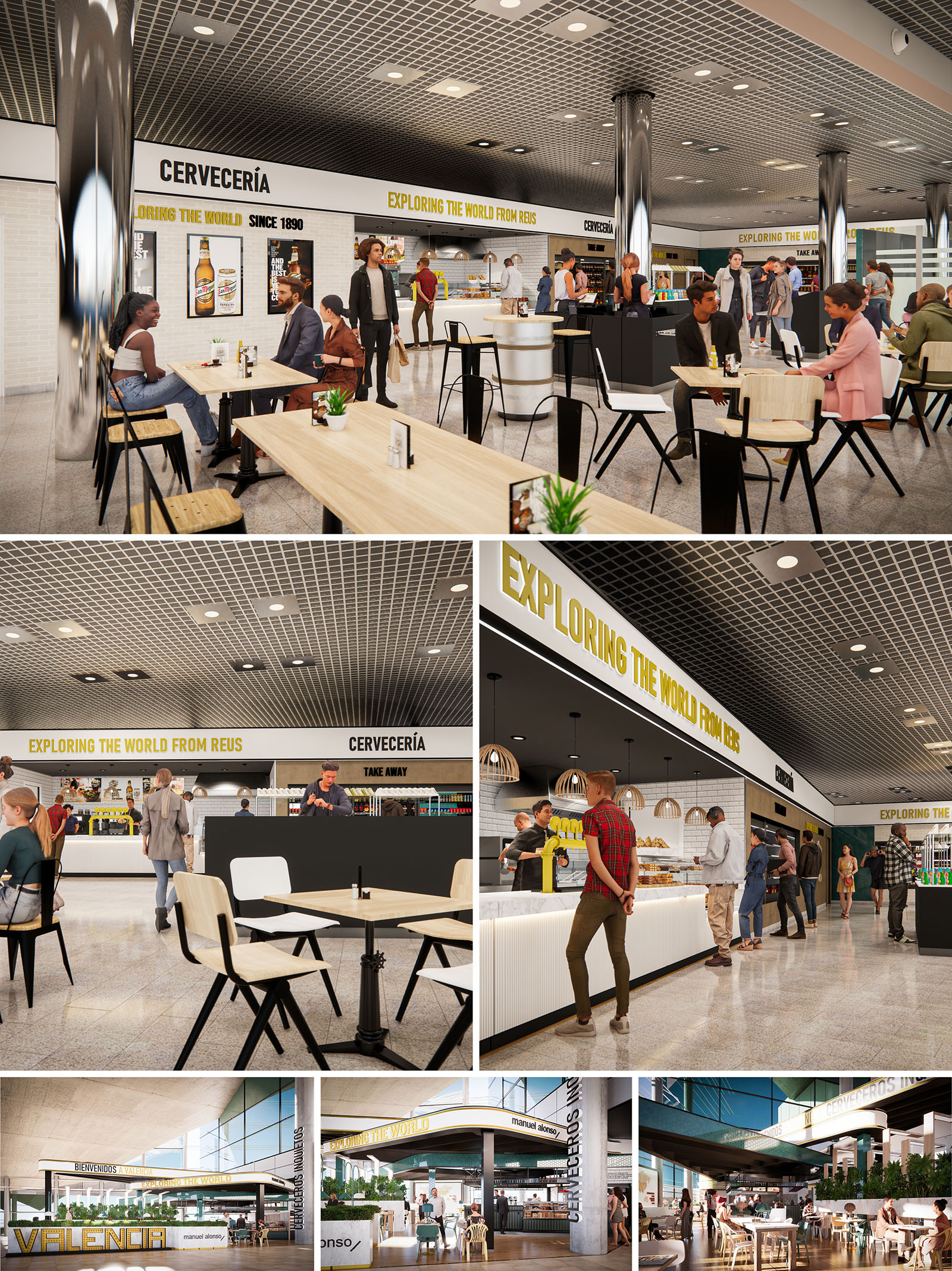
“Exploring the World” is conceived as a scalable hospitality concept that connects different Spanish cities through a unified architectural identity. Each location functions as an urban lounge where the idea of travel is translated into clear sight lines, permeable edges and a graphic narrative that runs through all spaces. The design emphasizes accessibility and visual openness, allowing users to intuitively understand the offer while feeling part of a broader journey across seven destinations.
The concept balances the informality of a cervecería with the efficiency of a contemporary food-court kiosk. A restrained palette of materials and colors is repeated in each project, creating brand cohesion and allowing local contextual variations in furniture arrangement, façade permeability and integration with surrounding commercial flows.
The plan is structured around a central service bar that operates as both visual anchor and functional core. Ordering, preparation and pick-up are aligned linearly to reduce crossings between customers and staff, improving ergonomics and safety. Perimeter counters and islands of seating radiate from this core, generating different degrees of intimacy: quick stops at high tables, social sharing at communal benches, and more relaxed stays at lower café tables.
In airport and station environments, the interventions prioritize transparency. The perimeter is largely open, with only low-height elements and light metal frames defining the boundary. This strategy ensures uninterrupted visual connections with departure halls and exterior plazas, encouraging spontaneous use and orienting the traveler within the terminal.
The interior design combines robust hospitality standards with a warm, approachable atmosphere. Furniture is characterized by slender black metal structures and light-toned timber tops, creating a calm horizontal datum against the more technical ceiling. Chairs and stools feature slightly angled legs and curved backs for comfort and stability, while communal tables encourage social interaction and group use.
Lighting is layered: an orthogonal grid of recessed downlights ensures homogeneous general illumination, complemented by accent fixtures over the bar and product displays. In some units, woven pendant lamps introduce a tactile, domestic note that softens the industrial ceiling grid. This contrast underlines the bar as a focal point and subtly guides movement and queuing.
The material palette hinges on three elements: white ceramic tiles, light natural wood, and black metal. White tiles form a continuous backdrop for the bar, reflecting light and facilitating maintenance, while also evoking traditional Iberian taverns in a contemporary language. Wood surfaces provide warmth and tactility where users sit and touch, offering a counterpoint to the coolness of tile and metal.
Branding is integrated architecturally rather than applied superficially. Bold yellow typography runs as a linear cornice above the counters, reading as a luminous band that unifies long façades and different modules. Black bands and frames emphasize openings and service points, while curated graphic panels showcase products and reinforce the narrative of travel “from Reus” or “Valencia” to the world, adapting text to each location without altering the overall identity.
In locations with generous façades, the design opens to plazas and terraces through large glazed planes and minimal framing. Interior flooring extends visually to exterior decking or paving, dissolving the threshold and turning terraces into an extension of the main hall. Pergolas and light canopies articulate these outdoor areas, providing shade and integrating lighting, signage and vegetation.
The edge between inside and outside is treated as an active façade with bar-height counters facing the public space, attracting passersby and providing a direct relationship with the urban environment. Structural columns are wrapped and branded, transforming technical elements into vertical beacons visible from a distance.
Sustainability is addressed through both material selection and operational strategies. The repeated use of standardized furniture and modular bar elements reduces manufacturing waste and facilitates maintenance across the seven projects. Preference is given to durable finishes such as high-resistance tiles, compact surfaces and powder-coated steel, extending lifecycle and minimizing replacement.
Where possible, LED lighting with high efficiency and dimmable controls is implemented, aligned with the regular ceiling grid to optimize installation. The open layout maximizes natural light penetration from existing façades, reducing daytime energy consumption. Planters and pockets of greenery in terraces and interior zones improve microclimate and user comfort, while specifying local suppliers for wood and fittings reduces transport impact and reinforces the link between the brand and each Spanish city it inhabits.
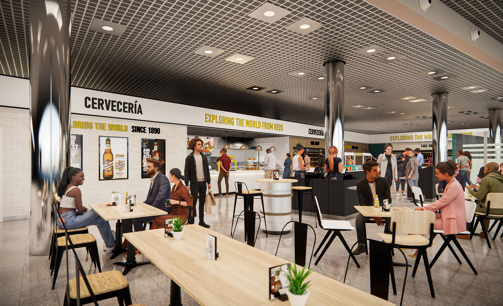
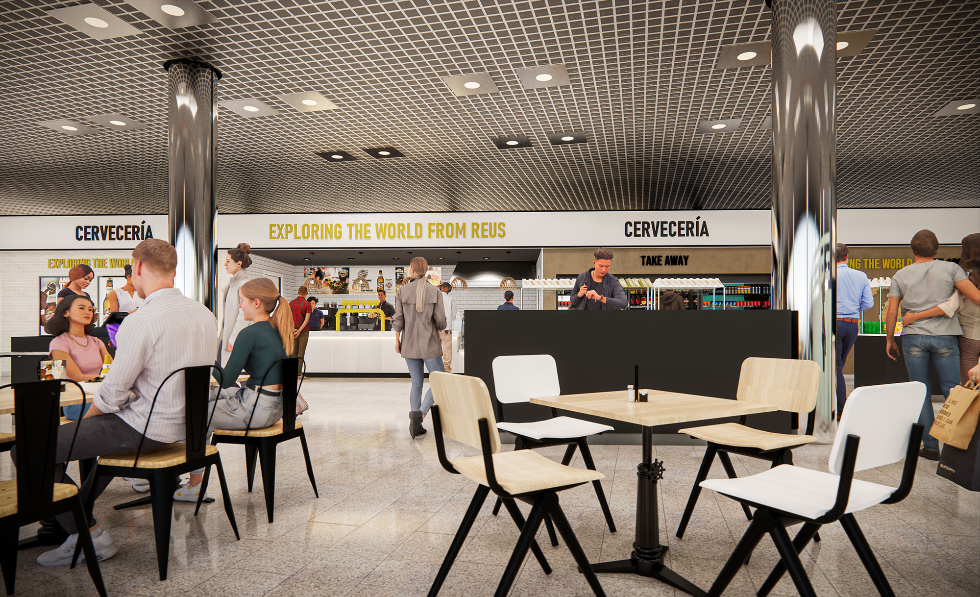
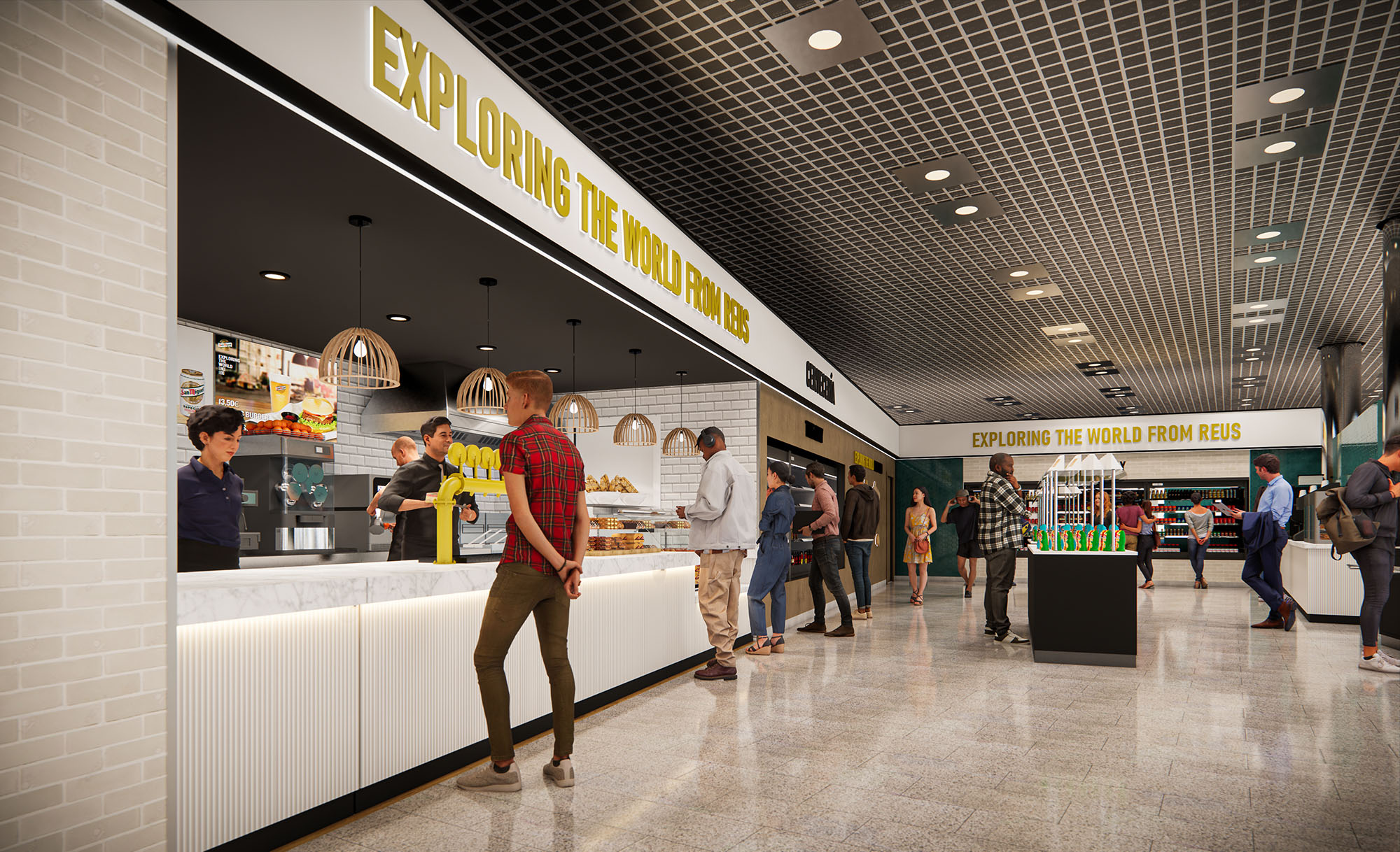
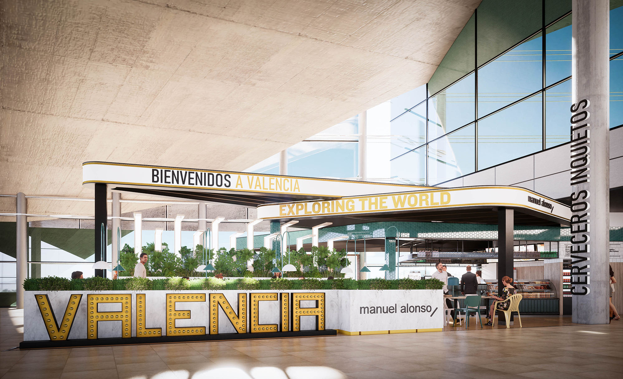
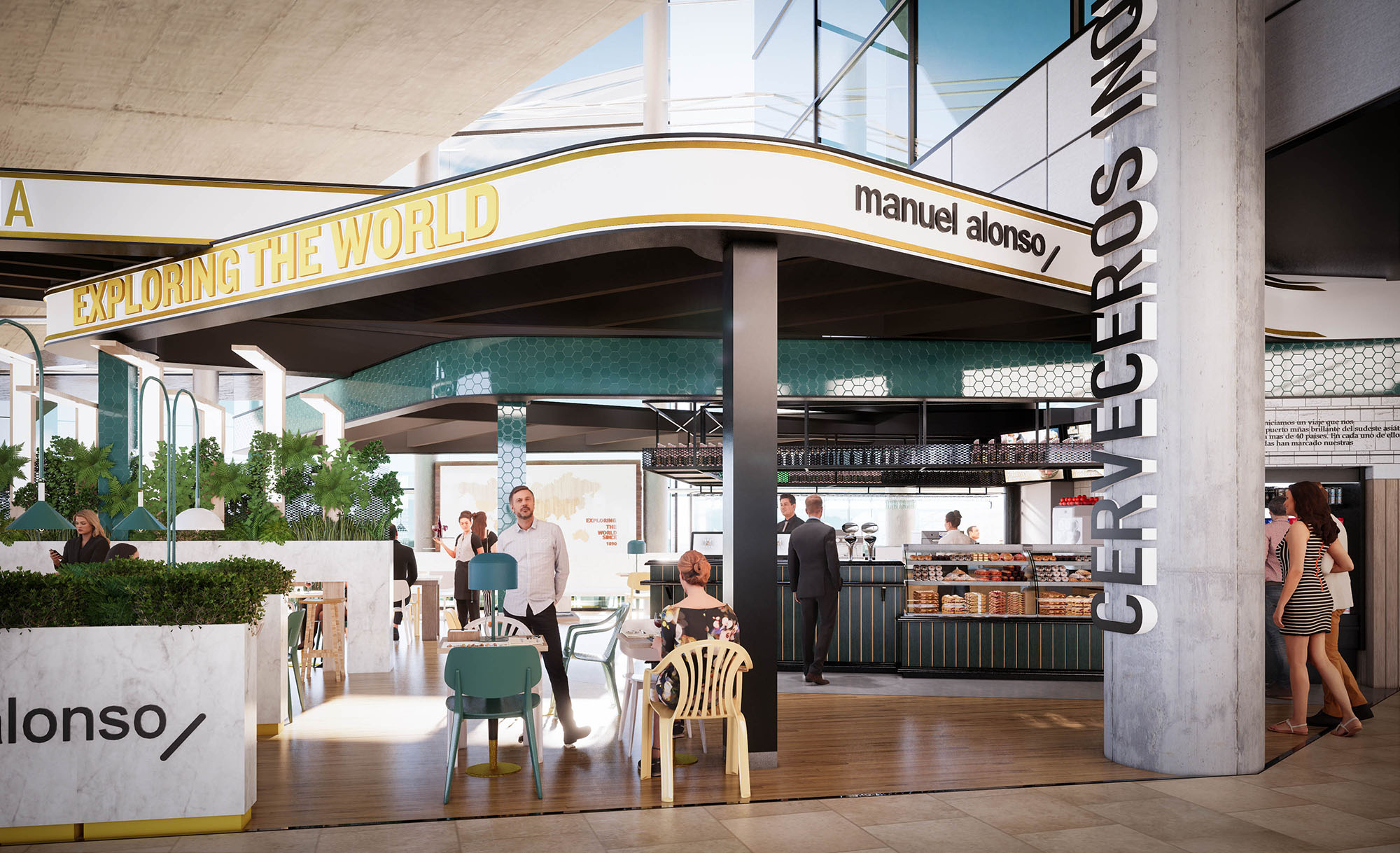
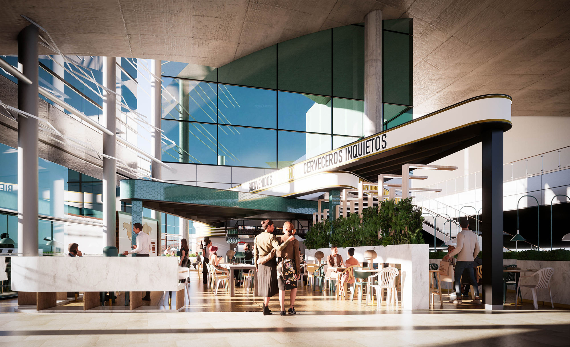
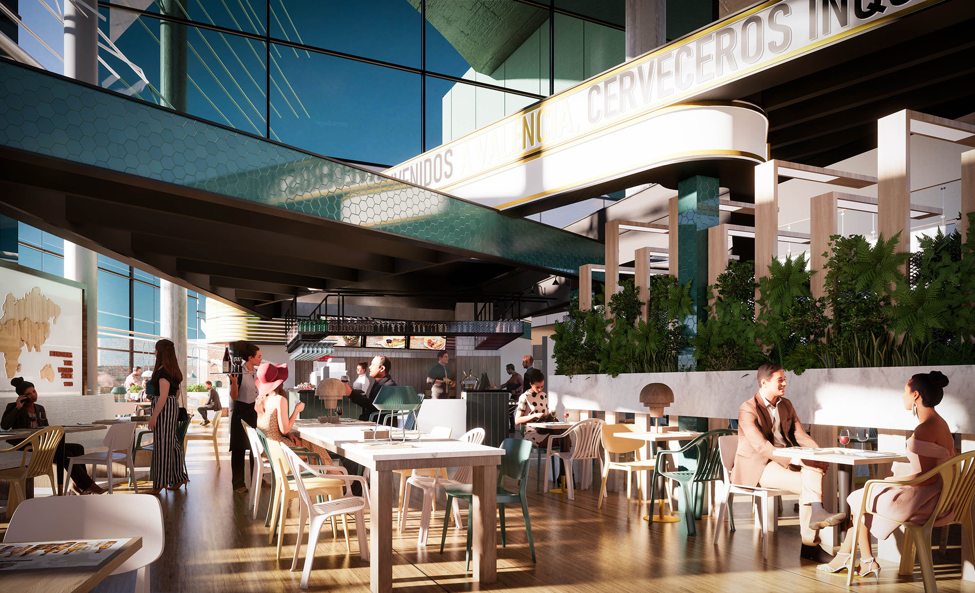
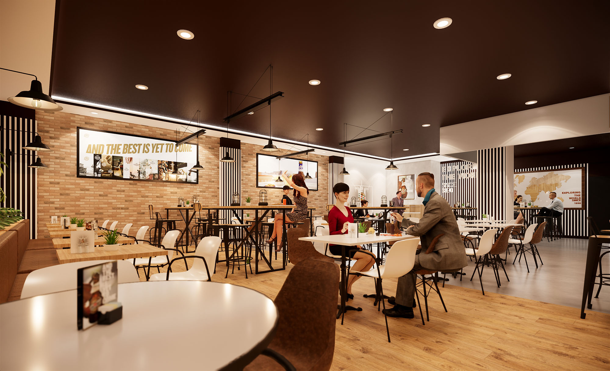
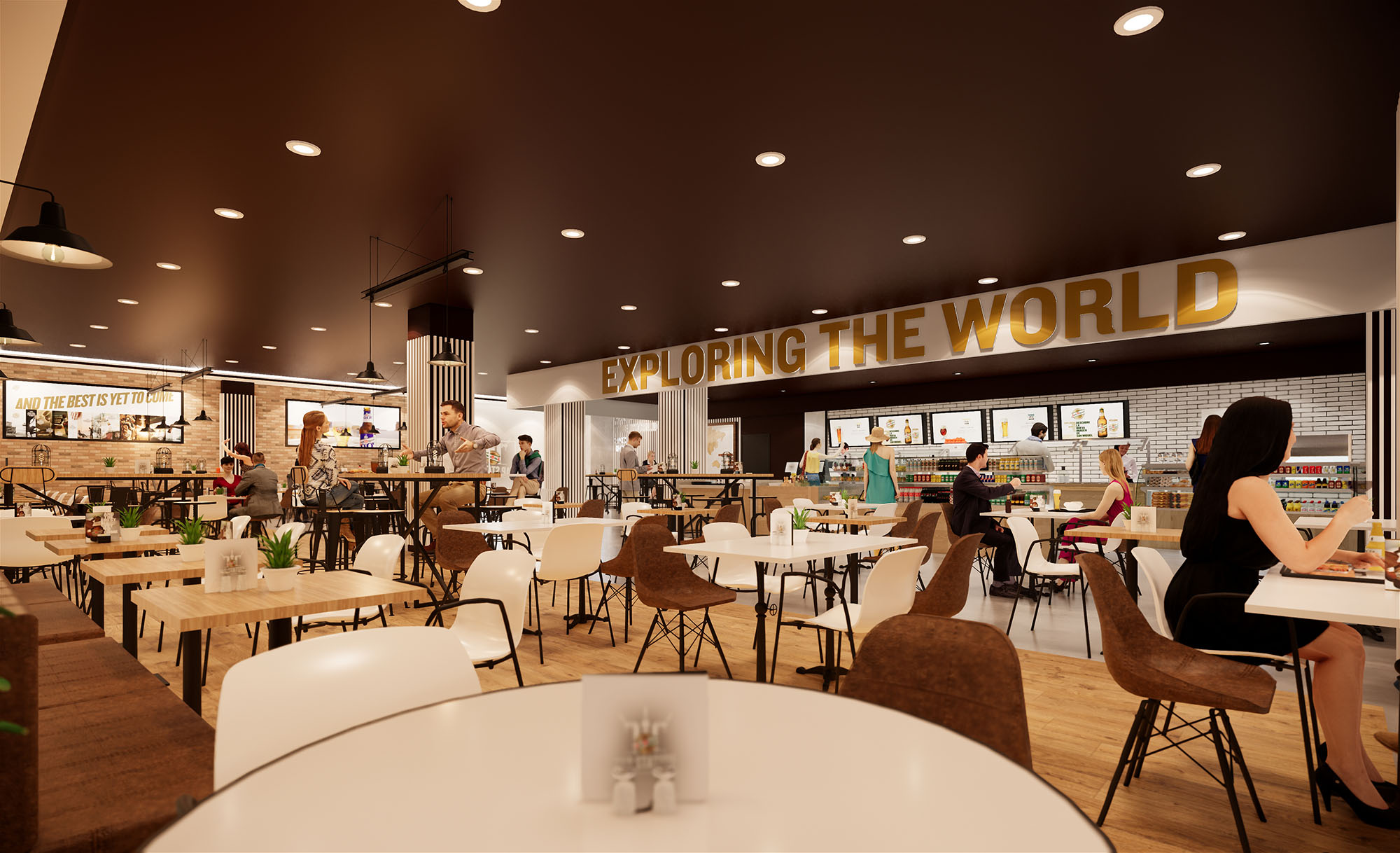
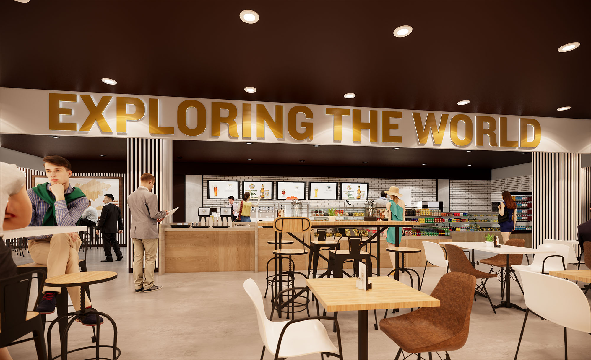
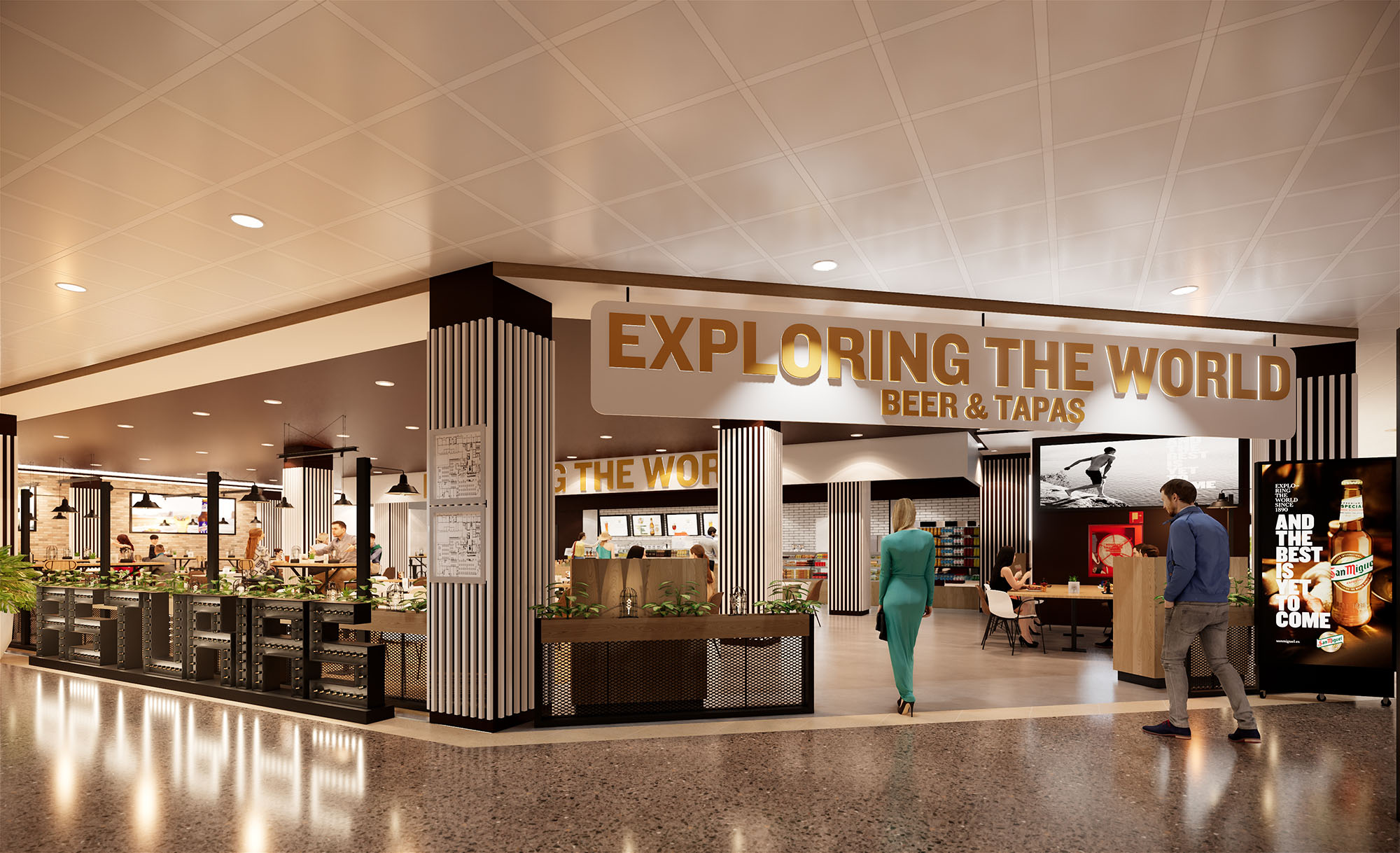
© 2021 by sanzpont [arquitectura] . Webpage by sanzpont [digital] . Innovative Digital Experiences

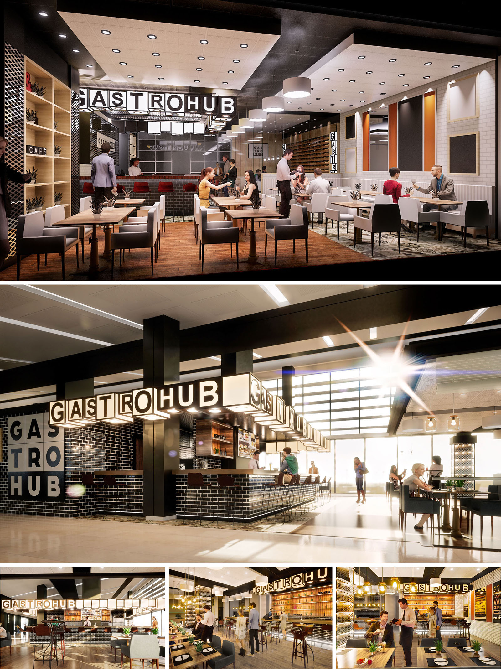
GASTROHUB is conceived as a cosmopolitan gastronomic platform that can be replicated across different countries while adapting to local cultures. The concept merges the informal vibrancy of a food market with the precision and comfort of a contemporary restaurant. A strong, recognizable identity is created through the illuminated volumetric signage, the use of black and white as the primary chromatic base, and a clear modular logic that structures bars, dining zones and circulation areas.
The design aims to generate a social condenser inside airports and commercial hubs, where travelers and locals converge. Open perimeters, visual transparency towards kitchens and bars, and a flexible furniture system encourage spontaneous occupation, short stays and longer, more relaxed visits. The project balances a bold graphic presence with warm, human-scale interiors.
The layout is organized around a central bar volume that acts as an anchor and orientation element. This bar concentrates preparation zones, service counters and display areas, freeing the perimeter for diverse seating typologies. Circulation flows are radial and intuitive, allowing easy access from multiple sides and minimizing cross-traffic between staff and customers.
Peripheral bands contain lounge tables, high communal tables and banquette seating, which respond to different user profiles: solo travelers, informal meetings, families and quick stops. Visual porosity is ensured through the use of open shelves, low partitions and double-height signage elements, which preserve long perspectives while subtly defining zones of greater privacy.
The material palette combines industrial robustness with domestic warmth. Black glazed brick tiles provide a durable, easy-to-clean envelope for bars and service walls, while also acting as a backdrop that enhances the luminous GASTROHUB signage. Light-toned wood is used on floors, shelving and table tops, counterbalancing the darker elements and generating a more welcoming atmosphere.
The color composition is deliberately restrained: black, white and warm wood tones are accented with selected graphic colors and lighting temperatures. This neutral base allows each geographic location to incorporate local textiles, artwork or vegetation without diluting the brand identity. Metallic elements in brushed steel and black iron profiles add precision and emphasize the structural grid.
Lighting design is a key component of the ambience. The volumetric letters of the logo function simultaneously as branding and as a continuous luminous canopy that defines the bar perimeter. These light boxes emit a warm, diffuse light that softens transitions between day and night uses and becomes a visual attractor from a distance.
Ceiling-mounted downlights provide general illumination with a uniform grid, while accent pendants over specific tables and counters create intimate pockets of light. Reflection on glossy tiles and metallic surfaces contributes to a vibrant, animated atmosphere, particularly suitable for transit environments. The overall strategy balances functional lux levels with a comfortable, hospitality-oriented mood.
The furniture selection prioritizes comfort, resistance and modularity. Upholstered chairs with clean geometries and banquettes with vertical tufting generate ergonomic support and visual order. Tables are dimensioned to be easily reconfigurable, allowing the space to adapt to fluctuating peak-hour demands and group sizes.
Vertical surfaces incorporate open shelving for bottles, plants and merchandising, and perforated or patterned panels that act as acoustic diffusers while introducing texture. The bar front integrates footrests, concealed lighting and power outlets, anticipating contemporary needs such as device charging and remote work. Every detail seeks to reconcile the efficiency of a high-traffic operation with the warmth of a neighborhood restaurant.
The strong graphic identity of GASTROHUB is designed to be legible in multicultural contexts across Mexico, Spain and the USA. The modular signage, repetitive structural bays and standardized finishes enable consistent brand recognition while allowing variations in layout according to each site’s geometry and local regulations.
Sustainability considerations are integrated through the specification of durable, low-maintenance materials, reducing replacement cycles and waste. LED lighting systems with dimming capabilities lower energy consumption and adapt to natural light availability in each location. Where possible, wood products from certified sources and low-VOC finishes are prioritized to improve indoor environmental quality. The replicable construction system allows components to be prefabricated, optimizing resources, minimizing on-site waste and facilitating future disassembly or reconfiguration of the spaces.
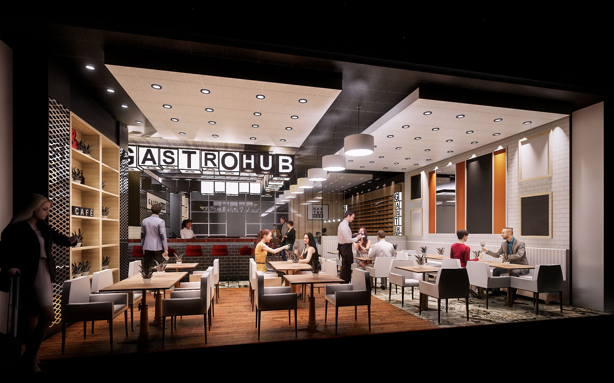
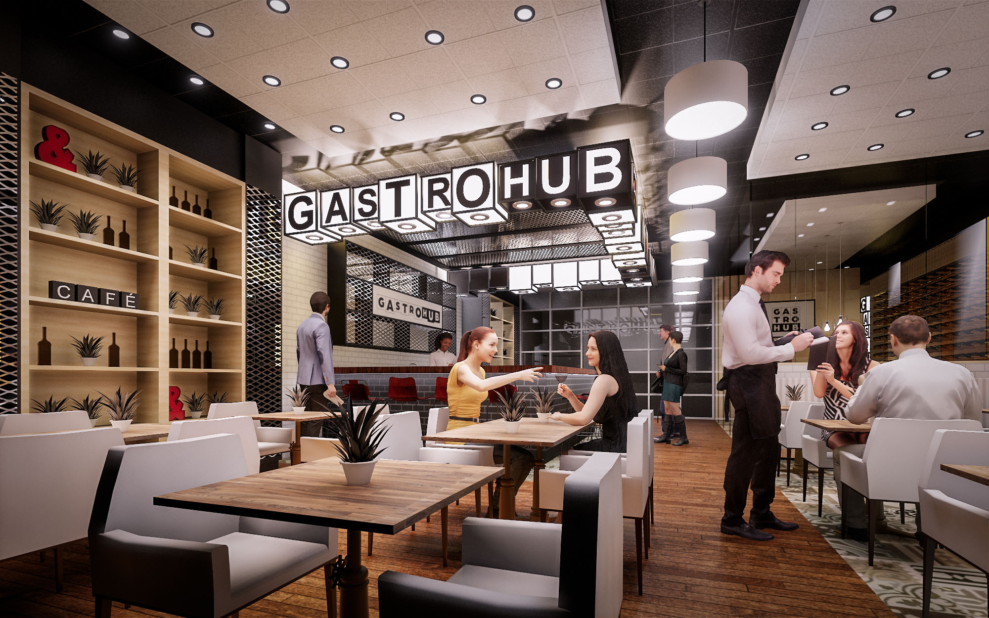
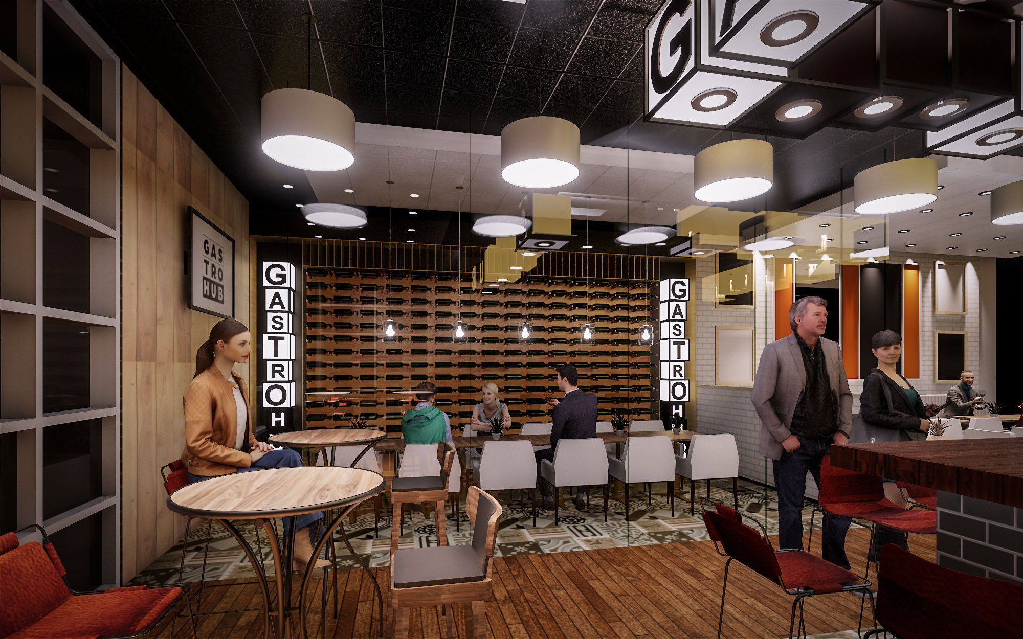
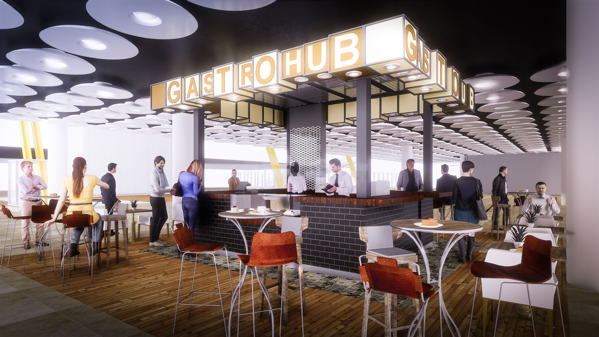
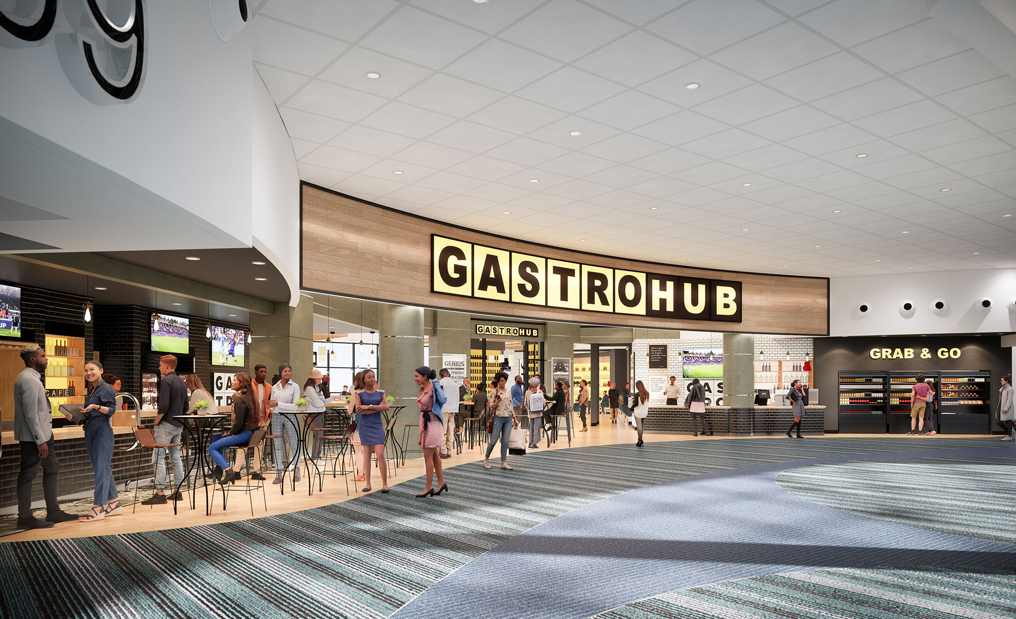
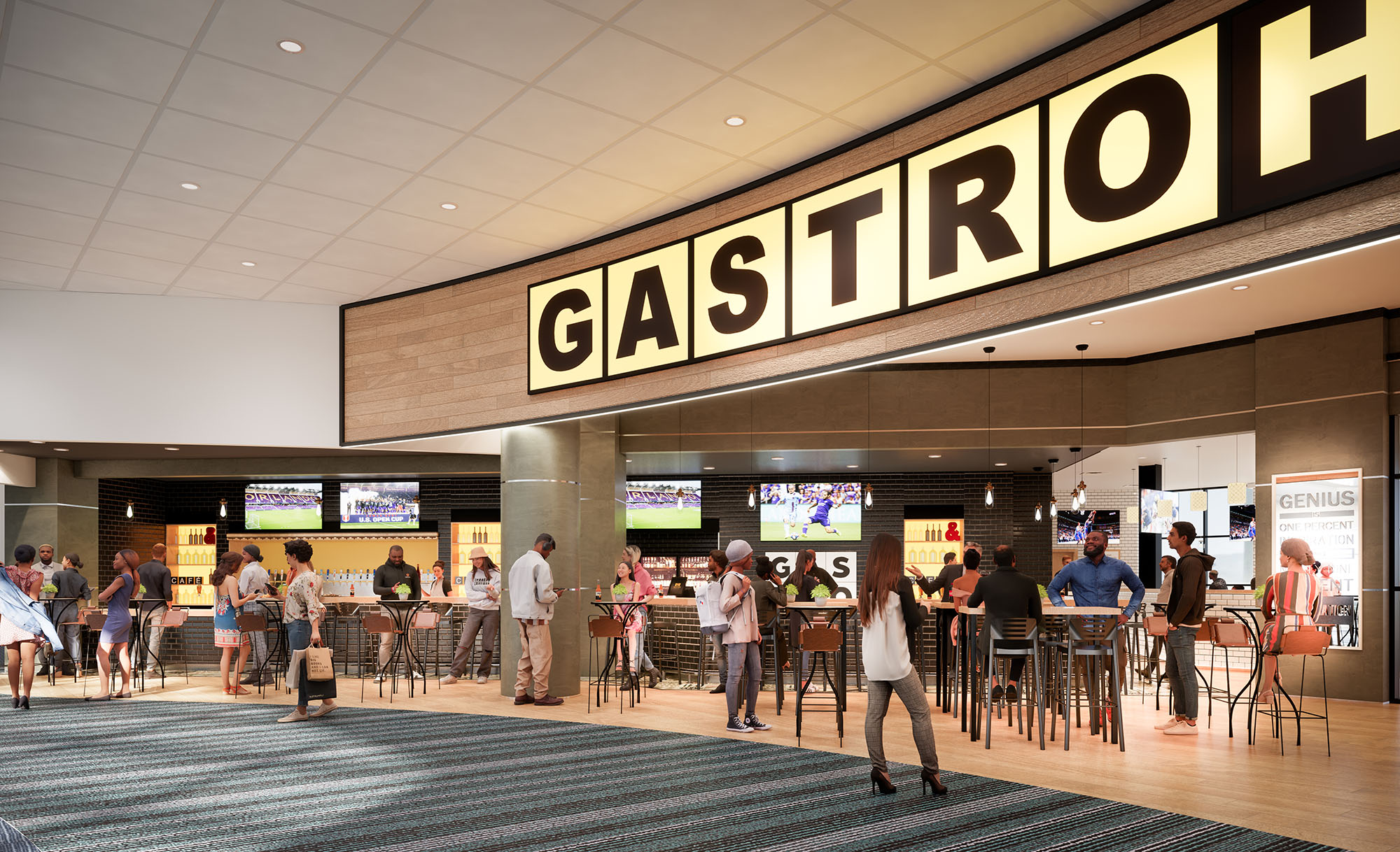
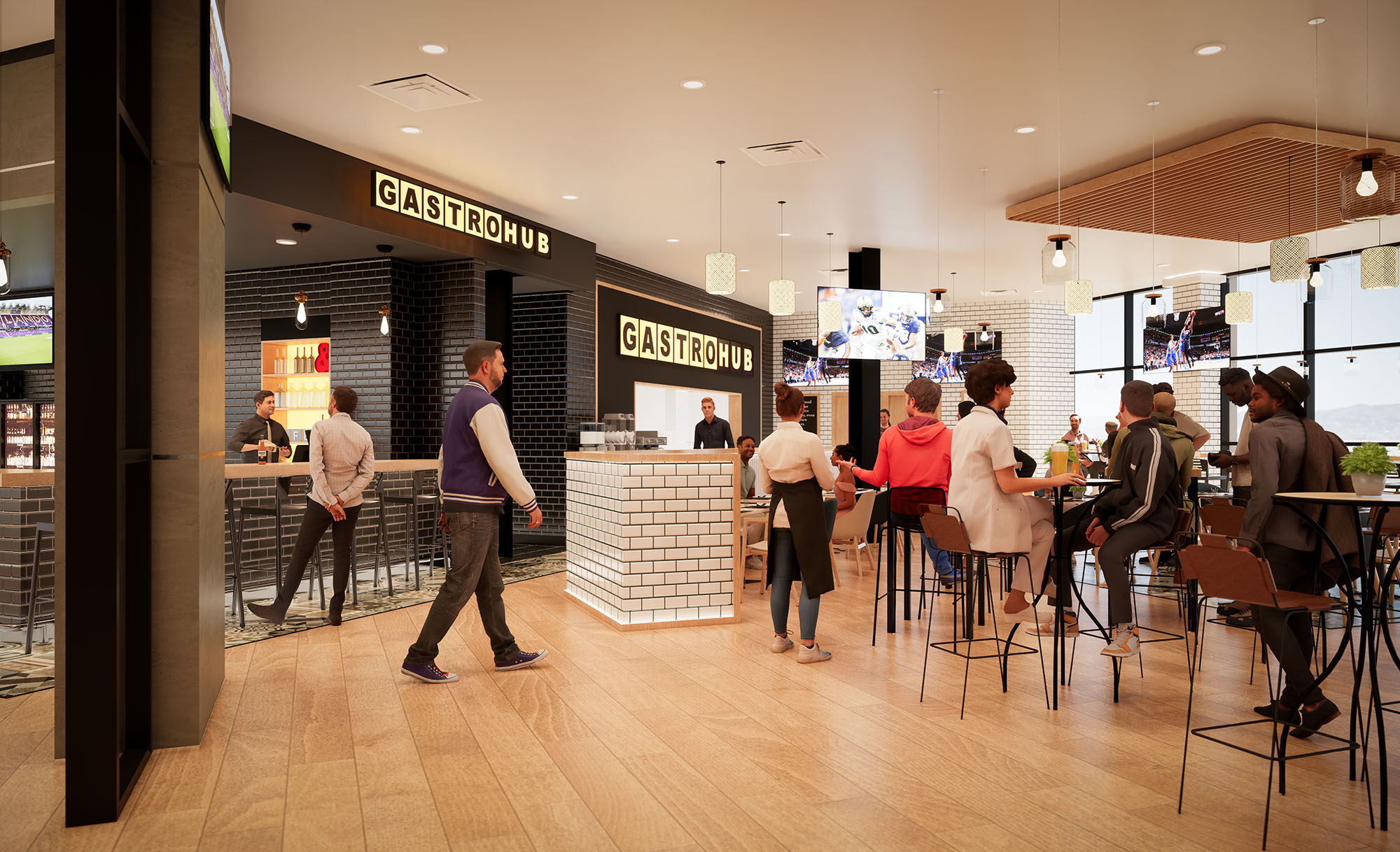
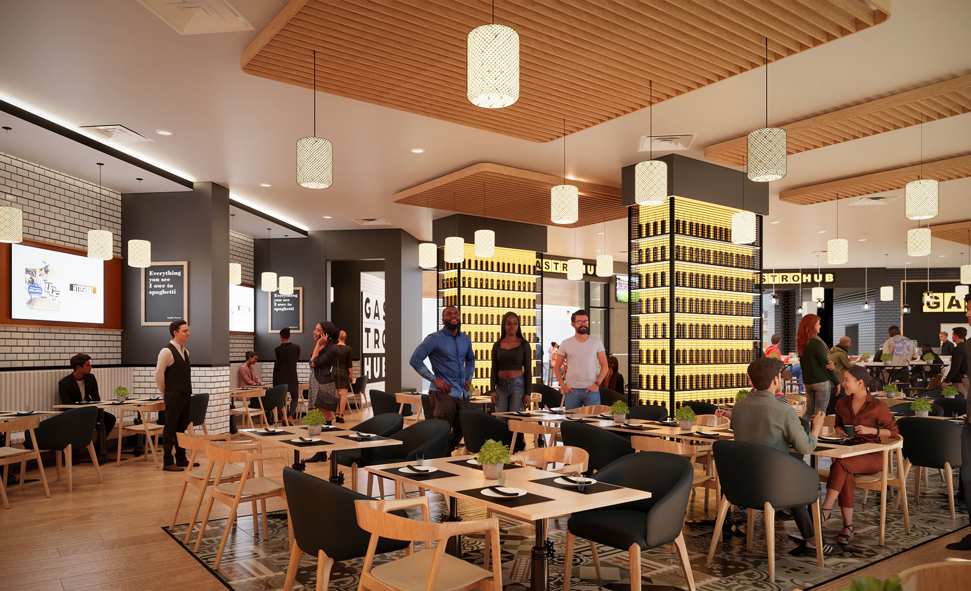
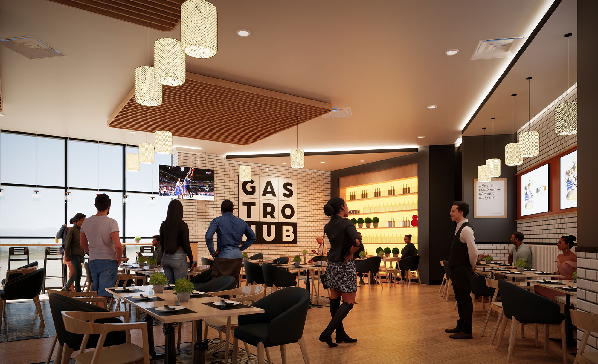
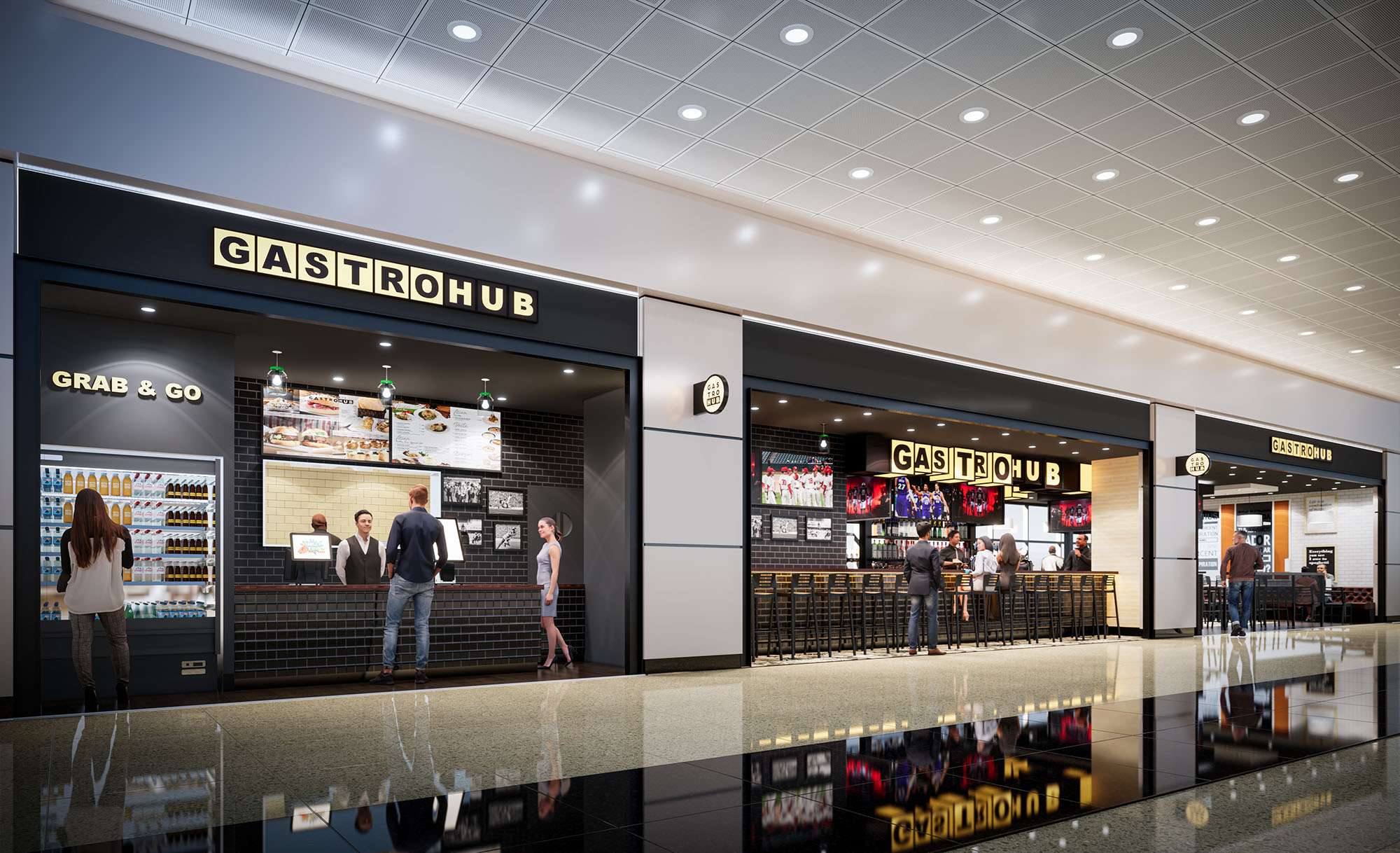
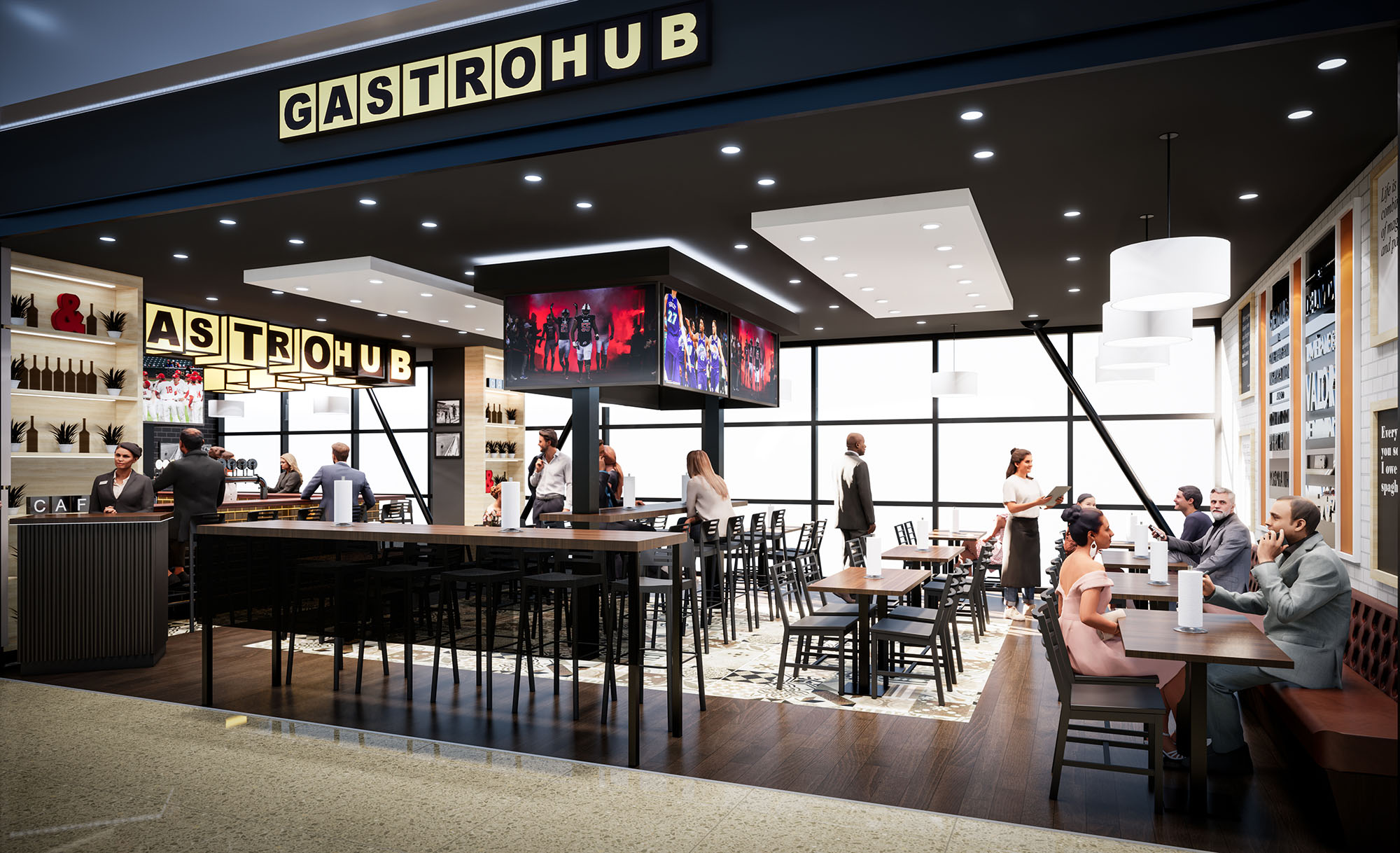
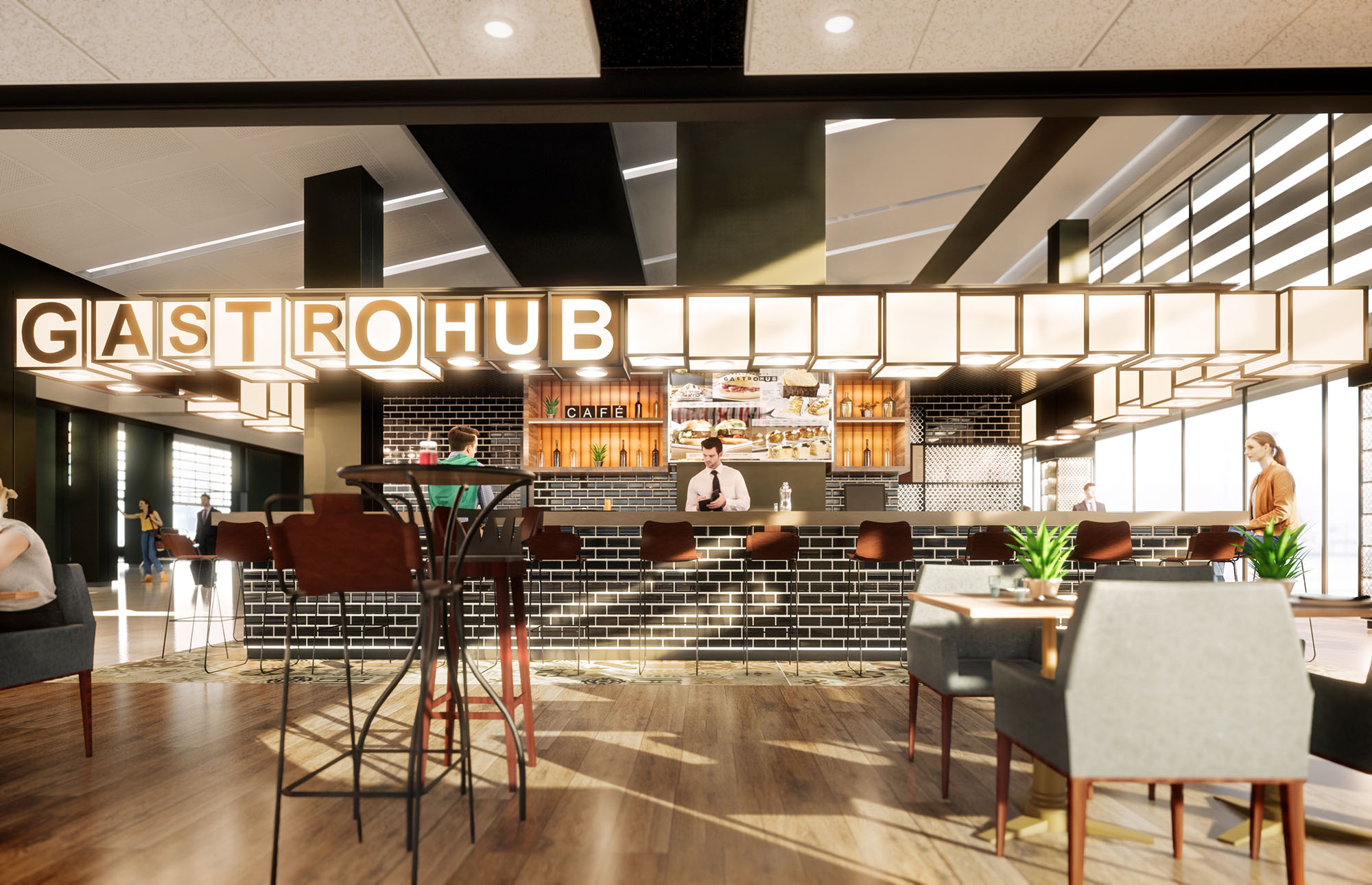
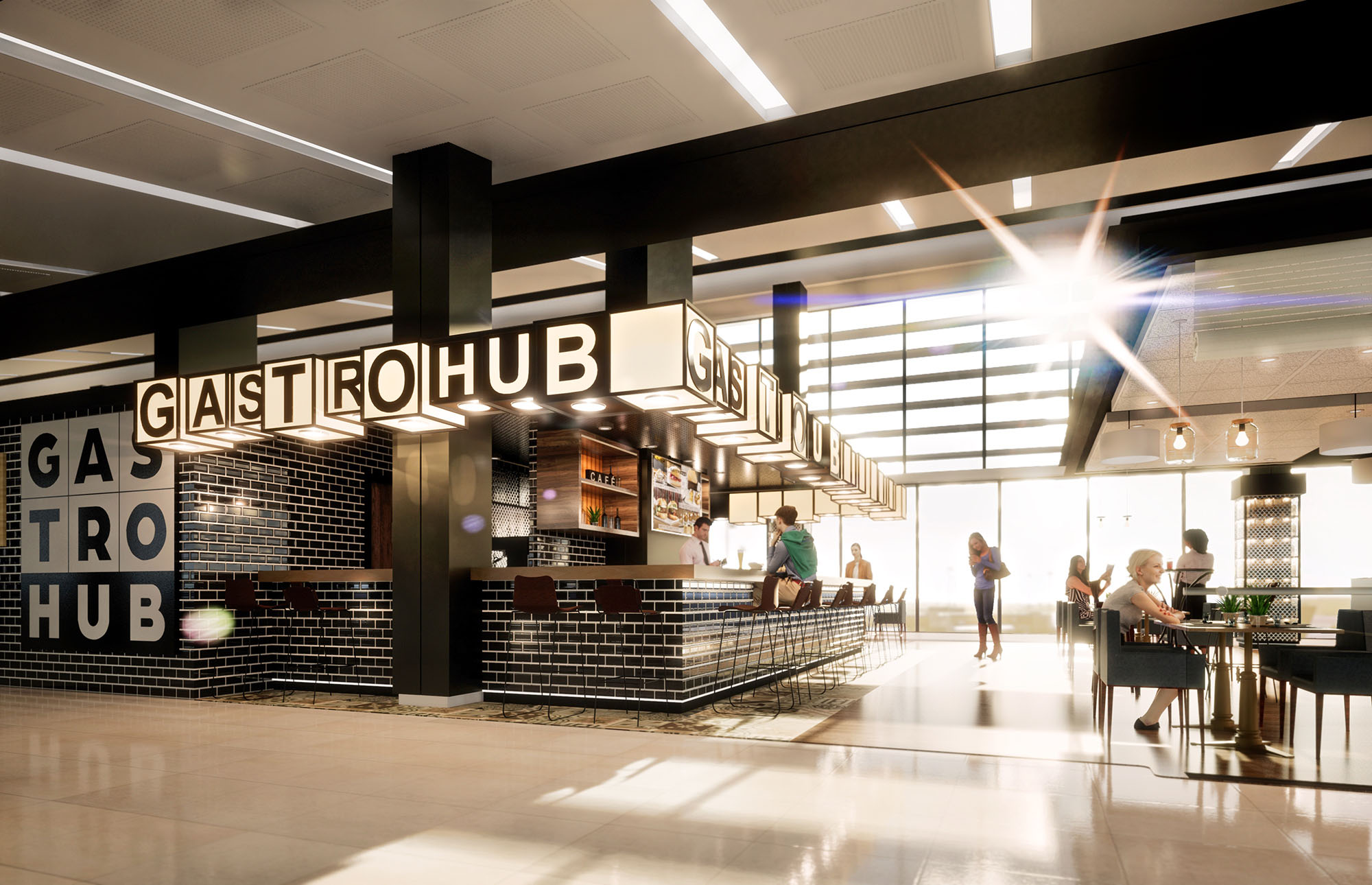
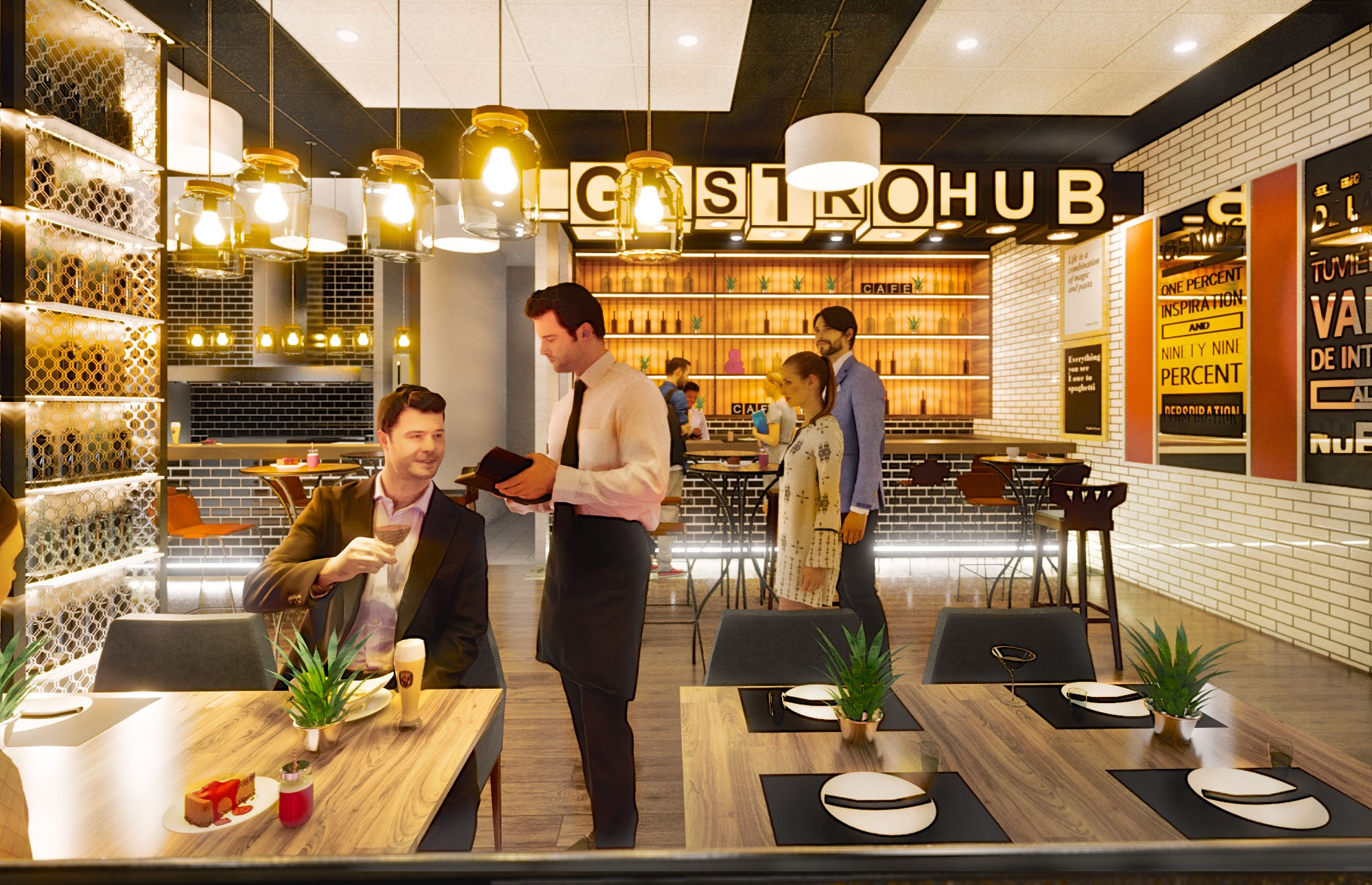
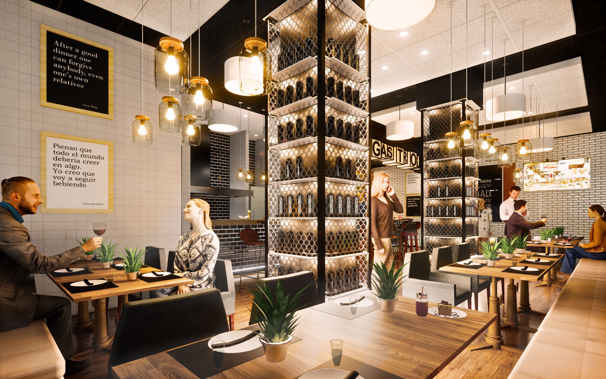
© 2021 by sanzpont [arquitectura] . Webpage by sanzpont [digital] . Innovative Digital Experiences

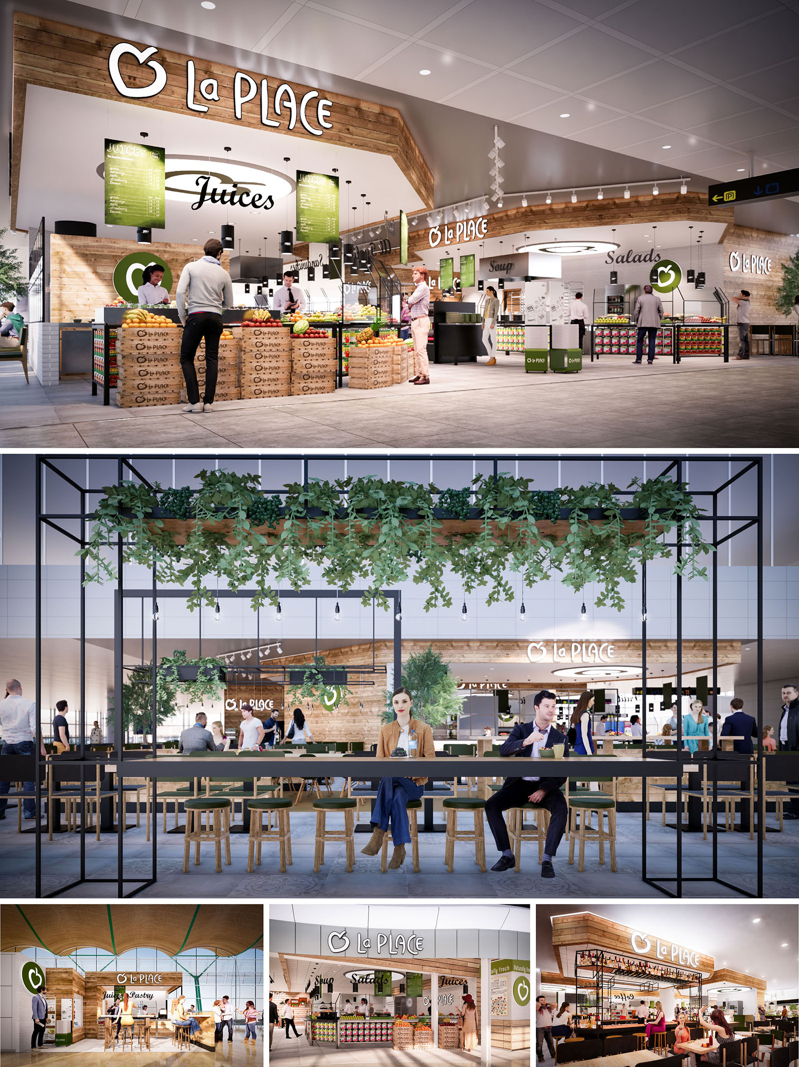
LA PLACE is conceived as an open, market-style restaurant that translates the freshness of a local food hall into the controlled environment of airports and shopping centers in Spain and Portugal. The design strategy is based on visual transparency, abundant product display and the integration of natural materials and greenery to communicate health, immediacy and trust. Instead of a closed restaurant box, the architecture dissolves boundaries and invites customers to flow around the food counters in a seamless way.
The primary gesture is a warm timber canopy that frames the brand and unifies the different food stations—juices, salads, soups and bakery—into a single recognisable identity. This canopy operates as an architectural “horizon line” in otherwise neutral concourses, creating a clear visual landmark while remaining permeable and light. The spatial language borrows from contemporary market halls, combining industrial precision with a tactile, human scale.
The layout is organised as a series of linear and corner counters, each dedicated to a specific food typology. These stations are arranged in a horseshoe or island configuration depending on location, allowing 360-degree accessibility and intuitive wayfinding. High product visibility at the perimeter encourages impulse decisions, while central preparation areas and back-of-house functions remain visually controlled yet connected.
Self-service and assisted-service zones are clearly distinguished through counter height, equipment integration and signage. Circulation is conceived to absorb peak flows common in transit environments: wide clear paths, orthogonal geometries and unobstructed sightlines reduce congestion and shorten decision-making time. Seating is deliberately placed slightly outside the service core, under lightweight metal pergolas, so that guests can visually remain in contact with the active food preparation scene without blocking operational areas.
The material palette is dominated by warm, lightly stained timber, white ceramic surfaces and black metal framing. Timber cladding wraps the canopy, counters and crates, evoking traditional market stalls and providing a soft contrast to the hard finishes of surrounding terminal architecture. The use of repetitive timber slats and stacked boxes reinforces a crafted, yet efficiently modular, character.
White tiles and solid surfaces are used in all food-contact and preparation areas, ensuring a hygienic and easy-to-clean backdrop that reflects light and enhances the perception of freshness. Black powder-coated steel structures introduce a contemporary, almost graphic element, framing signage, plant pergolas and communal tables. The brand’s green hue is applied strategically on signage, menu boards and accent elements, reinforcing the association with natural ingredients without overpowering the neutral base.
Lighting is designed to articulate the project at different scales: from airport concourse visibility to intimate dining moments. A continuous line of warm-white downlights integrated into the timber canopy highlights the serving counters and emphasises the quality of the fresh produce. Track-mounted spotlights allow flexibility to adapt to changing merchandising layouts, while ensuring that key functional zones—cash points, salad bars, juicing stations—remain perfectly lit.
In the seating areas, simple pendant luminaires hang from the black metal pergolas, creating a more domestic and calm atmosphere contrasted with the dynamic environment around. Reflected light from white ceilings and tiles, combined with accent lighting on the brand logo and menu rings, ensures high legibility from a distance and a recognisable identity within busy retail hubs.
Furniture is intentionally straightforward and robust, with solid wood stools and benches, and slender metal-framed communal tables. This combination supports high turnover and easy reconfiguration while maintaining visual coherence with the architectural envelope. Communal tables encourage social interaction and efficient use of space, crucial in compact, high-density contexts.
Greenery plays an essential role in softening the industrial elements. Planters integrated into elevated metal grids and pergolas introduce cascades of plants that visually lower the scale and create a subtle sense of enclosure. These green bands frame views toward the counters and help define the restaurant’s territory without solid walls. The brand identity is woven architecturally through the circular signage elements, menu rings above key counters and the consistent repetition of the apple icon, all carefully integrated into the timber and metal framework rather than applied as superficial graphics.
Sustainability is addressed through both material selection and operational planning. The predominant use of timber—sourced from certified suppliers where possible—contributes to a reduced embodied carbon footprint compared to fully metal or synthetic alternatives. Modular counters, crate displays and metal grid structures are designed for disassembly, allowing components to be reused or adapted across different locations, reducing waste during roll-out and refurbishment cycles.
Energy-efficient LED lighting, zoned and dimmable, minimises consumption while maintaining optimal luminance for food safety and brand visibility. The open market configuration facilitates natural cross-ventilation within the larger terminal or mall air system, reducing the need for enclosed, mechanically intensive micro-environments. The clear display of fresh, minimally processed products supports shorter supply chains and reduces packaging, aligning the architectural narrative with the brand’s commitment to healthier, more responsible food offerings.
© 2021 by sanzpont [arquitectura] . Webpage by sanzpont [digital] . Innovative Digital Experiences

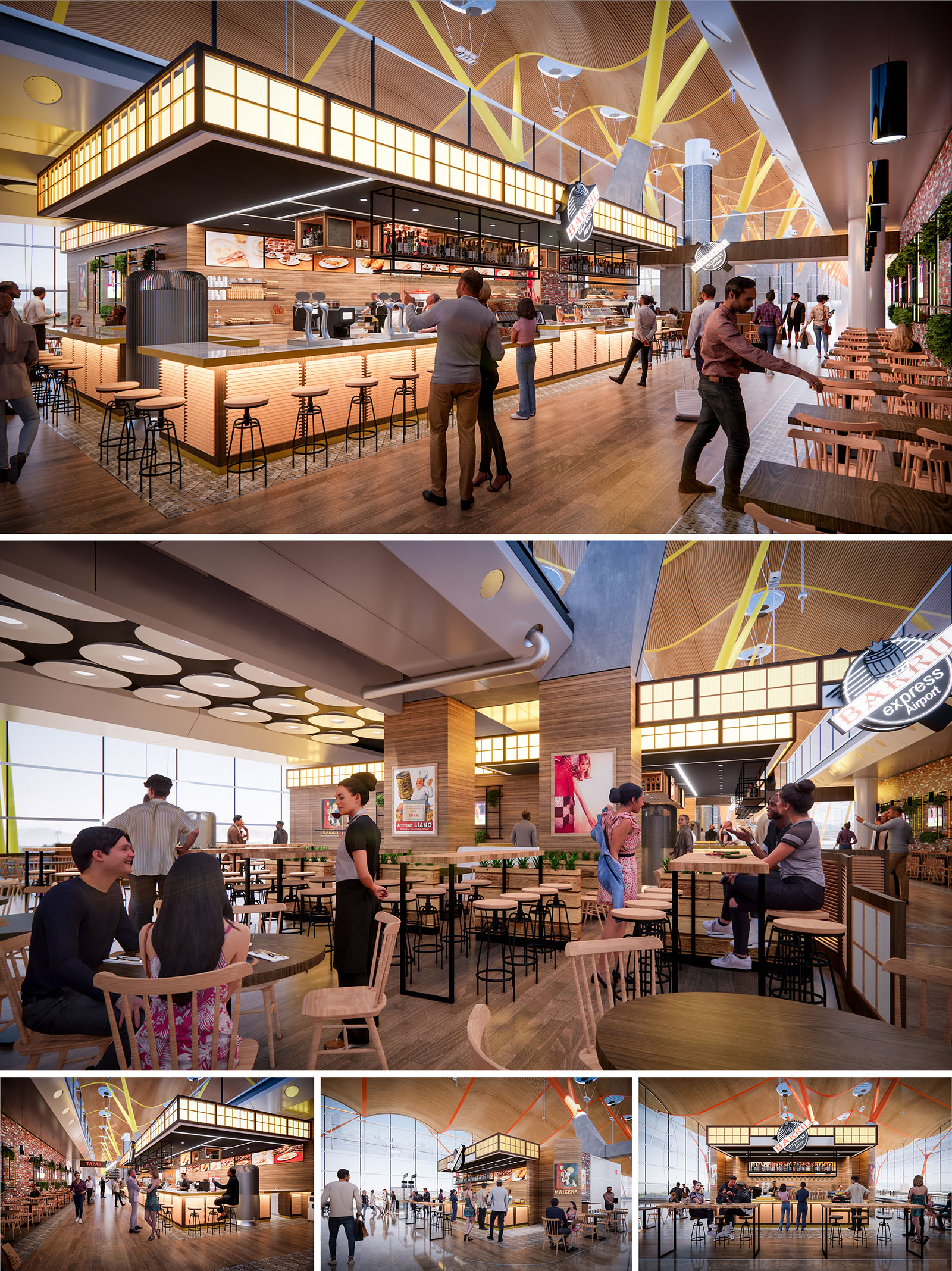
Barril Express is conceived as a contemporary reinterpretation of the traditional Spanish bar, adapted to the dynamics of an airport terminal in Madrid. The project combines the warmth of a neighbourhood taberna with the efficiency and clarity required by high passenger flows. The central bar becomes an illuminated landmark, functioning as an urban “farola” that guides travellers and organizes the surrounding seating areas.
The design strategically emphasizes permeability and visual continuity with the terminal, ensuring that the restaurant operates as an open, welcoming extension of the concourse rather than an enclosed unit. The atmosphere is informal and vibrant, encouraging short stays, quick meetings and relaxed waiting periods before boarding.
The layout is articulated around a large island bar that structures the entire project. This bar is accessible on multiple sides, optimizing service, reducing queues and allowing efficient distribution of drinks and tapas. The perimeter seating alternates high communal tables, bar stools and lower dining tables, responding to different user profiles and lengths of stay.
The main circulation axes of the terminal are respected and enhanced by clear transversal passages that cross the restaurant area. These allow intuitive entry from several fronts and maintain direct views to the boarding gates and the exterior apron. The open plan arrangement maximizes visibility of the product display and menu, facilitating quick decision-making for travellers under time pressure.
The material palette is based on warm woods, light ceramics and metallic accents in black, which generate a contemporary yet familiar language. The wooden floor and vertical cladding evoke the texture of traditional bars, while their controlled tonality ensures visual calm within the busy terminal environment. Metallic frames and shelving bring structural clarity and robustness.
Lighting is a key compositional element. A luminous cornice wraps the bar volume with diffuse, amber-toned light that recalls backlit glass of historic cafés. This glow contrasts with the cooler, more uniform general lighting of the terminal, creating a distinct micro-atmosphere without resorting to physical enclosures. Suspended luminaires and circular ceiling elements modulate scale above the seating area, visually lowering the height of the terminal and generating a more intimate dining space.
The furniture combines slender metal structures with solid timber seats and tabletops, ensuring durability and easy maintenance in a high-traffic context. The mix of high stools, benches and classic wooden chairs introduces diversity of posture and encourages flexible appropriation of the space, from solo travellers to families or business groups.
Branding is fully integrated into the architecture through signage, illuminated logos and graphic panels that recall Spanish culinary culture. These elements are placed strategically above the bar and on key façades, remaining legible from long distances within the terminal. The result is a strong identity that reinforces orientation and contributes to the overall character of the airport’s commercial area.
The project establishes a dialogue with the iconic structure of Madrid’s terminal through the careful alignment of volumes and the reading of existing rhythms. The elevated light box of the bar responds to the large-span roof and its structural lines, creating a secondary scale that coexists harmoniously with the dominant yellow structural elements and curved wooden ceiling of the terminal.
Large glazed façades are left as open as possible to maintain visual connection with the runway and natural light. This transparency turns Barril Express into an observatory over airport activity, enhancing the user experience and reducing the sensation of confinement typically associated with interior commercial units.
The design incorporates sustainability criteria through the selection of long-lasting, low-maintenance materials and the optimization of energy use. The predominant use of wood from certified sources contributes to reducing the project’s environmental impact while reinforcing a warm tactile quality. Finishes are specified for high durability, minimizing the need for replacements in a demanding, continuous-use environment.
Lighting is planned with high-efficiency LED systems, dimmable to adapt to different times of day and to the natural light available from the terminal’s large façades. Open layouts favor natural cross-ventilation within the terminal’s overall climate strategy, reducing reliance on localized mechanical systems. Operationally, the central bar consolidates equipment and services, shortening installation runs and helping to reduce both initial resource consumption and ongoing energy demand.
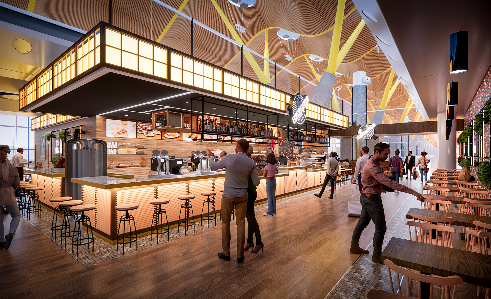
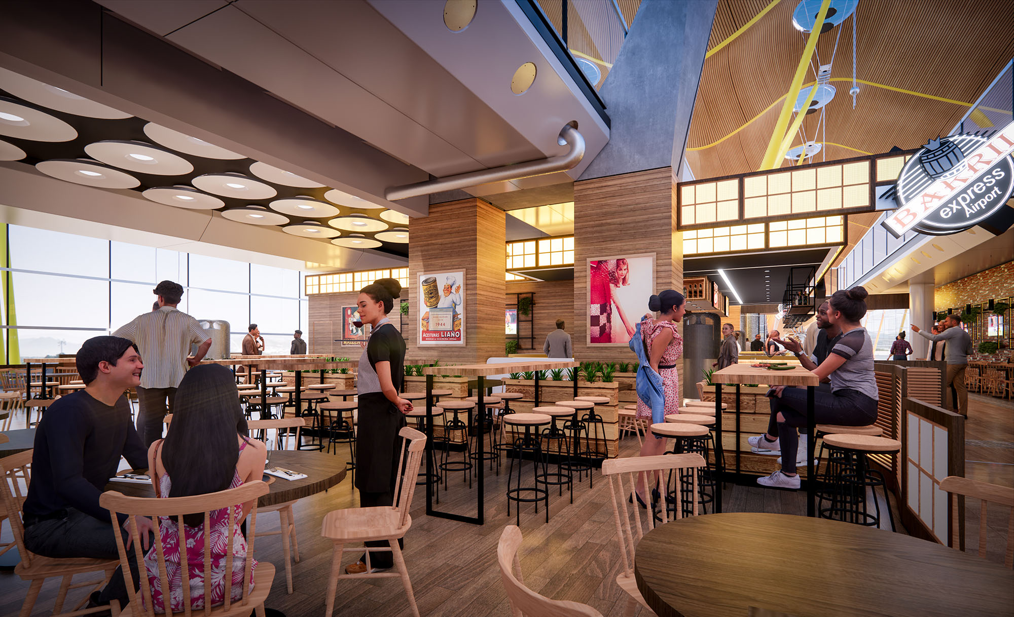
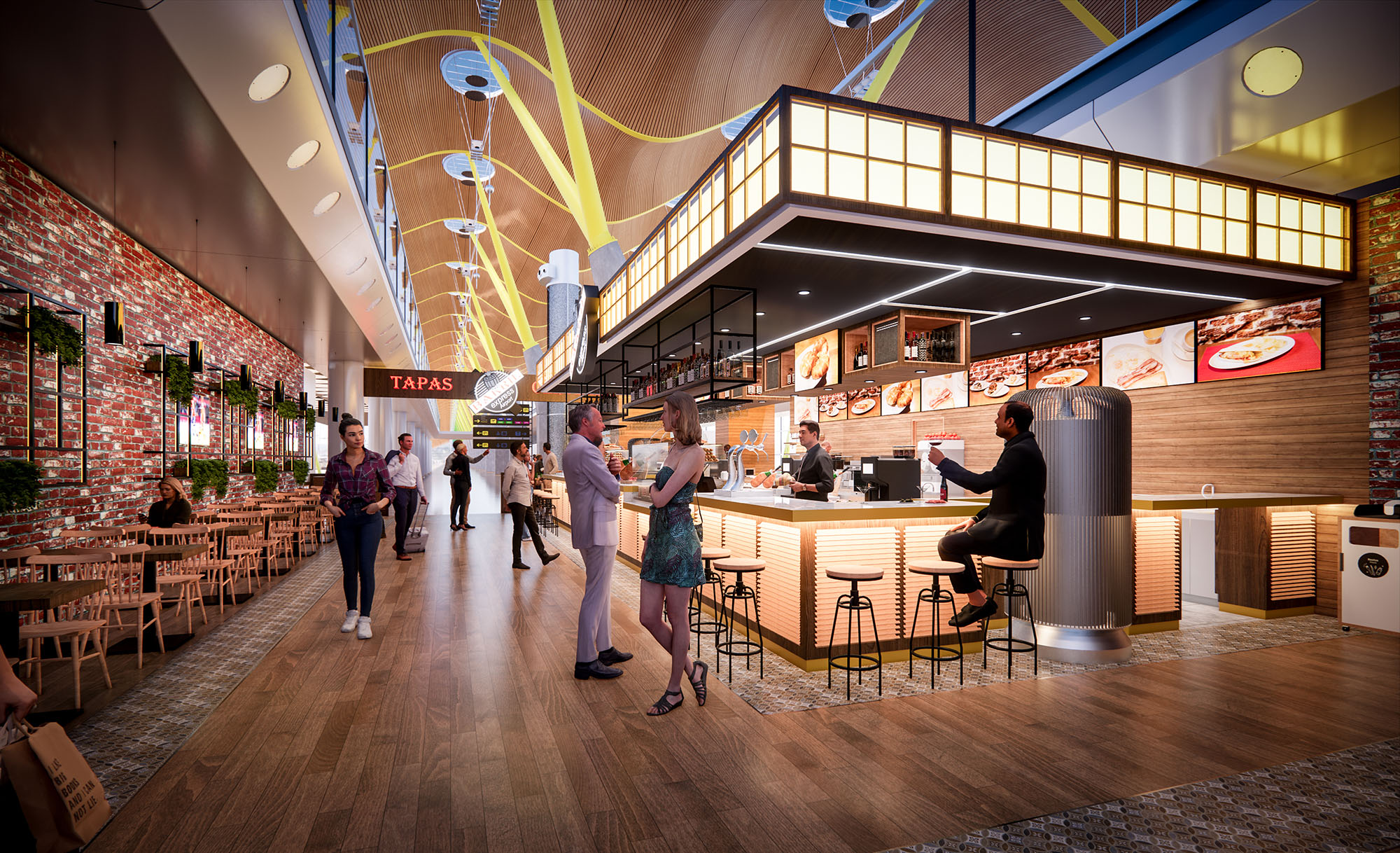
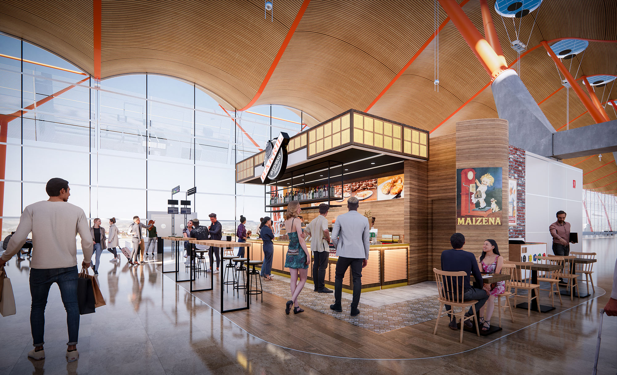
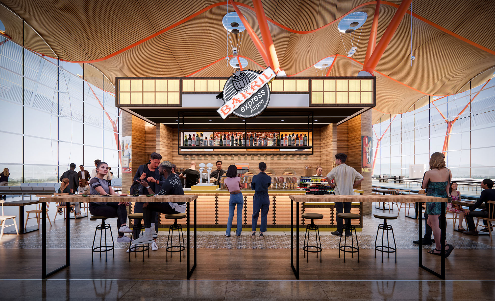
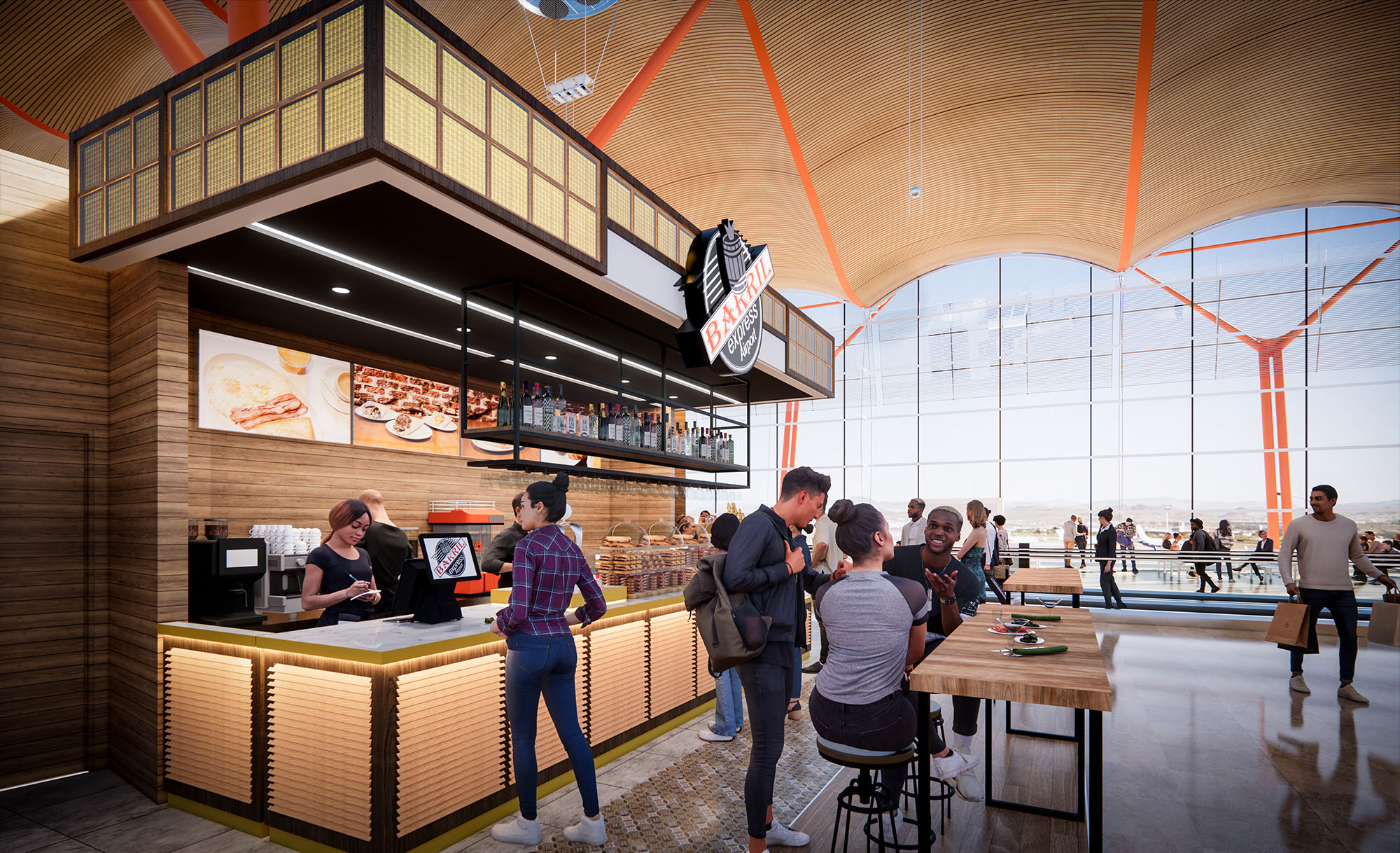
© 2021 by sanzpont [arquitectura] . Webpage by sanzpont [digital] . Innovative Digital Experiences
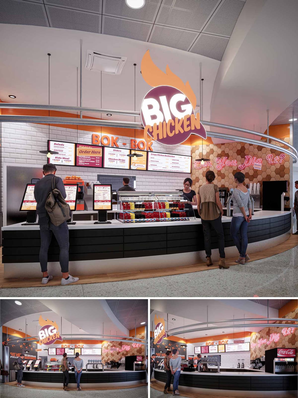
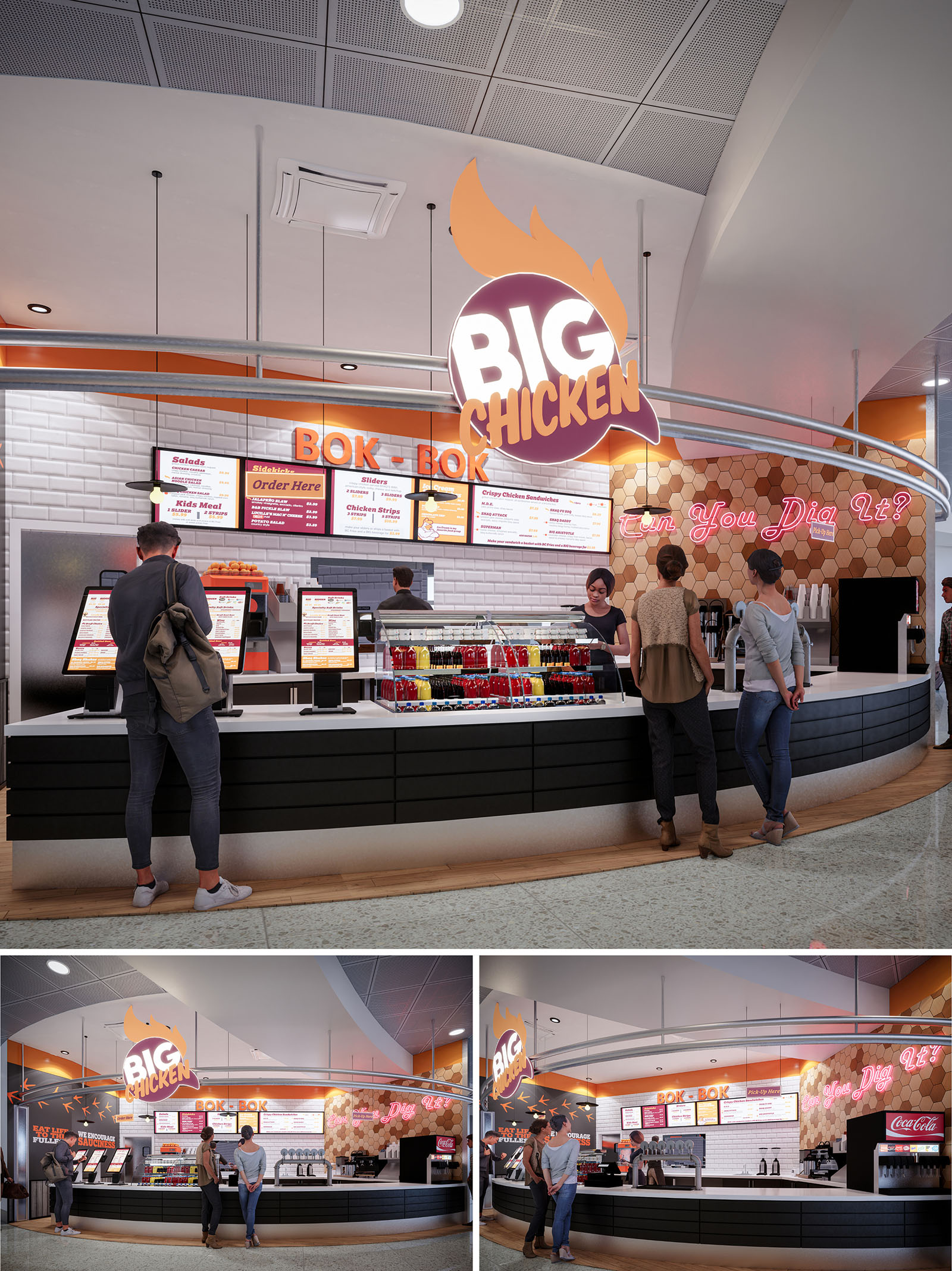
BIG CHICKEN in Miami is conceived as a bold, high‑impact quick‑service environment that translates the energy of a vibrant food brand into spatial form. The design amplifies the playful identity through oversized graphic elements, neon statements, and a warm, appetizing palette centered on oranges, yellows, and charcoals. The architectural strategy focuses on creating a clear, legible front‑of‑house experience that supports rapid service, digital ordering, and strong visual recognition within a busy retail or transit context.
The formal language is based on curves and sweeping lines, expressed in the plan of the counter, the overhead lighting track, and the signage band. These gestures guide customers intuitively along the order‑pay‑pickup sequence while framing the kitchen as a dynamic backdrop. Brand storytelling is integrated into every surface, transforming the restaurant into an immersive, memorable destination rather than a generic food outlet.
The front counter defines a generous concave arc toward the public space, maximizing visibility and encouraging engagement from multiple approach angles. Self‑service kiosks are positioned on the leading edge of this curve, allowing digital ordering to occur without obstructing the main counter. This placement separates browsing from queuing, reducing congestion and improving throughput at peak hours.
Behind the kiosks, the primary service line is organized as a clear linear sequence: illuminated menu boards, open display of beverages, and a visible preparation zone. The continuous counter surface accommodates both order and pickup functions while maintaining sufficient depth for equipment and staff circulation. Vertical sight lines allow guests to visually connect with food preparation, reinforcing transparency and quality, while lateral circulation in front of the façade remains fluid and unobstructed.
The material palette balances a clean, hygienic base with textured, brand‑driven accents. Glossy white subway tiles line the main back wall, providing a neutral, light‑reflective surface that enhances brightness and simplifies maintenance. In contrast, the lower counter is clad in horizontal black panels, grounding the composition and concealing operational wear at high‑contact zones.
A feature wall in honeycomb‑patterned tiles introduces warmth and a subtle reference to poultry and comfort food, using tones of caramel, sand, and amber. This surface acts as a visual anchor for the neon slogan while complementing the orange brand band that runs above the menu area. The overall chromatic strategy—white, black, and wood neutrals animated by orange and magenta light—creates a contemporary yet inviting ambiance that reads instantly from afar.
Lighting is conceived as both functional infrastructure and brand expression. A circular overhead rail traces the geometry of the counter, integrating downlights that evenly wash the work surfaces and customer zone. This rail also supports the prominent BIG CHICKEN logo, allowing it to float in space as a three‑dimensional beacon visible from multiple perspectives.
Neon typography and backlit menu boards create layered illumination, adding depth and hierarchy to the visual field. Warm color temperatures near the food display enhance product appeal, while cooler ambient lighting in the ceiling grid ensures visual comfort. The combination of direct, indirect, and accent lighting eliminates dark corners, enhances safety, and reinforces the energetic, urban character of the brand.
The counter design favors clean lines, minimal jointing, and robust, high‑durability finishes suited to intensive use. Edges are carefully radiused to soften the interface between guests and the built elements, while toe‑kicks in metallic tones protect against impact and add a subtle reflective base. Integrated display shelving for bottled beverages turns a functional element into a colorful focal point, supporting impulse decisions and emphasizing grab‑and‑go convenience.
Digital kiosks are treated as architectural objects rather than add‑ons, with consistent alignment, cable management, and coordinated color. The open view into the preparation zone provides an informal “theater kitchen” effect without compromising efficiency. All details—from pendant fittings to menu frames—follow a cohesive visual language, reinforcing brand identity and providing a reassuring sense of order for the customer.
Sustainability is addressed through a combination of material selection, lighting strategy, and operational planning. The extensive use of ceramic tile and high‑pressure laminates provides long‑life, low‑maintenance surfaces that withstand cleaning cycles, reducing the need for early replacement. Where possible, substrates and finishes can be specified with recycled content and low‑VOC emissions to improve indoor air quality.
LED technology dominates the lighting design, significantly lowering energy consumption while supporting long lamp life and reduced maintenance. The strong daylight‑reflective surfaces, particularly the white tile field and light ceiling, allow ambient illumination levels to be achieved with fewer fixtures. The compact, linear back‑of‑house arrangement minimizes staff travel distances, improving ergonomics and reducing energy wasted in unnecessary movements and duplicated equipment. Together, these choices create a restaurant environment that is not only visually impactful but also resource‑conscious and durable over time.
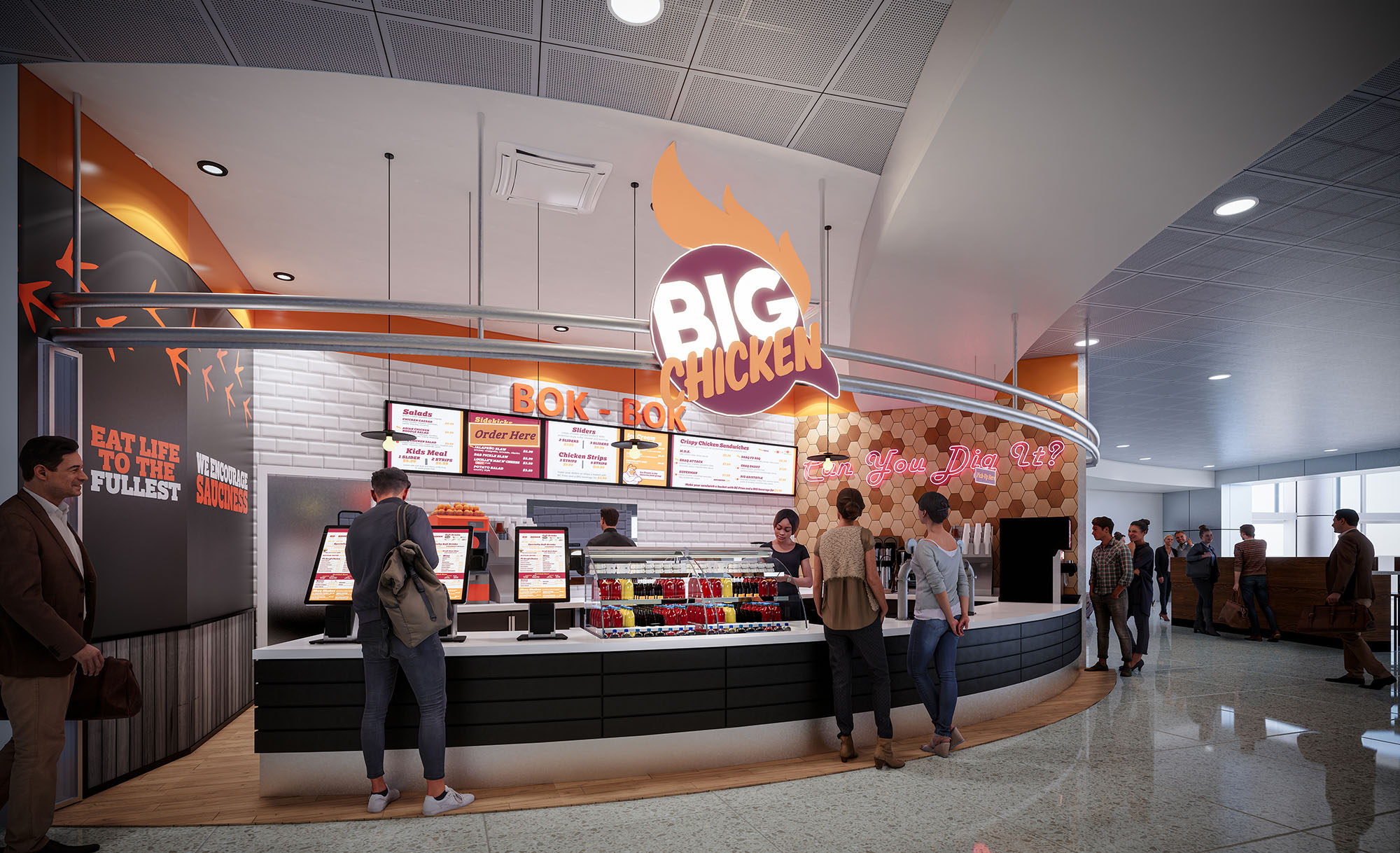
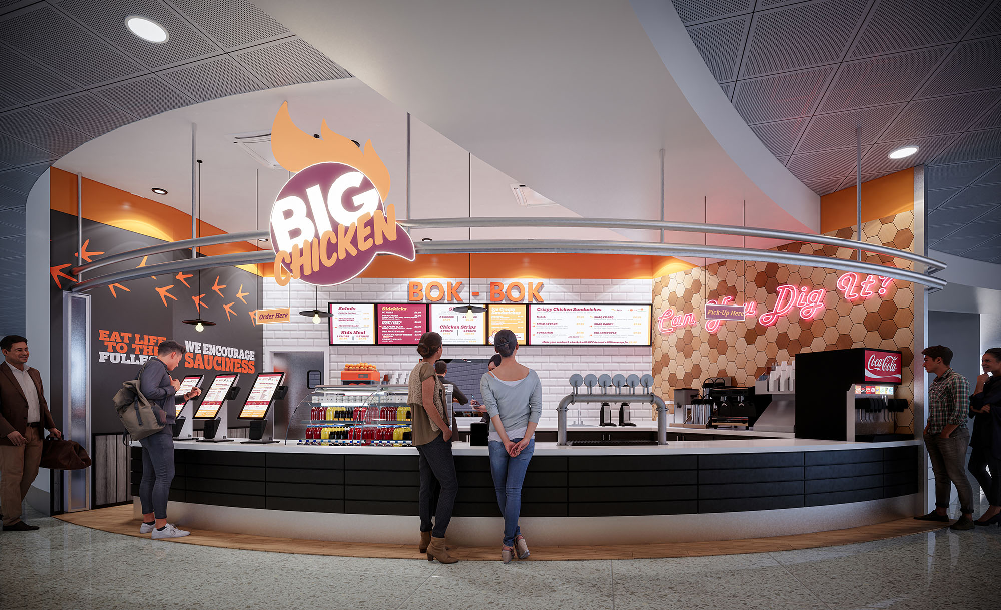
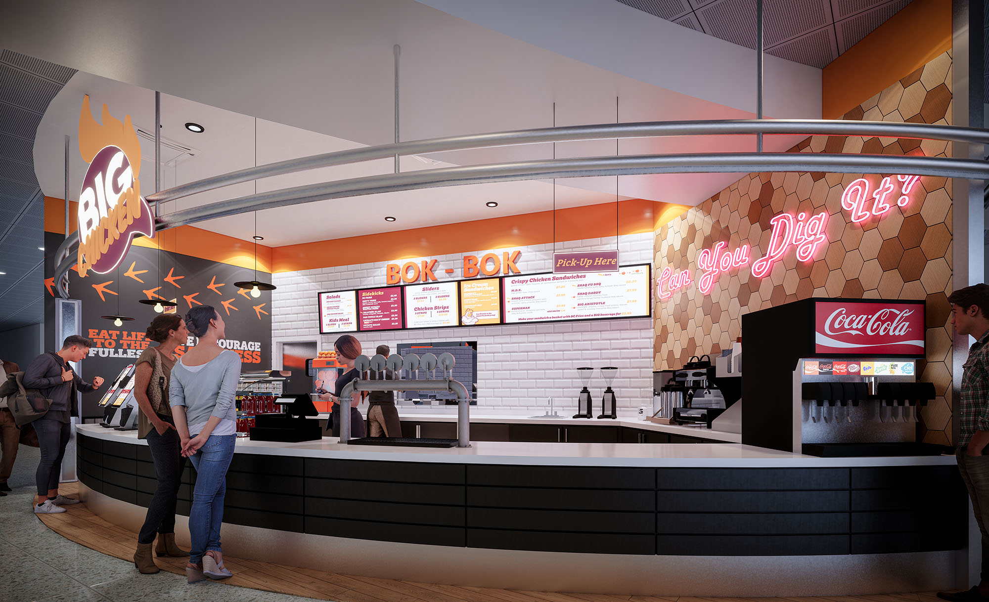
© 2021 by sanzpont [arquitectura] . Webpage by sanzpont [digital] . Innovative Digital Experiences
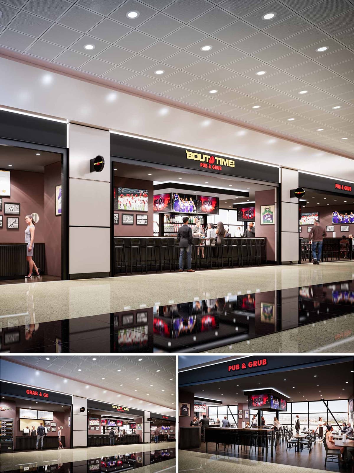
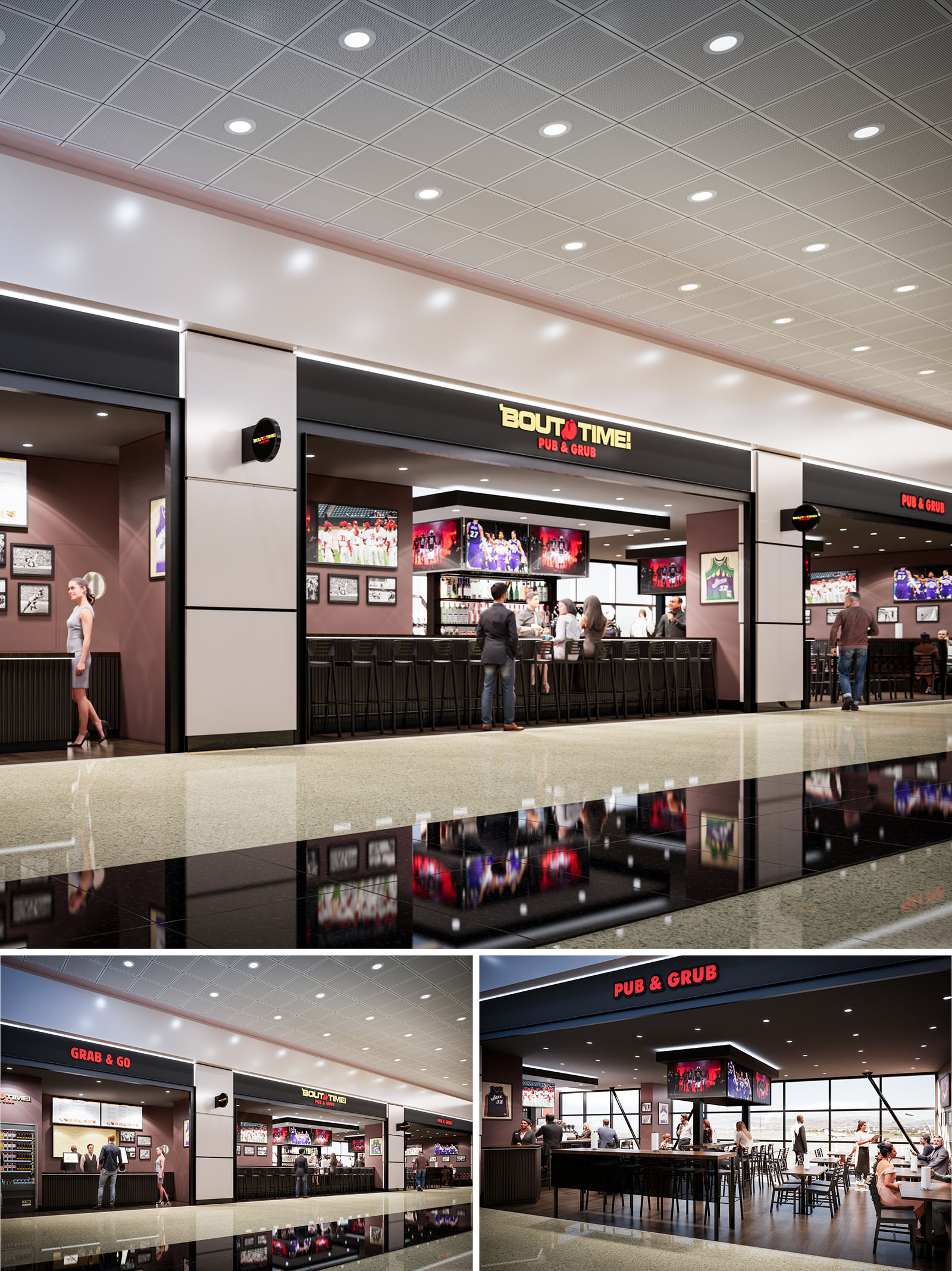
BOUT TIME PUB & GRUB is conceived as a contemporary sports pub tailored to the fast-paced context of an airport concourse in Salt Lake City. The design merges the familiarity of a neighborhood bar with the openness and clarity required for wayfinding in a transportation hub. A strong linear frontage, bold branding, and an inviting bar edge act as a visual anchor, drawing travelers into a space that feels energetic yet orderly.
The concept organizes the venue into two complementary experiences: a quick “grab & go” offer aligned with circulation, and a more immersive sit-down pub framed by large-format screens and curated sports memorabilia. This duality allows the restaurant to respond to different dwell times while maintaining a coherent architectural language.
The plan is structured around a central bar island, clearly visible from the concourse. This bar operates as the spatial and operational core, with perimeter seating zones radiating from it. High-top stools at the concourse edge allow brief stops, while deeper into the space, regular tables and banquettes support longer stays and group gatherings.
The open facade dissolves the boundary between public concourse and interior, maximizing view lines and natural surveillance. Circulation is deliberately simple: guests encounter the grab & go counter first, then either remain at the edge or transition into the main dining zone. Service routes for staff run discreetly behind the bar and along the back-of-house band, minimizing cross-traffic with guests.
The interior architecture employs a restrained palette of dark metals, warm woods, and matte wall finishes to convey a contemporary pub atmosphere. Vertical piers and soffit bands articulate the thresholds, framing the opening like a proscenium and lending the frontage a strong urban street presence within the terminal.
Wall planes in deep, muted tones create a calm backdrop for framed photographs and sports graphics, while ribbed millwork at the bar base and wall wainscoting introduces texture and shadow. Bar stools and chairs in black metal with clean lines contribute to a cohesive, slightly industrial character, balanced by the warmer timber flooring within the dining area.
Lighting is layered to emphasize both function and brand. At the concourse ceiling, a grid of recessed downlights provides uniform ambient illumination, ensuring clear visibility and a sense of safety. Within the pub, a darker ceiling plane with focused downlights creates more intimate light pools over tables and the bar surface.
Integrated LED strips highlight the primary signage bands, reinforcing the “BOUT TIME” identity from a distance. Large-format digital screens suspended over the bar double as both entertainment and luminous focal points, their glow animating the space and echoing the visual language of a sports arena. Accent lighting on memorabilia walls subtly draws attention without overwhelming the overall luminance balance.
Furniture selection prioritizes durability and efficient turnover while maintaining comfort. Slim-profile bar stools maximize seat count along the frontage, and flexible table arrangements accommodate both solo travelers and larger groups. The finishes are chosen for high resistance to wear, essential in an airport environment with rolling luggage and continuous traffic.
Graphic elements—team photos, jerseys, and historical imagery—are composed in a gallery-like arrangement, giving the walls narrative depth and reinforcing the sports-bar identity. Wayfinding is integrated into the architecture through clear, illuminated signage for “PUB & GRUB” and “GRAB & GO,” allowing guests to orient themselves quickly under time pressure.
Sustainability is addressed through both material selection and building systems. The design favors long-life, low-maintenance materials such as porcelain or terrazzo flooring at the concourse edge, durable laminates, and high-recycled-content metals, reducing replacement cycles and associated waste. Where possible, finishes with low VOC emissions are specified to support indoor air quality, particularly important in enclosed terminal environments.
Energy-efficient LED lighting is used throughout, coordinated with existing airport controls to optimize power consumption. The open facade strategy reduces the need for additional mechanical separation from the concourse, enabling shared environmental conditioning and lowering overall HVAC loads. Furniture and millwork are designed for modularity, allowing future reconfiguration or replacement of components without extensive demolition, extending the usable life of the fit-out and minimizing material waste over time.
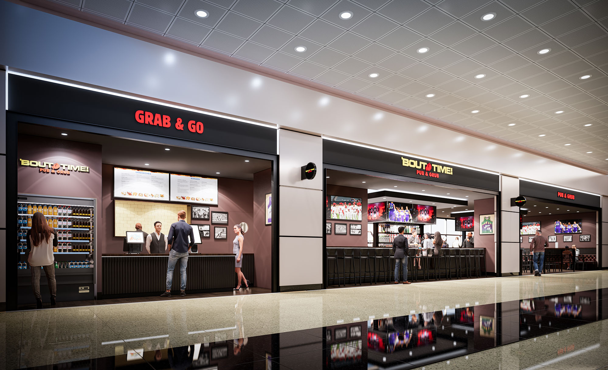
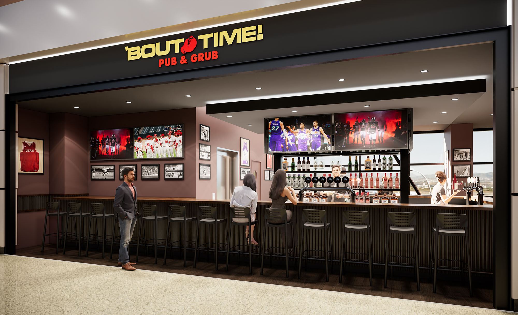
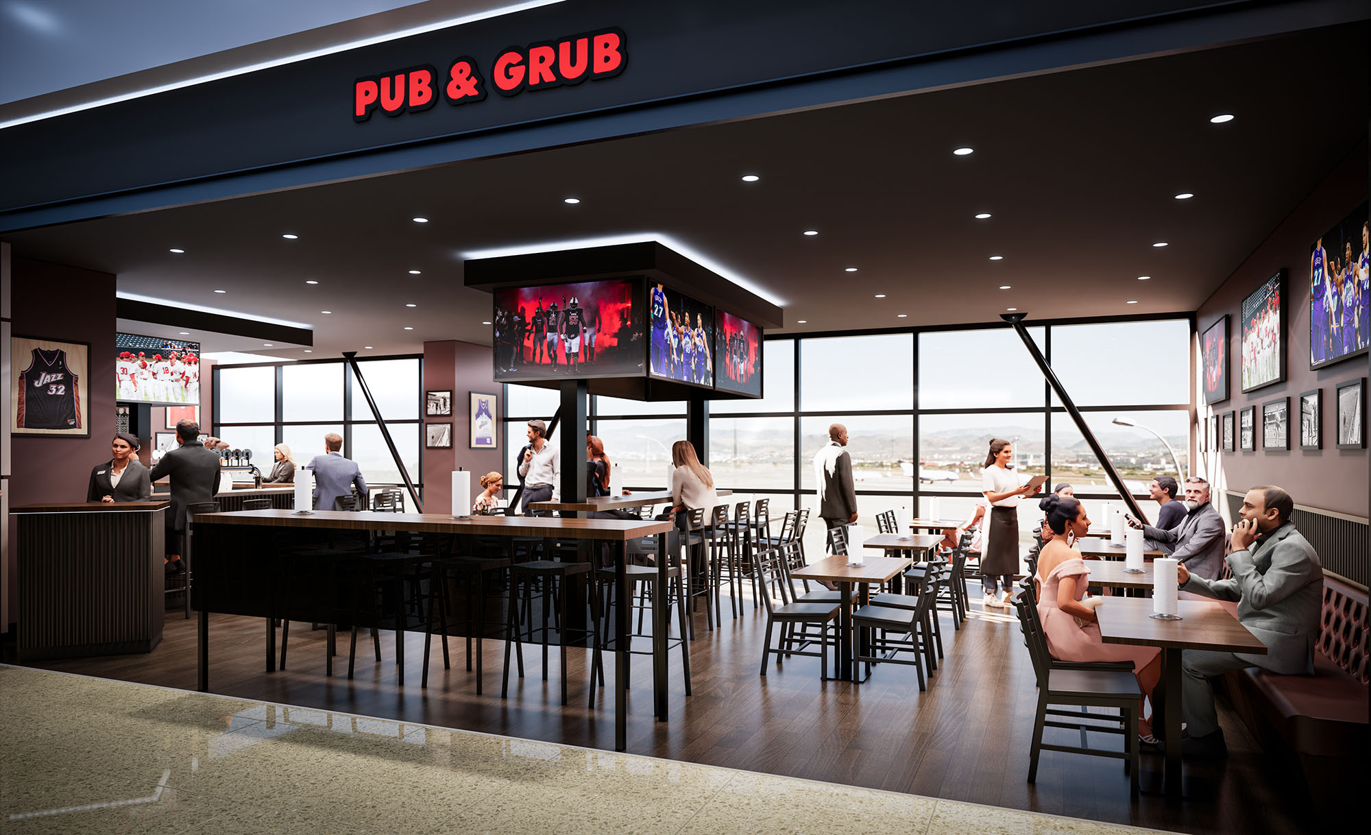
© 2021 by sanzpont [arquitectura] . Webpage by sanzpont [digital] . Innovative Digital Experiences
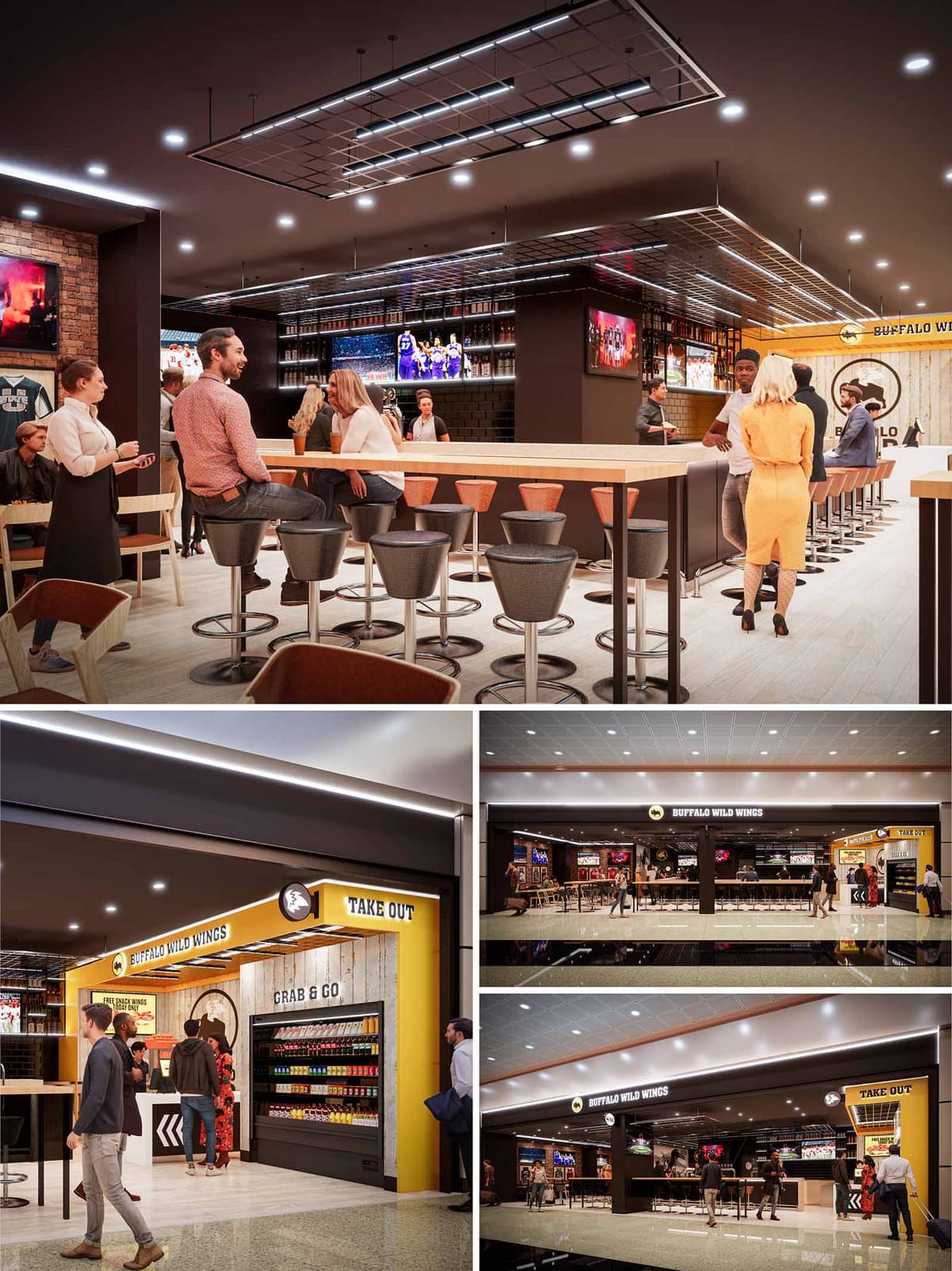
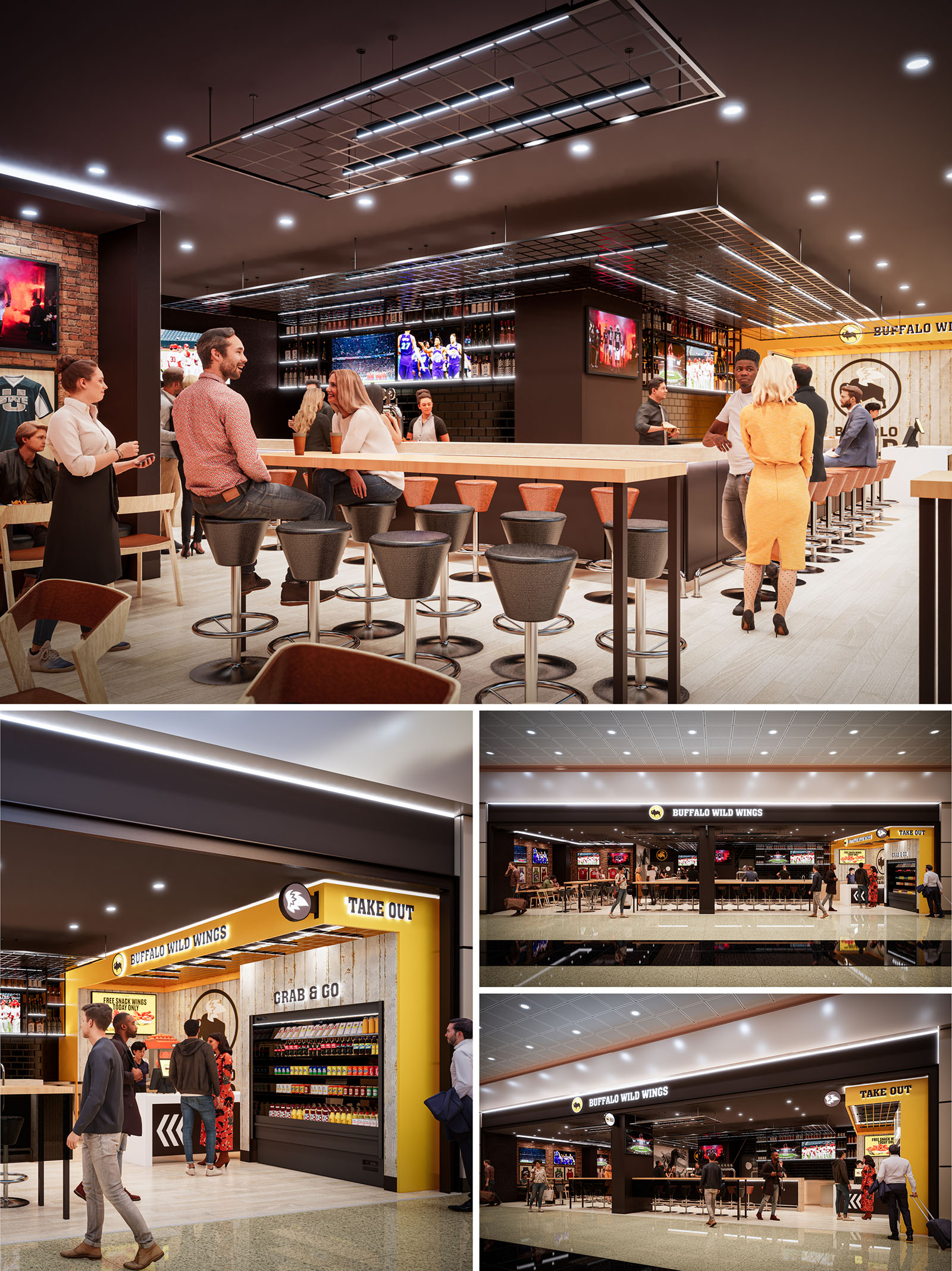
The Buffalo Wild Wings in Salt Lake City is conceived as an open, highly visible sports bar that blends the informality of a fan arena with the clarity of a contemporary retail frontage. The design creates a porous boundary between the mall concourse and the interior bar, using large structural openings and minimal glazing to visually extend the public realm into the restaurant. The concept emphasizes immersion in live sports, expressed through a panoramic arrangement of digital screens and a continuous bar core that becomes the architectural centerpiece.
The overall atmosphere combines industrial references—exposed grid ceilings, brick textures, black tile—with a warm, hospitality-driven palette. The brand’s yellow and black identity is integrated architecturally as volumetric frames, illuminated bands, and wayfinding elements rather than surface graphics alone, generating a cohesive and instantly recognizable environment.
The plan is structured around a central horseshoe bar that organizes circulation and sightlines. High stools and counter seating define the primary social zone, with peripheral tables offering more intimate dining while still maintaining direct views toward screens. This zoning ensures a gradient from active bar energy at the core to more relaxed seating toward the perimeter.
The frontage is articulated in three main programmatic bands: the main bar and dining area in the center, a take-out/“grab & go” component on one side, and an additional entry and merchandise or feature zone on the opposite side. This tripartite façade allows the concept to address both quick-service and full-service users simultaneously, optimizing throughput in a high-traffic mall context.
The material palette combines warm, light-toned timber flooring and countertops with dark metal bases and structural frames, creating a balanced contrast between hospitality and robustness. Brick cladding and black ceramic tiles add textural depth and reference the brand’s sports-bar heritage, while smooth gypsum surfaces and clean-edged millwork maintain a contemporary character.
Color is anchored by the brand yellow, strategically used as a spatial accent around the take-out portal and in linear bands along the soffits. Neutral greys, blacks, and natural wood tones dominate the interior, allowing digital screens and branded graphics to become dynamic focal points. Lighting is predominantly recessed LED downlights, complemented by linear fixtures integrated within an exposed metal grid ceiling. This grid not only organizes lighting and services but also establishes a strong visual datum that unifies the entire interior.
Toward the mall concourse, the restaurant presents a clear, horizontally articulated façade. The central open bay reveals the bar and live sports screens, functioning as an animated billboard that continually advertises the atmosphere inside. Flanking portals for “Buffalo Wild Wings” and “Take Out” are framed by illuminated yellow bands, enhancing legibility from a distance and guiding customer flow.
The grab-and-go zone is treated almost like a retail kiosk, with highly ordered shelving and clear product visibility. This dual identity—sports bar and fast-service node—responds to diverse user needs, from travelers seeking a quick purchase to groups looking for a full dining and viewing experience. Wayfinding is intuitive, relying on bold typography, color-coded thresholds, and directional graphics on the floor and walls.
The project integrates several pragmatic sustainability measures within the constraints of a mall environment. High-efficiency LED lighting is used exclusively, with tight beam control and dimmable circuits to reduce energy consumption while adapting to varying levels of occupancy and event intensity. The exposed ceiling grid simplifies access to mechanical and electrical systems, facilitating maintenance and future upgrades without extensive demolition.
Durable finishes—such as porcelain or high-performance vinyl flooring, glazed ceramic tiles, and metal-framed furniture—are selected for longevity in a high-traffic context, lowering replacement cycles and embodied impacts. Where possible, furniture and millwork utilize engineered wood products and veneers to optimize material use. The compact kitchen and bar back-of-house layout reduces unnecessary circulation, improving operational efficiency and indirectly decreasing energy use associated with food service equipment and refrigeration.
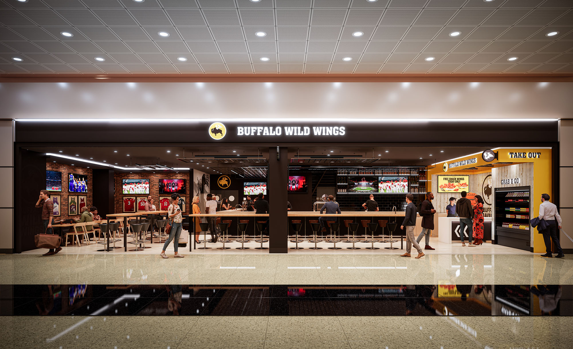
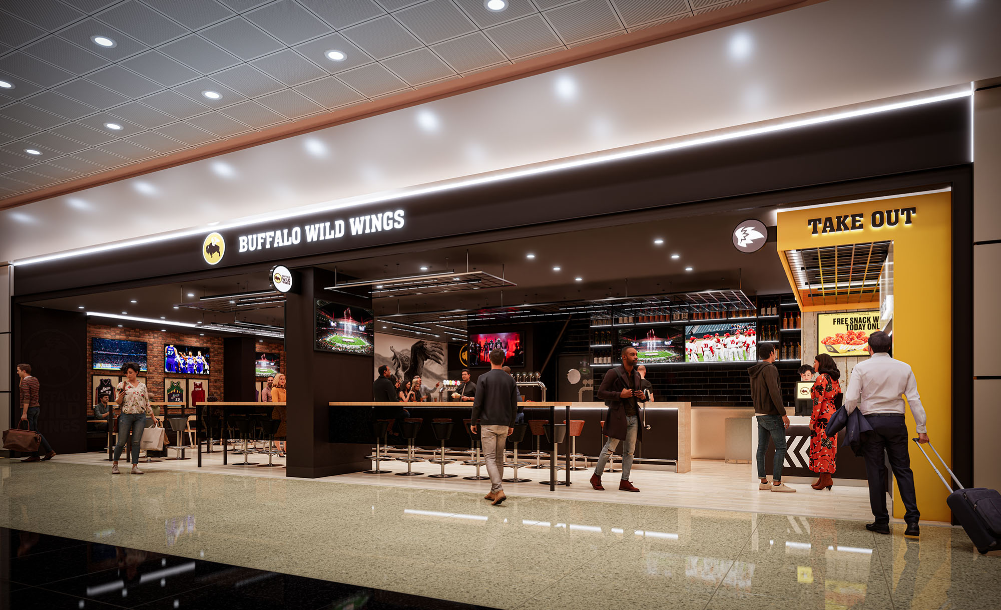
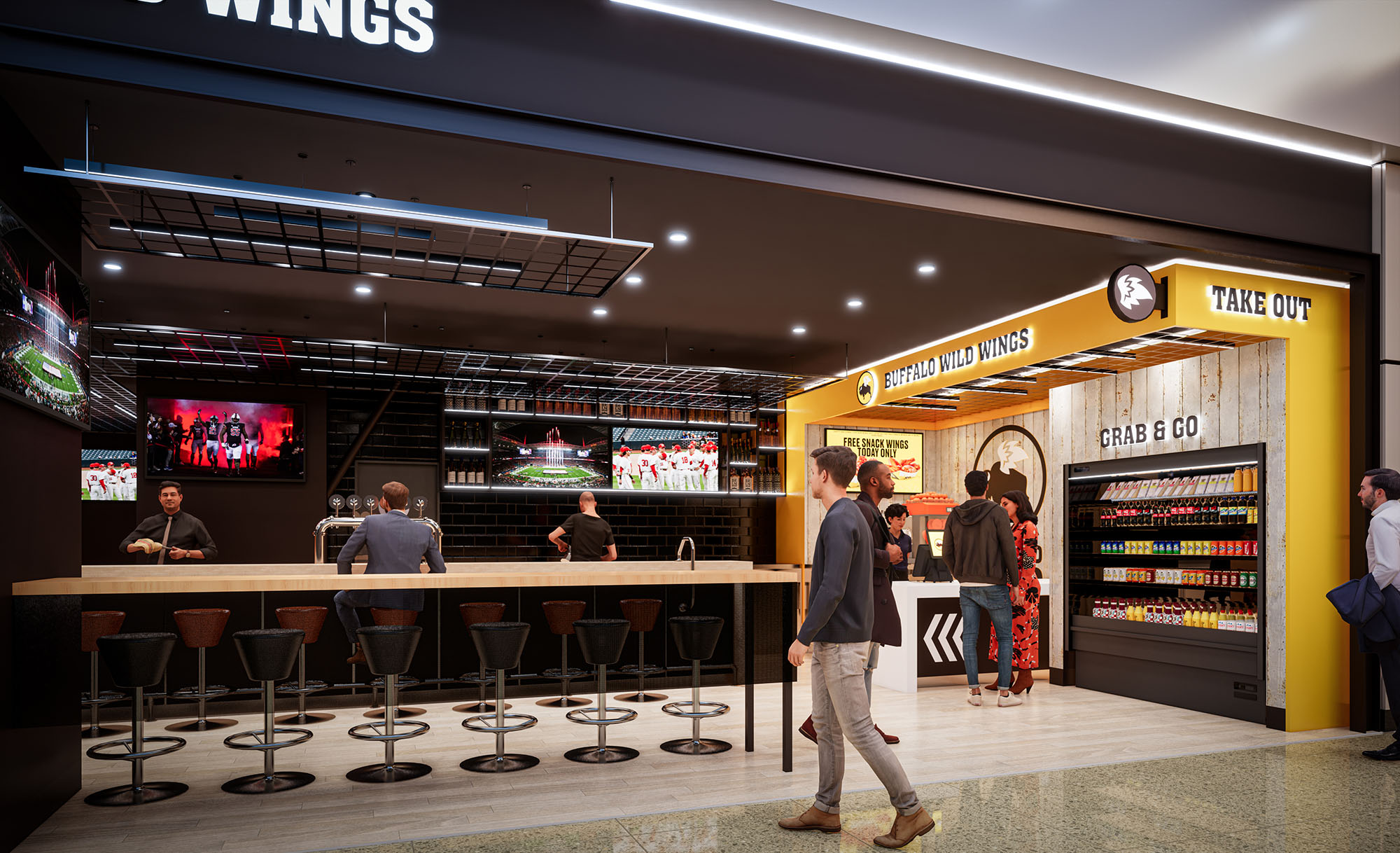
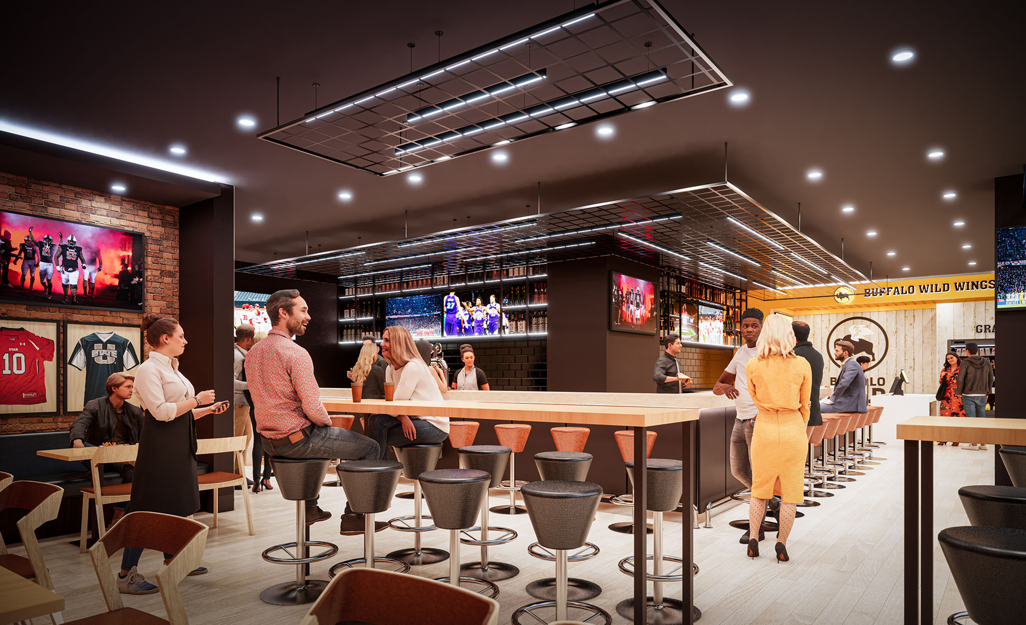
© 2021 by sanzpont [arquitectura] . Webpage by sanzpont [digital] . Innovative Digital Experiences
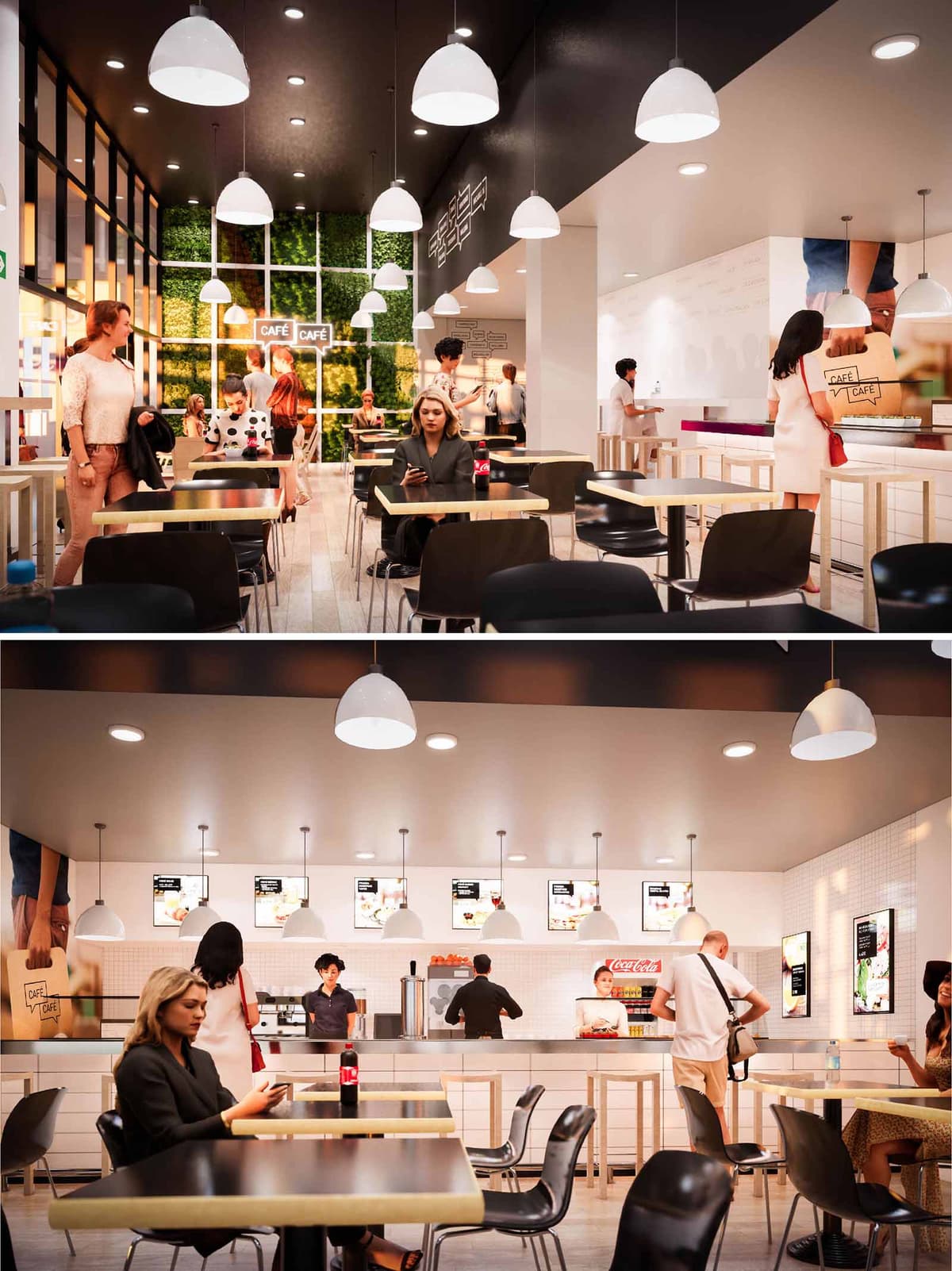
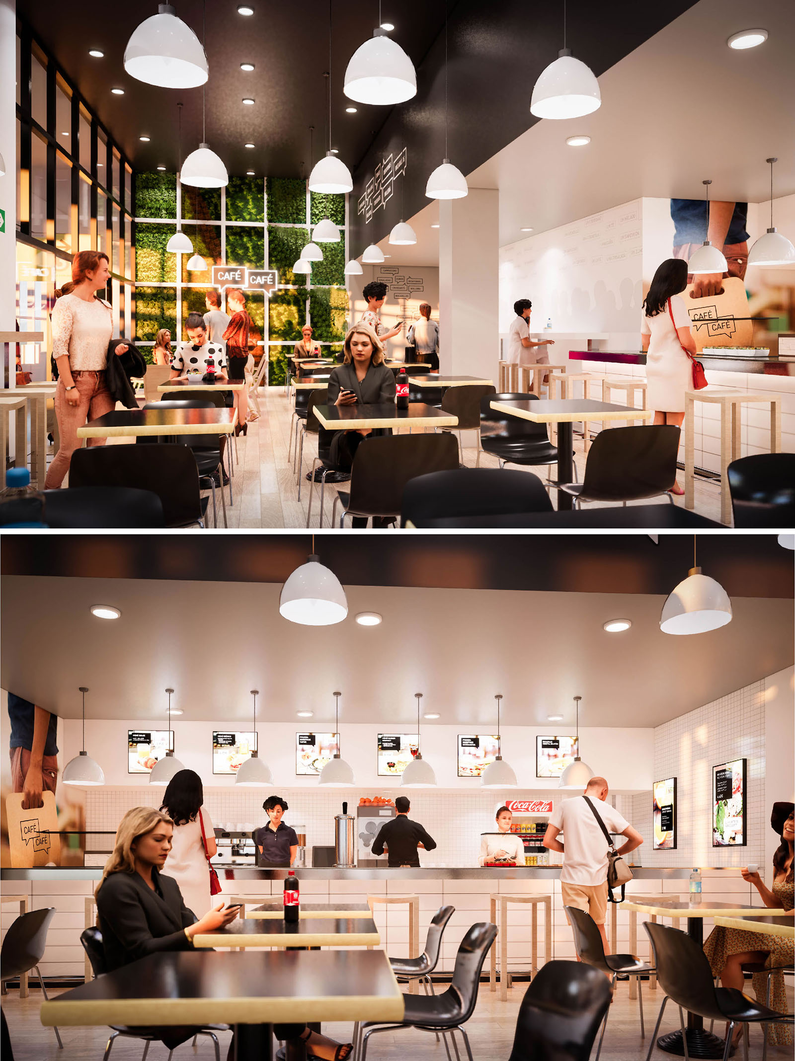
CAFE CAFE is conceived as a contemporary urban café chain that can be replicated in multiple locations while retaining a warm, human scale. The concept merges the clarity of a fast-service environment with the ambience of a comfortable neighborhood café. A restrained palette of materials and colors creates a recognizable brand identity, allowing each unit to adapt to its specific context without losing coherence.
The interior language balances efficiency and hospitality: clear circulation towards the counter, intuitive self-service dynamics and permeable seating zones that invite lingering. The design seeks to evoke an everyday ritual space, where light, vegetation and tactile finishes soften the highly functional program typical of high-turnover restaurants.
The floor plan is organized along a longitudinal axis that visually connects the entrance, the main seating area and the service counter. The access zone opens directly onto the dining space, minimizing visual barriers and enabling immediate orientation. The counter occupies the back wall as a continuous, linear element, consolidating ordering, pickup and display functions in a single gesture.
Seating is arranged in a modular grid of two- and four-top tables, allowing flexible reconfiguration for different groups and peak times. Perimeter bar-height seating along the serving front and windows offers an alternative for solo customers or short stays. Circulation aisles are deliberately generous, ensuring clear flows between tables and the counter, and complying with accessibility standards.
The material palette combines light-toned timber, white ceramic and matte black surfaces to articulate a clean yet warm atmosphere. Tabletops appear in black with a light wood edge, generating a sharp graphic contrast that reinforces the brand’s visual identity. The service counter and lower cabinetry use white finishes and subtle grooves, emphasizing horizontality and hygiene.
The walls are predominantly white, operating as a neutral canvas for illuminated menu boards and large-scale graphics. A key focal element is the vertical green wall that anchors one end of the space, introducing texture, depth and a strong biophilic component. This interplay of natural and synthetic materials produces a clear, legible environment that feels both contemporary and approachable.
Lighting strategy is based on layers. A continuous grid of recessed downlights provides uniform ambient illumination, ensuring operational clarity and comfort throughout the day. Suspended dome-shaped pendants define the main seating field and the counter line, lowering the perceived ceiling height and creating more intimate micro-environments within the larger volume.
The luminaires’ white finish blends with the ceiling, allowing the light itself to become the protagonist rather than the fixture. At the rear, the green wall is softly backlit, producing depth and a subtle gradient that draws visitors into the room. The overall effect is a balanced brightness suitable for quick service, while avoiding glare and excessive contrast.
Brand integration is handled through large photographic panels and discreet signage bearing the CAFE CAFE logo, always framed within the architectural geometry rather than superimposed. Digital menu screens are aligned in a strict horizontal band above the counter, reading as an integral extension of the wall plane.
The furniture follows a minimalist, robust aesthetic: lightweight black shell chairs and slim-profile tables with square tops emphasize modularity and quick reconfiguration. Bar stools at the counter and high tables add functional diversity while maintaining consistency in material and color. The repetition of these standard elements across locations ensures brand continuity and simplifies maintenance and replacement.
Sustainability is addressed through both material selection and operational strategies. The light-toned timber components are conceived to be specified from certified sources, while the predominance of neutral, durable surfaces extends the lifecycle of the interiors, reducing the need for frequent refurbishment. Modular furniture allows components to be reused or relocated between the different Spanish locations.
The lighting scheme is designed for LED technology, minimizing energy consumption and heat gain, which in turn reduces cooling loads. Large glazed surfaces at the façade harness natural light, decreasing the reliance on artificial lighting during daytime hours. The introduction of vertical greenery contributes to improved indoor environmental quality, providing acoustic absorption and a visual connection to nature. Together, these strategies craft a hospitality space that aligns operational efficiency with environmental responsibility across all eight establishments.
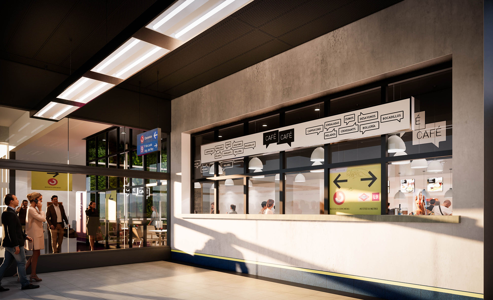
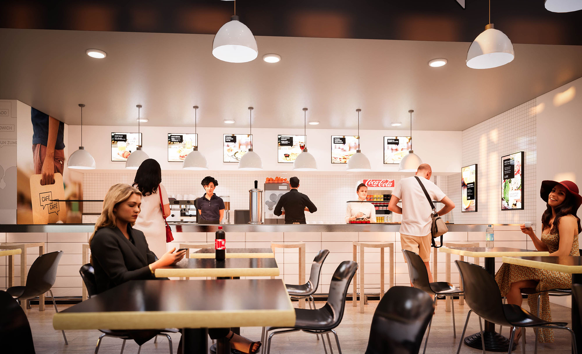
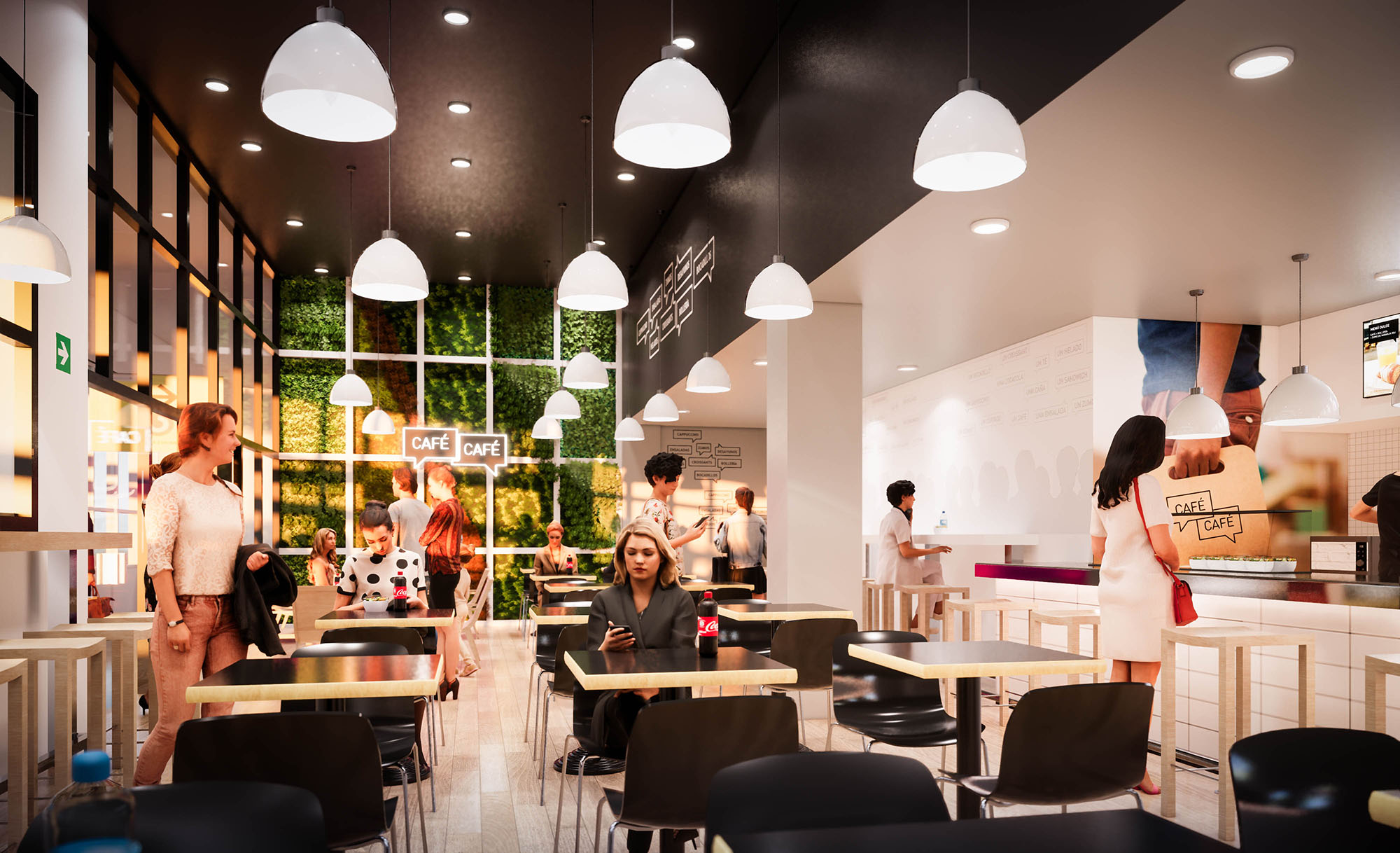
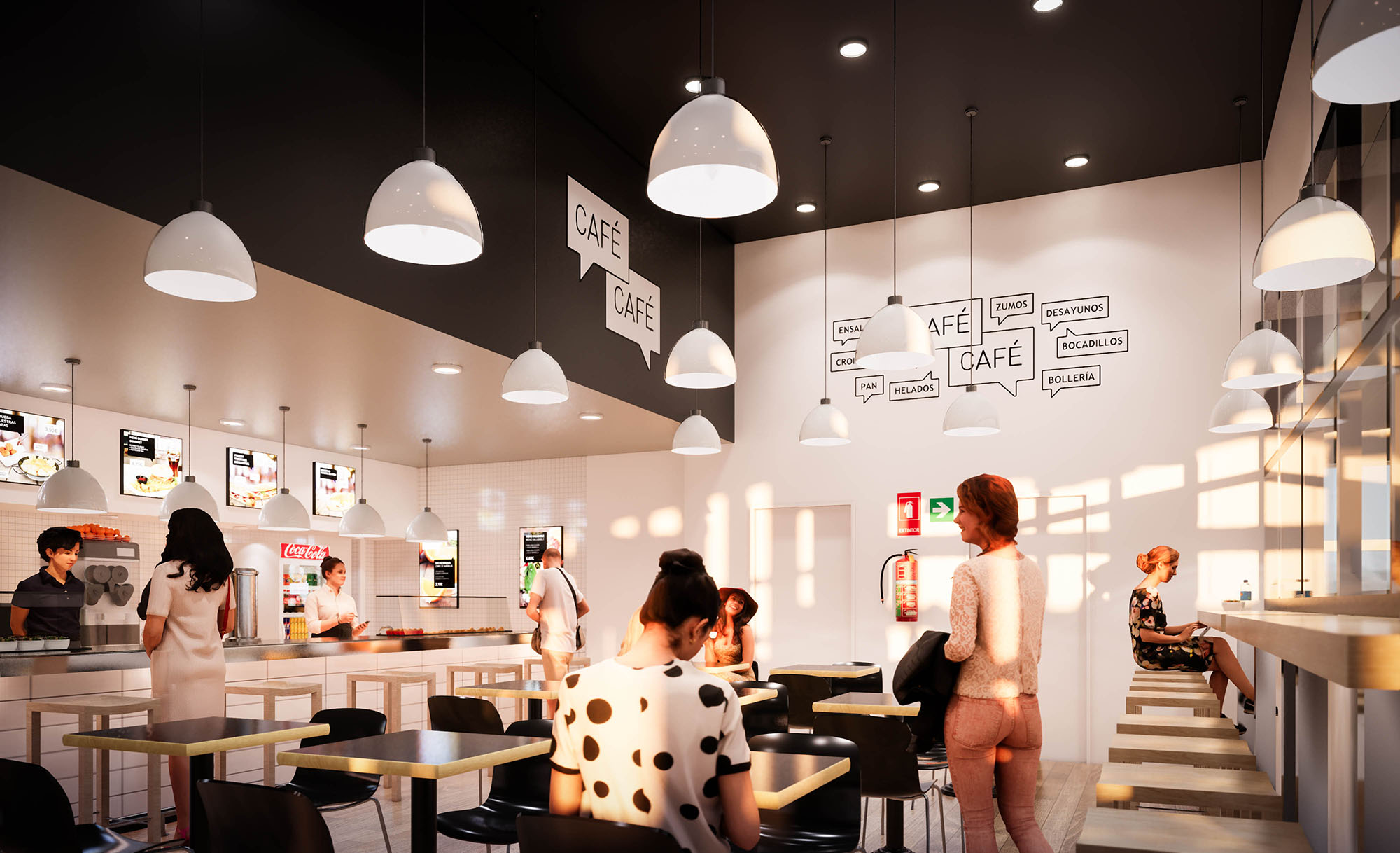
© 2021 by sanzpont [arquitectura] . Webpage by sanzpont [digital] . Innovative Digital Experiences
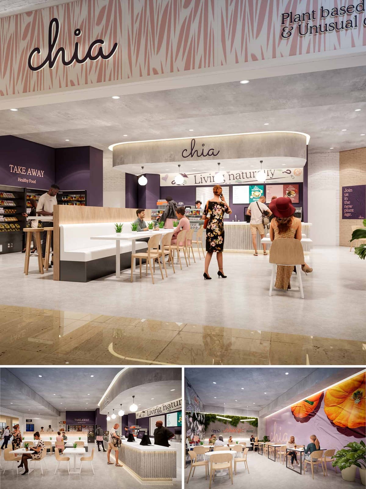
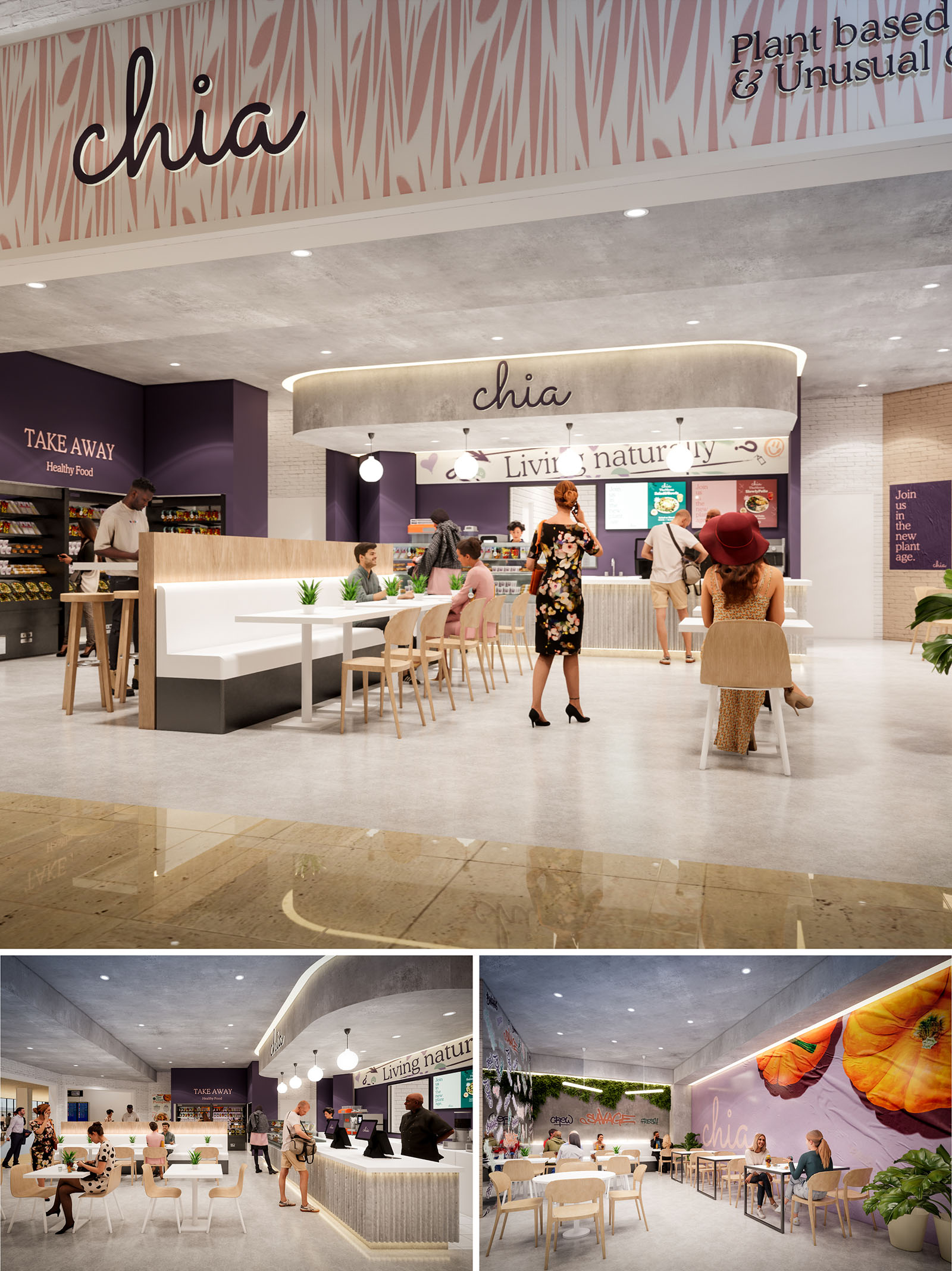
CHIA is conceived as an urban oasis dedicated to plant-based cuisine, translating the lightness and freshness of its menu into a spatial experience. The project articulates a clean, contemporary language, where soft geometries and warm minimalism convey accessibility and comfort while reinforcing the idea of conscious eating. The interior merges the immediacy of a takeaway venue with the calm of a slow-food café, blurring the boundary between commercial space and social hub.
The overall concept is structured around the notion of “living naturally,” expressed through a palette that combines earthy neutrals, botanical accents and a curated use of brand colors. Large-scale graphic walls, organic curves and integrated greenery communicate the narrative of plant-based gastronomy in a direct and memorable way, supporting the brand’s identity in every visual axis.
The layout is organized as a clear longitudinal sequence: entry, ordering counter, takeaway wall and seated dining area. This arrangement facilitates intuitive circulation, allowing customers to understand the service logic at first glance. The central service island, with its rounded canopy, operates as the main orientation element, anchoring the space visually and functionally.
To one side, a compact takeaway and retail strip addresses fast-flow users, with high tables for short stays. To the other, a more relaxed seating zone extends towards the back, framed by feature walls and soft lighting. Bench seating combined with loose chairs optimizes capacity while maintaining flexibility, enabling the restaurant to host different group sizes and rearrange configurations without architectural changes.
The material palette balances technical performance and tactile warmth. Continuous light-toned flooring, likely vinyl or microcement, ensures easy maintenance and seamless accessibility, while visually amplifying natural and artificial light. The ceiling retains an almost raw, concrete-like finish that introduces a subtle industrial layer, acting as a neutral background for the brand elements.
Vertical surfaces alternate between smooth painted walls in deep purple, warm nude tones and white brick textures. These create depth and rhythm, avoiding visual monotony. The service counter and central island feature ribbed or fluted cladding, adding fine-scale texture that catches grazing light. Wood finishes on chairs, tabletops and partial partitions soften the ambience, introducing a natural warmth consistent with the plant-based concept.
The furniture language is deliberately simple, with Scandinavian-inspired wooden chairs, light tabletops and integrated bench seating in neutral upholstery. This understated design allows food and brand graphics to remain the main protagonists, while ensuring ergonomic comfort and high turnover capability. The repetition of identical chair types contributes to visual coherence and facilitates stacking or replacement.
Lighting is layered: recessed downlights provide general illumination, while globe pendants over the counter and linear LED details along the canopy and baseboards generate a more intimate, atmospheric reading of the space. Large graphic murals with botanical and vegetable imagery become powerful focal points in the dining area, extending the gastronomic narrative and offering an immersive backdrop for guests.
Sustainability criteria are integrated both conceptually and technically. The plant-based culinary offer is supported by a design that prioritizes durability, low-maintenance surfaces and efficient lighting. The use of long-life LED fixtures, light-colored finishes to enhance reflectance and a compact service core all contribute to reduced energy demand. Where possible, wood elements are specified with FSC certification and low-VOC finishes to improve indoor air quality.
Biophilic strategies amplify user well-being: potted plants and green wall segments introduce natural textures, helping to establish a visual connection to nature in an otherwise interior mall environment. Generous aisle widths, clear signage and unobstructed views improve accessibility and comfort for all users. The result is a restaurant that not only communicates a sustainable lifestyle through its menu, but also materializes it spatially through responsible design decisions.
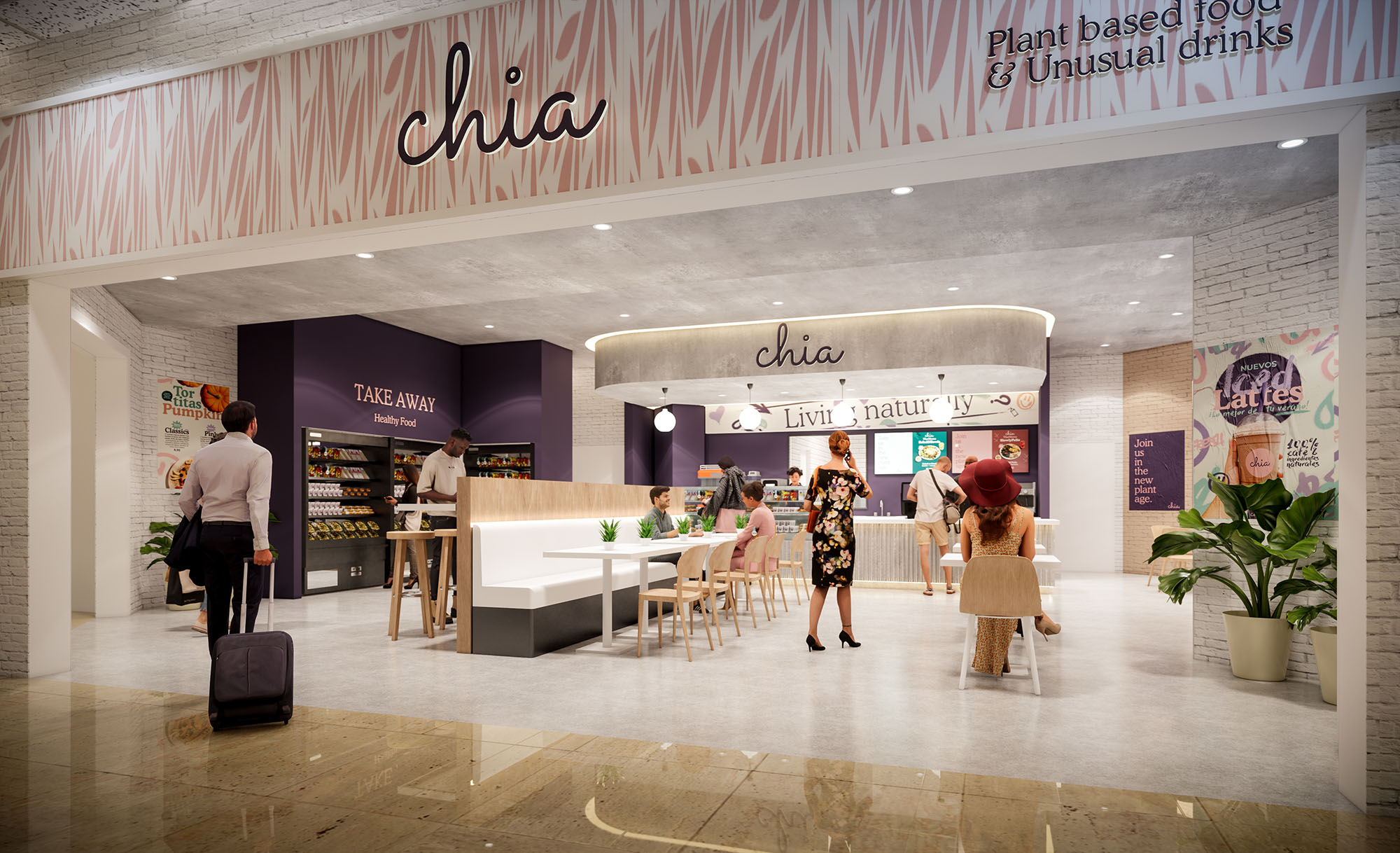
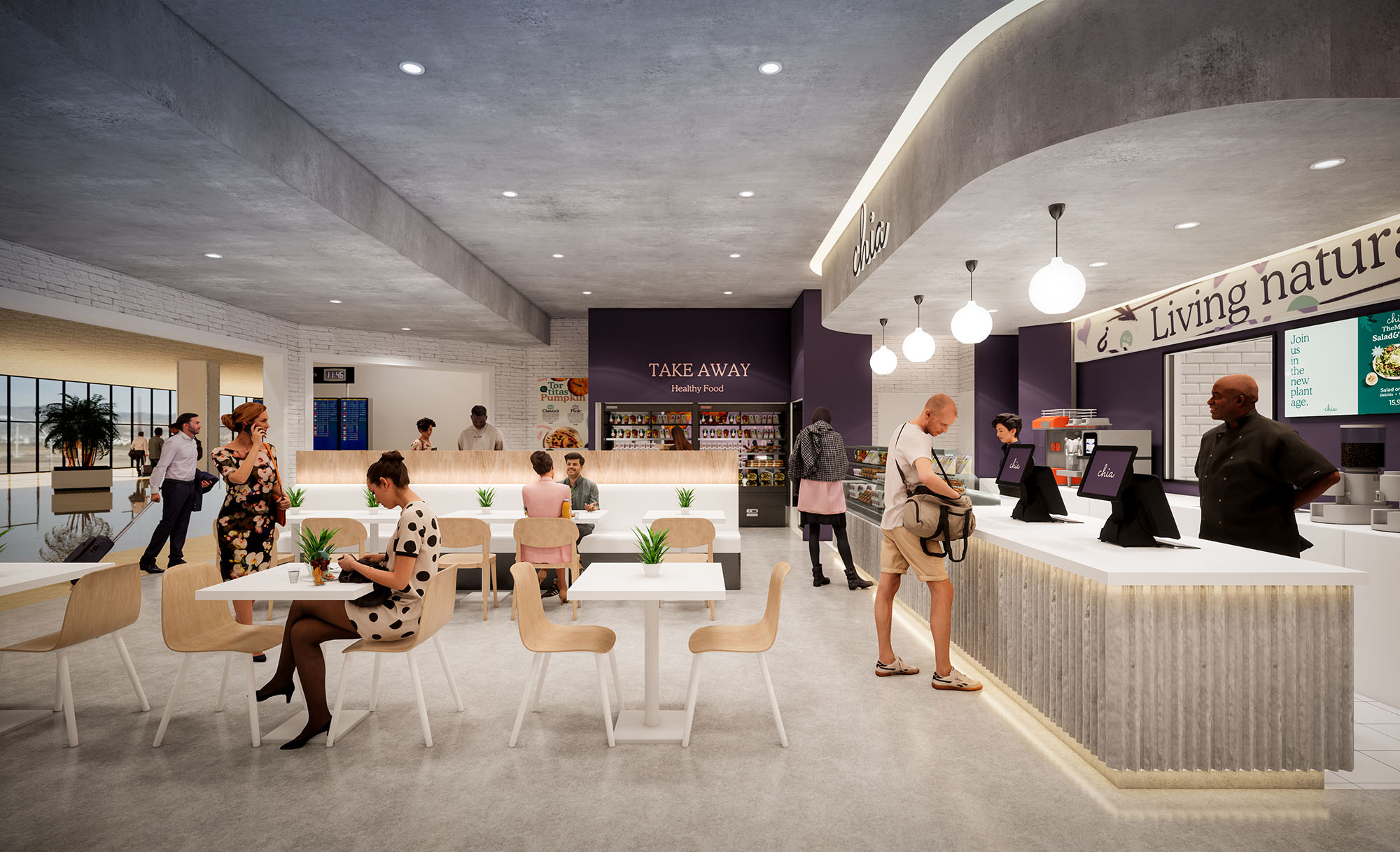
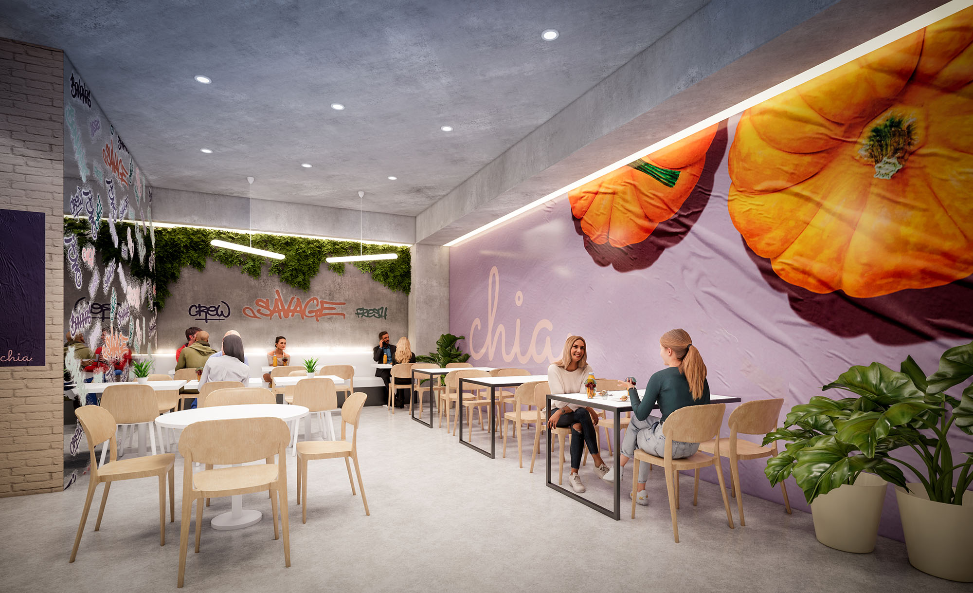
© 2021 by sanzpont [arquitectura] . Webpage by sanzpont [digital] . Innovative Digital Experiences
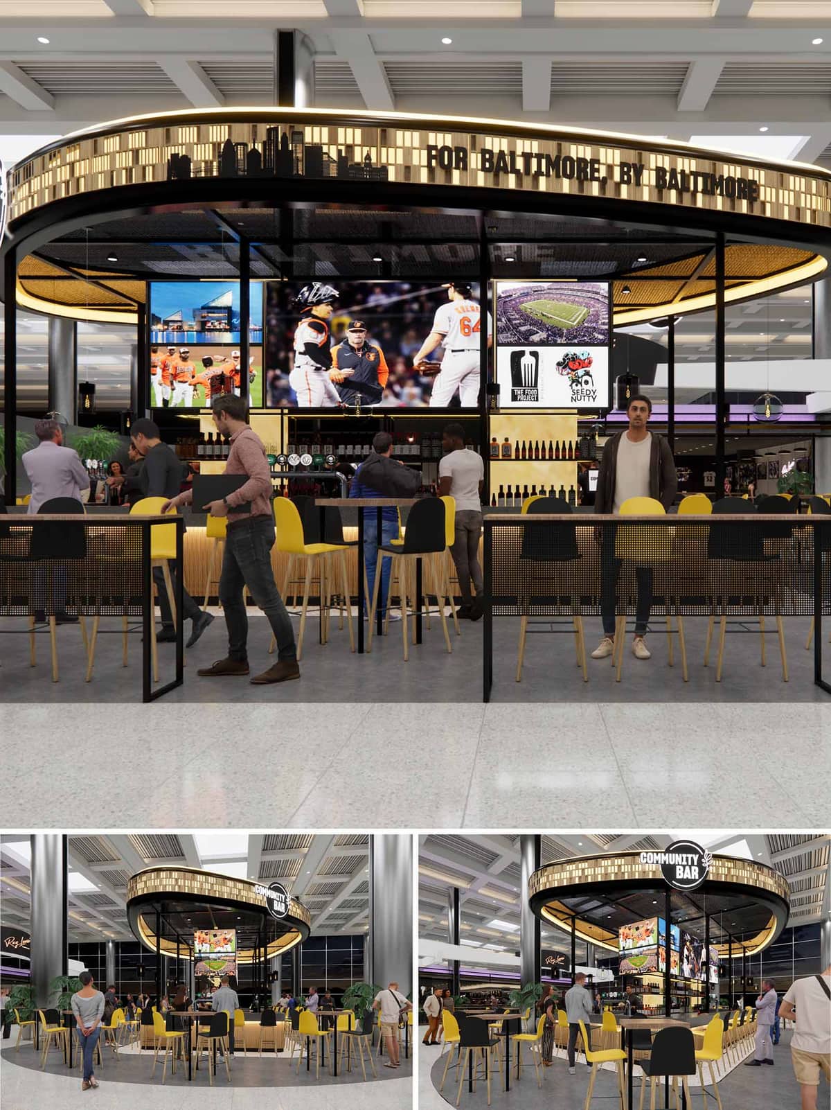

This design presents a contemporary, circular bar pavilion titled “Community Bar,” strategically integrated into a transit-oriented public interior, likely an airport terminal or commercial concourse. The concept is driven by a community-first approach, made explicit by the signage “For Baltimore, By Baltimore.” The design leverages the open, transparent nature of the structure to foster social interaction and a sense of inclusiveness, blending seamlessly into the flow of the surrounding space. The circular footprint encourages access from all directions, reinforcing its community-centric theme while maximizing visibility and approachability.
The plan is an open-ring configuration defined by a continuous bar counter that curves around the central service core. Seating options are well-differentiated: high stools at the bar, communal high tables at the perimeter, and flexible café-style tables in the outer ring. This variety supports different user behaviors—quick solo drinks, social gatherings, or casual meetings. The central core hosts large digital displays with sports content, enhancing the bar’s identity as a sports-friendly social hub. Vertical metal posts and a thin circular frame give the impression of lightness, maintaining visual permeability while providing structural rhythm.
The material expression is a refined balance between industrial minimalism and warm hospitality. Black steel framing outlines the structure with crisp definition, while light oak stools and bar panelling introduce warmth and tactility. The perforated black metal mesh on the seating dividers adds texture while preserving transparency. The ceiling treatment uses a gold mesh or acoustic paneling that adds an elegant shimmer and diffuses light, creating visual interest overhead. The seating’s yellow and black color palette pays homage to local sports teams (such as the Orioles and Ravens), reinforcing local identity while maintaining visual contrast and energy.
LED lighting is subtly integrated into the upper perimeter canopy, illuminating the laser-cut Baltimore skyline motif. This programmable lighting likely shifts in tone to match ambient conditions or event programming. Internally, pendant lighting punctuates the ceiling and further defines the bar area. A robust media wall anchors the central bar with dynamic sports content, making it a visual magnet for passersby. Digital signage is used effectively for both branding and content delivery, enhancing user engagement without overwhelming the architectural clarity.
Sustainability is addressed through a combination of material choices and spatial efficiency. The open-air configuration eliminates the need for active mechanical climate control, relying on the ambient conditioning of the host space. The use of durable, low-maintenance materials like steel and wood reduces lifecycle replacement and maintenance costs. Furthermore, the modular nature of the furnishings allows for future adaptability and ease of repair. Energy-efficient LED lighting and digital displays likely feature smart energy management to minimize consumption during off-peak hours. Lastly, promoting local culture and vendors supports economic sustainability by anchoring the design within the community’s ecosystem.
© 2021 by sanzpont [arquitectura] . Webpage by sanzpont [digital] . Innovative Digital Experiences


EL BARETO is conceived as a contemporary reinterpretation of the traditional Madrid “cervecería y bocatería”. The design builds on familiar codes of the classic neighborhood bar—warm wood, tiled counters, handwritten menus—and abstracts them into a clean, luminous environment suitable for a high-traffic commercial hub. The aim is to transmit informality and immediacy while maintaining an orderly and clearly legible spatial system.
The project emphasizes openness and visual continuity with the surrounding mall, using a wide, recessed façade that dissolves the threshold between corridor and bar. Signage, lighting and materials act as urban elements within the interior landscape, guiding the visitor naturally towards the bar, the dining area and the takeaway counter.
The plan is structured around a central serving spine that aligns the main bar, food display and payment points. This linear core guarantees clear wayfinding: the customer approaches frontally, orders, and then moves laterally towards the seating area or exits back to the mall. The position of the counter optimizes visibility of product and staff, reinforcing the idea of transparency and speed of service.
Seating is organized in flexible islands of tables and chairs, with perimeter benches that maximize capacity during peak hours. The furniture arrangement maintains generous circulation bands, allowing independent flows for diners, passersby and staff. Open corners and low-height planters define micro-ambiences without obstructing views, ensuring a sense of security and visual connection to the exterior.
The material palette combines natural-looking oak laminates, white lacquered surfaces and exposed brick, creating a warm and accessible atmosphere. The lower part of the façade and structural claddings use vertical timber paneling to evoke traditional carpentry while providing durability and easy maintenance in a demanding context. Counter fronts alternate ceramic tiling and stainless-steel planes, referencing classic bar counters in Madrid.
The chromatic base is neutral—whites, light woods and black accents—upon which corporate blue signage is superimposed. This contrast ensures strong brand legibility from a distance and under artificial lighting. Dark flooring defines the interior footprint against the terrazzo of the mall, subtly framing the restaurant as a “room within a corridor”.
Artificial lighting plays a key role in the character of EL BARETO. A grid of exposed bulbs in warm color temperature creates a festive ceiling reminiscent of street fairs and classic cafés, while also ensuring uniform illumination over tables. Track-mounted spotlights highlight the bar, food displays and blackboard menus, drawing attention to activity and fresh product.
Indirect LED strips incorporated in planter boxes, counters and perimeter walls emphasize horizontality and help orient circulation. The overall result is a bright, inviting space that maintains visual comfort, avoiding glare thanks to the diffusion of multiple low-intensity sources instead of a few powerful fixtures.
Graphic design is fully integrated into the architecture. Large typographic signs, wall messages and photographic murals animate the perimeter walls and emphasize the local, castizo identity of the concept. The use of simple sans-serif lettering and a limited color code guarantees coherence between façade, menus and internal signage.
Blackboards behind the bar allow for constant updating of offers and reinforce the artisanal, made-on-the-spot perception. Display shelves above the counter house bottles and branded elements, functioning simultaneously as storage, decoration and a visual filter that lowers the perceived height of the space.
The design strategy prioritizes durability and low maintenance as the main drivers of sustainability in a high-rotation commercial environment. Materials are chosen for their resistance to impact and ease of replacement, reducing the need for frequent renovations and associated waste. Laminated wood panels, ceramic tiles and compact surfaces guarantee long service life while preserving the aesthetic of warmth and craftsmanship.
Lighting design relies entirely on LED technology, significantly reducing energy consumption and heat gain. The regular ceiling grid and modular furniture enable future reconfigurations without major construction work, extending the life cycle of the project. In addition, the open layout facilitates natural cross-ventilation from the mall concourses, minimizing the need for localized air extraction and improving overall comfort for users and staff.
© 2021 by sanzpont [arquitectura] . Webpage by sanzpont [digital] . Innovative Digital Experiences
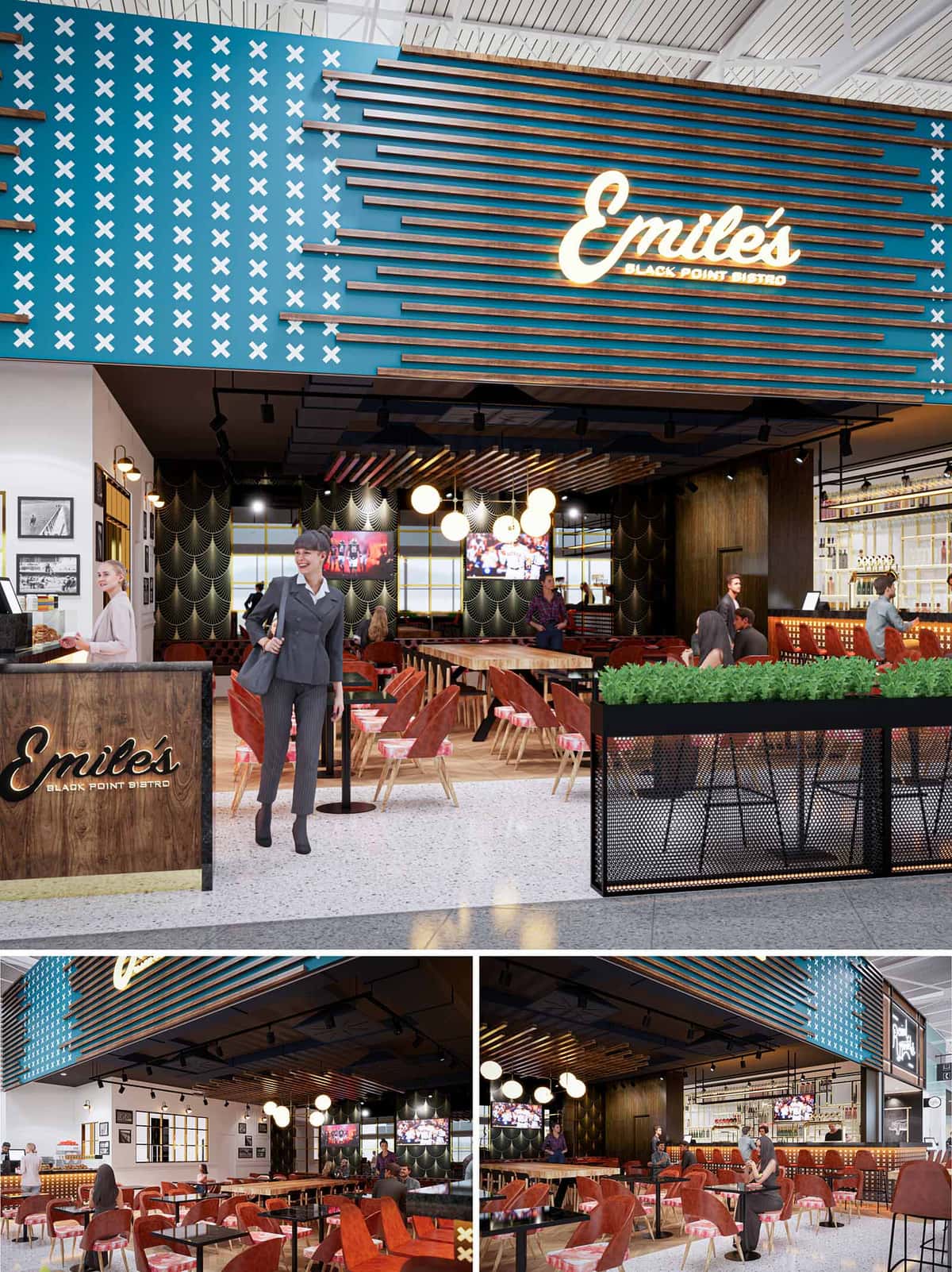

Emile’s is conceived as a contemporary airport bistro that fuses the warmth of a neighborhood restaurant with the efficiency and clarity required in a high-traffic terminal. The design language balances bold graphic identity with an intimate interior atmosphere, creating a recognizable destination visible from afar while remaining comfortable at a human scale. Color, pattern and lighting are orchestrated to convey a sense of lively hospitality rooted in Houston’s cosmopolitan energy.
The project emphasizes permeability between terminal circulation and the dining area, using a semi-open perimeter that invites spontaneous entry. Visual anchors such as the branded façade, illuminated signage and regimented ceiling elements guide travelers intuitively from concourse to counter, minimizing wayfinding stress in a transient environment.
The layout is organized around a central communal axis formed by a long shared table that visually aligns with the entrance. This gesture extends the concourse into the dining space, acting as both a spatial divider and a social condenser for solo travelers and small groups. Perimeter seating with smaller tables provides more intimate zones while preserving clear sightlines to the bar and departure concourse.
The bar is strategically located along one edge as a functional and visual backbone, consolidating service, storage and display in a single linear element. Open shelves and backlit bottles create depth, while the bar’s position allows staff to oversee the entire floor for operational efficiency. Circulation paths remain generous and direct, respecting luggage maneuverability and accessibility standards.
The façade operates as an oversized graphic portal. A deep teal backdrop with repetitive white “X” motifs establishes a strong visual identity, while horizontal timber slats introduce warmth and rhythm. The illuminated script logo is integrated as a sculptural element, projecting slightly from the plane to catch light and shadow.
Inside, the ceiling is treated as a unifying canopy. Suspended linear elements echo the exterior slats, compressing the scale and acoustically softening the open terminal volume. Blacked-out soffits conceal services and create contrast with the wooden strips, while track lighting delivers flexible, directional illumination that can adapt to changing furniture layouts.
The interior palette combines warm woods, deep reds and brass accents with graphic black-and-gold wall patterns. Timber flooring and tabletops introduce a tactile, residential quality, offsetting the hardness of the terminal’s terrazzo and metal finishes. Upholstered chairs in rust-red velvet tones offer visual richness and comfortable seating for extended dwell times.
Custom banquettes and freestanding tables are dimensioned for rapid turnover without sacrificing comfort, with carefully calibrated table spacing to maximize capacity while maintaining personal space. Decorative globe pendants over the communal area provide a soft, diffused light that contrasts with the more technical track lighting, adding a theatrical focal point above the central zone.
Lighting design is layered to articulate zones and reinforce brand identity. The glowing Emile’s sign and integrated LED strips along the base of planters and counters establish a welcoming threshold. Accent lighting highlights the patterned feature walls and photographic artwork, contributing to a narrative of place and memory within the transient airport context.
Graphic elements are curated along one wall in a gallery-like composition, using black-and-white imagery and simple frames to provide visual rhythm without overwhelming the compact footprint. The result is an atmosphere that feels both energetic and refined, encouraging short stays while remaining pleasant for longer layovers.
Sustainability strategies focus on durability, maintenance and responsible material selection in response to 24/7 operation. High-traffic surfaces such as flooring, bar fronts and tabletops are specified in robust, long-life materials to reduce replacement cycles. Upholstery fabrics are chosen for stain resistance and ease of cleaning, extending usability and limiting waste.
LED lighting throughout minimizes energy consumption while delivering precise control over illumination levels. The semi-open layout leverages existing terminal daylight and reduces the need for additional perimeter walls, lowering material use. Integrated planter elements introduce biophilic cues, improving perceived air quality and comfort without complex systems. Collectively, these measures provide a resilient, efficient bistro environment suited to Houston’s busy airport context.
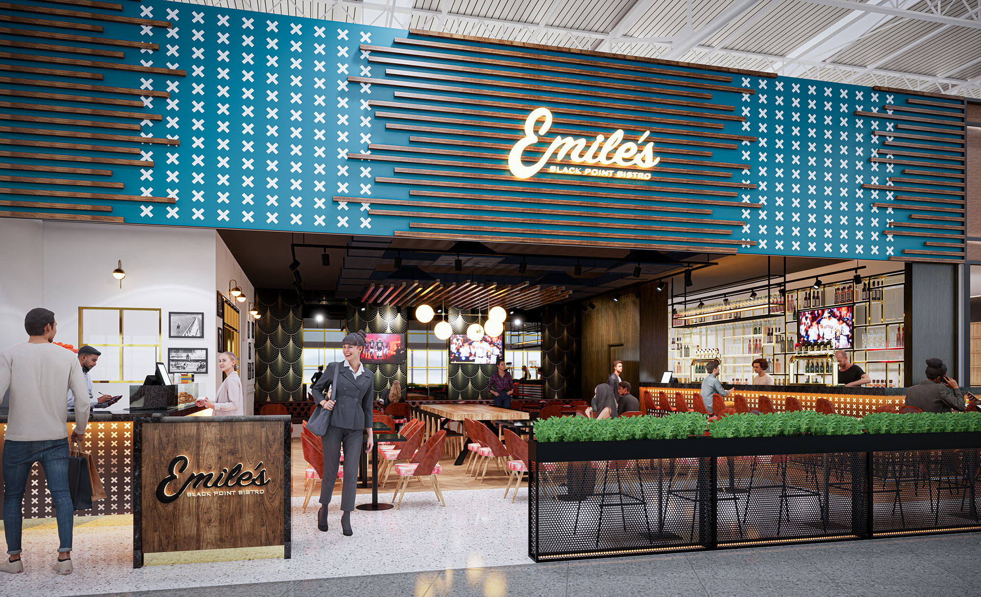
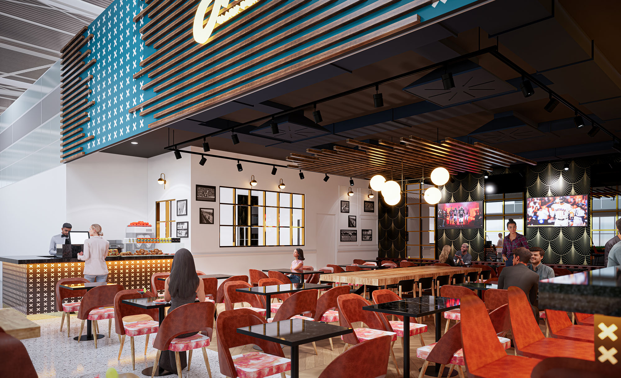
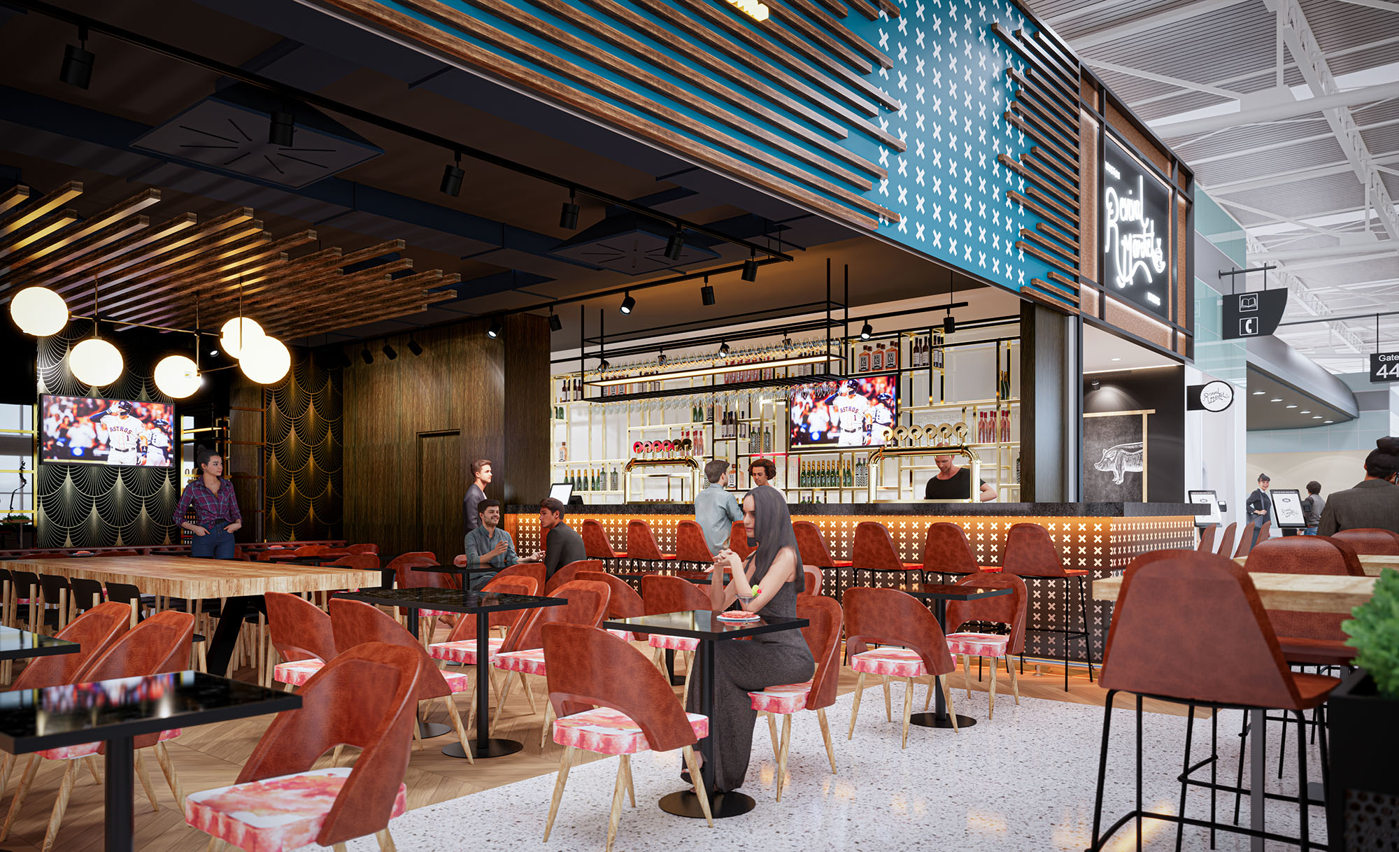
© 2021 by sanzpont [arquitectura] . Webpage by sanzpont [digital] . Innovative Digital Experiences

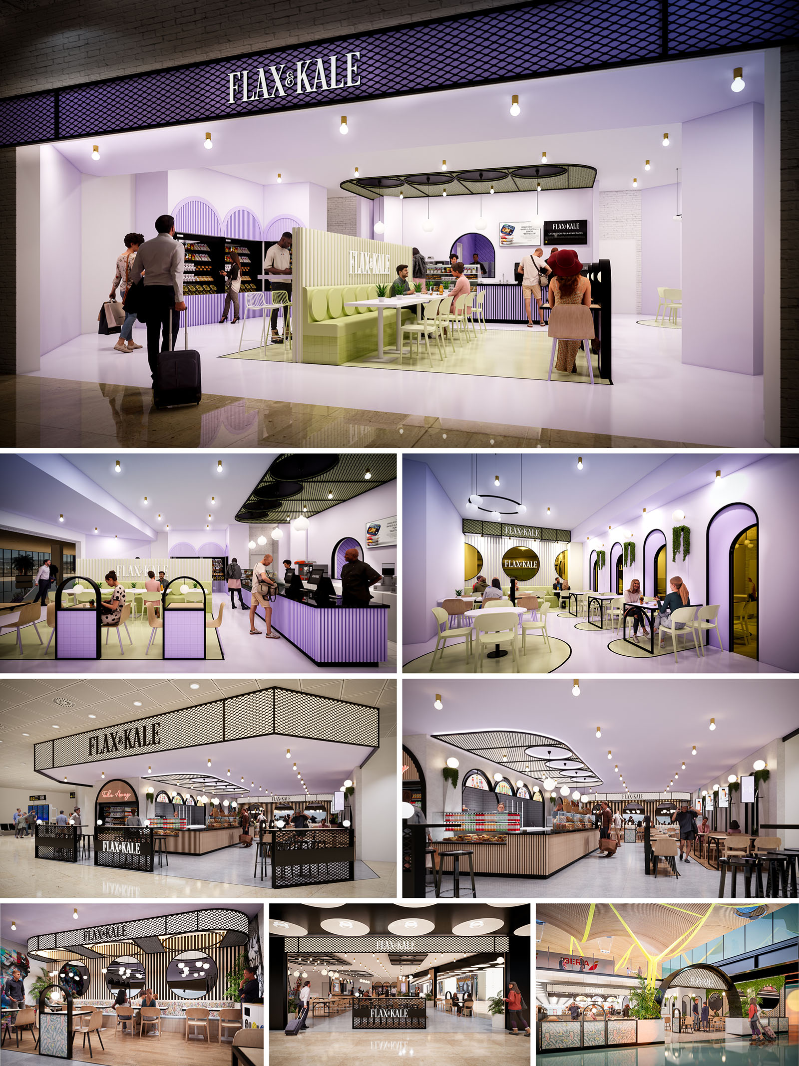
The design of FLAX & KALE in Madrid translates the brand’s flexitarian philosophy into a spatial experience that is fresh, playful and highly legible within the commercial context. The concept works with a soft‑toned, almost pastel chromatic palette contrasted by precise black outlines and metallic details, creating a graphic, contemporary identity that is recognizable from a distance. The restaurant is conceived as an open pavilion inside the mall, dissolving the boundary between corridor and interior to invite spontaneous access throughout the day.
The architecture uses a sequence of arcs and rounded geometries as a unifying motif, suggesting a welcoming and human‑scaled environment. These curved forms appear in façade openings, banquette backs, ceiling contours and floor inlays, generating continuity between volumes, surfaces and circulation lines. The result is a fluid, visually coherent landscape that supports both quick service and relaxed dining.
The spatial layout is organized around a central service core that integrates bar, kitchen front, and quick pick‑up counter. This nucleus is wrapped by a perimeter of seating typologies that range from high‑turnover individual tables to more intimate booth configurations. The open edges facing the mall maintain visual permeability while low partitions and planters subtly define the restaurant’s footprint without building solid walls.
Circulation follows a simple and intuitive scheme: guests enter from the most visible corner, align along the counter for ordering, and then move laterally toward the dining zones. A combination of longitudinal banquettes and freestanding tables allows flexible reconfiguration depending on peak hours. The design also incorporates generous aisles to accommodate luggage and prams, acknowledging the transient nature of mall users and ensuring universal accessibility.
The material palette emphasizes tactile contrast and visual clarity. Smooth, high‑performance resin or large‑format porcelain flooring in light tones creates a continuous, easy‑to‑clean base plane. Vertical elements such as counters and low walls use ribbed or fluted paneling in desaturated greens and lilacs, introducing rhythm and a subtle play of shadows. These striated surfaces reinforce the brand’s visual identity while providing robustness against daily wear.
Ceilings feature suspended mesh canopies and curved light coves in black and white, articulating the different functional areas without heavy construction. Powder‑coated steel frames in dark tones outline arches, shelving and railings, giving structural clarity and accentuating the graphic aesthetic. Tabletops and chair shells appear in neutral whites and light woods, balancing the more saturated planes and ensuring a calm backdrop for the food offering.
Lighting is conceived as a key element in defining atmosphere and guiding orientation. A combination of warm white pendant bulbs, circular ceiling fixtures and integrated LED strips in the mesh canopies ensures uniform illumination with localized accents on the counter and product displays. The warm color temperature offsets the coolness of the pastel palette, producing a welcoming, human‑centred ambience.
Indirect light embedded in the arches and behind vertical slats creates depth and highlights the curved geometry, particularly visible from the mall corridors. This layered strategy avoids glare, enhances perception of height, and makes the restaurant visually active during both daytime and evening trading hours, reinforcing its role as a focal point within the commercial environment.
Furniture is lightweight yet durable, chosen to support fast casual operation while maintaining a distinct aesthetic. Stackable chairs, slender metal frames and compact tables enable rapid reconfiguration for groups of different sizes. Banquettes with upholstered seats in muted greens anchor the main seating fields and offer comfort for longer stays. Integrated shelving and product walls display retail items, extending the brand narrative beyond the immediate dining experience.
Branding is seamlessly embedded in the architecture through backlit logos, patterned mesh fascias and color zoning on floors and walls. Each view line from the mall reveals a combination of signage, arches and illuminated counters, ensuring strong recognizability. The overall user experience prioritizes clarity of use, spatial generosity and a memorable visual language that aligns with a contemporary, health‑driven gastronomic proposal.
Sustainability is addressed through material selection, operational efficiency and adaptability. Preference is given to durable, low‑maintenance finishes such as powder‑coated steel, compact laminates and high‑resistance flooring, extending the lifecycle of the fit‑out and reducing the need for frequent replacement. Where possible, finishes can incorporate recycled content, particularly in metal elements and composite boards.
Energy performance is improved by an all‑LED lighting system with dimmable circuits that adjust intensity according to natural light levels in the mall. Open, wall‑free perimeter design enhances natural cross‑ventilation within the mall’s overall HVAC strategy and minimizes the need for additional mechanical partitions. Modular furniture and non‑load‑bearing partitions allow future reconfiguration or partial reuse of components in other locations, aligning the project with circular economy principles and reducing waste over time.
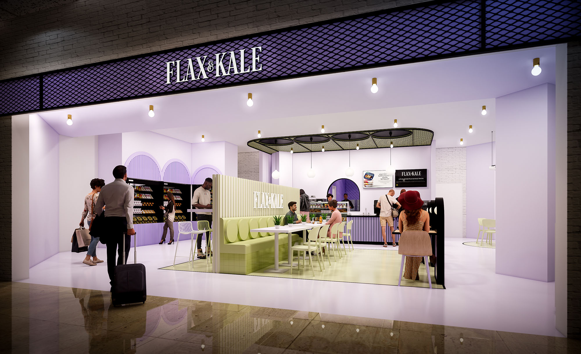
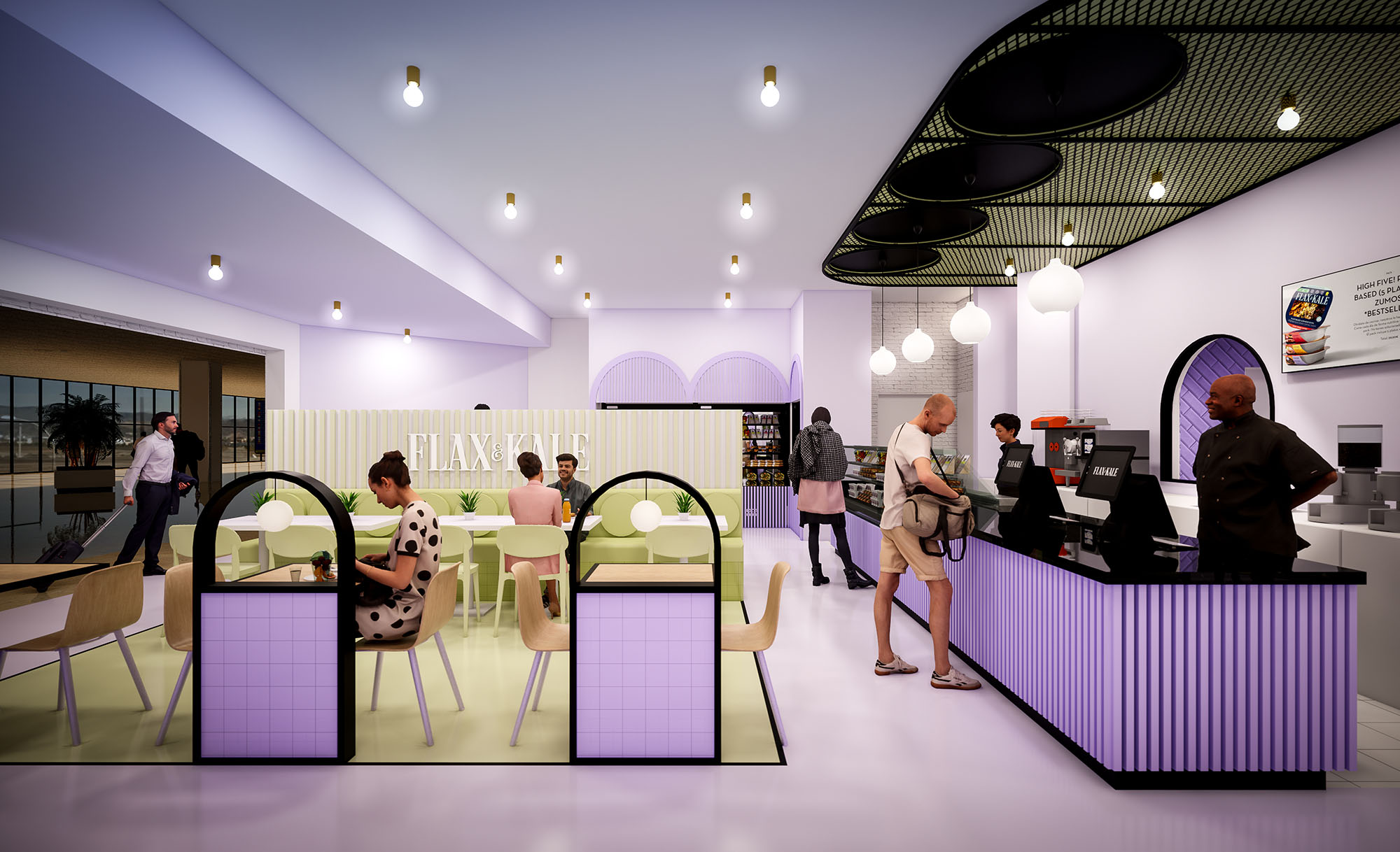
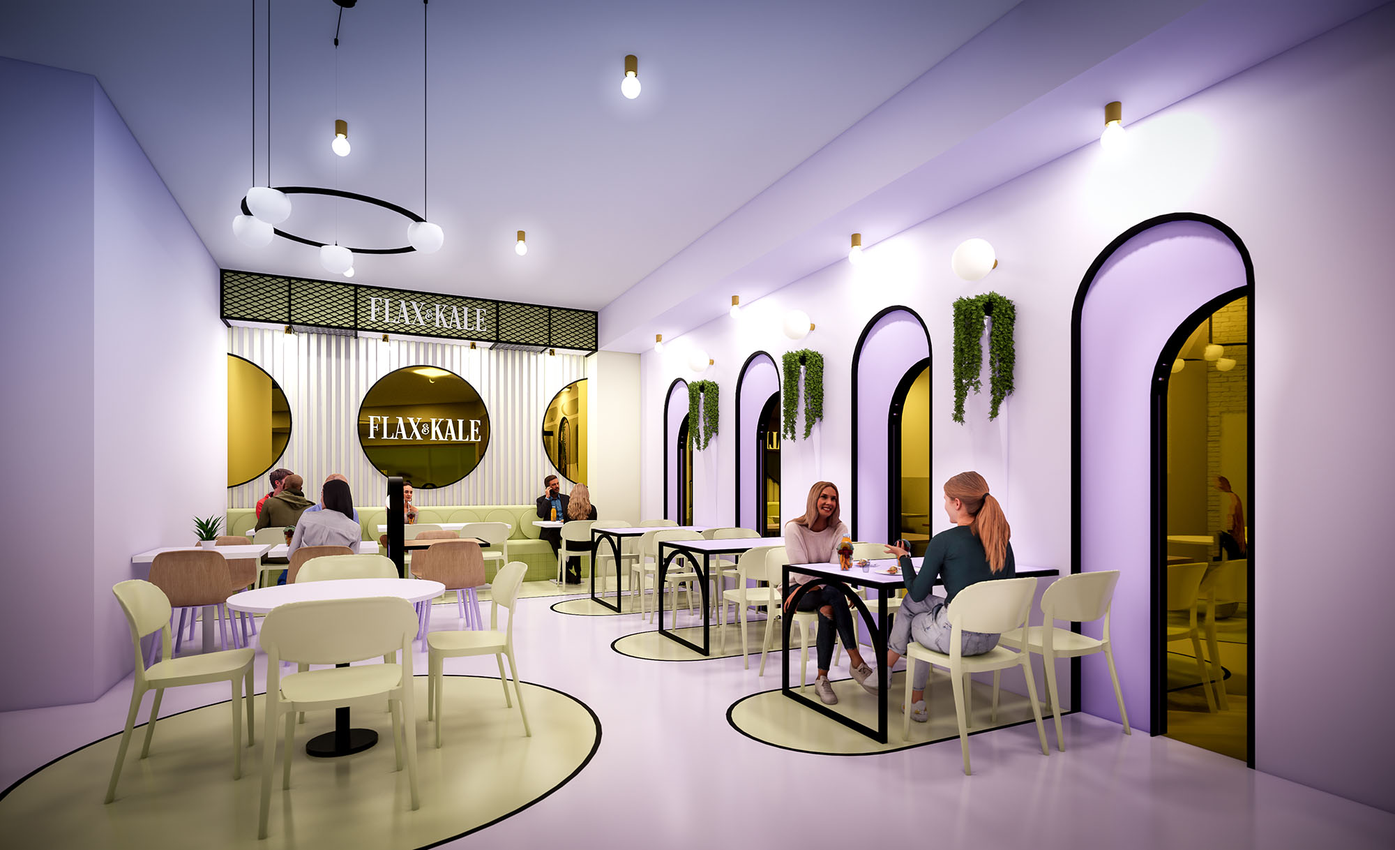
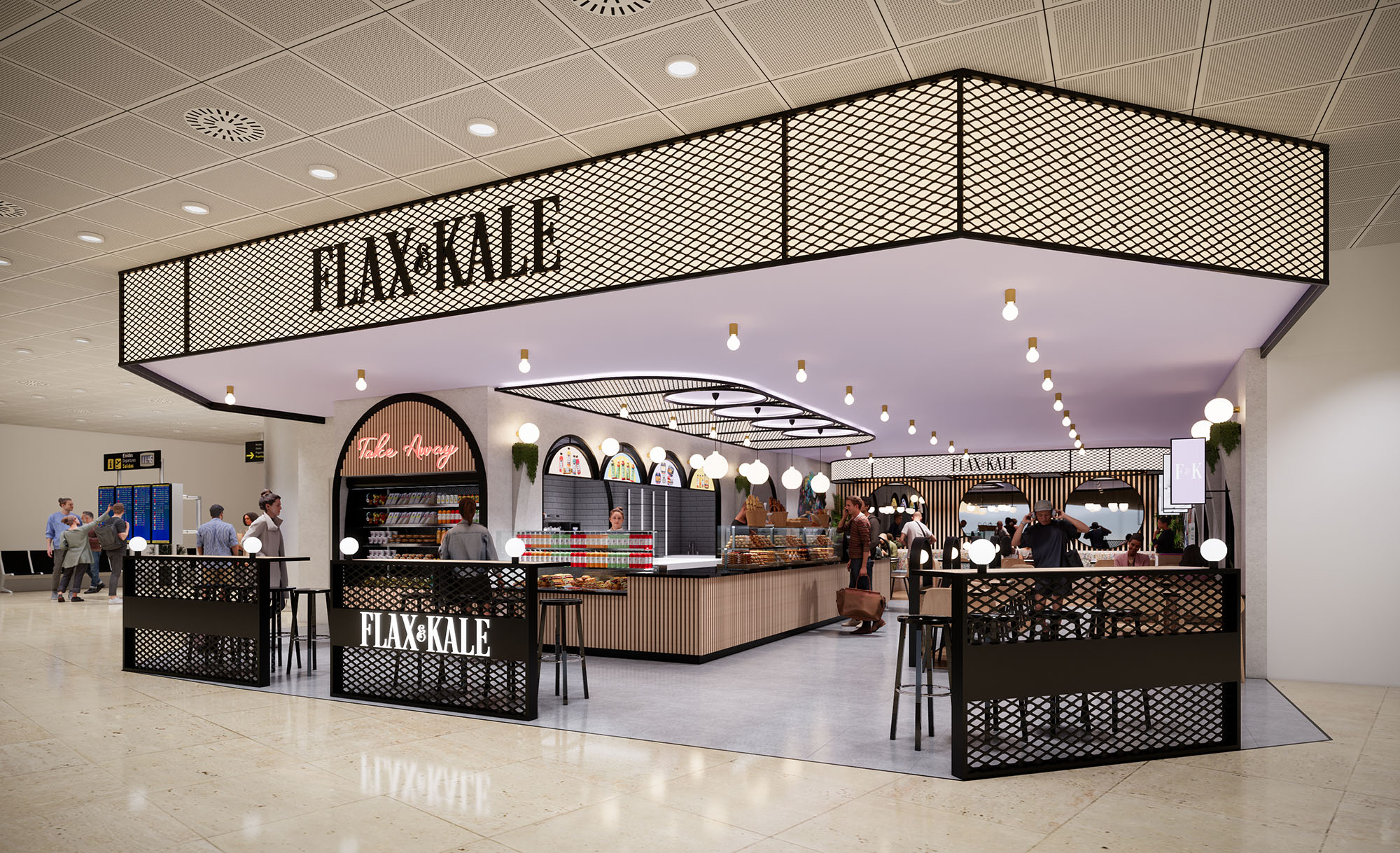
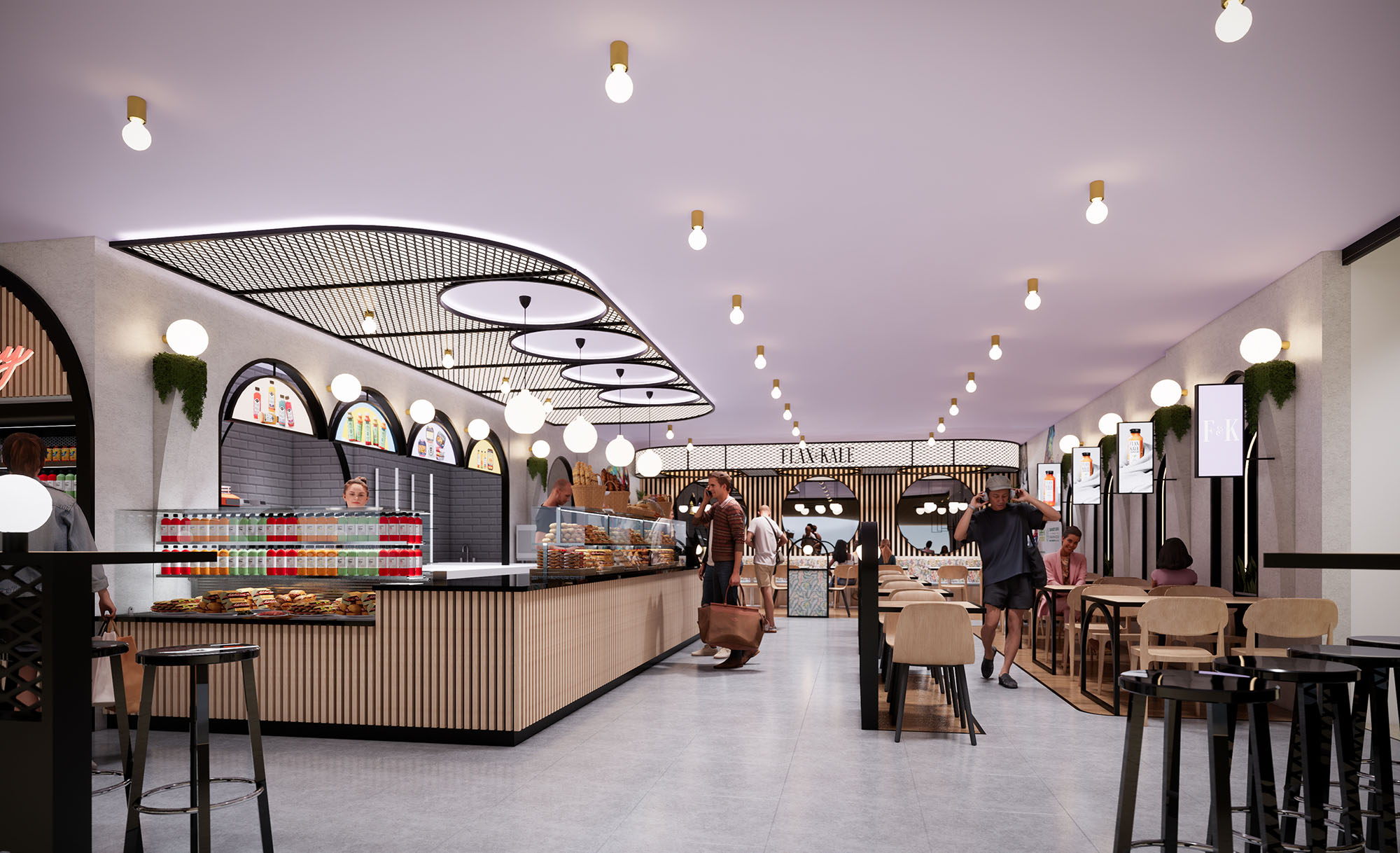
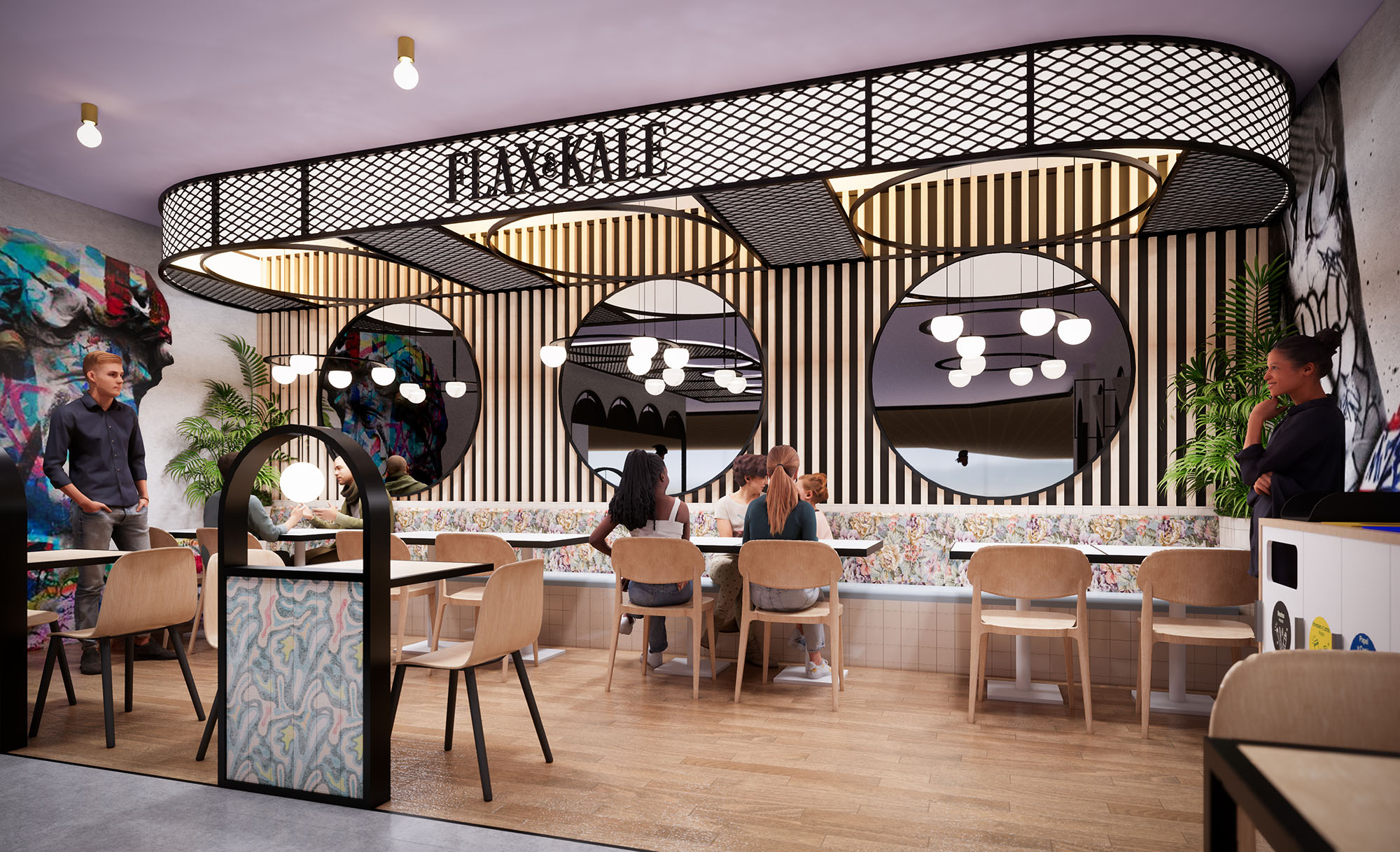
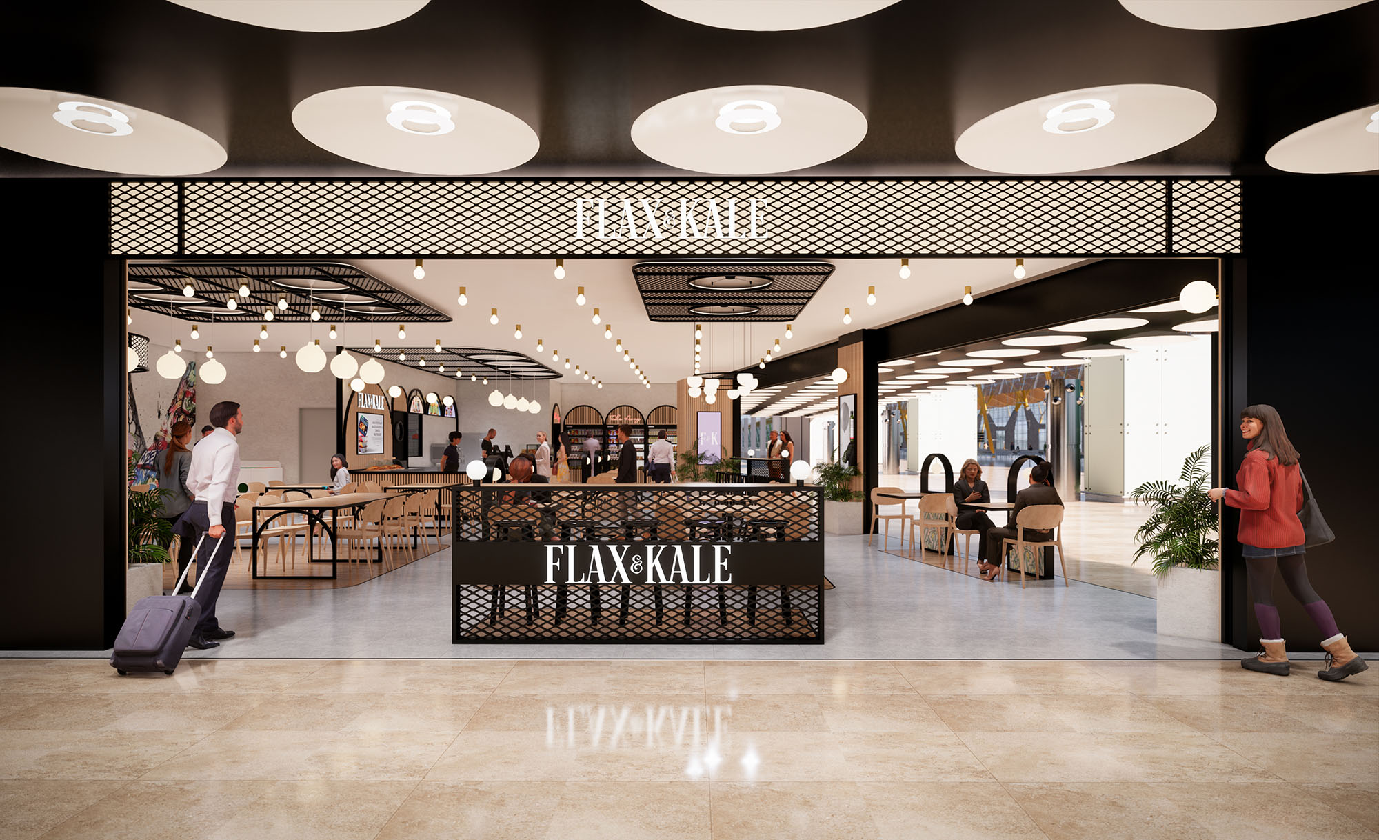
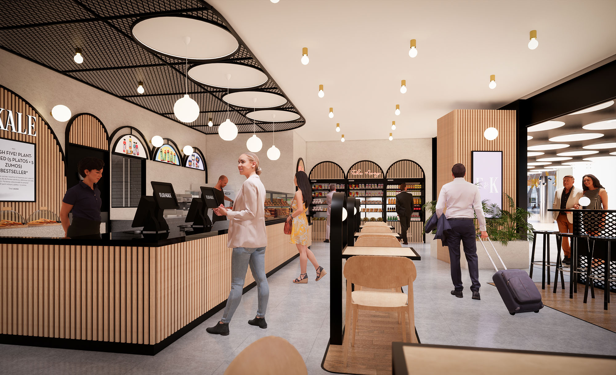
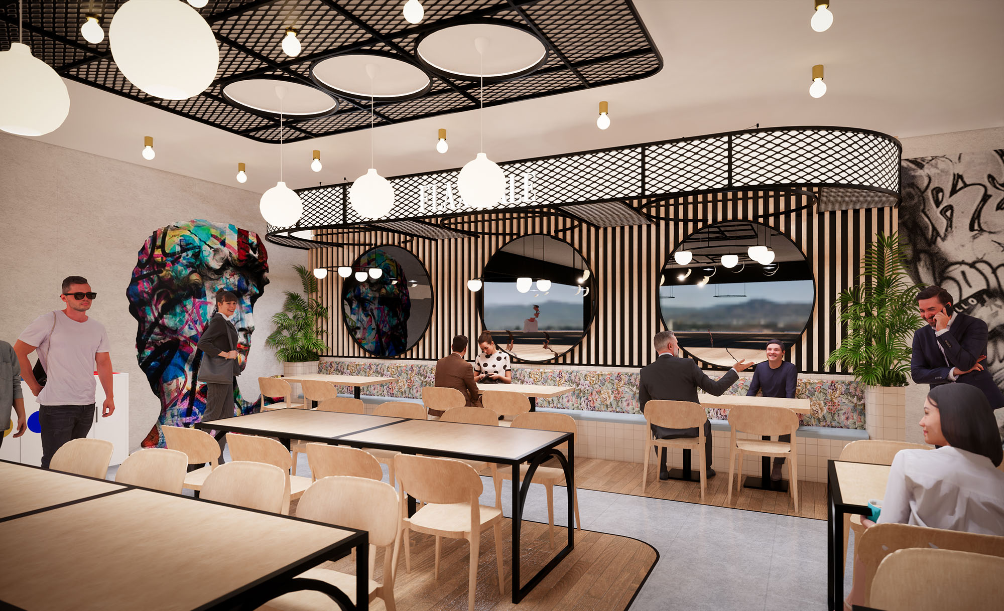
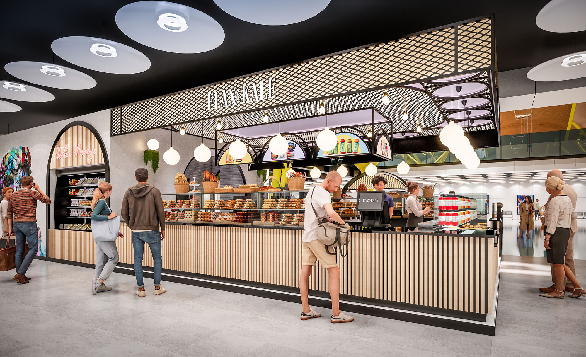
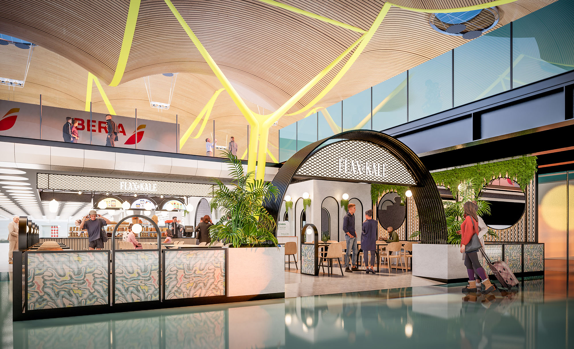
© 2021 by sanzpont [arquitectura] . Webpage by sanzpont [digital] . Innovative Digital Experiences
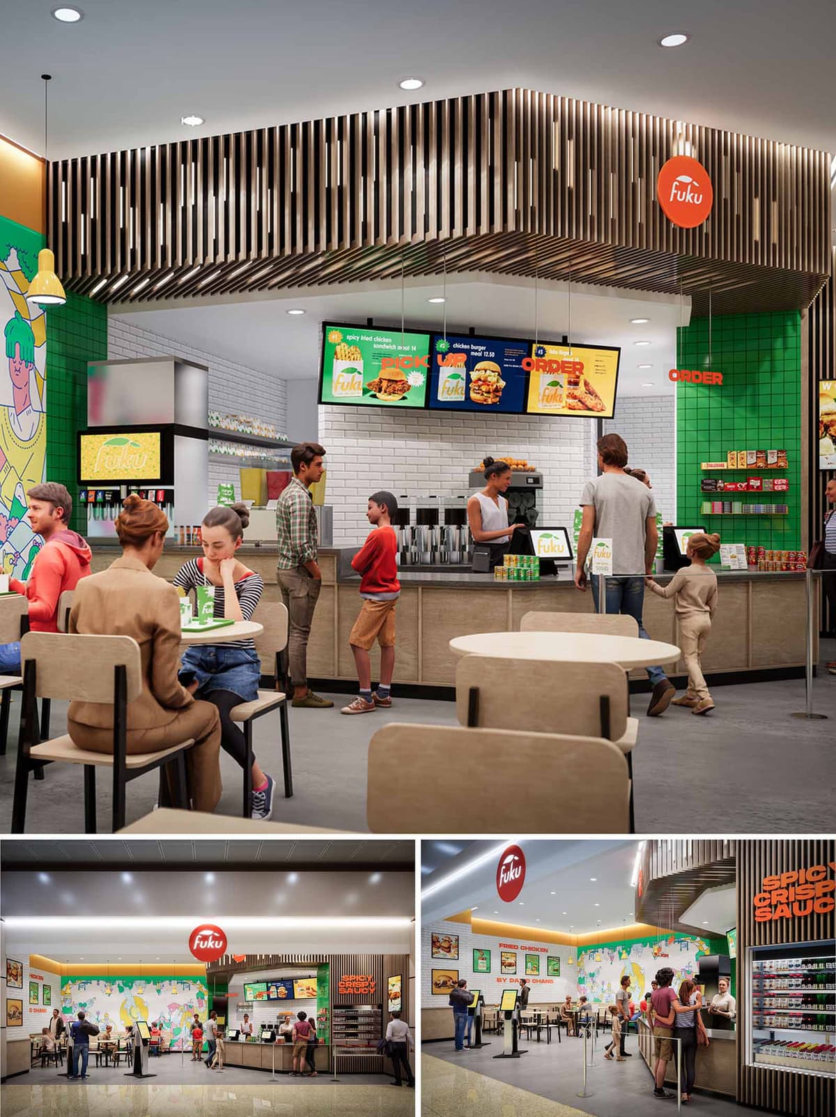

The design of FUKU in Salt Lake City translates a contemporary fast-casual dining model into a vivid, highly legible spatial experience. The concept combines a clean, minimalist architectural envelope with bold brand graphics and a playful color palette, producing a space that feels energetic yet ordered. The restaurant operates as a transparent stage for food preparation and service, where the counter, menu boards, and kitchen backdrop read as a continuous, easily readable band within the overall volume.
The layout emphasizes intuitive circulation and clear sightlines from the mall concourse. The open storefront, framed by a linear canopy and strong signage, blurs the boundary between interior dining and the public corridor, inviting passersby to visually engage with the activity inside.
The plan is organized along a single main axis: entry and queuing run parallel to the service counter, allowing customers to understand ordering, pickup, and seating at a glance. The service line is anchored by illuminated digital menu boards suspended from the ceiling, creating a visual datum that guides movement. Ordering, beverage stations, and food pickup are sequenced logically from left to right, reducing congestion and minimizing cross-traffic.
Seating zones are distributed in front of the counter and along the side wall, forming a porous edge between active queue and more static dining. Freestanding tables allow flexible reconfiguration for different group sizes, while the openness between tables ensures visual connectivity and a sense of spaciousness within a compact footprint.
The material palette balances warm natural tones with high-impact brand colors. Light wood laminates on the counter fronts and seating introduce warmth and tactility, offsetting the otherwise clean, durable surfaces required in a high-traffic food environment. The floor employs a neutral, resilient finish that visually recedes to highlight furnishings and branding.
White subway tiles at the back-of-house wall provide a hygienic, easily maintained surface while reflecting light deeper into the space. In contrast, saturated green tiles at the corner create a strong vertical accent that frames key merchandising and reinforces the brand identity. The ceiling feature composed of vertical wood slats adds depth and rhythm, visually lowering the scale above the counter and creating a sense of enclosure without blocking light or views.
Large-scale wall graphics, playful illustrations, and high-contrast menu imagery turn the interior into an immersive brand environment. The main mural along the dining wall operates as a visual anchor, animating the seating area and continuity between multiple vantage points inside and outside the unit. Branded red circular signage is positioned at the storefront and above the counter as a clear wayfinding element, easily recognizable from a distance.
Lighting is layered between recessed ceiling fixtures, concealed linear lighting at the perimeter, and accent pendants over specific zones. This combination ensures even overall illumination while subtly highlighting the counter and graphic surfaces. Warm-white color temperature supports the wood tones and food presentation, creating an inviting atmosphere that remains efficient and suitable for extended operating hours.
The furniture is deliberately simple and robust, with light wood seats and tabletops supported by dark metal frames. This contrast produces a clear visual outline and facilitates maintenance and replacement in a busy food court setting. Chair and table heights follow standard ergonomic guidelines for casual dining, ensuring comfort for short and medium-length stays.
Table spacing allows comfortable circulation for guests and staff, including accessibility for strollers and wheelchairs. The open layout, absence of visual barriers, and clear signage create an intuitive experience in which users can immediately identify where to order, wait, and dine without additional instruction.
Sustainability is addressed primarily through durable, low-maintenance materials and efficient building systems. Hard-wearing floor finishes, tiled wall surfaces, and laminated millwork are specified for longevity, reducing the need for frequent replacement and associated resource use. The modularity of furniture supports repair and component replacement rather than wholesale disposal.
LED lighting throughout reduces energy consumption and maintenance cycles, while the combination of high-reflectance finishes and focused task lighting minimizes the total number of fixtures required. Where possible, finishes are selected with consideration for low VOC content to enhance indoor air quality. The compact footprint, shared mall infrastructure, and open-front design benefit from the ambient conditioning of the larger concourse, reducing the restaurant’s standalone mechanical load and contributing to an overall more efficient operation.
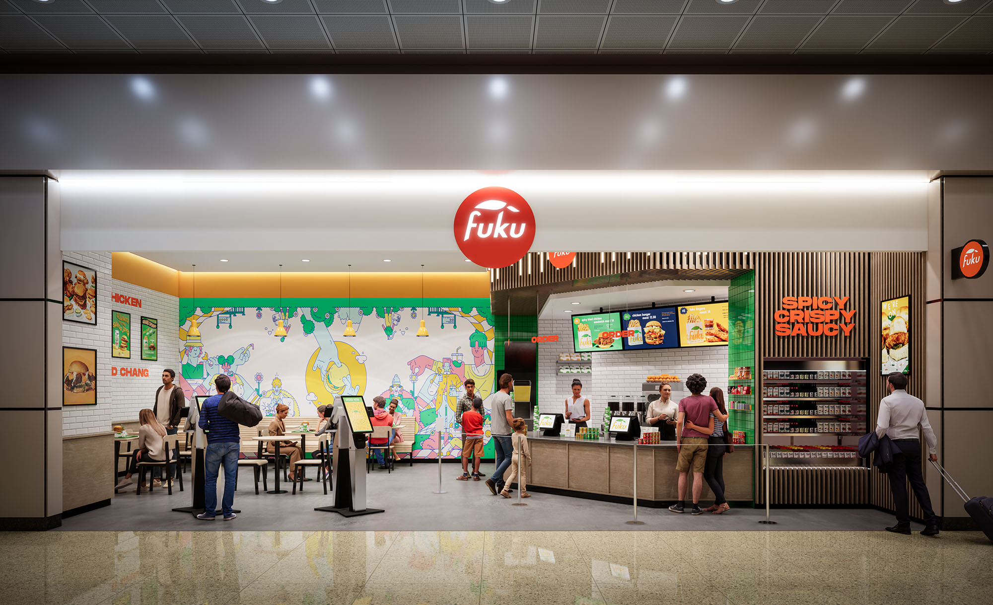
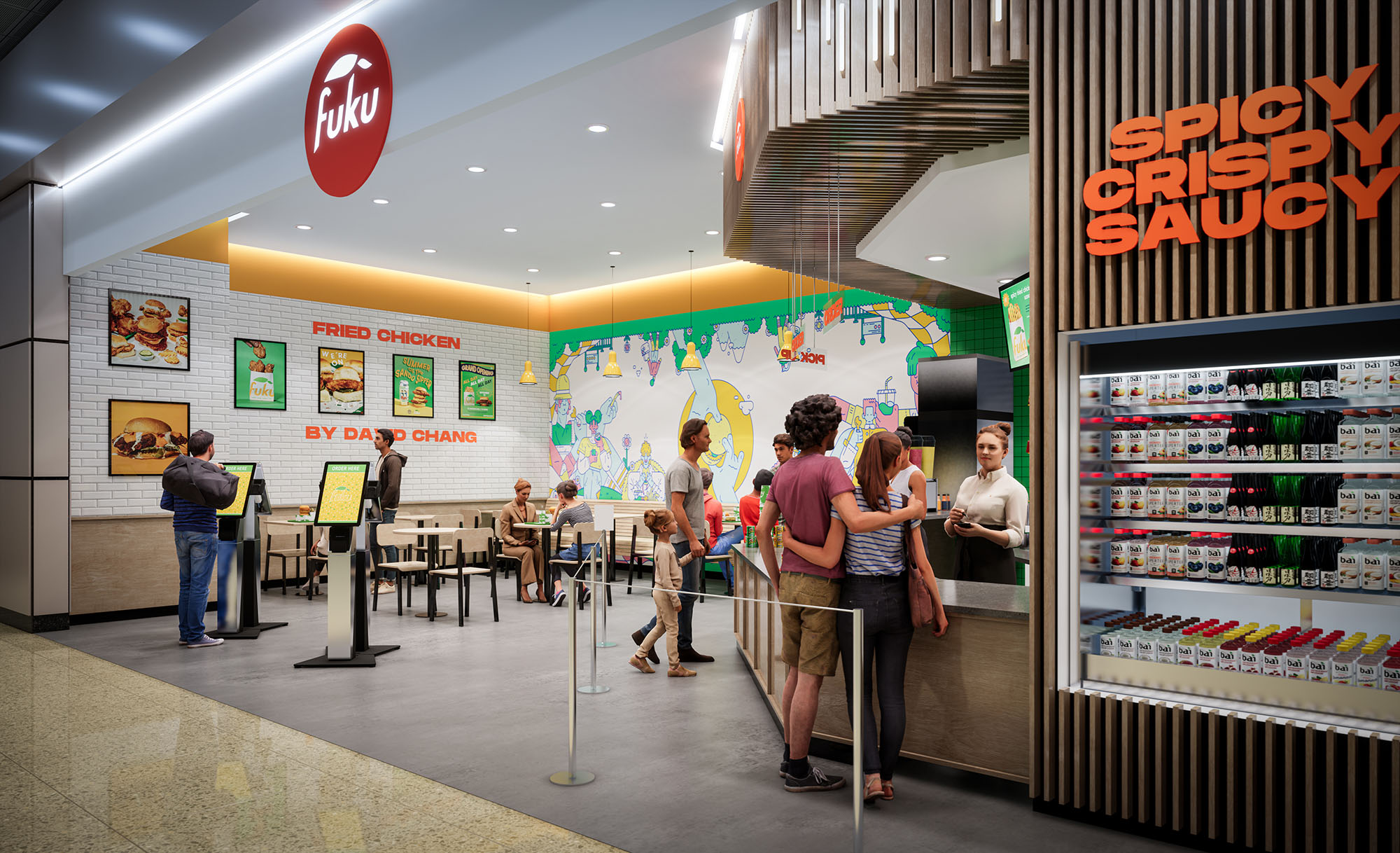
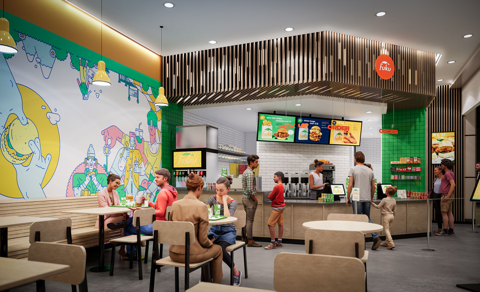
© 2021 by sanzpont [arquitectura] . Webpage by sanzpont [digital] . Innovative Digital Experiences
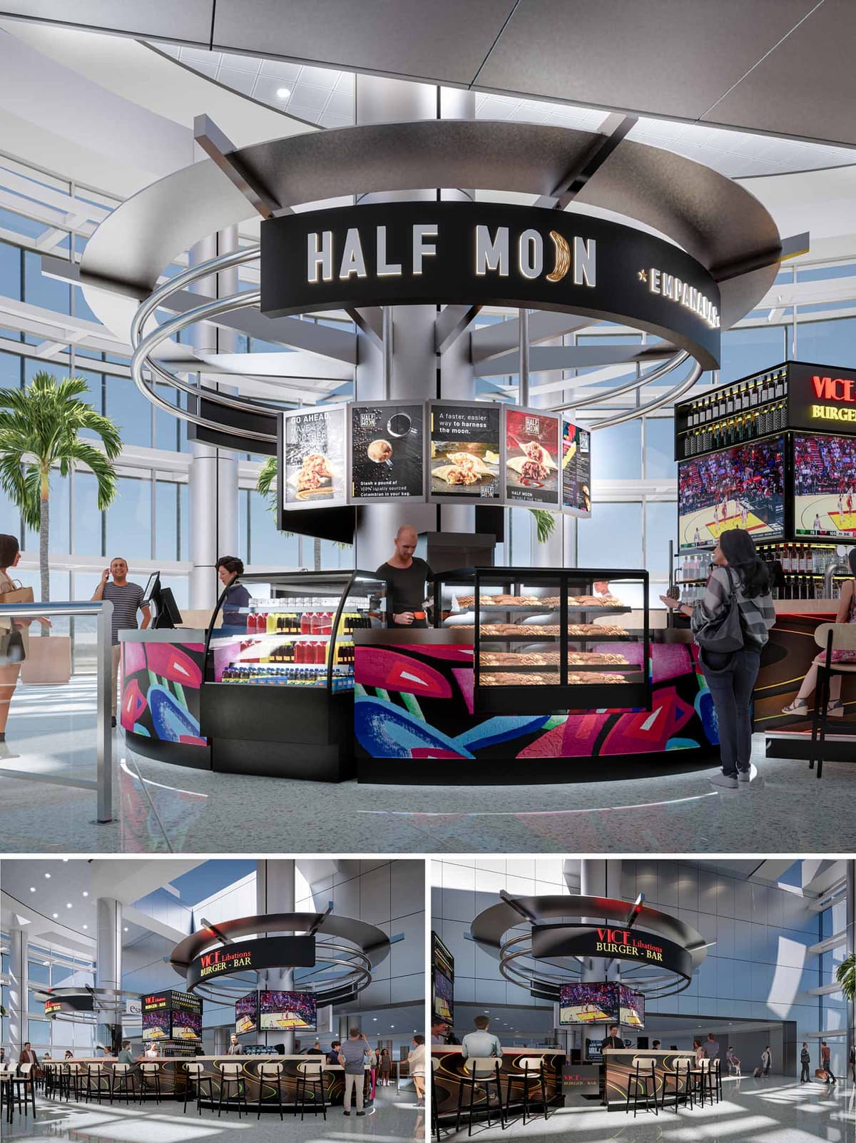
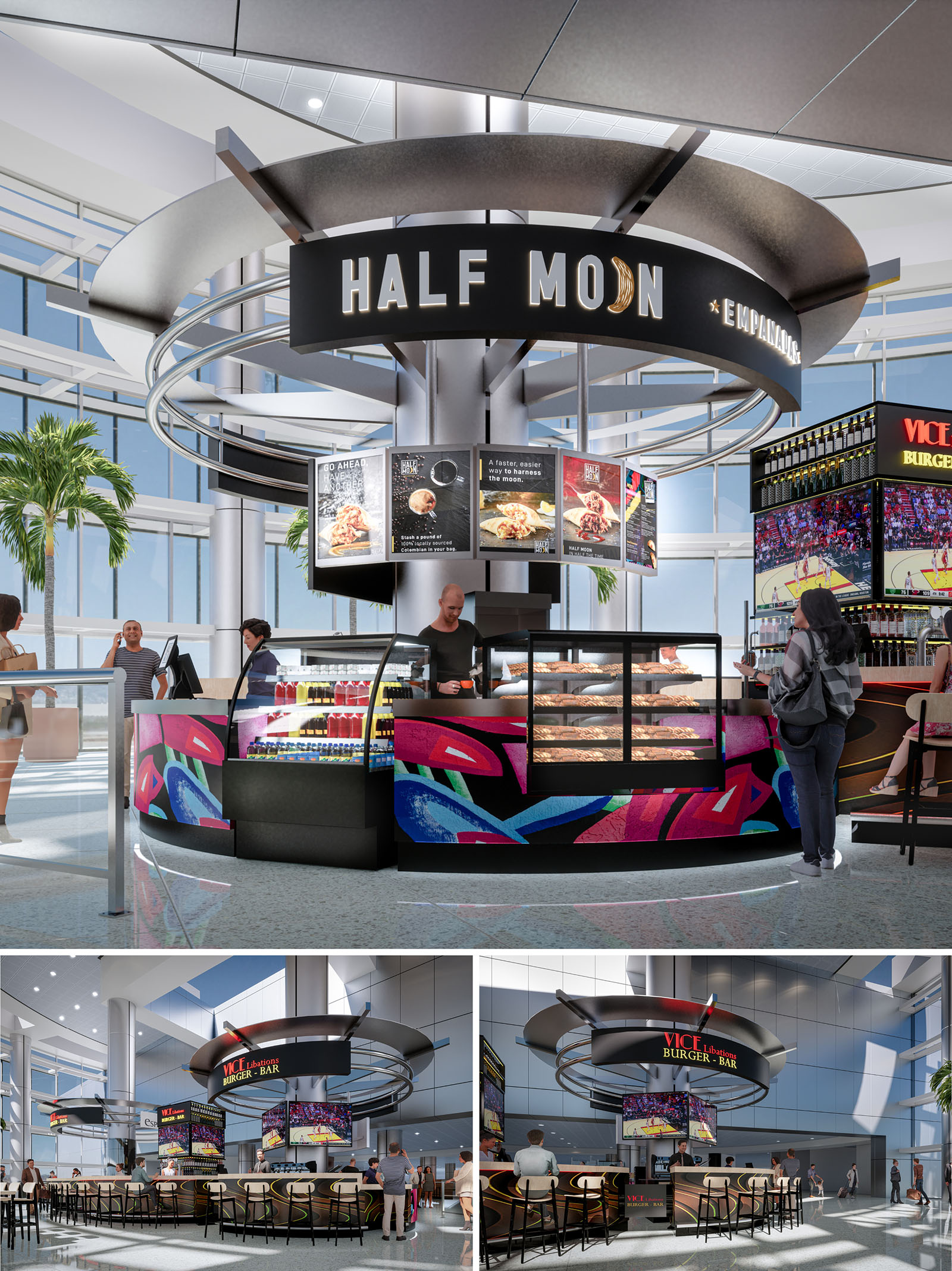
Half Moon Empanadas is conceived as a brightly illuminated island pavilion within the dynamic environment of Miami’s airport. The design emphasizes circular geometry and a bold graphic identity to attract passengers moving quickly through the concourse. The kiosk operates as a sculptural object in the terminal, with concentric metal rings floating above a central core, echoing the brand’s “half moon” name and the curved form of the empanada itself.
The project merges fast-casual efficiency with a theatrical food presentation. By placing the preparation and display cases on the perimeter of the island, service becomes highly visible and intuitive from all directions. The architecture becomes signage: form, light, and color work together to announce the presence of the brand long before passengers reach the counter.
The kiosk is organized as a 360-degree service hub with multiple points of access, minimizing congestion in the high-traffic terminal. The front arc is dedicated to grab-and-go display cases and beverages, while the adjacent segments accommodate ordering, payment, and order pick-up. This radial planning ensures that passengers can quickly identify their next step and navigate the space without confusion.
A central structural column consolidates utilities, storage, and technical infrastructure, freeing the perimeter for uninterrupted customer interaction. Seating is positioned in an encompassing horseshoe around the adjacent burger bar volume, visually linked through similar circular canopies and shared finishes. This creates a cohesive micro-district of food options while maintaining clear circulation corridors around the island.
The material palette combines dark, matte base elements with vivid graphic overlays. Black metal cladding and glass display cases form a neutral frame that highlights the colorful abstract artwork applied to the lower panels. These graphics reference Miami’s vibrant street art culture, tropical tones, and night-life energy, projecting a distinctly local character even within the global context of the airport.
Overhead, the suspended rings and continuous fascia carry the primary brand signage, using backlit lettering and a luminous crescent icon. The metallic finishes of the canopy reflect ambient daylight from the terminal’s glazed façades, enhancing the kiosk’s presence without overwhelming the surrounding architecture. Warm internal lighting within the pastry cases accentuates product freshness and creates a welcoming glow at eye level.
The lighting strategy is layered to support both visibility and atmosphere. Integrated LED strips in the canopy rings define the circular form and provide even general illumination to the counter line. Focused spotlights highlight menu boards and key signage, guiding customer attention to information and brand messages.
At floor level, subtle perimeter lighting beneath the counter edge visually lifts the kiosk and delineates the service zone. This creates a soft halo on the terrazzo-like airport flooring, reinforcing the island concept and improving orientation for travelers approaching from different directions.
The kiosk is carefully scaled to sit comfortably beneath the terminal’s generous ceiling height, using the vertical dimension to create impact while remaining permeable to long sightlines. The circular canopy aligns with existing structural bays and avoids obstructing views to boarding gates and wayfinding signage.
The transparent character of the surrounding terminal—large glass façades, high clerestories and visible palm trees—is echoed by the kiosk’s open perimeter and minimal solid walls. This maintains visual continuity across the concourse and ensures that the intervention feels integrated rather than inserted.
Sustainability is addressed primarily through compact planning, energy-conscious lighting, and durable materials. The centralized core allows for short utility runs, reducing energy loss and simplifying maintenance. LED lighting with high-efficiency drivers minimizes electrical consumption, while the reflective metal canopy enhances daylight distribution, reducing the need for excessive artificial light during daytime hours.
Finishes are selected for longevity in a high-traffic environment: metal, glass, and high-pressure laminates resist wear, reducing replacement cycles and associated resource use. The open layout supports natural cross-ventilation from the terminal and facilitates efficient cleaning routines, limiting the need for intensive mechanical systems and harsh chemicals. Together, these strategies align the kiosk’s bold commercial presence with responsible, long-term operation.
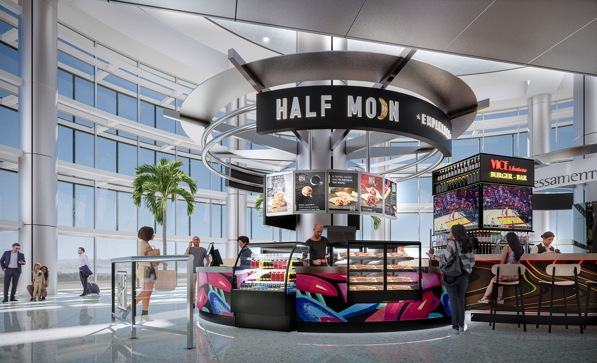
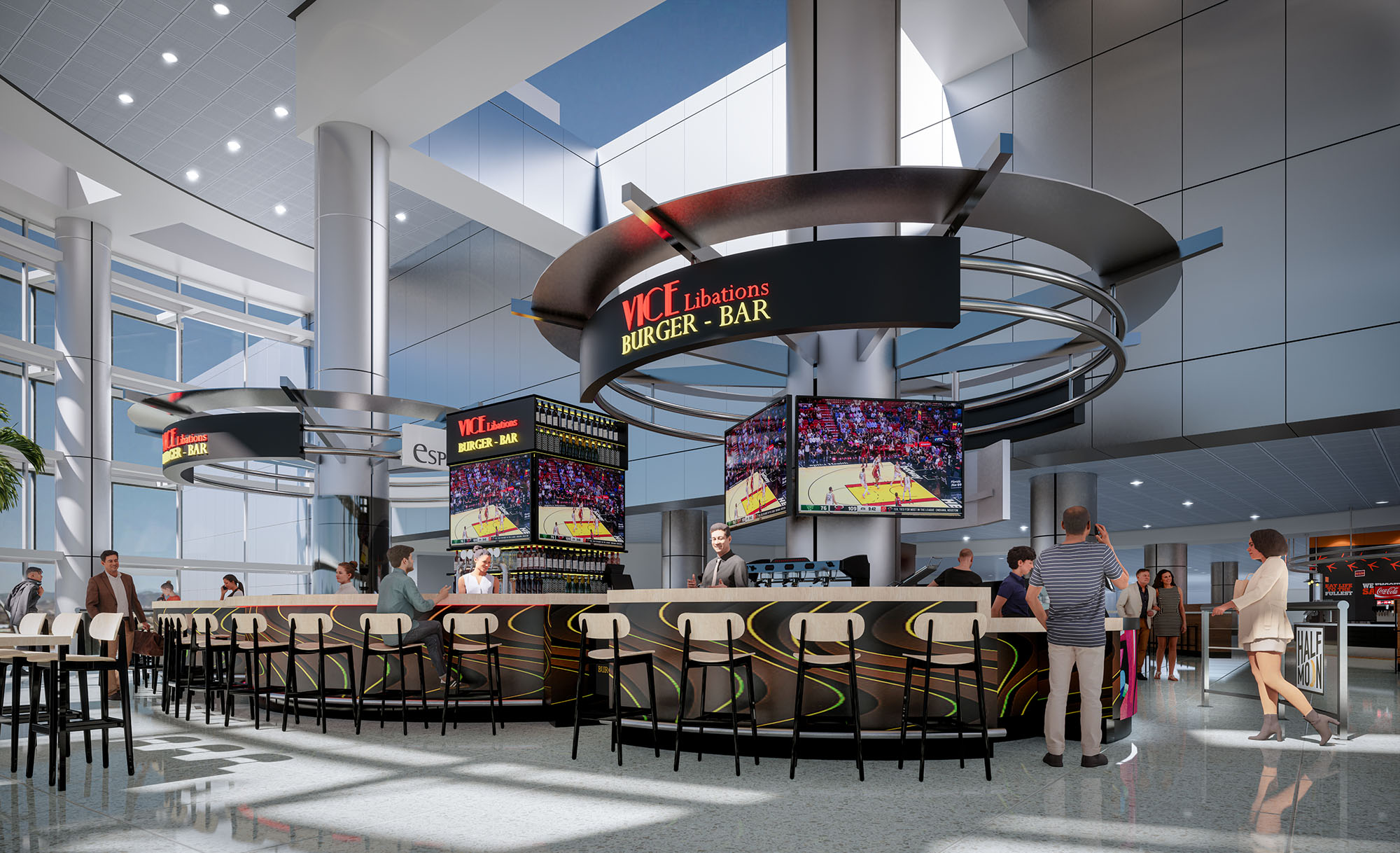
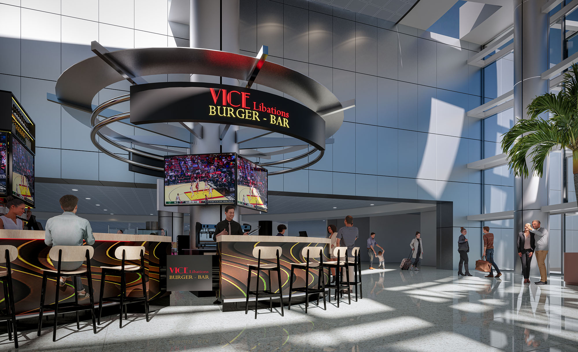
© 2021 by sanzpont [arquitectura] . Webpage by sanzpont [digital] . Innovative Digital Experiences
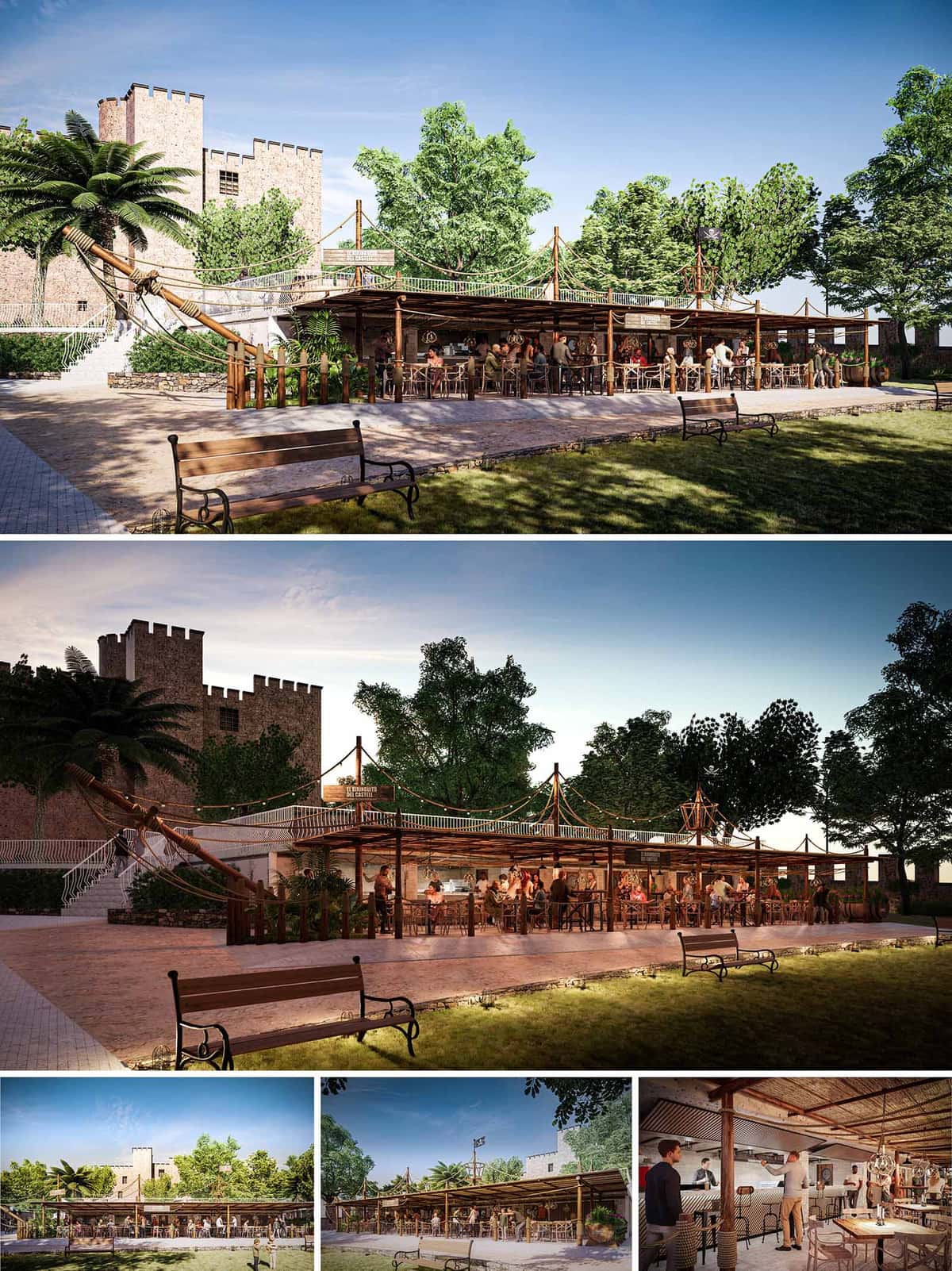

El Xiringuito del Castell is conceived as a temporary wooden structure that stages a dialogue between the medieval castle of Castelldefels and the informal, festive atmosphere of a Mediterranean beach bar. The project embraces the imagery of a historic ship moored at the foot of the fortress, using masts, ropes and sails as a narrative device that connects sea culture with the inland topography.
The architectural language is deliberately lightweight and reversible, designed to rest respectfully at the base of the stone walls without competing with the monument. Horizontal canopies, slender posts and textile elements form a low profile that frames views of the castle while sheltering an intense social life beneath. The result is an open-air living room for the town, where heritage, landscape and gastronomy converge.
The xiringuito occupies a linear platform parallel to the main garden promenade, acting as a permeable edge between the public park and the castle slope. The layout preserves existing circulation axes, allowing passersby to cross the terrace freely and to visually connect the square with the upper ramp leading to the monument.
The intervention follows the natural terracing of the terrain: the bar volume anchors itself against the retaining wall, while the main dining level projects towards the lawn as a broad, continuous terrace. This stepped configuration maintains low visual impact, ensuring that the castle towers remain the dominant skyline element. Soft night lighting integrated into the paving reinforces safety without producing glare on the heritage façades.
The spatial scheme is organized around a central linear bar that functions as both production core and social attractor. In front of it, an open dining area with flexible tables and high stools accommodates different group sizes and event formats. Circulation is clear and peripheral, enabling staff to move efficiently while guests enjoy unobstructed views of the garden and the stage-like bar.
Perimeter bays under the canopy house more intimate seating and standing areas, benefiting from the shade and the proximity to vegetation. The rear strip, leaning against the stone wall, integrates service spaces, storage and technical installations, all concealed behind a continuous cladding to maintain a unified façade. The rooftop deck, accessible via a light stair and rope railings, becomes a belvedere and symbolic “ship deck”, enhancing the experiential character of the venue.
The structural system is based on timber posts and beams, complemented by metal joints that guarantee durability while keeping all elements demountable. The roof uses light rafters and cane or reed latticework, creating a porous filter that modulates sunlight and generates dynamic shadows reminiscent of seaside pergolas.
Natural fibers, ropes and nautical hardware are used extensively, not only as decorative motifs but as functional elements for bracing, handrails and lighting supports. The chromatic palette is warm and earthy—browns, sands and off-whites—that harmonizes with the existing stone, the green canopy of trees and the ochre tones of the ground. At night, strings of small luminaires trace the “rigging” of the ship, reinforcing the festive but intimate atmosphere.
The interior bar counter combines textured plaster, ceramic tiling and timber to evoke traditional Mediterranean taverns while accommodating contemporary equipment. Open shelving and visible bottle displays contribute to an informal, approachable character. The furniture mix—wooden tables, director-style chairs and high stools—prioritizes comfort and adaptability, allowing rapid reconfiguration for concerts, talks or family gatherings.
The boundary between interior and exterior is intentionally blurred: there are no rigid façades, only a sequence of columns and low elements that maintain constant visual connectivity. Acoustic comfort is supported by the absorbent qualities of natural materials and the vegetation backdrop, creating an environment where conversation remains comfortable even at high occupancy.
Sustainability is approached through reversibility, material choice and passive environmental strategies. The entire system is conceived as a dry-assembled, demountable structure, minimizing ground intervention and allowing future re-use or reconfiguration with minimal waste. Foundations are lightweight and localized, reducing impact on the archaeological and landscape context.
The extensive use of certified timber, local stone and natural fiber coverings reduces embodied energy and facilitates end-of-life recycling. The open configuration maximizes cross-ventilation, while the deep overhangs and cane shading control solar gain, limiting the need for mechanical cooling. Low-consumption LED lighting, oriented downward and integrated into ropes and structural elements, cuts energy demand and respects the nocturnal environment. The project thus proposes a festive, seasonal facility that coexists responsibly with both the castle’s heritage and the surrounding ecosystem.
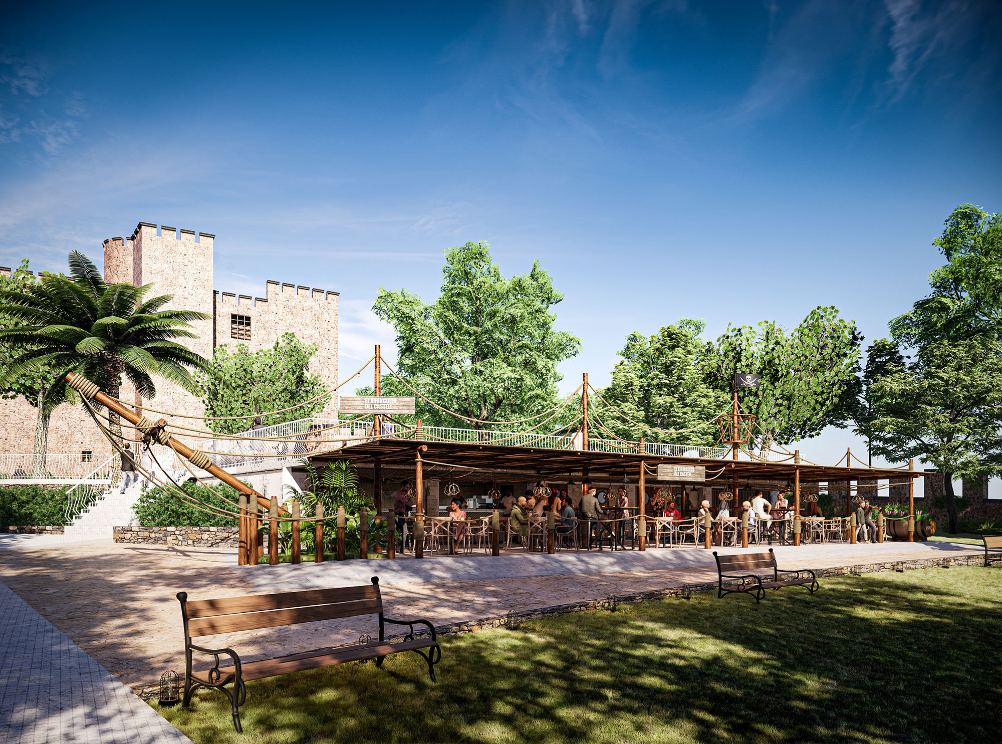
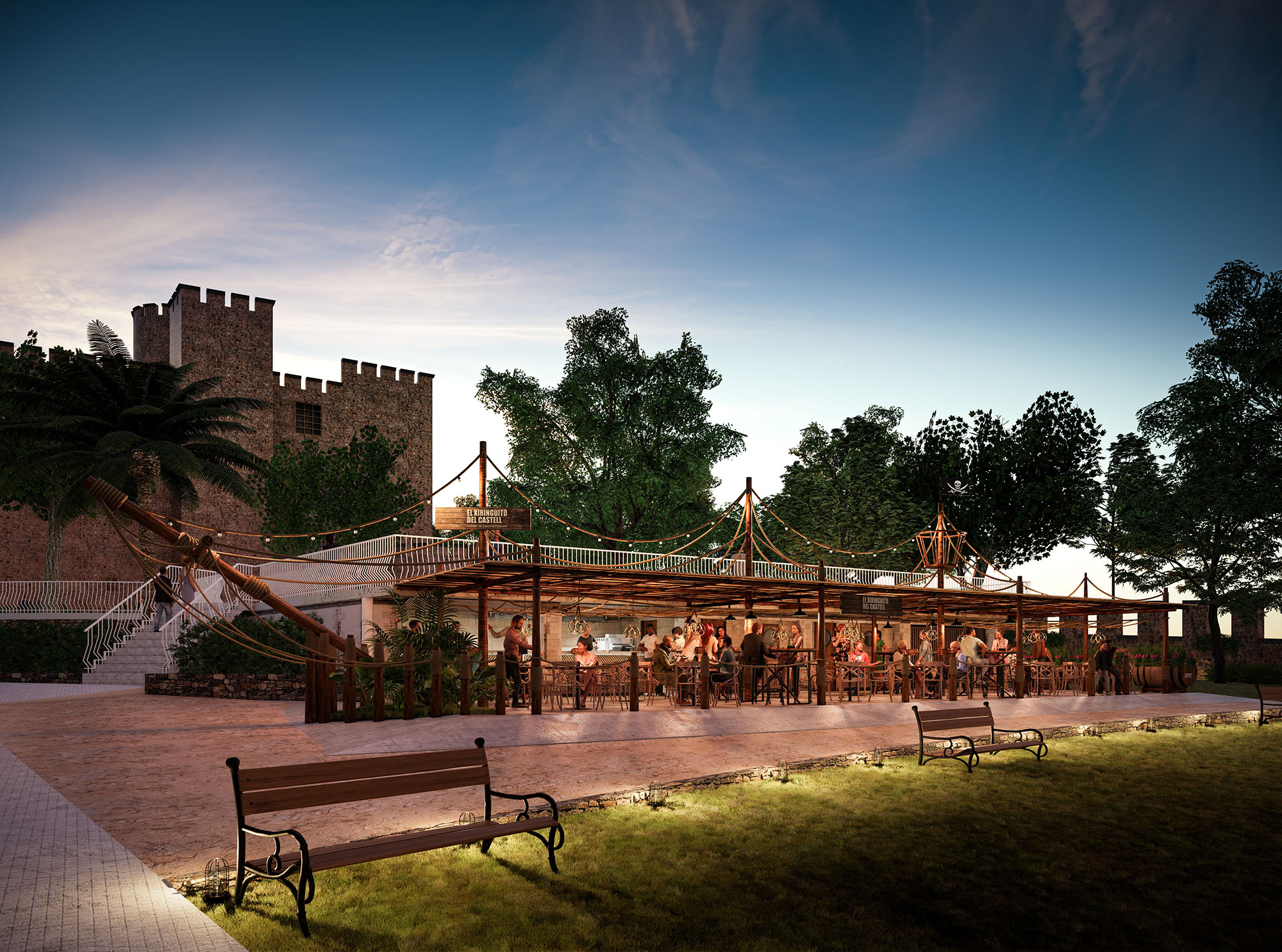
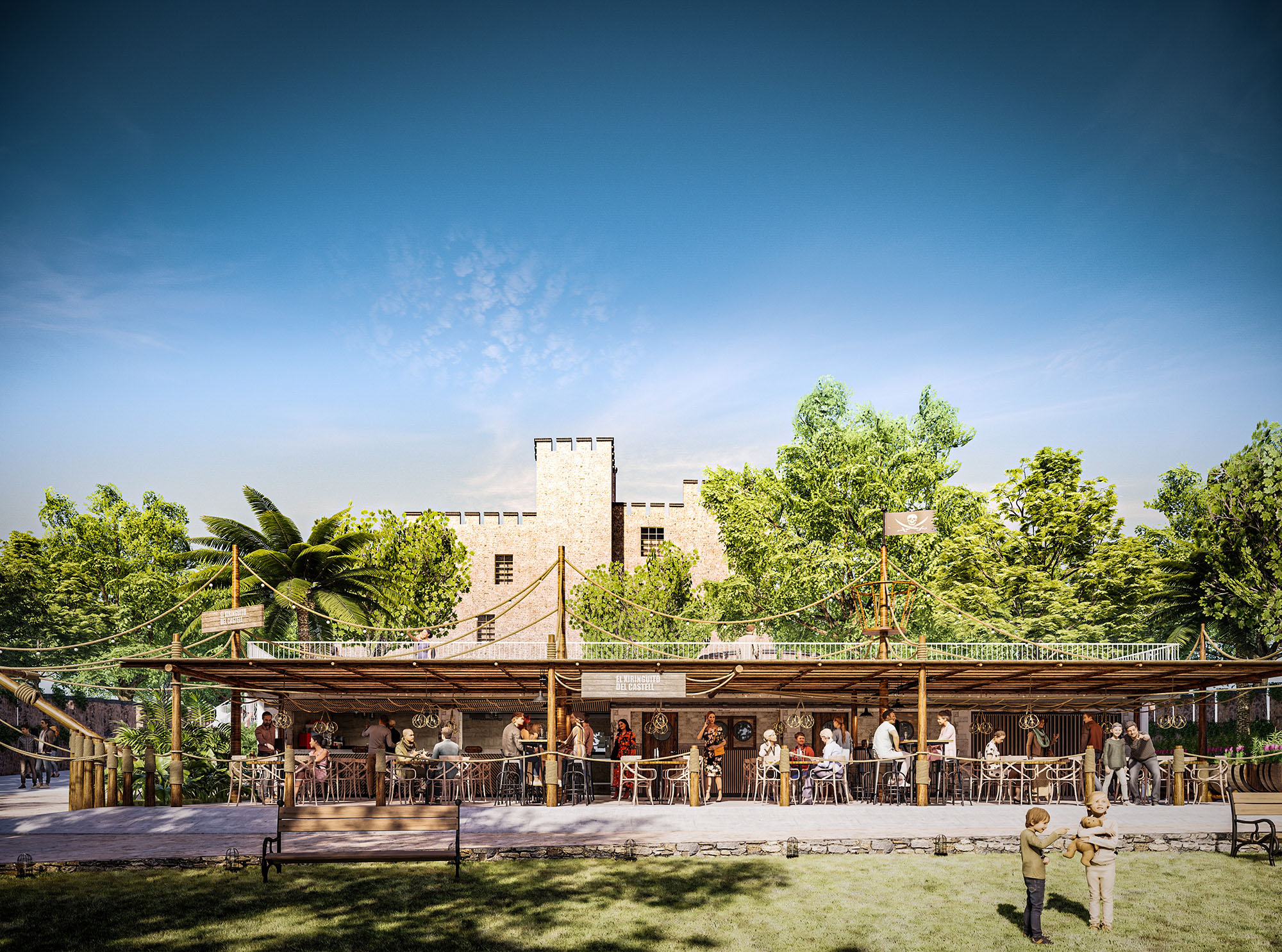
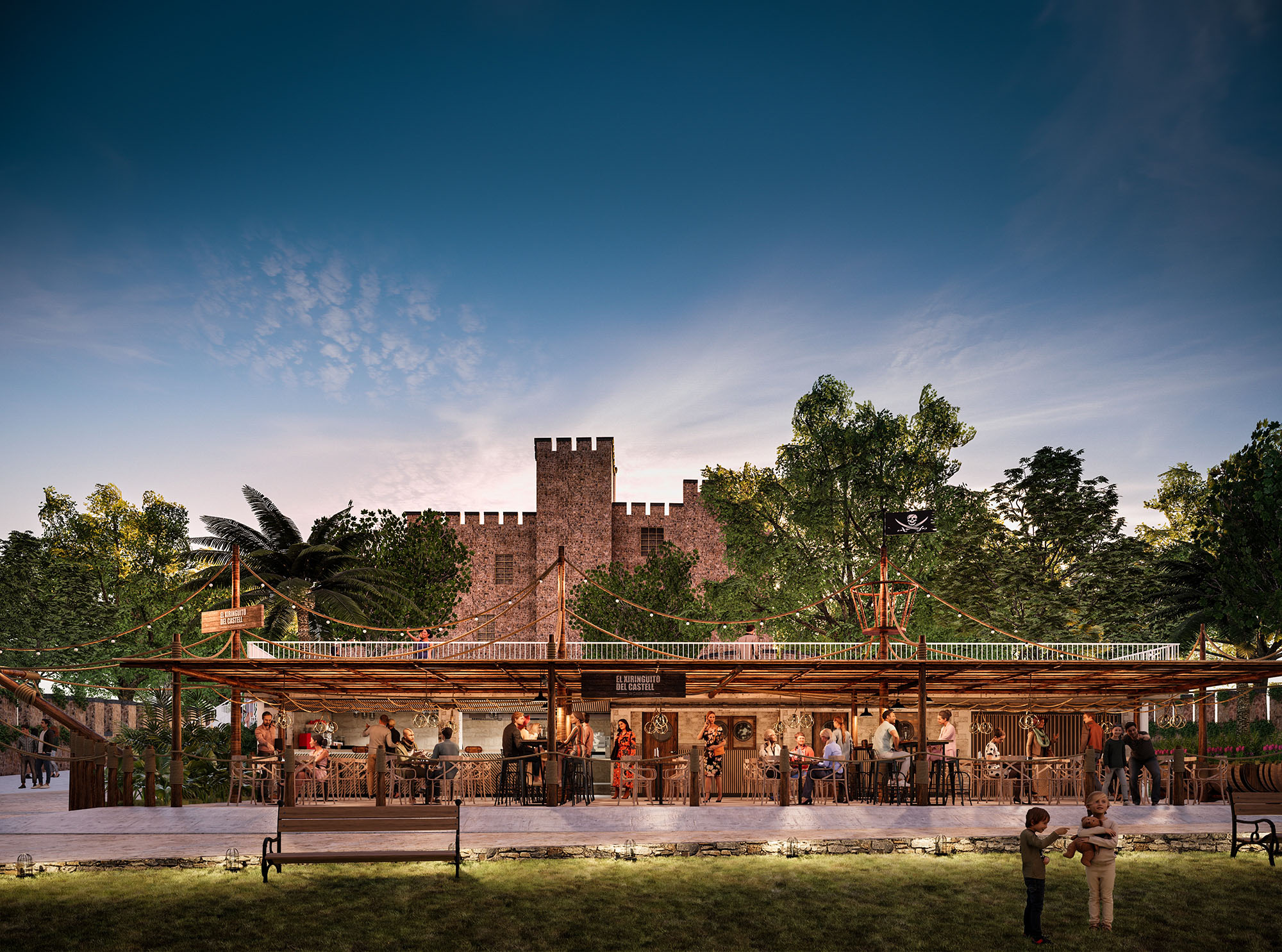
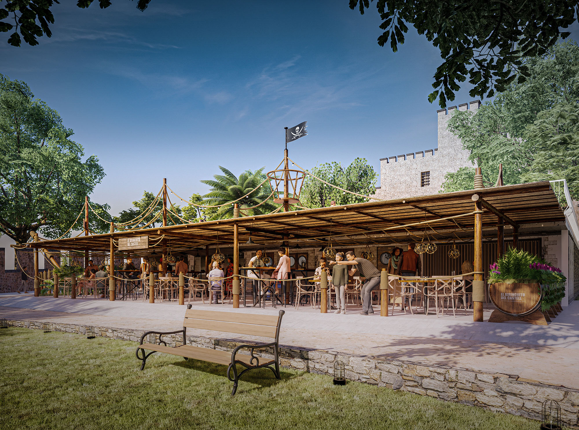
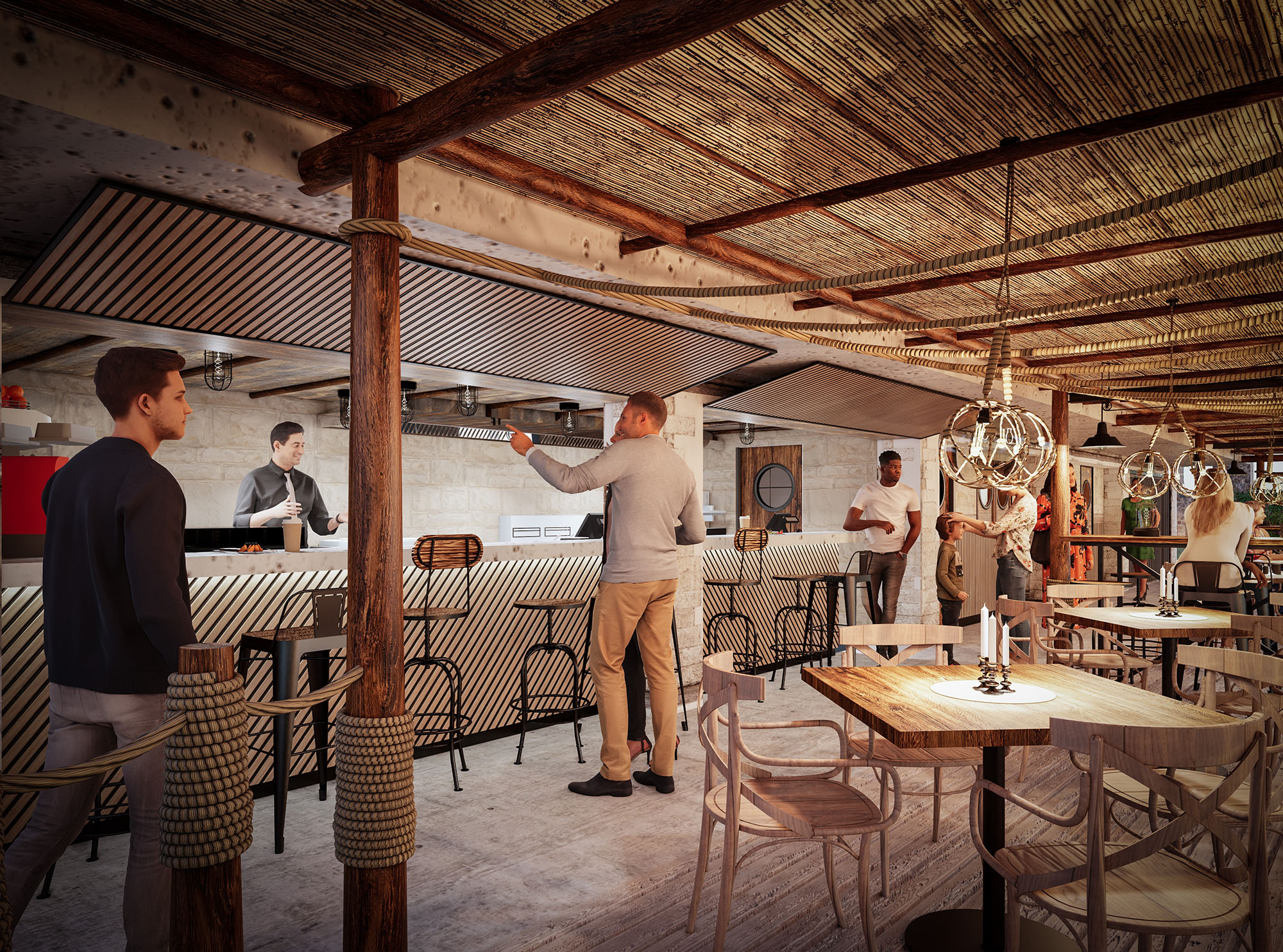
© 2021 by sanzpont [arquitectura] . Webpage by sanzpont [digital] . Innovative Digital Experiences
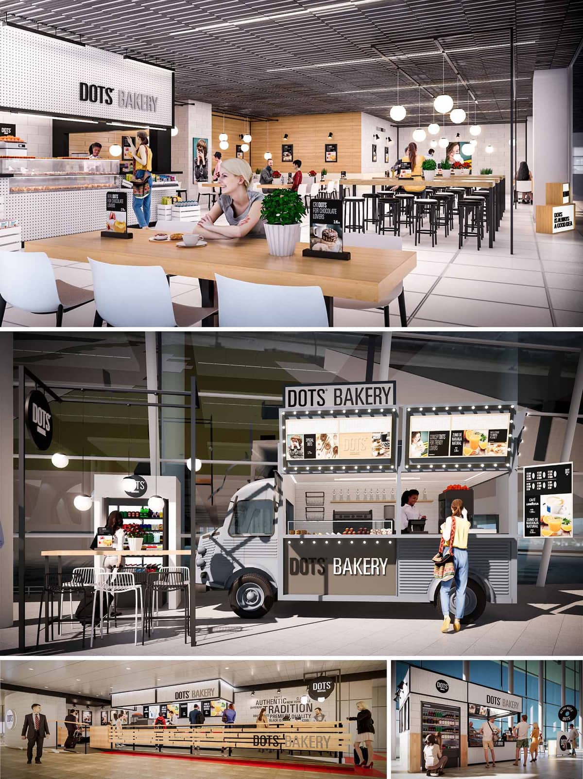

Dots’ Bakery is conceived as a flexible, replicable hospitality concept that can adapt to multiple locations across Spain and Portugal, from shopping malls to transit hubs and outdoor plazas. The design language is based on a clear, graphic identity where the idea of the “dot” becomes a visual and spatial motif, expressed through lighting, perforated panels, and circular details in signage and furniture.
The overall concept combines the warmth of a neighborhood bakery with the efficiency and clarity of a contemporary fast-casual restaurant. Open layouts, long communal tables, and visible production and service areas foster transparency and a sense of craftsmanship, while a restrained palette and strong branding ensure recognizability across all 10 units, including the food truck version.
The interior spaces are organized around a linear service counter that acts as the project’s main spine. Customers encounter the products immediately upon entry, with the display vitrines aligned to optimize visibility and encourage impulse purchases. Behind this front line, back-of-house areas are compact and rational, with clear separations between preparation, storage, and service zones to streamline operations.
Seating is structured in layers: perimeter benches for quick stays, central communal tables for groups, and high tables with stools that create a more informal bar-like atmosphere. Circulation routes are legible, with generous widths to accommodate peak hour queues, while strategic positioning of freestanding elements—such as menu totems and planter boxes—guides movement intuitively without physical barriers.
The material palette combines light-toned woods, white ceramic or painted masonry, and perforated metal panels to craft an interior that is both warm and highly durable. Timber tabletops and cladding soften the overall feel, contrasting with the industrial presence of black metal chair frames, barstools, and ceiling grids. The monochrome base—white, black, and shades of grey—is punctuated by the natural green of plants and the warm color of bakery products, which become the true chromatic protagonists.
Lighting is articulated through spherical pendant luminaires and linear tracks. The circular pendants echo the “dot” identity while providing comfortable, diffuse illumination above tables. Integrated LED strips in counters and display cases accentuate baked goods and graphics, improving legibility and driving sales. In the food truck and kiosk versions, strings of point lights reinforce the festive, street-food character and ensure visibility from a distance.
Graphic design is fully integrated into the architecture: logos, typography, and iconography appear on walls, menus, and counter fronts as architectural elements rather than applied decoration. The black-and-white branding enables quick reading of essential information—products, prices, offers—across different scales, from large interior murals to compact truck signage.
The customer experience is oriented toward clarity and comfort. Self-service elements, such as open refrigerators and accessible condiments, reduce waiting times, while a variety of seating configurations addresses different user profiles: solitary travelers, families, and office workers. Visual communication is carefully positioned at eye level to support intuitive ordering and encourage repeat visits.
The food truck extends the architectural identity into the public realm. Its façade operates as a compact, fold-out elevation where windows, shelves, and menu boards form a coherent composition. Corrugated metal cladding and compact counters are designed for quick assembly and disassembly, allowing the unit to be deployed at events, streets, or transport nodes without losing the core Dots’ image.
All elements—furniture, lighting fixtures, and signage—follow modular dimensions, facilitating replication in different footprints. This modularity allows rapid adaptation to varying lease depths, ceiling heights, and circulation patterns while maintaining consistent operational flows and brand perception across all locations.
The project incorporates sustainability through the careful selection of materials and long-term operational strategies. High-wear surfaces, such as tabletops and counter fronts, use robust laminates and hardwoods from certified sources, reducing the need for frequent replacement. Metal components are primarily powder-coated steel and aluminum, chosen for recyclability and ease of maintenance.
Energy-efficient LED lighting is used throughout, with dimmable systems to adapt brightness to natural light conditions and operating hours, reducing consumption. The open, compact layouts minimize unnecessary partitioning, decreasing material use and facilitating natural cross-ventilation where possible. Standardized components and modular construction further limit waste during fit-out and allow components to be reused when units relocate or are refurbished, reinforcing the lifecycle sustainability of the Dots’ Bakery network.
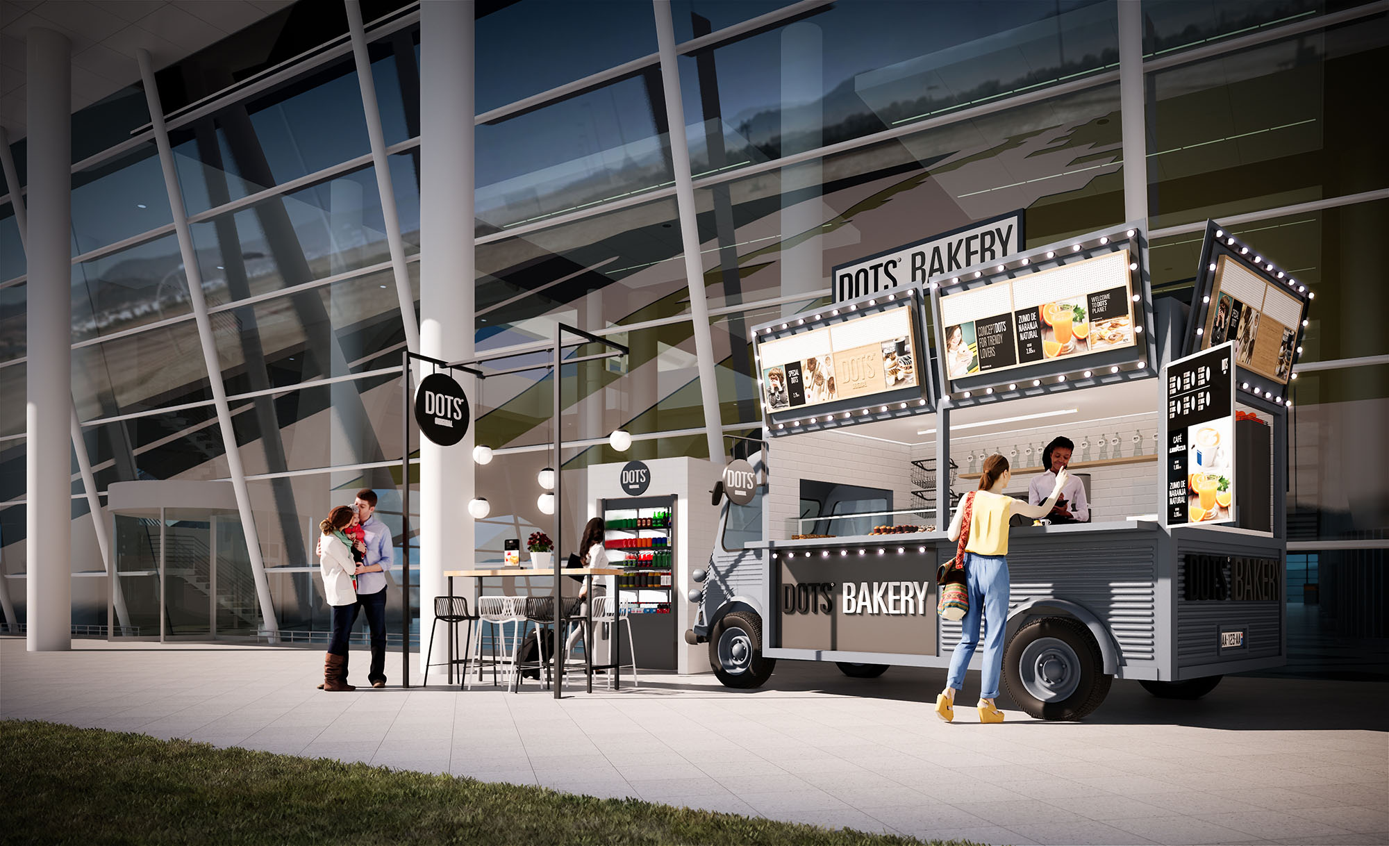
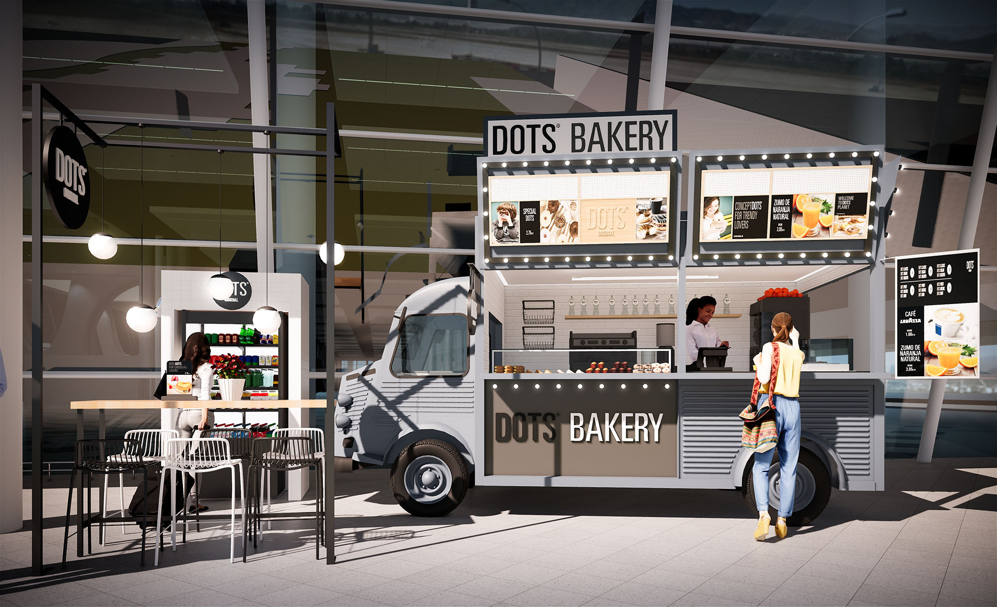
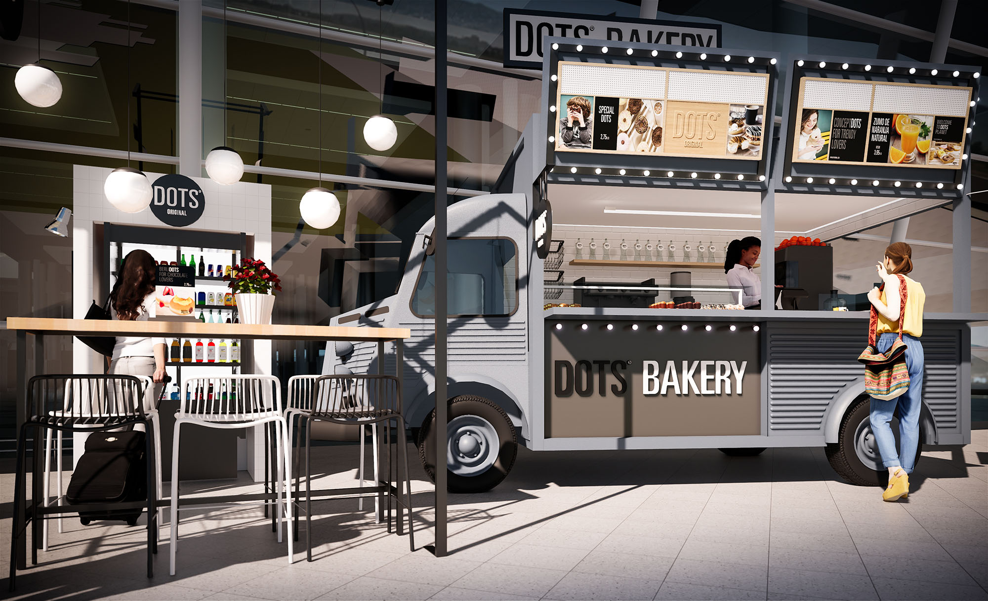
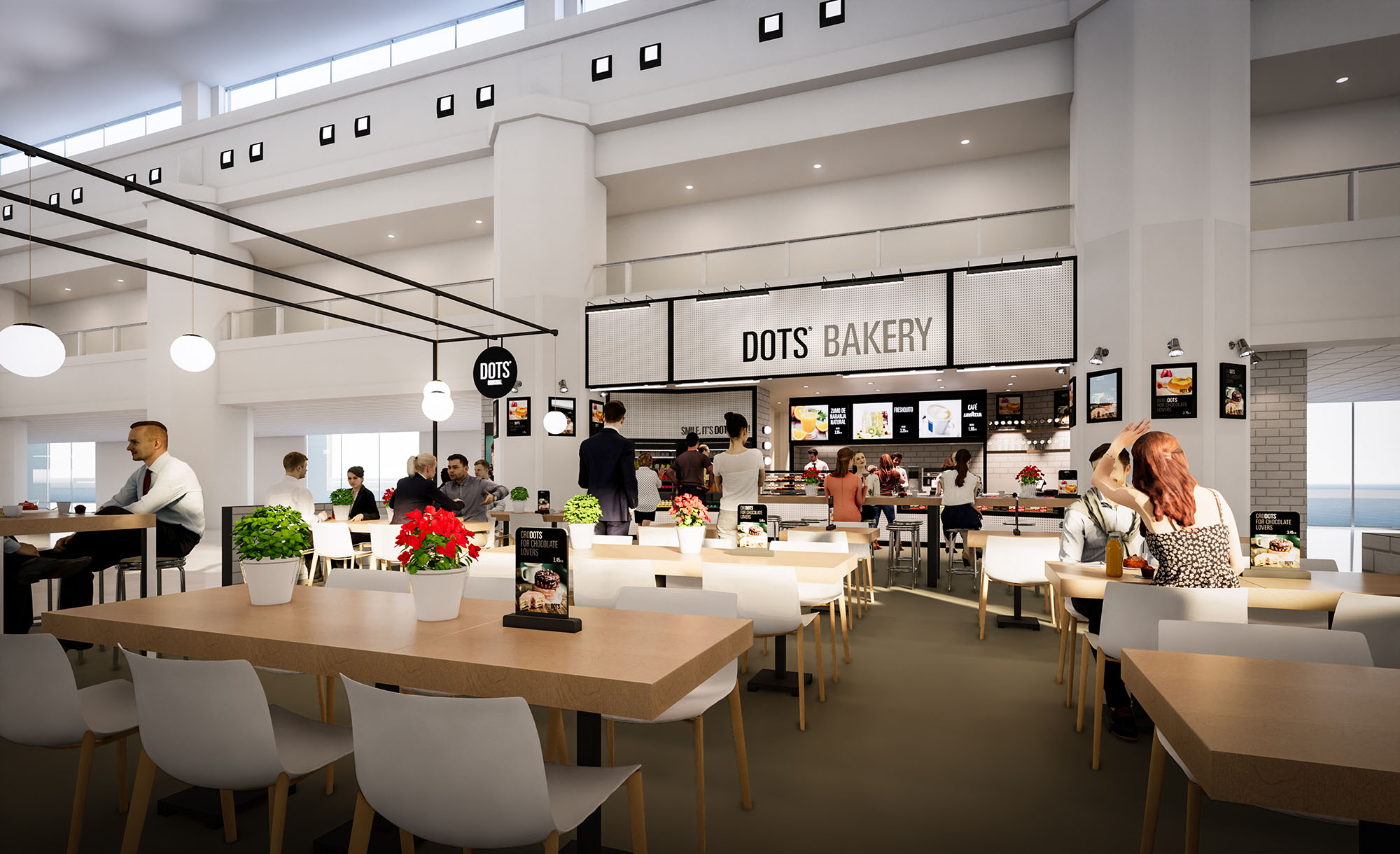
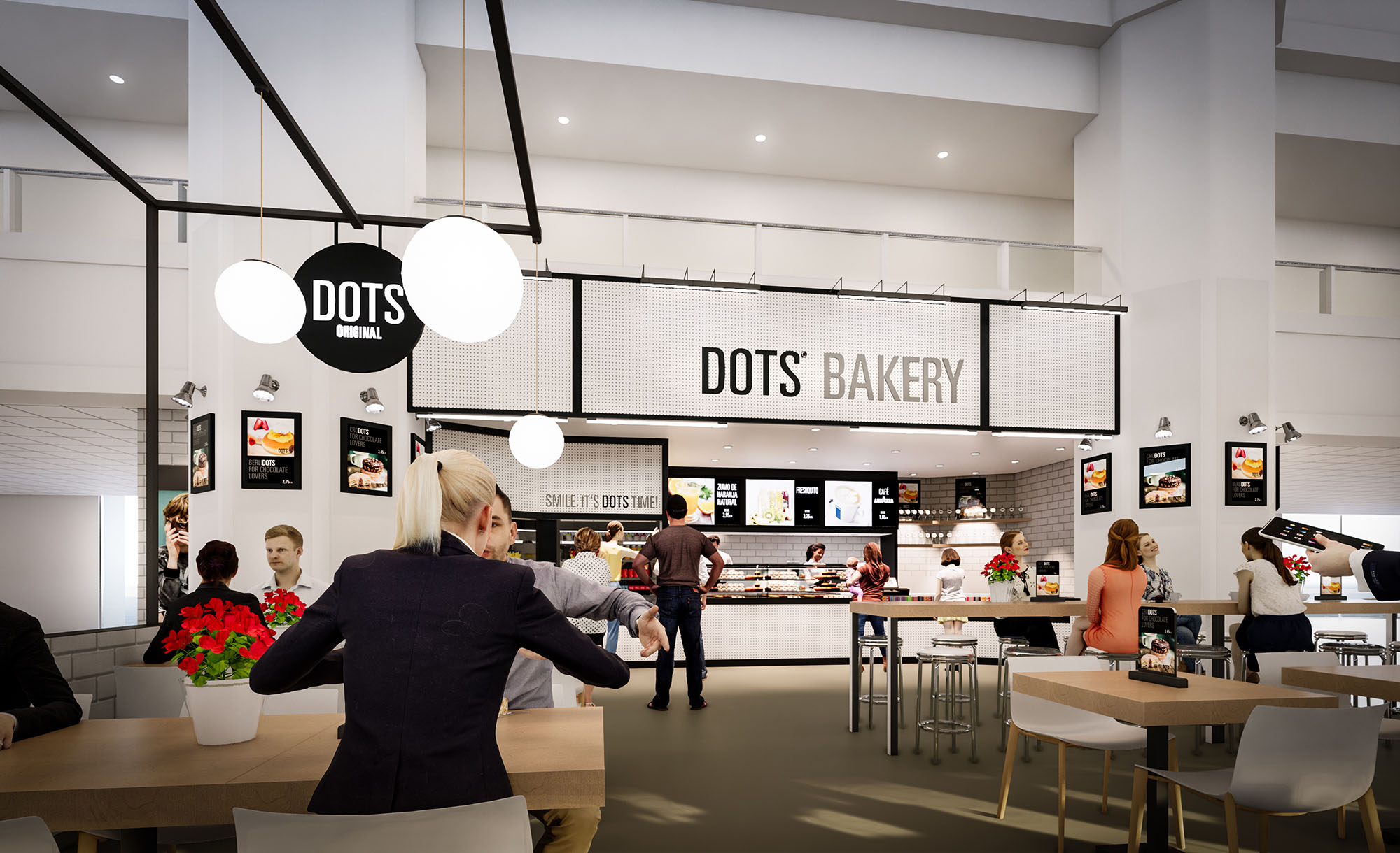
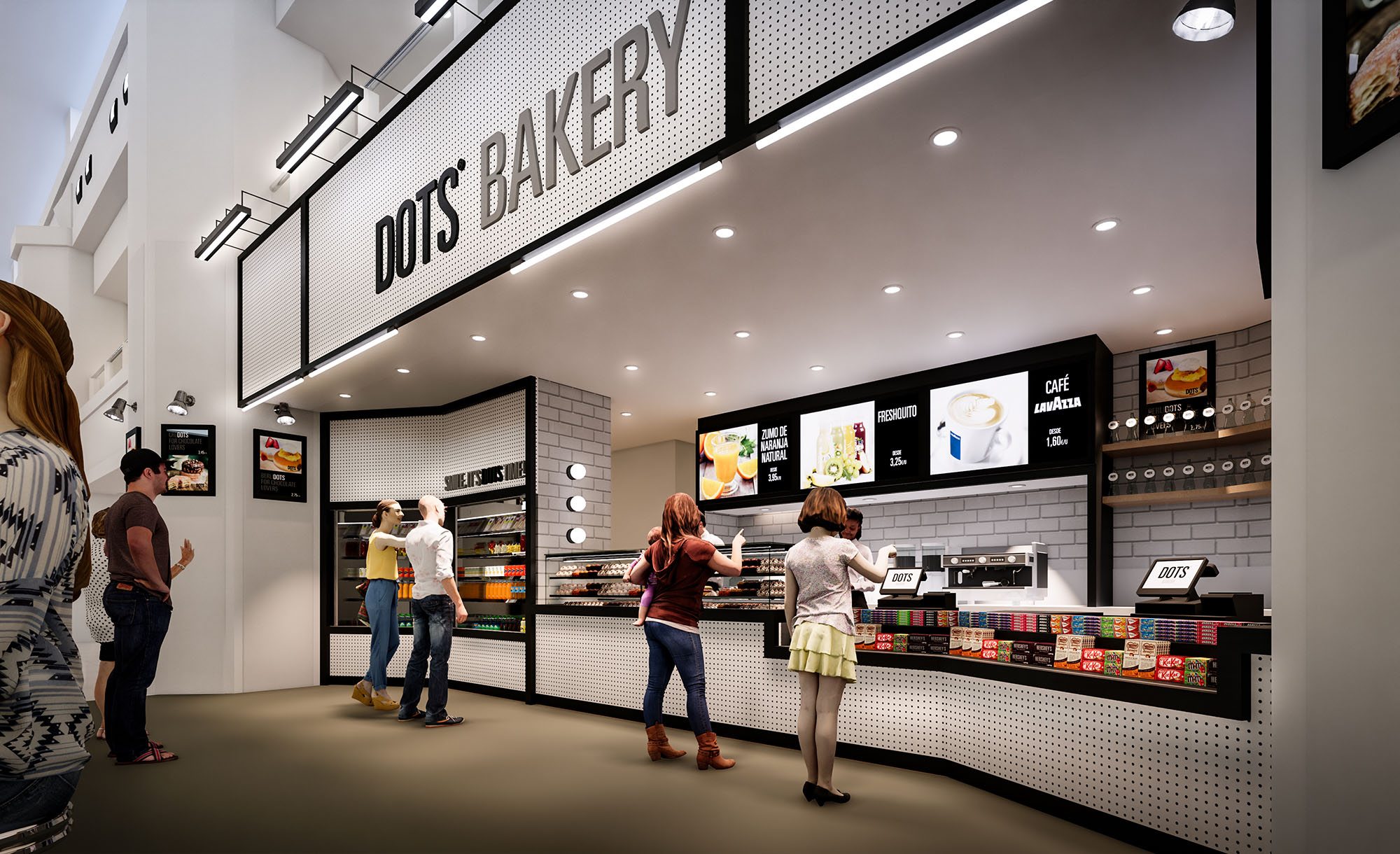
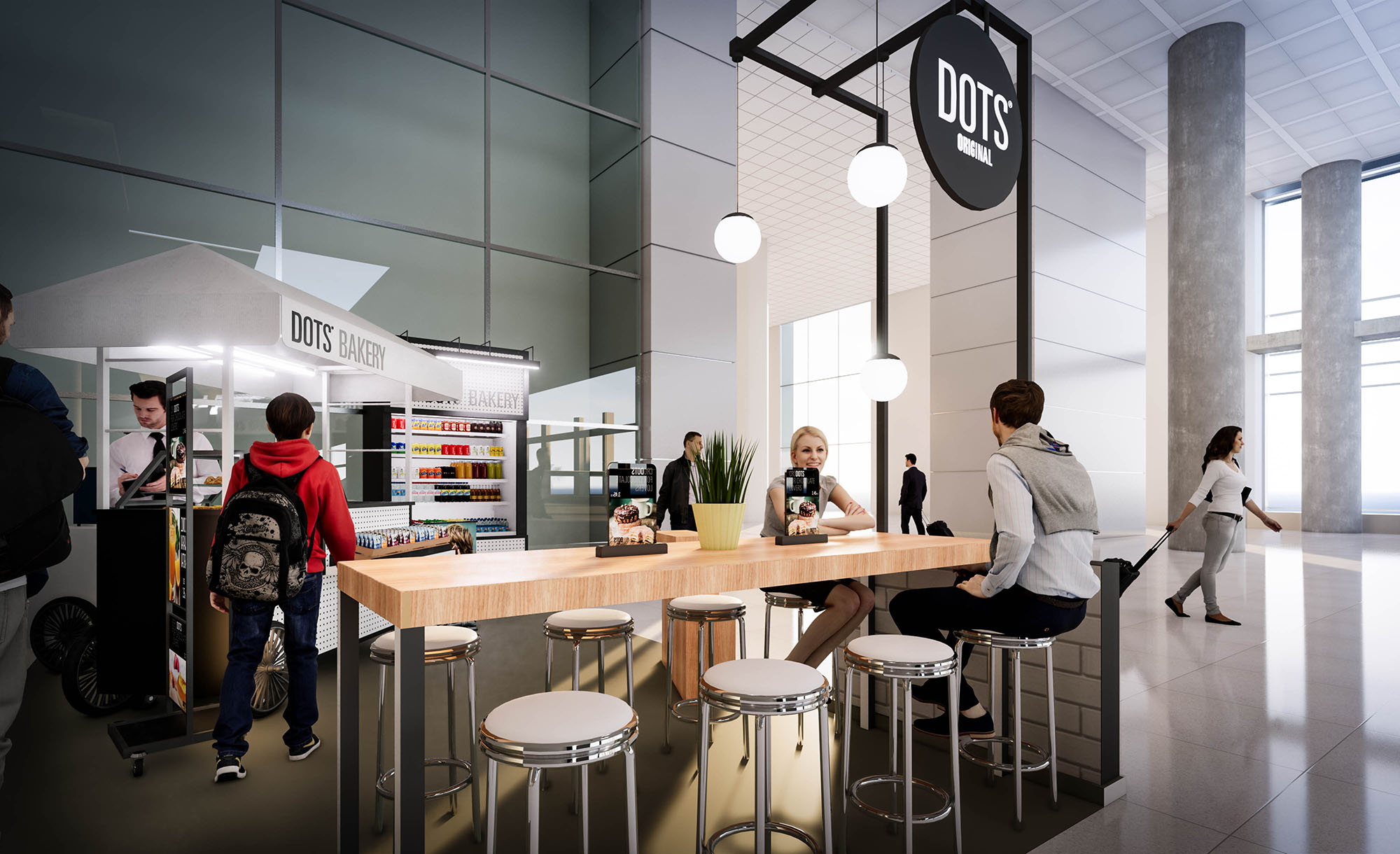
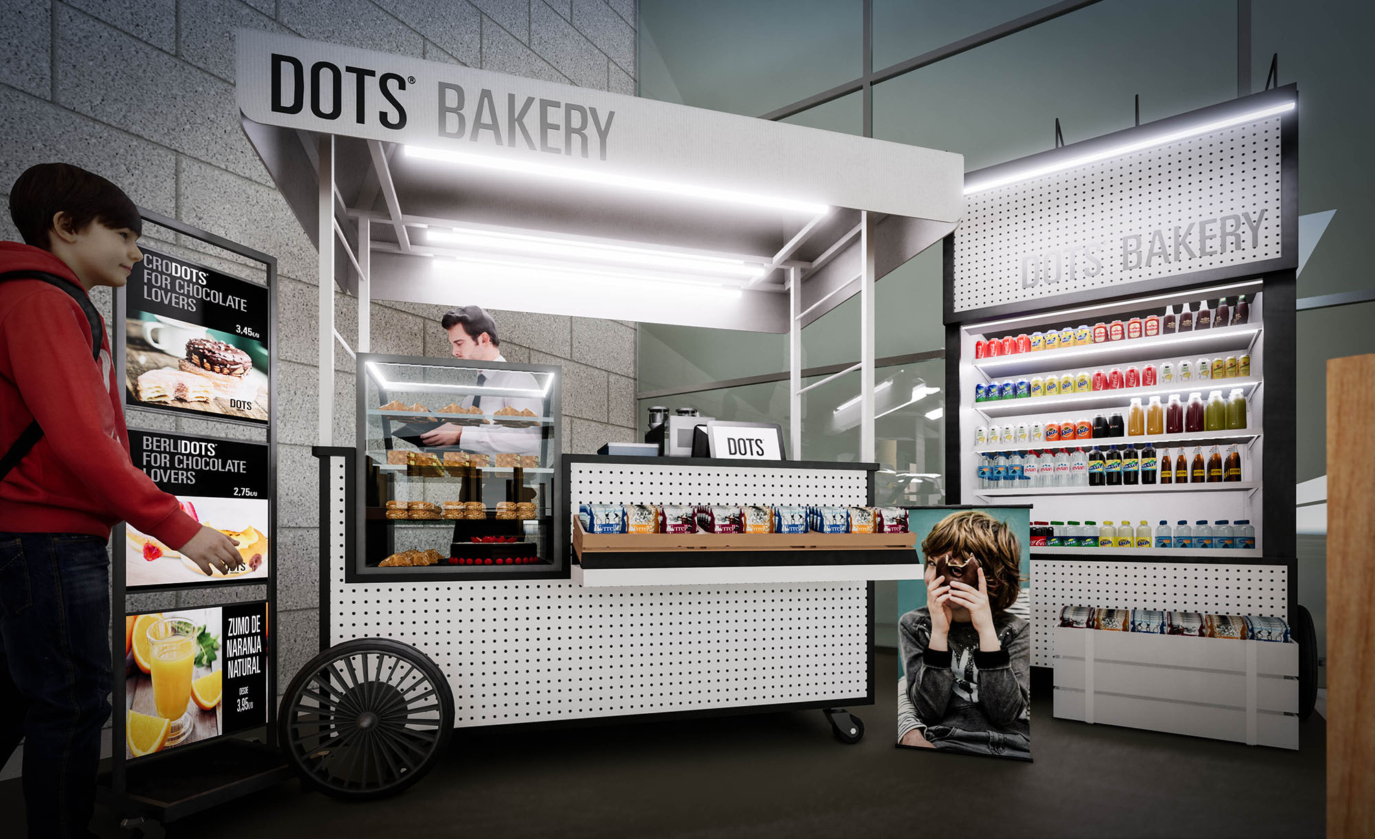
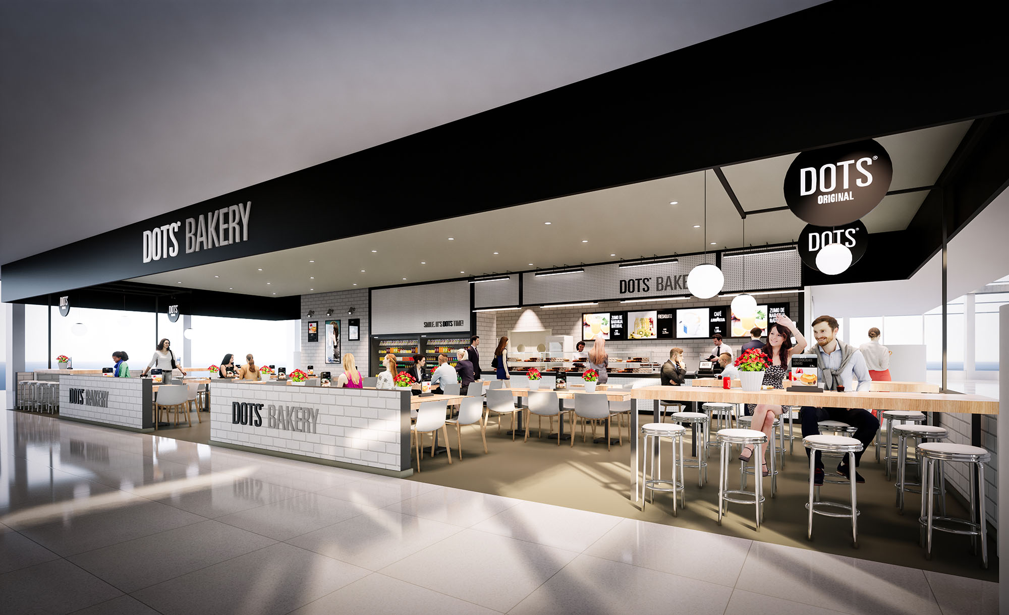
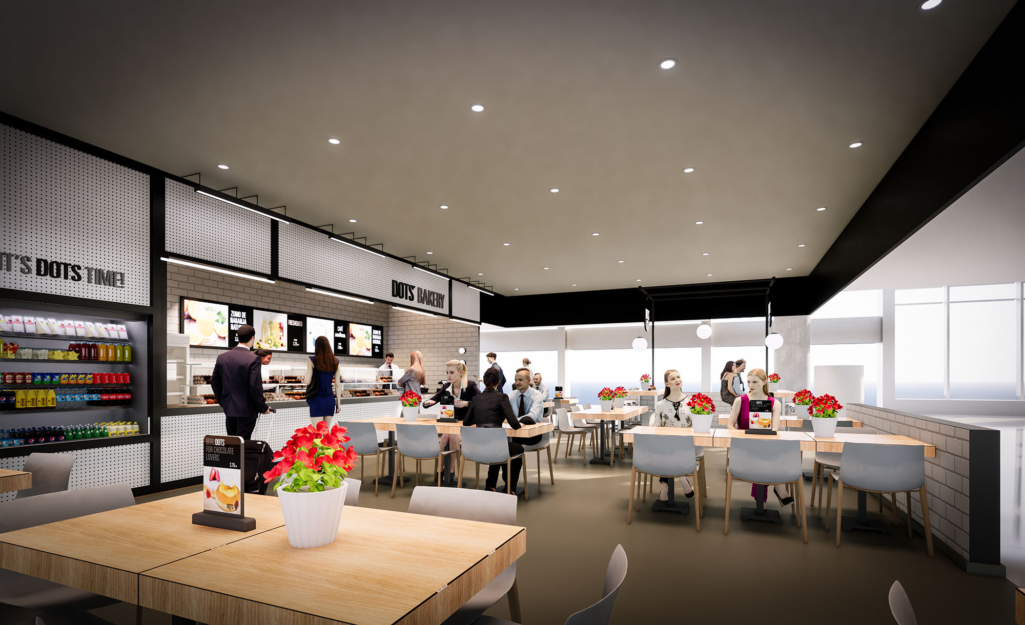
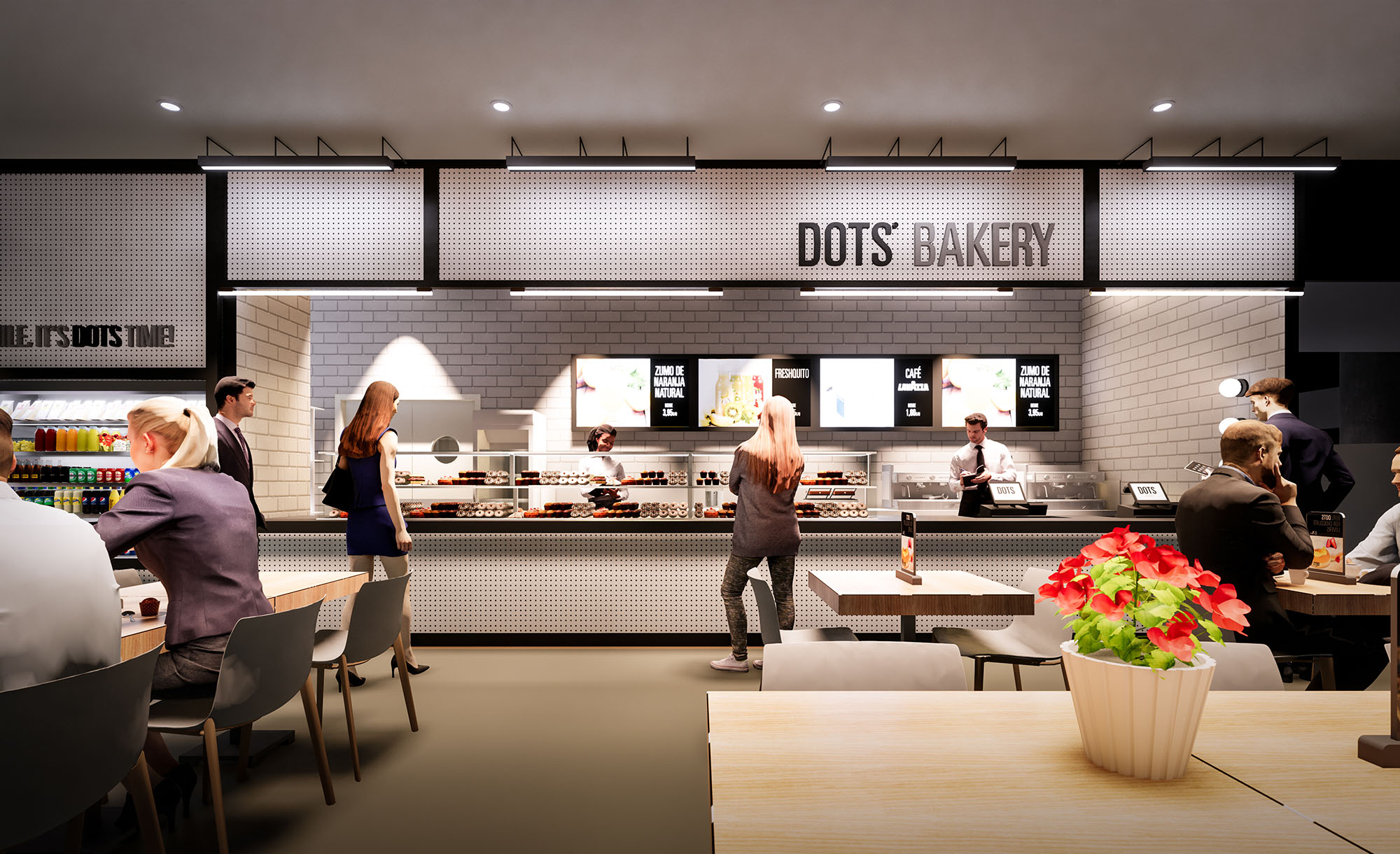
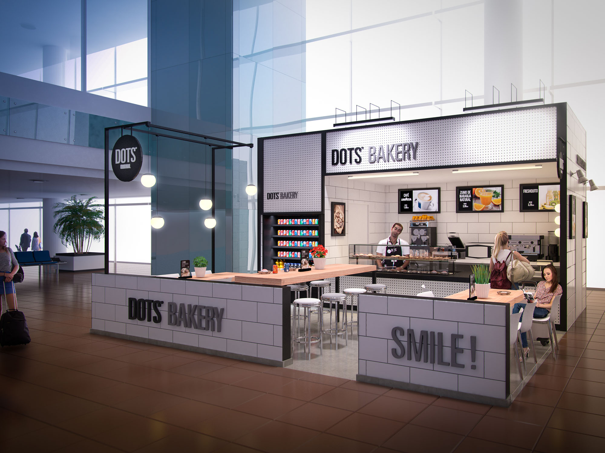
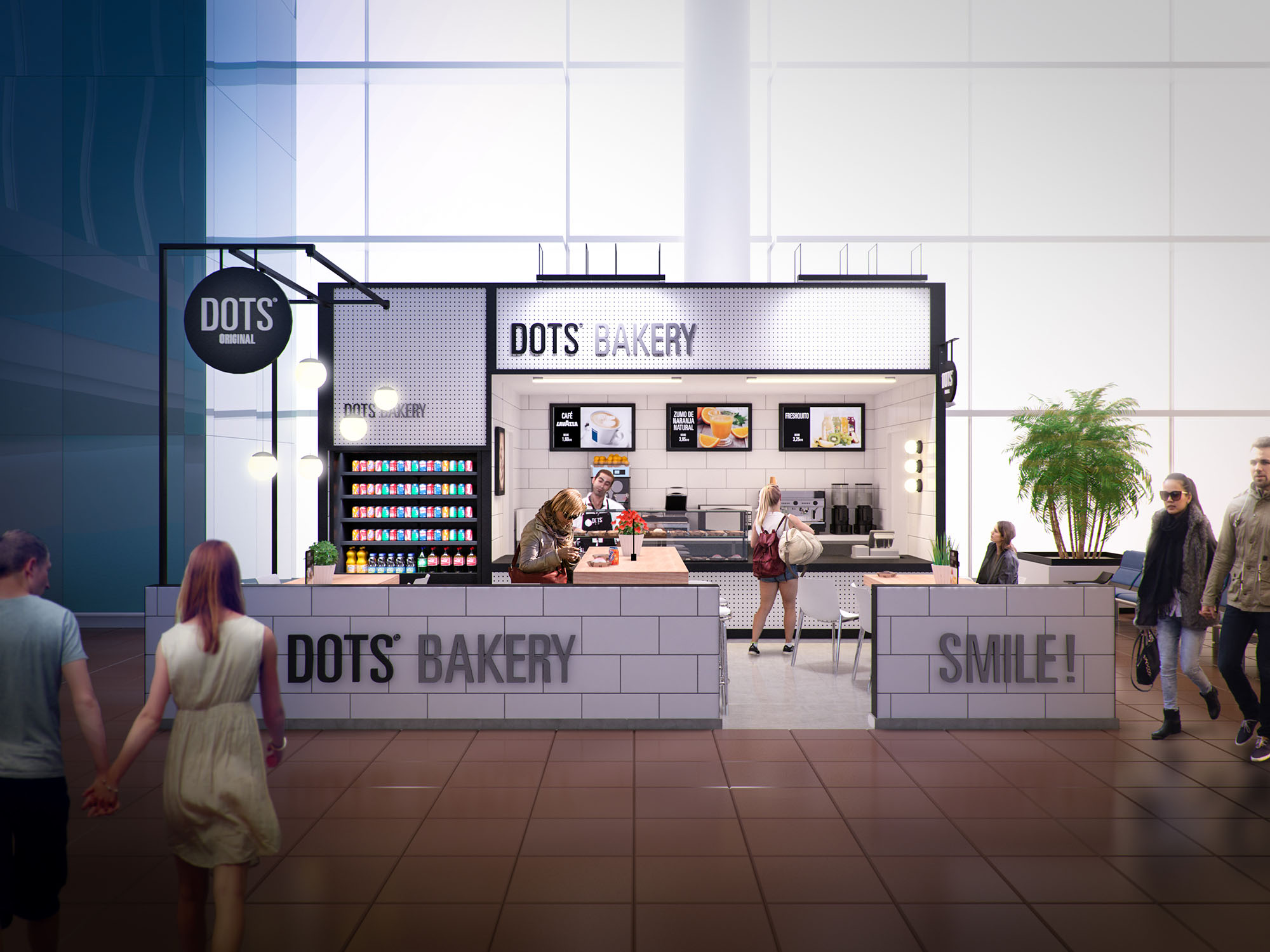
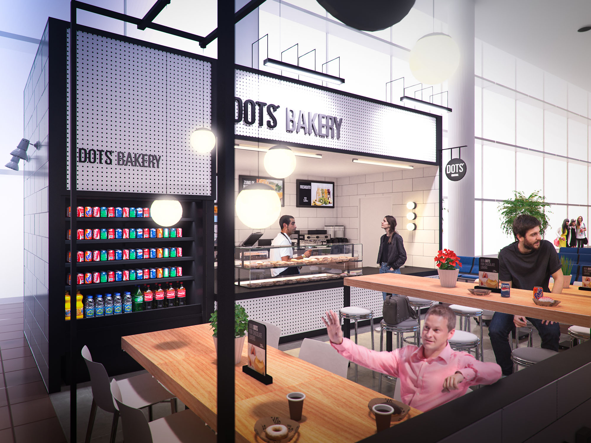
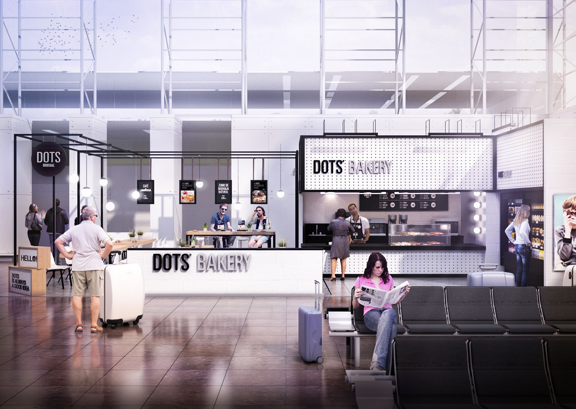
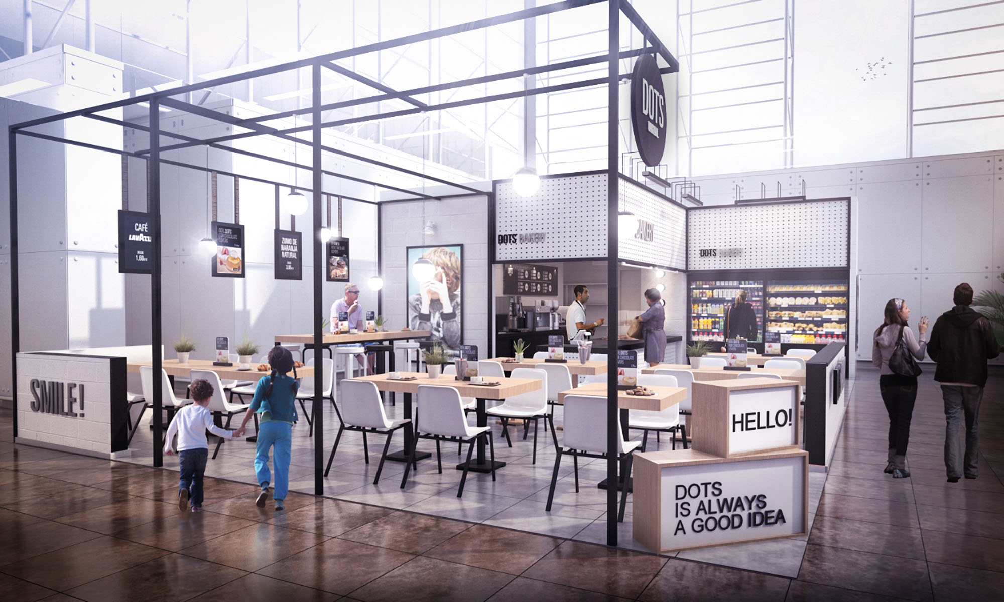
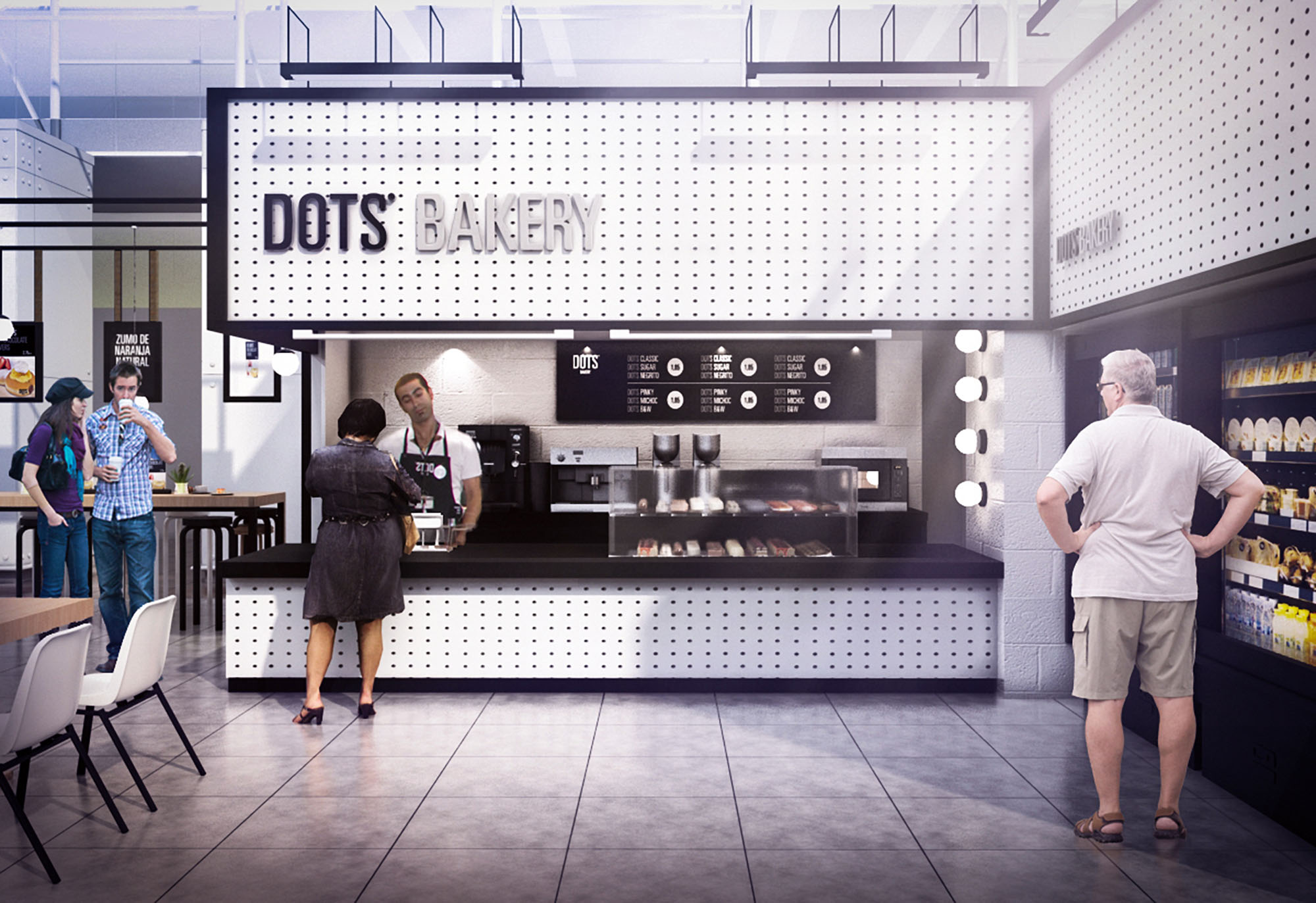
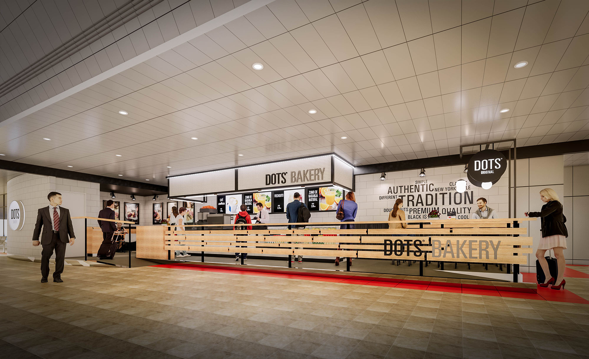
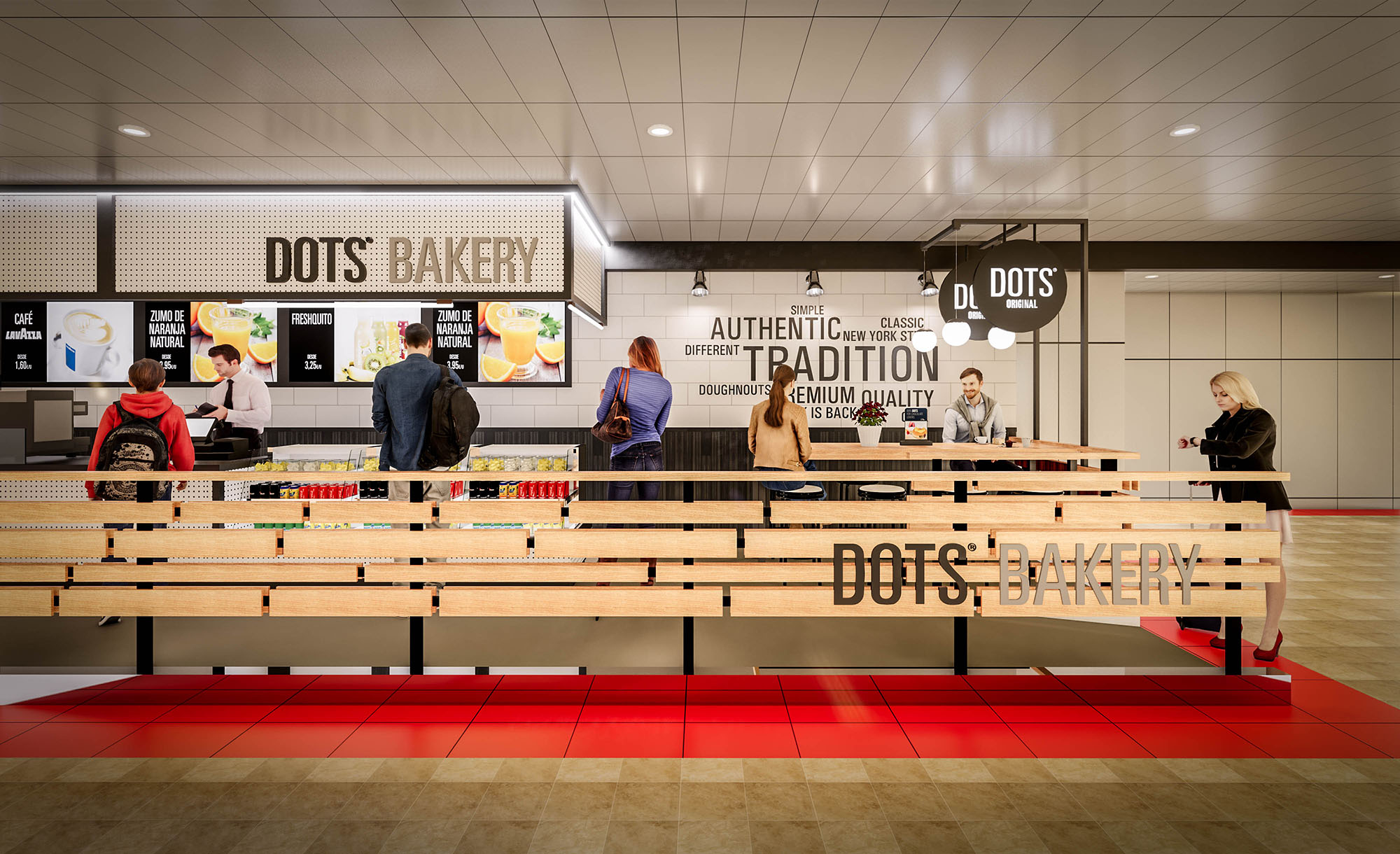
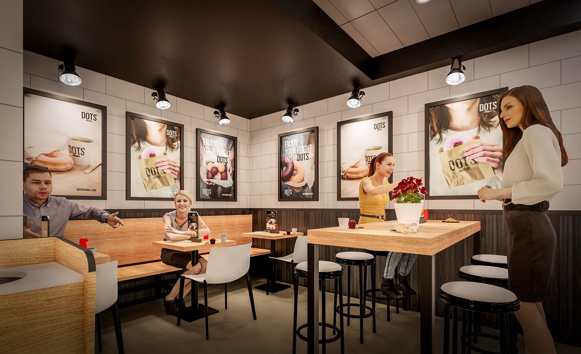
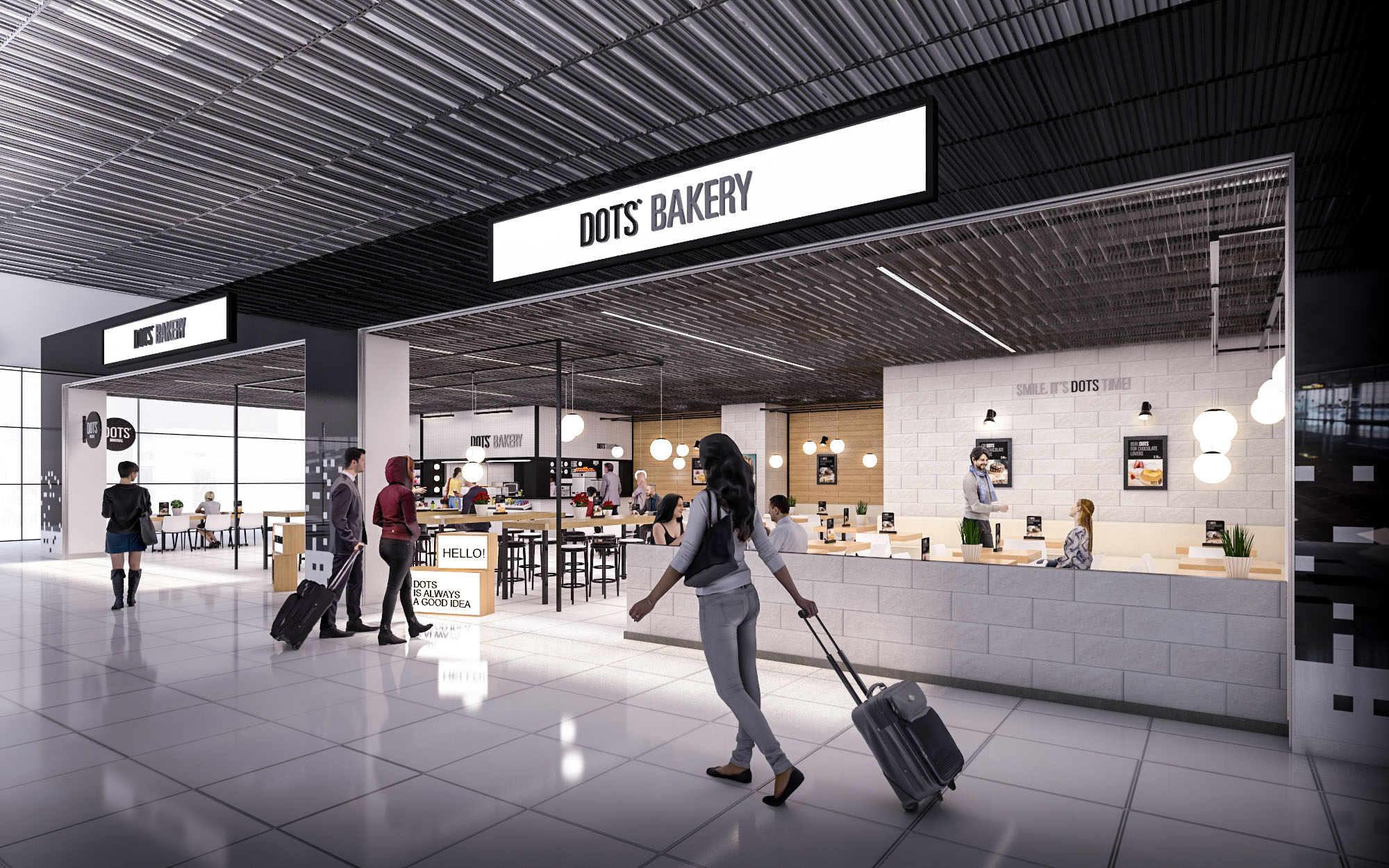
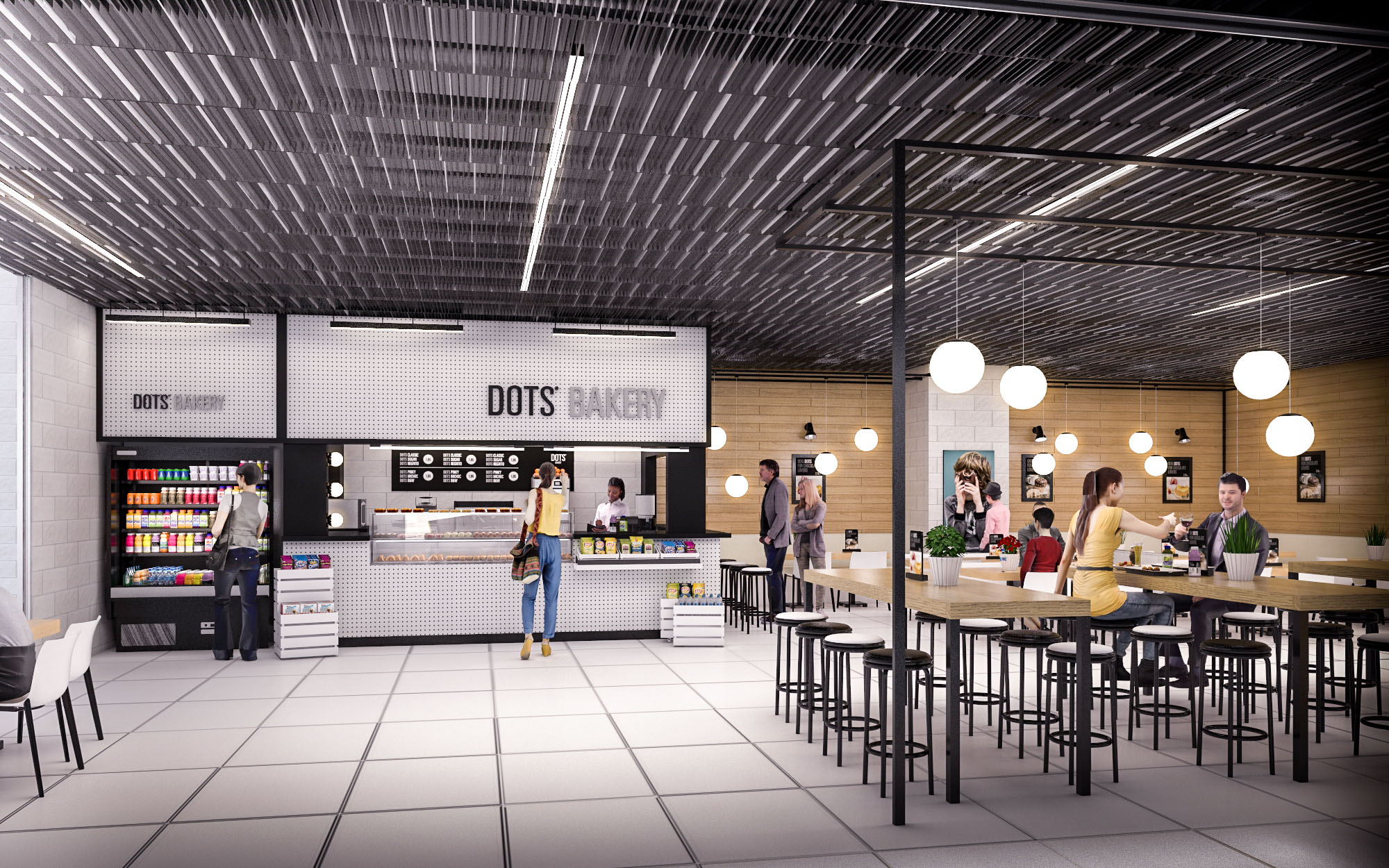
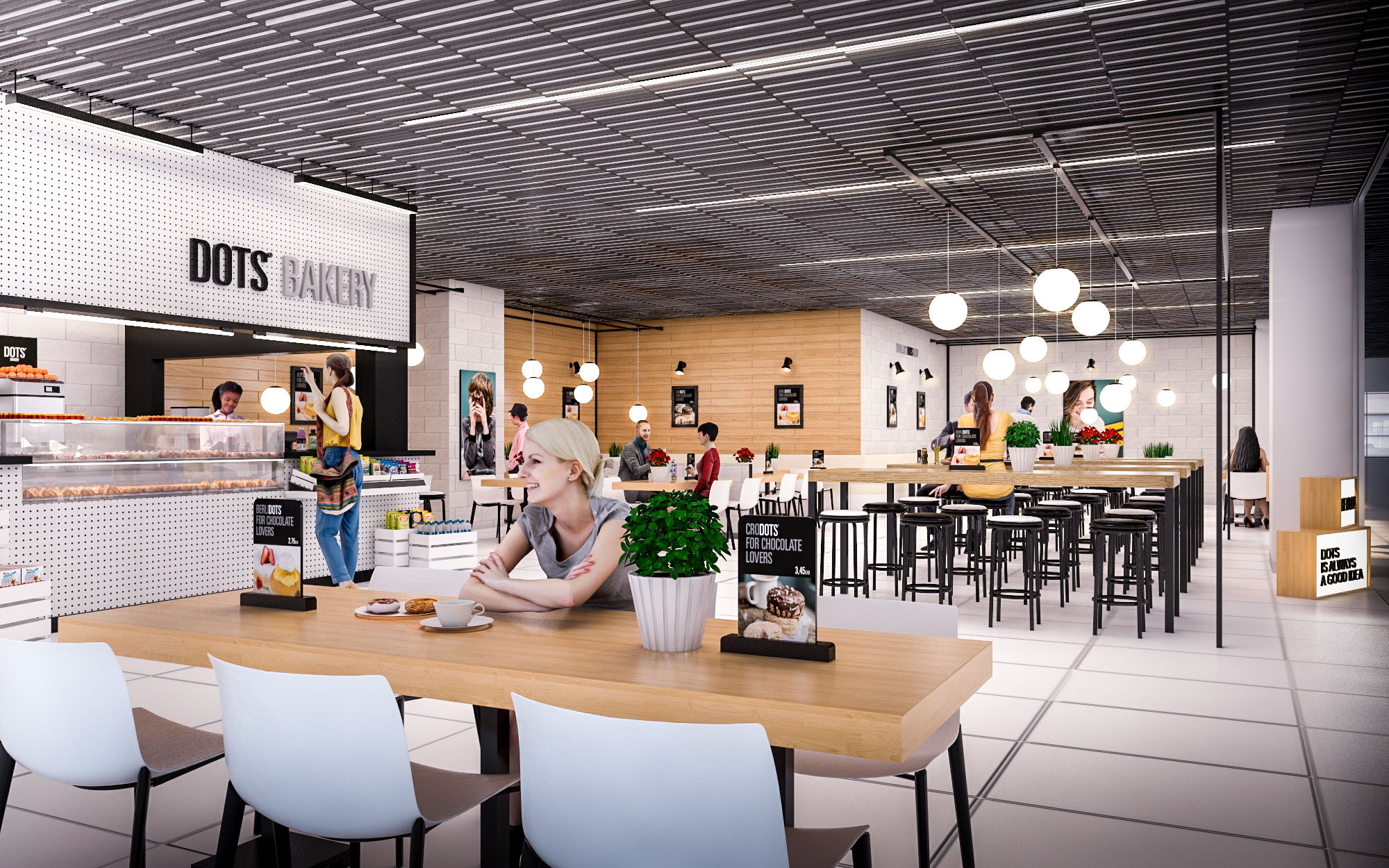
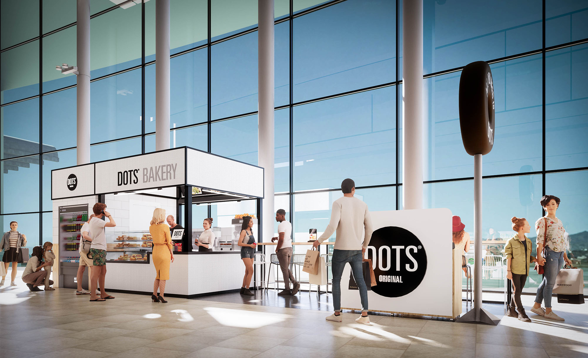
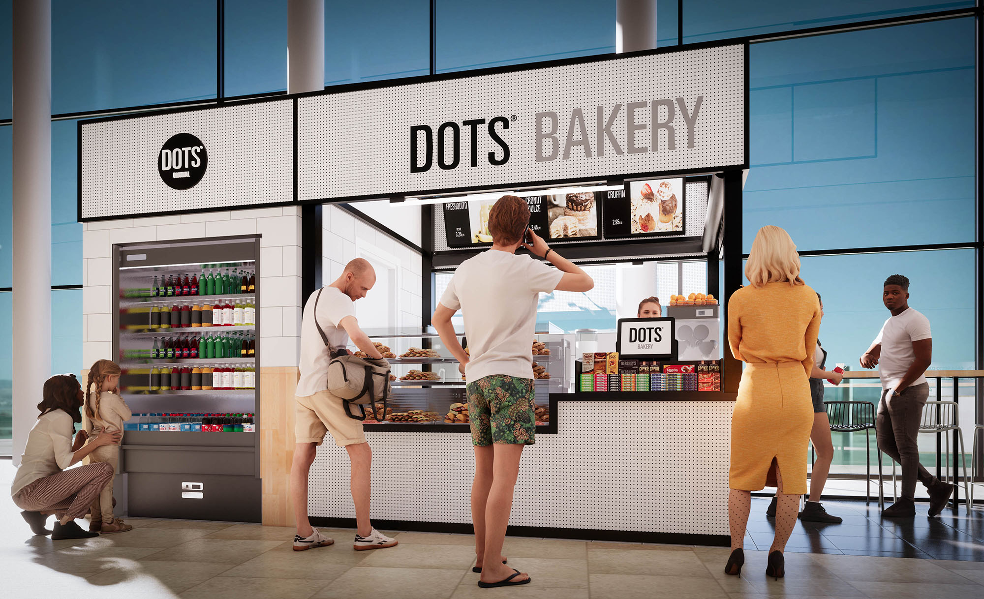
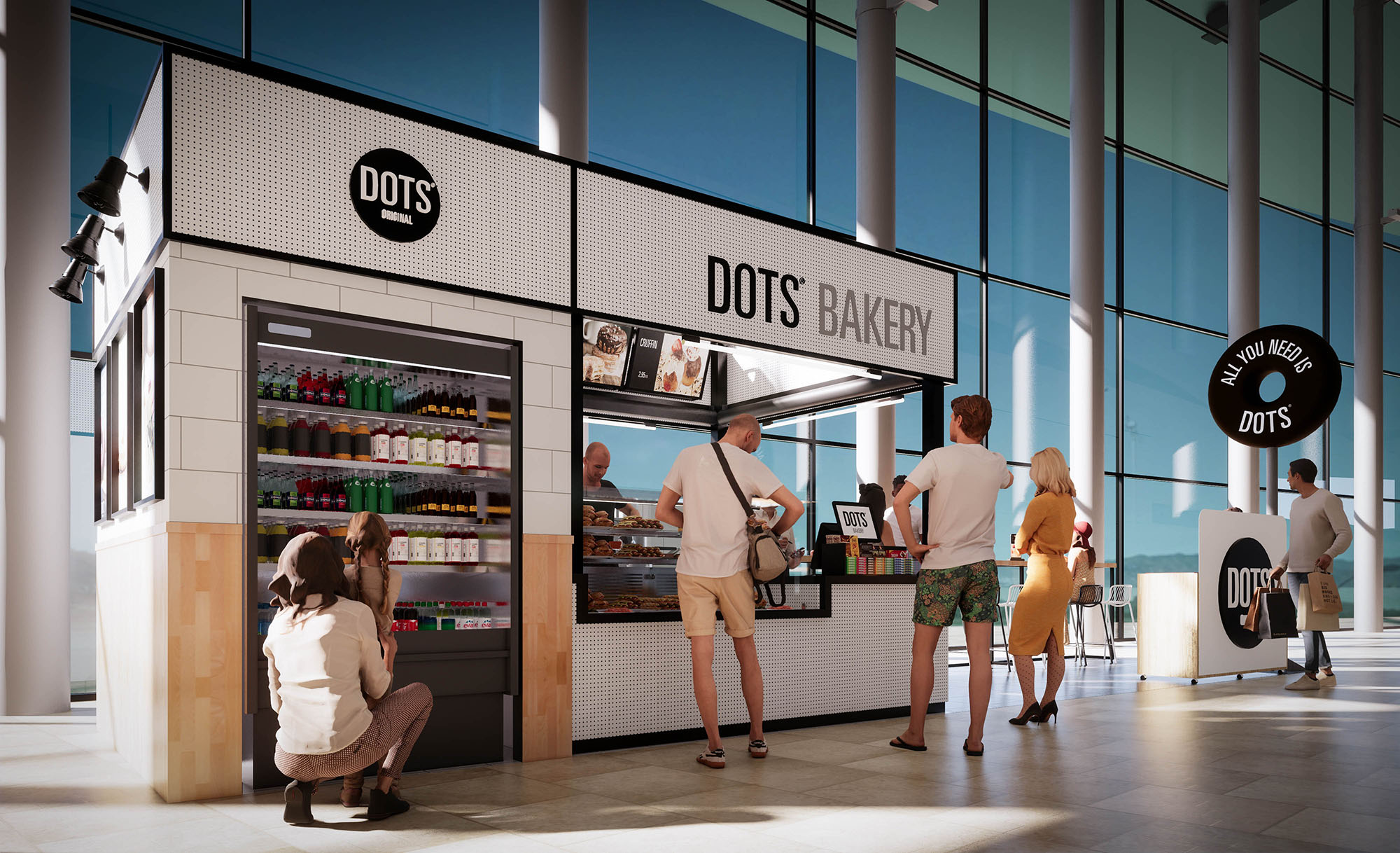
© 2021 by sanzpont [arquitectura] . Webpage by sanzpont [digital] . Innovative Digital Experiences

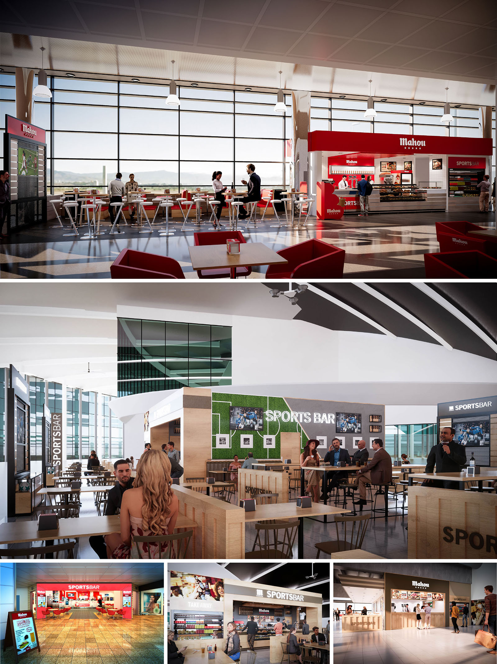
Mahou Sport Bar is conceived as a modular hospitality concept capable of adapting to different airport and transport-hub locations across Spain while maintaining a powerful and recognizable brand image. The project merges the vocabulary of contemporary sports arenas with the clarity of a fast-service bar, using strong geometry, bold color blocks, and open sight lines to promote visibility and intuitive circulation.
The design strategy prioritizes transparency and interaction with the surrounding terminal, framing runway views and public flows as part of the interior experience. Each unit operates as an “island” within the larger concourse, using low-height perimeters and permeable layouts so that the bar blends seamlessly with passenger movement while still generating a defined, welcoming atmosphere.
The spatial layout is structured around a central service spine: an elongated counter that concentrates ordering, preparation, and product display. This bar volume acts as the functional and visual anchor, allowing customers to immediately locate the point of service from multiple approach directions. Around this core, differentiated seating rings are arranged—from quick stop high tables near circulation routes to more relaxed low seating deeper in the footprint.
Visual axes are carefully maintained, ensuring uninterrupted views to flight information screens and to the large-format televisions broadcasting sports content. Circulation paths are generous, with clear transversal routes through the seating field so that even during high occupancy, passenger flow remains fluid. Edge conditions are treated with bar-height counters facing windows or concourse, offering solo travelers convenient spots without entering the interior cluster.
The material palette combines warm, light-toned wood with contrasting red brand accents and black technical elements. Timber veneers and laminated boards define the furniture and vertical cladding, creating a unified base that softens the predominantly glazed and metallic context of airport architecture. The red Mahou fascia, menu bands, and strategic surfaces provide an immediate brand reading and act as wayfinding beacons within the terminal.
Sports identity is expressed through artificial turf panels, line graphics reminiscent of playing fields, and integrated media walls. These are carefully scaled to avoid visual overload while creating a dynamic backdrop to the bar activity. Metallic frames, slim-profile stools, and high tables with circular tops reference stadium furniture and emphasize lightness, enabling easy reconfiguration for future operational changes.
Lighting design balances the abundant natural light of the terminal with a precise artificial scheme. Daylight is harnessed through floor-to-ceiling glazing, with interiors organized to avoid glare on display screens and counters. Pendant luminaires above high tables and linear LED profiles integrated into the bar canopy generate a comfortable luminance hierarchy, emphasizing key functional areas such as the ordering points and product showcases.
Vertical surfaces, especially branding and sports graphics, are washed with indirect light to enhance legibility without adding visual noise. Color temperatures are calibrated in a warm-neutral range to contrast subtly with the cooler terminal environment, making the bar feel more domestic and inviting while still aligned with the contemporary airport aesthetic.
Furniture is standardized yet varied in typology, offering stools at high communal tables, bar counters for single users, and low tables for longer stays. Heights, clearances, and distances between pieces follow ergonomic criteria that facilitate both comfort and rapid turnover. The use of slender, metal-framed chairs with wooden seats responds to maintenance needs while preserving a warm tactile quality.
Operational efficiency is supported by clear queuing zones, visible menu bands, and self-service display areas that reduce waiting times. Acoustic comfort is enhanced through soft finishes on selected walls and soffits, as well as the strategic positioning of screens and speakers to localize sound around the sports viewing areas without disturbing adjacent terminal spaces.
The concept is designed as a kit-of-parts system, allowing components to be prefabricated, transported, and assembled with minimal on-site waste. Standardized modules for counters, back-bars, and seating islands reduce material offcuts and enable reuse when units are relocated or remodeled. Durable finishes with high resistance to wear and easy-clean properties extend life cycles and minimize replacement needs.
Where possible, LED lighting with high energy efficiency and integrated controls reduces consumption, while the open layout maximizes the use of existing terminal daylight and mechanical systems, avoiding redundant installations. Timber elements are specified from certified sources, and the restrained use of applied finishes lowers embodied carbon. This combination of modularity, longevity, and efficient resource use ensures that Mahou Sport Bar can be replicated across multiple locations with a consistent, sustainable design framework.
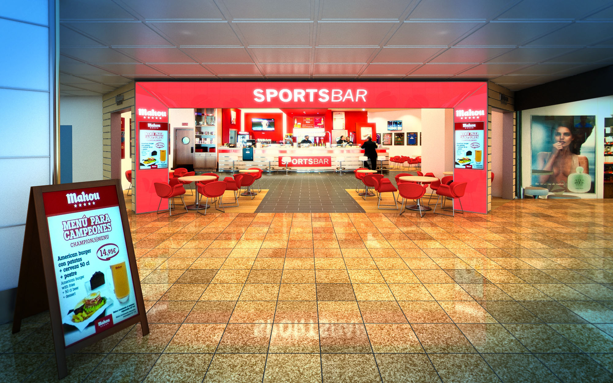
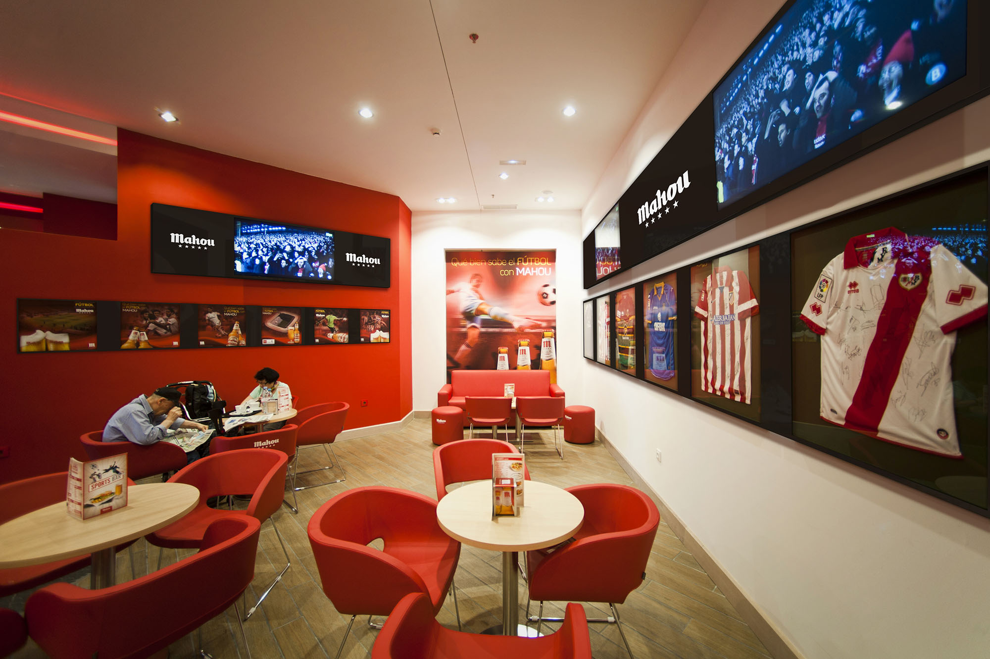
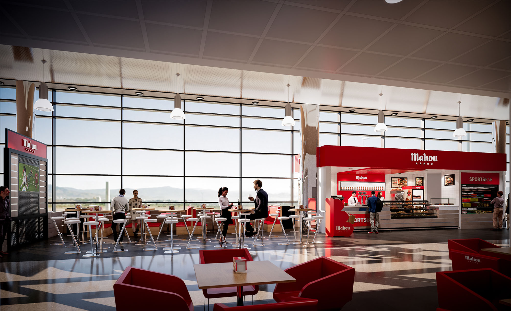
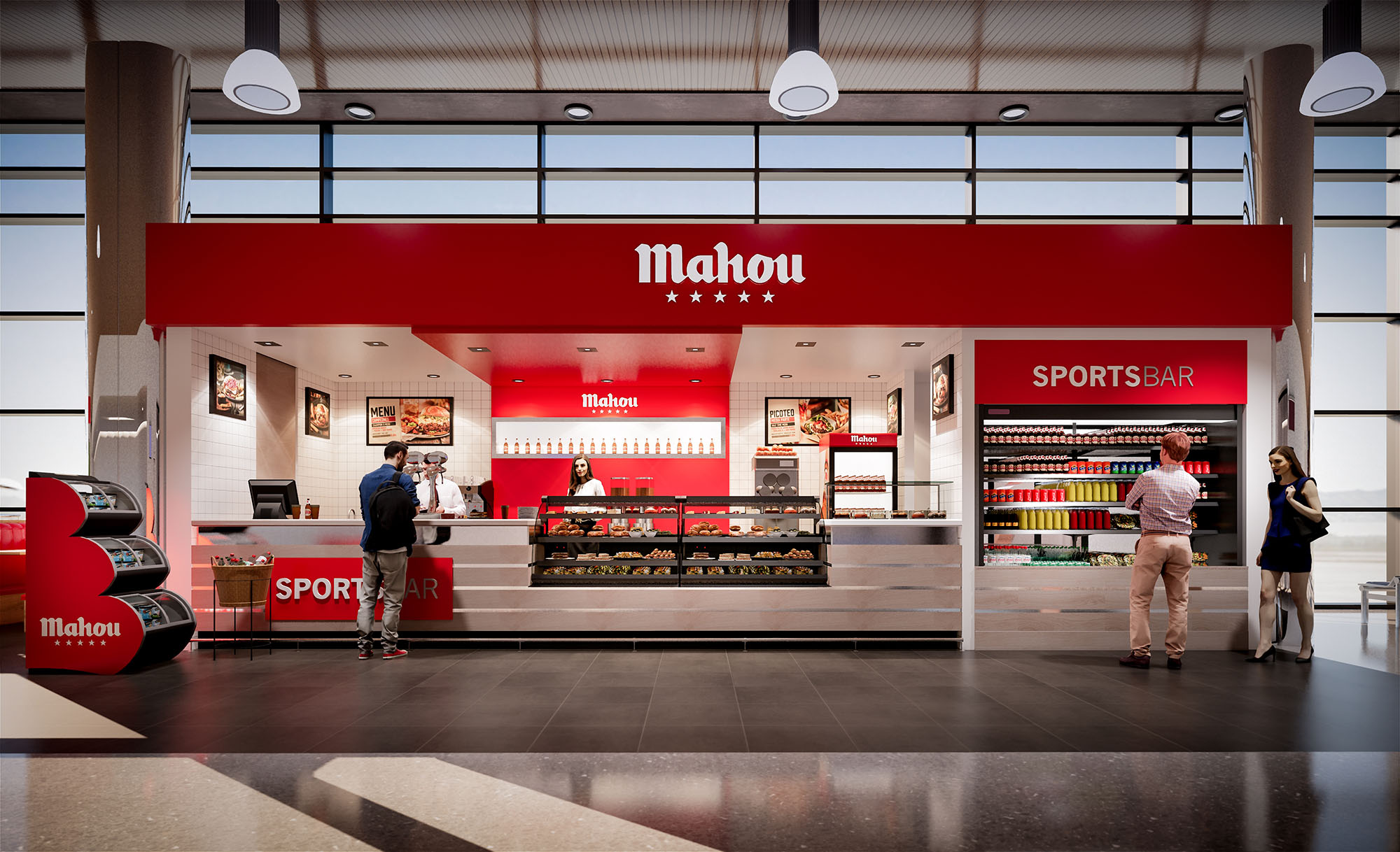
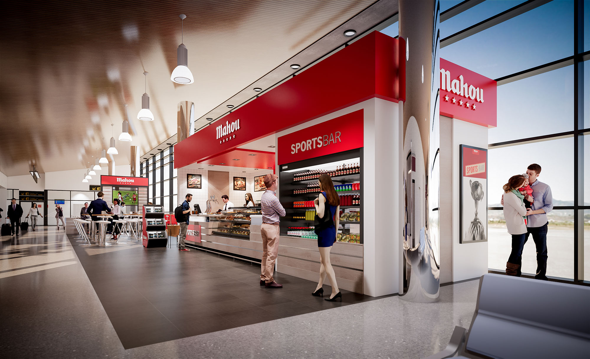
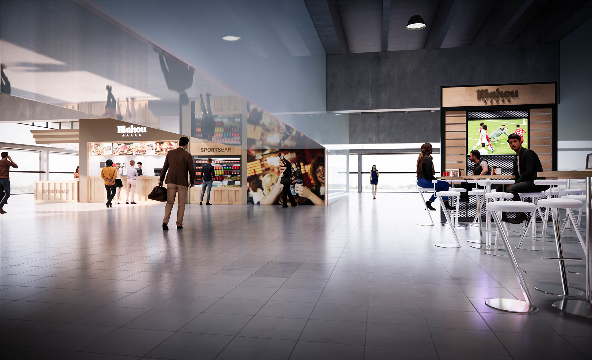
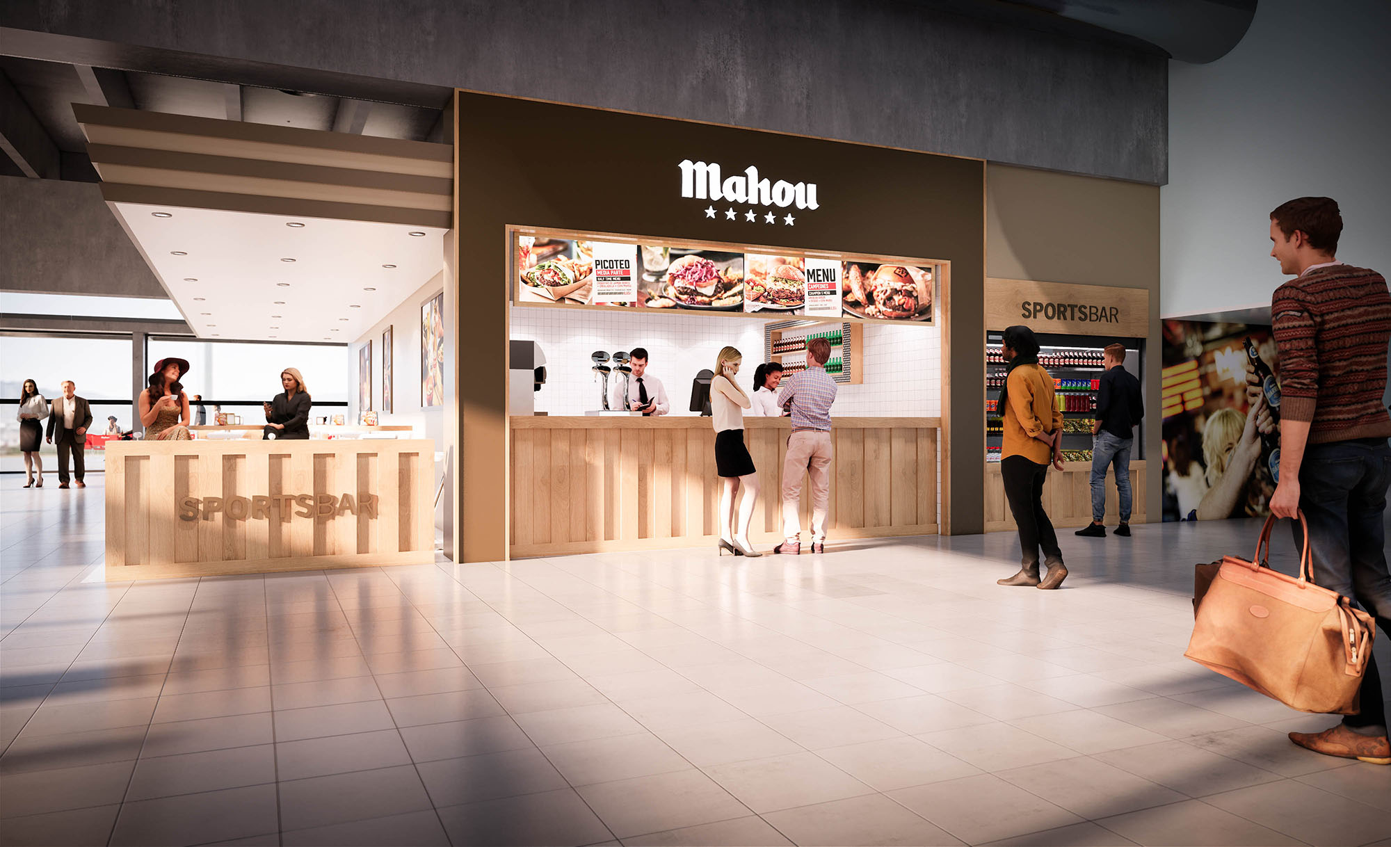
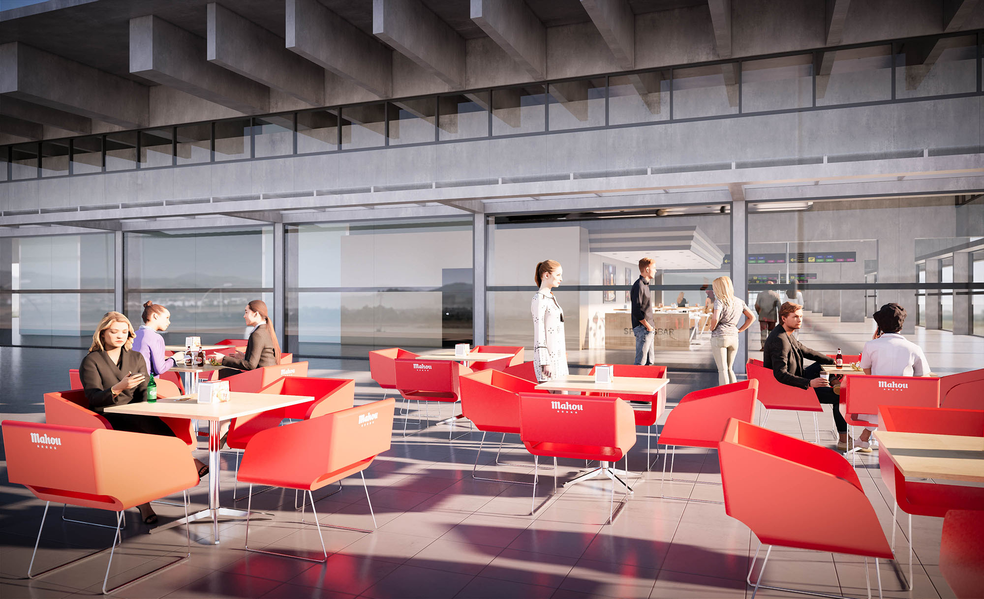
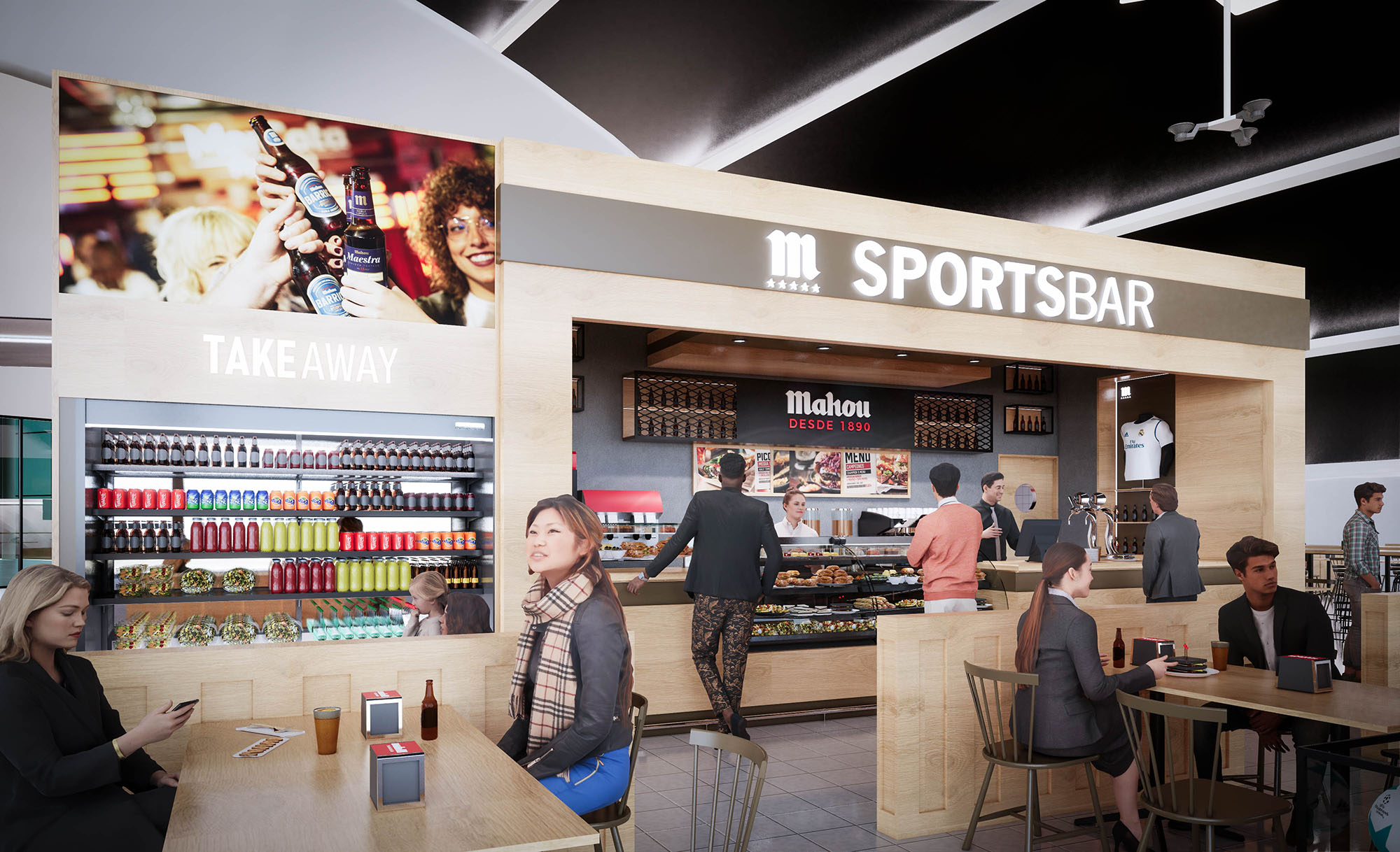
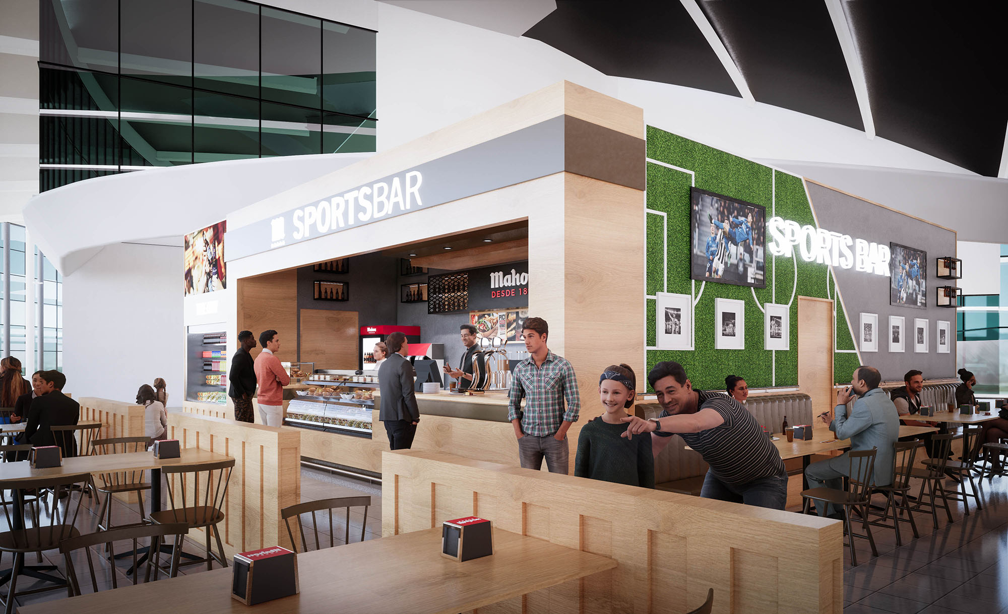
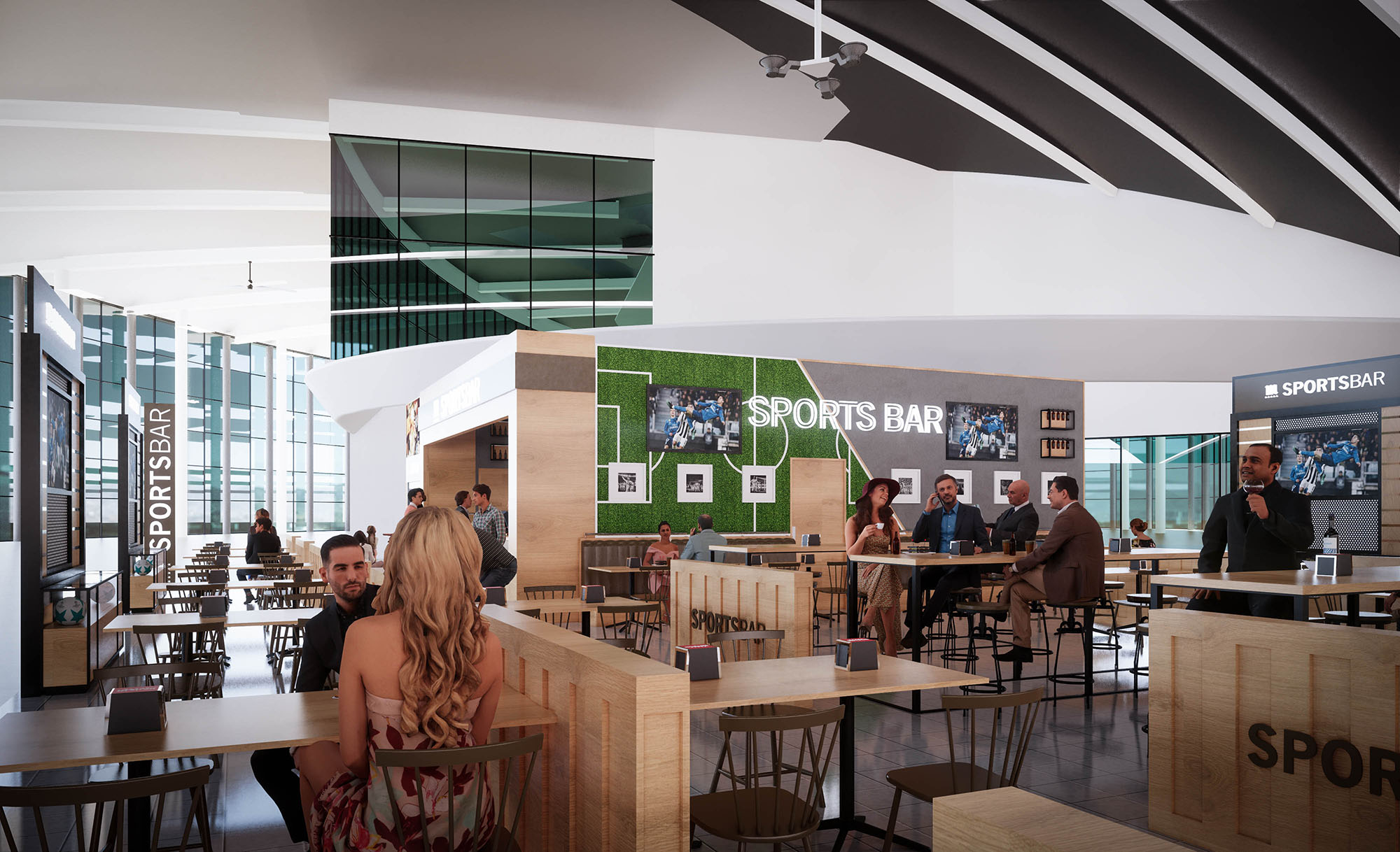
© 2021 by sanzpont [arquitectura] . Webpage by sanzpont [digital] . Innovative Digital Experiences
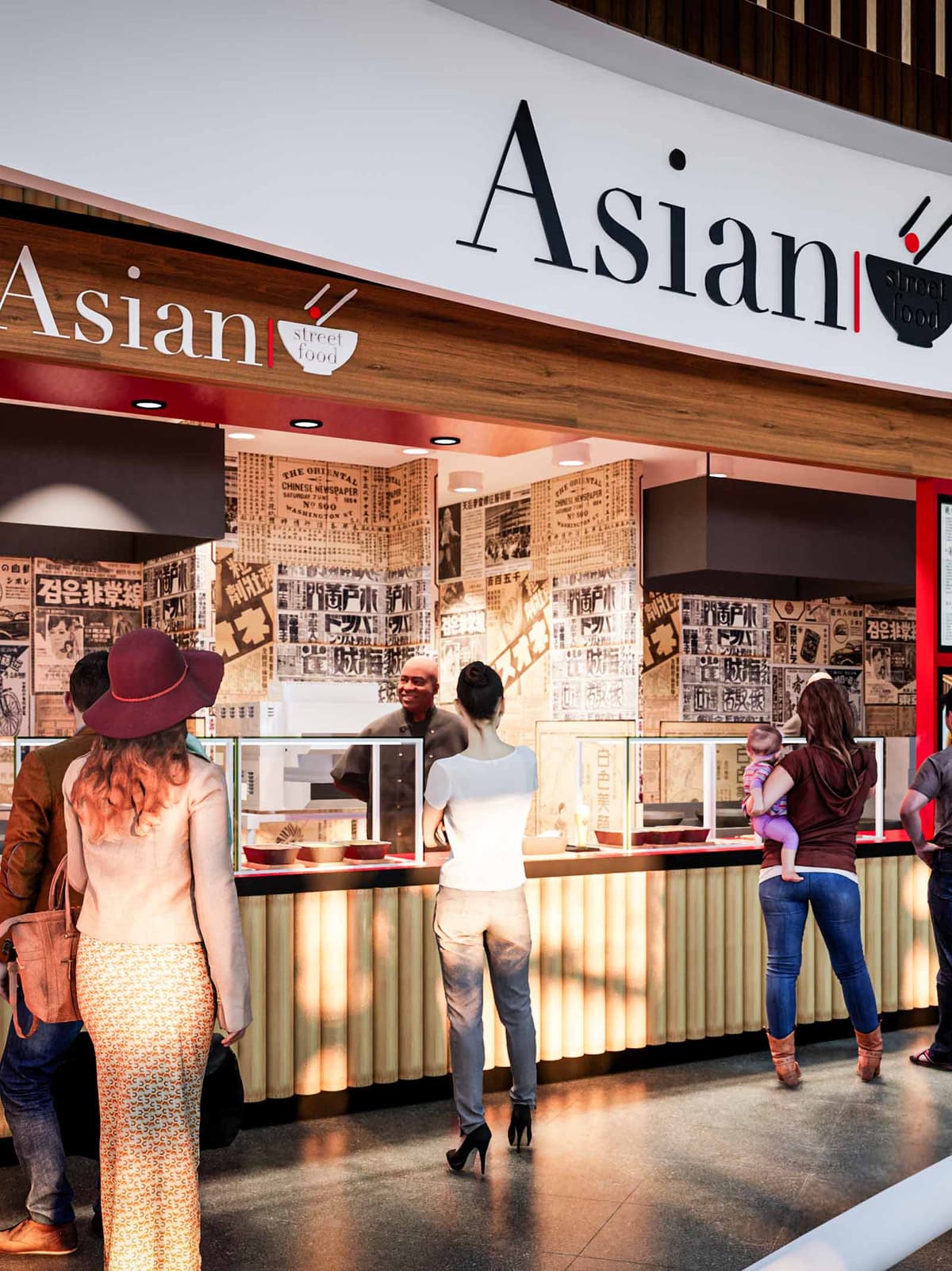

The Asian Street Food project in Los Cabos is conceived as a compact, contemporary interpretation of the bustling food alleys found across major Asian cities. The design translates the spontaneity and graphic intensity of street markets into a controlled, efficient retail module suitable for a high-traffic commercial environment. A clear, bold brand identity anchors the space, combining minimal architectural volumes with a rich visual narrative built from typography, texture, and light.
The concept balances immediacy and clarity: from a distance, the facade reads as a simple, legible storefront; at close range, layers of graphic detail and material warmth invite guests to explore the offer. The result is a stall that feels both urban and approachable, integrating seamlessly into the architectural context of Los Cabos while evoking a distinctly Asian atmosphere.
The layout is organized as a linear service counter with a clear front-of-house / back-of-house separation. Customers approach from the mall concourse along a straight trajectory, guided by the strong horizontal of the canopy and the extended counter line. This linear arrangement allows high throughput during peak hours while maintaining direct visual contact between staff and guests.
The service front is subtly articulated into ordering, preparation view, and collection zones, unified by continuous glazing that ensures hygiene without compromising interaction. Behind the counter, the working strip is planned as an efficient production line, with cooking, plating, and handover functions aligned to minimize backtracking. Vertical surfaces are fully utilized for storage, menu display, and brand communication, maximizing performance in a compact footprint.
The material palette blends warm woods, graphic wall treatments, and clean, durable surfaces. A wood-like soffit and fascia frame the storefront, introducing a natural tone that softens the otherwise graphic composition. The counter front features vertically ribbed elements that reference traditional bamboo stalls and rolling shutters, adding depth and shadow play along the base.
The back wall is wrapped in a collage of newspaper-inspired graphics and Asian typography, functioning as both a cultural backdrop and a dynamic textural surface. This monochrome base is punctuated by strategic accents of red, a color associated with energy and good fortune across many Asian cultures, and used here to highlight the brand logo, canopy underside, and select trim details. The countertop and floor employ darker, low-reflectance finishes to withstand heavy use and to visually anchor the lighter upper volumes.
Lighting is designed to emphasize both the freshness of the food and the vibrancy of the brand. Recessed downlights integrated into the canopy create a bright, even wash across the service line, eliminating shadows at the transaction point and enhancing the perception of cleanliness. The underside of the canopy, accented in red, reflects warm light onto the counter, subtly enriching skin tones and food colors.
Interior task lighting in the back-of-house is calibrated to higher lux levels to support precise preparation, while the guest-facing area maintains a warmer, more theatrical tone. The contrast between the illuminated graphics wall and the darker floor zone generates depth in a relatively shallow space, making the stall feel more immersive and visually engaging from the circulation areas.
The architectural envelope functions as an extension of the brand. The main signage utilizes an elegant, contemporary typeface with a simplified bowl-and-chopsticks icon, clearly communicating the culinary focus at a glance. The long, continuous sign band ensures visibility across the concourse, while the clean white background enhances legibility and contrasts with the wooden fascia.
At eye level, the wallpaper-like collage of Asian scripts and newspaper clippings evokes the layered visual culture of street markets, posters, and food stalls. This graphic layer is intentionally dense, creating a sense of authenticity and urban intensity without excessive physical ornamentation. The coordination between architectural elements and graphic design ensures that every surface contributes to storytelling, from the smallest label to the largest facade component.
The project prioritizes materials and systems that respond to both environmental and operational sustainability. High-traffic surfaces such as the countertop and flooring are specified in robust, easy-to-clean finishes to extend lifecycle and reduce the need for frequent replacement. Where possible, wood elements are designed to be realized in certified or engineered products, minimizing the use of solid timber while preserving a warm tactile quality.
Energy-efficient LED lighting is employed throughout, lowering energy consumption and maintenance costs while allowing precise control over color temperature and intensity. The compact footprint and linear equipment layout optimize ventilation and reduce unnecessary duct runs, contributing to more efficient HVAC performance. Finishes are selected with an emphasis on low-maintenance coatings and, where available, low-VOC products, supporting a healthier indoor environment for both staff and guests.
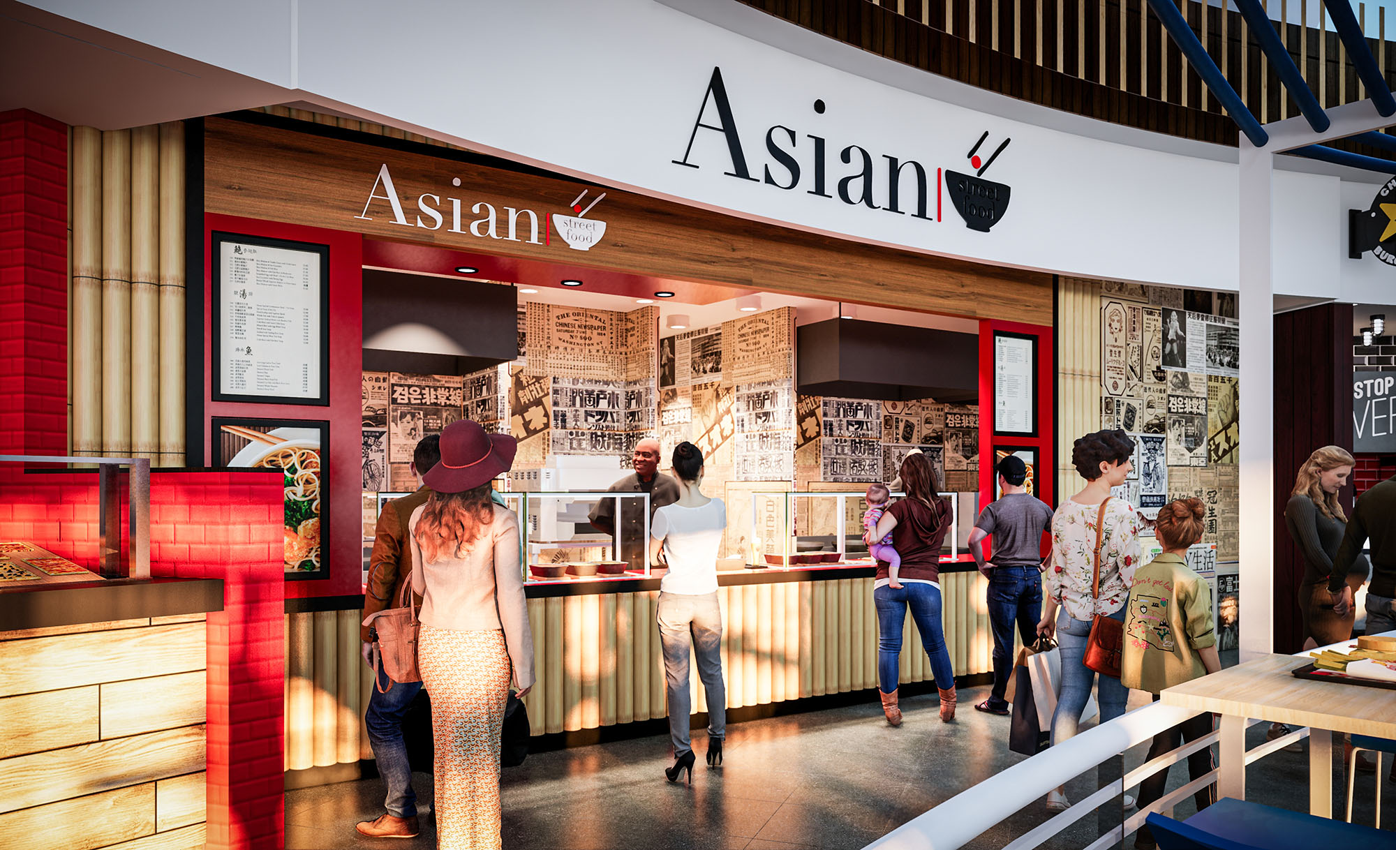
© 2021 by sanzpont [arquitectura] . Webpage by sanzpont [digital] . Innovative Digital Experiences

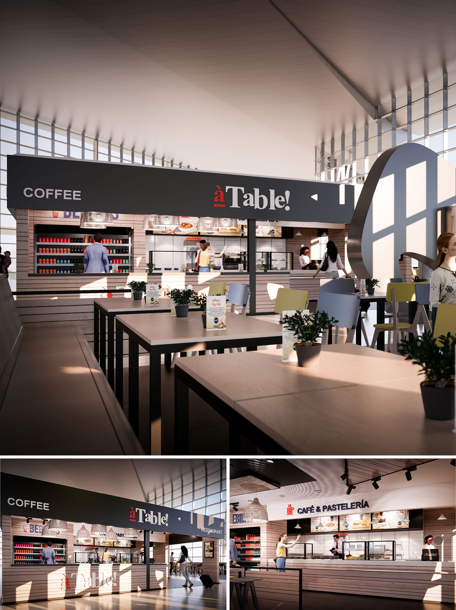
The “À Table” project is conceived as a contemporary food hall island within the dynamic context of Oporto’s airport. The design seeks to create a clear and recognizable identity in a high‑flow environment by using an iconic horizontal canopy and a strong graphic language. The architectural gesture is deliberately simple: a linear bar that organizes service, display and circulation, framed by a dark overhead band that acts as both sign and shelter.
The space balances efficiency and comfort, combining the rationality required for fast service with the warmth of a café atmosphere. The open layout promotes transparency between preparation areas and customers, reinforcing trust and visual connection with the food offer. The concept aims to be intuitively legible from a distance, guiding travelers quickly towards coffee, pastry and restaurant functions.
The project occupies a central island configuration, accessible from multiple sides, maximizing visibility within the terminal. The serving counter runs longitudinally, with self‑service and assisted service segments articulated along a continuous front. This linear strategy allows clear zoning of uses—coffee, pastry, hot meals—while preserving a single, unified image.
Customer seating radiates out from the counter in a gradient of densities. High tables closer to the service line support short stays, while standard tables and bench seating on the perimeter cater to longer meals. Circulation paths remain unobstructed, ensuring fluid movement of passengers with luggage. Vertical elements are minimized so that sight lines across the terminal remain open, preserving the spacious character of the existing architecture.
The material palette combines warm wood finishes with precise, graphic surfaces. Horizontal planes such as counters, cladding and tabletops use light-toned wood laminates that bring tactile warmth and a domestic sensibility, contrasting with the more technical environment of the airport. This wooden base is organized in horizontal slats, emphasizing continuity and reinforcing the linear geometry of the island.
The suspended fascia in dark grey acts as a visual anchor. It frames the brand name “À Table!” in high contrast white and red lettering, making the identity legible from long distances. Behind the counter, refrigerated displays and product shelving use neutral backgrounds that allow the color of packaged goods and menu imagery to stand out. Seating introduces soft accent tones—muted yellows and blues—to subtly energize the dining area without overwhelming the calm, natural base.
The lighting strategy leverages the abundant natural light of the terminal’s glazed façades. Daylight washes the seating area and counter fronts, creating shifting patterns of shadow across the slatted wood surfaces and enhancing their texture. The design ensures that fixtures remain visually light so as not to compete with the architecture of the terminal roof.
Artificial lighting is layered for clarity and comfort. Track-mounted spotlights highlight the food displays and menu boards, ensuring excellent legibility and color rendering. Over the counter, woven pendant luminaires introduce a softer, more domestic register, differentiating the dining zone from the surrounding concourses. Tabletop illumination is deliberately understated, avoiding glare while creating a warm, welcoming ambience suitable for both early-morning coffee and late-evening meals.
Furniture is designed to be robust, modular and easy to reconfigure according to operational needs. Tables adopt a simple rectangular geometry in laminated wood with fine, dark metal legs, which echo the structural language of the canopy above. This visual continuity between ceiling and floor elements reinforces the coherence of the concept while maintaining a light physical footprint.
Chairs and benches prioritize ergonomics and durability, using molded shells and metal frames suitable for intensive use. The presence of small potted plants on tables introduces a biophilic note, softening the perception of an otherwise highly functional travel environment. Menu holders and tabletop communication elements are carefully dimensioned to maintain visual order and to avoid clutter, supporting an intuitive user journey from approach, to ordering, to seating.
Sustainability is addressed through both material selection and operational efficiency. The predominant use of wood-based laminates and slatted cladding allows for components to be prefabricated, reducing on-site waste and facilitating disassembly or replacement over time. Furniture and counters are conceived as modular systems, enabling future reconfiguration without full demolition, extending the life cycle of the fit-out.
The design capitalizes on existing terminal daylight to minimize reliance on artificial lighting during daytime operation. High-efficiency LED fixtures, controlled in zones, allow light levels to be adjusted according to occupancy and natural light availability, reducing energy consumption. Finishes are chosen for durability and ease of maintenance, decreasing the need for frequent replacement. Where possible, recyclable components and low-VOC surface treatments are specified, contributing to better indoor environmental quality for staff and travelers alike.
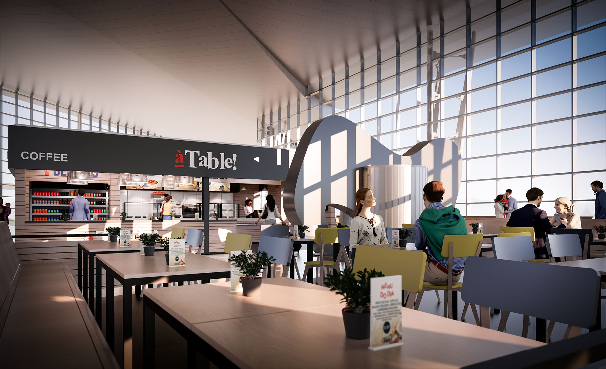
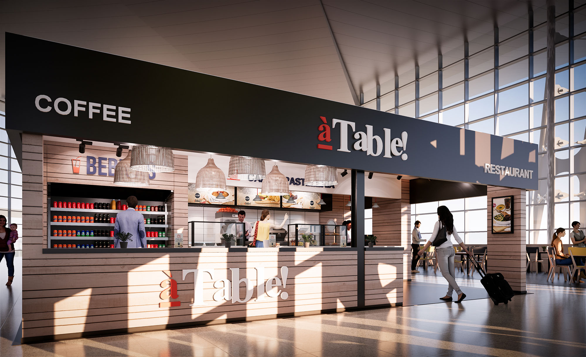
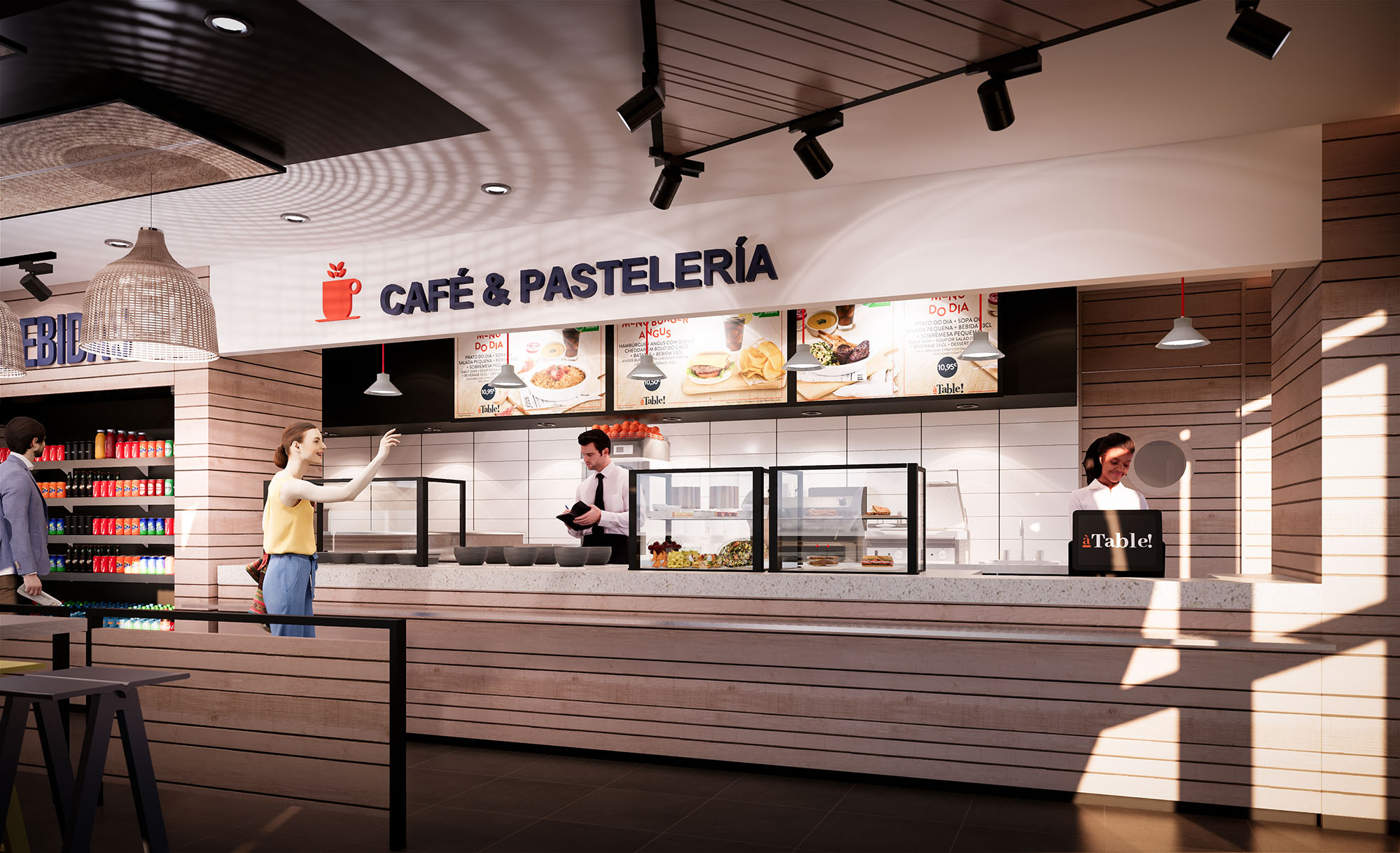
© 2021 by sanzpont [arquitectura] . Webpage by sanzpont [digital] . Innovative Digital Experiences

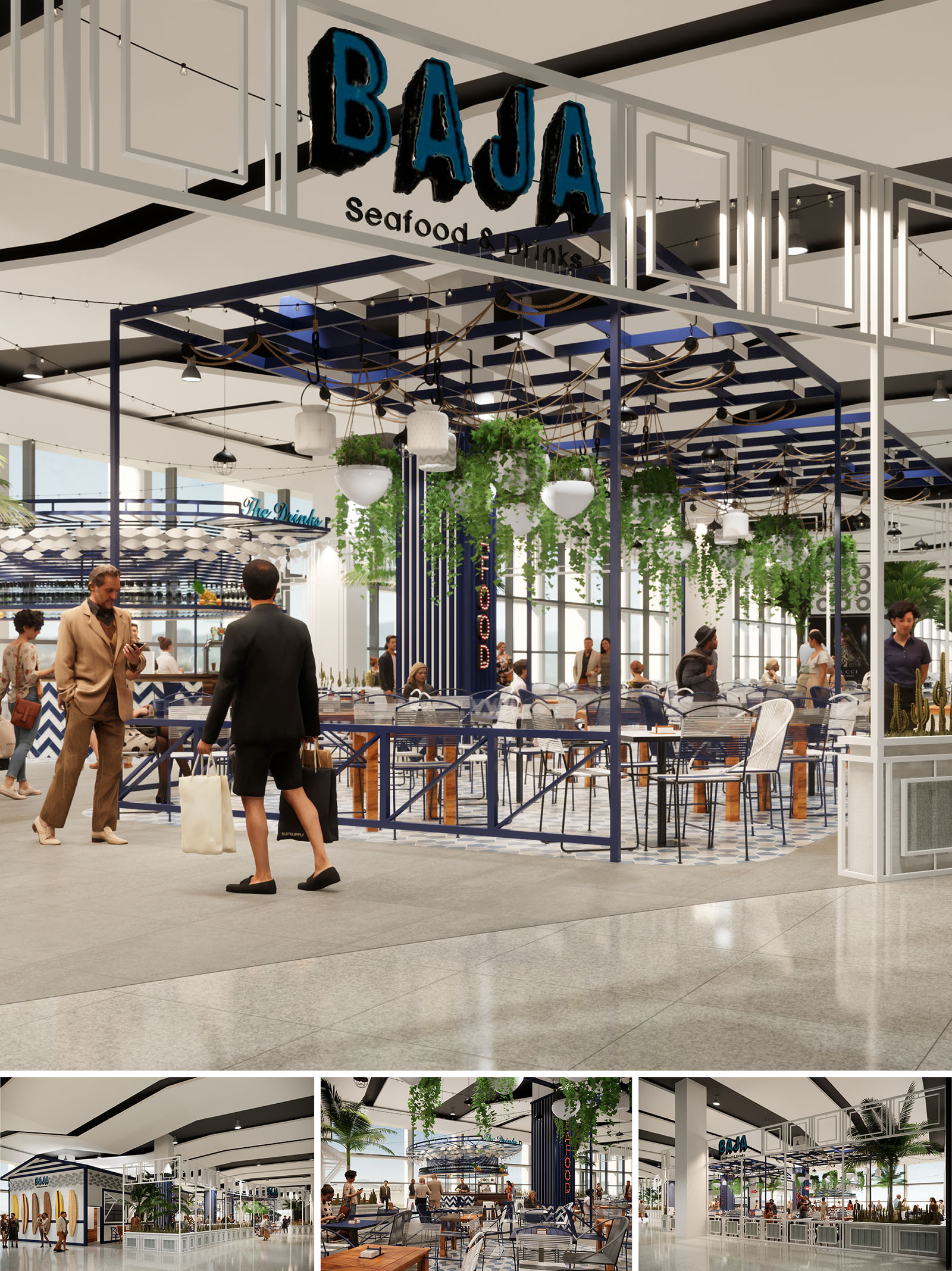
The concept for Baja Seafood & Drinks translates the relaxed coastal character of Los Cabos into a contemporary open-terrace restaurant inside a commercial environment. The design recreates the experience of an outdoor marina pavilion, using a light steel framework, hanging greenery and nautical details to define a permeable architectural envelope without closing off the visual continuity of the mall. The space is conceived as a social pier: a place where flows converge, people pause, and gastronomy becomes the central attraction.
The project draws from the chromatic and textural language of the Baja California seafront: deep ocean blues, crisp whites and warm wood accents. These elements are orchestrated to evoke freshness and informality while maintaining a clear, graphic identity that is easily perceived from a distance and supports strong brand recognition.
The restaurant occupies a corner plot within the shopping center, working as an island accessible from all sides. A metal perimeter railing with diagonal braces subtly demarcates the dining area while preserving full transparency to adjacent corridors. This low boundary frames a raised platform that functions as a stage for the dining experience, enhancing visibility of the interior activity.
Central circulation is organized on an axial layout that directs guests from the main signage element at the entrance towards the bar and food counter at the back. Seating clusters alternate between two- and four-top tables, with higher communal tables near the perimeter to activate the edge and encourage interaction with the passing public. The plan ensures clear paths for staff movement and service, separating guest flows from operational routes without resorting to solid partitions.
A lightweight steel pergola system defines the overhead plane, painted in a deep navy blue that anchors the composition. This structure carries an arrangement of suspended luminaires, string lights and hanging planters, generating a rhythmic ceiling landscape that visually lowers the scale and creates a more intimate atmosphere within the large mall volume. The beams are aligned with floor patterns to reinforce directional cues and segmentation of areas.
Lighting is layered: functional downlighting from integrated fixtures is complemented by warmer decorative pendants and festoon lights, evoking evening ambience at a seaside promenade. This combination allows flexible scene-setting depending on time of day and commercial needs while optimizing energy consumption through zoning and dimming controls.
The palette is intentionally concise to convey a clear, memorable identity. Blue and white dominate the vertical and horizontal surfaces, expressed through painted steel, ceramic tiles and printed graphics. Chevron and wave-inspired patterns on cladding and bar fronts reference maritime motifs without resorting to literal decoration, maintaining a contemporary aesthetic.
Seating combines metal frames with light finishes and wood-toned stools that introduce warmth into the predominantly cool palette. Transparent and perforated chair backs keep visual mass low, contributing to the sense of openness. The main “BAJA” signage employs bold typography and a textured, hand-painted effect that suggests artisanal character aligned with fresh, local seafood.
The interior atmosphere aims to evoke an outdoor terrace protected by shade structures. Natural light from the mall’s glazing enters unobstructed, while the overhead pergola and greenery filter and soften the brightness. Hanging plants and isolated palms provide vertical softness and a biophilic component that contrasts with the precise geometry of the metal framework.
Acoustic comfort is enhanced by the combination of plants, furniture upholstery and people density, helping to diffuse sound in an otherwise hard-surfaced mall environment. Visual permeability in all directions encourages spontaneous visits, while clearly readable zones—bar, dining, waiting—facilitate intuitive wayfinding and reduce the need for signage within the interior.
The project integrates sustainability primarily through material selection, efficient systems and long-term flexibility. Metal structures and railings are designed for modular assembly and potential reconfiguration, extending the life cycle of the components and minimizing waste in future adaptations. Finishes prioritize durable, low-maintenance surfaces suitable for high-traffic hospitality use, reducing replacement frequency.
LED lighting throughout, combined with programmable controls, significantly lowers energy consumption compared with conventional restaurant setups. The open design maximizes the use of existing mall climate control and daylight, reducing the need for additional mechanical equipment. Botanical elements not only improve perceived air quality and user well-being but are specified from species adapted to indoor environments in the local climate, limiting irrigation and maintenance demands. The project thereby aligns a strong, site-specific coastal identity with responsible, resource-conscious operation.
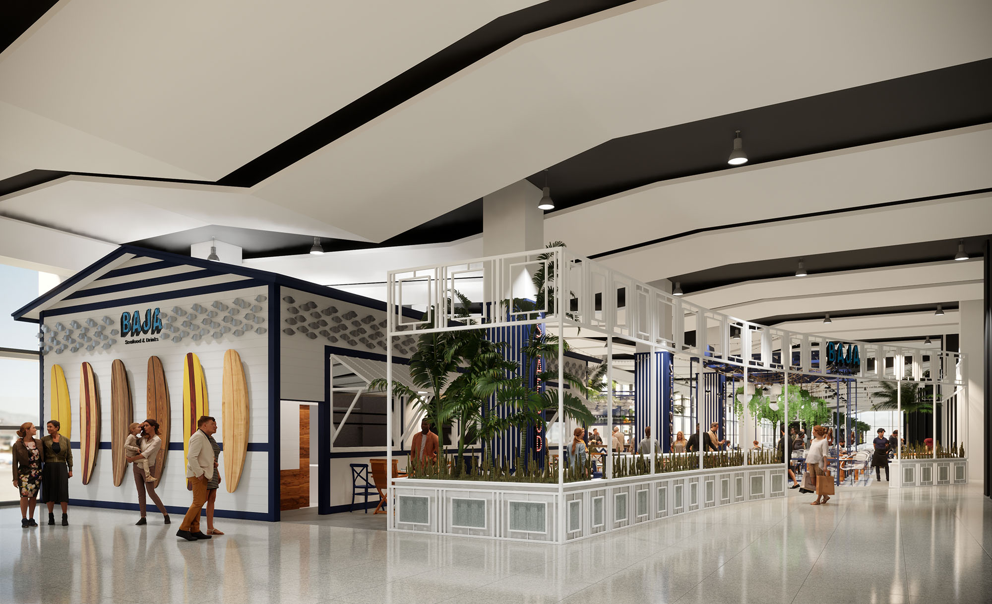
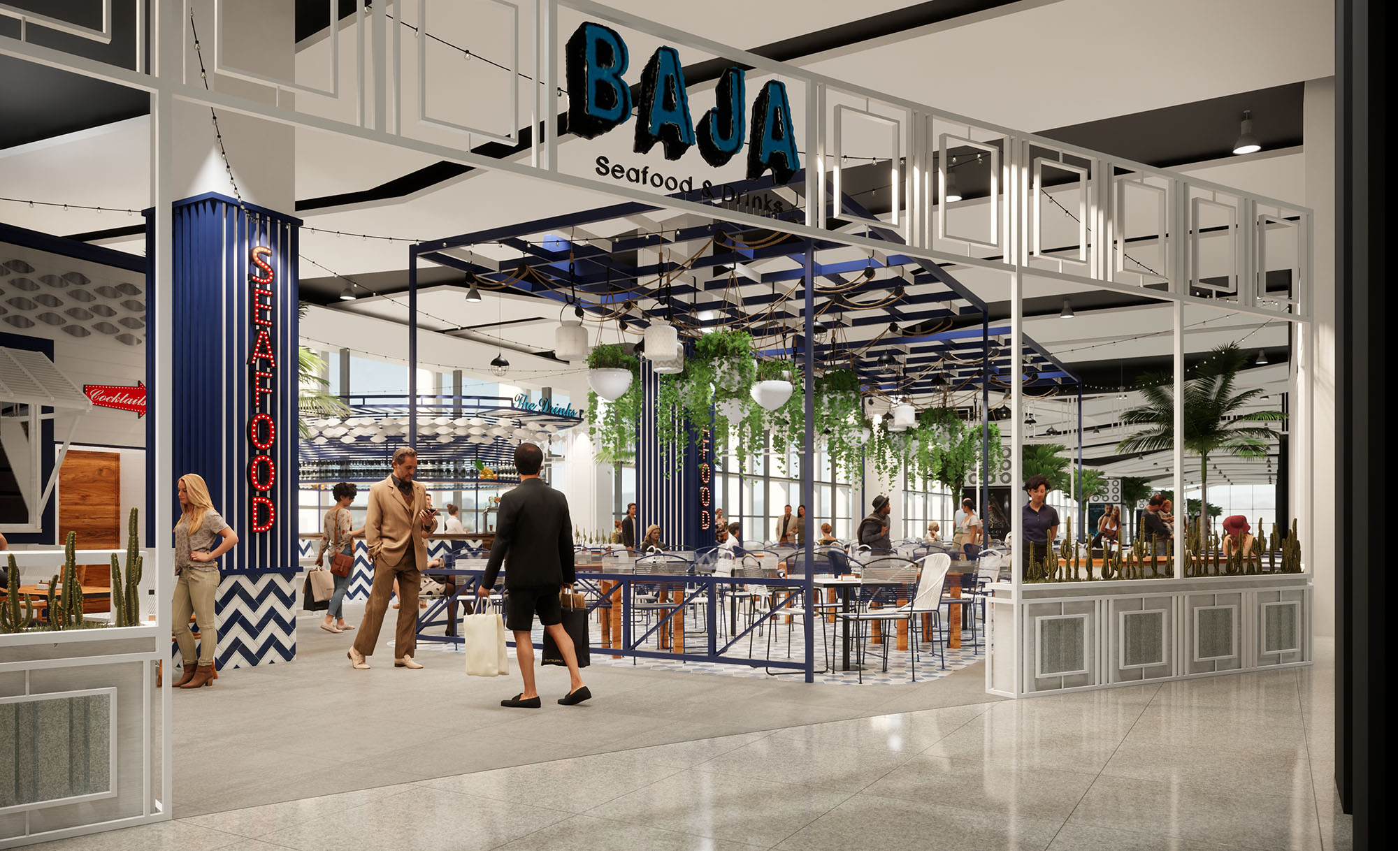
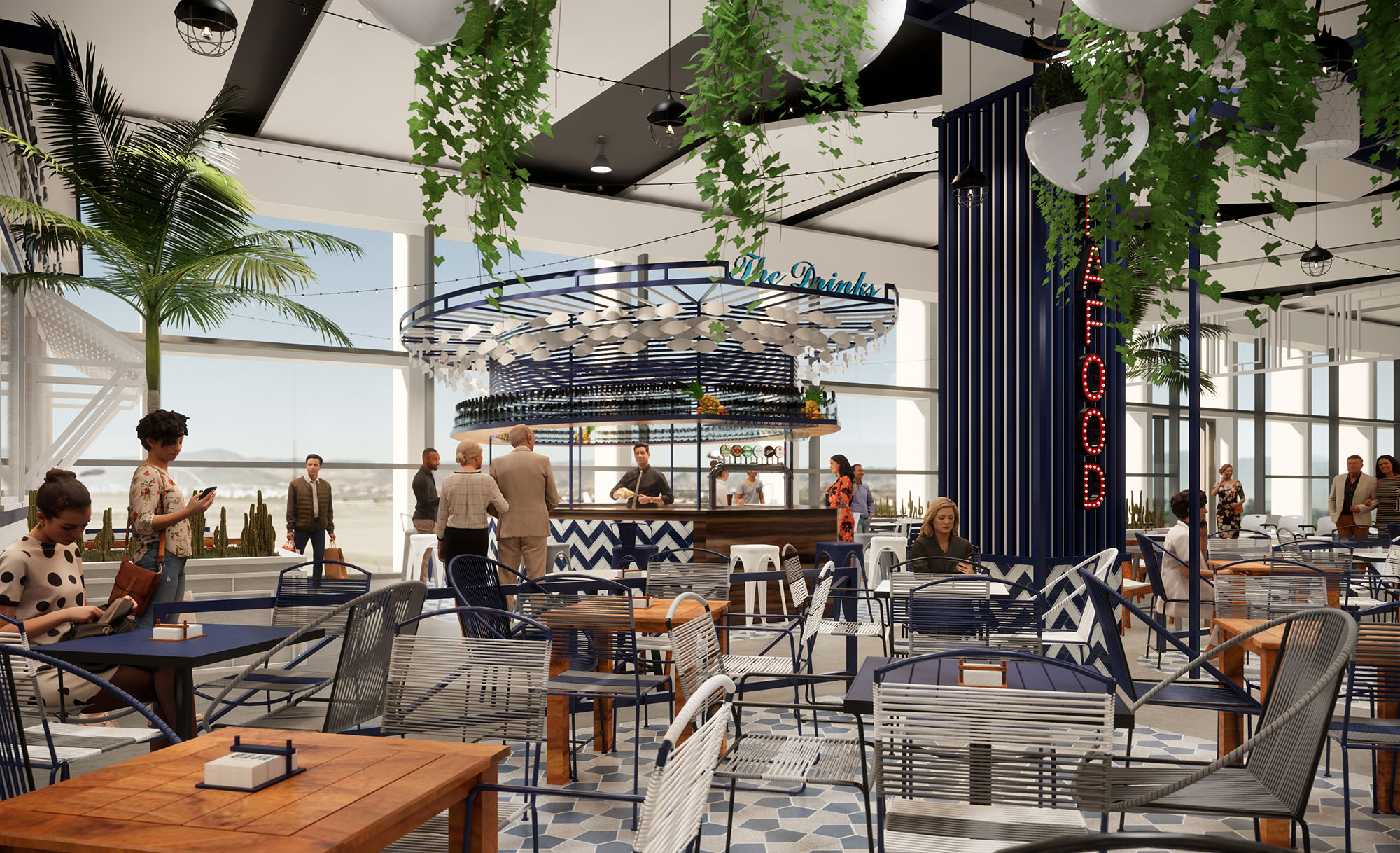
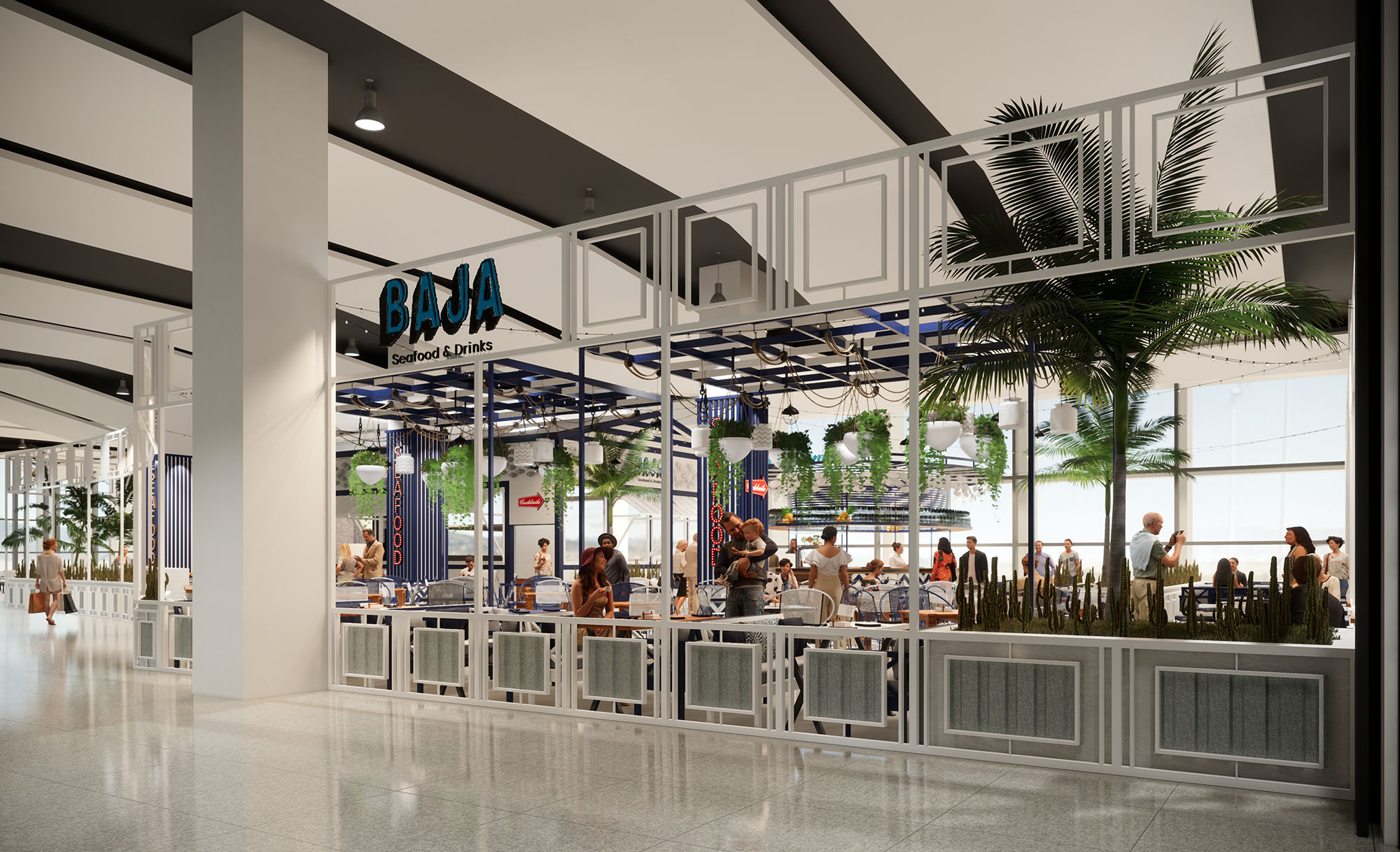
© 2021 by sanzpont [arquitectura] . Webpage by sanzpont [digital] . Innovative Digital Experiences

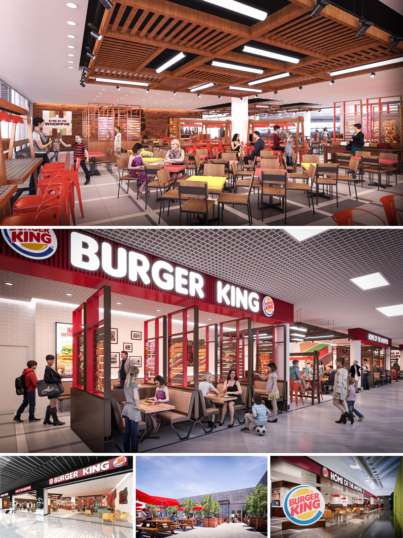
The Burger King restaurants in Spain and Portugal are conceived as contemporary urban eateries that translate the brand’s identity into a warm, approachable architectural language. The design moves away from purely standardized fast‑food imagery to create spaces that feel like everyday social hubs, combining robust materials, graphic clarity and flexible seating to accommodate families, groups of friends and individual diners. The concept emphasizes openness and visual permeability, inviting passersby to intuitively understand the interior atmosphere from the exterior frontage.
The scheme incorporates a consistent visual vocabulary across all 11 locations, yet allows for local adaptation. Outdoor terraces, mall units and stand‑alone restaurants share a common palette of wood, metal and brand colors, but each site negotiates its own context through specific façade treatments, lighting strategies and spatial layouts.
The plan is structured around a central dining field, framed by the service counter, kitchen block and perimeter seating. Circulation is deliberately fluid: clear axial views guide customers from the entrance to the order point and then to the seating area, minimizing crossflows and congestion. The main dining room uses a grid of tables and chairs to maximize capacity while still enabling straightforward reconfiguration for different peak‑hour patterns.
Perimeter booths and semi‑enclosed niches provide more intimate zones, using low partitions, glazed screens and suspended elements to create subtle boundaries without sacrificing transparency. In mall locations, the storefront opens almost entirely to the gallery, extending the interior visually and functionally into the public concourse. Outdoor restaurants feature generous terraces with picnic‑style tables, creating an intermediate zone between street and interior and reinforcing the brand’s informal, communal character.
The material palette balances industrial robustness with domestic warmth. Timber—both in solid elements and high‑pressure laminates—is used on ceilings, wall cladding and furniture to soften the atmosphere and counteract the hard surfaces typical of high‑traffic environments. Steel structures, painted metal chairs and exposed ceiling components introduce an urban loft sensibility, while ceramic and porcelain floor tiles ensure high durability and ease of maintenance.
The color strategy is anchored in the brand’s red, deployed in controlled accents across façades, framing elements, chairs and graphic bands. This is contrasted with neutral greys, off‑white tiles and natural wood tones, allowing the vivid hues to remain legible without overwhelming the space. Occasional yellow tabletops and graphic panels add a playful note, enhancing the perception of light and energy, especially in deep interior mall units.
The lighting design integrates linear LED fixtures with decorative elements to articulate different spatial layers. In several units, wooden slatted ceiling canopies host recessed linear luminaires, generating a rhythm that both defines the dining field and visually lowers the scale in tall retail envelopes. Track lighting is selectively used to accent feature walls, menu boards and brand graphics, supporting wayfinding and merchandising.
Uniform ambient lighting in the public areas is calibrated to avoid glare while ensuring a bright, safe environment suited to family use. In contrast, booths and perimeter zones receive slightly warmer and more focused lighting, creating a sense of comfort and encouraging longer stays. Outdoor terraces rely on a combination of façade lighting, low‑glare fixtures and natural daylight, extending the usability of these spaces throughout the day and evening.
Architectural and graphic elements are closely coordinated to reinforce the Burger King identity without resorting to excessive signage. Large illuminated logotypes and red cornices define the storefronts, acting as beacons within busy shopping centers. Inside, wall graphics, framed imagery and typography narrate the brand’s association with flame‑grilling and casual enjoyment, turning otherwise blank surfaces into storytelling devices.
Glazed partitions with colored mullions, branded feature walls near the counter and distinctive furniture silhouettes function as spatial markers. These components allow guests to recognize the brand immediately while still experiencing each location as a specific place rather than a generic outlet.
Sustainability is addressed through a combination of material selection, energy performance and operational planning. Priority is given to long‑life finishes such as high‑durability tiles, laminates and powder‑coated metals, reducing the frequency of replacement and associated waste. Timber elements are specified, where possible, from certified sources, and modular furniture systems facilitate repair and reuse across the 11 restaurants.
Energy‑efficient LED lighting, optimized lighting control and the use of natural light in street‑front and terrace areas contribute to reduced energy consumption. Compact kitchen footprints and rational back‑of‑house circulation support efficient workflows, which in turn minimize idle equipment time and energy waste. Trash and recycling areas are integrated into the layout to encourage proper waste segregation, while outdoor landscaping in terrace locations introduces shade and improves microclimate conditions for guests, further diminishing reliance on mechanical cooling.
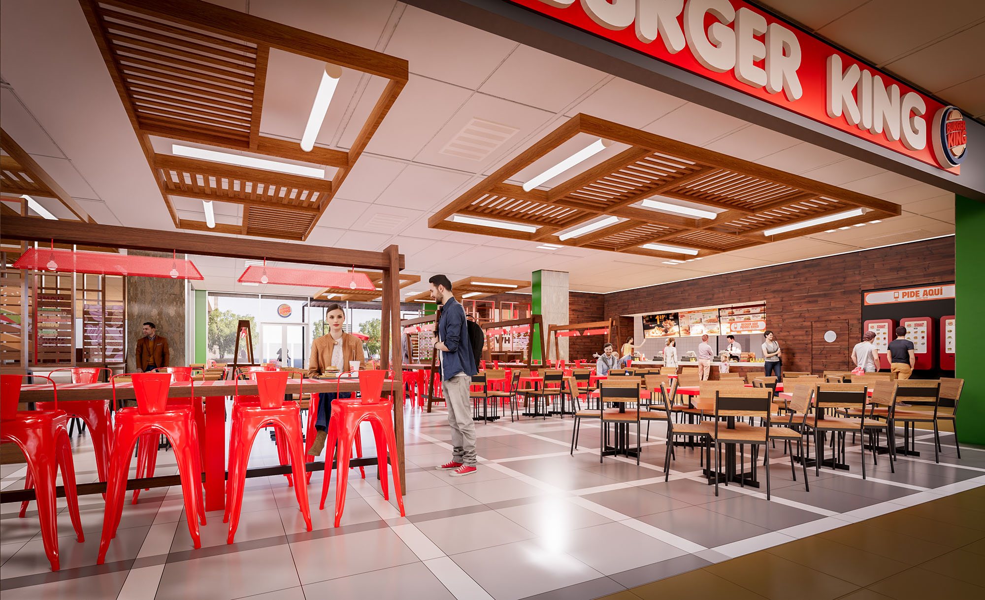
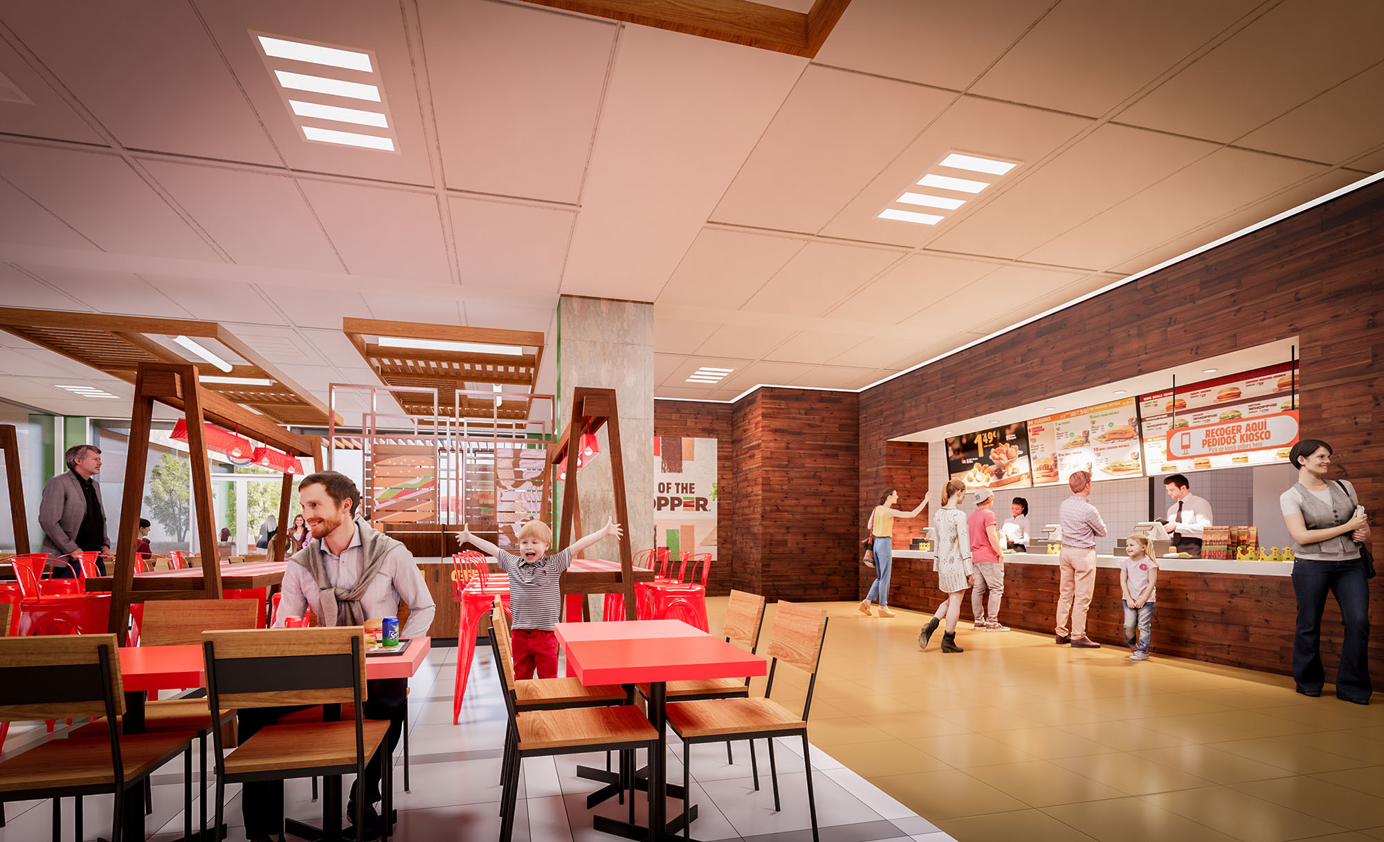
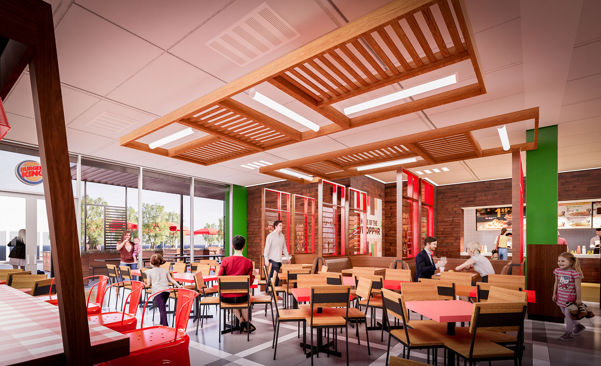
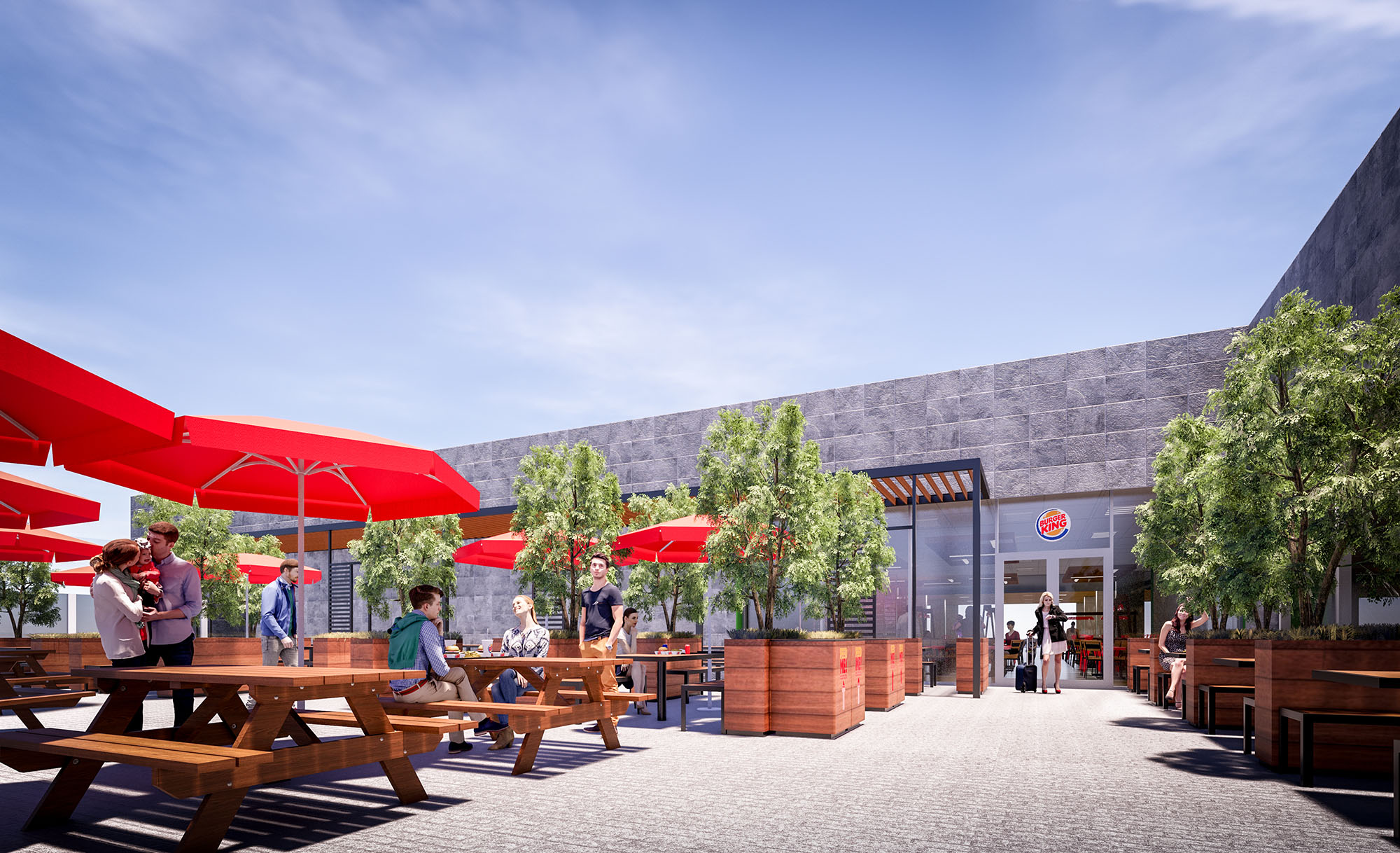
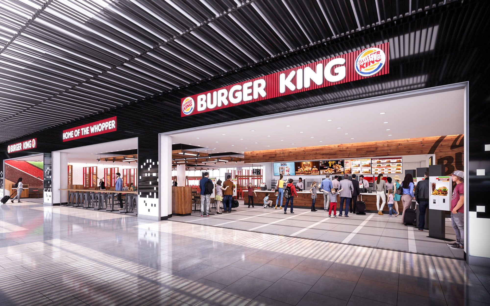
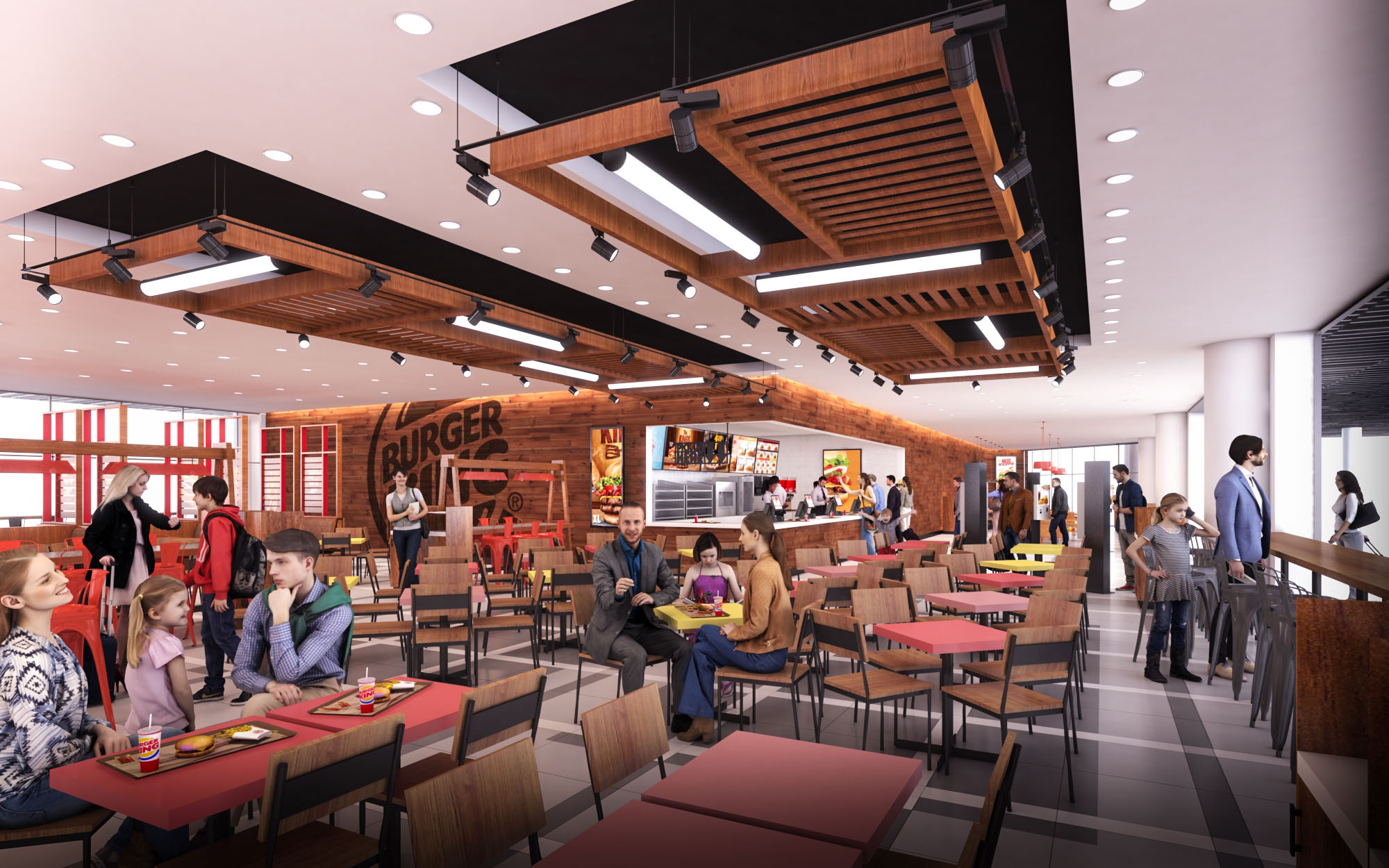
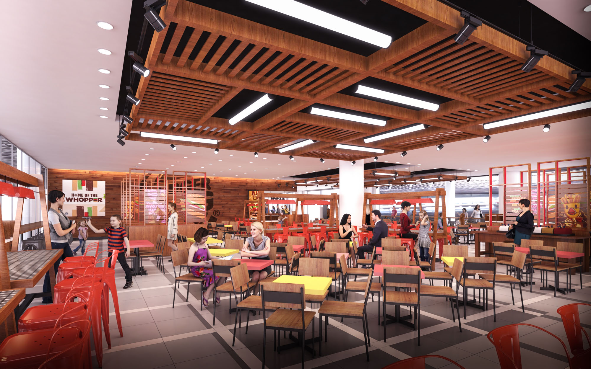
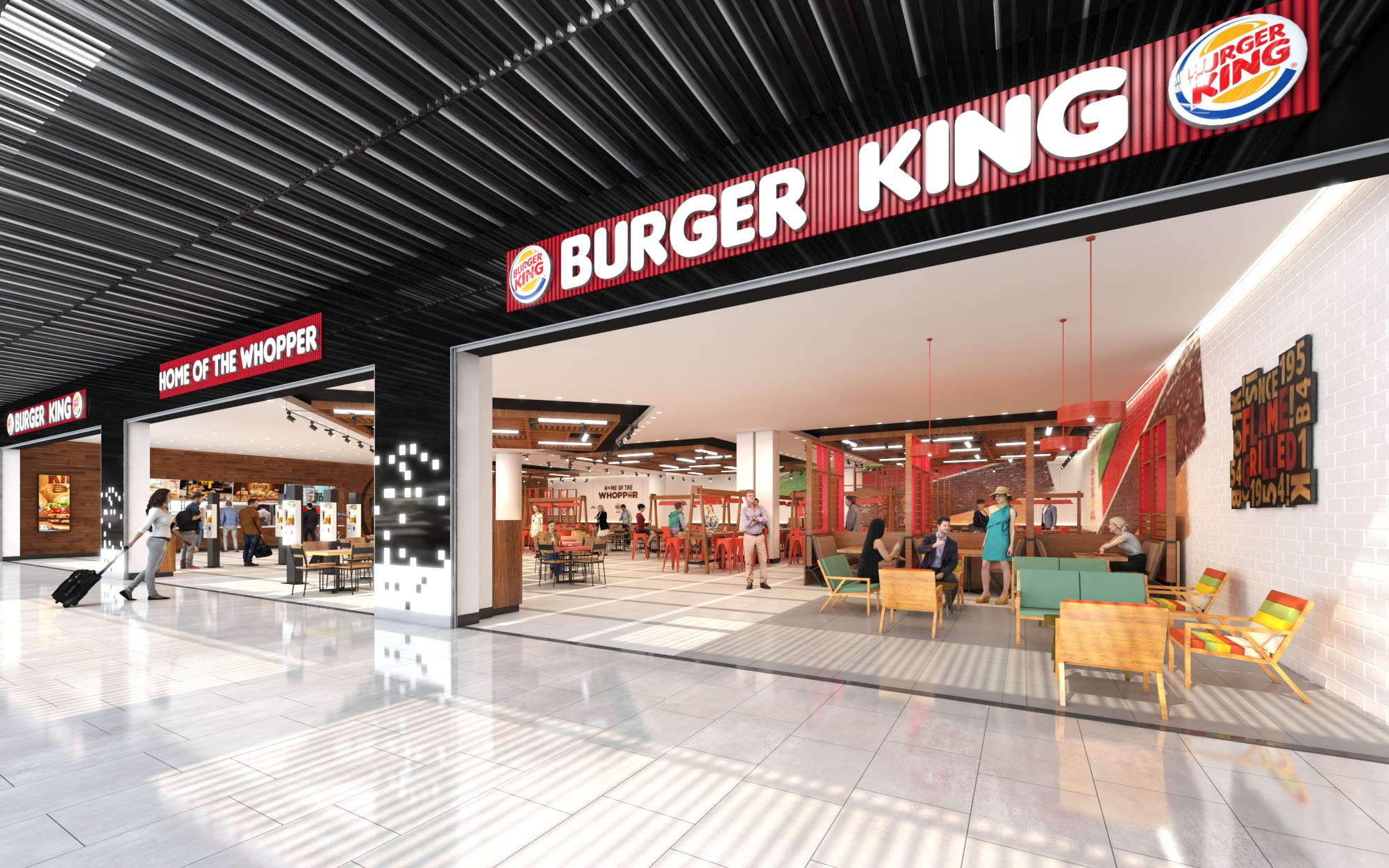
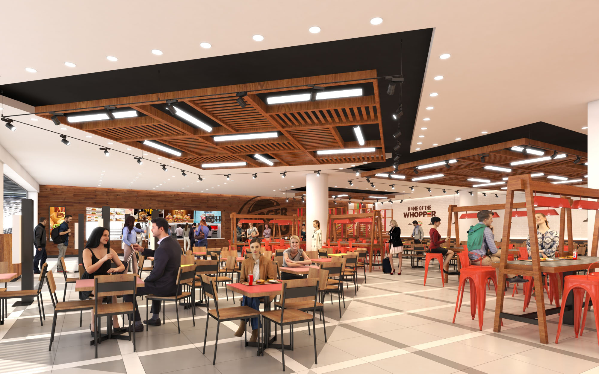
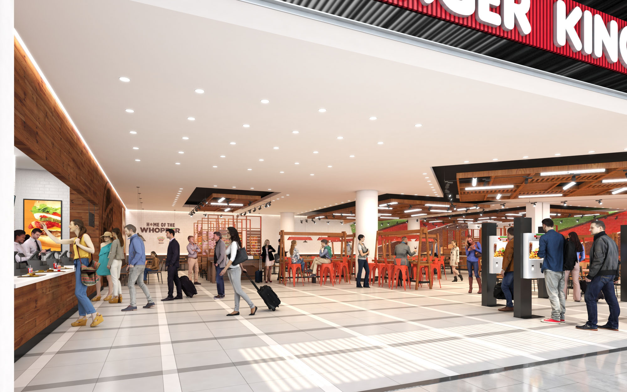
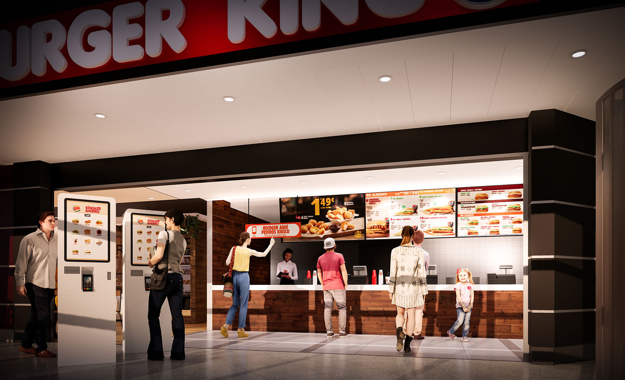
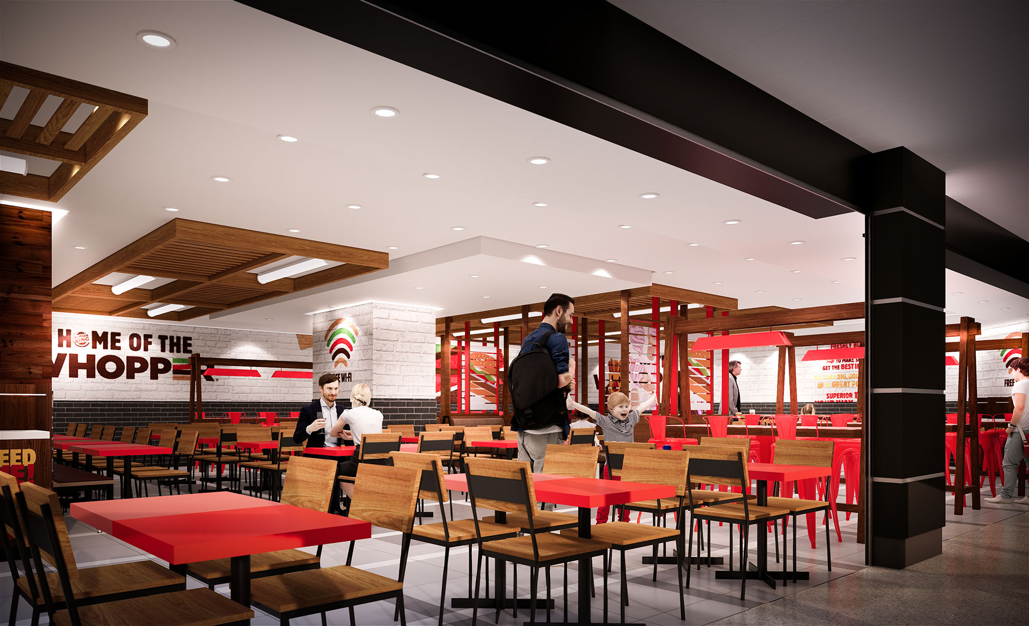
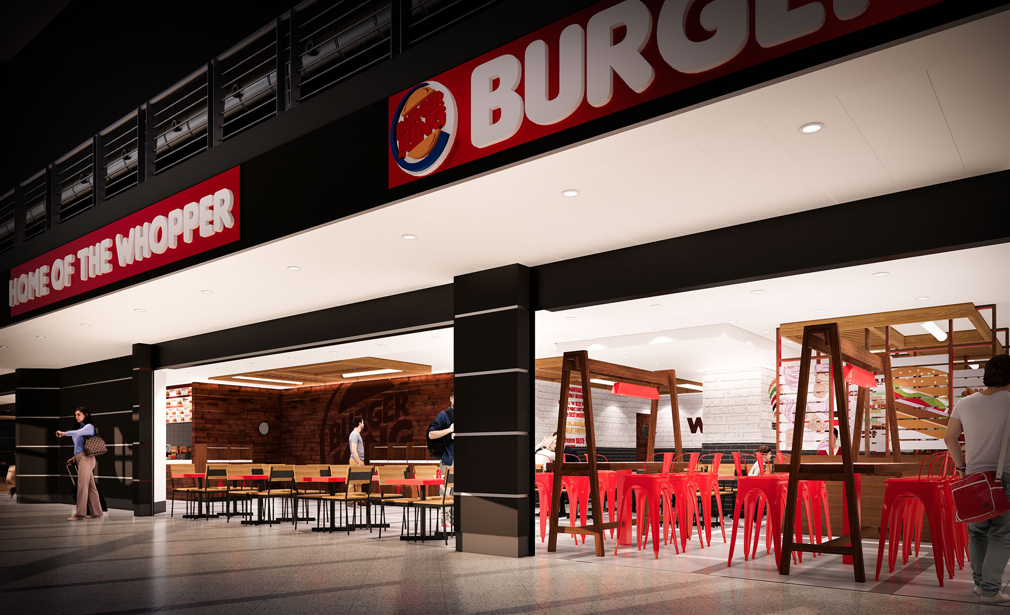
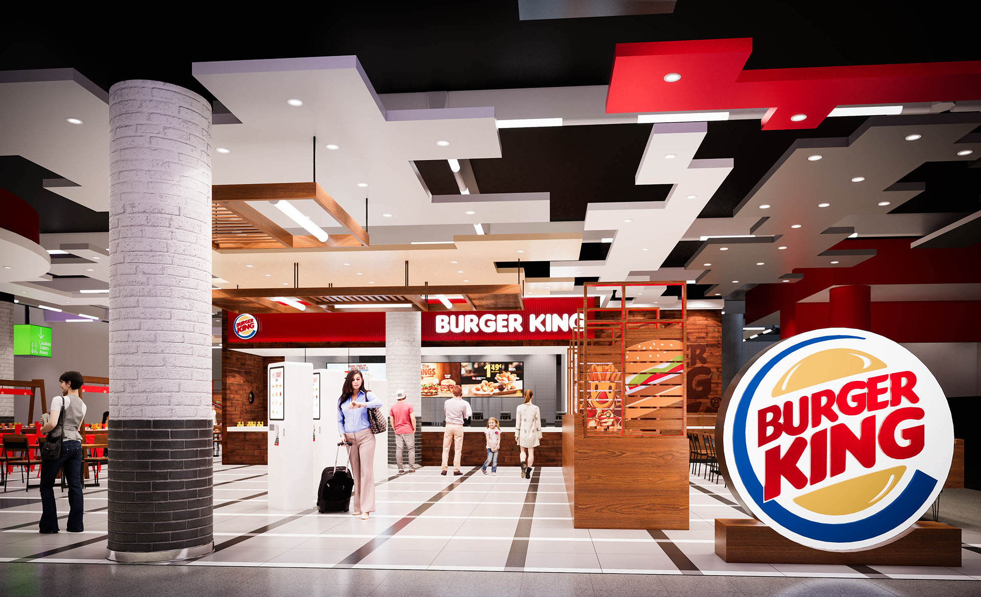
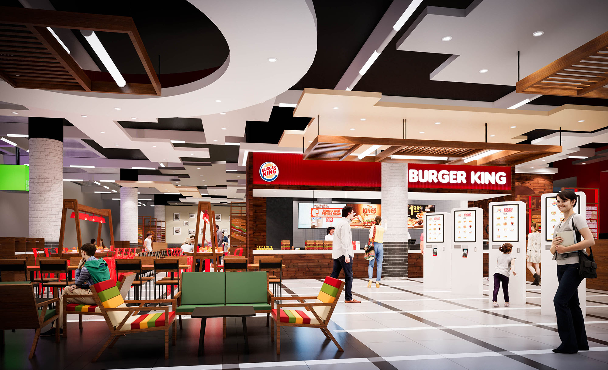
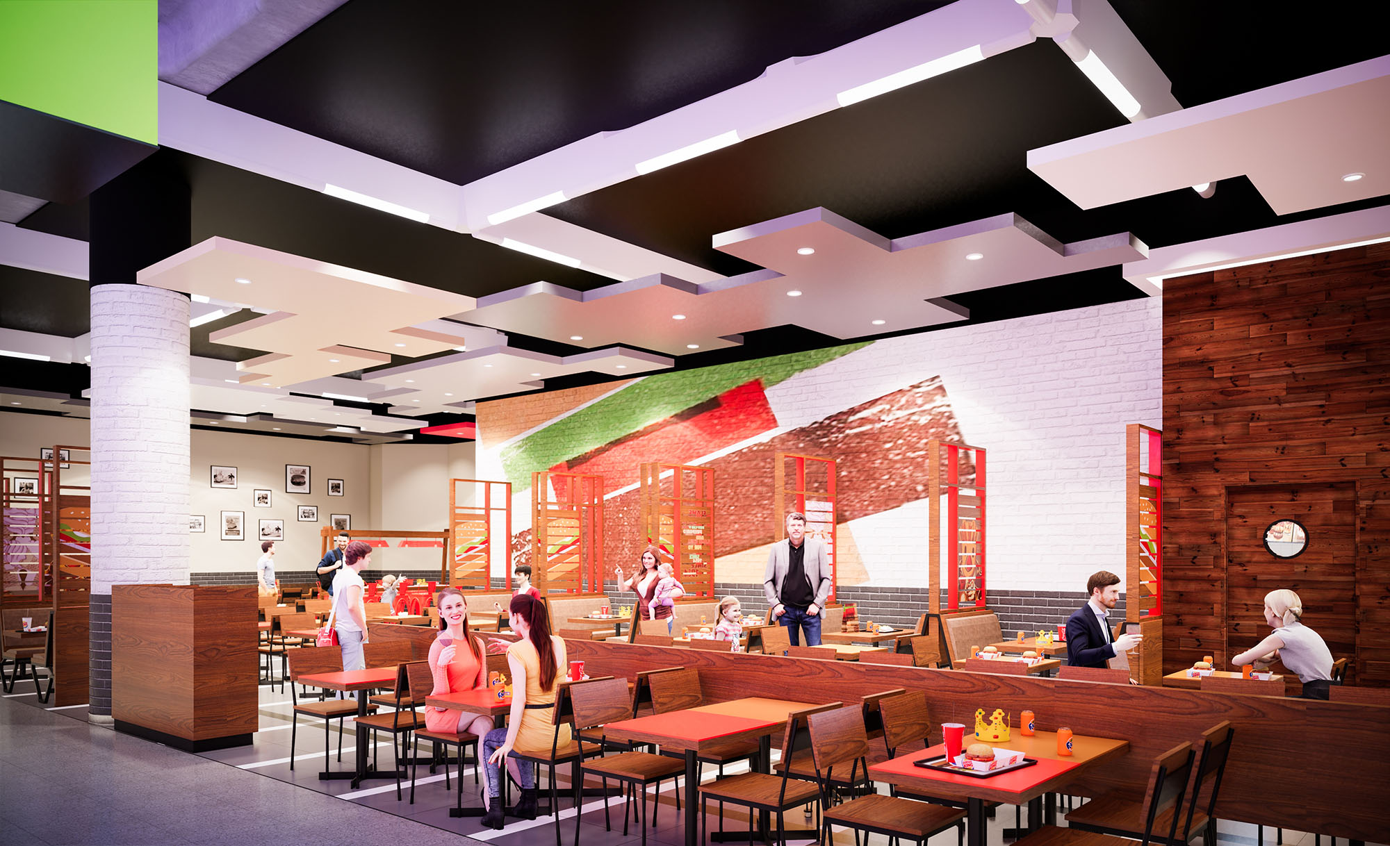
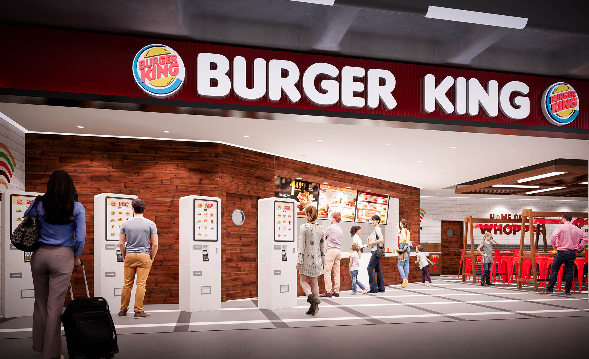
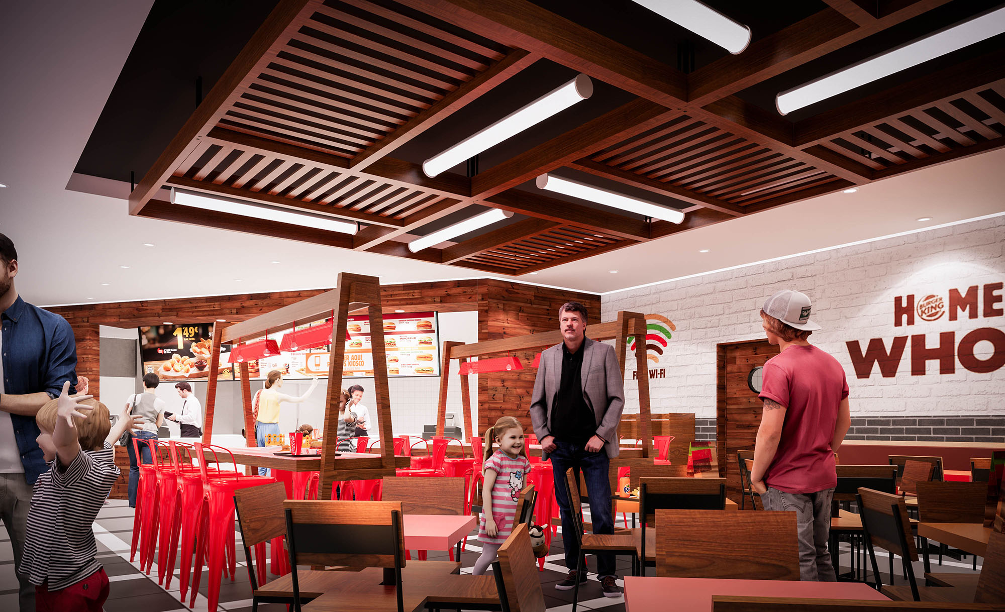
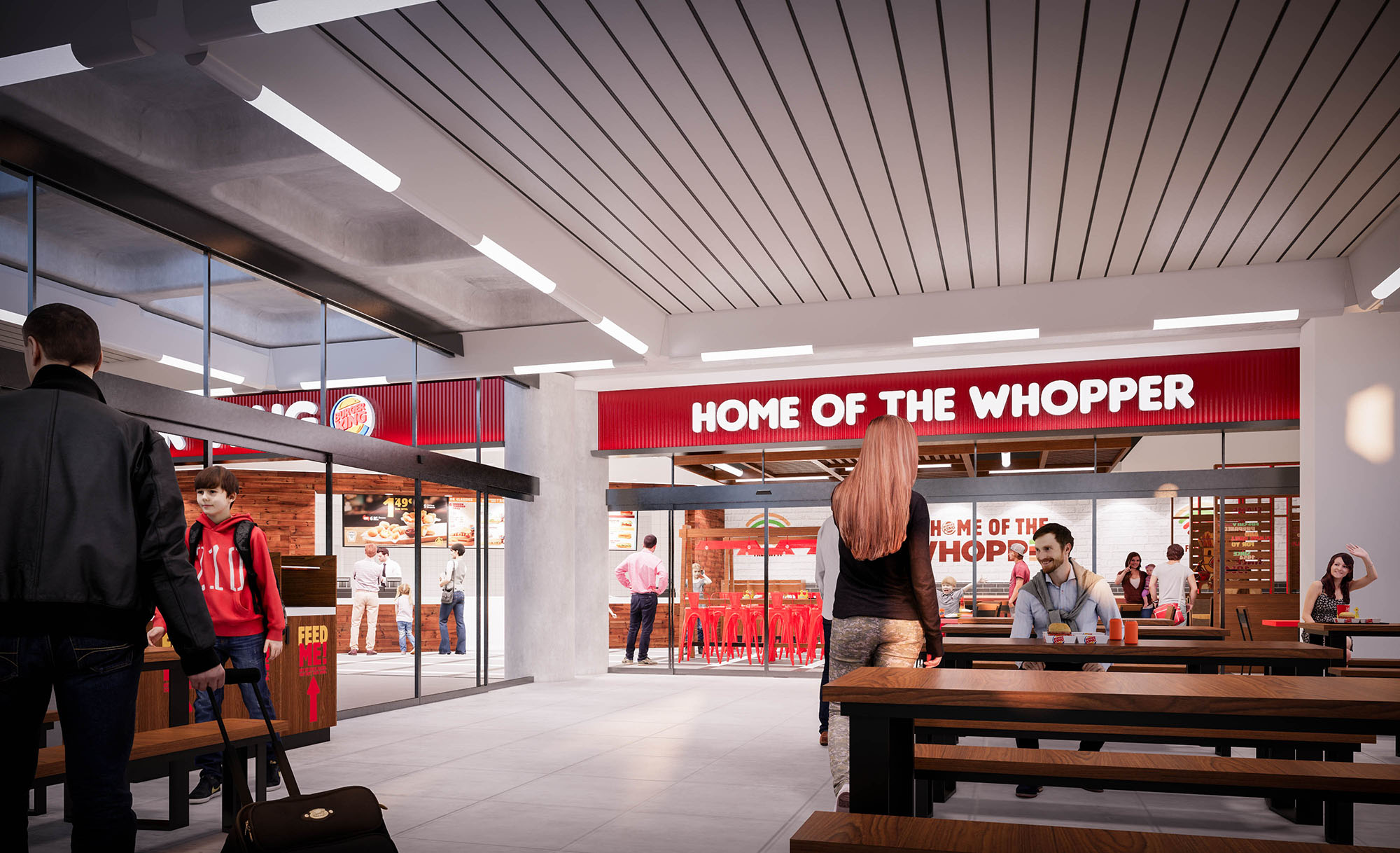
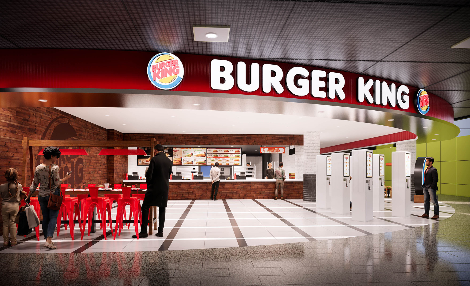
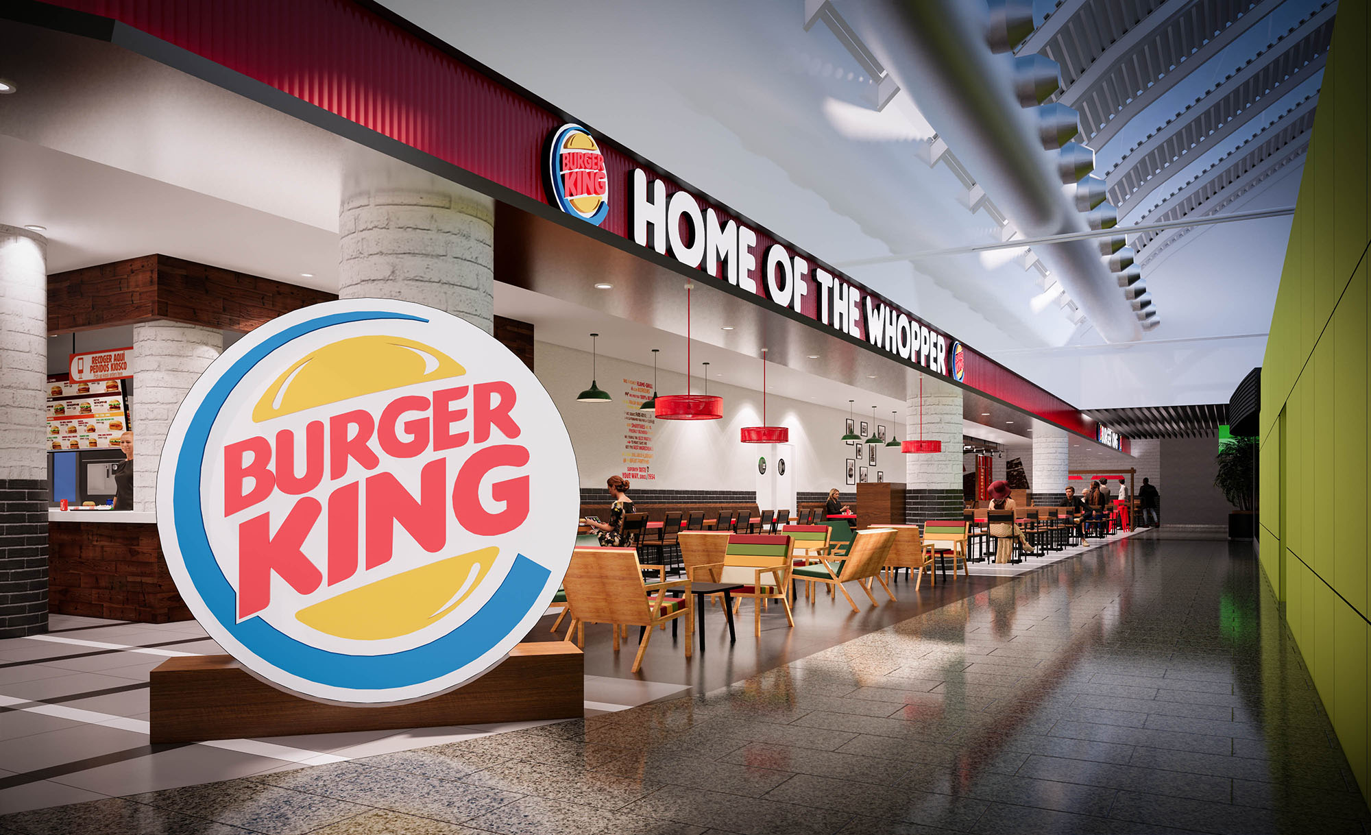
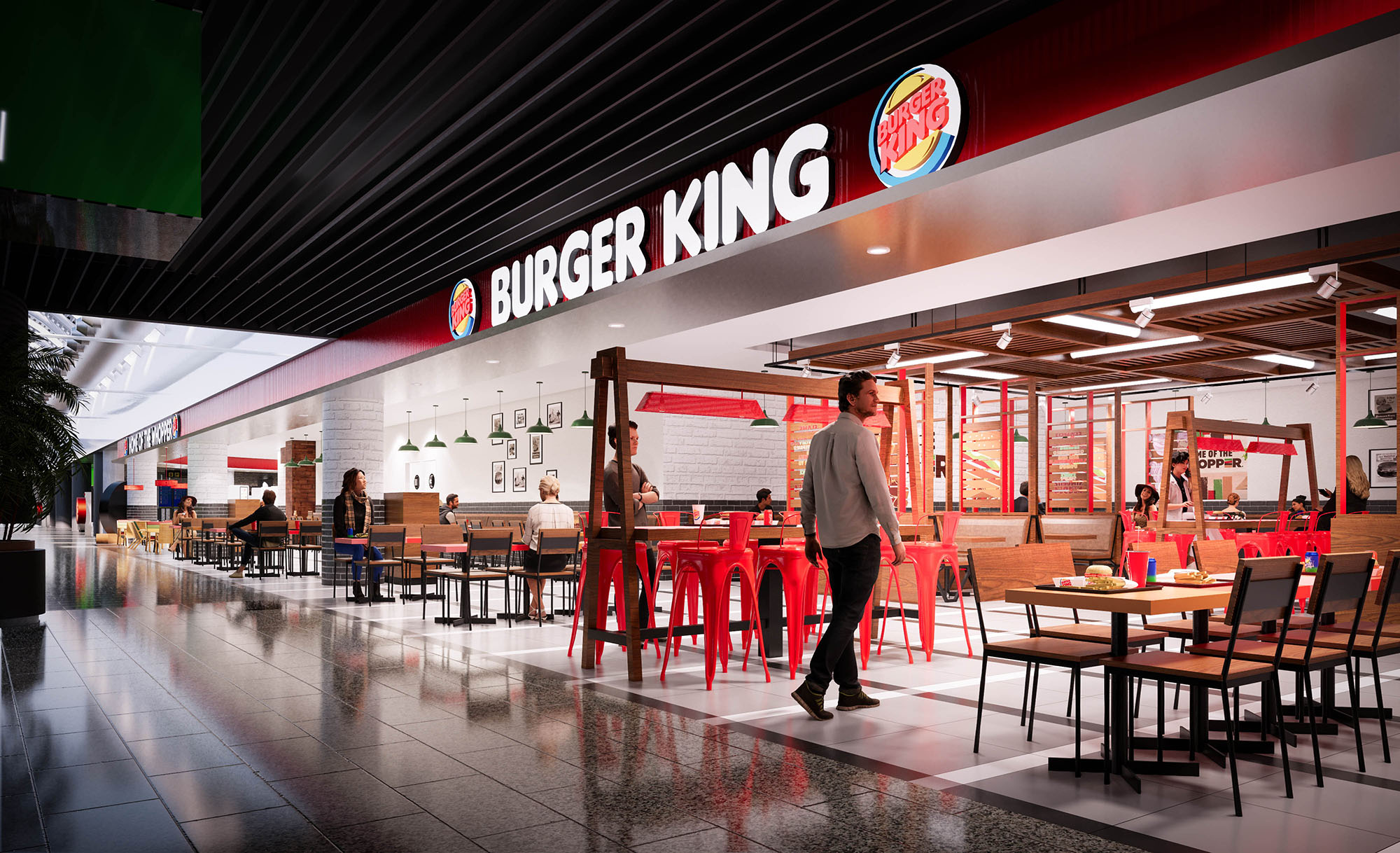
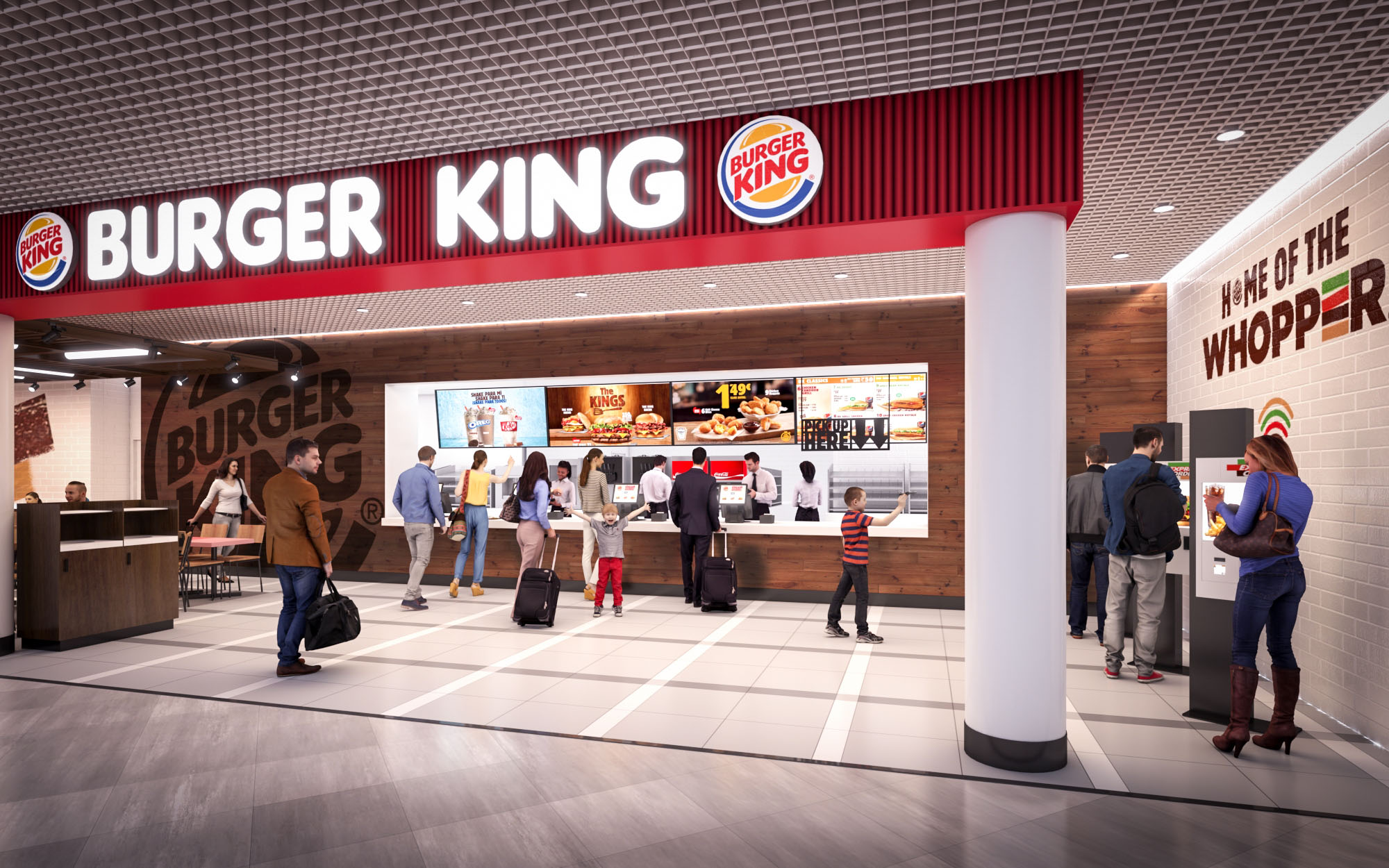
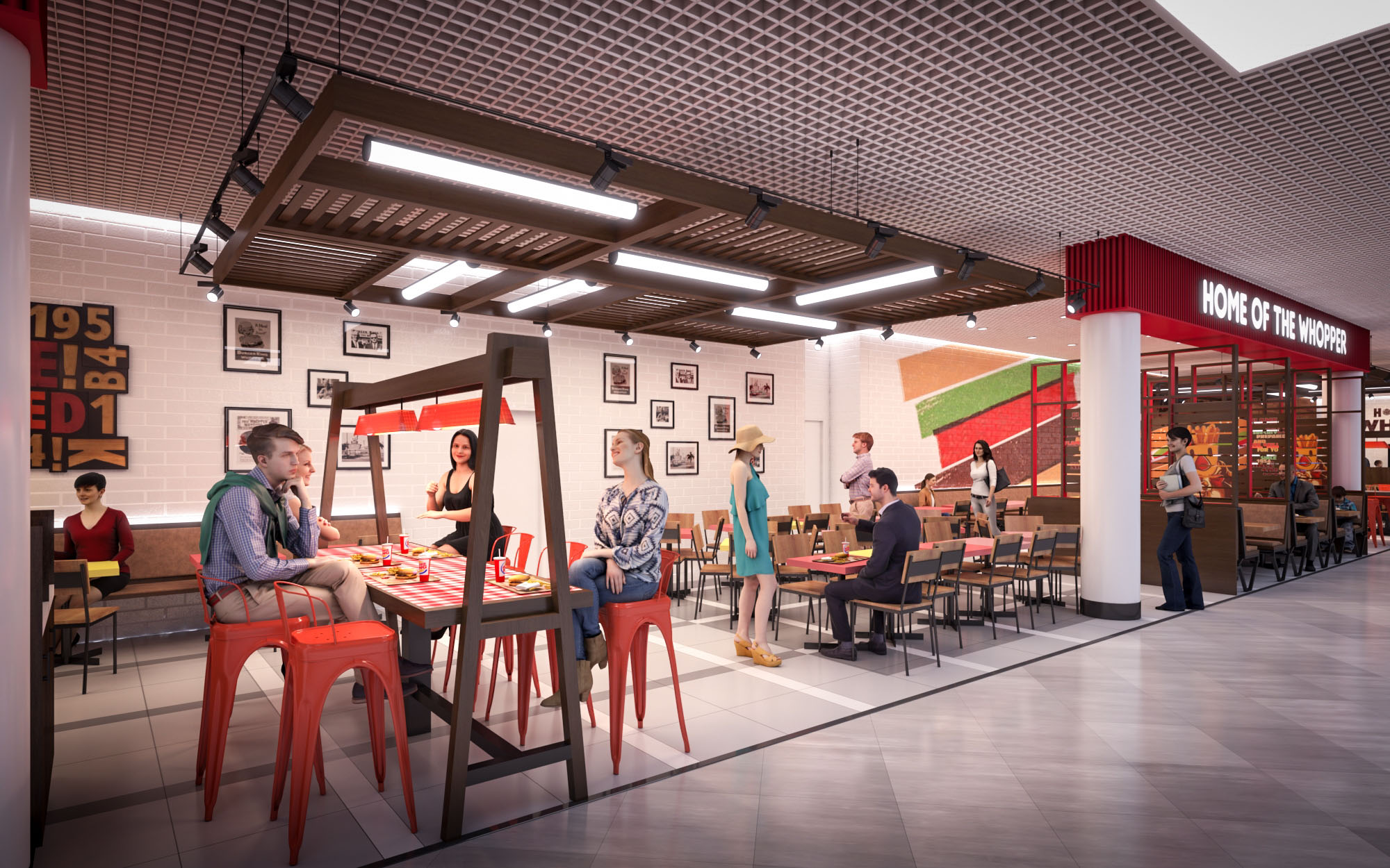
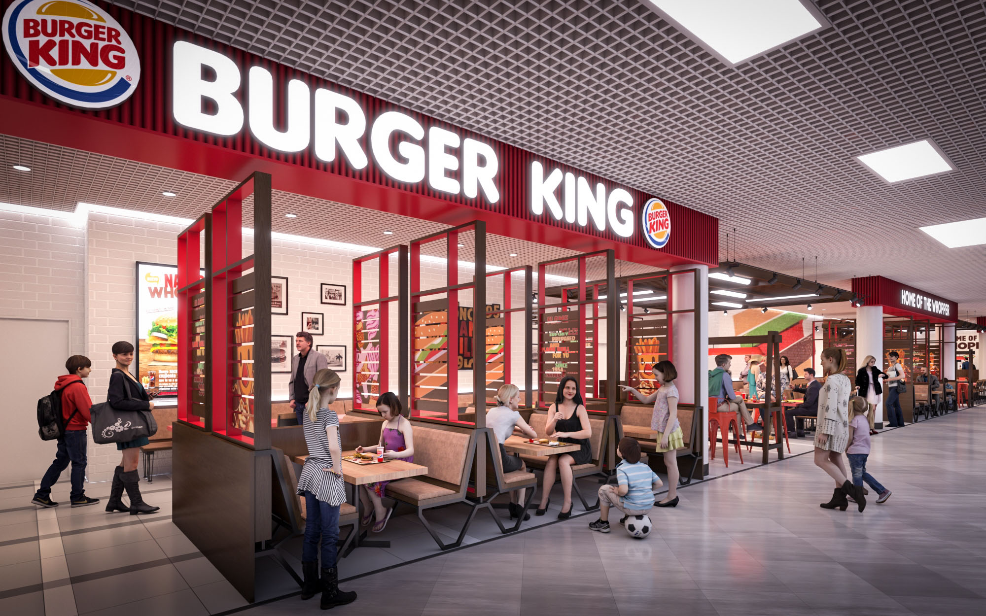
© 2021 by sanzpont [arquitectura] . Webpage by sanzpont [digital] . Innovative Digital Experiences

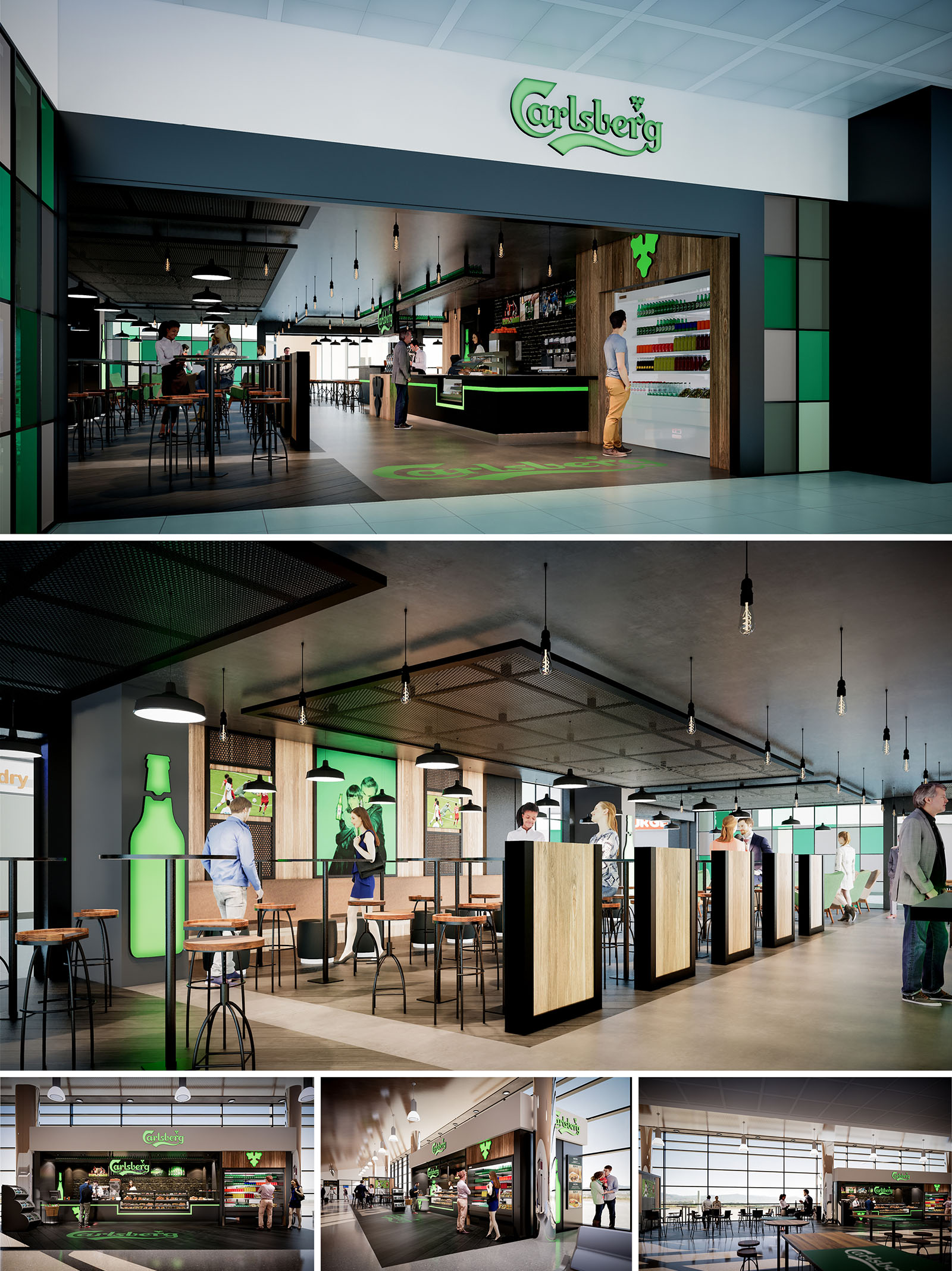
The Carlsberg project is conceived as a scalable brand environment for six restaurant units located in different Spanish cities. The design translates the brewery’s identity into a contemporary hospitality space, combining the atmosphere of an urban bar with the efficiency of a fast-service restaurant. A clear visual language based on green accents, dark frames and warm timber surfaces creates instant recognition in highly trafficked commercial contexts such as malls and transport hubs.
The interior architecture is organized as a permeable open-plan bar, where the threshold between corridor and restaurant becomes a fluid transition. Large openings, low partitions and transparent boundaries invite passers-by to visually access the space, while the branded canopy and ceiling interventions guide guests to the counter as the main focal point.
The layout prioritizes intuitive circulation around a central serving bar. The counter is aligned longitudinally, allowing simultaneous order, service and display of products, while maintaining clear visibility from the exterior. High tables and stools define a fast-consumption zone near the entrance, ideal for short stays and high turnover.
Further inside, semi-enclosed seating islands introduce a gradient of privacy. Vertical timber-clad screens frame individual standing tables, offering comfortable micro-spaces within the open hall. Circulation bands between these islands are kept generous to accommodate peak flows and easy staff movement, aligning with operational requirements of multiple locations.
The material palette combines industrial robustness with a warm, approachable character. Exposed concrete floors and dark metal structures evoke brewery and factory imagery, contrasted by oak-toned wood panels that soften the ambience. The front counter and perimeter cladding use durable laminates and composite panels to resist intensive use while remaining easy to maintain across all units.
Ceiling treatments alternate between smooth acoustic planes and perforated metal trays, integrating lighting, ventilation and acoustic control into a unified architectural element. This strategy allows each location to adapt to varying existing ceilings while preserving a consistent spatial identity.
Lighting is designed to articulate zones and reinforce the brand’s presence. A continuous linear fixture tracks the bar line, visually anchoring the service zone, while pendant luminaires over the high tables create intimate light pools within the otherwise open space. Exposed bulbs and black fittings recall industrial workshops, supporting the crafted-beer narrative.
Backlit graphic panels and the iconic green bottle silhouette act as luminous landmarks. These elements provide both orientation and ambiance, subtly adjusting brightness levels to maintain visual comfort and a warm color temperature suitable for extended social stays.
Brand integration is achieved through architectural means rather than mere signage. The Carlsberg green is embedded in floor inlays, counter detailing and vertical panels, creating a chromatic thread that unifies the six restaurants. Large-scale imagery, applied as framed lightboxes, brings human-scale storytelling to the walls without overwhelming the space.
The façade is conceived as an open frame around the bar interior: black profiles, translucent glass and modular colored panels form a recognizable gateway. This system allows each venue to adapt to different storefront widths while maintaining strict alignment with brand guidelines.
Sustainability is addressed through modular construction, durable materials and energy-conscious systems. Repetitive structural frames, standardized joinery details and prefabricated counter elements reduce waste and facilitate rapid installation in multiple locations. Where possible, timber components are specified from certified sources, and metal elements are designed for disassembly and future reuse.
LED lighting with dimming controls minimizes energy consumption, while the combination of natural daylight from large glazed fronts and targeted artificial lighting reduces the need for uniform high-intensity illumination. Finishes are selected for longevity and ease of maintenance, extending life cycles and lowering operational impact. The overall concept thereby creates a consistent, brand-driven environment that can adapt to varied shells while remaining efficient, robust and environmentally conscious.
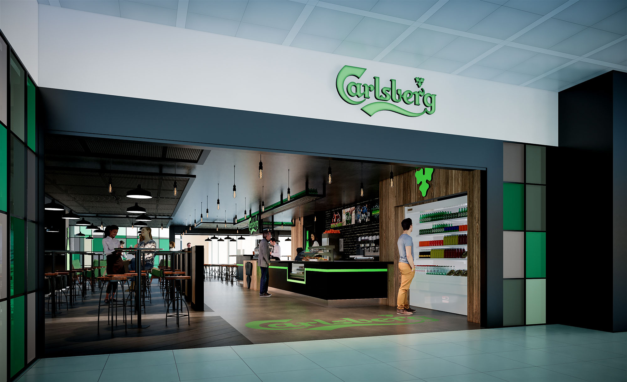
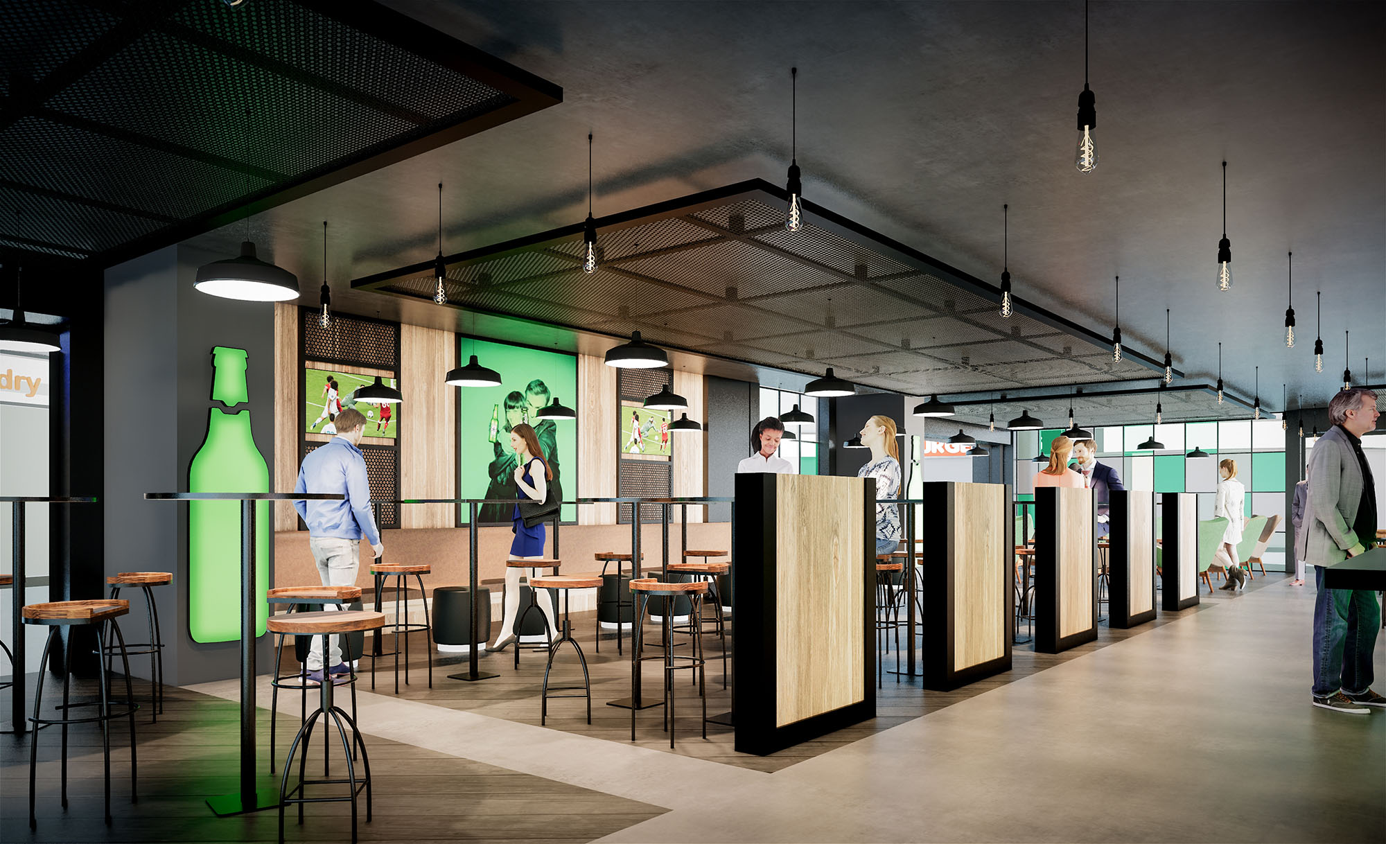
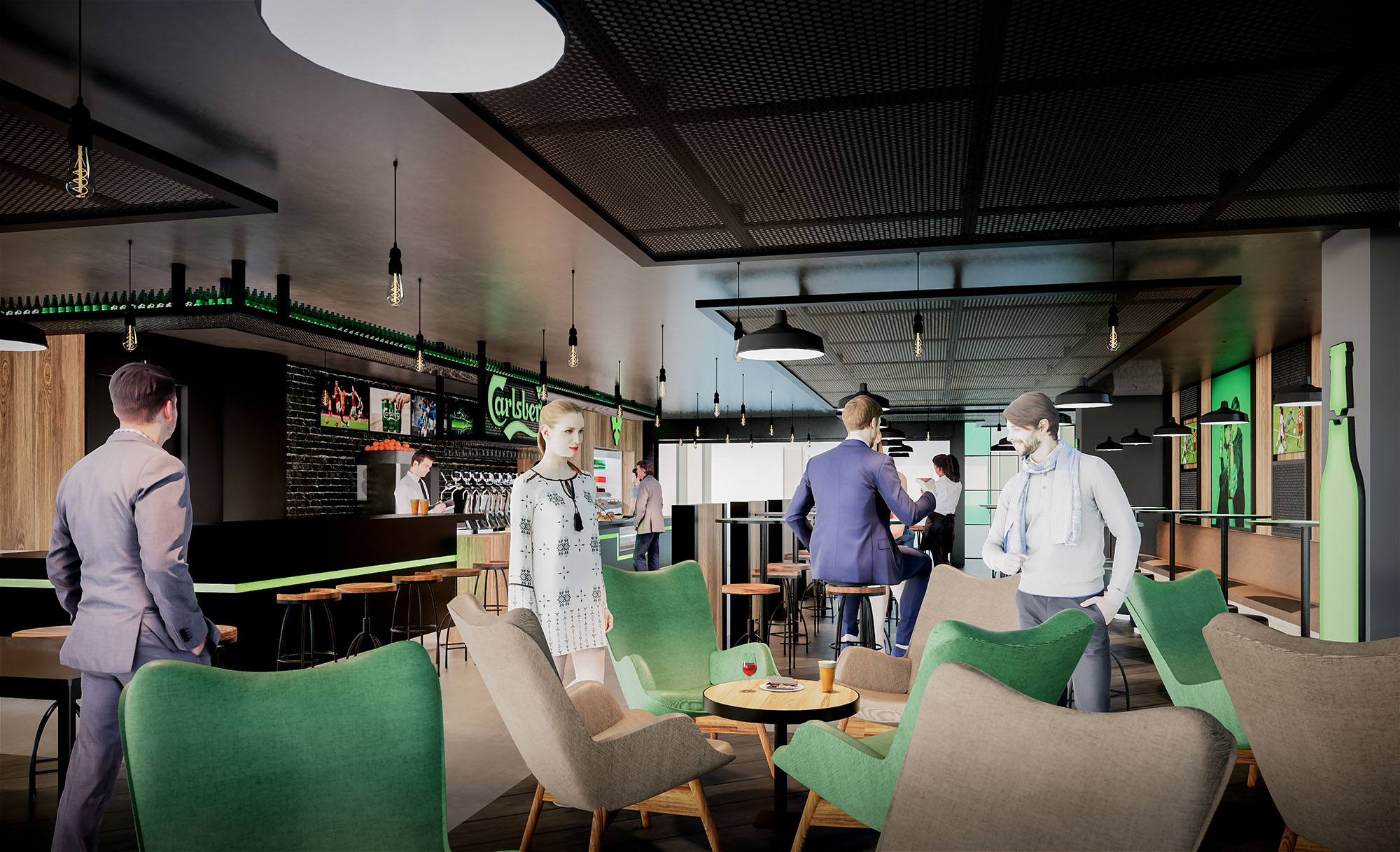
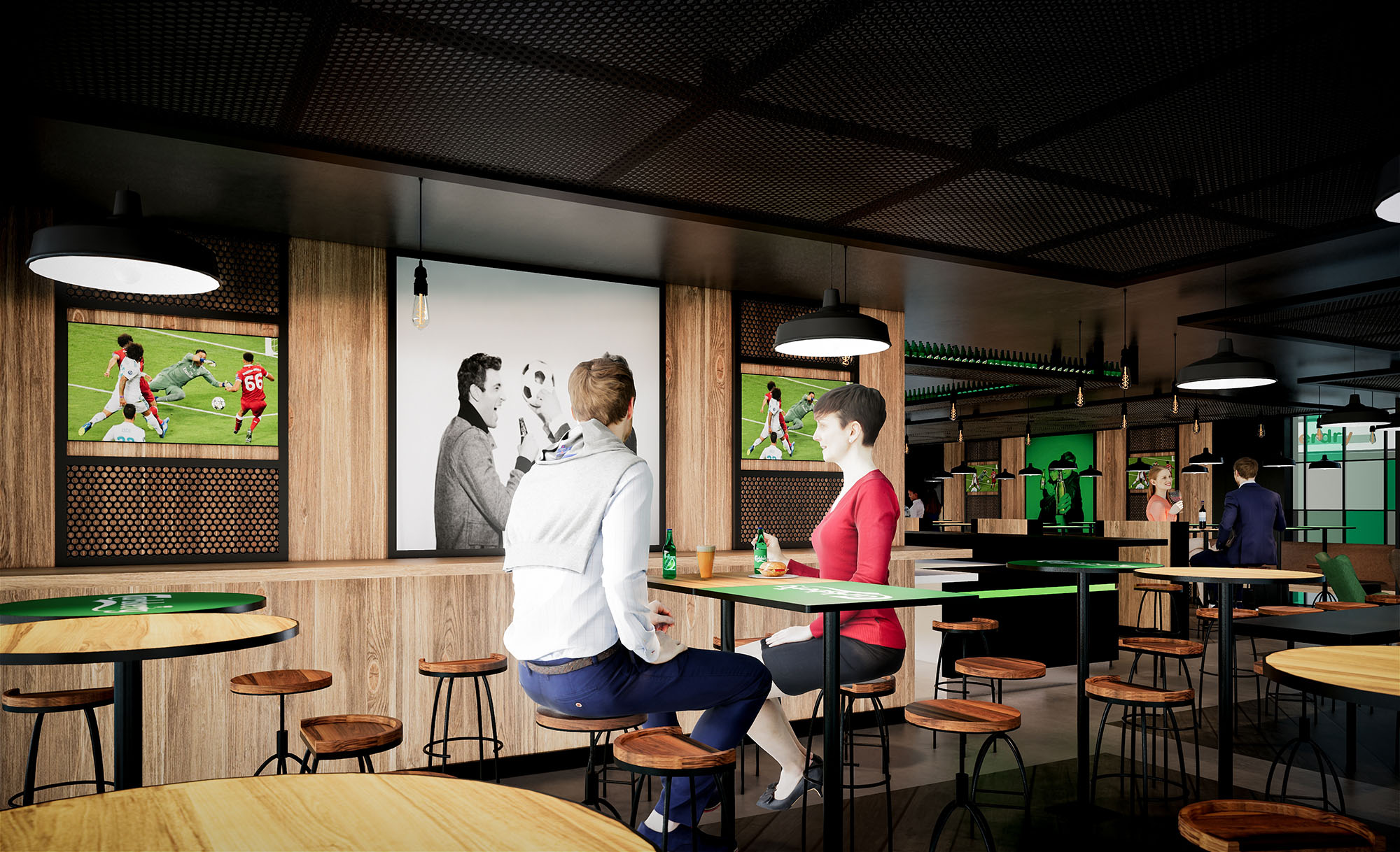
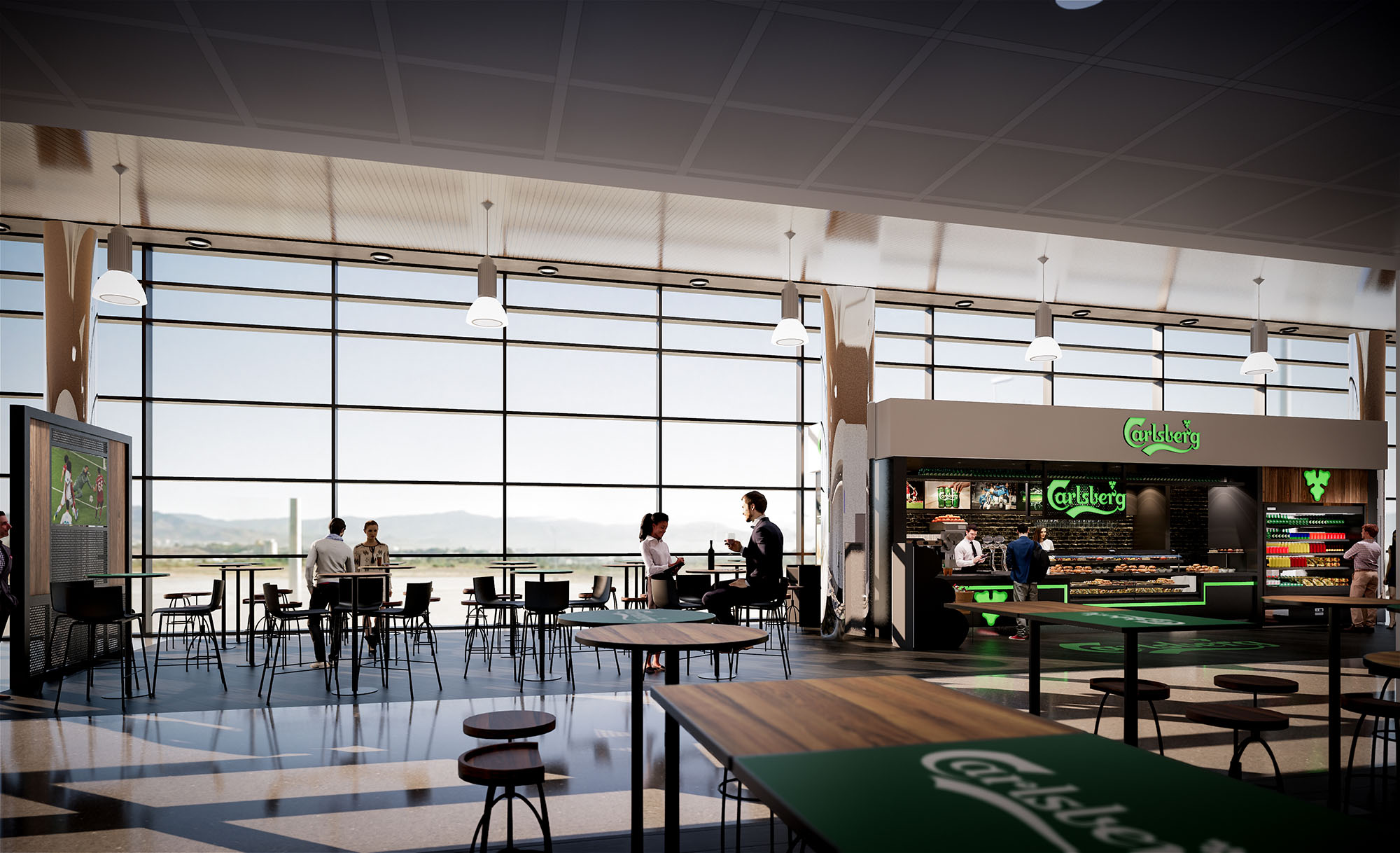
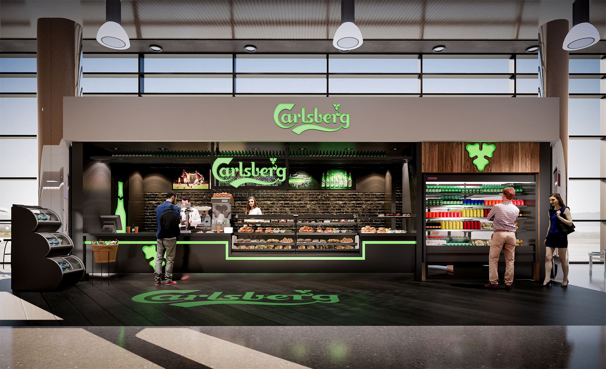
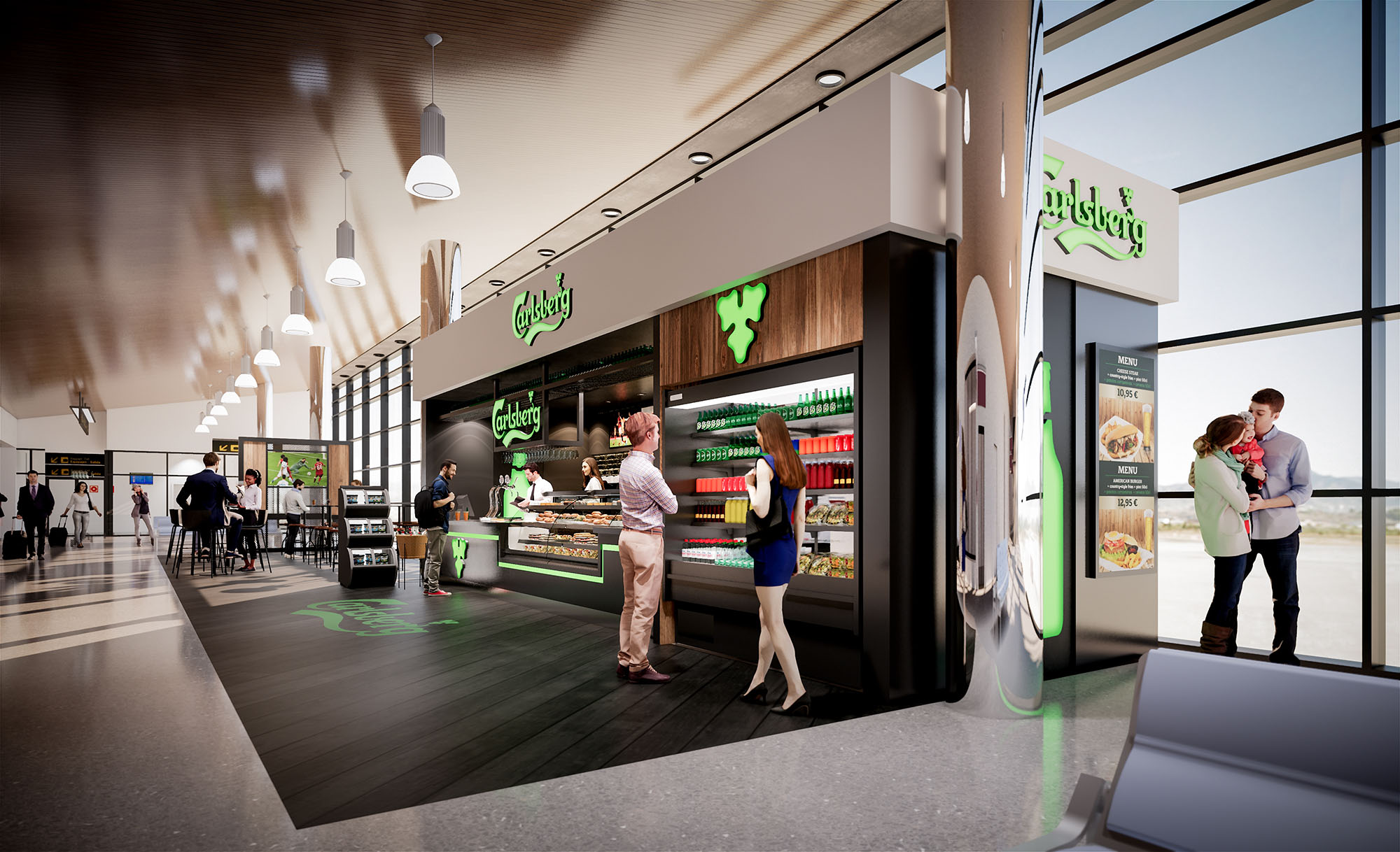
© 2021 by sanzpont [arquitectura] . Webpage by sanzpont [digital] . Innovative Digital Experiences
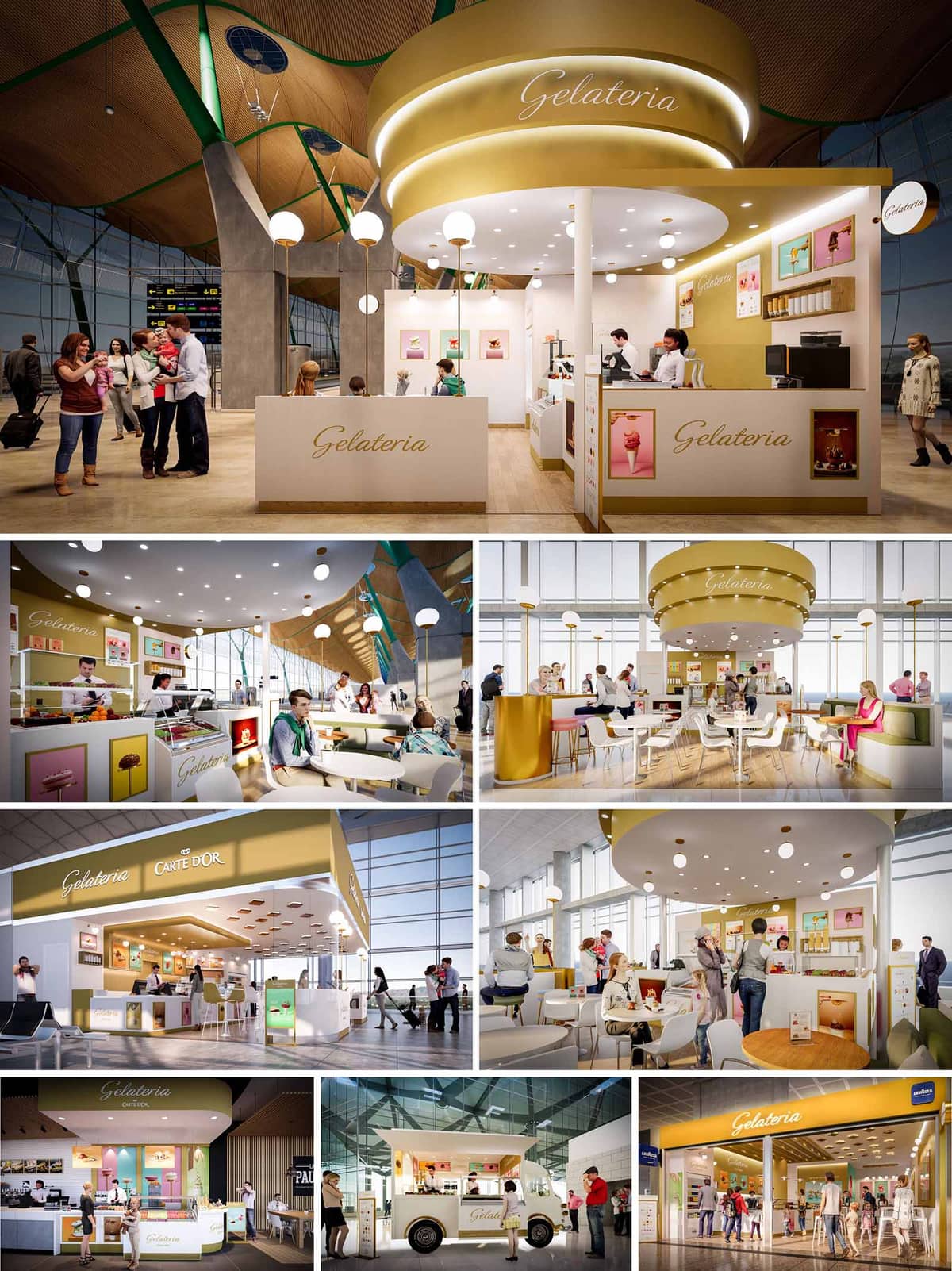

The Carte d’Or project is conceived as a family of gelato spaces that can inhabit multiple contexts in Spain—airports, shopping centres and outdoor plazas—while remaining instantly recognizable. The concept translates the sensorial qualities of artisanal ice cream into spatial form: softness, lightness and generosity are expressed through rounded geometries, warm lighting and a chromatic palette derived from cream, caramel and pistachio tones. Each unit operates as a luminous island within its host environment, creating a moment of pause and indulgence in otherwise transitional spaces.
A key objective is brand consistency without monotony. The design develops a modular language that can scale from compact kiosks and food trucks to larger café-style environments, always maintaining a clear visual hierarchy: the elevated golden canopy as landmark, the open counter as stage for product display, and the surrounding seating as social landscape.
The spatial layout prioritizes visibility and intuitive wayfinding. Counters are positioned as permeable perimeter elements, wrapping partially around the preparation area to maximize frontage and allow approach from multiple sides. This avoids congestion and supports high-traffic environments such as airport terminals. The ordering, payment and pick-up sequence follows a linear yet fluid path with minimal cross-flows.
In larger units, a central seating zone is organized around the iconic cylindrical canopy, which acts as a spatial anchor. Circular and semi-circular seating arrangements encourage social interaction and provide clear sightlines to the service counter, reinforcing the connection between consumption and preparation. Peripheral banquettes and flexible loose furniture accommodate solo travellers, families and groups, adapting to variable occupancy patterns throughout the day.
The formal language is dominated by soft curves—rounded canopies, circular soffits and gently filleted counters—that echo the scoop of ice cream and convey a sense of hospitality. Vertical elements remain deliberately slender and white, so that the golden crown and illuminated signage form a continuous ribbon that unifies all locations. Brand graphics and product imagery are framed as small, colourful tableaux, punctuating the otherwise calm surfaces.
Lighting is designed as both functional infrastructure and atmospheric device. A dense constellation of recessed downlights in the canopy ensures uniform illumination of counters and tables, while spherical pendant luminaires introduce a playful, almost theatrical character. Warm colour temperature enhances the appearance of food products and complements the beige and gold finishes, generating a cozy ambience even in vast, glazed terminal halls.
The material palette balances durability with visual softness. High-pressure laminates and lacquered MDF form the primary counter and wall claddings, chosen for their resistance to intensive use and ease of maintenance. Golden metallic finishes—applied as anodized aluminum or coated steel—define the upper bands, catching natural and artificial light to create a subtle, ever-changing sheen.
Flooring is generally specified as timber or wood-effect porcelain, introducing warmth and tactility while meeting commercial performance requirements. Seating combines upholstered banquettes in desaturated greens or pinks with white shell chairs and light timber tabletops, ensuring comfort without visual clutter. Detailing remains intentionally minimal: rebated LED strips emphasize canopy edges, while concealed joints and integrated menu holders preserve a clean, contemporary aesthetic.
The design system is conceived as a toolkit that can be deployed across seven distinct locations. Core elements—the golden canopy, signature typography, counter proportions and colour codes—remain constant, while secondary components adapt to footprint and context. This allows for compact linear bars, island kiosks, corner cafés and even a mobile food truck version, all recognizably part of the same family.
Modular cabinetry and standardized equipment bays simplify installation and future relocation. Services are concentrated in a compact back-of-house spine or central core, enabling maximum transparency to the public sides and facilitating efficient staff circulation. The mobility of furniture, particularly free-standing tables and chairs, allows operators to reconfigure seating layouts for events, peak periods or evolving operational needs.
Sustainability strategies focus on energy efficiency, material responsibility and long-term adaptability. LED lighting with high efficacy and dimmable drivers minimizes energy consumption and allows adjustment to natural daylight levels in glazed environments. Refrigeration equipment is specified with high-efficiency compressors and optimized ventilation paths, reducing heat gain and overall HVAC loads in host buildings.
Material selections prioritize durability to extend lifecycle and reduce replacement frequency. Where possible, substrates incorporate recycled content, and finishes are chosen for low-VOC emissions to maintain indoor air quality. The modular nature of the concept supports circularity: furniture, counters and canopy elements can be dismantled, relocated or reconfigured for new sites, reducing construction waste. Operationally, compact planning reduces unnecessary staff movement, while clear queuing and self-service elements limit bottlenecks, resulting in a more efficient, resource-conscious daily operation across all Carte d’Or locations.
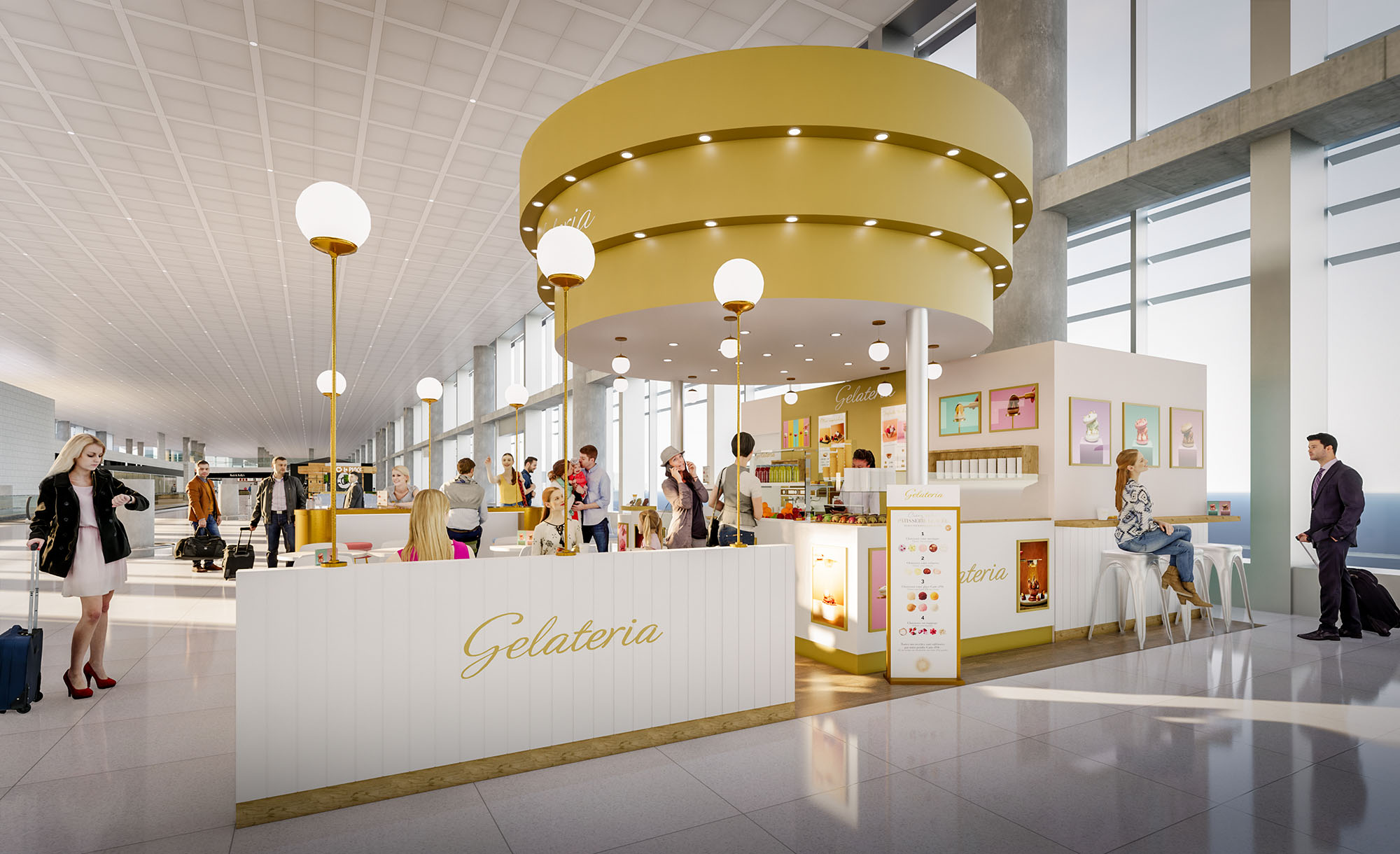
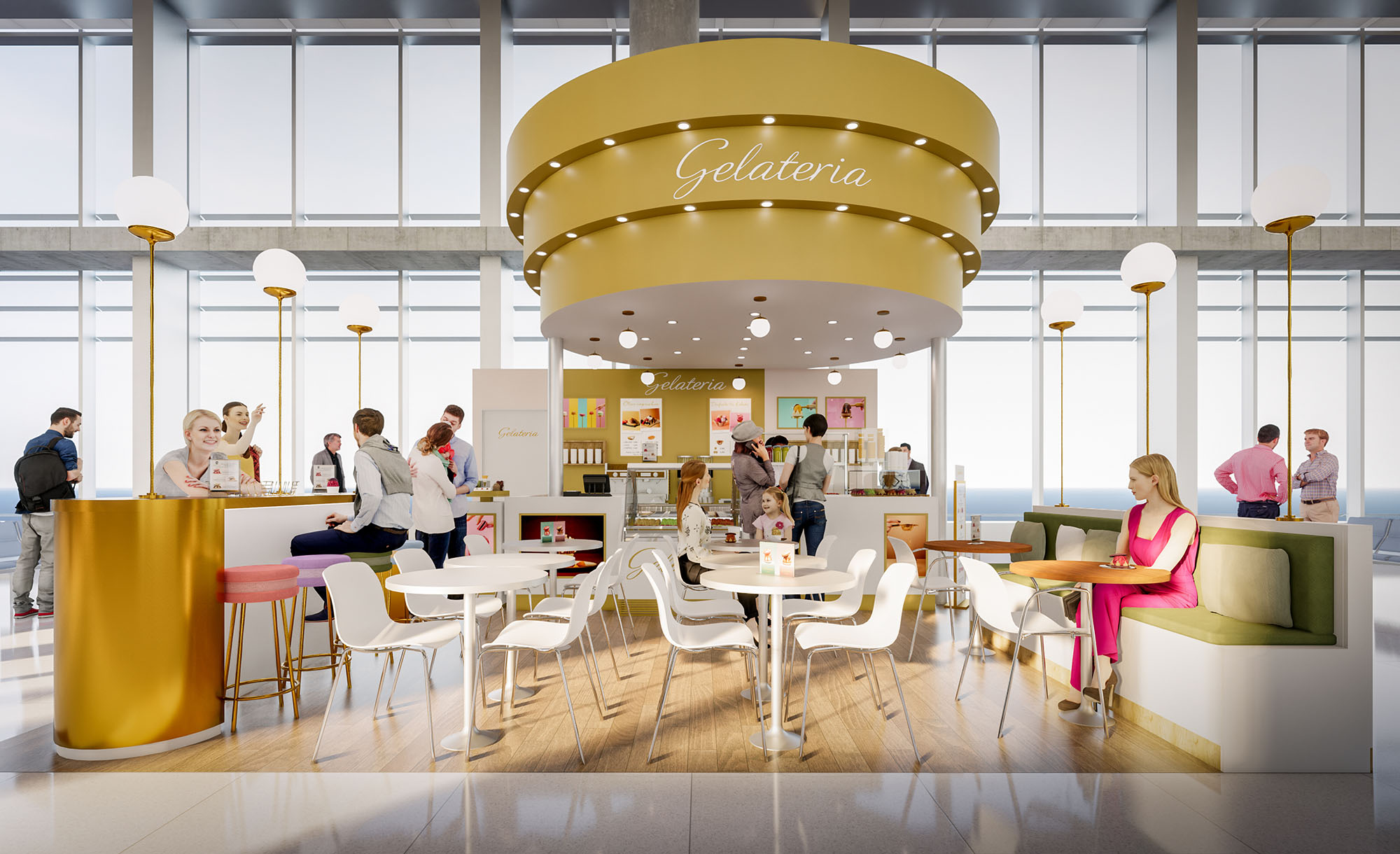
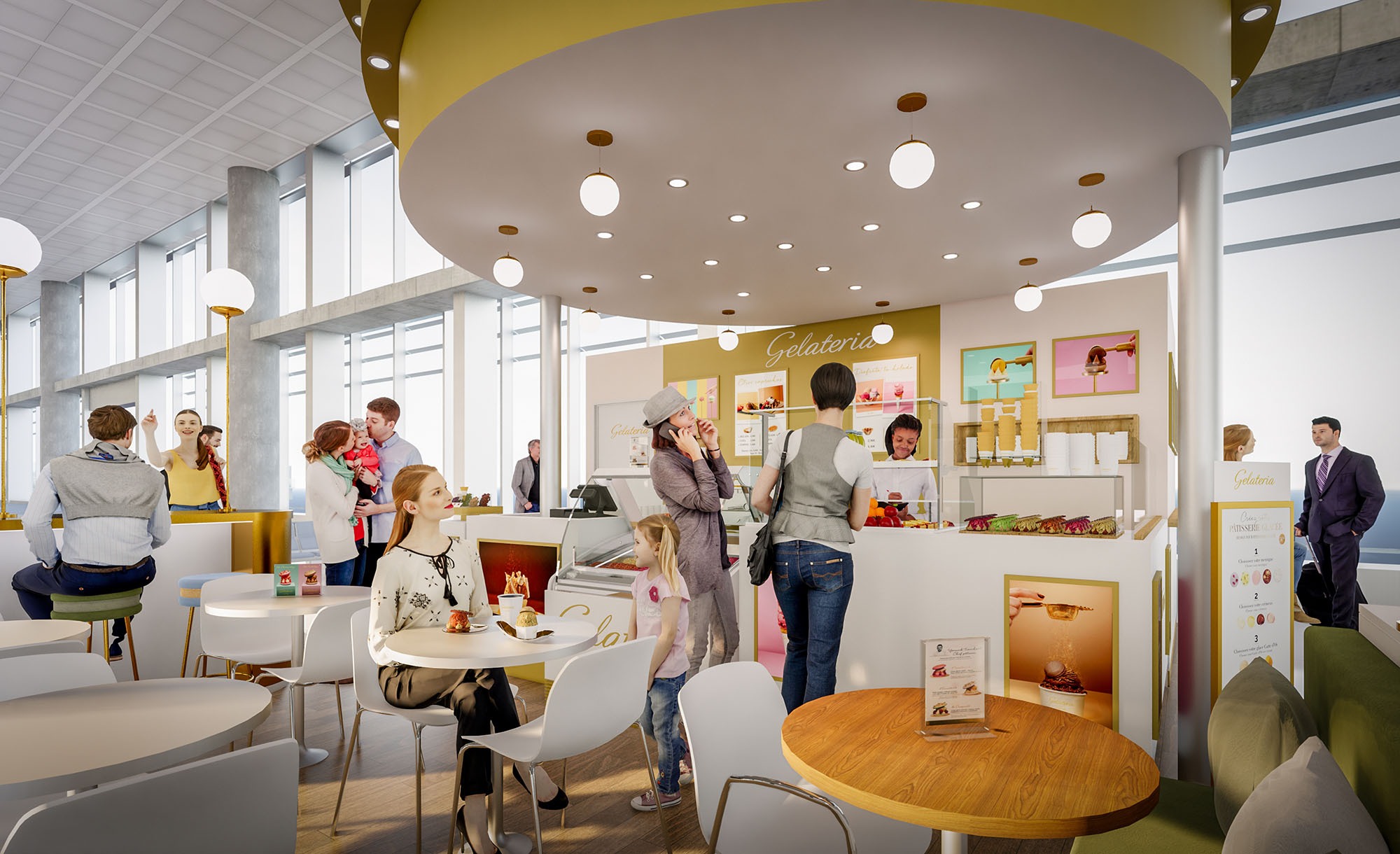
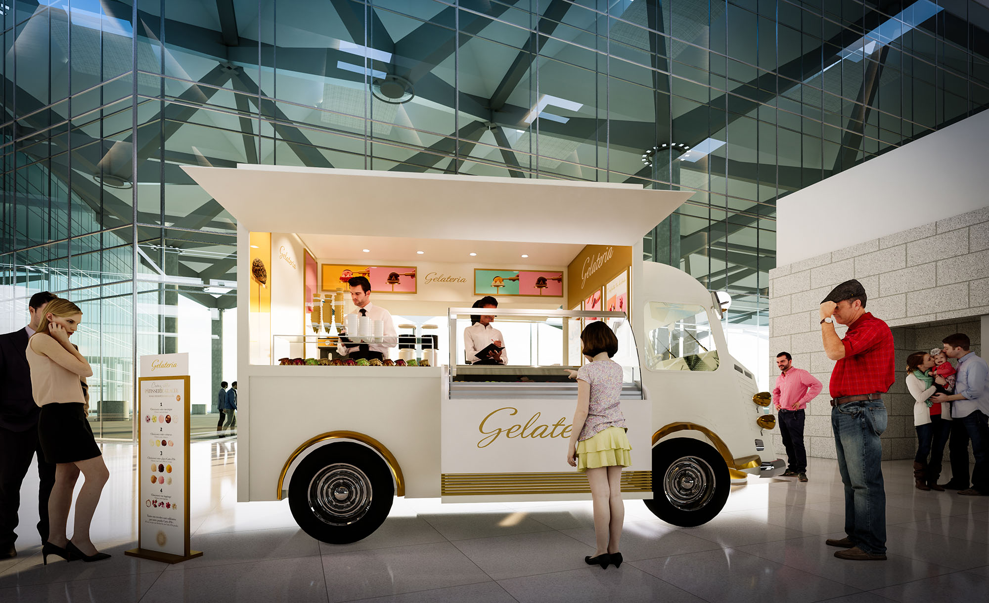
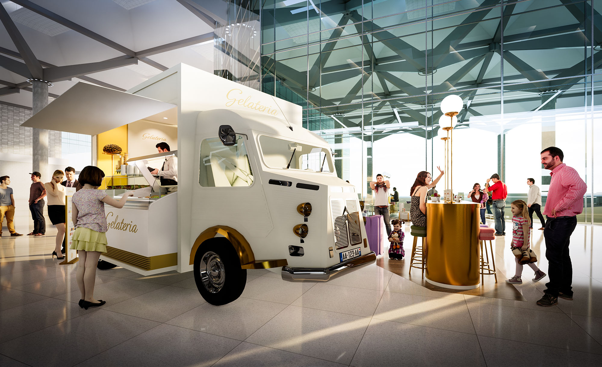
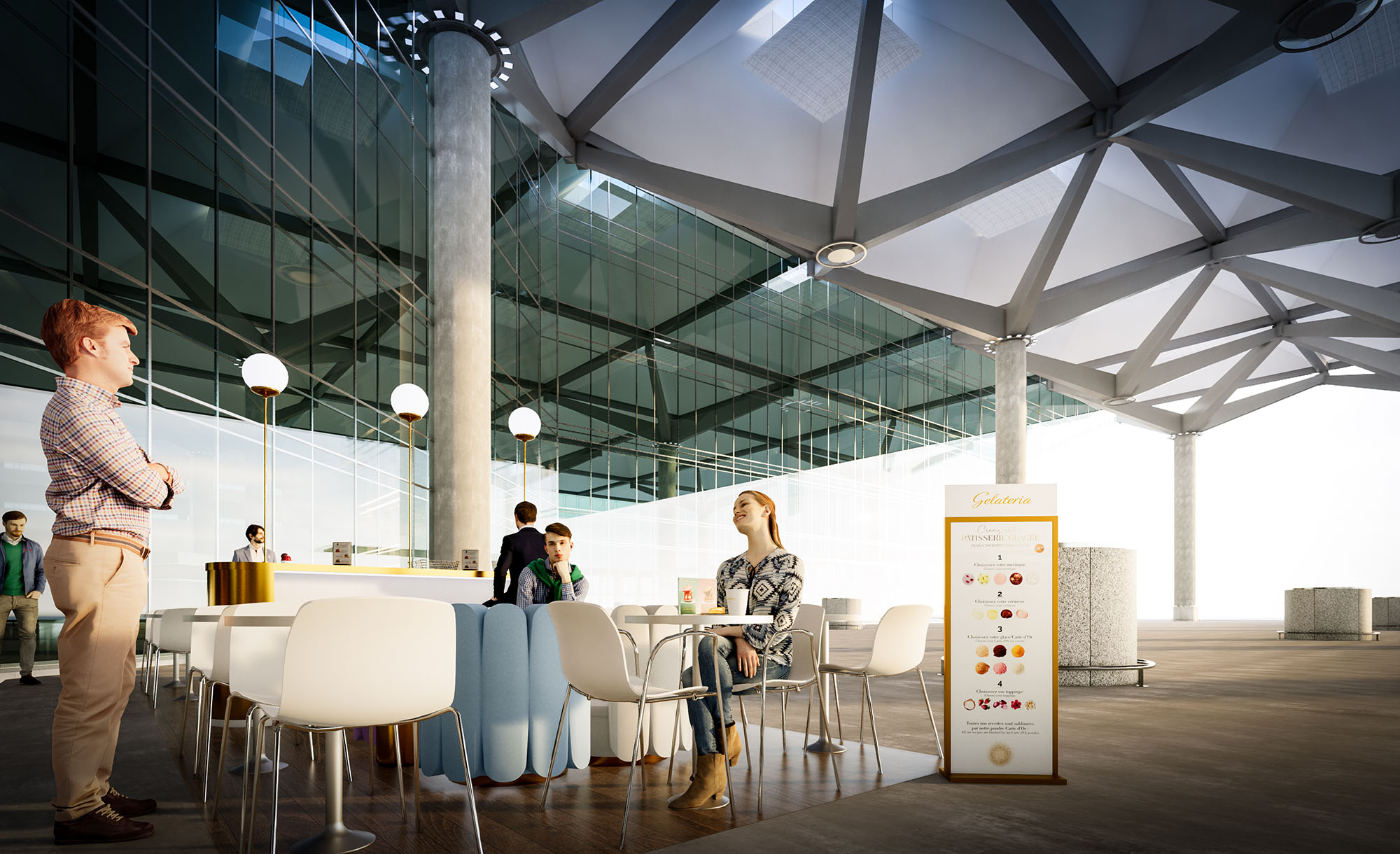
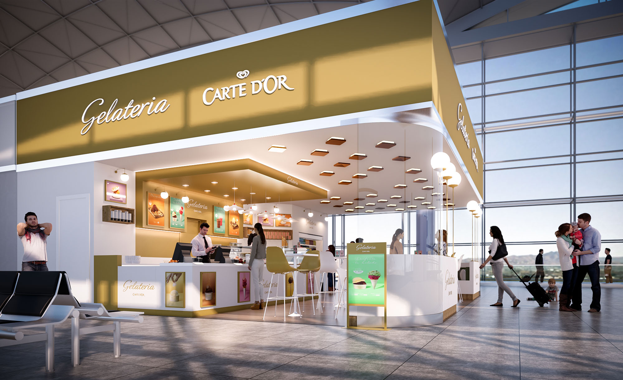
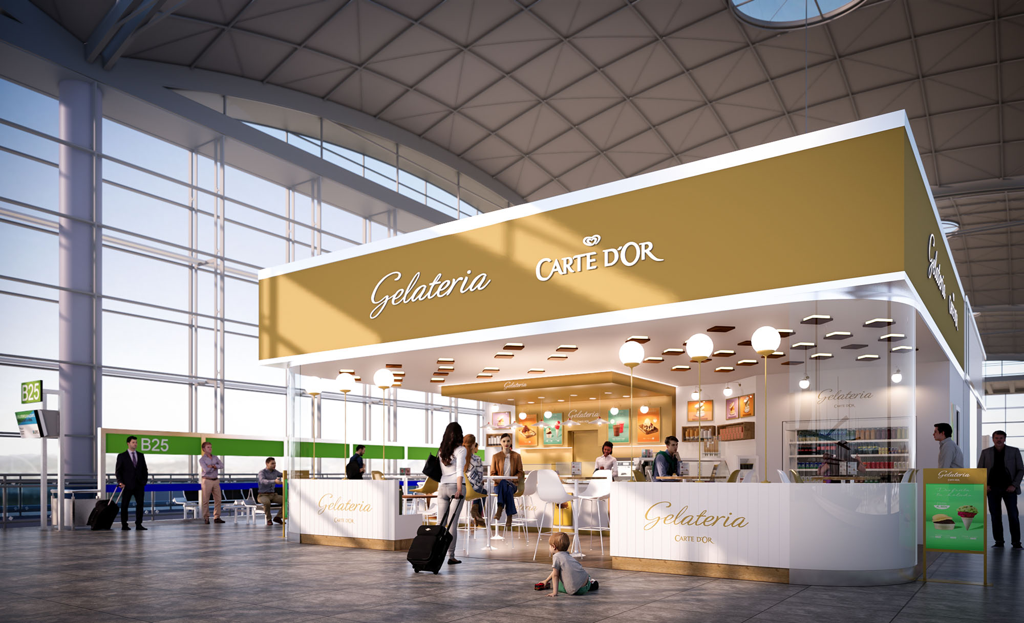
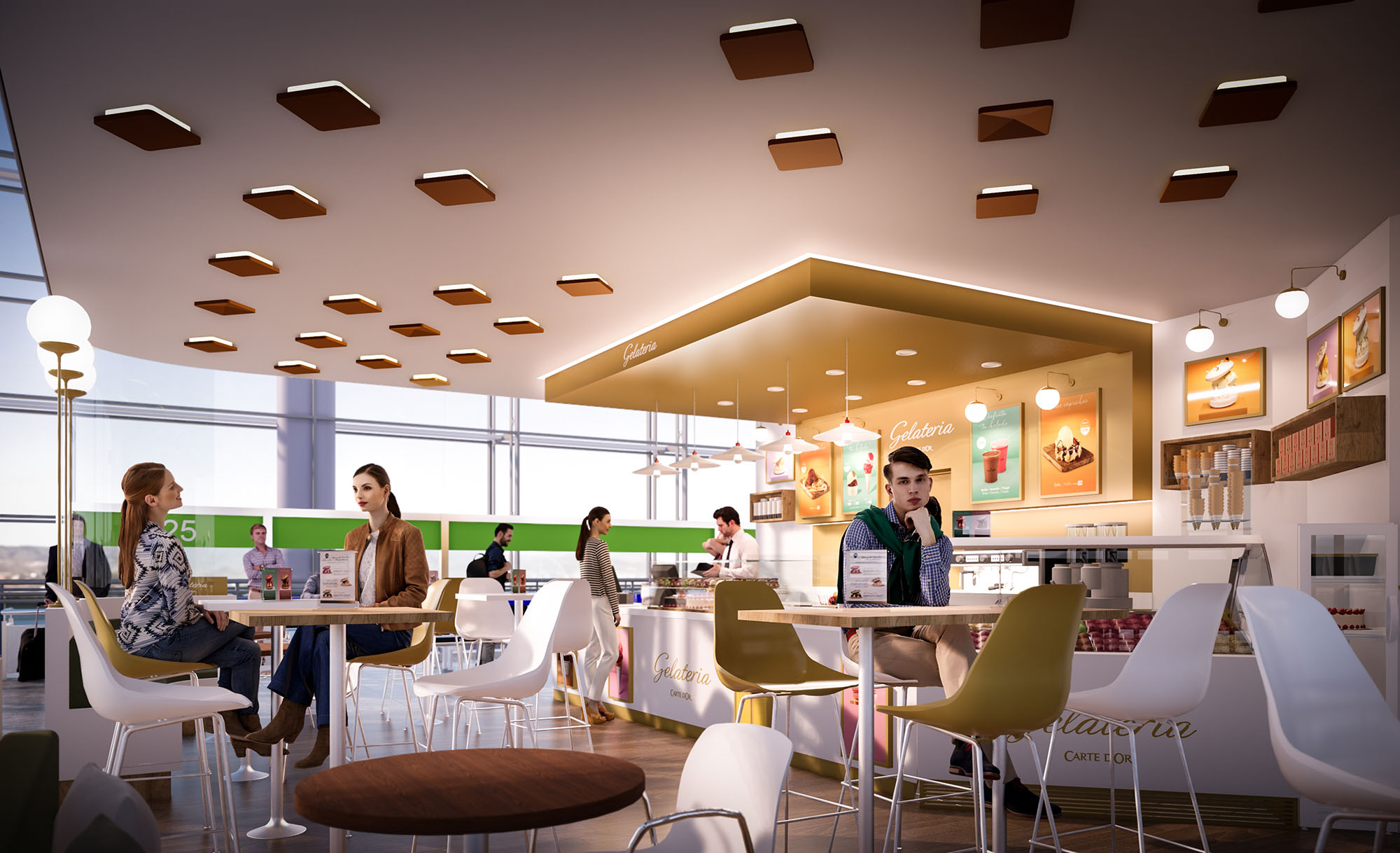
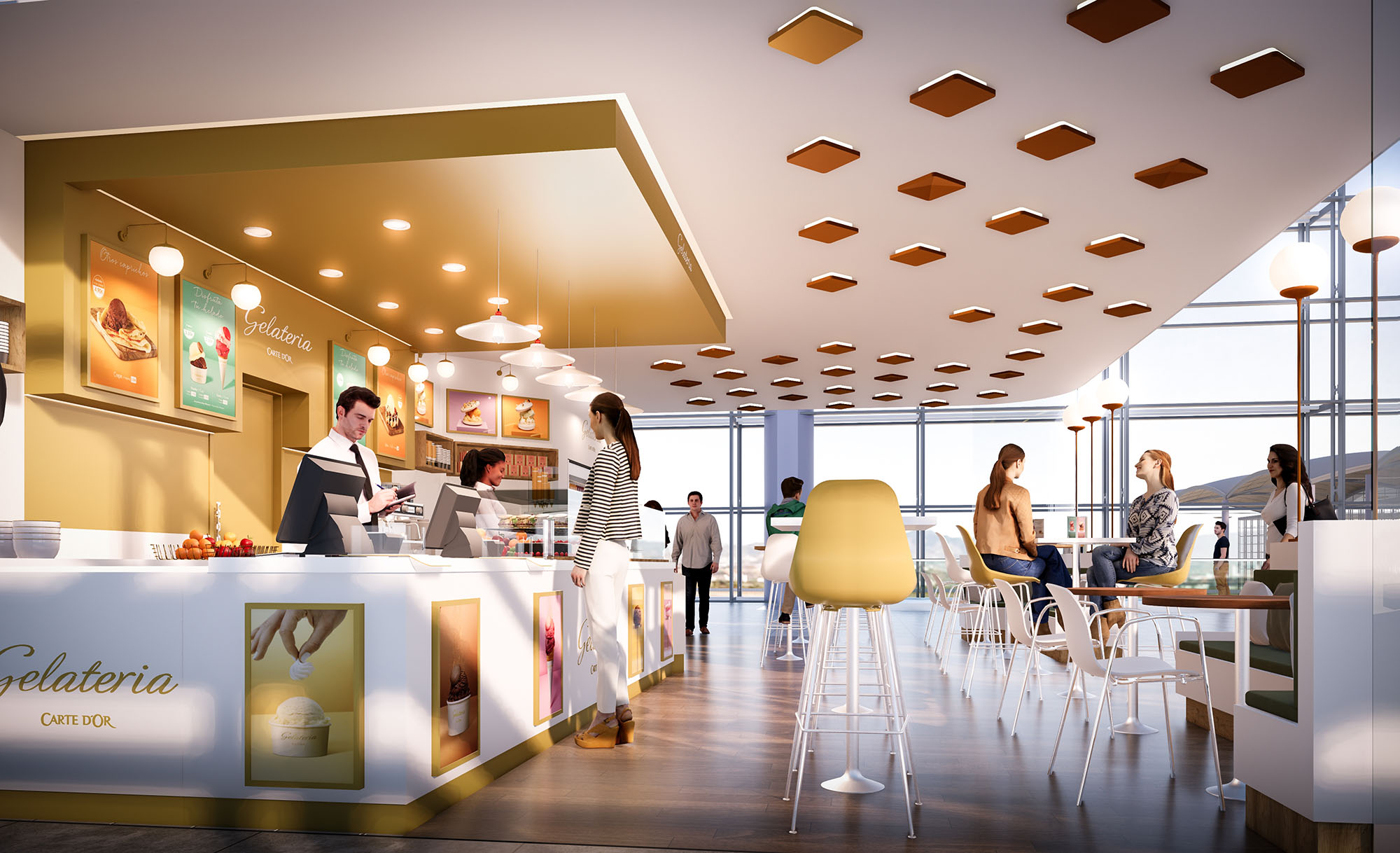
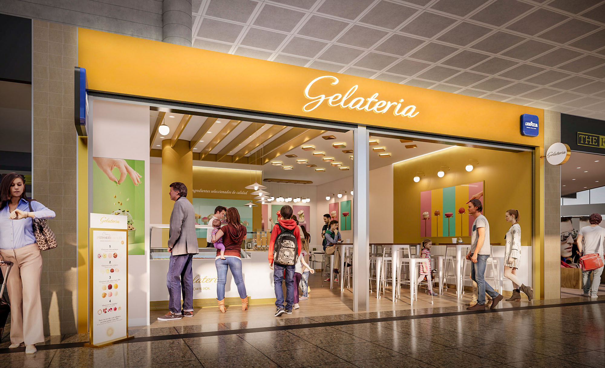
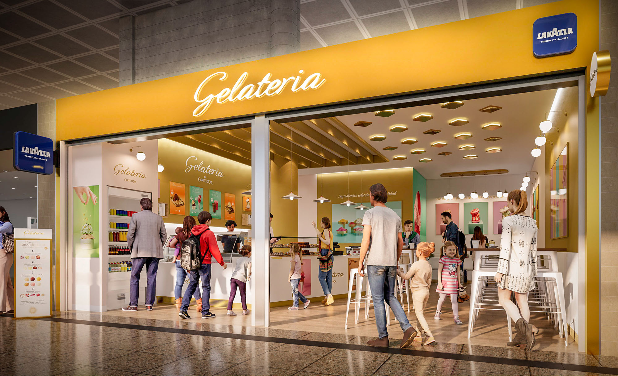
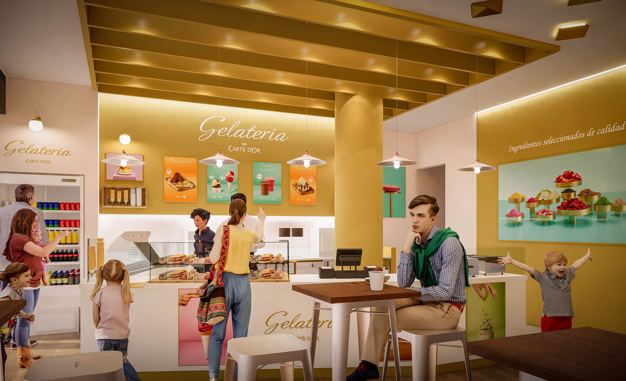
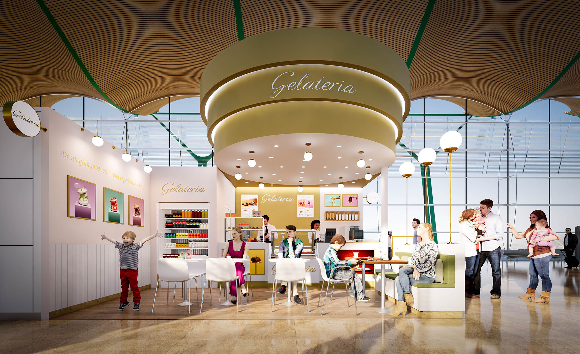
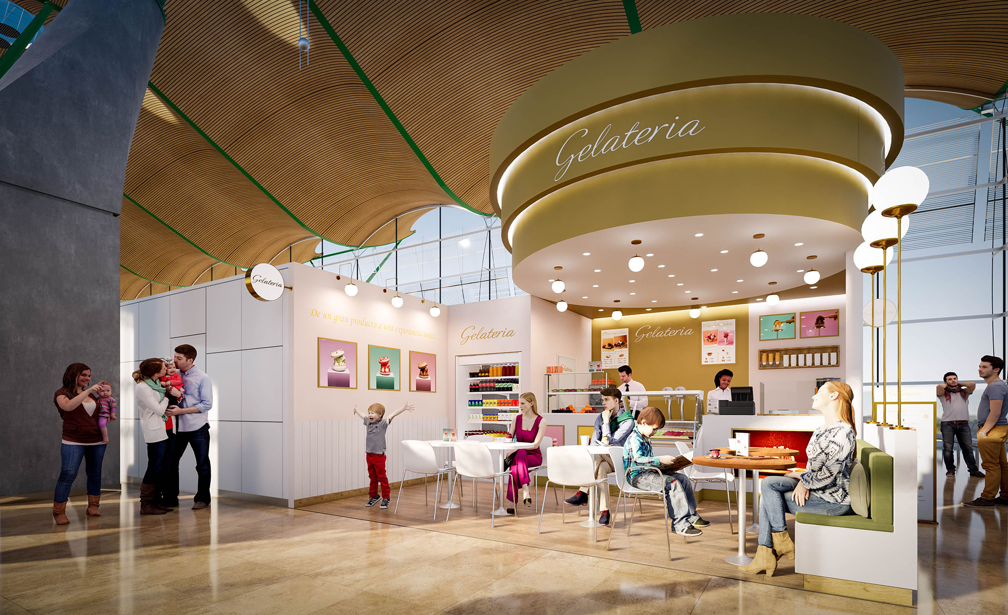
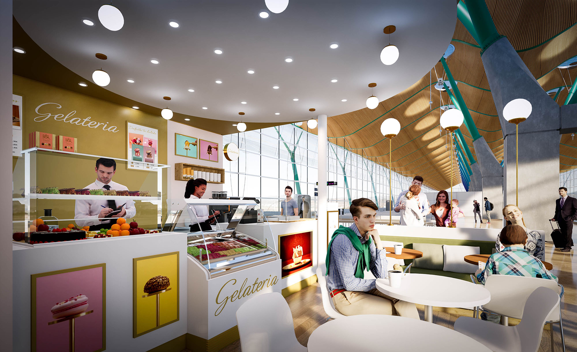
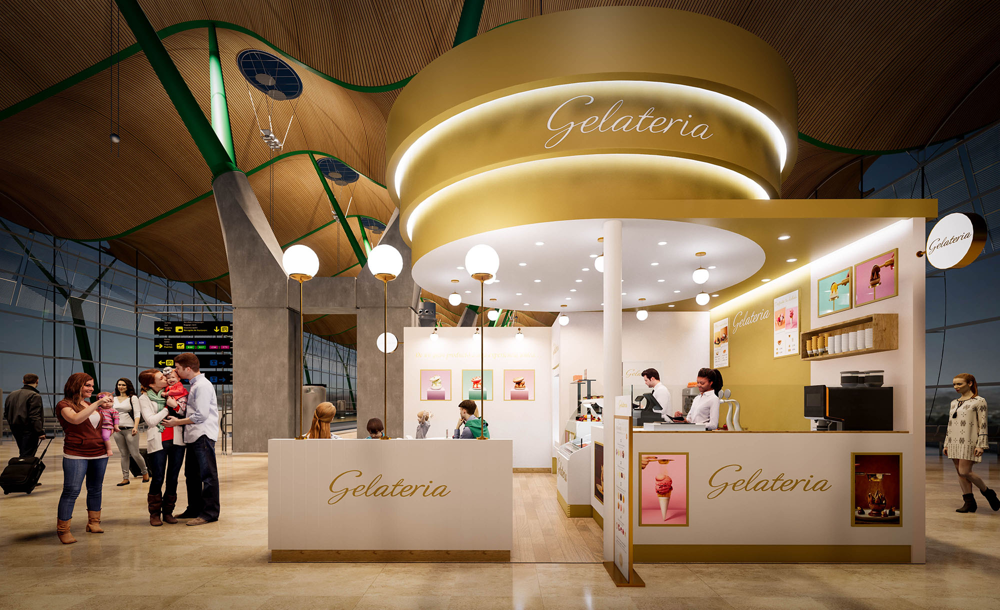
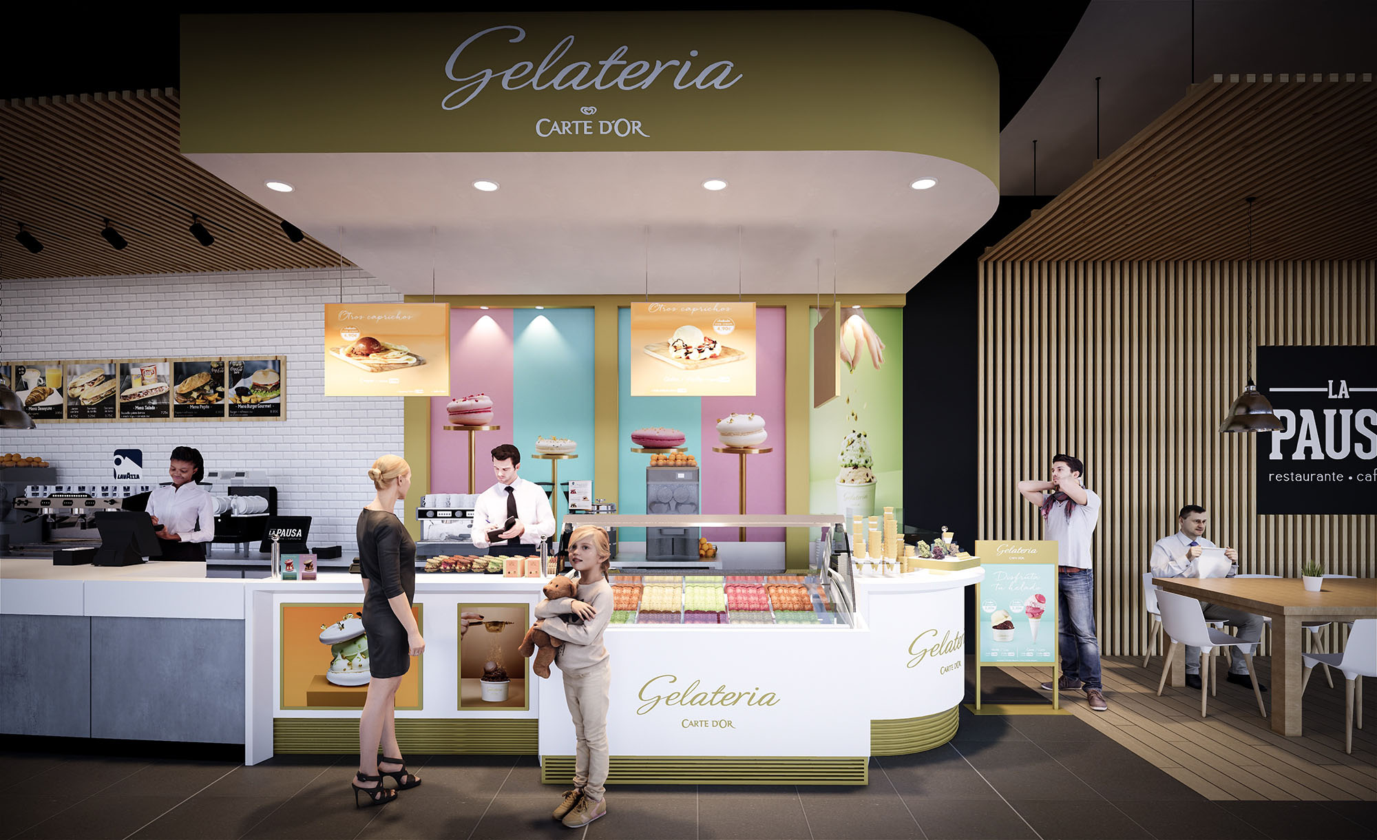
© 2021 by sanzpont [arquitectura] . Webpage by sanzpont [digital] . Innovative Digital Experiences
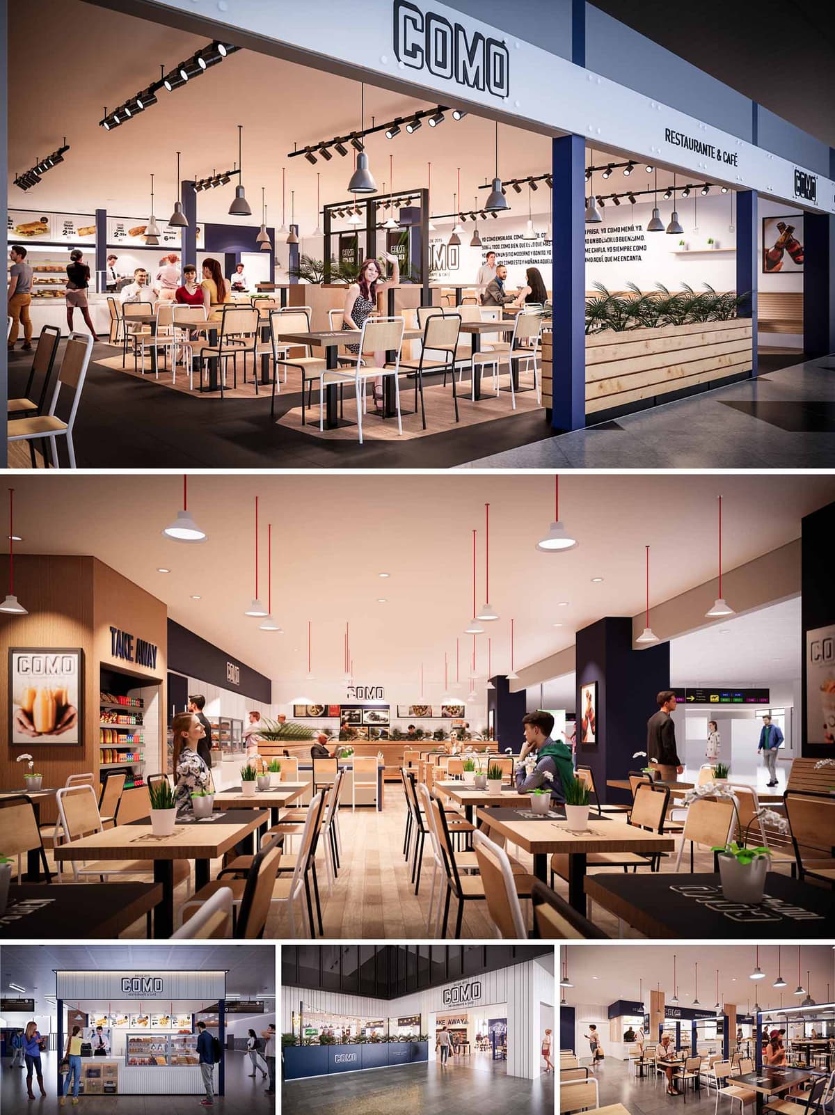

COMO is conceived as a contemporary fast‑casual restaurant brand that can be replicated in multiple Iberian locations while maintaining a clear and recognizable identity. The design language combines the efficiency of a food court kiosk with the warmth of a neighborhood café, using a palette of light woods, neutral tones and precise graphic elements. The architecture privileges visual permeability, allowing the interior atmosphere to extend into the surrounding circulation areas and inviting spontaneous access.
The concept emphasizes transparency of preparation and product display, reinforcing trust and freshness. Open counters, visible kitchens and large menu graphics construct a direct dialogue between customer and food. This approach positions COMO as an accessible, everyday meeting place within airports and retail environments in Spain and Portugal.
The restaurants operate as permeable islands within larger commercial flows, often open on two or three sides. Structural frames define a clear perimeter without enclosing it, creating a legible edge while preserving continuity with the mall or terminal. Strategic alignment of the main counter towards the principal pedestrian axis captures attention and simplifies wayfinding.
The interior layout is organized into sequential bands: service and display at the back, a central dining field of flexible tables, and a soft transition edge facing the circulation with planters and low partitions. This zoning allows efficient staff movement parallel to the counter, while guests circulate transversally through intuitive paths. The modular furniture system facilitates rapid reconfiguration for different peak periods and varying unit sizes.
The material strategy balances durability with a warm, approachable expression. Light oak-toned laminates dominate wall claddings and tabletops, contrasted with black metal table frames and chair structures that introduce an industrial note. Vertical timber slats in the planter fronts and counters add tactile rhythm and human scale.
The color palette is anchored by off‑white surfaces, deep navy accent walls and signage bands, and precise black typography for the COMO logo. This triad ensures strong brand recall while remaining restrained enough to integrate into multiple host architectures. Occasional red elements in pendant suspensions inject a subtle vibrancy that guides the eye along the space.
Lighting supports both operational clarity and a comfortable dining ambiance. Linear track systems run parallel to the main façade, washing tables and circulation with a uniform, warm-white light suitable for food presentation. Complementing this, a grid of suspended dome pendants introduces a more intimate scale, visually lowering the ceiling above the seating area.
Accent lighting is focused on the service counter, baked goods display and menu boards, emphasizing decision points and shortening the ordering process. Reflections from pale ceilings and light timber surfaces help to diffuse brightness, avoiding glare while maintaining a clean, airy perception even in deep interior locations without natural light.
The furniture language is deliberately simple and robust, using straight lines and honest joints to communicate functionality and transparency. Tables are predominantly rectangular to maximize occupancy flexibility, complemented by some smaller two‑top configurations along perimeters for more private use. Chairs combine metal frames with timber or light composite seats and backs, ensuring resistance in high‑turnover environments.
Brand expression is integrated architecturally rather than applied as decoration. The COMO logotype appears in backlit fascia signs, menu boards and subtly on tabletop mats, all in a consistent typographic system. Large-scale food imagery is framed within the same modular grid as the architecture, reinforcing a coherent visual rhythm throughout the different locations.
Sustainability is addressed through both material selection and operational intelligence. Preference is given to certified wood products and high-pressure laminates with extended lifecycle performance, reducing replacement frequency. Metal structures for furniture and counters are designed as demountable systems, allowing components to be repaired, recycled or reconfigured for future units.
Energy-efficient LED lighting, combined with carefully calculated luminous levels, reduces consumption while maintaining visual comfort. Standardized modules for counters, planters and storage shorten construction times and minimize onsite waste. Indoor plants incorporated into planter edges contribute to acoustic absorption and improve perceived air quality, while reinforcing a biophilic connection within otherwise hard commercial environments.
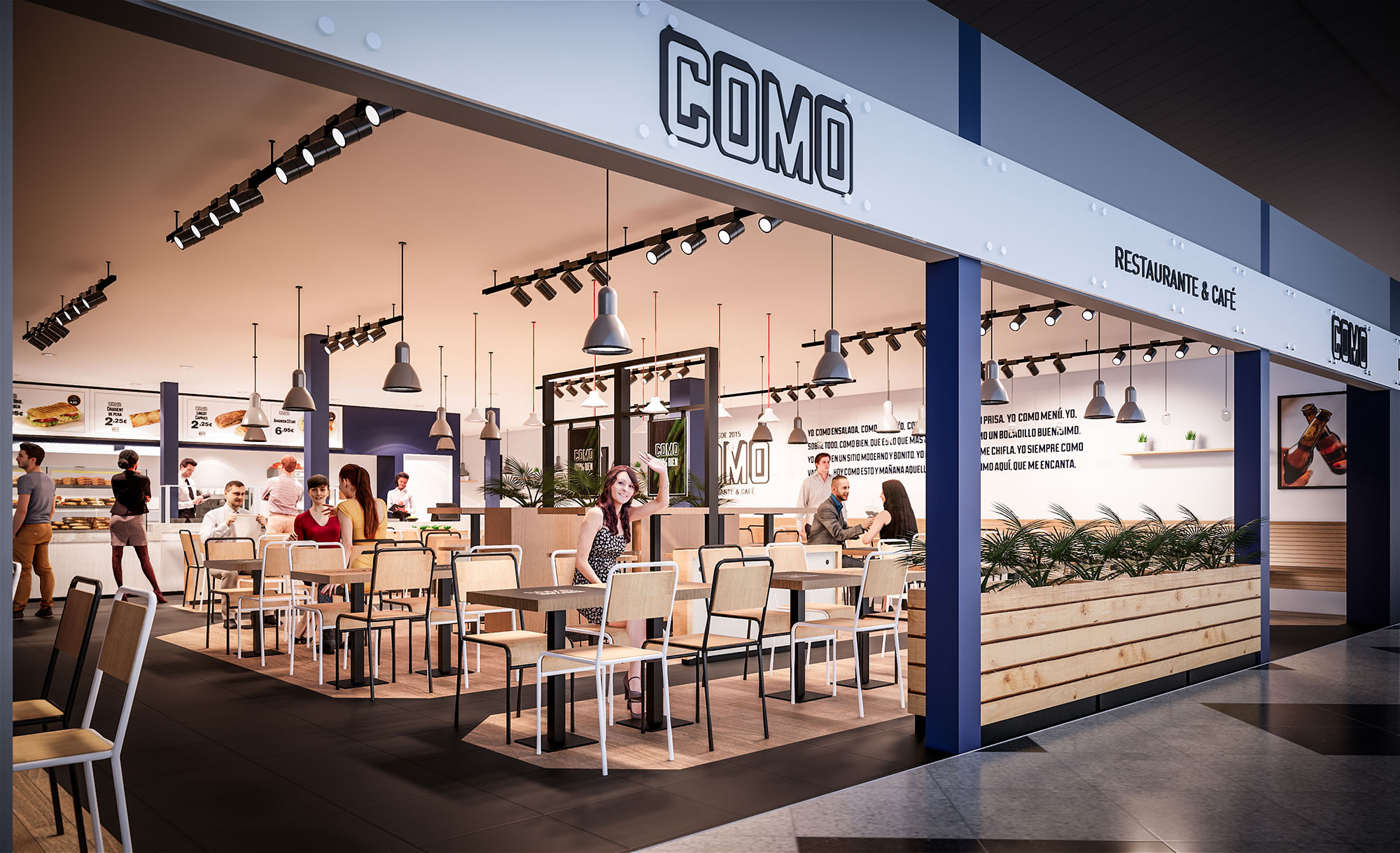
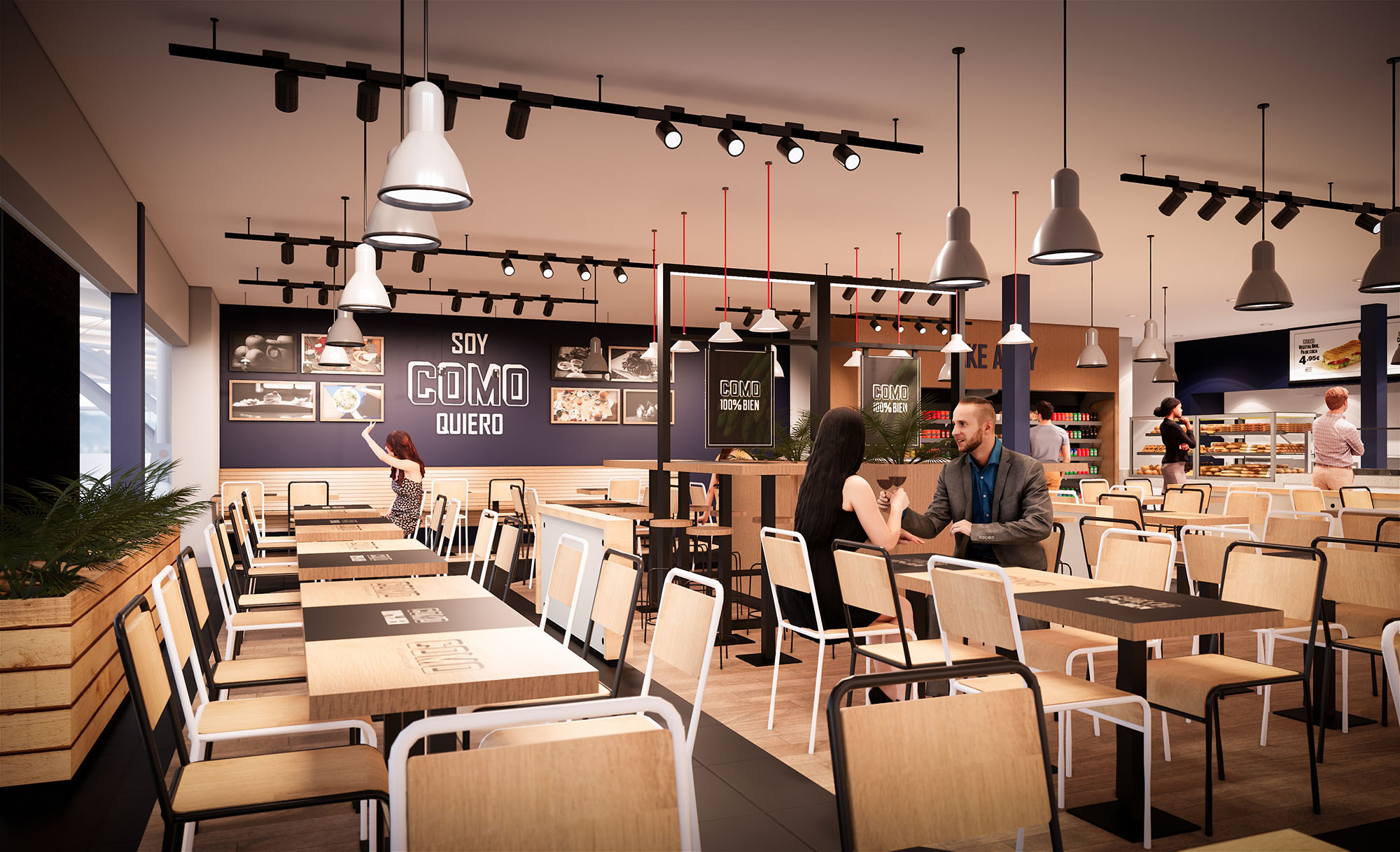
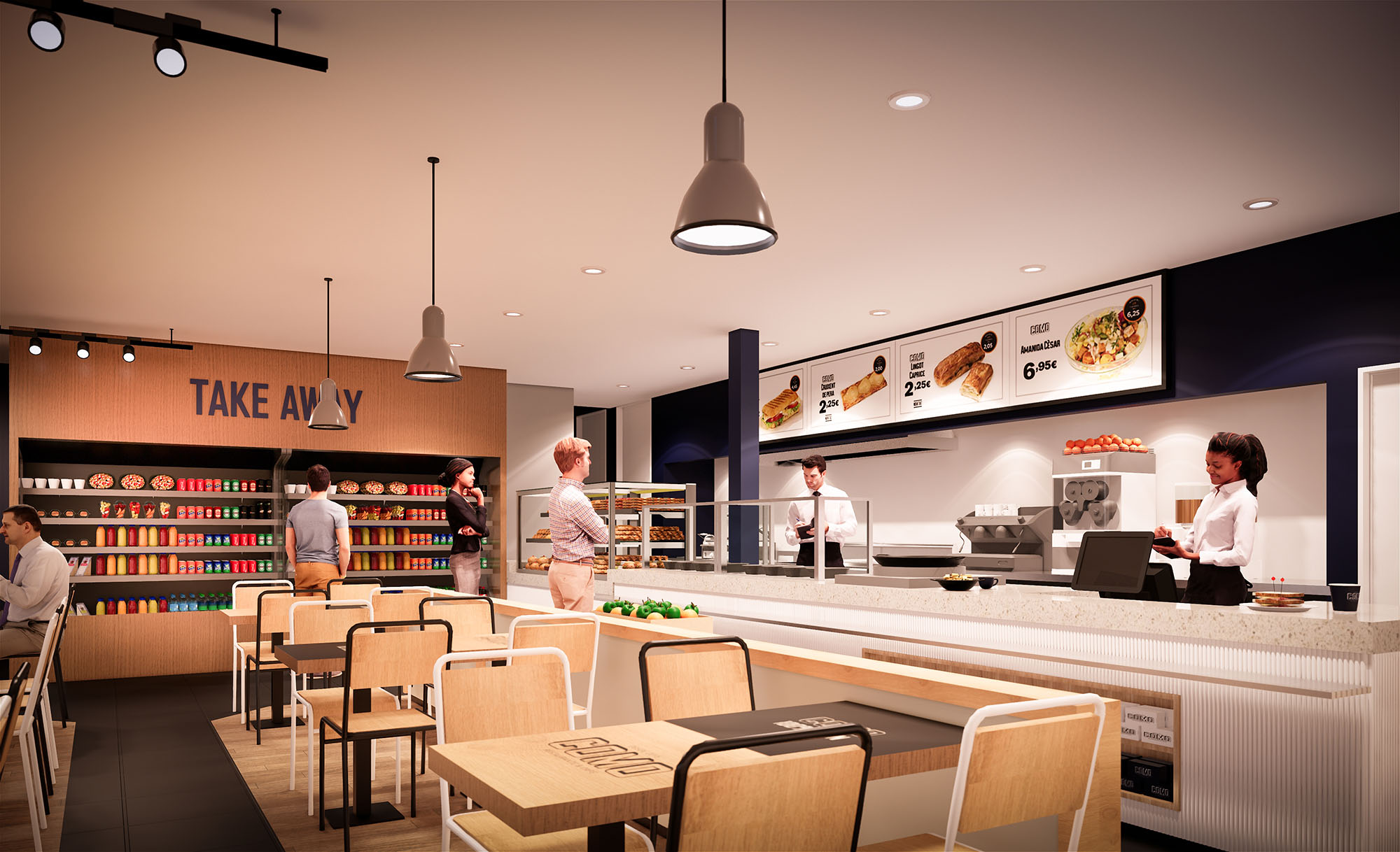
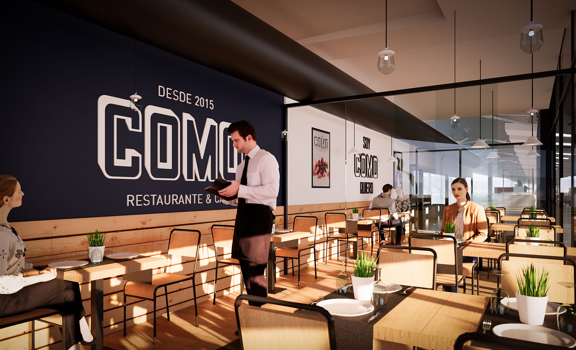
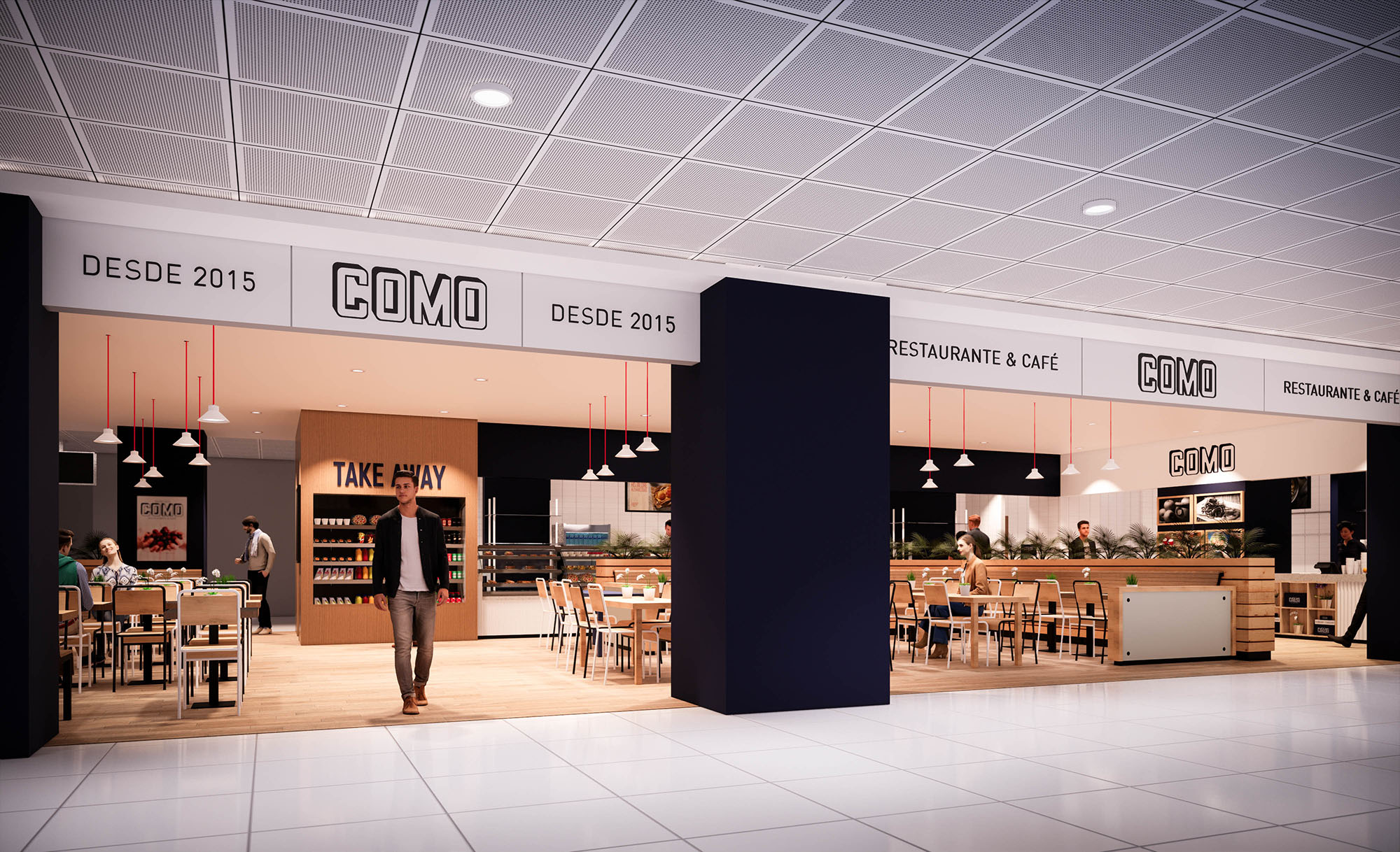
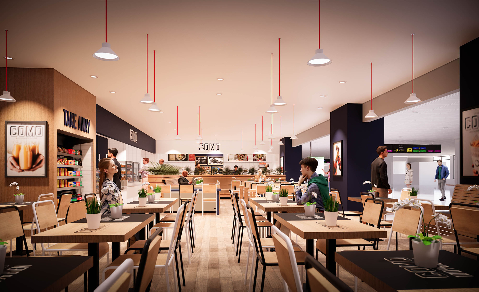
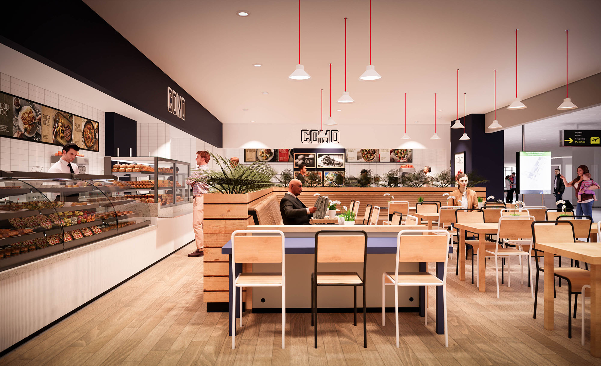
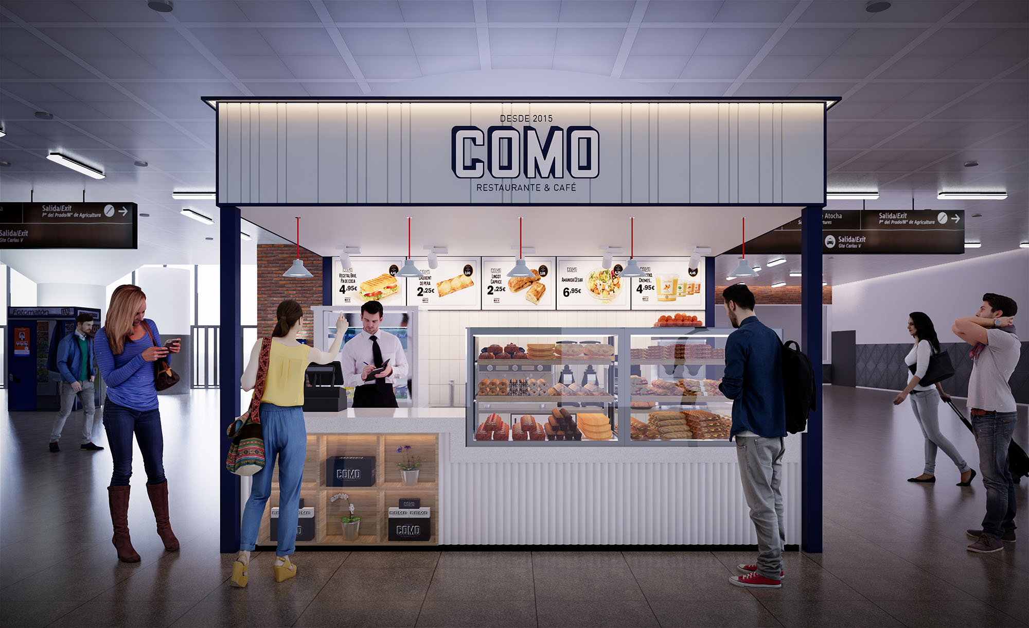
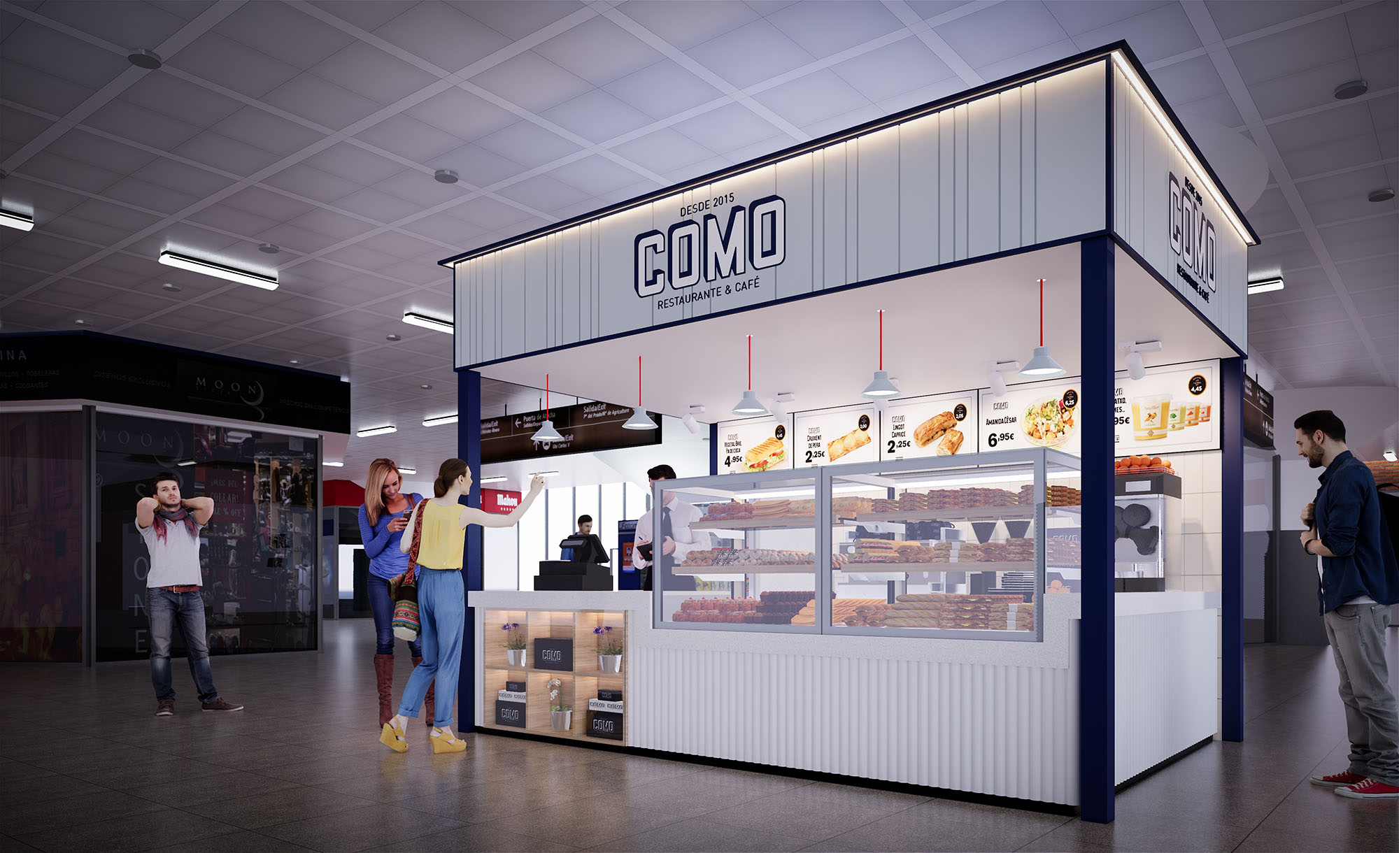
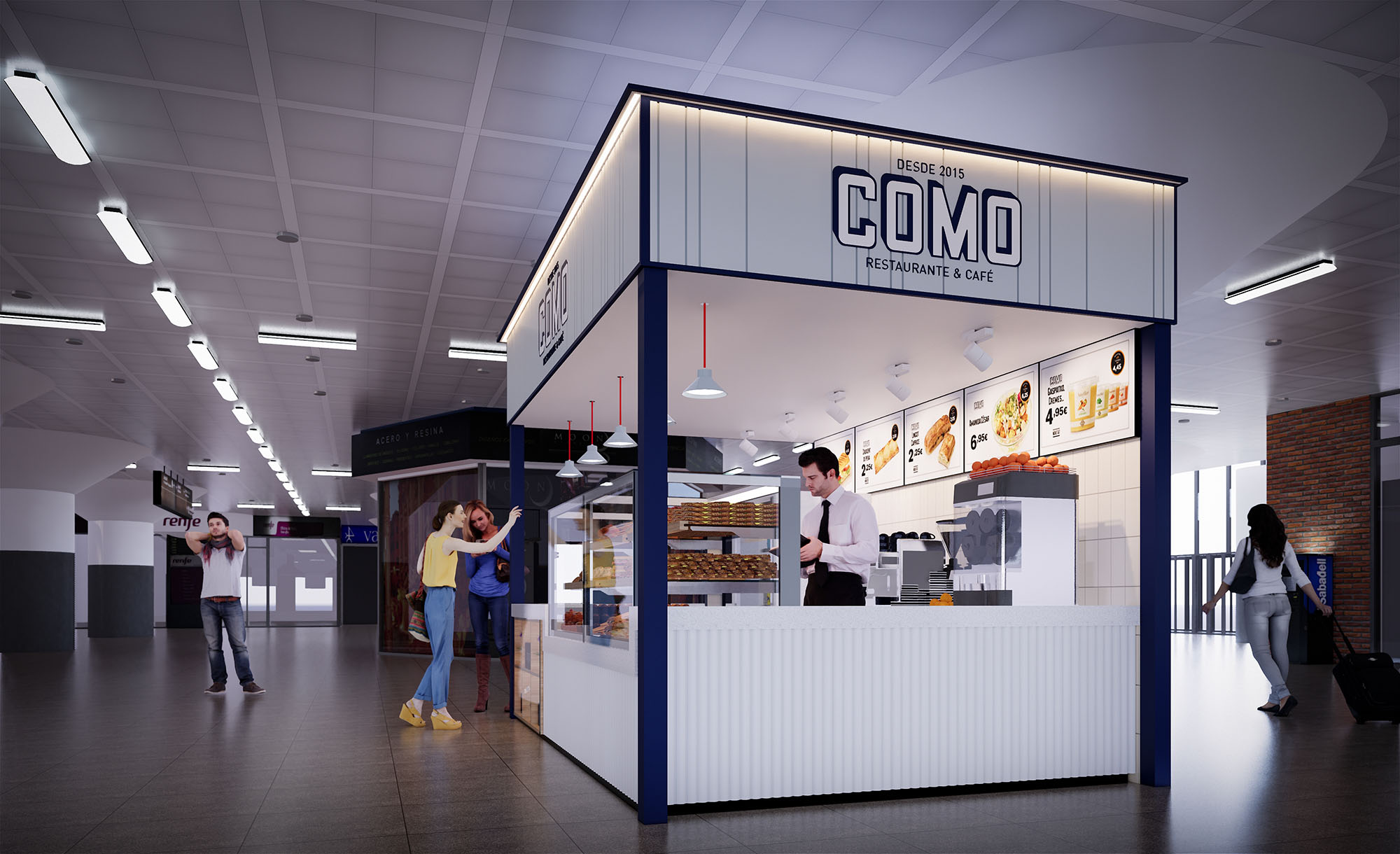
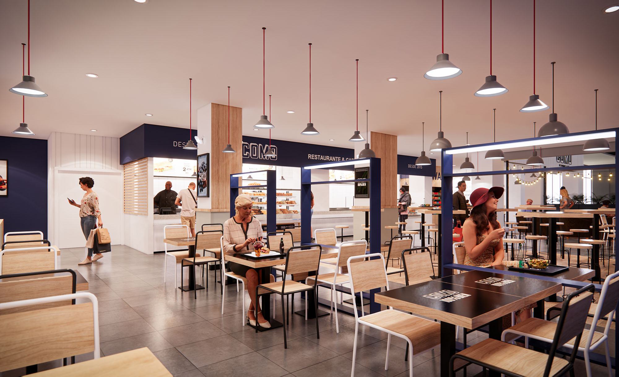
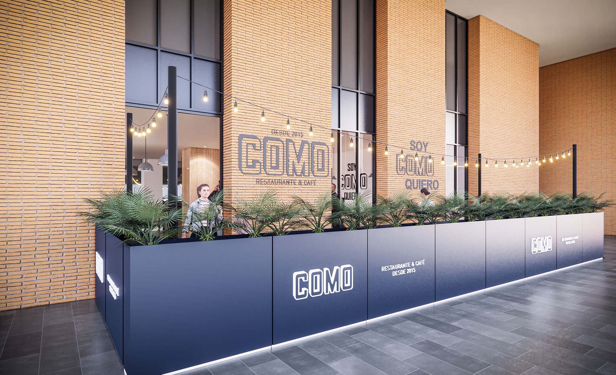
© 2021 by sanzpont [arquitectura] . Webpage by sanzpont [digital] . Innovative Digital Experiences
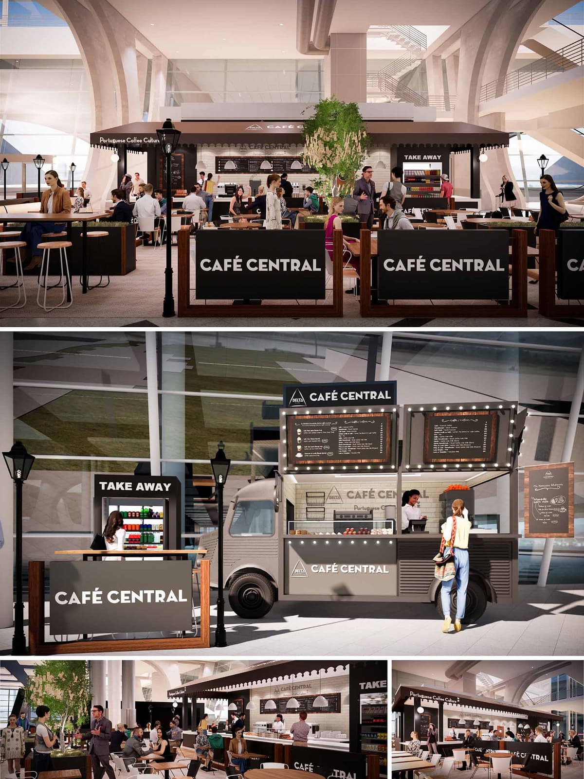
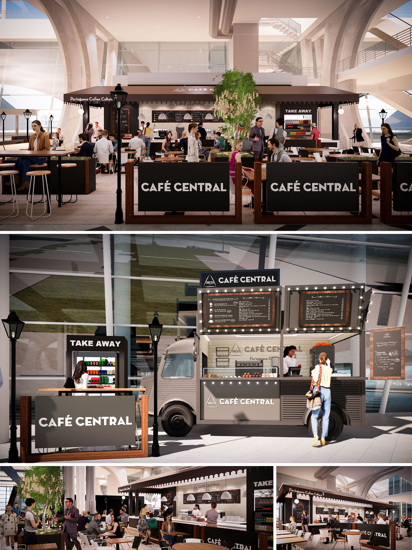
DELTA CAFE is conceived as a contemporary interpretation of the Portuguese café culture, designed to adapt to three different locations while maintaining a clear and recognisable identity. The project merges the informality of the traditional “café de bairro” with the efficiency of a transit‑oriented food hub, using a modular language that can be scaled, rotated and recombined according to each site. The core intention is to create an urban living room inside infrastructural environments such as malls or transport terminals, where people can pause, meet and experience coffee as a social ritual.
The architecture responds to the fluidity of public circulation with permeable edges, low partitions and open counters that invite approach from all sides. The visual vocabulary balances heritage and modernity: a monochrome base palette, clear signage and graphic rigor underline the brand, while material warmth and human scale bring comfort and familiarity to large glazed surroundings.
The spatial strategy is based on a sequence of differentiated zones: ordering counters, bar seating, communal tables and peripheral lounge areas. In the main configuration, the central bar aligns longitudinally with the flow of the concourse, creating a clear front for service and a more intimate back area for preparation. Peripheral timber-framed balustrades delineate the café footprint without forming solid walls, allowing views across the public hall and maintaining visual continuity.
High stools along linear counters support fast consumption for travellers, while larger shared tables accommodate groups and longer stays. The modular takeaway stations and the mobile coffee truck can operate independently or as extensions of the primary unit, ensuring flexibility during peak hours and the possibility of reconfiguring the layout as tenant needs or circulation patterns evolve.
The interior palette is deliberately restrained: deep charcoal and warm grey form the background for the white brand logotype, ensuring high legibility in busy environments. Timber in a medium, natural tone is used for frames, table tops and balustrades, providing tactile warmth and a domestic counterpoint to the surrounding structural concrete and glass. Black metal elements in stools, lamps and menu frames echo the graphic identity and create a coherent visual rhythm.
Surfaces behind the counter make use of white tiles and light-toned finishes to emphasise cleanliness and reflect light onto the worktop. Awning-like cornices and scalloped edges reference traditional Portuguese cafés, while festoon lighting around the truck and menu boards introduces a subtle festive atmosphere. The repetition of the “CAFÉ CENTRAL” signage on multiple planes ensures that the space is clearly identifiable from various approach angles within large-scale halls.
Furniture is designed for robustness and high turnover, with round-edged table tops and simple stool geometries that facilitate quick rearrangement. The mix of bar-height and standard-height seating addresses different user profiles, from solo travellers needing a quick stop with luggage to families or groups seeking a more relaxed moment. The defined yet permeable boundary created by branded panels offers a psychological sense of enclosure without compromising transparency.
Lighting combines the existing ambient illumination of the host buildings with focused pendant lights over the counter and integrated LED strips in menu boards and display shelves. This layered approach accentuates product presentation and guides the user intuitively to ordering points and pickup zones, while maintaining a comfortable overall luminance suitable for reading or working.
Sustainability is addressed through modular construction, durable materials and an emphasis on reusability across the three locations. The main structural and furniture elements are conceived as kit-of-parts systems that can be dismantled, transported and reassembled, reducing construction waste and enabling future adaptation when commercial requirements change. Timber components are specified from certified sources, and metal structures are designed for long life and easy maintenance.
The open, naturally lit host environments reduce the need for artificial lighting during daytime, while energy-efficient LED fixtures and compact equipment minimise operational consumption. The takeaway kiosks and mobile truck concentrate services and storage, optimising logistics and limiting back-of-house areas. The project also facilitates waste separation and encourages reusable cups and packaging solutions, integrating brand experience with responsible environmental behaviour.
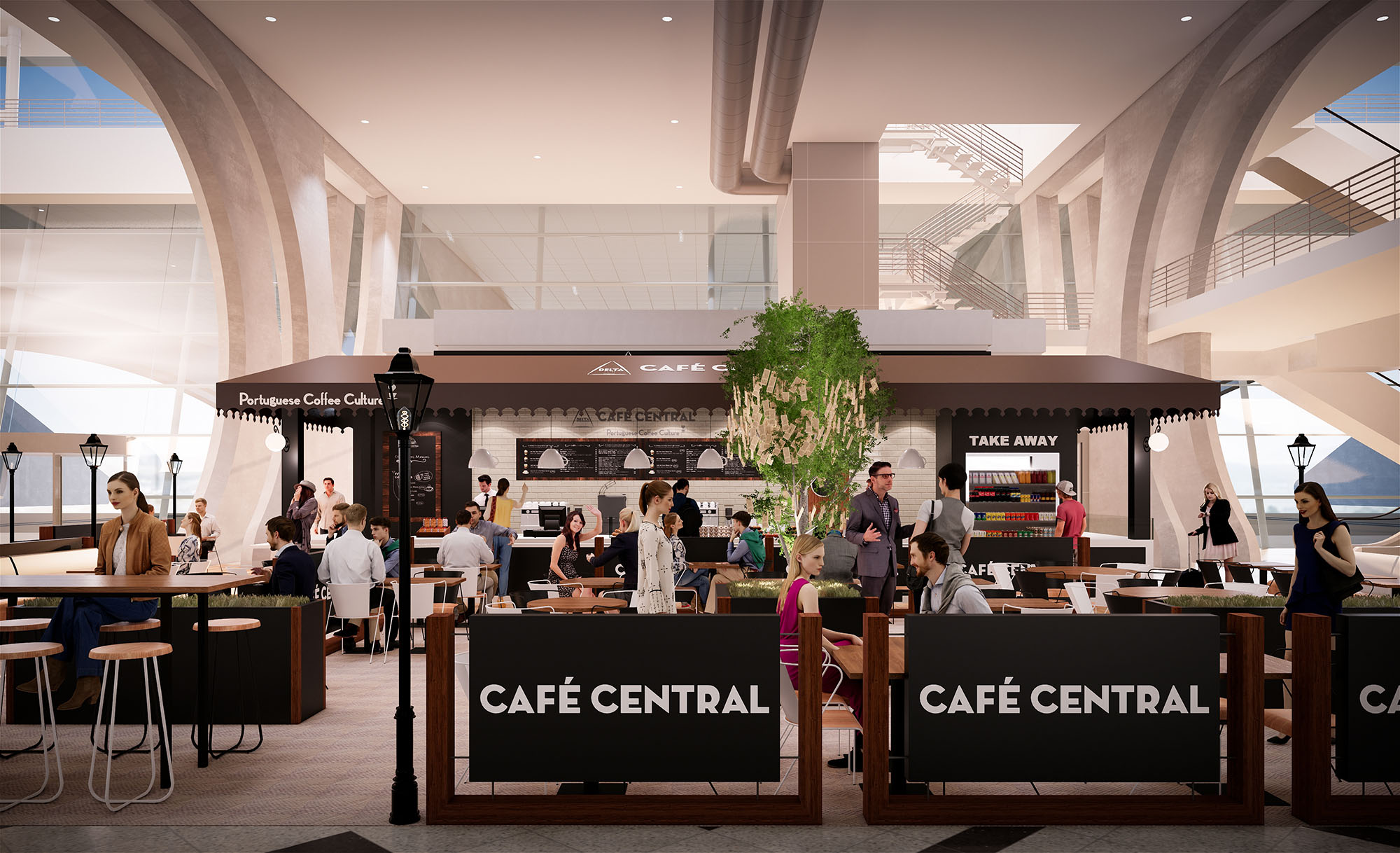
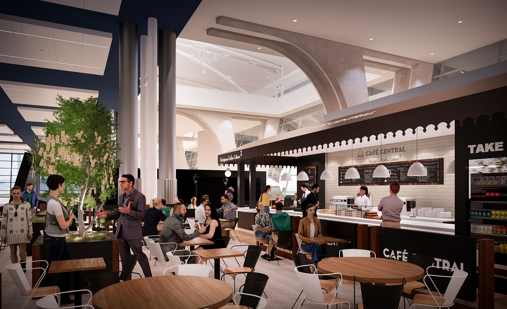
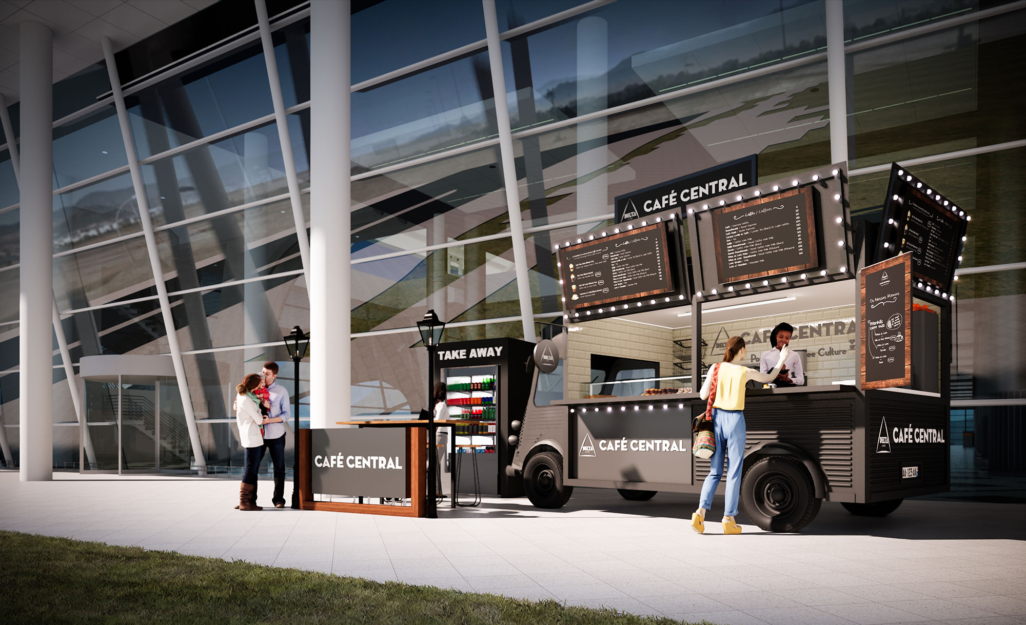
© 2021 by sanzpont [arquitectura] . Webpage by sanzpont [digital] . Innovative Digital Experiences
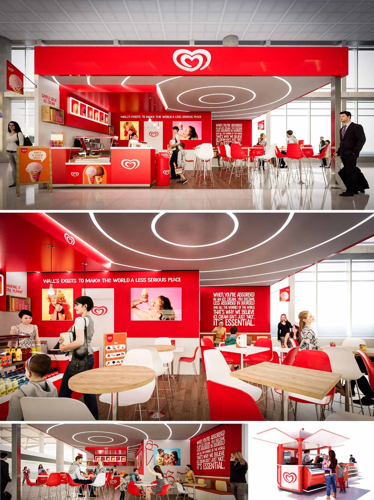

The FRIGO project is conceived as a recognizable, modular ice-cream environment that can be replicated across different sites in Spain and Portugal, from airports to malls and outdoor plazas. The design translates the brand’s playful character into a clear architectural language based on bold geometry, intense color fields and immersive graphics. The space is understood as a compact, high-visibility pavilion that radiates energy and warmth, turning the act of buying an ice cream into a short but memorable spatial experience.
The concept revolves around a strong red envelope that frames the service counter, seating area and ceiling, contrasted with white elements to maintain luminosity and visual balance. The architecture of the kiosk and the interior bar is reduced to essential volumes, allowing the brand iconography, digital media and the product itself to occupy center stage.
The layout is organized around a linear serving counter that anchors the main façade, ensuring maximum exposure to passing flows. This counter concentrates preparation, display and payment functions, reducing back-of-house requirements and optimizing staff movement. In front of it, a generous clear zone allows queuing without obstructing the general circulation of the host building.
Beyond the counter, a compact seating area with a mix of bar stools and standard-height tables creates different modes of occupation: quick consumption at the high counter and more relaxed, social use at the timber-topped tables. The open-plan configuration, free of visual barriers, supports direct supervision by staff and a strong sense of safety and transparency—an important aspect for family-oriented environments.
The interior design is driven by a coherent chromatic strategy where the brand red acts as the primary hue, paired with white and light wood to soften and humanize the atmosphere. The seating alternates red and white shells, generating a dynamic yet orderly rhythm. Timber tabletops introduce a natural texture that offsets the otherwise glossy, graphic surfaces.
Large-scale wall graphics and integrated digital screens reinforce storytelling and seasonal campaigns. Typography and imagery are architecturally framed within red planes, functioning almost as illuminated murals. The result is a seamless fusion of interior design and communication design, where messages are not applied superficially but structurally embedded in walls, soffits and counter faces.
The ceiling becomes a key expressive component. Concentric luminous rings in recessed LED profiles define the central area, guiding the eye inward and emphasizing the convivial core of the space. This circular motif echoes the brand’s logo, translating it into a three-dimensional, spatial gesture.
Functional lighting is resolved through energy-efficient LED systems with a neutral-white temperature, ensuring accurate color rendering of products while maintaining a fresh ambiance. The combination of halo-like feature lighting and discreet linear illumination ensures visual comfort, depth and a strong nighttime identity without unnecessary energy consumption.
Materials are selected for durability, ease of cleaning and fast installation. High-pressure laminates and lacquered MDF in red and white finish the main volumes, while compact, non-porous countertops support intensive food-service use. The floor is a hard-wearing smooth surface, facilitating quick maintenance and hygienic operation.
Furniture consists of lightweight, stackable chairs and bar stools in molded plastic with metal bases, allowing flexibility in layout and simplified logistics across multiple locations. The outdoor kiosk version uses similar material logic—powder-coated metal framing and robust cladding panels—to ensure weather resistance and a cohesive image between interior and exterior formats.
The project integrates sustainability through a modular construction strategy, allowing components to be prefabricated, transported flat and assembled on site with minimal waste. Standardized counters, ceiling modules and signage systems reduce material offcuts and facilitate future reconfiguration or relocation as commercial needs evolve.
High-efficiency refrigeration equipment, LED lighting and smart control of illuminated surfaces help lower operational energy consumption. Where possible, finishes prioritize long lifecycle and recyclability, favoring metal, laminates and plastics that can be separated at end-of-use. By combining intensive use of space with adaptable, repeatable elements, FRIGO maximizes commercial performance while limiting environmental impact across its multiple Iberian locations.
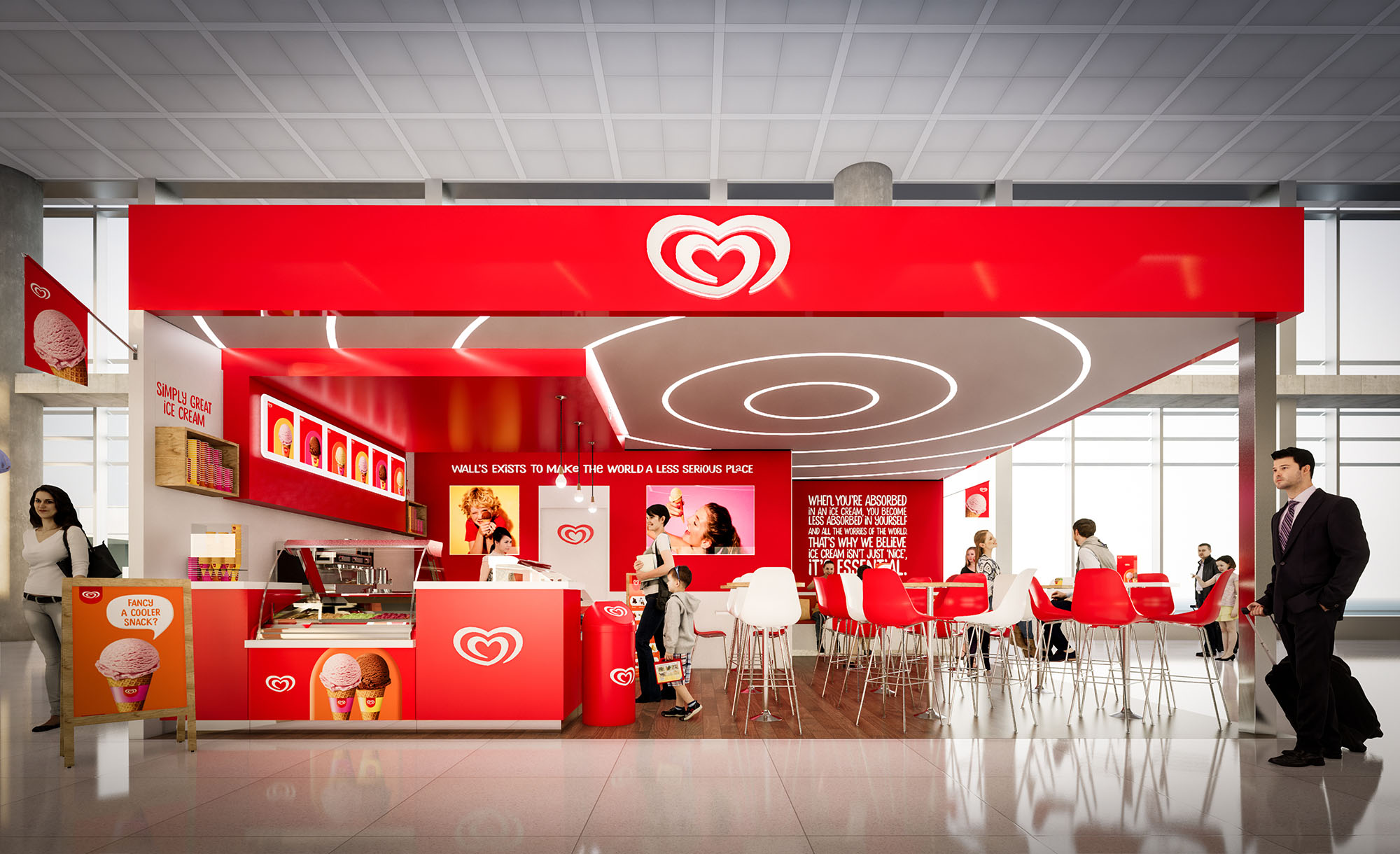
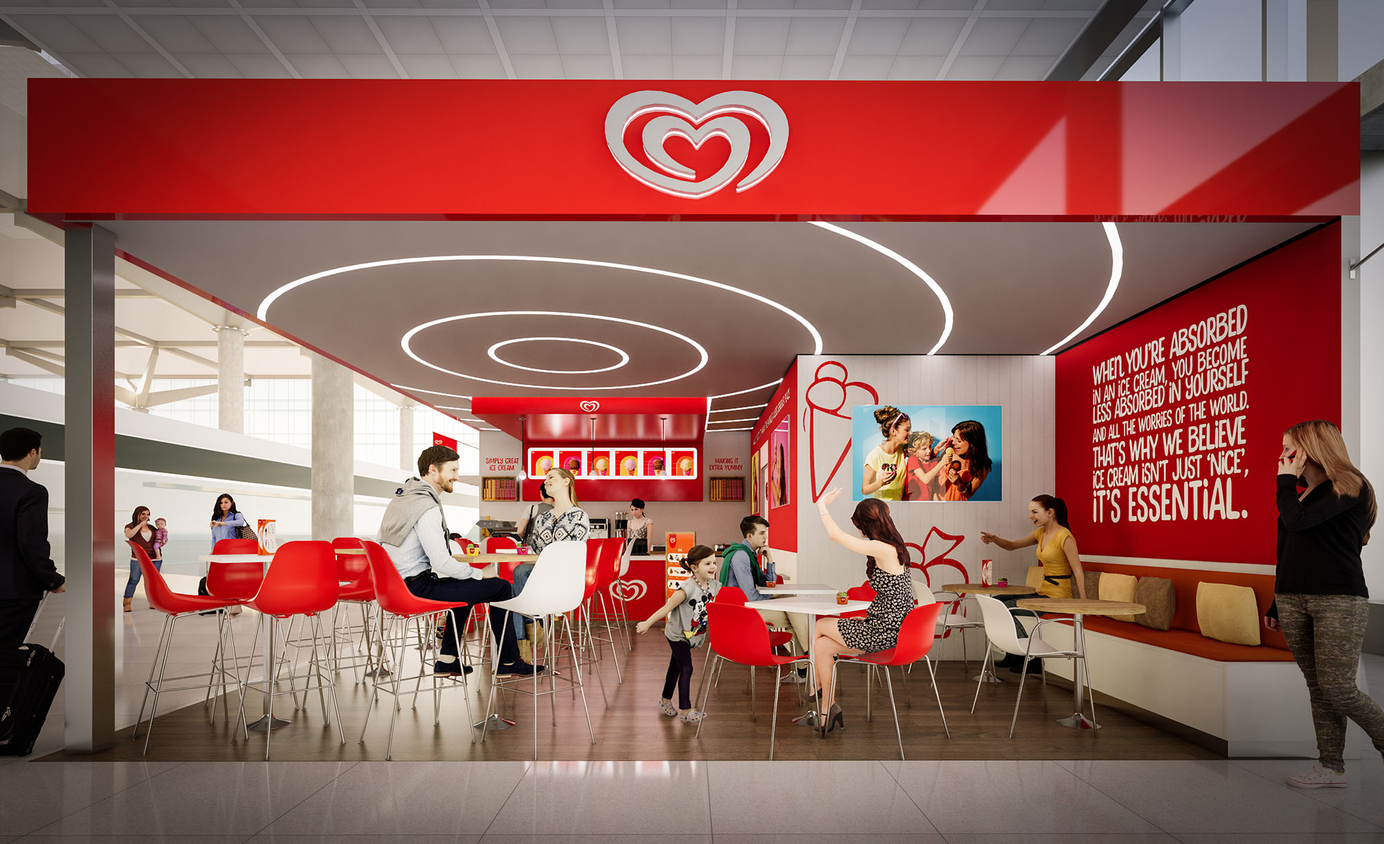
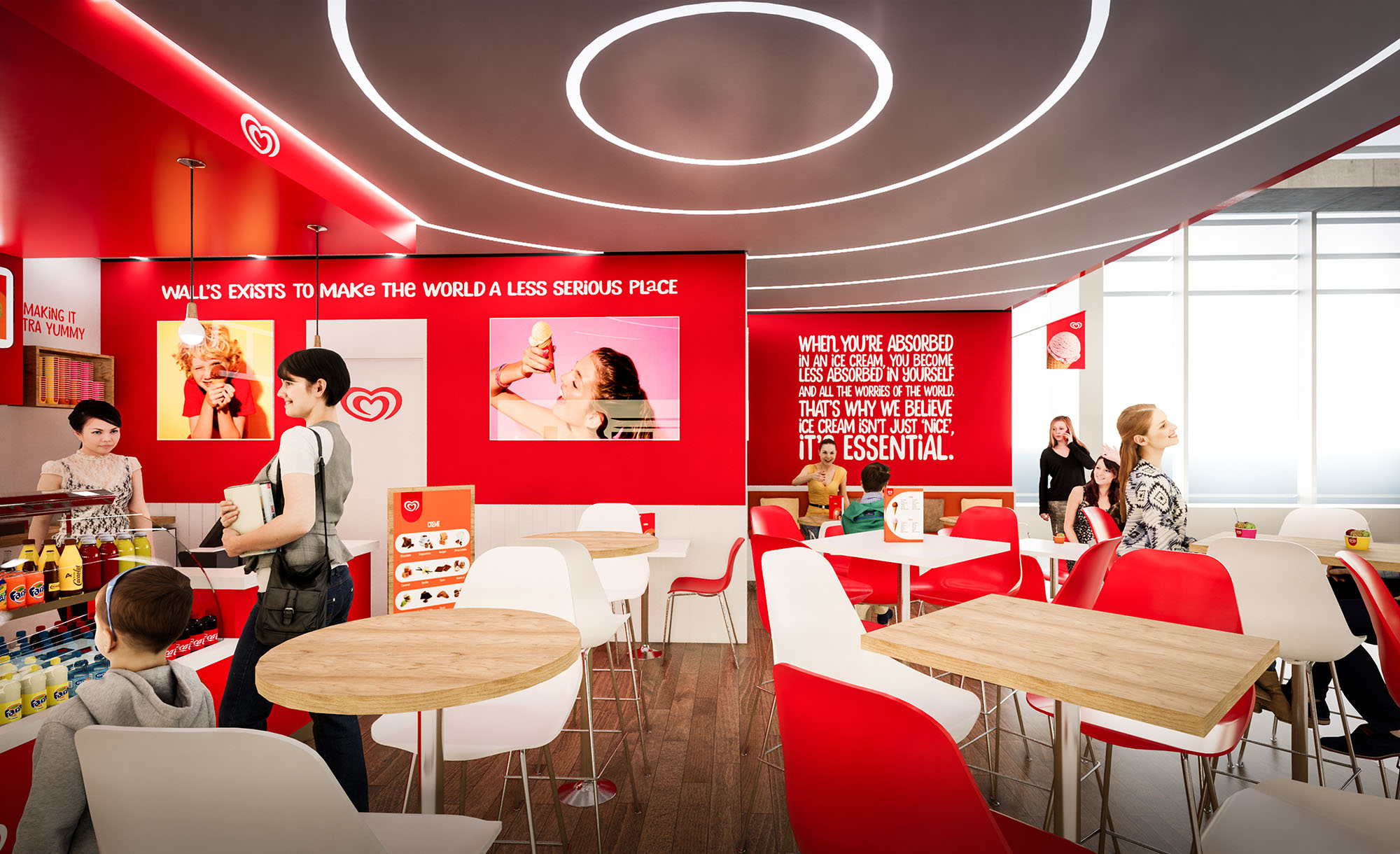
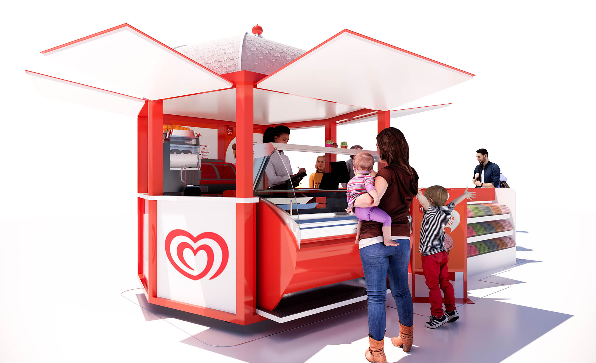
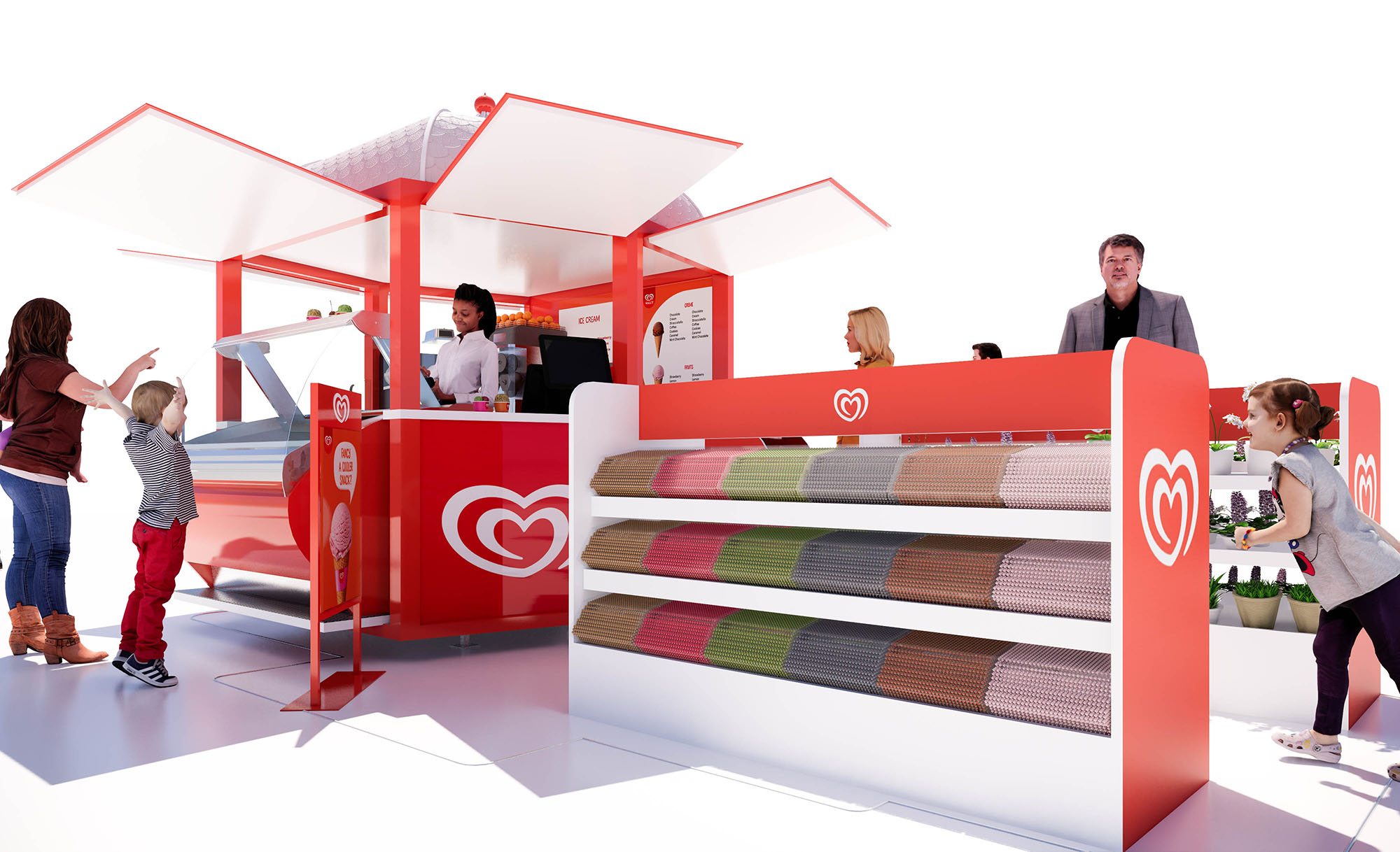
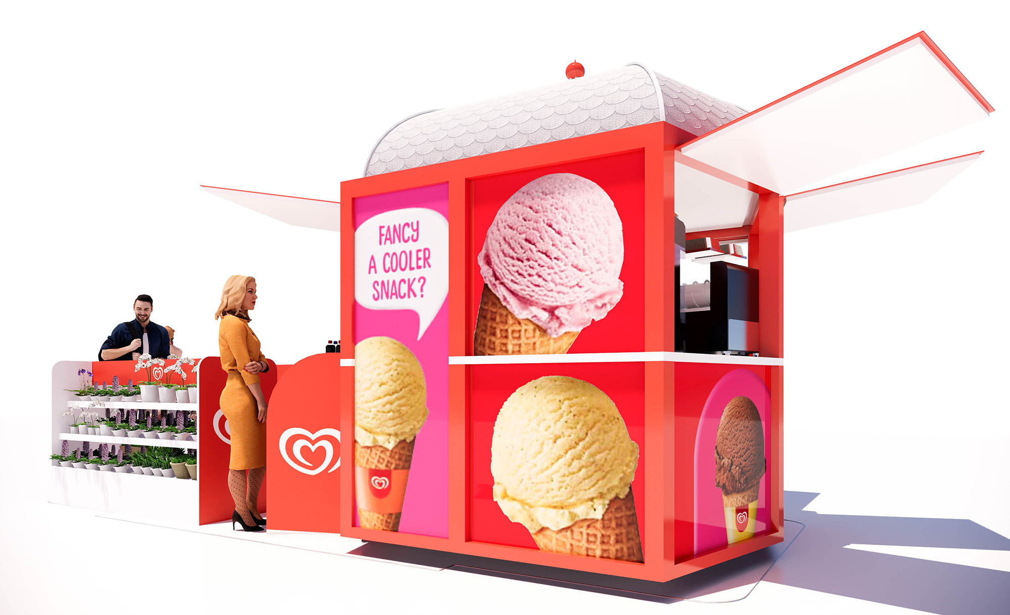
© 2021 by sanzpont [arquitectura] . Webpage by sanzpont [digital] . Innovative Digital Experiences
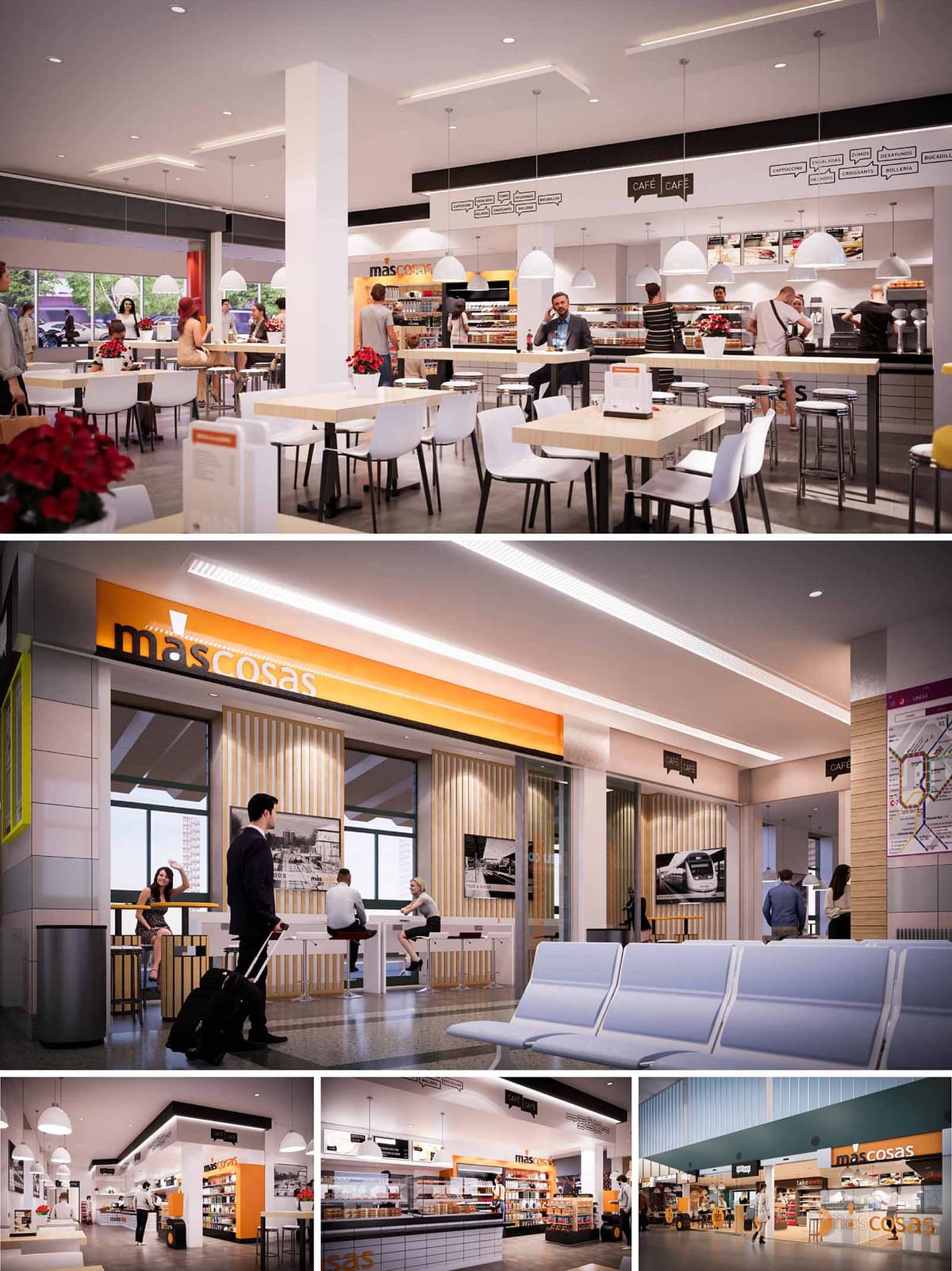

MAS COSAS is conceived as a recognizable, repeatable restaurant and retail concept for transport hubs across Spain. The design strategy combines the agility of a grab-and-go offer with the warmth of a neighborhood café, using a clear visual identity based on the orange brand band, light woods, and clean white surfaces. The spaces are planned to operate in high-traffic environments, offering intuitive navigation, quick orientation, and multiple modes of stay: from fast coffee stops to more leisurely meals.
The architecture works as an urban micro-foyer inside stations and terminals. Generous, open façades invite flows from the concourse, while the interior language emphasizes transparency and visual continuity. The project aims to be immediately legible from a distance, then gradually reveal more detail and comfort as users approach and enter.
The floor plan organizes three primary zones: frontal display and cashier line, central self-service and bar counters, and peripheral seating. The service counter is aligned longitudinally, allowing linear queuing and fast turnover during peak hours. Refrigerated displays and shelving form a low-height perimeter that maintains visual connection across the entire space.
Circulation is designed as a loop, avoiding dead ends and allowing passengers with luggage to move freely. Entry points are wide and unobstructed, aligning with main station pathways. Tall tables along façades provide short-stay seating for solo travelers, while grouped tables in the interior cater to families or small groups. Accessibility is prioritized with generous clearances between furniture and barrier-free access to counters.
The interior language is intentionally minimal and bright. Light-toned timber laminates, used in slatted wall panels and furniture, introduce warmth and tactility, counterbalancing the hard finishes typical of transport infrastructure. White solid surfaces and pale tabletops offer a clean, hygienic appearance and allow food products to remain the visual focus.
The flooring employs high-resistance materials with a neutral mid-gray tone that disguises wear and integrates with existing concourse surfaces. Vertical slat elements frame large windows and graphic panels, creating rhythmic façades and softly separating zones without visual closure. Metallic details, such as chromed stools and structural profiles, reference the technical world of rail and air travel while ensuring durability.
The MAS COSAS brand band, in a saturated orange, becomes the primary architectural sign. It wraps the shopfront and reappears on soffits and selected interior surfaces, reinforcing recognition across multiple locations. Signage is layered: large, backlit logotypes for long-distance visibility and smaller black-and-white pictograms and speech-bubble graphics at eye level for detailed menu communication.
Black linear elements and typographic bands hover above the counters, organizing information about coffee, snacks, and regional products. Integrated photographic panels depicting transport scenes create a direct link with the context of mobility and suggest a narrative of travel and pause.
Lighting is designed to balance functional clarity with a welcoming ambience. Continuous recessed LED lines in the ceiling guide the main circulation axes and emphasize the longitudinal geometry of the premises. Over the dining area, suspended dome-shaped pendants create a more intimate scale and define micro-zones within the open plan.
Illuminated shelving and counter front lighting highlight merchandise and ensure uniform luminance, avoiding high-contrast glare zones for travelers adapting from daylight concourses. The overall light temperature is kept in a neutral-warm range, enhancing the natural tones of wood and food while maintaining a contemporary aesthetic.
Sustainability is addressed through both material choice and operational design. Preference is given to durable finishes with low maintenance cycles, reducing the need for replacement in high-traffic environments. Where possible, wood-based elements rely on certified sources, and modular furniture systems allow reconfiguration and reuse across different locations.
LED lighting with high efficiency and smart zoning minimizes energy consumption, adapting levels to opening hours and natural light availability. Large glazed openings leverage existing daylight from terminal façades, reducing reliance on artificial lighting. The open layout enhances passive surveillance, improving safety and potentially lowering the need for additional security infrastructure.
© 2021 by sanzpont [arquitectura] . Webpage by sanzpont [digital] . Innovative Digital Experiences

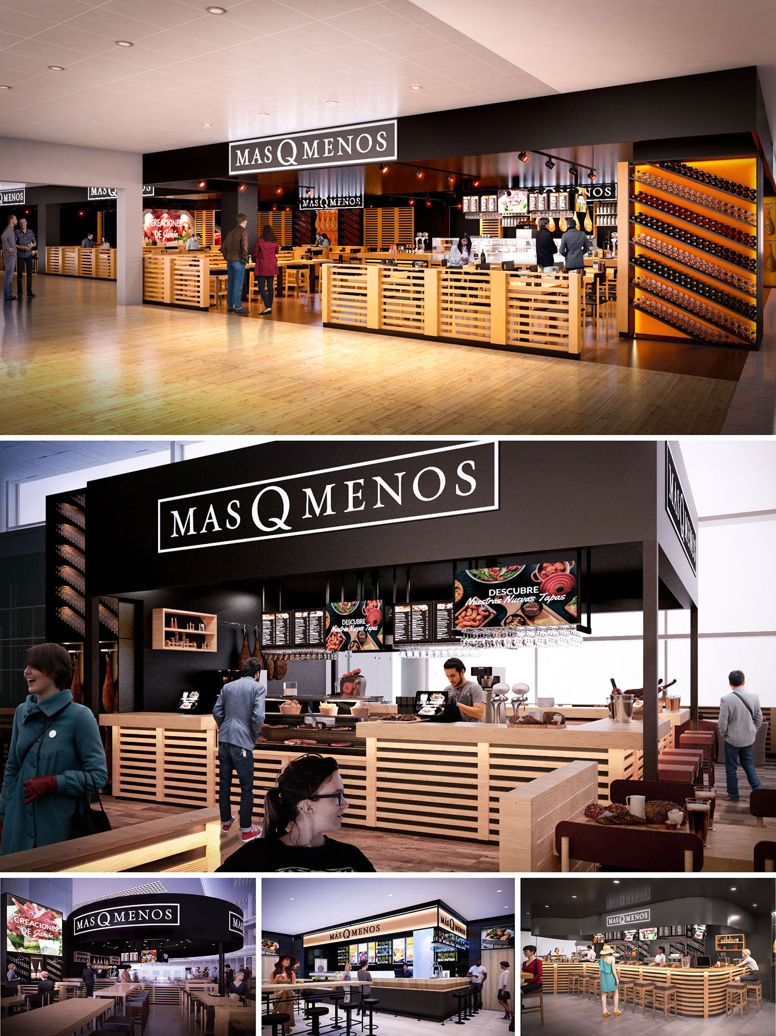
MAS Q MENOS is conceived as a contemporary reinterpretation of the traditional Spanish tapas bar, adapted to the dynamic context of airports in Barcelona, Palma de Mallorca, Málaga and Sevilla. The design translates the warmth of the classic bodega into an open, permeable space that invites transit passengers to pause, gather and taste. A strong, recognizable brand envelope in black and white contrasts with a luminous interior dominated by natural wood, highlighting the product as the main protagonist.
The architectural language is based on clarity and repetition: a simple, rectilinear volume frames the bar and dining areas, while a horizontal band of slatted timber creates a continuous base that unifies counters, perimeter enclosures and furniture. This modular strategy ensures identity and scalability, allowing each unit to adapt to different terminal geometries while maintaining a coherent visual code.
The layout is intentionally open, dissolving conventional façades to integrate seamlessly with the flow of the terminal. The bar island is positioned as a central nucleus, with service counters on multiple sides to optimize visibility and access. High stools along the bar perimeter encourage short stays and quick service, while linear communal tables in the foreground provide more relaxed seating for groups and solo travelers.
Circulation is organized radially around the bar, avoiding dead ends and allowing easy access from any direction. The low height of the timber enclosure keeps sightlines free across the concourse, increasing security perception and facilitating wayfinding. Strategic positioning of menu boards and illuminated signage ensures that the offer is legible from a distance, guiding passengers naturally toward the counter.
The project relies on a reduced and robust palette: natural-toned timber, matte black surfaces, and warm accent lighting. The extensive use of slatted wood provides texture, acoustic absorption and a tactile sense of craftsmanship that connects with Spanish gastronomic culture. The black structural frame and signage planes generate a clear graphic contrast, framing the bar like a contemporary proscenium.
Back walls and product displays introduce localized color through food imagery, wine bottles and hanging cured meats. These elements act as living ornaments, constantly renewed by daily operation. Flooring is resolved in wood or wood-effect surfaces to maintain continuity with the rest of the terminal while reinforcing the warm, domestic atmosphere within the commercial setting.
Lighting is a key tool to create an oasis within the airport environment. A combination of linear downlights and focused spotlights produces a warm, amber tone over the bar and tables, differentiating the restaurant from the cooler, more neutral lighting of the concourse. Illuminated shelves and bottle racks transform product into a visual landmark, while subtle under-counter lighting emphasizes the horizontality of the timber slats.
Branding is integrated architecturally rather than applied superficially. The black cornice band doubles as both structural frame and signage support, with the MAS Q MENOS logo centered on each façade. Digital menu boards are carefully aligned within this band, maintaining graphic order even with frequently changing content. The result is a consistent, legible identity that can be recognized instantly in different airports.
The interior choreography is designed for efficiency during peak passenger flows. Direct alignment between order points, preparation zones and delivery counters reduces waiting times and optimizes staff movement. Open kitchen elements showcase food preparation, reinforcing transparency and trust while animating the space visually.
Seating typologies respond to diverse dwell times: high counters for quick coffee or snacks, shared long tables for informal meals, and peripheral seating that allows for luggage maneuvering. Power outlets integrated in selected counters support contemporary traveler needs, turning the bar into both a gastronomic and functional stopover.
Sustainability is addressed through material choices, modular design and operational efficiency. The predominant use of certified timber reduces the environmental footprint and offers a renewable, low-embodied-energy finish. The slatted system is conceived as a kit of parts, allowing components to be dismantled, repaired or reused in future locations, minimizing waste throughout the life cycle of the brand.
Durable finishes suited to high-traffic airport environments are combined with LED lighting and high-efficiency kitchen equipment to reduce energy consumption. Open configurations maximize natural light from terminal façades, decreasing dependence on artificial lighting during the day. Together, these strategies create a resilient, comfortable and recognizable restaurant model that aligns with contemporary environmental and operational demands.
© 2021 by sanzpont [arquitectura] . Webpage by sanzpont [digital] . Innovative Digital Experiences
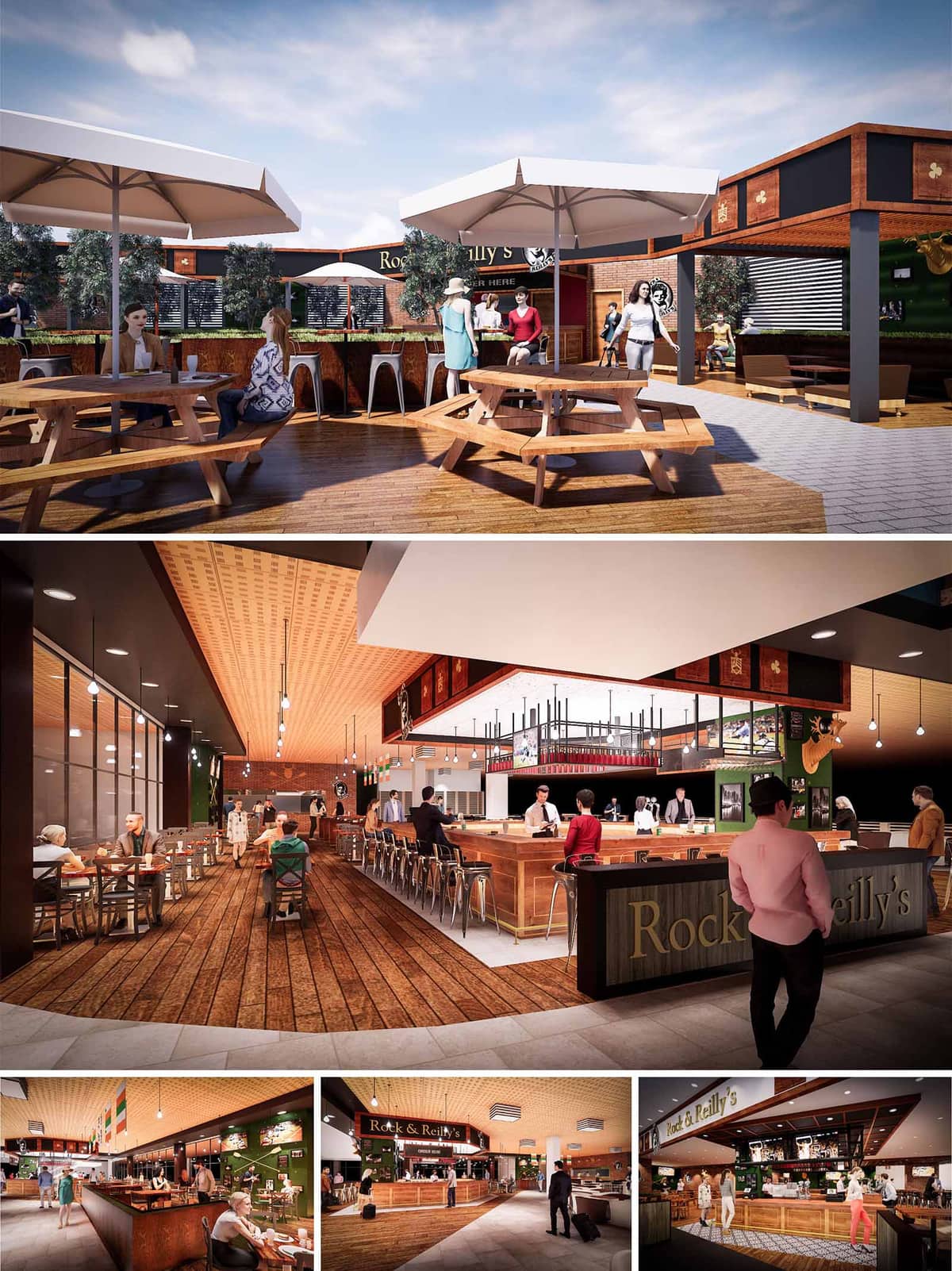

Rock & Reilly’s is conceived as a contemporary reinterpretation of the classic Irish pub, adapted to the dynamic context of Spanish airports. The design merges the warmth and informality of a neighborhood bar with the efficiency and clarity required in a high‑flux transit environment. Visual permeability, intuitive circulation and strong brand identity guide the entire proposal, both in the exterior terrace and in the interior dining and bar areas.
The architecture emphasizes a continuous wooden “carpet” that connects zones and directs passengers naturally towards the central bar. Above, a system of suspended canopies and framed signage creates a recognizable skyline within the terminal, consolidating the venue as a spatial landmark in the concourse while maintaining an open, inviting character.
The project is structured around a central horseshoe bar that organizes flows and anchors the different seating typologies. High stools around the bar cater to short‑stay users, while peripheral tables and lounge corners serve groups and longer dwell times. This gradation of densities provides flexibility throughout the day, from quick breakfasts to evening gatherings.
The outdoor terrace is configured as an extension of the interior, with circular picnic tables and large parasols, generating an informal beer‑garden atmosphere. Planters and low hedges define the edge without obstructing views, maintaining visual connection with the airport environment and signage while offering a sense of enclosure and comfort for guests.
Materiality is dominated by warm timber tones, dark metal accents and deep green surfaces, referencing traditional pub interiors while embracing a lighter, more contemporary language. The continuous wooden flooring and bar counter in solid or engineered wood evoke craftsmanship and durability, contrasted by industrial stools, exposed structures and suspended bottle racks.
Ceilings combine acoustic timber panels with blacked‑out technical bands, allowing lighting, sprinklers and ventilation to be integrated discreetly. Graphic elements, historic photographs and framed flags reinforce the narrative of the brand, adding texture and visual richness without saturating the space. The result is an atmosphere that feels both familiar and refreshed, appropriate for an international, multicultural user profile.
Lighting plays a strategic role in creating identity and hierarchy. Linear pendants and point luminaires above the bar emphasize it as the focal point, while softer, more uniform lighting over the dining areas ensures visual comfort and glare control for travelers. At night, the warm color temperature enhances the timber finishes, creating a cozy environment in contrast to the often neutral ambience of airport halls.
Branding is seamlessly integrated into the architecture: backlit logos, edge‑lit menu boards and a perimeter frieze of graphic panels form a continuous visual band. This approach avoids isolated signage, instead generating a coherent envelope that is clearly visible from different vantage points within the terminal and on the outdoor terrace.
The furniture selection balances robustness, ergonomics and rapid turnover needs. Metal‑framed stools and chairs with simple geometries ensure resistance to intensive use, while timber seats and tabletops bring tactile warmth. Circular picnic tables on the terrace encourage social interaction, while interior two‑ and four‑top configurations offer flexibility for individuals, couples and families.
The open service bar and partially visible preparation areas contribute to a transparent, engaging user experience. Passengers can quickly read the offer, order and be served without visual or physical barriers, optimizing dwell time and reducing perceived waiting.
Sustainability is addressed through material selection, energy efficiency and adaptability. Priority is given to certified woods, durable finishes and modular construction systems that facilitate installation in airport environments with minimal waste and potential for future reconfiguration or relocation. Many components, such as bar fronts, shelving and planters, are designed as prefabricated modules to reduce on‑site work and improve quality control.
The combination of generous natural light from the terminal façades with an efficient LED lighting scheme lowers energy demand while ensuring adequate illumination throughout the operating hours. Acoustic timber ceilings improve sound absorption, enhancing comfort in a typically noisy context and allowing background music and conversation levels to remain pleasant. The incorporation of vegetation in planters and hedges, especially on the terrace, contributes to microclimate regulation and introduces a biophilic dimension within the predominantly hardscape airport setting.
© 2021 by sanzpont [arquitectura] . Webpage by sanzpont [digital] . Innovative Digital Experiences

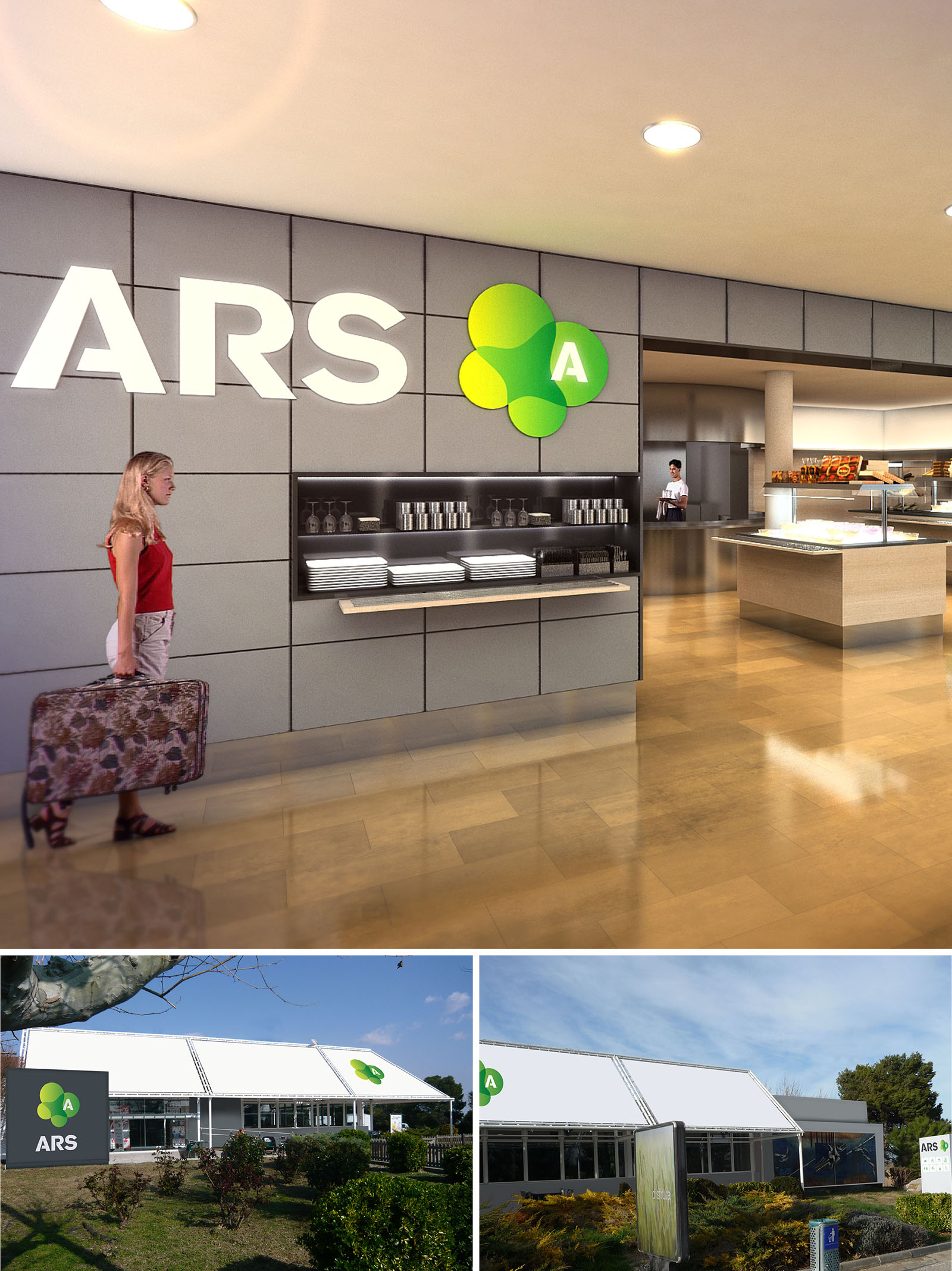
The ARS restaurants are conceived as a unified hospitality brand deployed across multiple Spanish locations, combining a clean, contemporary interior language with a light, pavilion-like architectural envelope. The design seeks to convey efficiency and clarity while maintaining a warm, approachable atmosphere for transient users such as travelers and resort guests. A strong, easily recognizable visual identity supports wayfinding and reinforces the sense of a coherent network of venues.
The concept is based on a dialogue between robust, orthogonal surfaces and a softer, organic graphic motif. This contrast generates a memorable spatial experience: rational layouts and precise detailing form the background for a friendly, nature-inspired logo and selective color accents, suggesting freshness and dynamism associated with food and landscape.
The exterior architecture adopts a lightweight, modular pavilion typology. Large, white roof planes fold gently over glazed façades, creating a clear, graphic silhouette that stands out in the suburban and landscaped contexts. The geometry is simple and repetitive, facilitating construction in multiple locations while allowing adaptation to plot conditions and orientation.
Extensive glazing along the perimeter promotes visual permeability between interior dining areas and surrounding gardens, reinforcing the connection with the landscape and maximizing natural light. The buildings are surrounded by low-maintenance planting beds and existing vegetation, which soften the linear volume and help anchor the pavilions within their green settings.
The interior organization prioritizes legibility and fluid circulation. Upon entering, guests encounter a clear visual axis toward the serving counters, with self-service islands and display areas arranged to minimize crossing paths and congestion. The open-plan configuration ensures direct visibility of food offers, seating zones, and exits, supporting intuitive wayfinding.
Back-of-house areas are compact and strategically located behind the service line, optimizing functional adjacency between storage, preparation, and dishwashing. Structural elements such as columns are integrated into the layout, often acting as subtle separators between serving areas and seating zones without fragmenting the spatial continuity.
The interior palette combines large-format floor tiles in warm, honey-toned finishes with neutral wall cladding composed of rectified panels arranged in a precise grid. This grid provides a calm, orderly backdrop for the bold ARS signage and green logo, which appear as illuminated relief elements, transforming the wall into a branded feature surface.
Horizontal shelving, integrated into the wall plane, displays plates, glasses, and accessories, turning operational storage into a graphic composition. Ceiling-integrated downlights provide uniform ambient illumination, complemented by accent lighting over the food counters to emphasize freshness and texture. The restrained material selection ensures durability and ease of maintenance in high-traffic environments, while the brand colors—especially the gradient greens—introduce a sense of vitality associated with healthy cuisine and natural surroundings.
The repeated pavilion typology allows for standardized, efficient construction, reducing material waste and simplifying maintenance across the different sites. The lightweight roof and façade systems are designed to accommodate high-performance insulation and reflective exterior finishes, helping to control solar gain in the Spanish climate and improving thermal comfort with reduced energy demand for cooling.
Generous glazing is oriented and shaded to leverage daylight while minimizing glare, decreasing the reliance on artificial lighting during daytime operation. The use of durable, easy-to-clean interior finishes extends life cycles and lowers replacement frequency, contributing to resource efficiency. The landscape design favors drought-tolerant planting and existing vegetation, reducing irrigation needs and enhancing local biodiversity around the restaurant pavilions.
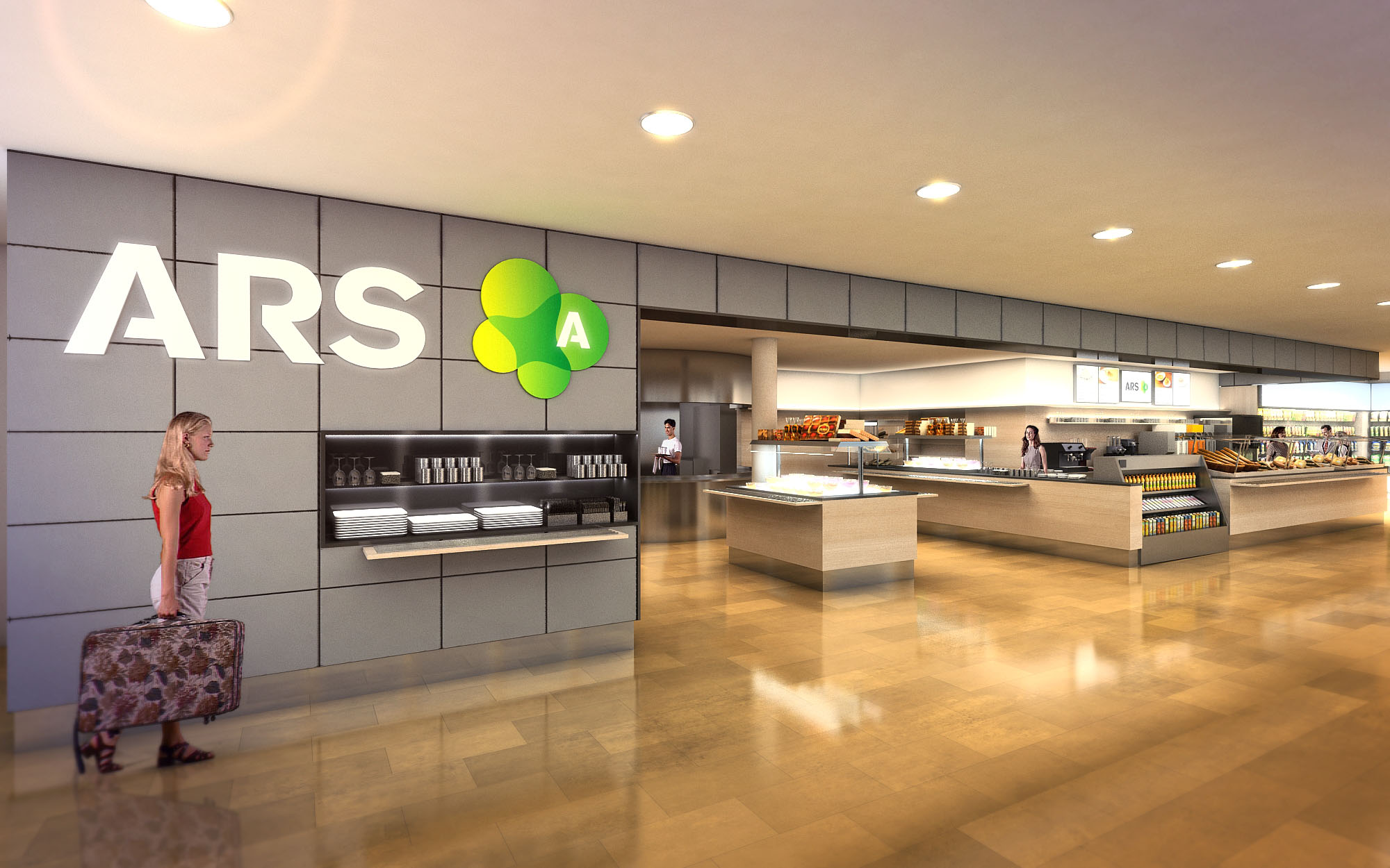
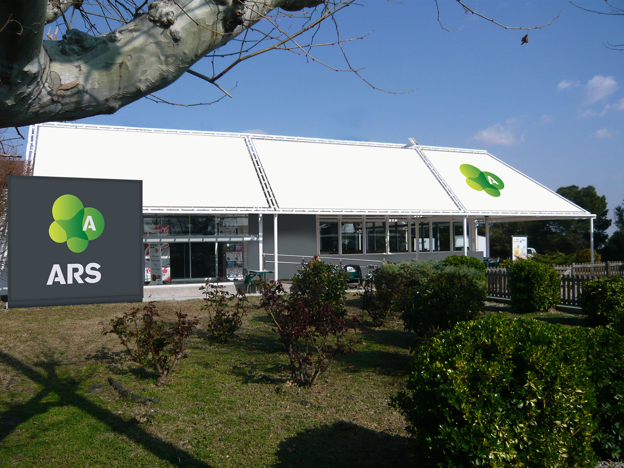
© 2021 by sanzpont [arquitectura] . Webpage by sanzpont [digital] . Innovative Digital Experiences
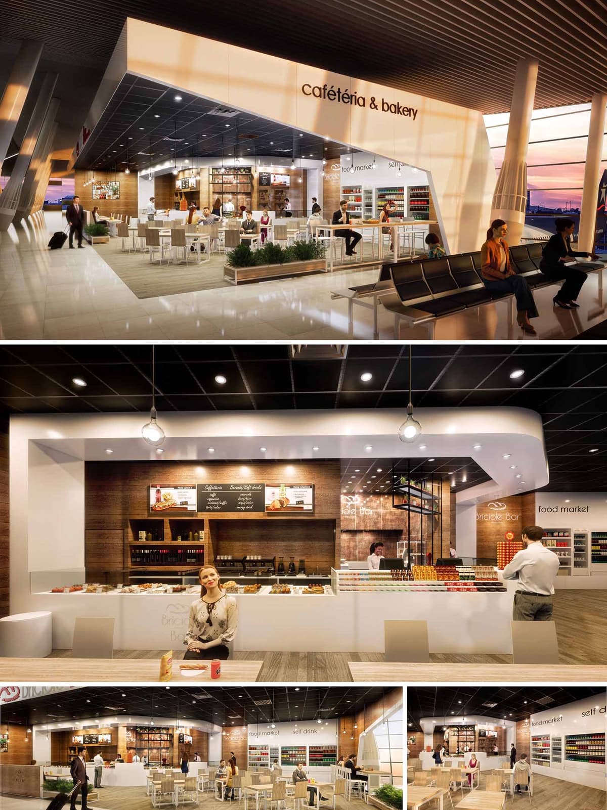

Briciole is conceived as an open and luminous café-bakery and food market that dissolves the traditional limits between airport concourse and restaurant. The project organizes a compact service core wrapped by a generous, permeable seating perimeter, encouraging intuitive access from multiple directions. The design language combines the warmth of a neighborhood bakery with the efficiency and clarity required in an airport environment, using a restrained palette and clean geometries to communicate order and calm within a busy terminal.
The space works as an interior “urban plaza,” where the architectural envelope frames views toward the airside while the central counter operates as an active, social focal point. Visual connection, transparency, and legible circulation are prioritized so that passengers with limited time can immediately understand the offer and flow through the space with ease.
The plan is structured around a linear bar that concentrates preparation, display, and payment, allowing all operational functions to remain visible but controlled. Behind the main counter, a continuous backdrop of shelving and menu boards forms a functional wall that organizes storage and information. Adjacent to this, a self-service food market creates a secondary axis, enhancing flexibility for different user profiles and levels of dwell time.
Seating is distributed in layers: higher stools along the perimeter and bar-height tables close to the concourse edge, standard-height tables occupying the central dining field, and a green buffer that subtly separates the café from the waiting area benches. This gradation of heights enhances visibility across the space, optimizes passenger wayfinding, and ensures that the commercial façade remains visually active from a distance.
The material palette balances tactile warmth with durability. Horizontal surfaces in light-toned engineered wood evoke the atmosphere of a domestic dining table while remaining resistant to intensive use. Vertical planes alternate between white solid surfaces and wood laminates, creating a rhythm that frames the product displays and highlights the baked goods as the main visual protagonist.
Lighting is layered to support both ambience and functional clarity. A luminous white canopy wraps the counter and extends toward the concourse, acting as a beacon visible from afar. Recessed downlights in the dark suspended ceiling generate contrast, focusing light on merchandise and work zones, while pendant fixtures above key points of sale bring a more human scale. The interplay between warm light over wood and cooler light on white planes reinforces zoning and guides the user journey.
The interior identity is defined by a precise use of branding and typography integrated into the architecture. The “cafetéria & bakery” signage is embedded within the luminous fascia, avoiding additional elements that might clutter the concourse. Inside, menu boards and graphic panels are framed within the wooden backdrop, reading as part of the wall composition rather than applied decoration.
Neutral furniture in light beige and white allows the chromatic emphasis to fall on the products: pastries, beverages, and packaged goods create a natural, ever-changing color layer. Transparent enclosures and minimal framing keep sightlines open, reinforcing the idea of an accessible, contemporary marketplace rather than an enclosed restaurant.
Sustainability is addressed through both material selection and operational strategy. The predominant use of engineered wood and laminates reduces reliance on solid timber while offering longevity and easy maintenance in a high-traffic context, minimizing the need for frequent replacement. Surfaces are chosen for their cleanability, supporting hygiene with limited use of aggressive chemicals.
The compact service core optimizes back-of-house circulation and reduces unnecessary conditioned volume. High-efficiency LED lighting, controlled in zones, lowers energy demand and allows adaptation to different levels of natural light from the terminal façade. Open boundaries eliminate the need for additional partitions and mechanical separation, encouraging passive air movement and shared climate control with the main terminal, thereby reducing overall environmental impact while maintaining user comfort.
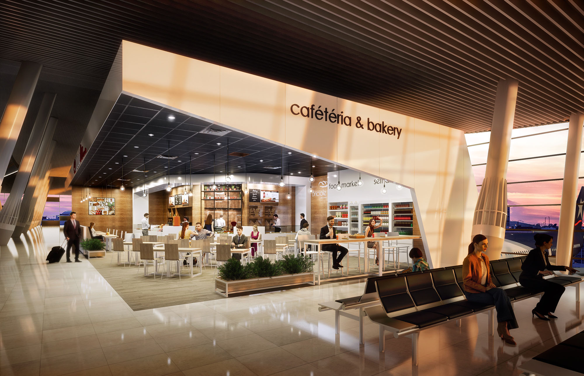
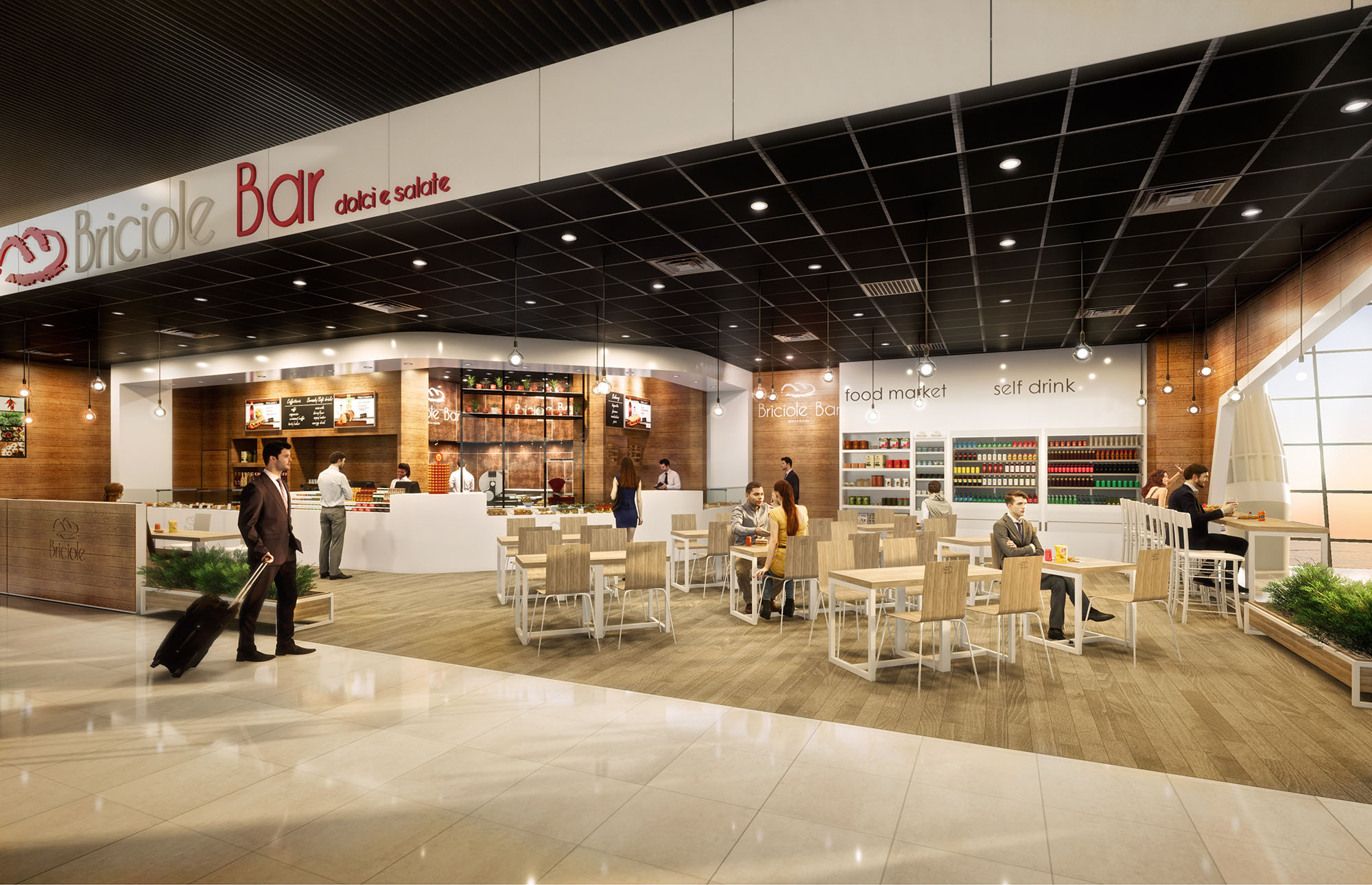
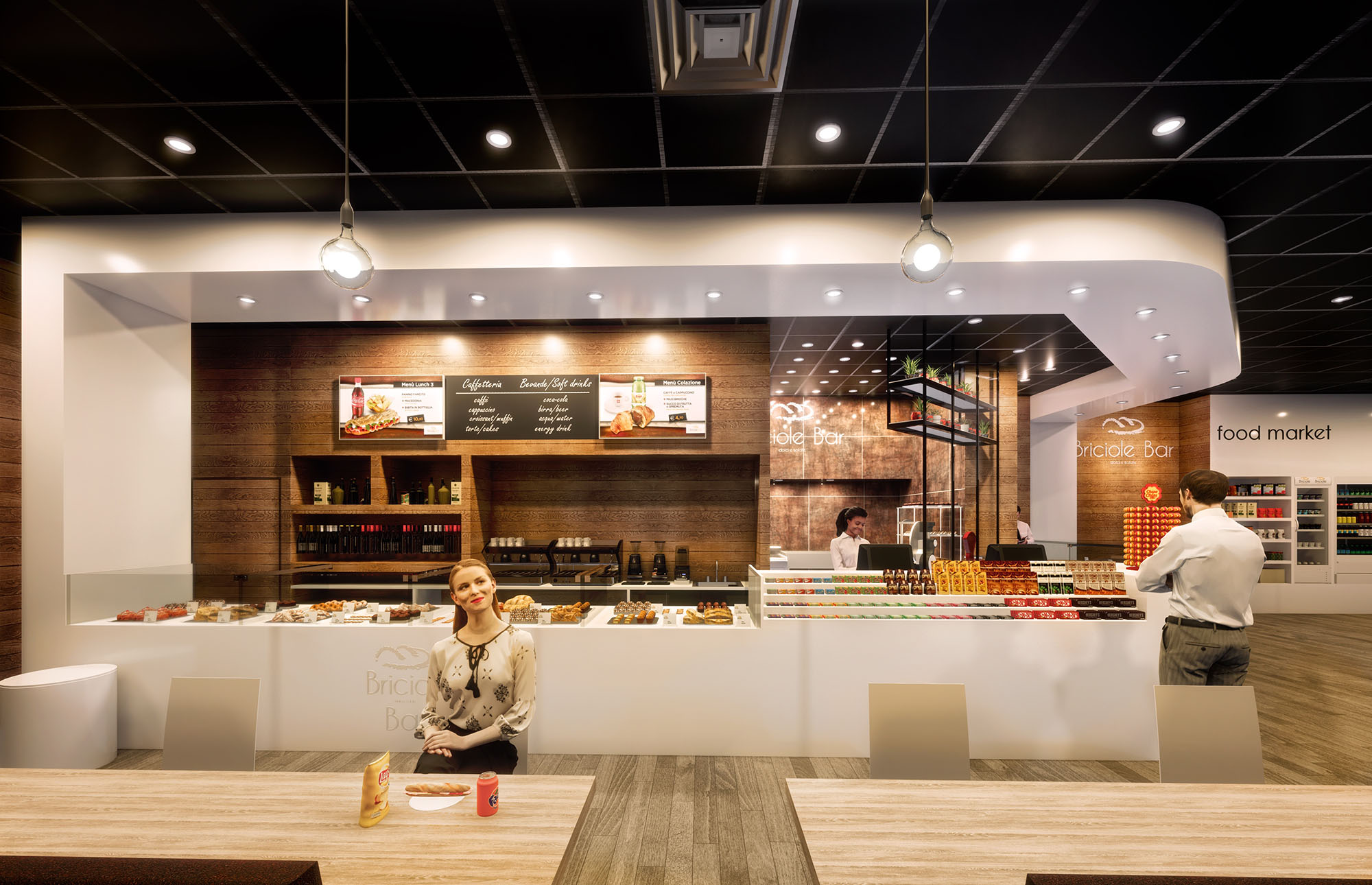
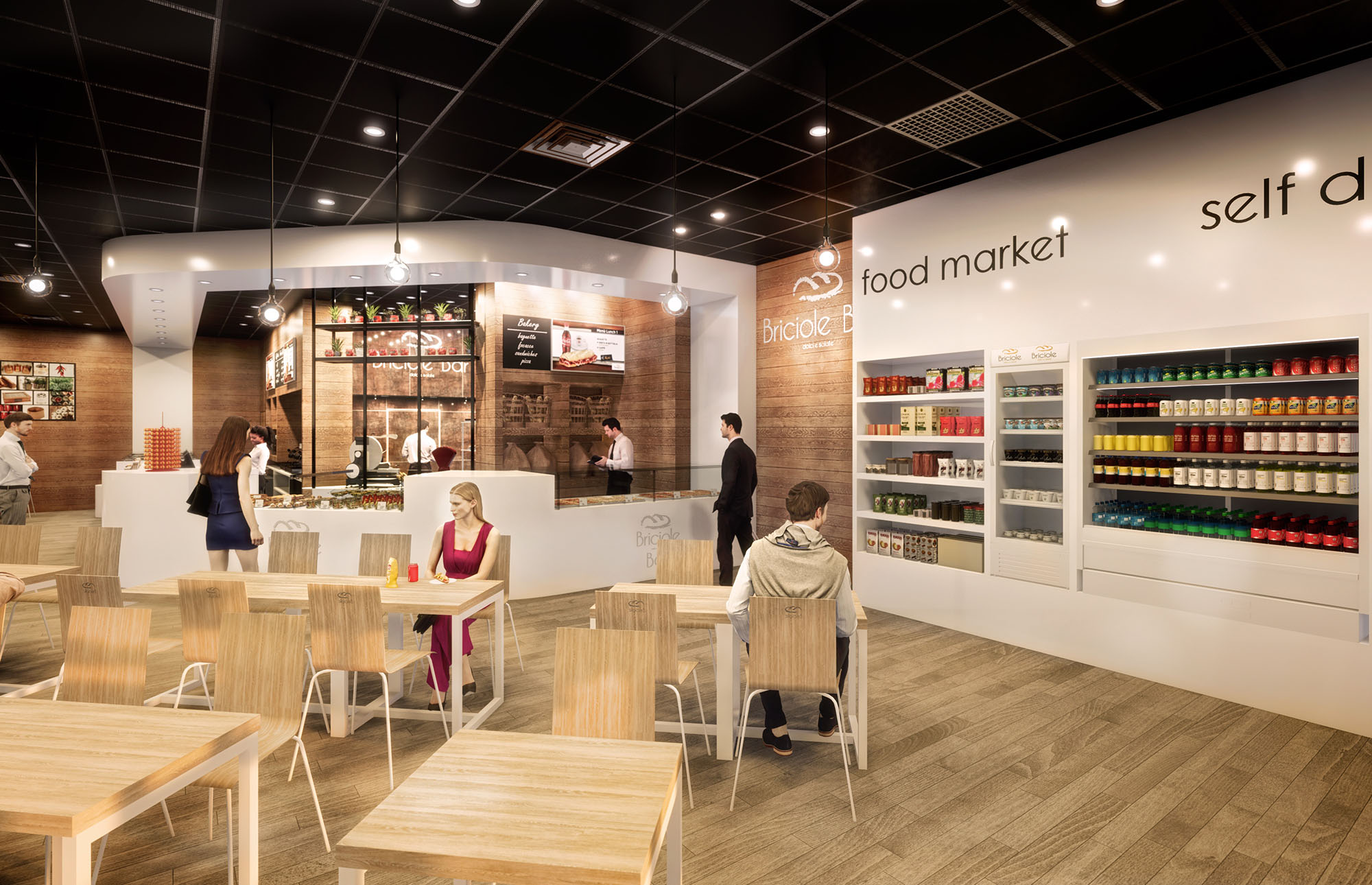
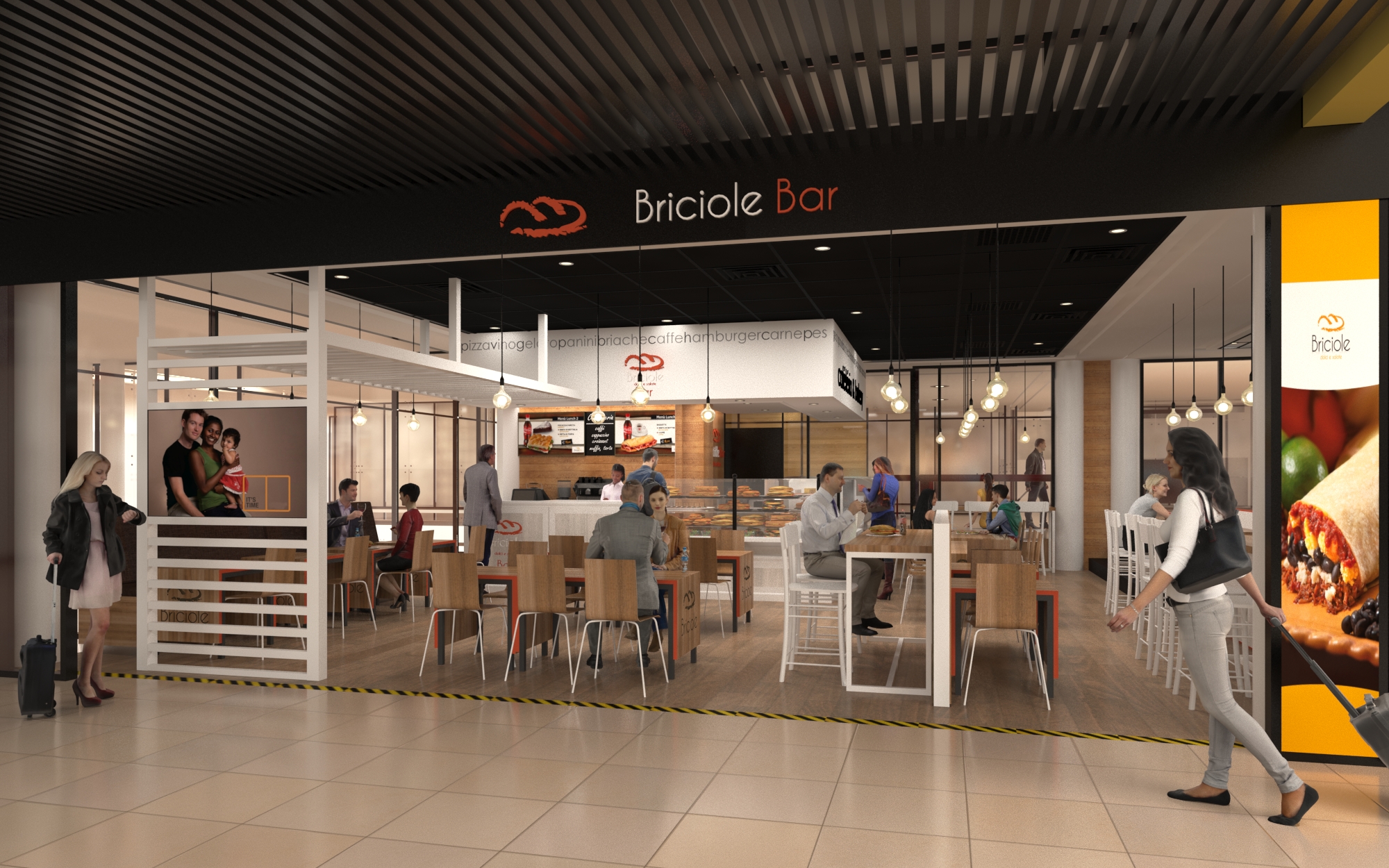
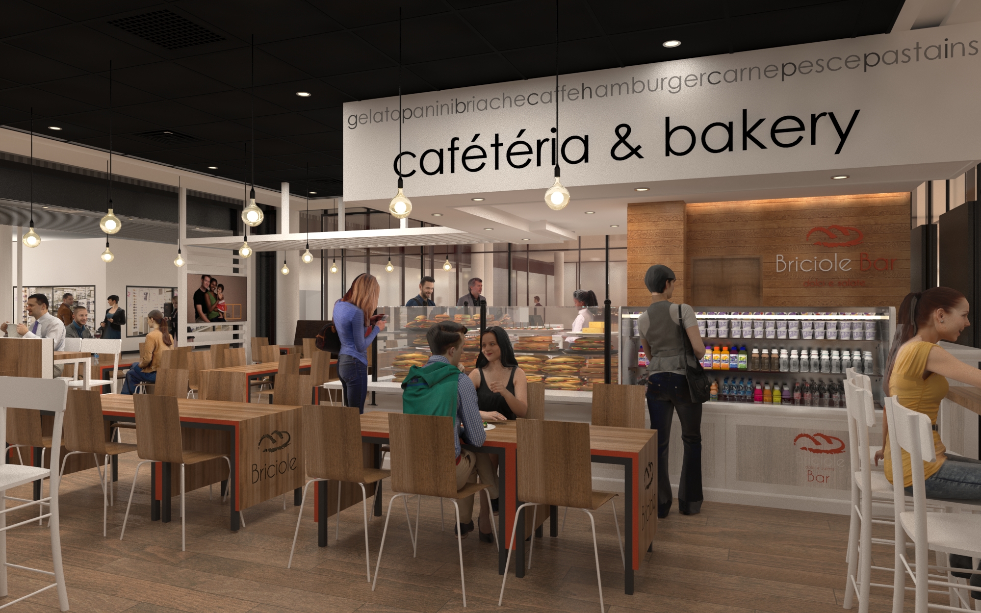
© 2021 by sanzpont [arquitectura] . Webpage by sanzpont [digital] . Innovative Digital Experiences
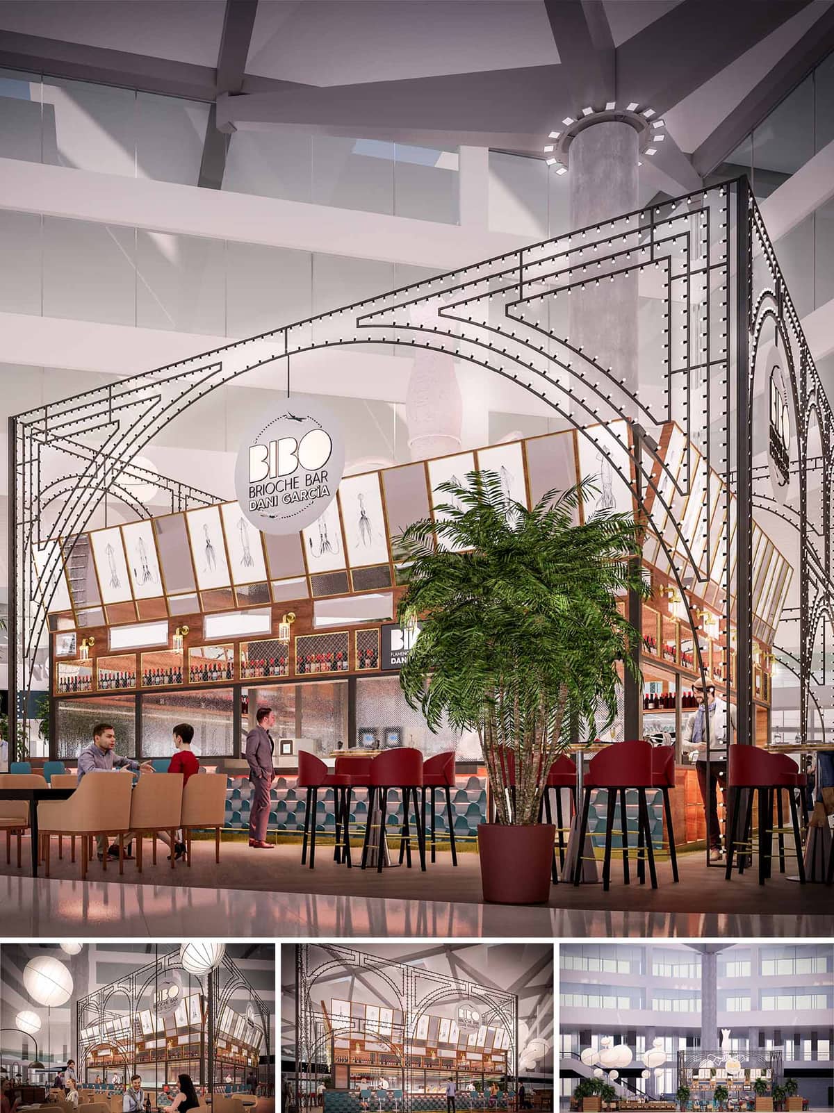

BRIOCHE BAR is conceived as a freestanding pavilion inside a shopping mall atrium, an urban kiosk that celebrates patisserie culture with a theatrical, almost scenographic presence. The design draws on light, slender metal structures reminiscent of early 20th‑century winter gardens and grand stations, reinterpreted with a contemporary language of geometry and illumination. The bar becomes a luminous object in the void of the atrium, clearly recognizable from every level of the building.
The open boundaries dissolve the traditional notion of a closed restaurant. Instead, a permeable framework outlines the space while preserving visual continuity with the mall. This approach allows the bar to function as a social node, inviting spontaneous occupation throughout the day and reinforcing its role as a meeting point within the commercial landscape of Málaga.
The project is organized around a compact, central service core that integrates the main bar, back‑of‑house, and display zones. Circulation flows around this nucleus, enabling 360‑degree access and maximizing seating exposure to both the bar and the surrounding atrium. This ring‑like organization ensures constant interaction between guests and staff, optimizing operational efficiency during peak hours.
Seating typologies are carefully layered to respond to different uses: perimeter bar stools create an active edge for quick consumption; intermediate high tables accommodate informal meetings; and lower lounge seating zones at the outer ring provide a more relaxed stay. The variation in heights generates a stepped visual field, keeping sightlines towards the interior open while offering a sense of gradated privacy as one moves away from the bar.
The most distinctive element is the exposed metal framework that defines the envelope without enclosing it. A series of arched trusses rise from a minimal base, intersecting overhead to form a light canopy that echoes the existing concrete structure of the atrium, creating a dialogue between the intervention and the host building. The rhythm of the arches frames views and subtly directs movement towards the main access points.
Integrated along this framework, a constellation of small, evenly spaced luminaires outlines the geometry, emphasizing its graphic quality. At night, the structure becomes a luminous drawing in space, a device that guides visitors from afar. Circular signage elements are suspended within the arches, reinforcing verticality and ensuring legibility from the upper levels of the mall.
The material palette contrasts the industrial refinement of steel with the warmth of timber and tactile upholstery. The main bar front is characterized by a combination of wood panels and patterned tiles, creating a vibrant pedestal for the food and beverage display. Transparent and mesh panels in the backbar introduce depth while allowing filtered glimpses into the preparation area, conveying craftsmanship and transparency.
Color operates in layers: deep reds in the bar stools, earthy tones in the low seating, and a nuanced range of blues and greens in the flooring and tiles generate a chromatic gradient that anchors the pavilion within the neutral mall context. Artwork and graphic illustrations, framed along the tilted upper band, bring a narrative dimension to the space, referencing gastronomic themes and linking the concept to the broader identity of the brand.
Lighting is treated as both functional infrastructure and expressive ornament. The perimeter light strings emphasize the structural arches, while concealed linear fixtures wash the bar fronts and shelving, enhancing material textures and product visibility. Large lantern‑type pendants hover above the seating area, softening the scale of the atrium and creating intimate pockets of light within the open environment.
The layered lighting design allows for different atmospheres throughout the day, from bright, energetic breakfast service to a more subdued, lounge‑like ambiance in the evening. Dimming strategies and energy‑efficient LED technology reduce consumption while maintaining precise control over the luminous composition.
Given its position within an existing, climate‑controlled atrium, the project focuses on material efficiency and operational sustainability rather than heavy envelope interventions. The metal framework is designed as a lightweight, demountable system, minimizing the quantity of material used and enabling potential disassembly or relocation with limited waste. Modular connections simplify installation and facilitate future maintenance or adaptation.
LED lighting with programmable control systems optimizes energy use, adapting light levels to natural daylight entering from the upper skylights of the mall. Finishes prioritize durability and ease of cleaning to support a long life cycle in a high‑traffic environment, reducing the need for frequent replacement. The incorporation of interior planting contributes to acoustic comfort and provides a biophilic counterpoint to the mineral character of the mall, subtly enhancing indoor environmental quality for users and staff.
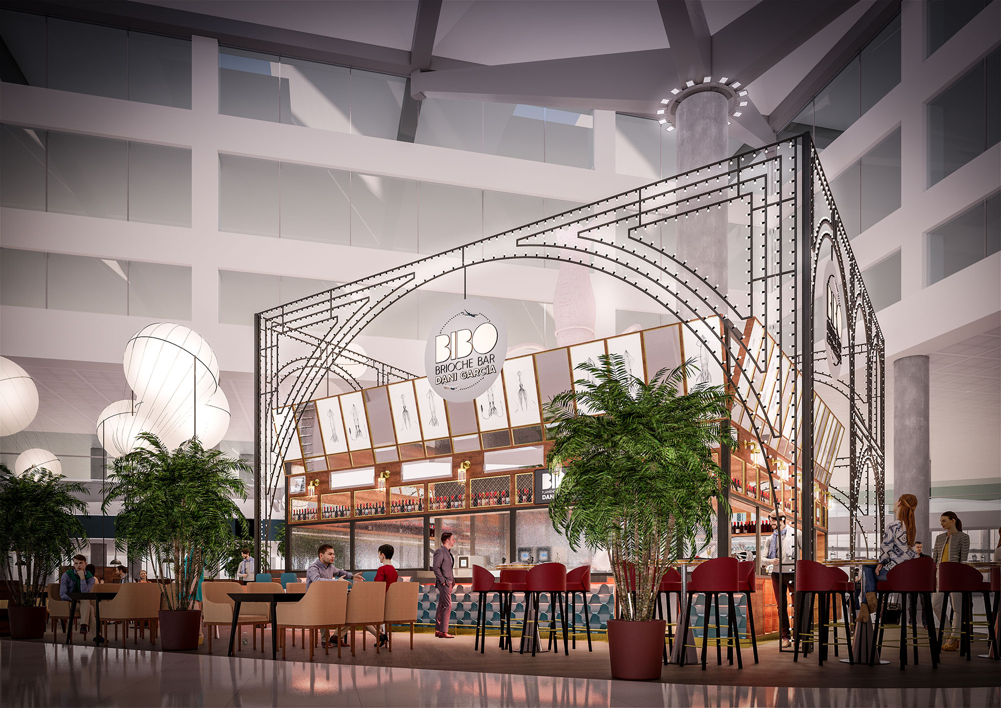
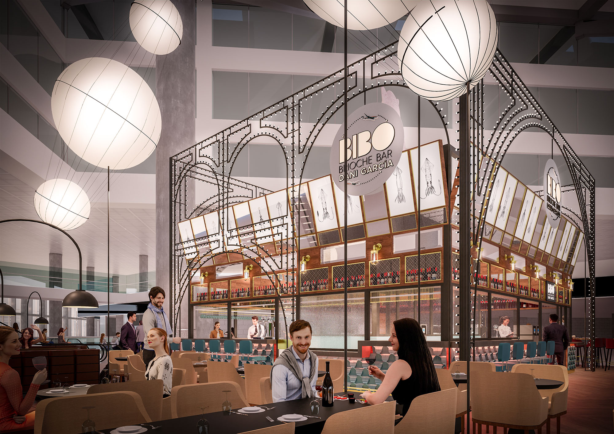
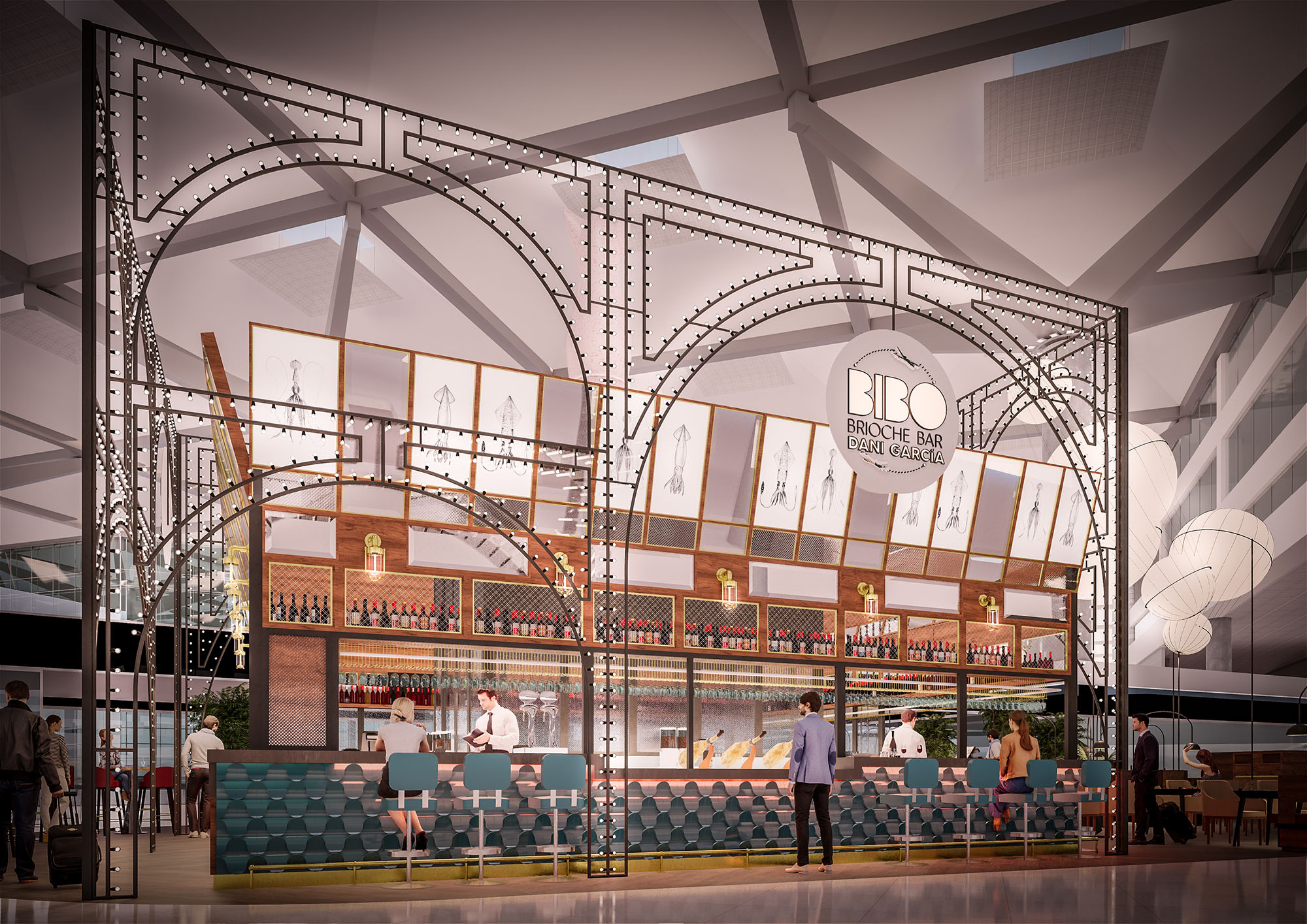
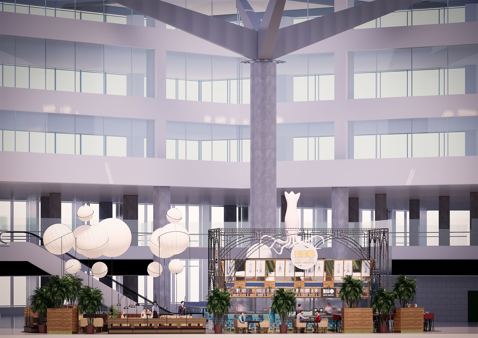
© 2021 by sanzpont [arquitectura] . Webpage by sanzpont [digital] . Innovative Digital Experiences
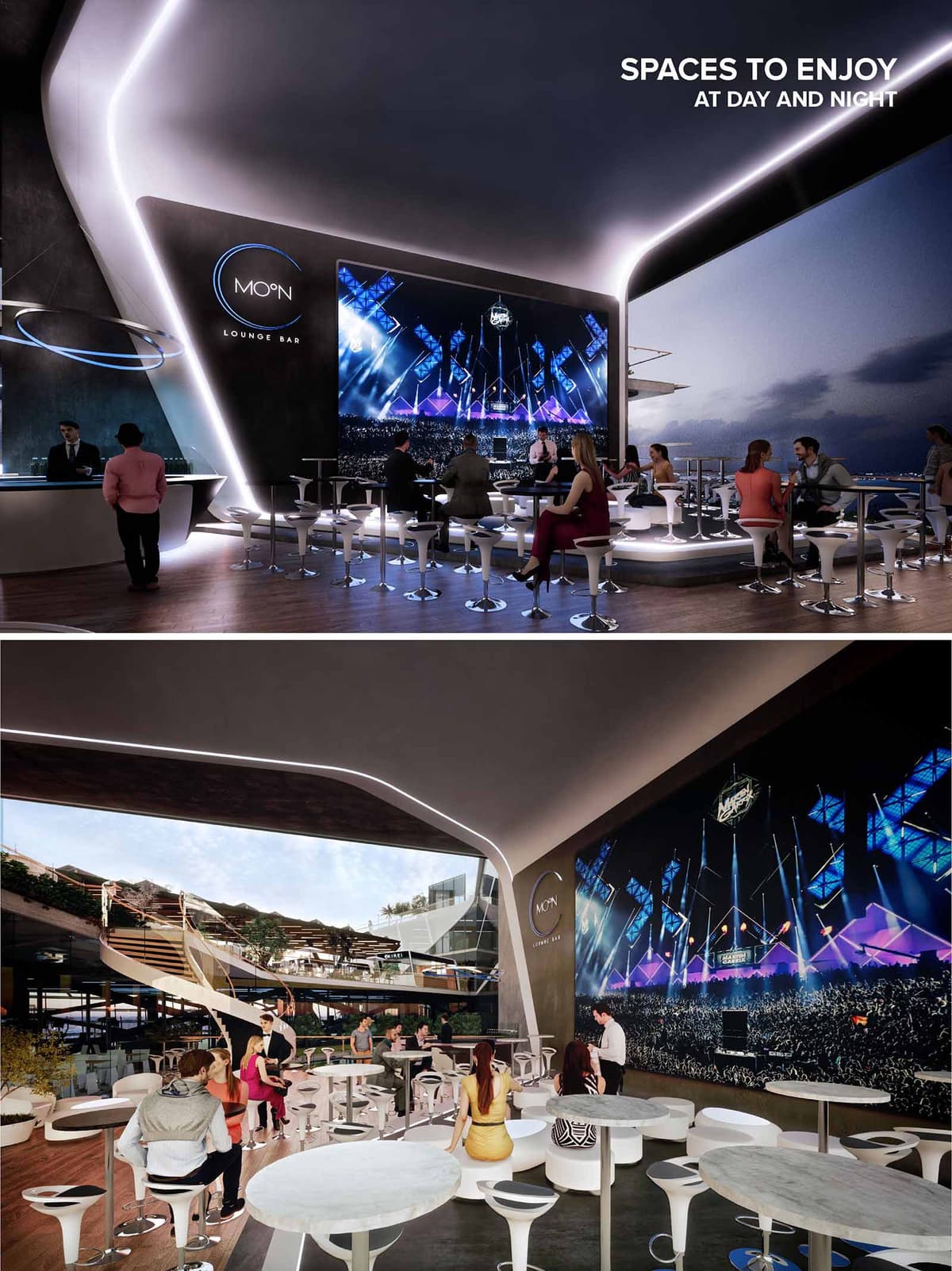

Moon Lounge Bar is conceived as a futuristic observatory for nightlife, integrating the vibrant energy of Cancún with an immersive, almost cosmic atmosphere. The design frames the Caribbean sky as a dynamic backdrop, allowing the bar to transform seamlessly from a relaxed daytime terrace into an intensely luminous night venue. Curved geometries and continuous lines evoke orbital trajectories, while the lighting strategy reinforces the lunar identity of the project.
The space acts as a hybrid between lounge, viewing deck and event arena. A large digital screen becomes the focal point, generating an ever-changing visual landscape that enhances the sense of being inside a contemporary “crater” open to the horizon. The architecture is intentionally minimal in its material palette so that light, projection and the natural setting carry the experiential weight.
The layout is structured around a central open platform that directs all views toward the main LED wall and the ocean beyond. Perimetral zones accommodate tables and stools on raised decks, promoting clear sightlines and allowing the public to circulate fluidly between bar, seating and viewpoints. The absence of solid partitions ensures that visual continuity and social interaction remain uninterrupted.
Ceiling and floor edges are treated as continuous ribbons that guide movement, subtly indicating transitions between standing, bar and lounge areas. The connection to the upper terrace and adjacent levels is articulated through generous stairways, enabling the lounge to operate as a nodal point within a larger hospitality complex. Accessibility is integrated by maintaining wide, obstacle-free routes and level changes managed with gentle ramps where required.
The material palette is deliberately restrained: smooth white surfaces for bar and ceilings, dark wall planes to enhance contrast, and warm-toned wood flooring that grounds the space. This combination produces a neutral yet sophisticated canvas where programmable lighting and projections can redefine the ambience according to time and event.
Integrated LED strips trace the curvature of the envelope, emphasizing the fluid geometry and acting as an architectural outline at night. Indirect lighting under platforms and bar counters creates a floating effect, while focused task lighting at tables ensures visual comfort. The large-format digital screen becomes a dynamic façade, allowing curated content, branding and live performances to transform the overall mood without physical reconfiguration.
Furniture is characterized by sleek, sculptural forms that echo the project’s futuristic narrative. High stools with chrome bases and compact circular tables provide flexibility in configuration, supporting both intimate gatherings and larger groups. The predominance of white in the seating elements reflects light and reinforces the visual purity of the interior.
Ergonomic considerations appear in the proportions of seats and table heights, enabling comfortable use during extended events. The density of furniture is carefully calibrated to maintain clear circulation paths and allow standing clusters near the bar without obstructing views. Overall, the interior design supports a casual yet elevated lounge experience, adaptable to concerts, DJ sets or more relaxed sunset sessions.
The open-sided configuration capitalizes on Cancún’s climate, favoring natural cross-ventilation and reducing dependence on mechanical cooling. The large roof overhang provides shading from direct solar radiation, mitigating heat gain and enhancing user comfort during the day. Strategic orientation maximizes views toward the sea and surrounding landscape, anchoring the venue within its coastal context.
From an environmental perspective, the project promotes efficient use of resources through LED-based lighting systems with programmable dimming to reduce energy consumption during lower occupancy periods. The limited material palette facilitates maintenance and potential future recycling of components. Where feasible, the specification of durable finishes and modular furniture extends the life cycle of interior elements, while the open-plan design reduces the need for additional construction if the layout evolves over time.
© 2021 by sanzpont [arquitectura] . Webpage by sanzpont [digital] . Innovative Digital Experiences
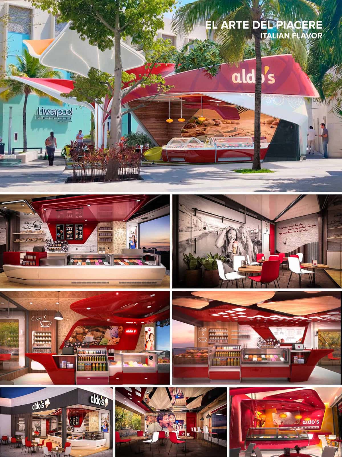

Aldo's Gelato is conceived as an urban pavilion of pleasure, translating the fluidity of Italian gelato into an architectural language of curves, layers and light. The concept explores the idea of “melting volumes”: shells and canopies appear to dissolve and overlap, creating a dynamic, welcoming threshold between city and interior. This design is replicated and adapted in 13 locations across Mexico, ensuring a recognizable brand identity while responding to each specific urban context.
Color becomes a key narrative device. The intense red of the brand is used as a continuous ribbon that folds from façade to ceiling to counter, guiding the eye and generating a sense of movement and energy. Neutral tones in beige, wood and soft greys balance this vibrancy, offering a calm background that celebrates the chromatic richness of the gelato itself.
The plan is structured around a clear linear axis: entrance, exhibition counter, and seating area. Generous openings and transparent façades blur interior and exterior, inviting passersby to visually connect with the product from the public realm. In open-mall locations, the kiosk typology adopts a free-standing, sculptural envelope that orients the main counter toward the highest pedestrian flows.
Circulation is intuitive and efficient. Customer movement naturally follows the display of flavors, while staff routes remain compact and ergonomic behind the counter, minimizing cross-traffic. Seating zones are fragmented into small clusters—two- and four-seat groupings—encouraging short stays but allowing easy reconfiguration for larger groups.
The material palette combines high-gloss, hygienic surfaces with warm, tactile elements. Solid surfaces and polished laminates in red and white define the food-handling areas, ensuring durability and easy cleaning. These are complemented by textured wall panels and faux-stone or brick finishes, evoking artisanal production and Italian café culture.
Ceilings are treated as sculptural elements: red lacquered canopies, perforated panels and suspended wooden blades create depth and acoustical comfort while integrating linear and recessed LED lighting. Warm white light above seating areas contrasts with cooler light at the display vitrines, where accurate color rendering is crucial to present the gelato and pastries.
The architecture operates as a three-dimensional brand envelope. Logos are integrated into volumetric signage, canopies, and corner elements, making each location instantly recognizable. Large-scale photographic murals and typographic phrases reinforce an emotional, convivial narrative, positioning the spaces as places to share moments rather than merely consume a product.
Furniture follows an informal, contemporary café vocabulary. Chairs in red and white with slender black legs echo the brand colors without overwhelming the space. Timber-look flooring and tabletops ground the composition, while full-height glazing frames exterior views, enhancing the perception of openness and lightness.
Sustainability is addressed through modular design, material selection and energy efficiency. The kiosk and interior elements are conceived as repeatable modules, reducing waste in fabrication, optimizing transport, and enabling partial reuse when relocating or updating units across the 13 sites. Durable laminates, LED lighting, and high-efficiency refrigeration equipment help reduce operational energy consumption and maintenance.
Large glazed fronts maximize natural daylight, decreasing reliance on artificial lighting during daytime. In open-air locations, canopy geometries provide shade to both customers and equipment, mitigating solar gain and improving thermal comfort in Mexico’s warm climates. Where possible, landscaping and existing trees are integrated to enhance microclimate, promote urban biodiversity and reinforce the sense of place around each Aldo's Gelato pavilion.
© 2021 by sanzpont [arquitectura] . Webpage by sanzpont [digital] . Innovative Digital Experiences
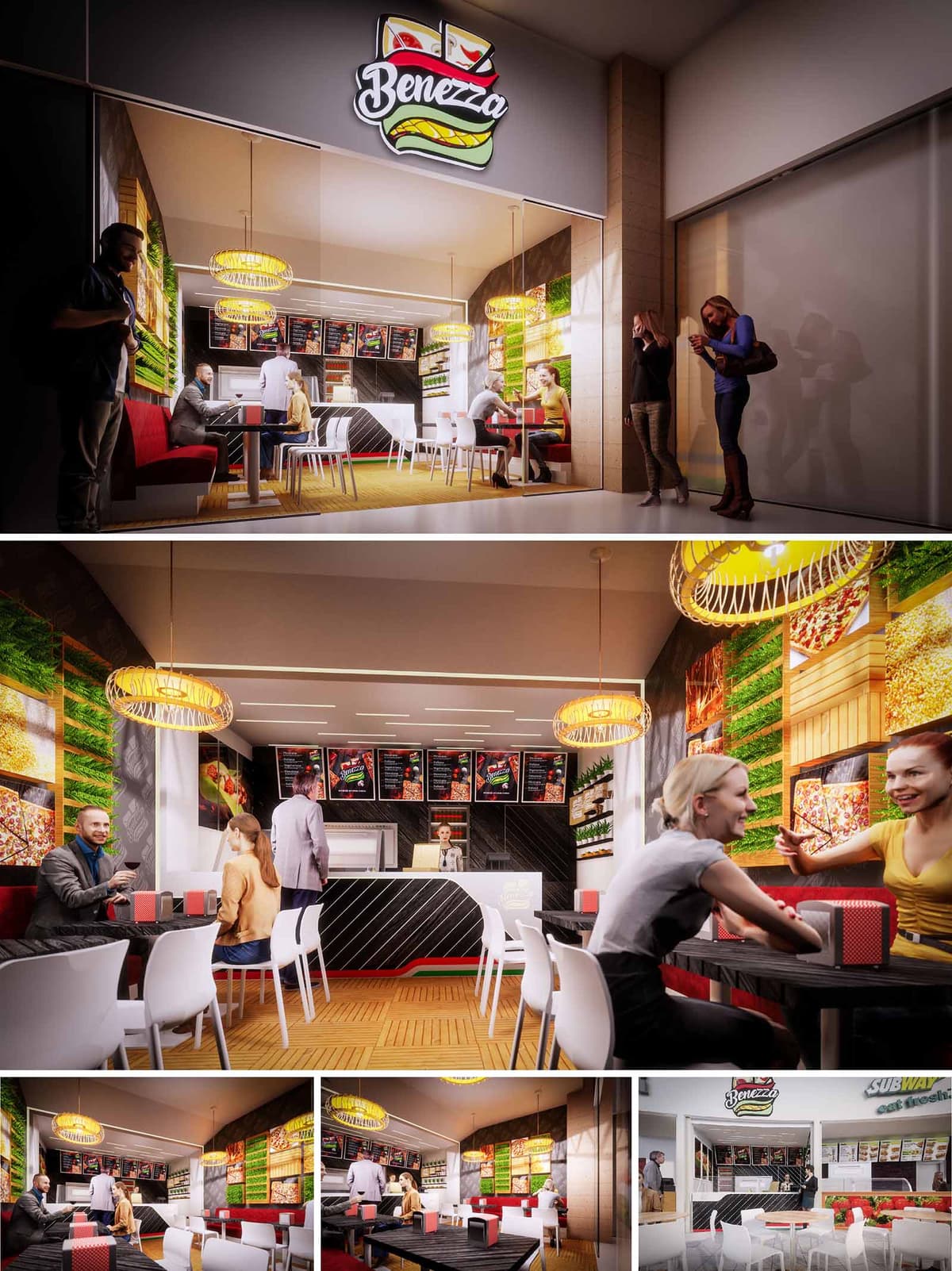
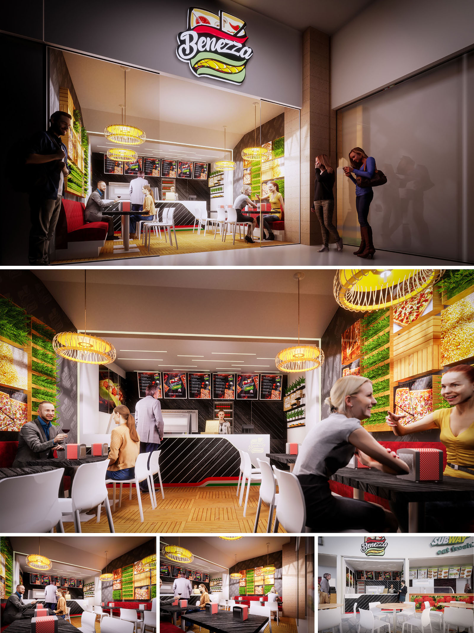
Benezza is conceived as a compact fast-casual restaurant that communicates freshness and dynamism from the first glance. The design translates the brand’s sandwich iconography into an interior language based on layered planes, bold color accents and illuminated graphics. The objective is to create a space that feels energetic and urban while remaining welcoming for short stays and quick turnover typical of food-court locations in Cuernavaca.
The concept takes the linear service ritual—ordering, payment and pick-up—and expresses it as a clear architectural axis. This axis begins at the illuminated façade and continues through the counter, menu band and ceiling lighting, orchestrating the movement of customers while framing the product offer as the central protagonist.
The restaurant is organized as a single open volume where front-of-house and back-of-house are visually connected but functionally distinct. Entry occurs through a fully transparent glass frontage that maximizes visibility into the interior and aligns with the mall corridor. Immediately ahead, the counter acts as an anchoring element, with the menu boards and preparation area positioned directly behind for intuitive orientation.
Customer circulation follows a straightforward path: access, queuing along the counter, ordering, and then dispersing into the seating area that unfolds along both side walls. Tables and chairs are arranged in parallel rows to optimize density, while a continuous upholstered bench on one side offers comfort and encourages group seating. Clearances between furniture facilitate easy movement for staff and visitors, sustaining operational efficiency during peak hours.
The material palette blends warm natural references with high-contrast, easy-to-clean surfaces suitable for intensive use. Floors in a wood-like modular pattern introduce warmth and a tactile character that counterbalances the otherwise sleek finishes. The counter and some wall planes are clad in dark panels with diagonal white striping, an abstraction of the brand’s graphic language that gives depth and a sense of motion.
The chromatic strategy reinforces the identity: greens associated with freshness, reds related to appetite and energy, and neutrals that frame these tones without visual fatigue. Backlit images of ingredients and menu items form a continuous frieze on the main wall, functioning simultaneously as decoration, communication and lighting. White chairs and light-colored ceilings reflect illumination, giving the small space visual amplitude.
Lighting is resolved through a combination of linear recessed fixtures and sculptural pendant luminaires. The recessed elements define the main circulation axis and ensure uniform working levels over the counter and seating. The pendants, with woven or ring-like geometries, introduce a softer, more domestic note that humanizes the fast-food typology.
Backlit graphic panels and vertical green elements contribute to a vibrant atmosphere, acting as luminous walls that avoid dark corners and visually extend the space. The façade lighting emphasizes the logo and interior activity, operating as an urban lantern that attracts customers from the shopping center corridors during evening hours.
Sustainability is approached through the selection of durable materials, energy-efficient lighting and strategies aimed at reducing maintenance. LED technology is incorporated in all general and accent lighting, decreasing energy consumption and extending replacement cycles. Surfaces exposed to continuous contact—tabletops, counter cladding and flooring—are specified in high-resistance finishes that prolong their useful life and minimize waste over time.
The significant glass frontage not only maximizes visibility but also allows the use of natural daylight during daytime, reducing dependency on artificial light. Vertical green elements, whether natural or preserved, help improve acoustic absorption in a highly reflective environment and symbolically reinforce the commitment to fresh ingredients and environmental awareness, aligning the brand image with contemporary sustainable values.
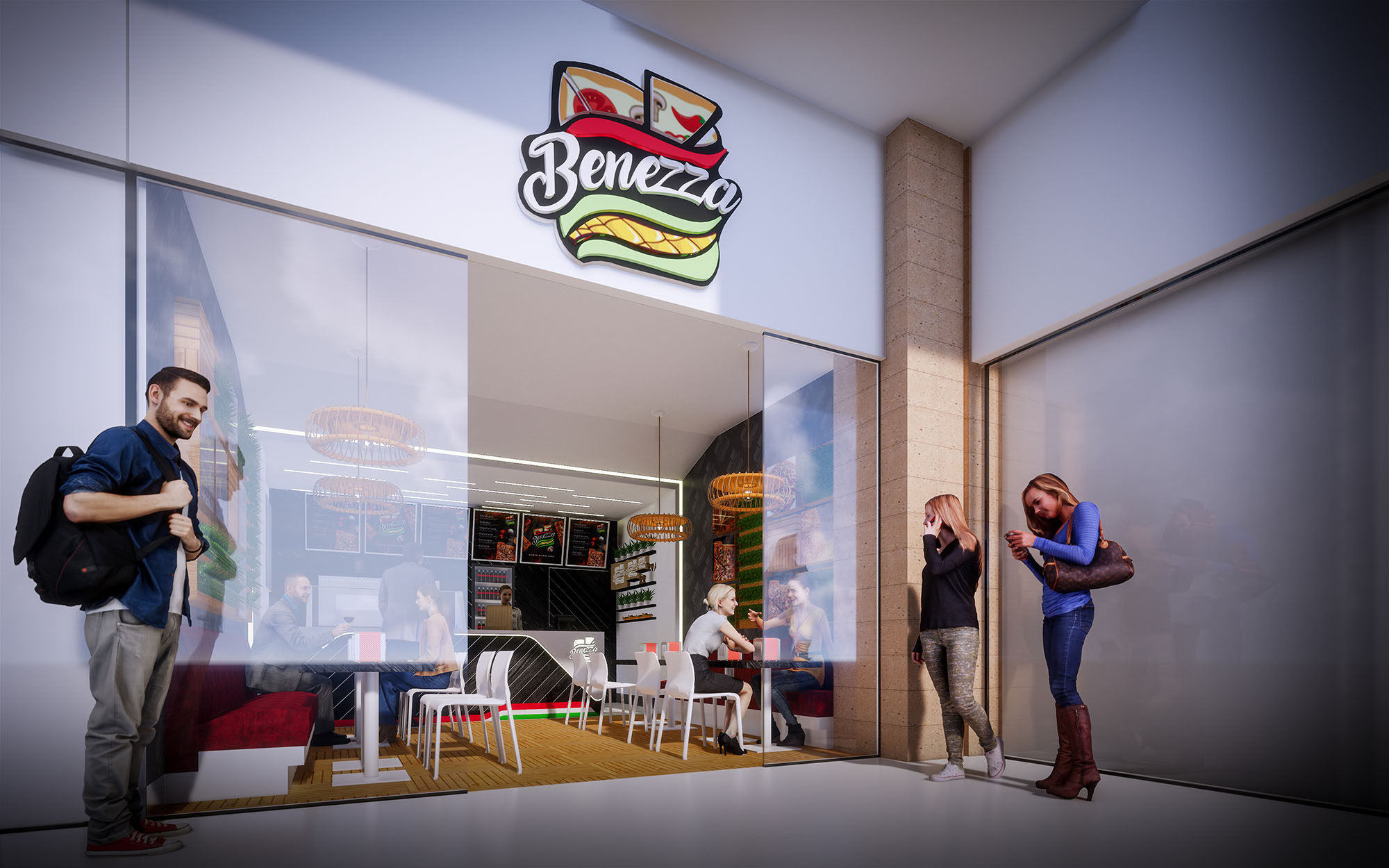
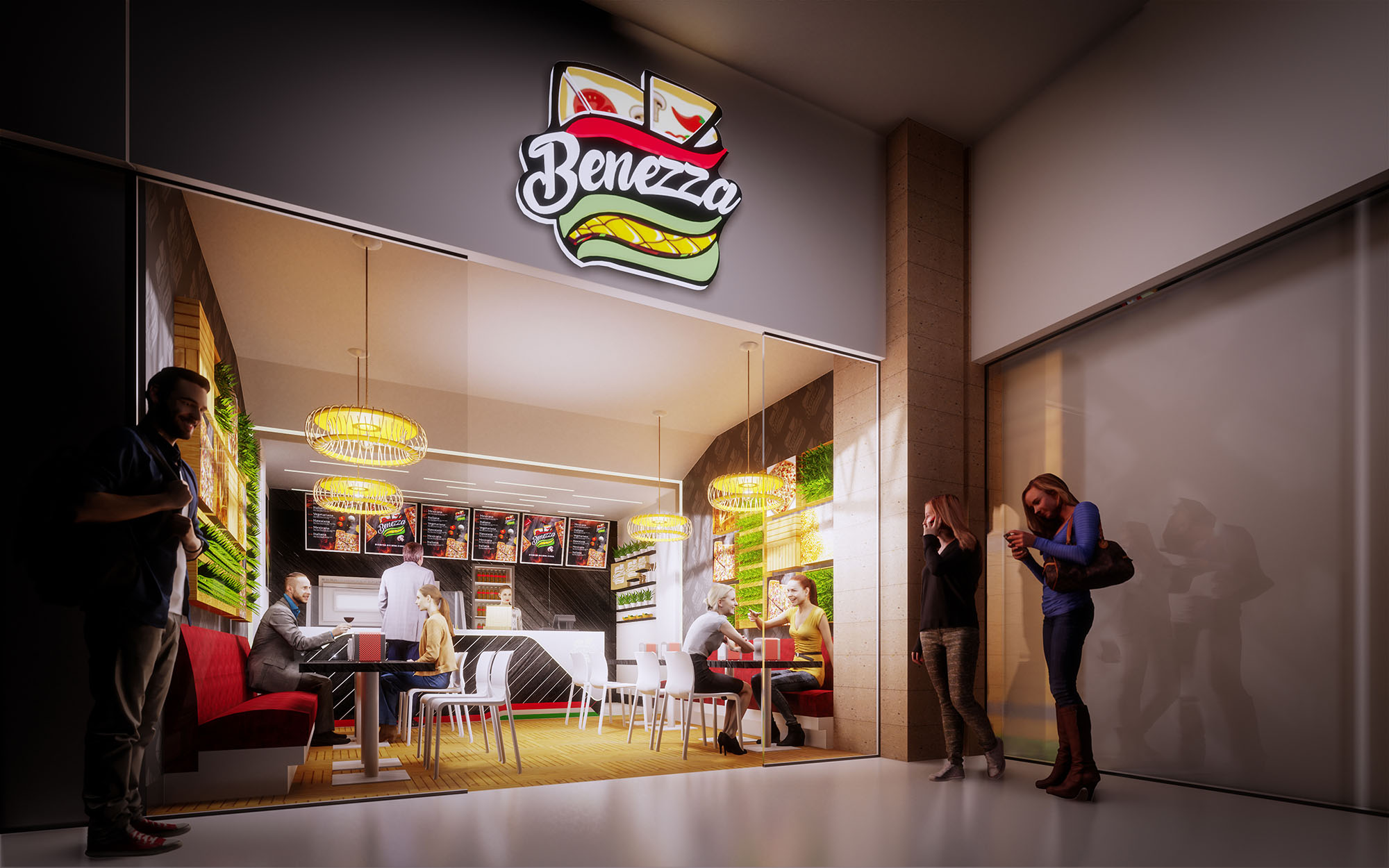
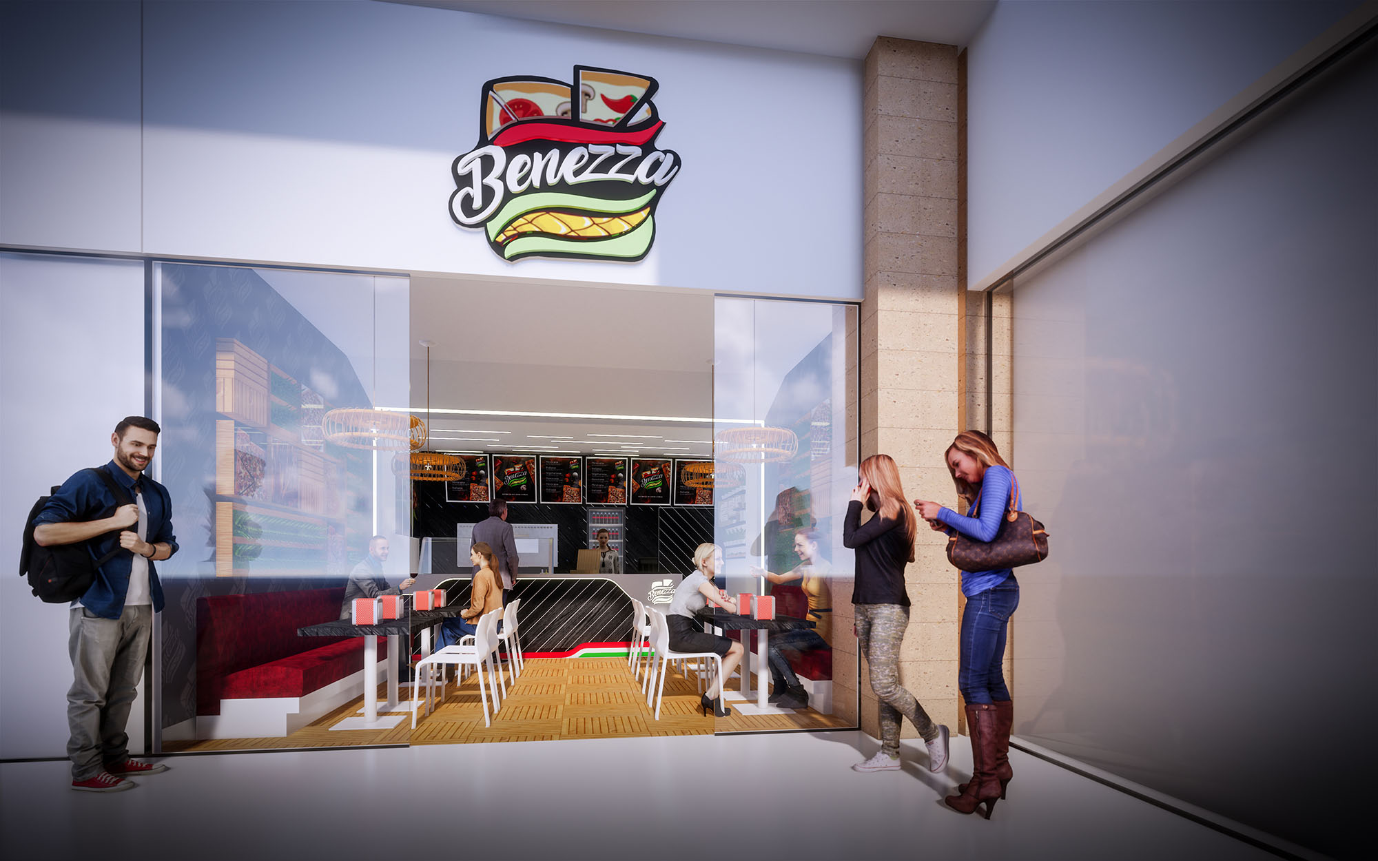
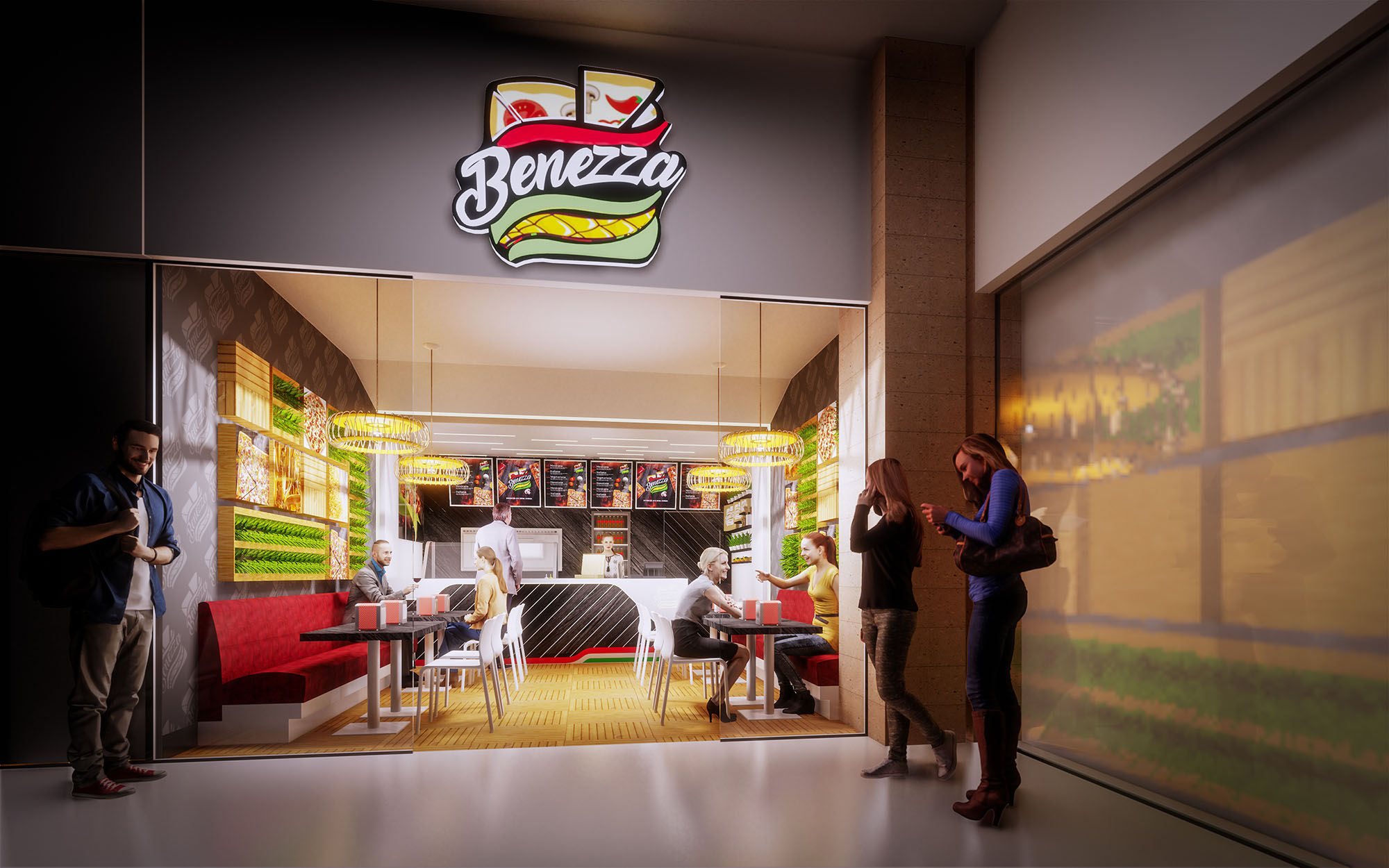
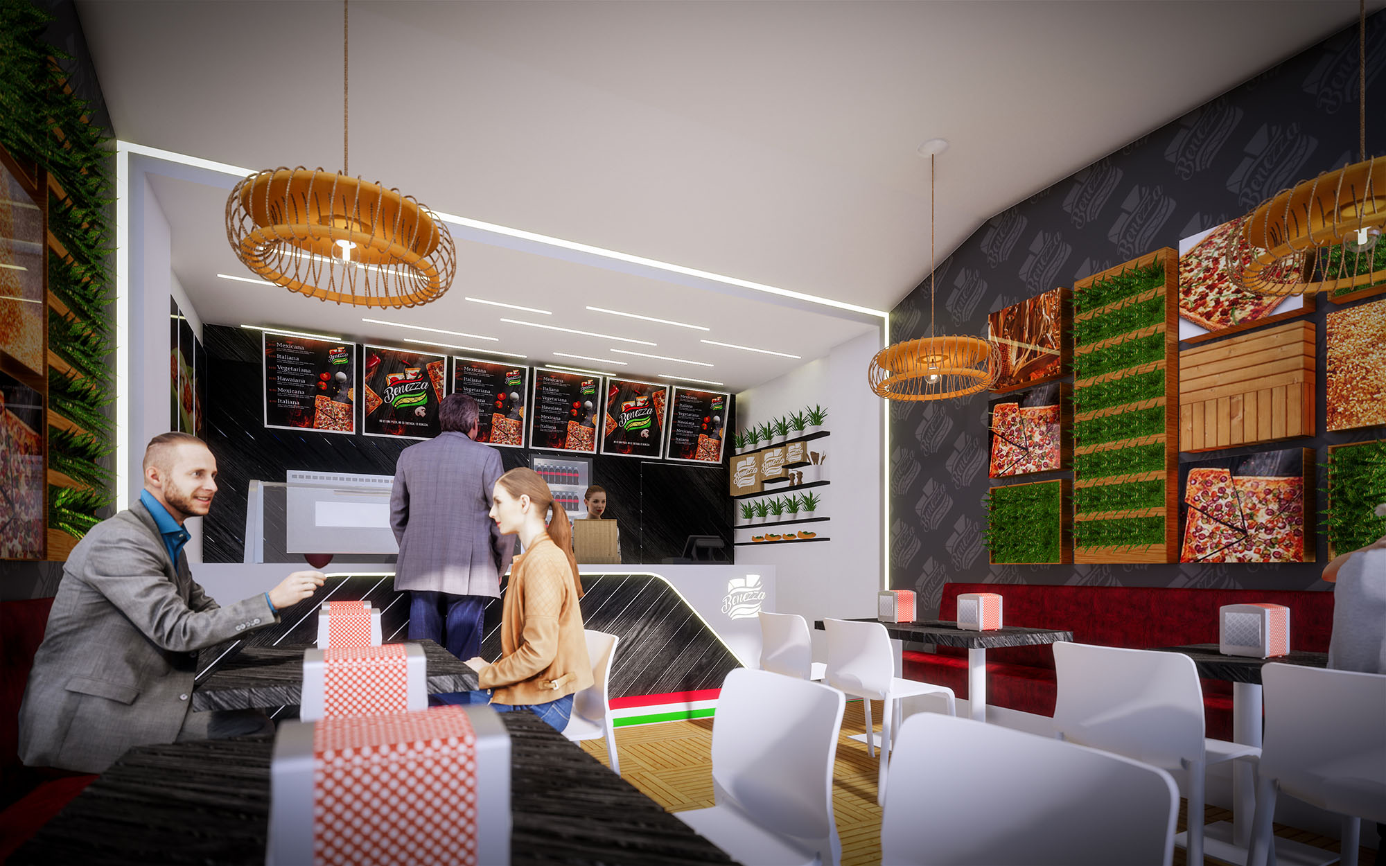
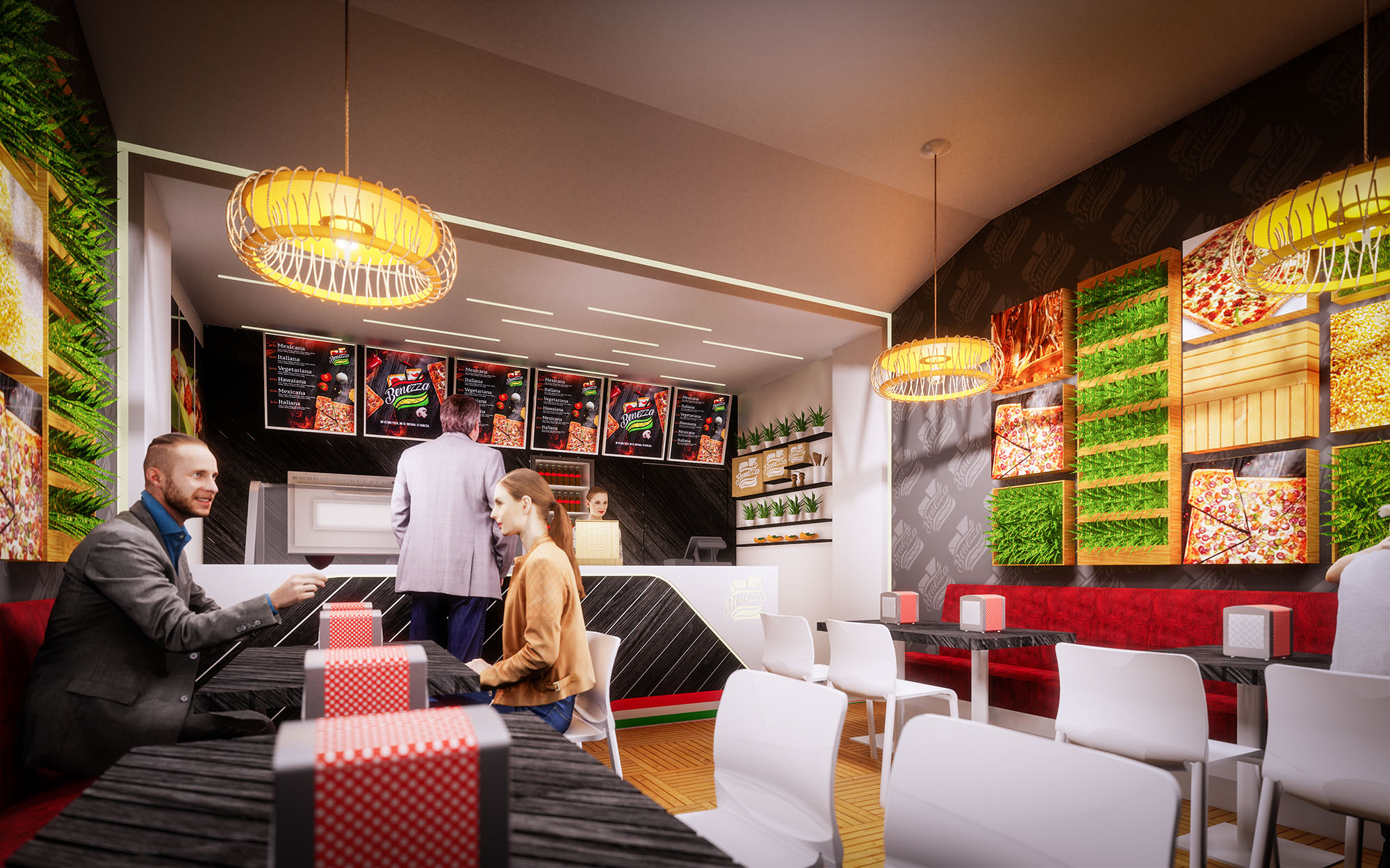
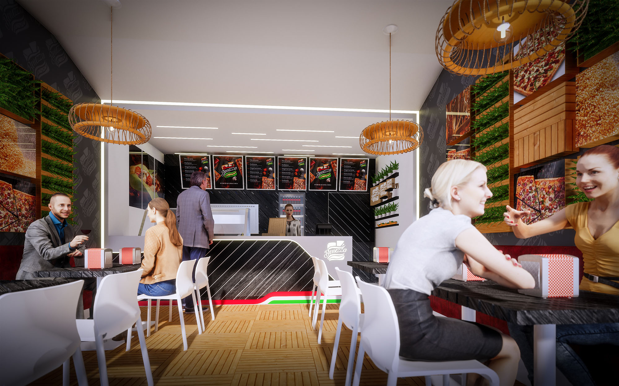
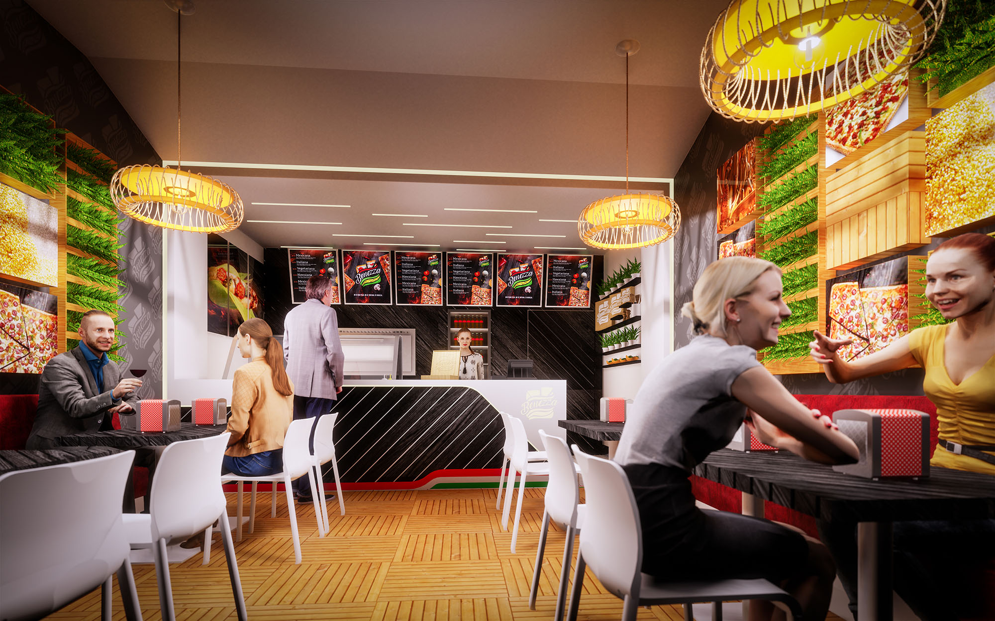
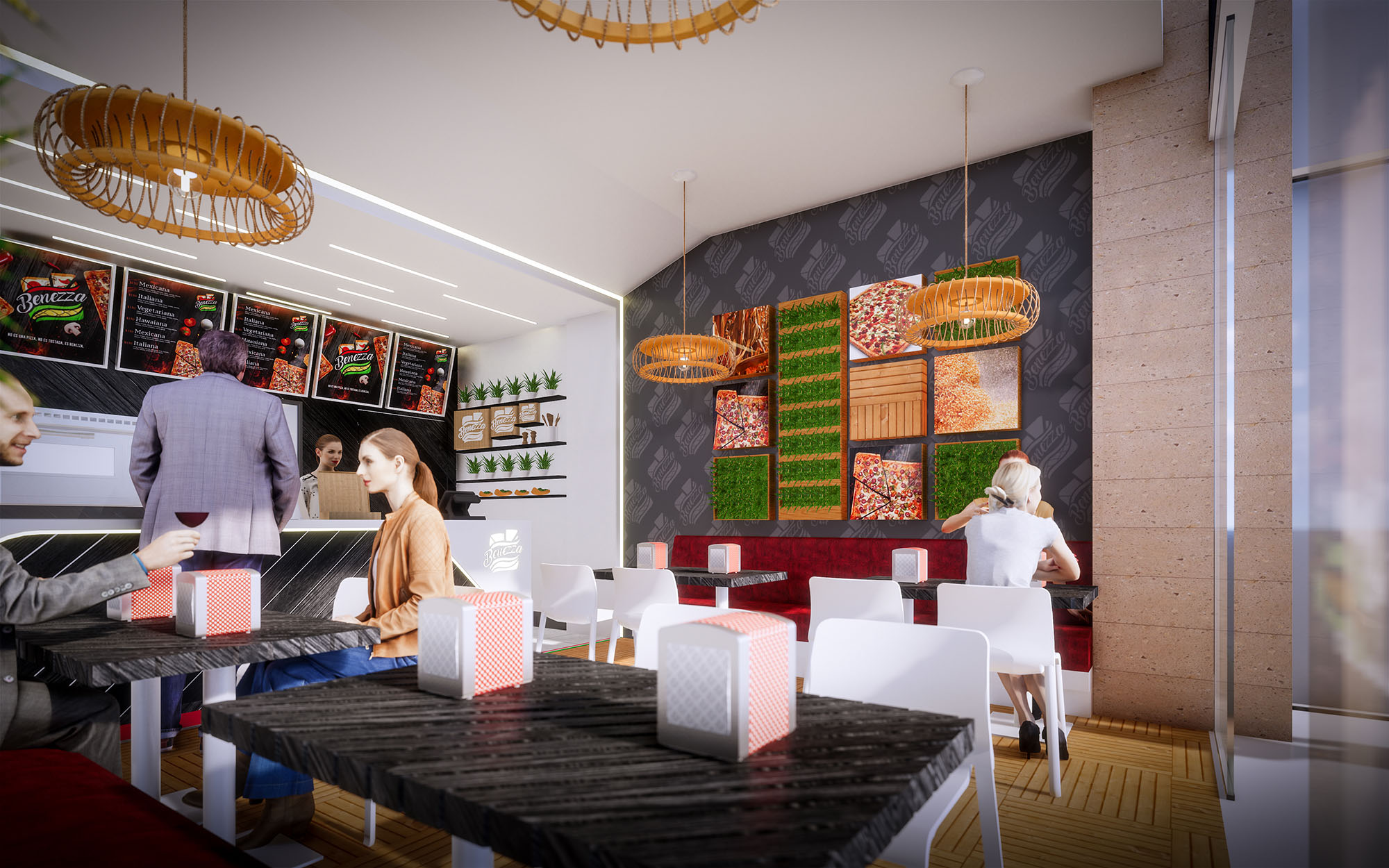
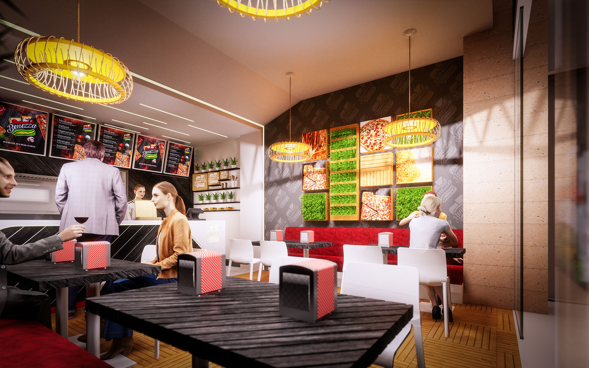
© 2021 by sanzpont [arquitectura] . Webpage by sanzpont [digital] . Innovative Digital Experiences
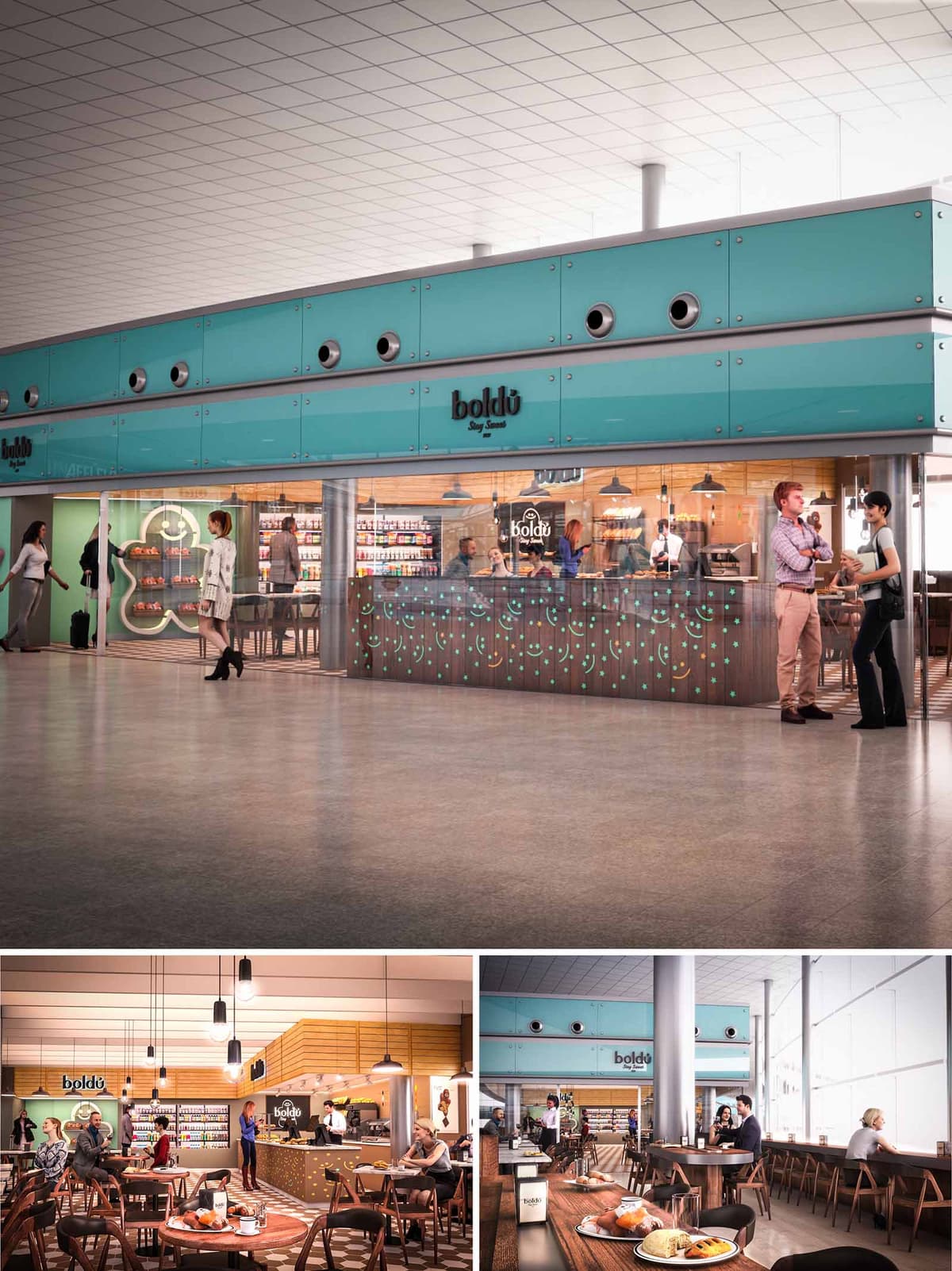
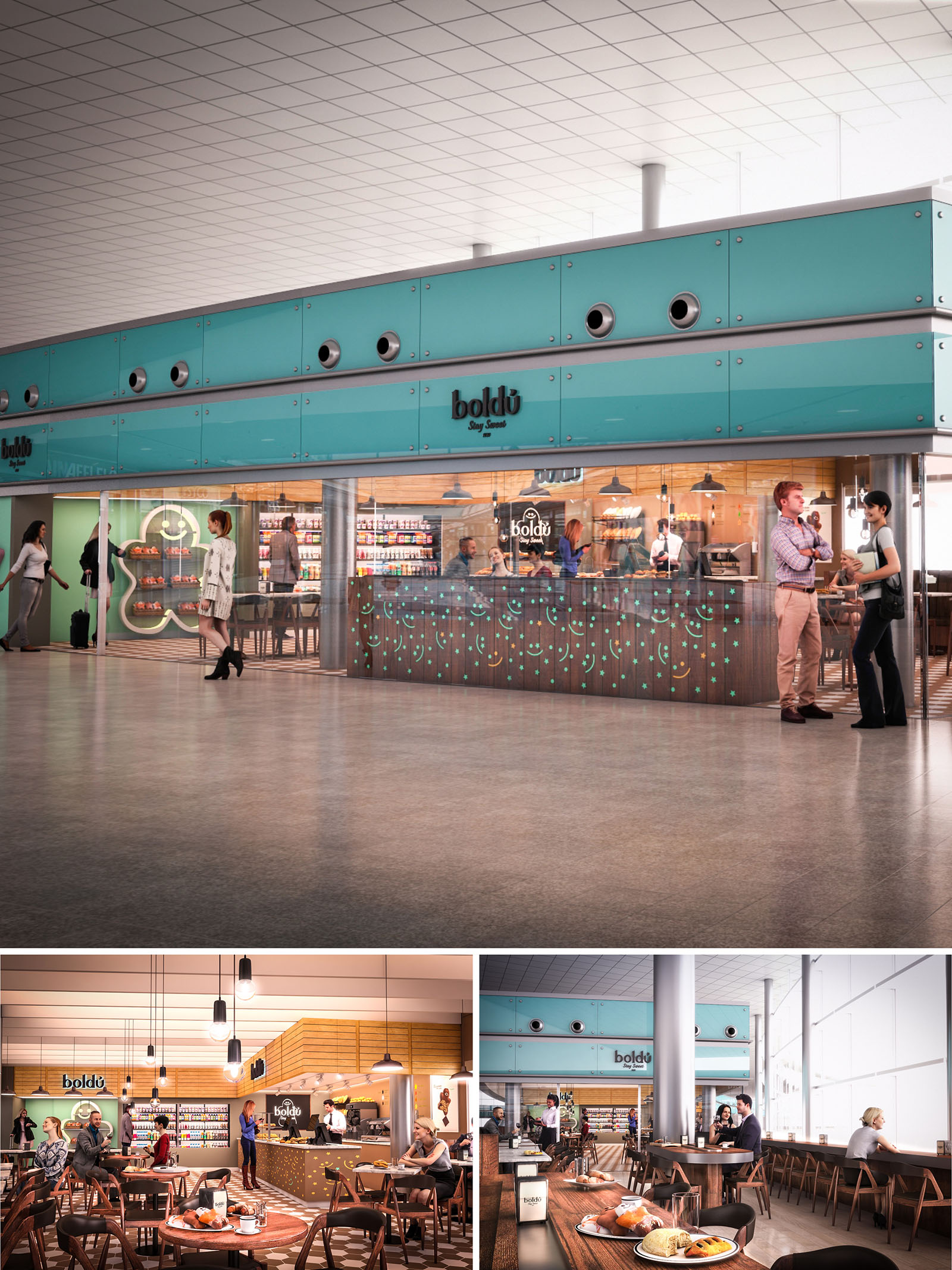
The BOLDU project in Barcelona is conceived as a contemporary pastry and coffee venue integrated into an airport terminal. The concept merges the clarity of transport architecture with the warmth of a neighborhood café, creating a recognizable urban “island” within the fluidity of the departures hall. The design emphasizes transparency, visibility, and an iconic turquoise fascia that operates as a long-distance landmark for travelers in transit.
The space is planned as an open, permeable volume where enclosure is suggested rather than imposed. Glass, light timber, and a refined industrial language define an atmosphere that is simultaneously efficient and welcoming, responding to the short dwell times and diverse user profiles of an airport environment.
The restaurant occupies a corner position along a main circulation axis, maximizing exposure on two fronts. The plan is organized around a central service core containing counter, back bar, and preparation area, with customer flows wrapping around it in a U-shaped movement. This configuration allows for clear differentiation between ordering, pickup, and seating while optimizing staff efficiency.
Perimeter seating lines the façade and opens directly to the terminal concourse, encouraging informal occupation by passersby. Loose tables populate the interior zone, allowing flexible reconfiguration for individuals, couples, or small groups. Long communal tables and bar-height counters address the needs of solo travelers, enabling quick stays without compromising comfort.
The external envelope is defined by a continuous band of turquoise cladding with circular perforations and porthole-like elements. This horizontal datum visually anchors the unit within the larger terminal while reinforcing the brand identity. The perimeter glazing below ensures full transparency, placing the product and activity on display and transforming the interior into a vibrant showcase.
Graphic elements—such as the illuminated pastry outline at the entrance and the dotted pattern on the counter facing—translate the brand’s playful character into spatial devices. These motifs are integrated into the architectural fabric rather than applied decoratively, ensuring coherence between signage, lighting, and enclosure.
The interior atmosphere is characterized by a balanced contrast between warm timber surfaces and cooler industrial finishes. Vertical wall cladding in light wood forms a continuous backdrop to the shelving and menu displays, giving depth and texture to the space. The service counter combines dark-toned panels with integrated turquoise points of light, generating a subtle, animated surface that remains legible from a distance.
Furniture is predominantly in dark wood with slender, tapered legs, creating a mid-century inspired profile that feels both familiar and contemporary. Pendant luminaires with simple cylindrical shades are suspended at varying heights, generating a human-scaled ceiling plane within the higher terminal volume and providing warm, localized pools of light over tables.
The lighting strategy combines ample natural daylight from the terminal’s glazed façade with a layered artificial system. Large windows along one side of the restaurant provide diffuse daylight, which is modulated by the warm timber interior to prevent glare and excessive contrast. This relationship between exterior brightness and interior materiality creates a comfortable visual transition for travelers entering from the concourse.
Artificial lighting is organized in three layers: ambient linear lighting integrated in ceiling and shelves, accent lighting at the counter to emphasize products, and decorative pendants over seating zones. The color temperature is unified in a warm-neutral range, ensuring faithful rendering of food while contributing to a relaxed, hospitable ambience.
Sustainability is addressed through efficient use of materials, natural light, and operational energy. The design relies on large glazed surfaces to minimize daytime artificial lighting, while high-efficiency LED fixtures with dimming controls adapt to variable passenger flows and daylight conditions, reducing energy consumption. The turquoise cladding elements are conceived as modular panels, facilitating maintenance, replacement, and potential future reuse.
Robust, long-lasting materials have been selected for high-traffic areas: compact surfaces for counters, treated timber for wall cladding, and durable flooring with high abrasion resistance. This extends the life cycle of the finishes and minimizes the need for frequent replacement. Furniture density and circulation routes are calculated to maintain fluid movement, reducing congestion and contributing to a calmer environment, which indirectly enhances user well-being and overall environmental quality within the terminal.
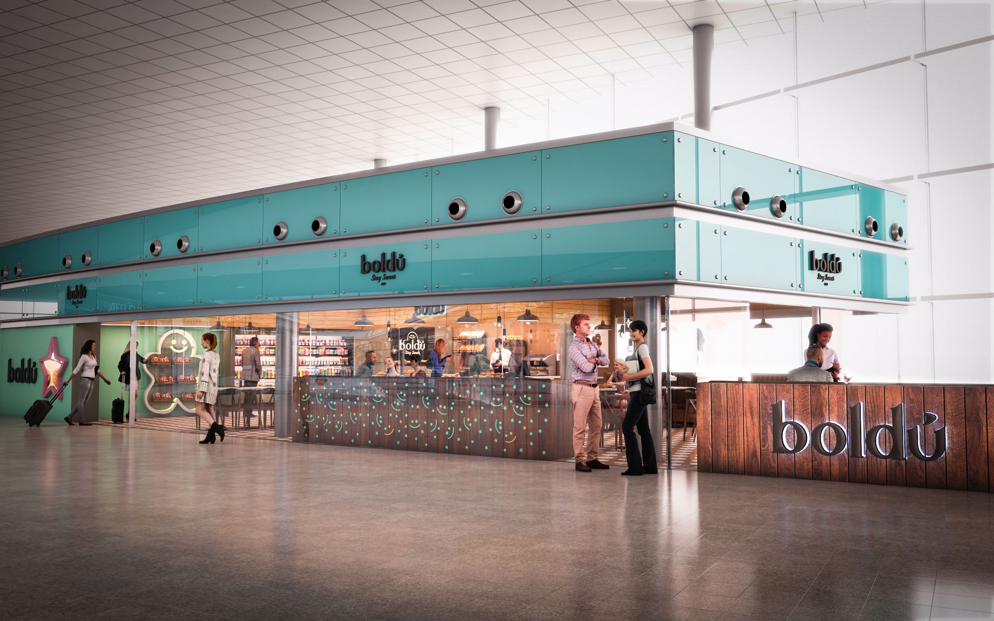
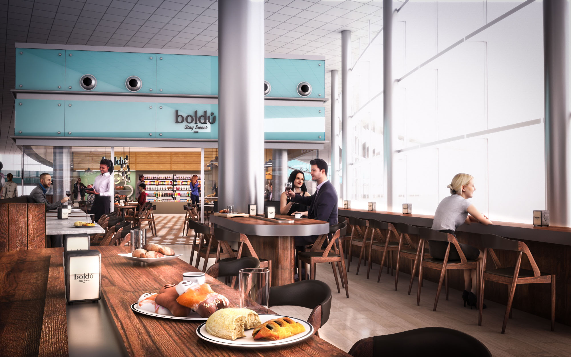
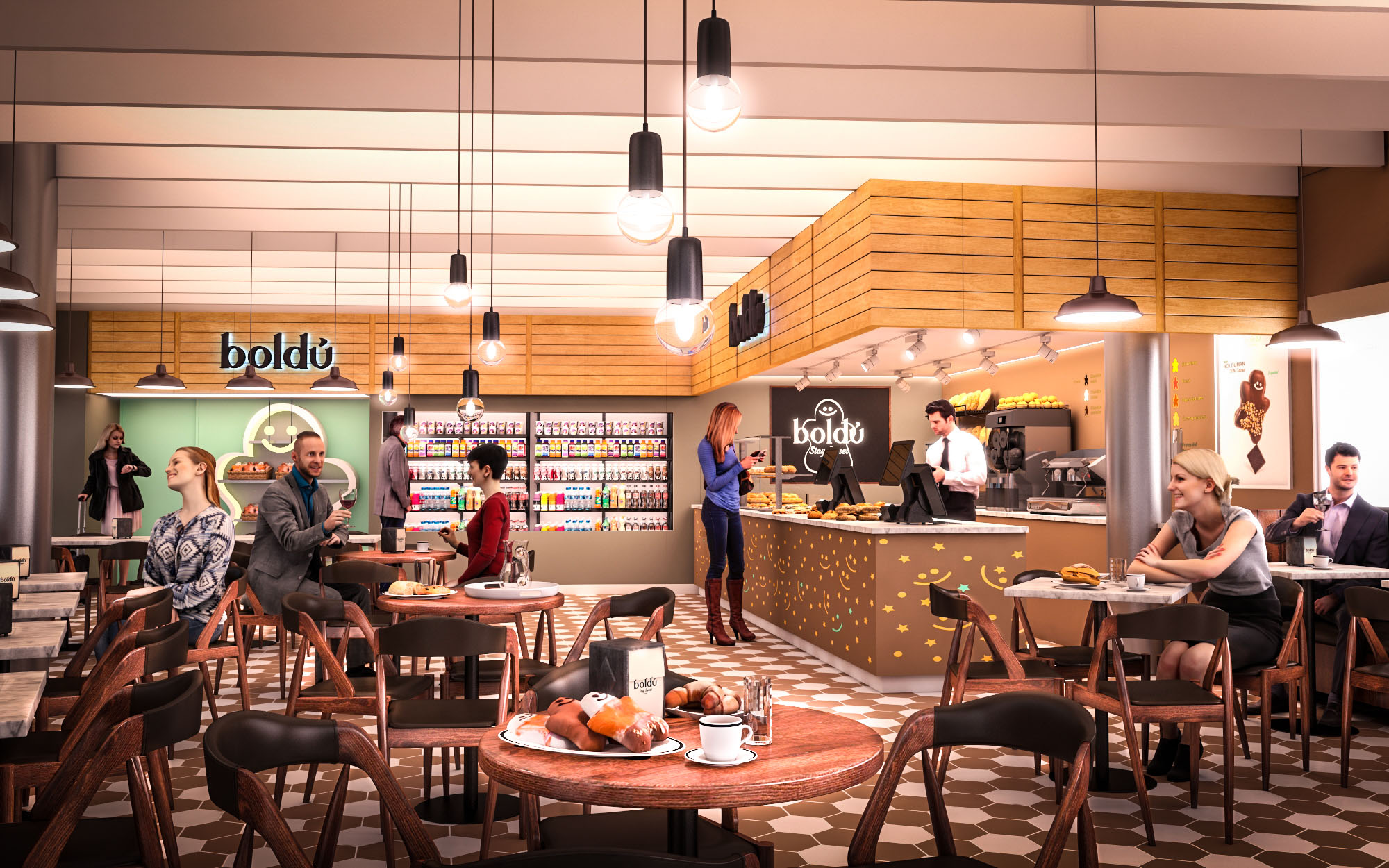
© 2021 by sanzpont [arquitectura] . Webpage by sanzpont [digital] . Innovative Digital Experiences

The Café de Indias project in Málaga is conceived as an open, contemporary coffee pavilion inserted within a larger commercial atrium. The design articulates a clear, recognizable brand front while remaining visually permeable and accessible from all sides. The café becomes a social condenser, blurring the limit between mall circulation and hospitality space through an inviting layout and an emphasis on transparency and warmth.
The architectural language combines clean, orthogonal lines with tactile finishes, seeking a balance between metropolitan sobriety and the artisan character of traditional coffee houses. The large, white structural frame provides a neutral canvas against which the dark fascia, signage, and warm timber elements stand out, generating a strong visual identity.
The plan is organized around a central service core that houses the counter, back-of-house preparation area, and refrigerated display units. This compact bar volume opens towards the main mall axis, maximizing visibility of products and barista activity, and thus enhancing the experiential dimension of the brand.
Seating radiates from this core in concentric bands of different densities. High tables and stools are located closer to the counter for short stays, while standard tables and more generous bench seating occupy the outer ring for longer, more relaxed use. Circulation aisles are intentionally wide, allowing fluid movement of customers and staff, and facilitating multiple entry points from the surrounding retail environment.
The material palette is governed by a contrast between light, large-format porcelain floor tiles and darker vertical surfaces. The floor provides continuity with the shopping center while clearly demarcating the café’s footprint through a subtle change in tone and joint pattern. The counter front uses textured timber cladding in a weathered finish, recalling coffee crates and reinforcing the narrative of origin and craftsmanship.
Tables employ warm natural wood tops combined with dark metal or leather-upholstered bases, while chairs feature slender black frames with light wooden backrests, adding visual rhythm without visual heaviness. The main fascia and soffit are rendered in matte white and charcoal, creating a crisp background for the “CAFE DE INDIAS” branding in bold black lettering, which becomes the key graphic element anchoring the space in the wider atrium.
Lighting design differentiates clearly between the commercial hall and the café interior. Within the high atrium, natural and general mall lighting flood the outer seating area, emphasizing openness. Under the café’s ceiling band, integrated downlights and focused spots generate a more intimate, human-scale atmosphere over the counter and central tables.
Accent lighting within the display cabinets and behind the bar highlights the product offer and creates depth in the background plane. The alternation of brighter operational zones and softer ambient pockets helps to structure the space without physical partitions, preserving the open character while offering a sense of enclosure to guests.
The brand identity is fully integrated into the architecture rather than applied superficially. Horizontal lines framing the logo are extended as subtle datum lines that organize menu boards, graphic panels, and shelving, resulting in a coherent visual grid. Informational panels about coffee origins and preparation methods are placed at eye level, transforming waiting time into an educational experience.
The seating typologies respond to different user profiles: individuals with laptops, quick solo visitors, couples, and larger groups. This diversity is achieved without fragmenting the space, thanks to the repetitive use of chair models, table geometries, and finishes, which maintain a unified aesthetic throughout.
Sustainability is approached through both material choices and operational efficiency. The specification prioritizes durable, easy-to-maintain finishes such as high-resistance porcelain flooring and robust timber laminates, extending the lifecycle of the fit-out and reducing replacement needs. Furniture is designed for disassembly, enabling components to be repaired or recycled.
LED lighting with high energy efficiency and long lifespan minimizes electrical consumption and maintenance. The open configuration of the café reduces the need for additional mechanical systems, taking advantage of the shopping center’s existing climate control. Where possible, equipment with low standby consumption and optimized refrigeration units is selected to decrease the overall environmental footprint of the operation.
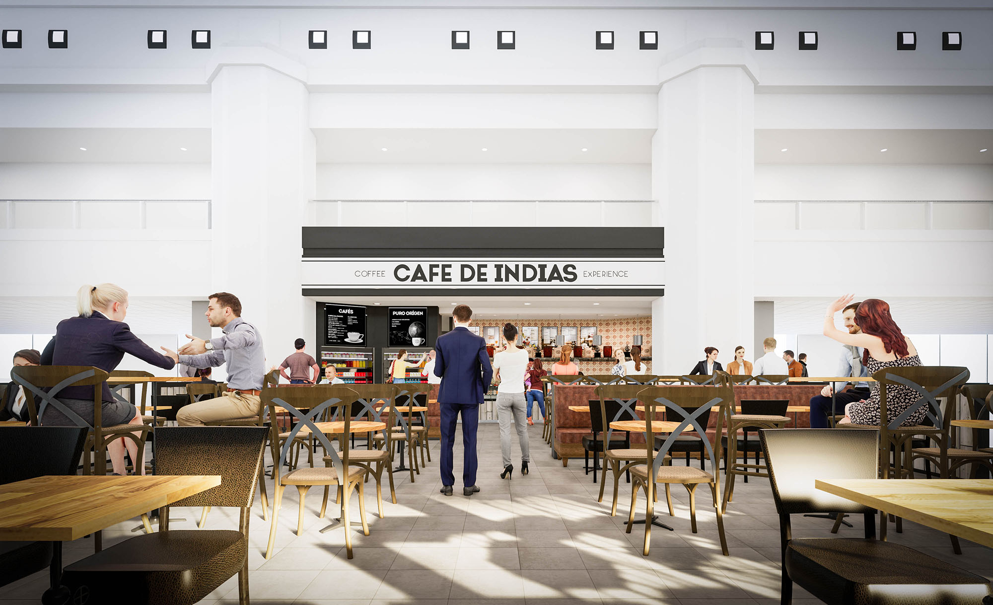
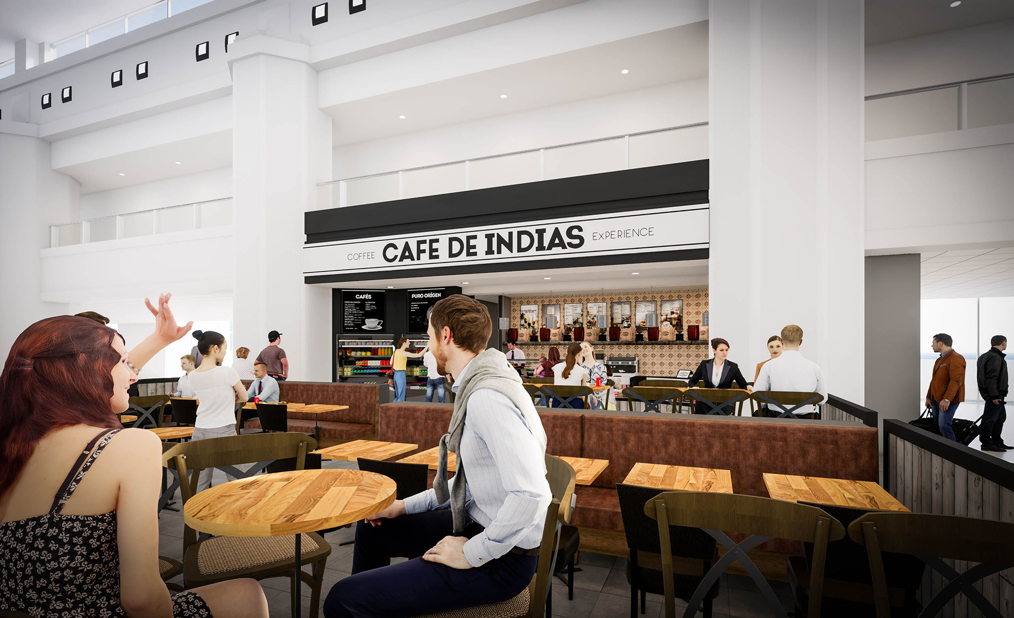
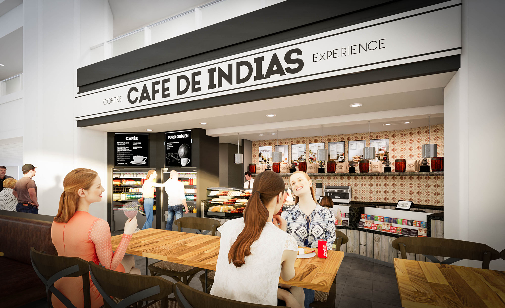
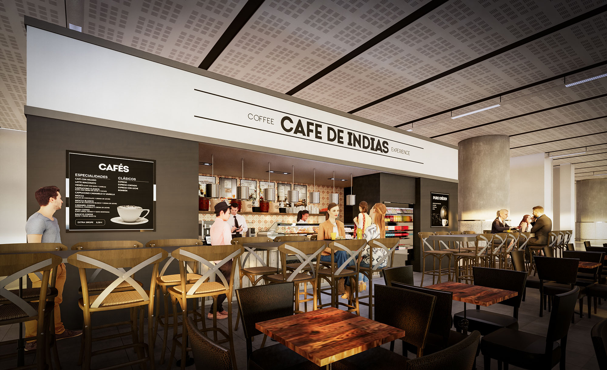
© 2021 by sanzpont [arquitectura] . Webpage by sanzpont [digital] . Innovative Digital Experiences

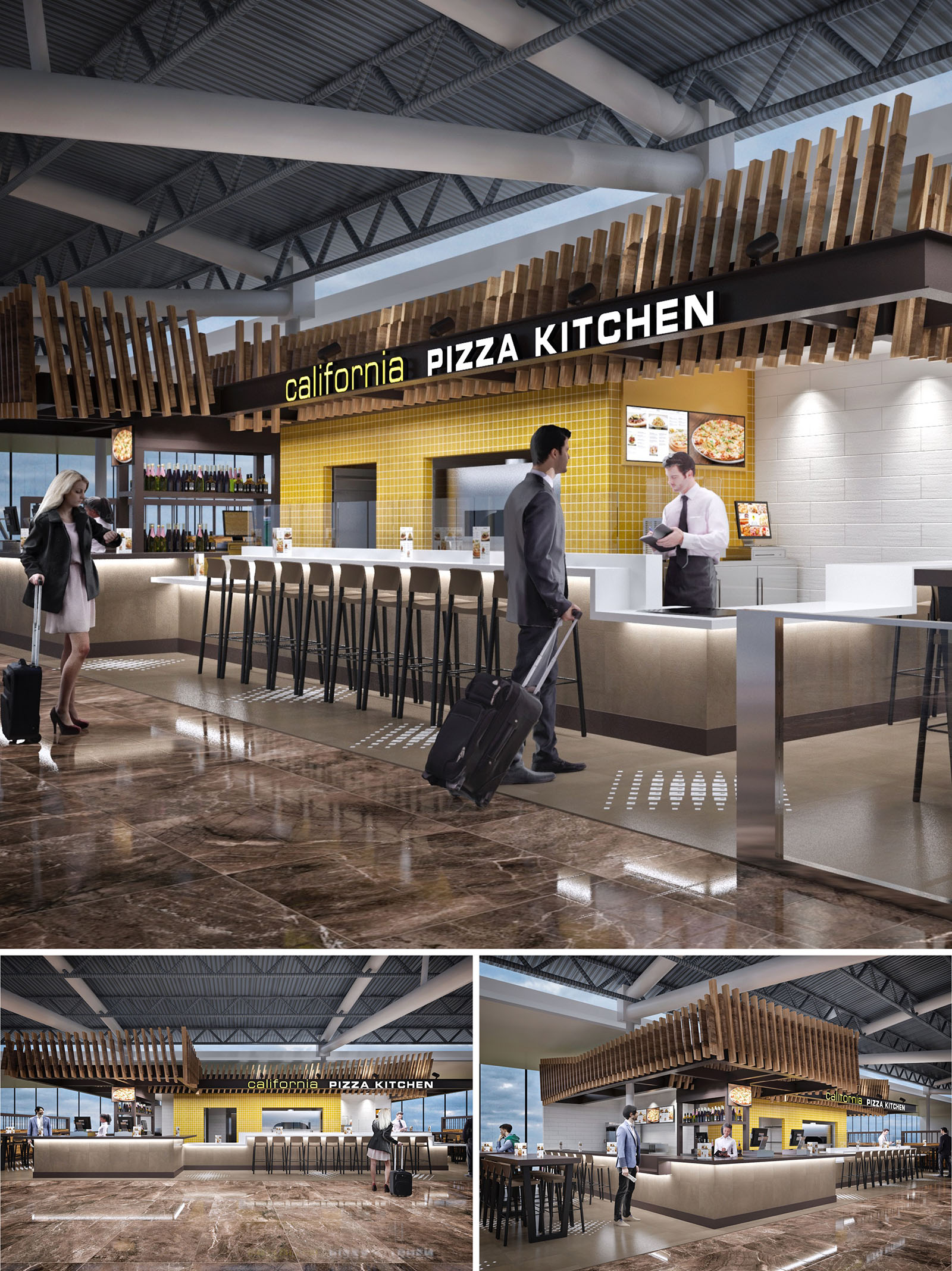
The California Pizza Kitchen in Tijuana is conceived as an open, sculptural island within the airport concourse, combining the informality of a Californian lifestyle with the efficiency required in a high‑traffic terminal. The design articulates a strong horizontal bar wrapped by a dynamic timber crown that becomes both a visual beacon and a unifying architectural element. This suspended wooden volume provides recognizable identity from multiple vantage points while maintaining visual permeability and openness to the surrounding terminal.
The project balances the warmth of natural materials with a contemporary, almost industrial envelope, dialoguing with the exposed steel trusses and generous heights of the airport structure. The restaurant is deliberately porous: no solid walls, only counters, furniture and overhead elements that define space without obstructing circulation or sightlines, ensuring comfort for transient users with limited time.
The layout is organized around a central service bar that acts as the operational core, concentrating ordering, payment and beverage service. This strategy reduces cross‑circulation between staff and travelers, allowing efficient workflows behind the counter while presenting a clear and intuitive front‑of‑house interface. High stools line the primary bar facing the kitchen, encouraging quick stays and solo travelers, while peripheral tables accommodate small groups with carry‑on luggage.
The island configuration prevents dead ends and enables 360‑degree access, essential in an airport context. Passengers can approach from any side, identify the service point immediately and continue their route without backtracking. Thresholds are subtly defined by floor material transitions and tactile guidance dots, which assist orientation and accessibility without resorting to physical barriers.
The material palette juxtaposes warm woods and textured ceramics against a neutral, durable base. The overhead timber slats, in a natural or lightly stained finish, provide a tactile counterpoint to the surrounding metal structure. They are composed in a rhythmic vertical pattern that folds and wraps around the bar, creating depth and a sense of crafted detail while remaining lightweight and modular.
The bar front and worktops use light, smooth solid‑surface or quartz finishes, chosen for their resistance to staining and ease of cleaning in a food‑service environment. Behind the counter, a field of yellow ceramic tiles introduces the brand’s chromatic identity and adds luminosity, reflecting light toward the preparation zone. White textured wall panels balance the composition, preventing visual saturation and ensuring a bright backdrop for digital menus and product imagery.
Lighting is designed to contrast the typically diffuse ambient light of the terminal with a more intimate, focused atmosphere at the restaurant. Linear recessed fixtures and discreet spotlights are integrated into the underside of the timber canopy, washing the bar and work surfaces with warm, uniform light. This approach clearly delineates the service zone and enhances the perception of cleanliness and order.
Under‑counter lighting along the bar introduces a floating effect, visually lightening the mass of the counter and guiding passengers along the seating edge. Accent lighting over the yellow-tiled wall reinforces the brand color and creates a depth gradient, drawing attention to the kitchen aperture and menu boards without competing with airport signage.
The furniture is intentionally slender and linear, with metal frames and timber seats that echo the canopy language. High stools along the bar prioritize quick turnover and clear sightlines, while standard-height tables on the perimeter allow more relaxed use. The neutral upholstery and finishes are selected to withstand intensive use yet remain visually calm against the more expressive architectural elements.
Brand integration is achieved architecturally rather than through excessive graphics. The yellow tile field, the black fascia band carrying the illuminated logo, and the timber envelope all function as three-dimensional branding devices visible from long distances within the concourse. This reduces the need for additional signage and visual clutter.
Sustainability considerations include the use of modular timber elements, allowing efficient fabrication, transport and potential replacement of individual slats instead of large assemblies. Durable, low‑maintenance surfaces minimize the need for aggressive cleaning chemicals and frequent replacement. High‑efficacy LED lighting reduces energy consumption, while the open island typology leverages the airport’s existing HVAC and natural lighting, avoiding redundant systems and lowering operational impact over the project’s life cycle.
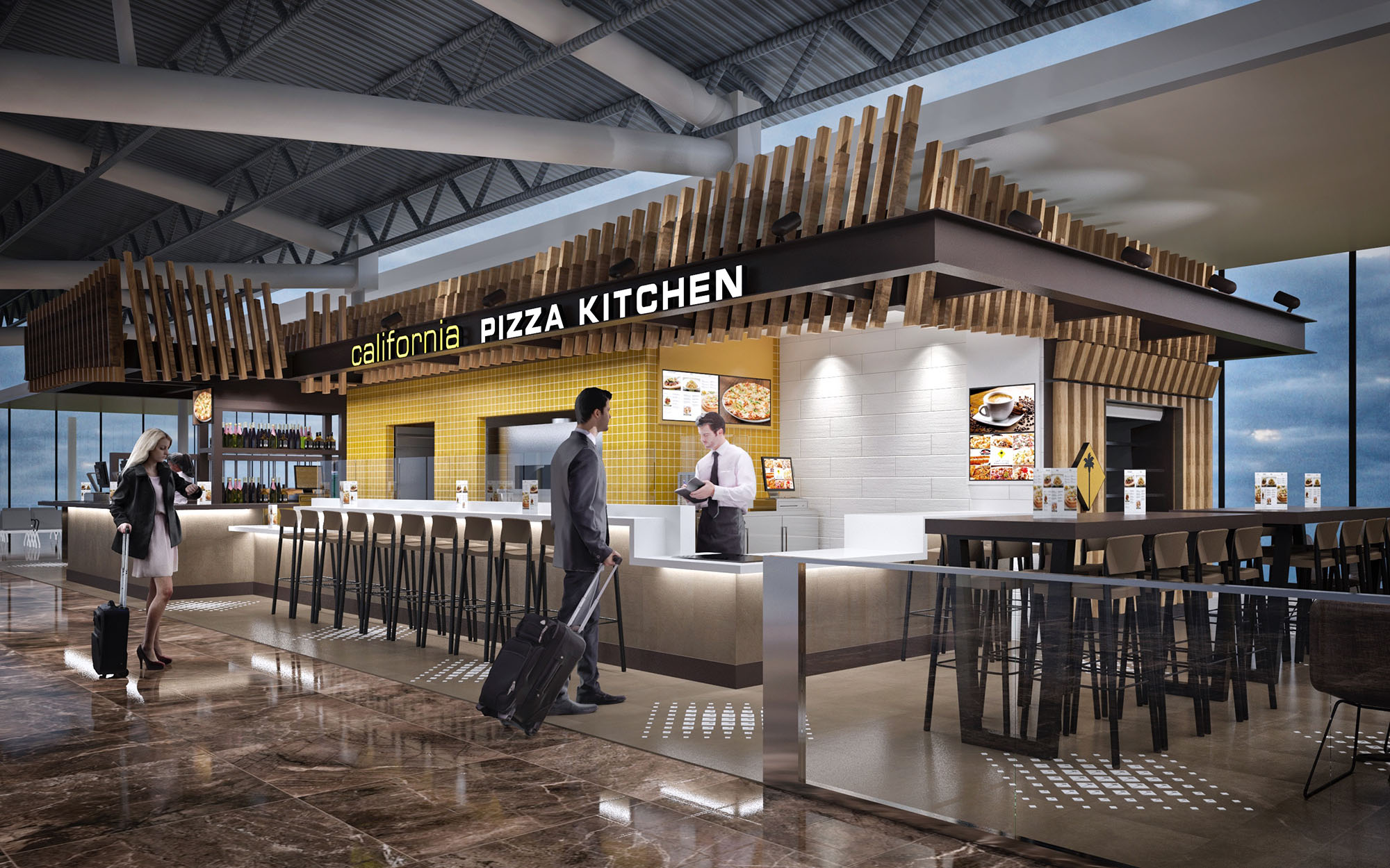
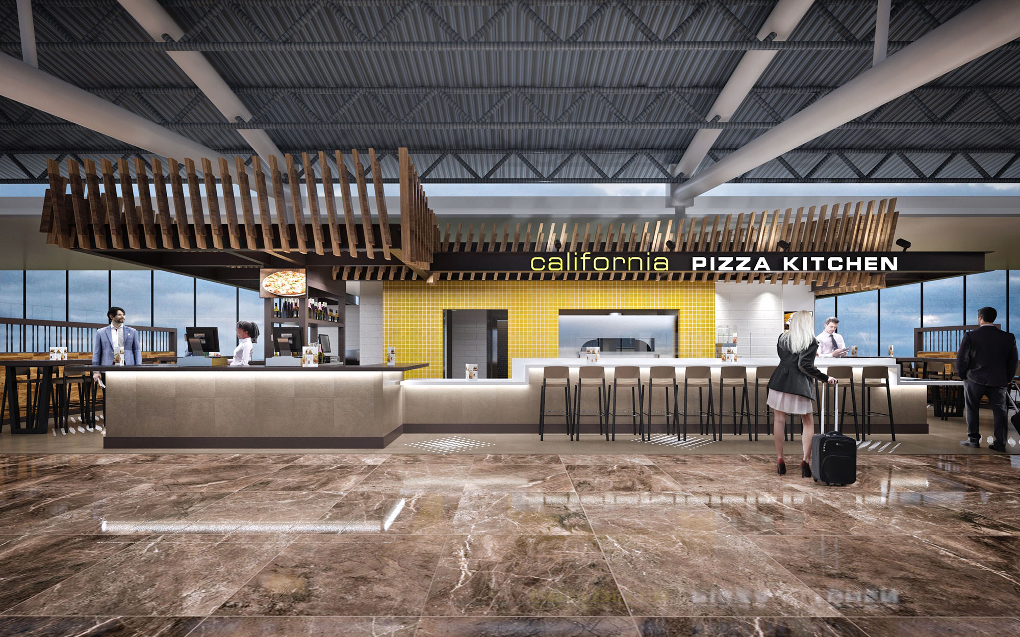
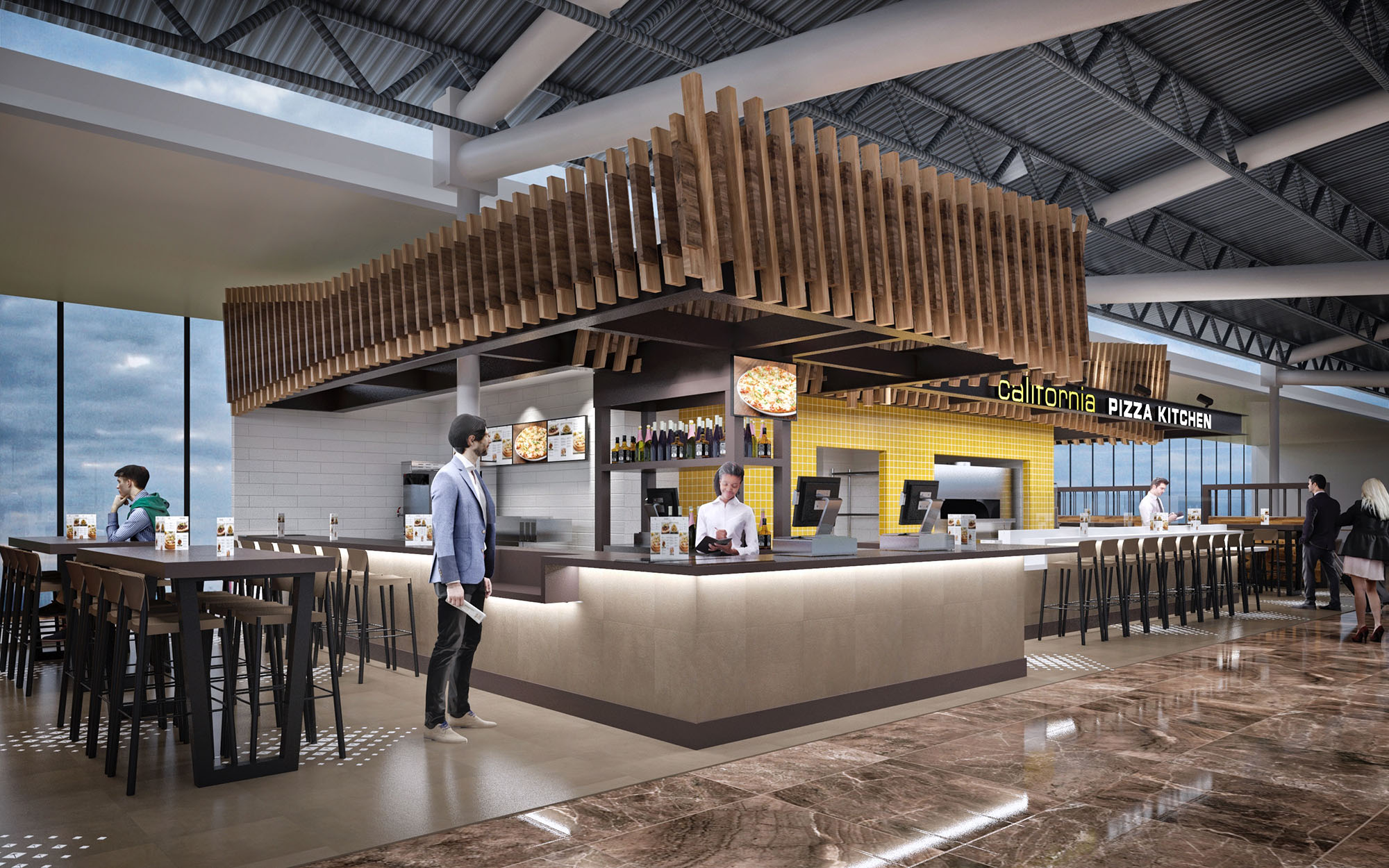
© 2021 by sanzpont [arquitectura] . Webpage by sanzpont [digital] . Innovative Digital Experiences
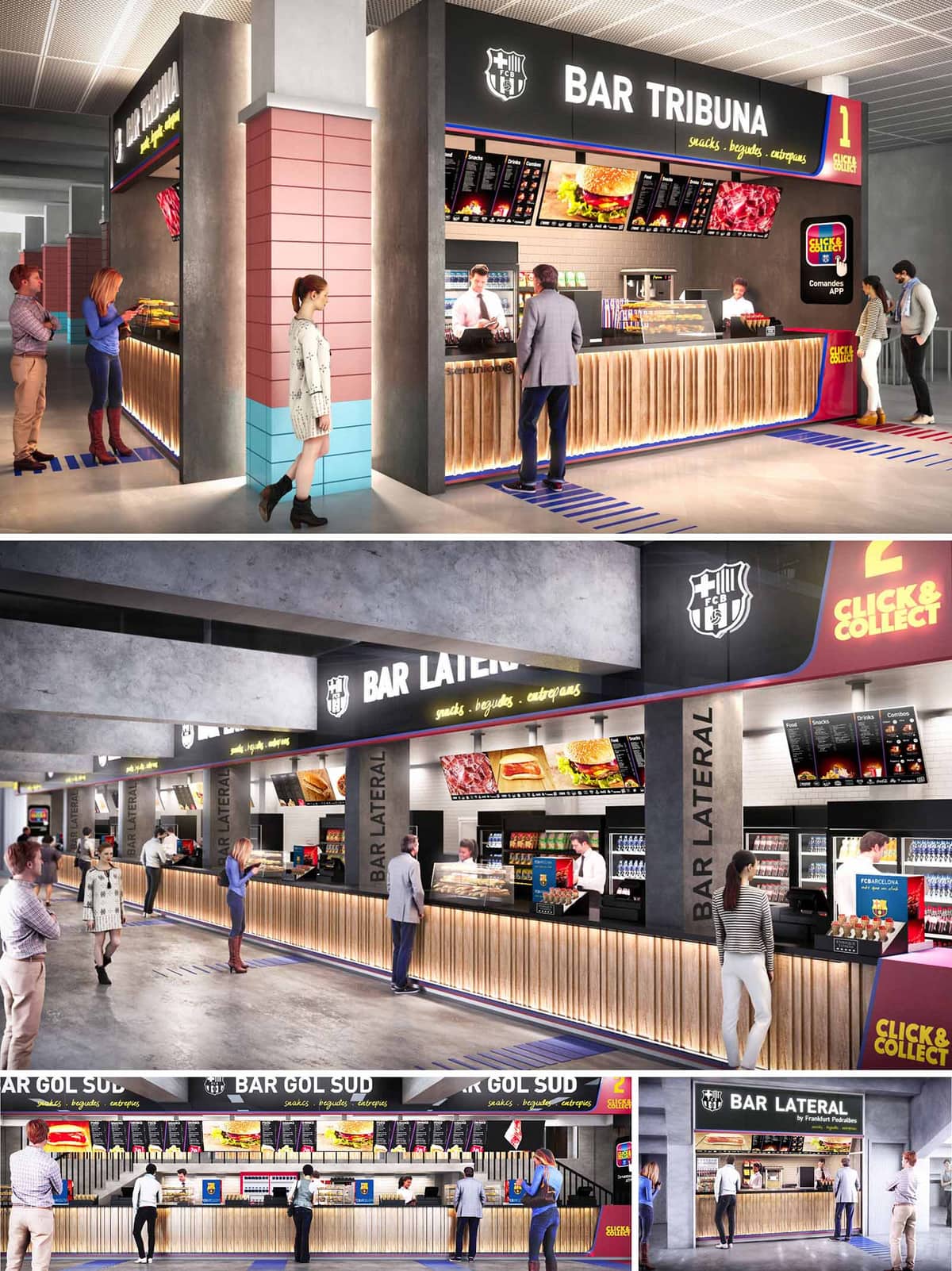
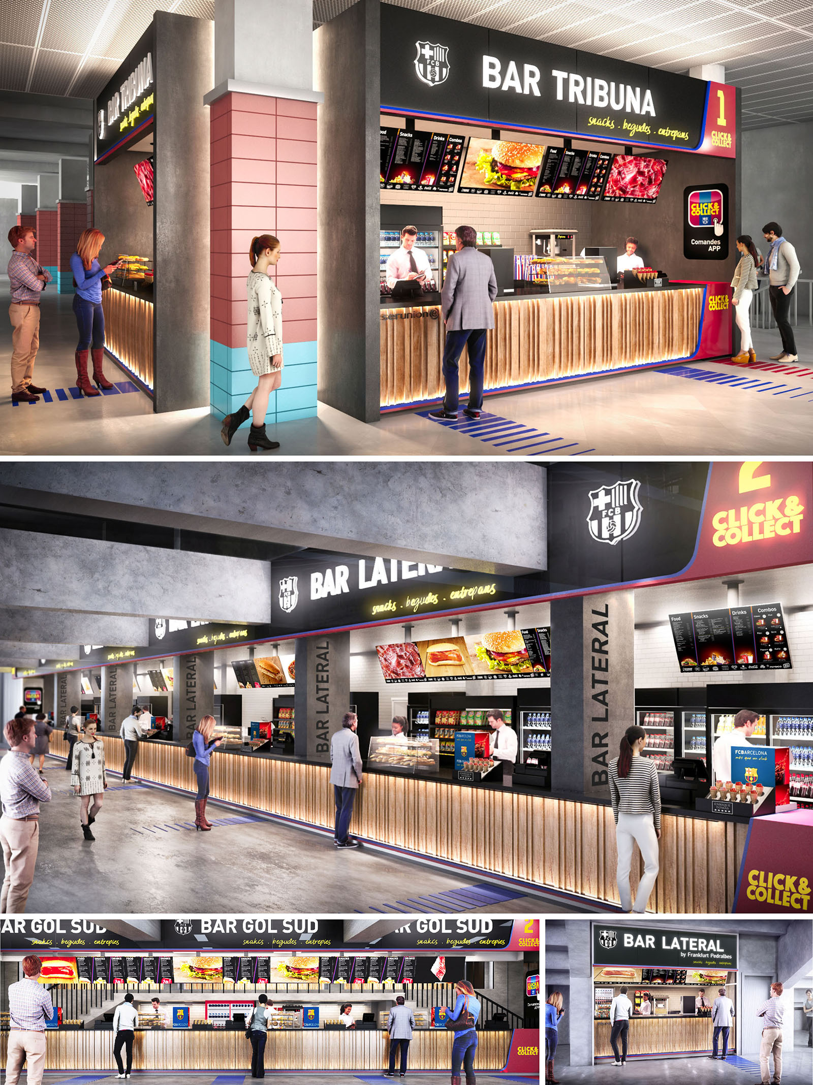
The kiosk system at Camp Nou is conceived as a continuous gastronomic boulevard that integrates with the stadium’s circulation areas, transforming waiting and transit spaces into an active food and beverage experience. The design emphasizes clarity of use, speed of service, and strong brand presence, aligning the match-day ritual with a contemporary hospitality environment. Each bar—Tribuna, Lateral and Gol Sud—is visually unified yet differentiated through graphic and chromatic cues, creating a legible wayfinding system inside the concourse.
The architecture works as a robust infrastructural backdrop while the frontal planes, signage, and lighting provide the emotional and commercial layer. The kiosks are treated as elongated urban façades: a rhythm of vertical slats, structural piers, and illuminated bands organizes the long counters into recognizable modules, ensuring that the experience remains coherent even at peak crowd densities.
The layout prioritizes linearity and visibility. Long continuous counters run parallel to the circulation corridors, allowing multiple service points and minimizing cross-traffic. Customers queue along clearly defined lanes on the floor, while the open counter front enables intuitive reading of product offerings and available pick-up areas. Structural columns are absorbed into the composition of the kiosk fronts, becoming wayfinding anchors instead of obstacles.
Each kiosk integrates dedicated zones for ordering, payment, and “click & collect” digital pick-up, reducing congestion and supporting omnichannel service. The counters are set at a height that balances ergonomic comfort for both staff and users, with generous overhangs to protect equipment and merchandise. Back-of-house storage and refrigeration are compact and aligned along the rear wall, ensuring that staff workflow is short, direct, and efficient.
The material palette contrasts the raw character of the existing stadium structure with warm, tactile finishes at the customer interface. Exposed concrete beams and columns frame a front layer of vertical wooden slats, whose natural tone softens the environment and provides a domestic touch in a highly infrastructural context. These slats are subtly backlit at the base, generating a floating effect and visually lightening the long counter volumes.
Ceiling lighting is uniform and technical, while accent lighting focuses on the menu boards, branding panels, and product displays. LED strips trace the lower edge of the counters and the upper cornices, reinforcing horizontality and guiding visitors along the kiosk line. The use of durable laminates, metal profiles, and easy-to-clean solid surfaces at worktops ensures resistance to intensive use and simplifies maintenance, critical in a high-traffic stadium environment.
Color is employed as a functional and emotional tool. The dominant neutral base of concrete grey and natural wood is contrasted with the club’s signature palette: deep blues, reds, and accent yellows. These colors appear in fascia bands, click & collect modules, floor graphics, and column cladding, ensuring immediate association with the club identity while aiding orientation across different bars and service areas.
Large-scale typography and illuminated logos on the fascia define each kiosk as a distinct destination, while menu boards combine imagery and clear typographic hierarchy to facilitate rapid decision-making. Floor markings in club colors organize the queues and subtly choreograph movement. The combination of architecture, environmental graphics, and digital displays turns the kiosks into immersive brand devices without compromising legibility or operational clarity.
The kiosk modules are conceived as repeatable and adaptable units that can be extended or reconfigured according to event requirements. Service equipment is organized in standardized bays, allowing future technological upgrades or changes in product offering with minimal intervention on the architectural envelope. Wide, obstruction-free front zones accommodate fluctuating crowd volumes, from regular league matches to major international events.
Sustainability is supported through several strategies: the extensive use of LED lighting with dimming capabilities reduces energy consumption; durable and low-maintenance materials extend the life cycle of finishes; and the modular construction facilitates off-site fabrication and potential reuse of elements. Where possible, finishes favor certified wood products and recyclable metal components. The efficient spatial layout, which minimizes back-of-house circulation and optimizes refrigeration clustering, also contributes to lowering operational energy demand and overall environmental impact.
© 2021 by sanzpont [arquitectura] . Webpage by sanzpont [digital] . Innovative Digital Experiences
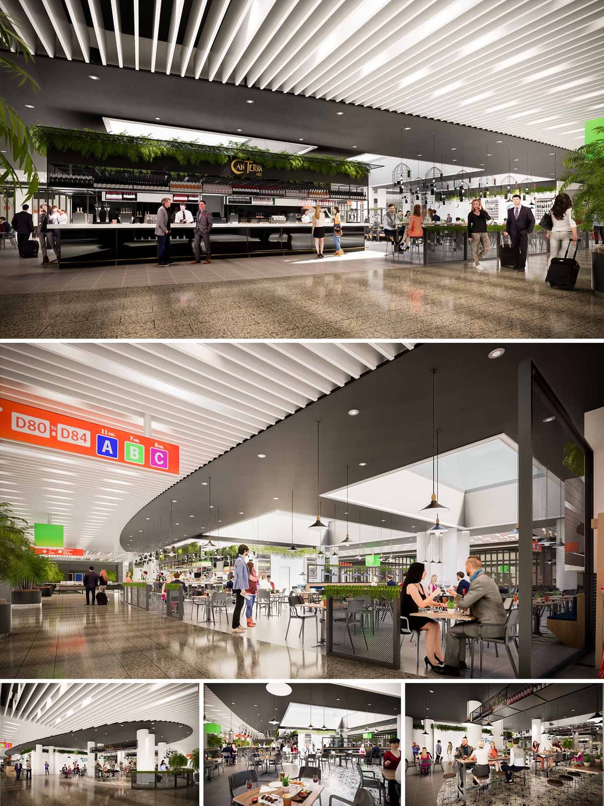

CAN TERRA is conceived as a contemporary Mediterranean food hub within the dynamic context of Mallorca’s airport. The project interprets the traditional Mallorcan bar and market stall as an open, permeable island that welcomes transient users while retaining a clear identity. The architectural language is deliberately clean and linear, creating a calm and legible environment inside the otherwise intense airport circulation flows.
The central idea is to articulate a “green spine” that organizes service, bar, and seating areas, bringing the landscape of the island into the terminal. This vegetated line, suspended and integrated in the ceiling and perimeter elements, becomes the recognizable signature of the restaurant and reinforces its territorial link to Mallorca.
The layout is structured around a large central island bar, clearly visible from all approach directions. This island acts as an anchor in the food court, ensuring natural wayfinding and facilitating intuitive movement around it. Auxiliary counters and preparation zones are embedded in the island core, allowing efficient radial service to the surrounding seating rings.
Seating is distributed in concentric layers: a primary ring of high tables and stools close to the bar, where quick consumption and interaction with staff are prioritized, and an outer layer of lower tables for longer stays and family groups. The absence of heavy partitions ensures visual continuity with the terminal, while subtle level changes in ceiling height and lighting define the restaurant’s boundaries without interrupting flows.
The project employs a restrained palette that balances airport robustness with the warmth of hospitality. Floors are finished in a terrazzo-like polished surface, chosen for its durability, ease of maintenance, and capacity to reflect light, enhancing brightness. The bar and furniture combine matte black metal structures with timber accents, creating a contemporary yet timeless character.
The ceiling is a key compositional element: a field of white linear baffles contrasts with the dark, continuous soffit over the restaurant area. This duality emphasizes the spatial footprint of CAN TERRA and improves acoustic absorption. Green vegetation and select touches of fresh color linked to signage and branding introduce the Mediterranean vibrancy without overwhelming the neutral base.
Lighting design orchestrates a clear hierarchy between transit space and dining area. A uniform, diffuse ambient light over the public concourse transitions into a warmer, more intimate lighting inside the restaurant boundaries. Pendant luminaires, suspended at varied heights, generate a human scale beneath the expansive terminal volume and articulate different seating clusters.
Integrated linear lighting within the ceiling baffles and under the bar counter accentuates the horizontality of the design and reinforces visual guidance. Skylight apertures and high-level openings, where available, are framed to allow natural light to reach the interior, strengthening the perception of an open, daylight-filled Mediterranean setting.
Furniture is lightweight, stackable, and flexible, allowing quick reconfiguration based on passenger flows and operational needs. A mix of communal tables, two-tops, and bar seating caters to solo travelers, couples, and groups alike. Perforated metal panels, planters, and low mesh screens subtly define micro-environments without blocking transparency or surveillance.
Details such as integrated charging points, luggage-friendly circulation clearances, and wide turning radii respond specifically to the airport context. Material junctions are designed for robustness, with protected edges and easily replaceable components to extend the service life of finishes under high-traffic conditions.
Sustainability is approached through both passive and operational measures. The open, perimeter-free configuration promotes natural cross-ventilation within the terminal’s overall HVAC strategy, reducing the need for localized mechanical systems. The reflective flooring and high-efficiency LED lighting lower energy consumption while maximizing the effect of available daylight.
Vegetation is not merely decorative but acts as a soft acoustic buffer and contributes to indoor air quality. Materials are selected with an emphasis on durability and low maintenance, minimizing replacement cycles and associated resource use. Modular furniture, demountable bar elements, and standardized metal structures allow future adaptation, reuse, or relocation, aligning the project with circular design principles appropriate for evolving airport infrastructures.
© 2021 by sanzpont [arquitectura] . Webpage by sanzpont [digital] . Innovative Digital Experiences
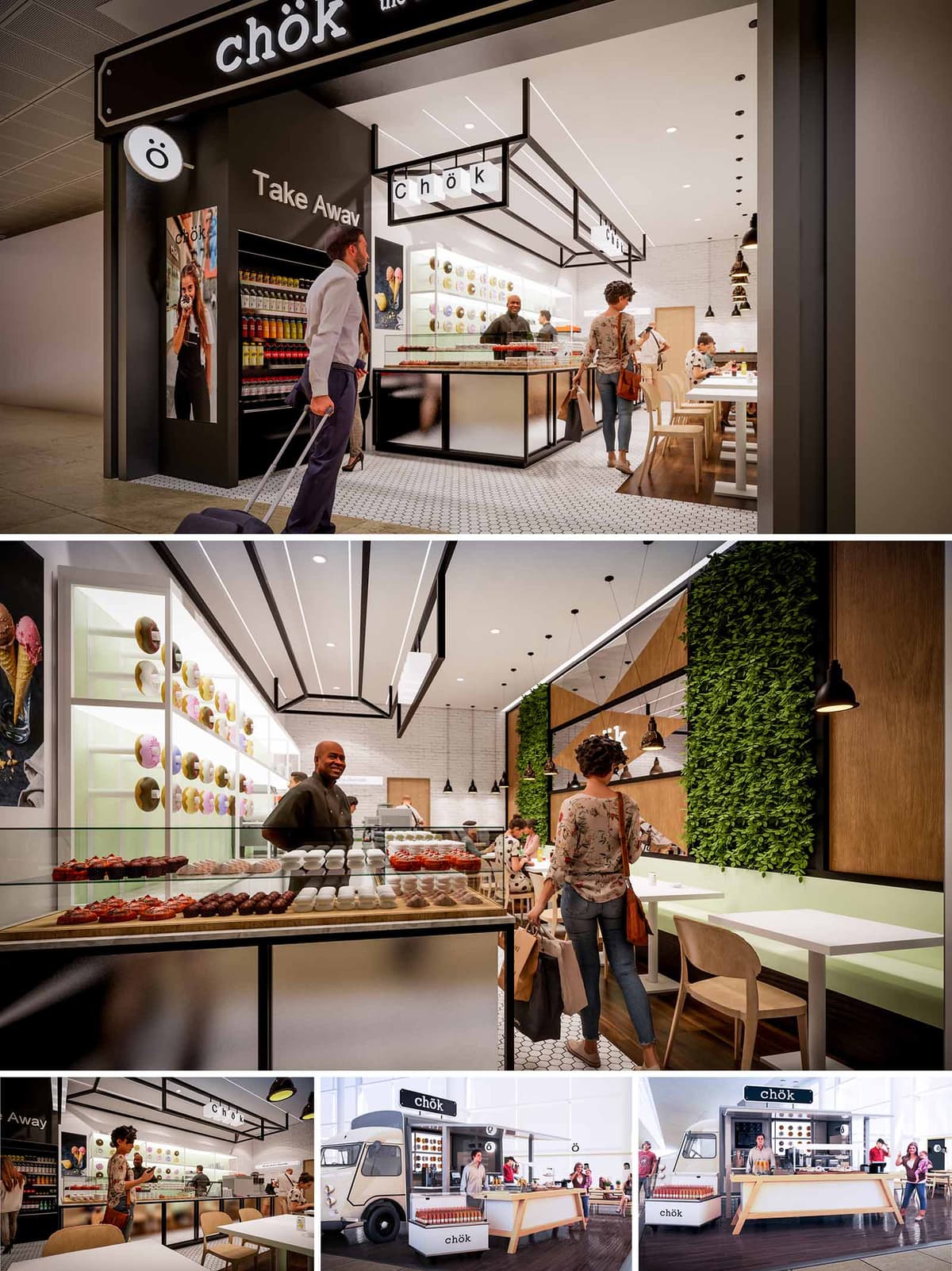
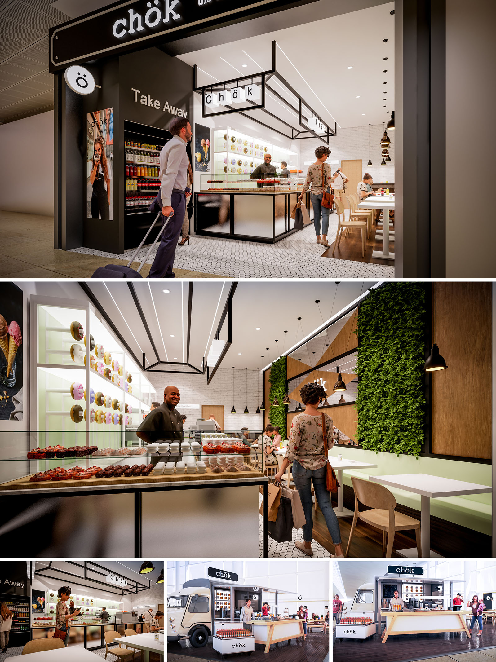
CHÖK is conceived as a contemporary pastry and coffee destination that merges the spontaneity of street food with the precision of boutique retail. The architectural language is based on a clear black-and-white framework that acts as a visual “grid” for the colorful product display, turning donuts and pastries into the main chromatic protagonists. The design is replicated across multiple locations, including a permanent interior venue and a mobile truck format, ensuring strong brand recognition through consistent spatial and graphic elements.
The project balances efficiency and warmth: rapid takeaway service for travelers coexists with a comfortable sit-in area. The space communicates transparency and openness, making the production and display of desserts visible from the exterior, and inviting passersby through an almost shop-window-like façade.
The plan is organized around a central service island that integrates display counters, preparation zones and payment points. This island anchors the circulation: customers naturally flow from the entrance along the showcases, then towards the barista zone and finally to the seating area at the rear. The configuration minimizes cross-traffic between staff and customers, enhancing operational efficiency.
At the threshold, a clearly defined takeaway corridor allows quick access for travelers, separated from the slower, more relaxed seating strip. In the food truck version, the same logic is compressed into a linear counter that unfolds along the truck façade, with an extended timber bar acting as an exterior communal table.
The material palette is deliberately restrained to highlight the product. Black metal frames and profiles define ceilings, counters and signage, acting as a strong graphic outline. These are combined with white ceilings and light-toned wall finishes, creating a bright, neutral backdrop that enhances both natural and artificial light.
Warm wood veneers are used on wall panels, furniture and floor accents to introduce a tactile, humane quality. The patterned hexagonal floor tiles at the entrance delineate the public zone and recall traditional café pavements, while the smooth darker flooring in the seating area emphasizes comfort. Pastel accents, predominantly soft greens, appear on bench seating and some vertical surfaces, giving a fresh and playful touch aligned with the dessert offer.
Lighting design is a key component in shaping the brand’s identity. Integrated linear LED profiles trace the geometry of the black ceiling frames, visually extending the counter and guiding movement towards the back of the store. This creates a dynamic, almost theatrical canopy over the main activity strip.
Ambient recessed downlights provide uniform general illumination, while suspended black pendants over tables and the main counter generate warmer pools of light, enhancing the perception of material texture and product detail. In the truck concept, exterior spotlights and the illuminated signage ensure clear visibility in transit environments and during evening operation.
Branding is integrated architecturally rather than applied superficially. The logo and typography are embedded in the metal canopy, in the frontal fascia of the counters and in circular projecting signs that act as beacons in busy circulation areas such as airports or stations. Vertical display niches showcasing products and imagery function as both merchandising and decorative elements.
Furniture is lightweight yet robust, with simple timber chairs and benches that echo Scandinavian simplicity. The glass display cases are designed with minimal framing to avoid visual barriers between customers and the product, reinforcing the idea of openness and abundance.
Sustainability strategies focus on material selection, energy efficiency and user wellbeing. The project favors durable, easily cleanable finishes that extend lifecycle and reduce maintenance, such as ceramic tiles and high-resistance laminates. Wood elements are specified from certified sources where possible, contributing to responsible resource use.
Energy-efficient LED lighting systems with dimming capabilities reduce consumption while allowing adaptation to different times of day and ambient conditions. The inclusion of vertical green walls not only offers a strong visual focal point but also improves acoustic comfort and perceived indoor air quality. The modular furniture and the mobile truck format encourage flexibility and future reconfiguration, extending the overall usefulness of the built elements and aligning the brand with contemporary sustainable hospitality practices.
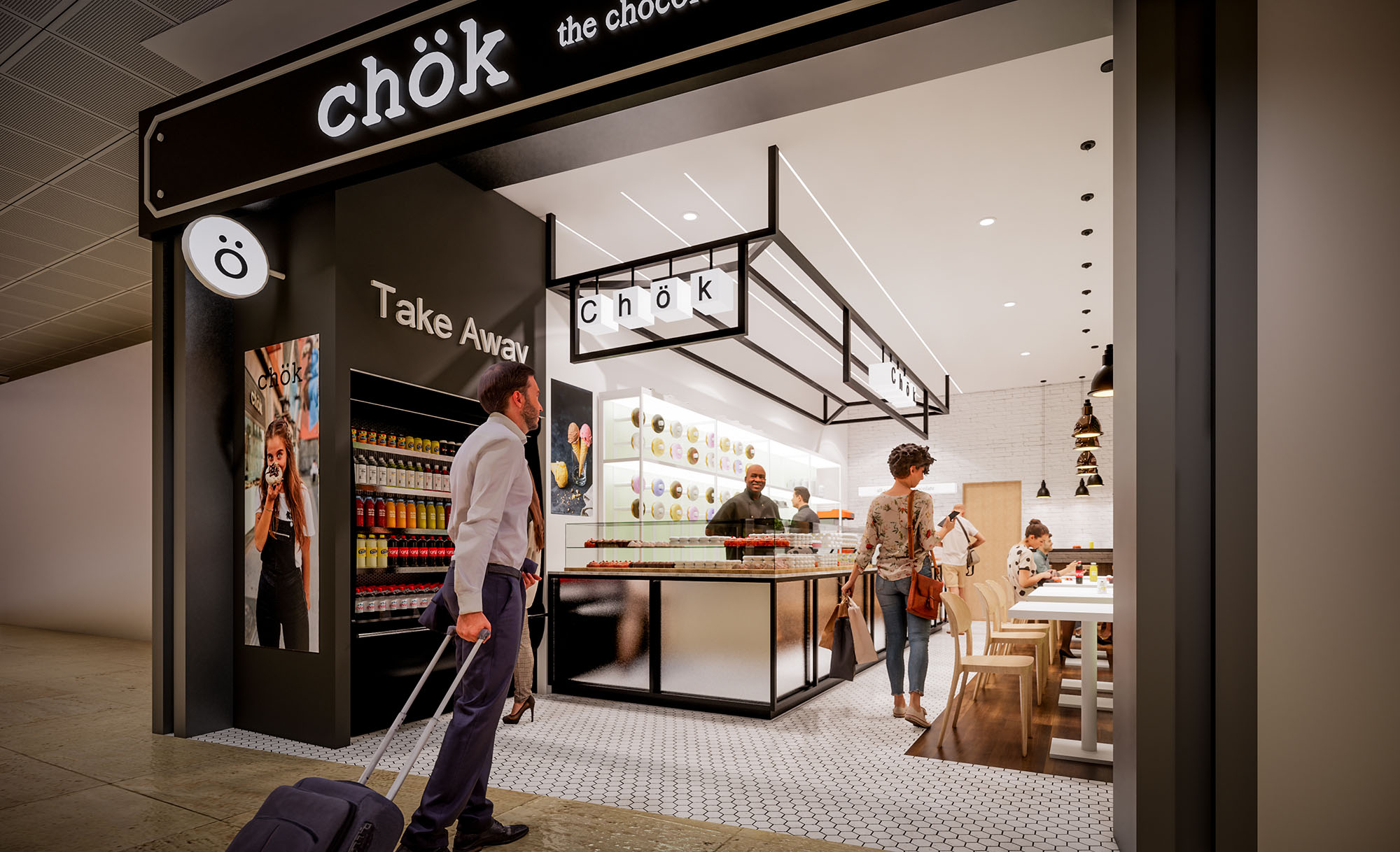
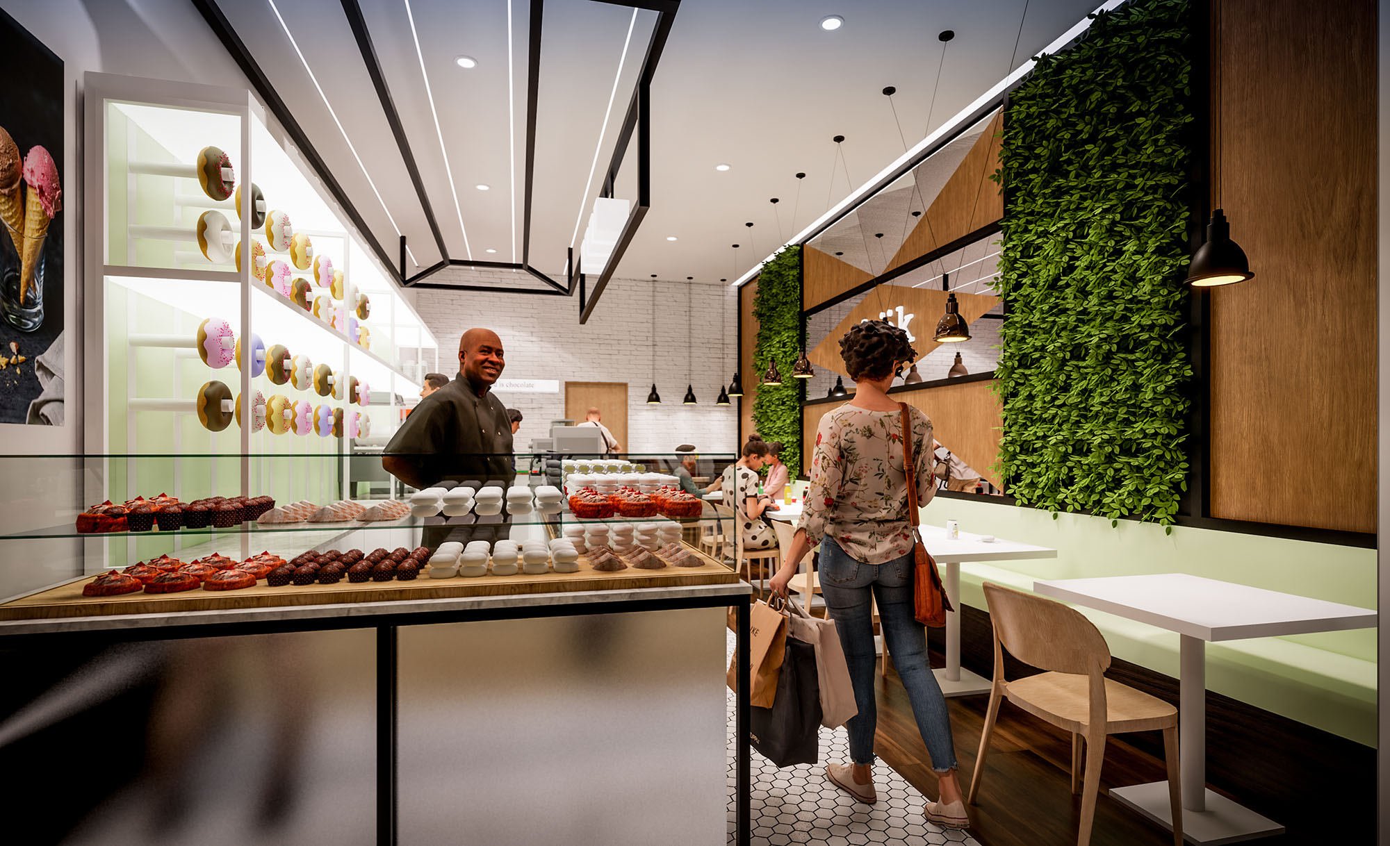
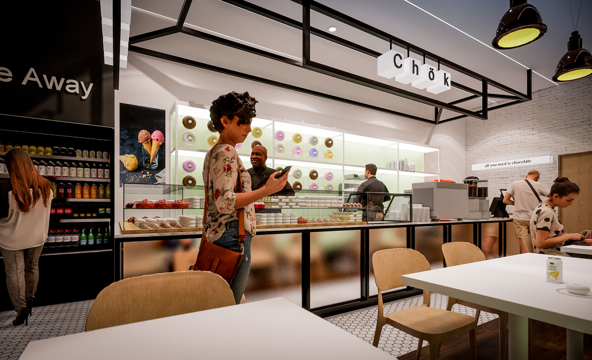
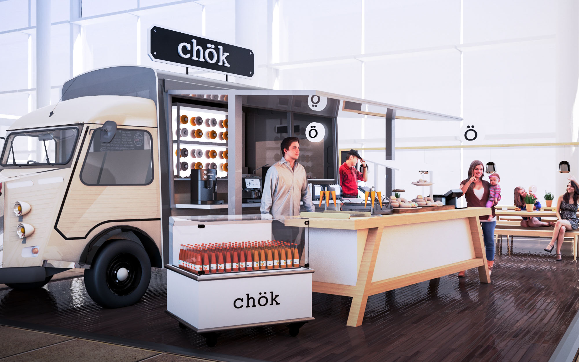
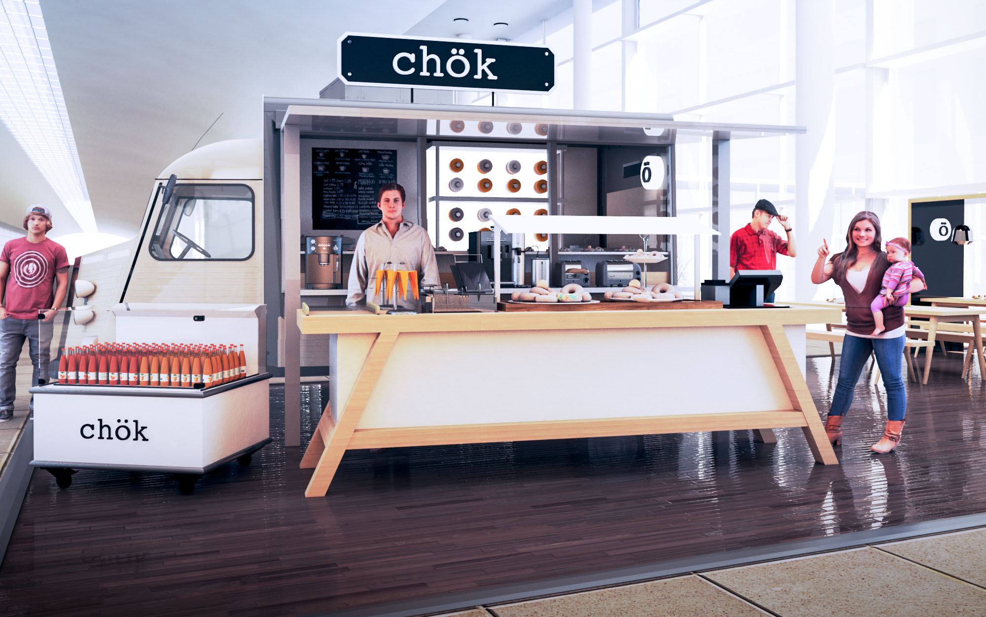
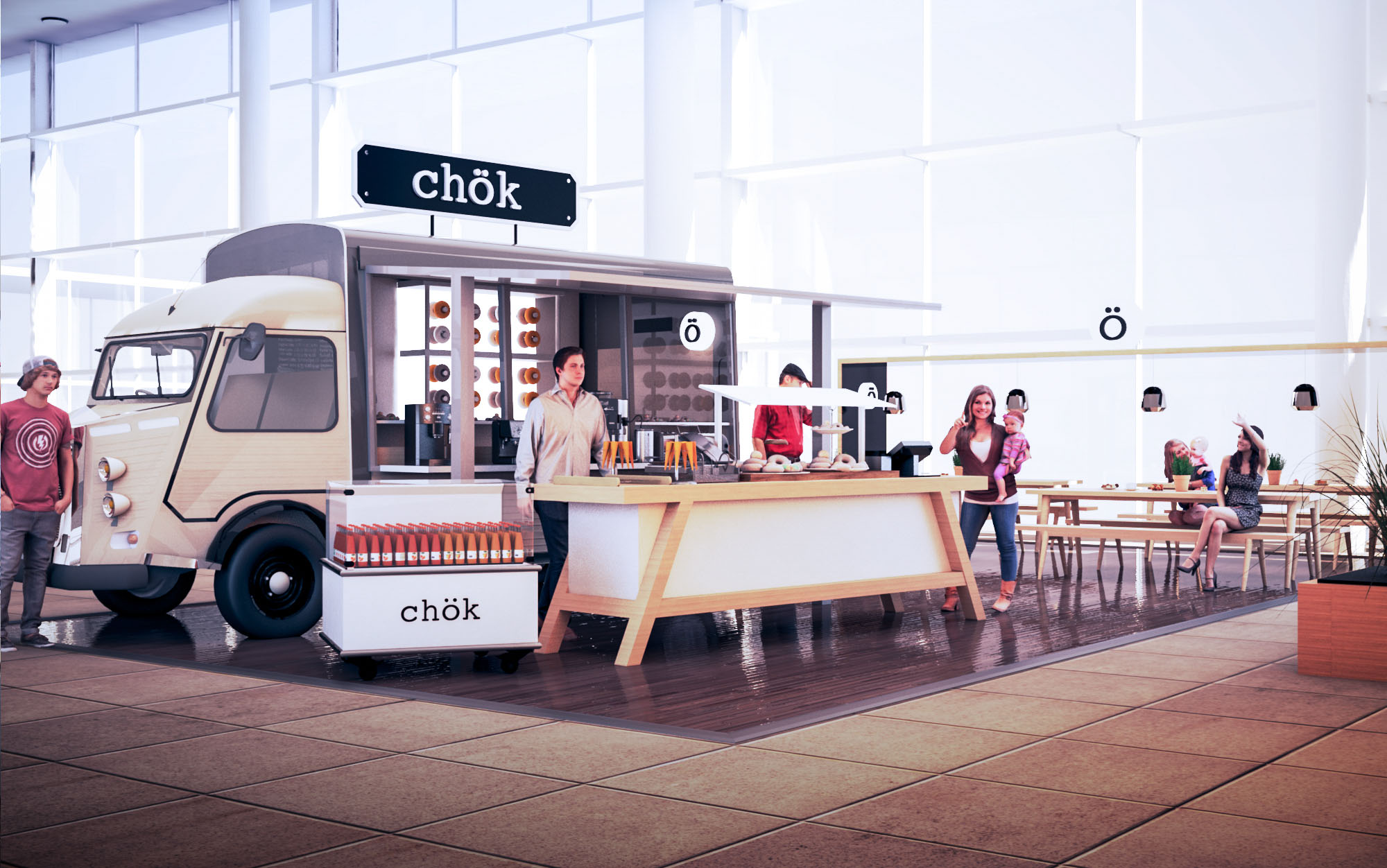
© 2021 by sanzpont [arquitectura] . Webpage by sanzpont [digital] . Innovative Digital Experiences
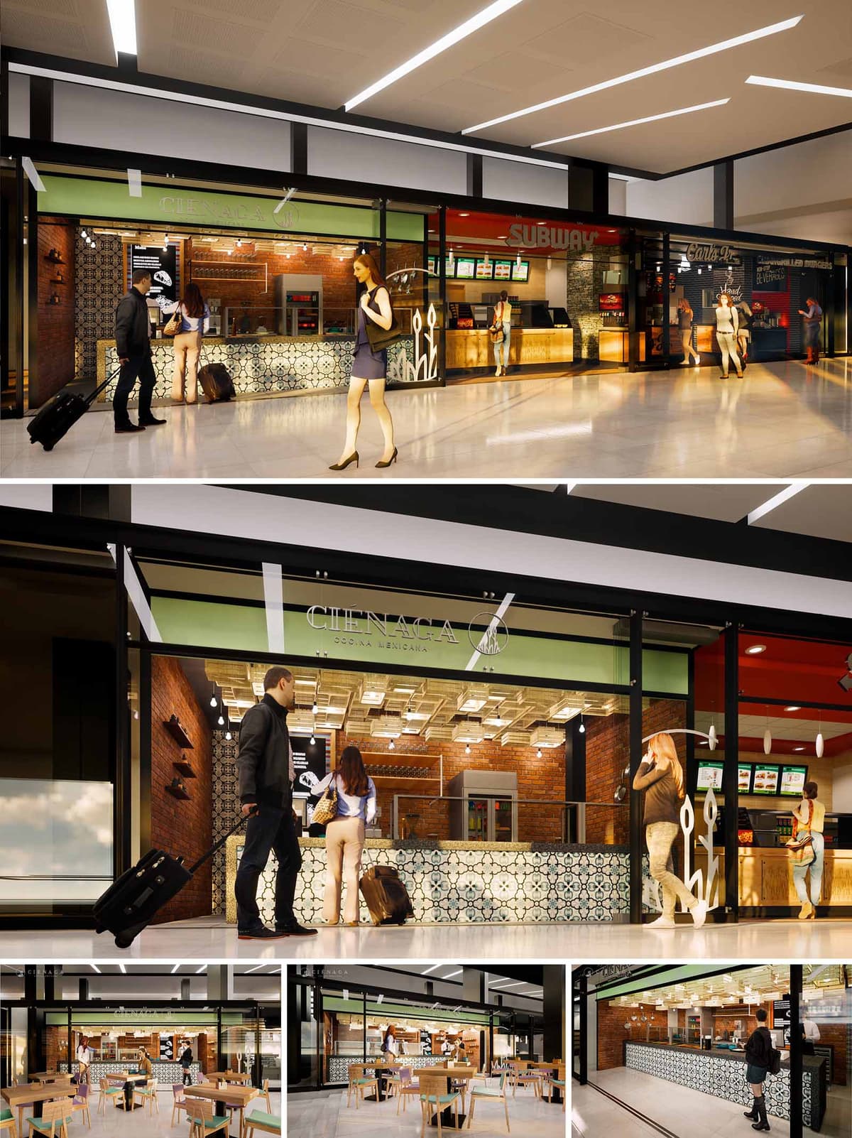
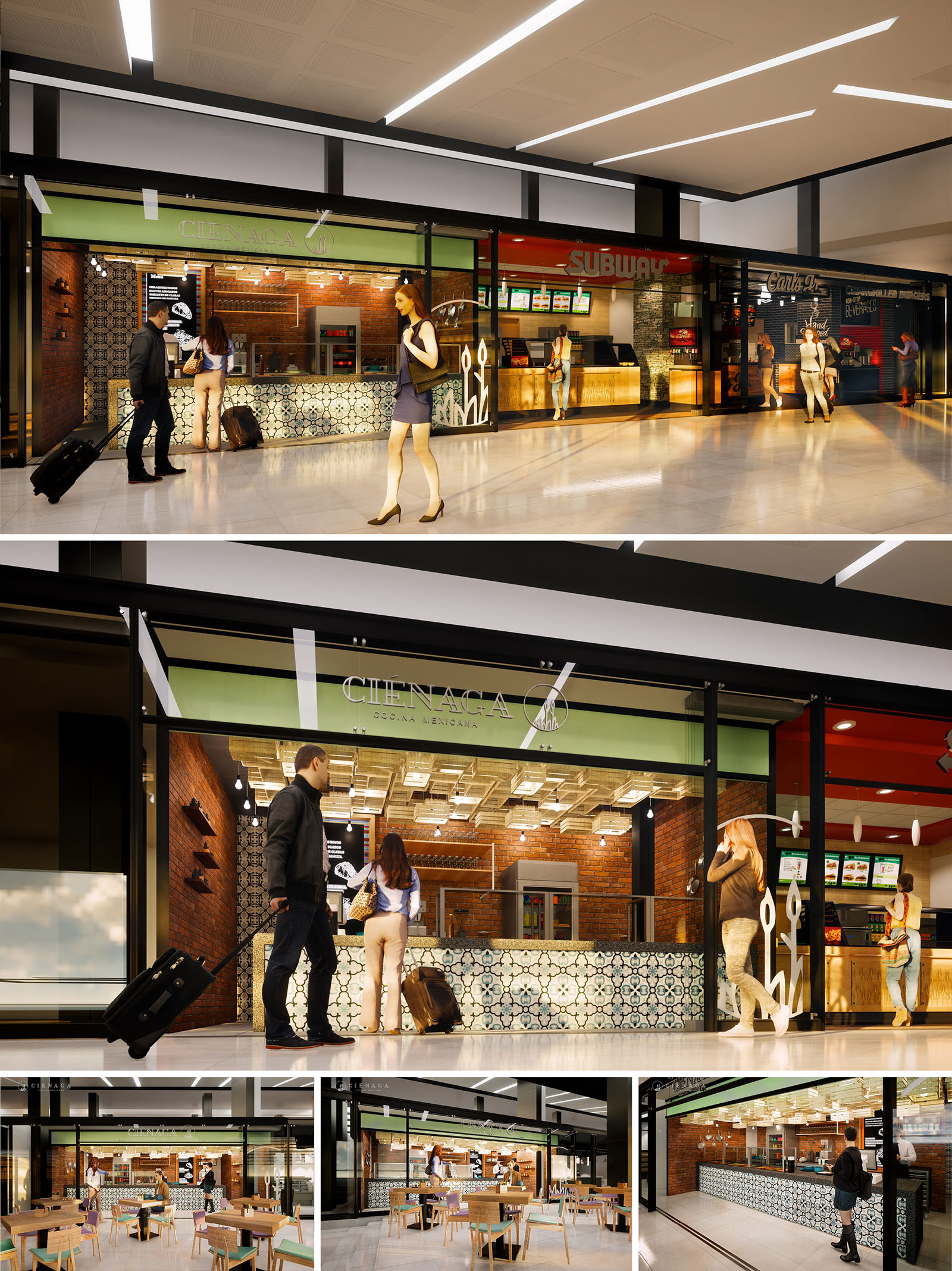
CIENAGA is conceived as a contemporary Mexican eatery embedded in a high-traffic commercial corridor, most likely an airport or shopping concourse. The project seeks to condense the atmosphere of a traditional mercado and the imagery of wetlands implied by its name into a compact, highly visible front. The design prioritizes openness and permeability, allowing the activity behind the counter and in the dining area to become part of the public space, encouraging spontaneous entry and fast circulation.
The architectural language balances industrial precision with handcrafted references. Clean steel frames and large glass panes set a neutral envelope, while patterned tiles, exposed brick, and warm lighting create a tactile and familiar environment. The result is a recognizable urban storefront that still expresses a strong local identity within an international context.
The façade operates as a transparent membrane between concourse and restaurant. A continuous glass front framed in dark metal profiles maximizes visual connection, turning the entire interior into a display. The upper band in green, hosting the CIENAGA logo and typography, functions as an urban canopy, visually anchoring the brand and providing contrast against the neutral mall finishes.
Sliding or retractable glass panels enable flexibility: during peak hours the front can be fully opened, eliminating barriers and allowing direct flow to the service counter and seating area. The graphic silhouettes of reeds on the glazing subtly evoke the “cienaga” landscape, creating an identifiable motif without overwhelming the clean composition.
The layout is organized in a linear sequence parallel to the concourse. At the front, a generous serving counter runs almost the full width, clarifying the point of order and pick-up. Behind it, a compact production zone consolidates cooking, preparation, and storage, optimizing back-of-house efficiency within a constrained footprint.
The dining area is positioned directly in front of the stall, occupying the open space of the corridor with lightweight, movable tables and chairs. This semi-open configuration blurs the edge between collective mall circulation and the restaurant’s domain, encouraging short stays and easy reconfiguration according to demand. Clear sightlines across the entire width ensure that staff can visually control both the counter and seating area.
Material selection celebrates Mexican craft through a contemporary lens. The counter front is clad in hydraulic cement tiles with a repetitive geometric pattern in soft blues, blacks, and creams, functioning as the main decorative focal point. Exposed red brick walls bring warmth and texture, referencing traditional construction and providing a robust, low-maintenance surface.
The color palette combines earthy tones with the signature green band of the brand, reinforcing recognition from a distance. Overhead, a gridded ceiling with recessed and pendant luminaires produces a warm, even illumination that contrasts with the cooler, more neutral light of the mall. Track-mounted spotlights accentuate the counter and product display, enhancing depth and hierarchy within the small volume.
The furniture is deliberately simple and functional, with wood-finished tabletops and light-toned chairs that maintain visual continuity with the tiled counter and brick surfaces. The clean lines and minimal upholstery support quick turnover and easy cleaning, while still offering comfort for short to medium stays. Table distribution allows flexible arrangements for individuals, couples, and small groups, responding to the transient nature of airport or mall users.
Accessibility is embedded in the clear floor paths and generous approach to the counter, ensuring convenient movement for travelers with luggage and users with reduced mobility. The overall ambience promotes a sense of casual familiarity, encouraging passersby to stop for an intuitive and efficient dining experience.
Sustainability is addressed through durable, low-maintenance materials and an efficient lighting strategy. Brick and ceramic tiles offer long life cycles, resistance to heavy use, and reduced need for replacement, lowering the project’s long-term environmental impact. The prevalence of hard, non-porous finishes also minimizes cleaning products and water consumption.
Large glass surfaces harness existing ambient lighting from the mall, allowing artificial lighting levels to be calibrated rather than constantly at maximum intensity. The warm LED system reduces energy consumption and maintenance compared to traditional lamps. A compact back-of-house, with equipment concentrated along a single service wall, contributes to energy efficiency in ventilation and refrigeration, while the open dining area minimizes the need for dedicated air-conditioning volumes.
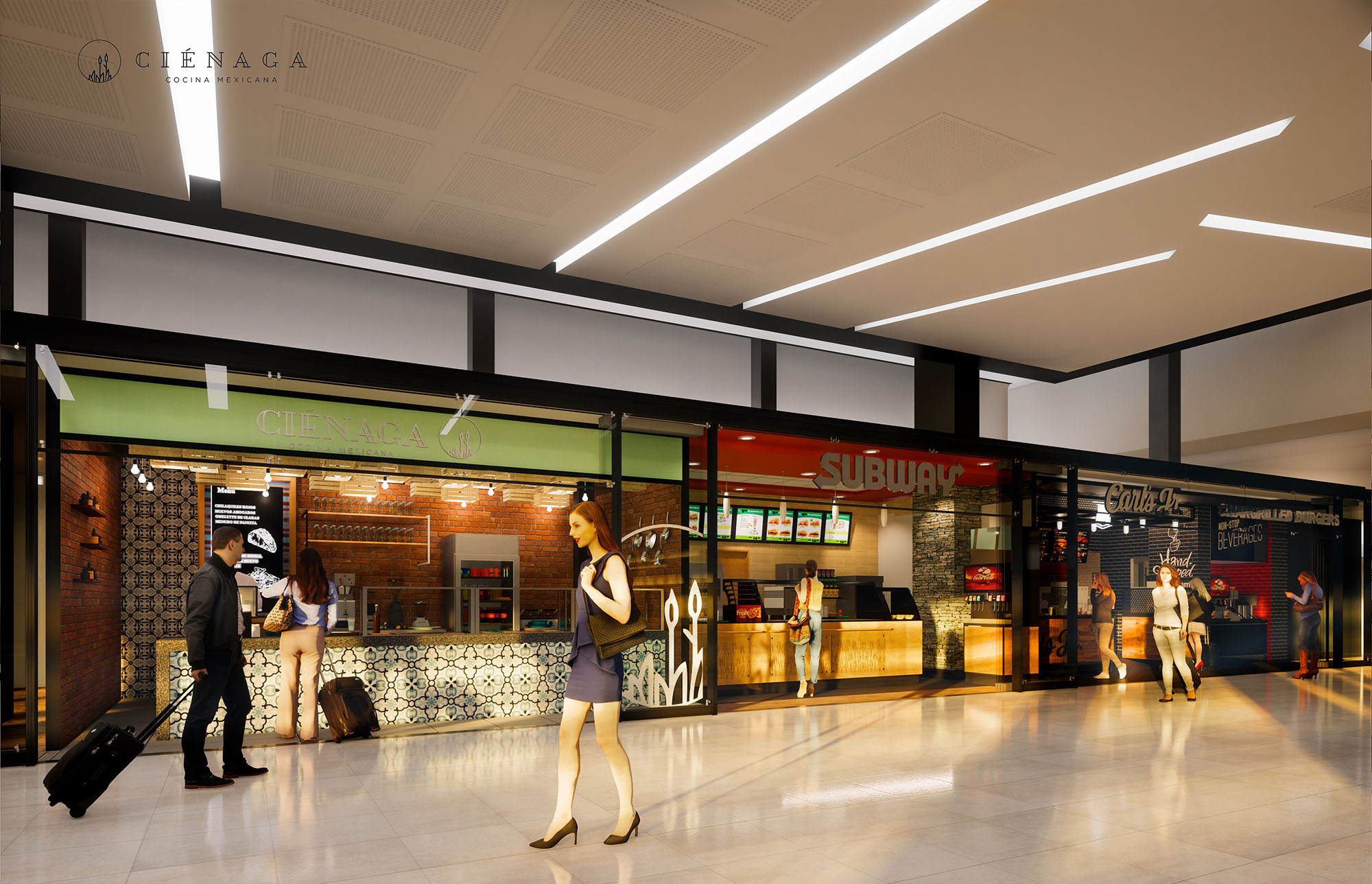
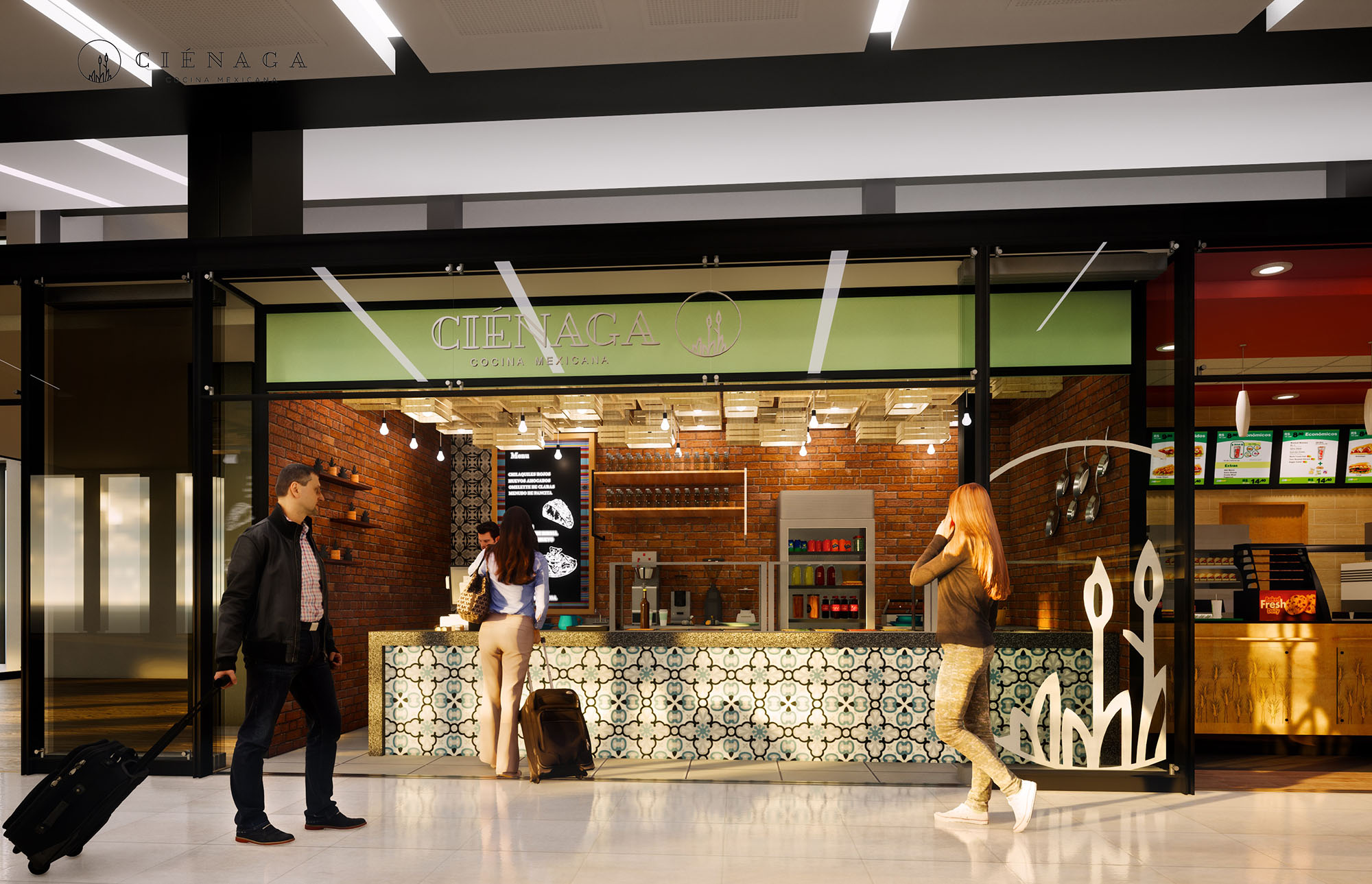
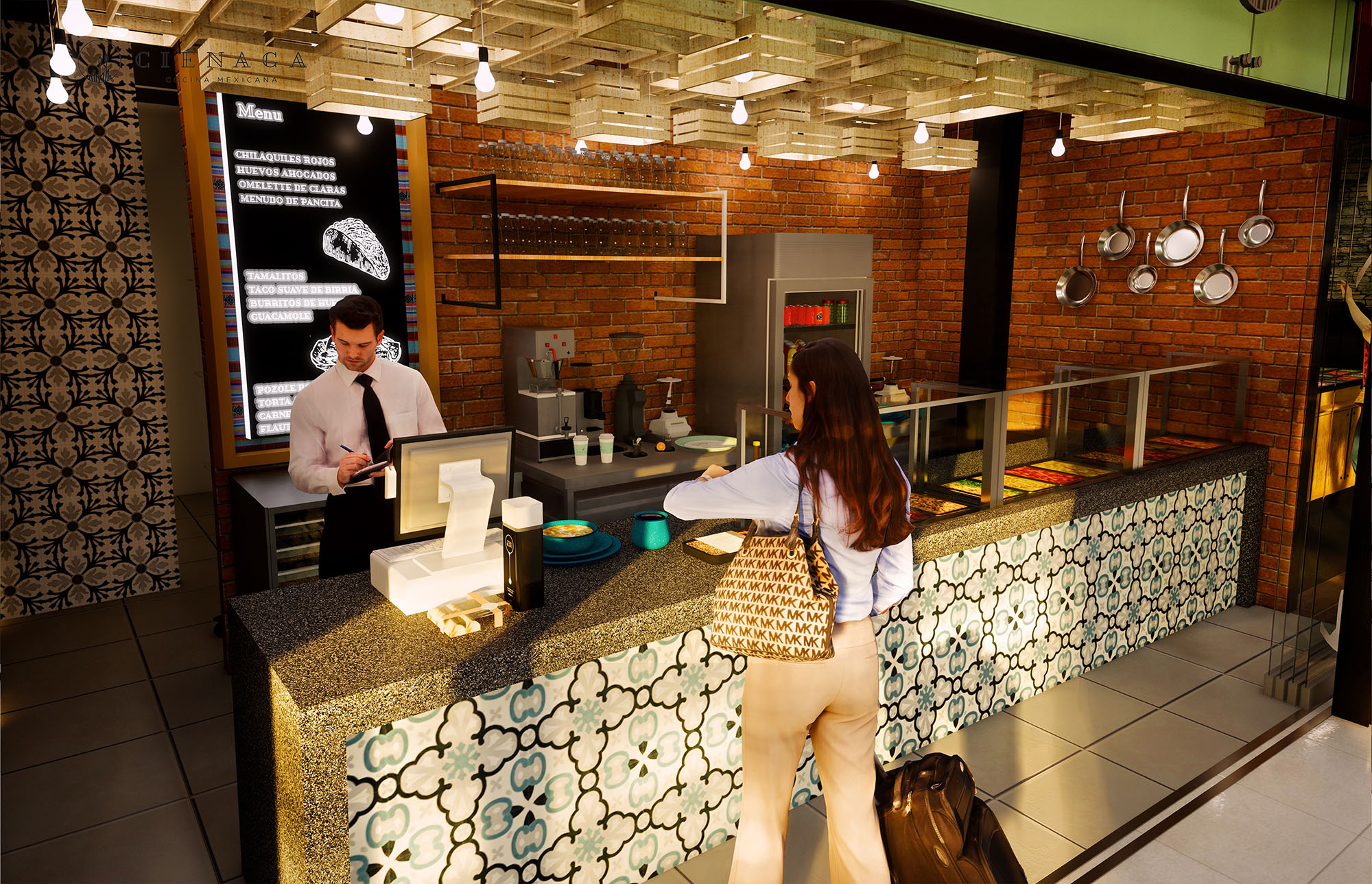
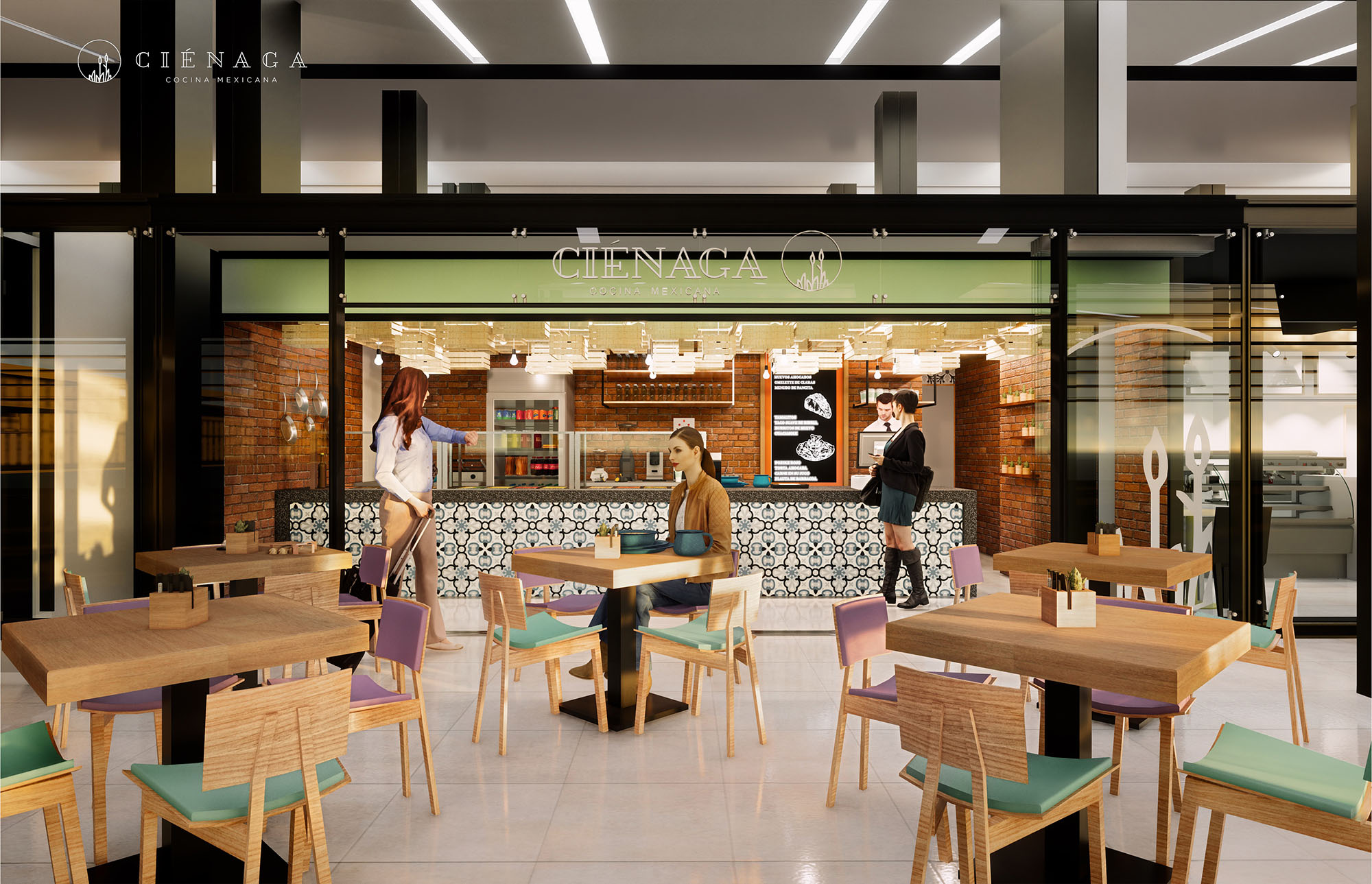
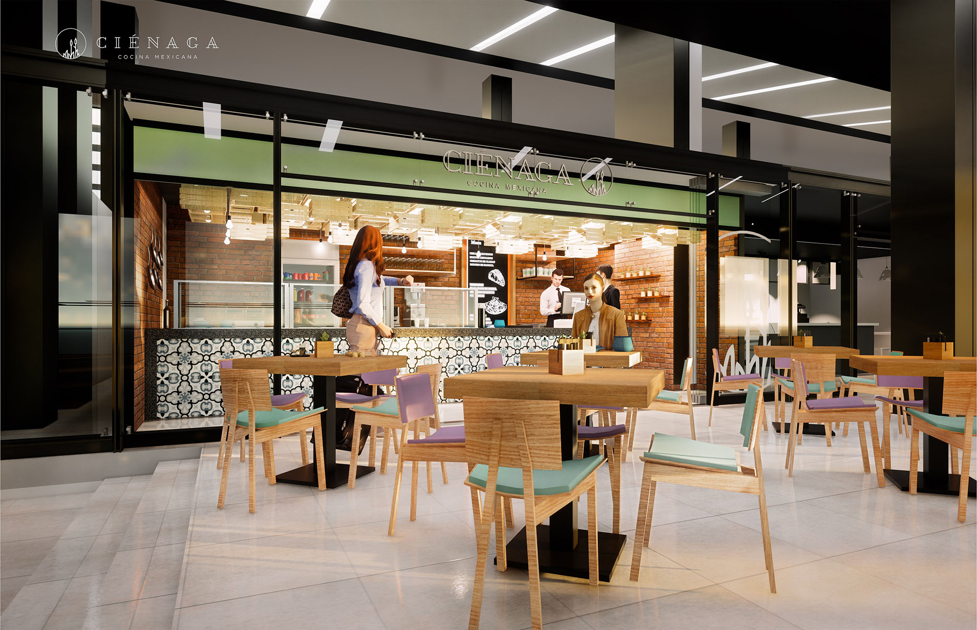
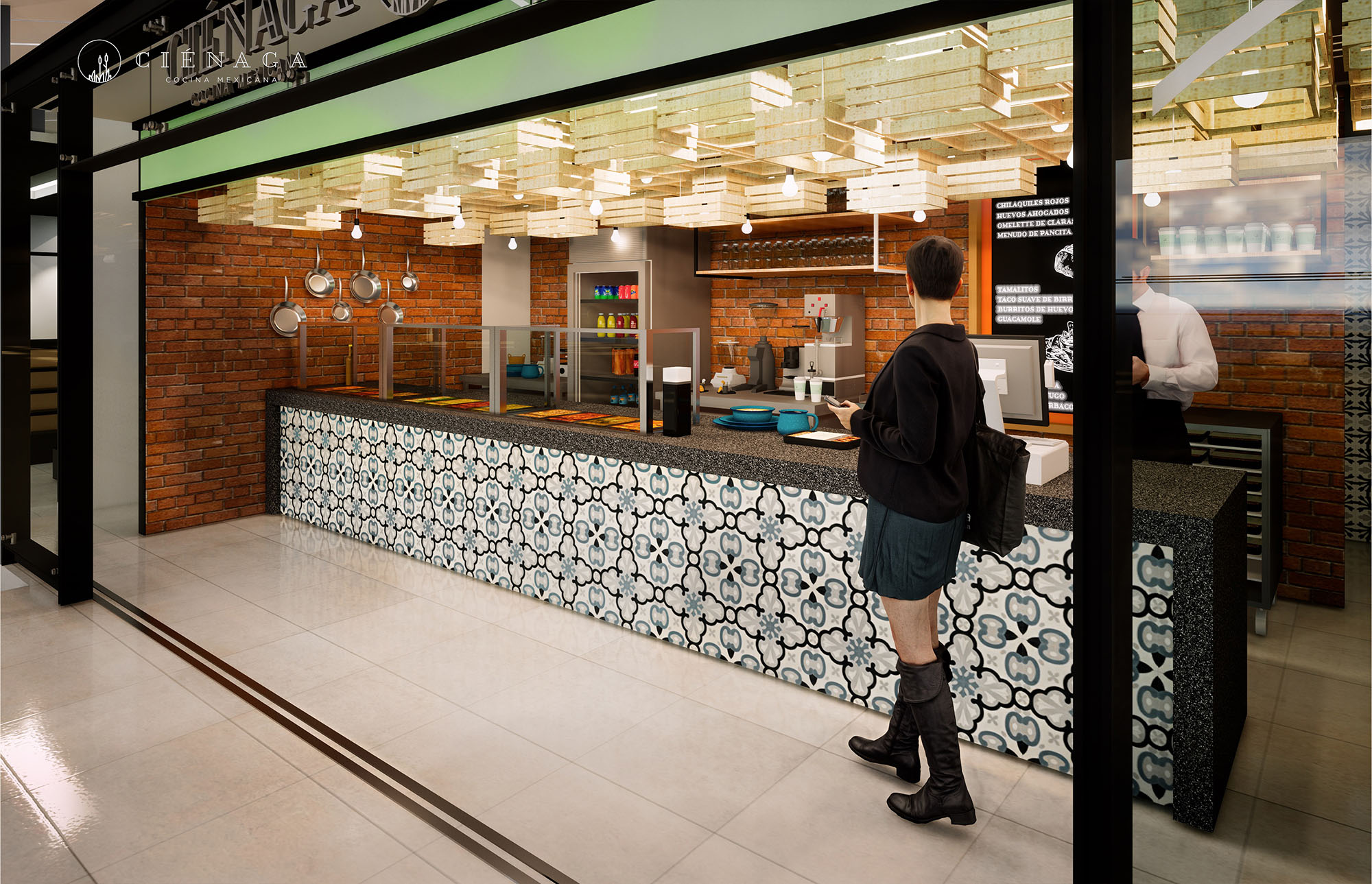
© 2021 by sanzpont [arquitectura] . Webpage by sanzpont [digital] . Innovative Digital Experiences

Easy Coffee is conceived as a highly legible, urban coffee platform that operates between mobility and permanence. The design creates a recognizable identity through a compact food truck, auxiliary modules, and a semi-open seating area that together function as a small plaza. The concept emphasizes speed and clarity of service while maintaining a warm and approachable atmosphere, echoing Mediterranean street culture in a contemporary commercial language.
The visual strategy is based on a strong chromatic code—orange, white, and warm wood tones—that ensures immediate brand recognition in the public realm. The architecture dissolves the boundary between interior and exterior, treating the truck façade and the surrounding furniture as a single, continuous service landscape.
The project occupies an outdoor forecourt, organized as a flexible micro-urban grid. The coffee truck anchors one edge of the space, acting as a linear bar from which all circulations radiate. In front of it, a generous clear zone allows queue formation without obstructing surrounding pedestrian flows, while seating is distributed peripherally to preserve visual permeability.
Different table typologies—standard café tables, higher bar tables, and large picnic benches—generate zones for short stops, informal meetings, and longer stays. The layout prioritizes diagonal visual connections so that the Easy Coffee brand and product display are visible from all approach directions, reinforcing wayfinding in the open-air environment.
The architectural composition is deliberately simple: a retrofitted truck with an articulated serving façade, a vertical service module for refrigerated products, and shaded seating islands. These elements are arranged to read as a single volumetric ensemble, with aligned cornice heights and a continuous color palette.
The truck façade opens upwards via canopies that double as signage bands, integrating menu boards and lighting. The adjacent vertical module acts as an outdoor backbar, framing bottled drinks and packaged items in a rational grid. Brand identity is not applied superficially but embedded in the structure—through the orange soffits, the perimeter railings, and the consistent typography that wraps both mobile and fixed components.
Materials are selected for resistance, easy maintenance, and visual coherence. Exterior furniture uses powder-coated metal in a light neutral tone, minimizing heat absorption while providing a calm background for the more saturated brand colors. Tabletops combine metallic structures with durable composite or laminated surfaces, suitable for intensive outdoor use.
Warm-toned woods, particularly in the picnic benches and selective vertical cladding, introduce a tactile counterpoint to the industrial steel and aluminum of the truck. The color scheme pivots around a vivid orange paired with white and soft grey, communicating dynamism without visual noise. Integrated LED lighting in the awnings and under the signage guarantees even illumination of the counters and menu boards, ensuring legibility during early mornings and evenings while controlling energy consumption.
The serving front is designed as a linear, ergonomic workflow: ordering, payment, and product delivery occur along a single façade, minimizing cross-movements for staff. Counter heights and the position of equipment are optimized for quick interaction, while the open hatch visually exposes the preparation process, increasing trust and perceived quality.
Seating is intentionally lightweight and movable, encouraging users to configure the space according to group size and sun conditions. Large parasols provide shade and create an intermediate microclimate, while the alternating high and low seating invites both solitary users with laptops and families with children. The consistent visual language between the outdoor truck area and the interior bar area allows an intuitive transition for users encountering the brand in different contexts.
Sustainability is addressed primarily through modularity, energy efficiency, and material choice. The mobile truck format reduces the need for heavy permanent construction, limiting embodied carbon and allowing the installation to adapt to changing urban dynamics. Prefabricated components for the bar modules and furniture simplify future relocation, repair, or replacement.
Energy consumption is minimized through LED lighting, compact equipment layout, and the strategic use of natural shade from trees combined with parasols, which helps reduce cooling demands inside the truck. Durable, recyclable metals dominate the material palette, decreasing long-term waste. The open-air configuration reduces reliance on mechanical ventilation, while the clear, standardized design supports potential incorporation of waste-sorting points and reusable cup systems in line with Barcelona’s environmental objectives.
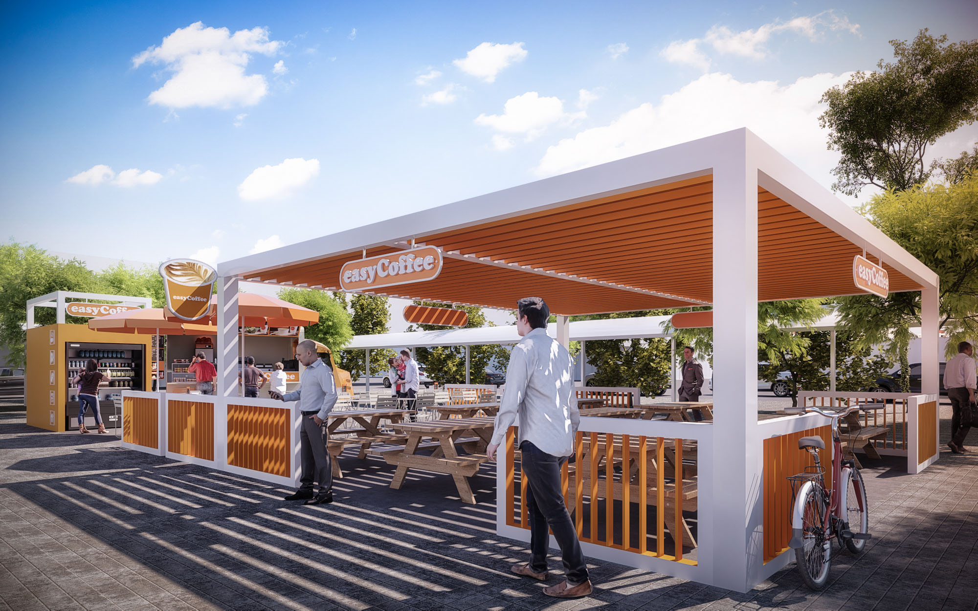
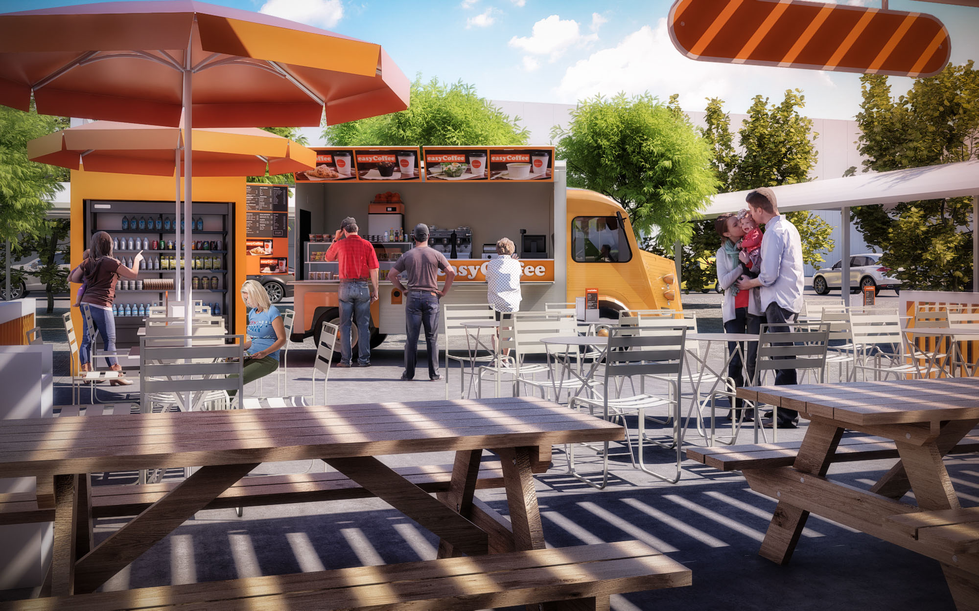
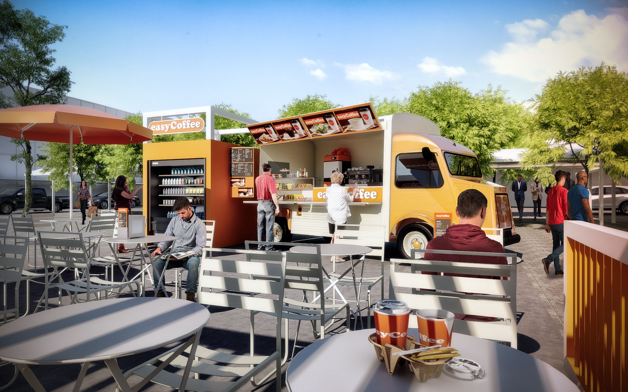
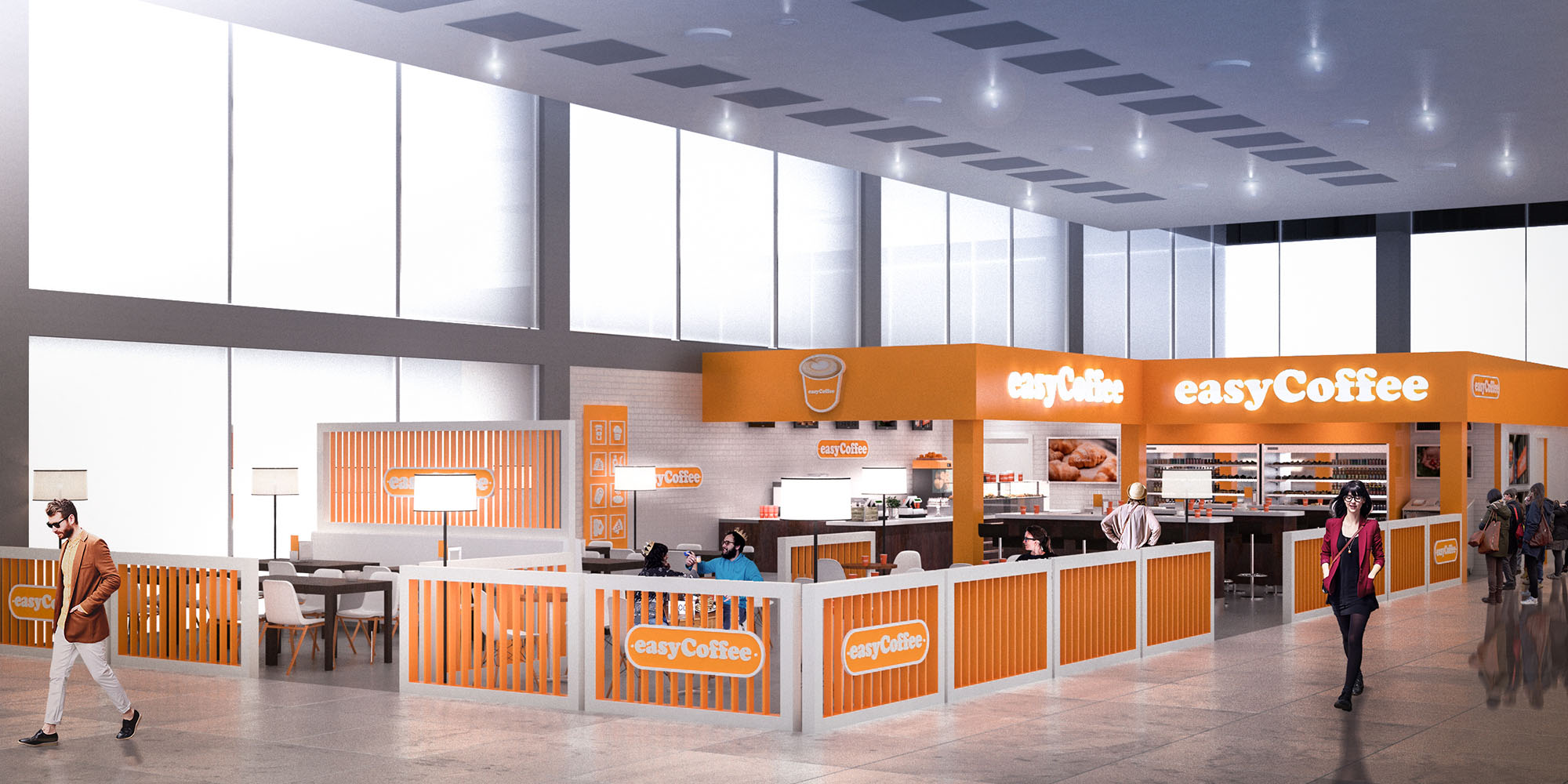
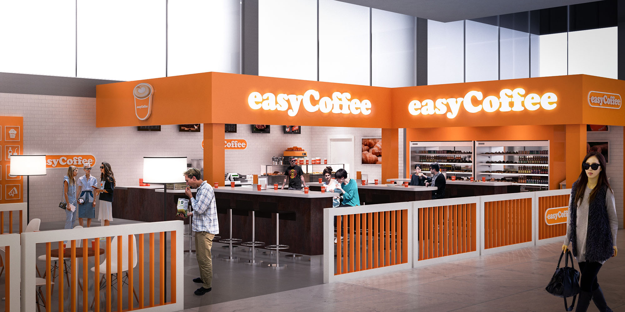
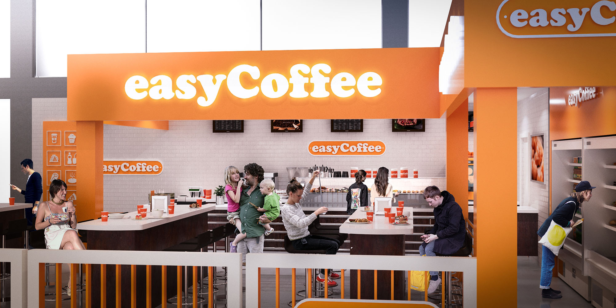
© 2021 by sanzpont [arquitectura] . Webpage by sanzpont [digital] . Innovative Digital Experiences
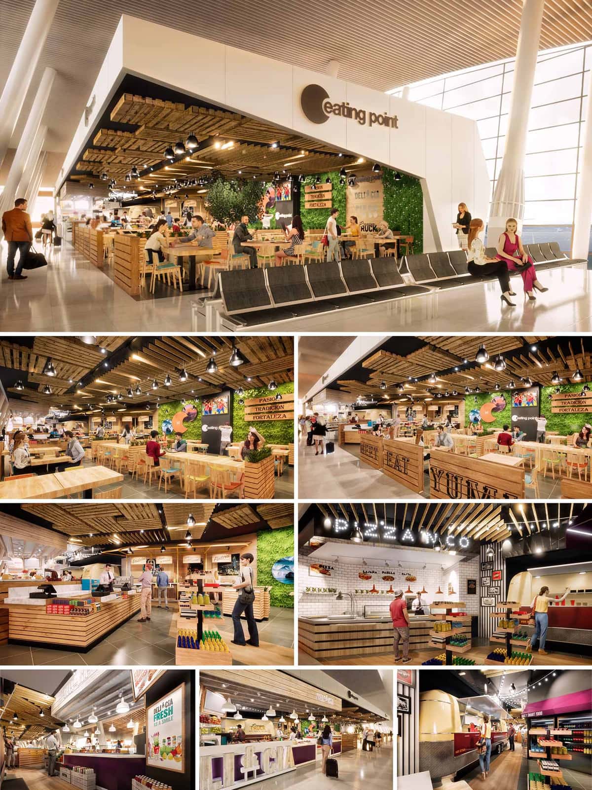
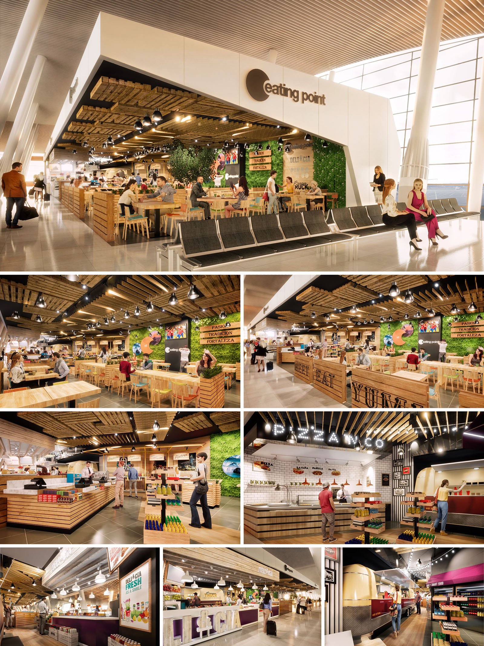
Eating Point is conceived as a contemporary food hall embedded within the fluid circulation of Santiago’s airport, acting as an urban plaza for travelers. The project dissolves the traditional boundary between concourse and restaurant, creating a porous threshold that invites passengers to enter, rest and eat without losing visual connection to the terminal. The design language combines market hall typologies with airport efficiency, resulting in a warm, vibrant destination that contrasts with the neutrality of the surrounding infrastructure.
The overall composition is guided by a clear, floating frame that defines the perimeter and ceiling plane, while remaining visually light. Within this frame, a sequence of food stations, communal tables and intimate seating pockets is organized like stalls in a street market. Natural textures, graphic storytelling and carefully calibrated lighting transform the transient condition of travel into a more human, tactile experience.
The layout is radial and open, allowing multiple points of access from the concourse and ensuring unobstructed visual axes to the boarding gates. Central communal tables act as the spatial anchor, with individual brands and counters arranged around them as a ring of specialized kiosks. This configuration encourages cross-visibility between different offers and supports impulsive decision-making typical of airport users with limited time.
Circulation is structured through generous transversal aisles that avoid bottlenecks and allow for luggage movement. Low-height partitions, mostly in timber slats and planters, subtly define zones without blocking sightlines, supporting both wayfinding and security control. Peripheral bar counters activate the edges toward the terminal while maintaining a continuous façade of activity and light.
The material strategy juxtaposes the industrial character of the airport shell with a warm, crafted interior palette. The main elements are untreated or lightly stained pine slats, arranged horizontally in counters and vertically in screens, transmitting a sense of artisanal construction and flexibility. Timber is complemented by large-format porcelain floor tiles in neutral gray, ensuring durability and ease of maintenance under high traffic.
Color accents are introduced through vivid green vegetated walls, fresh produce graphics and brand-specific signage. White ceramic tiles at some food stations evoke traditional kitchens and reinforce the perception of hygiene. Black metal lighting tracks and fixtures add depth and visually compress the ceiling, creating a more intimate scale beneath the airport’s vast structural roof.
The ceiling is a key atmospheric device, composed of staggered timber palettes and slatted panels that float below the terminal soffit. This layer conceals technical installations, integrates acoustic absorption and visually unifies the diverse food concepts. The irregular geometry breaks the linearity of the concourse, generating a more informal and domestic ambiance.
Lighting is predominantly warm-white, delivered through suspended spotlights and integrated linear LEDs. Accent beams highlight counters, menus and vertical gardens, while softer diffuse light over seating enhances comfort and facial recognition. The contrast between the bright, cooler airport hall and the warmer interior reinforces Eating Point as a haven within the travel sequence.
Furniture is designed with robustness and modularity in mind. Solid wood tables of varying lengths support flexible occupancy, from solo travelers to large groups. High stools and bar-height counters accommodate quick consumption, while standard-height communal tables invite longer stays. Simple geometries and open bases facilitate cleaning and luggage placement.
Branding is integrated architecturally rather than applied superficially. Laser-cut lettering, crate-style graphics and illuminated signs are embedded into the timber structures, generating a cohesive visual narrative of freshness and craft. Product displays function both as merchandising and as spatial dividers, contributing to the sensation of an active market.
The project emphasizes low-impact materials and operational efficiency suitable for a 24/7 airport context. The extensive use of locally sourced softwood reduces embodied energy and supports regional forestry industries. Repetition of standardized timber modules minimizes waste during fabrication and allows future reconfiguration or recycling of components.
Vertical gardens and planted elements contribute to indoor air quality and psychological comfort, introducing biophilic cues in a predominantly artificial environment. LED lighting with high energy efficiency and zoning controls reduces consumption while enabling different scenes according to passenger flows and day–night cycles. The open, naturally ventilated interface with the concourse avoids additional enclosure systems, decreasing HVAC loads and reinforcing the sense of a shared, public interior landscape.
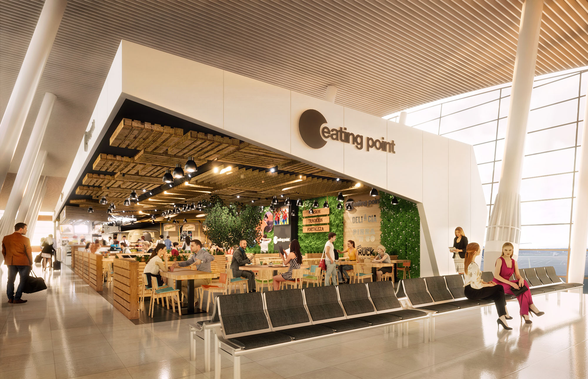
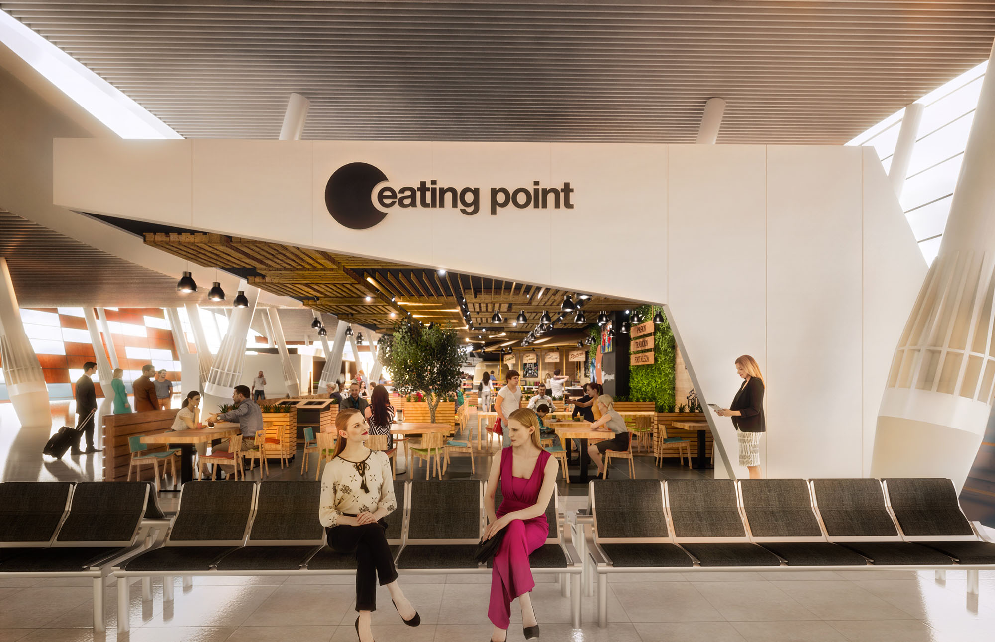
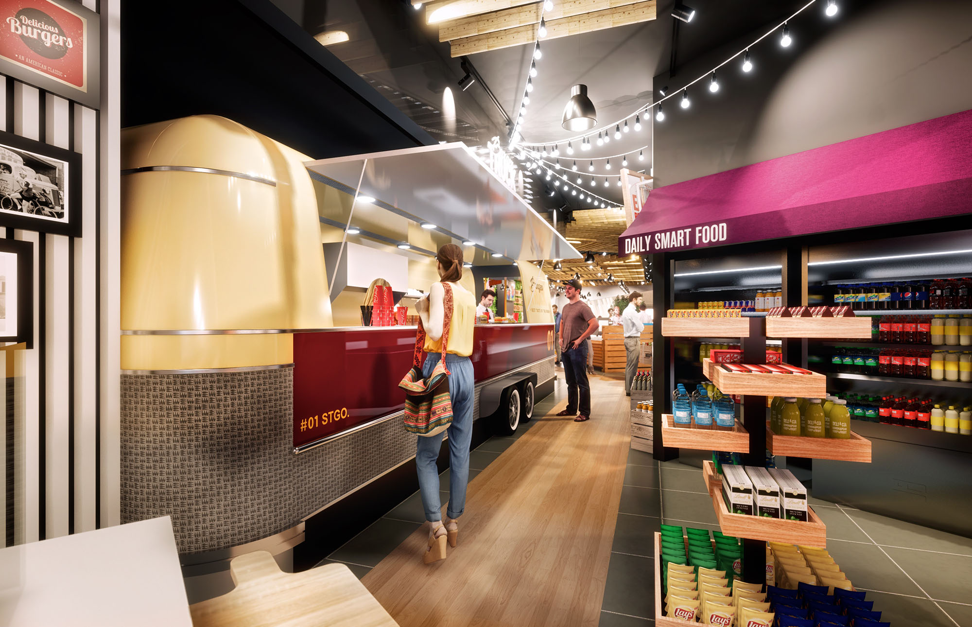
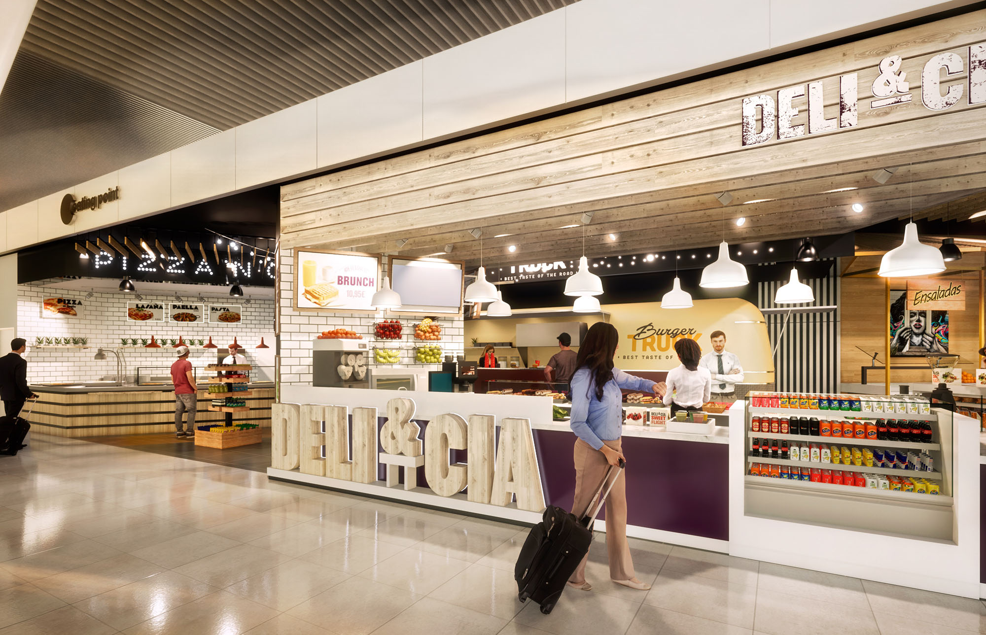
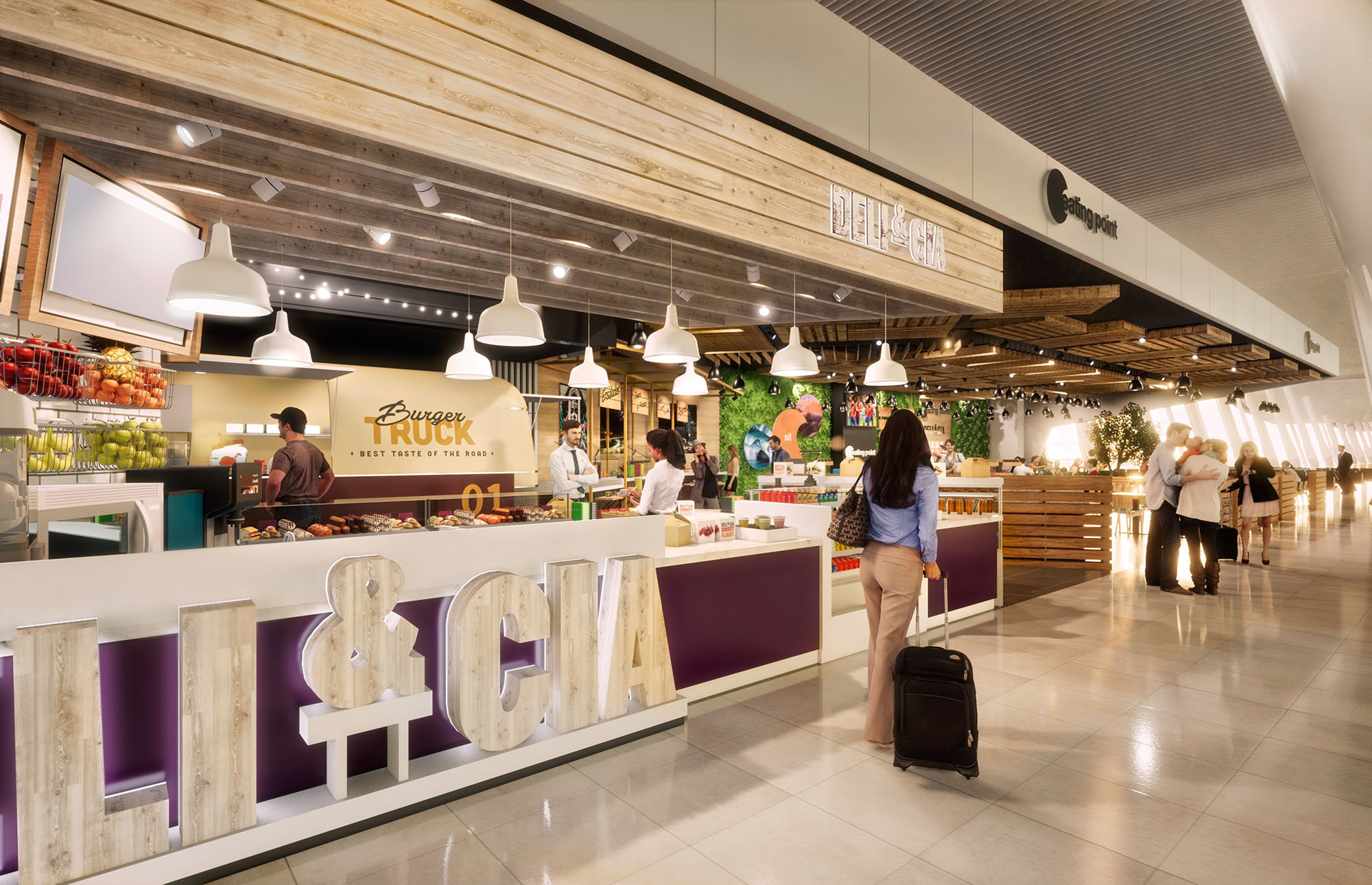
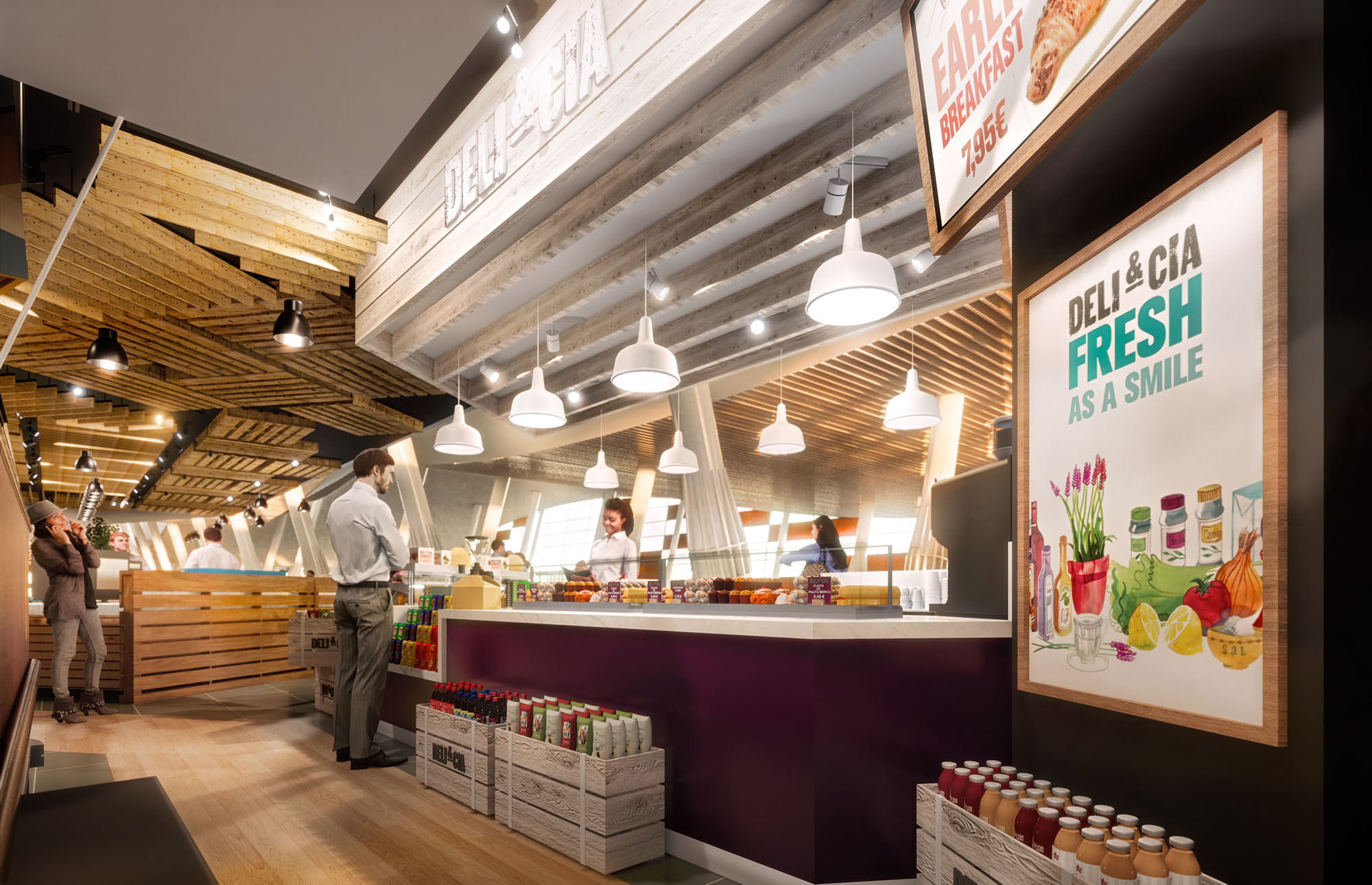
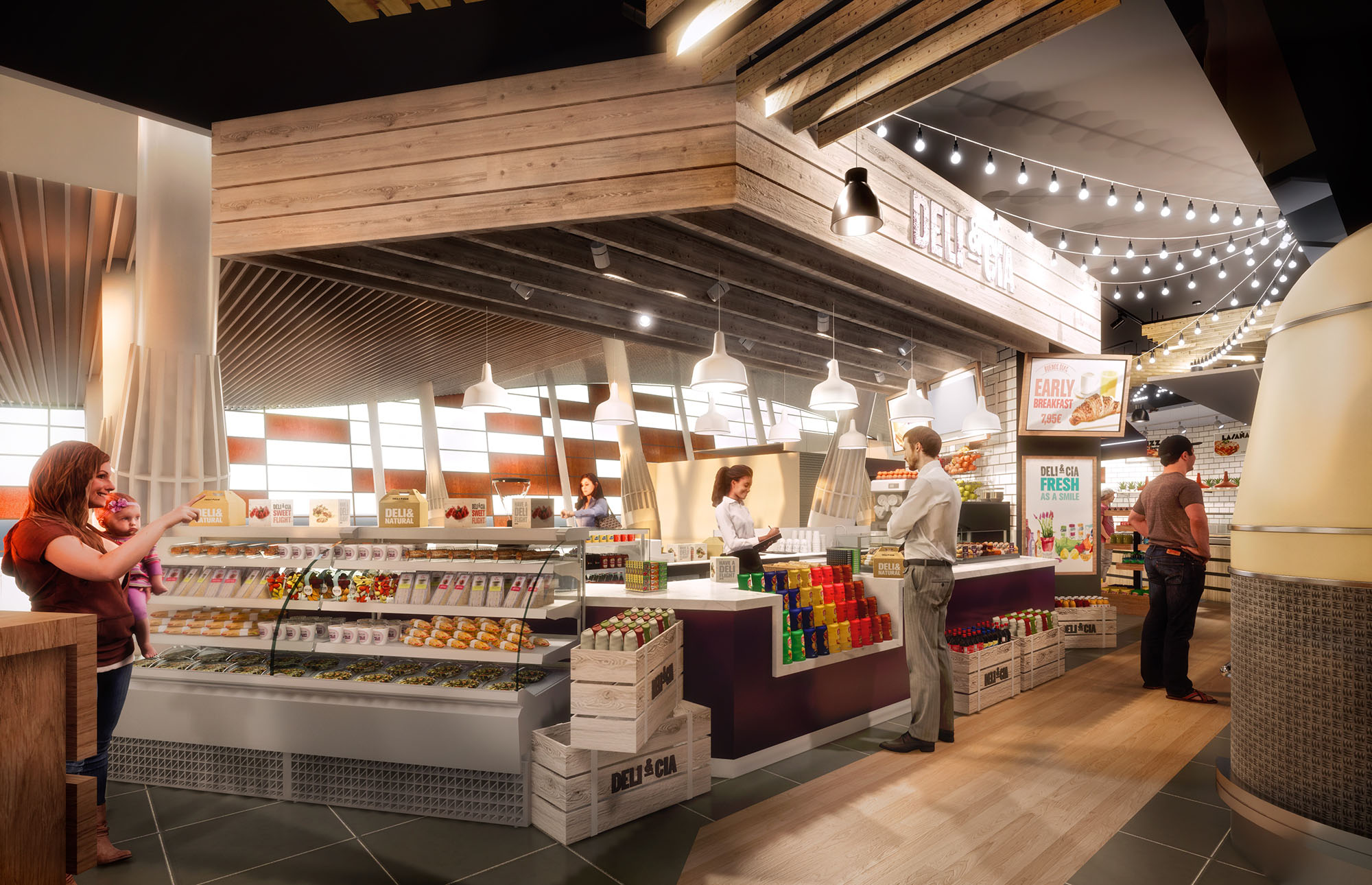
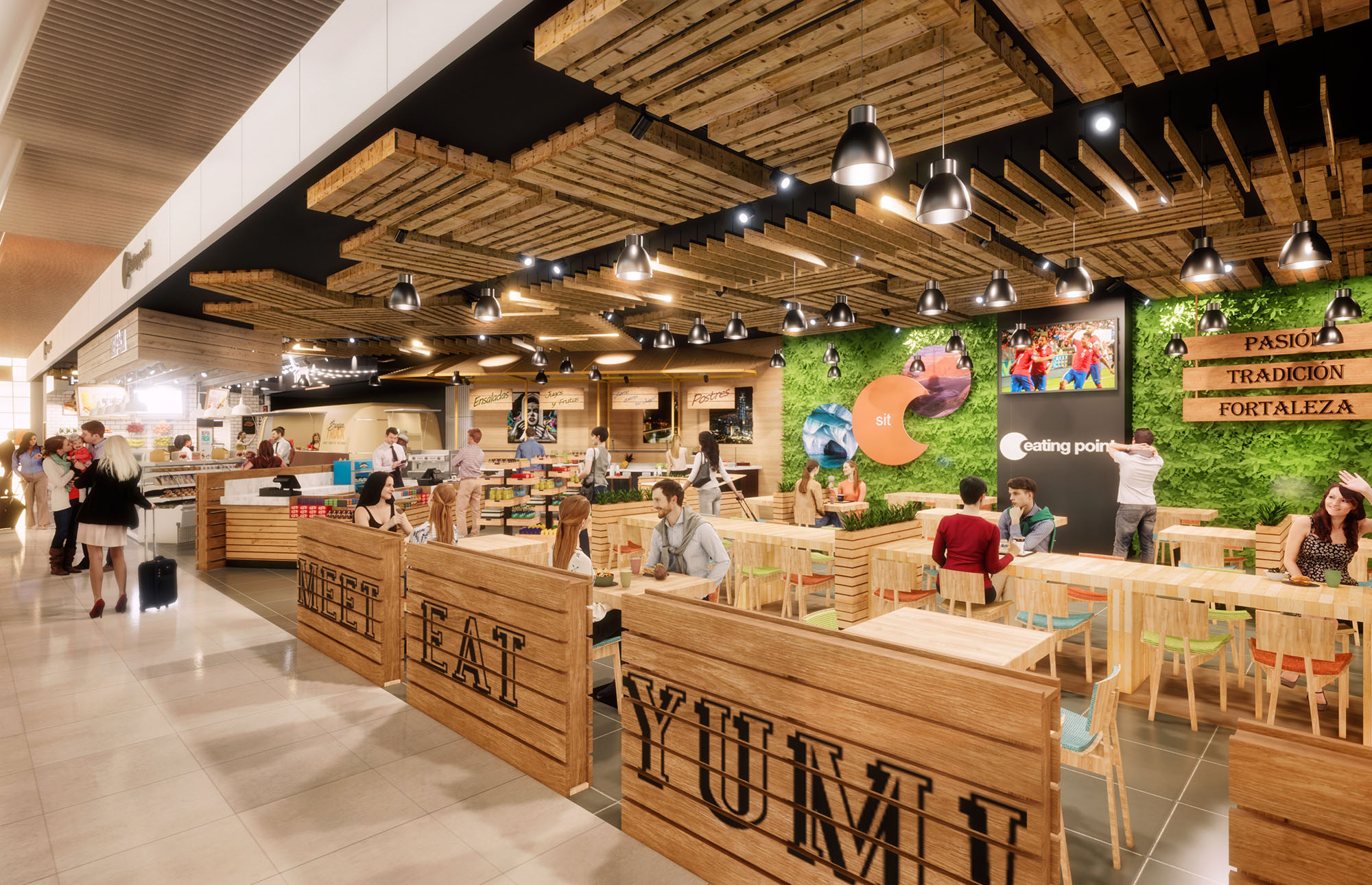
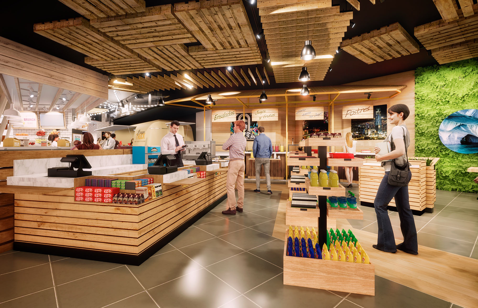
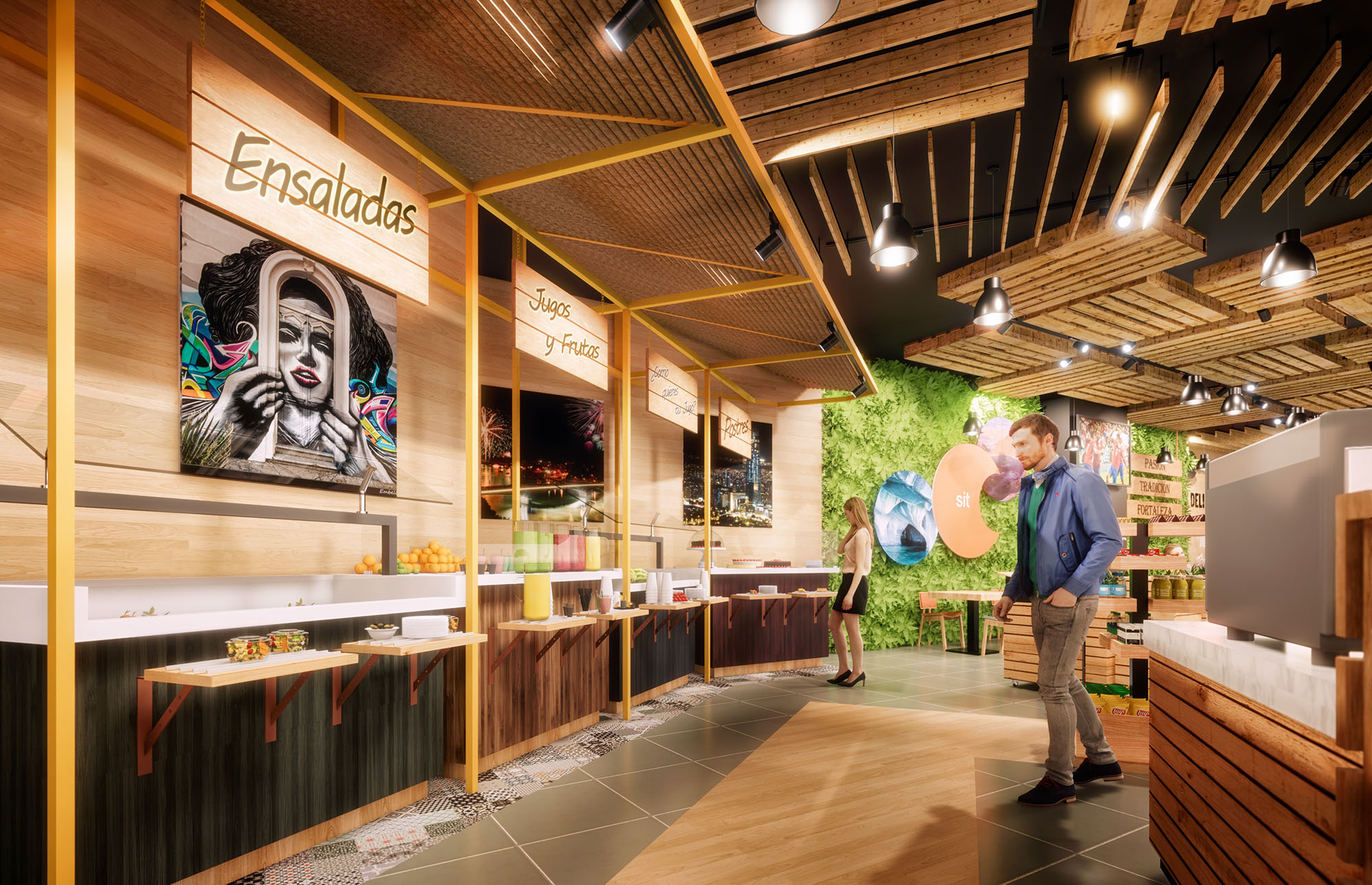
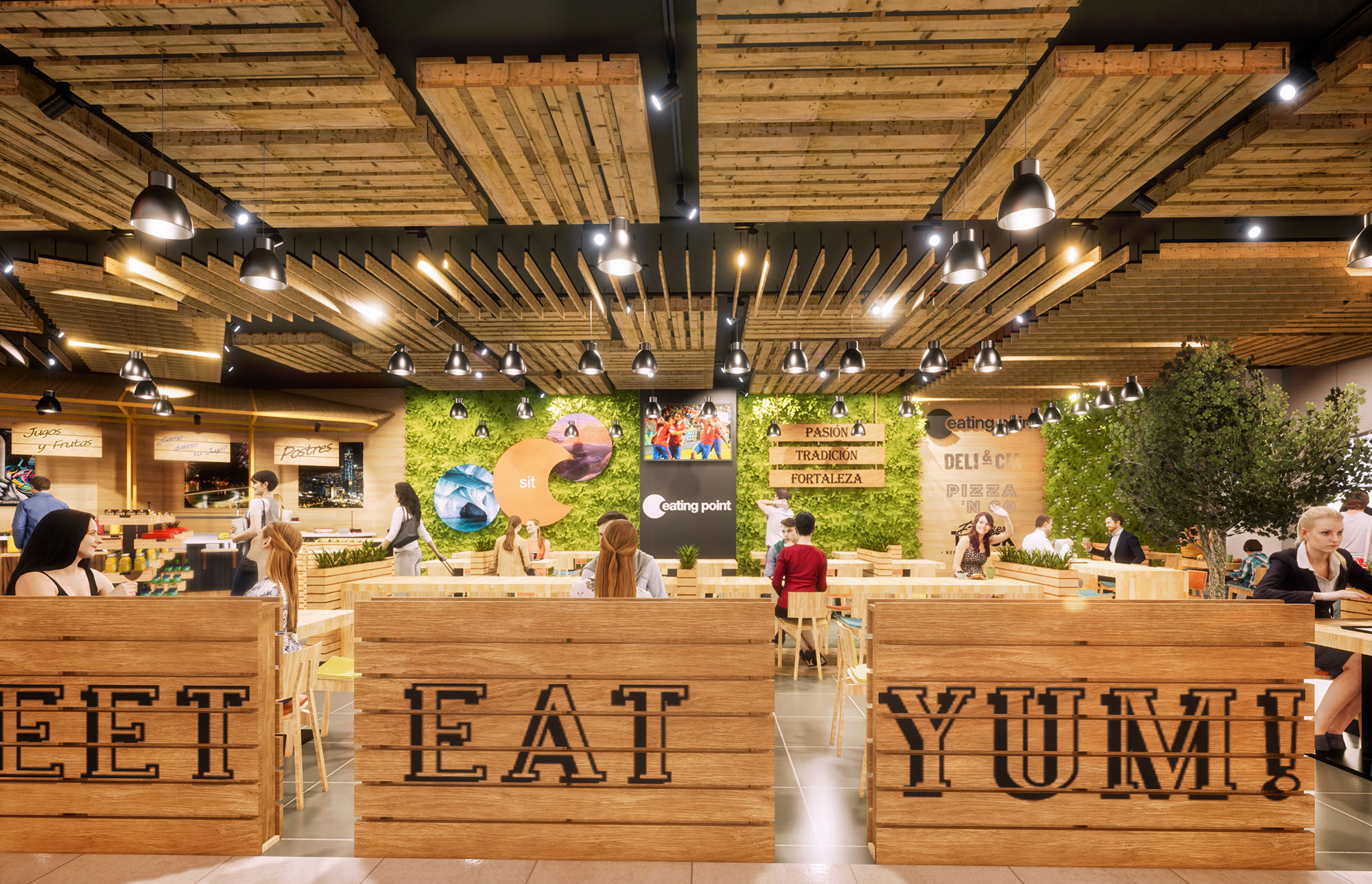
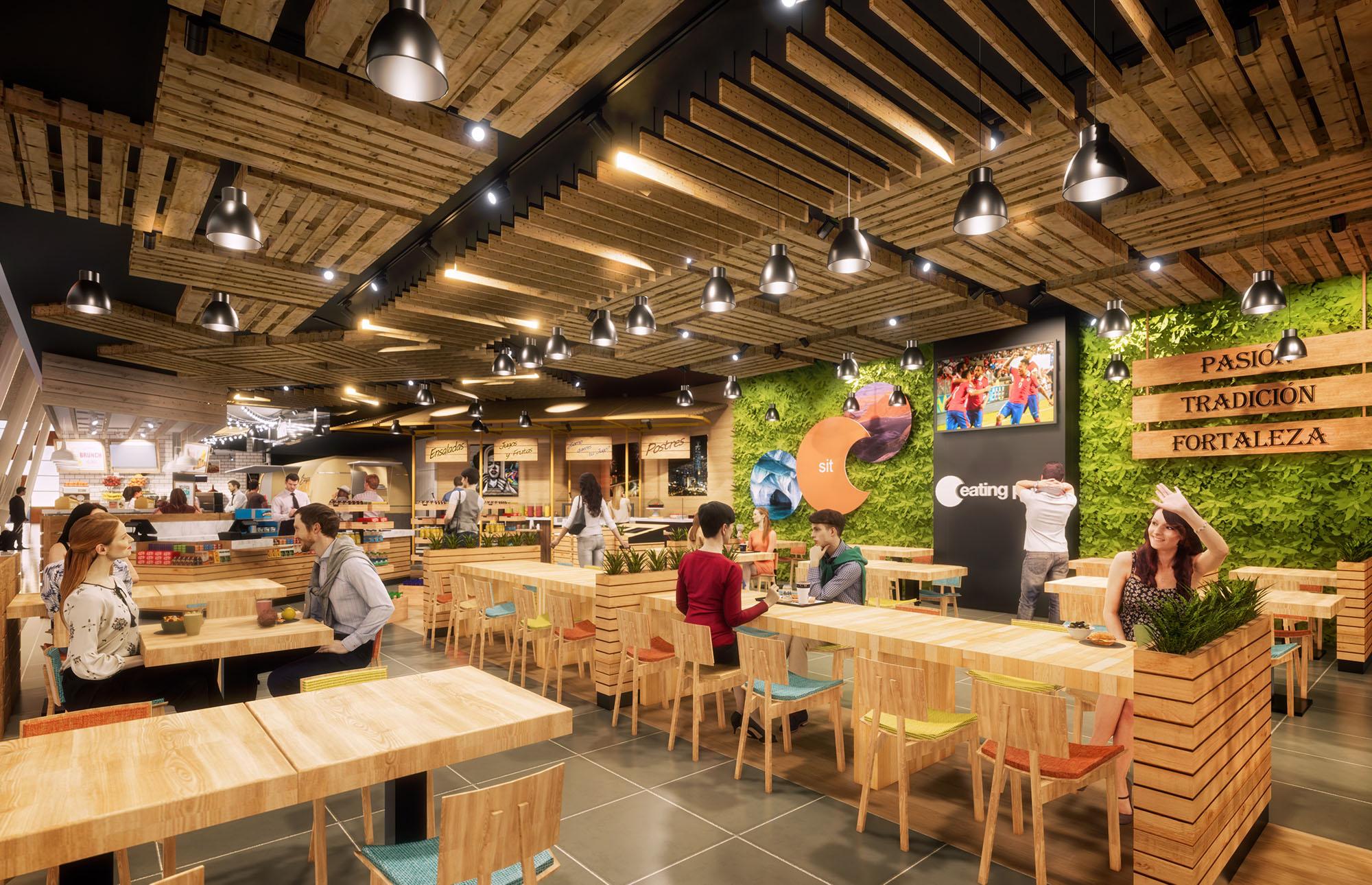
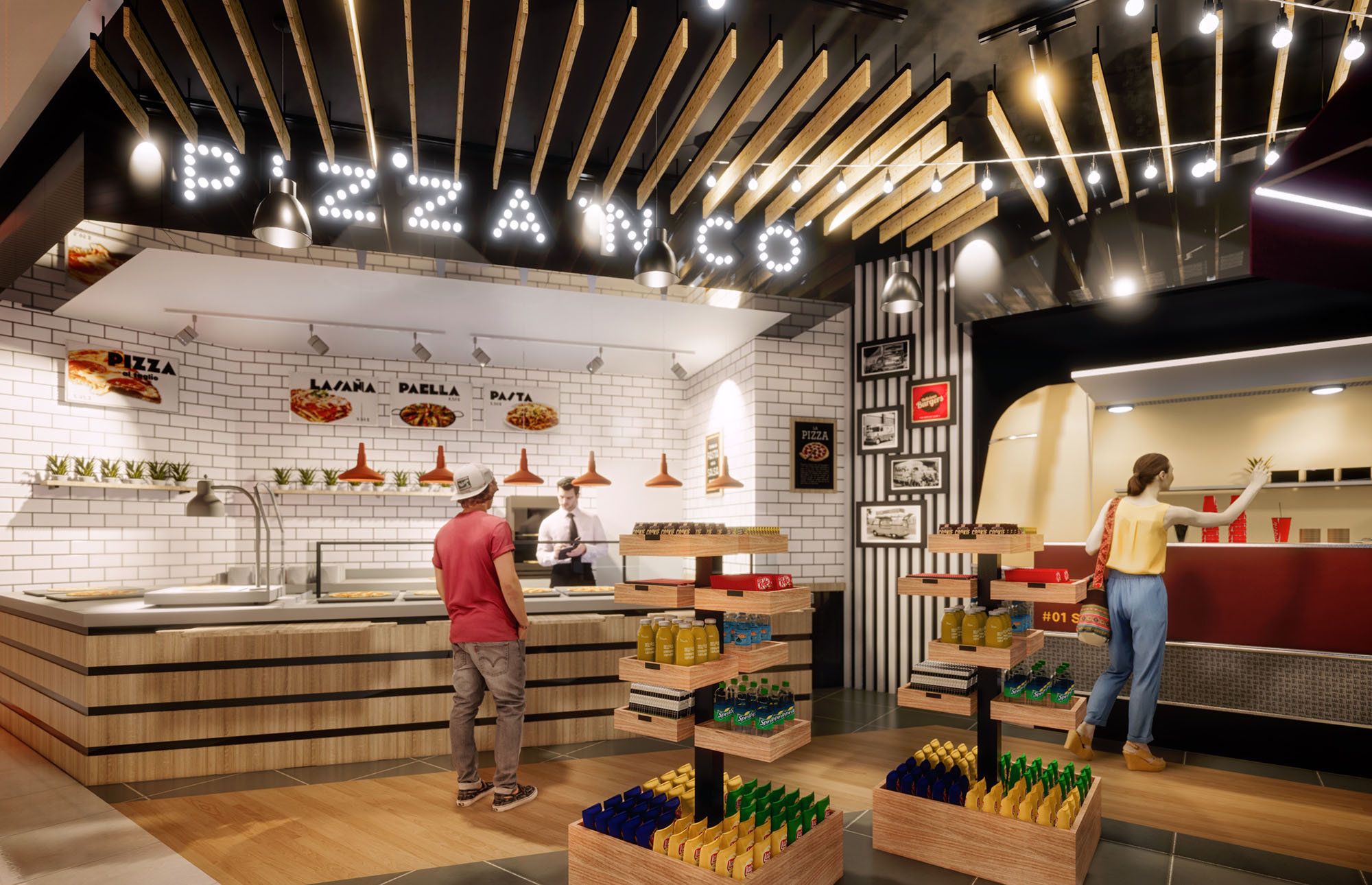
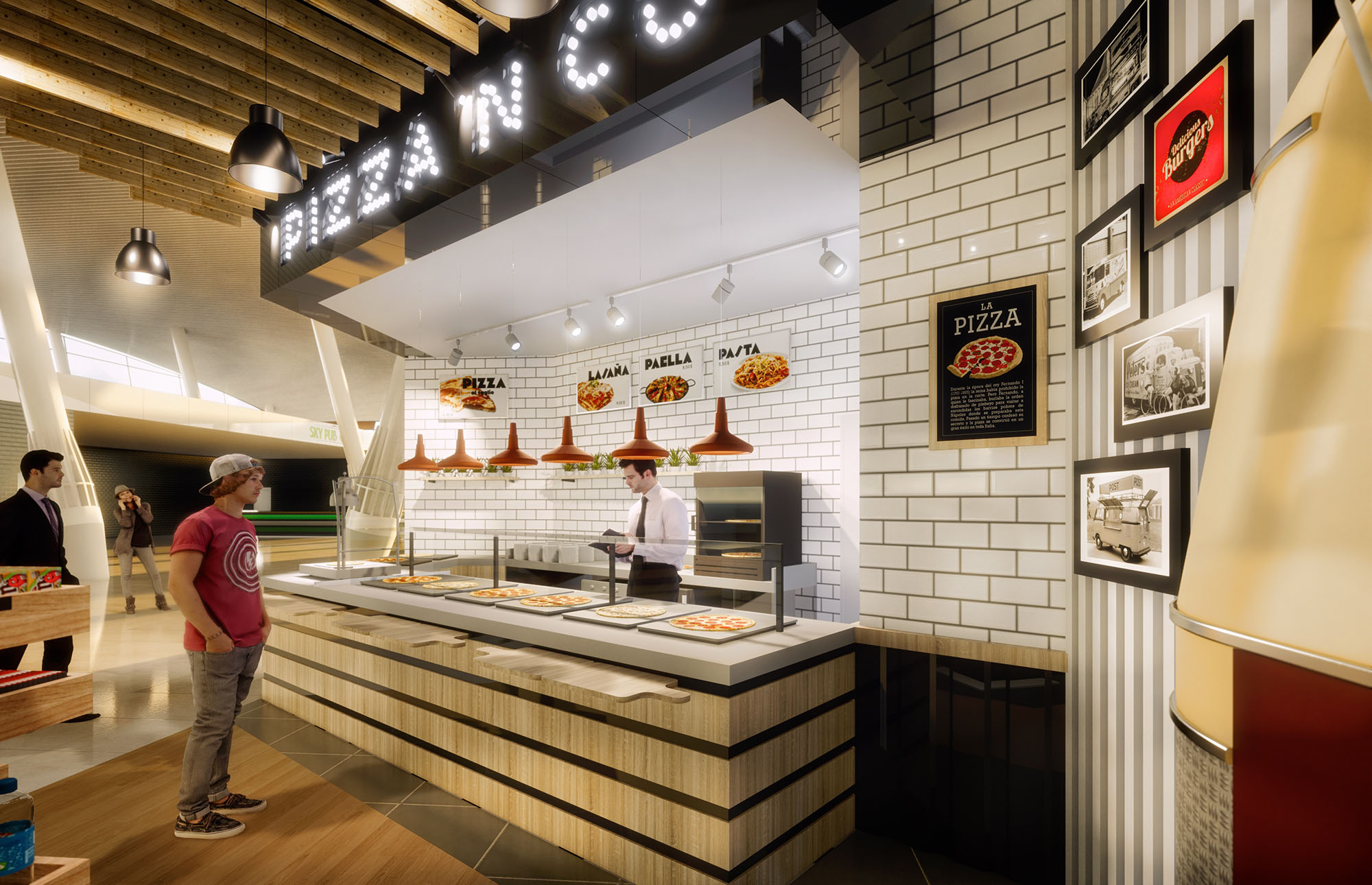
© 2021 by sanzpont [arquitectura] . Webpage by sanzpont [digital] . Innovative Digital Experiences
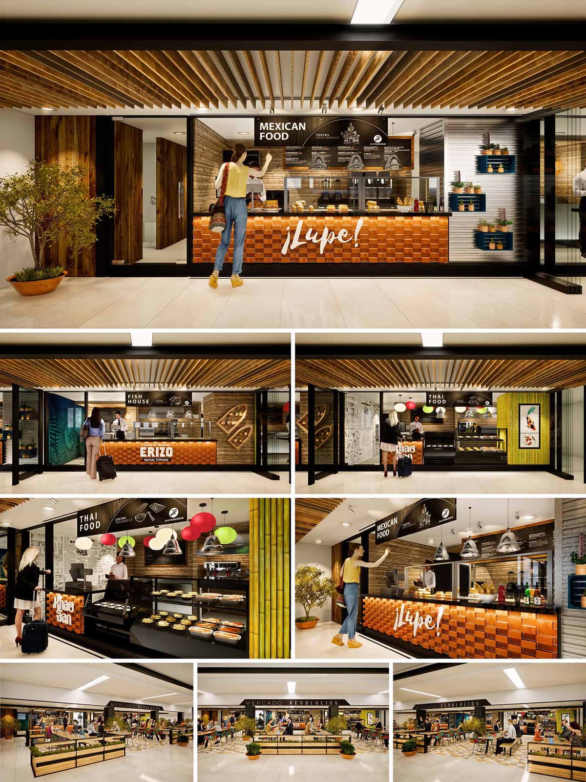
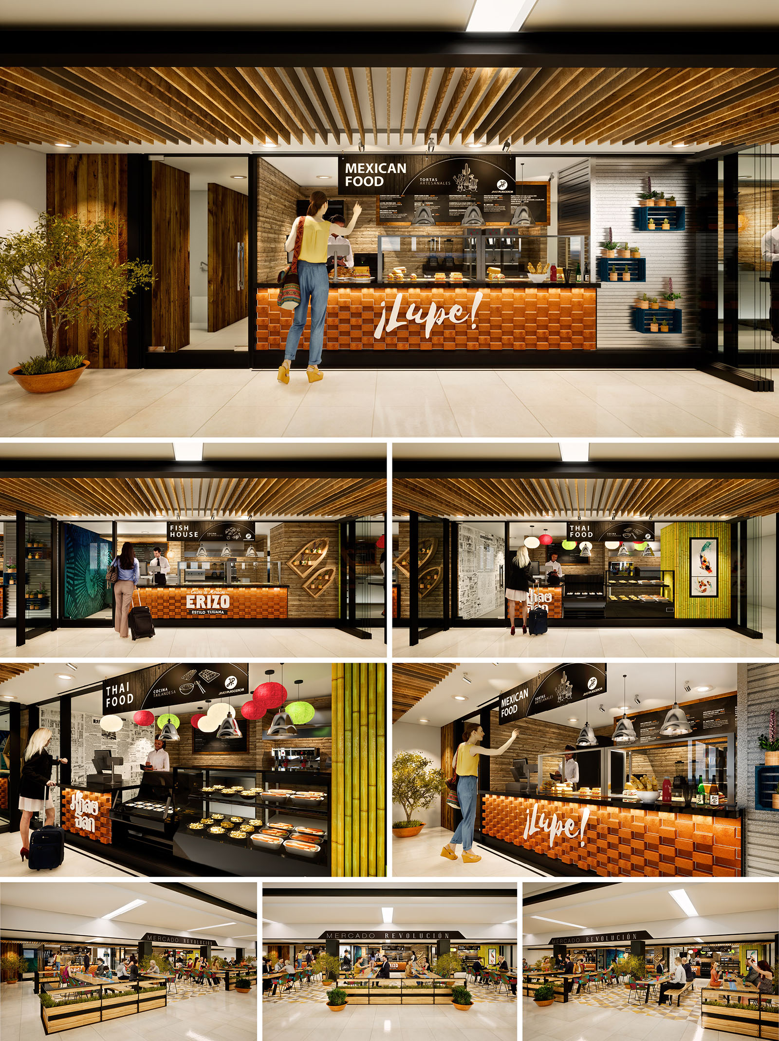
The project ERIZO KHAOSAN LUPE is conceived as a contemporary urban food hall that unites three distinct gastronomic identities—Mexican seafood, traditional Mexican cuisine, and Thai food—within a single coherent architectural language. The design celebrates culinary diversity through a marketplace atmosphere, where each stall has a strong visual character while remaining part of a unified spatial narrative. The concept draws from the energy of Tijuana’s street food culture, translating it into a refined, controlled environment appropriate for an international public.
The layout organizes the three kitchens along a continuous façade, opening directly to the central dining area. Transparency and visual porosity allow guests to understand preparation processes, aromas, and textures from a distance, inviting spontaneous interaction. Graphic elements, product displays, and illuminated signage are curated as part of the architectural composition, reinforcing the identity of each brand without fragmenting the overall space.
The material strategy combines warmth and tactility with a robust, easy-to-maintain finish suitable for intensive commercial use. Timber slats in natural and toasted tones dominate ceilings and vertical accents, creating rhythm and depth while referencing traditional market stalls. Counter fronts feature a textured module in warm terracotta and orange hues, evoking brick and handcrafted tiles, and establishing a continuous visual base across all concepts.
Background walls alternate between horizontal wood planks, neutral stone-look surfaces, and graphic black-and-white murals. For the Thai concept, vivid green bamboo elements and multi‑colored lanterns introduce a tropical layer that contrasts with the more earthy, coppery tones of the Mexican and seafood stalls. Black metal framing and signage unify the ensemble, giving a precise, contemporary edge to the composition and visually anchoring the space.
The food hall is structured around a generous central seating area with perimeter circulation that allows clear visibility of all vendors upon entry. Linear rows of tables and benches are oriented to maintain direct visual connection with the cooking fronts, reinforcing the theatrical dimension of food preparation. The furniture is intentionally lightweight and movable, enabling flexible reconfiguration for different occupancy levels and events.
Each stall is designed as a compact, efficient production unit, with back‑of‑house concealed behind continuous counter lines. Ordering, payment, and pickup zones are legible and clearly signposted, reducing confusion and queues. Wide corridors and open corners promote intuitive movement, while integrated planters and potted trees soften the geometry, adding a sense of pause and comfort within the commercial flow.
Illumination is layered to emphasize both product and architecture. General ambient lighting is provided by recessed linear fixtures in the ceiling, generating a bright, safe environment across the common areas. Over the counters, pendant luminaires and focused downlights create accent zones that highlight food displays and menu boards, drawing attention to each brand.
The combination of warm color temperature and reflections on wood and textured surfaces produces an inviting, almost domestic atmosphere within a highly public setting. Decorative lanterns in the Thai section and industrial‑style pendants over the Mexican stalls reinforce the identity of each kitchen while maintaining a consistent luminous hierarchy throughout the hall.
Architecture and graphic design are tightly integrated. Large black menu bands, hand‑lettered logos, and illustrative icons form part of the façade composition, functioning simultaneously as wayfinding and decorative relief. In the seafood area, stylized fish motifs and porthole‑like display niches reference coastal imagery, while Mexican cuisine uses typographic emphasis on exclamations and colloquial wording to transmit informality and warmth.
Details such as recessed shelving for packaged products, metal mesh baskets, and framed prints enrich the user’s visual experience without cluttering the space. The careful modulation of cladding pieces and alignment of joints ensure a precise, almost modular reading that facilitates future maintenance and potential rebranding if required.
Sustainability criteria guided both material selection and operational planning. The predominant use of timber and bamboo considers renewable sources and the possibility of local or regional procurement, reducing transportation impacts. Finishes are chosen for durability and ease of cleaning, minimizing the need for aggressive chemical products and frequent replacement.
The open plan favors cross‑ventilation opportunities and allows maximum use of natural light from adjacent areas, reducing dependence on artificial lighting during daytime. Modular furniture and demountable partitions support long‑term adaptability, extending the life cycle of the food hall by enabling reconfiguration without major demolition. Plant elements contribute to improved indoor air quality and psychological comfort, reinforcing the market’s connection to natural references within an otherwise controlled interior environment.
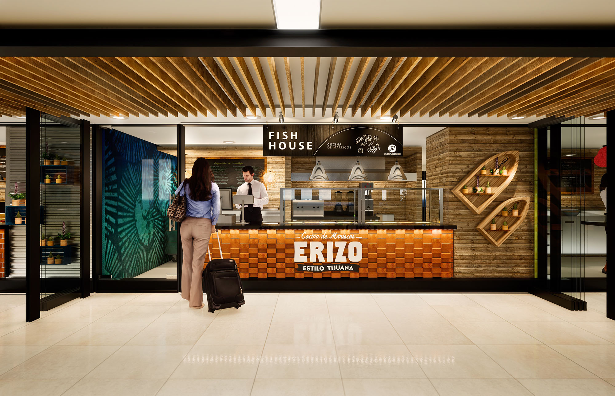
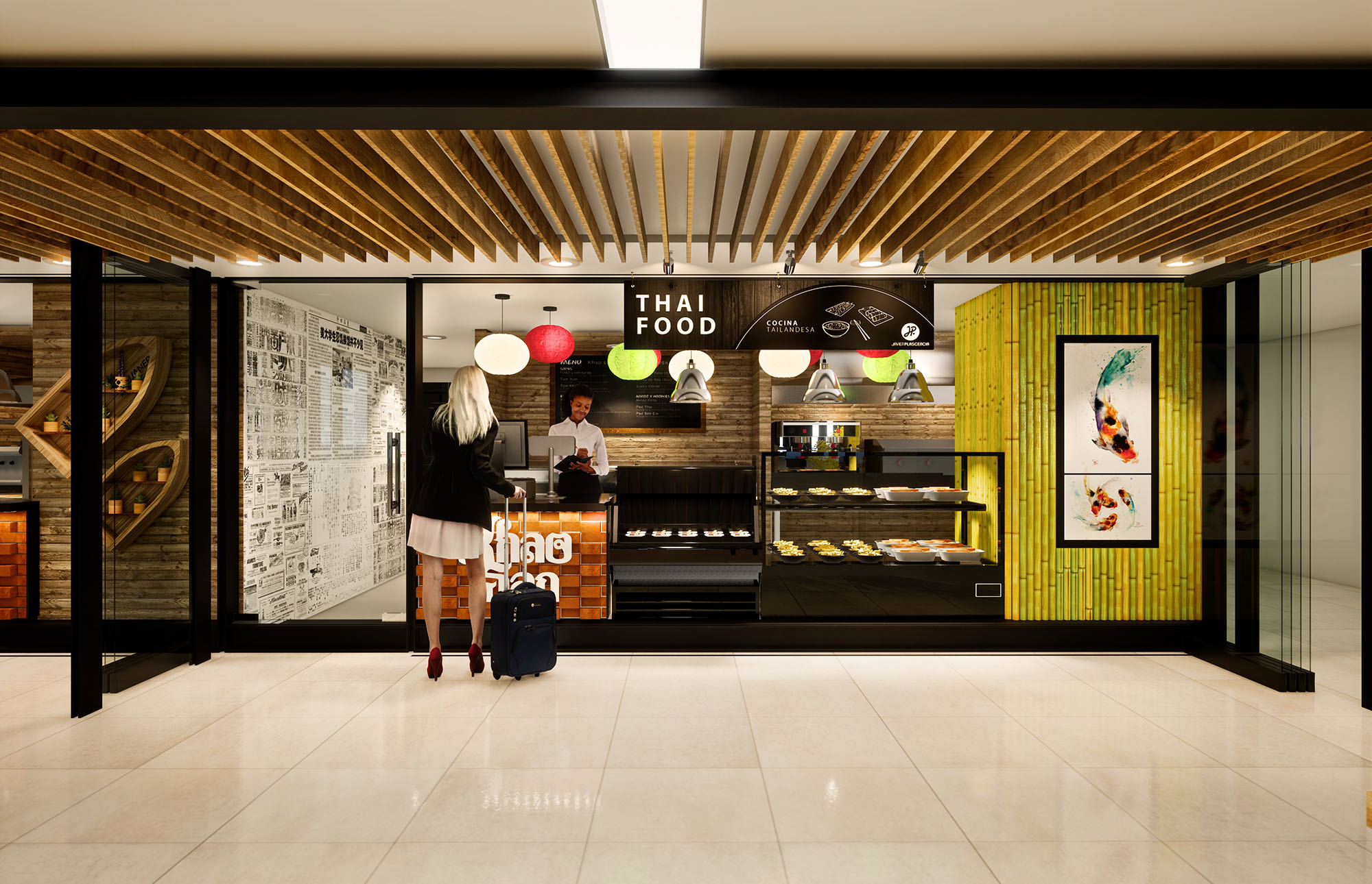
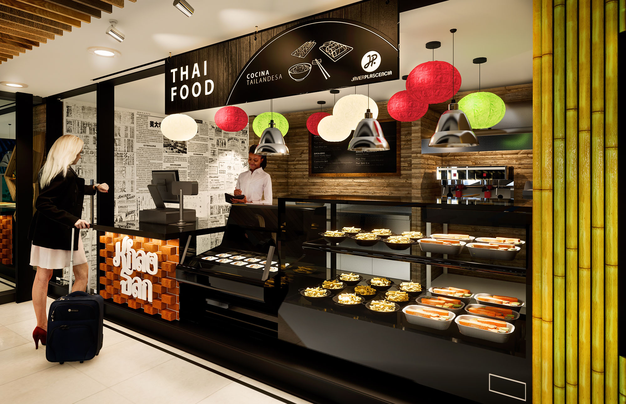
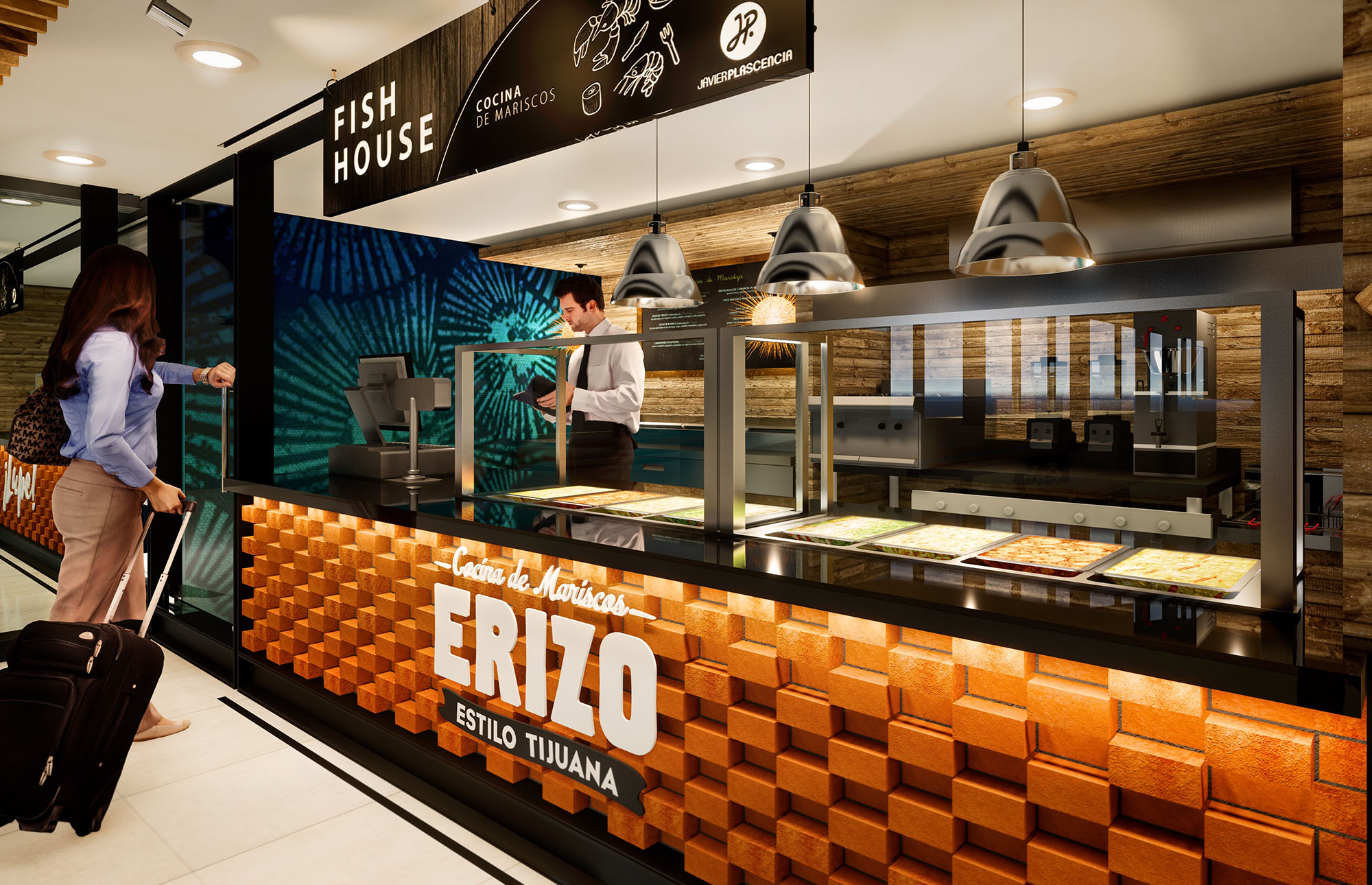
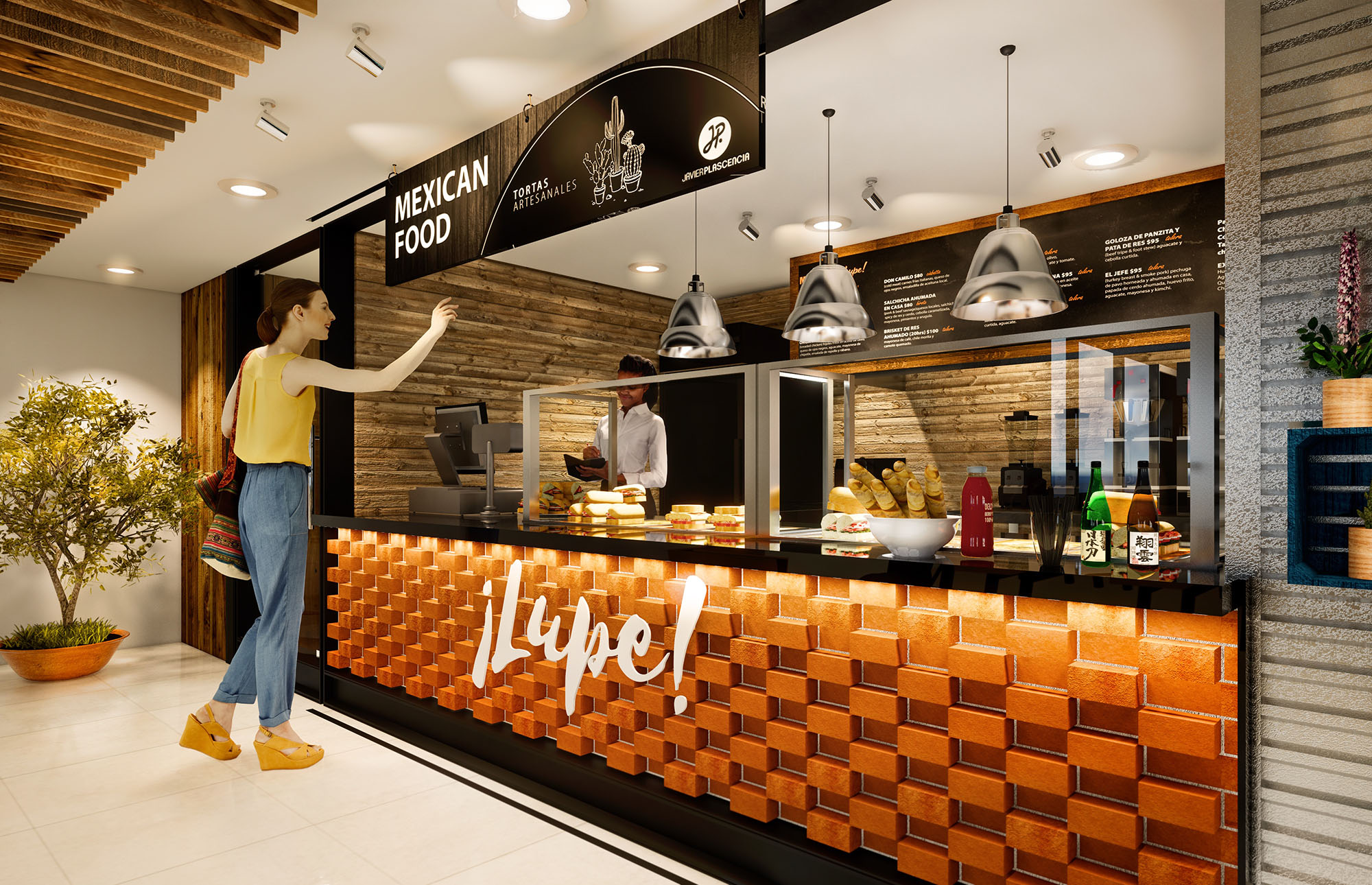
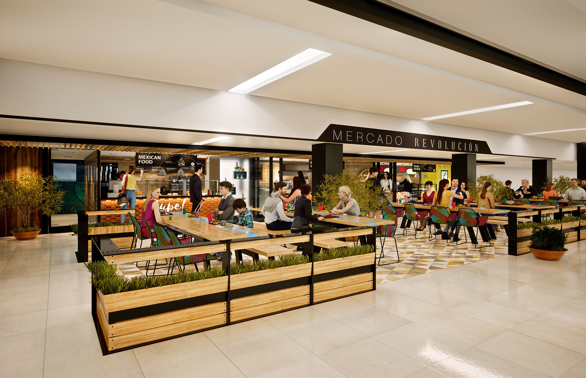
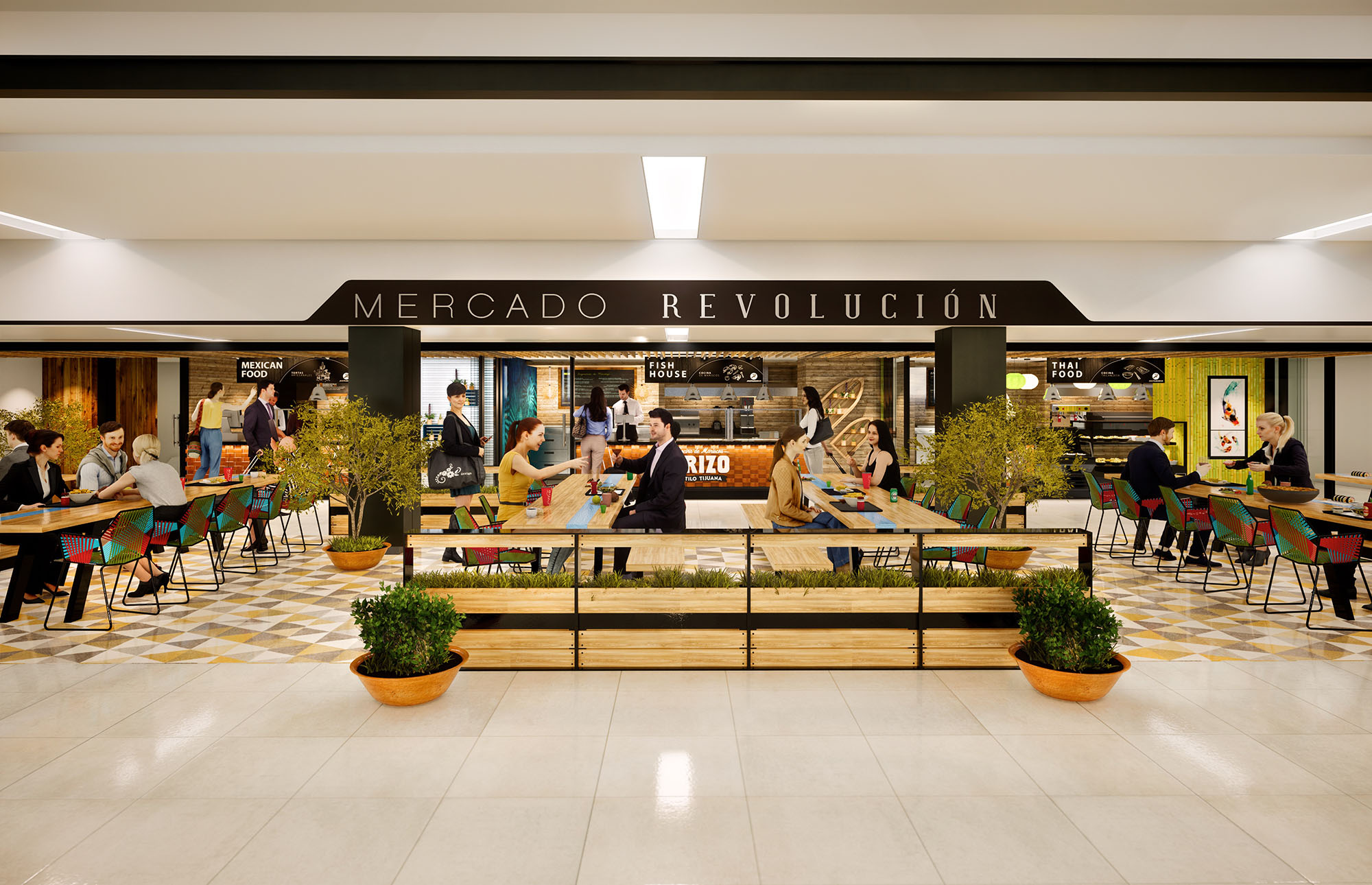
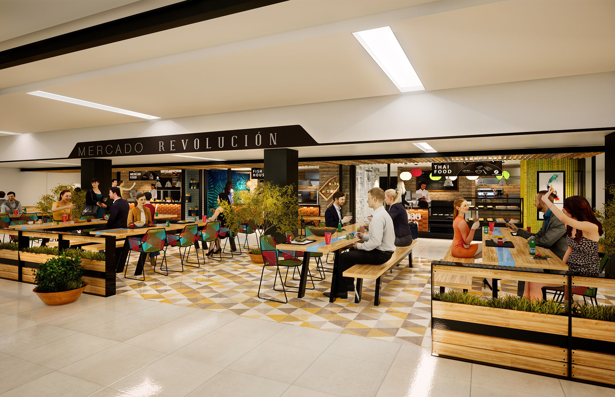
© 2021 by sanzpont [arquitectura] . Webpage by sanzpont [digital] . Innovative Digital Experiences
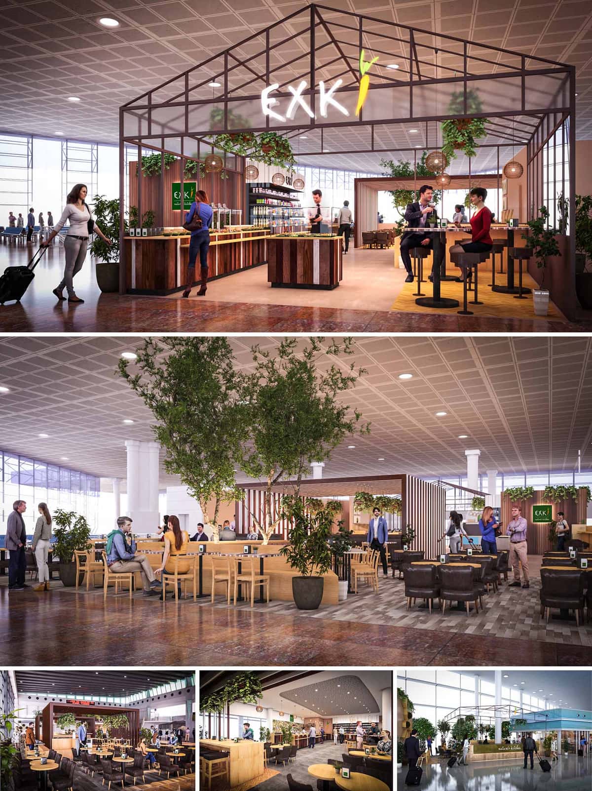
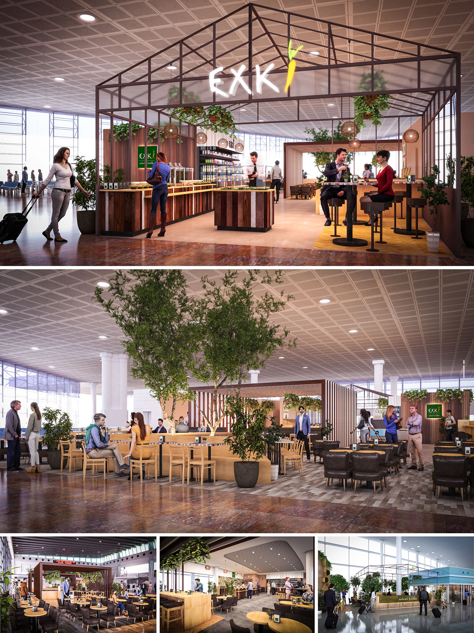
EXKI in Barcelona airport is conceived as a luminous urban greenhouse, a contemporary oasis that brings the language of nature and slow food into a hyper–transit environment. The project translates the brand’s healthy and seasonal philosophy into spatial form, using a light steel “house” structure, abundant planting and warm timber surfaces to create a recognisable and welcoming landmark within the terminal’s open hall.
The design intentionally contrasts with the surrounding large-scale infrastructure. While the terminal is defined by long sightlines and industrial ceilings, EXKI introduces a more domestic scale through the pitched canopy, layered seating typologies and carefully framed views. This creates a legible gateway for passengers: a clear threshold between circulation and pause.
The layout is organised around a central service spine that houses the counter, food display, beverage stations and back-of-house support. This linear core aligns with passenger flows, allowing intuitive access from multiple directions and minimising congestion at peak times. The open edges of the structure ensure full visual permeability, reinforcing the sense of a “public living room” within the airport.
Seating is zoned to accommodate different dwell times. High stools at the perimeter encourage short stays and solo travellers, enabling quick consumption while maintaining visual connection to departure gates. Deeper into the space, communal benches and standard-height tables are arranged in islands that form micro-environments of varying privacy. Soft lounge seating completes the ensemble, catering to longer layovers and informal meetings.
The most distinctive architectural element is the lightweight metal frame evoking a greenhouse silhouette. This dematerialised “roof” does not touch the existing ceiling but hovers beneath it, creating a secondary scale and giving the restaurant a clear identity without enclosing it. The frame integrates signage, pendant lighting and hanging plants, unifying technical and decorative components in a single system.
The material palette is intentionally warm and tactile: vertically composed timber slats, solid wood furnishings and natural fibre lamp shades. Variations of wood tones—ranging from pale oak to richer, reclaimed hues—introduce rhythm and texture along the counters and partitions. Large-format flooring articulates the dining zone, subtly differentiating it from the terminal’s circulation surfaces while remaining fully accessible for luggage and service carts.
The interior atmosphere seeks to soften the typical airport experience through an abundance of greenery and carefully tuned lighting. Trees planted in generous containers rise through the seating islands, providing vertical articulation and partial screening between tables. Lower planters and hanging vegetation extend this green layer across the structure, reinforcing the notion of an indoor garden.
Furniture is deliberately simple and robust, with clean lines and ergonomic proportions. Wooden chairs and benches are paired with neutral upholstery, while darker lounge armchairs add depth and contrast. Tables are dimensioned to support both dining and laptop use, anticipating contemporary passenger needs. Integrated power outlets and discreet table markers for digital ordering support a seamless, technology-friendly user experience.
Brand presence is expressed through calibrated interventions rather than overpowering graphics. The EXKI logo is suspended prominently in the greenhouse frame, backlit to ensure visibility across the terminal. The brand’s characteristic green is introduced on key vertical elements—menu totems, back wall panels and subtle signage—acting as visual anchors within the predominantly timber and neutral environment.
Product display is treated as an architectural layer: refrigerated cabinets and open shelving form a transparent backdrop to the counter, allowing colourful fresh ingredients and packaged items to become part of the interior composition. This reinforces the narrative of freshness and transparency, with preparation areas partially visible to passengers.
Sustainability is addressed through both material choices and operational strategies. Timber elements favour certified and, where feasible, reclaimed sources, reducing embodied carbon while enhancing the aesthetic of authenticity. The modular steel frame is conceived as a demountable system, facilitating future relocation or reconfiguration in line with circular design principles common to airport fit-outs.
Extensive planting contributes to improved indoor environmental quality, helping to psychologically mitigate the stress of travel and introducing biophilic benefits. LED lighting with high energy efficiency is carefully layered—ambient, accent and task—to minimise glare on glass façades and optimise power consumption. Finishes are selected for durability and ease of maintenance, ensuring a long life-cycle with reduced replacement and cleaning needs. Collectively, these decisions align the restaurant’s physical environment with the ethos of responsible, healthy eating that defines the EXKI brand.
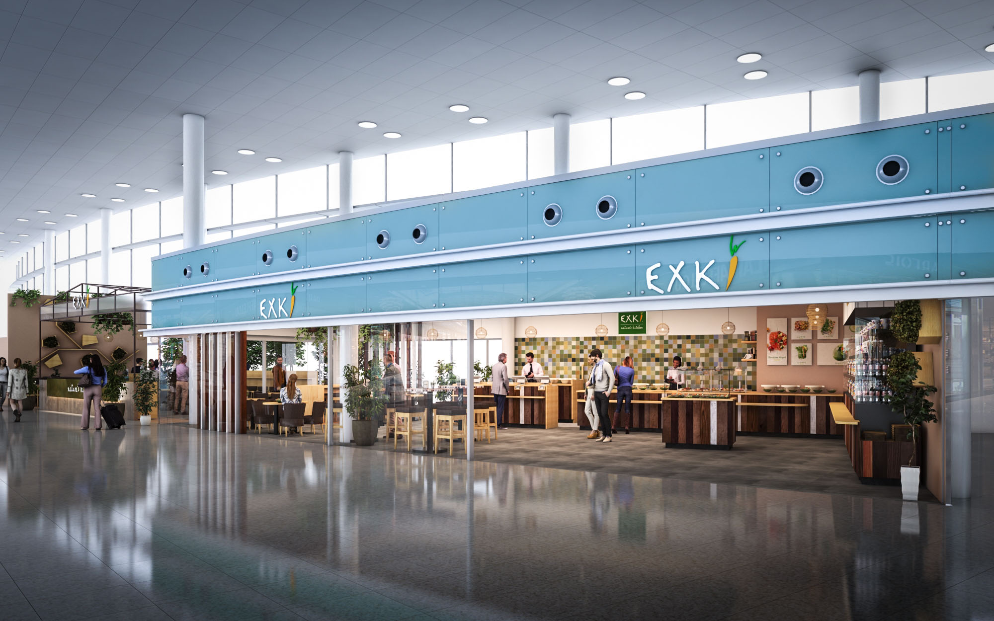
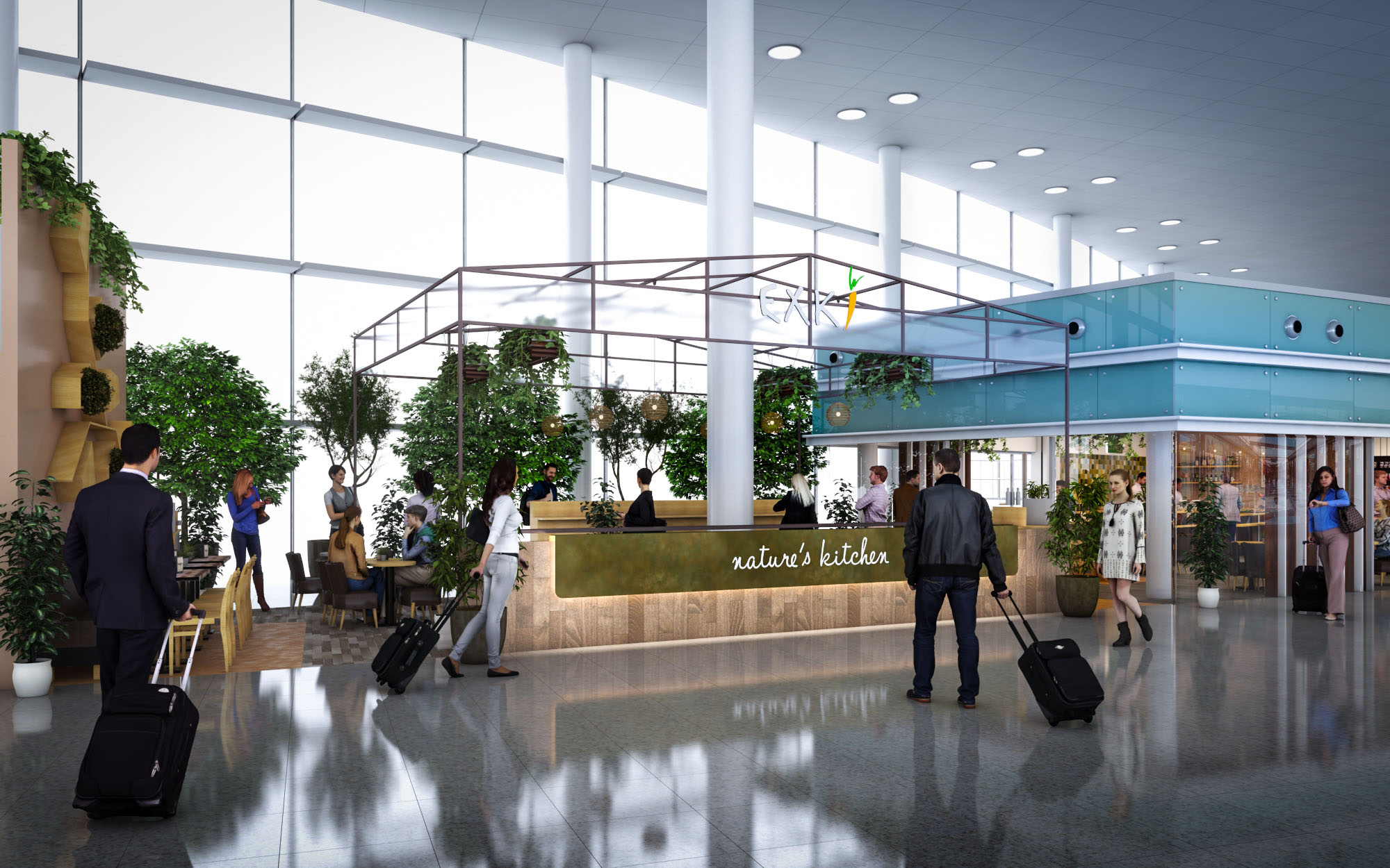
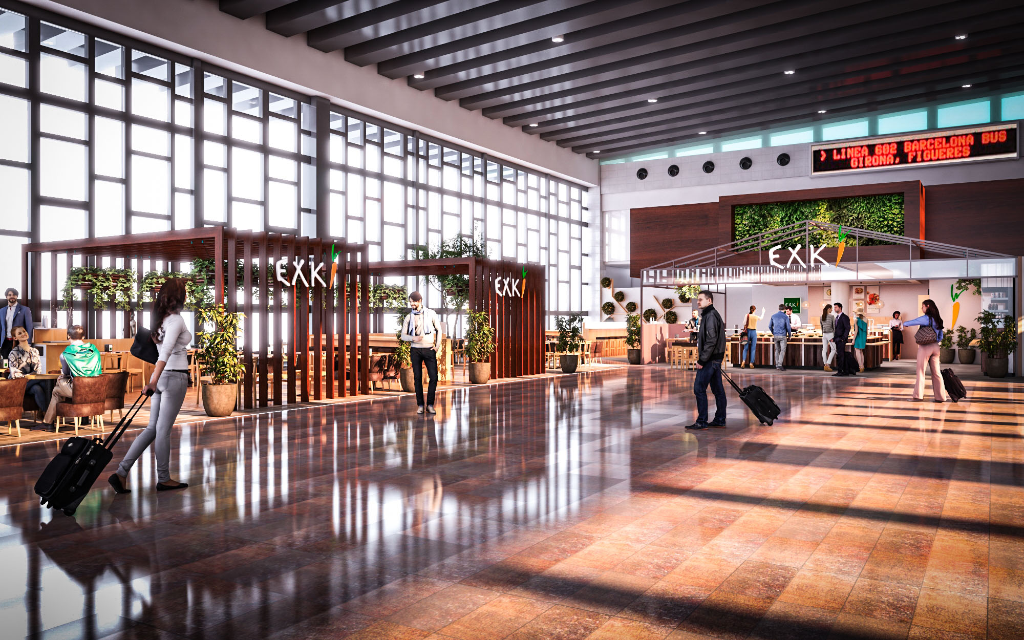
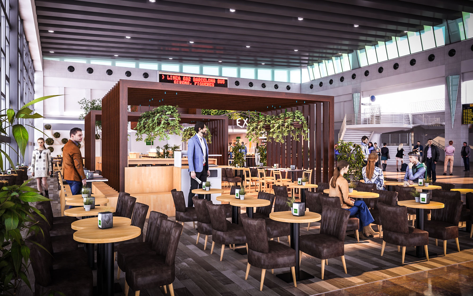
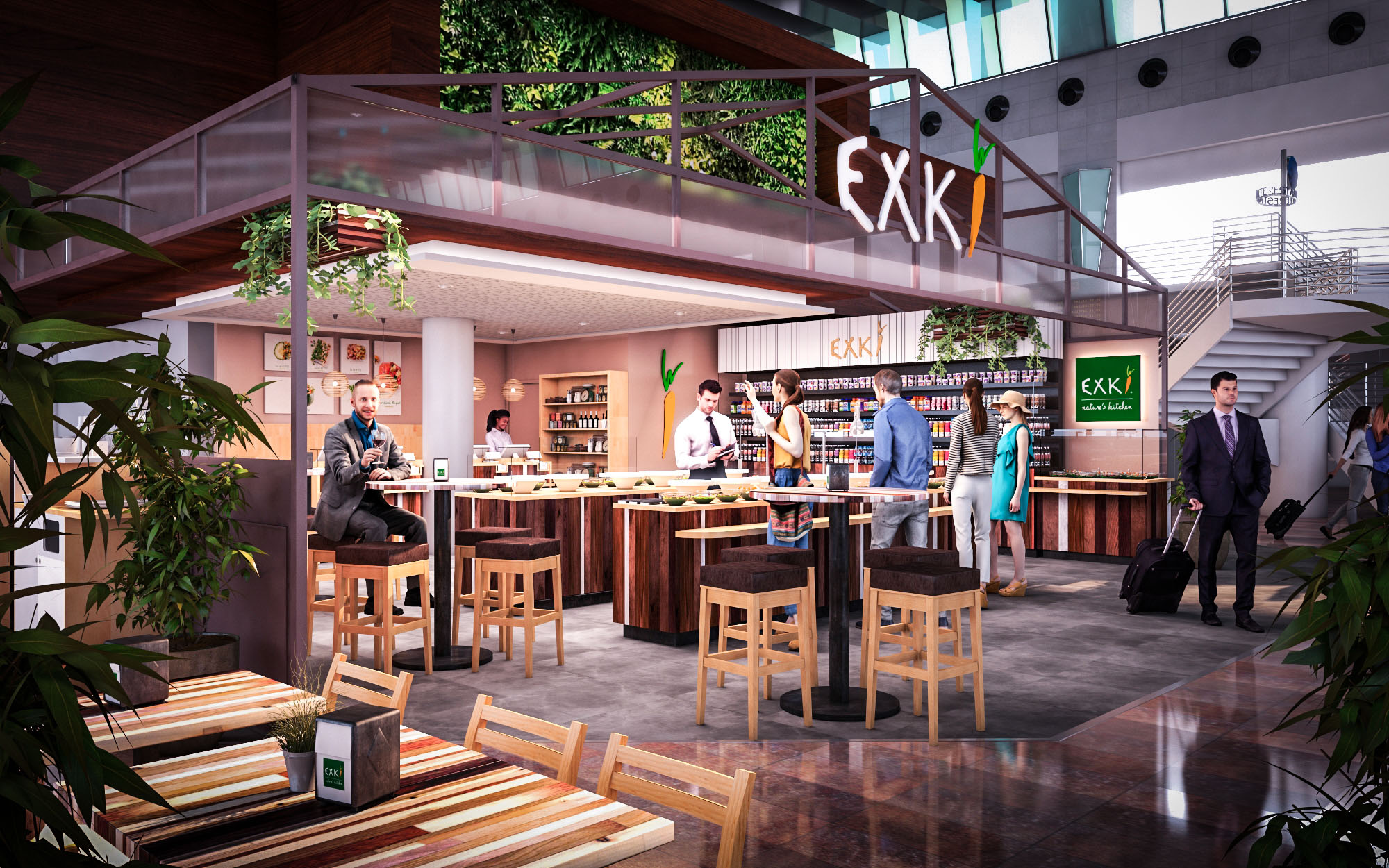
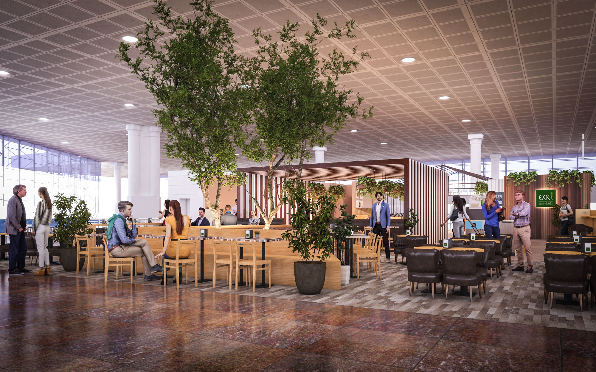
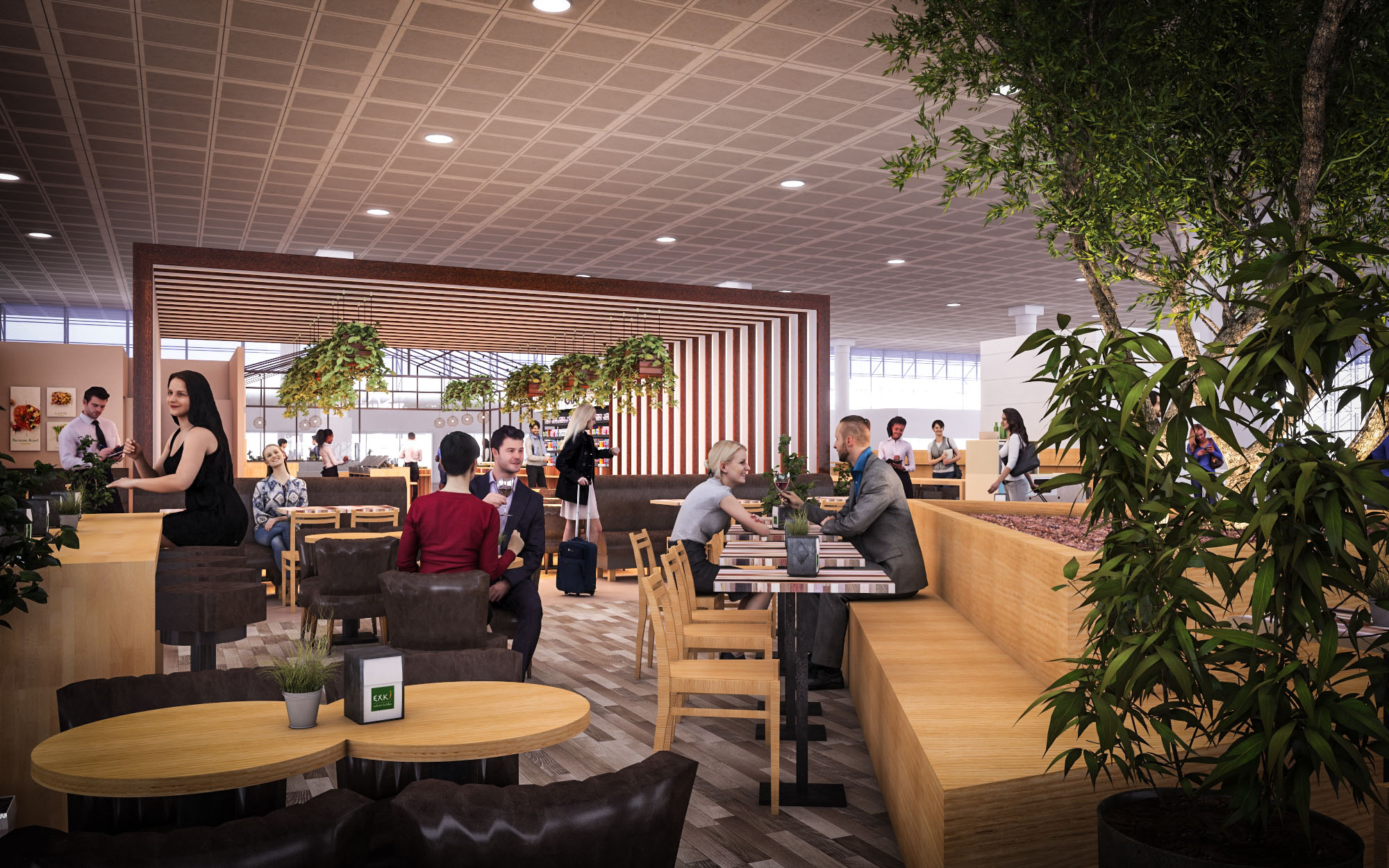
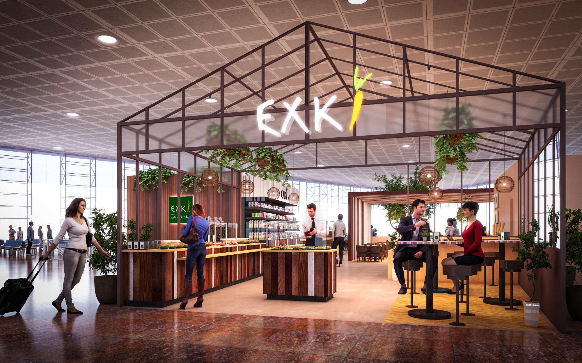
© 2021 by sanzpont [arquitectura] . Webpage by sanzpont [digital] . Innovative Digital Experiences

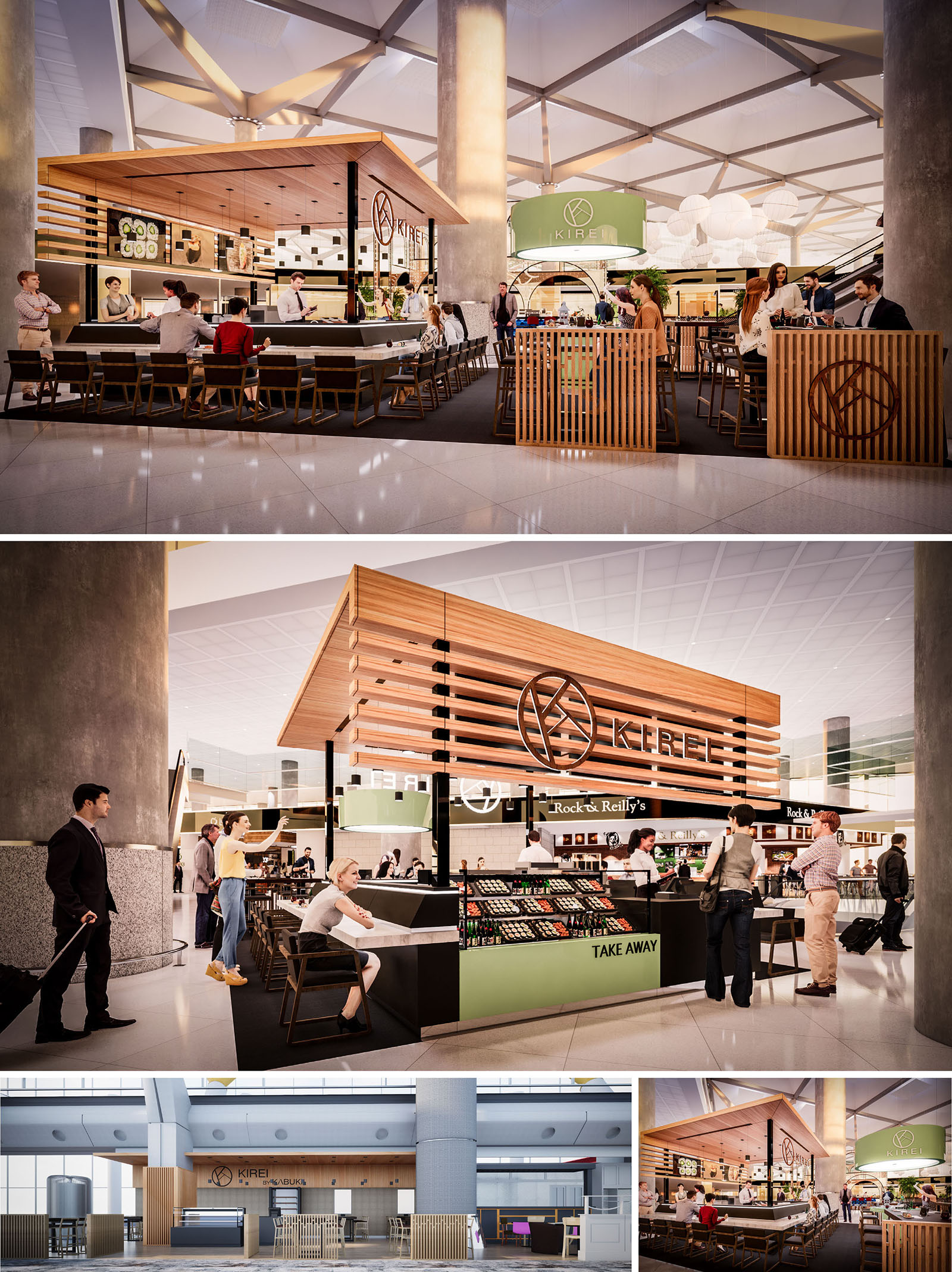
KIREI by Kabuki is conceived as an open urban pavilion within the airport terminal, translating the language of contemporary Japanese gastronomy into a compact, permeable architecture. The design creates a recognizable icon in the concourse while remaining visually light, allowing the flow of passengers to continue uninterrupted around and through the space. The restaurant blurs the boundary between bar, kitchen, and circulation, turning the act of preparation into a central stage visible from every angle.
The concept is based on the abstraction of the traditional Japanese teahouse and market stall, reinterpreted with clean lines, controlled proportions, and a warm material palette. The resulting volume is both sculptural and functional, working as a landmark that orients travelers and as an intimate destination for a short, high‑quality gastronomic pause.
The scheme is organized around a central U‑shaped sushi bar that acts as the core of the project. This bar concentrates the main preparation area and provides 360‑degree visibility, allowing passengers to sit on all sides and maximizing the number of linear seats within a reduced footprint. The perimeter circulation is fully open, guaranteeing fluid access from all directions in the terminal.
Different activity rings are defined: the innermost ring is the working bench for chefs; the intermediate ring is the bar counter for immediate consumption; and the outer ring integrates loose tables, high stools, and quick waiting areas for take‑away. A dedicated takeaway front opens towards the main flow of passengers, clearly signaled by the green base and integrated merchandise display, ensuring efficient service for travelers with limited time.
The architectural identity is built from a combination of warm timber, black metal framing, and light stone‑like surfaces. A floating roof in horizontal wooden slats crowns the pavilion, visually detached from the terminal ceiling and supported on slender black steel posts. This creates a sense of enclosure without blocking views or natural light, and emphasizes the brand logo, seamlessly integrated into the timber lattice.
The bar counter uses a robust, light‑toned solid surface for hygiene and durability, contrasted with darker kickplates to visually anchor the element. Vertical timber screens define thresholds and low partitions, providing a degree of privacy while maintaining transparency. All components are treated as prefabricated modules: the roof, bar, and screen systems can be assembled and disassembled with minimal intervention in the existing terminal structure, respecting airport operational constraints.
The interior atmosphere balances the efficiency of an airport environment with the calmness associated with Japanese aesthetics. Seating combines bar stools and simple timber chairs with upholstered touches, keeping ergonomics and rapid turnover in mind. The dark flooring island differentiates the restaurant from the surrounding concourse and visually “grounds” the pavilion, while reflecting light from the terminal to avoid a heavy appearance.
Lighting is layered: a continuous line of warm integrated LEDs under the timber canopy provides uniform ambient light, complemented by more focused lighting over the bar to highlight the freshness and color of the dishes. Reflected light from the pale ceiling and glossy floor contributes to a sense of openness, while the carefully controlled color temperature generates a comfortable contrast with the cooler, more technical light of the terminal.
Branding is synthesized into a few key architectural gestures rather than applied graphics. The circular KIREI emblem is carved into the main timber lattice and repeated on the entrance screens, transforming the logo into a three‑dimensional filter. Color is selectively used: the soft green of the take‑away counter and secondary signage evokes freshness and subtly recalls Japanese matcha tones, without overwhelming the neutral base palette.
Signage is integrated into structural elements and shelving, maintaining clean sightlines across the terminal. Product displays are modular and low in height to avoid creating visual barriers, ensuring that the pavilion reads as a continuous, accessible landscape within the larger public space.
Sustainability criteria informed the project from the outset, with a focus on material selection, modularity, and energy efficiency. Timber used in the canopy and screens is specified from certified sustainable sources, with finishes that maximize durability and allow for easy maintenance, extending the life cycle of the components. The modular metal structure is bolted rather than welded, facilitating disassembly, reuse, or relocation if terminal layouts evolve over time.
The open configuration reduces the need for dedicated mechanical systems by taking advantage of the terminal’s existing climate control and natural lighting. Warm‑white LED lighting with high efficiency and long service life minimizes energy consumption and maintenance interventions. Surfaces in contact with food are designed for easy cleaning, reducing the use of aggressive chemicals, while the compact layout optimizes back‑of‑house areas to limit waste in both space and operations. Together, these measures create a resilient, low‑impact restaurant model suited to high‑intensity airport environments.
© 2021 by sanzpont [arquitectura] . Webpage by sanzpont [digital] . Innovative Digital Experiences
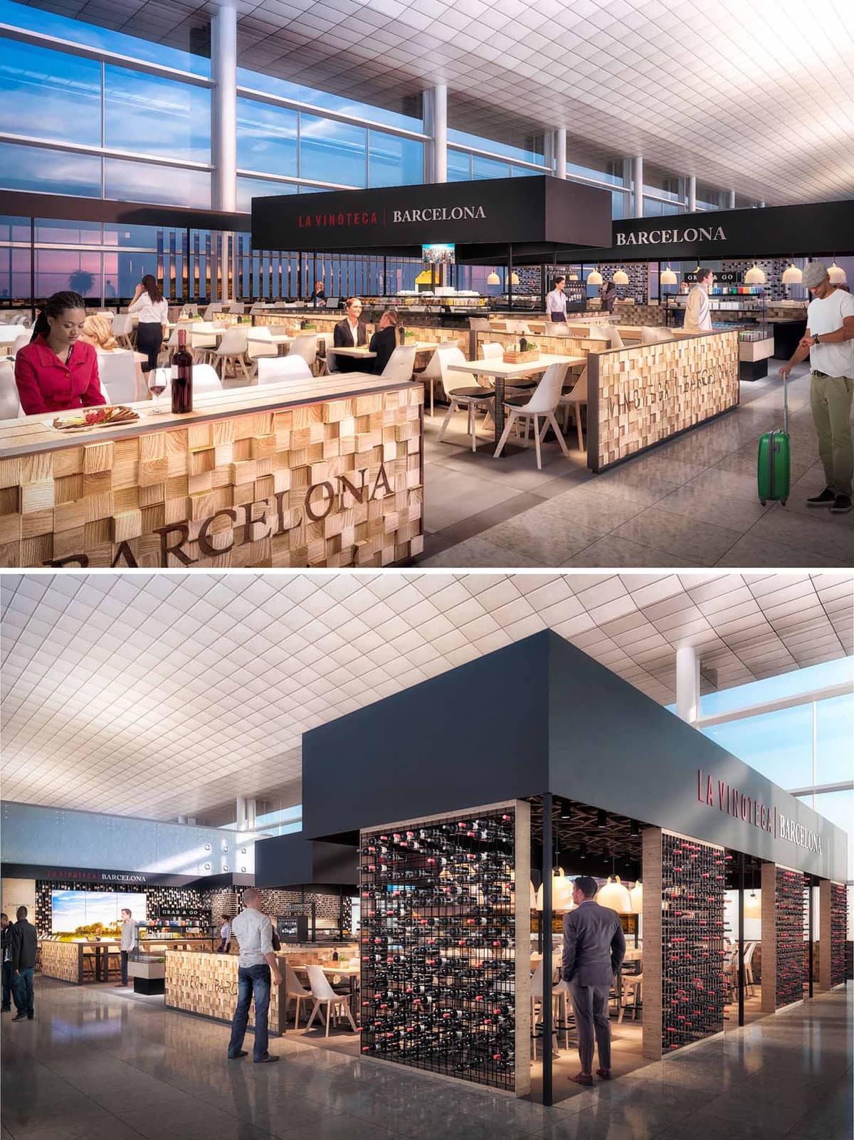

LA VINOTECA is conceived as an urban wine gallery embedded within the fluid dynamics of Barcelona’s airport. The project translates the atmosphere of a contemporary bodega into an open, permeable structure that responds to the transient nature of the terminal. The design organizes the space as a sequence of thresholds: from the surrounding concourse, through a permeable perimeter of wine racks, to a warm and intimate tasting core.
The architecture balances visibility and refuge. Generous openings invite passengers from all sides, while the central canopy and lowered lighting levels create a protective interior micro‑world. The language is deliberately simple and geometric, allowing the rich textures of wine bottles and timber to become the primary visual protagonists.
The project is laid out as an inscribed island within the terminal, without solid façades. A continuous perimeter counter defines the boundary between circulation and seating, operating as both reception and informal dining area. This edge condition frames the main dining field, which is articulated with flexible table groupings to accommodate solo travelers, couples, and larger groups.
At the heart of the scheme, a more enclosed bar and tasting zone sits directly beneath the dark volumetric canopy. This element compresses the height visually, creating intimacy under the expansive airport ceiling. Circulation is radial and intuitive: guests can enter from any side, orienting themselves immediately towards the bar as the spatial anchor, while service routes remain efficient and unobstructed behind the counters.
The material palette contrasts the cool, reflective surfaces of the terminal with warm, tactile finishes. The perimeter counters are clad in three‑dimensional timber blocks, creating a pixelated relief that catches the light and reinforces the crafted character of the place. This textured wood, in natural tones, is paired with light tabletops and neutral flooring, ensuring visual continuity with the existing concourse.
Above, a dark, monolithic canopy in charcoal grey delineates the venue in the vast open hall. The black steel wine racks, densely populated with bottles, form a dynamic chromatic mosaic of labels and glass, effectively becoming the restaurant’s graphic identity. The overall color scheme is deliberately restrained—wood, black, and soft whites—so that the wine itself supplies the chromatic richness.
Lighting design plays a key role in differentiating LA VINOTECA from the surrounding terminal. The large exterior glazing provides abundant natural light, which is filtered across the textured timber and bottle displays during the day. In contrast, a system of warm pendant lamps and integrated linear lighting under the canopy generates a more domestic, lounge‑like atmosphere, inviting longer dwell times.
Illuminance levels are carefully graded: brighter at the perimeter counters to signal openness and service activity, and slightly dimmed towards the central bar to emphasize the contemplative act of wine tasting. Reflections on the polished floor extend the luminance vertically, amplifying the perceived depth of the relatively compact footprint.
The furniture selection reinforces lightness and comfort. Timber chairs with upholstered seats and simple white tables echo the material logic of the counters while remaining easy to reconfigure. Detailing is intentionally clean, with concealed fixings and continuous edges to facilitate maintenance in the high‑traffic airport environment.
Branding is integrated architecturally rather than applied decoratively. The name “LA VINOTECA BARCELONA” appears in understated typographic bands on the canopy and counters, aligned with structural lines. The dense bottle walls act as a living logo, constantly changing as inventory rotates, and visually communicating the core focus on wine culture.
The design strategy addresses sustainability through material choices, efficient systems, and long‑life detailing. The predominant timber elements are specified from certified sources and conceived as modular cladding, allowing future disassembly or replacement of individual blocks without discarding entire assemblies. The steel wine racks are durable, recyclable, and dimensioned for standard bottle formats to minimize waste.
Energy performance is enhanced by relying on the terminal’s abundant daylight, reducing artificial lighting demand during daytime operation. Warm LED luminaires with high efficacy are used throughout, connected to dimming controls adapted to flight schedules and occupancy. The open configuration optimizes natural airflow from the terminal’s central HVAC, lowering the need for localized mechanical systems and reducing operational energy consumption while maintaining a comfortable, acoustically moderated interior environment.
© 2021 by sanzpont [arquitectura] . Webpage by sanzpont [digital] . Innovative Digital Experiences
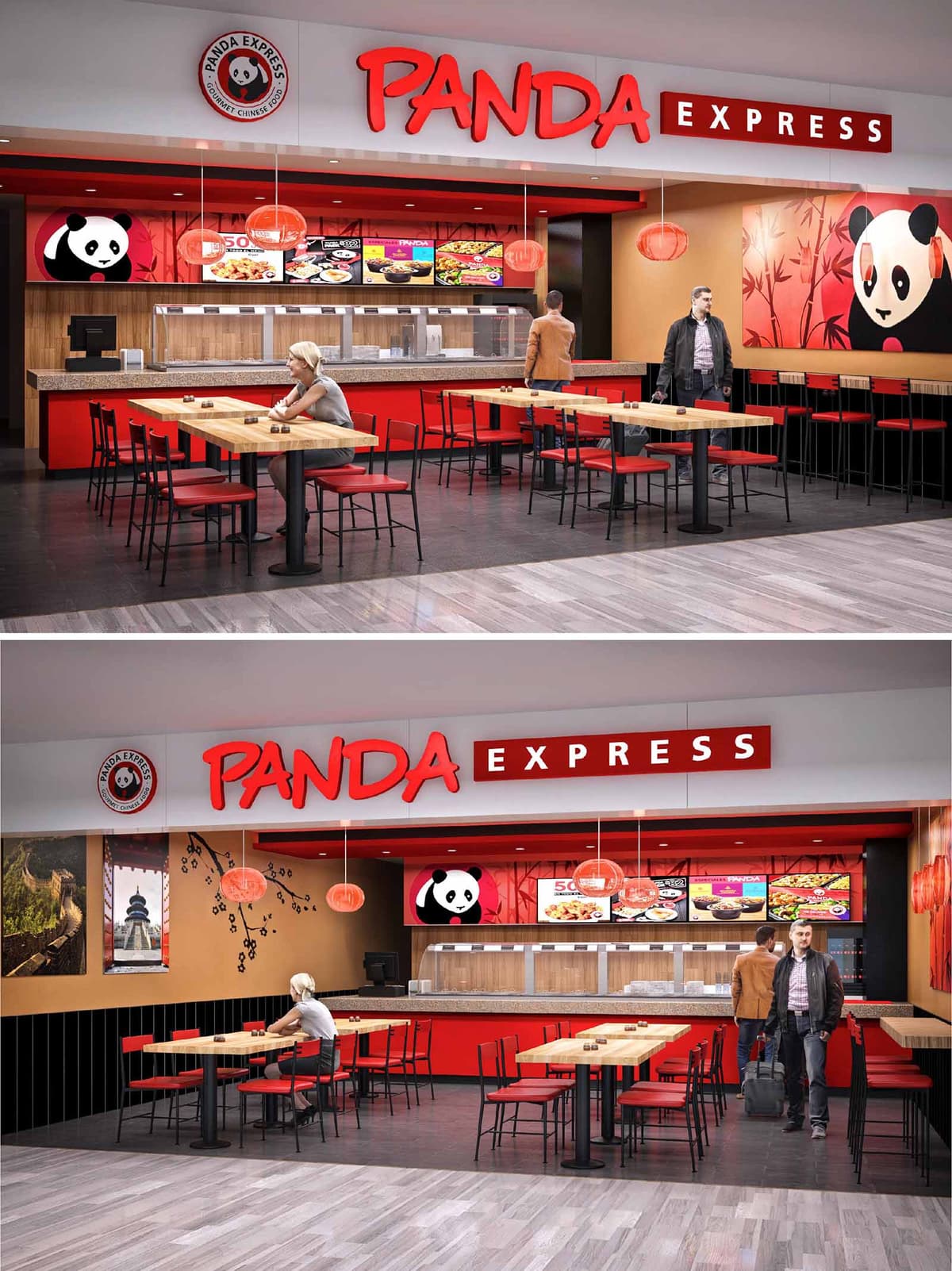
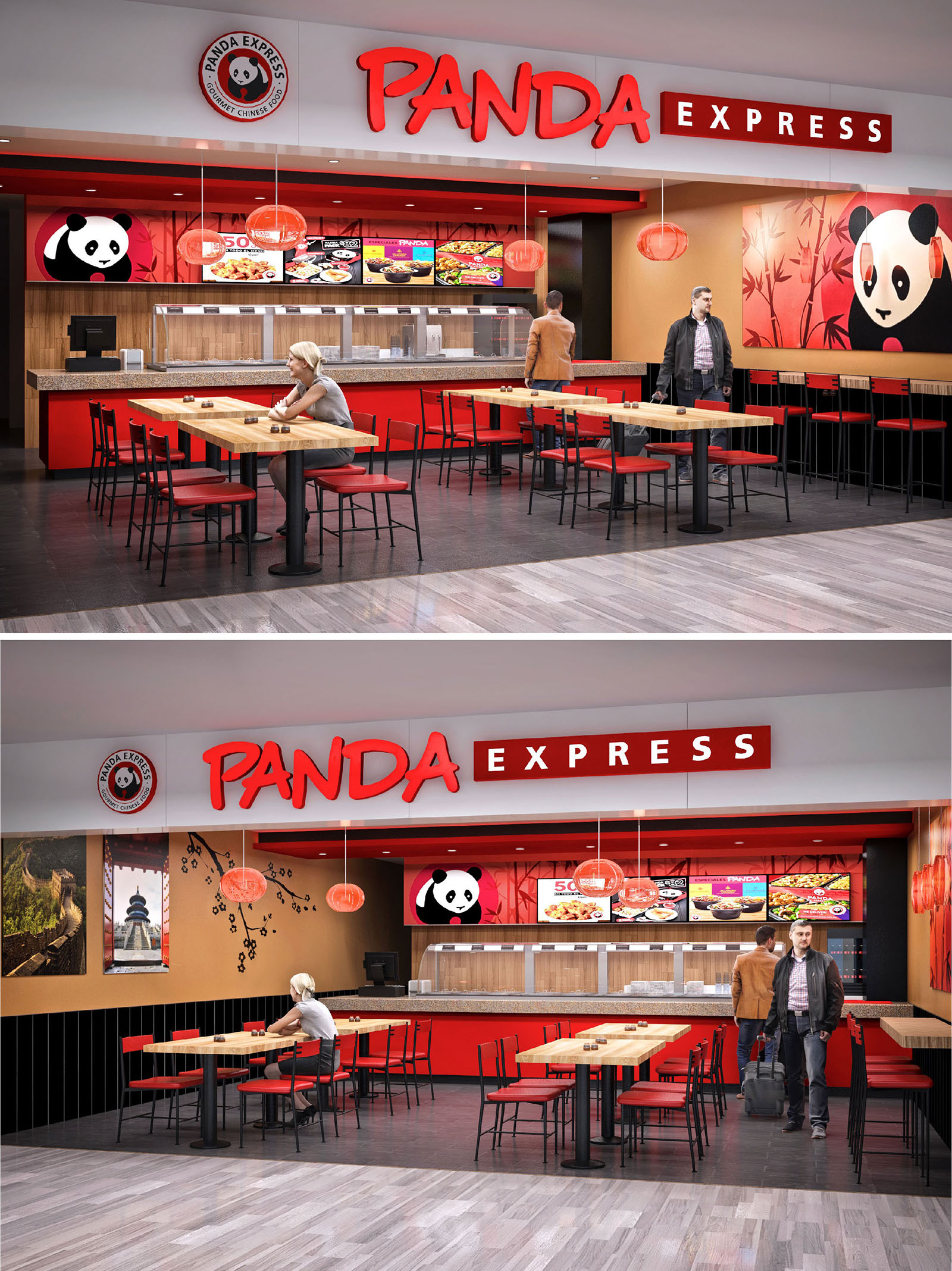
The Panda Express in Tijuana is conceived as an open and permeable food‑court pavilion that visually extends into the circulation areas of the mall. The concept combines the brand’s dynamic identity with a contemporary Asian‑inspired language, using clear geometric lines, strong chromatic contrasts and playful graphic elements. The restaurant front is treated as a continuous façade where logo, menu band and service counter form a single horizontal composition that immediately communicates function and access.
The design emphasizes transparency and legibility: from a distance, the guest can read the entire operation, from food display to seating. This visual continuity reinforces trust and accelerates decision making, an essential aspect in high‑flow commercial environments such as Tijuana’s shopping centers and transport hubs.
The layout is configured as a linear service counter at the back, with the dining area projected towards the public corridor. A central block of communal tables organizes the space, generating a clear axis between the mall circulation and the counter, while a perimeter bar along the side wall offers higher seating for quick stays. This dual seating strategy responds to both fast‑turnover users and customers who wish to remain longer.
Circulation is intuitive: entry is fully open, without doors or partitions, and the free plan allows multiple access points. The queueing zone is naturally defined by the alignment of the counter and the first row of tables, avoiding physical barriers. This ensures efficient flow at peak hours while maintaining visual spaciousness despite the compact footprint typical of food‑court premises.
The material palette combines warm wood tones, red lacquered surfaces and black accents, constructing a robust identity that is immediately recognizable. Natural‑look wood is used on tabletops, counter cladding and portions of the back wall, providing tactile warmth that balances the intensity of the corporate red. Black appears in chair structures, table bases and lower wall panels, grounding the composition and enhancing durability in high‑impact areas.
The ceiling and fascia are kept in light neutral tones to prevent chromatic saturation and to highlight the three‑dimensional “PANDA EXPRESS” signage. Large‑scale panda graphics and Asian‑inspired murals inject a playful narrative, while framed photographs of landscapes reference Chinese culture in a more subtle and architectural way. The continuous illuminated menu band functions as both lighting and wayfinding, reinforcing the brand while giving depth to the back wall.
Lighting strategy balances functional clarity at the counter with a warm, inviting ambience in the dining area. Linear concealed lighting above the menu and food line ensures accurate color rendering of dishes, a key factor in food presentation. In contrast, the dining zone incorporates suspended circular pendants with warm color temperature, visually lowering the perceived ceiling height and creating a more intimate scale within the open mall context.
Reflected light from the light‑colored ceiling and glossy red bands avoids harsh shadows, while the dark flooring absorbs glare, adding visual comfort. The result is a luminous environment that remains perceptible and attractive from a distance, yet comfortable for guests seated over longer periods.
The furniture is deliberately simple and robust, with slender metal frames and thin wood surfaces that convey lightness while optimizing resistance and ease of maintenance. Table dimensions are standardized to allow flexible grouping for couples or larger parties, responding to variable demand patterns. Chair geometry, with straight legs and minimal profiles, contributes to a clean visual field, ensuring that branding and food display remain protagonists.
Counter height and distance to the first row of tables are calibrated to facilitate both staff operation and customer comfort, leaving sufficient space for luggage or strollers, a frequent requirement in high‑traffic locations like Tijuana’s commercial nodes. Bar‑height seating along the mural wall offers an alternative for solo diners, maximizing capacity without congesting the central area.
Sustainability in this project is addressed through material selection, operational efficiency and long‑term durability. High‑resistance surfaces, such as composite countertops and dense laminates, reduce the need for frequent replacement and minimize waste over the lifecycle of the restaurant. Neutral flooring with high abrasion resistance ensures that the space maintains its appearance despite constant traffic, extending intervals between renovations.
LED lighting throughout the project significantly reduces energy consumption while providing precise color rendering indispensable for food service. The open frontage relies on the mall’s existing HVAC system, avoiding duplicated climate control equipment. The use of modular furniture and standardized components allows for easy repair, reuse or reconfiguration, supporting adaptable, resource‑conscious operation as the commercial context of Tijuana evolves.
© 2021 by sanzpont [arquitectura] . Webpage by sanzpont [digital] . Innovative Digital Experiences
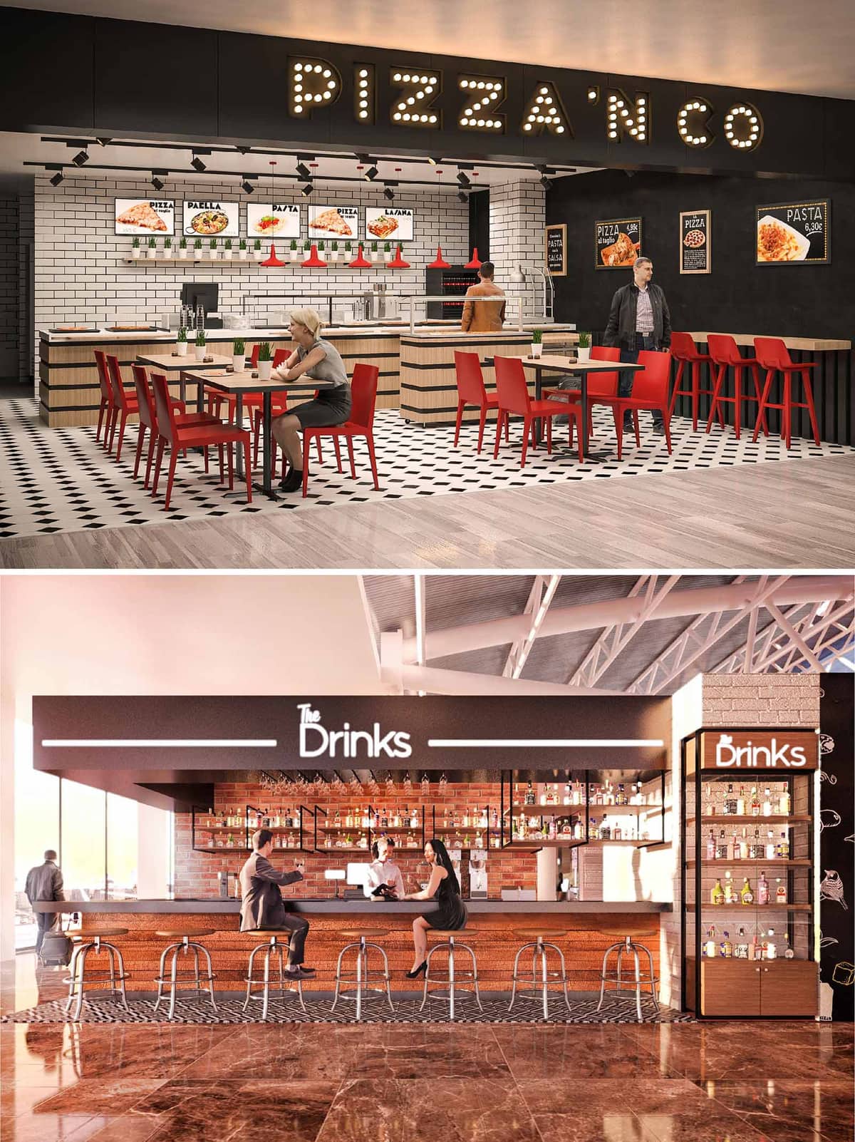

PIZZA’N CO is conceived as a fast-casual restaurant and bar format capable of replicating itself in airports and shopping centers in Mexico and Spain. The design strategy combines the clarity of a branded food court kiosk with the warmth of a neighborhood trattoria, using industrial and contemporary references. The space is divided into two complementary atmospheres: the vibrant pizzeria and the more intimate bar area, connected by a coherent material and graphic language that reinforces brand recognition at a distance.
The architectural concept is based on strong horizontal canopies and clear volumetric frames that define each unit without enclosing it. These frames act as urban “shopfronts” inside interior public spaces, making the offer legible from multiple angles and facilitating rapid orientation for transient users.
The layout prioritizes visibility of production and direct customer flow. In the pizzeria, the open counter and back-of-house line are fully exposed behind a continuous tiled backdrop, emphasizing transparency and speed of service. The sequence runs from menu reading, to ordering, to collection, minimizing cross-circulation and allowing staff to operate within a compact, ergonomic work triangle.
Dining is organized through a combination of loose tables and linear bar seating at the perimeter. This allows the brand to adapt to different footprints while keeping a clear zoning between circulation corridors and seated areas. In the bar, a central island counter works as an attracting core, allowing access on three sides and optimizing interaction between bartender and guests.
The material palette combines tactile finishes with easily maintainable surfaces. At PIZZA’N CO, white bevelled subway tiles with dark grout form a hygienic and luminous backdrop to the kitchen line, while blackboard-painted walls host illuminated menus and graphic elements. Blonde wood cladding wraps the service counters, introducing warmth and a human scale in contrast to the more industrial ceiling and lighting grid.
The chromatic identity is anchored in a triad of black, white, and a saturated red. Red chairs and stools inject energy and act as a visual anchor in high-traffic environments, while the monochrome floor pattern in mosaic tiles provides a classic, almost bistro-like reference. In the bar area, exposed red brick and warm-toned timber cabinetry build a more sophisticated, nocturnal mood, balanced by the dark canopy and linear LED accents.
Lighting is treated as both functional infrastructure and a key branding tool. At the pizzeria front, a marquee-style “PIZZA’N CO” sign with individual bulbs evokes cinema façades and draws attention from afar. Track-mounted spotlights over the counter ensure precise illumination of the food display and working surfaces, while pendant fixtures in brand red create a rhythm above the serving line.
In the bar, a continuous luminous band integrated into the canopy emphasizes the “The Drinks” logo and underlines the counter edge. Backlit bottle displays transform the rear wall into a dynamic, colorful plane, enhancing depth and ambiance. Overall, the scheme balances warm and neutral color temperatures to differentiate public seating, service counters, and circulation zones.
The furniture is intentionally simple, robust, and stackable where possible, allowing rapid reconfiguration and efficient maintenance. Metal-framed chairs with slim profiles maintain visual permeability across the dining area, preventing spatial congestion despite the compact footprint. Bar stools with tubular steel legs and timber seats echo the industrial language of the exposed structures above.
Edges, corners, and junctions are resolved with durable trims to withstand high occupancy and luggage impacts, particularly in airport contexts. The tabletops use high-pressure laminates with wood textures, balancing resistance to staining and scratching with a warm tactile perception. Menu boards, wall graphics, and bottle arrangements are designed as integral architectural components rather than add-ons, ensuring a cohesive brand narrative.
Given its multi-location rollout, the project emphasizes modularity and resource efficiency. Counter blocks, shelving units, and lighting tracks are conceived as standardized modules that can be prefabricated, transported flat, and installed with minimal site waste. This approach reduces construction time, energy consumption, and material offcuts in each venue.
Durable finishes such as ceramic tiles, brick, and metal structures minimize long-term replacement needs, contributing to life-cycle sustainability. LED lighting throughout dramatically reduces energy use and maintenance, while the open-front layout leverages existing ambient lighting from the host building. Where possible, locally sourced bricks, woods, and tiles are specified for each country, supporting regional economies and reducing transportation impacts while maintaining a consistent visual identity.
© 2021 by sanzpont [arquitectura] . Webpage by sanzpont [digital] . Innovative Digital Experiences

TCH Restaurant is conceived as a fluid transition between the Caribbean waterfront and a contemporary lounge atmosphere. The project fuses the dynamism of nightlife with the openness of a seaside terrace, creating a continuous spatial narrative from day to night. Organic ceiling forms, reflective surfaces and a central bar island structure orchestrate the experience, framing views towards the sea while generating an intimate interior landscape. The concept emphasizes movement and energy, expressed through curved geometries, layered lighting and carefully choreographed circulation around the bar.
The restaurant operates as both destination and viewpoint. Large glazed façades dissolve the physical limit between interior and exterior, allowing the vivid sky and sunset to become an active component of the design. During the day, natural light and the ocean horizon dominate; at night, chromatic LED lighting reconfigures the space, transforming it into a vibrant, immersive environment.
The plan is structured around a central bar island that functions as the spatial and social core. Seating radiates from this nucleus in concentric layers: high stools at the bar, followed by low dining tables, and finally the perimeter terrace that opens to the sea. This arrangement ensures clear sightlines, easy service circulation, and equal access to views for most tables.
Interior and exterior platforms are subtly differentiated by changes in floor material and level rather than by solid partitions. Sliding glass panels on the façade enable the dining area to operate either as a controlled indoor climate zone or as an open-air extension of the terrace. Circulation routes are intuitive, guiding guests from entry to bar, and then naturally out towards the oceanfront deck, where the sunset-oriented seating is maximized.
The material palette balances local warmth with contemporary precision. Polished concrete floors provide durability and thermal mass, while curved timber wall claddings and bar fronts introduce tactile comfort and visual softness. Wood is used in bar stools, tabletops, and pergola structures, creating a cohesive language that echoes the tones of sand and palm trunks.
Neutral base colors—beige floors, white ceilings, and dark bar volumes—are intentionally restrained to serve as a canvas for dynamic lighting. Metallic accents on bottle displays and mirrors enhance depth and reflection, multiplying views of both the interior and the exterior landscape. Exterior areas use more weather-resistant finishes and decking, maintaining continuity of tone without compromising performance in the coastal climate.
Lighting design is central to the identity of TCH Restaurant. Sculpted ceiling coves integrate RGB LED strips that wash the undulating surfaces with gradients of magenta, violet and blue, evoking the chromatic intensity of Caribbean sunsets. These indirect lights are complemented by warm white downlights that provide functional illumination for tables and the bar counter.
The combination of reflected colored light and strategic accenting on the bottle racks, bar surfaces and perimeter glazing generates a layered atmosphere. Lighting scenes are programmable, allowing smooth transition from a relaxed daytime ambience to a more theatrical nightlife setting. Exterior terraces rely on discreet, low-glare fixtures that preserve views of the night sky and the sea while ensuring guest comfort and safety.
Furniture is designed with ergonomic comfort and visual simplicity, using clean lines that do not compete with the expressive ceiling. High stools around the bar emphasize social interaction and flexibility, while dining chairs and tables are lightweight and easily reconfigurable for different group sizes or events. The central bar’s rounded geometry minimizes dead corners and optimizes service efficiency.
Custom wine displays and mirrored niches serve both as storage and as sculptural elements, articulating the back-bar wall. Large ceiling fans provide perceptible air movement, reinforcing comfort in the tropical climate and reducing the dependence on mechanical cooling when façades are open. The detailing of edges, junctions and transitions aims for a seamless reading of the space, enhancing the overall guest experience.
The project responds to the coastal context of Playa del Carmen by maximizing natural ventilation, visual permeability and orientation towards prevailing breezes. Extensive glazing is protected by overhangs and pergolas, mitigating direct solar gain while preserving panoramic views. The openable façade system allows the restaurant to operate in a hybrid indoor–outdoor mode, reducing reliance on air conditioning during temperate hours.
Sustainability strategies include the use of LED lighting throughout, significantly lowering energy consumption, and the selection of durable, locally appropriate materials that withstand saline air and humidity, reducing maintenance and replacement cycles. The predominance of wood from responsibly managed sources, combined with the thermal mass of concrete floors, supports a balanced indoor climate. By integrating bioclimatic principles with a high-impact aesthetic, the restaurant aligns environmental responsibility with a memorable guest experience.
© 2021 by sanzpont [arquitectura] . Webpage by sanzpont [digital] . Innovative Digital Experiences
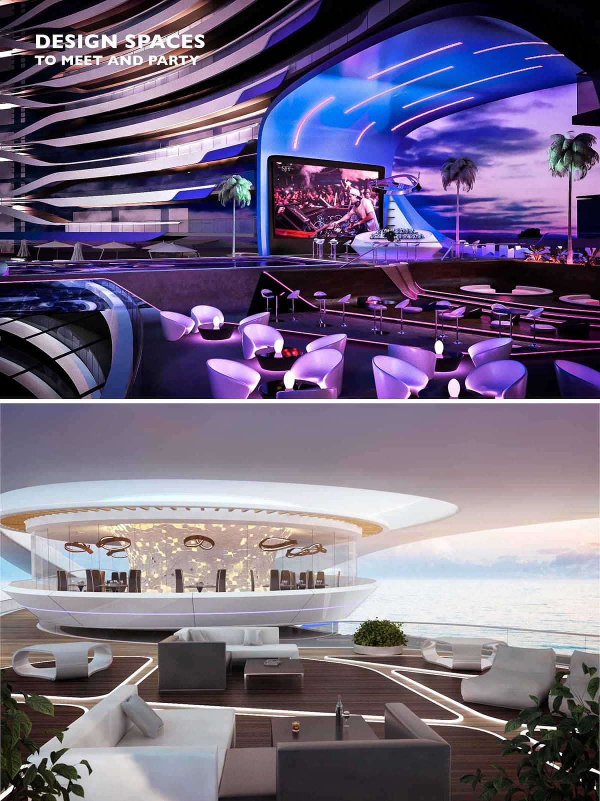

TMH Restaurant is conceived as a futuristic social landscape that merges gastronomy, nightlife and the Caribbean horizon into a single experiential sequence. The architectural language is fluid and aerodynamic, echoing the curves of waves and wind shaping the shoreline of Cancún. Rather than a conventional enclosed restaurant, the project operates as an open platform for meeting, partying and contemplating the sea, with overlapping terraces and sculpted canopies that frame views while choreographing light and sound.
The design alternates between two atmospheres: an immersive, club-like interior saturated with dynamic lighting, and an ethereal, elevated deck that appears to float over the water. This duality allows the venue to transition from day to night, from fine dining to performance space, without losing spatial coherence. All elements—furniture, ceilings, balustrades and lighting—are treated as continuous ribbons, creating a strong visual identity recognizable from afar.
The project is structured in clearly legible layers. The lower platforms accommodate lounge seating, bar areas and circulation, while upper tiers host the main dining room and stage. This terraced configuration guarantees uninterrupted sea views and direct visual connection with the central performance zone. The spatial sequence begins at an arrival promenade that gradually opens toward the ocean, culminating in the panoramic decks that project outward over the water.
In the more introverted club area, the stage is framed by a sweeping shell-like proscenium that integrates LED screens, lighting rails and acoustic treatments. Seating is arranged in concentric arcs around this focal point, optimizing sightlines for shows and DJ performances. The more diaphanous upper restaurant is enclosed by curved glass, operating as a glowing “lantern” over the deck. External lounges with low furniture and integrated planters soften the perimeter and foster informal gathering.
The interior design is driven by contrast between dark, reflective surfaces and luminous, softly curved elements. In the nightlife zone, chromatic LED lighting washes ceilings and walls, shifting between violet, blue and magenta tones to intensify the immersive club atmosphere. Integrated floor lighting subtly traces circulation routes and defines seating islands without the need for intrusive physical barriers.
Furniture pieces are sculptural and monolithic, often in glossy white or muted neutrals that act as canvases for changing light. Armchairs and lounge modules adopt ergonomic, organic forms, reinforcing the futuristic narrative. In the upper restaurant, the atmosphere is more serene: warm indirect lighting, textured wall panels perforated with star-like apertures, and suspended luminaires with fluid outlines create a refined dining environment that still echoes the dynamic language of the lower levels.
The material palette combines high-performance composites, glass and timber to withstand the marine environment while maintaining a refined aesthetic. Exterior shells and soffits use smooth, light-colored composite cladding to reflect solar radiation and reduce heat gain. Generous glass enclosures maximize transparency and visual continuity across interior and exterior spaces, while strategic fritting and overhangs mitigate glare.
The color strategy revolves around whites, soft grays and deep charcoals, punctuated by the programmable lighting spectrum. Decking surfaces employ durable tropical hardwood or composite slats, providing tactile warmth underfoot and referencing nautical decks. Detailing favors hidden fixings, integrated LED profiles and continuous edges to maintain the impression of seamless, aerodynamically carved surfaces, emphasizing the building as an object in motion facing the sea breeze.
Sustainability considerations focus on climate responsiveness and efficient resource use in a coastal, high-humidity context. The generous canopies and projecting eaves act as passive shading devices, protecting glazed areas from direct solar gain while enabling natural daylight and views. Open-sided lounges encourage cross-ventilation, reducing reliance on mechanical cooling for large portions of the occupied areas, particularly during milder evenings.
LED technology, dimmable controls and zoning strategies minimize energy consumption from the extensive lighting systems. Materials are selected for durability and low maintenance in a saline environment, extending lifecycle and reducing replacement frequency. Where possible, locally sourced plant species are integrated into planters and green pockets, contributing to microclimate regulation and reinforcing a connection to the native coastal landscape of Cancún.
© 2021 by sanzpont [arquitectura] . Webpage by sanzpont [digital] . Innovative Digital Experiences

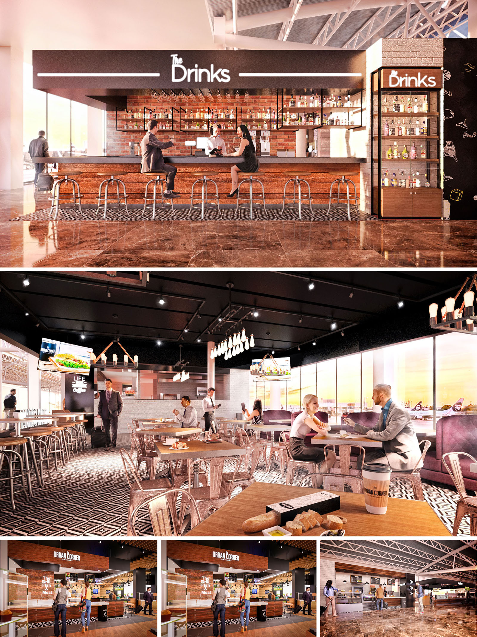
URBAN CORNER is conceived as a contemporary metropolitan oasis inside the dynamic context of airports in Tijuana and Guadalajara. The project merges the atmosphere of a street bistro and an urban bar, translating the vibrancy of the city into an interior that feels both informal and carefully curated. The design emphasizes clear brand visibility, open connectivity with the terminal, and a fluid customer experience from quick coffee stops to longer meals and drinks.
The overall language is industrial‑chic, combining exposed structures, metal furniture and warm woods to generate a robust yet welcoming environment. The spatial narrative is anchored by two main elements: the central bar “The Drinks” as a social focus, and the surrounding food counters and seating platforms that organize circulation and invite users to occupy the space in different ways.
The plan is structured around a clear axial composition. The bar occupies a central peninsula, open on three sides, allowing customers to approach from the main corridor or from the dining area. This strategy maximizes visibility and creates an iconic silhouette against the terminal glazing. Seating is distributed in layers: high stools along the bar and perimeter counters for quick stays, and standard tables with upholstered benches and metal chairs for longer visits.
Circulation flows diagonally across the restaurant, guiding users from the airport concourse into the service area and then towards the panoramic windows. Service counters for food selection, payment and beverage pick‑up are aligned to avoid crossings between staff and passengers with luggage. Lighting tracks and ceiling elements also help define functional zones without using physical barriers, preserving openness and transparency.
The palette is intentionally warm and urban. Brick cladding and timber panels define the main volumes, contrasted by black metal frames and shelving that reinforce the industrial character. The bar front and back counter use horizontal wood slats and glossy surfaces to reflect ambient light and highlight the bottle display. Behind the bar, a brick wall with open shelving becomes a graphic backdrop, intensifying the sense of depth.
The flooring alternates between polished stone in the circulation belt and patterned tiles in the dining and bar area. This contrast clearly marks the transition from public flow to the more intimate restaurant domain. Neutral tones—browns, grays and off‑whites—are punctuated by brand elements in black and white signage, as well as the warm glow of the suspended luminaires. The result is an atmosphere that feels sophisticated yet accessible to a broad traveler profile.
The lighting concept balances natural and artificial sources. Large glazed façades flood the interior with daylight and maintain visual continuity with the runways, transforming the restaurant into an observation platform. At night or in low‑light conditions, a combination of linear LEDs, track spotlights and decorative fixtures articulates the space and emphasizes textures.
Above the central dining area, sculptural pendant luminaires with exposed bulbs introduce a casual, almost domestic scale, softening the otherwise infrastructural character of the airport. The black ceiling absorbs reflections and hides installations, while focused lighting on tables and counters ensures visual comfort and highlights food presentation and brand graphics.
Furniture selection reinforces the urban identity. Metal Tolix‑style chairs and high stools echo the industrial vocabulary, while upholstered banquettes along the windows provide comfort for longer waits. Tables are simple wooden tops with robust metal bases, designed for intensive use and easy maintenance. The layout allows flexible grouping of tables to accommodate solo travelers, couples or larger groups.
Branding is integrated architecturally rather than applied superficially. Large overhead signage—“URBAN CORNER” and “The Drinks”—acts as a beacon visible from the concourse. Chalkboard‑style graphics and illuminated menu boards contribute to an informal, contemporary feel. The overall experience supports multiple rhythms of stay: a fast breakfast, a working coffee with laptops, or an after‑flight drink at the bar, all within a consistent visual identity.
Sustainability is addressed through material selection, energy efficiency and operational layout. Durable finishes such as ceramic tiles, metal furniture and engineered wood reduce replacement cycles and maintenance, key for high‑traffic airport environments. Where possible, locally sourced materials and standardized components minimize transport impacts and facilitate repairs.
The design maximizes existing natural light to reduce dependence on artificial lighting during the day, while LED technology and dimmable circuits optimize energy consumption after dark. The open layout allows cross‑ventilation in areas with operable façades and reduces the need for internal partitions, limiting construction waste. Operationally, the compact organization of kitchen, bar and service counters shortens staff routes and supports efficient use of equipment and resources, encouraging a more sustainable daily operation for URBAN CORNER.
© 2021 by sanzpont [arquitectura] . Webpage by sanzpont [digital] . Innovative Digital Experiences
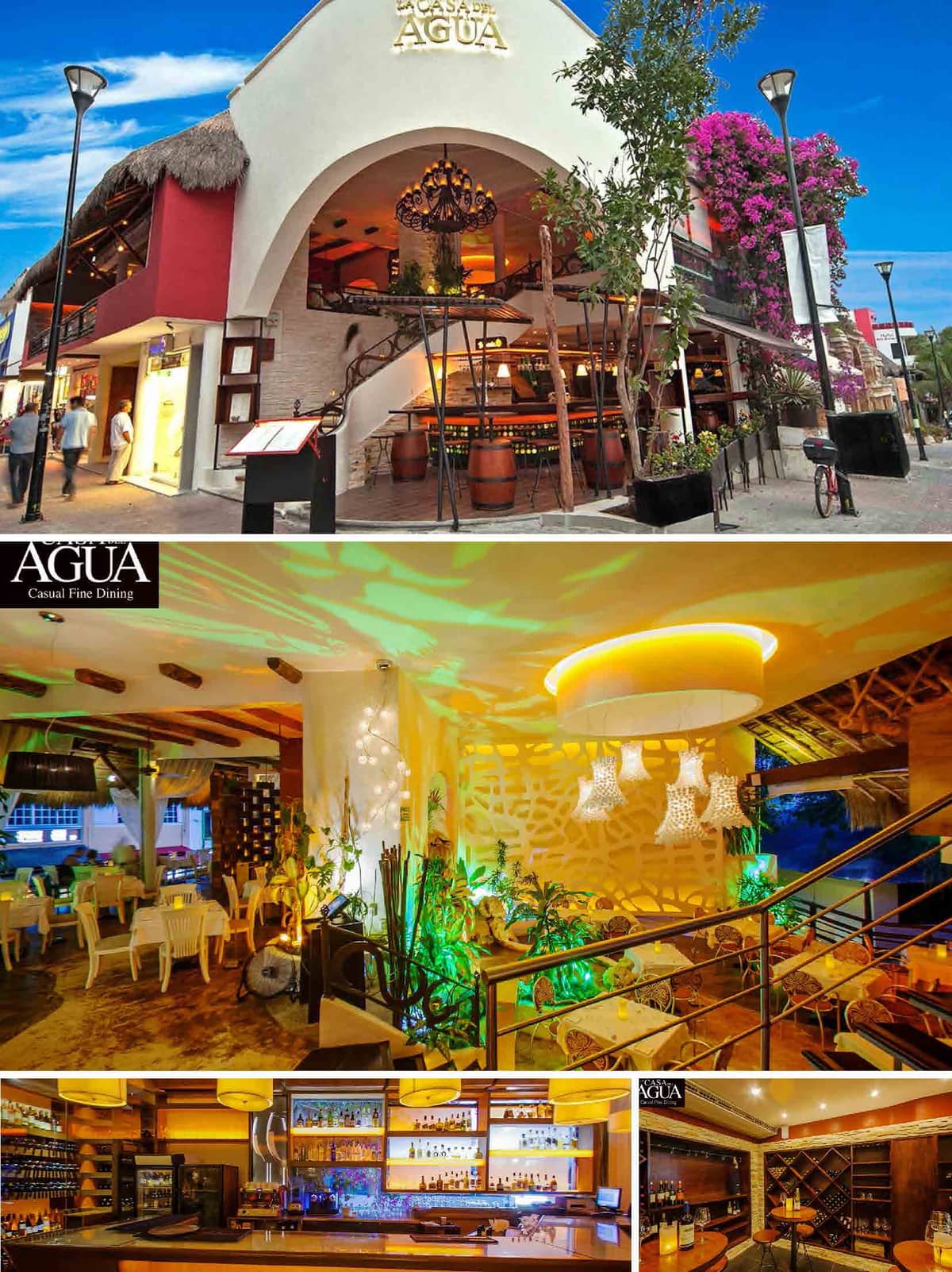

Proposal: Bar + Roof Lounge Bar. Concept. 5th Avenue, Playa del Carmen, Mexico.


Proposal: Bar + Roof Lounge Bar. Concept. 5th Avenue, Playa del Carmen, Mexico.
© 2021 by sanzpont [arquitectura] . Webpage by sanzpont [digital] . Innovative Digital Experiences
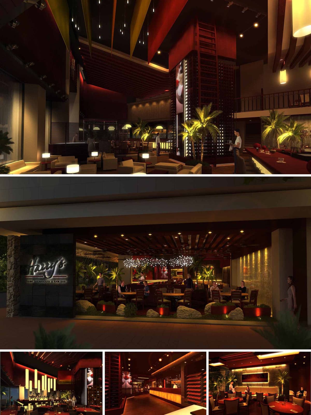
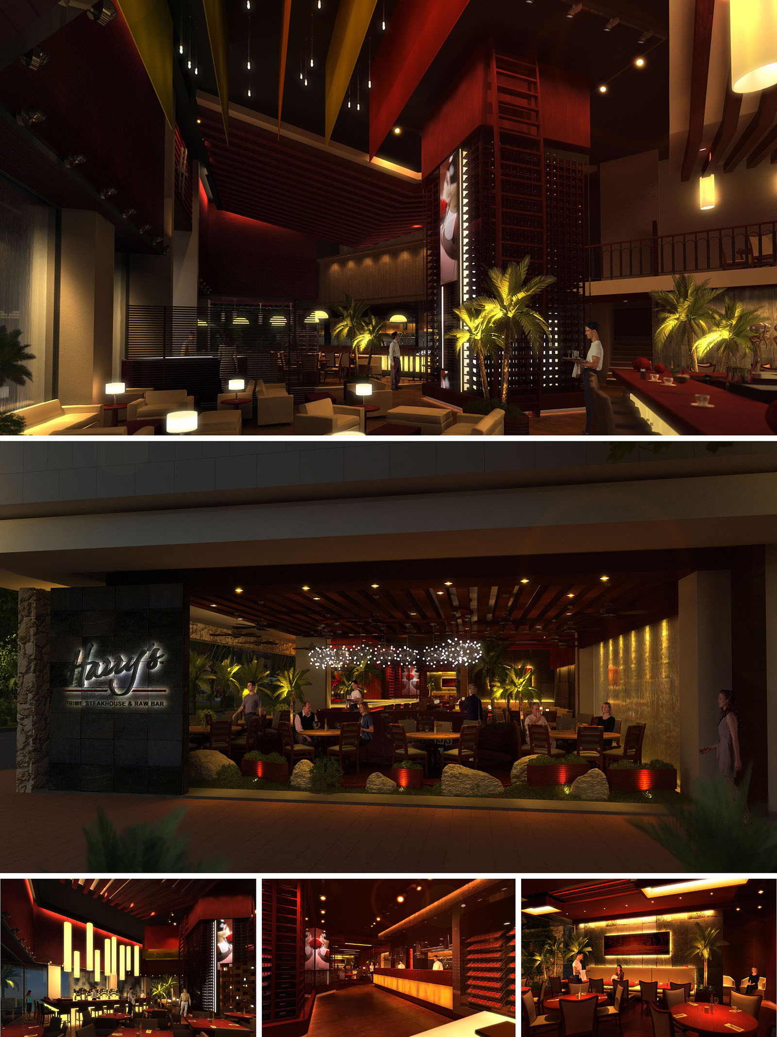
Harry’s is conceived as a contemporary Mexican steakhouse where gastronomy, light and materiality converge to create an immersive nocturnal atmosphere. The architectural language fuses cosmopolitan sophistication with resort-inspired openness, allowing the interior to extend visually toward the lush exterior landscape. Verticality, warm tones and controlled lighting orchestrate a highly sensorial experience that positions the restaurant as both destination and urban lounge.
The design emphasizes drama and intimacy simultaneously. Double-height spaces, sculptural ceiling elements and a central wine tower serve as focal points that organize circulation and frame views. Around these, a sequence of terraces, lounge areas and dining rooms gradates from public to private, offering diverse spatial experiences within a coherent aesthetic narrative.
The layout is structured around a central bar and wine library, which function as the core of the project. This nucleus anchors the main dining room, flanked by elevated platforms and semi-enclosed lounges that provide vantage points over the activity below. Split-level arrangements subtly separate acoustic zones while preserving continuous visual connection across the restaurant.
At the frontage, an open terrace mediates between the street and interior, operating as a threshold that blurs boundaries through retractable openings and continuous flooring. Internal circulation is intuitive and ring-shaped: guests can move fluidly around the bar, past the wine tower and along the glazing line, always maintaining orientation through strong axial views toward illuminated landscape features and feature walls.
The material palette is dominated by dark-stained woods, textured stone and burnished metal accents. These elements, combined with leather upholstery and deep red highlights, evoke the tactile richness of a classic steakhouse reinterpreted in a contemporary key. The contrast between matte and glossy surfaces is carefully calibrated to catch and modulate light.
Walls and ceilings incorporate slatted timber and perforated panels that add depth while concealing acoustic treatments and mechanical systems. Flooring alternates between warm-toned wood and large-format stone, visually anchoring the furniture islands. The chromatic strategy centers on warm ambers, caramels and burgundies, counterbalanced by greenery and the soft glow of integrated lighting.
Lighting design is central to the restaurant’s identity, shaping mood and hierarchy. A layered scheme combines concealed linear LEDs, pendant luminaires and table-level lamps to build a rich gradient of brightness from ceiling to floor. Vertical surfaces—wine racks, textured walls and palm foliage—are grazed with warm light, generating depth and emphasizing the architecture’s vertical rhythm.
In the double-height zones, suspended linear pendants and cluster fixtures create a sculptural ceiling landscape, guiding the eye upward and reinforcing the sense of grandeur. At guest level, localized lighting over tables ensures visual comfort and intimacy, while bar and kitchen front illumination highlights the theatrical nature of food and drink preparation.
Furniture is robust and generously proportioned, with solid wood tables, upholstered chairs and low lounge seating that invite long stays. The arrangement supports flexible configurations, from intimate dinners to larger social gatherings. Custom millwork, including the wine display modules and backlit bottle niches, becomes both storage and ornamental architecture.
Brand identity is subtly integrated through the signage, the distinctive script logo in backlit metal and the consistent use of red accent lighting. Decorative elements are restrained: natural stone boulders, planters and curated art pieces are positioned to reinforce focal points without cluttering the space, allowing the materials and lighting to remain protagonists.
The project responds to its Mexican locations by embracing an indoor-outdoor lifestyle. Generous openings, covered terraces and ceiling fans reduce reliance on full mechanical cooling during temperate conditions, enhancing natural cross-ventilation. Landscaping with palms and dense greenery creates visual continuity with the local environment and provides passive shading and evaporative cooling.
Sustainability strategies include the extensive use of durable, locally sourced stone and timber, which minimize transport impacts and resonate with regional construction traditions. LED lighting, dimming systems and zoning controls optimize energy consumption while enabling atmospheric flexibility. The modular furniture layout and adaptable lighting infrastructure are designed for longevity, allowing the restaurant to evolve over time without major material waste.
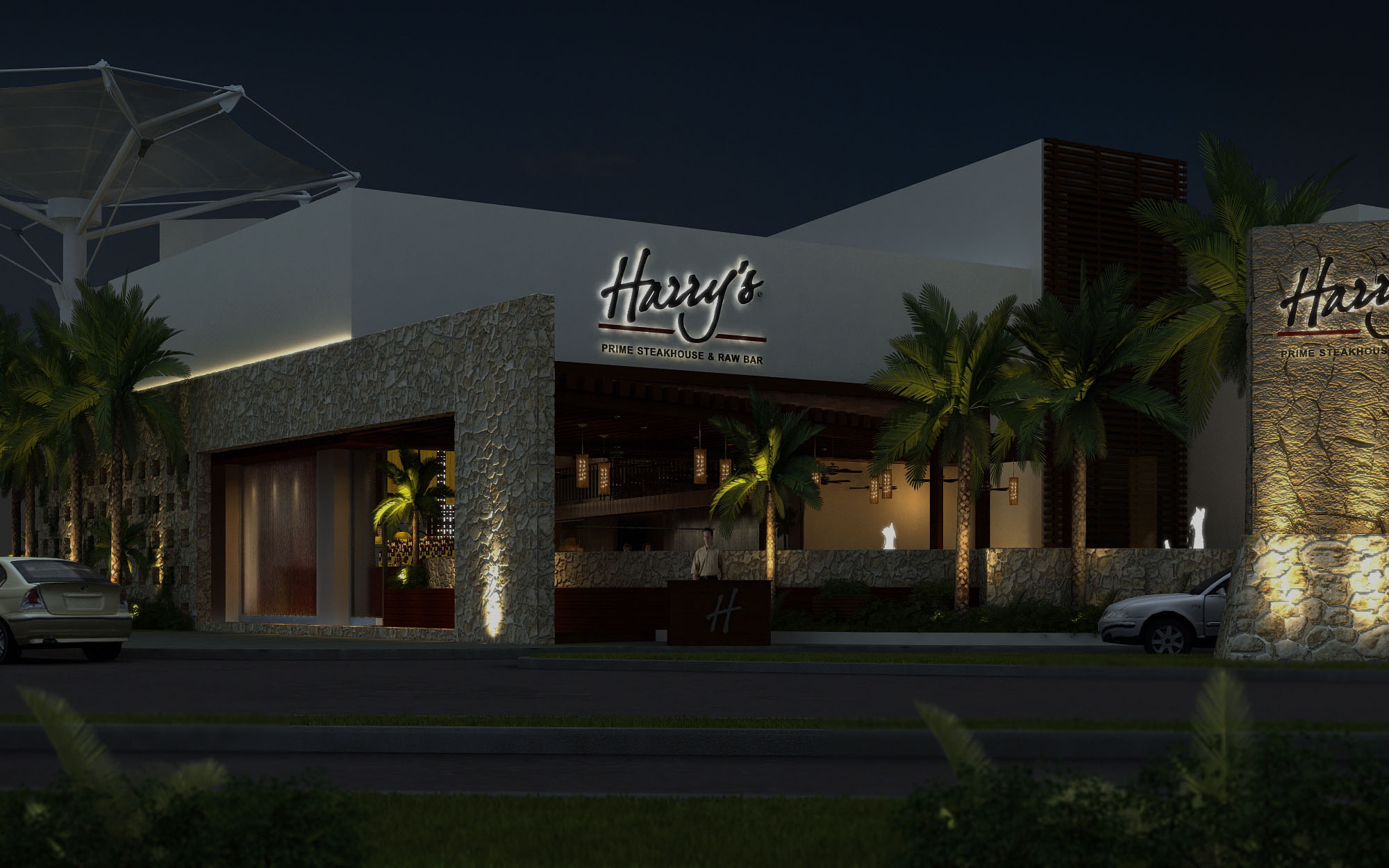
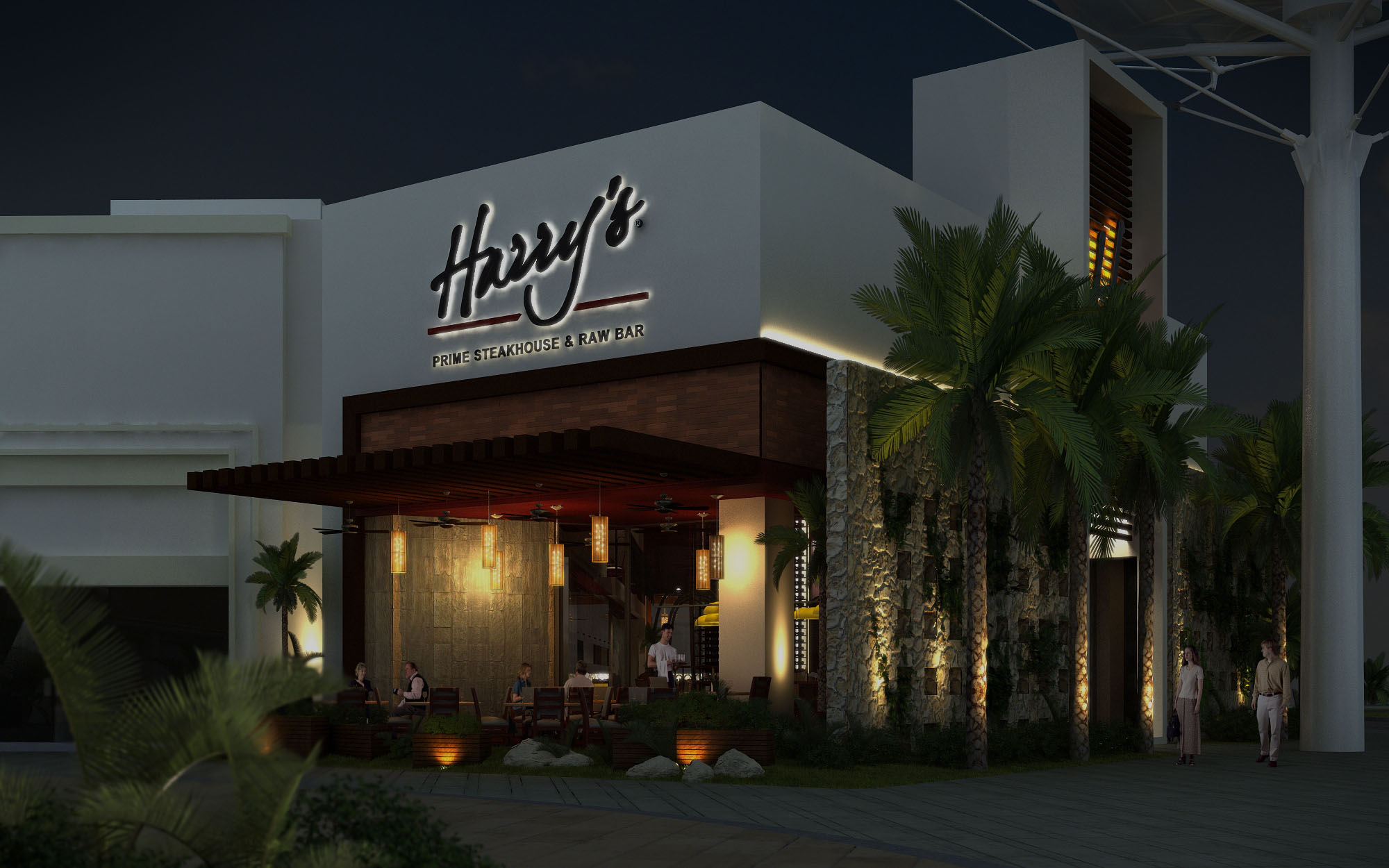
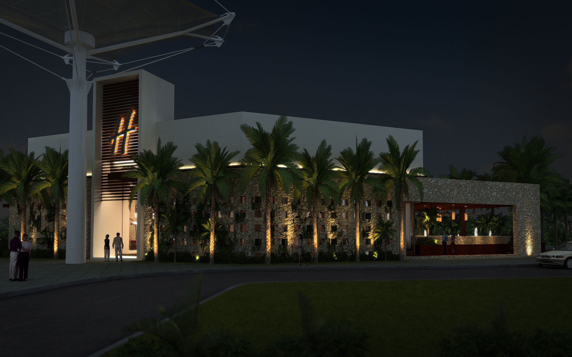
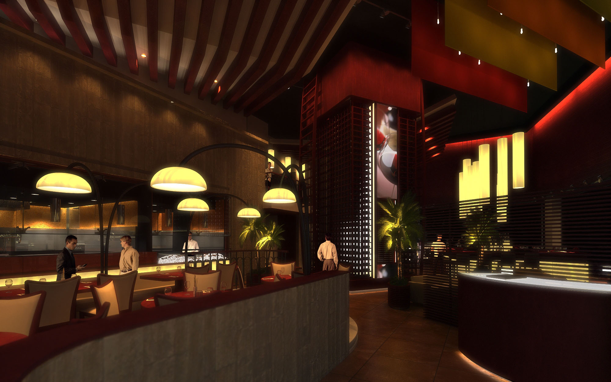
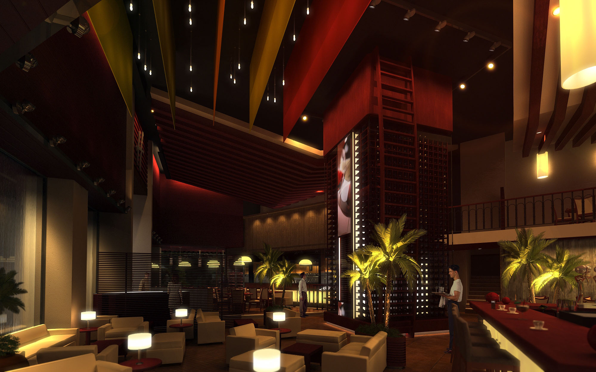
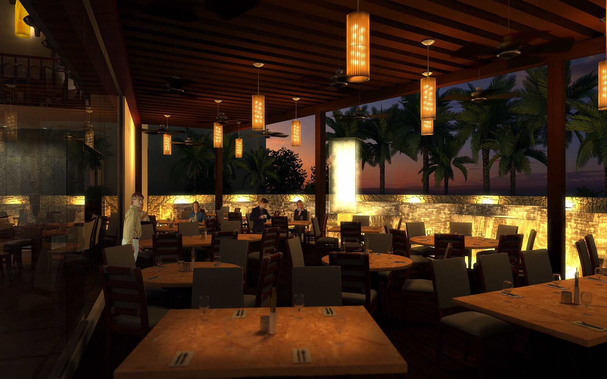
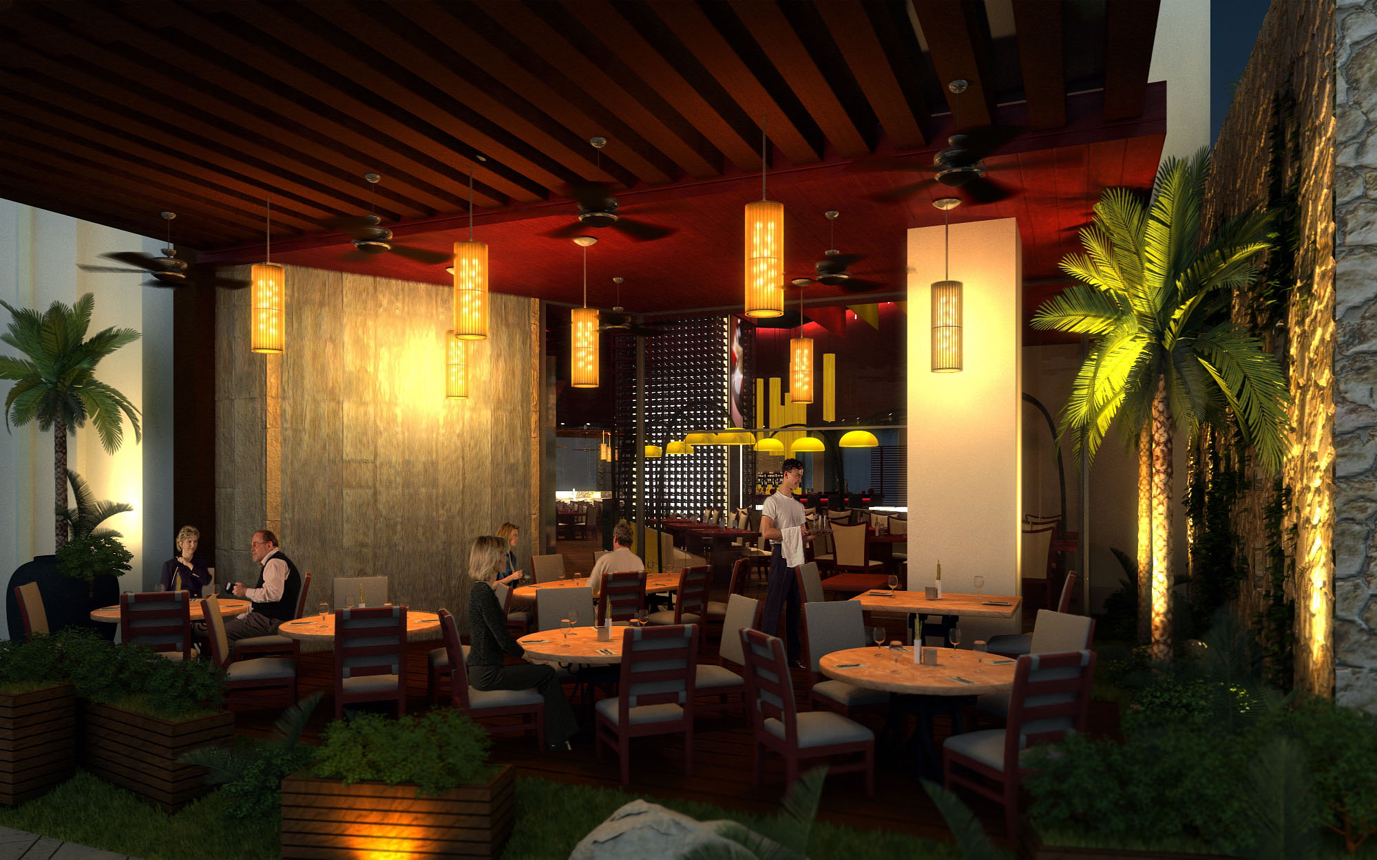
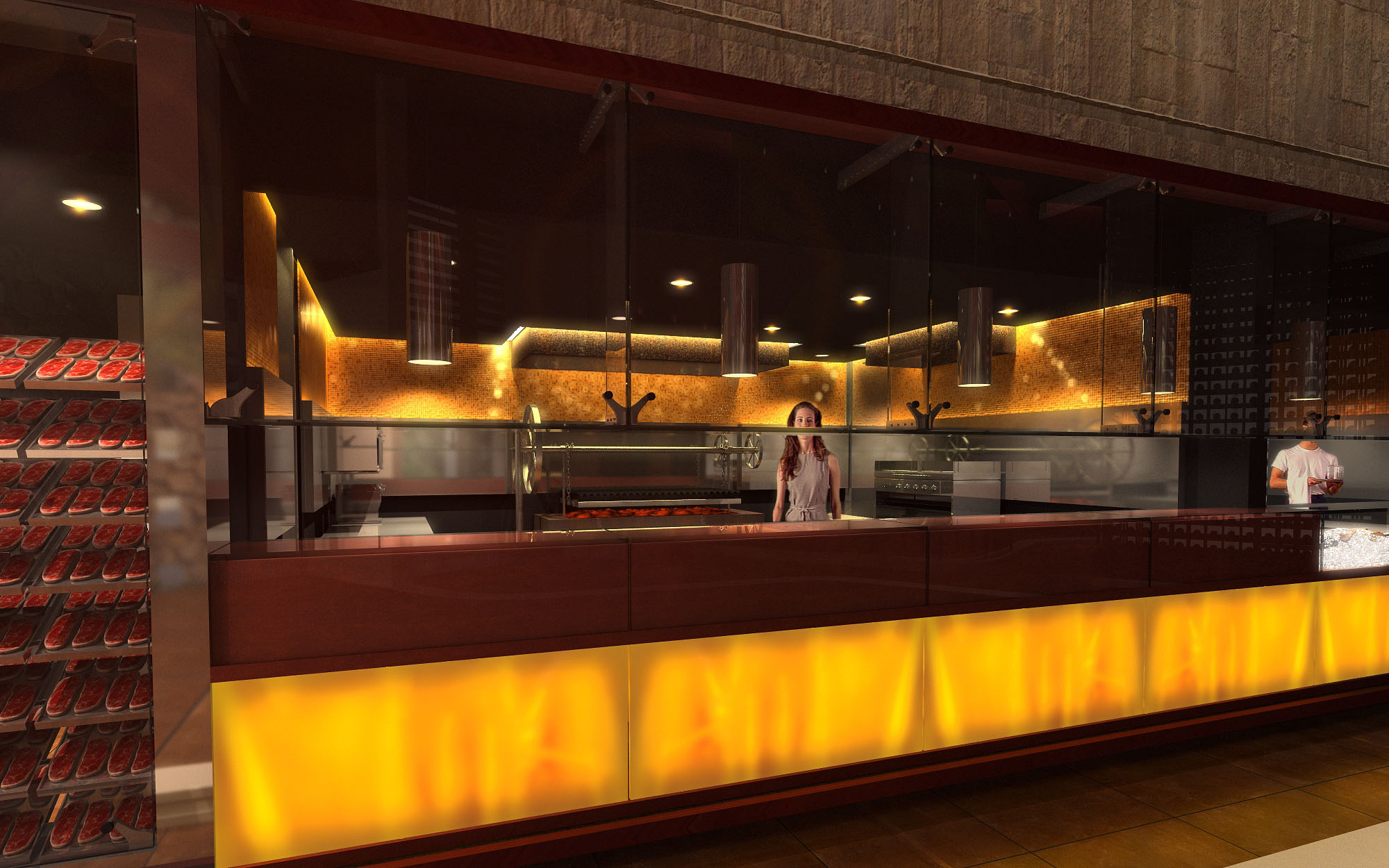
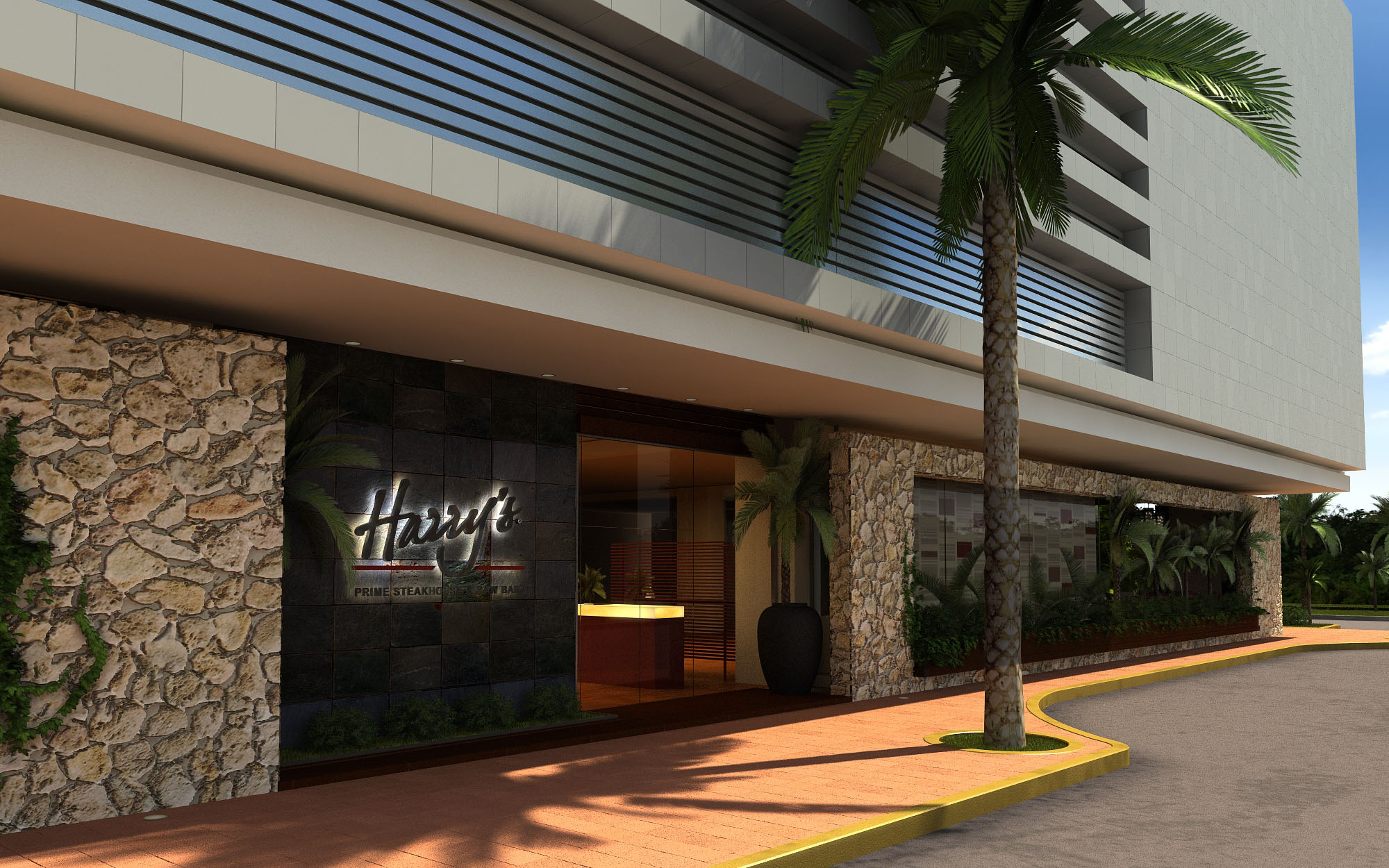
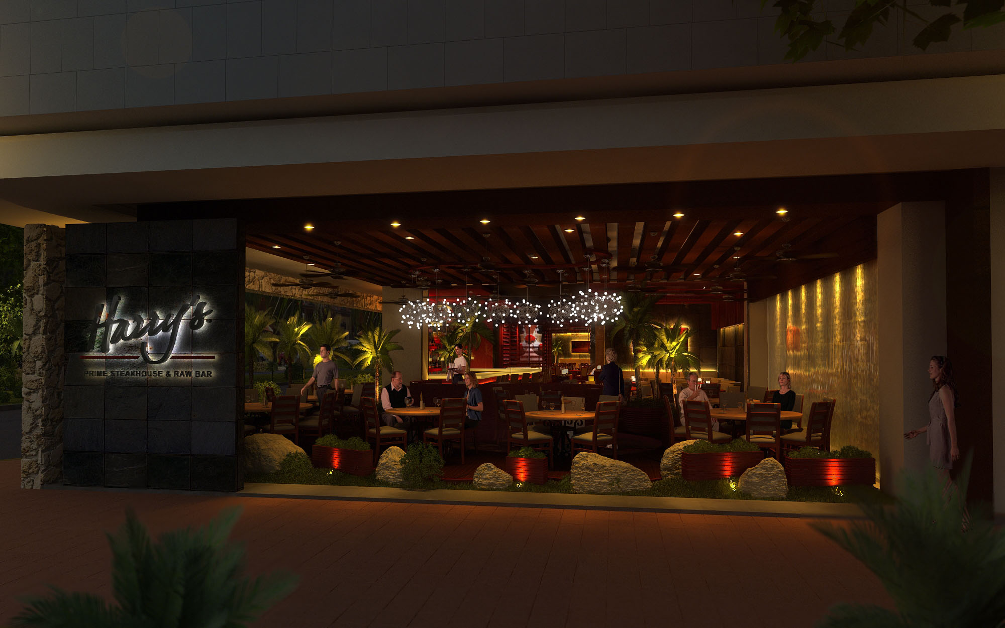
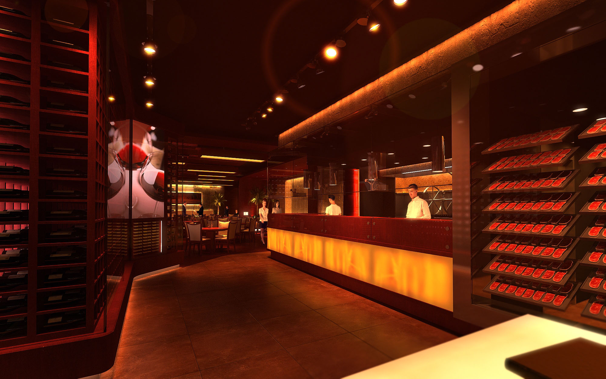
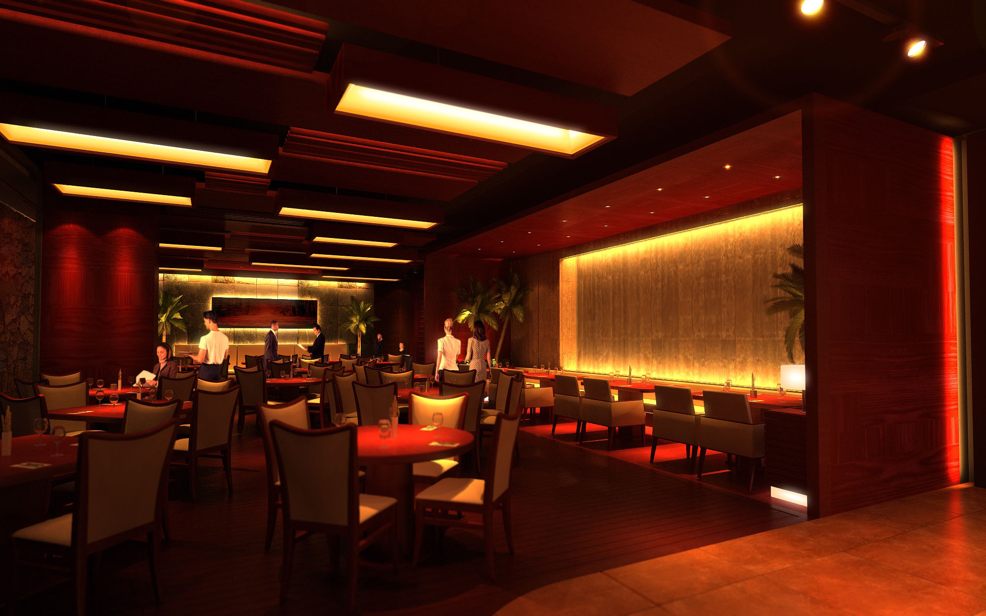
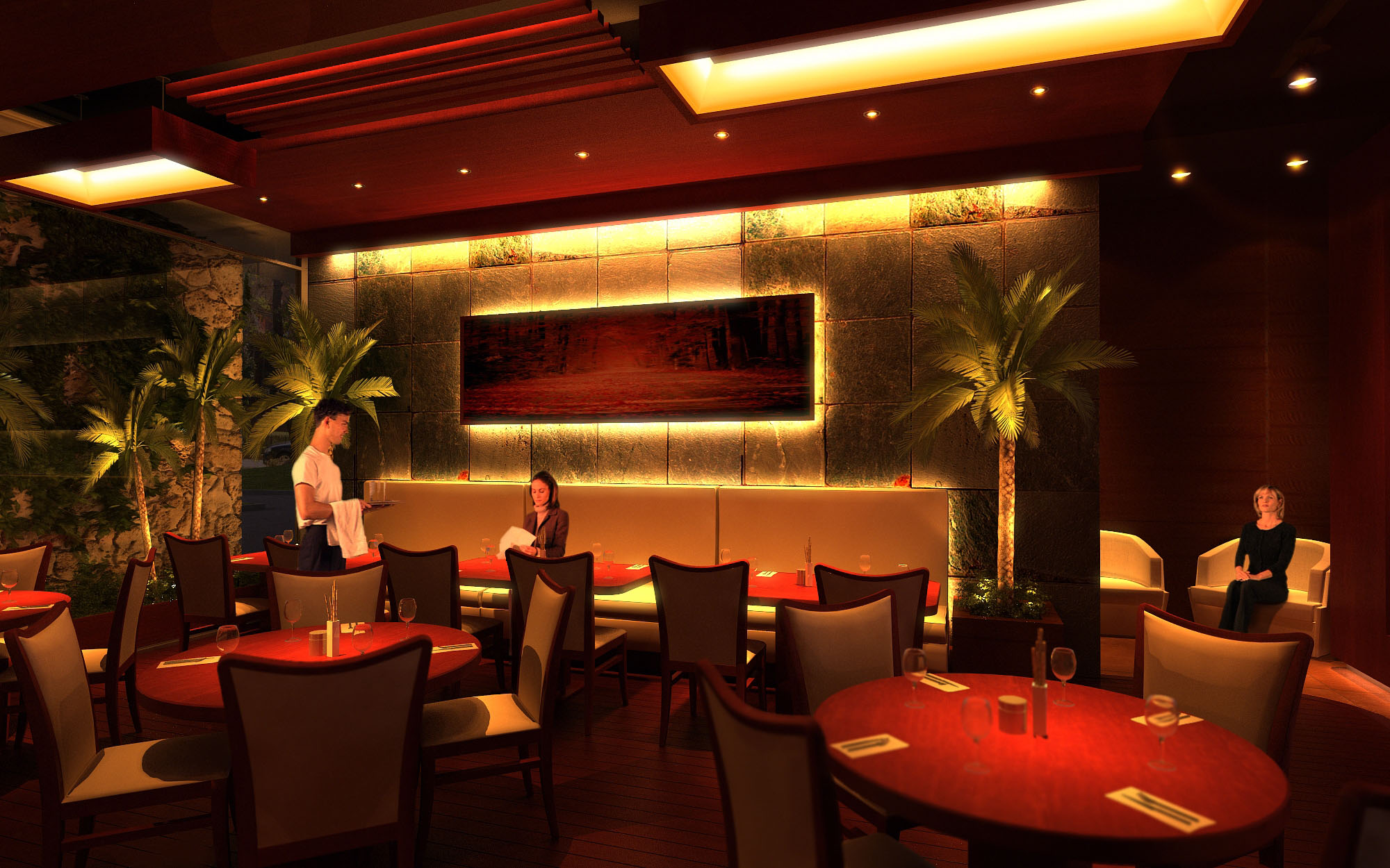
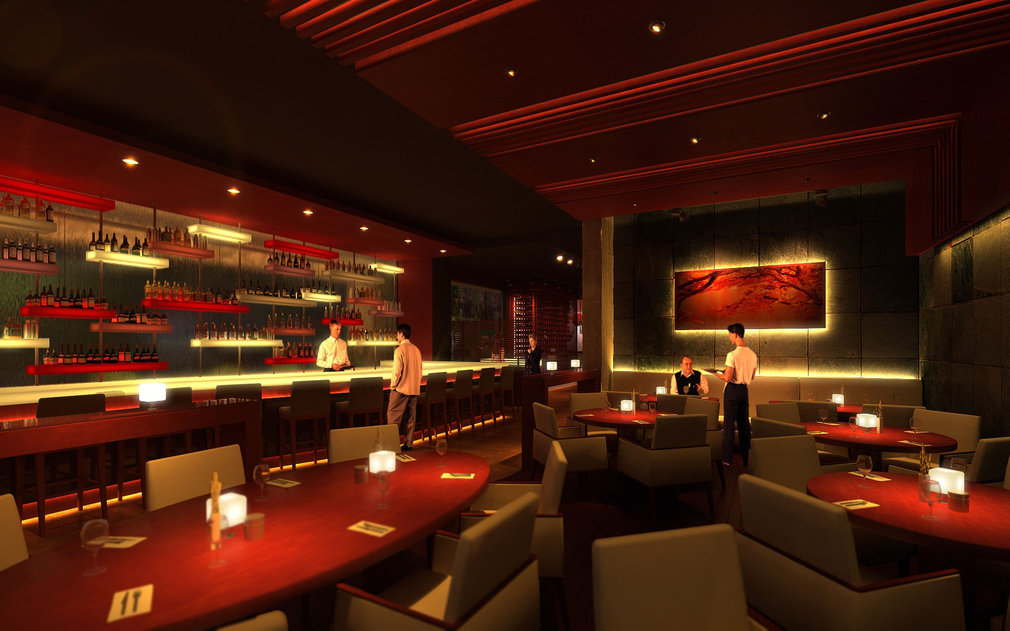
© 2021 by sanzpont [arquitectura] . Webpage by sanzpont [digital] . Innovative Digital Experiences
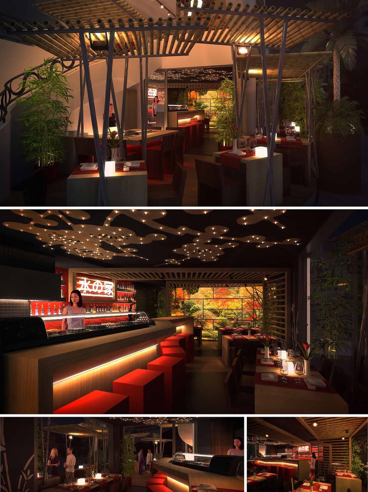
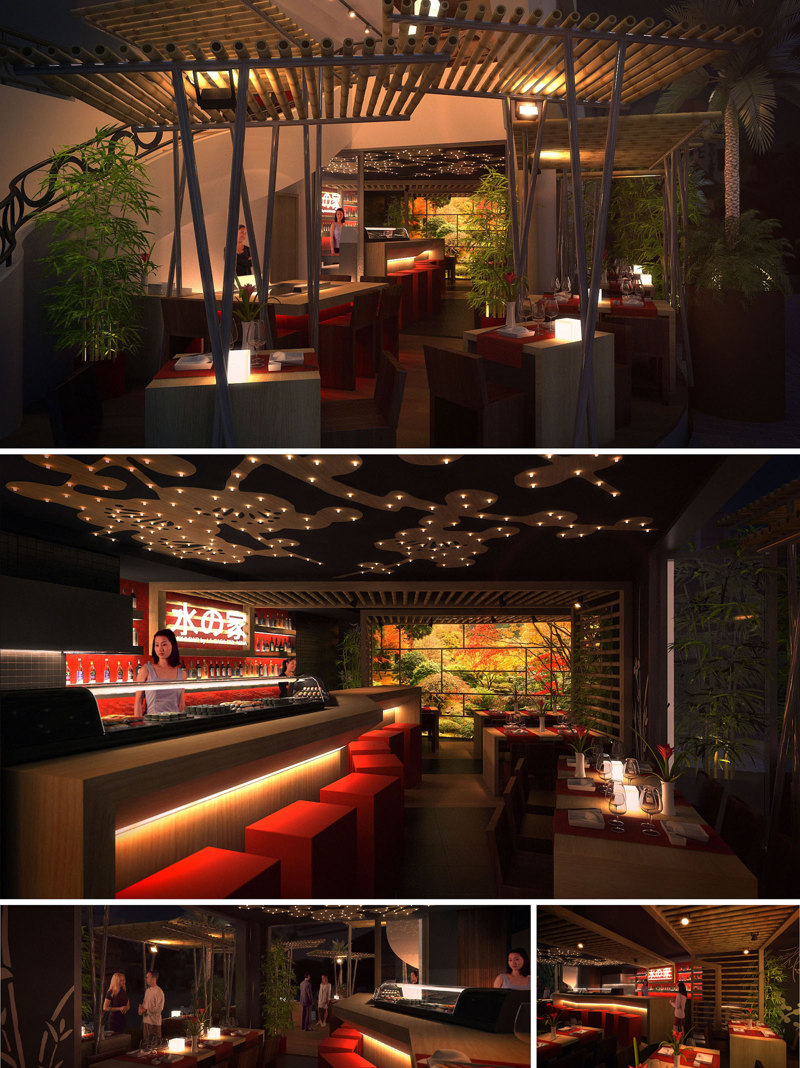
The Sushi Bar in Playa del Carmen is conceived as an immersive bridge between Japanese sensibility and Caribbean warmth. The design creates a dense, intimate atmosphere that contrasts the vibrant exterior of the Riviera Maya. A composition of bamboo, steel, and controlled lighting evokes a contemporary urban izakaya, while framed images of nature and live vegetation reconnect the interior to the tropical context. The space privileges elongated perspectives towards the sushi counter, emphasizing the ritual of preparation as a central spectacle.
The restaurant is organized around the idea of shelter under a lightweight canopy. Overhead structures and sculpted ceilings filter light like a forest cover, generating a sense of protection and privacy despite the compact footprint. Materials, textures, and colors are orchestrated to guide the guest from the exterior threshold into increasingly warm and intimate zones.
The layout is linear, with the sushi bar acting as a central spine that structures circulation. Bar seating in front of the chef allows direct interaction, while peripheral tables define semi-enclosed pockets for small groups. The route from entrance to bar is visually framed by vertical elements and plantings, subtly compressing and then expanding the space to increase spatial drama.
Custom furniture in rectilinear geometries optimizes the reduced area, integrating storage and lighting into bar and table plinths. Varied seating typologies—bar stools, two-seat and four-seat tables—accommodate different dining experiences without fragmenting the overall continuity. Strategic spacing between tables and the use of open slatted partitions maintain visual permeability while ensuring acoustic and visual comfort.
The material palette balances natural warmth with a contemporary edge. Light-toned woods and bamboo slats form the primary surfaces for ceilings and furniture, contrasted with dark flooring and wall planes to ground the space. Vertical metal supports, inclined and expressed, add a dynamic structural rhythm that recalls bamboo stalks while affirming the industrial character of the bar.
The chromatic strategy relies on a triad of black, natural wood, and a saturated red. Red is concentrated in stools, table linens, shelving, and selected wall details, referencing traditional Japanese aesthetics and signaling areas of interaction and energy. A luminous mural with autumnal tones at the back of the restaurant becomes a visual anchor, extending the perceived depth of the room and introducing a contemplative landscape element.
Lighting is the principal tool for defining the restaurant’s immersive atmosphere. A sculpted ceiling incorporates irregular perforations with recessed points of warm light, creating a starry, organic pattern that softens the otherwise orthogonal geometry. This ceiling becomes a visual signature, lowering the perceived height and enhancing intimacy.
Linear LED strips integrated under counters and bar edges provide a floating effect to the furniture, emphasizing horizontality and guiding circulation. Table lighting is intentionally low and warm, with accent luminaires highlighting vegetation and the mural. The overall lighting strategy minimizes glare and favors contrast, aligning with the nocturnal, lounge-like character appropriate to Playa del Carmen’s hospitality scene.
Vegetation is curated as an essential spatial device rather than mere decoration. Tall bamboo planters mark transitions between areas, soften corners, and provide vertical scale, reinforcing the Japanese inspiration while resonating with the local tropical flora. The natural motif of the backlit landscape panel extends this green presence visually even in the interior-most tables.
Textural balance is achieved by juxtaposing smooth lacquered surfaces at the bar with the tactile grain of wood and the fine pattern of wall tiles. This sensory layering contributes to a multi-dimensional experience, where guests perceive subtle changes in light reflection, temperature of materials, and acoustic absorption throughout the space.
The project incorporates sustainable criteria through material selection, energy efficiency, and passive design strategies adapted to the climate of Playa del Carmen. Preference is given to rapidly renewable resources such as bamboo and responsibly sourced woods, reducing environmental impact and reinforcing the conceptual link to nature. Modular furniture elements facilitate eventual reconfiguration or reuse, extending the life cycle of the interior fit-out.
LED technology predominates in the lighting system, significantly reducing energy consumption and heat gain—critical in a warm, humid environment. The layered lighting allows operation at low power levels during most of the service, while darker finishes help reduce the need for excessive illumination. Natural ventilation is supported by the semi-open character of the entrance zone and the use of permeable partitions, allowing cross-breezes when climatic conditions permit and decreasing reliance on mechanical cooling. In this way, the Sushi Bar responds both aesthetically and functionally to its Caribbean context while honoring the precision and restraint of Japanese design traditions.
© 2021 by sanzpont [arquitectura] . Webpage by sanzpont [digital] . Innovative Digital Experiences
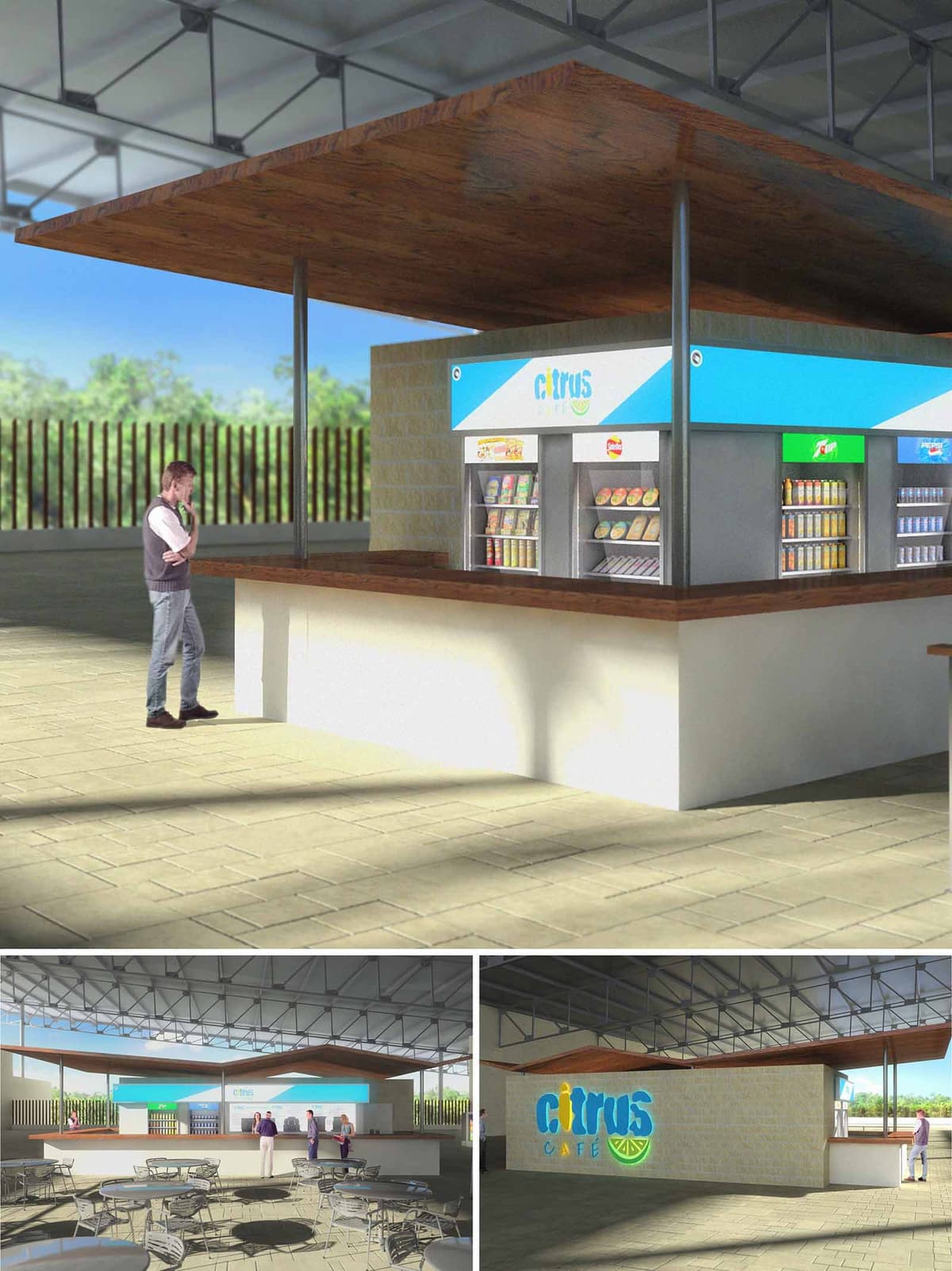
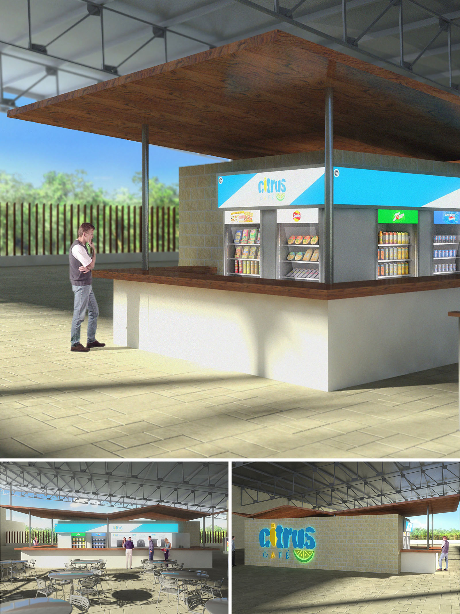
Citrus Café Albatros is conceived as a light, open-air pavilion that complements the tropical climate of Cancún while providing a vibrant and efficient food and beverage point. The design emphasizes horizontality, clean lines and an honest expression of structure, creating a contemporary kiosk that sits comfortably within a resort or campus environment. The café becomes both a functional node and a visual landmark, using branding, color and material contrast to guide users intuitively.
The concept draws on the freshness associated with citrus fruits: clarity, brightness and simplicity. This is translated into an architecture of few elements, where a floating wooden plane, a solid service bar and a continuous canopy define the space. The translucent, luminous signage band wraps the volume and reinforces the identity of the café, making it recognizable from a distance.
The café is organized as a central service core surrounded by a generous perimeter counter. This 360-degree layout optimizes service capacity and allows staff to address different flows of users, from quick takeaway customers to guests remaining in the adjacent seating area. The core houses refrigerated displays, snack shelves and preparation zones, kept compact to reduce circulation distances and improve operational efficiency.
The dining area extends outwards under a higher steel roof, with lightweight furniture arranged in a flexible grid that can adapt to different group sizes. Visual permeability is maintained in all directions, enhancing security and comfort. The surrounding vertical elements—such as the linear wooden fence and low masonry walls—frame the views toward the landscape without blocking natural ventilation.
The project combines three primary material families: warm wood, neutral masonry and light metal. The floating canopy and the countertop are finished in a rich wood tone that introduces warmth and tactility, offsetting the industrial character of the steel roof and structure. The service base is rendered in a light, almost white finish, reflecting sunlight and highlighting the cleanliness required in a food environment.
The color palette is anchored by the café’s branding band in turquoise and citrus green, which runs along the perimeter of the core and acts as a luminous frieze. This vivid element contrasts with the beige textured masonry wall, which adds depth and a sense of permanence. The overall result is a fresh, contemporary aesthetic that resonates with the beachside context of Cancún.
The kiosk is sheltered by a larger steel roof supported by a visible truss system, intentionally left exposed to communicate the constructive logic of the building. Beneath this, the thinner wooden canopy appears to float, supported by slender metal posts that minimize visual obstruction. This double-roof strategy creates intermediate shaded zones and allows hot air to rise and dissipate, improving thermal comfort without full enclosure.
Daylighting is the primary source of illumination during daytime, with the open perimeter maximizing cross-ventilation and reducing the need for mechanical cooling. At night, integrated linear lighting behind the signage panel and discreet under-counter fixtures provide uniform, glare-free light that enhances the café’s presence while maintaining energy efficiency.
The open-air configuration capitalizes on Cancún’s climate by prioritizing natural ventilation and shade over air-conditioned space, significantly reducing energy consumption. The elevated, lightweight roof system is designed to reflect solar radiation while allowing wind to circulate freely, mitigating heat gain on the occupied level. The high albedo flooring further reduces thermal absorption and contributes to user comfort.
Material selection favors durability in a coastal environment: treated wood, corrosion-resistant steel and masonry with low maintenance requirements ensure longevity and reduce the environmental impact of frequent replacements. The modular arrangement of equipment and furniture allows for phased upgrades and adaptation, extending the life cycle of the café. Together, these strategies anchor Citrus Café Albatros as a sustainable, context-sensitive intervention within its tropical setting.
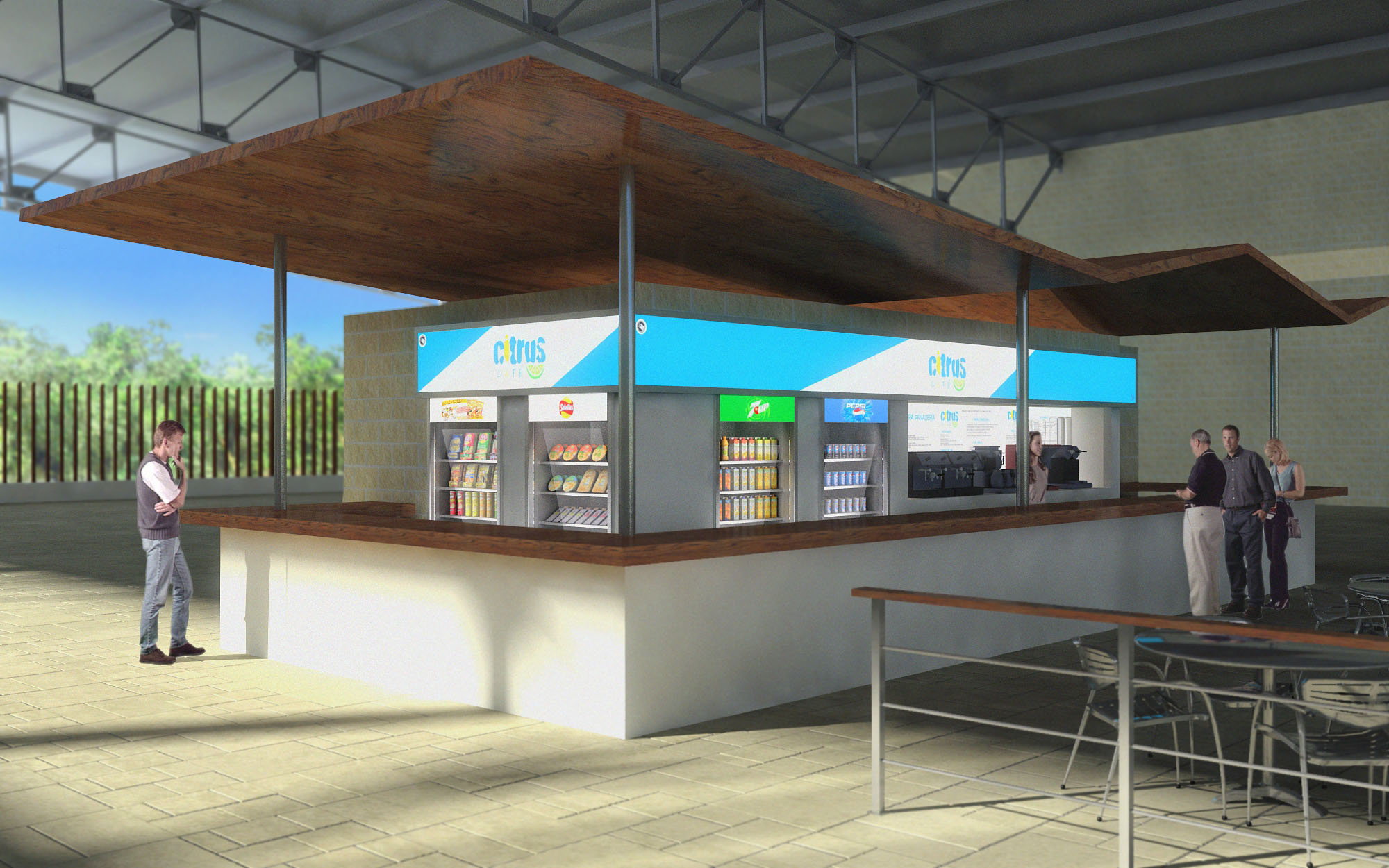
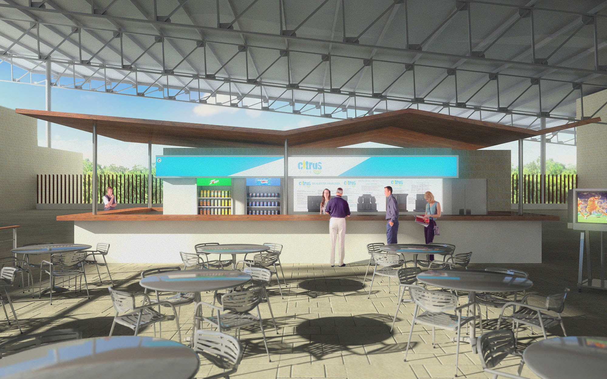
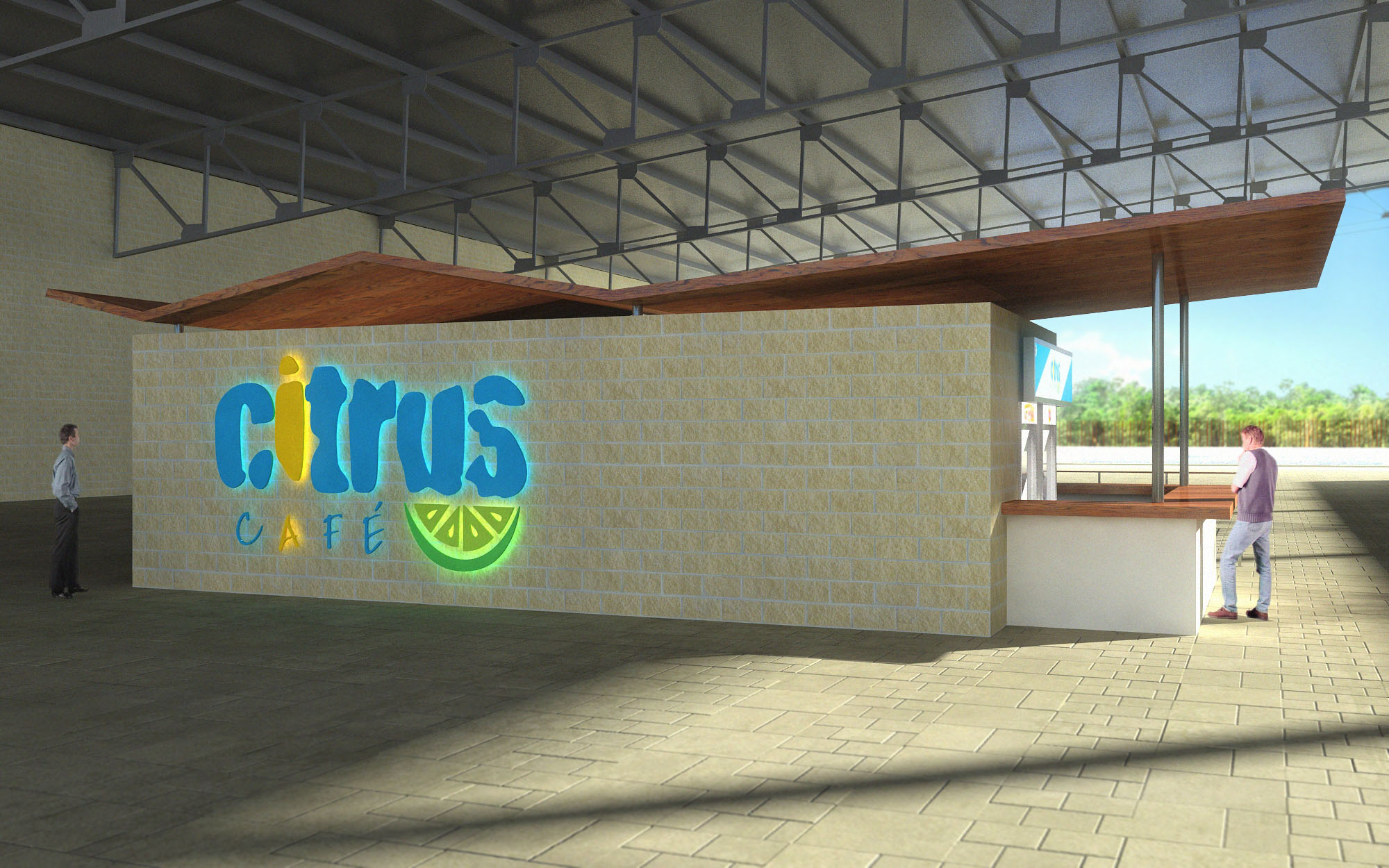
© 2021 by sanzpont [arquitectura] . Webpage by sanzpont [digital] . Innovative Digital Experiences
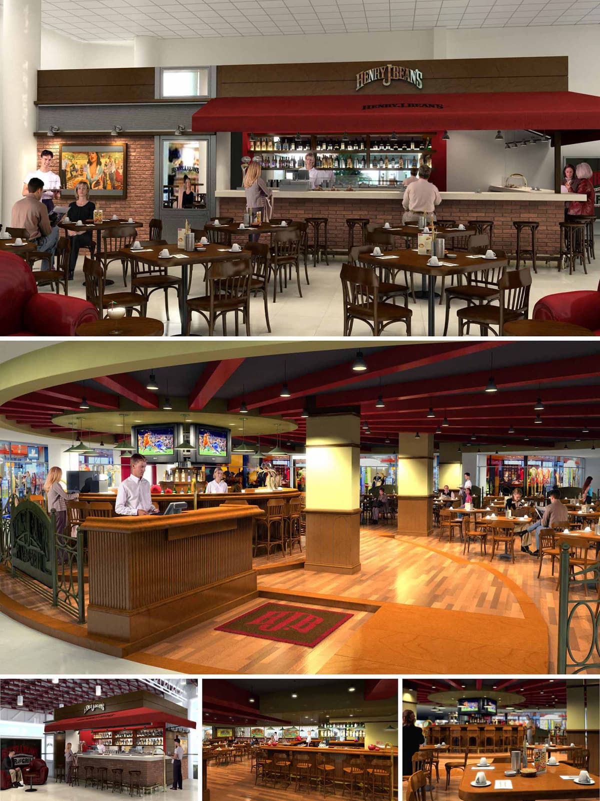

The HJB restaurants are conceived as contemporary interpretations of the classic American bar and grill, adapted to diverse commercial locations in México. The design strategy focuses on creating a recognizable brand atmosphere that can be replicated across multiple sites while allowing for subtle local variations. Warmth, informality and visual permeability guide the spatial narrative, inviting visitors to transition naturally from circulation areas into the dining environment.
The concept blends a traditional pub vocabulary—brick, wood, bar counters and vintage imagery—with clean, modern lines and generous lighting. This balance communicates a casual yet carefully curated ambience, suitable for both daytime family use and evening social life. The bar becomes the identity anchor of each venue, always visually emphasized as a central island or façade element.
The layouts are open-plan, prioritizing clear visual axes between mall corridors, bar counter and main seating areas. In some locations the bar works as a linear counter against a brick backdrop; in others it becomes a central island around which circulation flows. This island strategy allows guests to access the bar from multiple directions and creates several micro-ambiences within a single continuous space.
Dining zones are articulated with different densities of tables and variations in flooring patterns. Perimeter seating offers more intimate arrangements, while central areas are configured for flexibility and quick turnover. The alignment of furniture maintains direct views to television screens and the bar, reinforcing the sports-bar character without fragmenting the space with partitions.
Material selection prioritizes a sense of warmth and longevity. Wood is the main protagonist, used in solid and veneer applications for bar fronts, chair structures and tabletops. Its natural tone is contrasted with brick cladding on vertical surfaces, which evokes a classic bistro atmosphere and visually grounds the bar volume. Neutral ceramic floors are combined with wood or wood-effect inlays to define functional areas such as the bar perimeter and main circulation paths.
Metallic elements appear in railings, shelving and bar equipment, providing subtle industrial accents that enhance durability. Upholstered pieces in leather or leather-like materials add comfort while supporting a sophisticated yet robust image suitable for high-traffic environments. The palette is intentionally coherent across all venues to strengthen brand recognition.
The chromatic concept is built around warm browns, creams and beiges, complemented by a distinctive deep red associated with the HJB identity. This red appears in ceiling beams, awnings, signage and carpets, operating as a continuous visual thread between the different restaurants. The contrast between red details and neutral envelopes guides attention to key brand elements such as logos and bar counters.
Artwork and graphic panels, often with vintage or sports-inspired imagery, introduce narrative layers without overloading the architecture. These elements are positioned strategically on boundary walls facing circulation corridors, acting as visual attractors that announce the atmosphere of the interior.
The lighting design combines uniform ambient illumination with focused accent lighting on tables and bar surfaces. Ceiling-mounted downlights highlight the rhythm of structural beams and reinforce the linear geometry of the space. Over the back bar, more intense lighting showcases bottles and glassware, turning the bar into a luminous focal point.
Television screens are framed within darker ceiling areas to minimize glare and ensure comfortable visibility. The general brightness level is calibrated so that the restaurants feel open and inviting during the day, while dimmable systems enable a more intimate, evening-oriented ambience without modifying the physical layout.
Sustainability is addressed through both material selection and operational strategies appropriate for multi-site deployment. Preference is given to durable materials that reduce replacement frequency, such as high-resistance ceramics, engineered wood floors and robust upholstery. Where feasible, wood components can be specified from certified sources, and brick or masonry claddings are designed as thin veneers to reduce material volume.
The open-plan configuration optimizes natural visibility from adjacent mall areas, decreasing the need for internal signage and additional lighting to attract customers. Lighting fixtures are planned to be compatible with energy-efficient lamps and control systems, allowing flexible scenarios with reduced consumption. Standardized details for furniture, bars and finishes streamline fabrication, minimize waste and facilitate maintenance, ensuring that each HJB location maintains consistent quality and performance over time.
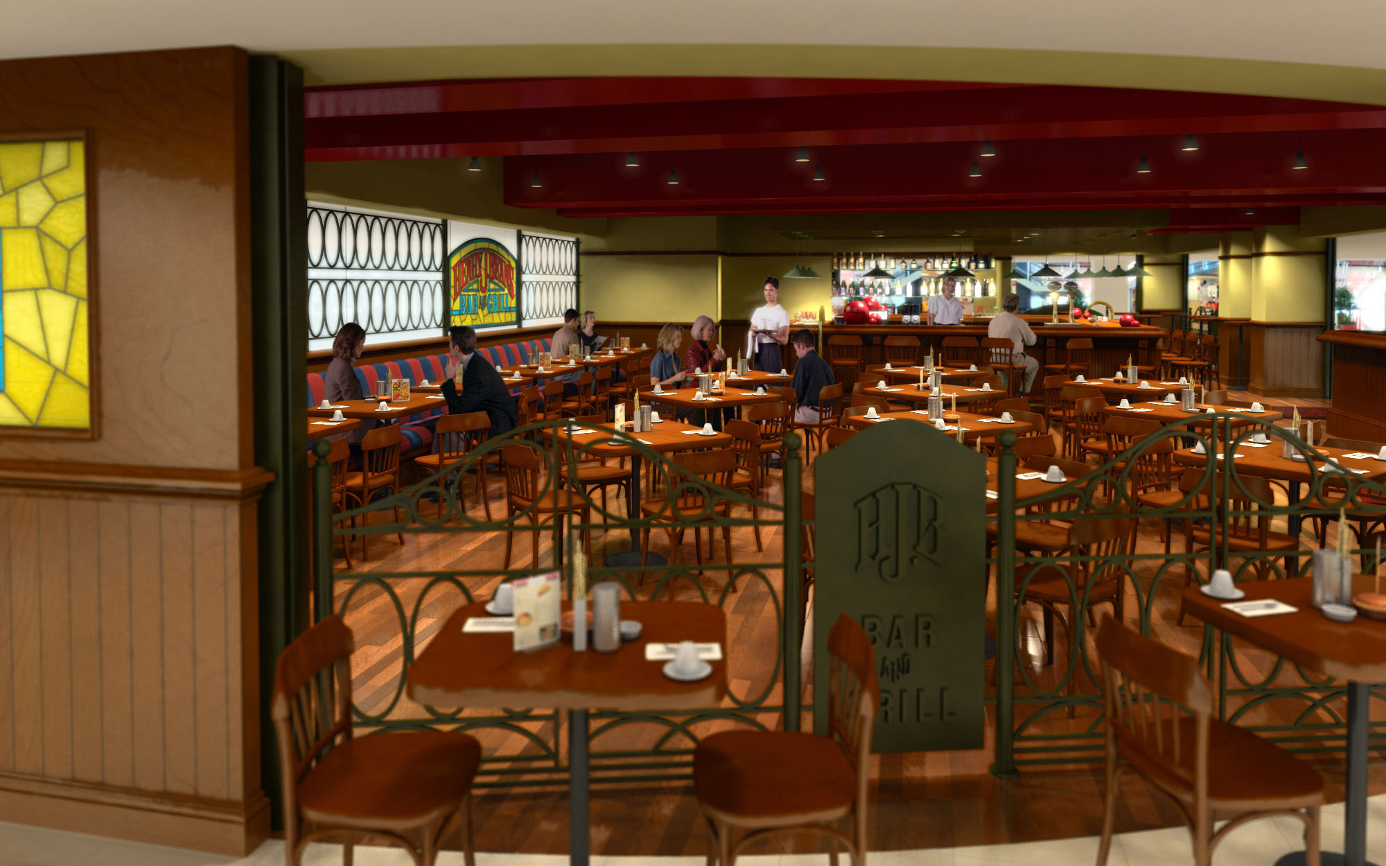
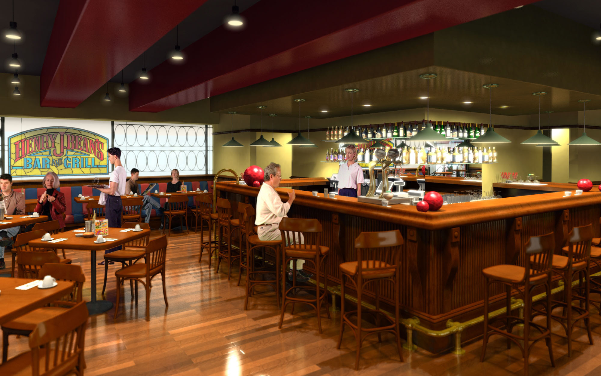
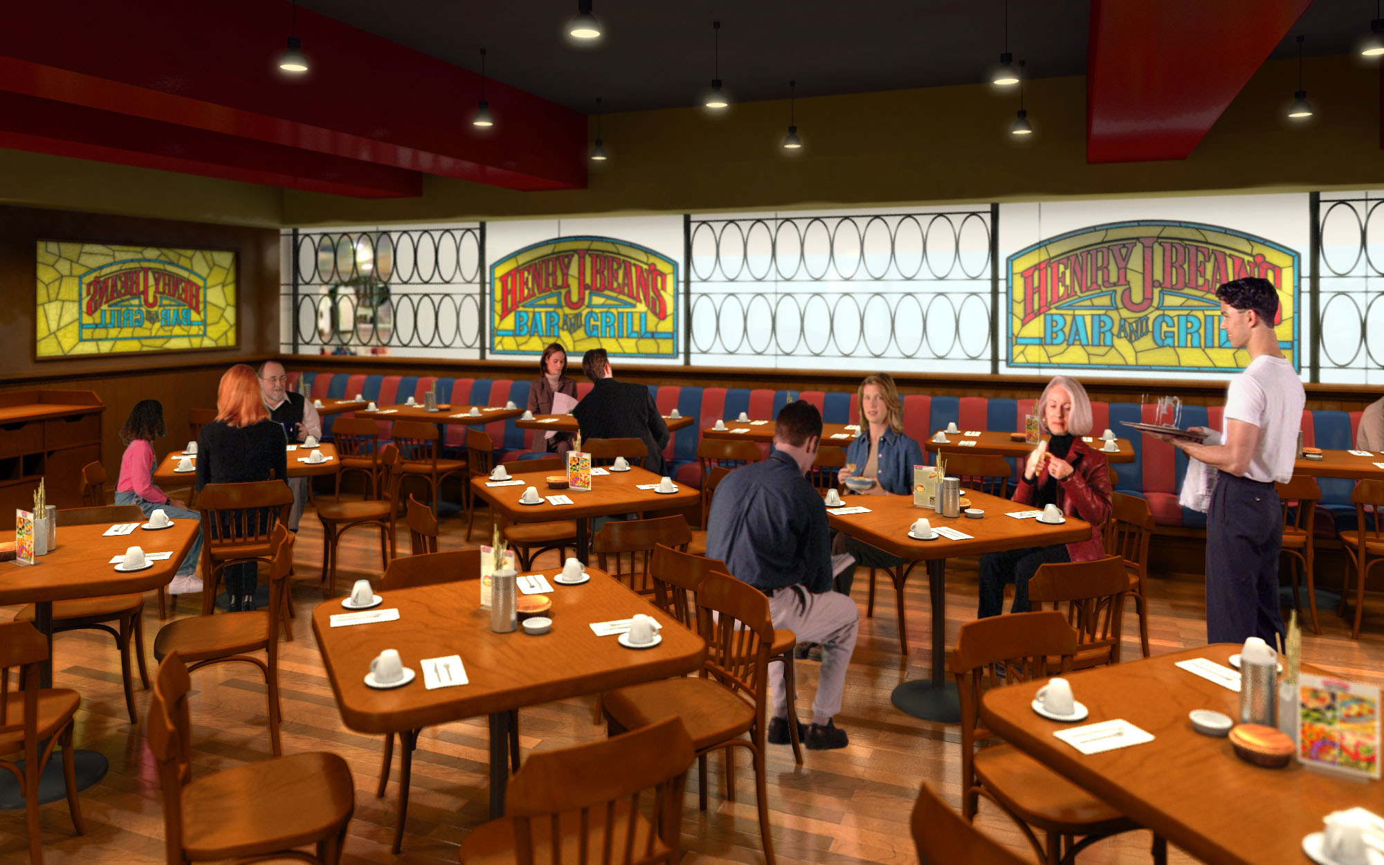
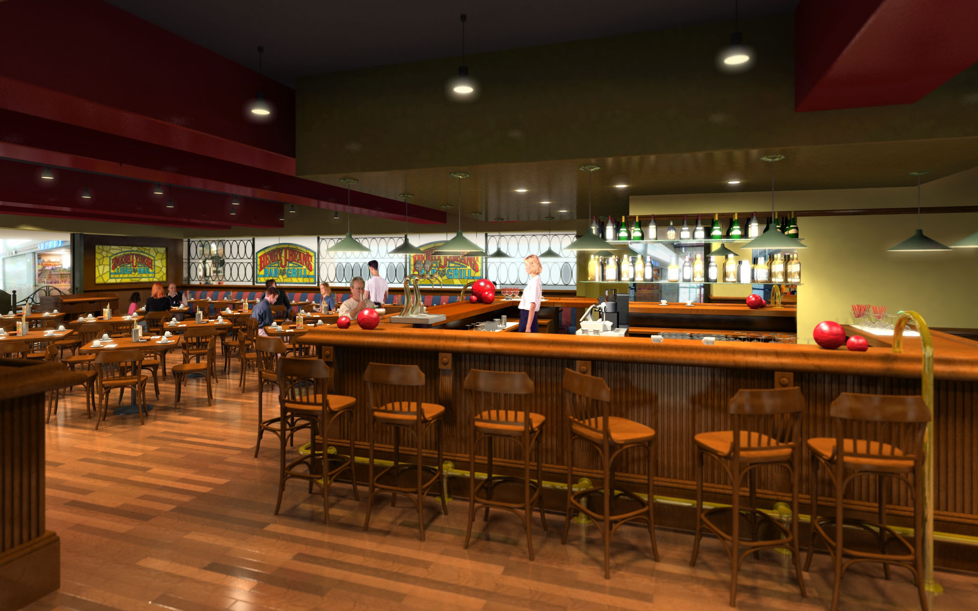
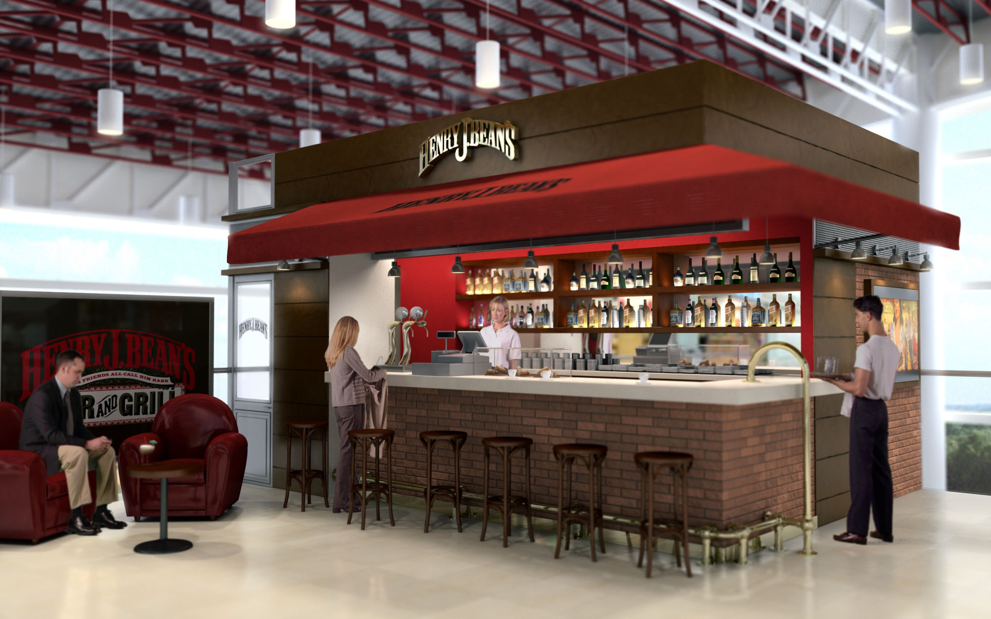
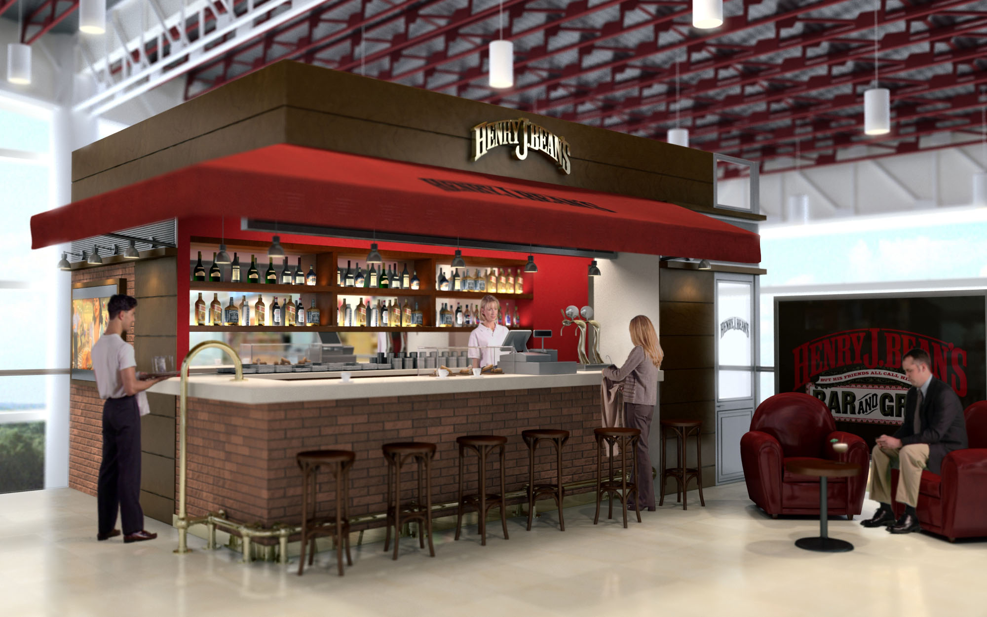
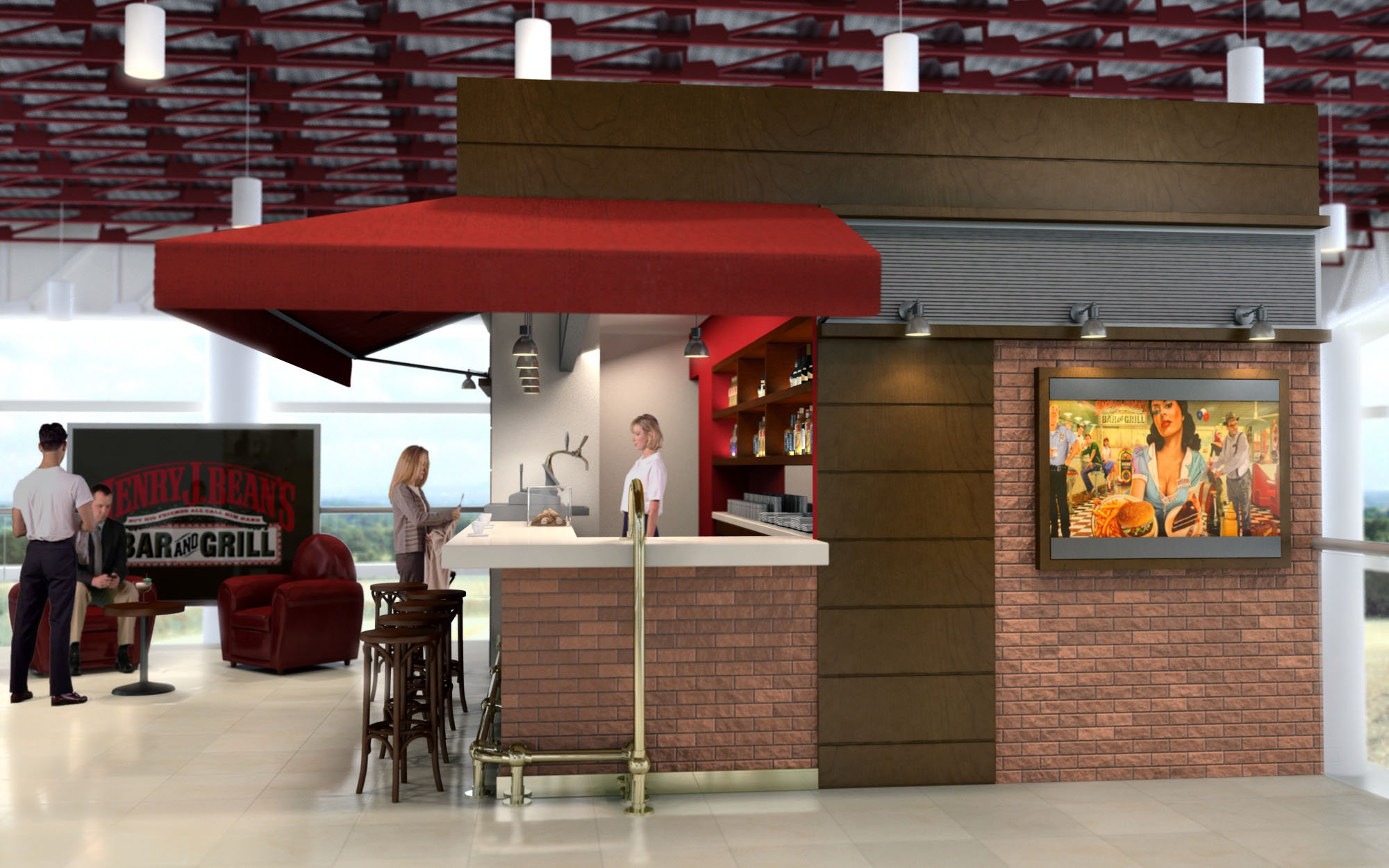
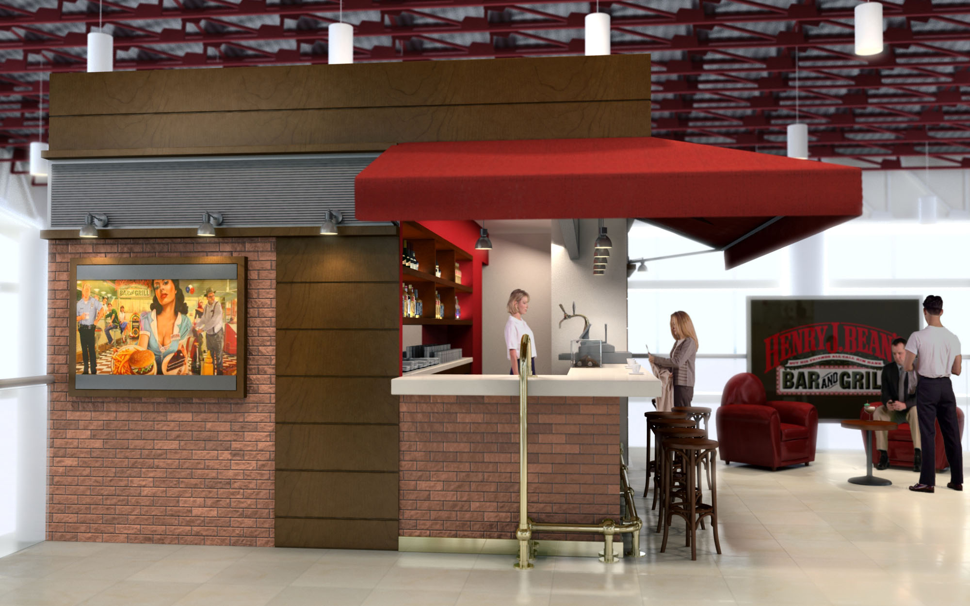
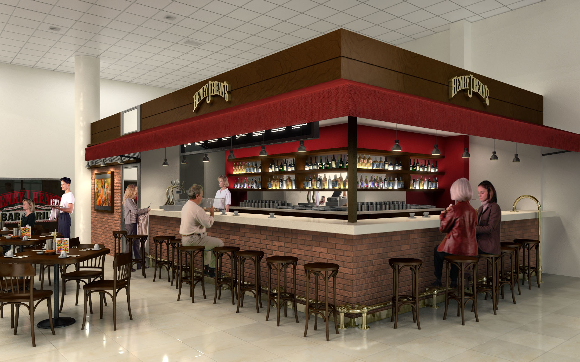
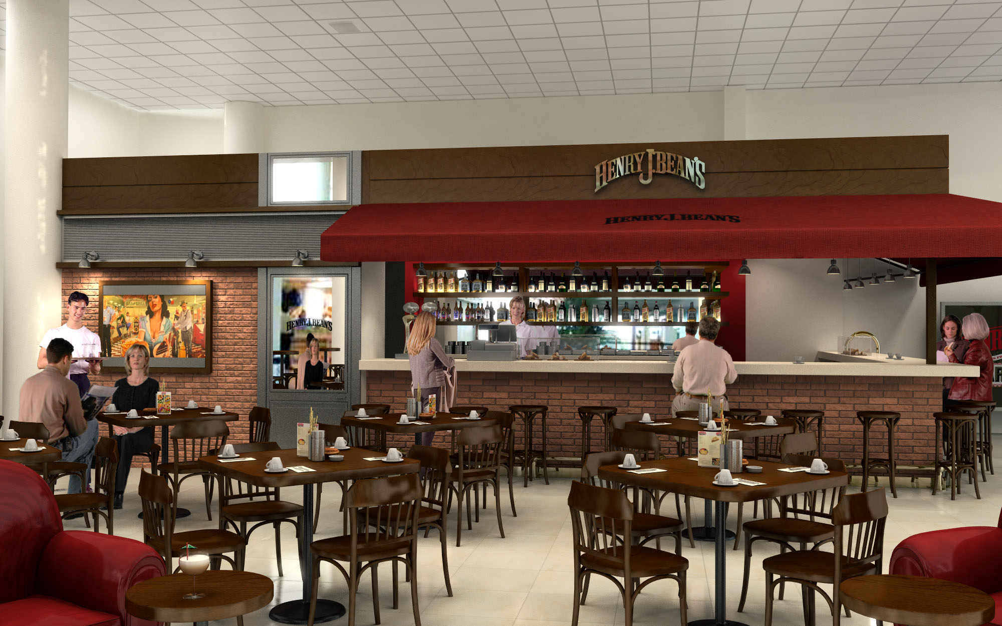
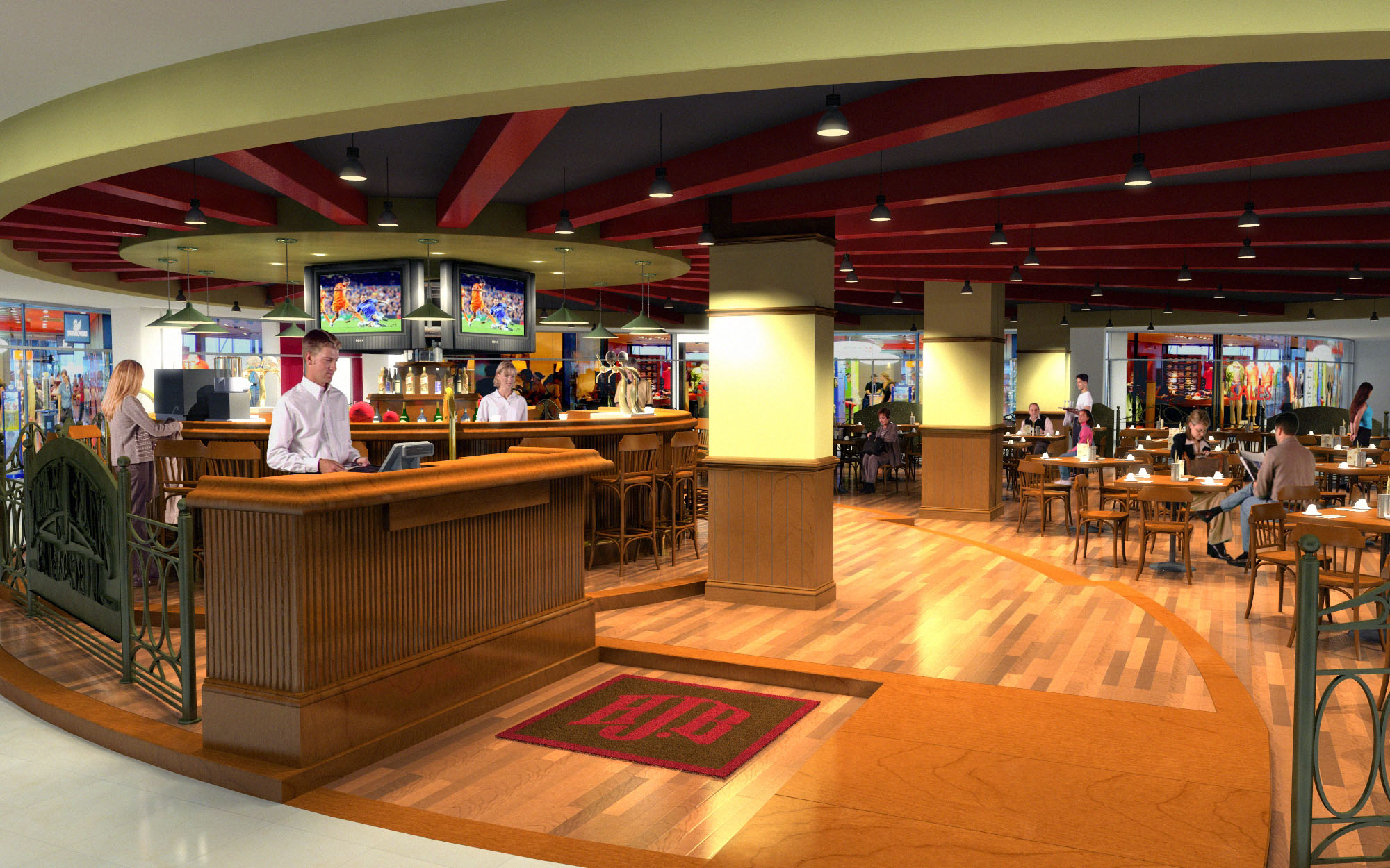
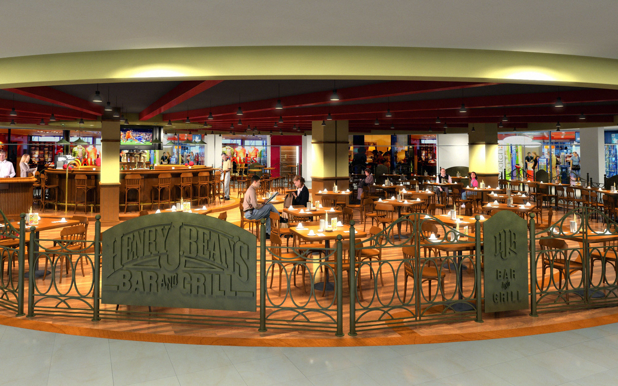
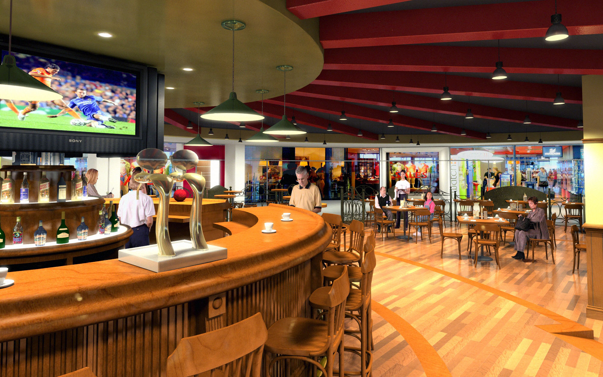
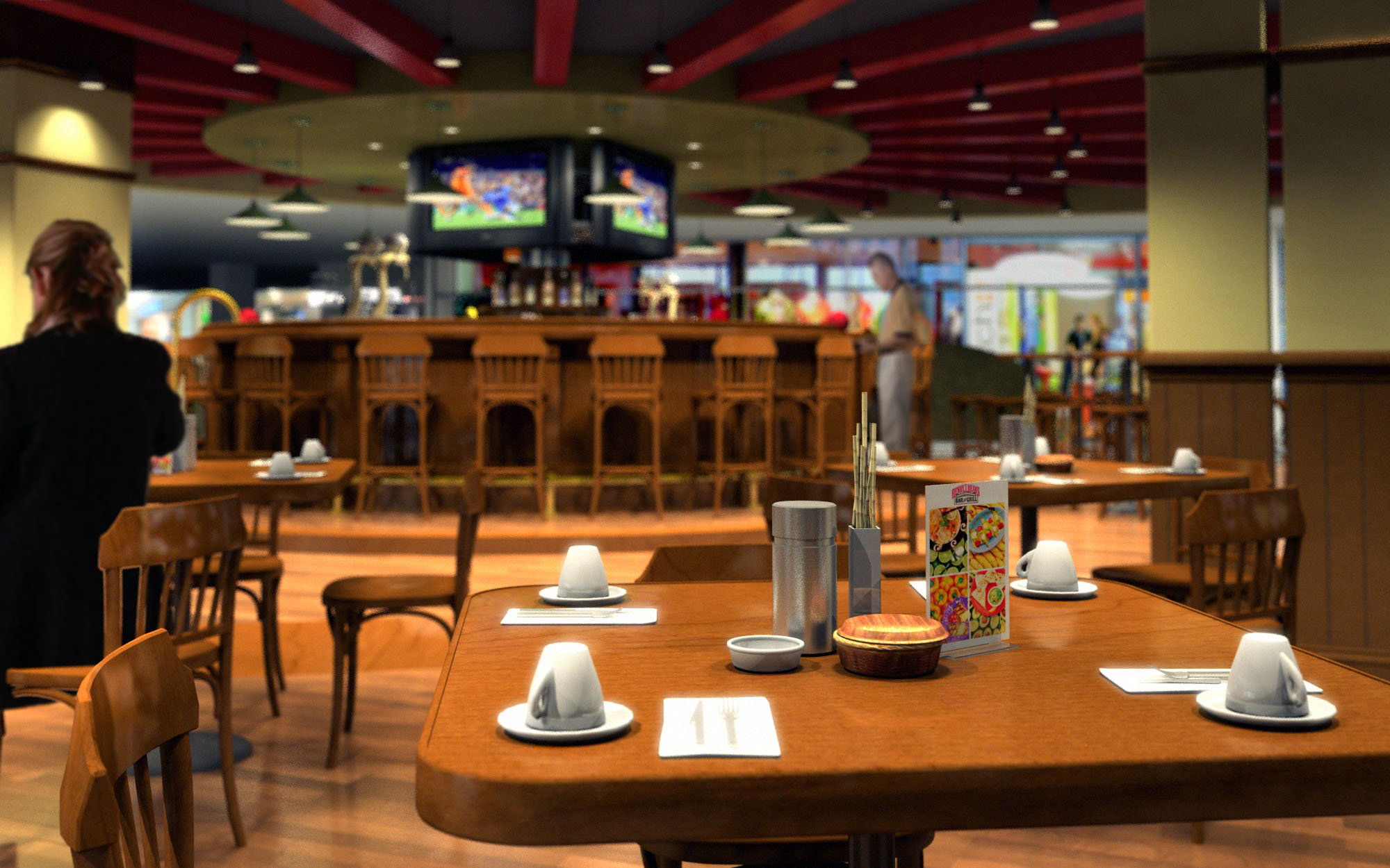
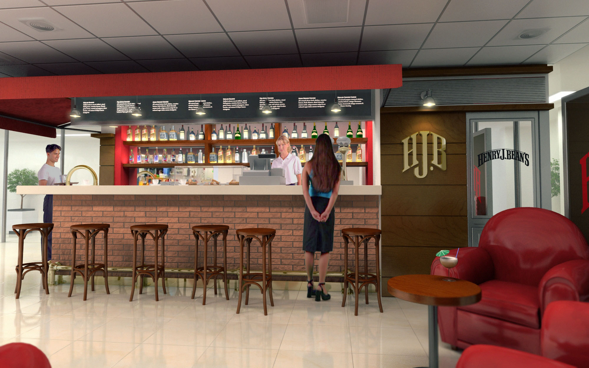
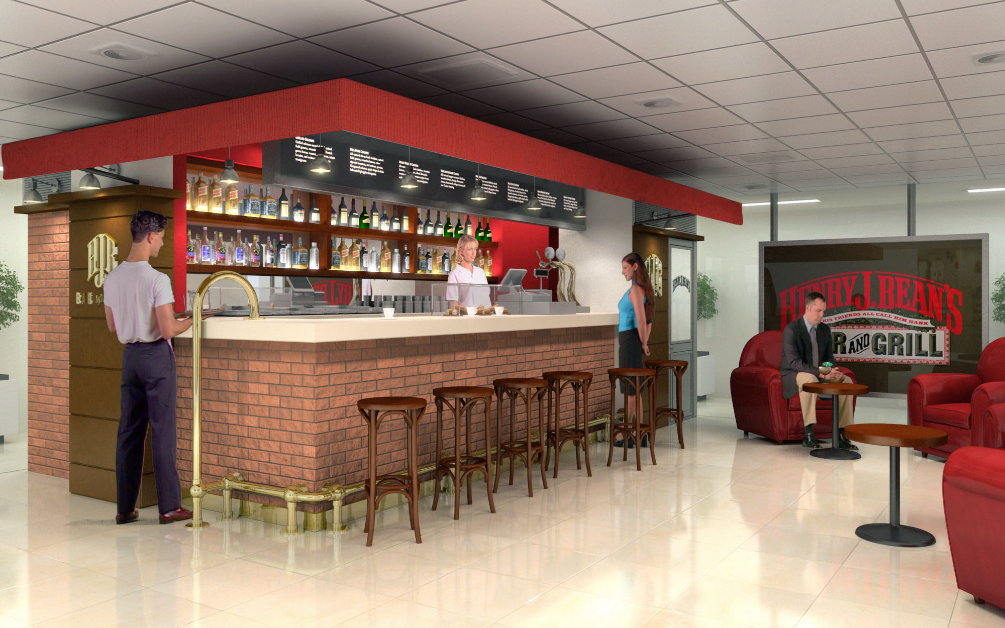
© 2021 by sanzpont [arquitectura] . Webpage by sanzpont [digital] . Innovative Digital Experiences
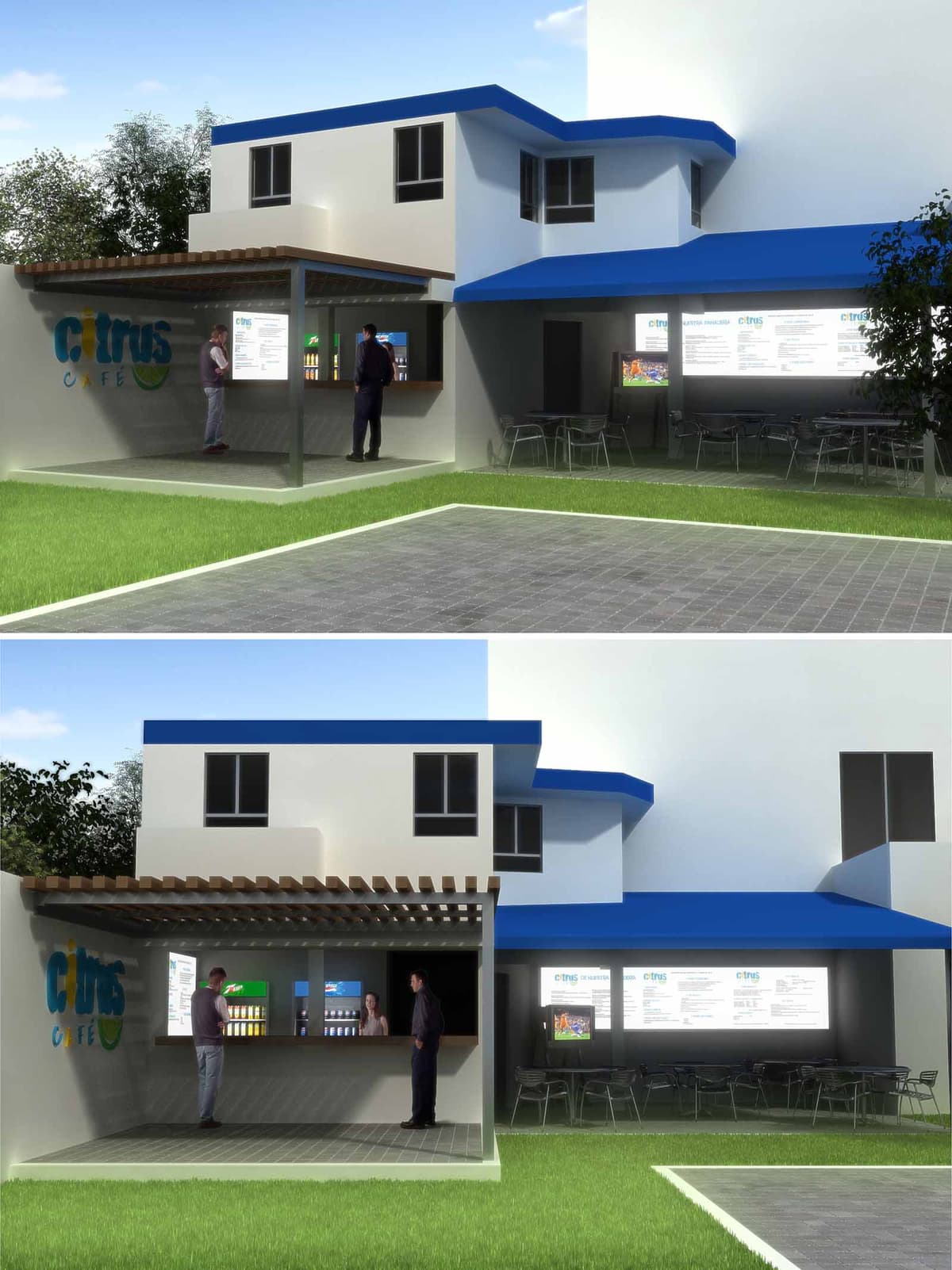
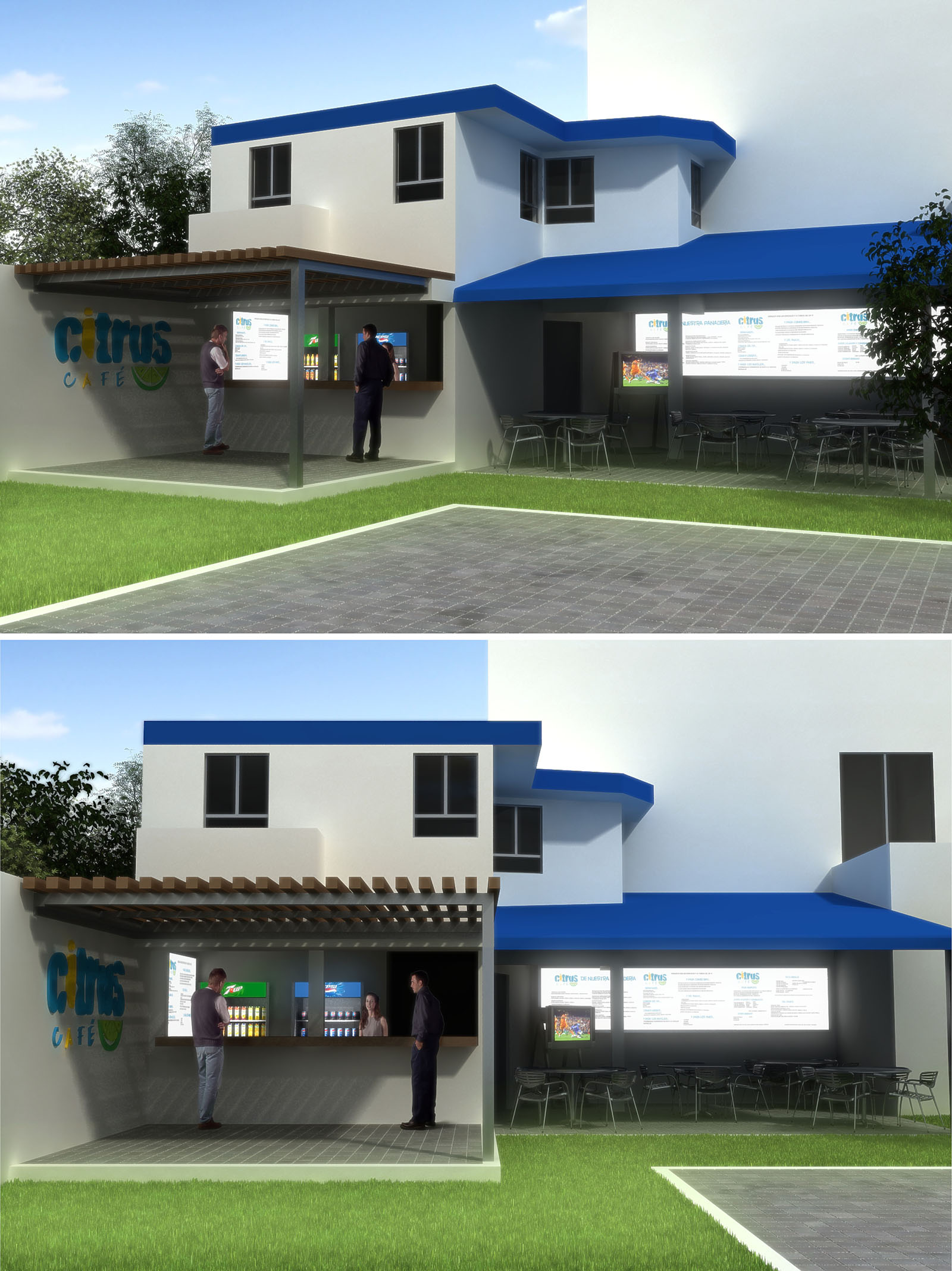
Citrus Café UNID is conceived as a fresh and casual campus meeting point, where a compact service core opens fluidly to the exterior. The architectural language is clean and geometric, using simple volumes in white with vibrant blue accents to echo the coastal character of Cancún while reinforcing the café’s youthful brand identity. The intervention focuses on the ground floor, attaching a light, open pavilion to the existing building to create a shaded transition between interior and exterior.
The project prioritizes legibility and user orientation: the counter, logo wall and menu boards are clearly visible from the main circulation axes, inviting spontaneous use by students and staff. The overall composition frames a semi‑outdoor plaza that operates as an informal social hub, blurring the boundary between café, campus and garden.
The layout is organized around a linear serving counter that functions as the project’s spine. Customers approach from the lawn and paved walkway, read the vertical menu near the logo wall, move along the counter to place and collect orders, and then flow naturally towards the covered seating area or the open garden. This sequential arrangement minimizes cross‑traffic and simplifies service logistics.
The existing building provides the solid background mass, while the new pavilion projects forward as a lightweight porch structure. The covered terrace to the right extends the café into an outdoor dining room with visual continuity to the service area. Door and window openings at ground level maintain direct connections to interior back‑of‑house and storage spaces, ensuring efficient operation with minimal circulation overlap between staff and users.
The primary envelope is resolved in painted masonry, chosen for durability and ease of maintenance in a humid, coastal climate. Smooth white walls reflect sunlight, reducing thermal gain, while the intense blue fascia lines emphasize the horizontal planes of the roofs and visually unify new and existing volumes.
The pavilion roof is supported by a light steel structure, expressed through slender columns and beams that allow maximum transparency. A pergola of closely spaced wooden or wood‑look slats creates a rhythmic soffit, generating dappled shade at the counter zone. Floor finishes in the service zone employ non‑slip ceramic or concrete tiles, resistant to heavy traffic and easy to clean, while the surrounding lawn softens the edges of the paved areas and anchors the café within the campus landscape.
The interior experience is intentionally simple and functional, allowing the brand graphics of Citrus Café to become the main visual focus. The logo wall at the left of the pavilion acts as a landmark, combining large‑scale signage with a neutral background to enhance color contrast and visibility. Behind the counter, linear refrigerators and illuminated menu bands organize the product display in a clear, modular system.
The adjacent seating area is furnished with lightweight metal and plastic chairs and tables, suitable for outdoor use and easy rearrangement. Lighting is integrated into the pergola and under the blue canopy to maintain comfortable brightness at night while highlighting the serving front and menu boards, reinforcing the café’s identity after dark.
In response to Cancún’s warm, humid climate, the design leverages passive strategies to reduce energy demand. The semi‑open pavilion eliminates the need for mechanical cooling in the main customer zone, relying on natural cross‑ventilation and shaded surfaces to maintain comfort. The pergola and deep blue canopy generate protective overhangs that minimize direct solar incidence on glazing and occupied areas.
Light exterior colors and the extensive use of outdoor seating decrease reliance on artificial lighting and air conditioning, particularly during daytime. The clear separation between conditioned interior support spaces and naturally ventilated customer areas allows targeted, efficient HVAC use. The project also anticipates the integration of LED lighting, low‑flow plumbing fixtures and, where feasible, the collection of roof runoff for landscape irrigation, promoting responsible resource consumption within the university campus context.
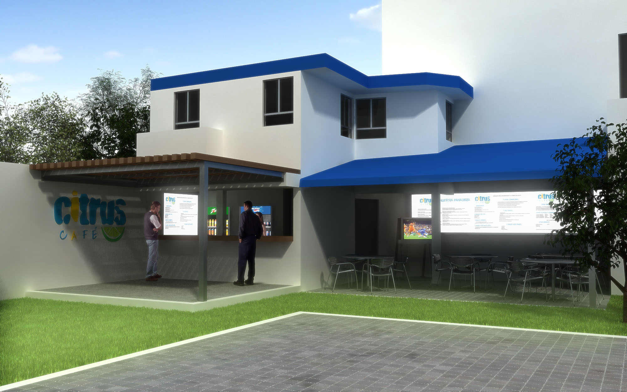
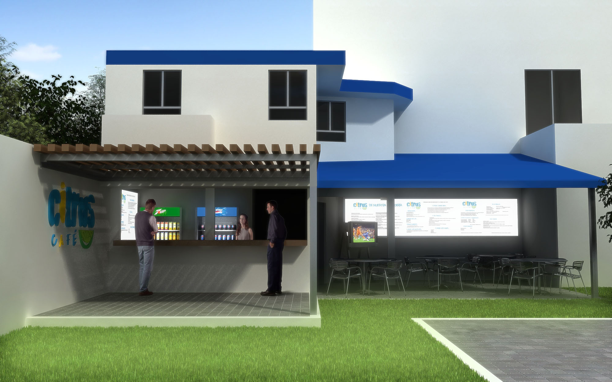
© 2021 by sanzpont [arquitectura] . Webpage by sanzpont [digital] . Innovative Digital Experiences

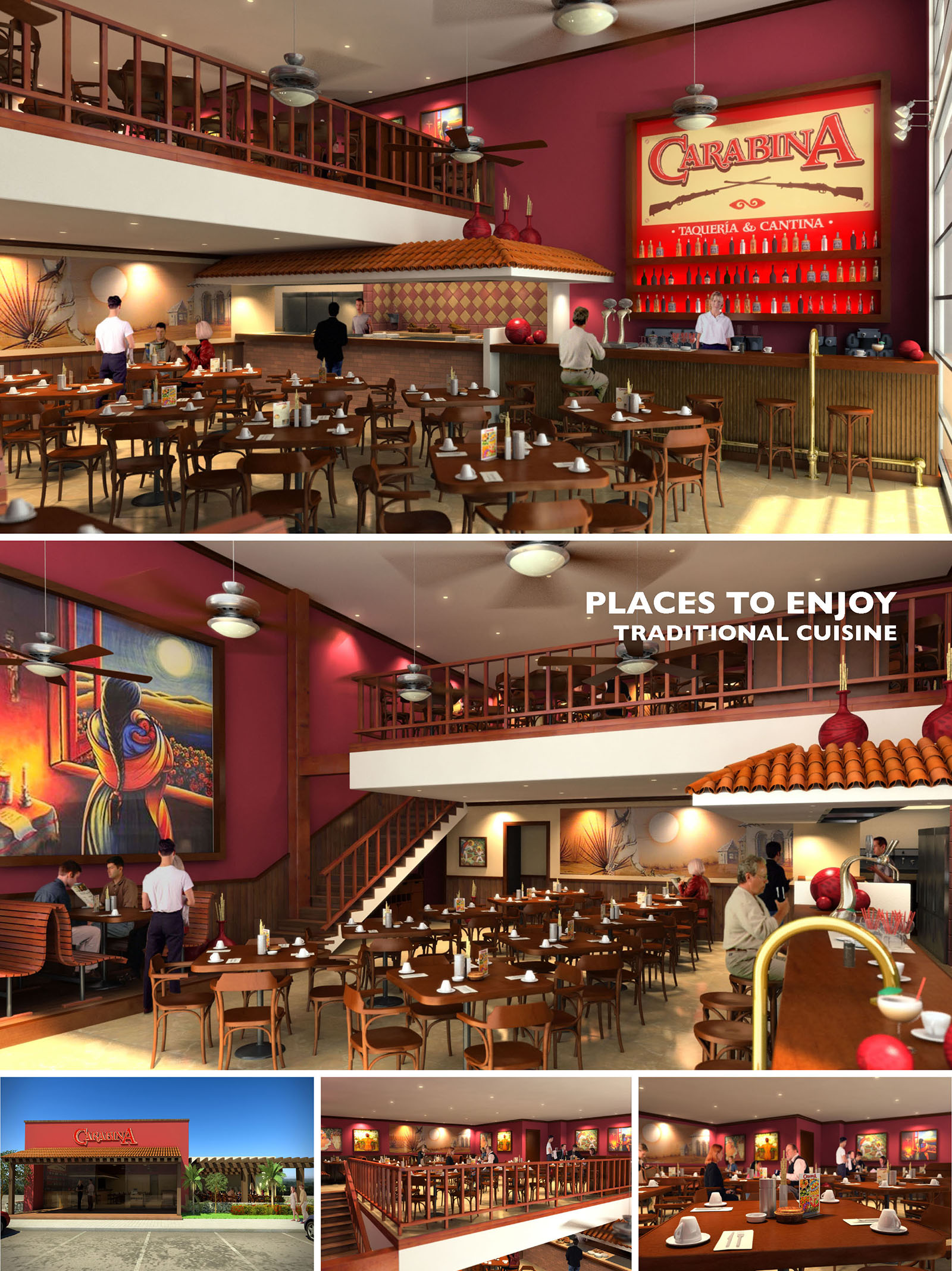
La Carabina is conceived as a contemporary taquería and cantina that celebrates traditional Mexican culture through a warm, festive spatial experience. The project combines the atmosphere of a neighborhood fonda with the efficiency of a modern casual-dining restaurant. Double-height volumes, bold color fields, and artisanal references create an environment that feels both familiar and iconic, suitable for replication in multiple locations across México.
The design strategy focuses on visibility and openness: the bar, grill and mezzanine are all visually connected to the main dining floor, reinforcing the idea of communal, shared enjoyment of food. Large murals and graphic elements become narrative devices that anchor the brand identity and transform the interior into a stage for traditional cuisine.
The restaurant is organized around a central double-height dining hall, with the primary seating distributed on the ground level and an open mezzanine that wraps along one side of the space. This configuration maximizes capacity while preserving generous visual connections between both levels. The mezzanine railing is intentionally transparent, using slender wooden balusters that maintain safety without obstructing sight lines.
Access to the mezzanine is provided by a straight wooden staircase placed at the side of the hall, allowing staff and guests to circulate without interfering with the main service routes. The bar and open kitchen are aligned along a longitudinal wall, clearly visible from almost every table. This ensures intuitive wayfinding for guests while facilitating efficient back-of-house operations and direct service to the main dining floor.
The material palette is anchored in warm timber tones, earthy tile finishes, and deep red walls. Wooden chairs, tables, railings and stair elements unify the different programmatic areas and evoke the atmosphere of traditional cantinas. The use of terracotta roof tiles over the kitchen volume functions as a strong visual motif, recalling vernacular Mexican architecture and visually “housing” the cooking area within the larger double-height space.
The color strategy combines saturated magentas and reds with neutral flooring and light ceilings. This contrast enhances luminosity while reinforcing the brand identity. Tiles in warm hues and geometric patterns enrich the bar and kitchen fronts, adding a tactile, handcrafted character. Decorative elements such as large red spheres and brass fixtures contribute subtle metallic accents that catch the light and animate the interior.
Ceiling-mounted pendants and fans are distributed rhythmically across the double-height volume, ensuring uniform ambient lighting and thermal comfort. The light temperature is kept warm to emphasize the natural tones of wood and tile, while accent lighting highlights the bar back, signage, and mural art. Indirect lighting behind bottle displays and under the bar counter adds depth and a cantina-like glow in the evening hours.
The large-scale artwork and graphics are deliberately lit to operate as visual focal points that guide the eye across the space. This creates an immersive, cinematic atmosphere without resorting to overly complex lighting systems, which supports ease of maintenance across multiple locations.
The exterior adopts a simple, bold façade with a dominant red volume and a clearly legible logo, ensuring strong recognition along vehicular corridors typical of suburban Mexican contexts. A recessed entrance porch offers shade and transition between exterior parking and interior dining, framed by a pergola structure and landscaping that soften the encounter with the building.
Glazing at the front allows visual continuity between street and interior activity, inviting passersby in and reinforcing the brand’s open, informal character. The façade’s restrained geometry facilitates adaptation to different lot sizes and orientations in the chain’s multiple locations.
Sustainability is approached through both passive design and robust material selection. The predominance of wood and ceramic tile responds well to Mexico’s diverse climates, offering durability and thermal stability. Light-colored flooring and ceilings enhance natural and artificial light, reducing the need for high-intensity fixtures. Ceiling fans support cross-ventilation strategies and allow moderate use of air conditioning, lowering energy consumption.
The modular furniture layout permits flexible occupancy and long-term adaptability, minimizing waste when reconfiguring the dining room. Finishes are chosen for their ease of cleaning and longevity in high-traffic hospitality environments, contributing to a reduced replacement cycle. The consistent design language across locations allows shared procurement of materials and fixtures, optimizing resources and supporting an efficient, scalable, and environmentally conscious restaurant model.
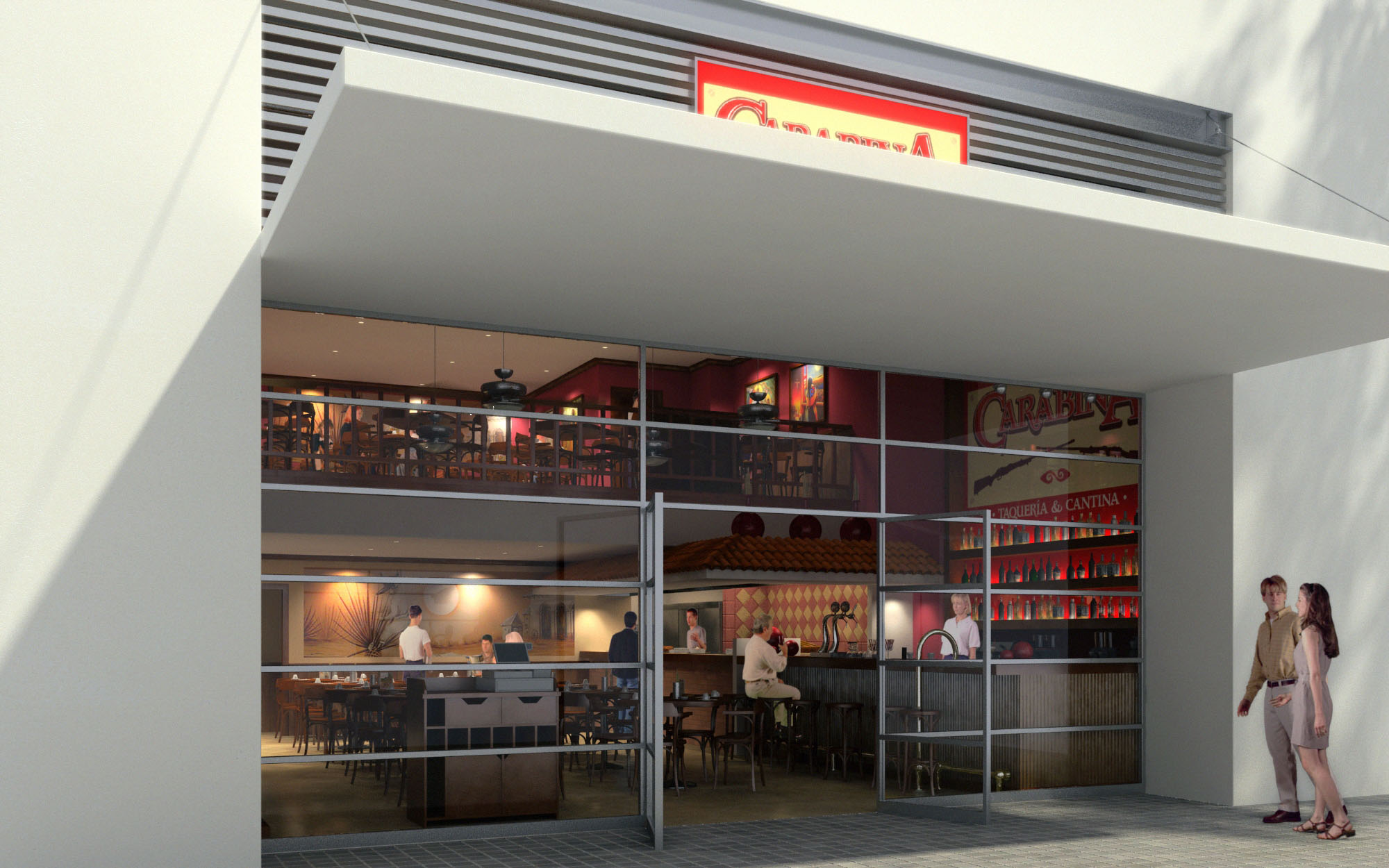
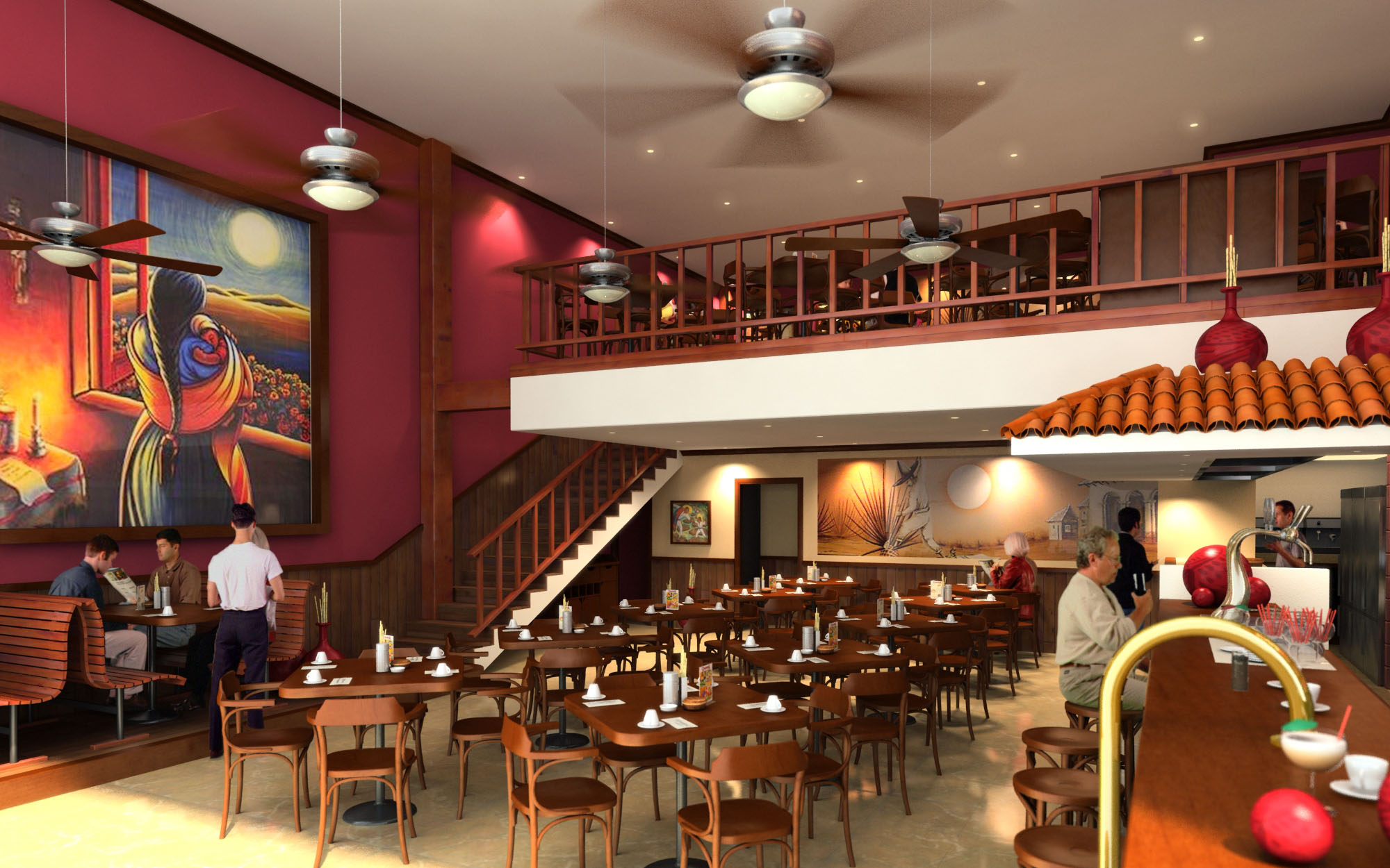
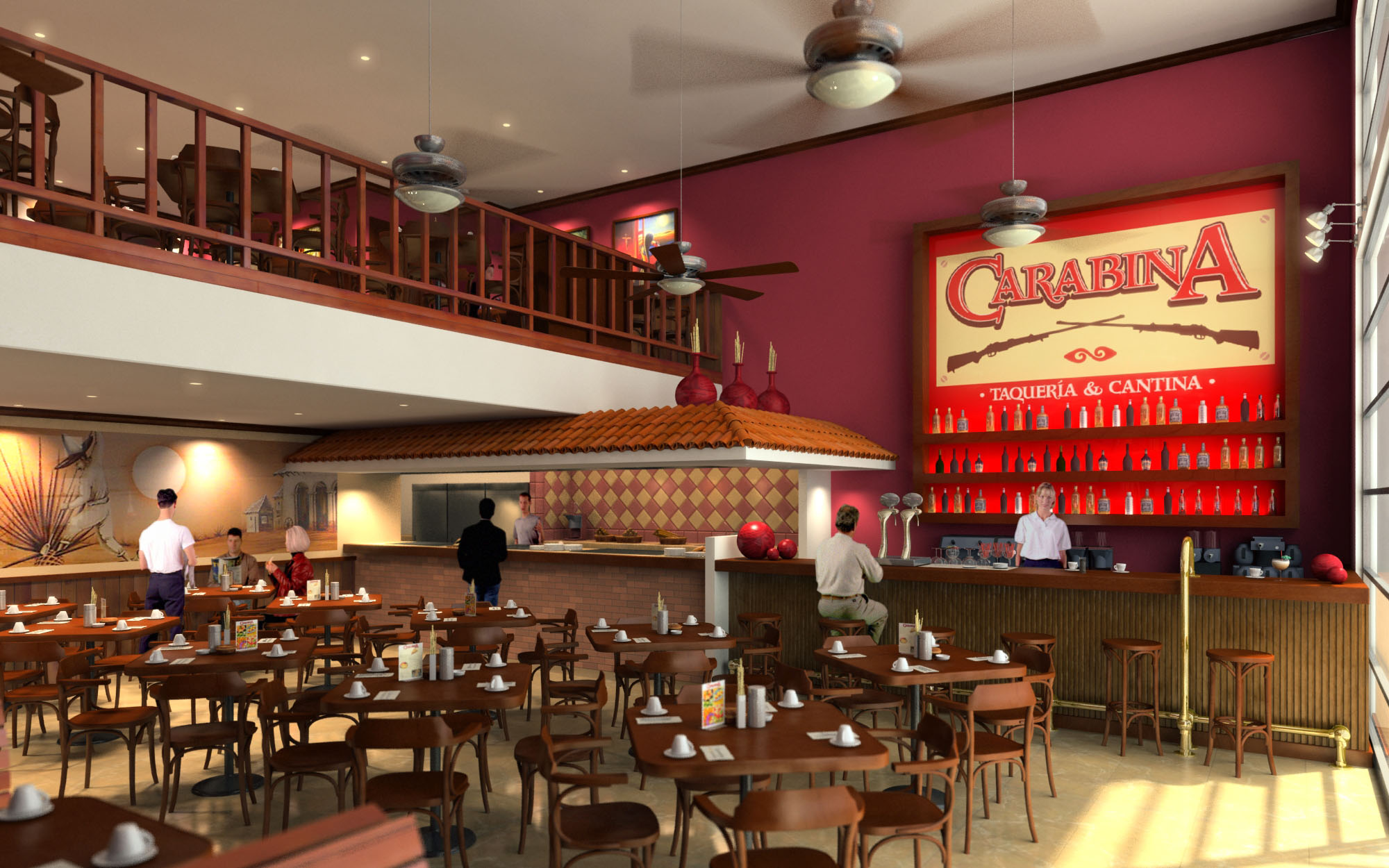
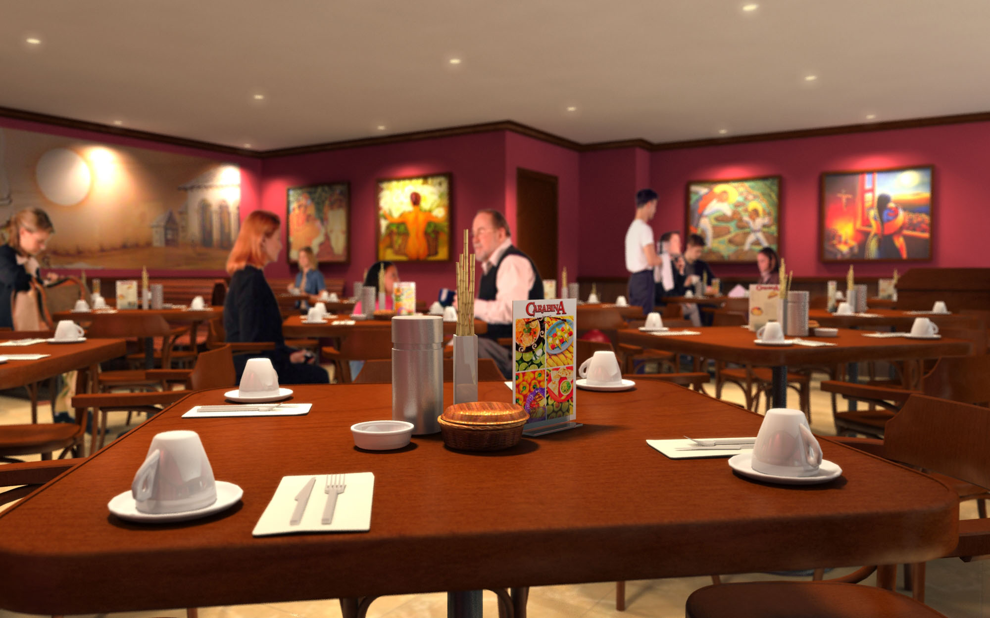
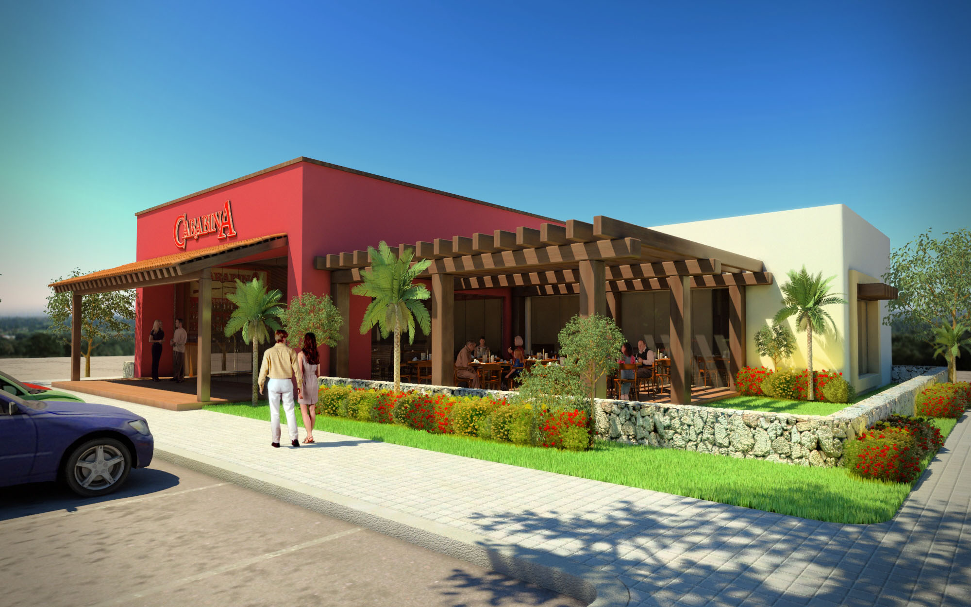
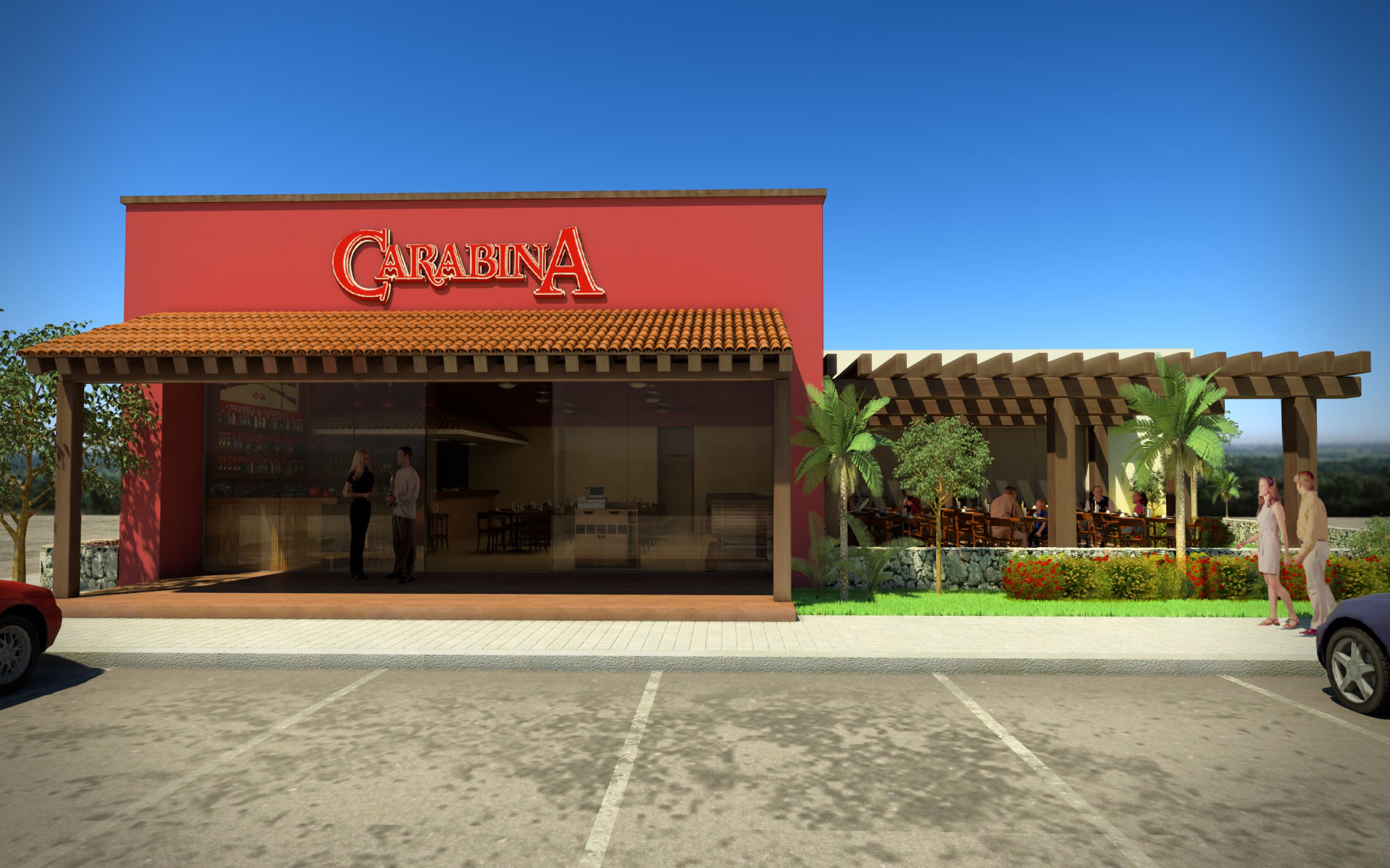
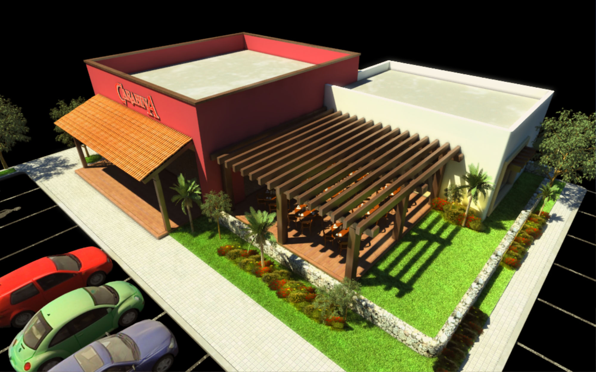
© 2021 by sanzpont [arquitectura] . Webpage by sanzpont [digital] . Innovative Digital Experiences

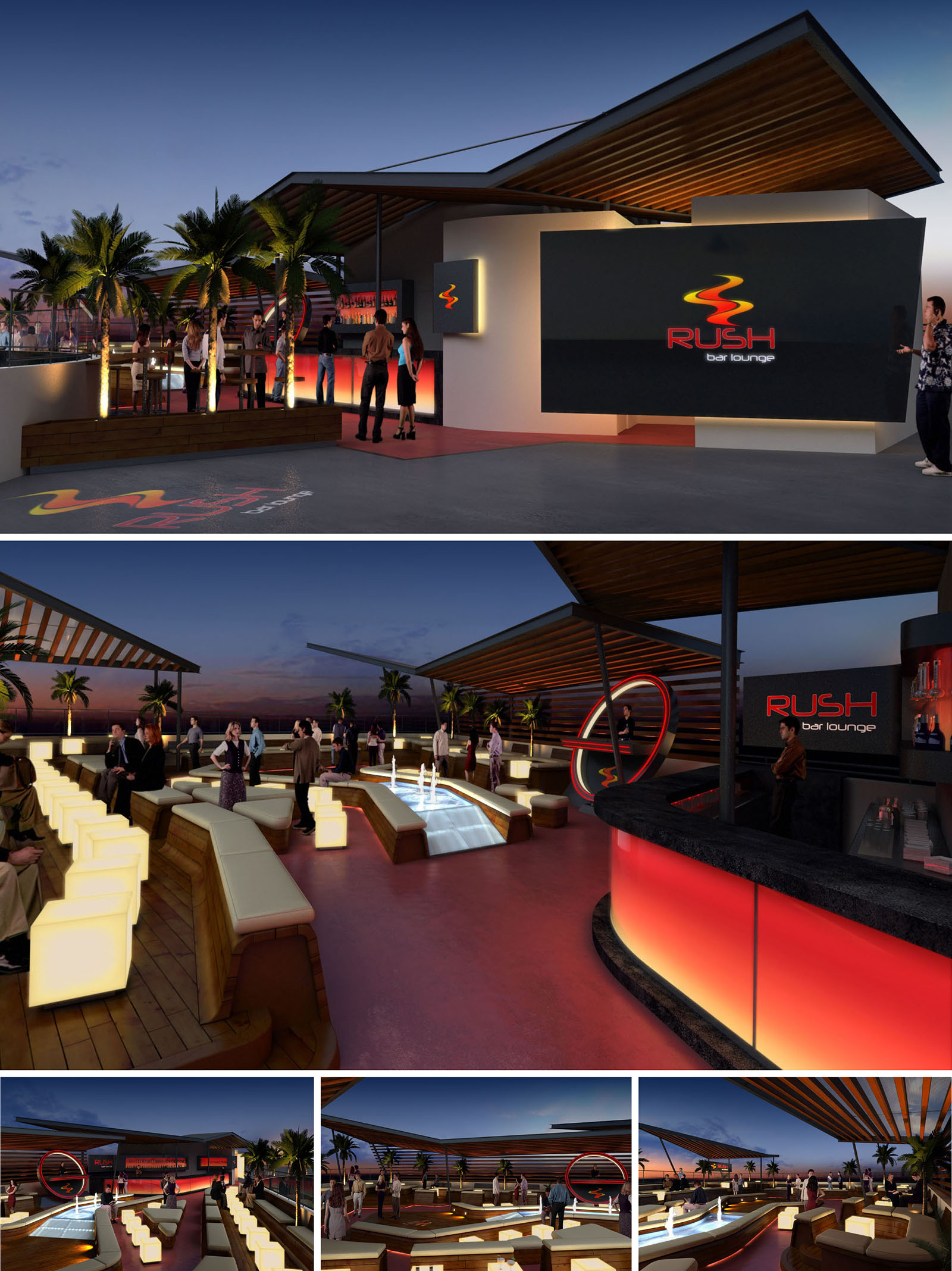
RUSH Lounge Bar is conceived as an elevated sunset observatory and social stage, set on a rooftop in Cancún. The design merges the dynamism of nightlife with the horizontality of the Caribbean horizon, using light, color and geometry to evoke movement and energy. The brand’s identity, based on a fluid “rush” line, is translated into sweeping roof planes, curved bar fronts and illuminated graphic elements that guide the visitor through the space.
The project proposes an open-air lounge that blurs the boundary between interior and exterior. Instead of closed volumes, a sequence of canopies, platforms and furniture islands defines functional zones, allowing continuous visual connections to the sea and the sky. The atmosphere seeks to feel simultaneously exclusive and relaxed, responding to the resort context while offering a contemporary urban character.
The access is resolved through a generous forecourt that acts as a threshold between the vertical circulation core of the building and the rooftop environment. A backlit façade plane with the RUSH logo marks the entry, working as both signage and light beacon visible from a distance. Once inside, circulation follows a linear axis parallel to the edge of the terrace, creating a promenade that gradually reveals the bar, lounge and central water feature.
The main bar is positioned laterally, protected under a cantilevered roof and aligned with the principal views. Opposite to it, a series of stepped lounge platforms with integrated seating generates an informal amphitheater around a central sunken deck, where a luminous water mirror and fountains become the focal point. This configuration encourages social interaction and multiplies the number of privileged viewpoints toward the landscape.
The material palette alternates warm and cool sensations to reinforce the nocturnal experience. Timber decking and slatted wooden ceilings introduce a tactile, natural layer that softens the overall composition, while dark stone or composite countertops provide robustness to the service areas. Smooth plastered planes in neutral tones act as backdrops for the intense chromatic accents of the brand.
Color is strategically concentrated in the bar front, signage and floor inlays, using reds and ambers that recall the tones of the sunset and the energy of nightlife. The contrast between matte structural elements and glossy or back-painted glass surfaces enhances reflections and depth, amplifying the perception of space after dusk.
Artificial lighting is the main instrument for constructing the nocturnal identity of RUSH. Linear LED strips concealed under bar counters, benches and fascia boards create a floating effect, detaching volumes from the floor. The central water feature integrates submerged lighting that transforms the pool into a luminous runway, visually organizing the lounge and drawing guests toward the center.
Accent lighting is directed toward vertical elements such as the brand wall, structural columns and perimeter palms, ensuring legibility without resorting to excessive brightness. The general illumination remains at low levels to preserve the perception of the night sky and the surrounding urban glow. The use of programmable RGB systems allows the atmosphere to shift from a relaxed early-evening ambience to a more vibrant late-night scene.
Furniture is designed as an extension of the architectural language, with continuous wooden bases and upholstered cushions defining longitudinal lounges that encourage group seating. Modular luminous cubes operate as both stools and side tables, providing flexible arrangements for different capacities and events. The combination of fixed platforms and movable elements ensures adaptability to changing operational needs.
Ergonomic considerations guide seat heights, backrest inclinations and circulation clearances, optimizing comfort during prolonged stays. The semi-open roof structures provide shade in daytime use and act as a visual frame for the sky at night, while their orientation is calibrated to capture prevailing breezes and enhance natural ventilation, crucial in Cancún’s tropical climate.
Although centered on an experiential nightlife concept, the project integrates several sustainable strategies appropriate to its coastal context. The open-air configuration minimizes the need for mechanical cooling, relying on cross-ventilation and the stack effect generated by the elevated position. Roof overhangs and slatted pergolas are dimensioned to mitigate solar gain on key surfaces while permitting filtered natural light.
LED technology is used throughout the lighting system to reduce energy consumption, particularly relevant given the extensive use of colored illumination. Where possible, materials such as wood are specified from certified sources resistant to humidity and saline environments, extending life cycle and reducing maintenance. The elevated decking allows for concealed drainage and potential rainwater capture, decreasing runoff and protecting the waterproofing layer of the rooftop slab in the long term.
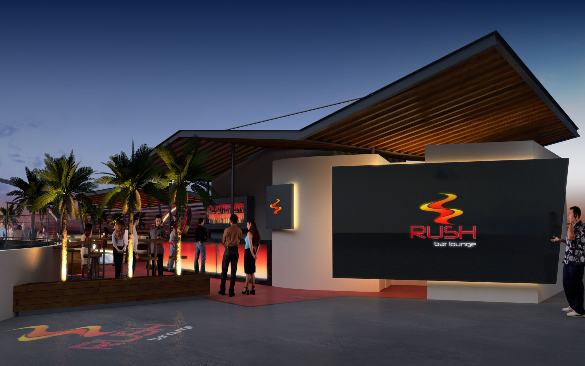
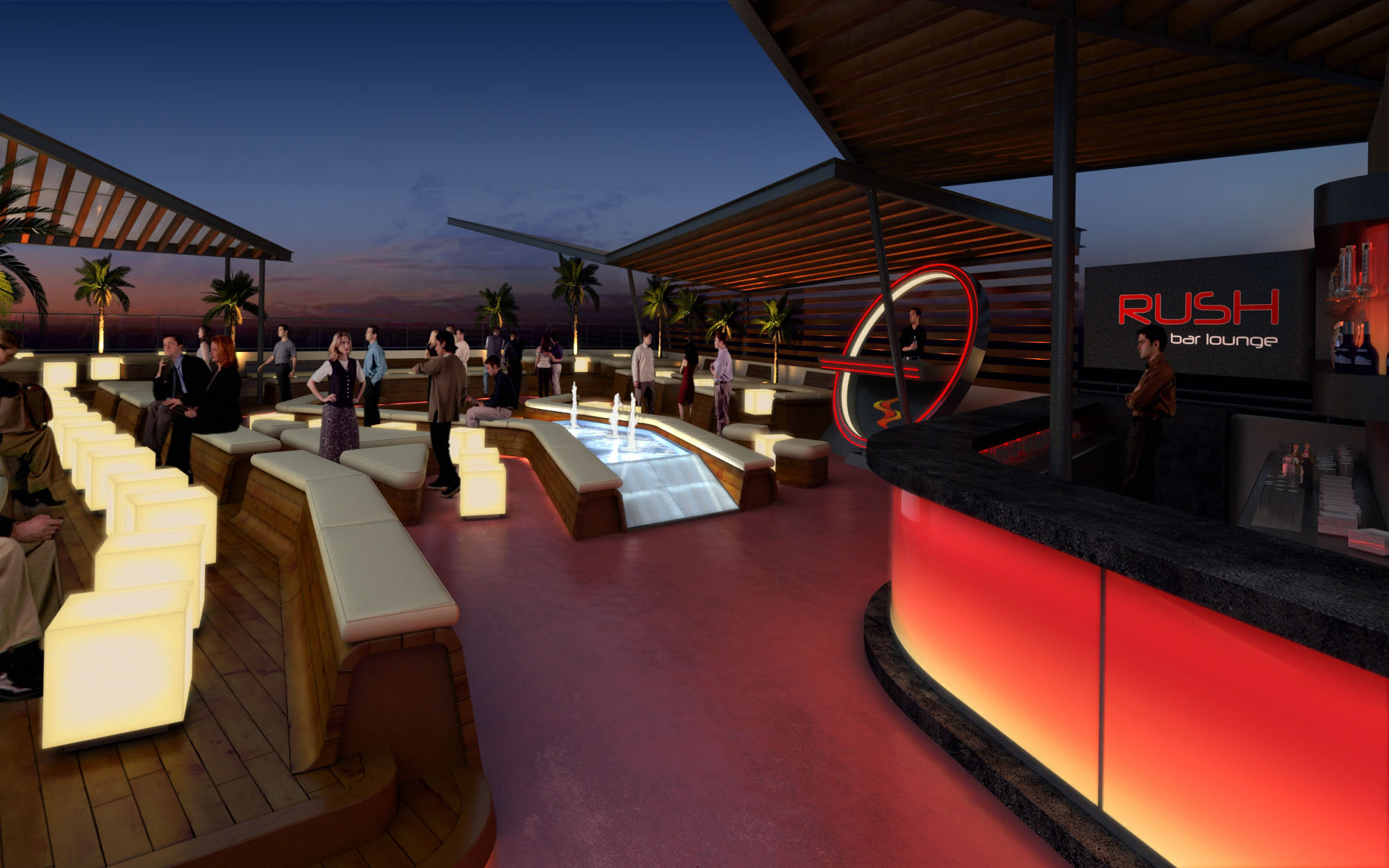
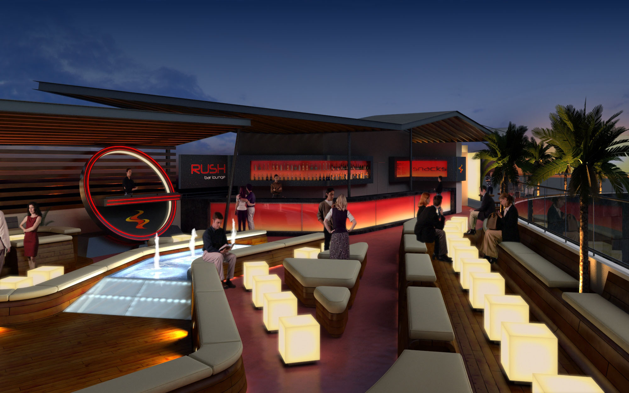
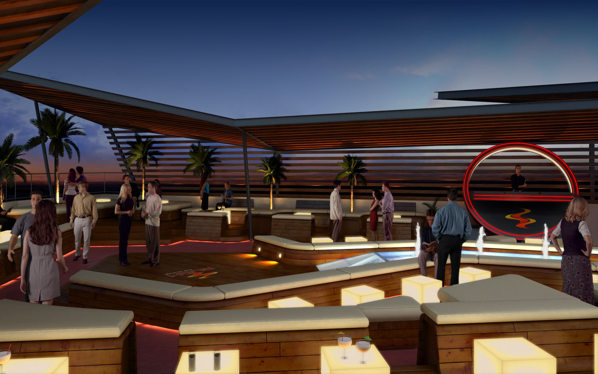
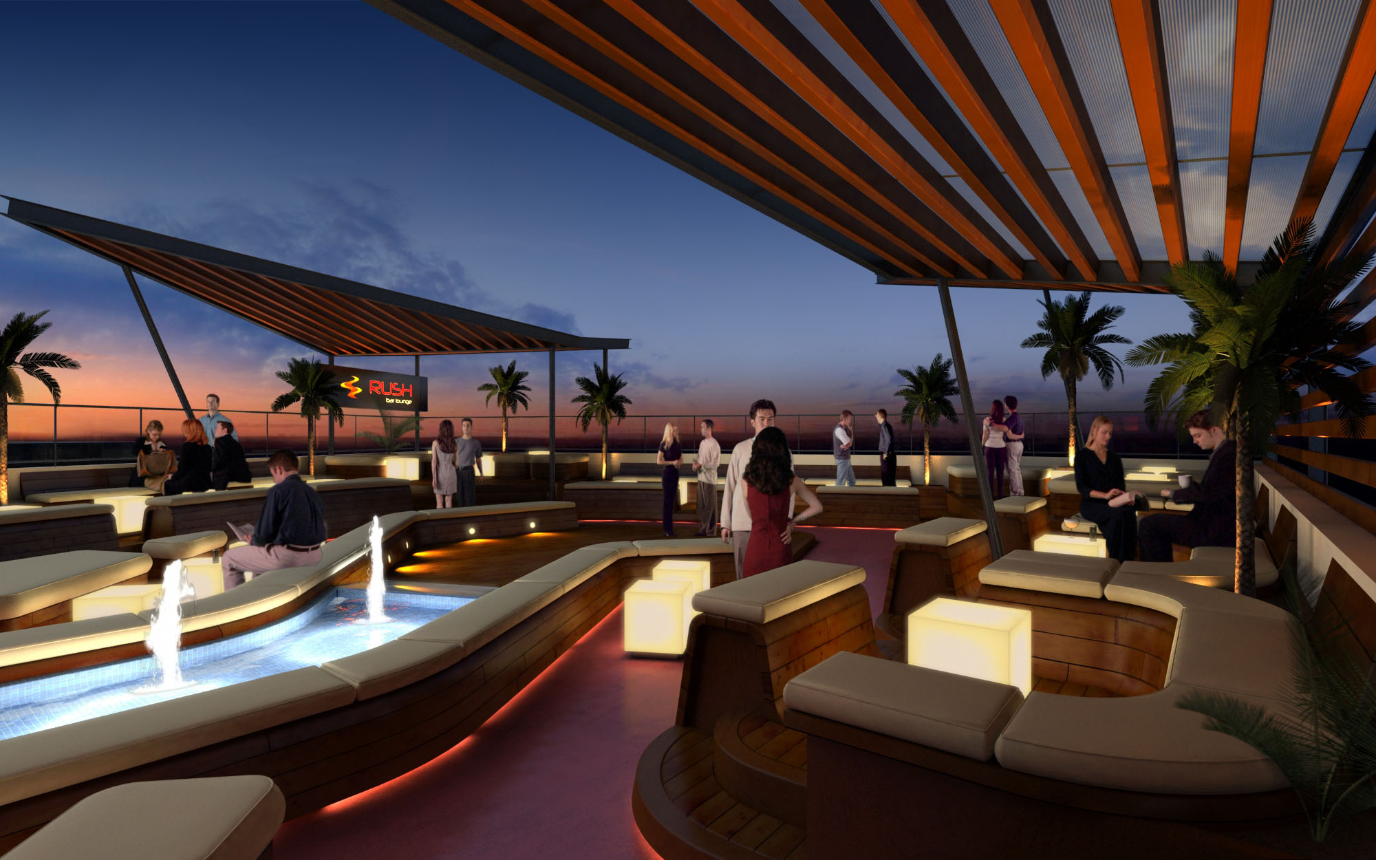
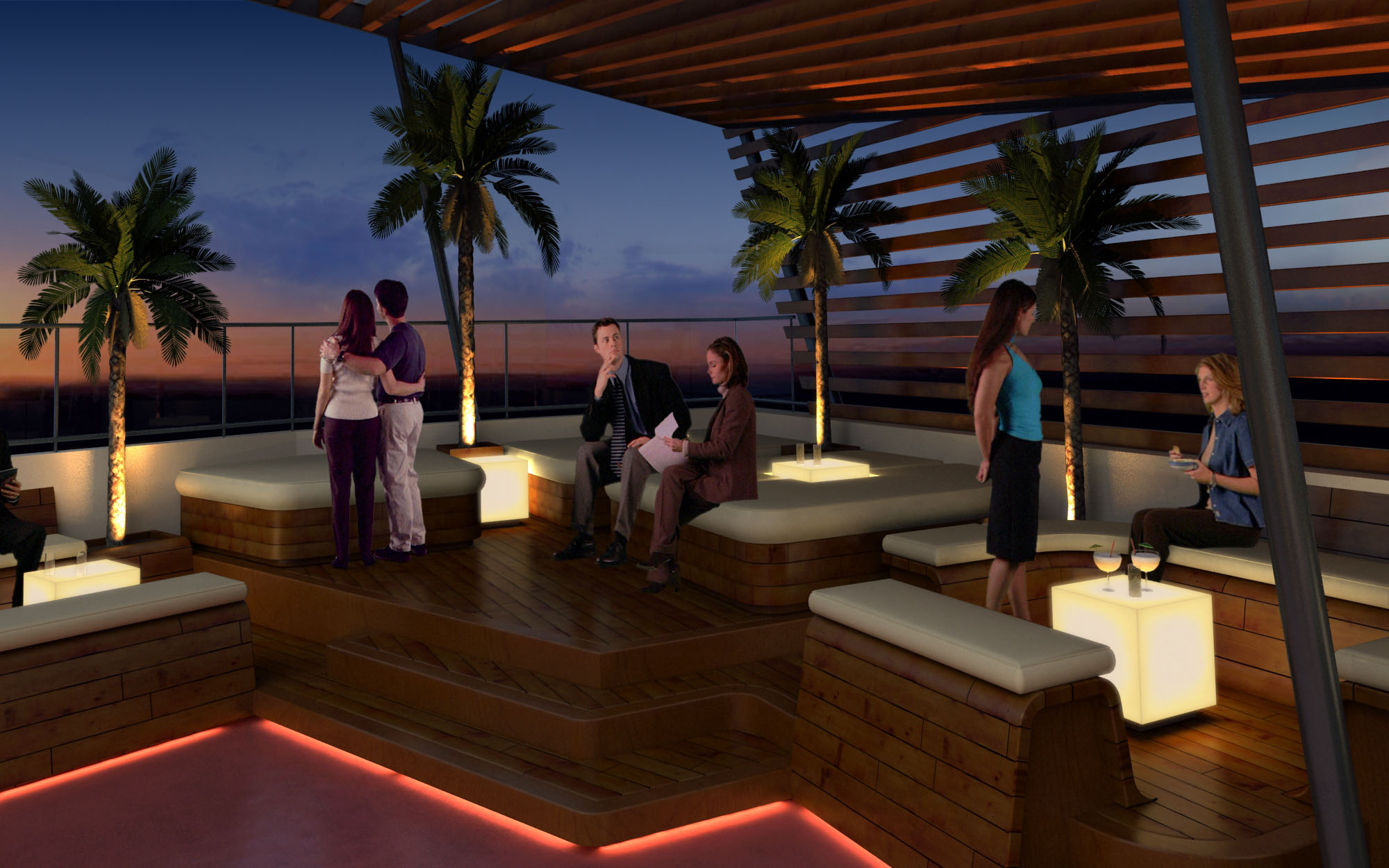
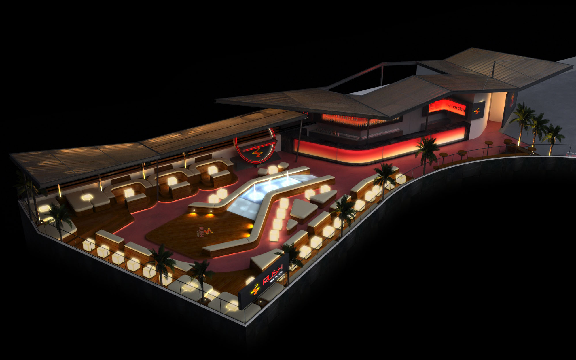
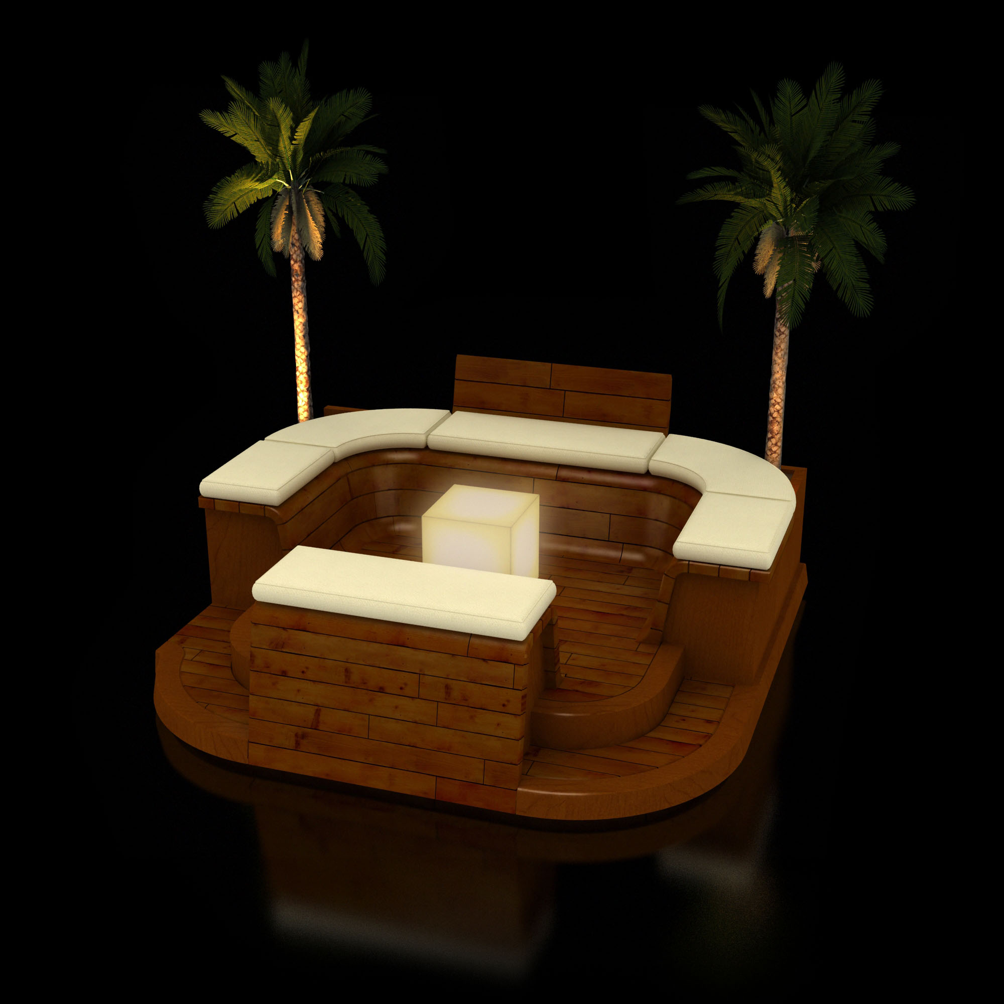
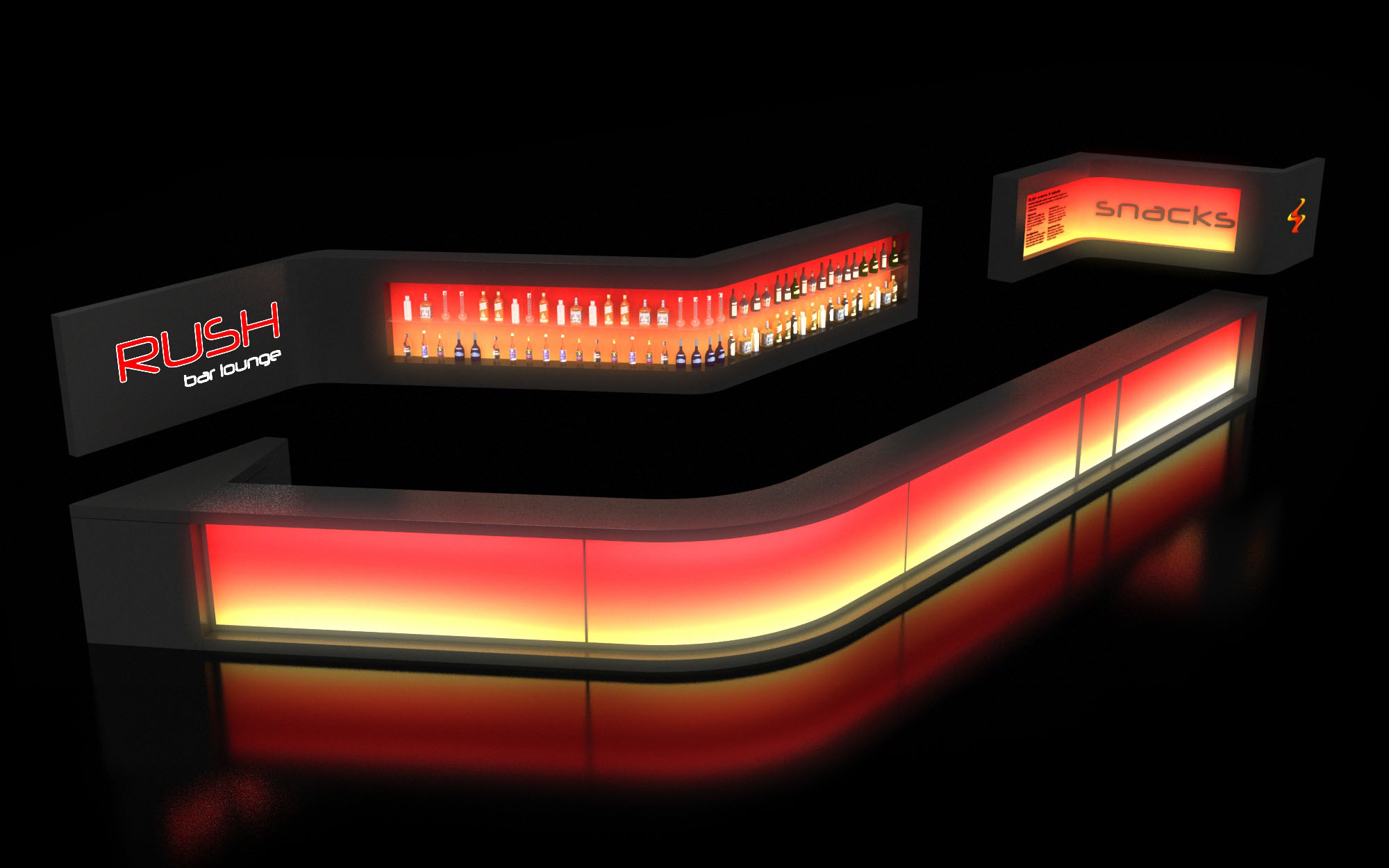
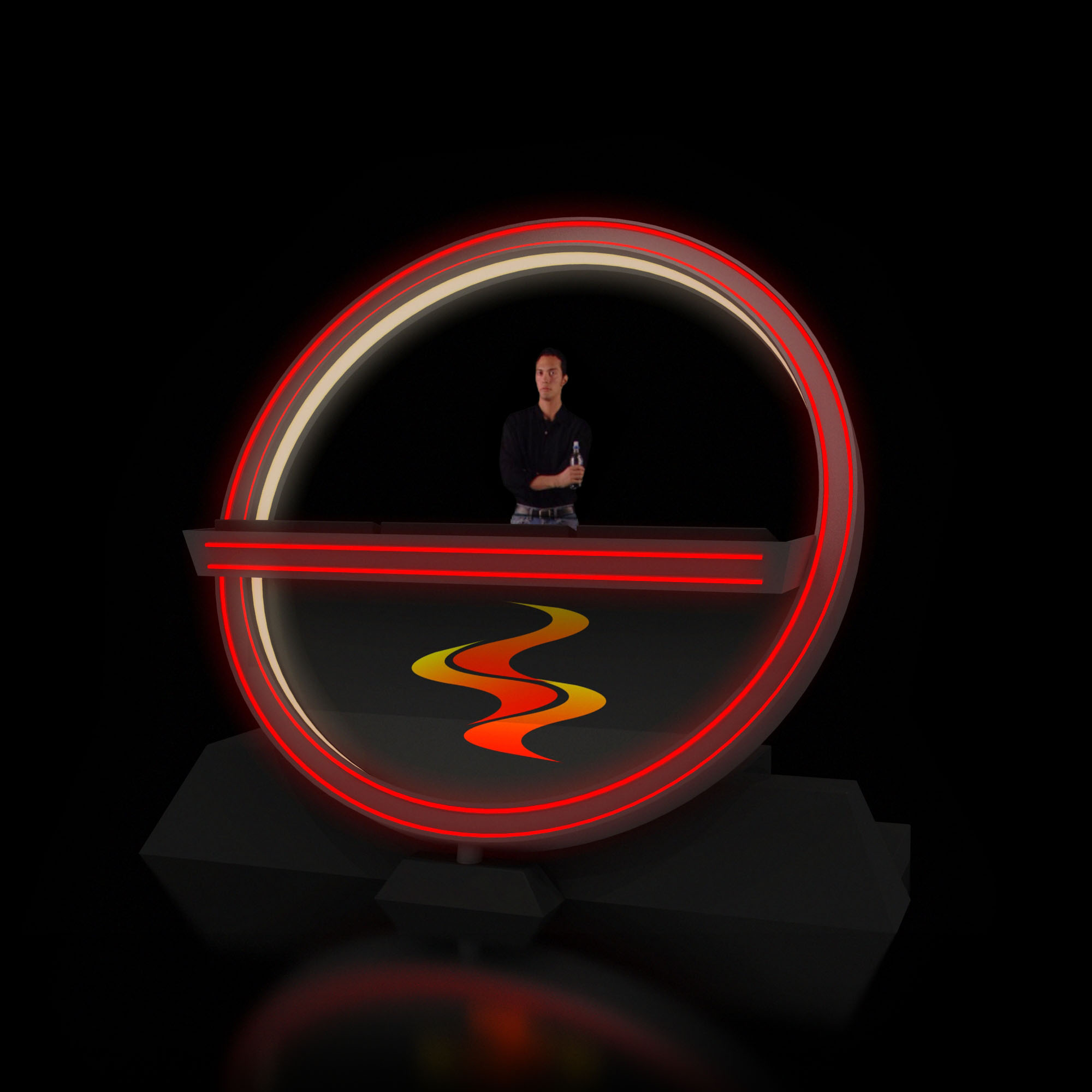
© 2021 by sanzpont [arquitectura] . Webpage by sanzpont [digital] . Innovative Digital Experiences
La implicación del cliente y el co-diseño son el centro de nuestro enfoque, asegurando que cada proyecto refleje las necesidades y la visión únicas de quienes confían en nosotros. Al involucrar activamente a propietarios, chefs y operadores durante todo el proceso de diseño, fomentamos un entorno colaborativo donde las ideas florecen, dando lugar a espacios no solo funcionales, sino profundamente personalizados.
Un proyecto no es solo el resultado: se trata de disfrutar el camino junto al cliente.
Diseñar el restaurante de tus sueños es nuestra especialidad. Elaboramos meticulosamente cada diseño para alinearlo con tu concepto, tu carta y tu operación. Nuestro proceso es interactivo y centrado en el cliente, asegurando que cada elemento de tu local respalde un servicio impecable y encarne perfectamente la identidad de tu marca.
El diseño sostenible y bioclimático se centra en la responsabilidad ambiental y la eficiencia energética. Al integrar elementos naturales y tecnologías innovadoras, estos diseños mejoran el confort, reducen el consumo de energía y promueven una experiencia gastronómica más saludable, alineando los espacios de hospitality contemporáneos con principios ecológicos.
Nuestros diseños son lógicos, funcionales y centrados en el usuario, adaptados a las necesidades de quienes habitan los espacios que creamos. Coreografiamos toda la operación —acceso, barra, sala, cocina y back-of-house— con layouts intuitivos y soluciones inteligentes que potencian la usabilidad y la eficiencia. Cada decisión de diseño nace de un profundo entendimiento del recorrido del comensal y del flujo operativo, garantizando una funcionalidad óptima.
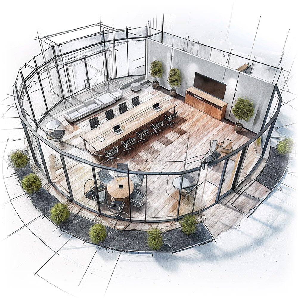
Nuestro flujo de trabajo BIM (Building Information Modeling) integra tecnología avanzada para agilizar y potenciar el proceso de diseño. Este método permite una planificación y ejecución precisas y eficientes, facilitando una mejor coordinación, un mayor control presupuestario y una visualización integral del proyecto. Con BIM aseguramos un proceso constructivo fluido, colaborativo y de alta calidad.
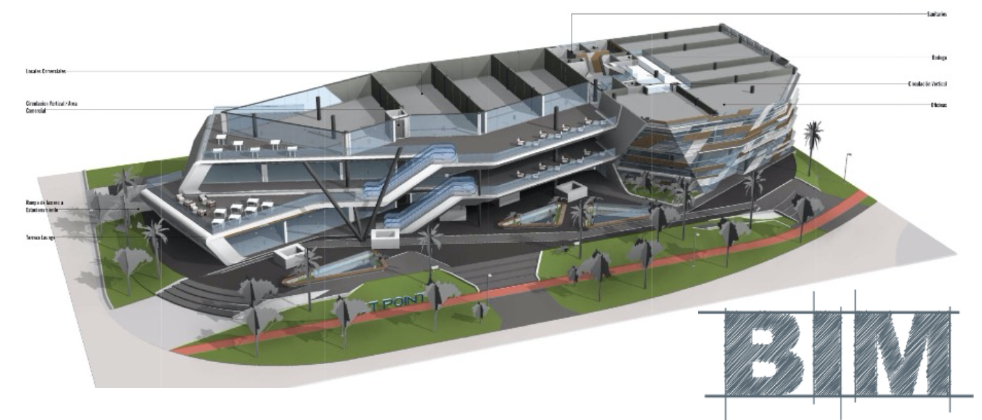
Nuestras visualizaciones interactivas dan vida a tu proyecto antes de que comience la obra, ofreciendo una experiencia dinámica e inmersiva. Estas herramientas avanzadas te permiten explorar opciones y modificaciones de diseño en tiempo real, asegurando que el resultado final se alinee perfectamente con tu visión. Esta tecnología fomenta una comprensión y una implicación más profundas durante todo el proceso de diseño.

La visualización en Realidad Virtual (VR) te permite experimentar y refinar tu proyecto antes de construirlo, ofreciendo una percepción clara del espacio y del diseño. Esta capacidad en tiempo real garantiza precisión, ahorra tiempo y evita modificaciones costosas, mejorando la toma de decisiones y reforzando tu conexión con la visión final del proyecto.

En esencia, somos un colectivo de mentes creativas que empuja constantemente los límites del diseño y la innovación. Nuestro equipo desafía las convenciones y explora nuevas posibilidades para crear espacios que no solo son funcionales, sino artísticamente inspiradores. Transformamos visiones en realidades, creando entornos que conmueven e inspiran.
Somos especialmente sensibles al presupuesto de cada proyecto, asegurando que nuestros diseños se ajusten a tus parámetros financieros sin comprometer calidad ni funcionalidad. Nuestro enfoque estratégico combina una planificación meticulosa con una gestión eficiente de los recursos, lo que nos permite entregar restaurantes excepcionales que respetan tu presupuesto y maximizan tu inversión.
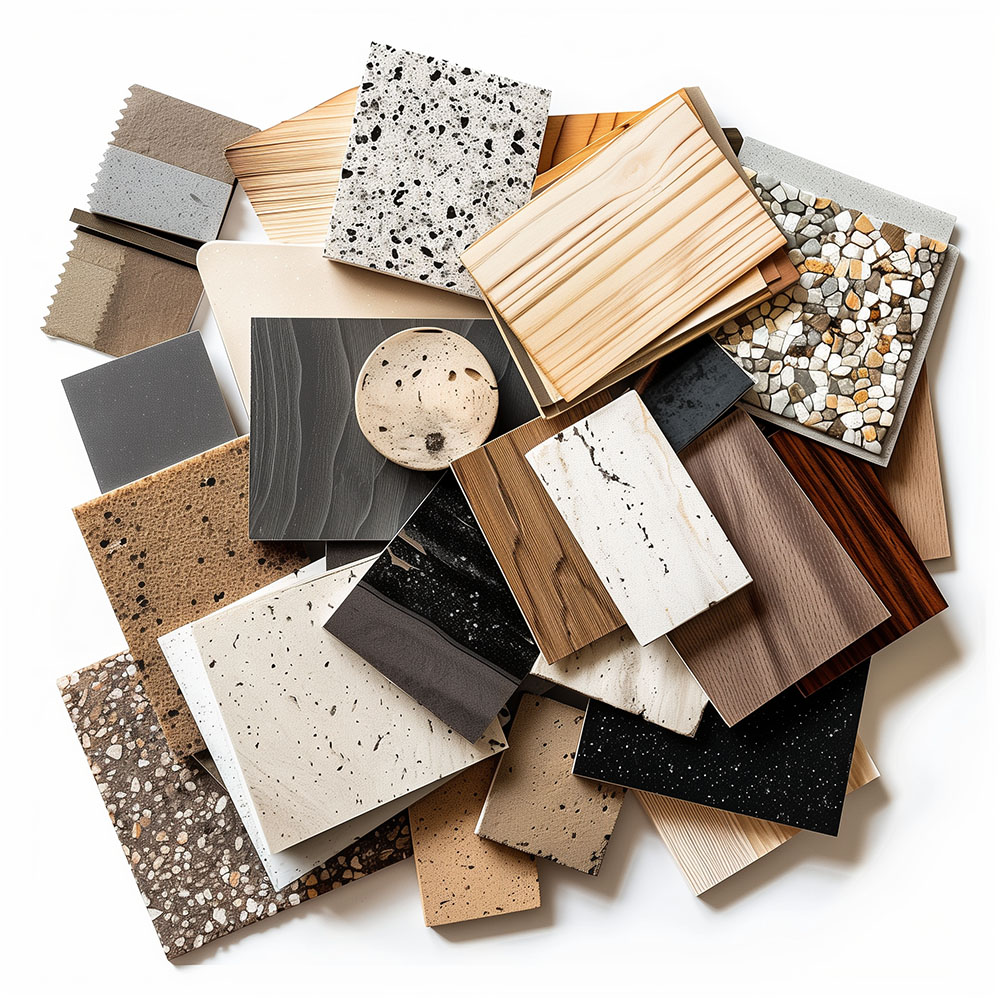
Nuestra experiencia en diseño internacional nos permite crear restaurantes y espacios F&B excepcionales en cualquier lugar del mundo. Con proyectos en España, Portugal, México, Estados Unidos, Chile, Perú y Oriente Medio, adaptamos cada diseño a la cultura y al entorno locales cumpliendo estándares universales de excelencia. Abras donde abras tu concepto, podemos crear tu espacio ideal.

Priorizamos la colaboración local, trabajando en equipo con consultores de cada región para asegurar que nuestros diseños cumplan las normativas y los estándares de cada comunidad. Este enfoque enriquece nuestros proyectos con conocimiento y visión locales, garantizando que cada proyecto no solo sea conforme, sino que esté contextualmente integrado.
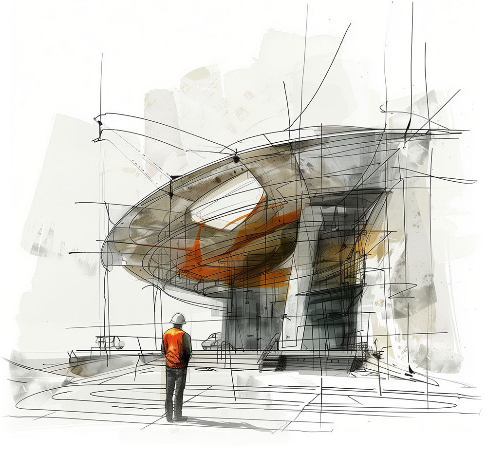


Nuestras oficinas están en Barcelona, Cancún, Chicago y Santo Domingo, pero gracias a la tecnología podemos desarrollar proyectos en cualquier parte del mundo.
Barcelona
Bac de Roda 136
08020, Barcelona
Spain
Madrid
Av. de Buendía 11
19005 Guadalajara (Madrid)
Spain
Chicago
373 Hazel Ave, Apt A1
60022, Glencoe, Illinois
United States