

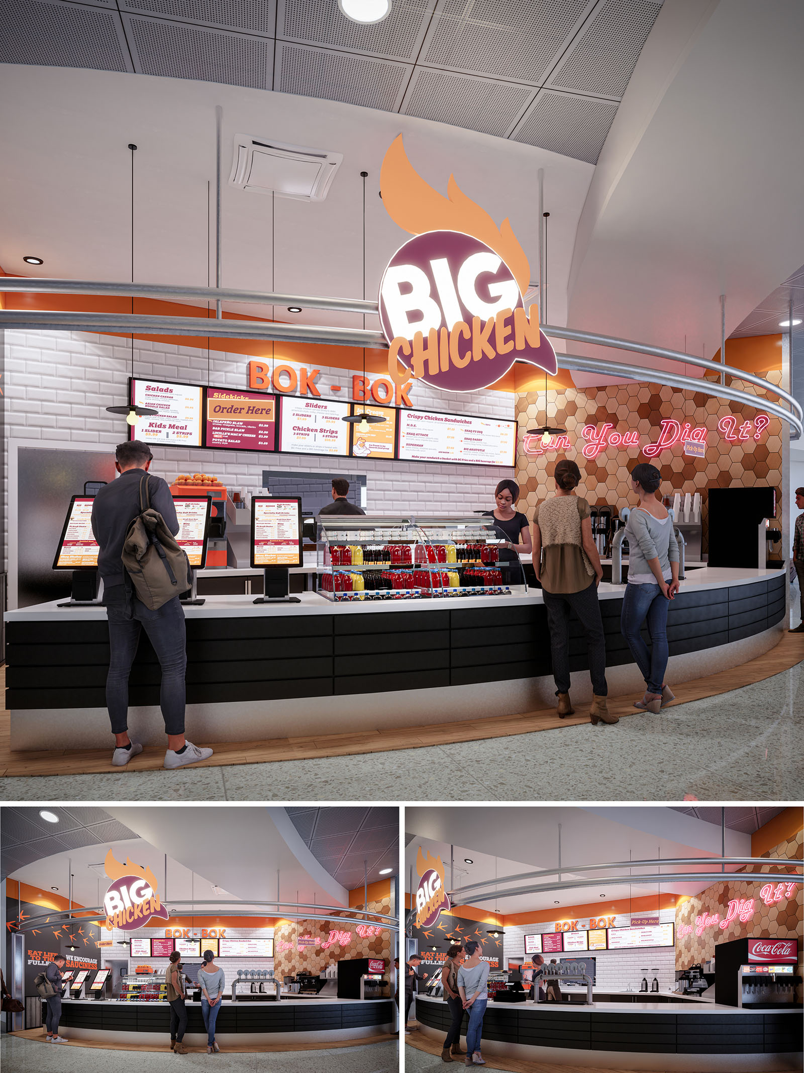
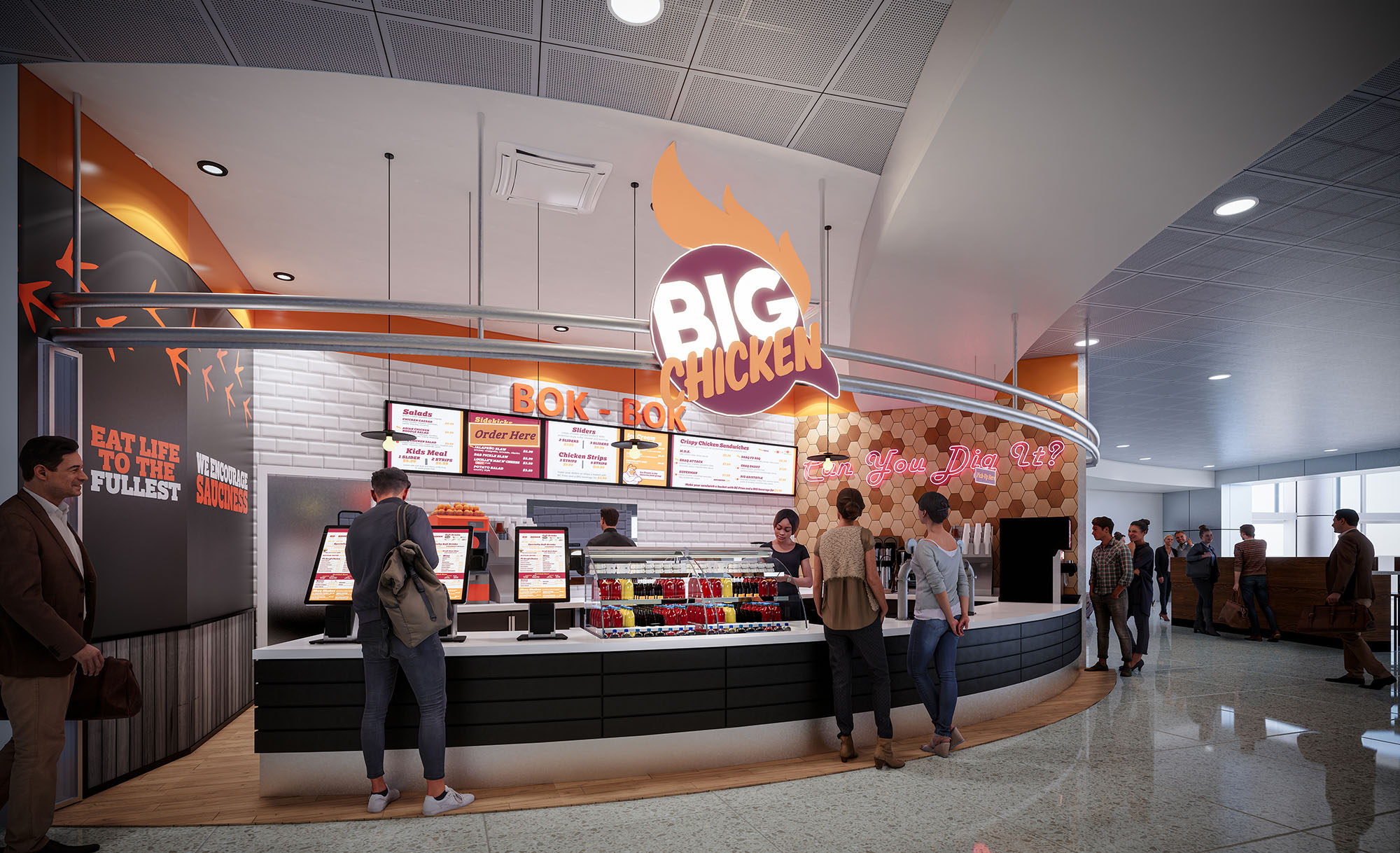
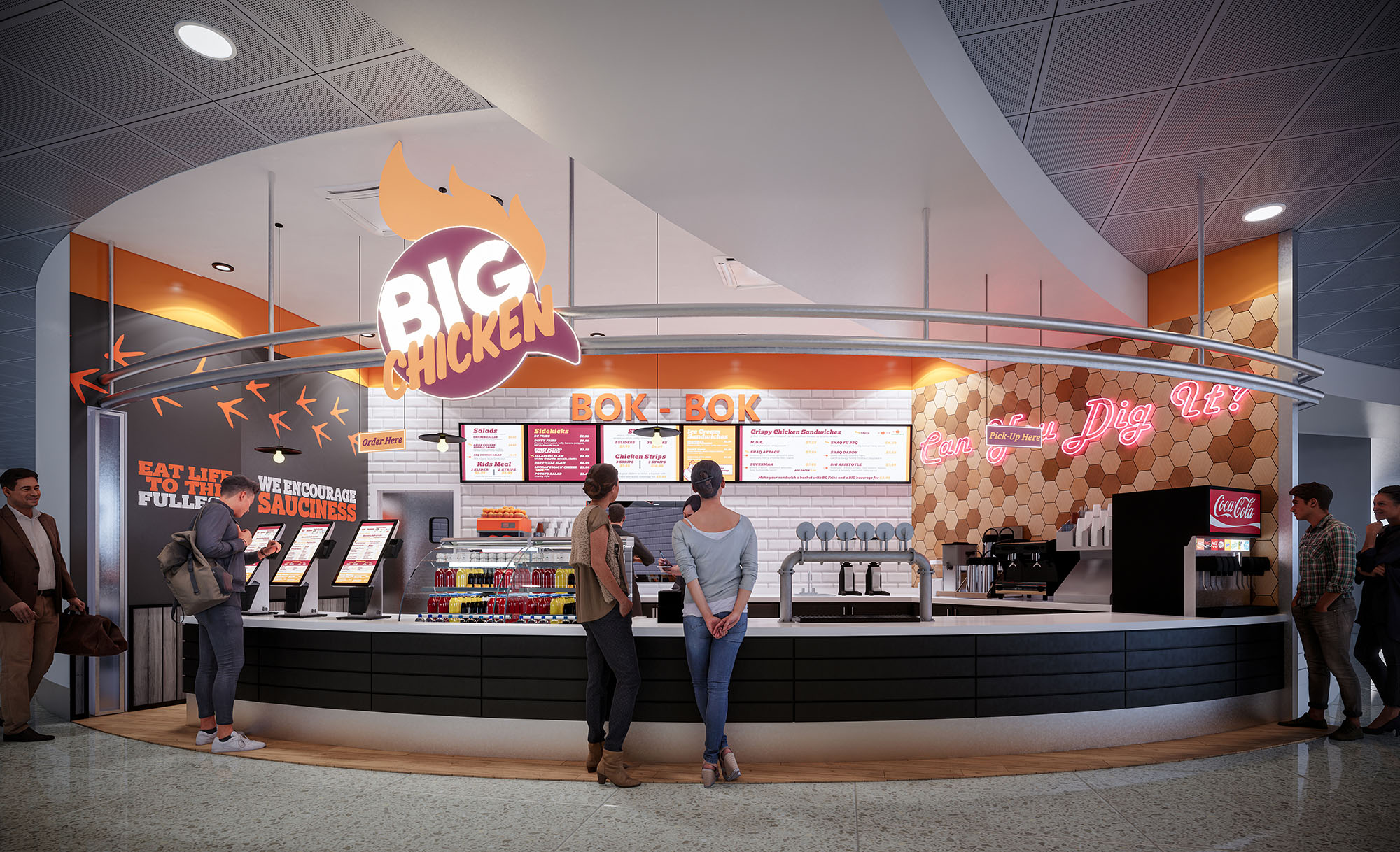
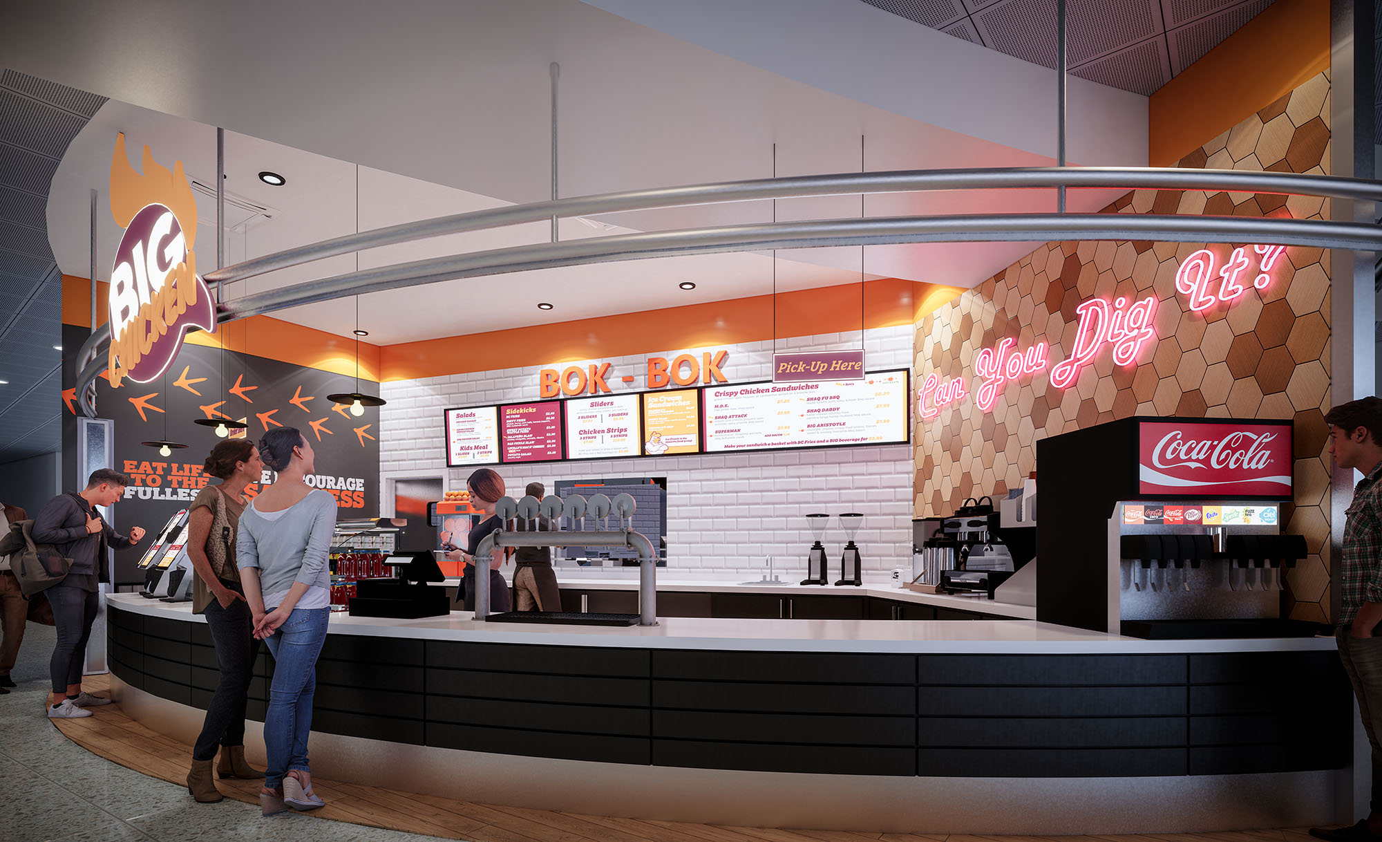
BIG CHICKEN in Miami is conceived as a bold, high‑impact quick‑service environment that translates the energy of a vibrant food brand into spatial form. The design amplifies the playful identity through oversized graphic elements, neon statements, and a warm, appetizing palette centered on oranges, yellows, and charcoals. The architectural strategy focuses on creating a clear, legible front‑of‑house experience that supports rapid service, digital ordering, and strong visual recognition within a busy retail or transit context.
The formal language is based on curves and sweeping lines, expressed in the plan of the counter, the overhead lighting track, and the signage band. These gestures guide customers intuitively along the order‑pay‑pickup sequence while framing the kitchen as a dynamic backdrop. Brand storytelling is integrated into every surface, transforming the restaurant into an immersive, memorable destination rather than a generic food outlet.
The front counter defines a generous concave arc toward the public space, maximizing visibility and encouraging engagement from multiple approach angles. Self‑service kiosks are positioned on the leading edge of this curve, allowing digital ordering to occur without obstructing the main counter. This placement separates browsing from queuing, reducing congestion and improving throughput at peak hours.
Behind the kiosks, the primary service line is organized as a clear linear sequence: illuminated menu boards, open display of beverages, and a visible preparation zone. The continuous counter surface accommodates both order and pickup functions while maintaining sufficient depth for equipment and staff circulation. Vertical sight lines allow guests to visually connect with food preparation, reinforcing transparency and quality, while lateral circulation in front of the façade remains fluid and unobstructed.
The material palette balances a clean, hygienic base with textured, brand‑driven accents. Glossy white subway tiles line the main back wall, providing a neutral, light‑reflective surface that enhances brightness and simplifies maintenance. In contrast, the lower counter is clad in horizontal black panels, grounding the composition and concealing operational wear at high‑contact zones.
A feature wall in honeycomb‑patterned tiles introduces warmth and a subtle reference to poultry and comfort food, using tones of caramel, sand, and amber. This surface acts as a visual anchor for the neon slogan while complementing the orange brand band that runs above the menu area. The overall chromatic strategy—white, black, and wood neutrals animated by orange and magenta light—creates a contemporary yet inviting ambiance that reads instantly from afar.
Lighting is conceived as both functional infrastructure and brand expression. A circular overhead rail traces the geometry of the counter, integrating downlights that evenly wash the work surfaces and customer zone. This rail also supports the prominent BIG CHICKEN logo, allowing it to float in space as a three‑dimensional beacon visible from multiple perspectives.
Neon typography and backlit menu boards create layered illumination, adding depth and hierarchy to the visual field. Warm color temperatures near the food display enhance product appeal, while cooler ambient lighting in the ceiling grid ensures visual comfort. The combination of direct, indirect, and accent lighting eliminates dark corners, enhances safety, and reinforces the energetic, urban character of the brand.
The counter design favors clean lines, minimal jointing, and robust, high‑durability finishes suited to intensive use. Edges are carefully radiused to soften the interface between guests and the built elements, while toe‑kicks in metallic tones protect against impact and add a subtle reflective base. Integrated display shelving for bottled beverages turns a functional element into a colorful focal point, supporting impulse decisions and emphasizing grab‑and‑go convenience.
Digital kiosks are treated as architectural objects rather than add‑ons, with consistent alignment, cable management, and coordinated color. The open view into the preparation zone provides an informal “theater kitchen” effect without compromising efficiency. All details—from pendant fittings to menu frames—follow a cohesive visual language, reinforcing brand identity and providing a reassuring sense of order for the customer.
Sustainability is addressed through a combination of material selection, lighting strategy, and operational planning. The extensive use of ceramic tile and high‑pressure laminates provides long‑life, low‑maintenance surfaces that withstand cleaning cycles, reducing the need for early replacement. Where possible, substrates and finishes can be specified with recycled content and low‑VOC emissions to improve indoor air quality.
LED technology dominates the lighting design, significantly lowering energy consumption while supporting long lamp life and reduced maintenance. The strong daylight‑reflective surfaces, particularly the white tile field and light ceiling, allow ambient illumination levels to be achieved with fewer fixtures. The compact, linear back‑of‑house arrangement minimizes staff travel distances, improving ergonomics and reducing energy wasted in unnecessary movements and duplicated equipment. Together, these choices create a restaurant environment that is not only visually impactful but also resource‑conscious and durable over time.


Our offices are located in Barcelona, Cancún, Chicago and Santo Domingo, but thanks to technology we can do projects on all over the world.
Barcelona
Bac de Roda 136
08020, Barcelona
Spain
Madrid
Av. de Buendía 11
19005 Guadalajara (Madrid)
Spain
Chicago
373 Hazel Ave, Apt A1
60022, Glencoe, Illinois
United States