

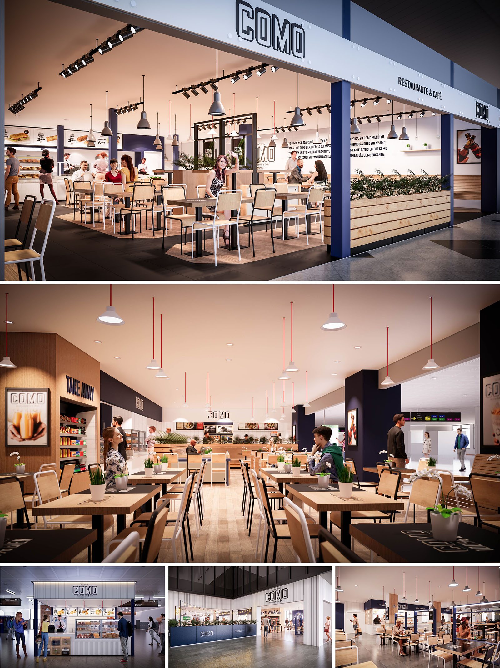
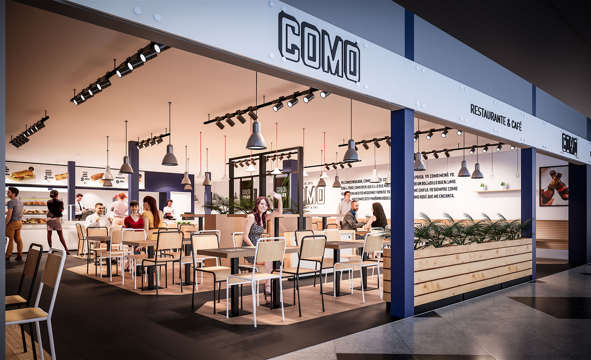
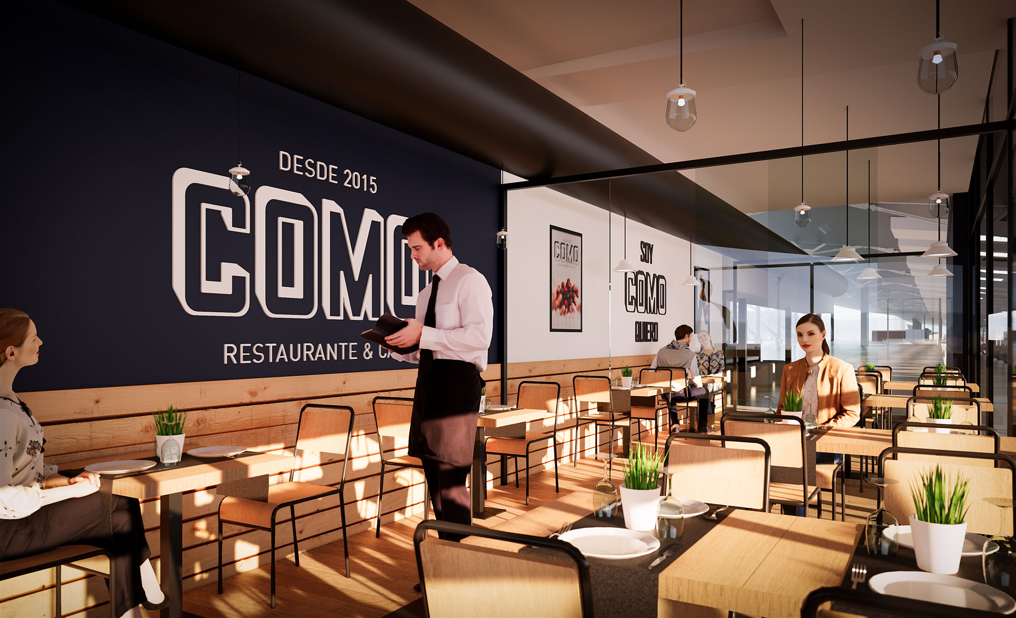
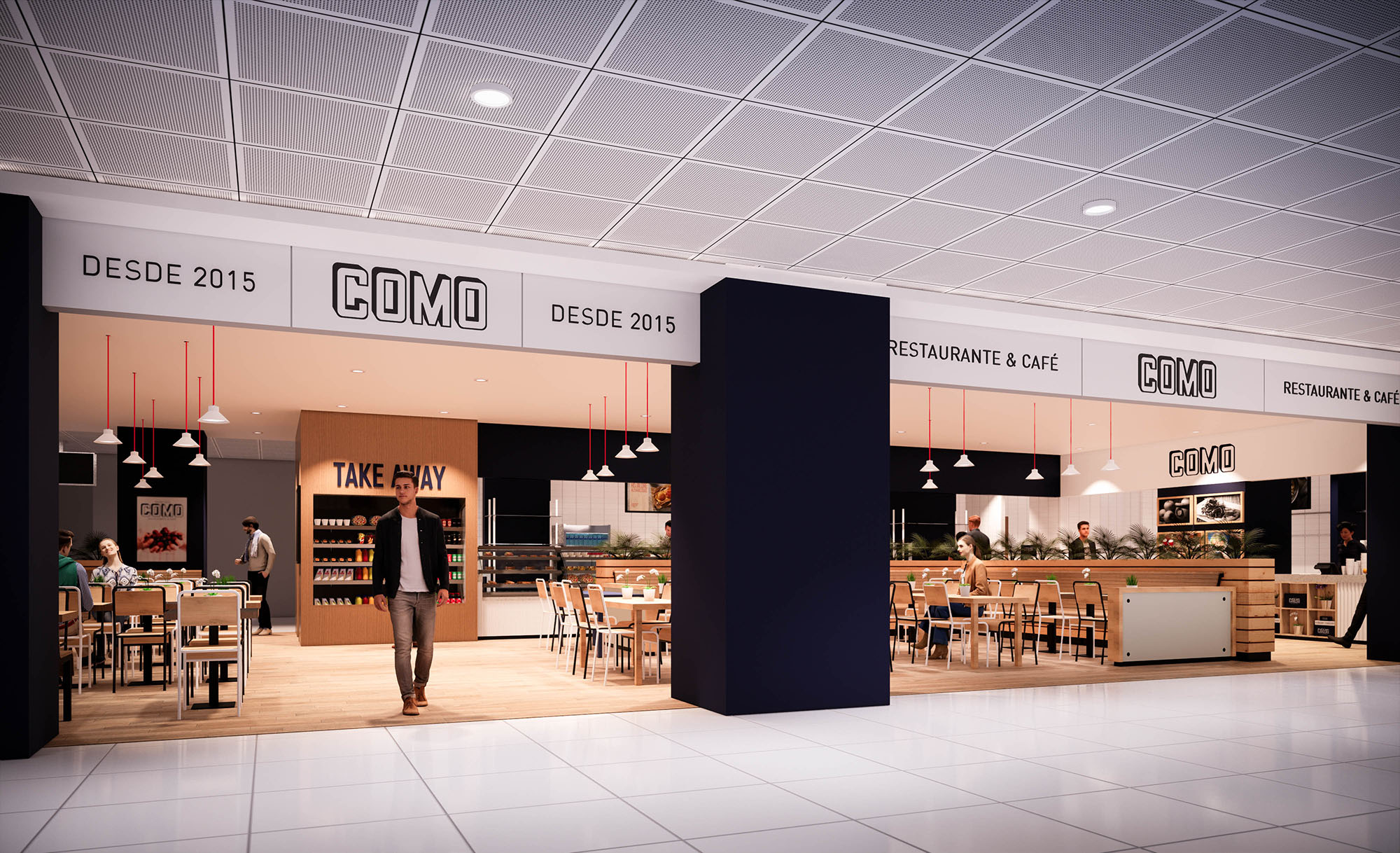
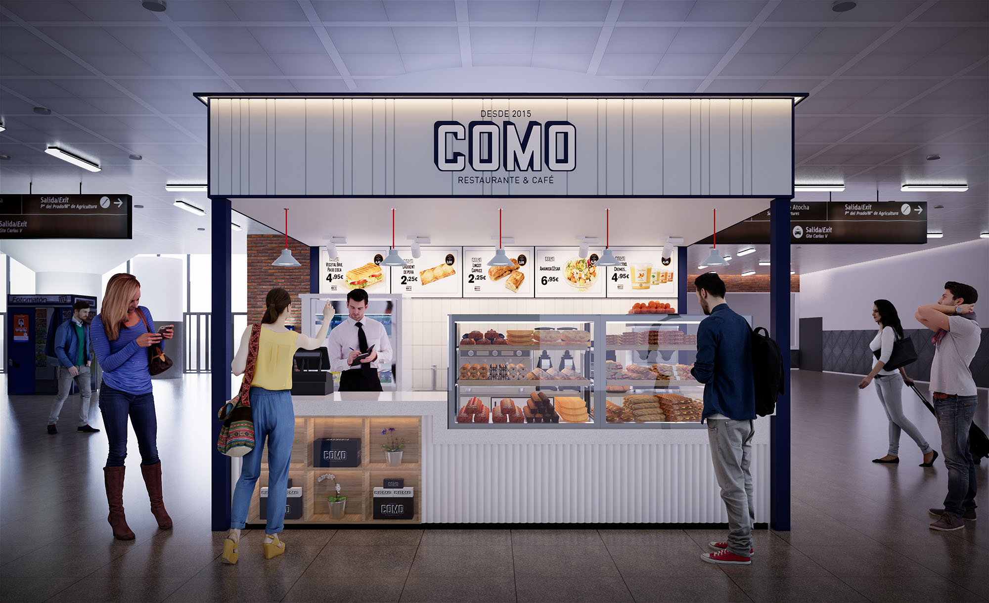
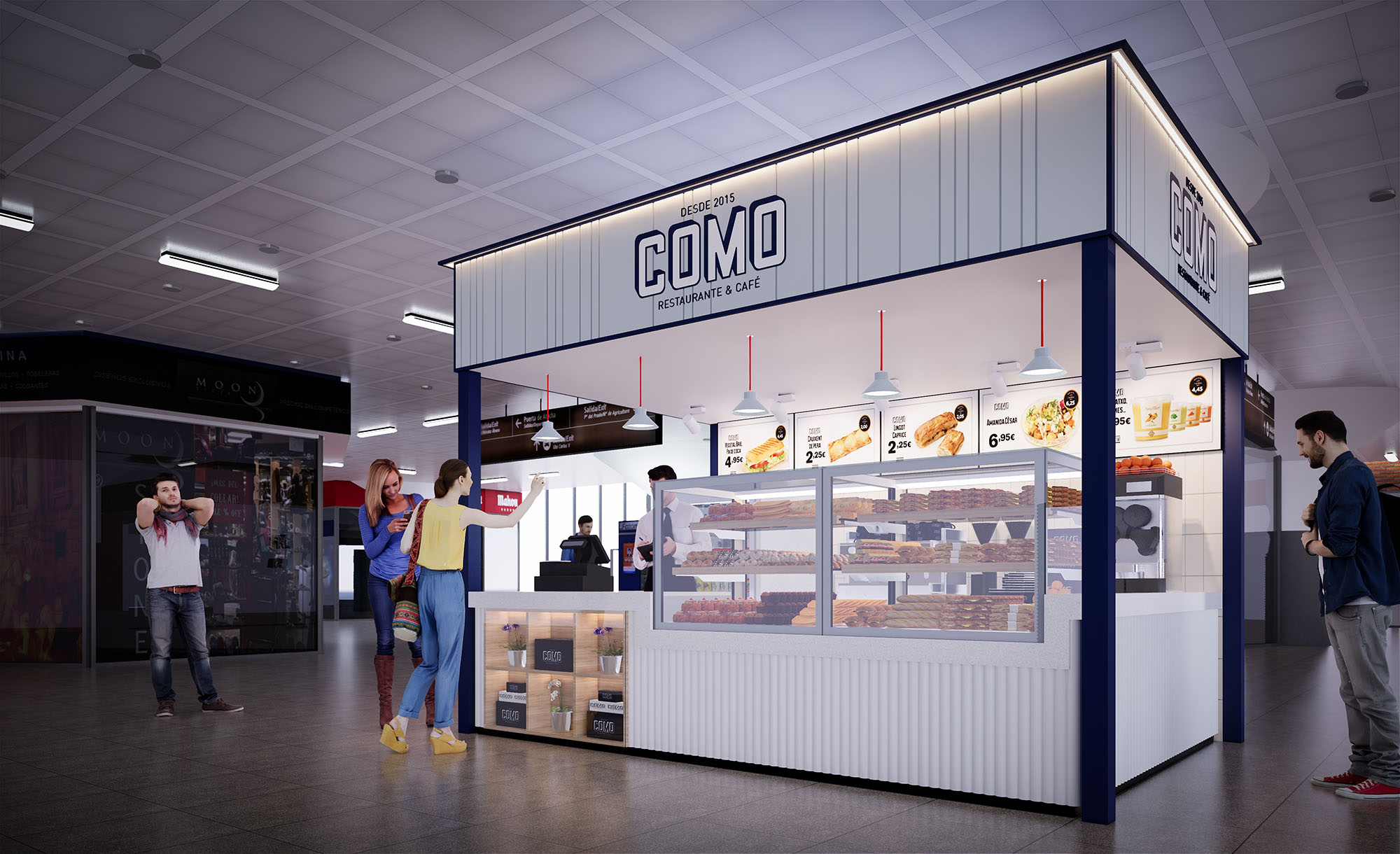
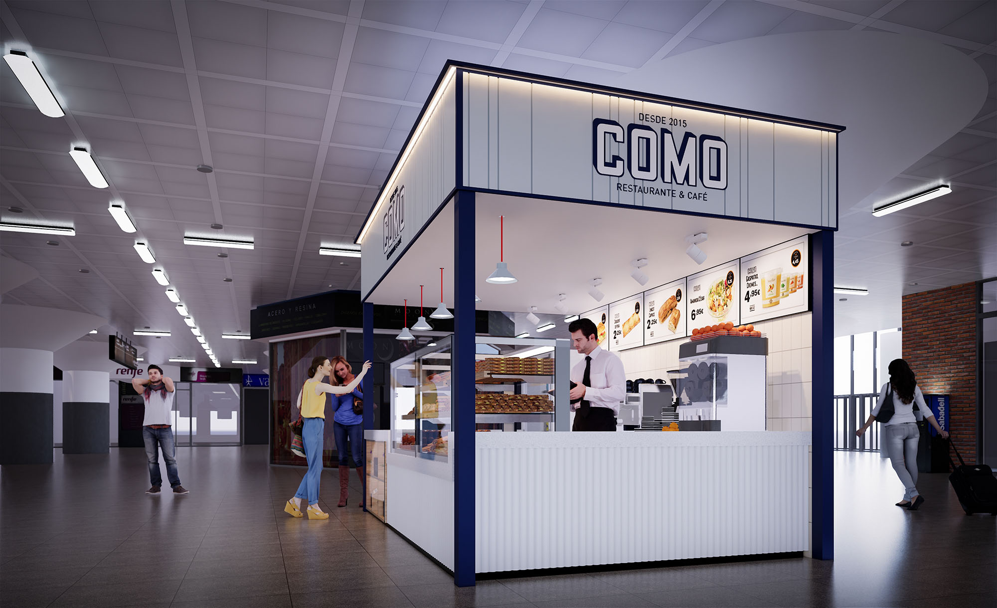
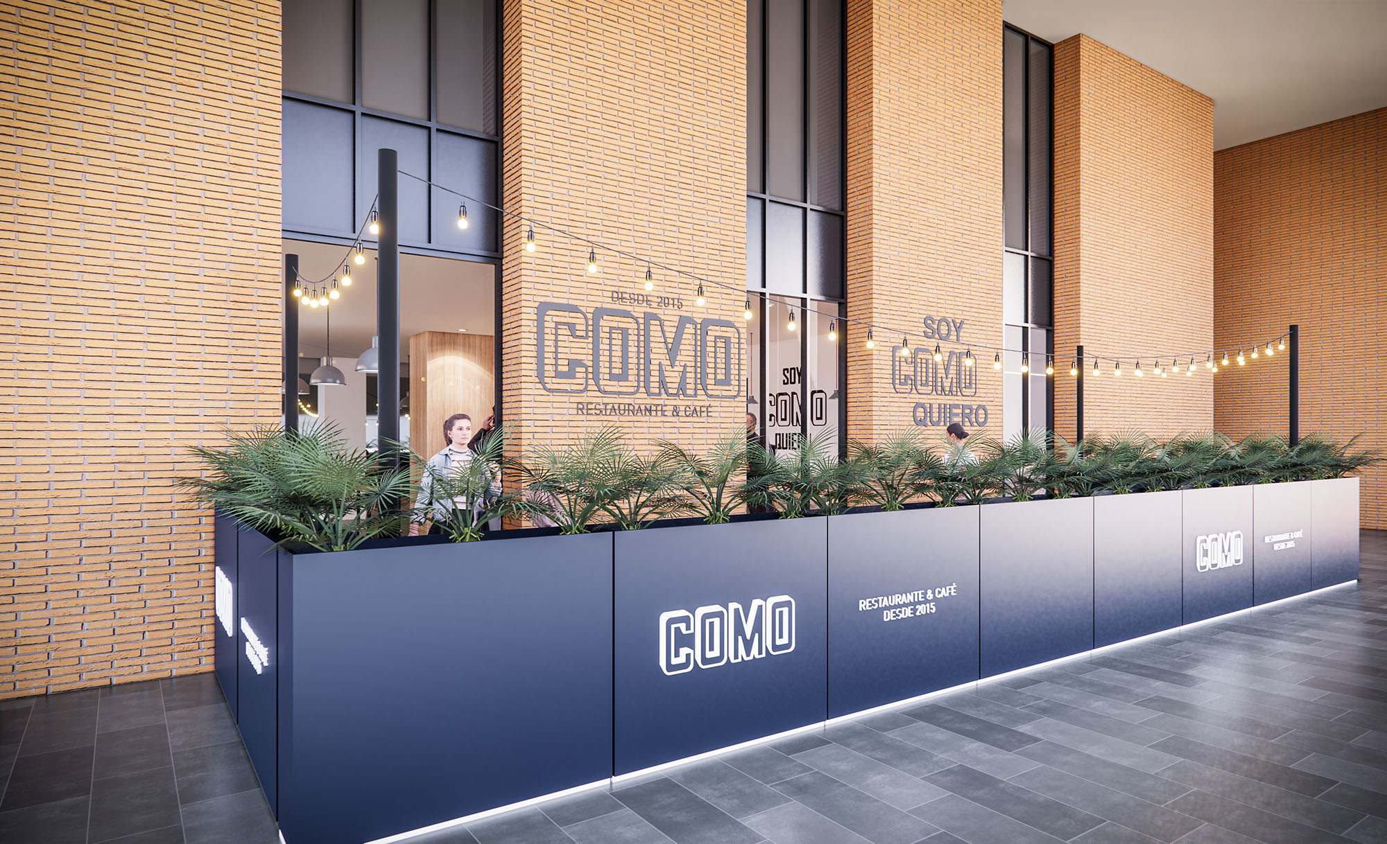
COMO is conceived as a contemporary fast‑casual restaurant brand that can be replicated in multiple Iberian locations while maintaining a clear and recognizable identity. The design language combines the efficiency of a food court kiosk with the warmth of a neighborhood café, using a palette of light woods, neutral tones and precise graphic elements. The architecture privileges visual permeability, allowing the interior atmosphere to extend into the surrounding circulation areas and inviting spontaneous access.
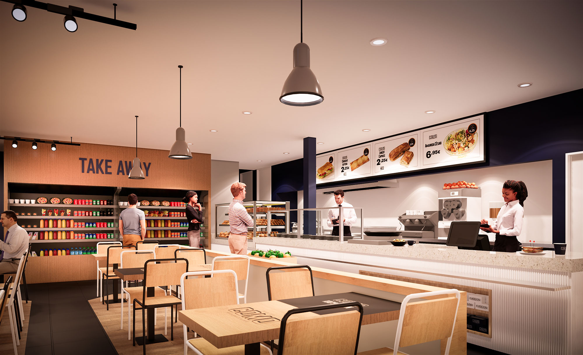
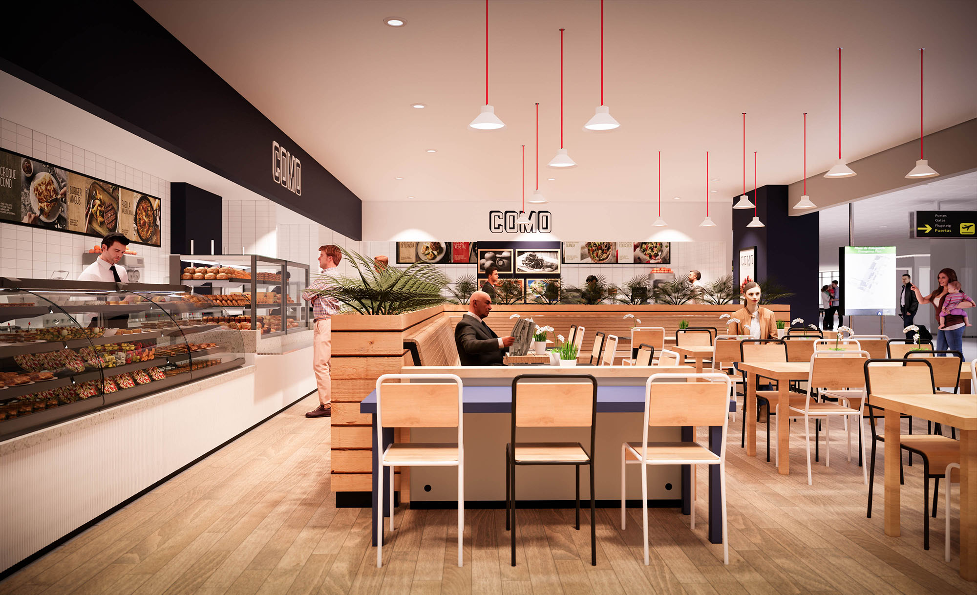
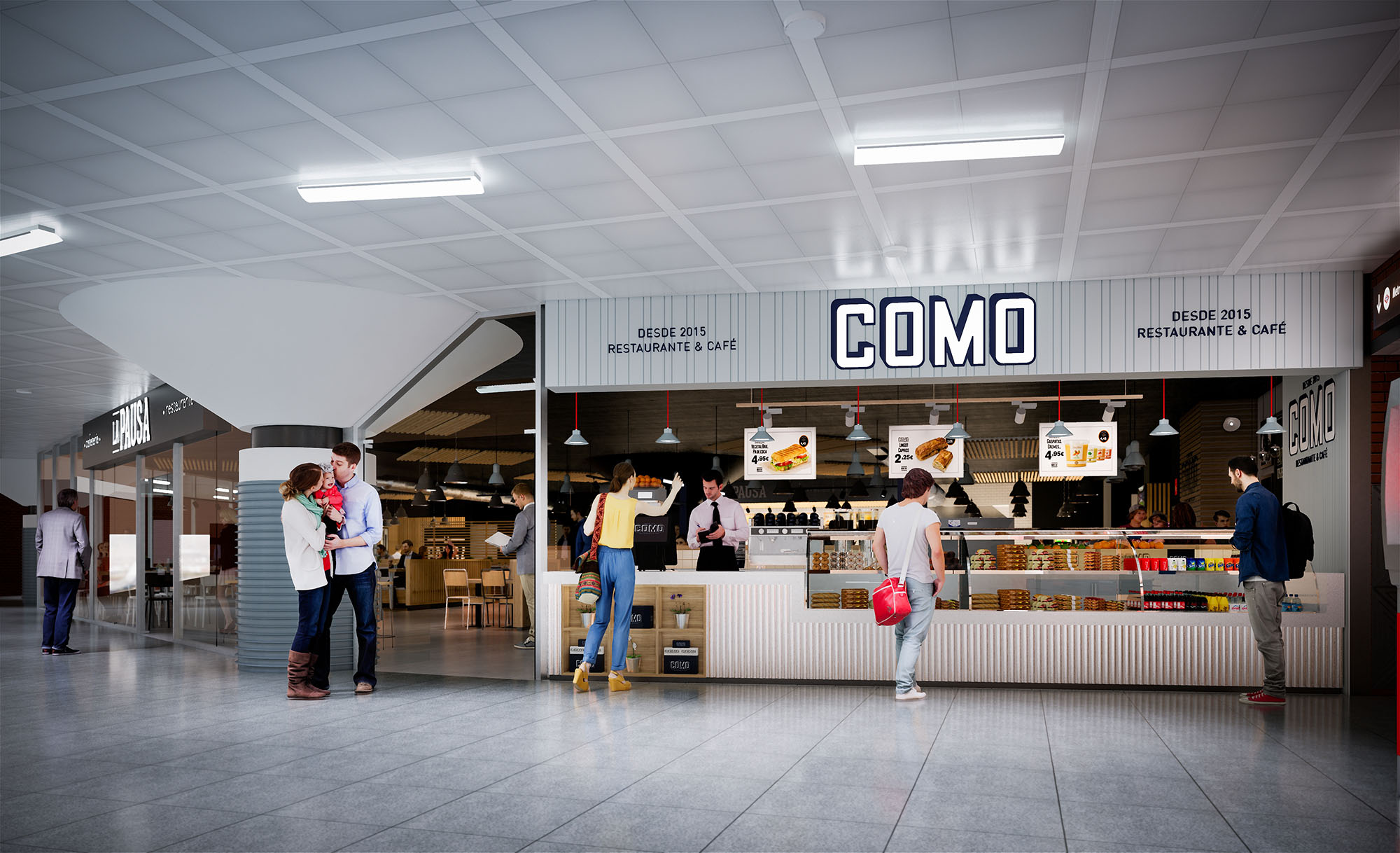
The concept emphasizes transparency of preparation and product display, reinforcing trust and freshness. Open counters, visible kitchens and large menu graphics construct a direct dialogue between customer and food. This approach positions COMO as an accessible, everyday meeting place within airports and retail environments in Spain and Portugal.
The restaurants operate as permeable islands within larger commercial flows, often open on two or three sides. Structural frames define a clear perimeter without enclosing it, creating a legible edge while preserving continuity with the mall or terminal. Strategic alignment of the main counter towards the principal pedestrian axis captures attention and simplifies wayfinding.
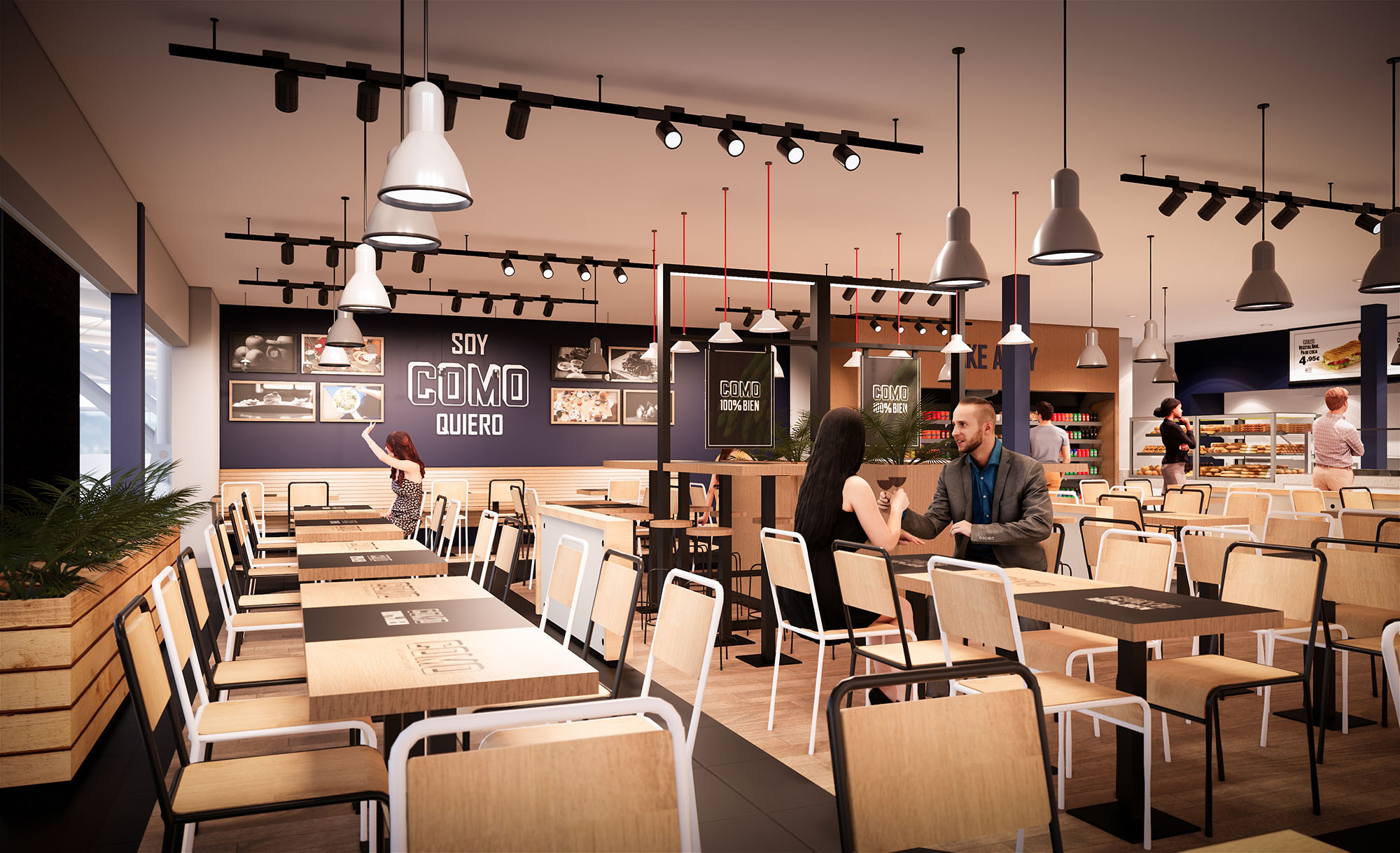
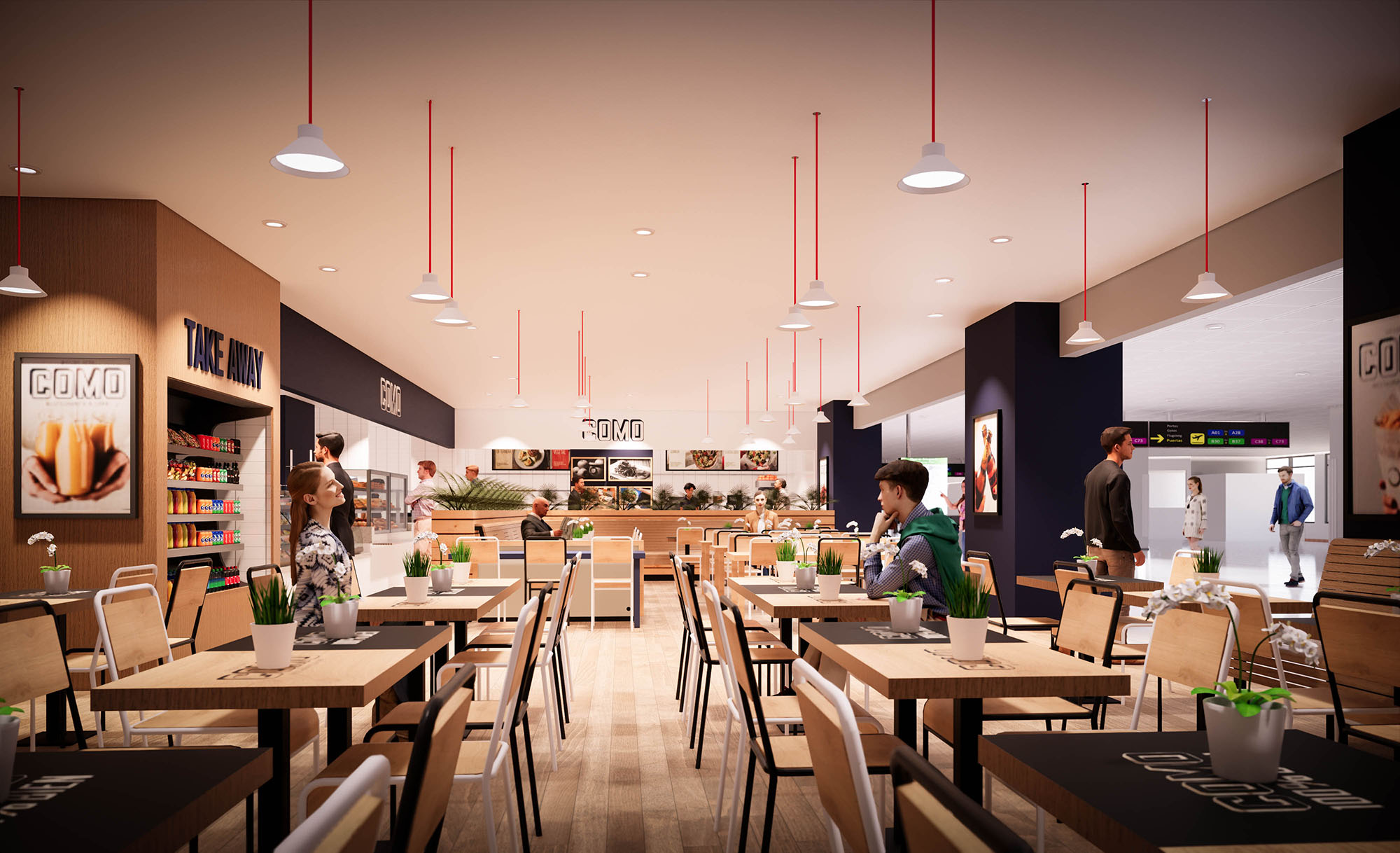
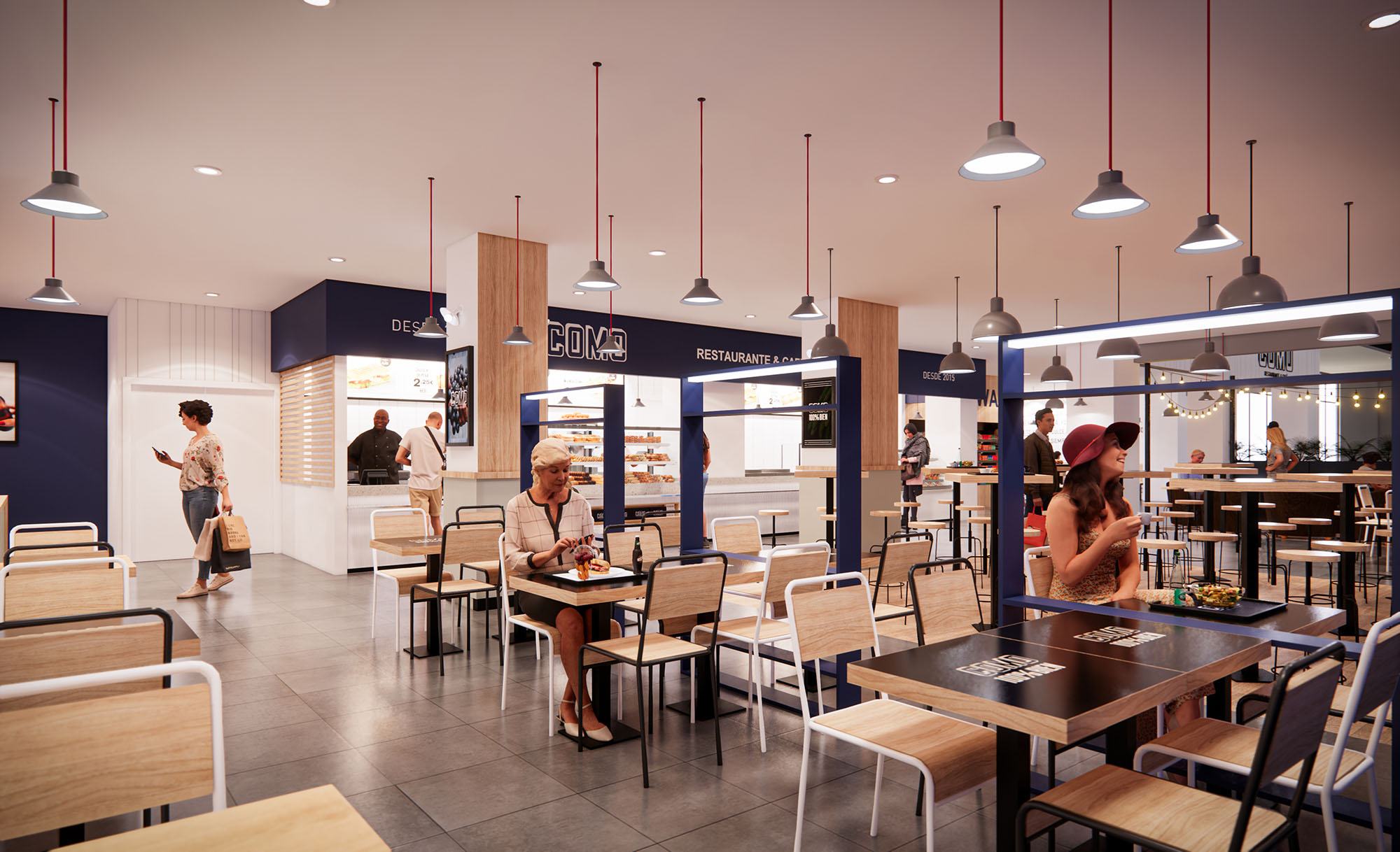
The interior layout is organized into sequential bands: service and display at the back, a central dining field of flexible tables, and a soft transition edge facing the circulation with planters and low partitions. This zoning allows efficient staff movement parallel to the counter, while guests circulate transversally through intuitive paths. The modular furniture system facilitates rapid reconfiguration for different peak periods and varying unit sizes.
The material strategy balances durability with a warm, approachable expression. Light oak-toned laminates dominate wall claddings and tabletops, contrasted with black metal table frames and chair structures that introduce an industrial note. Vertical timber slats in the planter fronts and counters add tactile rhythm and human scale.
The color palette is anchored by off‑white surfaces, deep navy accent walls and signage bands, and precise black typography for the COMO logo. This triad ensures strong brand recall while remaining restrained enough to integrate into multiple host architectures. Occasional red elements in pendant suspensions inject a subtle vibrancy that guides the eye along the space.
Lighting supports both operational clarity and a comfortable dining ambiance. Linear track systems run parallel to the main façade, washing tables and circulation with a uniform, warm-white light suitable for food presentation. Complementing this, a grid of suspended dome pendants introduces a more intimate scale, visually lowering the ceiling above the seating area.
Accent lighting is focused on the service counter, baked goods display and menu boards, emphasizing decision points and shortening the ordering process. Reflections from pale ceilings and light timber surfaces help to diffuse brightness, avoiding glare while maintaining a clean, airy perception even in deep interior locations without natural light.
The furniture language is deliberately simple and robust, using straight lines and honest joints to communicate functionality and transparency. Tables are predominantly rectangular to maximize occupancy flexibility, complemented by some smaller two‑top configurations along perimeters for more private use. Chairs combine metal frames with timber or light composite seats and backs, ensuring resistance in high‑turnover environments.
Brand expression is integrated architecturally rather than applied as decoration. The COMO logotype appears in backlit fascia signs, menu boards and subtly on tabletop mats, all in a consistent typographic system. Large-scale food imagery is framed within the same modular grid as the architecture, reinforcing a coherent visual rhythm throughout the different locations.
Sustainability is addressed through both material selection and operational intelligence. Preference is given to certified wood products and high-pressure laminates with extended lifecycle performance, reducing replacement frequency. Metal structures for furniture and counters are designed as demountable systems, allowing components to be repaired, recycled or reconfigured for future units.
Energy-efficient LED lighting, combined with carefully calculated luminous levels, reduces consumption while maintaining visual comfort. Standardized modules for counters, planters and storage shorten construction times and minimize onsite waste. Indoor plants incorporated into planter edges contribute to acoustic absorption and improve perceived air quality, while reinforcing a biophilic connection within otherwise hard commercial environments.
LIST OF PROJECTS EXPERIENCE
Designed, Executed and/or Built Projects
SPAIN
1. COMO - Mallorca - L7.01
2. COMO - RENFE - Atocha
3. COMO - RENFE - Sevilla
4. COMO - RENFE - Atocha
PORTUGAL
5. COMO - Oporto - Tierra Check In

COMO is conceived as a contemporary fast‑casual restaurant brand that can be replicated in multiple Iberian locations while maintaining a clear and recognizable identity. The design language combines the efficiency of a food court kiosk with the warmth of a neighborhood café, using a palette of light woods, neutral tones and precise graphic elements. The architecture privileges visual permeability, allowing the interior atmosphere to extend into the surrounding circulation areas and inviting spontaneous access.
The concept emphasizes transparency of preparation and product display, reinforcing trust and freshness. Open counters, visible kitchens and large menu graphics construct a direct dialogue between customer and food. This approach positions COMO as an accessible, everyday meeting place within airports and retail environments in Spain and Portugal.
The restaurants operate as permeable islands within larger commercial flows, often open on two or three sides. Structural frames define a clear perimeter without enclosing it, creating a legible edge while preserving continuity with the mall or terminal. Strategic alignment of the main counter towards the principal pedestrian axis captures attention and simplifies wayfinding.
The interior layout is organized into sequential bands: service and display at the back, a central dining field of flexible tables, and a soft transition edge facing the circulation with planters and low partitions. This zoning allows efficient staff movement parallel to the counter, while guests circulate transversally through intuitive paths. The modular furniture system facilitates rapid reconfiguration for different peak periods and varying unit sizes.
The material strategy balances durability with a warm, approachable expression. Light oak-toned laminates dominate wall claddings and tabletops, contrasted with black metal table frames and chair structures that introduce an industrial note. Vertical timber slats in the planter fronts and counters add tactile rhythm and human scale.
The color palette is anchored by off‑white surfaces, deep navy accent walls and signage bands, and precise black typography for the COMO logo. This triad ensures strong brand recall while remaining restrained enough to integrate into multiple host architectures. Occasional red elements in pendant suspensions inject a subtle vibrancy that guides the eye along the space.
Lighting supports both operational clarity and a comfortable dining ambiance. Linear track systems run parallel to the main façade, washing tables and circulation with a uniform, warm-white light suitable for food presentation. Complementing this, a grid of suspended dome pendants introduces a more intimate scale, visually lowering the ceiling above the seating area.
Accent lighting is focused on the service counter, baked goods display and menu boards, emphasizing decision points and shortening the ordering process. Reflections from pale ceilings and light timber surfaces help to diffuse brightness, avoiding glare while maintaining a clean, airy perception even in deep interior locations without natural light.
The furniture language is deliberately simple and robust, using straight lines and honest joints to communicate functionality and transparency. Tables are predominantly rectangular to maximize occupancy flexibility, complemented by some smaller two‑top configurations along perimeters for more private use. Chairs combine metal frames with timber or light composite seats and backs, ensuring resistance in high‑turnover environments.
Brand expression is integrated architecturally rather than applied as decoration. The COMO logotype appears in backlit fascia signs, menu boards and subtly on tabletop mats, all in a consistent typographic system. Large-scale food imagery is framed within the same modular grid as the architecture, reinforcing a coherent visual rhythm throughout the different locations.
Sustainability is addressed through both material selection and operational intelligence. Preference is given to certified wood products and high-pressure laminates with extended lifecycle performance, reducing replacement frequency. Metal structures for furniture and counters are designed as demountable systems, allowing components to be repaired, recycled or reconfigured for future units.
Energy-efficient LED lighting, combined with carefully calculated luminous levels, reduces consumption while maintaining visual comfort. Standardized modules for counters, planters and storage shorten construction times and minimize onsite waste. Indoor plants incorporated into planter edges contribute to acoustic absorption and improve perceived air quality, while reinforcing a biophilic connection within otherwise hard commercial environments.


Our offices are located in Barcelona, Cancún, Chicago and Santo Domingo, but thanks to technology we can do projects on all over the world.
Barcelona
Bac de Roda 136
08020, Barcelona
Spain
Madrid
Av. de Buendía 11
19005 Guadalajara (Madrid)
Spain
Chicago
373 Hazel Ave, Apt A1
60022, Glencoe, Illinois
United States