

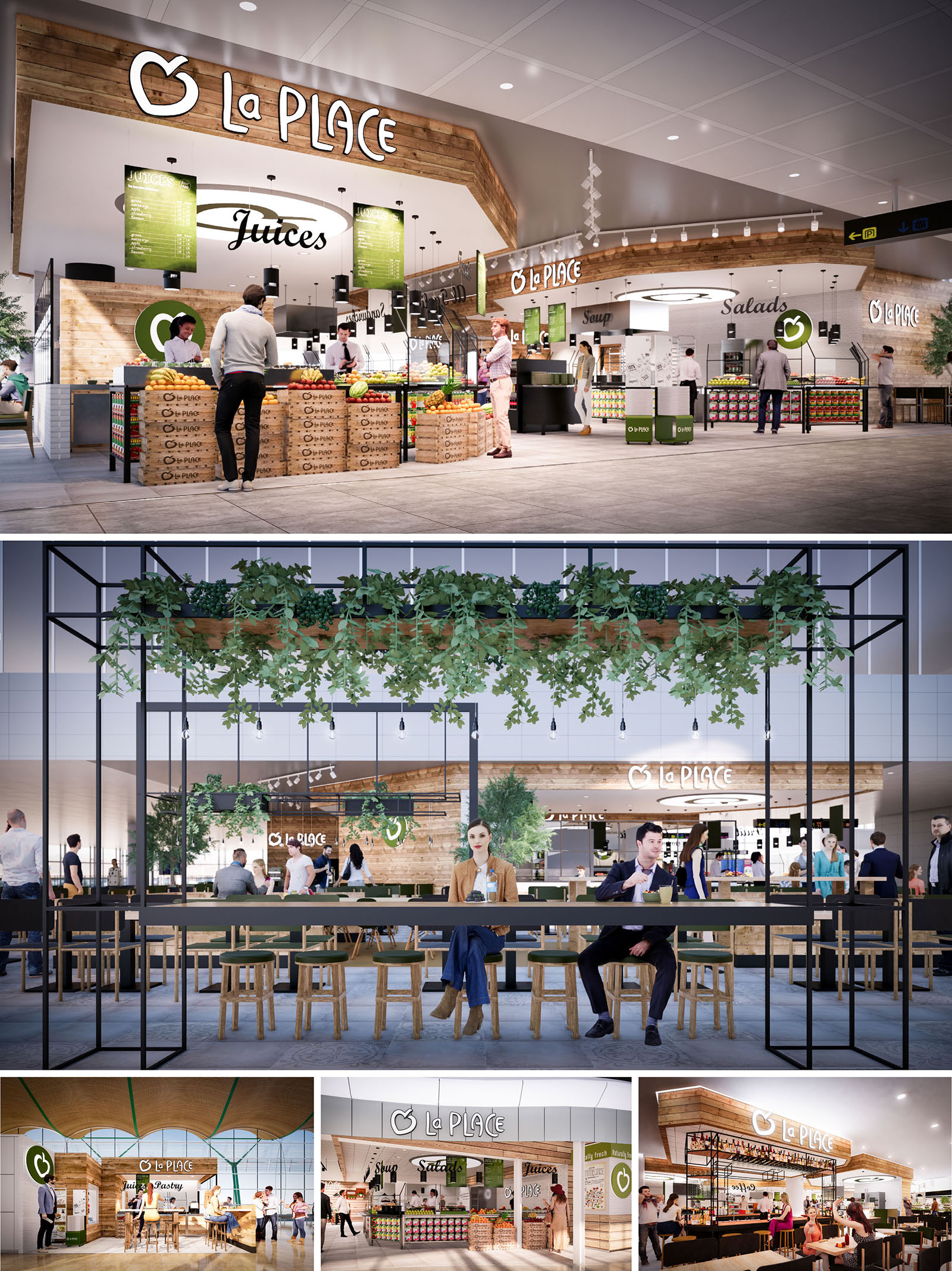
LA PLACE is conceived as an open, market-style restaurant that translates the freshness of a local food hall into the controlled environment of airports and shopping centers in Spain and Portugal. The design strategy is based on visual transparency, abundant product display and the integration of natural materials and greenery to communicate health, immediacy and trust. Instead of a closed restaurant box, the architecture dissolves boundaries and invites customers to flow around the food counters in a seamless way.
The primary gesture is a warm timber canopy that frames the brand and unifies the different food stations—juices, salads, soups and bakery—into a single recognisable identity. This canopy operates as an architectural “horizon line” in otherwise neutral concourses, creating a clear visual landmark while remaining permeable and light. The spatial language borrows from contemporary market halls, combining industrial precision with a tactile, human scale.
The layout is organised as a series of linear and corner counters, each dedicated to a specific food typology. These stations are arranged in a horseshoe or island configuration depending on location, allowing 360-degree accessibility and intuitive wayfinding. High product visibility at the perimeter encourages impulse decisions, while central preparation areas and back-of-house functions remain visually controlled yet connected.
Self-service and assisted-service zones are clearly distinguished through counter height, equipment integration and signage. Circulation is conceived to absorb peak flows common in transit environments: wide clear paths, orthogonal geometries and unobstructed sightlines reduce congestion and shorten decision-making time. Seating is deliberately placed slightly outside the service core, under lightweight metal pergolas, so that guests can visually remain in contact with the active food preparation scene without blocking operational areas.
The material palette is dominated by warm, lightly stained timber, white ceramic surfaces and black metal framing. Timber cladding wraps the canopy, counters and crates, evoking traditional market stalls and providing a soft contrast to the hard finishes of surrounding terminal architecture. The use of repetitive timber slats and stacked boxes reinforces a crafted, yet efficiently modular, character.
White tiles and solid surfaces are used in all food-contact and preparation areas, ensuring a hygienic and easy-to-clean backdrop that reflects light and enhances the perception of freshness. Black powder-coated steel structures introduce a contemporary, almost graphic element, framing signage, plant pergolas and communal tables. The brand’s green hue is applied strategically on signage, menu boards and accent elements, reinforcing the association with natural ingredients without overpowering the neutral base.
Lighting is designed to articulate the project at different scales: from airport concourse visibility to intimate dining moments. A continuous line of warm-white downlights integrated into the timber canopy highlights the serving counters and emphasises the quality of the fresh produce. Track-mounted spotlights allow flexibility to adapt to changing merchandising layouts, while ensuring that key functional zones—cash points, salad bars, juicing stations—remain perfectly lit.
In the seating areas, simple pendant luminaires hang from the black metal pergolas, creating a more domestic and calm atmosphere contrasted with the dynamic environment around. Reflected light from white ceilings and tiles, combined with accent lighting on the brand logo and menu rings, ensures high legibility from a distance and a recognisable identity within busy retail hubs.
Furniture is intentionally straightforward and robust, with solid wood stools and benches, and slender metal-framed communal tables. This combination supports high turnover and easy reconfiguration while maintaining visual coherence with the architectural envelope. Communal tables encourage social interaction and efficient use of space, crucial in compact, high-density contexts.
Greenery plays an essential role in softening the industrial elements. Planters integrated into elevated metal grids and pergolas introduce cascades of plants that visually lower the scale and create a subtle sense of enclosure. These green bands frame views toward the counters and help define the restaurant’s territory without solid walls. The brand identity is woven architecturally through the circular signage elements, menu rings above key counters and the consistent repetition of the apple icon, all carefully integrated into the timber and metal framework rather than applied as superficial graphics.
Sustainability is addressed through both material selection and operational planning. The predominant use of timber—sourced from certified suppliers where possible—contributes to a reduced embodied carbon footprint compared to fully metal or synthetic alternatives. Modular counters, crate displays and metal grid structures are designed for disassembly, allowing components to be reused or adapted across different locations, reducing waste during roll-out and refurbishment cycles.
Energy-efficient LED lighting, zoned and dimmable, minimises consumption while maintaining optimal luminance for food safety and brand visibility. The open market configuration facilitates natural cross-ventilation within the larger terminal or mall air system, reducing the need for enclosed, mechanically intensive micro-environments. The clear display of fresh, minimally processed products supports shorter supply chains and reduces packaging, aligning the architectural narrative with the brand’s commitment to healthier, more responsible food offerings.


Our offices are located in Barcelona, Cancún, Chicago and Santo Domingo, but thanks to technology we can do projects on all over the world.
Barcelona
Bac de Roda 136
08020, Barcelona
Spain
Madrid
Av. de Buendía 11
19005 Guadalajara (Madrid)
Spain
Chicago
373 Hazel Ave, Apt A1
60022, Glencoe, Illinois
United States