

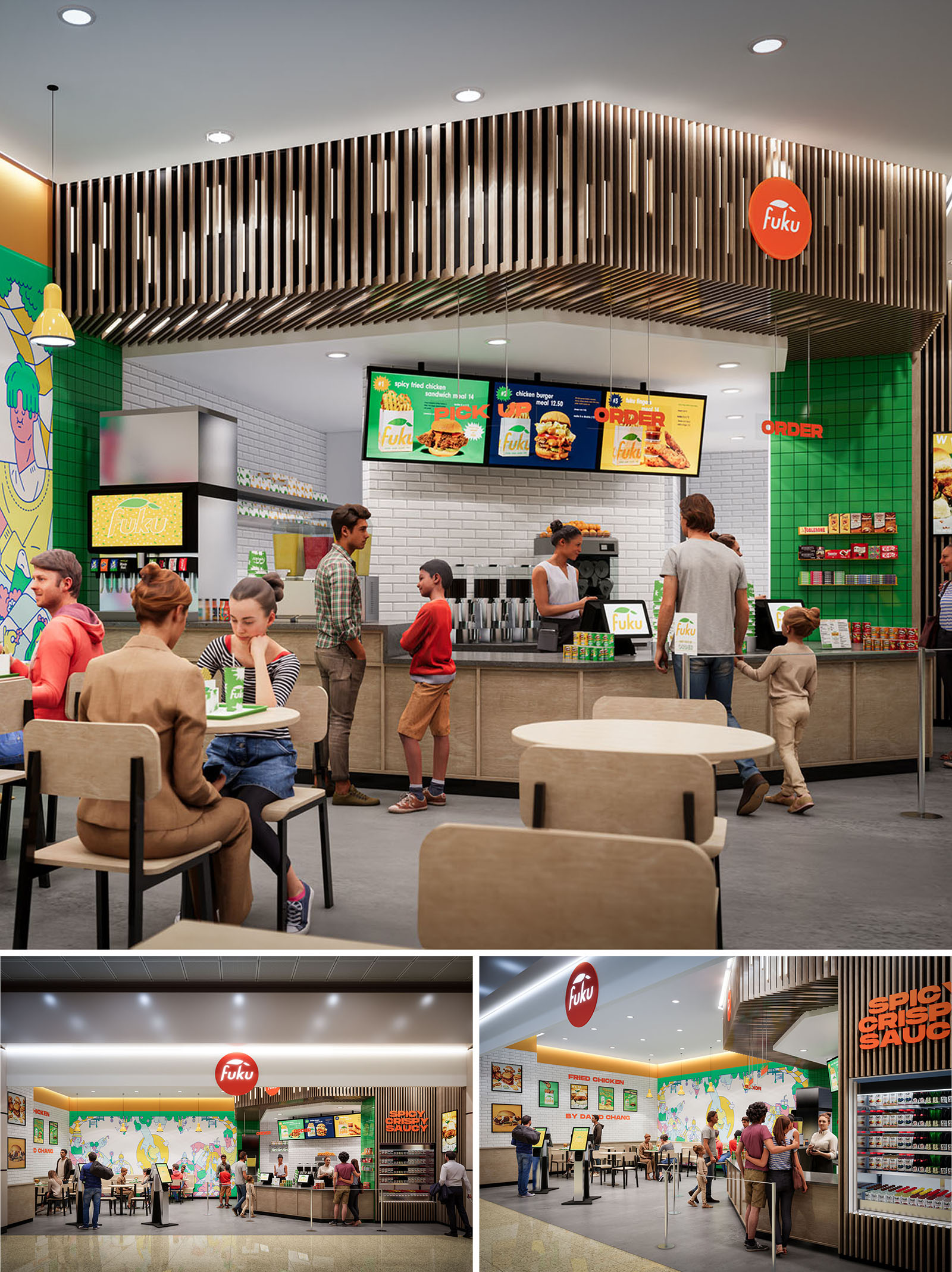
The design of FUKU in Salt Lake City translates a contemporary fast-casual dining model into a vivid, highly legible spatial experience. The concept combines a clean, minimalist architectural envelope with bold brand graphics and a playful color palette, producing a space that feels energetic yet ordered. The restaurant operates as a transparent stage for food preparation and service, where the counter, menu boards, and kitchen backdrop read as a continuous, easily readable band within the overall volume.
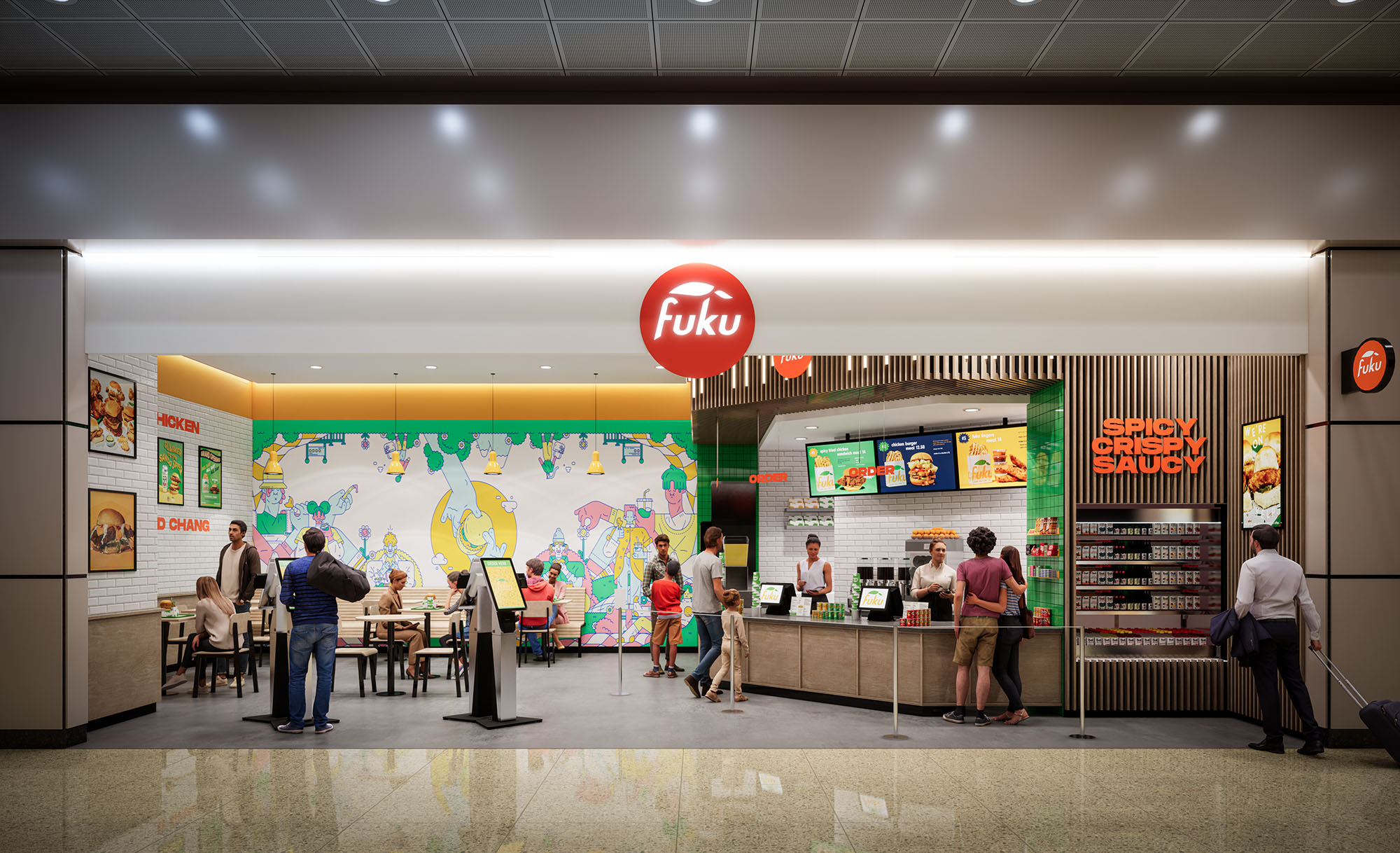
The layout emphasizes intuitive circulation and clear sightlines from the mall concourse. The open storefront, framed by a linear canopy and strong signage, blurs the boundary between interior dining and the public corridor, inviting passersby to visually engage with the activity inside.
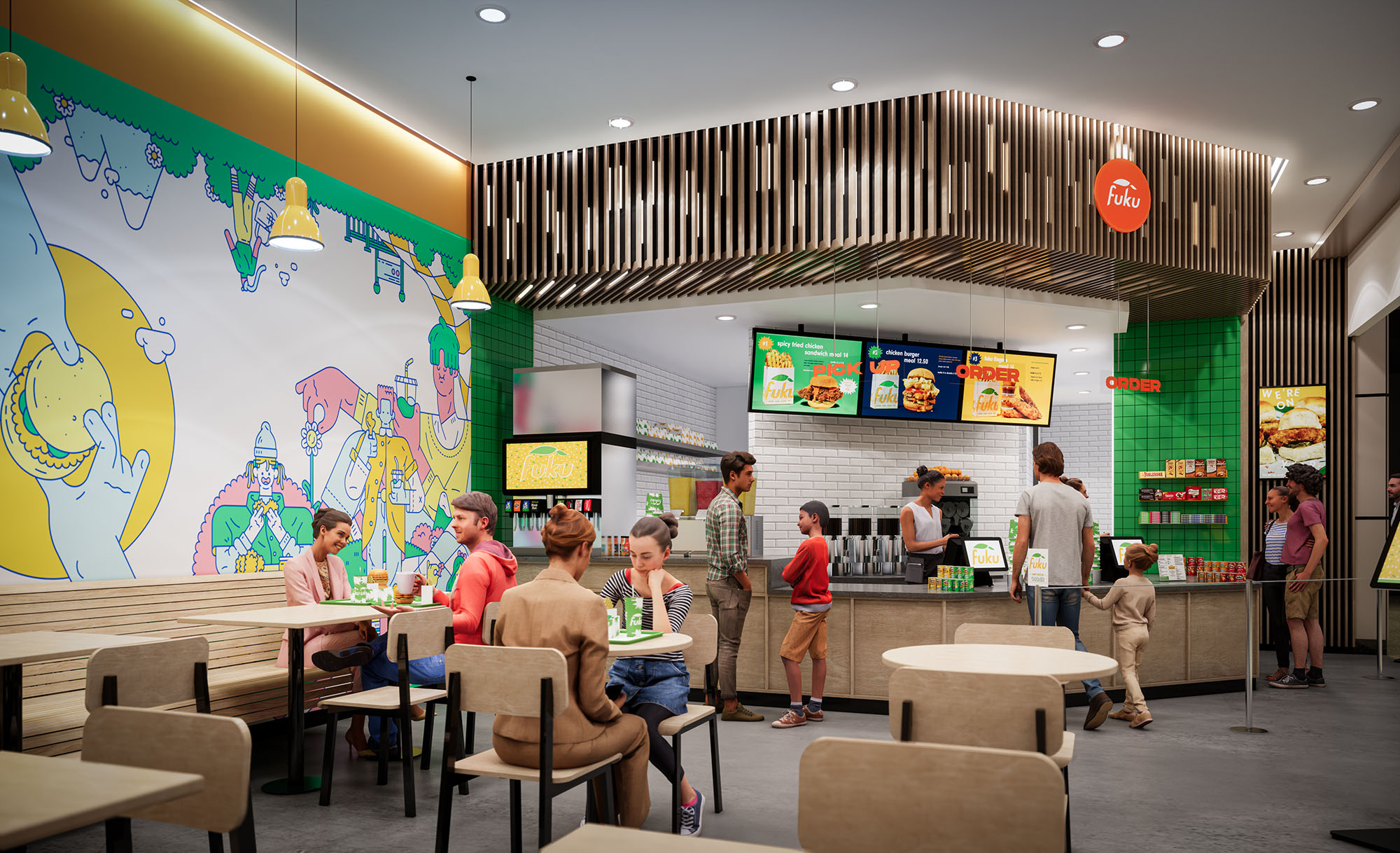
The plan is organized along a single main axis: entry and queuing run parallel to the service counter, allowing customers to understand ordering, pickup, and seating at a glance. The service line is anchored by illuminated digital menu boards suspended from the ceiling, creating a visual datum that guides movement. Ordering, beverage stations, and food pickup are sequenced logically from left to right, reducing congestion and minimizing cross-traffic.
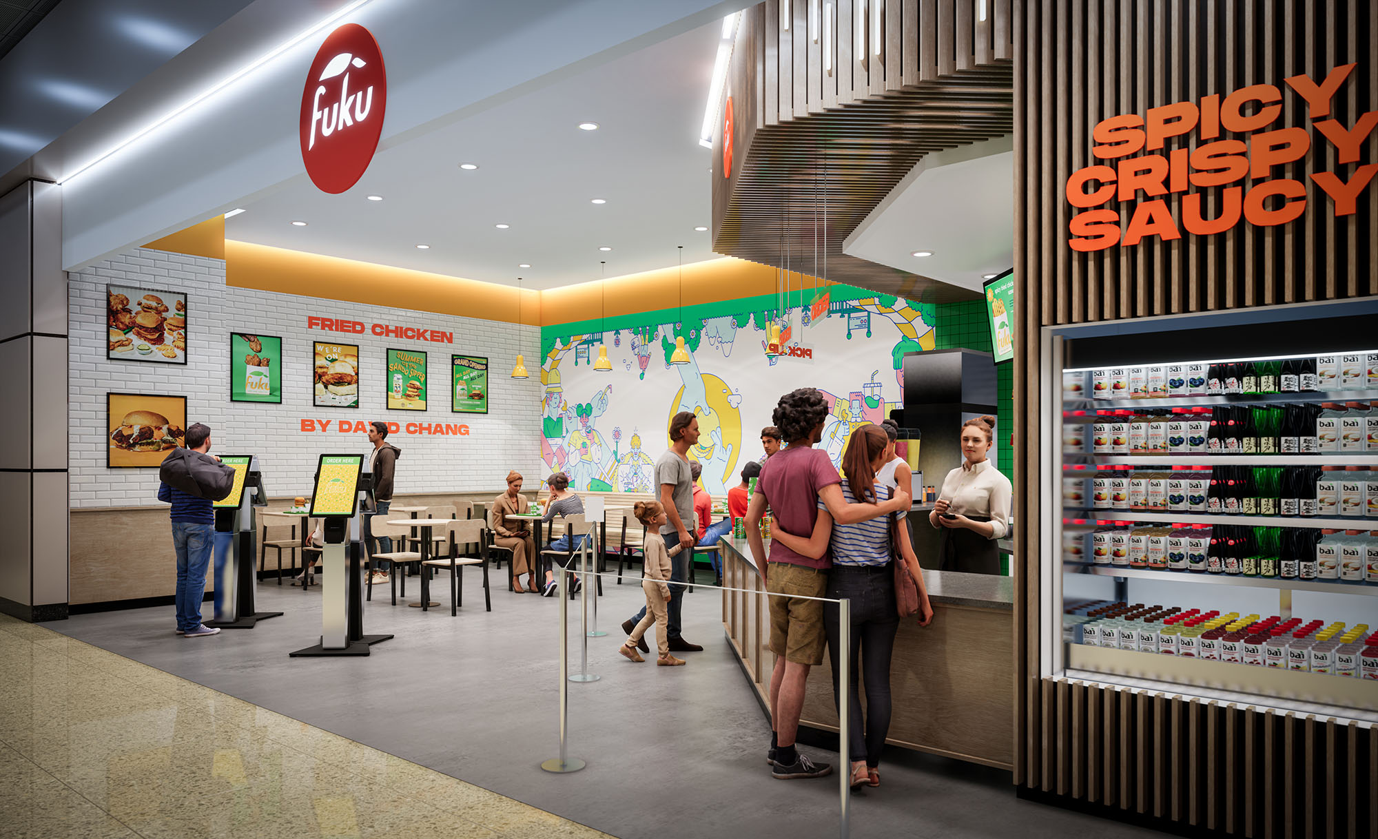
Seating zones are distributed in front of the counter and along the side wall, forming a porous edge between active queue and more static dining. Freestanding tables allow flexible reconfiguration for different group sizes, while the openness between tables ensures visual connectivity and a sense of spaciousness within a compact footprint.
The material palette balances warm natural tones with high-impact brand colors. Light wood laminates on the counter fronts and seating introduce warmth and tactility, offsetting the otherwise clean, durable surfaces required in a high-traffic food environment. The floor employs a neutral, resilient finish that visually recedes to highlight furnishings and branding.
White subway tiles at the back-of-house wall provide a hygienic, easily maintained surface while reflecting light deeper into the space. In contrast, saturated green tiles at the corner create a strong vertical accent that frames key merchandising and reinforces the brand identity. The ceiling feature composed of vertical wood slats adds depth and rhythm, visually lowering the scale above the counter and creating a sense of enclosure without blocking light or views.
Large-scale wall graphics, playful illustrations, and high-contrast menu imagery turn the interior into an immersive brand environment. The main mural along the dining wall operates as a visual anchor, animating the seating area and continuity between multiple vantage points inside and outside the unit. Branded red circular signage is positioned at the storefront and above the counter as a clear wayfinding element, easily recognizable from a distance.
Lighting is layered between recessed ceiling fixtures, concealed linear lighting at the perimeter, and accent pendants over specific zones. This combination ensures even overall illumination while subtly highlighting the counter and graphic surfaces. Warm-white color temperature supports the wood tones and food presentation, creating an inviting atmosphere that remains efficient and suitable for extended operating hours.
The furniture is deliberately simple and robust, with light wood seats and tabletops supported by dark metal frames. This contrast produces a clear visual outline and facilitates maintenance and replacement in a busy food court setting. Chair and table heights follow standard ergonomic guidelines for casual dining, ensuring comfort for short and medium-length stays.
Table spacing allows comfortable circulation for guests and staff, including accessibility for strollers and wheelchairs. The open layout, absence of visual barriers, and clear signage create an intuitive experience in which users can immediately identify where to order, wait, and dine without additional instruction.
Sustainability is addressed primarily through durable, low-maintenance materials and efficient building systems. Hard-wearing floor finishes, tiled wall surfaces, and laminated millwork are specified for longevity, reducing the need for frequent replacement and associated resource use. The modularity of furniture supports repair and component replacement rather than wholesale disposal.
LED lighting throughout reduces energy consumption and maintenance cycles, while the combination of high-reflectance finishes and focused task lighting minimizes the total number of fixtures required. Where possible, finishes are selected with consideration for low VOC content to enhance indoor air quality. The compact footprint, shared mall infrastructure, and open-front design benefit from the ambient conditioning of the larger concourse, reducing the restaurant’s standalone mechanical load and contributing to an overall more efficient operation.
The design of FUKU in Salt Lake City translates a contemporary fast-casual dining model into a vivid, highly legible spatial experience. The concept combines a clean, minimalist architectural envelope with bold brand graphics and a playful color palette, producing a space that feels energetic yet ordered. The restaurant operates as a transparent stage for food preparation and service, where the counter, menu boards, and kitchen backdrop read as a continuous, easily readable band within the overall volume.
The layout emphasizes intuitive circulation and clear sightlines from the mall concourse. The open storefront, framed by a linear canopy and strong signage, blurs the boundary between interior dining and the public corridor, inviting passersby to visually engage with the activity inside.
The plan is organized along a single main axis: entry and queuing run parallel to the service counter, allowing customers to understand ordering, pickup, and seating at a glance. The service line is anchored by illuminated digital menu boards suspended from the ceiling, creating a visual datum that guides movement. Ordering, beverage stations, and food pickup are sequenced logically from left to right, reducing congestion and minimizing cross-traffic.
Seating zones are distributed in front of the counter and along the side wall, forming a porous edge between active queue and more static dining. Freestanding tables allow flexible reconfiguration for different group sizes, while the openness between tables ensures visual connectivity and a sense of spaciousness within a compact footprint.
The material palette balances warm natural tones with high-impact brand colors. Light wood laminates on the counter fronts and seating introduce warmth and tactility, offsetting the otherwise clean, durable surfaces required in a high-traffic food environment. The floor employs a neutral, resilient finish that visually recedes to highlight furnishings and branding.
White subway tiles at the back-of-house wall provide a hygienic, easily maintained surface while reflecting light deeper into the space. In contrast, saturated green tiles at the corner create a strong vertical accent that frames key merchandising and reinforces the brand identity. The ceiling feature composed of vertical wood slats adds depth and rhythm, visually lowering the scale above the counter and creating a sense of enclosure without blocking light or views.
Large-scale wall graphics, playful illustrations, and high-contrast menu imagery turn the interior into an immersive brand environment. The main mural along the dining wall operates as a visual anchor, animating the seating area and continuity between multiple vantage points inside and outside the unit. Branded red circular signage is positioned at the storefront and above the counter as a clear wayfinding element, easily recognizable from a distance.
Lighting is layered between recessed ceiling fixtures, concealed linear lighting at the perimeter, and accent pendants over specific zones. This combination ensures even overall illumination while subtly highlighting the counter and graphic surfaces. Warm-white color temperature supports the wood tones and food presentation, creating an inviting atmosphere that remains efficient and suitable for extended operating hours.
The furniture is deliberately simple and robust, with light wood seats and tabletops supported by dark metal frames. This contrast produces a clear visual outline and facilitates maintenance and replacement in a busy food court setting. Chair and table heights follow standard ergonomic guidelines for casual dining, ensuring comfort for short and medium-length stays.
Table spacing allows comfortable circulation for guests and staff, including accessibility for strollers and wheelchairs. The open layout, absence of visual barriers, and clear signage create an intuitive experience in which users can immediately identify where to order, wait, and dine without additional instruction.
Sustainability is addressed primarily through durable, low-maintenance materials and efficient building systems. Hard-wearing floor finishes, tiled wall surfaces, and laminated millwork are specified for longevity, reducing the need for frequent replacement and associated resource use. The modularity of furniture supports repair and component replacement rather than wholesale disposal.
LED lighting throughout reduces energy consumption and maintenance cycles, while the combination of high-reflectance finishes and focused task lighting minimizes the total number of fixtures required. Where possible, finishes are selected with consideration for low VOC content to enhance indoor air quality. The compact footprint, shared mall infrastructure, and open-front design benefit from the ambient conditioning of the larger concourse, reducing the restaurant’s standalone mechanical load and contributing to an overall more efficient operation.


Our offices are located in Barcelona, Cancún, Chicago and Santo Domingo, but thanks to technology we can do projects on all over the world.
Barcelona
Bac de Roda 136
08020, Barcelona
Spain
Madrid
Av. de Buendía 11
19005 Guadalajara (Madrid)
Spain
Chicago
373 Hazel Ave, Apt A1
60022, Glencoe, Illinois
United States