

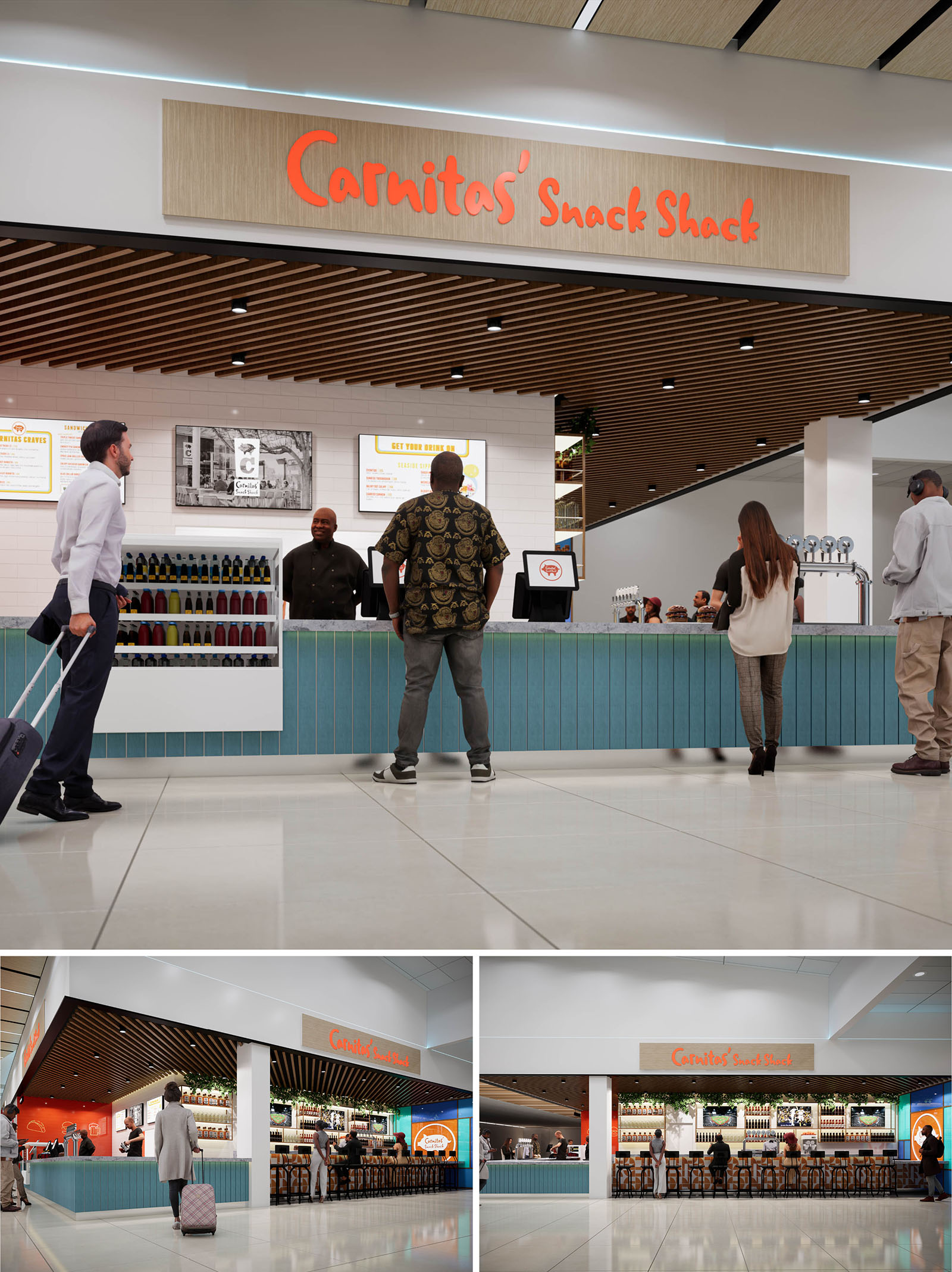
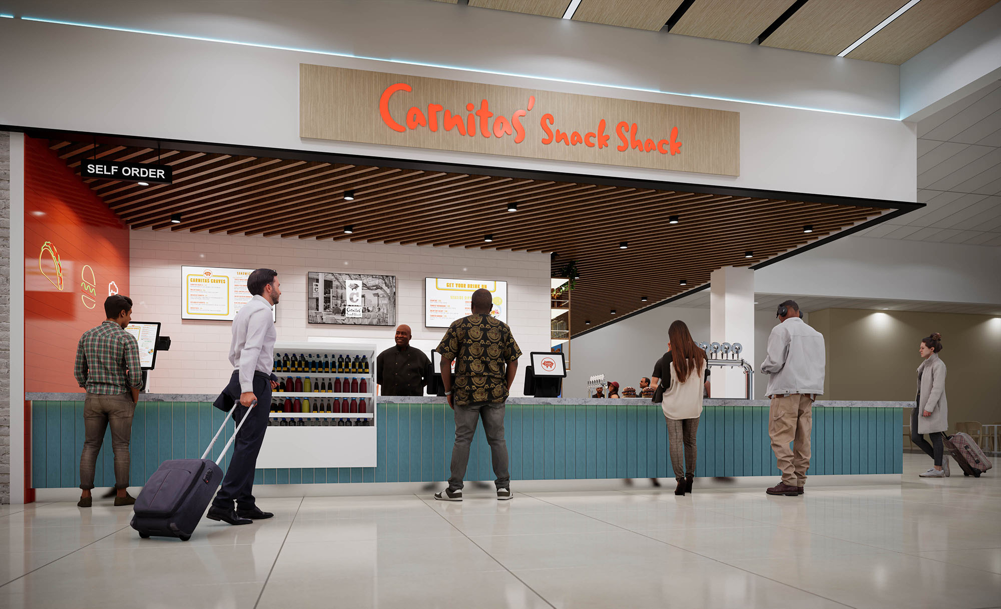
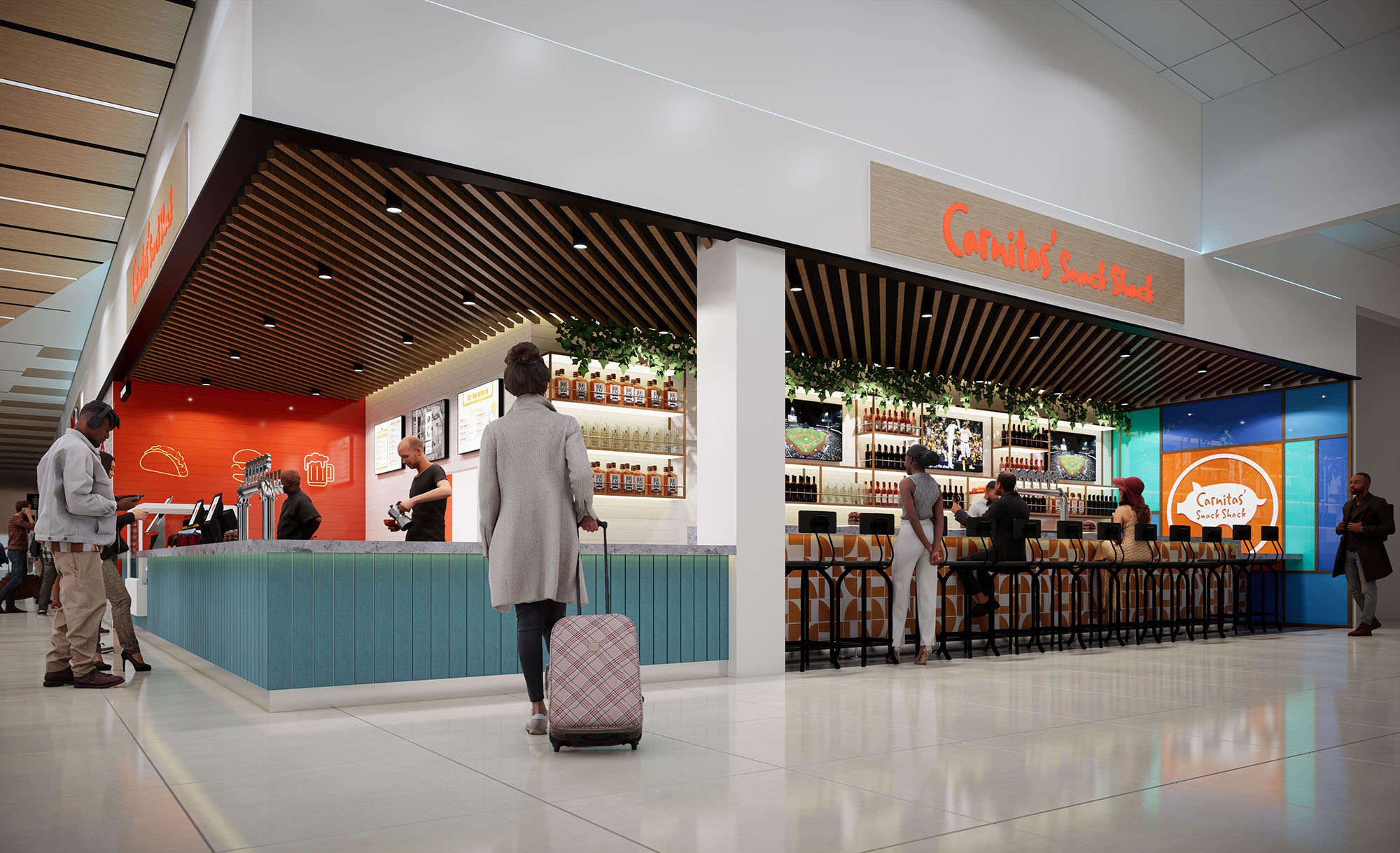
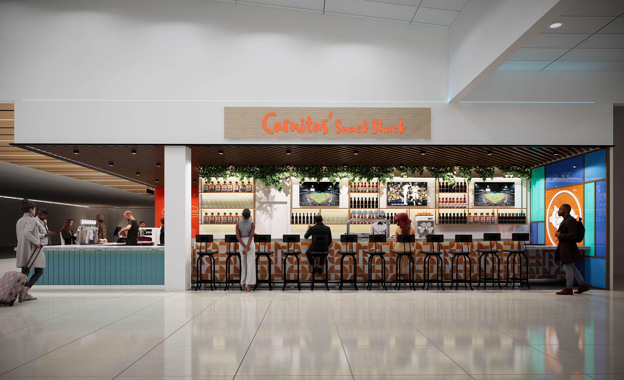
The design of Carnitas Snack Shack translates a beloved local brand into an airport setting by merging casual street-food energy with a refined, transit-friendly environment. The concept is built around openness and visibility, turning the corner tenancy into a porous, welcoming pavilion rather than a closed storefront. The architecture emphasizes horizontality, with a strong canopy line and continuous counter that guide passengers along the façade and intuitively organize queuing, ordering, and dining zones.
Brand character is expressed through a calibrated use of color and graphics that remain legible from long airport sightlines. The glow of the linear bar, the bold orange signage, and a warm timber ceiling create a recognizable beacon within the terminal while maintaining a balanced, uncluttered composition that respects the surrounding concourse architecture.
The layout is organized as a U-shaped service bar that wraps the corner, combining quick-service counter, beverage station, and seated bar into a continuous element. This configuration maximizes frontage to passenger flows on both sides, capturing cross-traffic and providing clear wayfinding from multiple approach angles. The back-of-house is compressed into a linear zone behind the counter, optimizing operational efficiency and minimizing visual clutter.
Queuing is handled directly along the primary counter, where integrated under-counter lighting and a change in materials subtly mark the customer zone without the need for barriers. The bar seating frames the open interior and acts as a soft edge between circulation and dining, allowing guests to observe terminal activity while remaining psychologically anchored within the restaurant environment.
The material palette balances durability with a relaxed, coastal character appropriate to San Diego. A slatted wood ceiling visually lowers and warms the volume, contrasting with the otherwise bright, neutral terminal shell. Below, the bar face is finished with vertically oriented blue paneling, recalling boardwalk cladding and providing rhythm and texture at the human scale. The countertop appears to be a composite or quartz surface, selected for resilience to heavy airport traffic and ease of maintenance.
Walls behind the counter are clad in white tile with clean, rectified joints, creating a sanitary backdrop and enhancing the legibility of menus and brand graphics. The main sign panel uses a light wood veneer and dimensional orange lettering, tying into the ceiling finish while emphasizing the visual hierarchy of the branding. Accent lighting along the shelving and under the counter adds depth and highlights product displays, contributing to merchandising effectiveness.
Lighting strategy combines integrated ambient, task, and accent lighting to support both operational needs and brand atmosphere. Recessed downlights within the slatted ceiling provide even illumination over the bar and queuing areas, carefully spaced to maintain a clean grid that aligns with the slat rhythm. Linear LEDs wash the counter front, generating a subtle glow that attracts attention from the concourse and reinforces the perception of cleanliness and modernity.
Backlit menu boards and illuminated shelving ensure high visibility of offerings, critical in an environment where passengers make rapid decisions. Warm color temperatures are used at the bar and signage to create contrast with the cooler general terminal lighting, giving the space a hospitable, lounge-like character while still feeling bright and efficient.
The bar stools feature slim metal frames and timber seats, echoing the ceiling and sign materials while remaining visually light to preserve transparency across the façade. Their repetitive alignment strengthens the linear geometry of the bar and contributes to a sense of order within the open plan. Bottle displays and tap handles are arranged with a strong horizontal datum, reinforcing the architectural lines and allowing the product itself to become part of the aesthetic composition.
Brand graphics are handled with restraint: large-scale logo panels are concentrated at key sightlines, while secondary graphic elements and historic imagery animate the interior without overwhelming it. This balance maintains visual clarity in a busy terminal context and ensures that operational information, such as menus and wayfinding, remains primary.
Sustainability is addressed through both material choices and operational planning. The extensive use of wood elements is conceived with responsibly sourced or FSC-certified products, combined with high-durability finishes that extend lifecycle and reduce replacement frequency. Hardwearing tile, composite counters, and metal furniture minimize maintenance and support long-term performance in a high-traffic environment.
Energy-efficient LED lighting is deployed throughout, with focused task lighting reducing the need for excess ambient illumination. The open pavilion layout leverages existing terminal HVAC and natural light from adjacent concourse areas, minimizing the need for additional mechanical interventions. Compact kitchen planning shortens service lines and reduces wasted movement, supporting lower energy use and faster turnover, which in turn optimizes resource consumption while maintaining a high-quality guest experience.


Our offices are located in Barcelona, Cancún, Chicago and Santo Domingo, but thanks to technology we can do projects on all over the world.
Barcelona
Bac de Roda 136
08020, Barcelona
Spain
Madrid
Av. de Buendía 11
19005 Guadalajara (Madrid)
Spain
Chicago
373 Hazel Ave, Apt A1
60022, Glencoe, Illinois
United States