


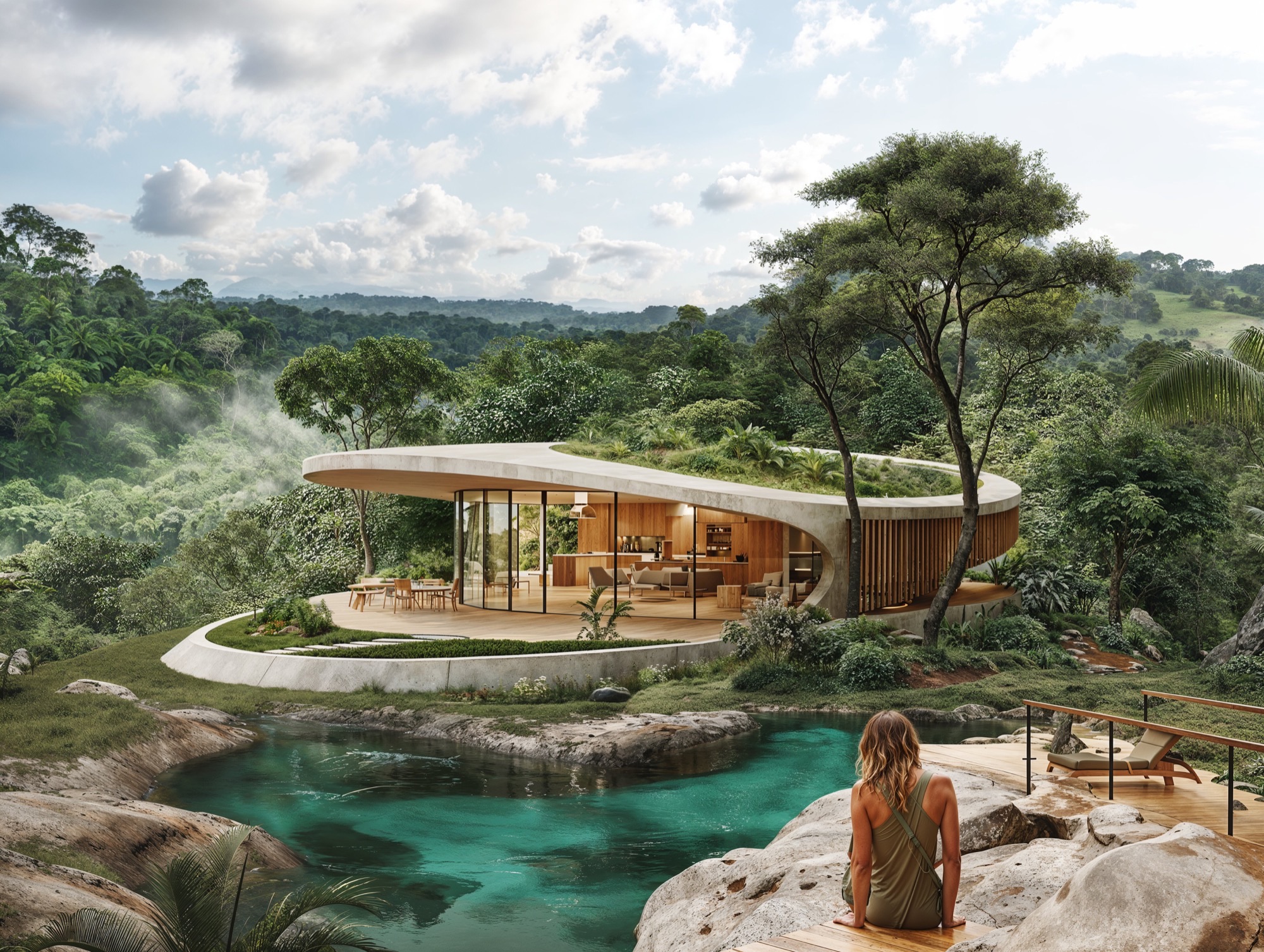
Alhambra Tourist Apartments is envisioned as a contemporary Mediterranean village that reinterprets tradition through a lens of wellness, sustainability, and experiential design. More than a collection of buildings, the project aspires to create a holistic environment where architecture, landscape, and human activity are intimately connected. Located in Murcia—an area steeped in natural beauty, Moorish heritage, and strong sunlight—the design draws inspiration from the poetic geometry and spatial richness of Islamic-Andalusian architecture. In particular, the visual language established by the Alhambra Wellness Hotel and Alhambra Residential is extended here, establishing a unified architectural identity across all three developments. These projects, though distinct in function, form a collective narrative centered on harmony, serenity, and timelessness.
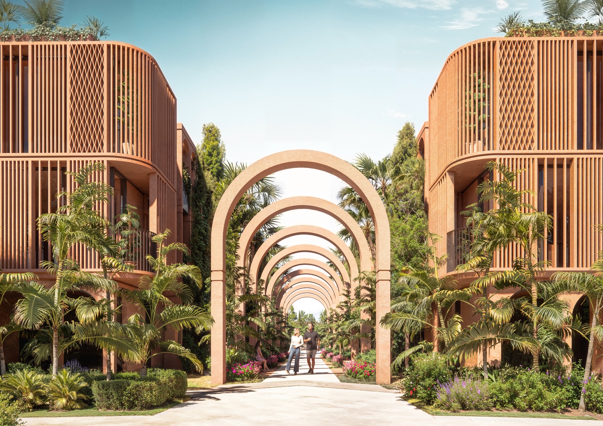
At the core of the concept is the desire to craft a destination that operates on a human scale—walkable, immersive, and emotionally resonant. The masterplan replaces conventional urban grids with a soft, organic layout composed of sinuous walkways, shaded arcades, and landscaped gathering spaces. This design approach creates a sense of discovery, as residents and visitors move through a sequence of curated spatial experiences: quiet courtyards, communal gardens, open plazas, and tranquil water features. The resulting fabric encourages social interaction, introspection, and engagement with nature.
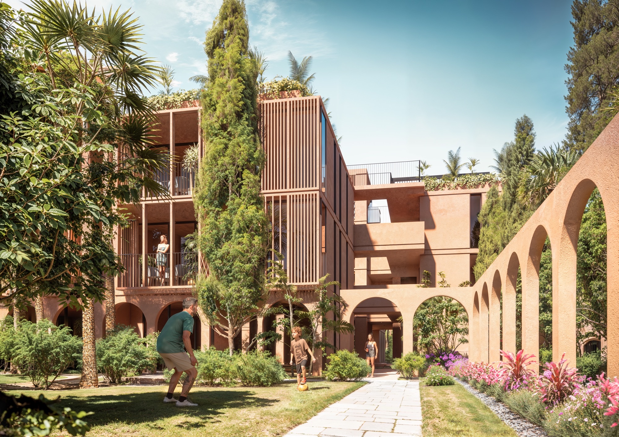
The architectural forms are deliberately restrained, defined by simplicity, repetition, and proportion. Their elegance lies not in ornamentation but in rhythm, balance, and material honesty. Inspired by vernacular Mediterranean construction, buildings are rendered in soft terracotta tones and finished in natural textures that reflect and absorb light differently throughout the day. These materials do not compete with the landscape—they belong to it. Volumes are articulated with vertical wooden screens and generous pergolas, creating an ever-changing interplay of light and shadow that adds depth and comfort.
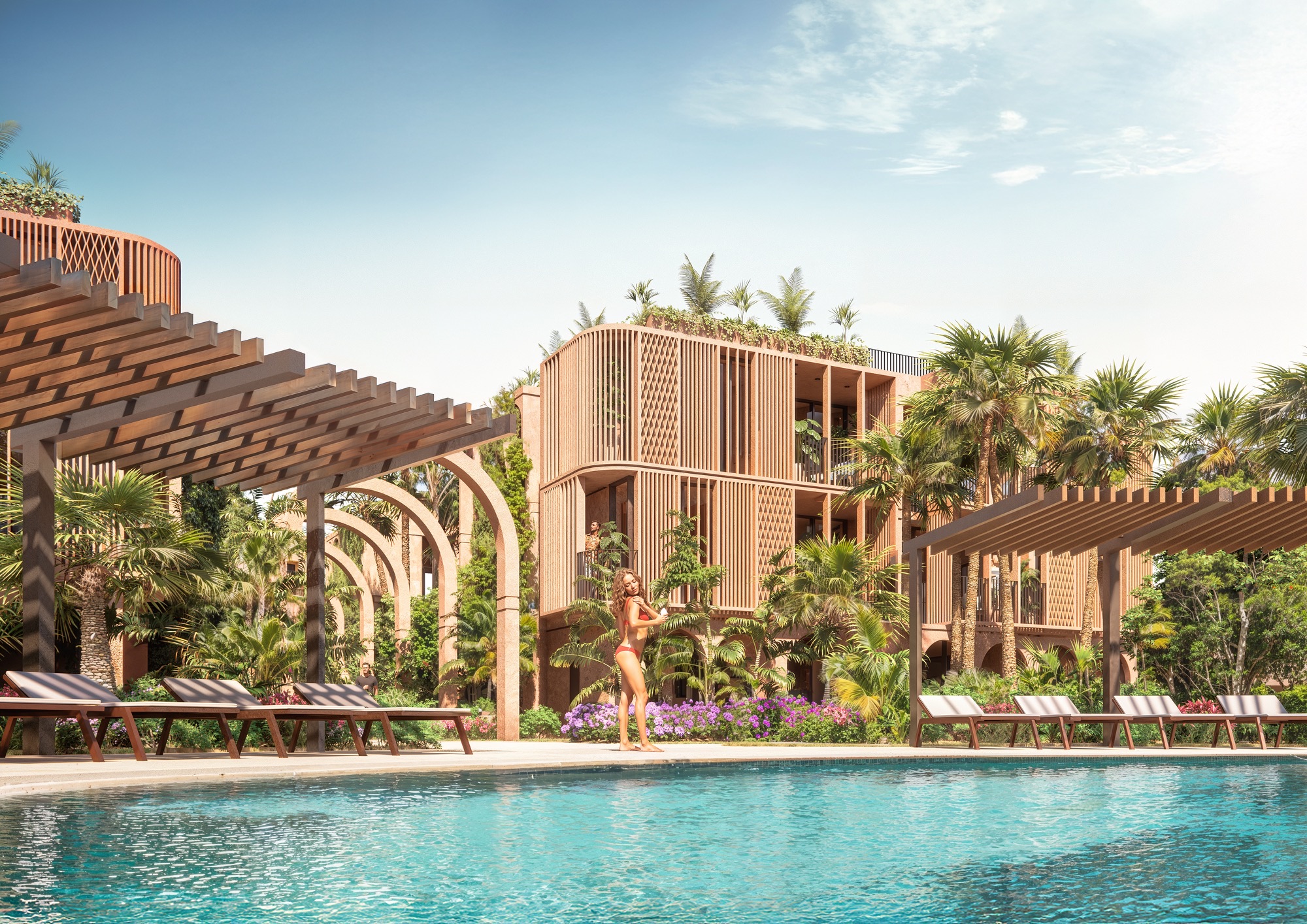
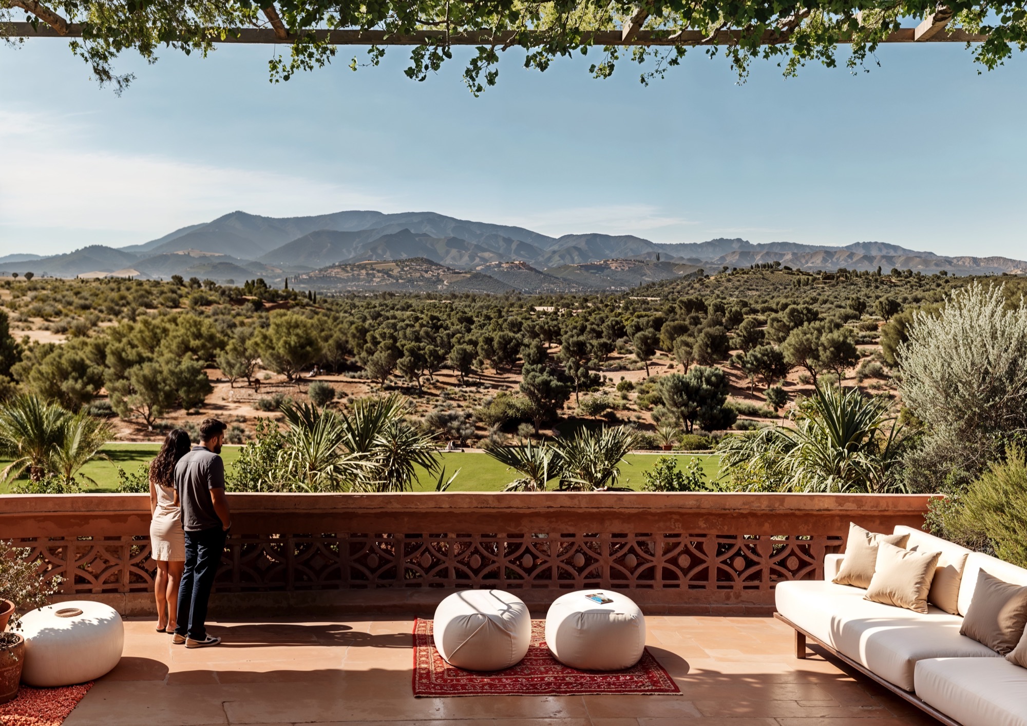
Crucially, the design privileges the seamless flow between interior and exterior space. Each unit opens out to private terraces, shaded loggias, or rooftop gardens that become part of daily life. These outdoor rooms are not decorative—they are functional extensions of the home, encouraging open-air living and offering shelter from the sun. The layout ensures that nearly every room is cross-ventilated and naturally lit, enhancing comfort and well-being.
The identity of Alhambra Tourist Apartments is not defined solely by its aesthetics, but by its values. It reflects a Mediterranean philosophy of living: one that embraces slowness, rootedness, and intention. In a world increasingly shaped by speed and disconnection, this project offers an alternative—a place where time slows, where beauty is found in the ordinary, and where the architecture supports a life lived in balance with others and with nature. Through this design, we seek to redefine hospitality as something deeply human: immersive, grounding, and meaningful.
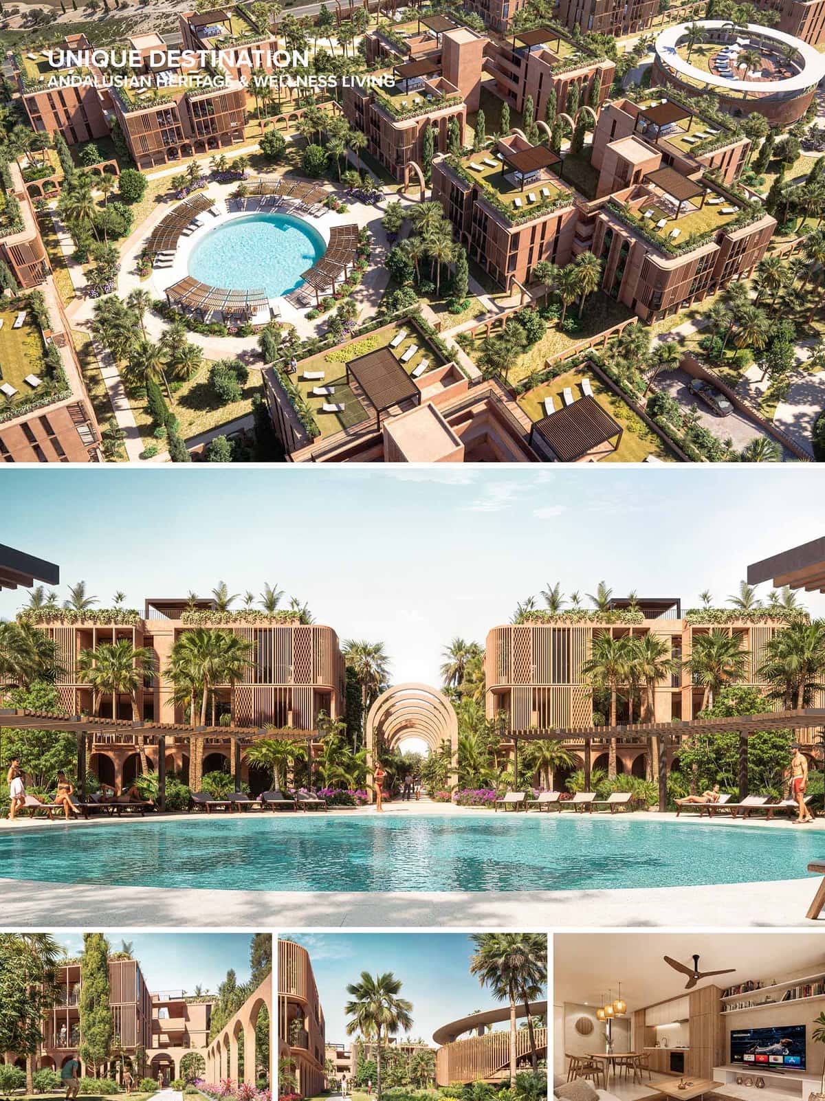
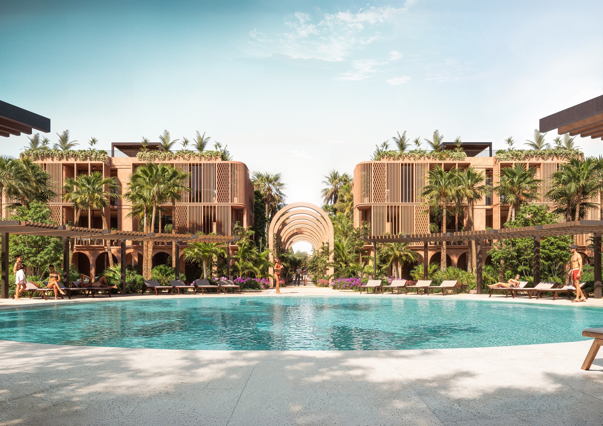
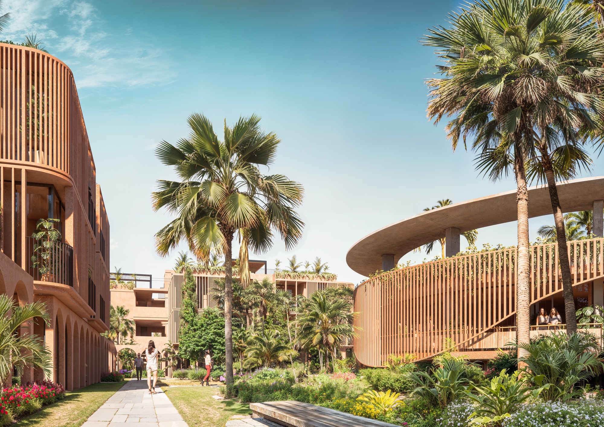
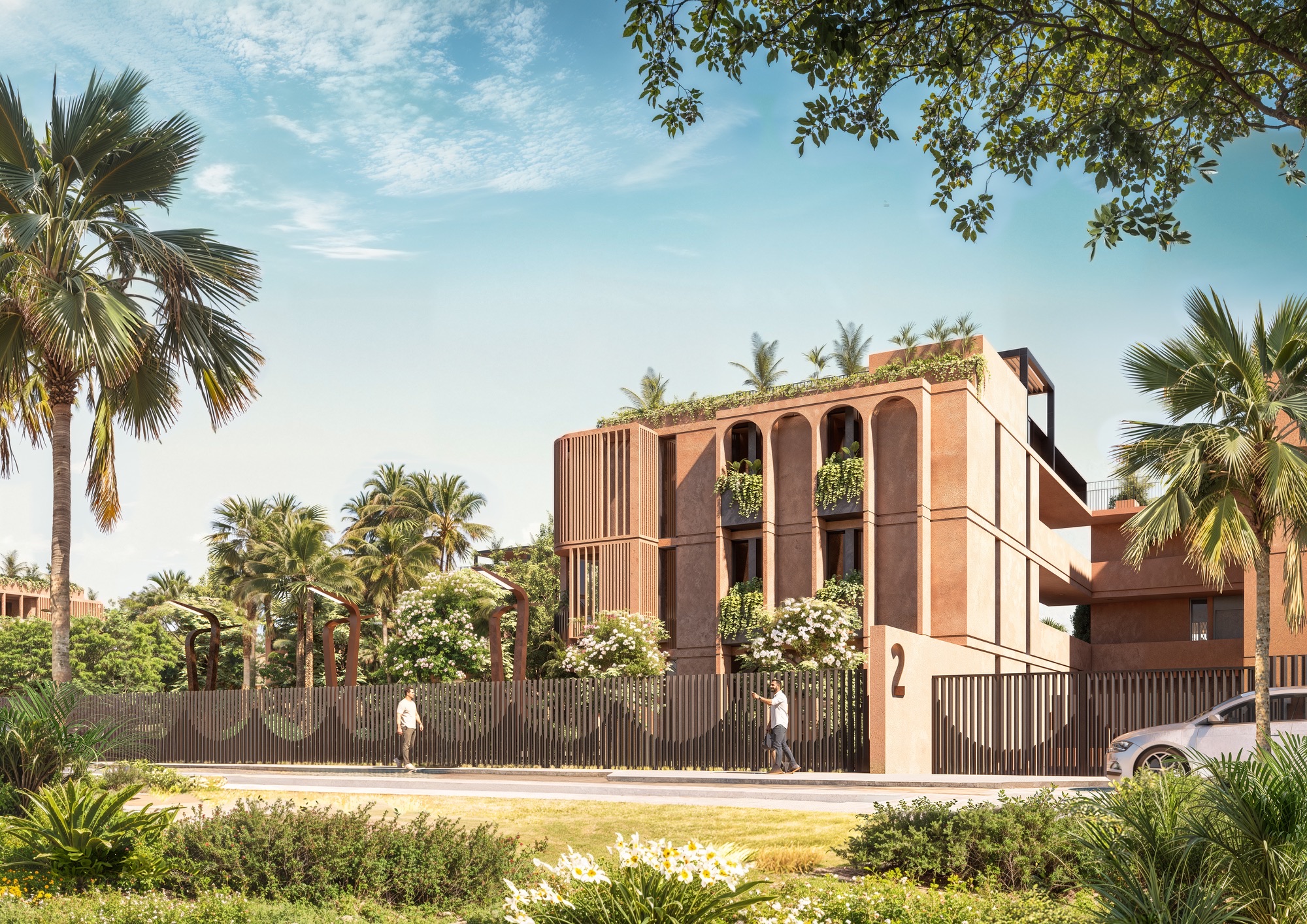
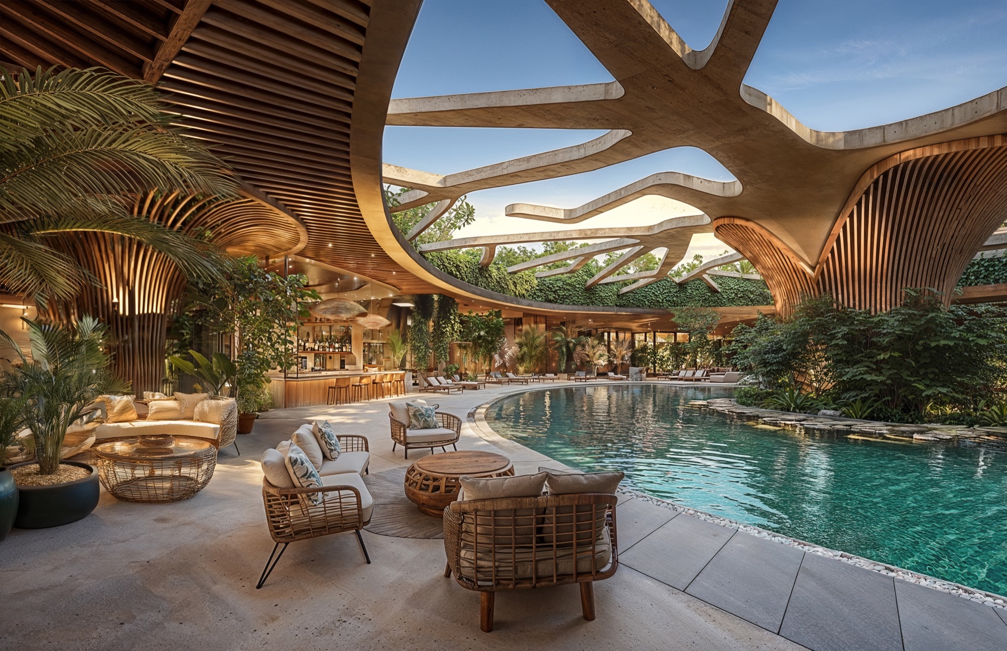
The buildings are organized as low-density clusters around communal courtyards and swimming pools, providing a balance of privacy and social interaction. Arches, arcades, and latticework reinterpret traditional motifs with a contemporary sensibility. Vertical wooden screens serve dual functions—providing solar protection while referencing mashrabiya elements, enhancing the dialogue between inside and outside. The rhythm of façades is carefully calibrated to create visual coherence, alternating between solid planes and permeable enclosures that filter natural light.
Volumes are modulated in warm, earthy tones with textures reminiscent of tadelakt and terracotta plaster, allowing the structures to blend seamlessly into the semi-arid landscape. Roof terraces, pergolas, and generous balconies become extensions of living spaces, encouraging open-air living in harmony with the region’s mild climate.
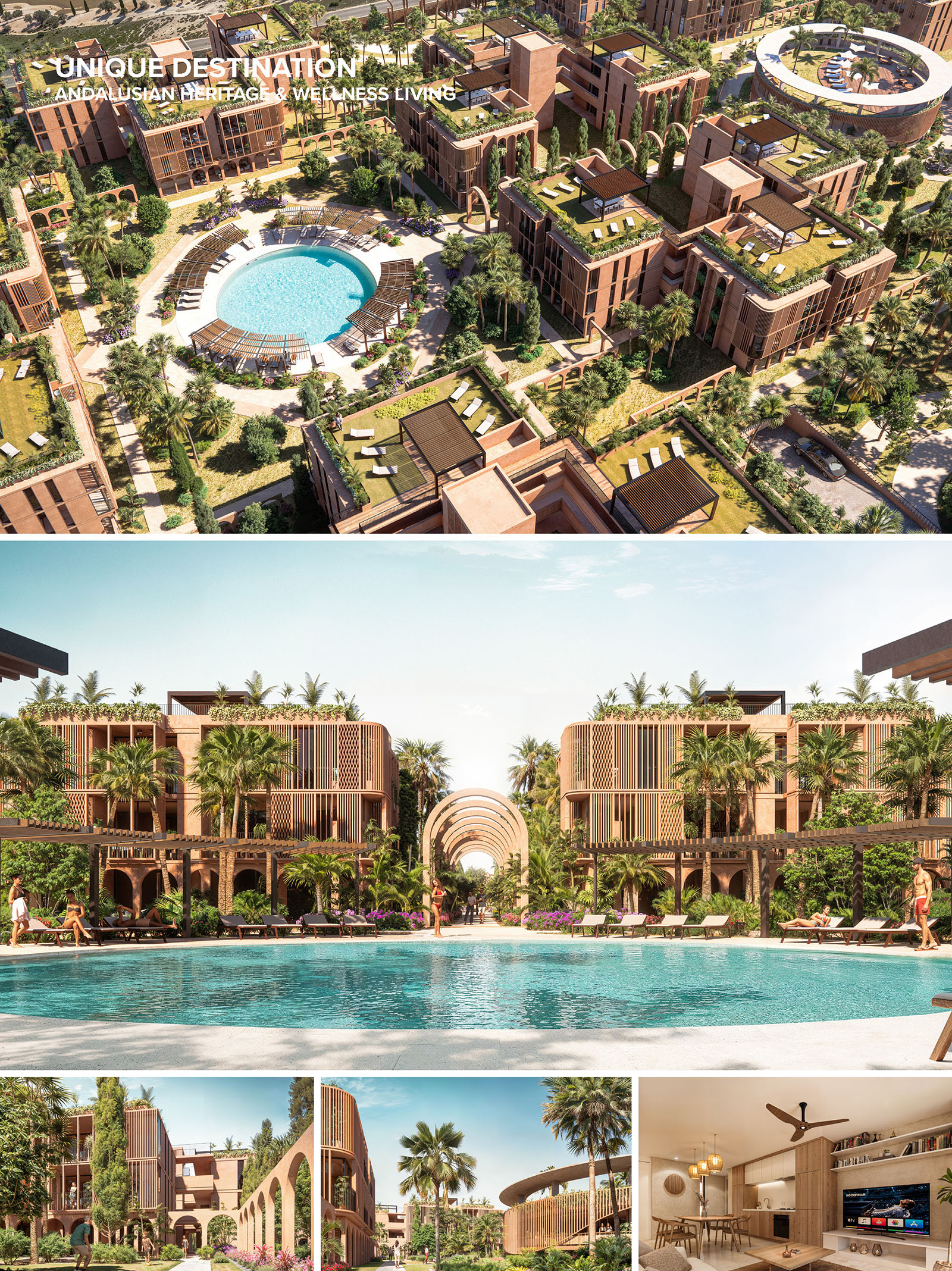
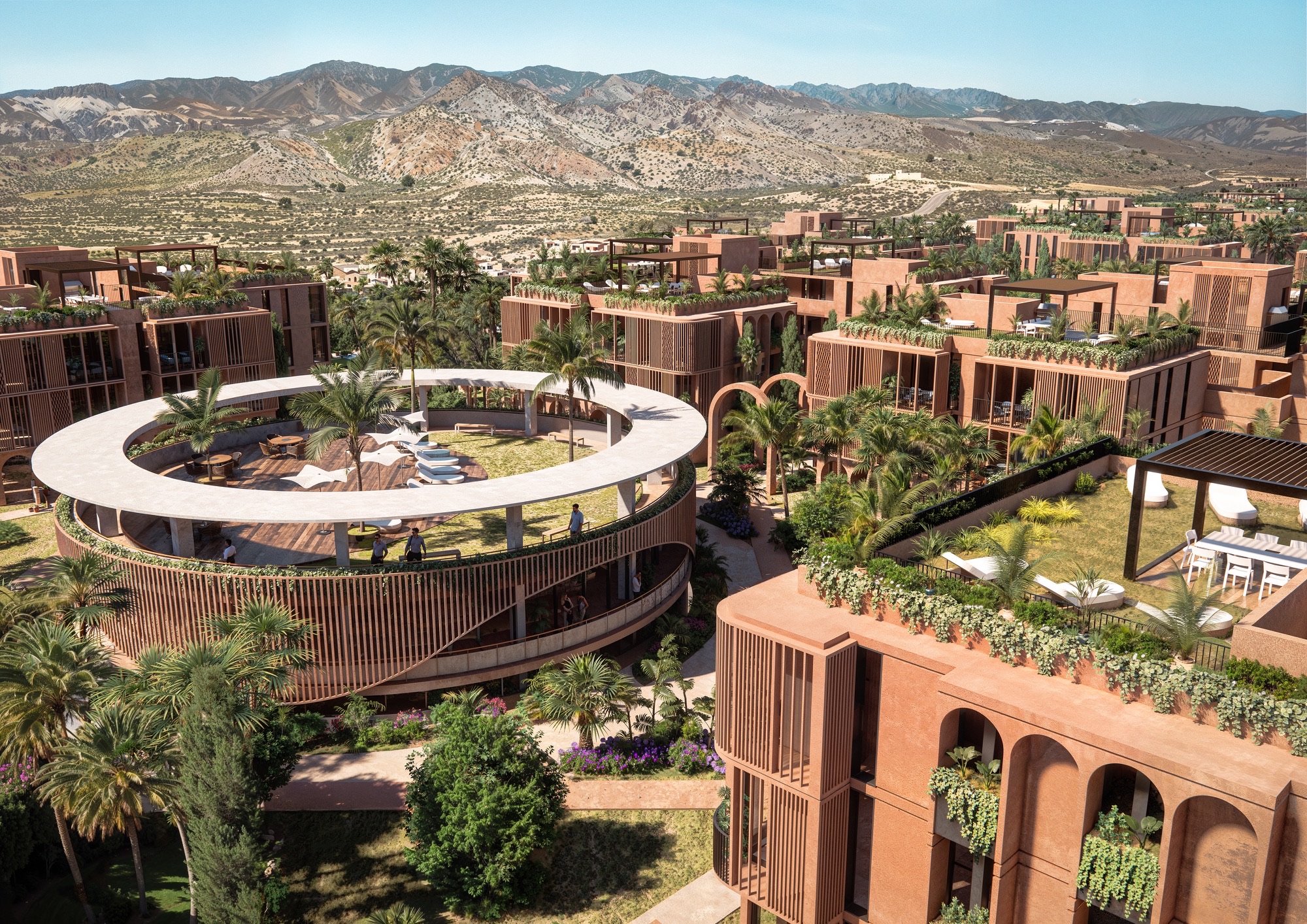
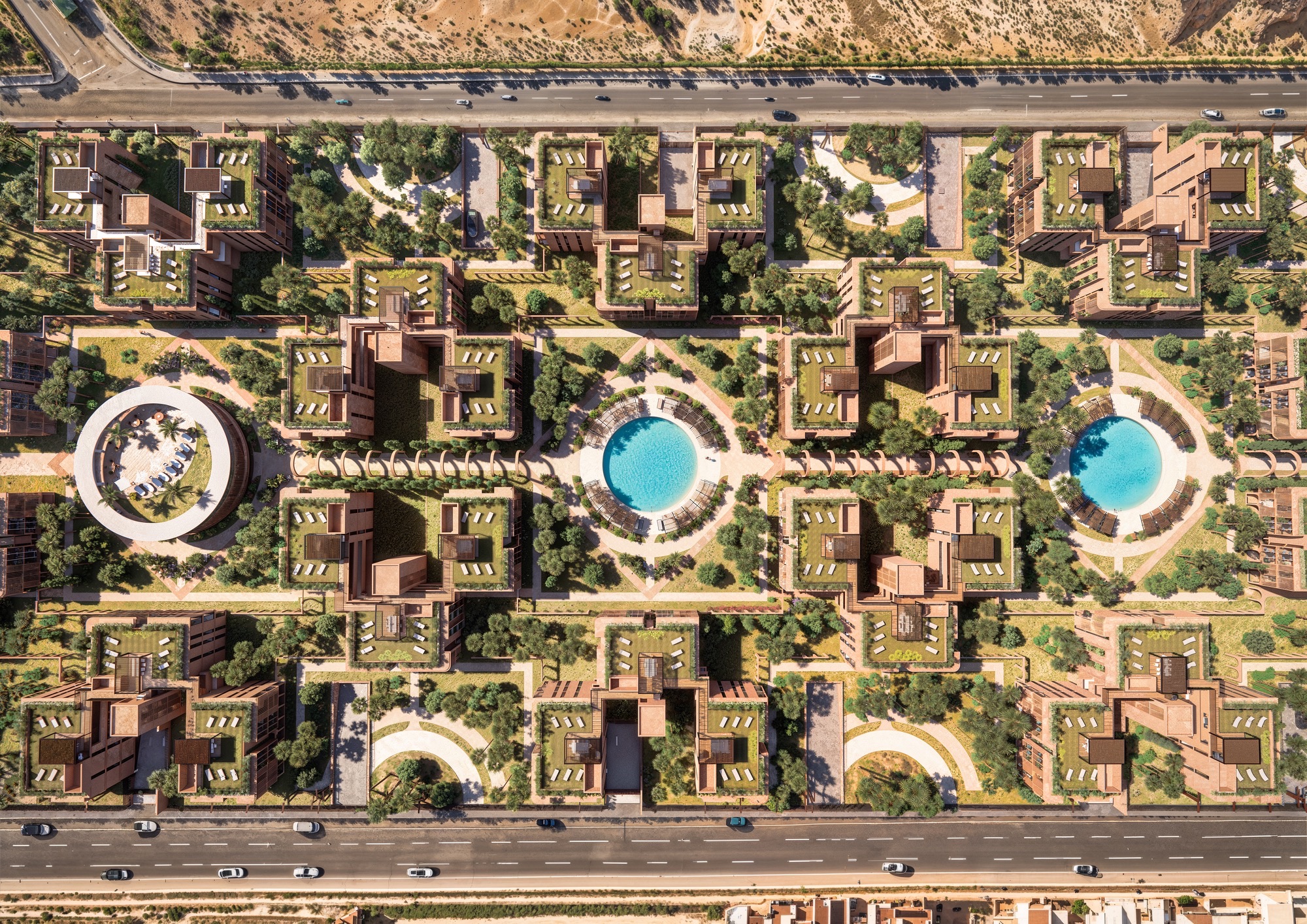
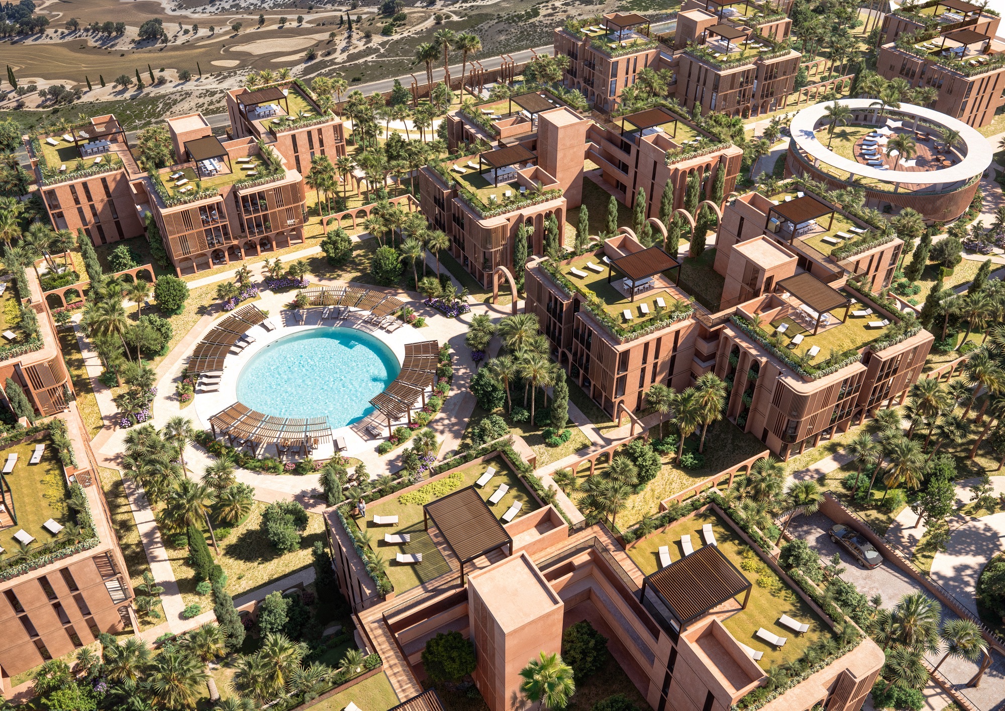
The urban layout of Alhambra Tourist Apartments is grounded in a precise geometric order inspired by traditional Islamic patterns—traces and grids that are not only ornamental, but structural tools for creating harmony, repetition, and spatial clarity. From the aerial perspective, the masterplan reveals itself as an intricate yet balanced composition: a modular arrangement of orthogonal blocks organized around interior patios and unified by a strong axial logic. This approach enables a readable, walkable environment where orientation, rhythm, and cohesion guide the user experience.
One of the defining qualities of the Alhambra Tourist Apartments is the seamless integration between interior and exterior environments. Ground-level units open directly to garden patios, while upper levels enjoy cross-ventilation and panoramic views of the surrounding landscape. Interiors are oriented to maximize daylight and natural airflow, eliminating the need for mechanical cooling for much of the year.
The architecture supports a biophilic lifestyle: residents are invited to engage with their surroundings, whether tending to a planter on a balcony, strolling through an olive grove, or gathering in the communal spaces under filtered shade.
Sustainability is embedded at every scale of the project. Bioclimatic design principles shape the orientation, form, and materiality of the buildings. Deep overhangs, vertical wooden slats, and thermal mass strategies work together to maintain interior comfort while minimizing energy demand.
The extensive use of native, drought-tolerant vegetation supports water conservation efforts and fosters local biodiversity. Greywater recycling systems and low-flow irrigation are integrated to optimize water use. At the infrastructural level, the incorporation of photovoltaic panels on rooftops and the potential for district-scale renewable energy systems contribute to a low-carbon operational footprint.
The design of the Alhambra Tourist Apartments exemplifies architecture as a holistic practice—merging beauty, tradition, and environmental stewardship into a harmonious, human-scaled living environment.
Explore our space through this immersive Virtual Tour: navigate freely, zoom in to discover details and move around by clicking the arrows or portals. Use the blue icons to teleport anywhere in the project, viewpoints or full‑screen mode, and feel free to switch to VR mode on VT Glasses for an even deeper experience! Sit back, take your time, and experience the environment as if you were really there—enjoy your journey
CRAFTED MASTER PLAN DESIGN
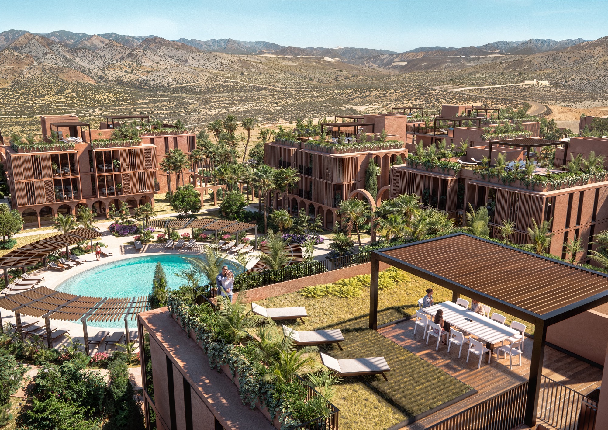
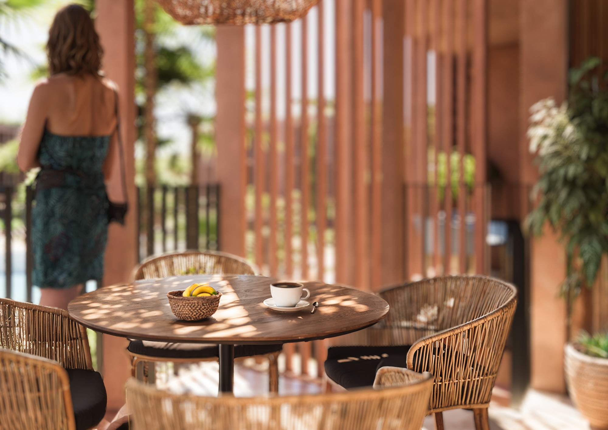
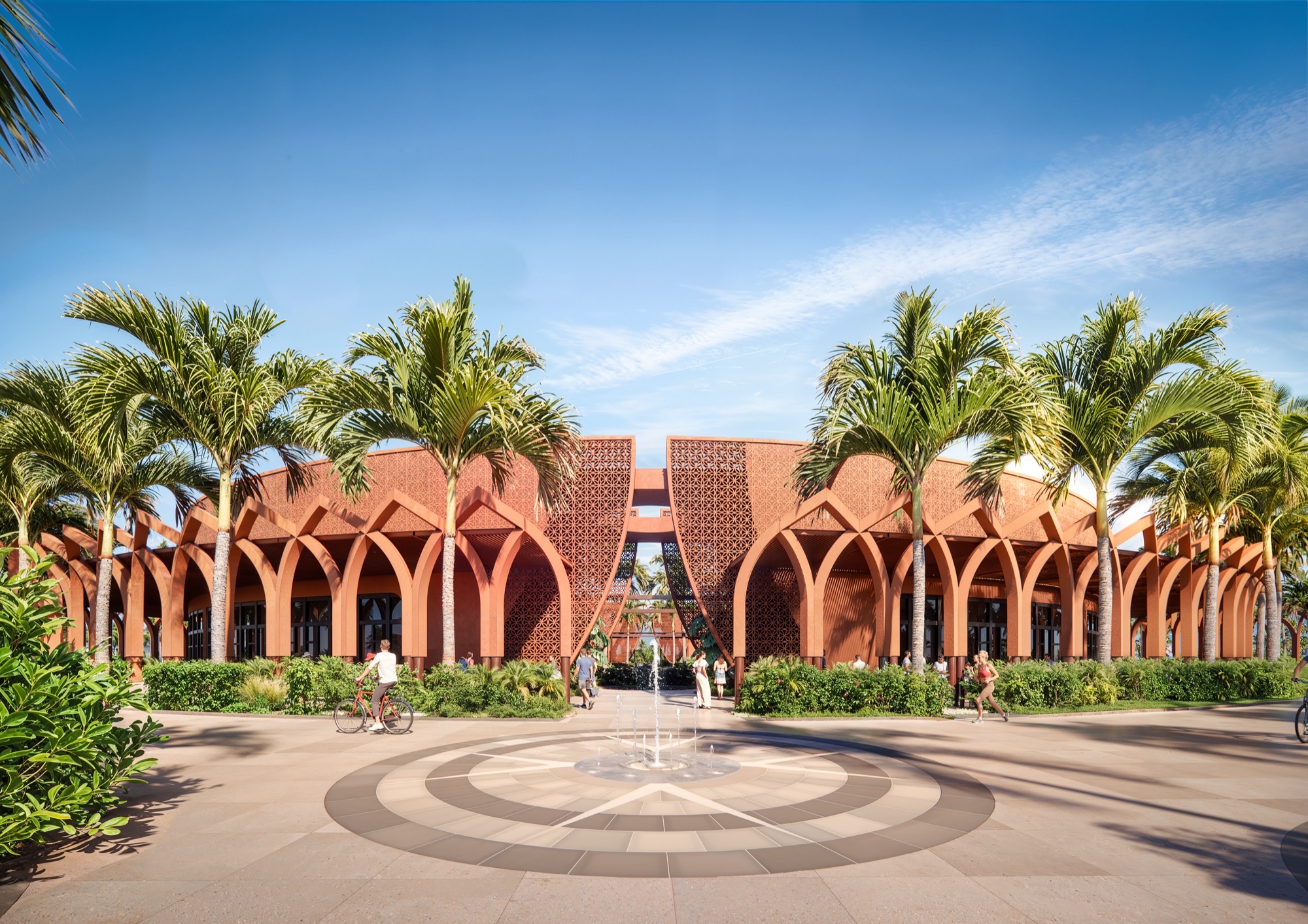
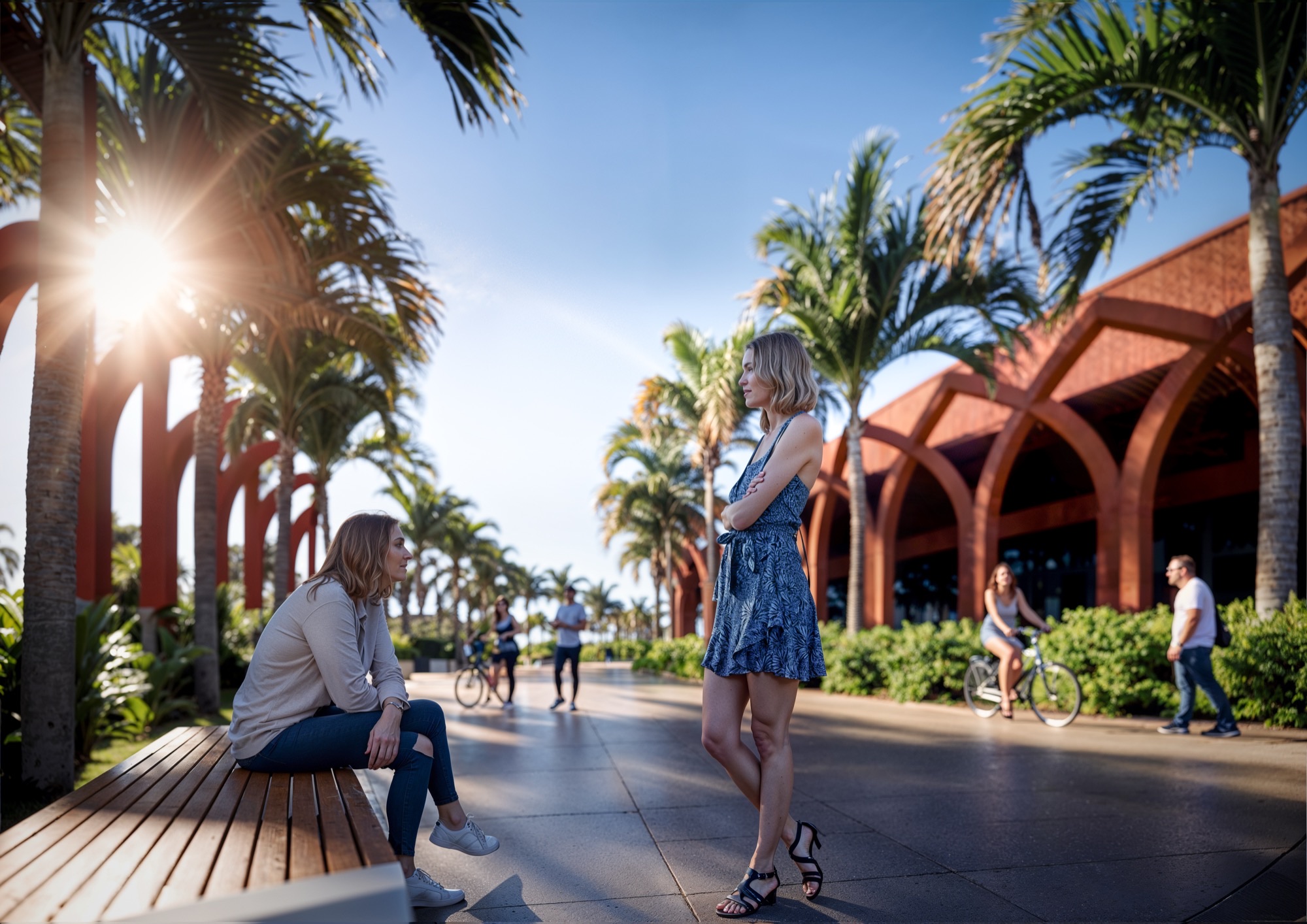
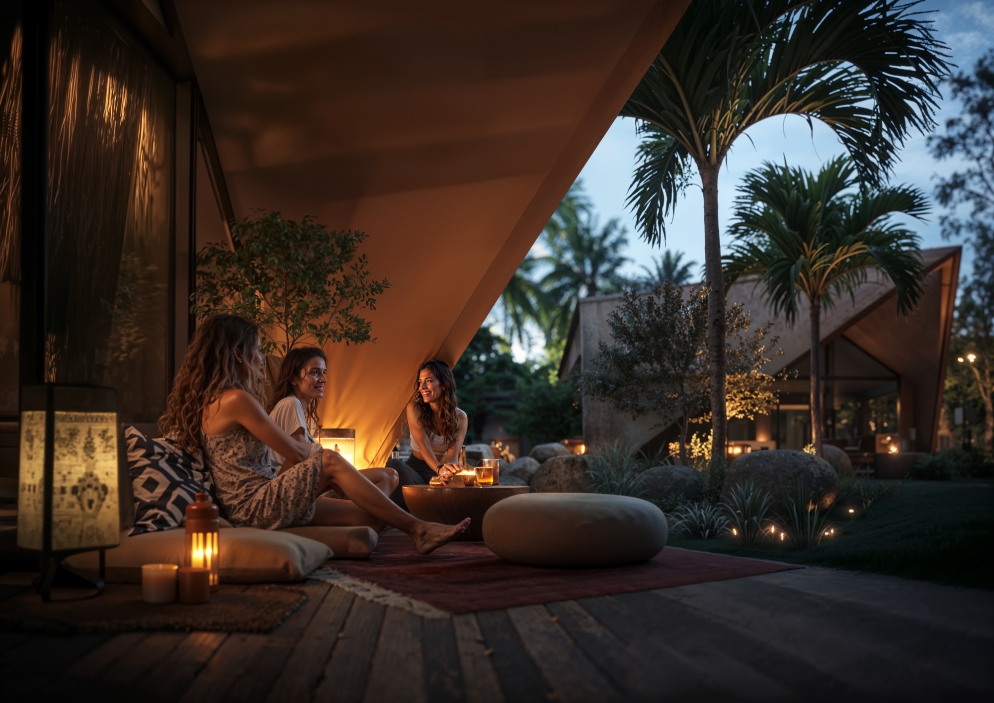
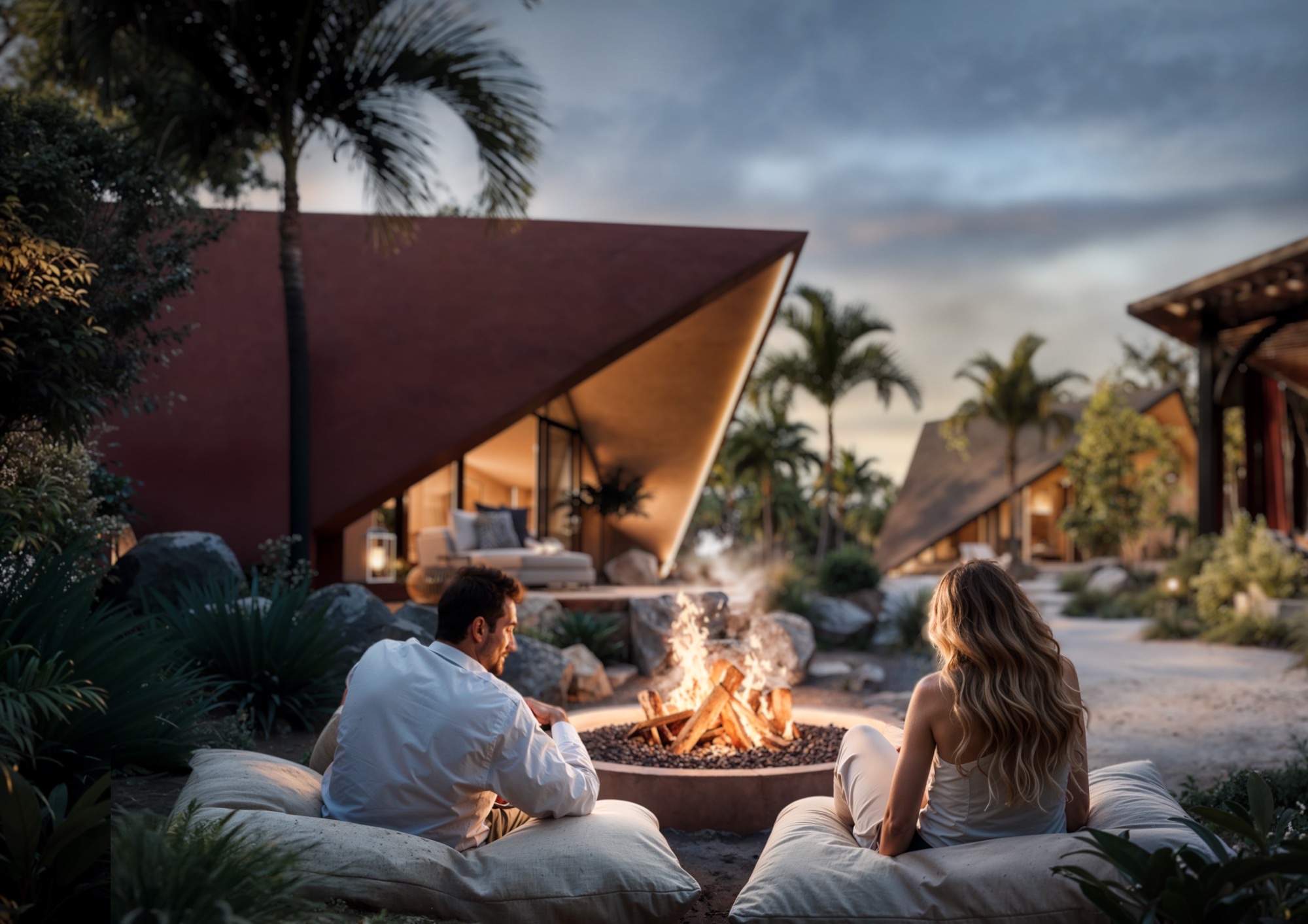
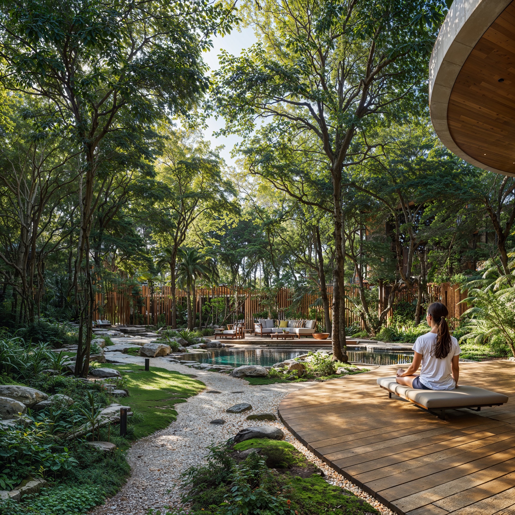
The entire complex is structured around a network of shaded pedestrian axes that link communal courtyards, swimming pools, plazas, and garden spaces. These pathways are defined by architectural elements such as rhythmic archways, pergolas, and arcades, which do more than mark circulation—they create a continuous canopy of shadow. In the hot Mediterranean climate of Murcia, shade is not a decorative gesture but an essential spatial strategy. It moderates temperature, softens light, and makes outdoor movement comfortable throughout the seasons.
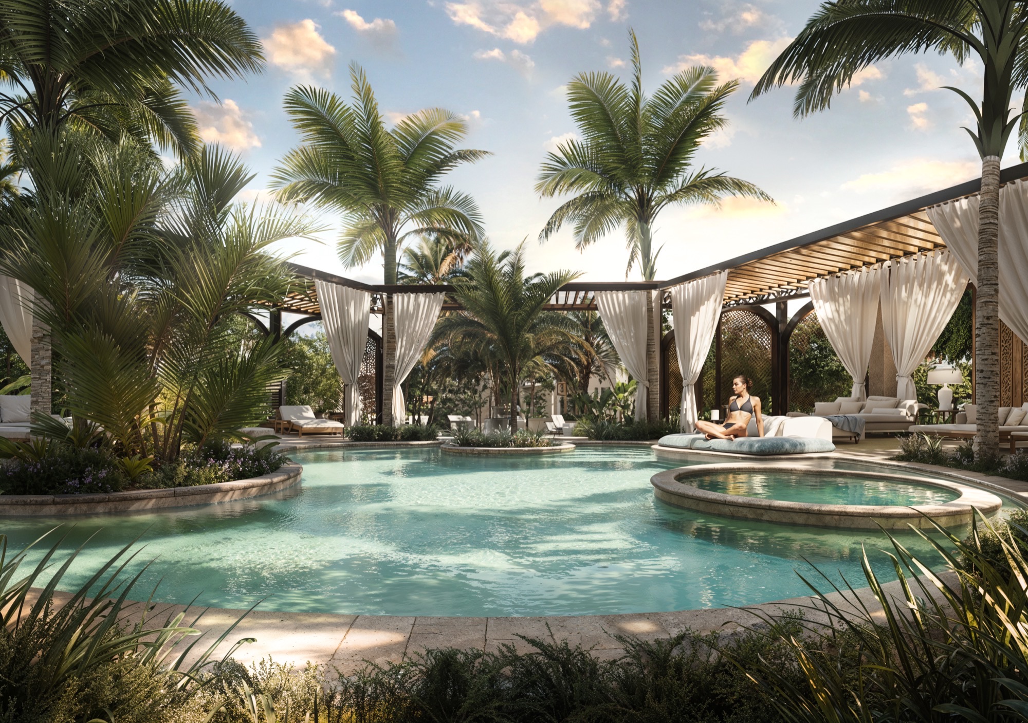
Each cluster of buildings is arranged around an interior courtyard, as a social and climatic nucleus. These courtyards are conceived as lush, introverted gardens featuring water elements, native planting, and social seating areas. Circular pools and linear gardens act as climatic moderators, producing natural cooling through evapotranspiration while offering communal areas for leisure and connection.
The planting strategy emphasizes Mediterranean and drought-tolerant species such as palm trees, cypresses, olive trees, and flowering shrubs—selected not only for their resilience but for their sensory richness. Ground-level paths are defined by stone paving, linear tree alignments, and structured garden beds that guide movement while softening the geometry of the built forms. Vegetation becomes a vital counterpoint to the architectural rigor, introducing texture, color, and seasonality.
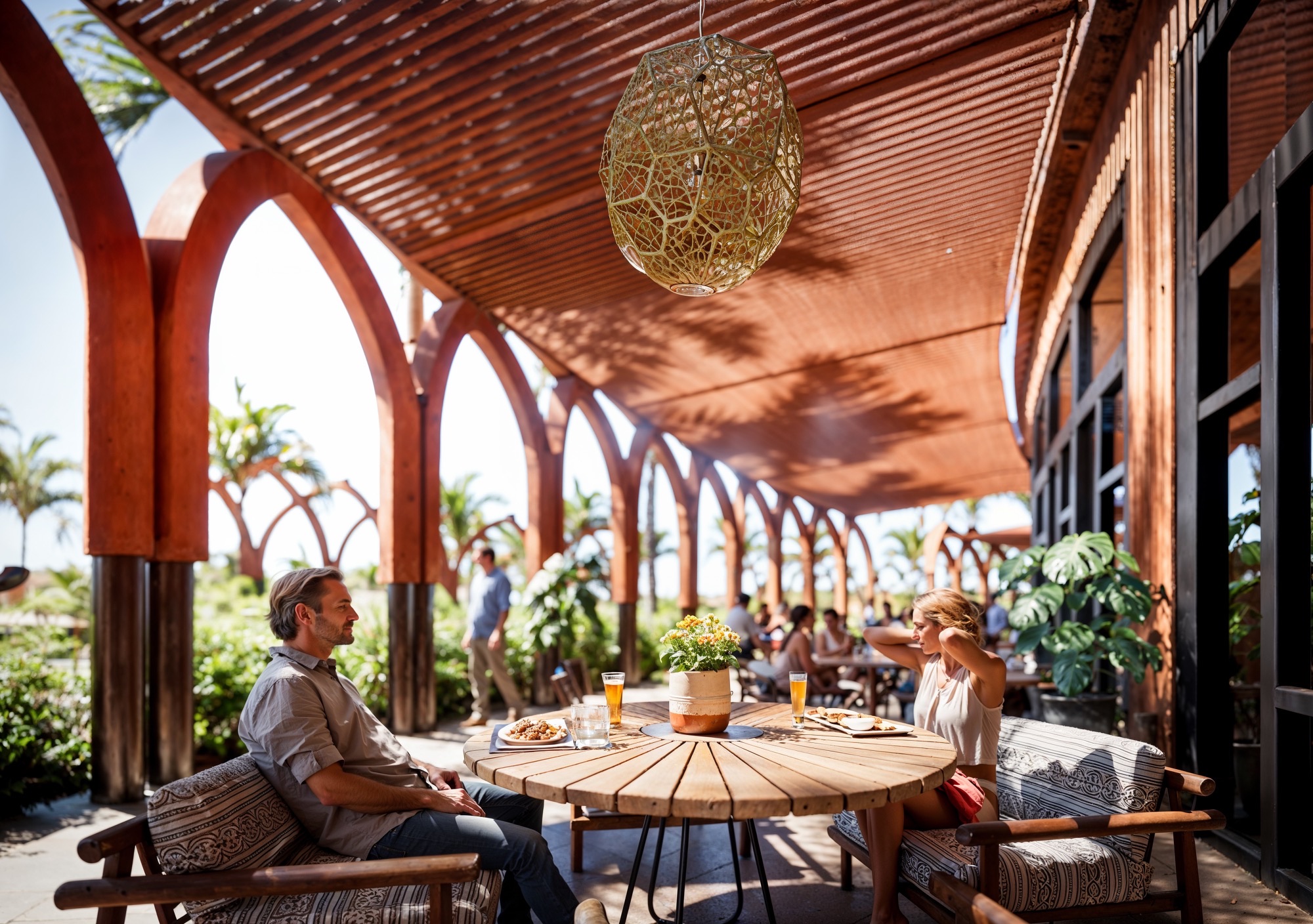
The design follows a logic of proximity and intimacy, reinforcing the idea of a contemporary village. The low-rise typologies and repeated patio modules ensure that no space feels overwhelming or out of scale. Life happens in the in-between: in colonnaded walkways, garden corridors, quiet benches under pergolas, and the shaded thresholds between buildings and landscape. These interstitial zones encourage casual encounters, reflection, and slowness.
Ultimately, the landscape and urban structure serve as the unifying backbone of the project. Through the use of geometric harmony and carefully modulated shade, Alhambra Tourist Apartments offers not just legibility and comfort, but an emotional atmosphere—one rooted in cultural memory and elevated through contemporary spatial language.
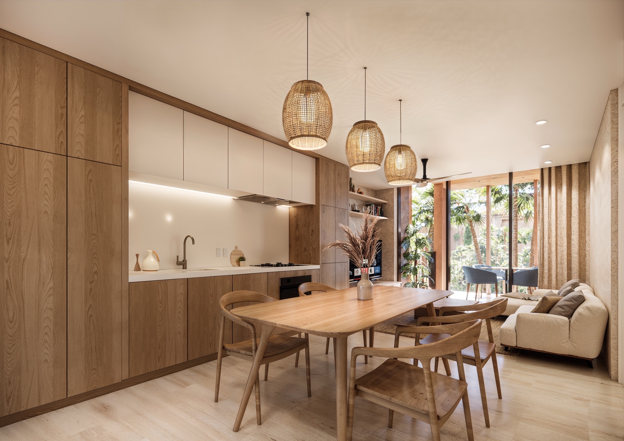
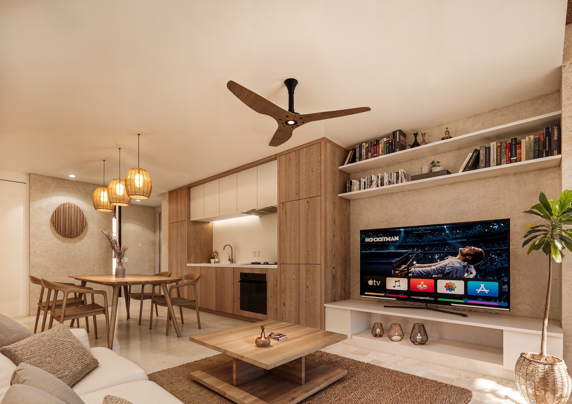
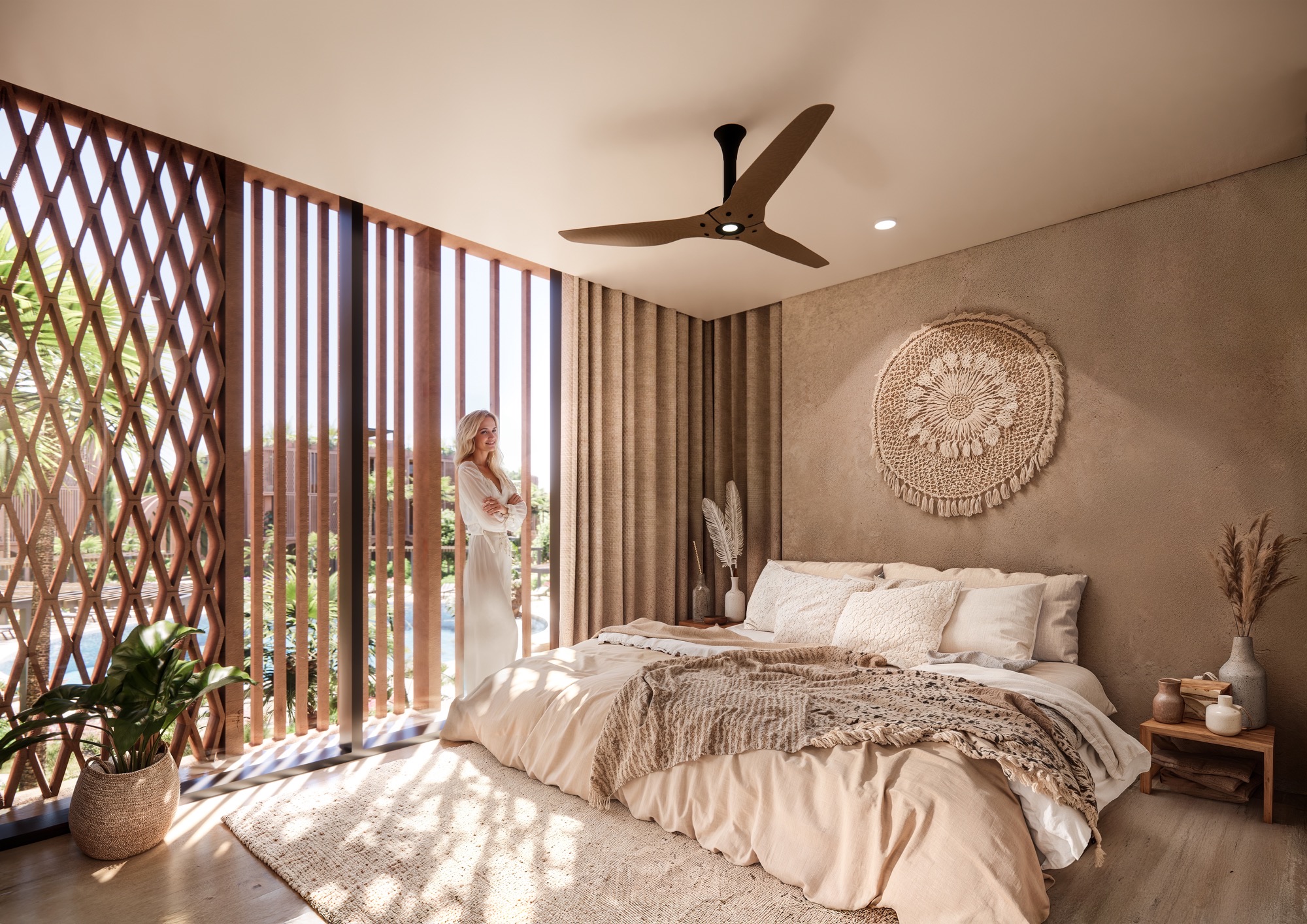
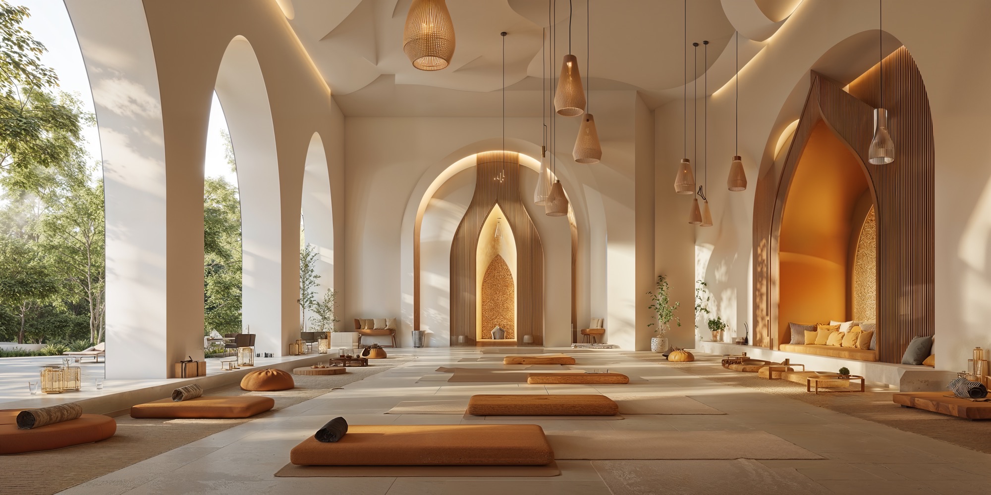
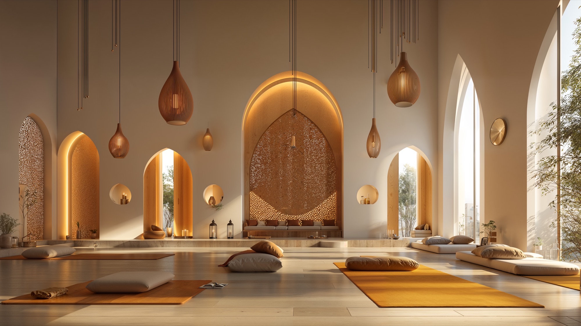
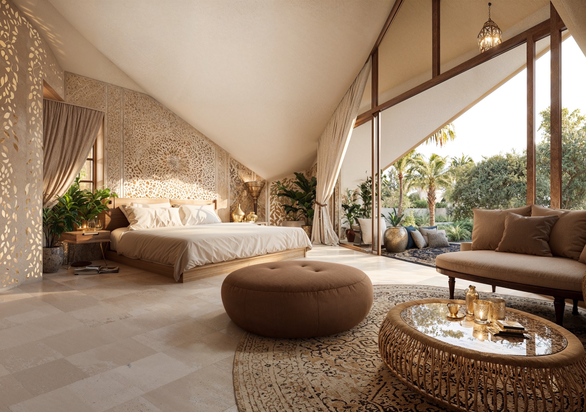
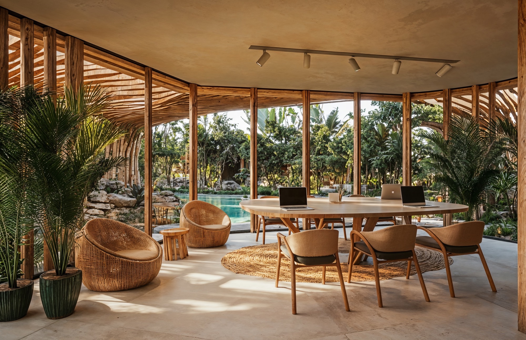
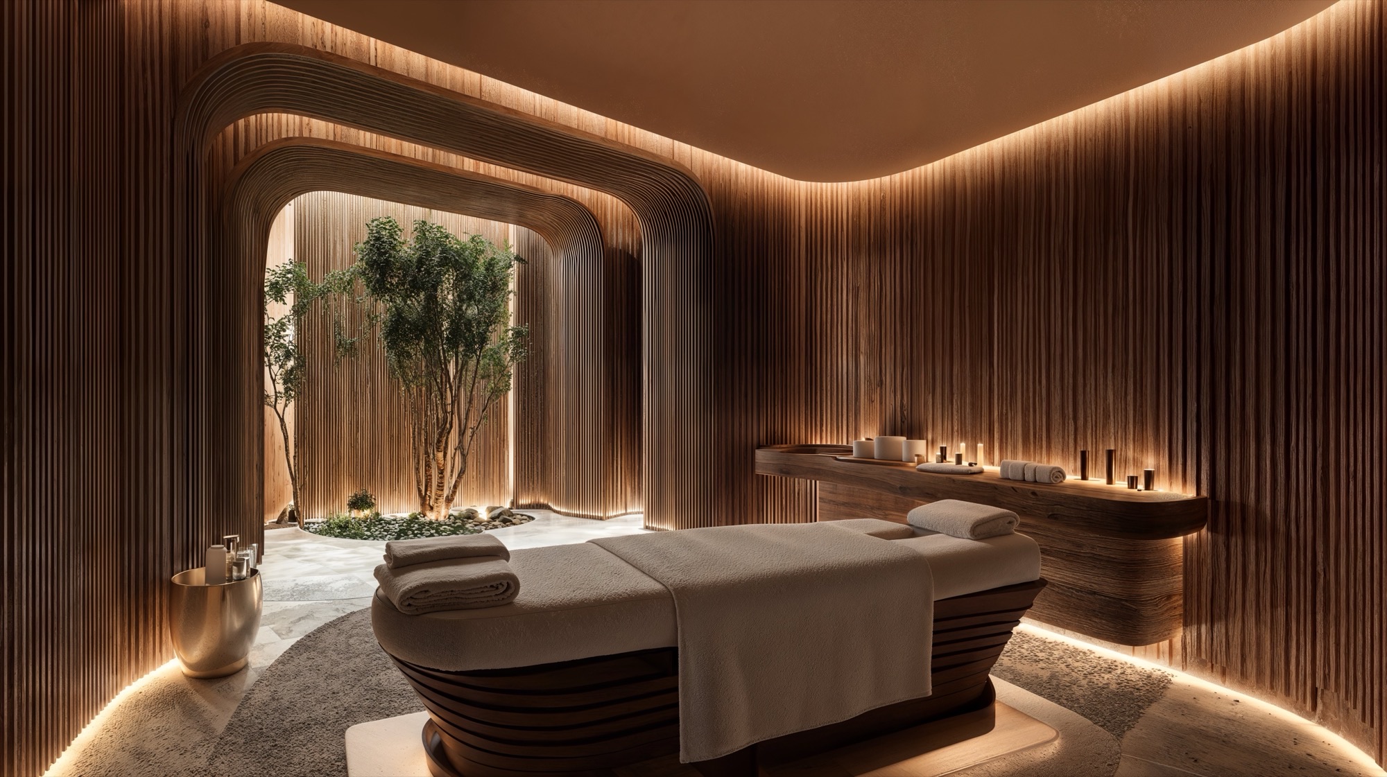
The interiors of Alhambra Tourist Apartments are designed to echo the same principles that define the architecture and landscape: natural materiality, soft Mediterranean tones, and a deep connection between indoor and outdoor living. Every space is conceived as an extension of the serene, rooted lifestyle promoted by the project—calm, tactile, and intentional.
The design embraces a palette of warm neutrals and earthy textures that speak to the regional context and climate. Floors are finished in light-toned limestone or ceramic materials that reflect natural light and keep interiors cool. Walls are rendered in natural plasters, subtly textured to create visual warmth and depth. Custom carpentry in oak or ash wood introduces a layer of artisanal refinement, present in built-in cabinetry, shelving, and millwork.
Ventilation and light control are key strategies. Ceiling fans and cross-ventilation reduce the need for artificial cooling, while layered lighting schemes allow for flexible ambiance: indirect LED strips under cabinetry, warm pendant lights over dining tables, and recessed fixtures for focused illumination. The lighting is not merely functional, but curated to enhance the spatial mood throughout the day and night. The interior design aims to support a lifestyle that values simplicity, wellness, and sensory connection. Each unit is a sanctuary, carefully composed with natural materials, elegant details, and spatial clarity—creating a domestic environment that is both tranquil and deeply connected to the surrounding landscape.
Alhambra Tourist Apartments is envisioned as a contemporary Mediterranean village that reinterprets tradition through a lens of wellness, sustainability, and experiential design. More than a collection of buildings, the project aspires to create a holistic environment where architecture, landscape, and human activity are intimately connected. Located in Murcia—an area steeped in natural beauty, Moorish heritage, and strong sunlight—the design draws inspiration from the poetic geometry and spatial richness of Islamic-Andalusian architecture. In particular, the visual language established by the Alhambra Wellness Hotel and Alhambra Residential is extended here, establishing a unified architectural identity across all three developments. These projects, though distinct in function, form a collective narrative centered on harmony, serenity, and timelessness.
At the core of the concept is the desire to craft a destination that operates on a human scale—walkable, immersive, and emotionally resonant. The masterplan replaces conventional urban grids with a soft, organic layout composed of sinuous walkways, shaded arcades, and landscaped gathering spaces. This design approach creates a sense of discovery, as residents and visitors move through a sequence of curated spatial experiences: quiet courtyards, communal gardens, open plazas, and tranquil water features. The resulting fabric encourages social interaction, introspection, and engagement with nature.
The architectural forms are deliberately restrained, defined by simplicity, repetition, and proportion. Their elegance lies not in ornamentation but in rhythm, balance, and material honesty. Inspired by vernacular Mediterranean construction, buildings are rendered in soft terracotta tones and finished in natural textures that reflect and absorb light differently throughout the day. These materials do not compete with the landscape—they belong to it. Volumes are articulated with vertical wooden screens and generous pergolas, creating an ever-changing interplay of light and shadow that adds depth and comfort.
Crucially, the design privileges the seamless flow between interior and exterior space. Each unit opens out to private terraces, shaded loggias, or rooftop gardens that become part of daily life. These outdoor rooms are not decorative—they are functional extensions of the home, encouraging open-air living and offering shelter from the sun. The layout ensures that nearly every room is cross-ventilated and naturally lit, enhancing comfort and well-being.
The identity of Alhambra Tourist Apartments is not defined solely by its aesthetics, but by its values. It reflects a Mediterranean philosophy of living: one that embraces slowness, rootedness, and intention. In a world increasingly shaped by speed and disconnection, this project offers an alternative—a place where time slows, where beauty is found in the ordinary, and where the architecture supports a life lived in balance with others and with nature. Through this design, we seek to redefine hospitality as something deeply human: immersive, grounding, and meaningful.
The buildings are organized as low-density clusters around communal courtyards and swimming pools, providing a balance of privacy and social interaction. Arches, arcades, and latticework reinterpret traditional motifs with a contemporary sensibility. Vertical wooden screens serve dual functions—providing solar protection while referencing mashrabiya elements, enhancing the dialogue between inside and outside. The rhythm of façades is carefully calibrated to create visual coherence, alternating between solid planes and permeable enclosures that filter natural light.
Volumes are modulated in warm, earthy tones with textures reminiscent of tadelakt and terracotta plaster, allowing the structures to blend seamlessly into the semi-arid landscape. Roof terraces, pergolas, and generous balconies become extensions of living spaces, encouraging open-air living in harmony with the region’s mild climate.
The urban layout of Alhambra Tourist Apartments is grounded in a precise geometric order inspired by traditional Islamic patterns—traces and grids that are not only ornamental, but structural tools for creating harmony, repetition, and spatial clarity. From the aerial perspective, the masterplan reveals itself as an intricate yet balanced composition: a modular arrangement of orthogonal blocks organized around interior patios and unified by a strong axial logic. This approach enables a readable, walkable environment where orientation, rhythm, and cohesion guide the user experience.
One of the defining qualities of the Alhambra Tourist Apartments is the seamless integration between interior and exterior environments. Ground-level units open directly to garden patios, while upper levels enjoy cross-ventilation and panoramic views of the surrounding landscape. Interiors are oriented to maximize daylight and natural airflow, eliminating the need for mechanical cooling for much of the year.
The architecture supports a biophilic lifestyle: residents are invited to engage with their surroundings, whether tending to a planter on a balcony, strolling through an olive grove, or gathering in the communal spaces under filtered shade.
Sustainability is embedded at every scale of the project. Bioclimatic design principles shape the orientation, form, and materiality of the buildings. Deep overhangs, vertical wooden slats, and thermal mass strategies work together to maintain interior comfort while minimizing energy demand.
The extensive use of native, drought-tolerant vegetation supports water conservation efforts and fosters local biodiversity. Greywater recycling systems and low-flow irrigation are integrated to optimize water use. At the infrastructural level, the incorporation of photovoltaic panels on rooftops and the potential for district-scale renewable energy systems contribute to a low-carbon operational footprint.
The design of the Alhambra Tourist Apartments exemplifies architecture as a holistic practice—merging beauty, tradition, and environmental stewardship into a harmonious, human-scaled living environment.
Explore our space through this immersive Virtual Tour: navigate freely, zoom in to discover details and move around by clicking the arrows or portals. Use the blue icons to teleport anywhere in the project, viewpoints or full‑screen mode, and feel free to switch to VR mode on VT Glasses for an even deeper experience! Sit back, take your time, and experience the environment as if you were really there—enjoy your journey
CRAFTED MASTER PLAN DESIGN
The entire complex is structured around a network of shaded pedestrian axes that link communal courtyards, swimming pools, plazas, and garden spaces. These pathways are defined by architectural elements such as rhythmic archways, pergolas, and arcades, which do more than mark circulation—they create a continuous canopy of shadow. In the hot Mediterranean climate of Murcia, shade is not a decorative gesture but an essential spatial strategy. It moderates temperature, softens light, and makes outdoor movement comfortable throughout the seasons.
Each cluster of buildings is arranged around an interior courtyard, as a social and climatic nucleus. These courtyards are conceived as lush, introverted gardens featuring water elements, native planting, and social seating areas. Circular pools and linear gardens act as climatic moderators, producing natural cooling through evapotranspiration while offering communal areas for leisure and connection.
The planting strategy emphasizes Mediterranean and drought-tolerant species such as palm trees, cypresses, olive trees, and flowering shrubs—selected not only for their resilience but for their sensory richness. Ground-level paths are defined by stone paving, linear tree alignments, and structured garden beds that guide movement while softening the geometry of the built forms. Vegetation becomes a vital counterpoint to the architectural rigor, introducing texture, color, and seasonality.
The design follows a logic of proximity and intimacy, reinforcing the idea of a contemporary village. The low-rise typologies and repeated patio modules ensure that no space feels overwhelming or out of scale. Life happens in the in-between: in colonnaded walkways, garden corridors, quiet benches under pergolas, and the shaded thresholds between buildings and landscape. These interstitial zones encourage casual encounters, reflection, and slowness.
Ultimately, the landscape and urban structure serve as the unifying backbone of the project. Through the use of geometric harmony and carefully modulated shade, Alhambra Tourist Apartments offers not just legibility and comfort, but an emotional atmosphere—one rooted in cultural memory and elevated through contemporary spatial language.
The interiors of Alhambra Tourist Apartments are designed to echo the same principles that define the architecture and landscape: natural materiality, soft Mediterranean tones, and a deep connection between indoor and outdoor living. Every space is conceived as an extension of the serene, rooted lifestyle promoted by the project—calm, tactile, and intentional.
The design embraces a palette of warm neutrals and earthy textures that speak to the regional context and climate. Floors are finished in light-toned limestone or ceramic materials that reflect natural light and keep interiors cool. Walls are rendered in natural plasters, subtly textured to create visual warmth and depth. Custom carpentry in oak or ash wood introduces a layer of artisanal refinement, present in built-in cabinetry, shelving, and millwork.
Ventilation and light control are key strategies. Ceiling fans and cross-ventilation reduce the need for artificial cooling, while layered lighting schemes allow for flexible ambiance: indirect LED strips under cabinetry, warm pendant lights over dining tables, and recessed fixtures for focused illumination. The lighting is not merely functional, but curated to enhance the spatial mood throughout the day and night. The interior design aims to support a lifestyle that values simplicity, wellness, and sensory connection. Each unit is a sanctuary, carefully composed with natural materials, elegant details, and spatial clarity—creating a domestic environment that is both tranquil and deeply connected to the surrounding landscape.
© 2021 by sanzpont [arquitectura] . Webpage by sanzpont [digital] . Innovative Digital Experiences

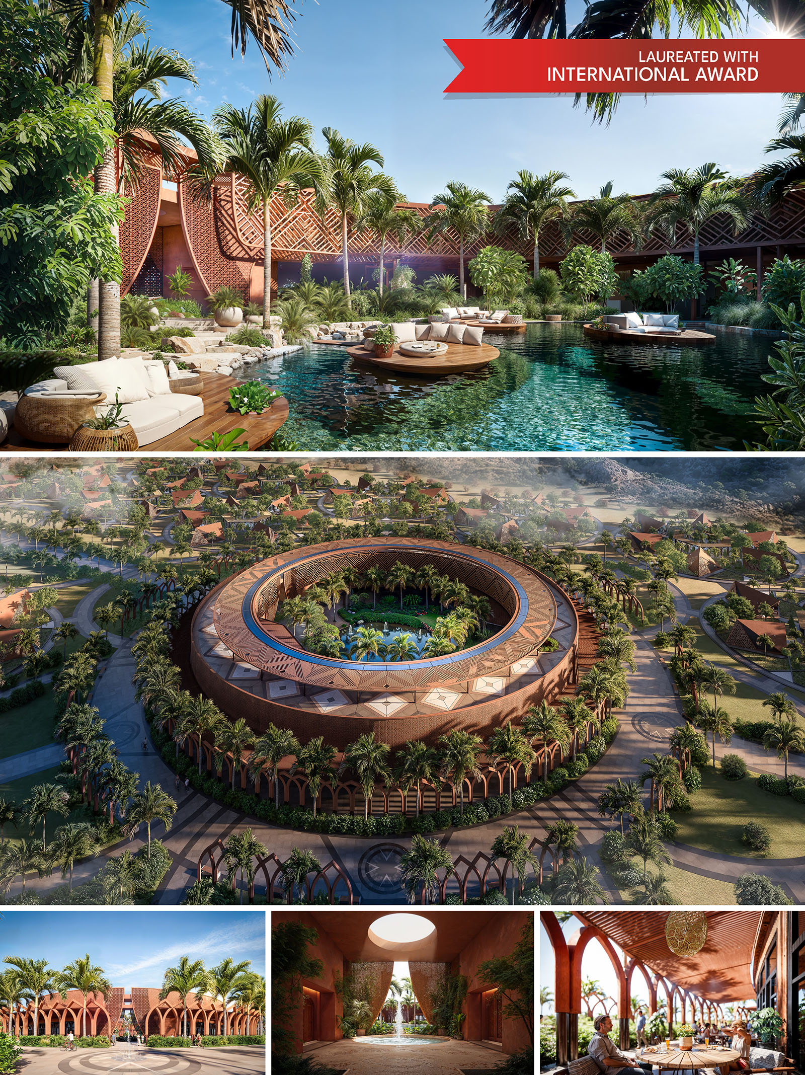
A contemporary sanctuary rooted in history, culture, and nature, Altaona Sports & Wellness Resort emerges from a profound respect for the land it inhabits and the stories it carries. Just fifteen minutes from the historic city of Murcia, the resort stands as a dialogue between the ancestral and the contemporary, merging the essence of Islamic-Andalusian heritage, the warmth of the Mediterranean landscape, and the harmony of sacred geometry found in nature. It is a destination that invites guests not only to rest but to reconnect—with the land, with themselves, and with the deeper rhythms of life.
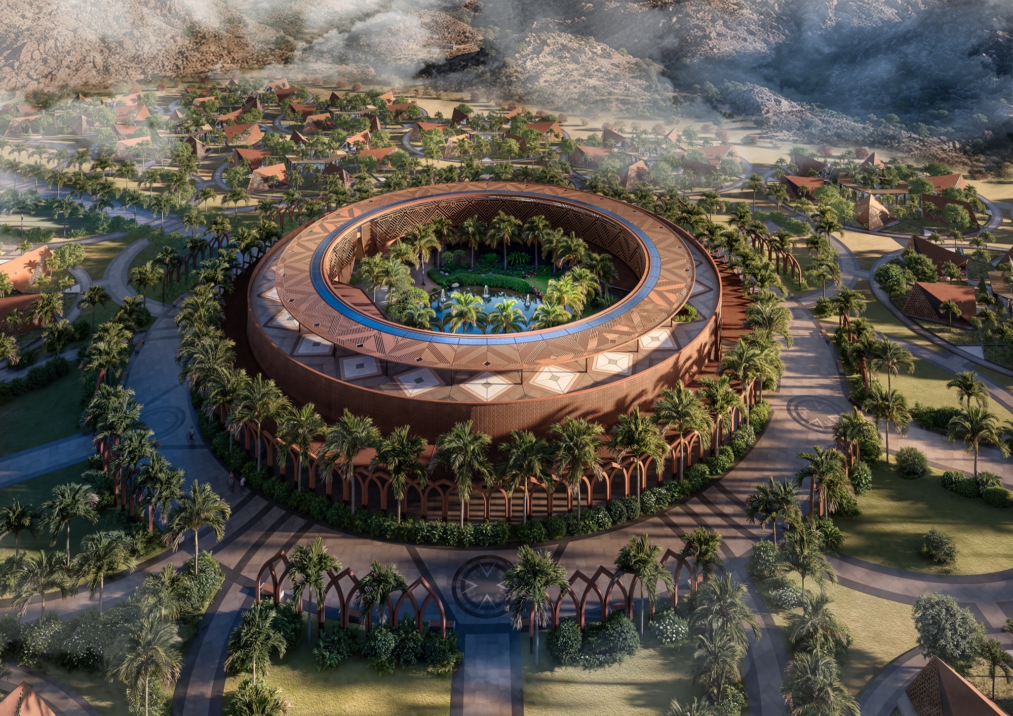
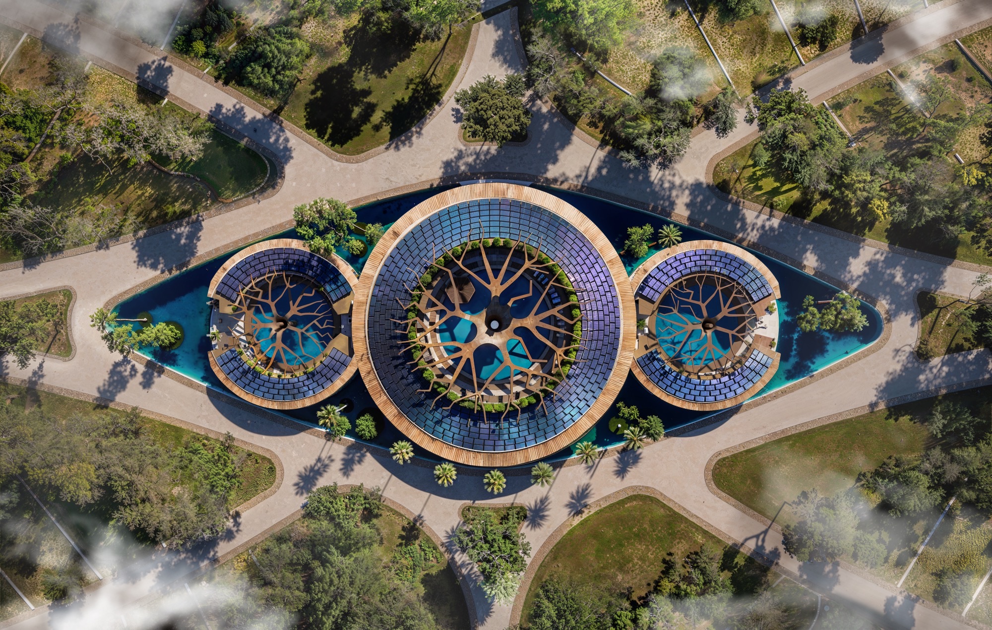
The master plan is structured through the principles of sacred geometry, a design philosophy that translates universal patterns—circles, hexagons, and fractals—into the spatial organization of the site. Inspired by the geometric intricacy of Islamic architecture, these patterns express balance, unity, and spiritual continuity, giving form to plazas, courtyards, and gardens that unfold with natural rhythm and human scale. Every axis, every curve, every threshold has symbolic and spatial intent: to guide movement, to inspire stillness, and to create a seamless transition between architecture and landscape.
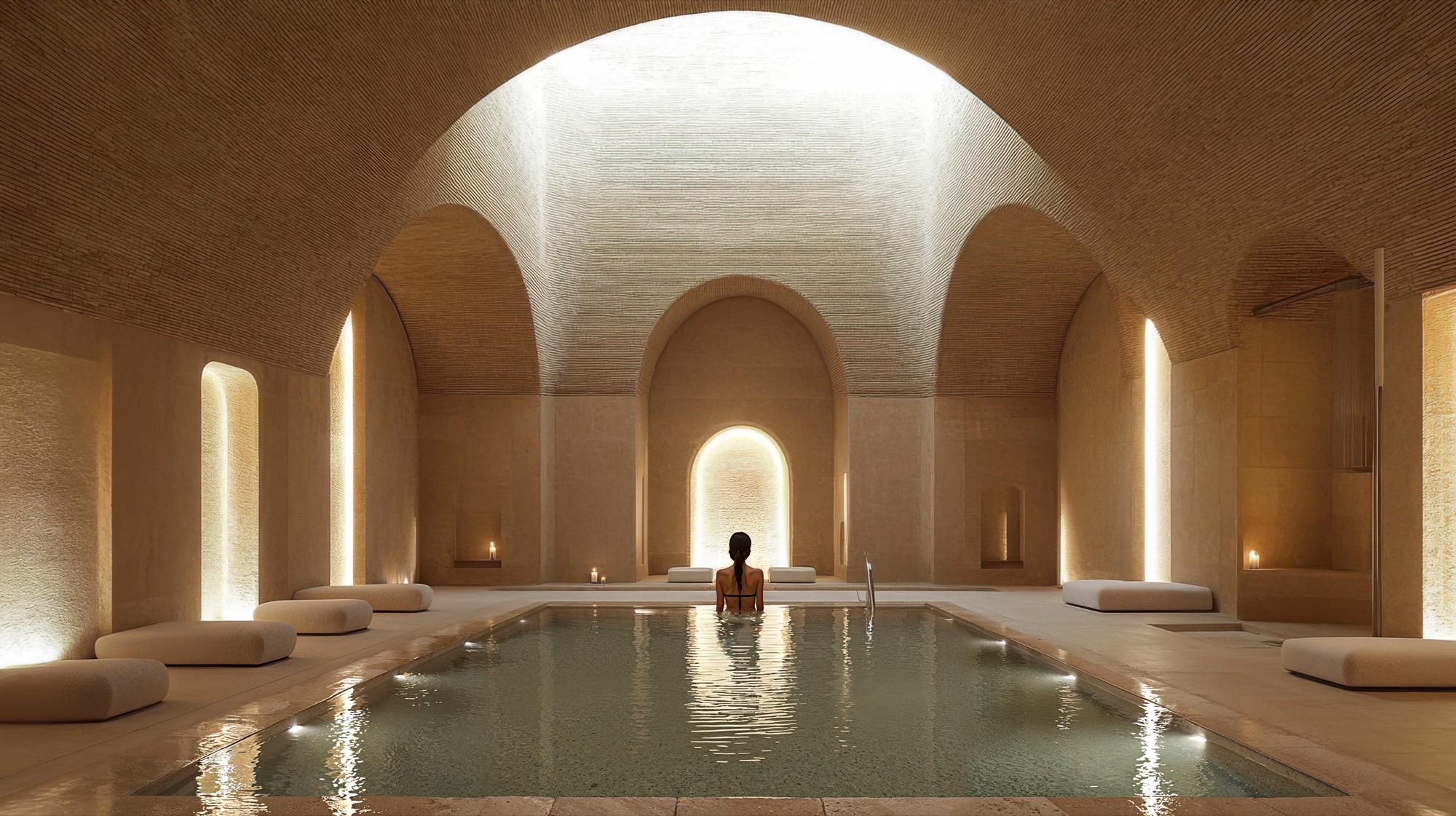
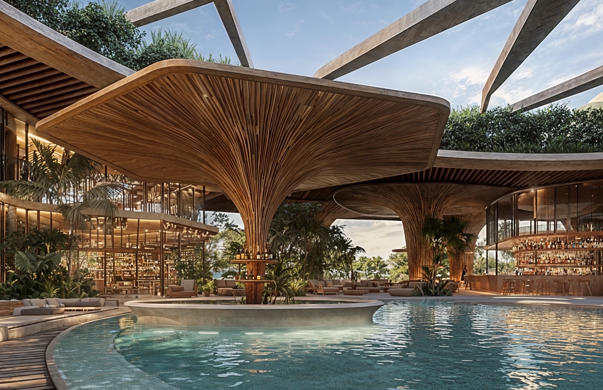
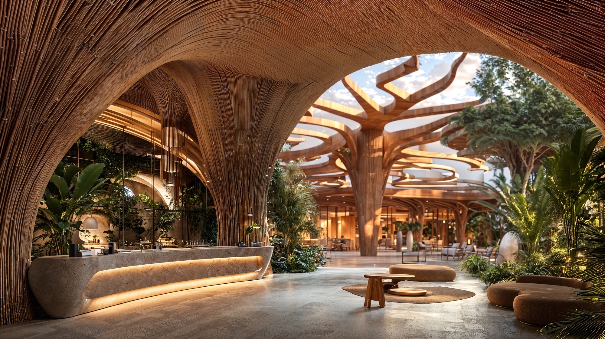
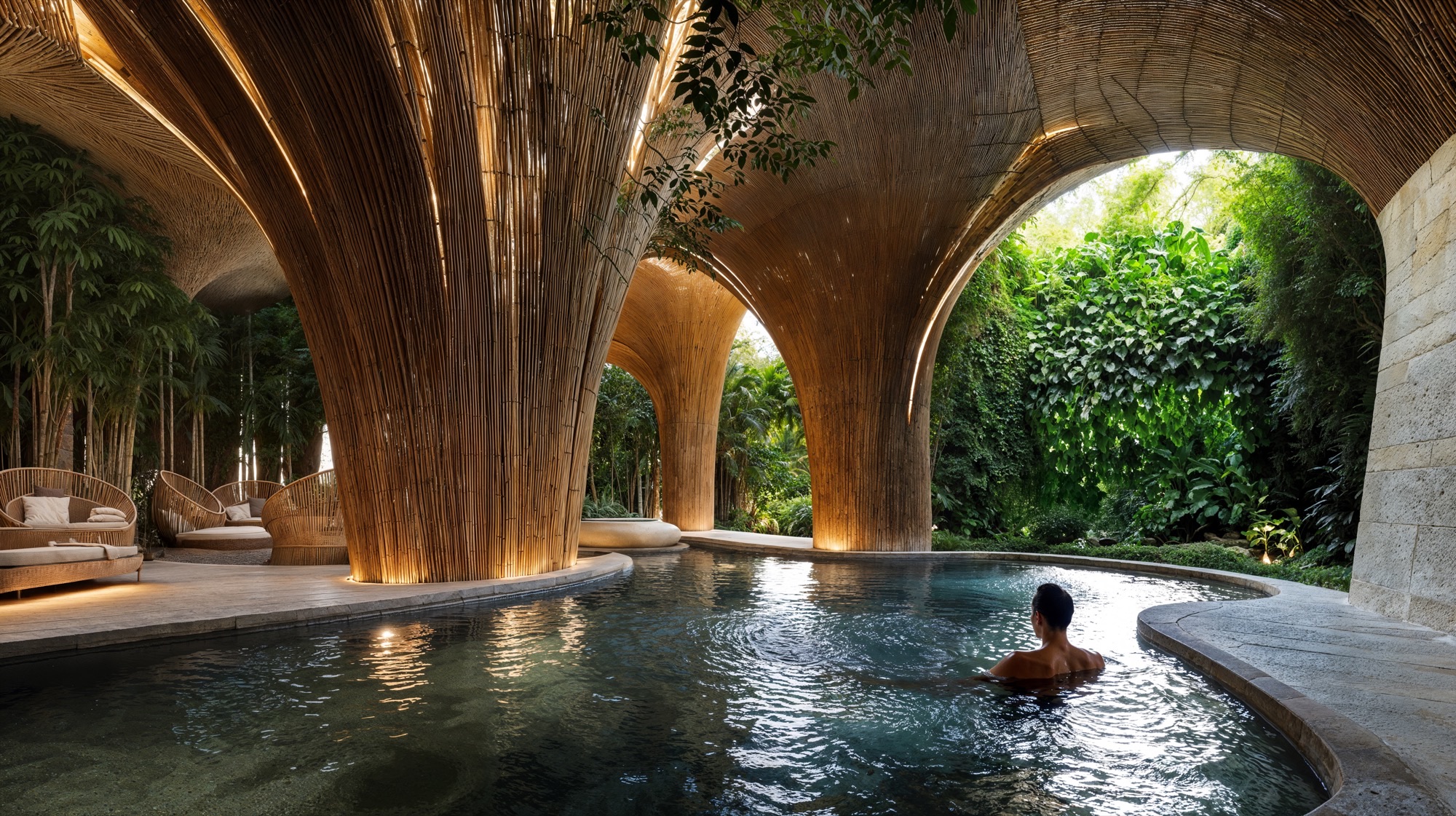
At the heart of the resort lies the ring-shaped Wellness Center, conceived not merely as a facility, but as the emotional and spiritual core of the entire composition. Its ring-shaped structure embodies connection and infinity, housing within its protective geometry a lush internal oasis. Guests enter a realm of calm and sensory immersion—thermal baths, hammams, treatment rooms, and meditation spaces surround a tranquil water garden shaded by palm canopies. Here, filtered sunlight penetrates through terracotta latticework, dancing across water surfaces and earthen walls, creating an atmosphere of quiet transcendence. The architecture feels ancient in its symbolism, yet forward-looking in its ecological intelligence and spatial fluidity.
The architecture of Altaona Sports & Wellness Resort draws directly from its contextual and cultural roots, using form, material, and texture as tools of storytelling. The built language is defined by a fusion of minimalism and craftsmanship, where every surface is expressive of natural materials and local tradition. The terracotta envelope, crafted from locally sourced clay, provides both chromatic harmony with the surrounding terrain and high thermal inertia, contributing to passive temperature regulation.
A network of arcaded walkways, shaded patios, and open-air lounges create transitional spaces that blur the boundary between indoors and outdoors. The design embraces permeability and climatic responsiveness—natural ventilation and controlled shading maintain comfort throughout the seasons, while the gentle presence of water enhances both sensory and thermal comfort.
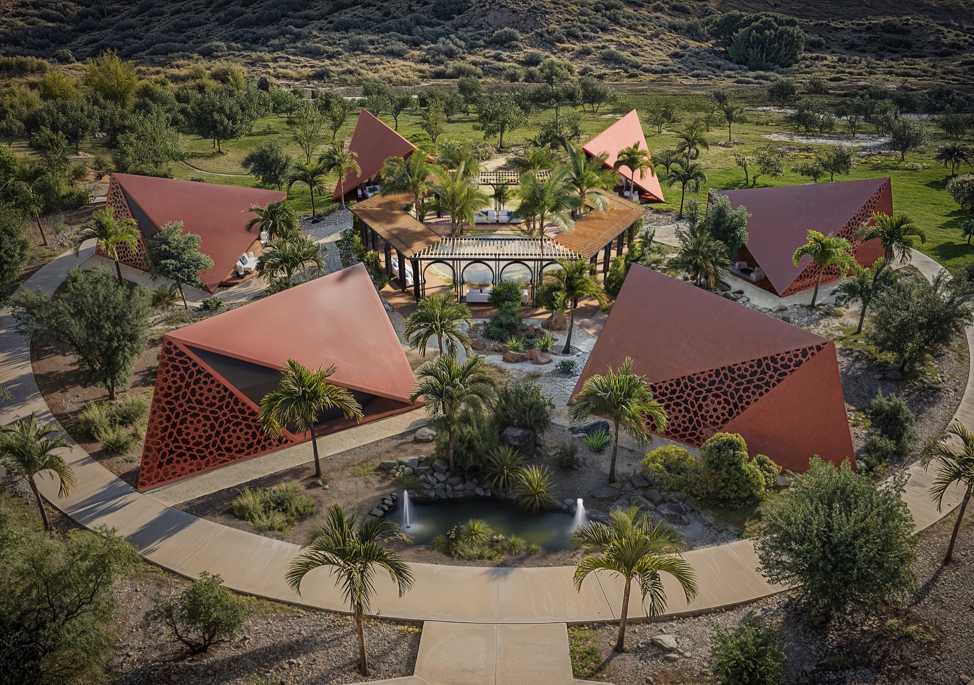
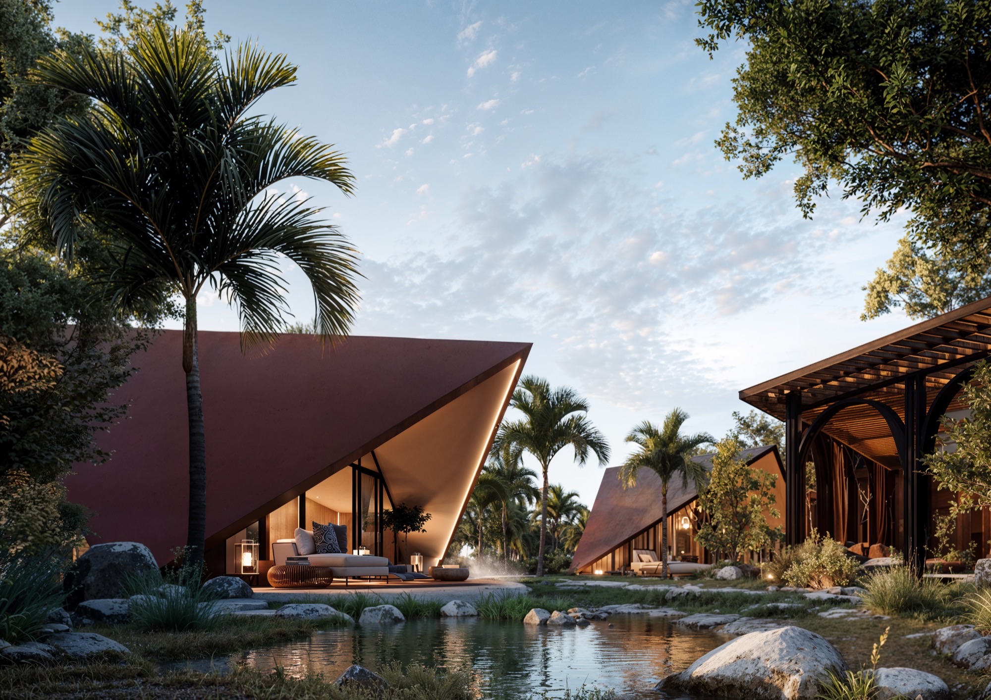
Radiating outward from the Wellness Center, clusters of triangular villas reinterpret the geometry of desert tents and nomadic dwellings. Their bold, angular forms rise from the landscape like sculpted terrains, combining privacy and openness. These villas are oriented strategically to capture views of the mountains, olive groves, and inner gardens, while maintaining optimal solar protection. The perforated metal screens—patterned with abstracted motifs from Islamic geometry—filter the sun and cast intricate shadows, giving each interior a dynamic, ever-changing quality of light.
Inside, the design embodies a language of serenity and craft. Walls are finished with carved plaster reliefs and woven latticework that recall the artistry of Andalusian interiors. A palette of natural stone, pale timber, linen, and brass sets a tone of timeless sophistication. The furniture is tactile and low to the ground, evoking intimacy and repose, while generous glazing opens the rooms to the surrounding gardens, blurring the threshold between refuge and landscape.
The landscape master plan transforms the resort into a living, breathing ecosystem. Nature is not a backdrop, but a co-author of the design. The planting strategy emphasizes native and adaptive Mediterranean species—olive, palm, and aromatic herbs—chosen for their resilience and sensory richness. The layout of gardens and pathways encourages slow movement, reflection, and discovery.
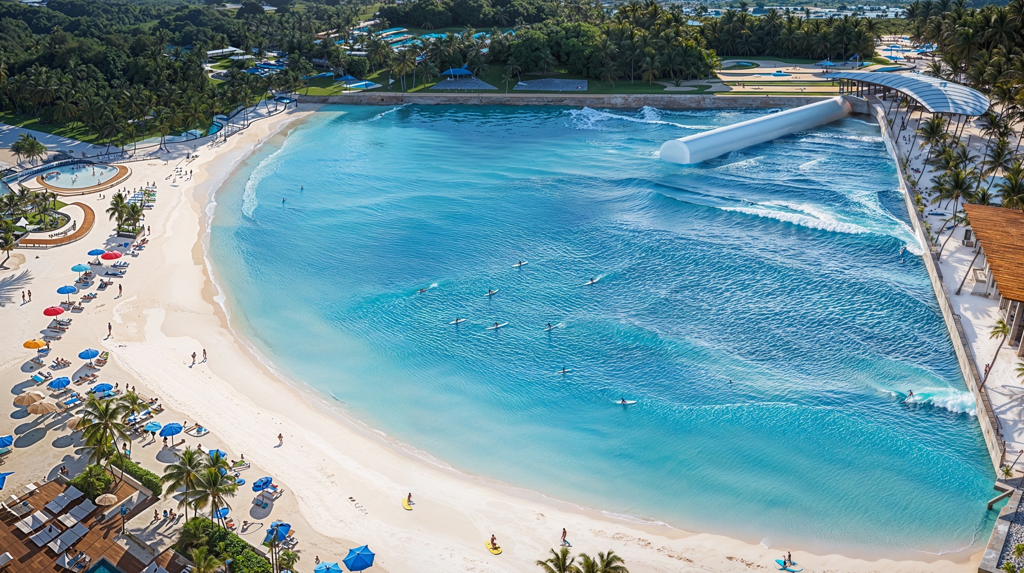
Every space within the resort is choreographed to evoke emotion. Intimate courtyards offer solitude for meditation or private dining; shaded terraces encourage social interaction; and open plazas host performances or cultural gatherings. Water plays a central role, not only as a cooling and reflective element but as a metaphor for renewal. Streams, pools, and fountains weave through the site, culminating in the Surf Lagoon, a vast body of crystalline water that doubles as both recreational attraction and environmental feature.
The Surf Lagoon anchors the resort’s leisure zone, offering an active counterpoint to the tranquil wellness spaces. Beyond its visual impact, the lagoon contributes to microclimatic balance—its large surface aids in natural cooling and humidity control. Adjacent facilities, such as the sports courts, celebration gardens, and fire pit lounges, complete the experience of movement and connection, allowing guests to flow effortlessly between activity and rest, social energy and quiet contemplation.
Sustainability at Altaona Sports & Wellness Resort is not an addition—it is the foundation of its design philosophy. The architecture employs passive cooling systems, solar collection technologies, and natural materials to minimize energy consumption. Roofs integrate photovoltaic panels discreetly within their geometry, while rainwater harvesting systems support irrigation of the landscape. Permeable paving and bioswales ensure responsible water management, preserving the hydrological integrity of the site.
Material selection prioritizes local resources and low-carbon production. Clay, timber, and stone are sourced regionally to reduce transportation impact and support local craftsmanship. Each building envelope is designed to optimize insulation and shading according to orientation, reducing mechanical dependency and maintaining indoor comfort naturally.
But sustainability extends beyond environmental metrics—it encompasses cultural and emotional sustainability. By reviving the spatial poetry of Andalusian architecture and reconnecting guests with the slow, sensory rhythms of Mediterranean life, the resort offers a model of regenerative luxury—where wellness, ecology, and heritage coexist harmoniously.
More than a resort, the project is an architectural symphony of balance and belonging. It celebrates the wisdom of tradition while embracing the possibilities of the future. Through its fusion of form, light, and landscape, it offers an experience of stillness, beauty, and renewal—a contemporary sanctuary that honors the timeless dialogue between humanity and the earth.
• GRI Global Awards 2025, Abu Dhabi, UAE : Second Best Hospitality Project Worldwide : Altaona Sports & Welnness Resort (2025)
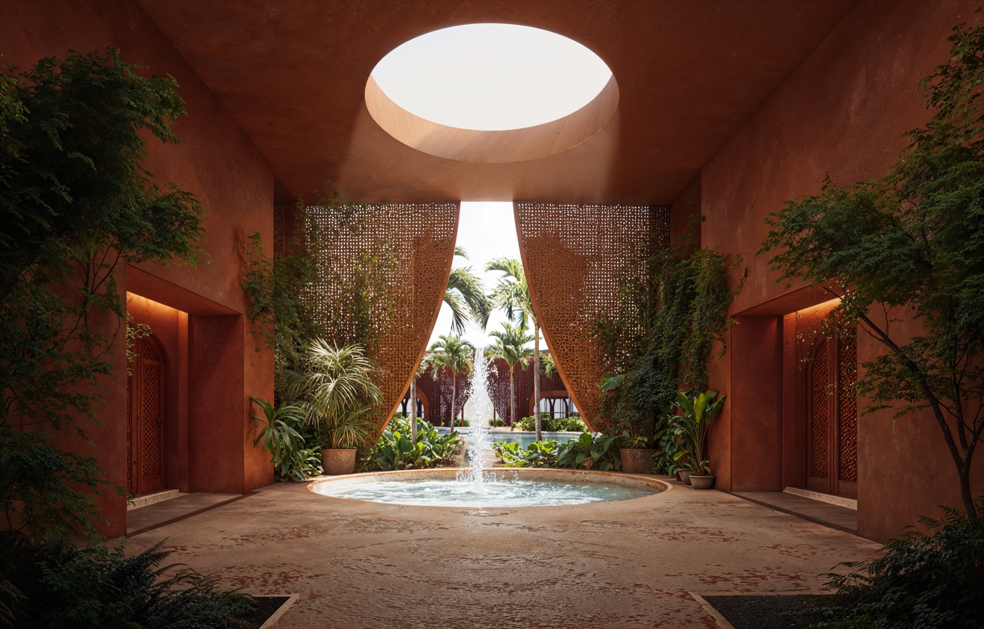
Rising from the sunlit valley of Murcia, the circular Wellness Center of Altaona stands as the soul of the resort—a symbol of unity between earth, water, and sky. Its geometry is timeless, drawn from the language of sacred patterns and desert architecture. Within its terracotta walls, a lush inner oasis unfolds, filled with palm trees and gentle pools that shimmer beneath the Mediterranean light. Every curve, every shadow, every reflection speaks of renewal and harmony. Surrounding this architectural sanctuary, a landscape of villas and palm-lined paths extends toward the horizon—an orchestrated rhythm between built form and nature. The warm tones of the structures echo the color of the soil, allowing architecture to merge seamlessly with the terrain. From above, Altaona appears like a living mandala—a destination designed for restoration, connection, and balance.
Hidden at the heart of Altaona lies a contemporary oasis — a sanctuary where architecture yields to nature and serenity flows like water through every space. Inspired by the ancestral concept of the desert oasis, this inner world reinterprets the timeless human desire for refuge, beauty, and renewal. Beneath a circular opening, sunlight pours gently from above, illuminating a courtyard where terracotta walls breathe with warmth and life. Delicate screens filter the light into intricate patterns, while the sound of water rises from a tranquil fountain — a reminder that every oasis begins with a spring. Here, air, shade, and movement merge in perfect balance, creating a threshold between earth and sky, stillness and flow.
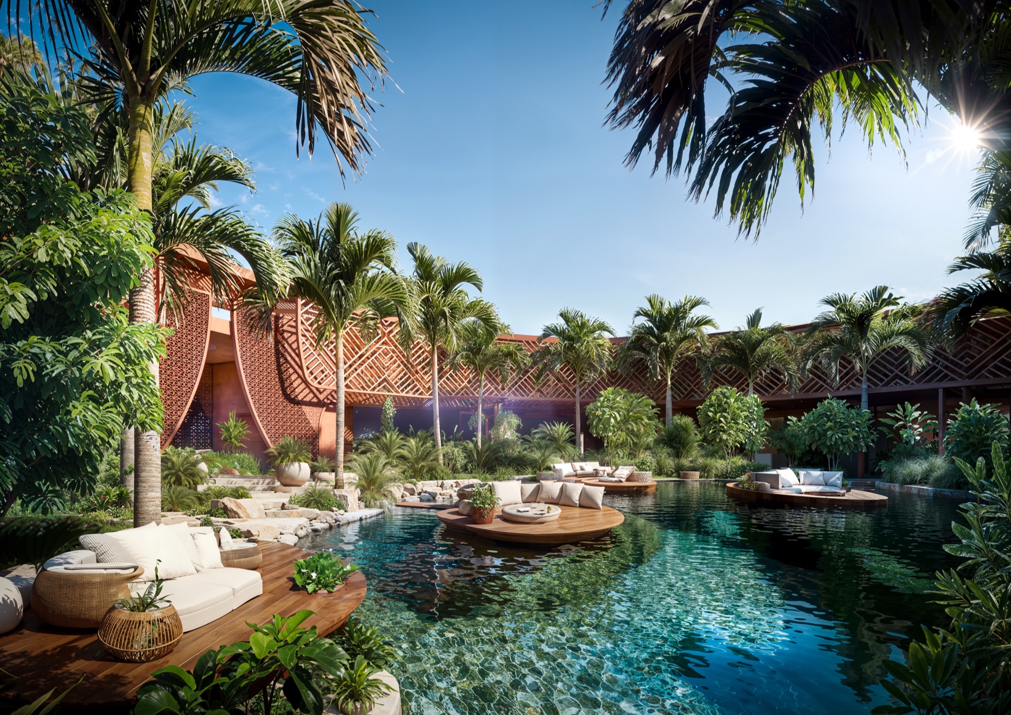
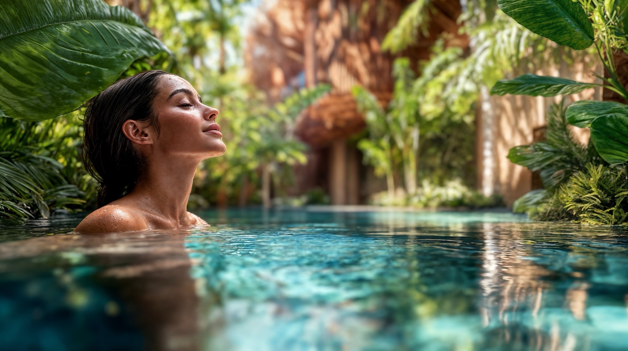
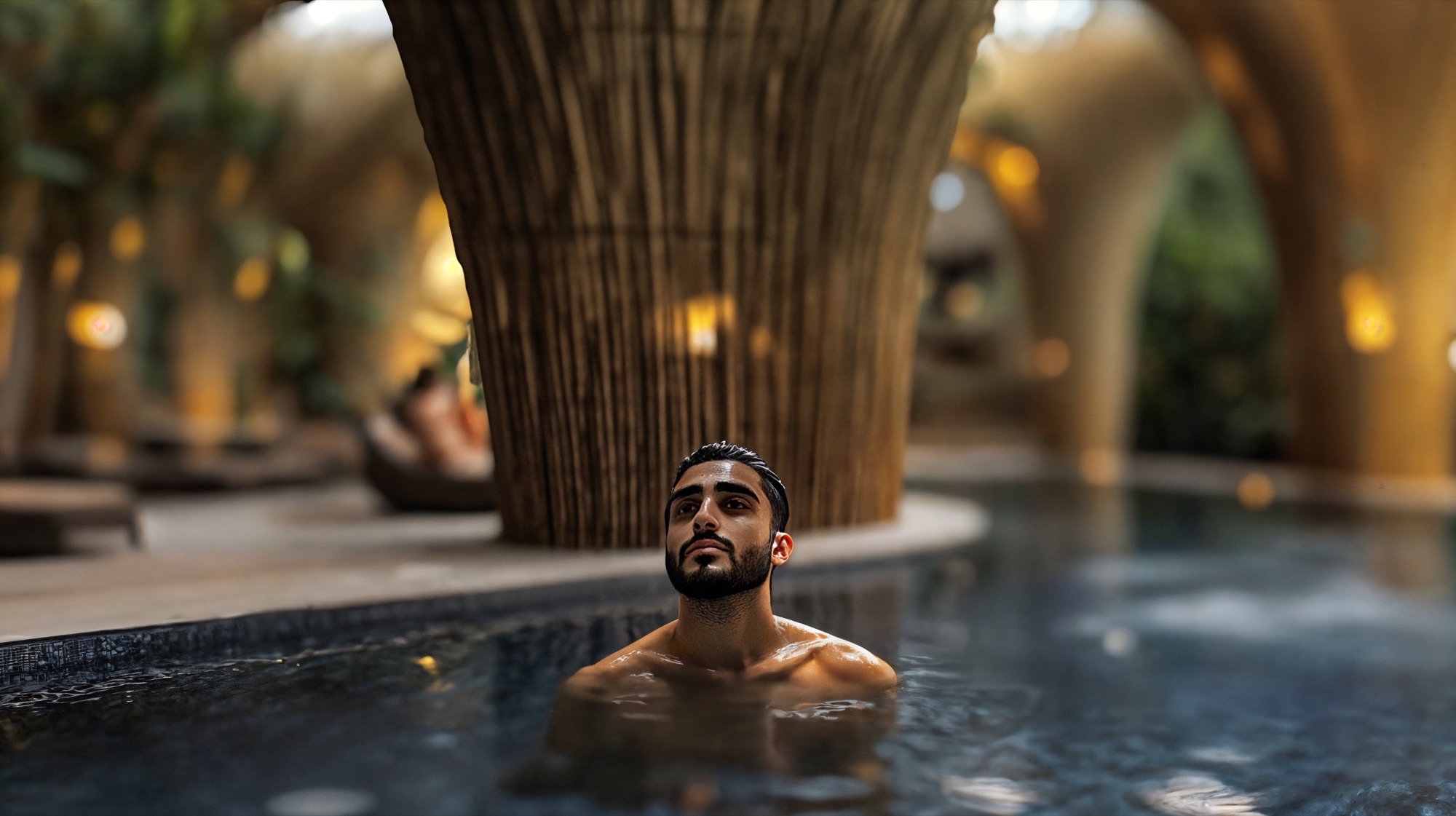
Beyond this passage, the heart of Altaona reveals itself: a lush water garden surrounded by palm trees, ferns, and flowering vines. The architecture encircles the lagoon protectively, like a jewel within the landscape. Wooden platforms float above crystalline waters; soft lounges invite quiet contemplation; reflections shimmer across the handcrafted walls. Every detail is composed to awaken the senses — the scent of greenery, the cool touch of water, the rhythm of light dancing on the surface. This oasis is more than a place of rest; it is a state of being. Immersed in the lagoon, the body reconnects with the calm pulse of nature. Time slows, thoughts fade, and only presence remains — pure, unhurried, and whole.
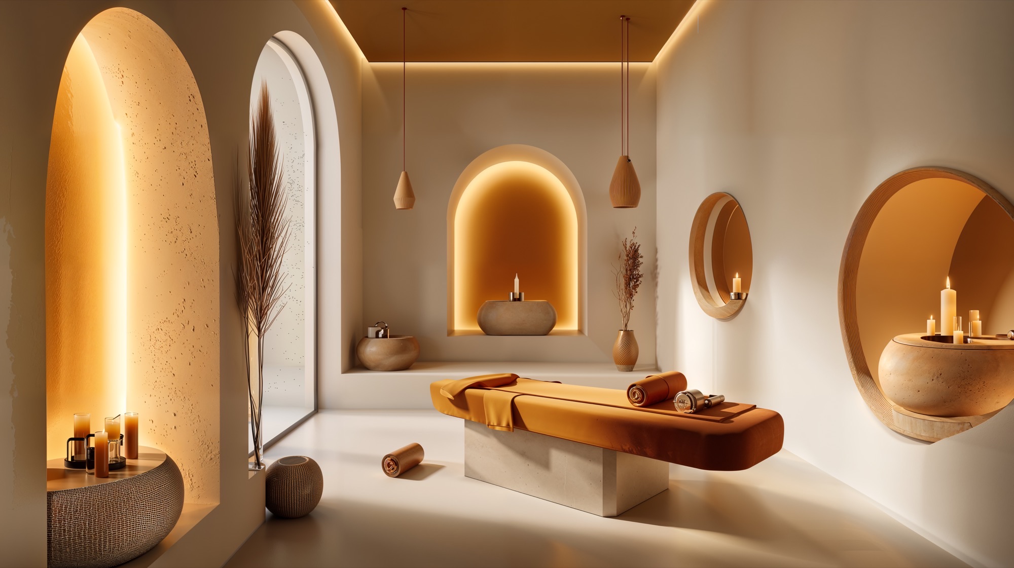
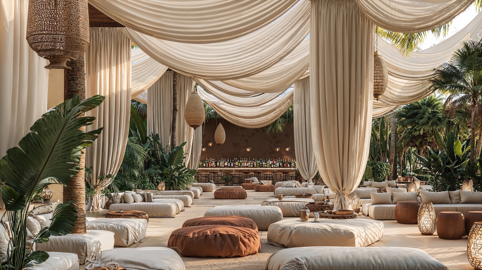
Here, wellness is lived, spaces for meditation, yoga, and rest unfold like an architectural poem, guided by geometry and emotion. Cushioned platforms lie beneath lanterns that glow like suspended drops of amber. The air is filled with the scent of wood and soft minerals, while the filtered daylight from vast arches opens each hall to the greenery beyond. Deeper still lies the Hammam, the heart of the ritual. Carved in stone, illuminated by skylights that pierce the vaulted ceiling, this chamber is both ancient and contemporary — a space of purification and rebirth. Water reflects the arches like liquid light, and silence amplifies every drop, every breath. The palette — ochres, sands, and warm whites — grounds the architecture in the memory of the desert, transforming simplicity into luxury. There is no ornament beyond light itself, no distraction beyond form and atmosphere. This is Altaona’s inner architecture: an ode to serenity where design becomes a spiritual act. It embodies the essence of the oasis — not as a place to escape the world, but to return to it renewed, centered, and alive.


The Surf Lagoon is more than a destination for sport; it is an architectural celebration of movement. Shimmering under the Mediterranean sun, its vast expanse of turquoise water becomes a living canvas where surfers trace lines of freedom and flow. Designed to mirror the beauty and power of the sea, every wave is perfectly formed — an invitation to reconnect with nature through motion, balance, and play.
Along the white sand beach, palm trees sway and parasols bloom in vivid colors. Families and friends gather in a landscape designed for joy, where the sound of laughter blends with the song of waves. Wooden decks, shaded lounges, and pools overlooking the lagoon create a space that is both vibrant and serene — a seamless extension of Altaona’s philosophy of holistic wellbeing.
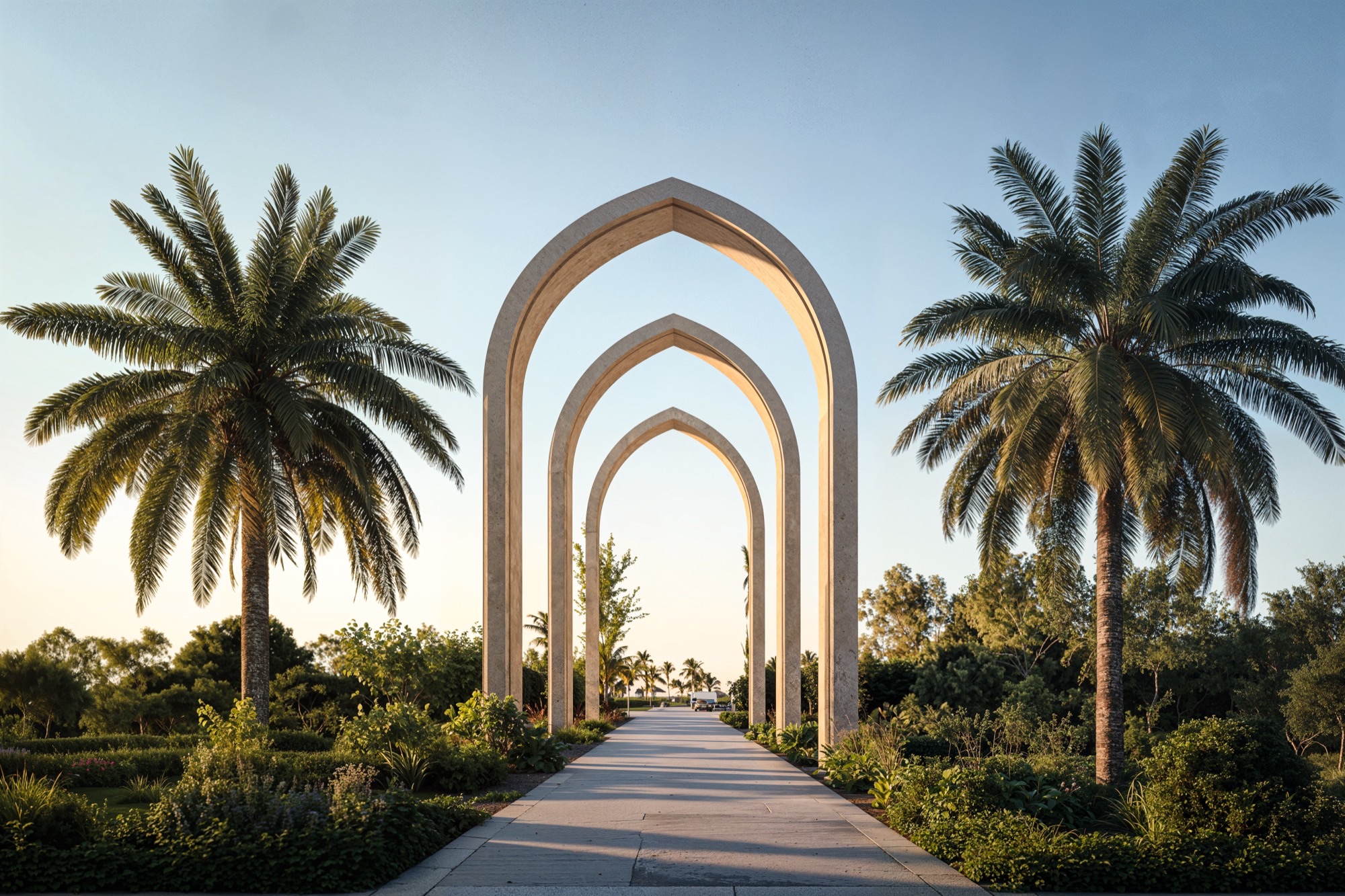
Like a mirage rising from the landscape, The Grand Entrance of Altaona marks the beginning of a journey — a passage from the ordinary into the extraordinary. Here, a sequence of elegant arches stands in perfect rhythm beneath the golden light of Murcia’s sun, framing the horizon as a sacred threshold between earth and sky. Each arch is a gesture of welcome, a modern homage to the geometry of ancient gateways that once defined places of gathering and reflection. The path beneath them feels ceremonial, guiding guests gently forward — step by step — into a world shaped by calm, beauty, and meaning. Flanked by palm trees and fragrant Mediterranean gardens, the walkway is alive with movement and stillness at once: the whisper of the breeze, the rustle of leaves, the distant shimmer of water ahead.
The suites design is born from the timeless poetry of the desert — from the quiet strength of nomadic tents, the shimmer of dunes at sunset, and the ancestral art of creating refuge amid vastness. Their design draws inspiration from the ancient Bedouin tradition, where every shelter was both protection and poetry, both a structure and a story told by wind and sand. The geometry of the suites is a contemporary reimagining of the desert tent. The bold triangular forms, sculpted by sun and shadow, evoke the simplicity and elegance of these ancestral dwellings. Just as the nomadic tent embraced its surroundings, each villa at Altaona rises gently from the landscape, blending with the tones of the earth and the rhythm of the palms.
Inside, the spirit of the desert is translated into modern serenity — open spaces bathed in golden light, natural materials that breathe, and textures that speak of craft and authenticity. The play of fabric and shadow, the filtered glow of lanterns, the soft layering of woven rugs and cushions — all evoke the intimacy and warmth of desert hospitality.

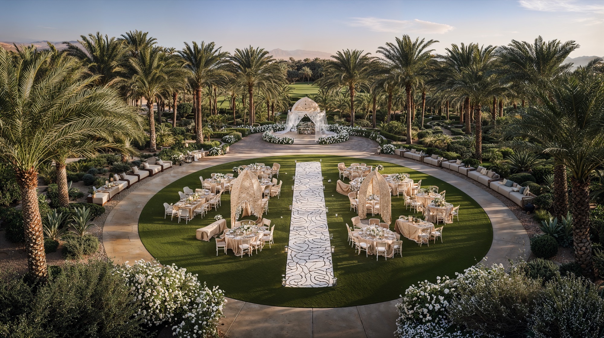
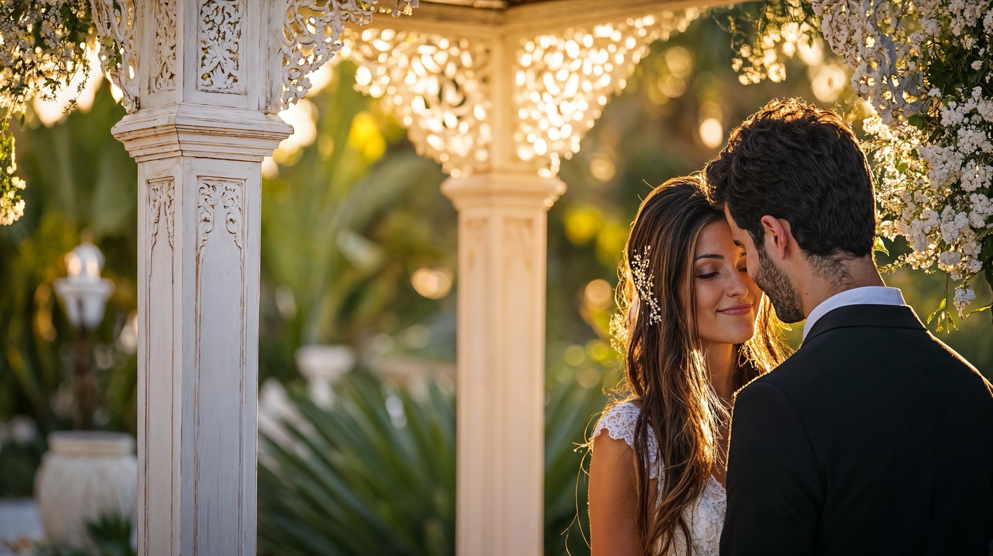
At the heart of Altaona, surrounded by palms and bathed in golden light, lies the Events Courtyard — a stage for life’s most meaningful celebrations. Designed as an open-air sanctuary, this grand circular garden brings together elegance, nature, and emotion in perfect harmony. A path of white stone leads to a delicate pavilion draped in flowers and fabric, its intricate arches glistening under the afternoon sun. Around it, tables and lounges are arranged in flowing symmetry, echoing the geometry of the resort’s architecture. The scent of jasmine and orange blossom lingers in the air, while the rustle of palm leaves becomes the soft soundtrack to each gathering.
Here, every celebration — a wedding, a dinner beneath the stars, a moment shared between loved ones — feels timeless. The architecture dissolves into the landscape, leaving only the experience: laughter carried on the breeze, candlelight reflected in the eyes of guests, the gentle glow of dusk as the day gives way to night.
• GRI Global Awards 2025, Abu Dhabi, UAE : Second Best Hospitality Project Worldwide : Altaona Sports & Welnness Resort (2025)
A contemporary sanctuary rooted in history, culture, and nature, Altaona Sports & Wellness Resort emerges from a profound respect for the land it inhabits and the stories it carries. Just fifteen minutes from the historic city of Murcia, the resort stands as a dialogue between the ancestral and the contemporary, merging the essence of Islamic-Andalusian heritage, the warmth of the Mediterranean landscape, and the harmony of sacred geometry found in nature. It is a destination that invites guests not only to rest but to reconnect—with the land, with themselves, and with the deeper rhythms of life.
The master plan is structured through the principles of sacred geometry, a design philosophy that translates universal patterns—circles, hexagons, and fractals—into the spatial organization of the site. Inspired by the geometric intricacy of Islamic architecture, these patterns express balance, unity, and spiritual continuity, giving form to plazas, courtyards, and gardens that unfold with natural rhythm and human scale. Every axis, every curve, every threshold has symbolic and spatial intent: to guide movement, to inspire stillness, and to create a seamless transition between architecture and landscape.
At the heart of the resort lies the ring-shaped Wellness Center, conceived not merely as a facility, but as the emotional and spiritual core of the entire composition. Its ring-shaped structure embodies connection and infinity, housing within its protective geometry a lush internal oasis. Guests enter a realm of calm and sensory immersion—thermal baths, hammams, treatment rooms, and meditation spaces surround a tranquil water garden shaded by palm canopies. Here, filtered sunlight penetrates through terracotta latticework, dancing across water surfaces and earthen walls, creating an atmosphere of quiet transcendence. The architecture feels ancient in its symbolism, yet forward-looking in its ecological intelligence and spatial fluidity.
The architecture of Altaona Sports & Wellness Resort draws directly from its contextual and cultural roots, using form, material, and texture as tools of storytelling. The built language is defined by a fusion of minimalism and craftsmanship, where every surface is expressive of natural materials and local tradition. The terracotta envelope, crafted from locally sourced clay, provides both chromatic harmony with the surrounding terrain and high thermal inertia, contributing to passive temperature regulation.
A network of arcaded walkways, shaded patios, and open-air lounges create transitional spaces that blur the boundary between indoors and outdoors. The design embraces permeability and climatic responsiveness—natural ventilation and controlled shading maintain comfort throughout the seasons, while the gentle presence of water enhances both sensory and thermal comfort.
Radiating outward from the Wellness Center, clusters of triangular villas reinterpret the geometry of desert tents and nomadic dwellings. Their bold, angular forms rise from the landscape like sculpted terrains, combining privacy and openness. These villas are oriented strategically to capture views of the mountains, olive groves, and inner gardens, while maintaining optimal solar protection. The perforated metal screens—patterned with abstracted motifs from Islamic geometry—filter the sun and cast intricate shadows, giving each interior a dynamic, ever-changing quality of light.
Inside, the design embodies a language of serenity and craft. Walls are finished with carved plaster reliefs and woven latticework that recall the artistry of Andalusian interiors. A palette of natural stone, pale timber, linen, and brass sets a tone of timeless sophistication. The furniture is tactile and low to the ground, evoking intimacy and repose, while generous glazing opens the rooms to the surrounding gardens, blurring the threshold between refuge and landscape.
The landscape master plan transforms the resort into a living, breathing ecosystem. Nature is not a backdrop, but a co-author of the design. The planting strategy emphasizes native and adaptive Mediterranean species—olive, palm, and aromatic herbs—chosen for their resilience and sensory richness. The layout of gardens and pathways encourages slow movement, reflection, and discovery.
Every space within the resort is choreographed to evoke emotion. Intimate courtyards offer solitude for meditation or private dining; shaded terraces encourage social interaction; and open plazas host performances or cultural gatherings. Water plays a central role, not only as a cooling and reflective element but as a metaphor for renewal. Streams, pools, and fountains weave through the site, culminating in the Surf Lagoon, a vast body of crystalline water that doubles as both recreational attraction and environmental feature.
The Surf Lagoon anchors the resort’s leisure zone, offering an active counterpoint to the tranquil wellness spaces. Beyond its visual impact, the lagoon contributes to microclimatic balance—its large surface aids in natural cooling and humidity control. Adjacent facilities, such as the sports courts, celebration gardens, and fire pit lounges, complete the experience of movement and connection, allowing guests to flow effortlessly between activity and rest, social energy and quiet contemplation.
Sustainability at Altaona Sports & Wellness Resort is not an addition—it is the foundation of its design philosophy. The architecture employs passive cooling systems, solar collection technologies, and natural materials to minimize energy consumption. Roofs integrate photovoltaic panels discreetly within their geometry, while rainwater harvesting systems support irrigation of the landscape. Permeable paving and bioswales ensure responsible water management, preserving the hydrological integrity of the site.
Material selection prioritizes local resources and low-carbon production. Clay, timber, and stone are sourced regionally to reduce transportation impact and support local craftsmanship. Each building envelope is designed to optimize insulation and shading according to orientation, reducing mechanical dependency and maintaining indoor comfort naturally.
But sustainability extends beyond environmental metrics—it encompasses cultural and emotional sustainability. By reviving the spatial poetry of Andalusian architecture and reconnecting guests with the slow, sensory rhythms of Mediterranean life, the resort offers a model of regenerative luxury—where wellness, ecology, and heritage coexist harmoniously.
More than a resort, the project is an architectural symphony of balance and belonging. It celebrates the wisdom of tradition while embracing the possibilities of the future. Through its fusion of form, light, and landscape, it offers an experience of stillness, beauty, and renewal—a contemporary sanctuary that honors the timeless dialogue between humanity and the earth.
Rising from the sunlit valley of Murcia, the circular Wellness Center of Altaona stands as the soul of the resort—a symbol of unity between earth, water, and sky. Its geometry is timeless, drawn from the language of sacred patterns and desert architecture. Within its terracotta walls, a lush inner oasis unfolds, filled with palm trees and gentle pools that shimmer beneath the Mediterranean light. Every curve, every shadow, every reflection speaks of renewal and harmony. Surrounding this architectural sanctuary, a landscape of villas and palm-lined paths extends toward the horizon—an orchestrated rhythm between built form and nature. The warm tones of the structures echo the color of the soil, allowing architecture to merge seamlessly with the terrain. From above, Altaona appears like a living mandala—a destination designed for restoration, connection, and balance.
Hidden at the heart of Altaona lies a contemporary oasis — a sanctuary where architecture yields to nature and serenity flows like water through every space. Inspired by the ancestral concept of the desert oasis, this inner world reinterprets the timeless human desire for refuge, beauty, and renewal. Beneath a circular opening, sunlight pours gently from above, illuminating a courtyard where terracotta walls breathe with warmth and life. Delicate screens filter the light into intricate patterns, while the sound of water rises from a tranquil fountain — a reminder that every oasis begins with a spring. Here, air, shade, and movement merge in perfect balance, creating a threshold between earth and sky, stillness and flow.
Beyond this passage, the heart of Altaona reveals itself: a lush water garden surrounded by palm trees, ferns, and flowering vines. The architecture encircles the lagoon protectively, like a jewel within the landscape. Wooden platforms float above crystalline waters; soft lounges invite quiet contemplation; reflections shimmer across the handcrafted walls. Every detail is composed to awaken the senses — the scent of greenery, the cool touch of water, the rhythm of light dancing on the surface. This oasis is more than a place of rest; it is a state of being. Immersed in the lagoon, the body reconnects with the calm pulse of nature. Time slows, thoughts fade, and only presence remains — pure, unhurried, and whole.
Here, wellness is lived, spaces for meditation, yoga, and rest unfold like an architectural poem, guided by geometry and emotion. Cushioned platforms lie beneath lanterns that glow like suspended drops of amber. The air is filled with the scent of wood and soft minerals, while the filtered daylight from vast arches opens each hall to the greenery beyond. Deeper still lies the Hammam, the heart of the ritual. Carved in stone, illuminated by skylights that pierce the vaulted ceiling, this chamber is both ancient and contemporary — a space of purification and rebirth. Water reflects the arches like liquid light, and silence amplifies every drop, every breath. The palette — ochres, sands, and warm whites — grounds the architecture in the memory of the desert, transforming simplicity into luxury. There is no ornament beyond light itself, no distraction beyond form and atmosphere. This is Altaona’s inner architecture: an ode to serenity where design becomes a spiritual act. It embodies the essence of the oasis — not as a place to escape the world, but to return to it renewed, centered, and alive.
The Surf Lagoon is more than a destination for sport; it is an architectural celebration of movement. Shimmering under the Mediterranean sun, its vast expanse of turquoise water becomes a living canvas where surfers trace lines of freedom and flow. Designed to mirror the beauty and power of the sea, every wave is perfectly formed — an invitation to reconnect with nature through motion, balance, and play.
Along the white sand beach, palm trees sway and parasols bloom in vivid colors. Families and friends gather in a landscape designed for joy, where the sound of laughter blends with the song of waves. Wooden decks, shaded lounges, and pools overlooking the lagoon create a space that is both vibrant and serene — a seamless extension of Altaona’s philosophy of holistic wellbeing.
Like a mirage rising from the landscape, The Grand Entrance of Altaona marks the beginning of a journey — a passage from the ordinary into the extraordinary. Here, a sequence of elegant arches stands in perfect rhythm beneath the golden light of Murcia’s sun, framing the horizon as a sacred threshold between earth and sky. Each arch is a gesture of welcome, a modern homage to the geometry of ancient gateways that once defined places of gathering and reflection. The path beneath them feels ceremonial, guiding guests gently forward — step by step — into a world shaped by calm, beauty, and meaning. Flanked by palm trees and fragrant Mediterranean gardens, the walkway is alive with movement and stillness at once: the whisper of the breeze, the rustle of leaves, the distant shimmer of water ahead.
The suites design is born from the timeless poetry of the desert — from the quiet strength of nomadic tents, the shimmer of dunes at sunset, and the ancestral art of creating refuge amid vastness. Their design draws inspiration from the ancient Bedouin tradition, where every shelter was both protection and poetry, both a structure and a story told by wind and sand. The geometry of the suites is a contemporary reimagining of the desert tent. The bold triangular forms, sculpted by sun and shadow, evoke the simplicity and elegance of these ancestral dwellings. Just as the nomadic tent embraced its surroundings, each villa at Altaona rises gently from the landscape, blending with the tones of the earth and the rhythm of the palms.
Inside, the spirit of the desert is translated into modern serenity — open spaces bathed in golden light, natural materials that breathe, and textures that speak of craft and authenticity. The play of fabric and shadow, the filtered glow of lanterns, the soft layering of woven rugs and cushions — all evoke the intimacy and warmth of desert hospitality.
At the heart of Altaona, surrounded by palms and bathed in golden light, lies the Events Courtyard — a stage for life’s most meaningful celebrations. Designed as an open-air sanctuary, this grand circular garden brings together elegance, nature, and emotion in perfect harmony. A path of white stone leads to a delicate pavilion draped in flowers and fabric, its intricate arches glistening under the afternoon sun. Around it, tables and lounges are arranged in flowing symmetry, echoing the geometry of the resort’s architecture. The scent of jasmine and orange blossom lingers in the air, while the rustle of palm leaves becomes the soft soundtrack to each gathering.
Here, every celebration — a wedding, a dinner beneath the stars, a moment shared between loved ones — feels timeless. The architecture dissolves into the landscape, leaving only the experience: laughter carried on the breeze, candlelight reflected in the eyes of guests, the gentle glow of dusk as the day gives way to night.
© 2021 by sanzpont [arquitectura] . Webpage by sanzpont [digital] . Innovative Digital Experiences

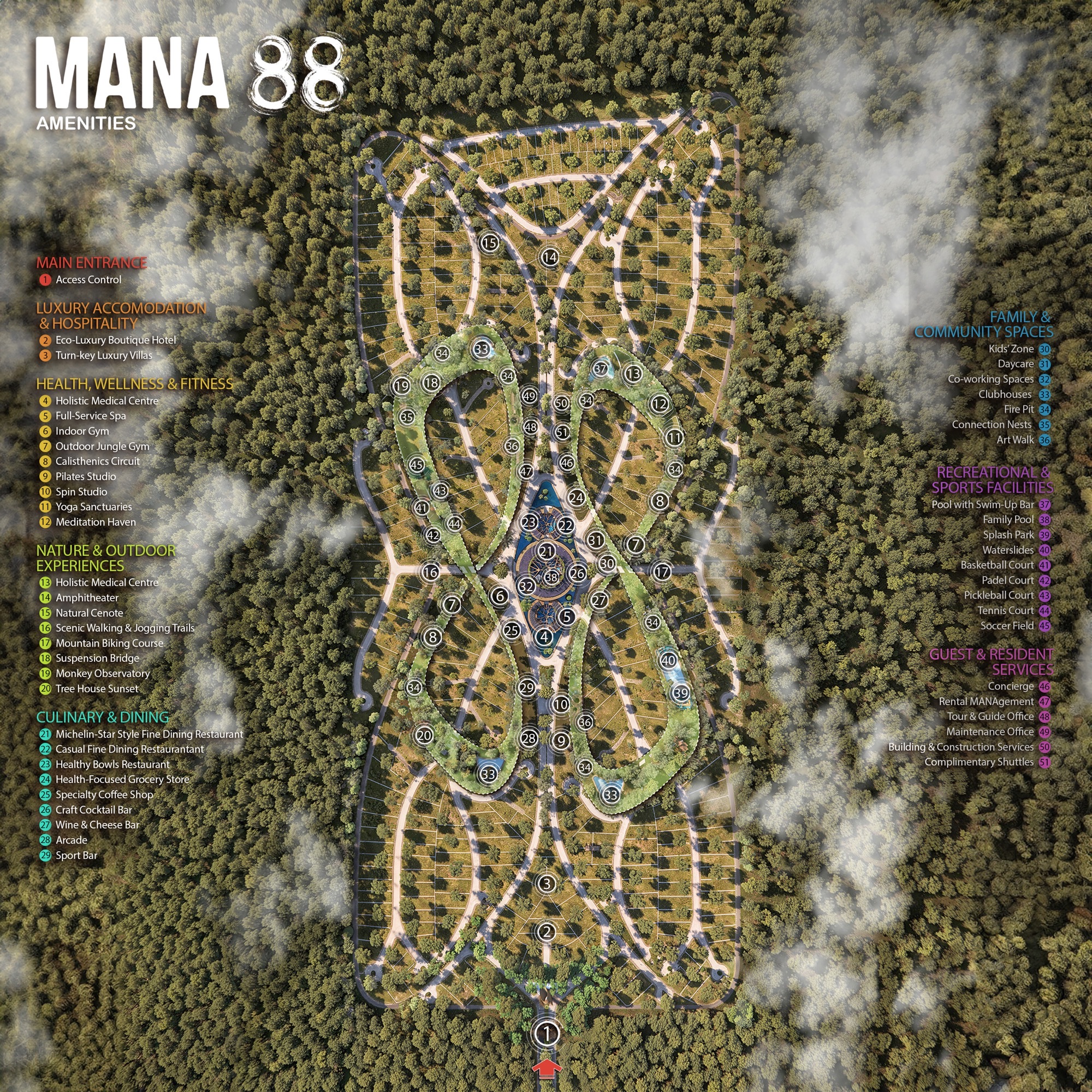
Deeply rooted in the cultural and ecological spirit of the Riviera Maya, MANA 88 is envisioned as a regenerative wellness community inspired by the sacred Alamo tree — guardian of the cenotes and symbol of protection, renewal, and connection between worlds.
Located in Akumal, Mexico, the project redefines the relationship between architecture and nature, creating a holistic environment where design, ecology, and human experience coexist in balance.
The master plan draws from the principles of sacred geometry and the Mayan cosmology of the three realms — the roots (underworld), trunk (earth), and branches (sky). These archetypes shape the spatial and symbolic organization of the entire development, guiding circulation, hierarchy, and visual alignment. The geometry unfolds as a living mandala: a network of paths, plazas, and gardens organized around the Wellness Center, the spiritual and social heart of the community
Within this circular sanctuary, water, light, and vegetation intertwine to create spaces of calm and renewal. The architecture becomes an instrument of balance — a dialogue between openness and refuge, between the elements and the human spirit. Around it, recreational amenities, meditation decks, and reflective gardens integrate seamlessly with clusters of villas designed for privacy, connection, and contemplation.
The architecture of MANA 88 expresses the harmony between material, landscape, and meaning. Inspired by the natural textures of limestone, bamboo, and rammed earth, the built language feels both timeless and rooted in place. Simple geometric forms emerge from the terrain as extensions of the landscape, blurring the line between built and natural.
Each villa prototype embodies the project’s regenerative philosophy — designed with passive systems for natural ventilation, solar orientation, and shading. The typologies respond to different micro-landscapes: jungle, cenote, and clearing, offering varied experiences of light, privacy, and connection to nature. Interiors are open and tactile, where stone, wood, and woven details evoke serenity and craft.
The Wellness Center, envisioned as a circular temple of wellbeing, anchors the entire composition. Its ring-shaped design embraces an inner oasis with thermal pools, shaded hammocks, and meditative gardens. The curved colonnade filters sunlight through bamboo lattices, casting ever-changing shadows that mirror the movement of water and wind.
In MANA 88, landscape is not the backdrop of architecture — it is the soul of the project. The master plan restores native ecosystems and weaves them into the spatial fabric of the community. A network of pathways connects the cenote lagoons, wellness zones, and recreational areas, encouraging slow movement, mindfulness, and discovery.
The vegetation palette prioritizes native and adaptive species — ceiba, chicozapote, palm, and endemic tropical flora — reinforcing biodiversity and resilience. Water is celebrated as a sacred element: shallow pools, reflective channels, and natural wetlands form a continuous hydrological network that cools the air, recharges the aquifer, and sustains the cenote ecology.
Every space is choreographed to awaken the senses — the texture of stone underfoot, the scent of wet earth, the sound of rustling bamboo. Community pavilions, fire-pit lounges, and yoga decks create social nodes that foster connection and belonging, while quiet corners invite solitude and reflection.
Sustainability in MANA 88 extends beyond environmental responsibility — it is a spiritual and cultural commitment to regeneration. The project integrates passive design strategies, solar collection, and rainwater harvesting to minimize its ecological footprint. Low-impact construction methods preserve existing topography and vegetation, while permeable materials maintain the site’s natural drainage and connection to the water table.
The architectural palette embraces local materials and craftsmanship: limestone from nearby quarries, bamboo harvested from sustainable sources, and artisanal finishes that celebrate Mayan traditions. Each structure is designed for long-term adaptability and minimal maintenance, ensuring resilience across generations.
More than a real-estate development, MANA 88 aspires to be a living organism — a model of regenerative living that harmonizes wellbeing, ecology, and culture. It embodies a vision of luxury as consciousness, where design becomes a vehicle for connection, restoration, and reverence for the natural world.
The master plan of MANA 88 unfolds as an infinite loop inspired by the sacred geometry of the Alamo tree—symbol of balance and regeneration. Designed as a living ecosystem, its organic layout connects villas, wellness spaces, and natural sanctuaries through a continuous flow of green corridors and pedestrian trails. At its heart lies the circular Wellness Center, surrounded by amenities dedicated to health, recreation, and community. Each area harmoniously integrates with the jungle, preserving native vegetation and celebrating the cenote landscape of Akumal.
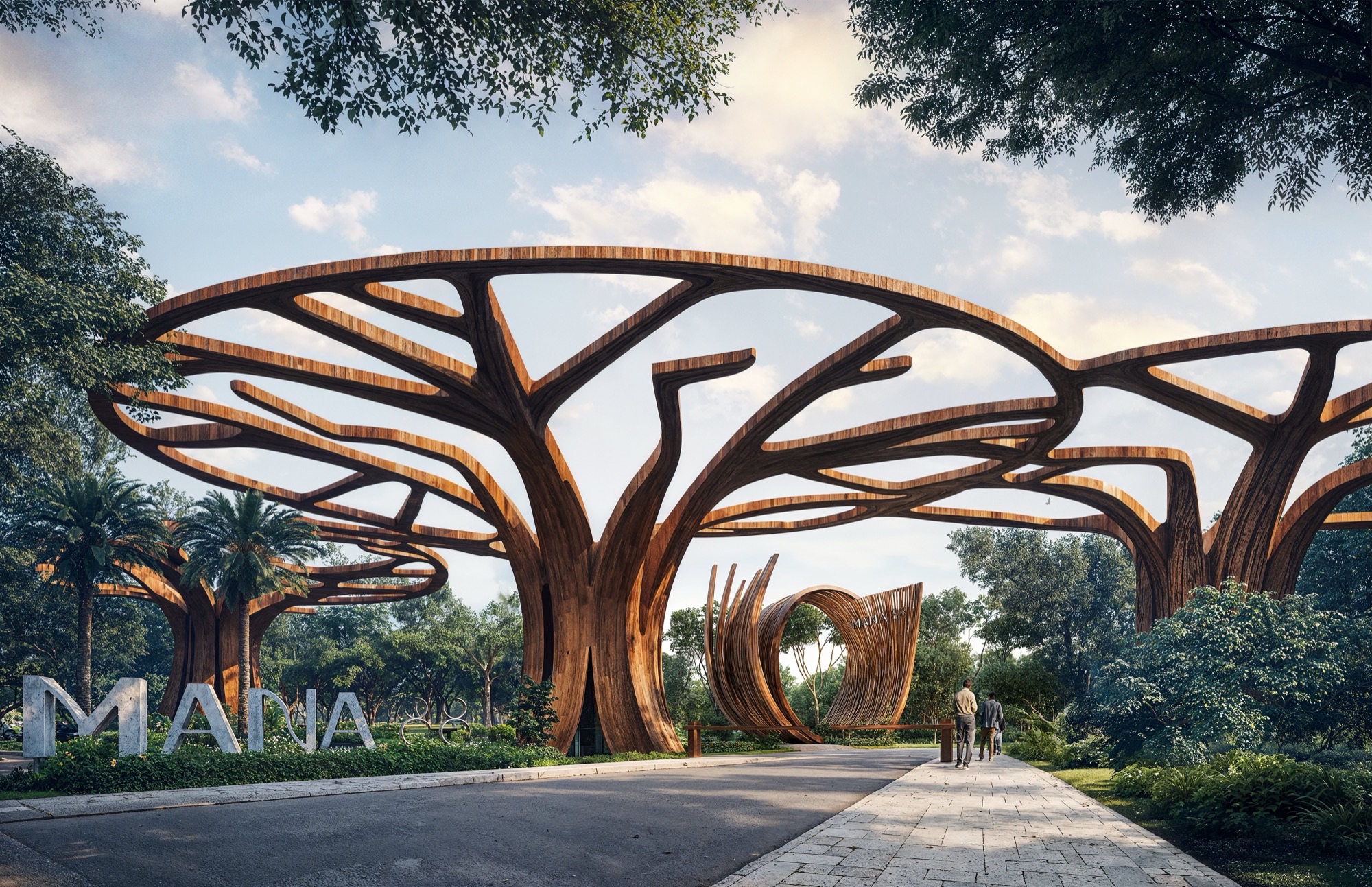
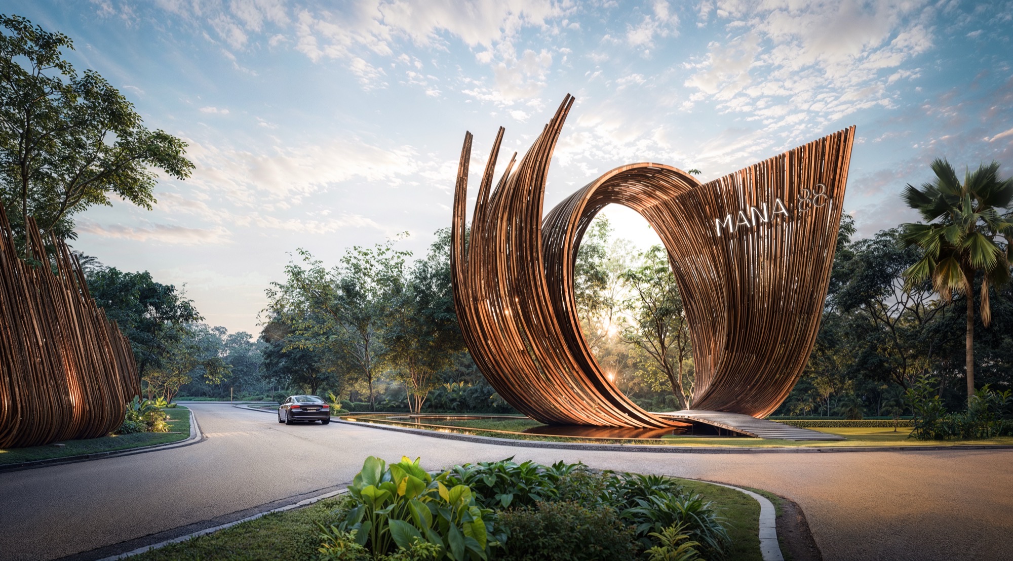
The Main Entrance of MANA 88 is conceived as a sculptural gateway that symbolizes the transition from the outside world into a realm of regeneration and serenity. Inspired by the organic movement of the Alamo tree, its flowing wooden forms rise like living roots embracing light and air. The structure’s curvature and openness evoke both strength and grace, welcoming visitors through an experience of harmony between architecture, nature, and spirit.
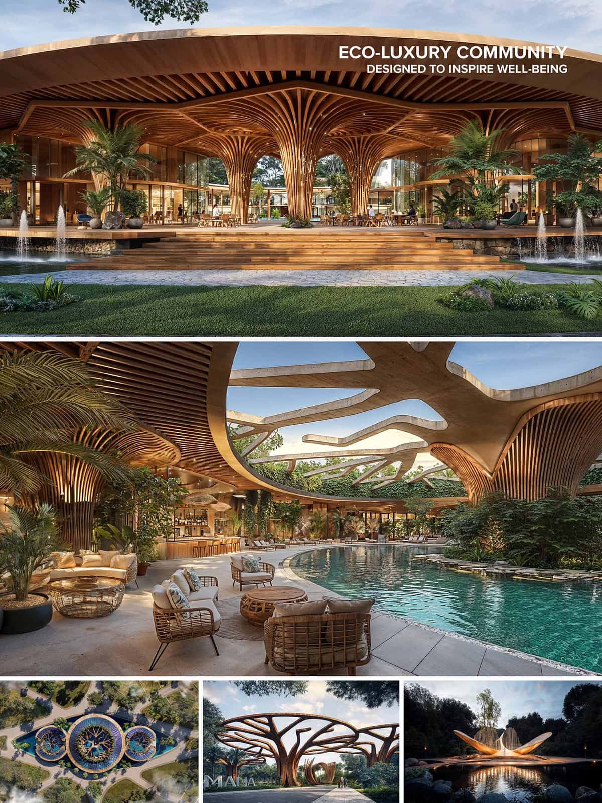
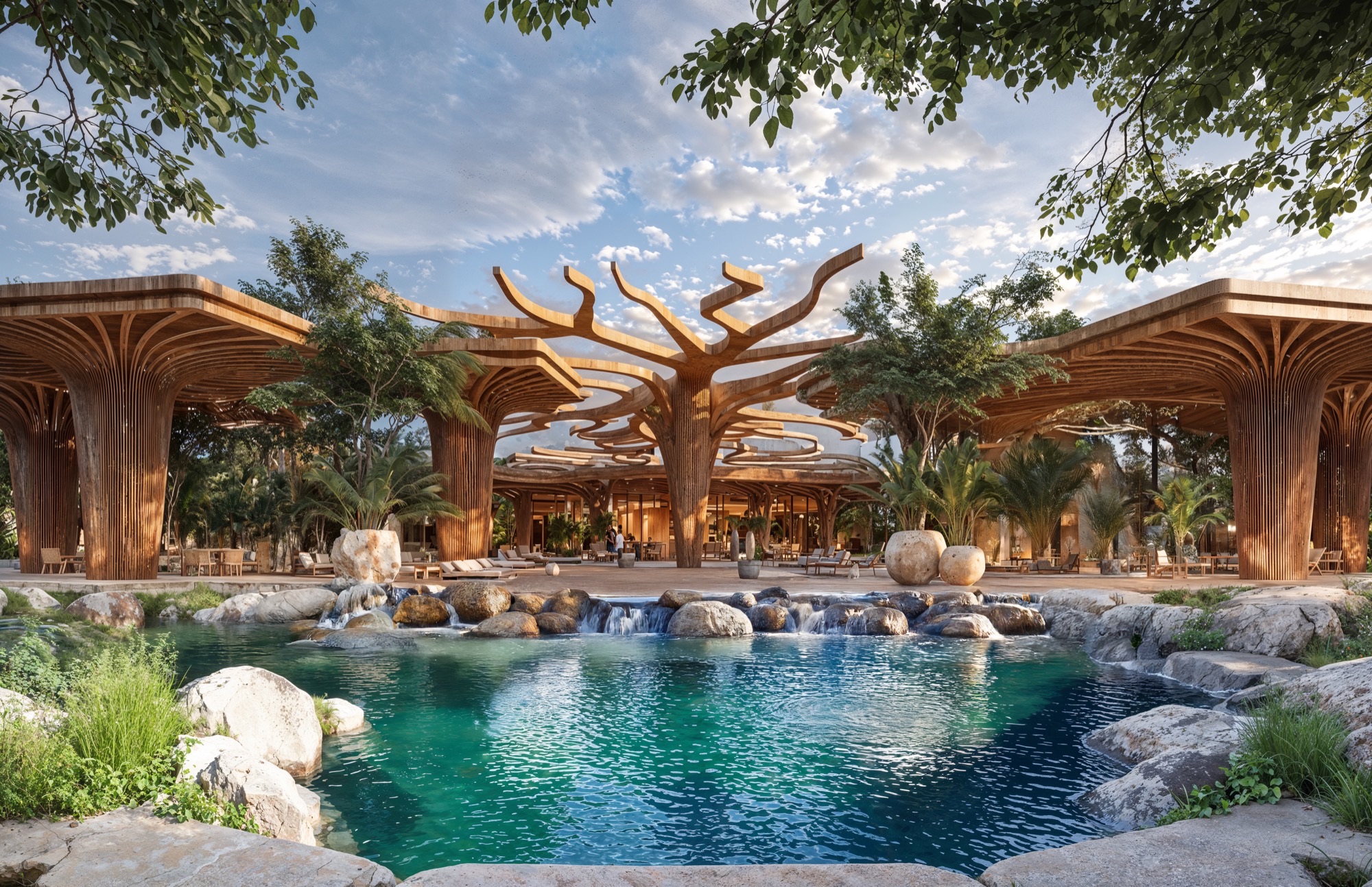
At the heart of MANA 88, the Clubhouse unfolds as an organic structure that celebrates connection and community. Its architecture, inspired by the branching forms of trees, merges wood, light, and water in a sculptural expression of harmony. The open design blurs boundaries between interior and nature—hosting lounges, co-working areas, and a poolside bar under a canopy of flowing timber beams. Surrounded by reflective ponds and lush greenery, it becomes a space for gathering, wellness, and renewal—a living symbol of balance within the resort’s regenerative vision.
_2k80.jpg)
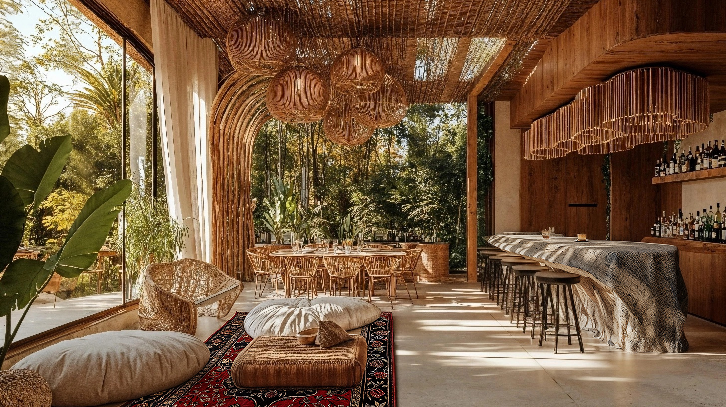
The Spa at MANA 88 is a sanctuary of tranquility where architecture and nature merge in a symphony of light, water, and texture. Nestled beneath bamboo vaults and surrounded by lush gardens, the design evokes the feeling of entering a sacred cavern. Soft curves, filtered sunlight, and the sound of flowing water create an atmosphere of deep calm. Each space — from thermal pools to private treatment rooms — is crafted to awaken the senses and restore inner harmony, embodying the regenerative essence of the project.
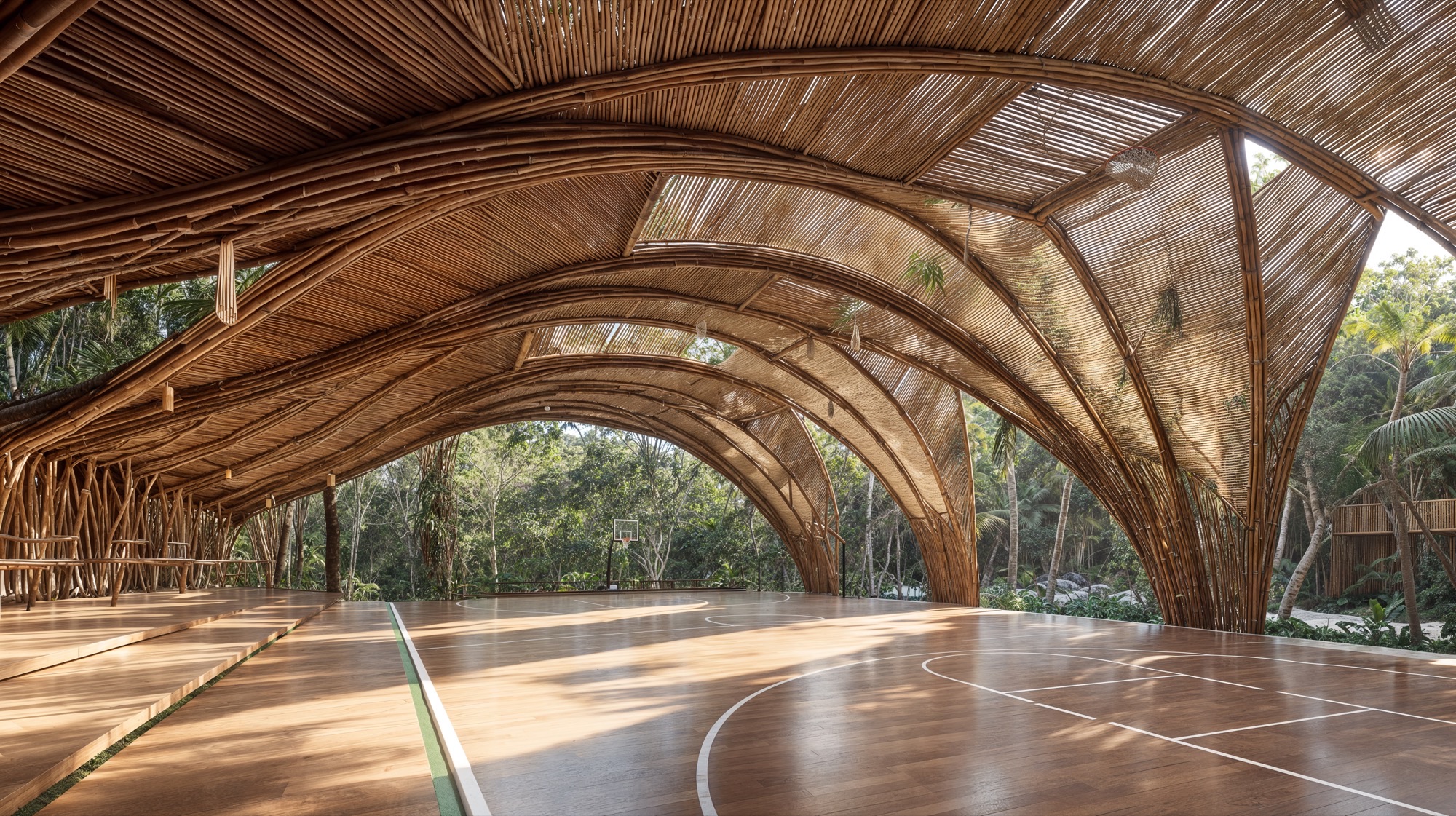
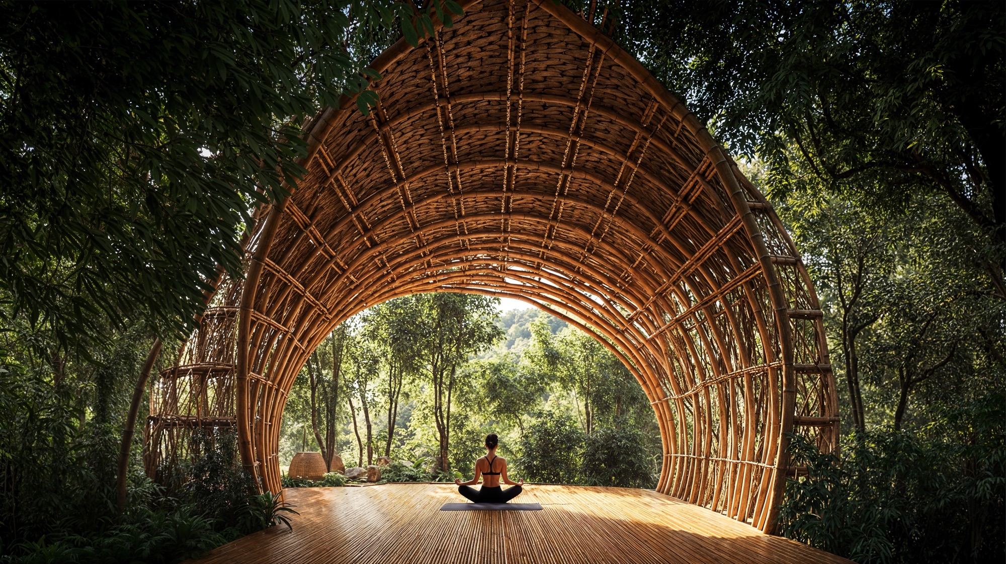
The Sports Complex at MANA 88 is designed as a natural pavilion that celebrates movement and vitality in harmony with the jungle. Its sculptural bamboo structure flows like a living canopy, filtering light and air to create a space that breathes with its surroundings. The organic design provides shelter for basketball, tennis, and multipurpose courts—transforming sport into an immersive experience of connection between body, nature, and architecture.
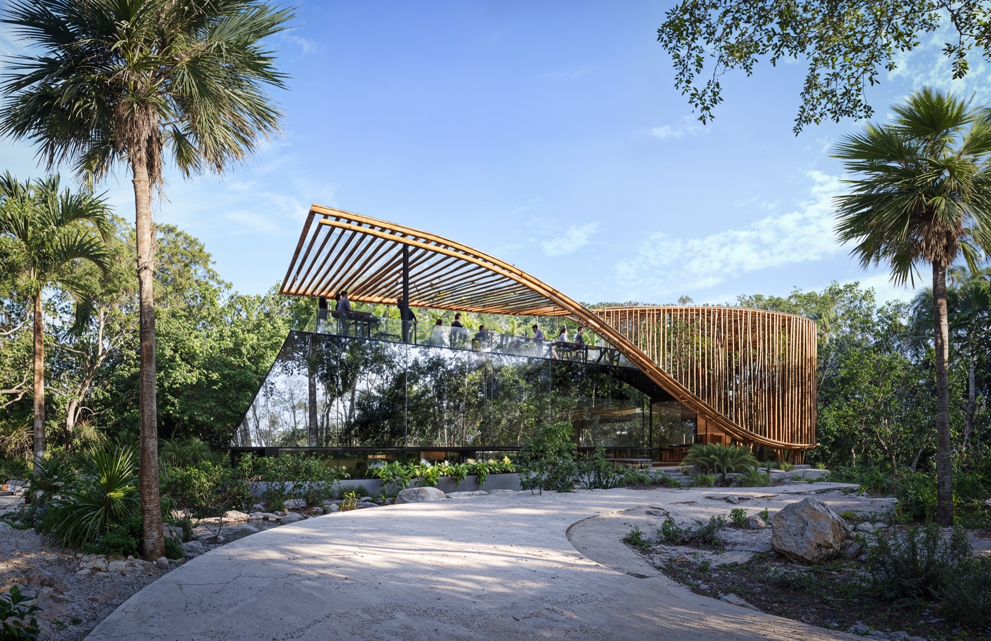
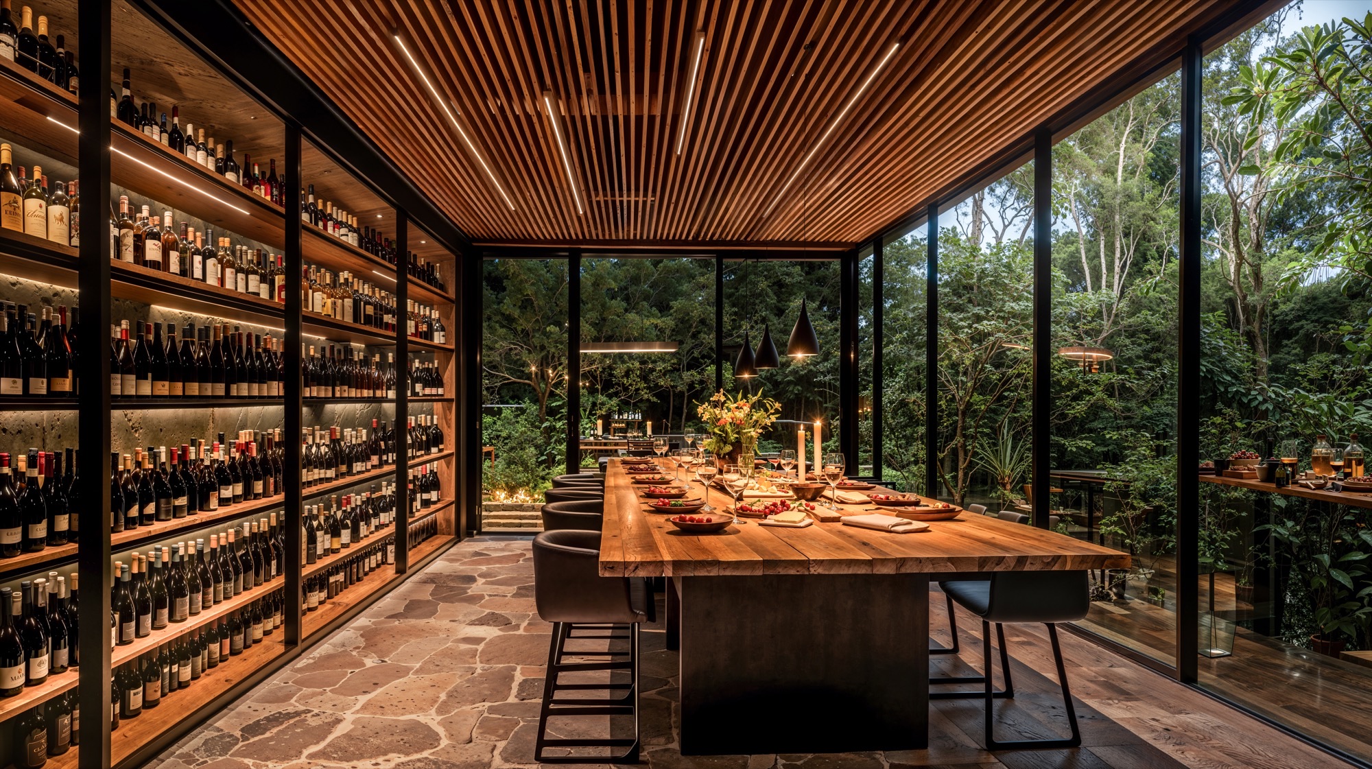
Perched among the trees, The Wine & Cheese Bar offers an elevated sensory experience where design and nature converge. Its sculptural wooden form opens to the jungle, while glass façades reflect the surrounding landscape. Inside, a curated collection of wines and artisanal cheeses is enjoyed in an atmosphere of warmth and sophistication. Natural materials, soft lighting, and panoramic views create an intimate retreat celebrating taste, texture, and connection.
THE YOGA CENTER
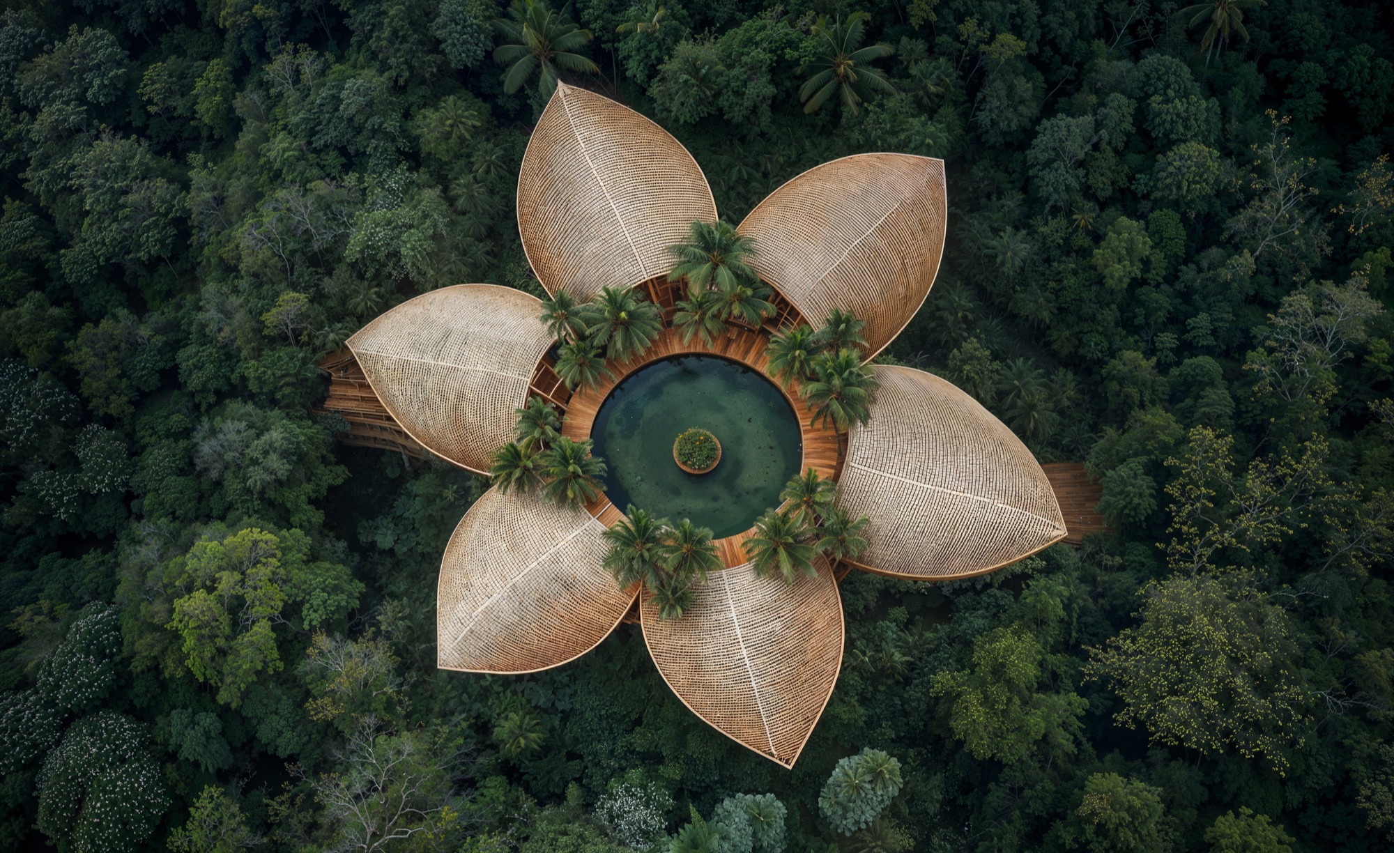
Shaped like a blossoming flower within the jungle canopy, The Yoga Center embodies serenity and balance. Its petal-inspired bamboo roofs open toward the sky, enclosing a circular lagoon that reflects the light and stillness of nature. Designed for mindfulness and connection, the space invites guests to breathe, move, and meditate in harmony with the rhythms of the earth — a sacred pavilion where architecture becomes a vessel for inner peace.
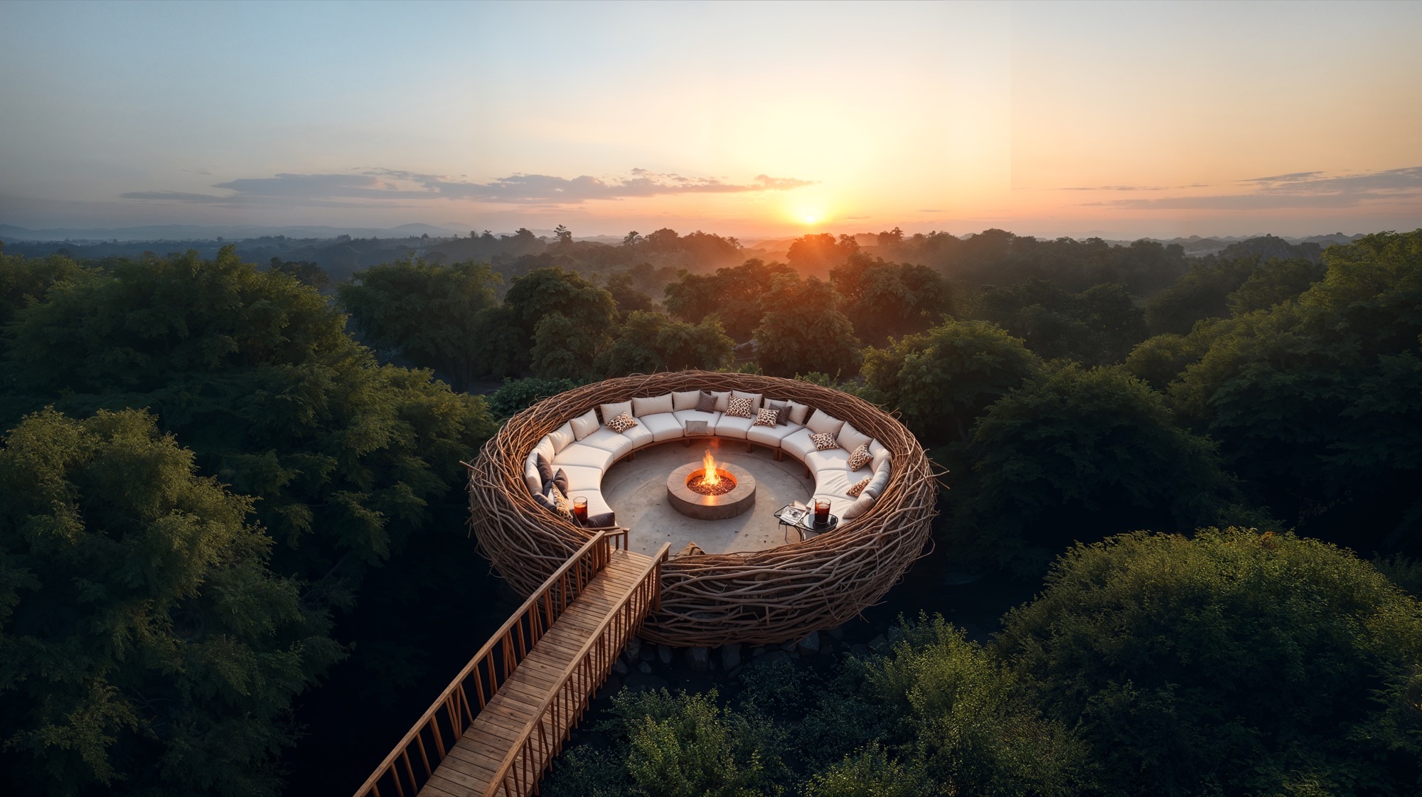
Suspended above the jungle canopy, The Nest is a circular lounge designed for connection, reflection, and wonder. Shaped like a woven sanctuary, it embraces guests around a central fire, opening to breathtaking sunsets and panoramic views of the forest. Blending natural materials with poetic form, it embodies the spirit of MANA 88 — harmony, community, and the quiet power of nature.
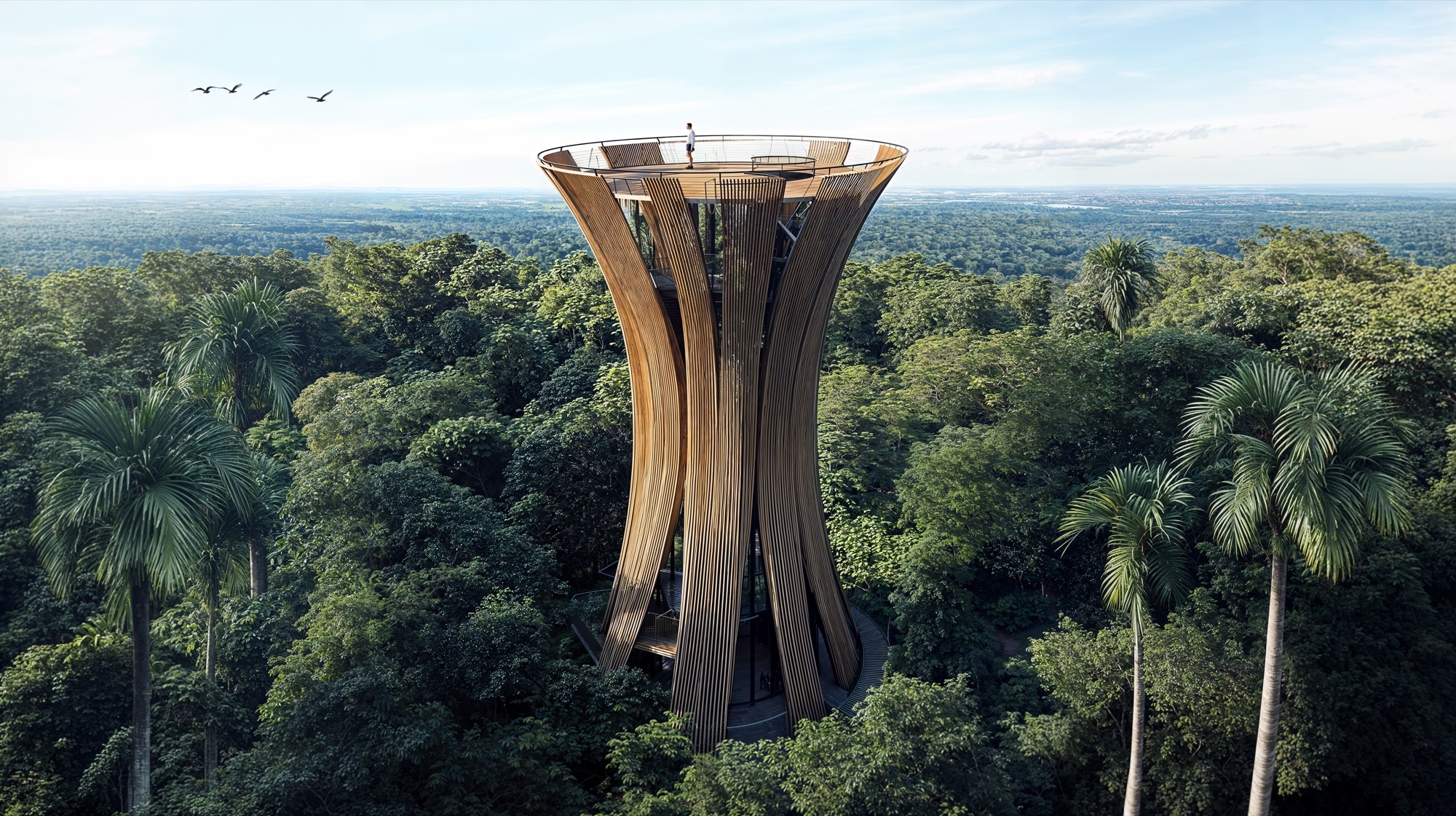
Rising above the jungle canopy, The Birds Tower offers a breathtaking 360° panorama of the surrounding landscape. Its fluid wooden structure mimics the elegance of unfolding wings, blending art and nature into one organic form. Designed as both an observatory and a contemplative retreat, it invites visitors to pause, breathe, and reconnect with the vastness of the horizon — a reminder of the harmony between humanity and the natural world.
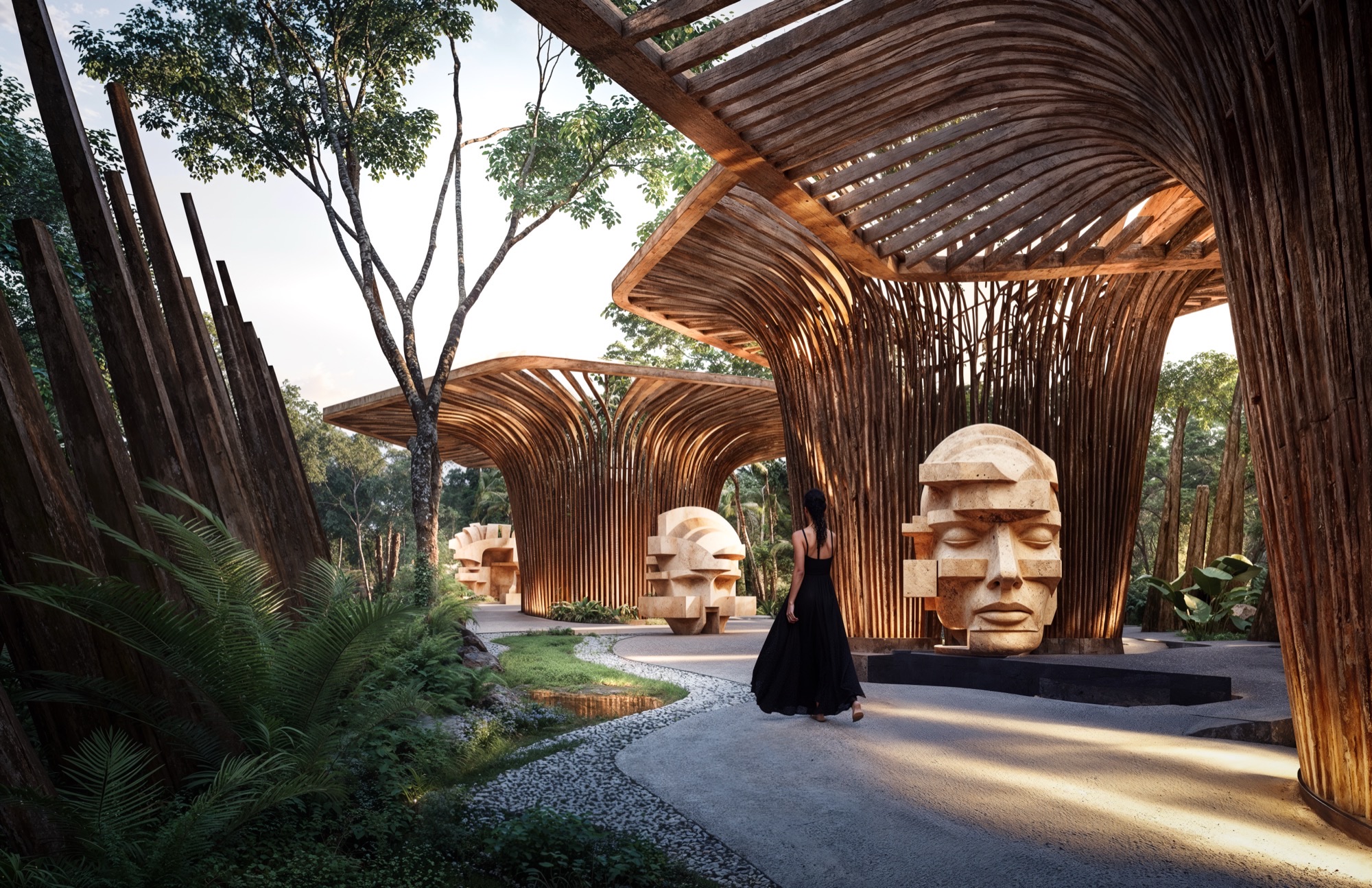
The Art Walk is a sculptural promenade that weaves art, architecture, and nature into one contemplative experience. Framed by organic timber structures, it showcases monumental stone artworks that echo ancestral Mayan forms and human introspection. Light filters through the wooden canopy, casting dynamic shadows that transform throughout the day — turning each step into a dialogue between culture, landscape, and spirit.
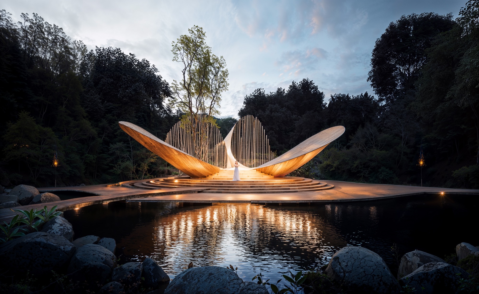
The Amphitheater stands as a sculptural stage for art, ceremony, and community. Inspired by the geometry of wings unfolding, its curved timber forms rise gracefully above a reflective lagoon. The design merges architecture and landscape in a poetic balance — where sound, light, and water converge to create an atmosphere of reverence and unity. It is both a performance space and a spiritual landmark, celebrating the essence of connection within nature.
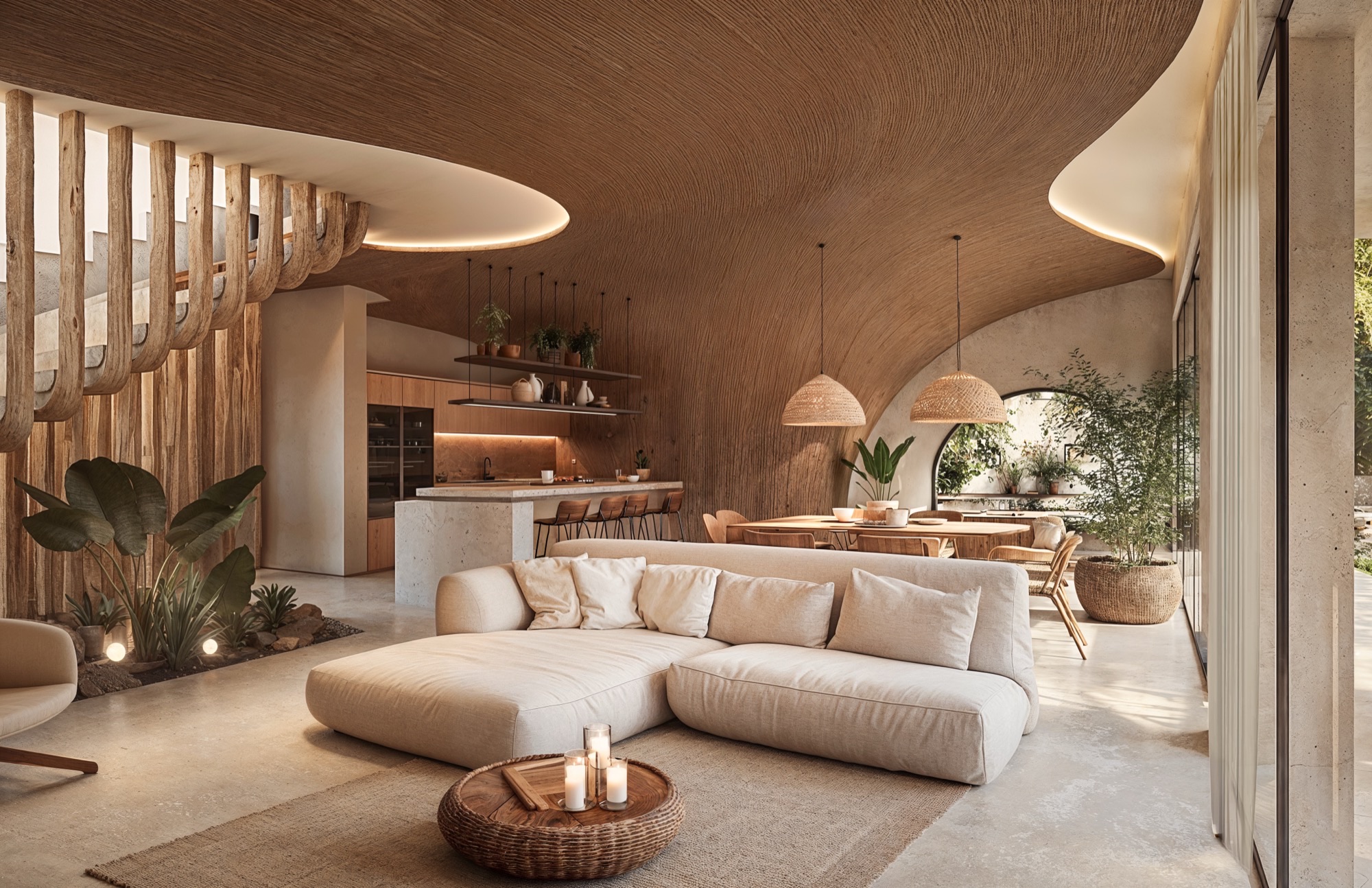
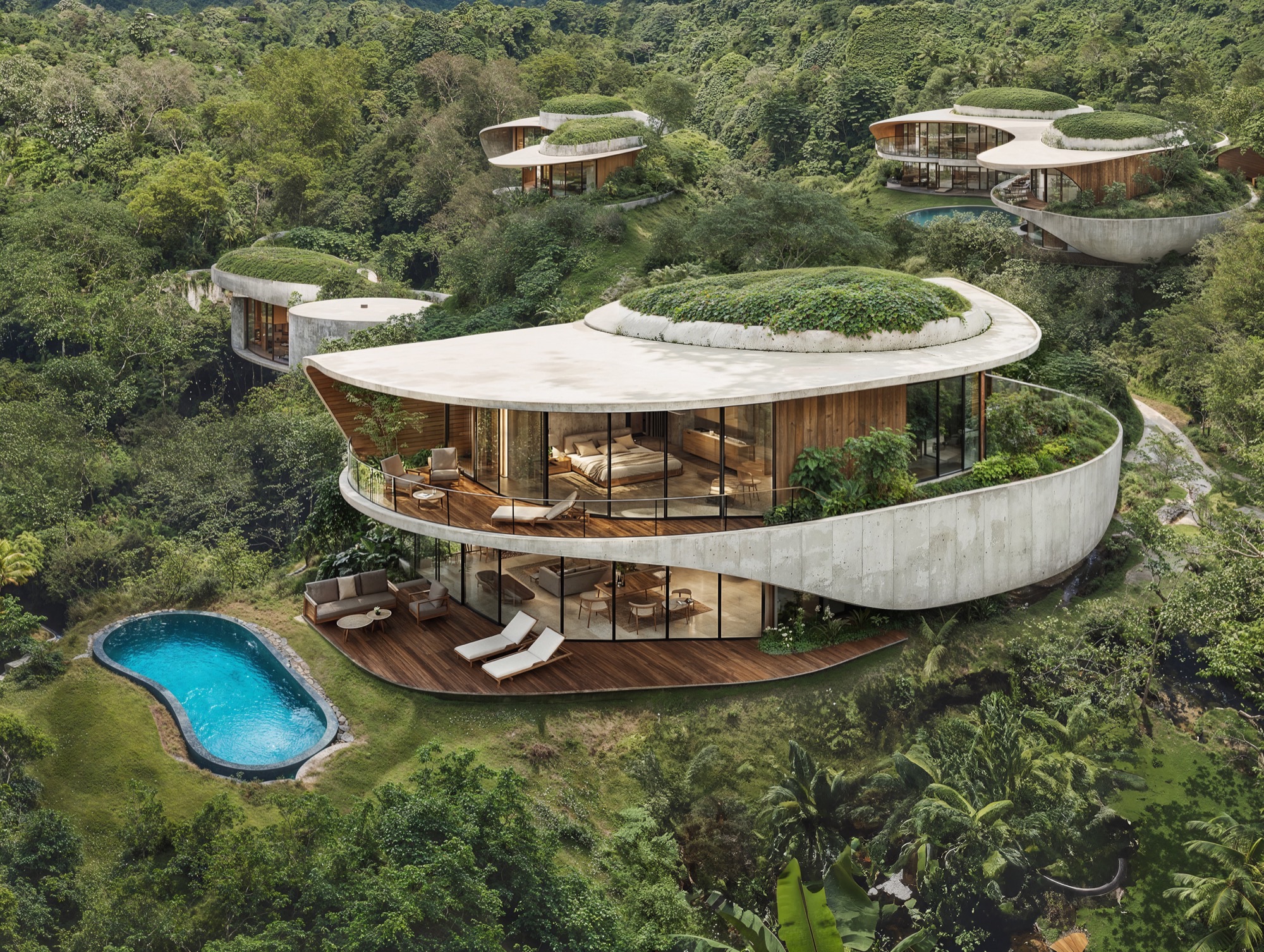
The Villas of MANA 88 are conceived as organic sanctuaries where architecture blends seamlessly with the landscape. Each residence embraces natural topography, opening to panoramic views of jungle and water. With fluid lines, warm materials, and passive design strategies, the villas invite light, air, and nature into every space. Interiors combine simplicity and craftsmanship — stone, wood, and soft textures — creating an atmosphere of calm luxury and regenerative living in harmony with the earth.


Deeply rooted in the cultural and ecological spirit of the Riviera Maya, MANA 88 is envisioned as a regenerative wellness community inspired by the sacred Alamo tree — guardian of the cenotes and symbol of protection, renewal, and connection between worlds.
Located in Akumal, Mexico, the project redefines the relationship between architecture and nature, creating a holistic environment where design, ecology, and human experience coexist in balance.
The master plan draws from the principles of sacred geometry and the Mayan cosmology of the three realms — the roots (underworld), trunk (earth), and branches (sky). These archetypes shape the spatial and symbolic organization of the entire development, guiding circulation, hierarchy, and visual alignment. The geometry unfolds as a living mandala: a network of paths, plazas, and gardens organized around the Wellness Center, the spiritual and social heart of the community
Within this circular sanctuary, water, light, and vegetation intertwine to create spaces of calm and renewal. The architecture becomes an instrument of balance — a dialogue between openness and refuge, between the elements and the human spirit. Around it, recreational amenities, meditation decks, and reflective gardens integrate seamlessly with clusters of villas designed for privacy, connection, and contemplation.
The architecture of MANA 88 expresses the harmony between material, landscape, and meaning. Inspired by the natural textures of limestone, bamboo, and rammed earth, the built language feels both timeless and rooted in place. Simple geometric forms emerge from the terrain as extensions of the landscape, blurring the line between built and natural.
Each villa prototype embodies the project’s regenerative philosophy — designed with passive systems for natural ventilation, solar orientation, and shading. The typologies respond to different micro-landscapes: jungle, cenote, and clearing, offering varied experiences of light, privacy, and connection to nature. Interiors are open and tactile, where stone, wood, and woven details evoke serenity and craft.
The Wellness Center, envisioned as a circular temple of wellbeing, anchors the entire composition. Its ring-shaped design embraces an inner oasis with thermal pools, shaded hammocks, and meditative gardens. The curved colonnade filters sunlight through bamboo lattices, casting ever-changing shadows that mirror the movement of water and wind.
In MANA 88, landscape is not the backdrop of architecture — it is the soul of the project. The master plan restores native ecosystems and weaves them into the spatial fabric of the community. A network of pathways connects the cenote lagoons, wellness zones, and recreational areas, encouraging slow movement, mindfulness, and discovery.
The vegetation palette prioritizes native and adaptive species — ceiba, chicozapote, palm, and endemic tropical flora — reinforcing biodiversity and resilience. Water is celebrated as a sacred element: shallow pools, reflective channels, and natural wetlands form a continuous hydrological network that cools the air, recharges the aquifer, and sustains the cenote ecology.
Every space is choreographed to awaken the senses — the texture of stone underfoot, the scent of wet earth, the sound of rustling bamboo. Community pavilions, fire-pit lounges, and yoga decks create social nodes that foster connection and belonging, while quiet corners invite solitude and reflection.
Sustainability in MANA 88 extends beyond environmental responsibility — it is a spiritual and cultural commitment to regeneration. The project integrates passive design strategies, solar collection, and rainwater harvesting to minimize its ecological footprint. Low-impact construction methods preserve existing topography and vegetation, while permeable materials maintain the site’s natural drainage and connection to the water table.
The architectural palette embraces local materials and craftsmanship: limestone from nearby quarries, bamboo harvested from sustainable sources, and artisanal finishes that celebrate Mayan traditions. Each structure is designed for long-term adaptability and minimal maintenance, ensuring resilience across generations.
More than a real-estate development, MANA 88 aspires to be a living organism — a model of regenerative living that harmonizes wellbeing, ecology, and culture. It embodies a vision of luxury as consciousness, where design becomes a vehicle for connection, restoration, and reverence for the natural world.
The master plan of MANA 88 unfolds as an infinite loop inspired by the sacred geometry of the Alamo tree—symbol of balance and regeneration. Designed as a living ecosystem, its organic layout connects villas, wellness spaces, and natural sanctuaries through a continuous flow of green corridors and pedestrian trails. At its heart lies the circular Wellness Center, surrounded by amenities dedicated to health, recreation, and community. Each area harmoniously integrates with the jungle, preserving native vegetation and celebrating the cenote landscape of Akumal.
The Main Entrance of MANA 88 is conceived as a sculptural gateway that symbolizes the transition from the outside world into a realm of regeneration and serenity. Inspired by the organic movement of the Alamo tree, its flowing wooden forms rise like living roots embracing light and air. The structure’s curvature and openness evoke both strength and grace, welcoming visitors through an experience of harmony between architecture, nature, and spirit.
At the heart of MANA 88, the Clubhouse unfolds as an organic structure that celebrates connection and community. Its architecture, inspired by the branching forms of trees, merges wood, light, and water in a sculptural expression of harmony. The open design blurs boundaries between interior and nature—hosting lounges, co-working areas, and a poolside bar under a canopy of flowing timber beams. Surrounded by reflective ponds and lush greenery, it becomes a space for gathering, wellness, and renewal—a living symbol of balance within the resort’s regenerative vision.
The Spa at MANA 88 is a sanctuary of tranquility where architecture and nature merge in a symphony of light, water, and texture. Nestled beneath bamboo vaults and surrounded by lush gardens, the design evokes the feeling of entering a sacred cavern. Soft curves, filtered sunlight, and the sound of flowing water create an atmosphere of deep calm. Each space — from thermal pools to private treatment rooms — is crafted to awaken the senses and restore inner harmony, embodying the regenerative essence of the project.
The Sports Complex at MANA 88 is designed as a natural pavilion that celebrates movement and vitality in harmony with the jungle. Its sculptural bamboo structure flows like a living canopy, filtering light and air to create a space that breathes with its surroundings. The organic design provides shelter for basketball, tennis, and multipurpose courts—transforming sport into an immersive experience of connection between body, nature, and architecture.
Perched among the trees, The Wine & Cheese Bar offers an elevated sensory experience where design and nature converge. Its sculptural wooden form opens to the jungle, while glass façades reflect the surrounding landscape. Inside, a curated collection of wines and artisanal cheeses is enjoyed in an atmosphere of warmth and sophistication. Natural materials, soft lighting, and panoramic views create an intimate retreat celebrating taste, texture, and connection.
THE YOGA CENTER
Shaped like a blossoming flower within the jungle canopy, The Yoga Center embodies serenity and balance. Its petal-inspired bamboo roofs open toward the sky, enclosing a circular lagoon that reflects the light and stillness of nature. Designed for mindfulness and connection, the space invites guests to breathe, move, and meditate in harmony with the rhythms of the earth — a sacred pavilion where architecture becomes a vessel for inner peace.
Suspended above the jungle canopy, The Nest is a circular lounge designed for connection, reflection, and wonder. Shaped like a woven sanctuary, it embraces guests around a central fire, opening to breathtaking sunsets and panoramic views of the forest. Blending natural materials with poetic form, it embodies the spirit of MANA 88 — harmony, community, and the quiet power of nature.
Rising above the jungle canopy, The Birds Tower offers a breathtaking 360° panorama of the surrounding landscape. Its fluid wooden structure mimics the elegance of unfolding wings, blending art and nature into one organic form. Designed as both an observatory and a contemplative retreat, it invites visitors to pause, breathe, and reconnect with the vastness of the horizon — a reminder of the harmony between humanity and the natural world.
The Art Walk is a sculptural promenade that weaves art, architecture, and nature into one contemplative experience. Framed by organic timber structures, it showcases monumental stone artworks that echo ancestral Mayan forms and human introspection. Light filters through the wooden canopy, casting dynamic shadows that transform throughout the day — turning each step into a dialogue between culture, landscape, and spirit.
The Amphitheater stands as a sculptural stage for art, ceremony, and community. Inspired by the geometry of wings unfolding, its curved timber forms rise gracefully above a reflective lagoon. The design merges architecture and landscape in a poetic balance — where sound, light, and water converge to create an atmosphere of reverence and unity. It is both a performance space and a spiritual landmark, celebrating the essence of connection within nature.
The Villas of MANA 88 are conceived as organic sanctuaries where architecture blends seamlessly with the landscape. Each residence embraces natural topography, opening to panoramic views of jungle and water. With fluid lines, warm materials, and passive design strategies, the villas invite light, air, and nature into every space. Interiors combine simplicity and craftsmanship — stone, wood, and soft textures — creating an atmosphere of calm luxury and regenerative living in harmony with the earth.
© 2021 by sanzpont [arquitectura] . Webpage by sanzpont [digital] . Innovative Digital Experiences
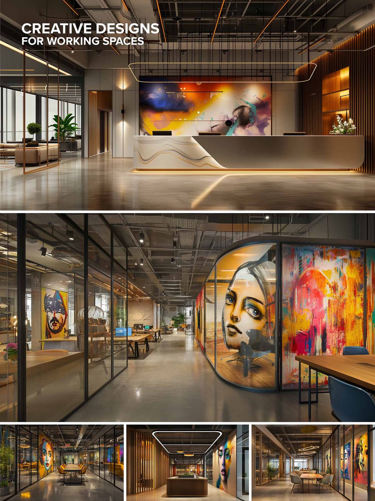

This interior design project for a modern workspace exemplifies a vibrant and dynamic approach that blends contemporary art with functional design. The central theme revolves around the integration of large, expressive art installations within various functional areas of the office, creating a stimulating and inspiring environment. The use of expansive murals and artistically significant pieces serves to enhance creative thinking and provide visual interest in areas typically characterized by conventional office aesthetics.
The office layout is strategically designed to accommodate both collaborative and individual work settings. Open-plan spaces are complemented by enclosed glass pods that offer privacy without sacrificing transparency. The fluid arrangement of workstations alongside communal areas encourages interaction while also allowing for concentration and solitude when needed. Pathways and corridors are wide and uncluttered, promoting an easy flow of movement and accessibility throughout the workspace.
A sophisticated palette of materials is used to reinforce the artistic theme of the workspace. Polished concrete floors provide a sleek, industrial feel that contrasts with the warm wooden accents seen in slatted wall panels and furniture. Metal finishes on lighting fixtures and railings add a modern touch, while glass walls enhance the openness of the space. The art pieces themselves are likely printed on high-quality canvas or fabricated from mixed media, adding texture and depth to the walls they adorn.
The color scheme is predominantly neutral, featuring shades of gray, black, and wood tones that serve as a backdrop to the vivid artwork. This choice allows the colorful murals and paintings to stand out, drawing attention and serving as focal points in the design. Accents in furniture and fixtures, such as blues and oranges, subtly echo the hues found in the artwork, creating a cohesive and thoughtfully curated environment.
Sustainability is considered through the implementation of energy-efficient lighting and climate control systems. LED strip lighting and spotlights not only highlight the artworks but also provide adjustable ambient lighting to suit different times of the day and work requirements. Large windows allow for ample natural light, reducing the reliance on artificial sources and promoting a healthy, environmentally friendly workplace.
Modern technology is seamlessly integrated into the design to enhance functionality and efficiency. State-of-the-art communication systems in conference areas, wireless charging stations at workstations, and smart climate controls are just a few examples of how technology is employed to create a workspace that is not only visually appealing but also highly adaptive to the needs of its users.
© 2021 by sanzpont [arquitectura] . Webpage by sanzpont [digital] . Innovative Digital Experiences
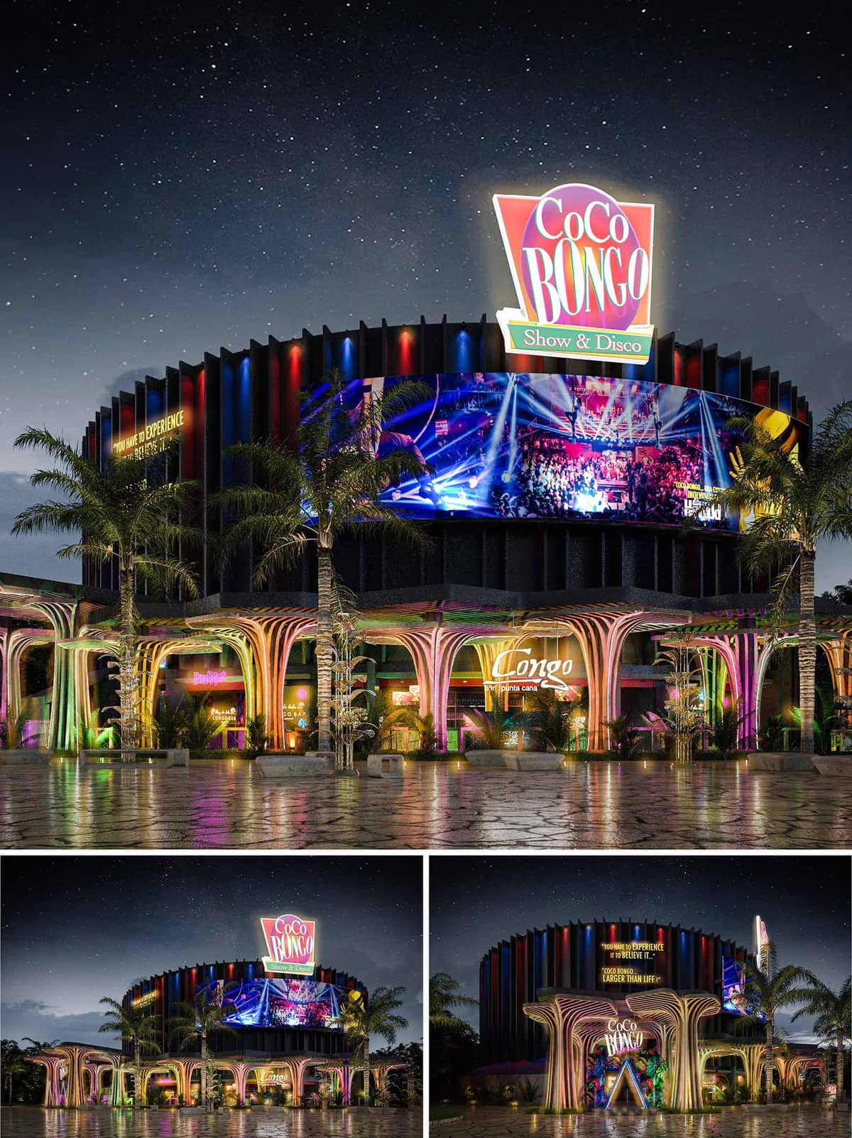

The facade renovation of the Coco Bongo Night Club in Punta Cana, Dominican Republic, embodies a vibrant and theatrical design that aligns with the club's iconic status as a destination for entertainment and nightlife. The architectural concept harnesses the dynamic spirit of the tropics and the energy of the nightlife, incorporating organic forms and expressive colors that suggest movement and excitement. The renovation expands the club's engagement with its external environment through the addition of an extended outdoor terrace bar, enhancing the venue's openness and accessibility.
The facade of Coco Bongo is characterized by its use of sweeping, fluidic forms that mimic natural elements. These organically shaped portals and supports, designed with a structural rhythm, create a welcoming grand entrance that is both functional and sculptural. The use of vivid lighting and neon accents not only highlights these forms but also works to attract attention from afar, ensuring that the building stands out in its urban setting.
Above, the main structure presents a series of vertical fins arranged in a rhythmic pattern, echoing the vibrant energy within. This choice of facade treatment not only contributes to the aesthetic but also serves a practical purpose, providing a semi-permeable barrier that enhances the acoustic qualities of the building while maintaining airflow. The integration of digital screens adds a layer of interactivity and connectivity, displaying vibrant visuals that reflect the lively atmosphere of the interior.
The selection of materials is pivotal in articulating the design's intent. High-performance concrete and advanced composites are used for the structural elements, chosen for their durability and flexibility in forming complex shapes. These are complemented by glass panels that allow visual continuity between the indoor and outdoor spaces, enriching the visitor's experience by merging the two settings seamlessly.
The color palette is intentionally bold and lively, featuring deep blues, bright reds, and vibrant purples that mirror the tropical environment and the club's energetic branding. These colors are used strategically to enhance the architectural forms and to create a visual narrative that guides visitors through the space.
Incorporating sustainable practices, the renovation utilizes energy-efficient LED lighting throughout the facade and terrace, significantly reducing the building's energy consumption while enhancing its nighttime appearance. The landscaping around the building employs native plants that are drought-resistant and require minimal maintenance, reducing water usage and integrating the building more deeply into its natural setting.
The extension of the outdoor terrace bar is a crucial aspect of this renovation, designed to offer an immersive experience that leverages the natural beauty of Punta Cana. This space is crafted to provide expansive views, employing minimalistic guardrails and strategically placed lighting to ensure safety without compromising the aesthetic. The terrace is configured to accommodate both intimate gatherings and larger groups, flexible in its layout while providing all visitors with a sense of exclusivity and engagement with the vibrant nightlife activities.
The combination of these architectural and design elements makes the Coco Bongo Night Club a landmark of modern design, infusing local cultural elements with contemporary architectural practices to create a space that is both inviting and exhilarating.
© 2021 by sanzpont [arquitectura] . Webpage by sanzpont [digital] . Innovative Digital Experiences

The Maestro Dobel Tequila bar concept is a dynamic fusion of brand identity and architectural innovation, designed to function as a high-impact space within transit-oriented environments such as airports. The core idea was to translate the premium essence of the tequila into a sculptural, immersive environment that enhances brand storytelling while offering a modern hospitality experience. The design articulates fluidity and movement—echoing the essence of tequila's distilled refinement—while attracting passersby with a captivating and futuristic form.
At the heart of the space is a sculptural bar canopy that doubles as a branding element and spatial anchor. Its sweeping curves and floating appearance create a sense of dynamism, drawing the eye and inviting circulation from all directions. The bar is designed as an open island, encouraging interaction from every angle and maximizing accessibility in a high-traffic environment. The perimeter seating wraps organically around the structure, allowing for both social and individual seating configurations. High stools and varied counter heights accommodate short stops as well as longer visits.
A refined palette combines dark vertical ribbed cladding at the base with high-gloss black finishes and illuminated linear accents. The primary feature—an illuminated, ribbon-like LED fascia—functions as a digital display and sculptural element. It reinforces the brand’s contemporary image while providing adaptive lighting that transitions from ambient glow to vibrant visual content. Behind the bar, a backlit bottle display wall adds depth and visual rhythm, with clear emphasis on showcasing the tequila selection. The lighting design uses concealed sources to accentuate textures and guide visual focus without glare.
Brand identity is not merely applied but integrated architecturally. The Maestro Dobel logo is embedded within the light feature and mirrored in the digital content, ensuring brand recall without overwhelming the spatial experience. The layout prioritizes operational efficiency: bartenders benefit from a centralized workflow with integrated storage, refrigeration, and display systems. Digital menus and branding are harmonized into the architectural shell, allowing for real-time content changes and promotions. These elements ensure both an elevated user experience and a highly functional hospitality setting.
Designed to perform within airport terminals or mall concourses, the space is conceived as a freestanding pavilion that creates a micro-environment within a transient context. The use of planters with integrated trees softens the high-tech aesthetic, providing visual balance and encouraging biophilic comfort. Sustainability is addressed through the modular construction of the bar, which allows disassembly and reuse in different locations, reducing material waste. LED lighting throughout ensures energy efficiency, while durable materials such as metal and engineered surfaces are selected for longevity and ease of maintenance in high-use areas.
The spatial experience is intentionally theatrical—visitors are drawn in by the contrast of dark, tactile materials and the animated glow of the canopy. The bar functions both as a social anchor and a brand stage, blending hospitality and retail cues. Ambient acoustics and seating orientation create zones of calm within bustling environments. The inclusion of glass partitions in certain variations creates a semi-enclosed lounge that offers visual connectivity while providing acoustic separation and a sense of exclusivity.
LIST OF PROJECTS EXPERIENCE
Designed, Executed and/or Built Projects
MEXICO
1. Dobel Tequila - Guadalajara - K01
2. Dobel Tequila - Guadalajara - K02
3. Dobel Tequila - Monterrey - FB12
4. Dobel Tequila - Tijuana - AL02
© 2021 by sanzpont [arquitectura] . Webpage by sanzpont [digital] . Innovative Digital Experiences

The retail space concept presents a dynamic and high-contrast design aesthetic, employing a vivid color palette and strategic lighting to emphasize product displays and create a distinctive brand atmosphere. The use of the bold yellow juxtaposed with black and neutral tones creates a space that is both inviting and visually striking, aligning with what appears to be a brand identity that is assertive and confident.
The interior design creates an immersive brand experience, with a careful balance between boldness and elegance. The use of color, light, and layout not only reinforces the identity of the brand but also creates a memorable and inviting environment for customers. The sustainability of the space could be further explored by the brand to ensure that environmental responsibility aligns with the visual and experiential impact of the design.
The dominant color palette consists of a vibrant yellow and deep black, establishing a striking contrast that is likely part of the brand's visual identity. Yellow, used as an accent color, energizes the space and attracts attention, while black provides a sophisticated backdrop that accentuates the merchandise. The integration of the brand logo and name in strategic locations reinforces brand identity and creates a cohesive environment.
A variety of materials are utilized to add depth and texture to the space. Glossy surfaces on display units and counters reflect light, enhancing brightness and visibility. The use of wood slats on the ceiling introduces an organic texture that contrasts with the sleekness of the display cases, balancing modernity with warmth. The flooring appears to be a wood-look laminate or tile, chosen for durability and ease of maintenance in high-traffic areas.
Strategically placed lighting highlights the merchandise and creates a hierarchy within the space. Spotlights are used to illuminate products individually, while ambient lighting enhances the overall mood. The display cases are internally lit, providing a soft glow that adds depth to the product presentation. This careful consideration of lighting supports not just aesthetic appeal but also functional visibility of the products.
The layout is designed to guide customers through a curated experience of the brand’s offerings. Central display tables invite interaction, while wall-mounted displays create a gallery-like environment that encourages exploration. The flow seems intentional, creating a rhythm between more private, focused viewing areas and open, communal spaces.
Considerations include the use of LED lighting for energy efficiency, materials sourced from sustainable suppliers, and design choices that reduce waste or allow for recycling of display elements. The longevity of design elements and modularity for future adaptations also contribute to sustainable practices in retail design.
LIST OF PROJECTS EXPERIENCE
Designed, Executed and/or Built Projects
COLOMBIA
1. Invicta - Colombia - Balash
GERMANY
2. Invicta - EU - Germany - Zweibrucken
MEXICO
3. Invicta - Cancun - Malecon Américas (WMW)
4. Invicta - DF - AICM
5. Invicta - Cancun - Invicta Cube
6. Invicta - Cancun - Plaza la Isla (G-Shock)
7. Invicta - Playa del Carmen - T80
8. Invicta - Kiosk
9. Invicta - Playa del Carmen - 5ta Avenida
10. Invicta - Cancun - Aeropuerto T2
11. Invicta - Plaza La Isla Cube
NETHERLANDS
12. Invicta - EU - Roosendaal - McArthurGlen Designer Outlet
13. Invicta - EU - Amsterdam Style Outlet
PORTUGAL
14. Invicta - EU - Lisbon
15. Invicta - EU - Portugal - Designer Outlet Algarve
PUERTO RICO
16. Invicta - PR - Puerto Rico Premium Outlet
17. Invicta - PR - Aeropuerto LM - T2C2-1
18. Invicta - PR - San Juan
19. Invicta - PR - Aeropuerto LM - T2C2-18
20. Invicta - PR - Plaza del Caribe
21. Invicta - PR - Mayagüez Mall
22. Invicta - PR - Old San Juan
23. Invicta - PR - Old San Juan - Gisi Store
SPAIN
24. Invicta - EU - Barcelona Viladecans - Outlet Village
25. Invicta - EU - Madrid - San Sebastian de los Reyes
26. Invicta - EU - Mallorca Fashion Outlet
UNITED KINGDOM
27. Invicta - UK - Kiosk 4x4
USA
28. Invicta - Delaware - Christiana Mall
29. Invicta - MD - Towson Town Center
30. Invicta - NJ - Jersey Shore PO
31. Invicta - FL - Aventura Mall
32. Invicta - TX - El Paso
33. Invicta - TX - Houston Galleria
34. Invicta - FL - Invicta Hollywood HQ Store
35. Invicta - TX - Dallas Galleria
36. Invicta - FL - Orlando Vineland
37. Invicta - NV - Las Vegas North PO
38. Invicta - MD - Wheaton Mall
39. Invicta - NY - Queens
40. Invicta - MD - Mall in Columbia
41. Invicta - NY - WTC
42. Invicta - TX - Houston Memorial City
43. Invicta - TX - North Star Mall
44. Invicta - FL - Sarasota
45. Invicta - VA - Fashion Centre at Pentagon City
46. Invicta - FL - Miami International Mall - LP43
47. Invicta - FL - Sawgrass Mills
48. Invicta - MD - Annapolis Mall
49. Invicta - TX - San Marcos Premium Outlets
50. Invicta - FL - Broward Mall
51. Invicta - FL - Woodbury Kiosk
52. Invicta - FL - Orlando International Premium Outlets
53. Invicta - VA - Tyson's Corner Center
54. Invicta - EU - Porto Portugal
55. Invicta - NY - Garden State Plaza
56. Invicta - NY - Cross County
57. Invicta - CN - Trumbull
58. Invicta - FL - Daytona Beach
59. Invicta - VA - Fair Oaks
60. Invicta - FL - Westland (Corner)
61. Invicta - NY - Woodbridge
62. Invicta - Prince Georges
63. Invicta - TX - Arlington - Parks Mall at Arlington
64. Invicta - GA - Atlanta
65. Invicta - NY - Time Square
66. Invicta - PR - Las Américas (Flagship)
67. Invicta - FL - Citrus Park
68. Invicta - GA - Atlanta - Perimeter Mall
69. Invicta - EU - Amsterdam - Vatavia Stad
70. Invicta - MD - Monthgomery Mall
71. Invicta - FL - Boca Raton
72. Invicta - NY - Christiana Mall
73. Invicta - TX - Stonebriar
74. Invicta - IN - Newport Center Kiosk
75. Invicta - CA - Los Angeles Citadel
76. Invicta - TX - San Marcos Tanger
77. Invicta - NV - Las Vegas South 48
78. Invicta - FL - Miami Boca Raton
79. Invicta - FL - Palm Beach Outlets
80. Invicta - TX - Willowbrook
81. Invicta - FL - Miami Dadeland - LP46
82. Invicta - AZ - Phoenix
83. Invicta - FL - Pembroke Lakes Mall
84. Invicta - TX - Town East Mall
85. Invicta - CA - LA Century City Westfield
86. Invicta - FL - Florida Mall Store
87. Invicta - NY - Staten Island
88. Invicta - FL - Westland
89. Invicta - Baltimore - Maryland
90. Invicta - Royal Caribbean Cruise - Invicta Shop onboard
91. Invicta - FL - Orlando Airport
92. Invicta - TX - San Antonio
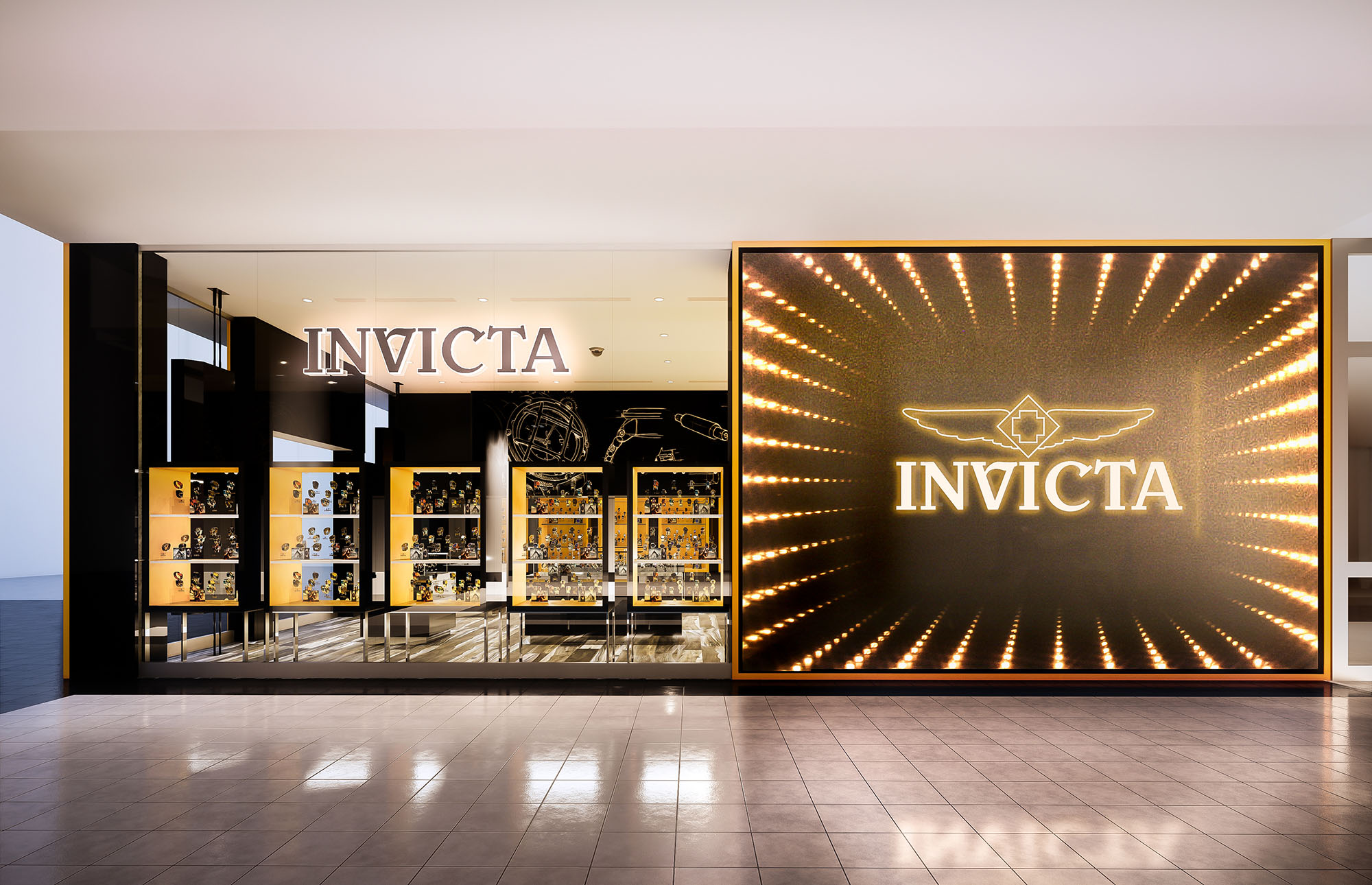
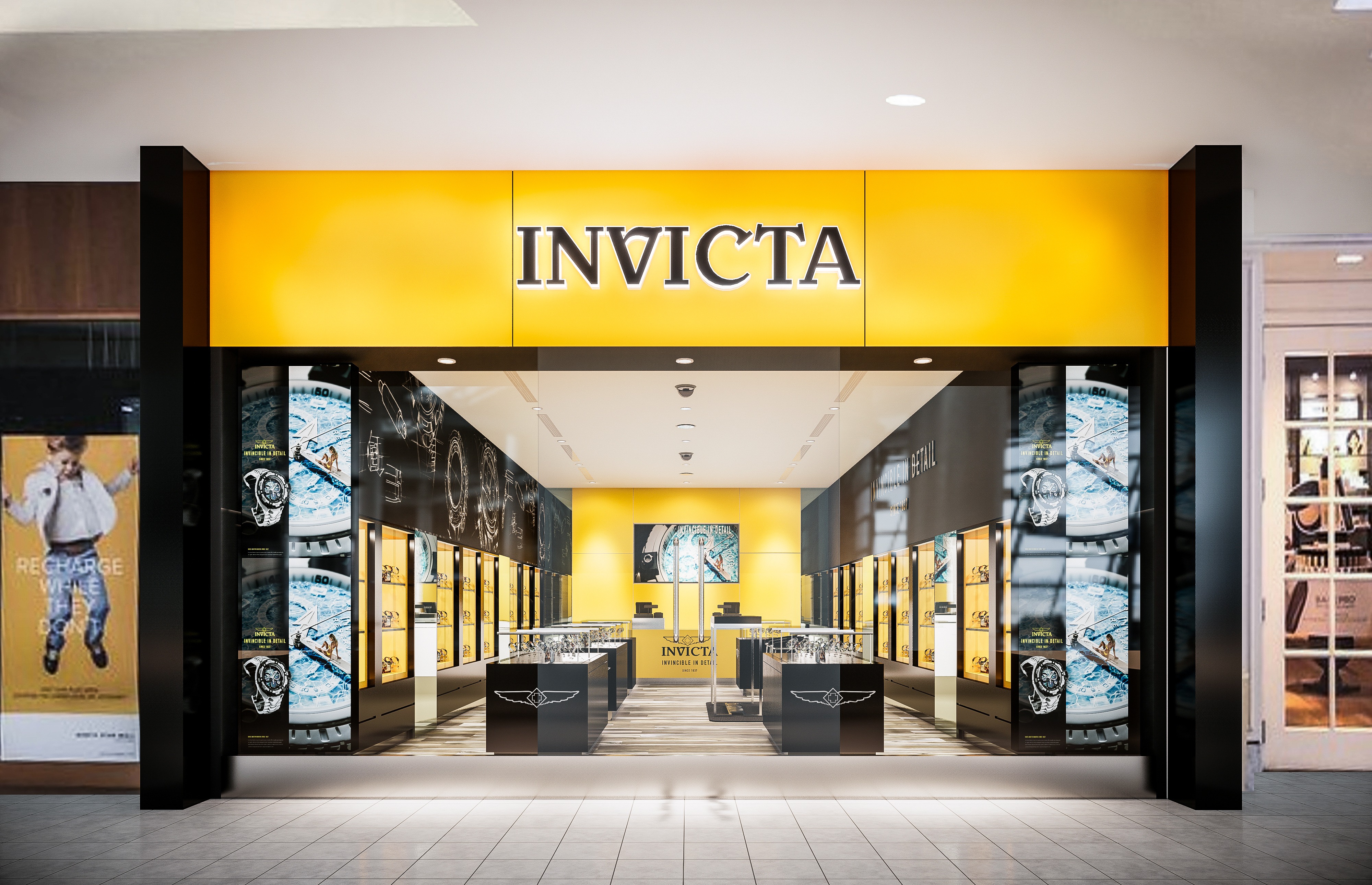
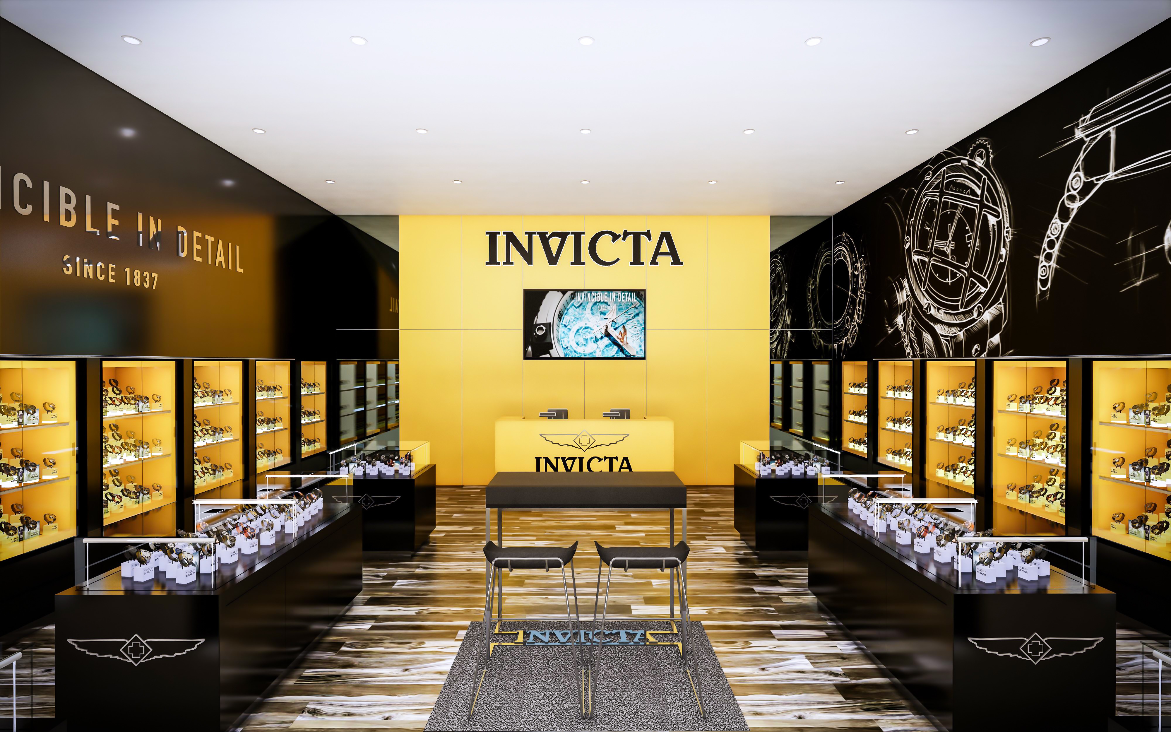
© 2021 by sanzpont [arquitectura] . Webpage by sanzpont [digital] . Innovative Digital Experiences

The Maralda Beach Club in Miches, Dominican Republic is conceived as an architecture that dissolves into its tropical surroundings through a fluid, biomorphic formal language. The overall concept draws inspiration from natural coastal geometries—waves, dunes, and the articulated patterns of palm canopies. This results in a continuous undulating roofscape formed primarily in bamboo, giving the impression that the structure emerges organically from the landscape. The design privileges openness, natural ventilation, and seamless integration of programmatic zones with the surrounding beach and forest.
The complex is arranged as an interconnected sequence of open-air environments, each calibrated to maximize visual and physical permeability. The central structure accommodates dining and lounge areas, set on a curvilinear timber platform that mirrors the form of the adjacent pool. The spatial composition avoids rigid enclosures, enabling breezes from the coastline to permeate throughout. Satellite structures—such as the sculptural bar pavilion and the secluded wellness retreat—reinforce the overall architectural language through similar curving, elevated, and porous forms. Together, these elements create an experiential promenade that guides visitors fluidly from beach to forest.
Bamboo is the dominant structural and expressive material, used both for its mechanical properties and its aesthetic resonance with tropical environments. Vertical bamboo culms are bundled to form branching structural supports that flare outward to hold the expansive roof. The roof itself—woven from bamboo, cane, and lightweight timber battens—achieves a high level of translucency, mediating sunlight and casting dynamic shadows throughout the day. Circular and looping bamboo elements within the bar pavilion function both as structural reinforcement and sculptural ornamentation, amplifying the sense of movement inherent in the design.
The interior environment maintains a cohesive aesthetic through the use of natural fibers, raw timber finishes, and artisanal furniture. Rattan, rope, and hand-woven textures complement the architectural palette, promoting a tactile and inviting atmosphere. Seating arrangements near the pool emphasize informality and relaxation, with low-profile lounge furniture and organically shaped platforms that blur the boundary between built space and water. Illumination is subtle and integrated into the structure, allowing the warm tones of the materials to define the nighttime ambiance.
The landscape strategy reinforces the project's immersive character by incorporating native vegetation directly into architectural voids and structural intersections. Pathways meander through dense foliage, leading to a stone-clad wellness pavilion set within a reflective water garden. Views are choreographed to maintain continuous contact with the surrounding ecological context, whether looking outward toward the sea or inward toward shaded courtyards. Pools and water features serve as transitional elements, cooling the microclimate and strengthening the visual connection between architecture and nature.
Sustainability is central to the project, beginning with the extensive use of bamboo, a rapidly renewable resource with low embodied energy. The open-air design reduces the need for mechanical cooling, leveraging cross-ventilation and shading from the expansive roof. Local sourcing of materials minimizes transportation impact while supporting regional craftsmanship. Rainwater is collected through the curving roof forms for use in irrigation, and the landscape relies on native plant species that naturally thrive in the coastal environment, reducing maintenance and preserving biodiversity.
© 2021 by sanzpont [arquitectura] . Webpage by sanzpont [digital] . Innovative Digital Experiences

This innovative beach showroom project embodies a synthesis of sustainability and modern design, employing recycled shipping containers as the primary structural framework, enveloped by a dynamic "second skin" of bamboo sticks. This concept not only leverages the robust, modular nature of the containers but also introduces a bioclimatic element with the bamboo, which integrates natural ventilation and light filtering properties to enhance the indoor environment while maintaining a low environmental footprint.
The layout consists of strategically placed containers that define a compact, efficient core, adapted to accommodate a showroom with minimal ecological impact. The containers are staggered and oriented to maximize views and natural light penetration, which are essential for a beachfront property. The interconnected spaces maintain an open flow, conducive to both display and interaction, which is critical in a showroom setting. External decking and walkways link the containers, promoting an indoor-outdoor connection that is vital for beachside architecture.
Central to the design philosophy is the use of recycled materials and sustainable practices. The shipping containers themselves are a nod to reusability, providing a sturdy and durable structure that repurposes industrial objects for architectural use. The bamboo facade acts as a sustainable, renewable resource that serves multiple functions: it forms an aesthetic statement with its rhythmic, linear patterns; provides shade and privacy; and enhances the building's thermal performance by creating a ventilated facade that reduces heat gain.
The choice of materials extends to the interior, where sustainable, locally-sourced materials are preferred, reducing transportation costs and supporting local economies. The landscaping around the pavilions also reflects a commitment to sustainability, using native plants that are drought-resistant and suitable for the sandy soil, minimizing water use and maintenance requirements.
Aesthetically, the design strikes a balance between industrial ruggedness and natural elegance. The dark tones of the containers contrast with the warm, natural texture of the bamboo, making the structure both a focal point and an integrated part of the landscape. Functionally, the bamboo not only embellishes the exterior but also acts as a natural insulator and sunshade, critical for thermal comfort in tropical climates. The open terraces and shaded areas provide spaces for relaxation and social interaction, essential in a showroom designed to attract and engage visitors.
This project is a prime example of how modern design can meet ecological responsibility without compromising on style or functionality. By integrating recycled materials with traditional techniques and modern technology, the beach showroom stands as a testament to innovative, sustainable architecture in a challenging coastal environment.
© 2021 by sanzpont [arquitectura] . Webpage by sanzpont [digital] . Innovative Digital Experiences

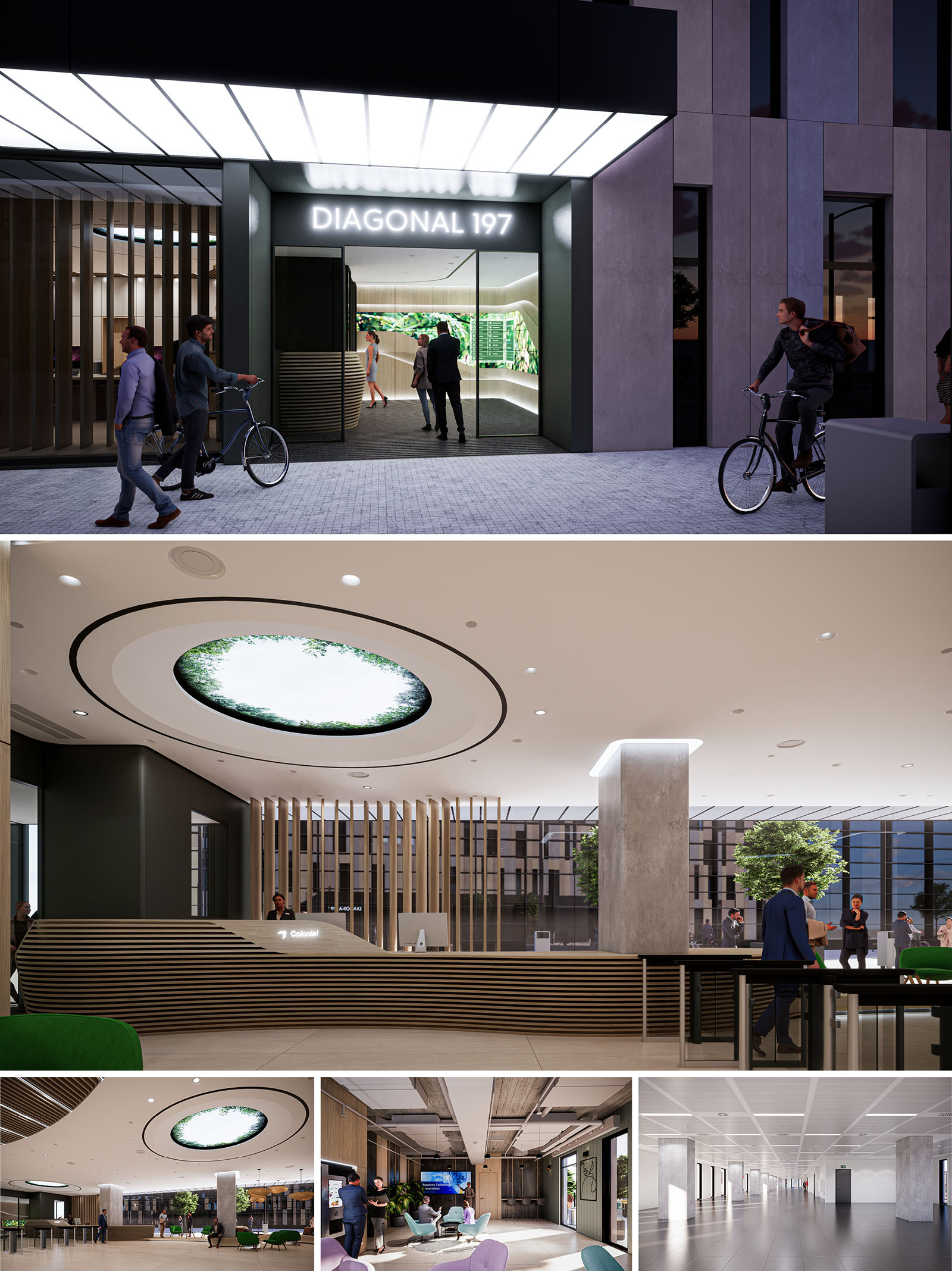
The D197 project redefines a corporate building in Barcelona as an open, permeable and contemporary workplace. The design concept is based on three key ideas: visibility towards the city, fluidity of circulation and incorporation of biophilic elements as a generator of well-being. The access, lobby and workspaces are conceived as a continuous spatial sequence where reception, informal meeting and circulation overlap, dissolving the traditional thresholds of a corporate building.
The architecture seeks a sober and timeless image, while the interior design introduces warmth and material richness. Neutral envelopes act as a backdrop for sculptural elements such as the curved reception desk, the vertical wooden slats and the large luminous oculus, which become identity milestones of the project and articulate the user experience from the street to the workspace.
The entrance on Diagonal is configured as a deep, illuminated porch that acts as a transition between the public sidewalk and the interior lobby. A generous canopy of diffuse light emphasizes the access and improves nighttime safety, while the clear and legible signage “Diagonal 197” strengthens the urban identity of the building. Large transparent panes visually connect the interior green wall with the exterior, projecting the image of an active and open ground floor.
The façade of vertical stone or composite panels provides rhythm and scale, aligning with the avenue’s corporate context. The ground floor setback generates a semi-public filter space where pedestrians and cyclists coexist, favoring soft mobility and encouraging access by bicycle, in line with sustainable mobility strategies in Barcelona.
The lobby is conceived as a large, flexible and representative space. A suspended circular oculus integrates a digital or backlit image of tree canopies, bringing an abstract fragment of nature to the interior and reinforcing biophilic design. This element, combined with indirect perimeter lighting, produces a calm and homogeneous illumination suitable for reception and waiting uses.
The reception desk is a continuous sculptural volume formed by horizontal wooden slats, whose sinuous geometry accompanies the main circulation and softens the perception of scale. Behind it, a screen of vertical slats filters the view towards the courtyard and offers a sense of depth without losing visual continuity. The material palette in the lobby alternates warm wood, exposed concrete and neutral surfaces, generating a balanced dialogue between corporate sobriety and domestic comfort.
The upper floors are designed as open-plan plates with a highly regular structural grid, which facilitates flexible partitioning and future reconfiguration of uses. Continuous ceilings with integrated linear lighting and technical grids allow an efficient distribution of HVAC, sprinklers and acoustic panels. The large perimeter glazing ensures abundant natural light and panoramic views, improving user comfort and reducing the need for artificial lighting during daytime hours.
Common areas and collaboration hubs are located near the façades and vertical cores, promoting chance encounters and interdisciplinary exchanges. Finishes in these zones become more informal, incorporating visible installations, textured ceilings and varied seating typologies that support agile work, short meetings and relaxed breaks within the same floor.
The project prioritizes durable and low-maintenance materials, such as ceramic or composite cladding on the façade, high-resistance flooring and FSC-certified wood for interior elements. The strategic integration of greenery in the access and interior courtyard improves microclimatic conditions, favors air quality and provides visual relief in a dense urban environment. The biophilic resources, together with the generous ceiling heights, contribute to psychological comfort and occupant well-being.
From an environmental standpoint, the building envelope is optimized to control solar gain, while the deep plan is compensated by atriums and transparent partitions that favor daylight penetration. LED lighting with presence and daylight sensors, efficient HVAC systems and the possibility of natural ventilation in certain areas help reduce energy consumption. The design also contemplates bicycle parking and facilities to encourage sustainable mobility, reinforcing the building’s commitment to a responsible and contemporary corporate architecture.
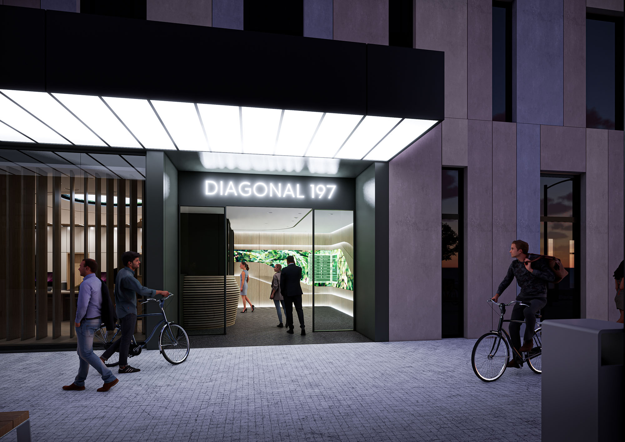
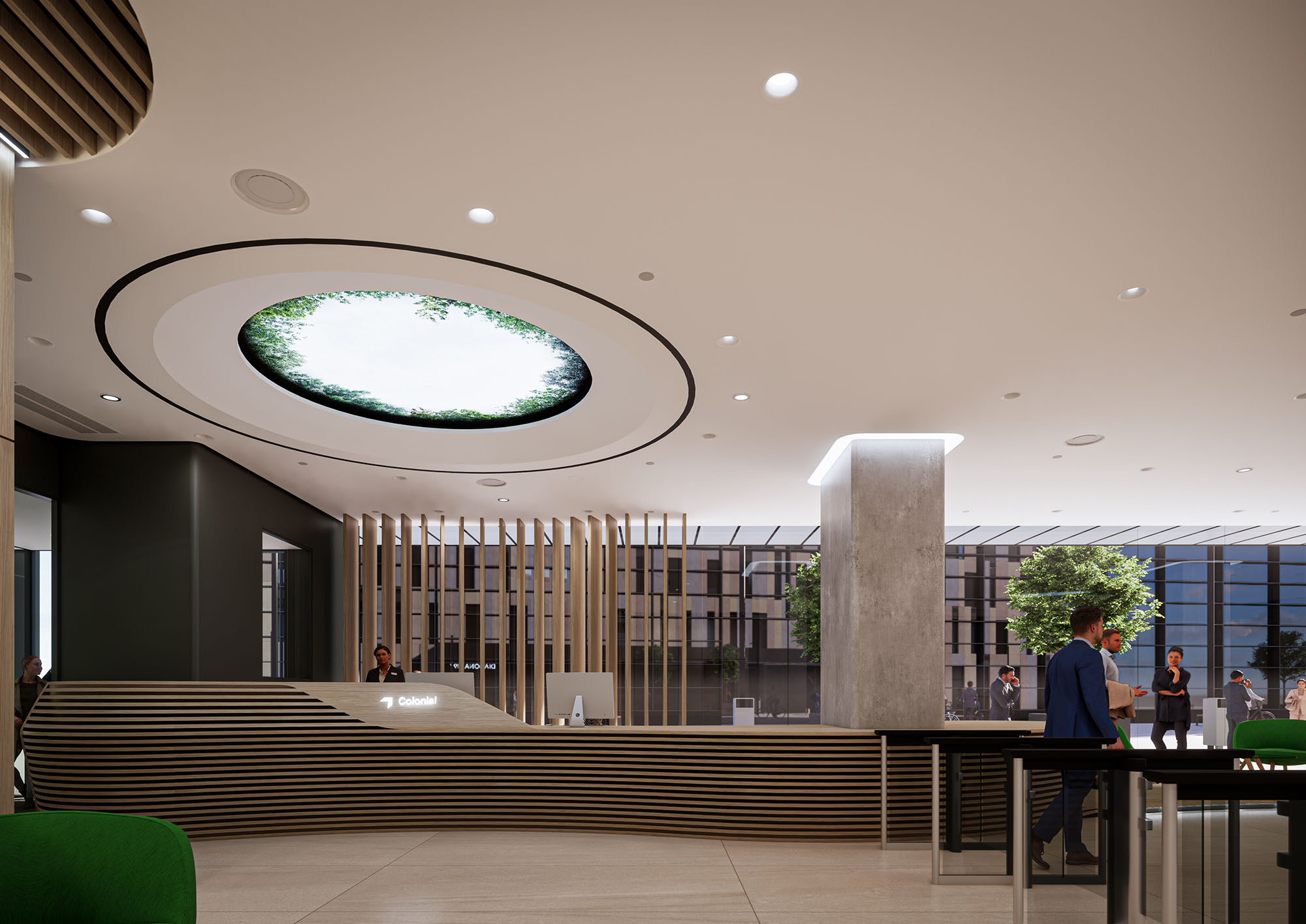
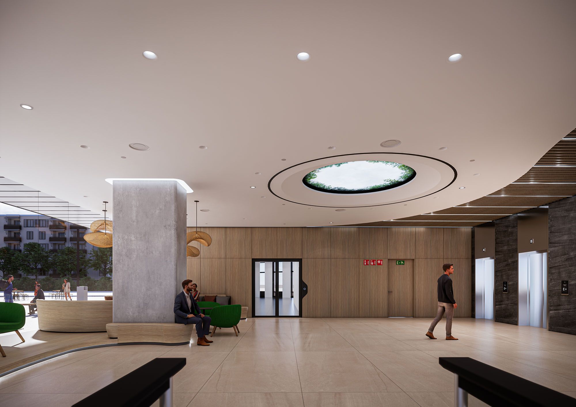
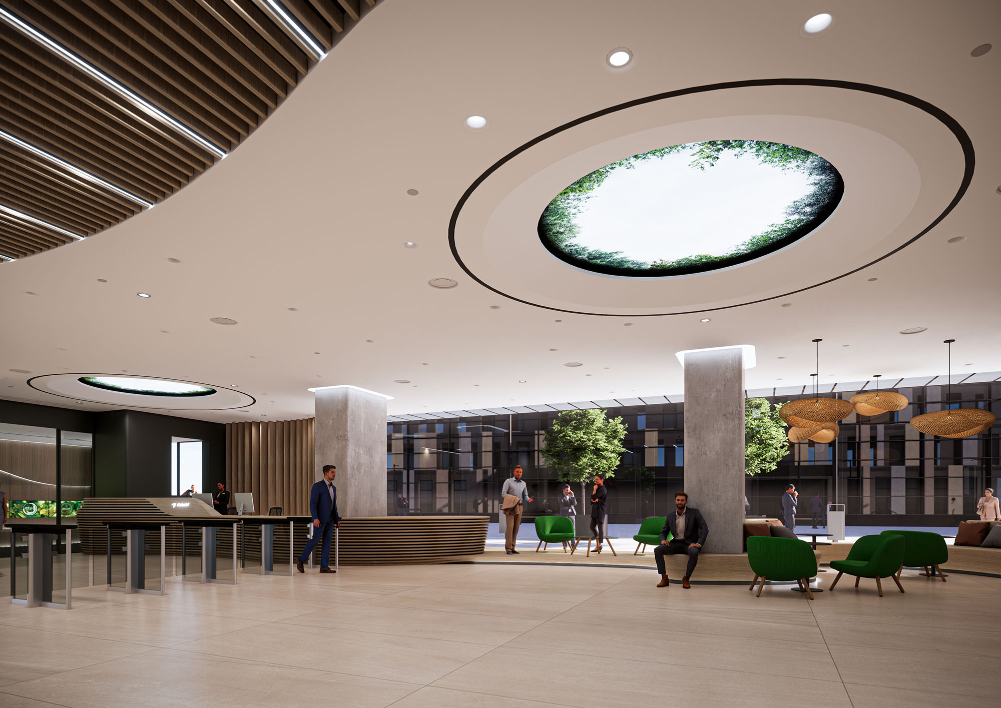
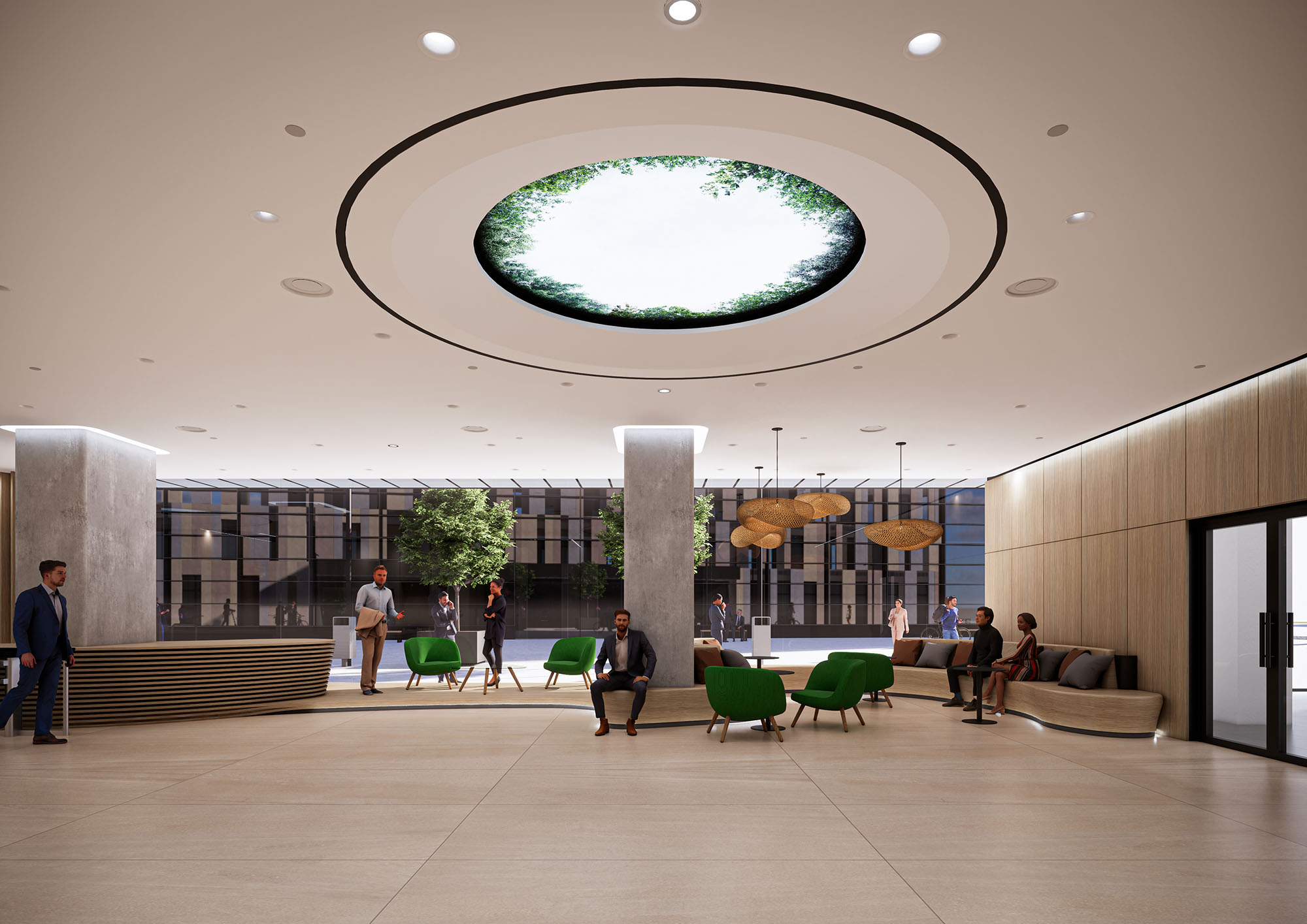
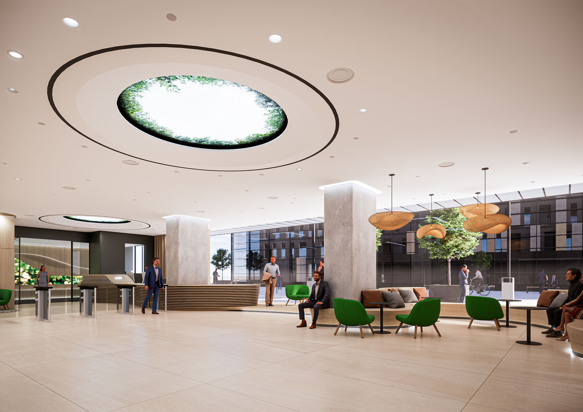
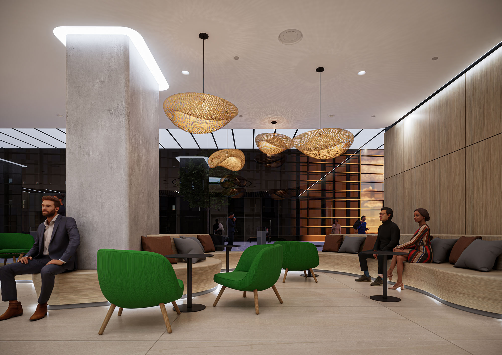
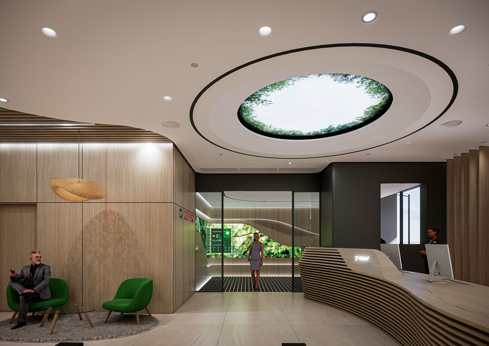
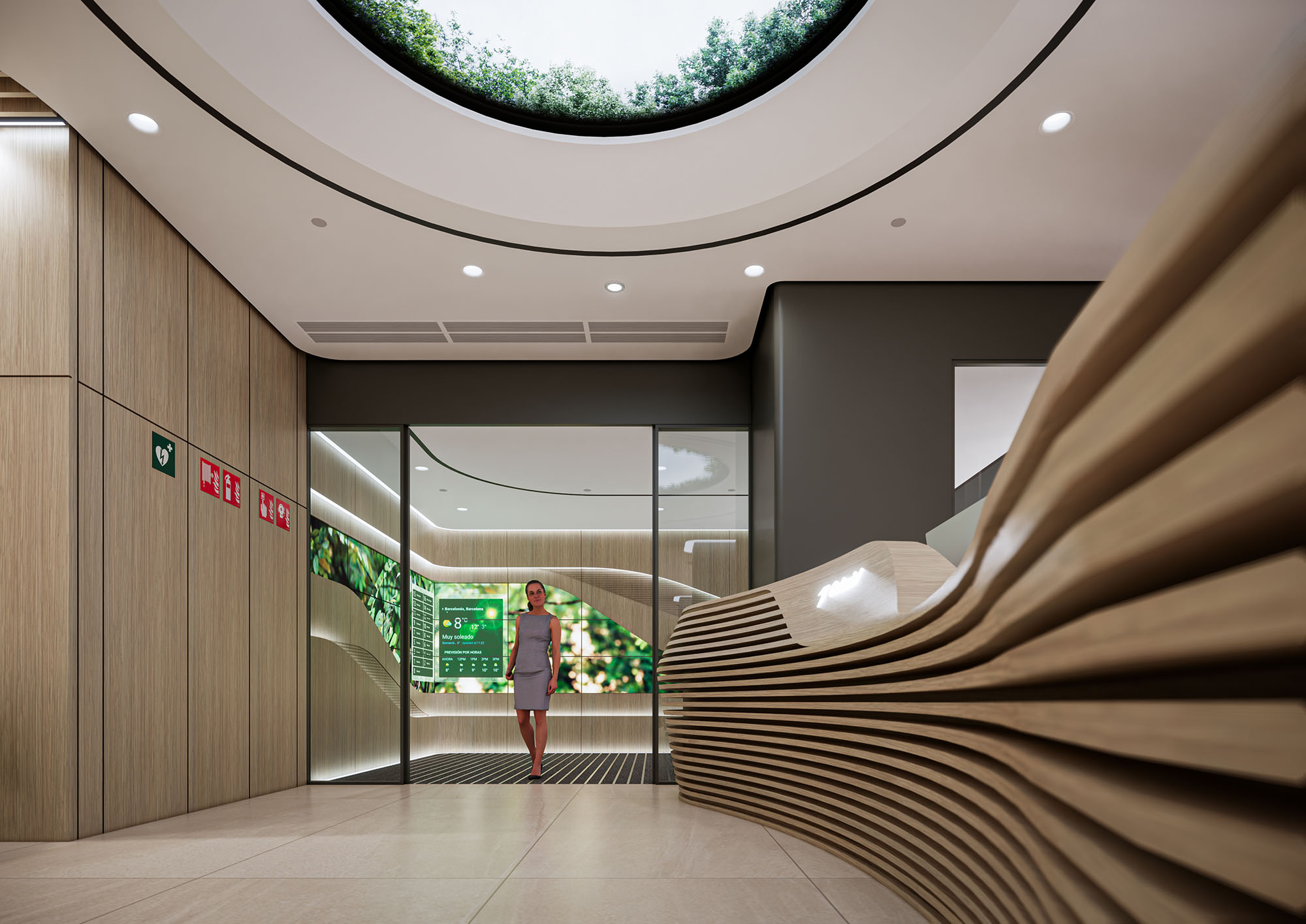
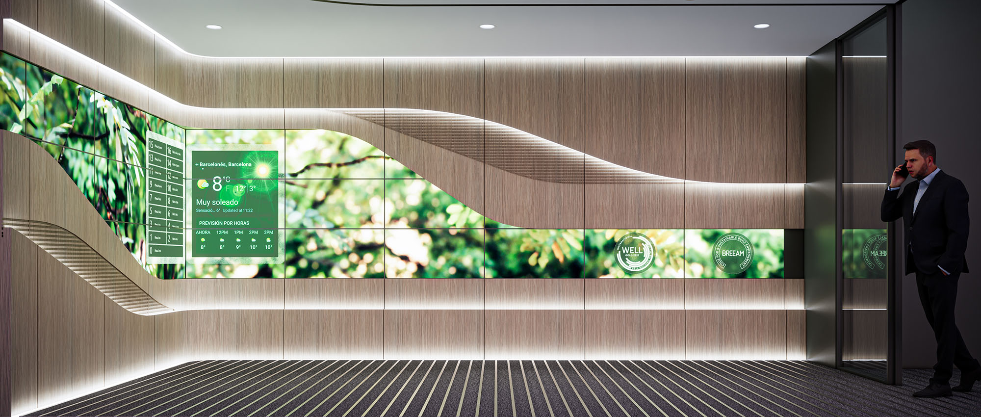
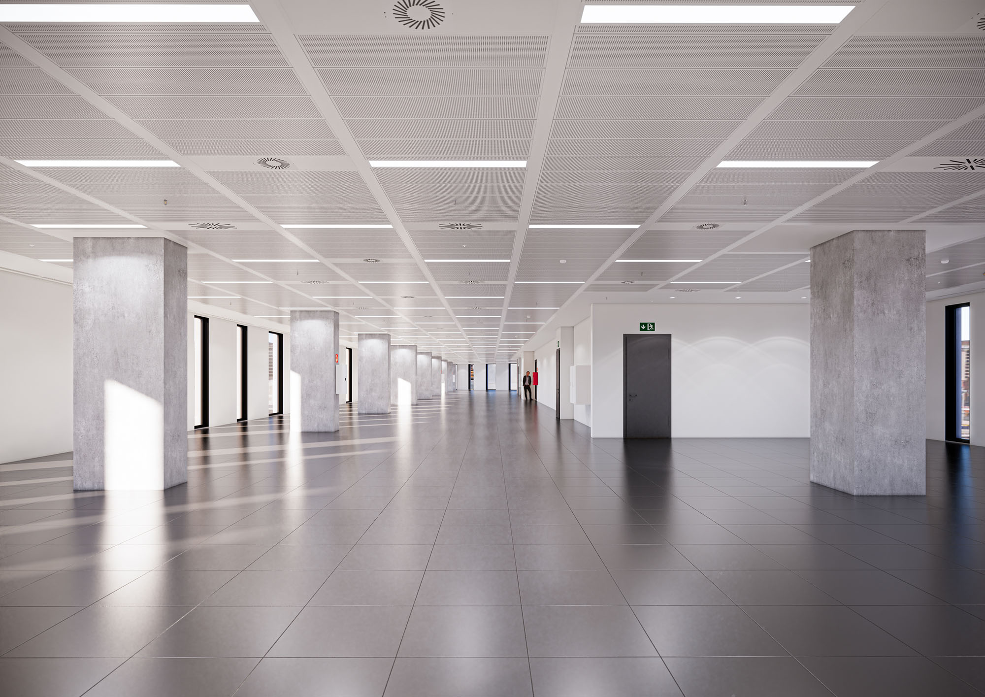
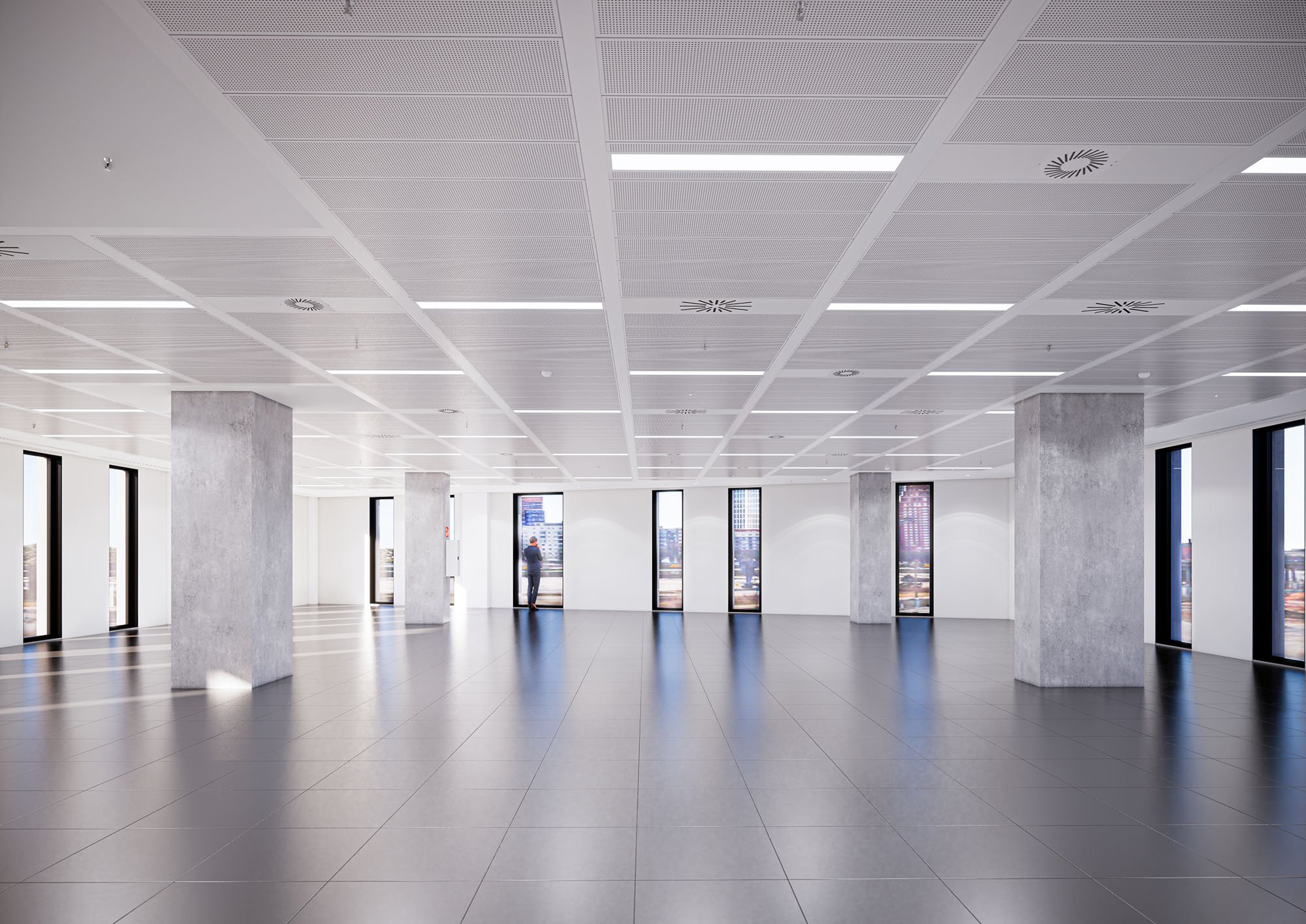
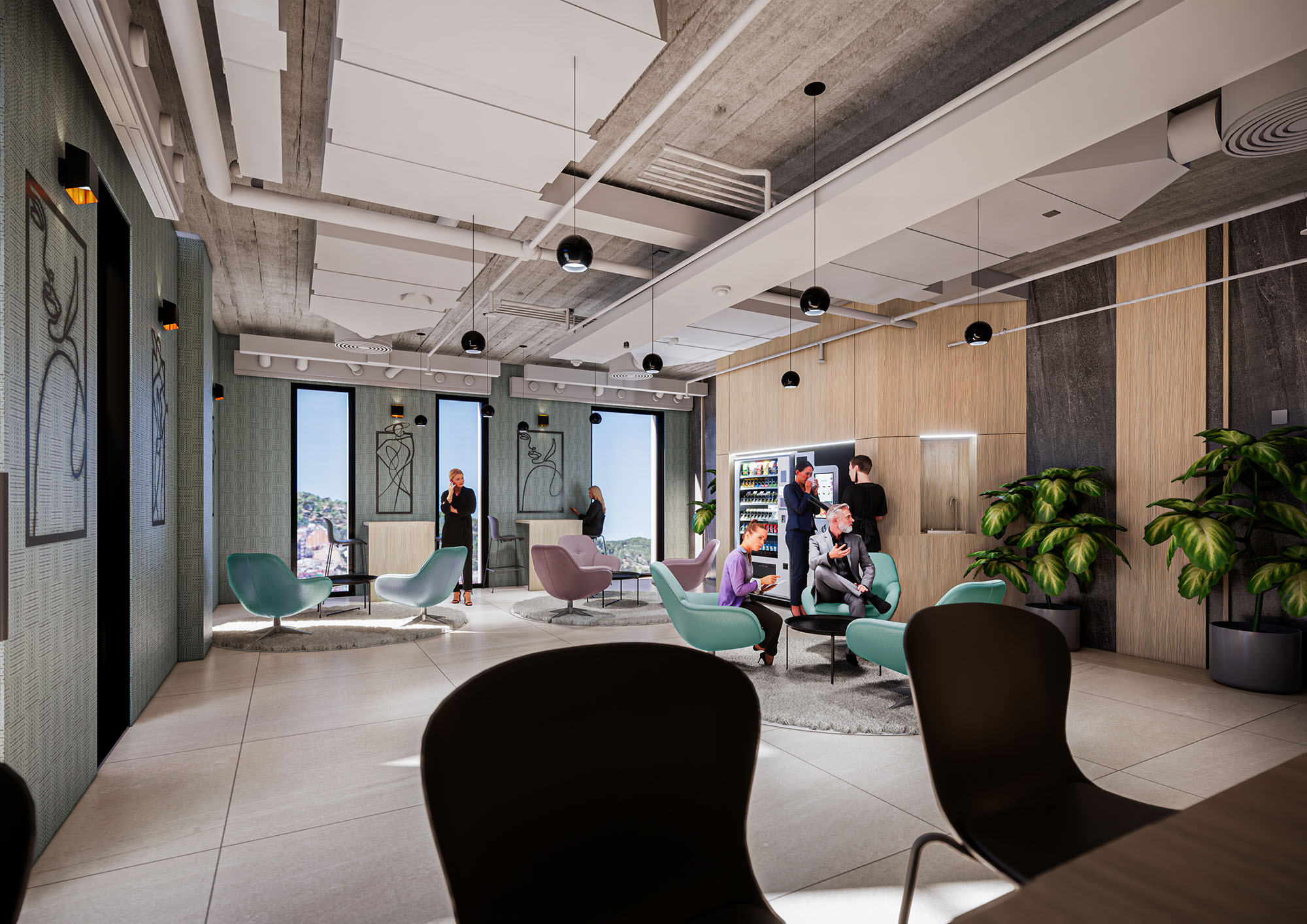
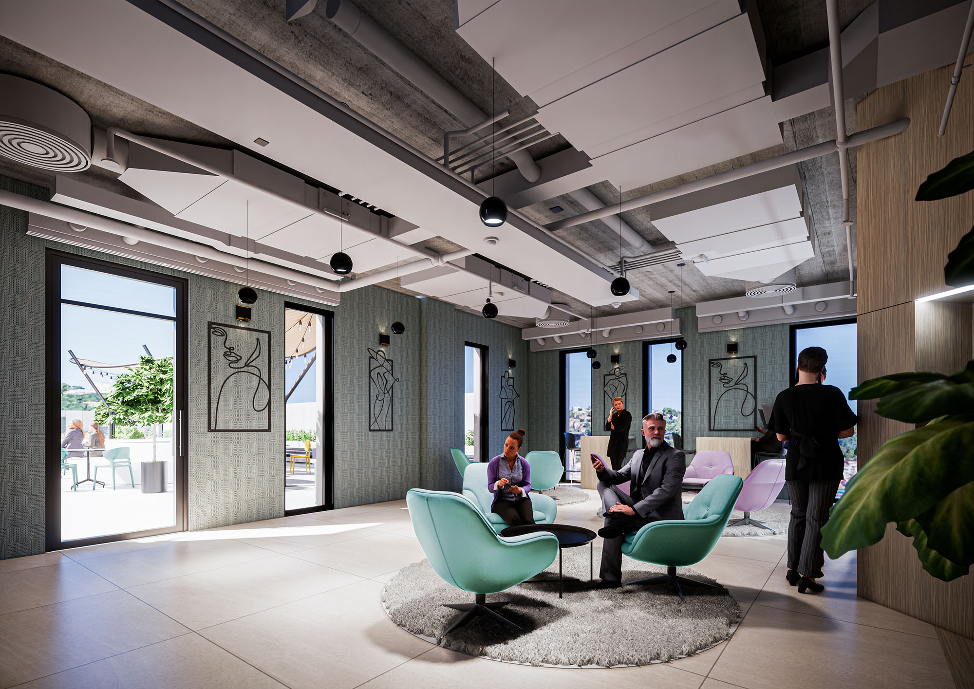
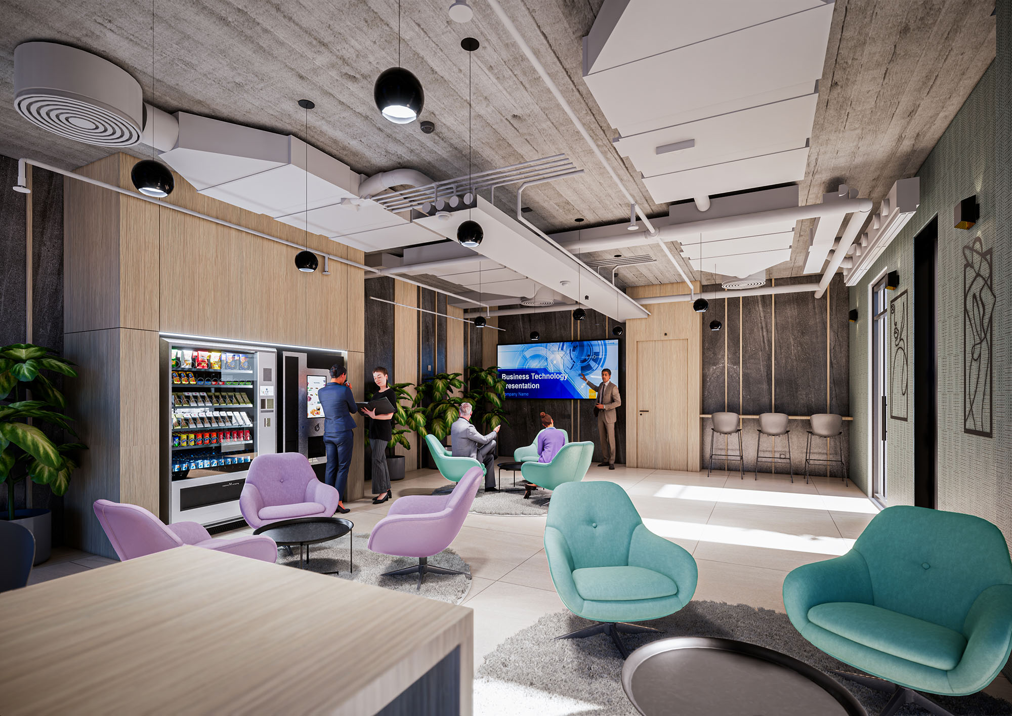
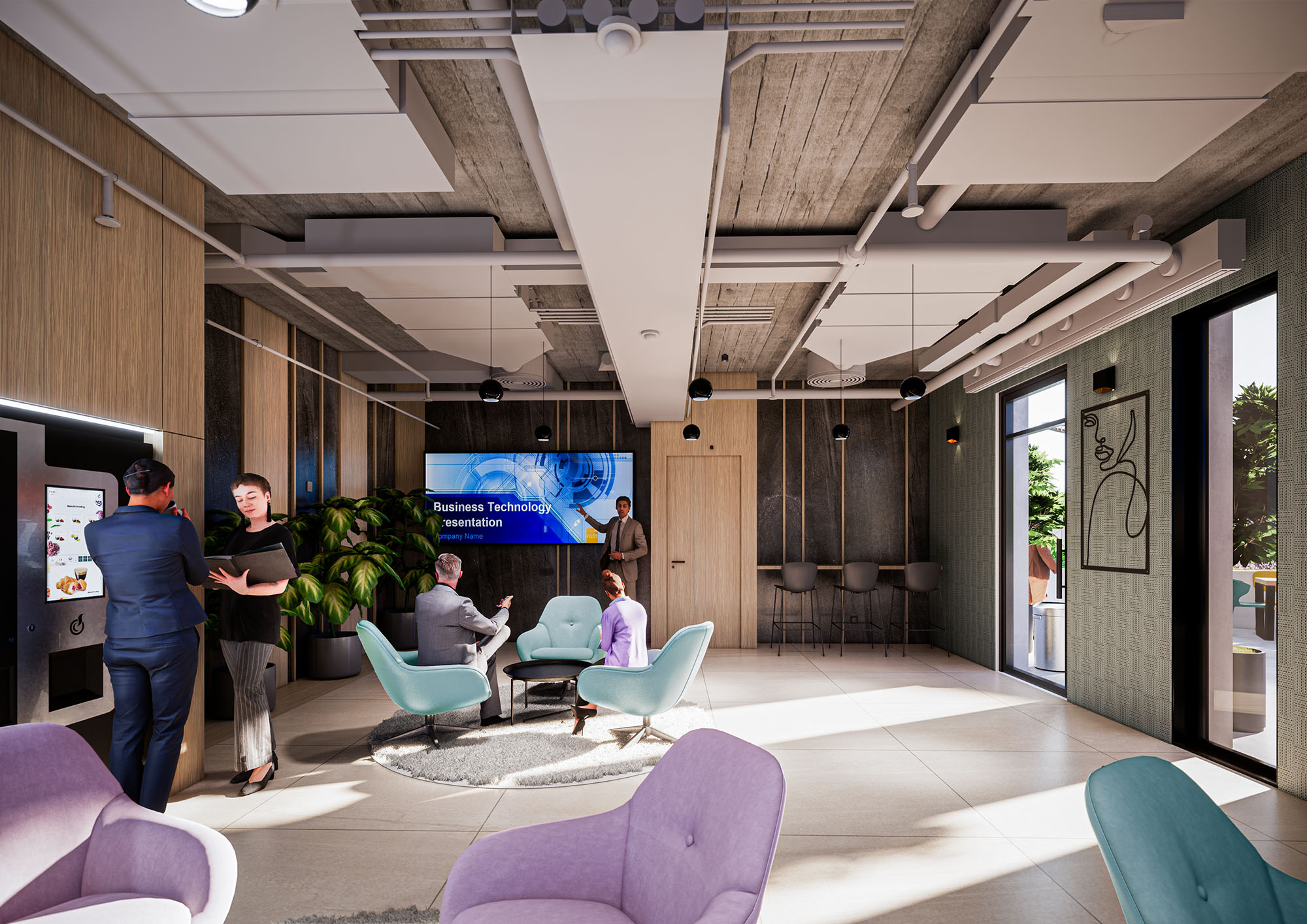
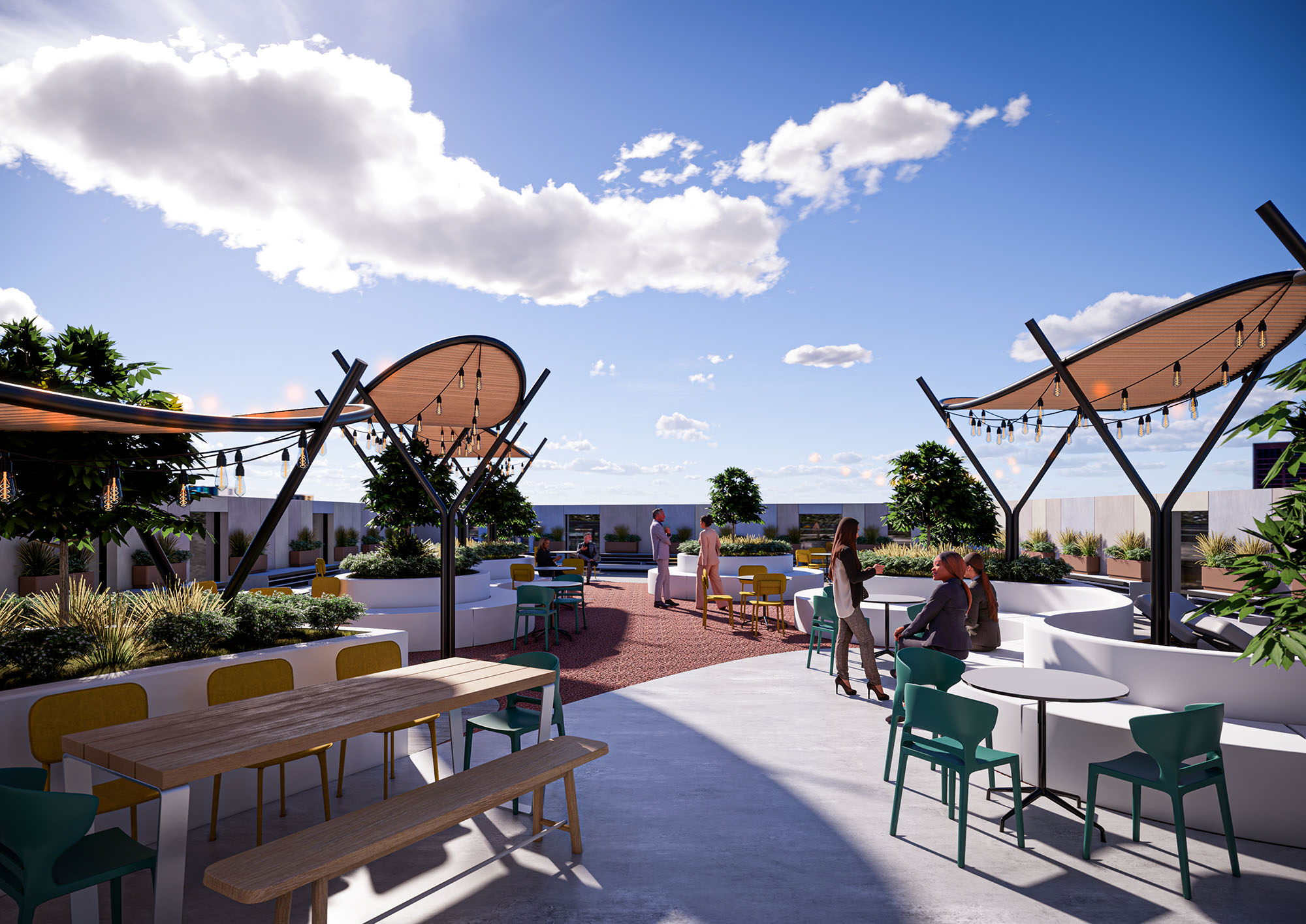
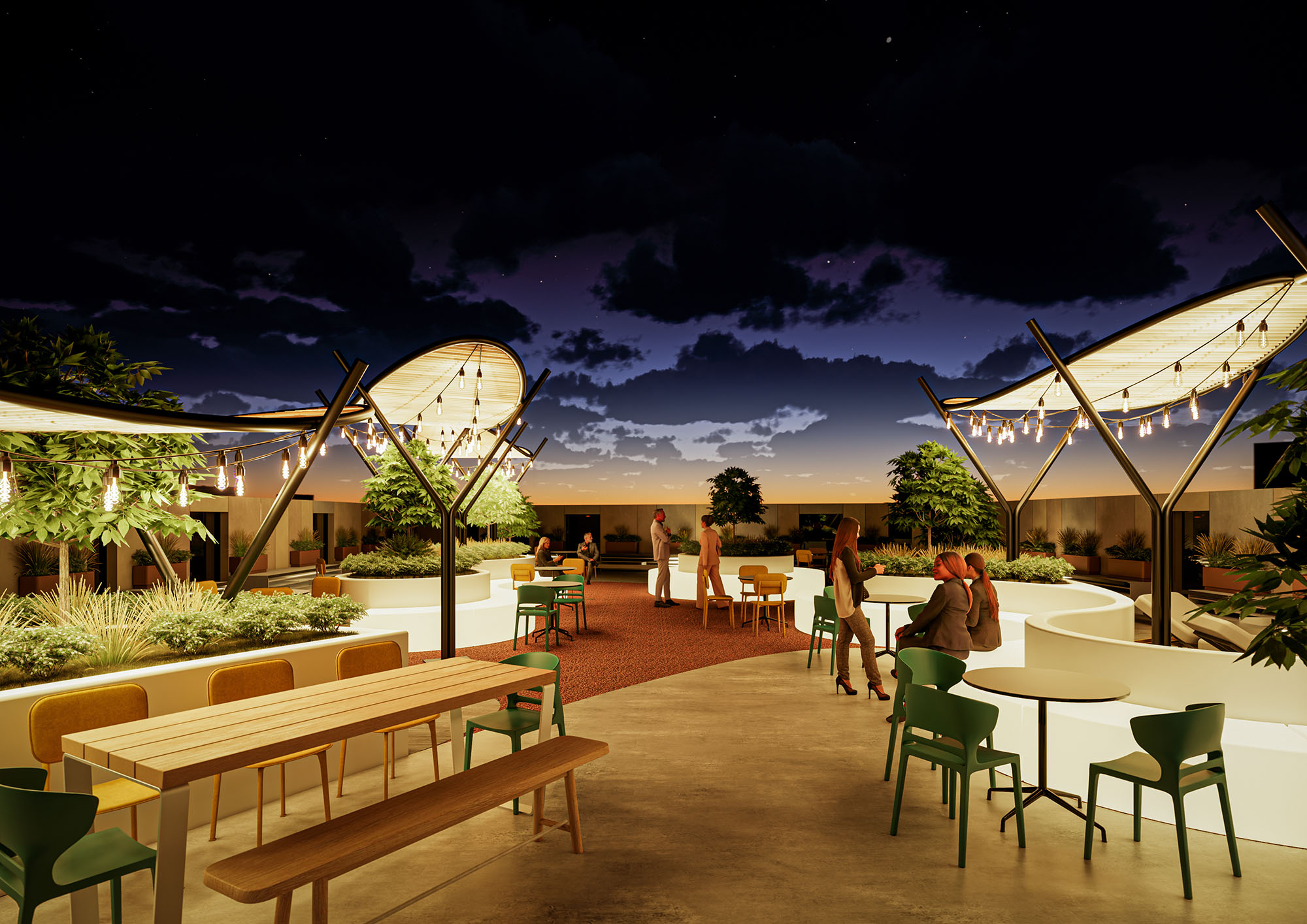
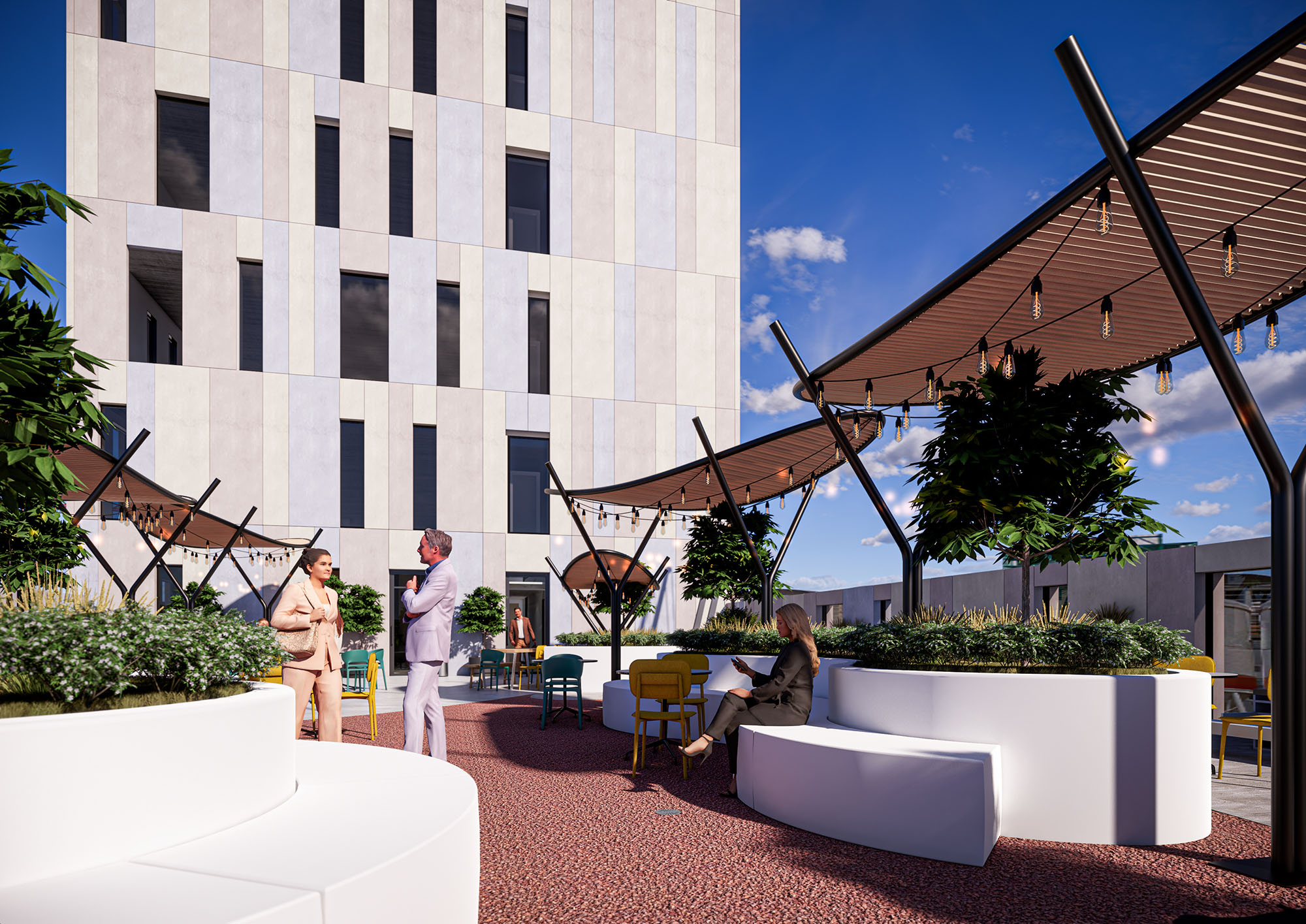
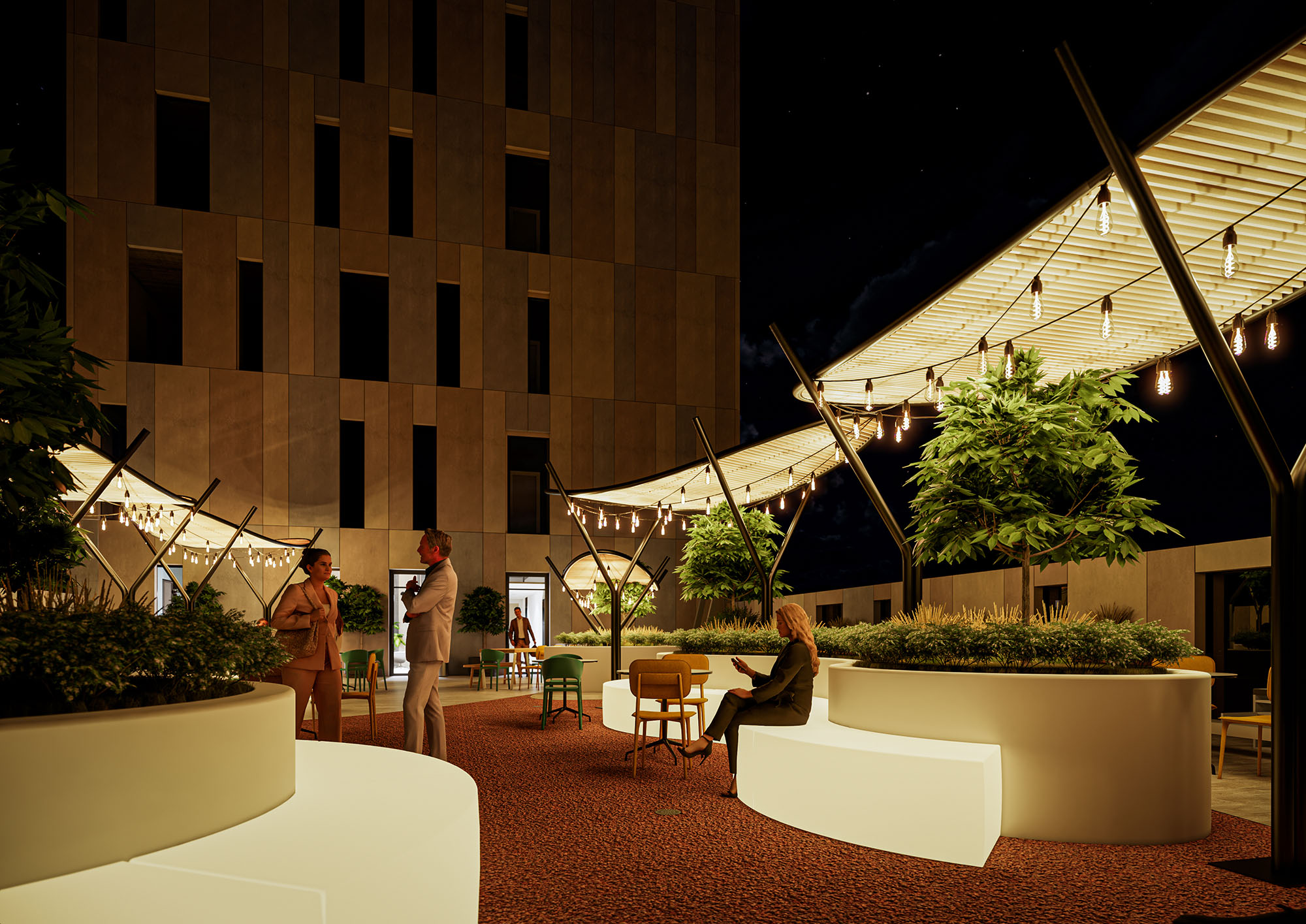
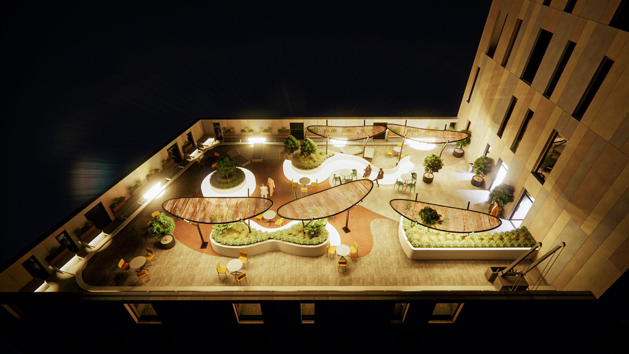
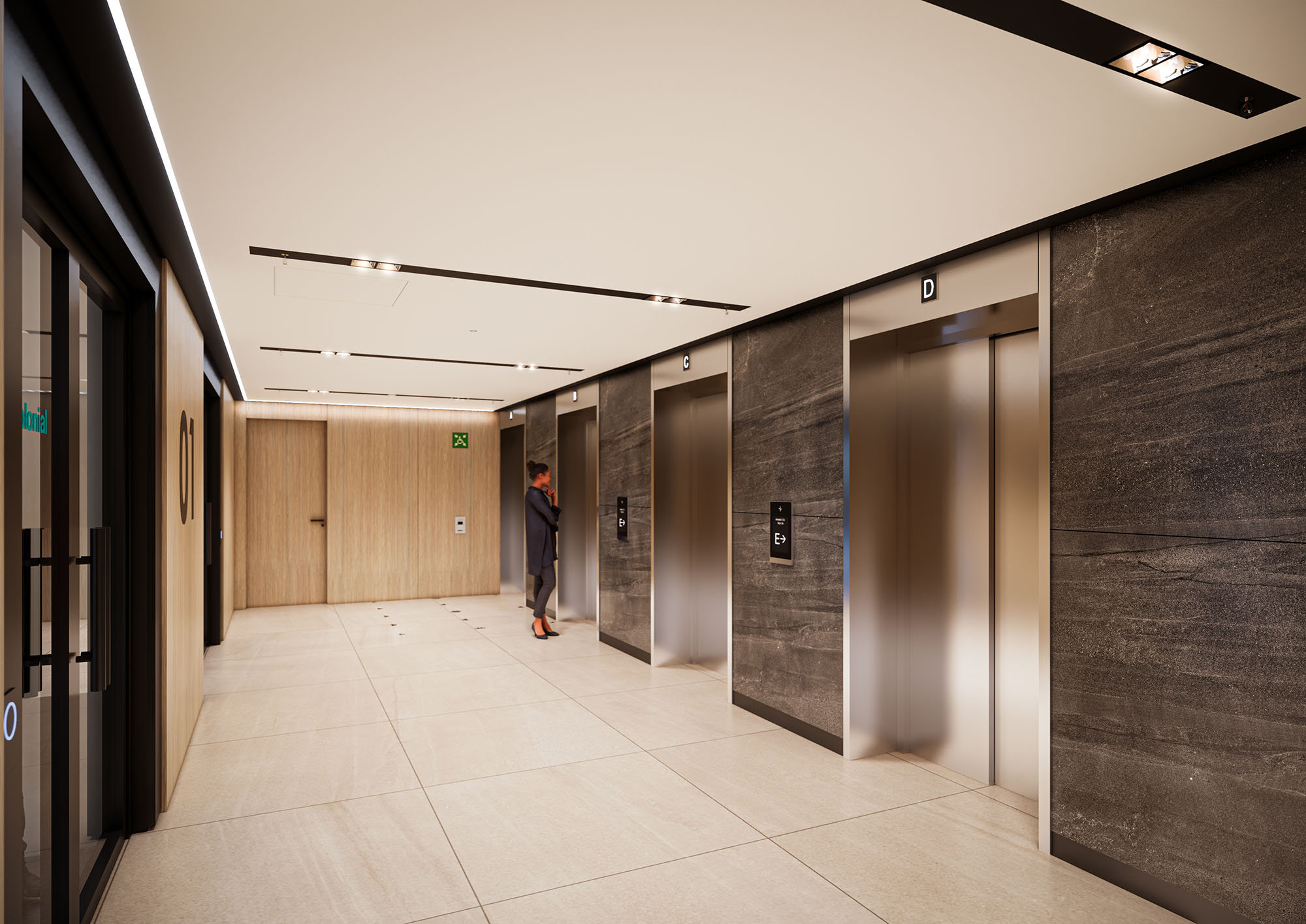
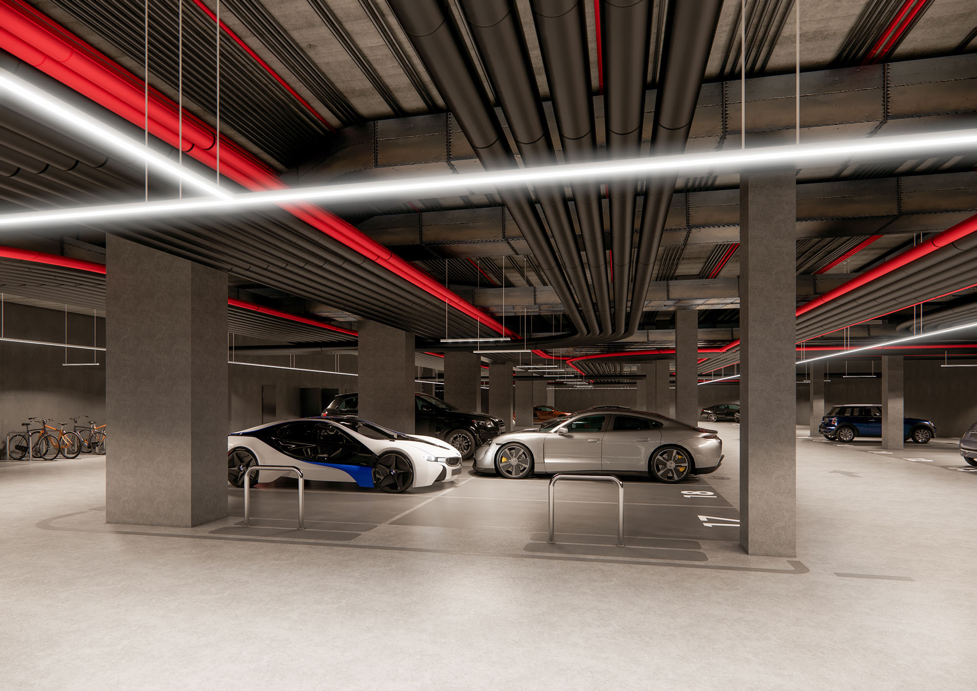
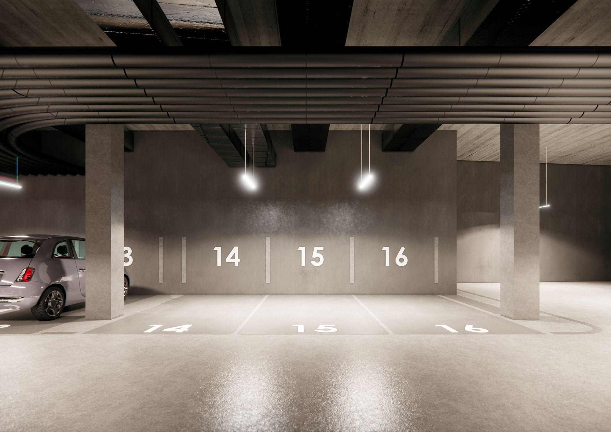
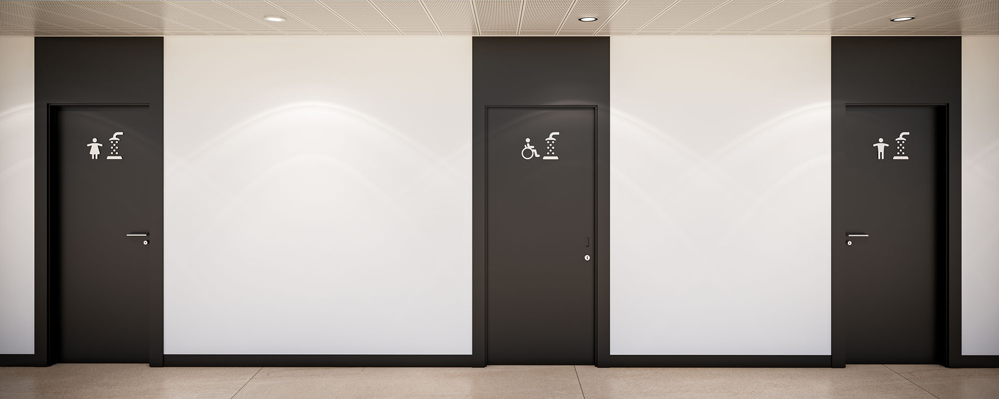
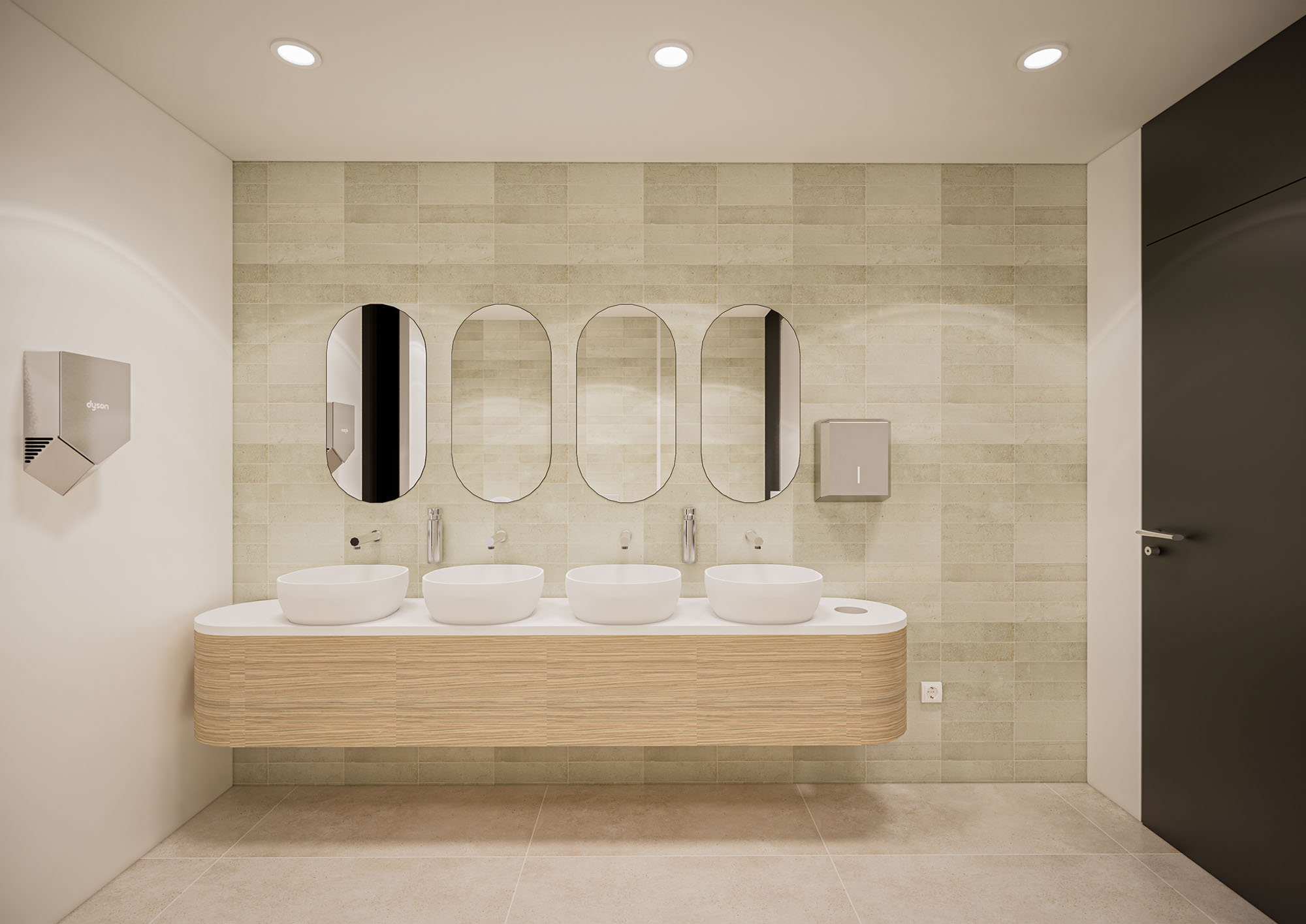
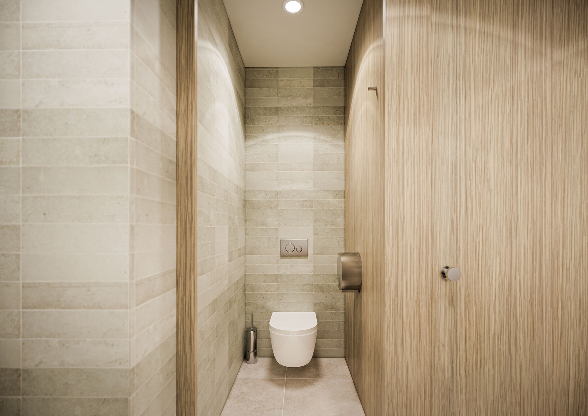
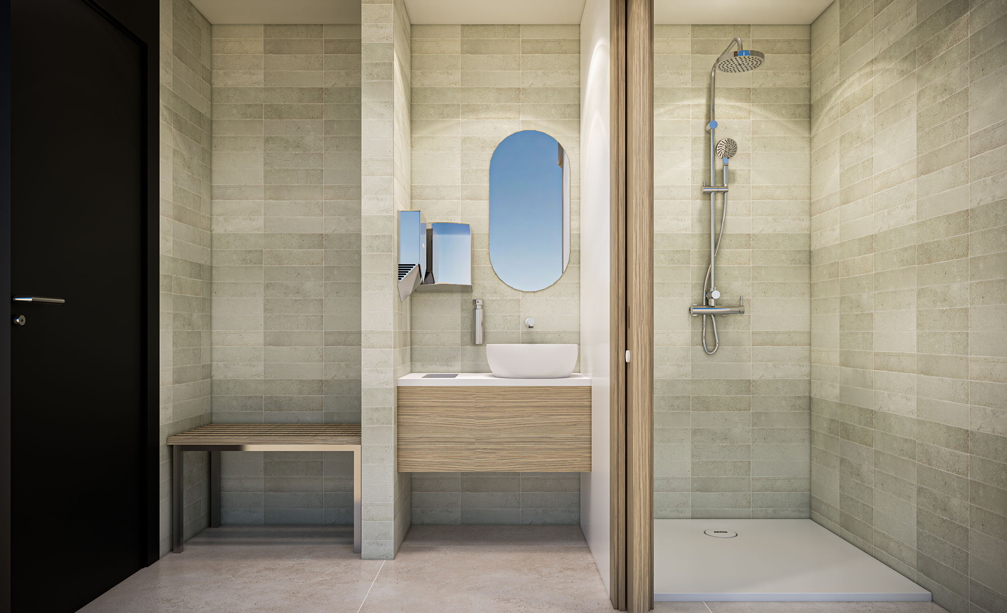
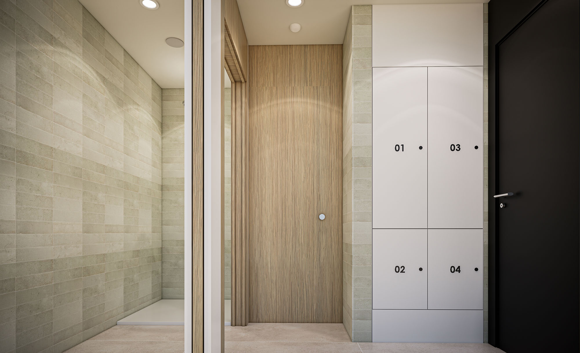
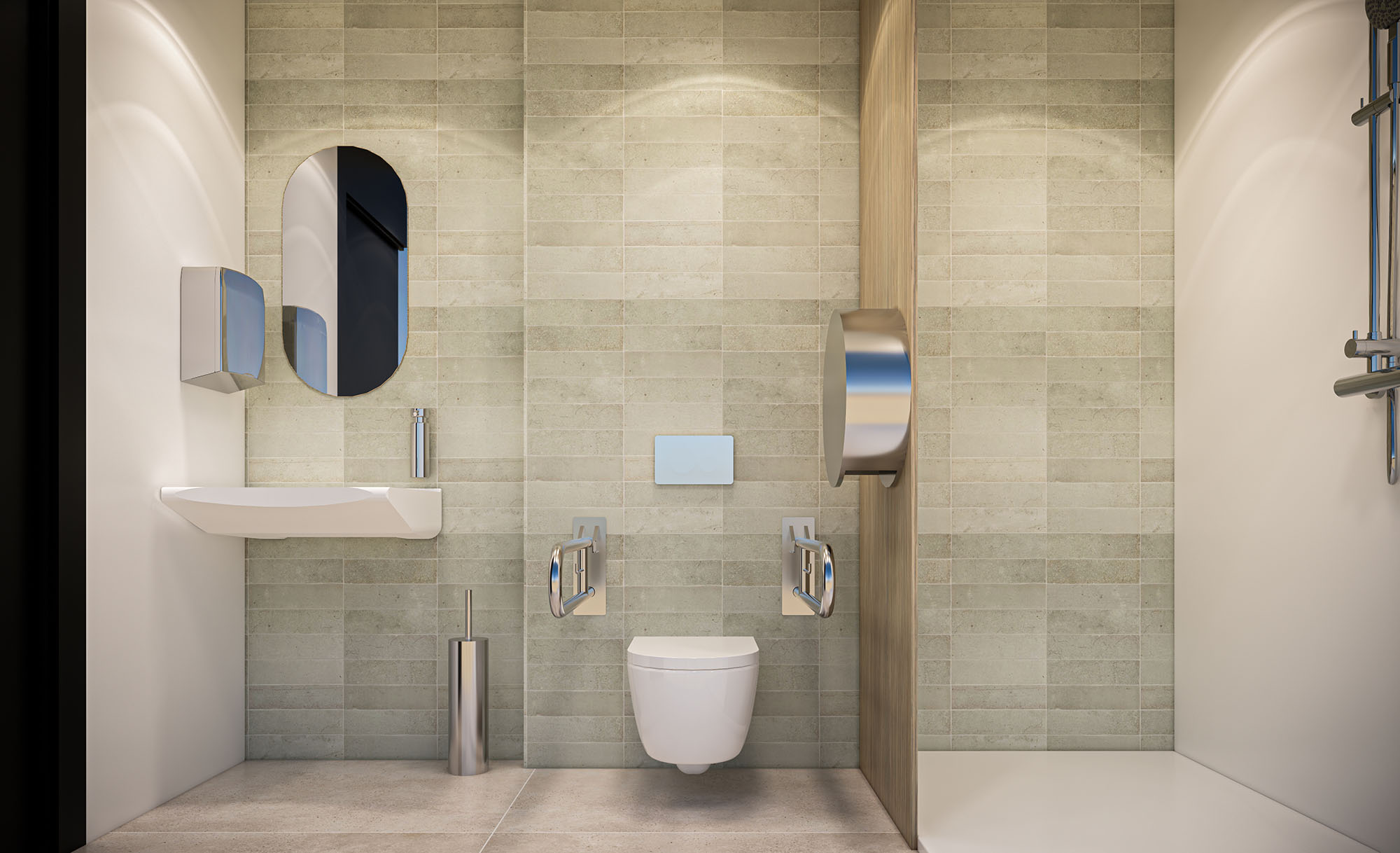
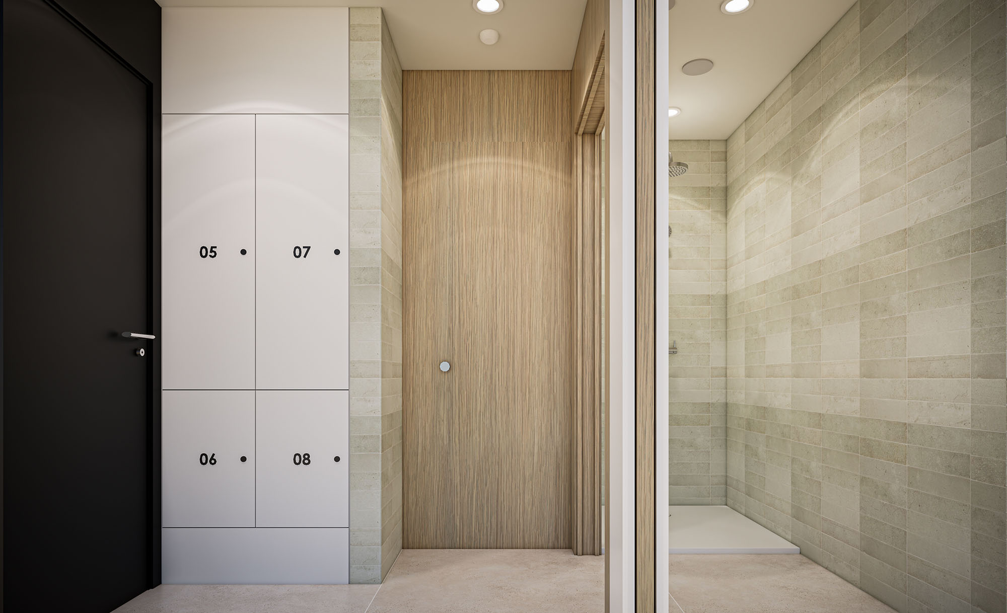
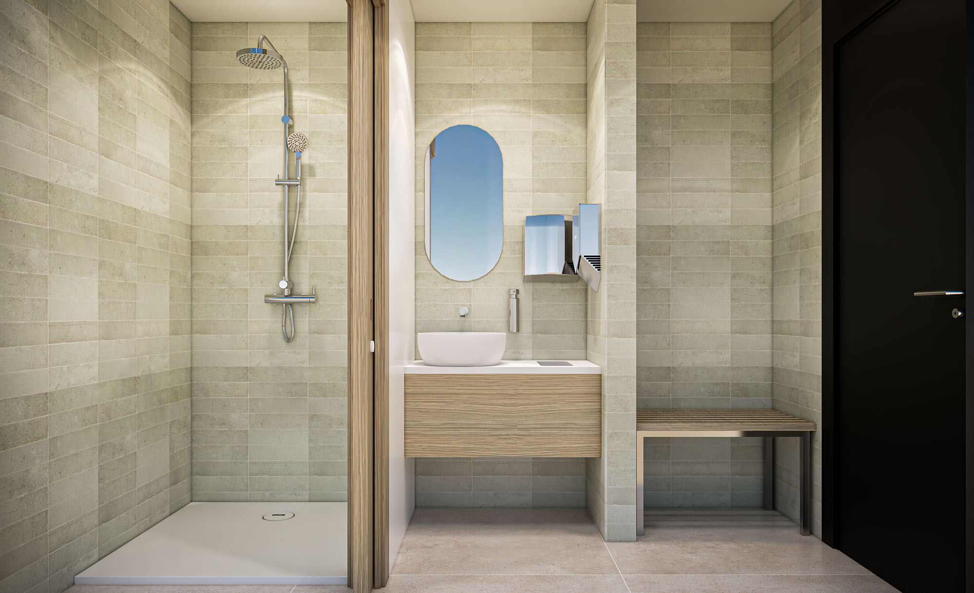
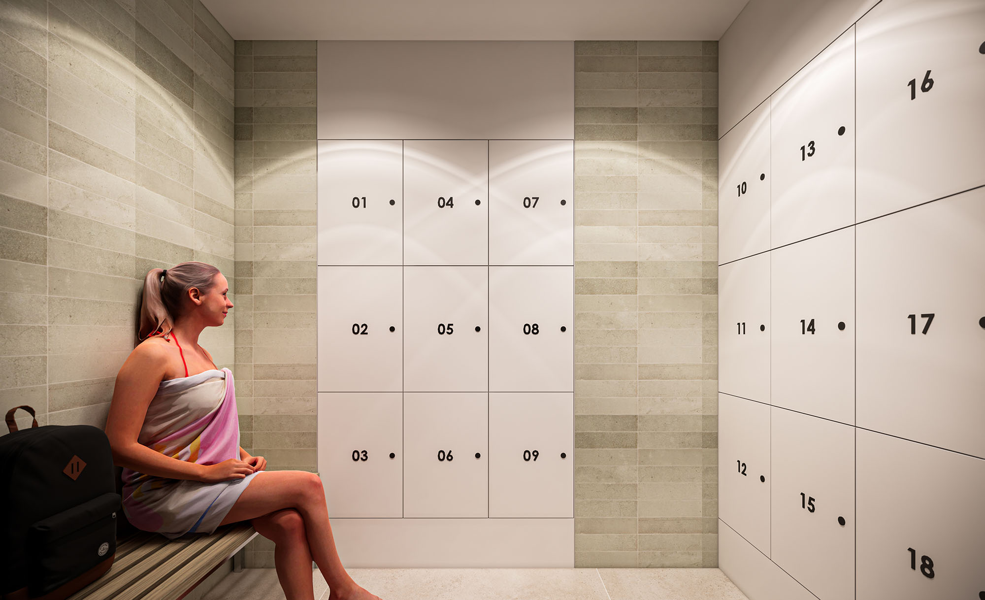
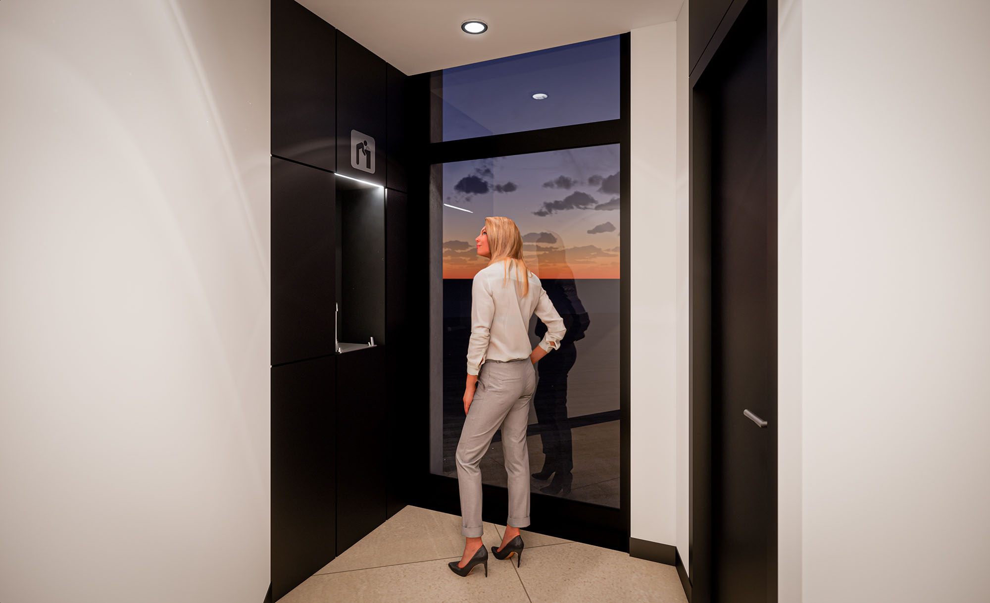
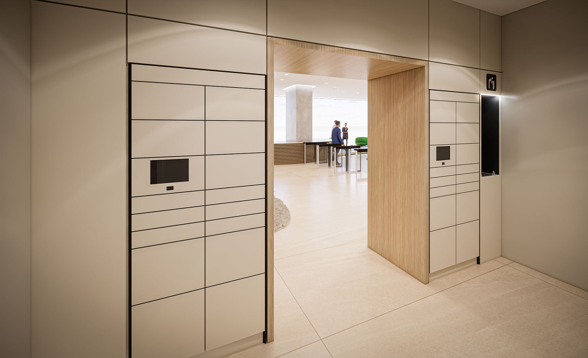
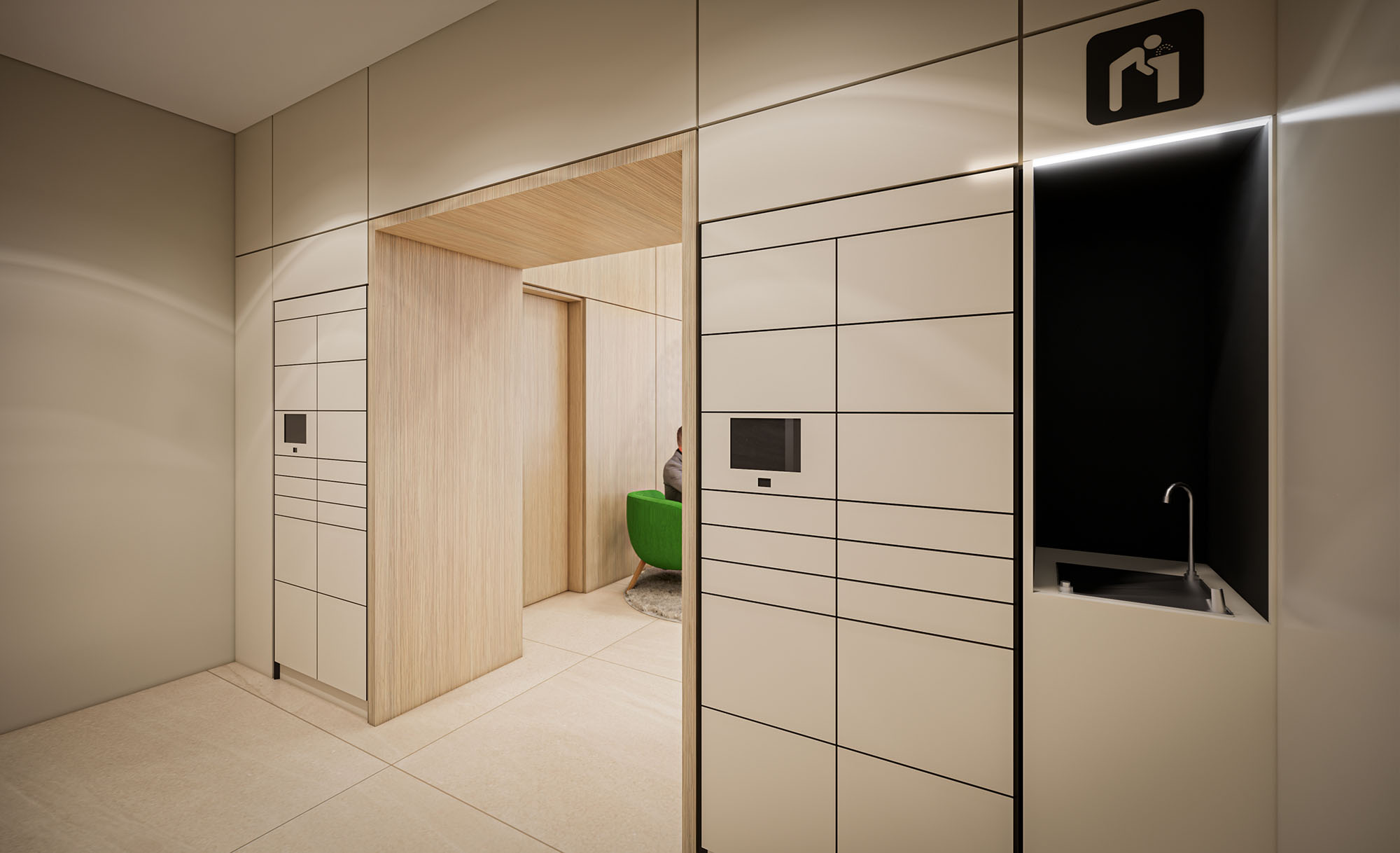
© 2021 by sanzpont [arquitectura] . Webpage by sanzpont [digital] . Innovative Digital Experiences
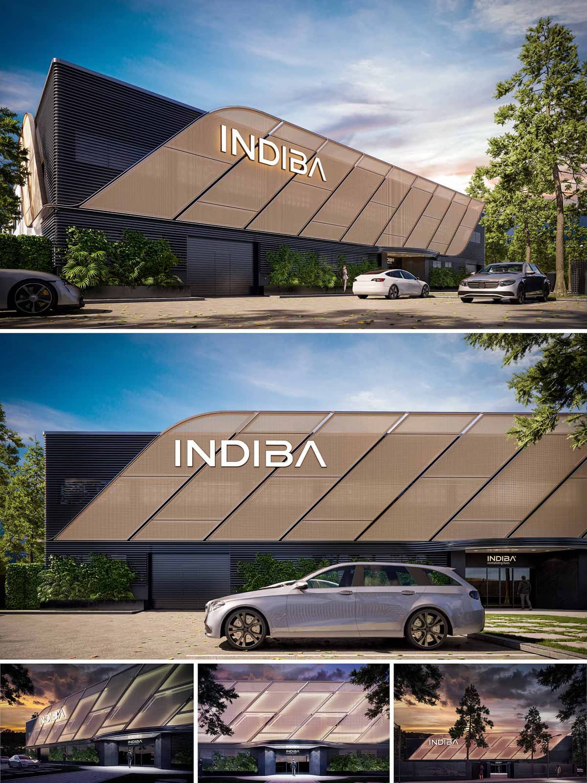

The renovation project proposal for the INDIBA Headquarters building is primarily focused on enhancing the visual impact and modernity of the existing structure while adhering to a stringent budget. This goal is achieved through a clever facade redesign that layers new, cost-effective materials over the original building elements to create a dynamic and contemporary appearance. The primary intent is to transform a conventional building into a visually striking landmark that aligns with the innovative spirit of the brand it houses.
The facade is revamped using two main materials: aluminum louvers and stretch fabric. These materials are chosen for their affordability, durability, and aesthetic flexibility. The aluminum louvers, serve not only as a visual highlight but also functionally, as they help in controlling natural light and enhancing the building’s thermal performance. Behind these louvers, the existing walls are painted in a dark gray hue, which provides a neutral backdrop that accentuates the metallic sheen of the aluminum. The stretch fabric, used selectively, adds a textural contrast and is illuminated for dramatic night-time effect, emphasizing the building’s branding.
The entrance of the building is redesigned to evoke a more sophisticated and welcoming atmosphere. The new design introduces a sleek, modern canopy that projects over the entrance, providing shelter and a strong visual frame. This canopy is supported by minimalistic structures that complement the linear expressions of the aluminum louvers. The entrance itself is made more prominent by enhanced lighting and clear signage, making it immediately recognizable and accessible.
In keeping with contemporary architectural practices, the renovation proposal considers not just aesthetic improvement but also environmental impact. The aluminum louvers provide passive cooling by shading the building’s interior from direct sunlight, thus reducing the reliance on air conditioning and lowering energy consumption. The choice of materials like aluminum, which is highly recyclable, and the decision to retain and refurbish existing structures rather than demolishing them, are reflective of a commitment to sustainability. Additionally, the use of low-VOC paint helps in maintaining air quality.
Overall, the project strikes a balance between aesthetic appeal and functional improvements. The design leverages simple yet effective architectural elements to revitalize an older building, enhancing its presence in the urban landscape while promoting environmental responsibility. The approach demonstrates how thoughtful material selection and design can be merged to achieve significant transformations even within limited budget constraints. This renovation not only redefines the building’s visual identity but also improves its operational efficiency and sustainability profile.
© 2021 by sanzpont [arquitectura] . Webpage by sanzpont [digital] . Innovative Digital Experiences
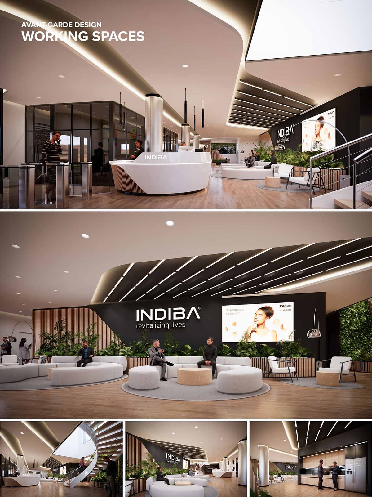

This renovation proposal for an existing office lobby space embraces an avant-garde approach to rejuvenate and transform the environment into a dynamic, brand-centric area for INDIBA. The design strategically incorporates modern elements and a sense of openness to reflect the company's commitment to revitalization and wellness. By integrating organic curves and a cohesive aesthetic, the space is reimagined to serve not only as a transitional area but as a vital part of the workplace that enhances brand identity and user experience.
The proposed design redefines the existing lobby by introducing a fluid layout that maximizes the use of space and encourages interaction. The central feature is a sleek, curved reception desk that acts as a focal point, while various seating arrangements offer both casual and formal waiting areas. The design ensures a logical flow from the entrance to other parts of the office, facilitating easy navigation and an inviting atmosphere. By maintaining visual connectivity across the lobby, the space promotes a collaborative and inclusive environment.
In the renovation, high-quality, sustainable materials are prioritized to align with the brand’s ethos. The use of polished wood for wall cladding and furniture brings warmth, while the matte finishes on composite materials offer a modern touch without overpowering the senses. The neutral color palette, enriched with natural green accents from plants, creates a calming and welcoming atmosphere. Such choices not only enhance the aesthetic value but also ensure durability and maintenance ease in a high-traffic lobby area.
The lighting design is crucial in transforming the existing lobby into a vibrant space. Recessed LED lighting strips follow the curved lines of the ceiling, enhancing the architectural features while providing uniform, ambient lighting that adapts to different times of the day. Task lighting over the reception desk and strategic placement of pendant lights in seating areas create layers of illumination, which are essential for both functionality and ambiance. This layered lighting approach supports varied activities, from relaxed waiting to informal meetings, contributing to a versatile environment.
Sustainability is a key component of the renovation proposal. Energy-efficient lighting solutions reduce electricity usage, while materials selected for their recycled content and low environmental impact underscore a commitment to green building practices. The integration of indoor plants not only beautifies the space but also improves air quality, enhancing the overall workplace environment. These sustainable practices demonstrate a forward-thinking design approach that aligns with current architectural trends and corporate responsibility.
The renovation proposal for the INDIBA office lobby is designed to transform an ordinary entry area into an extraordinary space that communicates the brand’s values and enhances user experience. Through thoughtful design elements, sustainable practices, and a focus on functionality, the project sets a new standard for office lobby spaces, making it not just a passageway but a key component of the workplace’s social and professional fabric. This transformation speaks to a modern, health-oriented brand, aiming to inspire both employees and visitors by revitalizing their everyday interactions with the space.
© 2021 by sanzpont [arquitectura] . Webpage by sanzpont [digital] . Innovative Digital Experiences
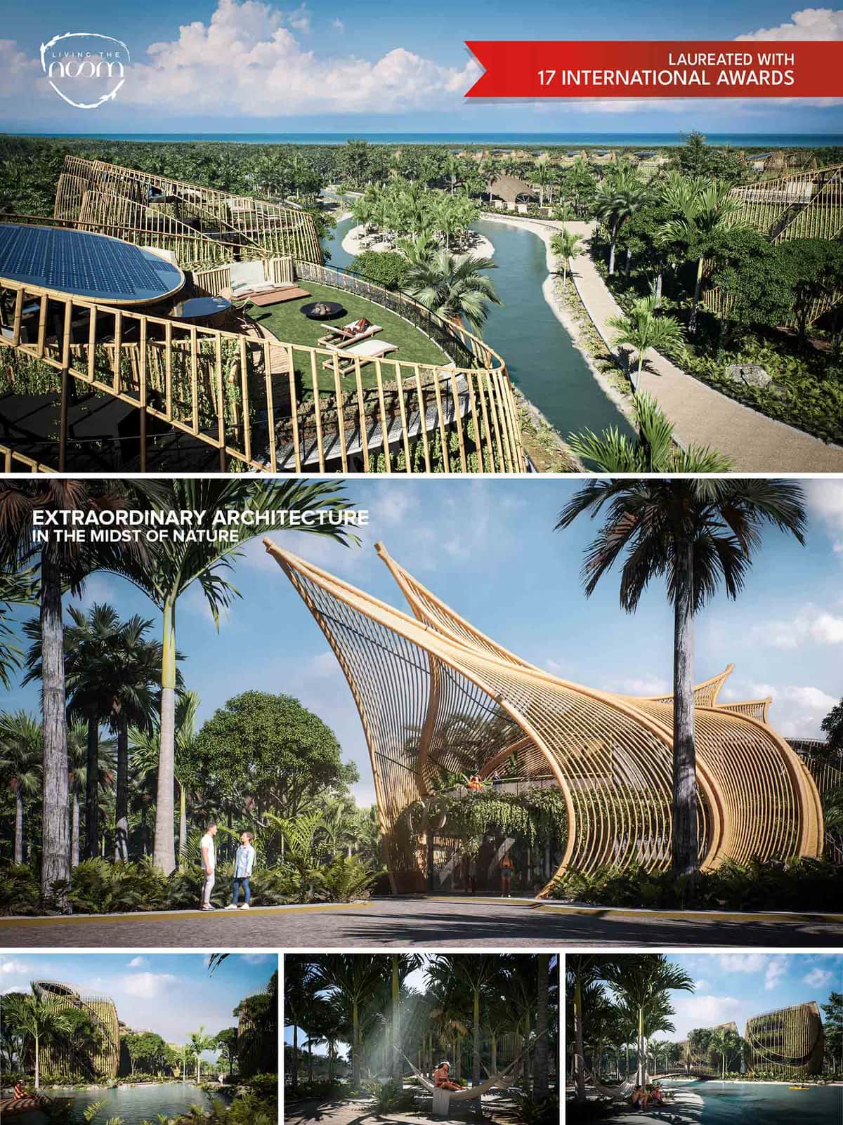

How would you like to live the rest of your life? We have asked ourselves the same question. Each one of us looks alike because we are human beings, but… we are truly different, we have different tastes, different needs… and above all a personality, each of us is “unique” in our own particular way. And this is where we have always asked ourselves: Why are all the homes for sale almost, all the same? Because almost all of them seem to be cut from the same mold? Do we all have the same personality? The same beliefs, or the same way of being? or the same tastes?
The reality is that on many occasions we let situations define us and we choose the least bad option.
IN HARMONY WITH THE SPIRIT
We are clear that living a full life, not only contemplates covering the basic physiological needs, also we must fill and satisfy the soul through stimuli that make us feel alive, we want to create a community that promotes Artistic Expression, invites to exercise, Yoga and Meditation, live with Nature every day at all times, promote a healthy diet, be designed for all family members through Pet Friendly spaces, but truly create a Community of people who share life with the same values.
Contact with nature transmits us tranquility, and provides us with a good dose of calm, and it can be the anti-stress oxygen that lowers the revolutions of the day, creating a bubble of peace that gives us mental health; with outdoor spaces for Exercise, Yoga and Meditation, as well as promoting healthy Eating through an Organic Garden and Hydroponic Cultivation.
PEACE “If you are sad, you are living in the past. Being anxious in some way means that you are living in the future. If you are at peace, you are living in the present ”Lao Tzu
We look for admirers of expressions, who through spaces surrounded by murals, installations, poetry and positive sentences written on the walls, floors and furniture, open us to experiment. We want to breathe art and expressions, and through workshops with local artists inspire us to create, to dream.
“Art is dreaming, it is living, it is feeling. Art sears your soul, moves you, transports you. It has a magical power in people if we open ourselves to experiment. And best of all, it invites us to express ourselves, to bring out the artist that we all carry inside ... Because art can be a great discovery. " Mercè López, The heART Ambassadors
We want to create a Pet Friendly community that provides a better life for all of our loved ones, because for many of us the love of our pets is as great as if they were our children.
Because it is difficult to live with people who do not share the same ideals and values, and society is very heterogeneous in ways of thinking, what is important for one may be trivial for others. We are convinced that in order to truly have a full life in society, community must be formed. The most important thing in real estate products should not be the business, but rather bring people who are like-minded closer to improving their quality of life, with tribal projects.
We care a lot about nature, we hate how people just eliminate and destroy everything in order to accommodate. Our duty should simply be to improve each place where we decide to build, we must simply coexist and have respect for the earth. That is the reason why we have decided to only occupy a maximum of 30% of the land, respecting the existing trees, in addition to providing even more green surface than we found, ultimately managing to increase the total green area by 130%.
The project promotes through passive and bioclimatic design the reduction of the use of resources, economic savings, with the aim of achieving a more sustainable and environmentally friendly housing product.
Passive design strategies are proposed to reduce energy consumption and increase the efficiency of the building, taking advantage of renewable energies for lighting, taking advantage of natural light, in addition to generating energy, through photovoltaic solar panels, located on the roof. Efficient installations are also very important, as well as the high-efficiency LED artificial lighting system.
1.- The interior spaces are illuminated throughout the day by natural lighting.
2.- Solar panels on the roof that generate energy.
3.- Cover with Thermal Insulation, to prevent thermal transmission.
4.- Natural green roof with grass as Thermal Insulation and social recreation area, in addition to cultivation area, for edible plants.
Natural lighting is achieved through the facades, where each unit has a single level taking advantage of 360 degrees of natural light. A bamboo and vegetation lattice is used to mitigate the overheating of the facades and to have a better control of the light and an adequate thermal environment in the interior spaces.
1.- All spaces have indirect natural light.
2.- The design of the house promotes natural ventilation to renew the indoor air and ensure an optimal level of comfort.
A more intelligent use of water is applied, both inside and outside the building, using technologies to reduce consumption, efficient installations, recycling water through the separation of gray water, then taking advantage of it for the irrigation of green areas, as well as its control and measurement.
The selection of responsible and local materials is proposed, in addition to minimizing the amount of waste in construction, as well as materials with recycled components and low environmental impact.
Although we know the human impact generated in nature by the settlement of people to live, we want to minimize it by preserving existing trees, also respecting natural life, trying to cohabit with squirrels, birds, iguanas and coatis that visit the land regularly, promoting a Low Ecological Footprint project
• LADI Awards, Latin American Real Estate Awards, Panamá : Best Disruptive Real State Product in Latin America : Living The Noom (2022)
• IDA Design Awards 2021 : Gold Medal : Living The Noom (2021)
• Global Future Design Awards 2021 : Winner : Living The Noom (2021)
• Golden Trezzini Awards 2021 : Best Project Residential : Living The Noom (2021)
• Tuvie Magazine : 2nd Best of the Best Design of the Year : Living The Noom (2021)
• The Architecture Community World Design Awards 2021 : Winner : Living The Noom (2021)
• Loop Design Awards : Architecture Concept Winner : Living The Noom (2021)
• The Plan Awards, Bologna, Italy : Honorable Mention in Future Housing : Living The Noom (2021)
• Top 20 A’ Architecture, Building And Structure Design Award, Milan, Italy: 2nd Best of the Best Design of the Year : Living The Noom (2020-2021)
• Novum Design Awards, Helsinki, Finland : Gold Award Winner : Living The Noom (2021)
• Architizer A+ Design Awards : 1st Place Jury Winner : Living The Noom (2021)
• Architizer A+ Design Awards : 1st Place Popular Choice Winner : Living The Noom (2021)
• APR Urban Design & Architecture Design Awards : 1st Place Winner : Living The Noom (2021)
• Rethinking The Future, New Delhi, India: Second Award - Housing (Upto 5 Floors) Concept : Living The Noom (2021)
• A’ Design Awards, Milan, Italy: Platinum Medal - Certificate Of Excellence in Architecture, Building and Structure Design Category: Living The Noom (2021)
• Muse Design Awards, New York, USA : Platinum Award - Conceptual Design of the Year : Living The Noom (2021)
• World Architecture Awards 10+5+X Honorary Members: Architecture - Designed Category, 36th Cycle : Living The Noom (2021)
sanzpont [arquitectura]
Pedrajo+Pedrajo Arquitectos
Grupo NX6 + Nader Enterprises
How would you like to live the rest of your life? We have asked ourselves the same question. Each one of us looks alike because we are human beings, but… we are truly different, we have different tastes, different needs… and above all a personality, each of us is “unique” in our own particular way. And this is where we have always asked ourselves: Why are all the homes for sale almost, all the same? Because almost all of them seem to be cut from the same mold? Do we all have the same personality? The same beliefs, or the same way of being? or the same tastes?
The reality is that on many occasions we let situations define us and we choose the least bad option.
IN HARMONY WITH THE SPIRIT
We are clear that living a full life, not only contemplates covering the basic physiological needs, also we must fill and satisfy the soul through stimuli that make us feel alive, we want to create a community that promotes Artistic Expression, invites to exercise, Yoga and Meditation, live with Nature every day at all times, promote a healthy diet, be designed for all family members through Pet Friendly spaces, but truly create a Community of people who share life with the same values.
Contact with nature transmits us tranquility, and provides us with a good dose of calm, and it can be the anti-stress oxygen that lowers the revolutions of the day, creating a bubble of peace that gives us mental health; with outdoor spaces for Exercise, Yoga and Meditation, as well as promoting healthy Eating through an Organic Garden and Hydroponic Cultivation.
PEACE “If you are sad, you are living in the past. Being anxious in some way means that you are living in the future. If you are at peace, you are living in the present ”Lao Tzu
We look for admirers of expressions, who through spaces surrounded by murals, installations, poetry and positive sentences written on the walls, floors and furniture, open us to experiment. We want to breathe art and expressions, and through workshops with local artists inspire us to create, to dream.
“Art is dreaming, it is living, it is feeling. Art sears your soul, moves you, transports you. It has a magical power in people if we open ourselves to experiment. And best of all, it invites us to express ourselves, to bring out the artist that we all carry inside ... Because art can be a great discovery. " Mercè López, The heART Ambassadors
We want to create a Pet Friendly community that provides a better life for all of our loved ones, because for many of us the love of our pets is as great as if they were our children.
Because it is difficult to live with people who do not share the same ideals and values, and society is very heterogeneous in ways of thinking, what is important for one may be trivial for others. We are convinced that in order to truly have a full life in society, community must be formed. The most important thing in real estate products should not be the business, but rather bring people who are like-minded closer to improving their quality of life, with tribal projects.
We care a lot about nature, we hate how people just eliminate and destroy everything in order to accommodate. Our duty should simply be to improve each place where we decide to build, we must simply coexist and have respect for the earth. That is the reason why we have decided to only occupy a maximum of 30% of the land, respecting the existing trees, in addition to providing even more green surface than we found, ultimately managing to increase the total green area by 130%.
The project promotes through passive and bioclimatic design the reduction of the use of resources, economic savings, with the aim of achieving a more sustainable and environmentally friendly housing product.
Passive design strategies are proposed to reduce energy consumption and increase the efficiency of the building, taking advantage of renewable energies for lighting, taking advantage of natural light, in addition to generating energy, through photovoltaic solar panels, located on the roof. Efficient installations are also very important, as well as the high-efficiency LED artificial lighting system.
1.- The interior spaces are illuminated throughout the day by natural lighting.
2.- Solar panels on the roof that generate energy.
3.- Cover with Thermal Insulation, to prevent thermal transmission.
4.- Natural green roof with grass as Thermal Insulation and social recreation area, in addition to cultivation area, for edible plants.
Natural lighting is achieved through the facades, where each unit has a single level taking advantage of 360 degrees of natural light. A bamboo and vegetation lattice is used to mitigate the overheating of the facades and to have a better control of the light and an adequate thermal environment in the interior spaces.
1.- All spaces have indirect natural light.
2.- The design of the house promotes natural ventilation to renew the indoor air and ensure an optimal level of comfort.
A more intelligent use of water is applied, both inside and outside the building, using technologies to reduce consumption, efficient installations, recycling water through the separation of gray water, then taking advantage of it for the irrigation of green areas, as well as its control and measurement.
The selection of responsible and local materials is proposed, in addition to minimizing the amount of waste in construction, as well as materials with recycled components and low environmental impact.
Although we know the human impact generated in nature by the settlement of people to live, we want to minimize it by preserving existing trees, also respecting natural life, trying to cohabit with squirrels, birds, iguanas and coatis that visit the land regularly, promoting a Low Ecological Footprint project
© 2021 by sanzpont [arquitectura] . Webpage by sanzpont [digital] . Innovative Digital Experiences
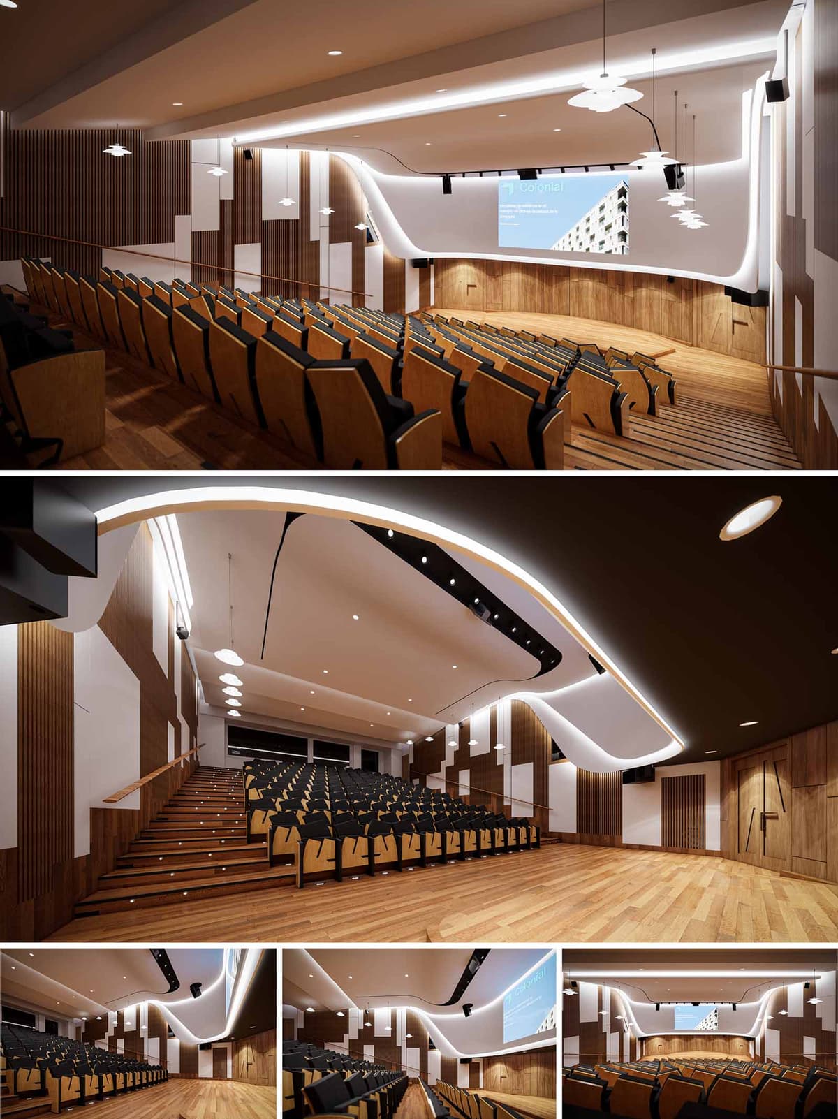

The concept for this auditorium renovation centered on redefining spatial dynamics through a synthesis of acoustics, visual identity, and ergonomic experience. The primary design intent was to modernize the space while reinforcing its function as a high-performance, multi-use presentation hall. We envisioned a space where sculptural fluidity meets technical precision—manifested in the reimagined stage, ceiling geometry, and integrated lighting strategy. The overall aesthetic expresses continuity between architectural form and performance utility, utilizing dynamic lines and warm materials to create an immersive and cohesive environment.
The ceiling was conceived as a continuous sculptural element, characterized by an undulating, wave-like form that enhances both acoustics and visual rhythm. This surface is treated with high-performance acoustic plaster, with integrated LED cove lighting tracing its organic contours. The asymmetrical curvature emphasizes forward motion toward the stage, subtly directing the audience's gaze. Suspended pendant lights are tactically placed along the central axis to create balanced illumination while contributing to the ceiling’s spatial rhythm. These are supplemented by focused downlights and linear wash lights to accommodate variable use-cases—ranging from lectures to multimedia events. The layered lighting system supports dynamic scene-setting and energy efficiency.
The stage front and proscenium wall underwent a complete transformation to enhance both technical performance and visual integration. A large-scale digital screen is recessed into a newly clad front wall, seamlessly bordered by vertical wood paneling and matte white acoustic baffles. The curvature from the ceiling transitions fluidly into the front wall, echoing the auditorium’s flowing language. Timber paneling in warm oak tones wraps the stage and lower walls, offering tactile warmth and supporting sound diffusion. The stage flooring continues the same material language, ensuring material coherence and visual continuity.
The interior palette is grounded in natural finishes—primarily oak wood and acoustic fabric panels. Vertical timber slats line side walls to soften reverberation and add rhythm to the wall composition. Contrasting white acoustic panels are interspersed in irregular patterns to break visual monotony while optimizing sound diffusion. Seating was custom-designed in laminated plywood with black upholstered inserts to balance comfort, durability, and formal simplicity. The staggered layout ensures optimal sightlines and circulation flow, with subtle LED strips embedded in stair risers for safe navigation.
The redesign features a complete upgrade to the audio-visual infrastructure. A new surround audio system is integrated into the ceiling and wall architecture, supported by concealed wiring and acoustic treatments that minimize echo and sound leakage. The projection and audio systems are controlled via a centralized console, hidden within a technical cabinet integrated into the rear wall. Ceiling curvature and material selections were carefully calculated to minimize flutter echoes and optimize spoken word clarity, essential for both live and recorded presentations.
Sustainability was addressed through the use of FSC-certified timber and low-VOC finishes, ensuring reduced environmental impact. LED lighting, motion-sensor systems, and zoned lighting controls were implemented to reduce energy consumption. Materials were sourced locally where possible, and modular design solutions were prioritized to simplify future maintenance or upgrade cycles. The acoustic panels are fabricated from recycled PET felt, offering both ecological and acoustic performance. The seating system, while visually refined, is engineered for disassembly and recyclability at end-of-life.
© 2021 by sanzpont [arquitectura] . Webpage by sanzpont [digital] . Innovative Digital Experiences
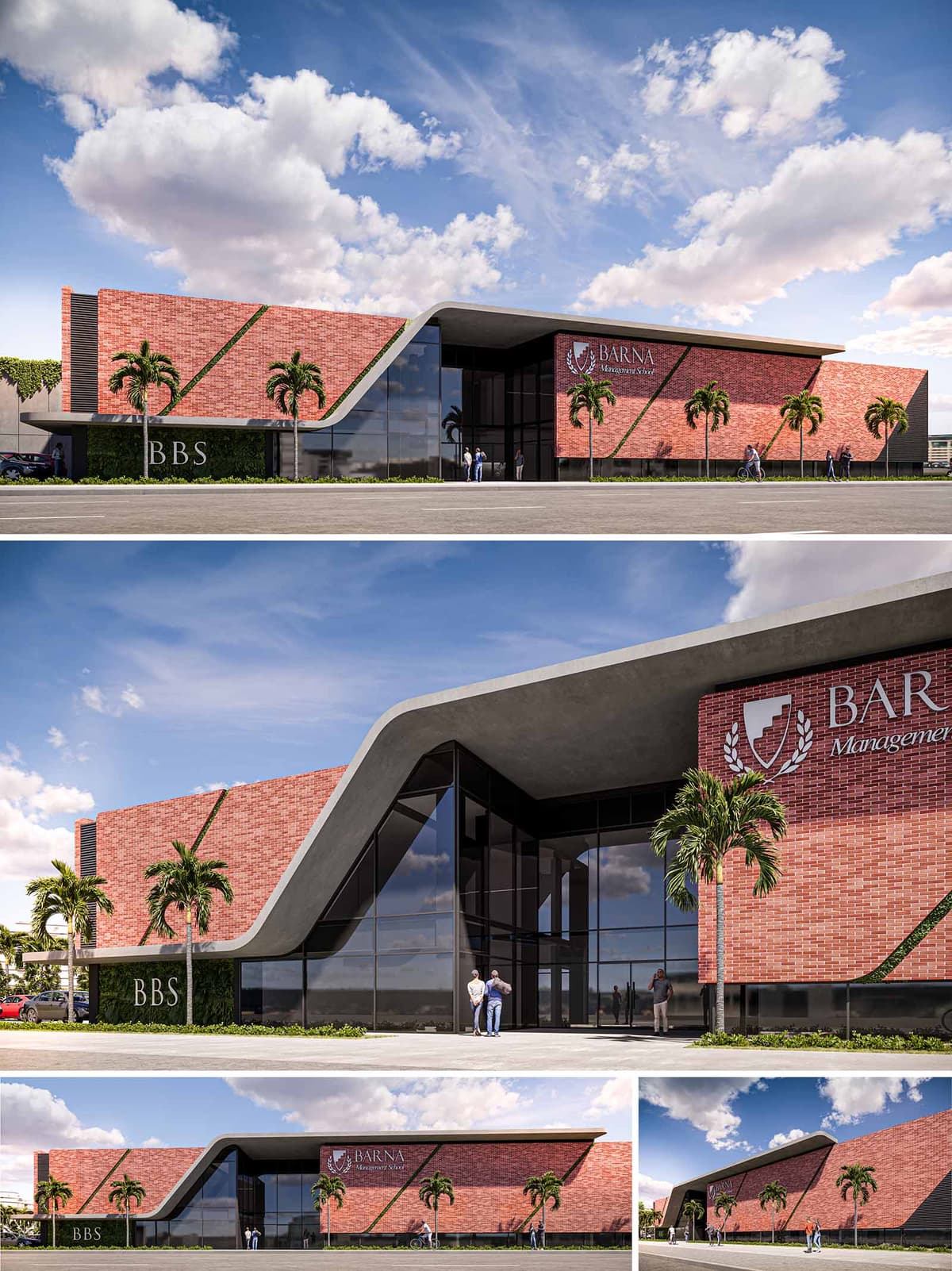

This architectural proposal illustrates a renovation and extension of a business school located in Santo Domingo, Dominican Republic, combining modern design principles with traditional materials to create a landmark educational facility. The design balances the robust, historical qualities of brickwork with contemporary glass and metal elements, symbolizing a bridge between traditional business practices and innovative management strategies.
The building's facade is striking, featuring a sloping roof that smoothly transitions into vertical walls, enveloping the structure in a seamless curve. This dynamic form not only contributes to the building's visual impact but also suggests a forward-thinking approach to education. The use of deep red bricks not only pays homage to the local architectural vernacular but also provides a textural contrast against the sleek, expansive glass panels that invite natural light deep into the interiors. The incorporation of the school's emblem on the exterior wall acts as a proud declaration of its identity and ethos.
The design optimally utilizes the space by clearly differentiating between the newly constructed areas and the renovated sections. The entrance is grand, marked by an expansive, welcoming glass front, ensuring visibility and accessibility. It leads into a multifunctional lobby that serves as both a social space for students and a transitional area leading to more private educational environments.
Teaching spaces and administrative offices are strategically placed to benefit from natural lighting, reducing the reliance on artificial light sources. Outdoor spaces are thoughtfully integrated with the internal environments, featuring landscaped areas where students and faculty can gather, promoting a sense of community and well-being.
Sustainability is a key component of the design, with the choice of materials reflecting both durability and environmental sensitivity. The bricks are locally sourced, reducing transportation emissions and supporting local industries. The large glass panels are double-glazed, minimizing heat gain while maximizing daylight use, which is critical in the tropical climate of Santo Domingo.
Moreover, the roofing material is chosen for its reflective properties, helping to reduce the building’s thermal load. Landscaping around the building utilizes native plants that require minimal irrigation, further contributing to the project's sustainability goals.
Technological integration is evident in the smart use of energy-efficient systems within the building. These include advanced HVAC systems that adapt to occupancy and weather conditions, and LED lighting with sensors that adjust based on the time of day and room usage, enhancing energy conservation.
The architectural design also incorporates rainwater harvesting systems that reduce the demand on the municipal water supply and provide water for landscape irrigation. This not only decreases operational costs but also exemplifies the institution’s commitment to sustainable practices.
This proposal for the business school in Santo Domingo is a testament to how architectural innovation can embody the spirit of an institution while promoting environmental stewardship and advanced learning environments.
© 2021 by sanzpont [arquitectura] . Webpage by sanzpont [digital] . Innovative Digital Experiences
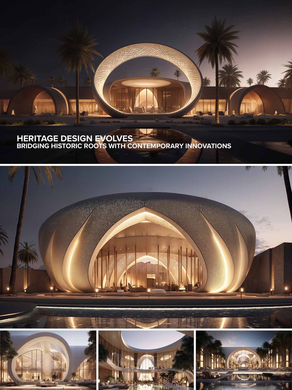

Bayt Al-Qamar Palace is conceived as a contemporary interpretation of the desert majlis, where the architecture becomes a lunar halo resting on the sand. The overarching circular ring and petal-like shells reference the full moon and its phases, a symbol deeply rooted in Arabian poetry and navigation. I worked with pure geometries—circle, arch and ellipse—to translate traditional Islamic motifs into a fluid, sculptural language. Rather than copying historical forms, the project abstracts them, creating an iconic silhouette that feels simultaneously ancestral and futuristic, and clearly legible against the vast Saudi night sky.
The palace sits low and wide, aligning itself with the horizontal character of the desert and the rhythm of palm trees. The central water axis reflects the main ring volume, visually doubling the form and anchoring the complex within its landscape. Perimeter walls and flanking barrel-vaulted wings create a sense of enclosure, echoing the introverted typology of traditional courtyard houses, while carefully framed openings preserve long views to the horizon. Vehicular access is kept discreet, allowing the arrival sequence to emphasize the ceremonial approach on foot along the reflecting pool.
The main hall is housed within the crescent-like shell, whose layered petals overlap to form deep portals. These portals articulate a gradation from public to intimate, guiding guests from open terrace to semi-public lounge and finally to more private reception areas. The circular ring overhead acts as a unifying canopy that organizes the plan around a central axis of water and light. Secondary functions—guest suites, spa, and service zones—occupy linear wings that embrace the central court, creating a protected micro-climate and ensuring that all principal spaces maintain a direct relationship with the pool and gardens.
The external skin employs a finely perforated, metallic-mineral finish inspired by traditional mashrabiya screens. By day, this shell reads as a monolithic, sand-tinted volume; by night, integrated linear LEDs emphasize the petals’ edges and reveal the intricate perforation as a glowing veil. Large, frameless glass panes behind the shell provide visual permeability while keeping the technical envelope clean. Interiors continue the soft, dune-like palette: warm stone flooring, light plaster, and timber accents that absorb and reflect the golden lighting strategy. The result is a gradation from bright exterior glow to warm, cocooned interiors.
From the outset, the design pursued passive environmental performance. The thick shell and ring elements act as thermal mass, buffering internal spaces from desert temperature swings, while their overhangs provide deep shade that minimizes direct solar gain on glass. The central water body assists evaporative cooling, working in tandem with cross-ventilation encouraged by carefully oriented openings. Primary materials are specified as locally sourced stone and high-recycled-content metal cladding to reduce embodied carbon. Roof surfaces are prepared to receive photovoltaic panels, and a grey-water system is integrated to reuse pool backwash and landscape runoff for irrigation of drought-tolerant planting.
Inside Bayt Al-Qamar, the spatial narrative is deliberately serene and ceremonial. Guests enter through a shaded, compressed threshold and emerge into a generous lounge that opens directly to the mirror-like pool, reinforcing the connection between architecture, sky, and water. Furnishings are kept low and minimal, allowing the eye to travel uninterrupted along the curved shells and up to the luminous ring above. Acoustic treatment is concealed within the sculpted ceilings to maintain intimacy even in large gatherings. Ultimately, the palace offers a sequence of spaces that support both grand receptions and quiet contemplation, always framed by the presence of the desert night and the metaphorical light of the moon.
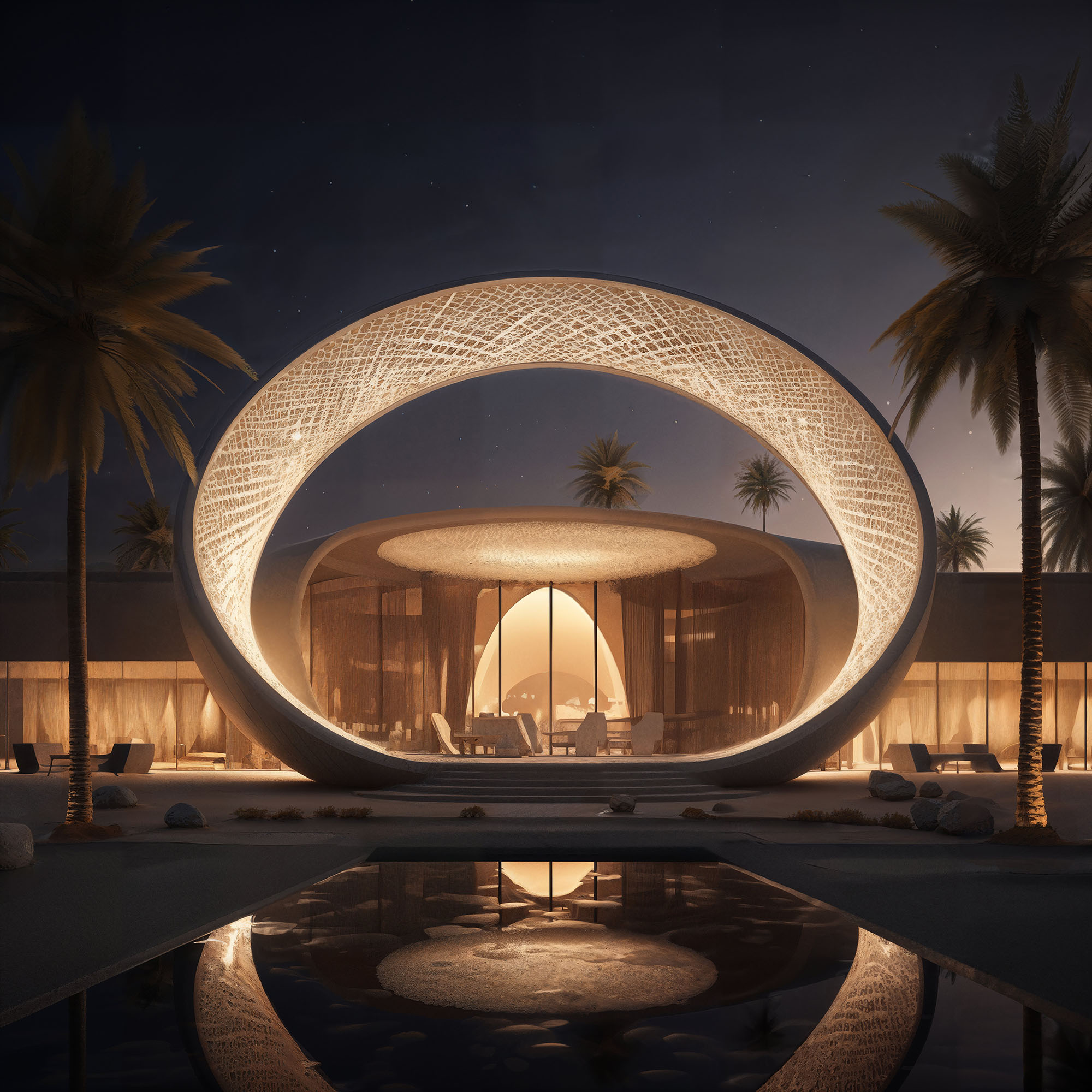
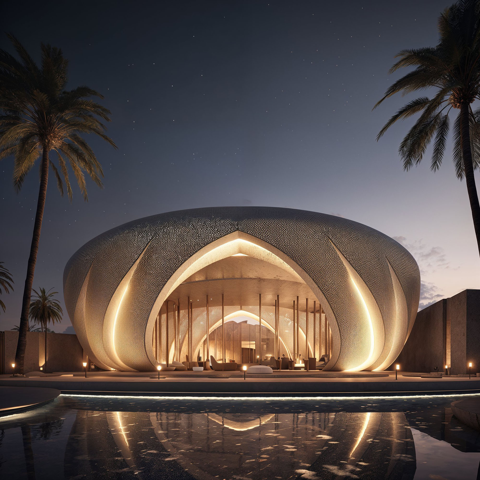
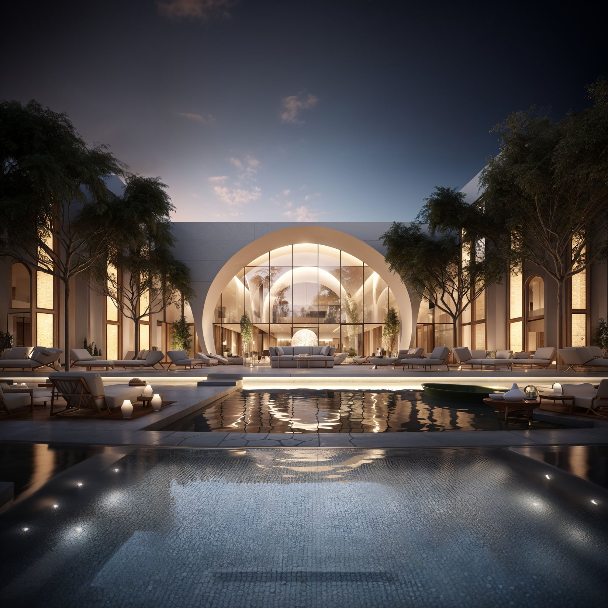
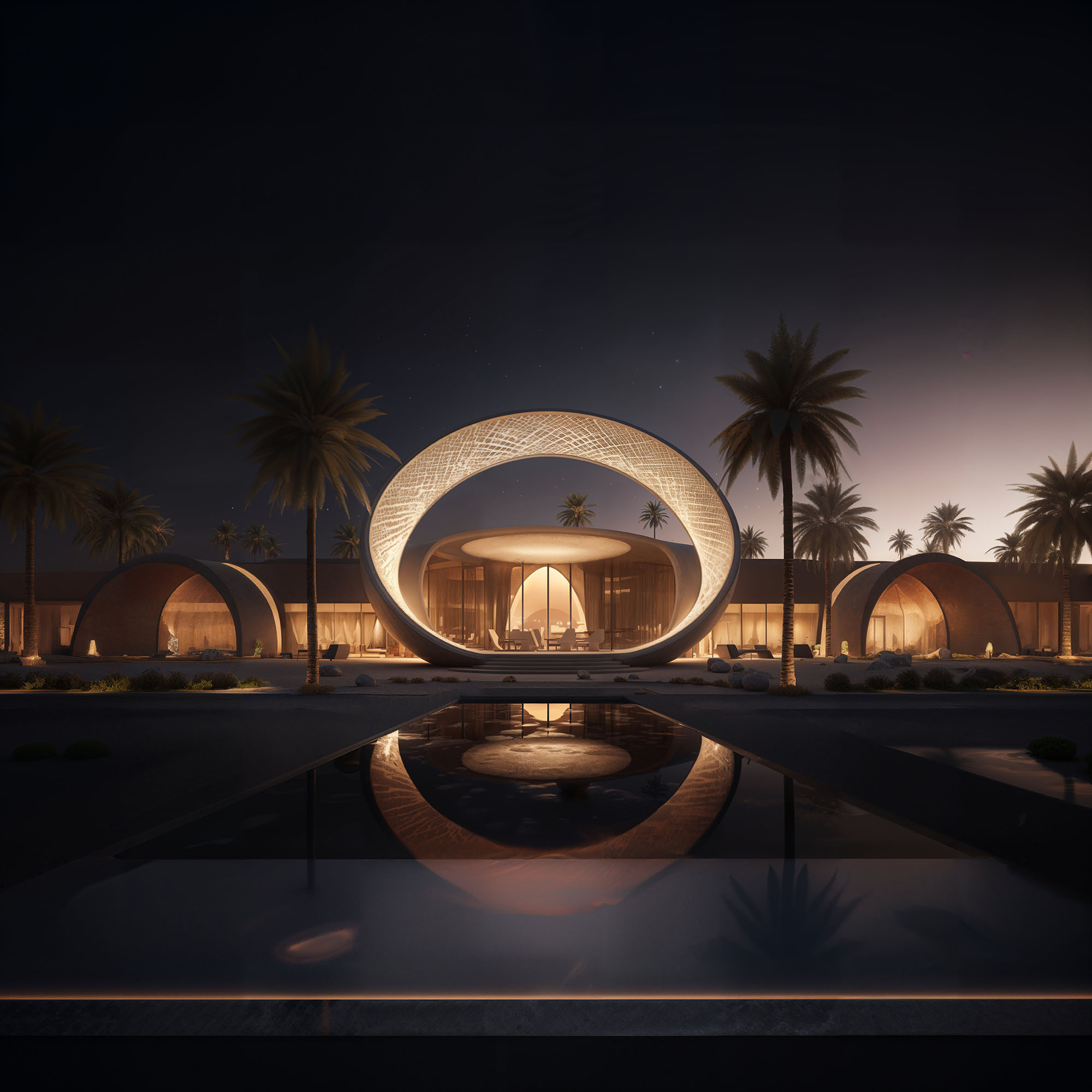
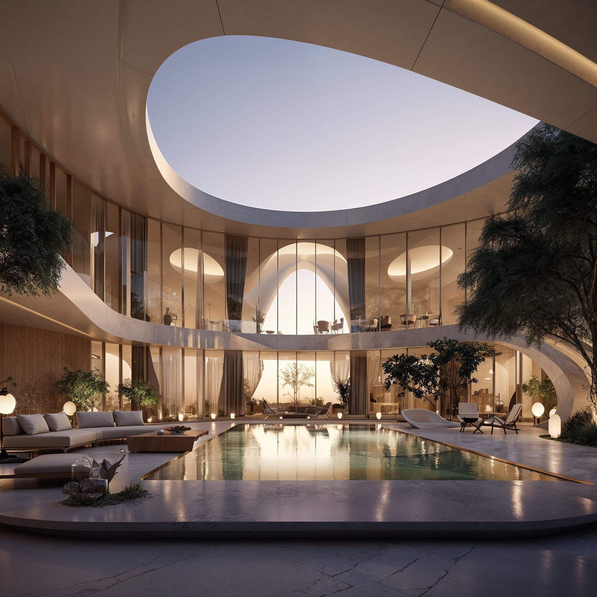
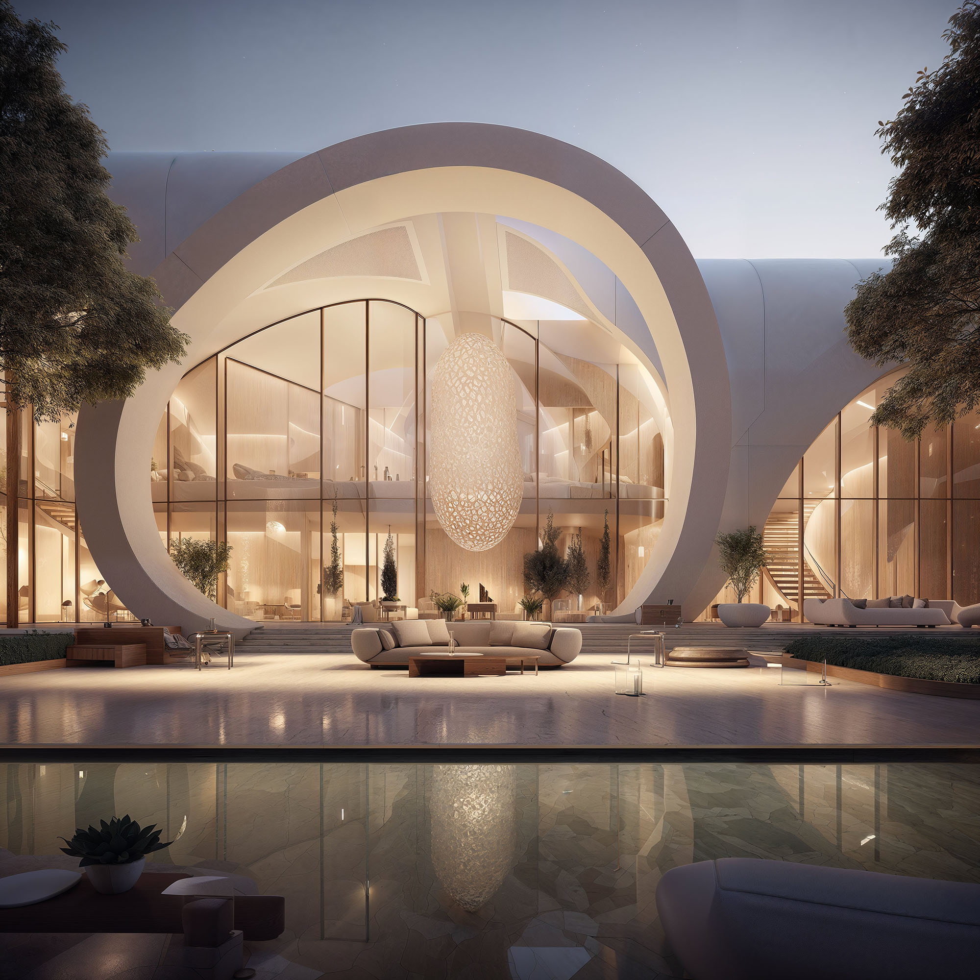
© 2021 by sanzpont [arquitectura] . Webpage by sanzpont [digital] . Innovative Digital Experiences
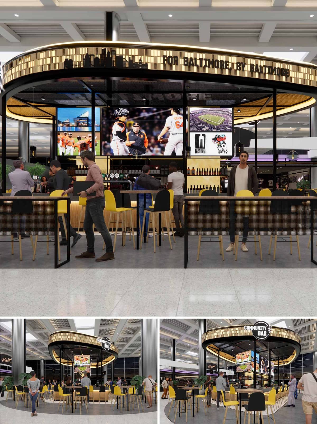

This design presents a contemporary, circular bar pavilion titled “Community Bar,” strategically integrated into a transit-oriented public interior, likely an airport terminal or commercial concourse. The concept is driven by a community-first approach, made explicit by the signage “For Baltimore, By Baltimore.” The design leverages the open, transparent nature of the structure to foster social interaction and a sense of inclusiveness, blending seamlessly into the flow of the surrounding space. The circular footprint encourages access from all directions, reinforcing its community-centric theme while maximizing visibility and approachability.
The plan is an open-ring configuration defined by a continuous bar counter that curves around the central service core. Seating options are well-differentiated: high stools at the bar, communal high tables at the perimeter, and flexible café-style tables in the outer ring. This variety supports different user behaviors—quick solo drinks, social gatherings, or casual meetings. The central core hosts large digital displays with sports content, enhancing the bar’s identity as a sports-friendly social hub. Vertical metal posts and a thin circular frame give the impression of lightness, maintaining visual permeability while providing structural rhythm.
The material expression is a refined balance between industrial minimalism and warm hospitality. Black steel framing outlines the structure with crisp definition, while light oak stools and bar panelling introduce warmth and tactility. The perforated black metal mesh on the seating dividers adds texture while preserving transparency. The ceiling treatment uses a gold mesh or acoustic paneling that adds an elegant shimmer and diffuses light, creating visual interest overhead. The seating’s yellow and black color palette pays homage to local sports teams (such as the Orioles and Ravens), reinforcing local identity while maintaining visual contrast and energy.
LED lighting is subtly integrated into the upper perimeter canopy, illuminating the laser-cut Baltimore skyline motif. This programmable lighting likely shifts in tone to match ambient conditions or event programming. Internally, pendant lighting punctuates the ceiling and further defines the bar area. A robust media wall anchors the central bar with dynamic sports content, making it a visual magnet for passersby. Digital signage is used effectively for both branding and content delivery, enhancing user engagement without overwhelming the architectural clarity.
Sustainability is addressed through a combination of material choices and spatial efficiency. The open-air configuration eliminates the need for active mechanical climate control, relying on the ambient conditioning of the host space. The use of durable, low-maintenance materials like steel and wood reduces lifecycle replacement and maintenance costs. Furthermore, the modular nature of the furnishings allows for future adaptability and ease of repair. Energy-efficient LED lighting and digital displays likely feature smart energy management to minimize consumption during off-peak hours. Lastly, promoting local culture and vendors supports economic sustainability by anchoring the design within the community’s ecosystem.
© 2021 by sanzpont [arquitectura] . Webpage by sanzpont [digital] . Innovative Digital Experiences

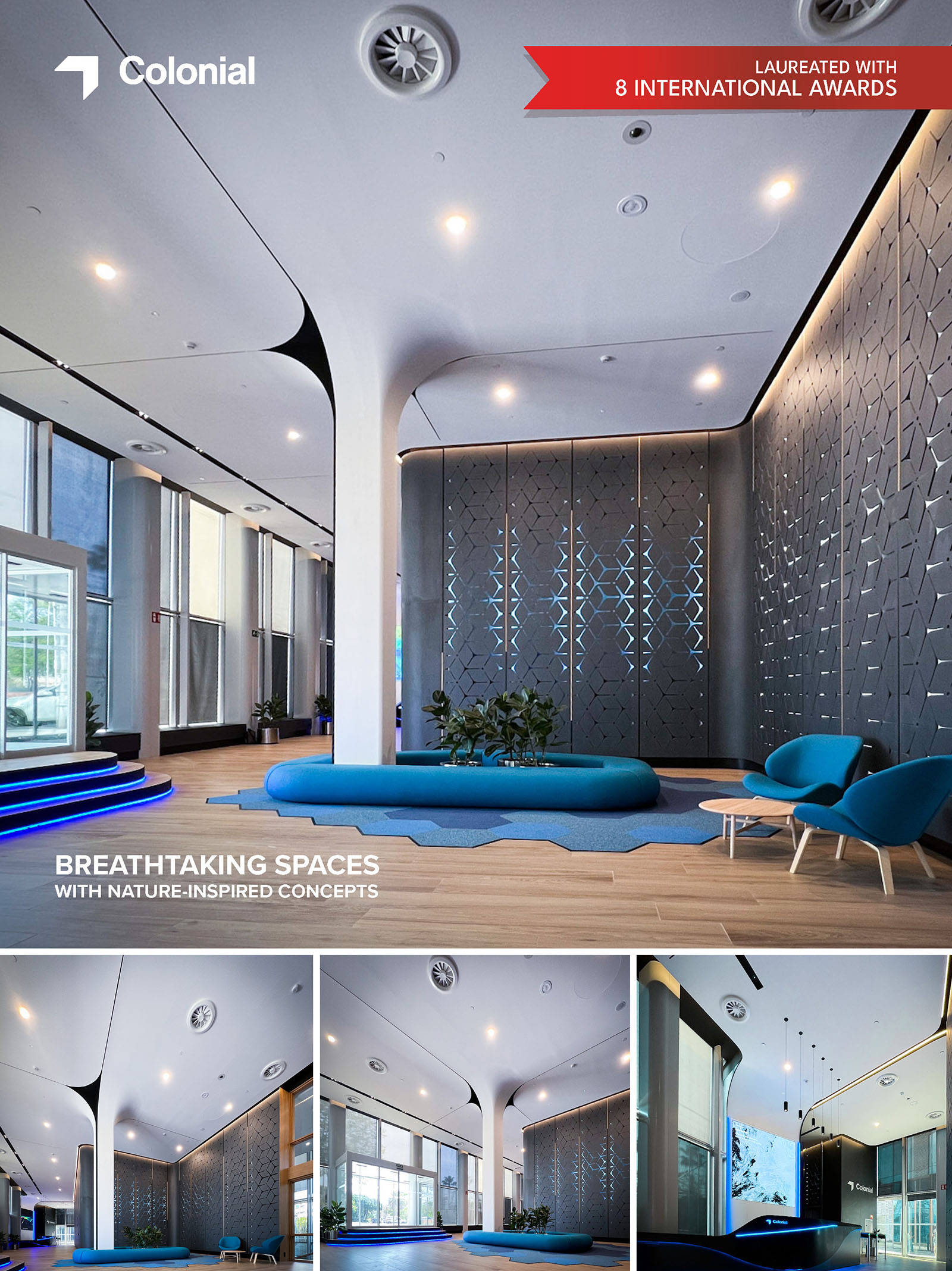
The design of the Marenostrum Tower lobby in Barcelona seeks to create a dialogue between natural forms and modern architecture, encapsulating the essence of the Mediterranean environment. The central pillar, transformed into a sculptural element reminiscent of a tree, serves as the nucleus of the space. This design choice is not only a functional necessity but also a bold artistic statement, where the pillar branches upwards into the ceiling, integrating the structural with the ornamental. The branching forms extend across the ceiling, reminiscent of a tree’s canopy, providing a sheltering presence and a focal point that draws the eye upward and outward, emphasizing the spaciousness of the lobby.
Further enhancing the central motif, the top of the pillar is designed with subtle nuances that evoke the wings of a butterfly. This addition introduces an element of delicate beauty and symbolizes transformation, resonating with the dynamic nature of the space. This design is particularly poignant in a corporate setting, suggesting the potential for growth and evolution within the professional environment.
The ceiling beyond the central tree-inspired pillar continues the narrative of natural inspiration with its design reminiscent of gentle Mediterranean waves. This element of the design moves fluidly across the space, culminating in a figure that abstractly represents a manta ray. This feature not only complements the marine-inspired aesthetic but also adds a layer of complexity to the ceiling's architecture, inviting those entering the building to pause and reflect on the interplay of form and function.
The overarching concept is anchored in creating an environment that transcends the traditional utilitarian function of a lobby by imbuing it with a sense of calm and inspiration drawn from nature. Through the use of sweeping lines, organic forms, and a nuanced palette of materials and lights, the lobby of the Marenostrum Tower becomes more than just an entrance; it transforms into an experiential journey that starts at the threshold of the building and continues within, influenced by the serene and invigorating spirit of the Mediterranean landscape.
The ceiling design draws from the undulating waves of the Mediterranean Sea, with soft, flowing forms that suggest calm and continuity. This design gradually transitions into a figure representing a manta ray, extending the nature-inspired theme into the marine realm. The integration of ambient lighting enhances these features, casting soft shadows that mimic the natural light filtering through water, further emphasizing the aquatic motif.
The walls are adorned with patterns inspired by coral reefs, crafted with precision to incorporate ambient lighting. These engravings are not merely decorative but are designed to emit a soft, indirect blue light, reminiscent of light penetrating deep underwater scenes. This lighting technique not only illuminates the space but also brings the walls to life, creating a dynamic interaction between light and structure that evokes the feeling of a living, breathing entity.
The reception area is designed with an aesthetic inspired by the elegance and fluidity of a swan. The desk features smooth, flowing lines that wrap around the space, guiding movement and interaction within the lobby. This design choice reinforces the theme of fluidity and movement, resonating with the gentle yet powerful grace of the swan.
In line with contemporary architectural practices, the project prioritizes environmental sustainability. The choice of materials reflects a commitment to eco-friendly solutions, ensuring that every element of the design contributes to a sustainable outcome. The project's execution utilized Building Information Modeling (BIM) technology, enabling precise coordination across various disciplines. This integration ensured that the virtual models for finishes, furniture, and installations were meticulously aligned with the physical construction, optimizing both aesthetic and functional outcomes.
This lobby is not just a passageway but a destination in itself, offering a tranquil retreat that invites reflection and appreciation of its intricate design inspired by the natural world. Through careful planning and innovative design, the Marenostrum Tower lobby becomes a testament to the possibilities of modern architecture to create spaces that are both functional and profoundly inspiring.
• APR International Interior Design Awards : Gold Award Winner : TMN Lobby (2022)
• Golden Trezzini Awards : Honorable Mention in Best Implemented Interior Design Project for Public Space Category : TMN Lobby (2022)
• Archframe Design Awards : Gold Winner : TMN Lobby (2022)
• The Architecture Community World Design Awards 2022 : Winner : TMN Lobby (2022)
• APR Global Future Design Awards: Gold Award Winner : TMN Lobby (2022)
• Loop Design Awards : Honorable Mention - Interior Offices : TMN Lobby (2022)
• World Architecture Awards 10+5+X Honorary Members : Interior Design Category, 41th Cycle : TMN Lobby (2022)
• Novum Design Awards, Helsinki, Finland : Gold Award Winner : TMN Lobby (2022)
The design of the Marenostrum Tower lobby in Barcelona seeks to create a dialogue between natural forms and modern architecture, encapsulating the essence of the Mediterranean environment. The central pillar, transformed into a sculptural element reminiscent of a tree, serves as the nucleus of the space. This design choice is not only a functional necessity but also a bold artistic statement, where the pillar branches upwards into the ceiling, integrating the structural with the ornamental. The branching forms extend across the ceiling, reminiscent of a tree’s canopy, providing a sheltering presence and a focal point that draws the eye upward and outward, emphasizing the spaciousness of the lobby.
Further enhancing the central motif, the top of the pillar is designed with subtle nuances that evoke the wings of a butterfly. This addition introduces an element of delicate beauty and symbolizes transformation, resonating with the dynamic nature of the space. This design is particularly poignant in a corporate setting, suggesting the potential for growth and evolution within the professional environment.
The ceiling beyond the central tree-inspired pillar continues the narrative of natural inspiration with its design reminiscent of gentle Mediterranean waves. This element of the design moves fluidly across the space, culminating in a figure that abstractly represents a manta ray. This feature not only complements the marine-inspired aesthetic but also adds a layer of complexity to the ceiling's architecture, inviting those entering the building to pause and reflect on the interplay of form and function.
The overarching concept is anchored in creating an environment that transcends the traditional utilitarian function of a lobby by imbuing it with a sense of calm and inspiration drawn from nature. Through the use of sweeping lines, organic forms, and a nuanced palette of materials and lights, the lobby of the Marenostrum Tower becomes more than just an entrance; it transforms into an experiential journey that starts at the threshold of the building and continues within, influenced by the serene and invigorating spirit of the Mediterranean landscape.
The ceiling design draws from the undulating waves of the Mediterranean Sea, with soft, flowing forms that suggest calm and continuity. This design gradually transitions into a figure representing a manta ray, extending the nature-inspired theme into the marine realm. The integration of ambient lighting enhances these features, casting soft shadows that mimic the natural light filtering through water, further emphasizing the aquatic motif.
The walls are adorned with patterns inspired by coral reefs, crafted with precision to incorporate ambient lighting. These engravings are not merely decorative but are designed to emit a soft, indirect blue light, reminiscent of light penetrating deep underwater scenes. This lighting technique not only illuminates the space but also brings the walls to life, creating a dynamic interaction between light and structure that evokes the feeling of a living, breathing entity.
The reception area is designed with an aesthetic inspired by the elegance and fluidity of a swan. The desk features smooth, flowing lines that wrap around the space, guiding movement and interaction within the lobby. This design choice reinforces the theme of fluidity and movement, resonating with the gentle yet powerful grace of the swan.
In line with contemporary architectural practices, the project prioritizes environmental sustainability. The choice of materials reflects a commitment to eco-friendly solutions, ensuring that every element of the design contributes to a sustainable outcome. The project's execution utilized Building Information Modeling (BIM) technology, enabling precise coordination across various disciplines. This integration ensured that the virtual models for finishes, furniture, and installations were meticulously aligned with the physical construction, optimizing both aesthetic and functional outcomes.
This lobby is not just a passageway but a destination in itself, offering a tranquil retreat that invites reflection and appreciation of its intricate design inspired by the natural world. Through careful planning and innovative design, the Marenostrum Tower lobby becomes a testament to the possibilities of modern architecture to create spaces that are both functional and profoundly inspiring.
© 2021 by sanzpont [arquitectura] . Webpage by sanzpont [digital] . Innovative Digital Experiences
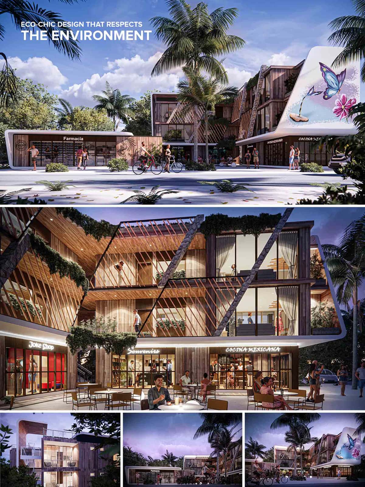

Tulum Plaza Norte is conceived as an eco-chic commercial and mixed-use plaza that harmonizes retail, dining, and community activity within a sustainable architectural language. The project embraces Tulum’s ethos—blending nature, art, and organic design—while promoting walkability and community interaction. The design promotes permeability both visually and spatially, allowing for constant interaction between interior and exterior spaces, and establishing a dialogue with its tropical context. The project combines ground-floor commercial units with upper-level boutique residences or workspaces, forming a dynamic programmatic layering. This strategy ensures continuous day and night activation, fostering economic and social vibrancy.
The architectural expression is characterized by a bold geometric articulation of slanted wooden fins, natural stone walls, and white sculptural curves. These diagonal timber brise-soleils serve both as sun protection and as a defining visual motif, lending the façade a rhythmic sense of movement and shadow play. This formal gesture also adds depth and texture to the envelope, making the building feel alive and responsive. A key feature is the integration of a large-scale butterfly mural on the curved facade—an emblematic element evoking nature and artistic identity, a nod to local culture and eco-tourism. At night, the architecture is softly illuminated with warm, indirect lighting that enhances textures and materiality while inviting a vibrant social atmosphere.
Materials were selected with durability, climate‑responsiveness and local character in mind. The primary cladding is naturally‑toned hardwood, chosen for its resilience in humid, coastal conditions and its visual warmth. Complementing this is rough stone – used for vertical accents and base elements – which grounds the building physically and visually to the site. Smooth white rendered curves provide contrast and modern clarity. The palette remains restrained: soft whites, warm browns, mid‑greys of the stone, and transparent glazing. Together they allow the surrounding greenery and sky to take on visual prominence.
Landscape design is woven into the architecture. Lush vegetation climbs trellises and cascades over balconies, blurring the boundary between nature and built form. The use of native plant species reduces irrigation needs and promotes biodiversity. The open-air central corridor and the shaded arcades provide a breezy pedestrian experience, facilitating cross-ventilation. Outdoor seating areas activate the ground level, encouraging community engagement and enhancing the commercial appeal. Palm trees and low tropical shrubbery complement the hardscape and provide additional cooling through shade.
Sustainability is woven into the design from passive to active strategies. The timber fin system reduces solar heat gain and improves daylighting performance, while the open‑ended layout promotes cross‑ventilation throughout the building. Locally‑sourced materials reduce embodied carbon and reinforce regional identity. Green roofs or planted terraces contribute to thermal insulation and storm‑water management, while LED lighting and efficient mechanical systems minimise operational energy. The provision for bicycle use and pedestrian priority further reinforces a low‑impact approach. In totality, the project seeks not simply to be energy‑efficient, but to achieve harmony with the wider ecosystem of the site.
DIRSA
© 2021 by sanzpont [arquitectura] . Webpage by sanzpont [digital] . Innovative Digital Experiences
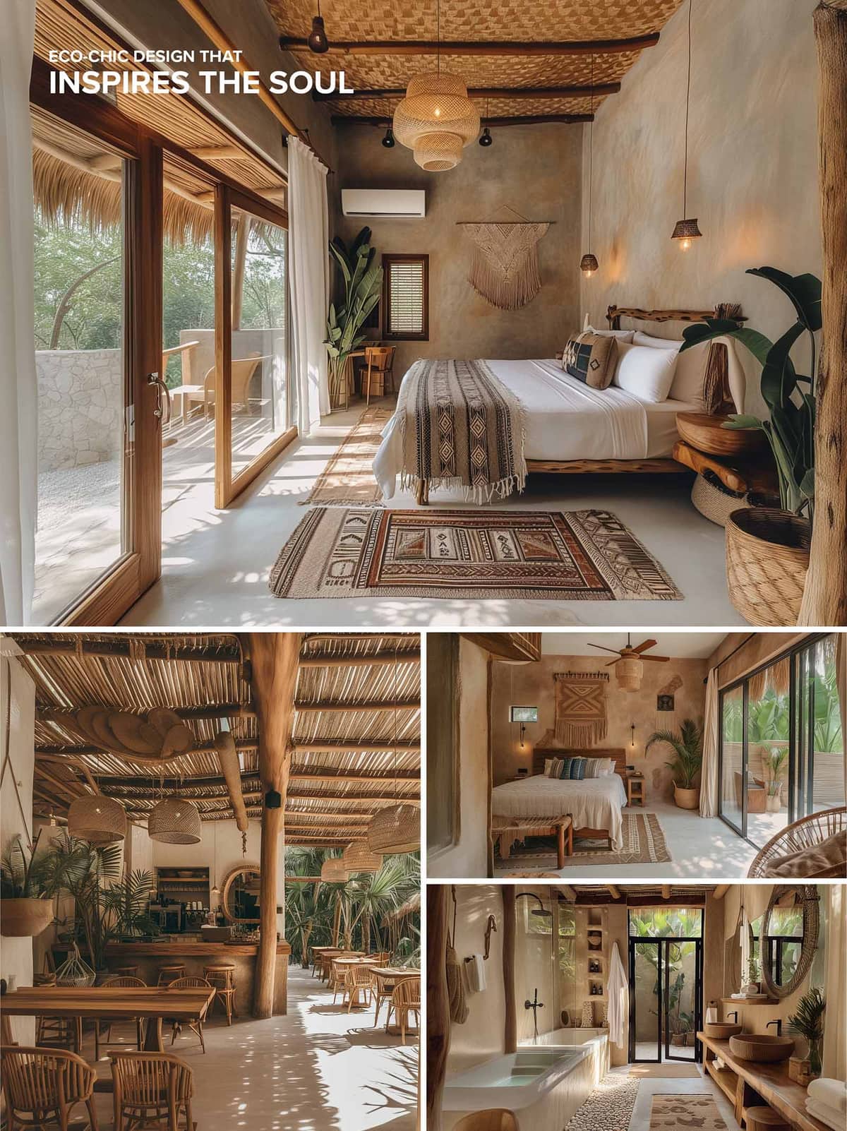

The Tulum Plaza Norte Suites embrace a refined eco-chic aesthetic, harmoniously merging vernacular Mexican architecture with contemporary comfort. The project is designed to evoke tranquility and rootedness through biophilic principles and material honesty. The overall concept draws from regional artisanal traditions, with a focus on tactile textures, neutral earth tones, and open-air spatial fluidity. This synthesis of cultural references and sustainable ethos is tailored for immersive hospitality in Tulum’s lush tropical context.
A restrained material palette is central to the authenticity of the design. Surfaces feature polished microcement floors, earthen plaster walls, and ceilings clad in woven palm or bamboo—traditional techniques revisited with a refined touch. The extensive use of local hardwoods, both structural and decorative, reinforces a grounded identity, particularly evident in the custom-made bed frames, side tables, and exposed support columns in the dining area. Furniture is sculptural and tactile, celebrating the irregularity and grain of solid timber. Handwoven textiles, basketry, and clay-based wall art add another layer of cultural specificity and tactility. These materials are left untreated or lightly finished to allow natural aging and patina, contributing to the project’s wabi-sabi undertone.
The interior layout favors openness, with sliding glass walls that dissolve the threshold between inside and out. This permeability maximizes ventilation and natural light, further integrating the suites into their landscape. Indoor spaces flow seamlessly into shaded patios or terraces furnished with minimal but comfortable seating. Each suite adheres to a restrained spatial logic—centrally located beds flanked by ambient lighting and accent pieces, with secondary areas like desks and lounges strategically positioned near window openings. The bathrooms continue the natural narrative: carved stone basins, timber vanities, and open rain showers evoke spa-like calm, while built-in shelving ensures functionality without visual clutter.
The project employs a warm lighting scheme with an emphasis on pendant lights crafted from organic fibers, wall sconces with subdued glow, and carefully concealed LED strips. These lighting elements are not only functional but reinforce the handcrafted ambiance. In the public areas, dappled light filtering through slatted ceilings and dense vegetation adds rhythm and a meditative quality to the environment.
Environmental responsibility is fundamental to the project. Passive design strategies—cross-ventilation, deep overhangs, thermal mass from earthen walls, and natural shading from native vegetation—minimize the need for mechanical cooling. The choice of locally sourced materials with low embodied energy and minimal processing further underscores the ecological sensitivity. Rainwater harvesting and greywater reuse systems (if implemented, assumed from the design philosophy) would support long-term water conservation. The architectural vocabulary promotes durability through simplicity, reducing future maintenance and intervention. This project exemplifies a sensitive integration of ecological awareness, cultural resonance, and spatial well-being, serving as a compelling model for sustainable hospitality design in tropical climates.
DIRSA
© 2021 by sanzpont [arquitectura] . Webpage by sanzpont [digital] . Innovative Digital Experiences
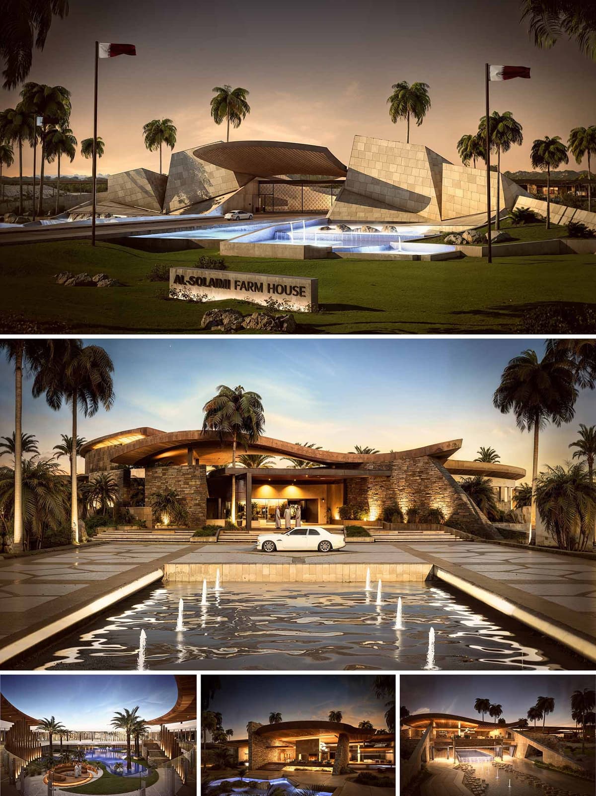

Al-Solaimi Farm House is conceived as a contemporary desert retreat that expresses both solidity and fluidity. The project translates the idea of “oasis” into architecture: protective stone masses sheltering generous, shaded voids animated by water and vegetation. The formal language moves between angular, tectonic planes at the entrance and soft, sweeping roofs around the main residence, reflecting the contrast between the harsh exterior landscape and the calm domestic interior. The farmhouse becomes a sculpted landmark within the agricultural setting, yet remains grounded in its rural function as a family gathering place.
Located within a palm-fringed farm in Qatar, the house is oriented to capture prevailing breezes and to frame long views across the cultivated land. The approach sequence is axial and ceremonial, crossing water and greenery before reaching the main porte-cochère. Slightly elevating the built mass above the surrounding fields protects it from irrigation flows while giving a clear visual hierarchy between landscape and architecture. The palm trees act as vertical markers and as climatic devices, shading outdoor circulation and reinforcing the oasis imagery.
At the front, faceted stone and concrete walls create a dynamic, almost geological entrance composition, suggesting protective layers opening toward the interior. Moving deeper into the house, the geometry relaxes into broad, curving roofs that hover above stacked-stone walls. Warm-toned stone cladding, timber soffits and earth-colored renders are chosen to resonate with local materials while offering durability in the desert climate. The thick envelope, recessed glazing and pronounced overhangs work together to reduce solar gain, while the sculptural form gives the farmhouse a strong, recognizable identity.
Water is a central design element, choreographing arrival and daily experience. Linear reflecting pools and shallow basins line the driveway, culminating in a larger water body in front of the entrance. Inside the compound, a central courtyard pool with integrated seating becomes the social heart, surrounded by soft landscaping and palms. These water elements cool the microclimate through evaporation, provide acoustic comfort, and visually link the various wings of the farmhouse. Hardscape patterns and stepped platforms manage level transitions while subtly guiding circulation.
The interiors are organized around open, interconnected social spaces that flow toward the courtyard and pool. Large glazed openings slide away to dissolve the boundary between inside and outside, turning terraces into extensions of the living areas. The main entrance lobby compresses the ceiling, then releases into double-height volumes under the sweeping roof, emphasizing the sense of arrival. Service spaces and private suites are discreetly embedded within the thicker stone masses, ensuring privacy and acoustic separation while maintaining direct visual connections to the landscape.
Artificial lighting is carefully integrated into the architecture, emphasizing the material texture and form. Warm, concealed linear lights wash stone walls and timber soffits, while recessed downlights define circulation paths. Exterior uplights highlight the vertical rhythm of palms and the sculptural roofs, giving the farmhouse a strong nocturnal presence without excessive glare. Water features are lit from within, creating reflections that animate adjacent ceilings and terraces, reinforcing the atmosphere of an inhabited oasis.
Sustainability is addressed through passive design and careful material selection rather than overt technological expression. Deep overhangs, shaded verandas and colonnades minimize direct solar exposure on glazing. The stone envelope provides thermal mass, moderating temperature fluctuations, while cross-ventilation paths are aligned with prevailing winds for natural cooling during milder months. Water bodies are strategically located to assist evaporative cooling in key outdoor living zones. Durable, low-maintenance finishes reduce lifecycle impacts, and the integration of landscaping with existing farm structures supports biodiversity and preserves the productive character of the land.
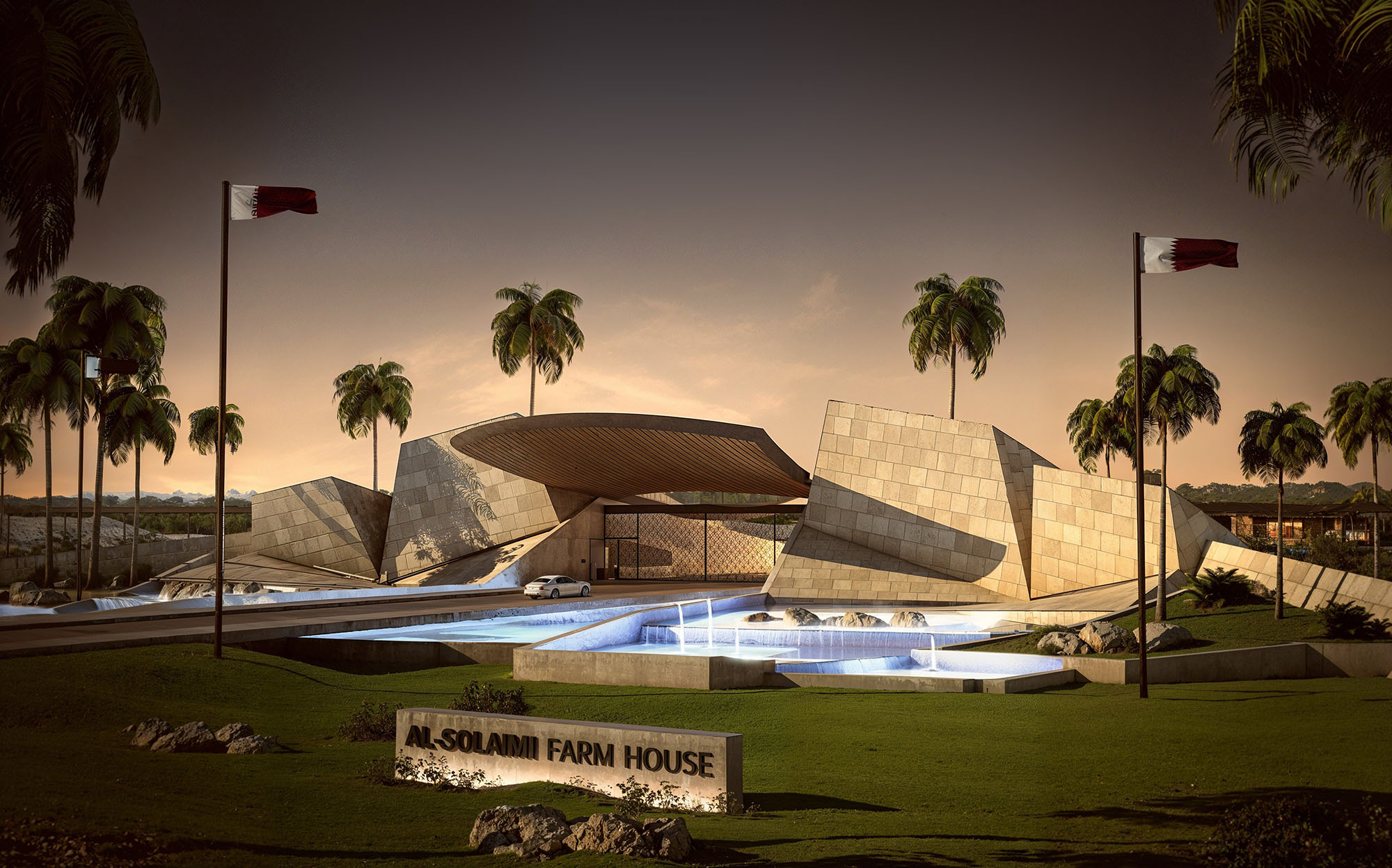
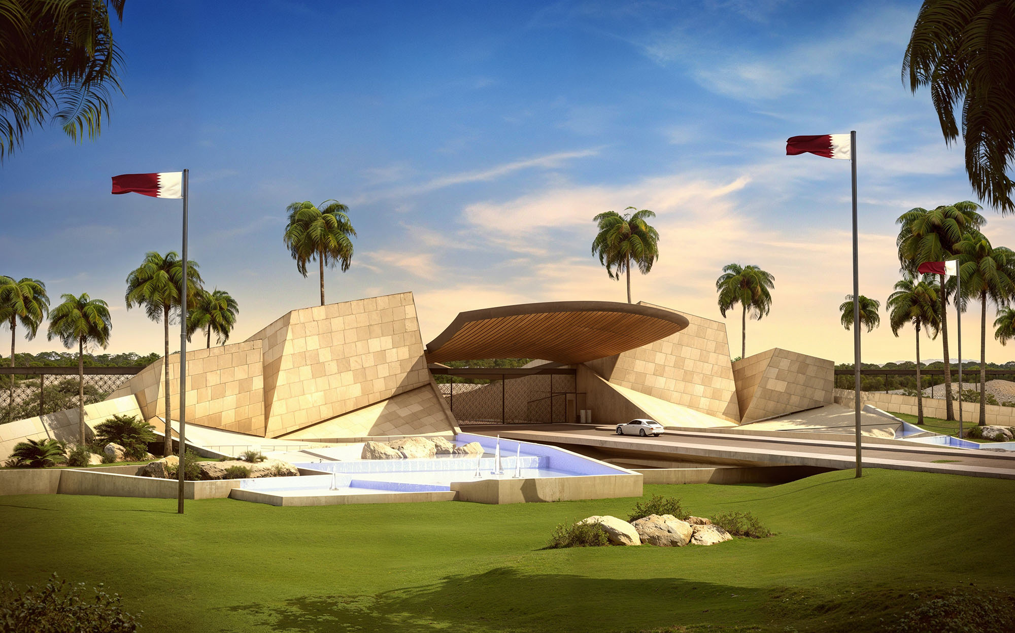
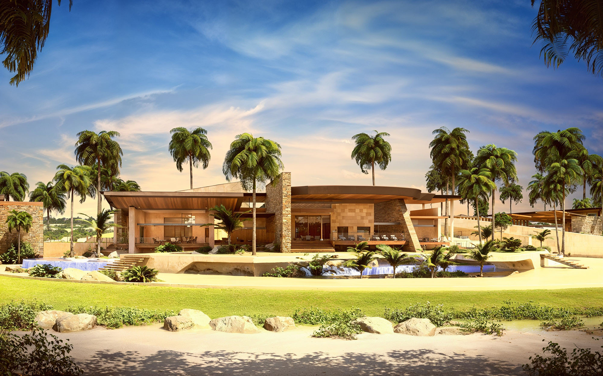
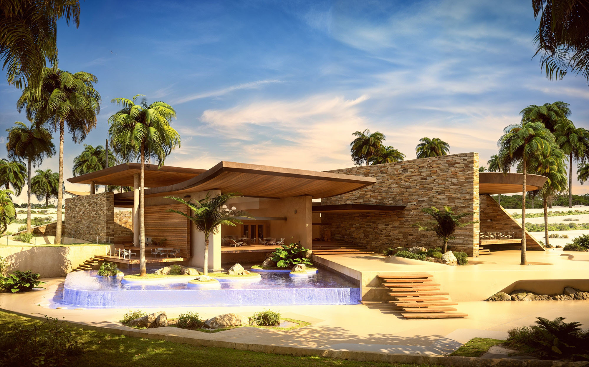
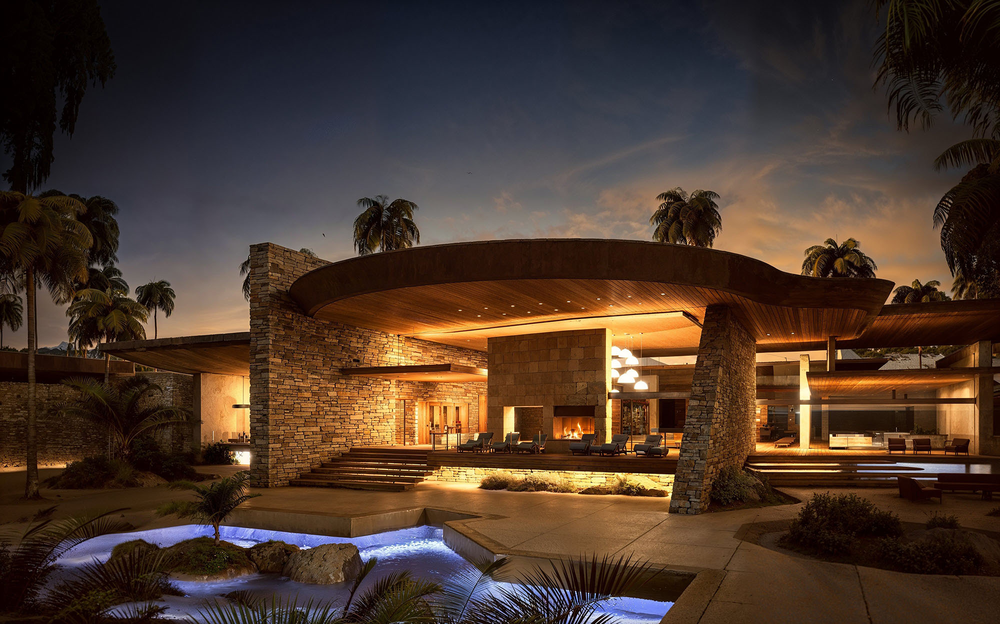
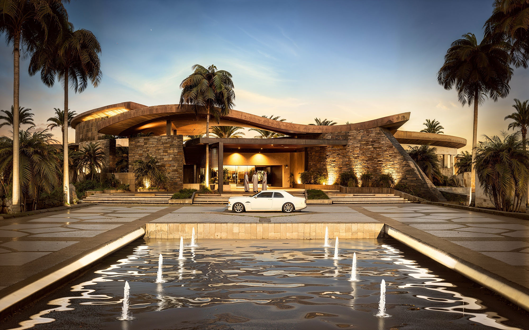
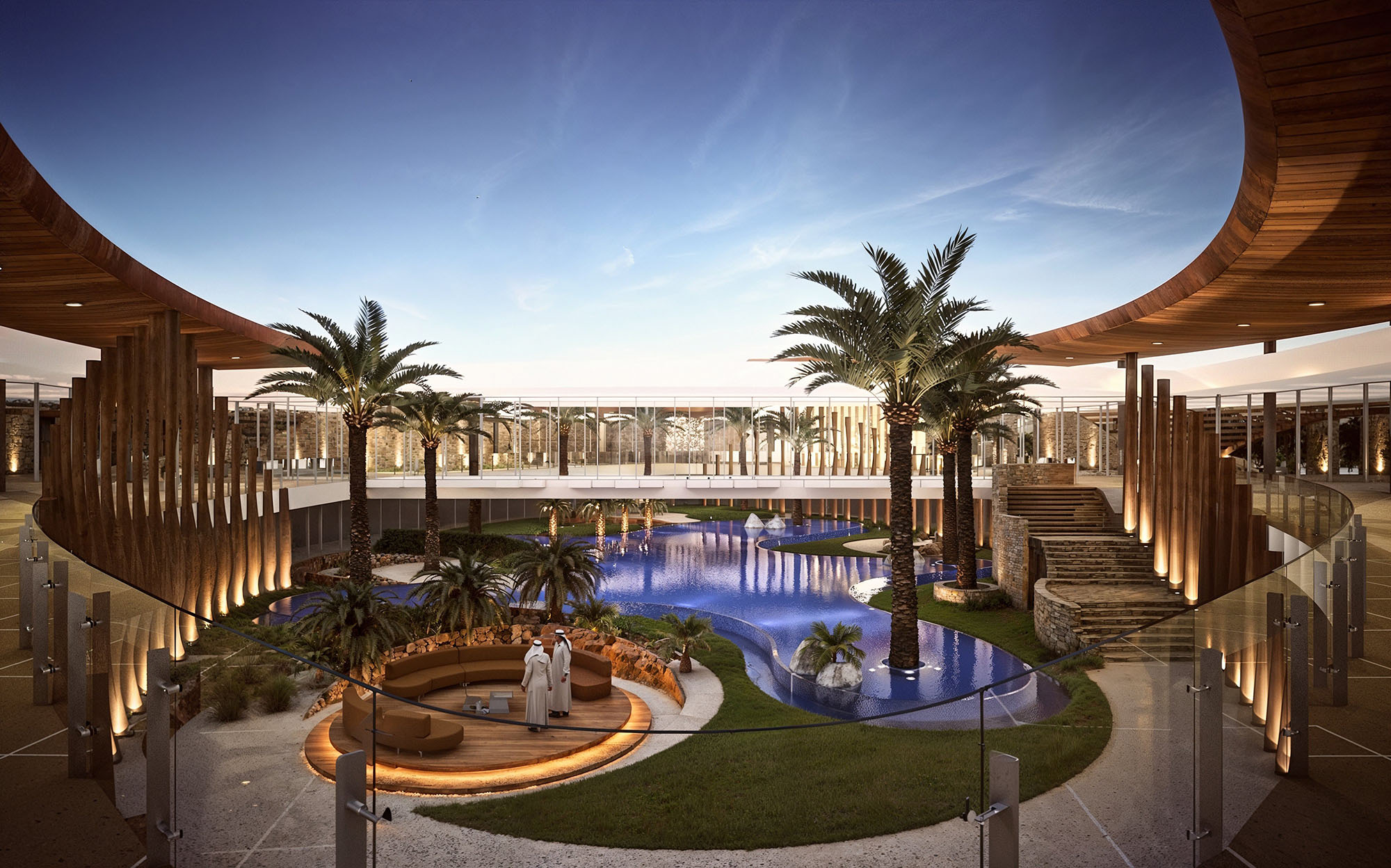
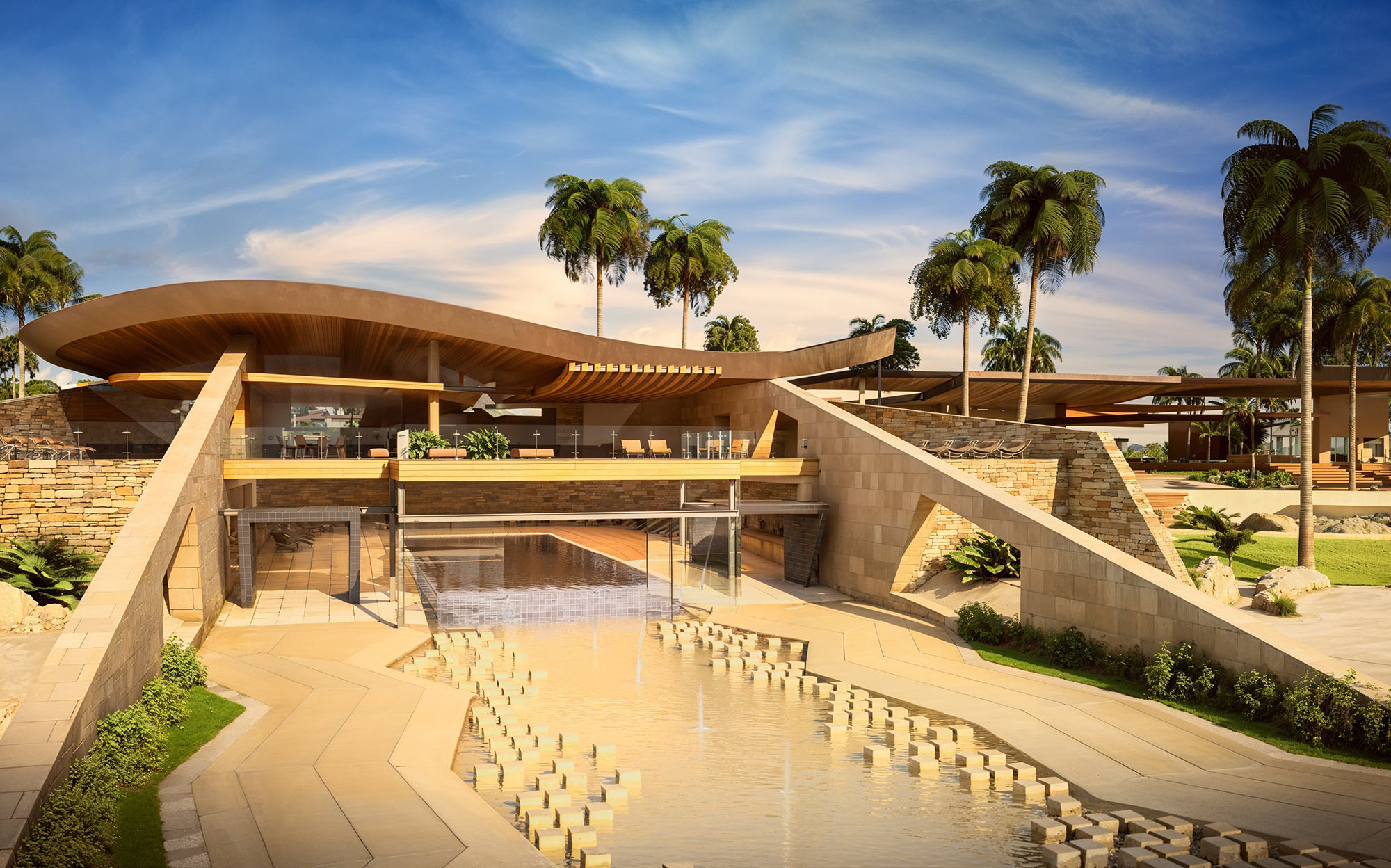
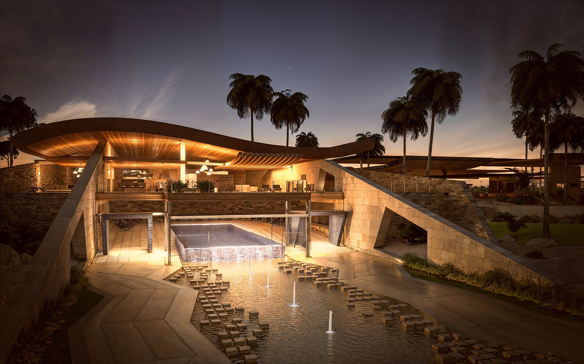
© 2021 by sanzpont [arquitectura] . Webpage by sanzpont [digital] . Innovative Digital Experiences


Nuestras oficinas están en Barcelona, Cancún, Chicago y Santo Domingo, pero gracias a la tecnología podemos desarrollar proyectos en cualquier parte del mundo.
Barcelona
Bac de Roda 136
08020, Barcelona
Spain
Madrid
Av. de Buendía 11
19005 Guadalajara (Madrid)
Spain
Chicago
373 Hazel Ave, Apt A1
60022, Glencoe, Illinois
United States