

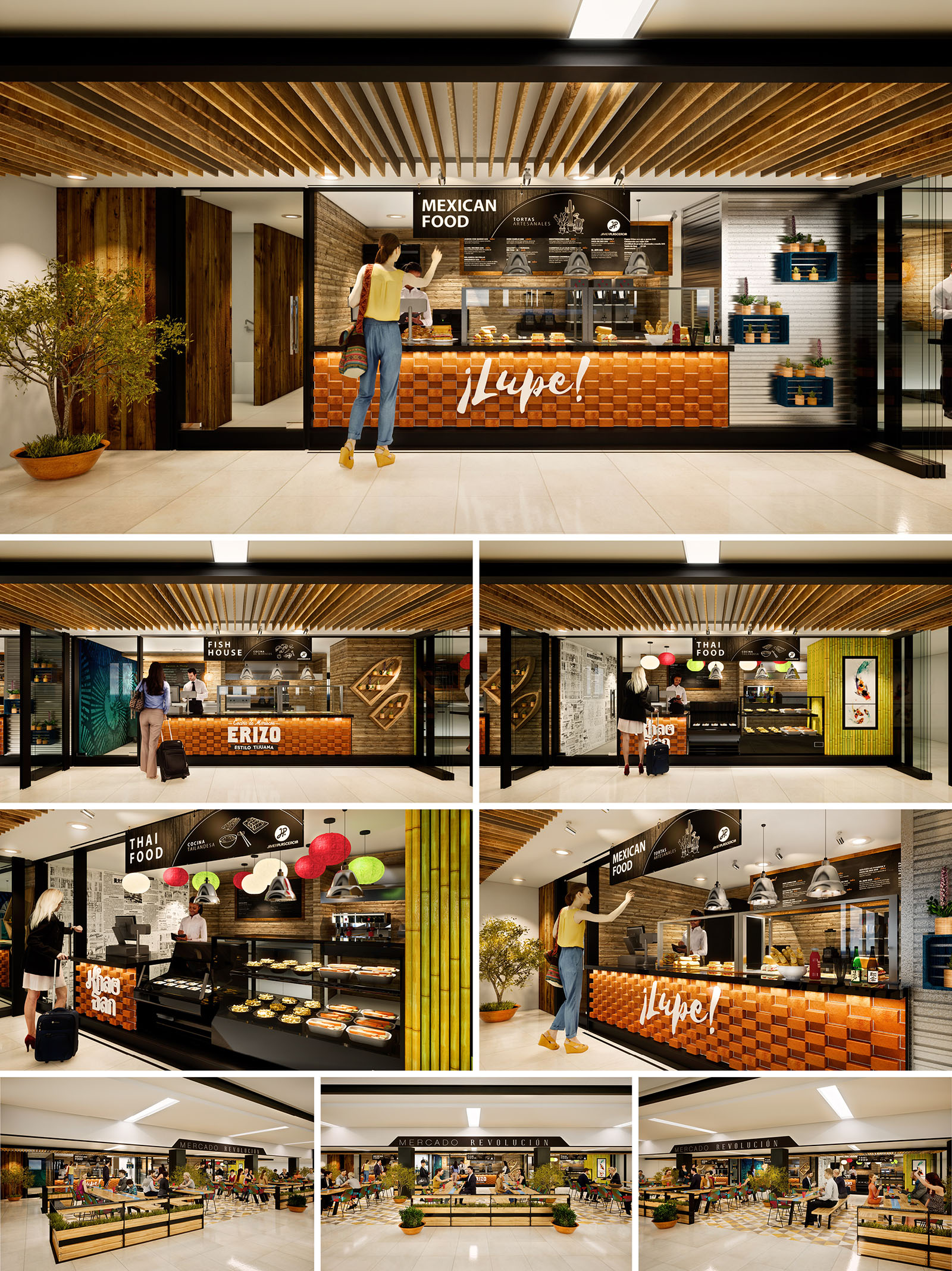
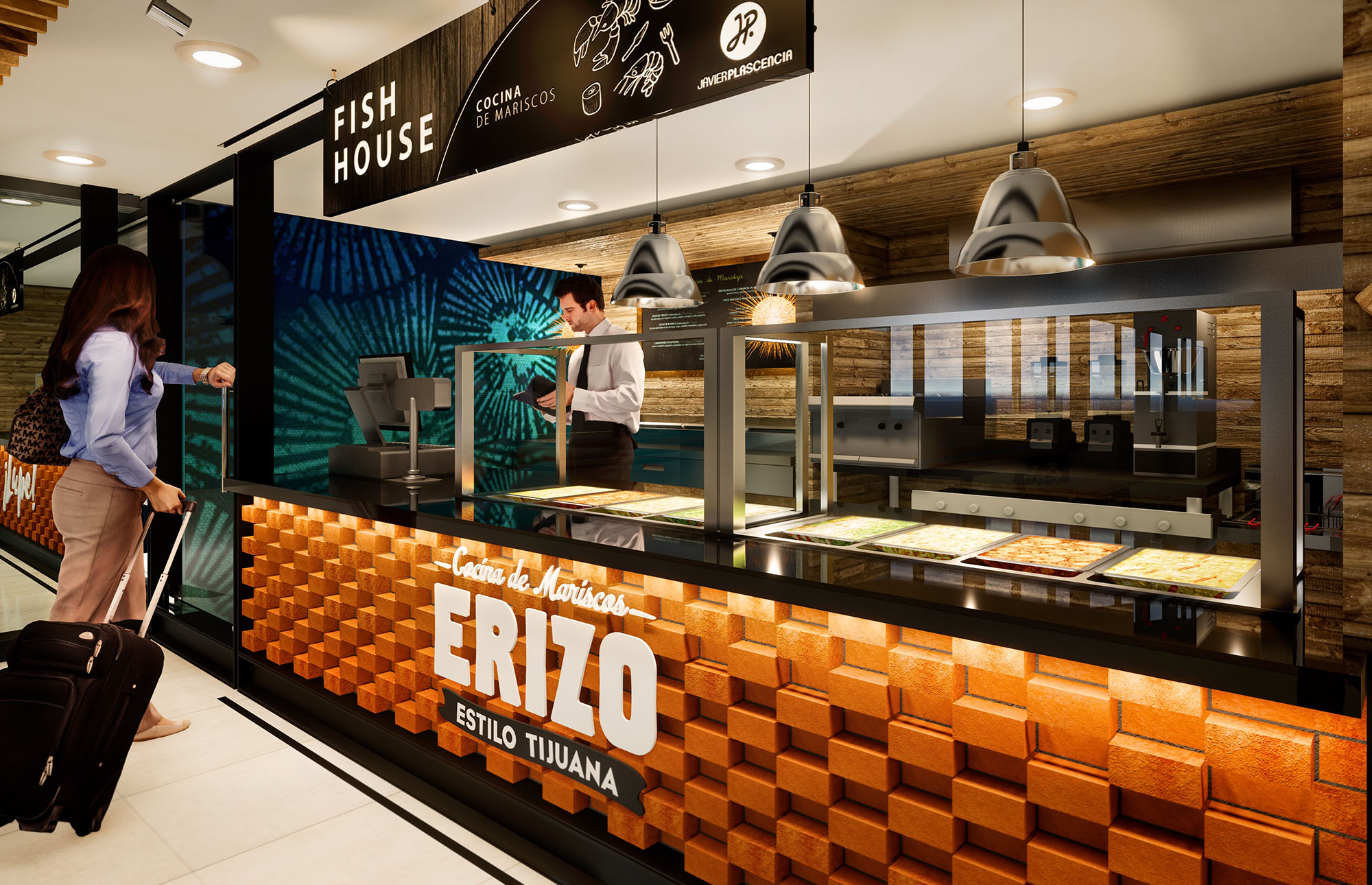
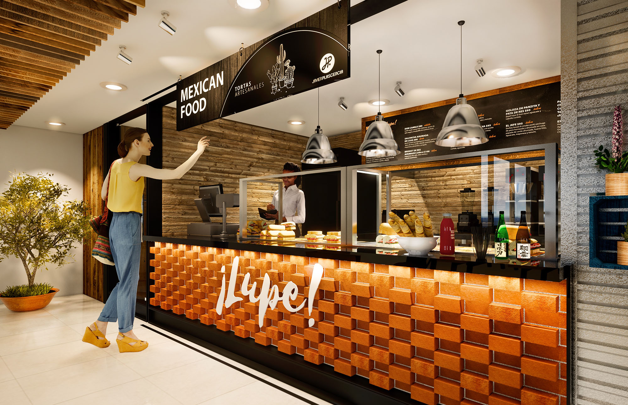
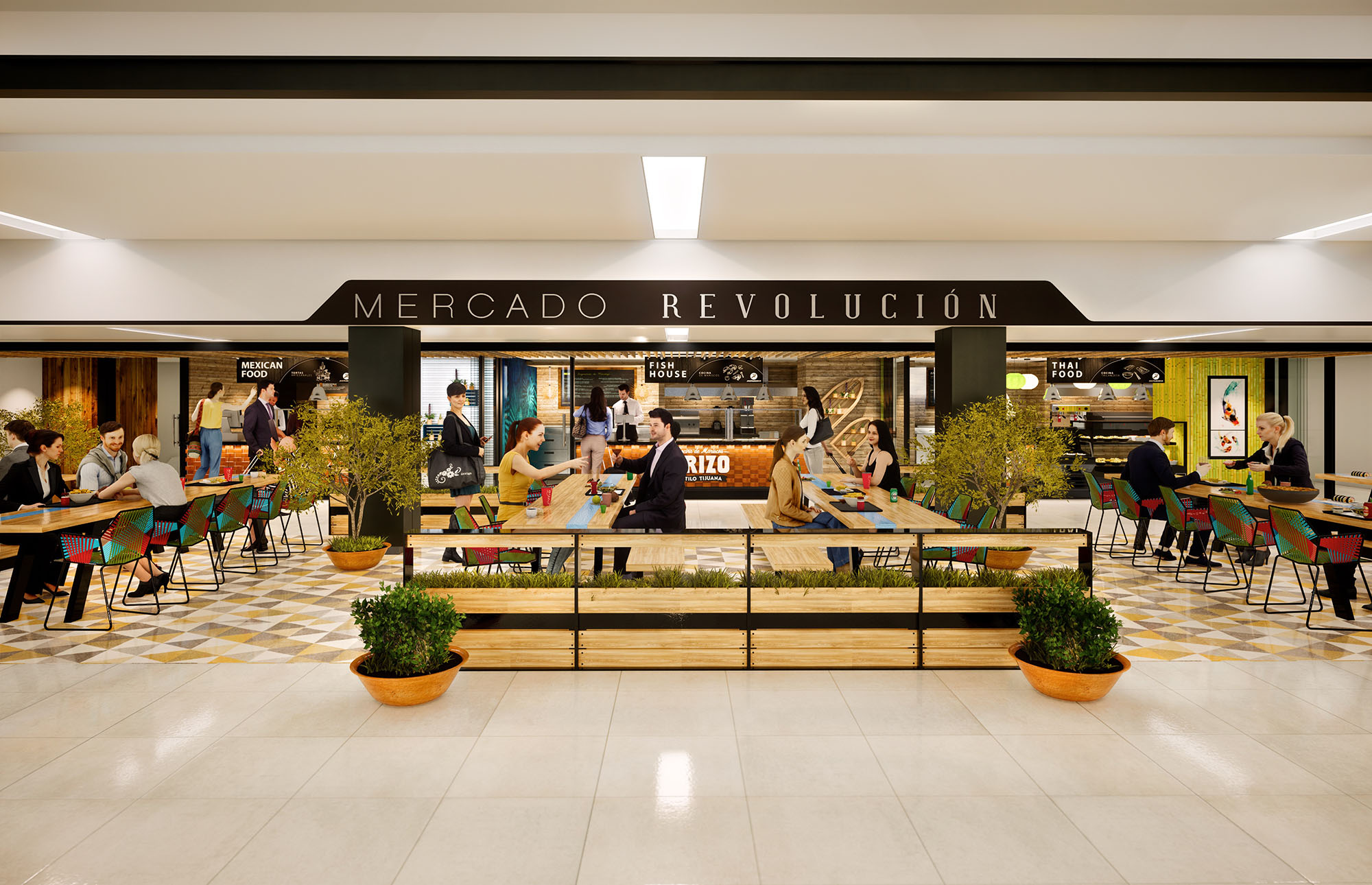
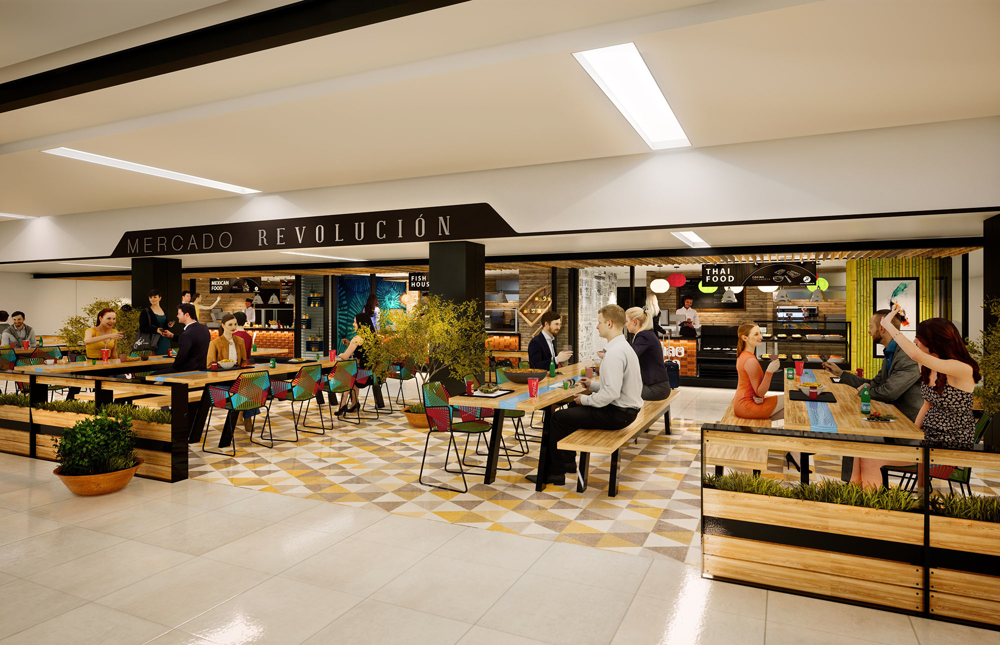
The project ERIZO KHAOSAN LUPE is conceived as a contemporary urban food hall that unites three distinct gastronomic identities—Mexican seafood, traditional Mexican cuisine, and Thai food—within a single coherent architectural language. The design celebrates culinary diversity through a marketplace atmosphere, where each stall has a strong visual character while remaining part of a unified spatial narrative. The concept draws from the energy of Tijuana’s street food culture, translating it into a refined, controlled environment appropriate for an international public.
The layout organizes the three kitchens along a continuous façade, opening directly to the central dining area. Transparency and visual porosity allow guests to understand preparation processes, aromas, and textures from a distance, inviting spontaneous interaction. Graphic elements, product displays, and illuminated signage are curated as part of the architectural composition, reinforcing the identity of each brand without fragmenting the overall space.
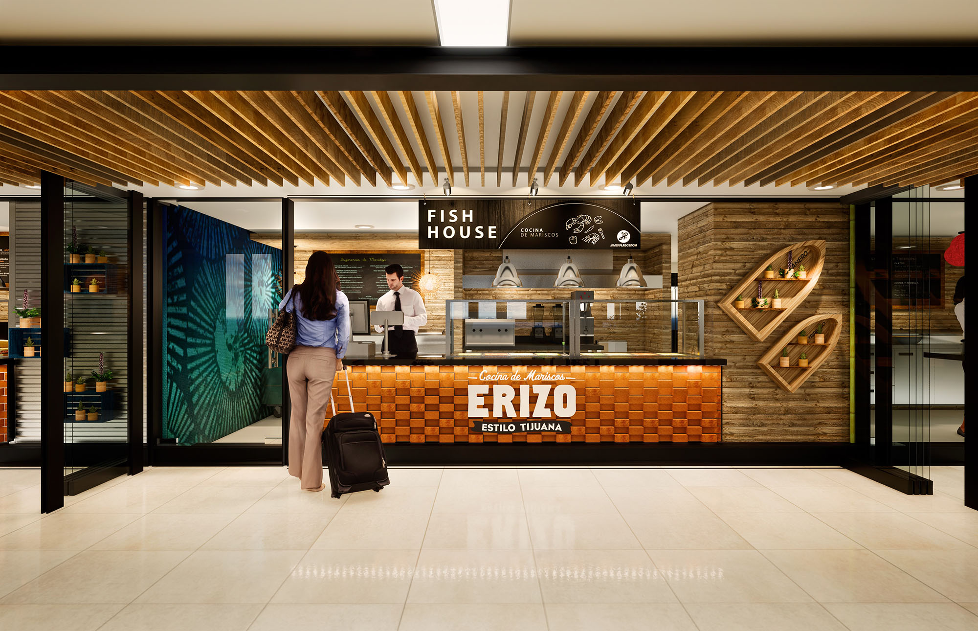
The material strategy combines warmth and tactility with a robust, easy-to-maintain finish suitable for intensive commercial use. Timber slats in natural and toasted tones dominate ceilings and vertical accents, creating rhythm and depth while referencing traditional market stalls. Counter fronts feature a textured module in warm terracotta and orange hues, evoking brick and handcrafted tiles, and establishing a continuous visual base across all concepts.
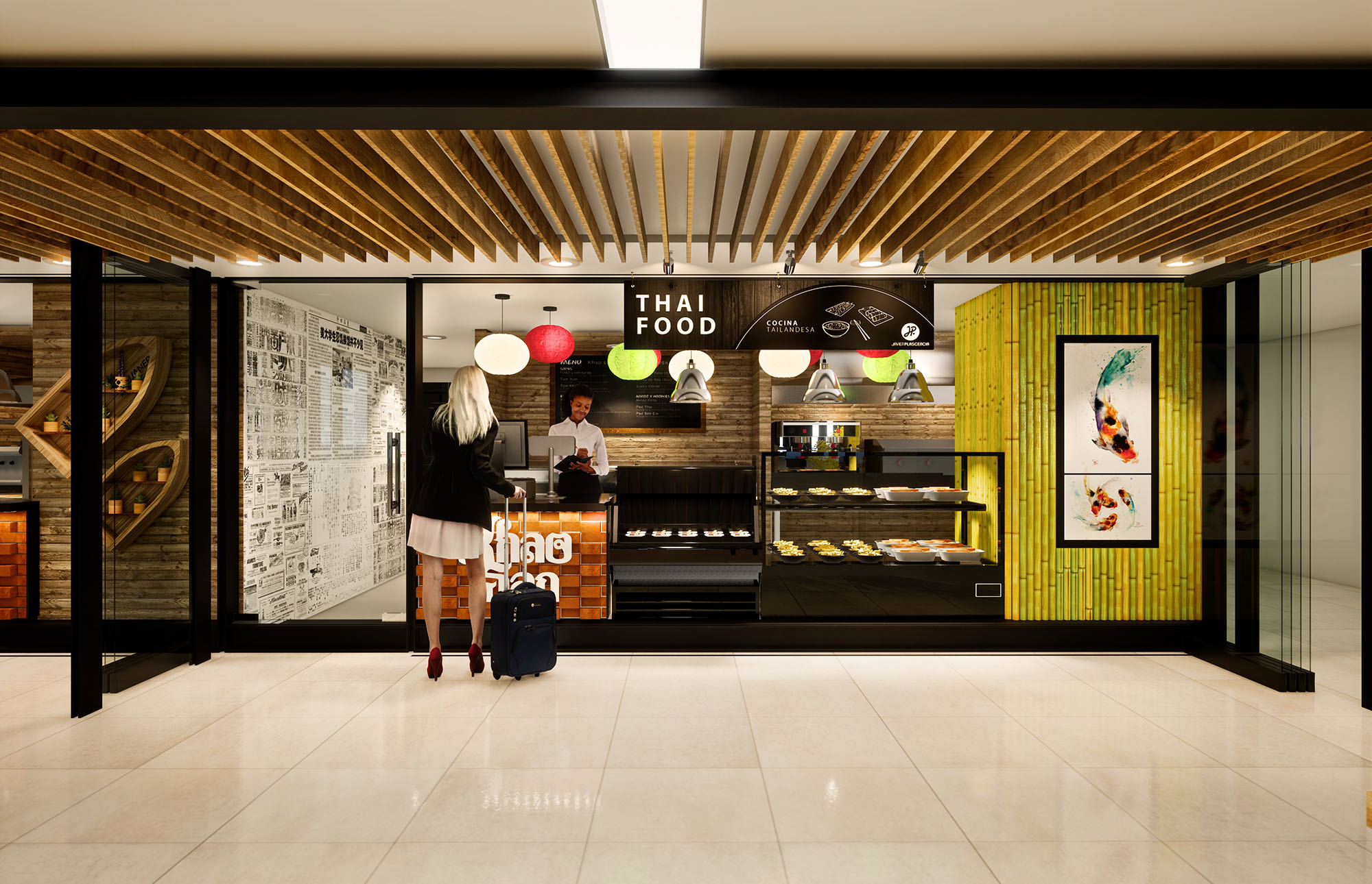
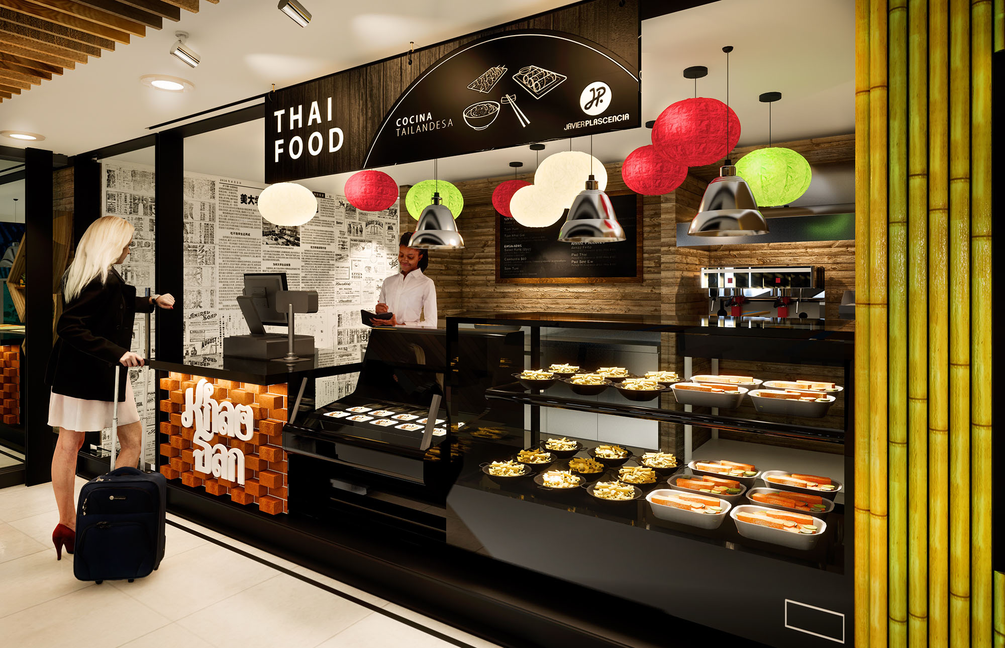
Background walls alternate between horizontal wood planks, neutral stone-look surfaces, and graphic black-and-white murals. For the Thai concept, vivid green bamboo elements and multi‑colored lanterns introduce a tropical layer that contrasts with the more earthy, coppery tones of the Mexican and seafood stalls. Black metal framing and signage unify the ensemble, giving a precise, contemporary edge to the composition and visually anchoring the space.
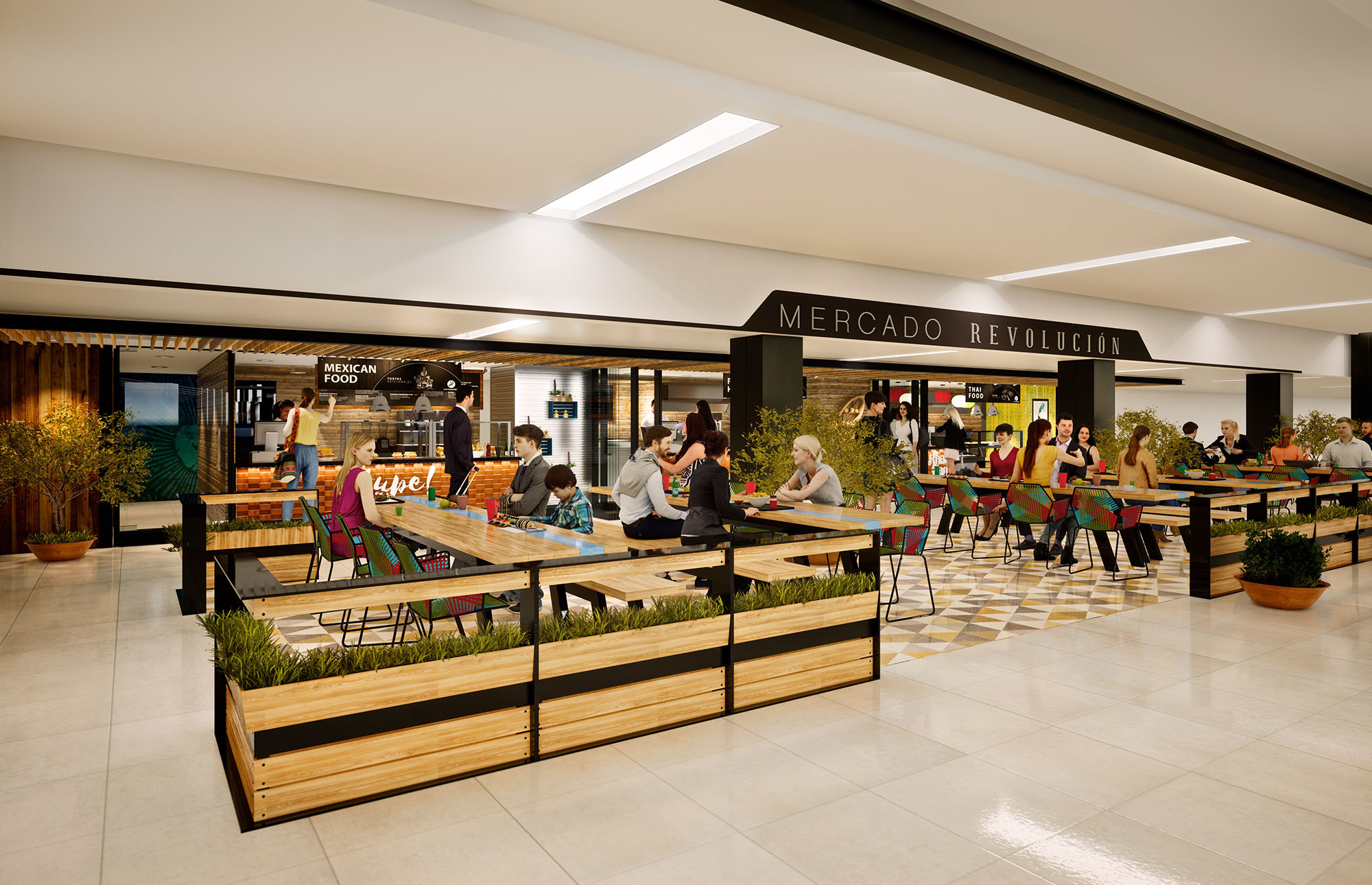
The food hall is structured around a generous central seating area with perimeter circulation that allows clear visibility of all vendors upon entry. Linear rows of tables and benches are oriented to maintain direct visual connection with the cooking fronts, reinforcing the theatrical dimension of food preparation. The furniture is intentionally lightweight and movable, enabling flexible reconfiguration for different occupancy levels and events.
Each stall is designed as a compact, efficient production unit, with back‑of‑house concealed behind continuous counter lines. Ordering, payment, and pickup zones are legible and clearly signposted, reducing confusion and queues. Wide corridors and open corners promote intuitive movement, while integrated planters and potted trees soften the geometry, adding a sense of pause and comfort within the commercial flow.
Illumination is layered to emphasize both product and architecture. General ambient lighting is provided by recessed linear fixtures in the ceiling, generating a bright, safe environment across the common areas. Over the counters, pendant luminaires and focused downlights create accent zones that highlight food displays and menu boards, drawing attention to each brand.
The combination of warm color temperature and reflections on wood and textured surfaces produces an inviting, almost domestic atmosphere within a highly public setting. Decorative lanterns in the Thai section and industrial‑style pendants over the Mexican stalls reinforce the identity of each kitchen while maintaining a consistent luminous hierarchy throughout the hall.
Architecture and graphic design are tightly integrated. Large black menu bands, hand‑lettered logos, and illustrative icons form part of the façade composition, functioning simultaneously as wayfinding and decorative relief. In the seafood area, stylized fish motifs and porthole‑like display niches reference coastal imagery, while Mexican cuisine uses typographic emphasis on exclamations and colloquial wording to transmit informality and warmth.
Details such as recessed shelving for packaged products, metal mesh baskets, and framed prints enrich the user’s visual experience without cluttering the space. The careful modulation of cladding pieces and alignment of joints ensure a precise, almost modular reading that facilitates future maintenance and potential rebranding if required.
Sustainability criteria guided both material selection and operational planning. The predominant use of timber and bamboo considers renewable sources and the possibility of local or regional procurement, reducing transportation impacts. Finishes are chosen for durability and ease of cleaning, minimizing the need for aggressive chemical products and frequent replacement.
The open plan favors cross‑ventilation opportunities and allows maximum use of natural light from adjacent areas, reducing dependence on artificial lighting during daytime. Modular furniture and demountable partitions support long‑term adaptability, extending the life cycle of the food hall by enabling reconfiguration without major demolition. Plant elements contribute to improved indoor air quality and psychological comfort, reinforcing the market’s connection to natural references within an otherwise controlled interior environment.

The project ERIZO KHAOSAN LUPE is conceived as a contemporary urban food hall that unites three distinct gastronomic identities—Mexican seafood, traditional Mexican cuisine, and Thai food—within a single coherent architectural language. The design celebrates culinary diversity through a marketplace atmosphere, where each stall has a strong visual character while remaining part of a unified spatial narrative. The concept draws from the energy of Tijuana’s street food culture, translating it into a refined, controlled environment appropriate for an international public.
The layout organizes the three kitchens along a continuous façade, opening directly to the central dining area. Transparency and visual porosity allow guests to understand preparation processes, aromas, and textures from a distance, inviting spontaneous interaction. Graphic elements, product displays, and illuminated signage are curated as part of the architectural composition, reinforcing the identity of each brand without fragmenting the overall space.
The material strategy combines warmth and tactility with a robust, easy-to-maintain finish suitable for intensive commercial use. Timber slats in natural and toasted tones dominate ceilings and vertical accents, creating rhythm and depth while referencing traditional market stalls. Counter fronts feature a textured module in warm terracotta and orange hues, evoking brick and handcrafted tiles, and establishing a continuous visual base across all concepts.
Background walls alternate between horizontal wood planks, neutral stone-look surfaces, and graphic black-and-white murals. For the Thai concept, vivid green bamboo elements and multi‑colored lanterns introduce a tropical layer that contrasts with the more earthy, coppery tones of the Mexican and seafood stalls. Black metal framing and signage unify the ensemble, giving a precise, contemporary edge to the composition and visually anchoring the space.
The food hall is structured around a generous central seating area with perimeter circulation that allows clear visibility of all vendors upon entry. Linear rows of tables and benches are oriented to maintain direct visual connection with the cooking fronts, reinforcing the theatrical dimension of food preparation. The furniture is intentionally lightweight and movable, enabling flexible reconfiguration for different occupancy levels and events.
Each stall is designed as a compact, efficient production unit, with back‑of‑house concealed behind continuous counter lines. Ordering, payment, and pickup zones are legible and clearly signposted, reducing confusion and queues. Wide corridors and open corners promote intuitive movement, while integrated planters and potted trees soften the geometry, adding a sense of pause and comfort within the commercial flow.
Illumination is layered to emphasize both product and architecture. General ambient lighting is provided by recessed linear fixtures in the ceiling, generating a bright, safe environment across the common areas. Over the counters, pendant luminaires and focused downlights create accent zones that highlight food displays and menu boards, drawing attention to each brand.
The combination of warm color temperature and reflections on wood and textured surfaces produces an inviting, almost domestic atmosphere within a highly public setting. Decorative lanterns in the Thai section and industrial‑style pendants over the Mexican stalls reinforce the identity of each kitchen while maintaining a consistent luminous hierarchy throughout the hall.
Architecture and graphic design are tightly integrated. Large black menu bands, hand‑lettered logos, and illustrative icons form part of the façade composition, functioning simultaneously as wayfinding and decorative relief. In the seafood area, stylized fish motifs and porthole‑like display niches reference coastal imagery, while Mexican cuisine uses typographic emphasis on exclamations and colloquial wording to transmit informality and warmth.
Details such as recessed shelving for packaged products, metal mesh baskets, and framed prints enrich the user’s visual experience without cluttering the space. The careful modulation of cladding pieces and alignment of joints ensure a precise, almost modular reading that facilitates future maintenance and potential rebranding if required.
Sustainability criteria guided both material selection and operational planning. The predominant use of timber and bamboo considers renewable sources and the possibility of local or regional procurement, reducing transportation impacts. Finishes are chosen for durability and ease of cleaning, minimizing the need for aggressive chemical products and frequent replacement.
The open plan favors cross‑ventilation opportunities and allows maximum use of natural light from adjacent areas, reducing dependence on artificial lighting during daytime. Modular furniture and demountable partitions support long‑term adaptability, extending the life cycle of the food hall by enabling reconfiguration without major demolition. Plant elements contribute to improved indoor air quality and psychological comfort, reinforcing the market’s connection to natural references within an otherwise controlled interior environment.


Our offices are located in Barcelona, Cancún, Chicago and Santo Domingo, but thanks to technology we can do projects on all over the world.
Barcelona
Bac de Roda 136
08020, Barcelona
Spain
Madrid
Av. de Buendía 11
19005 Guadalajara (Madrid)
Spain
Chicago
373 Hazel Ave, Apt A1
60022, Glencoe, Illinois
United States