

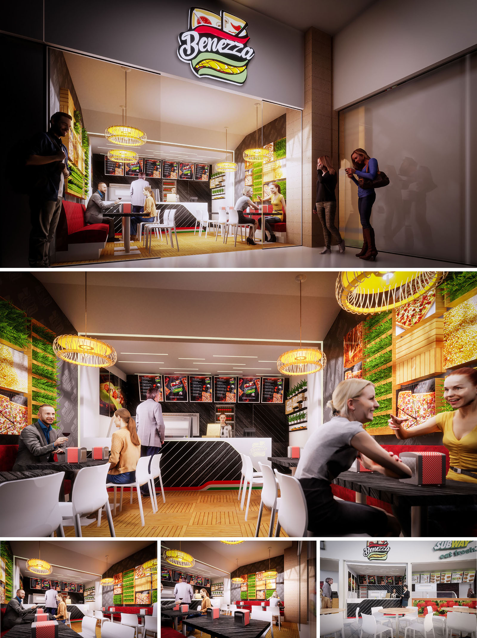
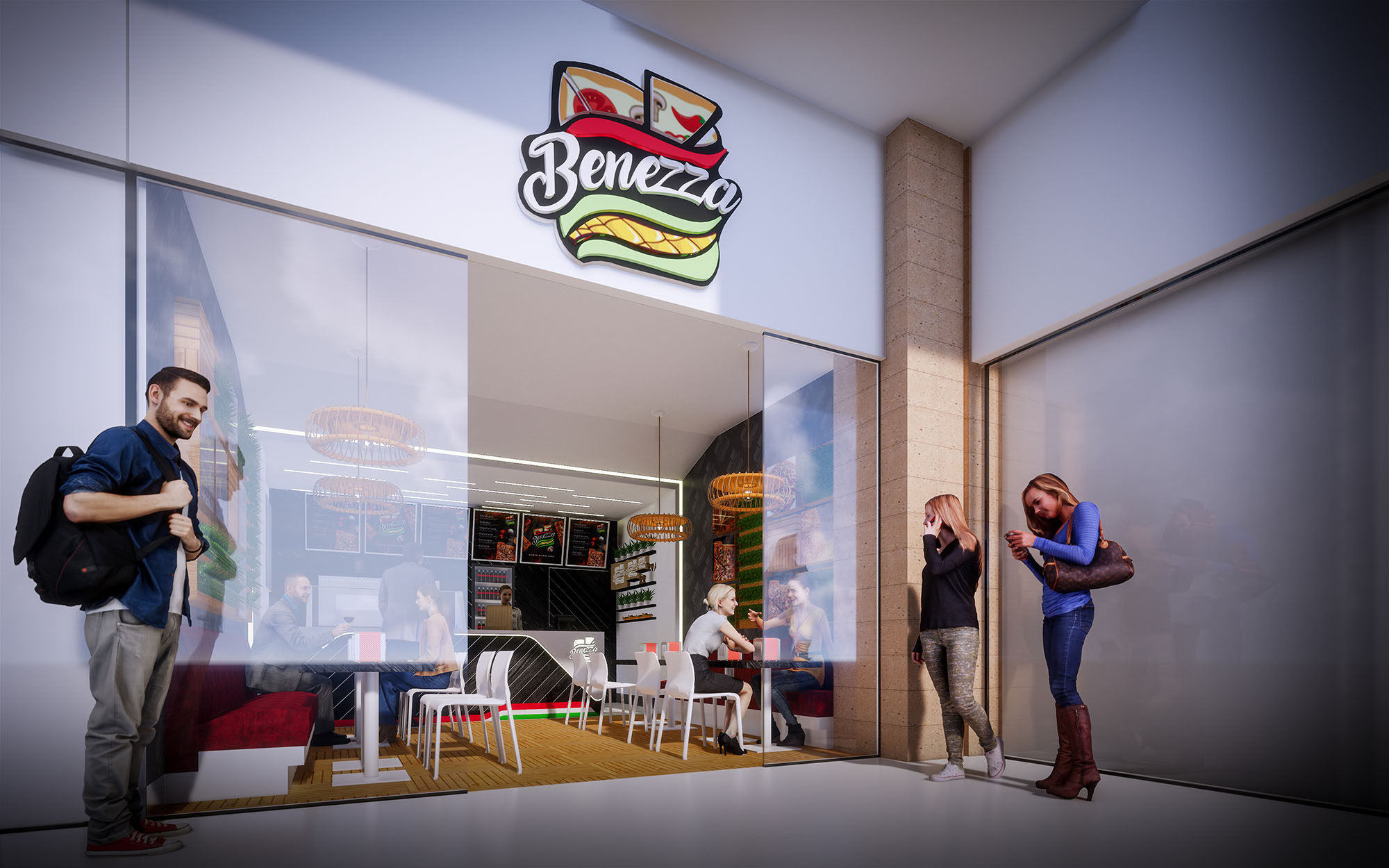
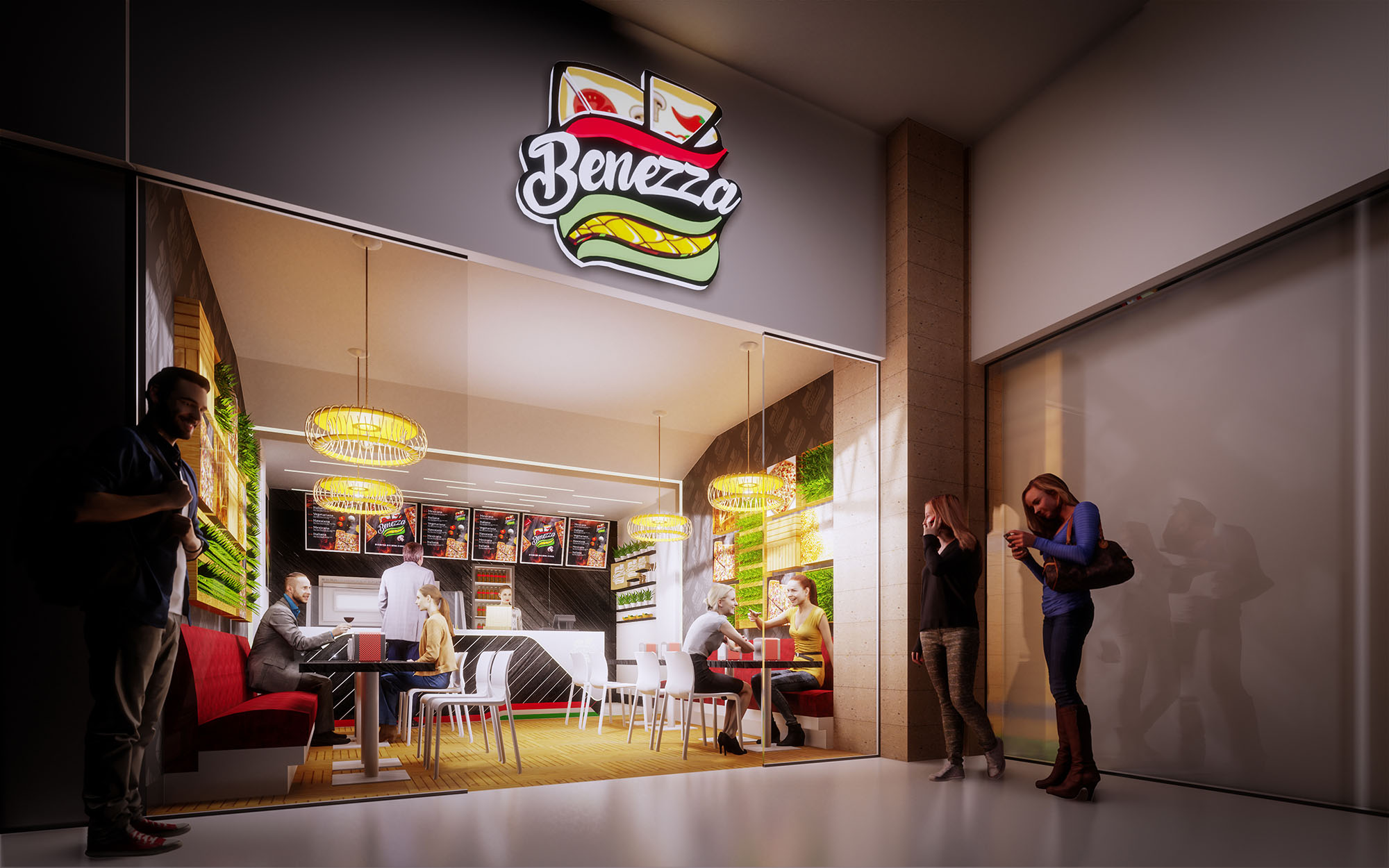
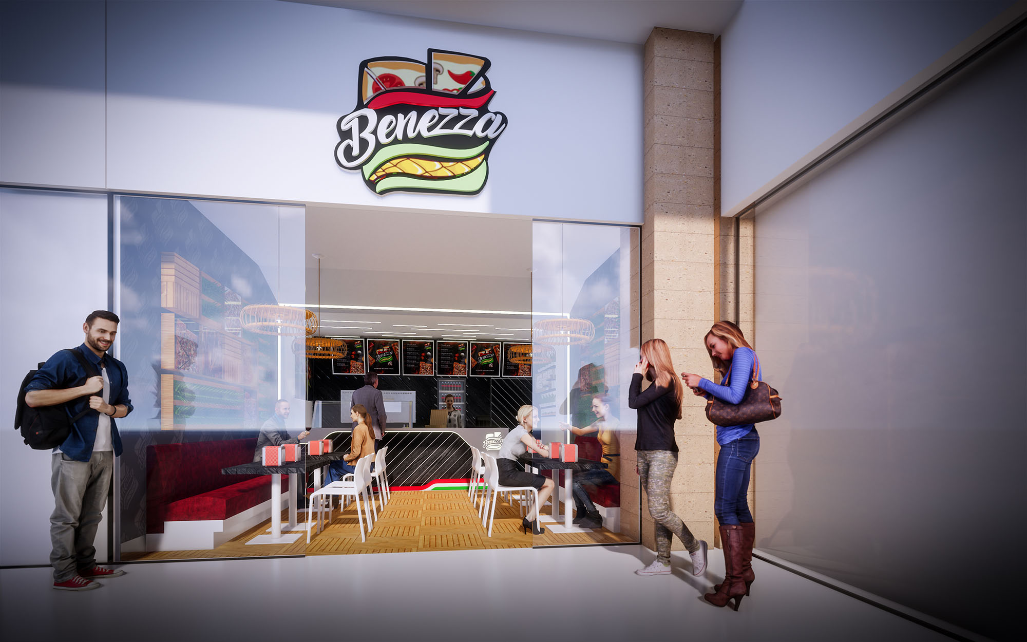
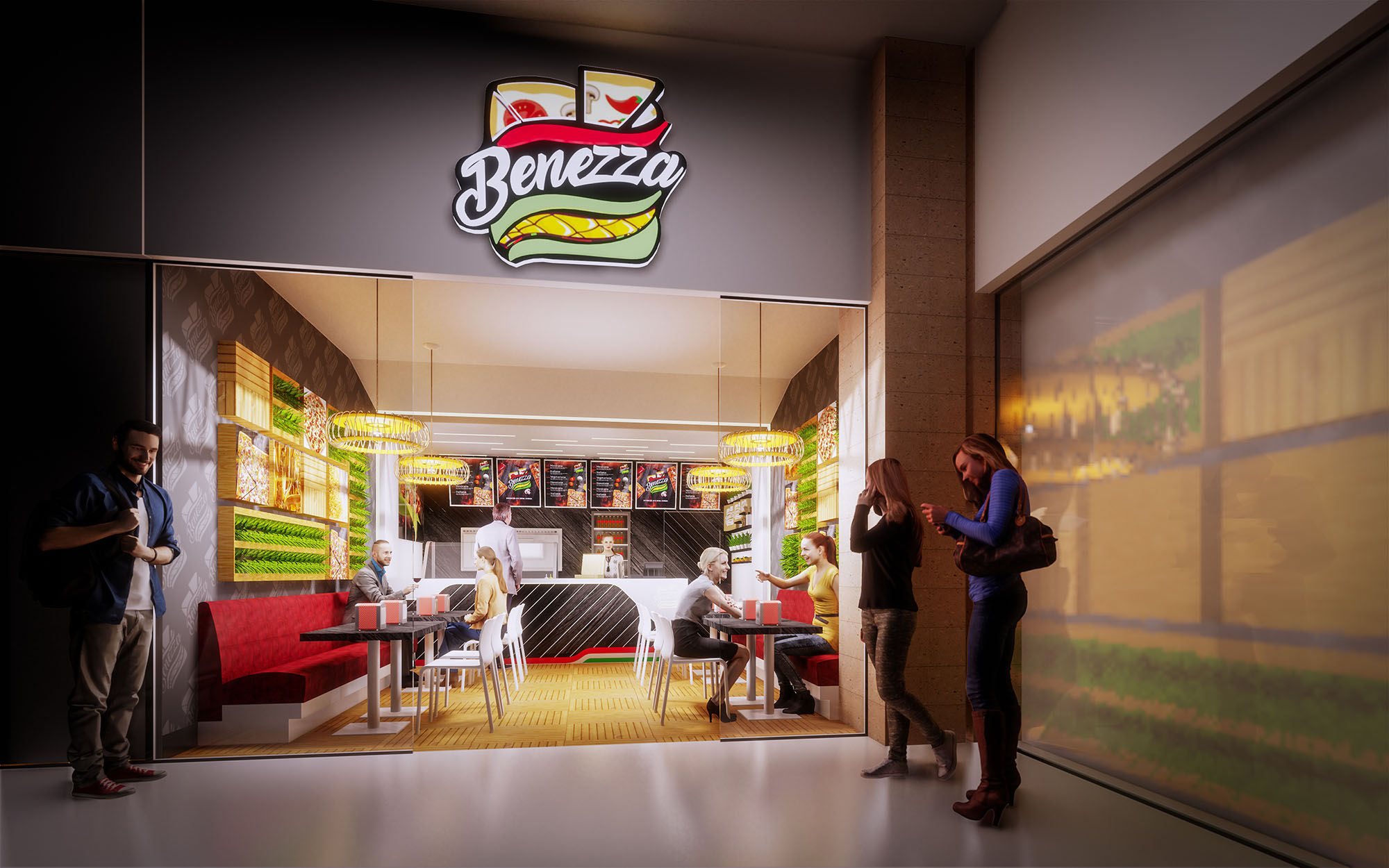
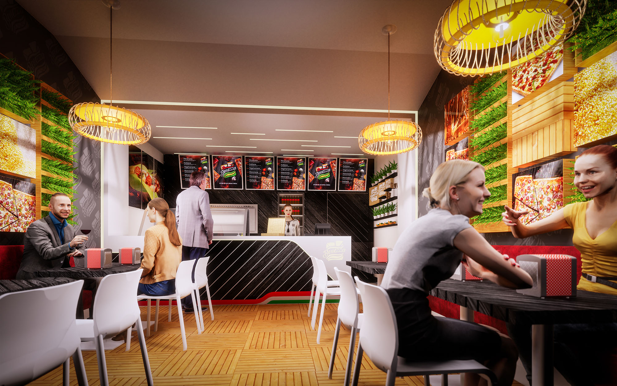
Benezza is conceived as a compact fast-casual restaurant that communicates freshness and dynamism from the first glance. The design translates the brand’s sandwich iconography into an interior language based on layered planes, bold color accents and illuminated graphics. The objective is to create a space that feels energetic and urban while remaining welcoming for short stays and quick turnover typical of food-court locations in Cuernavaca.
The concept takes the linear service ritual—ordering, payment and pick-up—and expresses it as a clear architectural axis. This axis begins at the illuminated façade and continues through the counter, menu band and ceiling lighting, orchestrating the movement of customers while framing the product offer as the central protagonist.
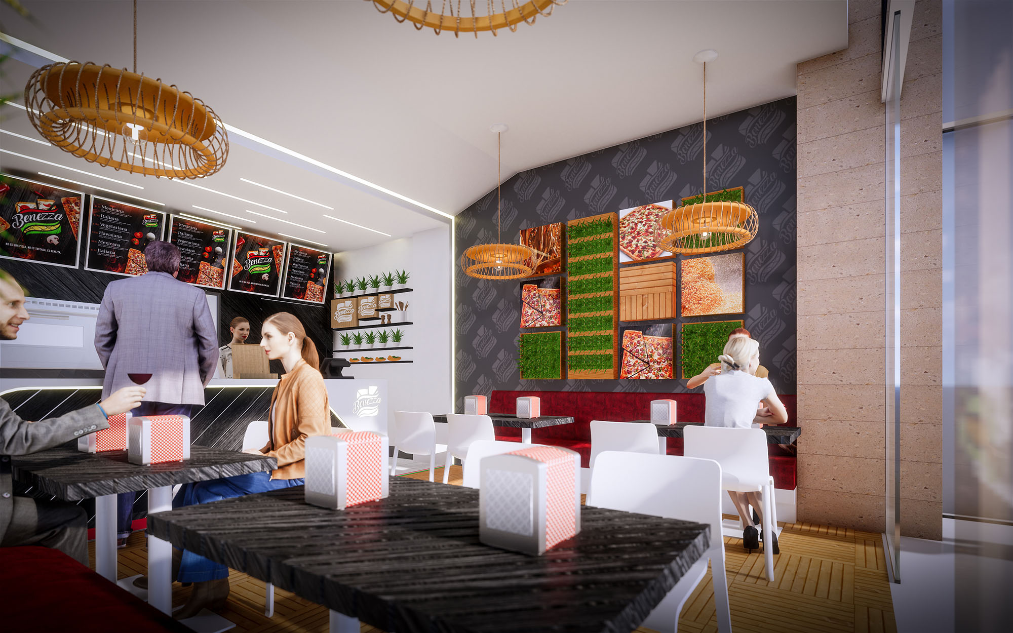
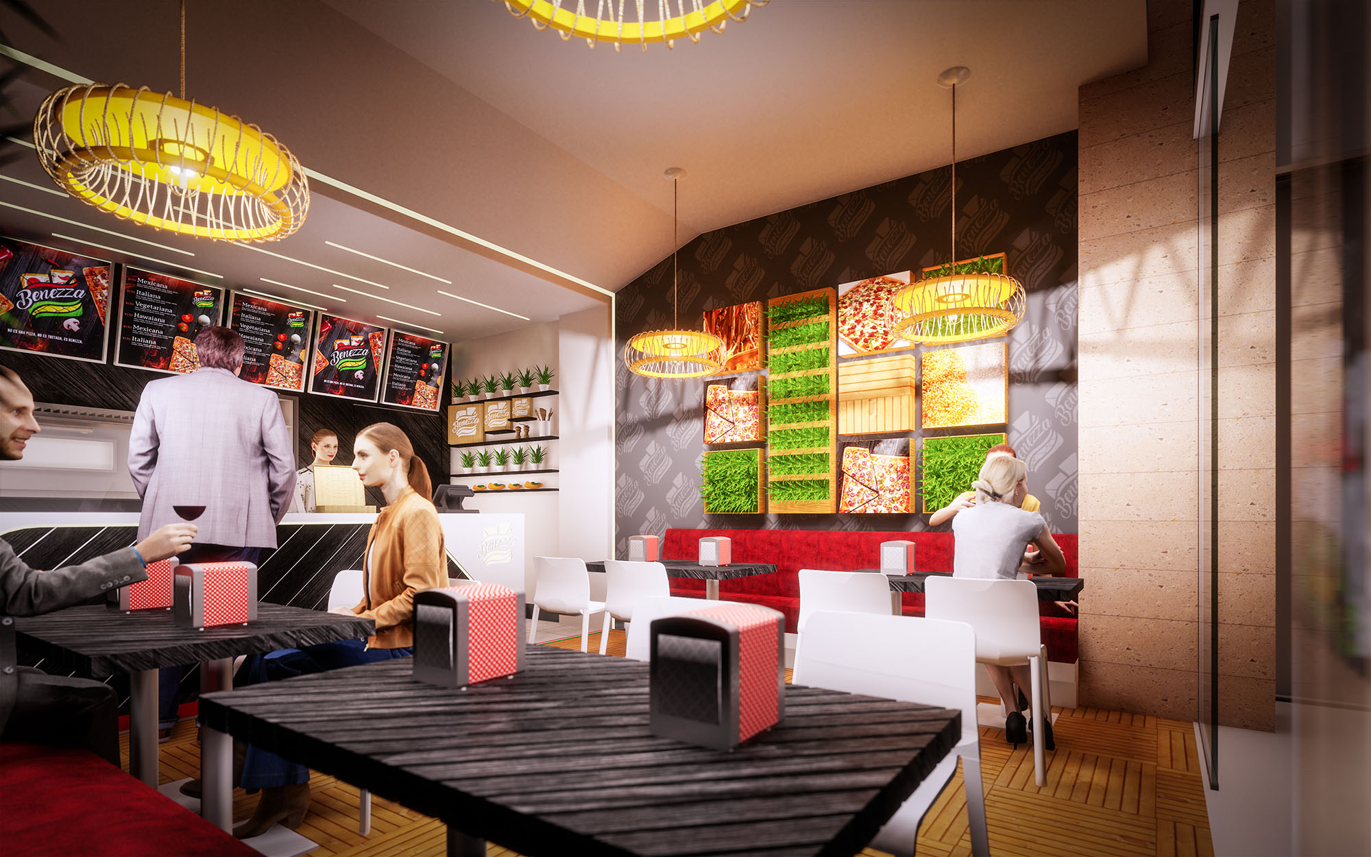
The restaurant is organized as a single open volume where front-of-house and back-of-house are visually connected but functionally distinct. Entry occurs through a fully transparent glass frontage that maximizes visibility into the interior and aligns with the mall corridor. Immediately ahead, the counter acts as an anchoring element, with the menu boards and preparation area positioned directly behind for intuitive orientation.
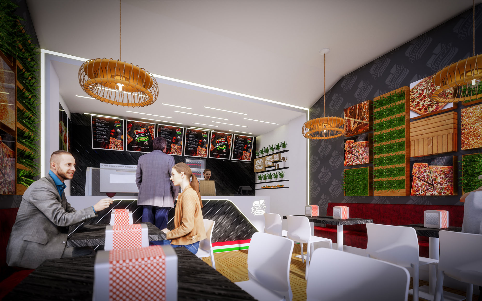
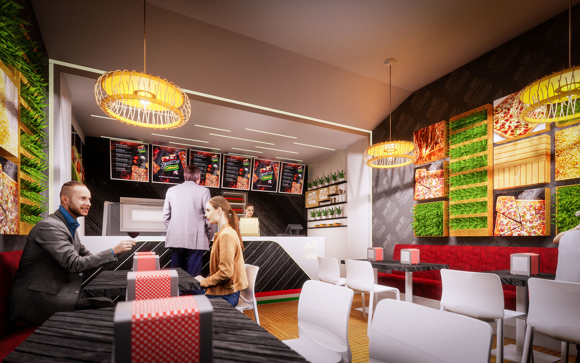
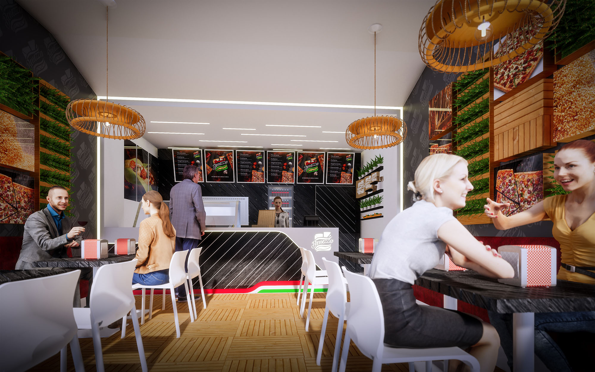
Customer circulation follows a straightforward path: access, queuing along the counter, ordering, and then dispersing into the seating area that unfolds along both side walls. Tables and chairs are arranged in parallel rows to optimize density, while a continuous upholstered bench on one side offers comfort and encourages group seating. Clearances between furniture facilitate easy movement for staff and visitors, sustaining operational efficiency during peak hours.
The material palette blends warm natural references with high-contrast, easy-to-clean surfaces suitable for intensive use. Floors in a wood-like modular pattern introduce warmth and a tactile character that counterbalances the otherwise sleek finishes. The counter and some wall planes are clad in dark panels with diagonal white striping, an abstraction of the brand’s graphic language that gives depth and a sense of motion.
The chromatic strategy reinforces the identity: greens associated with freshness, reds related to appetite and energy, and neutrals that frame these tones without visual fatigue. Backlit images of ingredients and menu items form a continuous frieze on the main wall, functioning simultaneously as decoration, communication and lighting. White chairs and light-colored ceilings reflect illumination, giving the small space visual amplitude.
Lighting is resolved through a combination of linear recessed fixtures and sculptural pendant luminaires. The recessed elements define the main circulation axis and ensure uniform working levels over the counter and seating. The pendants, with woven or ring-like geometries, introduce a softer, more domestic note that humanizes the fast-food typology.
Backlit graphic panels and vertical green elements contribute to a vibrant atmosphere, acting as luminous walls that avoid dark corners and visually extend the space. The façade lighting emphasizes the logo and interior activity, operating as an urban lantern that attracts customers from the shopping center corridors during evening hours.
Sustainability is approached through the selection of durable materials, energy-efficient lighting and strategies aimed at reducing maintenance. LED technology is incorporated in all general and accent lighting, decreasing energy consumption and extending replacement cycles. Surfaces exposed to continuous contact—tabletops, counter cladding and flooring—are specified in high-resistance finishes that prolong their useful life and minimize waste over time.
The significant glass frontage not only maximizes visibility but also allows the use of natural daylight during daytime, reducing dependency on artificial light. Vertical green elements, whether natural or preserved, help improve acoustic absorption in a highly reflective environment and symbolically reinforce the commitment to fresh ingredients and environmental awareness, aligning the brand image with contemporary sustainable values.
Benezza is conceived as a compact fast-casual restaurant that communicates freshness and dynamism from the first glance. The design translates the brand’s sandwich iconography into an interior language based on layered planes, bold color accents and illuminated graphics. The objective is to create a space that feels energetic and urban while remaining welcoming for short stays and quick turnover typical of food-court locations in Cuernavaca.
The concept takes the linear service ritual—ordering, payment and pick-up—and expresses it as a clear architectural axis. This axis begins at the illuminated façade and continues through the counter, menu band and ceiling lighting, orchestrating the movement of customers while framing the product offer as the central protagonist.
The restaurant is organized as a single open volume where front-of-house and back-of-house are visually connected but functionally distinct. Entry occurs through a fully transparent glass frontage that maximizes visibility into the interior and aligns with the mall corridor. Immediately ahead, the counter acts as an anchoring element, with the menu boards and preparation area positioned directly behind for intuitive orientation.
Customer circulation follows a straightforward path: access, queuing along the counter, ordering, and then dispersing into the seating area that unfolds along both side walls. Tables and chairs are arranged in parallel rows to optimize density, while a continuous upholstered bench on one side offers comfort and encourages group seating. Clearances between furniture facilitate easy movement for staff and visitors, sustaining operational efficiency during peak hours.
The material palette blends warm natural references with high-contrast, easy-to-clean surfaces suitable for intensive use. Floors in a wood-like modular pattern introduce warmth and a tactile character that counterbalances the otherwise sleek finishes. The counter and some wall planes are clad in dark panels with diagonal white striping, an abstraction of the brand’s graphic language that gives depth and a sense of motion.
The chromatic strategy reinforces the identity: greens associated with freshness, reds related to appetite and energy, and neutrals that frame these tones without visual fatigue. Backlit images of ingredients and menu items form a continuous frieze on the main wall, functioning simultaneously as decoration, communication and lighting. White chairs and light-colored ceilings reflect illumination, giving the small space visual amplitude.
Lighting is resolved through a combination of linear recessed fixtures and sculptural pendant luminaires. The recessed elements define the main circulation axis and ensure uniform working levels over the counter and seating. The pendants, with woven or ring-like geometries, introduce a softer, more domestic note that humanizes the fast-food typology.
Backlit graphic panels and vertical green elements contribute to a vibrant atmosphere, acting as luminous walls that avoid dark corners and visually extend the space. The façade lighting emphasizes the logo and interior activity, operating as an urban lantern that attracts customers from the shopping center corridors during evening hours.
Sustainability is approached through the selection of durable materials, energy-efficient lighting and strategies aimed at reducing maintenance. LED technology is incorporated in all general and accent lighting, decreasing energy consumption and extending replacement cycles. Surfaces exposed to continuous contact—tabletops, counter cladding and flooring—are specified in high-resistance finishes that prolong their useful life and minimize waste over time.
The significant glass frontage not only maximizes visibility but also allows the use of natural daylight during daytime, reducing dependency on artificial light. Vertical green elements, whether natural or preserved, help improve acoustic absorption in a highly reflective environment and symbolically reinforce the commitment to fresh ingredients and environmental awareness, aligning the brand image with contemporary sustainable values.


Our offices are located in Barcelona, Cancún, Chicago and Santo Domingo, but thanks to technology we can do projects on all over the world.
Barcelona
Bac de Roda 136
08020, Barcelona
Spain
Madrid
Av. de Buendía 11
19005 Guadalajara (Madrid)
Spain
Chicago
373 Hazel Ave, Apt A1
60022, Glencoe, Illinois
United States