Lorem ipsum dolor sit amet, consectetur adipiscing elit. Suspendisse varius enim in eros elementum tristique. Duis cursus, mi quis viverra ornare, eros dolor interdum nulla, ut commodo diam libero vitae erat.
Our Retail Design Department is committed to designing workspaces that focus on attracting success and talent, adopting an environment that reflects excellence and innovation. The approach focuses on enhancing your company's image, setting it apart as a leader in modernity and forward-thinking design. Your retail store becomes more than just a physical space; it stands as the pivotal reference point and primary contact for both your team and clients. This strategic environment fosters meaningful connections and positions your business at the forefront of industry standards, directly influencing perception and encouraging sustained growth.
Ensure that your workspace is not only practical but also exudes success. A well-designed office is a powerful marketing tool that attracts and retains high-caliber clients. Every detail in your office should reflect a commitment to quality. Opt for a design that impresses at first glance and builds a reputation for leadership and trust.
We have designed +450 retail projects across +75 retail brands.
Over the years, we've participated in numerous projects at various stages, from conception to completion. Some cannot be showcased in our portfolio due to client confidentiality, but each has enriched our experience. Below is a list of projects we have been involved with in various capacities.
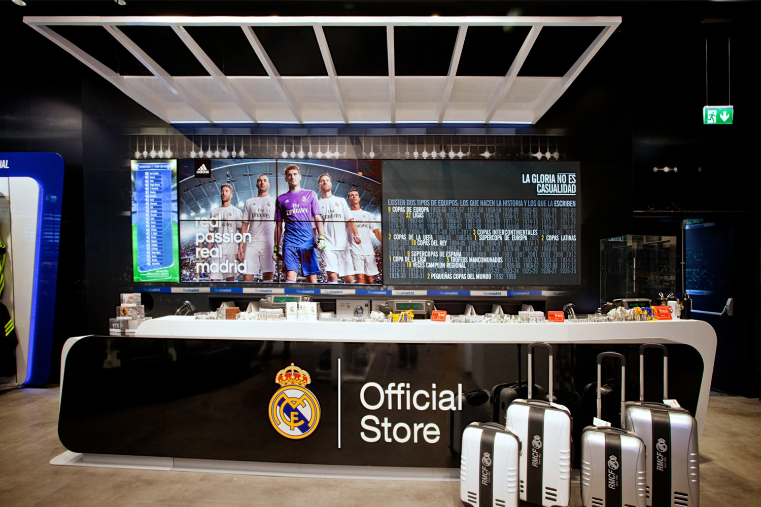
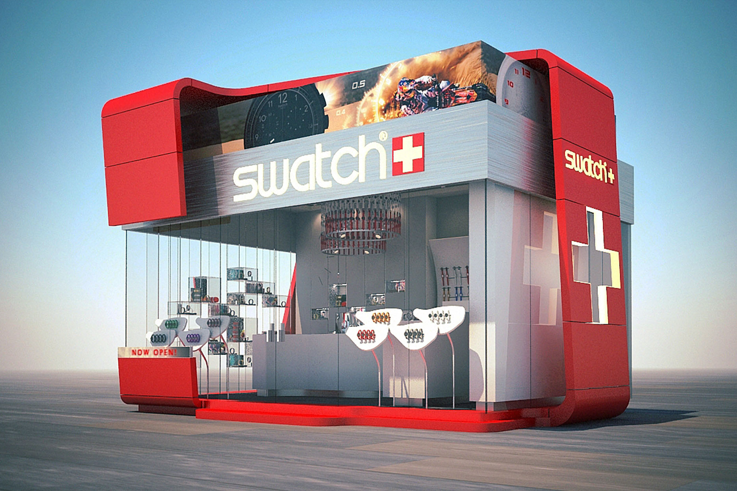
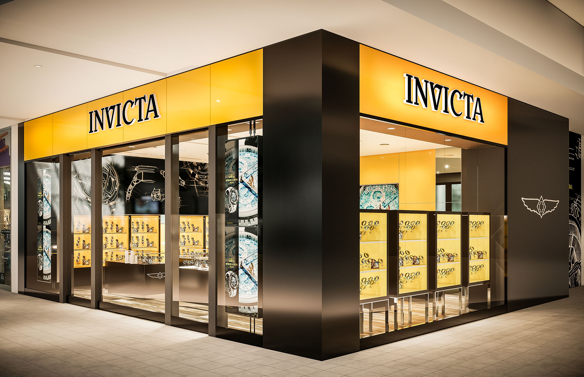
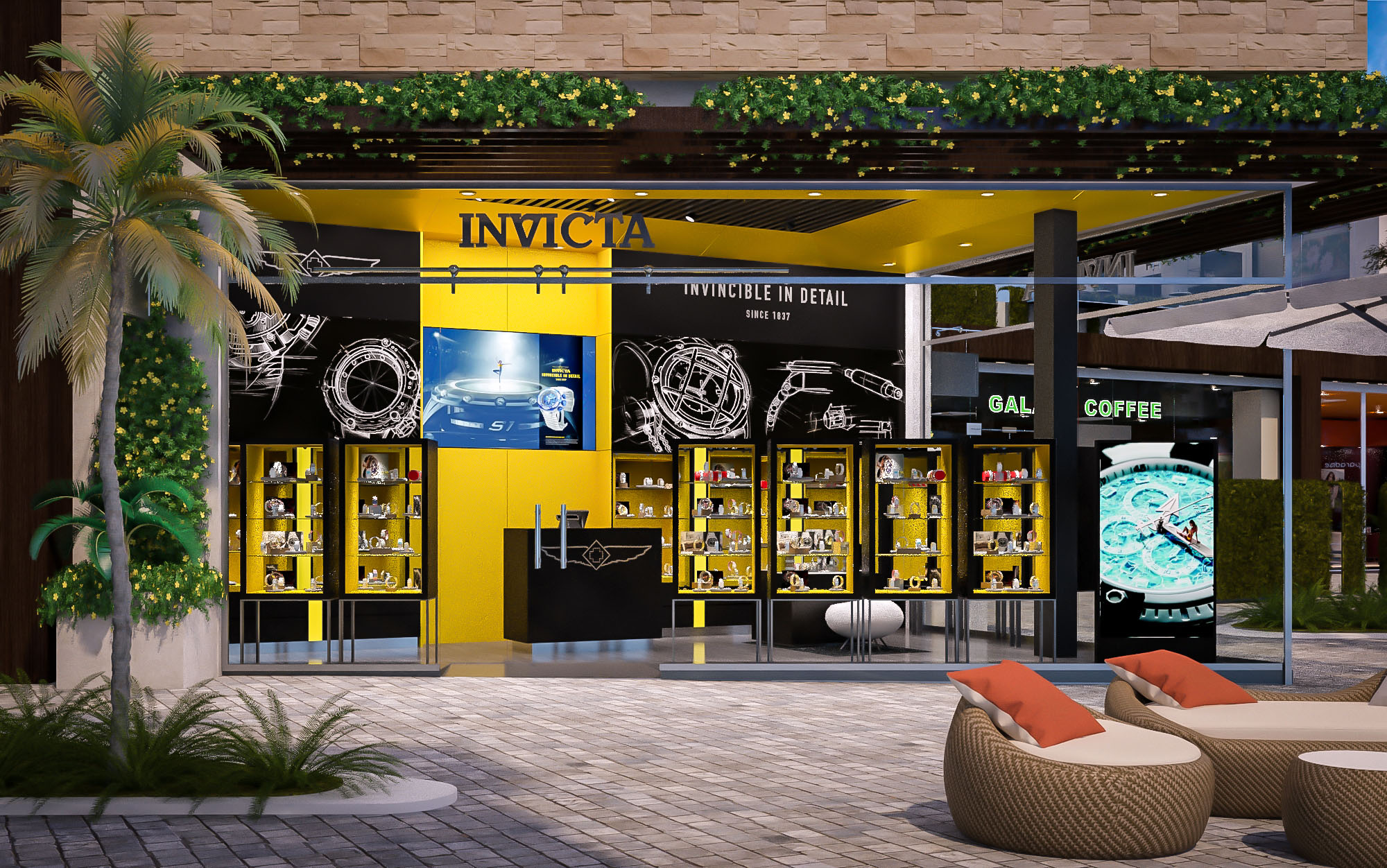
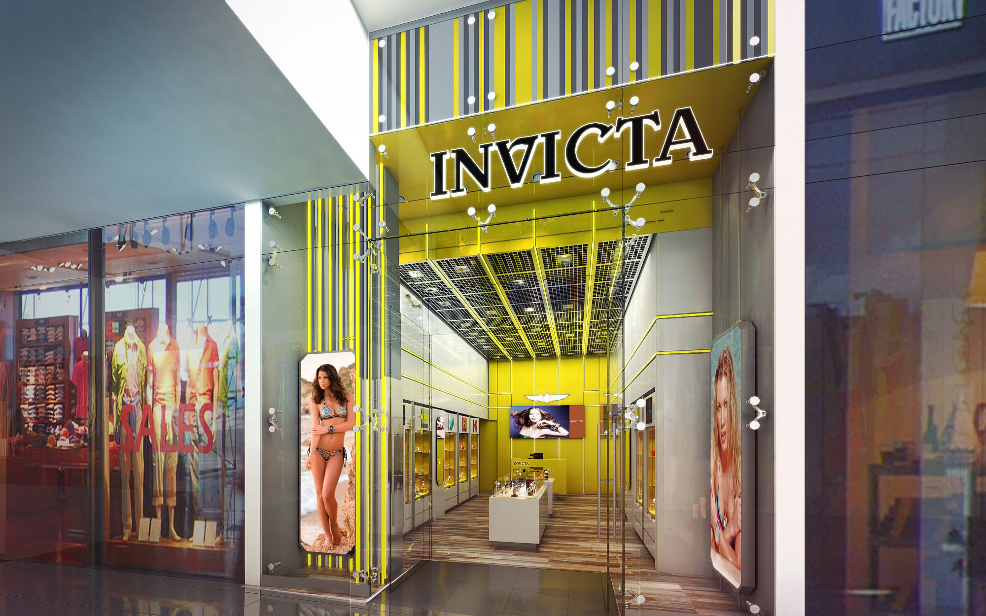
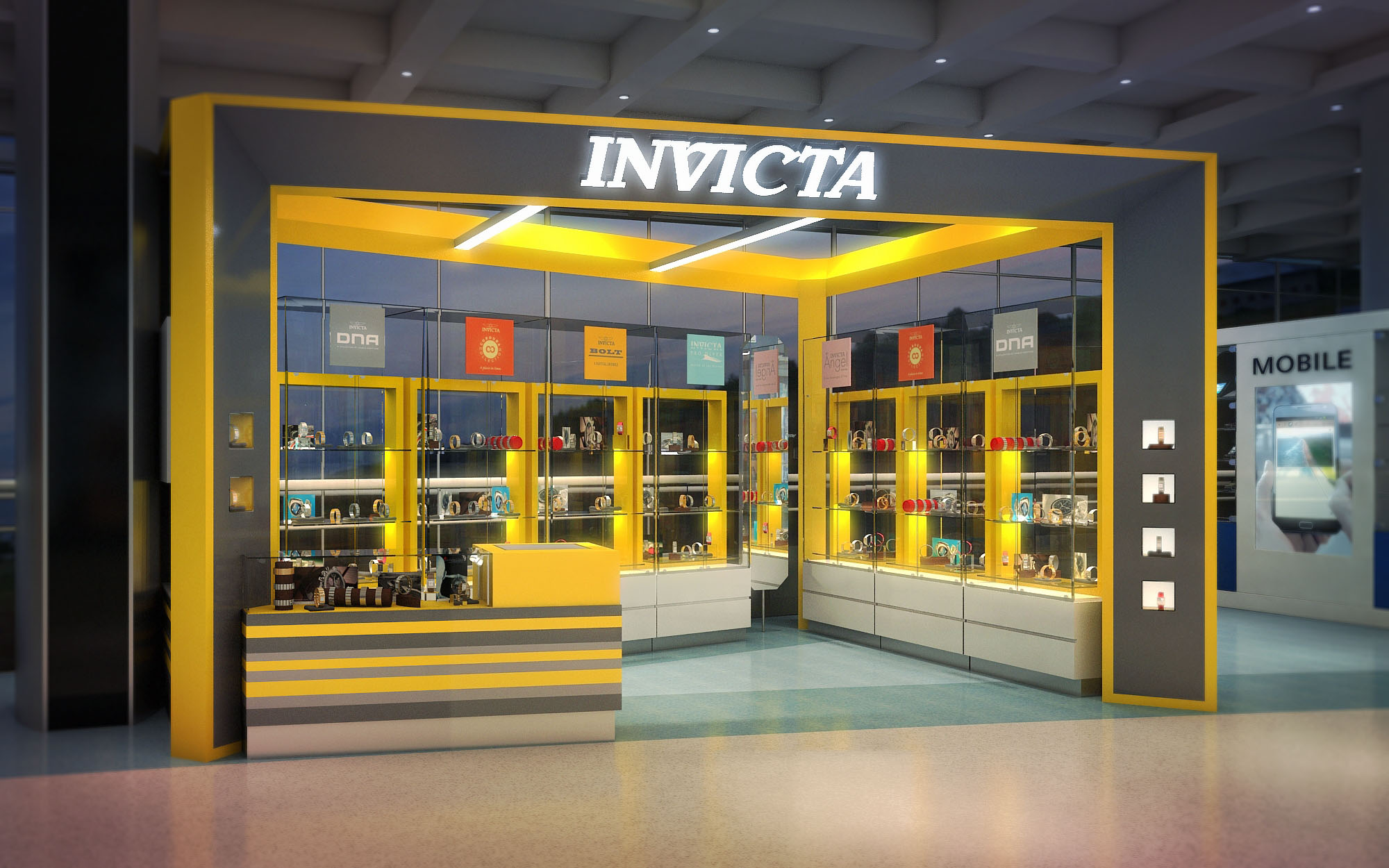
• Adidas : 4 • Adolfo Dominguez : 9 • AeroMarket : 3 • Agua Bendita : 5 • Alpargatus : 5 • Beesket : 1 • Bloomish : 1 • BLUE : 4 • Caribbean Souvenirs & Gifts : 1 • Civitatis Store : 1 • CocoBongo Boutique : 1 • Corona Corners : 2 • Cosmetics : 2 • Custo Barcelona : 1 • Daily Cleaners : 1 • Del Poble : 1 • Deportes Marti : 3 • DutyFree Shops : 27 • El Romero de Salamanca : 1 • Estanco Tabacos : 7 • Eureka : 4 • Fair Play Store : 1 • FCB Official Store : 1 • From : 6 • G-Shock : 1 • Gallery Boutique : 1 • General Optica : 1 • Havaianas Stores : 1 • Imaginarium : 3 • Indie Gen : 1 • Info Center Maremagnum : 1 • Invicta Watches : 92 • Isla Perfect Vision : 1 • Island Optica : 3 • Jewelry Warehouse : 1 • Kin Mayab : 2 • Local IV Sunglass Island : 1 • Mexico Lovers : 3 • Minisuper Lola : 1 • NBA Store : 1 • News & Books Shops : 25 • Oakley Store : 14 • Orbea Stores : 1 • Osborne : 3 • Oxigeno2 : 1 • Palau Moja : 1 • Parfois : 1 • Piquadro : 2 • Real Madrid Store : 31 • Sibarium : 58 • Solaris : 9 • Sport Zone : 1 • Sunglass Hut Stores : 1 • Sunglass Island Shops : 21 • Swatch Shops : 1 • Sweet Market Shops : 31 • Sweet Story : 2 • Swimwear Store : 7 • TechnoMarine : 3 • Telemundo : 2 • The Close Out : 2 • Tiendas : 1 • Totem Digital : 1 • TravelMarket : 3 • TucTuc Shops : 2 • Viña del Mar : 1 • Watch My Watch Shops : 54 • Watch My Watch Vintage : 4 • Worten Stores : 1
Experience the breadth of our capabilities and the depth of our dedication as you navigate through our Published Projects Portfolio. Here, we're not just showcasing our projects; we're inviting you to understand the passion and precision that we bring to every design we create.
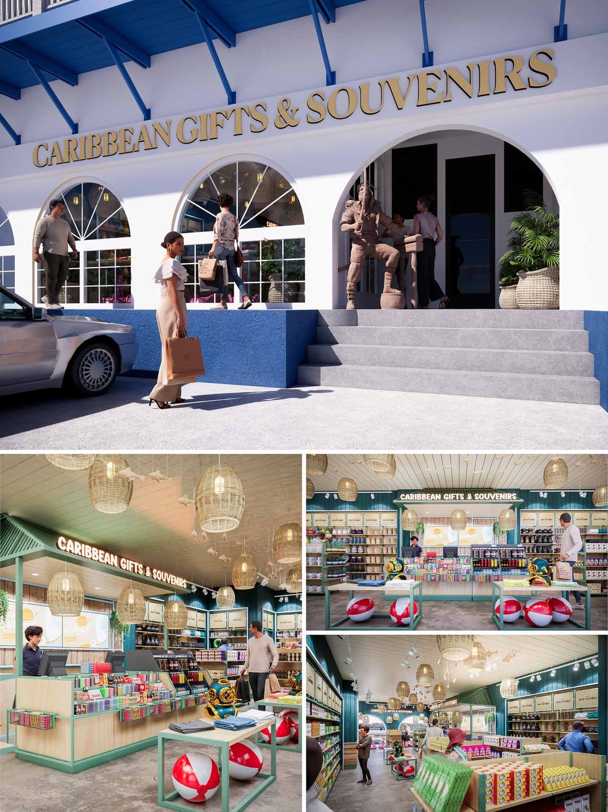
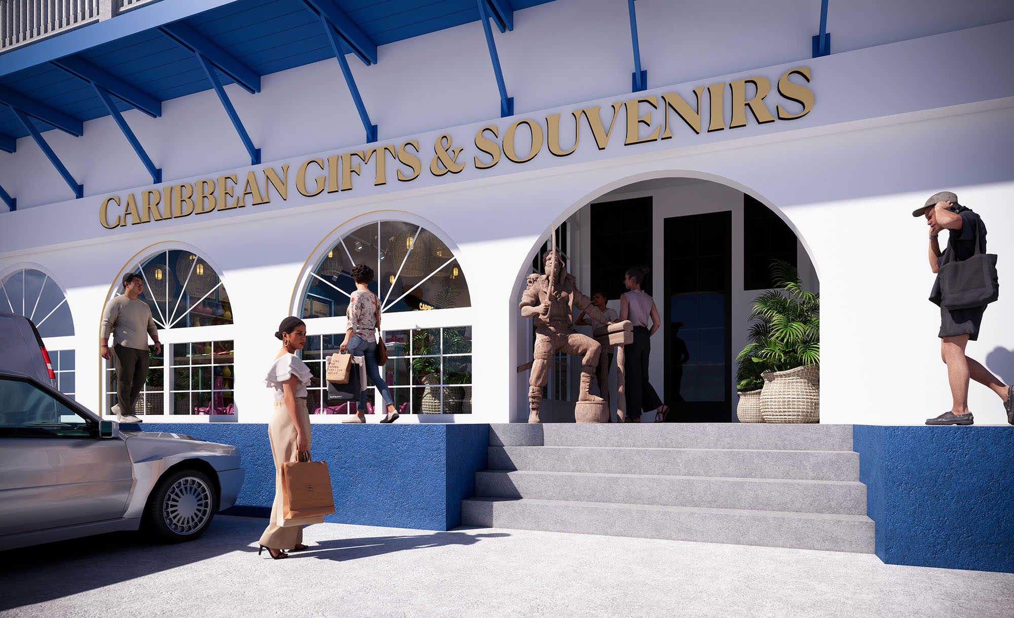
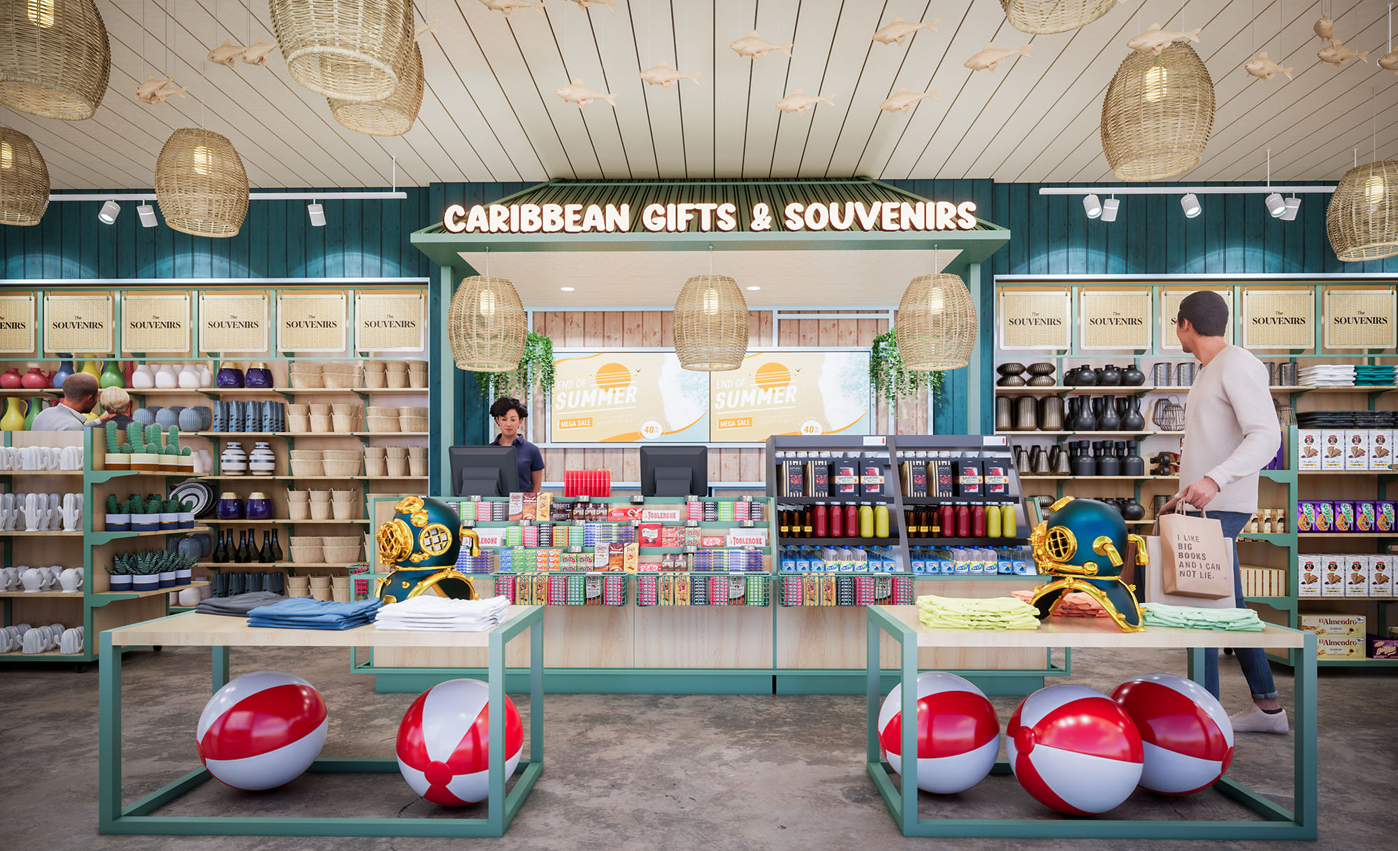
The project “Caribbean Souvenirs & Gifts” is conceived as a contemporary interpretation of the Caribbean coastal vernacular, adapted to the urban context of San Martín, México. The design prioritizes an immediate visual connection to vacation memories through a clear, fresh and luminous spatial identity, combining maritime references with warm local craftsmanship. The architecture seeks to create a seamless transition between exterior and interior, where the façade already anticipates the colorful and playful character of the retail experience.
The concept is organized around fluid circulation and full visibility of the merchandise from the entrance. A central axis directs the visitor’s gaze towards the main back wall, framed by generous shelving and branding, while freestanding display islands encourage intuitive browsing and impulse purchases. The overall spatial strategy supports high turnover retail without losing a relaxed, resort-like ambience.
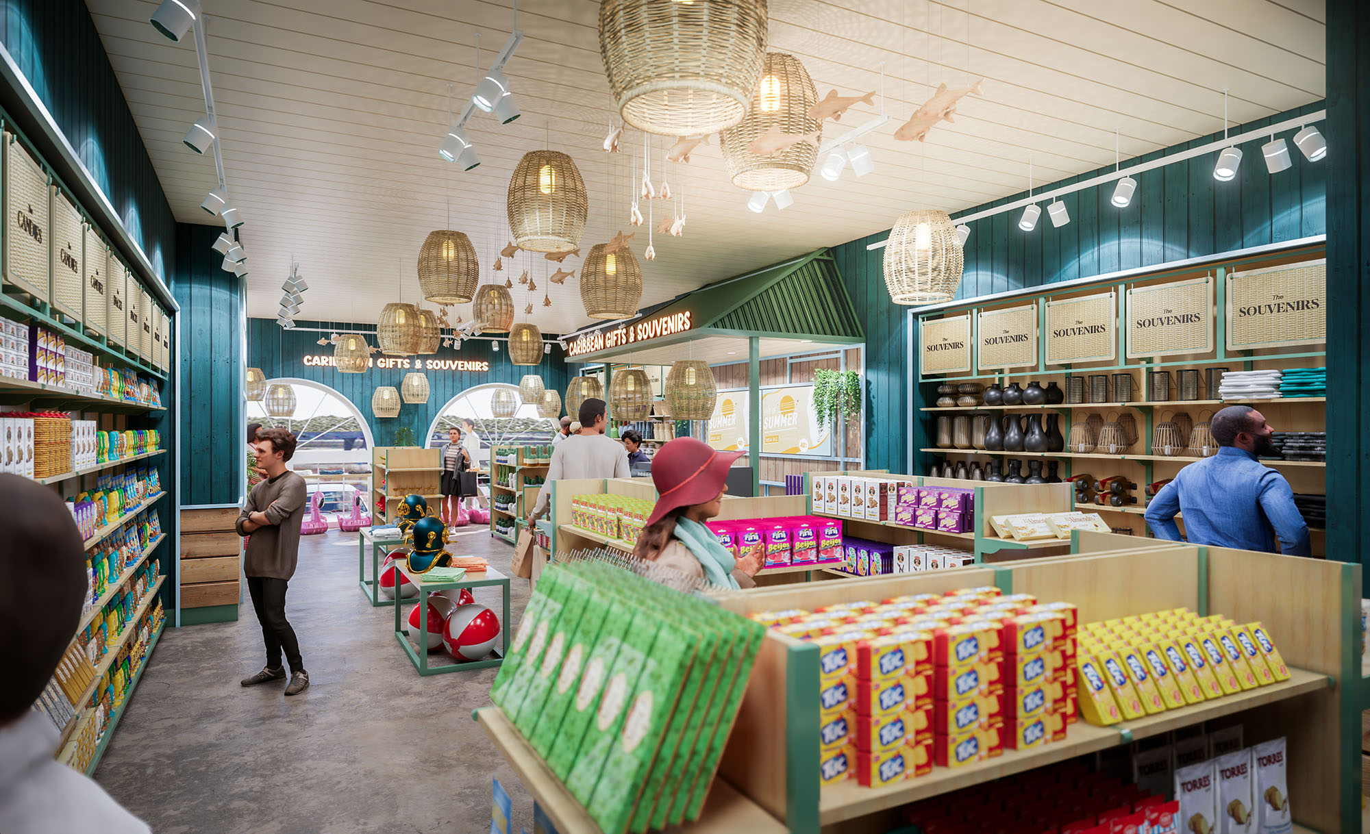
The façade uses clean white volumes with accentuated blue elements evocative of Caribbean seaside architecture. Large segmental arches create a rhythmic colonnade that opens the interior to the street and maximizes natural light. The arches also frame the display windows, transforming the storefront into an active showcase for products and interior life.
The upper blue overhang and exposed structural brackets provide deep shading, acting as a passive climatic device while reinforcing the nautical aesthetic. The main entrance is emphasized by a sculptural figure and generous steps that form an informal plaza, inviting visitors to pause, take photos and gradually move into the store. Gold-toned signage in relief typography adds a refined, resort-hotel touch, ensuring strong visibility in the commercial context.
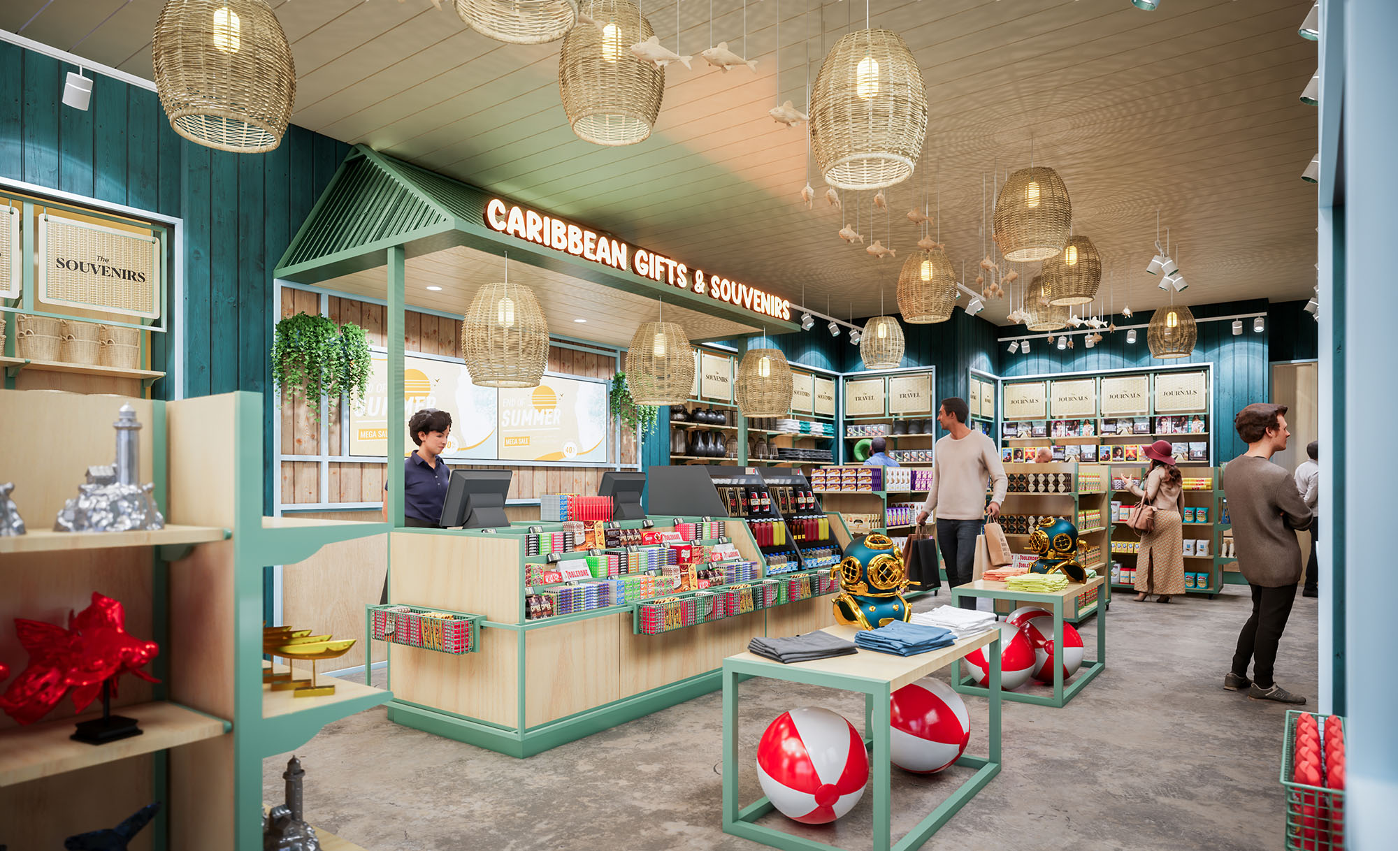
The interior layout is organized in a perimeter display system with a central field of low-height tables and gondolas. This configuration guarantees long visual corridors, facilitating orientation and allowing staff to monitor the entire space. The cashier block is placed laterally near the entrance to efficiently manage arrivals and departures without interrupting the main circulation loop.
Product zoning is defined both by color and by subtle variations in furniture height and density. Beach and leisure items are concentrated in the foreground with more tactile, accessible displays, while shelves with packaged gifts and local delicacies occupy the rear wall, functioning as a visual anchor. The layout supports both quick purchases and slower, exploratory browsing typical of tourists.
The material palette combines light-toned wood laminates for counters and shelving with deep green vertical paneling on accent walls, creating a contrast that makes merchandise stand out. Mint-green metal frames in the central tables introduce a fresh, coastal nuance, while the neutral concrete floor provides durability for high traffic and visually grounds the vivid colors of the products.
The ceiling is finished in light wood slats that reflect warm light and enhance acoustic comfort. Woven rattan pendant lamps create a handcrafted, tropical atmosphere and act as focal points over the central area. These are complemented by track lighting and recessed fixtures integrated into the perimeter signage band, ensuring uniform illumination and excellent product visibility while reducing glare.
Brand identity is embedded architecturally through continuous signage bands that wrap around key walls, unifying graphic communication and lighting. Typography is consistent from façade to interior, strengthening memorability and orientation. Neutral, organized back-of-shelf labeling systems allow fast reconfiguration of product lines without compromising visual order.
Display heights are carefully calibrated to maintain eye-level focus on primary merchandise while enabling secondary products to be discovered at lower shelves and table levels. The combination of open baskets, framed niches and linear shelving supports multiple product scales, from small souvenirs to volumetric beach toys, while preserving a cohesive visual language.
Sustainability is addressed through both passive and material strategies. The deep façade overhang, combined with the arched openings, reduces direct solar gain on the glazing, improving thermal comfort and limiting cooling loads. Natural daylight penetration minimizes daytime reliance on artificial lighting, while warm LED technology is specified throughout to reduce energy consumption.
The interior employs durable, low-maintenance finishes such as sealed concrete floors and laminated wood panels to extend lifecycle and reduce replacement frequency. The use of rattan and other natural fibers for lighting and decorative elements promotes renewable materials and supports local craftsmanship. Flexible modular furniture allows seasonal reconfiguration without major construction waste, ensuring the retail space can evolve with changing product lines and tourism trends.
The project “Caribbean Souvenirs & Gifts” is conceived as a contemporary interpretation of the Caribbean coastal vernacular, adapted to the urban context of San Martín, México. The design prioritizes an immediate visual connection to vacation memories through a clear, fresh and luminous spatial identity, combining maritime references with warm local craftsmanship. The architecture seeks to create a seamless transition between exterior and interior, where the façade already anticipates the colorful and playful character of the retail experience.
The concept is organized around fluid circulation and full visibility of the merchandise from the entrance. A central axis directs the visitor’s gaze towards the main back wall, framed by generous shelving and branding, while freestanding display islands encourage intuitive browsing and impulse purchases. The overall spatial strategy supports high turnover retail without losing a relaxed, resort-like ambience.
The façade uses clean white volumes with accentuated blue elements evocative of Caribbean seaside architecture. Large segmental arches create a rhythmic colonnade that opens the interior to the street and maximizes natural light. The arches also frame the display windows, transforming the storefront into an active showcase for products and interior life.
The upper blue overhang and exposed structural brackets provide deep shading, acting as a passive climatic device while reinforcing the nautical aesthetic. The main entrance is emphasized by a sculptural figure and generous steps that form an informal plaza, inviting visitors to pause, take photos and gradually move into the store. Gold-toned signage in relief typography adds a refined, resort-hotel touch, ensuring strong visibility in the commercial context.
The interior layout is organized in a perimeter display system with a central field of low-height tables and gondolas. This configuration guarantees long visual corridors, facilitating orientation and allowing staff to monitor the entire space. The cashier block is placed laterally near the entrance to efficiently manage arrivals and departures without interrupting the main circulation loop.
Product zoning is defined both by color and by subtle variations in furniture height and density. Beach and leisure items are concentrated in the foreground with more tactile, accessible displays, while shelves with packaged gifts and local delicacies occupy the rear wall, functioning as a visual anchor. The layout supports both quick purchases and slower, exploratory browsing typical of tourists.
The material palette combines light-toned wood laminates for counters and shelving with deep green vertical paneling on accent walls, creating a contrast that makes merchandise stand out. Mint-green metal frames in the central tables introduce a fresh, coastal nuance, while the neutral concrete floor provides durability for high traffic and visually grounds the vivid colors of the products.
The ceiling is finished in light wood slats that reflect warm light and enhance acoustic comfort. Woven rattan pendant lamps create a handcrafted, tropical atmosphere and act as focal points over the central area. These are complemented by track lighting and recessed fixtures integrated into the perimeter signage band, ensuring uniform illumination and excellent product visibility while reducing glare.
Brand identity is embedded architecturally through continuous signage bands that wrap around key walls, unifying graphic communication and lighting. Typography is consistent from façade to interior, strengthening memorability and orientation. Neutral, organized back-of-shelf labeling systems allow fast reconfiguration of product lines without compromising visual order.
Display heights are carefully calibrated to maintain eye-level focus on primary merchandise while enabling secondary products to be discovered at lower shelves and table levels. The combination of open baskets, framed niches and linear shelving supports multiple product scales, from small souvenirs to volumetric beach toys, while preserving a cohesive visual language.
Sustainability is addressed through both passive and material strategies. The deep façade overhang, combined with the arched openings, reduces direct solar gain on the glazing, improving thermal comfort and limiting cooling loads. Natural daylight penetration minimizes daytime reliance on artificial lighting, while warm LED technology is specified throughout to reduce energy consumption.
The interior employs durable, low-maintenance finishes such as sealed concrete floors and laminated wood panels to extend lifecycle and reduce replacement frequency. The use of rattan and other natural fibers for lighting and decorative elements promotes renewable materials and supports local craftsmanship. Flexible modular furniture allows seasonal reconfiguration without major construction waste, ensuring the retail space can evolve with changing product lines and tourism trends.
© 2021 by sanzpont [arquitectura] . Webpage by sanzpont [digital] . Innovative Digital Experiences
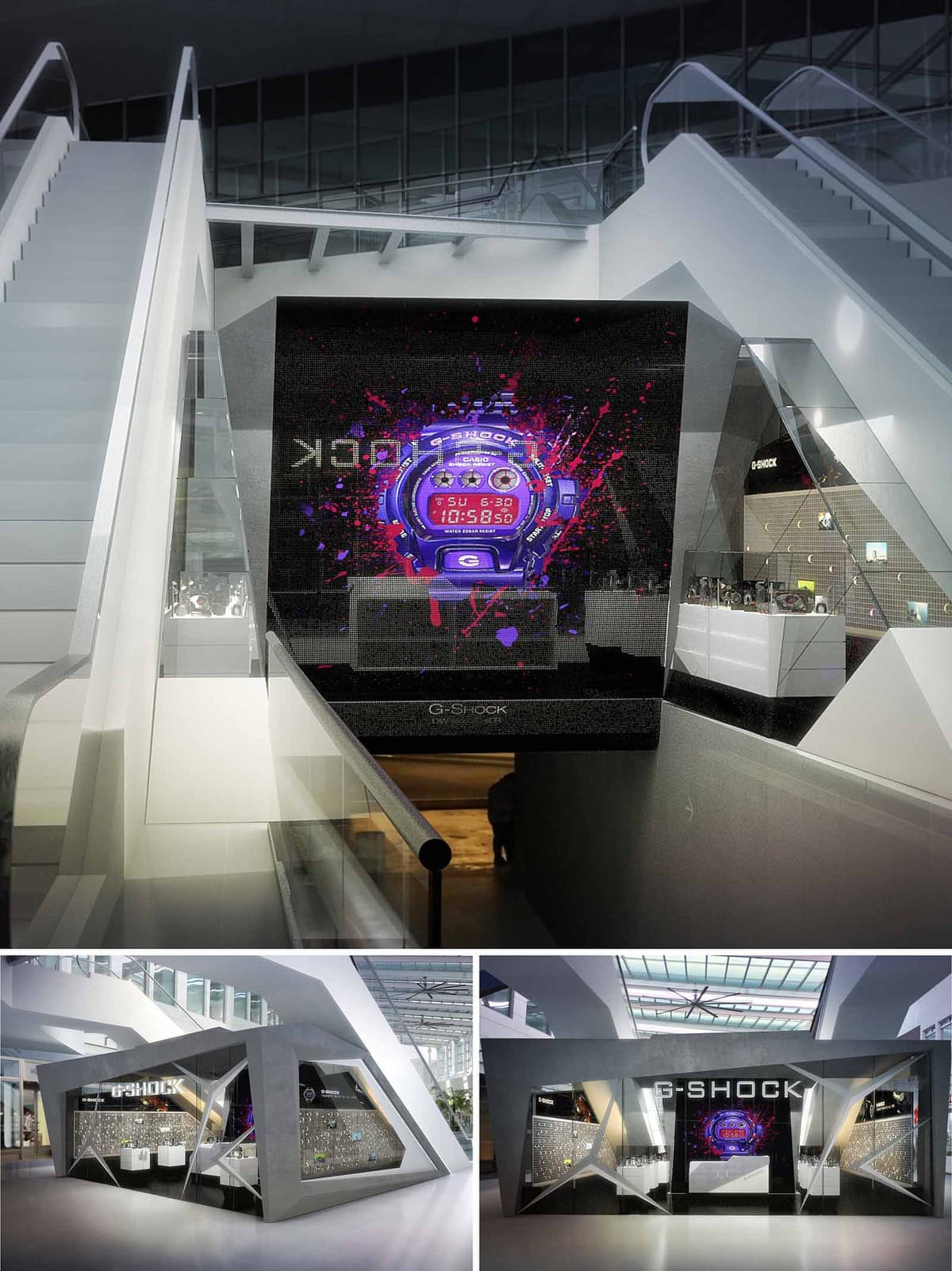

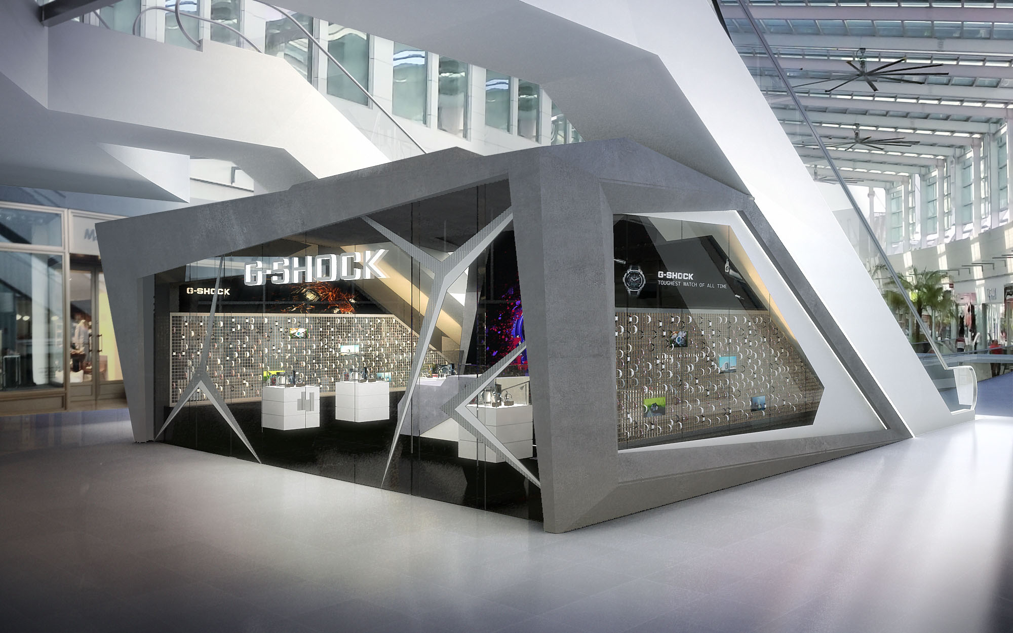
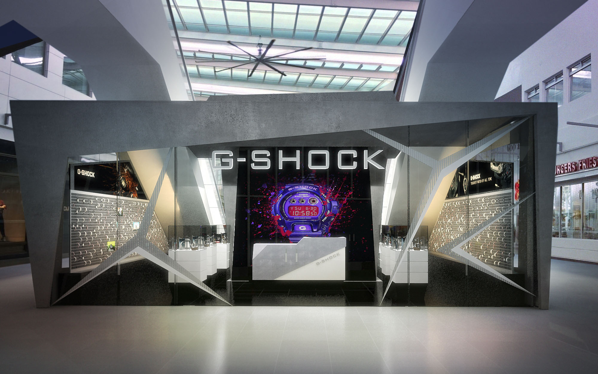
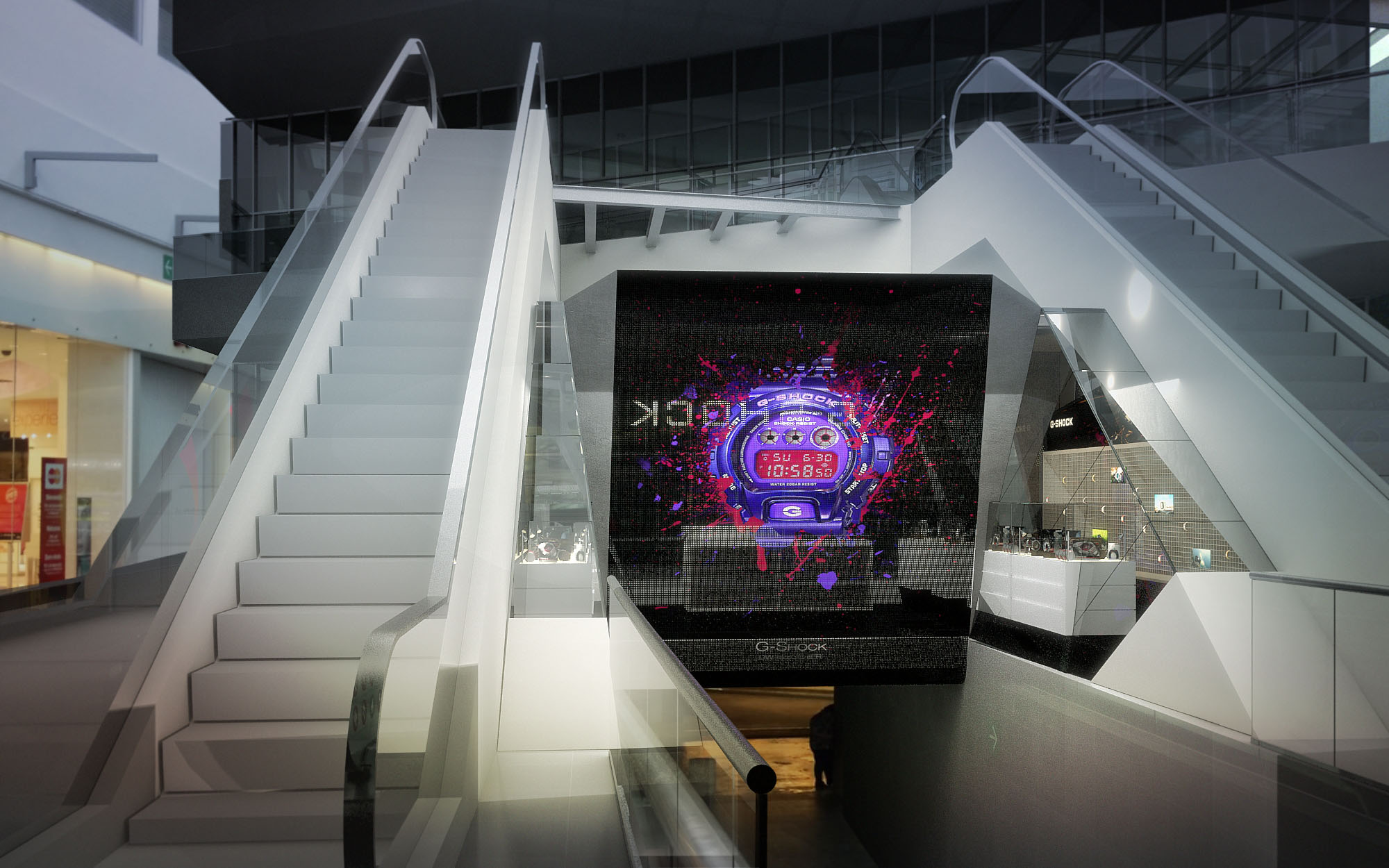
The G-SHOCK retail space in Cancún is conceived as an architectural translation of the brand’s core values: resistance, precision, and urban energy. The volume is designed as a faceted monolith, almost sculpted from a single block, echoing the robust geometry of the watches themselves. The kiosk-like structure sits as an autonomous object within the larger atrium, contrasting with the smooth circulation of the mall and becoming an immediate point of attraction.
The design prioritizes visual impact and clear brand recognition. A large digital screen integrated into the central façade acts as a dynamic canvas, communicating technology, color, and movement, while the angular cuts and sharp edges of the envelope recall mechanical parts and protective casings. The overall result is a hybrid between pavilion and product, where architecture behaves like an enlarged watch body.
The project is articulated as a compact, open-plan interior within a clearly defined external shell. Access is from the front façade, where a recessed central opening invites visitors into a controlled, immersive environment. Interior circulation is straightforward and linear, guiding the user along the main display wall and towards secondary showcases embedded in the side facades.
Display zones are strategically located along the perimeter, allowing the central space to remain visually free and flexible for customer interaction and product testing. The geometry of the exterior facets informs the interior layout, generating niches and angled planes that become integrated vitrines, podiums, and graphic supports. Seating elements near the entrance encourage short stays and personalized service, while preserving a clear view of the entire collection.
The external envelope operates as a three-dimensional brand statement. Faceted concrete-like surfaces and sharp chamfers create a sense of movement and resilience, mirroring the shock-resistant character of the watches. Large transparent planes are inserted as crystalline cuts, revealing the interior and framing curated views of the products.
The front façade is composed as a triptych: a central multimedia panel flanked by two angular display windows. This composition reinforces symmetry and focus on the main digital content, while the flanking showcases work as luminous beacons that attract passersby from oblique angles. The G-SHOCK logo is integrated in a bold, high-contrast manner above the entrance, ensuring immediate recognition at distance within the mall’s open atrium.
The material palette combines dark, matte surfaces with high-gloss and transparent elements to emphasize technological sophistication. The outer shell suggests a mineral, almost concrete texture, contrasted with polished metal trims and clear glass planes. Inside, neutral greys and blacks form a controlled backdrop that intensifies the chromatic accents of the watches and digital graphics.
Lighting is predominantly integrated and indirect, concealed within joints and edges of the faceted planes to accentuate the geometry and avoid glare. Linear LED strips wash the display walls, while focused projectors highlight key models and limited editions. The central screen introduces saturated color and dynamic light, creating an ever-changing focal point that energizes both the interior and the surrounding public space.
The design incorporates several measures to optimize environmental performance within the constraints of a retail kiosk. The compact footprint reduces material usage, while the faceted envelope allows for the strategic placement of insulated opaque panels, minimizing heat gain from the extensively glazed mall atrium. High-efficiency LED lighting with programmable controls lowers energy consumption and permits dimming scenarios according to natural daylight levels.
Durable finishes with high resistance to abrasion and impact extend lifecycle and reduce the need for replacement, in line with the brand’s durability ethos. Modular display components facilitate reconfiguration and reuse for future collections, decreasing waste. Where possible, local fabrication and sourcing in México limit transportation impacts, and the project’s demountable nature allows the structure to be relocated or adapted rather than discarded at the end of its use in this specific location.
© 2021 by sanzpont [arquitectura] . Webpage by sanzpont [digital] . Innovative Digital Experiences
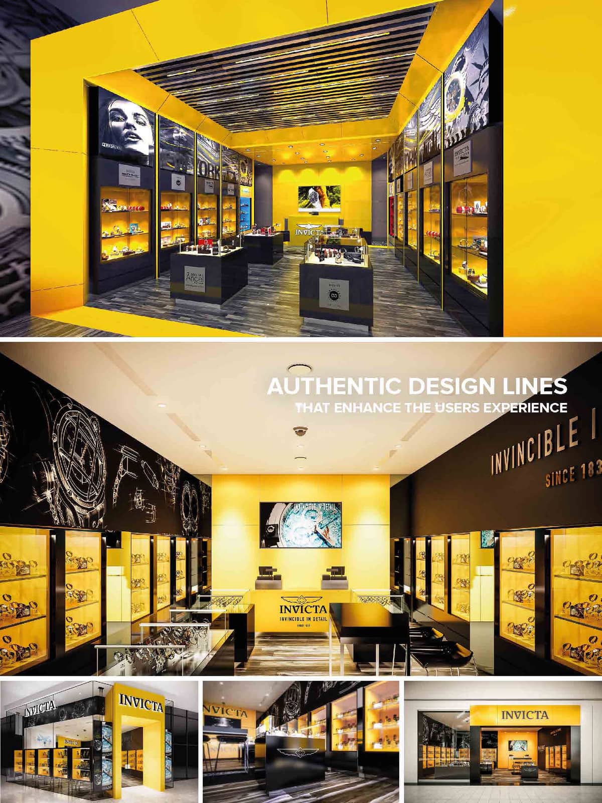

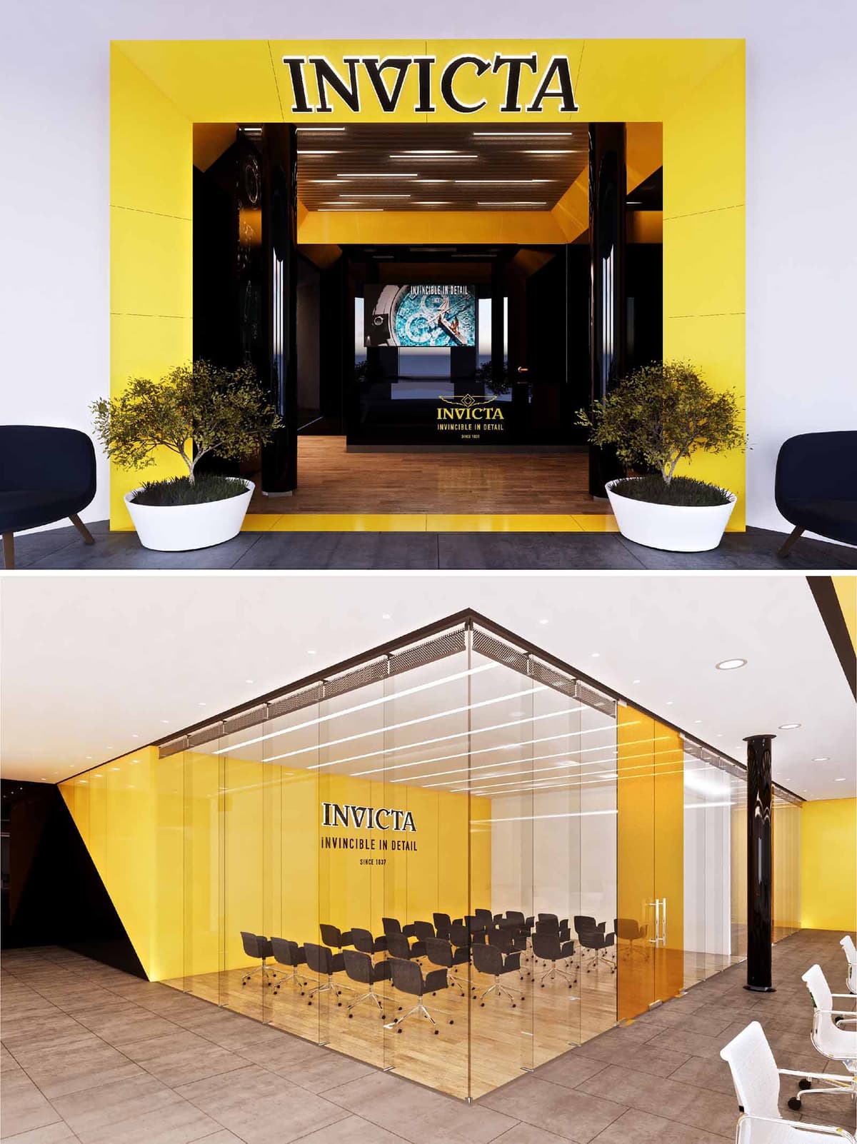
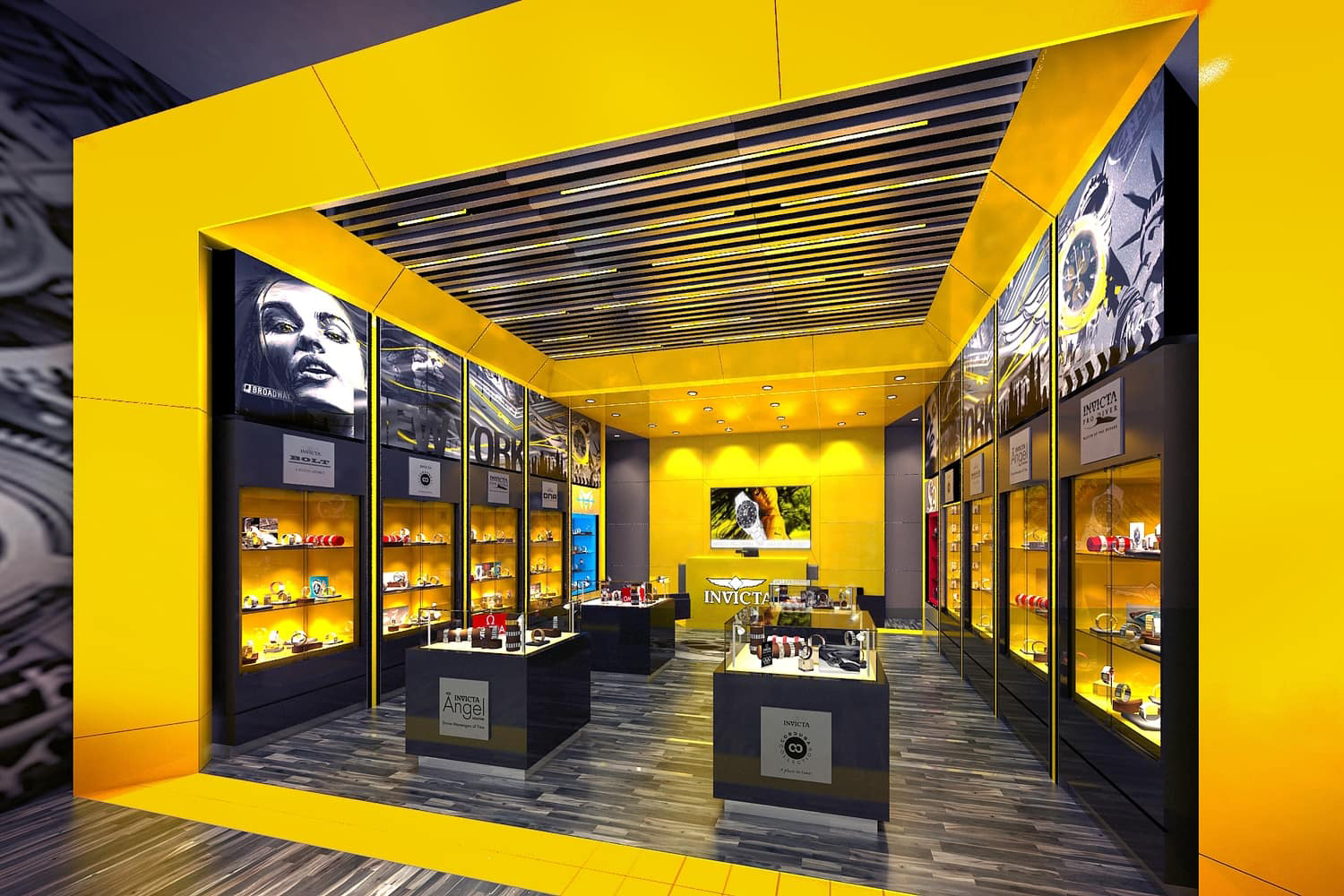
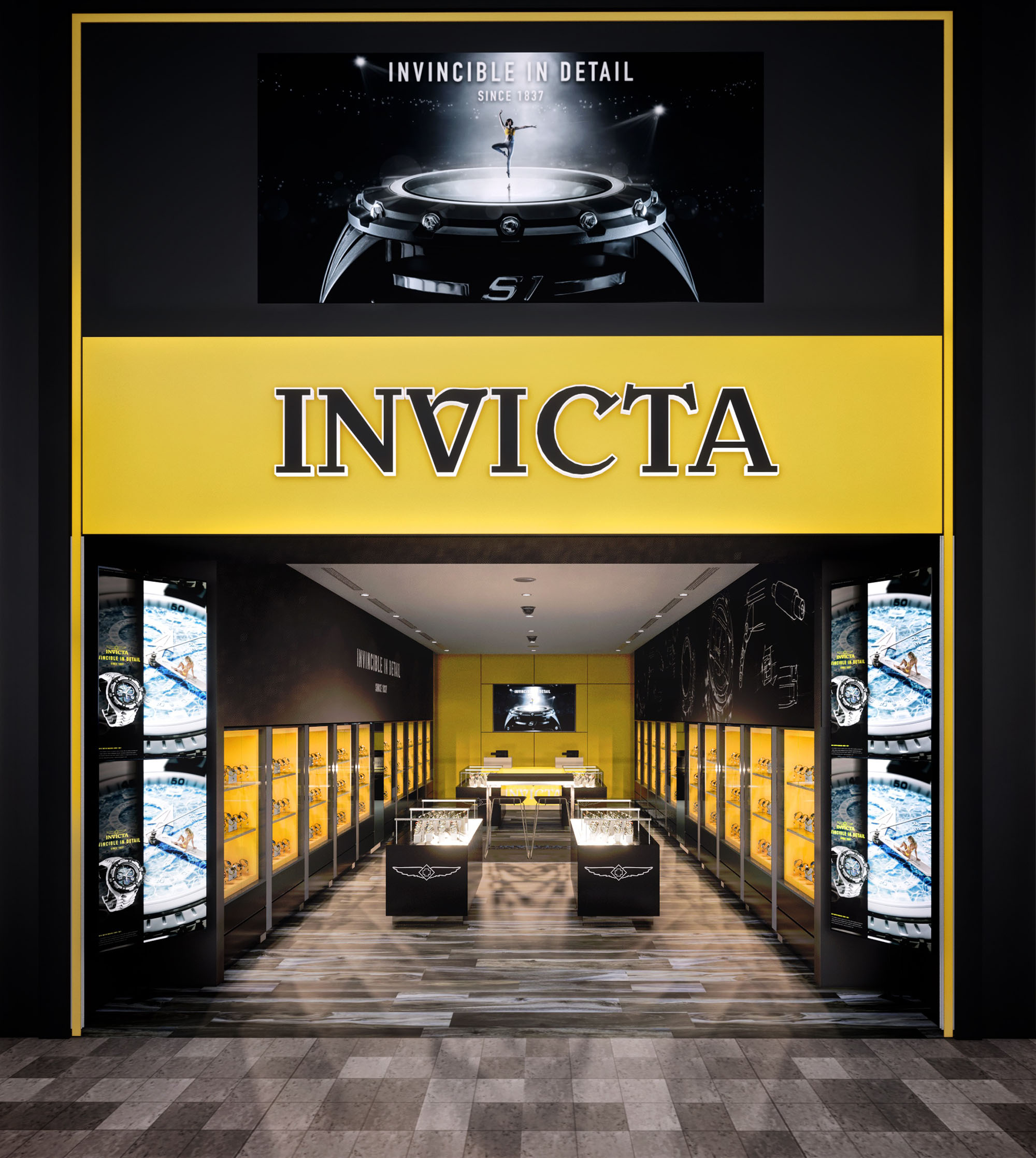
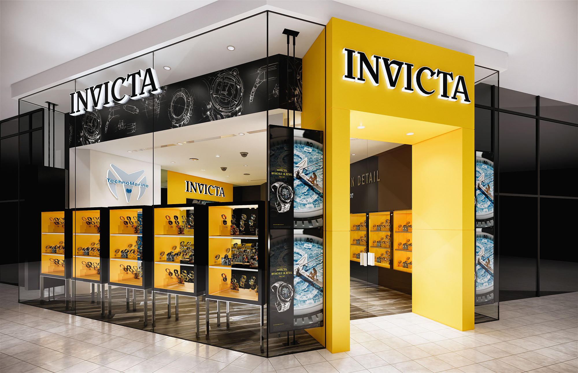
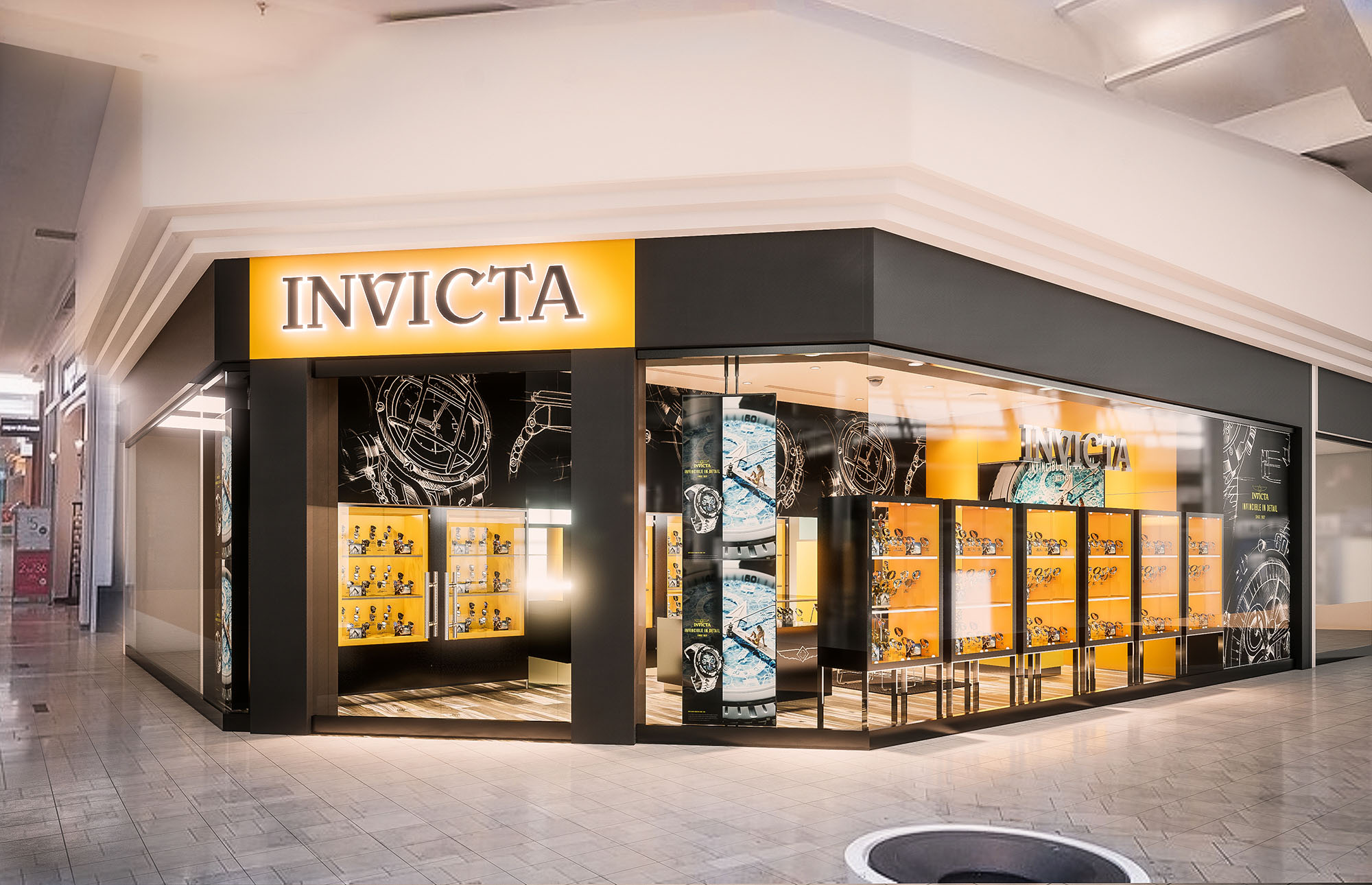
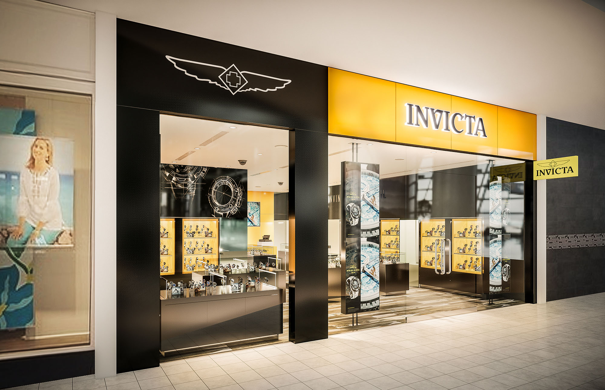
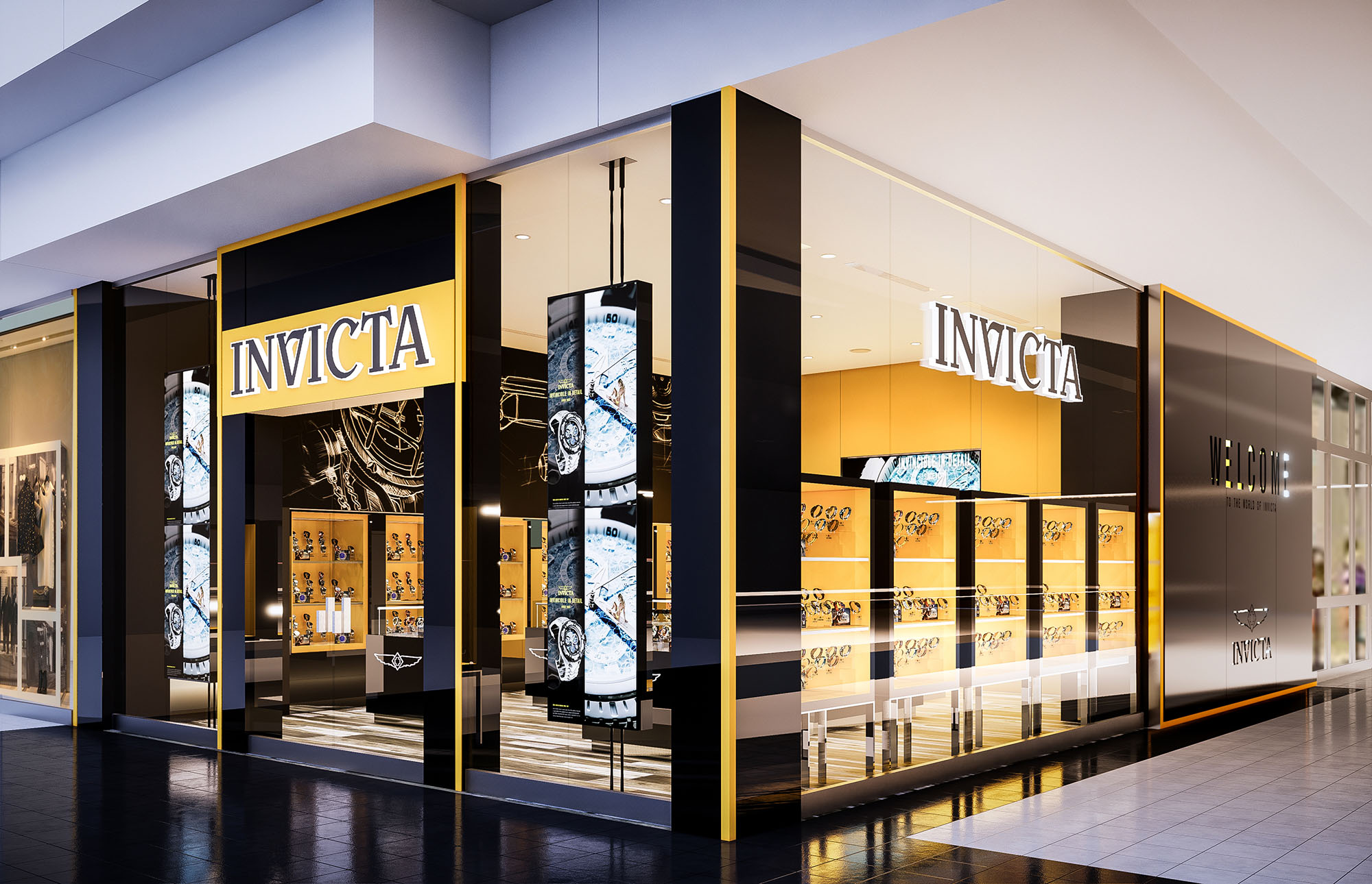
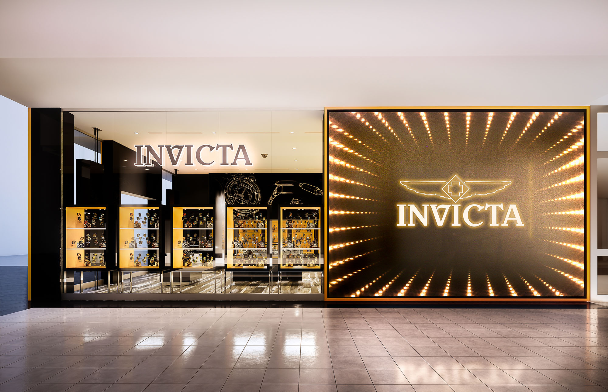
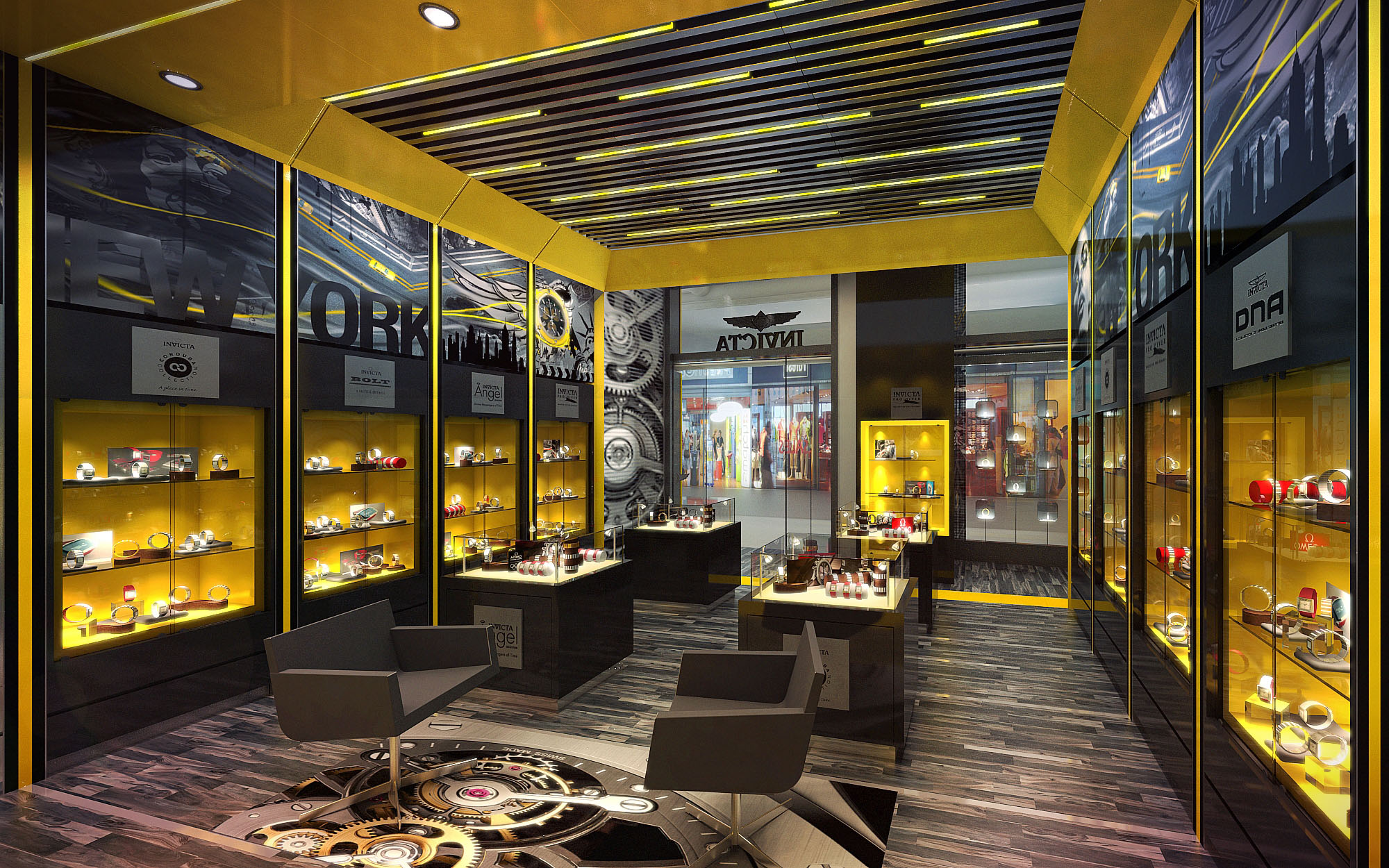
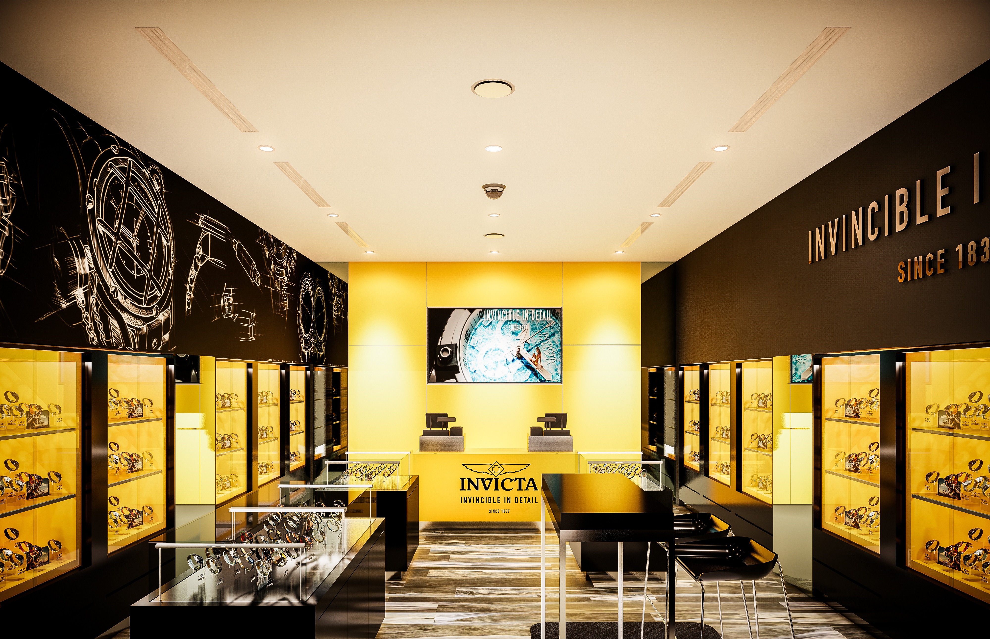
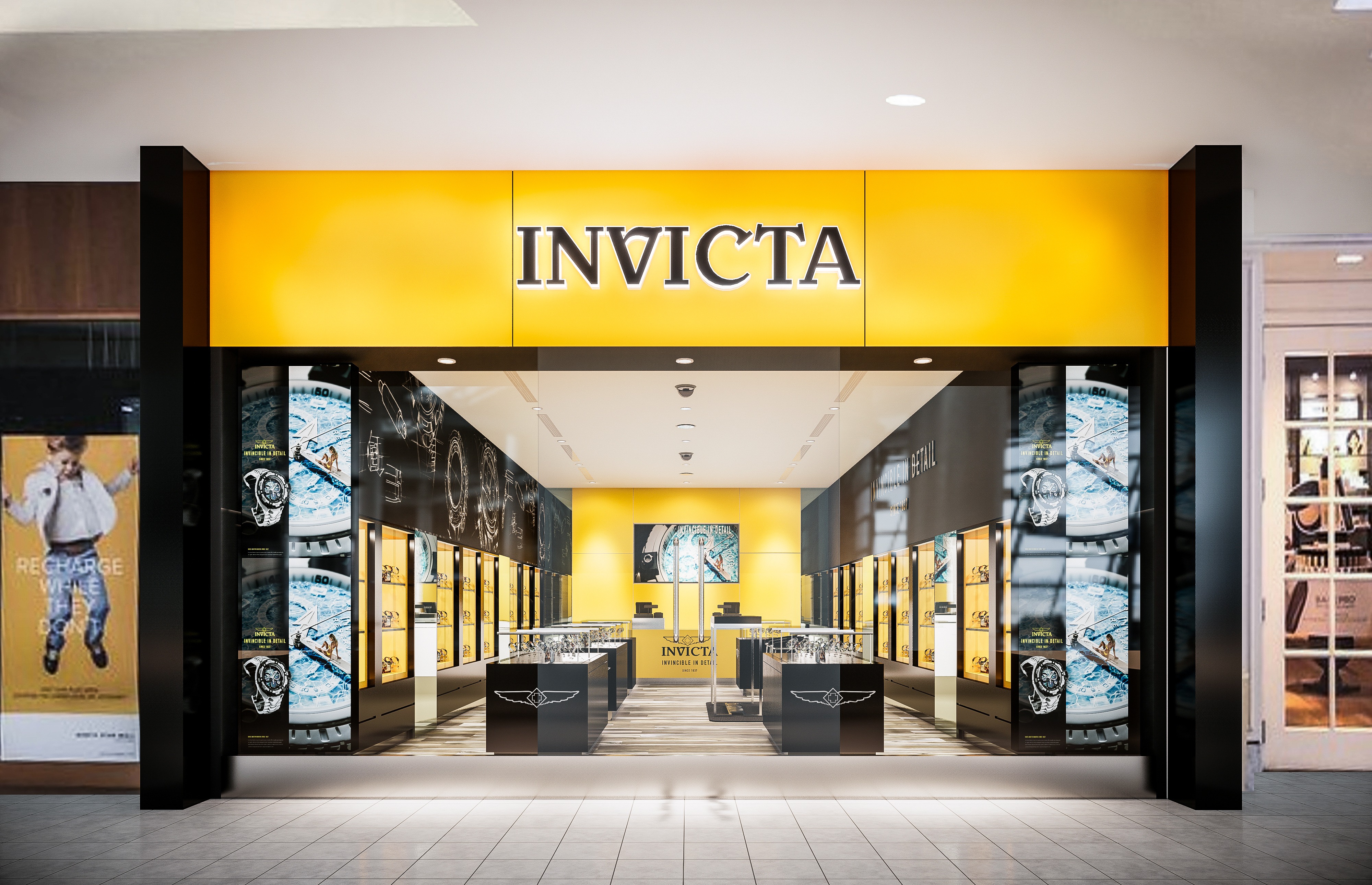
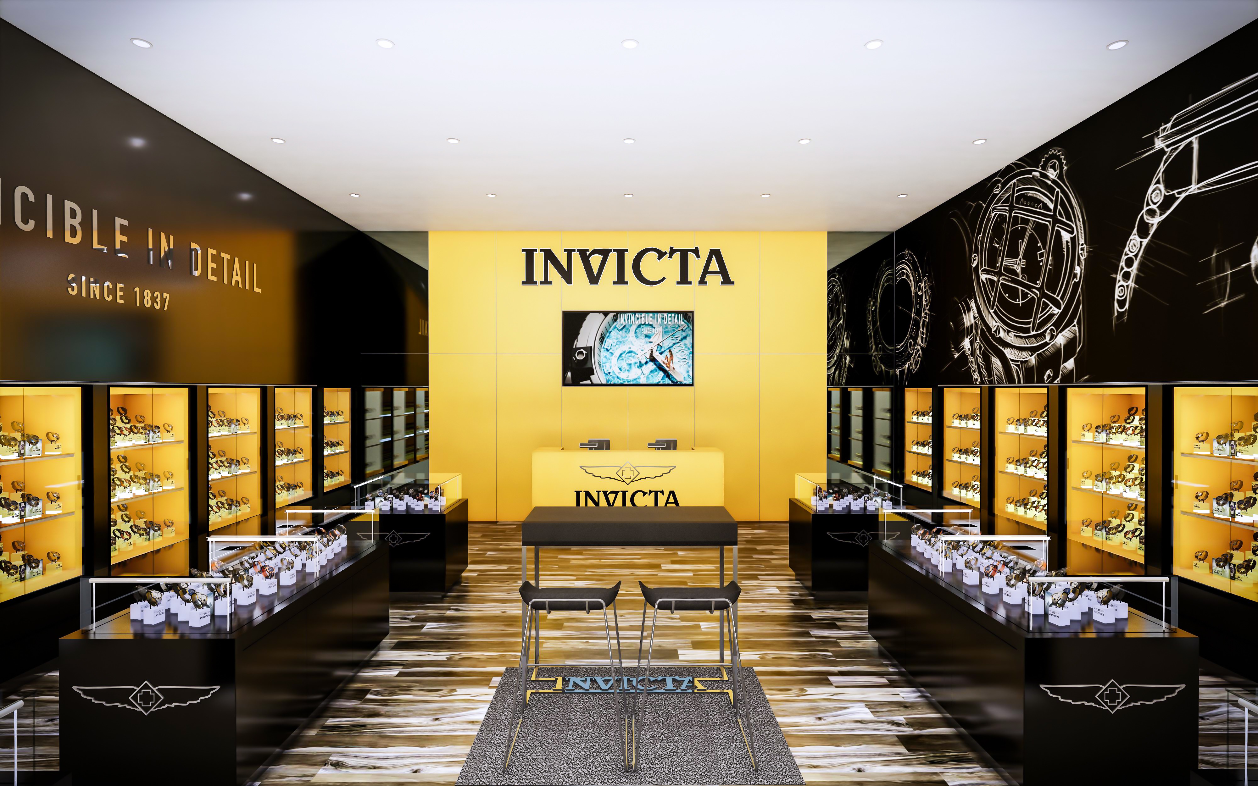
The retail space concept presents a dynamic and high-contrast design aesthetic, employing a vivid color palette and strategic lighting to emphasize product displays and create a distinctive brand atmosphere. The use of the bold yellow juxtaposed with black and neutral tones creates a space that is both inviting and visually striking, aligning with what appears to be a brand identity that is assertive and confident.
The interior design creates an immersive brand experience, with a careful balance between boldness and elegance. The use of color, light, and layout not only reinforces the identity of the brand but also creates a memorable and inviting environment for customers. The sustainability of the space could be further explored by the brand to ensure that environmental responsibility aligns with the visual and experiential impact of the design.
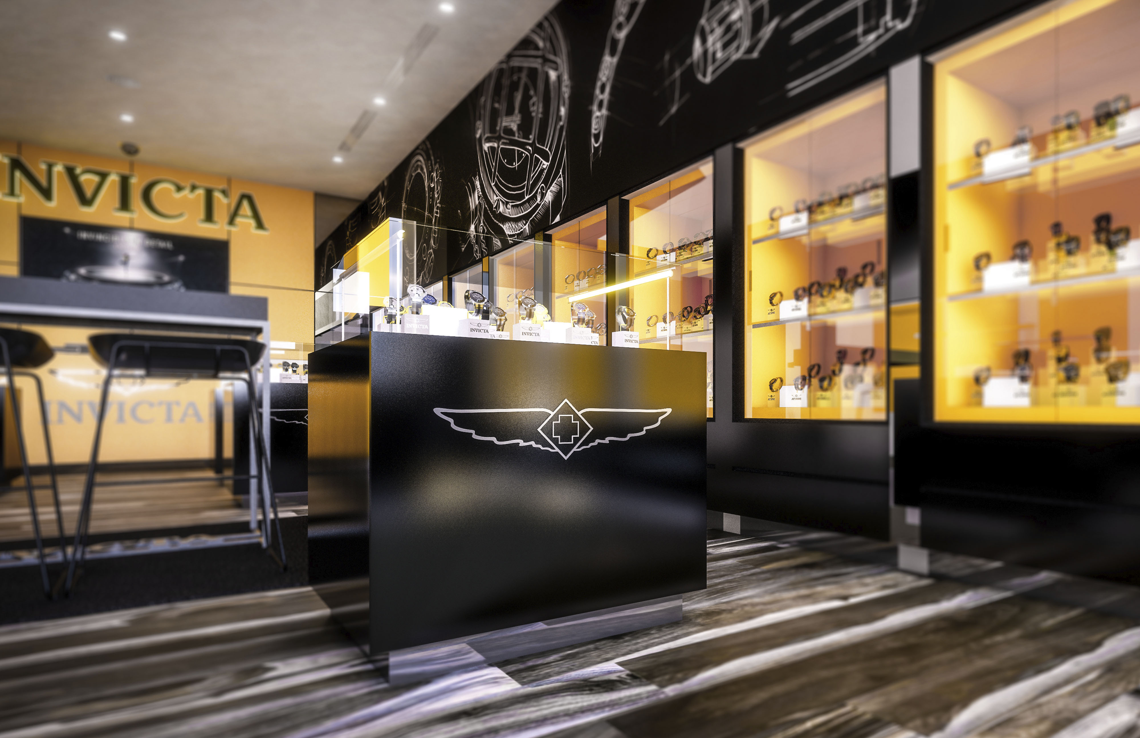
The dominant color palette consists of a vibrant yellow and deep black, establishing a striking contrast that is likely part of the brand's visual identity. Yellow, used as an accent color, energizes the space and attracts attention, while black provides a sophisticated backdrop that accentuates the merchandise. The integration of the brand logo and name in strategic locations reinforces brand identity and creates a cohesive environment.
A variety of materials are utilized to add depth and texture to the space. Glossy surfaces on display units and counters reflect light, enhancing brightness and visibility. The use of wood slats on the ceiling introduces an organic texture that contrasts with the sleekness of the display cases, balancing modernity with warmth. The flooring appears to be a wood-look laminate or tile, chosen for durability and ease of maintenance in high-traffic areas.
Strategically placed lighting highlights the merchandise and creates a hierarchy within the space. Spotlights are used to illuminate products individually, while ambient lighting enhances the overall mood. The display cases are internally lit, providing a soft glow that adds depth to the product presentation. This careful consideration of lighting supports not just aesthetic appeal but also functional visibility of the products.
The layout is designed to guide customers through a curated experience of the brand’s offerings. Central display tables invite interaction, while wall-mounted displays create a gallery-like environment that encourages exploration. The flow seems intentional, creating a rhythm between more private, focused viewing areas and open, communal spaces.
Considerations include the use of LED lighting for energy efficiency, materials sourced from sustainable suppliers, and design choices that reduce waste or allow for recycling of display elements. The longevity of design elements and modularity for future adaptations also contribute to sustainable practices in retail design.

The retail space concept presents a dynamic and high-contrast design aesthetic, employing a vivid color palette and strategic lighting to emphasize product displays and create a distinctive brand atmosphere. The use of the bold yellow juxtaposed with black and neutral tones creates a space that is both inviting and visually striking, aligning with what appears to be a brand identity that is assertive and confident.
The interior design creates an immersive brand experience, with a careful balance between boldness and elegance. The use of color, light, and layout not only reinforces the identity of the brand but also creates a memorable and inviting environment for customers. The sustainability of the space could be further explored by the brand to ensure that environmental responsibility aligns with the visual and experiential impact of the design.
The dominant color palette consists of a vibrant yellow and deep black, establishing a striking contrast that is likely part of the brand's visual identity. Yellow, used as an accent color, energizes the space and attracts attention, while black provides a sophisticated backdrop that accentuates the merchandise. The integration of the brand logo and name in strategic locations reinforces brand identity and creates a cohesive environment.
A variety of materials are utilized to add depth and texture to the space. Glossy surfaces on display units and counters reflect light, enhancing brightness and visibility. The use of wood slats on the ceiling introduces an organic texture that contrasts with the sleekness of the display cases, balancing modernity with warmth. The flooring appears to be a wood-look laminate or tile, chosen for durability and ease of maintenance in high-traffic areas.
Strategically placed lighting highlights the merchandise and creates a hierarchy within the space. Spotlights are used to illuminate products individually, while ambient lighting enhances the overall mood. The display cases are internally lit, providing a soft glow that adds depth to the product presentation. This careful consideration of lighting supports not just aesthetic appeal but also functional visibility of the products.
The layout is designed to guide customers through a curated experience of the brand’s offerings. Central display tables invite interaction, while wall-mounted displays create a gallery-like environment that encourages exploration. The flow seems intentional, creating a rhythm between more private, focused viewing areas and open, communal spaces.
Considerations include the use of LED lighting for energy efficiency, materials sourced from sustainable suppliers, and design choices that reduce waste or allow for recycling of display elements. The longevity of design elements and modularity for future adaptations also contribute to sustainable practices in retail design.
© 2021 by sanzpont [arquitectura] . Webpage by sanzpont [digital] . Innovative Digital Experiences
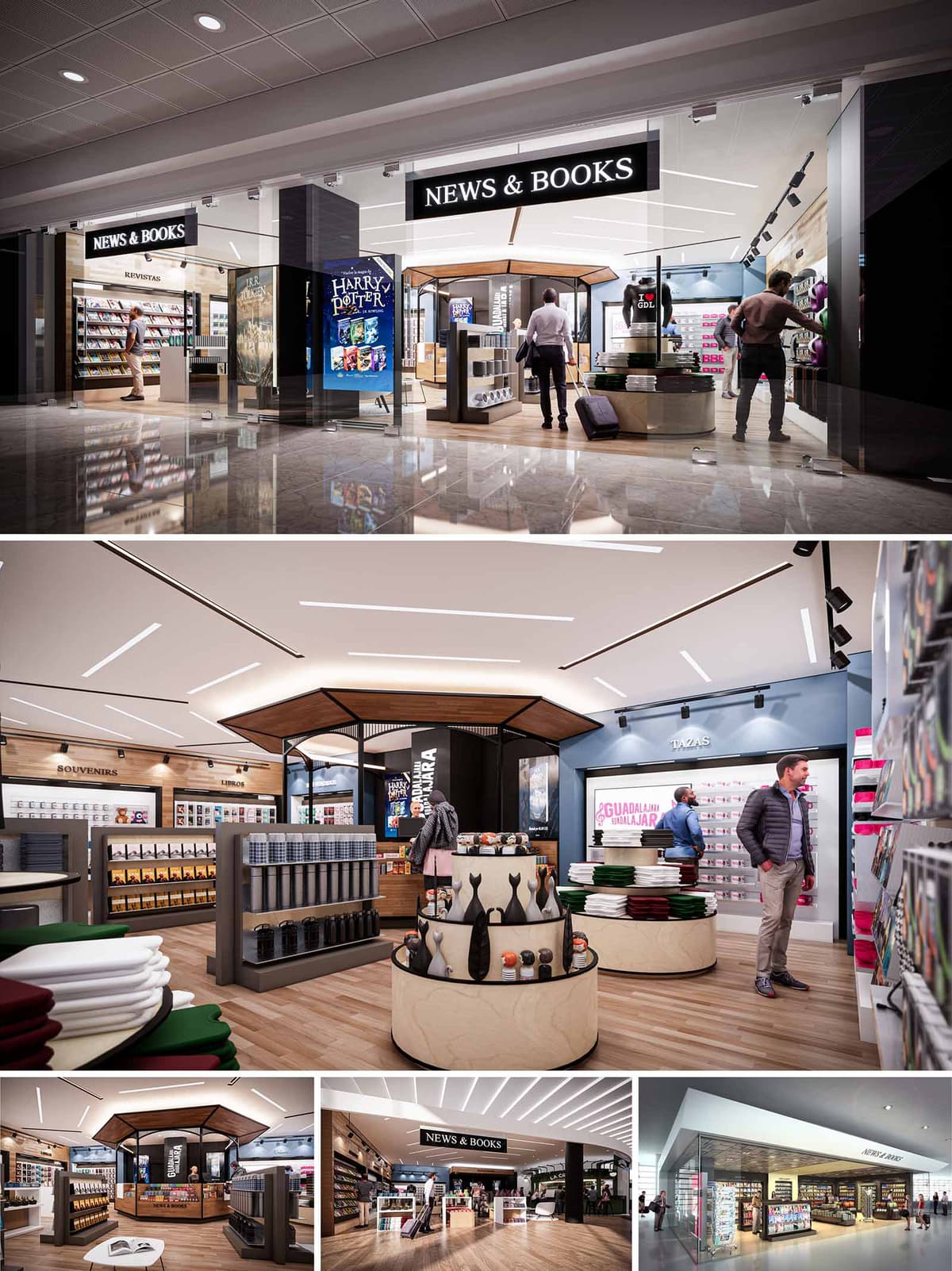

The NEWS & BOOKS concept is conceived as a contemporary travel hub where literature, press and curated gift items converge in a clear, legible environment. The architectural language is based on clean lines, generous transparency and warm materials, creating a calm pause within the dynamic flow of airports and transport terminals. The store acts as an illuminated “lantern” in the concourse, with high-contrast signage and open façades that invite intuitive entry.
The design is modular and replicable, allowing consistent brand recognition across 25 locations while adapting to different footprints. Central to the concept is a sequence of thematic zones—press, books, souvenirs and convenience items—organized around a strong geometric core that guides circulation and sightlines.
The spatial organization is based on a borderless threshold: large glazed fronts and wide openings remove physical barriers between corridor and interior. This encourages a seamless transition and supports self-directed browsing, essential in high-traffic, time-sensitive environments. Linear shelves define the perimeter, while lower gondolas structure the central area without obstructing long views.
A hexagonal or octagonal kiosk-like volume anchors the center of the plan, working as both a visual landmark and a functional node for high-rotation products. Circular display islands complement this geometry, softening circulation and allowing 360º access. The layout favors a one-way intuitive loop, subtly guiding customers past all main product families before returning them to the exit and cash-wrap zone.
The materials palette combines natural finishes with robust retail-grade surfaces. Warm-toned wood-effect flooring establishes continuity across the space and provides a neutral base that highlights merchandise. Vertical surfaces alternate between wood cladding, matte neutral paints and black metal profiles, generating a balanced contrast between warmth and precision.
Display furniture uses light birch or beech tones, rounded MDF edges and laminated tops to withstand heavy use. Dark grey shelving and black metal details introduce a graphic rhythm that frames books and products without visual noise. The overall chromatic range remains calm and desaturated so that covers, magazines and souvenirs supply the primary color accents.
Lighting is a key component of the architectural identity. A continuous white ceiling plane is animated by recessed linear LED profiles, arranged in diagonals that echo movement and subtly reference routes and trajectories of travel. These lines visually stitch different areas together and create depth towards the back of the store.
Track-mounted spotlights provide adjustable accent lighting on shelving and promotional walls, ensuring good legibility of spines and covers. Large backlit graphic panels, digital screens and clearly legible typography reinforce the brand while enabling quick orientation: zones such as “REVISTAS”, “SOUVENIRS” or “TAZAS” are immediately identifiable from the entrance.
The furniture system is designed for high flexibility and easy reconfiguration across multiple locations. Perimeter shelving maximizes vertical storage, while mid-height gondolas support cross-merchandising of books, travel essentials and gifts. Circular tiered displays highlight impulse items and seasonal collections, encouraging short dwell yet intensive browsing.
Ergonomic considerations guide counter heights, shelf depths and aisle widths, allowing comfortable use for luggage-carrying travelers. Finely detailed junctions, rounded corners and protected bases increase durability and safety in crowded environments. The result is a clear, intuitive environment that supports rapid purchasing without sacrificing the pleasure of browsing.
The design strategy integrates sustainability through material selection, lighting efficiency and modular construction. Surfaces prioritize durable laminates, engineered woods from certified sources and finishes that withstand intensive use, reducing the need for frequent replacement. Repetitive furniture modules minimize production waste and simplify maintenance across the 25 stores.
LED technology, combined with carefully calculated lighting levels, reduces energy consumption while eliminating excessive glare on glossy covers. The open-plan layout allows visual control with a limited number of staff, optimizing operational resources. Where possible, demountable partitions and freestanding fixtures are employed so that future relocations or re-branding can reuse the majority of components, extending the life cycle of the fit-out and reducing its environmental impact.
© 2021 by sanzpont [arquitectura] . Webpage by sanzpont [digital] . Innovative Digital Experiences
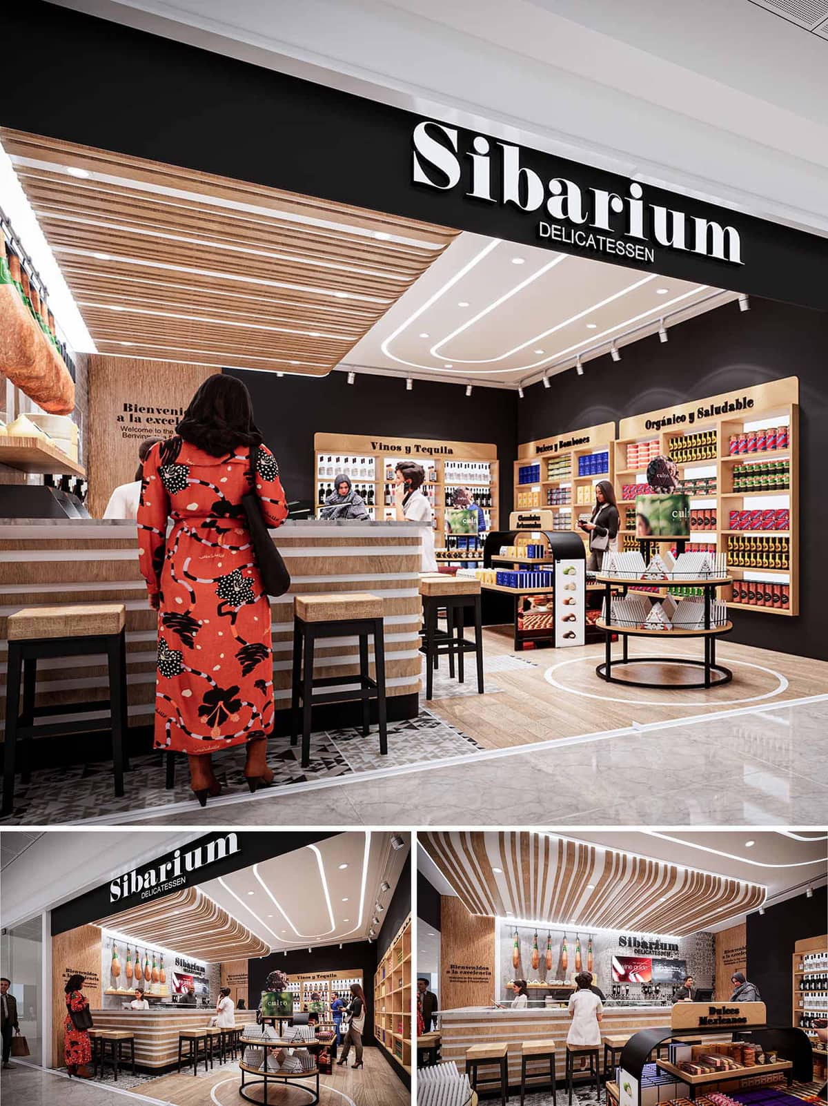

The SIBARIUM delicatessen concept is conceived as an open, welcoming boutique of gastronomy that operates as a hybrid between bar, market and specialty store. The design emphasizes visibility and accessibility from the corridor, using a strong black portal with illuminated signage to frame the interior as a curated stage for premium products. The spatial narrative celebrates Mediterranean and Iberian culinary culture, translating it into a contemporary retail language that is easily replicable across diverse locations in México, Portugal and Spain.
The project is based on a clear brand architecture: a monochrome envelope that highlights warm timber volumes and linear lighting, generating a refined yet informal atmosphere. The space invites customers to approach, stay and taste, establishing a direct connection between the product, the artisan preparation area and the customer journey.
The layout is structured around a central bar-counter that functions as both service core and social hub. Positioned perpendicular to the façade, it visually anchors the space and naturally directs circulation. Customers are drawn first to the tasting counter, then guided along perimeter shelving where product categories are clearly identified with integrated signage such as “Vinos y Tequila” or “Orgánico y Saludable.”
The open front, without physical doors, blurs the threshold between mall circulation and interior, while a change in flooring and a circular inlay on the ground defines the SIBARIUM domain. Islands and low gondolas are strategically placed to maintain clear sightlines and avoid visual barriers, allowing staff to maintain full control and enhancing security and service interaction. The configuration is compact but highly efficient, optimized for high-traffic retail environments such as airports, stations or malls.
The material palette combines light oak tones, white accents and a deep matte black background, creating a calm and sophisticated canvas for the colorful packaging of gourmet products. Timber is applied in slatted cladding on ceilings and counters, as well as in shelving, generating visual continuity between horizontal and vertical planes. The counter front uses alternating horizontal bands in wood and light material, reinforcing the layered identity of the brand.
The black back walls serve as a neutral backdrop that intensifies the presence of merchandise and illuminated typography. Stone-look or patterned tiles articulate the floor beneath the bar area, introducing texture and subtly recalling traditional market pavements. This balance between natural warmth and contemporary finishes underlines the store’s dual character: artisanal in content, precise and modern in form.
Ceiling design plays a key role in the spatial identity of SIBARIUM. Curved white light channels trace soft, continuous lines that follow the geometry of the bar and guide the customer’s path through the store. These luminous paths emphasize depth and generate a sense of dynamism even in relatively small footprints.
Track spotlights provide focused accent lighting on product displays, ensuring correct color rendering for wines, preserves and delicacies. Above the bar, slatted wooden elements extend from the vertical wall to the ceiling, creating a canopy effect that frames the ham display area and accentuates the gastronomic ritual. The combination of indirect linear light and precise spots creates layered illumination, while allowing adaptation to different locations and ceiling heights.
Furniture is purposely simple and robust, with high stools and bar tables in solid wood and black metal structures to withstand intensive use. Perimeter shelving integrates rounded upper frames for signage, giving the space a recognizable and cohesive language. The graphic identity, with its bold white typography over black surfaces, is seamlessly embedded into architectural elements such as the façade beam, back wall and category headers.
The design encourages interaction through standing and seated tasting options. Visual contact between preparation area and customer is constant, reinforcing transparency and craftsmanship. Universal circulation widths and clear, legible graphics facilitate orientation for international users, while the warm materiality ensures a comfortable and inviting atmosphere despite the high commercial intensity.
Sustainability is addressed through a combination of material selection, modular systems and efficient lighting. The predominant use of certified wood products supports responsible forestry and reduces the carbon footprint compared to fully synthetic fit-outs. Modular shelving, counters and ceiling slats are designed for off-site fabrication and quick assembly, minimizing construction waste and enabling partial reuse or reconfiguration when relocating or updating stores.
LED lighting is used throughout, with linear profiles and adjustable projectors optimized to reduce energy consumption while ensuring excellent visual comfort and product rendering. The restrained material palette simplifies logistics for the 58 locations and allows bulk procurement, reducing transport and production impacts. The overall strategy aims for a long-lasting aesthetic that can adapt to different shells and cultures, avoiding trends that would require early replacement and thereby contributing to a more sustainable lifecycle of the retail network.
© 2021 by sanzpont [arquitectura] . Webpage by sanzpont [digital] . Innovative Digital Experiences

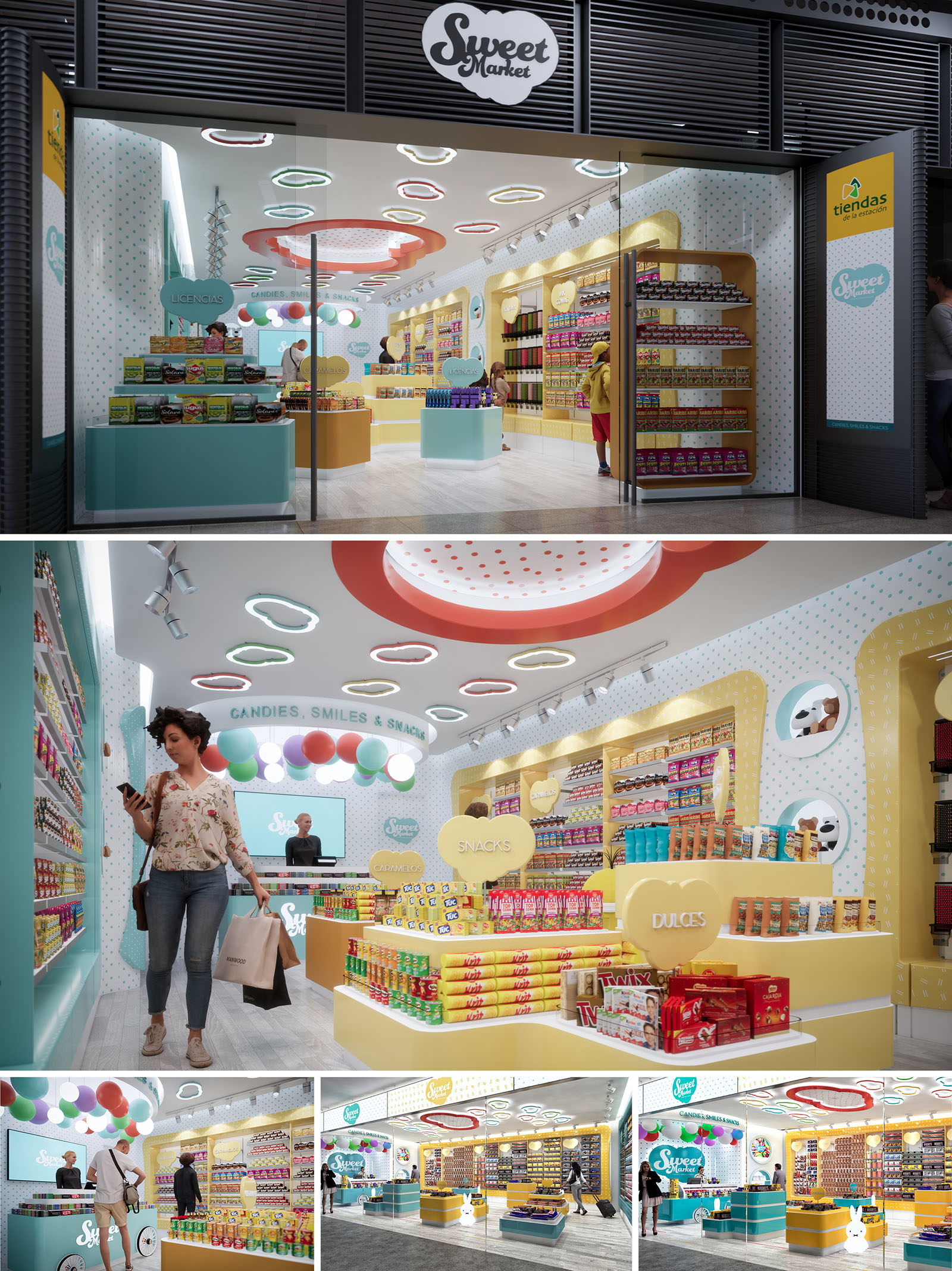
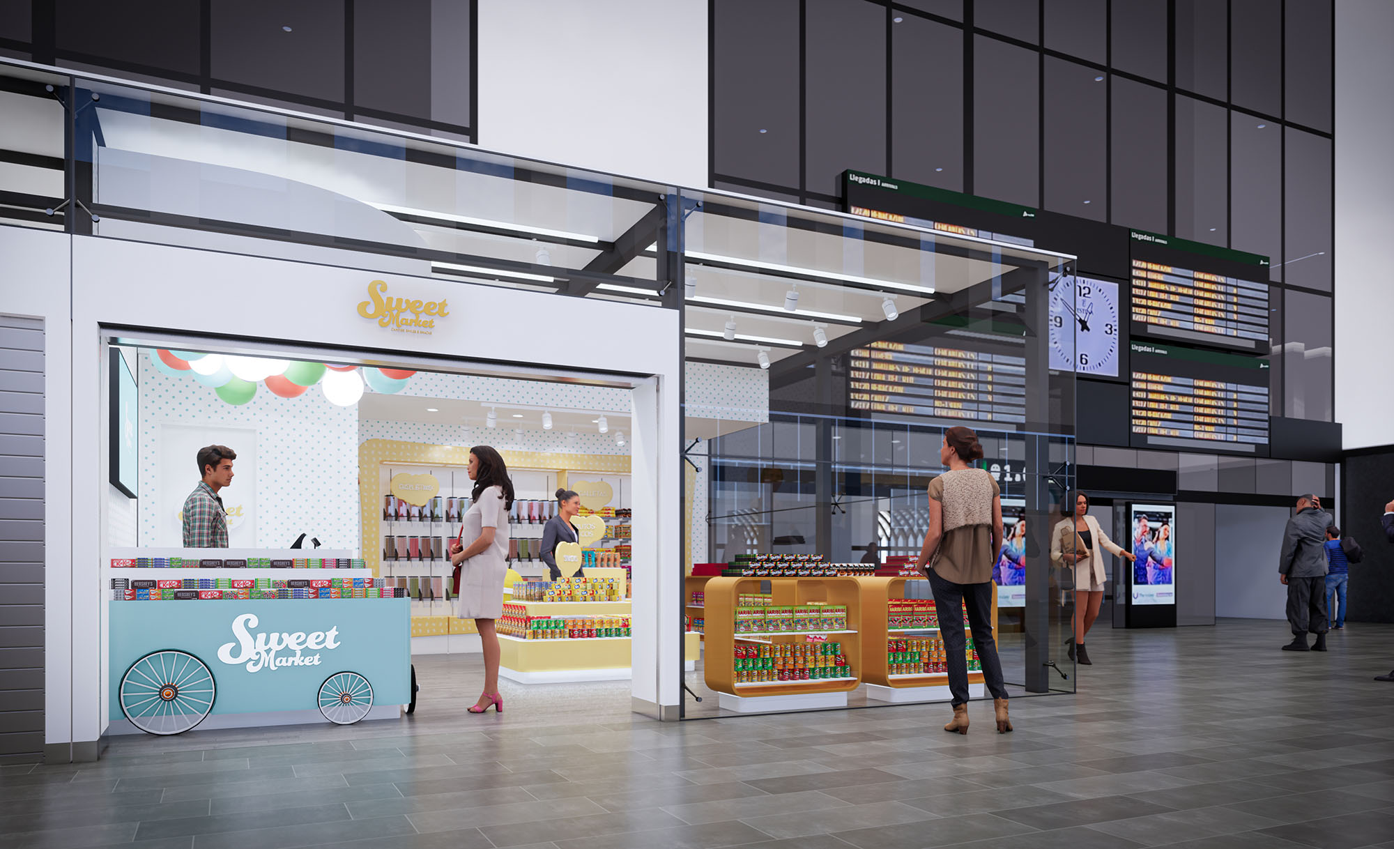
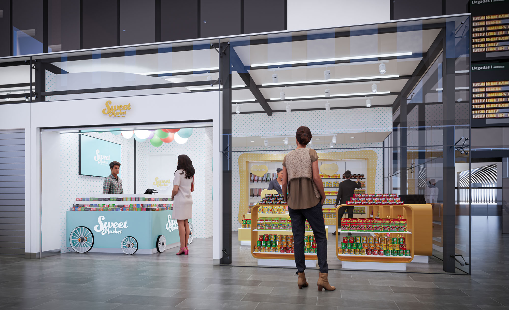
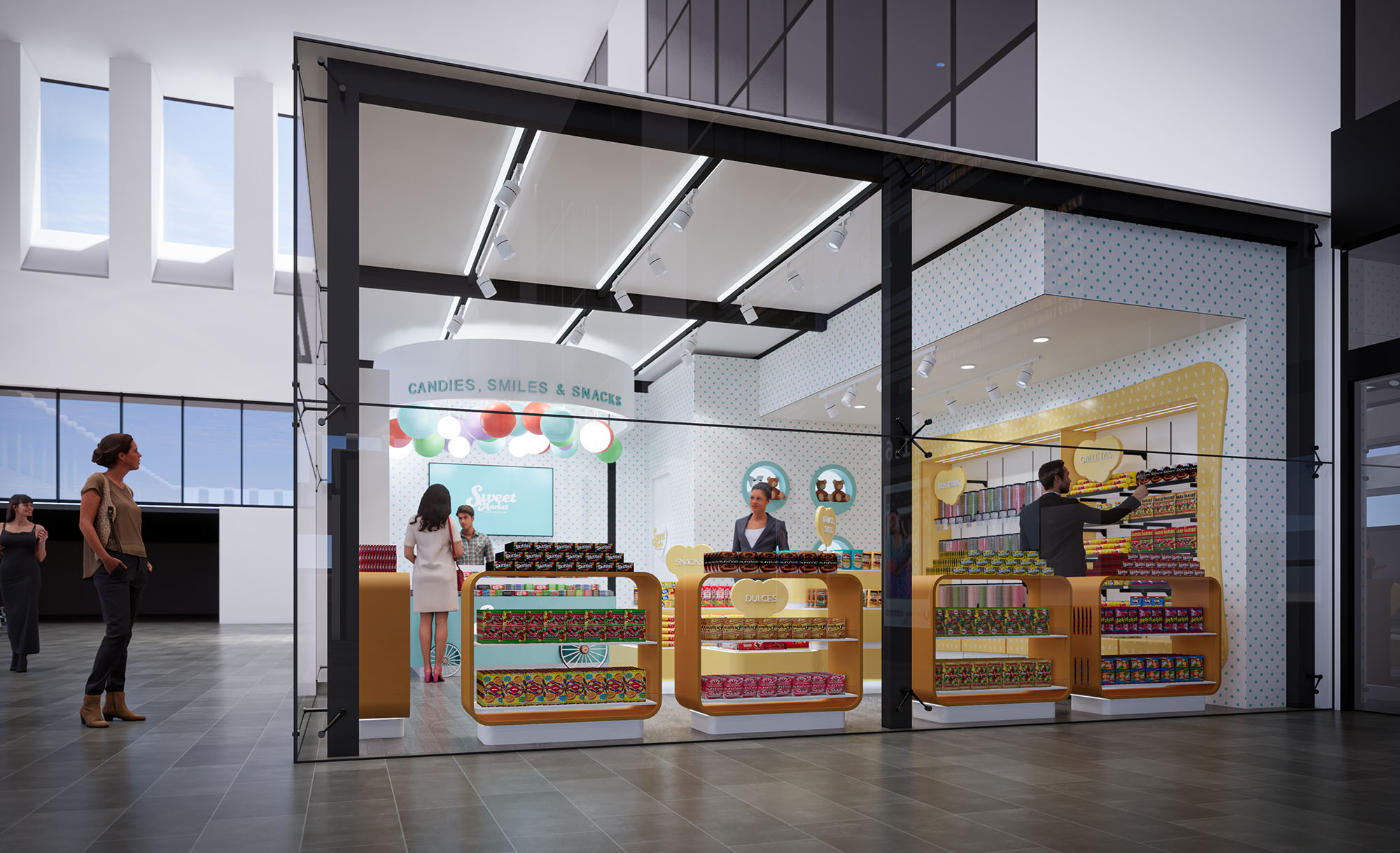
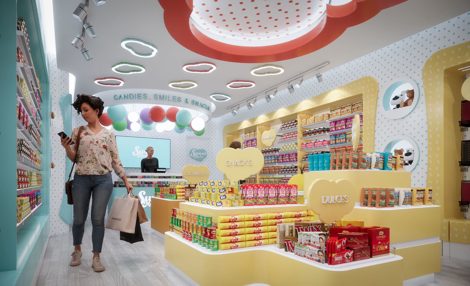
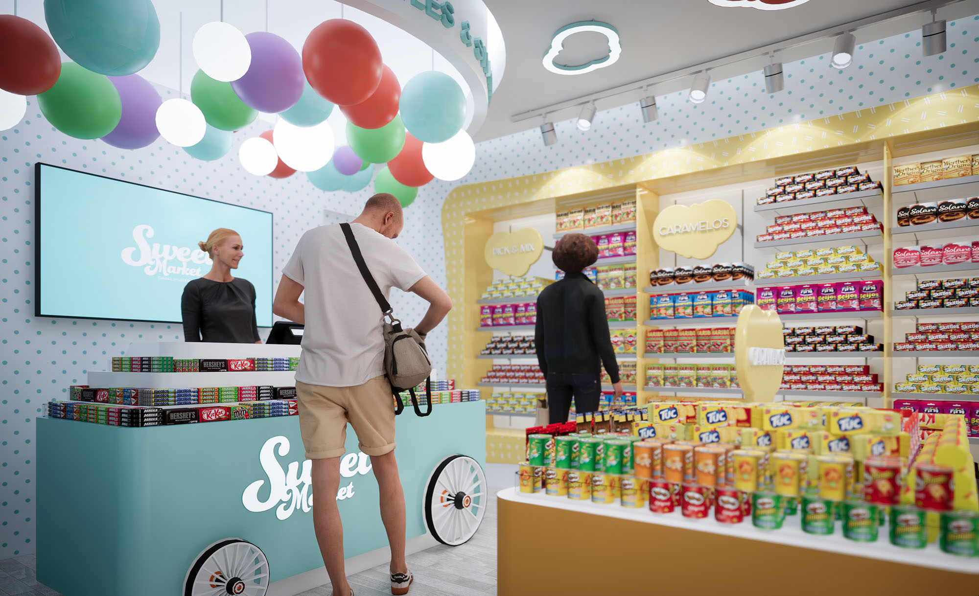
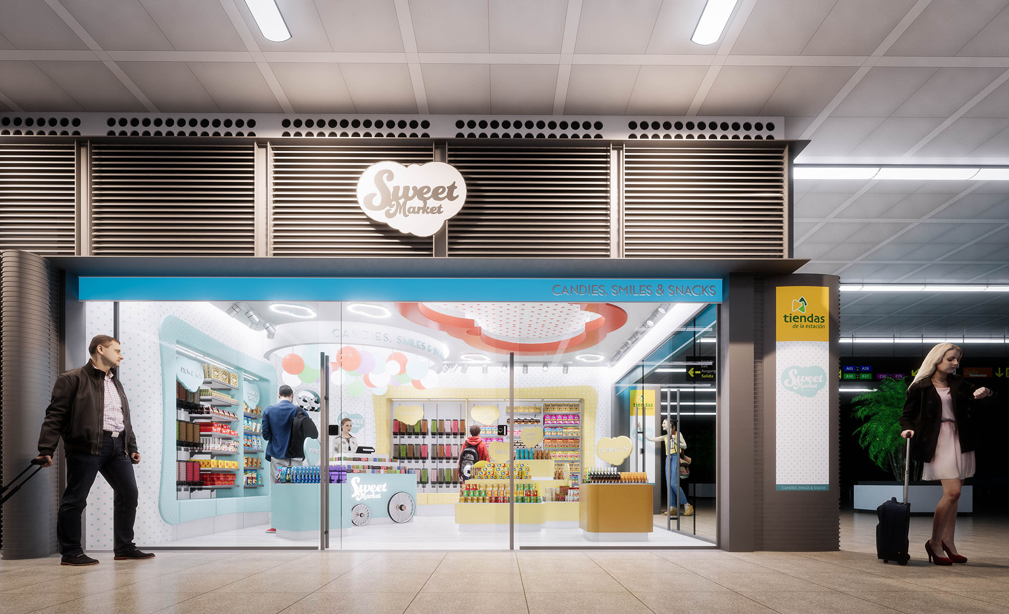
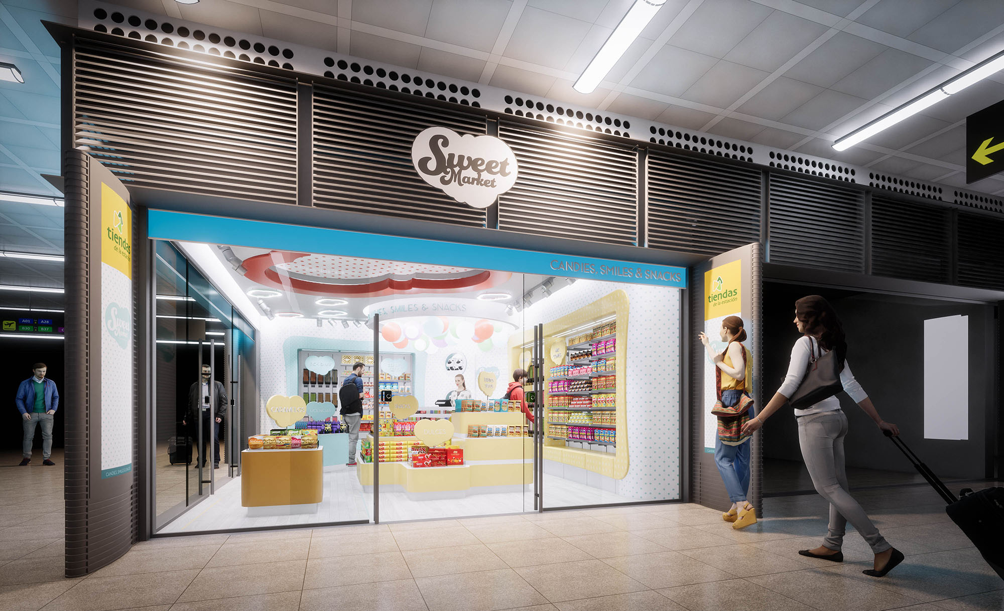
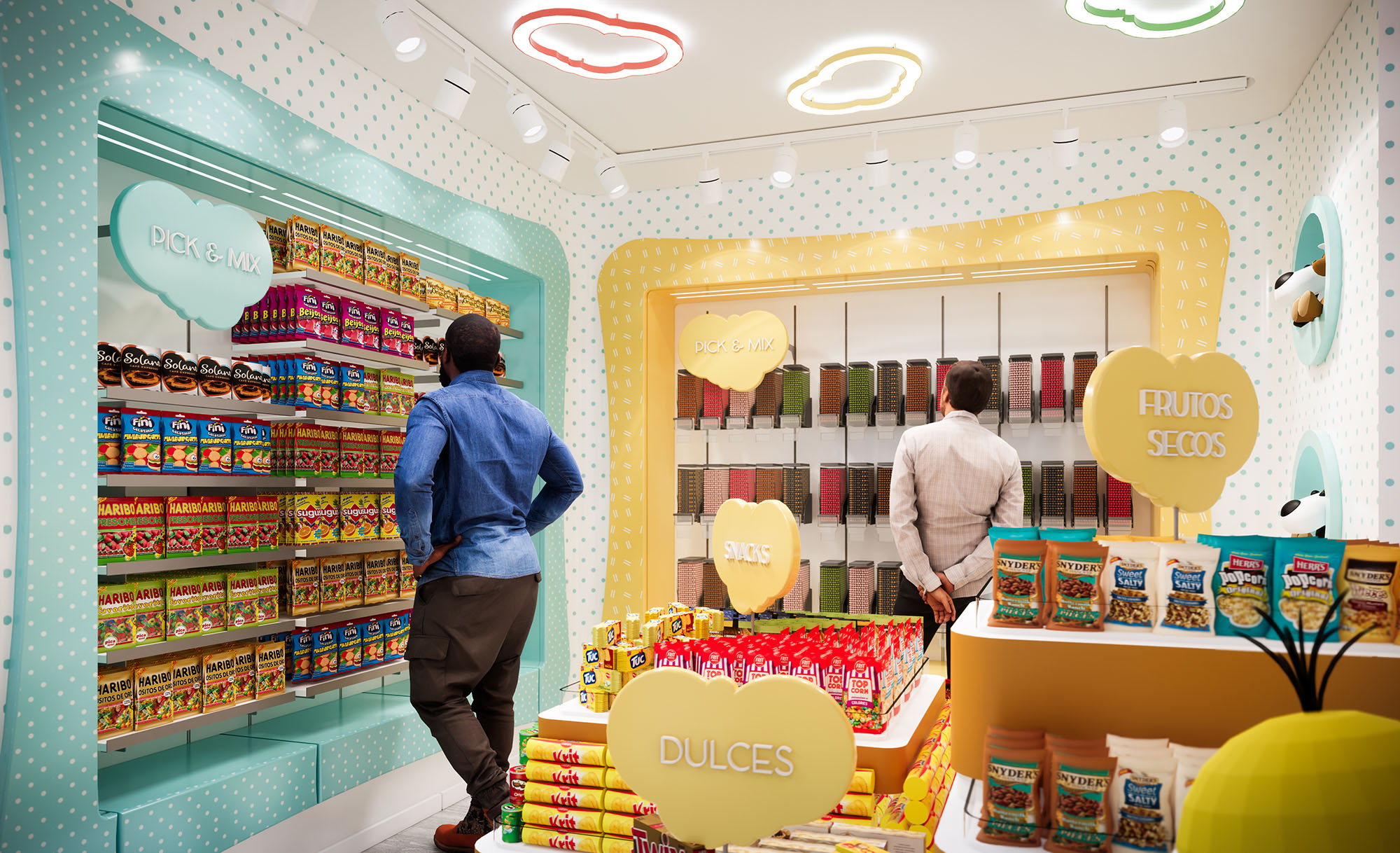
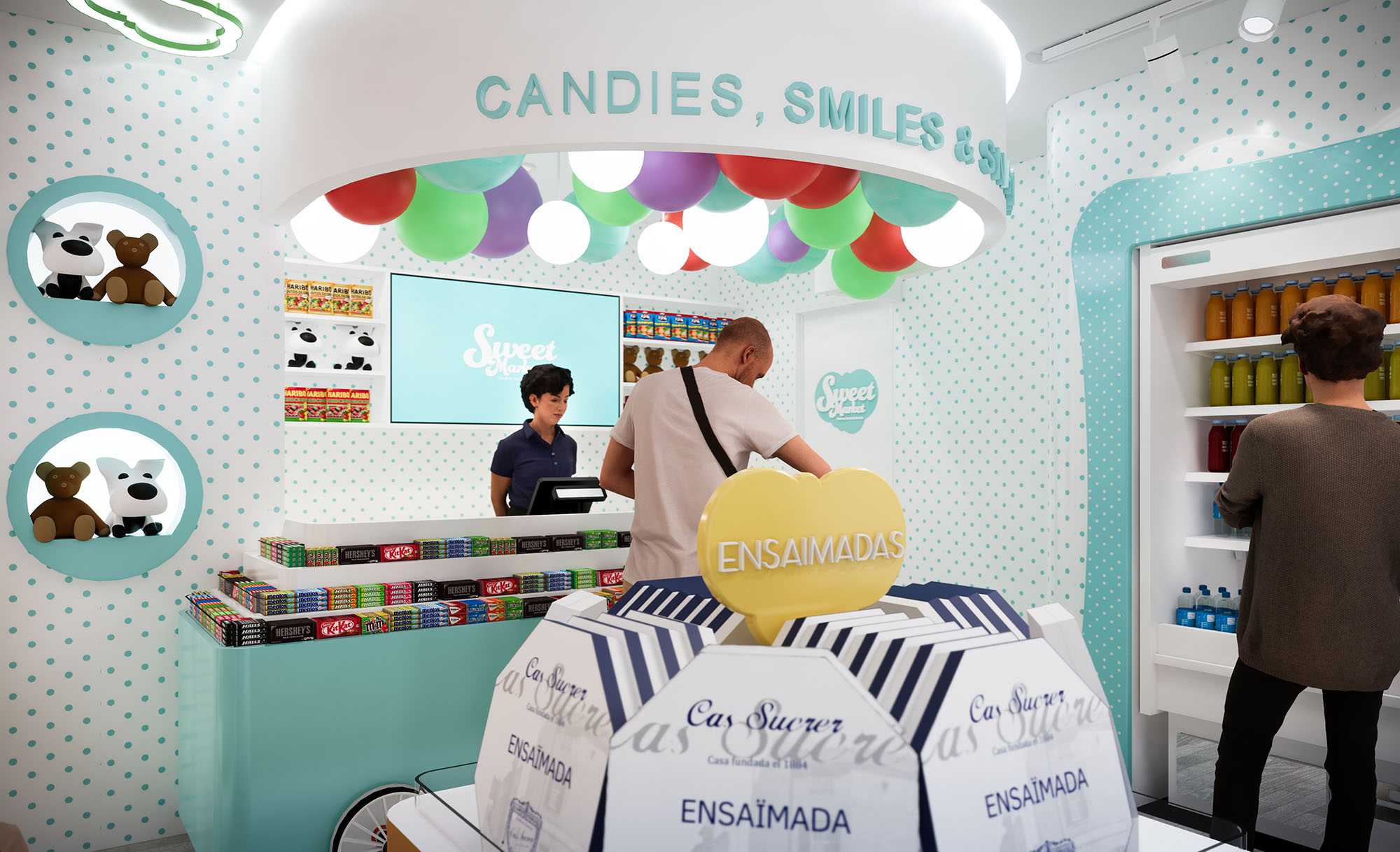
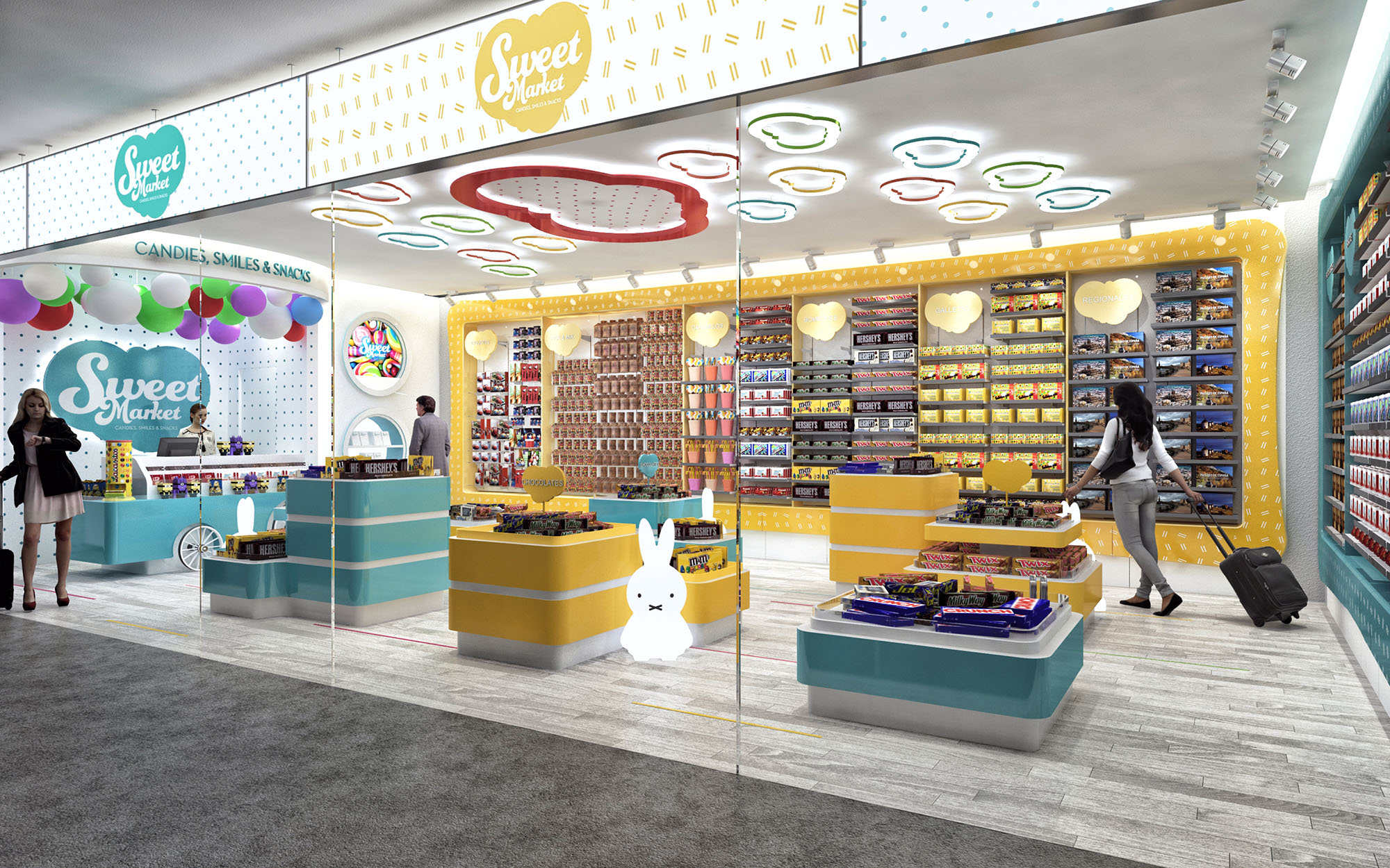
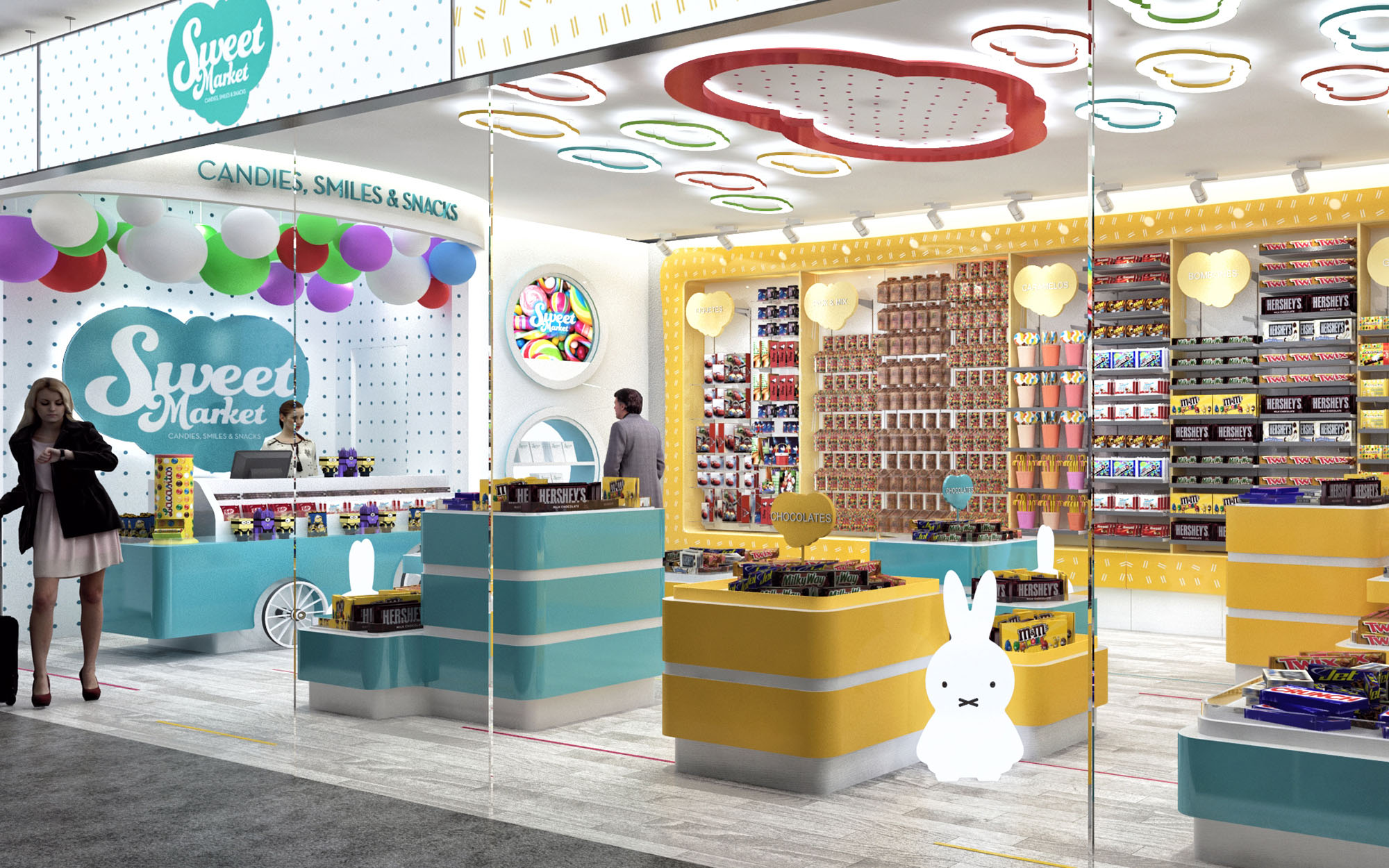
The Sweet Market concept translates the emotional universe of childhood confectionery into a contemporary retail language. The space is conceived as an immersive “candy cloud” where soft geometries, luminous color and playful graphics build a memorable brand experience. Each element is designed to be immediately legible from the mall corridor, turning the store into a luminous showcase that communicates abundance, joy and accessibility.
The design is modular and replicable across 29 locations in Spain, ensuring a strong, cohesive identity while allowing small adjustments to respond to different footprints and circulation constraints. The overall strategy combines high-density product display with generous visual permeability, so that the merchandise itself becomes a key part of the interior scenography.
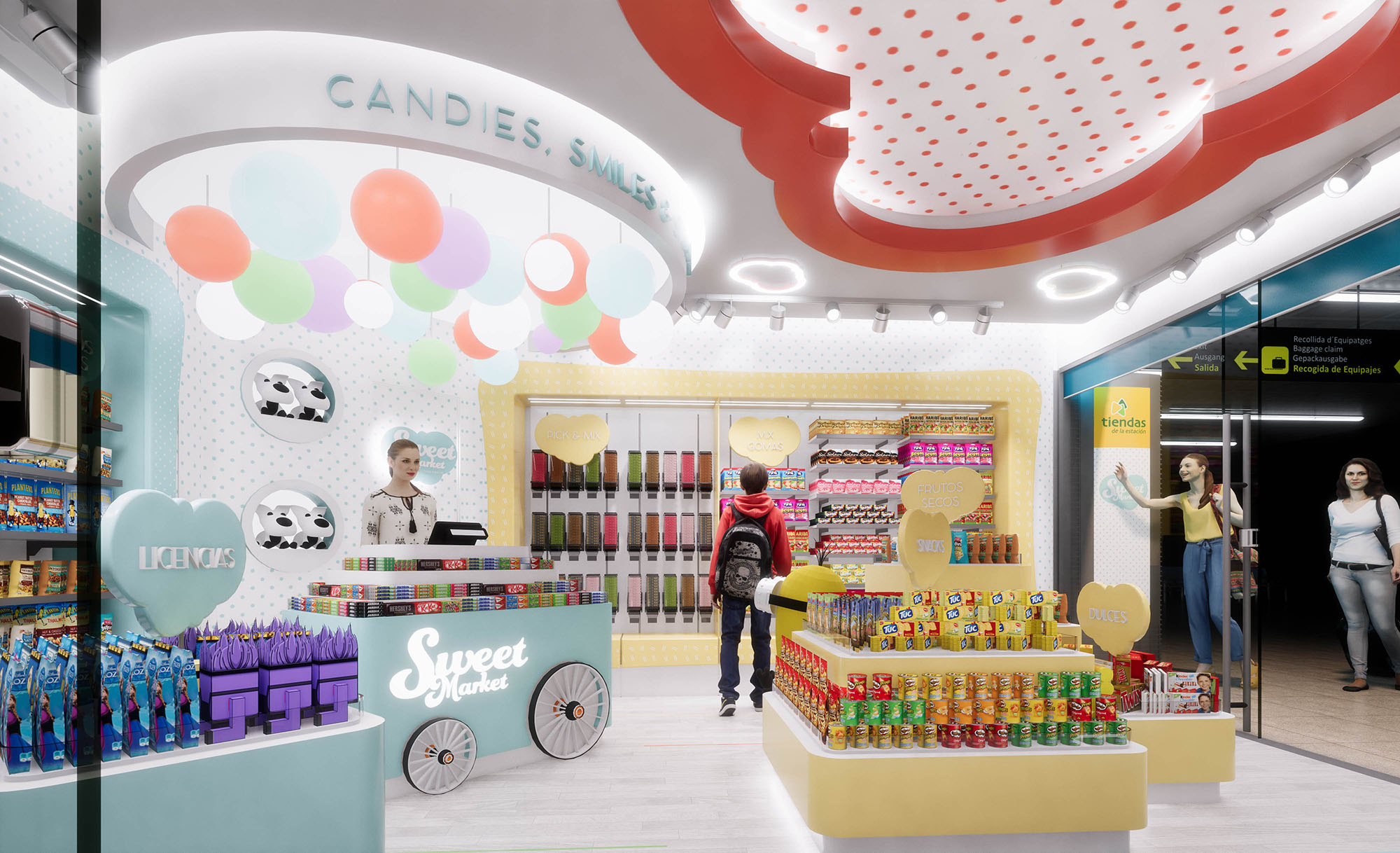
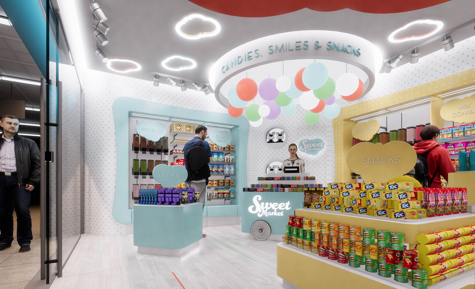
The store layout follows a perimeter-and-island scheme. Linear shelving along the walls offers maximum storage capacity and clear product categorization, while central islands organize impulse purchasing and highlight seasonal or promotional items. This arrangement maintains open sightlines from the entrance to the back counter, supporting intuitive orientation and shop security.
Upon entering, customers are guided by a subtle funneling effect: the curved front counters and islands gently narrow the access zone and then open towards the rear cashier and brand wall. This sequence creates a short but deliberate journey, encouraging browsing while ensuring quick turnover for high-traffic mall locations. Circulation loops allow customers to walk around each central module, facilitating interaction with products at child and adult heights.
The material palette is intentionally simple and robust, relying on lacquered MDF, high-pressure laminates and powder-coated metal structures, all selected for durability and ease of maintenance. Warm light wood tones on shelving plinths are combined with smooth pastel finishes in yellow, aqua and blush, evoking classic candy tones without becoming visually overwhelming.
Branding is fully integrated into the architecture: polka-dot graphic patterns wrap walls and vertical frames, while oversized heart and cloud silhouettes function as both signage and display backdrops. Edge lighting highlights these shapes, reinforcing the identity even when shelves are fully stocked. The storefront glazing acts as a transparent showcase; the suspended logo and backlit interior ceiling elements make the store instantly recognizable from a distance.
Artificial lighting is a key driver of the experience. A continuous ambient layer is provided by recessed linear fixtures and indirect light coves that wash the upper walls, creating a bright, shadow-free background. Accentuated spotlights on track systems allow flexible focusing on vertical merchandising, ensuring uniform color rendering of diverse packaging.
The ceiling features playful cloud-shaped LED luminaires and a central circular recess with perforated diffuser, referencing candy dots. This sculpted ceiling not only becomes a brand signature across locations but also visually lowers the scale, making relatively deep or tall units feel more intimate while maintaining functional luminance levels compliant with retail standards.
Display furniture is designed as a kit-of-parts, with modular bases and interchangeable upper elements. Radiused corners enhance safety and encourage smooth circulation, particularly for children. Different counter heights accommodate varied product typologies and age groups, from low-access bins for candies to higher shelves for snacks and licensed products.
Integrated signage totems and heart-shaped category markers are conceived as removable elements that slide into dedicated slots, allowing rapid reconfiguration as product mixes evolve. Storage zones concealed within the base of central islands help minimize back-of-house requirements, improving operational efficiency in small units.
Sustainability is addressed through both material choices and operational efficiency. Wherever possible, furniture uses certified wood-based panels with low-emission finishes, and metal components are specified with durable powder coatings to extend lifecycle and facilitate recycling at end of use. The modular design minimizes waste during fabrication and allows components to be reused across different premises as leases or locations change.
The lighting system relies entirely on LED technology with high efficacy and long service life, significantly reducing energy consumption and maintenance in comparison to traditional retail schemes. The bright, predominantly light-colored interior enhances daylight penetration through the large glazed shopfront, allowing lower artificial lighting levels during daytime. Easy-clean surfaces and robust edges reduce the need for frequent replacement, aligning the playful, emotional character of the brand with responsible, long-term resource use across the 29-store rollout.

The Sweet Market concept translates the emotional universe of childhood confectionery into a contemporary retail language. The space is conceived as an immersive “candy cloud” where soft geometries, luminous color and playful graphics build a memorable brand experience. Each element is designed to be immediately legible from the mall corridor, turning the store into a luminous showcase that communicates abundance, joy and accessibility.
The design is modular and replicable across 29 locations in Spain, ensuring a strong, cohesive identity while allowing small adjustments to respond to different footprints and circulation constraints. The overall strategy combines high-density product display with generous visual permeability, so that the merchandise itself becomes a key part of the interior scenography.
The store layout follows a perimeter-and-island scheme. Linear shelving along the walls offers maximum storage capacity and clear product categorization, while central islands organize impulse purchasing and highlight seasonal or promotional items. This arrangement maintains open sightlines from the entrance to the back counter, supporting intuitive orientation and shop security.
Upon entering, customers are guided by a subtle funneling effect: the curved front counters and islands gently narrow the access zone and then open towards the rear cashier and brand wall. This sequence creates a short but deliberate journey, encouraging browsing while ensuring quick turnover for high-traffic mall locations. Circulation loops allow customers to walk around each central module, facilitating interaction with products at child and adult heights.
The material palette is intentionally simple and robust, relying on lacquered MDF, high-pressure laminates and powder-coated metal structures, all selected for durability and ease of maintenance. Warm light wood tones on shelving plinths are combined with smooth pastel finishes in yellow, aqua and blush, evoking classic candy tones without becoming visually overwhelming.
Branding is fully integrated into the architecture: polka-dot graphic patterns wrap walls and vertical frames, while oversized heart and cloud silhouettes function as both signage and display backdrops. Edge lighting highlights these shapes, reinforcing the identity even when shelves are fully stocked. The storefront glazing acts as a transparent showcase; the suspended logo and backlit interior ceiling elements make the store instantly recognizable from a distance.
Artificial lighting is a key driver of the experience. A continuous ambient layer is provided by recessed linear fixtures and indirect light coves that wash the upper walls, creating a bright, shadow-free background. Accentuated spotlights on track systems allow flexible focusing on vertical merchandising, ensuring uniform color rendering of diverse packaging.
The ceiling features playful cloud-shaped LED luminaires and a central circular recess with perforated diffuser, referencing candy dots. This sculpted ceiling not only becomes a brand signature across locations but also visually lowers the scale, making relatively deep or tall units feel more intimate while maintaining functional luminance levels compliant with retail standards.
Display furniture is designed as a kit-of-parts, with modular bases and interchangeable upper elements. Radiused corners enhance safety and encourage smooth circulation, particularly for children. Different counter heights accommodate varied product typologies and age groups, from low-access bins for candies to higher shelves for snacks and licensed products.
Integrated signage totems and heart-shaped category markers are conceived as removable elements that slide into dedicated slots, allowing rapid reconfiguration as product mixes evolve. Storage zones concealed within the base of central islands help minimize back-of-house requirements, improving operational efficiency in small units.
Sustainability is addressed through both material choices and operational efficiency. Wherever possible, furniture uses certified wood-based panels with low-emission finishes, and metal components are specified with durable powder coatings to extend lifecycle and facilitate recycling at end of use. The modular design minimizes waste during fabrication and allows components to be reused across different premises as leases or locations change.
The lighting system relies entirely on LED technology with high efficacy and long service life, significantly reducing energy consumption and maintenance in comparison to traditional retail schemes. The bright, predominantly light-colored interior enhances daylight penetration through the large glazed shopfront, allowing lower artificial lighting levels during daytime. Easy-clean surfaces and robust edges reduce the need for frequent replacement, aligning the playful, emotional character of the brand with responsible, long-term resource use across the 29-store rollout.
© 2021 by sanzpont [arquitectura] . Webpage by sanzpont [digital] . Innovative Digital Experiences
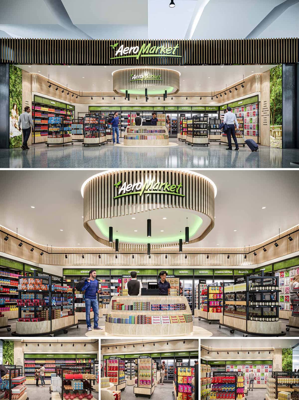

AEROMARKET is conceived as a contemporary airport marketplace that merges efficiency of transit retail with the warmth of a local neighborhood store. The design creates a strong visual identity through a continuous wood-slat envelope and a luminous central feature that anchors the interior. The architectural language emphasizes fluid circulation, clear visibility of products, and a welcoming atmosphere for travelers with limited time. The project aims to transform the usual duty‑free experience into a more human, urban and approachable environment, strongly connected to the natural character of Los Cabos.
The concept is structured around a circular core that operates as both focal point and orientation device, surrounded by flexible perimeter shelving and mobile gondolas. This central gesture reinforces the brand while organizing flows, guiding customers intuitively from entrance to checkout and back to the boarding gates.
The store opens completely to the concourse with a wide, unobstructed façade, eliminating physical barriers and inviting spontaneous entry. The linear frontage maximizes exposure to passenger flows while the overhead wood lattice and illuminated signage define a clear threshold without enclosing the space.
Inside, the floor plan is planned as a perimeter ring of fixed shelving and refrigerated walls, complemented by radial display islands. The circular cash desk in the center allows 360‑degree visibility and quick access from all sides, reducing queuing conflicts. Freestanding gondolas are deliberately kept at a medium height to maintain clear sightlines across the store and to the departure hall beyond, enhancing a sense of openness and security.
The material palette is based on light-toned wood, black metal accents and green brand elements, generating a fresh and natural aesthetic. Vertical wooden slats articulate the façade band and the suspended central ring, lending rhythm and texture while visually unifying the different zones. Their warm tone contrasts with the neutral white ceiling and polished floor, producing a calm backdrop for the colorful product display.
Green panels and signage introduce a direct visual association with vegetation and local landscapes, supported by large-format photographic graphics of nature along the perimeter walls. Black profiles, track lighting and shelving frames provide a precise, technical counterpoint to the softer wood, reinforcing an image of order and reliability expected in an airport environment.
The lighting strategy combines uniform ambient illumination with targeted accent lighting on merchandise and architectural features. Recessed downlights deliver a homogeneous base level, minimizing glare for travelers entering from the brighter terminal. Adjustable track fixtures along the perimeter emphasize vertical product faces, improving legibility and encouraging impulse purchases.
The central circular canopy integrates indirect LED light with a subtle green hue, highlighting the brand and generating a distinctive landmark visible from a distance. Pendant fixtures descending from this ring bring the scale down over the cashier area, creating a more intimate atmosphere within the otherwise open plan.
Display furniture is modular and predominantly rectilinear, with soft curved corners on gondolas and counters to ease pedestrian movement and avoid impact points in high‑traffic conditions. Category zoning is clearly identified through overhead signage bands, while the flexibility of mobile gondolas allows seasonal reconfiguration or adaptation to changing passenger profiles.
The central counter is designed as a layered display surface that integrates impulse items with payment functions, maximizing last‑minute sales without obstructing circulation. Refrigerated walls, souvenir areas and regional product sections are organized to encourage discovery yet remain fully legible at a glance, essential for time‑constrained users.
Sustainability is addressed through the selection of durable, low‑maintenance finishes and efficient lighting systems. LED technology with controlled color temperature reduces energy consumption, while the open storefront relies on the ambient conditioning of the terminal, minimizing the need for additional HVAC partitioning. The use of wood from certified sources and high‑resistance composite surfaces extends lifecycle and reduces replacement frequency.
Environmental graphics and the green‑wood palette subtly reference the desert‑oasis landscape of San José del Cabo, strengthening a sense of place within the global context of an airport. By combining long‑lasting materials, adaptable display systems and energy‑efficient equipment, AEROMARKET positions itself as a contemporary, responsible retail environment that reflects both the dynamism of travel and the natural character of Baja California Sur.
© 2021 by sanzpont [arquitectura] . Webpage by sanzpont [digital] . Innovative Digital Experiences
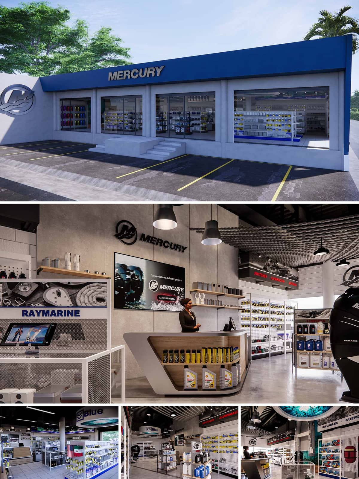

The BLUE project is conceived as a specialized retail environment for marine equipment, designed to translate the precision and robustness of nautical engineering into an accessible commercial space. The architectural language combines clean geometries with an industrial aesthetic, evoking the efficiency of a shipyard while remaining inviting to customers. The design strategy is replicated and adapted across four locations in México, ensuring brand consistency while allowing flexibility for different footprints and urban contexts.
The overall concept builds on the idea of a “technical showroom at port”: products are displayed as if they were part of a well-organized workshop, with clear zoning, generous visibility, and intuitive circulation. Visual communication and interior architecture are fully integrated so that shelving, lighting, and signage work together as a unified system.
The exterior composition is based on a horizontal volume with a continuous canopy band in the brand’s characteristic blue, acting as a strong visual anchor from the street. Large display windows create a transparent façade, turning the merchandise itself into an urban-scale graphic element and reinforcing the idea of openness and trust. The neutral light-gray envelope frames this band and allows the corporate identity to stand out without visual noise.
Access is emphasized by a central stair and a recessed plane that subtly marks the entrance, while the logo in relief on the blind wall operates as a sculptural sign. The parking layout is directly in front of the storefront, ensuring maximum convenience and visual connection between vehicles and entry, a key aspect for customers often transporting marine parts and accessories.
The interior space is organized through a clear orthogonal grid that assigns each product family a specific zone, improving orientation and wayfinding. Central gondolas, perimetral shelving, and freestanding feature units define circulation loops that encourage exploration while maintaining efficient routes for quick purchases.
The service counter is strategically positioned as a visual anchor upon entry, allowing immediate contact with staff and fast technical consultation. Vertical surfaces host large-format graphics and technical information, reinforcing the brand narrative and guiding customers toward key categories such as engines, electronics, and maintenance products.
The material palette combines polished concrete floors, painted masonry walls, and exposed structural elements, expressing an honest, utilitarian character analogous to industrial port facilities. Warm wood finishes at the main counter and selected shelving elements introduce a human scale and a tactile counterpoint to the otherwise technical environment.
Artificial lighting is predominantly provided by suspended industrial-style fixtures and linear LED systems integrated into shelves and signage. This layered lighting strategy ensures high visibility of small components while creating accent zones for hero products. The chromatic scheme is based on neutrals—gray and white—to enhance legibility, with blue highlights and subtle red accents used to code categories and emphasize key product lines.
Brand identity is incorporated architecturally rather than merely applied as graphics. Logos, typefaces, and color bands are embedded into the volumetry of counters, display structures, and ceiling elements. Digital interfaces and demonstration areas are inserted into the shelving system to allow interactive exploration of technical data and product configurations.
The spatial experience balances technical rigor with clarity and comfort: generous aisle widths, controlled ceiling height variations, and acoustically absorbent ceiling treatments reduce reverberation typically present in hard-surface industrial interiors, supporting longer and more focused customer visits.
Sustainability is addressed through both architectural and operational decisions. The extensive use of natural light via large storefront glazing significantly reduces the dependence on artificial lighting during daytime, especially in Mexico’s high-irradiance climates. Solar control is achieved through the projecting canopy and by calibrating glass specifications to limit heat gain while preserving transparency.
Interior finishes prioritize durability and low maintenance: polished concrete, metal shelving, and modular display systems extend lifecycle and minimize replacement. LED lighting technology is used throughout, improving energy efficiency and reducing cooling loads. The modular nature of furniture and fixtures allows reconfiguration as product lines evolve, avoiding material waste and enabling future adaptation of the stores without major construction interventions.
© 2021 by sanzpont [arquitectura] . Webpage by sanzpont [digital] . Innovative Digital Experiences
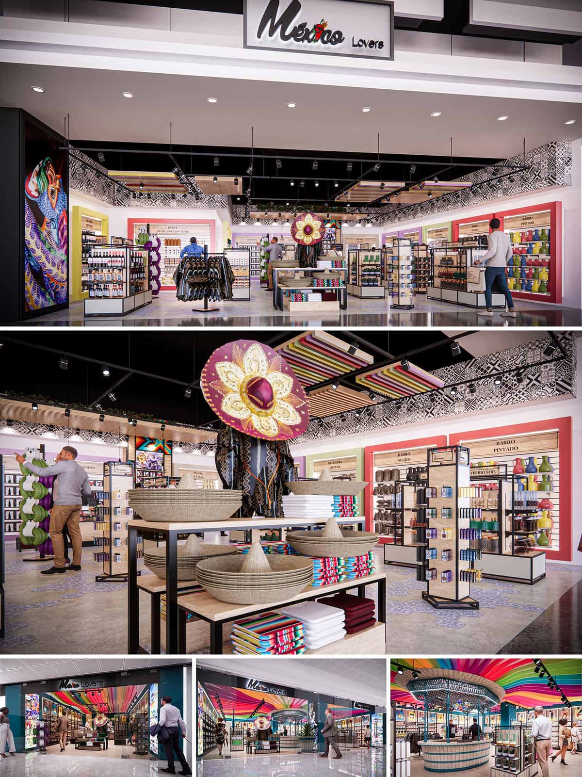

Mexico Lovers is conceived as an immersive retail experience that celebrates contemporary Mexican identity through color, craft and storytelling. The concept translates the richness of local traditions into a clear, commercial environment where every element acts as a narrative layer: from the ceiling “fiesta” ribbons to the artisanal product displays. The design seeks to reconcile the energy of a street market with the order and clarity of an airport or mall retail typology, inviting travelers to explore Mexican culture in a legible and memorable way.
The spatial language is based on a sequence of frames and thresholds that guide the customer from the public corridor into an interior world of patterns and textures. Large-scale graphic elements, sculptural hats and folkloric motifs work as iconic markers visible from a distance, reinforcing brand recall while signaling the diversity of products within.
The plan is organized around a central axis that aligns with the storefront opening, ensuring direct visual penetration to the back of the space. Perimeter walls are dedicated to category-specific “product altars” that highlight ceramics, textiles, food products and beauty items, while low gondolas occupy the center to preserve long-range visibility and natural wayfinding. This combination enables efficient browsing without obstructing sightlines to key brand elements.
Strategic focal points, such as the oversized sombrero installation and mid-height feature tables, anchor the circulation and operate as intuitive meeting points between zones. The layout supports both quick, impulse buying through easily accessible front modules, and deeper exploration in more specialized niches towards the back and sides of the store.
The material palette juxtaposes neutral, robust surfaces with vibrant accents that reference Mexican craftsmanship. Polished concrete or terrazzo-like flooring provides a continuous, high-durability base suitable for high-traffic environments. Black steel structures and track lighting give a contemporary, almost industrial frame that allows the chromatic richness of the products to stand out.
Warm wood laminates on shelving and soffits introduce tactility and evoke traditional carpentry, while woven baskets, straw hats and textile stacks add authentic, hand-made textures. Perimeter wall modules mix matte paint in saturated tones—reds, greens, yellows—with back panels in wood or textured laminates, creating depth and contrast without visual overload.
Color is the main vehicle for brand identity. The ceiling bands in rainbow hues reinterpret papel picado and festive ribbons, creating a dynamic canopy that draws visitors inside and visually connects the different store locations. This chromatic gesture is complemented by large-format graphic panels featuring stylized Mexican motifs, which reinforce narrative themes such as folklore, gastronomy and landscape.
Signage is integrated into the architectural frames using clear typography and warm backlighting, ensuring legibility from multiple angles. Category descriptors on the walls are treated as part of the graphic composition, helping customers orient themselves while maintaining a cohesive visual language consistent with the Mexico Lovers brand.
The lighting strategy combines general ambient illumination with focused accent lighting to emphasize merchandise and art pieces. Recessed downlights provide a uniform base level, while adjustable track spotlights highlight vertical surfaces and feature tables, enhancing color saturation and texture perception. This layered approach ensures that both products and architectural details are perceived clearly.
Visual merchandising is conceived as modular and flexible: gondolas with open steel frames and wood shelves can be reconfigured according to seasonal campaigns or product rotation. Central displays are slightly higher to mark key promotions, while lower perimeter units near the entrance encourage touch and interaction. The result is a retail stage that can evolve without sacrificing spatial coherence.
Sustainability is addressed through durability, modularity and efficient resource use. The selection of hard-wearing floors, metal structures and laminated woods reduces the need for frequent replacement, extending the life cycle of the fit-out. Many display components are designed as standardized modules that can be relocated between the different stores, optimizing manufacturing processes and minimizing waste.
Energy-efficient LED lighting is used throughout, with accent fixtures on tracks to allow repositioning as the merchandising changes, avoiding unnecessary new installations. Where possible, natural-looking materials—such as woven fibers and textiles sourced from local artisans—support regional economies and reduce transport-related impacts. The design balances strong visual impact with responsible material choices, enabling Mexico Lovers to operate as a vibrant yet conscientious ambassador of Mexican culture.
© 2021 by sanzpont [arquitectura] . Webpage by sanzpont [digital] . Innovative Digital Experiences
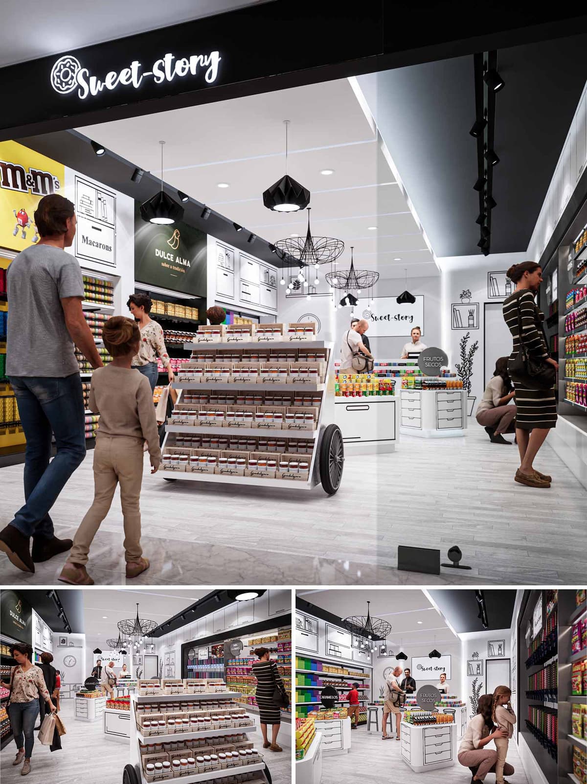

The design of SWEET STORY in Guadalajara is conceived as an immersive candy boutique, where the narrative of sweets is translated into a playful yet highly organized spatial experience. The concept merges the warmth of a neighborhood “dulcería” with the precision of contemporary retail design, generating an environment that is both familiar and visually stimulating. A monochrome architectural envelope acts as a neutral stage on which color, contained in the products themselves, becomes the protagonist.
The project seeks to create a clear and legible story from the entrance: an inviting portal with illuminated signage leads the customer into a luminous interior, where circulation flows intuitively around central display elements. The atmosphere aims to evoke a stylized graphic novel, using line drawings and black contours over white surfaces to suggest cupboards, shelves and domestic scenes that expand the perceived volume of the small footprint.
The floor plan is organized along a central spine that directs movement from the storefront threshold to the service counter at the back. A mobile cart-like gondola placed in the middle of the space structures circulation into a loop, encouraging customers to circulate around it and along the perimeter shelving. This arrangement maximizes linear display area while preserving a generous central aisle and clear sightlines from the mall corridor into the entire store.
Perimeter walls are dedicated to high-density shelving for packaged products, while the rear counter consolidates cashier, service, and specialty bulk items. The low central furniture maintains the visual continuity of the store and allows supervision by staff. The design intentionally places the most colorful and impulse-purchase products at eye level along the circulation ring, while premium or specialty brands occupy framed niches highlighted with accent lighting.
The material palette is deliberately restrained: white lacquered furniture, light wood-effect flooring, and black metal accents. This neutral composition emphasizes cleanliness and order, simultaneously providing a timeless background for constantly changing product collections. The floor uses a high-resistance porcelain or vinyl finish with a light grain, suitable for high traffic and easy maintenance.
Color is introduced almost exclusively through the merchandise and through strategic brand graphics. Black linear drawings on white walls simulate cabinets, bookshelves and domestic objects, reinforcing the “story” concept and providing depth without adding physical volume. The ceiling and some vertical planes are painted in matte black to frame the luminaires and signage, creating a contrast that guides the gaze toward the displays.
The lighting strategy combines general uniform illumination with accent and decorative fixtures. Recessed downlights and linear LED tracks provide homogeneous lighting that ensures accurate color rendition of the sweets. Adjustable projectors along the tracks highlight vertical shelving, increasing perceived brightness at the product plane and enhancing legibility of packaging.
Decorative pendants with geometric wireframe shades introduce a sculptural element over the central area and the service counter. Their black silhouettes echo the graphic drawings on the walls, reinforcing the visual identity of the brand. All luminaires are specified with energy-efficient LED technology and warm-neutral color temperature, balancing visual comfort with vivid product display.
Built-in cabinets and modular gondolas are designed with clear ergonomic criteria: optimal reach heights, rounded edges for safety, and integrated storage drawers for stock. The central cart, with visible wheels, references traditional street vendors and functions as a flexible display that can be reconfigured according to seasonal campaigns or promotions.
Branding elements are seamlessly integrated into the architecture: the illuminated “Sweet Story” sign at the entrance, the logo on the rear wall, and the subtle presence of partner brands in dedicated panels. The user experience is oriented toward families, with clear visibility for children, inviting colors, and a welcoming service counter that encourages interaction rather than rapid, purely transactional shopping.
Sustainability is approached through material selection, energy efficiency and operational flexibility. The predominant use of light-colored surfaces enhances the reflection of artificial light, allowing a reduction in installed lighting power without compromising visual comfort. LED technology, combined with potential dimming and time-control systems, significantly decreases energy consumption over the store’s life cycle.
Furniture is designed as modular and demountable, enabling reuse and reconfiguration rather than replacement when the brand evolves. Preference is given to durable finishes and substrates with low VOC emissions, improving indoor air quality. The compact footprint, high-density display and emphasis on long-lasting materials reduce the environmental impact per unit of product sold, aligning the sweet, playful character of the project with responsible resource use.
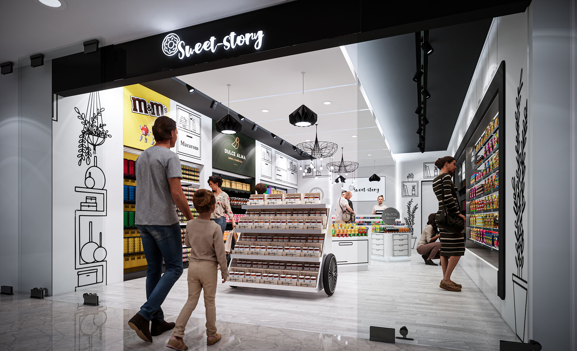
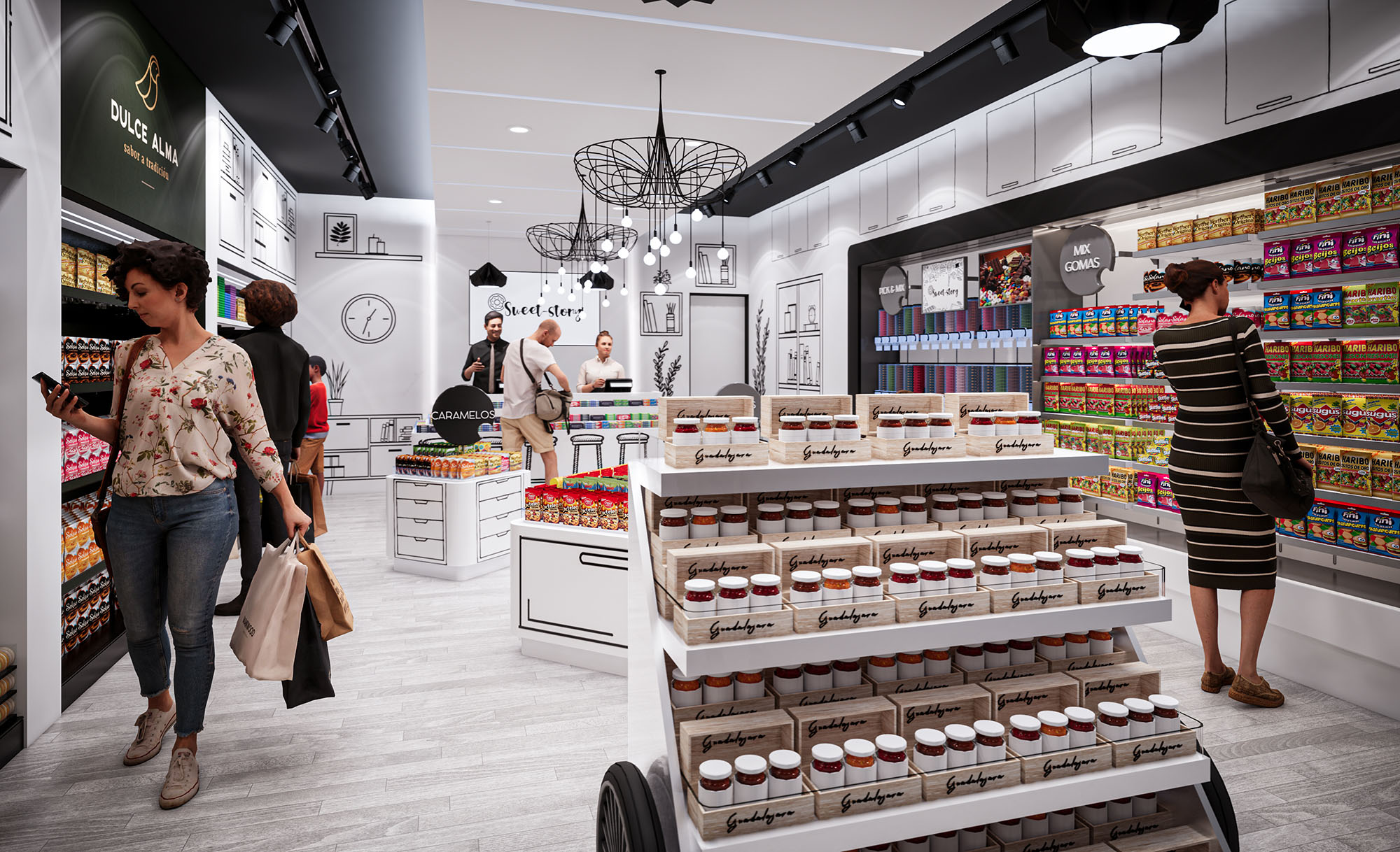
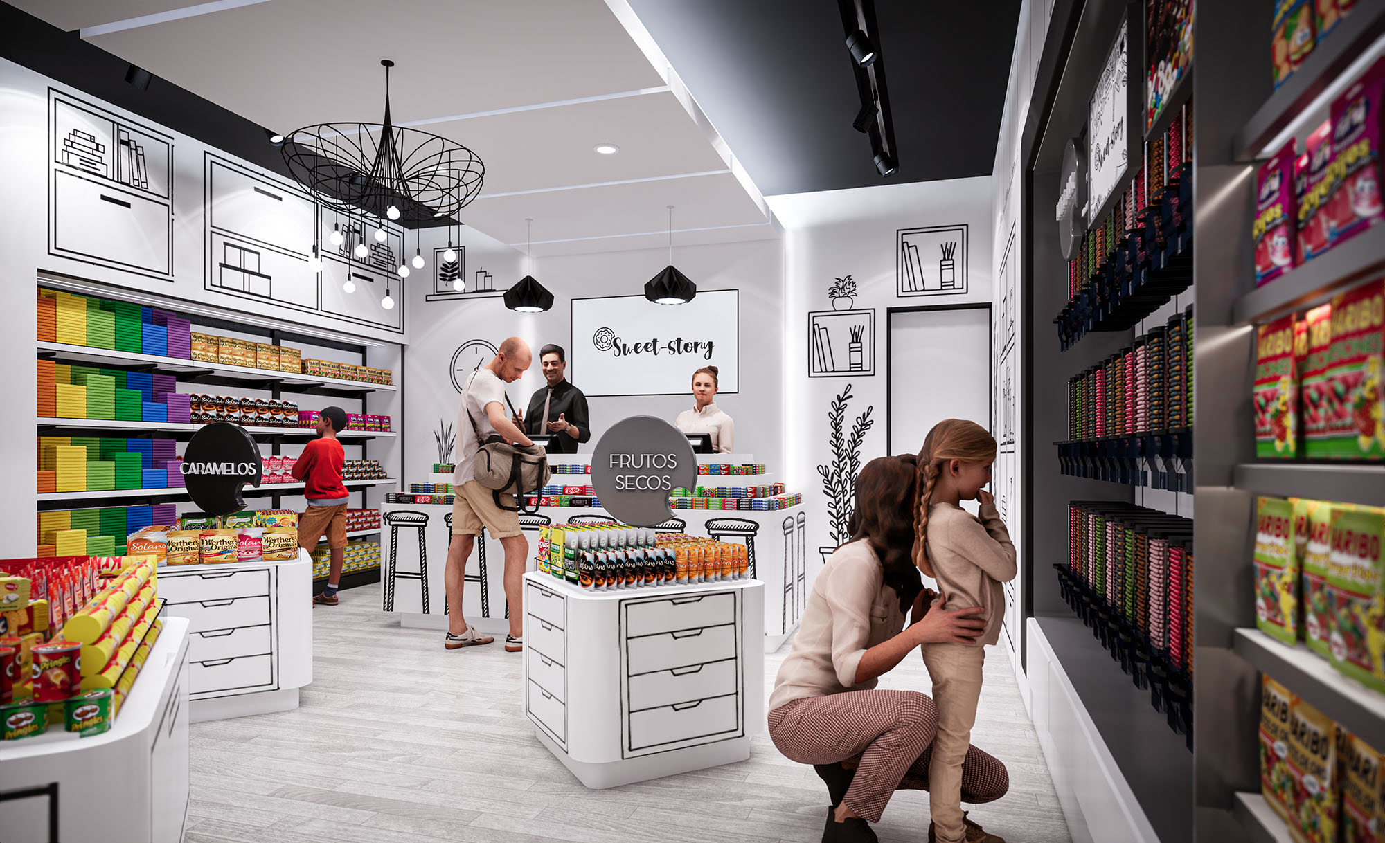
© 2021 by sanzpont [arquitectura] . Webpage by sanzpont [digital] . Innovative Digital Experiences
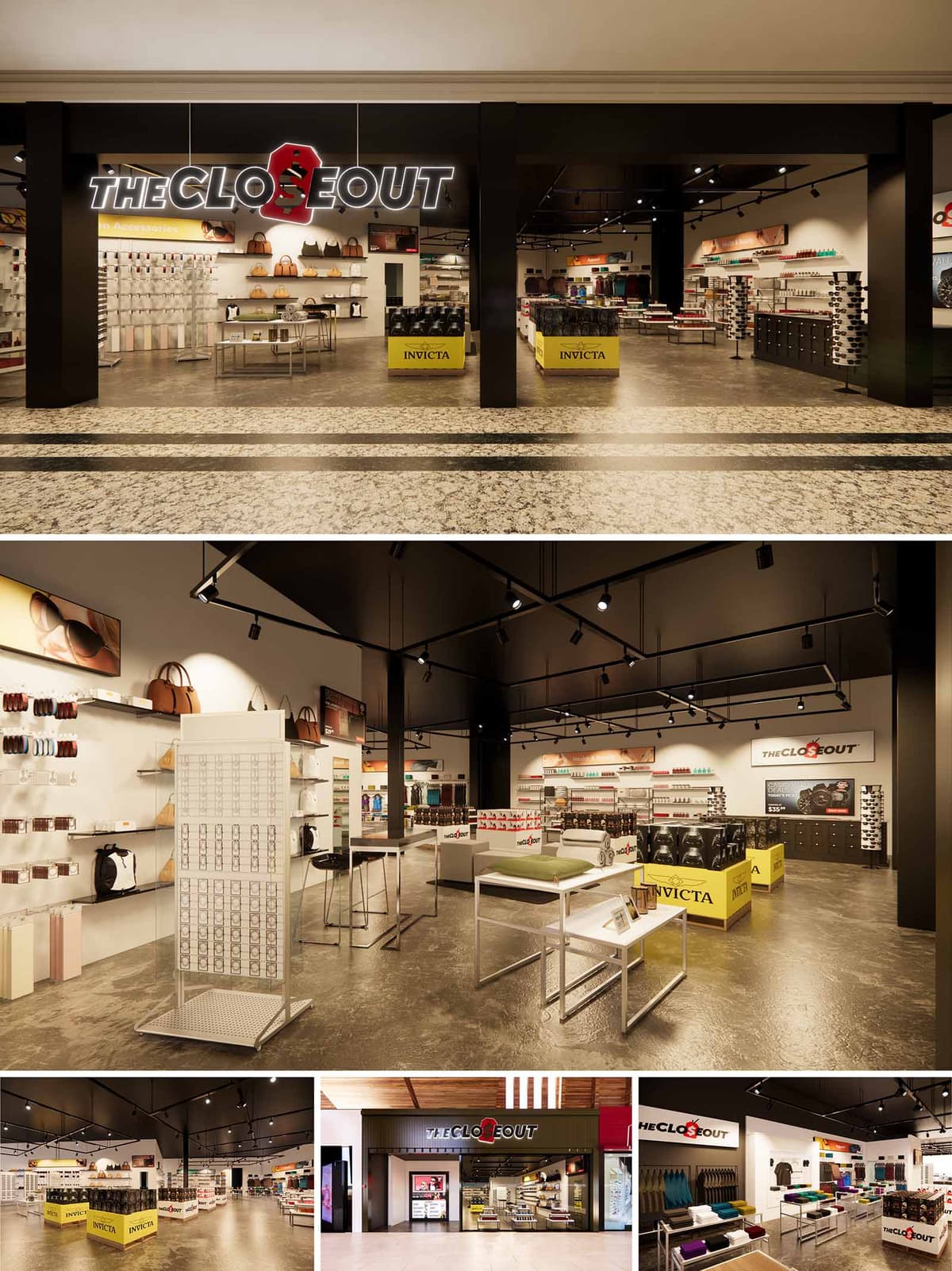
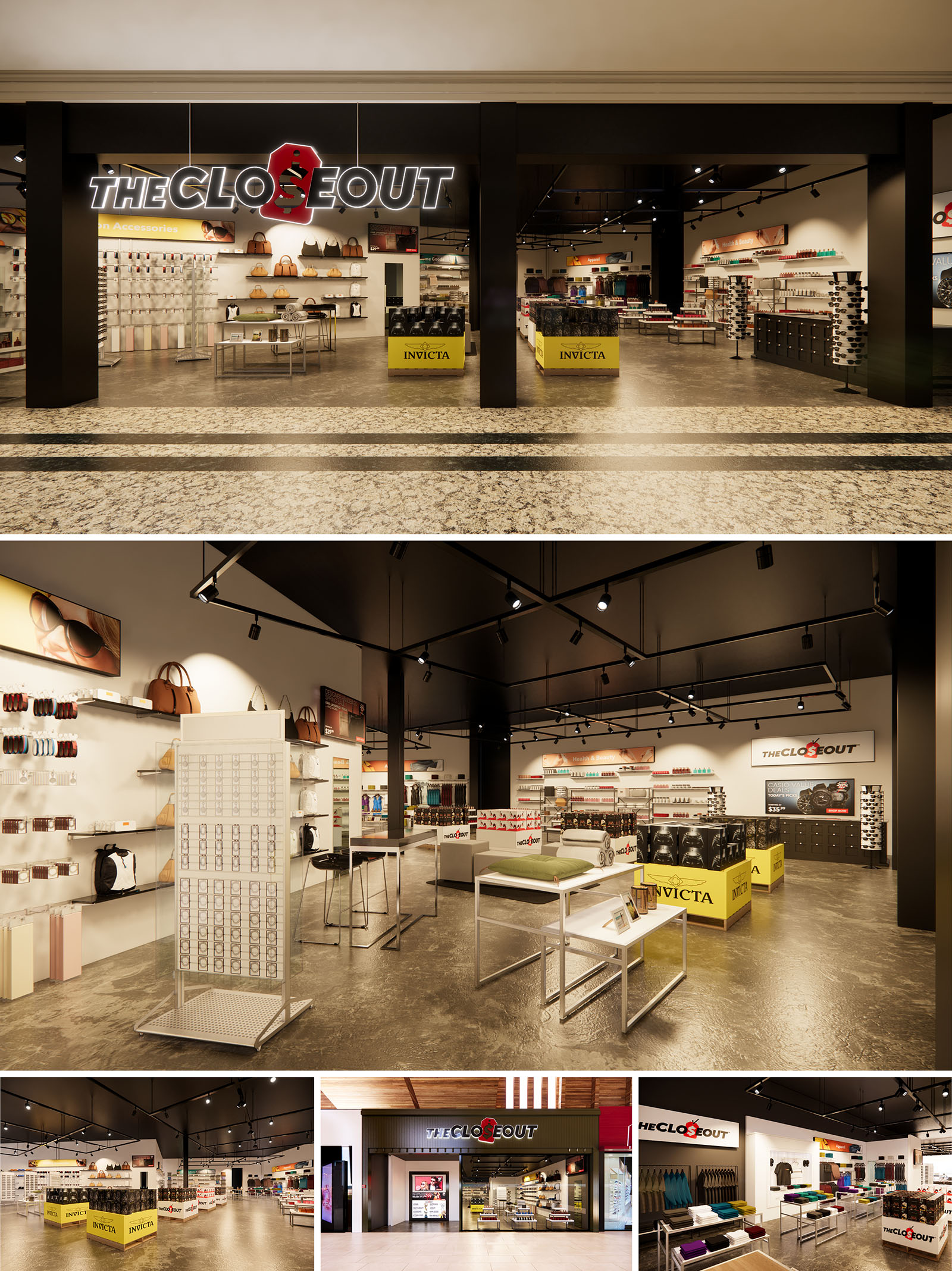
The Close Out is conceived as a flexible retail platform that stages discounted products with the same clarity and dignity as premium merchandise. The design language merges the efficiency of a warehouse with the precision of a fashion boutique, using a restrained material and color palette to foreground the products. Large, open floor plates and minimal vertical obstructions ensure full visual transparency from the mall circulation areas into the depth of the store, drawing visitors toward value-driven discoveries.
The architectural expression is unified across locations in the continental United States and Puerto Rico, establishing a recognizable brand environment that can adapt to varying leasable footprints. A strong black frame, illuminated signage, and a luminous interior backdrop create an immediately legible threshold between the public mall and the retail universe inside, reinforcing brand identity and ease of orientation.
The store fronts are organized as large, open portals framed in matte black cladding. This frame acts as an urban proscenium, showcasing the merchandise and displays as if on stage. The illuminated logotype is positioned centrally above the opening, with a slightly oversized red “O” element that becomes the focal point and a key component of the brand’s visual lexicon.
The flooring at the entry negotiates the transition between mall finishes and the more industrial interior. Subtle banding and texture shifts guide customers inward, while the absence of physical doors maintains a seamless, welcoming flow. The transparent interior composition—low gondolas and clear sightlines—allows the facade to operate almost like a display window without glass, emphasizing accessibility and immediacy.
The layout is based on a flexible grid of modular display islands that can accommodate rapid changes in product categories and inventory density. Primary circulation runs diagonally across the store, encouraging cross-shopping between accessories, apparel, and specialty items. Secondary paths weave through gondolas and wall systems, maintaining ADA-compliant widths while enabling high product exposure.
Key zones—such as promotional platforms, seasonal merchandise, and branded partner areas—are articulated through distinct cluster arrangements and the strategic use of branded yellow plinths. These elements act as navigational beacons, visually organizing the open plan and creating intuitive pause points for browsing and up-selling opportunities.
The interior materials balance robustness with a contemporary aesthetic suited to high-traffic retail. Polished concrete flooring provides a continuous, durable surface that reflects light and underscores the industrial tone of the concept. Perimeter walls are treated in a warm, neutral white to enhance product visibility, while black ceiling planes and structural elements frame the scene and conceal technical systems.
The color strategy relies on a triad of black, white, and brand-accent yellow. Black is used for framing, fixture bases, and ceiling grids; white surfaces support merchandising clarity; yellow highlights promotional zones and communicates value. Track-mounted LED spotlights and linear fixtures deliver a layered lighting scheme, offering accent illumination on shelving and feature tables while maintaining overall ambient brightness. This system is fully adjustable, enabling rapid re-focusing as product mixes evolve.
Display fixtures are designed as lightweight, modular assemblies in powder-coated metal and laminate surfaces. Wall systems employ slotted standards and shelves to adapt to belts, bags, eyewear, and small accessories without requiring structural changes. Freestanding tables and gondolas feature clean, rectilinear forms and open bases to preserve visual permeability and ease of maintenance.
Partner brands are integrated via dedicated bays and mobile cubes that can be repositioned to support seasonal campaigns or store reconfigurations. This kit-of-parts approach allows each location—whether in mainland malls or Caribbean shopping centers—to maintain a coherent identity while responding to different floor plates, customer flows, and sales strategies.
Sustainability is addressed through both material selection and operational efficiency. The use of polished concrete as the primary flooring minimizes additional finish layers and future replacement cycles. Fixtures are largely fabricated from recyclable metal components with bolted rather than welded connections, facilitating disassembly, reuse, and end-of-life recycling when store layouts are updated.
Energy-efficient LED lighting significantly reduces electrical loads and maintenance requirements across the multiple locations, while programmable controls allow dimming schedules aligned with mall operating hours. Standardized fixture families and finishes promote economies of scale in manufacturing and shipping, reducing material waste and transportation impacts. Together, these strategies support a resilient retail concept capable of evolving over time with reduced environmental footprint.
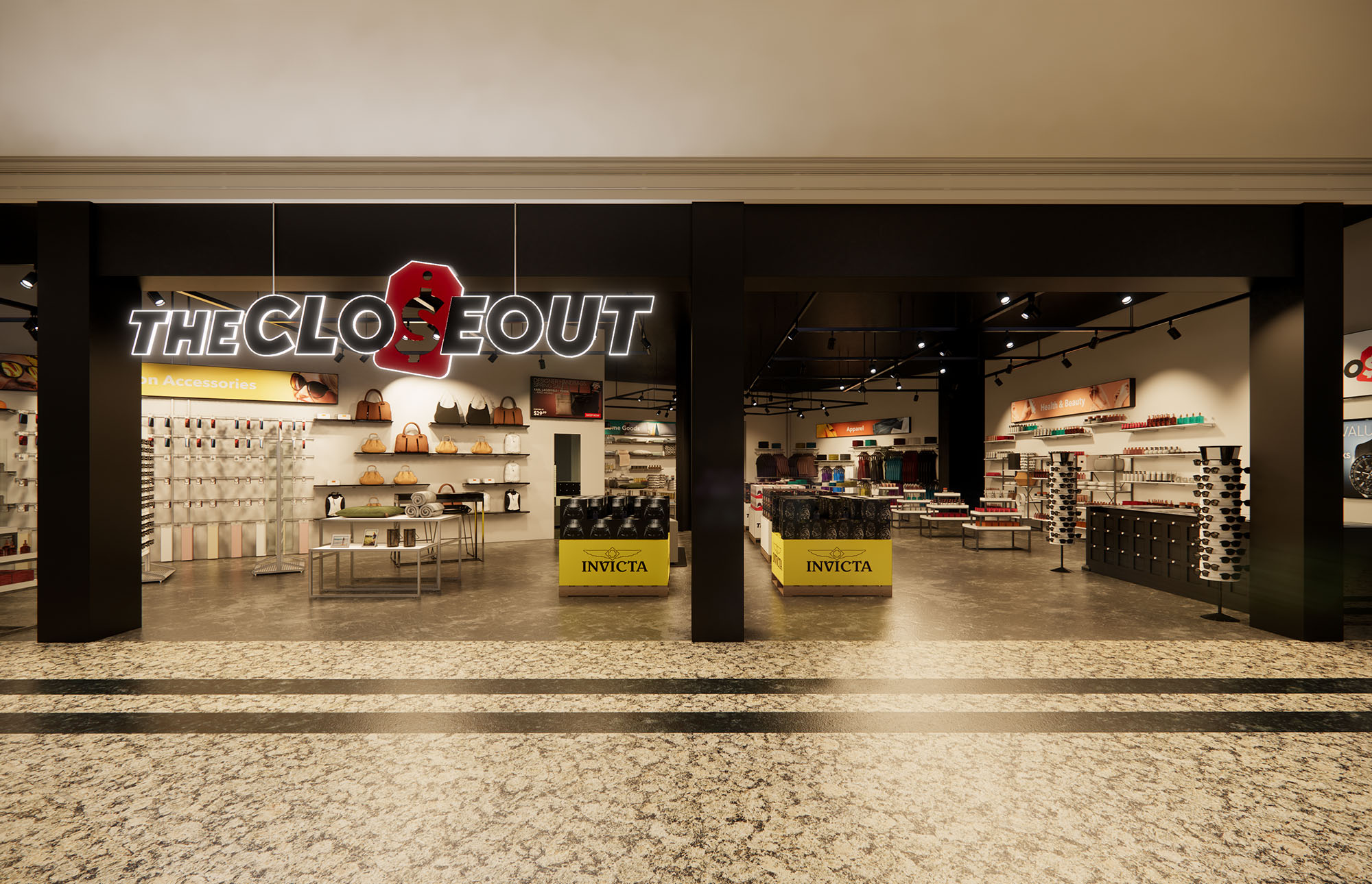
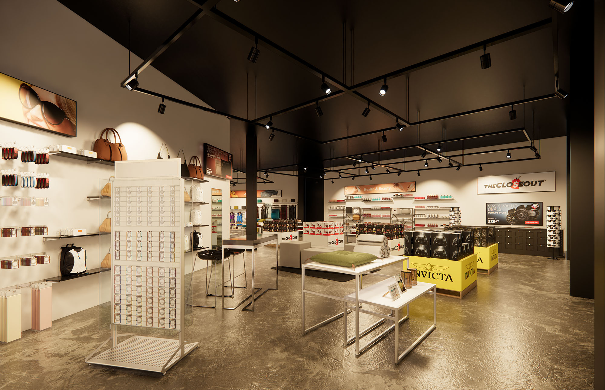
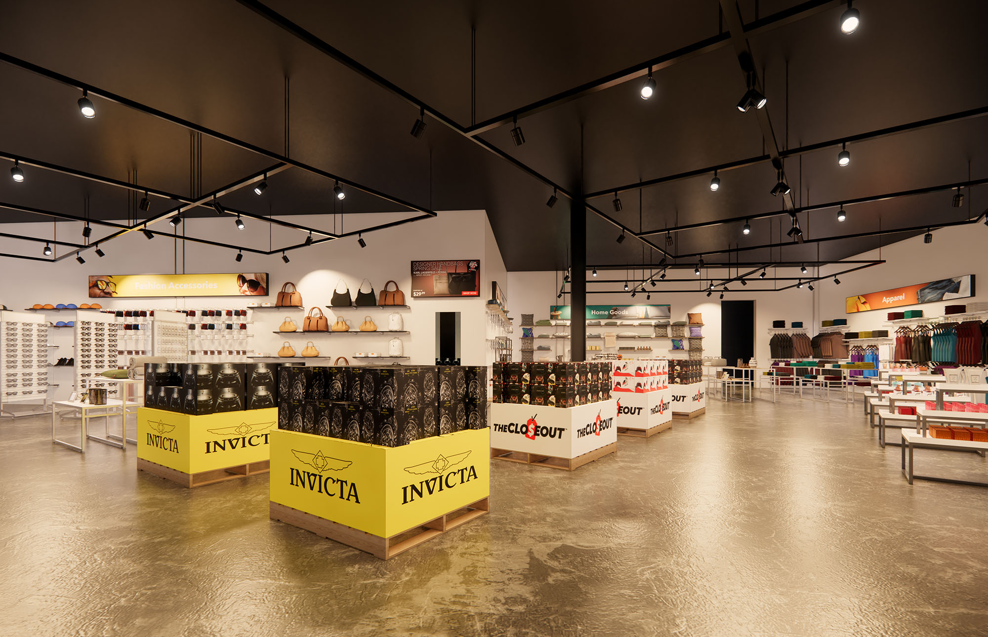
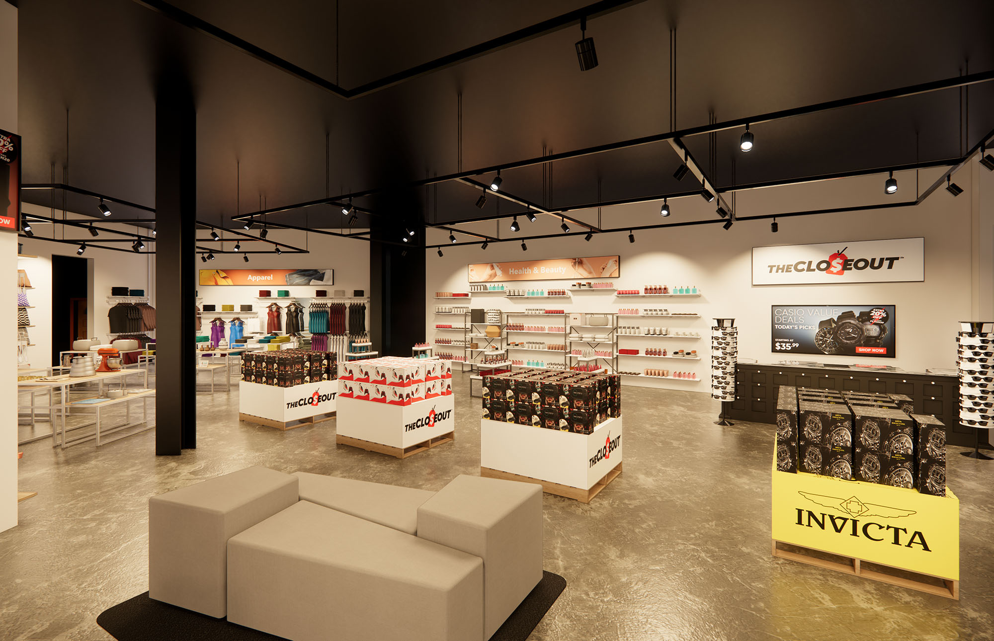
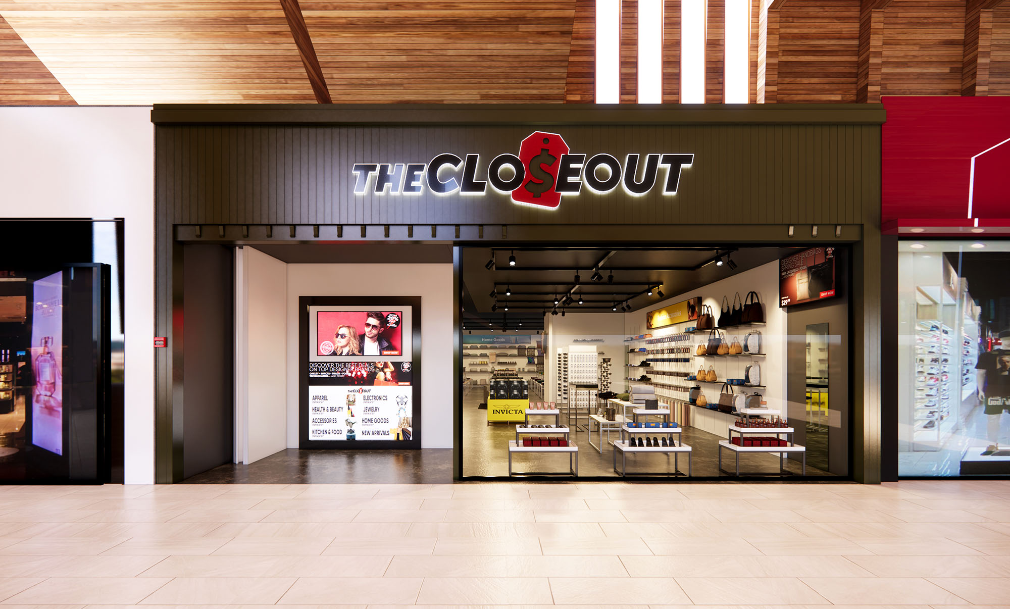
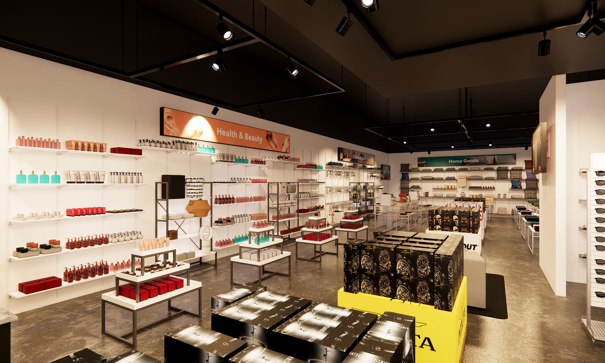
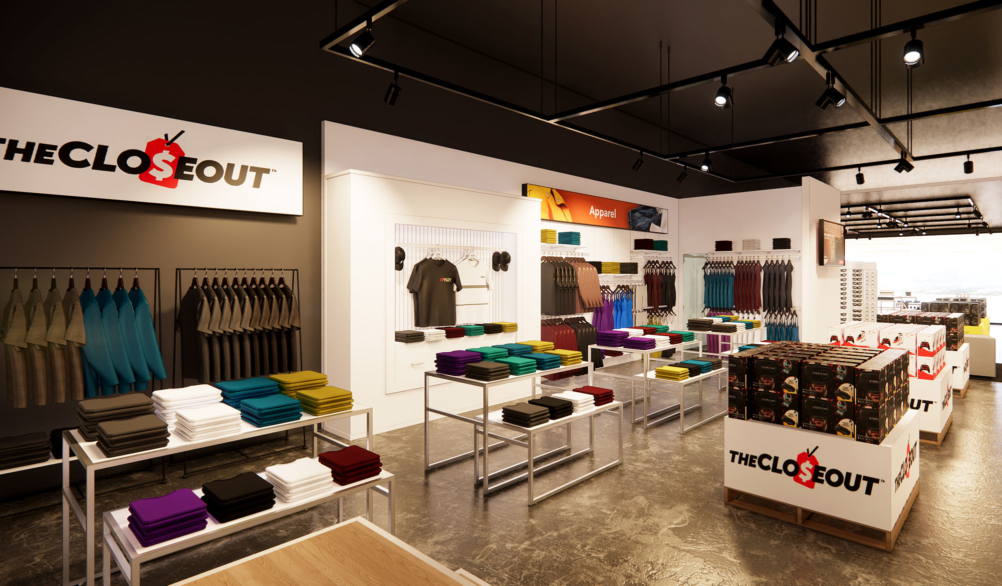
© 2021 by sanzpont [arquitectura] . Webpage by sanzpont [digital] . Innovative Digital Experiences
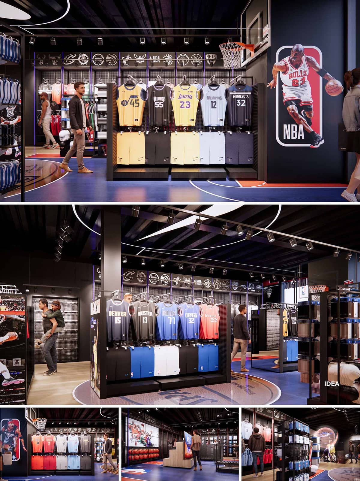

The design of the NBA Store in London translates the dynamism of a basketball arena into a retail interior, creating an immersive brand experience rather than a conventional shop. Spatial composition, lighting, graphics and materiality are orchestrated to evoke the sensation of stepping courtside, placing visitors at the center of the game. The store becomes an urban pavilion celebrating NBA culture, where circulation follows the logic of the court and product is displayed as if it were athletic equipment ready for play.
The concept is based on clarity of identity: every surface, from floor graphics to ceiling ribbons, communicates the language of basketball. Large-scale player imagery and league iconography act as architectural elements, visually “anchoring” zones and guiding customers across the space. The aim is to balance spectacle with legible merchandising, ensuring that emotional engagement supports rather than competes with retail performance.
The plan is organized around a central court-inspired axis that structures the main flow. A full-court graphic, integrated into the floor finish, subtly delineates primary routes and pause points. Perimeter walls are dedicated to team-specific collections, while freestanding gondolas articulate secondary paths and create smaller “pockets” for focused browsing. This hierarchy of open and more intimate areas supports both quick purchases and longer, exploratory visits.
Key sightlines are carefully controlled: on entry, the view terminates on a strong visual icon, typically a player graphic or illuminated logo wall. Circulation curves gently around the court lines, encouraging movement while avoiding visual clutter. High-demand categories such as jerseys and footwear occupy the most visible positions along this spine, with accessories and memorabilia layered deeper into the layout, encouraging progressive discovery.
The material palette juxtaposes dark, technical surfaces with vivid brand colors. Black ceilings, columns and metal fixtures create a neutral, almost theatrical background, allowing the saturated blues, reds and yellows of the NBA identity and team jerseys to stand out. Perforated metal panels and wire-mesh backdrops reference locker-room and arena railings, reinforcing the sports infrastructure aesthetic.
Flooring combines resilient sports-like finishes in blue and hardwood-effect areas, echoing the visual language of a professional court. This not only reinforces the concept but also provides robust performance for high-traffic retail environments. Linear LED strips and adjustable track lighting are deployed to model the space much like arena lighting, with accent beams focused on key merchandise walls and vertical graphic panels. Controlled contrast enhances product legibility while creating a sense of depth and drama.
Merchandising systems are designed as modular frames that can quickly adapt to changing collections, playoffs or special events. Jerseys are displayed frontally at eye level on continuous rails, creating a rhythmic backdrop of color blocks representing different teams. Below, integrated cabinetry provides concealed storage and a solid visual base, grounding the vertical display.
Overhead, a band of illuminated team logos runs along the perimeter, acting as a continuous frieze that orients visitors and celebrates league diversity. Large-scale player graphics and digital screens punctuate these sequences, enabling storytelling, highlights and campaign content. This layered branding strategy ensures that the environment remains fresh and responsive while maintaining a coherent architectural framework.
Sustainability is addressed through material selection, lighting strategy and long-term flexibility. Fixtures are predominantly metal and engineered board, chosen for durability, high recyclability and ease of reconfiguration, reducing the need for future fit-out waste. Finishes are specified with high abrasion resistance and, where possible, low-VOC coatings to promote healthier indoor air quality.
The lighting scheme relies on high-efficiency LED technology with controllable drivers, minimizing energy consumption while allowing scenes to adapt to daylight levels, events or promotional periods. Concentrating graphic expression in interchangeable panels and digital media reduces the environmental footprint associated with frequent rebranding. The robust, modular design extends the life cycle of the interior, supporting both sustainable operation and evolving retail narratives.
© 2021 by sanzpont [arquitectura] . Webpage by sanzpont [digital] . Innovative Digital Experiences
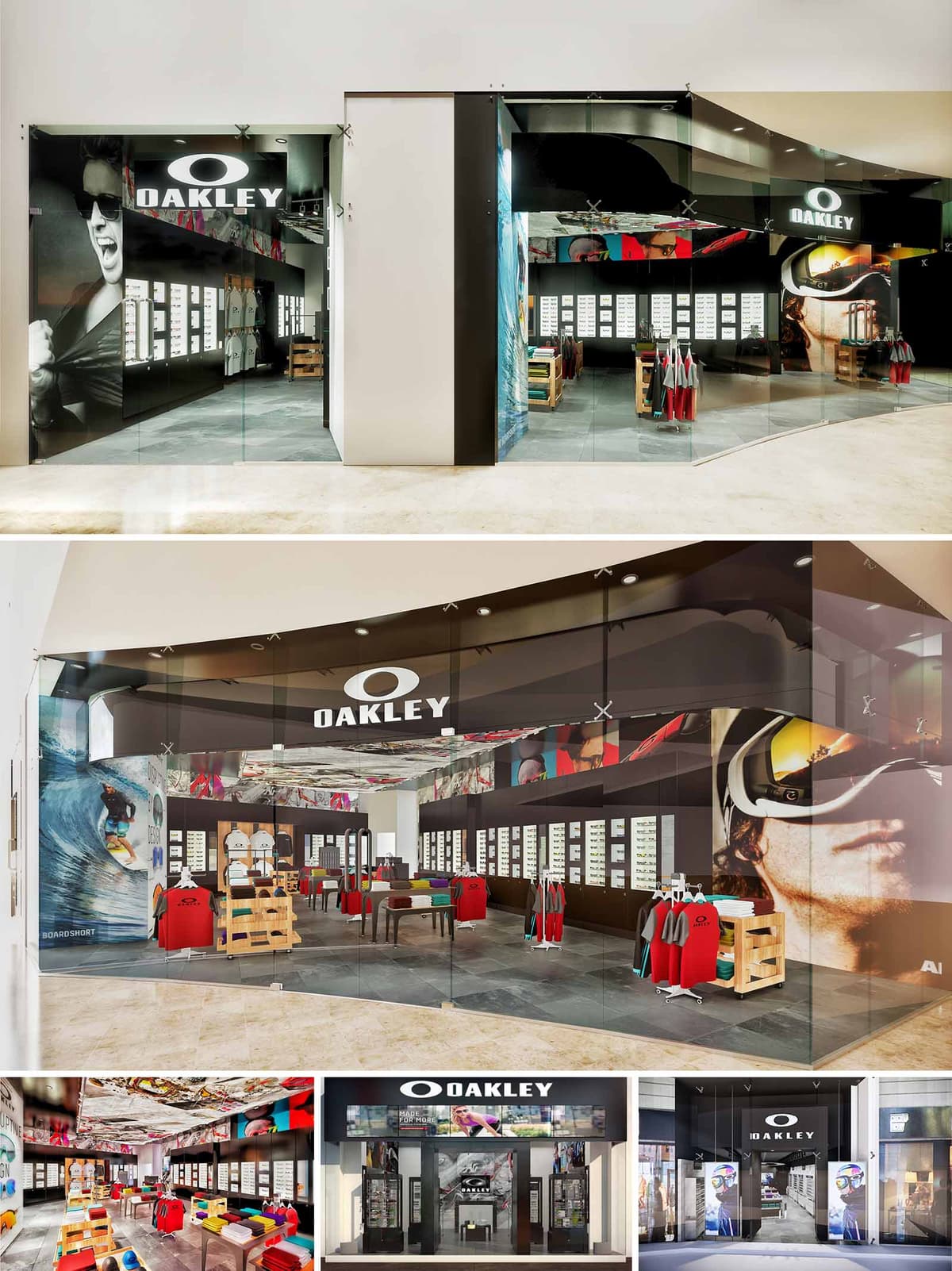

The OAKLEY stores are conceived as immersive brand capsules, where architecture, graphics and lighting merge to communicate performance, technology and urban energy. The design strategy translates the brand’s association with action sports into a controlled, almost gallery-like retail environment, where merchandise becomes the primary protagonist against a dark, continuous backdrop. The envelope, both at the façade and interior, is used as a dynamic canvas for large-scale imagery, generating a powerful visual impact even at distance inside the mall.
Across the 14 locations, the concept prioritizes replicable spatial rules rather than identical forms, allowing adaptation to different lease lines and depths while maintaining a strong and recognizable identity. Clean geometry, bold contrasts and precise detailing are employed to convey technical excellence and to frame curated product narratives focused on eyewear and apparel.
The typical store layout is organized as a clear frontal entry zone with a wide, transparent opening that eliminates physical barriers and maximizes permeability from the mall corridor. Once inside, circulation follows a simple horseshoe or perimeter loop, guided by continuous display walls that house the core eyewear collections. Central freestanding tables, low enough to preserve visual continuity, host apparel and accessories and structure transversal flows.
The cash wrap and service areas are intentionally recessed, keeping the primary visual field dedicated to merchandise. Sightlines are carefully controlled: from the entrance, the visitor immediately perceives the full depth of the space and the dense, luminous grid of eyewear displays at the back, encouraging exploration. Circulation remains intuitive and obstacle-free, accommodating high traffic while maintaining space for dwell and product testing.
The façade system relies on full-height glass planes, minimally framed, which create a showcase-like condition and visually extend the interior into the public realm. Black opaque bands at the upper zone host the illuminated OAKLEY logotype and a sequence of back-printed graphics, generating a strong cornice line that unifies the storefront and conceals technical elements such as lighting tracks and structure.
Overscaled photography of athletes and equipment is printed on both exterior and interior surfaces, producing a layered visual field when viewed obliquely from the mall circulation. The transparency of the glass, combined with the opacity of the brand band, balances openness and controlled branding, allowing the store to stand out without resorting to volumetric protrusions.
The interior palette is dominated by dark, neutral surfaces—charcoal floor tiles and deep brown or black wall systems—that provide a high-contrast backdrop for the brightly colored merchandise. This chromatic strategy reinforces the precision and technical feel of the brand, while enabling rapid visual recognition of products. Display furniture uses a combination of matte laminates, powder-coated metal frames and natural or lightly stained wood crates, evoking a workshop aesthetic appropriate to action-sport equipment.
The ceiling incorporates printed graphic panels and recessed downlights, creating a dynamic but unified overhead plane. Reflections on glass display vitrines add depth without clutter. Materials are selected for durability and ease of maintenance in high-traffic environments, with anti-scratch surfaces and robust hardware that support frequent remerchandising.
Lighting plays a critical role in the perception of product quality and color fidelity. A combination of linear LED systems and adjustable spotlights is employed to form luminous ribbons above the perimeter walls, accentuating the eyewear displays and creating a continuous horizon of light. High color-rendering sources ensure accurate representation of lens tints and apparel hues.
Central fixtures are illuminated from above with focused beams that define product islands and subtly guide circulation. The general ambient level is kept slightly lower than the accent lighting, reinforcing a gallery-like atmosphere where products appear to float against darker backgrounds. Integrated lighting within some display cases highlights premium lines and organizes the visual hierarchy of the assortment.
Sustainability is addressed through a combination of efficient systems, modularity and responsible material selection. LED lighting drastically reduces energy consumption and maintenance compared to conventional sources, a critical factor when multiplied across 14 locations. The standardized fixture families and modular display walls minimize waste during installation and future renovations, as elements can be reused, relocated or reconfigured instead of being discarded.
Durable floor finishes and high-resistance laminates extend the life cycle of components, lowering the need for replacement and associated embodied energy. Whenever feasible, wood elements use certified or low-impact sources, and finishes are specified with low-VOC content to improve indoor air quality. The replicable design toolkit allows the brand to scale consistently while optimizing fabrication, transport and installation processes, reducing the overall environmental footprint of the retail network.
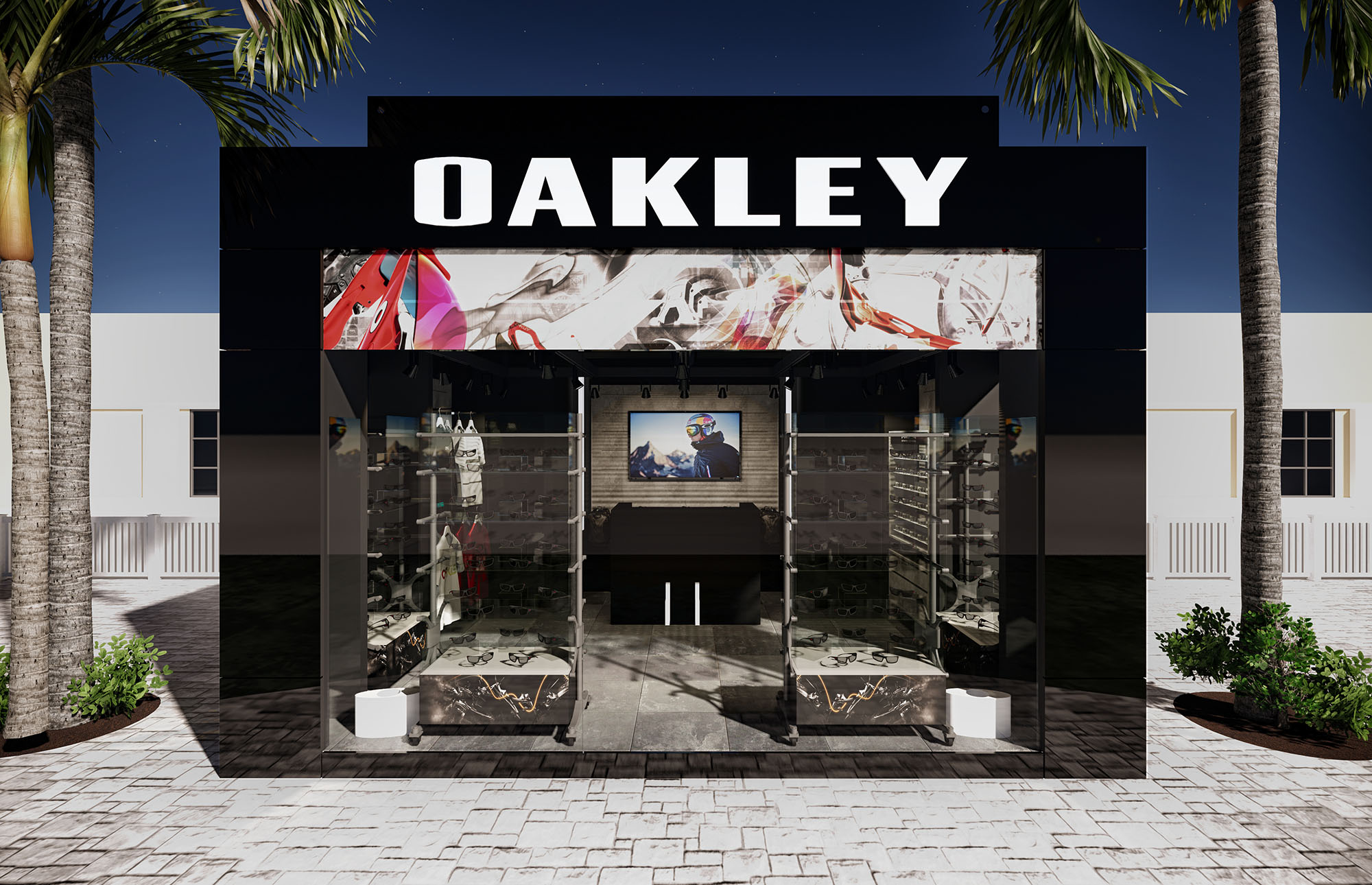
© 2021 by sanzpont [arquitectura] . Webpage by sanzpont [digital] . Innovative Digital Experiences
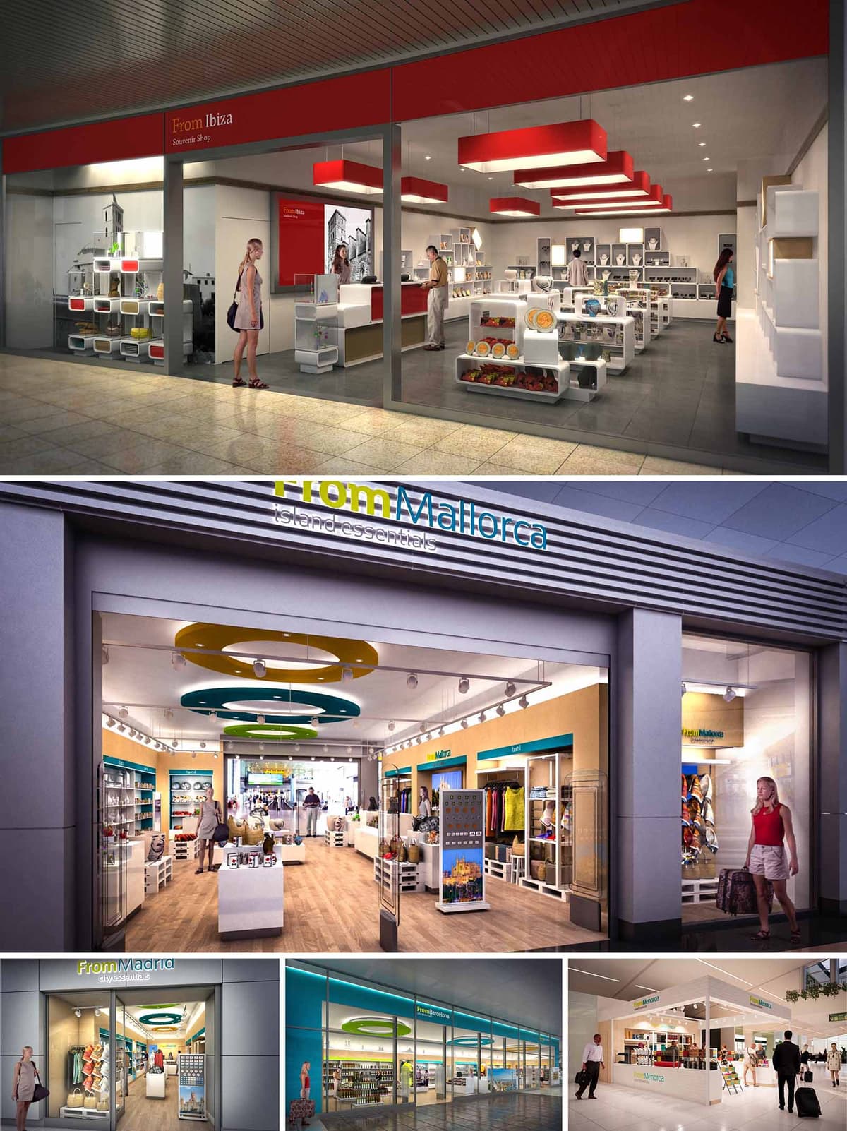

The FROM stores are conceived as a coherent family of airport and travel‑retail spaces that translate the identity of each destination into a clear, contemporary architectural language. The design strategy uses a modular system of elements that can adapt to different footprints while preserving a recognizable brand image. Color, light, and graphic storytelling work together to create an immediate sense of place, transforming functional transit areas into gateways to Ibiza, Mallorca, Madrid and other locations.
The concept balances efficiency and emotional impact: highly rational layouts and standardized fixtures are combined with iconic ceiling elements, large‑scale imagery and calibrated accent colors. This ensures that the visitor immediately understands the offer, navigates easily, and experiences the store as an extension of the local culture.
The floor plans follow open, perimeter‑oriented layouts that maximize visual permeability from the concourse. Low central gondolas preserve long sight lines, while taller perimeter walls and shelving act as a continuous merchandising backdrop. Entrance zones remain visually unobstructed, inviting passengers to flow naturally into the store without feeling a hard threshold.
Circulation is organized around a central spine, with impulse products placed along intuitive paths between the entrance and the cash desk. The cash point is generally located laterally or at the rear, anchoring the perspective and encouraging full exploration of the sales area. Strategic use of empty floor space near the entrance ensures rapid orientation for time‑pressed travelers, while modular display cubes allow for seasonal or promotional islands without compromising circulation.
The material palette combines neutral, durable finishes with destination‑specific chromatic accents. Floors alternate between warm wood‑effect surfaces in some locations and large‑format porcelain tiles in others, both chosen for high resistance and easy maintenance. Perimeter walls are treated with smooth, light‑toned surfaces that reflect light and keep the atmosphere clear and fresh.
Brand colors appear in calibrated doses on ceiling features, fascias, back panels and signage. For example, the Ibiza concept employs a crisp red identity with monochrome photographic murals, while Mallorca and Madrid incorporate turquoise, yellow and green, echoing sea, sun and urban vibrancy. Modular white shelving and display cubes create a neutral canvas that enhances product visibility, allowing local specialties and souvenirs to provide much of the visual richness.
Lighting plays a central role in creating a uniform brand experience. General illumination is achieved through continuous track lighting or recessed downlights, providing high lux levels suitable for retail while avoiding glare. Accent luminaires on adjustable tracks focus on key product zones and promotional displays, generating depth and hierarchy within the space.
Each store features distinctive ceiling elements that act as spatial landmarks. In some locations, linear red light boxes run in sequence, drawing the eye inward and emphasizing the store’s longitudinal axis. In others, circular suspended rings in green, blue and yellow articulate the ceiling plane and echo the logo typography. These sculptural elements integrate indirect lighting, improving visual comfort and contributing to the store’s recognizability from a distance.
Large‑scale photographic graphics anchor the narrative of “island essentials” and city souvenirs. Black‑and‑white or desaturated images of local landmarks contrast with the vivid product colors, reinforcing the connection to place without visually overwhelming the merchandise. External fascias and window bands clearly announce the “FROM + destination” identity, ensuring immediate legibility in busy airport corridors.
Fixtures are based on a flexible grid system of cubes, shelves and wall bays, allowing for rapid reconfiguration in response to changing product mixes. Transparent or open‑backed modules maintain visual depth across the store and avoid creating heavy masses. Vertical segmentation in wall bays—such as labeled bands for “food,” “gifts,” or “fashion”—guides customers efficiently and supports cross‑selling opportunities.
Sustainability is integrated through both material selection and operational strategies. The design favors long‑life materials with high abrasion resistance, reducing the need for frequent replacement in high‑traffic environments. Many fixtures are conceived as reusable modular components, capable of being relocated between different FROM stores or reconfigured as assortments evolve, minimizing waste.
LED technology is used extensively for general and accent lighting, reducing energy consumption and maintenance while ensuring consistent color rendering for food and textiles. Light‑colored interior finishes enhance natural and artificial light, enabling lower power densities. Where possible, locally sourced finishes and regionally fabricated fixtures are specified to reduce transport emissions and support local economies. Cleaning and maintenance protocols are simplified by smooth, non‑porous surfaces, contributing to the long‑term durability and environmental performance of the retail network.
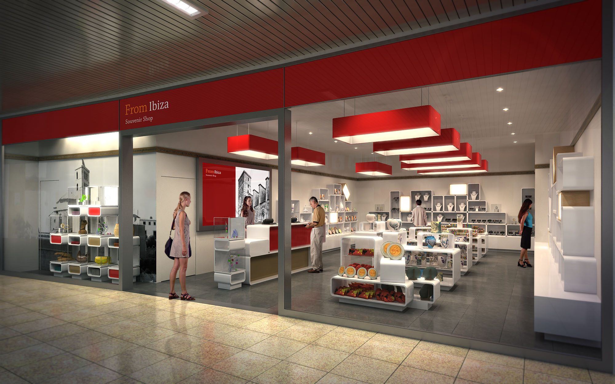
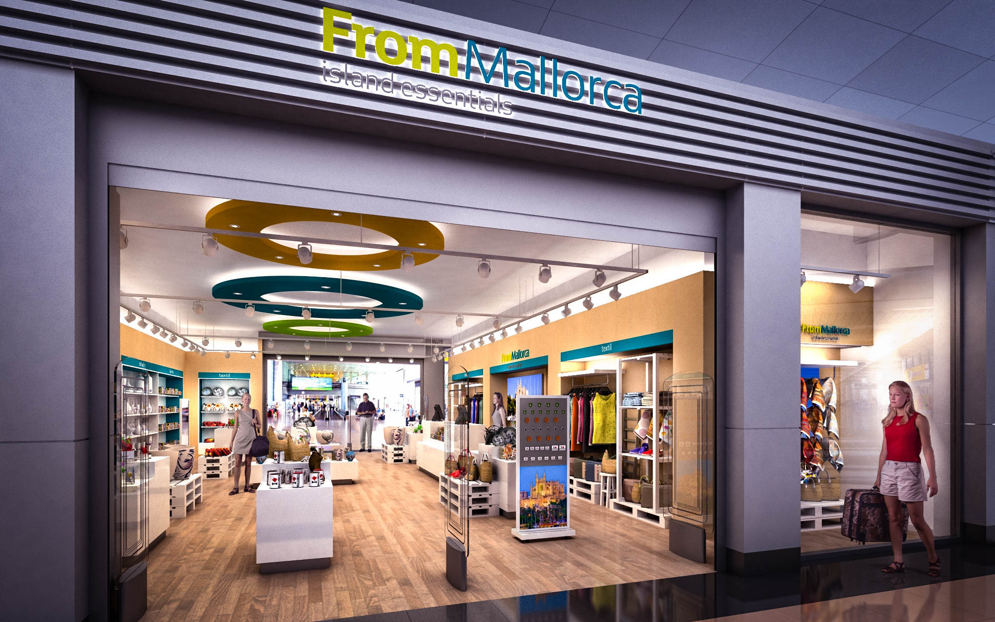
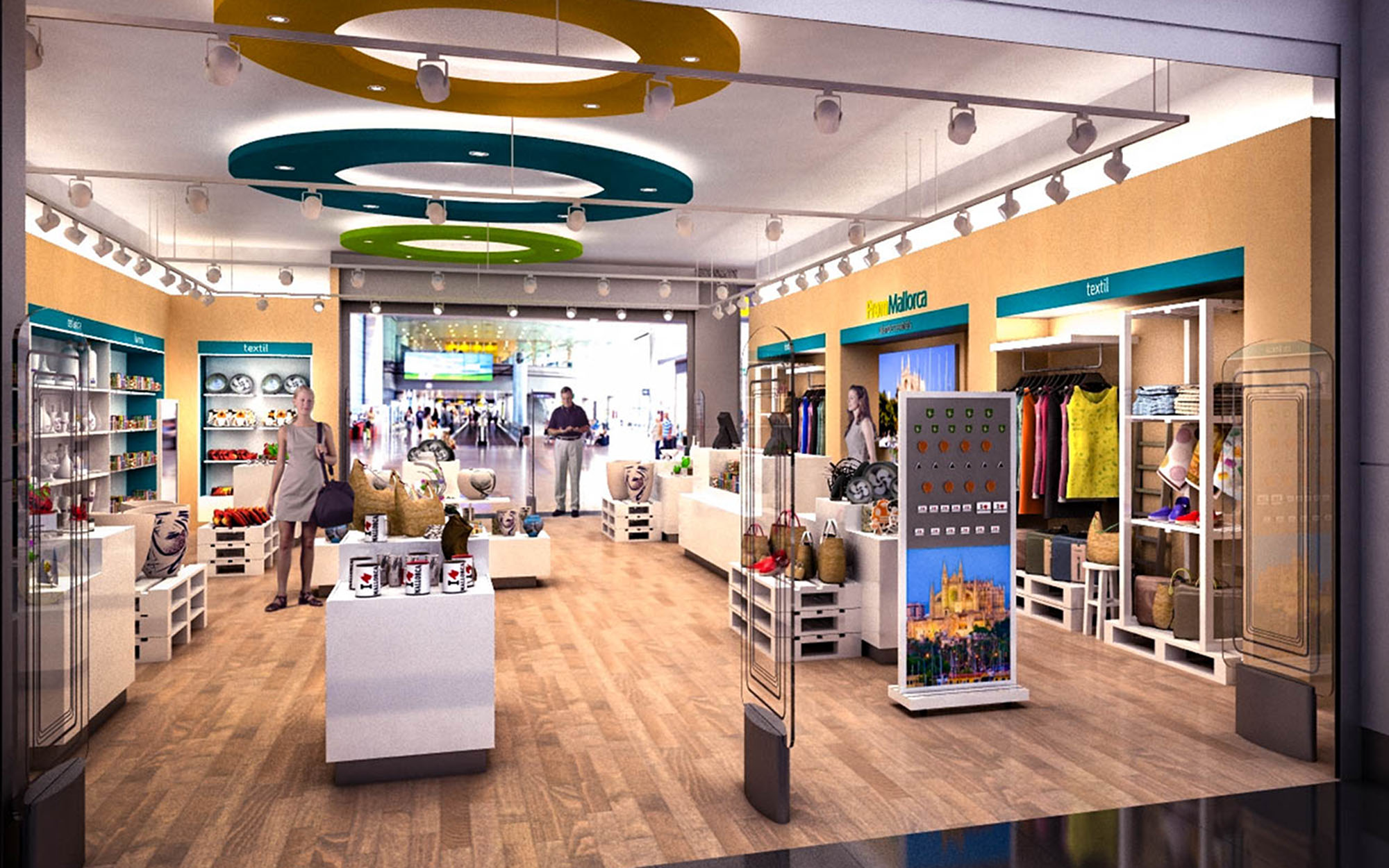
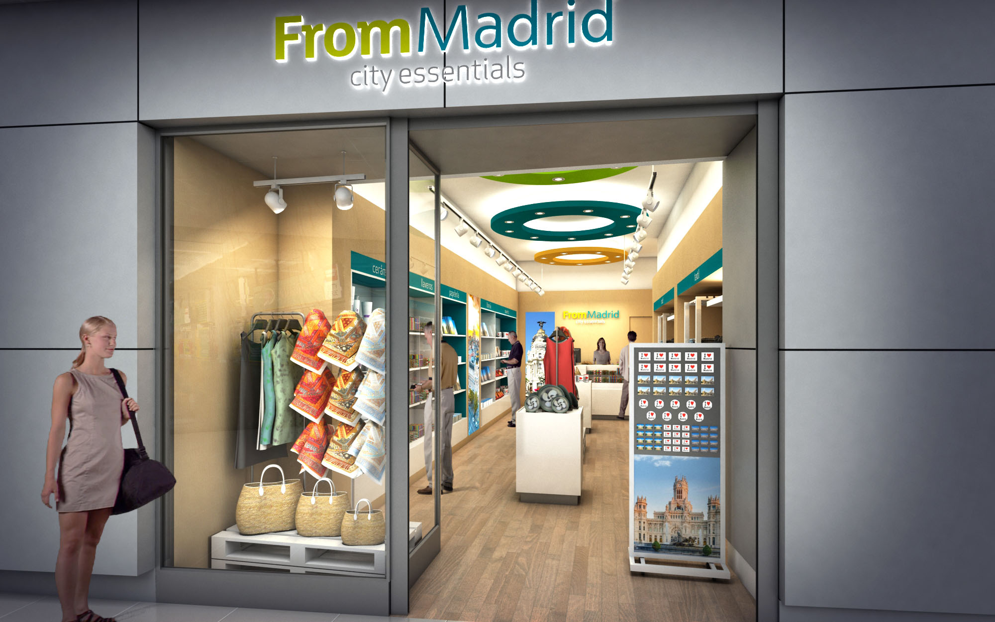
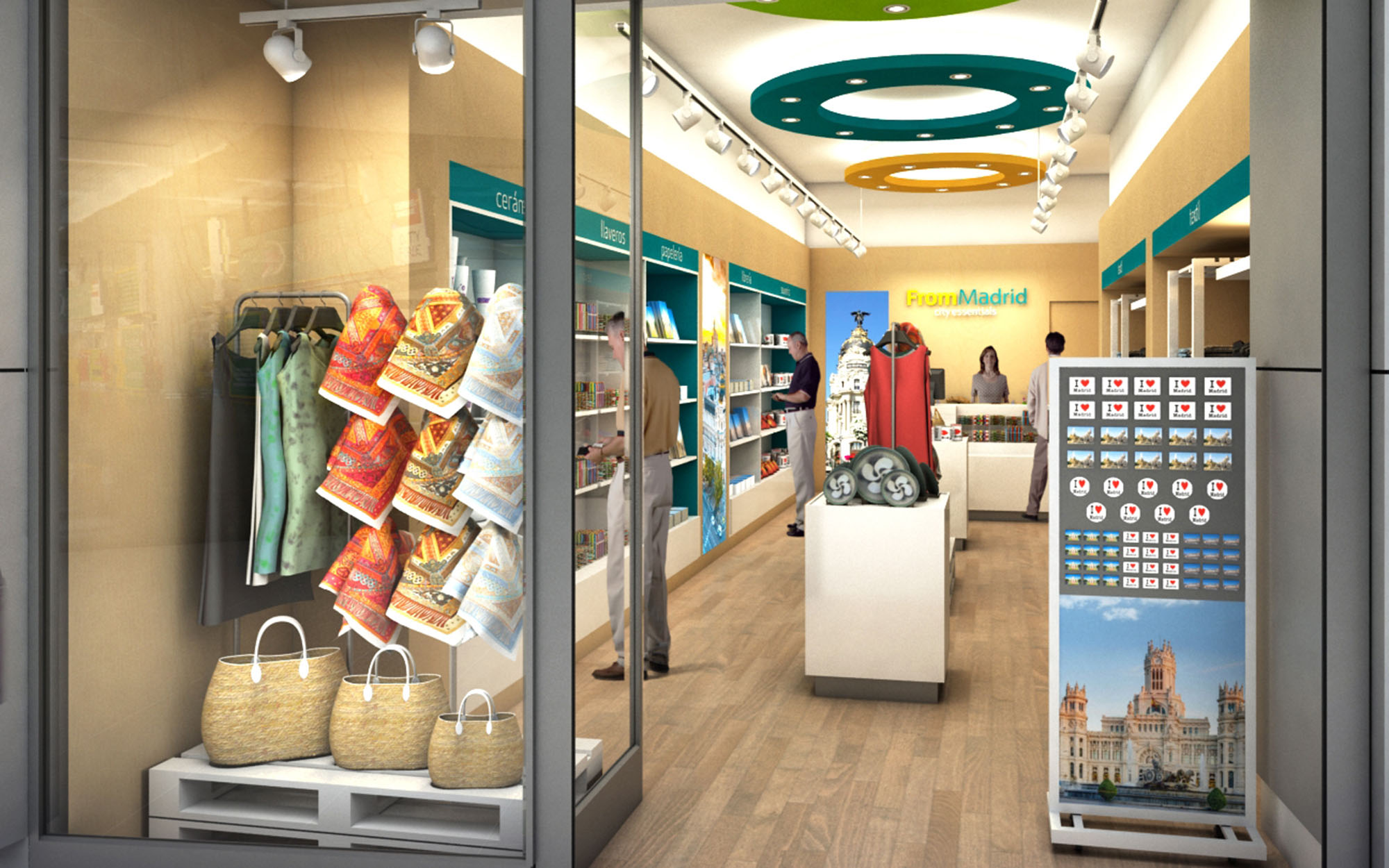
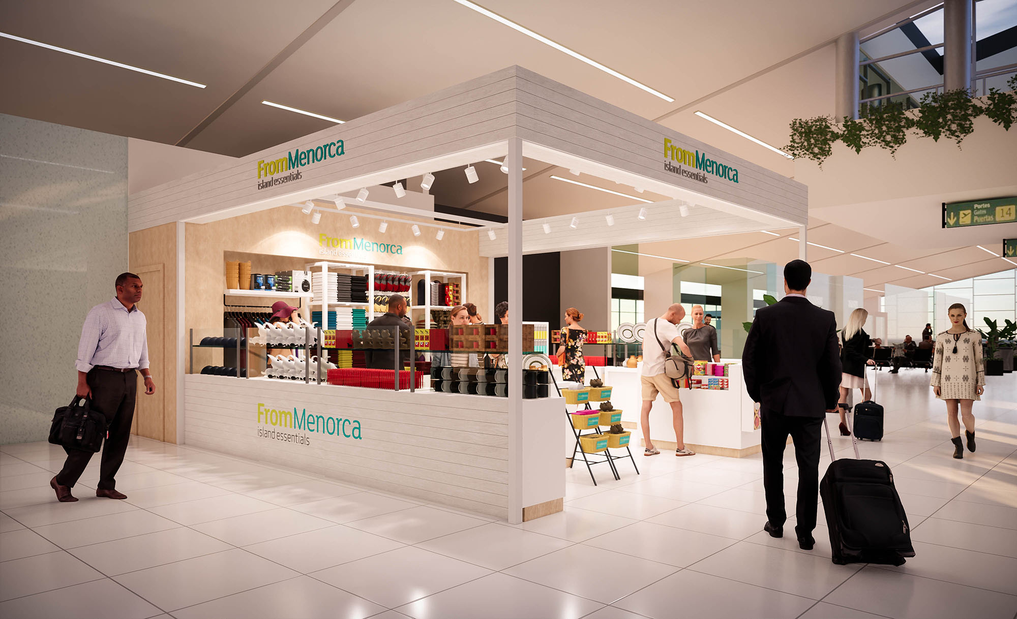
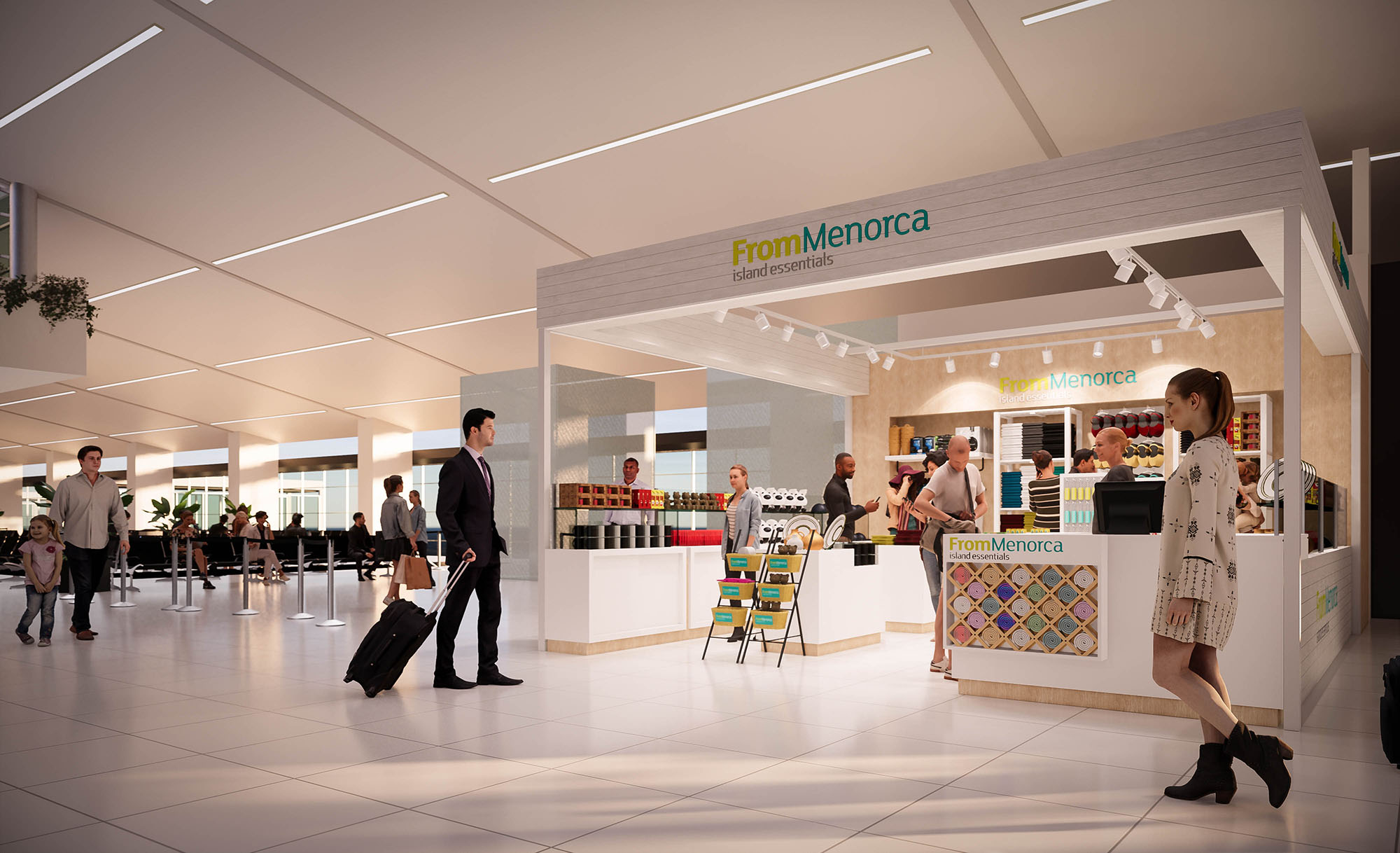
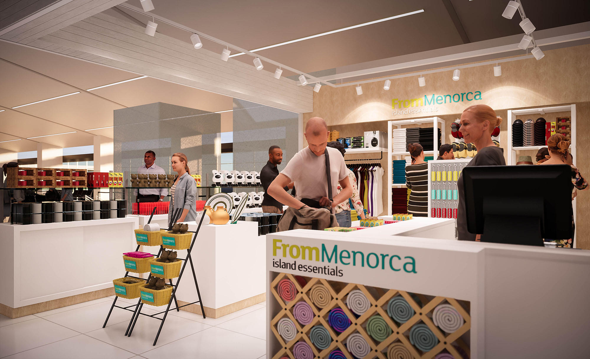
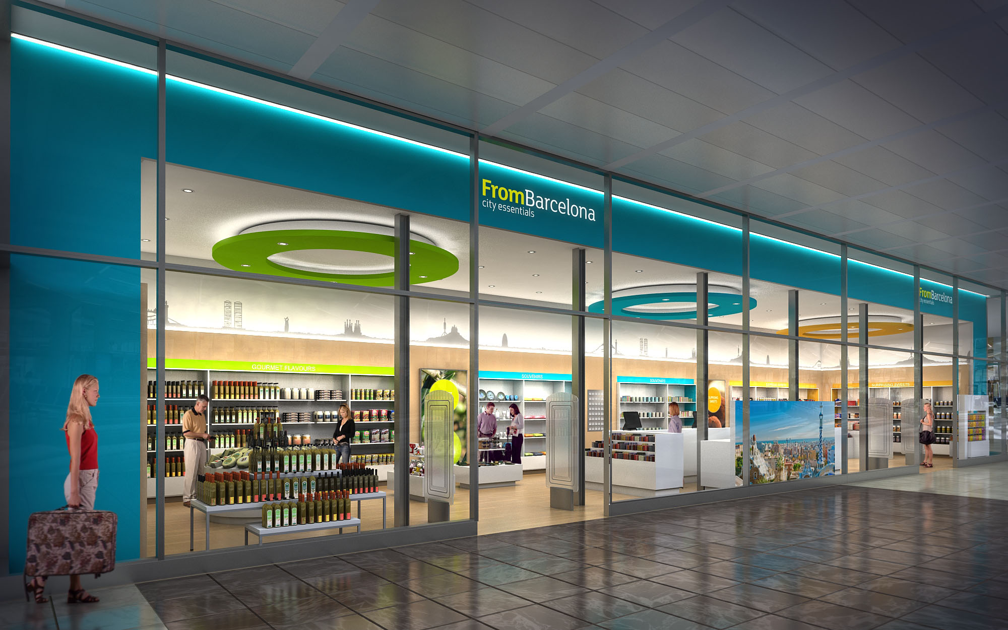
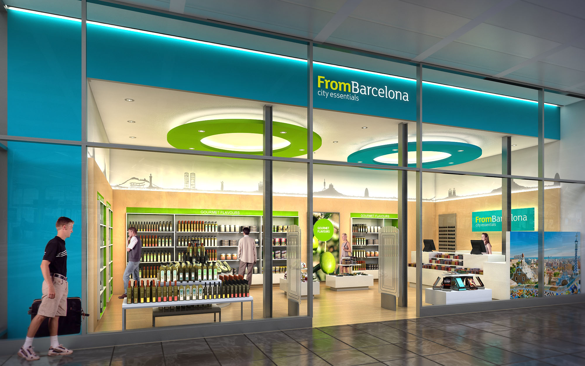
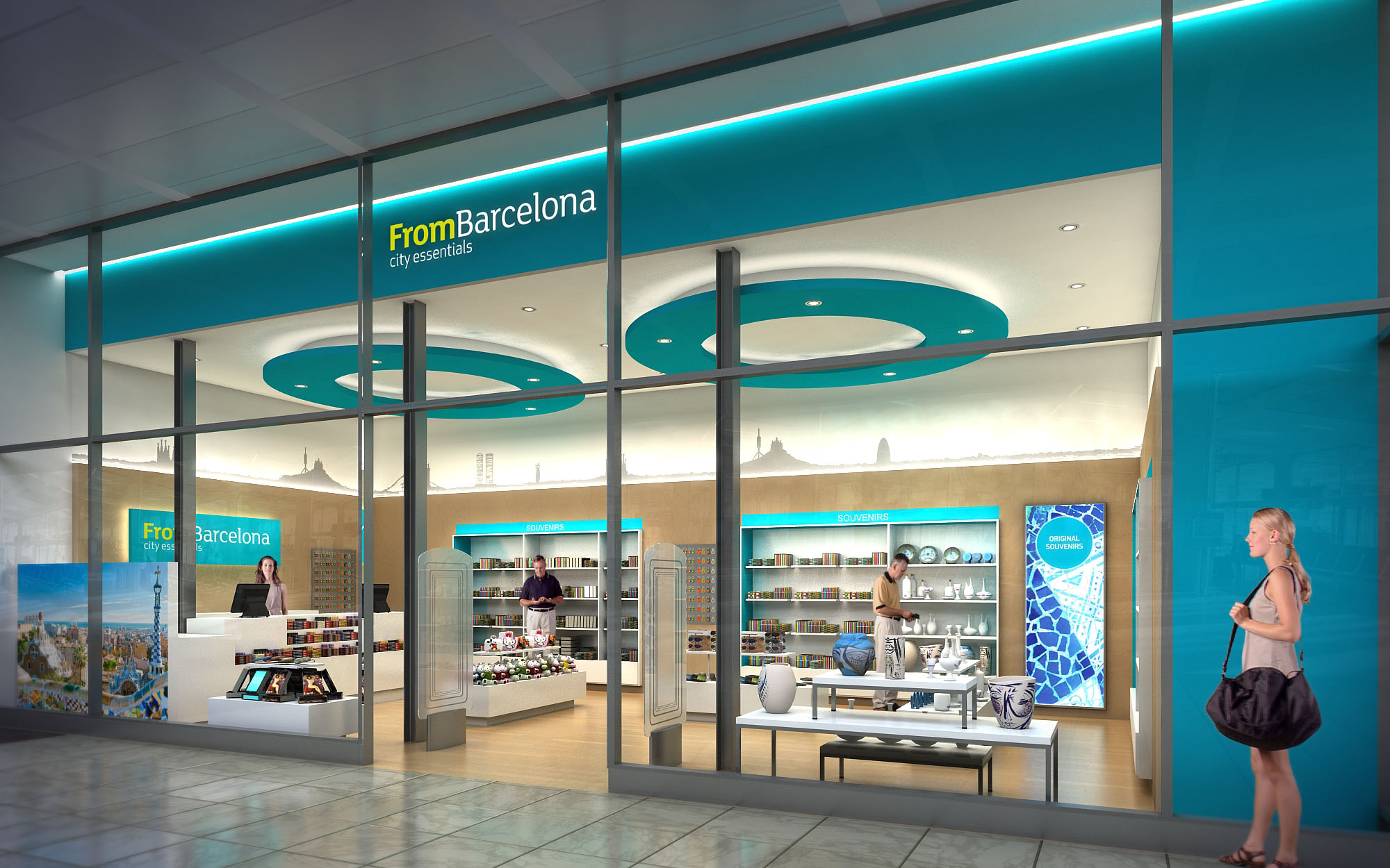
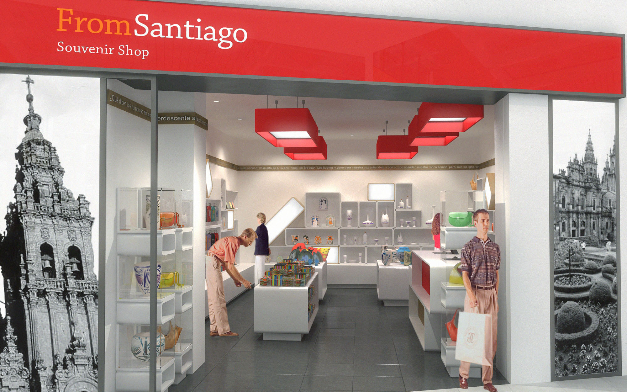
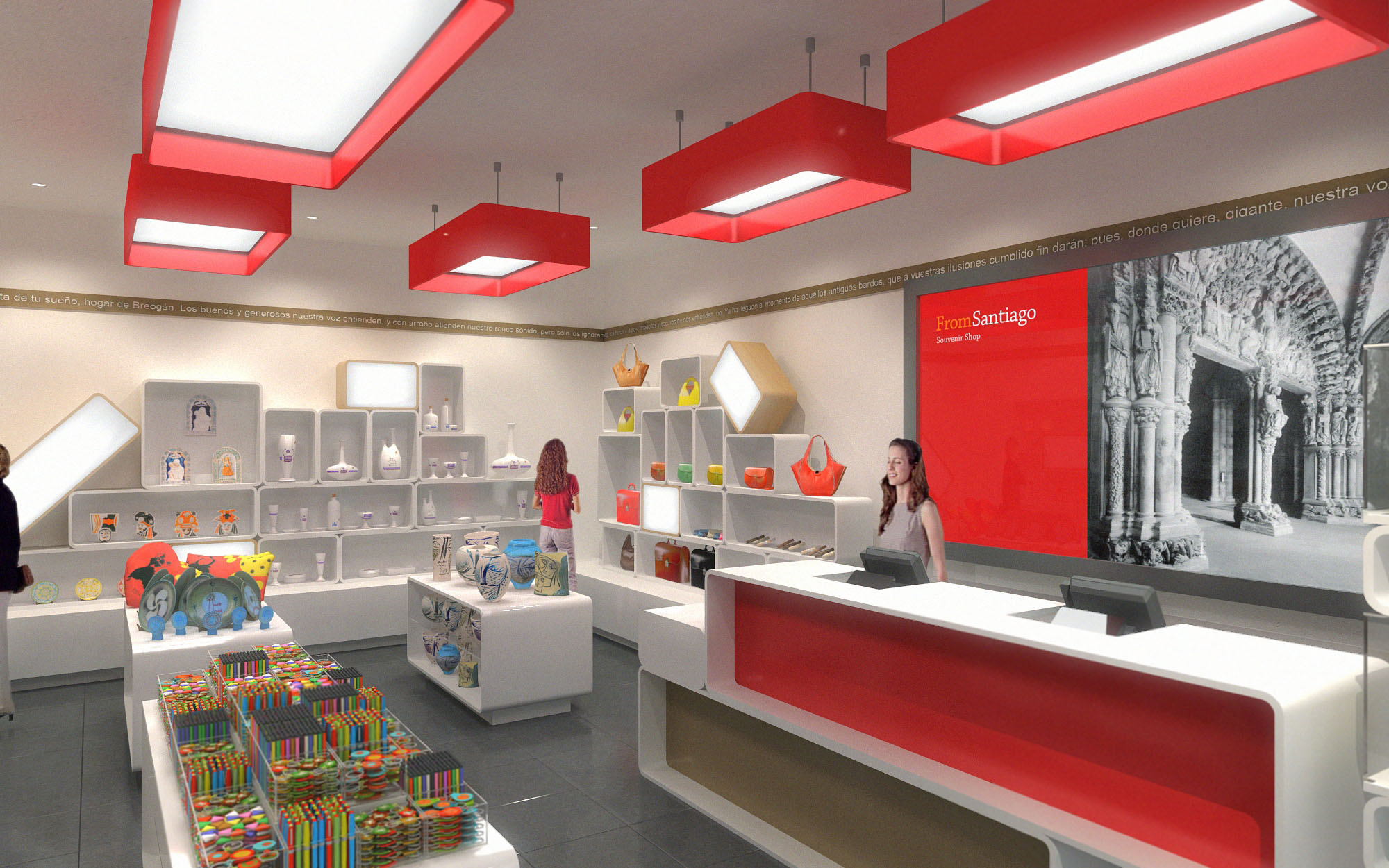
© 2021 by sanzpont [arquitectura] . Webpage by sanzpont [digital] . Innovative Digital Experiences

Miami Farmers Market is conceived as a contemporary urban marketplace that merges the robust character of an industrial train depot with the warmth of a tropical civic plaza. The architectural language references “The Station” as a unifying narrative, using long-span steel structures, expressed trusses and linear bays to evoke a rail platform while accommodating a flexible mix of food, retail and event programs. The design aims to create a community destination that is legible, comfortable and vibrant throughout the day and into the evening.
The concept prioritizes permeability and visual continuity. Generous openings, glazed façades and a central spine aligned with the main entrance establish clear sightlines from street to market hall. This transparency allows visitors to perceive the depth of the interior activity from the public realm, drawing them into a sequence of spaces that gradually transition from urban scale to human scale.
The main elevation presents a bold, symmetrical composition anchored by a dynamic folded roof canopy. This hovering roof, lined in warm timber, projects outward to form a sheltered forecourt and a strong urban gesture visible from the approach roads. Slender black columns emphasize verticality and frame the central entrance, accentuating the sense of arrival.
The façade is organized in a rhythmic grid of dark structural frames infilled with brick and large-scale graphic panels. The brick masonry introduces tactile, human-scale texture, while the illuminated banners provide a changeable layer for seasonal produce, events and branding. Low planting beds and palms soften the base of the building, integrating landscape with architecture and mediating between sidewalk and interior.
Internally, the market functions as a clear longitudinal spine flanked by modular vendor units. This main axis, reminiscent of a station concourse, guides visitors intuitively from entrance to food hall and event terraces. The layout privileges linear circulation with multiple lateral cross-passages, allowing easy navigation and ensuring that each stall benefits from continuous pedestrian flow.
Vendor modules are conceived as lightweight black-framed “carriages” that can be reconfigured over time. Their consistent envelope establishes order, while individualized signage and merchandise create diversity. Color-coded floor markings, reminiscent of rail lines, support intuitive wayfinding and introduce playful graphics that help orient visitors and define thematic zones such as fresh produce, artisanal goods and prepared foods.
The interior aesthetic is rooted in a contrast between industrial robustness and warm hospitality. Exposed steel trusses, black metal columns and polished concrete floors provide a durable backdrop. Against this, natural timber benches, warm-toned brick accents and abundant planting generate a welcoming, tactile environment aligned with the values of a farmers market.
Daylighting is a key driver: linear skylights and translucent roof panels bring controlled natural light deep into the hall, reducing reliance on artificial lighting during daytime. At night, suspended track lighting and pendant fixtures mounted on the steel grid create a soft, uniform illumination, while targeted spotlights highlight produce displays and dining areas, enhancing visual comfort and product visibility.
The market integrates multiple communal zones that encourage lingering and social interaction. Generous timber bleacher seating and long communal tables form an outdoor dining terrace, oriented toward a landscaped backdrop and potential performance wall. This area serves as a flexible platform for food festivals, cultural programming and informal gatherings.
Internally, clusters of planting and movable furniture break down the hall into smaller “neighborhoods,” facilitating varying levels of intimacy from quick stops to extended meals. Clear vistas across the hall maintain a sense of collective belonging, while acoustic absorption from timber elements and vegetation tempers the lively atmosphere.
The project responds to Miami’s climate with a focus on passive comfort strategies and resource efficiency. The extended roof overhang at the entrance provides shading and reduces solar gain on the primary glazed façade. High-level operable openings and the tall volume enable effective natural cross-ventilation, particularly along the central aisle, lowering cooling loads in shoulder seasons.
Material selection prioritizes longevity and low maintenance, with concrete, steel and brick offering high durability and reduced replacement cycles. Timber elements are envisioned from certified sources, and the extensive use of interior greenery contributes to improved indoor air quality and a biophilic spatial experience. The daylight-optimized roof structure minimizes dependence on artificial lighting, while the modular stall system supports adaptability, reducing future demolition and waste as tenant mixes evolve.
© 2021 by sanzpont [arquitectura] . Webpage by sanzpont [digital] . Innovative Digital Experiences
The ORBEA retail space in Barcelona is conceived as an immersive brand landscape that translates cycling performance into architectural form. The design uses the geometry and dynamics of a racing circuit to organize the interior, transforming the store into a three‑dimensional track where products, graphics and users move in a choreographed flow. Strong, clean lines and a controlled color palette create a highly recognizable brand environment that can be replicated in future locations as a scalable retail concept.
The concept focuses on clarity of orientation and product storytelling. Longitudinal axes direct visitors from the entrance to the main communication walls, while central islands define thematic zones such as mountain, road and urban categories. The store is understood as a showcase for innovation rather than a traditional shop, emphasizing experience, consultation and configuration over simple display.
The spatial layout is organized around a central spine composed of elevated blue platforms that function as display plinths and informal seating. This spine structures the circulation, encouraging a progressive discovery of the different product universes. Perimeter walls are reserved for modular display systems, leaving the core of the space open and highly flexible for seasonal changes or event setups.
At the entrance, a reception and information counter establishes an immediate point of contact with staff. From there, a clearly marked circulation path—suggested by floor graphics that reference road markings—guides visitors through the store. Large digital and printed visuals at focal points punctuate the route, reinforcing brand narratives and providing orientation anchors without the need for intrusive signage.
The material palette contrasts the technical precision of cycling equipment with a sober, almost industrial envelope. Dark, matte wall surfaces and ceilings create a neutral background that absorbs reflections and visually amplifies the luminous blue elements. The flooring uses a high‑resistance, low‑gloss surface suitable for heavy traffic, with integrated striping that suggests lanes and movement.
ORBEA blue is deployed as a structural element: it forms the volumetric frames of the display walls, the edges of the counters, and the central islands, creating a continuous chromatic thread. White planes are used selectively to highlight product areas and increase perceived brightness at eye level. Black accents in profiles, fixtures and lighting tracks add definition and a technical character consistent with high‑performance sports equipment.
The furniture is conceived as an integrated system rather than isolated pieces. Perimeter walls feature modular panels with interchangeable brackets, shelves and hooks, allowing quick reconfiguration for different product typologies. The base volumes, inclined and faceted, echo the geometry of frames and helmets, subtly referencing the mechanics of cycling.
The central blue platforms act as stages for hero products, special editions or bike fitting demonstrations. Freestanding totems accommodate digital screens and wayfinding information, while broad counters provide areas for configuration services and after‑sales support. All elements are dimensioned to maintain maximum transparency across the store, preserving long visual perspectives and avoiding visual clutter.
Lighting design plays a key role in shaping the atmosphere. A continuous track along the perimeter allows precise positioning of adjustable projectors to emphasize products without excessive glare. The dark ceiling visually disappears, turning luminaires and circular ceiling features into floating graphic elements that echo wheels and motion.
Large circular recessed elements, finished in white and blue, generate homogeneous ambient illumination over the central axis, while accent lighting intensifies contrast on key display walls. The result is a controlled, cinematic light level that enhances textures and colors of the merchandise and reinforces the high‑tech identity of the brand.
Sustainability is addressed through a combination of material selection, energy efficiency and long‑term adaptability. The use of LED luminaires with high luminous efficacy significantly reduces energy consumption compared to traditional retail lighting, while track systems allow reorientation without additional installations, extending the life of the infrastructure.
Furniture and wall systems are designed as modular, demountable components fabricated principally from recyclable metal profiles and certified wood panels with low‑emission finishes. This approach minimizes waste during updates and facilitates disassembly or relocation. The restrained palette and timeless geometry reduce the need for frequent refurbishments, supporting a slower, more responsible renovation cycle aligned with contemporary environmental standards.
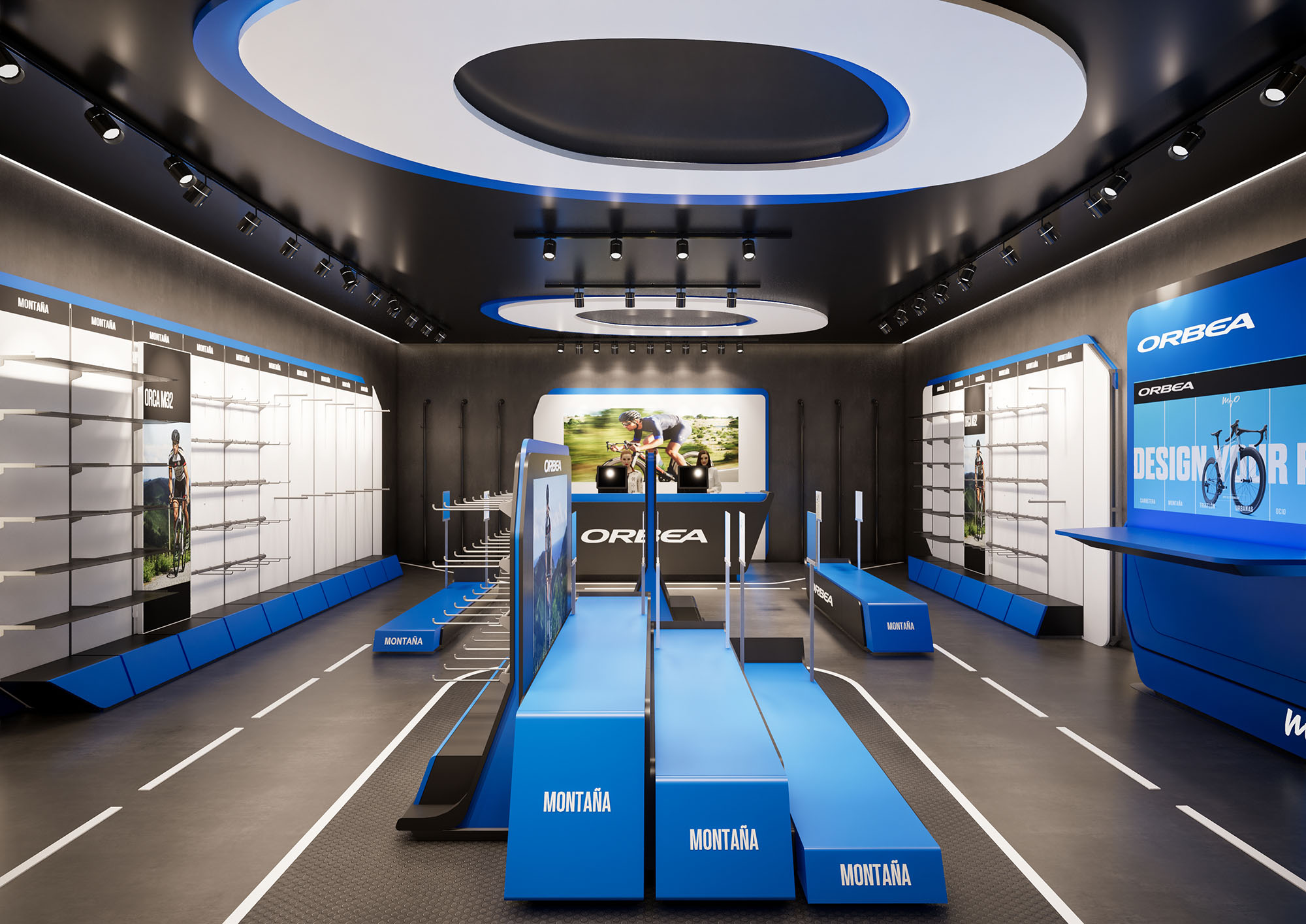
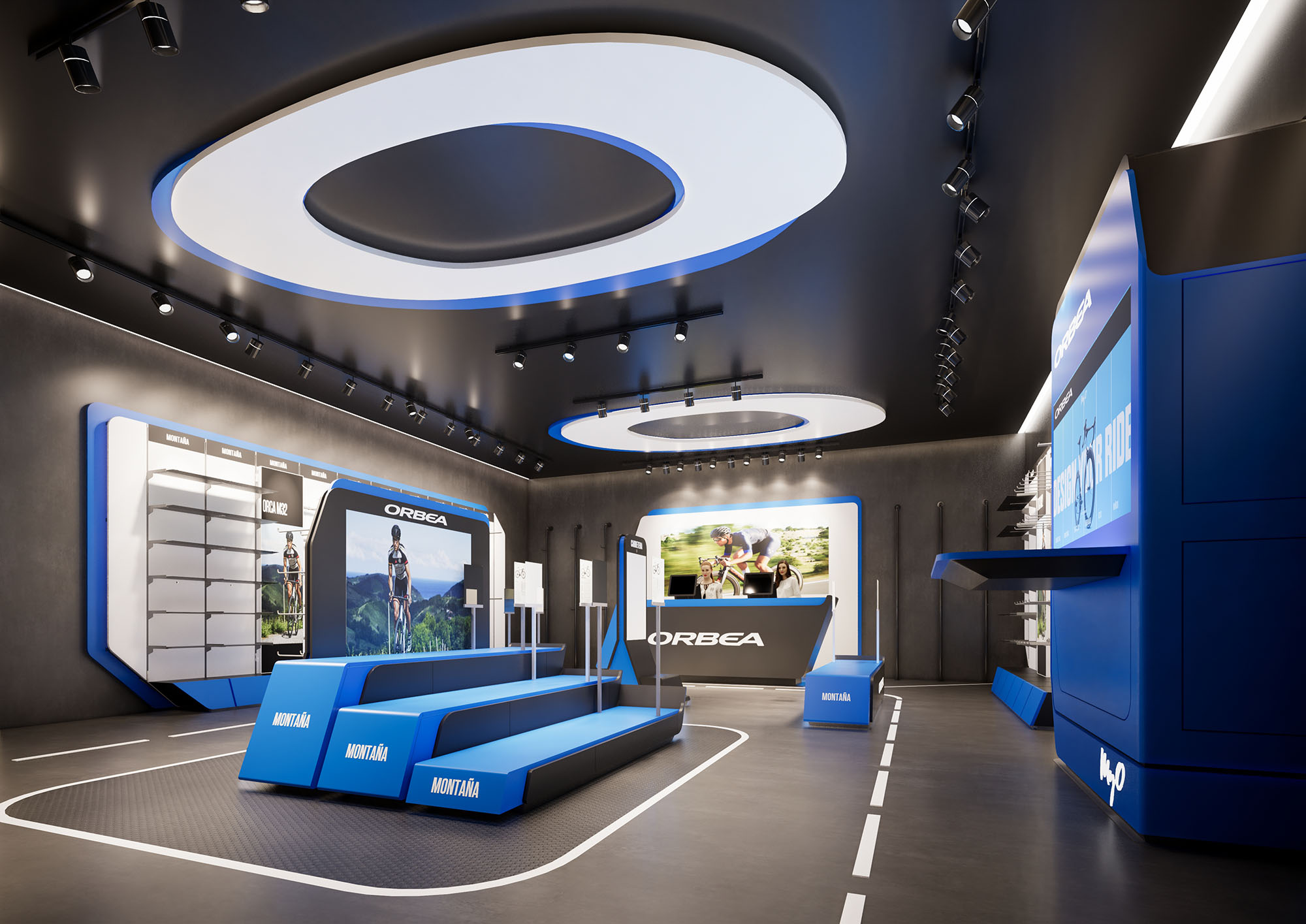
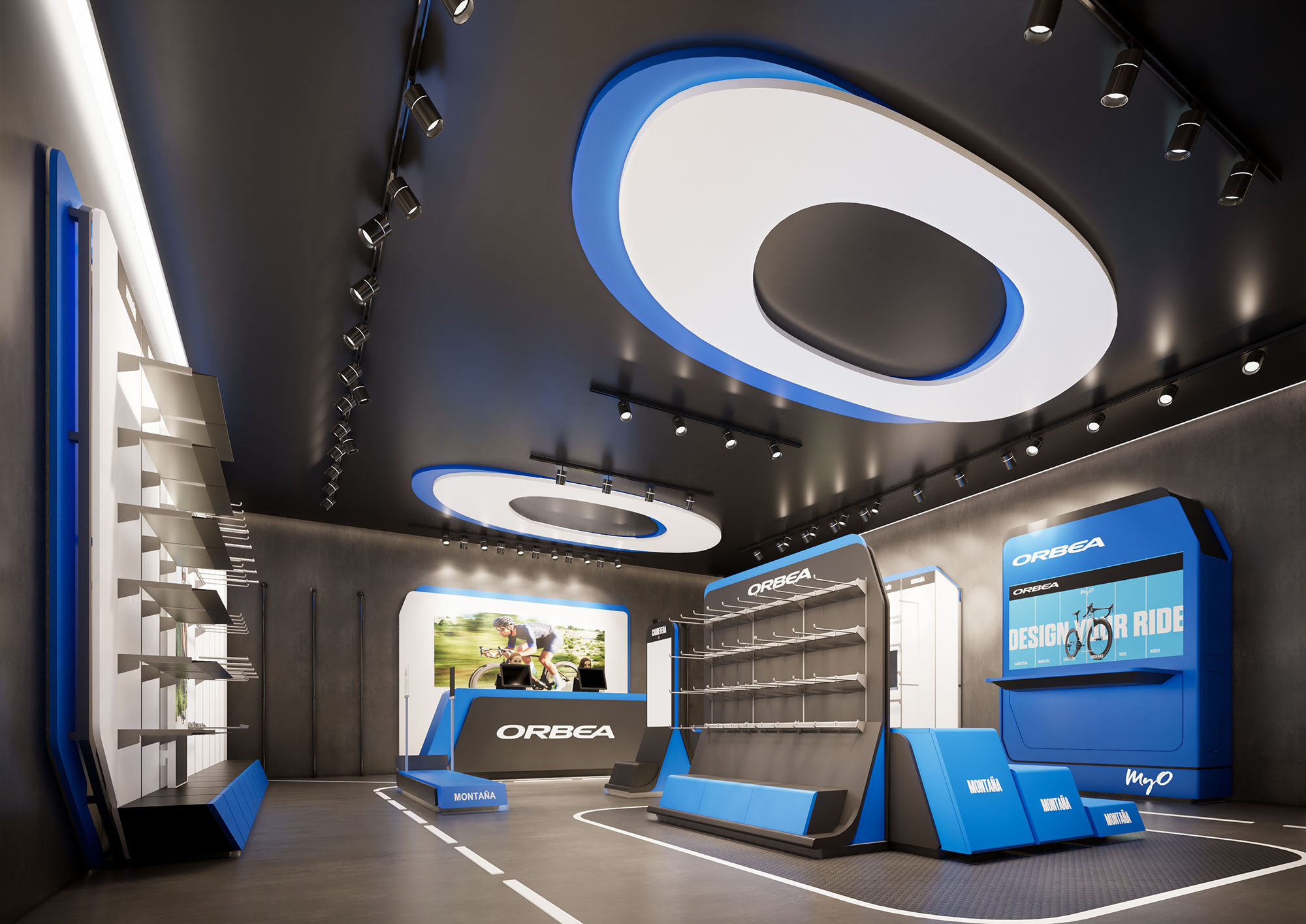
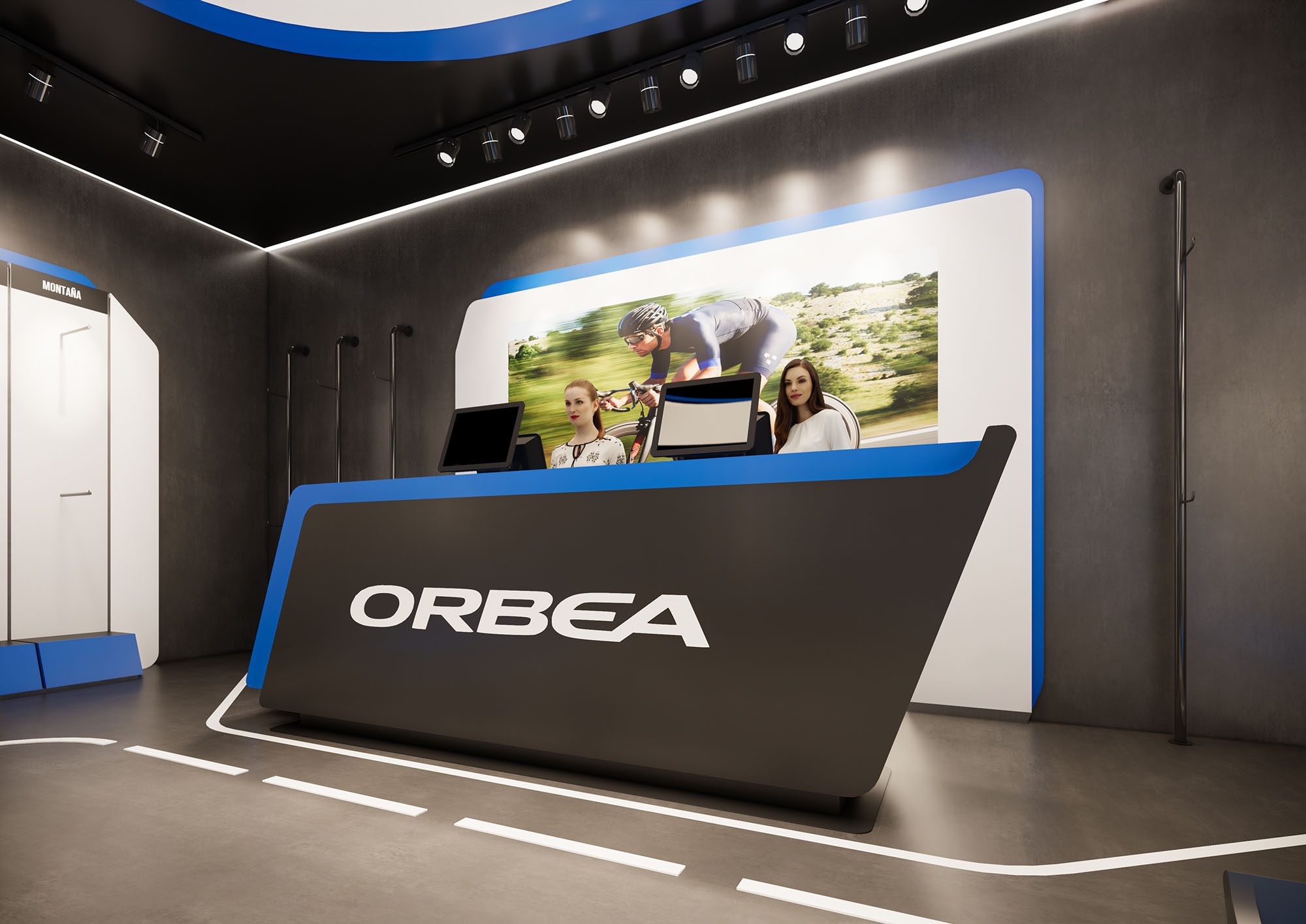
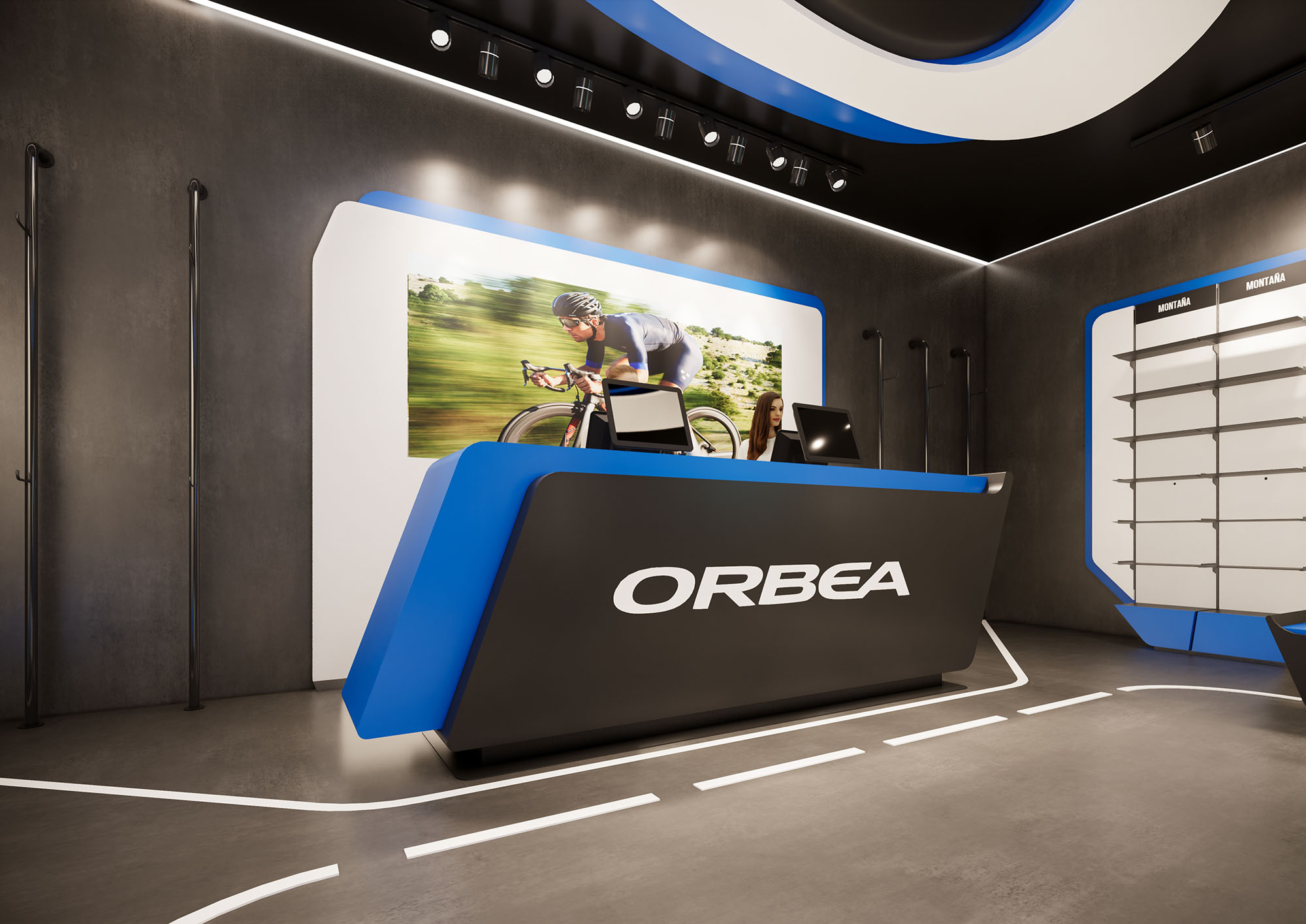
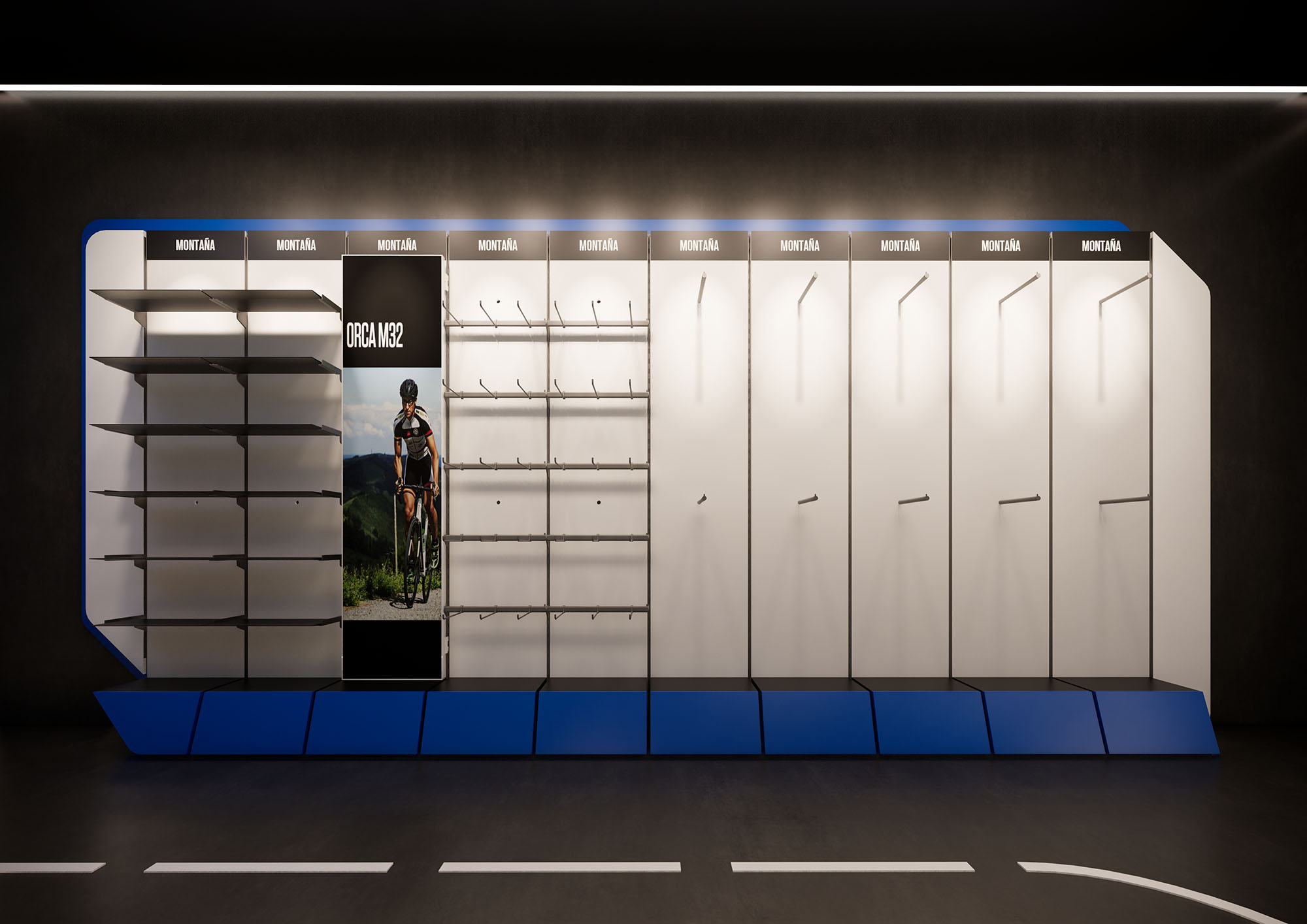
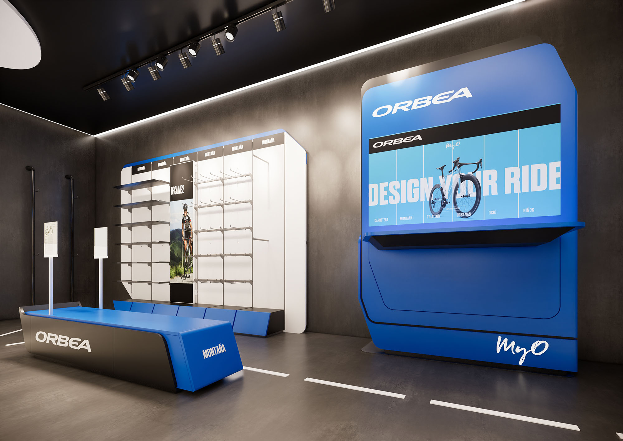
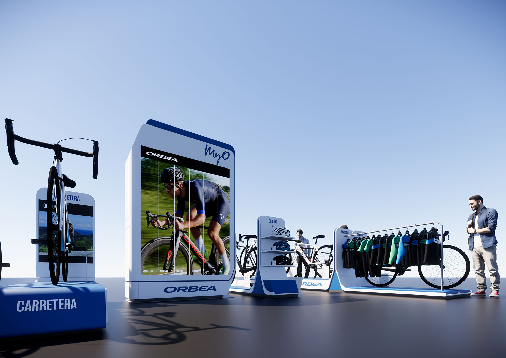
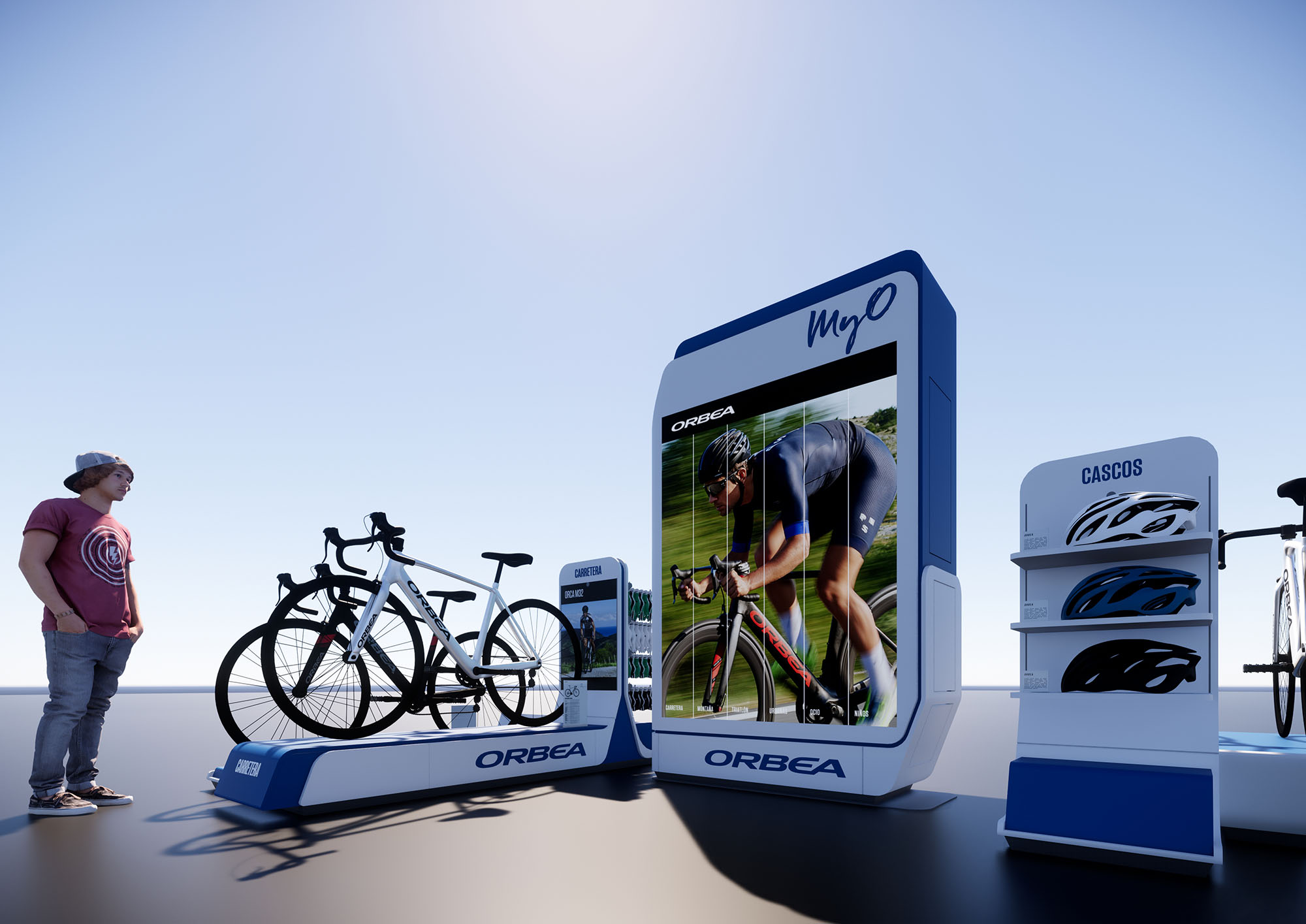
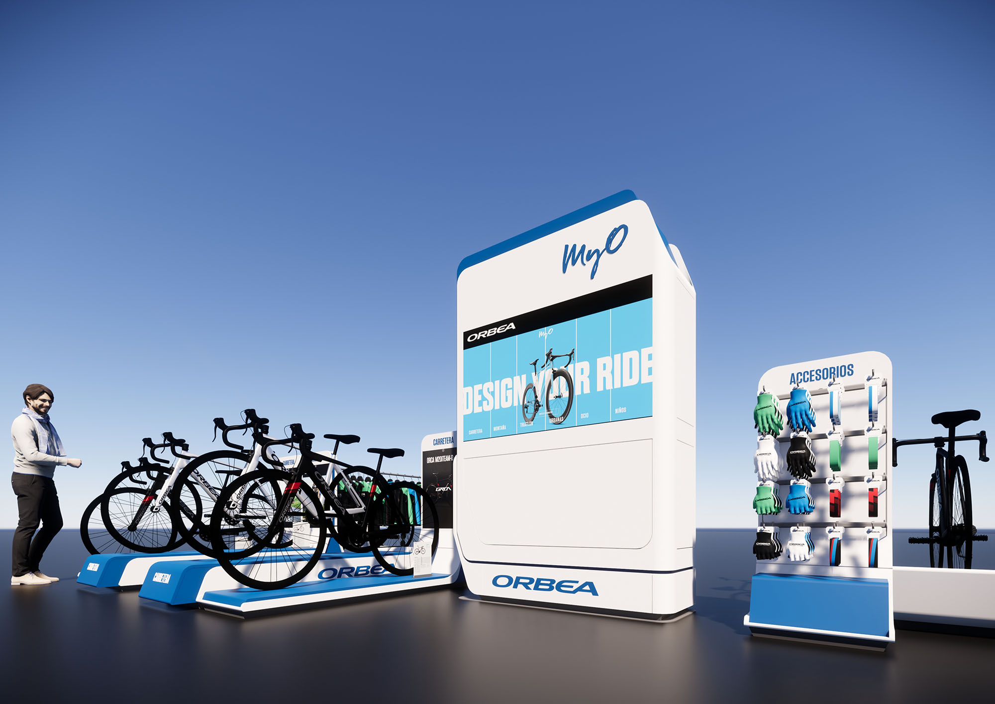
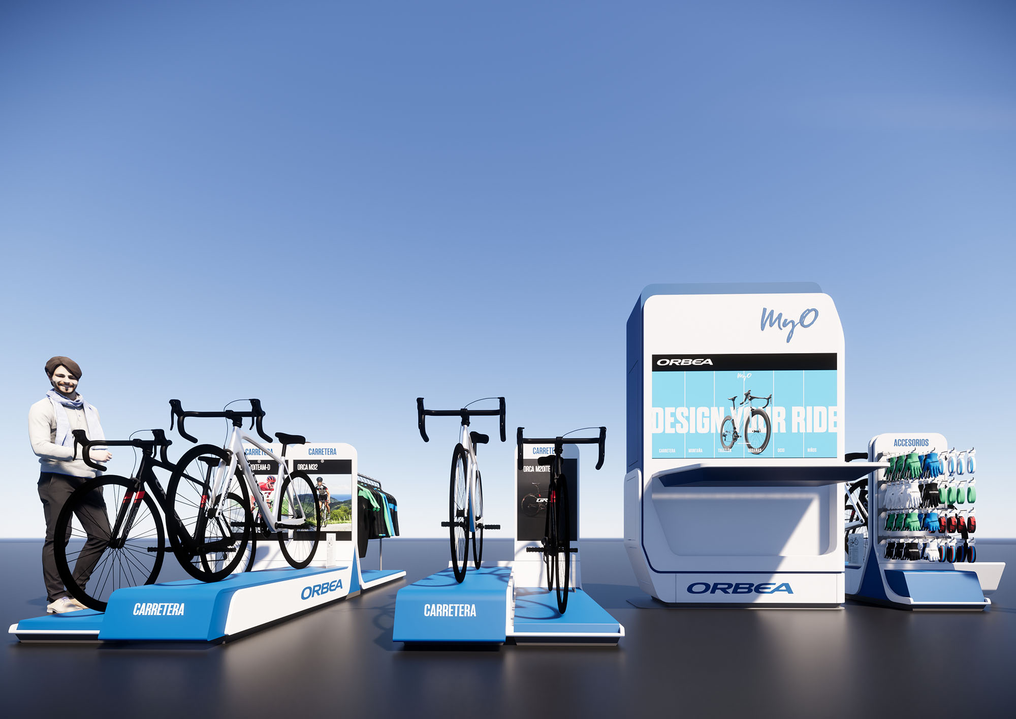
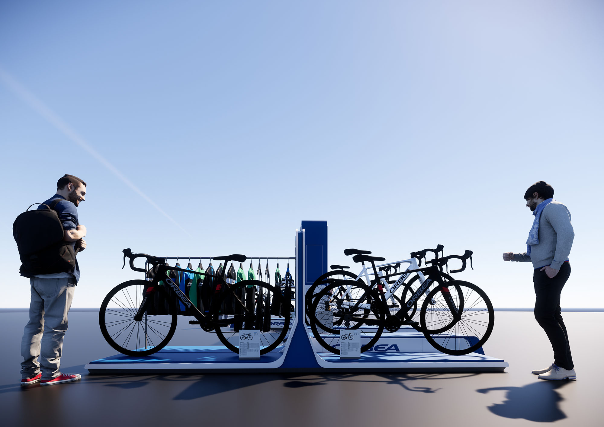
© 2021 by sanzpont [arquitectura] . Webpage by sanzpont [digital] . Innovative Digital Experiences
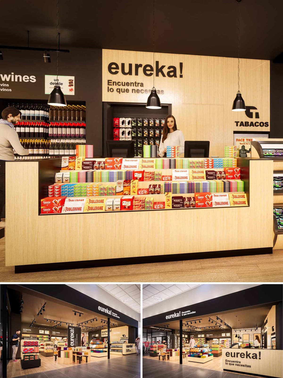
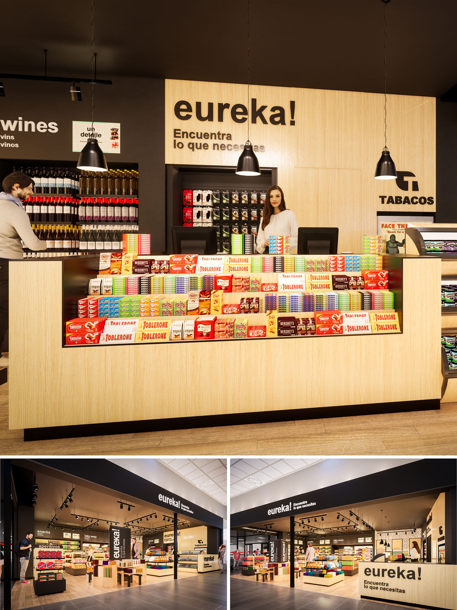
The EUREKA convenience store in Girona is conceived as an open and intuitive retail landscape where the customer can visually grasp the entire offer at a glance. The concept blends the agility of a travel retail kiosk with the warmth of a neighborhood store, using a clear graphic language and ordered product presentation to minimize decision time and enhance impulse purchases. Architecture, interior, lighting and signage are integrated to form a single, legible brand experience.
The space is structured as a permeable box, open on two façades, that invites transversal circulation from the corridor. Low central islands combined with taller perimeter walls generate a graduated skyline of shelving, ensuring maximum visibility from outside while keeping sight lines unobstructed inside. Black branding bands frame the opening, transforming the entrance into an urban storefront within the interior of a larger commercial node.
The plan is organized around a central axis that directs the customer from the main entrance towards the cashier counter set as a visual anchor at the back. This counter wall, clad in light wood with the large “eureka!” sign, works as a focal element, naturally guiding movement and orienting users. The layout follows a loop circulation: entry through one side, progression around low gondolas of snacks and convenience products, and return towards checkout on the opposite side.
Perimeter shelving accommodates more specific categories such as wines, beverages, and tobacco, allowing focused browsing without breaking the global reading of the store. The counter itself acts as a high-impact display for confectionery, with tiered arrangements that place products directly in the customer’s line of sight during payment, optimizing commercial performance while maintaining order and clarity.
The material palette is intentionally reduced: natural light oak finishes for counters and shelving, matte black for ceilings, structural elements and signage, and neutral flooring in warm tones. This triad creates a calm and coherent background that highlights the vibrant colors of packaged products, effectively turning merchandise into the main decorative element.
Graphic identity is integrated architecturally. Large-scale typography, in white over black or black over wood, reinforces wayfinding and brand recognition. The contrast between the soft, tactile feel of the timber and the precision of the black bands and luminaires conveys a contemporary yet approachable atmosphere, appropriate for both local users and transient travelers.
Lighting is resolved through a combination of black track-mounted spotlights and suspended pendants above the main counter. The dark ceiling plane allows fixtures to visually disappear, emphasizing the illuminated merchandise rather than the technical equipment. Accent lighting on vertical displays gives depth to the perimeter walls and highlights premium categories such as wines and gift items.
The merchandising strategy prioritizes horizontality and rhythm. Repetitive shelving modules and carefully aligned product fronts produce a sense of order that facilitates quick selection. Lower central displays maintain a human scale, while the higher rear wall behind the counter frames the brand logo and tobacco category, ensuring compliance with visibility and operational requirements.
Sustainability is addressed through both material choice and operational efficiency. The predominant use of laminated wood and wood veneer panels allows the integration of certified, low-formaldehyde substrates, which can be sourced locally to reduce transport emissions. The neutral and timeless aesthetic extends the lifecycle of the interior, minimizing the need for frequent refurbishments and thus reducing material waste.
LED lighting technology is selected for all luminaires, significantly lowering energy consumption and maintenance while ensuring robust color rendering for packaged goods. The modular shelving and gondola system is fully reconfigurable, enabling future adaptation to new product mixes without structural alterations. Finishes are chosen for high resistance to wear and ease of cleaning, supporting long-term performance with minimal use of aggressive cleaning agents.
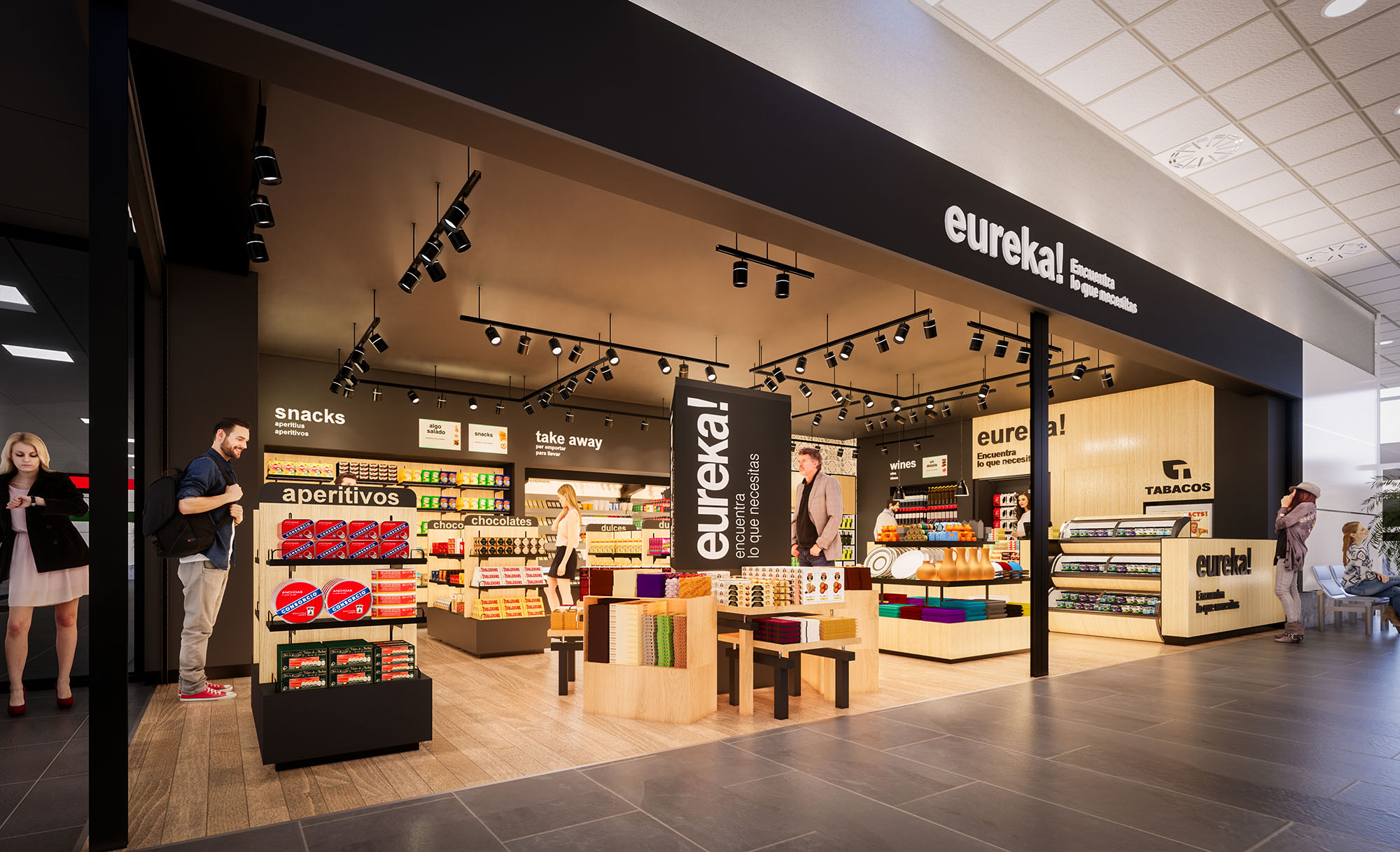
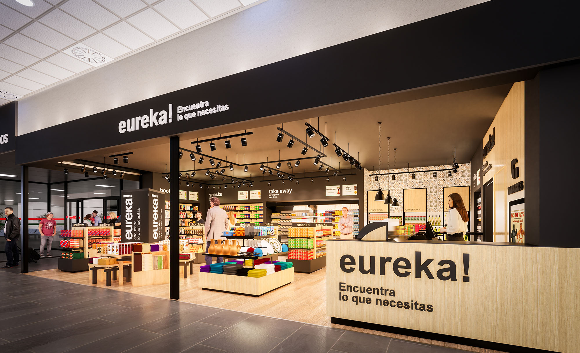
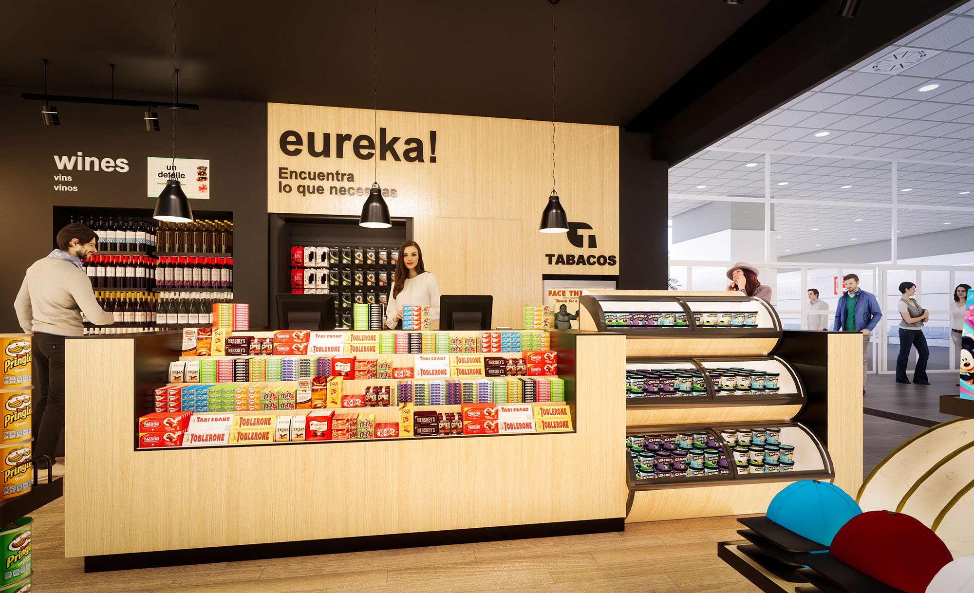
© 2021 by sanzpont [arquitectura] . Webpage by sanzpont [digital] . Innovative Digital Experiences
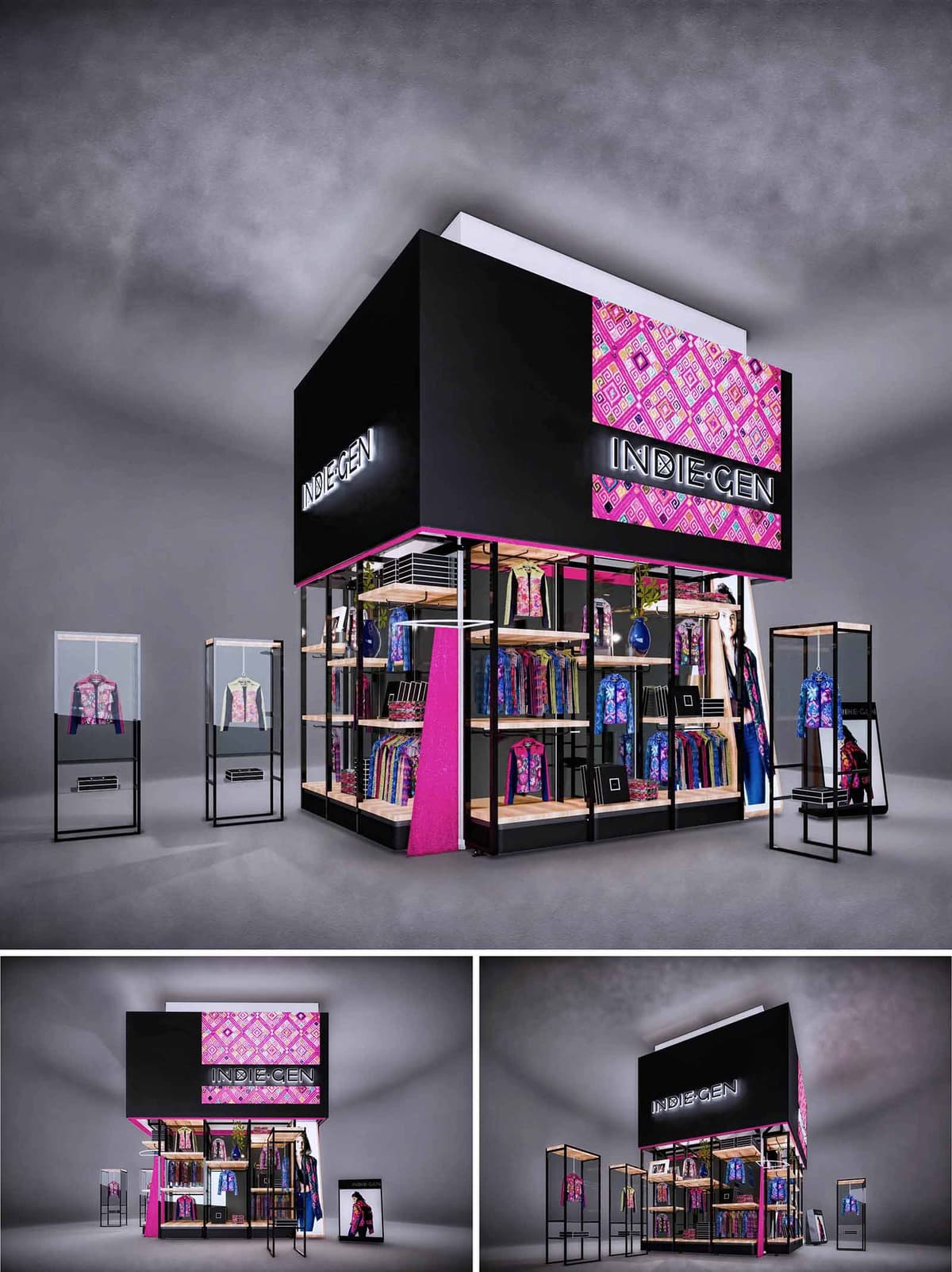
INDIE GEN is conceived as a compact retail pavilion that fuses contemporary urban language with the chromatic richness of Mexican indigenous textiles. The concept frames fashion pieces as cultural artifacts, transforming the stand into a three-dimensional showcase that celebrates pattern, color and identity. A simple black volume functions as a neutral “void” that amplifies the vibrancy of magenta and geometric motifs, allowing the garments to become the primary protagonists.
The stand is designed for high-traffic commercial environments, prioritizing visual impact from long distances. Large-format illuminated graphics and a bold, monolithic upper volume give the project a landmark character within the retail landscape, while the permeable base invites visitors to circulate and explore the collection up close.
The architecture is structured around a double-height black prism that operates as a visual totem. This upper volume integrates backlit signage and patterned panels, functioning simultaneously as brand support, storage enclosure, and lighting reflector. Below, a transparent perimeter, defined by slender metal frames, opens all façades toward the corridor, dissolving boundaries between interior and exterior.
The plan is organized in an L-shaped configuration, generating a corner of maximum exposure. Along the perimeter, linear shelving and hanging rails create a continuous product band, while the center remains intentionally freed for flexible circulation and temporary displays. Detached vitrines positioned in front of the stand extend the retail area into the public space, guiding the visitor naturally toward the entrance.
The material palette juxtaposes matte black metal, natural-toned wood shelves, and high-transparency glass. Black acts as a unifying canvas that provides visual coherence and a gallery-like atmosphere. The warmth of the wood introduces a tactile counterpoint, softening the industrial character of the metallic structure.
Color is introduced strategically through textiles, printed panels, and selective magenta accents on structural edges. The graphic patterning references traditional Mexican weaving, but is abstracted into a contemporary, almost digital aesthetic, aligning with the “GEN” (generation) component of the brand. This controlled use of color ensures that the interior remains visually rich without becoming saturated, and keeps the garments as the main chromatic drivers.
Display systems are modular and repeatable: vertical frames carry adjustable shelves and hanging bars, enabling rapid reconfiguration as the collection evolves. Integrated niches for accessories and folded garments provide varied product hierarchies, while dedicated hero pieces are elevated within glass vitrines, treated as museum-like exhibits.
Lighting is composed of concealed linear LEDs under shelves and ceiling tracks that wash the perimeter and vitrines with uniform light, enhancing texture and color fidelity. The open layout allows for intuitive circulation, encouraging visitors to approach from any side and discover the merchandise without physical barriers. Brand communication is reinforced through large photographic graphics and illuminated logos that remain visible at 360 degrees.
The stand is conceived as a demountable, reusable system to minimize environmental impact over multiple installations. The metal framework is based on standardized profiles, allowing components to be flat-packed, transported efficiently, and reassembled without material loss. Bolted rather than welded connections facilitate maintenance and extend the useful life of the structure.
Sustainable strategies include the proposed use of LED lighting with low energy consumption, durable laminates and powder-coated metals resistant to intensive commercial use, and wood elements specified from certified or rapidly renewable sources where feasible. Graphic panels are designed to be interchangeable, enabling seasonal updates without discarding the entire support. This combination of modularity, durability, and efficient lighting reduces waste and supports a more responsible retail model aligned with contemporary environmental expectations.
© 2021 by sanzpont [arquitectura] . Webpage by sanzpont [digital] . Innovative Digital Experiences

AGUA BENDITA is conceived as an immersive brand oasis that translates the vibrancy of Mexican beach culture into a refined retail environment. The architecture and interior design celebrate craft, color and tropical light, framing the swimwear collections as the protagonists of a dynamic, resort-inspired narrative. Each of the five stores adapts this common language to its local context, ensuring consistency of identity while allowing for flexible layouts and display strategies.
The concept fuses contemporary minimalism with artisanal references. Clean lines, unobstructed sightlines and a controlled material palette create a calm canvas against which intense prints and textures stand out. Iconic lifestyle graphics and large-scale photographic imagery establish an immediate emotional connection with the sea, sun and body, reinforcing the aspirational universe of the brand.
The floor plans are organized around an open central zone dedicated to free-standing display tables and flexible fixtures, surrounded by perimeter walls that concentrate the main hanging systems. This configuration maintains maximum visual permeability from the storefront and facilitates intuitive circulation, guiding visitors from entry to fitting rooms and cashier without rigid routes.
At the back of the store, the service counter acts as a visual anchor, framed by a distinctive feature wall that integrates the brand logo. This focal point subtly orients the customer’s movement and creates a sense of depth, making compact footprints feel more generous. Modular platforms near the floor offer tiered presentation for accessories and folded garments, while suspended racks accommodate full collections at eye level.
The material palette is dominated by warm-toned woods in slatted and plank formats, evoking beach decks and cabanas. This timber base is contrasted with crisp white furniture pieces whose softly curved legs and edges introduce a touch of elegance and femininity, resonating with the swimwear silhouettes.
Color is introduced strategically through the merchandise itself and through a series of patterned backdrops inspired by textile motifs. These walls, composed of geometric compositions in saturated hues, reinterpret traditional weaving patterns in a contemporary key, reinforcing the handmade character of the products. Glossy, turquoise-toned graphic panels and imagery reference water and sky, strengthening the connection between interior space and coastal landscape.
The lighting design combines general recessed downlights with a constellation of suspended cylindrical pendants that punctuate the central axis of the store. This mixture creates an even, comfortable ambient level while adding vertical rhythm and visual interest. Accent lighting is precisely aimed at key merchandise walls, ensuring faithful color rendering of prints and enhancing perceived product quality.
Reflections on the pale wooden floor and the light-colored walls amplify brightness, contributing to an airy, resort-like atmosphere. In the open-air or semi-outdoor versions of the store, the structure filters natural light through lattice elements, producing an interplay of sun and shadow that echoes palm fronds and beach palapas.
The storefront composition is deliberately transparent, with large glass panes revealing the full depth of the interior. Vertical wooden cladding frames the opening, creating a warm threshold between mall circulation and the retail universe. Mannequins at the entrance present high-impact looks, while oversized lifestyle graphics function as a visual “horizon line” that immediately communicates the beach context.
In exterior locations, a lightweight structural framework of diagonal members wraps the white volume of the store, referencing both fishing nets and woven textiles. This permeable skin generates a strong identity from a distance and works as a shading device, tying the architectural envelope to the brand’s narrative of craft and coastal life.
The design strategy integrates sustainability through the choice of materials, construction systems and operational efficiency. Engineered wood products and laminates are prioritized for their reduced consumption of solid timber and their durability in high-traffic environments. Modular shelving, hanging rails and platforms are designed for disassembly and reuse, allowing relocation between the five stores and extending their life cycle.
LED lighting technology is employed throughout, minimizing energy consumption while providing high-quality illumination. The open-plan layouts reduce the need for partitions and finishes, decreasing embodied material use. In outdoor concept stores, the permeable façade structures promote cross-ventilation and reduce reliance on mechanical cooling, leveraging local climate conditions to create comfortable, low-impact retail environments aligned with the brand’s values of respect for the sea and its ecosystems.
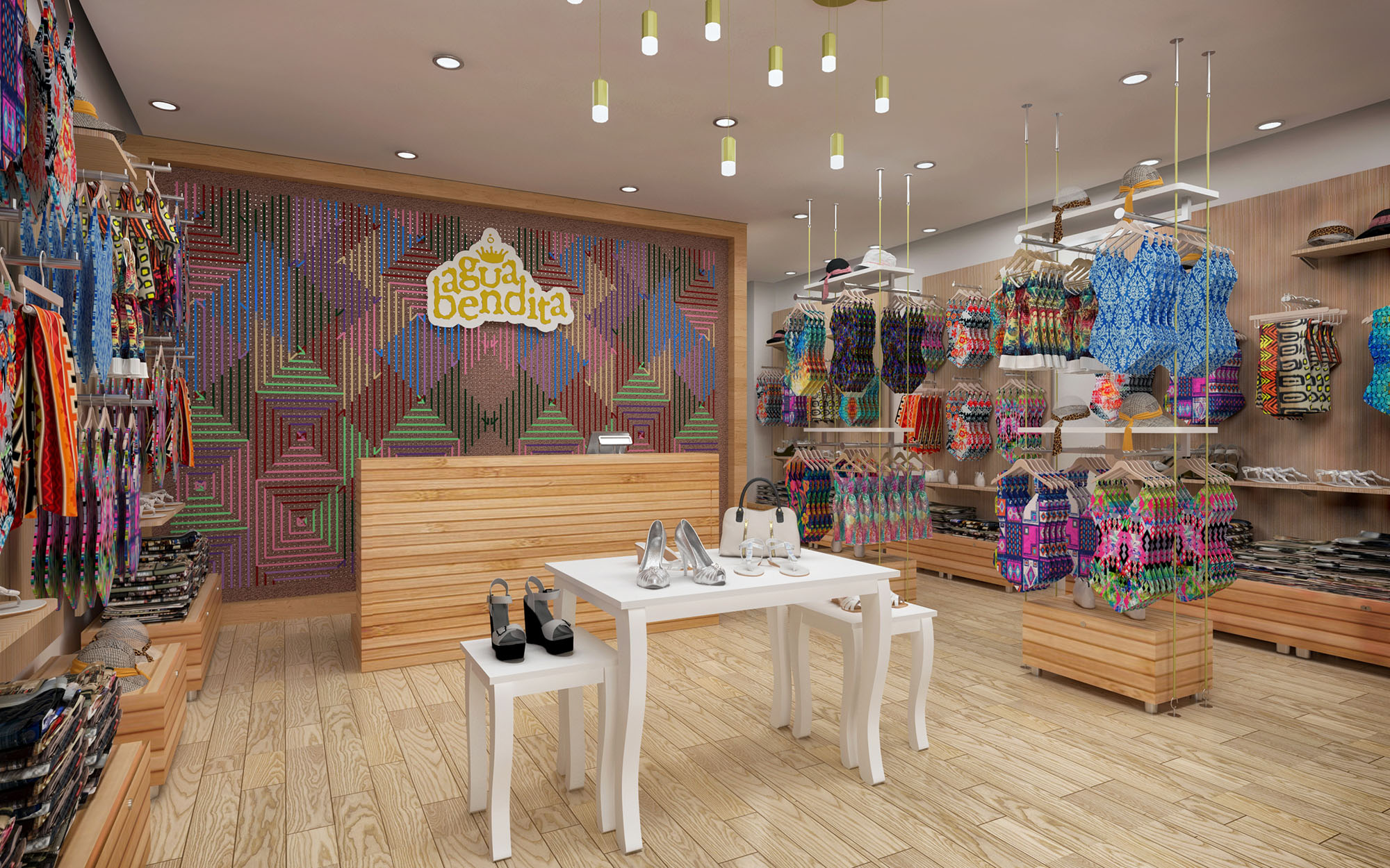
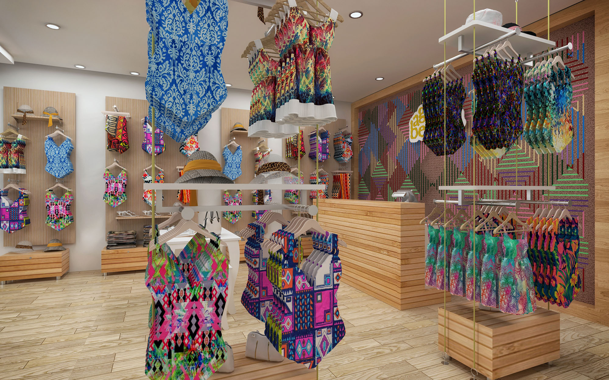
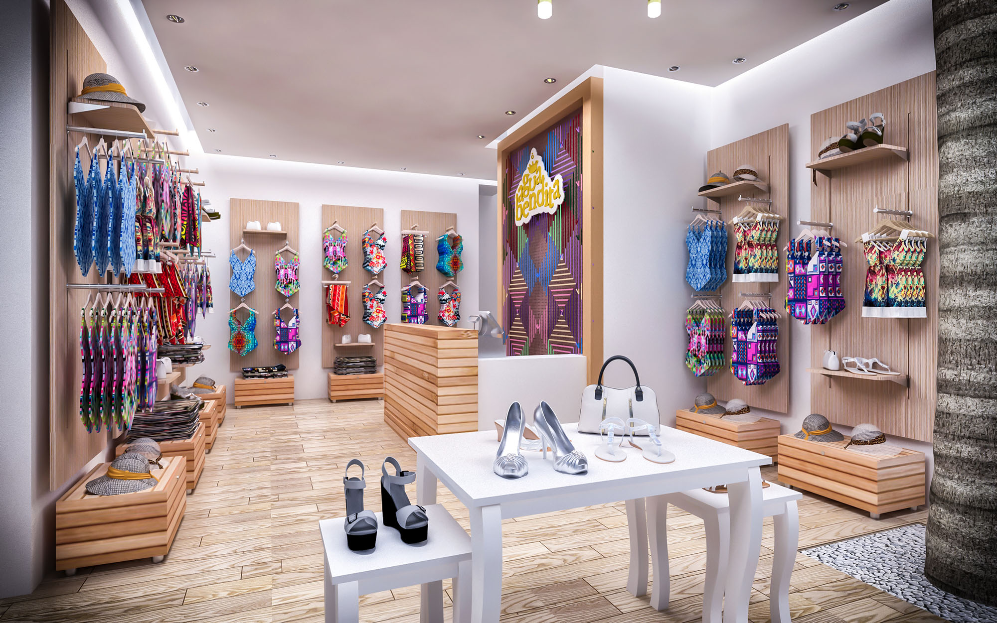
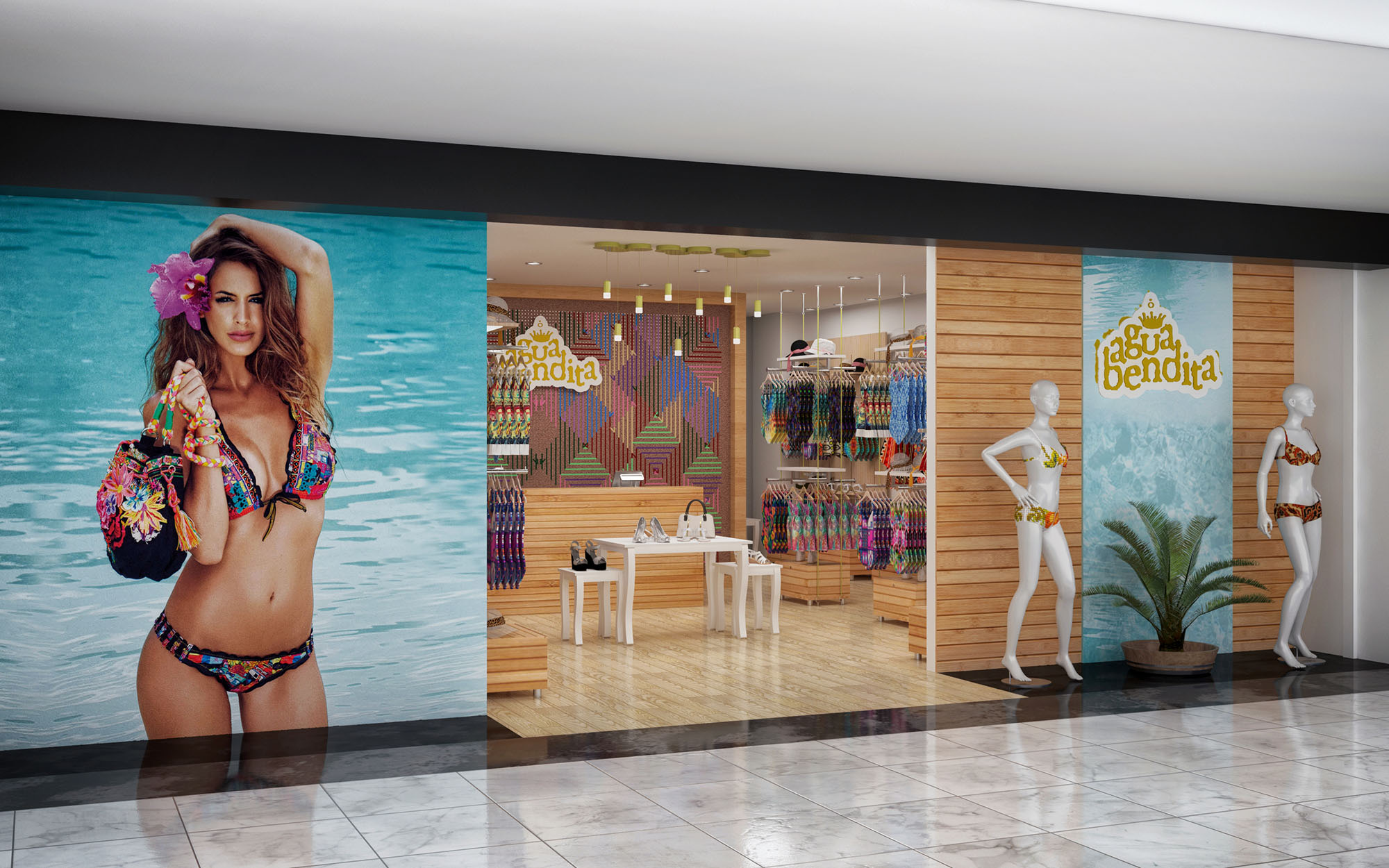
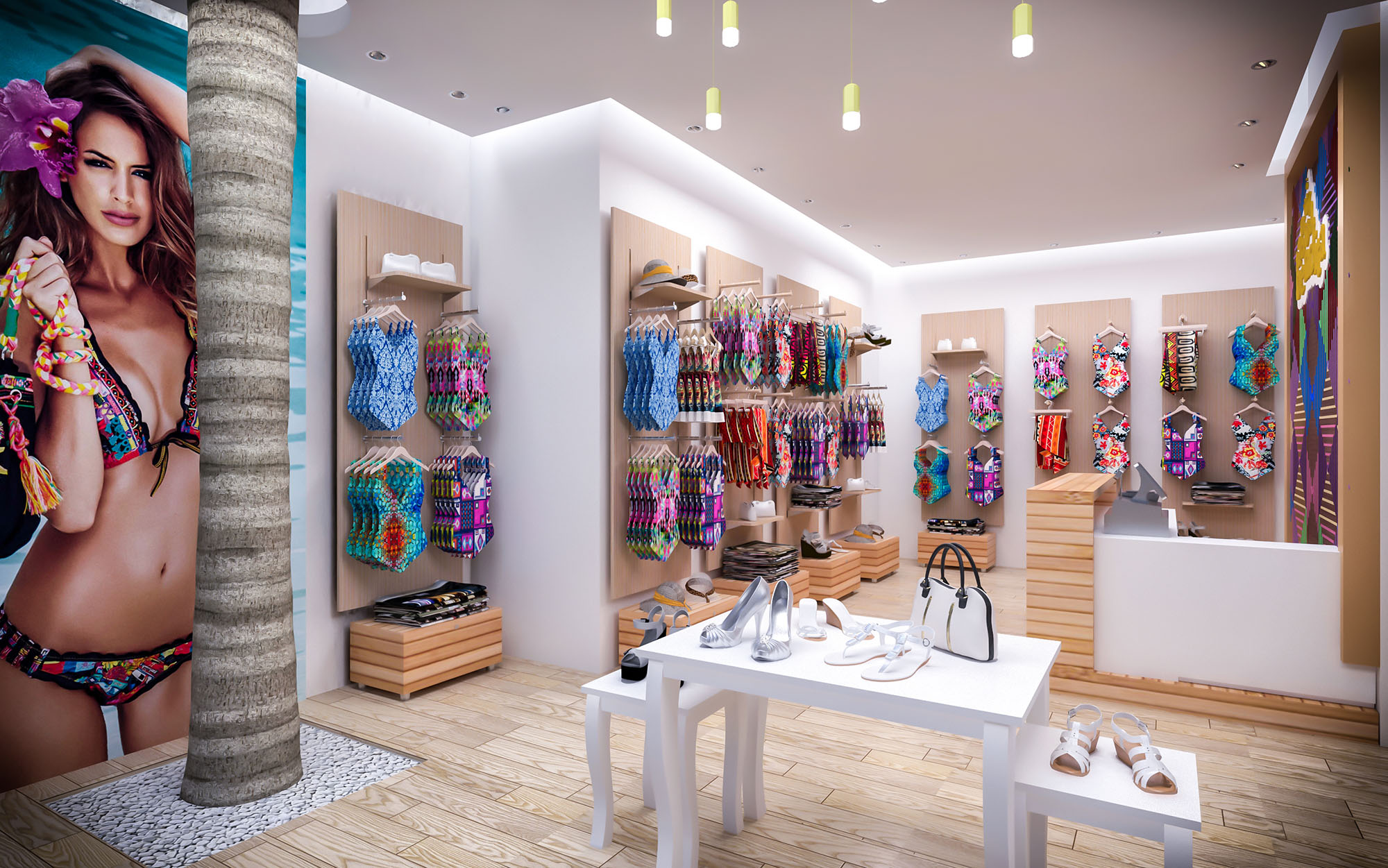
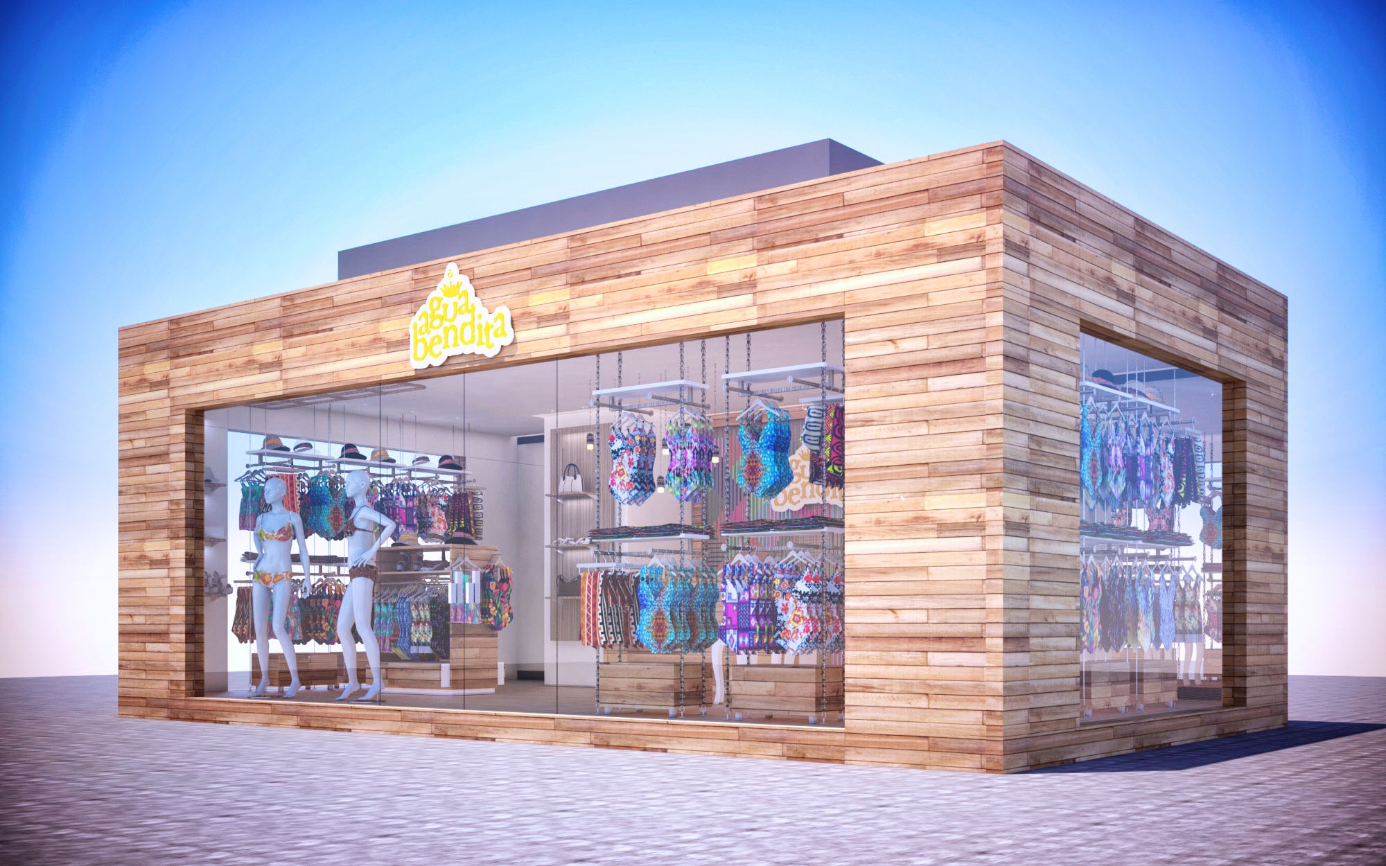
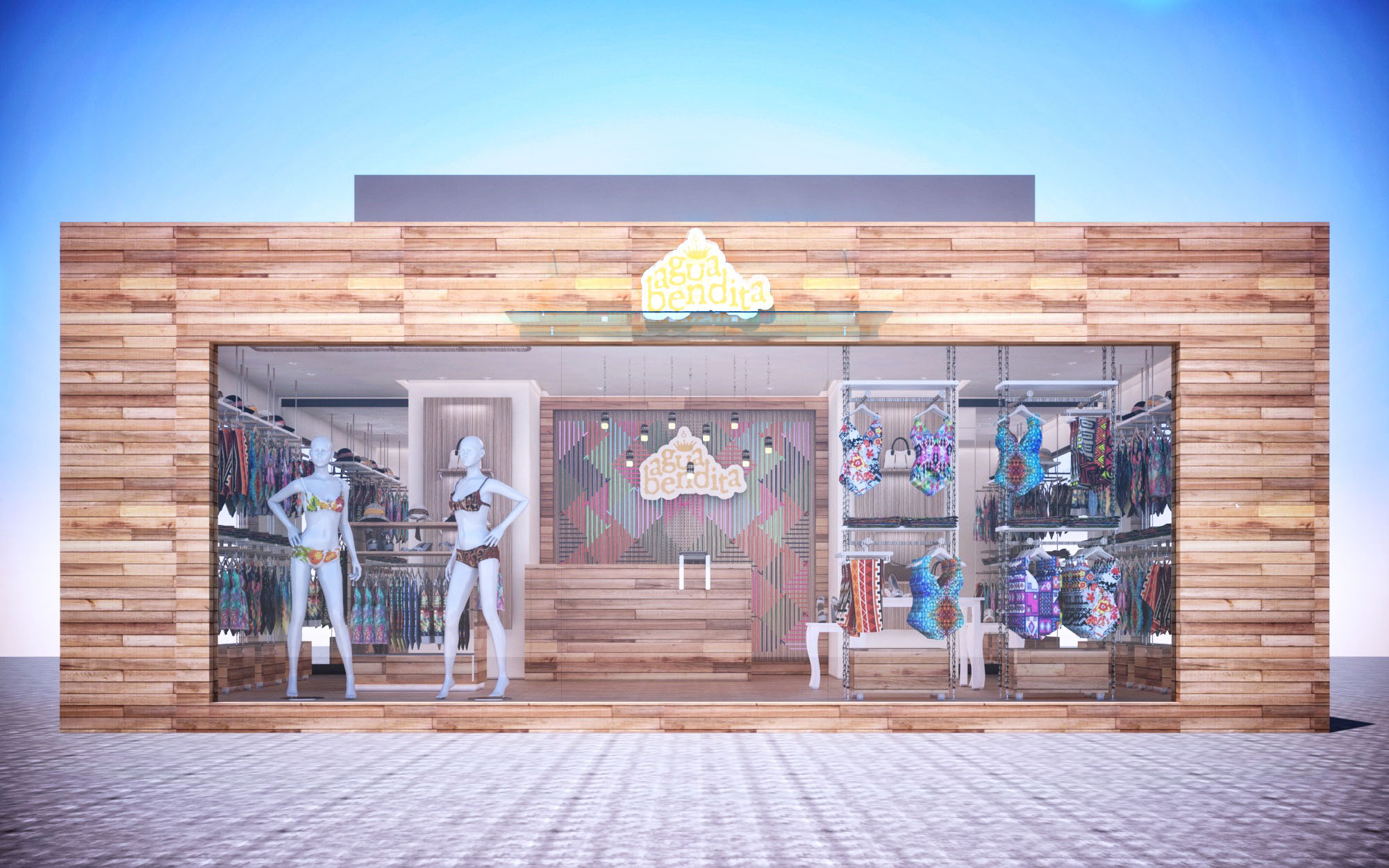
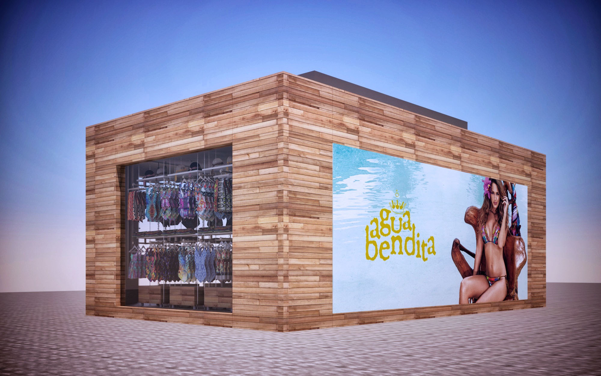
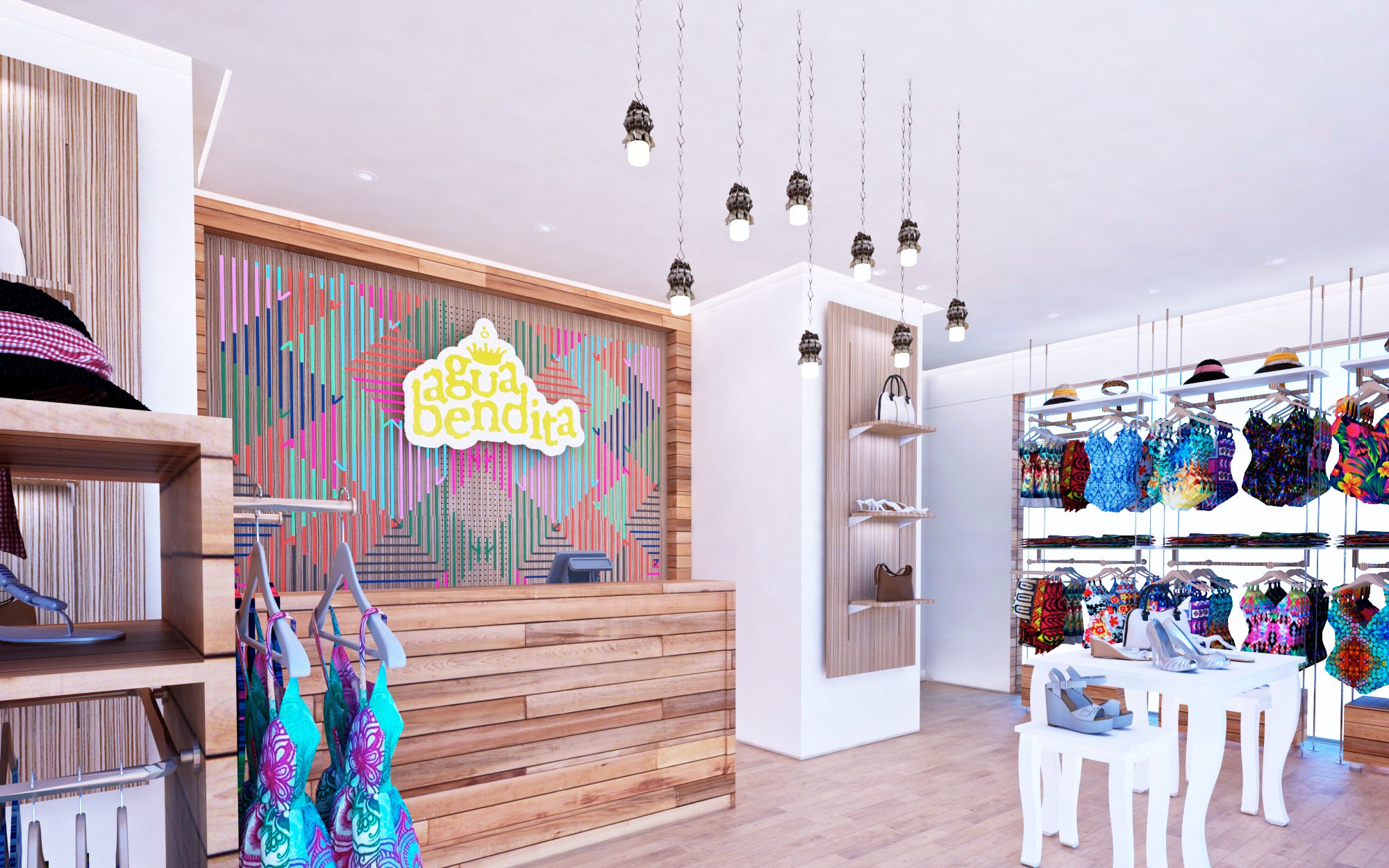
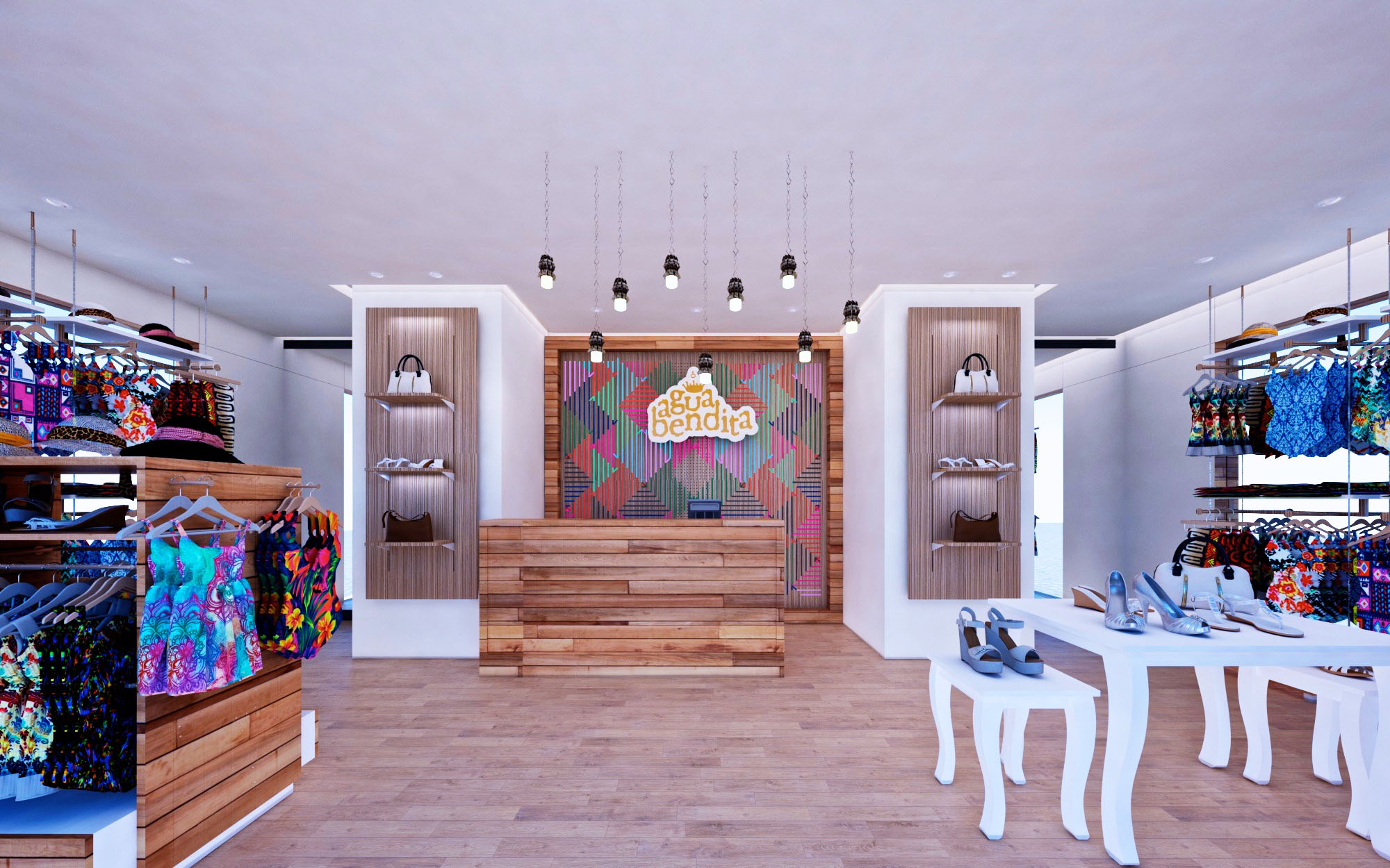
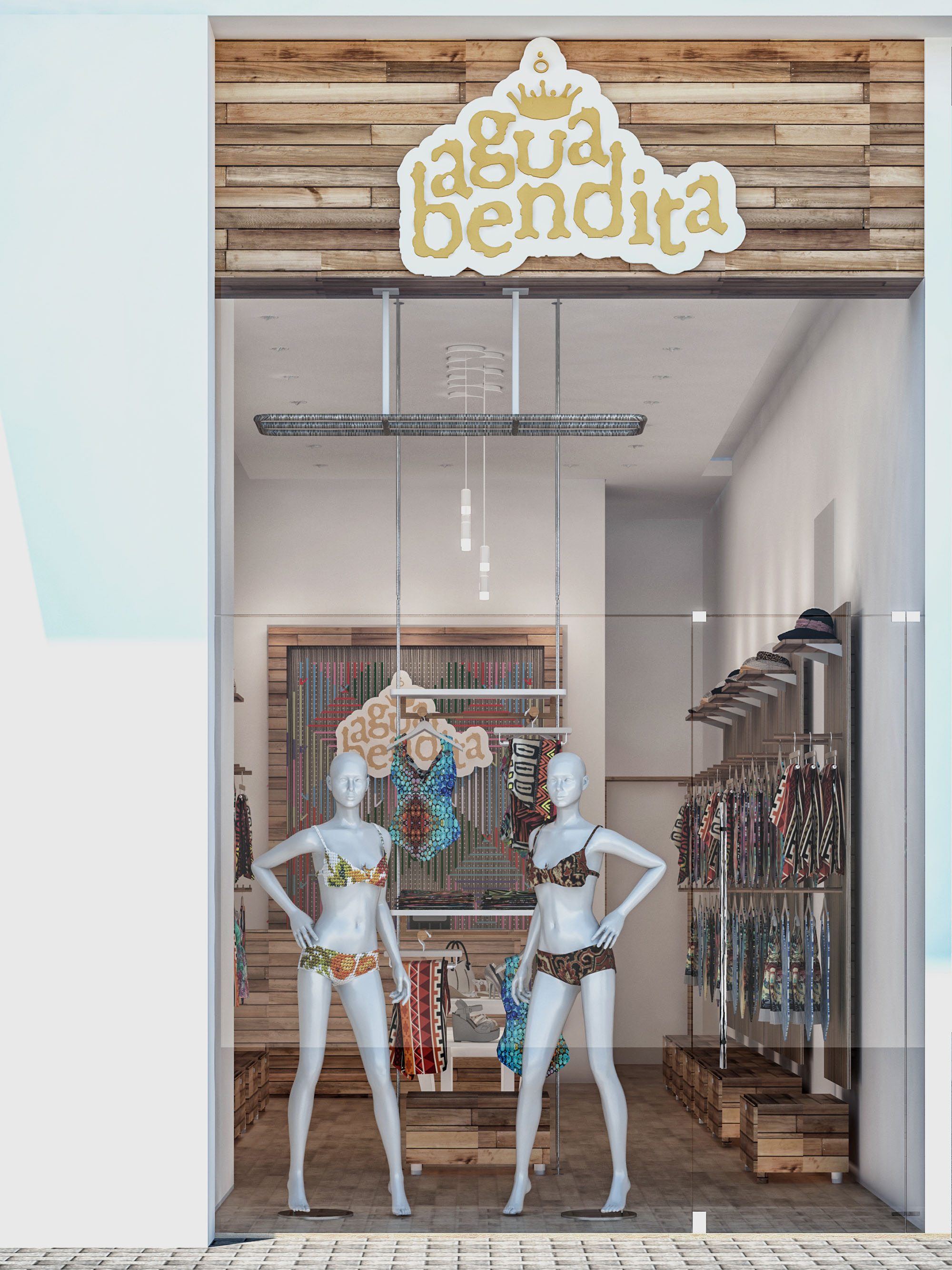
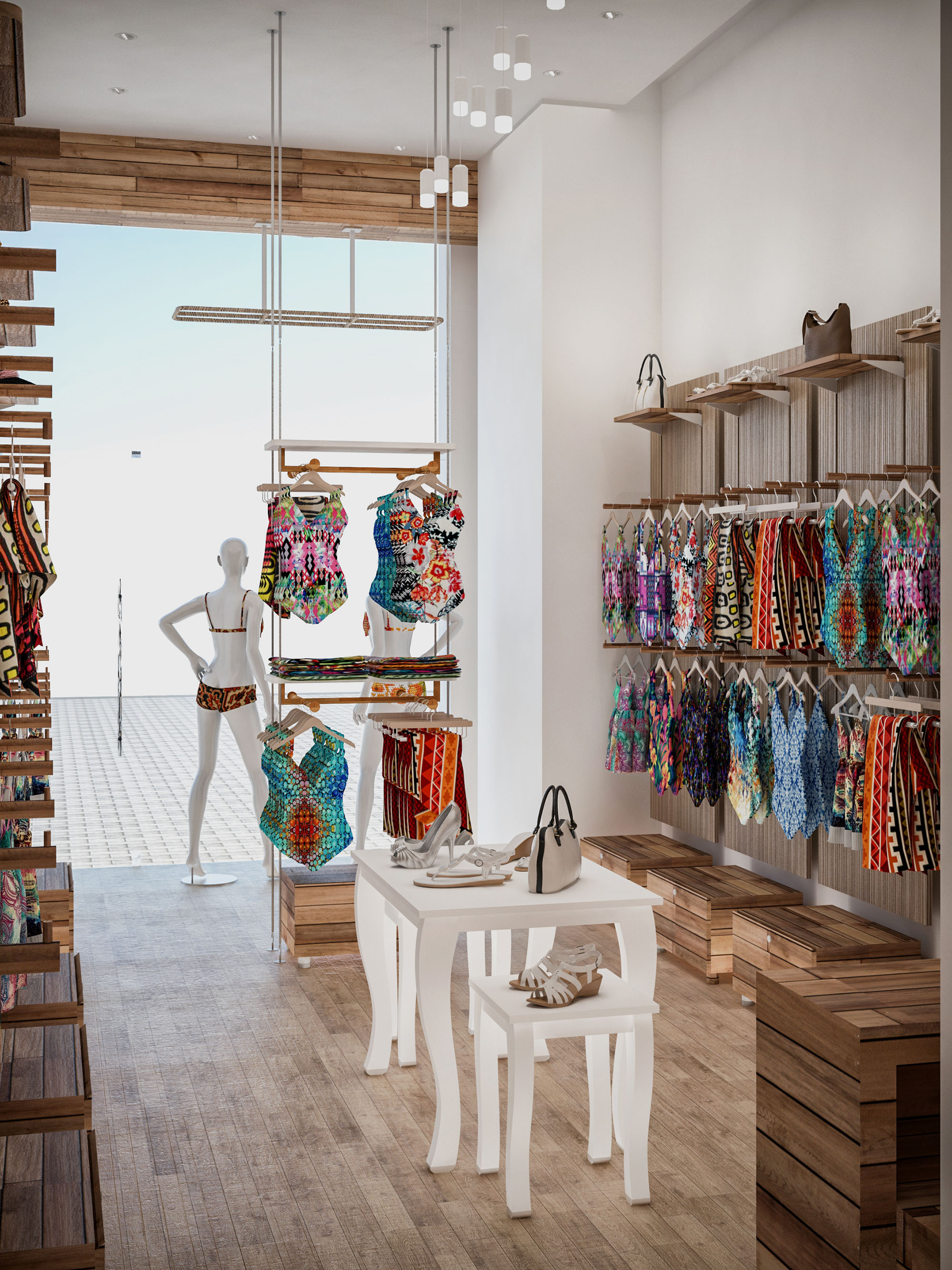
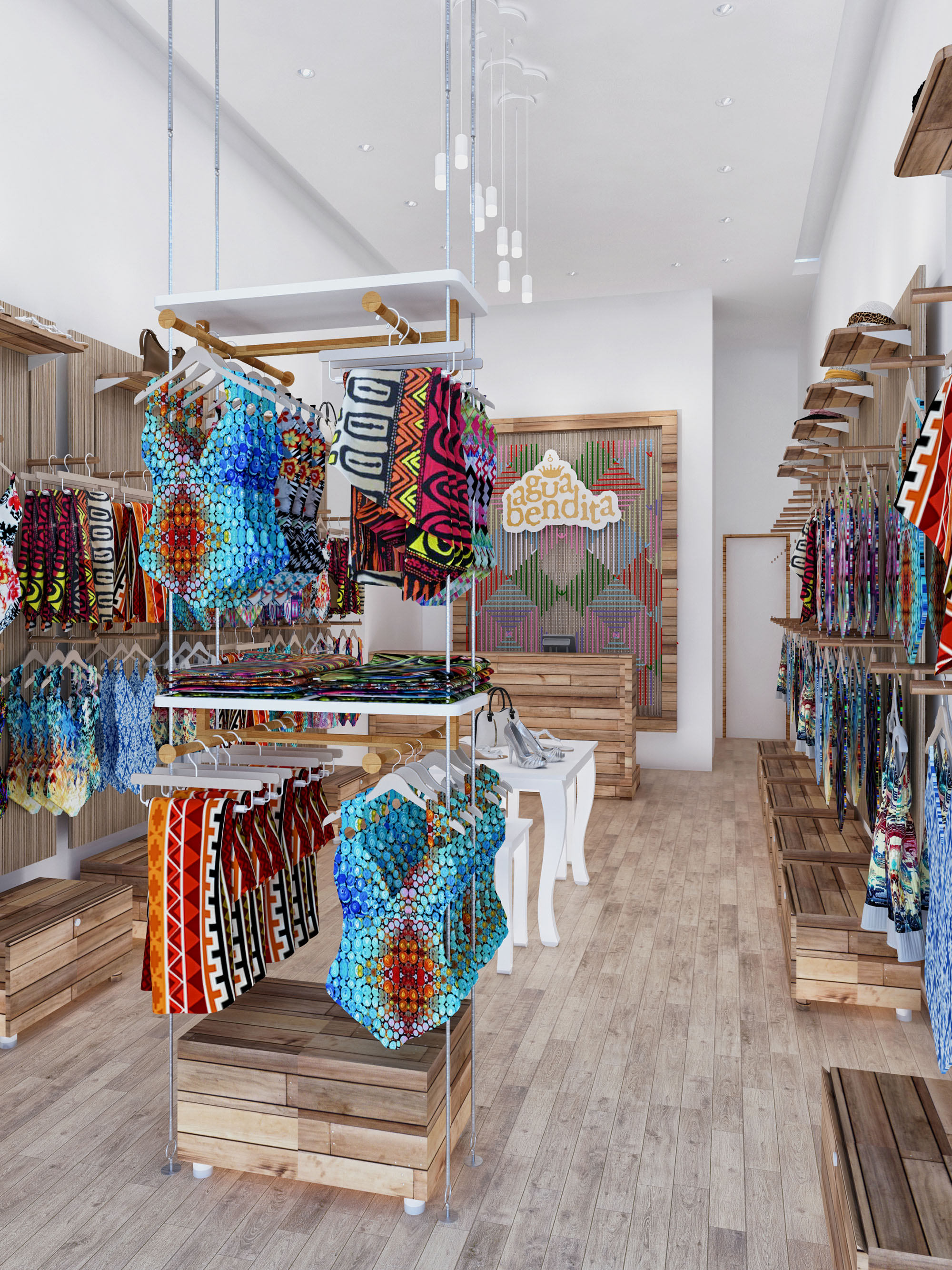
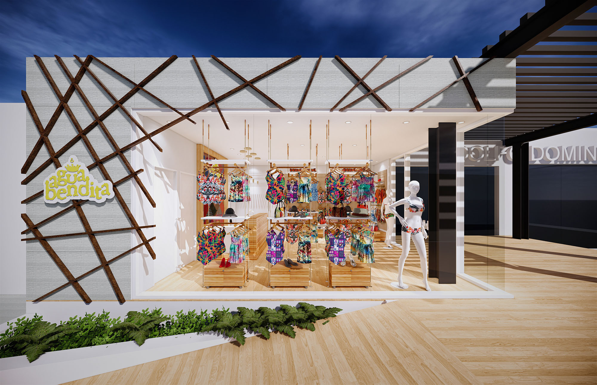
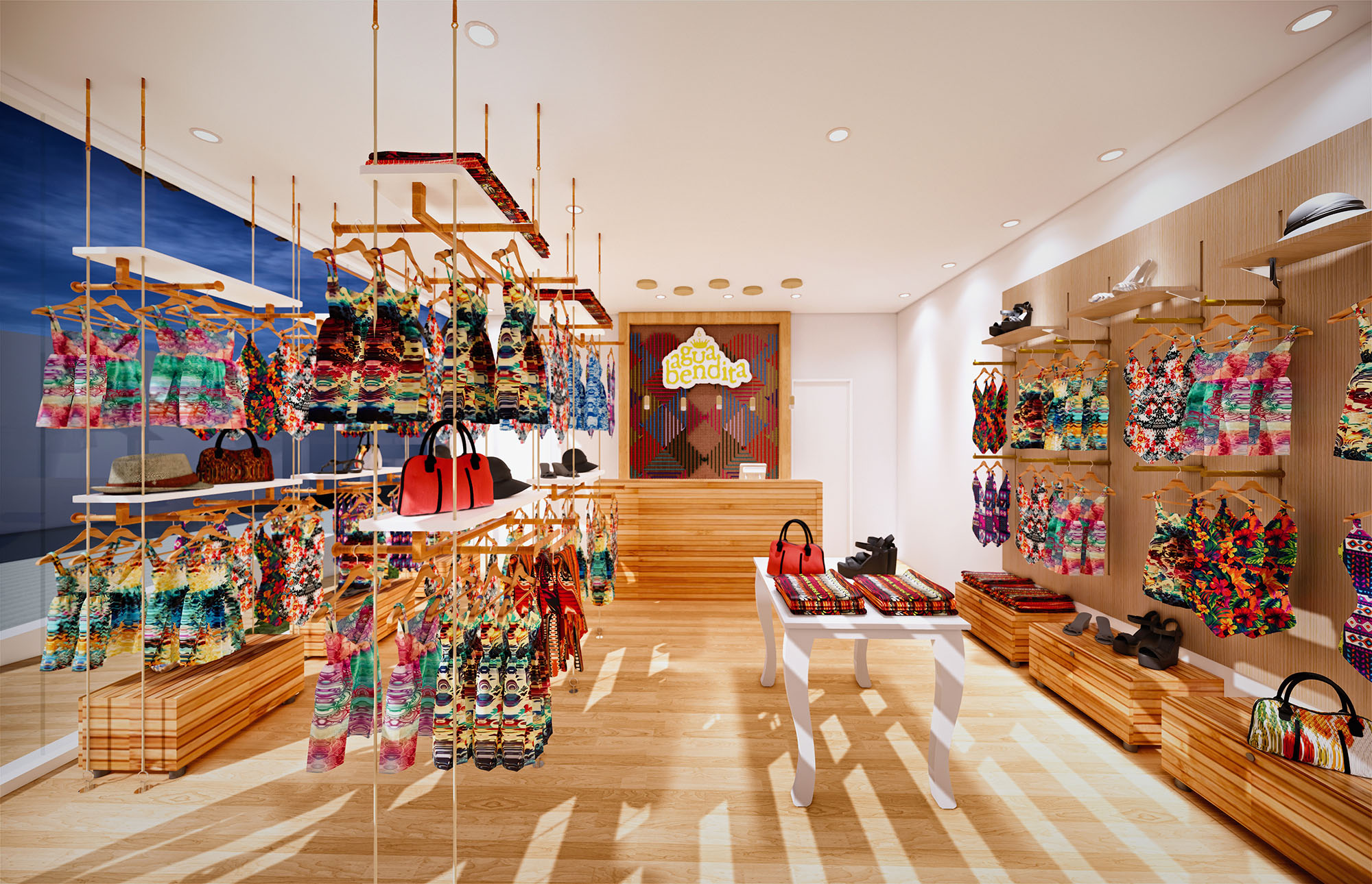
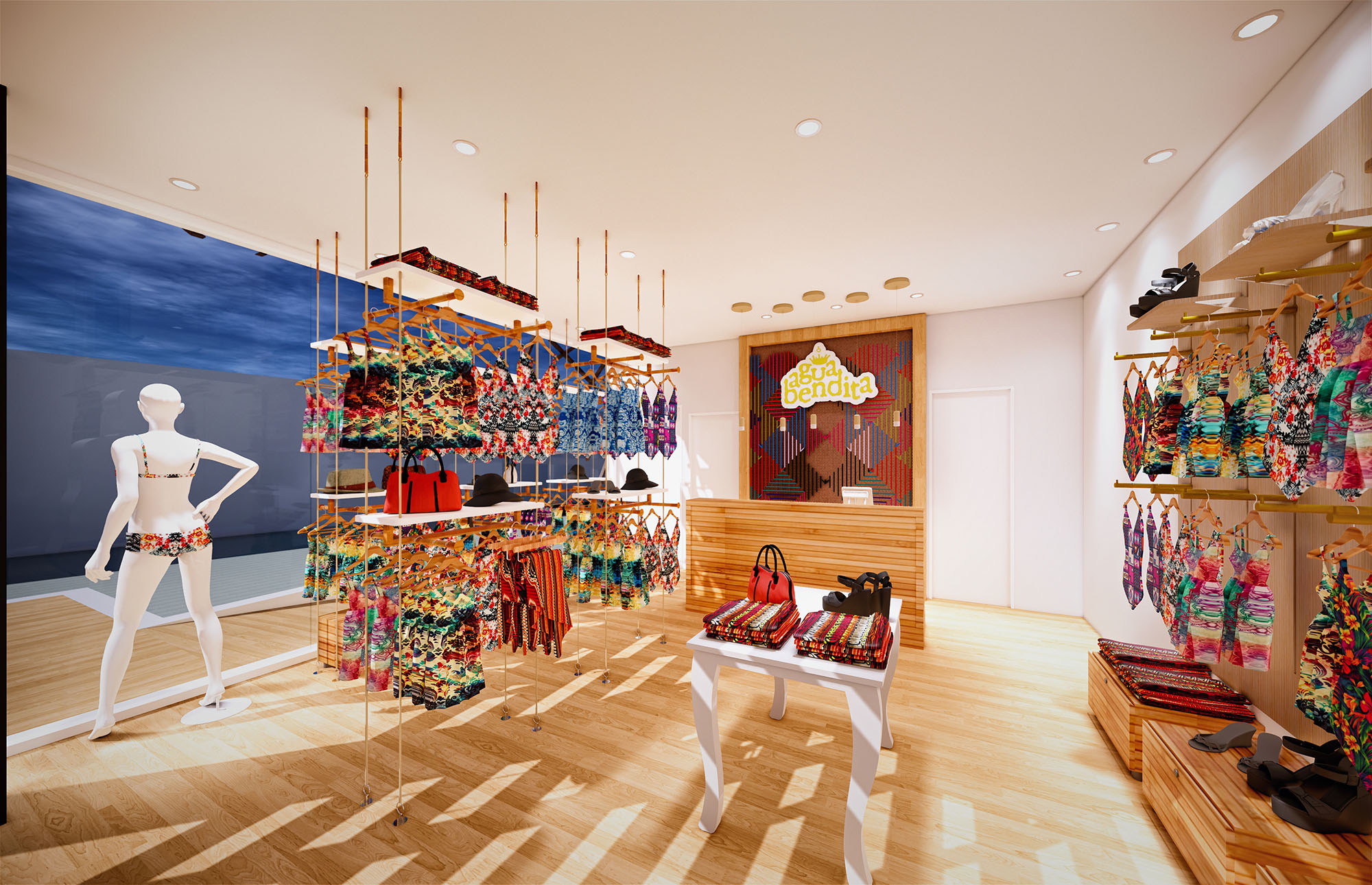
© 2021 by sanzpont [arquitectura] . Webpage by sanzpont [digital] . Innovative Digital Experiences


The General Optica store in Barcelona is conceived as an open, luminous environment that celebrates vision and precision. The design merges retail and consulting functions within a continuous space, where the brand’s chromatic identity becomes the main spatial driver. The circular geometry, present in the logo, ceiling, furniture and lighting, structures the customer journey and underlines the idea of a 360º visual experience.
The store front operates as a transparent showcase, maximizing permeability between mall circulation and interior activity. Full-height glazing, minimal mullions and a clean white fascia amplify visibility and invite natural light deep into the shop. The interior is arranged as a sequence of clearly legible zones—reception, retail display, fitting and consulting—allowing intuitive navigation without visual barriers.
The plan is organized around a central reception island aligned with the storefront axis, acting as a visual anchor. On either side, longitudinal walls host linear display systems for frames and sunglasses, ensuring maximum exposition length and straightforward comparison of products. Central circular tables accommodate advisory and consulting activities, keeping staff and clients in the heart of the commercial space.
Circulation is radial and fluid, with generous clearances between displays and furniture to facilitate accessibility and enhance comfort. Self-service browsing along the perimeter is naturally complemented by assisted service at the central islands. The rear area integrates technical zones and refraction rooms, visually connected but acoustically protected, ensuring privacy for eye examinations while maintaining a cohesive spatial narrative.
The material palette balances warmth and clinical precision. Timber-effect flooring extends across the entire interior, providing continuity and a domestic, comfortable character that contrasts with the technical nature of optical equipment. Walls and ceiling are finished in smooth white surfaces, functioning as a neutral backdrop that reinforces brightness and product visibility.
The brand’s corporate colors are introduced through strategic accents. Red appears in pendant luminaires, reception desk detailing and iconic Eames-style chairs, injecting energy and directing attention to key interaction points. The multicolored logo is enlarged to mural scale behind the counter, acting as a luminous focal element that organizes the visual composition of the store.
Lighting design is calibrated to achieve both clinical accuracy and commercial appeal. A continuous layer of diffuse ambient light ensures uniform illumination over the sales floor, while recessed spotlights above the display walls deliver precise, glare-controlled accent lighting on the frames. Color rendering is prioritized to guarantee faithful perception of lens tints and frame materials.
Large circular pendant fixtures, finished in red, provide a warmer, more intimate light above the central consultation area, visually lowering the scale and emphasizing the customer-focused zone. Reflections on the polished mall flooring contribute to the perception of brightness from the exterior, turning the store into a luminous beacon within the gallery.
Custom furniture is designed with soft-edged geometries and integrated technology. White lacquered desks incorporate screens and storage, maintaining uncluttered work surfaces for optical diagnostics and sales procedures. Circular tables encourage face-to-face interaction, reinforcing the advisory nature of the brand’s service model.
Brand communication is embedded architecturally rather than applied superficially. Large-scale photographic graphics, three-dimensional signage and embossed slogans on the walls are positioned to be legible from different distances, guiding the customer through the offer. Seating elements and display heights are optimized for ergonomic comfort, considering diverse user profiles and accessibility requirements.
Sustainability criteria inform both material selection and store operation. Durable, easy-to-maintain finishes reduce replacement cycles, while high-efficiency LED lighting systems minimize energy consumption and heat gain. The open-plan layout maximizes the reach of natural light from the façade, allowing for lower artificial lighting levels during daytime.
Display systems are modular and reconfigurable, enabling product rotation and future updates without extensive building work, thereby reducing waste over the store’s lifecycle. Furniture has been designed to be demountable and recyclable at end of life, and the reliance on digital signage in place of printed graphics supports a reduction in consumable materials across the brand’s retail network.
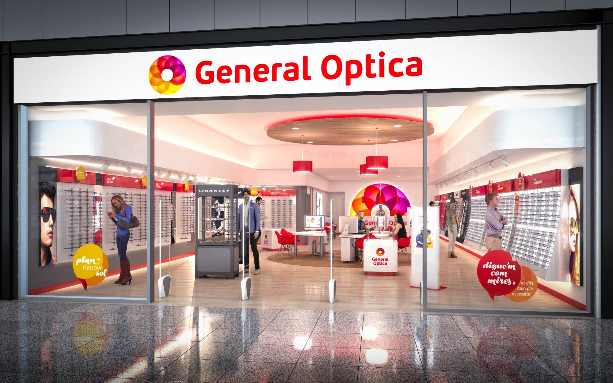
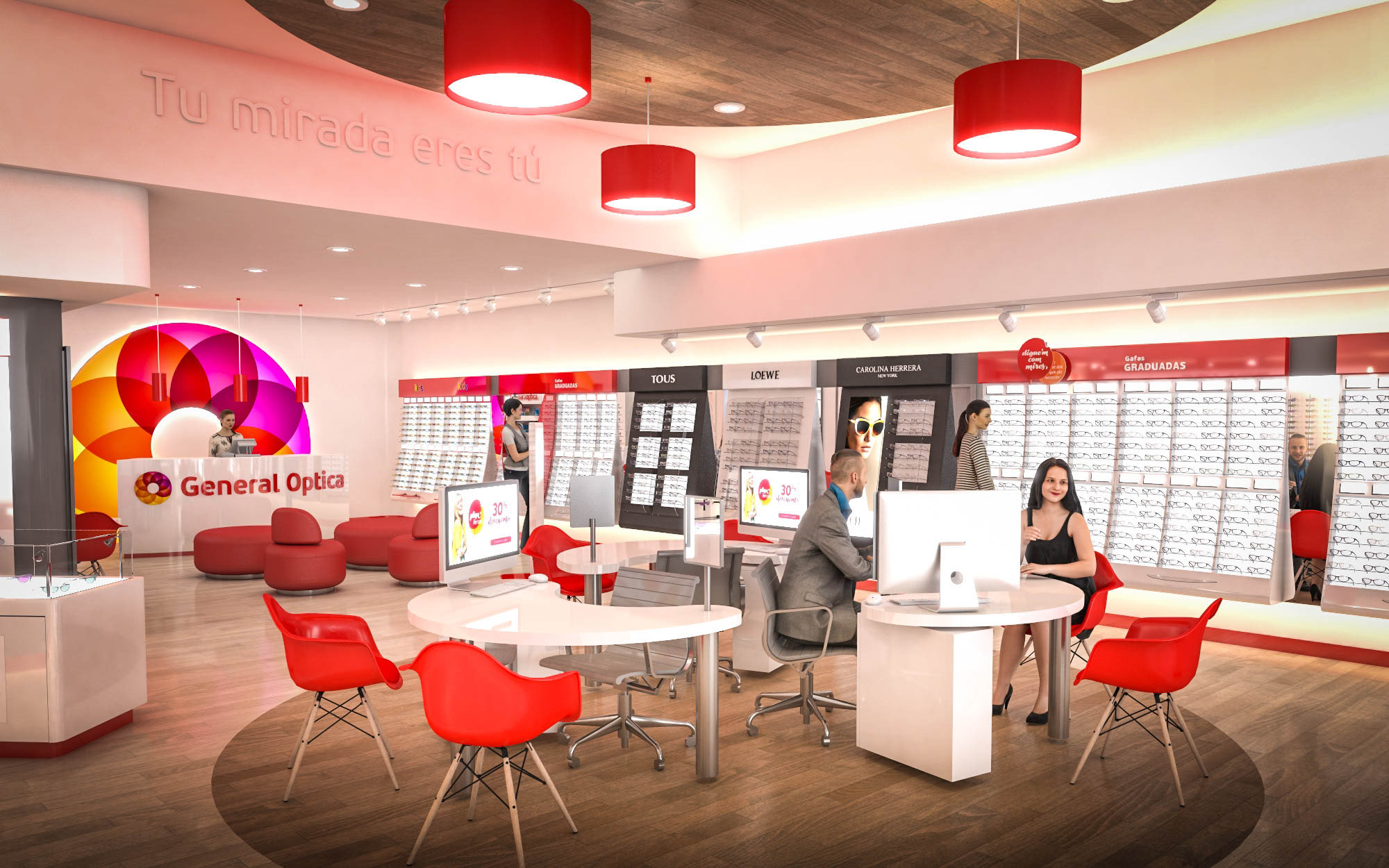
© 2021 by sanzpont [arquitectura] . Webpage by sanzpont [digital] . Innovative Digital Experiences
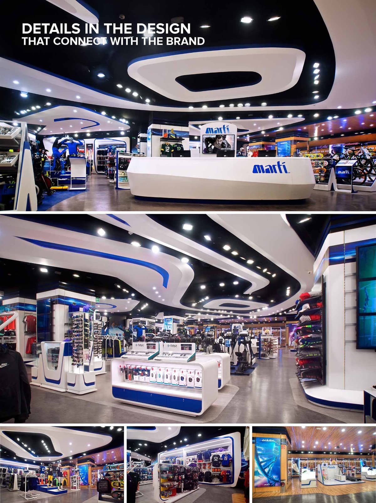

The MARTI flagship store in Mexico City is conceived as an immersive sports experience where architecture, lighting, and product layout act as extensions of the brand. The design draws inspiration from the dynamic movement of athletes, translating speed, fluidity, and energy into continuous curves on the ceiling, counters, and display modules. This unified language creates a strong visual identity that customers recognize immediately upon entering the space.
The project prioritizes clarity of circulation and product visibility. The central axis is defined by a sculptural cash desk and surrounding islands that guide the user naturally through different product universes. The perimeter walls function as a continuous merchandising ribbon, integrating graphics, digital media, and storage while maintaining a clean and future‑ready image.
The floor plan operates as an open field with low display fixtures that preserve long visual perspectives across the entire store. Primary paths radiate from the main entrance, allowing intuitive orientation without the need for explicit signage. Each sports category is emphasized through subtle variations in color accents, lighting, and fixture density rather than rigid partitions.
The cash desk is treated as a central sculptural object, with faceted white planes and integrated branding that anchor the space. Around it, modular gondolas and freestanding elements define micro‑zones for accessories, apparel, and equipment. The generous circulation between fixtures accommodates high visitor flows and facilitates ADA‑compliant accessibility, while clear perimeter zones support wall merchandising of larger or more technical products.
The dominant formal gesture is the continuous, flowing ceiling that alternates black and white bands with integrated lighting. These sinuous shapes echo running tracks and cycling velodromes, reinforcing the sports narrative while visually leading customers deeper into the store. Softly rounded corners on furniture and displays enhance the sense of motion and avoid visual clutter.
The material palette is intentionally streamlined: high‑gloss white solid surfaces for counters and fixtures, durable vinyl or epoxy flooring in neutral gray, and high‑pressure laminates in white and MARTI blue. Strategic use of timber on selected ceiling planes and wall areas introduces warmth and a tactile counterpoint to the otherwise high‑tech environment. The color scheme is firmly anchored in the brand identity—white as a neutral backdrop for products, blue for recognition and wayfinding, and black for depth and contrast in the ceiling plane.
Lighting is designed as a key architectural component rather than a mere technical layer. LED downlights are embedded in the black ceiling bands, producing a star‑like pattern that emphasizes the curves and adds rhythm to the space. Continuous linear LEDs highlight product walls and create vertical light that enhances colors and textures of merchandise.
Large digital screens are flush‑mounted into architectural surfaces, acting as dynamic façades within the interior. Their integration is carefully framed by white and blue panels so that technology appears as a natural continuation of the spatial composition. This allows real‑time content updates—campaigns, events, or product launches—without physical alterations to the built environment.
The design transforms the store into a three‑dimensional representation of the MARTI brand. Typography, logo, and corporate colors are embedded in counters, shelving edges, and vertical totems, while graphic murals and sports imagery reinforce the emotional connection with athletic performance. The store layout encourages exploration, with focal points such as mannequins and feature displays staged along the main route to maintain visual excitement.
Sustainability is addressed through several strategies. The exclusive use of LED lighting significantly reduces energy consumption and maintenance while limiting heat gain in the interior. Durable, low‑VOC materials and finishes are selected for their long lifespan in a high‑traffic retail environment, minimizing replacement cycles. Modular display systems extend the useful life of fixtures, allowing reconfiguration for new collections without generating construction waste. Together, these measures create a high‑impact retail space that aligns environmental responsibility with commercial performance.
© 2021 by sanzpont [arquitectura] . Webpage by sanzpont [digital] . Innovative Digital Experiences

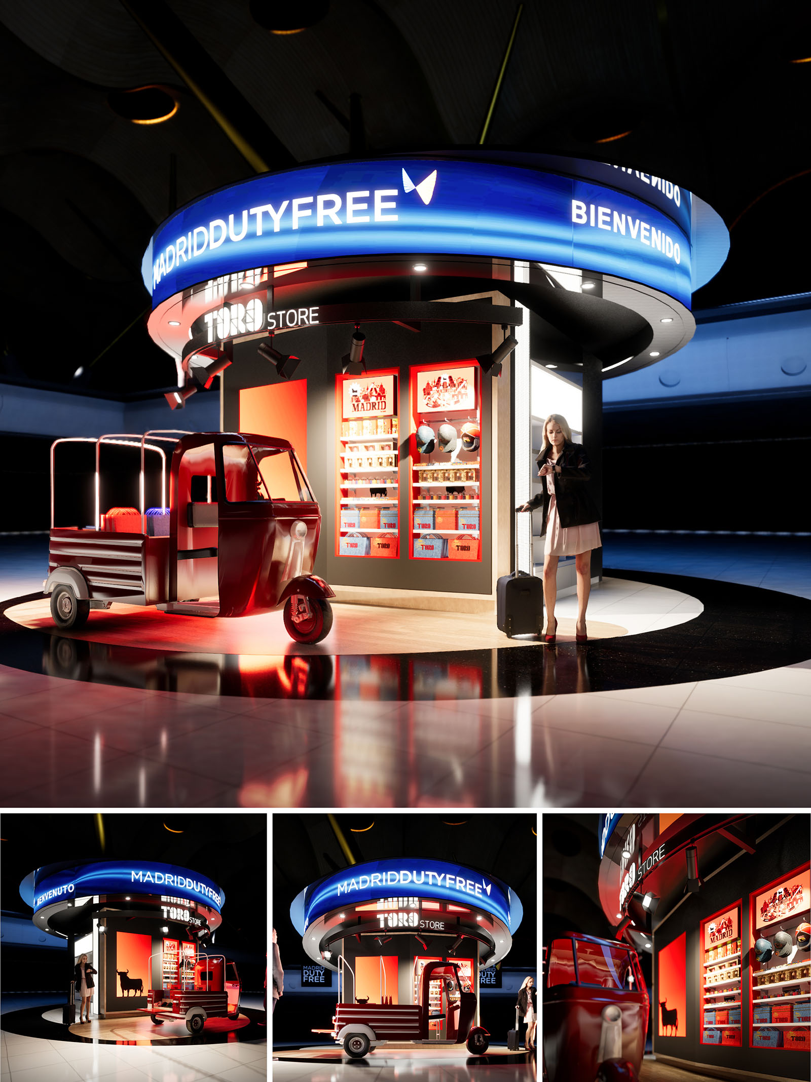
The OSBORNE kiosk is conceived as a compact brand pavilion within Madrid Airport, translating the iconic Toro identity into an immersive micro-architecture. The design uses the circle as its primary gesture, creating a 360º retail experience that welcomes passengers from all directions. The powerful contrast of deep black, intense red and illuminated graphics reinforces the character of the Spanish brand while remaining clearly legible in the busy duty free environment.
The stand operates as a hybrid between street-market stall and contemporary light installation. A retrofitted three‑wheeled vehicle anchors the composition, symbolizing mobility and travel, while the suspended luminous ring forms a recognizable landmark in the terminal. Together, these elements create a memorable threshold between airport infrastructure and local culture.
The kiosk is organized around a central cylindrical core that houses structure, services and storage. Around this core, the retail band is arranged radially, allowing continuous circulation and intuitive access from all sides. Passengers can approach, browse and exit in a fluid loop that avoids congestion, essential in high‑flow airport environments.
The vehicle is strategically positioned tangential to the kiosk, acting both as display and as spatial marker defining the main entry point. Its open platform offers flexible merchandising surfaces, while the surrounding glossy floor ring subtly guides movement and visually frames the intervention within the larger terminal hall.
The material palette combines high‑gloss metal, back‑painted glass and engineered panels to ensure durability, ease of maintenance and a premium finish. The base plinth is treated in dark reflective stone or porcelain, visually grounding the structure and amplifying the play of light and reflections from the illuminated signage above.
Lighting is layered to articulate different functions: a continuous LED crown with dynamic blue gradients signals the MADRID DUTY FREE identity at long distance; recessed downlights in the soffit provide general illumination; and adjustable projectors highlight products and graphic panels in red niches. The vehicle is accented with linear LEDs integrated under the chassis and roof, reinforcing its sculptural presence and creating a cinematic aura around the stand.
The façade is punctuated by vertical display modules framed in red, each acting as a showcase for key product lines and souvenirs associated with Madrid and the OSBORNE universe. Silhouettes of the Toro, city skylines and typographic compositions are used as backdrops, creating strong visual narratives without overwhelming the compact footprint.
Inside the shelving bays, warm white lighting with high color rendering enhances packaging tones and ensures product legibility. The consistent use of red as a volumetric element, rather than merely a graphic color, transforms brand identity into architectural form, turning each niche into a glowing display box embedded in a dark envelope.
The kiosk is conceived as a dry‑assembled system based on modular steel framing and prefabricated panels. This approach minimizes on‑site construction time and facilitates disassembly, relocation or partial reuse of components, an important consideration for constantly evolving airport layouts. Structural elements are dimensioned for reconfiguration, allowing future adaptation to new merchandising requirements.
All lighting is LED, with dimmable drivers and programmable scenes to reduce energy consumption during off‑peak hours. High‑efficiency power supplies and integrated cable management reduce material waste and simplify maintenance. Durable finishes, such as powder‑coated metals and compact laminates, extend lifecycle and limit replacement frequency. Wherever possible, substrates are specified with recycled content and low‑VOC adhesives, improving indoor air quality while aligning the retail intervention with broader sustainability goals for the terminal.
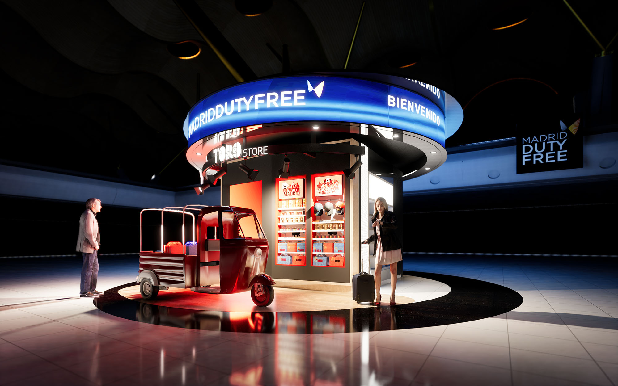
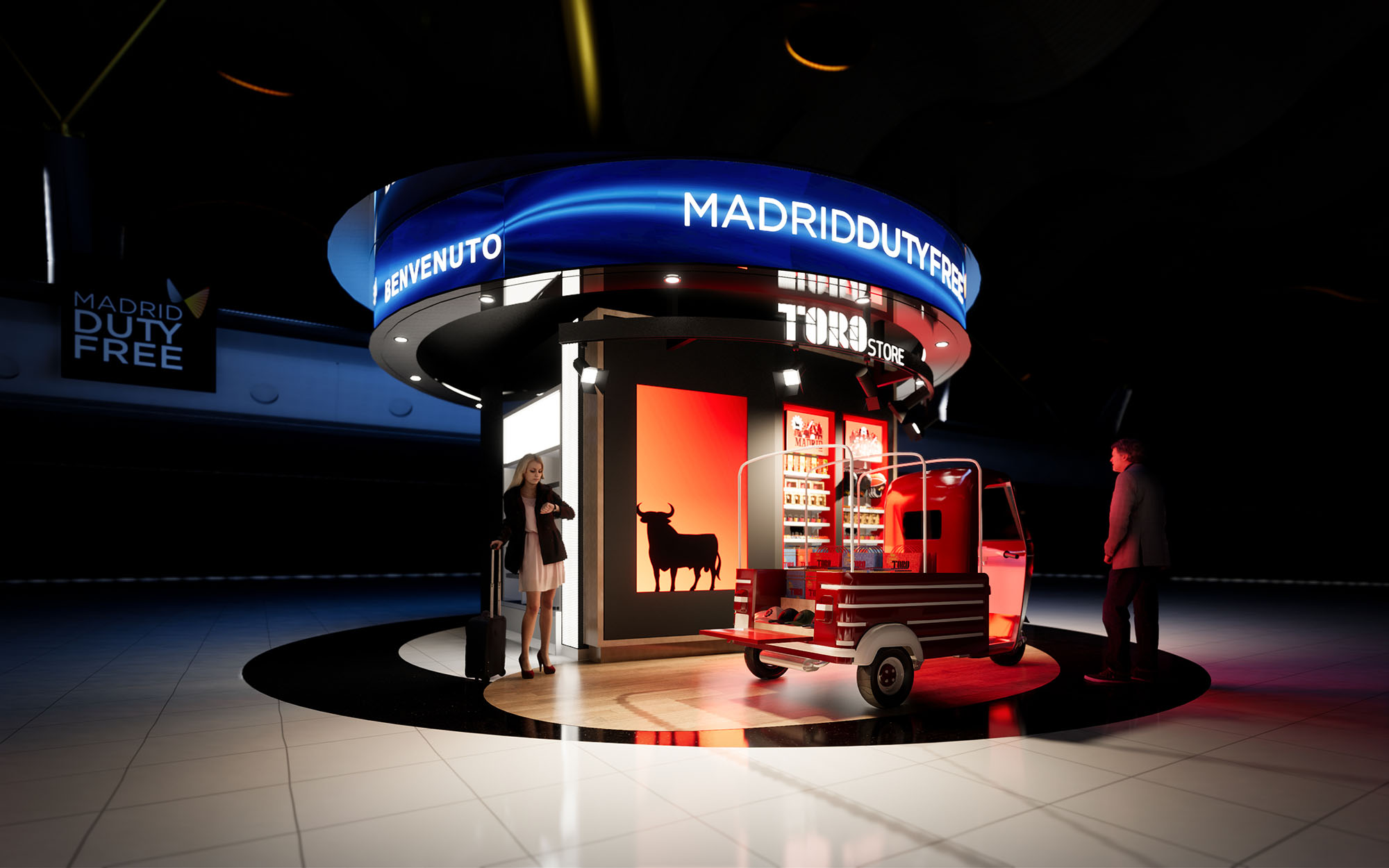
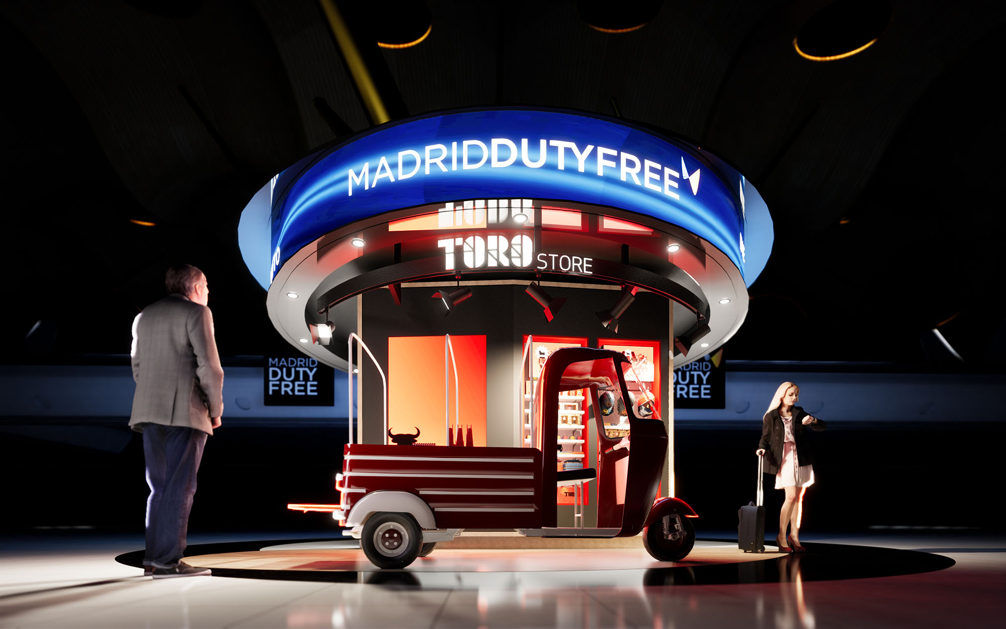
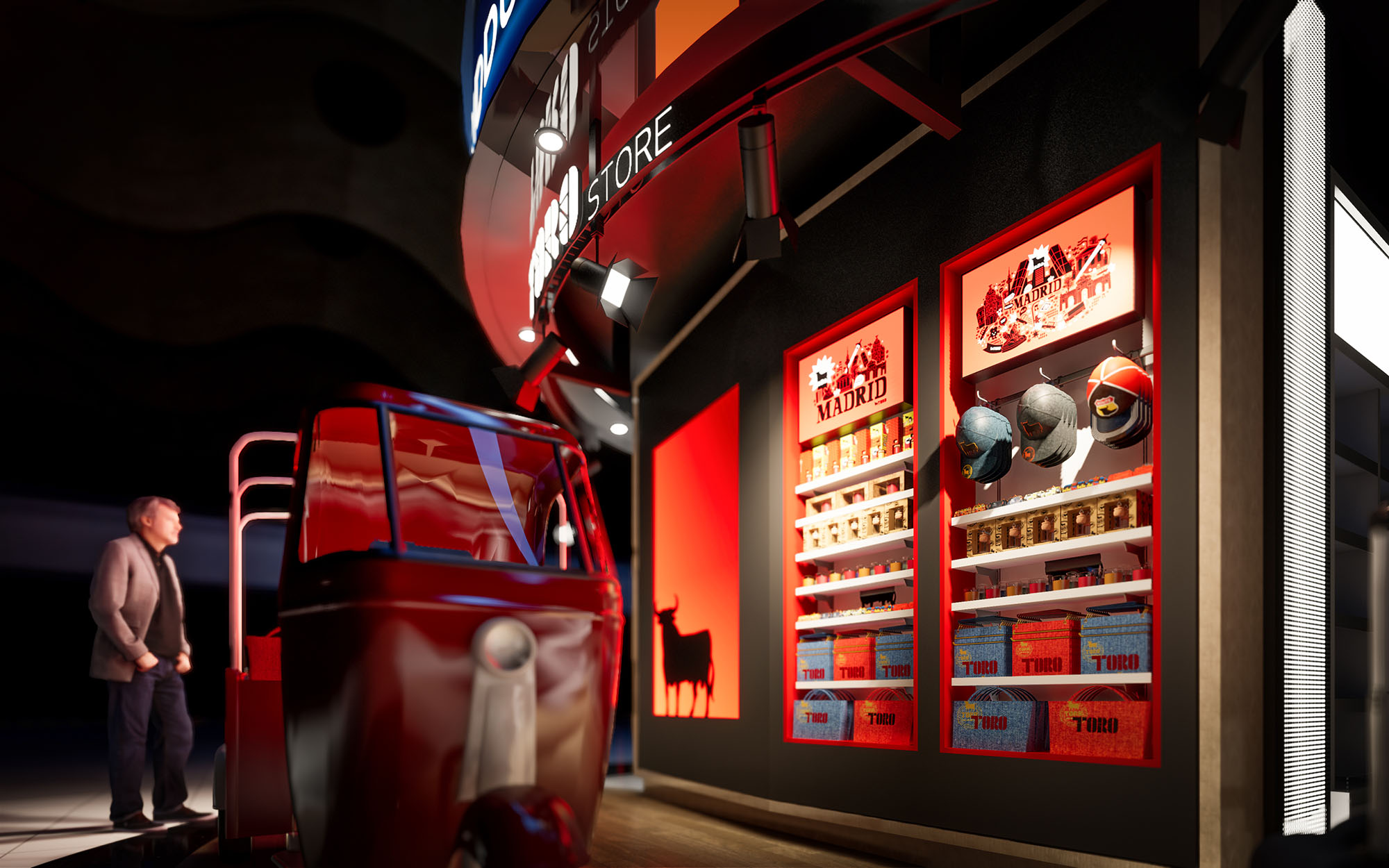
© 2021 by sanzpont [arquitectura] . Webpage by sanzpont [digital] . Innovative Digital Experiences
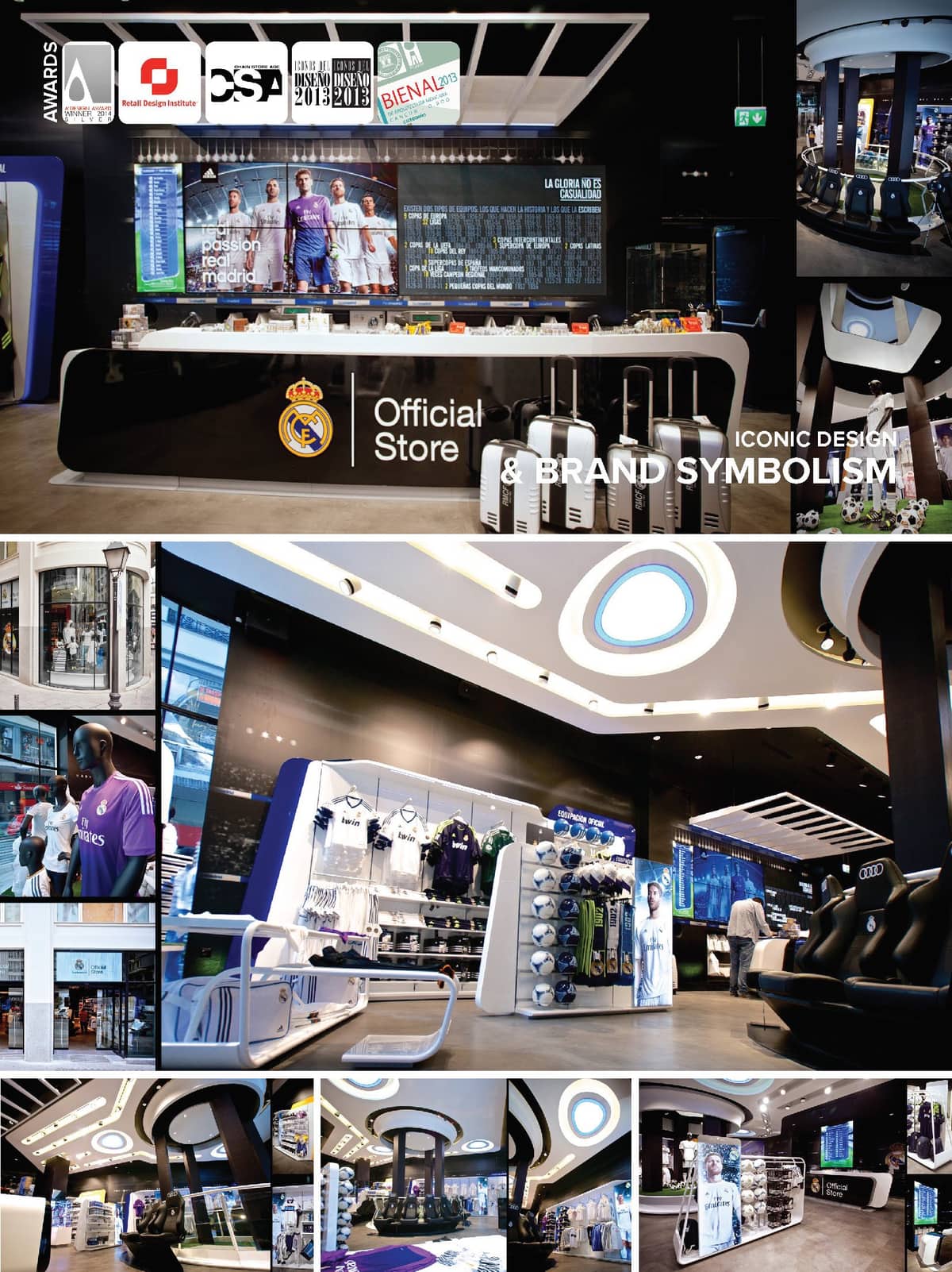

After winning a Restricted International Competition, sanzpont [arquitectura] was selected for the design of the Real Madrid Official Store. The project includes Concept Design and Commercial Implementation, Branding, Packaging, Graphic Line and Industrial Furniture Design. The club Real Madrid, Adidas and Areas opt for a very innovative and cutting-edge design, focused on the shopping experience and the creation of impression. Led by the multinational company Areas, the first store was opened at Goya, 77 in the center of Madrid, and this flagship store is located at Gran Via 31, in the Spanish capital. In the basement of the store we find a Special Corner, a thematic space that changes over time. Currently this space is themed as a Real Madrid bathroom, in the near future it will be a bedroom and even a full equip kitchen.
Cutting Edge BIM Technology The project was developed using cutting edge design tools from start to end based in a BIM system. “The working methodology in sanzpont is fully three-dimensional with BIM technology, we do not create drawings of a design, we create intelligent digital models of the design itself. Such models contain a digital constructive database capable of generating any type of digital information depending on the current phase of the project, in a way that to progress in the development of a project, is to advance the level of detail of the model.”
“The information generated through a BIM system is totally reliable and very rich in visual quality, since all the elements and views are connected to the same model. This system allows you to create stunning 3D visual information of a project related in 4D timeline and its implementation phases.”
Experience the Santiago Bernabéu The design concept of the store is based on an experience at the Santiago Bernabeu, all the walls are lined with images that make you teleport to the center of the field, in game action. The central marquee of the stadium is reinterpreted to highlight the store cash-wrap, accompanied by a media wall and a panel lined with victories that shows all the glory of the club.
Glory is not by Chance The Creative Concept is based on representing the required effort to achieve glory. It is the justification of a majestic sport career, only own by the best soccer team in history. Is a concept that at the same time it honors, praises and immortalizes the club, it states that achievements have been the result of talent, effort, struggle, dedication and determination. The fighting spirit identifies the club with his followers, is what makes us great, is what leads us to win.
LEDs are integrated in the images of the walls to create the effects of the public taking pictures with flash. These LEDs are synchronized with the in-store multimedia system, and activated when a goal happens in the media wall screens, all these while listening to the crowded stadium. The players reflected on the walls of the store are legends that have been indispensable for the greatness and immortality in the club.
Modular Vanguard Design The store is divided into three exhibition areas: Textile Zone (Official Gear and Training), Merchandising Zone and Adidas Zone. All the furniture is modular and is designed with the concept of “Ready to Assemble Modular Design”, which is designed from the minimum piece to its intelligent assembly system. This allows maximum flexibility and versatility of distribution, a more sustainable transportation by optimizing the dimensions and logistics for international expansion.
Equipment Efficiency An important factor in the concept design is energy saving and a serious commitment for sustainability, that is why 100% of the store is made with last generation LED luminaries with a maximum energy efficiency. In addition to intelligent lighting, the HVAC systems are optimized for maximum performance to minimize energy consumption. The store entrance is designed with double HVAC sealing system, besides having an automated gate that opens only when the customer enters or leaves, it has an air curtain that works intelligently.
DESIGN SCOPE
Concept Design, Brand Image, Graphic Design, Store Packaging, Construction Documents, Construction Supervision.
• IDA Design Awards, Los Angeles, USA : Honorable Mention - Interior Design Commercial : Real Madrid Official Store (2014)
• A’ Design Awards, Milán, Italy : Silver Medal - Certificado de Excelencia en Diseño de Espacios Interiores y de Exhibición del Mundo : Real Madrid Official Store (2014)
• Chain Store Age, NY, USA : 1st Place Softline Specialty Store Category : Real Madrid Official Store (2013)
• Chain Store Age, NY, USA : 1st Place Cashwrap Design Category: Real Madrid Official Store (2013)
• International Store Design Awards, Retail Design Institute, NY, USA : Award of Merit : Real Madrid Official Store (2013)
• Iconos del Diseño AD 2013, Architectural Digest México : Best Comercial Architecture : Real Madrid Official Store (2013)
• Tercera Bienal de Arquitectura Mexicana, Cancún : 1st Place Technical Innovation Category : Real Madrid Official Store (2013)
After winning a Restricted International Competition, sanzpont [arquitectura] was selected for the design of the Real Madrid Official Store. The project includes Concept Design and Commercial Implementation, Branding, Packaging, Graphic Line and Industrial Furniture Design. The club Real Madrid, Adidas and Areas opt for a very innovative and cutting-edge design, focused on the shopping experience and the creation of impression. Led by the multinational company Areas, the first store was opened at Goya, 77 in the center of Madrid, and this flagship store is located at Gran Via 31, in the Spanish capital. In the basement of the store we find a Special Corner, a thematic space that changes over time. Currently this space is themed as a Real Madrid bathroom, in the near future it will be a bedroom and even a full equip kitchen.
Cutting Edge BIM Technology The project was developed using cutting edge design tools from start to end based in a BIM system. “The working methodology in sanzpont is fully three-dimensional with BIM technology, we do not create drawings of a design, we create intelligent digital models of the design itself. Such models contain a digital constructive database capable of generating any type of digital information depending on the current phase of the project, in a way that to progress in the development of a project, is to advance the level of detail of the model.”
“The information generated through a BIM system is totally reliable and very rich in visual quality, since all the elements and views are connected to the same model. This system allows you to create stunning 3D visual information of a project related in 4D timeline and its implementation phases.”
Experience the Santiago Bernabéu The design concept of the store is based on an experience at the Santiago Bernabeu, all the walls are lined with images that make you teleport to the center of the field, in game action. The central marquee of the stadium is reinterpreted to highlight the store cash-wrap, accompanied by a media wall and a panel lined with victories that shows all the glory of the club.
Glory is not by Chance The Creative Concept is based on representing the required effort to achieve glory. It is the justification of a majestic sport career, only own by the best soccer team in history. Is a concept that at the same time it honors, praises and immortalizes the club, it states that achievements have been the result of talent, effort, struggle, dedication and determination. The fighting spirit identifies the club with his followers, is what makes us great, is what leads us to win.
LEDs are integrated in the images of the walls to create the effects of the public taking pictures with flash. These LEDs are synchronized with the in-store multimedia system, and activated when a goal happens in the media wall screens, all these while listening to the crowded stadium. The players reflected on the walls of the store are legends that have been indispensable for the greatness and immortality in the club.
Modular Vanguard Design The store is divided into three exhibition areas: Textile Zone (Official Gear and Training), Merchandising Zone and Adidas Zone. All the furniture is modular and is designed with the concept of “Ready to Assemble Modular Design”, which is designed from the minimum piece to its intelligent assembly system. This allows maximum flexibility and versatility of distribution, a more sustainable transportation by optimizing the dimensions and logistics for international expansion.
Equipment Efficiency An important factor in the concept design is energy saving and a serious commitment for sustainability, that is why 100% of the store is made with last generation LED luminaries with a maximum energy efficiency. In addition to intelligent lighting, the HVAC systems are optimized for maximum performance to minimize energy consumption. The store entrance is designed with double HVAC sealing system, besides having an automated gate that opens only when the customer enters or leaves, it has an air curtain that works intelligently.
DESIGN SCOPE
Concept Design, Brand Image, Graphic Design, Store Packaging, Construction Documents, Construction Supervision.
© 2021 by sanzpont [arquitectura] . Webpage by sanzpont [digital] . Innovative Digital Experiences
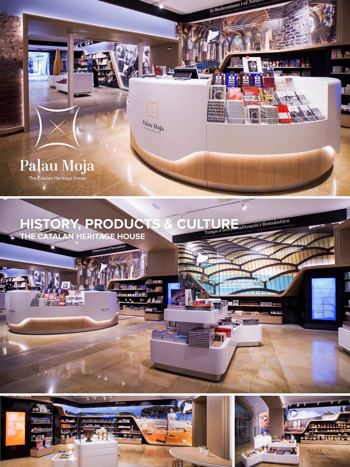

The Palau Moja, The Catalan Heritage House is a place where you will be able to travel across Catalan history, discover genuine Catalan products, learn about Catalan culture, explore Catalan heritage and how it uniquely relates to the territory, and also buy tour ticket for visiting the main cultural and historical sites of the country. At the Catalan Heritage House, technology plays a fundamental role. At the Catalan Heritage House, technology plays a fundamental role. The visitor can navigate through Catalan history via tablet and interactive screens where they will find information about Catalan heritage from their origins up to modern times. This way visitors may discover previously unknown areas of Catalan culture that they now want to explore further.


The Palau Moja, The Catalan Heritage House is a place where you will be able to travel across Catalan history, discover genuine Catalan products, learn about Catalan culture, explore Catalan heritage and how it uniquely relates to the territory, and also buy tour ticket for visiting the main cultural and historical sites of the country. At the Catalan Heritage House, technology plays a fundamental role. At the Catalan Heritage House, technology plays a fundamental role. The visitor can navigate through Catalan history via tablet and interactive screens where they will find information about Catalan heritage from their origins up to modern times. This way visitors may discover previously unknown areas of Catalan culture that they now want to explore further.
© 2021 by sanzpont [arquitectura] . Webpage by sanzpont [digital] . Innovative Digital Experiences
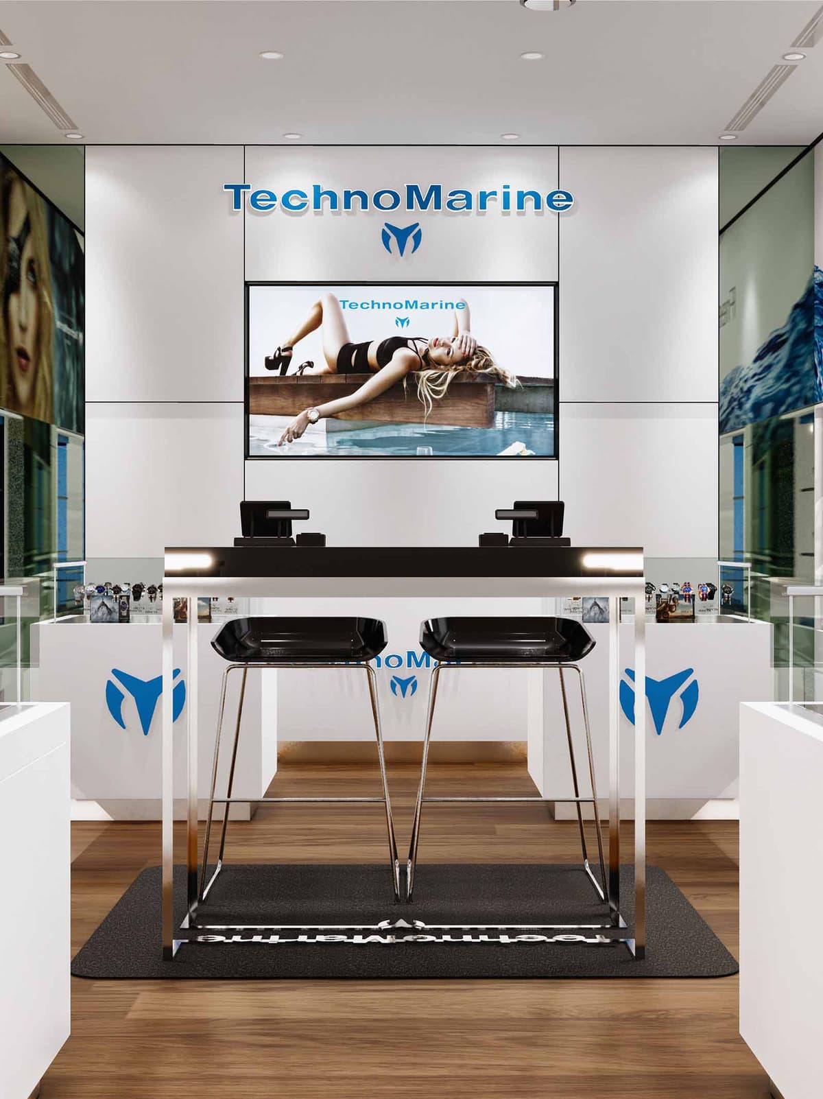

The Technomarine Store in Cancún is conceived as a compact yet immersive brand pavilion, where the world of nautical-inspired watchmaking meets a refined urban aesthetic. The interior expresses a dialogue between precision technology and coastal leisure, translating the maritime DNA of the brand into a clean, contemporary retail environment. Visual communication, product display and customer interaction are orchestrated along a central axis that immediately directs the gaze toward the illuminated brand wall and large digital screen at the back of the space.
The design prioritizes clarity and legibility: neutral planes, high contrast accents and carefully framed visual merchandising concentrate attention on the timepieces while reinforcing brand recognition. The store behaves as an elegant “showcase from within,” where every surface and reflection amplifies the product rather than competing with it.
The spatial layout is organized around a longitudinal promenade leading from the mall corridor into the heart of the store. A central bar-height consultation table with two stools operates as both a point of sale and a place for personalized product presentation. This dual-function furniture piece structures the circulation, allowing visitors to skirt around it to reach the lateral vitrines and then converge again at the rear counter.
Peripheral glass display cases along the sides create a continuous exhibition strip, encouraging exploratory movement while maintaining clear sightlines to the branding focal point. The rear wall, dominated by the logo and digital imagery, acts as a visual anchor that compresses perspective and gives depth to a relatively compact footprint.
The material palette is deliberately restrained: warm-toned wooden flooring grounds the space and introduces a subtle reference to yacht decks, while satin white wall panels and furniture provide a neutral backdrop for merchandise. High-gloss and glass surfaces on the displays deliver crisp reflections that enhance the perception of precision and craftsmanship in the watches.
Brand blue appears in the Technomarine logotype and iconography, strategically placed on counters and vertical planes to punctuate the white envelope with a fresh, aquatic accent. Black elements, such as the central table surface, stools and entrance mat, add visual weight and sophistication, framing the products and preventing light tones from feeling clinically cold.
Lighting is integrated through recessed ceiling fixtures and local accent illumination on the displays. The approach favors a uniform, glare-free ambient light enhanced by targeted spotlights that highlight key product clusters and the large digital screen, ensuring the merchandise remains the brightest element within the visual field.
Furniture is designed with minimal profiles and precise detailing, aligning with the technological character of the brand. The main consultation table uses slender metallic legs and a monolithic top, conveying structural lightness while preserving a robust presence in the center of the store. Bar stools with angular, faceted seats echo the geometry of watch cases, reinforcing the product narrative.
Display units are predominantly low, transparent vitrines that keep the horizon line open and unobstructed. This allows the large-scale brand imagery on the walls to remain visible from multiple vantage points, creating a strong graphic backdrop for the timepieces. The merchandising strategy favors clear, orderly arrangements, using modular watch stands to enable rapid reconfiguration of collections and seasonal stories.
The store is conceived as an experiential micro-flagship, relying on immersive visual content and tactile engagement with the products. The large digital panel at the rear allows dynamic storytelling about lifestyle, technical features and new releases, reducing the need for printed campaign materials and enabling rapid, low-waste updates. The overall chromatic restraint amplifies these narratives without visual noise.
Sustainability considerations are integrated primarily through lighting and material strategies. High-efficiency LED fixtures with long life cycles minimize energy consumption and maintenance, while the high reflectance of white interior surfaces reduces the number of luminaires required to achieve optimal brightness. The preference for durable, easily cleanable finishes such as glass, metal and engineered wood extends the lifespan of the fit-out, decreasing replacement frequency and associated embodied carbon. Wherever possible, loose furniture and modular displays are conceived for disassembly and reuse in future brand configurations, supporting a circular approach to retail design.
© 2021 by sanzpont [arquitectura] . Webpage by sanzpont [digital] . Innovative Digital Experiences

Bloomish is conceived as a sensorial retail experience that merges wellness, color and tropical vibrancy within a compact linear layout. The concept translates the freshness of skincare and beauty products into an immersive interior, where floating elements, dynamic lighting and chromatic accents guide the visitor from entrance to checkout. The store functions as an urban oasis in Playa del Carmen, framing the pedestrian flow of Quinta Avenida and drawing users inside through transparency, depth and a strong central axis.
The design balances a clean, almost clinical display language with playful volumes and textures. Neutral shells and continuous cabinetry create visual calm, while vivid cubes, ceiling petals and graphic panels introduce the brand’s youthful identity. The result is a space that feels both professional and approachable, encouraging exploration and extended dwell time.
The store is organized as a double-loaded gallery with a central promenade. Long lateral counters host the main product ranges, ensuring continuous visibility and easy accessibility. High-capacity drawers below and transparent shelving above optimize vertical storage, maintaining a clutter-free merchandising plane at eye level.
At the center, a sequence of colorful cubic displays works as both sculptural focal point and flexible island for seasonal or promotional items. This spine subtly narrows and widens the path, regulating speed and creating moments of pause without obstructing circulation. The cash desk and digital screen are located at the back wall, using perspective to pull customers through the entire depth of the space.
Material selection emphasizes warmth, hygiene and durability. The floor combines a light wood finish in the main path with neutral inserts that zone key areas. Continuous timber cabinetry with horizontal grain brings a natural, spa-like character, contrasting with the smooth white corian-style countertops and wall claddings that communicate cleanliness and precision.
The color palette is intentionally restrained in the envelope to highlight the merchandise and the brand’s chromatic interventions. Translucent cubes with multicolored circular patterns, vivid graphic bands and suspended pink elements add energy and visual rhythm. These saturated accents float over a base of whites, beiges and light woods, ensuring that color is perceived as fresh rather than overwhelming.
Lighting strategy combines focused retail illumination with experiential effects. Linear tracks with adjustable spotlights provide uniform, high-CRI lighting over product shelves, guaranteeing accurate color rendition of cosmetics and packaging. Integrated LED strips within displays emphasize vertical surfaces, enhancing product legibility and creating a sense of depth.
The ceiling incorporates sculpted recesses and organic cut-outs that host indirect lighting, softening contrasts and visually lifting the height of the space. The interplay between bright task lighting at the perimeter and a slightly warmer ambient tone at the center generates a welcoming, intimate atmosphere appropriate for personal care and testing.
Sustainability is addressed through both material choice and operational efficiency. Timber elements are envisaged from certified or locally sourced species, reducing transport impact and rooting the project in the Yucatán context. The predominance of durable finishes, modular shelving and replaceable panels extends the lifecycle of the fit-out, minimizing waste during future rebranding or layout adjustments.
The lighting system relies on LED technology with dimmable drivers and zoning controls, reducing energy consumption in response to natural light entering from the storefront. High reflectance surfaces amplify this daylight, allowing lower artificial lighting levels during daytime. Where possible, low-VOC paints and finishes are prioritized to maintain healthy indoor air quality, aligning the built environment with the wellness values expressed by the Bloomish brand.
© 2021 by sanzpont [arquitectura] . Webpage by sanzpont [digital] . Innovative Digital Experiences

From the creators of The Best Medical Spa, the concept of the airport Wellness Center was born; easily accessible, located inside the Madrid International Airport, developed on a single level and divided among three main areas: Public Area: Refreshment Table, Refrigerators, Boutique, Counter and Information Semi-Public Area: Hair Salon, Make-up Salon, Beauty Salon and Massages
Madrid Airport T4 / T4S. Spain, Madrid - Design Concept: Tranquility and Well-being Based on the experience and knowledge of Sha Wellness Clinic, recognized as the Best International Medical Spa, Esenza by SHA aims to bring health and well-being to those who aim to make this their lifestyle.
Private Area: Massage and Nursing Room: The objective of this project is to create a bubble of tranquility within the chaos and bustle of the airport and to provide the passenger with a comfortable space and an image of avant-garde innovation, while simultaneously transmitting a sense of tranquility and security; a place where you can trust the facilities, equipment and highly qualified personnel.
Materials Used: Warmth and Luminosity Uniform materials and soft colors were used to amplify the calm interior which create unity and amplitude in the space. Fabric finishes and wooden floors were used for a warm feel.
The public areas are more illuminated and blend in with the surrounding airport. The other areas where quietude and relaxation are required, offer more darkness and intimacy. This was achieved by using indirect light in more tranquil areas and more direct light spots in the public areas.
Subtle lighting was used to convey a sense of peace and tranquility, accompanied by seating areas with light colored material to provide comfort.
Digital Manufacturing: Latest BIM Technology: The team of architects was able to design the facade using parametric digital experimentation techniques, in which the structural supports and the white Aluminum Composite Panels are resolved by means of a 3D model. All the different pieces of assembly are extracted, as if it were a puzzle.
© 2021 by sanzpont [arquitectura] . Webpage by sanzpont [digital] . Innovative Digital Experiences
The Info Center Maremagnum is conceived as a fluid interface between the commercial dynamics of the mall and the touristic energy of Barcelona’s waterfront. The project merges information desk, ticketing and souvenir retail into a single, legible organism. A continuous blue canopy acts as a strong graphic horizon, evoking the sea and guiding visitors from afar, while the white volumetry beneath recalls the clarity of a nautical deck, emphasizing orientation, brightness and cleanliness.
The design prioritizes immediacy of reading: “Souvenirs”, “Tickets” and the tourist information icon are composed as large-scale environmental graphics, integrated into the architecture rather than applied signage. The result is a compact yet highly visible node that clarifies functions at a glance and encourages spontaneous approach from all directions of the circulation flow.
The plan is organized as a sequence of functional strips aligned along the main façade. To one side, a vertically accentuated souvenir area combines perimeter wall displays with central islands to create a dense yet orderly retail front. At the opposite side, the information and ticketing counter forms a generous, curved reception point that welcomes visitors frontally and obliquely, minimizing congestion during peak hours.
The circulation space between retail and counter remains unobstructed, allowing visitors to browse, queue and receive information without cross-interference. Service and storage are integrated into the lower cabinetry of the counter and behind the rear panels, enabling efficient restocking and discrete technical access. The result is an open-plan layout that supports both rapid transactional use and longer advisory interactions.
The architectural language is based on soft, continuous curves that recall the movement of waves and the fluidity of public flows inside the shopping center. The main counter and display bases adopt rounded edges, inviting contact and reducing visual hardness in the busy environment. This organic geometry is contrasted with strictly orthogonal glass cabinets, generating a controlled tension between softness and precision.
Material selection emphasizes luminosity and durability. High-gloss white solid surfaces and lacquered panels reflect light and give the unit a clean, contemporary character. Transparent glass showcases present merchandise as if floating, while integrated aluminum profiles and discreet shelving hardware maintain a minimal visual footprint. The background to the ticketing area incorporates a darker, textured panel reminiscent of basalt or stone, creating focal contrast and referencing the city’s material heritage.
Lighting is conceived as both functional infrastructure and branding tool. A continuous LED strip embedded in the blue canopy washes the front elevation, reinforcing the identity line and providing uniform ambient illumination. Additional spotlights within the soffit target the glass displays, ensuring merchandise is evenly lit without glare or excessive shadows.
Backlit graphic panels play a central role in orienting users: one panel emphasizes ticket sales, another promotes Maremagnum and the wider city experience. These elements transform the info point into a visual landmark within the mall, maintaining strong visibility even under changing natural and artificial lighting conditions.
Sustainability is addressed through compact footprint, efficient systems and durable materials. The entire unit is designed as a prefabricated, modular structure, reducing on-site construction time and waste. Components are dimensioned for easy disassembly, enabling future relocation or partial replacement without demolishing the whole installation.
Lighting is based on low-consumption LED technology with high efficiency and long life, minimizing energy use and maintenance. Glass showcases and light-colored surfaces maximize reflectance, reducing the need for high-intensity fixtures. Finishes prioritize robust, easily cleanable materials that extend service life in a high-traffic environment, while wood-effect flooring introduces warmth through a laminated or engineered surface that uses less natural timber than traditional solid wood. Collectively, these strategies create a visually striking yet resource-conscious intervention adapted to the maritime context of Barcelona.
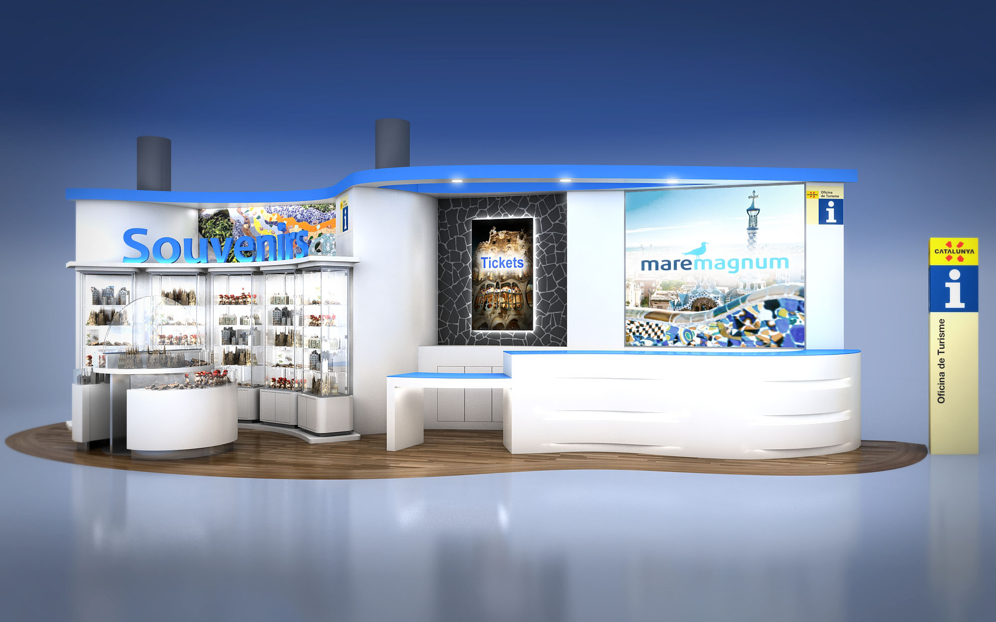
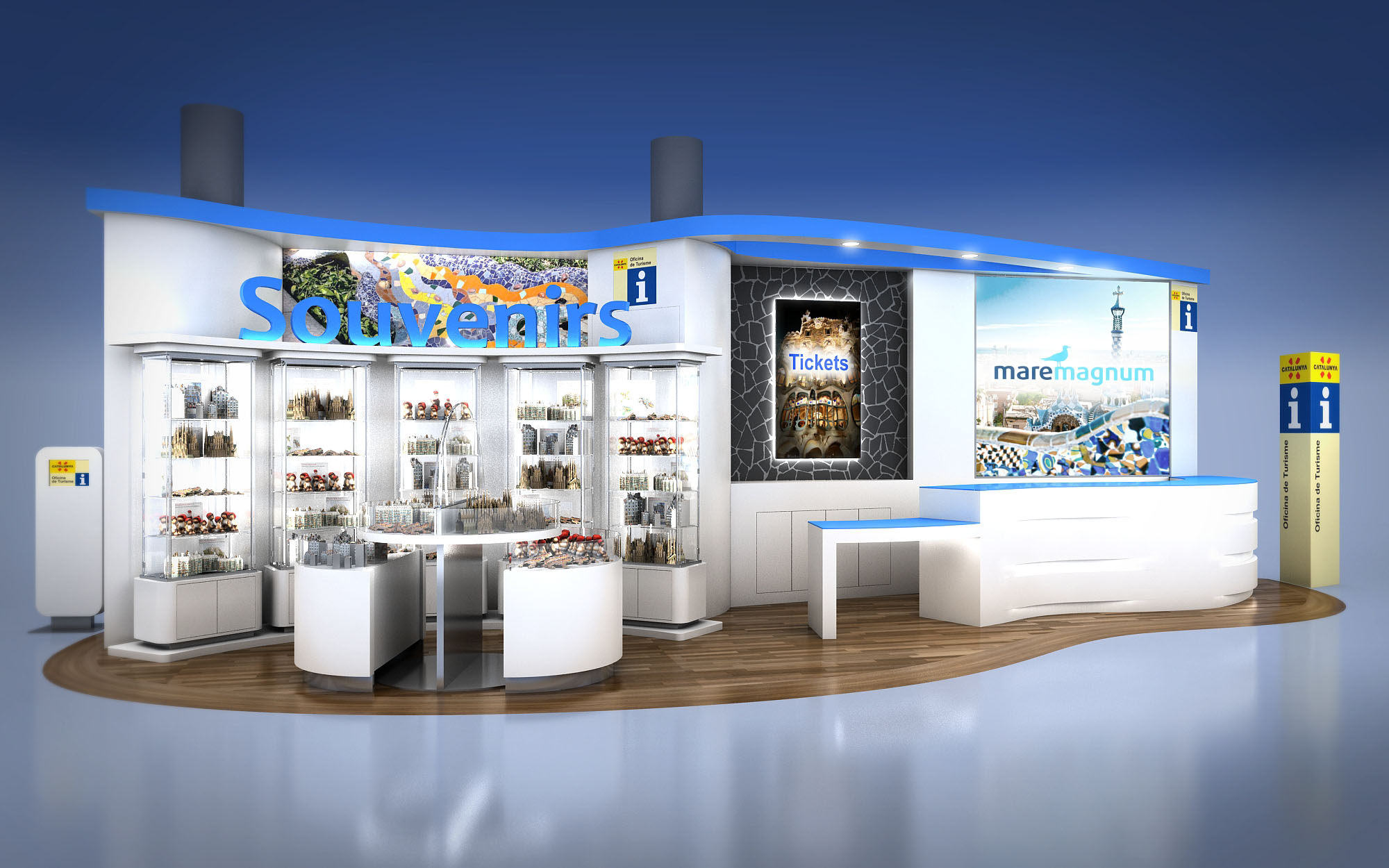
© 2021 by sanzpont [arquitectura] . Webpage by sanzpont [digital] . Innovative Digital Experiences

The Jewelry Warehouse kiosk is conceived as a luminous cylindrical pavilion that functions as a jewel itself within the circulation space of a shopping mall in Cancún. The design establishes a 360-degree visual relationship with the surroundings, using transparency and reflection to capture the attention of visitors from all directions. The kiosk dissolves the traditional boundary between interior and exterior, offering an open, walk-around object where display and architecture merge.
The concept relies on a minimal, almost dematerialized envelope so that the merchandise becomes the true protagonist. A restrained palette of glass, polished stone, and discreet metal profiles frames the jewelry with precision, evoking the clarity of a gemstone setting. The geometry is simple and legible, allowing the intense visual richness of the products to stand out without competition.
The kiosk occupies a circular footprint strategically placed near vertical circulation elements such as escalators, maximizing exposure to pedestrian flows on multiple levels. Access is controlled yet visually porous, with counters arranged in a ring that allows staff to manage the entire perimeter efficiently, while customers circulate freely around the external façade.
The interior is organized as a compact service core surrounded by display bands at different heights. Lower counters cater to close-up interaction and consultation, while higher shelving and vitrines target views from a distance and from the upper level of the mall. The circular plan eliminates blind corners and creates continuous visual surveillance, improving security and operational control.
Full-height curved glass panels define the enclosure, joined with minimal vertical mullions to create uninterrupted vistas and a seamless façade. The precision of the glass work, combined with subtle shadow joints at floor and ceiling, enhances the impression of a floating, transparent object. The base and framing elements employ dark, polished stone or high-pressure laminate, creating a strong horizontal datum and a refined contrast with the transparency above.
Display surfaces are rendered in neutral tones with integrated lighting tracks and concealed cable management. The finishes are selected for their resistance to high-traffic commercial environments—scratch-resistant glass, durable stone, and solvent-resistant coatings—while maintaining a high-end, polished aesthetic appropriate to luxury retail.
Lighting is conceived as the primary tool to animate the kiosk. Linear LED fixtures integrated in the shelves provide uniform, glare-free illumination that enhances the brilliance of metals and gemstones. Accent spotlights are calibrated to avoid harsh reflections on the curved glass while ensuring that key pieces receive higher luminance levels to guide the customer’s gaze.
The large central signage band, with backlit branding and imagery, acts as a visual anchor that orients visitors in the wider mall space. Below it, horizontal display lines are carefully aligned, creating a rhythmic composition of shelves and vitrines. This visual order supports flexible merchandising, allowing different product families to be grouped while maintaining a coherent, continuous presentation around the entire perimeter.
The kiosk responds to its Cancún context by embracing openness and brightness, taking advantage of the abundant ambient light in the mall while controlling glare through the use of frosted elements in the upper canopy. The circular form allows air circulation to flow naturally around the structure, preventing stagnant zones and contributing to user comfort in a warm, humid climate.
From a sustainability perspective, the project prioritizes long-life, low-maintenance materials such as tempered glass, stone, and aluminum profiles, reducing the need for frequent replacement. High-efficiency LED lighting minimizes energy consumption and heat gain, lowering cooling loads in the surrounding mall environment. Modular construction of display units facilitates disassembly, relocation, or reuse, extending the lifecycle of the kiosk and reducing waste associated with future remodeling or tenant changes.
© 2021 by sanzpont [arquitectura] . Webpage by sanzpont [digital] . Innovative Digital Experiences
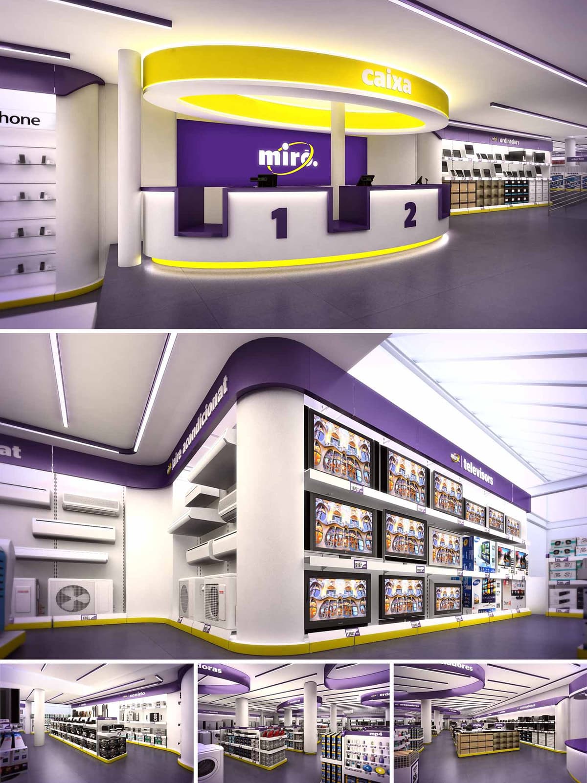
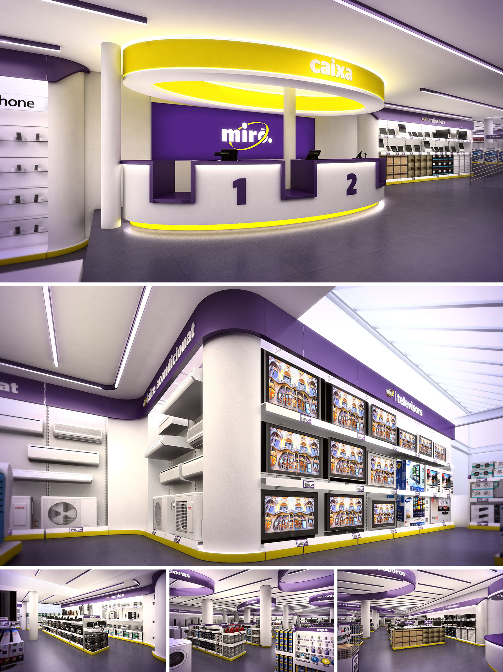
The MIRO retail project in Madrid is conceived as a contemporary, highly legible environment for consumer electronics, where architecture, graphics and lighting merge into a continuous brand experience. The design uses a clear chromatic code—white, purple and yellow—to articulate circulation, highlight product areas and reinforce corporate identity. Soft, fluid geometries organize the space, avoiding visual clutter and allowing customers to understand the store at a glance.
The layout is based on a sequence of rings and bands that guide movement from entrance to cashier and through specialized product zones. This creates a unified interior landscape where architecture acts as wayfinding. The goal is to generate an immersive, dynamic atmosphere that remains efficient and easy to navigate during peak hours.
The store is structured around a central, open-plan sales floor with radial circulation. From the access, the main axis leads directly to the circular cashier hub, which functions as an orienting landmark visible from almost every point. Around this core, product islands and perimetral shelving define specialized sectors for televisions, air conditioning, small appliances and accessories.
The circulation strategy is based on clear perimetral loops combined with transverse corridors. This allows alternative paths while gently directing customers through high-visibility product fronts. Generous aisle widths accommodate simultaneous browsing and trolley circulation, essential for an electronics retailer with bulky items. Structural columns are integrated within display islands, so that no element interrupts the visual field or pedestrian flow.
The project employs a reduced palette of durable, easy-maintenance materials. Continuous resin or large-format porcelain flooring in neutral grey provides a robust, seamless base that resists heavy traffic. Vertical surfaces combine lacquered MDF, high-pressure laminates and powder-coated metal shelving, ensuring dimensional stability and flexibility for future reconfiguration.
Color is used as an architectural tool rather than mere decoration. White dominates ceilings, walls and most fixtures, acting as a neutral backdrop that enhances product visibility. The corporate purple forms a continuous upper band that traces the perimeter, emphasizing horizontality and visually connecting distant areas. A vivid yellow line, at skirting and ceiling level, works as a dynamic accent that underlines the cashier ring and the base of shelving units, subtly guiding movement while reinforcing brand recall.
Lighting design prioritizes uniformity and product emphasis. Linear recessed luminaires in the ceiling generate a continuous, glare-free general illumination, ensuring accurate color rendering for electronic devices. The cashier canopy integrates concealed LED strips that wash the curved surfaces, intensifying the reading of the circular geometry and distinguishing the service zone.
Wall systems for televisions and air-conditioning units are conceived as illuminated façades. Integrated backlighting and targeted spotlights ensure that the product, rather than the support, becomes the protagonist. The modular shelving allows variable heights and configurations, facilitating regular updates of merchandising strategies without requiring structural interventions.
The cashier desk is the iconic element of the project: a continuous circular counter with differentiated service points clearly numbered and highlighted by the yellow luminous ring at floor level. This piece combines high-pressure laminate and solid surfaces to provide durability in intensive use areas. Generous recessed toe spaces and ergonomic counter heights improve staff comfort and service efficiency.
Graphic elements are fully integrated into the architecture. Signage bands align with the purple cornice, placing category names at a continuous, easily legible height. This avoids excessive vertical dispersion of logos and texts, resulting in a calm yet strongly branded environment. The overall experience is one of clarity and order, where customers can orient themselves quickly and products remain the main focus.
Sustainability criteria focus on energy performance, durability and adaptability. The lighting system is based on high-efficiency LED technology with optimized color temperature for retail, significantly reducing consumption compared to traditional solutions. The linear layout simplifies maintenance and allows partial dimming in low-traffic periods through programmable control systems.
Material selection favors long-lasting finishes and modular components, minimizing replacement cycles and waste. Shelving systems and display walls are fully reconfigurable, extending their lifecycle even if product typologies or store layout evolve. The neutral base palette reduces the need for frequent redecoration, while the use of non-porous, easily cleanable surfaces ensures hygienic conditions with minimal use of aggressive cleaning products. These strategies combine to create a retail space that is visually distinctive, operationally efficient and environmentally responsible.
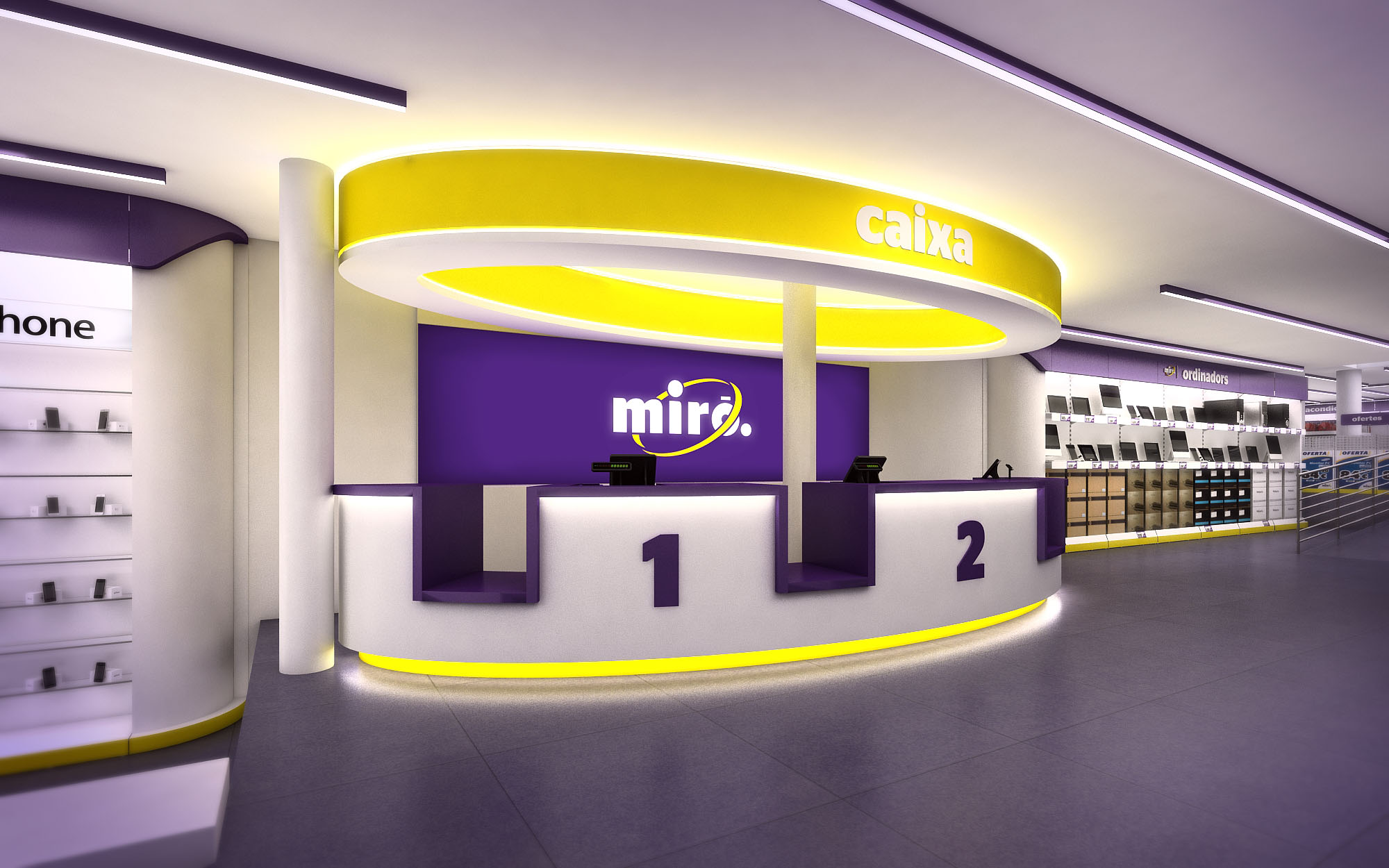
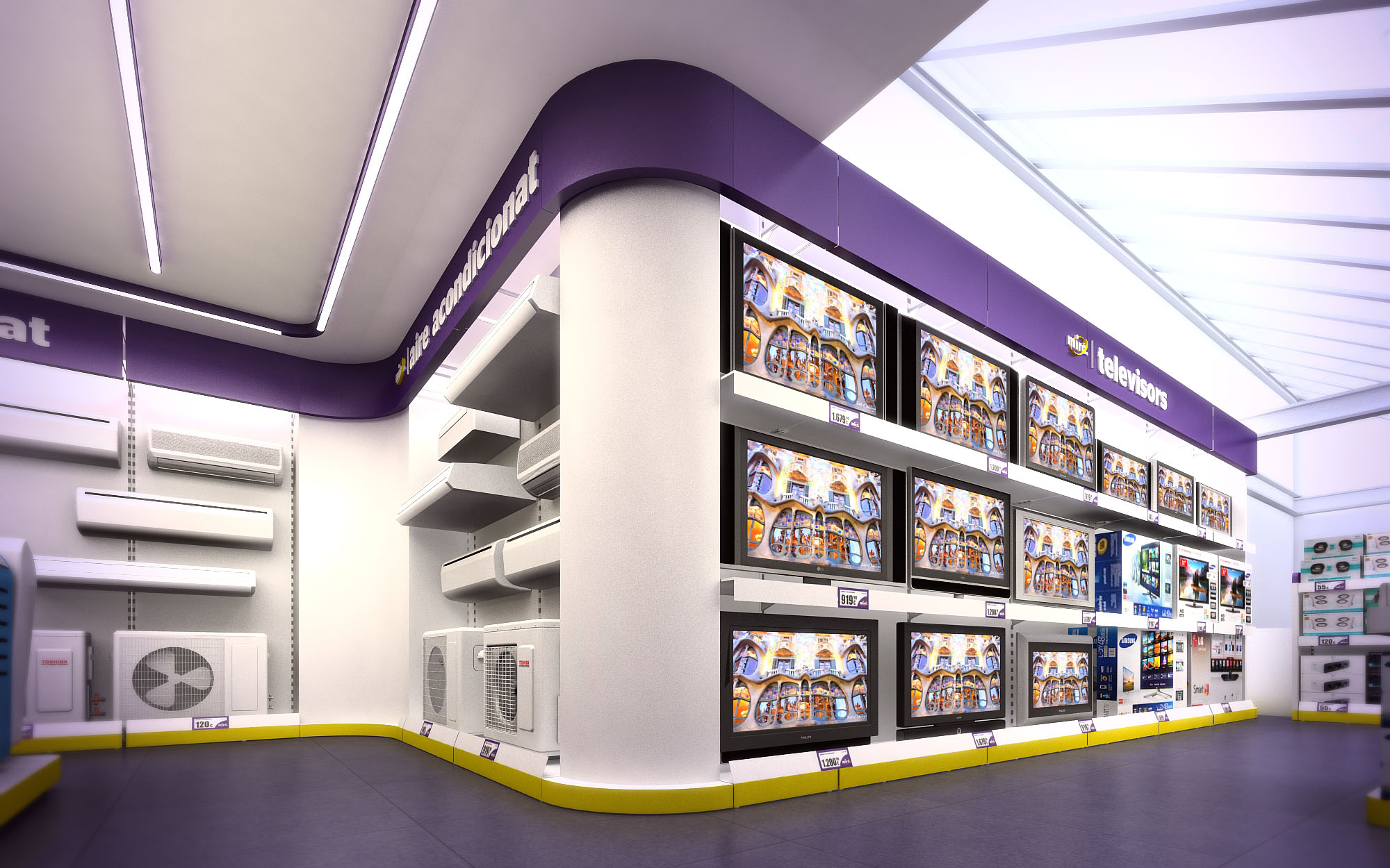
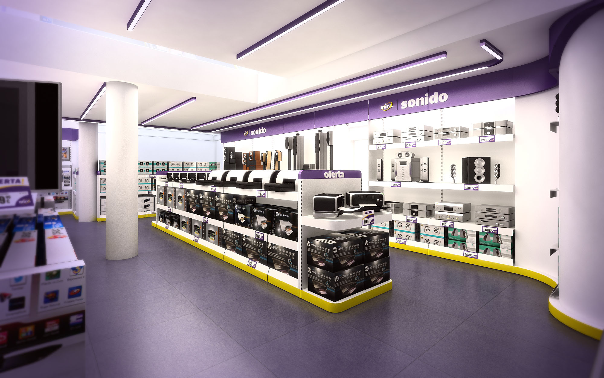
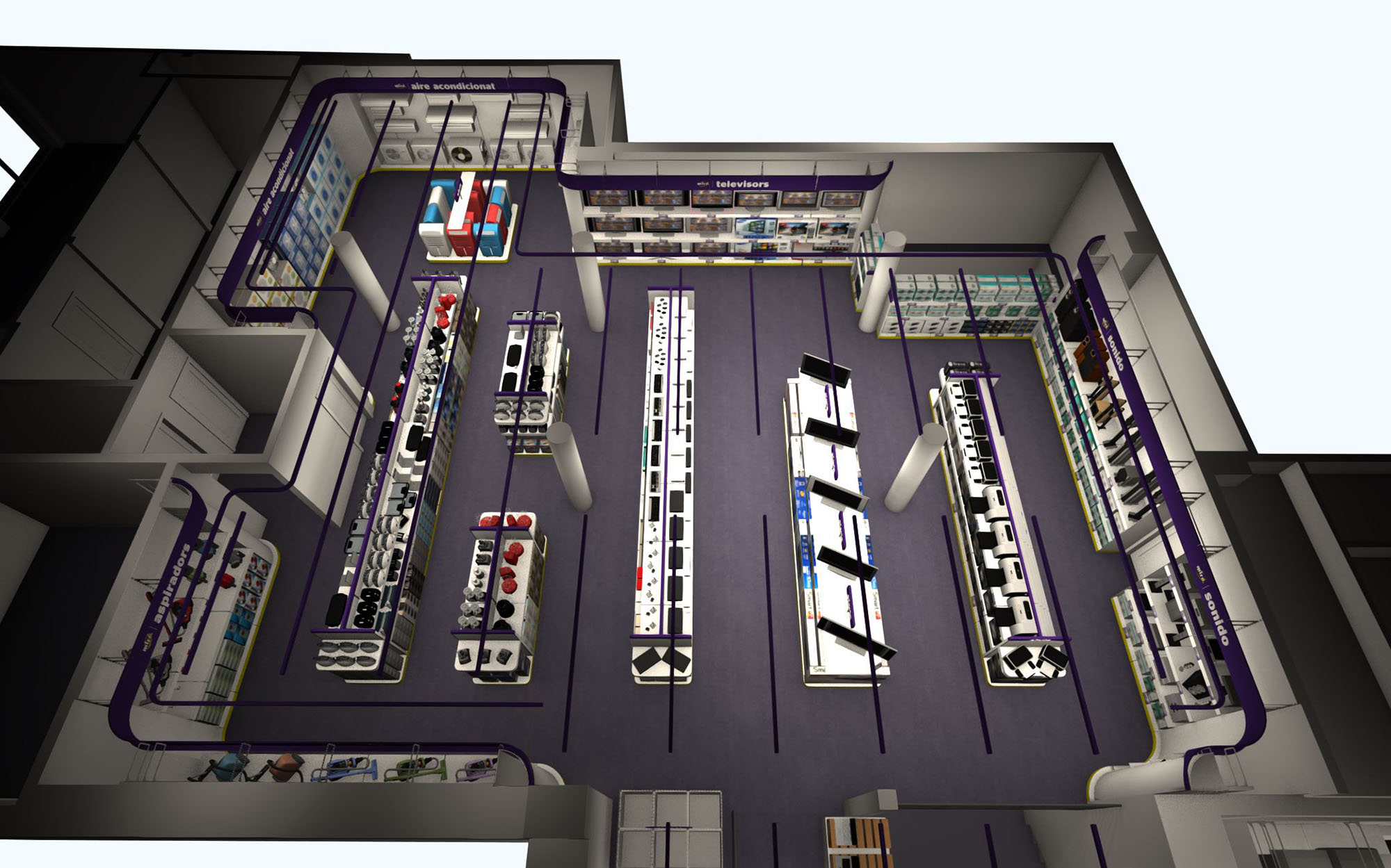
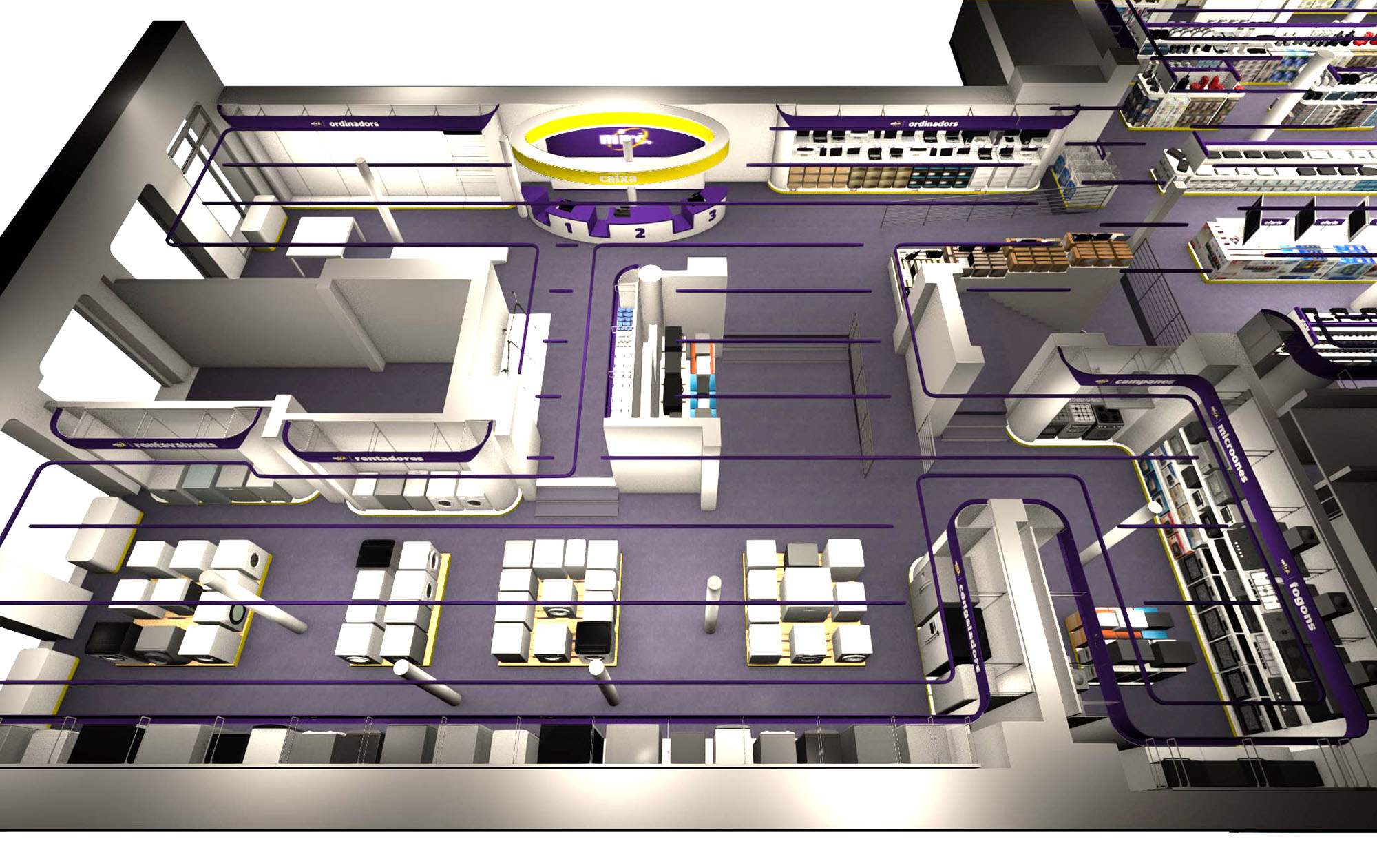
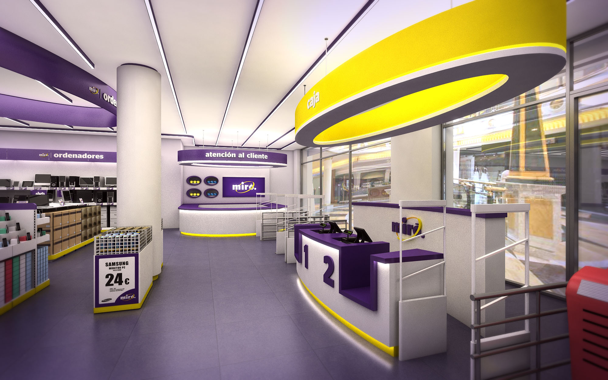
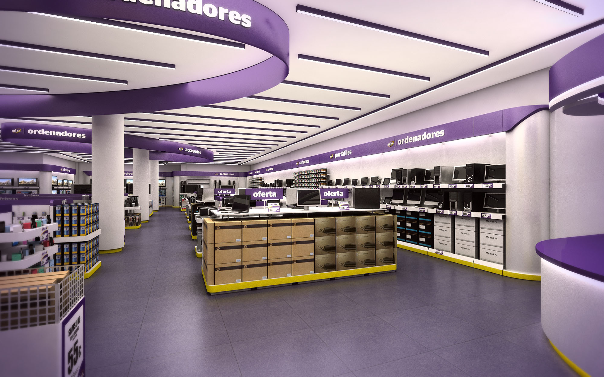
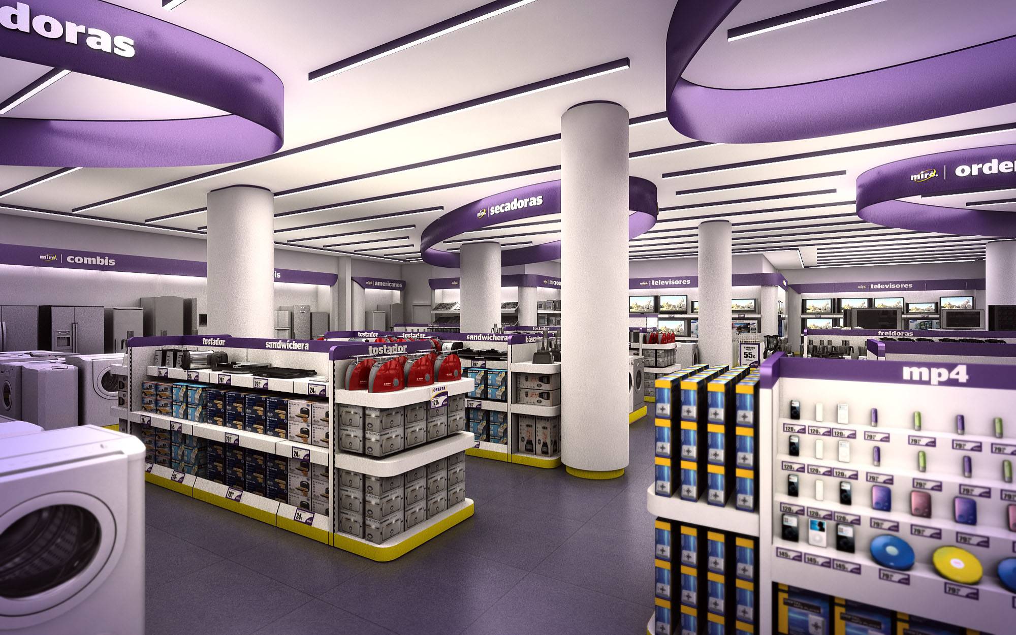
© 2021 by sanzpont [arquitectura] . Webpage by sanzpont [digital] . Innovative Digital Experiences
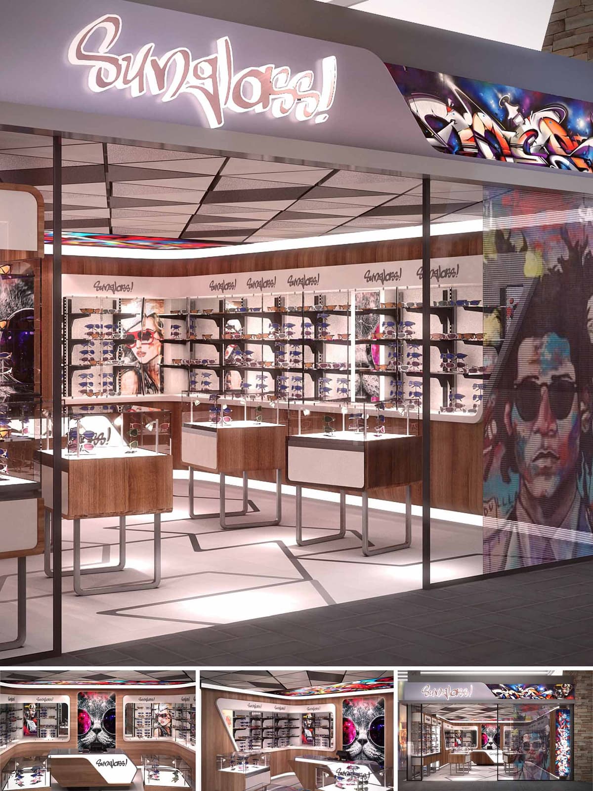
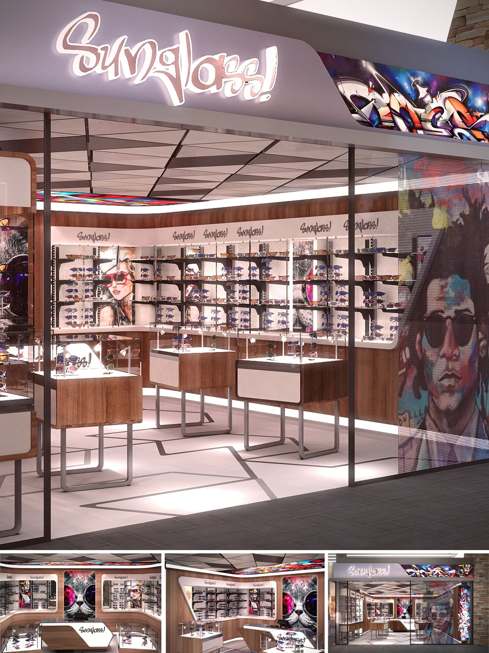
The SUNGLASS! store in Cancún is conceived as an immersive urban gallery that merges street-art culture with refined product display. The design frames sunglasses as collectible objects, using layers of graphics, light, and material contrast to create a vibrant yet controlled environment. The architecture embraces the energy of the resort city, translating it into a compact, expressive retail space that feels dynamic from every angle of the circulation corridor.
The concept emphasizes permeability and visibility. A fully open storefront, supported by slender metal profiles and clear glazing, blurs the boundary between mall passage and interior, turning the store itself into a luminous showcase. Customers are visually drawn by the interplay of neon-like signage, colorful murals, and precisely lit display volumes that appear to float above the floor.
The plan is organized around a U-shaped perimeter display system complemented by freestanding central showcases. This configuration allows for intuitive circulation: visitors enter through the widest open edge, are guided along the perimeter to explore the full collection, and naturally loop back toward the service counter placed as a focal anchor.
The central vitrines are dimensioned to maintain clear visual corridors across the entire store, ensuring constant eye contact with both merchandise and brand imagery. Their elevation off the floor, on slender metal frames, maintains openness and promotes uninterrupted sightlines to perimeter walls and murals. The counter is positioned slightly off-center to avoid visual blockage, functioning simultaneously as a service point and an additional display surface.
The material palette balances warm natural finishes with a graphic, almost digital aesthetic. Wood veneers with a medium warm tone wrap the lower cabinetry and portions of the perimeter walls, providing a tactile counterpoint to the sleek metal structures and glass shelves. This warmth is essential in grounding the otherwise highly luminous, image-driven environment.
Neutral light-toned flooring and white solid surfaces act as a canvas that amplifies reflections and enhances product visibility. Thin metal frames in a dark, almost black finish outline counters and support structures, echoing industrial references from urban streetscapes. The color palette is intentionally restrained in the architectural elements so that the high-saturation street-art murals and product lenses can stand out as the primary chromatic accents.
Lighting design plays a central role in defining the brand atmosphere. A continuous band of integrated LED lighting at the base of the perimeter showcases and under the central vitrines generates a floating effect, adding depth and lightness. The main ceiling grid employs modular panels with concealed linear fixtures, delivering uniform ambient light while avoiding glare on the glass lenses.
Accent lighting is focused directly onto the display shelves and vitrines, calibrating color temperature to enhance frame materials and lens tints. The backlit logo and the vibrant graffiti panel at the fascia function as luminous beacons in the mall environment, reinforcing brand recognition from a distance. Reflections on glass and polished surfaces are controlled to maintain clarity of merchandise while still achieving a dynamic play of light.
The interior walls serve as a curated graphic backdrop that positions the store within a youthful, cosmopolitan aesthetic. Large-format photographic panels and illustrated street-art characters are integrated into the shelving system, always framed by clean white bands carrying the SUNGLASS! logo. This alternation of image and logo generates rhythm and visually segments the collection without physical partitions.
Merchandise is presented on slender horizontal glass shelves and within museum-like vitrines, encouraging a gallery-style exploration. The varying heights of central showcases allow for tiered product storytelling, highlighting key collections at eye level while reserving the upper perimeter shelves for broader assortment display. The visual merchandising strategy supports quick orientation while allowing for expressive thematic compositions tied to seasons or trends.
The project incorporates several strategies to enhance environmental performance while maintaining a high-impact retail image. LED technology is used exclusively for all general and accent lighting, substantially reducing energy consumption and minimizing heat gain in the compact volume, which is particularly relevant in Cancún’s warm climate. Dimmable systems allow adaptation to natural light conditions in the mall and extend lamp life.
Furniture elements are designed as modular, demountable units. Metal structures and glass shelves are easily reconfigurable, extending the store’s lifecycle and avoiding waste when collections or layouts change. Where possible, wood finishes are specified with certified or low-VOC products, and durable materials have been selected to withstand high traffic, reducing the need for frequent replacement. The open storefront also leverages shared mall conditioning, decreasing the need for additional mechanical systems within the store envelope.
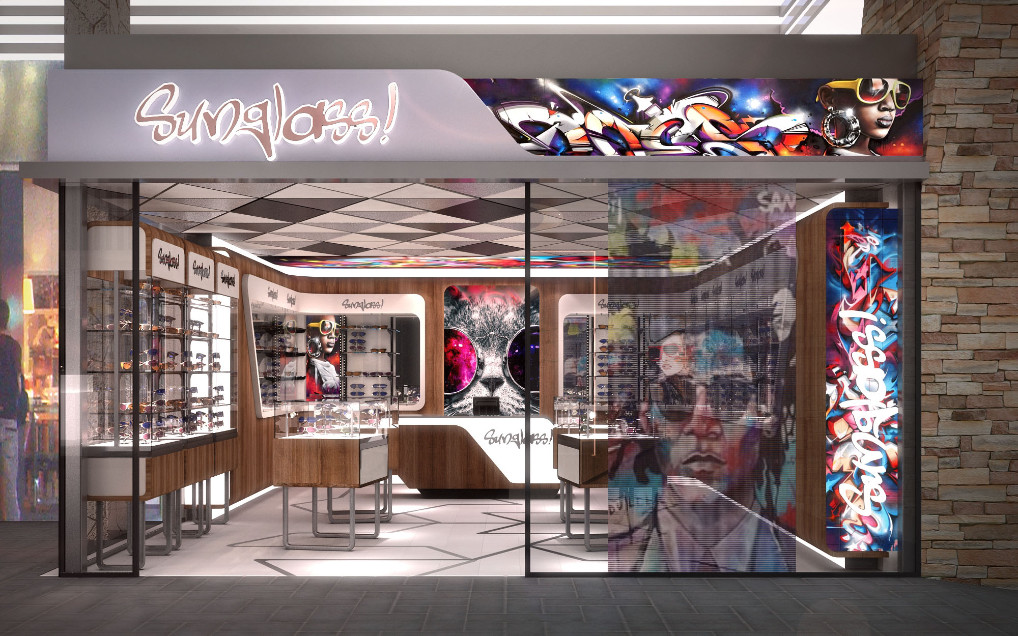
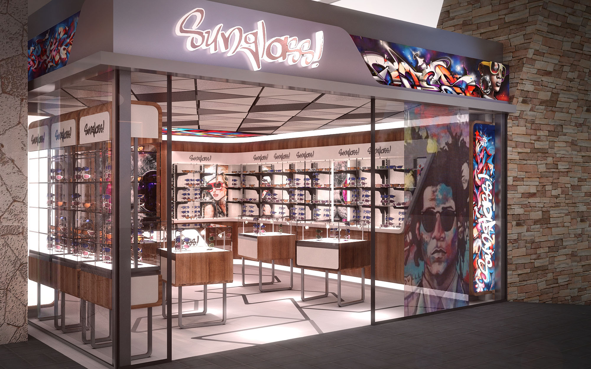
© 2021 by sanzpont [arquitectura] . Webpage by sanzpont [digital] . Innovative Digital Experiences

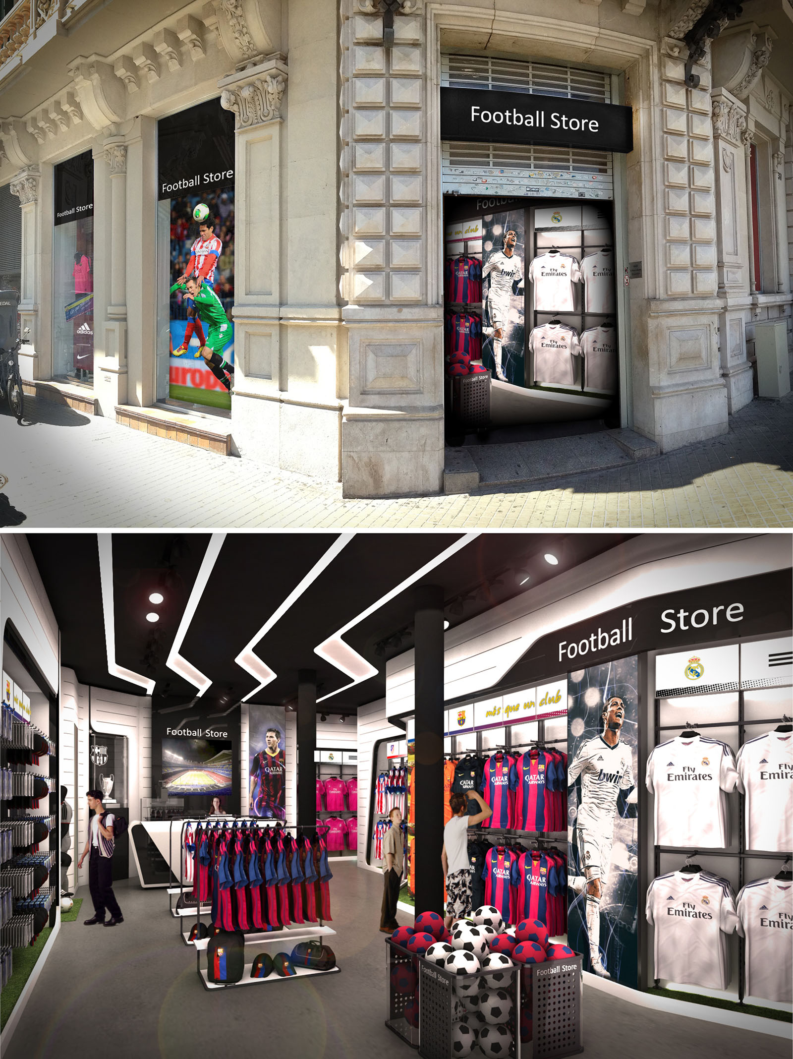
The Football Store in Mallorca is conceived as a contemporary sports pavilion embedded within a heritage urban façade. The design juxtaposes the solidity and ornamentation of the existing stone architecture with a dynamic, light-filled interior that celebrates movement, speed and team identity. The store becomes a stage for football culture, where jerseys, accessories and club imagery are presented as protagonists in a curated, immersive environment.
The concept is based on three guiding ideas: the stadium, the tunnel and the pitch. The façade graphics and entrance create the sense of arriving at a stadium gate; the elongated interior and ceiling slats evoke the players’ tunnel; and the product platforms and turf-lined elements suggest fragments of the pitch. This narrative guides the visitor from street to checkout through a fluid, legible spatial sequence.
The existing historic façade is preserved and framed as a stone proscenium around the new commercial insertion. Large-format glazing and printed graphics occupy the original openings, maintaining the rhythm of pilasters and cornices while activating the street with vivid football imagery. The neutral “Football Store” signage is contained within simple black bands, deliberately restrained to respect the architectural language of the building.
Backlit visuals featuring players in action act as visual beacons, enhancing visibility from a distance and drawing customers into the narrow entry. The transparent threshold allows a direct visual link to the interior merchandise, transforming the old portal into a contemporary display window without altering the protected stonework.
The interior is organized as a linear, single-level plan optimized for intuitive circulation. Perimeter walls host continuous merchandising systems, leaving a central, flexible spine for display gondolas and promotional islands. The entrance zone functions as a high-impact “hero area,” immediately showcasing key jerseys and seasonal collections to capture attention and guide movement deeper into the space.
Structural columns are integrated into the layout as visual anchors, wrapped with graphics or used as supports for shelving, avoiding visual clutter. The checkout counter is positioned at the back, encouraging customers to traverse the full length of the store, while maintaining clear sightlines for staff supervision and security. Circulation widths are calibrated for comfortable two-way traffic, even in peak tourist seasons.
The interior palette combines dark ceilings and flooring with bright, light-reflective wall surfaces to focus attention on the product. The black ceiling, articulated with white illuminated bands, creates a strong contrast that visually elongates the space and echoes the graphic lines of a stadium roof. Walls are finished in modular white cladding, allowing easy reconfiguration of shelving and graphics.
Track lighting and recessed downlights provide layered illumination, with accent spots targeting key merchandise and large graphics. LED technology is used extensively, ensuring low energy consumption and excellent color rendering for jerseys and branding. Touches of artificial turf, metallic mesh and perforated steel on fixtures subtly reference stadium materials, reinforcing the football narrative while offering robust, easy-to-maintain surfaces.
Product zoning is clearly legible: replica kits occupy prime wall positions at eye level, while accessories, balls and footwear are arranged on lower racks and freestanding displays. Large player portraits and club crests frame each zone, reinforcing team identity and aiding orientation within the store. This combination of graphic branding and organized display facilitates quick selection for focused fans while remaining inviting for casual visitors.
Central islands are deliberately kept low to preserve sightlines across the store, contributing to a sense of openness within a relatively compact footprint. The spatial rhythm between full-height wall graphics, illuminated signage bands and vertical columns generates a dynamic yet coherent environment that supports both browsing and fast transactional behavior typical of tourist-driven retail.
The design prioritizes adaptive reuse of the existing building envelope, minimizing structural intervention and honoring the embodied energy of the original masonry and decorative stonework. Internally, the use of modular display systems and standardized shelving profiles extends the lifecycle of fittings, enabling reconfiguration for new clubs, sponsors or merchandise without significant construction waste.
Energy-efficient LED lighting, coupled with targeted accenting rather than uniform over-illumination, reduces operational energy demand while creating a more engaging atmosphere. Durable materials such as powder-coated steel, high-pressure laminates and resilient floor finishes are specified to withstand high visitor turnover, limiting the need for frequent replacement. Where possible, graphics are printed on recyclable substrates, and fixture components are designed for disassembly, ensuring that the store can evolve over time while maintaining a responsible environmental footprint.
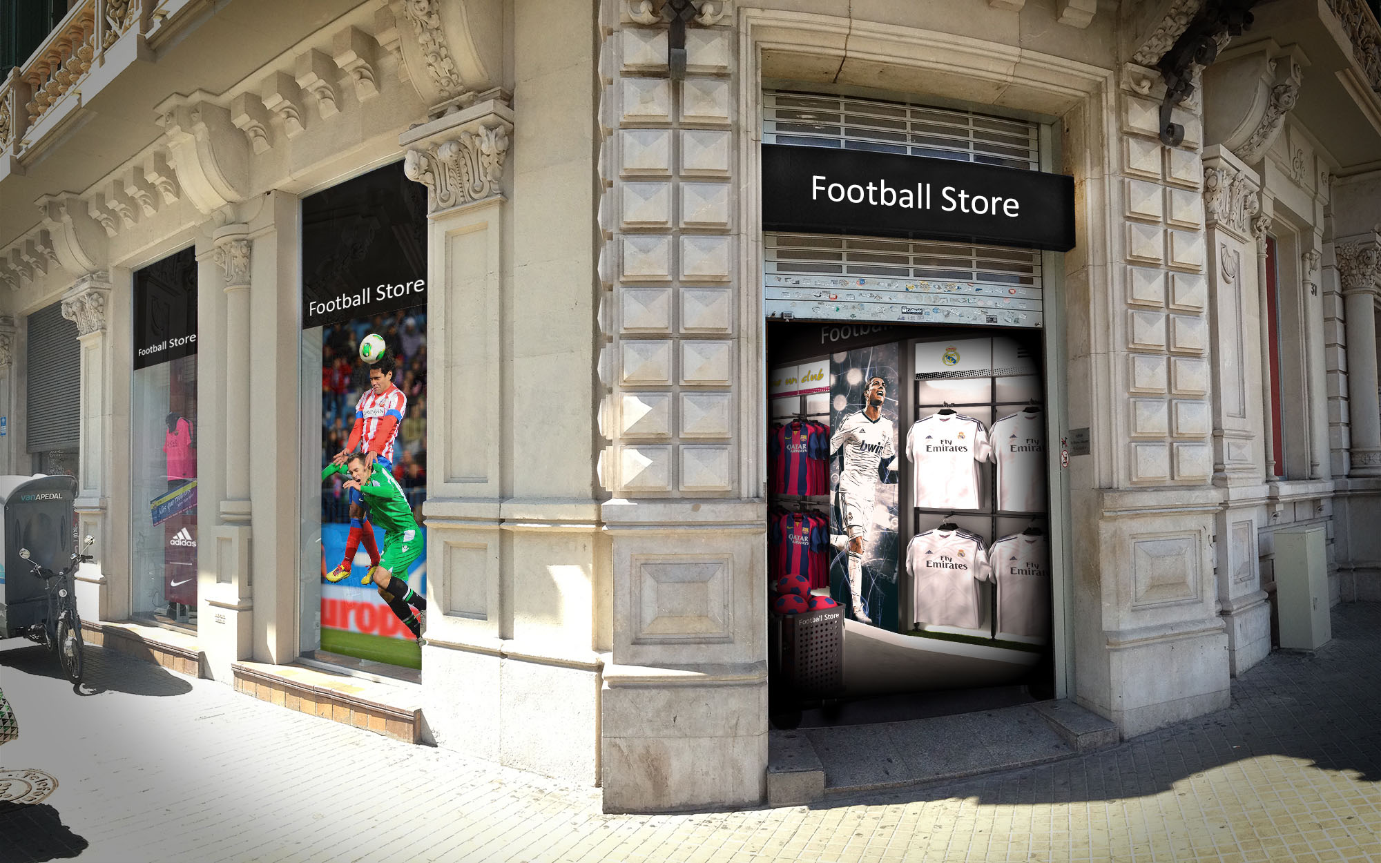
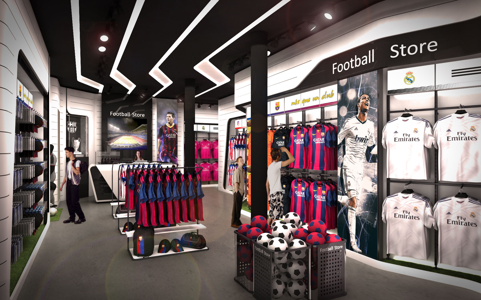
© 2021 by sanzpont [arquitectura] . Webpage by sanzpont [digital] . Innovative Digital Experiences
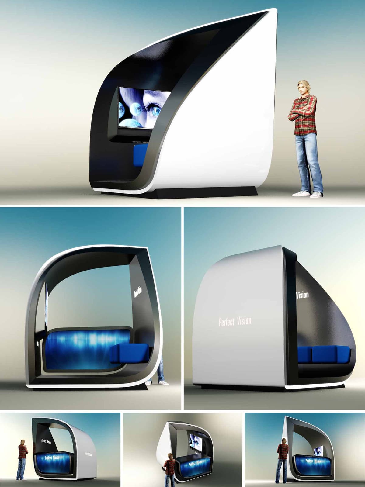
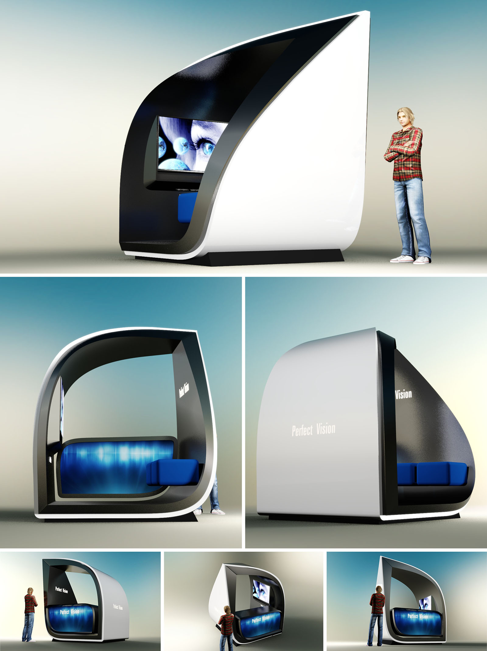
ISLA PERFECT VISION is conceived as a compact, iconic retail capsule that communicates technological precision and clarity through its sculptural form. The volume suggests a protective shell opening toward the user, evoking the act of the eyelid revealing the eye. This gesture frames the internal multimedia display as the focal point, aligning the spatial experience with the brand’s focus on visual health and high-definition optics.
The design balances futurist aesthetics with ergonomic comfort. The enveloping geometry creates a semi-enclosed micro-environment that isolates the visitor from the surrounding mall or airport context, transforming a minimal footprint into a memorable, immersive brand encounter.
The architecture is based on a continuous loop profile that rises from the floor, curves overhead, and returns to the ground, defining a monolithic frame. The resulting section is aerodynamic and dynamic, suggesting motion and innovation even when static. Softly rounded edges contrast with the sharp apex at the rear, reinforcing the sense of directionality toward the access opening.
Spatially, the unit is organized in two zones: the public threshold, where the integrated screen addresses passersby, and the interior niche, where the visitor sits for consultation or product interaction. The asymmetrical opening maximizes visibility from circulation corridors while offering a clear entrance sequence and intuitive flow.
The exterior envelope is envisioned in high-gloss composite panels or thermoformed solid surface, producing a seamless, almost automotive finish. The combination of a white outer skin and a contrasting black inner shell generates depth and frames the luminous blue core. This tri-chromatic palette—white, black, and electric blue—expresses cleanliness, precision, and technological sophistication.
The seating elements and lower interior surfaces employ upholstered modules in intense blue, aligning with the illuminated backdrop to create a continuous chromatic band. The minimal material palette simplifies maintenance, strengthens brand recognition, and helps the unit read as a single, cohesive object within busy retail environments.
Inside, the visitor occupies a protected alcove where the lateral walls and overhead frame generate a sense of intimacy without complete enclosure. The proportions of the seat and backrest are calibrated for short to medium stays, enabling quick eye-screen alignment for tests, demonstrations, or digital catalog browsing.
The integrated screen is positioned at comfortable eye level for a seated user, with the surrounding matte black finish reducing reflections and visual noise. The gently curved floor and vertical surfaces guide circulation while eliminating sharp corners, enhancing safety and accessibility for a wide range of users.
Lighting is a fundamental layer of the design. A concealed LED system washes the lower interior surface with a gradient blue glow, reinforcing the brand’s association with clarity and depth of vision. This luminous base transforms the capsule into a beacon within the retail landscape, attracting attention at a distance.
Externally, subtle backlit signage—“Perfect Vision”—is integrated flush with the shell, avoiding applied graphics and maintaining the purity of the form. The screen on the front façade operates as both information interface and kinetic façade, displaying high-resolution imagery that communicates product innovation and medical trustworthiness.
The unit is conceived as a modular, prefabricated element that can be transported and installed with minimal on-site work, reducing construction waste and disturbance in existing commercial venues. The structural frame is suitable for lightweight steel or recycled aluminum profiles, allowing for disassembly and reuse in different locations over its lifecycle.
Durable, low-VOC surface materials and LED lighting systems minimize operational impacts and maintenance needs. The compact footprint optimizes use of leased retail space, while the high aesthetic impact ensures that a small volume delivers maximum experiential and commercial value, aligning environmental responsibility with efficient brand deployment.
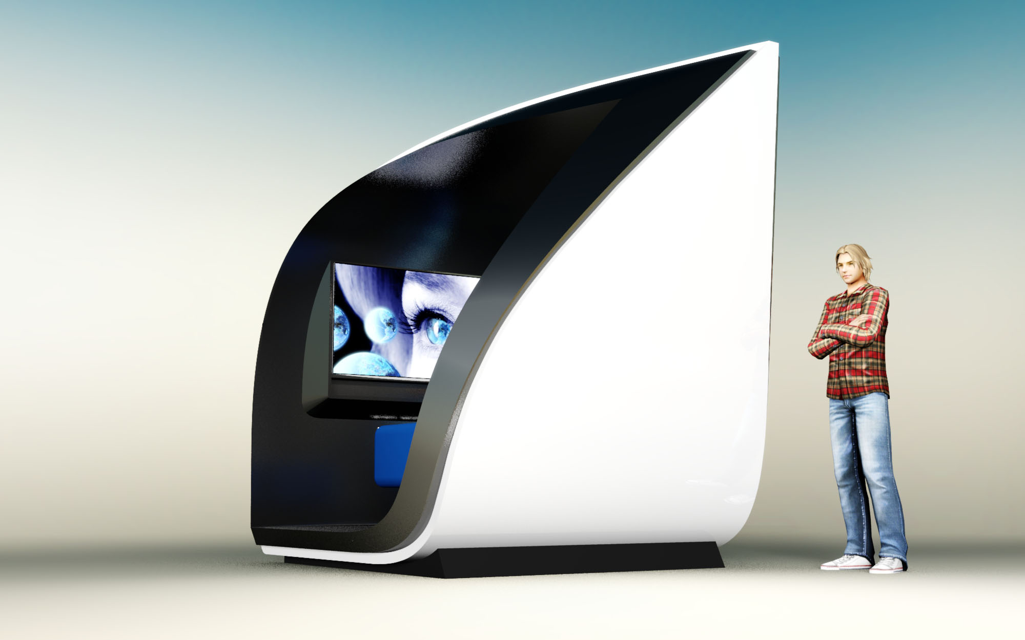
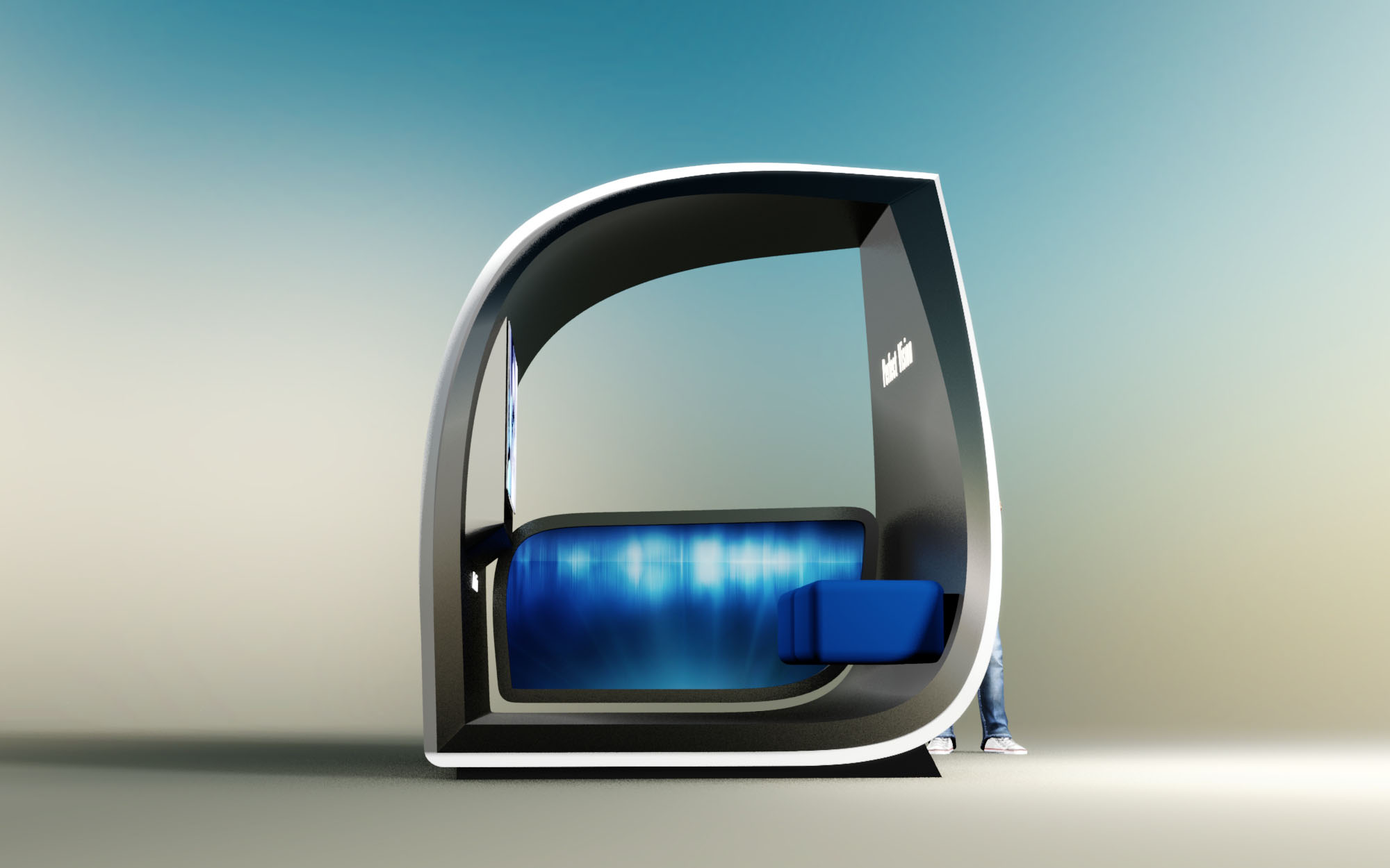
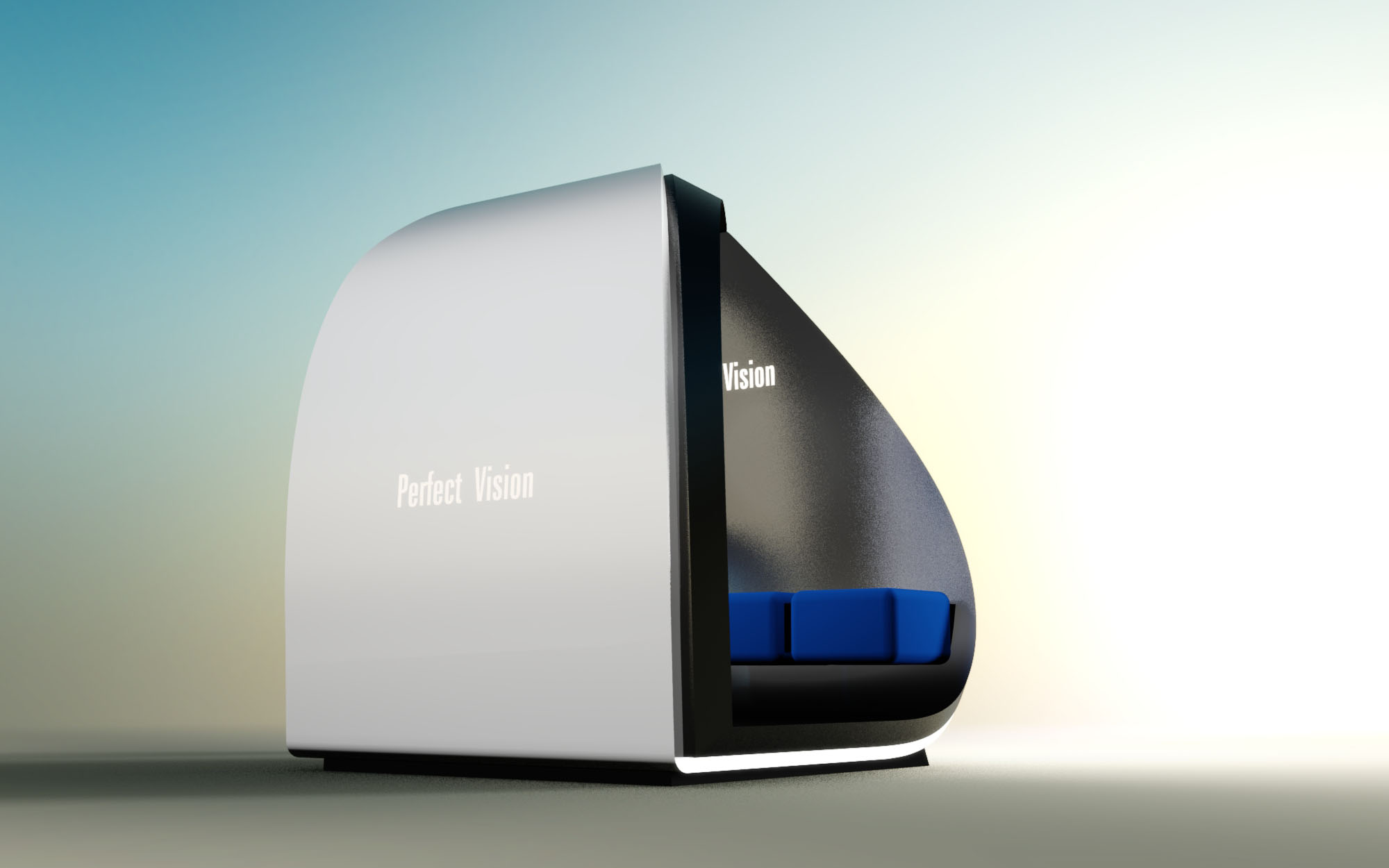
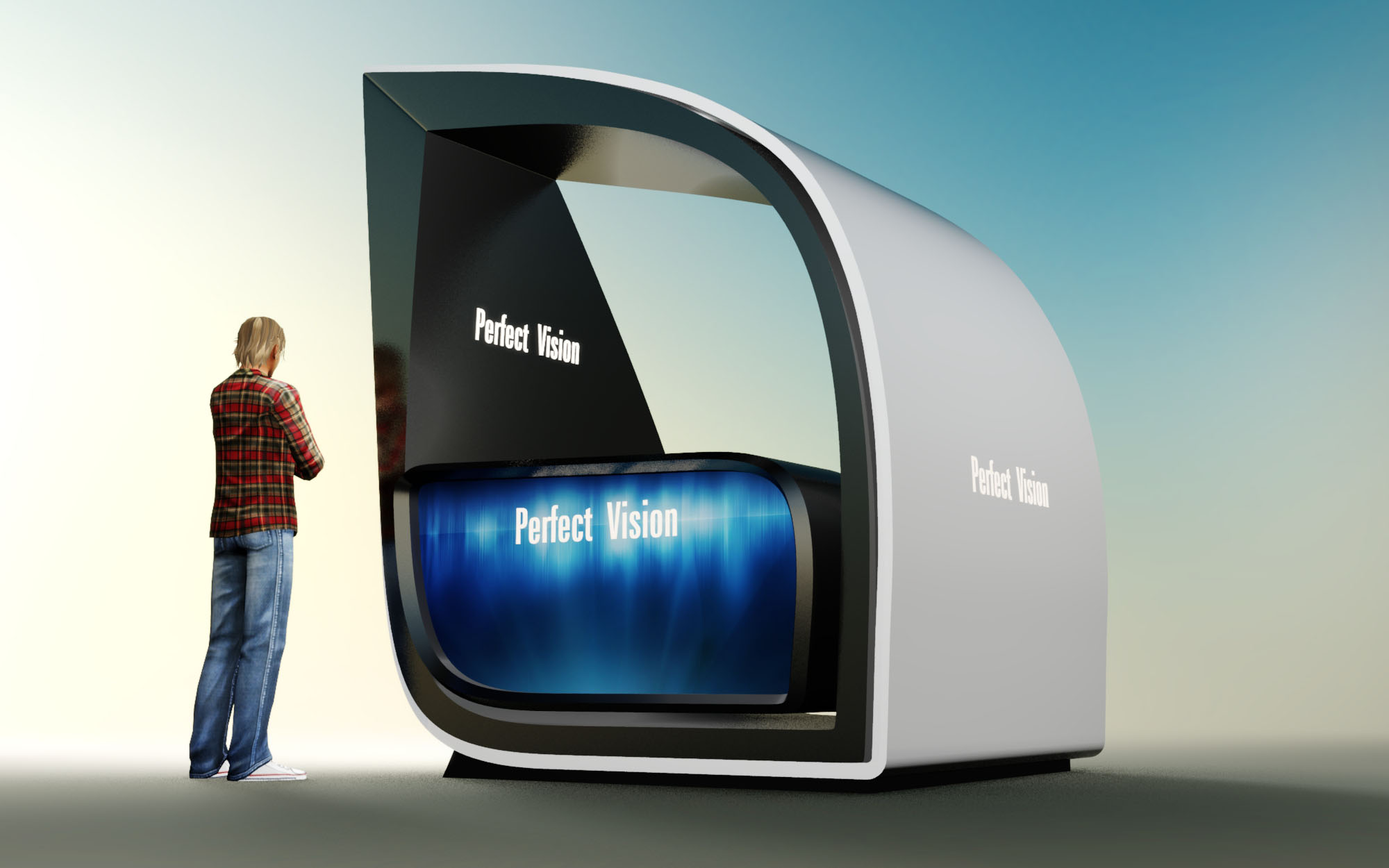
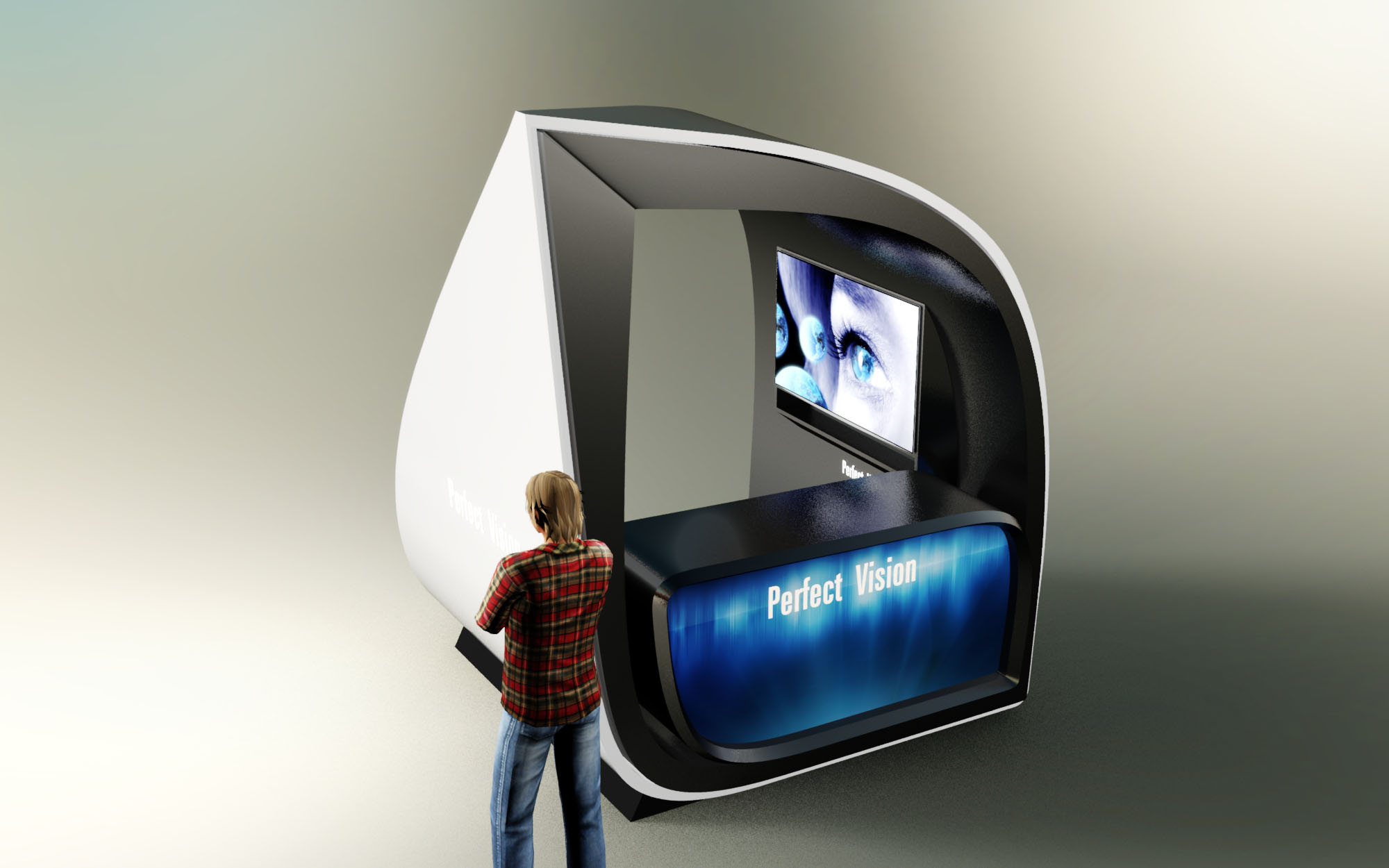
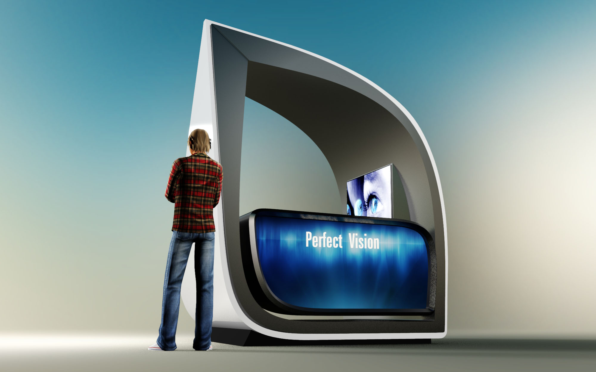
© 2021 by sanzpont [arquitectura] . Webpage by sanzpont [digital] . Innovative Digital Experiences

The swimwear store is conceived as a compact beach pavilion, a mobile shell that appears to have been shaped by sea breeze and sand. Its continuous curved envelope evokes a seashell resting on the coast of Playa del Carmen, creating an iconic object that is instantly recognizable from a distance. The formal language is aerodynamic and soft, minimizing sharp edges and emphasizing fluidity, in tune with the movement of waves and the body.
The project merges retail space and advertising surface into a single sculpted volume. A large vertical display panel anchors the composition, acting both as entry threshold and brand totem. Around it, the open perimeter showcases merchandise on all sides, transforming the store into a 360-degree window that attracts beachgoers from any direction.
The interior is organized as a ring around a central core that can host storage, graphics, or digital media. Circulation is radial and intuitive: users naturally drift along the curved perimeter, discovering garments as they follow the shell’s inner line. The absence of interior partitions preserves visual continuity and allows maximum flexibility in arranging the product mix.
Display modules are suspended from a structural lattice, freeing the floor area and keeping the space visually light. Folded garments, accessories, and hanging swimwear each occupy dedicated zones, clearly legible despite the compact footprint. The store can operate as a walk-in kiosk or as a semi-open stand, depending on placement within a resort, promenade, or shopping mall.
The envelope reads as a double-curved shell, likely built from a lightweight structural frame clad with composite panels and a textured outer skin. The exterior finish suggests a woven or fabric-like material, recalling beach umbrellas and sunshades, while the interior surfaces are smoother and more reflective to enhance natural light and product visibility.
Timber accents at the lower display plinths introduce warmth and a tactile counterpoint to the otherwise sleek structure. The lattice display system appears to be in powder-coated metal, delivering slenderness and durability in a high-humidity coastal environment. The base platform anchors the kiosk while defining a subtle threshold between the public promenade and the retail micro-interior.
The color palette balances neutral tones in the architecture with vibrant hues in the merchandise. The shell remains in light sand and soft white shades, deliberately understated so that the swimwear and accessories provide the main chromatic impact. This strategy reinforces the seasonal, playful character of the brand without visually overloading a small volume.
Large-scale photographic panels provide immediate storytelling, linking the product to the local landscape of palm trees and turquoise water. At night, integrated linear lighting along the roof and base would transform the kiosk into a softly glowing object, highlighting silhouettes of the garments and maintaining a resort-like atmosphere even after sunset.
Sustainability is addressed through compactness, modularity, and potential for reuse. The kiosk behaves as a demountable unit that can be transported, reassembled, and reconfigured according to seasonal demand, reducing the need for permanent construction along the coast. Lightweight construction minimizes material consumption and simplifies future disassembly and recycling.
The overhanging shell functions as a passive shading device, protecting users and products from direct solar radiation and reducing cooling requirements. The open, cross-ventilated layout encourages natural airflow, enhancing comfort without mechanical systems. Specifying certified timber, recyclable metal components, and high-durability finishes ensures longevity in the marine climate while aligning the project with responsible tourism and environmentally conscious retail practices in Playa del Carmen.
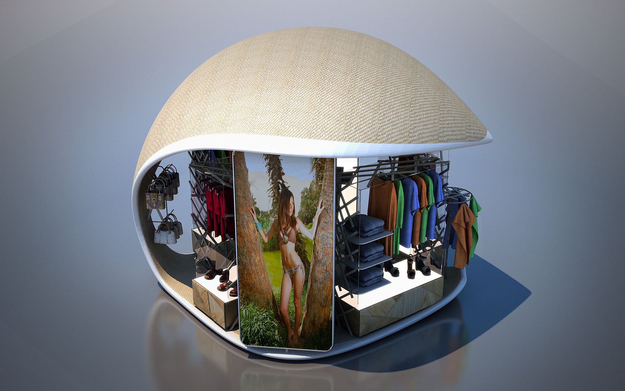
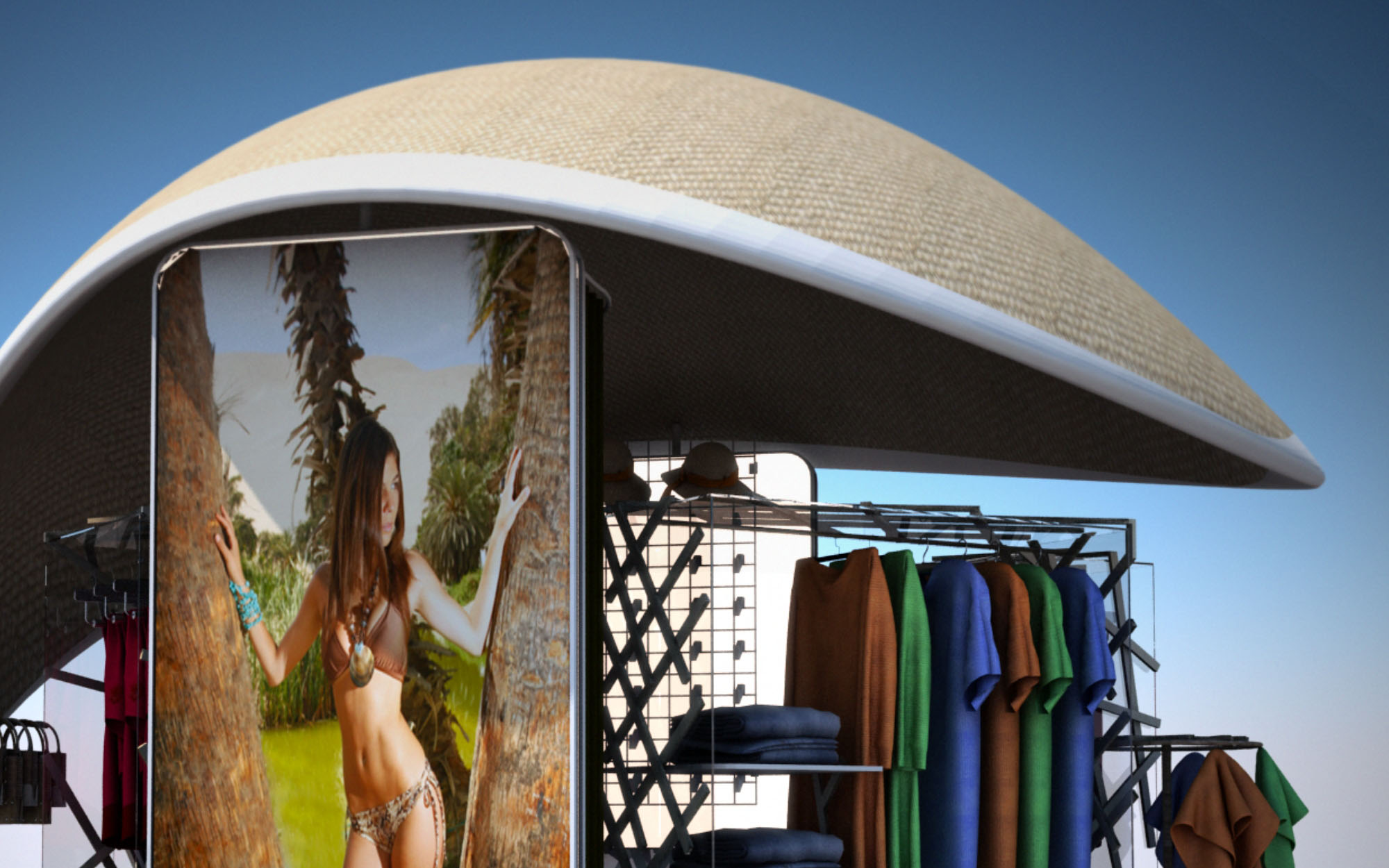
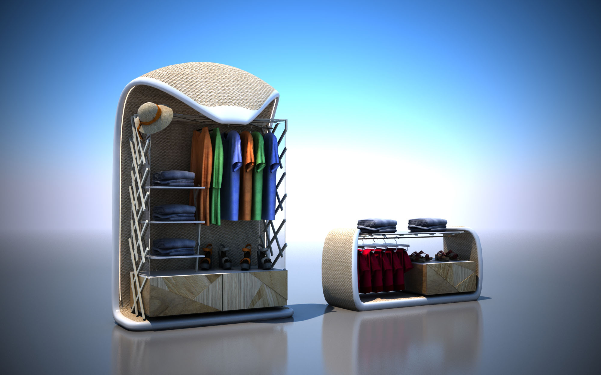
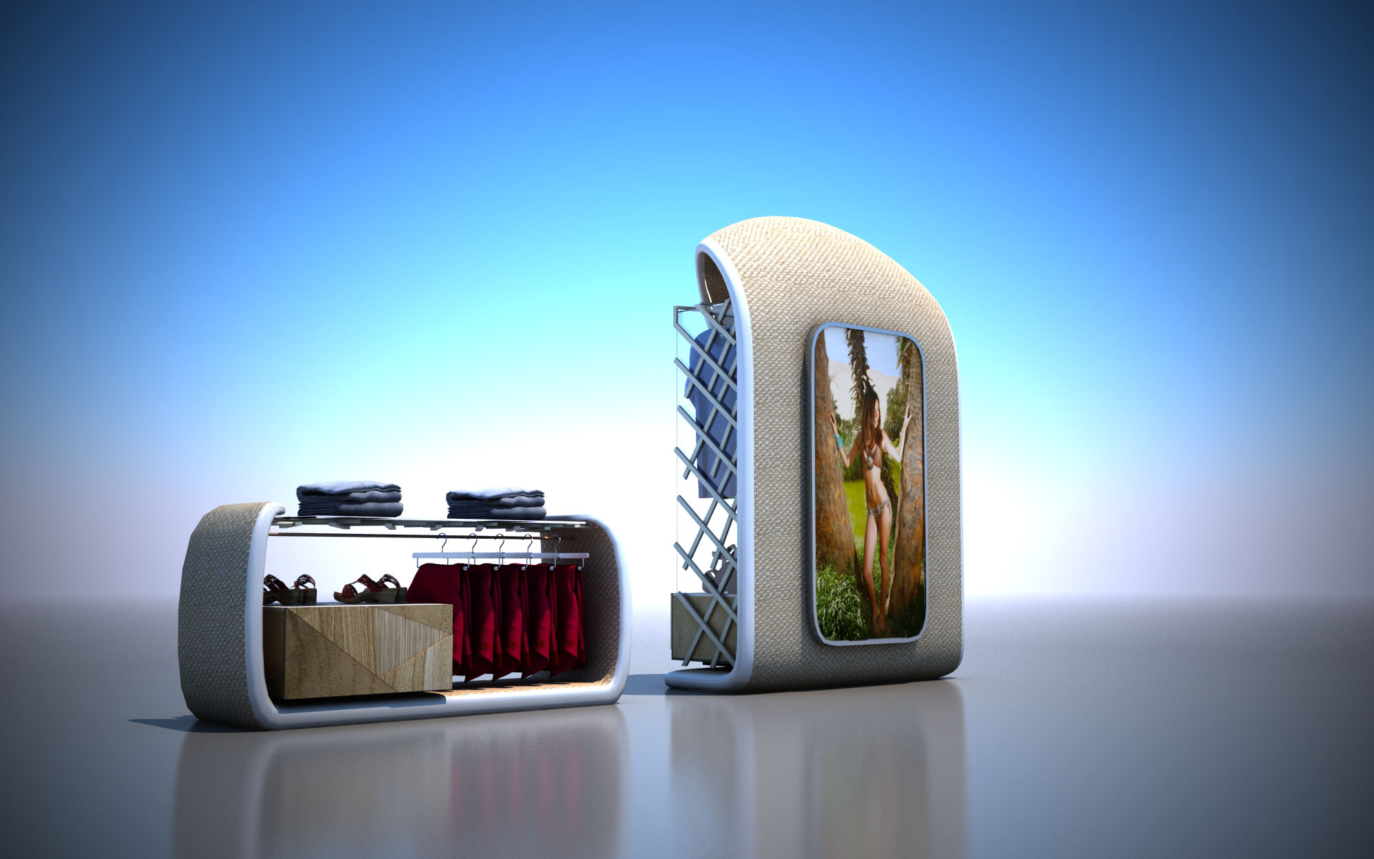
© 2021 by sanzpont [arquitectura] . Webpage by sanzpont [digital] . Innovative Digital Experiences
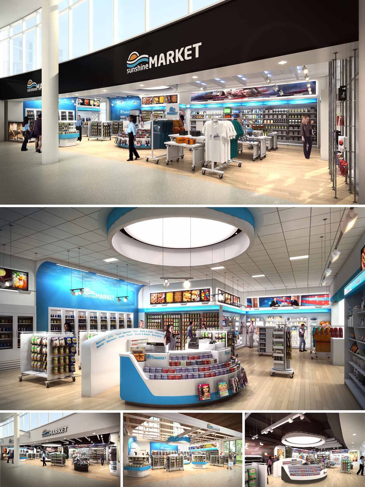
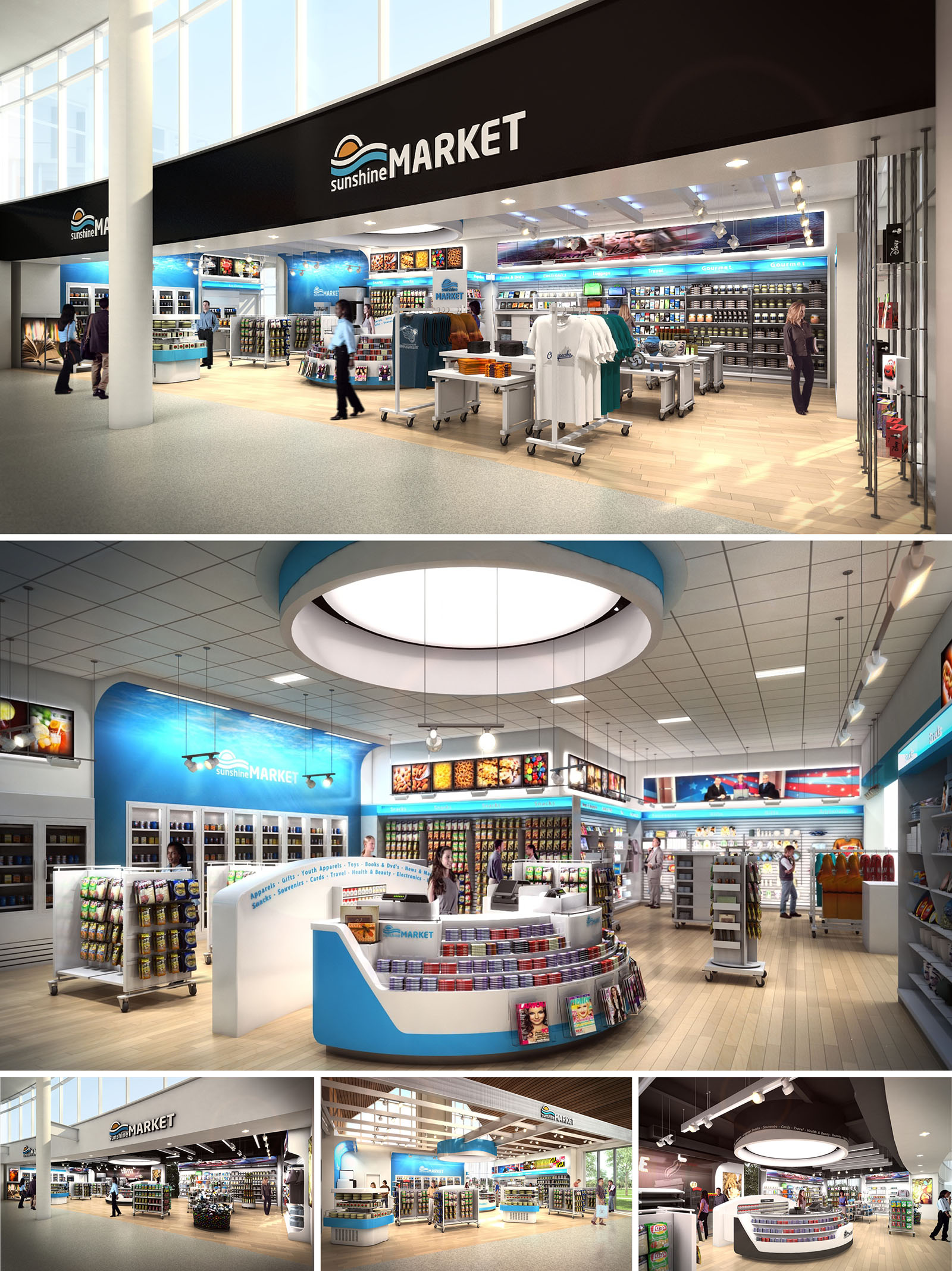
TRAVELMARKET is conceived as a flexible retail platform for transportation hubs, delivering a unified brand experience across multiple US locations. The architectural concept translates the idea of “journey and horizon” into spatial form through sweeping curves, luminous circular ceiling elements, and a continuous band of brand color that visually guides travelers. The store reads as an open, inviting marketplace rather than a closed convenience shop, dissolving the threshold between concourse and retail floor.
The design emphasizes instant legibility for time-pressed travelers. Clear sightlines, low gondolas, and a strong perimeter merchandising wall allow quick scanning of offers from outside the store. The arrangement supports impulse purchases while still providing structured zones for food, travel essentials, apparel, and regional gifts, all under a cohesive, easily recognizable identity.
The plan is organized around a central circular hub containing the primary service counters and high-rotation items. This hub acts as an orientation anchor, allowing customers to intuitively navigate around it in a radial movement pattern. Secondary display islands are positioned to create gentle meanders rather than rigid aisles, controlling flow without obstructing visibility.
Perimeter walls are used for vertical merchandising of packaged goods, refrigerated products, and promotional media screens. Entry is deliberately wide and column-free, maximizing permeability from the concourse. The cash wrap is oriented diagonally toward the main approach path, ensuring direct visual connection to both entrance and exit doors to accelerate the transaction process and enhance security oversight.
Interior architecture is driven by a consistent vocabulary of curves and horizontal bands, echoing the project’s travel and horizon narrative. Large circular ceiling features with integrated lighting articulate the main focus zones and provide a recognizable signature element across all locations. These rings visually lower the perceived ceiling height over the central hub, creating an intimate scale within large terminal volumes.
Brand graphics and digital imagery are strategically integrated into wall coves and light boxes, celebrating destinations, fresh food, and motion. These elements are treated architecturally rather than as applied decoration, set within framed reveals and continuous ledges that align with shelving heights, reinforcing an ordered visual rhythm.
The material palette balances durability with a light, contemporary expression. Warm-toned wood-look flooring defines the retail zone and contrasts with adjacent concourse finishes, subtly signaling entry. Perimeter shelving and service counters are rendered in white solid surfaces and laminates, chosen for their clean appearance, easy maintenance, and resistance to high-traffic wear.
Brand colors—primarily aqua blue with accents of sunrise orange—are applied as continuous bands at soffits, counter insets, and feature walls. This chromatic strategy both reinforces identity and assists wayfinding, quickly communicating key categories such as food, travel gear, and apparel. Metal fixtures and rails introduce a robust, technical note appropriate to transportation environments.
Lighting design combines large circular luminaires, linear LED coves, and adjustable spotlights to achieve both ambient uniformity and product-focused emphasis. The circular ceiling features function as luminous skylights, creating a sense of daylight even within enclosed terminal interiors. Linear coves run along perimeter walls and signage bands, emphasizing the horizontal movement of the space.
Color temperature is calibrated toward neutral white to ensure accurate product rendering and a fresh, hygienic atmosphere. Glare is minimized through diffused lenses and recessed fixtures, while track-mounted spots highlight feature displays and promotional media. The layered lighting strategy ensures that the store remains visually legible from a distance and comfortable at close range.
Sustainability is addressed through both material choices and operational strategies. Predominantly LED lighting reduces energy consumption and maintenance, particularly important in 24/7 travel environments. Lighting controls with zoning and dimming capabilities allow adjustment to natural daylight levels from adjacent glazing, further lowering energy loads.
Fixture systems are modular and largely reconfigurable, extending the life of the fit-out by allowing quick category changes without major construction waste. Durable finishes—impact-resistant wall panels, high-wear flooring, and metal fixtures—are selected to withstand high traffic, reducing replacement frequency. Where project specifications allow, substrates and finishes incorporate recycled content and low-VOC formulations to support healthier indoor air quality and a more sustainable retail model across all locations.
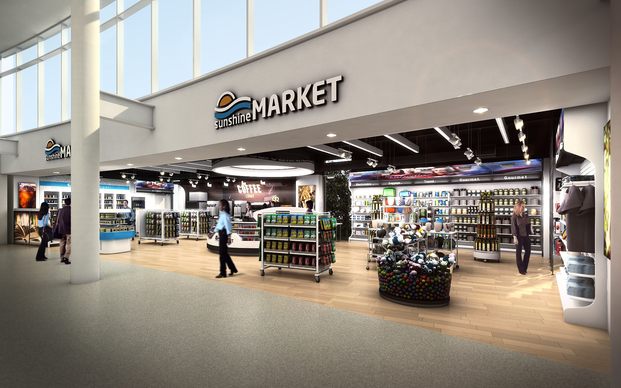
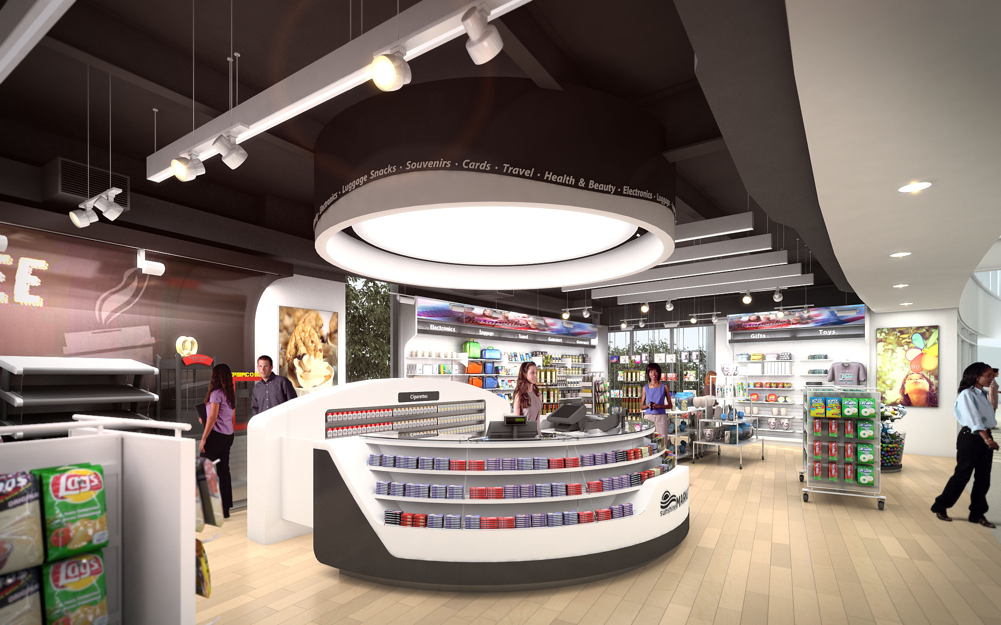
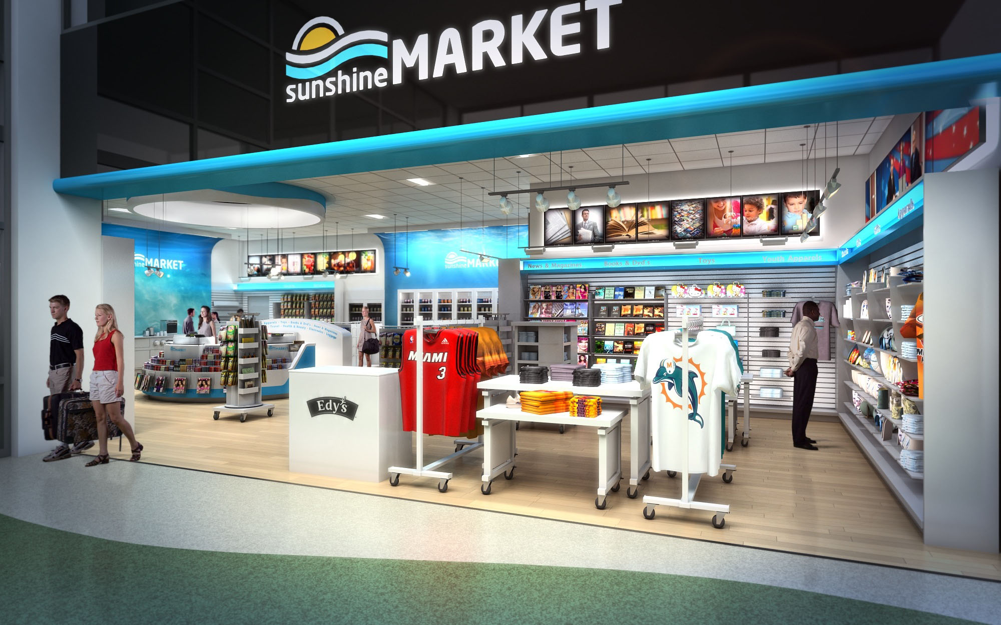
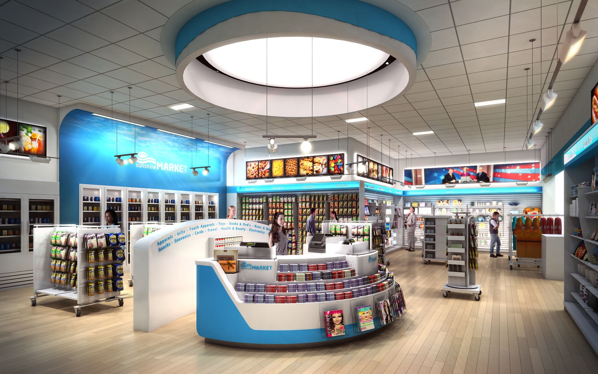
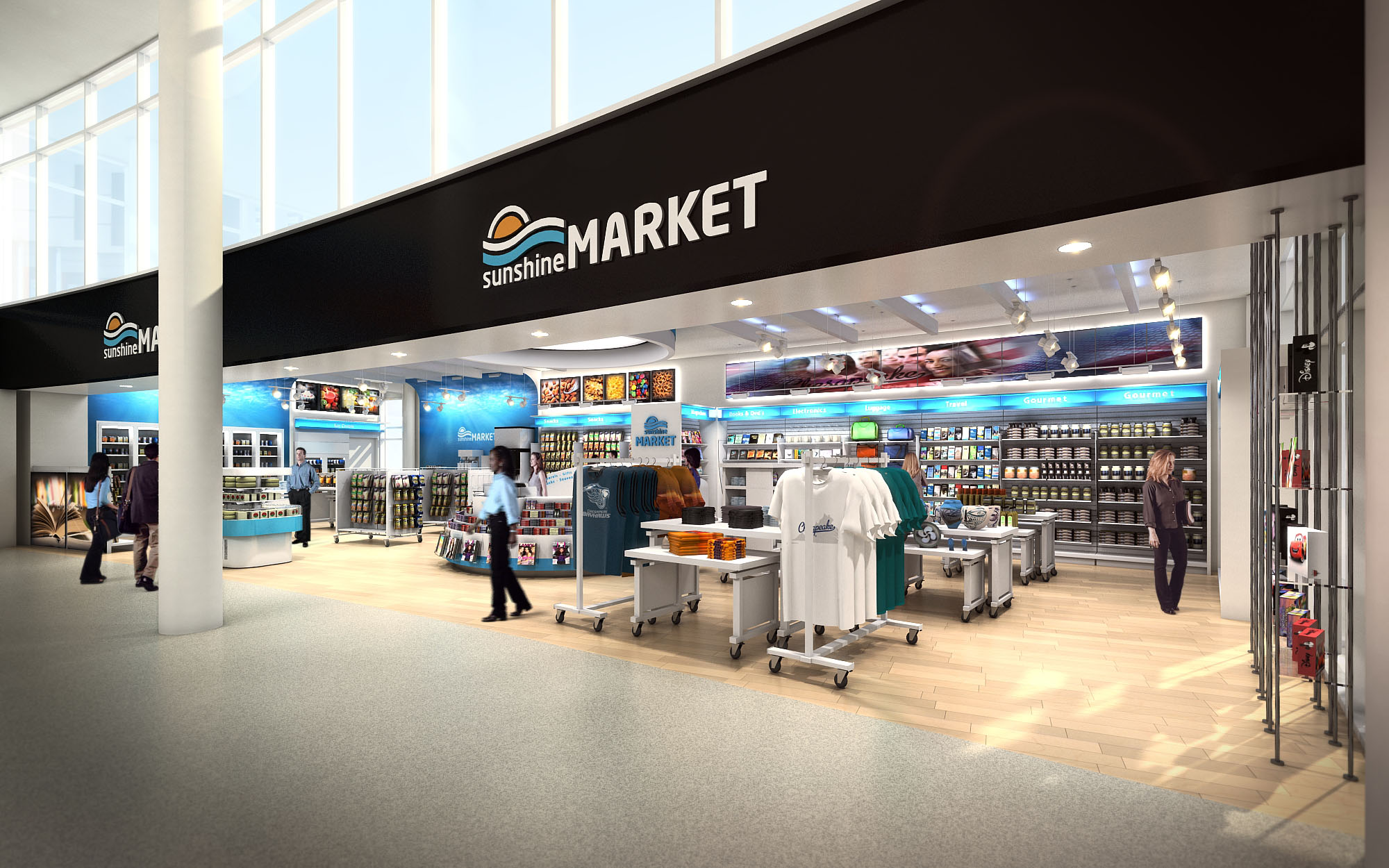
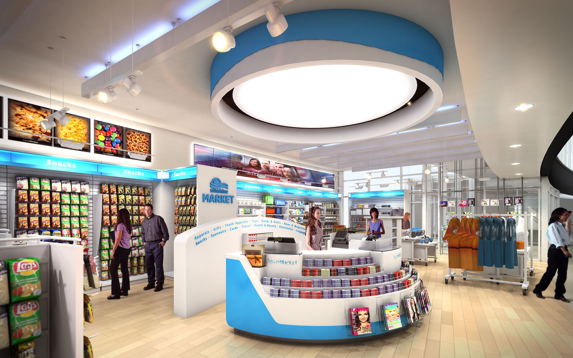
© 2021 by sanzpont [arquitectura] . Webpage by sanzpont [digital] . Innovative Digital Experiences
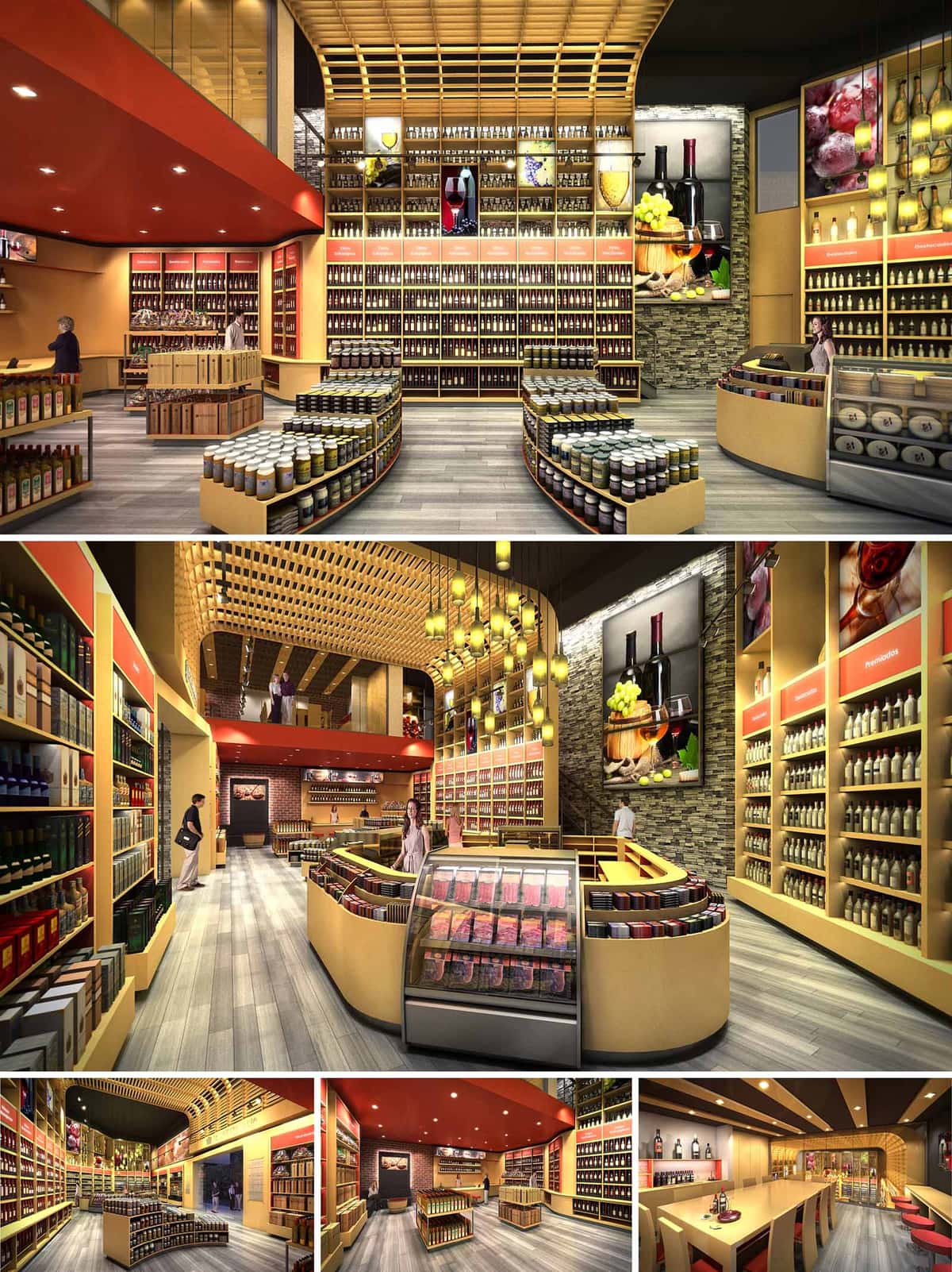

The “Viña del Mar” store is conceived as a contemporary urban wine cellar, where retail merges with an immersive gastronomic experience. The design evokes the warmth of traditional wineries while adopting a clean, modern language suitable for a high-traffic commercial setting. A sweeping central gesture of curved counters and shelving organizes the space and intuitively guides visitors through a narrative of wine, preserves, and gourmet products. Overhead, a timber lattice ceiling recalls crates and barrels, visually stitching the different areas together and creating a recognizable spatial identity that reinforces the brand’s connection to the wine culture of the region.
The layout is structured through a clear perimeter–core strategy. Tall shelving lines the walls, providing high-density display for bottles and packaged products, while lower, curved gondolas occupy the center, favoring visibility and easy access. From the entrance, visitors are naturally drawn along a main axis that opens into a double-height space, encouraging full exploration of the store. Service functions such as checkout counters and refrigerated display cases are positioned to maintain continuous sightlines and avoid visual barriers. A tasting and social area at the rear acts as the experiential climax of the journey, transitioning from quick purchasing to slower, more contemplative consumption.
Material choices blend warmth, durability, and brand expression. Light-toned wood dominates the gondolas, ceiling lattice, and framing elements, delivering a welcoming ambience while visually unifying the composition. Stone-clad feature walls introduce a tactile reference to winery architecture and vineyard landscapes, adding depth and texture. The chromatic base of beige and gray is punctuated by strategic accents of deep red and warm orange on bulkheads, signage bands, and seating; these tones subtly reference wine hues without overwhelming the eye. The continuous gray flooring, with a linear pattern, reinforces directionality and withstands intense use, simplifying maintenance in an environment with constant product handling.
Lighting is designed as both a functional tool and a storytelling element. Recessed downlights in the red ceiling plane provide uniform ambient illumination, ensuring safe and comfortable navigation. A cluster of pendant luminaires descends from the timber lattice, creating a luminous focal point over the central area and emphasizing the double-height volume. Linear LED strips integrated into wall shelving highlight bottles and labels, improving product legibility while giving the merchandise a refined, gallery-like presence. Large-scale food and wine graphics, framed within illuminated niches, reinforce the brand narrative and bring color and texture to vertical surfaces without adding physical clutter.
Sustainability is addressed through material selection, lighting strategy, and efficient planning. The predominance of engineered and certified woods reduces environmental impact and allows for modular fabrication, minimizing waste during construction and facilitating future reconfiguration of the store. LED technology is used throughout, combining low energy consumption with long service life and reduced heat emission, which in turn lowers cooling loads. Lighting is zoned to allow partial operation during off-peak hours. The compact arrangement of storage and service areas behind the main floor shortens internal logistics routes, improving staff efficiency and reducing the need for additional conditioned back-of-house space, thereby optimizing both operational and environmental performance.
© 2021 by sanzpont [arquitectura] . Webpage by sanzpont [digital] . Innovative Digital Experiences
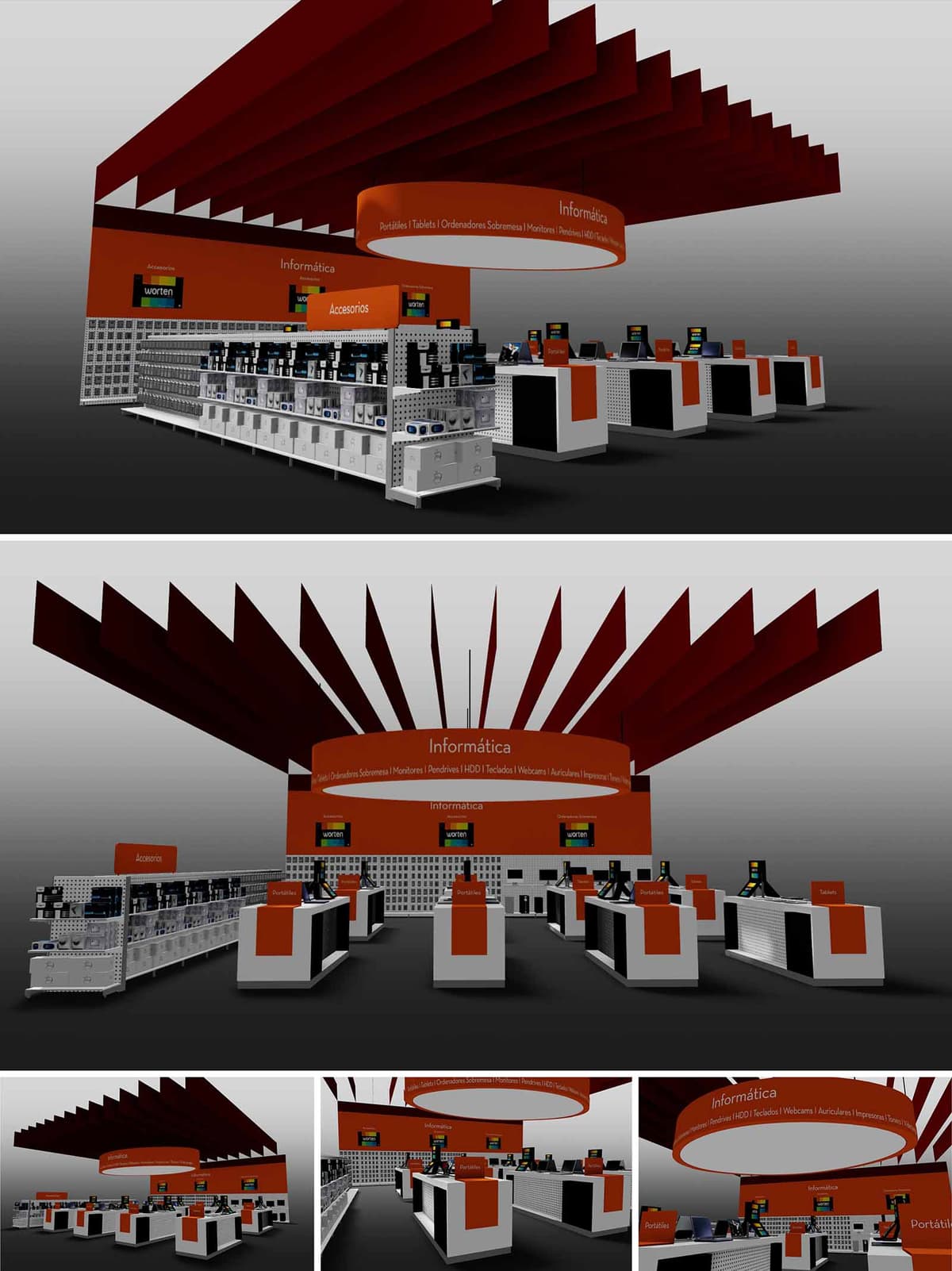
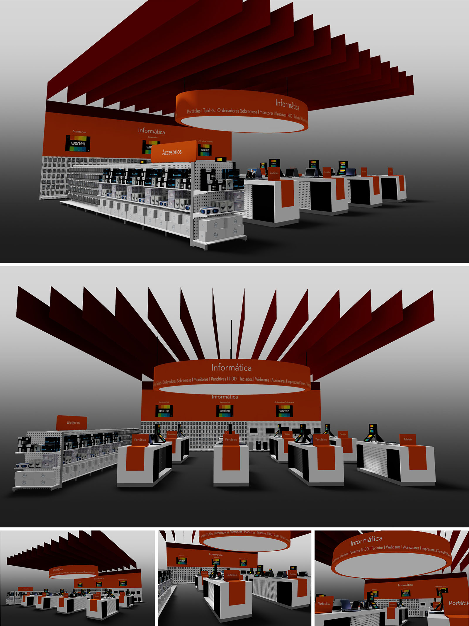
The design of Worten Stores in Madrid is conceived as an immersive technological landscape where architecture, product and brand converge into a single spatial gesture. The space is organized around a central circular hub dedicated to computing, articulated by a suspended luminous ring that clearly marks the “Informática” universe and becomes a strong visual landmark in the store. From this center, the layout radiates in an orderly grid of workstations and product islands, ensuring both legibility and flexibility for future upgrades of the technological offer.
The intervention emphasizes clarity and orientation: long perspectives, aligned gondolas and a powerful overhead structure guide the customer intuitively through the different categories, from laptops to accessories. The abstract language of the ceiling blades and the sculptural ring conveys innovation and speed, aligning the architectural image with the digital character of the products on display.
The floor plan is structured as a sequence of parallel bands: perimeter shelving for boxed goods and accessories, and a central spine of demonstration counters where customers can experience laptops, tablets and peripherals. The access points are aligned with visual corridors that lead directly to the main hub, minimizing decision points and avoiding congestion in high-traffic zones.
Each workstation is dimensioned as a compact “micro‑store” with its own frontal presentation area, interaction zone and storage plinth, allowing staff to attend multiple customers efficiently. The modularity of the elements supports rapid reconfiguration according to seasonal campaigns or new product lines, while maintaining a consistent navigation logic throughout the department.
The architectural expression relies on a controlled palette of geometric volumes: orthogonal counters and shelving are contrasted with the large circular canopy and dynamic ceiling fins. These horizontal and radial elements frame the space without resorting to full-height partitions, preserving visual continuity across the store.
Brand identity is reinforced through the chromatic contrast between the neutral base—white and light gray surfaces—and the corporate orange fields that mark key touchpoints: category totems, counter fronts and the circular ring. Signage is integrated into the architecture, using continuous bands of text that wrap the central element, making product categories visible from a distance and reducing reliance on secondary graphic supports.
The project adopts robust retail materials: laminated board for counters and shelving, perforated metal back panels for flexible hook-on display systems, and high-resistance flooring suitable for intensive use and easy maintenance. The suspended blades are conceived in lightweight composite or painted metal, allowing long spans with minimal structural impact.
Lighting is layered to enhance perception of products: a uniform ambient wash ensures comfortable global illumination, while accent lighting along the ring and above the workstations highlights screens and keyboards without causing glare. The combination of deep red blades, orange signage bands and neutral fixtures creates a calm but strongly branded environment, where the eye naturally gravitates to the illuminated central ring and the active sales points.
Sustainability is addressed through a rational use of resources and a design strategy focused on longevity and reusability. The modular furniture system reduces material waste during installation and facilitates future relocation or reconfiguration of elements, extending the lifecycle of each component. Preference is given to recyclable materials such as steel and standardized laminated boards, enabling responsible end-of-life management.
On the environmental performance side, the scheme is compatible with high-efficiency LED lighting, controlled by zoning and dimming systems that adapt intensity to occupancy and daylight contribution, thus lowering energy consumption. The open ceiling concept minimizes the need for secondary finishes, exposing only essential elements and reducing embodied carbon. Combined, these measures produce a technologically expressive retail space that remains resource-conscious and operationally efficient over time.
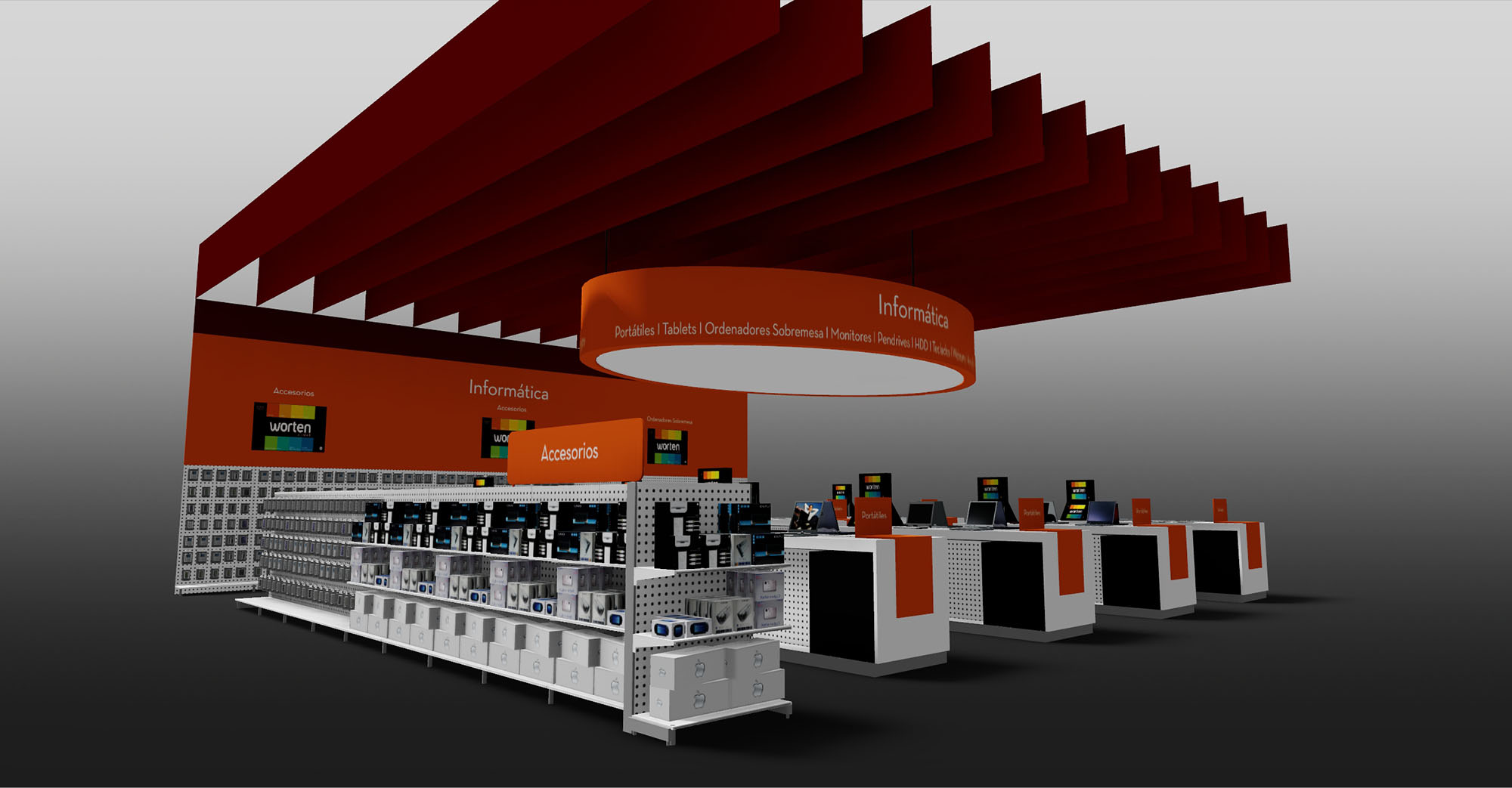
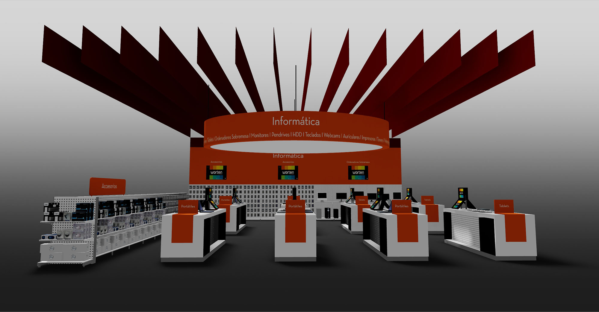
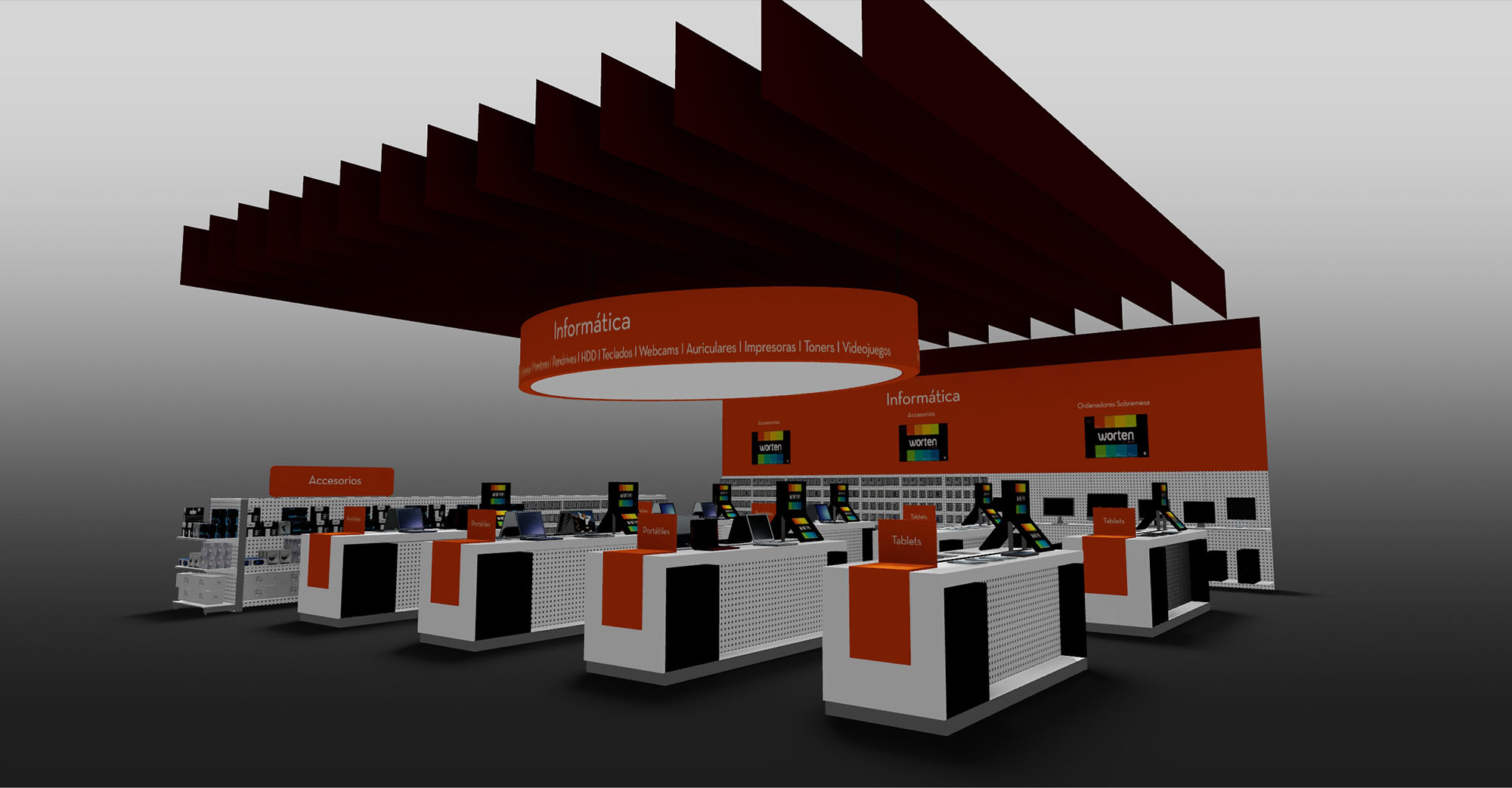
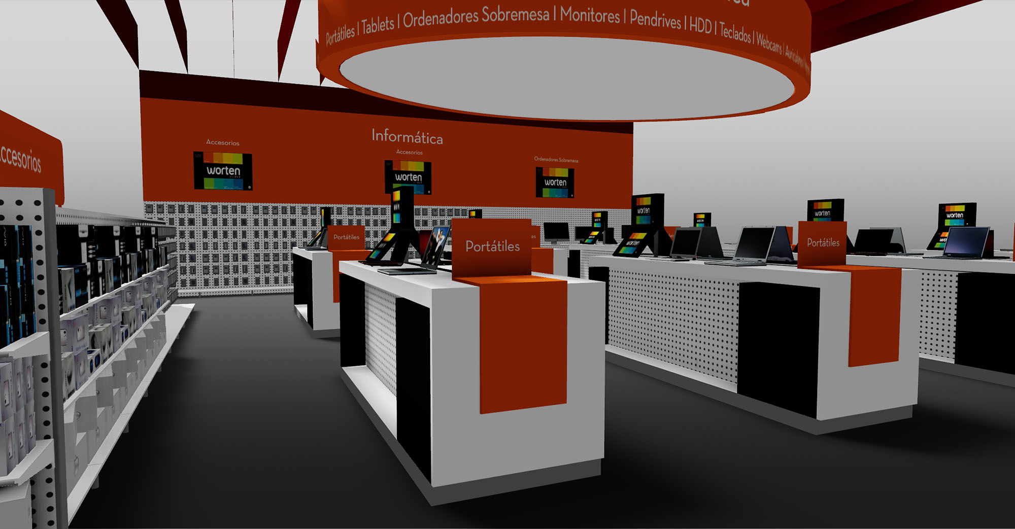
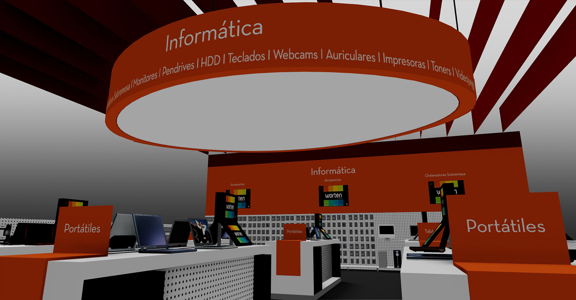
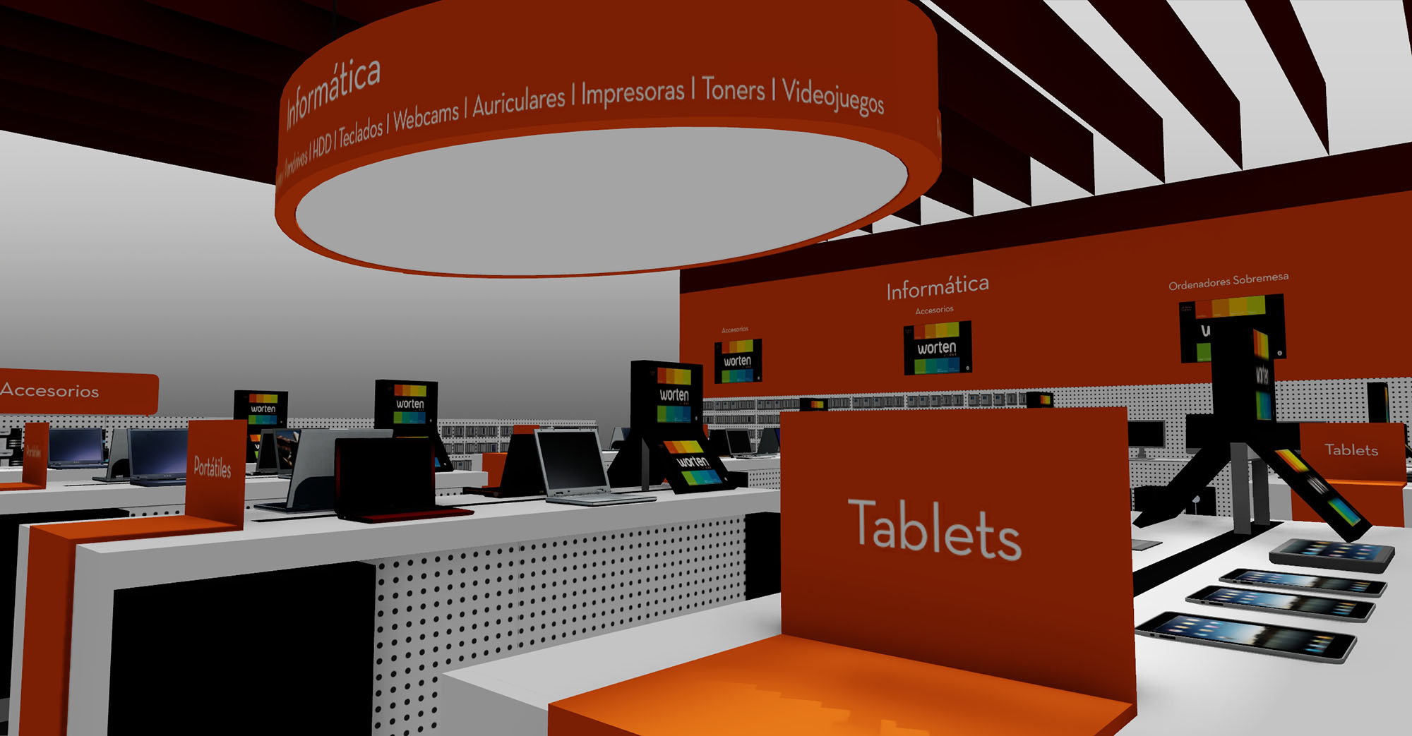
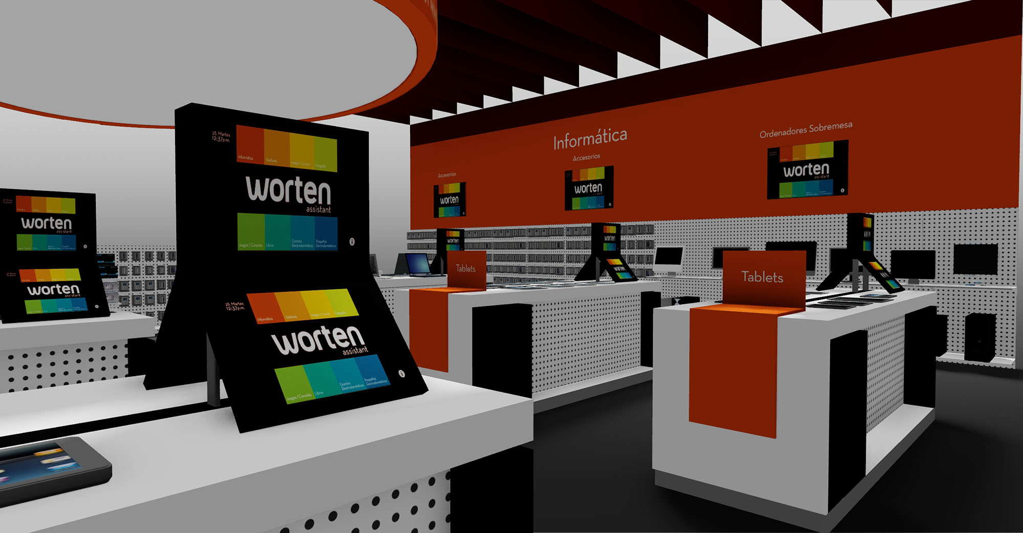
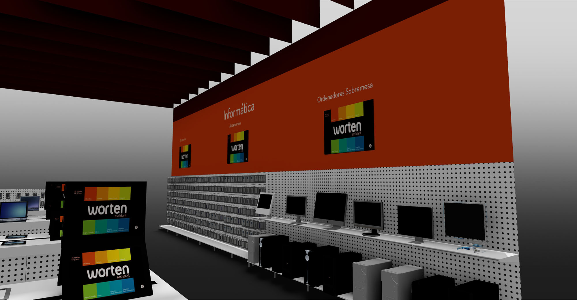
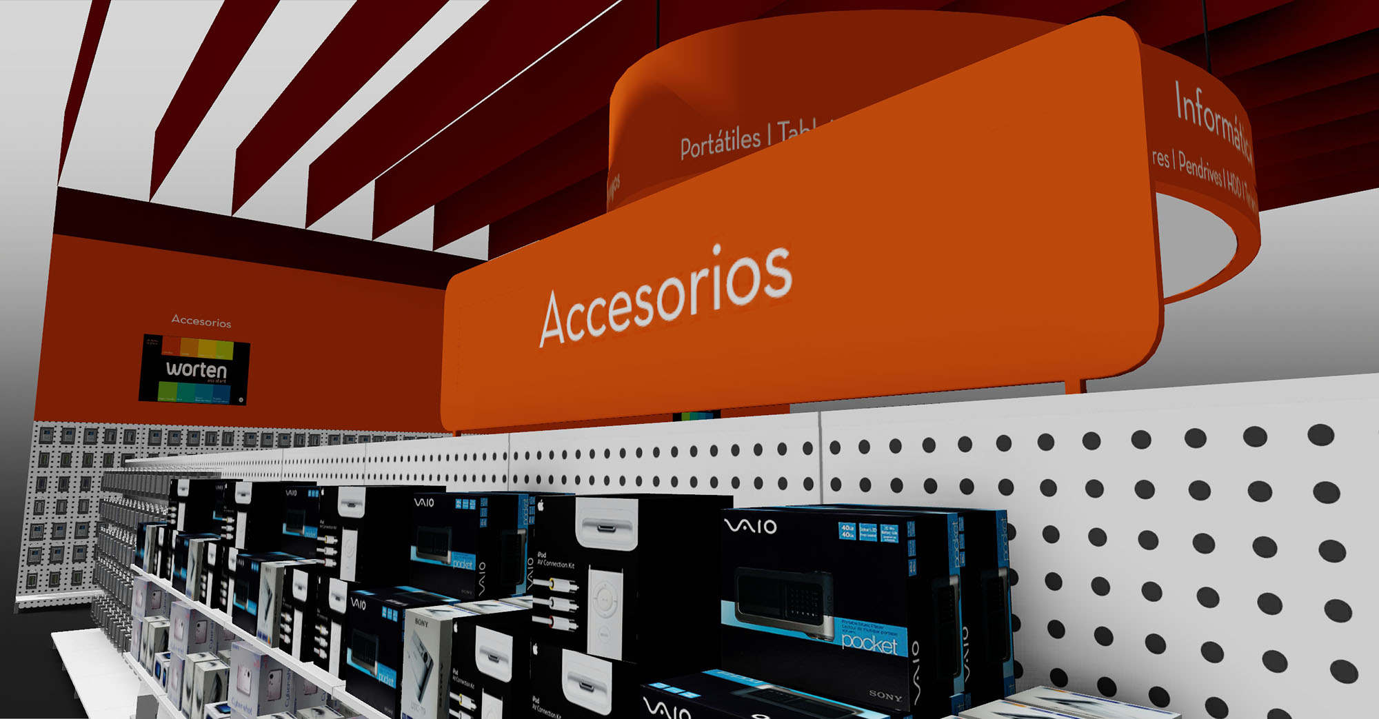
© 2021 by sanzpont [arquitectura] . Webpage by sanzpont [digital] . Innovative Digital Experiences
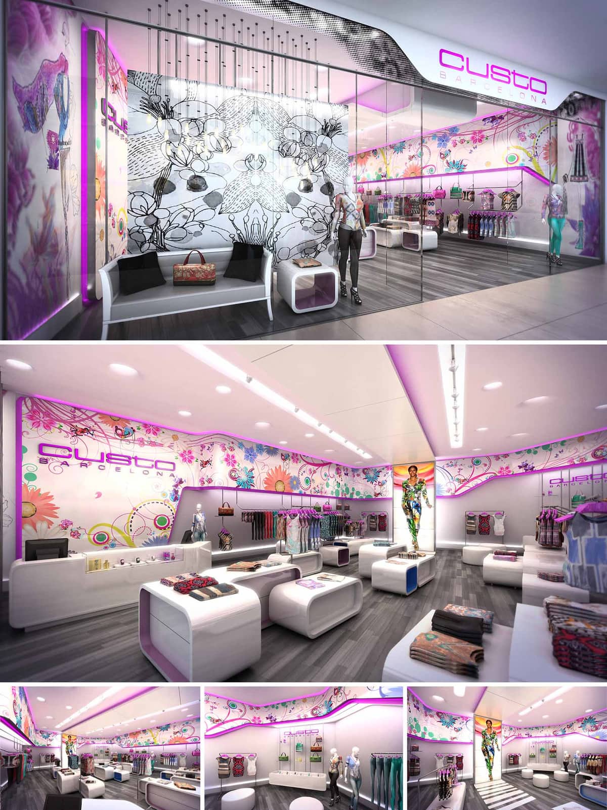
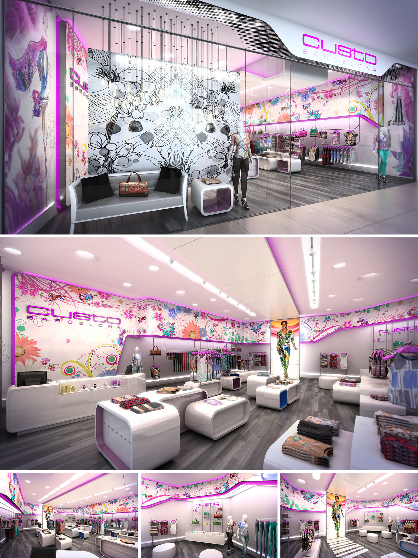
The CUSTO store in Barcelona is conceived as an immersive retail landscape that translates the brand’s vibrant graphic universe into three-dimensional space. The interior operates as a luminous white canvas over which a dynamic layer of color, illustration, and light is applied, echoing the fashion collections. An enveloping ribbon of artwork runs along the perimeter, visually unifying the store while guiding the customer through a curated sequence of product zones.
The design balances a futuristic minimalism with expressive, almost pop-art surfaces. Clean, rounded volumes and continuous lines generate a sense of fluidity, reducing visual noise so the garments and graphic murals remain the protagonists. The store becomes a hybrid between gallery and boutique, where fashion is displayed as collectible art pieces.
The plan is organized as a linear, open-flow space that begins at the fully glazed façade and extends toward the focal backdrop featuring a large-scale fashion graphic. This perspective axis reinforces depth and pulls visitors into the interior. Entrance and window display zones work as a porous threshold, combining seating, mannequins, and accessory displays to capture attention while maintaining transparency from the mall corridor.
Central freestanding modules structure the circulation without rigid partitions, allowing a continuous loop around the store. These island fixtures are low in height to preserve long visual corridors and encourage cross-views between product categories. Perimeter walls host hanging rails and shelving, freeing the center for flexible merchandising and temporary installations. The cash desk is positioned near the entrance edge, ensuring intuitive orientation and efficient purchase flow.
The interior architecture is defined by softly curved geometries and a predominance of white, high-gloss surfaces. Walls are articulated by an upper undulating band that separates the neutral base plane from the intense printed graphics, functioning both as a design signature and as a concealed technical plenum for lighting and services. This ribbon effect visually lifts the ceiling, increasing the perceived height and generating a floating sensation.
Furniture pieces are conceived as sculptural monoliths with rounded edges, integrating storage, display, and seating. Their modular nature allows reconfiguration according to seasonal needs. The continuous language between service counter, display tables, and seating elements creates a cohesive family of objects, reinforcing brand identity. Mannequins are strategically located at nodal points—corners, central alignments, and end walls—acting as three-dimensional extensions of the graphics behind them.
The material palette combines lacquered MDF, back-painted glass, and polished solid surfaces, all in a predominantly white tone to maximize light reflection. This neutral base is contrasted with high-definition printed panels featuring floral and abstract motifs in magenta, cyan, and citrus hues, mirroring the textile patterns of the clothing line. Flooring in warm grey wood or wood-look material introduces a tactile counterpoint, grounding the otherwise ethereal atmosphere.
Lighting is layered to support both ambience and product emphasis. Recessed downlights provide general uniform illumination, while a linear track of adjustable projectors targets mannequins and merchandise. Concealed LED strips integrated into the upper ribbon and furniture edges emit a soft magenta glow, enhancing the brand’s chromatic identity and creating depth without overwhelming the garments. The full-height glass façade allows visual continuity with the mall and capitalizes on existing ambient light.
Brand identity is embedded architecturally through oversized logotypes, continuous graphic murals, and a consistent chromatic code. The interplay of illustration and architecture transforms the perimeter envelope into a communicative skin that narrates the CUSTO universe. Rather than relying on separate signage elements, the design fuses brand communication with spatial form, ensuring immediate recognition from the exterior.
Sustainability is addressed through the use of energy-efficient LED lighting systems with dimmable controls, reducing consumption and allowing adaptation to natural light levels throughout the day. Durable, low-maintenance materials such as high-pressure laminates and quality coatings extend the life cycle of fixtures, minimizing replacement needs. Where feasible, modular furniture facilitates reuse and adaptation in future layouts, reducing waste. The bright, reflective surfaces enhance luminosity, enabling a lower installed lighting power while maintaining the vibrant, high-impact visual experience that defines the CUSTO store.
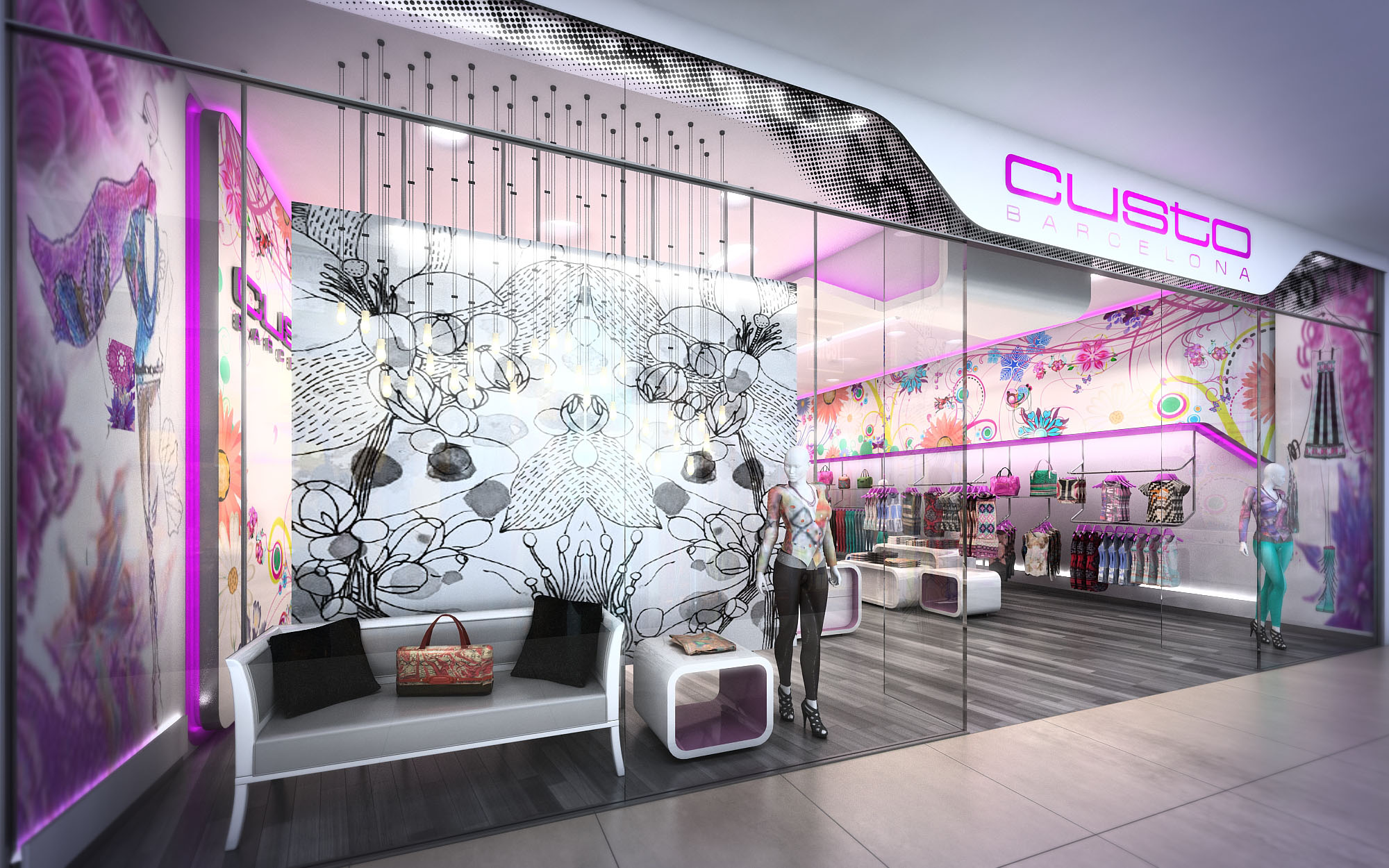
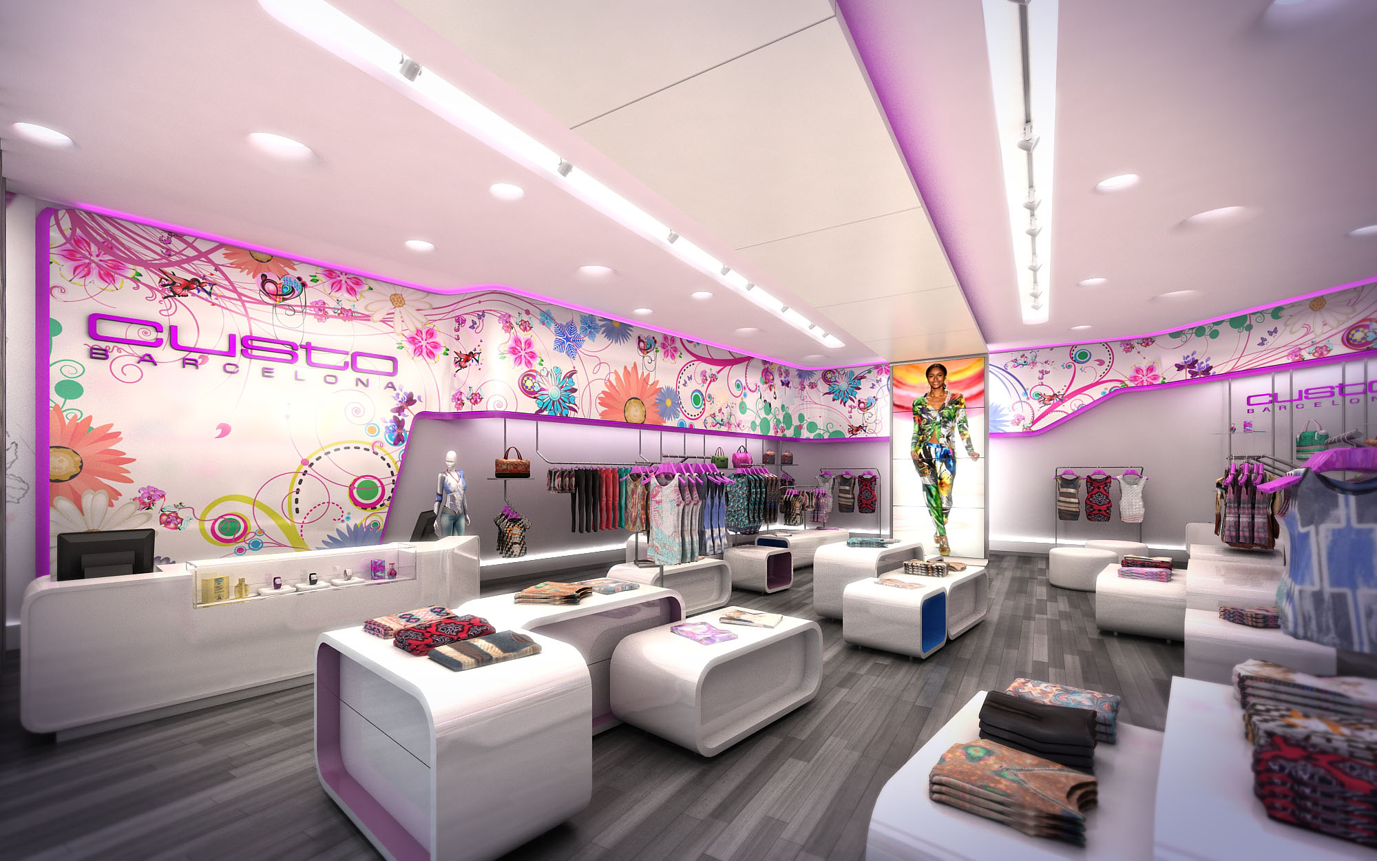
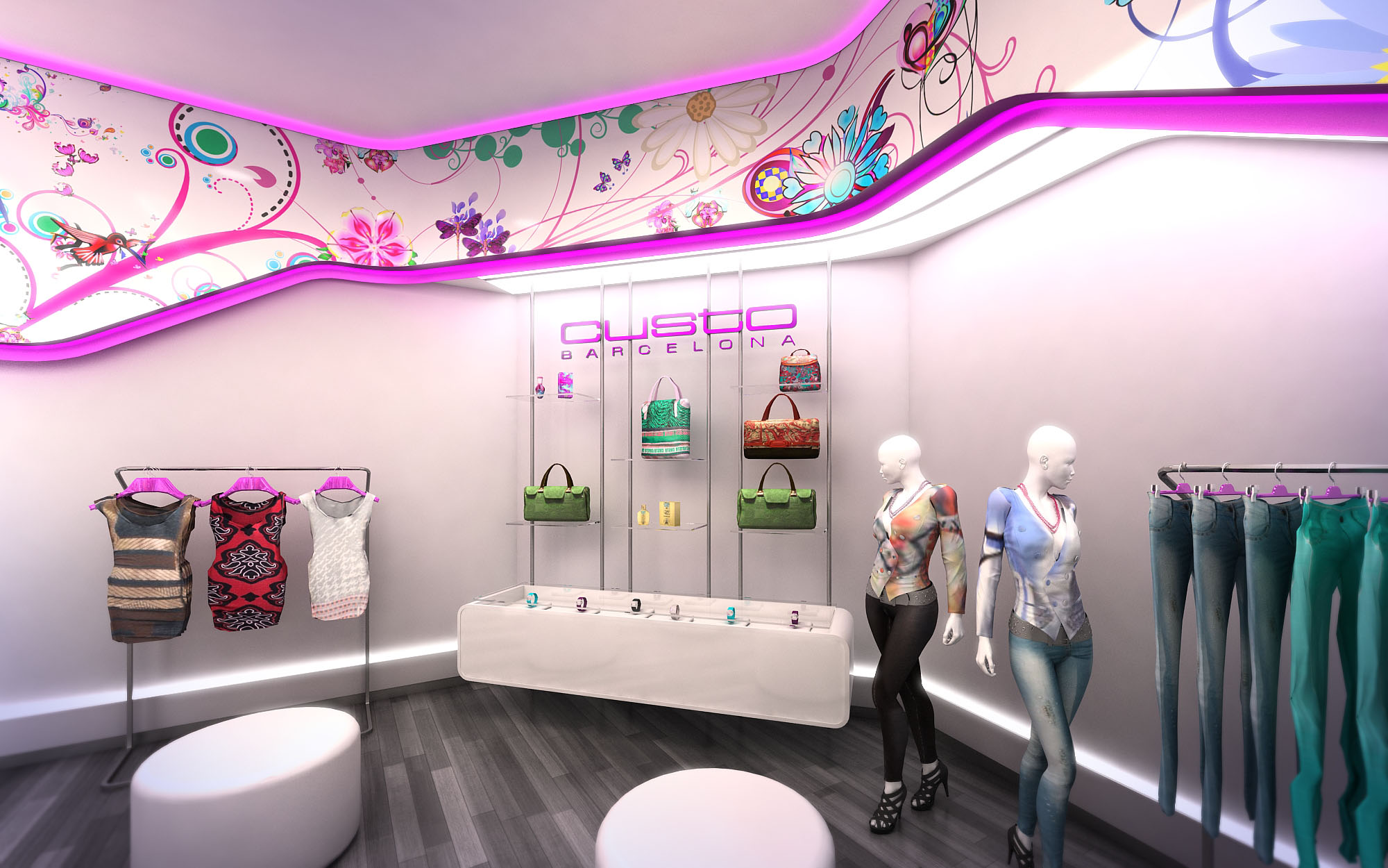
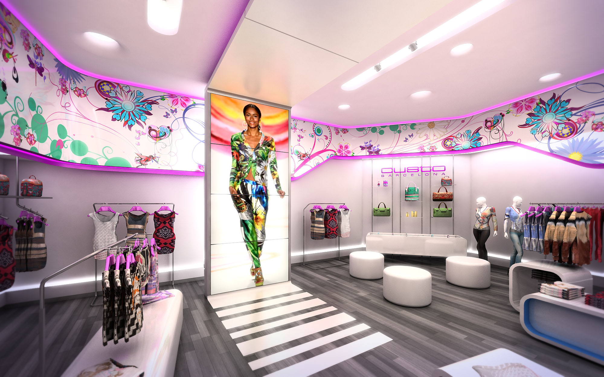
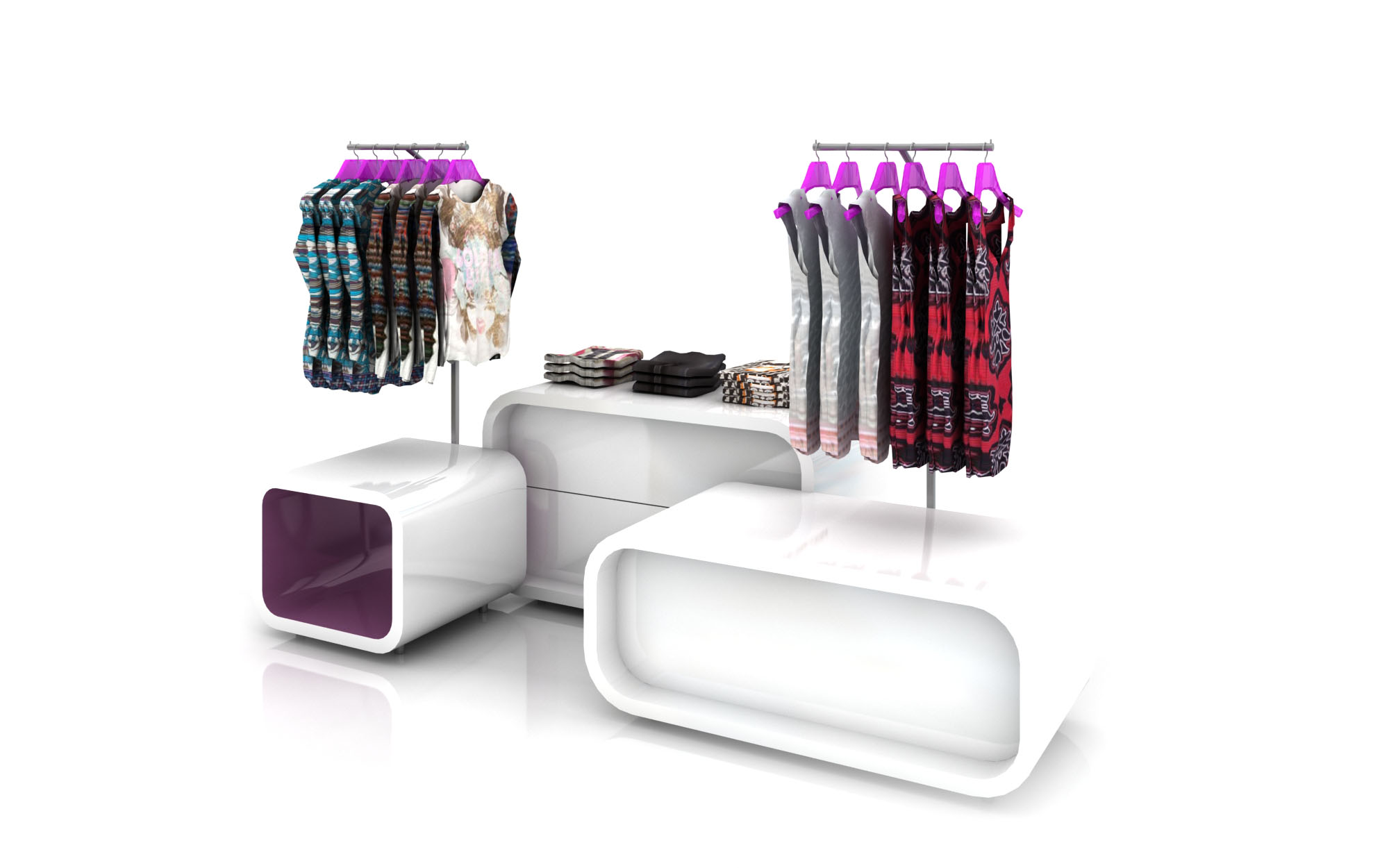
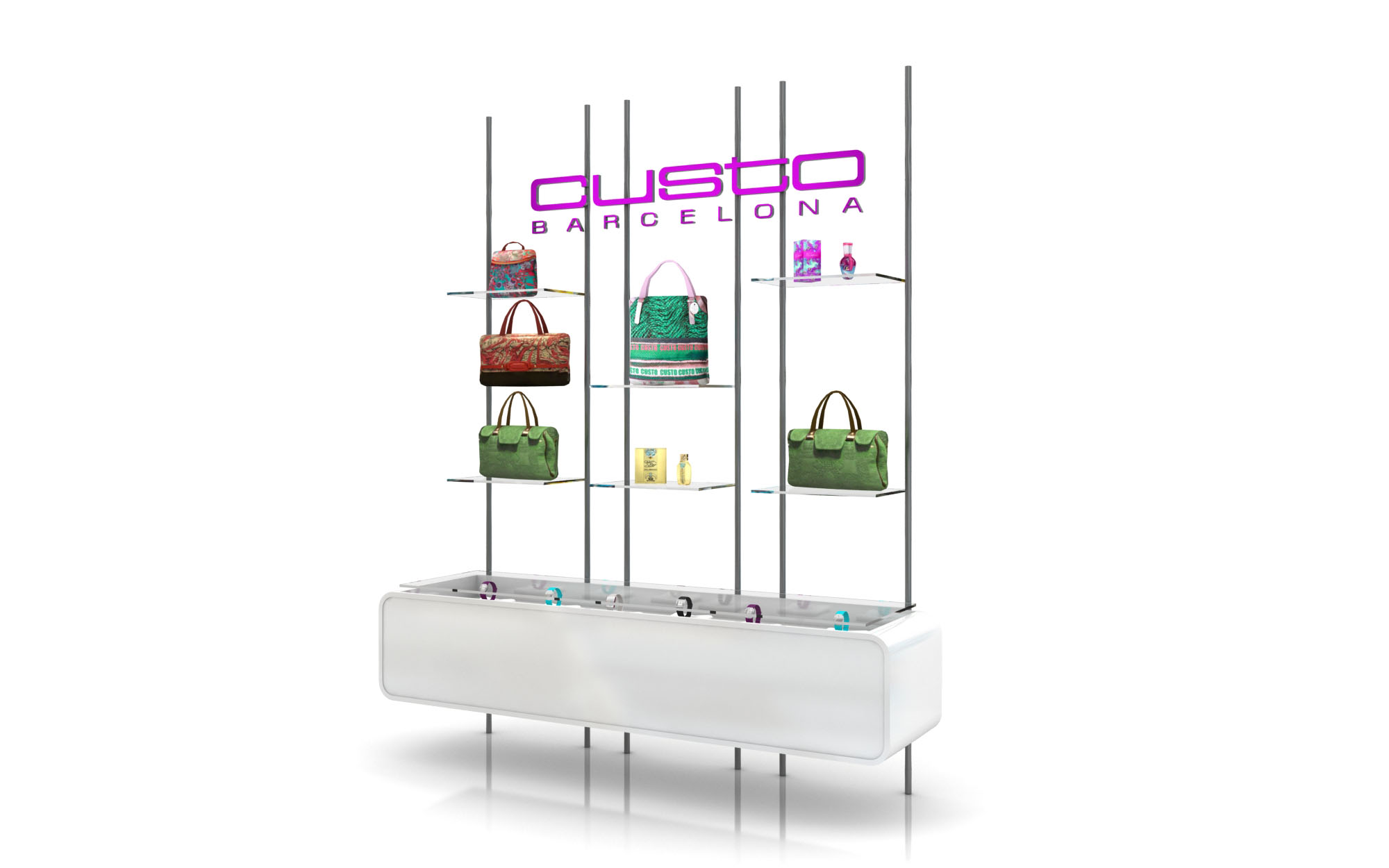
© 2021 by sanzpont [arquitectura] . Webpage by sanzpont [digital] . Innovative Digital Experiences

Proposal: This project was developed in collaboration with BNKR Architects, proposing a convention stand that exploited the maximum use of drywall. The idea was to create a stand completely formed out of the semi-perforated panels. By breaking off samples of the material for its visitors, the form of the stand itself generated these small samples to be distributed, therefore deconstructing itself as to not have to discard the stand entirely at the end of the convention. It was exhibited at the CIHAC Expo, a space where every year exhibitors have the opportunity to showcase their work and attract attention through the design of their stands.
Expo CIHAC.
© 2021 by sanzpont [arquitectura] . Webpage by sanzpont [digital] . Innovative Digital Experiences

The Solaris retail concept is conceived as a luminous “lightbox” dedicated to sunglasses, transforming a compact footprint into an immersive product gallery. The architecture frames the eyewear as the true protagonist, using a continuous perimeter of vertical displays that read as a curated wall of light. The store envelope is intentionally neutral and monochromatic, allowing a strong chromatic identity—Solaris orange—to act as a guiding thread across all locations in Mexico and France, ensuring brand recognition and spatial coherence.
The design narrative is built around clarity, legibility and rhythm. Linear geometries, clean junctions and restrained detailing generate a contemporary, almost gallery-like atmosphere. Overscaled fashion portraits anchor the space visually, establishing an emotional connection and giving depth to the otherwise orthogonal composition. The result is an environment that feels both technical and glamorous, echoing the precision of eyewear design.
The layout is organized as a clear frontal perspective: from the mall corridor, customers perceive the full depth of the store and the density of the collection at a glance. The entrance is fully open, operating as a seamless threshold with no physical barriers, encouraging intuitive entry and cross-traffic. The cash desk is located laterally, freeing the central axis for circulation and product discovery.
Free-standing display islands are positioned on a loose grid, generating micro-routes and pauses without obstructing visual continuity. Their low height preserves long sightlines to the back feature wall, which functions as a focal point and orientation reference. The perimeter walls house the majority of the stock in high-capacity modular panels, while the center of the space is dedicated to curated selections and new launches, enabling fast browsing and impulse purchasing.
The internal architecture is deliberately minimal, allowing the display systems to define the character of the store. Perimeter fixtures combine vertical framing with backlit shelving, creating a uniform luminous background against which the silhouettes of the sunglasses stand out clearly. The grid of cubicles and linear trays is dimensioned for ergonomic reach and efficient restocking, supporting high turnover and easy re-merchandising.
The central display units are designed as sculptural volumes: rectilinear plinths with open bases that lighten their presence and allow for cable routing and integrated lighting. Glass tops and transparent supports ensure unobstructed views of the products from all angles. The repetition of these units generates a disciplined rhythm, while small variations in configuration accommodate different collection sizes and marketing priorities.
The material palette is composed of high-gloss white finishes, satin metallic accents and large-format porcelain or ceramic floor tiles in a light neutral tone. This combination maximizes light diffusion, creating a crisp, hygienic impression that is appropriate for an optic-related retail environment. The reflective properties of the finishes enhance the perceived brightness and amplify the visual presence of the eyewear.
Solaris orange operates as an architectural highlight: applied to back panels, ceiling bands and selected vertical surfaces, it provides depth and a dynamic contrast to the white envelope. Lighting is predominantly integrated into the fixtures, using continuous linear LEDs and accent downlights to avoid glare on lenses while ensuring accurate color rendering. The balanced illumination supports both product evaluation and brand storytelling, with dedicated spots reinforcing graphic panels and key promotional zones.
The façade acts as a large-scale brand statement. A generous opening framed by a neutral gray portal sets up a strong contrast with the bright interior. The Solaris logo, rendered in backlit channel letters, is clearly legible from a distance and aligned with the overall linear geometry of the shopfront. Large vertical lightboxes on the sides of the entrance display fashion imagery that extends into the interior, visually pulling customers inside.
Within the store, the integration of graphics is choreographed to maintain balance with the merchandise. Oversized portraits behind the counter and at focal walls create depth and scale, while secondary messaging remains discreet so as not to saturate the visual field. The repetition of typography, color and photographic language across all nine locations guarantees consistent brand perception within diverse architectural contexts.
Sustainability is addressed through a combination of energy-efficient systems, durable materials and modular design. LED lighting is employed throughout, significantly reducing energy consumption and maintenance needs compared to traditional luminaires. High-reflectance surfaces diminish the required lighting power, ensuring a bright environment with optimized wattage per square meter.
The fixture system is conceived as a kit-of-parts, allowing individual components to be reconfigured, repaired or reused across different stores and future roll-outs. Robust finishes and easily cleanable surfaces extend the lifecycle of the interior, minimizing the need for premature replacement. Where possible, standardized components facilitate local sourcing and streamlined logistics, reducing transportation impacts between the various sites in Mexico and France and supporting a flexible, long-term retail strategy.
© 2021 by sanzpont [arquitectura] . Webpage by sanzpont [digital] . Innovative Digital Experiences

The concept behind this retail space is one that speaks to modernity and brand emphasis. The design intention seems to revolve around creating an immersive brand experience where each section is not only a display but also a statement piece reflecting the identity of the respective brand. It utilizes a monochromatic color palette as a backdrop, allowing the vibrant hues of the brand graphics and illuminated displays to stand out, drawing attention and guiding the customer’s eye through the space.
The layout is meticulously planned for visibility and accessibility. The open plan allows for unobstructed sightlines across the space, facilitating easy navigation and product discovery. Central display counters are strategically placed to serve as focal points, while peripheral displays line the walls, maximizing the use of space and encouraging a circular flow that invites exploration.
Materials have been chosen for their sleek appearance and durability. The predominant use of glass showcases allows for transparency and the sense of an extended space while highlighting the merchandise. Matte finishes on the counters contrast with the high-gloss flooring, adding depth and dimension. Accent materials, such as the metal in the brand logos and the leather-like textures of the seating, contribute to a tactile experience.
The color schemes are brand-specific, providing each counter with a distinct identity within the overall space. Lighting plays a crucial role here, with directed spotlights enhancing the brilliance of the products and ambient lighting contributing to a high-end atmosphere. LED accents, particularly the vertical strips, energize the space and add a dynamic element to the static displays.
In considering sustainability, the design appears to prioritize energy-efficient LED lighting, which not only accentuates product features but also reduces energy consumption. The use of durable materials suggests a reduction in the need for frequent refurbishments, and the open design maximizes natural light, reducing the reliance on artificial lighting during the day.
Each brand’s space within the store is a microcosm of its identity, with dedicated visuals and thematic elements that resonate with their individual marketing narratives. This immersive branding strategy goes beyond mere logos to incorporate brand-specific color gradients and imagery that evoke emotional connections with the customer.
The inclusion of contemporary technology is subtly evident, potentially in digital price tags and interactive displays. This tech-forward approach likely extends to inventory management systems and customer service enhancements, all integrated seamlessly into the design without detracting from the visual experience.
In summary, the architectural narrative is one of brand celebration, spatial efficiency, and modern elegance, coupled with a commitment to sustainable practices. This retail space is not just a place to shop; it is an environment crafted to create and sustain a branded experience.
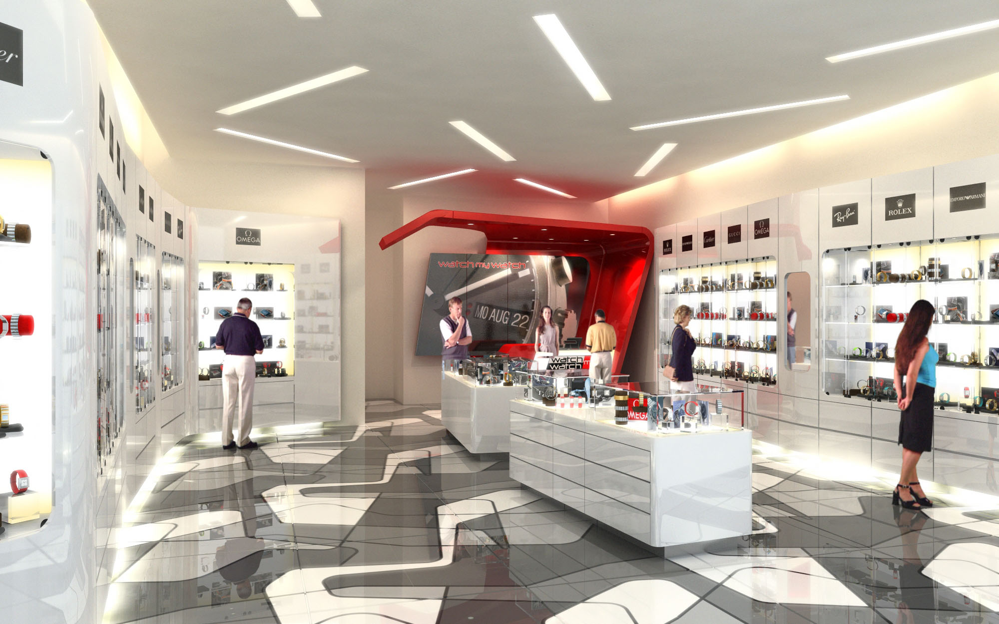
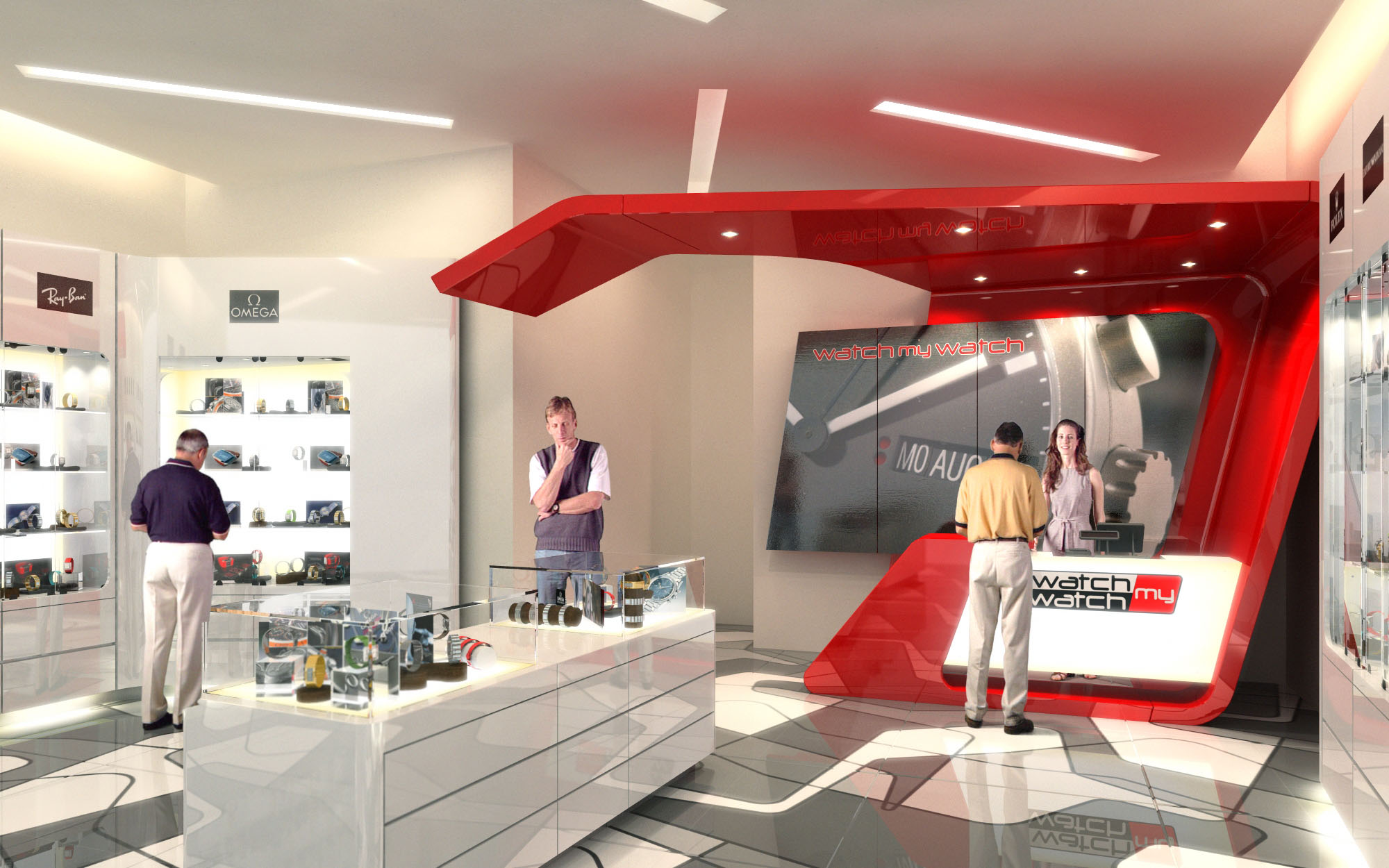
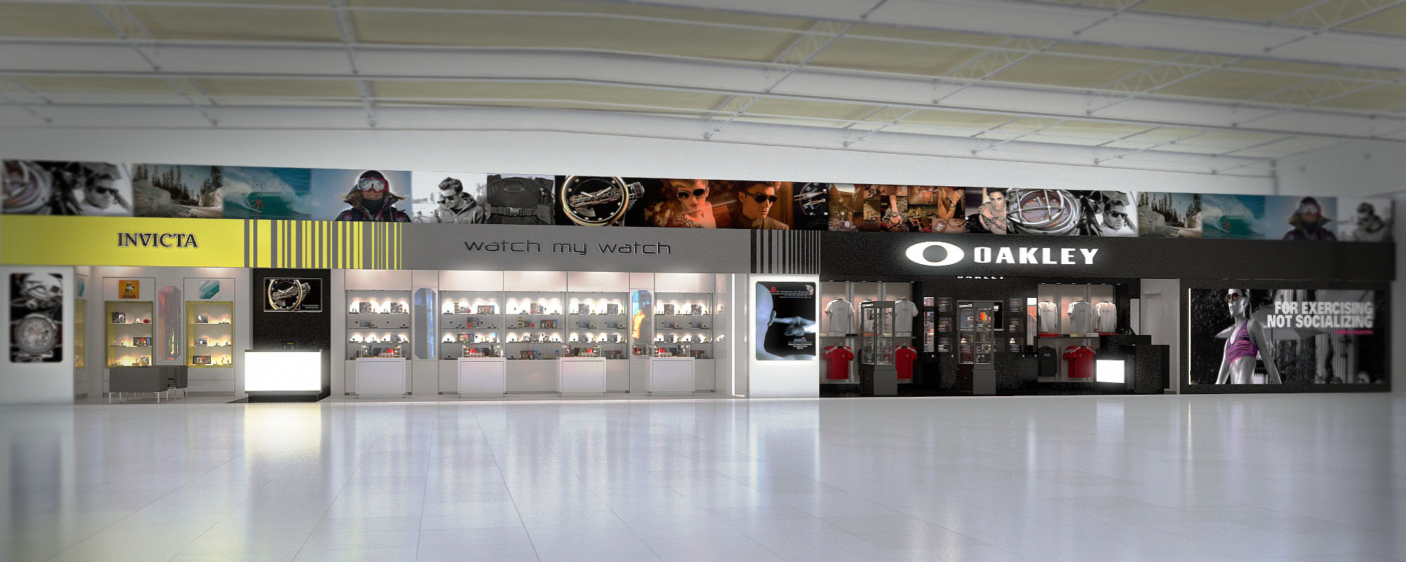
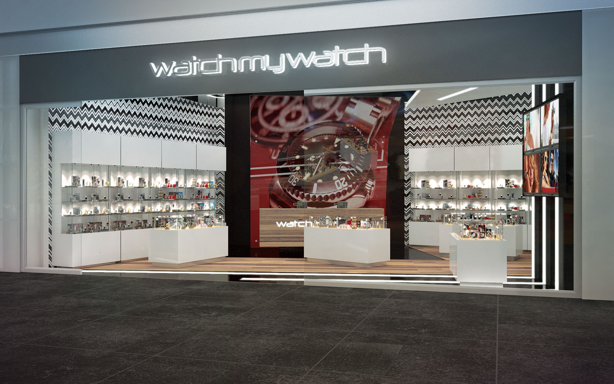
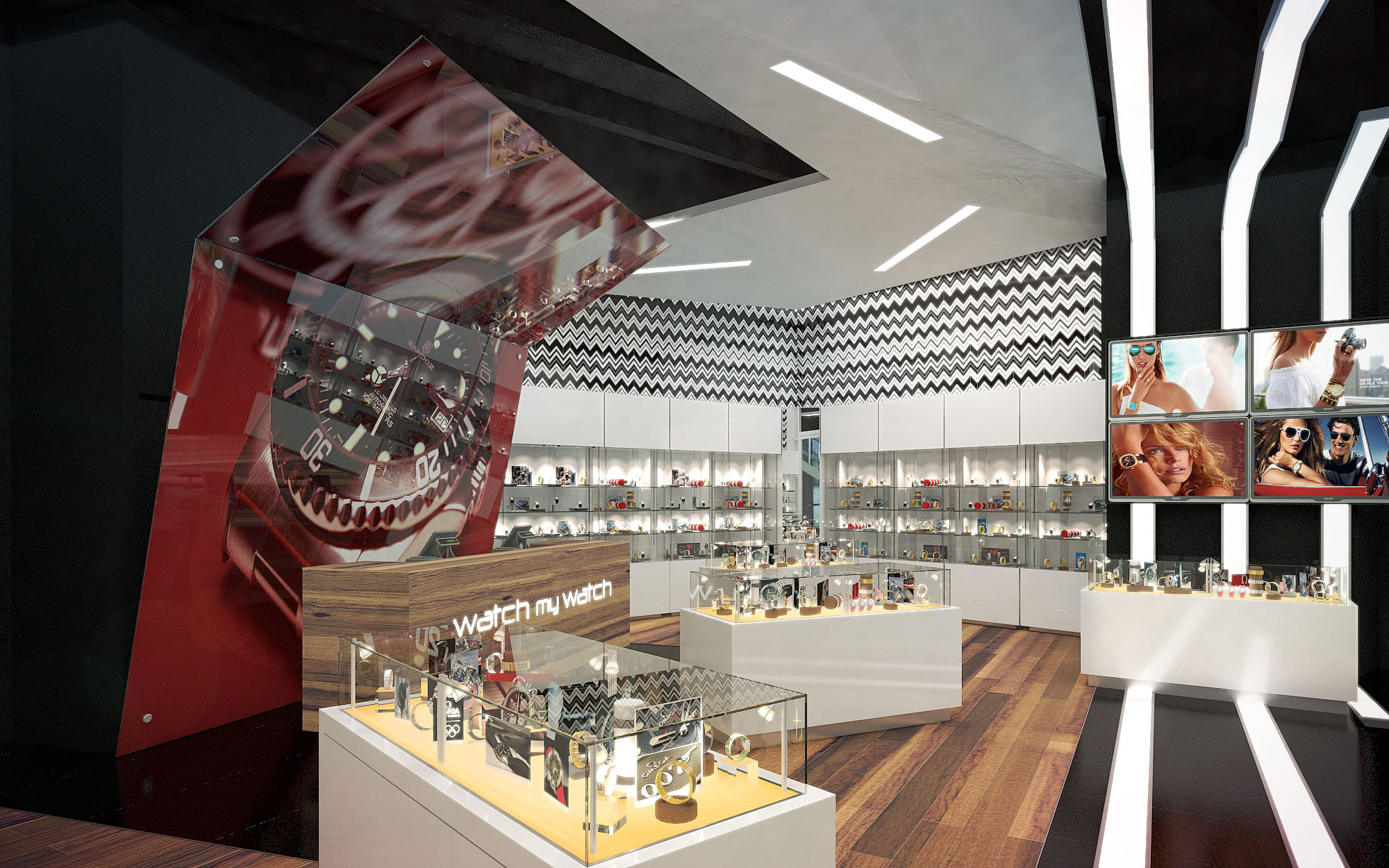
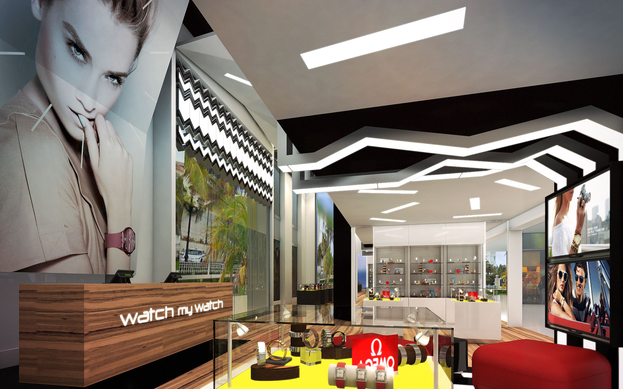
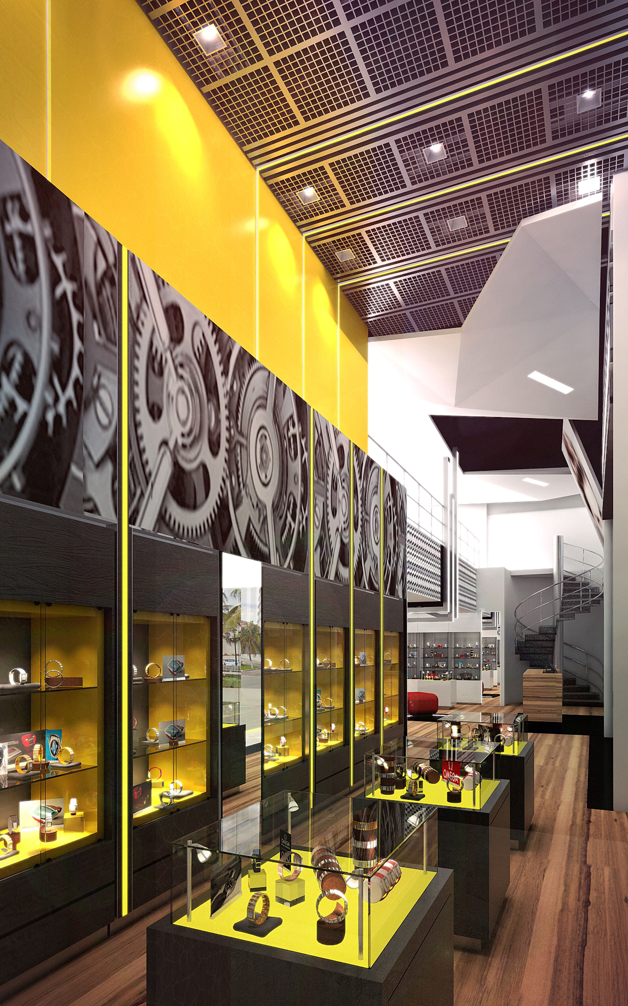
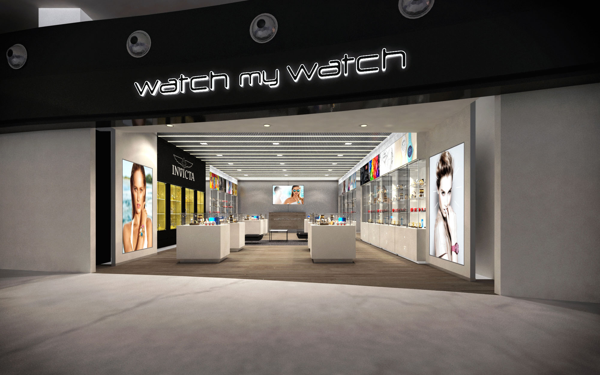
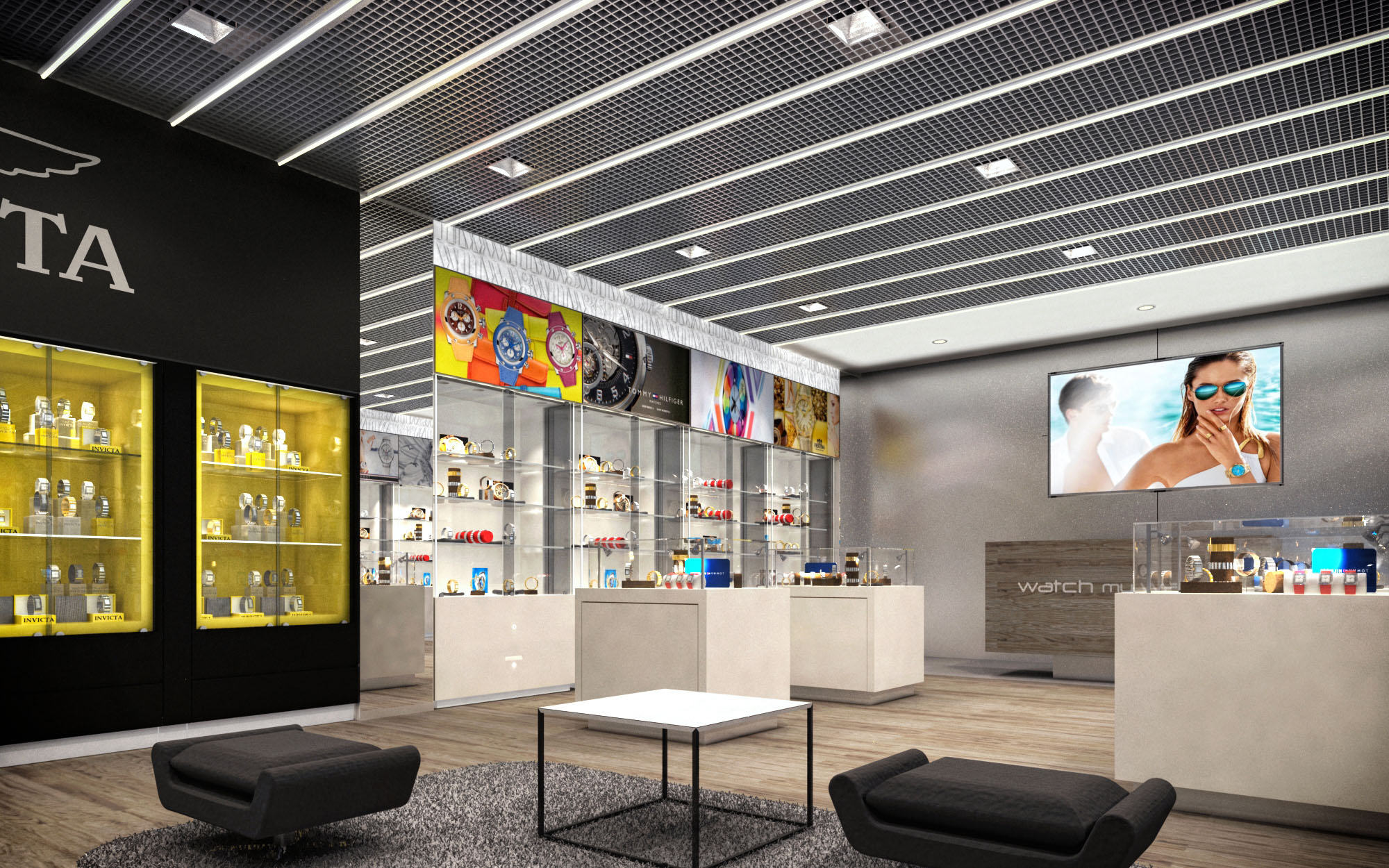
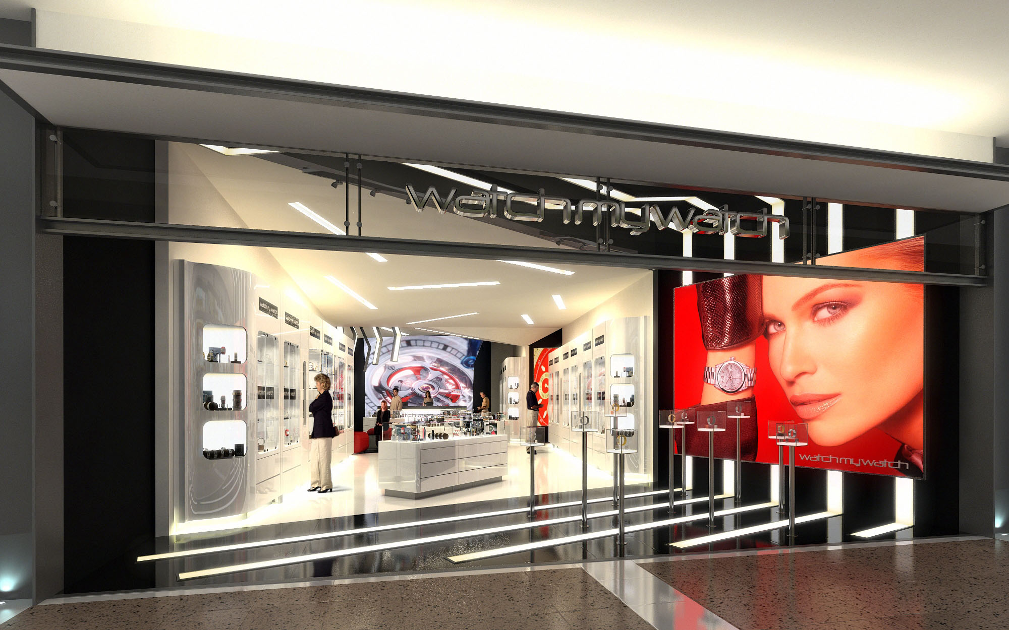
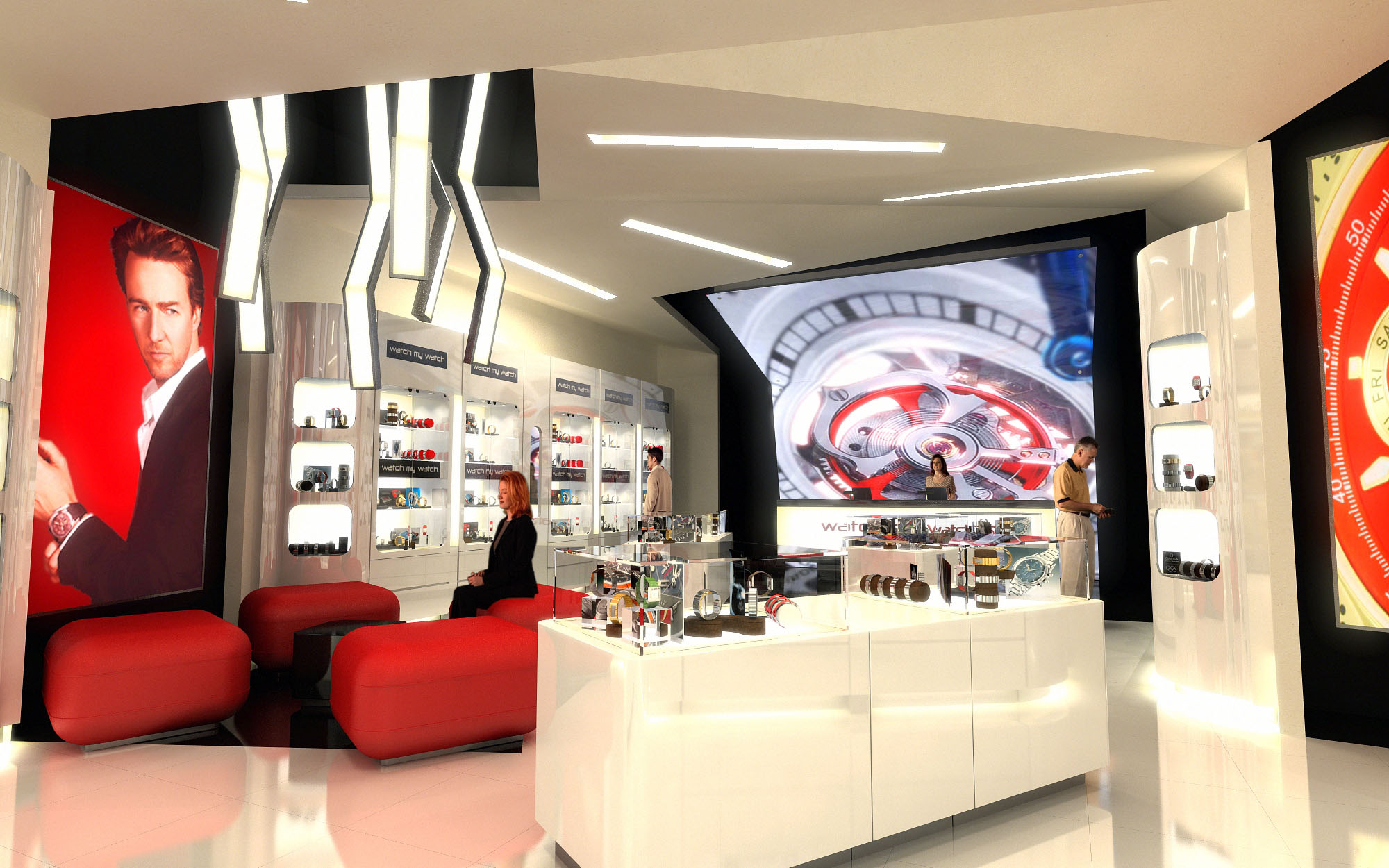
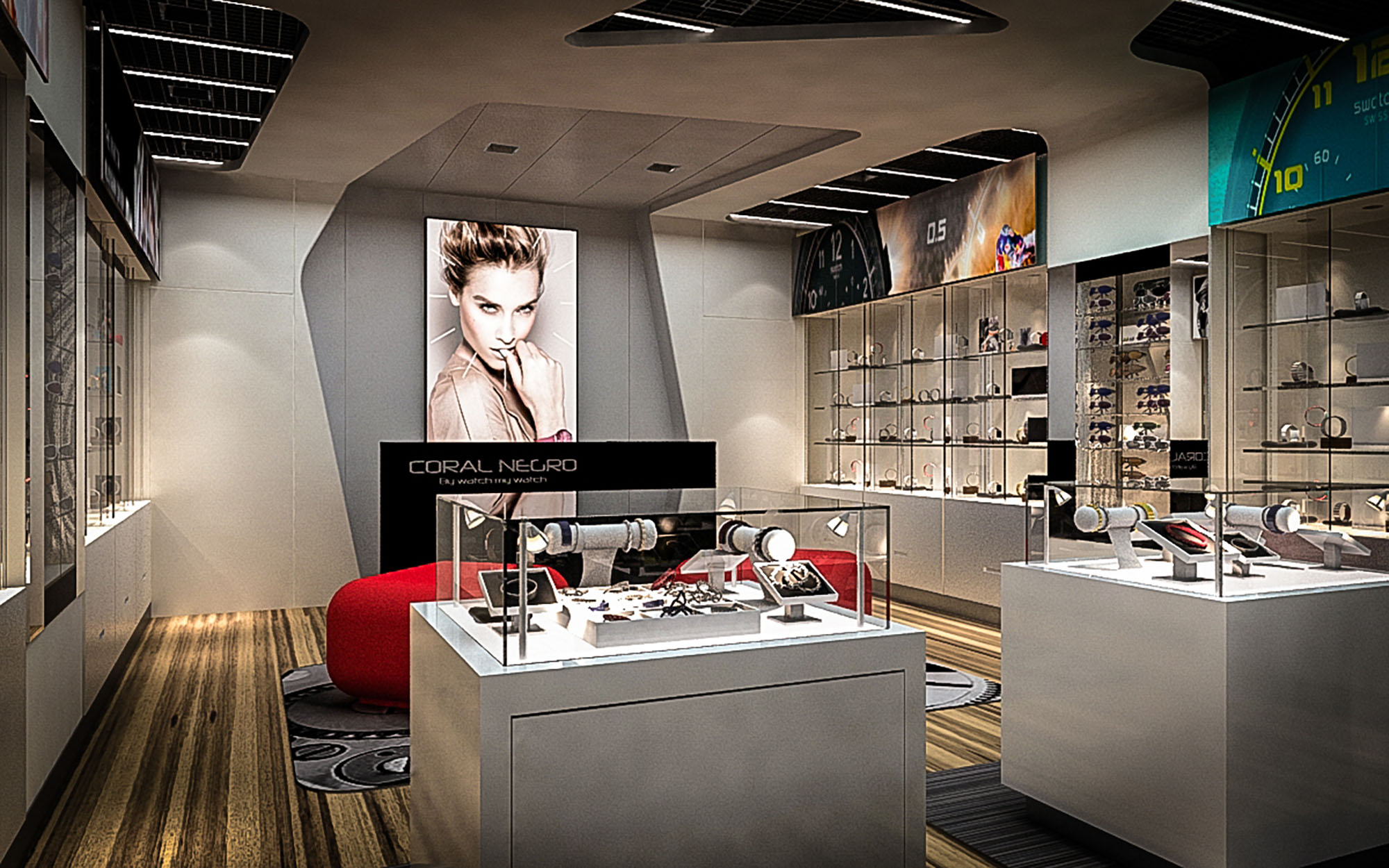
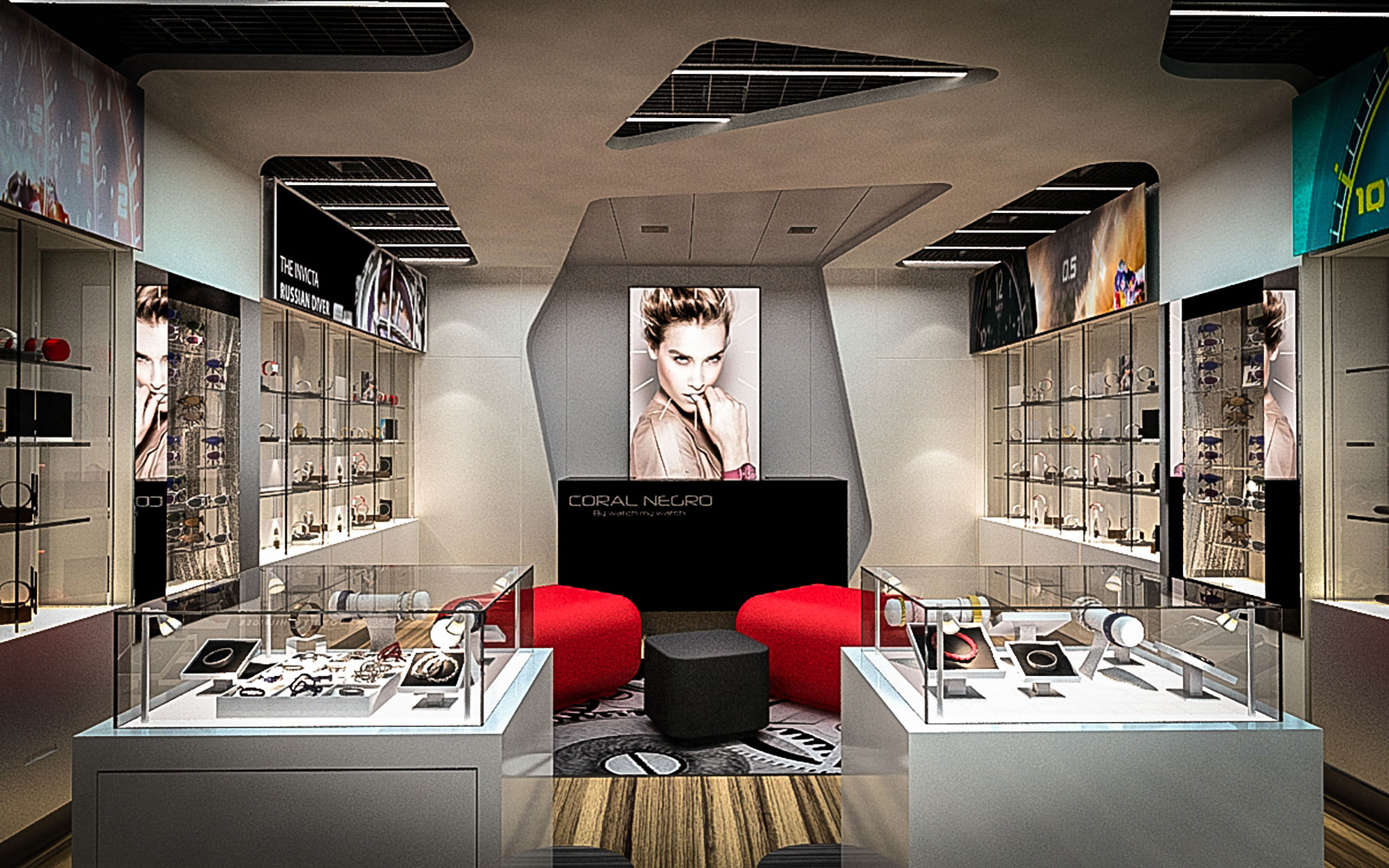
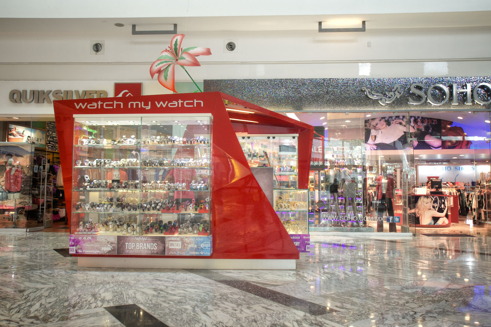
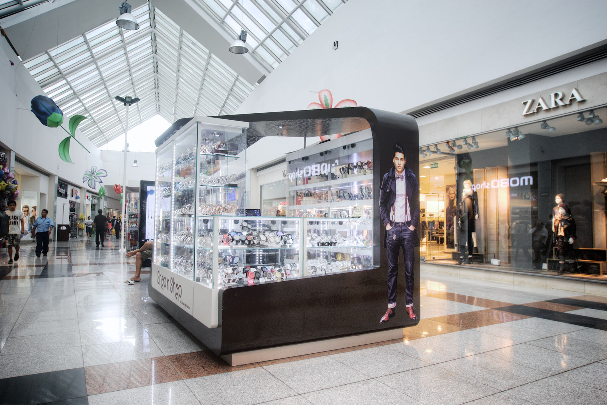
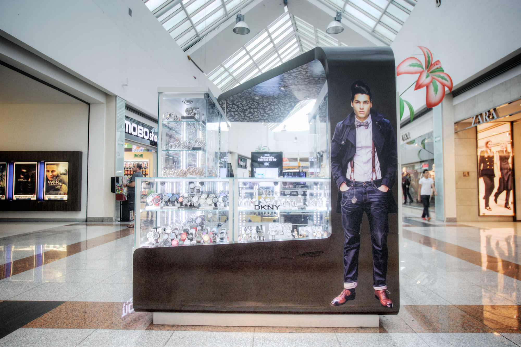
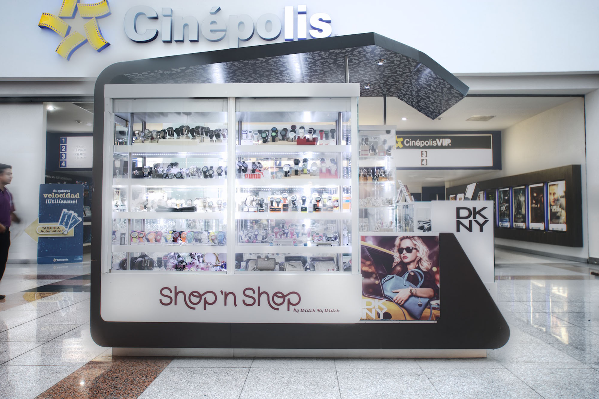
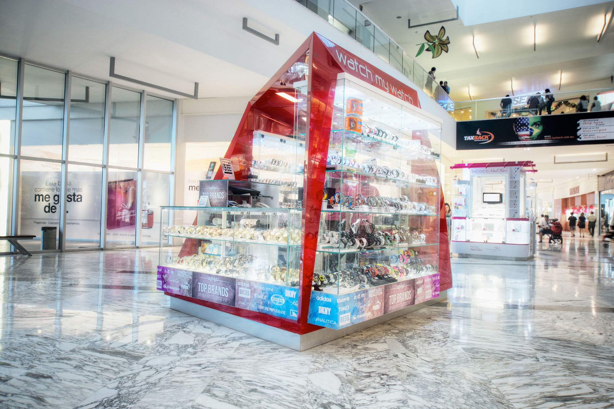
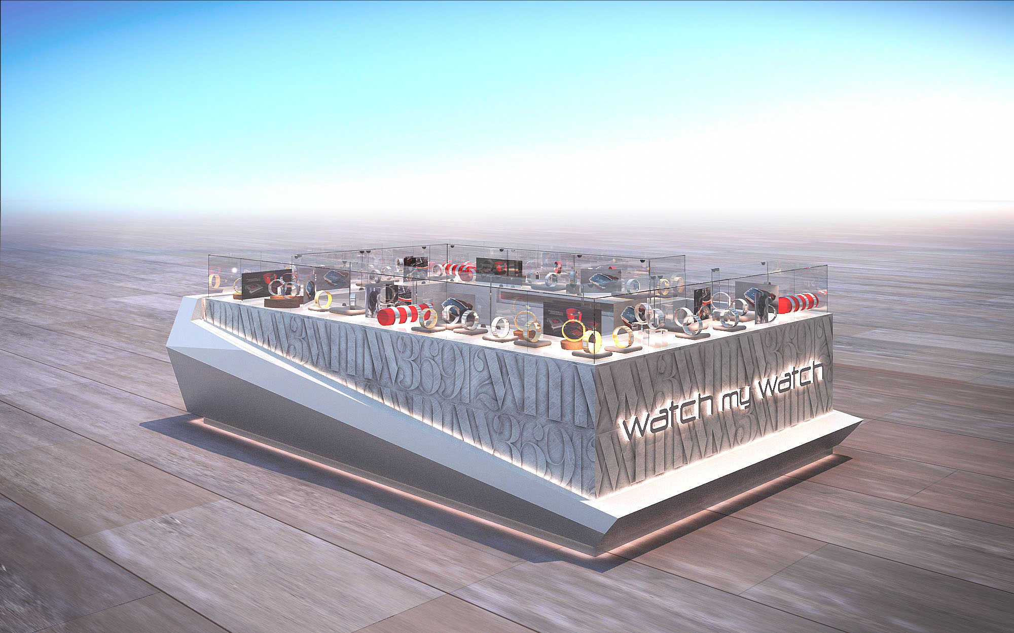
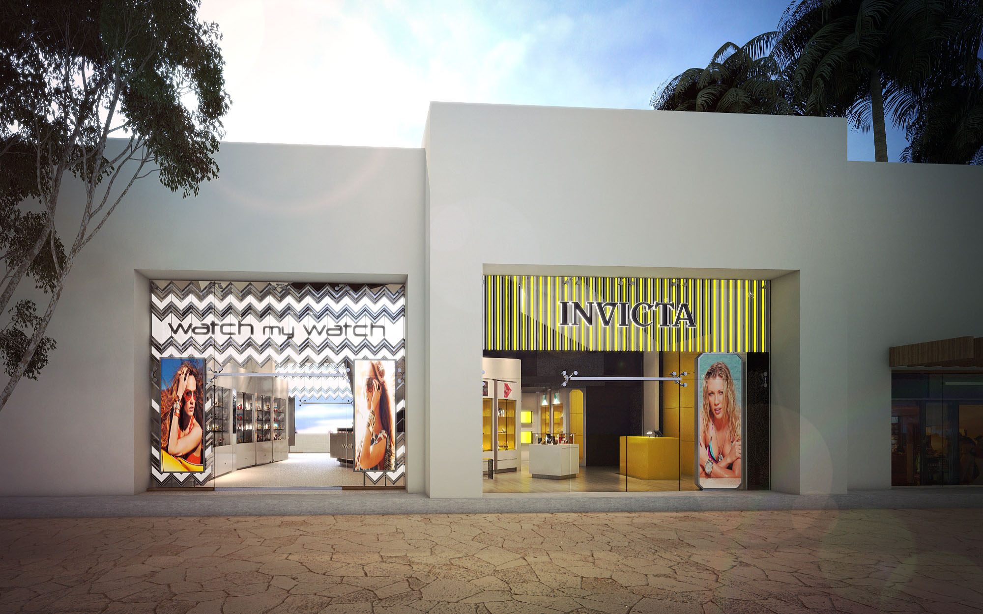
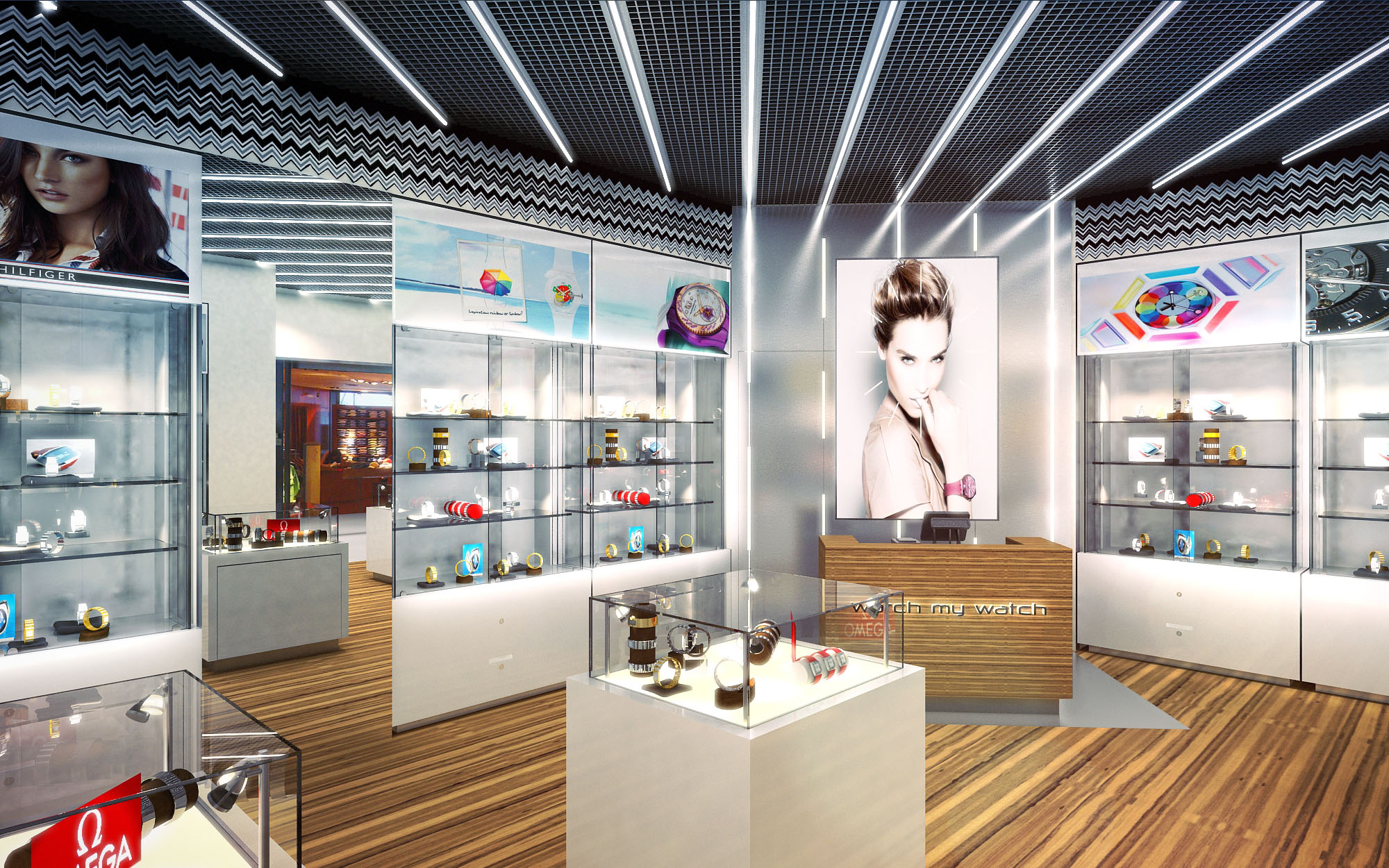
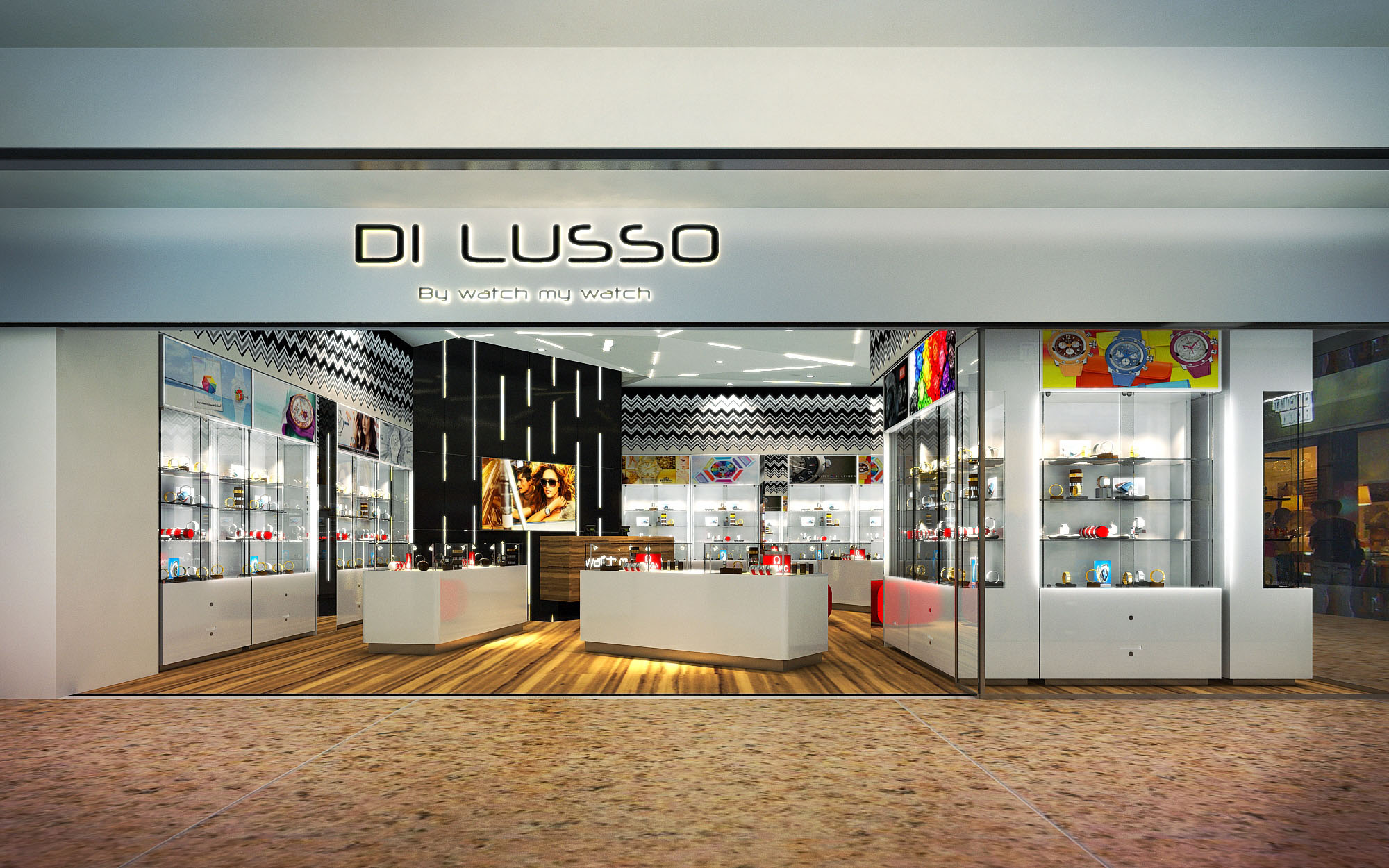
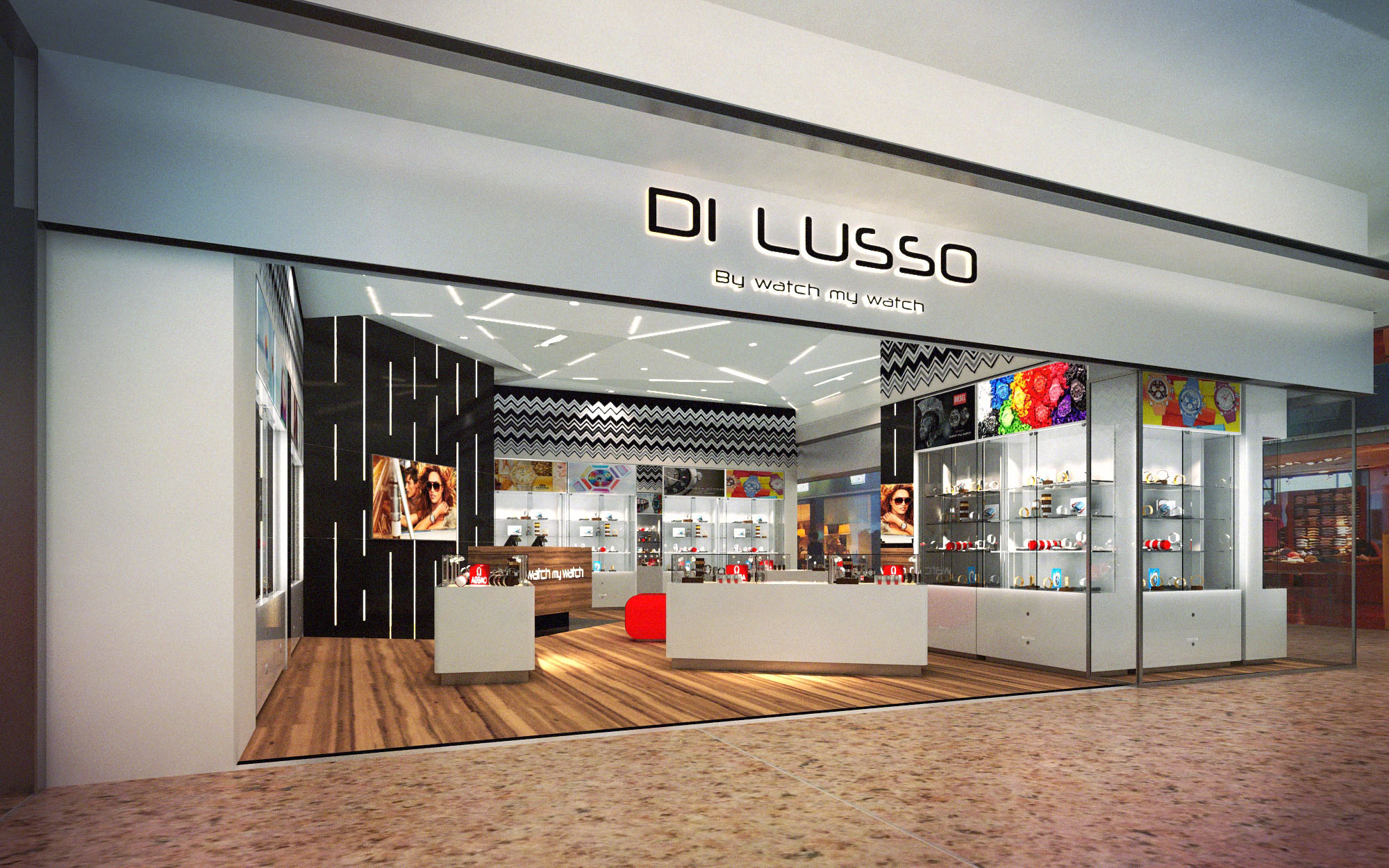
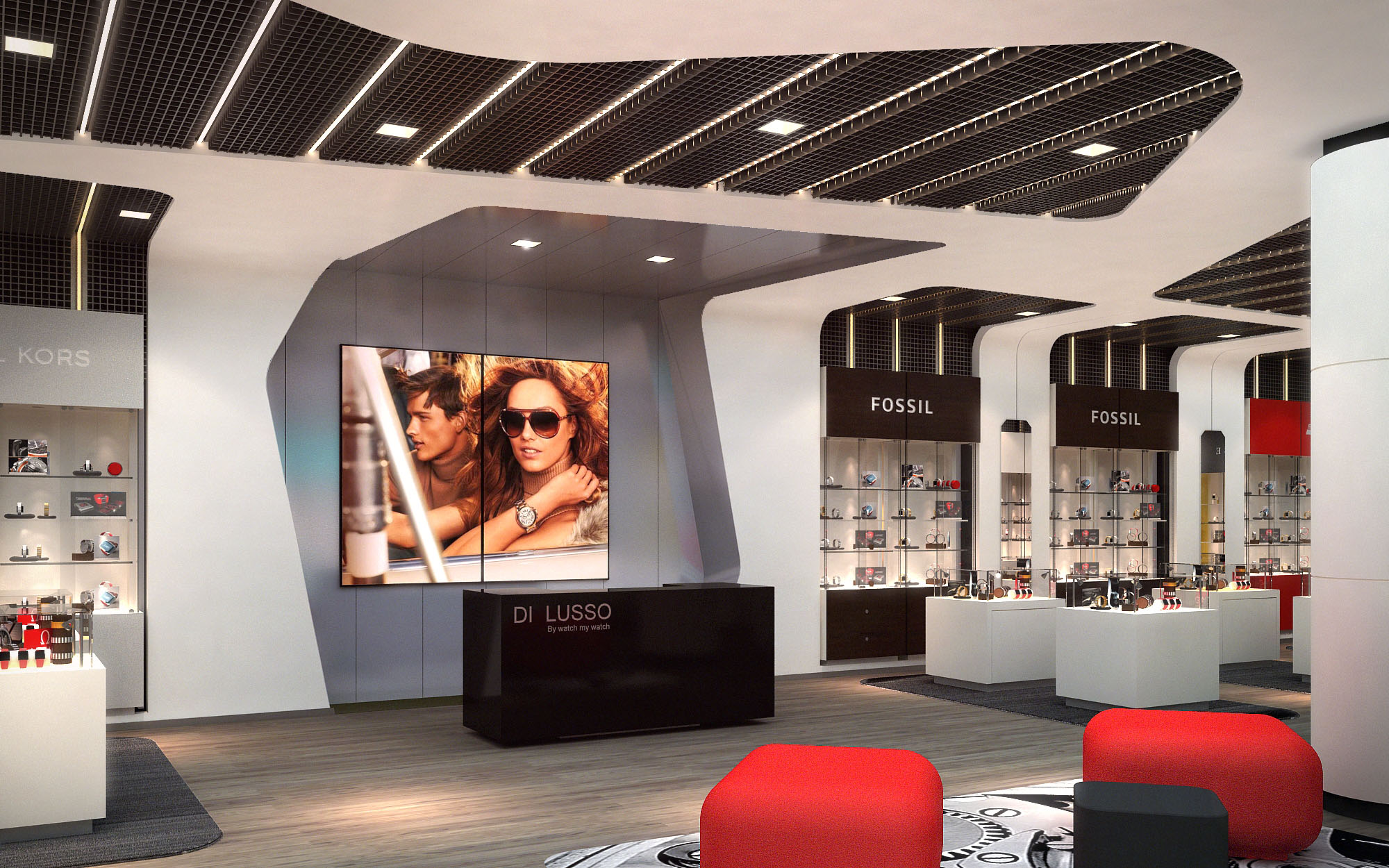
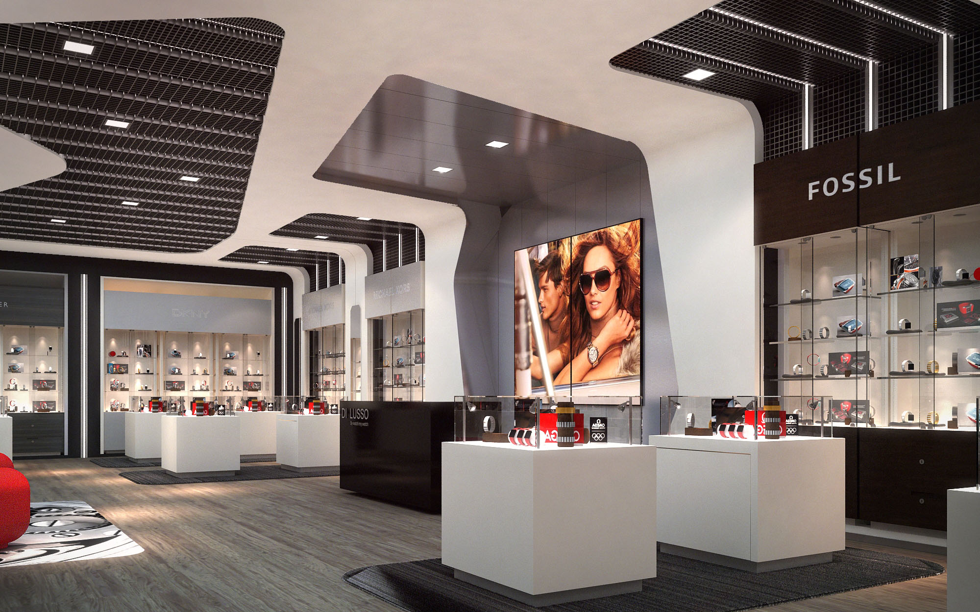
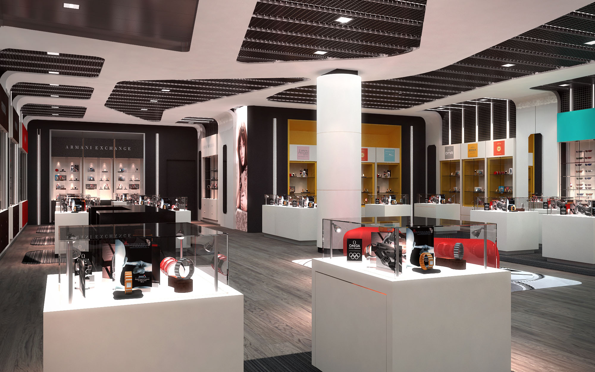
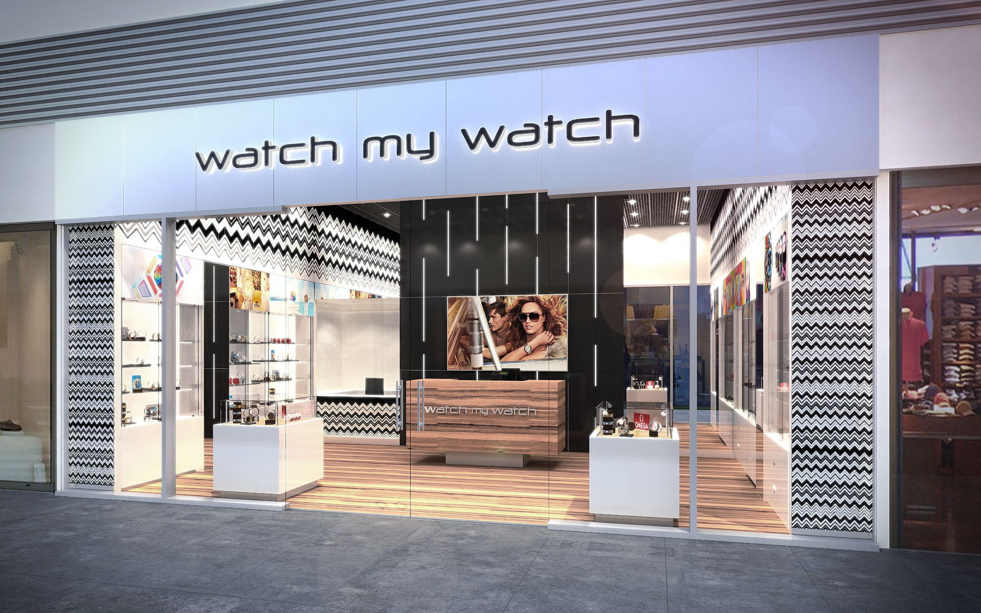
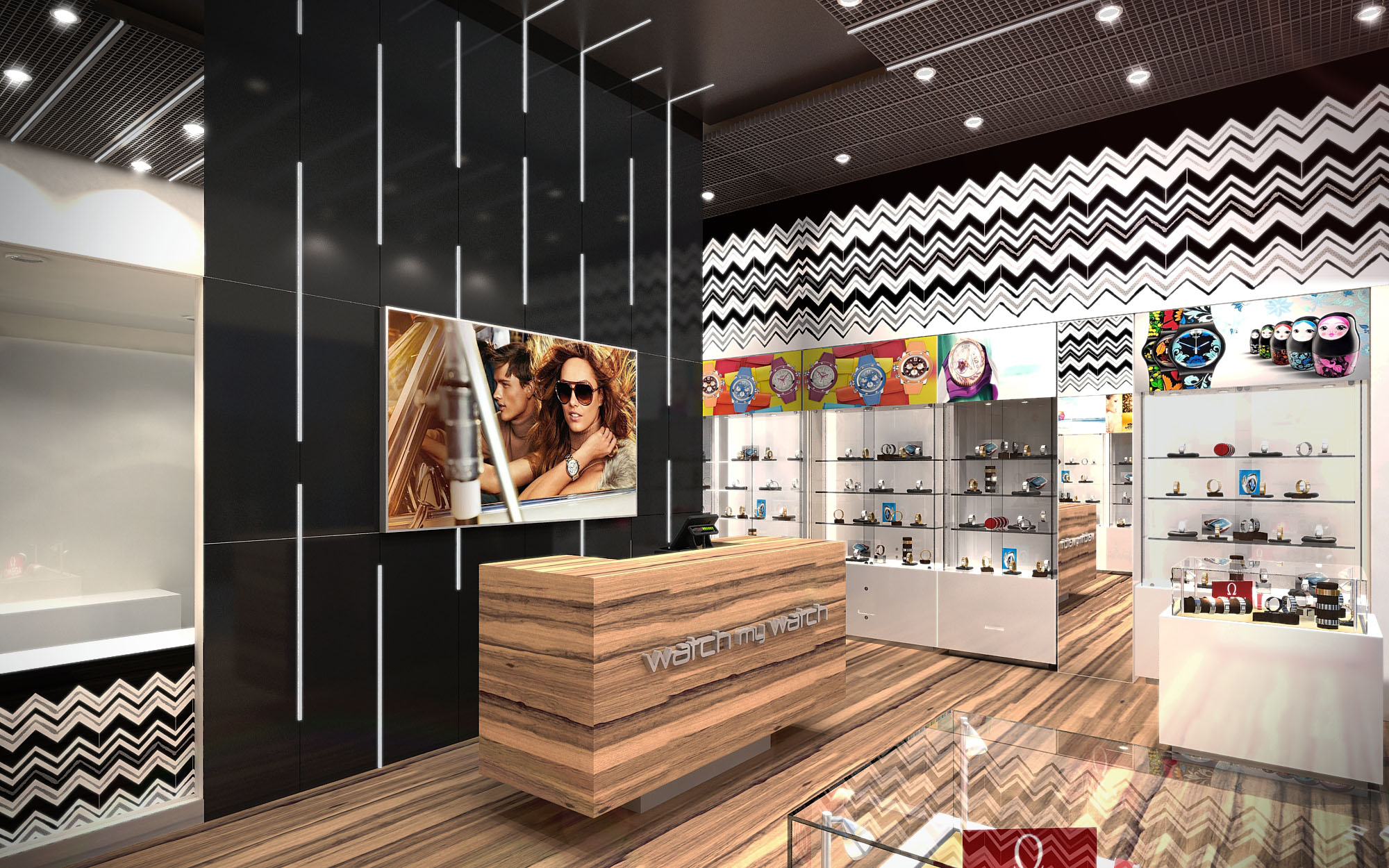
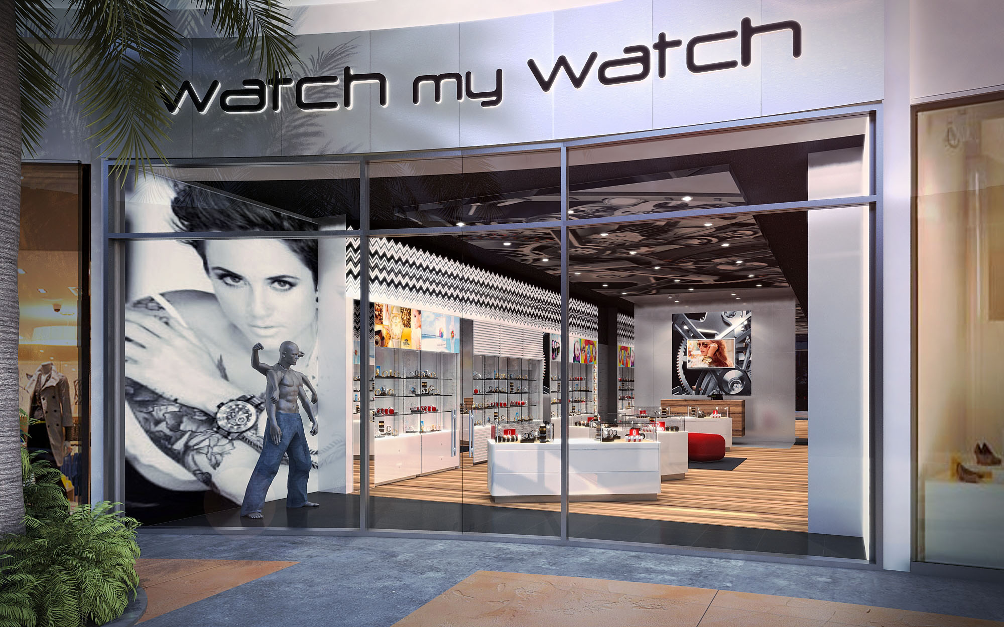
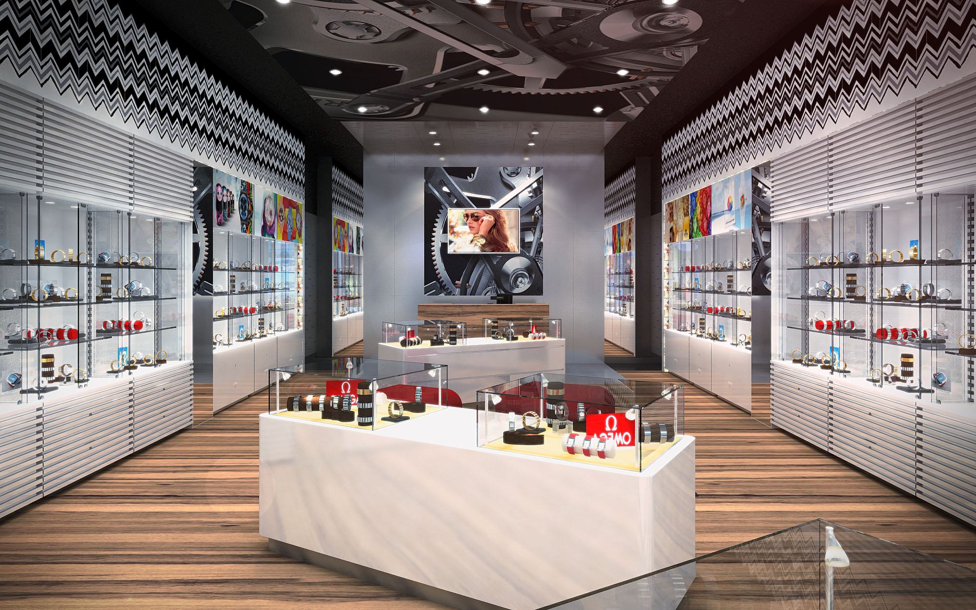
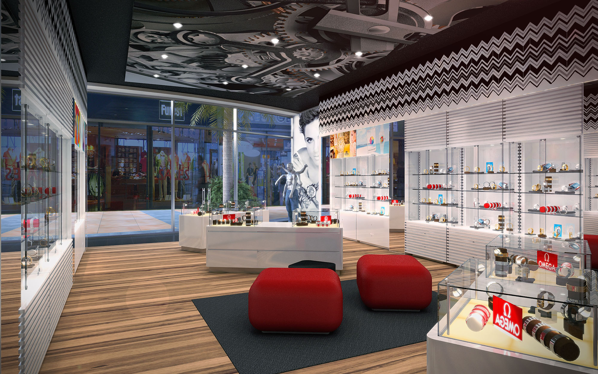
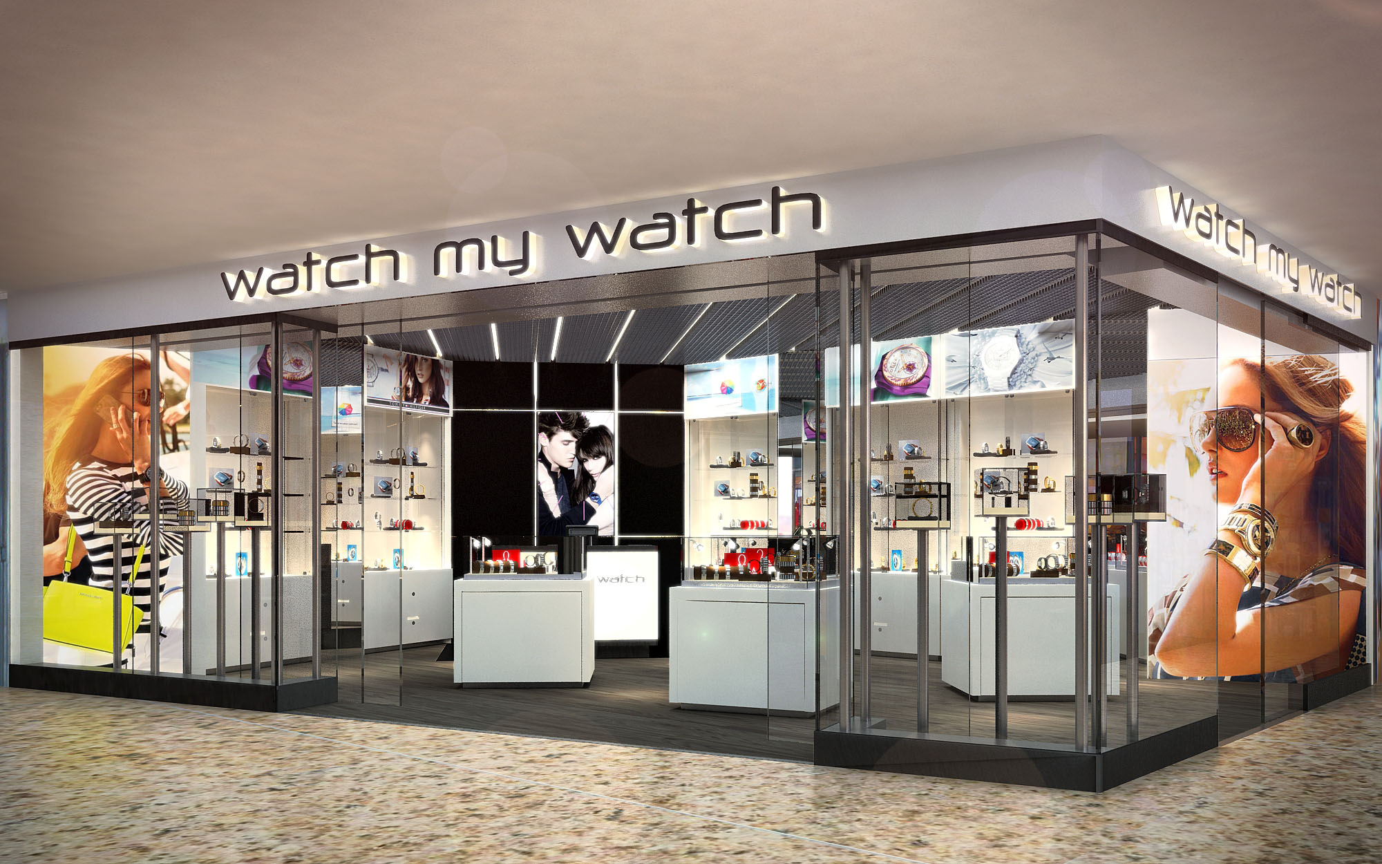
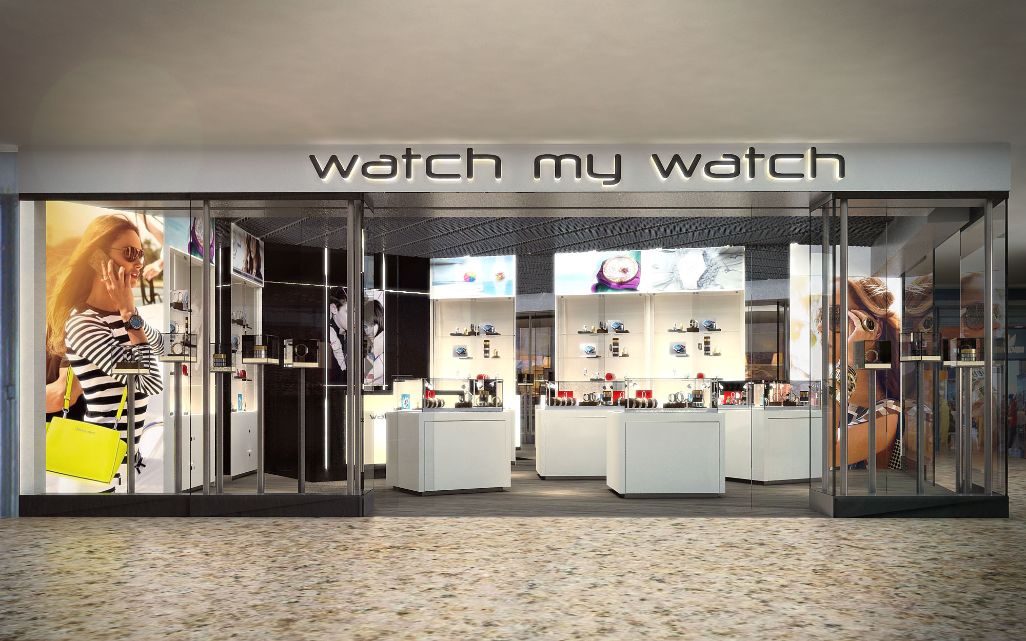
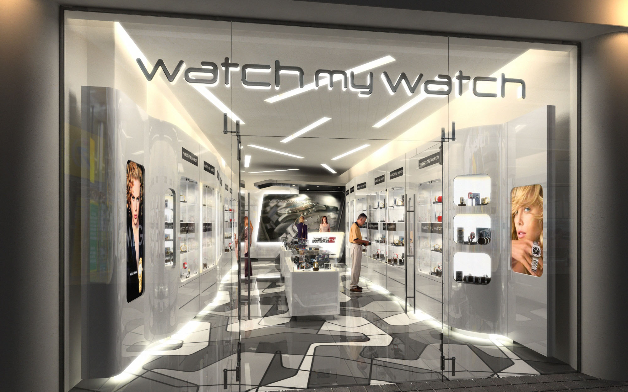
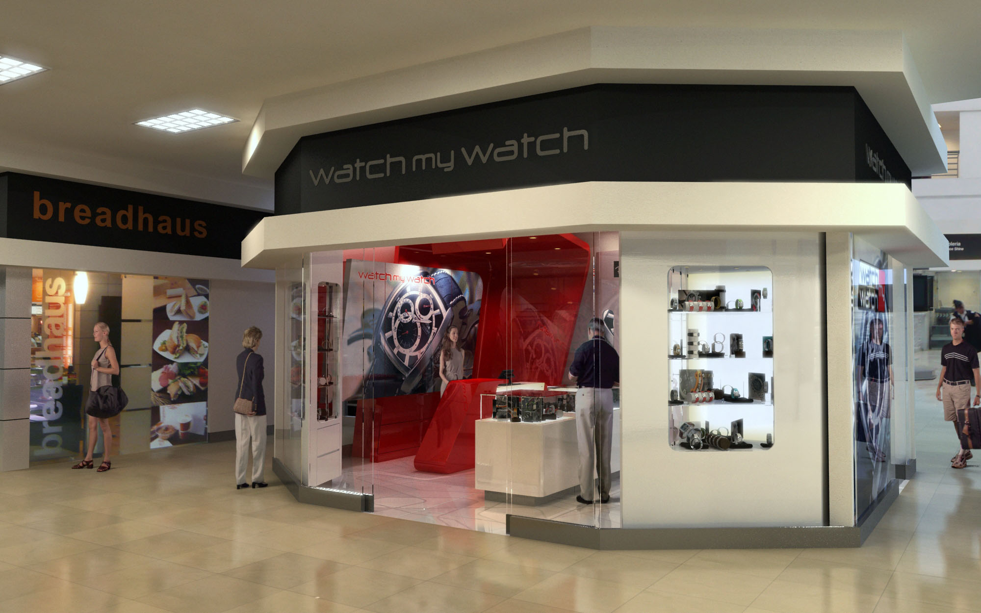
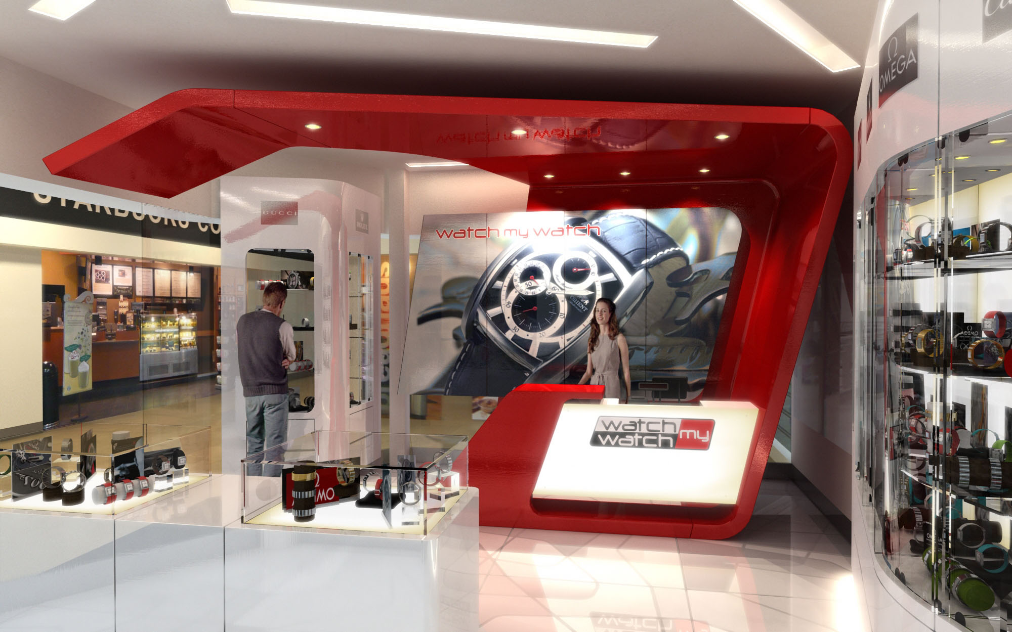
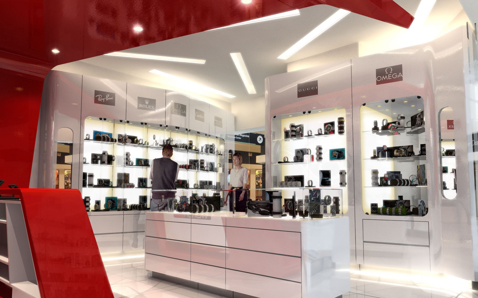
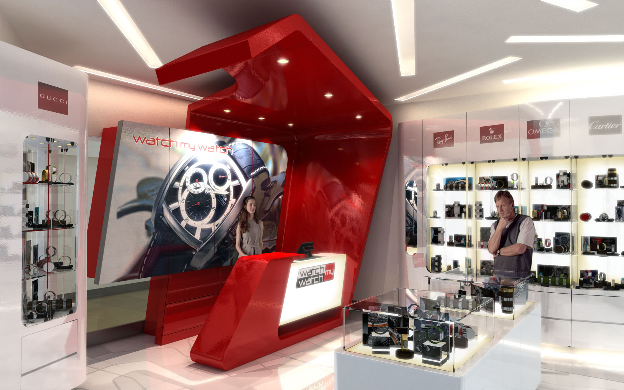
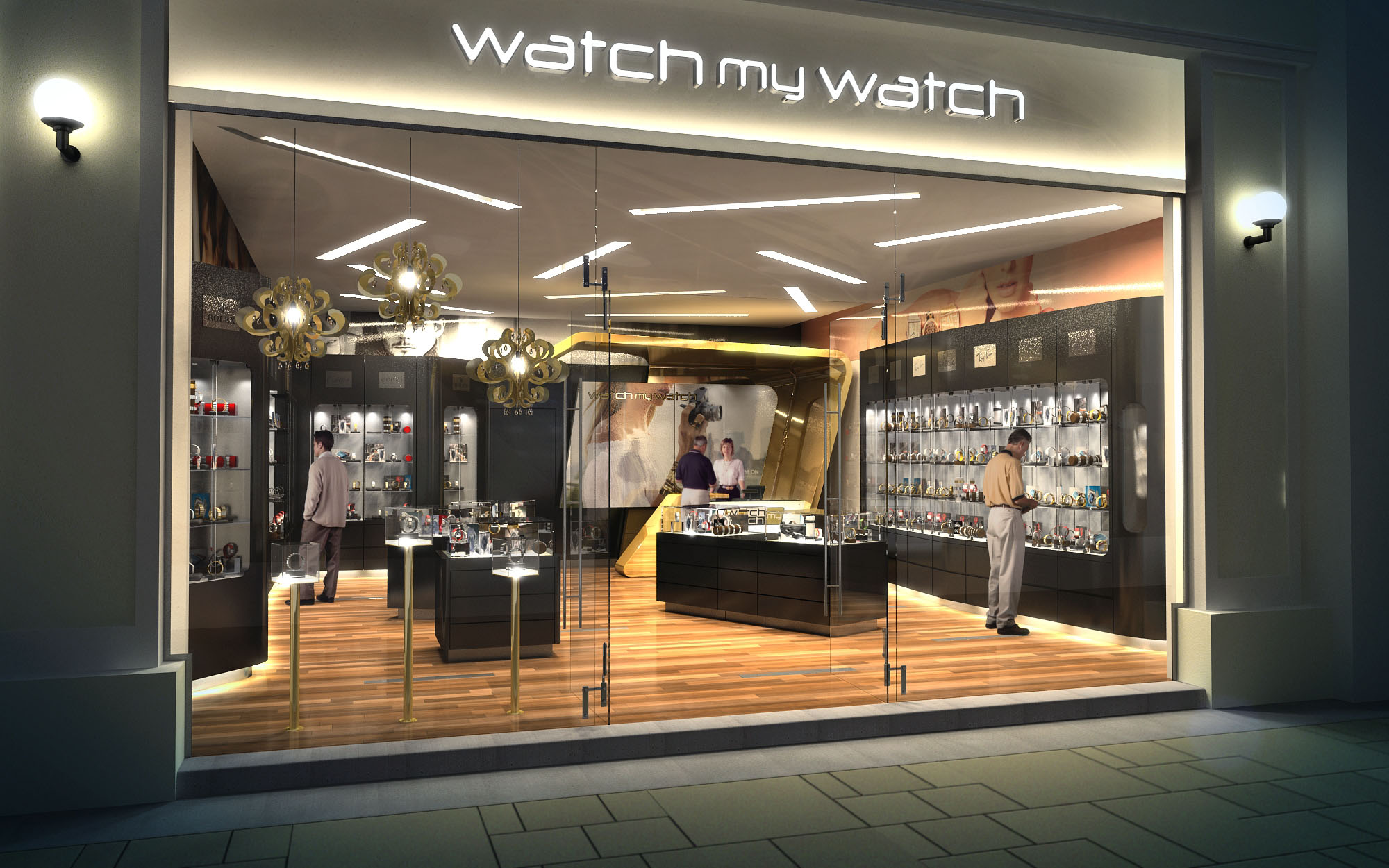
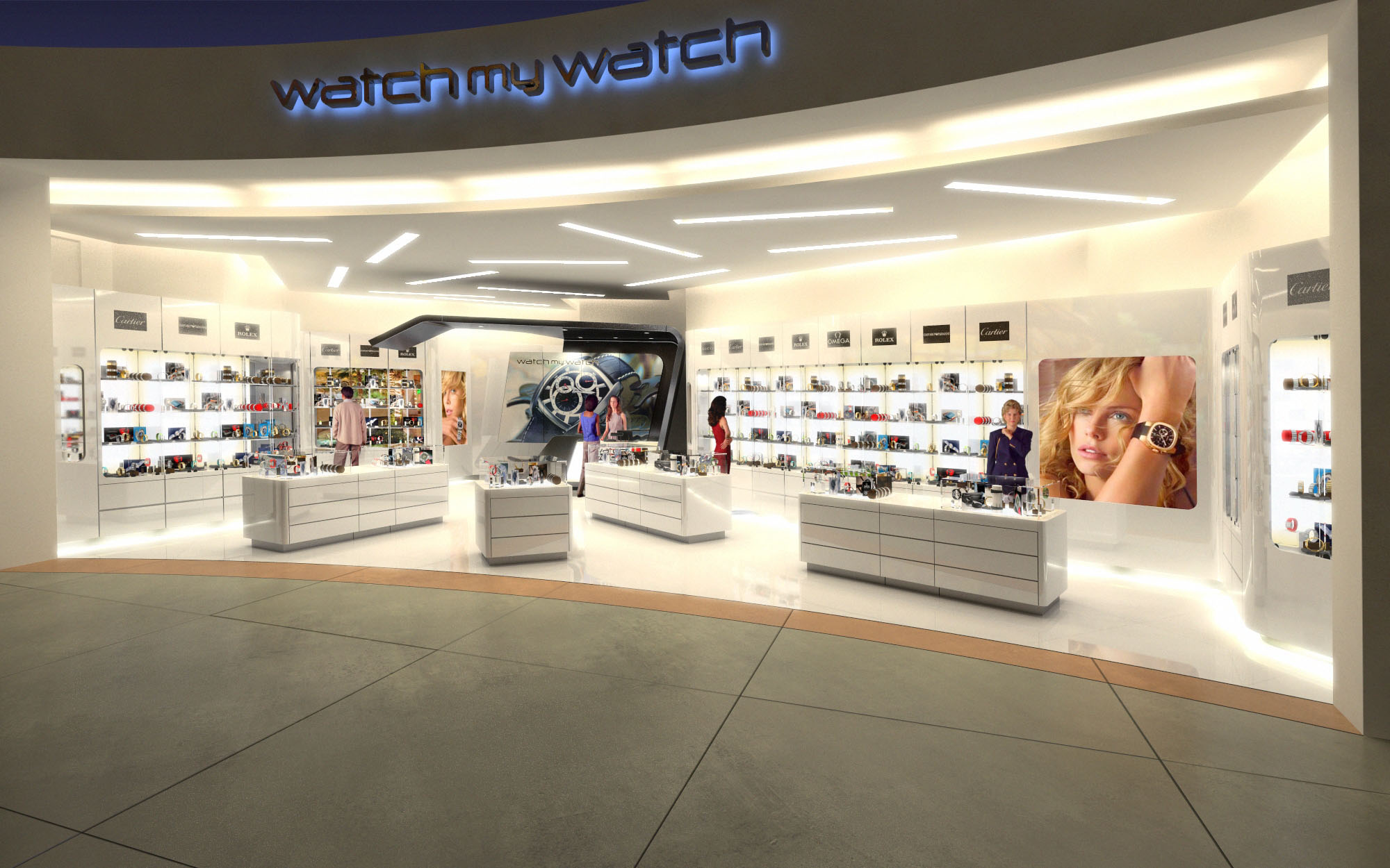
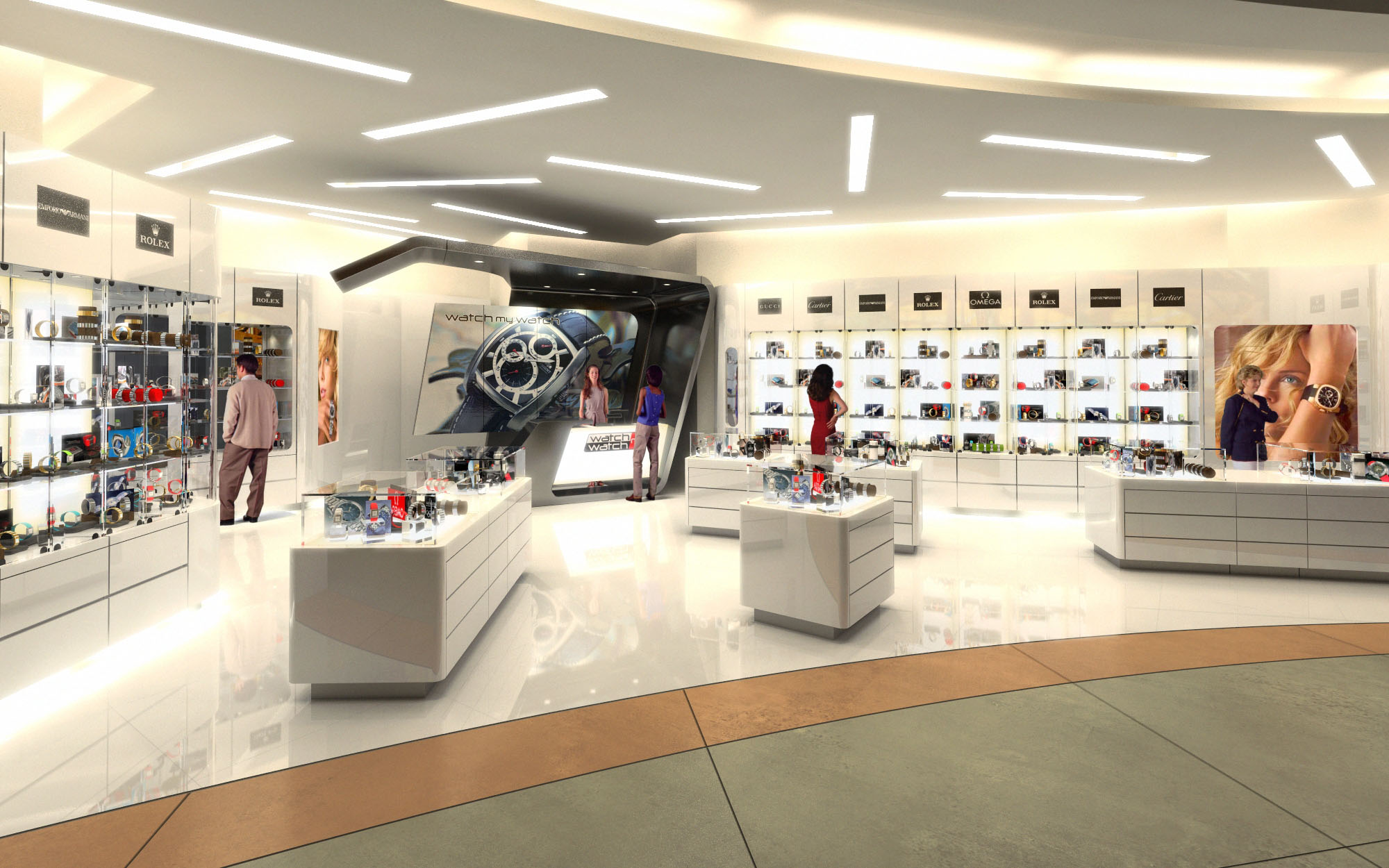
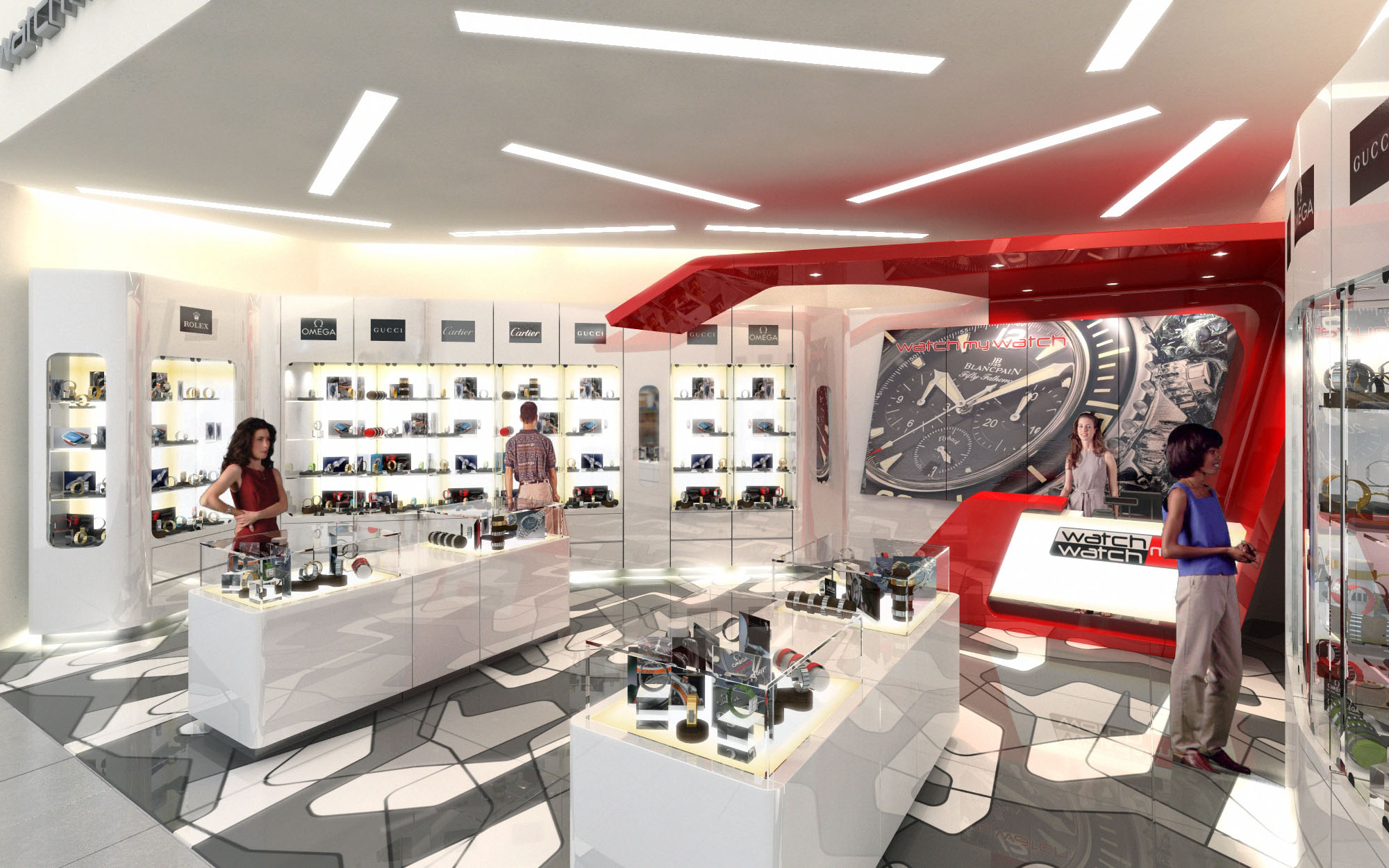
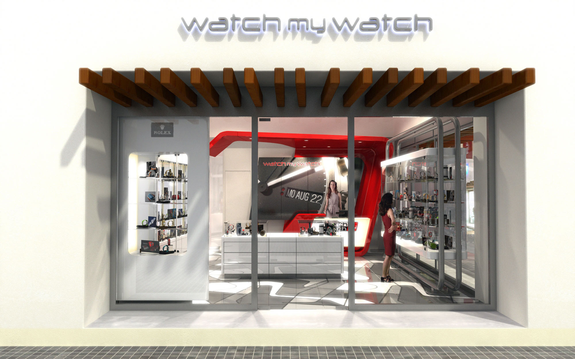
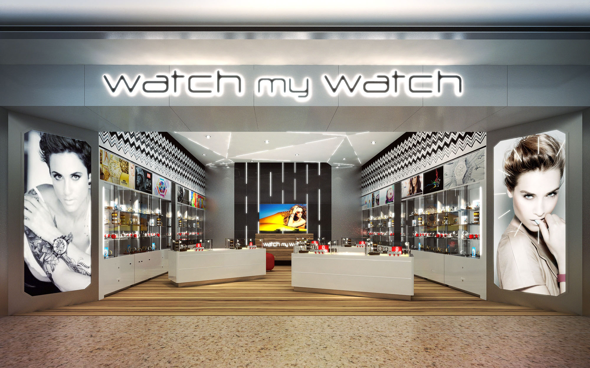
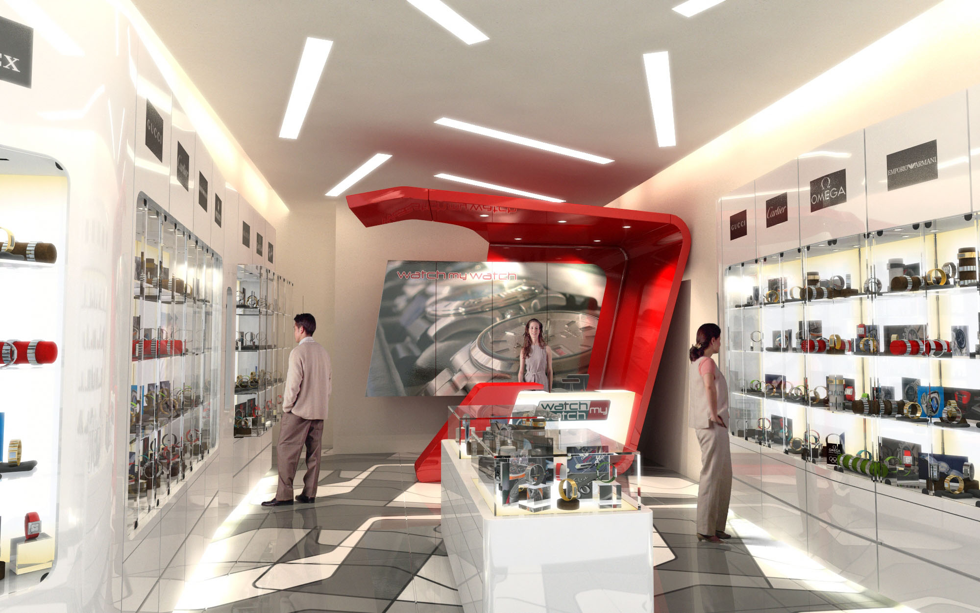
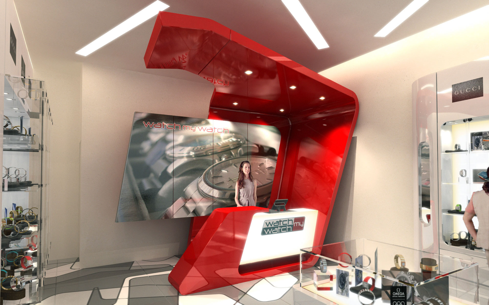
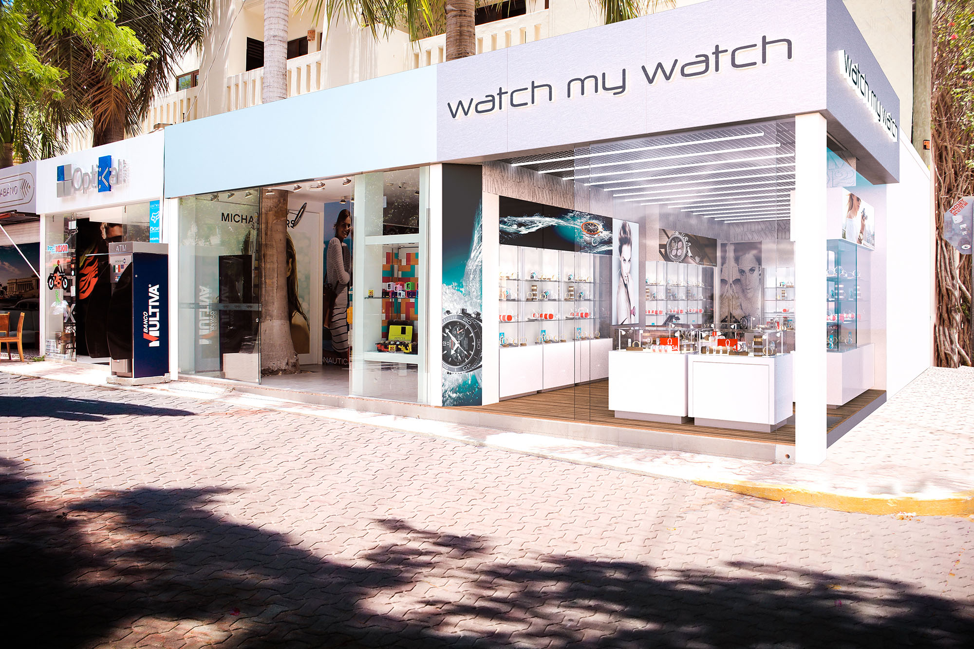
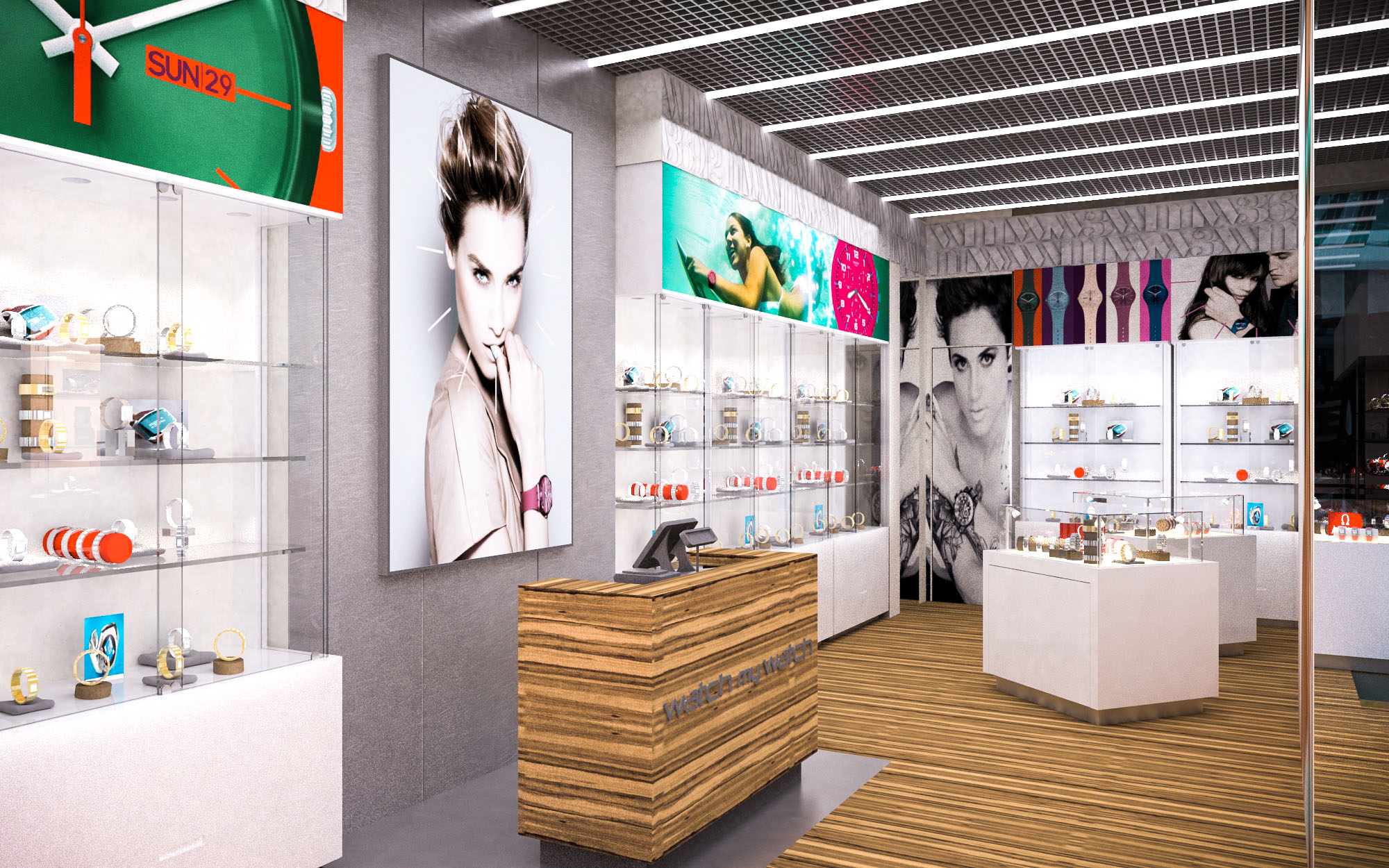
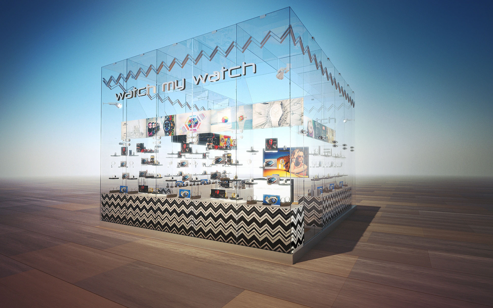
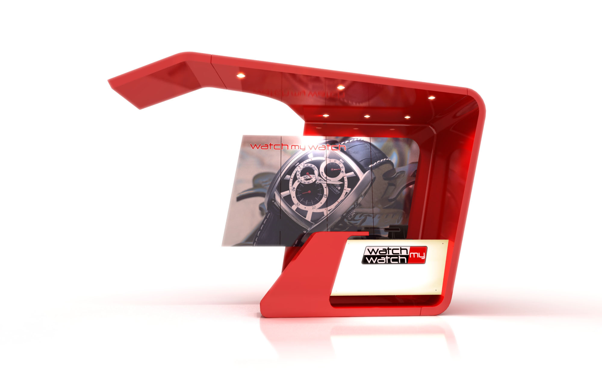
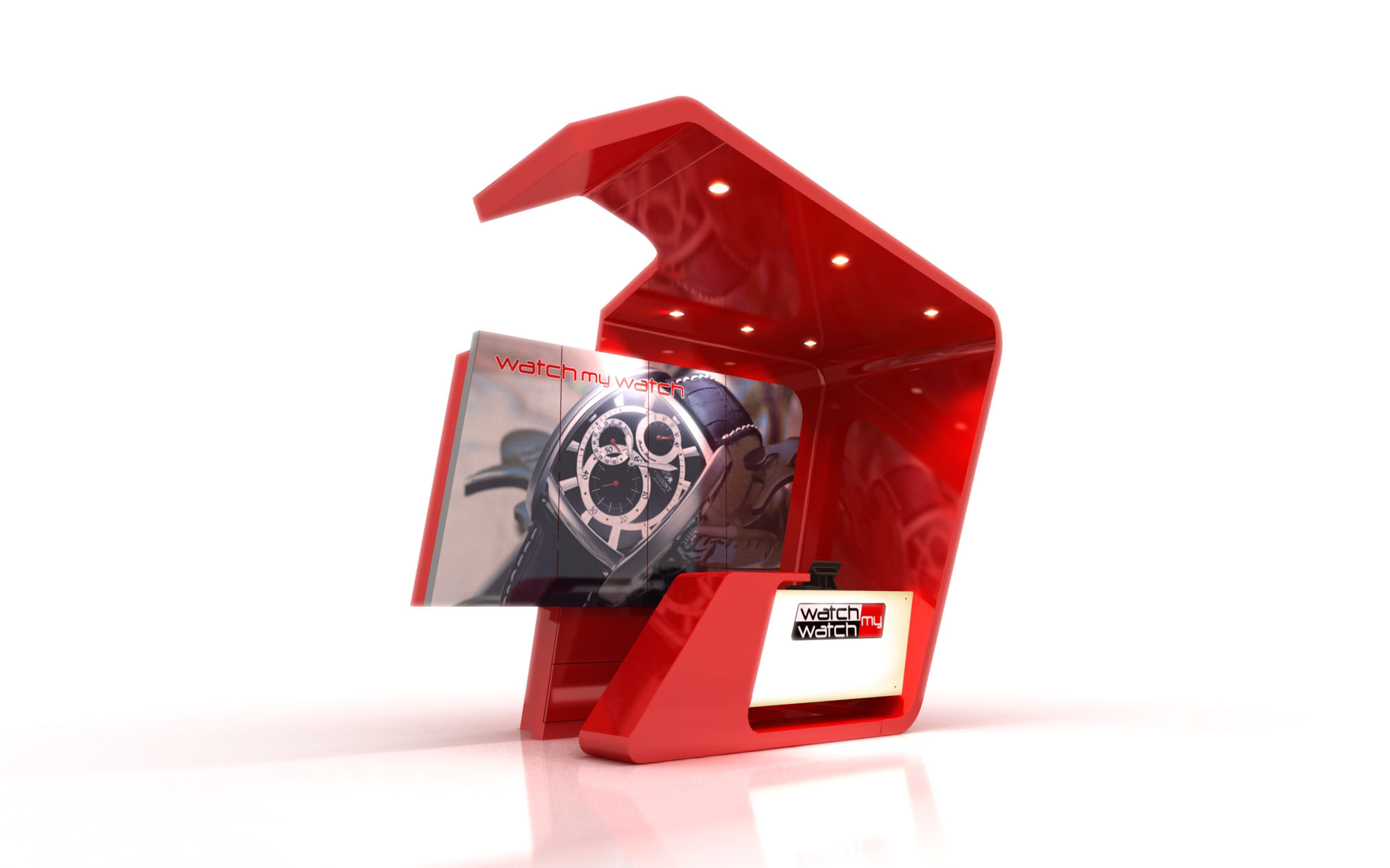
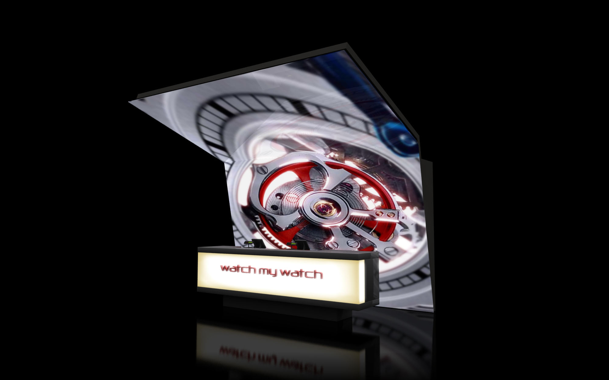
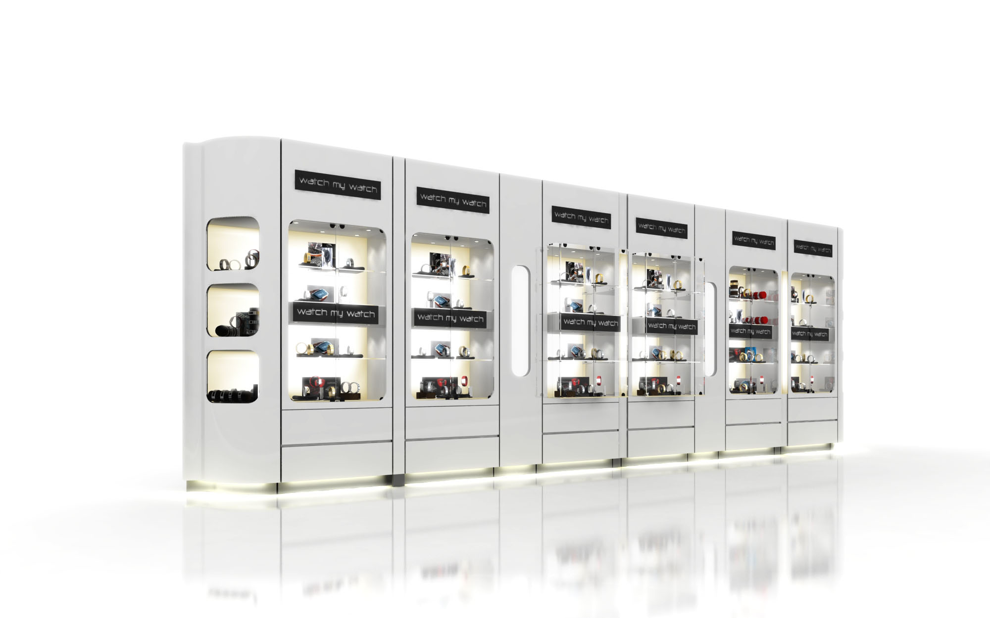
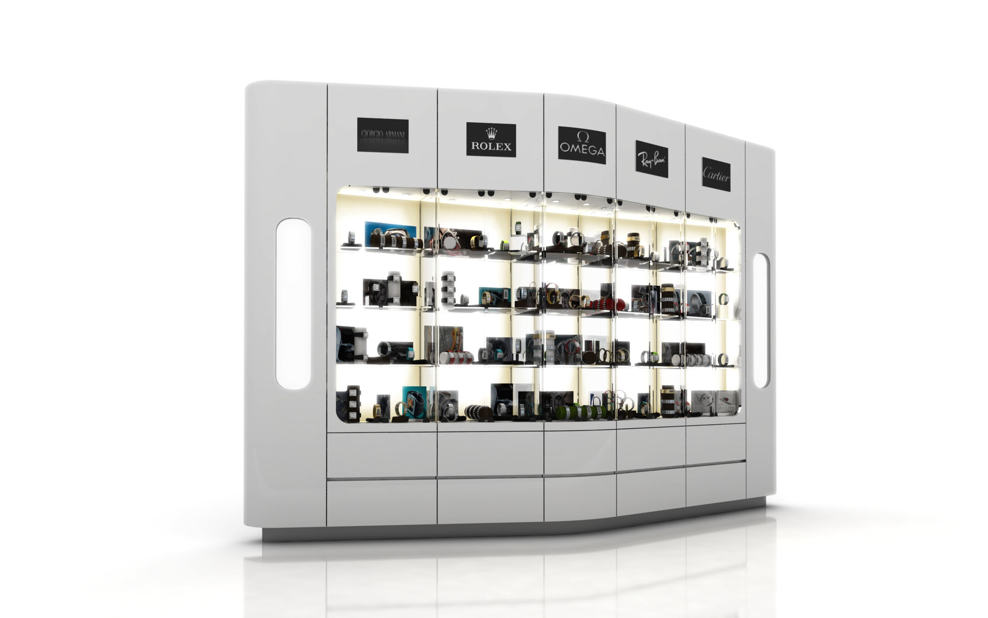
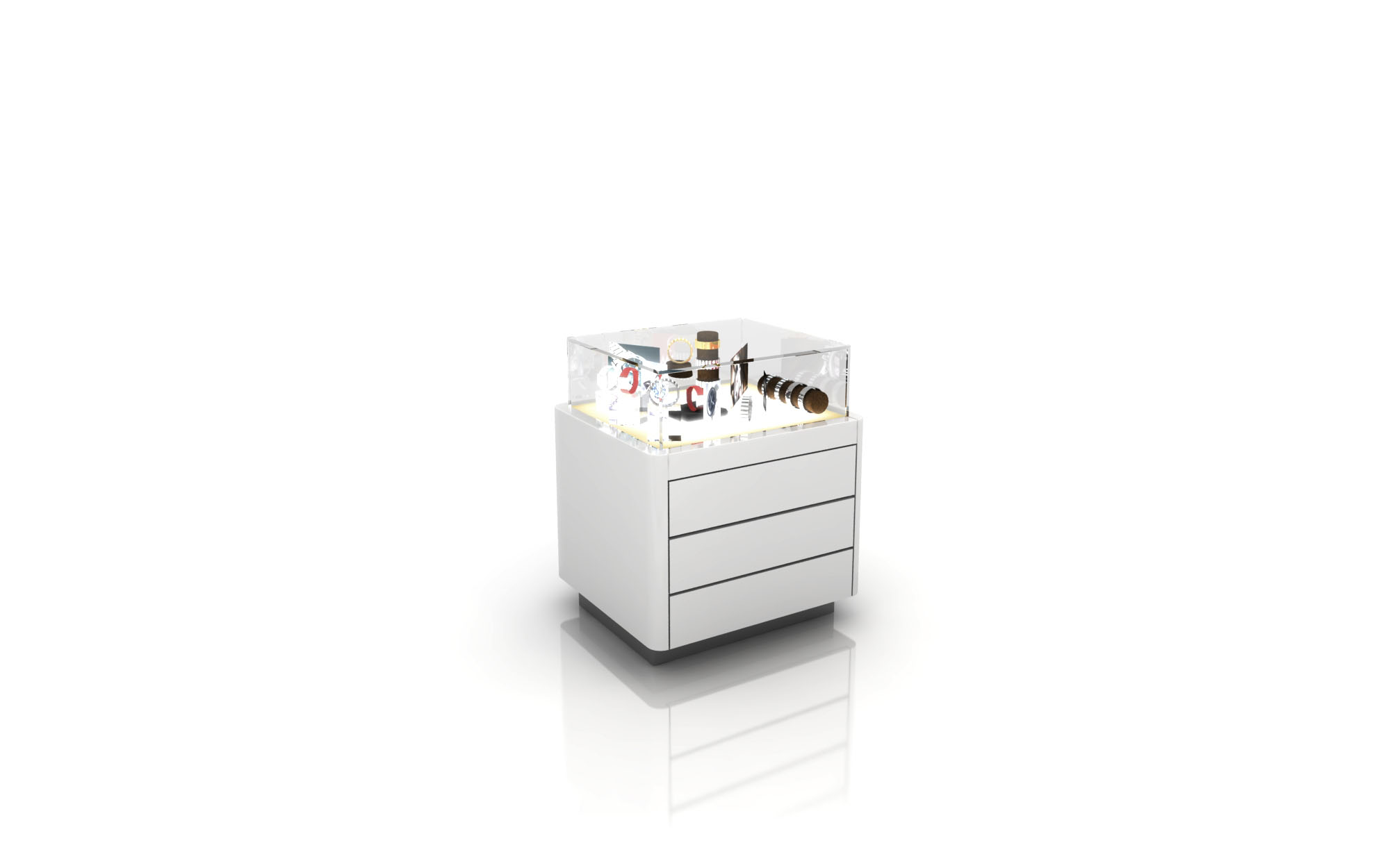
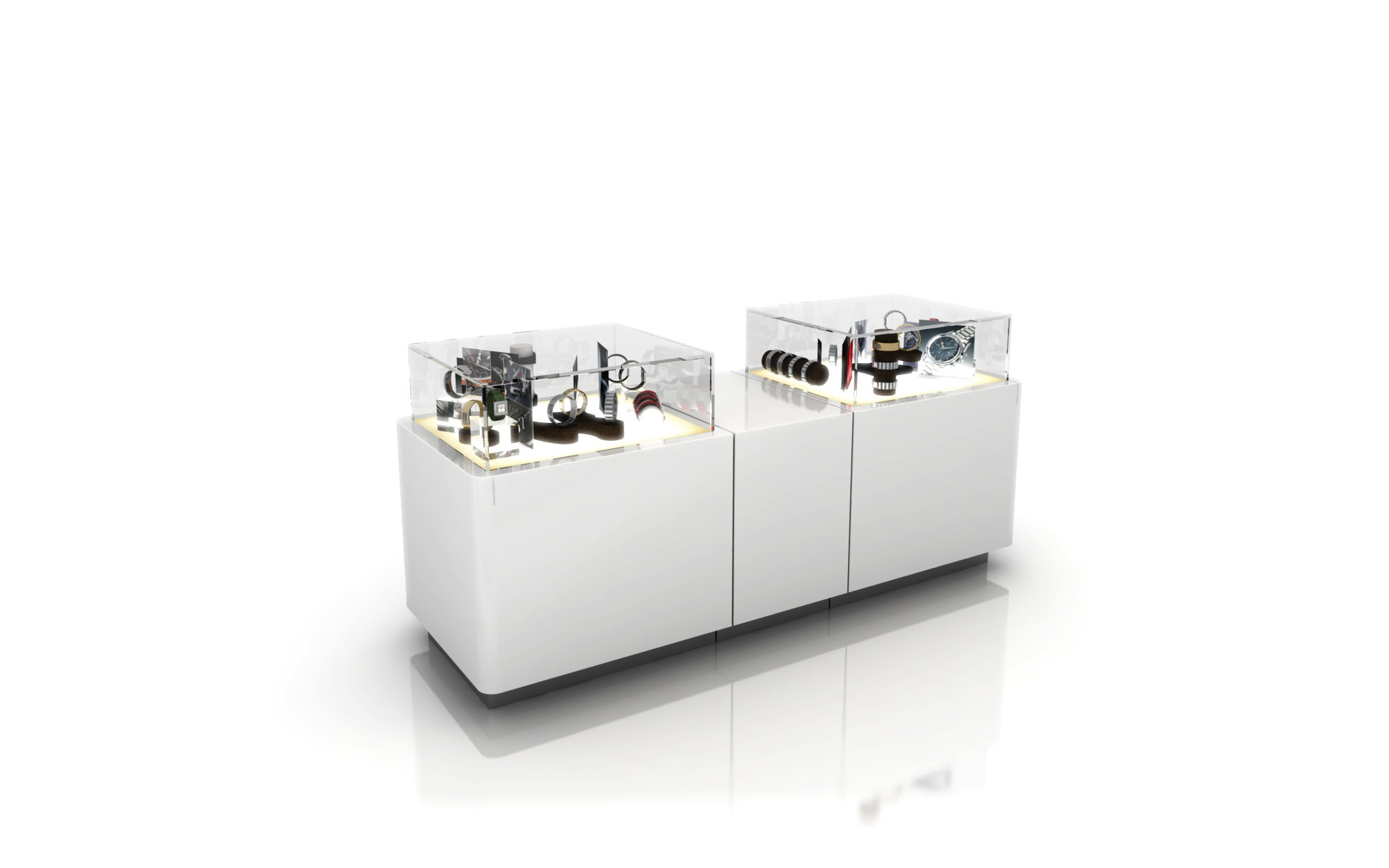
© 2021 by sanzpont [arquitectura] . Webpage by sanzpont [digital] . Innovative Digital Experiences

The Bellápierre Cosmetics store in Playa del Carmen is conceived as an immersive beauty “set,” where the customer steps into a contemporary studio environment. The spatial narrative merges the language of professional makeup stages with a futuristic retail gallery, communicating precision, glamour, and technical expertise. Clean white architectural envelopes, contrasted with deep black flooring and ceiling, create a neutral yet dramatic backdrop that allows the brand’s signature lilac accents and the chromatic richness of the products to stand out.
The concept prioritizes clarity of product display, controlled lighting, and a central experiential zone where makeup application and consultation become performative acts visible from every point of the store.
The layout is organized around a central axis, with the makeup station positioned on a lilac oval rug that anchors the space. This “island” functions as the main experiential node, while continuous perimeter walls house the product displays and graphic communication. Entry is directed toward the brand counter and logo, establishing an immediate visual connection to the illuminated backdrop and large-format images.
Circulation follows a loop strategy: customers naturally move along the left and right display walls, transitioning from skincare and base products to color ranges, before returning to the central station. Seating toward the rear offers a more intimate consultation corner, slightly recessed to provide comfort without losing visual contact with the rest of the store. The layout optimizes visibility, maintaining clear sightlines across the compact footprint.
The materiality supports a high-tech yet accessible aesthetic. Glossy black porcelain or high-pressure laminate flooring reflects light and products, visually expanding the space and adding depth. The walls and built-in display units are finished in high-gloss white lacquer, ensuring an ultra-clean, laboratory-like appearance that reinforces perceptions of purity and quality in cosmetics.
Lilac is applied in controlled accents: the central rug, counter fronts, illuminated side panels, and backlit brand elements. This curated use of color strengthens brand recognition without overwhelming the visitor. Transparent acrylic shelves and display trays present products as if floating, while satin metallic details in fixtures and stools lend a professional studio character.
Lighting design is a key component of the project. A black ceiling plane is punctuated by a matrix of circular, colored elements, suggesting makeup pans and acting as a strong iconic feature visible from outside the store. Integrated linear LED strips in the display walls provide uniform, shadow-free illumination on products, critical for accurate color perception.
At the central station, adjustable spotlights emulate photographic studio lighting, reinforcing the “backstage” concept and enabling precise makeup application. Large backlit graphic panels with high-resolution beauty imagery serve as both brand communication and ambient light sources. Digital interfaces at the central totem can host tutorials, product information, and dynamic content, enhancing the didactic dimension of the retail experience.
Furniture elements follow ergonomic standards of professional makeup stations: elevated director-style chairs, mobile lighting and mirrors, and inclined display racks that maintain optimal viewing angles. The sofa area offers relaxed seating for waiting clients or longer consultations, encouraging dwell time. All edges and transitions are rounded or chamfered, improving safety and comfort in a high-traffic retail context.
Sustainability is approached through the use of LED lighting throughout, minimizing energy consumption and reducing heat gain in the tropical climate of Playa del Carmen. Modular display units are designed for reconfiguration and long life, reducing the need for frequent replacements. High-durability laminates and finishes are specified to withstand intensive use, limiting waste over time. Where possible, structural components are conceived for disassembly, enabling recycling of metal and acrylic elements at end of life, aligning the brand’s physical environment with a responsible design attitude.
© 2021 by sanzpont [arquitectura] . Webpage by sanzpont [digital] . Innovative Digital Experiences
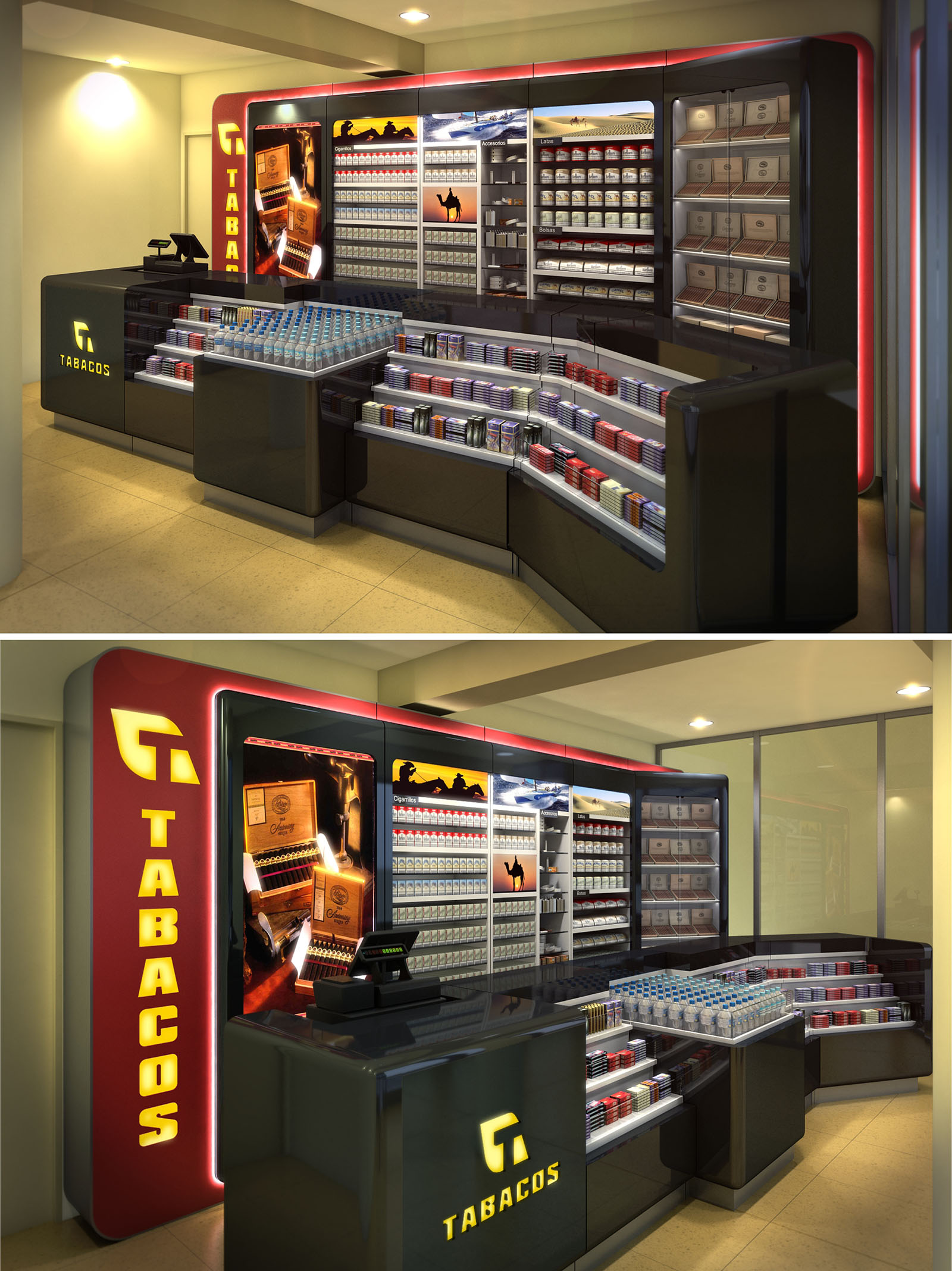
The design of Estanco Tabacos in Barcelona is conceived as a compact, highly visible retail device that concentrates product, branding, and circulation into a single continuous element. The project transforms a small premises into a strong urban interior landmark, using light, color, and glossy finishes to build a distinctive identity within the standardized imagery of the official “Tabacos” network. The furniture is treated as an integrated architectural object rather than a set of separate counters and shelves.
The concept is based on a dynamic perimeter band that wraps the main display wall and cash counter, framing the tobacco offer and guiding customer flow. This band, in red with integrated light, contrasts with the sober envelope of the shop, emphasizing the commercial heart of the space and reinforcing recognition from the exterior through the illuminated logo.
The plan is organized around a U-shaped counter system that defines a clear service perimeter while maximizing the linear meters of display. Customers circulate along the outer edge of this U, with products presented at low and medium height on the front counters and higher, back-of-house stock located on the wall display behind the cashier. This arrangement allows intuitive self-orientation and maintains visual control for the staff.
The cash point is strategically positioned at the intersection of the wall display and the central counter, acting as an anchor and visual pivot. From this point, the vendor has direct access to the full range of products and can manage both impulse purchases at the front and specific requests from the rear shelving. The geometry of the counters, with chamfered corners and soft curves, avoids bottlenecks and promotes smooth movement even in peak hours.
The furniture uses high-gloss lacquered panels in dark anthracite combined with transparent and translucent acrylics for the display areas. This contrast allows the product to become the true protagonist, with packaging colors intensified by the neutral, reflective background. Work surfaces are designed with durable, easy-clean finishes suitable for intensive retail use.
Lighting is a key compositional tool: integrated LED strips run along the red perimeter band and within the shelving, generating a uniform wash of light that eliminates shadows on the products. Warm spotlights in the ceiling complement this system, while the backlit “TABACOS” signage and logo create a layered luminous hierarchy that enhances brand presence without overwhelming the space.
The space translates the official tobacco identity into a contemporary retail language. The vertical brand totem at the entrance, with large backlit letters, operates as a threshold element and as an interior façade. Large-format photographic panels embedded in the wall display introduce atmospheric imagery associated with cigars and landscapes, bringing depth and narrative to an otherwise compact room.
Graphic organization follows clear zoning: mass-market products are arranged in rational, modular grids, while premium cigars occupy highlighted niches with warmer lighting. This hierarchy provides quick legibility for the habitual customer and, at the same time, supports upselling through strategically positioned highlight areas.
The project incorporates sustainability primarily through long-life components and energy-efficient lighting. The extensive use of LED technology significantly reduces electricity consumption and maintenance compared with traditional fluorescent systems, while also limiting heat gains in a small, enclosed retail space.
Furniture is designed as a modular system, allowing future reconfiguration or partial replacement without discarding the full installation. Durable finishes minimize the need for frequent renovation, and the compact layout optimizes conditioned area, reducing overall operational energy. Preference is given to materials with stable surfaces that facilitate cleaning with low-toxicity products, contributing to a healthier work environment for staff and regular users.
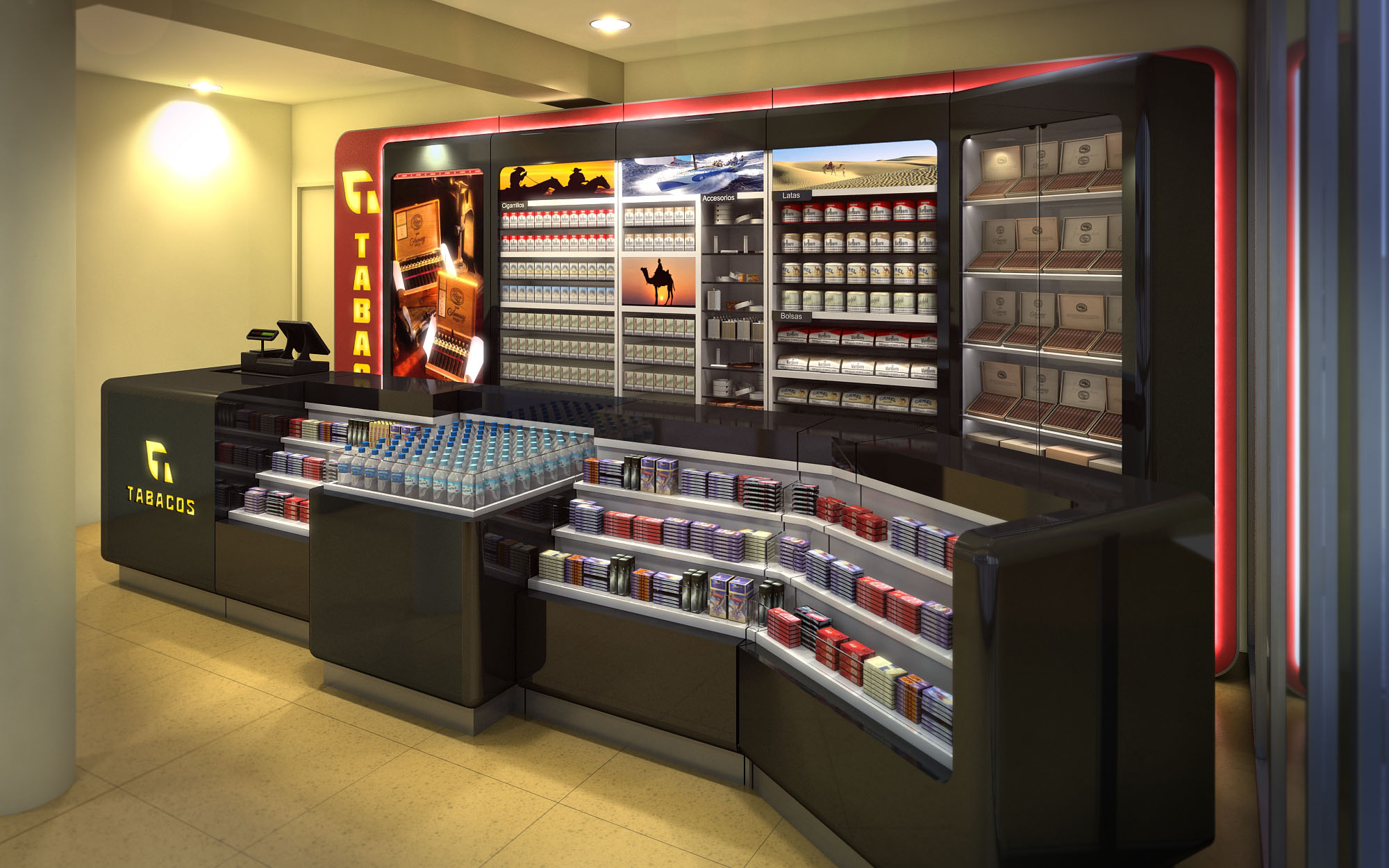
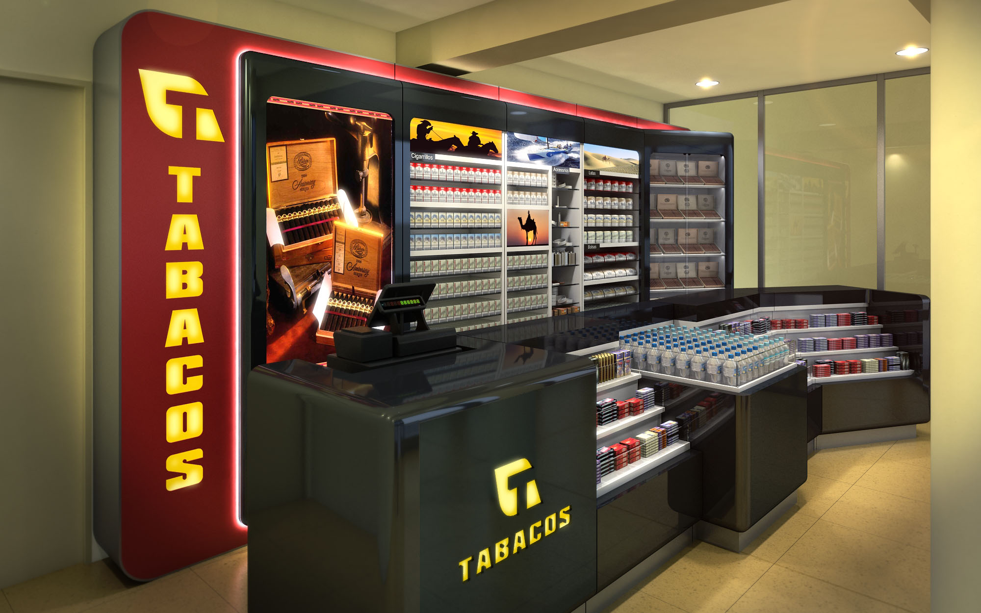
© 2021 by sanzpont [arquitectura] . Webpage by sanzpont [digital] . Innovative Digital Experiences
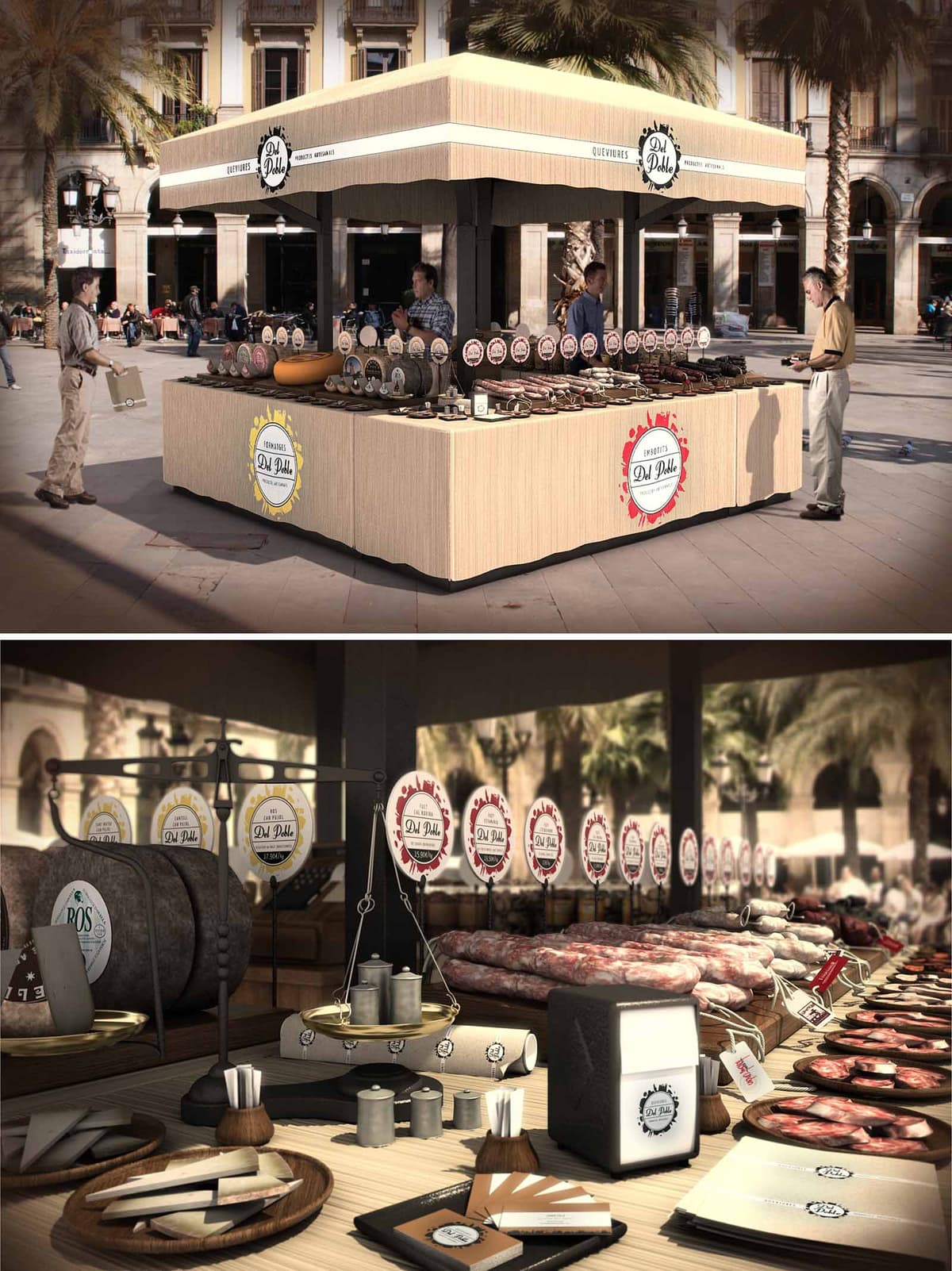

The Del Poble kiosk is conceived as a contemporary reinterpretation of the traditional market stall, designed to anchor itself in the urban life of Barcelona’s historic squares. The project emphasizes openness on all four sides, transforming the kiosk into a permeable island that invites approach from every direction and encourages direct interaction between vendor and visitor. The design merges the informality of a street market with a clear, recognizable visual identity, reinforcing the artisanal character of the products on display.
The volumetric composition is deliberately simple: a solid base, a lighter intermediate band, and a generous canopy that frames the kiosk as a civic object rather than a temporary stand. This tripartite structure ensures the kiosk is legible from a distance, functioning as a small urban landmark while remaining respectful to the surrounding historic façades and palm-lined plaza.
The kiosk is positioned as a freestanding cube, allowing continuous circulation around its perimeter and avoiding any visual obstruction of existing pedestrian flows. Its height and proportions are carefully calibrated to stay below the cornice lines of neighboring buildings and lampposts, maintaining a balanced relationship with the surrounding public space. The open-plan configuration removes physical barriers between interior and exterior, effectively extending the public realm onto the display counters.
The layout is organized through four continuous counter lines that form a perimeter ring. This arrangement maximizes display surface while keeping the center uncluttered for storage, preparation and staff circulation. Strategic corner openings generate natural access points for staff, enabling efficient movement between the service zone and each façade of the kiosk. This 360-degree service approach enhances visibility of the products and distributes customer queues evenly around the stand.
The kiosk uses a restrained material palette that draws on the tactile memory of traditional markets. The base counters are clad in a light, wood-textured surface that provides warmth and a neutral background for the intense colors of cured meats and cold cuts. This wood finish continues onto the horizontal worktops, where a higher-resistance laminate or sealed timber is proposed to withstand daily cleaning and heavy use.
Dark metal uprights and frames create a clear structural rhythm and visually anchor the canopy. The contrast between the warm wooden planes and the dark metallic elements underlines the crafted yet robust character of the kiosk. Edge detailing is kept clean and flush, avoiding unnecessary ornamentation and allowing the branding elements to stand out as the primary graphic layer.
The identity of Del Poble is integrated architecturally rather than applied superficially. Circular logos and color-coded labels form a continuous horizon line along the inner side of the canopy and above the product displays. This repetitive graphic system functions both as signage and as wayfinding, assisting the customer in reading product typologies and origins at a glance.
Products are arranged on tiered wooden platters and boards, emphasizing horizontality and abundance. The almost museum-like alignment of sausages, hams and sliced meats elevates everyday food into curated objects while still retaining an approachable, market atmosphere. Auxiliary elements such as scales, napkin dispensers and packaging have been designed or selected to echo the same palette and graphic language, ensuring visual coherence across every touchpoint.
The kiosk prioritizes ergonomics and operational efficiency. Counter heights are calibrated for both comfortable service and clear visibility of the displayed goods, allowing customers to observe textures and cuts without bending or stretching. The central working area is conceived as a compact back-of-house, with under-counter storage for refrigerated units, packaging, tools and waste separation systems.
The open edges facilitate informal interaction, enabling staff to engage with customers across short distances and maintain visual contact even during peak periods. The large overhanging canopy offers shade and reduces glare on the product surfaces, improving color perception and comfort for users standing around the kiosk.
Sustainability is addressed through the kiosk’s compact footprint, material selection and potential for reusability. The design favors durable, replaceable cladding panels over disposable decorative elements, extending the service life of the structure and minimizing maintenance interventions. Wood-based components are envisaged from certified sources, using finishes with low volatile organic compounds to reduce environmental impact and improve air quality for staff.
The open-air configuration reduces the need for mechanical ventilation and artificial lighting during daytime, relying instead on natural cross-ventilation and daylight. Integrated LED strips can be added beneath the canopy for low-energy evening illumination, highlighting the products without producing excessive heat. The kiosk’s modular structure allows for disassembly, relocation or future adaptation to different public spaces, supporting a circular approach to urban furniture and ephemeral retail architecture.
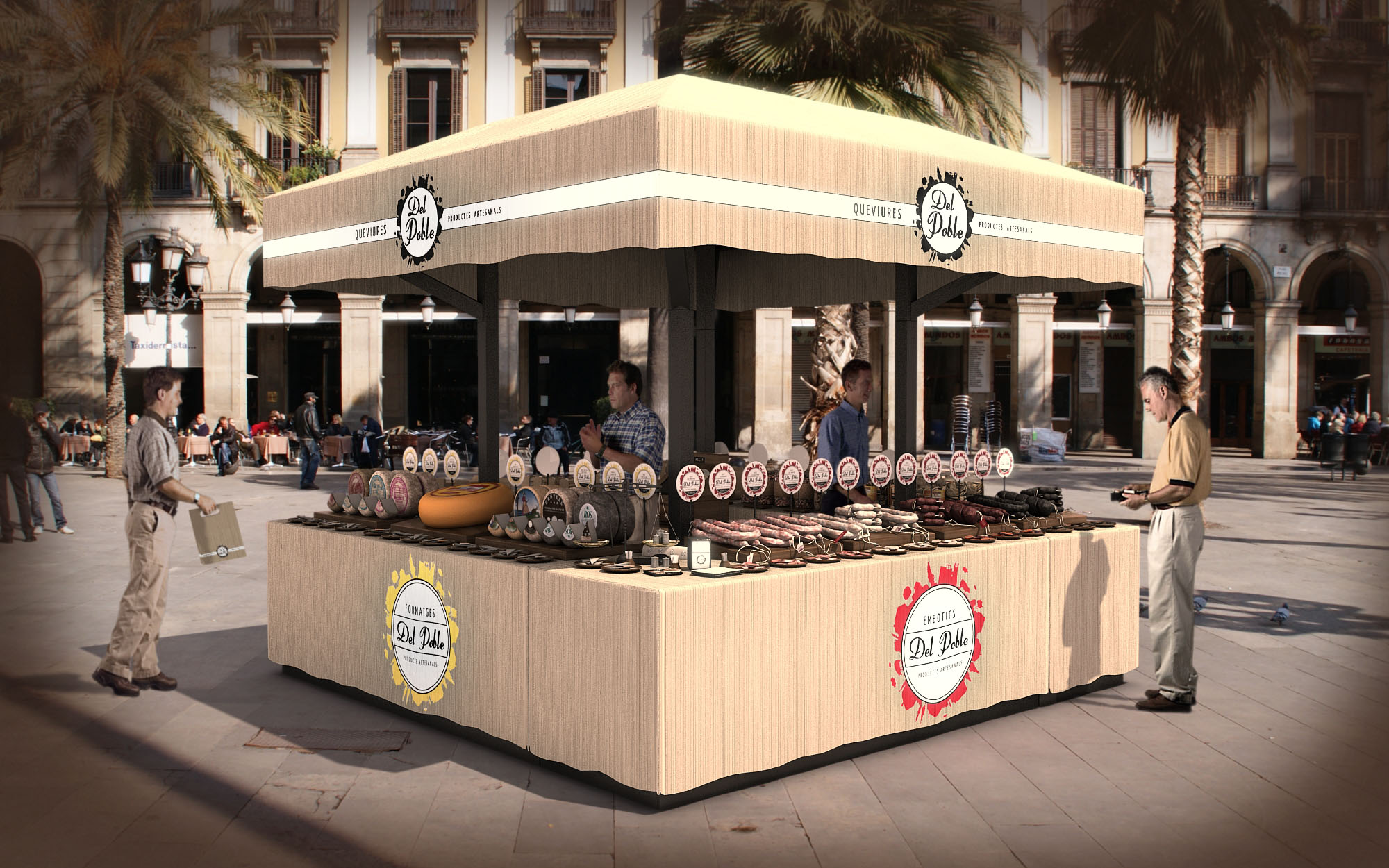
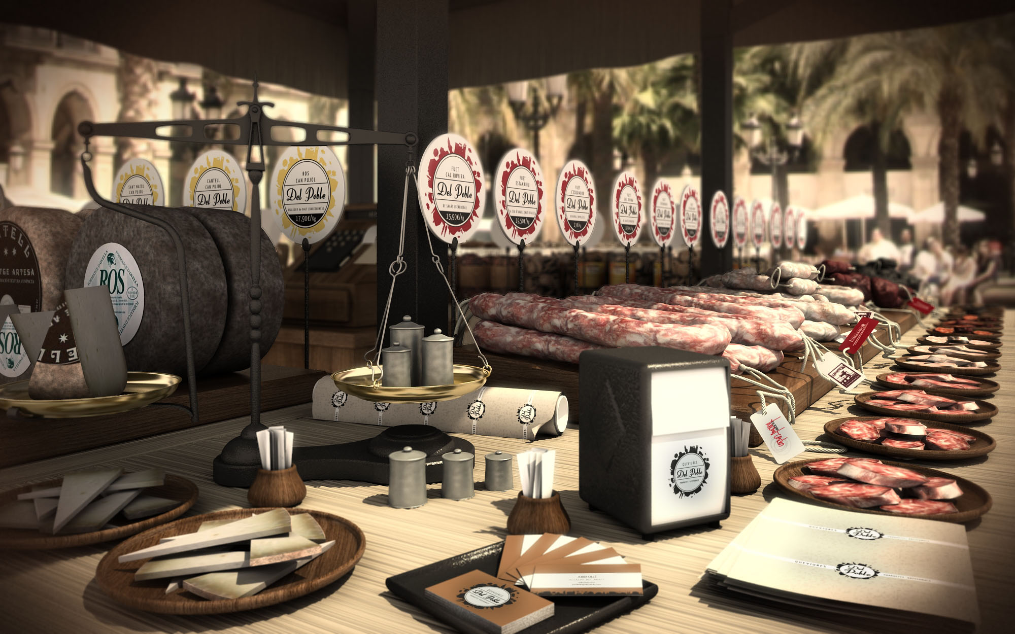
© 2021 by sanzpont [arquitectura] . Webpage by sanzpont [digital] . Innovative Digital Experiences

The Sunglass Hut store in Cancún is conceived as a luminous showcase that merges fashion retail with the clarity and precision associated with optical products. The design is based on a clean, orthogonal geometry where ceiling, floor and display walls form a continuous frame for the merchandise. The architecture acts as a neutral but sophisticated background, allowing lenses, colors and reflections of the sunglasses to become the true protagonists. A restrained palette of white, warm wood and deep chocolate is selectively energized with neon lime accents, evoking the tropical vibrancy of Cancún while maintaining a cosmopolitan character.
The spatial strategy focuses on transparency and visual permeability from the mall corridor. A fully glazed façade, with suspended branding and digital media panels, creates a seamless transition between exterior and interior. The store works as an illuminated “hut” of light within the larger commercial environment, inviting passersby to enter through strong linear perspectives that direct the gaze to the central display islands and back feature wall.
The plan is organized around a clear central axis, with freestanding display tables structuring the primary circulation loop. These islands are dimensioned to maintain generous passing widths, allowing customers to move fluidly between furniture pieces while maintaining constant contact with the product. The perimeter is dedicated to high-capacity linear shelving systems that maximize wall surface, combining horizontal trays and slender vertical supports to display a large assortment without visual clutter.
The checkout and service counter is strategically positioned at the back, aligned with the main axis so that the customer journey gradually discovers the full extent of the collection. Low seating elements—cylindrical poufs—punctuate the floor and provide comfortable testing points without interrupting sightlines. The layout enables multiple simultaneous interactions: quick browsing along the walls, more focused examination at central islands, and personalized attention at the back counter.
The material selection emphasizes contrast between warm and cool sensations. The flooring is a light, natural-toned wood or wood-look surface that introduces warmth and tactility while reflecting light softly. This is complemented by white lacquered display furniture with sharp, minimal profiles, which reinforces the sense of precision and cleanliness associated with eyewear. Vertical surfaces alternate between high-gloss white panels and dark, almost black, backgrounds that frame the merchandise with depth.
Neon lime details appear as linear inlays in the floor, graphic patterns on pedestal bases and luminous ceiling elements. These accents provide a dynamic visual code for seasonal campaigns—such as “Spring”—without overwhelming the core neutral base. Transparent glass is heavily used for display cases and balustrades, ensuring that the structure of the furniture almost disappears and the sunglasses appear to float, accentuated by carefully controlled reflections.
Lighting is treated as a primary design element, both functional and atmospheric. Rectangular luminous frames in the ceiling define the commercial area and mirror the geometry of the central islands, creating an ordered grid of light. The general illumination is neutral to slightly warm, ensuring accurate color rendering of frames and lenses. Integrated LED strips in the shelving systems deliver frontal light to each product, minimizing shadows and making the details of the eyewear clearly legible.
Feature ceilings with lime-colored soffits introduce a second, more expressive lighting layer, using backlit panels and spotlights to highlight promotional zones. Reflected light from the glossy ceiling and vertical panels contributes to an overall luminous, almost weightless ambiance, reinforcing the concept of brightness associated with sun and outdoor lifestyle.
Brand identity is seamlessly embedded in the architecture through the consistent use of logo bands, typography and integrated digital media. The façade carries a suspended sign and a large-scale image panel that establishes immediate brand recognition from the mall corridor. Inside, the back feature wall with logo functions as a visual anchor, aligning with the main perspective and closing the visual sequence.
The customer experience is conceived as intuitive and immersive, where the combination of clear organization, comfortable seating and subtle wayfinding through light and color leads visitors naturally through the collections. The environment balances the feeling of a high-end boutique with the accessibility of a self-service store, encouraging both quick purchases and more leisurely exploration.
Sustainability is approached through material selection, lighting efficiency and long-term adaptability. The extensive use of LED technology in ceiling fixtures and integrated shelf lighting significantly reduces energy consumption and maintenance compared to traditional systems. The neutral architectural base—wood flooring, white and dark panels, and simple modular furniture—extends the life cycle of the store, as seasonal changes can be implemented primarily through graphics, colors and digital content rather than complete remodels.
Where possible, finishes are specified with durable, low-VOC coatings, ensuring indoor air quality and reducing replacement frequency in a high-traffic retail environment. The modular display units and wall systems are designed for disassembly and reconfiguration, facilitating reuse in future store formats or relocations. This design strategy minimizes waste and aligns the brand’s physical presence with responsible resource management, an increasingly important value for visitors in a destination such as Cancún.
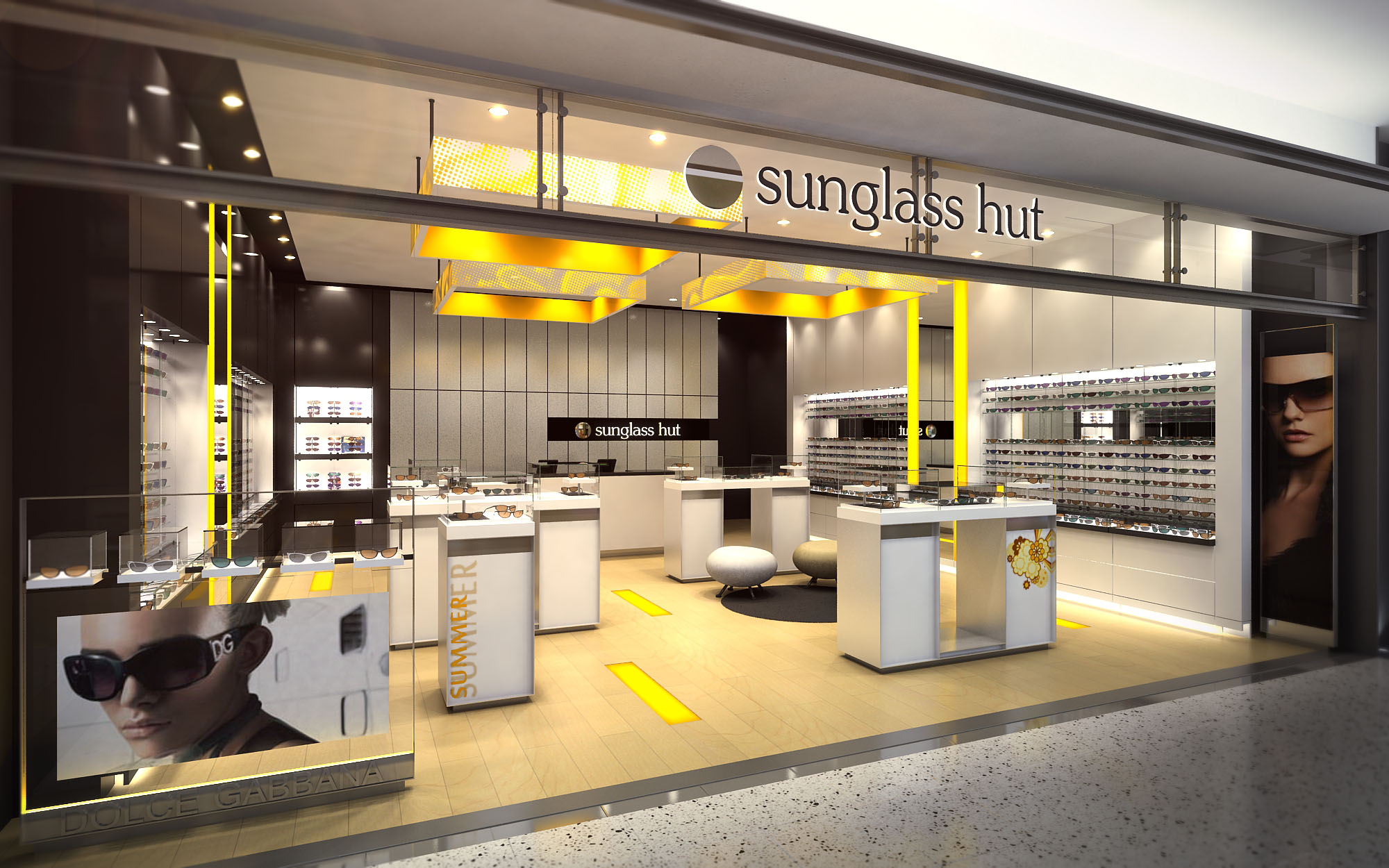
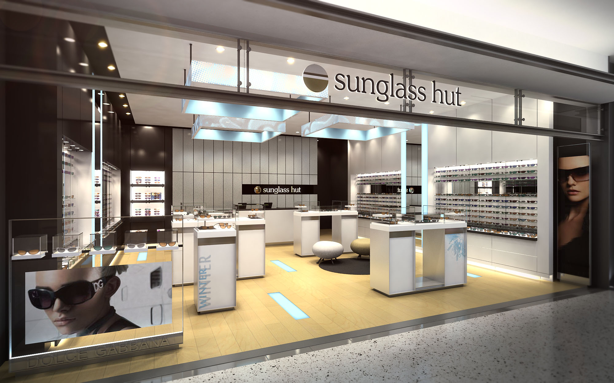
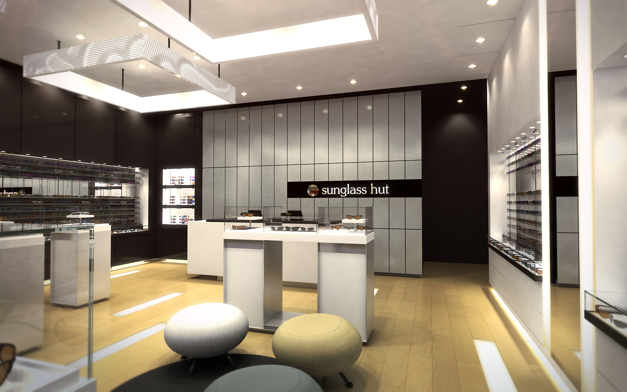
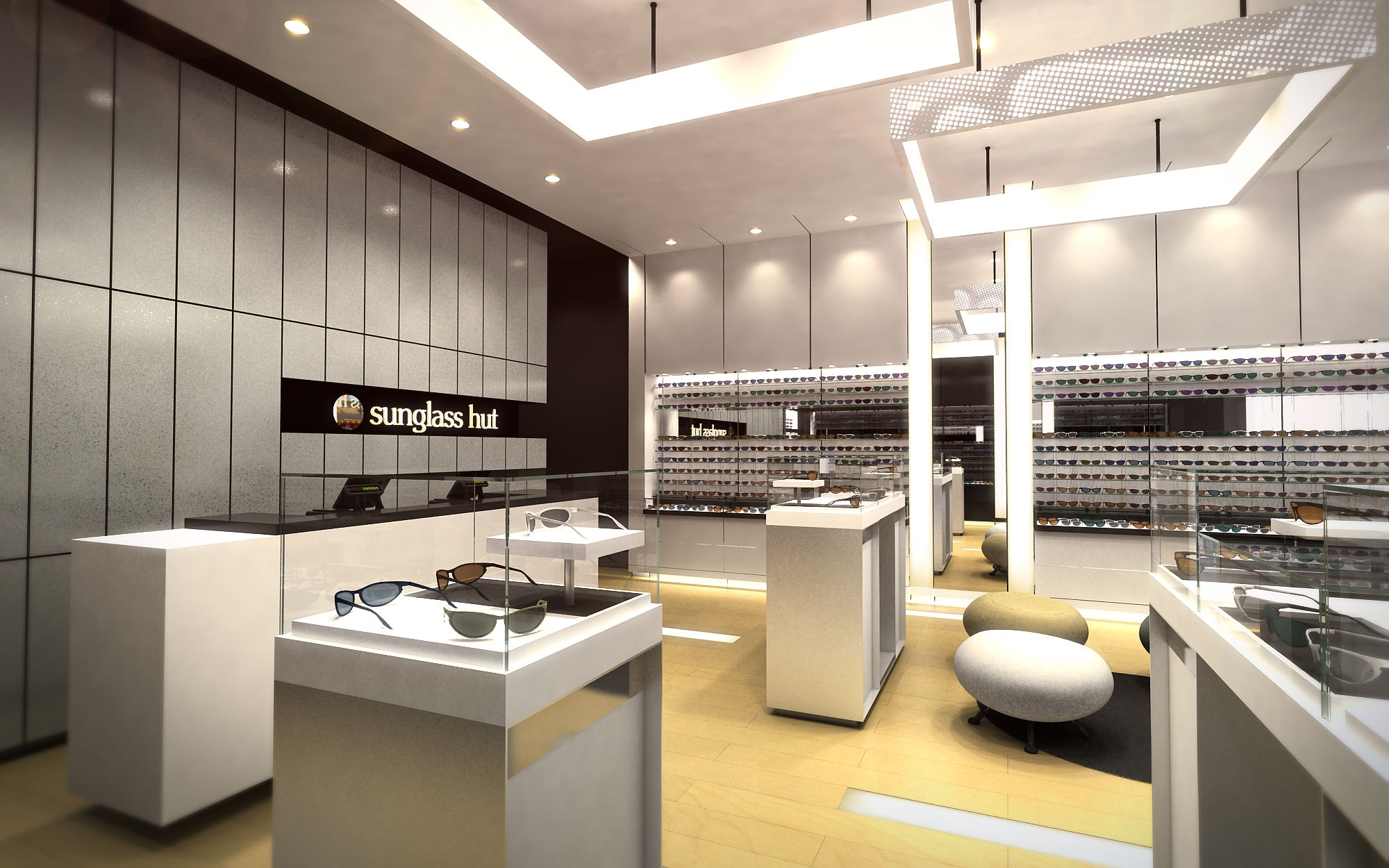
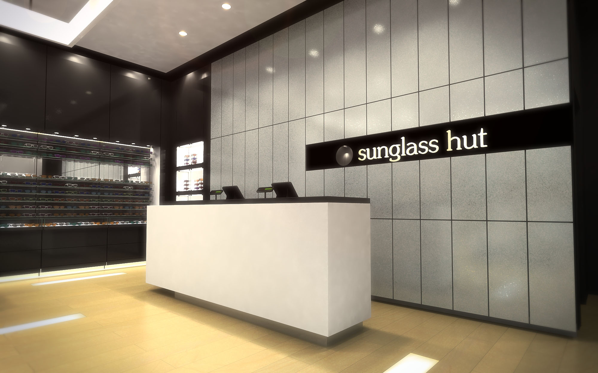
© 2021 by sanzpont [arquitectura] . Webpage by sanzpont [digital] . Innovative Digital Experiences
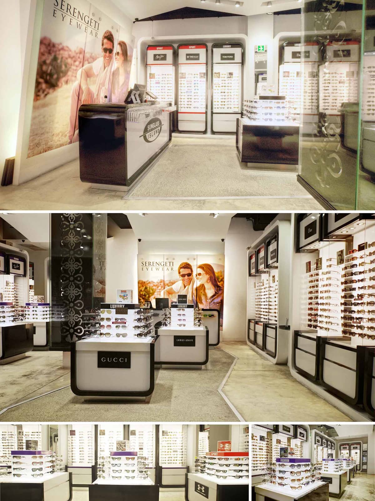

The design of Sunglass Island is conceived as a bright gallery for eyewear, where each brand becomes a curated exhibit within a continuous, fluid space. The concept balances an almost clinical precision in product display with a warm, lifestyle-oriented graphic backdrop, connecting technical performance with aspirational imagery. The environment is intentionally neutral and monochromatic so that color, reflection, and diversity of frames provide the visual richness.
The store identity relies on a strong perimeter frame: dark-edged, rounded modules that encase luminous walls of sunglasses. These “islands” of light create an immediate focal attraction from the corridor of a mall, while the center of the store is occupied by lower-height display blocks that maintain visual transparency and encourage free circulation.
The layout is organized along a clear axial route that guides visitors from the entrance towards the large illuminated lifestyle image at the rear, used as a visual anchor. Around this axis, display modules are arranged in a loose grid, allowing multidirectional movement and easy cross-navigation between brands and product categories.
Perimeter walls are dedicated to high-density display, maximizing vertical surface with linear shelving and integrated backlighting. Freestanding central units provide moments of pause and closer interaction with selected products and premium labels. The cash counter is located near the entrance, acting as a threshold element and control point, yet kept visually light so as not to obstruct the transparency of the interior.
The material palette is deliberately restrained: polished dark laminates for frames and edging, matte white display fields, clear and etched glass, and a continuous light-toned floor. This neutral base serves to reflect and diffuse light, allowing the metallic finishes and lens colors of the sunglasses to stand out.
Contrasting black trims define each module, creating a graphic rhythm and subtly evoking the outline of eyewear frames. Glass partitions incorporate decorative etching, adding texture and a degree of privacy without compromising transparency. The floor combines smooth concrete or microcement with inset paths, subtly guiding circulation while resisting heavy foot traffic typical of retail environments.
Lighting is a critical component of the project and is treated as both functional infrastructure and branding tool. Backlit shelves provide uniform, shadow-free illumination to the eyewear, ensuring accurate perception of lens color and frame details. This luminous backdrop also visually expands the space, making the store feel larger and more open.
Adjustable ceiling spotlights highlight central display islands and vertical brand panels, creating layers of accent lighting. Warm-neutral color temperatures are selected to flatter skin tones during fittings while keeping the merchandise crisp. The large luminous graphic walls act as oversized light boxes, blending visual communication with ambient glow.
The interior architecture is designed as a flexible matrix for multiple international brands. Each brand is assigned dedicated zones with clear signage but contained within a unified display language, avoiding visual fragmentation. Logos are integrated into the fascia of the modules and into the central islands, ensuring easy orientation and intuitive product segmentation between sport, luxury, and lifestyle categories.
Large-scale photographic graphics at key focal points reinforce the aspirational and outdoor narrative associated with sunglasses, contrasting the highly controlled interior with images of open landscapes and natural light. This duality strengthens the emotional connection between product and user experience.
Sustainability is addressed primarily through lighting efficiency, material durability, and modular design. LED technology is specified throughout for backlighting and spotlights, reducing energy consumption and maintenance while providing stable, low-heat illumination that protects the merchandise.
The modular display system allows reconfiguration for new collections and brand rotations without the need for major construction, extending the life cycle of the fit-out. Durable finishes such as laminates, glass, and polished concrete minimize replacement and cleaning requirements, contributing to lower long-term environmental impact. Where possible, components are designed for disassembly, enabling reuse across multiple locations within the brand’s 21-store network in Mexico and the USA.
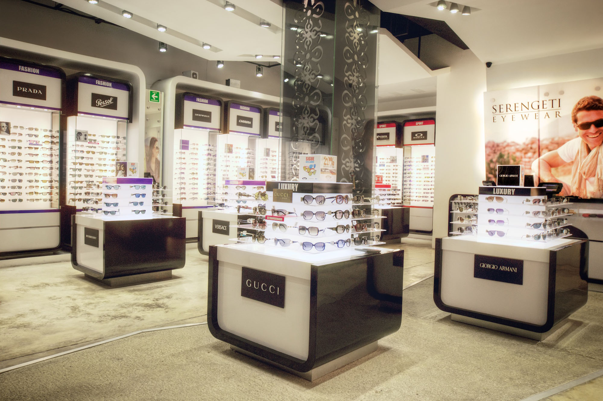
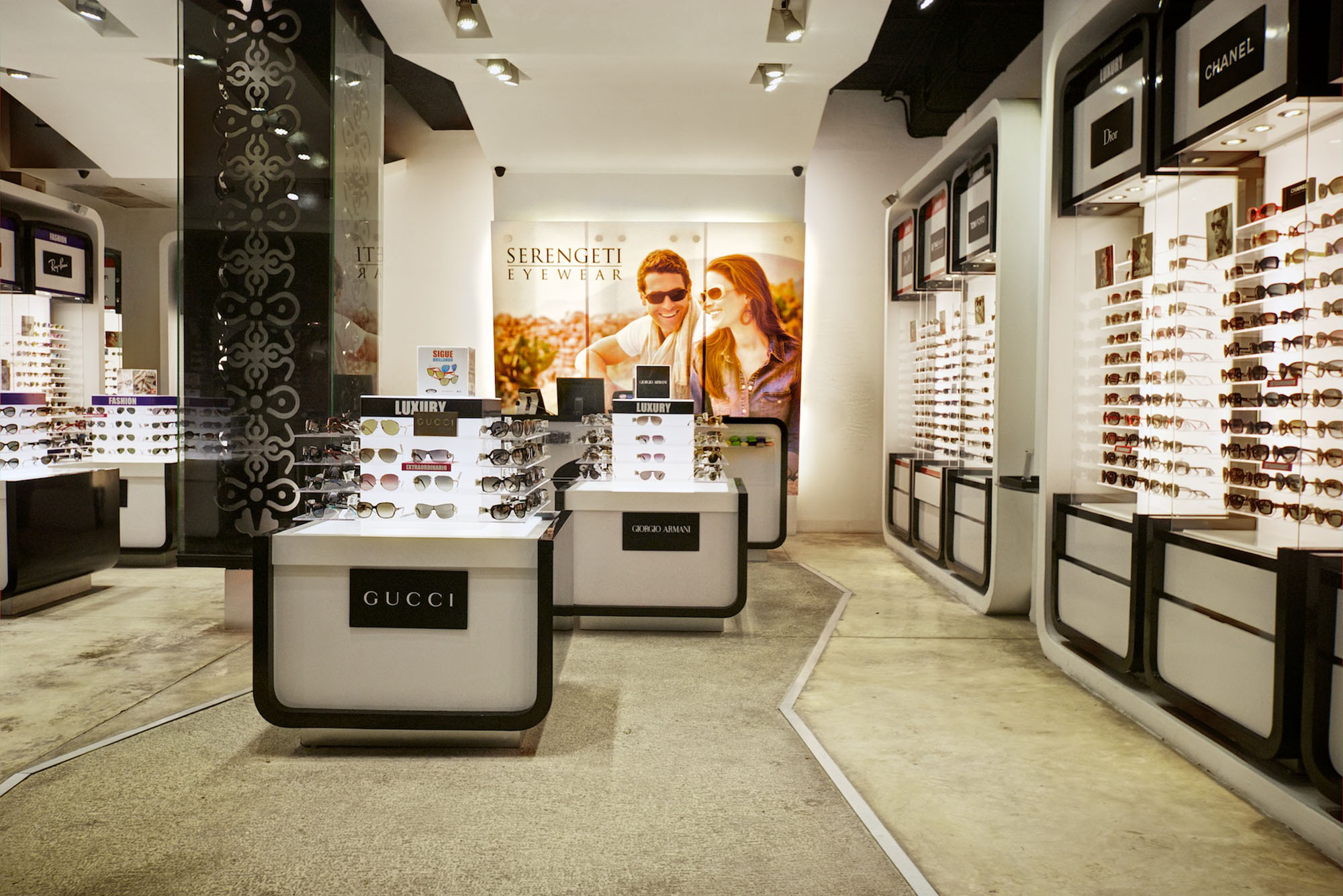
© 2021 by sanzpont [arquitectura] . Webpage by sanzpont [digital] . Innovative Digital Experiences

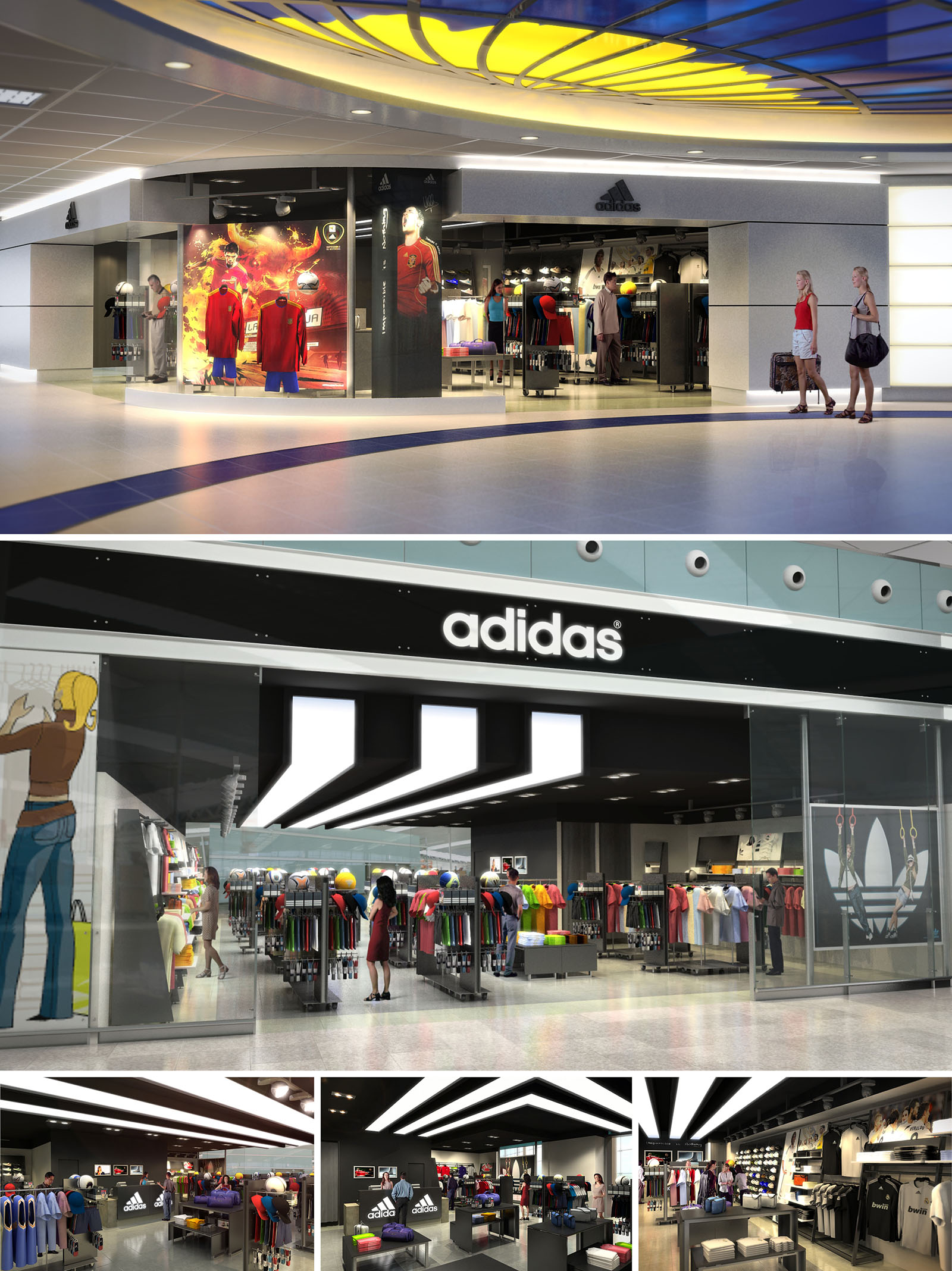
The portfolio of Adidas retail projects in multiple locations across Spain is conceived as a consistent yet locally adaptable brand environment. The core concept is to translate the values of performance, innovation, and urban culture into spatial form, creating immersive experiences rather than conventional product displays. Each project works with a clear narrative: the store as an “urban arena” where sport, technology, and lifestyle intersect, articulated through strong geometry, controlled lighting, and a robust, industrial-inspired material palette. Brand identity is reinforced through bold graphic elements and a calibrated use of the Adidas color code, while spatial fluidity encourages intuitive circulation and product discovery.
The design strategy focuses on modularity and repeatable design components, allowing for efficient rollout across multiple sites while maintaining enough flexibility to respond to each store’s scale, context, and customer profile.
The spatial organization typically follows a clear zoning logic: entrance as impact zone, central floor as dynamic display field, and perimeter as product “shell” for more detailed browsing. The introduction zone near the access concentrates key brand messages, latest collections, and digital content, immediately immersing visitors in the Adidas universe.
Circulation is planned through generous, unobstructed axes that guide movement diagonally across the space, maximizing visual connections and product exposure. Fixtures are kept relatively low in central areas to preserve long sight lines, while higher perimeter walls structure the space and act as graphic backdrops. Secondary paths lead to more specialized areas—such as running, training, or lifestyle—allowing customers to self-select their journey according to interest and time available.
The material palette blends raw and technical finishes, referencing both sports infrastructure and contemporary urban spaces. Typical floors are in polished concrete or high-resistance resin, offering durability and a neutral base that highlights the merchandise. Walls alternate between exposed or painted concrete, technical wall cladding, and large-format graphic panels, enabling quick update of campaigns.
Ceilings often reveal technical installations, painted in dark tones to create depth and visually “dematerialize” the upper plane, focusing attention on the products and illuminated zones. Metal profiles, perforated steel, mesh panels, and tubular structures provide a light yet robust system for shelving and hanging displays. The chromatic language is primarily monochromatic—greys, blacks, and whites—accented by Adidas’ brand colors strategically placed on signage, lighting details, and key fixtures, reinforcing brand recognition without overwhelming the space.
Lighting plays a fundamental role in emphasizing the sporty, high-performance character of the stores. A combination of linear LED tracks, projectors, and integrated shelf lighting creates layered illumination, with higher intensities on products and focal points, and more subdued ambient light in circulation zones. Adjustable track lights ensure flexibility to adapt to new merchandising layouts and seasonal changes.
Visual communication is fully integrated into the architectural framework. Large-format light boxes, dynamic digital screens, and supergraphics on walls and columns articulate collections, athlete stories, and collaborations. Typography and iconography are consistent across locations, turning signage into an extension of the architectural language rather than a mere add-on.
Sustainability criteria are embedded through durable materials, modular construction, and energy-efficient systems. The use of robust finishes such as concrete, steel, and high-resistance coatings reduces the need for frequent replacement, extending the life cycle of the fit-out. Modular fixtures and standardized components facilitate reconfiguration, relocation, or partial reuse in future projects, minimizing waste associated with store updates.
LED lighting, presence and daylight sensors where applicable, and high-efficiency HVAC systems contribute to lower operational energy consumption. Where possible, materials with recycled content—such as metal structures and some floor or display elements—are prioritized, along with low-VOC paints and adhesives to improve indoor environmental quality. The overall strategy seeks to align brand expression with responsible resource use, ensuring that the strong visual and experiential impact of the Adidas stores is achieved with a conscious approach to environmental performance.
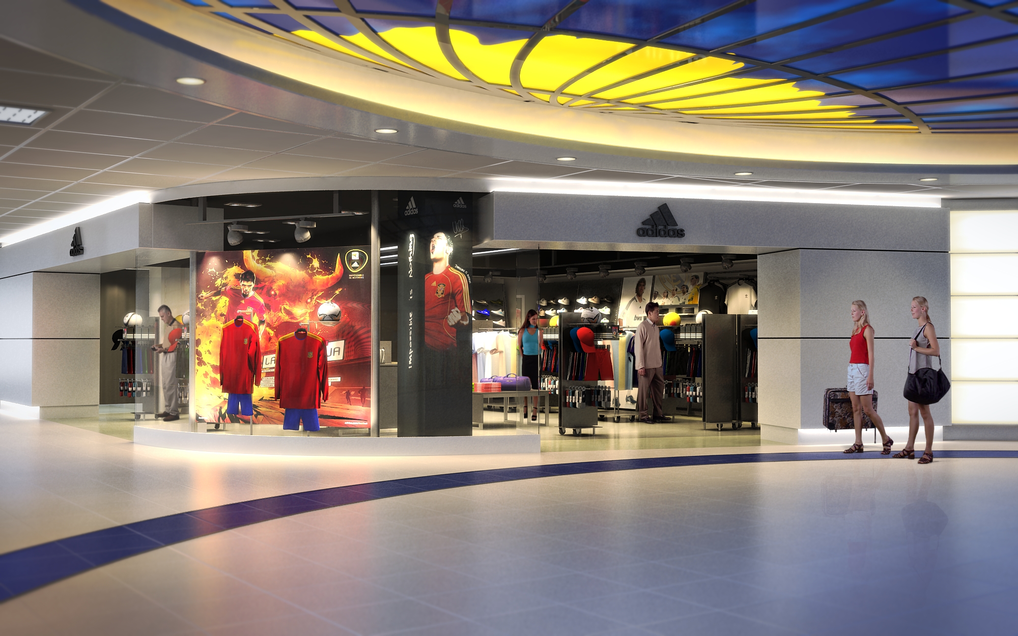
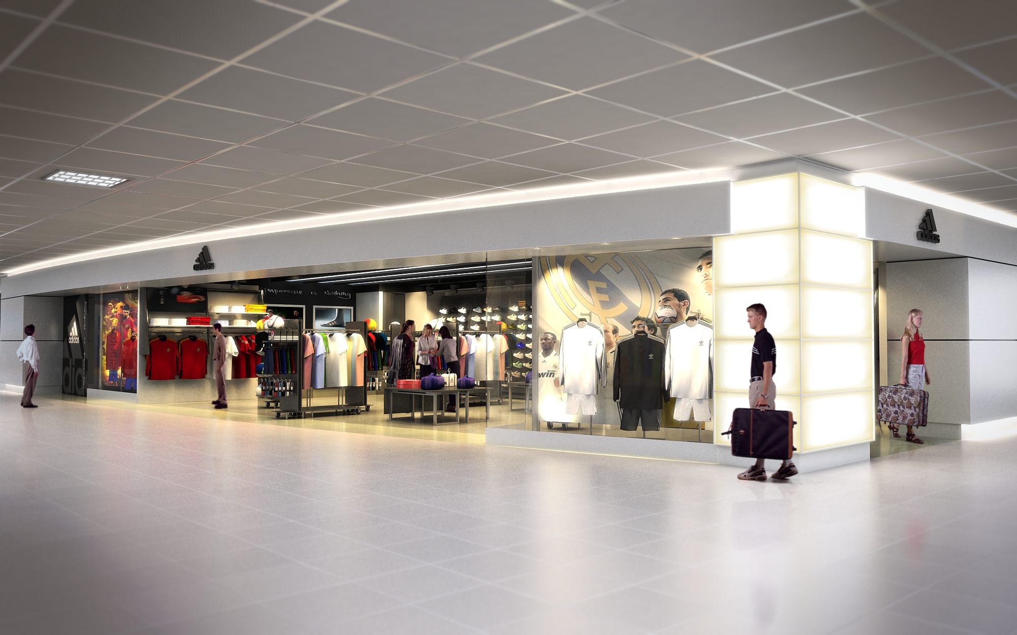
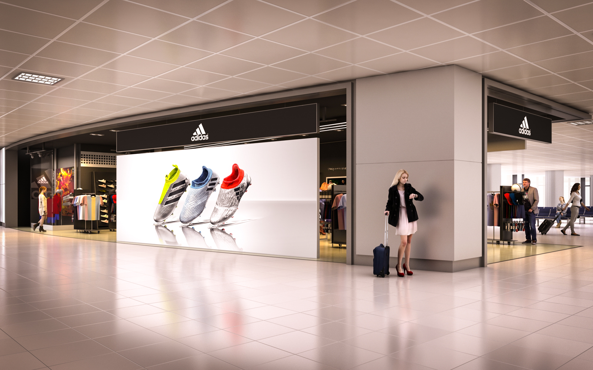
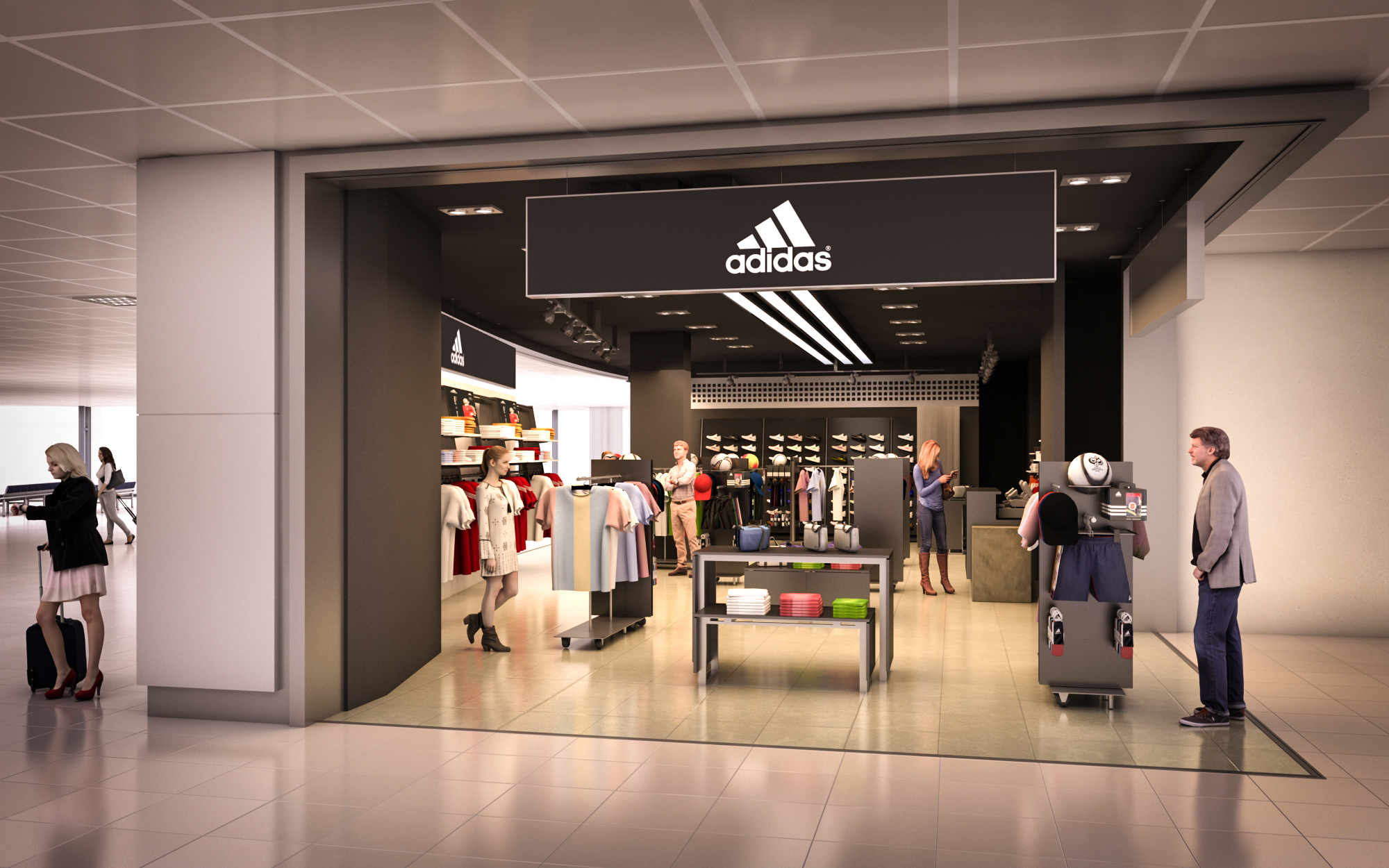
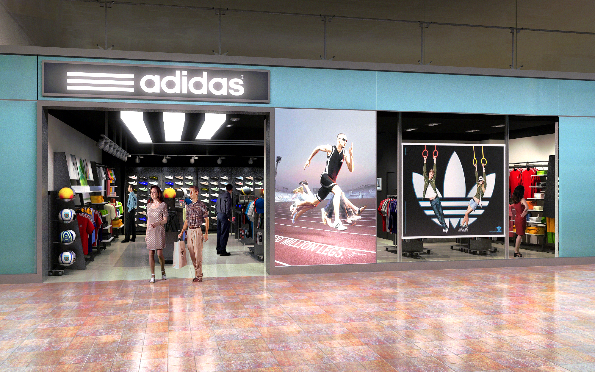
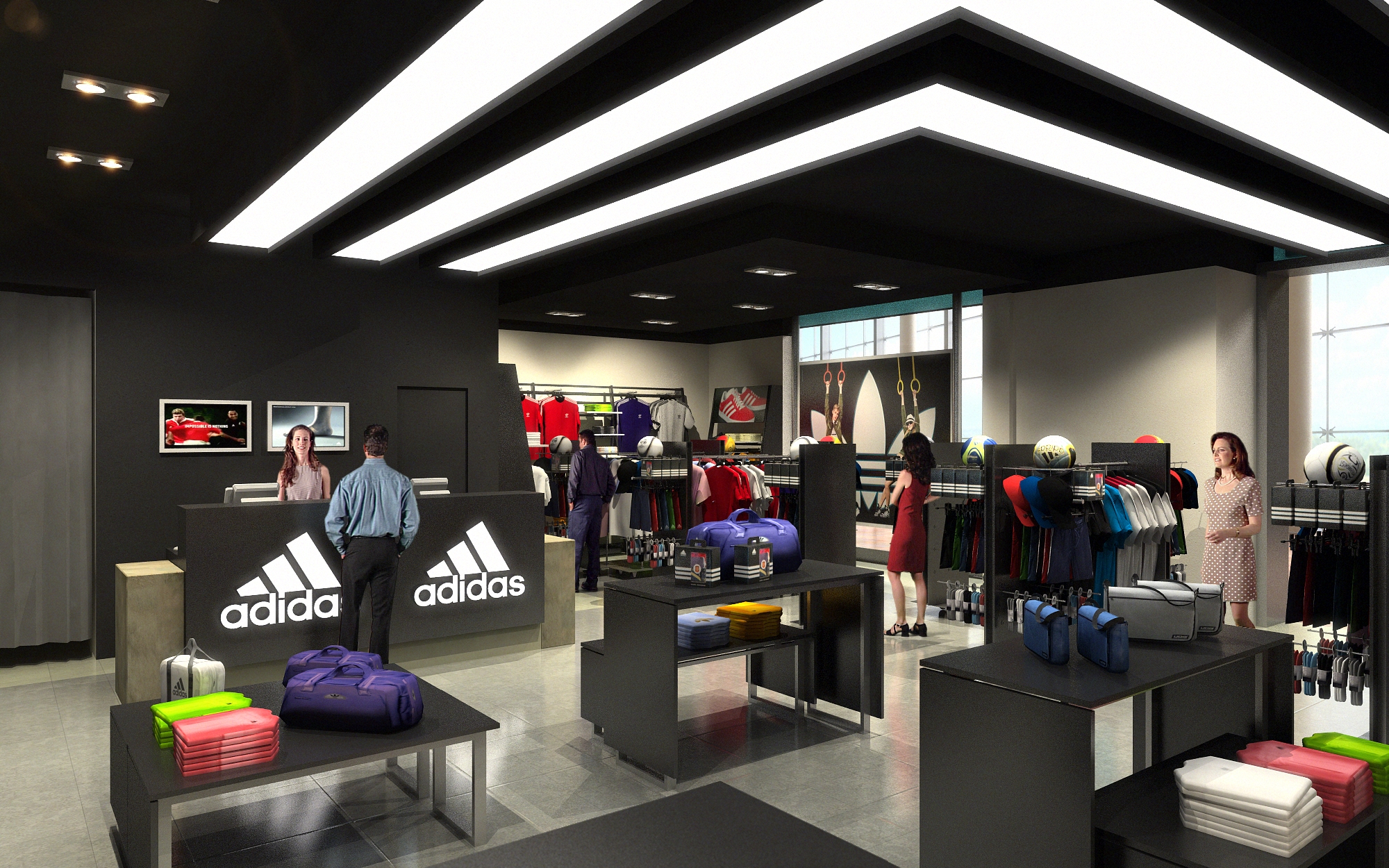
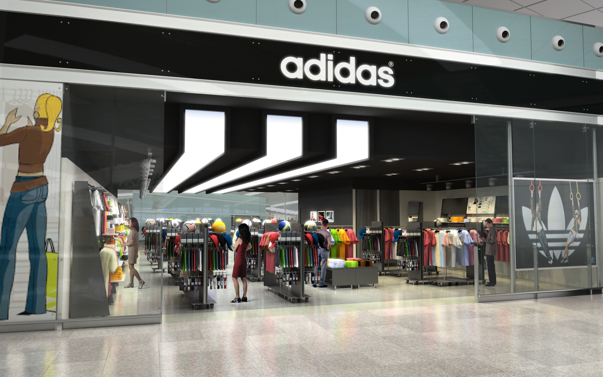
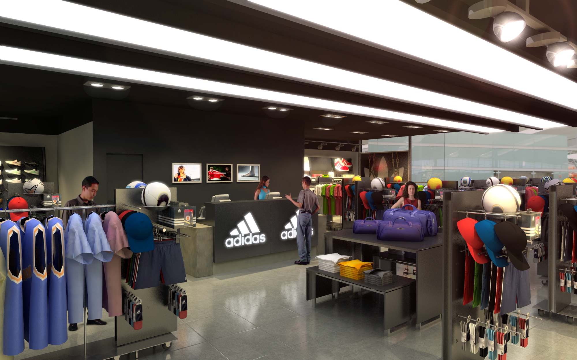
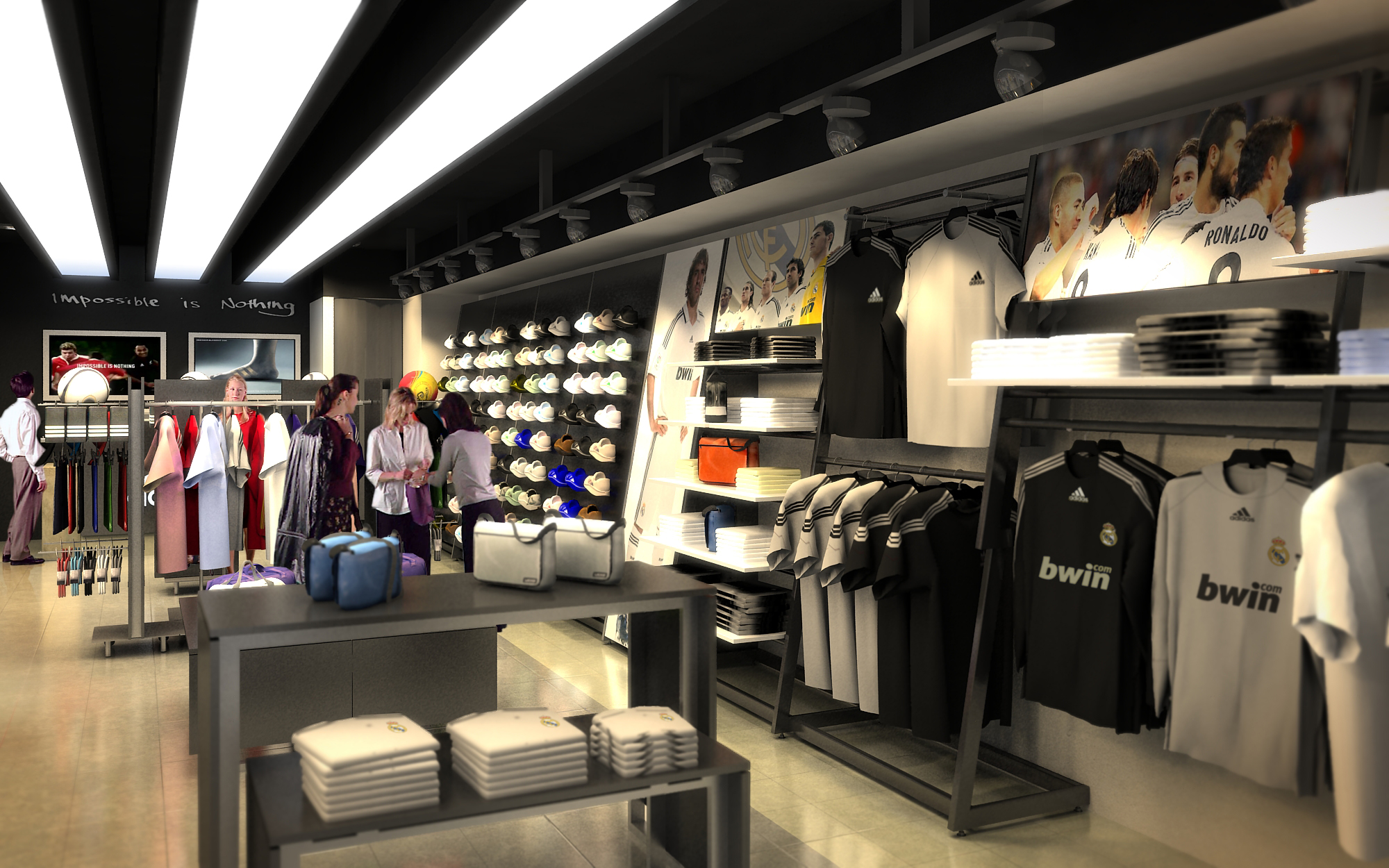
© 2021 by sanzpont [arquitectura] . Webpage by sanzpont [digital] . Innovative Digital Experiences
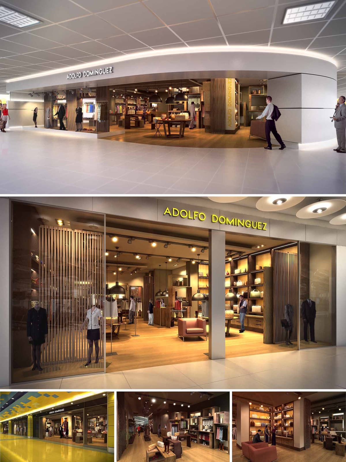
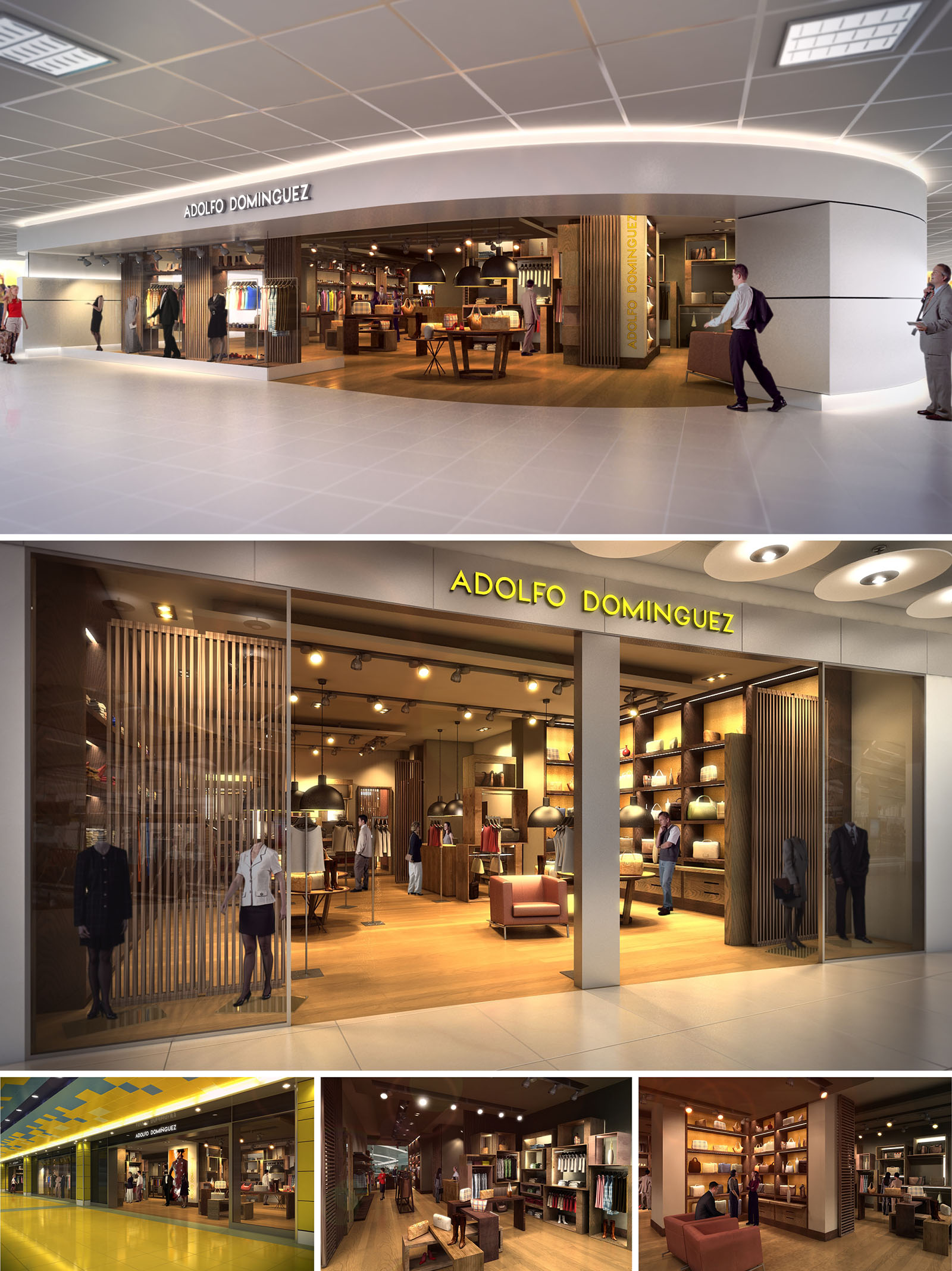
The ADOLFO DOMINGUEZ stores are conceived as warm, urban refuges within highly transit‑oriented commercial environments. The design establishes a clear contrast between the neutral, almost infrastructural exterior of the malls and an interior universe defined by craft, tactility and calm. The architectural language prioritizes horizontality and openness, avoiding enclosed boxes in favor of fluid, porous boundaries that invite visual continuity and intuitive access.
The concept is based on three key ideas: a continuous wooden “landscape” that unifies the chain of stores, a vertical rhythm that orders the product display, and a soft, domestic lighting strategy that transforms shopping into an intimate, leisurely experience. These elements are replicated with variations in the nine different locations across Spain, ensuring a recognizable brand identity while allowing adaptation to each specific mall geometry.
The floor plan is structured around a central longitudinal axis that organizes the main circulation. From this axis, secondary transversal paths branch out towards the perimeter display walls and freestanding furniture islands. This configuration guarantees a clear and legible route while encouraging cross‑views between product categories.
At the entrance, a generous threshold without doors or visual barriers blurs the line between corridor and interior. Strategic placement of low display tables and mannequins creates a graduated transition, avoiding abrupt visual obstacles and allowing the store to be perceived in depth from the mall. Fitting rooms and service areas are grouped towards the back, forming a more secluded and intimate zone that balances the public character of the access area.
The material palette is deliberately restrained, built around natural timber, warm textiles and matte, neutral surfaces. A continuous timber floor extends from the entrance to the rear, acting as a unifying base that visually “pulls” visitors into the store. Vertical wooden slats, used as both partitions and backdrops, provide transparency and rhythm while filtering views in a subtle way.
The display walls combine open shelving and closed storage, predominantly in oak tones, emphasizing the tactile quality of the garments and accessories. Occasional lacquered elements and metallic profiles introduce measured contrast without compromising the overall sense of warmth. Upholstered seating in muted, earthy colors reinforces the idea of a lounge rather than a traditional retail environment.
Lighting is a fundamental component of the project, designed to generate an intimate and welcoming atmosphere. A combination of recessed ceiling fixtures, track‑mounted spotlights and large pendant luminaires allows differentiated lighting layers. General ambient light remains controlled and warm, while accent lighting highlights key collections and display areas.
At the storefront, a higher lighting level creates a luminous frame that enhances visibility from the circulation corridors. Deeper inside, more subdued intensities and focused beams encourage slower browsing and emphasize textures and volumes. The careful use of warm color temperatures strengthens the perception of comfort and material richness.
The façade operates as a continuous showcase, with large glass panes from floor to ceiling that maximize transparency and create direct visual connection with the interior. The brand name appears in a simple, backlit typographic treatment, suspended over the opening or integrated into a horizontal band, depending on each location’s constraints.
Instead of relying on heavy graphic elements, the identity is conveyed through the depth of the interior, the visible wooden slats and the warm glow of the lighting. The storefront is conceived as a cinematographic frame in which mannequins, furniture and customers become actors, constantly reactivating the image of the brand.
Sustainability is addressed through material selection, construction logic and lighting efficiency. The recurring use of certified timber and durable finishes extends the life cycle of the fit‑outs, allowing for reconfiguration and partial reuse across different stores in the chain. Modular furniture components facilitate maintenance and future adaptation without requiring full refurbishment.
Lighting design incorporates high‑efficiency LED luminaires and control systems that adjust intensity according to opening hours and natural light availability in each mall, reducing energy consumption. The restrained palette, timeless forms and avoidance of overly trend‑driven elements contribute to a design whose aesthetic longevity minimizes waste associated with frequent image updates, aligning the commercial space with contemporary criteria of responsible, enduring architecture.
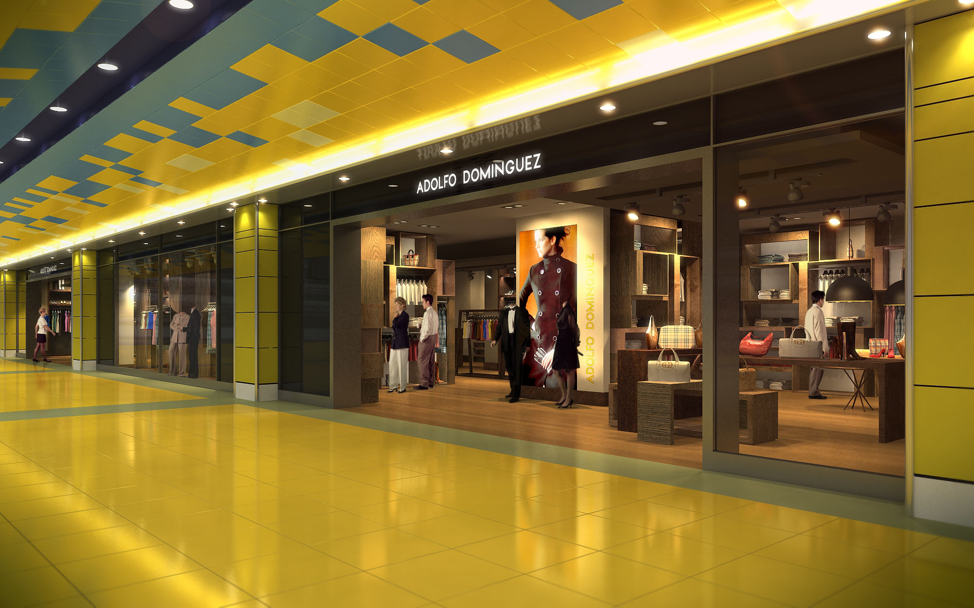
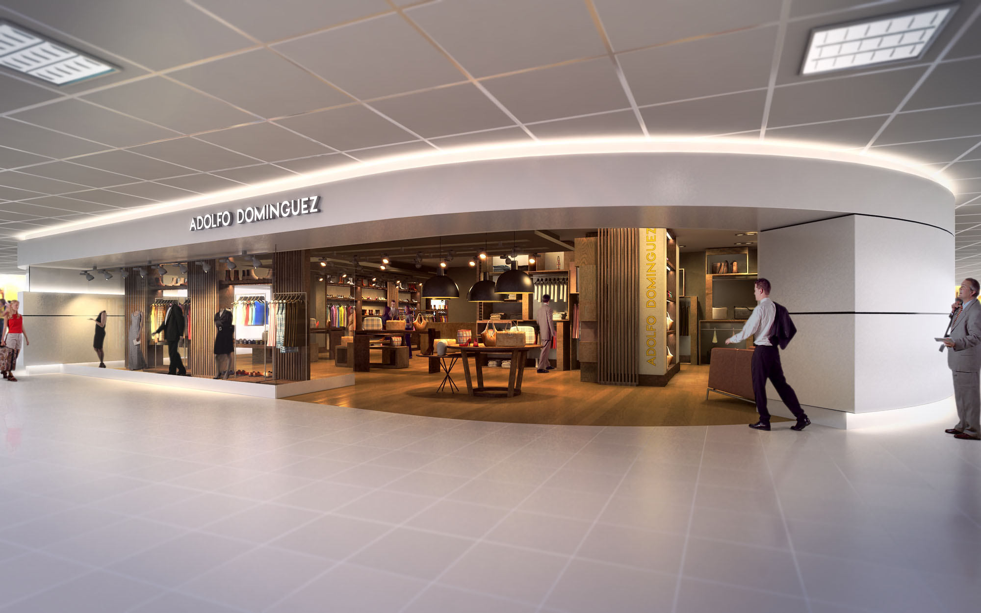
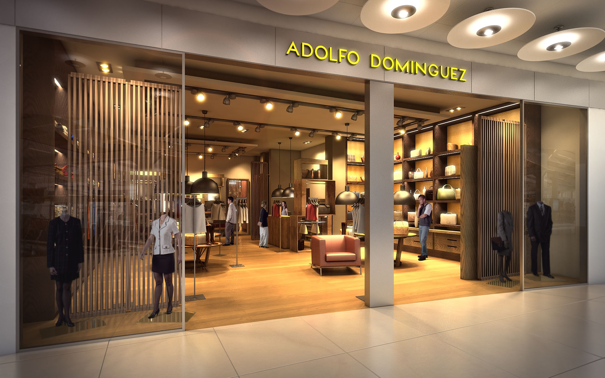
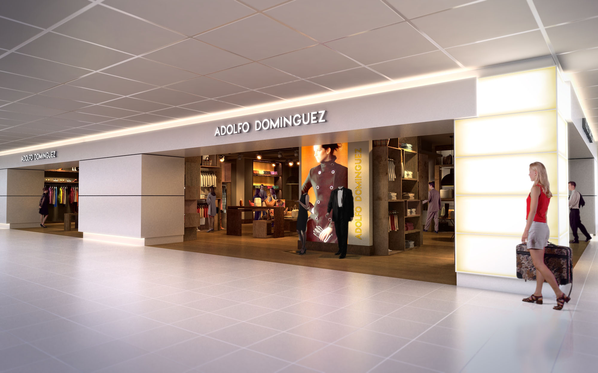
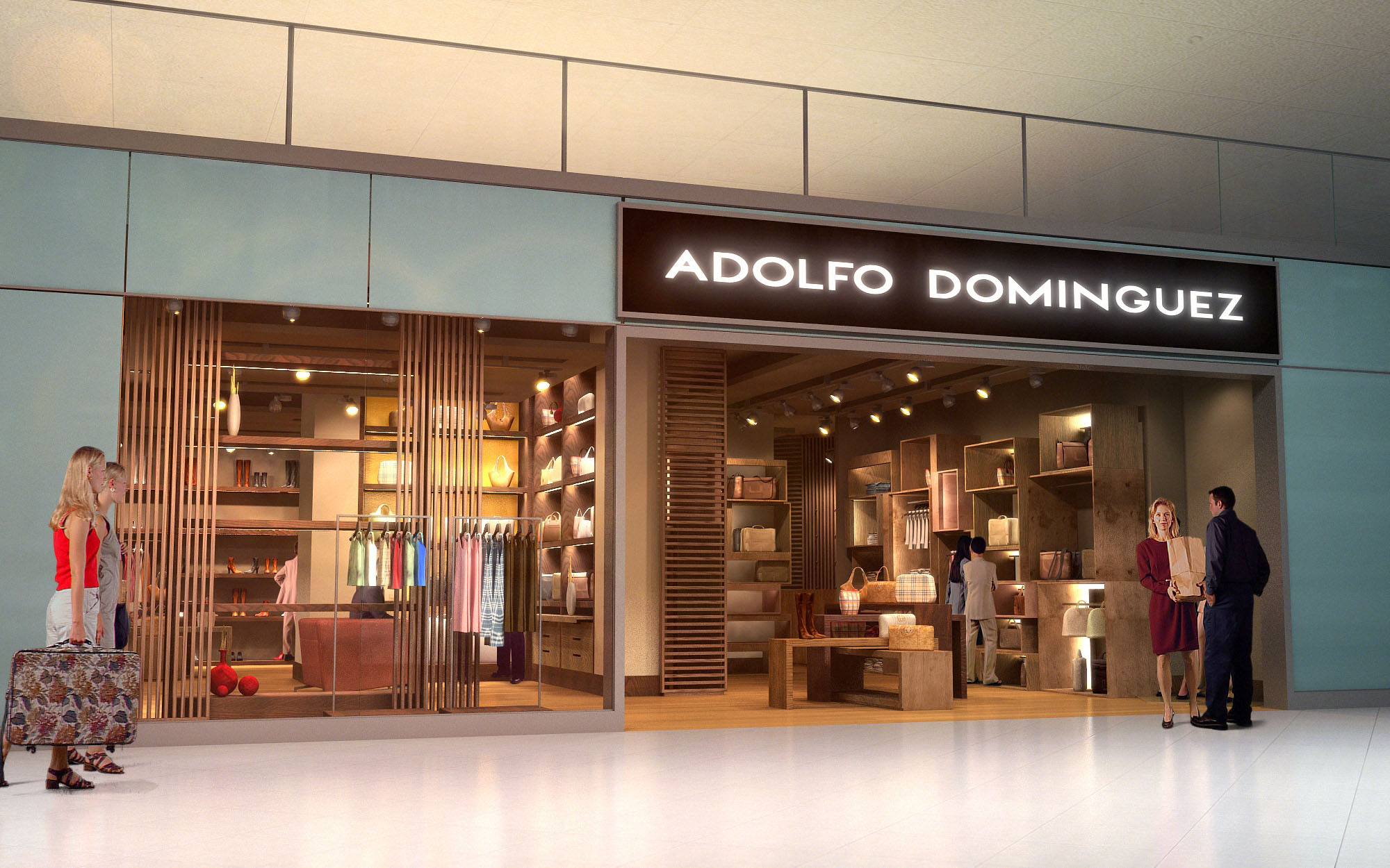
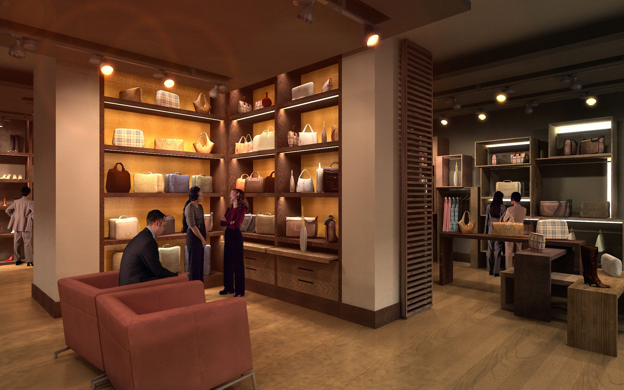
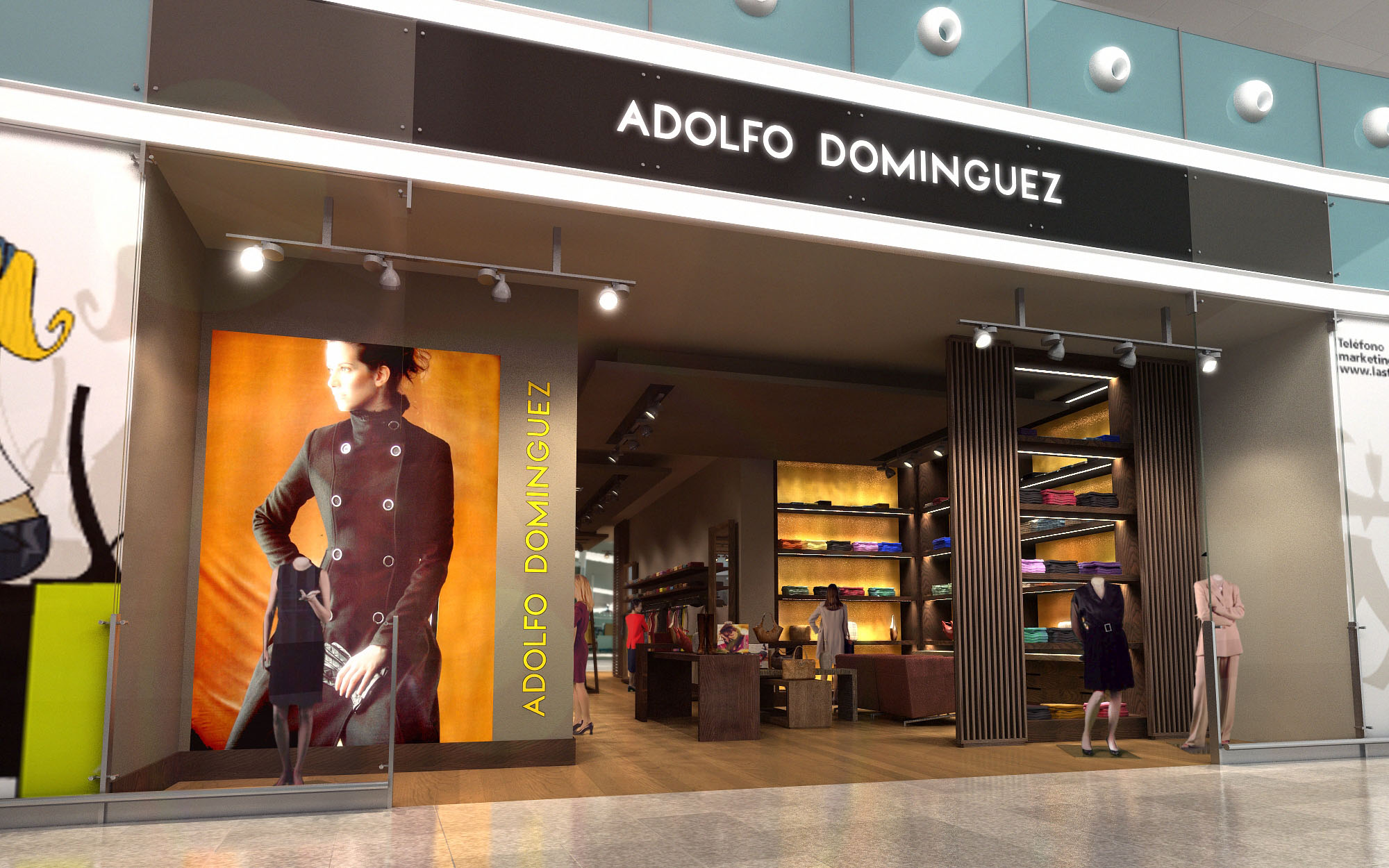
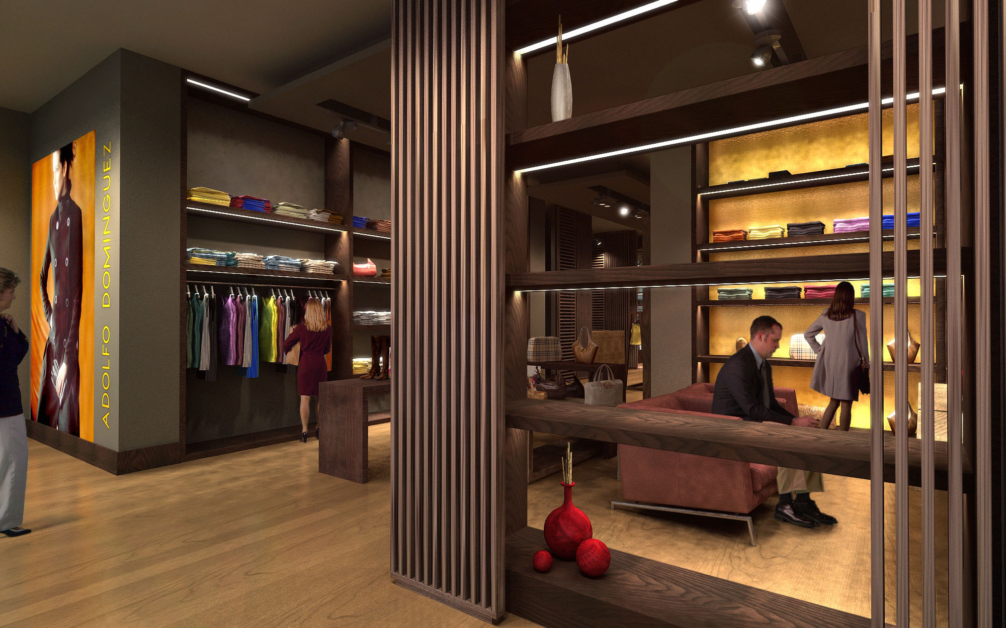
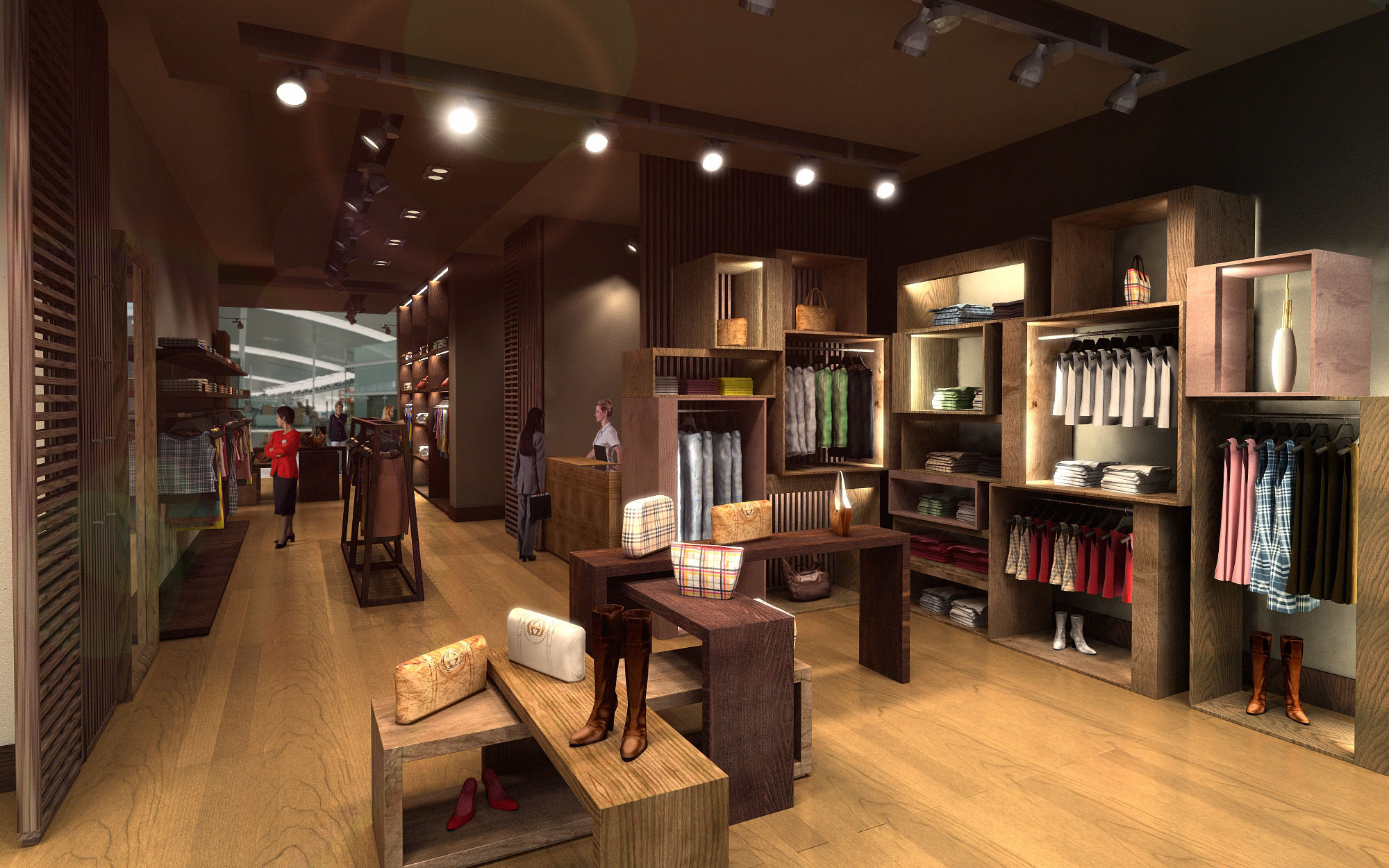
© 2021 by sanzpont [arquitectura] . Webpage by sanzpont [digital] . Innovative Digital Experiences
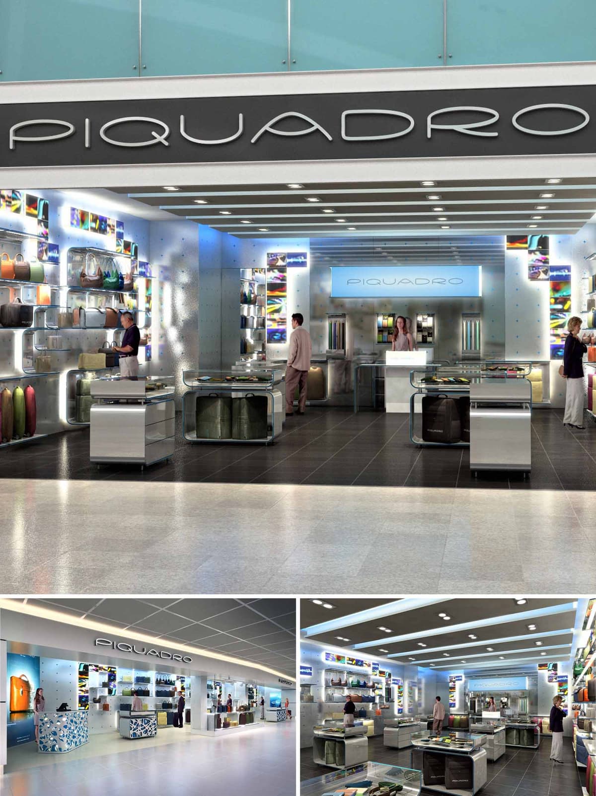

The PIQUADRO boutiques in Spain are conceived as luminous urban showcases that translate the precision of contemporary luggage design into architectural space. The concept is based on a calibrated contrast between a neutral, almost immaterial envelope and vibrant chromatic inserts that echo the brand’s graphic identity. The stores operate as compact “travel terminals” where products, light and movement form a single narrative about mobility, technology and Italian craftsmanship.
The design seeks maximum legibility from afar within busy transit environments. A deep, frameless opening dissolves the threshold, turning the entire façade into a display device. Inside, a rigorously orthogonal spatial grid organizes circulation and exhibition, while the modular system of walls, ceilings and furnishings allows the concept to be replicated and adapted across multiple locations with minimal transformation.
The plan is structured around a central longitudinal axis that visually connects the entrance with the back-lit brand wall. Perimeter shelving concentrates the main product families, freeing the core for a sequence of low islands and service counters. This arrangement ensures uninterrupted sightlines across the whole store, encouraging intuitive browsing and quick orientation for time-pressed travelers.
The entrance zone functions as a high-impact “runway” for best sellers, with mobile display units that can be reconfigured according to merchandising requirements. Mid-store, the density of islands increases, creating micro-ambiences dedicated to specific typologies such as business bags, travel accessories and small leather goods. The cash desk and customer service area are deliberately aligned with the focal wall, transforming the purchasing moment into the natural culmination of the spatial journey.
The material palette is intentionally restrained and technological: brushed aluminium, high-pressure laminates with metallic finishes, extra-clear glass and finely textured composite panels. These surfaces provide a neutral yet sophisticated backdrop that amplifies the color and tactility of the leather goods without competing with them. The modular shelving integrates opaque and transparent elements, allowing products to appear almost suspended.
Edge profiles, joints and fixings are meticulously minimized to reinforce the sense of precision. Display islands are monolithic volumes with rounded corners, referencing the aerodynamics of contemporary luggage design. Their bases incorporate integrated storage and discrete cable management, keeping the sales floor visually uncluttered. Flooring differentiates circulation from display: darker, more intimate tones in the product area contrast with the lighter tones of the mall, emphasizing the transition into the PIQUADRO universe.
Lighting is the primary tool for constructing atmosphere and brand recognition. A system of linear recessed luminaires in the ceiling establishes a strong rhythm that guides movement through the store. Vertical illumination accentuates the perimeter walls, providing uniform, shadow-free light on products and enhancing color rendering to highlight material quality.
Integrated LED strips within shelves and wall niches create halos that dematerialize the supports and draw attention to featured items. Backlit graphic panels, with their saturated chromatic fields and photographic textures, punctuate the white and metallic surfaces and act as landmarks within the space. The signage band, with its clean typography and continuous presence along the façade, ensures immediate recognizability and coherence between different locations.
Sustainability is addressed through a combination of energy efficiency, durability and adaptability. Lighting relies extensively on LED technology with high efficiency and long lifespan, reducing both consumption and maintenance in high-usage retail environments. The modular furnishing system is designed for disassembly, allowing elements to be reconfigured, relocated or recycled at the end of their life cycle, minimizing waste during future fit-outs.
Material choices prioritize robust finishes that withstand intensive traffic and cleaning, extending the operational life of the store and reducing the need for replacement. Where possible, substrates employ recyclable metals and engineered boards with controlled sourcing. The clear organization of services and the careful integration of technical systems into the furnishings facilitate easy maintenance and upgrades, ensuring that the shops can adapt to new display technologies or evolving commercial needs without invasive construction.
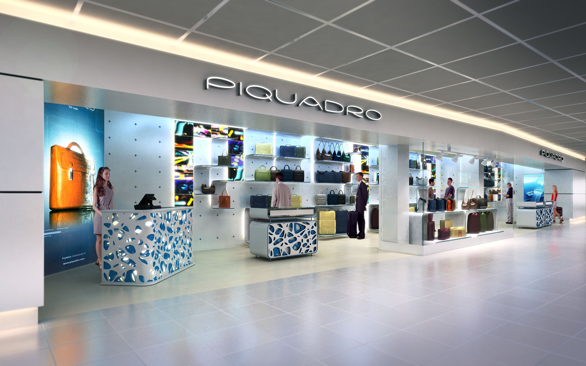
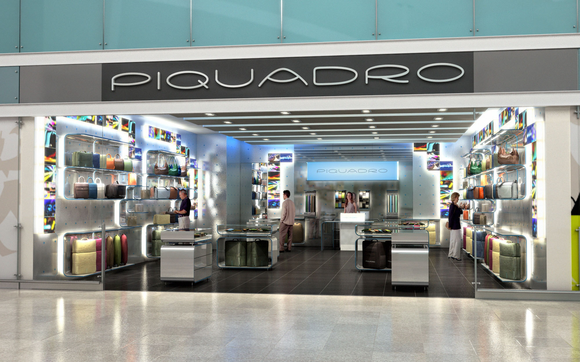
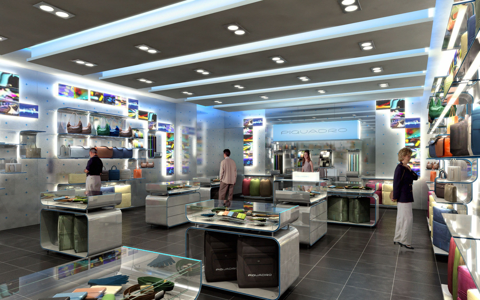
© 2021 by sanzpont [arquitectura] . Webpage by sanzpont [digital] . Innovative Digital Experiences

Concept For Official Store. Watch My Watch. Cancun, Mexico.

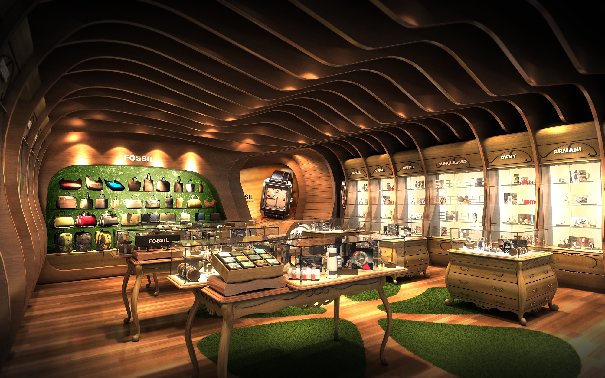
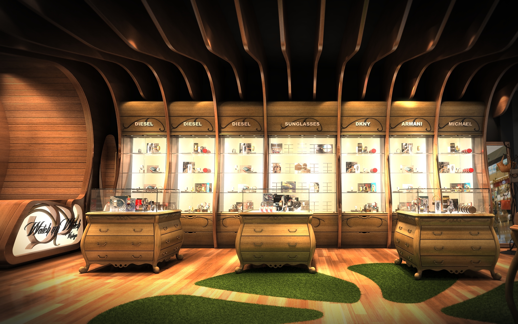
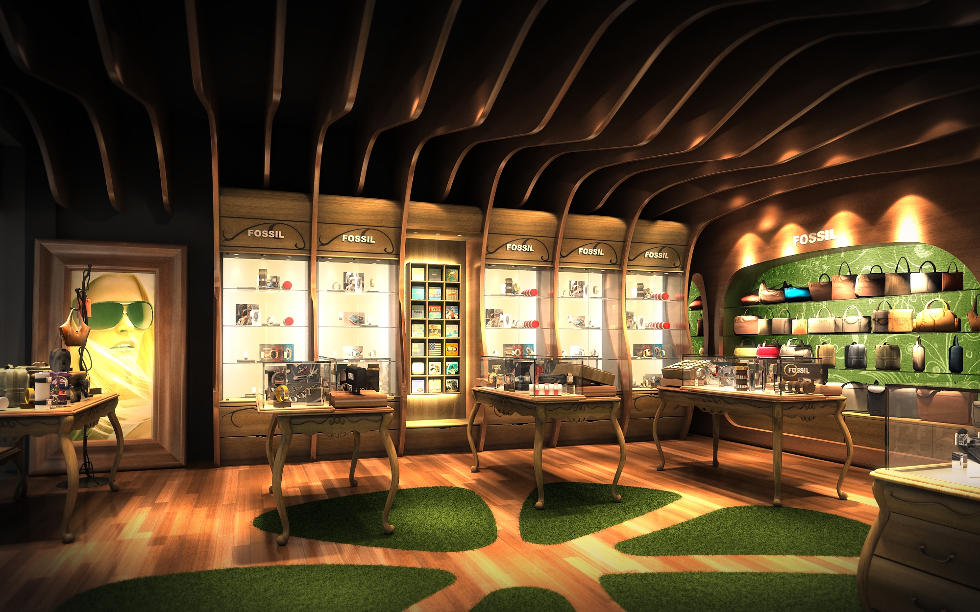
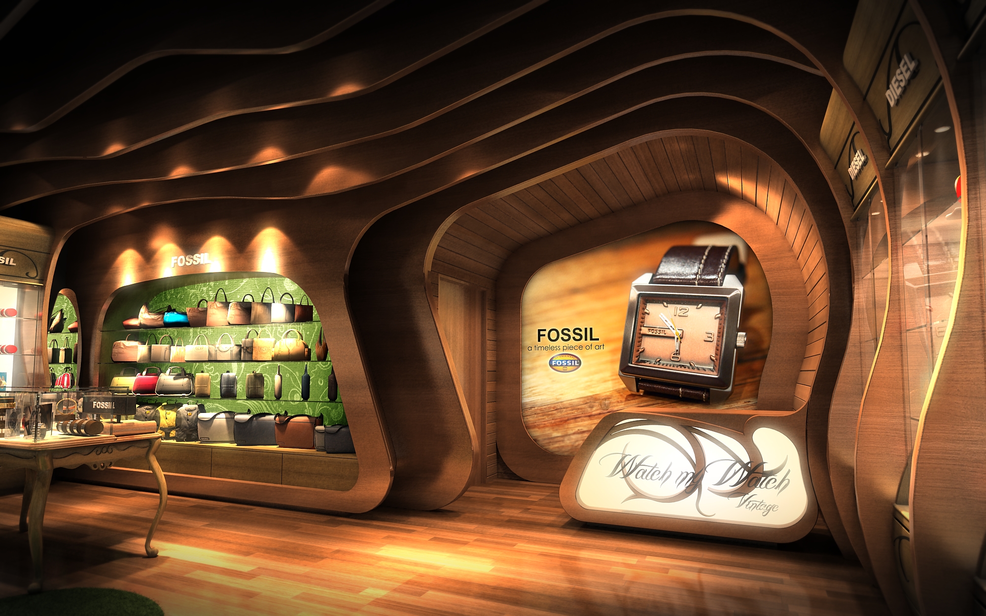
Concept For Official Store. Watch My Watch. Cancun, Mexico.
© 2021 by sanzpont [arquitectura] . Webpage by sanzpont [digital] . Innovative Digital Experiences
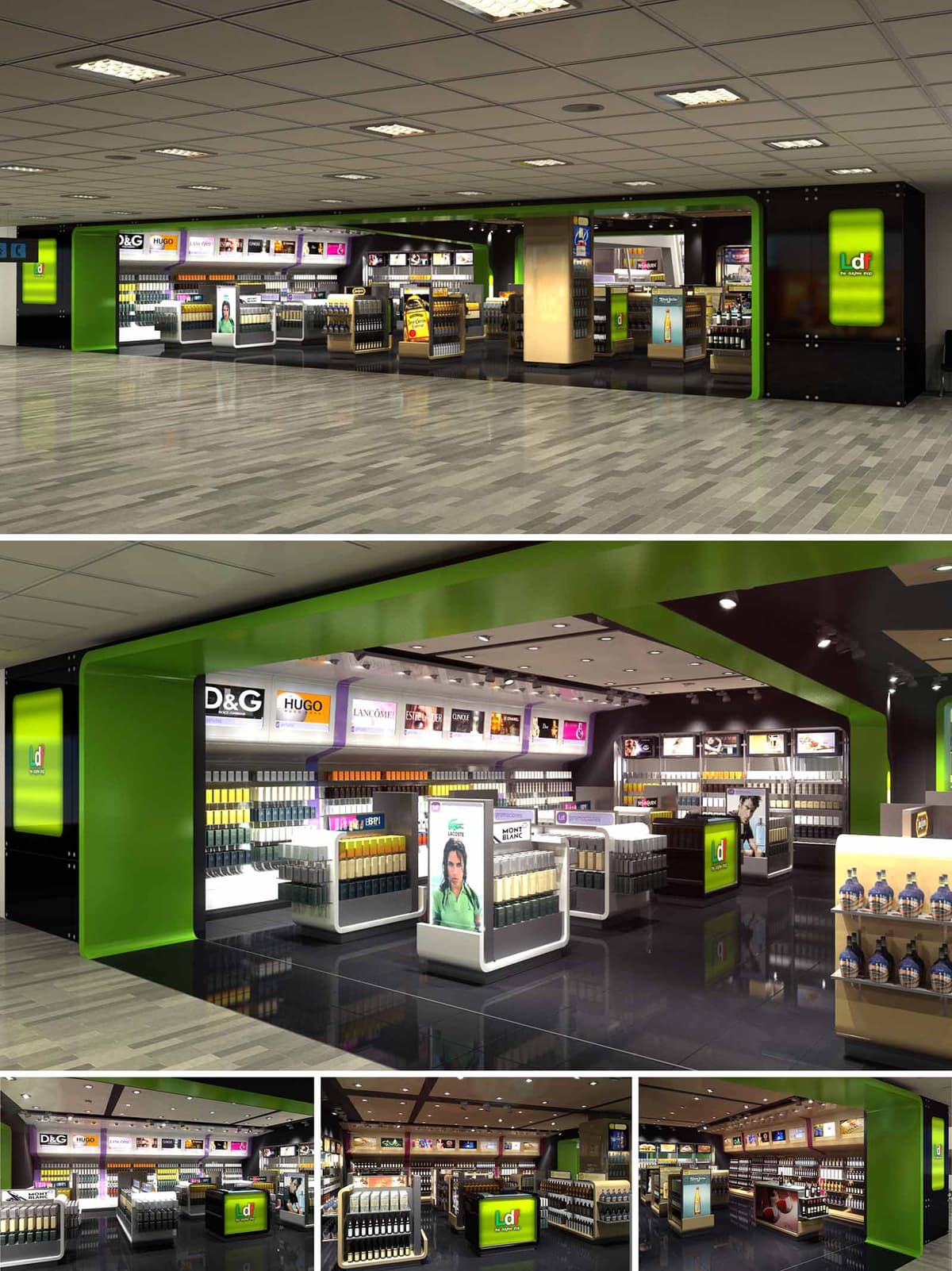

The duty free shops are conceived as a continuous, highly legible commercial landscape that links various airport terminals in Spain and Mexico through a unified visual identity. The concept is based on framing and highlighting the product as the protagonist, while the architecture acts as a flexible backdrop that can adapt to different footprints and passenger flows. The design emphasizes openness and transparent sightlines, allowing travelers to understand the entire offer at a glance and to move intuitively between the different product categories.
A strong chromatic code, based on a vivid green paired with black and neutral tones, defines the perimeter of each shop as a recognizable “gateway” in the airport environment. This continuous frame organizes the interior volumes, guiding circulation and creating a clear entrance threshold without the need for physical doors. The shops function as luminous islands within the terminal, deliberately porous and inviting from all sides.
The interior layout follows a loop strategy that encourages a fluid, non-linear visit. Freestanding gondolas of controlled height structure transversal paths, while longitudinal aisles run parallel to the storefront, ensuring constant visual contact with boarding gates and wayfinding elements. The perimeter walls are dedicated to backlit shelving and brand zones, maximizing vertical merchandising surface and freeing the central area for flexible arrangements.
Special attention is given to dwell-time hotspots such as fragrance and cosmetics, positioned near the main entrance to capture immediate attention, while spirits and gifts are gradually revealed deeper inside the shop. This zoning responds to different buying behaviors: impulse purchases near the circulation edges and more deliberate selections in the inner core. Clear circulation spines avoid dead ends, facilitating quick transit for hurried passengers and comfortable browsing for those with more time.
The material palette contrasts a dark, reflective floor finish with the luminous white of the display fixtures and the bright green of the architectural frames. The high-gloss flooring amplifies light and merchandise reflections, intensifying the perception of abundance and sophistication. Wall claddings in black and deep grey act as a neutral canvas, allowing brand graphics and illuminated logos to stand out with high legibility.
Display furniture is predominantly white with rounded edges, emphasizing cleanliness and contemporary precision. Integrated light-boxes and digital imagery are calibrated to achieve uniform brightness and avoid glare. The repetition of the green portal motif along the perimeter reinforces brand recognition across the different locations, while also helping passengers quickly identify the tax-free areas within the terminal’s complex visual context.
Lighting is designed as a multilayered system that combines general ambient illumination with highly targeted accent lighting. Recessed downlights in the ceiling grid provide homogeneous base lighting, ensuring comfort and safety, while adjustable projectors focus on key product lines and promotional islands. The color temperature is selected in a neutral-white range to render skin tones and packaging faithfully, critical for cosmetics and premium beverages.
Continuous backlit panels above the shelving produce a luminous horizon line that visually expands the space and supports brand storytelling through interchangeable graphics. The interplay between indirect perimeter light and the glossy floor creates subtle reflections, making the shop visible from a distance. The lighting control system allows for energy-efficient dimming and scenario changes according to daytime, passenger peaks, and promotional campaigns.
The design integrates sustainable criteria through the specification of long-life LED lighting, reducing energy consumption and maintenance needs across the four projects. Modular ceiling grids facilitate access to technical installations and allow for progressive upgrades without invasive works. Where possible, finishes are selected for durability and easy cleaning, extending their lifecycle in a high-traffic environment.
Display units are conceived as modular, demountable elements that can be reconfigured as product ranges evolve or as different brands occupy the space. This approach reduces waste and supports circular use of furniture across multiple locations. The consistent architectural language across Spain and Mexico ensures that future expansions or refurbishments can reuse components and construction systems, optimizing logistics and minimizing the environmental footprint of subsequent phases.
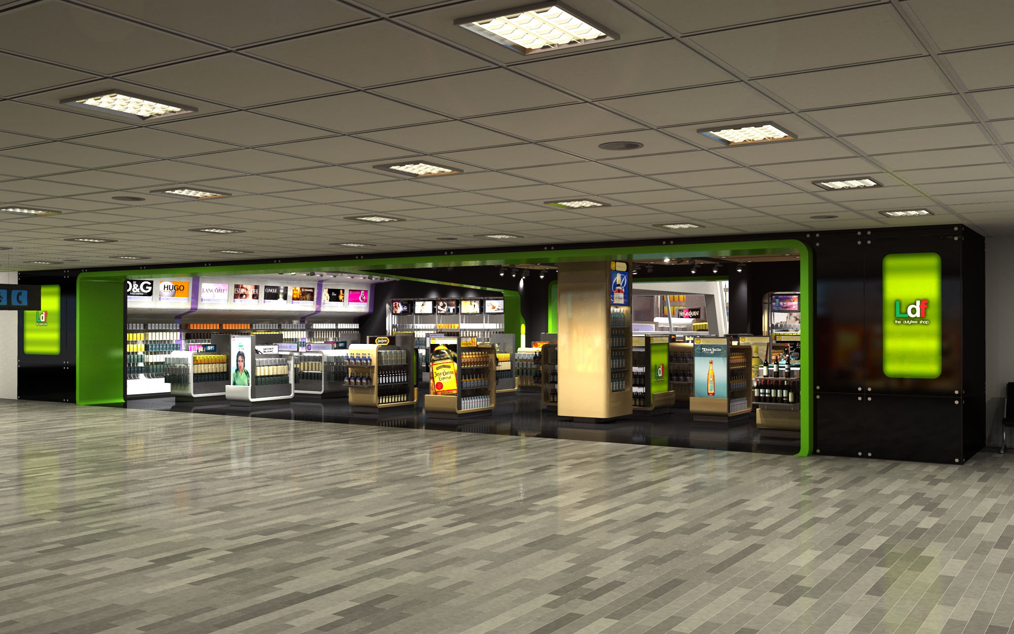
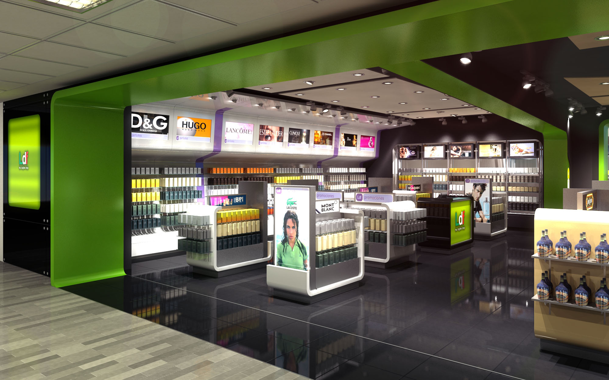
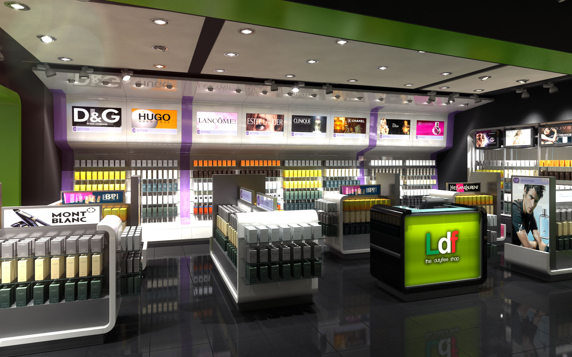
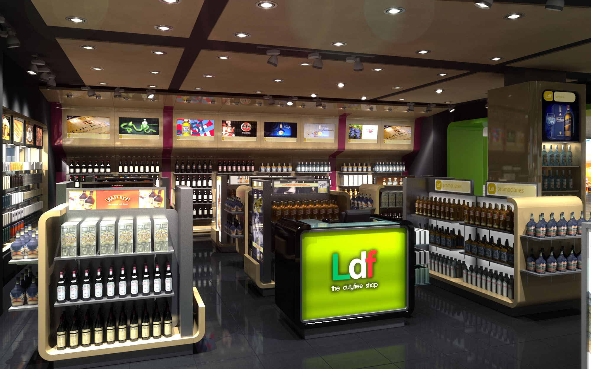
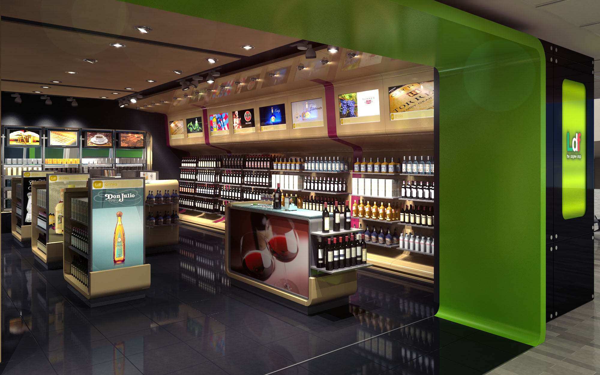
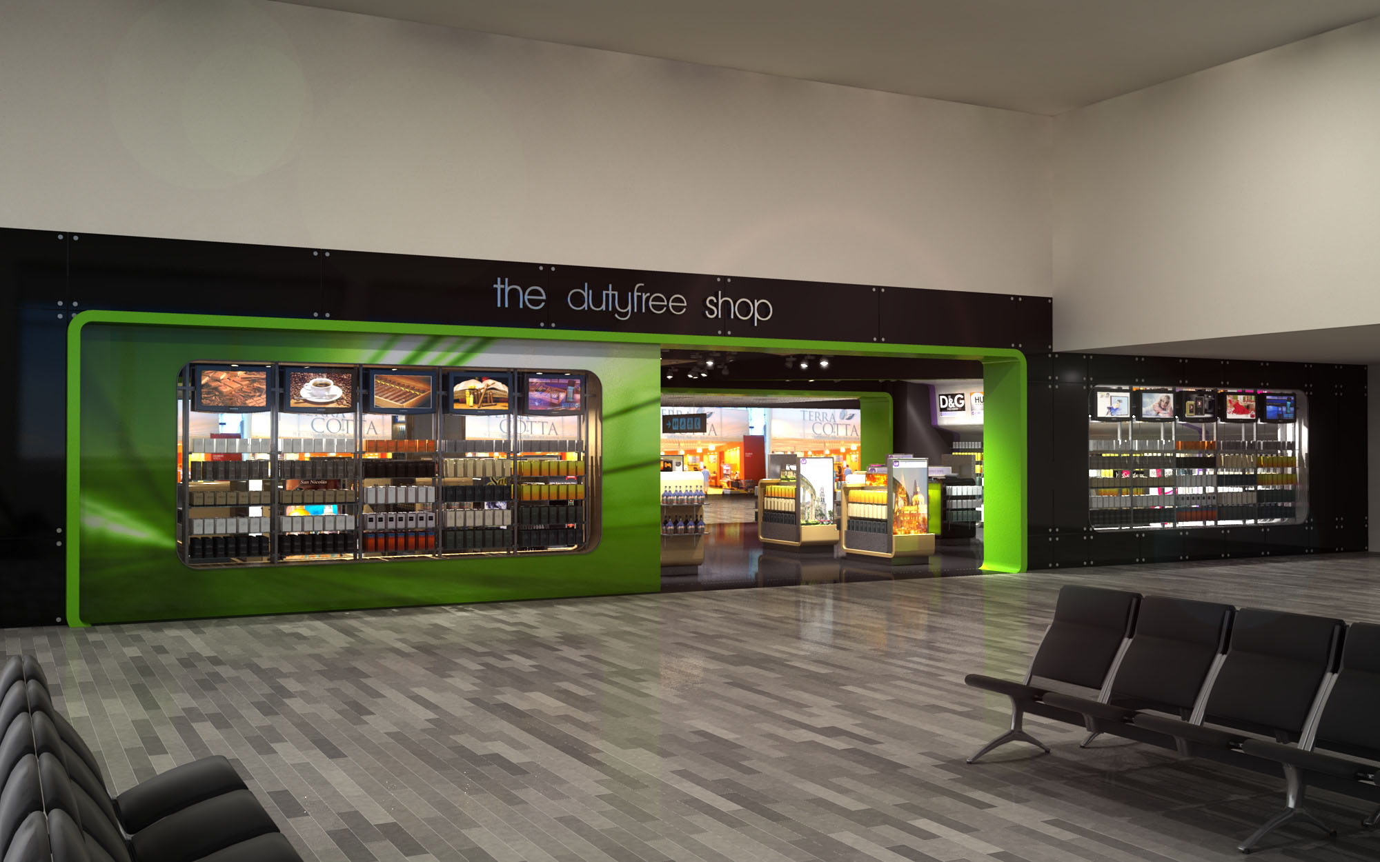
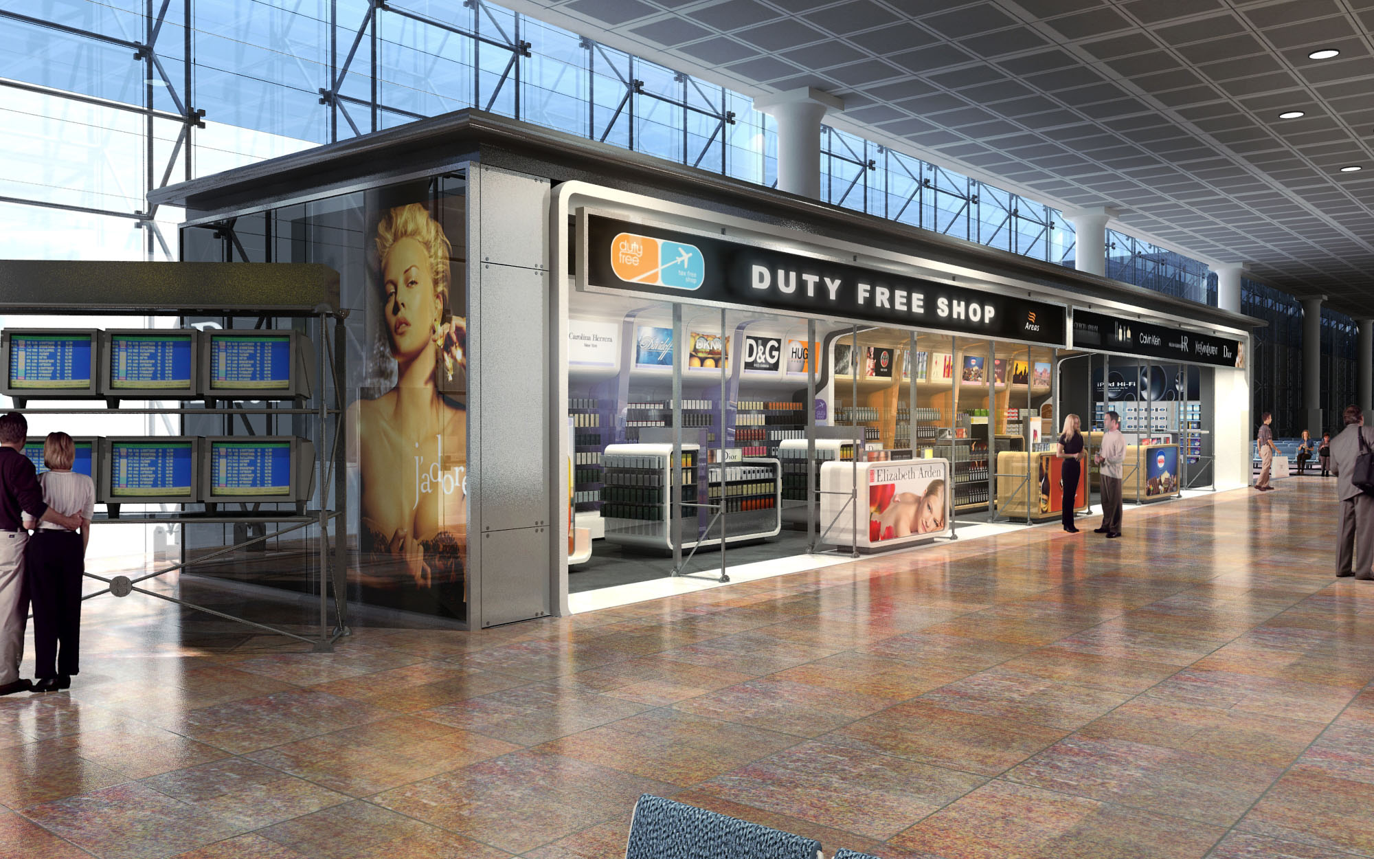
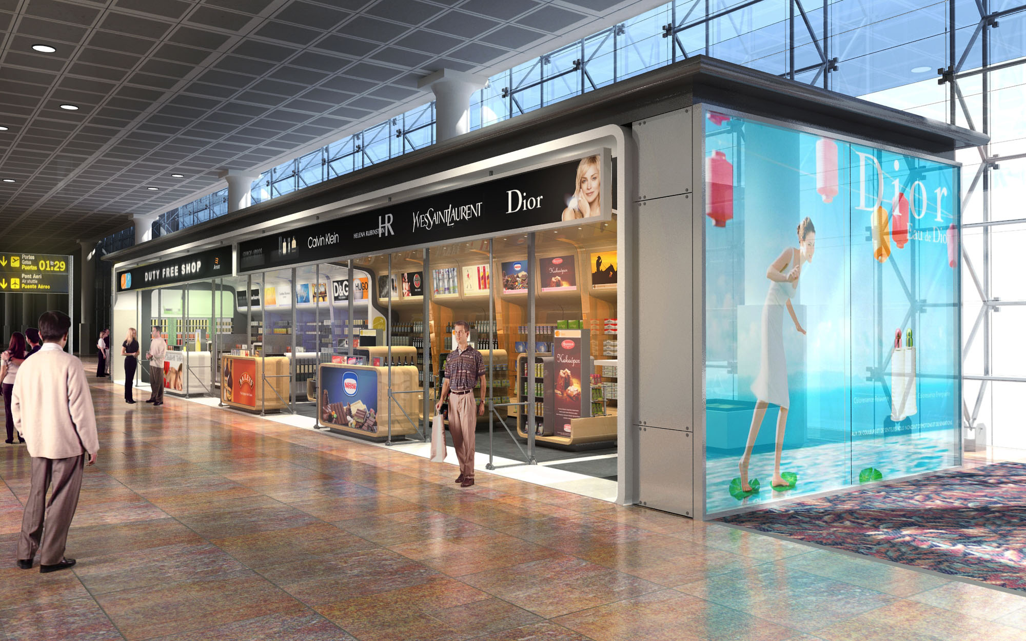
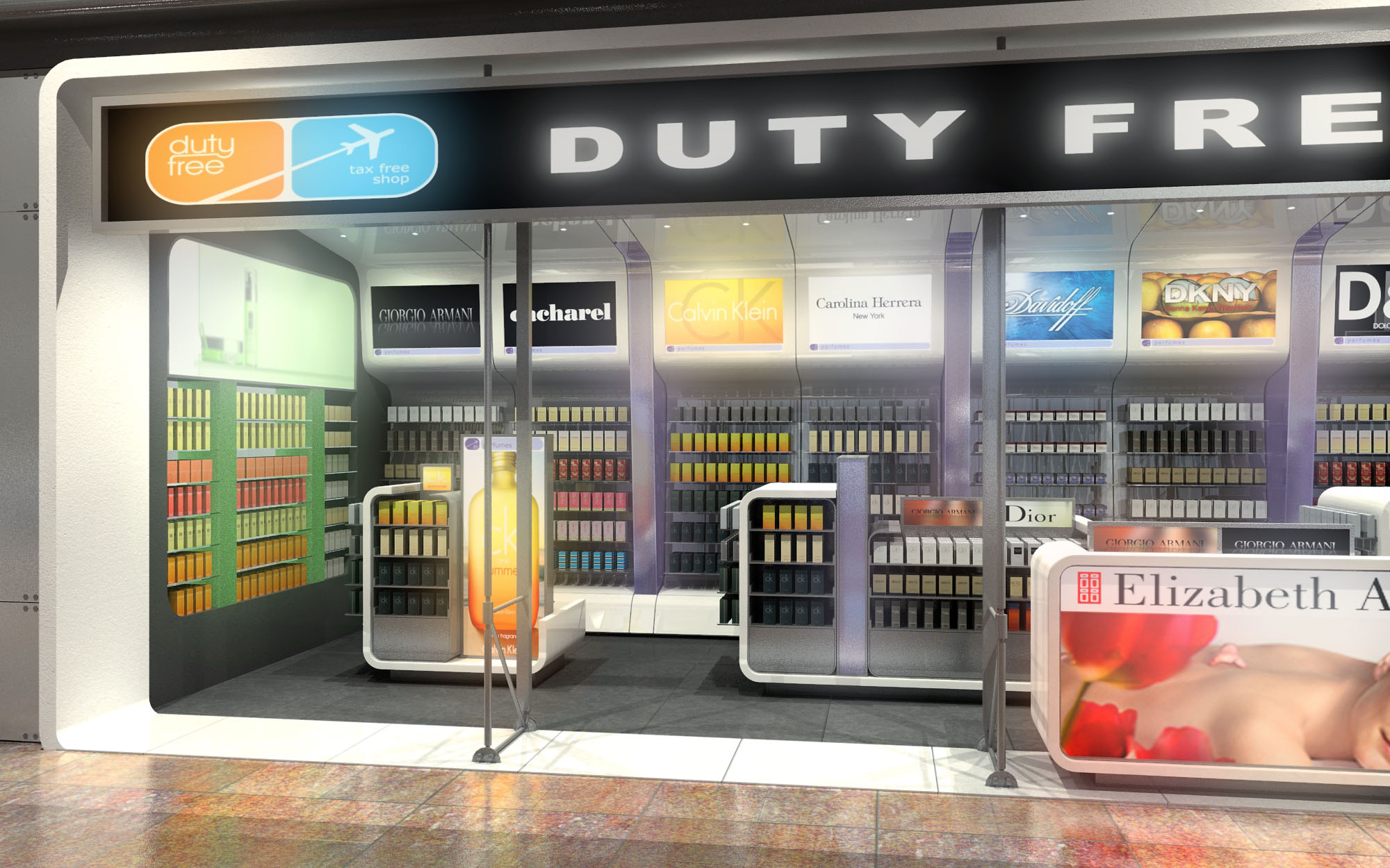
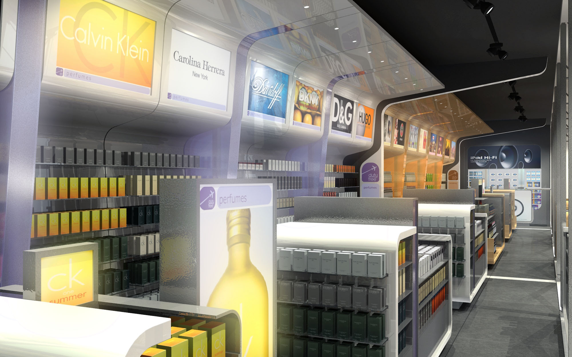
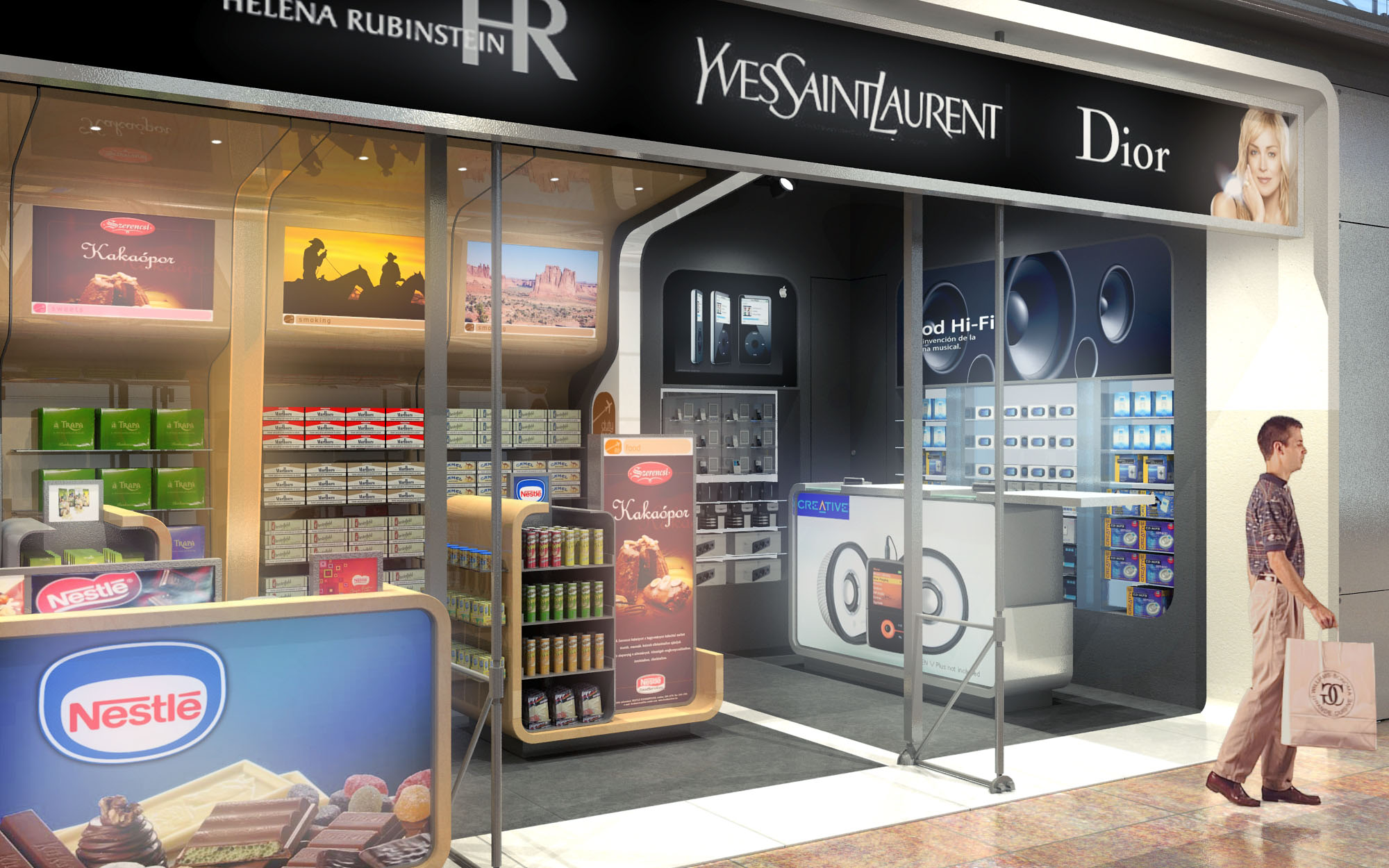
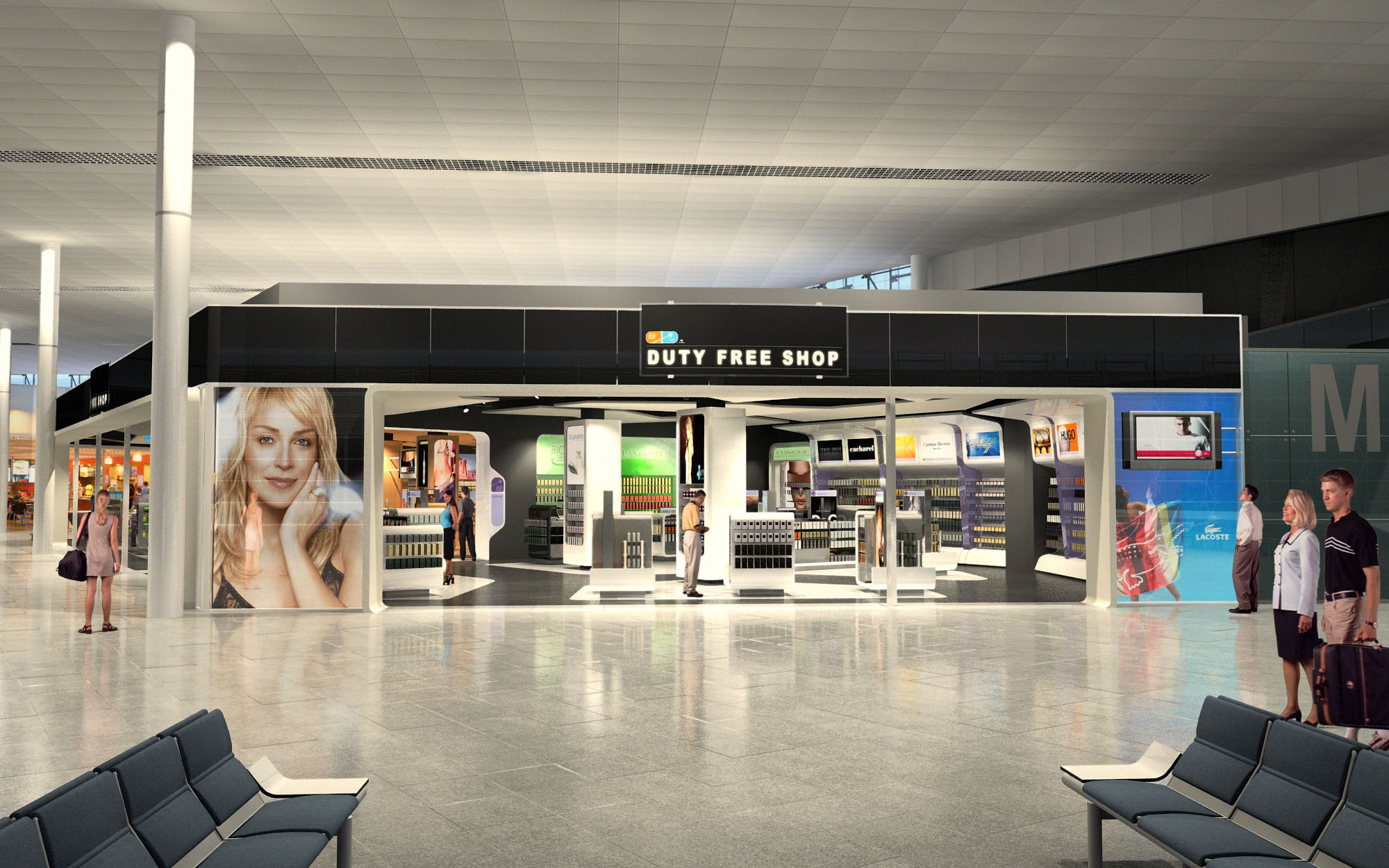
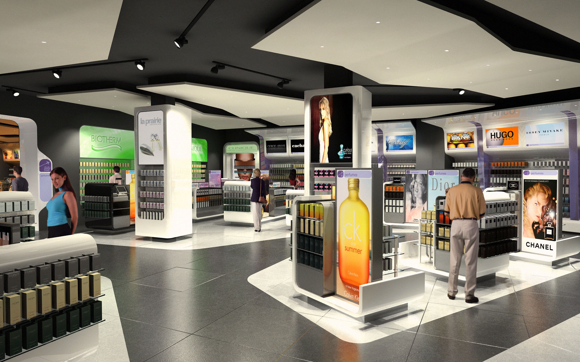
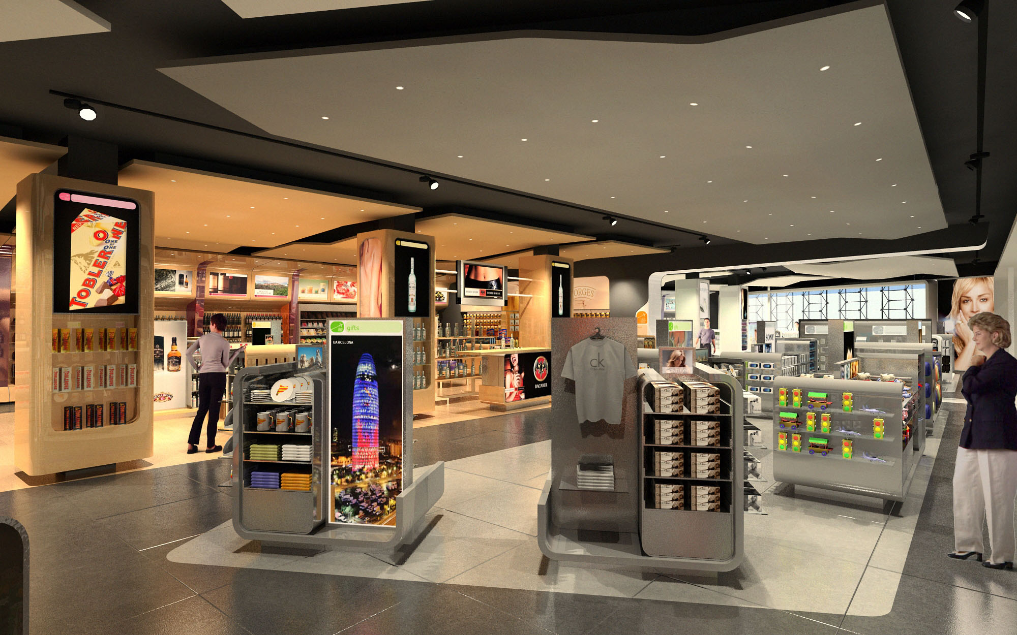
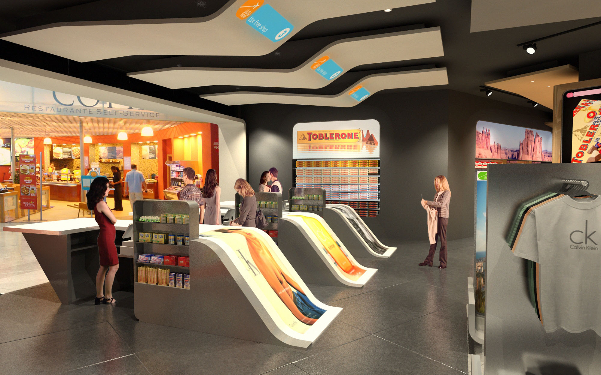
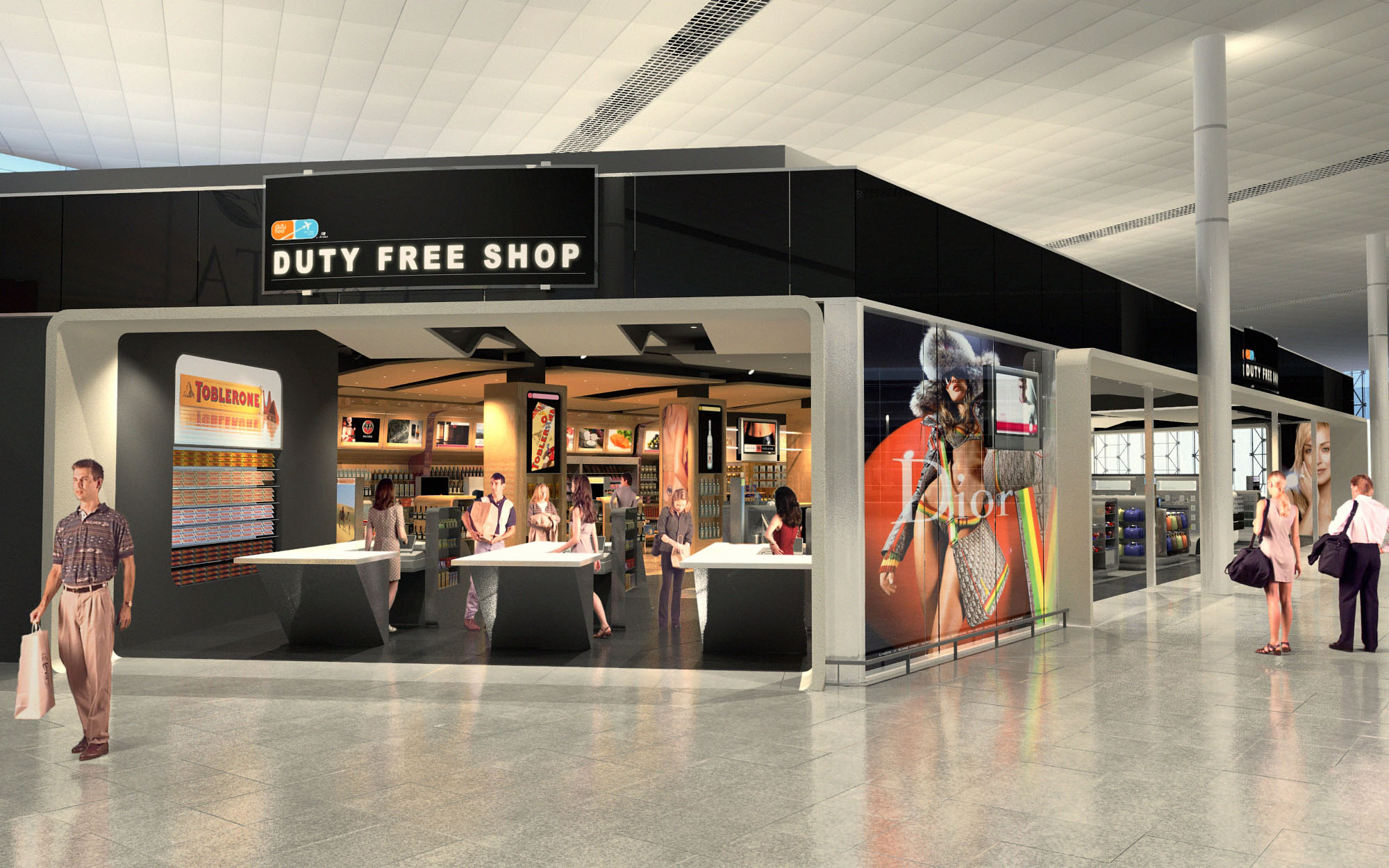
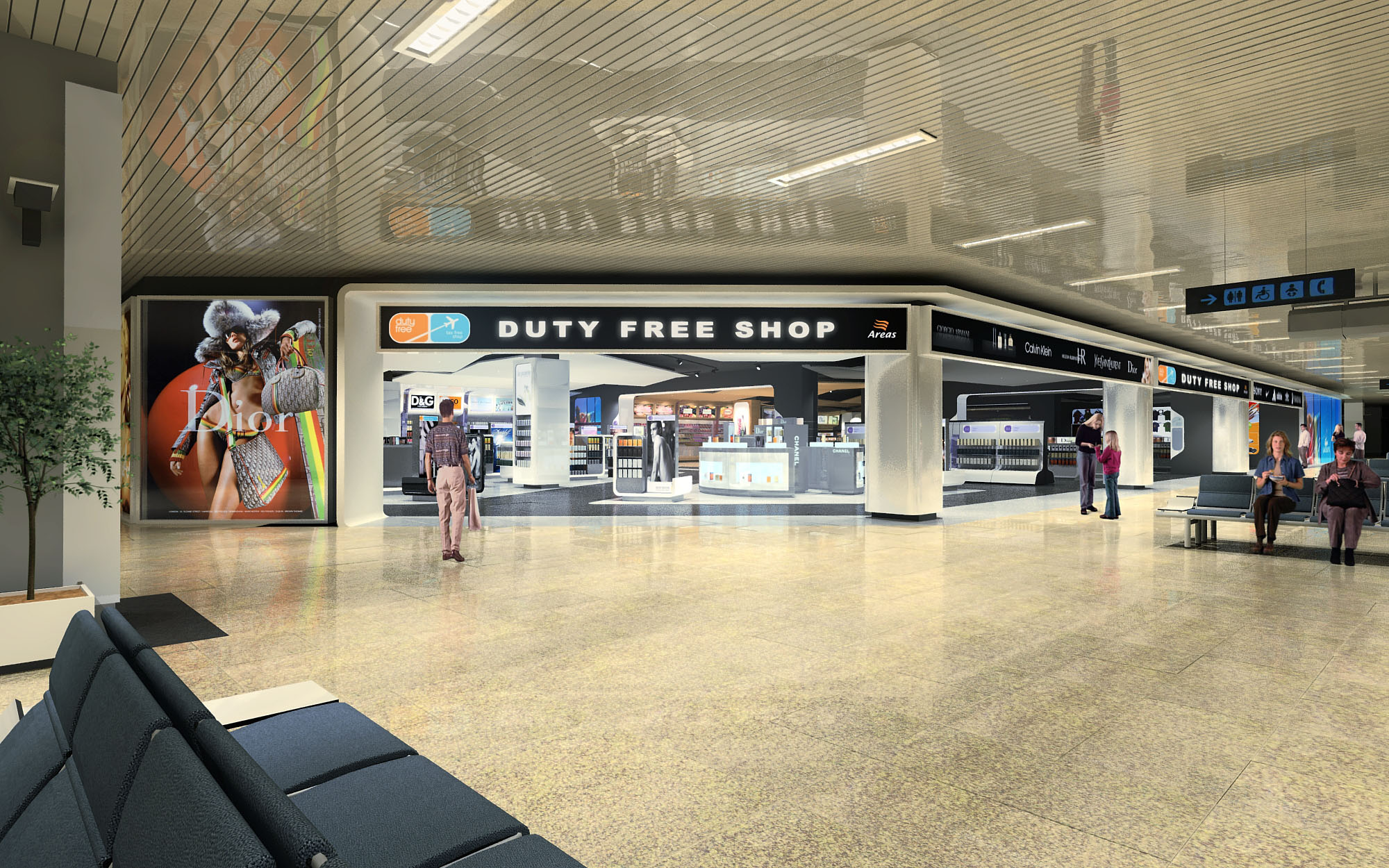
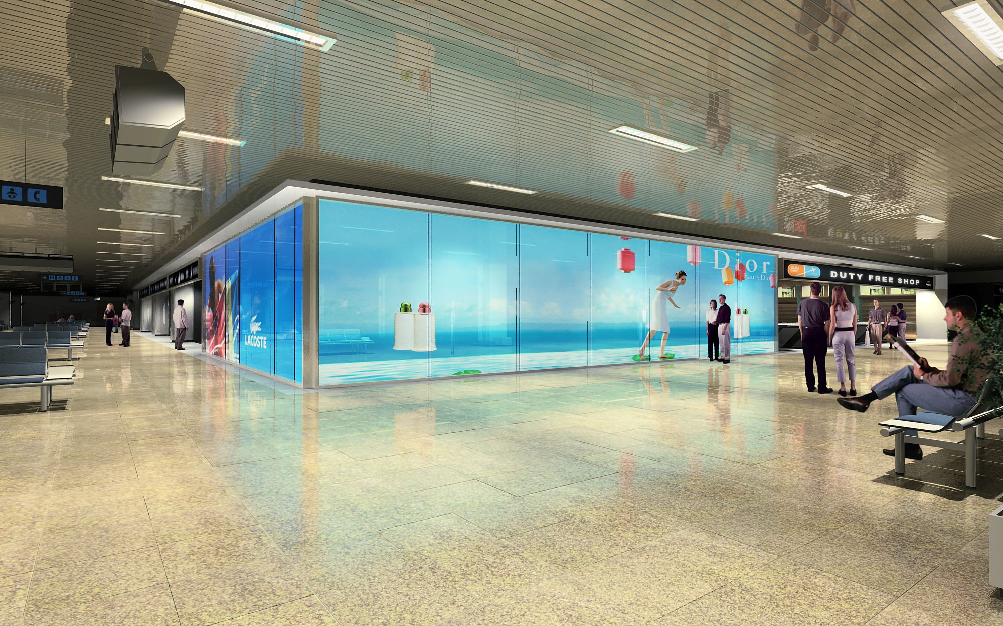
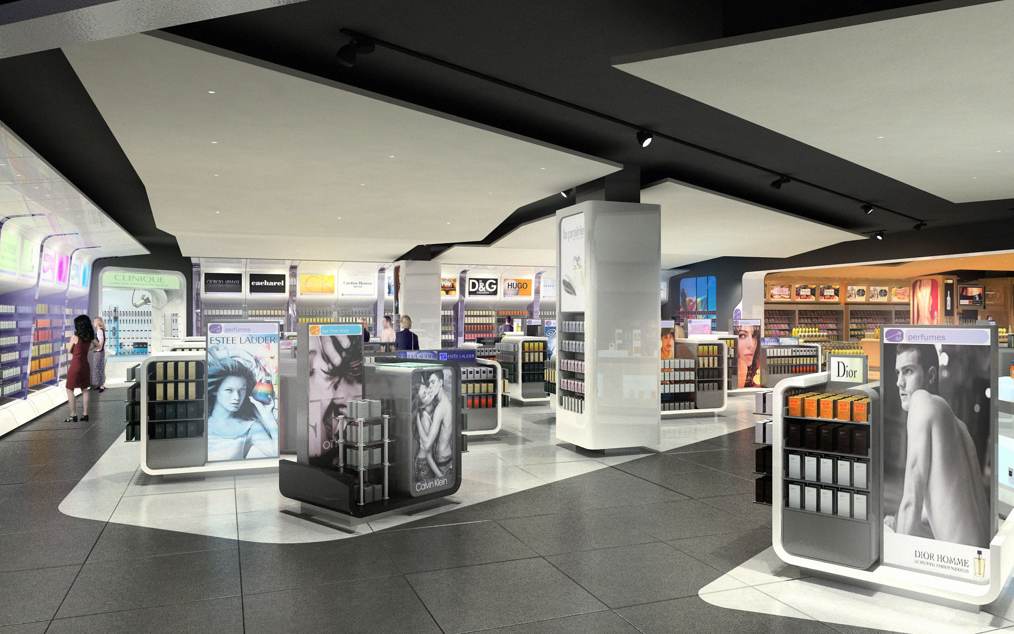
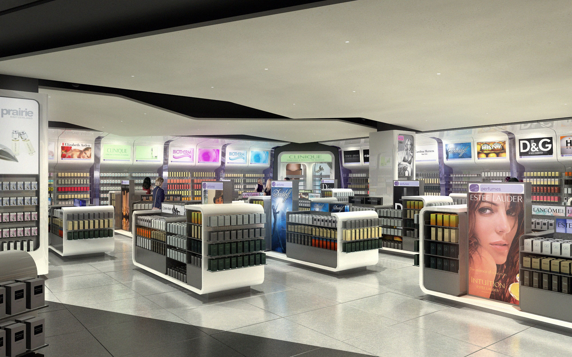
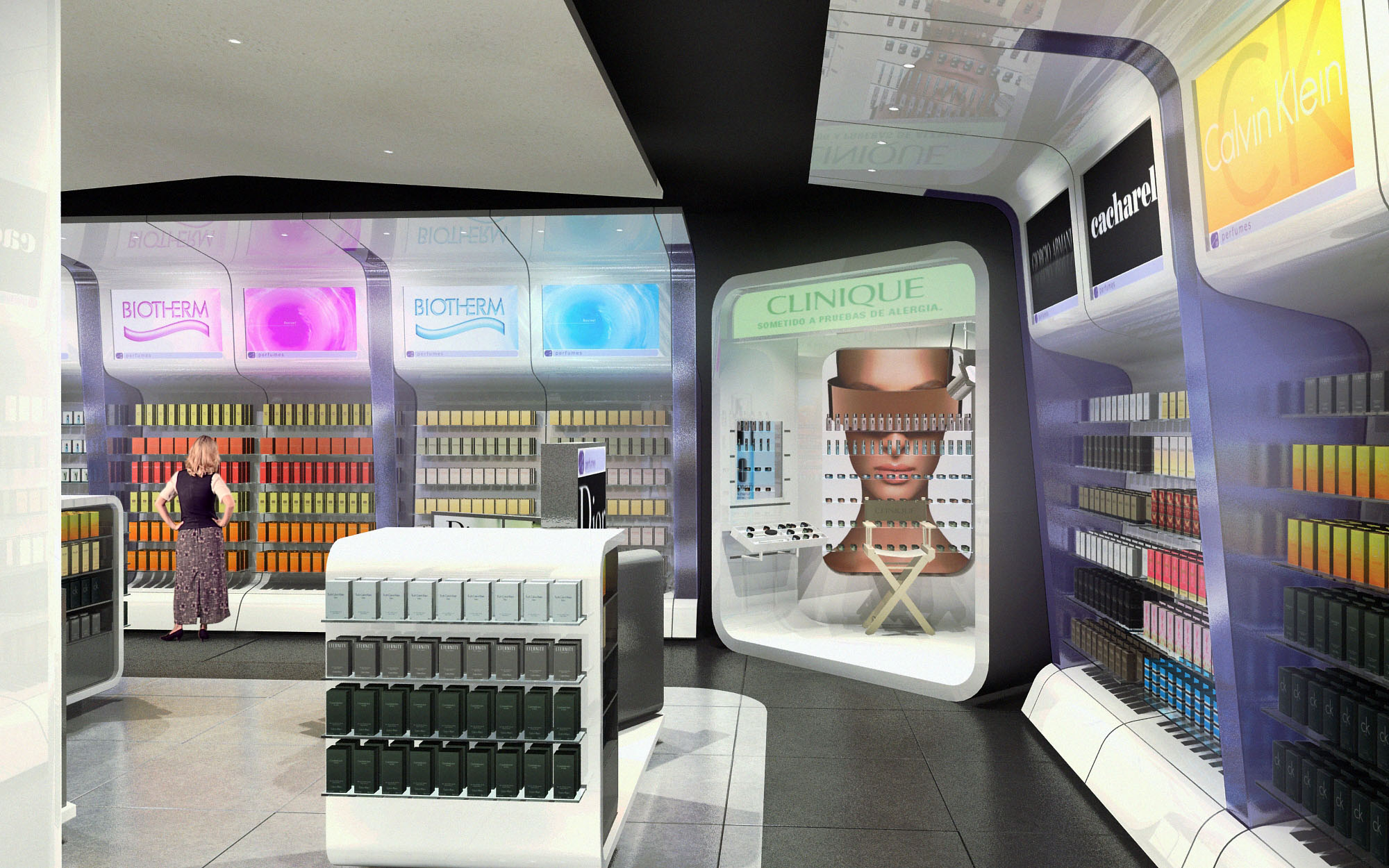
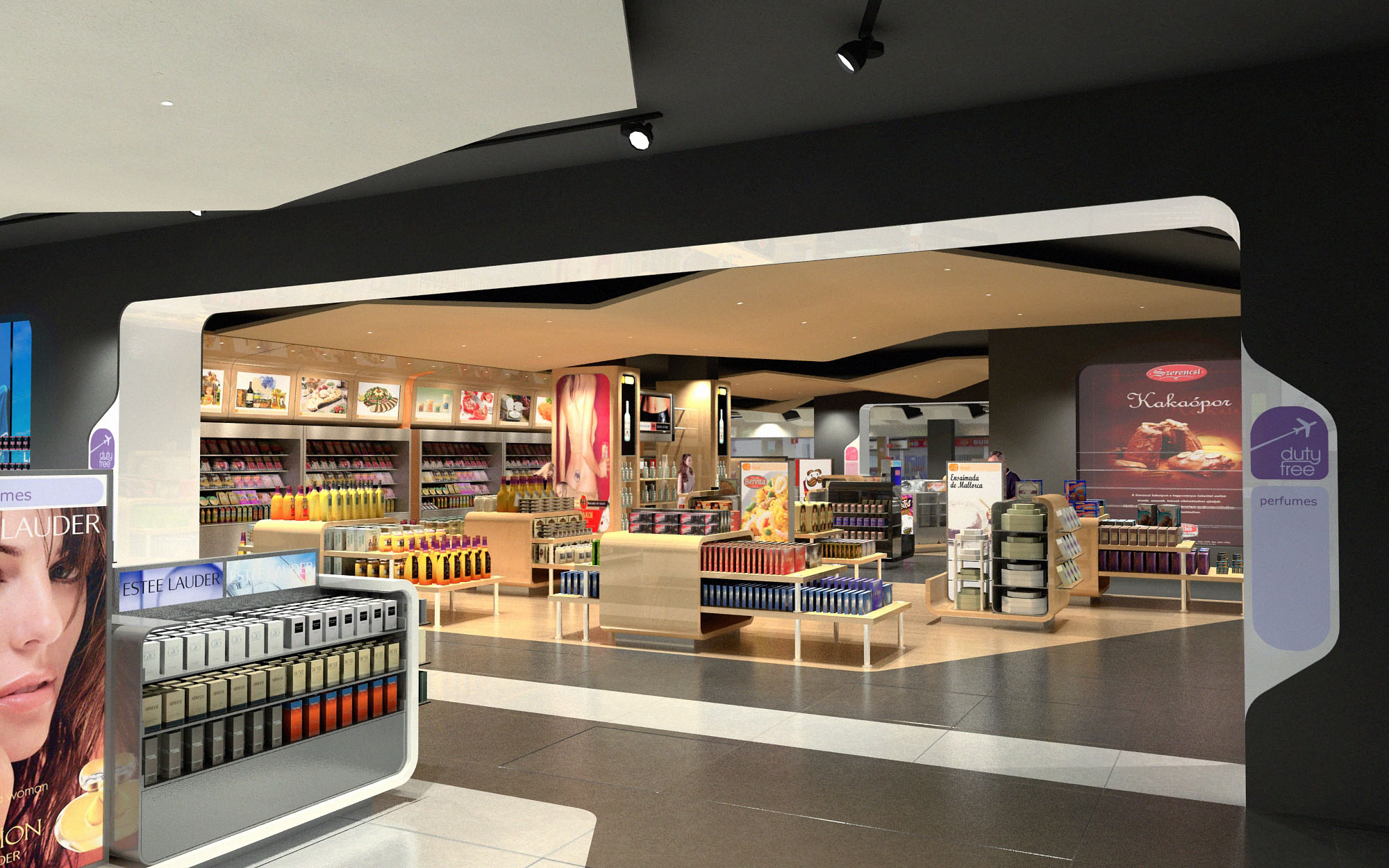
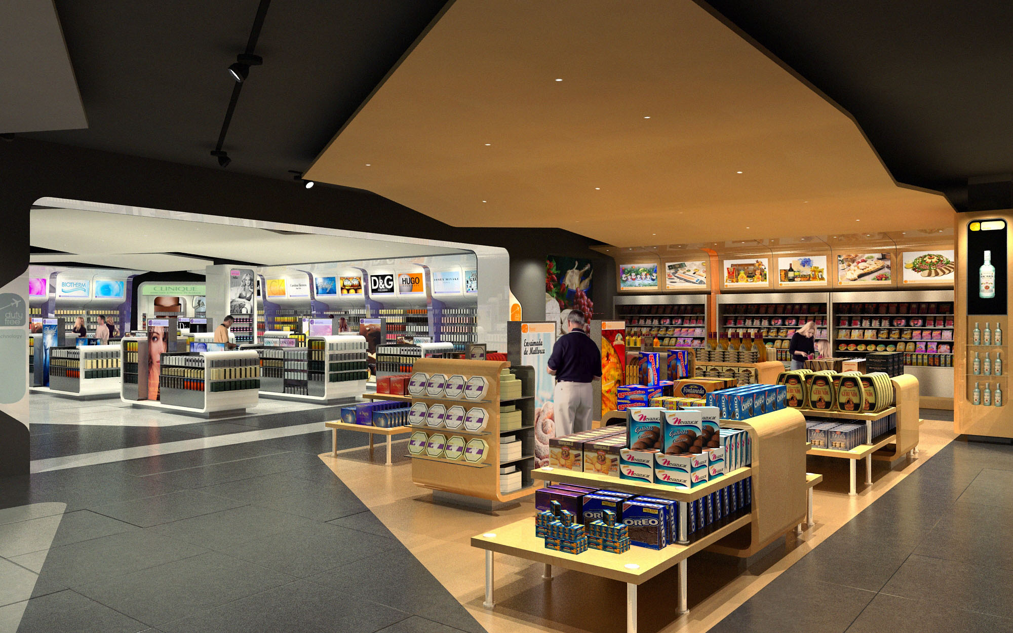
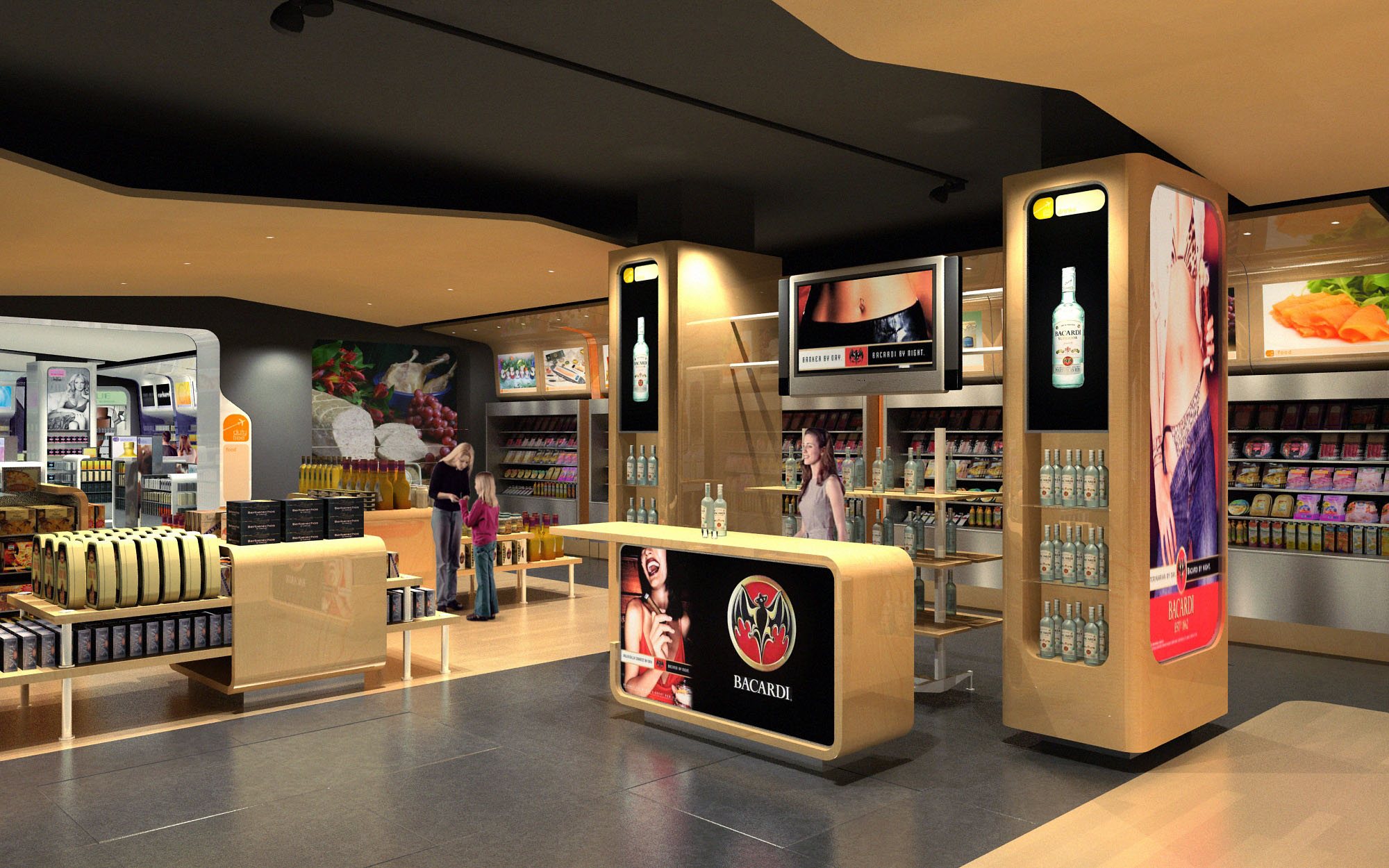
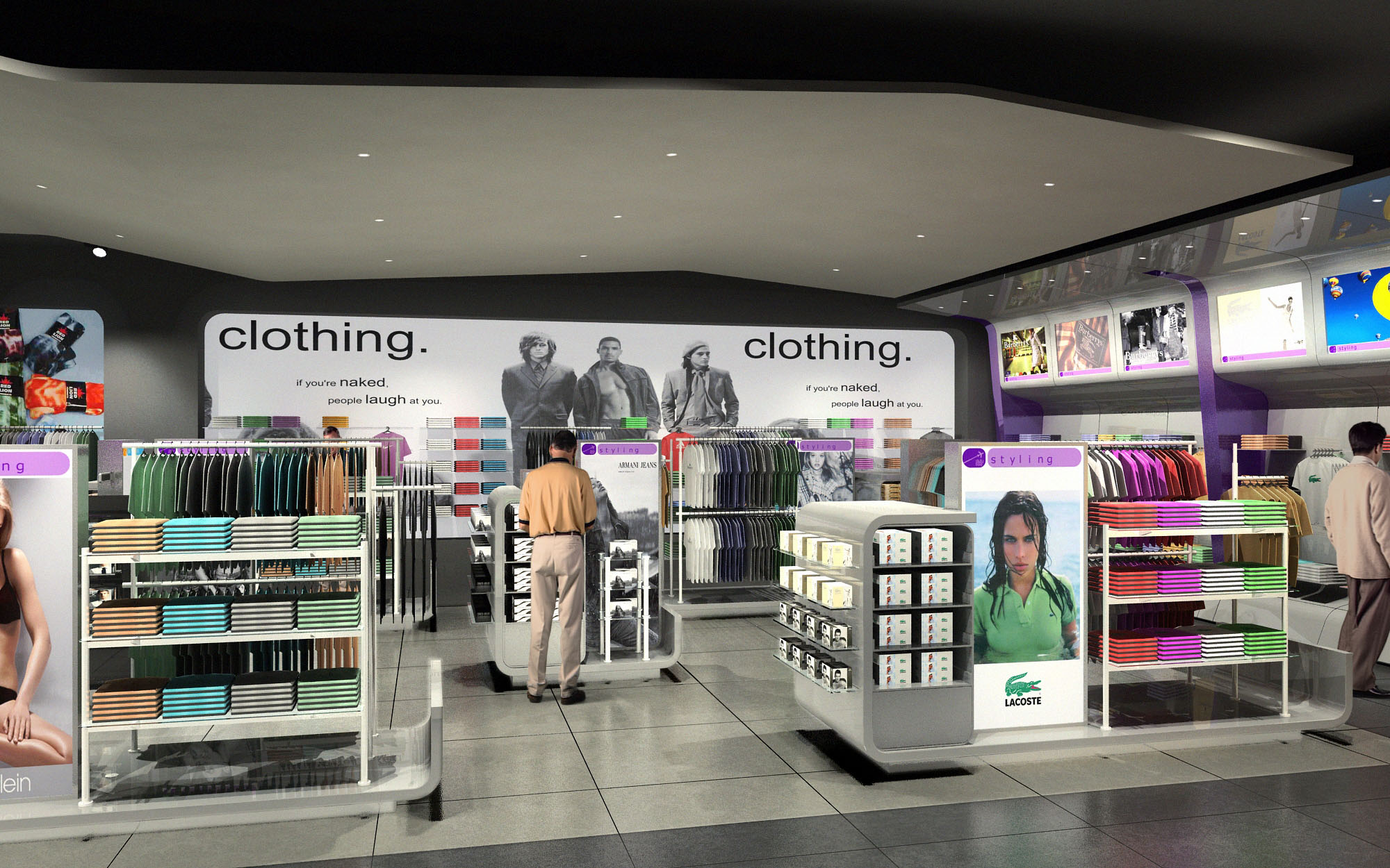
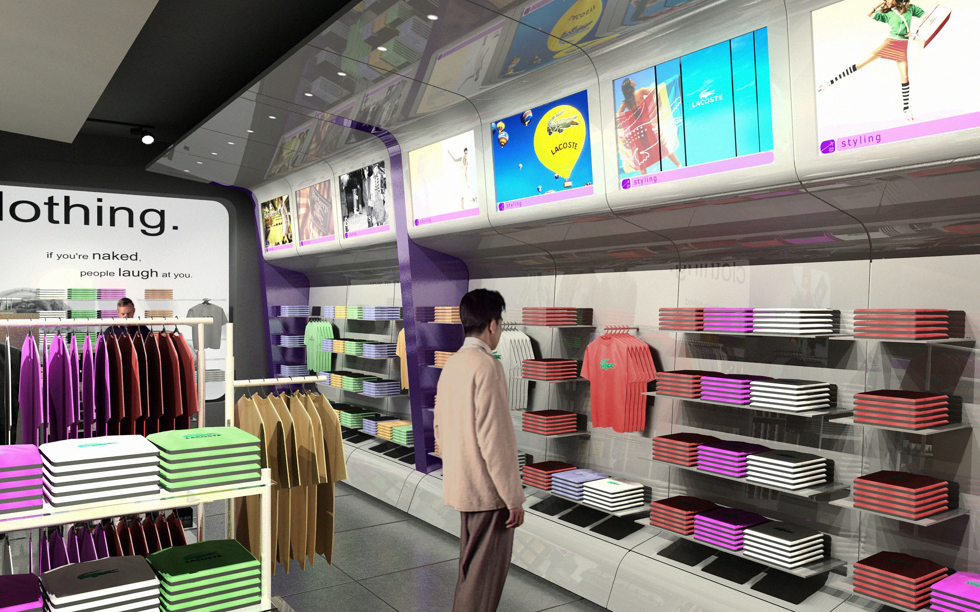
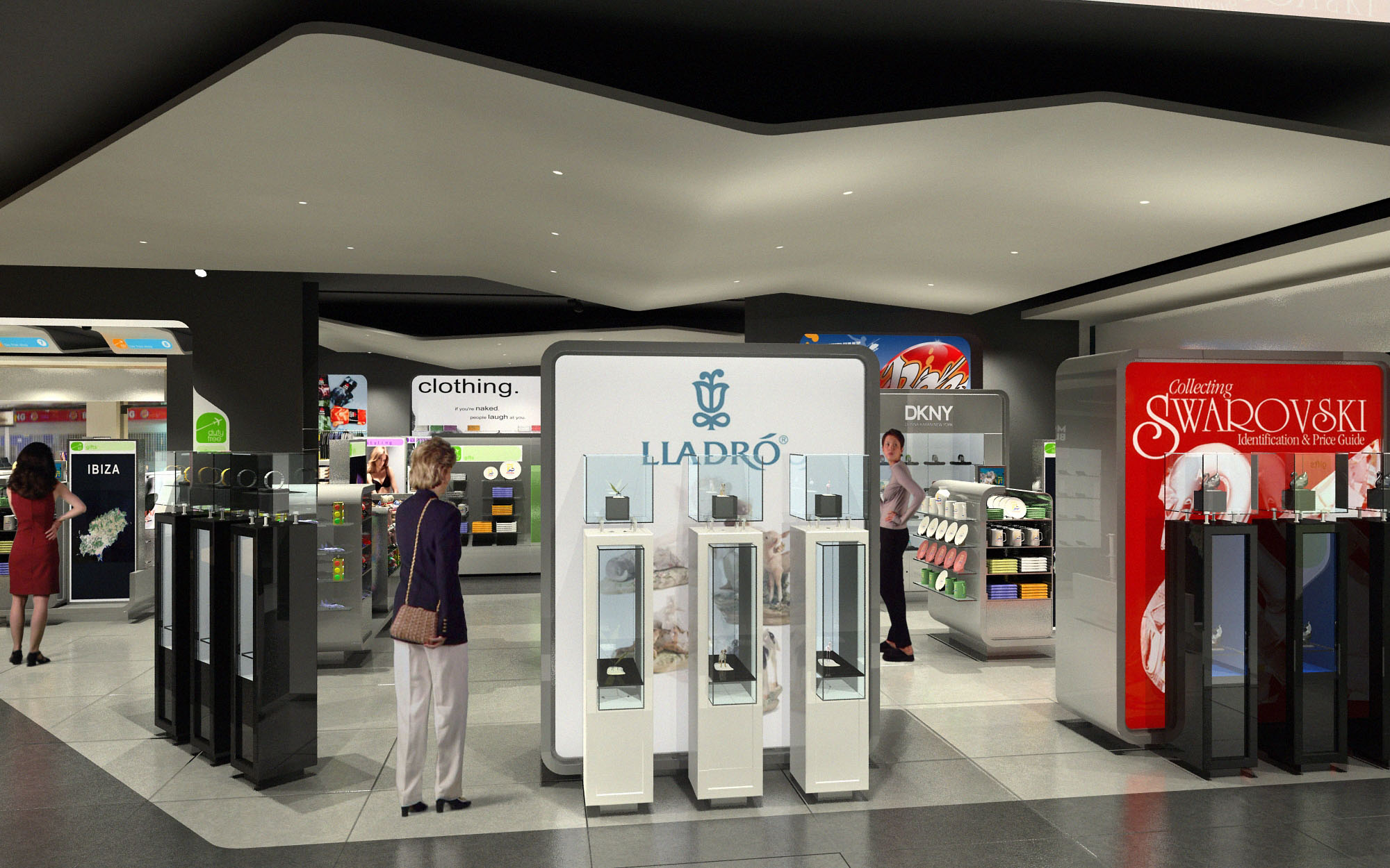
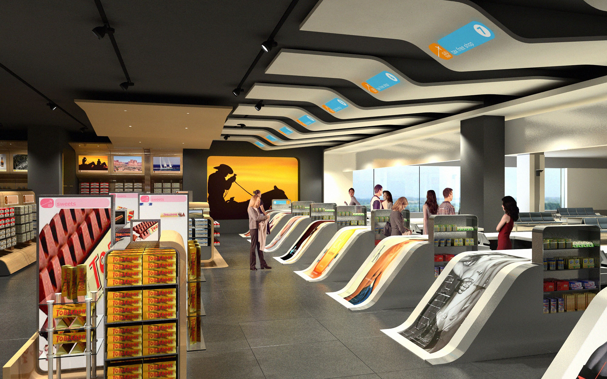
© 2021 by sanzpont [arquitectura] . Webpage by sanzpont [digital] . Innovative Digital Experiences

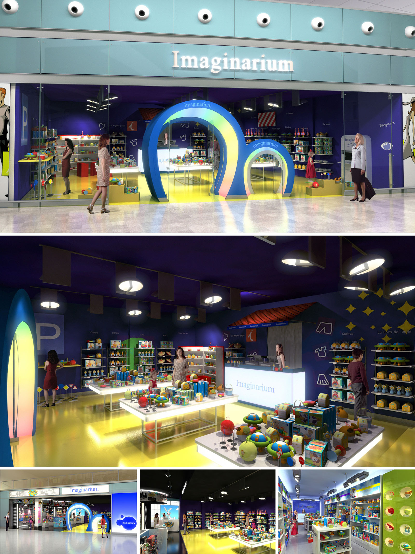
The IMAGINARIUM stores are conceived as immersive landscapes for children and adults, where the architectural language extends the brand’s universe into physical space. The concept is based on the idea of a “portal to imagination”: a sequence of fluid, luminous arches that mark the transition from the neutral mall environment to a chromatically intense interior. These portals, duplicated at two different scales, create a shared entrance ritual for adults and children, reinforcing playfulness while maintaining clear accessibility and visibility from the corridor.
The spatial narrative is deliberately simple and legible. A bright, continuous floor plane guides visitors towards the central display islands, while the darker ceiling compresses the perceived height and focuses attention on the merchandise. The envelope becomes a backdrop for storytelling, using color blocks, graphic constellations and iconic silhouettes to structure thematic areas within the open plan.
The layout is organized as a sequence of concentric layers. Immediately after the entrance arches, low central tables display high-rotation products at a child-friendly reach, encouraging tactile interaction. Around this heart of the store, perimeter shelving forms a continuous “toy library” where collections are organized by age and typology. This ring strategy optimizes sightlines for caregivers while allowing children a degree of autonomous exploration within a controlled field of vision.
The cash desk and customer service counter are positioned as a luminous anchor at the back, visually accessible from the entrance to provide orientation and security. Circulation flows in a loose loop, with generous turning radii for strollers and clear transversal connections between islands and wall units. Fixtures are kept predominantly low in height except for a few vertical accent elements, ensuring overall visual permeability and reducing the sensation of clutter despite the abundance of small-format products.
The formal language is based on soft curves and simplified geometric volumes, echoing the ergonomics and safety standards of children’s toys. The dual-height entry arches, elliptical lighting elements and rounded shelving corners all contribute to a cohesive identity that feels both iconic and approachable. These gestures are repeated across the three international locations, creating immediate brand recognition while allowing for local adaptations.
Color is employed as a primary design tool. A saturated, almost nocturnal blue defines walls and ceiling, creating a theatrical background for the vivid chromatic palette of the products. In contrast, the floor and central furniture adopt luminous yellows and whites that act as reflective surfaces, amplifying light and enhancing the perception of cleanliness. Accent gradients on the portal elements subtly recall digital environments and animated worlds, aligning the physical store with contemporary visual culture associated with play and fantasy.
Durability and ease of maintenance drive the material selection. Continuous resilient flooring with a glossy finish withstands intense traffic and reflects light deep into the space. Shelving and tables combine powder-coated metal structures with high-pressure laminates, ensuring impact resistance and rounded, child-safe edges. Transparent acrylics and glass are used sparingly for feature displays, adding sparkle without compromising robustness.
The lighting strategy combines large circular downlights with concealed linear LEDs integrated into shelving and counters. The ceiling luminaires provide a uniform base illumination, while accent lighting on façades and feature walls creates depth and highlights key product families. Backlit signage and digital displays integrated into the front elevation enhance brand communication and can be updated remotely, allowing synchronized campaigns across Spain and the USA locations.
Sustainability is approached through material selection, energy performance and adaptability. The use of LED lighting throughout significantly reduces electricity consumption and heat gain compared to conventional solutions, lowering cooling loads in enclosed mall environments. High-durability finishes minimize the need for frequent replacement, extending the life cycle of fixtures and reducing waste over time.
Display systems are modular and reconfigurable, based on standardized metal frames and interchangeable shelves, enabling ongoing reorganization of products and seasonal storytelling without structural works. This flexibility allows the three international stores to respond to evolving retail strategies while keeping construction impacts low. Where feasible, components are specified from suppliers with certified environmental management and designed for disassembly, so that at the end of their life they can be separated into recyclable material streams, supporting a more circular retail design approach.
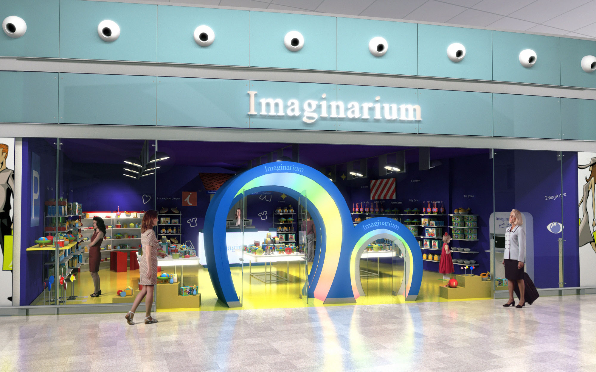
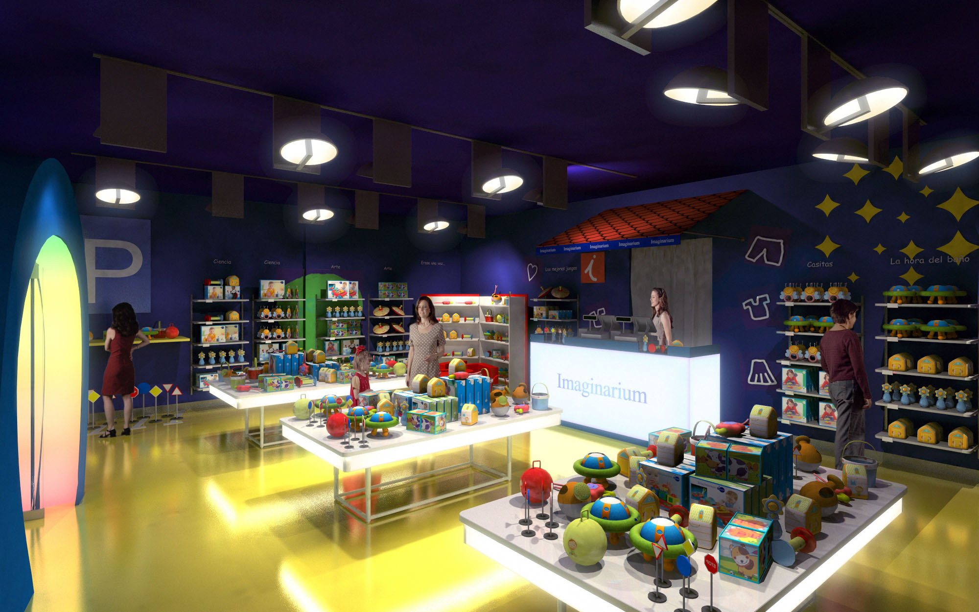
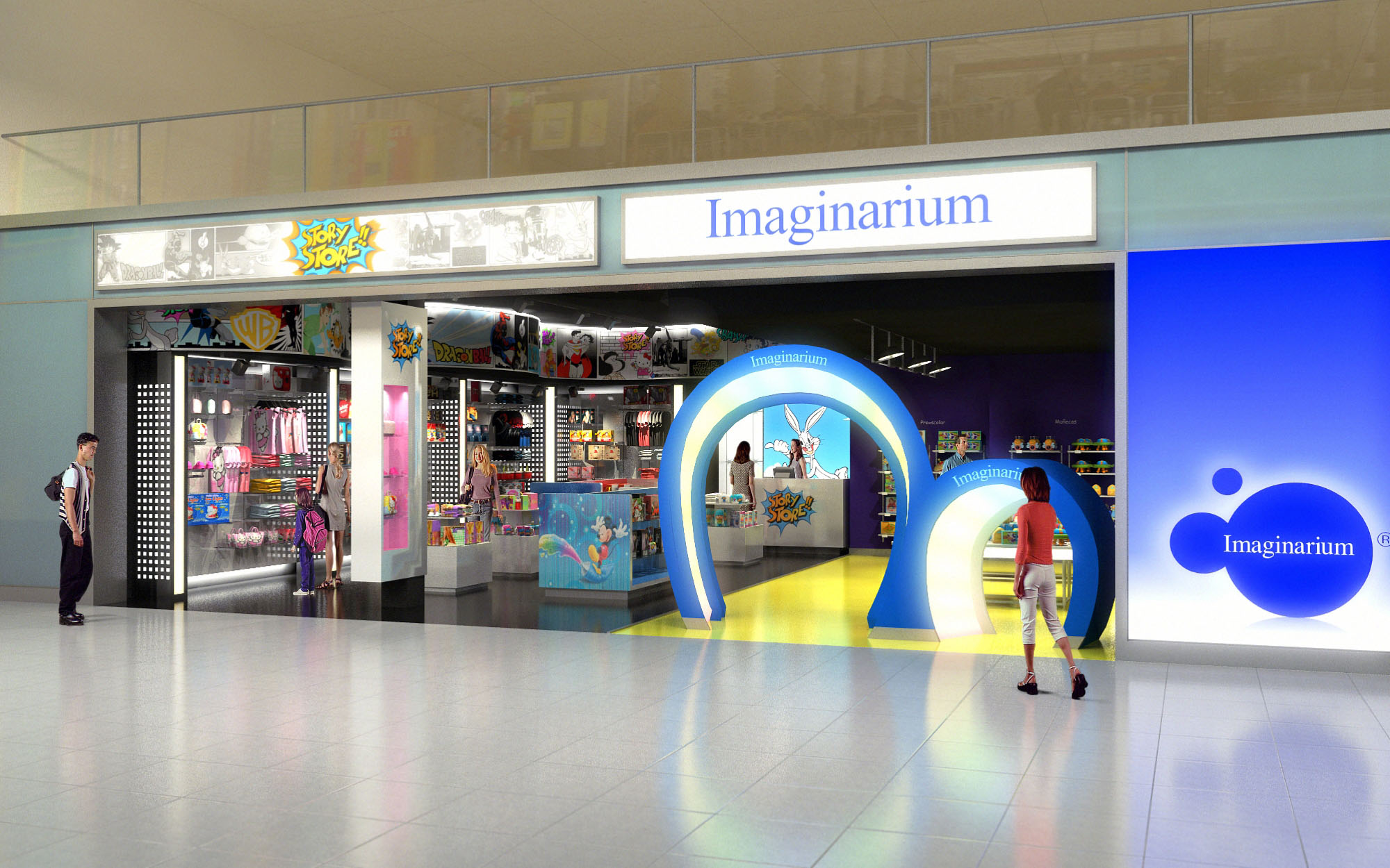
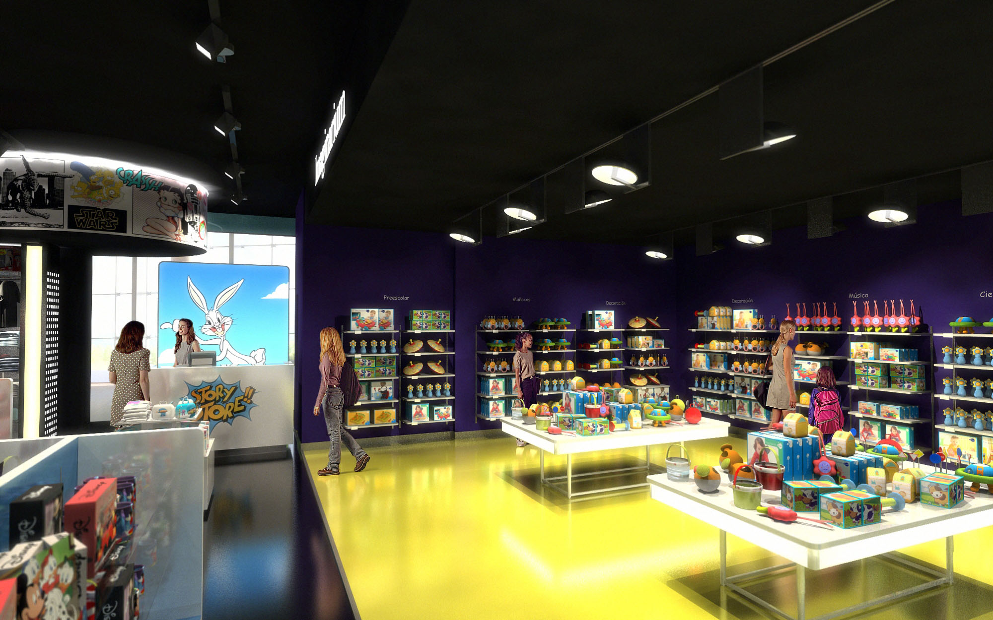
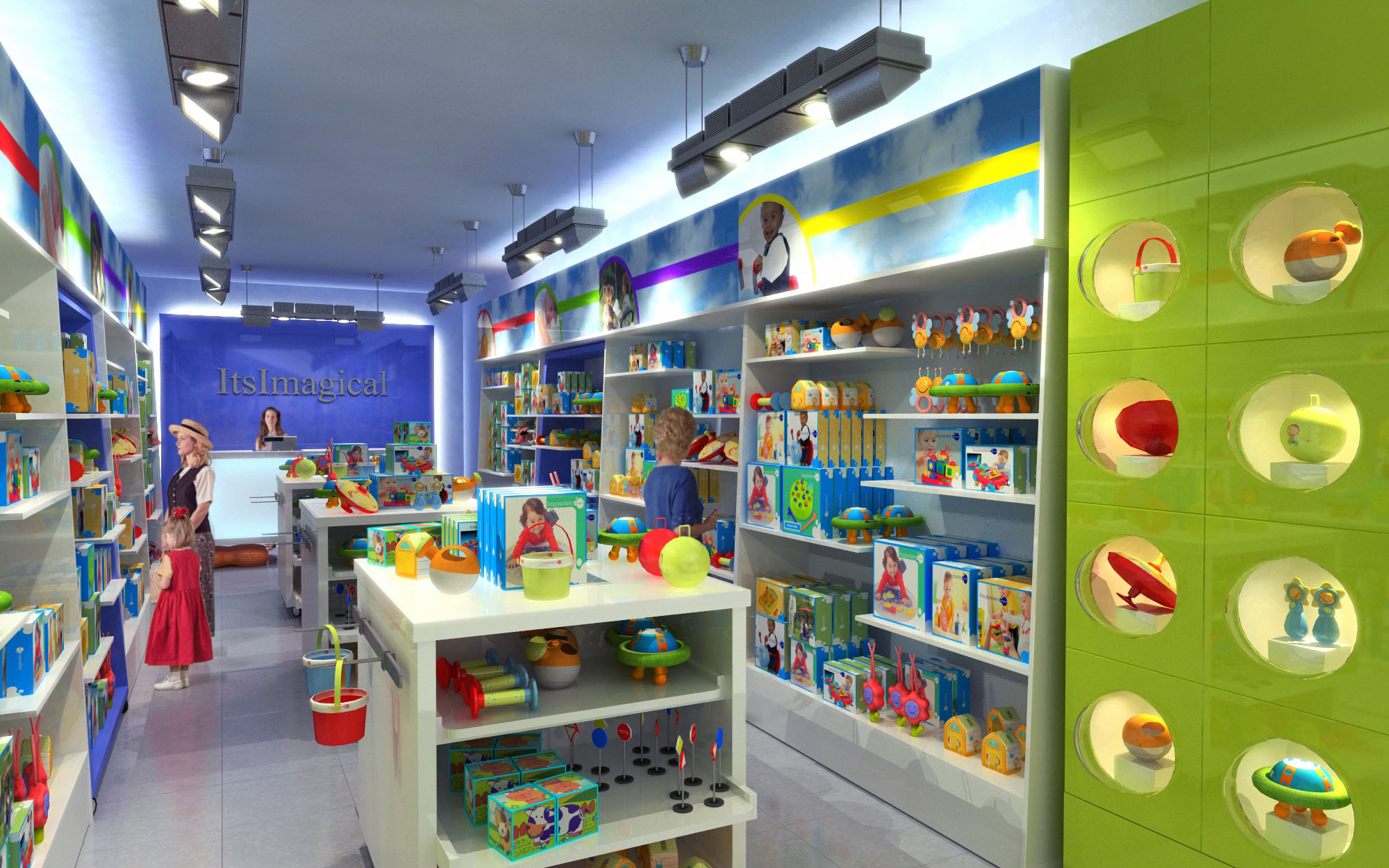
© 2021 by sanzpont [arquitectura] . Webpage by sanzpont [digital] . Innovative Digital Experiences
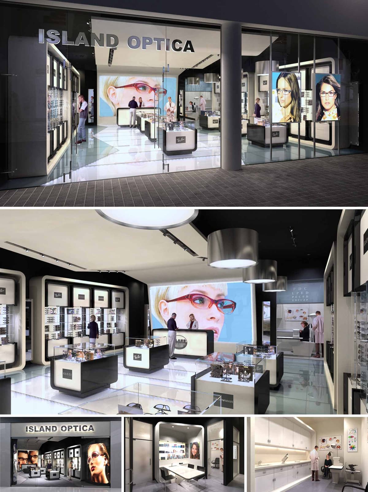
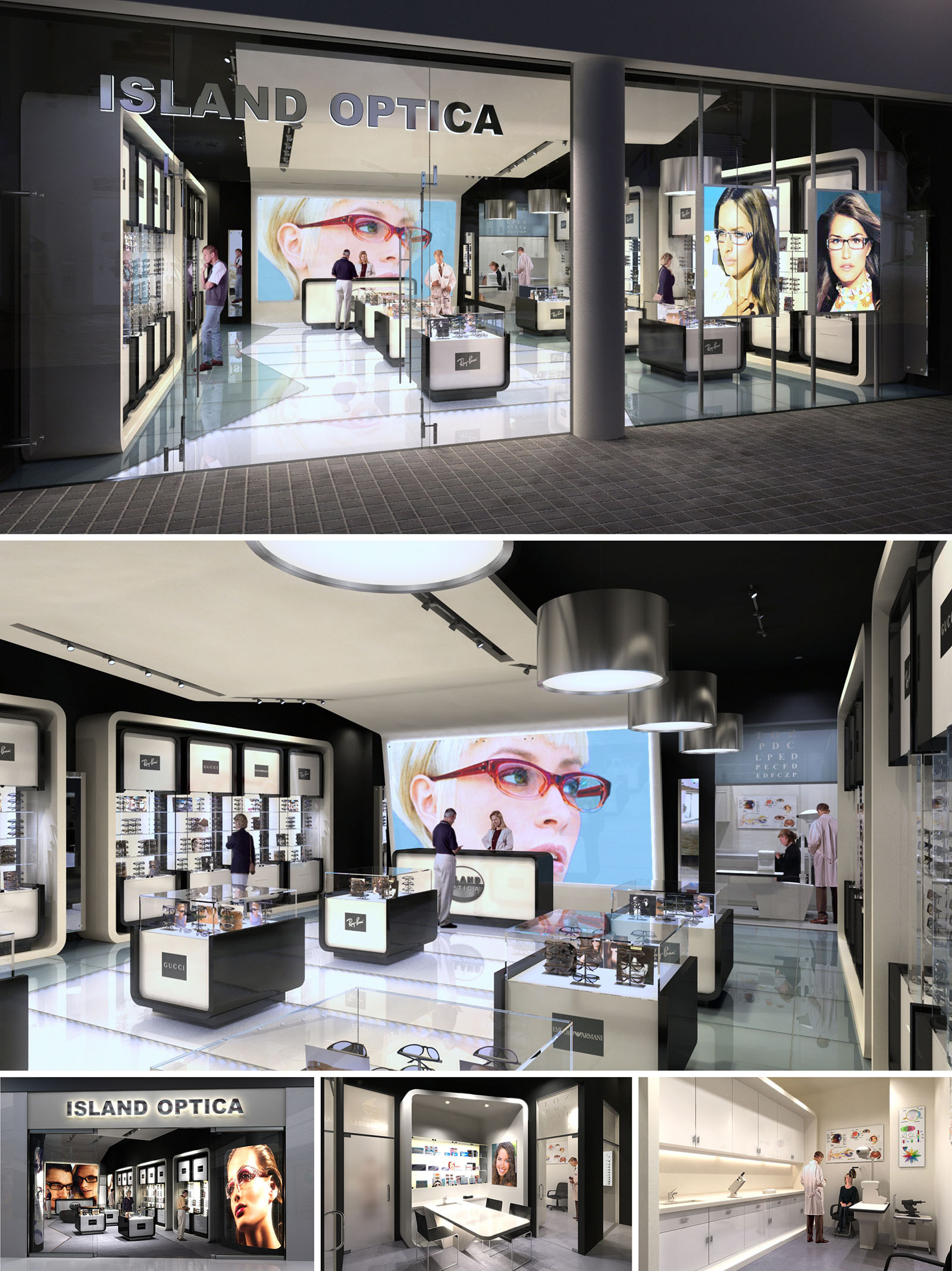
The concept for Island Optica is based on the idea of the eyewear boutique as a luminous viewing device, where architecture, lighting and display systems work together like the internal mechanism of a camera. The stores are conceived as transparent boxes that reveal their contents to the street, turning the product into an illuminated landscape of precision and clarity. This notion is consistent across the three locations in México, generating a recognizable brand identity while allowing each space to respond to its specific urban context.
The design aligns the medical rigor of optometry with the emotional world of fashion retail. Clean lines, controlled geometries and a restrained color palette evoke clinical accuracy, while large-format images and illuminated showcases introduce a sensorial and aspirational dimension. The result is a hybrid environment where consultation, diagnosis and purchase occur seamlessly within a single coherent spatial narrative.
The plan is structured around a central exhibition spine composed of freestanding display islands. These low-height elements preserve visual continuity across the interior, allowing clear sightlines from the façade to the consulting areas at the rear. Circulation flows naturally around these islands, encouraging browsing while avoiding congestion in peak hours.
The perimeter houses tall wall displays framed as deep, backlit niches. These frames articulate the store envelope, giving rhythm to the walls and simultaneously maximizing vertical merchandising capacity. At the far end, the examination and consulting rooms are organized as a calmer, more private zone separated by translucent partitions. This maintains acoustic and visual comfort for patients while keeping the professional aspect of the practice visually linked to the retail floor.
The material strategy relies on a high-contrast black-and-white scheme, reinforcing the ideas of clarity and precision associated with vision. Glossy white flooring and display surfaces amplify light and reflections, creating a sense of weightlessness around the products. Black lacquered elements and a dark ceiling plane frame the space, sharpening perspectives and visually suspending the luminous showcases.
Display modules combine lacquered MDF, clear and low-iron glass, and fine metallic profiles in brushed aluminum. These elements are dimensioned with minimal joints and thin edges to give an almost laboratory-like sense of refinement. In the clinical zones, finishes transition to more matte, tactile materials such as vinyl flooring and satin paint, providing a softer and more controlled background for medical equipment.
Lighting is treated as the main architectural tool for both branding and functional clarity. Linear tracks with adjustable projectors provide accent lighting on the merchandise, ensuring correct color rendering for frame selection. Large circular pendants introduce a softer, atmospheric light that balances the more technical spots and anchors the central axis of the shop.
Backlit wall niches and integrated LEDs within the display furniture provide uniform, shadow-free illumination of the eyewear, turning each frame into an object of precision. The façade uses full-height glazing and internally illuminated graphic panels to create strong street visibility. Oversized photographic portraits act as luminous beacons, communicating the fashion-driven aspect of the brand and making each store immediately recognizable in its urban setting.
The customer journey is designed to be intuitive and comfortable. Entry from the street brings visitors directly into the main display zone, where circulation is unobstructed and products are reachable without assistance. Consultation desks are strategically located in the mid-zone, forming a transition between open retail and private examination rooms. This sequencing supports a gradual shift from informal browsing to focused diagnostic interaction.
Back-of-house areas, including laboratories and storage, are planned along linear worktops with continuous upper and lower cabinetry. This arrangement optimizes workflow for lens preparation, adjustment and repairs, ensuring that technical operations remain efficient yet visually discreet from the public area.
The design incorporates sustainability through both material selection and operational strategies. Durable finishes such as high-pressure laminates, long-life LED systems and modular aluminum profiles reduce the need for frequent replacement, extending the store’s life cycle. The predominance of light-colored interior surfaces increases reflectivity, allowing general illumination levels to be achieved with lower energy consumption.
Display furniture is conceived as a modular system: shelves, light boxes and support structures can be reconfigured or expanded without structural work. This adaptability supports evolving product lines and changing brand campaigns, minimizing construction waste over time. The extensive use of glass not only promotes visual permeability and natural daylight penetration from the frontage, but also facilitates end-of-life recycling, reinforcing a responsible and future-oriented approach to retail design.
© 2021 by sanzpont [arquitectura] . Webpage by sanzpont [digital] . Innovative Digital Experiences

OXIGENO2 is conceived as a contemporary hybrid space that brings together convenience retail and a compact café area within a single, fluid environment. The design strategy focuses on clarity, brightness and intuitive circulation, evoking the idea of “oxygen” as light, order and transparency. A neutral architectural envelope is used as a calm backdrop against which the chromatic richness of products becomes the main visual protagonist. The result is a retail experience that feels open, legible and efficient, while maintaining a warm, human scale.
The project responds to its urban context in Barcelona by offering a fast yet comfortable stopover environment, anticipating the rhythms of commuters and travelers. Linear geometries, clean lines and restrained detailing reinforce a sense of precision and reliability, essential in a high-turnover retail format. The interior is intentionally free of visual noise, allowing signage, product families and service counters to be understood at a glance.
The plan is structured around a clear longitudinal axis that runs from the entrance towards the service counters at the back. Central gondolas organize dry food, snacks and complementary products, while perimeter shelving hosts refrigerated goods, drinks and magazines. This arrangement creates a continuous circulation loop that encourages exploration yet avoids bottlenecks, even at peak hours.
The café seating is strategically aligned along one side, parallel to the main aisle. Fixed tables with cantilevered bases and integrated seating optimize the available footprint, creating a compact dining strip that does not interfere with retail flows. The checkout and service counter are positioned as a focal terminus to the perspective, reinforcing orientation and intuitively guiding customers through the space.
A restrained palette combines warm-toned ceramic flooring with light gray and white furniture elements. The warm floor introduces a sense of comfort and domesticity, counterbalancing the technical character of the shelving and stainless-steel elements. Vertical display systems and tables are predominantly white, enhancing light diffusion and providing a neutral canvas for branding and product color.
Ceilings are kept smooth and uninterrupted, punctuated by a dense grid of recessed downlights that ensure homogeneous illumination across shelves and circulation areas. This uniform lighting minimizes shadows on merchandise and supports accurate color rendering. Accent is introduced via the green corporate identity: wall graphics, subtle logos and wayfinding typography above each product category generate immediate recognition and improve orientation without resorting to heavy architectural gestures.
The fixed seating modules feature crisp, rectilinear profiles with upholstered backs and seats for short to medium-stay comfort. Their metal supports are recessed, creating a visual sense of levitation and facilitating cleaning and maintenance under the benches. Table dimensions and alignments are calculated to allow precise circulation clearances between aisles, diners and shoppers.
Retail fixtures are designed as low to mid-height gondolas in the center, with taller refrigerated walls at the perimeter. This hierarchy protects long-distance sightlines, maintaining visual connectivity across the entire store. The curved end displays soften circulation nodes and invite approach from multiple angles, while the children’s and toy display uses lower heights and rounded forms to be accessible and safe for younger users.
The project integrates sustainability through both material choice and operational planning. The continuous ceramic flooring offers long-term durability and reduced replacement cycles, lowering the embodied environmental impact over the building’s life. Modular shelving and furniture systems are designed for disassembly, enabling future reconfiguration or selective replacement instead of full refurbishment.
The dense array of recessed luminaires is conceived to operate with high-efficiency LED technology, reducing energy consumption and maintenance. Bright, reflective interior surfaces enhance light distribution, allowing lower wattage levels while maintaining a luminous environment. Refrigeration walls are consolidated along the perimeter to facilitate efficient cooling systems and simplified insulation strategies. The overall compact layout shortens circulation paths for staff, improving logistics and minimizing energy use associated with daily operations.
© 2021 by sanzpont [arquitectura] . Webpage by sanzpont [digital] . Innovative Digital Experiences
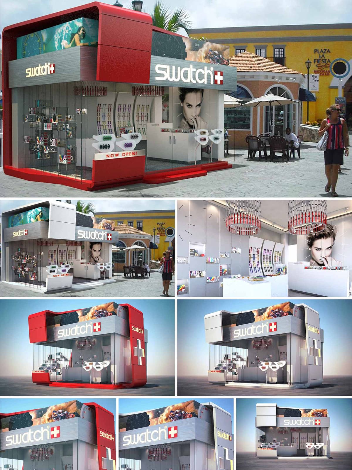
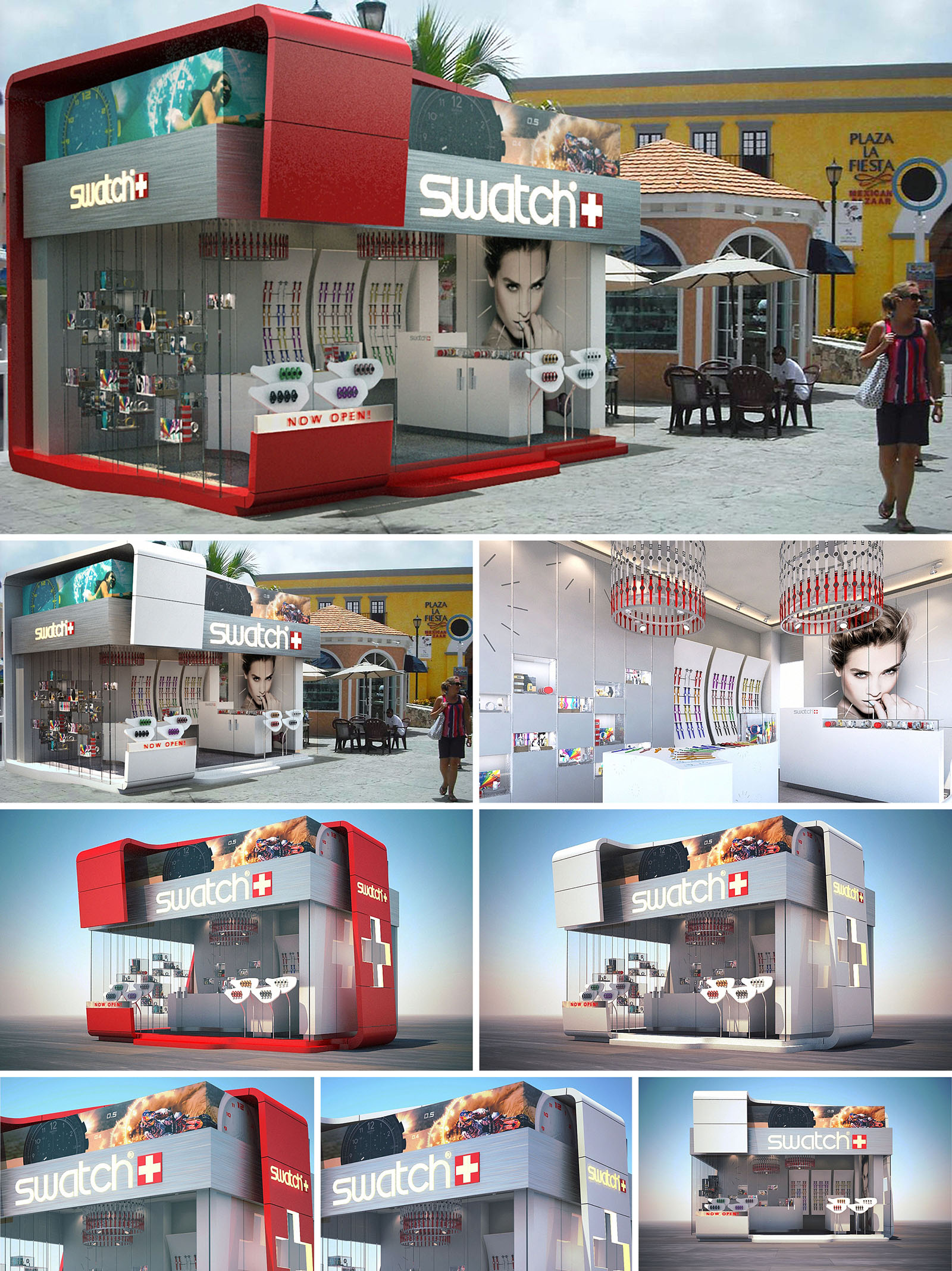
The SWATCH retail pavilion in Cancún is conceived as an urban “time capsule” that compresses the brand’s playful precision into a compact, freestanding volume. The architectural language is based on a bold, aerodynamic box that appears to float over a fully transparent base, embodying lightness, speed and the dynamic character of the watches on display. The design establishes a strong visual contrast with the surrounding colonial-inspired context, using contemporary geometry and color blocking to create an immediate landmark within the plaza.
The envelope abstracts the Swiss cross and the iconic SWATCH logotype into architectural elements, transforming branding into three-dimensional form. Large-format graphics wrap the upper volume like an illuminated bezel, while the recessed ground floor is conceived as a showcase in permanent motion, where merchandise and customers become part of a living display visible from every side.
The pavilion is organized as a double-height rectangular prism, rounded at the corners to evoke the soft contours of a watch case. A projecting upper “hood” cantilevers over the perimeter, providing shade and enhancing the sense of levitation. This upper band works as an integrated lightbox for high-resolution imagery and branding, transforming the building into an oversized advertising surface without adding separate signage structures.
The ground plane is wrapped almost entirely in frameless glass, emphasizing permeability and blurring the boundary between interior and exterior. Vertical display fins and minimal mullions are carefully aligned to avoid visual noise, allowing the colored watches to become the primary façade texture. A solid side wall incorporates an oversized Swiss cross in relief, acting simultaneously as structural stiffener, brand marker, and night-time lantern when backlit.
The interior is designed as a fluid loop, encouraging customers to move freely around the compact footprint. The main access is chamfered at the corner, naturally drawing visitors into a central reception and service counter aligned with a large-format portrait graphic, which acts as visual anchor for the space. From this point, circulation flows along the glazed perimeter where linear display bands and curved panels present the product in a continuous timeline.
Wall-mounted systems are complemented by freestanding islands and cantilevered trays that keep the central area visually open while maximizing linear merchandising length. The ceiling is treated as a fifth façade, incorporating circular feature elements that reference watch dials and subtly organize the space beneath. The layout ensures clear sightlines from outside, with the most colorful product zones strategically located at the corners to attract attention from different approach angles.
The interior palette is deliberately restrained, using predominantly white and light grey finishes to produce a luminous, gallery-like background. This neutrality amplifies the chromatic diversity of the watches, which effectively become the primary color accents. High-gloss lacquered surfaces, seamless solid-surface counters, and precise junctions between planes reinforce the perception of technical refinement associated with Swiss engineering.
Suspended circular luminaires composed of modular colored elements reinterpret the idea of a watch bracelet, bringing brand identity into the lighting design. These fixtures provide both ambient and focal light, supplemented by recessed linear LEDs integrated into ceiling coves and display shelves. The result is a homogeneous, glare-controlled lighting environment that enhances product legibility and ensures consistent color rendering throughout the day.
The architecture acts as a three-dimensional extension of the SWATCH graphic universe. Typography, color and iconography are embedded into the construction logic instead of being applied superficially. The white, gray and red triad structures the entire composition, from macro elements like the cantilevered red base and upper volume to micro details such as edge profiles and display trims.
Customer experience is built around immediacy and accessibility: products are always within arm’s reach, displayed at ergonomic heights and organized by families along intuitive trajectories. The transparency of the kiosk encourages casual browsing and visual interaction even from outside, aligning with the brand’s democratic and youthful positioning. Visual merchandising is designed to be reconfigurable, allowing rapid adaptation to new collections or collaborations.
The compact footprint and kiosk typology inherently reduce material consumption and site impact. The use of a lightweight steel frame with modular cladding panels facilitates off-site prefabrication, minimizing construction waste and assembly time on the plaza. Glazed surfaces are composed of high-performance tempered glass, and large cantilevers on the upper volume act as brise-soleil, limiting direct solar gain on the display zones while maintaining full transparency.
LED technology is employed exclusively for both interior and exterior lighting, significantly reducing energy demand and heat emission, a key factor in Cancún’s tropical climate. The neutral interior palette and reflective finishes contribute to daylight diffusion, lowering the need for artificial lighting during daytime operation. The modular interior systems are designed for disassembly and reuse, allowing the pavilion to be relocated or reconfigured in future locations, extending its lifecycle and reducing the environmental footprint associated with single-use retail structures.
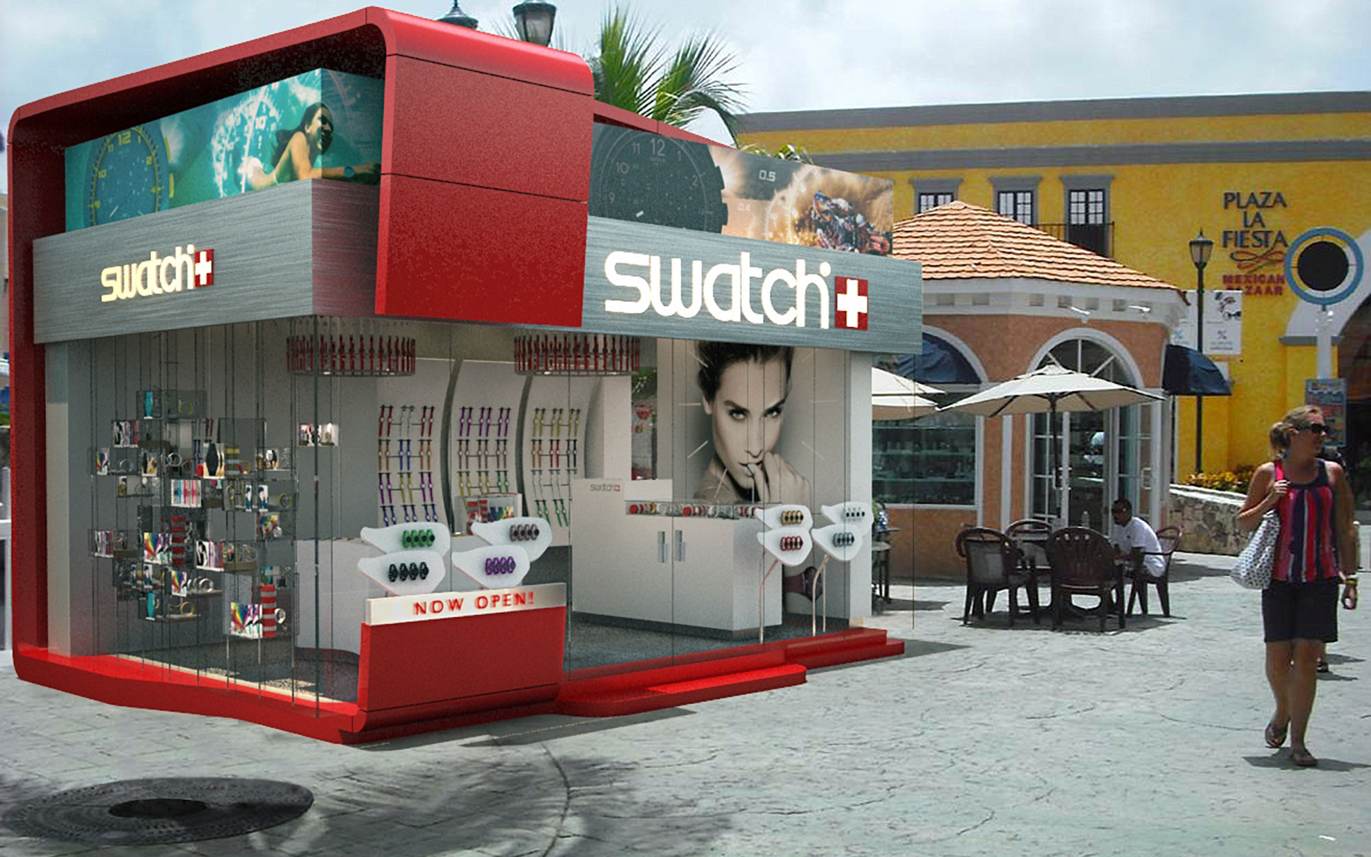
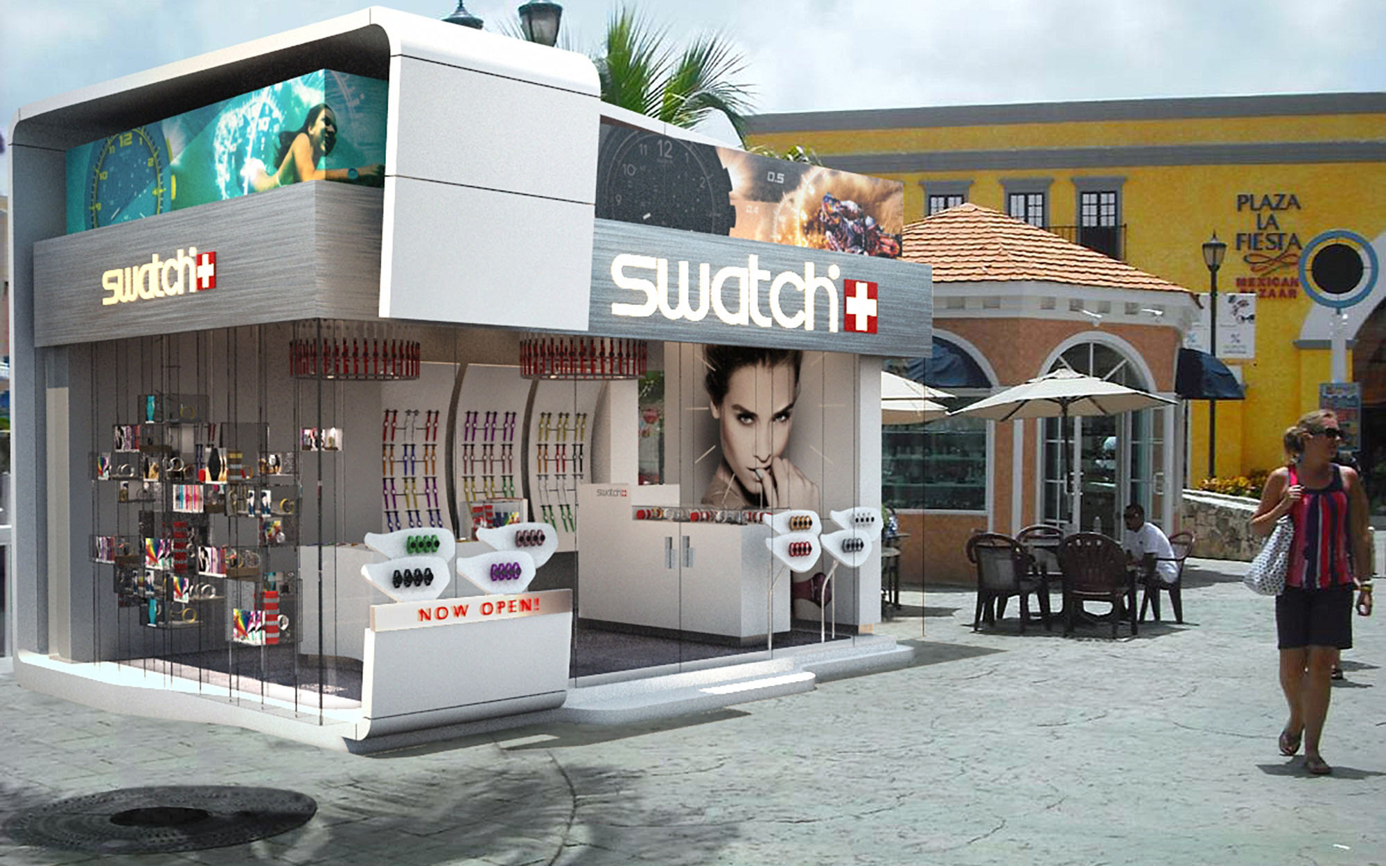
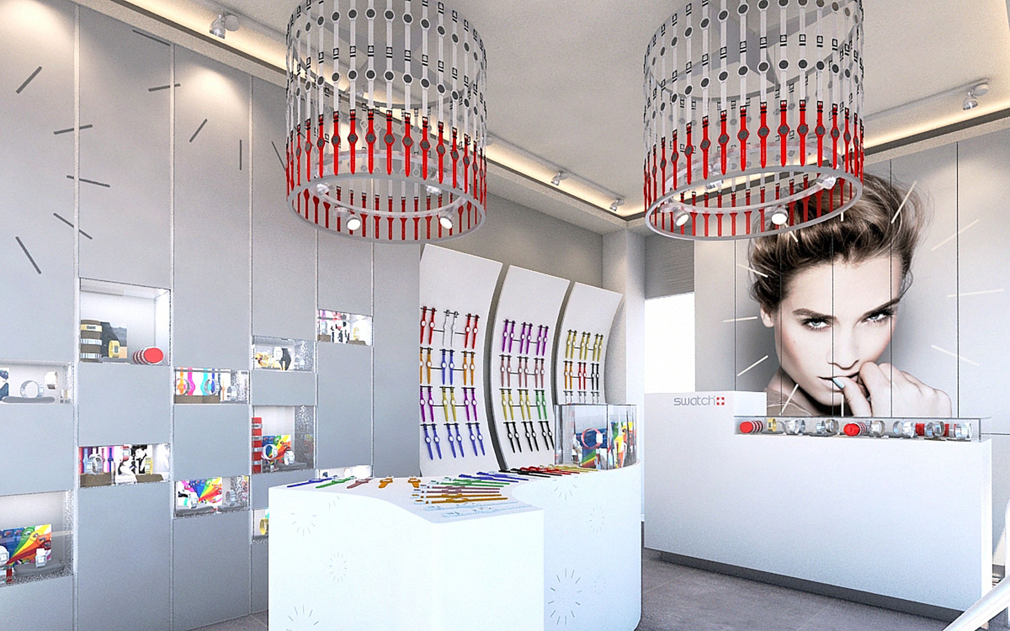
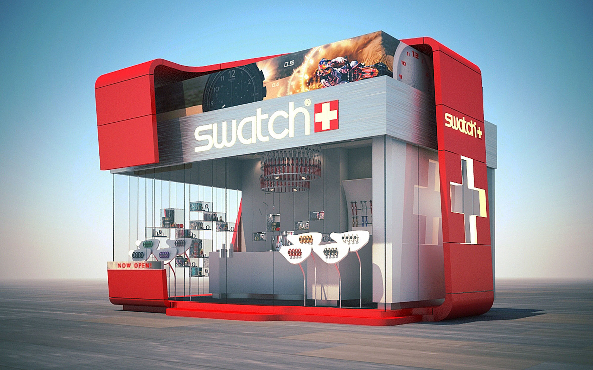
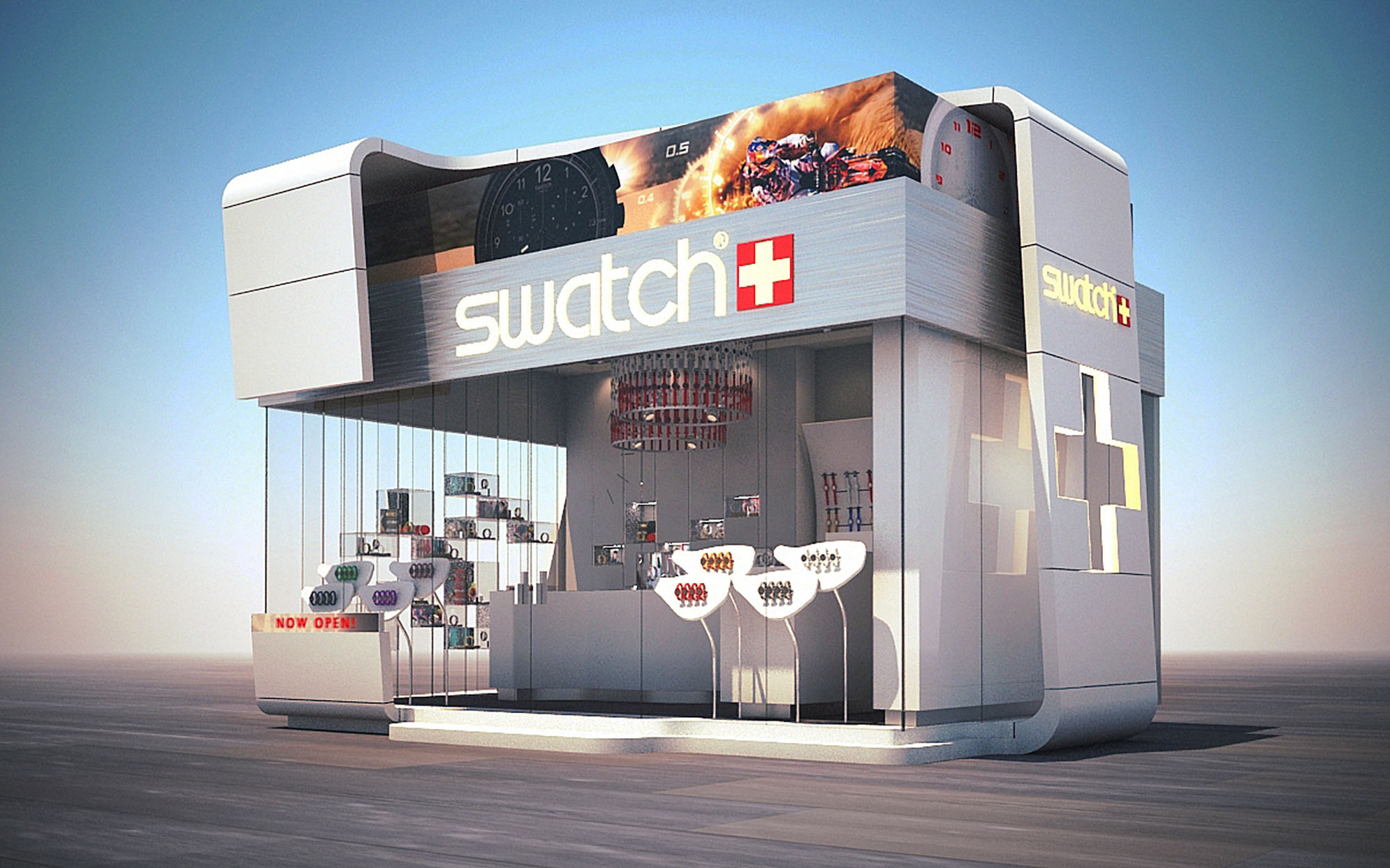
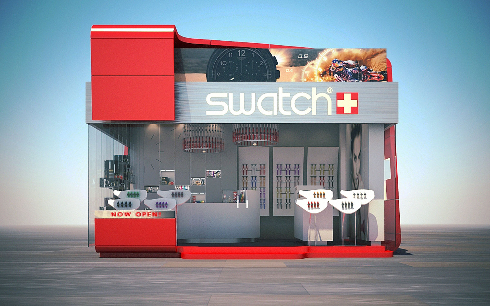
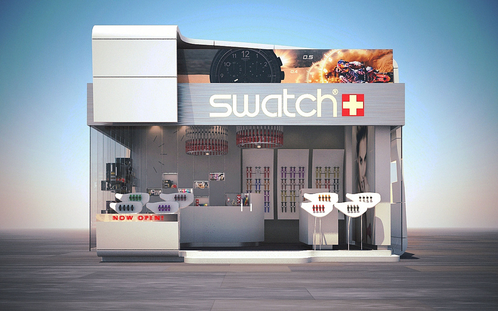
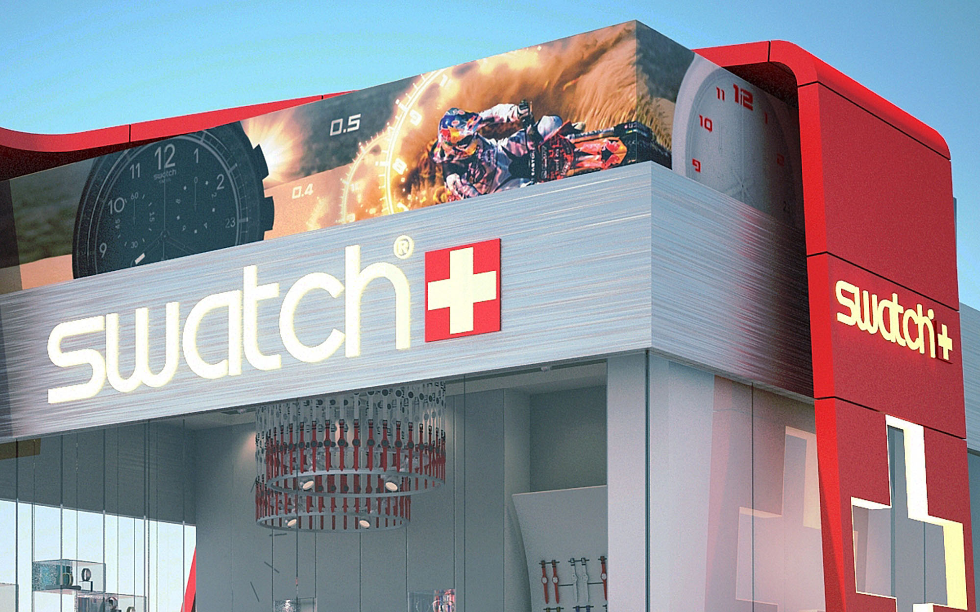
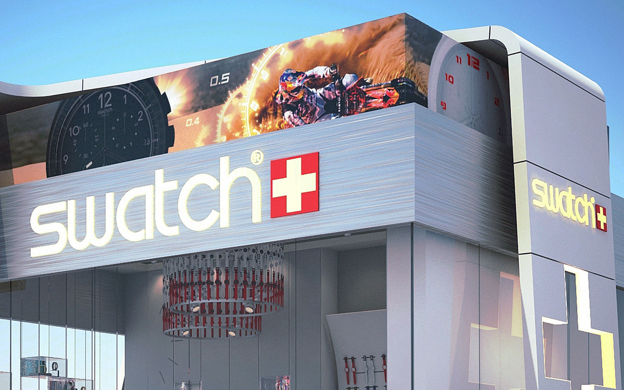
© 2021 by sanzpont [arquitectura] . Webpage by sanzpont [digital] . Innovative Digital Experiences

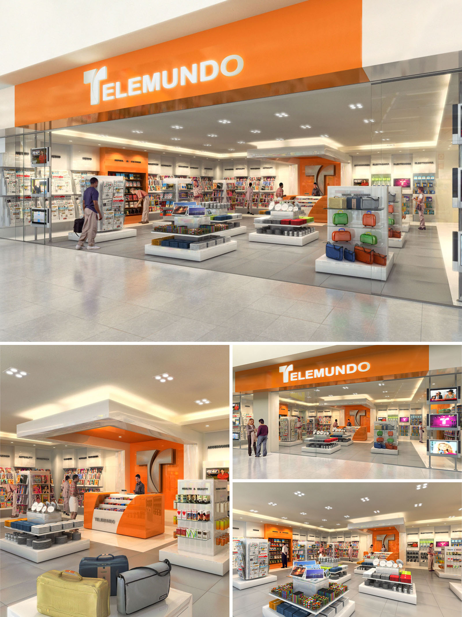
The TELEMUNDO retail concept in Florida is conceived as a bright, streamlined media and travel convenience store, where brand experience and functional circulation converge. The space is organized as an open-plan box with high visibility from the mall corridor, using a strong axial view toward the back feature wall to draw visitors inside. The design emphasizes immediacy and clarity: products, brand colors, and digital content are legible from a distance, guiding quick decision-making for passersby and travelers.
The architectural language is based on clean horizontal planes, floating volumes, and a restrained palette that foregrounds merchandise. Ceiling and furniture geometries reinforce a sense of order and orientation, while the strategic use of the TELEMUNDO orange becomes the main organizing element, anchoring counters and focal points throughout the store.
The storefront is fully glazed, maximizing transparency and visual merchandising opportunities toward the mall concourse. A continuous orange fascia band frames the opening, functioning simultaneously as a brand sign and architectural portal. The illuminated logo is centered within this band, ensuring long-range visibility and a clear identity within the retail mix.
Side glass showcases and integrated display niches extend the interior merchandising to the exterior line, creating a seamless transition between public and commercial space. The neutral surrounding frame in light tones allows the orange canopy to stand out, offering a strong contrast that reinforces recognition without visual clutter.
The interior is laid out with a central open field of low gondolas and product islands, surrounded by perimeter shelving that maximizes vertical display capacity. This configuration creates a flexible grid that supports different categories—magazines, electronics, accessories, and travel goods—while maintaining clear sightlines across the store.
The main circulation ring naturally follows the store perimeter, with transversal paths cutting through the central islands. This allows intuitive browsing loops and minimizes congestion in peak hours. The cash wrap and service area are located on axis with the entrance, beneath a distinctive ceiling feature, reinforcing wayfinding and supervision.
The material palette balances durability and light reflectance, with large-format porcelain or ceramic floor tiles in neutral gray providing a robust, easy-to-maintain base. Perimeter millwork and central fixtures are finished in white lacquered panels and clear acrylics, generating a crisp backdrop that enhances product visibility and illuminance.
Brand color is introduced through high-gloss orange laminates on the cashier counter, niche walls, and selected ceiling recesses. This controlled use of color creates focal points without overwhelming the eye. The lighting scheme combines recessed downlights for general illumination with concealed linear LED strips in ceiling coves and display shelves, ensuring uniform brightness, minimal glare, and optimal color rendering for printed media and packaging.
Central gondolas are designed as low, rectilinear blocks with integrated storage and modular shelving, allowing fast reconfiguration of categories. Transparent acrylic dividers, rotating racks, and pegboard systems are incorporated for flexible merchandising of small items and electronics. Perimeter walls use a continuous slotted panel system, enabling adjustable shelving heights and maximizing wall utilization.
The cashier area is defined by a sculptural counter volume and a suspended canopy above, visually distinguishing the transactional zone. This architectural emphasis supports queue organization and highlights impulse-buy displays, while remaining visually aligned with the overall orthogonal language of the store.
Sustainability strategies focus on energy efficiency, material selection, and long-term adaptability of the fit-out. The predominant use of LED lighting reduces energy consumption and heat gain, improving comfort and lowering HVAC loads in the Florida climate. High-reflectance finishes on ceilings and walls further diminish the number of luminaires required to achieve target lux levels.
Durable, low-maintenance floor and fixture materials extend the life cycle of the store, reducing replacement frequency and associated waste. The modular nature of shelving, gondolas, and digital display supports future reprogramming of the space without structural changes, minimizing demolition in subsequent fit-outs. Where feasible, low-VOC paints and laminates are specified to enhance indoor air quality, aligning the retail environment with contemporary sustainability standards and visitor well-being.
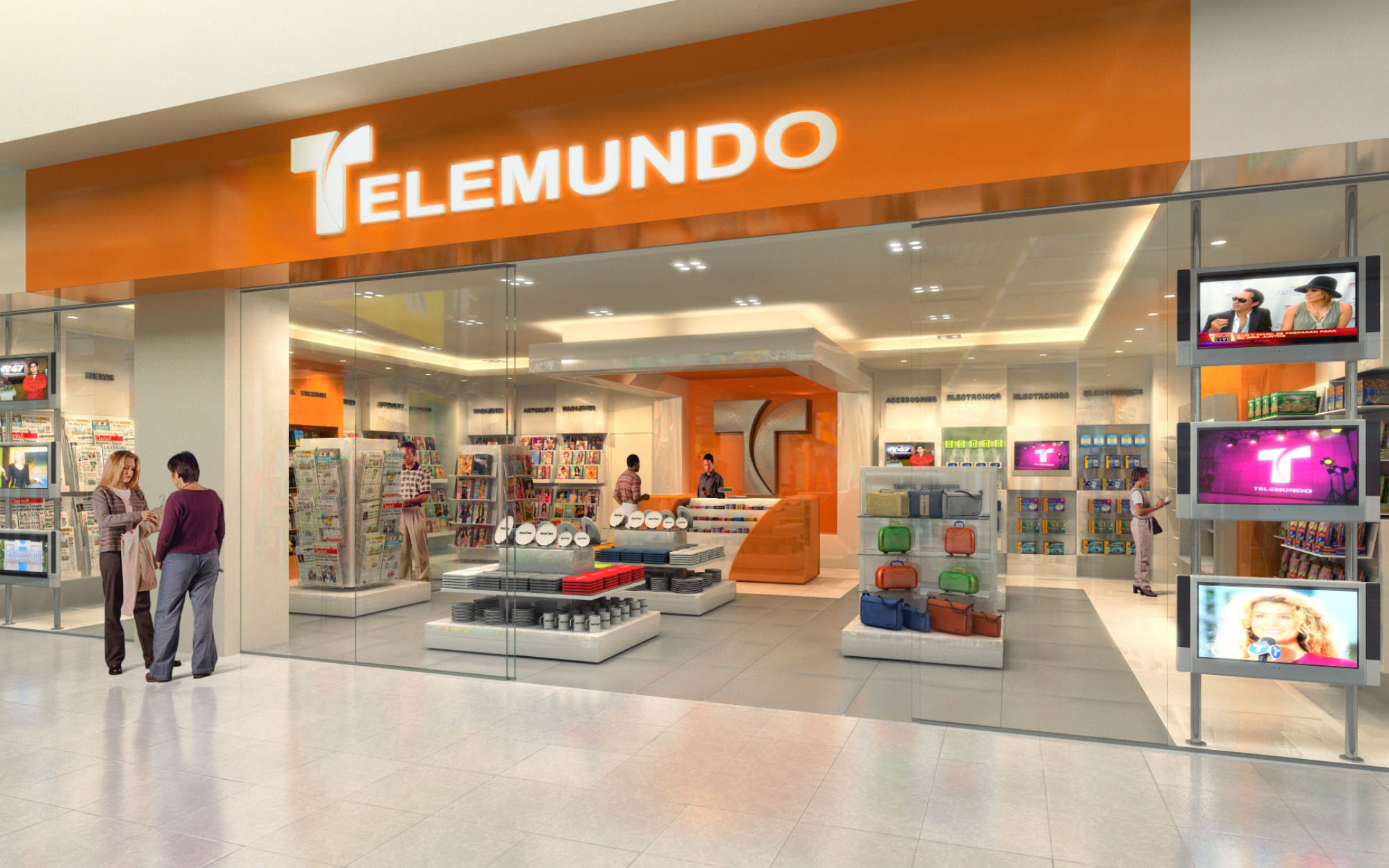
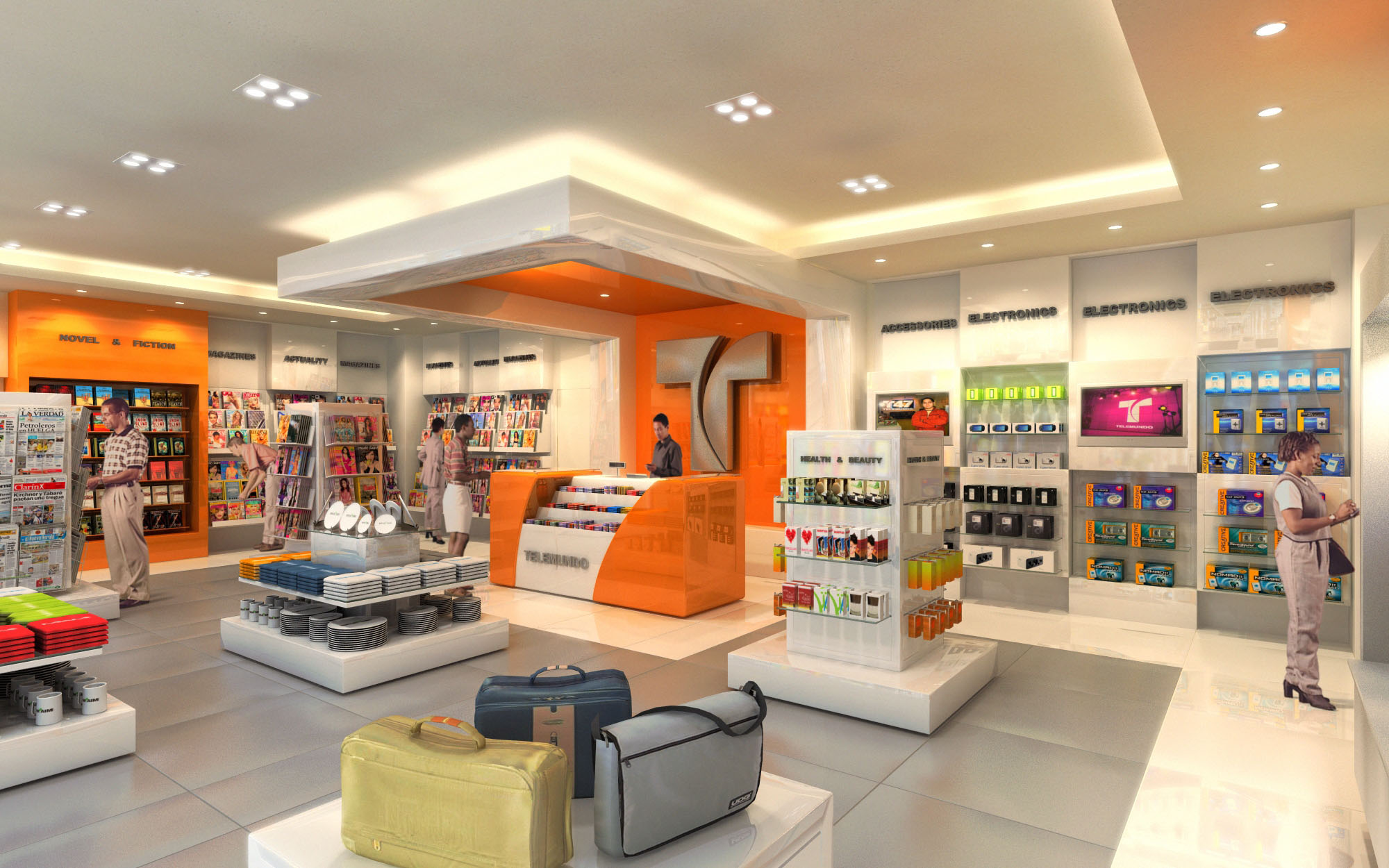
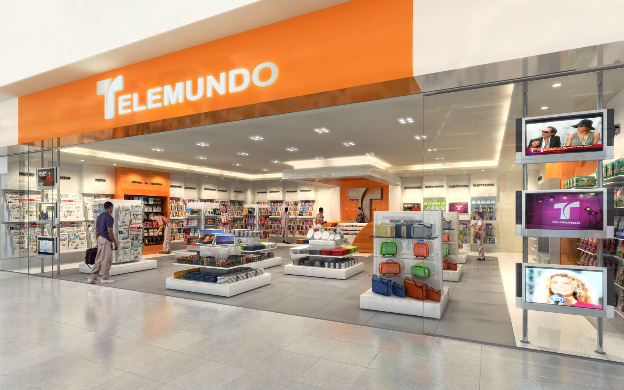
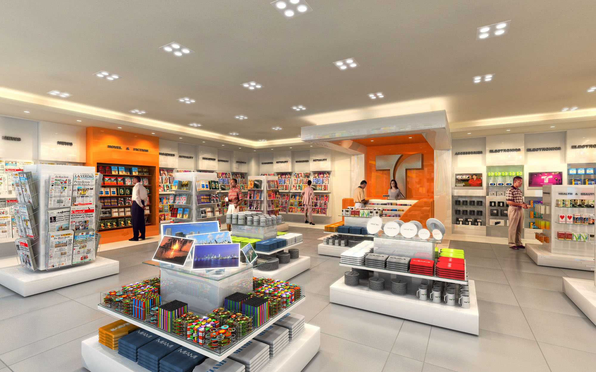
© 2021 by sanzpont [arquitectura] . Webpage by sanzpont [digital] . Innovative Digital Experiences

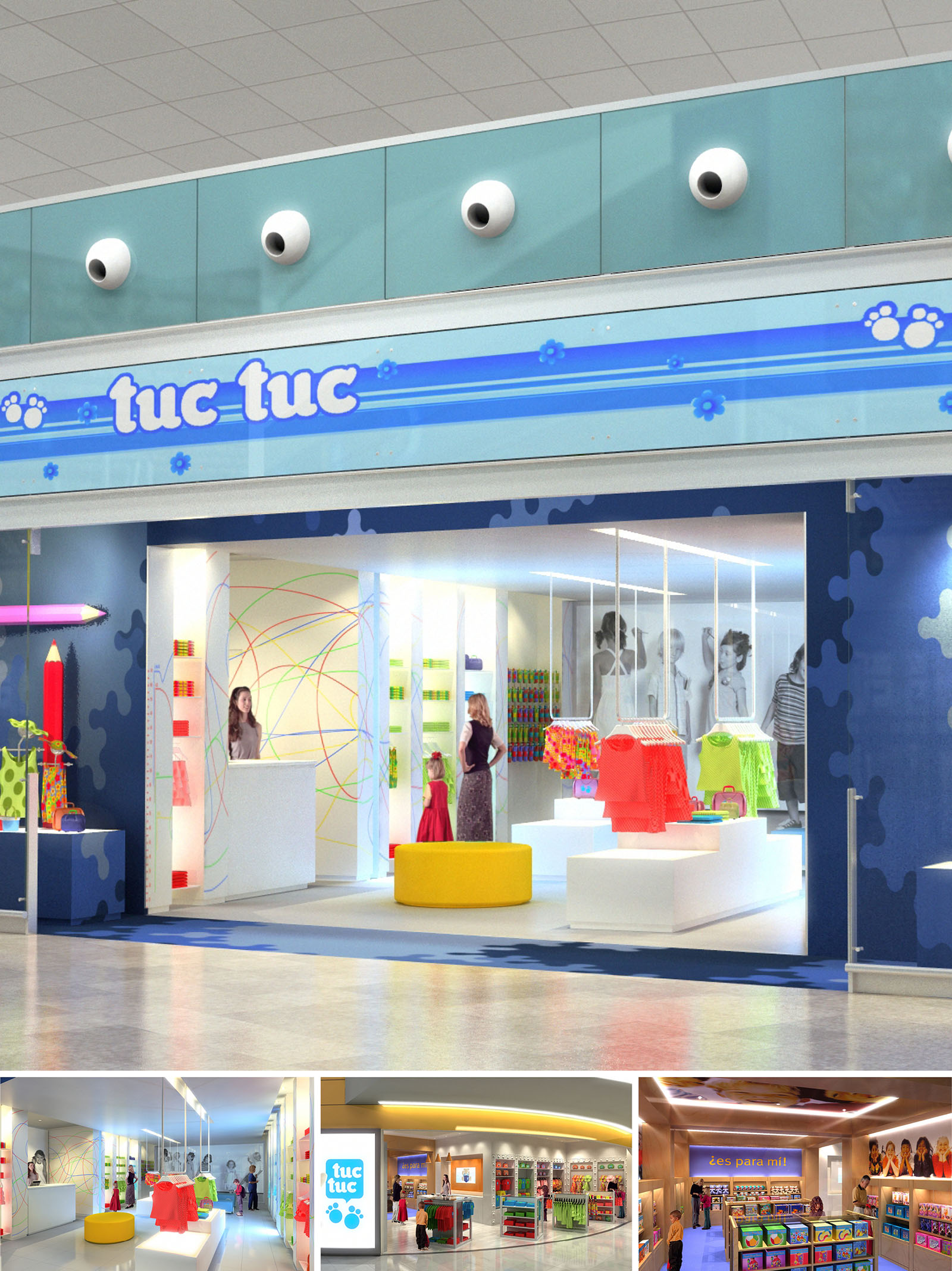
Tuctuc Shops is conceived as an immersive retail universe for children’s fashion and accessories, where architecture, graphics and product merge into a playful narrative. The concept is based on translating the brand’s comic, colorful identity into spatial elements that stimulate curiosity and intuitive exploration. The stores operate as bright “cabins” within larger commercial environments, clearly recognizable from a distance through their bold chromatic treatment and iconic signage.
The design draws inspiration from children’s drawings and toys, using simplified, oversized forms, such as giant pencils, circular ottomans and puzzle-shaped motifs, to create a friendly and imaginative atmosphere. This language is consistent across the two locations in Spain, allowing a coherent brand experience while maintaining flexibility for varying floor plans and commercial contexts.
The layout is organized as a central open field flanked by linear display bands. Entry is wide and fully transparent to maximize visual permeability and remove any barrier between corridor and shop. Once inside, circulation unfolds in a loop, encouraging parents and children to walk through each product family while always keeping a clear visual connection to the exit and cashier area.
Low central islands display folded garments and accessories at child height, while perimeter walls host hanging systems and shelving for full outfits and themed collections. This height stratification ensures that products for children remain within their line of sight and reach, while signage and brand communication are positioned at adult eye level. The cashier counter is placed laterally, integrated in a vertical graphic panel that doubles as an orientation landmark within the store.
The material palette combines durable, easy-to-maintain finishes with a highly expressive color strategy. Continuous, light-toned flooring in vinyl or polished resin provides a neutral base, while glossy lacquered panels in blues, yellows and reds activate the envelope. Puzzle-shaped wall graphics and multicolored line patterns evoke doodles and games, reinforcing the playful atmosphere without visually overloading the space.
Furniture is predominantly white, using lacquered MDF and solid surfaces to reflect light and highlight the chromatic intensity of the garments. Occasional elements—such as the yellow round ottoman—introduce saturated color accents and serve as informal seating. Lighting is resolved with linear recessed LEDs creating uniform ambient illumination, complemented by concealed projectors focused on key display tables. The overall effect is a bright, shadow-free environment where color fidelity and product visibility are prioritized.
The facades are designed as luminous canvases that extend the Tuctuc graphic universe into the mall environment. Large-format signage, backlit and framed by horizontal blue bands with paw and flower motifs, ensures immediate recognition. Above the sign, three-dimensional “eyes” punctuate a continuous glass strip, giving the storefront a playful, almost character-like expression that attracts children from afar.
Maximum transparency of the shopfront glazing allows the interior narrative to act as a visual display in itself. The first view frames the central color islands and hanging garments, functioning as a dynamic shop window that can change with seasons and collections. The clean, rectilinear opening contrasts with the soft, organic graphics inside, inviting visitors to “enter the story” of the brand.
Display systems are conceived as modular rails, shelves and plinths that can be easily reconfigured between seasons or adapted to different store sizes. Many units are freestanding and lightweight, simplifying logistics and enabling rapid visual merchandising updates. Storage is integrated discreetly below plinths and behind wall panels, keeping the shop floor uncluttered and safe for children’s movement.
Sustainability is addressed through the choice of long-lasting materials, LED lighting with low energy consumption and high-efficiency drivers, and the use of light-colored surfaces that improve reflectance and reduce lighting loads. Where possible, furniture is manufactured with certified wood and low-VOC finishes to ensure indoor air quality. The design also favors adaptability over obsolescence: by using a consistent kit of modular elements and a timeless white base, the stores can absorb future brand evolutions and layout changes without extensive demolition or waste, extending the lifecycle of the fit-out and minimizing environmental impact.
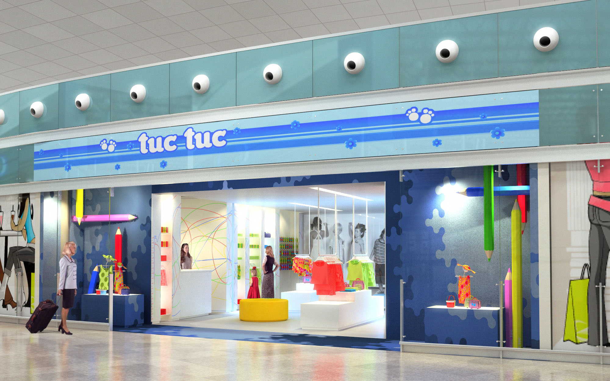
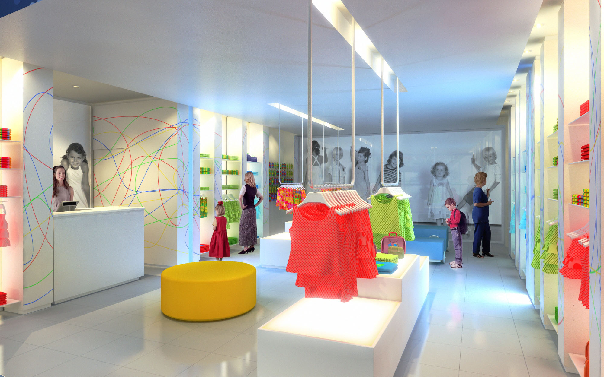
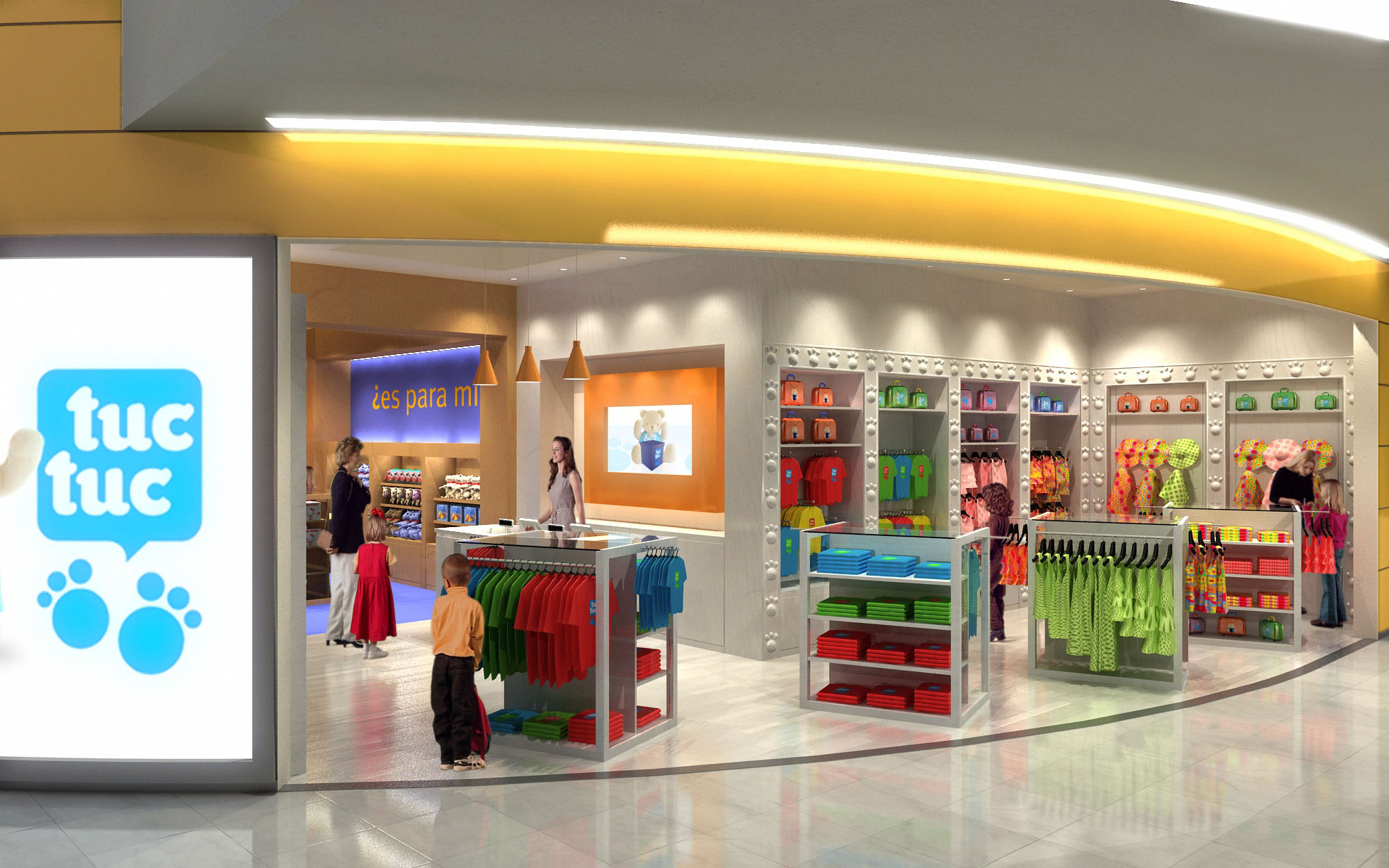
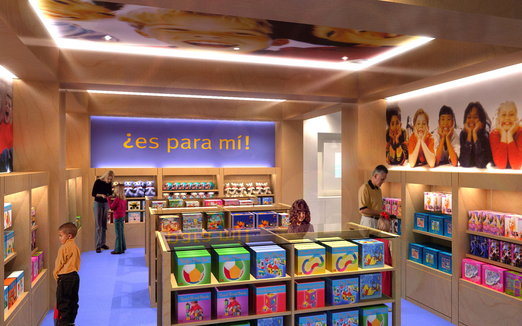
© 2021 by sanzpont [arquitectura] . Webpage by sanzpont [digital] . Innovative Digital Experiences
At our firm, tailoring your dream workspace is our specialty. We meticulously craft each design to align with your specific business needs and aesthetic preferences. Our process is interactive and client-focused, ensuring that every element of your workspace supports productivity and embodies your corporate identity perfectly.
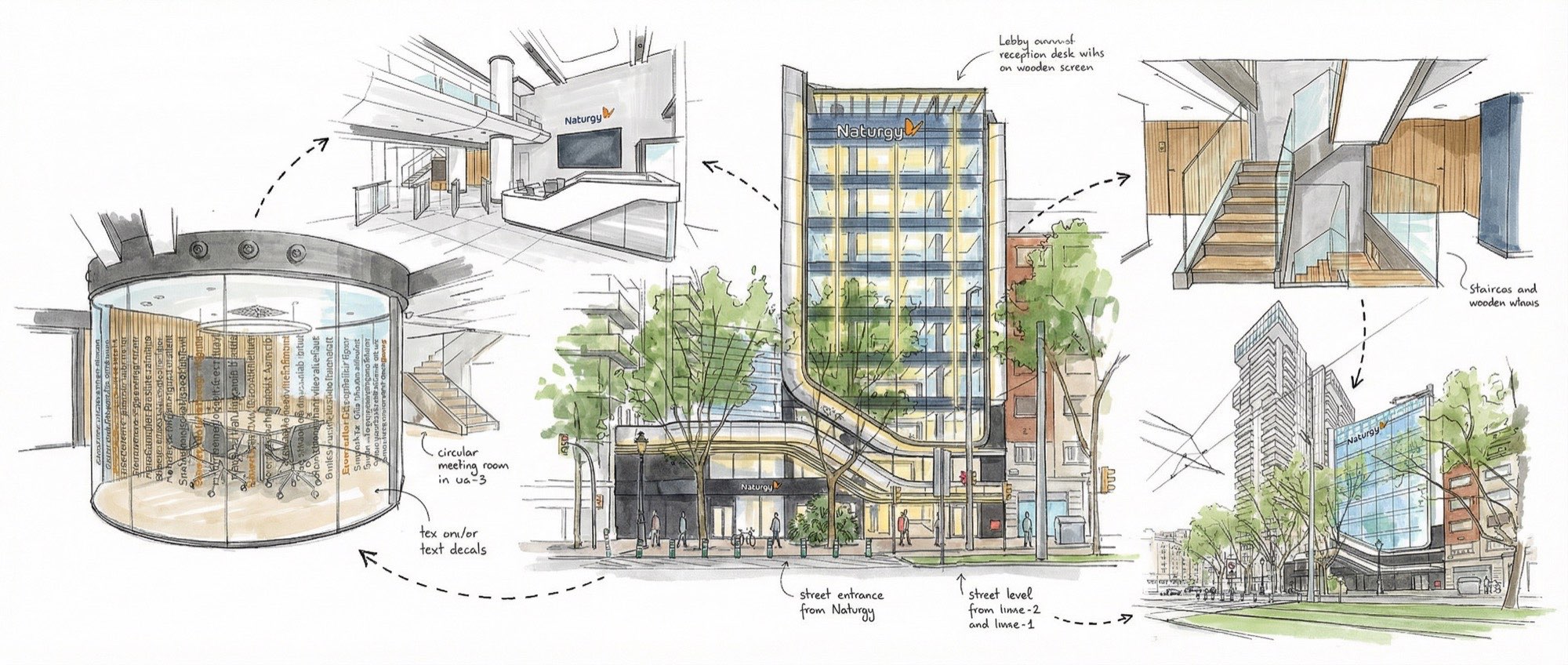
Sustainable and bioclimatic design focuses on environmental responsibility and energy efficiency. By integrating natural elements and innovative technologies, these designs enhance comfort, reduce energy consumption, and promote a healthier workplace, aligning modern office environments with ecological principles.
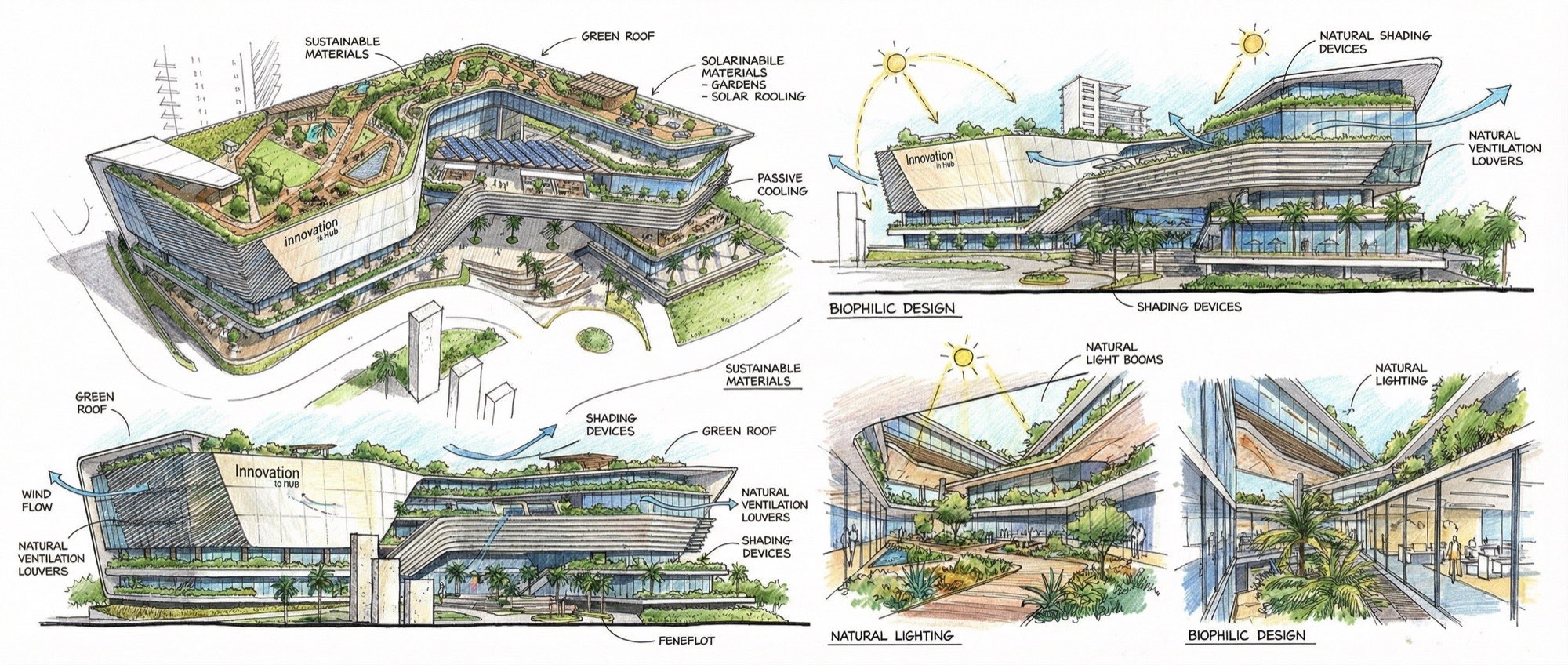
Our designs are user-focused, logical, and functional, tailored to meet the specific needs of those who inhabit the spaces we create. We prioritize intuitive layouts and smart solutions that enhance usability and efficiency. Every design decision is driven by a deep understanding of user interaction and operational flow, ensuring optimal functionality.
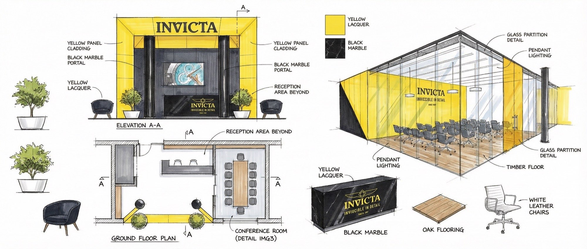
Our BIM (Building Information Modeling) projects workflow integrates advanced technology to streamline and enhance the design process. This method allows for precise, efficient planning and execution, enabling better coordination, cost management, and project visualization. With BIM, we ensure a seamless, collaborative, and high-quality construction process.
Our interactive visualizations bring your project to life before construction begins, offering a dynamic and immersive experience. These advanced tools enable you to explore design options and modifications in real-time, ensuring the final outcome perfectly aligns with your vision. This technology fosters deeper understanding and engagement throughout the design process.

Virtual Reality (VR) visualization lets you experience and refine your project before it's built, providing a clear sense of space and design. This real-time capability ensures accuracy, saves time, and prevents expensive modifications, enhancing decision-making and deepening your connection to the project's final vision.

At our core, we are a collective of creative minds, constantly pushing the boundaries of design and innovation. Our team thrives on challenging conventions and exploring new possibilities to create spaces that are not only functional but also artistically inspiring. We transform visions into realities, crafting environments that resonate and inspire.
We are acutely sensitive to project budgets, ensuring that our designs align with your financial parameters without compromising quality or functionality. Our strategic approach involves meticulous planning and resource management, allowing us to deliver exceptional workspaces that respect your budget and maximize your investment.

Our expertise in international designs allows us to create exceptional workspaces anywhere in the world. With a global perspective and adaptable strategies, we tailor designs to local cultures and environments while meeting universal standards of excellence. No matter where your business is located, we can craft your ideal workspace.

We prioritize local collaboration, working closely as a team with regional consultants to ensure our designs meet local regulations and community standards. This approach enriches our projects with local expertise and insight, guaranteeing that each project is not only compliant but also contextually integrated.


Our offices are located in Barcelona, Cancún, Chicago and Santo Domingo, but thanks to technology we can do projects on all over the world.
Barcelona
Bac de Roda 136
08020, Barcelona
Spain
Madrid
Av. de Buendía 11
19005 Guadalajara (Madrid)
Spain
Chicago
373 Hazel Ave, Apt A1
60022, Glencoe, Illinois
United States