

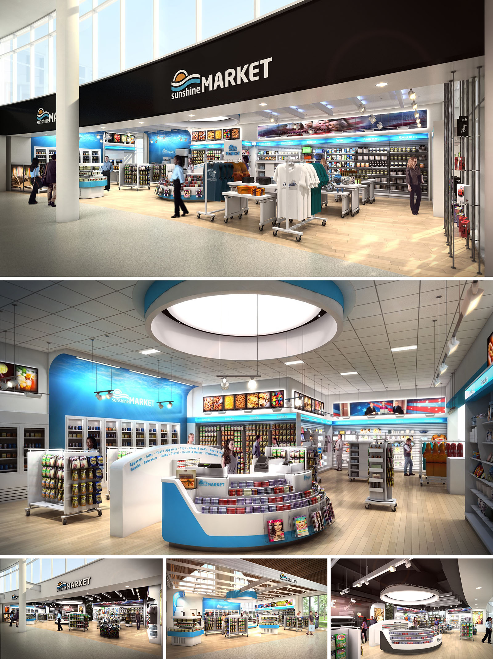
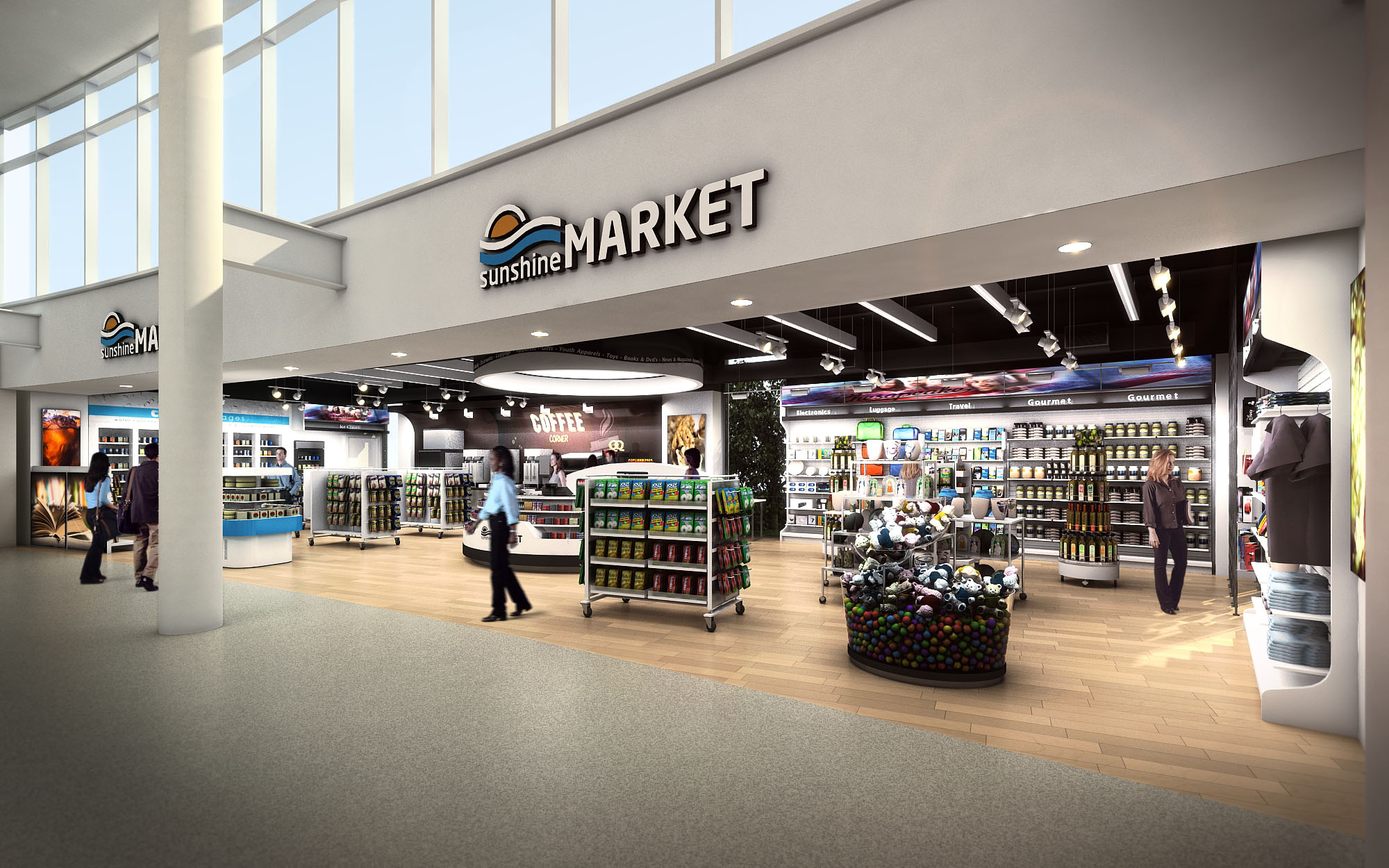
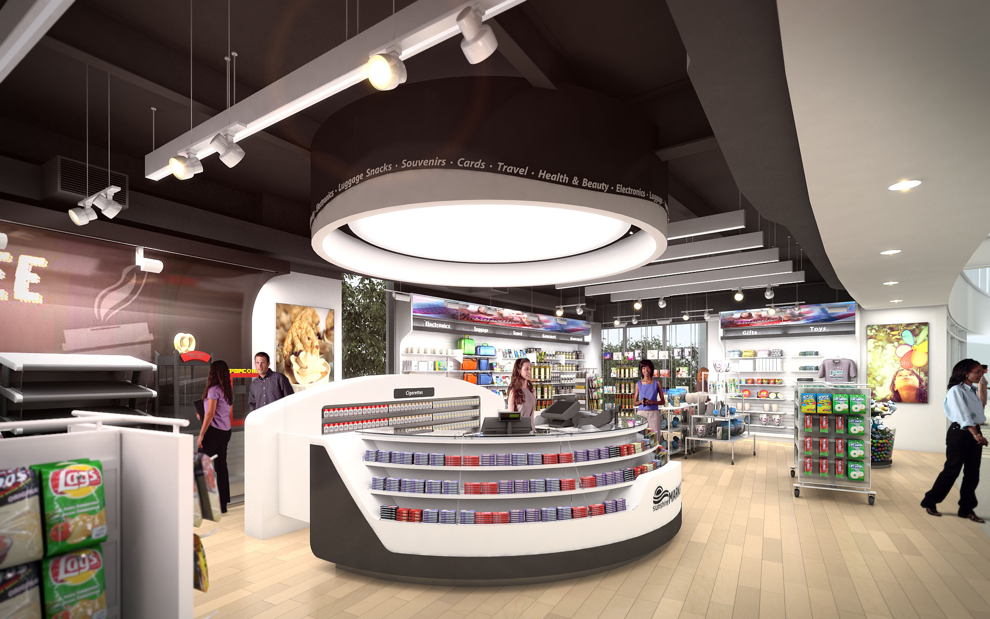
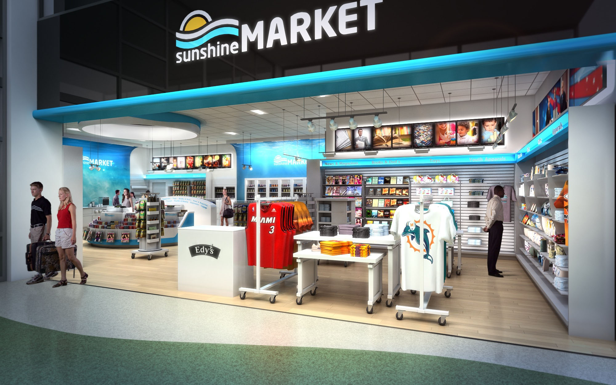
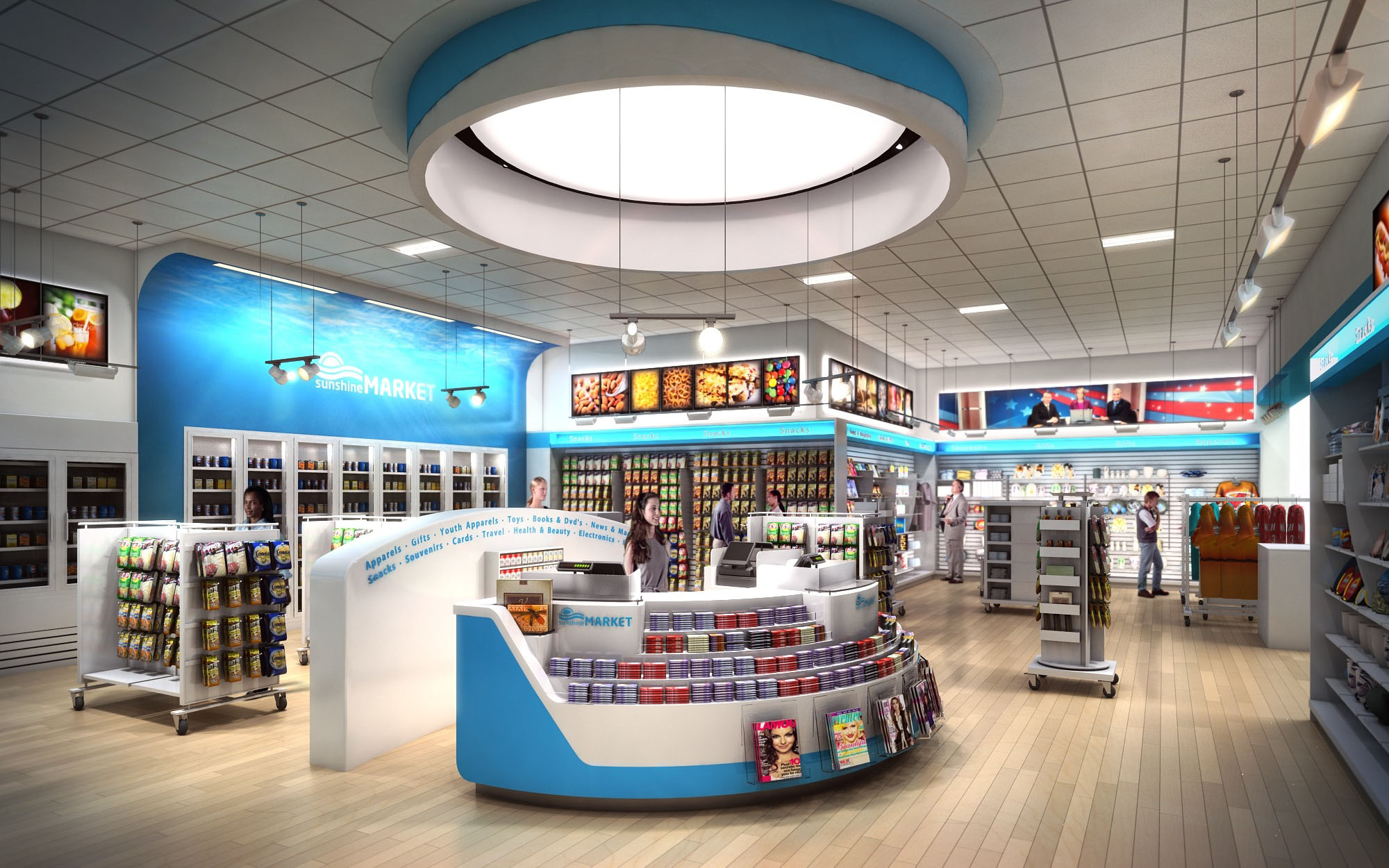
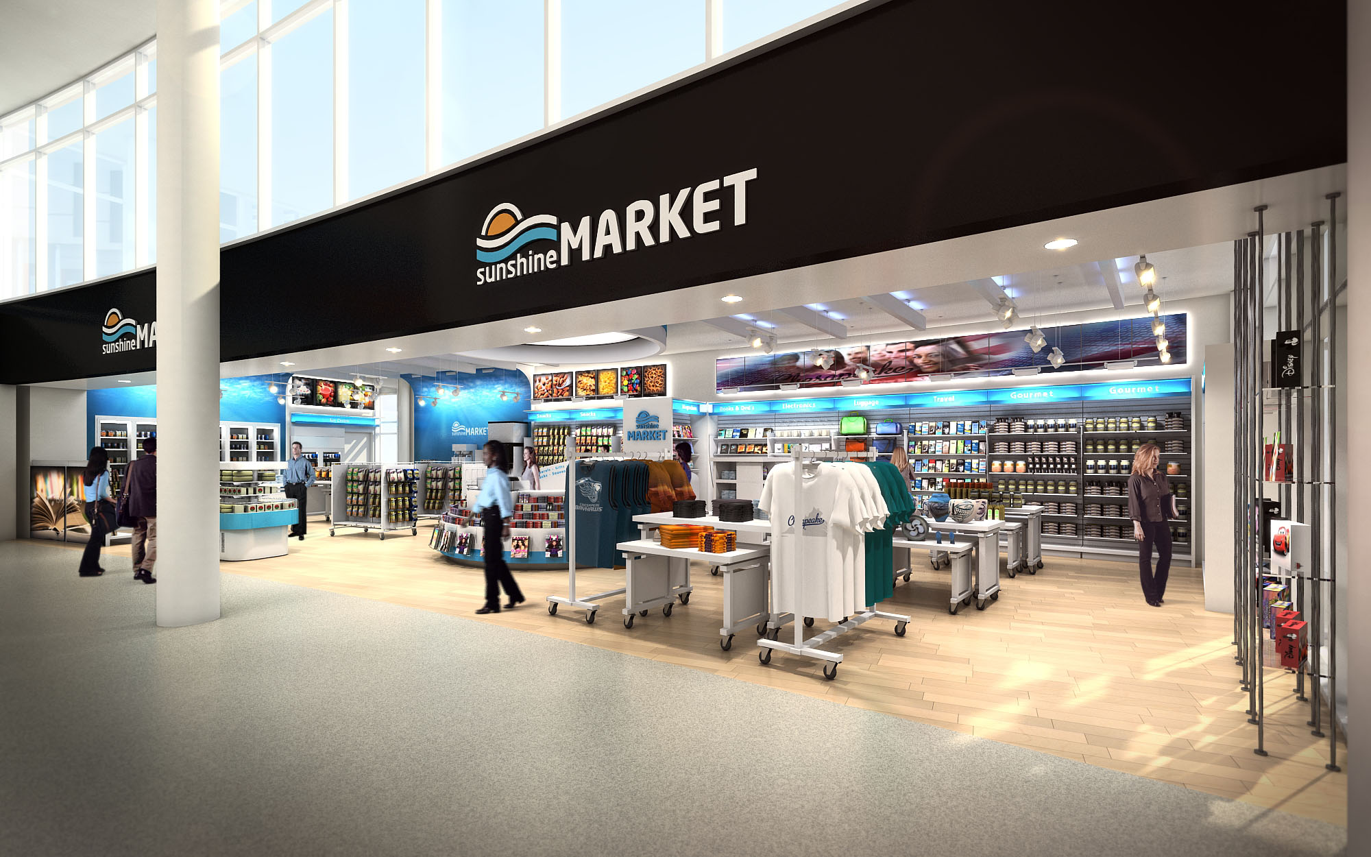
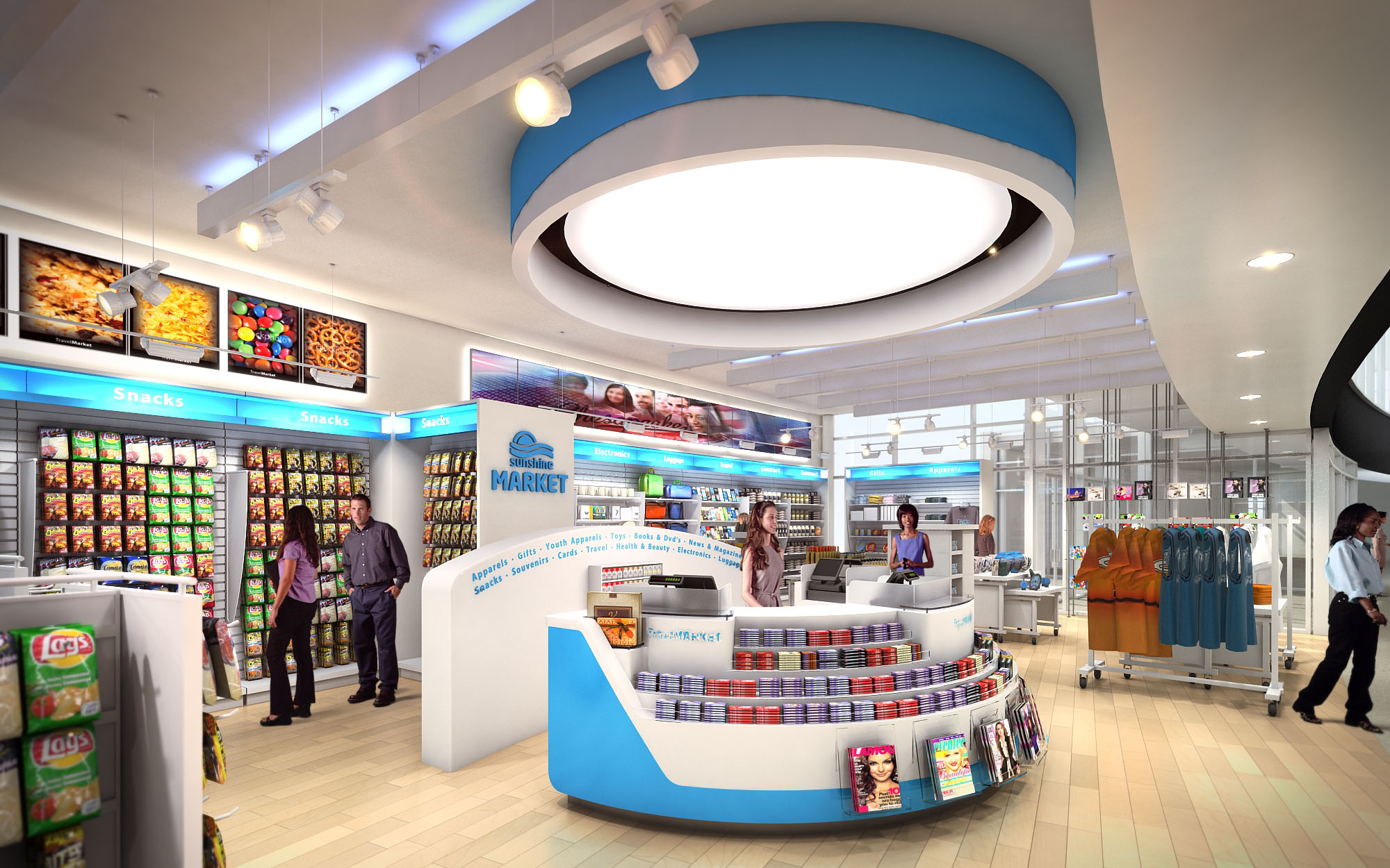
TRAVELMARKET is conceived as a flexible retail platform for transportation hubs, delivering a unified brand experience across multiple US locations. The architectural concept translates the idea of “journey and horizon” into spatial form through sweeping curves, luminous circular ceiling elements, and a continuous band of brand color that visually guides travelers. The store reads as an open, inviting marketplace rather than a closed convenience shop, dissolving the threshold between concourse and retail floor.
The design emphasizes instant legibility for time-pressed travelers. Clear sightlines, low gondolas, and a strong perimeter merchandising wall allow quick scanning of offers from outside the store. The arrangement supports impulse purchases while still providing structured zones for food, travel essentials, apparel, and regional gifts, all under a cohesive, easily recognizable identity.
The plan is organized around a central circular hub containing the primary service counters and high-rotation items. This hub acts as an orientation anchor, allowing customers to intuitively navigate around it in a radial movement pattern. Secondary display islands are positioned to create gentle meanders rather than rigid aisles, controlling flow without obstructing visibility.
Perimeter walls are used for vertical merchandising of packaged goods, refrigerated products, and promotional media screens. Entry is deliberately wide and column-free, maximizing permeability from the concourse. The cash wrap is oriented diagonally toward the main approach path, ensuring direct visual connection to both entrance and exit doors to accelerate the transaction process and enhance security oversight.
Interior architecture is driven by a consistent vocabulary of curves and horizontal bands, echoing the project’s travel and horizon narrative. Large circular ceiling features with integrated lighting articulate the main focus zones and provide a recognizable signature element across all locations. These rings visually lower the perceived ceiling height over the central hub, creating an intimate scale within large terminal volumes.
Brand graphics and digital imagery are strategically integrated into wall coves and light boxes, celebrating destinations, fresh food, and motion. These elements are treated architecturally rather than as applied decoration, set within framed reveals and continuous ledges that align with shelving heights, reinforcing an ordered visual rhythm.
The material palette balances durability with a light, contemporary expression. Warm-toned wood-look flooring defines the retail zone and contrasts with adjacent concourse finishes, subtly signaling entry. Perimeter shelving and service counters are rendered in white solid surfaces and laminates, chosen for their clean appearance, easy maintenance, and resistance to high-traffic wear.
Brand colors—primarily aqua blue with accents of sunrise orange—are applied as continuous bands at soffits, counter insets, and feature walls. This chromatic strategy both reinforces identity and assists wayfinding, quickly communicating key categories such as food, travel gear, and apparel. Metal fixtures and rails introduce a robust, technical note appropriate to transportation environments.
Lighting design combines large circular luminaires, linear LED coves, and adjustable spotlights to achieve both ambient uniformity and product-focused emphasis. The circular ceiling features function as luminous skylights, creating a sense of daylight even within enclosed terminal interiors. Linear coves run along perimeter walls and signage bands, emphasizing the horizontal movement of the space.
Color temperature is calibrated toward neutral white to ensure accurate product rendering and a fresh, hygienic atmosphere. Glare is minimized through diffused lenses and recessed fixtures, while track-mounted spots highlight feature displays and promotional media. The layered lighting strategy ensures that the store remains visually legible from a distance and comfortable at close range.
Sustainability is addressed through both material choices and operational strategies. Predominantly LED lighting reduces energy consumption and maintenance, particularly important in 24/7 travel environments. Lighting controls with zoning and dimming capabilities allow adjustment to natural daylight levels from adjacent glazing, further lowering energy loads.
Fixture systems are modular and largely reconfigurable, extending the life of the fit-out by allowing quick category changes without major construction waste. Durable finishes—impact-resistant wall panels, high-wear flooring, and metal fixtures—are selected to withstand high traffic, reducing replacement frequency. Where project specifications allow, substrates and finishes incorporate recycled content and low-VOC formulations to support healthier indoor air quality and a more sustainable retail model across all locations.
LIST OF PROJECTS EXPERIENCE
Designed, Executed and/or Built Projects
USA
1. Travel Market - Chesapeake, VA
2. Travel Market - Fort Drum, FL
3. Travel Market - Maryland, MD

TRAVELMARKET is conceived as a flexible retail platform for transportation hubs, delivering a unified brand experience across multiple US locations. The architectural concept translates the idea of “journey and horizon” into spatial form through sweeping curves, luminous circular ceiling elements, and a continuous band of brand color that visually guides travelers. The store reads as an open, inviting marketplace rather than a closed convenience shop, dissolving the threshold between concourse and retail floor.
The design emphasizes instant legibility for time-pressed travelers. Clear sightlines, low gondolas, and a strong perimeter merchandising wall allow quick scanning of offers from outside the store. The arrangement supports impulse purchases while still providing structured zones for food, travel essentials, apparel, and regional gifts, all under a cohesive, easily recognizable identity.
The plan is organized around a central circular hub containing the primary service counters and high-rotation items. This hub acts as an orientation anchor, allowing customers to intuitively navigate around it in a radial movement pattern. Secondary display islands are positioned to create gentle meanders rather than rigid aisles, controlling flow without obstructing visibility.
Perimeter walls are used for vertical merchandising of packaged goods, refrigerated products, and promotional media screens. Entry is deliberately wide and column-free, maximizing permeability from the concourse. The cash wrap is oriented diagonally toward the main approach path, ensuring direct visual connection to both entrance and exit doors to accelerate the transaction process and enhance security oversight.
Interior architecture is driven by a consistent vocabulary of curves and horizontal bands, echoing the project’s travel and horizon narrative. Large circular ceiling features with integrated lighting articulate the main focus zones and provide a recognizable signature element across all locations. These rings visually lower the perceived ceiling height over the central hub, creating an intimate scale within large terminal volumes.
Brand graphics and digital imagery are strategically integrated into wall coves and light boxes, celebrating destinations, fresh food, and motion. These elements are treated architecturally rather than as applied decoration, set within framed reveals and continuous ledges that align with shelving heights, reinforcing an ordered visual rhythm.
The material palette balances durability with a light, contemporary expression. Warm-toned wood-look flooring defines the retail zone and contrasts with adjacent concourse finishes, subtly signaling entry. Perimeter shelving and service counters are rendered in white solid surfaces and laminates, chosen for their clean appearance, easy maintenance, and resistance to high-traffic wear.
Brand colors—primarily aqua blue with accents of sunrise orange—are applied as continuous bands at soffits, counter insets, and feature walls. This chromatic strategy both reinforces identity and assists wayfinding, quickly communicating key categories such as food, travel gear, and apparel. Metal fixtures and rails introduce a robust, technical note appropriate to transportation environments.
Lighting design combines large circular luminaires, linear LED coves, and adjustable spotlights to achieve both ambient uniformity and product-focused emphasis. The circular ceiling features function as luminous skylights, creating a sense of daylight even within enclosed terminal interiors. Linear coves run along perimeter walls and signage bands, emphasizing the horizontal movement of the space.
Color temperature is calibrated toward neutral white to ensure accurate product rendering and a fresh, hygienic atmosphere. Glare is minimized through diffused lenses and recessed fixtures, while track-mounted spots highlight feature displays and promotional media. The layered lighting strategy ensures that the store remains visually legible from a distance and comfortable at close range.
Sustainability is addressed through both material choices and operational strategies. Predominantly LED lighting reduces energy consumption and maintenance, particularly important in 24/7 travel environments. Lighting controls with zoning and dimming capabilities allow adjustment to natural daylight levels from adjacent glazing, further lowering energy loads.
Fixture systems are modular and largely reconfigurable, extending the life of the fit-out by allowing quick category changes without major construction waste. Durable finishes—impact-resistant wall panels, high-wear flooring, and metal fixtures—are selected to withstand high traffic, reducing replacement frequency. Where project specifications allow, substrates and finishes incorporate recycled content and low-VOC formulations to support healthier indoor air quality and a more sustainable retail model across all locations.


Our offices are located in Barcelona, Cancún, Chicago and Santo Domingo, but thanks to technology we can do projects on all over the world.
Barcelona
Bac de Roda 136
08020, Barcelona
Spain
Madrid
Av. de Buendía 11
19005 Guadalajara (Madrid)
Spain
Chicago
373 Hazel Ave, Apt A1
60022, Glencoe, Illinois
United States