

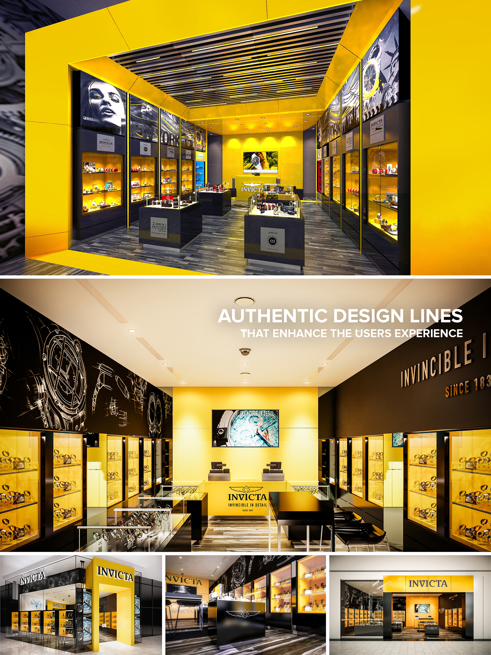
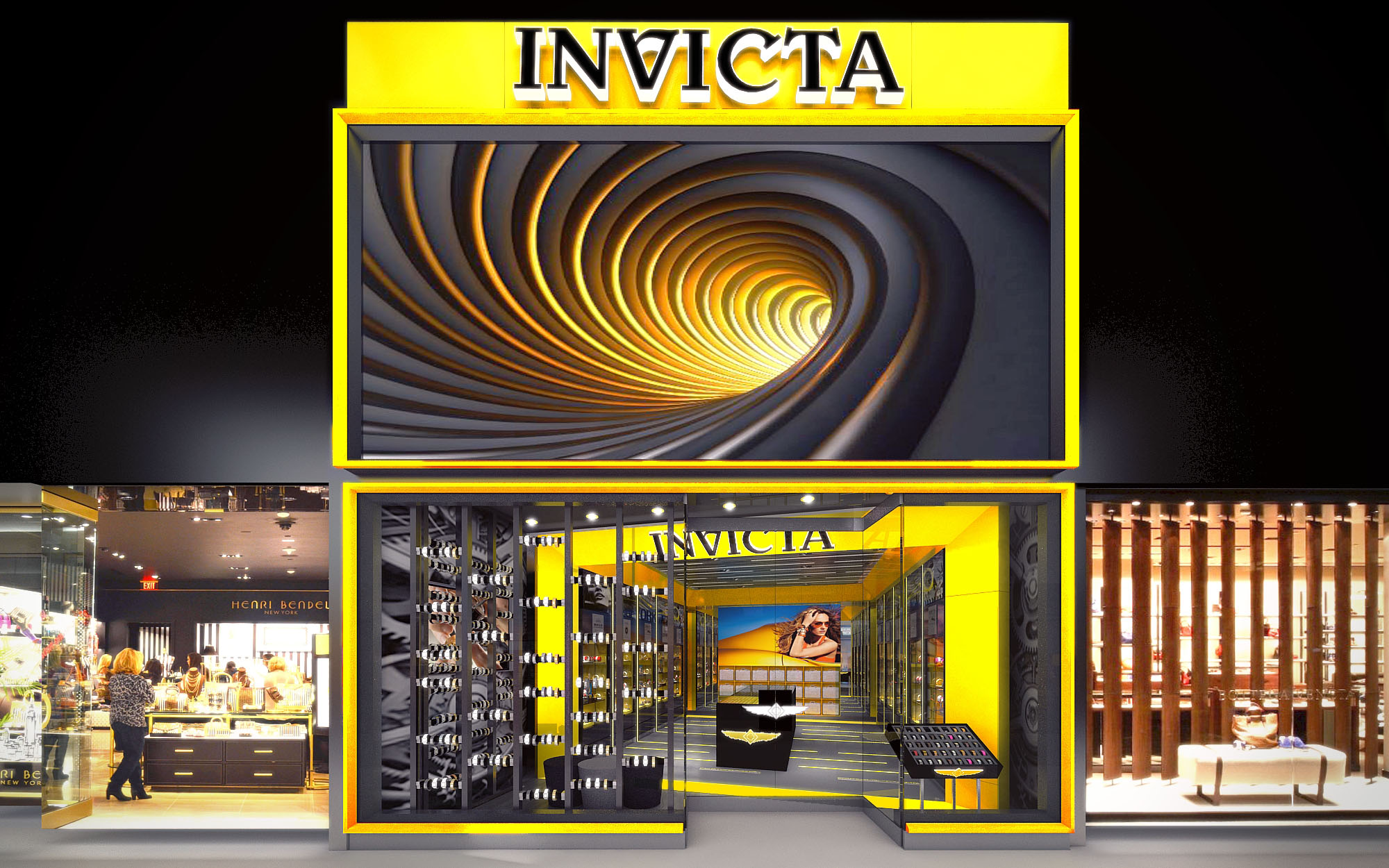
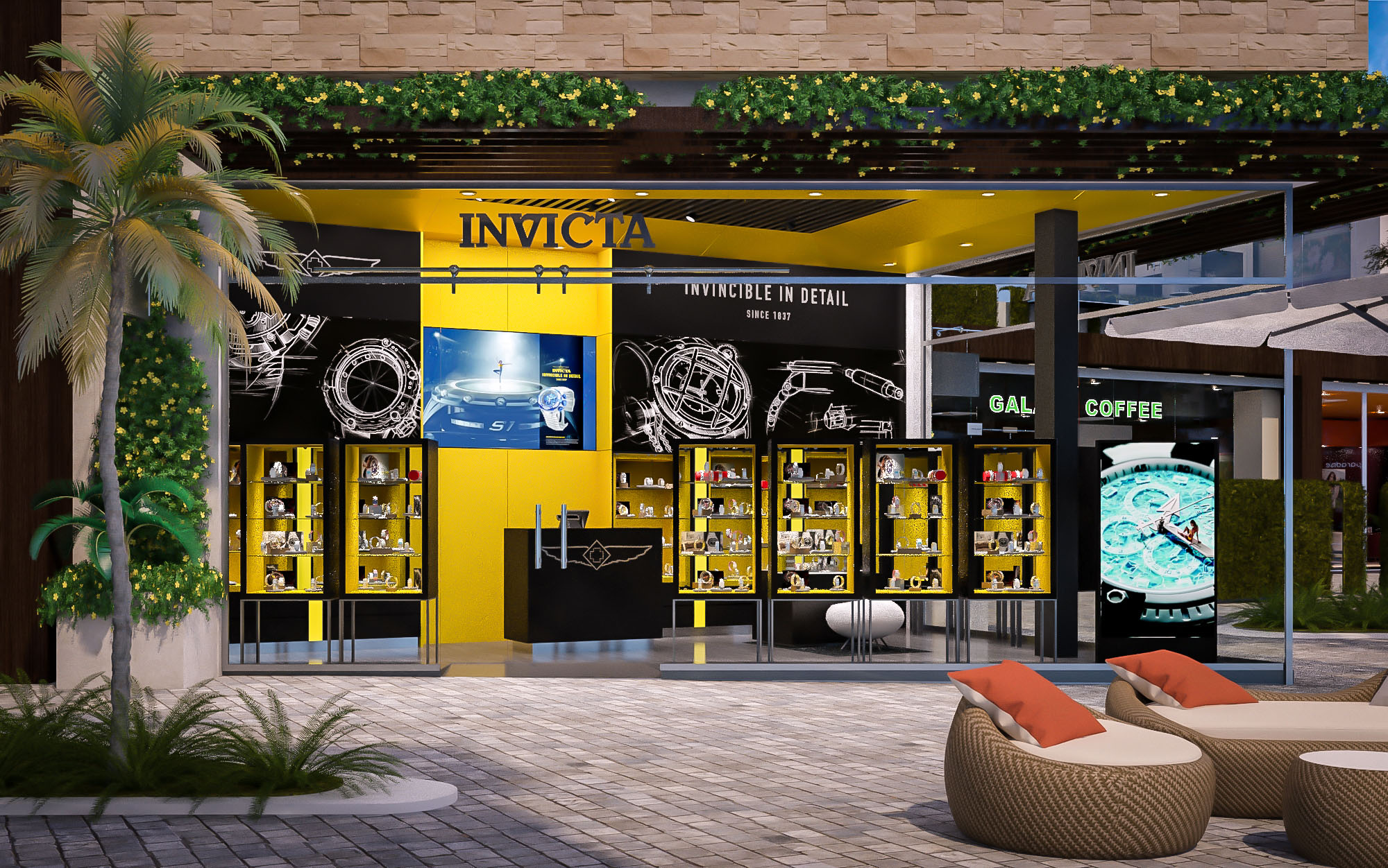
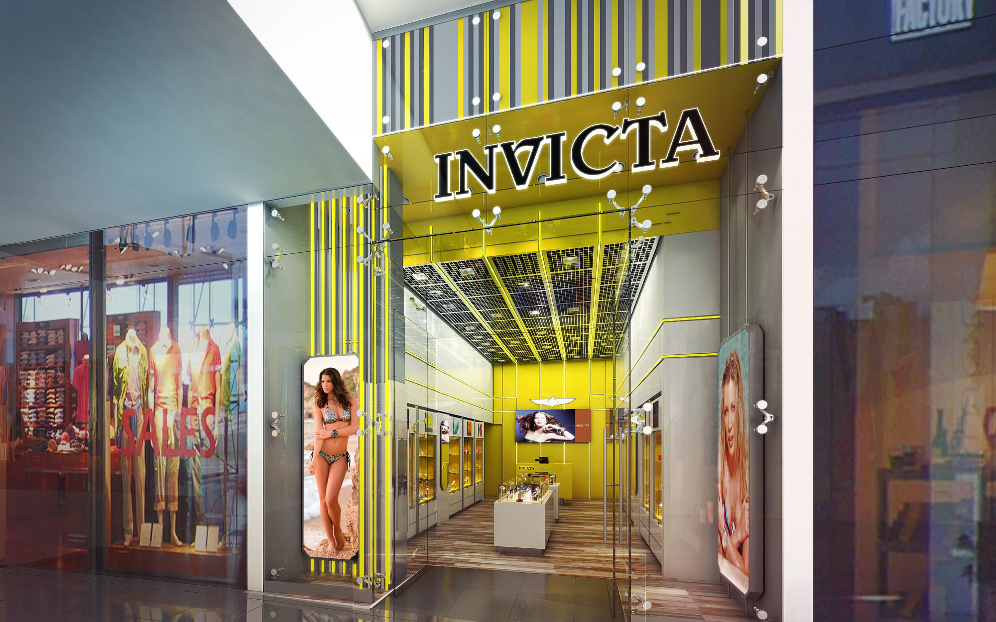
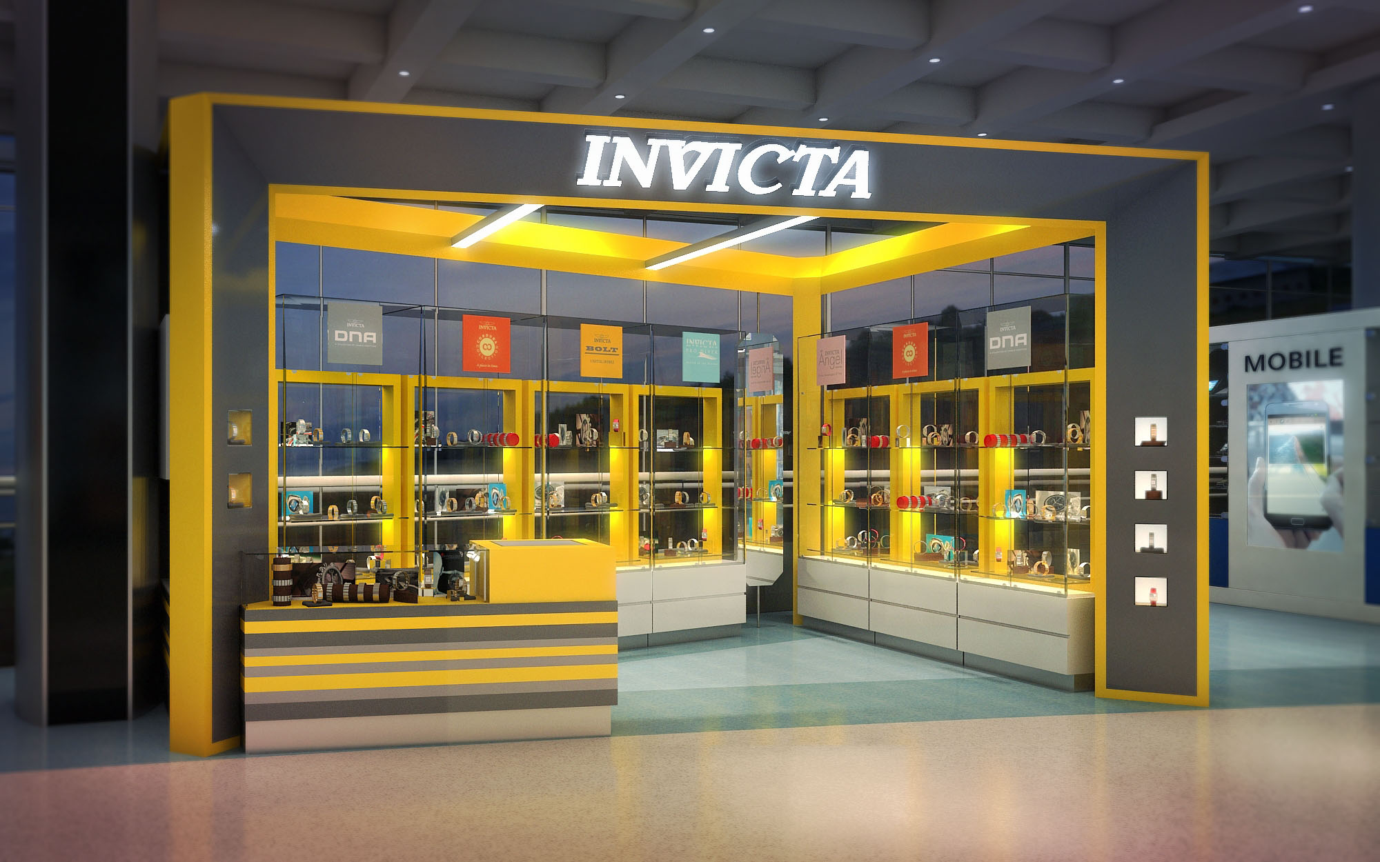
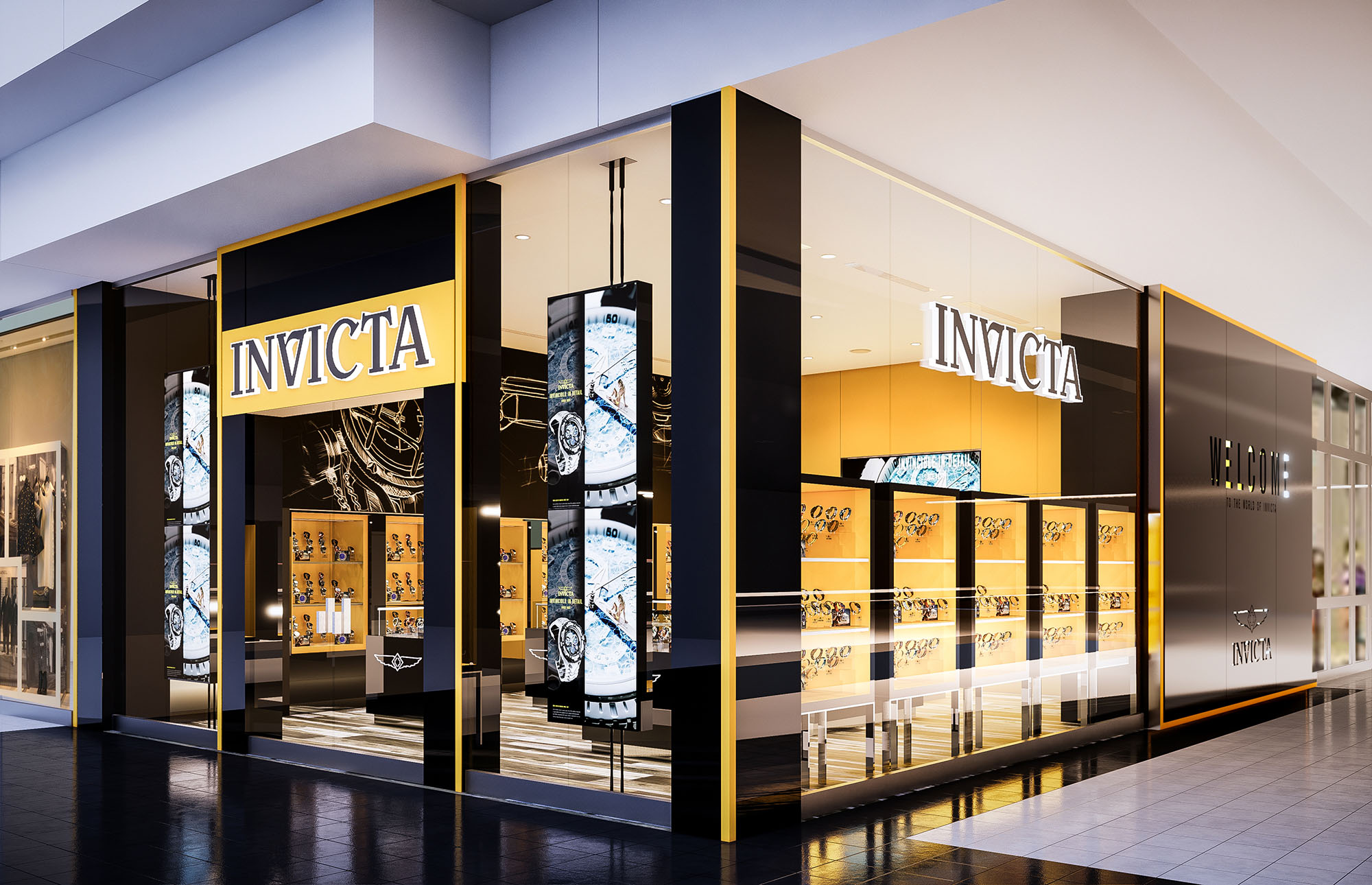
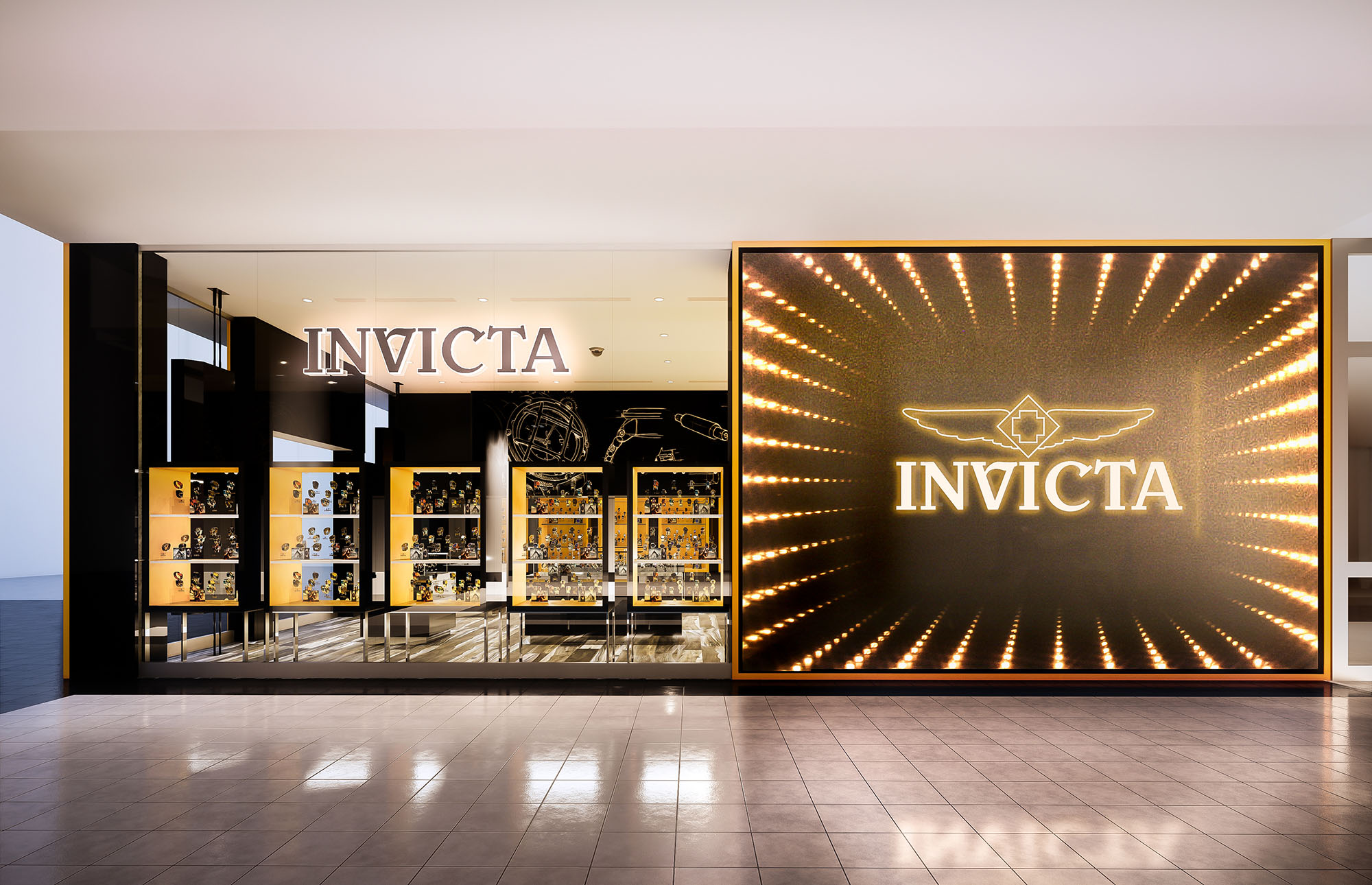
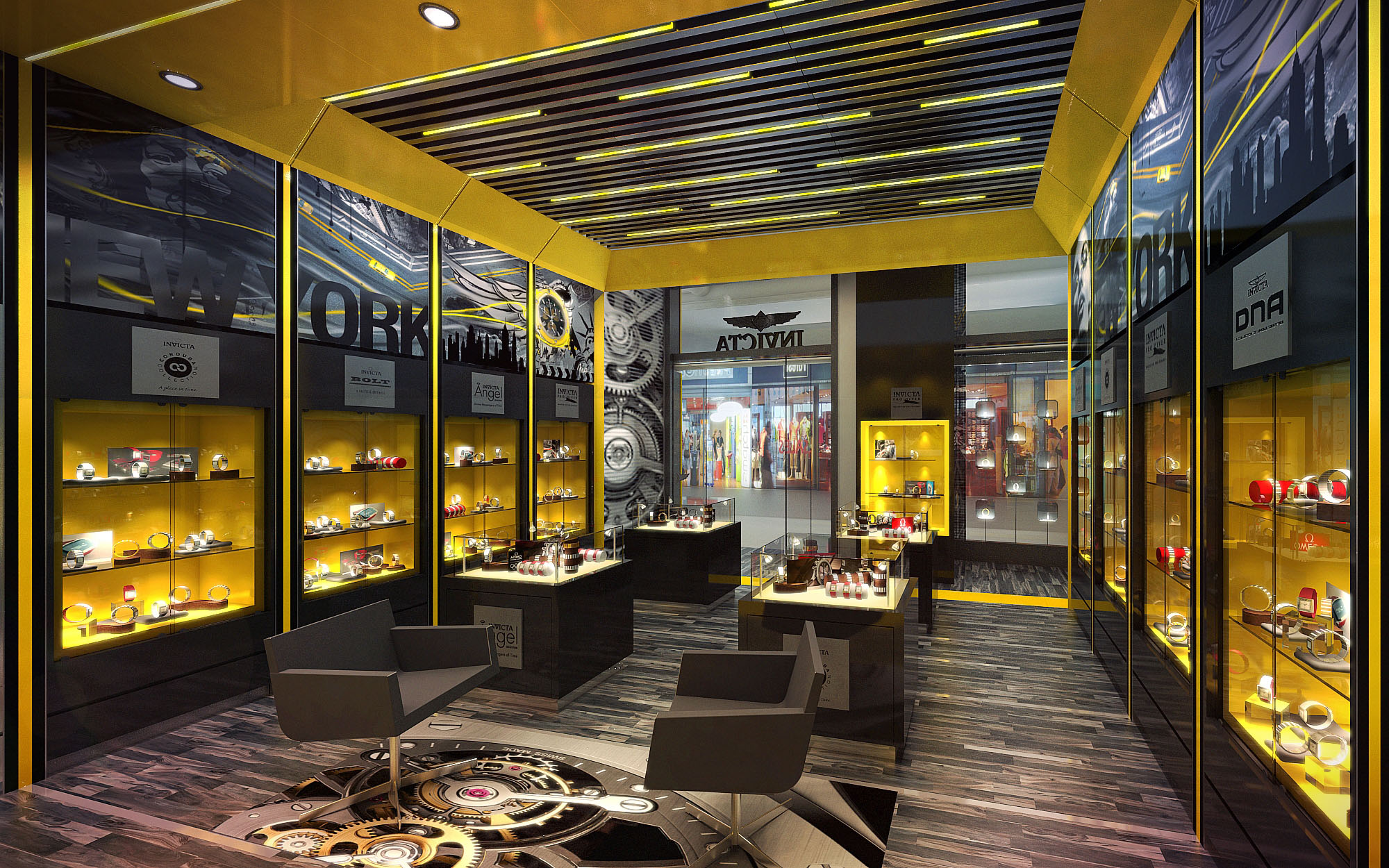
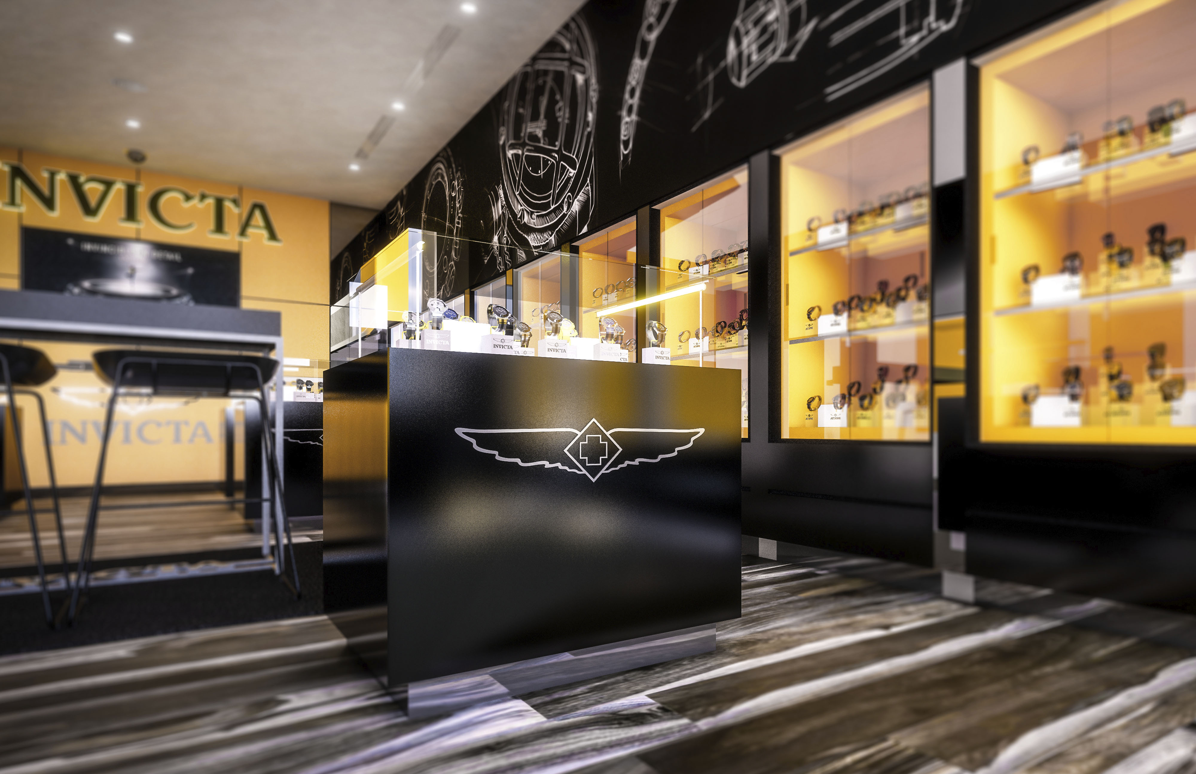
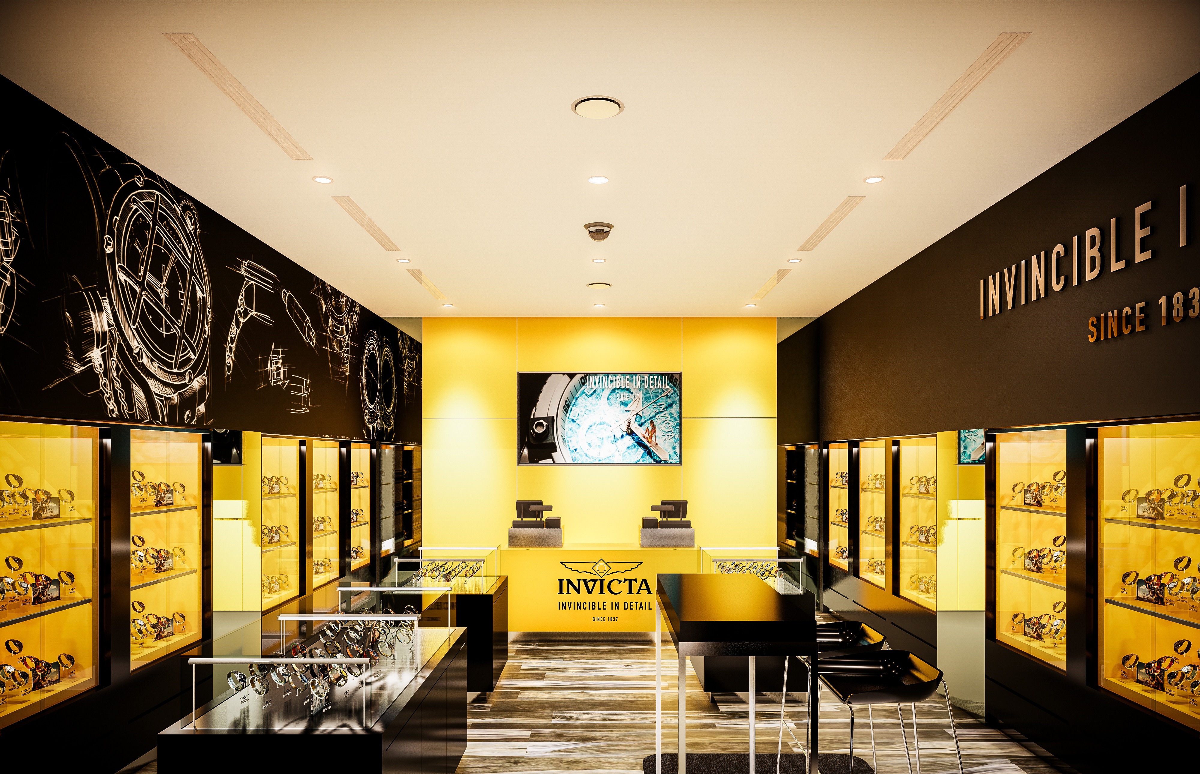
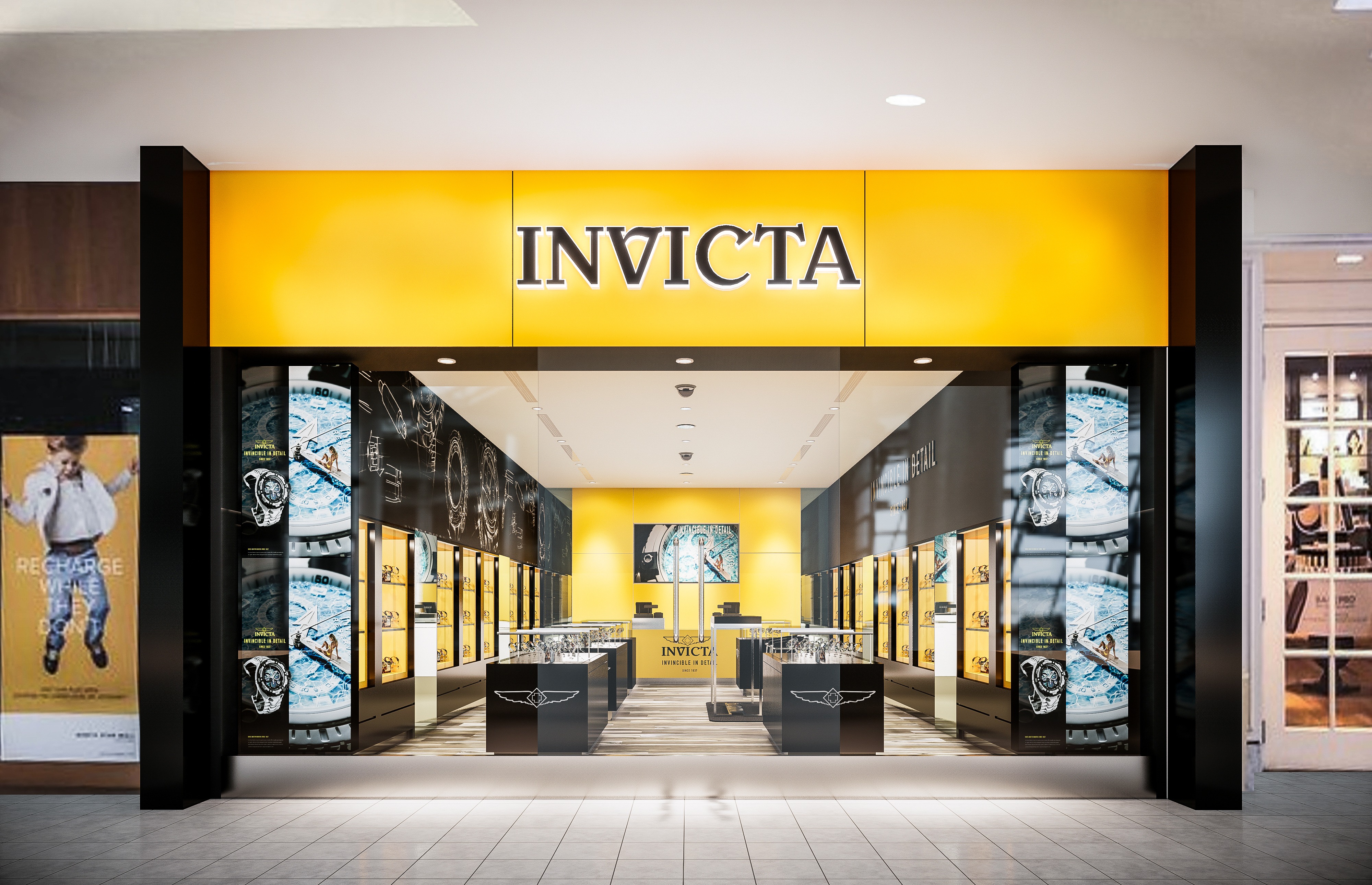
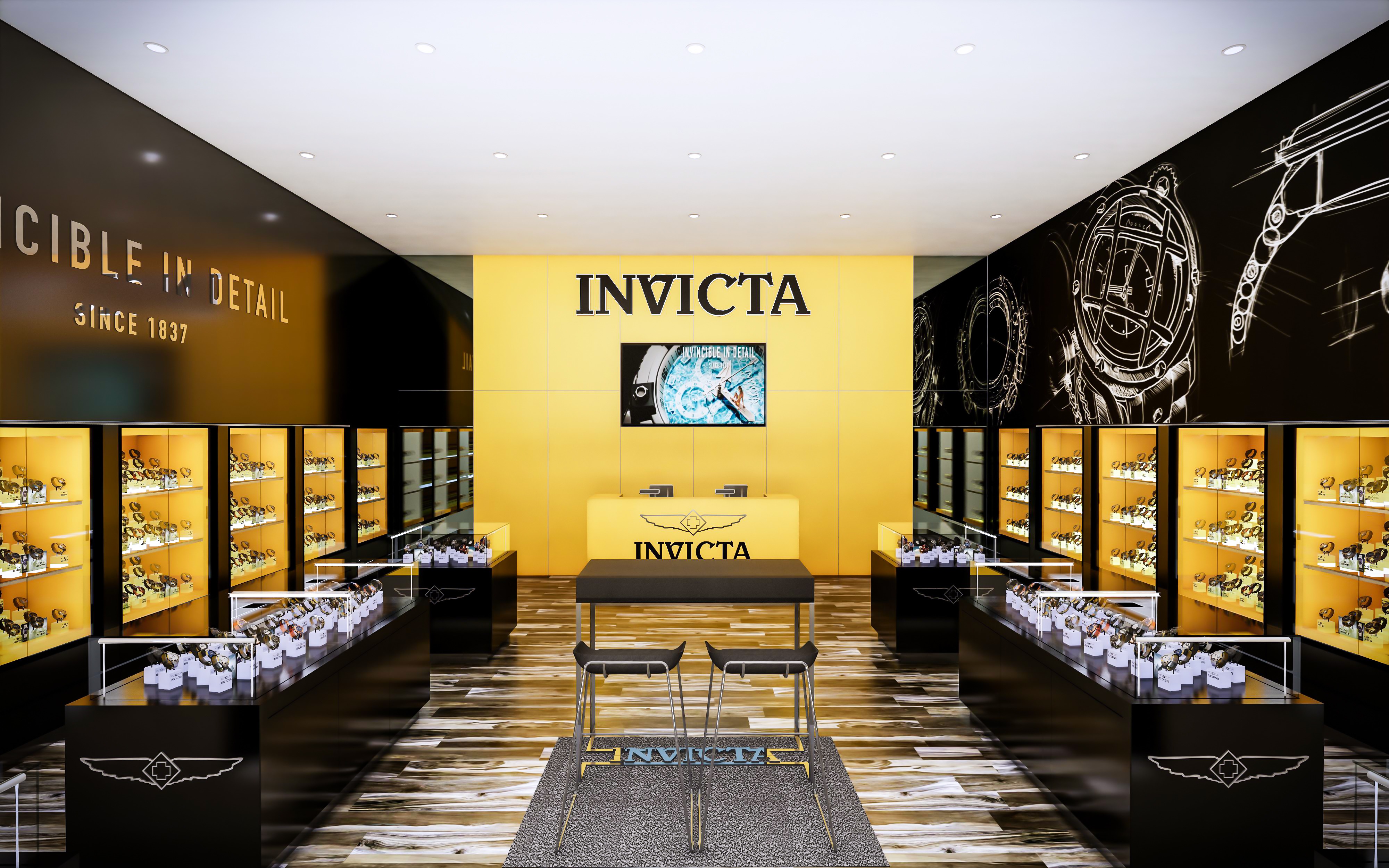
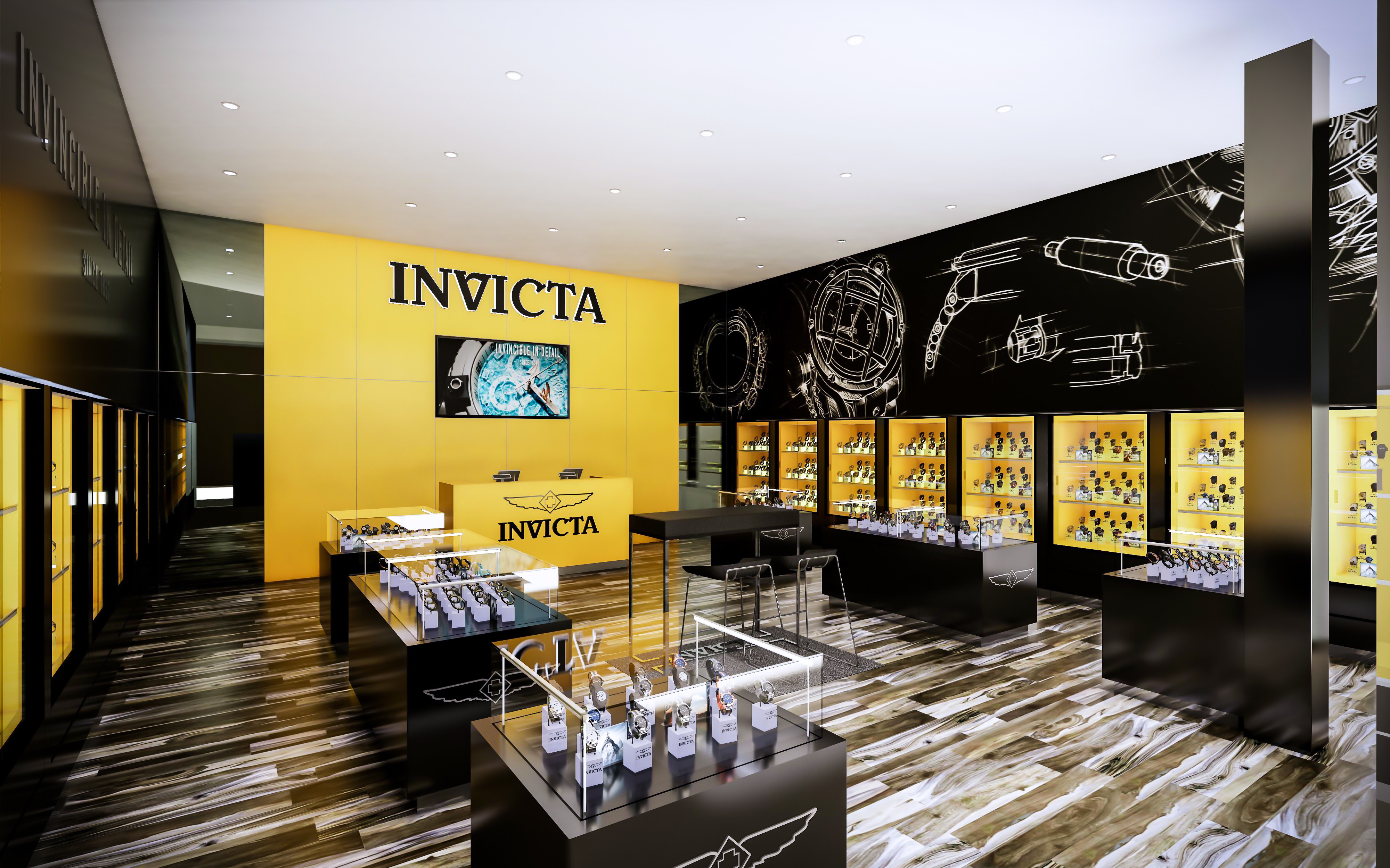
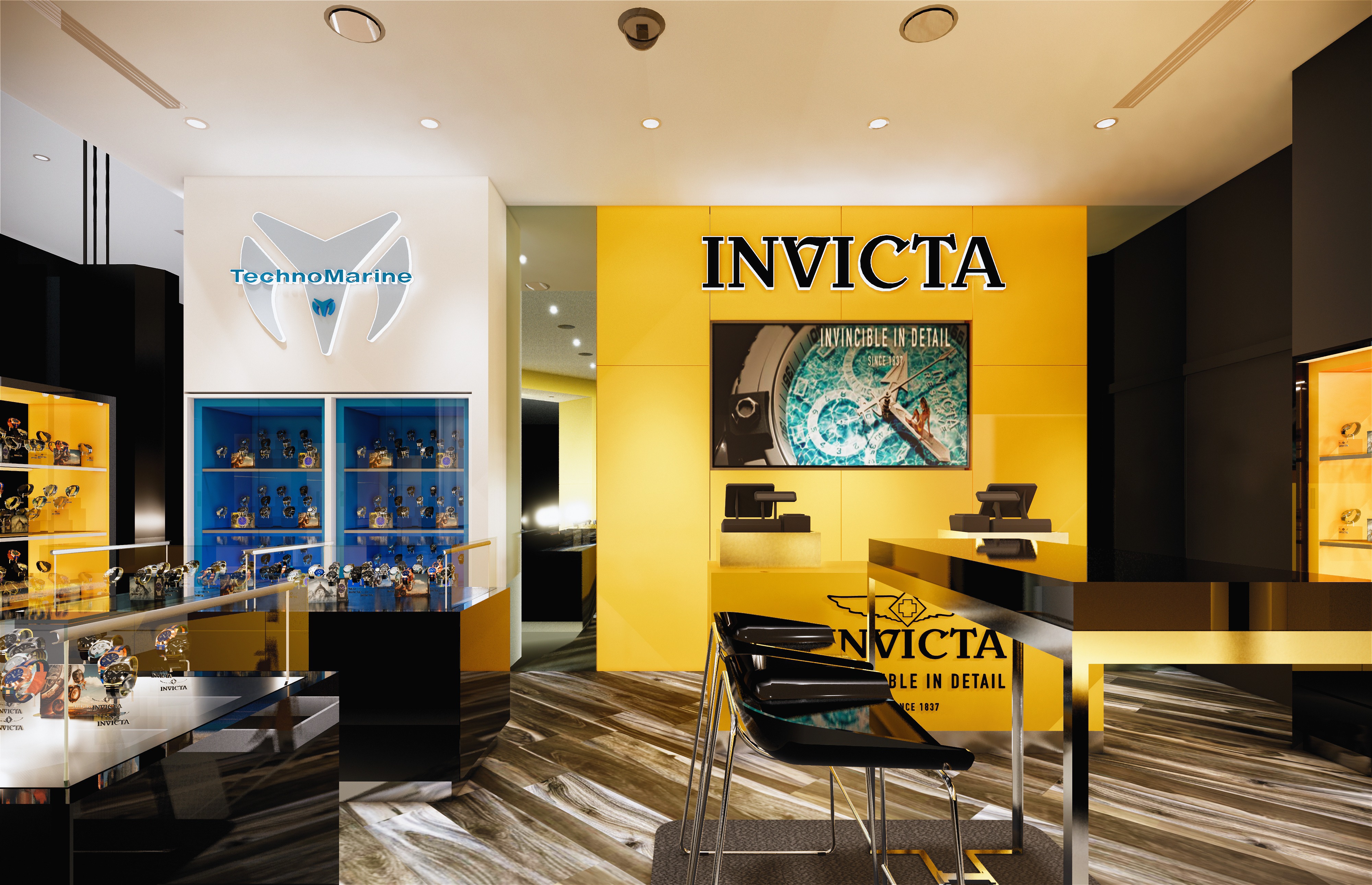
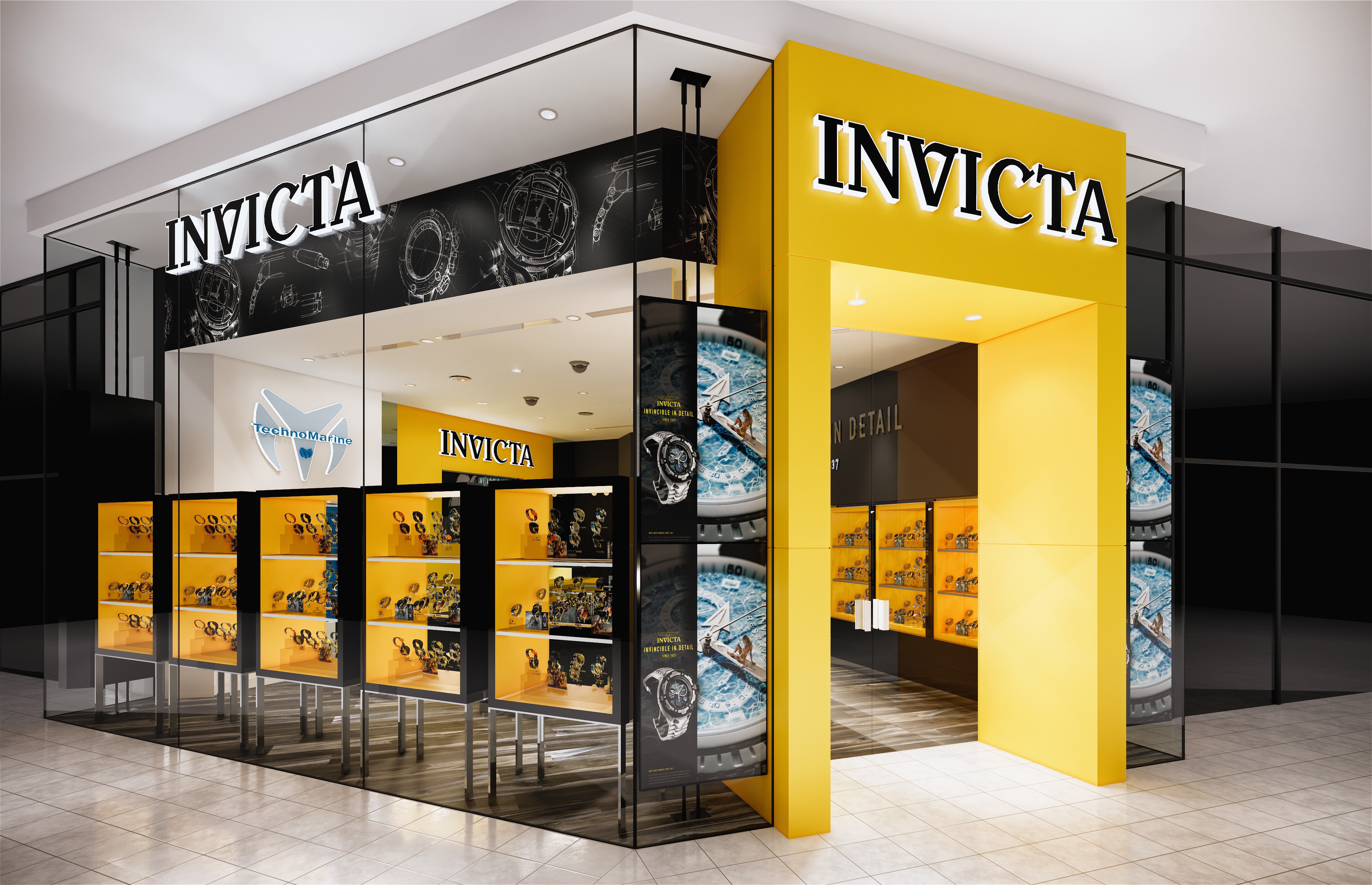
The retail space concept presents a dynamic and high-contrast design aesthetic, employing a vivid color palette and strategic lighting to emphasize product displays and create a distinctive brand atmosphere. The use of the bold yellow juxtaposed with black and neutral tones creates a space that is both inviting and visually striking, aligning with what appears to be a brand identity that is assertive and confident.
The interior design creates an immersive brand experience, with a careful balance between boldness and elegance. The use of color, light, and layout not only reinforces the identity of the brand but also creates a memorable and inviting environment for customers. The sustainability of the space could be further explored by the brand to ensure that environmental responsibility aligns with the visual and experiential impact of the design.
The dominant color palette consists of a vibrant yellow and deep black, establishing a striking contrast that is likely part of the brand's visual identity. Yellow, used as an accent color, energizes the space and attracts attention, while black provides a sophisticated backdrop that accentuates the merchandise. The integration of the brand logo and name in strategic locations reinforces brand identity and creates a cohesive environment.
A variety of materials are utilized to add depth and texture to the space. Glossy surfaces on display units and counters reflect light, enhancing brightness and visibility. The use of wood slats on the ceiling introduces an organic texture that contrasts with the sleekness of the display cases, balancing modernity with warmth. The flooring appears to be a wood-look laminate or tile, chosen for durability and ease of maintenance in high-traffic areas.
Strategically placed lighting highlights the merchandise and creates a hierarchy within the space. Spotlights are used to illuminate products individually, while ambient lighting enhances the overall mood. The display cases are internally lit, providing a soft glow that adds depth to the product presentation. This careful consideration of lighting supports not just aesthetic appeal but also functional visibility of the products.
The layout is designed to guide customers through a curated experience of the brand’s offerings. Central display tables invite interaction, while wall-mounted displays create a gallery-like environment that encourages exploration. The flow seems intentional, creating a rhythm between more private, focused viewing areas and open, communal spaces.
Considerations include the use of LED lighting for energy efficiency, materials sourced from sustainable suppliers, and design choices that reduce waste or allow for recycling of display elements. The longevity of design elements and modularity for future adaptations also contribute to sustainable practices in retail design.
LIST OF PROJECTS EXPERIENCE
Designed, Executed and/or Built Projects
COLOMBIA
1. Invicta - Colombia - Balash
GERMANY
2. Invicta - EU - Germany - Zweibrucken
MEXICO
3. Invicta - Cancun - Malecon Américas (WMW)
4. Invicta - DF - AICM
5. Invicta - Cancun - Invicta Cube
6. Invicta - Cancun - Plaza la Isla (G-Shock)
7. Invicta - Playa del Carmen - T80
8. Invicta - Kiosk
9. Invicta - Playa del Carmen - 5ta Avenida
10. Invicta - Cancun - Aeropuerto T2
11. Invicta - Plaza La Isla Cube
NETHERLANDS
12. Invicta - EU - Roosendaal - McArthurGlen Designer Outlet
13. Invicta - EU - Amsterdam Style Outlet
PORTUGAL
14. Invicta - EU - Lisbon
15. Invicta - EU - Portugal - Designer Outlet Algarve
PUERTO RICO
16. Invicta - PR - Puerto Rico Premium Outlet
17. Invicta - PR - Aeropuerto LM - T2C2-1
18. Invicta - PR - San Juan
19. Invicta - PR - Aeropuerto LM - T2C2-18
20. Invicta - PR - Plaza del Caribe
21. Invicta - PR - Mayagüez Mall
22. Invicta - PR - Old San Juan
23. Invicta - PR - Old San Juan - Gisi Store
SPAIN
24. Invicta - EU - Barcelona Viladecans - Outlet Village
25. Invicta - EU - Madrid - San Sebastian de los Reyes
26. Invicta - EU - Mallorca Fashion Outlet
UNITED KINGDOM
27. Invicta - UK - Kiosk 4x4
USA
28. Invicta - Delaware - Christiana Mall
29. Invicta - MD - Towson Town Center
30. Invicta - NJ - Jersey Shore PO
31. Invicta - FL - Aventura Mall
32. Invicta - TX - El Paso
33. Invicta - TX - Houston Galleria
34. Invicta - FL - Invicta Hollywood HQ Store
35. Invicta - TX - Dallas Galleria
36. Invicta - FL - Orlando Vineland
37. Invicta - NV - Las Vegas North PO
38. Invicta - MD - Wheaton Mall
39. Invicta - NY - Queens
40. Invicta - MD - Mall in Columbia
41. Invicta - NY - WTC
42. Invicta - TX - Houston Memorial City
43. Invicta - TX - North Star Mall
44. Invicta - FL - Sarasota
45. Invicta - VA - Fashion Centre at Pentagon City
46. Invicta - FL - Miami International Mall - LP43
47. Invicta - FL - Sawgrass Mills
48. Invicta - MD - Annapolis Mall
49. Invicta - TX - San Marcos Premium Outlets
50. Invicta - FL - Broward Mall
51. Invicta - FL - Woodbury Kiosk
52. Invicta - FL - Orlando International Premium Outlets
53. Invicta - VA - Tyson's Corner Center
54. Invicta - EU - Porto Portugal
55. Invicta - NY - Garden State Plaza
56. Invicta - NY - Cross County
57. Invicta - CN - Trumbull
58. Invicta - FL - Daytona Beach
59. Invicta - VA - Fair Oaks
60. Invicta - FL - Westland (Corner)
61. Invicta - NY - Woodbridge
62. Invicta - Prince Georges
63. Invicta - TX - Arlington - Parks Mall at Arlington
64. Invicta - GA - Atlanta
65. Invicta - NY - Time Square
66. Invicta - PR - Las Américas (Flagship)
67. Invicta - FL - Citrus Park
68. Invicta - GA - Atlanta - Perimeter Mall
69. Invicta - EU - Amsterdam - Vatavia Stad
70. Invicta - MD - Monthgomery Mall
71. Invicta - FL - Boca Raton
72. Invicta - NY - Christiana Mall
73. Invicta - TX - Stonebriar
74. Invicta - IN - Newport Center Kiosk
75. Invicta - CA - Los Angeles Citadel
76. Invicta - TX - San Marcos Tanger
77. Invicta - NV - Las Vegas South 48
78. Invicta - FL - Miami Boca Raton
79. Invicta - FL - Palm Beach Outlets
80. Invicta - TX - Willowbrook
81. Invicta - FL - Miami Dadeland - LP46
82. Invicta - AZ - Phoenix
83. Invicta - FL - Pembroke Lakes Mall
84. Invicta - TX - Town East Mall
85. Invicta - CA - LA Century City Westfield
86. Invicta - FL - Florida Mall Store
87. Invicta - NY - Staten Island
88. Invicta - FL - Westland
89. Invicta - Baltimore - Maryland
90. Invicta - Royal Caribbean Cruise - Invicta Shop onboard
91. Invicta - FL - Orlando Airport
92. Invicta - TX - San Antonio
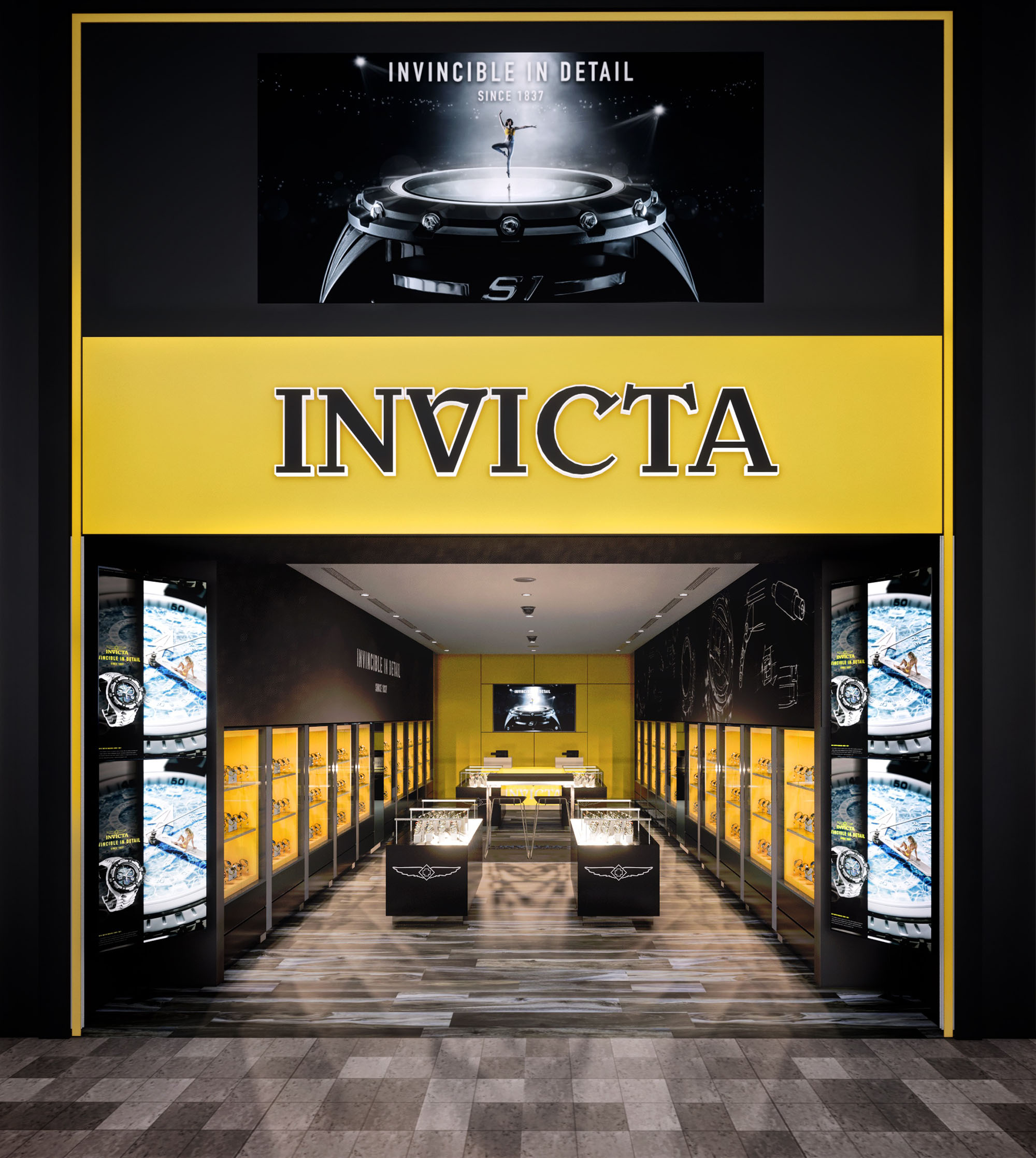

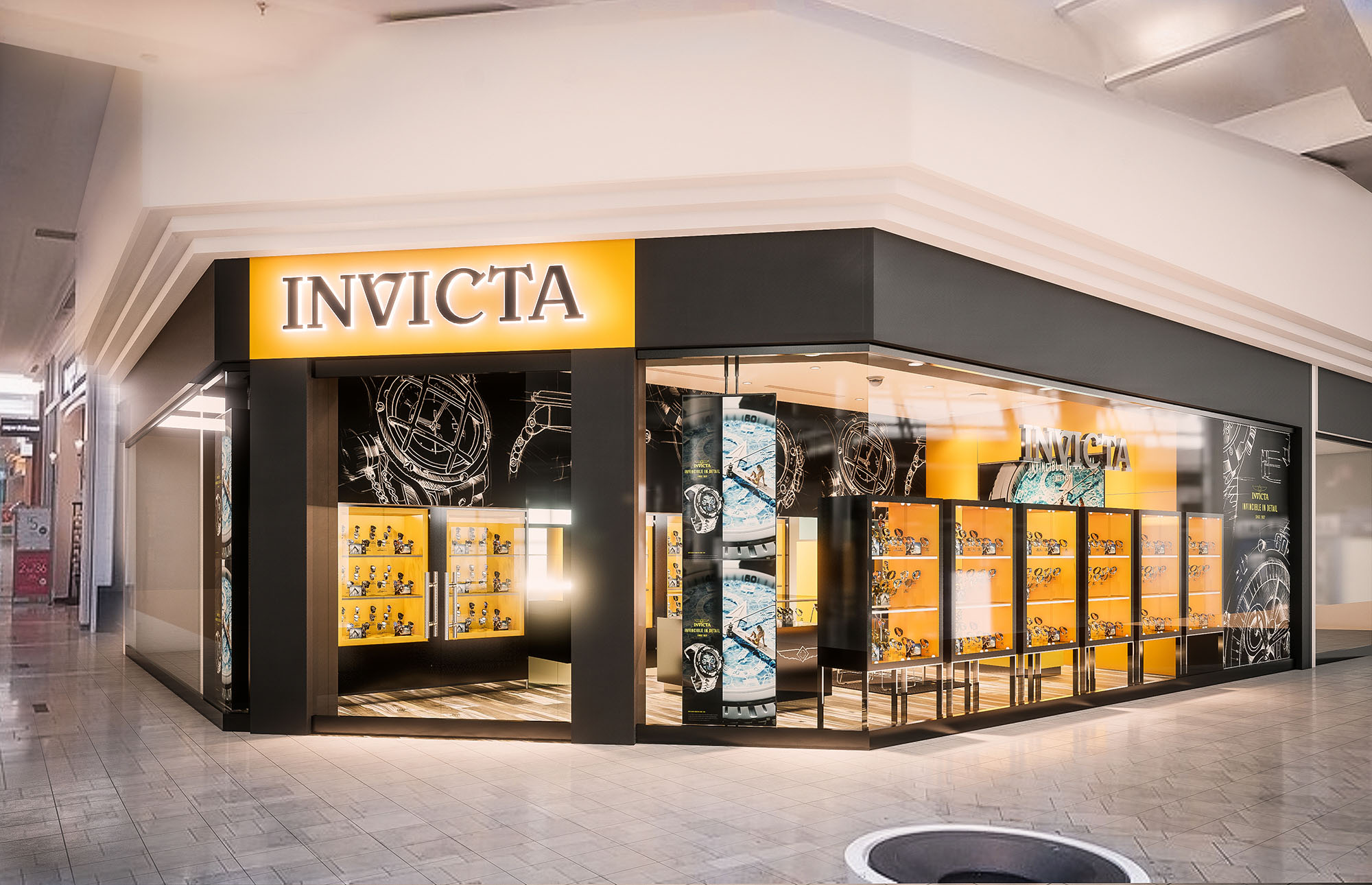
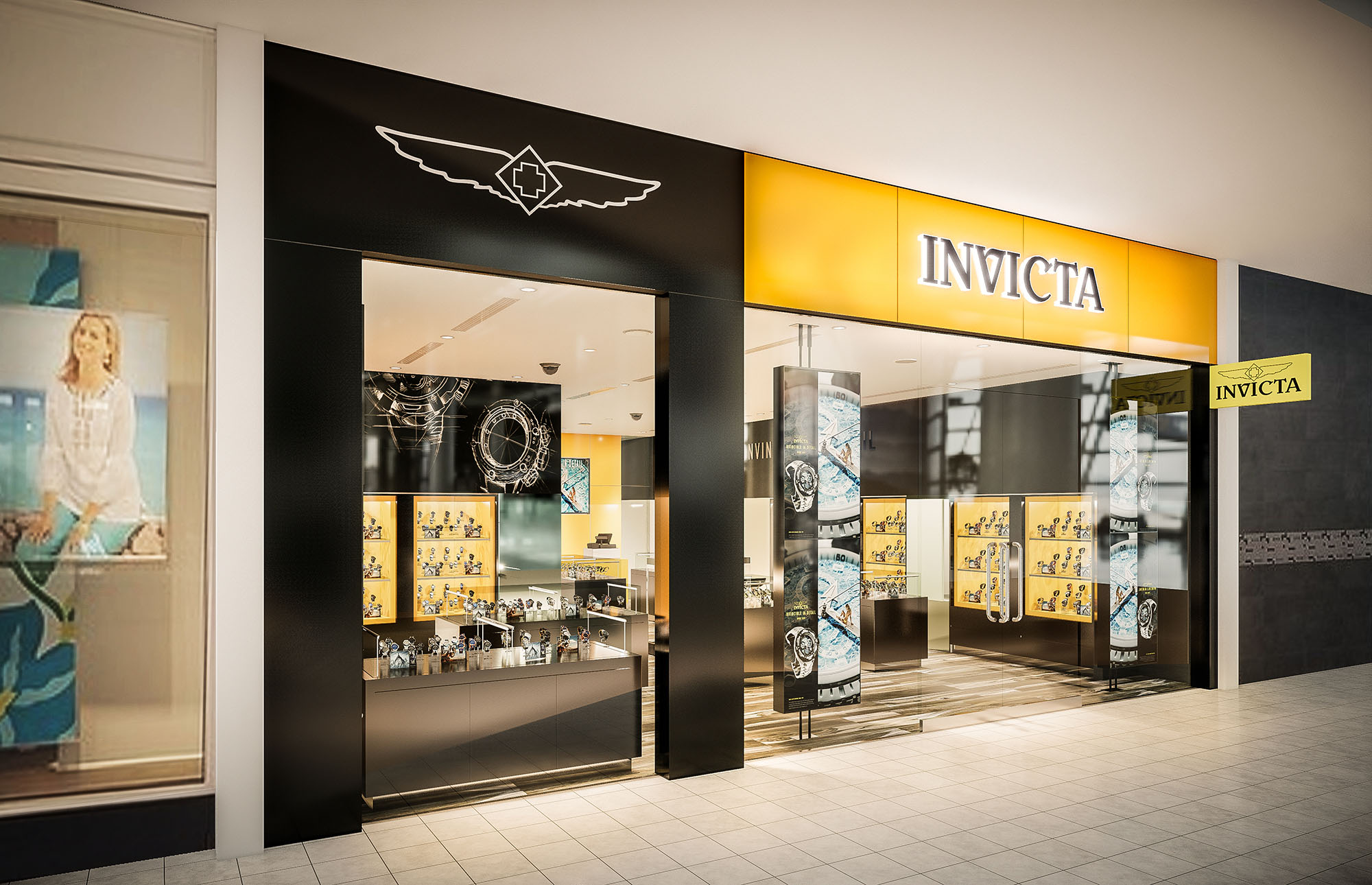
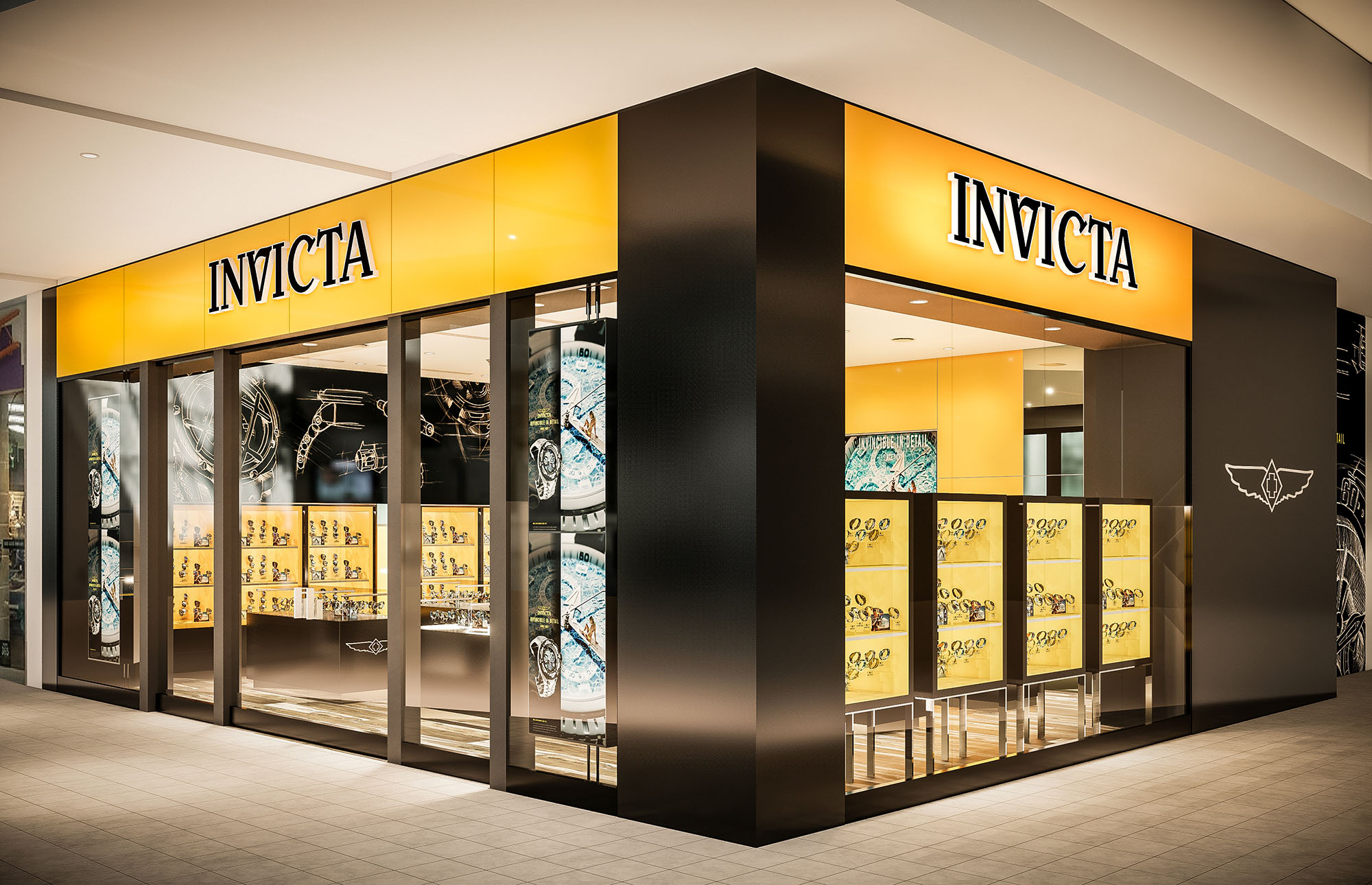

The retail space concept presents a dynamic and high-contrast design aesthetic, employing a vivid color palette and strategic lighting to emphasize product displays and create a distinctive brand atmosphere. The use of the bold yellow juxtaposed with black and neutral tones creates a space that is both inviting and visually striking, aligning with what appears to be a brand identity that is assertive and confident.
The interior design creates an immersive brand experience, with a careful balance between boldness and elegance. The use of color, light, and layout not only reinforces the identity of the brand but also creates a memorable and inviting environment for customers. The sustainability of the space could be further explored by the brand to ensure that environmental responsibility aligns with the visual and experiential impact of the design.
The dominant color palette consists of a vibrant yellow and deep black, establishing a striking contrast that is likely part of the brand's visual identity. Yellow, used as an accent color, energizes the space and attracts attention, while black provides a sophisticated backdrop that accentuates the merchandise. The integration of the brand logo and name in strategic locations reinforces brand identity and creates a cohesive environment.
A variety of materials are utilized to add depth and texture to the space. Glossy surfaces on display units and counters reflect light, enhancing brightness and visibility. The use of wood slats on the ceiling introduces an organic texture that contrasts with the sleekness of the display cases, balancing modernity with warmth. The flooring appears to be a wood-look laminate or tile, chosen for durability and ease of maintenance in high-traffic areas.
Strategically placed lighting highlights the merchandise and creates a hierarchy within the space. Spotlights are used to illuminate products individually, while ambient lighting enhances the overall mood. The display cases are internally lit, providing a soft glow that adds depth to the product presentation. This careful consideration of lighting supports not just aesthetic appeal but also functional visibility of the products.
The layout is designed to guide customers through a curated experience of the brand’s offerings. Central display tables invite interaction, while wall-mounted displays create a gallery-like environment that encourages exploration. The flow seems intentional, creating a rhythm between more private, focused viewing areas and open, communal spaces.
Considerations include the use of LED lighting for energy efficiency, materials sourced from sustainable suppliers, and design choices that reduce waste or allow for recycling of display elements. The longevity of design elements and modularity for future adaptations also contribute to sustainable practices in retail design.


Our offices are located in Barcelona, Cancún, Chicago and Santo Domingo, but thanks to technology we can do projects on all over the world.
Barcelona
Bac de Roda 136
08020, Barcelona
Spain
Madrid
Av. de Buendía 11
19005 Guadalajara (Madrid)
Spain
Chicago
373 Hazel Ave, Apt A1
60022, Glencoe, Illinois
United States