


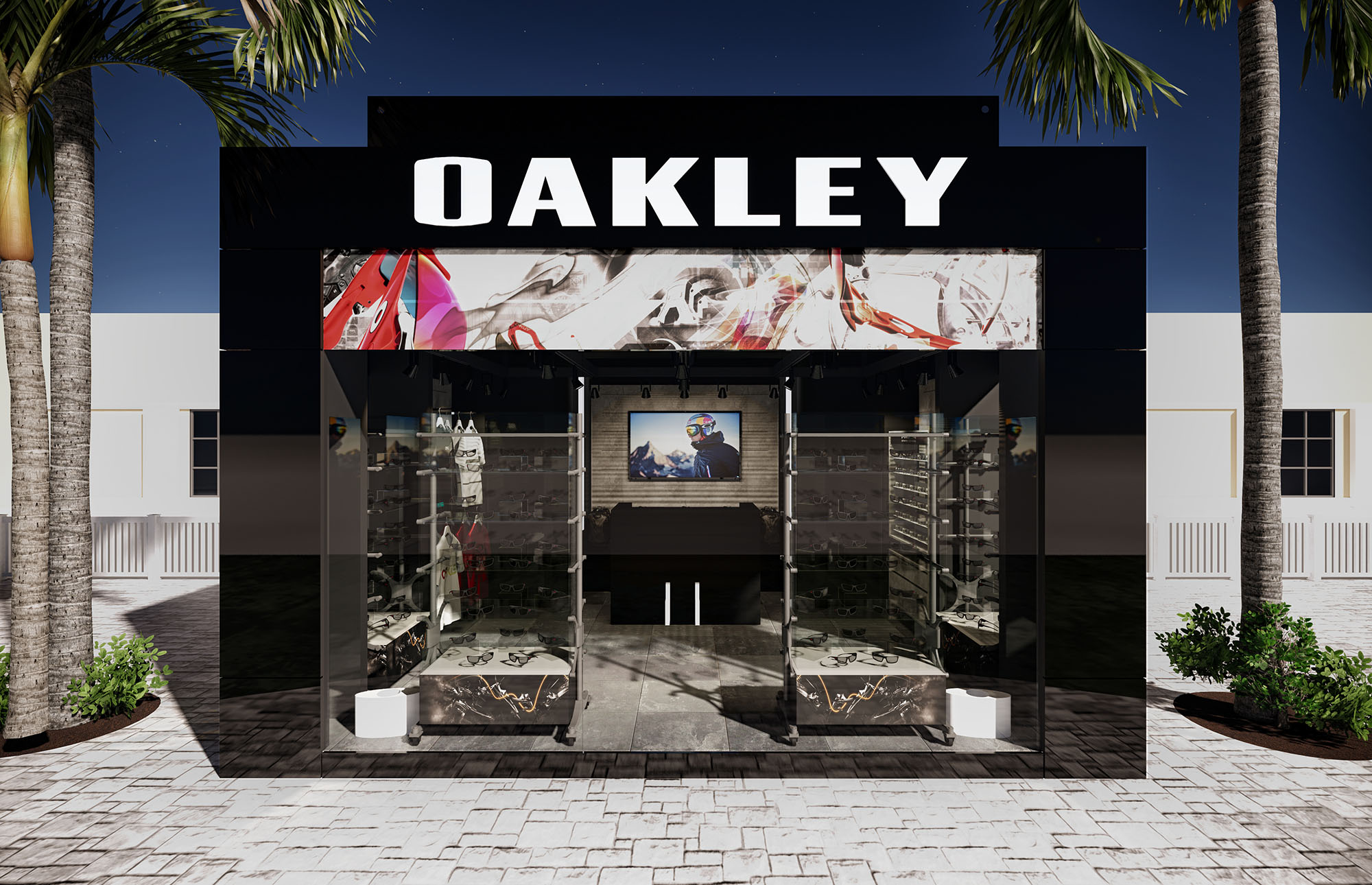
The OAKLEY stores are conceived as immersive brand capsules, where architecture, graphics and lighting merge to communicate performance, technology and urban energy. The design strategy translates the brand’s association with action sports into a controlled, almost gallery-like retail environment, where merchandise becomes the primary protagonist against a dark, continuous backdrop. The envelope, both at the façade and interior, is used as a dynamic canvas for large-scale imagery, generating a powerful visual impact even at distance inside the mall.
Across the 14 locations, the concept prioritizes replicable spatial rules rather than identical forms, allowing adaptation to different lease lines and depths while maintaining a strong and recognizable identity. Clean geometry, bold contrasts and precise detailing are employed to convey technical excellence and to frame curated product narratives focused on eyewear and apparel.
The typical store layout is organized as a clear frontal entry zone with a wide, transparent opening that eliminates physical barriers and maximizes permeability from the mall corridor. Once inside, circulation follows a simple horseshoe or perimeter loop, guided by continuous display walls that house the core eyewear collections. Central freestanding tables, low enough to preserve visual continuity, host apparel and accessories and structure transversal flows.
The cash wrap and service areas are intentionally recessed, keeping the primary visual field dedicated to merchandise. Sightlines are carefully controlled: from the entrance, the visitor immediately perceives the full depth of the space and the dense, luminous grid of eyewear displays at the back, encouraging exploration. Circulation remains intuitive and obstacle-free, accommodating high traffic while maintaining space for dwell and product testing.
The façade system relies on full-height glass planes, minimally framed, which create a showcase-like condition and visually extend the interior into the public realm. Black opaque bands at the upper zone host the illuminated OAKLEY logotype and a sequence of back-printed graphics, generating a strong cornice line that unifies the storefront and conceals technical elements such as lighting tracks and structure.
Overscaled photography of athletes and equipment is printed on both exterior and interior surfaces, producing a layered visual field when viewed obliquely from the mall circulation. The transparency of the glass, combined with the opacity of the brand band, balances openness and controlled branding, allowing the store to stand out without resorting to volumetric protrusions.
The interior palette is dominated by dark, neutral surfaces—charcoal floor tiles and deep brown or black wall systems—that provide a high-contrast backdrop for the brightly colored merchandise. This chromatic strategy reinforces the precision and technical feel of the brand, while enabling rapid visual recognition of products. Display furniture uses a combination of matte laminates, powder-coated metal frames and natural or lightly stained wood crates, evoking a workshop aesthetic appropriate to action-sport equipment.
The ceiling incorporates printed graphic panels and recessed downlights, creating a dynamic but unified overhead plane. Reflections on glass display vitrines add depth without clutter. Materials are selected for durability and ease of maintenance in high-traffic environments, with anti-scratch surfaces and robust hardware that support frequent remerchandising.
Lighting plays a critical role in the perception of product quality and color fidelity. A combination of linear LED systems and adjustable spotlights is employed to form luminous ribbons above the perimeter walls, accentuating the eyewear displays and creating a continuous horizon of light. High color-rendering sources ensure accurate representation of lens tints and apparel hues.
Central fixtures are illuminated from above with focused beams that define product islands and subtly guide circulation. The general ambient level is kept slightly lower than the accent lighting, reinforcing a gallery-like atmosphere where products appear to float against darker backgrounds. Integrated lighting within some display cases highlights premium lines and organizes the visual hierarchy of the assortment.
Sustainability is addressed through a combination of efficient systems, modularity and responsible material selection. LED lighting drastically reduces energy consumption and maintenance compared to conventional sources, a critical factor when multiplied across 14 locations. The standardized fixture families and modular display walls minimize waste during installation and future renovations, as elements can be reused, relocated or reconfigured instead of being discarded.
Durable floor finishes and high-resistance laminates extend the life cycle of components, lowering the need for replacement and associated embodied energy. Whenever feasible, wood elements use certified or low-impact sources, and finishes are specified with low-VOC content to improve indoor air quality. The replicable design toolkit allows the brand to scale consistently while optimizing fabrication, transport and installation processes, reducing the overall environmental footprint of the retail network.
LIST OF PROJECTS EXPERIENCE
Designed, Executed and/or Built Projects
MEXICO
1. Aeropuerto Internacional Cancun T1
2. Aeropuerto Internacional Cancun T2
3. Aeropuerto Propuesta
4. Cancun - La Isla - Kiosko
5. Cancun - La Isla - Kiosko II
6. Cancun - Malecón Américas
7. Cancun - Plaza Kukulcan
8. DF AICM
9. Los Cabos - Puerto Paraiso Mall - L84
10. Merida
11. Playa - 5ta Alegria
12. Playa del Carmen - Paseo del Carmen
13. Plaza Outlet
14. Propuesta Aeropuerto DF


The OAKLEY stores are conceived as immersive brand capsules, where architecture, graphics and lighting merge to communicate performance, technology and urban energy. The design strategy translates the brand’s association with action sports into a controlled, almost gallery-like retail environment, where merchandise becomes the primary protagonist against a dark, continuous backdrop. The envelope, both at the façade and interior, is used as a dynamic canvas for large-scale imagery, generating a powerful visual impact even at distance inside the mall.
Across the 14 locations, the concept prioritizes replicable spatial rules rather than identical forms, allowing adaptation to different lease lines and depths while maintaining a strong and recognizable identity. Clean geometry, bold contrasts and precise detailing are employed to convey technical excellence and to frame curated product narratives focused on eyewear and apparel.
The typical store layout is organized as a clear frontal entry zone with a wide, transparent opening that eliminates physical barriers and maximizes permeability from the mall corridor. Once inside, circulation follows a simple horseshoe or perimeter loop, guided by continuous display walls that house the core eyewear collections. Central freestanding tables, low enough to preserve visual continuity, host apparel and accessories and structure transversal flows.
The cash wrap and service areas are intentionally recessed, keeping the primary visual field dedicated to merchandise. Sightlines are carefully controlled: from the entrance, the visitor immediately perceives the full depth of the space and the dense, luminous grid of eyewear displays at the back, encouraging exploration. Circulation remains intuitive and obstacle-free, accommodating high traffic while maintaining space for dwell and product testing.
The façade system relies on full-height glass planes, minimally framed, which create a showcase-like condition and visually extend the interior into the public realm. Black opaque bands at the upper zone host the illuminated OAKLEY logotype and a sequence of back-printed graphics, generating a strong cornice line that unifies the storefront and conceals technical elements such as lighting tracks and structure.
Overscaled photography of athletes and equipment is printed on both exterior and interior surfaces, producing a layered visual field when viewed obliquely from the mall circulation. The transparency of the glass, combined with the opacity of the brand band, balances openness and controlled branding, allowing the store to stand out without resorting to volumetric protrusions.
The interior palette is dominated by dark, neutral surfaces—charcoal floor tiles and deep brown or black wall systems—that provide a high-contrast backdrop for the brightly colored merchandise. This chromatic strategy reinforces the precision and technical feel of the brand, while enabling rapid visual recognition of products. Display furniture uses a combination of matte laminates, powder-coated metal frames and natural or lightly stained wood crates, evoking a workshop aesthetic appropriate to action-sport equipment.
The ceiling incorporates printed graphic panels and recessed downlights, creating a dynamic but unified overhead plane. Reflections on glass display vitrines add depth without clutter. Materials are selected for durability and ease of maintenance in high-traffic environments, with anti-scratch surfaces and robust hardware that support frequent remerchandising.
Lighting plays a critical role in the perception of product quality and color fidelity. A combination of linear LED systems and adjustable spotlights is employed to form luminous ribbons above the perimeter walls, accentuating the eyewear displays and creating a continuous horizon of light. High color-rendering sources ensure accurate representation of lens tints and apparel hues.
Central fixtures are illuminated from above with focused beams that define product islands and subtly guide circulation. The general ambient level is kept slightly lower than the accent lighting, reinforcing a gallery-like atmosphere where products appear to float against darker backgrounds. Integrated lighting within some display cases highlights premium lines and organizes the visual hierarchy of the assortment.
Sustainability is addressed through a combination of efficient systems, modularity and responsible material selection. LED lighting drastically reduces energy consumption and maintenance compared to conventional sources, a critical factor when multiplied across 14 locations. The standardized fixture families and modular display walls minimize waste during installation and future renovations, as elements can be reused, relocated or reconfigured instead of being discarded.
Durable floor finishes and high-resistance laminates extend the life cycle of components, lowering the need for replacement and associated embodied energy. Whenever feasible, wood elements use certified or low-impact sources, and finishes are specified with low-VOC content to improve indoor air quality. The replicable design toolkit allows the brand to scale consistently while optimizing fabrication, transport and installation processes, reducing the overall environmental footprint of the retail network.


Our offices are located in Barcelona, Cancún, Chicago and Santo Domingo, but thanks to technology we can do projects on all over the world.
Barcelona
Bac de Roda 136
08020, Barcelona
Spain
Madrid
Av. de Buendía 11
19005 Guadalajara (Madrid)
Spain
Chicago
373 Hazel Ave, Apt A1
60022, Glencoe, Illinois
United States