


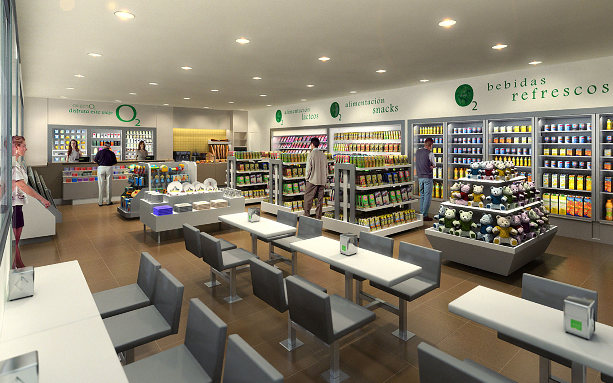
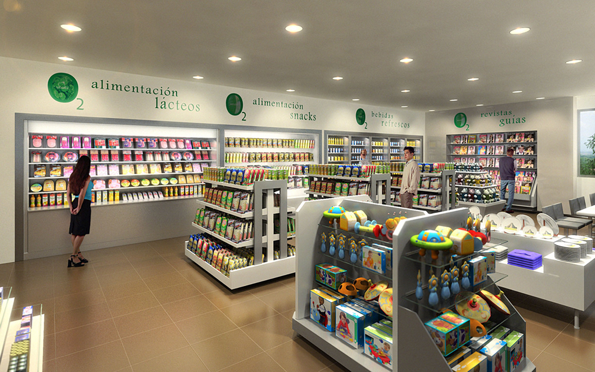
OXIGENO2 is conceived as a contemporary hybrid space that brings together convenience retail and a compact café area within a single, fluid environment. The design strategy focuses on clarity, brightness and intuitive circulation, evoking the idea of “oxygen” as light, order and transparency. A neutral architectural envelope is used as a calm backdrop against which the chromatic richness of products becomes the main visual protagonist. The result is a retail experience that feels open, legible and efficient, while maintaining a warm, human scale.
The project responds to its urban context in Barcelona by offering a fast yet comfortable stopover environment, anticipating the rhythms of commuters and travelers. Linear geometries, clean lines and restrained detailing reinforce a sense of precision and reliability, essential in a high-turnover retail format. The interior is intentionally free of visual noise, allowing signage, product families and service counters to be understood at a glance.
The plan is structured around a clear longitudinal axis that runs from the entrance towards the service counters at the back. Central gondolas organize dry food, snacks and complementary products, while perimeter shelving hosts refrigerated goods, drinks and magazines. This arrangement creates a continuous circulation loop that encourages exploration yet avoids bottlenecks, even at peak hours.
The café seating is strategically aligned along one side, parallel to the main aisle. Fixed tables with cantilevered bases and integrated seating optimize the available footprint, creating a compact dining strip that does not interfere with retail flows. The checkout and service counter are positioned as a focal terminus to the perspective, reinforcing orientation and intuitively guiding customers through the space.
A restrained palette combines warm-toned ceramic flooring with light gray and white furniture elements. The warm floor introduces a sense of comfort and domesticity, counterbalancing the technical character of the shelving and stainless-steel elements. Vertical display systems and tables are predominantly white, enhancing light diffusion and providing a neutral canvas for branding and product color.
Ceilings are kept smooth and uninterrupted, punctuated by a dense grid of recessed downlights that ensure homogeneous illumination across shelves and circulation areas. This uniform lighting minimizes shadows on merchandise and supports accurate color rendering. Accent is introduced via the green corporate identity: wall graphics, subtle logos and wayfinding typography above each product category generate immediate recognition and improve orientation without resorting to heavy architectural gestures.
The fixed seating modules feature crisp, rectilinear profiles with upholstered backs and seats for short to medium-stay comfort. Their metal supports are recessed, creating a visual sense of levitation and facilitating cleaning and maintenance under the benches. Table dimensions and alignments are calculated to allow precise circulation clearances between aisles, diners and shoppers.
Retail fixtures are designed as low to mid-height gondolas in the center, with taller refrigerated walls at the perimeter. This hierarchy protects long-distance sightlines, maintaining visual connectivity across the entire store. The curved end displays soften circulation nodes and invite approach from multiple angles, while the children’s and toy display uses lower heights and rounded forms to be accessible and safe for younger users.
The project integrates sustainability through both material choice and operational planning. The continuous ceramic flooring offers long-term durability and reduced replacement cycles, lowering the embodied environmental impact over the building’s life. Modular shelving and furniture systems are designed for disassembly, enabling future reconfiguration or selective replacement instead of full refurbishment.
The dense array of recessed luminaires is conceived to operate with high-efficiency LED technology, reducing energy consumption and maintenance. Bright, reflective interior surfaces enhance light distribution, allowing lower wattage levels while maintaining a luminous environment. Refrigeration walls are consolidated along the perimeter to facilitate efficient cooling systems and simplified insulation strategies. The overall compact layout shortens circulation paths for staff, improving logistics and minimizing energy use associated with daily operations.


Our offices are located in Barcelona, Cancún, Chicago and Santo Domingo, but thanks to technology we can do projects on all over the world.
Barcelona
Bac de Roda 136
08020, Barcelona
Spain
Madrid
Av. de Buendía 11
19005 Guadalajara (Madrid)
Spain
Chicago
373 Hazel Ave, Apt A1
60022, Glencoe, Illinois
United States