

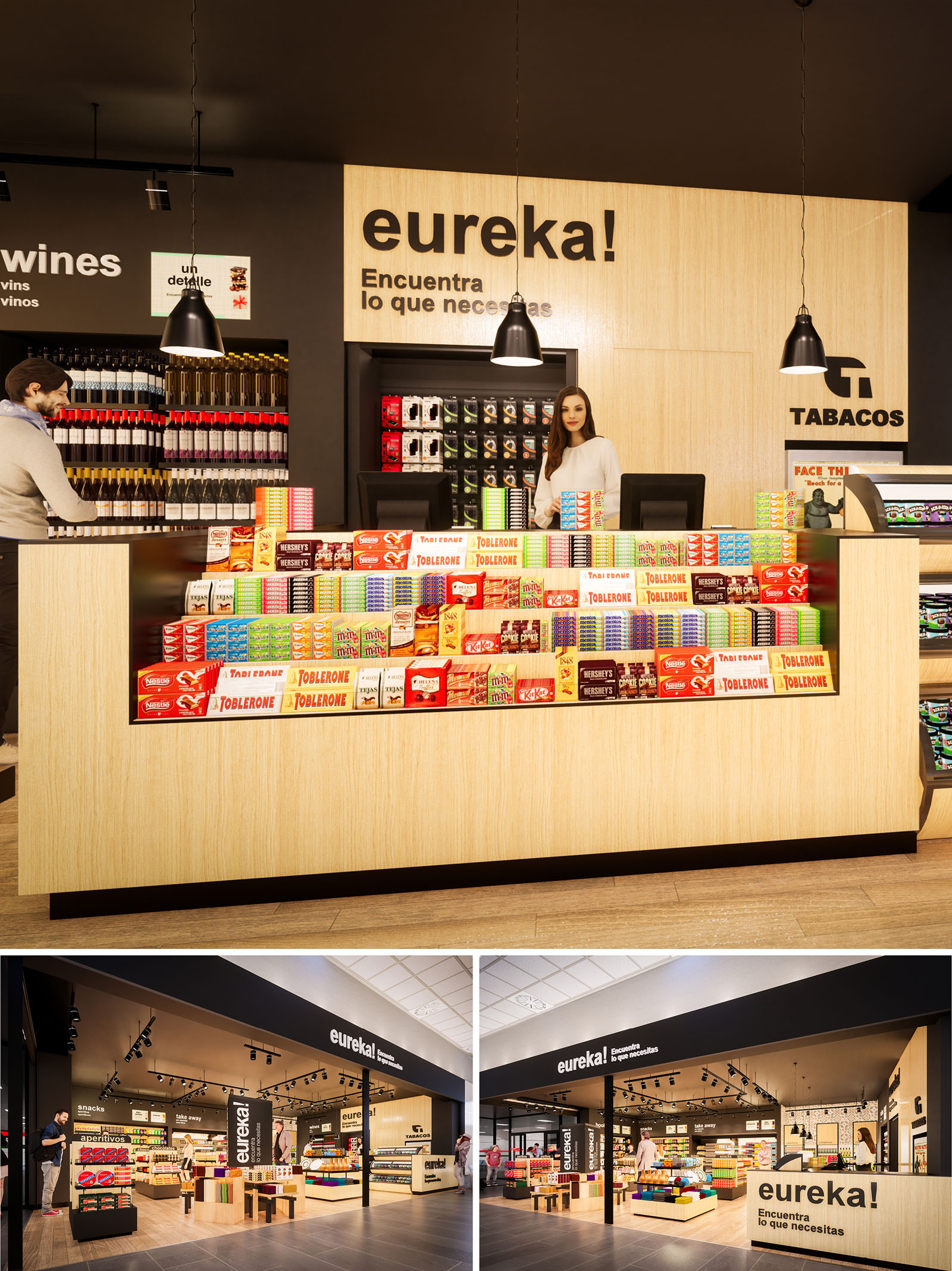
The EUREKA convenience store in Girona is conceived as an open and intuitive retail landscape where the customer can visually grasp the entire offer at a glance. The concept blends the agility of a travel retail kiosk with the warmth of a neighborhood store, using a clear graphic language and ordered product presentation to minimize decision time and enhance impulse purchases. Architecture, interior, lighting and signage are integrated to form a single, legible brand experience.
The space is structured as a permeable box, open on two façades, that invites transversal circulation from the corridor. Low central islands combined with taller perimeter walls generate a graduated skyline of shelving, ensuring maximum visibility from outside while keeping sight lines unobstructed inside. Black branding bands frame the opening, transforming the entrance into an urban storefront within the interior of a larger commercial node.
The plan is organized around a central axis that directs the customer from the main entrance towards the cashier counter set as a visual anchor at the back. This counter wall, clad in light wood with the large “eureka!” sign, works as a focal element, naturally guiding movement and orienting users. The layout follows a loop circulation: entry through one side, progression around low gondolas of snacks and convenience products, and return towards checkout on the opposite side.
Perimeter shelving accommodates more specific categories such as wines, beverages, and tobacco, allowing focused browsing without breaking the global reading of the store. The counter itself acts as a high-impact display for confectionery, with tiered arrangements that place products directly in the customer’s line of sight during payment, optimizing commercial performance while maintaining order and clarity.
The material palette is intentionally reduced: natural light oak finishes for counters and shelving, matte black for ceilings, structural elements and signage, and neutral flooring in warm tones. This triad creates a calm and coherent background that highlights the vibrant colors of packaged products, effectively turning merchandise into the main decorative element.
Graphic identity is integrated architecturally. Large-scale typography, in white over black or black over wood, reinforces wayfinding and brand recognition. The contrast between the soft, tactile feel of the timber and the precision of the black bands and luminaires conveys a contemporary yet approachable atmosphere, appropriate for both local users and transient travelers.
Lighting is resolved through a combination of black track-mounted spotlights and suspended pendants above the main counter. The dark ceiling plane allows fixtures to visually disappear, emphasizing the illuminated merchandise rather than the technical equipment. Accent lighting on vertical displays gives depth to the perimeter walls and highlights premium categories such as wines and gift items.
The merchandising strategy prioritizes horizontality and rhythm. Repetitive shelving modules and carefully aligned product fronts produce a sense of order that facilitates quick selection. Lower central displays maintain a human scale, while the higher rear wall behind the counter frames the brand logo and tobacco category, ensuring compliance with visibility and operational requirements.
Sustainability is addressed through both material choice and operational efficiency. The predominant use of laminated wood and wood veneer panels allows the integration of certified, low-formaldehyde substrates, which can be sourced locally to reduce transport emissions. The neutral and timeless aesthetic extends the lifecycle of the interior, minimizing the need for frequent refurbishments and thus reducing material waste.
LED lighting technology is selected for all luminaires, significantly lowering energy consumption and maintenance while ensuring robust color rendering for packaged goods. The modular shelving and gondola system is fully reconfigurable, enabling future adaptation to new product mixes without structural alterations. Finishes are chosen for high resistance to wear and ease of cleaning, supporting long-term performance with minimal use of aggressive cleaning agents.
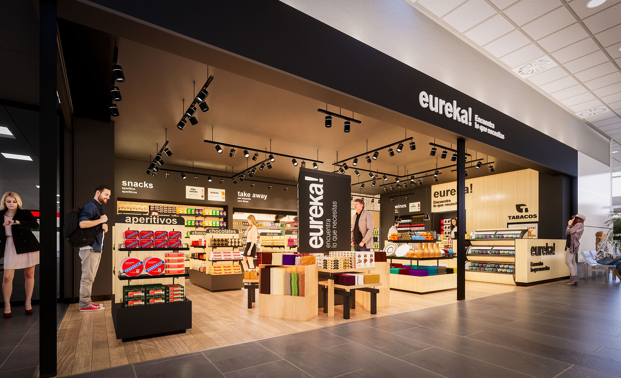
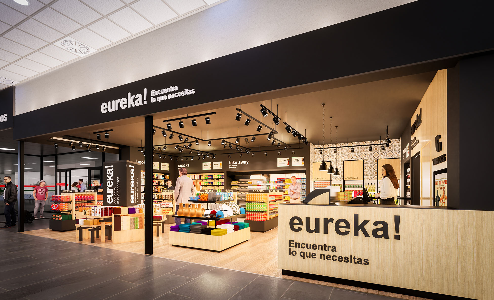
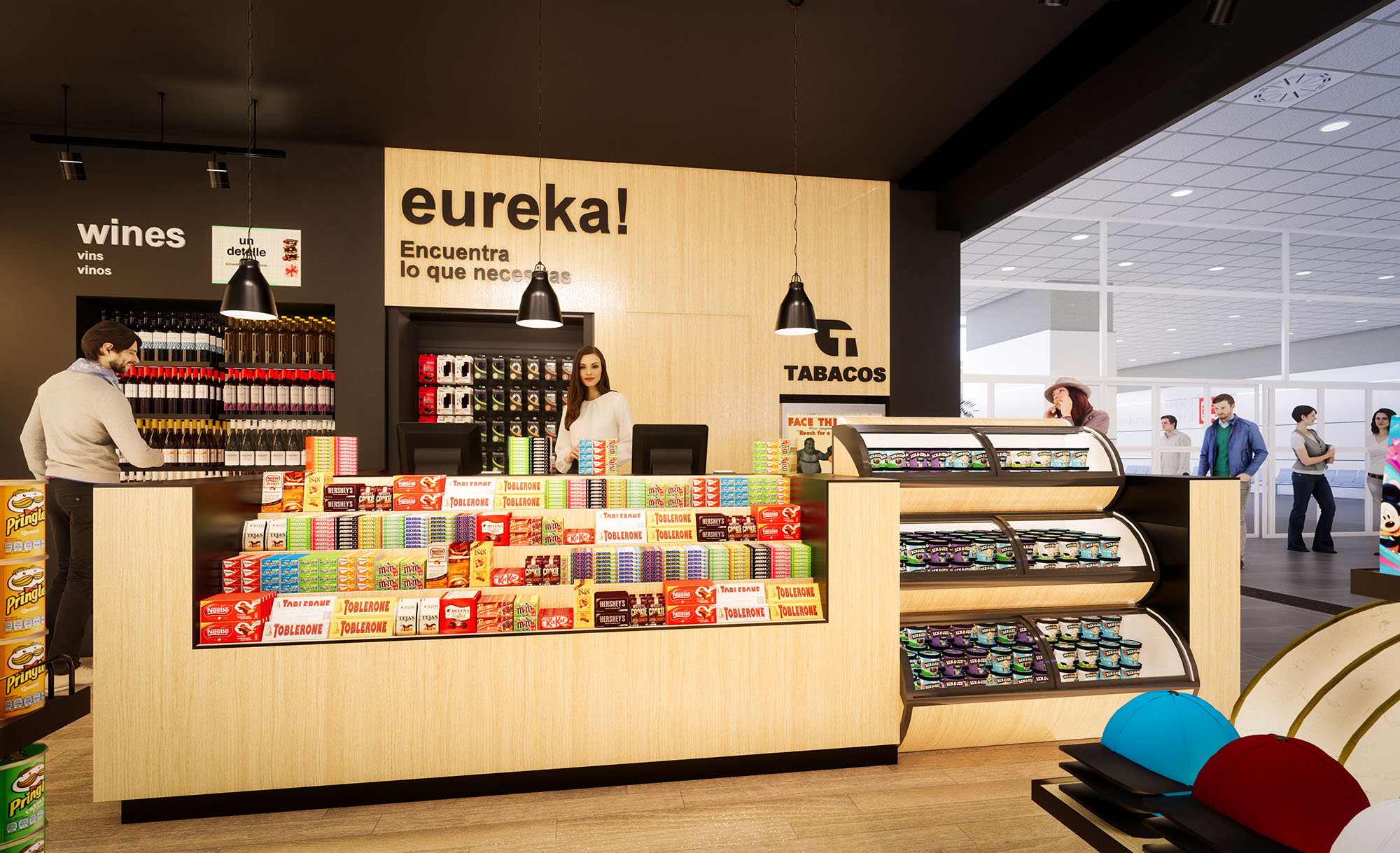


Our offices are located in Barcelona, Cancún, Chicago and Santo Domingo, but thanks to technology we can do projects on all over the world.
Barcelona
Bac de Roda 136
08020, Barcelona
Spain
Madrid
Av. de Buendía 11
19005 Guadalajara (Madrid)
Spain
Chicago
373 Hazel Ave, Apt A1
60022, Glencoe, Illinois
United States