

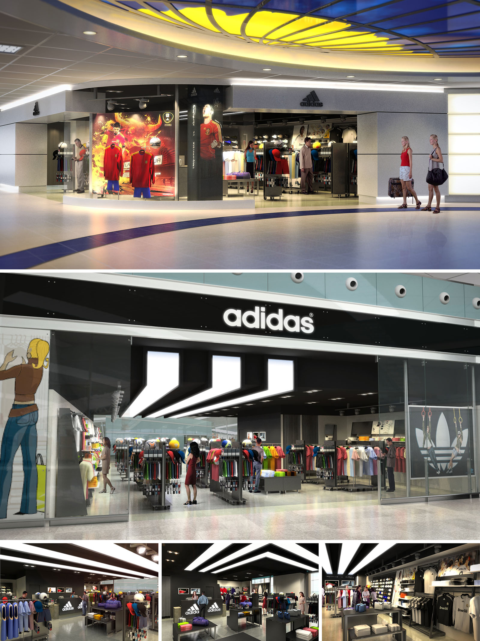
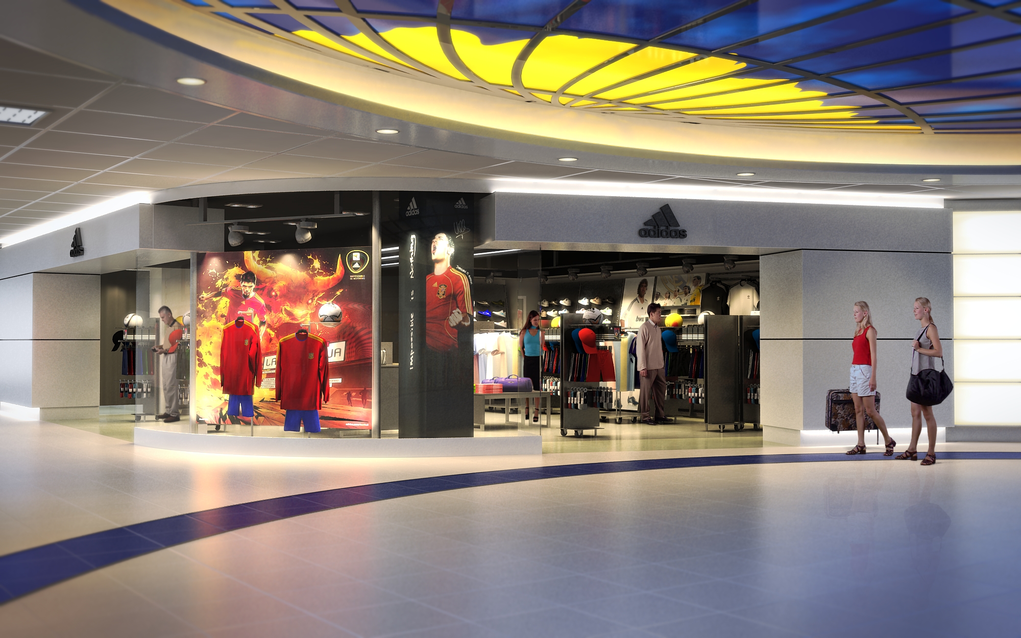
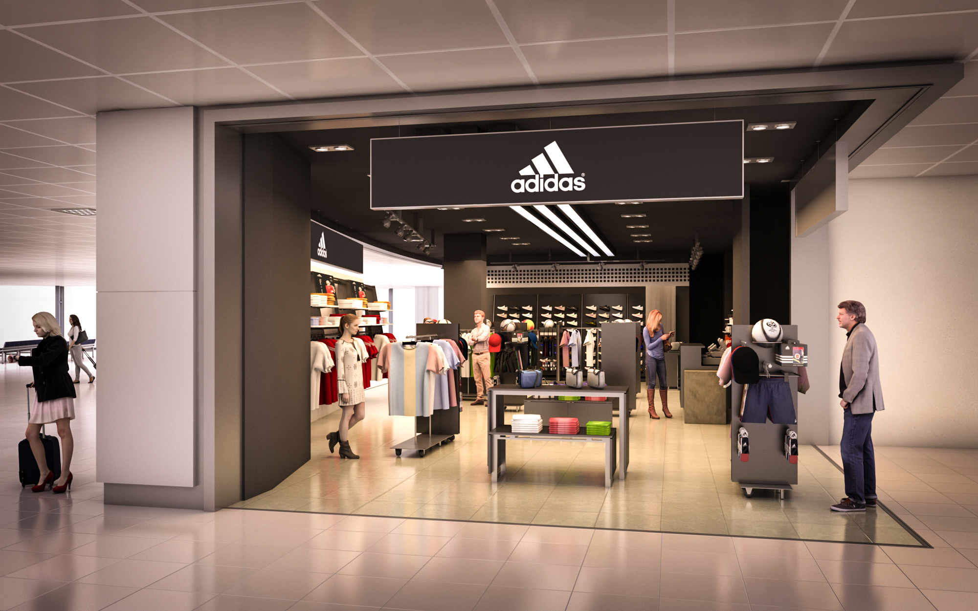
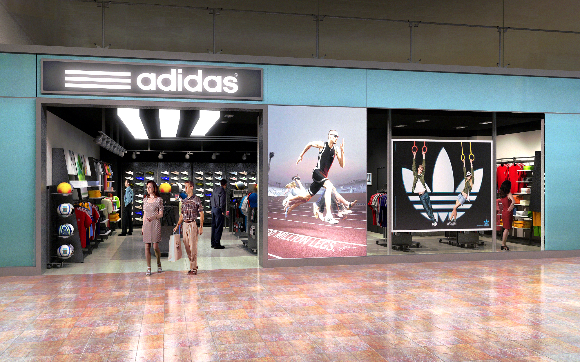
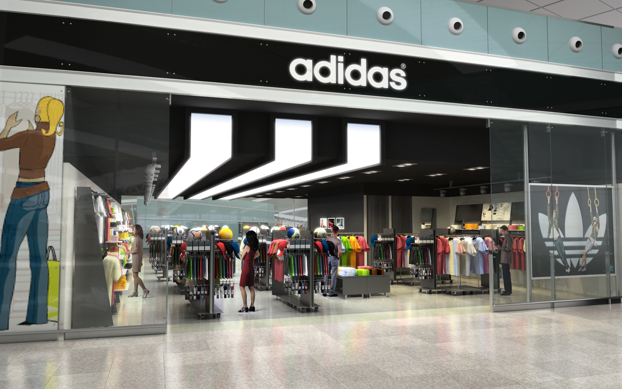
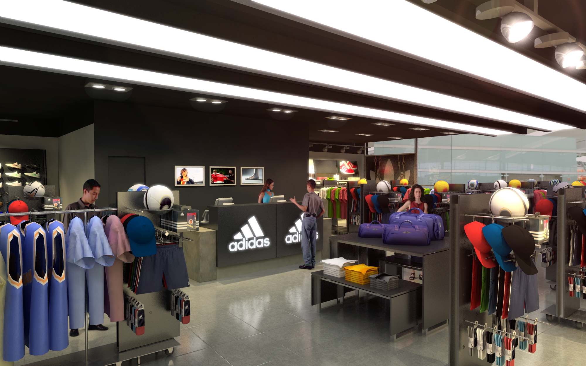
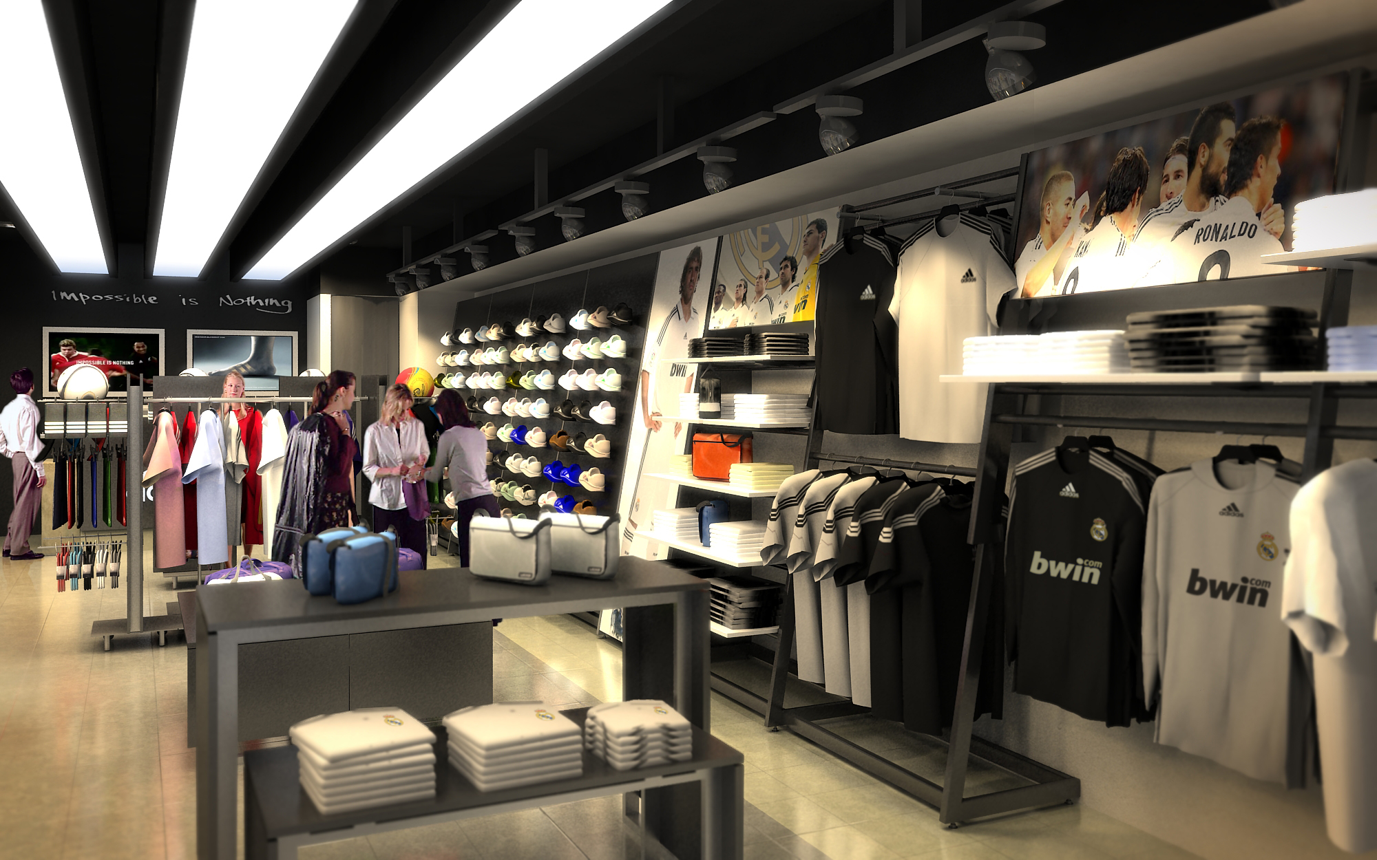
The portfolio of Adidas retail projects in multiple locations across Spain is conceived as a consistent yet locally adaptable brand environment. The core concept is to translate the values of performance, innovation, and urban culture into spatial form, creating immersive experiences rather than conventional product displays. Each project works with a clear narrative: the store as an “urban arena” where sport, technology, and lifestyle intersect, articulated through strong geometry, controlled lighting, and a robust, industrial-inspired material palette. Brand identity is reinforced through bold graphic elements and a calibrated use of the Adidas color code, while spatial fluidity encourages intuitive circulation and product discovery.
The design strategy focuses on modularity and repeatable design components, allowing for efficient rollout across multiple sites while maintaining enough flexibility to respond to each store’s scale, context, and customer profile.
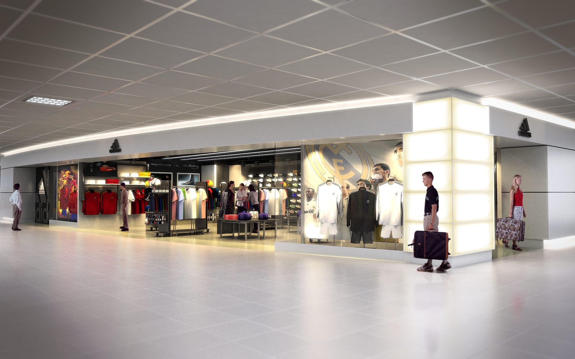
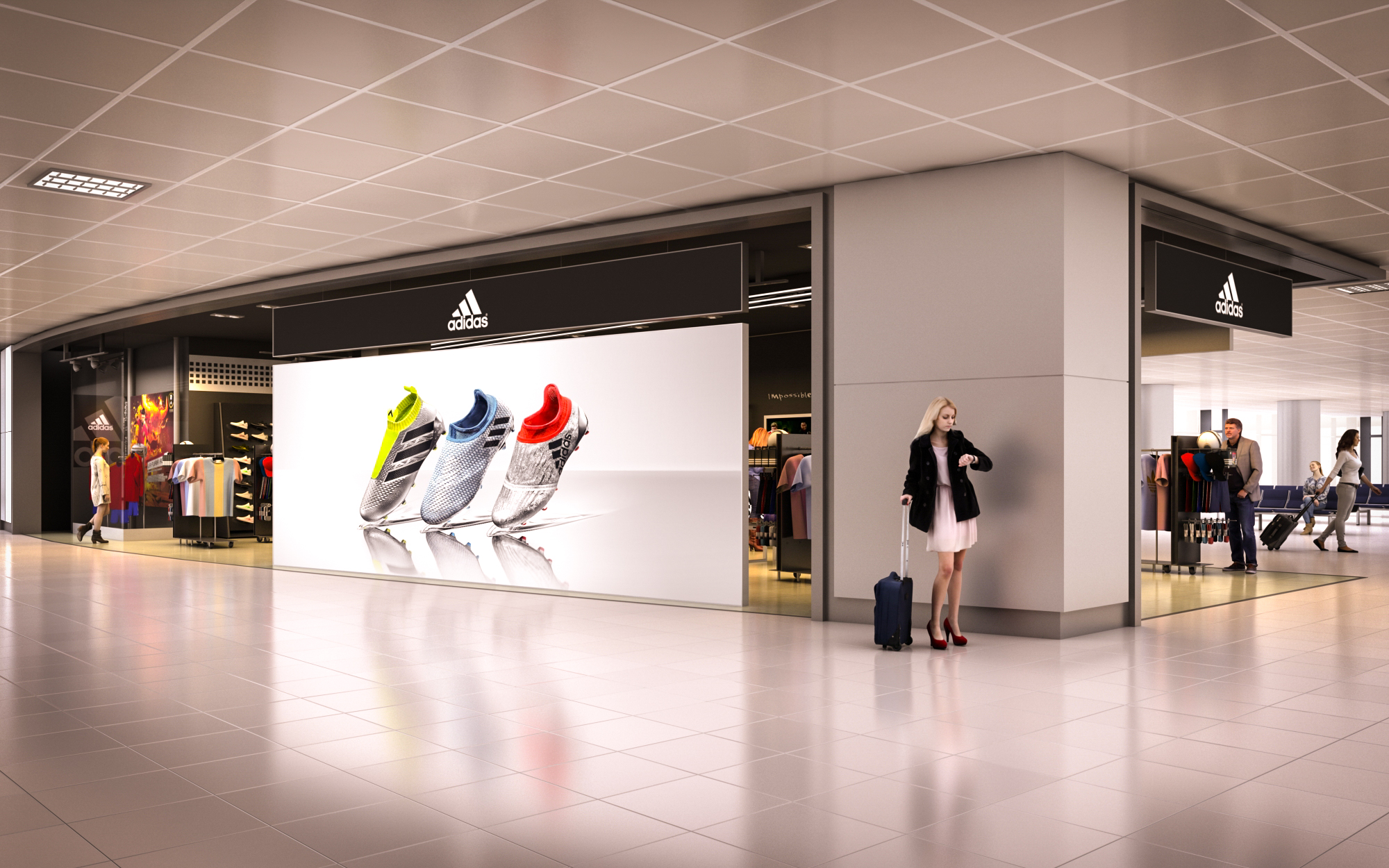
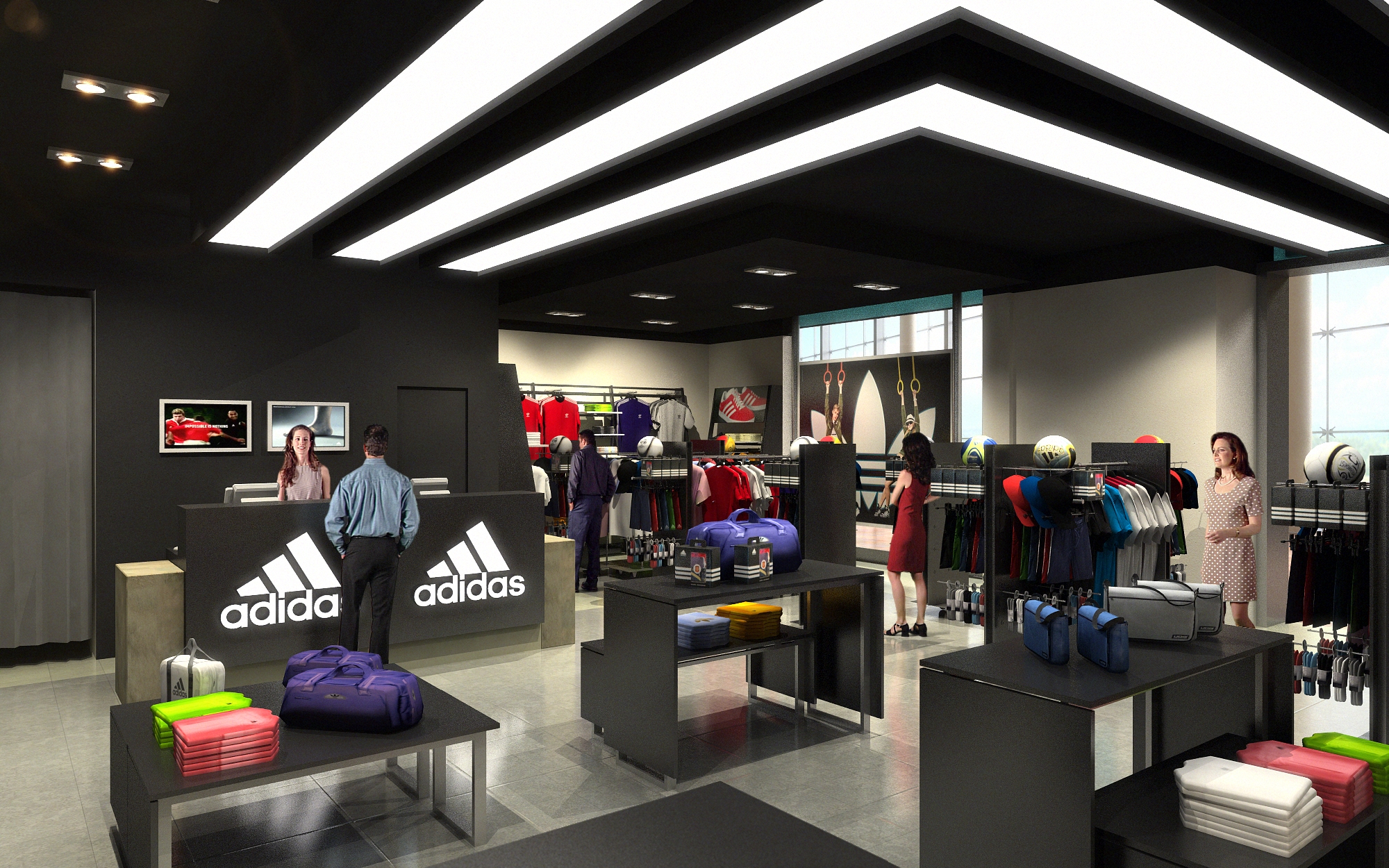
The spatial organization typically follows a clear zoning logic: entrance as impact zone, central floor as dynamic display field, and perimeter as product “shell” for more detailed browsing. The introduction zone near the access concentrates key brand messages, latest collections, and digital content, immediately immersing visitors in the Adidas universe.
Circulation is planned through generous, unobstructed axes that guide movement diagonally across the space, maximizing visual connections and product exposure. Fixtures are kept relatively low in central areas to preserve long sight lines, while higher perimeter walls structure the space and act as graphic backdrops. Secondary paths lead to more specialized areas—such as running, training, or lifestyle—allowing customers to self-select their journey according to interest and time available.
The material palette blends raw and technical finishes, referencing both sports infrastructure and contemporary urban spaces. Typical floors are in polished concrete or high-resistance resin, offering durability and a neutral base that highlights the merchandise. Walls alternate between exposed or painted concrete, technical wall cladding, and large-format graphic panels, enabling quick update of campaigns.
Ceilings often reveal technical installations, painted in dark tones to create depth and visually “dematerialize” the upper plane, focusing attention on the products and illuminated zones. Metal profiles, perforated steel, mesh panels, and tubular structures provide a light yet robust system for shelving and hanging displays. The chromatic language is primarily monochromatic—greys, blacks, and whites—accented by Adidas’ brand colors strategically placed on signage, lighting details, and key fixtures, reinforcing brand recognition without overwhelming the space.
Lighting plays a fundamental role in emphasizing the sporty, high-performance character of the stores. A combination of linear LED tracks, projectors, and integrated shelf lighting creates layered illumination, with higher intensities on products and focal points, and more subdued ambient light in circulation zones. Adjustable track lights ensure flexibility to adapt to new merchandising layouts and seasonal changes.
Visual communication is fully integrated into the architectural framework. Large-format light boxes, dynamic digital screens, and supergraphics on walls and columns articulate collections, athlete stories, and collaborations. Typography and iconography are consistent across locations, turning signage into an extension of the architectural language rather than a mere add-on.
Sustainability criteria are embedded through durable materials, modular construction, and energy-efficient systems. The use of robust finishes such as concrete, steel, and high-resistance coatings reduces the need for frequent replacement, extending the life cycle of the fit-out. Modular fixtures and standardized components facilitate reconfiguration, relocation, or partial reuse in future projects, minimizing waste associated with store updates.
LED lighting, presence and daylight sensors where applicable, and high-efficiency HVAC systems contribute to lower operational energy consumption. Where possible, materials with recycled content—such as metal structures and some floor or display elements—are prioritized, along with low-VOC paints and adhesives to improve indoor environmental quality. The overall strategy seeks to align brand expression with responsible resource use, ensuring that the strong visual and experiential impact of the Adidas stores is achieved with a conscious approach to environmental performance.
LIST OF PROJECTS EXPERIENCE
Designed, Executed and/or Built Projects
SPAIN
1. Adidas - Barcelona - L100
2. Adidas - Madrid - T32
3. Adidas - Malaga - L146
4. Adidas - Madrid - T23
The portfolio of Adidas retail projects in multiple locations across Spain is conceived as a consistent yet locally adaptable brand environment. The core concept is to translate the values of performance, innovation, and urban culture into spatial form, creating immersive experiences rather than conventional product displays. Each project works with a clear narrative: the store as an “urban arena” where sport, technology, and lifestyle intersect, articulated through strong geometry, controlled lighting, and a robust, industrial-inspired material palette. Brand identity is reinforced through bold graphic elements and a calibrated use of the Adidas color code, while spatial fluidity encourages intuitive circulation and product discovery.
The design strategy focuses on modularity and repeatable design components, allowing for efficient rollout across multiple sites while maintaining enough flexibility to respond to each store’s scale, context, and customer profile.
The spatial organization typically follows a clear zoning logic: entrance as impact zone, central floor as dynamic display field, and perimeter as product “shell” for more detailed browsing. The introduction zone near the access concentrates key brand messages, latest collections, and digital content, immediately immersing visitors in the Adidas universe.
Circulation is planned through generous, unobstructed axes that guide movement diagonally across the space, maximizing visual connections and product exposure. Fixtures are kept relatively low in central areas to preserve long sight lines, while higher perimeter walls structure the space and act as graphic backdrops. Secondary paths lead to more specialized areas—such as running, training, or lifestyle—allowing customers to self-select their journey according to interest and time available.
The material palette blends raw and technical finishes, referencing both sports infrastructure and contemporary urban spaces. Typical floors are in polished concrete or high-resistance resin, offering durability and a neutral base that highlights the merchandise. Walls alternate between exposed or painted concrete, technical wall cladding, and large-format graphic panels, enabling quick update of campaigns.
Ceilings often reveal technical installations, painted in dark tones to create depth and visually “dematerialize” the upper plane, focusing attention on the products and illuminated zones. Metal profiles, perforated steel, mesh panels, and tubular structures provide a light yet robust system for shelving and hanging displays. The chromatic language is primarily monochromatic—greys, blacks, and whites—accented by Adidas’ brand colors strategically placed on signage, lighting details, and key fixtures, reinforcing brand recognition without overwhelming the space.
Lighting plays a fundamental role in emphasizing the sporty, high-performance character of the stores. A combination of linear LED tracks, projectors, and integrated shelf lighting creates layered illumination, with higher intensities on products and focal points, and more subdued ambient light in circulation zones. Adjustable track lights ensure flexibility to adapt to new merchandising layouts and seasonal changes.
Visual communication is fully integrated into the architectural framework. Large-format light boxes, dynamic digital screens, and supergraphics on walls and columns articulate collections, athlete stories, and collaborations. Typography and iconography are consistent across locations, turning signage into an extension of the architectural language rather than a mere add-on.
Sustainability criteria are embedded through durable materials, modular construction, and energy-efficient systems. The use of robust finishes such as concrete, steel, and high-resistance coatings reduces the need for frequent replacement, extending the life cycle of the fit-out. Modular fixtures and standardized components facilitate reconfiguration, relocation, or partial reuse in future projects, minimizing waste associated with store updates.
LED lighting, presence and daylight sensors where applicable, and high-efficiency HVAC systems contribute to lower operational energy consumption. Where possible, materials with recycled content—such as metal structures and some floor or display elements—are prioritized, along with low-VOC paints and adhesives to improve indoor environmental quality. The overall strategy seeks to align brand expression with responsible resource use, ensuring that the strong visual and experiential impact of the Adidas stores is achieved with a conscious approach to environmental performance.


Our offices are located in Barcelona, Cancún, Chicago and Santo Domingo, but thanks to technology we can do projects on all over the world.
Barcelona
Bac de Roda 136
08020, Barcelona
Spain
Madrid
Av. de Buendía 11
19005 Guadalajara (Madrid)
Spain
Chicago
373 Hazel Ave, Apt A1
60022, Glencoe, Illinois
United States