

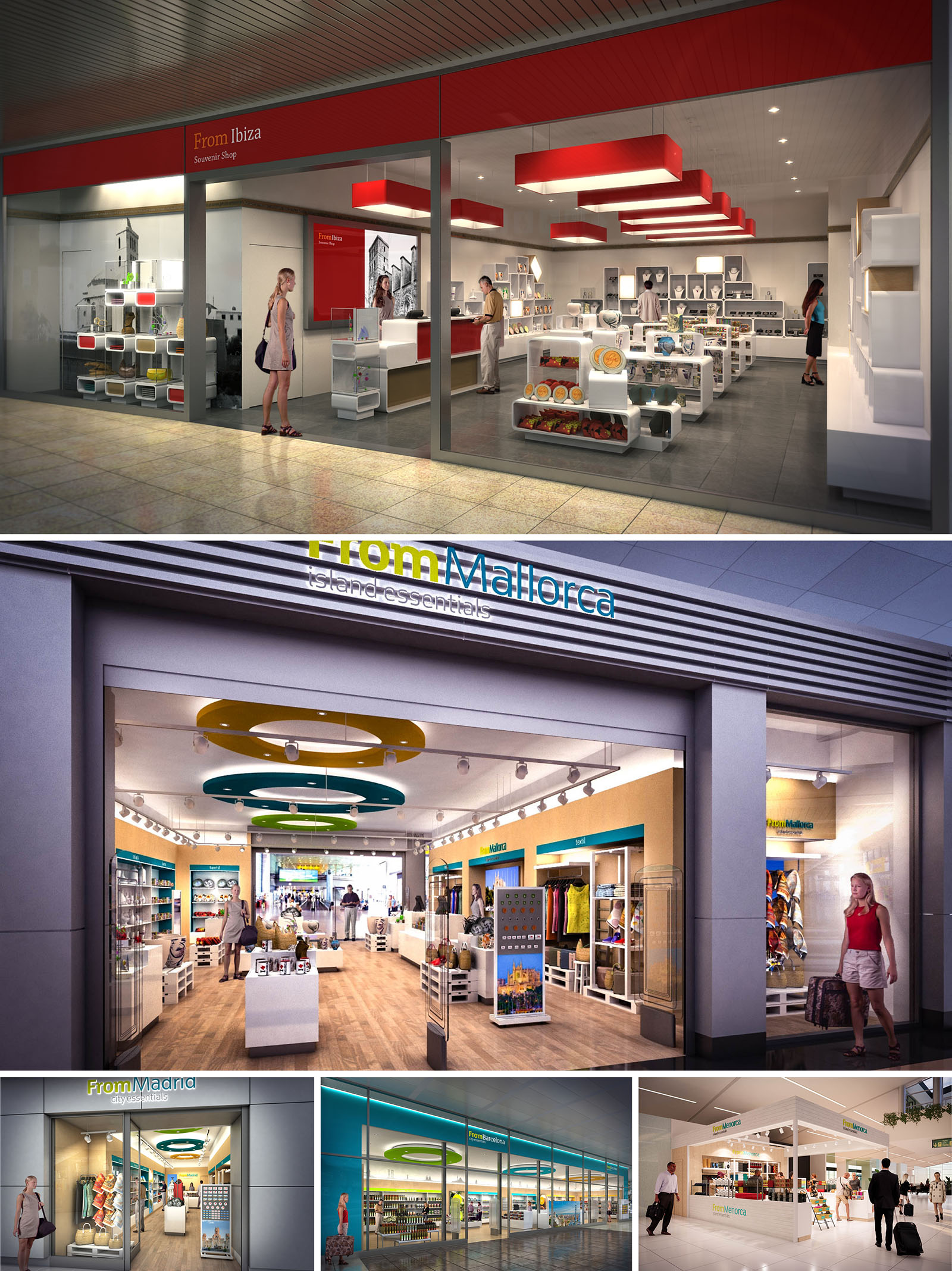
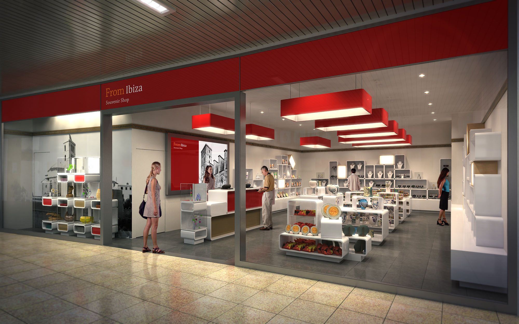
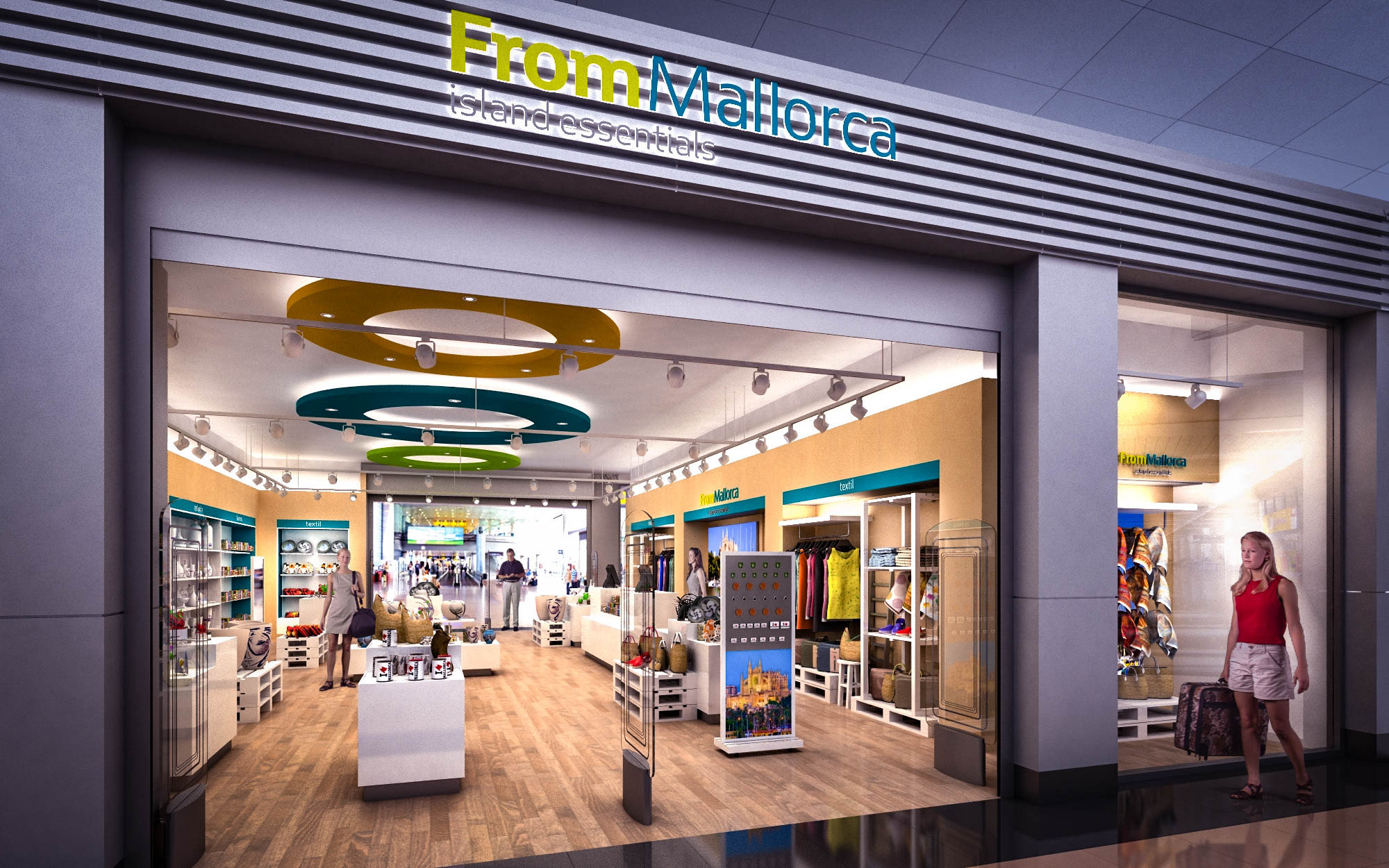
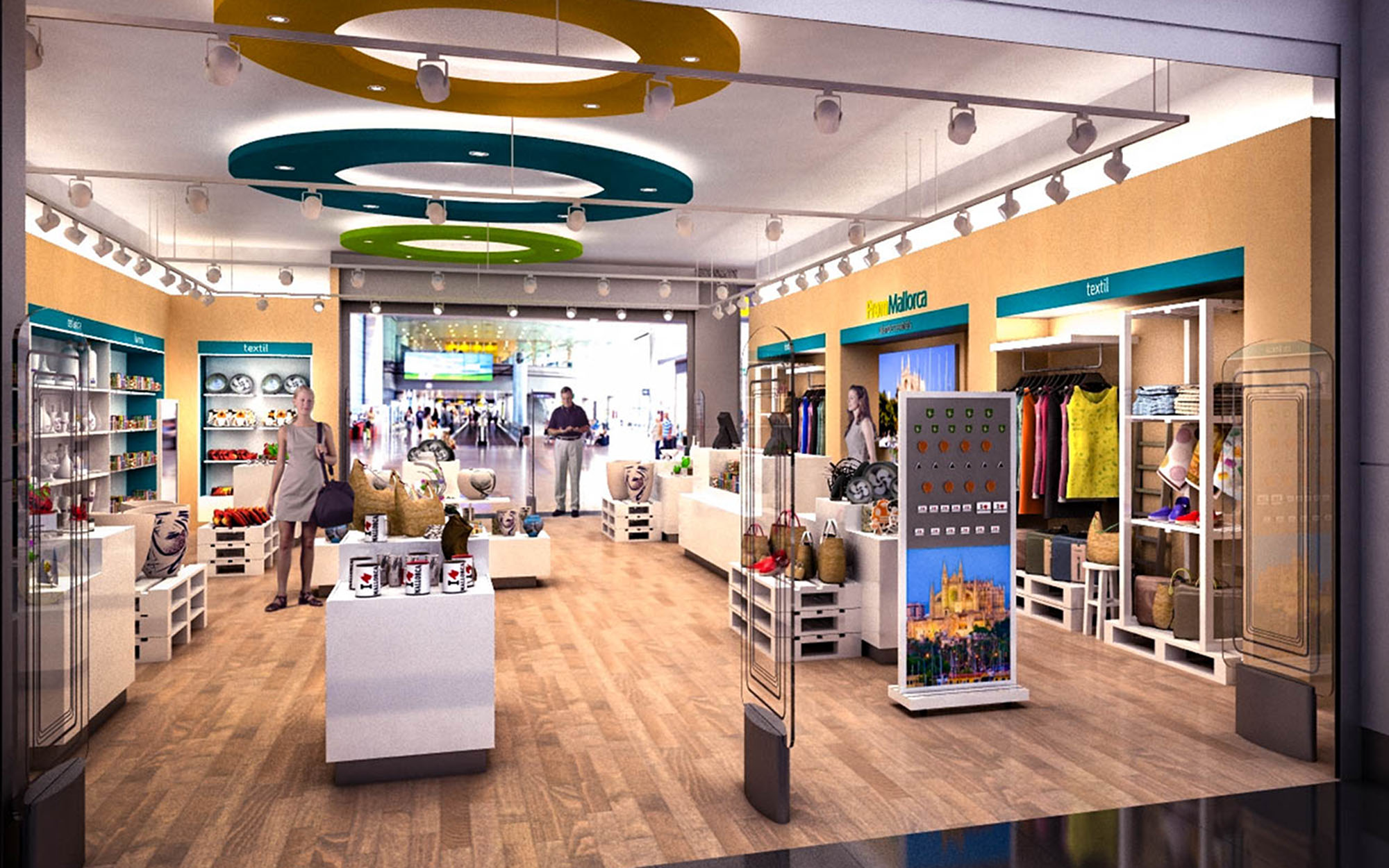
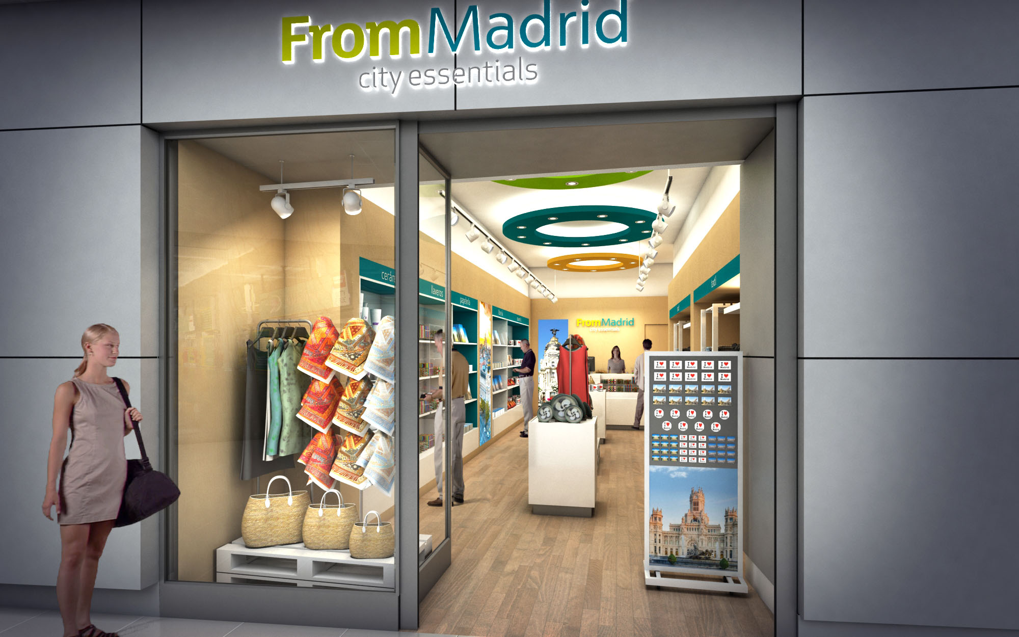
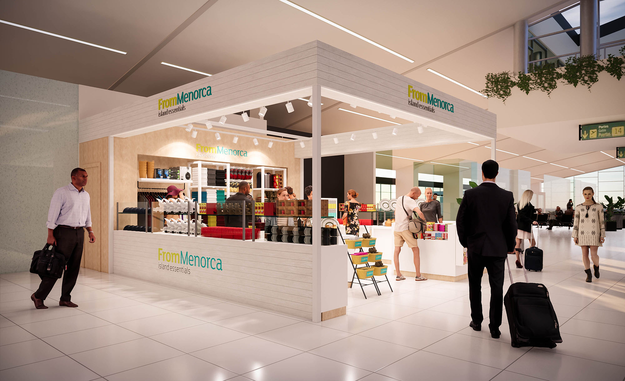
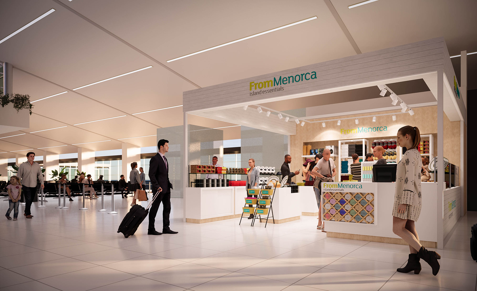
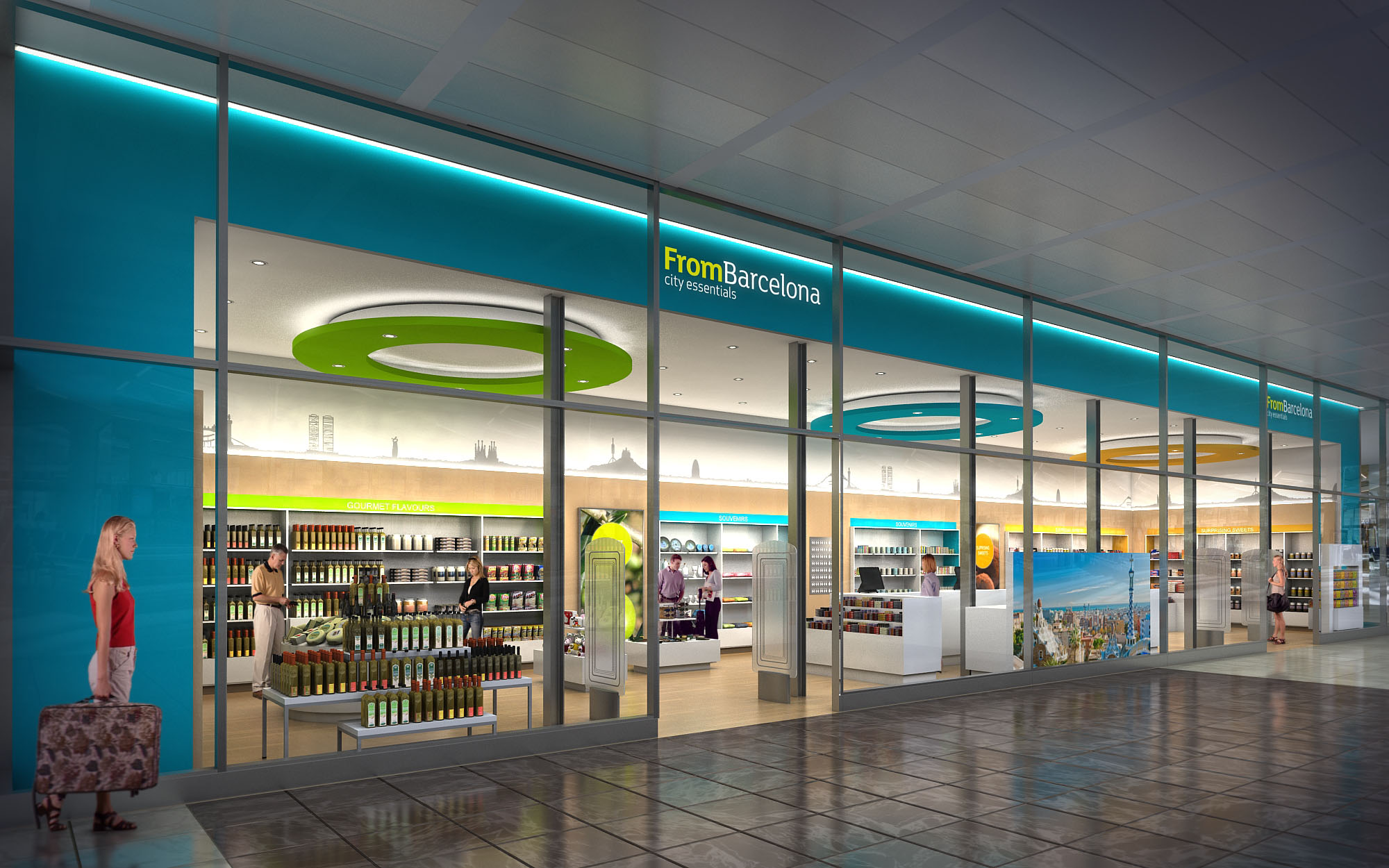
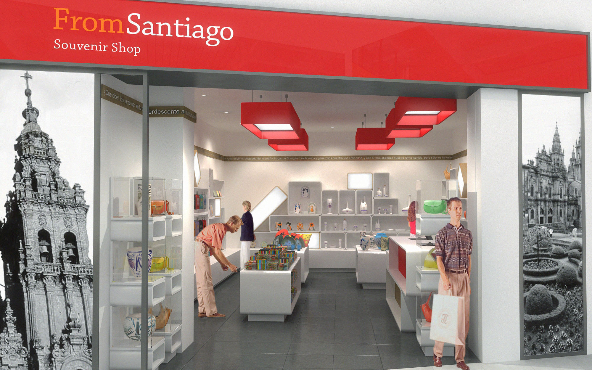
The FROM stores are conceived as a coherent family of airport and travel‑retail spaces that translate the identity of each destination into a clear, contemporary architectural language. The design strategy uses a modular system of elements that can adapt to different footprints while preserving a recognizable brand image. Color, light, and graphic storytelling work together to create an immediate sense of place, transforming functional transit areas into gateways to Ibiza, Mallorca, Madrid and other locations.
The concept balances efficiency and emotional impact: highly rational layouts and standardized fixtures are combined with iconic ceiling elements, large‑scale imagery and calibrated accent colors. This ensures that the visitor immediately understands the offer, navigates easily, and experiences the store as an extension of the local culture.
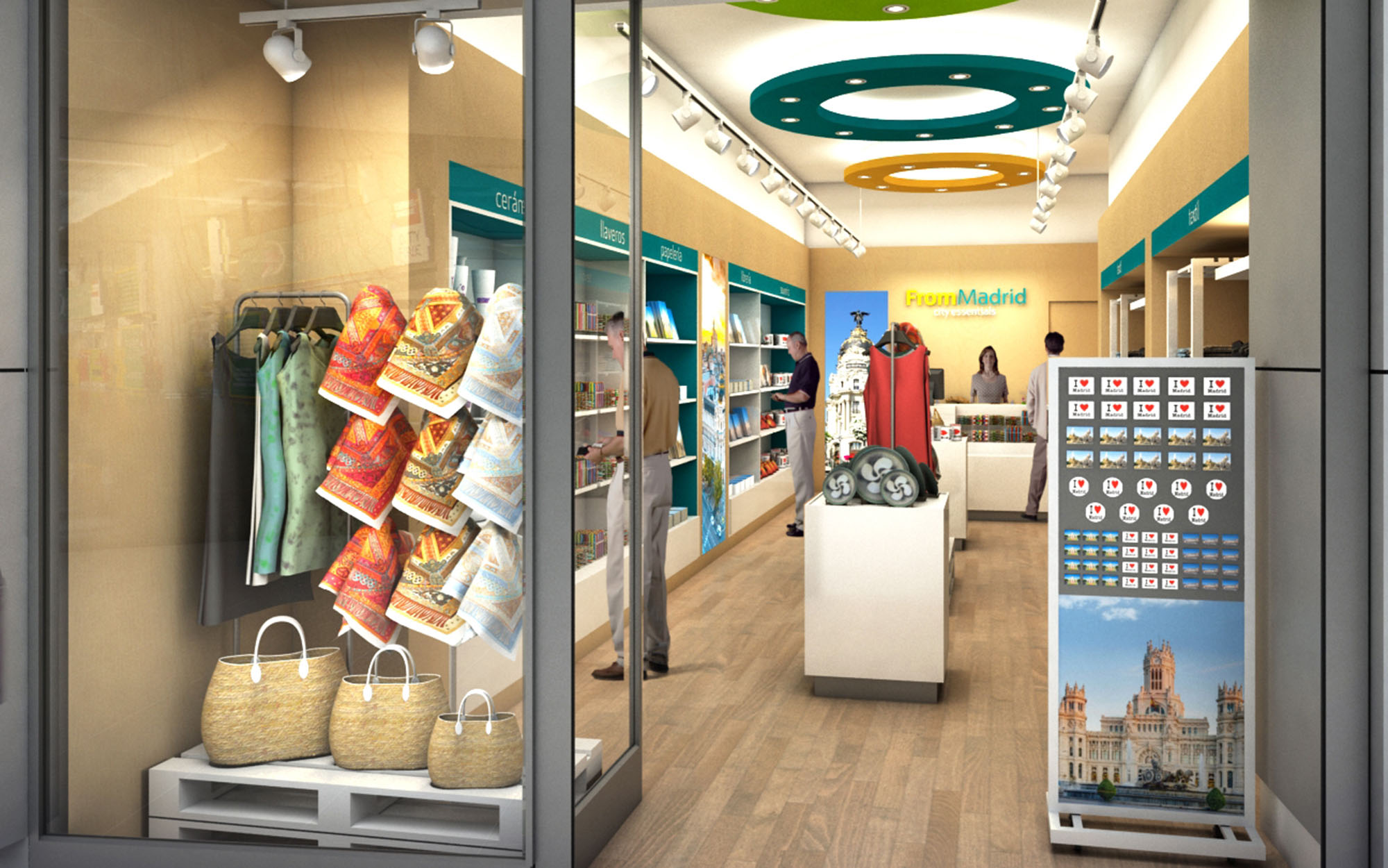
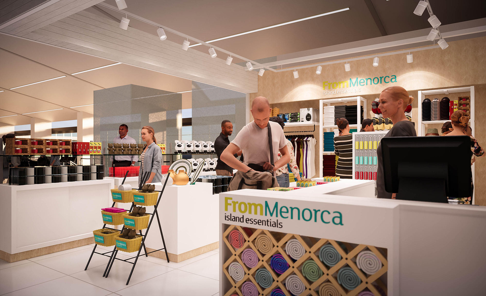
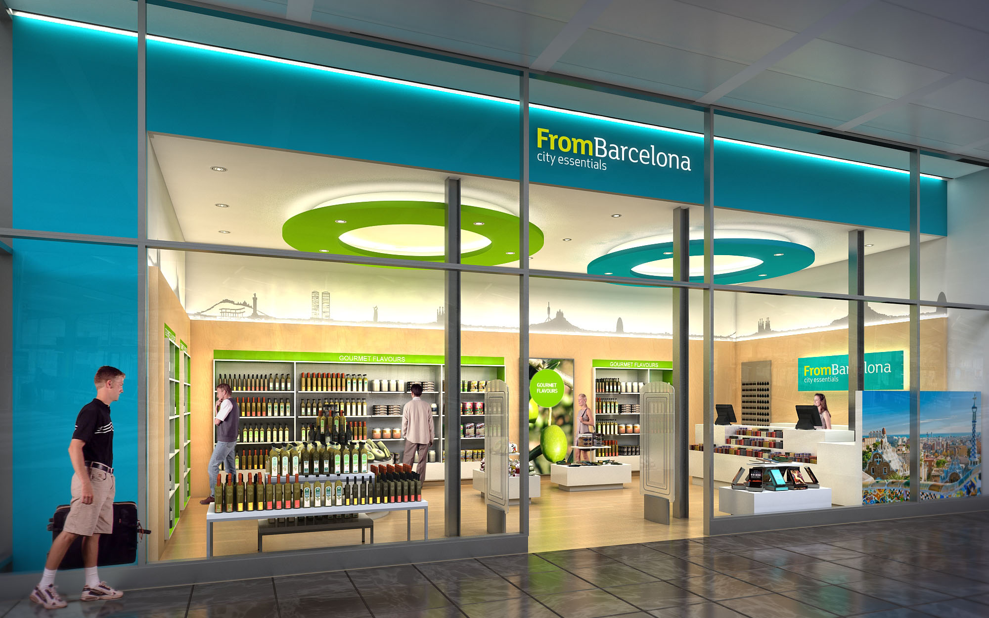
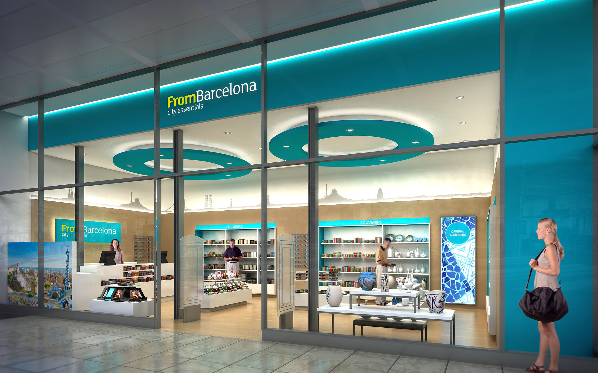
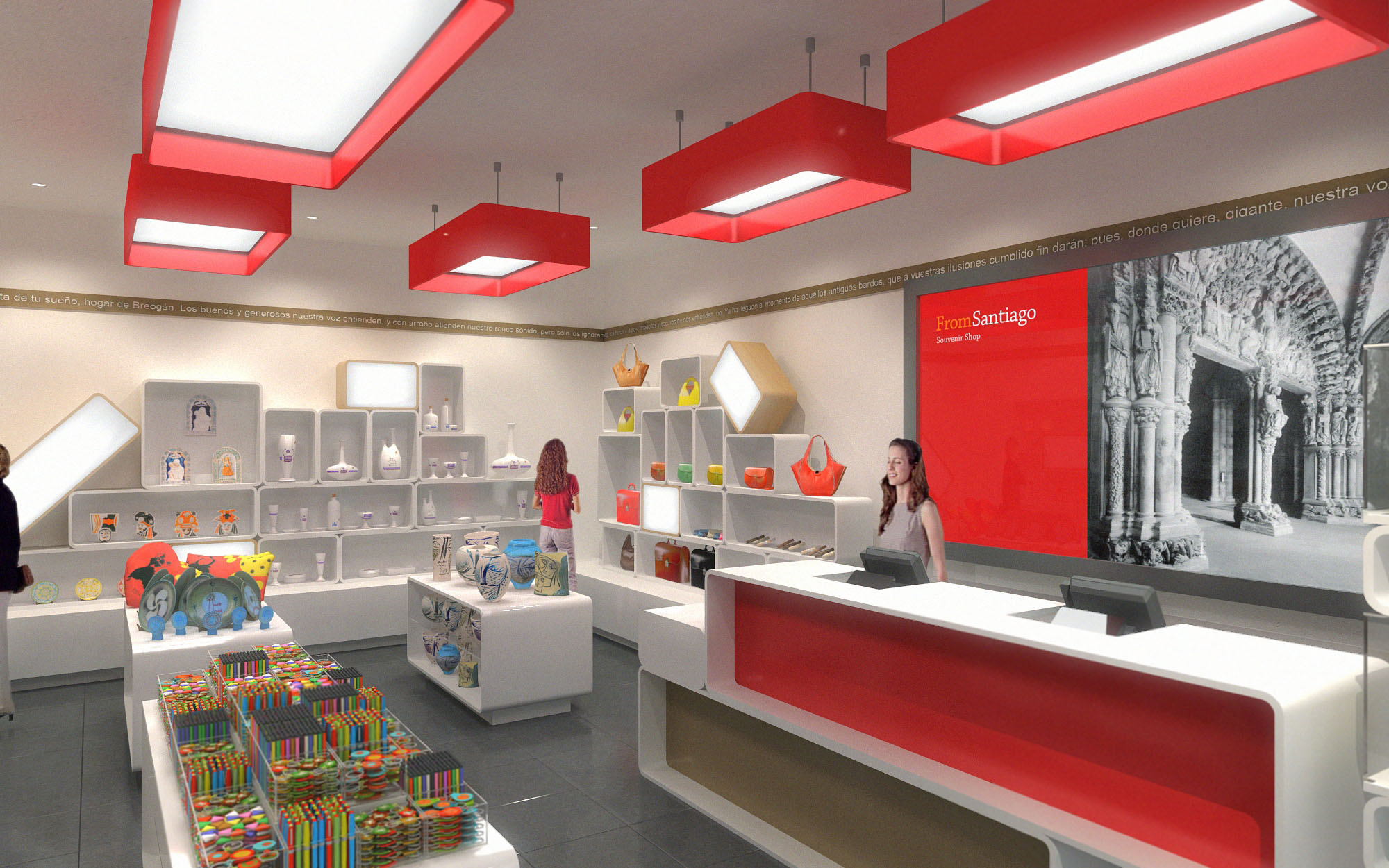
The floor plans follow open, perimeter‑oriented layouts that maximize visual permeability from the concourse. Low central gondolas preserve long sight lines, while taller perimeter walls and shelving act as a continuous merchandising backdrop. Entrance zones remain visually unobstructed, inviting passengers to flow naturally into the store without feeling a hard threshold.
Circulation is organized around a central spine, with impulse products placed along intuitive paths between the entrance and the cash desk. The cash point is generally located laterally or at the rear, anchoring the perspective and encouraging full exploration of the sales area. Strategic use of empty floor space near the entrance ensures rapid orientation for time‑pressed travelers, while modular display cubes allow for seasonal or promotional islands without compromising circulation.
The material palette combines neutral, durable finishes with destination‑specific chromatic accents. Floors alternate between warm wood‑effect surfaces in some locations and large‑format porcelain tiles in others, both chosen for high resistance and easy maintenance. Perimeter walls are treated with smooth, light‑toned surfaces that reflect light and keep the atmosphere clear and fresh.
Brand colors appear in calibrated doses on ceiling features, fascias, back panels and signage. For example, the Ibiza concept employs a crisp red identity with monochrome photographic murals, while Mallorca and Madrid incorporate turquoise, yellow and green, echoing sea, sun and urban vibrancy. Modular white shelving and display cubes create a neutral canvas that enhances product visibility, allowing local specialties and souvenirs to provide much of the visual richness.
Lighting plays a central role in creating a uniform brand experience. General illumination is achieved through continuous track lighting or recessed downlights, providing high lux levels suitable for retail while avoiding glare. Accent luminaires on adjustable tracks focus on key product zones and promotional displays, generating depth and hierarchy within the space.
Each store features distinctive ceiling elements that act as spatial landmarks. In some locations, linear red light boxes run in sequence, drawing the eye inward and emphasizing the store’s longitudinal axis. In others, circular suspended rings in green, blue and yellow articulate the ceiling plane and echo the logo typography. These sculptural elements integrate indirect lighting, improving visual comfort and contributing to the store’s recognizability from a distance.
Large‑scale photographic graphics anchor the narrative of “island essentials” and city souvenirs. Black‑and‑white or desaturated images of local landmarks contrast with the vivid product colors, reinforcing the connection to place without visually overwhelming the merchandise. External fascias and window bands clearly announce the “FROM + destination” identity, ensuring immediate legibility in busy airport corridors.
Fixtures are based on a flexible grid system of cubes, shelves and wall bays, allowing for rapid reconfiguration in response to changing product mixes. Transparent or open‑backed modules maintain visual depth across the store and avoid creating heavy masses. Vertical segmentation in wall bays—such as labeled bands for “food,” “gifts,” or “fashion”—guides customers efficiently and supports cross‑selling opportunities.
Sustainability is integrated through both material selection and operational strategies. The design favors long‑life materials with high abrasion resistance, reducing the need for frequent replacement in high‑traffic environments. Many fixtures are conceived as reusable modular components, capable of being relocated between different FROM stores or reconfigured as assortments evolve, minimizing waste.
LED technology is used extensively for general and accent lighting, reducing energy consumption and maintenance while ensuring consistent color rendering for food and textiles. Light‑colored interior finishes enhance natural and artificial light, enabling lower power densities. Where possible, locally sourced finishes and regionally fabricated fixtures are specified to reduce transport emissions and support local economies. Cleaning and maintenance protocols are simplified by smooth, non‑porous surfaces, contributing to the long‑term durability and environmental performance of the retail network.
LIST OF PROJECTS EXPERIENCE
Designed, Executed and/or Built Projects
SPAIN
1. From - Barcelona - Sants
2. From - Ibiza - LCB2
3. From - Madrid - L201T
4. From - Mallorca - L3
5. From - Menorca - L60
6. From - Santiago - L55
The FROM stores are conceived as a coherent family of airport and travel‑retail spaces that translate the identity of each destination into a clear, contemporary architectural language. The design strategy uses a modular system of elements that can adapt to different footprints while preserving a recognizable brand image. Color, light, and graphic storytelling work together to create an immediate sense of place, transforming functional transit areas into gateways to Ibiza, Mallorca, Madrid and other locations.
The concept balances efficiency and emotional impact: highly rational layouts and standardized fixtures are combined with iconic ceiling elements, large‑scale imagery and calibrated accent colors. This ensures that the visitor immediately understands the offer, navigates easily, and experiences the store as an extension of the local culture.
The floor plans follow open, perimeter‑oriented layouts that maximize visual permeability from the concourse. Low central gondolas preserve long sight lines, while taller perimeter walls and shelving act as a continuous merchandising backdrop. Entrance zones remain visually unobstructed, inviting passengers to flow naturally into the store without feeling a hard threshold.
Circulation is organized around a central spine, with impulse products placed along intuitive paths between the entrance and the cash desk. The cash point is generally located laterally or at the rear, anchoring the perspective and encouraging full exploration of the sales area. Strategic use of empty floor space near the entrance ensures rapid orientation for time‑pressed travelers, while modular display cubes allow for seasonal or promotional islands without compromising circulation.
The material palette combines neutral, durable finishes with destination‑specific chromatic accents. Floors alternate between warm wood‑effect surfaces in some locations and large‑format porcelain tiles in others, both chosen for high resistance and easy maintenance. Perimeter walls are treated with smooth, light‑toned surfaces that reflect light and keep the atmosphere clear and fresh.
Brand colors appear in calibrated doses on ceiling features, fascias, back panels and signage. For example, the Ibiza concept employs a crisp red identity with monochrome photographic murals, while Mallorca and Madrid incorporate turquoise, yellow and green, echoing sea, sun and urban vibrancy. Modular white shelving and display cubes create a neutral canvas that enhances product visibility, allowing local specialties and souvenirs to provide much of the visual richness.
Lighting plays a central role in creating a uniform brand experience. General illumination is achieved through continuous track lighting or recessed downlights, providing high lux levels suitable for retail while avoiding glare. Accent luminaires on adjustable tracks focus on key product zones and promotional displays, generating depth and hierarchy within the space.
Each store features distinctive ceiling elements that act as spatial landmarks. In some locations, linear red light boxes run in sequence, drawing the eye inward and emphasizing the store’s longitudinal axis. In others, circular suspended rings in green, blue and yellow articulate the ceiling plane and echo the logo typography. These sculptural elements integrate indirect lighting, improving visual comfort and contributing to the store’s recognizability from a distance.
Large‑scale photographic graphics anchor the narrative of “island essentials” and city souvenirs. Black‑and‑white or desaturated images of local landmarks contrast with the vivid product colors, reinforcing the connection to place without visually overwhelming the merchandise. External fascias and window bands clearly announce the “FROM + destination” identity, ensuring immediate legibility in busy airport corridors.
Fixtures are based on a flexible grid system of cubes, shelves and wall bays, allowing for rapid reconfiguration in response to changing product mixes. Transparent or open‑backed modules maintain visual depth across the store and avoid creating heavy masses. Vertical segmentation in wall bays—such as labeled bands for “food,” “gifts,” or “fashion”—guides customers efficiently and supports cross‑selling opportunities.
Sustainability is integrated through both material selection and operational strategies. The design favors long‑life materials with high abrasion resistance, reducing the need for frequent replacement in high‑traffic environments. Many fixtures are conceived as reusable modular components, capable of being relocated between different FROM stores or reconfigured as assortments evolve, minimizing waste.
LED technology is used extensively for general and accent lighting, reducing energy consumption and maintenance while ensuring consistent color rendering for food and textiles. Light‑colored interior finishes enhance natural and artificial light, enabling lower power densities. Where possible, locally sourced finishes and regionally fabricated fixtures are specified to reduce transport emissions and support local economies. Cleaning and maintenance protocols are simplified by smooth, non‑porous surfaces, contributing to the long‑term durability and environmental performance of the retail network.


Our offices are located in Barcelona, Cancún, Chicago and Santo Domingo, but thanks to technology we can do projects on all over the world.
Barcelona
Bac de Roda 136
08020, Barcelona
Spain
Madrid
Av. de Buendía 11
19005 Guadalajara (Madrid)
Spain
Chicago
373 Hazel Ave, Apt A1
60022, Glencoe, Illinois
United States