

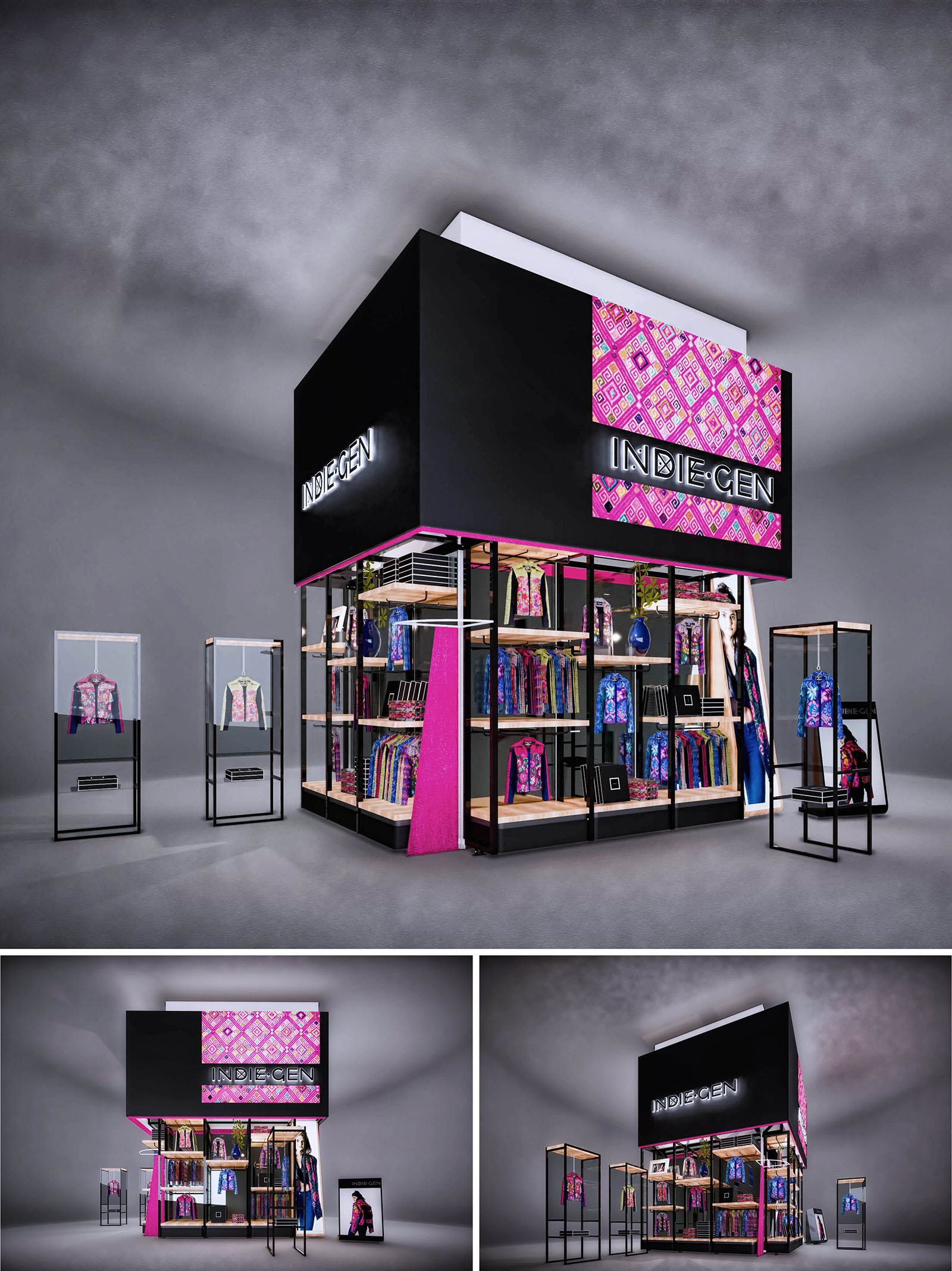
INDIE GEN is conceived as a compact retail pavilion that fuses contemporary urban language with the chromatic richness of Mexican indigenous textiles. The concept frames fashion pieces as cultural artifacts, transforming the stand into a three-dimensional showcase that celebrates pattern, color and identity. A simple black volume functions as a neutral “void” that amplifies the vibrancy of magenta and geometric motifs, allowing the garments to become the primary protagonists.
The stand is designed for high-traffic commercial environments, prioritizing visual impact from long distances. Large-format illuminated graphics and a bold, monolithic upper volume give the project a landmark character within the retail landscape, while the permeable base invites visitors to circulate and explore the collection up close.
The architecture is structured around a double-height black prism that operates as a visual totem. This upper volume integrates backlit signage and patterned panels, functioning simultaneously as brand support, storage enclosure, and lighting reflector. Below, a transparent perimeter, defined by slender metal frames, opens all façades toward the corridor, dissolving boundaries between interior and exterior.
The plan is organized in an L-shaped configuration, generating a corner of maximum exposure. Along the perimeter, linear shelving and hanging rails create a continuous product band, while the center remains intentionally freed for flexible circulation and temporary displays. Detached vitrines positioned in front of the stand extend the retail area into the public space, guiding the visitor naturally toward the entrance.
The material palette juxtaposes matte black metal, natural-toned wood shelves, and high-transparency glass. Black acts as a unifying canvas that provides visual coherence and a gallery-like atmosphere. The warmth of the wood introduces a tactile counterpoint, softening the industrial character of the metallic structure.
Color is introduced strategically through textiles, printed panels, and selective magenta accents on structural edges. The graphic patterning references traditional Mexican weaving, but is abstracted into a contemporary, almost digital aesthetic, aligning with the “GEN” (generation) component of the brand. This controlled use of color ensures that the interior remains visually rich without becoming saturated, and keeps the garments as the main chromatic drivers.
Display systems are modular and repeatable: vertical frames carry adjustable shelves and hanging bars, enabling rapid reconfiguration as the collection evolves. Integrated niches for accessories and folded garments provide varied product hierarchies, while dedicated hero pieces are elevated within glass vitrines, treated as museum-like exhibits.
Lighting is composed of concealed linear LEDs under shelves and ceiling tracks that wash the perimeter and vitrines with uniform light, enhancing texture and color fidelity. The open layout allows for intuitive circulation, encouraging visitors to approach from any side and discover the merchandise without physical barriers. Brand communication is reinforced through large photographic graphics and illuminated logos that remain visible at 360 degrees.
The stand is conceived as a demountable, reusable system to minimize environmental impact over multiple installations. The metal framework is based on standardized profiles, allowing components to be flat-packed, transported efficiently, and reassembled without material loss. Bolted rather than welded connections facilitate maintenance and extend the useful life of the structure.
Sustainable strategies include the proposed use of LED lighting with low energy consumption, durable laminates and powder-coated metals resistant to intensive commercial use, and wood elements specified from certified or rapidly renewable sources where feasible. Graphic panels are designed to be interchangeable, enabling seasonal updates without discarding the entire support. This combination of modularity, durability, and efficient lighting reduces waste and supports a more responsible retail model aligned with contemporary environmental expectations.
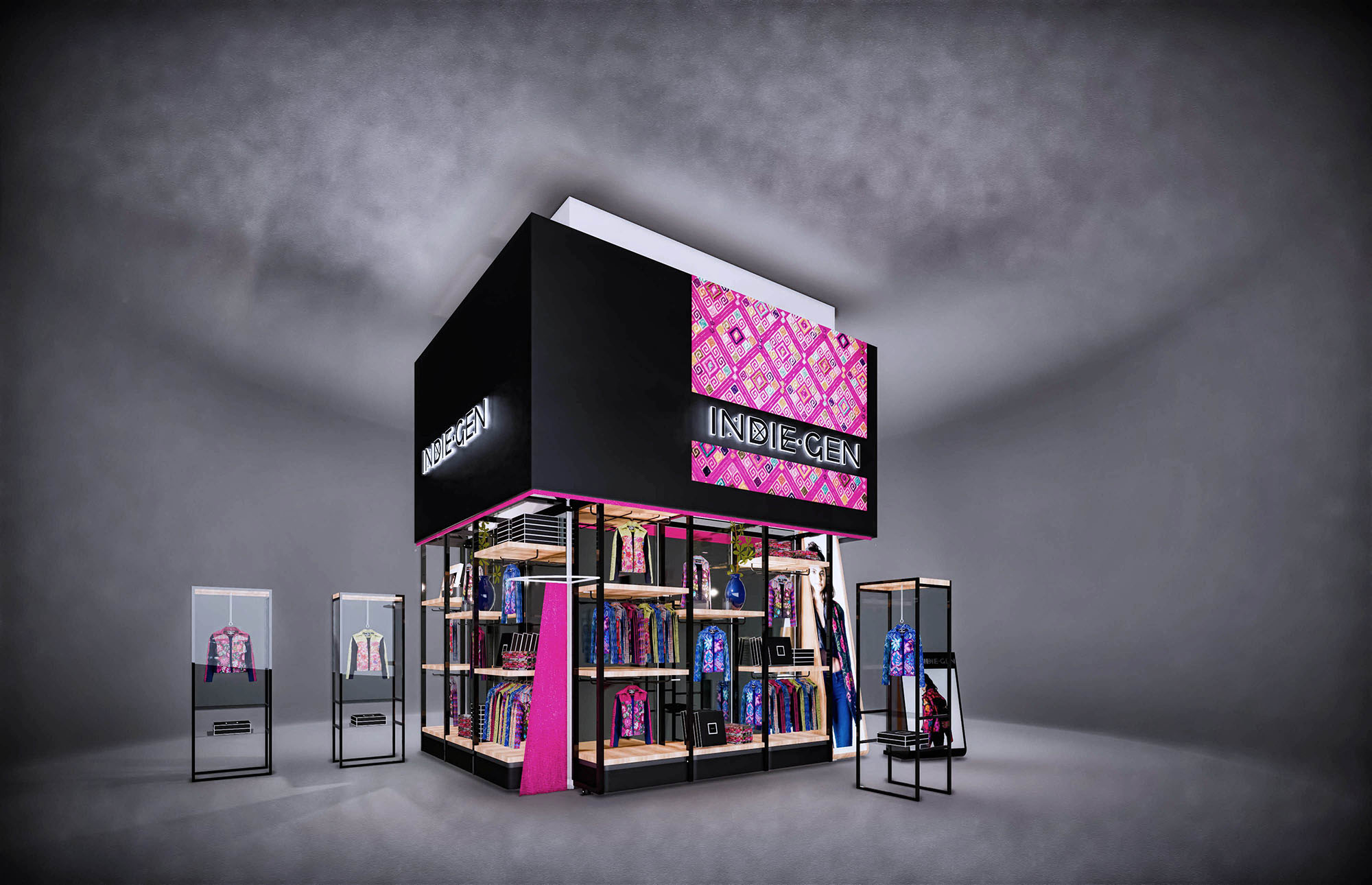
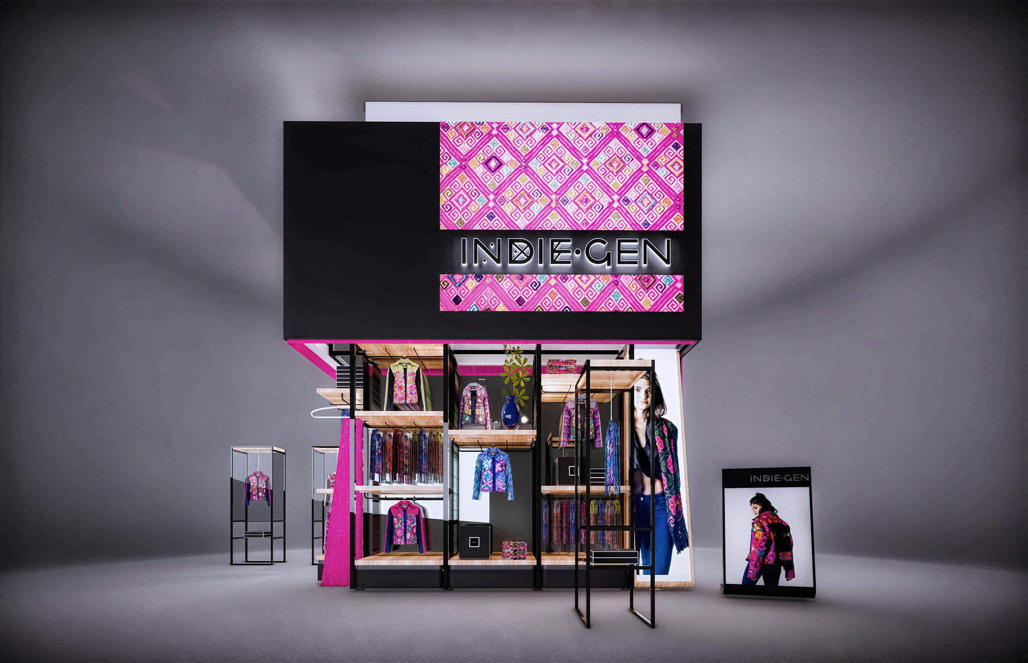
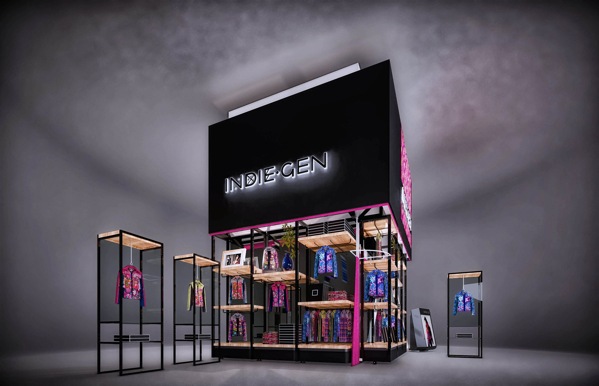


Our offices are located in Barcelona, Cancún, Chicago and Santo Domingo, but thanks to technology we can do projects on all over the world.
Barcelona
Bac de Roda 136
08020, Barcelona
Spain
Madrid
Av. de Buendía 11
19005 Guadalajara (Madrid)
Spain
Chicago
373 Hazel Ave, Apt A1
60022, Glencoe, Illinois
United States