Lorem ipsum dolor sit amet, consectetur adipiscing elit. Suspendisse varius enim in eros elementum tristique. Duis cursus, mi quis viverra ornare, eros dolor interdum nulla, ut commodo diam libero vitae erat.
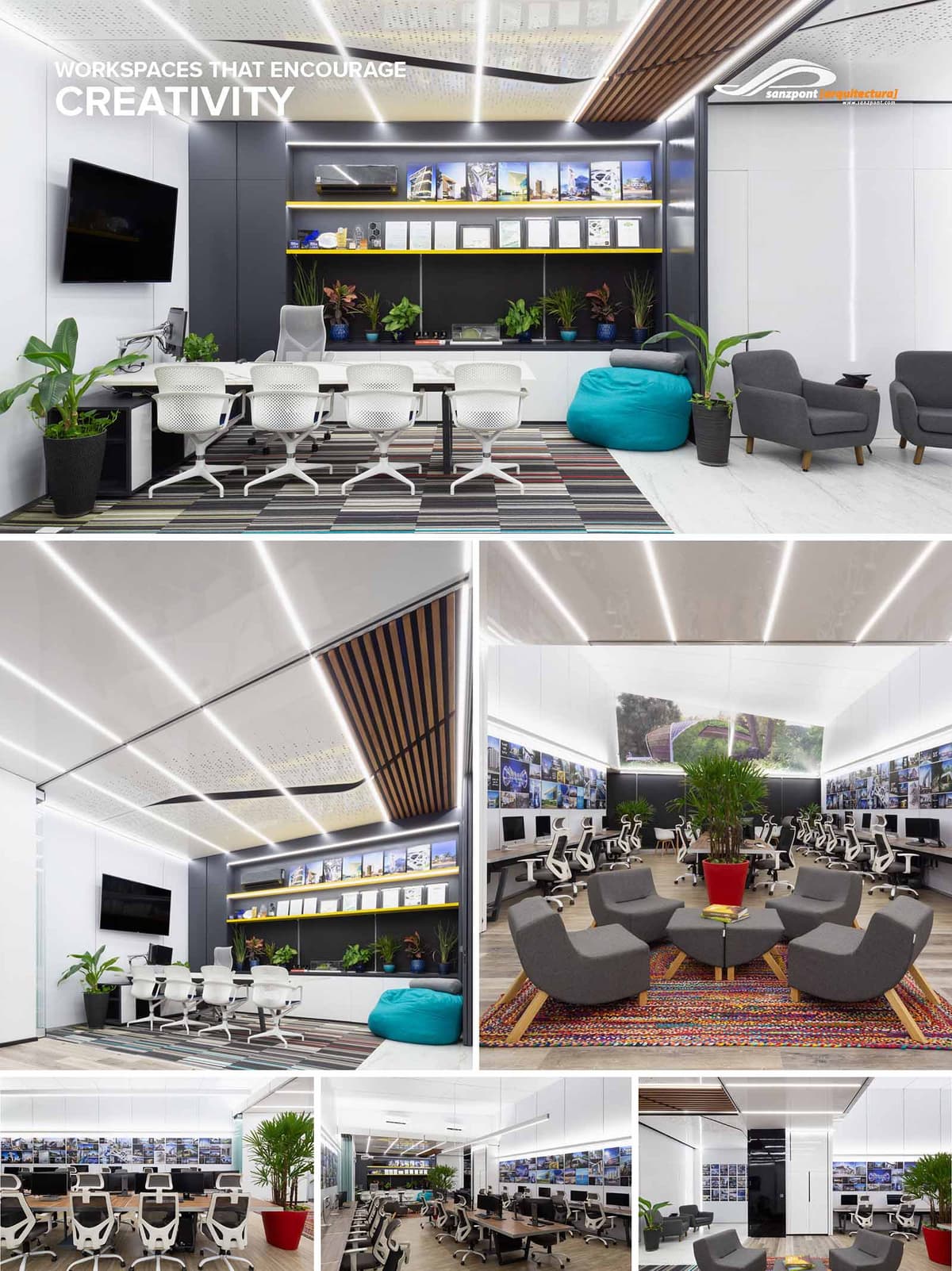
Nuestro Departamento de Arquitectura Comercial se dedica a diseñar espacios comerciales que atraen a las personas y convierten la afluencia en valor duradero: desde desarrollos de usos mixtos, centros comerciales y plazas hasta showrooms y espacios de entretenimiento. Nuestro enfoque convierte cada proyecto en un destino y lo diferencia a través de la innovación, la identidad y la experiencia. Tu espacio comercial se convierte en mucho más que un edificio: es el punto de encuentro entre tu marca, tus operadores y tu comunidad. Este entorno estratégico impulsa la conexión con el visitante y posiciona tu desarrollo a la vanguardia del mercado, influyendo directamente en la percepción, la afluencia y un retorno de inversión sostenido.
DISEÑO ARQUITECTÓNICO
Edificios comerciales icónicos y master plans que maximizan la visibilidad, la circulación y el valor del suelo, creando una impresión duradera.
DISEÑO INTERIOR
Entornos diseñados desde la experiencia, donde los materiales, la iluminación y la narrativa espacial prolongan la visita y fortalecen tu marca.
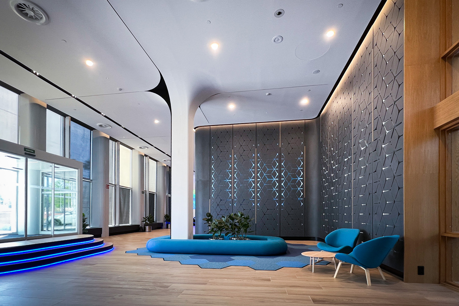
Asegúrate de que tu espacio comercial no solo sea funcional, sino verdaderamente magnético. Un centro comercial, una plaza o un showroom bien diseñados son una poderosa herramienta de marketing que atrae visitantes, fideliza a los operadores e incrementa el valor del activo. De Coco Bongo Punta Cana y Babylon Park Cancún a los salones VIP de aeropuerto de GAP o la NBA Store de Londres, diseñamos destinos que la gente recuerda, vuelve a visitar y recomienda.
Hemos diseñado +70 proyectos comerciales en México, Estados Unidos, España, el Caribe y más allá.
A lo largo de los años hemos participado en numerosos proyectos en distintas etapas, desde la concepción hasta la entrega. Algunos no pueden mostrarse en nuestro portafolio por acuerdos de confidencialidad con el cliente, pero todos han enriquecido nuestra experiencia. A continuación, una lista de proyectos en los que hemos participado en distintas capacidades.
• Maralda Showroom, Miches, D. Republic
• Coco Bongo, Punta Cana, D. Republic
• Maralda Beach Club, Miches, D. Republic
• Babylon Park, Cancún, México
• Tulum Plaza Norte, Tulum, México
• eGolf NextLinks Arena, California, USA
• VM2 Master Plan, Sabadell, Spain
• Commercial Containers, Tulum, México
• Tulum Plaza Sur, Tulum, México
• Miami Farmers Market, Miami, USA
• Meet Point, Cancún, México
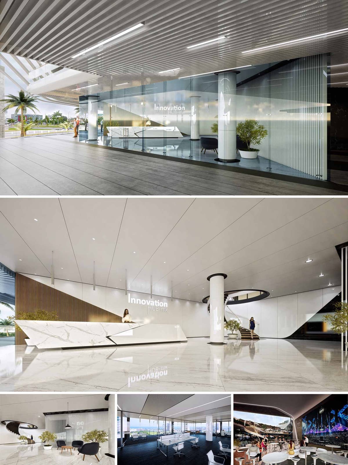
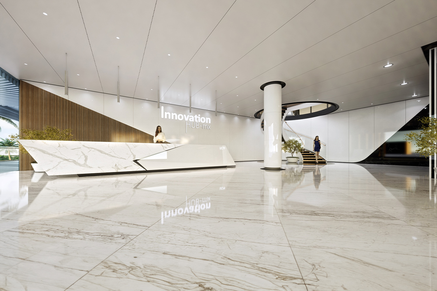
• Innovation Hub, Cancún, México
• Civitatis, Madrid, Spain
• San Antonio Plaza, Cancún, México
• Casino Cancún, Cancún, México
• GAP Airport VIP Lounge SJD, San José del Cabo, México
• Van Dutch Center, Cancún, México
• Troldtekt Pavilion, México City, México
• United Airlines CTO, Santa Fe, México
• SHA Spa, Madrid, Spain
• GAP Airport VIP Lounges, SJD · TIJ · GDL, México
• SJD Airport Commercial Area, San José del Cabo, México
• Grand Coral Showroom, Playa del Carmen, México
• Beton Hala Center, Belgrade, Serbia
• Gallery Boutique, Cancún, México
• VIP Guadalajara, Guadalajara, México
• NBA Store, London, UK
• Alpargatus Stores, Madrid & Barcelona, Spain
• Kin Mayab Stores, Playa del Carmen, México
• The Top Real Estate Store, Cancún, México
• The Market Stores, Multiple Locations, Spain
• Farga Stores, Barcelona, Spain
• Lavinia Store, Barcelona, Spain
• Airport Market Stores, Multiple Locations, Spain
• Ferrari Stores, Multiple Locations, Spain
• Visitor Center Stores, Multiple Locations, USA
• Panel Rey CIHAC Pavilion, México City, México
• Daily Cleaners, Cancún, México
• Story Store, Multiple Locations, Spain
• Boutique Stores, Multiple Locations, USA
Descubre la amplitud de nuestras capacidades y la profundidad de nuestra dedicación recorriendo nuestro Portafolio de Proyectos Publicados. Aquí no solo mostramos proyectos: te invitamos a comprender la pasión y la precisión que ponemos en cada diseño que creamos.
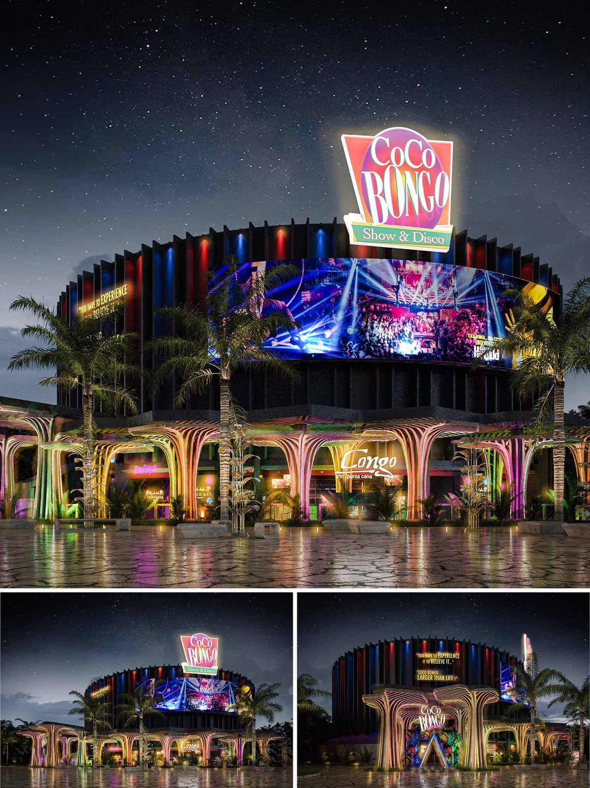
The facade renovation of the Coco Bongo Night Club in Punta Cana, Dominican Republic, embodies a vibrant and theatrical design that aligns with the club's iconic status as a destination for entertainment and nightlife. The architectural concept harnesses the dynamic spirit of the tropics and the energy of the nightlife, incorporating organic forms and expressive colors that suggest movement and excitement. The renovation expands the club's engagement with its external environment through the addition of an extended outdoor terrace bar, enhancing the venue's openness and accessibility.
The facade of Coco Bongo is characterized by its use of sweeping, fluidic forms that mimic natural elements. These organically shaped portals and supports, designed with a structural rhythm, create a welcoming grand entrance that is both functional and sculptural. The use of vivid lighting and neon accents not only highlights these forms but also works to attract attention from afar, ensuring that the building stands out in its urban setting.
Above, the main structure presents a series of vertical fins arranged in a rhythmic pattern, echoing the vibrant energy within. This choice of facade treatment not only contributes to the aesthetic but also serves a practical purpose, providing a semi-permeable barrier that enhances the acoustic qualities of the building while maintaining airflow. The integration of digital screens adds a layer of interactivity and connectivity, displaying vibrant visuals that reflect the lively atmosphere of the interior.
The selection of materials is pivotal in articulating the design's intent. High-performance concrete and advanced composites are used for the structural elements, chosen for their durability and flexibility in forming complex shapes. These are complemented by glass panels that allow visual continuity between the indoor and outdoor spaces, enriching the visitor's experience by merging the two settings seamlessly.
The color palette is intentionally bold and lively, featuring deep blues, bright reds, and vibrant purples that mirror the tropical environment and the club's energetic branding. These colors are used strategically to enhance the architectural forms and to create a visual narrative that guides visitors through the space.
Incorporating sustainable practices, the renovation utilizes energy-efficient LED lighting throughout the facade and terrace, significantly reducing the building's energy consumption while enhancing its nighttime appearance. The landscaping around the building employs native plants that are drought-resistant and require minimal maintenance, reducing water usage and integrating the building more deeply into its natural setting.
The extension of the outdoor terrace bar is a crucial aspect of this renovation, designed to offer an immersive experience that leverages the natural beauty of Punta Cana. This space is crafted to provide expansive views, employing minimalistic guardrails and strategically placed lighting to ensure safety without compromising the aesthetic. The terrace is configured to accommodate both intimate gatherings and larger groups, flexible in its layout while providing all visitors with a sense of exclusivity and engagement with the vibrant nightlife activities.
The combination of these architectural and design elements makes the Coco Bongo Night Club a landmark of modern design, infusing local cultural elements with contemporary architectural practices to create a space that is both inviting and exhilarating.
© 2021 by sanzpont [arquitectura] . Webpage by sanzpont [digital] . Innovative Digital Experiences
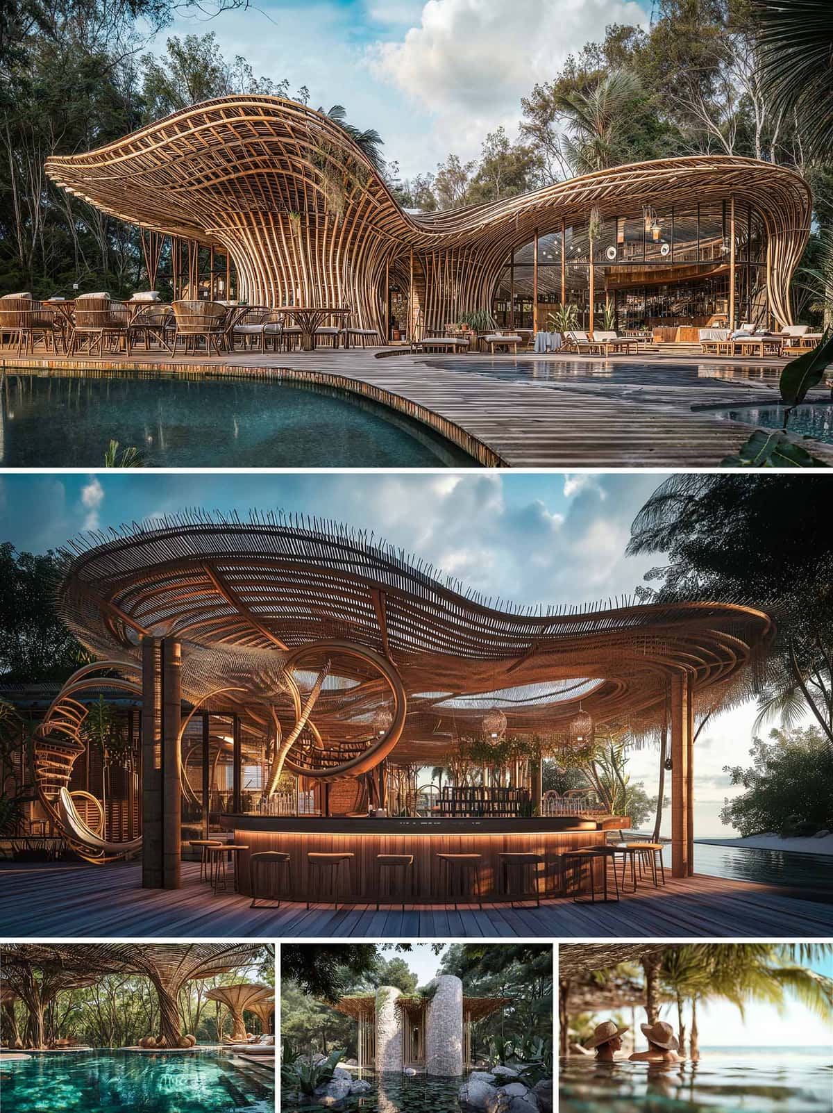

The Maralda Beach Club in Miches, Dominican Republic is conceived as an architecture that dissolves into its tropical surroundings through a fluid, biomorphic formal language. The overall concept draws inspiration from natural coastal geometries—waves, dunes, and the articulated patterns of palm canopies. This results in a continuous undulating roofscape formed primarily in bamboo, giving the impression that the structure emerges organically from the landscape. The design privileges openness, natural ventilation, and seamless integration of programmatic zones with the surrounding beach and forest.
The complex is arranged as an interconnected sequence of open-air environments, each calibrated to maximize visual and physical permeability. The central structure accommodates dining and lounge areas, set on a curvilinear timber platform that mirrors the form of the adjacent pool. The spatial composition avoids rigid enclosures, enabling breezes from the coastline to permeate throughout. Satellite structures—such as the sculptural bar pavilion and the secluded wellness retreat—reinforce the overall architectural language through similar curving, elevated, and porous forms. Together, these elements create an experiential promenade that guides visitors fluidly from beach to forest.
Bamboo is the dominant structural and expressive material, used both for its mechanical properties and its aesthetic resonance with tropical environments. Vertical bamboo culms are bundled to form branching structural supports that flare outward to hold the expansive roof. The roof itself—woven from bamboo, cane, and lightweight timber battens—achieves a high level of translucency, mediating sunlight and casting dynamic shadows throughout the day. Circular and looping bamboo elements within the bar pavilion function both as structural reinforcement and sculptural ornamentation, amplifying the sense of movement inherent in the design.
The interior environment maintains a cohesive aesthetic through the use of natural fibers, raw timber finishes, and artisanal furniture. Rattan, rope, and hand-woven textures complement the architectural palette, promoting a tactile and inviting atmosphere. Seating arrangements near the pool emphasize informality and relaxation, with low-profile lounge furniture and organically shaped platforms that blur the boundary between built space and water. Illumination is subtle and integrated into the structure, allowing the warm tones of the materials to define the nighttime ambiance.
The landscape strategy reinforces the project's immersive character by incorporating native vegetation directly into architectural voids and structural intersections. Pathways meander through dense foliage, leading to a stone-clad wellness pavilion set within a reflective water garden. Views are choreographed to maintain continuous contact with the surrounding ecological context, whether looking outward toward the sea or inward toward shaded courtyards. Pools and water features serve as transitional elements, cooling the microclimate and strengthening the visual connection between architecture and nature.
Sustainability is central to the project, beginning with the extensive use of bamboo, a rapidly renewable resource with low embodied energy. The open-air design reduces the need for mechanical cooling, leveraging cross-ventilation and shading from the expansive roof. Local sourcing of materials minimizes transportation impact while supporting regional craftsmanship. Rainwater is collected through the curving roof forms for use in irrigation, and the landscape relies on native plant species that naturally thrive in the coastal environment, reducing maintenance and preserving biodiversity.
© 2021 by sanzpont [arquitectura] . Webpage by sanzpont [digital] . Innovative Digital Experiences
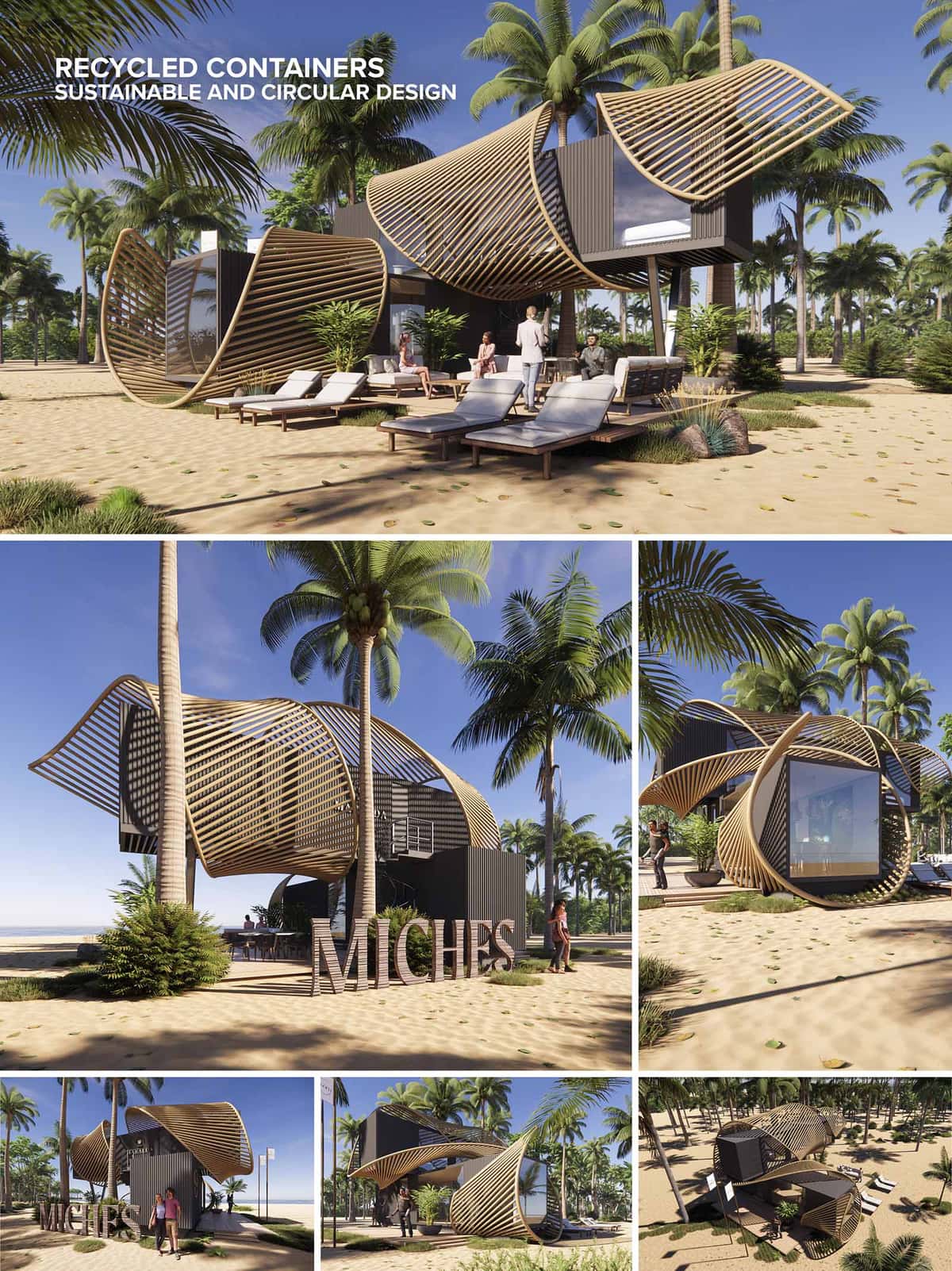

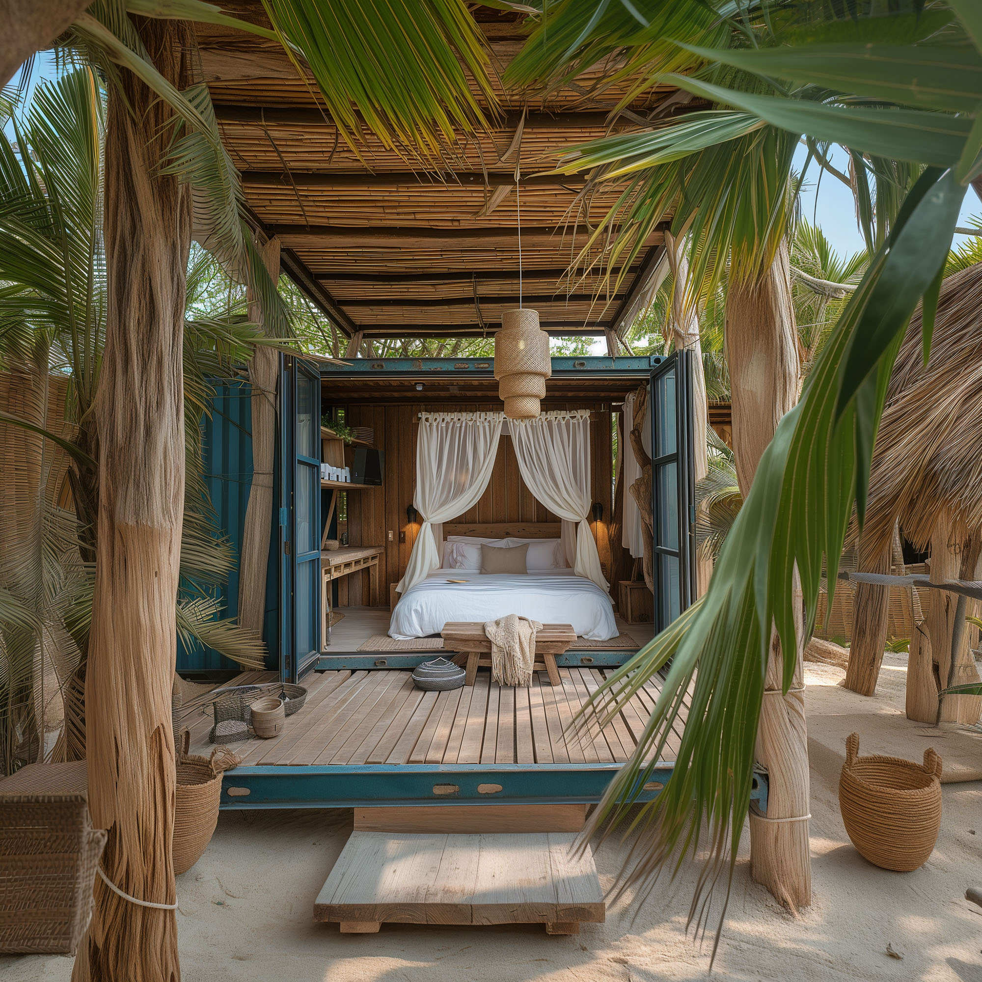
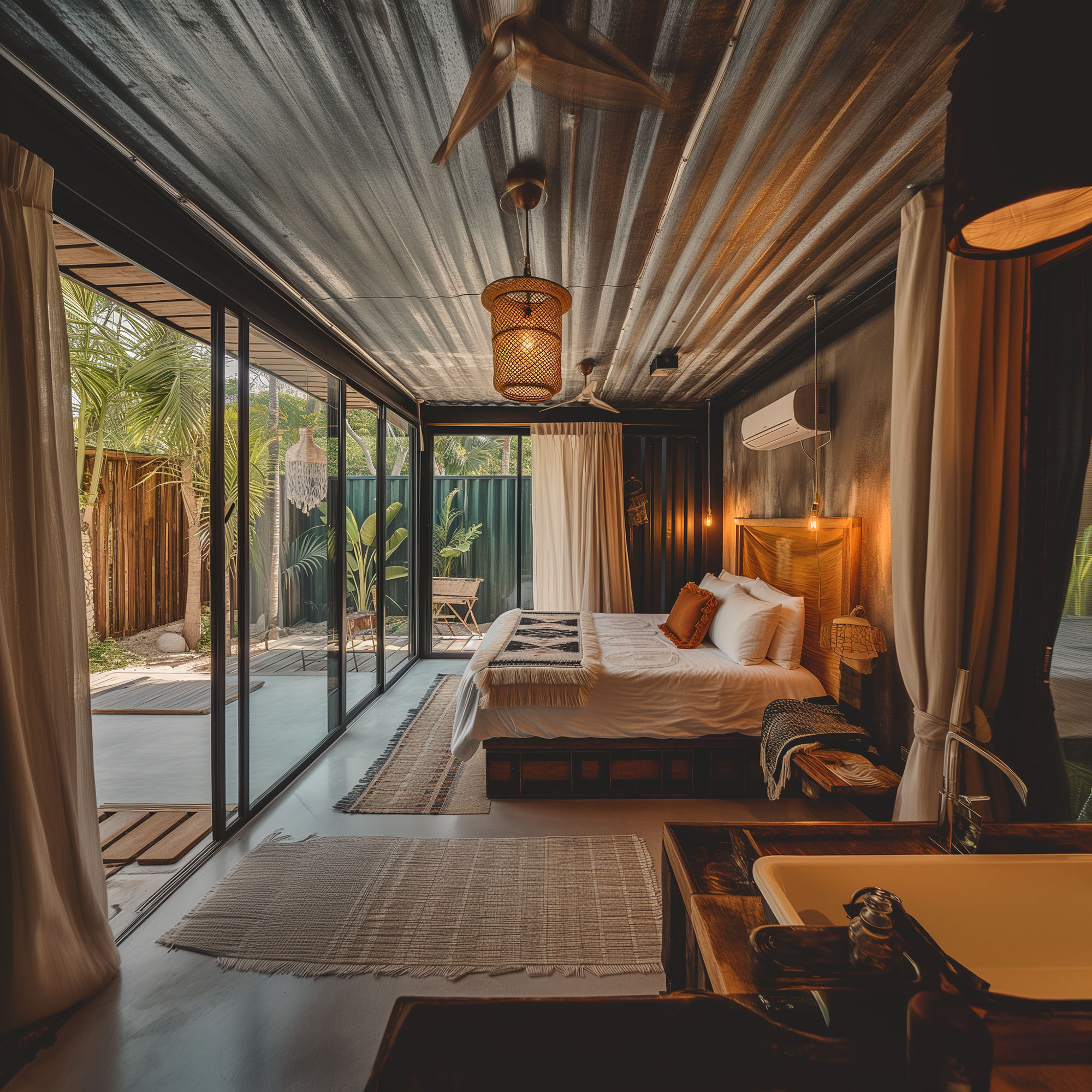
This innovative beach showroom project embodies a synthesis of sustainability and modern design, employing recycled shipping containers as the primary structural framework, enveloped by a dynamic "second skin" of bamboo sticks. This concept not only leverages the robust, modular nature of the containers but also introduces a bioclimatic element with the bamboo, which integrates natural ventilation and light filtering properties to enhance the indoor environment while maintaining a low environmental footprint.
The layout consists of strategically placed containers that define a compact, efficient core, adapted to accommodate a showroom with minimal ecological impact. The containers are staggered and oriented to maximize views and natural light penetration, which are essential for a beachfront property. The interconnected spaces maintain an open flow, conducive to both display and interaction, which is critical in a showroom setting. External decking and walkways link the containers, promoting an indoor-outdoor connection that is vital for beachside architecture.
Central to the design philosophy is the use of recycled materials and sustainable practices. The shipping containers themselves are a nod to reusability, providing a sturdy and durable structure that repurposes industrial objects for architectural use. The bamboo facade acts as a sustainable, renewable resource that serves multiple functions: it forms an aesthetic statement with its rhythmic, linear patterns; provides shade and privacy; and enhances the building's thermal performance by creating a ventilated facade that reduces heat gain.
The choice of materials extends to the interior, where sustainable, locally-sourced materials are preferred, reducing transportation costs and supporting local economies. The landscaping around the pavilions also reflects a commitment to sustainability, using native plants that are drought-resistant and suitable for the sandy soil, minimizing water use and maintenance requirements.
Aesthetically, the design strikes a balance between industrial ruggedness and natural elegance. The dark tones of the containers contrast with the warm, natural texture of the bamboo, making the structure both a focal point and an integrated part of the landscape. Functionally, the bamboo not only embellishes the exterior but also acts as a natural insulator and sunshade, critical for thermal comfort in tropical climates. The open terraces and shaded areas provide spaces for relaxation and social interaction, essential in a showroom designed to attract and engage visitors.
This project is a prime example of how modern design can meet ecological responsibility without compromising on style or functionality. By integrating recycled materials with traditional techniques and modern technology, the beach showroom stands as a testament to innovative, sustainable architecture in a challenging coastal environment.
© 2021 by sanzpont [arquitectura] . Webpage by sanzpont [digital] . Innovative Digital Experiences
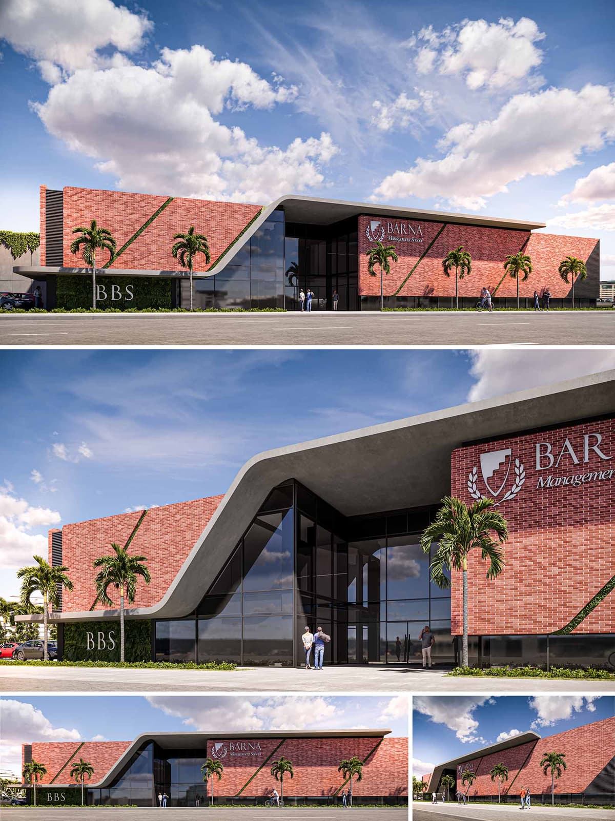

This architectural proposal illustrates a renovation and extension of a business school located in Santo Domingo, Dominican Republic, combining modern design principles with traditional materials to create a landmark educational facility. The design balances the robust, historical qualities of brickwork with contemporary glass and metal elements, symbolizing a bridge between traditional business practices and innovative management strategies.
The building's facade is striking, featuring a sloping roof that smoothly transitions into vertical walls, enveloping the structure in a seamless curve. This dynamic form not only contributes to the building's visual impact but also suggests a forward-thinking approach to education. The use of deep red bricks not only pays homage to the local architectural vernacular but also provides a textural contrast against the sleek, expansive glass panels that invite natural light deep into the interiors. The incorporation of the school's emblem on the exterior wall acts as a proud declaration of its identity and ethos.
The design optimally utilizes the space by clearly differentiating between the newly constructed areas and the renovated sections. The entrance is grand, marked by an expansive, welcoming glass front, ensuring visibility and accessibility. It leads into a multifunctional lobby that serves as both a social space for students and a transitional area leading to more private educational environments.
Teaching spaces and administrative offices are strategically placed to benefit from natural lighting, reducing the reliance on artificial light sources. Outdoor spaces are thoughtfully integrated with the internal environments, featuring landscaped areas where students and faculty can gather, promoting a sense of community and well-being.
Sustainability is a key component of the design, with the choice of materials reflecting both durability and environmental sensitivity. The bricks are locally sourced, reducing transportation emissions and supporting local industries. The large glass panels are double-glazed, minimizing heat gain while maximizing daylight use, which is critical in the tropical climate of Santo Domingo.
Moreover, the roofing material is chosen for its reflective properties, helping to reduce the building’s thermal load. Landscaping around the building utilizes native plants that require minimal irrigation, further contributing to the project's sustainability goals.
Technological integration is evident in the smart use of energy-efficient systems within the building. These include advanced HVAC systems that adapt to occupancy and weather conditions, and LED lighting with sensors that adjust based on the time of day and room usage, enhancing energy conservation.
The architectural design also incorporates rainwater harvesting systems that reduce the demand on the municipal water supply and provide water for landscape irrigation. This not only decreases operational costs but also exemplifies the institution’s commitment to sustainable practices.
This proposal for the business school in Santo Domingo is a testament to how architectural innovation can embody the spirit of an institution while promoting environmental stewardship and advanced learning environments.
© 2021 by sanzpont [arquitectura] . Webpage by sanzpont [digital] . Innovative Digital Experiences
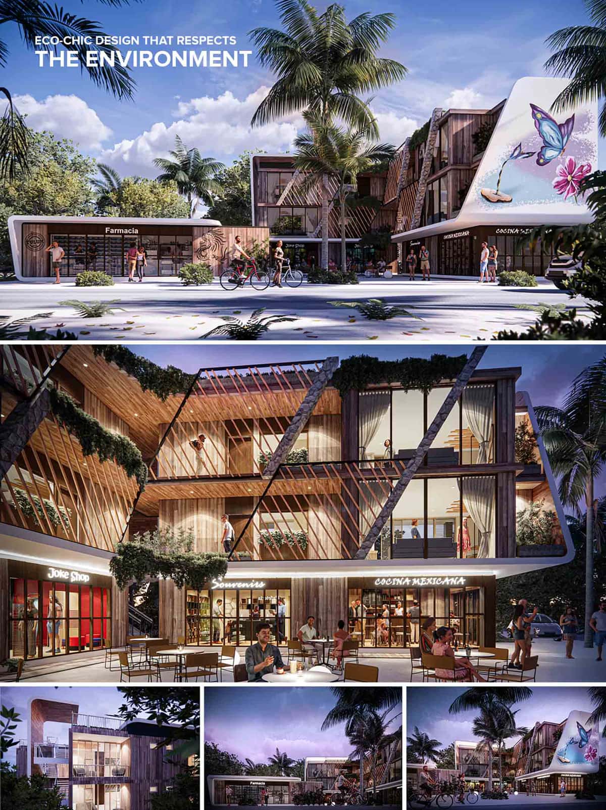

Tulum Plaza Norte is conceived as an eco-chic commercial and mixed-use plaza that harmonizes retail, dining, and community activity within a sustainable architectural language. The project embraces Tulum’s ethos—blending nature, art, and organic design—while promoting walkability and community interaction. The design promotes permeability both visually and spatially, allowing for constant interaction between interior and exterior spaces, and establishing a dialogue with its tropical context. The project combines ground-floor commercial units with upper-level boutique residences or workspaces, forming a dynamic programmatic layering. This strategy ensures continuous day and night activation, fostering economic and social vibrancy.
The architectural expression is characterized by a bold geometric articulation of slanted wooden fins, natural stone walls, and white sculptural curves. These diagonal timber brise-soleils serve both as sun protection and as a defining visual motif, lending the façade a rhythmic sense of movement and shadow play. This formal gesture also adds depth and texture to the envelope, making the building feel alive and responsive. A key feature is the integration of a large-scale butterfly mural on the curved facade—an emblematic element evoking nature and artistic identity, a nod to local culture and eco-tourism. At night, the architecture is softly illuminated with warm, indirect lighting that enhances textures and materiality while inviting a vibrant social atmosphere.
Materials were selected with durability, climate‑responsiveness and local character in mind. The primary cladding is naturally‑toned hardwood, chosen for its resilience in humid, coastal conditions and its visual warmth. Complementing this is rough stone – used for vertical accents and base elements – which grounds the building physically and visually to the site. Smooth white rendered curves provide contrast and modern clarity. The palette remains restrained: soft whites, warm browns, mid‑greys of the stone, and transparent glazing. Together they allow the surrounding greenery and sky to take on visual prominence.
Landscape design is woven into the architecture. Lush vegetation climbs trellises and cascades over balconies, blurring the boundary between nature and built form. The use of native plant species reduces irrigation needs and promotes biodiversity. The open-air central corridor and the shaded arcades provide a breezy pedestrian experience, facilitating cross-ventilation. Outdoor seating areas activate the ground level, encouraging community engagement and enhancing the commercial appeal. Palm trees and low tropical shrubbery complement the hardscape and provide additional cooling through shade.
Sustainability is woven into the design from passive to active strategies. The timber fin system reduces solar heat gain and improves daylighting performance, while the open‑ended layout promotes cross‑ventilation throughout the building. Locally‑sourced materials reduce embodied carbon and reinforce regional identity. Green roofs or planted terraces contribute to thermal insulation and storm‑water management, while LED lighting and efficient mechanical systems minimise operational energy. The provision for bicycle use and pedestrian priority further reinforces a low‑impact approach. In totality, the project seeks not simply to be energy‑efficient, but to achieve harmony with the wider ecosystem of the site.
DIRSA
© 2021 by sanzpont [arquitectura] . Webpage by sanzpont [digital] . Innovative Digital Experiences
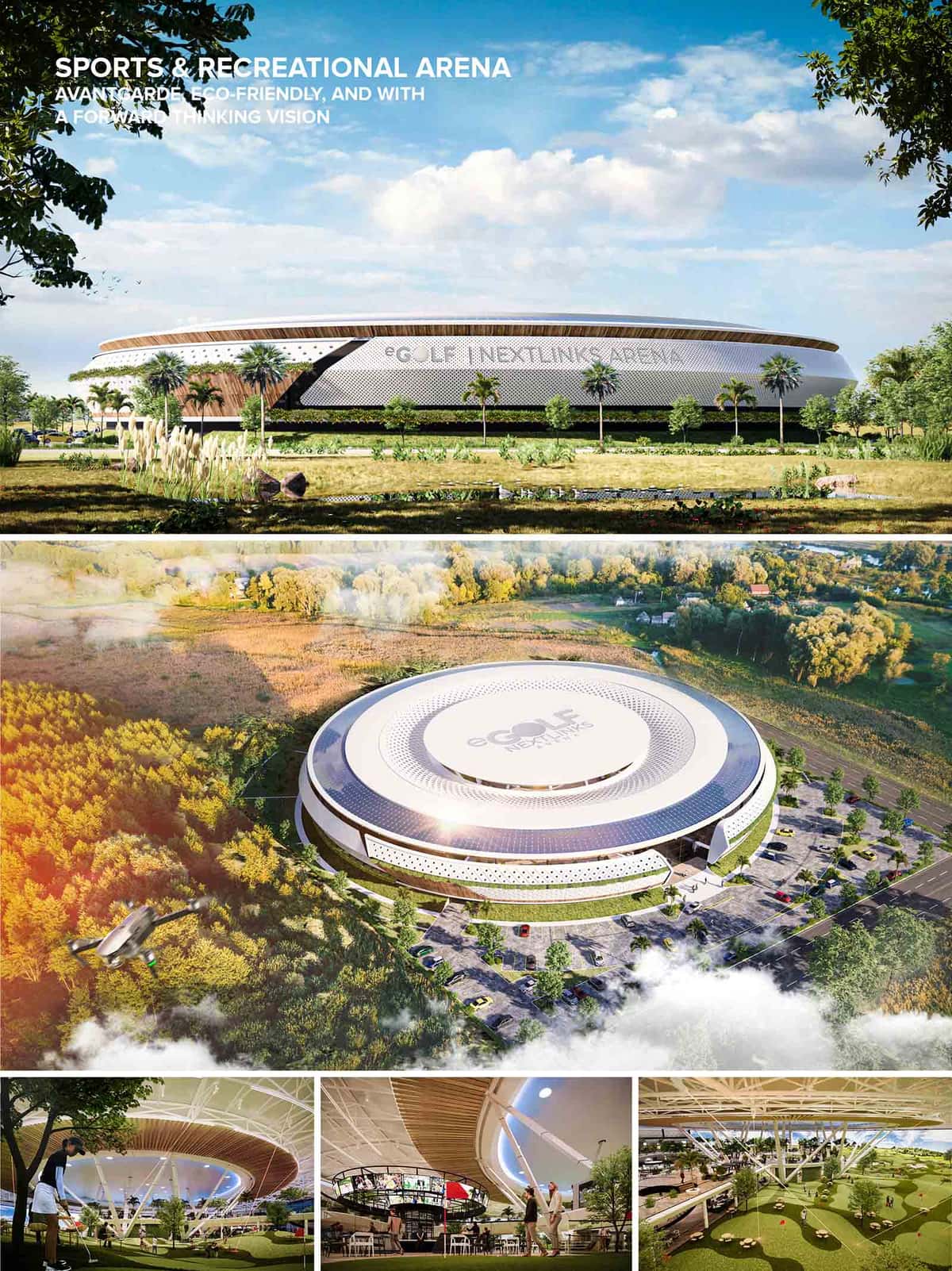

eGolf Arena is a new golf concept that unites sports and entertainment under one roof, creating a functional building full of leisure activities to enjoy with the family, with an iconic avant-garde image that inspires to play the sport with the latest in technology, and all based on the concept of sustainability and respect for the environment.
“Is a functional re-imagination of the brick and mortar standard established for driving range based entertainment, but more efficient in every way along with an iconic building design specification.”
- Dave Shultz, NextLinks
SPORTS & RECREATION ARENA
Sports & recreation arena with a forward thinking vision, where traditional game meets technology, focused on fun & entertainment. Made for young and old, for beginners and experts and for all those who want to have an excellent time involved in the world of golf. The design is conceived as an organic atmosphere, where the spaces flow with natural curves integrating with each other continuously, turning every space as social experience.
“We love so much the game of Golf, so we imagined how the next Play & Entertainment should look & feel like, envisioning almost a sacred place: GOLF Temple. Where technology and entertainment are combined to create a realistic and exciting next generation golfing experience.”
- sanzpont [arquitectura] + Pizá Golf + Nextlinks
GOLF ICONIC VENUE
The building's concept is inspired by the most recognized shape of the game: the golf ball. The round-shaped design welcomes all activities between its 2 floors and its double-height spaces, generating a unique experience that combines sport, technology, leisure and entertainment, learning, human connection, as well as gastronomy. The entrance gives you a spectacular welcoming, while the front desk makes you feel at home, the sports bar is located in a central strategic place, visible from any view, so that you can enjoy a welcome drink in connection with everything space. The gastronomy space gives you the opportunity to enjoy a variety of food experiences for all tastes, making a quiet but always in the same environment, giving you the feeling of playing while you eat. The private spaces are designed in the form of comfortable and pleasant amenities, and the lounge balconies are the perfect space to see and be seen. The use of nature is fundamental in the design, generating an indoor park venue that gives life to the environment.
“The game of Golf is immersed in nature while playing, so we wanted to bring as much of the natural environment Indoors, envisioning a park-venue”
- Victor & Sergio Sanz, sanzpont [arquitectura]
THE GOLF GAME EXPERIENCE
The arena is designed as a disruptive game changer experience, enjoying the amazing atmosphere while playing, making you feel like a pro at the center of the action, combining lights and technology as a part of incredible experience. Virtual games and hitting bays complement the technological experience, taking the sport we love to another level. The playing atrium is designed in a disruptive way, combining a double height space, RGB LED lasers, a topography and playing field grass according to the standards of the game. A space where in addition to feeling the quality of the game and technology, it allows you to have a good time with friends and family while you enjoy yourself, even spending quality time in the fire pit space.
“The strategy behind the design is to provide real shot values that can be as challenging or easy as the player wants. eGolf Arena can be played by an avid golfer or a non-golfer. This is what we strive for: Growing the game we love”
- Agustín Pizá, Pizá Golf
SUSTAINABLE DESIGN
An avant-garde and eco-friendly design, based on sustainability, the use of natural resources and the use of environmentally friendly materials. The use of photovoltaic panels on the roof, take advantage of solar energy to create clean energy, the openings of the building generate natural cross ventilation and the design of the roof, takes advantage of rainwater for its capture. The use of vegetation is fundamental in the design creating a microclimate that improves comfort and clean air.
“An important element of eGolf is sustainability: ecologically, socially and economically. The eGolf arena is designed and developed to bring forward all of the skills of traditional golf within its own uniquely majestic environment. How many new golfers will be inspired to play traditional golf after spending time in our venue?”
Magic is what happens at eGolf
- sanzpont [arquitectura] + Pizá Golf + Nextlinks
The team that has made this concept possible combines creativity and experience in its sector in an avant-garde way, uniting vertical building architecture, horizontal gaming architecture and entertainment technology, all with a cutting-edge and sustainability approach.
Architecture Design: sanzpont [arquitectura]
Golf Design: Pizá Golf
Technology Design: Nextlinks
ABOUT SANZPONT [ARQUITECTURA]
SANZPONT is an AWARD WINNING international architecture firm with offices in Barcelona, México and Chicago. Their main interest is creativity, design and a constant search for innovation. They strive to create connections between people and spaces, always prioritising sustainability and the environment. Having offices in three countries, Spain, México and the United States, Has allowed them to create an important network of professionals and companied that work with them to ensure the successful completion of their designs around the world.
ABOUT PIZÁ GOLF
Agustín Pizá is an AWARD WINNING GOLF COURSE ARCHITECT with a Masters in Golf Course Architecture from Edinburgh University in Scotland. Member of Golf European Institute and the American Society of Gold Course Architects. For more than two decades, Pizá has collaborated with legends of the game and world class golf developments. His designs are known for delivering quality, sustainability, aesthetics and strategic gold courses with its concepts WellnessGolf and GolfLounge.
ABOUT NEXTLINKS
NEXTLINKS provide spacious putting technology and gaming systems that entertain the masses at golf courses and beyond. They partner with preexisting entertainment and restaurant venues, as well as traditional golf destinations, to complement existing spaces with their proprietary technology-driven golf entertainment solutions. Re-purposing under-utilised space without need for brick and mortar construction is their specialty.
• Muse Design Awards, New York, USA : Platinum Award - Sports & Recreation : eGolf NextLinks Arena (2022)


• Muse Design Awards, New York, USA : Platinum Award - Sports & Recreation : eGolf NextLinks Arena (2022)
eGolf Arena is a new golf concept that unites sports and entertainment under one roof, creating a functional building full of leisure activities to enjoy with the family, with an iconic avant-garde image that inspires to play the sport with the latest in technology, and all based on the concept of sustainability and respect for the environment.
“Is a functional re-imagination of the brick and mortar standard established for driving range based entertainment, but more efficient in every way along with an iconic building design specification.”
- Dave Shultz, NextLinks
SPORTS & RECREATION ARENA
Sports & recreation arena with a forward thinking vision, where traditional game meets technology, focused on fun & entertainment. Made for young and old, for beginners and experts and for all those who want to have an excellent time involved in the world of golf. The design is conceived as an organic atmosphere, where the spaces flow with natural curves integrating with each other continuously, turning every space as social experience.
“We love so much the game of Golf, so we imagined how the next Play & Entertainment should look & feel like, envisioning almost a sacred place: GOLF Temple. Where technology and entertainment are combined to create a realistic and exciting next generation golfing experience.”
- sanzpont [arquitectura] + Pizá Golf + Nextlinks
GOLF ICONIC VENUE
The building's concept is inspired by the most recognized shape of the game: the golf ball. The round-shaped design welcomes all activities between its 2 floors and its double-height spaces, generating a unique experience that combines sport, technology, leisure and entertainment, learning, human connection, as well as gastronomy. The entrance gives you a spectacular welcoming, while the front desk makes you feel at home, the sports bar is located in a central strategic place, visible from any view, so that you can enjoy a welcome drink in connection with everything space. The gastronomy space gives you the opportunity to enjoy a variety of food experiences for all tastes, making a quiet but always in the same environment, giving you the feeling of playing while you eat. The private spaces are designed in the form of comfortable and pleasant amenities, and the lounge balconies are the perfect space to see and be seen. The use of nature is fundamental in the design, generating an indoor park venue that gives life to the environment.
“The game of Golf is immersed in nature while playing, so we wanted to bring as much of the natural environment Indoors, envisioning a park-venue”
- Victor & Sergio Sanz, sanzpont [arquitectura]
THE GOLF GAME EXPERIENCE
The arena is designed as a disruptive game changer experience, enjoying the amazing atmosphere while playing, making you feel like a pro at the center of the action, combining lights and technology as a part of incredible experience. Virtual games and hitting bays complement the technological experience, taking the sport we love to another level. The playing atrium is designed in a disruptive way, combining a double height space, RGB LED lasers, a topography and playing field grass according to the standards of the game. A space where in addition to feeling the quality of the game and technology, it allows you to have a good time with friends and family while you enjoy yourself, even spending quality time in the fire pit space.
“The strategy behind the design is to provide real shot values that can be as challenging or easy as the player wants. eGolf Arena can be played by an avid golfer or a non-golfer. This is what we strive for: Growing the game we love”
- Agustín Pizá, Pizá Golf
SUSTAINABLE DESIGN
An avant-garde and eco-friendly design, based on sustainability, the use of natural resources and the use of environmentally friendly materials. The use of photovoltaic panels on the roof, take advantage of solar energy to create clean energy, the openings of the building generate natural cross ventilation and the design of the roof, takes advantage of rainwater for its capture. The use of vegetation is fundamental in the design creating a microclimate that improves comfort and clean air.
“An important element of eGolf is sustainability: ecologically, socially and economically. The eGolf arena is designed and developed to bring forward all of the skills of traditional golf within its own uniquely majestic environment. How many new golfers will be inspired to play traditional golf after spending time in our venue?”
Magic is what happens at eGolf
- sanzpont [arquitectura] + Pizá Golf + Nextlinks
The team that has made this concept possible combines creativity and experience in its sector in an avant-garde way, uniting vertical building architecture, horizontal gaming architecture and entertainment technology, all with a cutting-edge and sustainability approach.
Architecture Design: sanzpont [arquitectura]
Golf Design: Pizá Golf
Technology Design: Nextlinks
ABOUT SANZPONT [ARQUITECTURA]
SANZPONT is an AWARD WINNING international architecture firm with offices in Barcelona, México and Chicago. Their main interest is creativity, design and a constant search for innovation. They strive to create connections between people and spaces, always prioritising sustainability and the environment. Having offices in three countries, Spain, México and the United States, Has allowed them to create an important network of professionals and companied that work with them to ensure the successful completion of their designs around the world.
ABOUT PIZÁ GOLF
Agustín Pizá is an AWARD WINNING GOLF COURSE ARCHITECT with a Masters in Golf Course Architecture from Edinburgh University in Scotland. Member of Golf European Institute and the American Society of Gold Course Architects. For more than two decades, Pizá has collaborated with legends of the game and world class golf developments. His designs are known for delivering quality, sustainability, aesthetics and strategic gold courses with its concepts WellnessGolf and GolfLounge.
ABOUT NEXTLINKS
NEXTLINKS provide spacious putting technology and gaming systems that entertain the masses at golf courses and beyond. They partner with preexisting entertainment and restaurant venues, as well as traditional golf destinations, to complement existing spaces with their proprietary technology-driven golf entertainment solutions. Re-purposing under-utilised space without need for brick and mortar construction is their specialty.
© 2021 by sanzpont [arquitectura] . Webpage by sanzpont [digital] . Innovative Digital Experiences


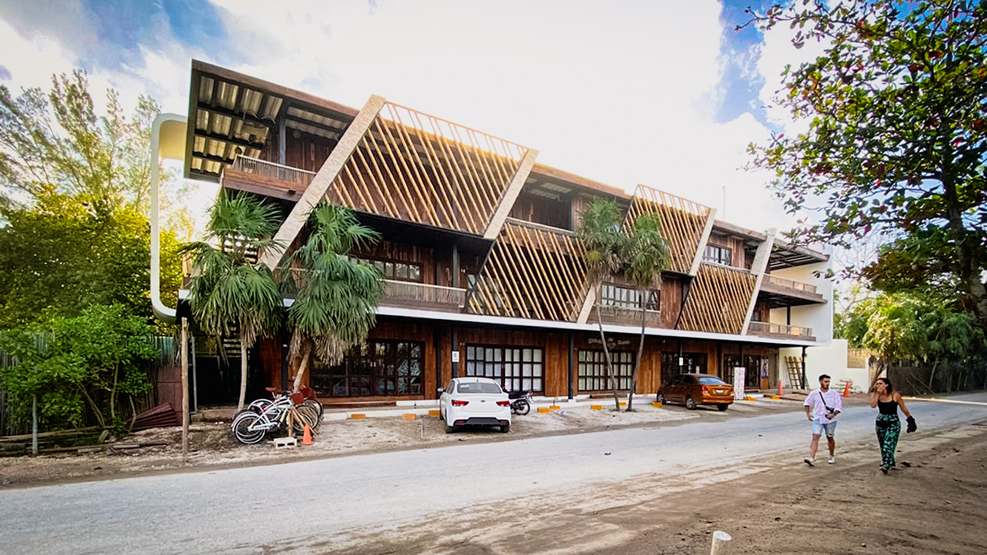
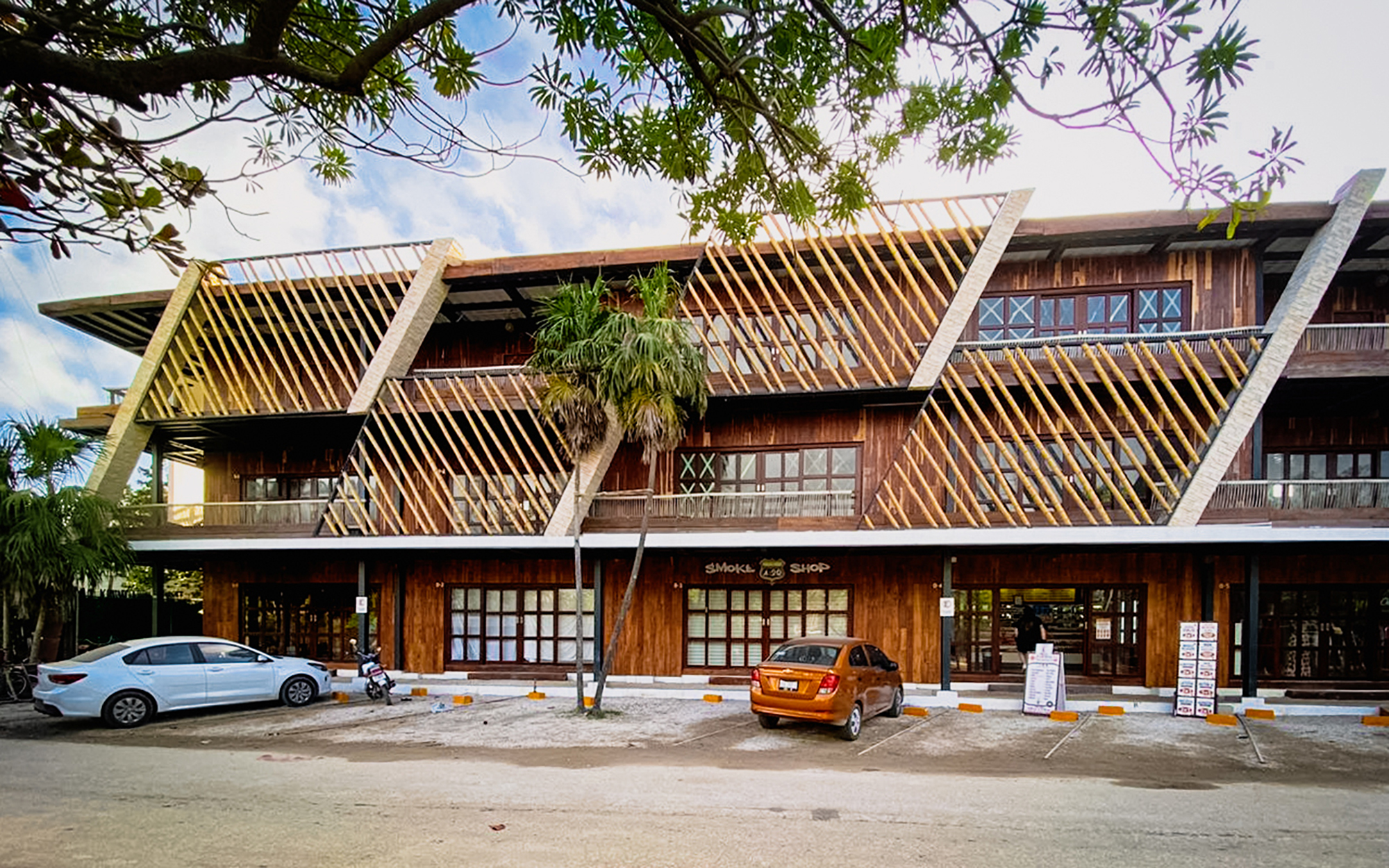
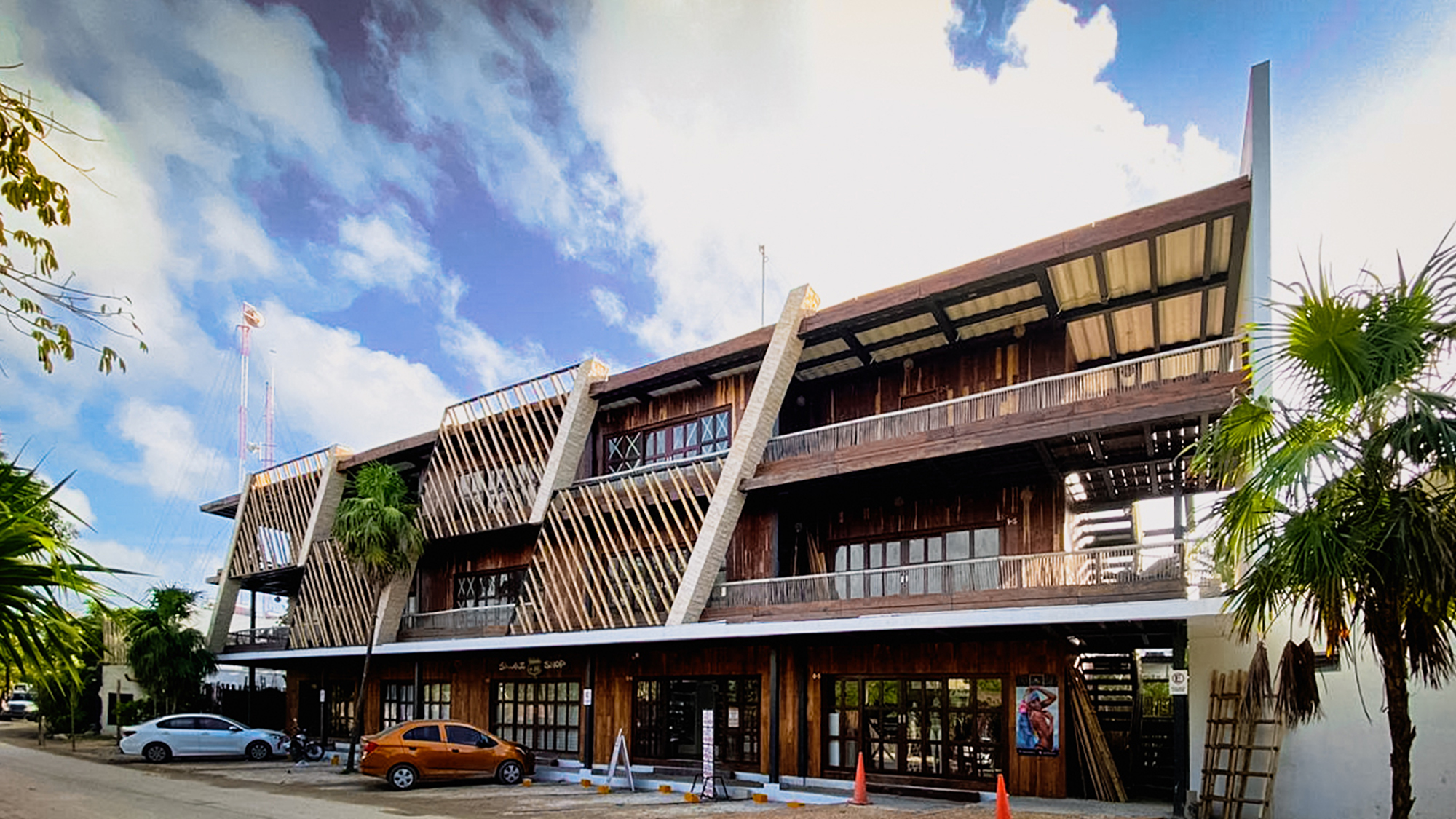
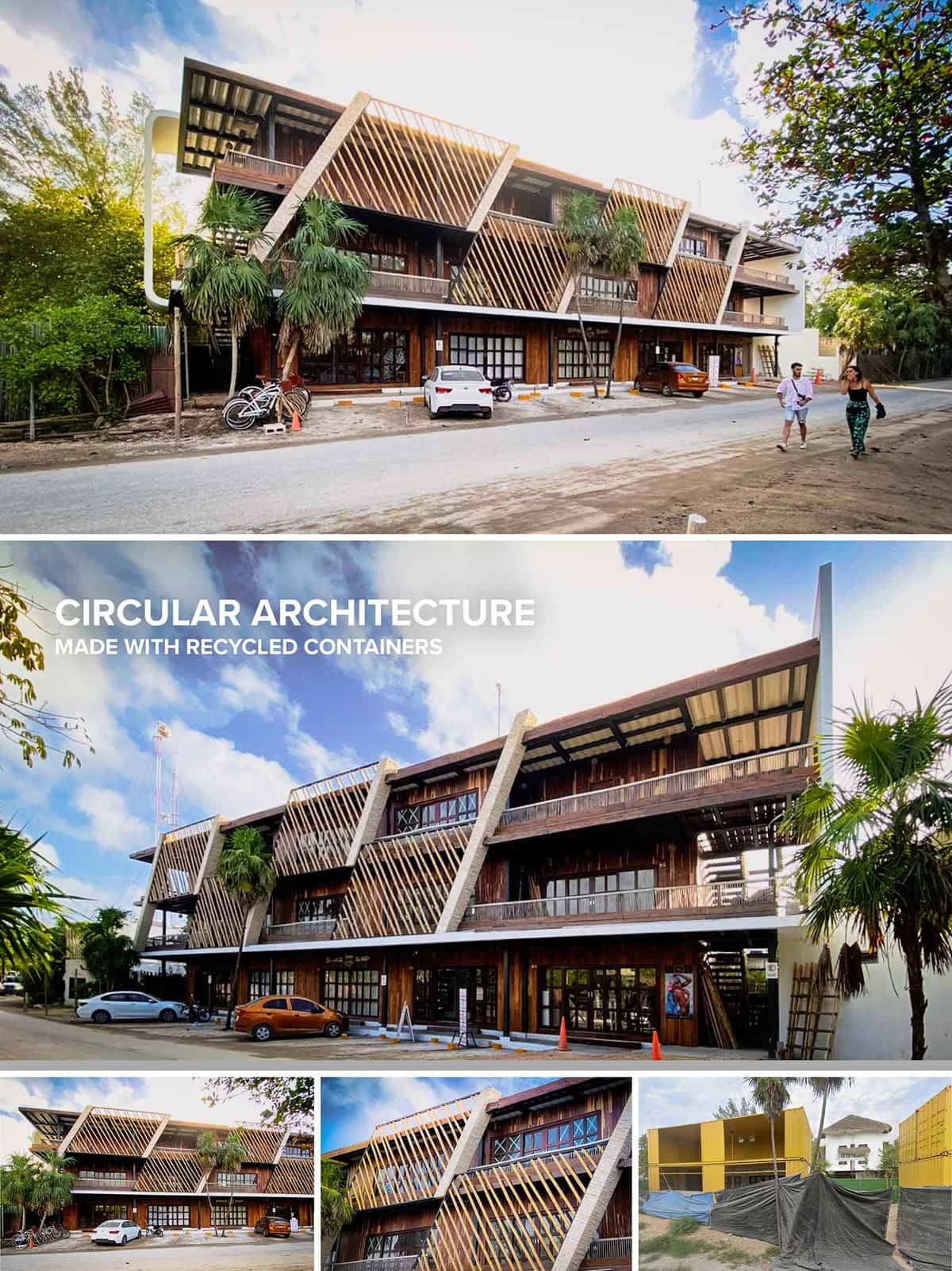
The Commercial Containers project in Tulúm reinterprets the traditional retail strip through the language of circular architecture and modular construction. The design transforms recycled shipping containers into a three‑level commercial hub, integrating them within a light steel skeleton and tropical timber envelope. The building acts as an urban façade that mediates between the informal street front and the dense vegetation at the back, while maintaining a strong linear presence along the road.
The concept is based on stacking and staggering container modules to create shaded galleries, generous terraces and double‑height moments that break the typical boxy reading of container architecture. Oblique structural fins and diagonal timber brise‑soleil generate a dynamic rhythm, expressing movement and echoing the angled geometry of the surrounding palm fronds and local vegetation.
The ground floor is conceived as a porous commercial plinth. Continuous glazing and multiple access points allow each retail unit to open directly to the sidewalk, encouraging pedestrian interaction and visual continuity between interior and exterior. The setback from the street creates a slim parking strip and a transitional zone, absorbing the informal character of Tulúm’s infrastructure.
The upper levels host a combination of offices, studios and flexible commercial spaces organized along linear exterior corridors. Terraces facing the street function as semi‑public balconies, offering vantage points over the urban activity while providing spill‑out space for tenants. Circulation is legible and straightforward, with stair cores integrated into the structural frames that punctuate the façade.
The architectural expression is defined by three superposed bands: the transparent, recessed ground floor; the more solid, timber‑clad middle level; and the lightweight roof level marked by the exposed container structure and metal overhangs. This stratification gives scale and hierarchy to the building volume while clearly articulating use.
Large concrete or masonry fins project from the façade, bracing the container volumes and framing the diagonal timber slats. These slats operate as vertical and oblique louvers, filtering sunlight, protecting glazing, and generating a play of shadows that evolves throughout the day. The interplay between industrial elements (corrugated steel, metal railings) and warm natural materials creates a balanced aesthetic midway between tropical rusticity and contemporary urban design.
Recycled shipping containers form the primary structural and spatial modules. Their corrugated steel walls are strategically opened to accommodate full‑height glazing, sliding doors and interior connections between units. Internally, the containers are likely thermally insulated and lined with gypsum board or timber panels to provide comfort and acoustic control, while concealing services and reinforcing a more refined interior finish.
On floors and common areas, polished concrete and hardwood are used for durability and low maintenance in a high‑traffic commercial environment. Exposed steel members, visible roof decks and the repetition of timber on ceilings and balustrades extend the exterior language indoors, ensuring continuity between the retail spaces, galleries and terraces.
The project is designed as a passive response to Tulúm’s tropical climate. Deep overhangs, the diagonal timber brise‑soleil and the setback terraces collectively reduce solar gain on the glazed surfaces, limiting cooling demands. Cross‑ventilation is promoted by linear circulation balconies and the ability to open containers on multiple sides, capturing prevailing breezes and reducing reliance on mechanical air conditioning.
Circularity is central to the project’s sustainability strategy. The reuse of shipping containers significantly reduces embodied energy compared to conventional new construction, while the modular approach allows for potential disassembly and relocation of units in the future. The extensive use of locally sourced timber lowers transportation impacts and supports regional economies. Combined with the compact footprint and shared infrastructure of a multi‑tenant building, these measures position the development as a pragmatic example of circular commercial architecture in the Riviera Maya context.
© 2021 by sanzpont [arquitectura] . Webpage by sanzpont [digital] . Innovative Digital Experiences

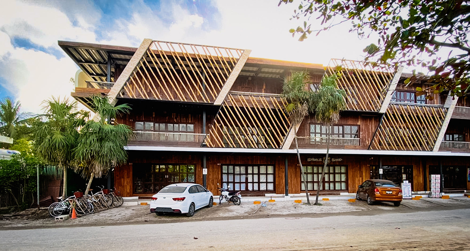
Tulum Plaza Sur is a contemporary commercial-hospitality hybrid development that embodies the ethos of circular architecture through the adaptive reuse of shipping containers. Located in the tropical context of Tulum, Mexico, this structure responds to both environmental and cultural contexts with a raw, honest material language and a bold structural rhythm. The design celebrates modularity and prefabrication. The recycled containers form the core volumetric units, arranged in a stacked linear configuration across three levels. The ground level houses commercial spaces, conceived as flexible retail modules that activate the street frontage, while the upper two levels accommodate hotel suites offering a balance of privacy and openness. The architectural concept was to create a low-impact, modular complex that could be constructed rapidly and disassembled or modified with minimal environmental footprint.
The building presents a rhythmic facade composed of exposed structural frames and diagonal wooden slats that function as sunbreakers. These slats are not only an aesthetic gesture, giving the elevation dynamic texture, but also perform an environmental role, reducing solar gain in Tulum’s hot climate. The material palette is anchored in its commitment to sustainability and regional expression. Corten-style steel elements echo the patina of time, while locally sourced tropical wood brings warmth and organic tactility. The containers themselves—painted and insulated—retain their industrial geometry but are softened with natural materials and shading devices. The slanted concrete fins reinforce the structural modularity while serving as expressive brise-soleils and lateral supports.
The exploded axonometric drawing reveals a clear and efficient modular assembly. Each floor is defined by a consistent container grid, which facilitates repetition in planning and construction. Circulation cores—staircases and access corridors—are positioned laterally and to the rear, maximizing usable frontage and natural ventilation for each unit. The retail level is fully glazed at street level, allowing visibility and openness, ideal for commercial interaction. Hotel suites above are provided with private balconies set behind the wooden lattice, ensuring both shade and filtered views. Overhangs and extended eaves on the top level provide additional passive cooling, vital in the tropical climate.
This project embodies key principles of circular architecture by reusing industrial materials—most notably shipping containers—thus reducing demand for new construction resources. The structure is highly modular, allowing for adaptability over time. Passive cooling techniques are employed through orientation, shading systems, cross-ventilation, and thermal insulation strategies applied to the metal containers. Rainwater harvesting systems and potential integration of solar panels (suggested by roof form and context) enhance environmental performance. Wood cladding is likely sourced from renewable forests, and minimal ground excavation respects the natural permeability of the site.
The axonometric breakdown clearly communicates a layered, prefabricated approach: base slab foundation, modular steel framework, infilled containers, and panelized façades. Each component is dimensionally coordinated for efficient assembly and future disassembly, reinforcing the circular concept. The open steel frame not only defines structural support but also allows for architectural expression through diagonal bracing and shading elements. This construction logic ensures minimal site disturbance and rapid on-site erection, making it an ideal strategy for developing areas with growing tourism demand but sensitive ecological surroundings.
DIRSA
© 2021 by sanzpont [arquitectura] . Webpage by sanzpont [digital] . Innovative Digital Experiences

Residencial Cumbres is one of the most successful housing developments in Cancun, located in a commercial area between the airport and the city center. In addition to the neighborhood’s steady growth, the complex offers various amenities to its residents, such as service and commercial areas and an important urban corridor for its users. Our critical analysis stems from the city’s lack of public walking space, which due to the climate, must be shaded so the users are comfortable. For this reason, all commercial spaces were built at the sidewalk level and the complex features an immense system of walkways, bringing commerce and life to the pedestrian.
DESIGN CONCEPT
Our proposal goes beyond any initiative, by promoting the expansion of public space through a pedestrian plaza, and by complying with land occupation guidelines, the building is set back from the sidewalk as much as possible, expanding the public space to create a city. The shaded space extends from the sidewalk an additional 20 meters, inviting pedestrians to use the space for living, rest and recreation, designed with universal accessibility.
URBAN DESIGN
A market study conducted by the property owner determined that the project would consist of a power center building with a mix of commercial storefronts and corporate office space, offering accessible commerce and convenience to the patrons. While this business model is relatively common, we wanted to take it a step further and proposed to create a public space available to all. This took the form of a public, shaded recreational space for pedestrians and even non-consumers to enjoy. This urban terrace immediately adds value to the surrounding context.
FUNCTIONALITY
The project had to accommodate the typical commercial storefront layout, rectangular and in battery. In order to avoid one of the most common problems in commercial centers, the lack of interest and desire to access the upper floors, it was decided to give prominence to the escalators and place them in the center as a focal point, providing greater accessibility to the users. Continuous walkways propose various routes to access the three different levels, reaching urban terraces which are oriented toward the dominant winds. These terraces are perfect for retail and coffee shops connected to elevators and escalators via the main walkways. The large overhangs invite users to stay and enjoy the space. To complement the commercial area, there is a different volume containing the corporate office spaces. This volume has a different function and language than the first, generating a “glass box” structure typical of corporate buildings. The spaces are more private and conducive to offices. Internal circulations have high efficiency causing the rented space to be more cost effective. Rental spaces for modular “self service” offices to be rented and subdivided according to the needs of each company.
TECHNOLOGY
While it can be a challenge to stay within budget when constructing a building of “normal” design and cost, it can be even more challenging for an atypical building with an irregular structure such as Meet Point. In this case, it was imperative to effectively utilize 3D BIM (Building Information Modeling) technology to develop all design and construction documents, allowing the team to fabricate digital models and collaborate across all disciplines, effectively avoiding construction errors. Another great challenge was the execution of the metal structure, due to its inclined columns and angled joints. This was addressed by designing, manufacturing and cutting the pieces digitally, then assembling them on site using screws. The other major challenge was the angled glass facade of the corporate office area, which was also solved by digitally designing, fabricating and manufacturing the parts.
5 INTERNATIONAL ARCHITECTURE AWARDS
• III Bienal Arquitectura del Caribe Mexicano : Mención Honorífica Categoría Uso Mixto : Meet Point Plaza (2020)
• World Architecture Awards 10+5+X Honorary Members : Architecture Realised Category - 33rd Cycle, Category : Meet Point Plaza (2020)
• World Architecture Awards 10+5+X Community Members : Architecture Realised Category - 33rd Cycle : Meet Point Plaza (2020)
• Urban Design & Architecture Design Awards 2019 - 1st Place - Commercial Built Category : Meet Point Plaza (2019)
• Peninsula Award For Architecture and Interior Design AA/Mexico : 3rd Place - Architecture Category : Meet Point Plaza (2019)
SOLAR RADIATION STUDY
To develop the project, a study of solar thermal radiation was made to determine the architectural solution of the envelope and materials to be used, in order to guarantee adequate comfort with the minimum of energy resources. Through the study, it was seen the need to generate solar protection overhangs in order to avoid direct sun radiation into interior spaces.


5 INTERNATIONAL ARCHITECTURE AWARDS
• III Bienal Arquitectura del Caribe Mexicano : Mención Honorífica Categoría Uso Mixto : Meet Point Plaza (2020)
• World Architecture Awards 10+5+X Honorary Members : Architecture Realised Category - 33rd Cycle, Category : Meet Point Plaza (2020)
• World Architecture Awards 10+5+X Community Members : Architecture Realised Category - 33rd Cycle : Meet Point Plaza (2020)
• Urban Design & Architecture Design Awards 2019 - 1st Place - Commercial Built Category : Meet Point Plaza (2019)
• Peninsula Award For Architecture and Interior Design AA/Mexico : 3rd Place - Architecture Category : Meet Point Plaza (2019)
Residencial Cumbres is one of the most successful housing developments in Cancun, located in a commercial area between the airport and the city center. In addition to the neighborhood’s steady growth, the complex offers various amenities to its residents, such as service and commercial areas and an important urban corridor for its users. Our critical analysis stems from the city’s lack of public walking space, which due to the climate, must be shaded so the users are comfortable. For this reason, all commercial spaces were built at the sidewalk level and the complex features an immense system of walkways, bringing commerce and life to the pedestrian.
DESIGN CONCEPT
Our proposal goes beyond any initiative, by promoting the expansion of public space through a pedestrian plaza, and by complying with land occupation guidelines, the building is set back from the sidewalk as much as possible, expanding the public space to create a city. The shaded space extends from the sidewalk an additional 20 meters, inviting pedestrians to use the space for living, rest and recreation, designed with universal accessibility.
URBAN DESIGN
A market study conducted by the property owner determined that the project would consist of a power center building with a mix of commercial storefronts and corporate office space, offering accessible commerce and convenience to the patrons. While this business model is relatively common, we wanted to take it a step further and proposed to create a public space available to all. This took the form of a public, shaded recreational space for pedestrians and even non-consumers to enjoy. This urban terrace immediately adds value to the surrounding context.
FUNCTIONALITY
The project had to accommodate the typical commercial storefront layout, rectangular and in battery. In order to avoid one of the most common problems in commercial centers, the lack of interest and desire to access the upper floors, it was decided to give prominence to the escalators and place them in the center as a focal point, providing greater accessibility to the users. Continuous walkways propose various routes to access the three different levels, reaching urban terraces which are oriented toward the dominant winds. These terraces are perfect for retail and coffee shops connected to elevators and escalators via the main walkways. The large overhangs invite users to stay and enjoy the space. To complement the commercial area, there is a different volume containing the corporate office spaces. This volume has a different function and language than the first, generating a “glass box” structure typical of corporate buildings. The spaces are more private and conducive to offices. Internal circulations have high efficiency causing the rented space to be more cost effective. Rental spaces for modular “self service” offices to be rented and subdivided according to the needs of each company.
TECHNOLOGY
While it can be a challenge to stay within budget when constructing a building of “normal” design and cost, it can be even more challenging for an atypical building with an irregular structure such as Meet Point. In this case, it was imperative to effectively utilize 3D BIM (Building Information Modeling) technology to develop all design and construction documents, allowing the team to fabricate digital models and collaborate across all disciplines, effectively avoiding construction errors. Another great challenge was the execution of the metal structure, due to its inclined columns and angled joints. This was addressed by designing, manufacturing and cutting the pieces digitally, then assembling them on site using screws. The other major challenge was the angled glass facade of the corporate office area, which was also solved by digitally designing, fabricating and manufacturing the parts.
SOLAR RADIATION STUDY
To develop the project, a study of solar thermal radiation was made to determine the architectural solution of the envelope and materials to be used, in order to guarantee adequate comfort with the minimum of energy resources. Through the study, it was seen the need to generate solar protection overhangs in order to avoid direct sun radiation into interior spaces.
© 2021 by sanzpont [arquitectura] . Webpage by sanzpont [digital] . Innovative Digital Experiences
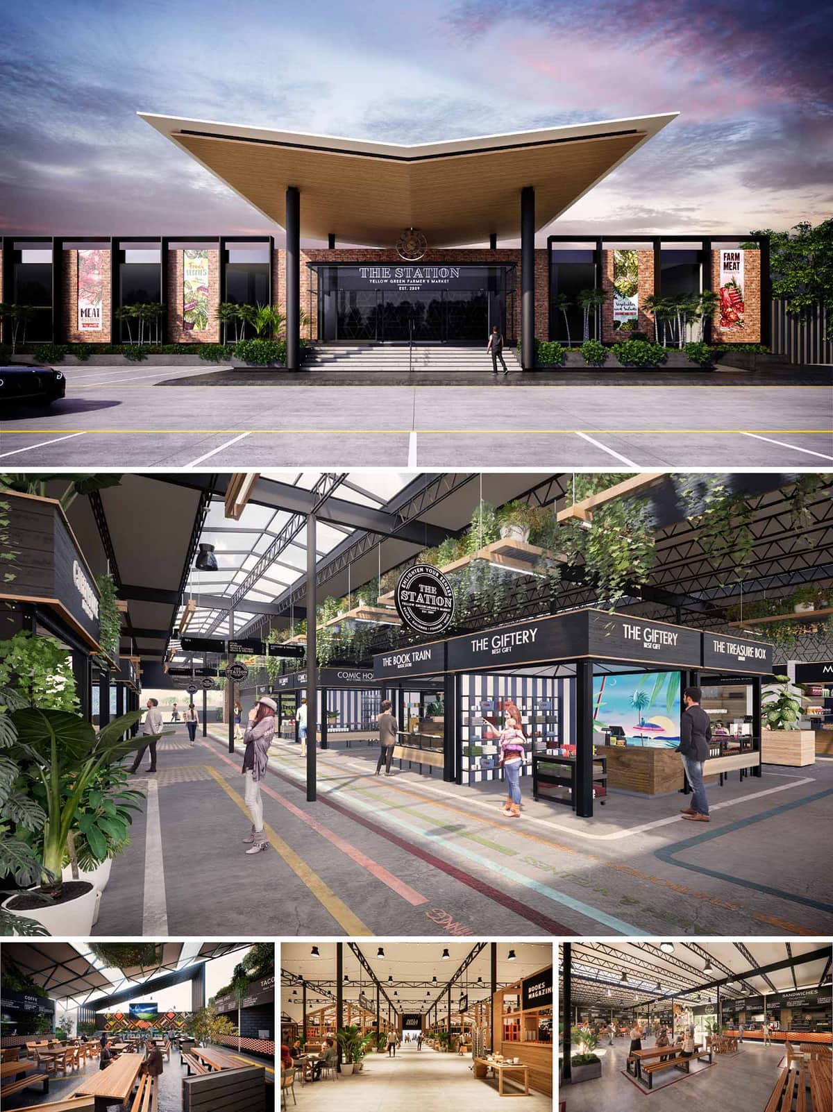

Miami Farmers Market is conceived as a contemporary urban marketplace that merges the robust character of an industrial train depot with the warmth of a tropical civic plaza. The architectural language references “The Station” as a unifying narrative, using long-span steel structures, expressed trusses and linear bays to evoke a rail platform while accommodating a flexible mix of food, retail and event programs. The design aims to create a community destination that is legible, comfortable and vibrant throughout the day and into the evening.
The concept prioritizes permeability and visual continuity. Generous openings, glazed façades and a central spine aligned with the main entrance establish clear sightlines from street to market hall. This transparency allows visitors to perceive the depth of the interior activity from the public realm, drawing them into a sequence of spaces that gradually transition from urban scale to human scale.
The main elevation presents a bold, symmetrical composition anchored by a dynamic folded roof canopy. This hovering roof, lined in warm timber, projects outward to form a sheltered forecourt and a strong urban gesture visible from the approach roads. Slender black columns emphasize verticality and frame the central entrance, accentuating the sense of arrival.
The façade is organized in a rhythmic grid of dark structural frames infilled with brick and large-scale graphic panels. The brick masonry introduces tactile, human-scale texture, while the illuminated banners provide a changeable layer for seasonal produce, events and branding. Low planting beds and palms soften the base of the building, integrating landscape with architecture and mediating between sidewalk and interior.
Internally, the market functions as a clear longitudinal spine flanked by modular vendor units. This main axis, reminiscent of a station concourse, guides visitors intuitively from entrance to food hall and event terraces. The layout privileges linear circulation with multiple lateral cross-passages, allowing easy navigation and ensuring that each stall benefits from continuous pedestrian flow.
Vendor modules are conceived as lightweight black-framed “carriages” that can be reconfigured over time. Their consistent envelope establishes order, while individualized signage and merchandise create diversity. Color-coded floor markings, reminiscent of rail lines, support intuitive wayfinding and introduce playful graphics that help orient visitors and define thematic zones such as fresh produce, artisanal goods and prepared foods.
The interior aesthetic is rooted in a contrast between industrial robustness and warm hospitality. Exposed steel trusses, black metal columns and polished concrete floors provide a durable backdrop. Against this, natural timber benches, warm-toned brick accents and abundant planting generate a welcoming, tactile environment aligned with the values of a farmers market.
Daylighting is a key driver: linear skylights and translucent roof panels bring controlled natural light deep into the hall, reducing reliance on artificial lighting during daytime. At night, suspended track lighting and pendant fixtures mounted on the steel grid create a soft, uniform illumination, while targeted spotlights highlight produce displays and dining areas, enhancing visual comfort and product visibility.
The market integrates multiple communal zones that encourage lingering and social interaction. Generous timber bleacher seating and long communal tables form an outdoor dining terrace, oriented toward a landscaped backdrop and potential performance wall. This area serves as a flexible platform for food festivals, cultural programming and informal gatherings.
Internally, clusters of planting and movable furniture break down the hall into smaller “neighborhoods,” facilitating varying levels of intimacy from quick stops to extended meals. Clear vistas across the hall maintain a sense of collective belonging, while acoustic absorption from timber elements and vegetation tempers the lively atmosphere.
The project responds to Miami’s climate with a focus on passive comfort strategies and resource efficiency. The extended roof overhang at the entrance provides shading and reduces solar gain on the primary glazed façade. High-level operable openings and the tall volume enable effective natural cross-ventilation, particularly along the central aisle, lowering cooling loads in shoulder seasons.
Material selection prioritizes longevity and low maintenance, with concrete, steel and brick offering high durability and reduced replacement cycles. Timber elements are envisioned from certified sources, and the extensive use of interior greenery contributes to improved indoor air quality and a biophilic spatial experience. The daylight-optimized roof structure minimizes dependence on artificial lighting, while the modular stall system supports adaptability, reducing future demolition and waste as tenant mixes evolve.
© 2021 by sanzpont [arquitectura] . Webpage by sanzpont [digital] . Innovative Digital Experiences
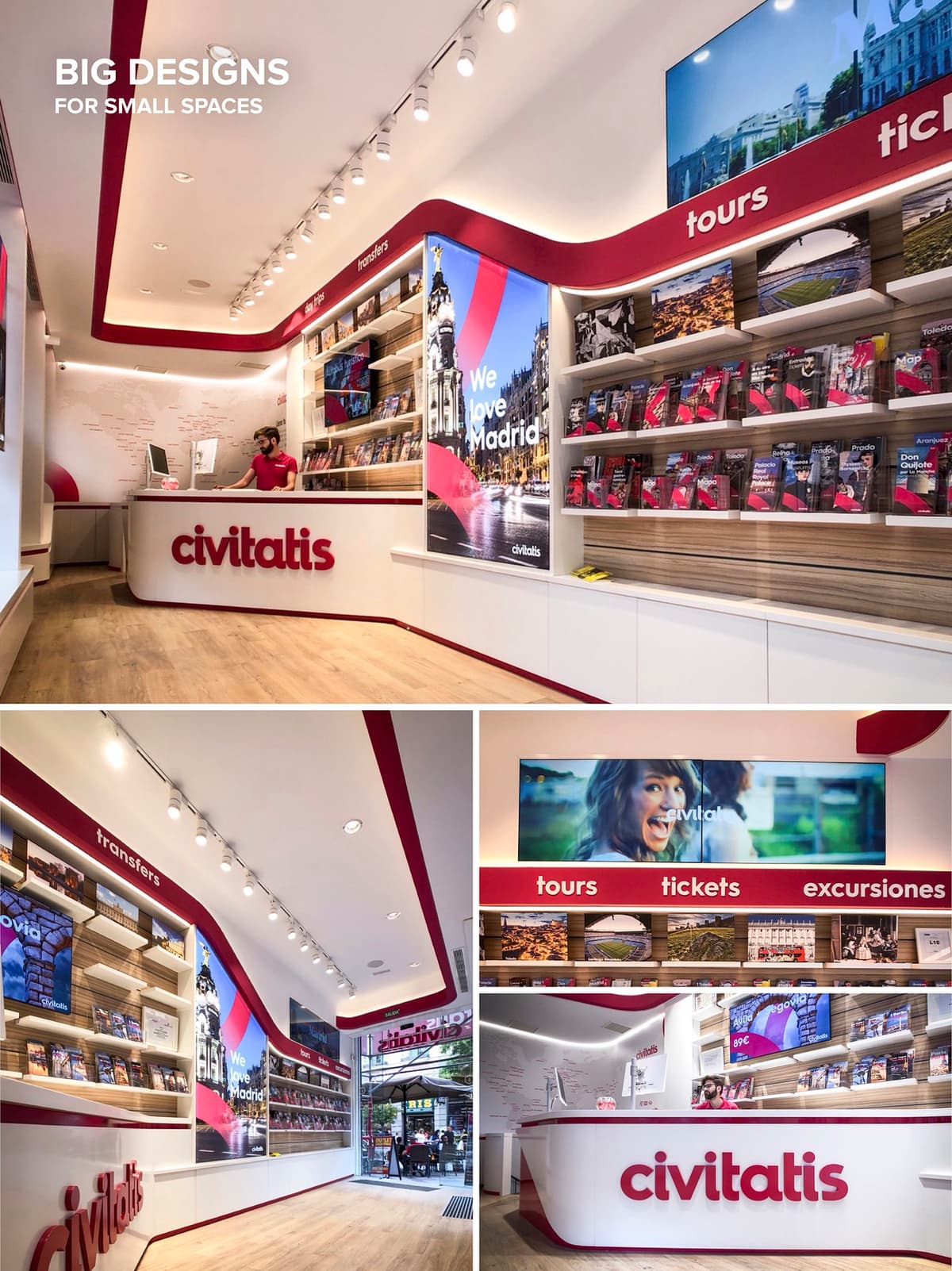

Technology help us simulate, plan and visualize the project with the client, allowing for flexibility in the exploration and changes to the project design until the accomplishment of all needs. BIM give us a better coordination and collaboration with contractors, helping in deliver, optimize, schedule and cost control allowing the prefabrication of more parts of the project giving faster results with superior quality.
The retail and tourist information center for Civitatis.com was a digitally handcrafted in BIM technology improving the overall project quality with a faster delivery process.
© 2021 by sanzpont [arquitectura] . Webpage by sanzpont [digital] . Innovative Digital Experiences
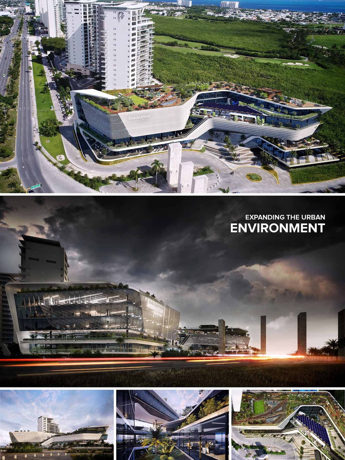

Innovation Hub is conceived as a dynamic urban catalyst, a hybrid building that fuses corporate, commercial and leisure functions into a single continuous architectural landscape. The volume emerges as a sculpted horizontal podium that extends the city fabric towards the mangrove reserve, softening the threshold between the dense avenue and the natural territory. Fluid lines, cantilevered platforms and generous terraces translate the idea of innovation into a built form that is constantly opening, overlapping and connecting.
The project operates as an elevated urban ground. Instead of a conventional closed block, the mass is fractured into stepped plates that generate plazas, paseos and belvederes at different levels. These terraces act as extensions of office spaces, retail programs and restaurants, promoting an informal interaction between work, commerce and public life while framing panoramic views to the Caribbean landscape.
The building occupies a strategic corner along a primary urban corridor, responding with a clear gesture: a curved façade that accompanies the movement of vehicles and pedestrians and defines a generous setback. This setback becomes a forecourt with drop-off areas, landscaped islets and vertical stone elements that evoke local Mayan references, marking the corporate entrance and creating a strong urban presence.
Multiple access points articulate a porous ground floor. Retail premises open directly to the sidewalks, while covered arcades and double-height lobbies provide climatic shelter and visual continuity. Vehicular circulation is organized in a perimeter loop that separates service and parking flows from the main pedestrian promenades, ensuring safe and intuitive navigation throughout the complex.
The architectural language is based on superposed horizontal slabs that slide and cantilever to create overhangs, balconies and sky gardens. The resulting expression is aerodynamic and contemporary, resonating with the coastal context of Cancún while clearly differentiating the corporate plates from the retail plinth. Large cantilevers protect the glazed areas from direct sun, reinforcing both the environmental and spatial performance.
The façades combine high-performance curtain wall systems with a second skin of horizontal louvers and perforated panels. On the main avenue, the louvers are denser and more sculptural, forming a kinetic surface that changes with the angle of view and the incidence of light. On the upper levels, the second skin opens to allow unobstructed views from executive offices and terraces, while still providing controlled shading and glare reduction.
The internal organization is structured around linear atriums and open galleries that visually connect several levels and orient the circulation. These interior voids act as climatic buffers, introducing natural light deep into the floor plates and creating visual relationships between corporate spaces, collaborative areas and the commercial program. Green planters, water features and exposed vegetation blur the boundary between interior and exterior.
Office floors are configured with flexible, large-span layouts, allowing a variety of fit-out scenarios for corporate tenants and co-working environments. Meeting rooms and informal lounges open onto terraces, encouraging outdoor work and social interaction in a climate-responsive manner. In the commercial zones, double-height shopfronts, escalators and bridges create a vertical retail experience, while the continuous roof garden operates as a communal park above the city.
The material palette is defined by light-toned concrete, glass, aluminum and local stone, producing a clean, luminous image that reduces heat absorption under tropical sun. The rounded edges and white envelope minimize thermal bridges and reflect solar radiation, while the extensive use of greenery cools the microclimate and contributes to visual comfort. Interior finishes favor neutral colors and natural materials, allowing corporate and commercial brands to personalize their spaces without compromising the architectural coherence.
Sustainability is addressed through an integrated strategy. The building orientation and overhangs optimize solar control, complemented by high-performance glazing and operable elements that promote cross ventilation where feasible. The roofscape is conceived as an active ecological layer, with native and adaptive species that reduce irrigation needs, support biodiversity and improve stormwater management. Photovoltaic panels can be integrated on selected roof areas and pergolas, contributing to on-site energy generation. Efficient LED lighting, smart building management systems and water-saving fixtures complete the environmental approach, positioning Innovation Hub as a contemporary, responsible landmark within Cancún’s evolving urban fabric.
© 2021 by sanzpont [arquitectura] . Webpage by sanzpont [digital] . Innovative Digital Experiences
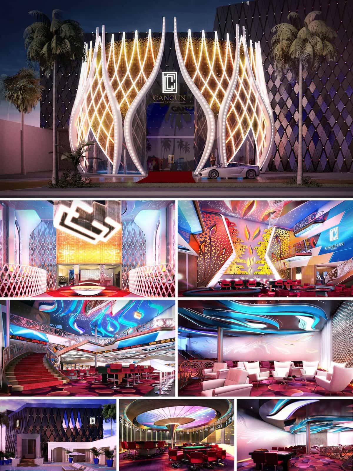

CASINO CANCUN is conceived as an immersive, nocturnal landmark that fuses the exuberance of Cancún’s nightlife with the fluid geometry of the Caribbean Sea. The architectural language draws inspiration from waves, palm fronds and luminescent marine creatures, translating them into a dynamic envelope and interior scenography that celebrates movement, light and color. The project positions the casino as a contemporary icon on the urban strip, a glowing lantern that announces entertainment while offering a controlled, theatrical interior universe.
The overall concept is based on layering: a solid, almost monolithic black volume acts as a backdrop, while a series of curvilinear, illuminated shells peel away from the façade and extend inward, guiding visitors through a sequence of increasingly intense spatial experiences. This strategy creates a strong identity visible from a distance and a coherent narrative from arrival to gaming floors and lounges.
The main façade is defined by tall, petal-like structural ribs that curve outward from the base and converge toward the sky. These ribs, integrated with LED lines and point lights, form a luminous lattice reminiscent of woven reeds or coral structures. Behind this translucent veil, a darker diamond-patterned cladding reinforces the sense of depth and frames the bright entry portal. The contrast between glossy black polygons and vibrant, warm light accentuates the verticality and creates a refined backdrop for branding.
The entrance is emphasized by a double-height, recessed portal finished with reflective materials and golden gradients, creating a visually magnetic threshold. The red carpet and low, sculpted landscape elements direct the flow of vehicles and pedestrians. Palm trees and minimal planting soften the perimeter without competing with the sculptural façade, while the controlled overhang provides partial shading and weather protection for arrivals.
The spatial organization is anchored by a clear north-south circulation spine that aligns with the entrance axis, allowing visual continuity from the lobby through to the main gaming floor. Visitors enter a double-height hall where staircases and balconies reveal the upper levels and invite exploration. Curved balustrades and perforated screens subtly guide circulation, while maintaining sightlines across the entire volume to reinforce orientation and excitement.
The gaming floor unfolds around central feature elements, such as sculptural ceilings and illuminated columns, while peripheral zones accommodate slot machines, table games, and VIP areas. Secondary lounges and bar zones are positioned as quieter pockets along the main circulation, offering acoustic and visual relief. Vertical connections through grand staircases and elevators link to private rooms, administration, and entertainment platforms, ensuring operational efficiency and differentiated experiences.
The interior design employs a rich but controlled palette: high-gloss metallics, lacquered surfaces, patterned carpets and upholstered seating in crimson, fuchsia and deep violet. These are contrasted with white and cream-toned armchairs that create visual pauses within the chromatic intensity. The floor patterns reference casino chips and abstracted wave forms, helping to zone functions while unifying the whole environment.
Ceilings act as primary expressive surfaces. Undulating, backlit panels integrate RGB LED systems that wash the space with programmable gradients of blues, magentas and cyans, evoking aquatic motion. Perforated metal panels and translucent stretch membranes filter and diffuse light, concealing technical equipment and improving acoustic absorption. Feature walls with cut-out leaf and flame motifs are backlit to produce a layered, luminous effect that animates the gaming areas and lounge zones.
Furniture is tailored to the extended-stay nature of casino use. Gaming chairs combine ergonomic back support, rotary bases and durable upholstery, while VIP lounges feature deeper, lounge-style seating with generous armrests and side tables. The layout of seating and tables ensures clear circulation paths for guests and staff, minimizing congestion and enhancing service efficiency.
Color temperature and light levels are carefully calibrated: brighter, more saturated lighting emphasizes gaming areas to maintain alertness, while warmer, dimmer scenes characterize bars and relaxation pockets to promote comfort and social interaction. Acoustic treatments in ceilings and walls reduce noise reverberation, creating an environment that is vibrant yet not overwhelming, thus supporting long-term user comfort.
Despite its high-impact visual language, the project integrates sustainable design measures appropriate to Cancún’s tropical climate. The dark, insulated outer volume acts as a thermal shield, while the ventilated cavity behind the decorative façade reduces direct solar gain on the main envelope. High-performance glazing and selective openings limit heat infiltration, lowering cooling loads in a building type that operates primarily at night.
LED technology is used almost exclusively for both exterior and interior lighting, significantly reducing energy consumption and maintenance compared to conventional systems. Centralized lighting controls and scene programming optimize power use throughout the day and adapt to different occupancy levels. Interior finishes favor durable, low-maintenance materials, extending life cycles in this high-traffic environment. Where possible, locally sourced materials and regional contractors are prioritized, decreasing transportation impacts and supporting the local economy, aligning the casino’s expressive architecture with responsible environmental and social performance.
© 2021 by sanzpont [arquitectura] . Webpage by sanzpont [digital] . Innovative Digital Experiences
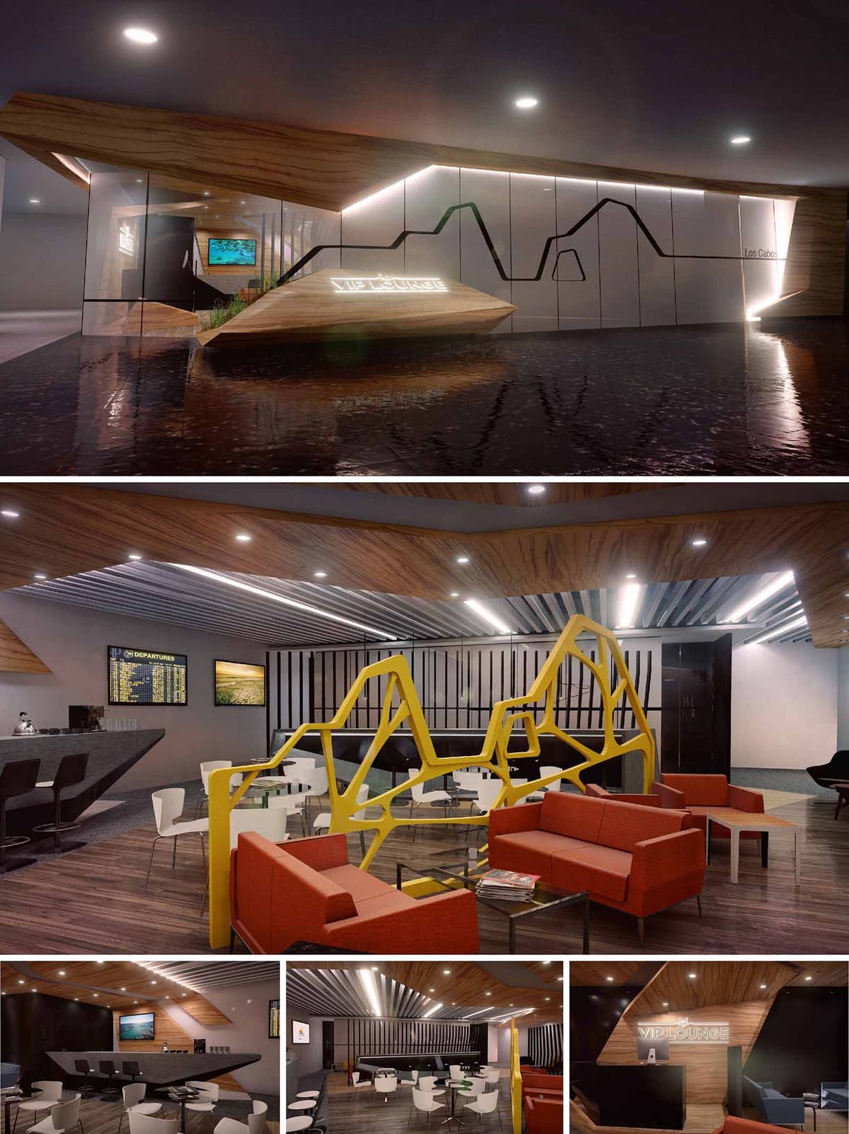

The GAP Airport VIP Lounge SJD is conceived as an urban oasis that translates the dynamism of air travel into a calm and controlled interior landscape. The design draws inspiration from flight trajectories and topographic lines, abstracted into sharp, faceted volumes and continuous graphic lines that guide the passenger’s journey from concourse to lounge. The envelope is composed of folded planes in warm wood and glossy white panels, intersected by a black line that evokes both skyline and route map, creating a strong identity visible from the public circulation.
Inside, the project balances business efficiency with resort-like comfort, referencing the Mexican Pacific context through textures, colors, and an emphasis on horizontality. The spatial narrative moves from an expressive, sculptural reception toward more intimate and acoustically controlled seating zones, offering a gradual decompression from airport stress.
The reception lobby acts as a threshold space, defined by a floating, angular desk set within a reflective surface that suggests water and visually amplifies the volume. From this point, circulation branches into different functional areas: bar, workstations, lounge seating, and dining. The plan is organized in open bands rather than enclosed rooms, allowing clear sightlines to flight information displays and service points while maintaining distinct atmospheres.
A central sculptural yellow screen partitions the main salon, providing visual separation between lounge seating and dining without blocking natural light or supervision. Perimeter seating zones are oriented to take advantage of views and media walls, while central furniture clusters support social interaction and short-stay users. Service areas such as bar, buffet, and back-of-house are consolidated along one side to optimize operations and reduce staff circulation.
The material strategy contrasts the efficiency of contemporary aviation infrastructure with the warmth of hospitality environments. Ceilings and key vertical planes are clad in wood veneer with pronounced grain, generating a continuous envelope that visually “folds” around guests and reinforces the faceted geometry. This is balanced by metallic linear panels and neutral walls that reflect and distribute artificial light in a controlled manner.
The furniture palette introduces bold chromatic accents: vivid orange seating elements convey energy and brand differentiation, while the bright yellow partition becomes a sculptural focal point. Tables and bar counters in dark stone or solid surfaces introduce a sense of robustness and durability, essential for high-traffic airport conditions. Monochromatic white and black elements, including chairs and vertical slats, anchor the composition and prevent visual overload.
The lighting design emphasizes linearity and direction, echoing the concept of runways and flight paths. Recessed linear LED fixtures run parallel to the corrugated ceiling panels, reinforcing perspective and guiding movement through the lounge. Integrated lighting in the reception desk and wall panels highlights the VIP Lounge signage and enhances the perception of floating volumes.
Ambient lighting is uniformly distributed to support reading and work activities, while accent lighting is used to mark the bar, artwork, and key architectural gestures. Warm color temperatures complement the timber finishes, creating a comfortable atmosphere that counterbalances the cooler tones of metal and glass typically found in airport environments.
Sustainability is addressed through durable, low-maintenance materials and an efficient lighting strategy. The use of LED technology reduces energy consumption and maintenance frequency, critical in 24/7 operational contexts. Light-colored reflective surfaces on ceilings and walls optimize luminance levels, allowing lower overall wattage while maintaining visual comfort.
High-wear finishes, such as composite surfaces for counters and engineered flooring, extend lifecycle and reduce the need for replacement, thereby minimizing material waste over time. Where possible, certified wood veneers and low-VOC finishes are specified to improve indoor air quality. The open-plan configuration promotes flexible furniture arrangements, enabling future reconfiguration without significant construction waste, ensuring the lounge can adapt to evolving passenger needs and operational demands across SJD, TIJ, and GDL airports.
© 2021 by sanzpont [arquitectura] . Webpage by sanzpont [digital] . Innovative Digital Experiences
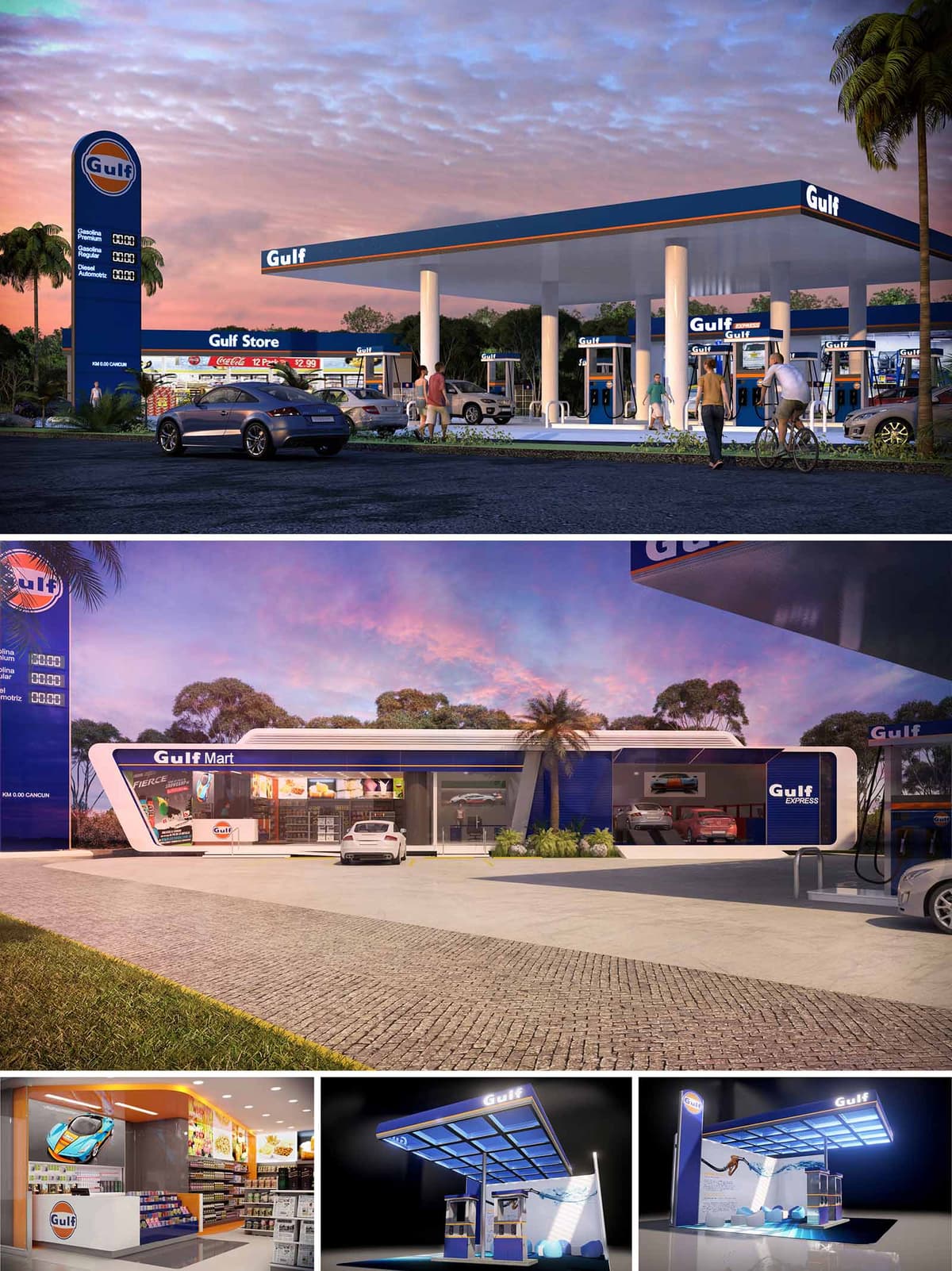

The GULF service station in Cancún is conceived as a contemporary mobility hub that merges efficiency, brand visibility and comfort within a tropical coastal context. The architecture translates the corporate identity into a sequence of dynamic blue and orange surfaces, creating a recognizable urban landmark along the highway while remaining visually light and open to the landscape. The composition balances the horizontal emphasis of the canopies with the sculpted volume of the convenience store, generating a cohesive ensemble that frames the flow of vehicles and pedestrians.
The project reinterprets the traditional gas station typology by integrating fueling, retail and quick-service functions into a single, legible layout. Generous overhangs, transparent façades and clear circulation lines promote intuitive use, prioritizing safety and rapid orientation for users arriving by car, bicycle or on foot.
The masterplan organizes the forecourt as a broad, unobstructed platform where the fuel islands are aligned perpendicularly to the main access, facilitating direct entry and exit movements. The canopy is dimensioned to maximize shade during the hottest hours, while maintaining sufficient free height for various vehicle types. Perimeter landscaping softens the interface with the surrounding vegetation, framing views towards the dense tree line characteristic of the region.
The convenience store and ancillary volumes are placed laterally, generating a clear separation between fueling operations and retail parking. This arrangement allows pedestrians to move safely from parked vehicles to the store through marked walkways, without crossing the main circulation lanes. Service areas and deliveries are concealed to the rear, preserving the clean, branded front elevation.
The architectural language is defined by elongated horizontal lines, rounded transitions and a precise chromatic contrast between white structural frames, deep blue infill panels and orange highlights. The main store volume is articulated as a streamlined bar with cantilevered corners, suggesting movement and echoing automotive aesthetics. Large glass fronts dissolve the boundary between interior and exterior, transforming the store into a luminous showcase, especially during evening hours.
Materials are selected for durability and low maintenance in a humid, saline environment: steel and aluminum claddings with baked enamel finishes, high-reflectance composite panels on soffits, and non-slip concrete paving with integral expansion joints. The canopy underside employs reflective, easy-to-clean surfaces that amplify artificial lighting and enhance perceived security at night.
Inside the Gulf Mart, the layout is organized around a central service counter with clear merchandising corridors radiating from it. Warm white lighting, combined with accent strips in brand colors, guides customers through snacks, beverages and automotive accessories. Tall refrigerated walls, low gondolas and transparent product displays ensure maximum visibility while maintaining comfortable sightlines across the store.
The interior palette balances bright corporate tones with neutral flooring and ceilings, avoiding visual fatigue and enabling rapid product identification. Finishes prioritize robustness and hygiene: vinyl or porcelain tile floors with high abrasion resistance, laminated cabinetry and impact-resistant wall panels in high-traffic zones. The overall ambience is that of a compact, efficient mini-market that invites brief but pleasant stays.
Artificial lighting plays a strategic role in transforming the station into a safe, attractive node after dusk. LED luminaires integrated into the canopy perimeter generate a continuous luminous band that reinforces the station’s silhouette from a distance. Vertical signs and totems are backlit to ensure visibility while avoiding glare towards the roadway.
Within the retail volume, controlled brightness levels create hierarchy between the facade display and the interior shelves, functioning as an illuminated “urban showcase.” Accent lighting on structural frames and signage underlines the architectural geometry and maintains coherence between the forecourt and interior spaces.
Sustainability strategies are embedded in the morphology and technical specification of the project. The extended canopies and deep overhangs substantially reduce direct solar gain on vehicles and glazed surfaces, improving user comfort and diminishing cooling loads inside the store. High-performance glazing combined with external shading optimizes natural daylight while limiting heat transmission.
LED lighting with smart controls is proposed throughout the complex, reducing energy consumption and maintenance. The canopy offers potential integration of photovoltaic panels, transforming the large roof surface into an energy-generating plane. Permeable or semi-permeable paved areas and perimeter planting beds contribute to rainwater infiltration, mitigate surface temperatures and visually connect the station with Cancún’s lush tropical environment.
© 2021 by sanzpont [arquitectura] . Webpage by sanzpont [digital] . Innovative Digital Experiences
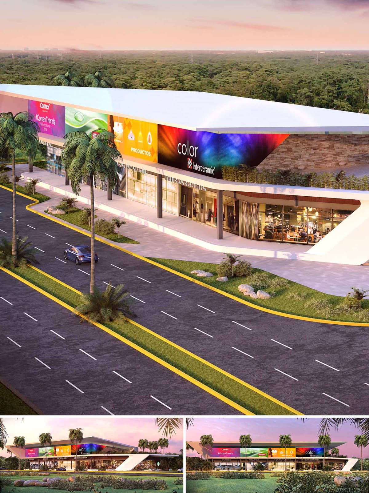

San Antonio Plaza is conceived as a linear commercial hub that acts as a colorful urban façade along one of Cancún’s main access roads. The design emphasizes horizontality and movement, using a continuous canopy and a vibrant graphic band to frame retail activity while creating a recognizable landmark. The architecture operates as an urban screen, capturing attention from fast vehicular flows and transforming it into a welcoming, pedestrian-oriented experience at ground level.
The project articulates a clear contrast between a calm, white structural envelope and a dynamic, chromatic upper zone dedicated to branding and communication. This dual reading allows the building to accommodate changing tenants and campaigns while preserving a coherent architectural identity anchored in clean, contemporary lines.
The plaza is organized as a single elongated volume, protected by a cantilevered roof that projects significantly towards the avenue, emphasizing linearity and providing deep shade to the storefronts. Structural supports are minimized and expressed as slender, dark-colored columns, enhancing transparency and visual continuity across the ground floor.
The façade is resolved with large-format glazing, creating a visual dialogue between interior retail spaces and the exterior public realm. Above this transparent base, a continuous band accommodates digital or printed signage, conceived as a controlled “media façade.” A stone-clad backdrop and vegetated strip on the upper level offer a warm counterpoint to the technological character of the graphic band, rooting the building in the local material context.
The interior is organized as a sequence of flexible commercial modules aligned along a continuous circulation spine parallel to the avenue. The open structural grid allows for different tenant sizes, from large anchor stores to smaller specialty shops, ensuring long-term adaptability to evolving commercial needs.
At ground level, generous overhangs and a widened sidewalk create an intermediate climatic buffer zone functioning as a covered gallery. This semi-exterior strip encourages window-shopping, supports outdoor displays, and provides shaded waiting and meeting areas without obstructing the visual field of the storefronts.
Located between the dense green landscape of Cancún and a high-traffic roadway, the plaza mediates between natural and urban environments. The building’s low profile respects the horizontal character of the surroundings and preserves long views toward the vegetation beyond.
Landscaped parterres with palms and low shrubs structure the setback between roadway and commercial strip, softening the transition from asphalt to architecture. The curved geometry of the sidewalks and planted islands echoes the fluidity of traffic, while integrating stormwater infiltration areas into the landscape design.
The material palette combines white plastered surfaces, large glass panes, natural stone, and metallic framing. The white and neutral tones enhance daylight reflection, contributing to a bright yet controlled interior ambience. At night, the building transforms through integrated LED lighting in the signage band and warm interior illumination, turning the plaza into a luminous beacon along the avenue.
The absence of excessive façade ornamentation leaves prominence to light, graphics, and merchandise as the main protagonists. This approach enables a contemporary and adaptable aesthetic, where the architecture functions as an elegant and efficient support for commercial expression.
The project responds to Cancún’s tropical climate through passive design measures. The extended roof overhang and the recessed shopfronts reduce direct solar gain on glazing, lowering cooling demands while enhancing user comfort in the shaded exterior gallery. Clear zoning between conditioned interiors and semi-open circulation areas optimizes energy use.
Landscape elements along the road and building perimeter are designed to aid stormwater management, using permeable surfaces and planting beds to facilitate infiltration and reduce runoff. The selection of durable, low-maintenance materials such as stone cladding and aluminum framing supports longevity in a saline coastal environment, while the modular structure and flexible floor plans allow future reconfiguration without significant demolition, contributing to the plaza’s long-term environmental and economic sustainability.
© 2021 by sanzpont [arquitectura] . Webpage by sanzpont [digital] . Innovative Digital Experiences
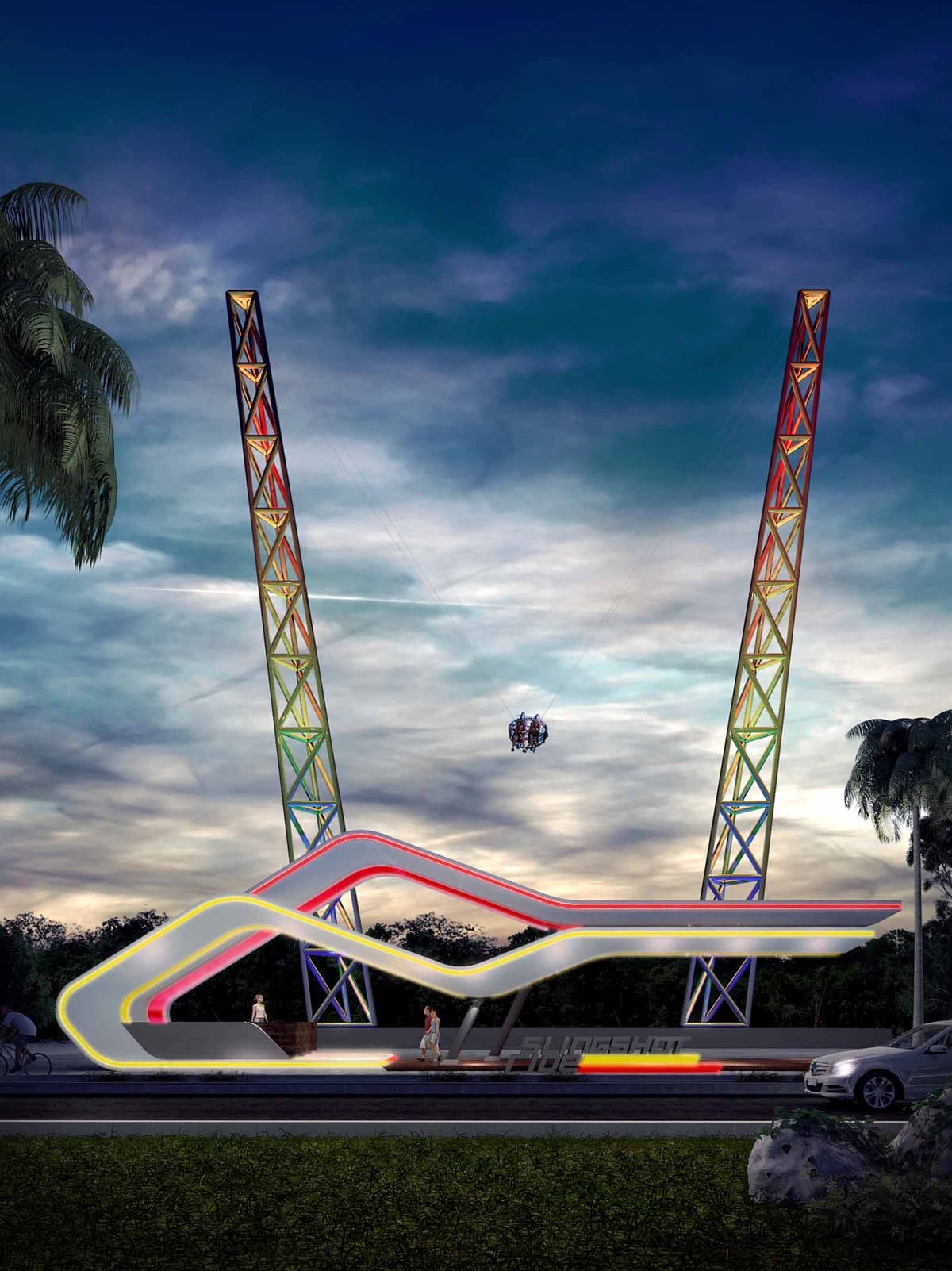
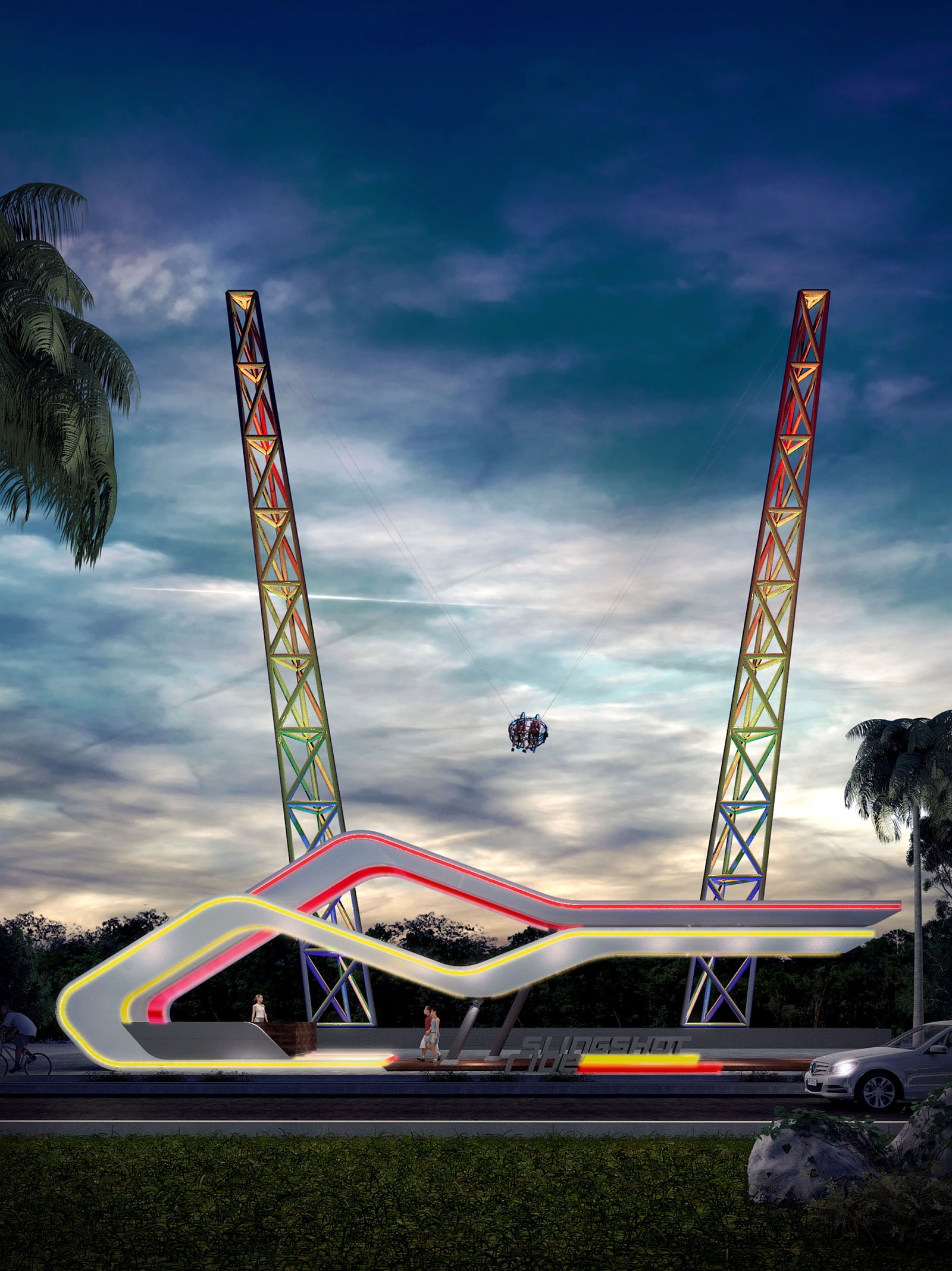
The Slingshot Ride in Cancún is conceived as an urban landmark that translates the extreme dynamics of the attraction into an architectural gesture. The project explores the tension between earth and sky: two vertical towers anchor the structure to the ground while a fluid, illuminated base traces the trajectory of the launch. The architecture is not a neutral support for the ride, but a three-dimensional graphic that amplifies the sensation of speed, risk and elevation.
The formal language is inspired by the energy of light trails and aerodynamic profiles. Continuous curves envelop the boarding platform, creating a sculptural shell that visually connects the towers and defines a clear, iconic silhouette against the Caribbean sky. The design aims to be instantly recognizable from the hotel zone and the nearby road, functioning simultaneously as infrastructure, attraction and luminous sign.
The project is located along a primary vehicular corridor, so the composition is organized longitudinally, parallel to the street, to maximize visibility and legibility at high speed. The access esplanade, ticketing and waiting area are all integrated into a low, elongated plinth that visually grounds the towers and protects users from the traffic edge.
Circulation is resolved through a clear sequence: street sidewalk, raised platform, controlled access and embarkation zone. Visual permeability is maintained at all times, both for safety and for the theatricality of the experience, allowing passersby to observe the preparation and launch. The vertical towers frame the horizon and work as a contemporary gateway, signaling arrival to a leisure strip within the city.
The two slender towers are expressed as triangulated steel trusses, optimized for stiffness and wind performance in a coastal environment. Their geometry responds to the mechanical requirements of the slingshot system, while the colored lighting accentuates the rhythm of the structural modules. The apparent lightness of the towers contrasts with their technical robustness, emphasizing the controlled nature of the extreme experience.
The base canopy is conceived as a ribbon-like steel structure clad with high-performance composites and smooth, durable finishes suitable for outdoor, saline conditions. Its continuous curves function as a structural shell and as an integrated support for LED lighting, signage and safety barriers. Joints and fixings are concealed to preserve the impression of a seamless, flowing element hovering above the platform.
Given Cancún’s strong nocturnal tourism activity, the project is designed primarily as a night-time icon. Dynamic RGB LED lines trace the contours of the base canopy, while programmable fixtures embedded in the truss bays transform the towers into vertical light totems. Color gradients can be synchronized with the launch sequence, turning each ride into a short light performance visible from long distances.
The palette is intentionally vibrant, referencing the atmosphere of amusement parks and the luminosity of the Caribbean nightlife. At the same time, the use of linear lighting and controlled optics reduces glare and focuses brightness where it amplifies the geometry, allowing the structure to remain legible without excessive light pollution.
The architecture frames the emotional transition of the user from spectator to participant. The enveloping canopy creates a threshold that separates the everyday urban context from the intense moment of launch. The raised platform allows unobstructed views for companions and onlookers, transforming the waiting time into a shared show.
Safety is expressed through transparency and clarity: guardrails, access ramps and control zones are integrated into the overall form, avoiding visual clutter while ensuring compliance with international amusement-ride standards. Night lighting of circulation edges and steps reinforces intuitive wayfinding and reduces risk, even during peak hours.
The project incorporates sustainable strategies adapted to the tropical, coastal climate of Cancún. The compact footprint minimizes land occupation and preserves existing vegetation around the perimeter, using it as a natural backdrop instead of overdeveloping the plot. Structural steel is specified with a high recycled content and is designed for potential disassembly or relocation, aligning with circular economy principles for entertainment infrastructure.
Energy consumption is reduced through the exclusive use of LED technology with programmable scenarios that dim lighting during low-traffic hours. Control systems allow selective activation of tower and canopy effects, optimizing power use during operation. Corrosion-resistant coatings and low-maintenance materials extend the life cycle of components in the saline environment, reducing replacement frequency and associated environmental impact. Rainwater harvesting from the canopy for landscape irrigation is foreseen, contributing to responsible water management in the region.
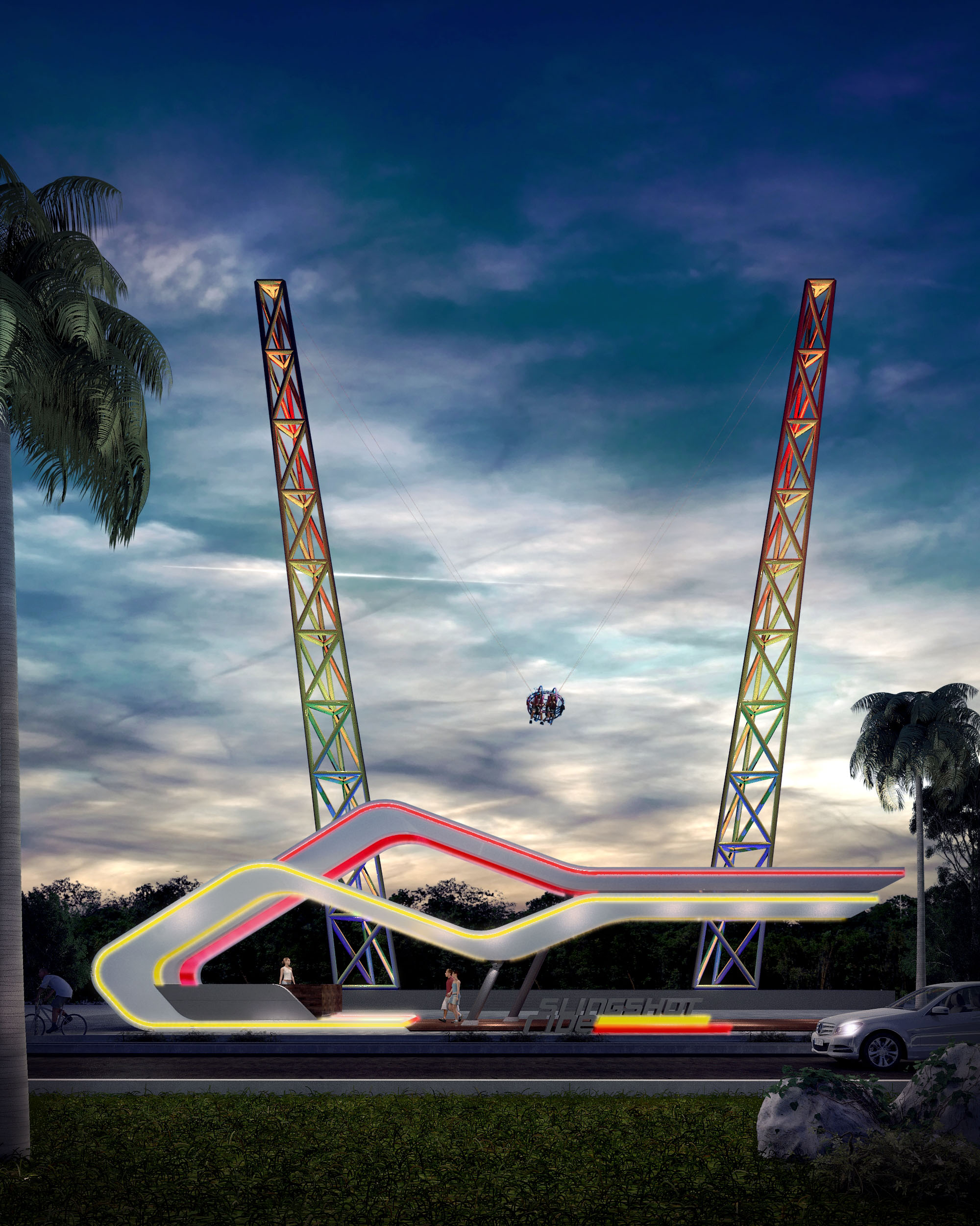
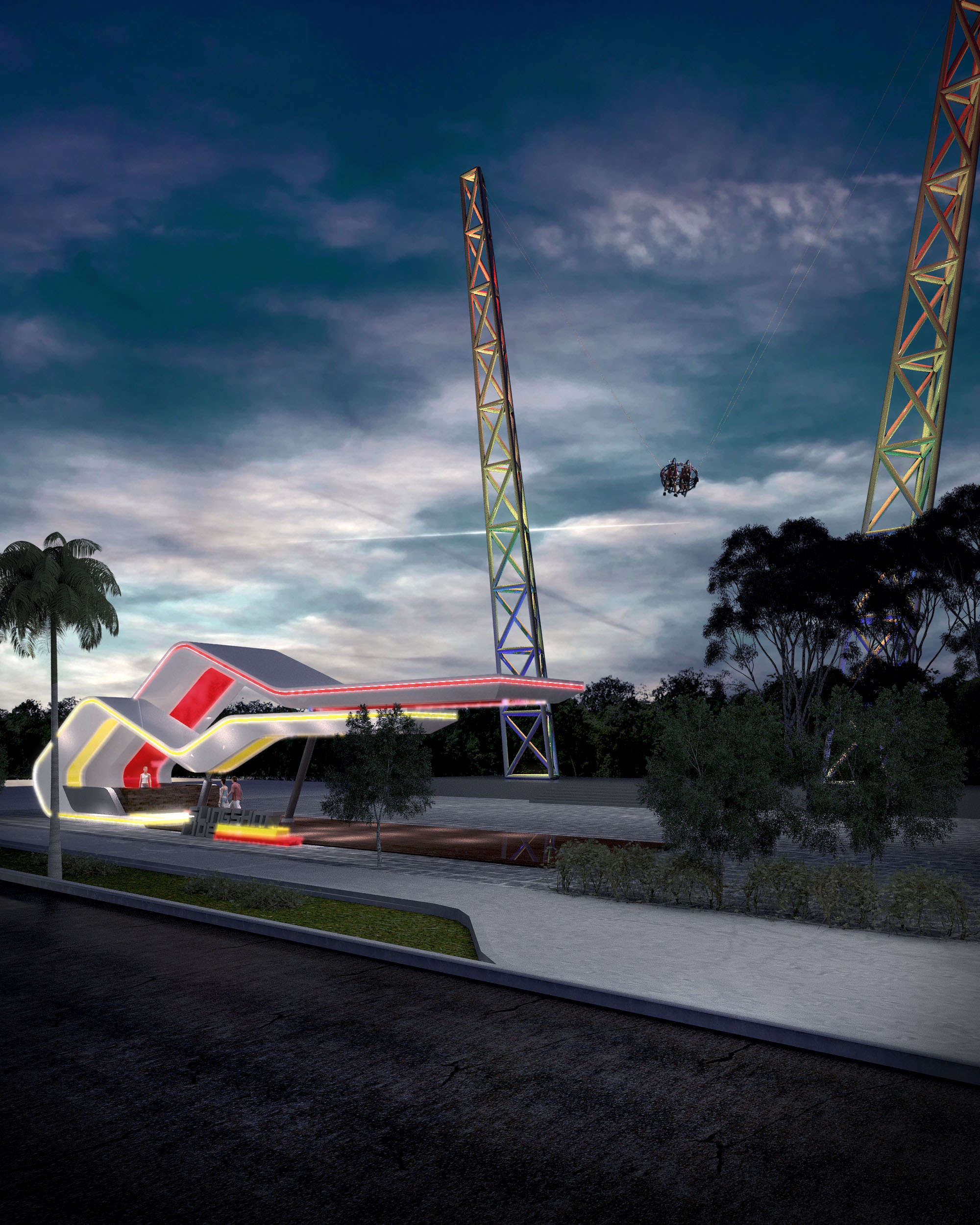
© 2021 by sanzpont [arquitectura] . Webpage by sanzpont [digital] . Innovative Digital Experiences
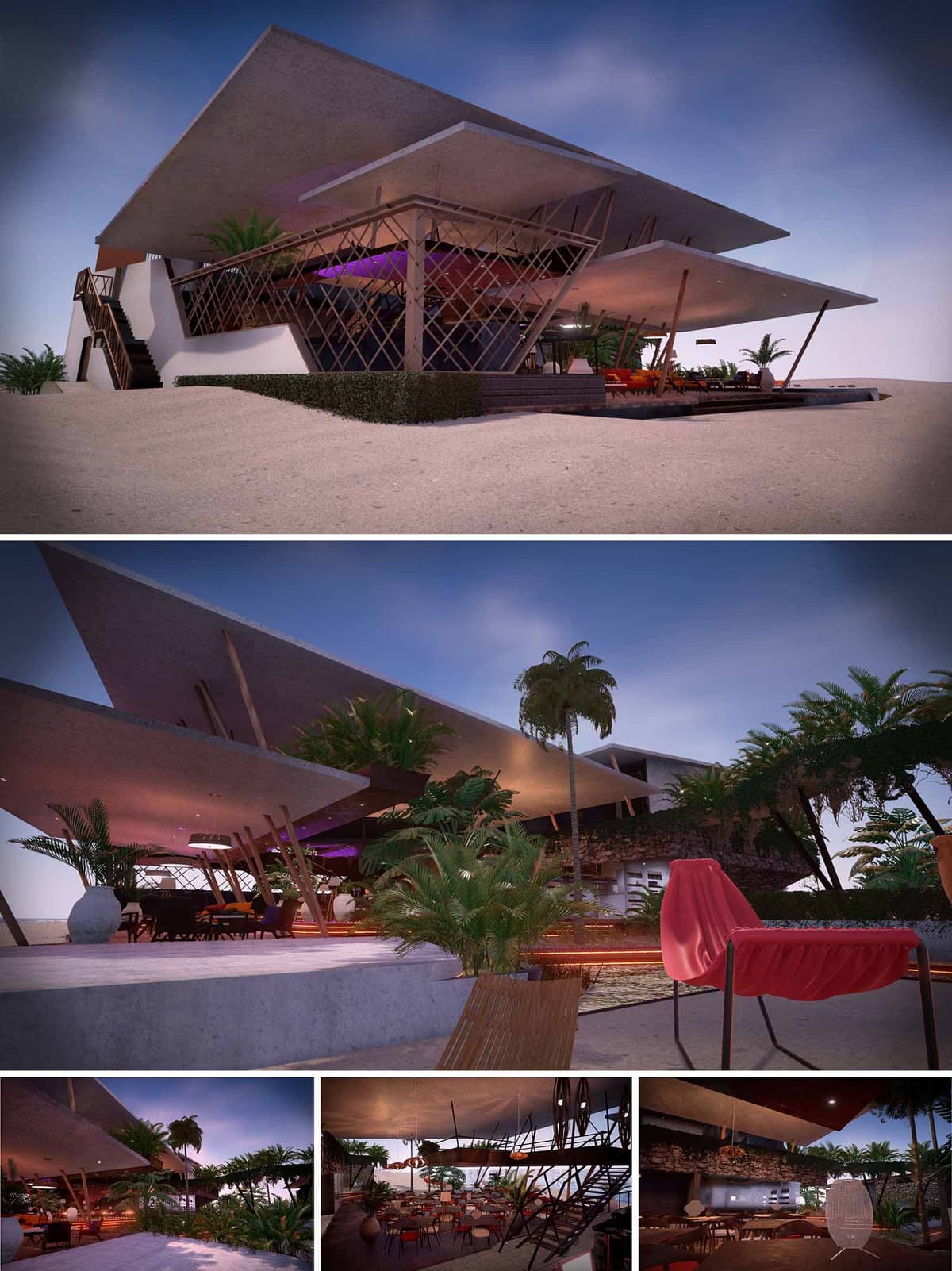
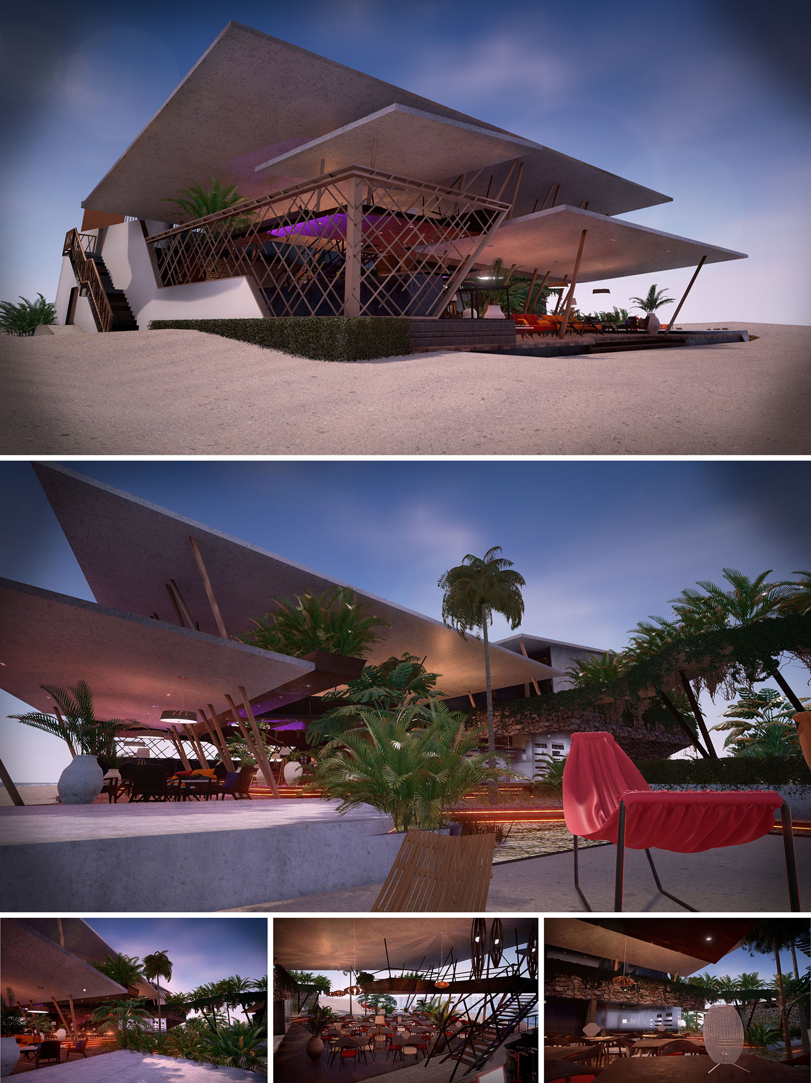
Tulum Beach Club is conceived as a sculptural shelter that hovers lightly above the sand, framing the Caribbean horizon through a sequence of horizontal planes and permeable enclosures. The project fuses contemporary coastal architecture with a relaxed, barefoot luxury atmosphere, using large cantilevered slabs that evoke the abstraction of waves and dunes. The design is organized as a series of terraces and platforms that gradually descend toward the sea, allowing the social life of the club to unfold in constant visual and climatic dialogue with the beach.
The architecture is intentionally open and porous, privileging natural ventilation, visual continuity and the sensory experience of light, shade and breeze. Structural elements are expressed as part of the aesthetic language, with inclined supports and latticework that produce a dynamic, almost kinetic reading of the building while maintaining a clear and legible geometry.
The club is positioned parallel to the shoreline, creating a low, elongated volume that respects the natural profile of the dune and preserves existing vegetation where possible. Access from the land side is resolved through a gradual ascent via staircases and ramps that elevate visitors above the sand, generating a threshold between the public beach and the semi-private world of the club.
The architecture avoids vertical excessive impact by fragmenting the mass into staggered plates and open voids. This strategy maintains ocean views from the surroundings and allows sea breezes to cross the project. Vegetation bands and low hedges stabilize the dune, prevent erosion and visually soften the transition between built and natural environments.
The interior layout is structured around a central bar and lounge core, from which different atmospheres are articulated: dining terraces, shaded relaxation areas, and front-row sun decks directed to the sea. A double-height space under the main slab enhances openness, while intermediate mezzanines generate more intimate corners without losing connection to the main environment.
Circular and fluid circulation promotes exploration. Long peripheral promenades connect seating platforms, pools and beach access, allowing guests to move barefoot on continuous surfaces that alternate between polished concrete, wood decking and sand. Vertical circulation is resolved with light staircases that emphasize transparency and maintain visual continuity between levels.
The structural system is based on exposed reinforced concrete slabs in large overhangs, supported by inclined steel or timber-like columns that reinforce the nautical and tropical character of the club. These planes float above the terrain, generating deep eaves that protect from sun and rain while producing generous shaded outdoor rooms.
The material palette combines raw concrete, natural wood tones, stone walls and woven elements that reference local craft traditions. Interior furnishings introduce warm colors such as terracotta and coral, contrasted with abundant greenery in large planters. At night, a calibrated lighting scheme with warm LEDs and integrated strips in floors and ceilings enhances textures and creates a vibrant yet cozy atmosphere appropriate for events and evening gatherings.
Landscape design is conceived as an extension of the coastal ecosystem, using native and adaptive species that require minimal irrigation and contribute to dune stabilization. Palm trees, shrubs and groundcovers are strategically placed to filter views, provide shade and create microclimates within the terraces and paths.
Sustainability is present through passive environmental control: the open, cross-ventilated configuration reduces dependence on mechanical air conditioning, while the deep concrete overhangs limit direct solar gain on occupied areas. Durable, low-maintenance materials such as exposed concrete and natural stone are selected for their longevity and thermal inertia, improving comfort in the tropical climate. The design contemplates efficient LED lighting, potential integration of solar panels on the upper slabs, and water-saving fixtures, aligning the project with responsible tourism principles in Tulum’s fragile coastal context.
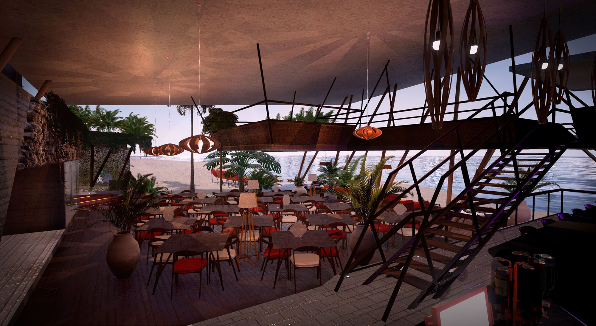
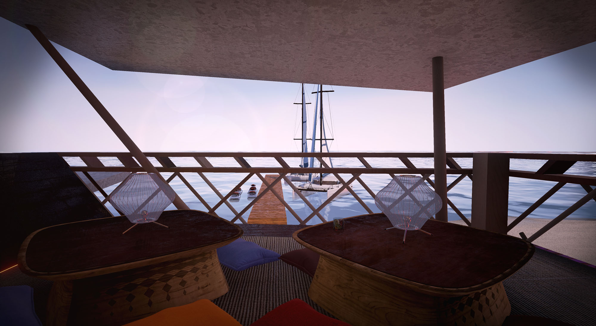
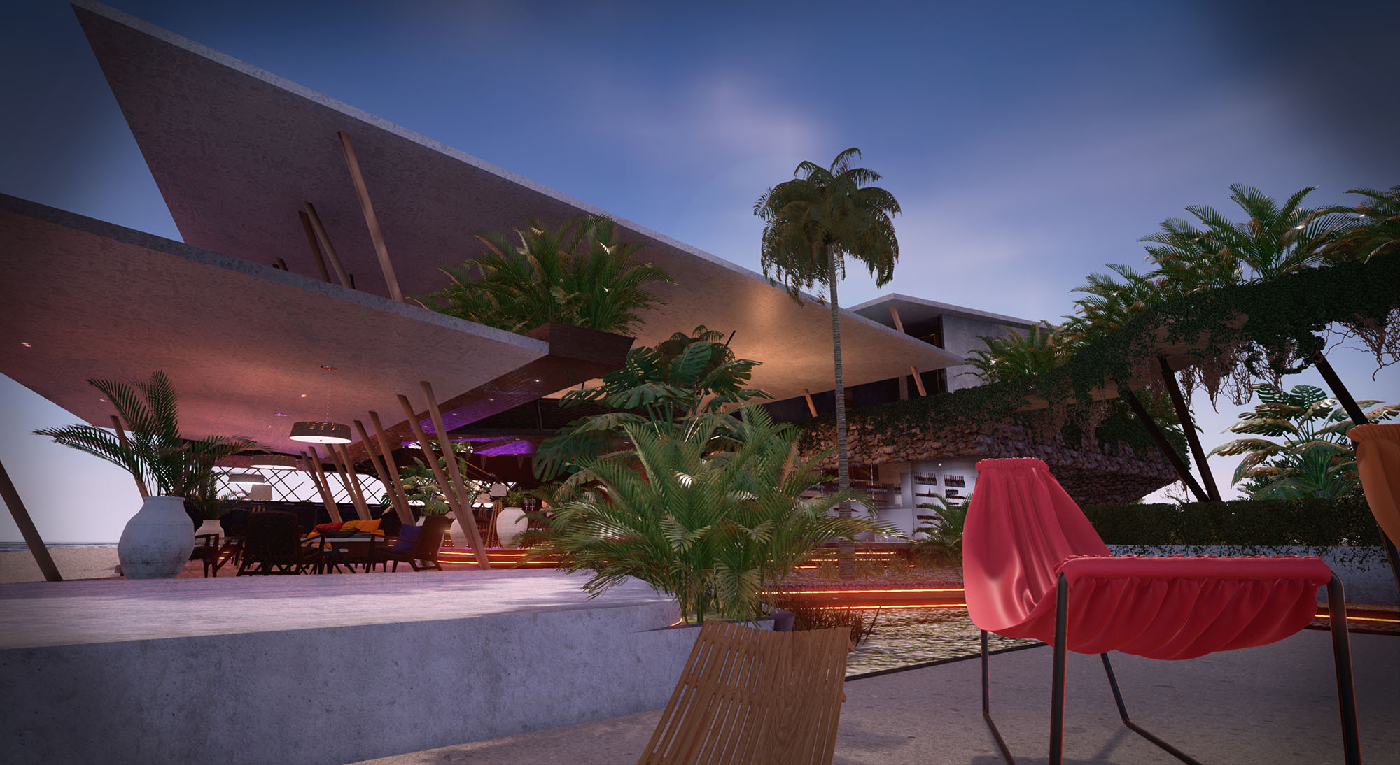
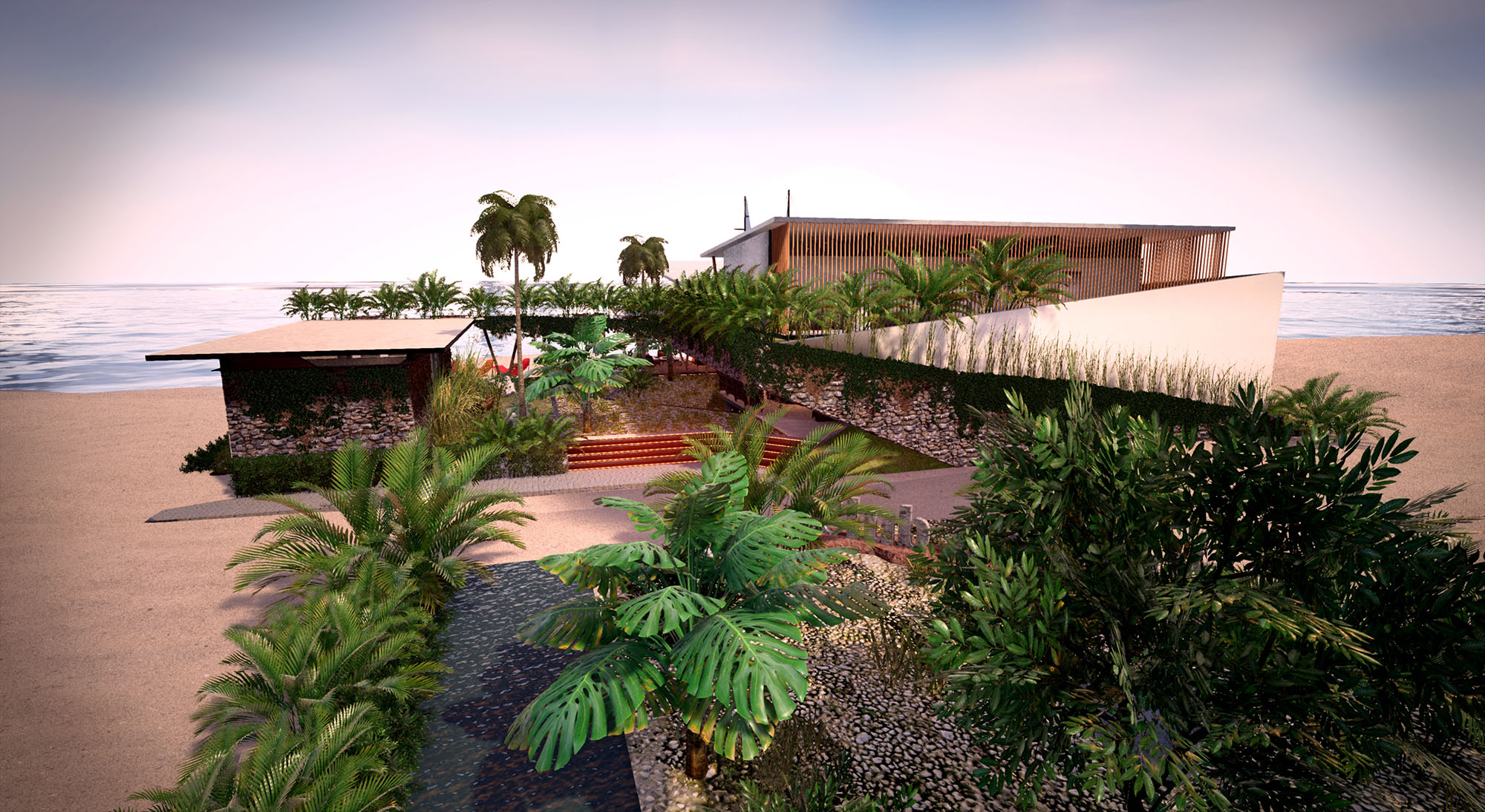
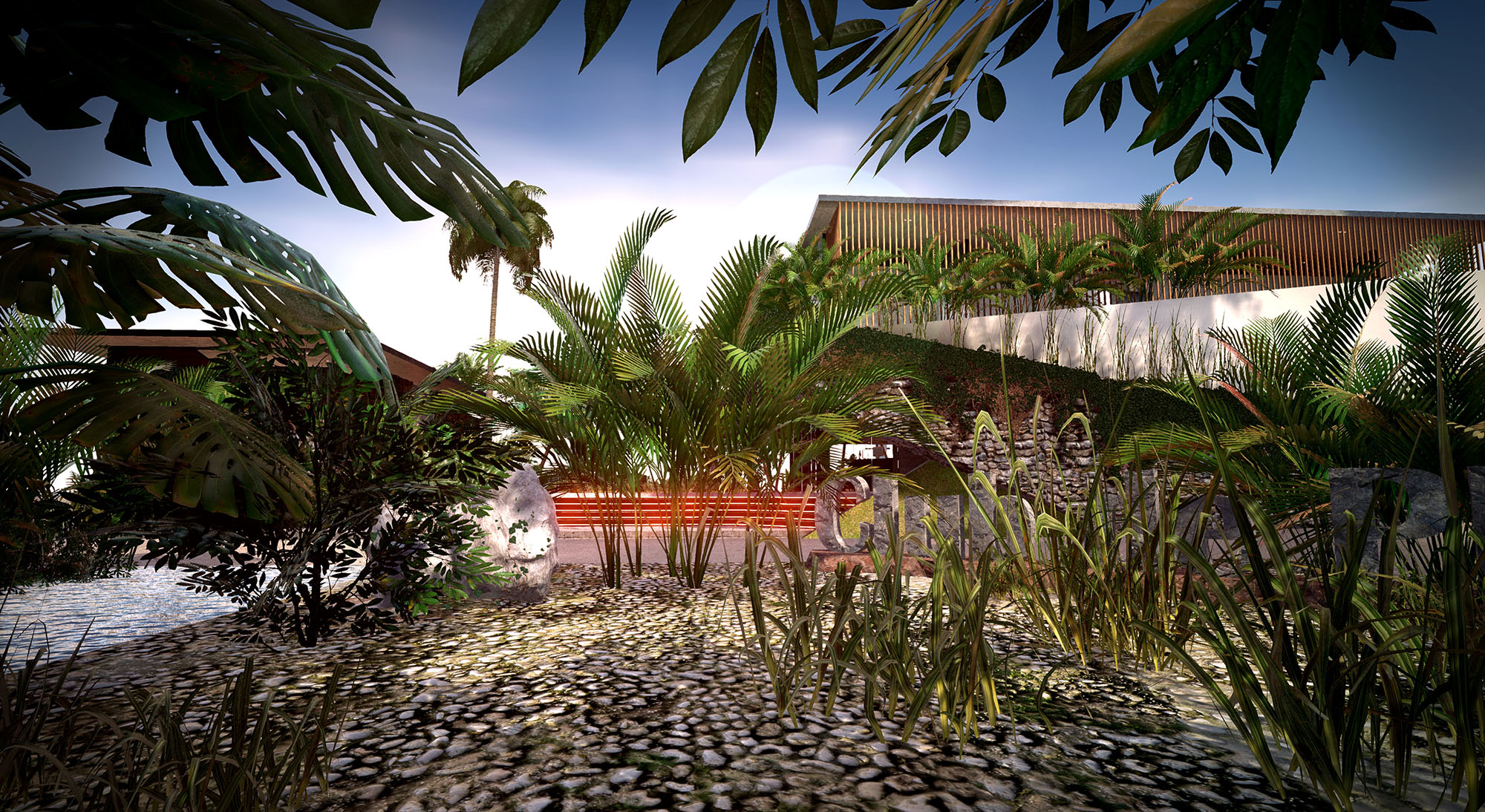
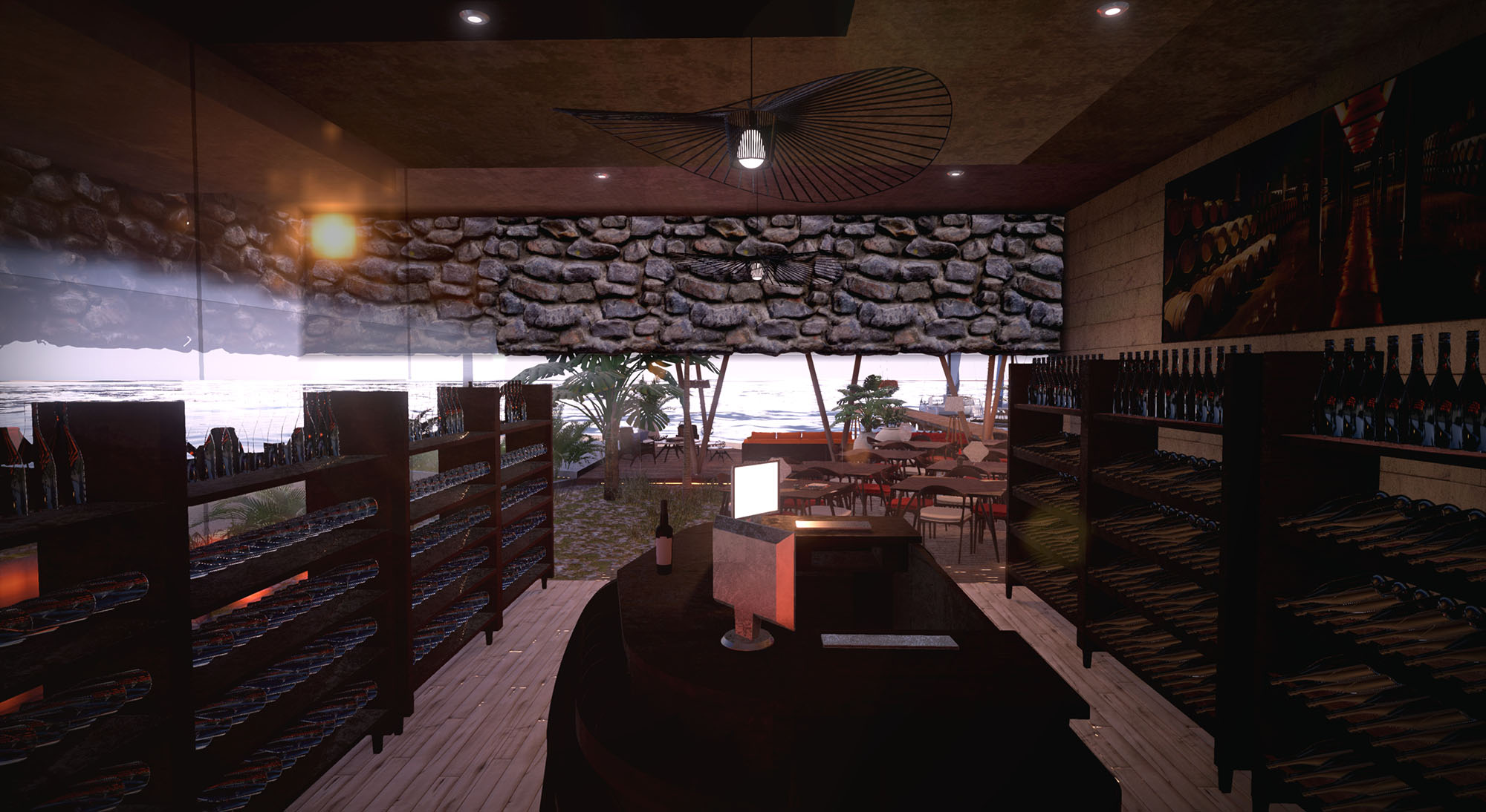
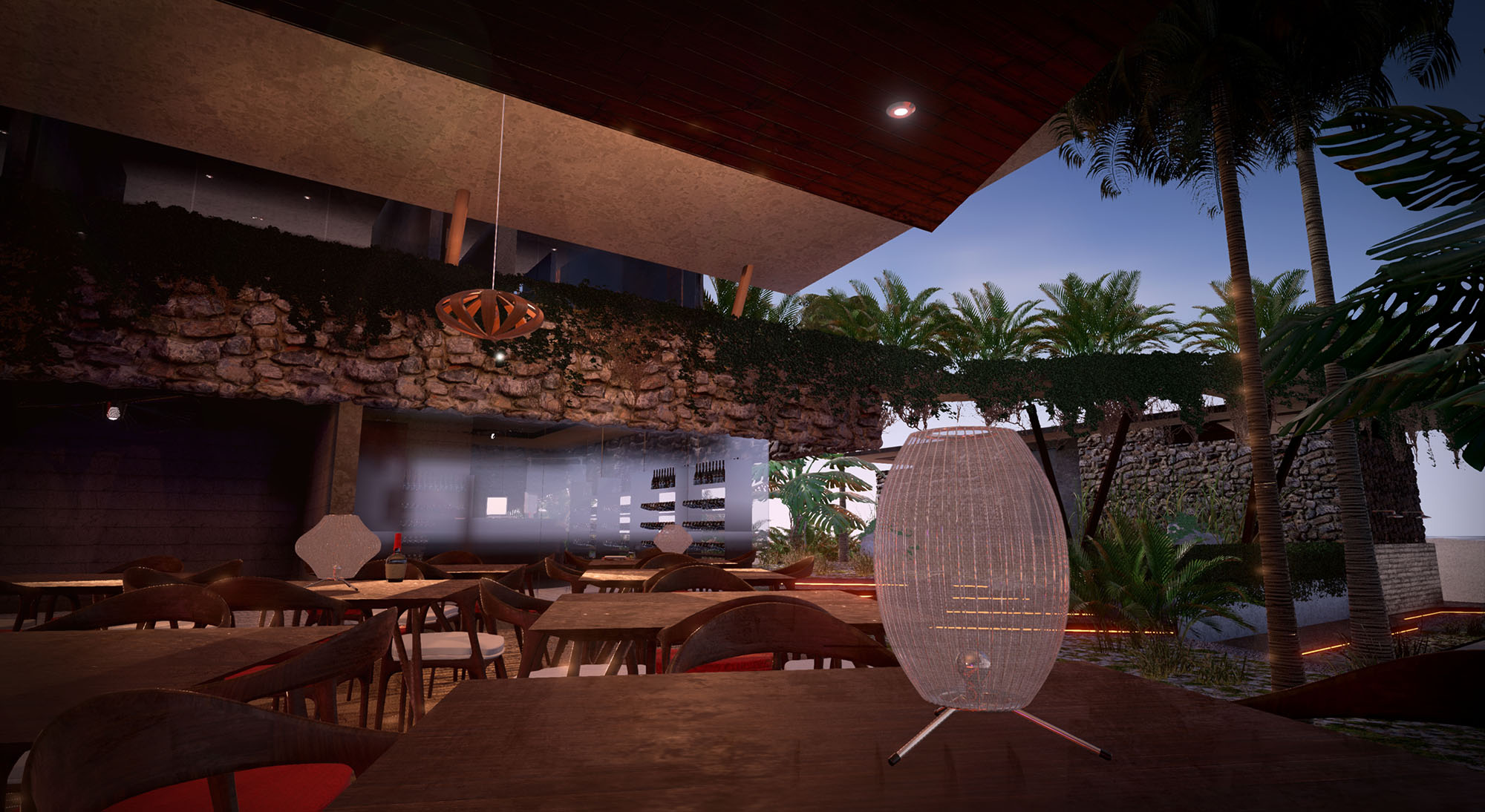
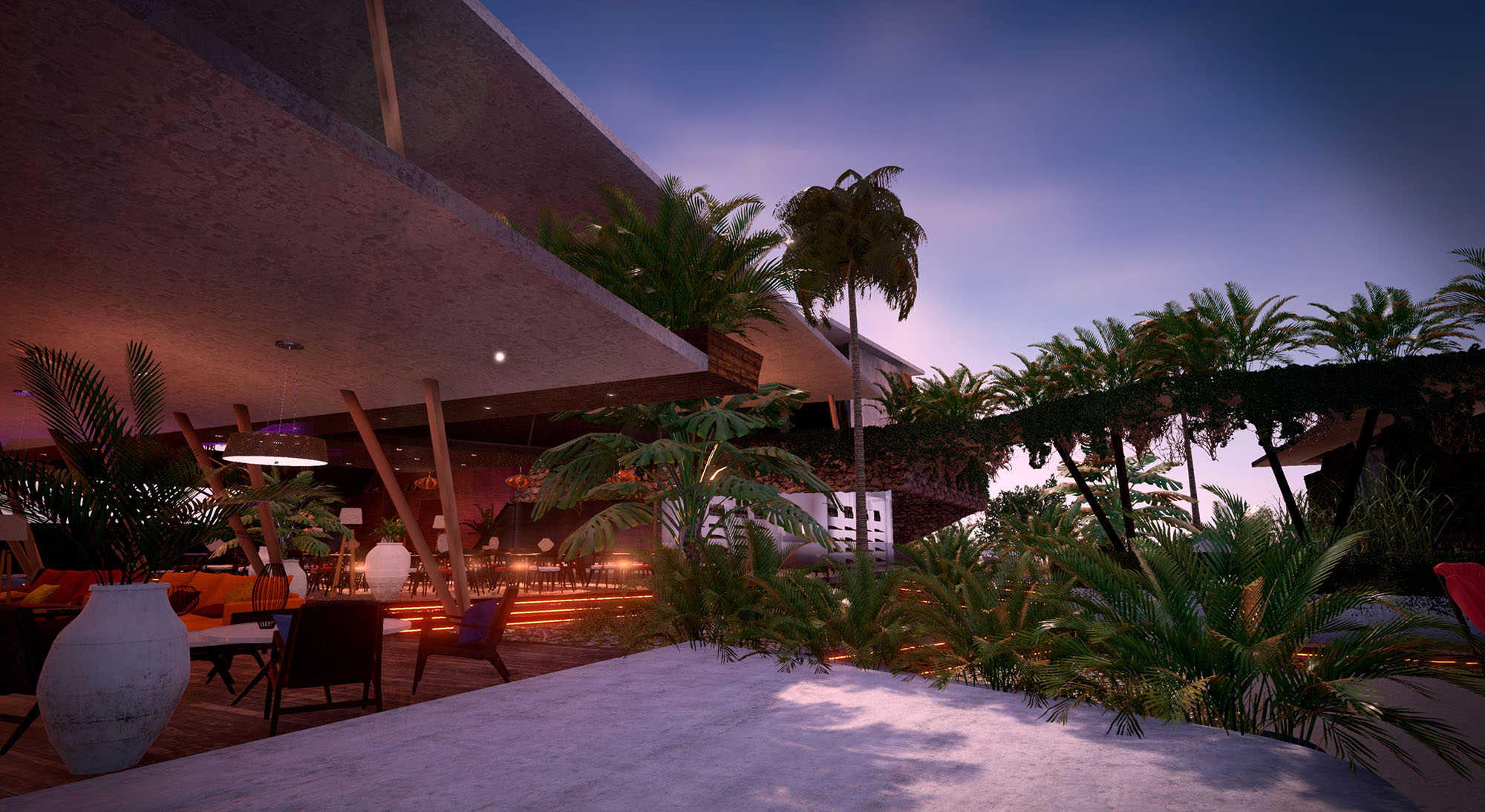
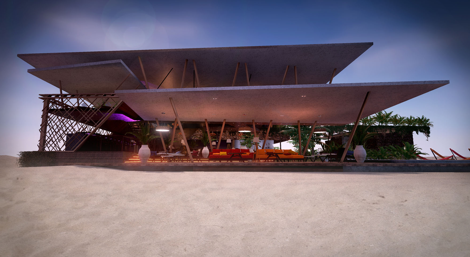
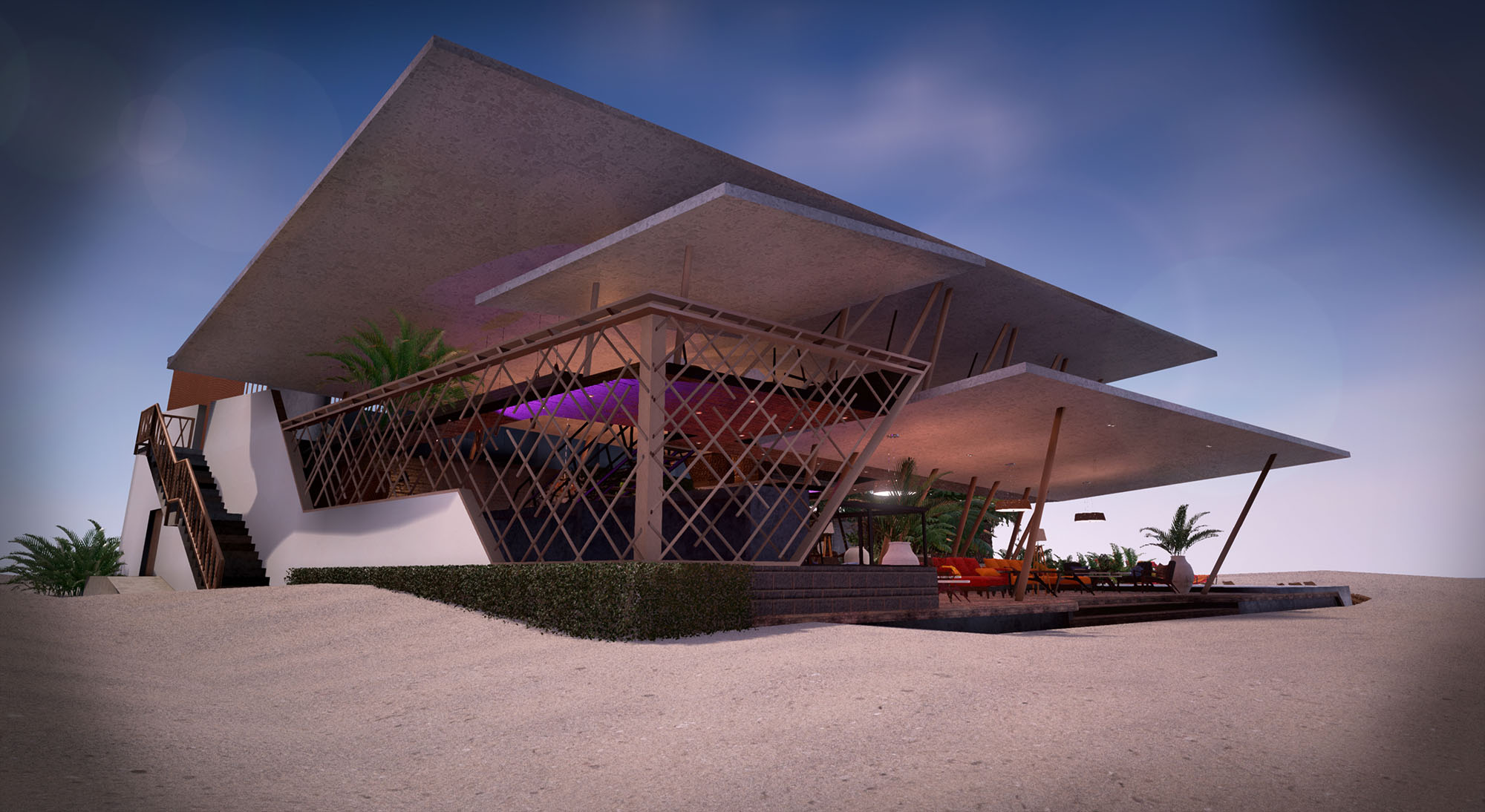
© 2021 by sanzpont [arquitectura] . Webpage by sanzpont [digital] . Innovative Digital Experiences
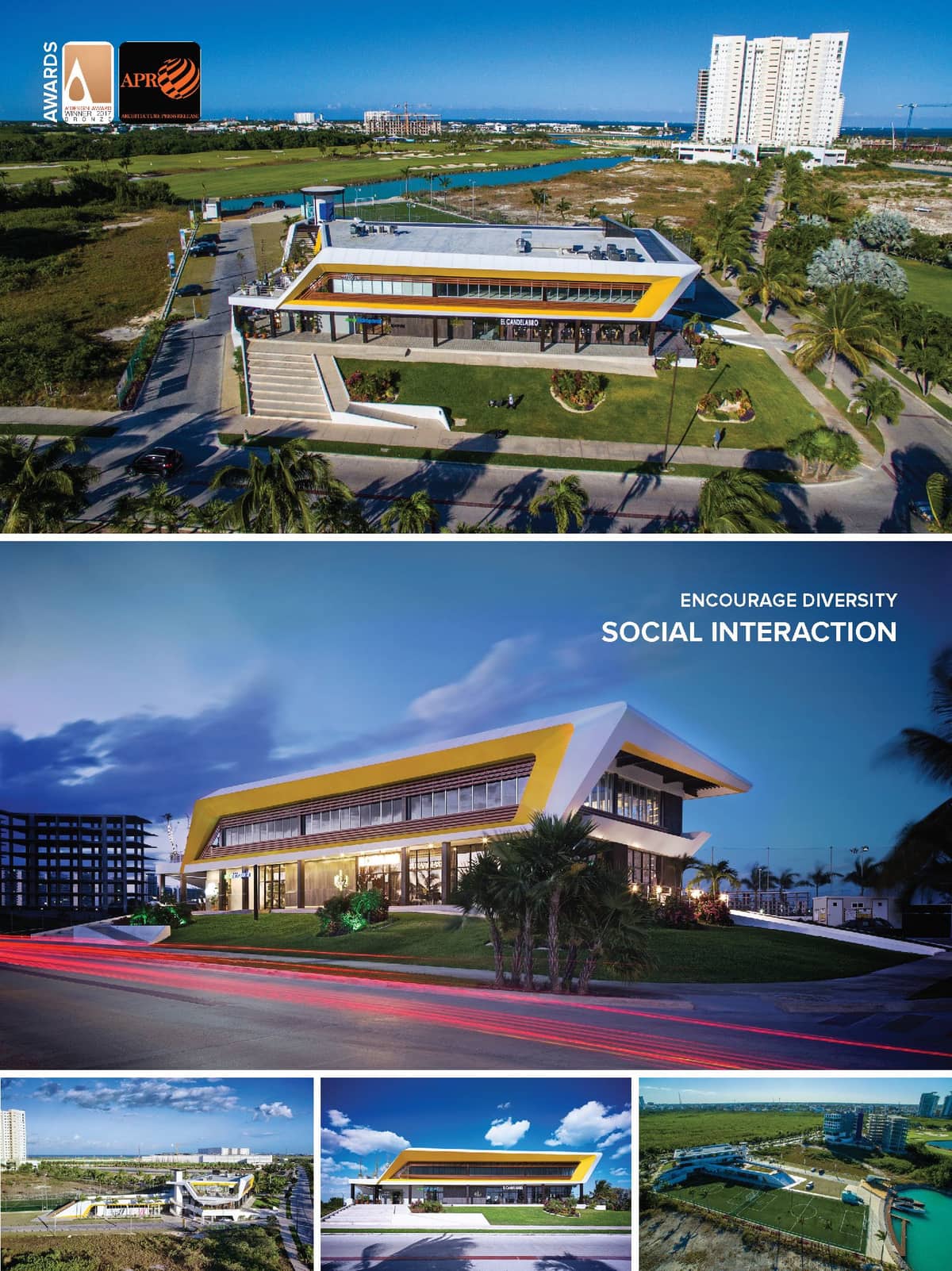

Awards: Bronze A' Design Award Winner in Architecture, Building and Structure Design Category 2016 - 2017 - Puerto Cancún - Cancún. México.
Inspiration: The Design Concept is inspired by the aerodynamic lines and elegance of VanDutch yachts and the natural elements of the Caribbean, with the main objective as Recreational, Sports Integration spaces with Social Activities within the views of the canal and the golf course, inspired by boat and marina lifestyle.
Van Dutch Yachts: Design Concept The elegance and aerodynamic lines of the Van Dutch yachts were the main source of inspiration for the design concept of the complex, focusing on the main views of the surrounding environment.
Digital Design: Latest BIM technology: This project was developed using the latest BIM technology for digital project design. The working methodology is completely three-dimensional because it does not create drawings, but rather creates intelligent digital models of the design. These models also contain a constructive database capable of generating any kind of digital information depending on the project phase in such a way that advancing the development of a project is equivalent to advancing the level of detail of the model. The information generated through a BIM work system is reliable, visual and of the best quality, since all the elements are connected to the same model. This system allows you to create a stunning 3D visual model of the project through each of its execution phases.
Production, Realization Technology: Design was developed entirely with BIM (Building Information Modeling) Technology. From the design phase, documentation and fabrication. iPhone/iPad A360 cloud 3D model was always on site for better people understanding about construction phases, from steel structure, MEP, and aluminum clading facade.
Solar Geometry Analysis The site contained an existing metallic structure; a single-level showroom that was surveyed and digitalized into a 3D model. With the help of Autodesk Revit, a preliminary volumetric study was conducted to analyze the solar geometry to determine the bioclimatic response of the future sports facility.
Conceptual Design The site, the existing building and the future installations were now reflected in a 3D model environment. Conceptual design sketches were drawn on the volumetric images in digital sketch on iPad with Autodesk Sketchbook Pro software. Later we proceeded to elaborate the 3D model and the solution of the integral project in BIM in Autodesk Revit.
Immersive Visualization Photorealistic renders were created with Autodesk 3Dsmax using the same BIM model, with the objective of visualizing the project in the form of digital images and creating more realistic worksheets. The same model was transferred to a specialized video game software, UnReal Engine, to immerse the client in a virtual reality experience using 3D Oculus goggles, allowing a complete understanding of the project before being built.
Documentation The technical information and documentation of the executive project was created entirely in BIM in Autodesk Revit, allowing a more thorough understanding of the project and a better coordination of each worksheet as the real-time representation of the 3D BIM model. Because the information continues to develop during the process of design and the level of detail required increases, it allows information to be more efficient and easy to coordinate when different disciplines share the same 3D model.
Digital Fabrication The production of the aluminum panel facades is based on the 3D model, generating its digital display in the industrial design software Rhinoceros 3D. This allows the panels to be created piece by piece, cut using CNC cutting machinery, then labeled numerically to facilitate a perfect assembly. Likewise, the entire metal structure was manufactured in a workshop and then assembled on-site.
On-Site Building Coordination Autodesk a360, a cloud-based software, allowed the visualization and coordination of the digital BIM model, containing all the construction information. This model, with all its layers of architecture, installations and structure, was always available on-site using an iPad and/or an iPhone, which allowed for better communication with each contractor and a more thorough understanding of the project through each phase. Being able to isolate each piece of work in context and see it in 3D through a digital medium, allowed for a successful execution.
Social Infrastructure and Public Space The Van Dutch Recreation Center will provide Cancun with a new social infrastructure facility, promoting the use of public, sporting and recreational space.
Recreational and sporting integration:
Conceived as a new space to bring people together with the goal of integrating society. Van Dutch features the following- Sports spaces Green roof and elevated square Outdoor recreation and exhibition spaces Terrace and pier with canal view Themed restaurants Landscape integration
The project offers a unique and contemporary avant-garde design developed with the latest technologies. Accessibility and Pedestrian Circulation Conceived for its accessibility and designed for all the public, the pedestrian use creates city and welcomes the user from the outside. Conversion of Previous Spaces (Use-Cycling) Sustainability is promoted by recycling the use of previous spaces, generating an intelligent conversion of construction, and adapting and adding new elements to the architectural program.
Commercial (Conversion of Prior Building) Sports Recreational Services Social Integration Retail (Yacht Showroom)
© 2021 by sanzpont [arquitectura] . Webpage by sanzpont [digital] . Innovative Digital Experiences

Perfect Vision is a Laser Ophthalmology Institute dedicated to advanced treatments with the latest technology equipment. The entrusted objective for his remodeling was being able to transmit across the design, the confidence and safety with technology and vanguard to the clients who come to the clinic. To offer an innovation and perfection image and at the same time to offer safety and tranquility. To transmit the sensation of cleanliness we use futuristic lines, pure white colors with subtle blue lighting to bring peace and calm, accompanied by a comfortable waiting area with seating in various shades of relaxing tones.
Concept Design and Remodeling Purpose To entrust in the individual health is a fear that every person must confront in certain moment and to feel the tranquility of being in the right hands for any clinical procedure is a real relief. - Cancún, México. sanzpont [arquitectura]
The concept of design was generated from the inside to the outside, it was to create a spaceship interior environment, with the last generation technology, where across the glass transparency it could watch the different procedures that are realized by the suitable machines and the highly qualified staff. Those areas are defined by windows that delimit every space, complemented with images designed specifically for every zone, as wallpapers to give this galactic sensation of being inside a spaceship.
The exterior remodeling should reflect what happens on the inside, so a new aluminum skin façade was made with a futuristic aspect, inspired on an aerospace design. A white unfolded envelope was made to create the façade silhouette that complement itself with a graphical ocular image and a several white aluminum panels which are sensitive to the wind movement, generating soft waves inspired by Ned Khan work, with his invention of Kinetic Façades.
For the development of the project, we entrusted in the last generation BIM methodology (Building Information Modeling) and Digital Fabrication, where every piece was modeled in 3D with his information, measures and materials in Autodesk Revit, to be digitally made through a Computer Numerical Control in different materials like wood, aluminum and PVC, to be assembled in the correct place. The use of the technology was the solution to realize with perfection and exigency every element.
INTERNATIONAL ARCHITECTURE AWARDS
• IDA Design Awards, Los Angeles, USA : Bronze Medal - Interior Renovation Design : Perfect Vision, Cancún (2015)
• A’ Design Awards, Milán, Italy : Bronze Medal - Certificate of Excellence in World Interior Design & Exhibition Spaces : Perfect Vision (2015)


INTERNATIONAL ARCHITECTURE AWARDS
• IDA Design Awards, Los Angeles, USA : Bronze Medal - Interior Renovation Design : Perfect Vision, Cancún (2015)
• A’ Design Awards, Milán, Italy : Bronze Medal - Certificate of Excellence in World Interior Design & Exhibition Spaces : Perfect Vision (2015)
Perfect Vision is a Laser Ophthalmology Institute dedicated to advanced treatments with the latest technology equipment. The entrusted objective for his remodeling was being able to transmit across the design, the confidence and safety with technology and vanguard to the clients who come to the clinic. To offer an innovation and perfection image and at the same time to offer safety and tranquility. To transmit the sensation of cleanliness we use futuristic lines, pure white colors with subtle blue lighting to bring peace and calm, accompanied by a comfortable waiting area with seating in various shades of relaxing tones.
Concept Design and Remodeling Purpose To entrust in the individual health is a fear that every person must confront in certain moment and to feel the tranquility of being in the right hands for any clinical procedure is a real relief. - Cancún, México. sanzpont [arquitectura]
The concept of design was generated from the inside to the outside, it was to create a spaceship interior environment, with the last generation technology, where across the glass transparency it could watch the different procedures that are realized by the suitable machines and the highly qualified staff. Those areas are defined by windows that delimit every space, complemented with images designed specifically for every zone, as wallpapers to give this galactic sensation of being inside a spaceship.
The exterior remodeling should reflect what happens on the inside, so a new aluminum skin façade was made with a futuristic aspect, inspired on an aerospace design. A white unfolded envelope was made to create the façade silhouette that complement itself with a graphical ocular image and a several white aluminum panels which are sensitive to the wind movement, generating soft waves inspired by Ned Khan work, with his invention of Kinetic Façades.
For the development of the project, we entrusted in the last generation BIM methodology (Building Information Modeling) and Digital Fabrication, where every piece was modeled in 3D with his information, measures and materials in Autodesk Revit, to be digitally made through a Computer Numerical Control in different materials like wood, aluminum and PVC, to be assembled in the correct place. The use of the technology was the solution to realize with perfection and exigency every element.
© 2021 by sanzpont [arquitectura] . Webpage by sanzpont [digital] . Innovative Digital Experiences
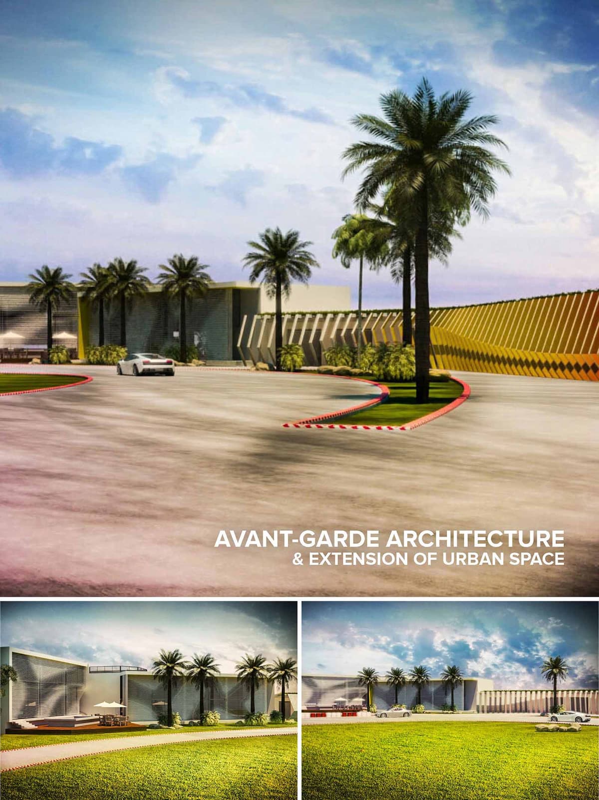

TECH GARAGE is conceived as a hybrid between a high-performance automotive facility and an urban leisure landscape, translating the dynamism of speed into a clear, linear architectural language. The complex operates as an extension of the city’s public realm, transforming a traditionally technical program into an accessible, experience-driven destination where cars, people and landscape coexist.
The design takes advantage of Cancún’s expansive horizon, composing long, low volumes that emphasize movement and perspective. The project’s geometry is guided by the logic of the racetrack: curves, acceleration lanes and visual vanishing points are echoed in the built forms, the circulation routes and the open spaces, creating a continuous spatial narrative from arrival to the most intimate technical areas.
The complex is organized as a sequence of exterior forecourts, green buffers and service bands aligned along the main access spine. This configuration creates a generous setback from the road that functions as a civic plaza and staging area, visually announcing the project while absorbing traffic flows associated with events and peak operation times.
The perimeter wall is treated not as a barrier but as a dynamic urban façade. Its articulated, inclined elements modulate transparency and opacity, allowing glimpses into the activity within while ensuring security and acoustic control toward the surrounding context. The wall thus becomes a linear landmark that reinforces orientation and identity along the access corridor.
The main architectural volumes are resolved as clean, rectilinear prisms that host workshop bays, showrooms, support services and hospitality areas. These boxes are interspersed with deep porticos and shaded outdoor terraces that encourage interaction and visual continuity with the landscaped areas. Large car courts and maneuvering zones are seamlessly integrated, maintaining clear separation between pedestrian promenades and vehicular circulation for safety and comfort.
Programmatic elements are layered from public to private. The most open, visitor-oriented spaces occupy the front zone, with display areas and lounges extending towards the landscaped lawns. More technical and restricted functions are located deeper on the site, buffered by planting strips and the expressive perimeter structure, which also acts as a climatic filter for back-of-house operations.
The façades are characterized by large-format planes and a play of horizontality accentuated by deep eaves and shading fins. A combination of smooth, light-colored cladding and ribbed or perforated metal screens responds to the intense Caribbean sun, reducing heat gain while maintaining a contemporary, industrial aesthetic suitable for a technology and automotive-oriented program.
The rhythm of vertical elements along the enclosure wall introduces a sense of speed and vibration, as if the architecture itself were in motion. Transparent spans framed by slender structural members reveal selective interior views, while high-performance glazing minimizes glare. The color palette favors warm neutrals contrasted with strategic accents that can be associated with brand identity or racing graphics, emphasizing the project’s avant-garde character.
Landscape design is integral to the architectural composition, using palm alignments and low-maintenance tropical planting to define axes, soften edges and provide natural shading. Generous green surfaces counterbalance the extensive paved areas, contributing to microclimate regulation and offering flexible outdoor zones for events, exhibitions or informal gathering.
Sustainability strategies address both environmental performance and long-term operational efficiency. Building orientation and shading devices reduce solar gain, lowering cooling loads in Cancún’s humid climate. Reflective roof finishes and light-colored pavements mitigate heat island effects, while permeable zones and planted swales improve on-site stormwater management. The structural and envelope systems are conceived for durability and ease of maintenance, supporting adaptive reuse and future technological upgrades within the TECH GARAGE complex.
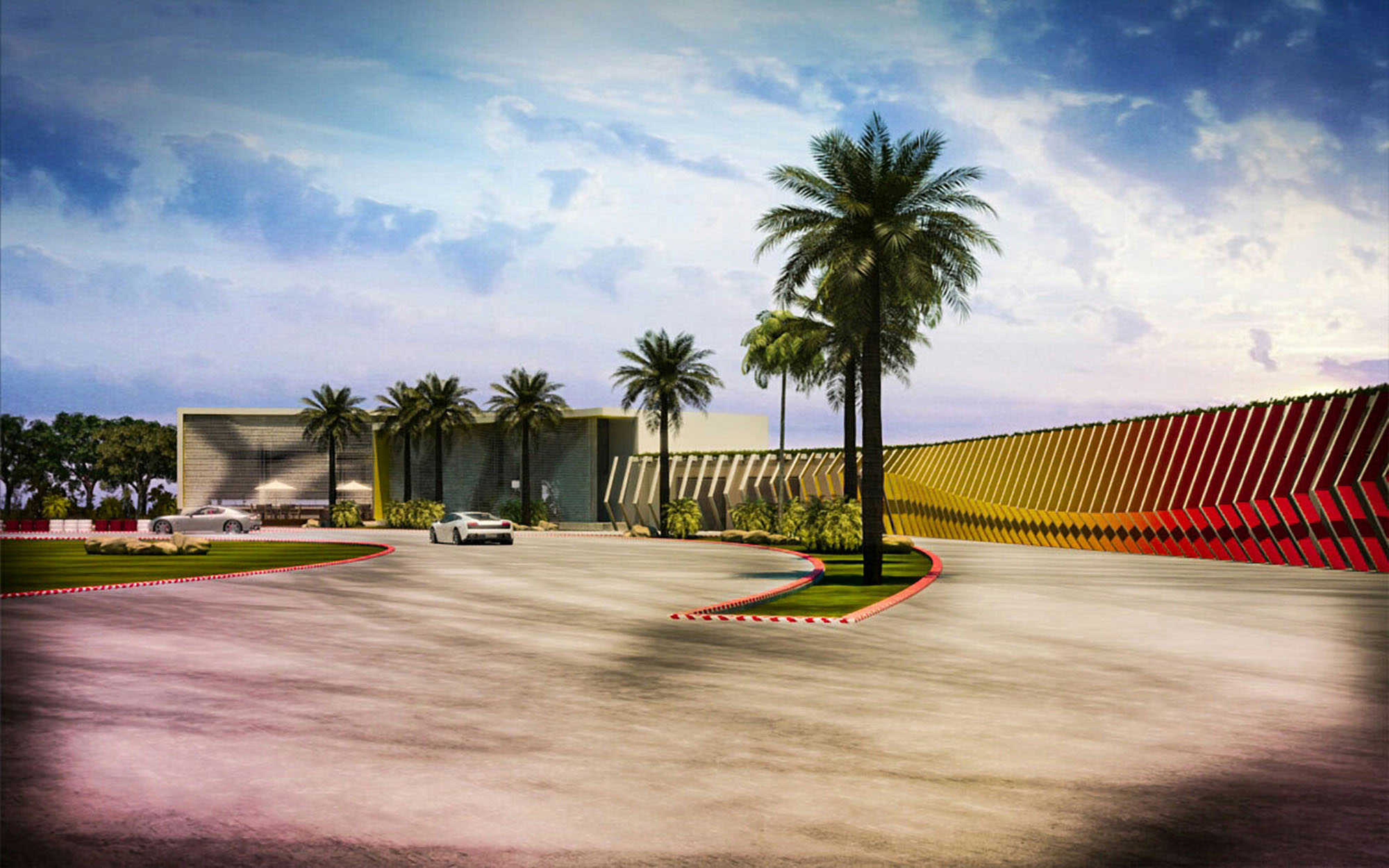
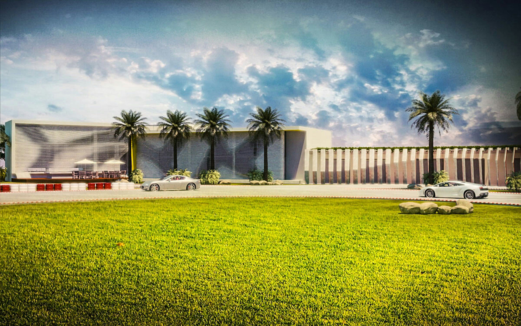
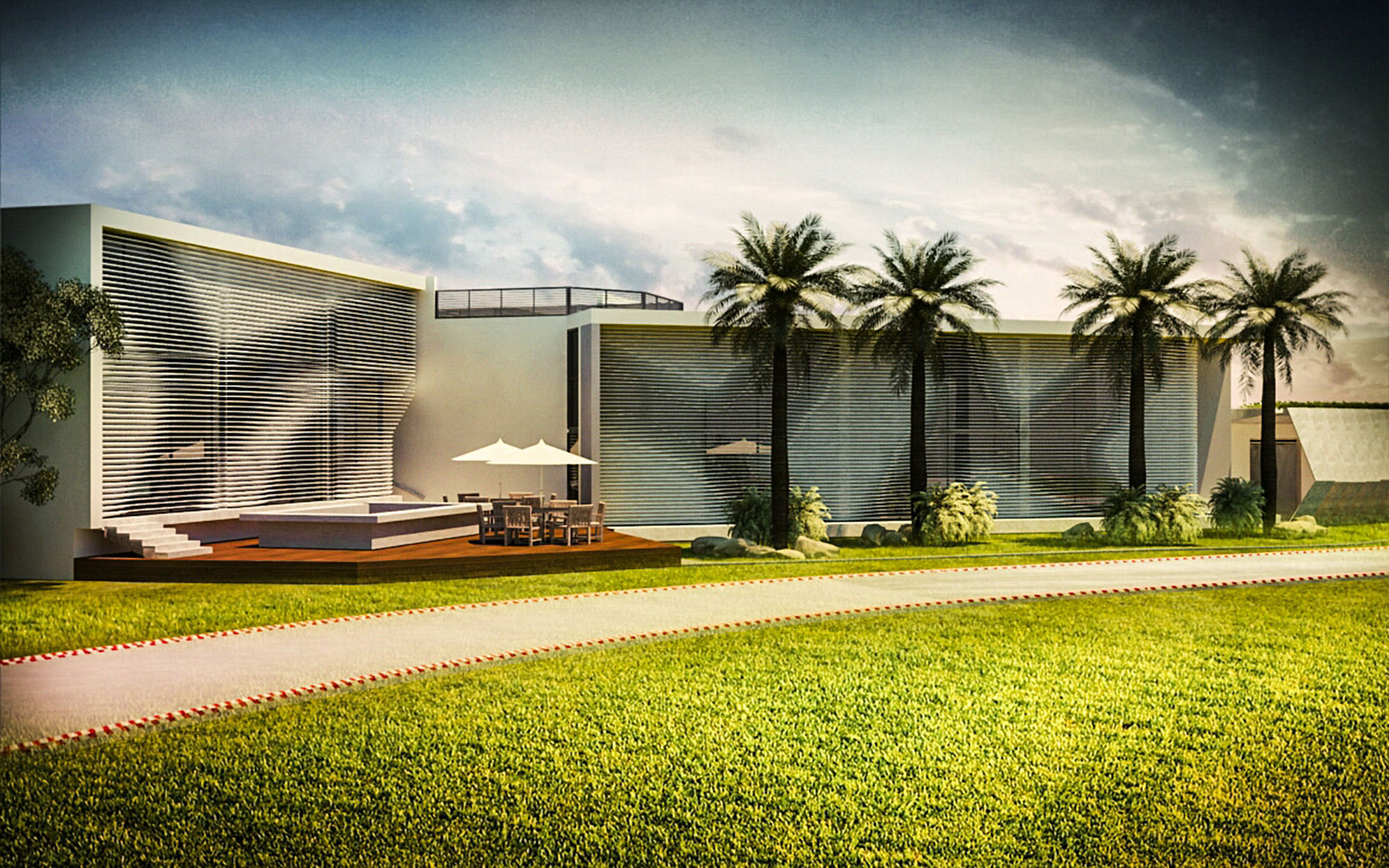
© 2021 by sanzpont [arquitectura] . Webpage by sanzpont [digital] . Innovative Digital Experiences

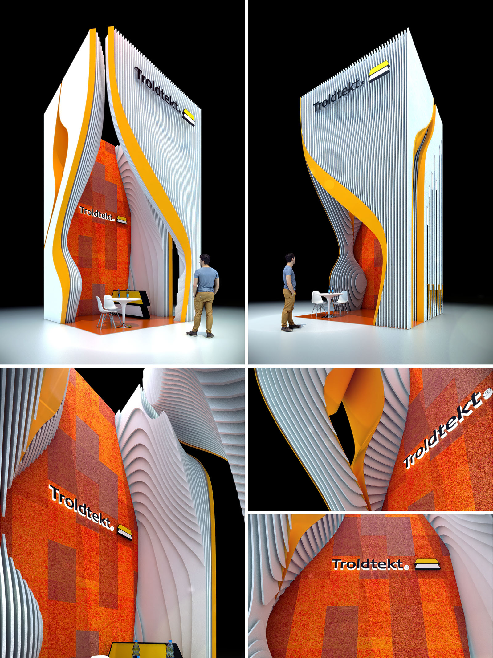
The Troldtekt Pavilion in Mexico City is conceived as a vertical urban landmark that expresses sound, movement and materiality within a compact exhibition footprint. The design translates acoustic waves into an architectural gesture, using layered surfaces that appear to ripple around a vivid central core. This sculptural envelope frames the brand as an immersive spatial experience rather than a conventional trade-fair stand.
The pavilion works as a tall, narrow “urban canyon,” drawing visitors inward through a carved entrance. The void between the outer fins and the inner volume creates a sense of compression and release, enhancing the perception of height and transforming a small floor area into an expansive spatial sequence.
The overall geometry is defined by a series of vertical lamellae that rise continuously from floor to roof, forming an open shell. These fins are parametrically modulated to twist and peel away, generating a dynamic portal that visually guides visitors towards the interior. The interplay between straight edges and fluid curves establishes a strong contrast that is legible from a distance.
Inside, the space is organized as a single multifunctional chamber. The front zone accommodates reception and informal meetings, with a compact table and chairs positioned to benefit from the visual depth of the layered walls. The rear zone acts as a brand backdrop, using the Troldtekt surface as a large-scale exhibition wall and visual anchor.
The pavilion is structured around the expressive use of Troldtekt acoustic panels, showcased on the inner vertical plane in a warm orange palette. The textured surface, composed of subtle tonal variations, demonstrates the product’s capacity to form continuous, visually rich fields while optimizing sound absorption within a highly reflective fair environment.
The lamellae are conceived as lightweight framed elements with a smooth, neutral finish that contrasts with the tactile Troldtekt core. Their stepped profile acts as a three-dimensional acoustic baffle, diffusing sound and reducing reverberation. In this way, visitors experience the acoustic performance of the material through both hearing and touch.
The chromatic scheme relies on a triad of white, orange and a dark neutral background. The intense orange of the Troldtekt surface becomes the central visual identity, framed by a white shell that emphasizes brightness and clarity. A bold yellow-orange ribbon cuts through the fins, reinforcing the brand line and guiding the eye vertically.
The black void surrounding the pavilion, both in physical backdrop and visual communication, isolates the object and heightens its presence. The logo is integrated directly into the acoustic surface, ensuring that brand recognition is inseparable from the material experience.
The pavilion is designed as a dry-assembled system, allowing quick on-site installation and disassembly. Repetitive lamella modules can be CNC-cut from standardized boards, minimizing waste and simplifying logistics. The structural stability is achieved through hidden frames and base fixings, maintaining the visual lightness of the vertical fins.
The open front and top allow the pavilion to adapt to different exhibition halls and lighting conditions. The internal layout remains flexible, permitting alternative furniture arrangements or integration of digital displays without compromising the architectural character.
Sustainability is addressed primarily through material selection and reversibility. Troldtekt panels, based on wood wool and cement, provide a durable, low-emission acoustic solution that can be reused across multiple events. The modular lamellae are dimensioned to optimize sheet usage and facilitate reconfiguration for future pavilions.
The vertical, compact footprint reduces the stand’s physical impact while maximizing visibility, making efficient use of expensive exhibition floor area. The reliance on surface articulation and color, rather than heavy construction or integrated technology, reduces resource consumption and supports a circular approach where all elements can be dismantled, stored and re-employed in subsequent installations.
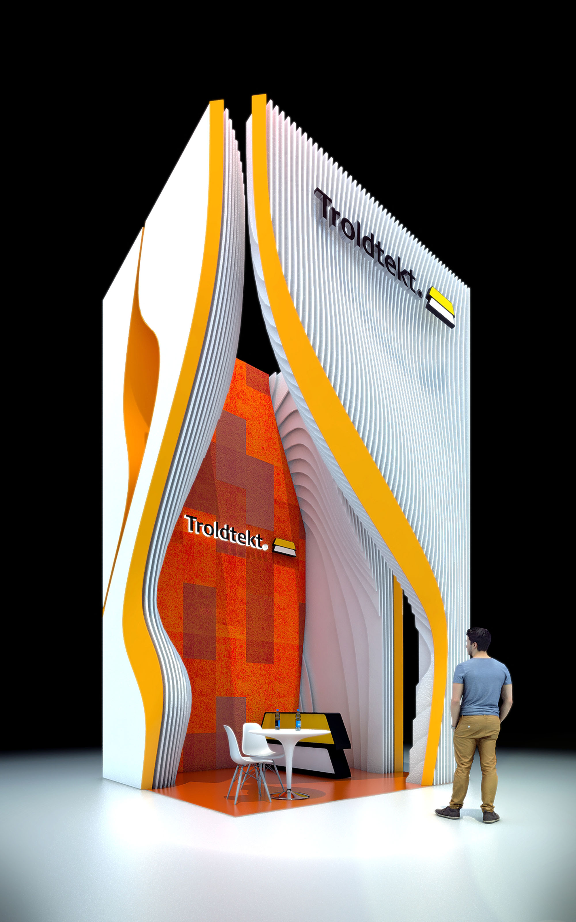
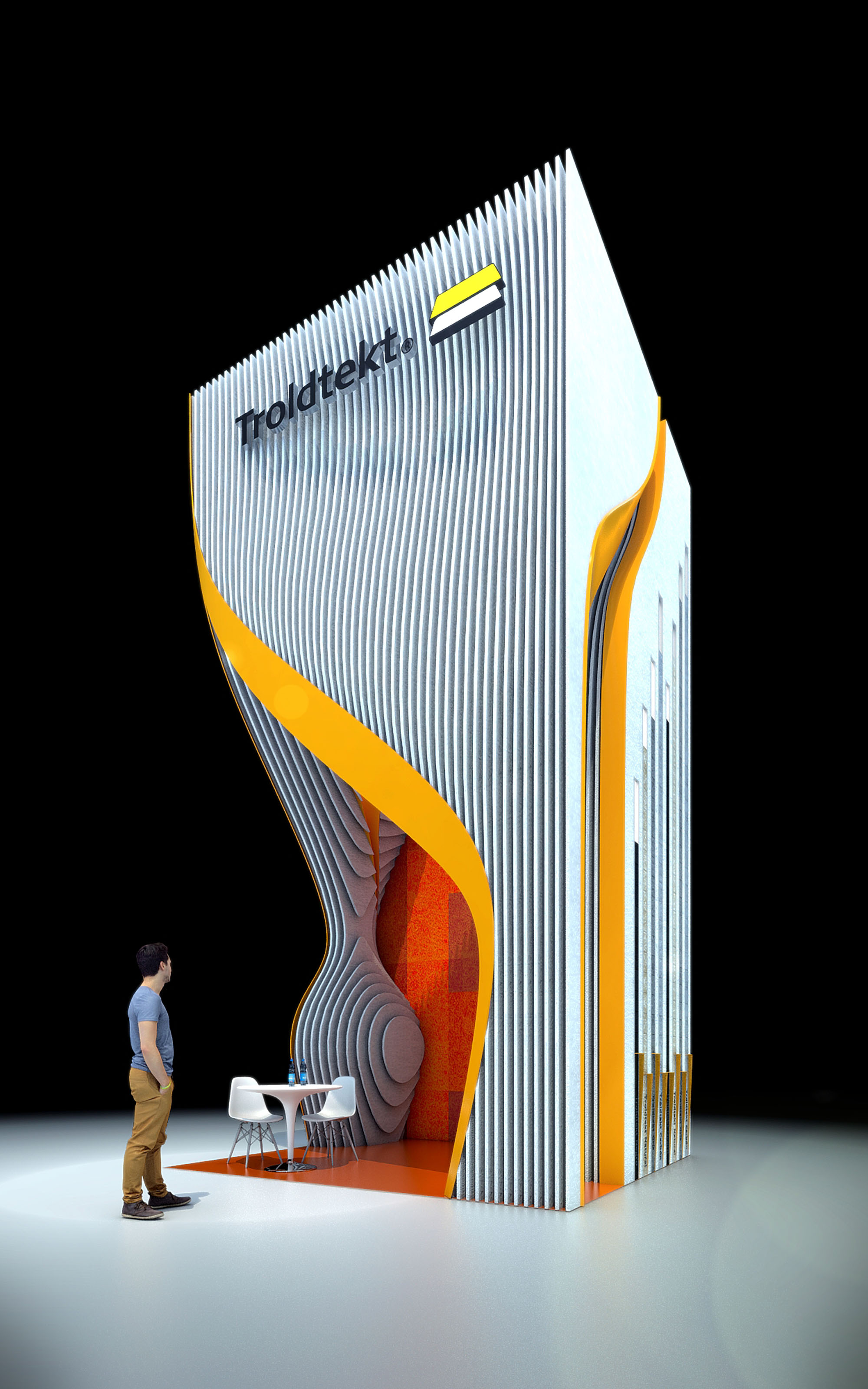
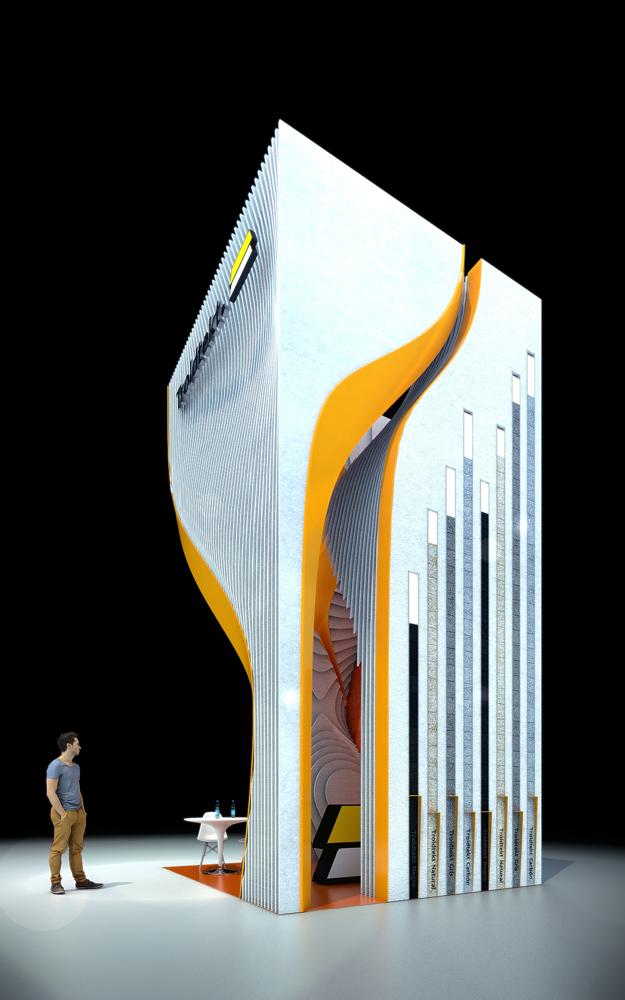
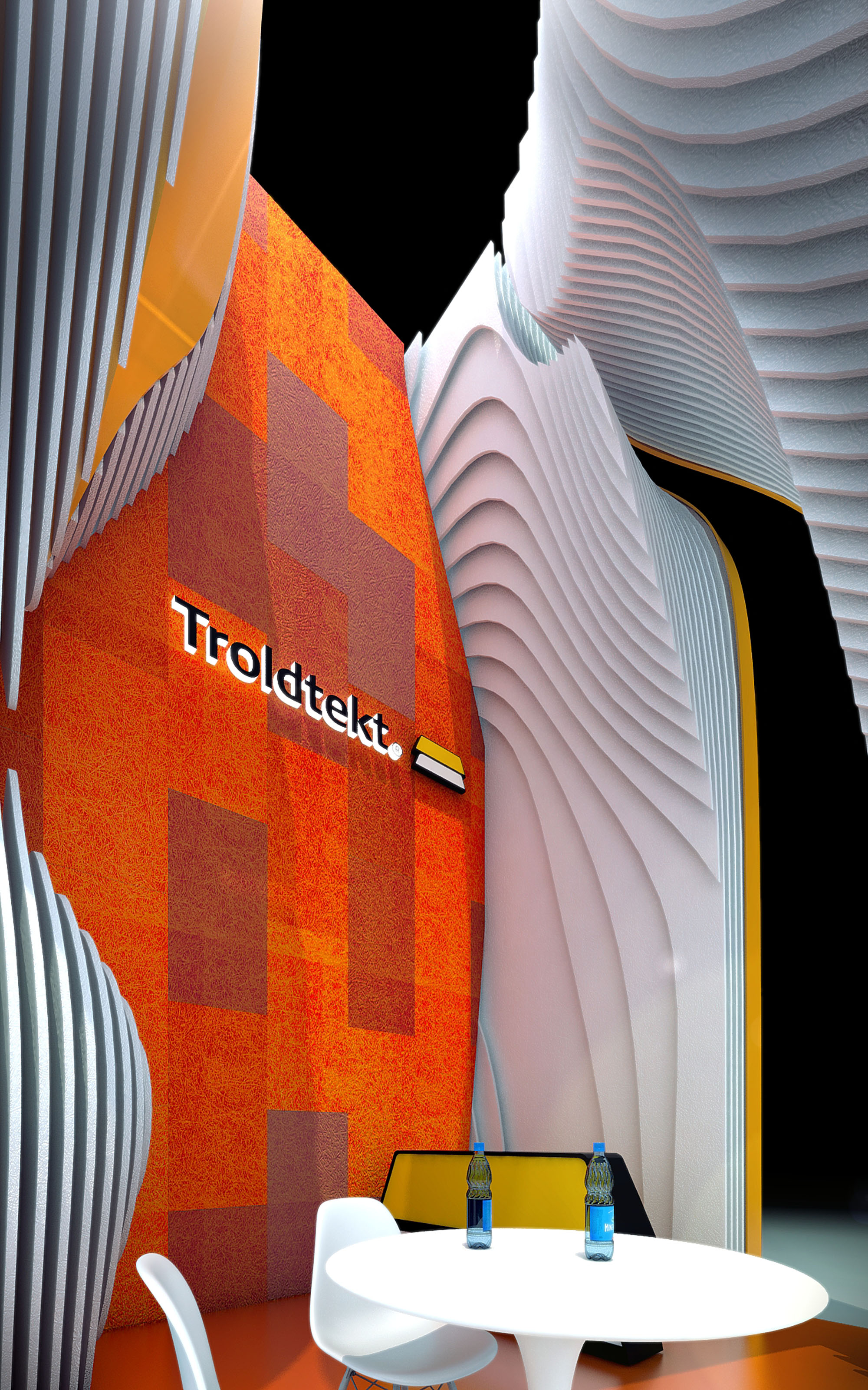
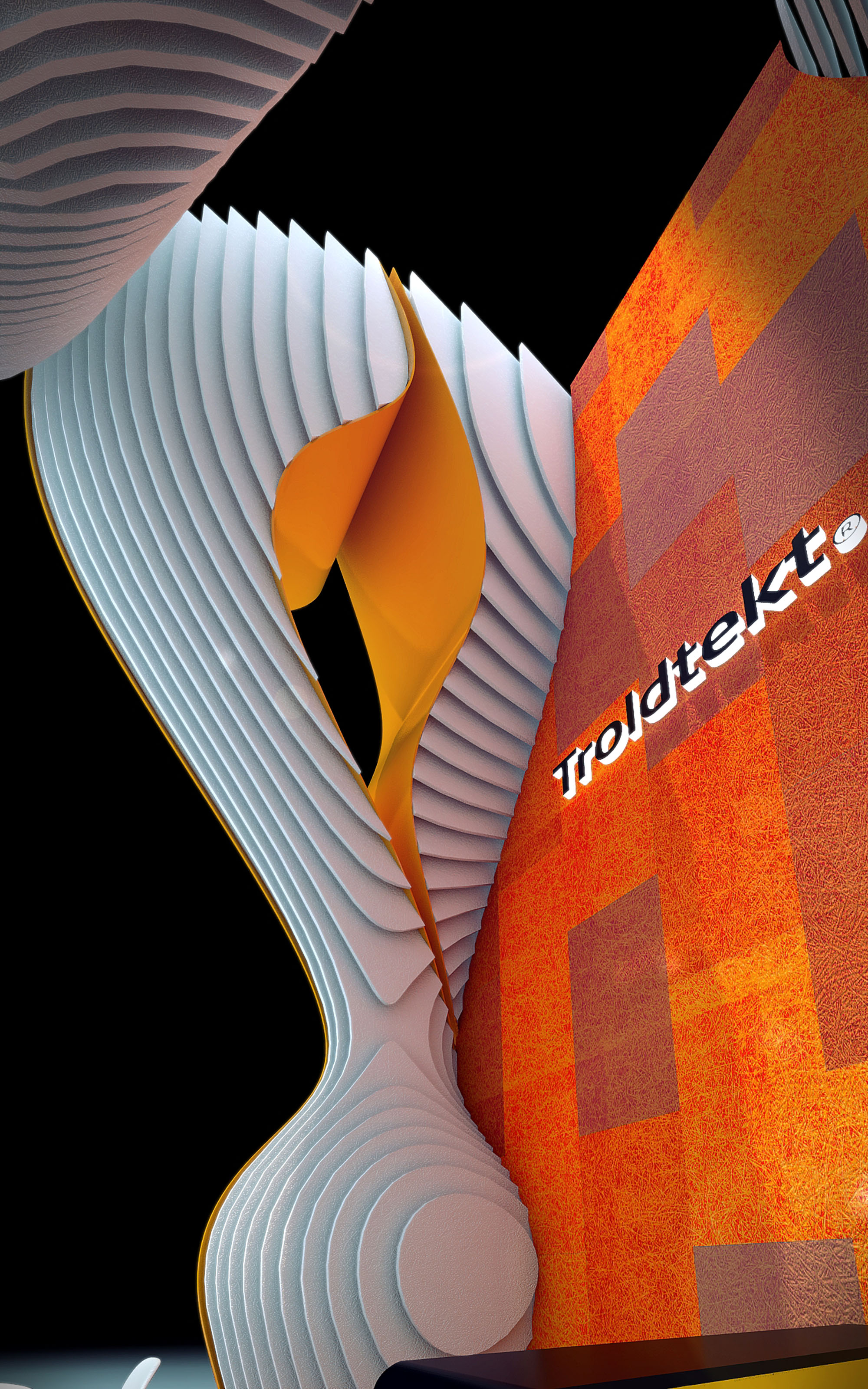
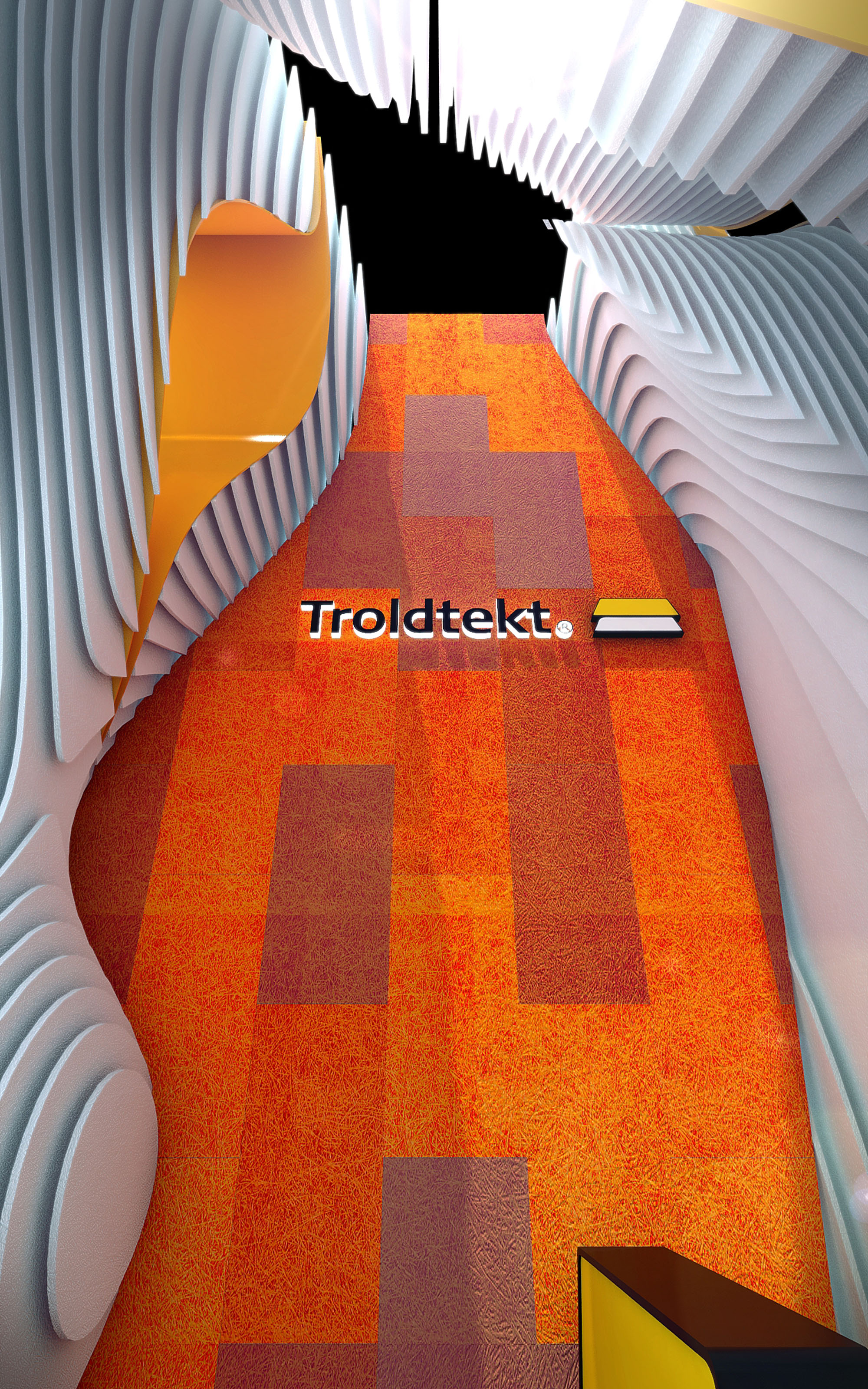
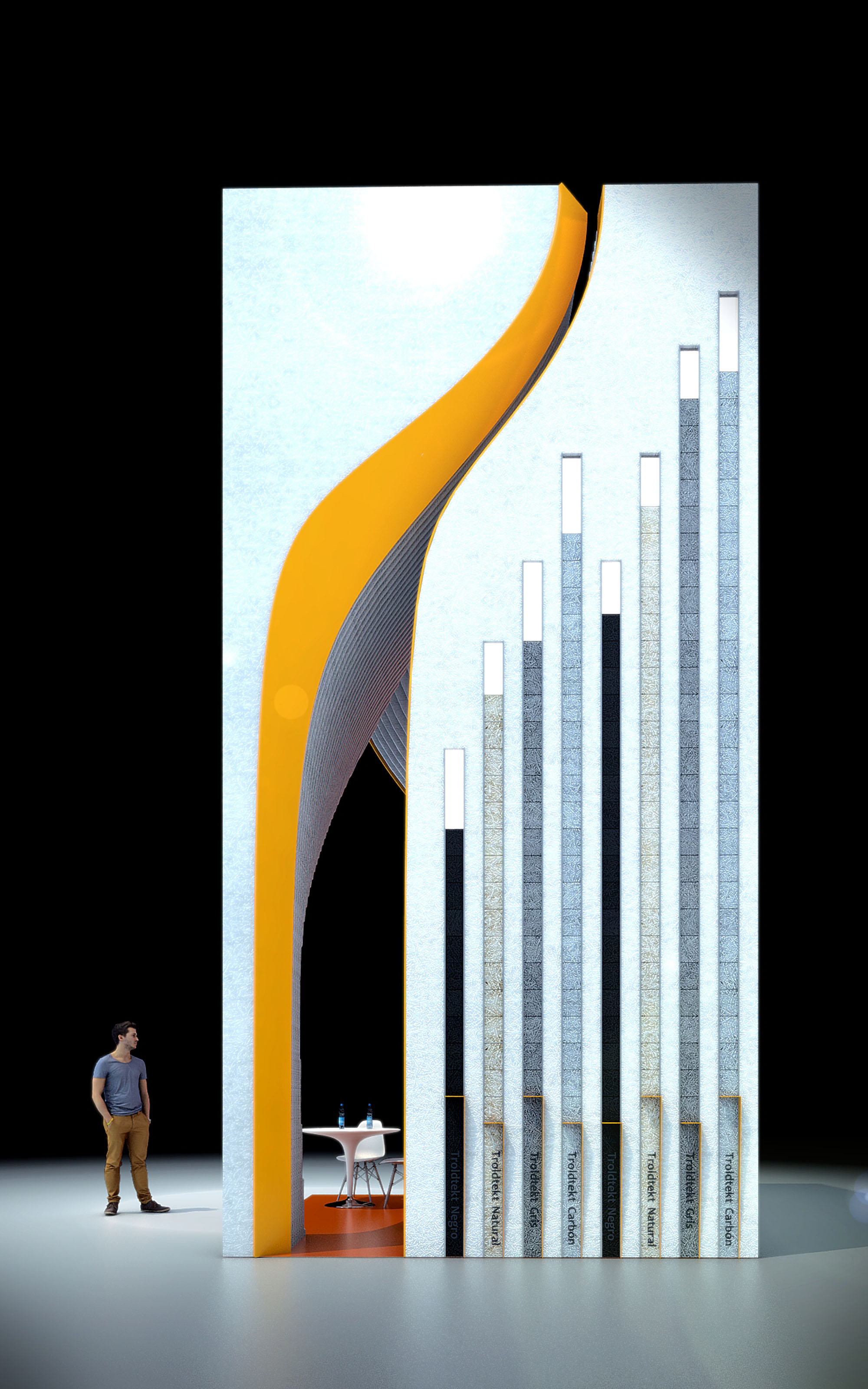
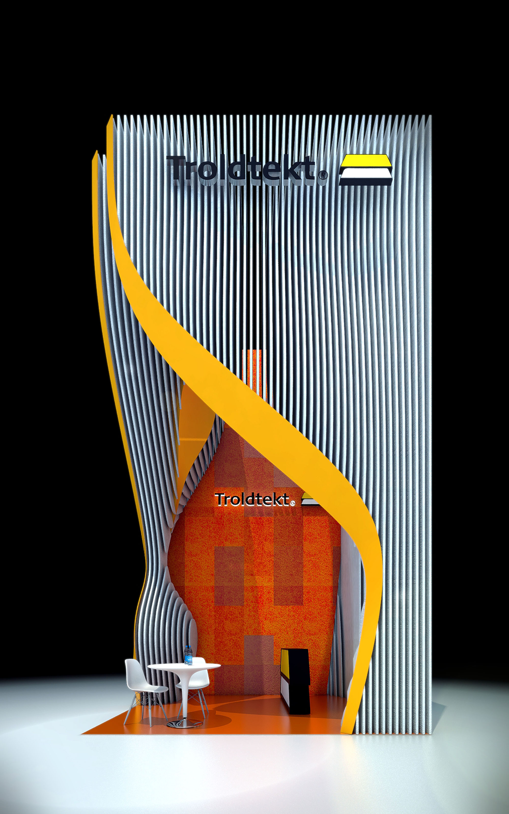
© 2021 by sanzpont [arquitectura] . Webpage by sanzpont [digital] . Innovative Digital Experiences
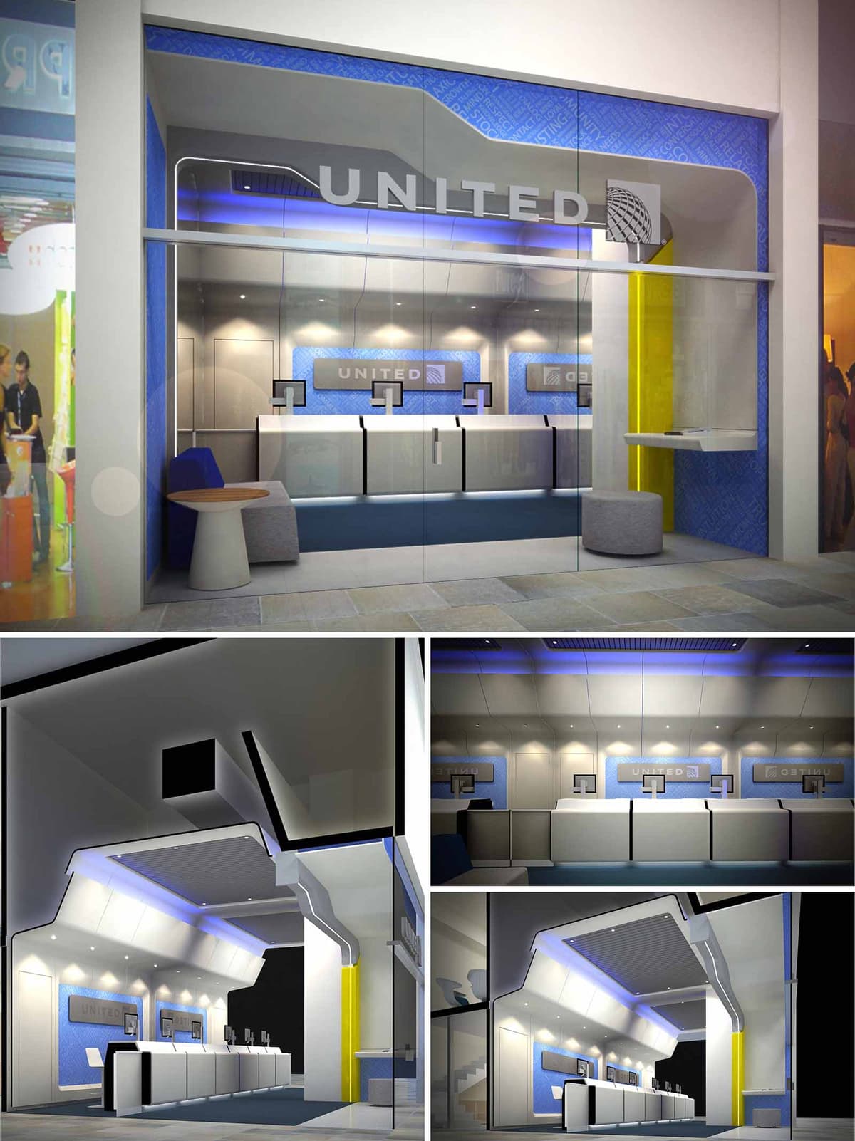

The United Airlines CTO space in Santa Fe is conceived as a three-dimensional translation of the airline experience, bringing the language of aircraft cabins and jetways into a compact commercial front. The design emphasizes dynamism, clarity of orientation, and a sense of technological precision, reflecting the identity of an international carrier while responding to the high-traffic context of a corporate and retail hub.
The envelope is treated as a continuous fuselage-like shell that folds from ceiling to façade and frames the check-in counters in a single gesture. This sculpted geometry guides the eye from the public corridor into the service area, reinforcing a narrative of movement, boarding, and connection. The overall image projects efficiency and reliability, while remaining approachable and human-scaled.
The plan is organized as a linear sequence parallel to the storefront, optimizing visibility and user flow. A generous front zone behind the glass façade acts as a transition foyer, allowing users to read information, queue comfortably, or wait, without obstructing circulation in the mall.
The check-in line is set back slightly from the glass, creating a clear queueing corridor that intuitively orients passengers toward the service desks. Counters are modular and rhythmically repeated, allowing flexible staffing levels and easy reconfiguration. Peripheral niches integrate seating, informal work surfaces, and secondary services, making efficient use of the narrow depth of the unit.
The dominant volumetric element is a folded canopy that originates at the storefront and extends deep into the space. Its sharp, faceted geometry recalls the aerodynamic profiles of an aircraft wing, while also concealing technical systems such as air conditioning, cabling, and indirect lighting.
Recessed linear LED strips and perimeter cove lighting wash the ceiling planes, emphasizing the broken, angular forms and producing a floating effect over the counters. Accent blue lighting introduces a subtle chromatic gradient that reinforces brand recognition and contributes to a calm, travel-oriented atmosphere. Downlights over the work surfaces ensure optimal visual comfort and task illumination, reducing glare on screens and documents.
The material palette combines high-performance laminates, back-painted glass, and metal finishes in a controlled range of whites, grays, and blues. This restrained composition produces a clean, technical aesthetic aligned with aeronautical engineering and contemporary corporate architecture.
Blue wall panels with subtle graphic patterns form a continuous backdrop for the counters, integrating the airline’s visual identity without resorting to excessive signage. White and light gray surfaces maximize light diffusion and maintain visual clarity, while a contrasting yellow vertical plane at the side introduces a single, vivid accent that anchors the entrance and aids wayfinding. Upholstered seating elements and a small timber side table introduce tactile warmth within the otherwise sleek environment.
The counters are designed as hybrid analog-digital stations, with integrated monitors and equipment concealed within minimalist volumes to avoid visual clutter. The height and depth of the worktops are calibrated for ergonomic interaction between staff and passengers, facilitating document handling, device placement, and accessibility for people with reduced mobility.
Wall-mounted screens behind the counters act as both branding devices and dynamic information carriers, capable of displaying destinations, promotions, or operational messages. This layered information strategy ensures that essential content is legible from the corridor as well as from within the space, enhancing communication and operational flexibility.
Sustainability is approached through efficient systems, durable materials, and adaptable design. LED lighting throughout the project minimizes energy consumption and maintenance, while the indirect lighting strategy reduces the number of fixtures required to achieve uniform illumination. The bright, reflective interior surfaces contribute to higher light efficacy, allowing lower installed wattage.
Materials are selected for longevity and ease of cleaning in a high-traffic commercial environment, reducing replacement cycles and associated environmental impact. Modular counter components and demountable wall panels enable future reconfiguration, extending the service life of the fit-out and minimizing construction waste. The fully glazed façade optimizes visual connection and relies on the mall’s existing climate control, reducing the need for extensive additional HVAC equipment within the unit.
© 2021 by sanzpont [arquitectura] . Webpage by sanzpont [digital] . Innovative Digital Experiences
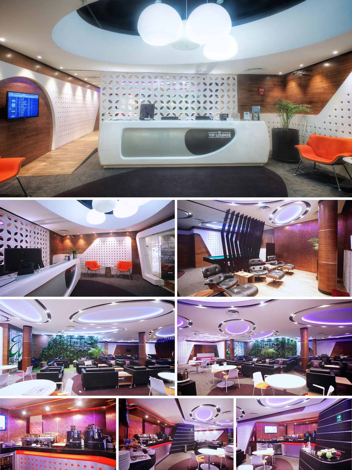

The VIP lounges for GAP Airports in SJD, TIJ and GDL redefine the waiting experience as a fluid, contemporary interior landscape. The concept is inspired by the dynamics of air travel: continuous flow, soft transitions and a perception of time that becomes more relaxed and diffuse. Organic geometries, perforated partitions and circular ceiling features evoke movement and lightness, while warm tones and tactile materials counterbalance the technological character of the airport environment.
The design establishes a recognizable brand language across different locations, using recurring elements such as sculpted reception desks, backlit feature walls and circular luminaires. These components create a cohesive identity that passengers can intuitively associate with comfort, privacy and premium service, regardless of the specific terminal.
The spatial organization is based on a clear sequence from public to private. The reception zone acts as a transitional filter between the hectic concourse and the controlled atmosphere of the lounge. Behind this threshold, the layout fragments into multiple seating typologies: individual workstations, informal lounge clusters, semi-private relaxation zones and dining areas.
Curved partitions, changes in flooring texture and variations in ceiling height subtly guide circulation while avoiding rigid corridors. Visual permeability is maintained through perforated screens and low furniture, allowing staff supervision and intuitive orientation, yet providing enough enclosure for guests to feel protected from the main concourse. Service areas such as buffet lines, bars and coffee stations are positioned centrally to reduce staff travel distances and to activate the social heart of each lounge.
The material palette combines warm woods, high-gloss solid surfaces and perforated composite panels. Timber cladding on walls and columns brings a sense of hospitality and continuity, while the white, sculpted reception counters and partitions add a precise, almost aerodynamic character reminiscent of aircraft interiors. The perforated panels create depth and texture, becoming a unifying skin that wraps walls and occasionally integrates lighting.
The chromatic strategy relies on a base of neutral grays and whites, enriched by copper and burgundy tones on accent walls. Strategic pops of orange in seating pieces and controlled LED color washes introduce energy without overwhelming the space. Upholstery choices balance durability with comfort, using easy-to-clean, fire-rated textiles and leathers suitable for intensive airport use.
Lighting design is central to the project’s identity. Large circular ceiling coves with integrated RGB LEDs generate a soft, indirect glow that can be tuned to different color temperatures throughout the day. These luminous rings visually anchor seating areas and reinforce the theme of movement and concentric trajectories associated with flight paths.
Task lighting is discreetly integrated into coves and furniture edges, avoiding glare and preserving a calm ambiance. Accent lighting highlights the reception desk, bar fronts and the vertical garden wall, creating focal points that help organize the visual field. The overall result is an interior that feels simultaneously high-tech and relaxing, where lighting becomes both functional infrastructure and key aesthetic element.
Furniture selection supports a wide range of passenger needs, from short business stops to longer layovers. Ergonomic lounge chairs with integrated footrests occupy quieter corners, while modular sofas and armchairs create flexible groupings in the main hall. Dining tables and bar-height counters respond to users who wish to work or eat while remaining connected to the activity of the lounge.
Curved millwork elements define coffee bars and self-service areas, facilitating efficient circulation during peak hours. Integrated power outlets and data connections are discreetly embedded into tables and partitions, allowing users to work without visible clutter of cables. Acoustical comfort is enhanced through soft finishes, carpets and the strategic placement of furniture to break sound propagation.
Sustainable criteria are incorporated through material selection, efficient systems and biophilic elements. High-durability, low-maintenance finishes reduce the need for replacement and minimize lifecycle impacts, while low-VOC paints and adhesives contribute to better indoor air quality. LED lighting with dimming and zoning significantly reduces energy consumption compared to conventional airport interiors.
The introduction of a green wall and abundant planters not only improves acoustics and visual comfort but also establishes a connection with nature in an otherwise highly artificial environment. Controlled natural light, where available, is balanced with shading and indirect artificial illumination to reduce glare and thermal gain. Together, these measures create a lounge environment that prioritizes passenger well-being while aligning with contemporary sustainability standards for commercial interiors.
© 2021 by sanzpont [arquitectura] . Webpage by sanzpont [digital] . Innovative Digital Experiences

The Ocean Dental clinic in Cancún is conceived as an immersive spatial metaphor of the sea, translating waves, currents and transparency into built form. The design uses continuous flowing lines to guide users from the street into the treatment areas, evoking a calm and fluid journey that counteracts the anxiety often associated with healthcare environments. The architecture aims to merge branding, spatial orientation, and emotional comfort into one coherent, ocean-inspired narrative.
The overall composition is based on the repetition and deformation of horizontal bands that behave like abstracted wave fronts. These bands shape the façade, define ceilings and walls, and visually connect circulation spaces, creating a strong identity that is instantly recognizable from the public realm.
The main façade is a fully glazed plane behind a field of slender horizontal fins that undulate across the entire front. These white linear elements act simultaneously as sun-screening louvers, visual filters and a dynamic graphic layer that communicates movement and depth. The louvers thicken and compress near the stair area, subtly announcing the vertical circulation behind the glass and drawing the eye inward.
Transparency is carefully calibrated: the public can visually access the lobby while interior users are protected from direct street exposure. The Ocean Dental logo and signage are integrated into the glazing and fin system, reinforcing brand visibility without adding clutter to the composition.
Upon entry, visitors encounter a double-height reception space dominated by a sculptural wave wall in deep blue tones, traversed by illuminated curvilinear lines. This element anchors the interior and visually continues the façade language, creating a sense of continuity between outside and inside. Indirect LED lighting traces the curves, producing a tranquil, aquatic glow that defines the clinic’s atmosphere.
The reception desk, with its soft, carved geometry in white and light wood, recalls a boat hull resting on the shore. Seating areas are organized to maintain clear visual axes to the desk and vertical circulation, simplifying wayfinding. Surfaces in neutral grays and whites are contrasted with warm timber elements, balancing a clinical perception of cleanliness with a more residential sense of comfort.
Circulation corridors extend the motif of parallel bands, now rendered as semi-transparent wall cladding and glass partitions. This strategy generates a rhythmic perspective, elongating the space and visually unifying different functional zones. The linear LED lighting and circular ceiling fixtures provide both orientation and visual punctuation along the corridors.
The layout separates public waiting, administrative areas, and treatment zones while keeping them visually connected through glazed partitions. This promotes staff efficiency and passive supervision while preserving acoustic privacy in clinical rooms. Vertical movement through the stair is highlighted by clear balustrades and continuous handrails, reinforcing the light, floating character of the interior.
The material palette is intentionally restrained: glass, painted plaster, white solid surfaces, and warm wood floors. The high reflectance of finishes enhances the penetration of natural light and reduces the need for artificial lighting during the day. Soft blue accents, integrated into feature walls and light strips, reintroduce the marine concept without overwhelming the neutral clinical base.
Lighting design is predominantly indirect, avoiding glare for patients and staff. Recessed linear fixtures wash walls and ceilings, while pendant luminaires above the reception and seating areas create more intimate, human-scaled zones within the larger volume.
Sustainability is approached through passive and active strategies embedded in the architecture. The external horizontal fins act as shading devices, limiting solar gain on the fully glazed façade and reducing cooling loads in Cancún’s warm climate. High-performance glazing and airtight framing systems contribute to thermal efficiency and acoustic comfort.
Inside, the extensive use of glass partitions maximizes daylight penetration, decreasing reliance on artificial lighting and supporting circadian well-being. Energy-efficient LED fixtures with controlled color temperature ensure low consumption and visual comfort. Durable, low-maintenance materials are selected for high-traffic healthcare use, minimizing replacement cycles and associated environmental impacts. The biophilic integration of plants in the lobby completes the experience, providing natural reference points that reinforce patient relaxation and enhance indoor air quality.
© 2021 by sanzpont [arquitectura] . Webpage by sanzpont [digital] . Innovative Digital Experiences
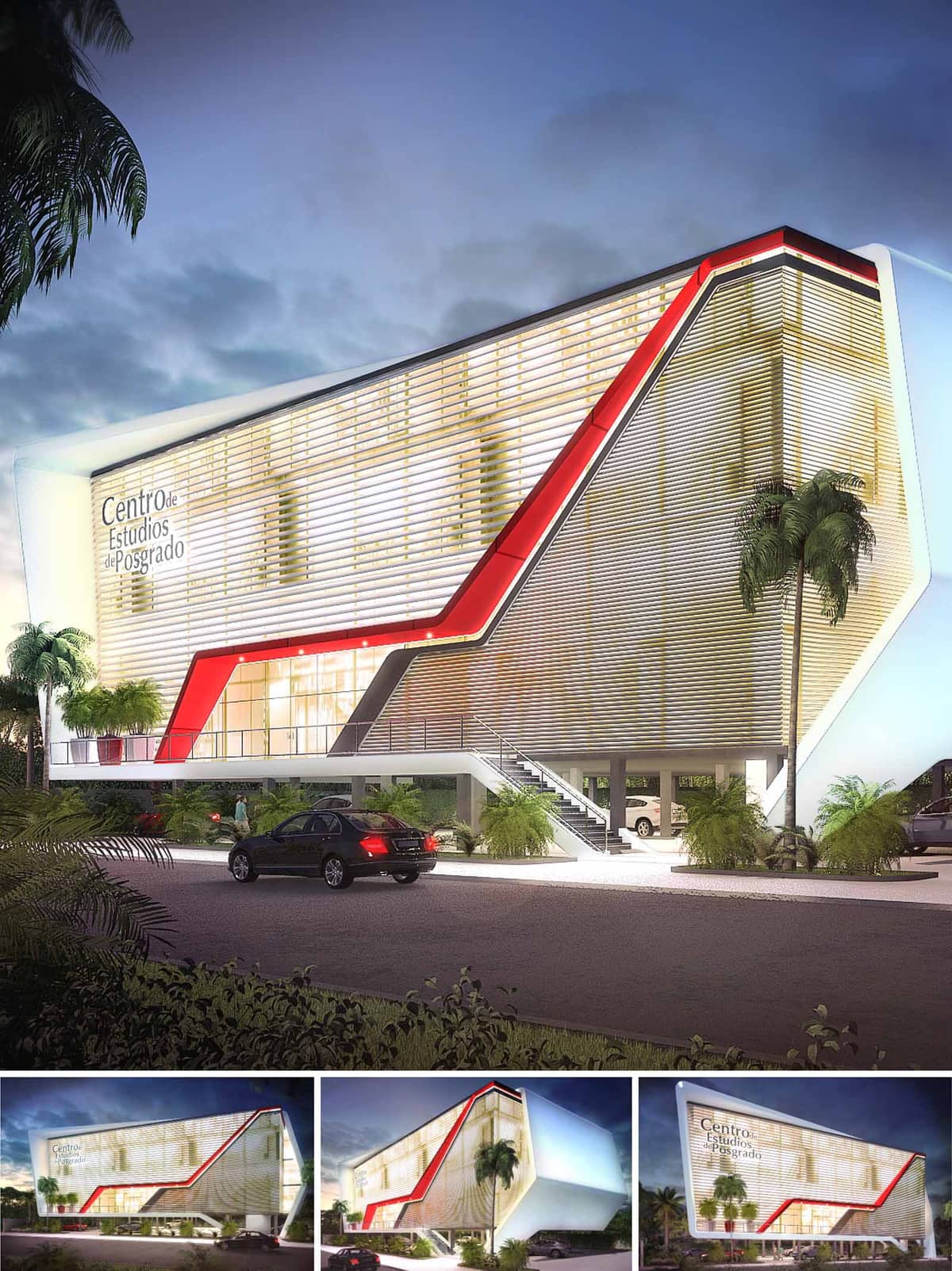

The Postgraduate Building in Cancún is conceived as a compact, iconic volume that projects the institutional identity of an advanced education center. Its pure prismatic form is subtly twisted and enveloped by a continuous skin, emphasizing horizontality and dynamism. A bold red gesture cuts diagonally across the façade, functioning simultaneously as a wayfinding element and as a graphic representation of academic progression and growth. The building is raised above ground level, providing a permeable base that visually lightens the mass and creates an urban porch that welcomes students and visitors.
The concept seeks to reconcile the clarity and efficiency of a commercial building with the symbolic presence required by a postgraduate institution. The resulting architecture is recognizable from a distance, acting as an urban landmark along the vehicular corridors of Cancún while maintaining a human-scale interface at the entrance level.
The project is organized as a three- to four-level volume occupying a compact footprint, responding to the limited plot size and the surrounding vehicular context. The elevated main body allows for shaded parking and drop-off areas underneath, improving circulation on site and freeing the ground plane for landscaping and pedestrian flows. A frontal stair and ramp system, clearly highlighted within the red frame, guide users to the main lobby level, establishing an intuitive arrival sequence.
Inside, the plan is arranged along a central circulation spine, with teaching spaces, seminar rooms and support offices positioned along the façades to maximize natural light. Public and semi-public functions are oriented to the front, engaging with the street, while more private academic and administrative areas are placed towards the quieter sides. The compact plan reduces internal travel distances and allows for flexible reconfiguration of classrooms over time.
The architectural expression is dominated by a double façade composed of horizontal louvers, behind which a glazed curtain wall defines the climatic envelope. This layered system governs the building’s image by day, with soft, filtered reflections, and by night, when the interior illumination converts the volume into a luminous lantern. The louvers create a continuous, almost ethereal skin that visually unifies the different elevations and conceals structural elements.
The red structural-cladding band is introduced as a deliberate contrast to the neutral palette of whites and light metallic tones. It underlines circulation paths, frames the main entrance, and traces a diagonal movement that reinforces the dynamic academic character of the institution. The base structure and circulation cores are expressed in exposed concrete and steel, chosen for durability in the coastal environment and to minimize maintenance.
Natural light is the primary organizer of interior spaces. The horizontal louvers modulate solar incidence, producing evenly lit classrooms that avoid glare, which is crucial for digital projections and prolonged study sessions. Behind the screened façade, transparent and translucent glass panels are combined to balance outward views with privacy, depending on the function of each space.
The interior color strategy is derived from the façade: predominantly neutral surfaces in white and light gray serve as a calm background for learning activities, while controlled accents of red appear in handrails, signage and furniture pieces to reinforce orientation and institutional identity. At night, warm artificial lighting activates the façade and undercroft, ensuring visual comfort and security without excessive energy consumption.
The building employs a regular structural grid in reinforced concrete, optimized for open-plan academic floors that can evolve with changing pedagogical needs. The elevated volume not only creates sheltered parking but also promotes cross-ventilation at ground level, reducing heat accumulation around the building. The compact massing minimizes exposed envelope area relative to usable floor space, supporting energy-efficient operation.
Given Cancún’s tropical climate, the environmental strategy centers on passive measures. The ventilated double skin of louvers acts as a solar filter, reducing direct heat gain while allowing daylight penetration, which lowers dependence on artificial lighting. The orientation of the main façades and the depth of overhangs are calibrated to protect from intense sun and rain. Landscape areas around and beneath the building incorporate native and low-maintenance vegetation, improving microclimate and stormwater absorption. Provision is made for high-efficiency HVAC systems, low-consumption lighting, and the future integration of rooftop photovoltaic panels, aligning the project with contemporary sustainable campus standards.
© 2021 by sanzpont [arquitectura] . Webpage by sanzpont [digital] . Innovative Digital Experiences
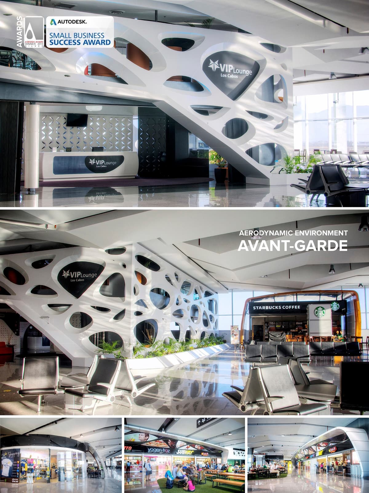

The recognized Grupo Aeroportuario del Pacifico with a total of 12 airports in Mexico selected the architecture and design firm sanzpont [arquitectura] to carry out the project for the Commercial Area of its new International Terminal at San Jose del Cabo with a total of 7,500 m2.
Commercial Area inside the Airport.
The totality of the commercial area space is lit by natural sunlight thanks to a monumental glass façade facing the runway. This generates significant energy savings in lighting throughout the day and thus creates a more sustainable commercial environment.
The interior space is designed as if it were an outside commercial corridor, trying to create a futuristic urban experience for the passengers by providing enjoyable spaces and consequently a pleasant stay while waiting for their flight.
Since the initial planning phase of the project, a contemporary and homogeneous commercial architectural image was sought. The formal concept is based in aerodynamic design using curved lines that reflect vanguardism and a morphological integration with aeronautical design. Vending spaces are contained by enveloping curves made of white Aluminium Compound Panels. The architects relied on digital design and manufacturing techniques to solve the intrinsically formal and constructional part of the project using BIM software, allowing them to visualize and coordinate all aspects of the construction phase.
Organic Design and Digital Fabrication. The VIP Waiting Room was designed with an organic and vanguardist cell design concept in mind. The façade is made using a Voronoi type porous skin, which allows privacy in the room without blocking the view to the exterior. The architectural team designed this complex façade by using experimental parametric digital techniques, which solved the 3D formal and structural model of all the support system and its white Aluminum Compound Panel cover, so by these means, all the different and unique pieces are extracted and assembled just like a puzzle.
© 2021 by sanzpont [arquitectura] . Webpage by sanzpont [digital] . Innovative Digital Experiences
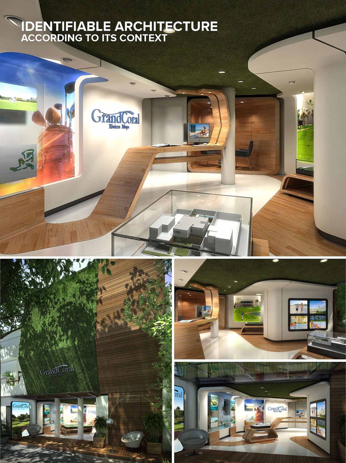

The Grand Coral Showroom is conceived as an immersive spatial narrative that translates the resort’s Caribbean landscape into architectural form. The interior becomes a three-dimensional brand experience where sinuous lines, warm woods, and lush green surfaces evoke dunes, fairways, and coastal vegetation. The design aims to create identifiable architecture strongly rooted in its Playa del Carmen context, allowing visitors to intuitively associate the space with leisure, nature, and high-end hospitality.
The showroom operates as a hybrid between gallery and lounge, in which each curve of the envelope guides visitors along a choreographed path. Architectural surfaces blur the distinction between floor, wall, furniture, and ceiling, transforming the interior into a continuous sculpted topography that reinforces the project’s identity.
The layout is organized around a central exhibition area featuring a scale model of the development, which acts as both focal point and orientation device. Circulation flows radially from this center, leading visitors toward thematic display niches, consultation zones, and a more intimate seating area.
Curved partitions and integrated counters frame semi-enclosed bays where multimedia presentations and project imagery are displayed. These soft boundaries maintain visual continuity across the space while creating enough separation for focused conversations. The open plan combined with controlled vistas encourages exploration, ensuring that the full range of amenities and products associated with Grand Coral is progressively revealed.
The material strategy is anchored in the contrast between warm timber, crisp white surfaces, and deep green textures. Laminated wood wraps from floor to wall and into custom furnishings, suggesting boardwalks and yacht decks, while simultaneously providing a tactile, hospitable atmosphere. The white flooring and walls act as a neutral canvas, enhancing natural light and emphasizing the brand’s graphic elements.
A green, turf-like ceiling and exterior cladding allude directly to golf courses and tropical vegetation. This vegetal texture visually lowers the ceiling plane, making the interior feel intimate while reinforcing the connection with the surrounding landscape. Large, backlit imagery and display windows introduce vibrant blues and sands, recalling sea and beach and completing the resort-inspired chromatic palette.
Most furniture elements are conceived as extensions of the architectural envelope, forming monolithic pieces that curve to become desks, benches, or display plinths. This approach minimizes visual clutter and ensures that every element contributes to a coherent spatial language. Occasional loose furnishings, such as woven lounge chairs, introduce a subtle reference to outdoor terraces and coastal living.
Lighting combines recessed downlights with concealed linear illumination integrated into coves and display frames. This layered strategy highlights the curved geometry, accentuates the texture of the wood and green surfaces, and guides attention to the models and graphic content. Branding is seamlessly embedded through backlit logos, framed visual narratives, and digital screens, transforming the showroom into a powerful communication tool rather than a simple sales office.
Sustainability is addressed through material selection, environmental integration, and energy-conscious systems. The extensive use of wood favors renewable, low-embodied-energy materials, specified with certified origins where feasible. The green cladding and turf-like surfaces, particularly on the exterior, contribute to improved thermal performance by shading exposed walls and reducing direct solar gain.
Daylighting enters through generous openings at the façade, diminishing dependence on artificial lighting during daytime and reinforcing the visual relationship with the surrounding vegetation. High-efficiency LED fixtures and controlled lighting zones reduce energy consumption, while the compact layout limits the need for intensive mechanical conditioning. By merging landscape references, resource-conscious choices, and a durable, timeless aesthetic, the showroom positions itself as an architectural ambassador of Grand Coral’s commitment to responsible and context-sensitive development.
© 2021 by sanzpont [arquitectura] . Webpage by sanzpont [digital] . Innovative Digital Experiences

The Hunter Douglas corporate space in Cancún is conceived as an immersive brand gallery where architecture, product and landscape imagery converge. The design revolves around fluid, folded planes that grow from floor to ceiling to form reception desks, display backdrops and soffits, expressing the company’s expertise in surface modulation and envelope systems. A neutral architectural shell is activated with strong longitudinal perspectives, guiding visitors through a curated sequence of experiences that move from reception to exhibition, meeting zones and training areas.
The conceptual language balances precision and warmth. Clean geometries, sharp edges and backlit profiles evoke technological rigor, while wood finishes and large-format nature graphics introduce a human, tactile dimension. This duality underscores the brand’s positioning between innovation and comfort in interior shading and façade solutions.
The layout operates as a linear promenade. Upon entering, visitors encounter a sculptural reception desk that extends seamlessly into a ceiling plane, establishing an immediate sense of direction and hierarchy. From here, circulation flows along the perimeter, keeping the central area open and flexible to accommodate demonstrations, small events or temporary product installations.
Programmatic zones are layered in depth: an initial welcome and waiting area, followed by consultation niches, a main product gallery, and finally a training and presentation space. Glass partitions and large, continuous wall surfaces keep visual connections open, allowing users to understand the overall configuration at a glance while maintaining acoustical and functional separation where needed.
The predominant material is a warm-toned wood veneer, used on horizontal and vertical surfaces to craft monolithic volumes. This is complemented by light-colored vinyl or engineered wood flooring that enhances continuity and reflects light. The neutral gray seating and white display elements act as quiet counterparts, ensuring that Hunter Douglas products and the large-scale nature graphics remain the primary visual focus.
Strategically placed high-gloss and glass panels introduce reflection and depth, amplifying the perceived scale of the interior. Dark structural elements in the ceiling, combined with the grid of circular luminaires, generate a strong visual canopy that both frames and contrasts with the bright exhibition surfaces below.
The ceiling is treated as a luminous field, composed of a dense matrix of recessed and pendant circular fixtures. This configuration provides uniform ambient lighting while creating a recognizable signature element that reinforces the brand experience. The grid is modulated in density over key areas, accentuating the main gallery and reception zones.
Task and accent lighting are integrated into the wooden folds and display walls, using concealed linear LEDs to highlight textures and products without visible sources. The combination of warm white general light with selective, cooler accents allows precise color rendering of fabrics, slats and finishes, essential in a commercial specification environment.
Large-format photographic panels of forests and natural landscapes establish a visual narrative that links the brand with themes of daylight, views and environmental connection. These images are framed by angular, faceted edges that echo the geometry of blinds and louvers, subtly referencing core products without literal representation.
Brand signage is integrated into the architecture, backlit within wooden planes or aligned with product displays to maintain coherence. Comfortable seating clusters with iconic modern chairs invite informal discussions, while a more structured classroom-style area supports training sessions for designers, installers and clients, reflecting the space’s dual role as showroom and learning hub.
The design emphasizes responsible material selection and optimized lighting. Engineered wood products and veneers are specified with preference for certified or low-emission sources, reducing reliance on solid timber and improving dimensional stability in the humid Cancún climate. High-reflectance interior surfaces maximize the efficiency of the lighting system, allowing lower wattage fixtures while achieving required illumination levels.
The extensive use of LED technology significantly reduces energy consumption and maintenance, particularly important for a commercial space with long operating hours. Daylight, filtered through Hunter Douglas shading systems, can be modulated to control glare and heat gain, serving both as a live demonstration of product performance and as a genuine strategy for thermal and visual comfort. Flexible, demountable display structures enable reconfiguration and reuse, extending the life cycle of the fit-out and minimizing future waste.
© 2021 by sanzpont [arquitectura] . Webpage by sanzpont [digital] . Innovative Digital Experiences

Beton Hala Waterfornt Center is conceived as a fluid infrastructural landscape that stitches together the city of Belgrade, the Sava River embankment and the Kalemegdan hill. The project transforms the existing linear warehouse structure into a multimodal urban platform, combining commercial, cultural and leisure functions with public circulation. A sequence of white, shell‑like canopies defines a strong formal identity, echoing the motion of river waves while framing views toward the historic fortress and the opposite riverbank. Rather than a singular building, the center operates as a continuous urban ribbon, negotiating topography, traffic flows and waterfront activities into a cohesive architectural gesture.
The design reinforces the role of the waterfront as Belgrade’s civic living room, creating a generous, permeable interface between land and water. Commercial functions are interwoven with promenades, bicycle paths and public terraces, ensuring that the project serves both as destination and connector within the broader metropolitan fabric.
The scheme establishes a critical link between the upper city and the river level through a combination of ramps, elevated walkways and bridges. A new tram and vehicular viaduct passes above the complex, intersecting with pedestrian connections that descend to the commercial plinth and ascend toward Kalemegdan park. This stacked circulation hierarchy separates flows while maintaining visual continuity, allowing users to experience the river from multiple heights and perspectives.
Along the riverfront, a widened quay provides docking facilities for passenger boats and cruise ships, integrating the center into regional waterborne networks. The ground plane is kept as open and porous as possible, with covered arcades beneath the canopies offering shaded routes parallel to the water. This continuous loop encourages strolling and supports the retail and leisure program without compromising accessibility to existing piers and services.
The architectural expression is defined by a series of repetitive, arched roof shells that rise and fold to form a rhythmic skyline. These elements are conceived as lightweight steel or composite structures, spanning over column‑free interior spaces suitable for flexible commercial use. Their sculptural white surfaces emphasize horizontality along the river while producing dynamic sectional profiles toward the hill.
The shells are anchored into a robust concrete podium that reinterprets the industrial character of the original Beton Hala warehouses. Large glazed façades open the commercial interiors to the promenade, while deep overhangs and inclined façades moderate solar exposure. Viewed from the river, the alternating sequence of open bays and solid vaults creates a strong visual continuity, turning the center into a recognizable infrastructural landmark within Belgrade’s panorama.
The roofscape is treated as an accessible green topography, extending the park of Kalemegdan toward the water. Grassy mounds, planted surfaces and integrated seating form a series of belvederes, allowing visitors to overlook the river traffic and city skyline. The articulation of the roof into walkable terraces effectively doubles the usable public space, providing a continuous park‑bridge that can be enjoyed independently of the commercial program below.
At quay level, timber or composite decking, planting strips and small pavilions generate a warm, human‑scaled environment that softens the infrastructural context. Bicycles, joggers and pedestrians share a generous promenade, while occasional widened nodes host outdoor cafés, temporary markets or cultural events. This layering of green roof, intermediate deck and quay promenade produces a rich three‑dimensional public realm.
Sustainability is embedded through both passive and active measures. The extensive green roofs contribute to thermal insulation, reduction of heat‑island effect and on‑site rainwater retention. Their thickness and planting strategy are calibrated to improve microclimate along the embankment, providing evaporative cooling and shaded resting areas. Orientations of the shell forms promote natural cross‑ventilation of interior spaces, supported by operable façades facing the river breeze.
The project anticipates the integration of renewable energy systems, such as vertical‑axis wind turbines and photovoltaic panels placed on optimal roof segments. Daylighting is maximized through carefully positioned skylights and clerestory openings, reducing reliance on artificial lighting for the commercial interiors. Material choices emphasize durable, low‑maintenance finishes suitable for the riverfront environment, while the reuse and transformation of the existing Beton Hala footprint minimize excavation and embodied carbon. Together, these strategies position the center as a contemporary, resilient waterfront catalyst for Belgrade.
© 2021 by sanzpont [arquitectura] . Webpage by sanzpont [digital] . Innovative Digital Experiences

Hotel Zone, Cancun, Quintana Roo, Mexico. sanzpont [arquitectura] Silver Medal in the Interior Design Category at the 2nd Mexican Architecture Biennial held in Cancún, Quintana Roo. - Silver Medal in the Interior Design Category at the 2nd Mexican Architecture Biennial held in Cancún, Quintana Roo.
Conceptual Design: Creating a Fluid Path This project is a small 70m2 / 753 sq. foot storefront gallery located in a high-end shopping center in the tourist area of the city. The client required a clean, distinctive and avant-garde design. The design concept is based on a golden river; a yellow liquid running through the ceiling that invites you to walk through the store, incorporating an element of identity and memorability for its visitors. All forms originate in the false ceiling, as if it were a river bank and its waves. The fluid design extends into the floor and the furniture. As for colors, the white was used throughout for a clean look and the yellow in the ceiling leads to a marketing image that forms the backdrop of the cash wrap. The design of the cash wrap is a soft, irregular shape floating in the waves of the river engraved on the pavement. Indirect lighting gently bathes the surface, subtly highlighting the shape of the curves.
False Ceiling Design: Creating a Fluid Path The concept of the ceiling is a fluid continuity that represents the movement of the river’s waves. This is materialized by ridges and soft valleys throughout the space, integrated into the wall furniture that continues its shape down to the floor.
Constructive Digital Model With the creation of a digital model, it was possible to obtain all the tracing points in XYZ. They then created a three-dimensional cartesian model within the space.
Flexible Panel Ceiling It was necessary to be able to mold the curved shape of the ceiling using a thinner and more flexible drywall than usual. The very demanding curvatures within the project were made possible by utilizing a 1/4” thick plasterboard with superior flexibility.
Facade Design: Non-existent for a Total Opening The design of the facade is nonexistent, which generates a total opening of the store towards the outside. Commercially speaking, it helps that there is no barrier to hinder access to the store, generating an "extension of the corridor" outside circulation, allowing potential customers to enter without realizing it.
Furniture Design: Modular and Parametric Design Even with a fluid and non-orthogonal design, the challenge was to create completely modular furniture that can be repeated along the perimeter of the store, connected together. Wall Furniture: The concept of all the perimeter furniture, unlike the traditional scheme (solid, self-supporting furniture), was that all the modules were designed hanging from a tubular structured frame. With this avant-garde, industrial design comes considerable savings in the furniture manufacturing since only the visible surfaces are wood. The module itself integrates LED lighting, creating considerable energy savings.
© 2021 by sanzpont [arquitectura] . Webpage by sanzpont [digital] . Innovative Digital Experiences

20 story tower, destinated for commercial, hospitality and office use. The building consists in 2 vertical bodies that meet at the top by 2 habitable bridges with an interior garden to form a large frame of the natural landscape. The building is protected from the sun in its west side by a "ventilated facade" of Alucobond flaky and indirect light is filtered inside between the horizontal slats of its outline.
On the Eastern front, the skin of the building is designed with a set of silkscreened, and transparent crystals sandblasteados advantage of the views of the golf course in Cancun and the Caribbean Sea. It has 2 parking levels integrated vegetated slope and high public square that generates a large urban balcony.
The interior design of the Mall in the early levels, expresses dynamism and spatial continuity invite another climb even higher to sit and have a coffee and enjoy the view terrace. In addition, the building opened to the public the opportunity to rise further, as it has a gazebo lounge restaurant on the top level. Thus, this vertical infrastructure with the inhabitant of the city and its urban environment is integrated.
• A’ Design Awards, Milán, Italy : Bronze Medal - Certificate of Excellence in World Architecture & Structure Design: GSI Tower (2015)
• IDA Design Awards, Los Angeles, USA : Silver Medal - Conceptual Architecture Design : GSI Tower, Cancún (2014)


• A’ Design Awards, Milán, Italy : Bronze Medal - Certificate of Excellence in World Architecture & Structure Design: GSI Tower (2015)
• IDA Design Awards, Los Angeles, USA : Silver Medal - Conceptual Architecture Design : GSI Tower, Cancún (2014)
20 story tower, destinated for commercial, hospitality and office use. The building consists in 2 vertical bodies that meet at the top by 2 habitable bridges with an interior garden to form a large frame of the natural landscape. The building is protected from the sun in its west side by a "ventilated facade" of Alucobond flaky and indirect light is filtered inside between the horizontal slats of its outline.
On the Eastern front, the skin of the building is designed with a set of silkscreened, and transparent crystals sandblasteados advantage of the views of the golf course in Cancun and the Caribbean Sea. It has 2 parking levels integrated vegetated slope and high public square that generates a large urban balcony.
The interior design of the Mall in the early levels, expresses dynamism and spatial continuity invite another climb even higher to sit and have a coffee and enjoy the view terrace. In addition, the building opened to the public the opportunity to rise further, as it has a gazebo lounge restaurant on the top level. Thus, this vertical infrastructure with the inhabitant of the city and its urban environment is integrated.
© 2021 by sanzpont [arquitectura] . Webpage by sanzpont [digital] . Innovative Digital Experiences

The Neve Shalom Temple in Cancún is conceived as a compact urban sanctuary that filters the intensity of the city and the Caribbean climate into a calm, introspective interior. The architectural language merges contemporary minimalism with symbolic elements of light, enclosure, and layered thresholds, expressing the idea of protection and spiritual ascent within a restrained, cubic volume. The building operates as both a religious and community space, with a façade that is reserved toward the street and increasingly permeable as visitors move inward.
The composition articulates a clear base–middle–crown hierarchy: an opaque plinth anchors the project to the street, a warm timber band creates a human-scale interface, and a luminous perforated upper volume signals the sacred space. This tripartite reading allows the temple to be recognizable in the urban fabric while maintaining an intimate scale appropriate to the local community.
The main façade is organized as a horizontal bar that screens the interior from direct views while subtly announcing the entrance through a recessed portal. Large-format dark panels form a solid, tectonic base, contrasted by a diagonally articulated timber cladding that introduces dynamism and visually extends the volume along the street front. Linear light slots integrated into the wood create a discreet nocturnal identity and echo the idea of prayers as beams of light emerging from within.
Above this grounded base, the upper sanctuary volume is wrapped in a perforated metallic skin. This translucent enclosure transforms the interior lighting into a soft lantern effect at night, while by day it filters sunlight and frames silhouettes of palm trees and sky. The interplay of wood, metal, and smooth white plaster surfaces creates a precise, contemporary palette that withstands the tropical climate yet feels warm and approachable.
The interior journey is choreographed as a gradual transition from compression to openness. Entry occurs through a contained vestibule, moving into a double-height hall defined by latticed wood screens and controlled overhead light. These perforated elements modulate views and acoustics, guiding the eye toward the central worship or gathering space while preserving a sense of privacy.
Within the main hall, surfaces are handled with a balance of solidity and reflection. Timber cladding, stacked in horizontal bands, is juxtaposed with polished dark flooring that subtly mirrors light fixtures and water elements. Circulation is clear and legible, with stairs and ramps carefully integrated along the perimeter to maintain a central, uninterrupted devotional or assembly area suitable for flexible programming.
Material selection focuses on tactile warmth and controlled luminosity. Exterior timber is used in calibrated strips, emphasizing horizontality and guiding natural ventilation joints. The dark stone or porcelain cladding grounds the building while offering durability against humidity and saline air. The perforated metal mesh of the upper volume acts as a climatic and visual veil, generating dappled light patterns that recall traditional screens while remaining distinctly contemporary.
Artificial lighting is conceived as an extension of the architecture. Integrated linear fixtures within the façade boards and interior walls create soft washes rather than direct glare, reinforcing the meditative character of the spaces. In select areas, clusters of suspended luminaires simulate a starry canopy, emphasizing verticality and enhancing the ceremonial dimension without resorting to overt ornamentation.
The project accommodates worship functions alongside educational and community activities, organized around a clear zoning strategy. Public and semi-public areas occupy the lower level, ensuring direct access from the street, while more contemplative spaces are located above, buffered from noise and urban distractions. Service zones and storage are compactly arranged along blind walls, maximizing usable area for gathering and circulation.
Sustainability is addressed through passive and material strategies appropriate to Cancún’s tropical climate. The perforated upper skin acts as a brise-soleil, reducing solar gain while allowing cross-ventilation and lowering reliance on mechanical cooling. High-performance glazing, insulated roof assemblies, and the use of durable, low-maintenance finishes extend the building’s life cycle. Where possible, locally sourced timber and stone reduce transportation impacts, while the careful orientation of openings optimizes natural light, minimizing artificial lighting loads and ensuring that the temple remains both energy-efficient and comfortable throughout the year.
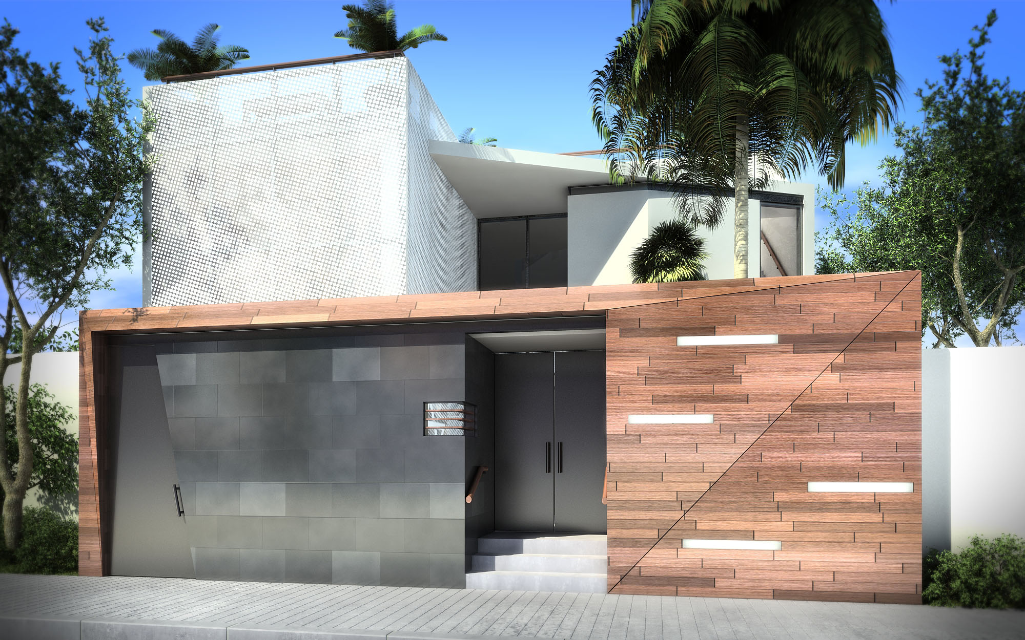
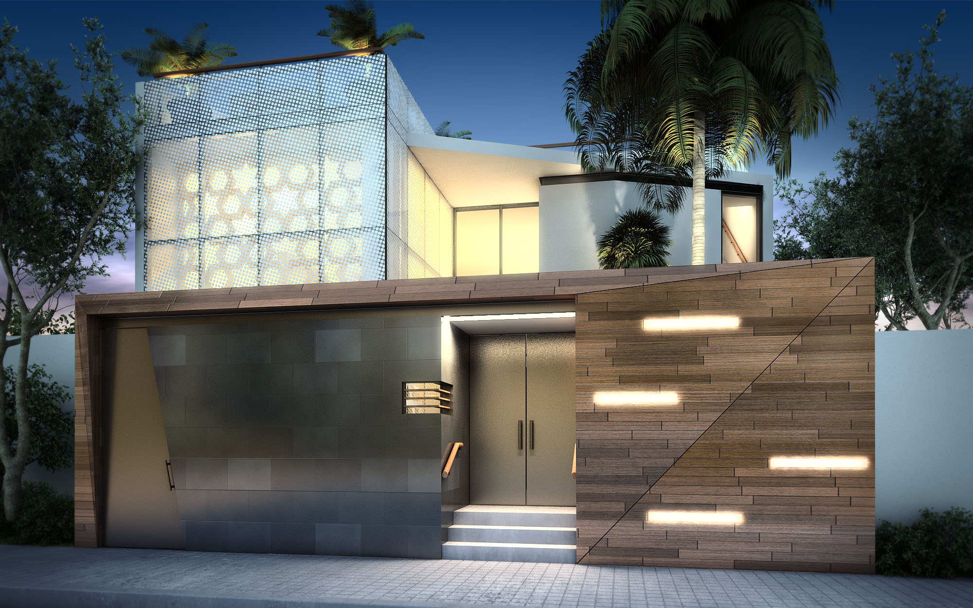
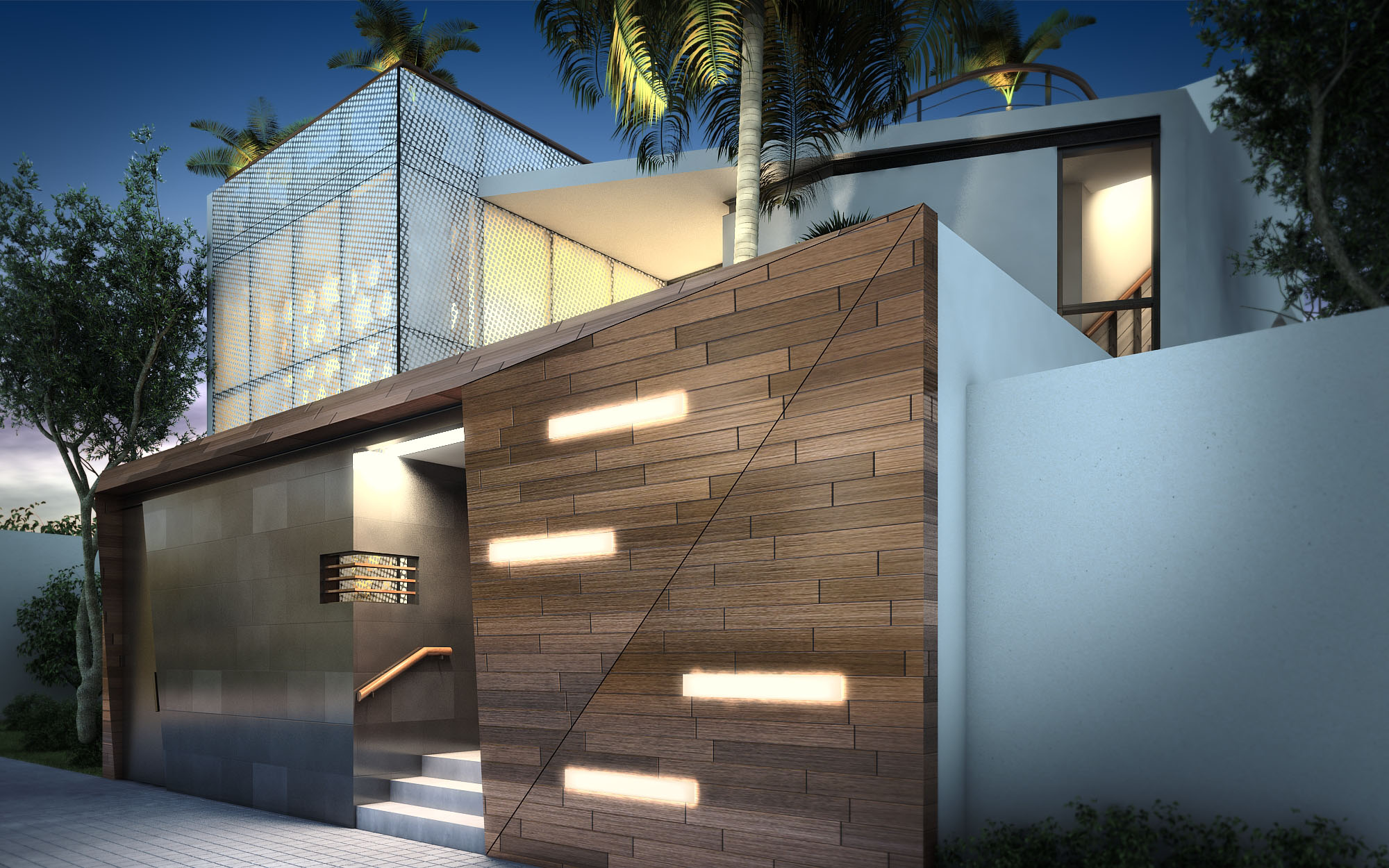
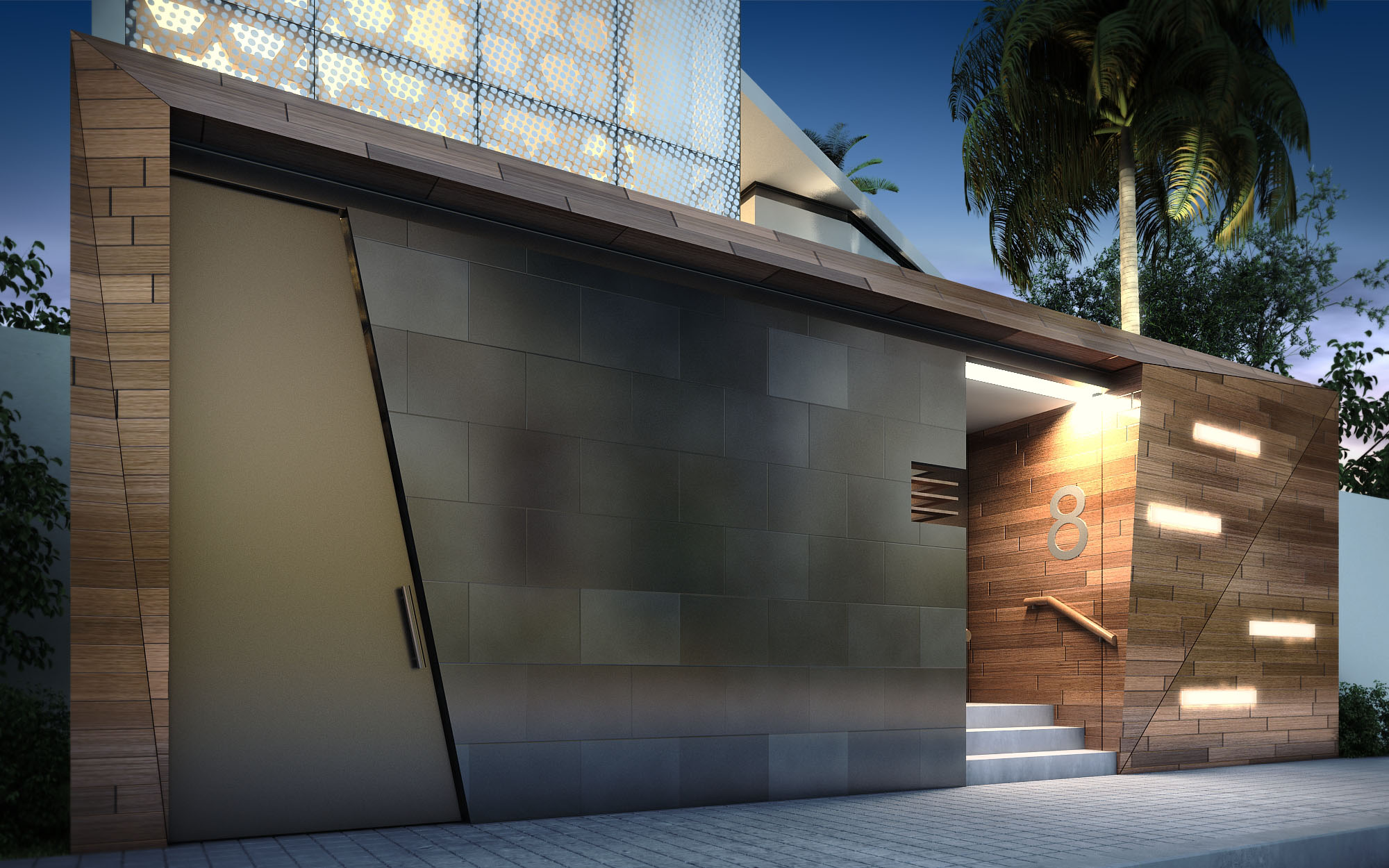
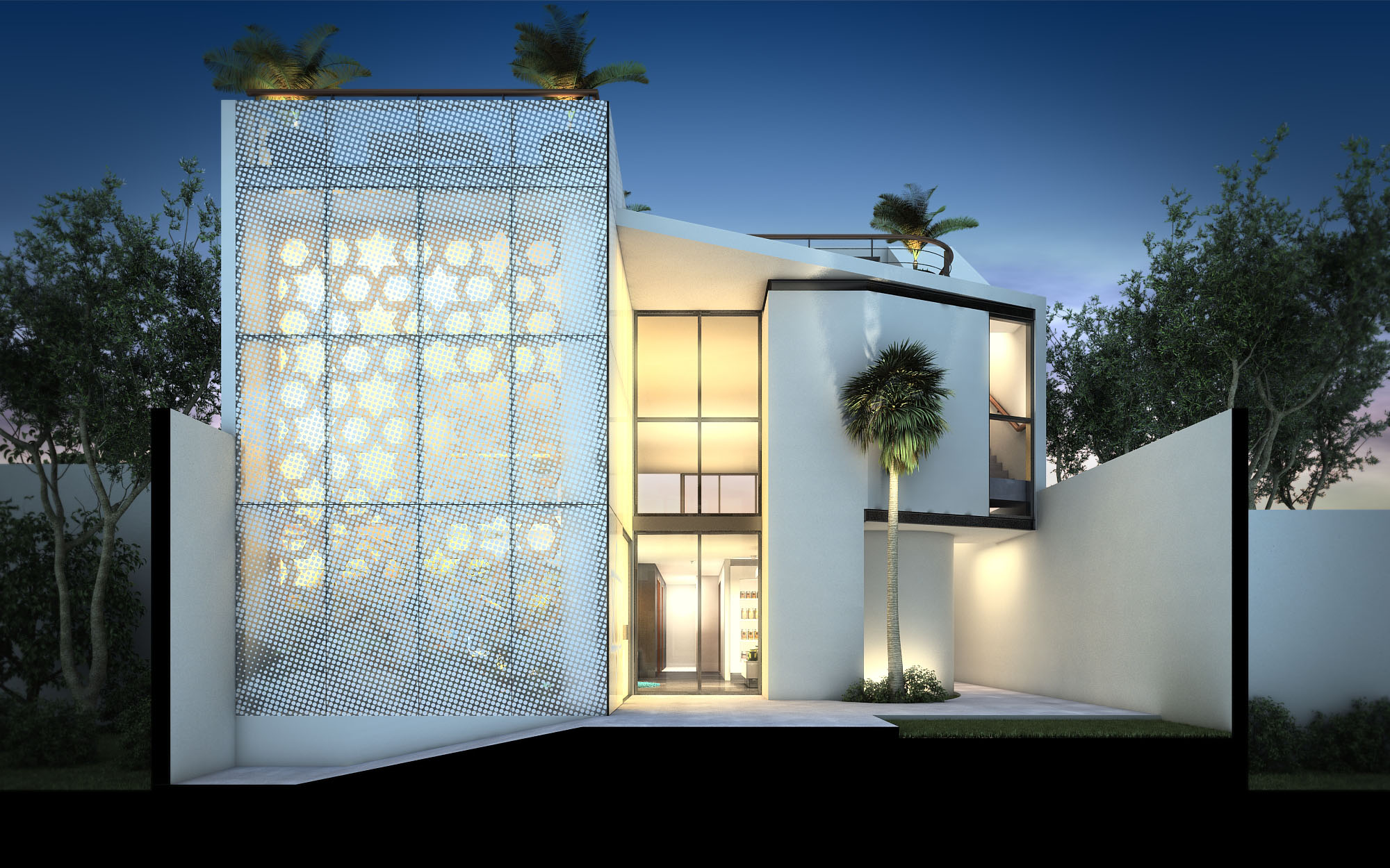
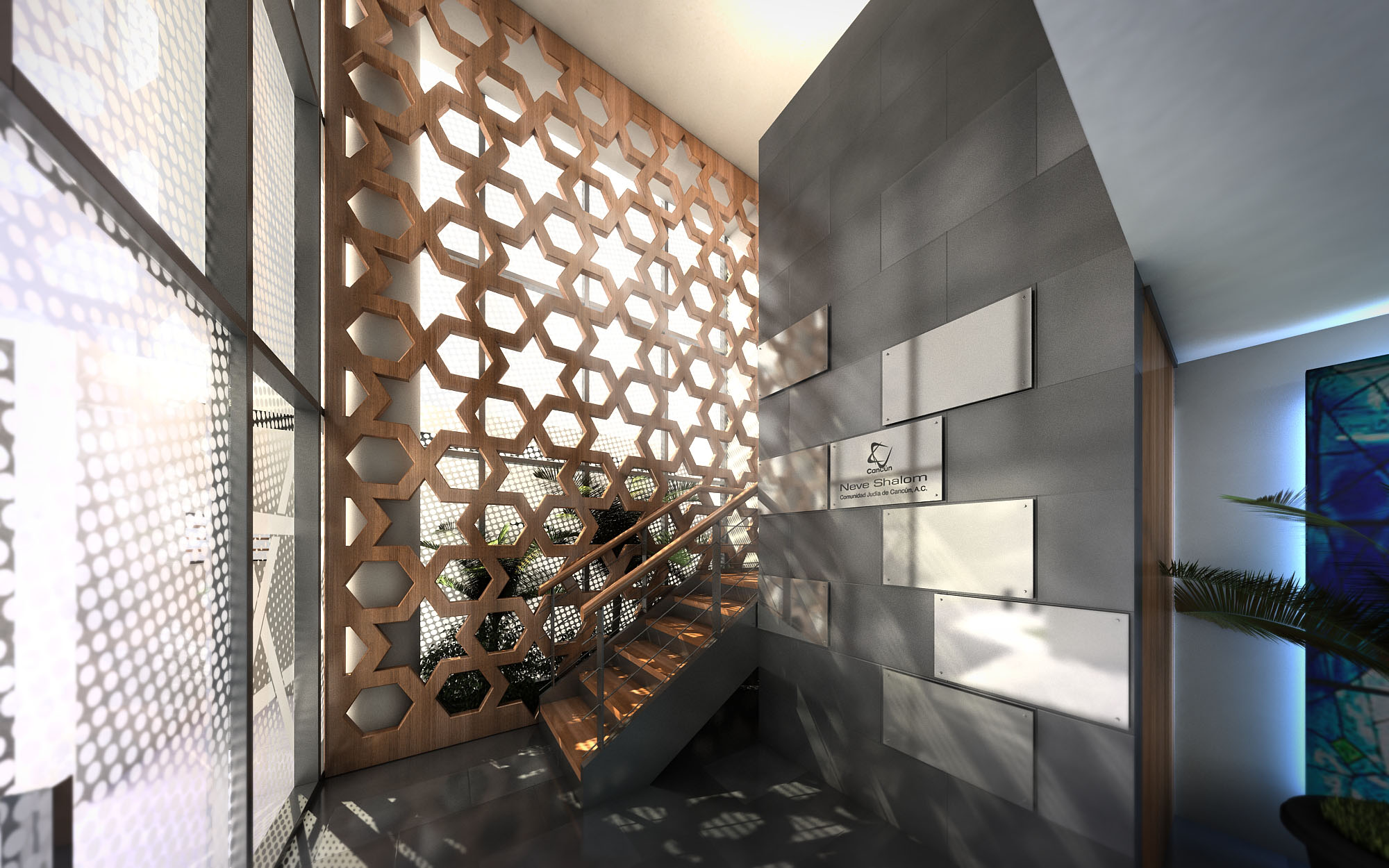
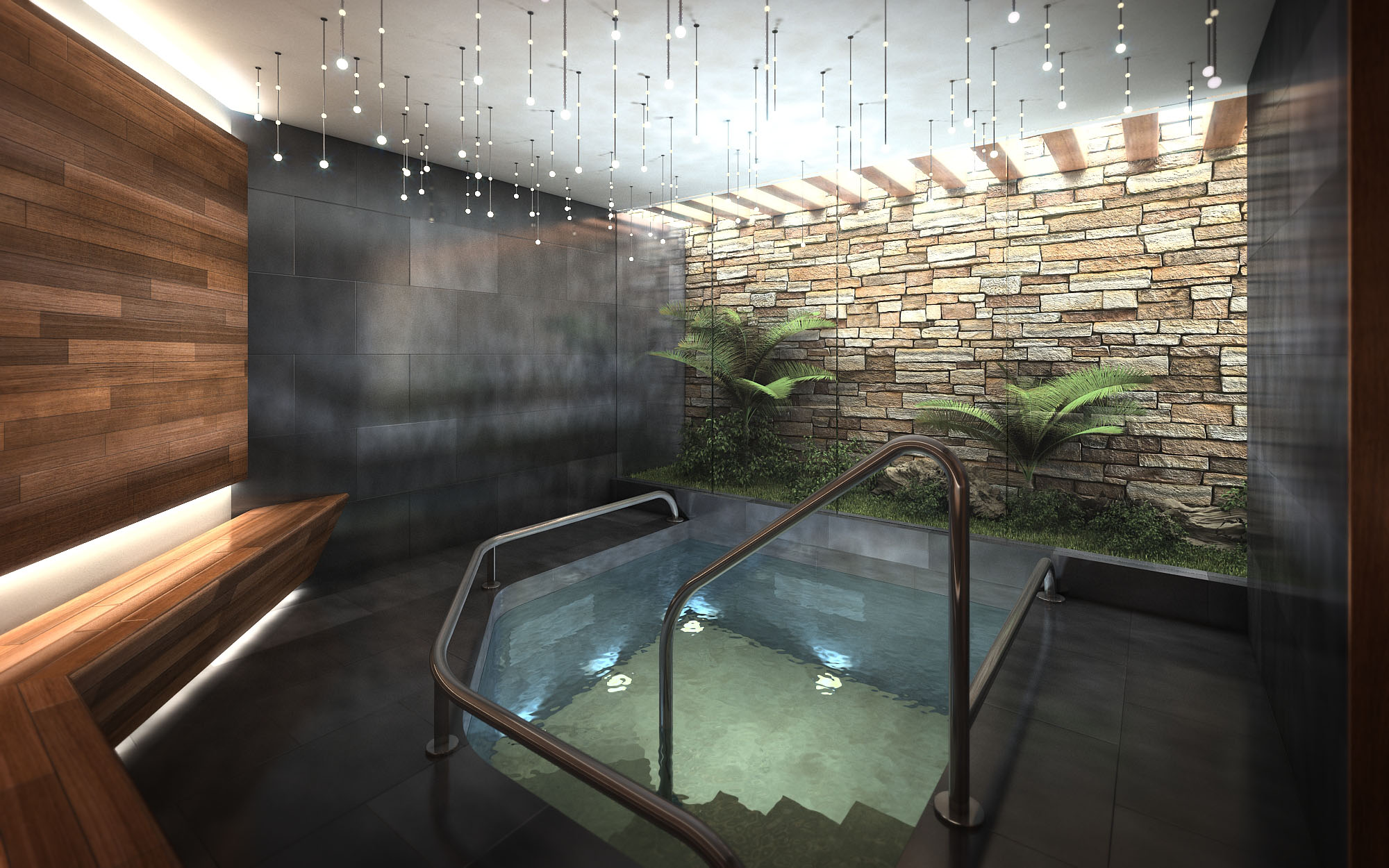
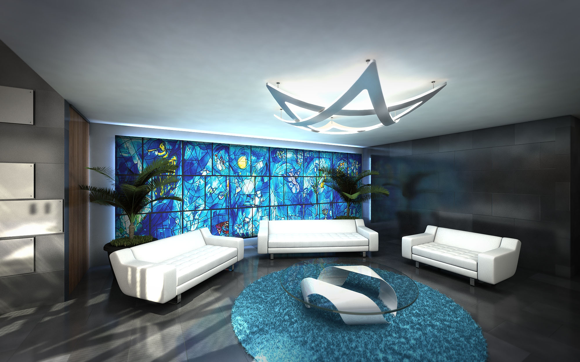
© 2021 by sanzpont [arquitectura] . Webpage by sanzpont [digital] . Innovative Digital Experiences
La participación del cliente y el co-diseño son el centro de nuestro enfoque, asegurando que cada proyecto refleje las necesidades y la visión únicas de quienes confían en nosotros. Al involucrar activamente al cliente durante todo el proceso de diseño, fomentamos un entorno de colaboración donde las ideas florecen, dando lugar a espacios no solo funcionales, sino también profundamente personalizados.
Un proyecto no es solo el resultado: es disfrutar el camino junto al cliente.
Hacer realidad tu visión comercial es nuestra especialidad. Diseñamos meticulosamente cada proyecto a la medida de tu modelo de negocio, tus operadores y las expectativas de tus visitantes. Nuestro proceso es interactivo y centrado en el cliente, asegurando que cada elemento de tu centro comercial, plaza o showroom impulse el rendimiento comercial y refleje fielmente la identidad de tu marca.
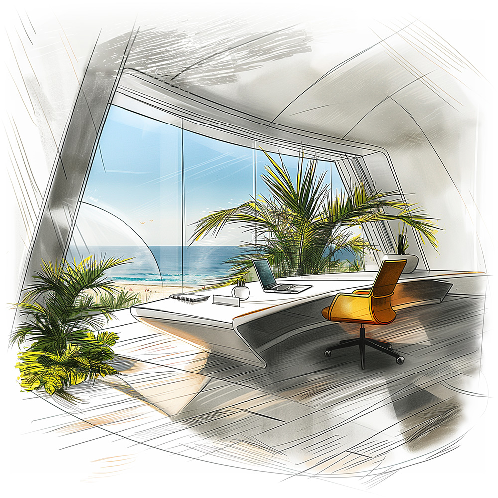
El diseño sostenible y bioclimático se centra en la responsabilidad ambiental y la eficiencia energética. Al integrar elementos naturales y tecnologías innovadoras, estos diseños mejoran el confort, reducen el consumo energético y promueven entornos más saludables, alineando los espacios comerciales contemporáneos con principios ecológicos.
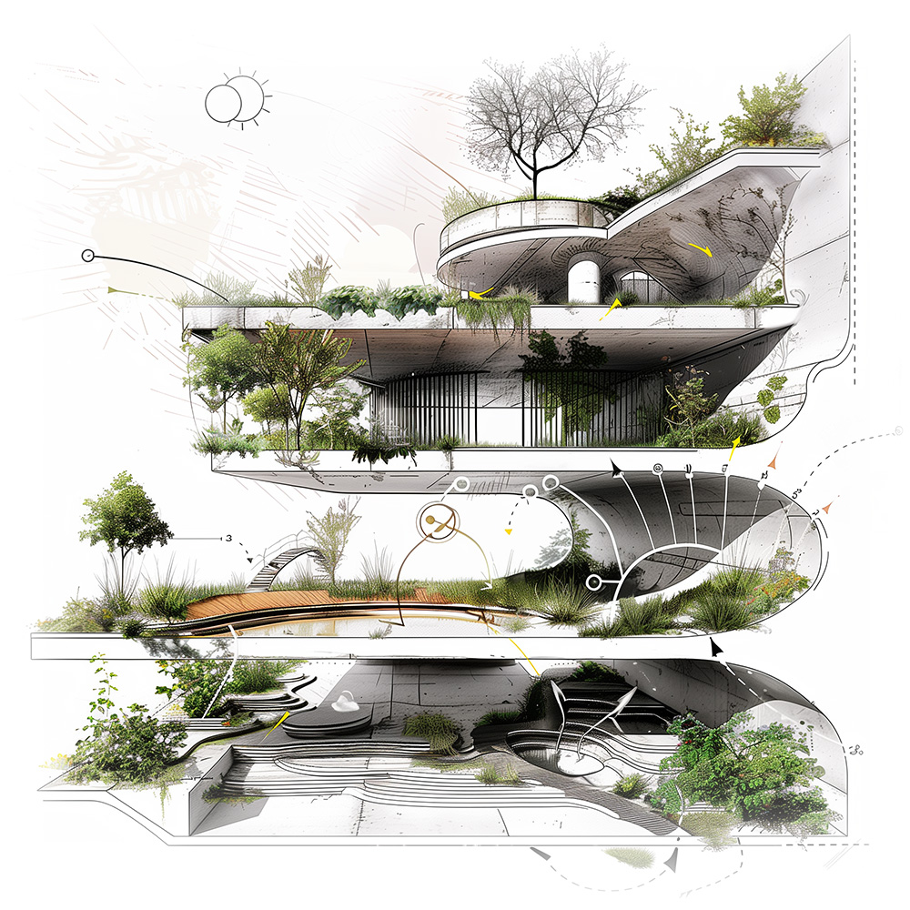
Nuestros diseños están centrados en el usuario, son lógicos y funcionales, y responden a la forma en que las personas se mueven, se reúnen y compran. Priorizamos circulaciones intuitivas, una orientación clara y distribuciones inteligentes que mejoran la experiencia del visitante y la eficiencia operativa. Cada decisión de diseño nace de una comprensión profunda del flujo de visitantes y de la lógica comercial, garantizando una funcionalidad óptima.
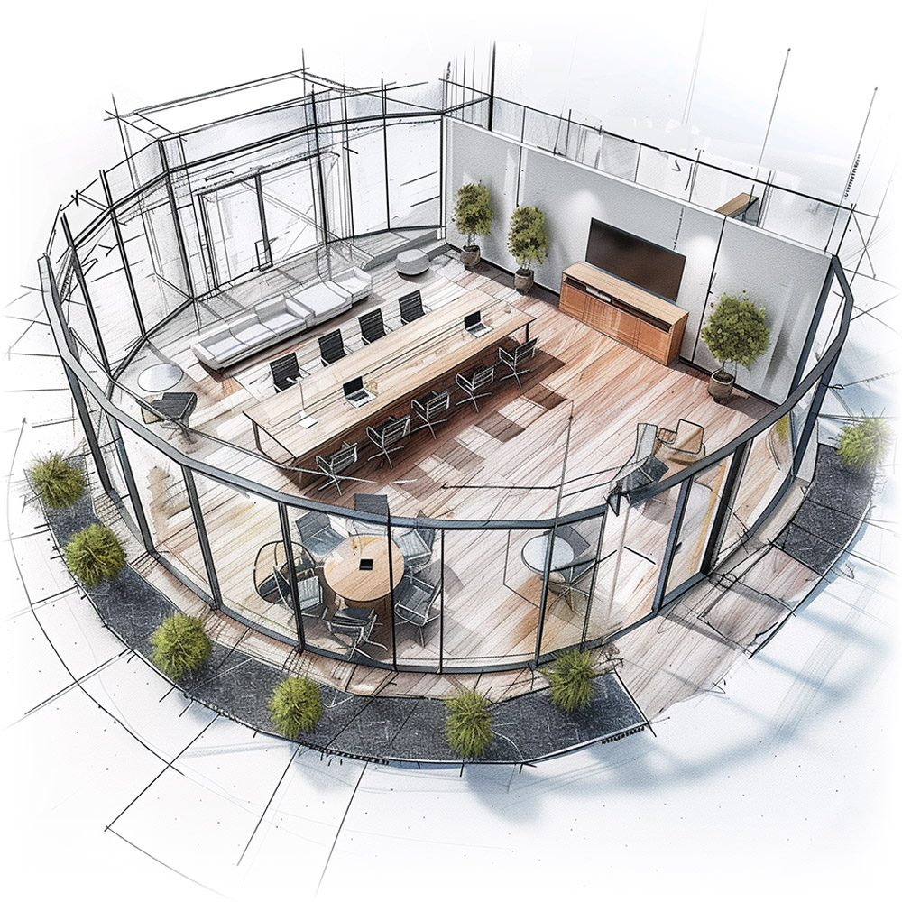
Nuestro flujo de trabajo BIM (Building Information Modeling) integra tecnología avanzada para optimizar y potenciar el proceso de diseño. Este método permite una planificación y ejecución precisas y eficientes, facilitando una mejor coordinación, una gestión de costos más rigurosa y una visualización clara del proyecto. Con BIM garantizamos un proceso constructivo fluido, colaborativo y de alta calidad.
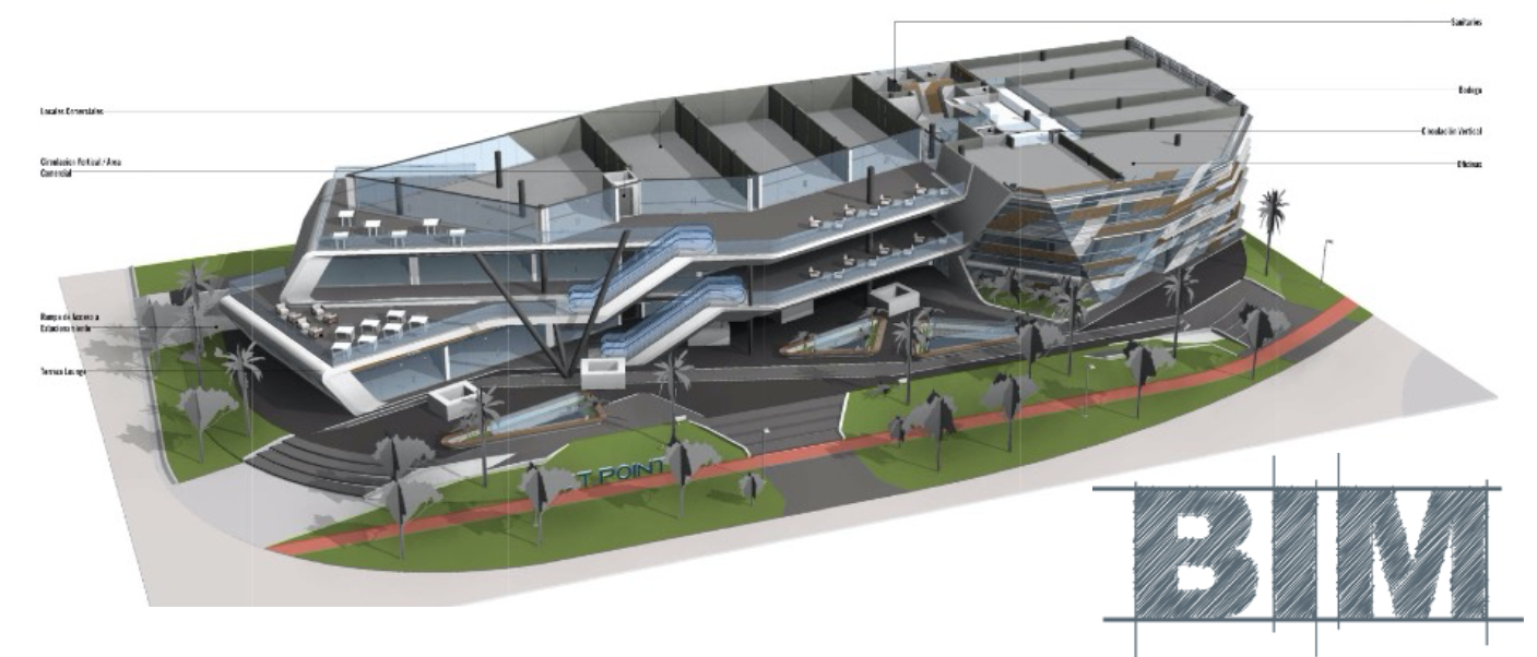
Nuestras visualizaciones interactivas dan vida a tu proyecto antes de que comience la construcción, ofreciendo una experiencia dinámica e inmersiva. Estas herramientas avanzadas te permiten explorar opciones y modificaciones de diseño en tiempo real, asegurando que el resultado final se alinee perfectamente con tu visión. Esta tecnología fomenta una comprensión y una implicación más profundas durante todo el proceso de diseño.

La visualización en Realidad Virtual (VR) te permite experimentar y afinar tu proyecto antes de construirlo, con una percepción clara del espacio y del diseño. Esta capacidad en tiempo real garantiza precisión, ahorra tiempo y evita modificaciones costosas, mejorando la toma de decisiones y profundizando tu conexión con la visión final del proyecto.

En esencia, somos un colectivo de mentes creativas que empuja constantemente los límites del diseño y la innovación. Nuestro equipo desafía las convenciones y explora nuevas posibilidades para crear espacios que no solo son funcionales, sino también artísticamente inspiradores. Transformamos visiones en realidades, creando entornos que emocionan e inspiran.
Somos especialmente sensibles al presupuesto de cada proyecto, asegurando que nuestros diseños se ajusten a tus parámetros financieros sin comprometer la calidad ni la funcionalidad. Nuestro enfoque estratégico se basa en una planificación meticulosa y una gestión eficiente de los recursos, lo que nos permite entregar espacios comerciales excepcionales que respetan tu presupuesto y maximizan tu inversión.
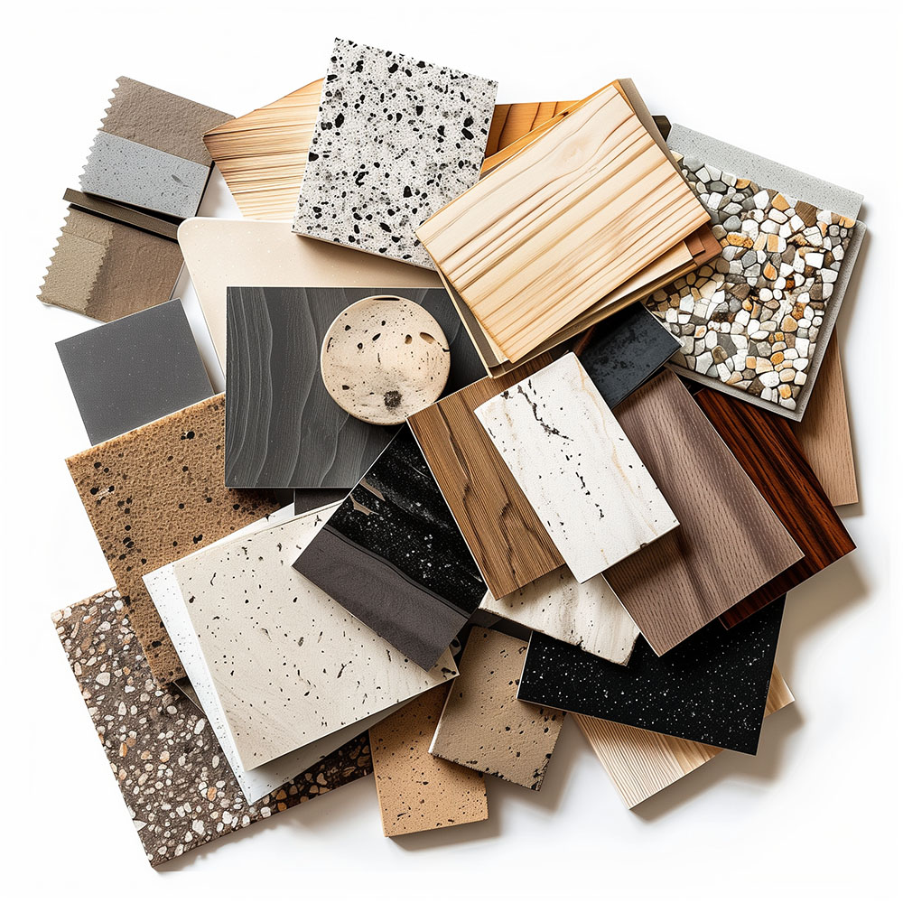
Nuestra experiencia en diseño internacional nos permite crear destinos comerciales excepcionales en cualquier parte del mundo. Con oficinas en Barcelona, Cancún, Chicago y Santo Domingo, hemos desarrollado proyectos comerciales desde México y el Caribe hasta España, Estados Unidos y Reino Unido, adaptando cada diseño a la cultura local sin renunciar a estándares universales de excelencia. Esté donde esté tu desarrollo, podemos crear tu destino ideal.
Priorizamos la colaboración local, trabajando en equipo con consultores de cada región para asegurar que nuestros diseños cumplan la normativa local y los estándares de cada comunidad. Este enfoque enriquece nuestros proyectos con conocimiento y sensibilidad locales, garantizando que cada proyecto no solo cumpla las normas, sino que se integre plenamente en su contexto.
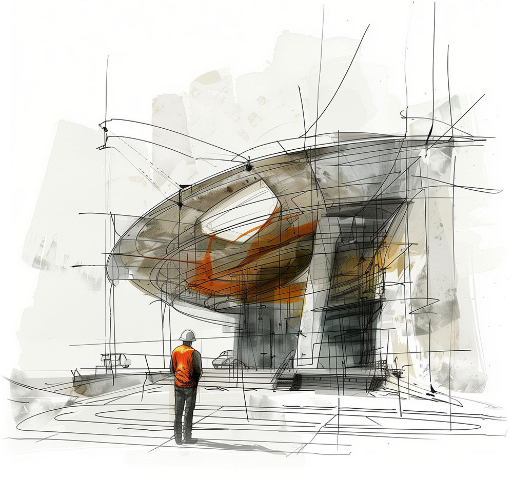


Nuestras oficinas están en Barcelona, Cancún, Chicago y Santo Domingo, pero gracias a la tecnología podemos desarrollar proyectos en cualquier parte del mundo.
Barcelona
Bac de Roda 136
08020, Barcelona
Spain
Madrid
Av. de Buendía 11
19005 Guadalajara (Madrid)
Spain
Chicago
373 Hazel Ave, Apt A1
60022, Glencoe, Illinois
United States