





Proposal: Promoting Korean Philosophy The concept of design is based on the philosophy of Korea, the balance of opposites, the Um-Yang. The fundamental idea is to create an iconic building that represents the culture in which it is immersed, to remind the native people where they come from in order to promote this philosophy to the outside world. Materializing this ancient philosophy in a cutting edge building connects the past with the present, giving long life to a culture that must be projected into the future. The vision of this building is the integration with its natural and urban environment, besides being spectacular, create public spaces and nature, respecting and helping the environment, a sustainable design that promote a city to the world.
SKIN INNOVATION: Energy Flow in Motion : Click to see Animation Video The LED RGB lighting glows inside a double layer of Nebular Gradient Silkscreened ETFE. The printed texture gradients the opacity of the skin to control sunlight and lighting. By controlling the intensity and the RGB gradients of the LEDs, the skin creates Energy Flow in Motion. The skin represents the unity of opposites that compose the cosmos.
SUSTAINABLE DESIGN : Minimizing Carbon Footprint The skin incorporates Photovoltaic Solar Panels capturing energy from the sun to generate and supply electricity from a clean and sustainable energy. The Extensive Green Roof helps to provide oxygen and ambient temperature regulation, providing a natural insulation skin on the top of the building. LED technology glow the skin of the building at night, creating art with light of low energy consumption emphasizing the fluid and singular skin. The Ventilated and Shading Façade reduces interior solar radiation by shading the internal curtain wall, and the diffuse solar light enters interior space through the gradient opacities. Rainwater is collected through the entire roof and stored to be used in bathroom equipment and landscape irrigation. Grey water is treated and re-used for landscape irrigation.
URBAN DESIGN: Maximizing Public Space The building is designed to be passable inside and out, becomes an urban element deployed from the site as a bridge to its top as a balcony. The Green Roof extends the gardens and recreational areas of the city, increase the natural landscape and invites you to rise to the top of the building creating an Urban Park. The rising walkway increases pedestrian paths in the area and invites you to rise to the top while enjoying panoramic views, then go down and continue a site walk. The terraces at different levels generate scenic viewpoints. The green surface along the roof creates natural seating steps for the contemplation of aquatic and urban events. The exterior urban areas of the site are designed according to Korean Philosophy; the building is surrounded by 4 plazas: Ri/Fire, Gon/Earth, Gam/Water and Geon/Metal. The design also incorporates a Water Balcony as part of the pedestrian path; this element provides a little more interaction between users and their natural environment.


Proposal: Promoting Korean Philosophy The concept of design is based on the philosophy of Korea, the balance of opposites, the Um-Yang. The fundamental idea is to create an iconic building that represents the culture in which it is immersed, to remind the native people where they come from in order to promote this philosophy to the outside world. Materializing this ancient philosophy in a cutting edge building connects the past with the present, giving long life to a culture that must be projected into the future. The vision of this building is the integration with its natural and urban environment, besides being spectacular, create public spaces and nature, respecting and helping the environment, a sustainable design that promote a city to the world.
SKIN INNOVATION: Energy Flow in Motion : Click to see Animation Video The LED RGB lighting glows inside a double layer of Nebular Gradient Silkscreened ETFE. The printed texture gradients the opacity of the skin to control sunlight and lighting. By controlling the intensity and the RGB gradients of the LEDs, the skin creates Energy Flow in Motion. The skin represents the unity of opposites that compose the cosmos.
SUSTAINABLE DESIGN : Minimizing Carbon Footprint The skin incorporates Photovoltaic Solar Panels capturing energy from the sun to generate and supply electricity from a clean and sustainable energy. The Extensive Green Roof helps to provide oxygen and ambient temperature regulation, providing a natural insulation skin on the top of the building. LED technology glow the skin of the building at night, creating art with light of low energy consumption emphasizing the fluid and singular skin. The Ventilated and Shading Façade reduces interior solar radiation by shading the internal curtain wall, and the diffuse solar light enters interior space through the gradient opacities. Rainwater is collected through the entire roof and stored to be used in bathroom equipment and landscape irrigation. Grey water is treated and re-used for landscape irrigation.
URBAN DESIGN: Maximizing Public Space The building is designed to be passable inside and out, becomes an urban element deployed from the site as a bridge to its top as a balcony. The Green Roof extends the gardens and recreational areas of the city, increase the natural landscape and invites you to rise to the top of the building creating an Urban Park. The rising walkway increases pedestrian paths in the area and invites you to rise to the top while enjoying panoramic views, then go down and continue a site walk. The terraces at different levels generate scenic viewpoints. The green surface along the roof creates natural seating steps for the contemplation of aquatic and urban events. The exterior urban areas of the site are designed according to Korean Philosophy; the building is surrounded by 4 plazas: Ri/Fire, Gon/Earth, Gam/Water and Geon/Metal. The design also incorporates a Water Balcony as part of the pedestrian path; this element provides a little more interaction between users and their natural environment.
© 2021 by sanzpont [arquitectura] . Webpage by sanzpont [digital] . Innovative Digital Experiences
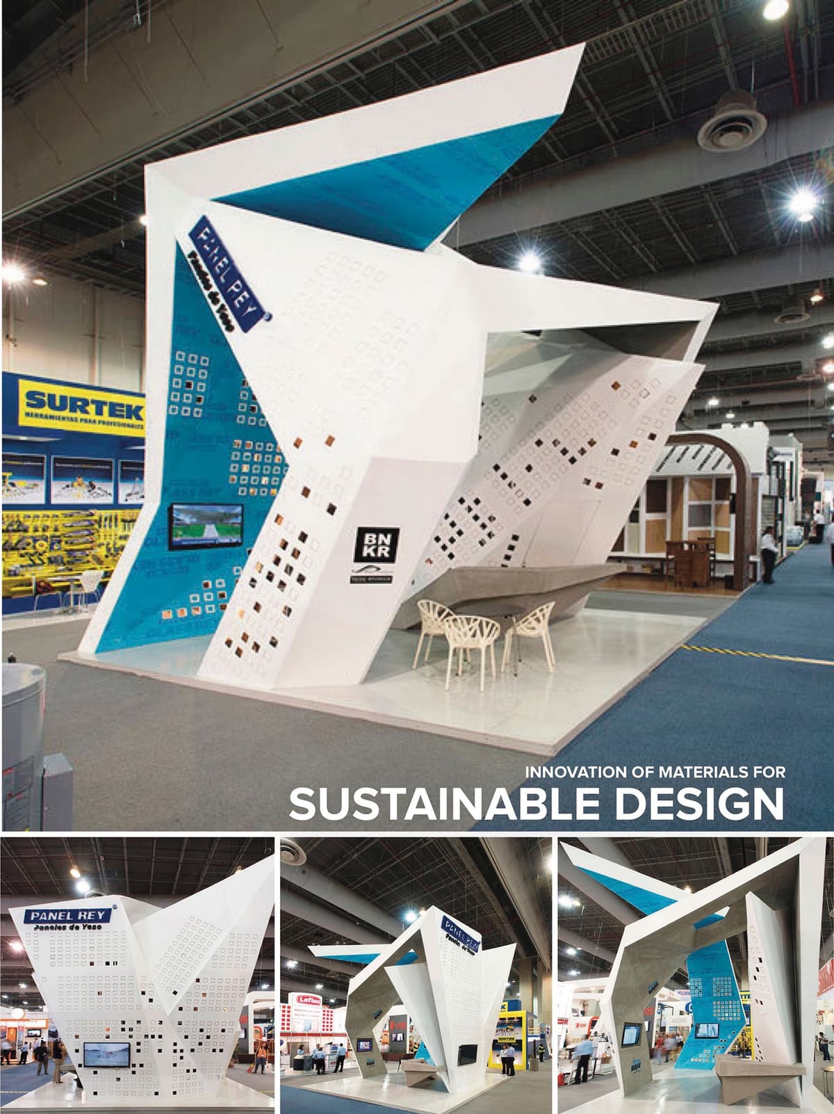

Proposal: This project was developed in collaboration with BNKR Architects, proposing a convention stand that exploited the maximum use of drywall. The idea was to create a stand completely formed out of the semi-perforated panels. By breaking off samples of the material for its visitors, the form of the stand itself generated these small samples to be distributed, therefore deconstructing itself as to not have to discard the stand entirely at the end of the convention. It was exhibited at the CIHAC Expo, a space where every year exhibitors have the opportunity to showcase their work and attract attention through the design of their stands.
Expo CIHAC.


Proposal: This project was developed in collaboration with BNKR Architects, proposing a convention stand that exploited the maximum use of drywall. The idea was to create a stand completely formed out of the semi-perforated panels. By breaking off samples of the material for its visitors, the form of the stand itself generated these small samples to be distributed, therefore deconstructing itself as to not have to discard the stand entirely at the end of the convention. It was exhibited at the CIHAC Expo, a space where every year exhibitors have the opportunity to showcase their work and attract attention through the design of their stands.
Expo CIHAC.
© 2021 by sanzpont [arquitectura] . Webpage by sanzpont [digital] . Innovative Digital Experiences

DESIGN CONCEPT
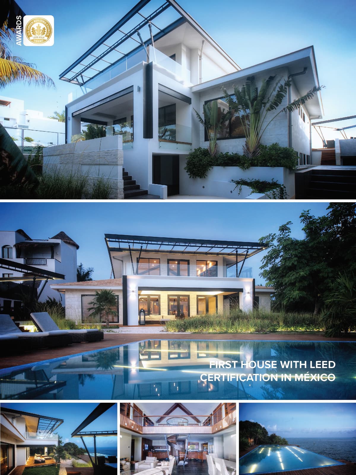
Contemporary Caribbean House. Casa SDLV is conceptualized as ecological house, used as a rest house, named in reference to the owner's initials; located on the island portion of Isla Mujeres Mexico, flanked by the sea and the lagoon, but was designed to take advantage of benefits provided by the Caribbean with efficient design and contemporary Caribbean character. The project began as a restoration of an old wooden house in disrepair , where the essence was kept and where the conceptual idea was to create a contemporary housing adapted to the elements of the Caribbean; the efficient use of its resources and aware of their natural environment.
PRIVILEGED VIEWS
The property is developed in an open and flexible space, with the purpose of organizing the spaces so they can open their visual to the Caribbean Sea. It has the basic architectural housing program maximizing views to the outside.
BIOCLIMATIC DESIGN
Energy – Efficient Concept. The house is designed to cover the needs of comfort with minimum energy expenditure; in a climate where the entire city uses the air conditioning, 365 days a year, this house is designed to reduce consumption. It is a proposal about how to live in the warm Caribbean, with a feeling of being in touch with nature in a cottage style.
LEED GOLD for Homes Certification: Sustainable design minimizing the carbon footprint
PASSIVE SOLAR DESIGN
Photovoltaic system on facades and sloping roofs resulting in optimum protection to reduce solar incidence and self-generation of energy.
RAINWATER REUSE
Capture system of rainwater for reuse in drip irrigation of green areas.
ENDEMIC VEGETATION
Endemic vegetation noninvasive and low-maintenance landscaping, and the minimum use of conventional pastures and wooded conservation and restoration of existing natural areas.
LOW THERMAL EMISSION MATERIALS
The use of certified wood (FSC) and reused as native finishing materials and furniture.
HEAT ISLAND EFFECT MITIGATION
Materials were applied with high solar reflectance index (SRI) to reduce the urban “heat island” effect, getting equally decreased surface temperature, which results in better thermal performance, reducing maintenance and power consumption (air conditioning).
SAVING & ENERGY GENERATION
LED lighting to reduce energy consumption and HVAC systems not harmful to the environment high efficiency. Photovoltaic pergolas are designed to generate much of the energy consumption.
First LEED certified housing in Mexico, for having materials with low thermal emission, permeable pavement, anticyclone windows, use of non-invasive vegetation, use of many recycled materials as well as rainwater harvesting through slabs.
A green building increases the productivity of the occupants, it has been designed for quality living spaces, the required amount of natural light, appropriate noise levels, thermal control, and adequate ventilation, among others. All these aspects are to improve the quality of life and health of users. Moreover a certified building reduces the negative effects that the construction could have on the environment, reduce greenhouse gas emissions to the environment, avoiding damage to the ozone layer and climate change, reduce waste sent to landfills preserving the natural environment, protecting ecosystems and biodiversity.
AWARDS & CERTIFICATIONS
• LEED GOLD for Homes
• First House with LEED for Homes certification in Mexico


AWARDS & CERTIFICATIONS
• LEED GOLD for Homes
• First House with LEED for Homes certification in Mexico
DESIGN CONCEPT
Contemporary Caribbean House. Casa SDLV is conceptualized as ecological house, used as a rest house, named in reference to the owner's initials; located on the island portion of Isla Mujeres Mexico, flanked by the sea and the lagoon, but was designed to take advantage of benefits provided by the Caribbean with efficient design and contemporary Caribbean character. The project began as a restoration of an old wooden house in disrepair , where the essence was kept and where the conceptual idea was to create a contemporary housing adapted to the elements of the Caribbean; the efficient use of its resources and aware of their natural environment.
PRIVILEGED VIEWS
The property is developed in an open and flexible space, with the purpose of organizing the spaces so they can open their visual to the Caribbean Sea. It has the basic architectural housing program maximizing views to the outside.
BIOCLIMATIC DESIGN
Energy – Efficient Concept. The house is designed to cover the needs of comfort with minimum energy expenditure; in a climate where the entire city uses the air conditioning, 365 days a year, this house is designed to reduce consumption. It is a proposal about how to live in the warm Caribbean, with a feeling of being in touch with nature in a cottage style.
LEED GOLD for Homes Certification: Sustainable design minimizing the carbon footprint
PASSIVE SOLAR DESIGN
Photovoltaic system on facades and sloping roofs resulting in optimum protection to reduce solar incidence and self-generation of energy.
RAINWATER REUSE
Capture system of rainwater for reuse in drip irrigation of green areas.
ENDEMIC VEGETATION
Endemic vegetation noninvasive and low-maintenance landscaping, and the minimum use of conventional pastures and wooded conservation and restoration of existing natural areas.
LOW THERMAL EMISSION MATERIALS
The use of certified wood (FSC) and reused as native finishing materials and furniture.
HEAT ISLAND EFFECT MITIGATION
Materials were applied with high solar reflectance index (SRI) to reduce the urban “heat island” effect, getting equally decreased surface temperature, which results in better thermal performance, reducing maintenance and power consumption (air conditioning).
SAVING & ENERGY GENERATION
LED lighting to reduce energy consumption and HVAC systems not harmful to the environment high efficiency. Photovoltaic pergolas are designed to generate much of the energy consumption.
First LEED certified housing in Mexico, for having materials with low thermal emission, permeable pavement, anticyclone windows, use of non-invasive vegetation, use of many recycled materials as well as rainwater harvesting through slabs.
A green building increases the productivity of the occupants, it has been designed for quality living spaces, the required amount of natural light, appropriate noise levels, thermal control, and adequate ventilation, among others. All these aspects are to improve the quality of life and health of users. Moreover a certified building reduces the negative effects that the construction could have on the environment, reduce greenhouse gas emissions to the environment, avoiding damage to the ozone layer and climate change, reduce waste sent to landfills preserving the natural environment, protecting ecosystems and biodiversity.
© 2021 by sanzpont [arquitectura] . Webpage by sanzpont [digital] . Innovative Digital Experiences
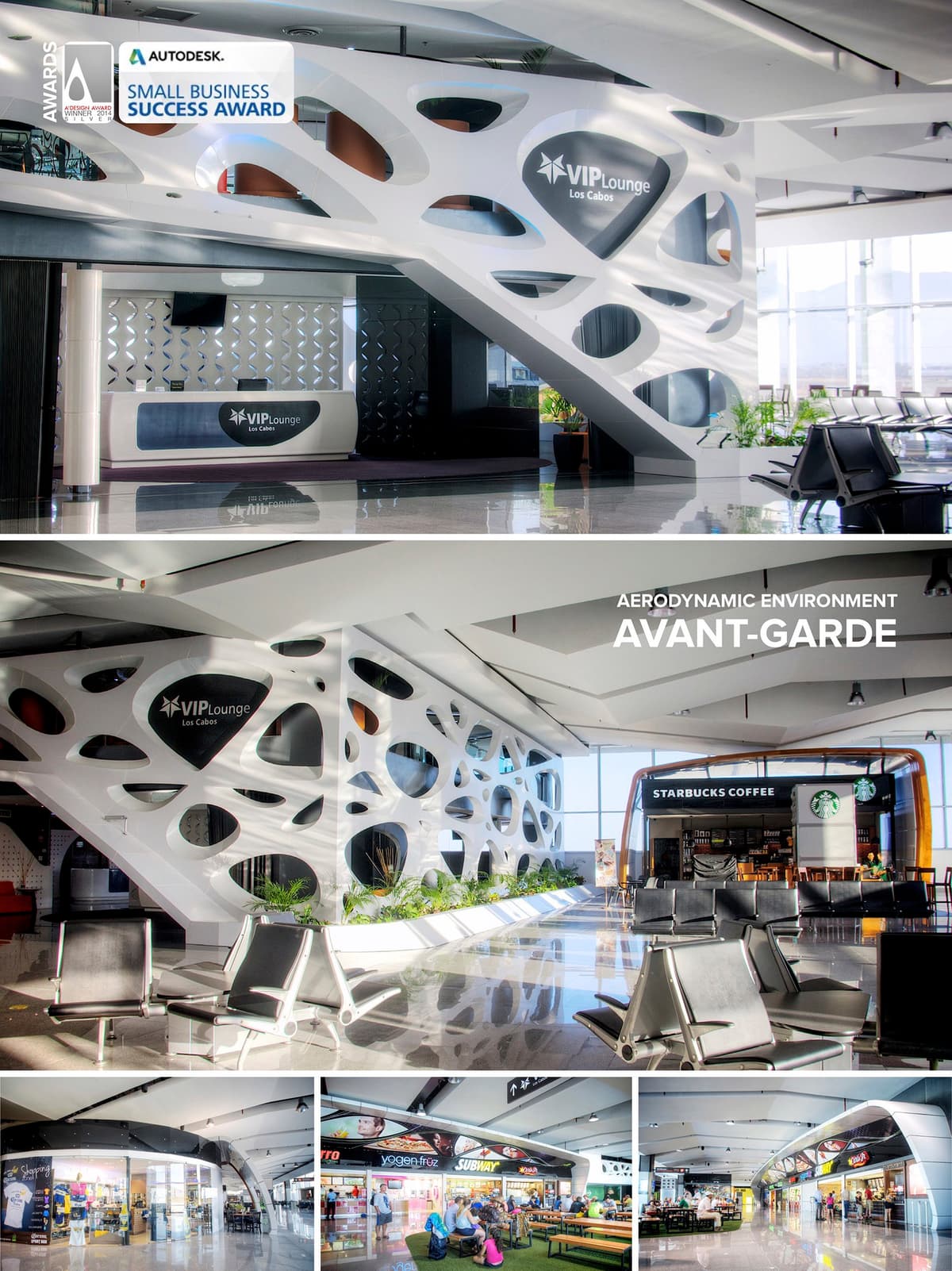

The recognized Grupo Aeroportuario del Pacifico with a total of 12 airports in Mexico selected the architecture and design firm sanzpont [arquitectura] to carry out the project for the Commercial Area of its new International Terminal at San Jose del Cabo with a total of 7,500 m2.
Commercial Area inside the Airport.
The totality of the commercial area space is lit by natural sunlight thanks to a monumental glass façade facing the runway. This generates significant energy savings in lighting throughout the day and thus creates a more sustainable commercial environment.
The interior space is designed as if it were an outside commercial corridor, trying to create a futuristic urban experience for the passengers by providing enjoyable spaces and consequently a pleasant stay while waiting for their flight.
Since the initial planning phase of the project, a contemporary and homogeneous commercial architectural image was sought. The formal concept is based in aerodynamic design using curved lines that reflect vanguardism and a morphological integration with aeronautical design. Vending spaces are contained by enveloping curves made of white Aluminium Compound Panels. The architects relied on digital design and manufacturing techniques to solve the intrinsically formal and constructional part of the project using BIM software, allowing them to visualize and coordinate all aspects of the construction phase.
Organic Design and Digital Fabrication. The VIP Waiting Room was designed with an organic and vanguardist cell design concept in mind. The façade is made using a Voronoi type porous skin, which allows privacy in the room without blocking the view to the exterior. The architectural team designed this complex façade by using experimental parametric digital techniques, which solved the 3D formal and structural model of all the support system and its white Aluminum Compound Panel cover, so by these means, all the different and unique pieces are extracted and assembled just like a puzzle.


The recognized Grupo Aeroportuario del Pacifico with a total of 12 airports in Mexico selected the architecture and design firm sanzpont [arquitectura] to carry out the project for the Commercial Area of its new International Terminal at San Jose del Cabo with a total of 7,500 m2.
Commercial Area inside the Airport.
The totality of the commercial area space is lit by natural sunlight thanks to a monumental glass façade facing the runway. This generates significant energy savings in lighting throughout the day and thus creates a more sustainable commercial environment.
The interior space is designed as if it were an outside commercial corridor, trying to create a futuristic urban experience for the passengers by providing enjoyable spaces and consequently a pleasant stay while waiting for their flight.
Since the initial planning phase of the project, a contemporary and homogeneous commercial architectural image was sought. The formal concept is based in aerodynamic design using curved lines that reflect vanguardism and a morphological integration with aeronautical design. Vending spaces are contained by enveloping curves made of white Aluminium Compound Panels. The architects relied on digital design and manufacturing techniques to solve the intrinsically formal and constructional part of the project using BIM software, allowing them to visualize and coordinate all aspects of the construction phase.
Organic Design and Digital Fabrication. The VIP Waiting Room was designed with an organic and vanguardist cell design concept in mind. The façade is made using a Voronoi type porous skin, which allows privacy in the room without blocking the view to the exterior. The architectural team designed this complex façade by using experimental parametric digital techniques, which solved the 3D formal and structural model of all the support system and its white Aluminum Compound Panel cover, so by these means, all the different and unique pieces are extracted and assembled just like a puzzle.
© 2021 by sanzpont [arquitectura] . Webpage by sanzpont [digital] . Innovative Digital Experiences
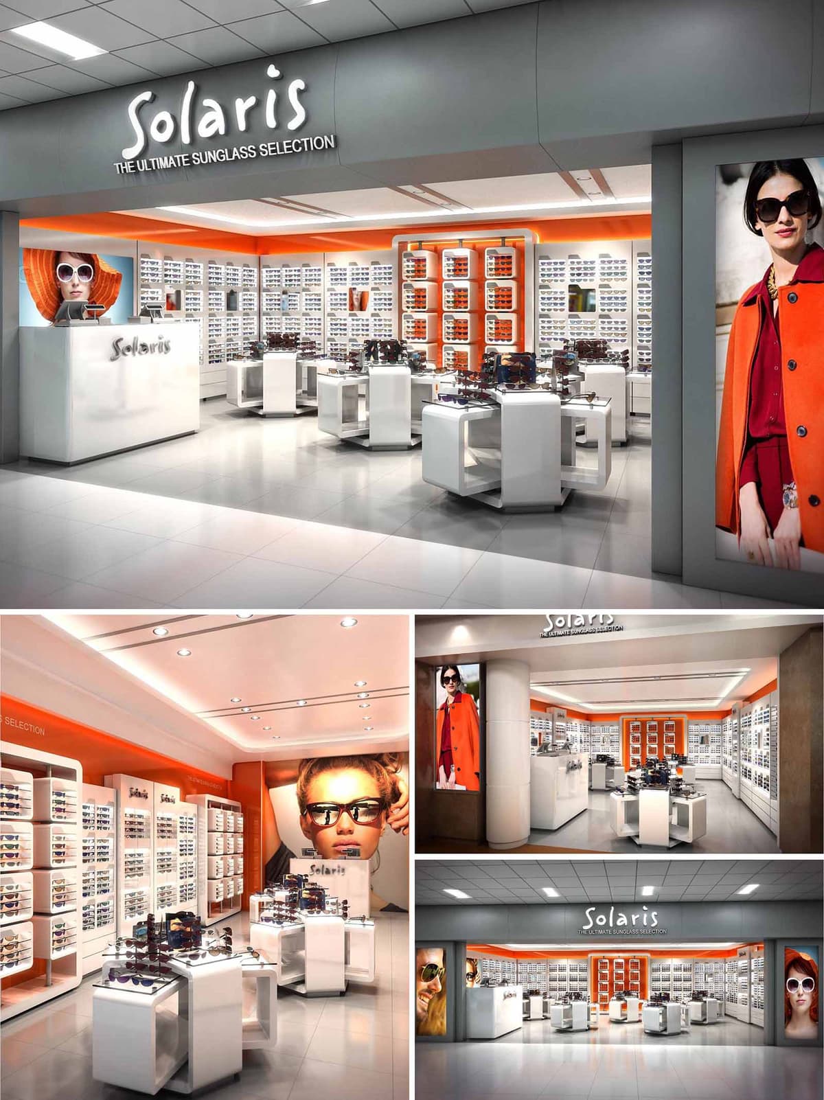

The Solaris retail concept is conceived as a luminous “lightbox” dedicated to sunglasses, transforming a compact footprint into an immersive product gallery. The architecture frames the eyewear as the true protagonist, using a continuous perimeter of vertical displays that read as a curated wall of light. The store envelope is intentionally neutral and monochromatic, allowing a strong chromatic identity—Solaris orange—to act as a guiding thread across all locations in Mexico and France, ensuring brand recognition and spatial coherence.
The design narrative is built around clarity, legibility and rhythm. Linear geometries, clean junctions and restrained detailing generate a contemporary, almost gallery-like atmosphere. Overscaled fashion portraits anchor the space visually, establishing an emotional connection and giving depth to the otherwise orthogonal composition. The result is an environment that feels both technical and glamorous, echoing the precision of eyewear design.
The layout is organized as a clear frontal perspective: from the mall corridor, customers perceive the full depth of the store and the density of the collection at a glance. The entrance is fully open, operating as a seamless threshold with no physical barriers, encouraging intuitive entry and cross-traffic. The cash desk is located laterally, freeing the central axis for circulation and product discovery.
Free-standing display islands are positioned on a loose grid, generating micro-routes and pauses without obstructing visual continuity. Their low height preserves long sightlines to the back feature wall, which functions as a focal point and orientation reference. The perimeter walls house the majority of the stock in high-capacity modular panels, while the center of the space is dedicated to curated selections and new launches, enabling fast browsing and impulse purchasing.
The internal architecture is deliberately minimal, allowing the display systems to define the character of the store. Perimeter fixtures combine vertical framing with backlit shelving, creating a uniform luminous background against which the silhouettes of the sunglasses stand out clearly. The grid of cubicles and linear trays is dimensioned for ergonomic reach and efficient restocking, supporting high turnover and easy re-merchandising.
The central display units are designed as sculptural volumes: rectilinear plinths with open bases that lighten their presence and allow for cable routing and integrated lighting. Glass tops and transparent supports ensure unobstructed views of the products from all angles. The repetition of these units generates a disciplined rhythm, while small variations in configuration accommodate different collection sizes and marketing priorities.
The material palette is composed of high-gloss white finishes, satin metallic accents and large-format porcelain or ceramic floor tiles in a light neutral tone. This combination maximizes light diffusion, creating a crisp, hygienic impression that is appropriate for an optic-related retail environment. The reflective properties of the finishes enhance the perceived brightness and amplify the visual presence of the eyewear.
Solaris orange operates as an architectural highlight: applied to back panels, ceiling bands and selected vertical surfaces, it provides depth and a dynamic contrast to the white envelope. Lighting is predominantly integrated into the fixtures, using continuous linear LEDs and accent downlights to avoid glare on lenses while ensuring accurate color rendering. The balanced illumination supports both product evaluation and brand storytelling, with dedicated spots reinforcing graphic panels and key promotional zones.
The façade acts as a large-scale brand statement. A generous opening framed by a neutral gray portal sets up a strong contrast with the bright interior. The Solaris logo, rendered in backlit channel letters, is clearly legible from a distance and aligned with the overall linear geometry of the shopfront. Large vertical lightboxes on the sides of the entrance display fashion imagery that extends into the interior, visually pulling customers inside.
Within the store, the integration of graphics is choreographed to maintain balance with the merchandise. Oversized portraits behind the counter and at focal walls create depth and scale, while secondary messaging remains discreet so as not to saturate the visual field. The repetition of typography, color and photographic language across all nine locations guarantees consistent brand perception within diverse architectural contexts.
Sustainability is addressed through a combination of energy-efficient systems, durable materials and modular design. LED lighting is employed throughout, significantly reducing energy consumption and maintenance needs compared to traditional luminaires. High-reflectance surfaces diminish the required lighting power, ensuring a bright environment with optimized wattage per square meter.
The fixture system is conceived as a kit-of-parts, allowing individual components to be reconfigured, repaired or reused across different stores and future roll-outs. Robust finishes and easily cleanable surfaces extend the lifecycle of the interior, minimizing the need for premature replacement. Where possible, standardized components facilitate local sourcing and streamlined logistics, reducing transportation impacts between the various sites in Mexico and France and supporting a flexible, long-term retail strategy.
LIST OF PROJECTS EXPERIENCE
Designed, Executed and/or Built Projects
MEXICO
1. Solaris - Playa del Carmen - 5ta Av
2. Solaris - Playa del Carmen - ADO
3. Solaris - Cancún - Plaza La Isla - Kiosko
FRANCE
4. Solaris - Paris - 3x3 Kiosk
5. Solaris - Paris - 20m2 Kiosk
6. Solaris - Paris - Department Store
7. Solaris - Paris - L Island
8. Solaris - Paris - Parallel Island
9. Solaris - Paris - Pop-up Store
The Solaris retail concept is conceived as a luminous “lightbox” dedicated to sunglasses, transforming a compact footprint into an immersive product gallery. The architecture frames the eyewear as the true protagonist, using a continuous perimeter of vertical displays that read as a curated wall of light. The store envelope is intentionally neutral and monochromatic, allowing a strong chromatic identity—Solaris orange—to act as a guiding thread across all locations in Mexico and France, ensuring brand recognition and spatial coherence.
The design narrative is built around clarity, legibility and rhythm. Linear geometries, clean junctions and restrained detailing generate a contemporary, almost gallery-like atmosphere. Overscaled fashion portraits anchor the space visually, establishing an emotional connection and giving depth to the otherwise orthogonal composition. The result is an environment that feels both technical and glamorous, echoing the precision of eyewear design.
The layout is organized as a clear frontal perspective: from the mall corridor, customers perceive the full depth of the store and the density of the collection at a glance. The entrance is fully open, operating as a seamless threshold with no physical barriers, encouraging intuitive entry and cross-traffic. The cash desk is located laterally, freeing the central axis for circulation and product discovery.
Free-standing display islands are positioned on a loose grid, generating micro-routes and pauses without obstructing visual continuity. Their low height preserves long sightlines to the back feature wall, which functions as a focal point and orientation reference. The perimeter walls house the majority of the stock in high-capacity modular panels, while the center of the space is dedicated to curated selections and new launches, enabling fast browsing and impulse purchasing.
The internal architecture is deliberately minimal, allowing the display systems to define the character of the store. Perimeter fixtures combine vertical framing with backlit shelving, creating a uniform luminous background against which the silhouettes of the sunglasses stand out clearly. The grid of cubicles and linear trays is dimensioned for ergonomic reach and efficient restocking, supporting high turnover and easy re-merchandising.
The central display units are designed as sculptural volumes: rectilinear plinths with open bases that lighten their presence and allow for cable routing and integrated lighting. Glass tops and transparent supports ensure unobstructed views of the products from all angles. The repetition of these units generates a disciplined rhythm, while small variations in configuration accommodate different collection sizes and marketing priorities.
The material palette is composed of high-gloss white finishes, satin metallic accents and large-format porcelain or ceramic floor tiles in a light neutral tone. This combination maximizes light diffusion, creating a crisp, hygienic impression that is appropriate for an optic-related retail environment. The reflective properties of the finishes enhance the perceived brightness and amplify the visual presence of the eyewear.
Solaris orange operates as an architectural highlight: applied to back panels, ceiling bands and selected vertical surfaces, it provides depth and a dynamic contrast to the white envelope. Lighting is predominantly integrated into the fixtures, using continuous linear LEDs and accent downlights to avoid glare on lenses while ensuring accurate color rendering. The balanced illumination supports both product evaluation and brand storytelling, with dedicated spots reinforcing graphic panels and key promotional zones.
The façade acts as a large-scale brand statement. A generous opening framed by a neutral gray portal sets up a strong contrast with the bright interior. The Solaris logo, rendered in backlit channel letters, is clearly legible from a distance and aligned with the overall linear geometry of the shopfront. Large vertical lightboxes on the sides of the entrance display fashion imagery that extends into the interior, visually pulling customers inside.
Within the store, the integration of graphics is choreographed to maintain balance with the merchandise. Oversized portraits behind the counter and at focal walls create depth and scale, while secondary messaging remains discreet so as not to saturate the visual field. The repetition of typography, color and photographic language across all nine locations guarantees consistent brand perception within diverse architectural contexts.
Sustainability is addressed through a combination of energy-efficient systems, durable materials and modular design. LED lighting is employed throughout, significantly reducing energy consumption and maintenance needs compared to traditional luminaires. High-reflectance surfaces diminish the required lighting power, ensuring a bright environment with optimized wattage per square meter.
The fixture system is conceived as a kit-of-parts, allowing individual components to be reconfigured, repaired or reused across different stores and future roll-outs. Robust finishes and easily cleanable surfaces extend the lifecycle of the interior, minimizing the need for premature replacement. Where possible, standardized components facilitate local sourcing and streamlined logistics, reducing transportation impacts between the various sites in Mexico and France and supporting a flexible, long-term retail strategy.
LIST OF PROJECTS EXPERIENCE
Designed, Executed and/or Built Projects
MEXICO
1. Solaris - Playa del Carmen - 5ta Av
2. Solaris - Playa del Carmen - ADO
3. Solaris - Cancún - Plaza La Isla - Kiosko
FRANCE
4. Solaris - Paris - 3x3 Kiosk
5. Solaris - Paris - 20m2 Kiosk
6. Solaris - Paris - Department Store
7. Solaris - Paris - L Island
8. Solaris - Paris - Parallel Island
9. Solaris - Paris - Pop-up Store
© 2021 by sanzpont [arquitectura] . Webpage by sanzpont [digital] . Innovative Digital Experiences
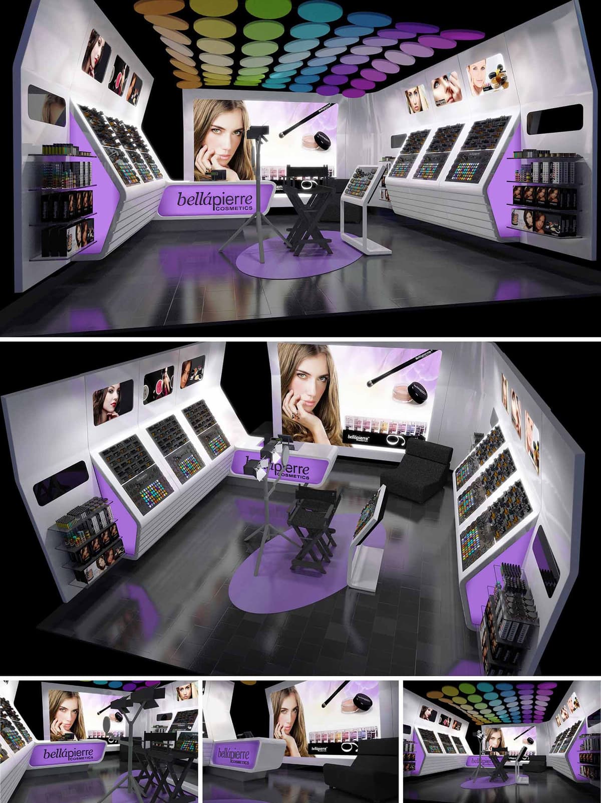

The Bellápierre Cosmetics store in Playa del Carmen is conceived as an immersive beauty “set,” where the customer steps into a contemporary studio environment. The spatial narrative merges the language of professional makeup stages with a futuristic retail gallery, communicating precision, glamour, and technical expertise. Clean white architectural envelopes, contrasted with deep black flooring and ceiling, create a neutral yet dramatic backdrop that allows the brand’s signature lilac accents and the chromatic richness of the products to stand out.
The concept prioritizes clarity of product display, controlled lighting, and a central experiential zone where makeup application and consultation become performative acts visible from every point of the store.
The layout is organized around a central axis, with the makeup station positioned on a lilac oval rug that anchors the space. This “island” functions as the main experiential node, while continuous perimeter walls house the product displays and graphic communication. Entry is directed toward the brand counter and logo, establishing an immediate visual connection to the illuminated backdrop and large-format images.
Circulation follows a loop strategy: customers naturally move along the left and right display walls, transitioning from skincare and base products to color ranges, before returning to the central station. Seating toward the rear offers a more intimate consultation corner, slightly recessed to provide comfort without losing visual contact with the rest of the store. The layout optimizes visibility, maintaining clear sightlines across the compact footprint.
The materiality supports a high-tech yet accessible aesthetic. Glossy black porcelain or high-pressure laminate flooring reflects light and products, visually expanding the space and adding depth. The walls and built-in display units are finished in high-gloss white lacquer, ensuring an ultra-clean, laboratory-like appearance that reinforces perceptions of purity and quality in cosmetics.
Lilac is applied in controlled accents: the central rug, counter fronts, illuminated side panels, and backlit brand elements. This curated use of color strengthens brand recognition without overwhelming the visitor. Transparent acrylic shelves and display trays present products as if floating, while satin metallic details in fixtures and stools lend a professional studio character.
Lighting design is a key component of the project. A black ceiling plane is punctuated by a matrix of circular, colored elements, suggesting makeup pans and acting as a strong iconic feature visible from outside the store. Integrated linear LED strips in the display walls provide uniform, shadow-free illumination on products, critical for accurate color perception.
At the central station, adjustable spotlights emulate photographic studio lighting, reinforcing the “backstage” concept and enabling precise makeup application. Large backlit graphic panels with high-resolution beauty imagery serve as both brand communication and ambient light sources. Digital interfaces at the central totem can host tutorials, product information, and dynamic content, enhancing the didactic dimension of the retail experience.
Furniture elements follow ergonomic standards of professional makeup stations: elevated director-style chairs, mobile lighting and mirrors, and inclined display racks that maintain optimal viewing angles. The sofa area offers relaxed seating for waiting clients or longer consultations, encouraging dwell time. All edges and transitions are rounded or chamfered, improving safety and comfort in a high-traffic retail context.
Sustainability is approached through the use of LED lighting throughout, minimizing energy consumption and reducing heat gain in the tropical climate of Playa del Carmen. Modular display units are designed for reconfiguration and long life, reducing the need for frequent replacements. High-durability laminates and finishes are specified to withstand intensive use, limiting waste over time. Where possible, structural components are conceived for disassembly, enabling recycling of metal and acrylic elements at end of life, aligning the brand’s physical environment with a responsible design attitude.


The Bellápierre Cosmetics store in Playa del Carmen is conceived as an immersive beauty “set,” where the customer steps into a contemporary studio environment. The spatial narrative merges the language of professional makeup stages with a futuristic retail gallery, communicating precision, glamour, and technical expertise. Clean white architectural envelopes, contrasted with deep black flooring and ceiling, create a neutral yet dramatic backdrop that allows the brand’s signature lilac accents and the chromatic richness of the products to stand out.
The concept prioritizes clarity of product display, controlled lighting, and a central experiential zone where makeup application and consultation become performative acts visible from every point of the store.
The layout is organized around a central axis, with the makeup station positioned on a lilac oval rug that anchors the space. This “island” functions as the main experiential node, while continuous perimeter walls house the product displays and graphic communication. Entry is directed toward the brand counter and logo, establishing an immediate visual connection to the illuminated backdrop and large-format images.
Circulation follows a loop strategy: customers naturally move along the left and right display walls, transitioning from skincare and base products to color ranges, before returning to the central station. Seating toward the rear offers a more intimate consultation corner, slightly recessed to provide comfort without losing visual contact with the rest of the store. The layout optimizes visibility, maintaining clear sightlines across the compact footprint.
The materiality supports a high-tech yet accessible aesthetic. Glossy black porcelain or high-pressure laminate flooring reflects light and products, visually expanding the space and adding depth. The walls and built-in display units are finished in high-gloss white lacquer, ensuring an ultra-clean, laboratory-like appearance that reinforces perceptions of purity and quality in cosmetics.
Lilac is applied in controlled accents: the central rug, counter fronts, illuminated side panels, and backlit brand elements. This curated use of color strengthens brand recognition without overwhelming the visitor. Transparent acrylic shelves and display trays present products as if floating, while satin metallic details in fixtures and stools lend a professional studio character.
Lighting design is a key component of the project. A black ceiling plane is punctuated by a matrix of circular, colored elements, suggesting makeup pans and acting as a strong iconic feature visible from outside the store. Integrated linear LED strips in the display walls provide uniform, shadow-free illumination on products, critical for accurate color perception.
At the central station, adjustable spotlights emulate photographic studio lighting, reinforcing the “backstage” concept and enabling precise makeup application. Large backlit graphic panels with high-resolution beauty imagery serve as both brand communication and ambient light sources. Digital interfaces at the central totem can host tutorials, product information, and dynamic content, enhancing the didactic dimension of the retail experience.
Furniture elements follow ergonomic standards of professional makeup stations: elevated director-style chairs, mobile lighting and mirrors, and inclined display racks that maintain optimal viewing angles. The sofa area offers relaxed seating for waiting clients or longer consultations, encouraging dwell time. All edges and transitions are rounded or chamfered, improving safety and comfort in a high-traffic retail context.
Sustainability is approached through the use of LED lighting throughout, minimizing energy consumption and reducing heat gain in the tropical climate of Playa del Carmen. Modular display units are designed for reconfiguration and long life, reducing the need for frequent replacements. High-durability laminates and finishes are specified to withstand intensive use, limiting waste over time. Where possible, structural components are conceived for disassembly, enabling recycling of metal and acrylic elements at end of life, aligning the brand’s physical environment with a responsible design attitude.
© 2021 by sanzpont [arquitectura] . Webpage by sanzpont [digital] . Innovative Digital Experiences
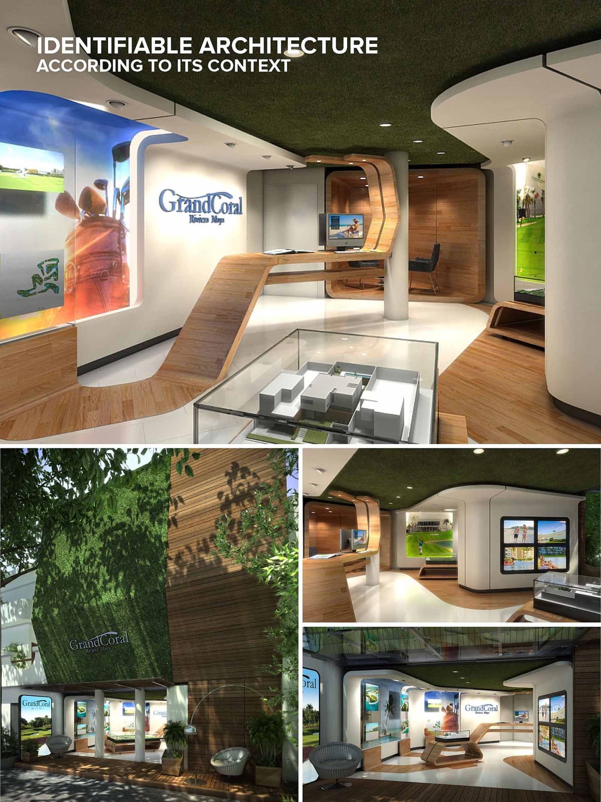

The Grand Coral Showroom is conceived as an immersive spatial narrative that translates the resort’s Caribbean landscape into architectural form. The interior becomes a three-dimensional brand experience where sinuous lines, warm woods, and lush green surfaces evoke dunes, fairways, and coastal vegetation. The design aims to create identifiable architecture strongly rooted in its Playa del Carmen context, allowing visitors to intuitively associate the space with leisure, nature, and high-end hospitality.
The showroom operates as a hybrid between gallery and lounge, in which each curve of the envelope guides visitors along a choreographed path. Architectural surfaces blur the distinction between floor, wall, furniture, and ceiling, transforming the interior into a continuous sculpted topography that reinforces the project’s identity.
The layout is organized around a central exhibition area featuring a scale model of the development, which acts as both focal point and orientation device. Circulation flows radially from this center, leading visitors toward thematic display niches, consultation zones, and a more intimate seating area.
Curved partitions and integrated counters frame semi-enclosed bays where multimedia presentations and project imagery are displayed. These soft boundaries maintain visual continuity across the space while creating enough separation for focused conversations. The open plan combined with controlled vistas encourages exploration, ensuring that the full range of amenities and products associated with Grand Coral is progressively revealed.
The material strategy is anchored in the contrast between warm timber, crisp white surfaces, and deep green textures. Laminated wood wraps from floor to wall and into custom furnishings, suggesting boardwalks and yacht decks, while simultaneously providing a tactile, hospitable atmosphere. The white flooring and walls act as a neutral canvas, enhancing natural light and emphasizing the brand’s graphic elements.
A green, turf-like ceiling and exterior cladding allude directly to golf courses and tropical vegetation. This vegetal texture visually lowers the ceiling plane, making the interior feel intimate while reinforcing the connection with the surrounding landscape. Large, backlit imagery and display windows introduce vibrant blues and sands, recalling sea and beach and completing the resort-inspired chromatic palette.
Most furniture elements are conceived as extensions of the architectural envelope, forming monolithic pieces that curve to become desks, benches, or display plinths. This approach minimizes visual clutter and ensures that every element contributes to a coherent spatial language. Occasional loose furnishings, such as woven lounge chairs, introduce a subtle reference to outdoor terraces and coastal living.
Lighting combines recessed downlights with concealed linear illumination integrated into coves and display frames. This layered strategy highlights the curved geometry, accentuates the texture of the wood and green surfaces, and guides attention to the models and graphic content. Branding is seamlessly embedded through backlit logos, framed visual narratives, and digital screens, transforming the showroom into a powerful communication tool rather than a simple sales office.
Sustainability is addressed through material selection, environmental integration, and energy-conscious systems. The extensive use of wood favors renewable, low-embodied-energy materials, specified with certified origins where feasible. The green cladding and turf-like surfaces, particularly on the exterior, contribute to improved thermal performance by shading exposed walls and reducing direct solar gain.
Daylighting enters through generous openings at the façade, diminishing dependence on artificial lighting during daytime and reinforcing the visual relationship with the surrounding vegetation. High-efficiency LED fixtures and controlled lighting zones reduce energy consumption, while the compact layout limits the need for intensive mechanical conditioning. By merging landscape references, resource-conscious choices, and a durable, timeless aesthetic, the showroom positions itself as an architectural ambassador of Grand Coral’s commitment to responsible and context-sensitive development.


The Grand Coral Showroom is conceived as an immersive spatial narrative that translates the resort’s Caribbean landscape into architectural form. The interior becomes a three-dimensional brand experience where sinuous lines, warm woods, and lush green surfaces evoke dunes, fairways, and coastal vegetation. The design aims to create identifiable architecture strongly rooted in its Playa del Carmen context, allowing visitors to intuitively associate the space with leisure, nature, and high-end hospitality.
The showroom operates as a hybrid between gallery and lounge, in which each curve of the envelope guides visitors along a choreographed path. Architectural surfaces blur the distinction between floor, wall, furniture, and ceiling, transforming the interior into a continuous sculpted topography that reinforces the project’s identity.
The layout is organized around a central exhibition area featuring a scale model of the development, which acts as both focal point and orientation device. Circulation flows radially from this center, leading visitors toward thematic display niches, consultation zones, and a more intimate seating area.
Curved partitions and integrated counters frame semi-enclosed bays where multimedia presentations and project imagery are displayed. These soft boundaries maintain visual continuity across the space while creating enough separation for focused conversations. The open plan combined with controlled vistas encourages exploration, ensuring that the full range of amenities and products associated with Grand Coral is progressively revealed.
The material strategy is anchored in the contrast between warm timber, crisp white surfaces, and deep green textures. Laminated wood wraps from floor to wall and into custom furnishings, suggesting boardwalks and yacht decks, while simultaneously providing a tactile, hospitable atmosphere. The white flooring and walls act as a neutral canvas, enhancing natural light and emphasizing the brand’s graphic elements.
A green, turf-like ceiling and exterior cladding allude directly to golf courses and tropical vegetation. This vegetal texture visually lowers the ceiling plane, making the interior feel intimate while reinforcing the connection with the surrounding landscape. Large, backlit imagery and display windows introduce vibrant blues and sands, recalling sea and beach and completing the resort-inspired chromatic palette.
Most furniture elements are conceived as extensions of the architectural envelope, forming monolithic pieces that curve to become desks, benches, or display plinths. This approach minimizes visual clutter and ensures that every element contributes to a coherent spatial language. Occasional loose furnishings, such as woven lounge chairs, introduce a subtle reference to outdoor terraces and coastal living.
Lighting combines recessed downlights with concealed linear illumination integrated into coves and display frames. This layered strategy highlights the curved geometry, accentuates the texture of the wood and green surfaces, and guides attention to the models and graphic content. Branding is seamlessly embedded through backlit logos, framed visual narratives, and digital screens, transforming the showroom into a powerful communication tool rather than a simple sales office.
Sustainability is addressed through material selection, environmental integration, and energy-conscious systems. The extensive use of wood favors renewable, low-embodied-energy materials, specified with certified origins where feasible. The green cladding and turf-like surfaces, particularly on the exterior, contribute to improved thermal performance by shading exposed walls and reducing direct solar gain.
Daylighting enters through generous openings at the façade, diminishing dependence on artificial lighting during daytime and reinforcing the visual relationship with the surrounding vegetation. High-efficiency LED fixtures and controlled lighting zones reduce energy consumption, while the compact layout limits the need for intensive mechanical conditioning. By merging landscape references, resource-conscious choices, and a durable, timeless aesthetic, the showroom positions itself as an architectural ambassador of Grand Coral’s commitment to responsible and context-sensitive development.
© 2021 by sanzpont [arquitectura] . Webpage by sanzpont [digital] . Innovative Digital Experiences
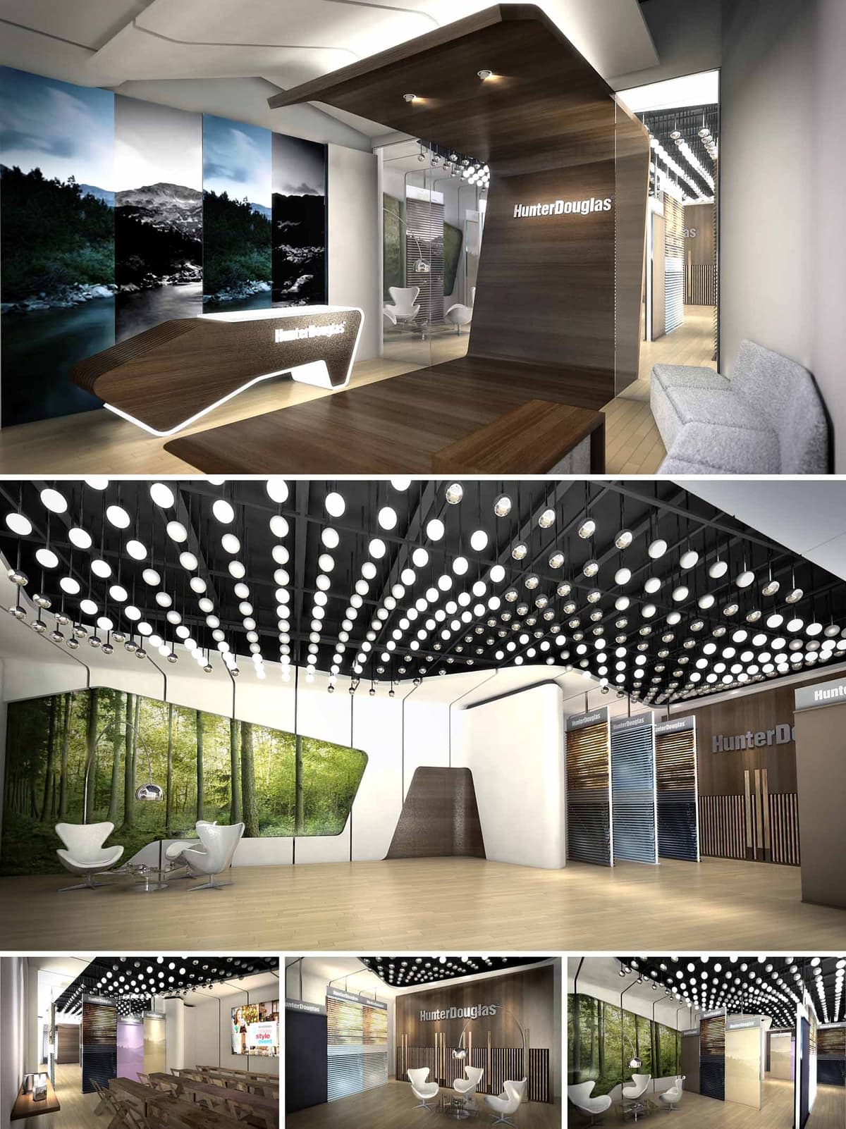

The Hunter Douglas corporate space in Cancún is conceived as an immersive brand gallery where architecture, product and landscape imagery converge. The design revolves around fluid, folded planes that grow from floor to ceiling to form reception desks, display backdrops and soffits, expressing the company’s expertise in surface modulation and envelope systems. A neutral architectural shell is activated with strong longitudinal perspectives, guiding visitors through a curated sequence of experiences that move from reception to exhibition, meeting zones and training areas.
The conceptual language balances precision and warmth. Clean geometries, sharp edges and backlit profiles evoke technological rigor, while wood finishes and large-format nature graphics introduce a human, tactile dimension. This duality underscores the brand’s positioning between innovation and comfort in interior shading and façade solutions.
The layout operates as a linear promenade. Upon entering, visitors encounter a sculptural reception desk that extends seamlessly into a ceiling plane, establishing an immediate sense of direction and hierarchy. From here, circulation flows along the perimeter, keeping the central area open and flexible to accommodate demonstrations, small events or temporary product installations.
Programmatic zones are layered in depth: an initial welcome and waiting area, followed by consultation niches, a main product gallery, and finally a training and presentation space. Glass partitions and large, continuous wall surfaces keep visual connections open, allowing users to understand the overall configuration at a glance while maintaining acoustical and functional separation where needed.
The predominant material is a warm-toned wood veneer, used on horizontal and vertical surfaces to craft monolithic volumes. This is complemented by light-colored vinyl or engineered wood flooring that enhances continuity and reflects light. The neutral gray seating and white display elements act as quiet counterparts, ensuring that Hunter Douglas products and the large-scale nature graphics remain the primary visual focus.
Strategically placed high-gloss and glass panels introduce reflection and depth, amplifying the perceived scale of the interior. Dark structural elements in the ceiling, combined with the grid of circular luminaires, generate a strong visual canopy that both frames and contrasts with the bright exhibition surfaces below.
The ceiling is treated as a luminous field, composed of a dense matrix of recessed and pendant circular fixtures. This configuration provides uniform ambient lighting while creating a recognizable signature element that reinforces the brand experience. The grid is modulated in density over key areas, accentuating the main gallery and reception zones.
Task and accent lighting are integrated into the wooden folds and display walls, using concealed linear LEDs to highlight textures and products without visible sources. The combination of warm white general light with selective, cooler accents allows precise color rendering of fabrics, slats and finishes, essential in a commercial specification environment.
Large-format photographic panels of forests and natural landscapes establish a visual narrative that links the brand with themes of daylight, views and environmental connection. These images are framed by angular, faceted edges that echo the geometry of blinds and louvers, subtly referencing core products without literal representation.
Brand signage is integrated into the architecture, backlit within wooden planes or aligned with product displays to maintain coherence. Comfortable seating clusters with iconic modern chairs invite informal discussions, while a more structured classroom-style area supports training sessions for designers, installers and clients, reflecting the space’s dual role as showroom and learning hub.
The design emphasizes responsible material selection and optimized lighting. Engineered wood products and veneers are specified with preference for certified or low-emission sources, reducing reliance on solid timber and improving dimensional stability in the humid Cancún climate. High-reflectance interior surfaces maximize the efficiency of the lighting system, allowing lower wattage fixtures while achieving required illumination levels.
The extensive use of LED technology significantly reduces energy consumption and maintenance, particularly important for a commercial space with long operating hours. Daylight, filtered through Hunter Douglas shading systems, can be modulated to control glare and heat gain, serving both as a live demonstration of product performance and as a genuine strategy for thermal and visual comfort. Flexible, demountable display structures enable reconfiguration and reuse, extending the life cycle of the fit-out and minimizing future waste.


The Hunter Douglas corporate space in Cancún is conceived as an immersive brand gallery where architecture, product and landscape imagery converge. The design revolves around fluid, folded planes that grow from floor to ceiling to form reception desks, display backdrops and soffits, expressing the company’s expertise in surface modulation and envelope systems. A neutral architectural shell is activated with strong longitudinal perspectives, guiding visitors through a curated sequence of experiences that move from reception to exhibition, meeting zones and training areas.
The conceptual language balances precision and warmth. Clean geometries, sharp edges and backlit profiles evoke technological rigor, while wood finishes and large-format nature graphics introduce a human, tactile dimension. This duality underscores the brand’s positioning between innovation and comfort in interior shading and façade solutions.
The layout operates as a linear promenade. Upon entering, visitors encounter a sculptural reception desk that extends seamlessly into a ceiling plane, establishing an immediate sense of direction and hierarchy. From here, circulation flows along the perimeter, keeping the central area open and flexible to accommodate demonstrations, small events or temporary product installations.
Programmatic zones are layered in depth: an initial welcome and waiting area, followed by consultation niches, a main product gallery, and finally a training and presentation space. Glass partitions and large, continuous wall surfaces keep visual connections open, allowing users to understand the overall configuration at a glance while maintaining acoustical and functional separation where needed.
The predominant material is a warm-toned wood veneer, used on horizontal and vertical surfaces to craft monolithic volumes. This is complemented by light-colored vinyl or engineered wood flooring that enhances continuity and reflects light. The neutral gray seating and white display elements act as quiet counterparts, ensuring that Hunter Douglas products and the large-scale nature graphics remain the primary visual focus.
Strategically placed high-gloss and glass panels introduce reflection and depth, amplifying the perceived scale of the interior. Dark structural elements in the ceiling, combined with the grid of circular luminaires, generate a strong visual canopy that both frames and contrasts with the bright exhibition surfaces below.
The ceiling is treated as a luminous field, composed of a dense matrix of recessed and pendant circular fixtures. This configuration provides uniform ambient lighting while creating a recognizable signature element that reinforces the brand experience. The grid is modulated in density over key areas, accentuating the main gallery and reception zones.
Task and accent lighting are integrated into the wooden folds and display walls, using concealed linear LEDs to highlight textures and products without visible sources. The combination of warm white general light with selective, cooler accents allows precise color rendering of fabrics, slats and finishes, essential in a commercial specification environment.
Large-format photographic panels of forests and natural landscapes establish a visual narrative that links the brand with themes of daylight, views and environmental connection. These images are framed by angular, faceted edges that echo the geometry of blinds and louvers, subtly referencing core products without literal representation.
Brand signage is integrated into the architecture, backlit within wooden planes or aligned with product displays to maintain coherence. Comfortable seating clusters with iconic modern chairs invite informal discussions, while a more structured classroom-style area supports training sessions for designers, installers and clients, reflecting the space’s dual role as showroom and learning hub.
The design emphasizes responsible material selection and optimized lighting. Engineered wood products and veneers are specified with preference for certified or low-emission sources, reducing reliance on solid timber and improving dimensional stability in the humid Cancún climate. High-reflectance interior surfaces maximize the efficiency of the lighting system, allowing lower wattage fixtures while achieving required illumination levels.
The extensive use of LED technology significantly reduces energy consumption and maintenance, particularly important for a commercial space with long operating hours. Daylight, filtered through Hunter Douglas shading systems, can be modulated to control glare and heat gain, serving both as a live demonstration of product performance and as a genuine strategy for thermal and visual comfort. Flexible, demountable display structures enable reconfiguration and reuse, extending the life cycle of the fit-out and minimizing future waste.
© 2021 by sanzpont [arquitectura] . Webpage by sanzpont [digital] . Innovative Digital Experiences
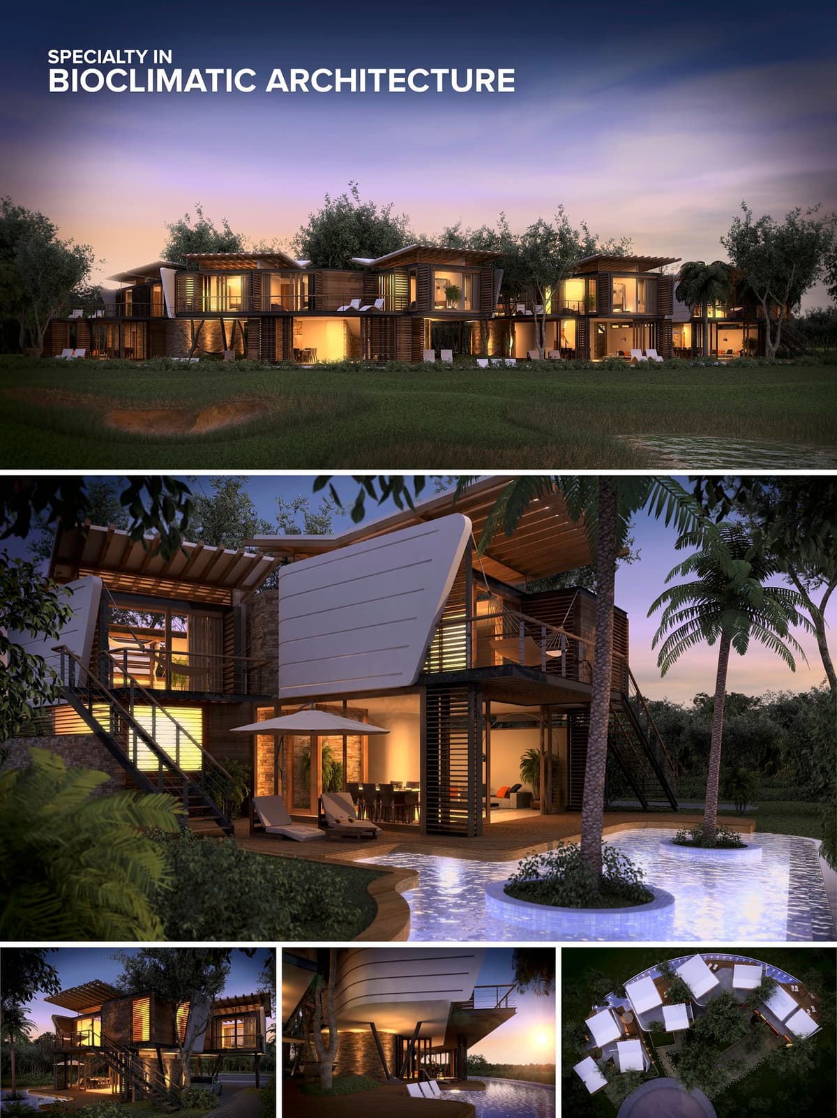

Design Concept: The main idea of the project was to integrate the house to the site respecting the existing trees to maximize the natural shade they provide and be more environmentally conscious. So the biggest challenge was to find the exact spot where to place the base of the house and the general form was developed dodging trees and integrating the design within an overall concept. So the site gives way to the House, while it coexists harmoniously. Four villas have been integrated in a natural and continuous space, where outdoor blends indoor spaces to achieve an atmosphere of relaxation and rest.
Respecting Existing Nature. The soul of this design is the respect of existing nature; by dodging trees the site gives way to the house.
Materials: In the choice of materials, the stone of the region was used to shape the foundations and walls of the ground floor, thus giving further strength visually, naturally integrates with the subsoil of the land. Recycled Timber is one of the main materials of the house; it gives warmth and a natural comfort.
Sustainable Design: Recycled Timber is also used to create shades, sliding and folding shutters that provide shade and control the passage of direct sunlight and heat to interior. The white walls upstairs, makes a "Reflective Shield" on the faces towards the sun and receive the skylight colors. The design of the roofs provides shade on the terraces at the same time that opens to make way for wind in and crosses to refresh all interior areas.
A Home to Relax: The interior spaces have been integrated with the surroundings through large outdoor terraces overlooking the golf course; exterior furnishings create an environment of relaxation and Caribbean peace.


Design Concept: The main idea of the project was to integrate the house to the site respecting the existing trees to maximize the natural shade they provide and be more environmentally conscious. So the biggest challenge was to find the exact spot where to place the base of the house and the general form was developed dodging trees and integrating the design within an overall concept. So the site gives way to the House, while it coexists harmoniously. Four villas have been integrated in a natural and continuous space, where outdoor blends indoor spaces to achieve an atmosphere of relaxation and rest.
Respecting Existing Nature. The soul of this design is the respect of existing nature; by dodging trees the site gives way to the house.
Materials: In the choice of materials, the stone of the region was used to shape the foundations and walls of the ground floor, thus giving further strength visually, naturally integrates with the subsoil of the land. Recycled Timber is one of the main materials of the house; it gives warmth and a natural comfort.
Sustainable Design: Recycled Timber is also used to create shades, sliding and folding shutters that provide shade and control the passage of direct sunlight and heat to interior. The white walls upstairs, makes a "Reflective Shield" on the faces towards the sun and receive the skylight colors. The design of the roofs provides shade on the terraces at the same time that opens to make way for wind in and crosses to refresh all interior areas.
A Home to Relax: The interior spaces have been integrated with the surroundings through large outdoor terraces overlooking the golf course; exterior furnishings create an environment of relaxation and Caribbean peace.
© 2021 by sanzpont [arquitectura] . Webpage by sanzpont [digital] . Innovative Digital Experiences
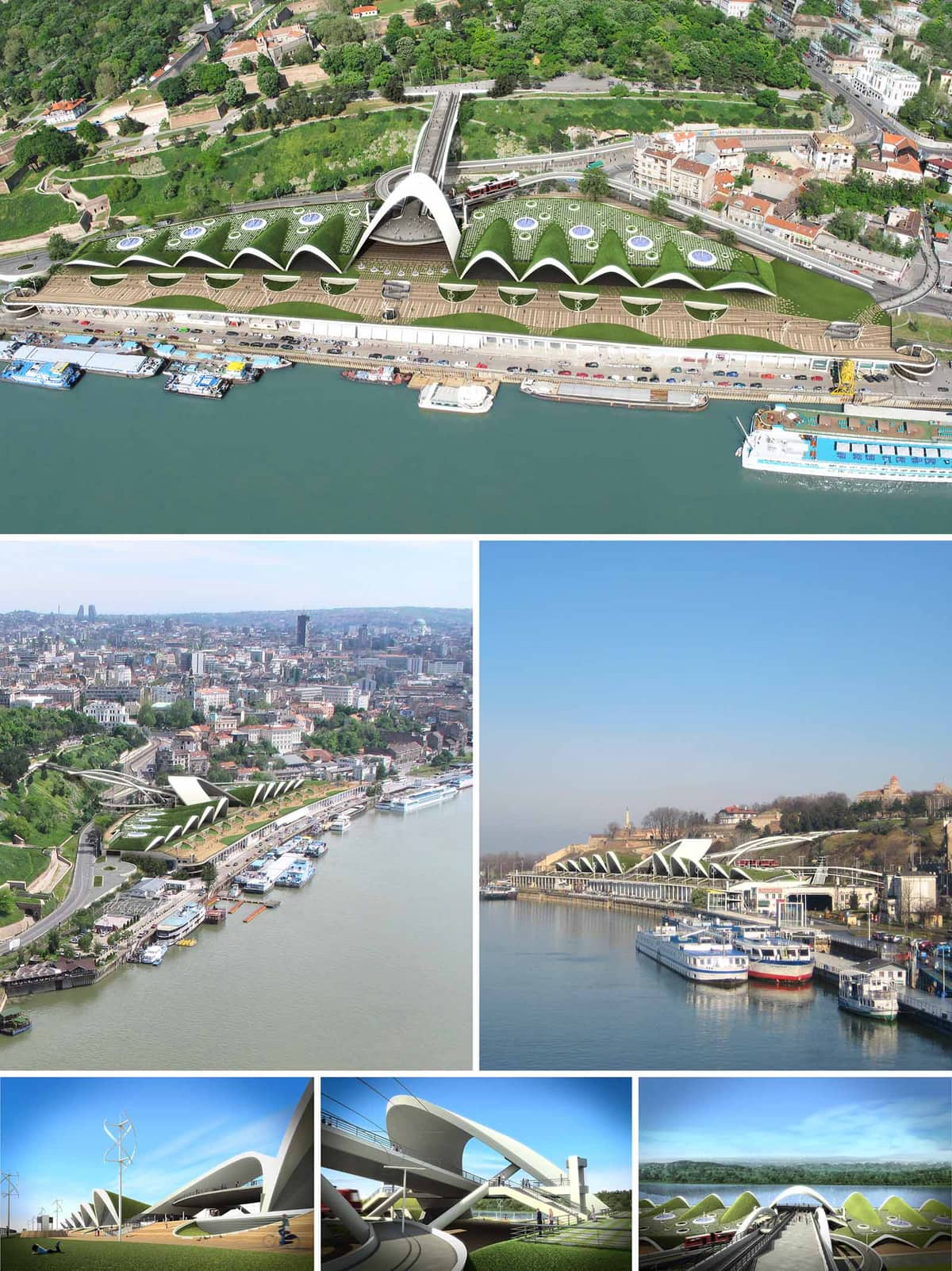

Beton Hala Waterfornt Center is conceived as a fluid infrastructural landscape that stitches together the city of Belgrade, the Sava River embankment and the Kalemegdan hill. The project transforms the existing linear warehouse structure into a multimodal urban platform, combining commercial, cultural and leisure functions with public circulation. A sequence of white, shell‑like canopies defines a strong formal identity, echoing the motion of river waves while framing views toward the historic fortress and the opposite riverbank. Rather than a singular building, the center operates as a continuous urban ribbon, negotiating topography, traffic flows and waterfront activities into a cohesive architectural gesture.
The design reinforces the role of the waterfront as Belgrade’s civic living room, creating a generous, permeable interface between land and water. Commercial functions are interwoven with promenades, bicycle paths and public terraces, ensuring that the project serves both as destination and connector within the broader metropolitan fabric.
The scheme establishes a critical link between the upper city and the river level through a combination of ramps, elevated walkways and bridges. A new tram and vehicular viaduct passes above the complex, intersecting with pedestrian connections that descend to the commercial plinth and ascend toward Kalemegdan park. This stacked circulation hierarchy separates flows while maintaining visual continuity, allowing users to experience the river from multiple heights and perspectives.
Along the riverfront, a widened quay provides docking facilities for passenger boats and cruise ships, integrating the center into regional waterborne networks. The ground plane is kept as open and porous as possible, with covered arcades beneath the canopies offering shaded routes parallel to the water. This continuous loop encourages strolling and supports the retail and leisure program without compromising accessibility to existing piers and services.
The architectural expression is defined by a series of repetitive, arched roof shells that rise and fold to form a rhythmic skyline. These elements are conceived as lightweight steel or composite structures, spanning over column‑free interior spaces suitable for flexible commercial use. Their sculptural white surfaces emphasize horizontality along the river while producing dynamic sectional profiles toward the hill.
The shells are anchored into a robust concrete podium that reinterprets the industrial character of the original Beton Hala warehouses. Large glazed façades open the commercial interiors to the promenade, while deep overhangs and inclined façades moderate solar exposure. Viewed from the river, the alternating sequence of open bays and solid vaults creates a strong visual continuity, turning the center into a recognizable infrastructural landmark within Belgrade’s panorama.
The roofscape is treated as an accessible green topography, extending the park of Kalemegdan toward the water. Grassy mounds, planted surfaces and integrated seating form a series of belvederes, allowing visitors to overlook the river traffic and city skyline. The articulation of the roof into walkable terraces effectively doubles the usable public space, providing a continuous park‑bridge that can be enjoyed independently of the commercial program below.
At quay level, timber or composite decking, planting strips and small pavilions generate a warm, human‑scaled environment that softens the infrastructural context. Bicycles, joggers and pedestrians share a generous promenade, while occasional widened nodes host outdoor cafés, temporary markets or cultural events. This layering of green roof, intermediate deck and quay promenade produces a rich three‑dimensional public realm.
Sustainability is embedded through both passive and active measures. The extensive green roofs contribute to thermal insulation, reduction of heat‑island effect and on‑site rainwater retention. Their thickness and planting strategy are calibrated to improve microclimate along the embankment, providing evaporative cooling and shaded resting areas. Orientations of the shell forms promote natural cross‑ventilation of interior spaces, supported by operable façades facing the river breeze.
The project anticipates the integration of renewable energy systems, such as vertical‑axis wind turbines and photovoltaic panels placed on optimal roof segments. Daylighting is maximized through carefully positioned skylights and clerestory openings, reducing reliance on artificial lighting for the commercial interiors. Material choices emphasize durable, low‑maintenance finishes suitable for the riverfront environment, while the reuse and transformation of the existing Beton Hala footprint minimize excavation and embodied carbon. Together, these strategies position the center as a contemporary, resilient waterfront catalyst for Belgrade.


Beton Hala Waterfornt Center is conceived as a fluid infrastructural landscape that stitches together the city of Belgrade, the Sava River embankment and the Kalemegdan hill. The project transforms the existing linear warehouse structure into a multimodal urban platform, combining commercial, cultural and leisure functions with public circulation. A sequence of white, shell‑like canopies defines a strong formal identity, echoing the motion of river waves while framing views toward the historic fortress and the opposite riverbank. Rather than a singular building, the center operates as a continuous urban ribbon, negotiating topography, traffic flows and waterfront activities into a cohesive architectural gesture.
The design reinforces the role of the waterfront as Belgrade’s civic living room, creating a generous, permeable interface between land and water. Commercial functions are interwoven with promenades, bicycle paths and public terraces, ensuring that the project serves both as destination and connector within the broader metropolitan fabric.
The scheme establishes a critical link between the upper city and the river level through a combination of ramps, elevated walkways and bridges. A new tram and vehicular viaduct passes above the complex, intersecting with pedestrian connections that descend to the commercial plinth and ascend toward Kalemegdan park. This stacked circulation hierarchy separates flows while maintaining visual continuity, allowing users to experience the river from multiple heights and perspectives.
Along the riverfront, a widened quay provides docking facilities for passenger boats and cruise ships, integrating the center into regional waterborne networks. The ground plane is kept as open and porous as possible, with covered arcades beneath the canopies offering shaded routes parallel to the water. This continuous loop encourages strolling and supports the retail and leisure program without compromising accessibility to existing piers and services.
The architectural expression is defined by a series of repetitive, arched roof shells that rise and fold to form a rhythmic skyline. These elements are conceived as lightweight steel or composite structures, spanning over column‑free interior spaces suitable for flexible commercial use. Their sculptural white surfaces emphasize horizontality along the river while producing dynamic sectional profiles toward the hill.
The shells are anchored into a robust concrete podium that reinterprets the industrial character of the original Beton Hala warehouses. Large glazed façades open the commercial interiors to the promenade, while deep overhangs and inclined façades moderate solar exposure. Viewed from the river, the alternating sequence of open bays and solid vaults creates a strong visual continuity, turning the center into a recognizable infrastructural landmark within Belgrade’s panorama.
The roofscape is treated as an accessible green topography, extending the park of Kalemegdan toward the water. Grassy mounds, planted surfaces and integrated seating form a series of belvederes, allowing visitors to overlook the river traffic and city skyline. The articulation of the roof into walkable terraces effectively doubles the usable public space, providing a continuous park‑bridge that can be enjoyed independently of the commercial program below.
At quay level, timber or composite decking, planting strips and small pavilions generate a warm, human‑scaled environment that softens the infrastructural context. Bicycles, joggers and pedestrians share a generous promenade, while occasional widened nodes host outdoor cafés, temporary markets or cultural events. This layering of green roof, intermediate deck and quay promenade produces a rich three‑dimensional public realm.
Sustainability is embedded through both passive and active measures. The extensive green roofs contribute to thermal insulation, reduction of heat‑island effect and on‑site rainwater retention. Their thickness and planting strategy are calibrated to improve microclimate along the embankment, providing evaporative cooling and shaded resting areas. Orientations of the shell forms promote natural cross‑ventilation of interior spaces, supported by operable façades facing the river breeze.
The project anticipates the integration of renewable energy systems, such as vertical‑axis wind turbines and photovoltaic panels placed on optimal roof segments. Daylighting is maximized through carefully positioned skylights and clerestory openings, reducing reliance on artificial lighting for the commercial interiors. Material choices emphasize durable, low‑maintenance finishes suitable for the riverfront environment, while the reuse and transformation of the existing Beton Hala footprint minimize excavation and embodied carbon. Together, these strategies position the center as a contemporary, resilient waterfront catalyst for Belgrade.
© 2021 by sanzpont [arquitectura] . Webpage by sanzpont [digital] . Innovative Digital Experiences


CONCEPT DESIGN:
The soul of this design is to create self-sustainable living architecture that respond to its use.
MODULAR + FLEXIBLE:
The Module: Cylindrical Tensile Membrane + Double Helix Structure made of carbon fiber semi flexible tubes. This simple and flexible module can be repeated according to the desired length connecting two buildings forming a pedestrian connection.
STRUCTURAL FLEXIBILITY:
The design of the bridge meets the structural flexibility of differential movement between the buildings. A connection between two independent structures cannot be rigid, so this bridge is structurally based on a tensile membrane.
DYNAMIC REACTION:
Being a flexible tensile structure, by applying more tension to different points, a technological dynamic deformation can be achieved in response to the people crossing the bridge. It becomes a living element that responds to its use.
INTERNATIONAL ARCHITECTURE AWARDS:
• Int Design Awards, LA, USA: Bronze Medal - Conceptual Architecture Design
• A’ Design Award & Competition, Milán, Italy: Silver Medal - Certificate of Excellence in World Architectural Lighting Design
• 20+10+X World Architecture Award 2011 Winner: WORLD ARCHITECTURE COMMUNITY Awards (worldarchitecture.org), as one of the world’s most representative project in the world.
• 1st Place “Building to Building Pedestrian Bridge International Challenge”. DesignByMany Challenge sponsored by HP and ArchDaily.


INTERNATIONAL ARCHITECTURE AWARDS:
• Int Design Awards, LA, USA: Bronze Medal - Conceptual Architecture Design
• A’ Design Award & Competition, Milán, Italy: Silver Medal - Certificate of Excellence in World Architectural Lighting Design
• 20+10+X World Architecture Award 2011 Winner: WORLD ARCHITECTURE COMMUNITY Awards (worldarchitecture.org), as one of the world’s most representative project in the world.
• 1st Place “Building to Building Pedestrian Bridge International Challenge”. DesignByMany Challenge sponsored by HP and ArchDaily.
CONCEPT DESIGN:
The soul of this design is to create self-sustainable living architecture that respond to its use.
MODULAR + FLEXIBLE:
The Module: Cylindrical Tensile Membrane + Double Helix Structure made of carbon fiber semi flexible tubes. This simple and flexible module can be repeated according to the desired length connecting two buildings forming a pedestrian connection.
STRUCTURAL FLEXIBILITY:
The design of the bridge meets the structural flexibility of differential movement between the buildings. A connection between two independent structures cannot be rigid, so this bridge is structurally based on a tensile membrane.
DYNAMIC REACTION:
Being a flexible tensile structure, by applying more tension to different points, a technological dynamic deformation can be achieved in response to the people crossing the bridge. It becomes a living element that responds to its use.
© 2021 by sanzpont [arquitectura] . Webpage by sanzpont [digital] . Innovative Digital Experiences
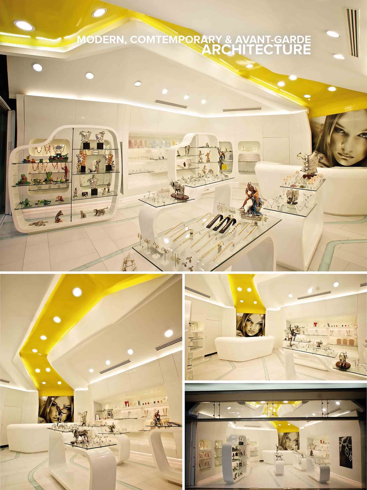

Hotel Zone, Cancun, Quintana Roo, Mexico. sanzpont [arquitectura] Silver Medal in the Interior Design Category at the 2nd Mexican Architecture Biennial held in Cancún, Quintana Roo. - Silver Medal in the Interior Design Category at the 2nd Mexican Architecture Biennial held in Cancún, Quintana Roo.
Conceptual Design: Creating a Fluid Path This project is a small 70m2 / 753 sq. foot storefront gallery located in a high-end shopping center in the tourist area of the city. The client required a clean, distinctive and avant-garde design. The design concept is based on a golden river; a yellow liquid running through the ceiling that invites you to walk through the store, incorporating an element of identity and memorability for its visitors. All forms originate in the false ceiling, as if it were a river bank and its waves. The fluid design extends into the floor and the furniture. As for colors, the white was used throughout for a clean look and the yellow in the ceiling leads to a marketing image that forms the backdrop of the cash wrap. The design of the cash wrap is a soft, irregular shape floating in the waves of the river engraved on the pavement. Indirect lighting gently bathes the surface, subtly highlighting the shape of the curves.
False Ceiling Design: Creating a Fluid Path The concept of the ceiling is a fluid continuity that represents the movement of the river’s waves. This is materialized by ridges and soft valleys throughout the space, integrated into the wall furniture that continues its shape down to the floor.
Constructive Digital Model With the creation of a digital model, it was possible to obtain all the tracing points in XYZ. They then created a three-dimensional cartesian model within the space.
Flexible Panel Ceiling It was necessary to be able to mold the curved shape of the ceiling using a thinner and more flexible drywall than usual. The very demanding curvatures within the project were made possible by utilizing a 1/4” thick plasterboard with superior flexibility.
Facade Design: Non-existent for a Total Opening The design of the facade is nonexistent, which generates a total opening of the store towards the outside. Commercially speaking, it helps that there is no barrier to hinder access to the store, generating an "extension of the corridor" outside circulation, allowing potential customers to enter without realizing it.
Furniture Design: Modular and Parametric Design Even with a fluid and non-orthogonal design, the challenge was to create completely modular furniture that can be repeated along the perimeter of the store, connected together. Wall Furniture: The concept of all the perimeter furniture, unlike the traditional scheme (solid, self-supporting furniture), was that all the modules were designed hanging from a tubular structured frame. With this avant-garde, industrial design comes considerable savings in the furniture manufacturing since only the visible surfaces are wood. The module itself integrates LED lighting, creating considerable energy savings.


Hotel Zone, Cancun, Quintana Roo, Mexico. sanzpont [arquitectura] Silver Medal in the Interior Design Category at the 2nd Mexican Architecture Biennial held in Cancún, Quintana Roo. - Silver Medal in the Interior Design Category at the 2nd Mexican Architecture Biennial held in Cancún, Quintana Roo.
Conceptual Design: Creating a Fluid Path This project is a small 70m2 / 753 sq. foot storefront gallery located in a high-end shopping center in the tourist area of the city. The client required a clean, distinctive and avant-garde design. The design concept is based on a golden river; a yellow liquid running through the ceiling that invites you to walk through the store, incorporating an element of identity and memorability for its visitors. All forms originate in the false ceiling, as if it were a river bank and its waves. The fluid design extends into the floor and the furniture. As for colors, the white was used throughout for a clean look and the yellow in the ceiling leads to a marketing image that forms the backdrop of the cash wrap. The design of the cash wrap is a soft, irregular shape floating in the waves of the river engraved on the pavement. Indirect lighting gently bathes the surface, subtly highlighting the shape of the curves.
False Ceiling Design: Creating a Fluid Path The concept of the ceiling is a fluid continuity that represents the movement of the river’s waves. This is materialized by ridges and soft valleys throughout the space, integrated into the wall furniture that continues its shape down to the floor.
Constructive Digital Model With the creation of a digital model, it was possible to obtain all the tracing points in XYZ. They then created a three-dimensional cartesian model within the space.
Flexible Panel Ceiling It was necessary to be able to mold the curved shape of the ceiling using a thinner and more flexible drywall than usual. The very demanding curvatures within the project were made possible by utilizing a 1/4” thick plasterboard with superior flexibility.
Facade Design: Non-existent for a Total Opening The design of the facade is nonexistent, which generates a total opening of the store towards the outside. Commercially speaking, it helps that there is no barrier to hinder access to the store, generating an "extension of the corridor" outside circulation, allowing potential customers to enter without realizing it.
Furniture Design: Modular and Parametric Design Even with a fluid and non-orthogonal design, the challenge was to create completely modular furniture that can be repeated along the perimeter of the store, connected together. Wall Furniture: The concept of all the perimeter furniture, unlike the traditional scheme (solid, self-supporting furniture), was that all the modules were designed hanging from a tubular structured frame. With this avant-garde, industrial design comes considerable savings in the furniture manufacturing since only the visible surfaces are wood. The module itself integrates LED lighting, creating considerable energy savings.
© 2021 by sanzpont [arquitectura] . Webpage by sanzpont [digital] . Innovative Digital Experiences
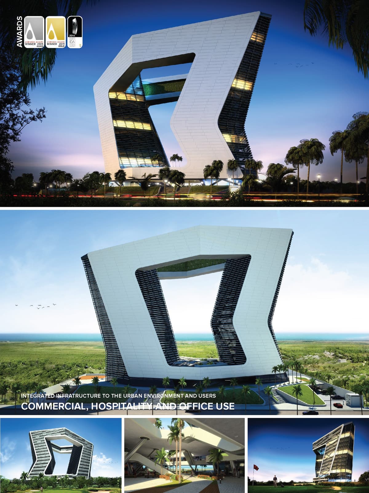

20 story tower, destinated for commercial, hospitality and office use. The building consists in 2 vertical bodies that meet at the top by 2 habitable bridges with an interior garden to form a large frame of the natural landscape. The building is protected from the sun in its west side by a "ventilated facade" of Alucobond flaky and indirect light is filtered inside between the horizontal slats of its outline.
On the Eastern front, the skin of the building is designed with a set of silkscreened, and transparent crystals sandblasteados advantage of the views of the golf course in Cancun and the Caribbean Sea. It has 2 parking levels integrated vegetated slope and high public square that generates a large urban balcony.
The interior design of the Mall in the early levels, expresses dynamism and spatial continuity invite another climb even higher to sit and have a coffee and enjoy the view terrace. In addition, the building opened to the public the opportunity to rise further, as it has a gazebo lounge restaurant on the top level. Thus, this vertical infrastructure with the inhabitant of the city and its urban environment is integrated.
• A’ Design Awards, Milán, Italy : Bronze Medal - Certificate of Excellence in World Architecture & Structure Design: GSI Tower (2015)
• IDA Design Awards, Los Angeles, USA : Silver Medal - Conceptual Architecture Design : GSI Tower, Cancún (2014)


• A’ Design Awards, Milán, Italy : Bronze Medal - Certificate of Excellence in World Architecture & Structure Design: GSI Tower (2015)
• IDA Design Awards, Los Angeles, USA : Silver Medal - Conceptual Architecture Design : GSI Tower, Cancún (2014)
20 story tower, destinated for commercial, hospitality and office use. The building consists in 2 vertical bodies that meet at the top by 2 habitable bridges with an interior garden to form a large frame of the natural landscape. The building is protected from the sun in its west side by a "ventilated facade" of Alucobond flaky and indirect light is filtered inside between the horizontal slats of its outline.
On the Eastern front, the skin of the building is designed with a set of silkscreened, and transparent crystals sandblasteados advantage of the views of the golf course in Cancun and the Caribbean Sea. It has 2 parking levels integrated vegetated slope and high public square that generates a large urban balcony.
The interior design of the Mall in the early levels, expresses dynamism and spatial continuity invite another climb even higher to sit and have a coffee and enjoy the view terrace. In addition, the building opened to the public the opportunity to rise further, as it has a gazebo lounge restaurant on the top level. Thus, this vertical infrastructure with the inhabitant of the city and its urban environment is integrated.
© 2021 by sanzpont [arquitectura] . Webpage by sanzpont [digital] . Innovative Digital Experiences
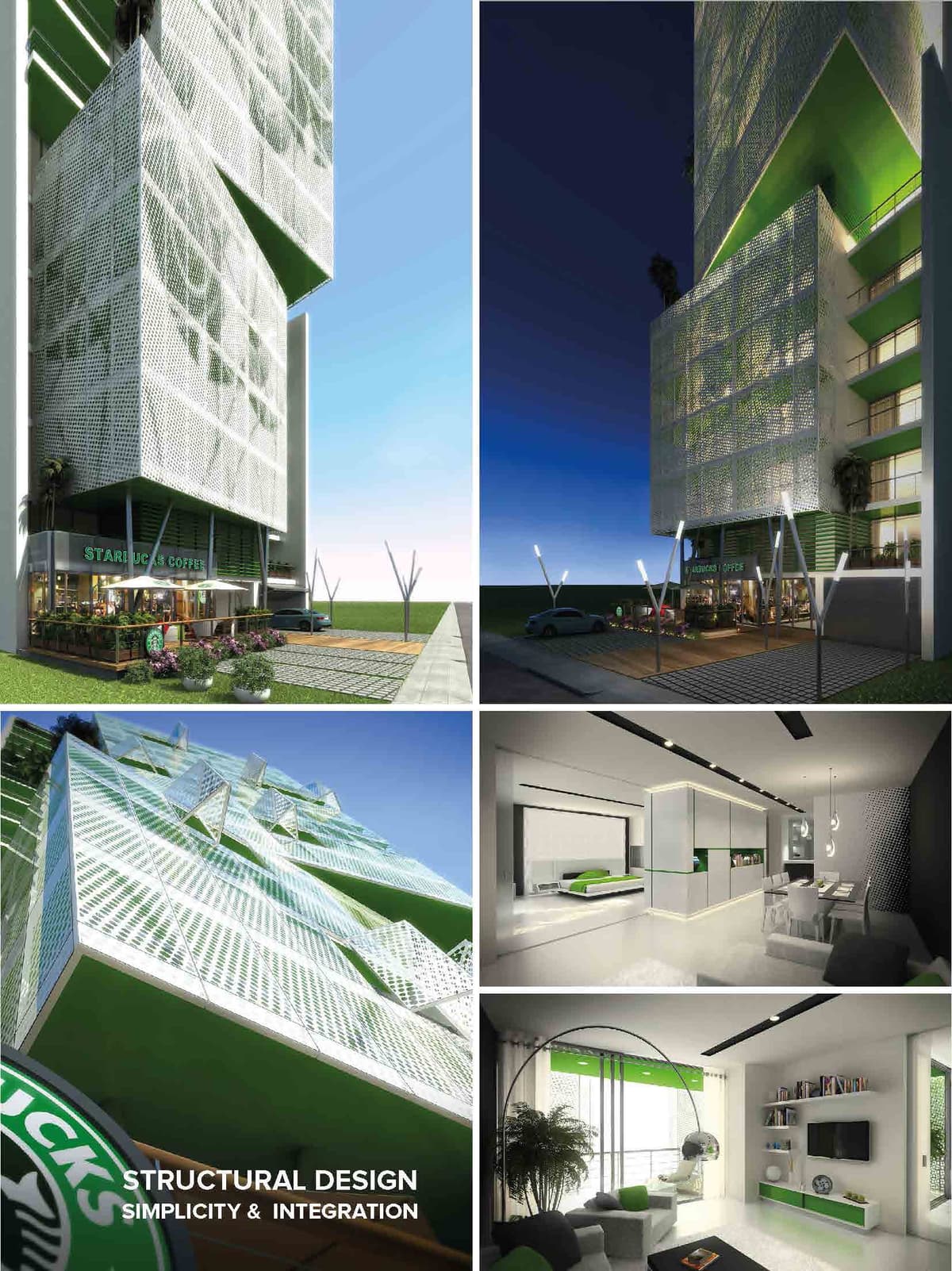

STRUCTURAL DESIGN
Simplicity of defined axes. An important factor in the building design was to have a simple structure, so from the beginning a plot of axes was defined that would jointly contemplate the underground parking garage and the vertical mass of housing.
URBAN INTEGRATION
Expansion of public space. To integrate the building with its urban fabric, there is a setback of the faade on the ground floor, thereby maximizing the public area by generating an access plaza and a terrace. With this gesture it is possible to have a spatial scale at the pedestrian level. Through a longitudinal design of the cafeteria, the public space is carried to the back of the land where the garden can be used for recreation and contemplation.
ARCHITECTURAL DISTRIBUTION
Responding to the functional needs. The building fully responds to the architectural program and the needs of use. The 30 lofts are flats that look directly toward the Golf Club. All the apartments have the same configuration and dimensions, the only variation is the size of the terraces, which is by facade design. The total built area per apartment is between 207 m2 and 217 m2, including terraces. The loft interior space is created by means of a unique and open space between kitchen, hall, dining room, living room, master bedroom and terraces, where the entire space revolves around a central bookcase. In case privacy is required in the main room, a large sliding panel isolates it from the rest of the space. The underground parking garage was resolved in half levels with a vehicular circulation around the vertical core with a total of 118 parking spaces.
CHANGEABLE FACADE
Depending on the time of year. The volumetric design of the main facade responds to the model based on the analysis of the site, and the micro-perforated graphic art integrates it with the green landscape. This glass facade has the ability to be opened in its entirety by means of folding windows on a pivoting mechanism, above all by thinking of the summer air circulation, easy maintenance and the ability to clean from the inside. This system of windows gives the building the ability to have a CHANGEABLE FACADE according to the climate- a living skin that is transformed at the user's will to achieve greater comfort in summer and winter. THE SKIN OF THE BUILDING: Graphic art and design according to its orientation. The skin of the building responds to the orientation of the facade. On the South facade the percentage of openings is lower and the windows are protected by sliding micro-perforated aluminum panels to avoid overheating in SUMMER while simultaneously allowing the wind to flow through for natural cross ventilation.
On the North facade, the skin of the building is totally glazed to make the most of natural light and depending on the cloudiness, to capture some solar radiation and slightly heat the interior space in WINTER. This skin is composed of: a. Glass to allow maximum natural light b. Micro-perforated vinyl that allows you to see from the inside to the outside, while generating privacy on the terraces. The art and graphic design of the vinyl simulates a vegetation-like skin that is integrated into the golf course, which is complemented by the green background of the balconies, providing the building with an artistic and avant-garde image c. Elements of pivoting, reinforced aluminum.
BIOCLIMATIC AND SUSTAINABILITY
The building adapts to the climate. The CLIMATIC ANALYSIS of the site tells us that Lima is a city with a moderate climate, practically without rainfall but with a very high level of atmospheric humidity. The average annual temperature is 18.5 to 19 ¡ C. The summer lasts from December to April, with an average temperature between 29 and 21 ¡ C. In winter, from June to September, the temperature ranges between 19 and 12 ¡ C. The natural conditions of the site generate a thermal inversion that causes an almost permanent cloudiness that makes the passage of direct solar radiation difficult. Even so, we believe it is important to take advantage of solar energy as much as possible, which varies depending on the degree of cloudiness of each day. The dominant wind comes from the South throughout the year.
In WINTER the windows remain closed and by means of the glazing of the terraces, you can also take advantage of these spaces during the day when it is cold. At night, you can close the window between the terrace and the room, leaving this space as an air chamber, improving the thermal insulation. In SUMMER natural cross ventilation is the most important bioclimatic technique, mainly because it is achieved in ALL living spaces and bedrooms, as can be seen in the architectural plan. This is achieved with the following elements:
1. Continuous open space through the kitchen, dining room, living room and terrace with direct air inlet and outlet on opposite sides. By means of the central recess in the rear facade of the building, the air is compressed and creates a Venturi effect that drives the air inwards. The front facing windows do the rest by means of negative pressure.
2. Air inlet into the basement over the entire width of the ground in the back.
3. Induction of natural air into the ventilation ducts by means of forced or convective ventilation. These ducts finish in the upper part of the building in bioclimatic air chimneys orienting the exit towards the negative pressure.
4. The south-facing bedrooms have windows in front of a direct wind entrance and the exit is by means of the vertical ventilation duct.
5. North-facing bedrooms are ventilated by means of the vertical ventilation duct and the air outlet is generated by negative pressure on the windows of the north facade.
UTILIZATION OF RENEWABLE ENERGY
For energy savings. Throughout the building design, the use and collection of renewable natural energy is considered to ensure energy savings. The wind is used to cool the spaces in the summer and depending on the cloudiness, the sun to heat them in winter through a bioclimatic design. In addition, the building has a THERMAL SOLAR COVER that captures as much as solar energy as possible, depending on the cloudiness, to support the thermal regulation of the pool so it does not depend totally on the boiler. Likewise, there are lights and energy saving equipment that reduce electricity consumption. The plant covers also provide thermal insulation to the building.


STRUCTURAL DESIGN
Simplicity of defined axes. An important factor in the building design was to have a simple structure, so from the beginning a plot of axes was defined that would jointly contemplate the underground parking garage and the vertical mass of housing.
URBAN INTEGRATION
Expansion of public space. To integrate the building with its urban fabric, there is a setback of the faade on the ground floor, thereby maximizing the public area by generating an access plaza and a terrace. With this gesture it is possible to have a spatial scale at the pedestrian level. Through a longitudinal design of the cafeteria, the public space is carried to the back of the land where the garden can be used for recreation and contemplation.
ARCHITECTURAL DISTRIBUTION
Responding to the functional needs. The building fully responds to the architectural program and the needs of use. The 30 lofts are flats that look directly toward the Golf Club. All the apartments have the same configuration and dimensions, the only variation is the size of the terraces, which is by facade design. The total built area per apartment is between 207 m2 and 217 m2, including terraces. The loft interior space is created by means of a unique and open space between kitchen, hall, dining room, living room, master bedroom and terraces, where the entire space revolves around a central bookcase. In case privacy is required in the main room, a large sliding panel isolates it from the rest of the space. The underground parking garage was resolved in half levels with a vehicular circulation around the vertical core with a total of 118 parking spaces.
CHANGEABLE FACADE
Depending on the time of year. The volumetric design of the main facade responds to the model based on the analysis of the site, and the micro-perforated graphic art integrates it with the green landscape. This glass facade has the ability to be opened in its entirety by means of folding windows on a pivoting mechanism, above all by thinking of the summer air circulation, easy maintenance and the ability to clean from the inside. This system of windows gives the building the ability to have a CHANGEABLE FACADE according to the climate- a living skin that is transformed at the user's will to achieve greater comfort in summer and winter. THE SKIN OF THE BUILDING: Graphic art and design according to its orientation. The skin of the building responds to the orientation of the facade. On the South facade the percentage of openings is lower and the windows are protected by sliding micro-perforated aluminum panels to avoid overheating in SUMMER while simultaneously allowing the wind to flow through for natural cross ventilation.
On the North facade, the skin of the building is totally glazed to make the most of natural light and depending on the cloudiness, to capture some solar radiation and slightly heat the interior space in WINTER. This skin is composed of: a. Glass to allow maximum natural light b. Micro-perforated vinyl that allows you to see from the inside to the outside, while generating privacy on the terraces. The art and graphic design of the vinyl simulates a vegetation-like skin that is integrated into the golf course, which is complemented by the green background of the balconies, providing the building with an artistic and avant-garde image c. Elements of pivoting, reinforced aluminum.
BIOCLIMATIC AND SUSTAINABILITY
The building adapts to the climate. The CLIMATIC ANALYSIS of the site tells us that Lima is a city with a moderate climate, practically without rainfall but with a very high level of atmospheric humidity. The average annual temperature is 18.5 to 19 ¡ C. The summer lasts from December to April, with an average temperature between 29 and 21 ¡ C. In winter, from June to September, the temperature ranges between 19 and 12 ¡ C. The natural conditions of the site generate a thermal inversion that causes an almost permanent cloudiness that makes the passage of direct solar radiation difficult. Even so, we believe it is important to take advantage of solar energy as much as possible, which varies depending on the degree of cloudiness of each day. The dominant wind comes from the South throughout the year.
In WINTER the windows remain closed and by means of the glazing of the terraces, you can also take advantage of these spaces during the day when it is cold. At night, you can close the window between the terrace and the room, leaving this space as an air chamber, improving the thermal insulation. In SUMMER natural cross ventilation is the most important bioclimatic technique, mainly because it is achieved in ALL living spaces and bedrooms, as can be seen in the architectural plan. This is achieved with the following elements:
1. Continuous open space through the kitchen, dining room, living room and terrace with direct air inlet and outlet on opposite sides. By means of the central recess in the rear facade of the building, the air is compressed and creates a Venturi effect that drives the air inwards. The front facing windows do the rest by means of negative pressure.
2. Air inlet into the basement over the entire width of the ground in the back.
3. Induction of natural air into the ventilation ducts by means of forced or convective ventilation. These ducts finish in the upper part of the building in bioclimatic air chimneys orienting the exit towards the negative pressure.
4. The south-facing bedrooms have windows in front of a direct wind entrance and the exit is by means of the vertical ventilation duct.
5. North-facing bedrooms are ventilated by means of the vertical ventilation duct and the air outlet is generated by negative pressure on the windows of the north facade.
UTILIZATION OF RENEWABLE ENERGY
For energy savings. Throughout the building design, the use and collection of renewable natural energy is considered to ensure energy savings. The wind is used to cool the spaces in the summer and depending on the cloudiness, the sun to heat them in winter through a bioclimatic design. In addition, the building has a THERMAL SOLAR COVER that captures as much as solar energy as possible, depending on the cloudiness, to support the thermal regulation of the pool so it does not depend totally on the boiler. Likewise, there are lights and energy saving equipment that reduce electricity consumption. The plant covers also provide thermal insulation to the building.
© 2021 by sanzpont [arquitectura] . Webpage by sanzpont [digital] . Innovative Digital Experiences
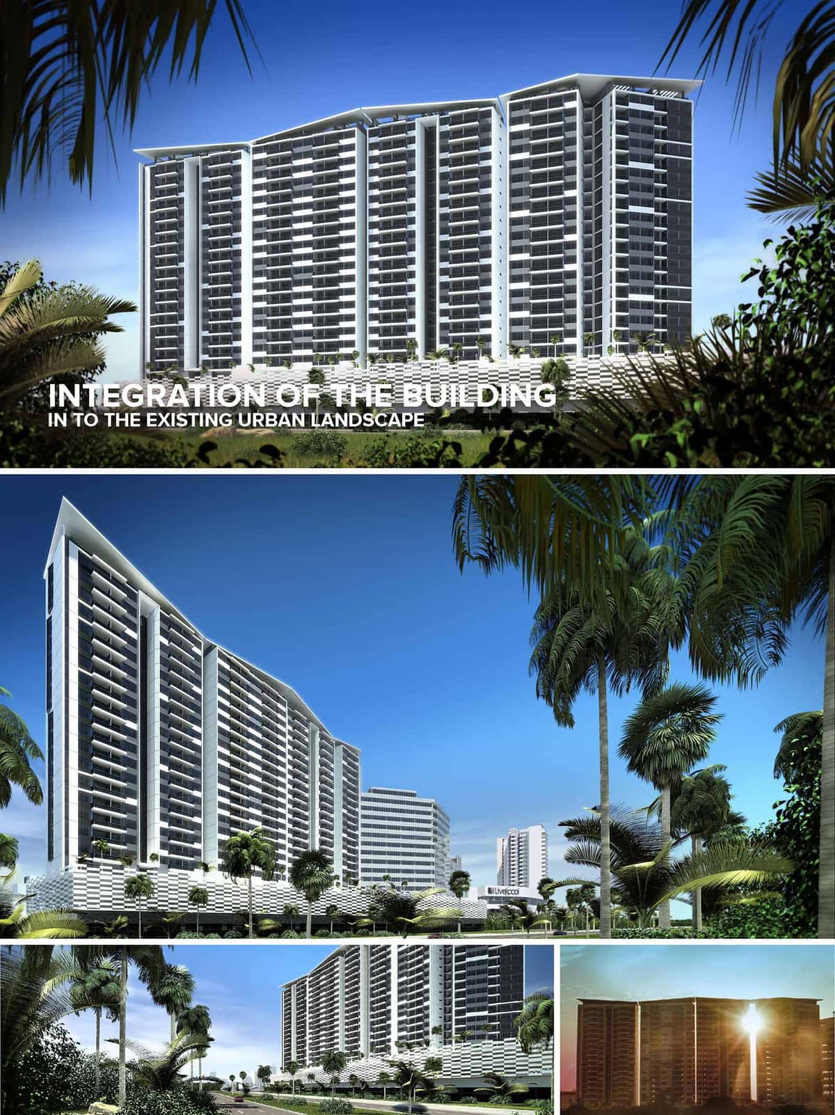
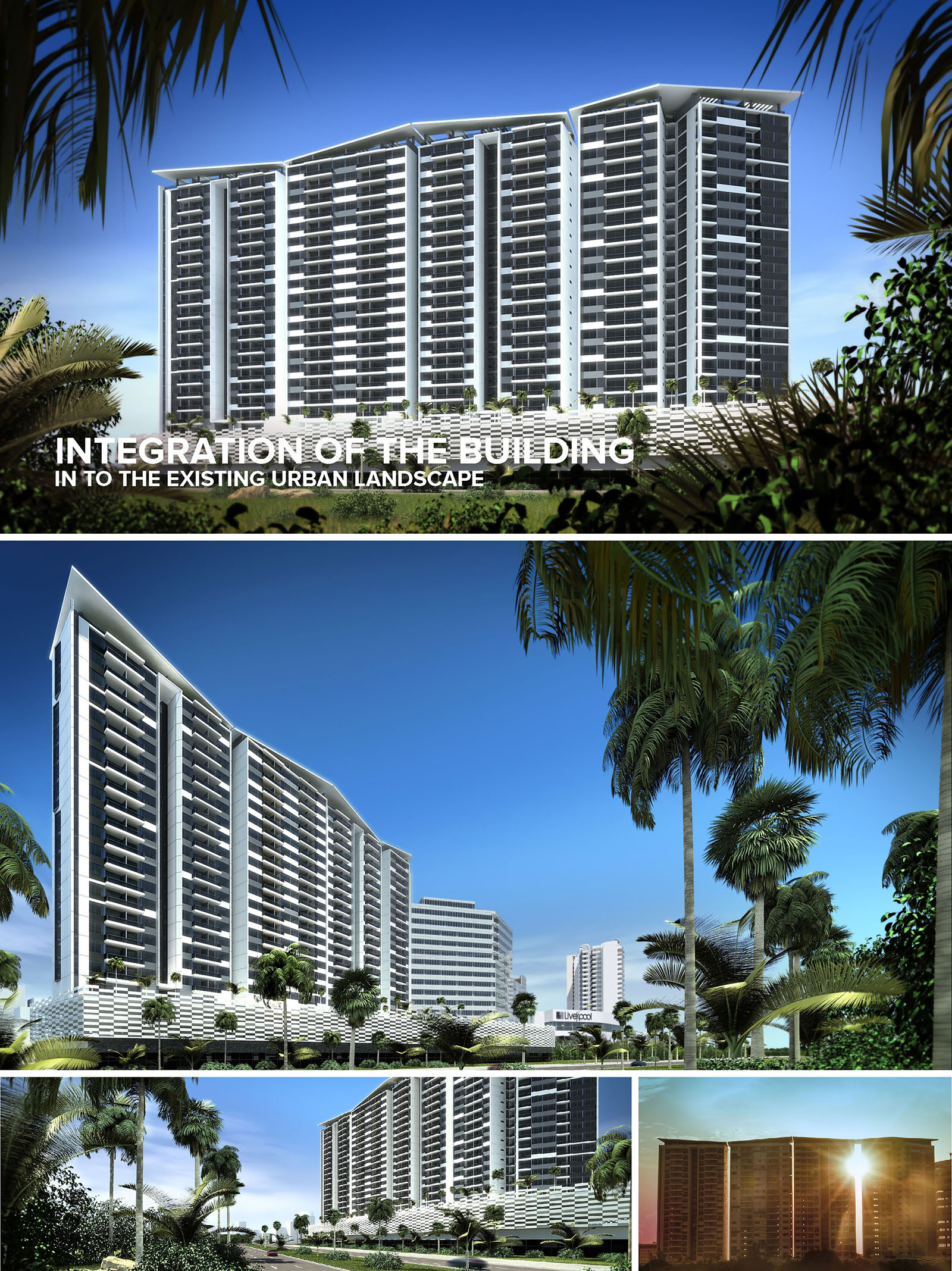
MALECON AMERICAS is conceived as a contemporary residential landmark that reinforces the urban skyline of Cancún while maintaining a strong connection with the coastal landscape. The volumetry is based on a sequence of slender towers joined by subtle inflections, creating a dynamic façade that responds to the movement of the sun and prevailing breezes. This configuration maximizes ocean-oriented views and cross-ventilation for the greatest number of units.
The architectural language is intentionally clean and orthogonal, emphasizing horizontality through continuous balconies and verticality through structural blades. The interplay of these elements produces a rhythm that visually lightens the mass of the building and expresses the modular nature of the residential typologies.
The project occupies a strategic front along an important urban corridor, acting as a transition between dense city fabric and the more open coastal landscape. The plinth aligns with the street grid, consolidating commercial and lobby functions and activating the public realm at ground level. Above this base, the residential volumes slightly withdraw, generating a clear separation between public, semi-public, and private domains.
Open landscaped setbacks and pedestrian promenades at the base connect to existing sidewalks and green areas, promoting permeability and walkability. The elevated platform accommodates parking and service areas, allowing the ground plane to remain visually open and planted, contributing to an improved microclimate along the avenue.
The towers are articulated through a faceted geometry, with subtle bends that orient the façades toward key views while reducing direct solar gain on the most exposed orientations. Vertical white frames and fins define the structural grid and provide shading to the balconies, while darker infill panels and glazing recede to emphasize depth and shadow.
At the podium, a textured horizontal banding creates a strong base condition and visually anchors the complex. This patterning introduces a human scale at street level and conceals parking ventilation through integrated perforations. The upper crown of the building is resolved with extended roof planes and recessed mechanical zones, giving a crisp, controlled silhouette against the sky.
The residential floors are organized on efficient double-loaded corridors that prioritize corner units and long, panoramic façades. Each apartment enjoys generous balconies, conceived as outdoor living rooms that expand the interior space and frame views of the city and coastline. Sliding glazed doors enable a fluid relationship between inside and outside, adapting to different climatic conditions.
Common amenities are strategically located at podium and intermediate levels to encourage social interaction among residents. These shared spaces, combined with visual continuity toward the surrounding greenery, build a resort-like living atmosphere while maintaining the privacy expected in an urban residence.
The material palette emphasizes durability and low maintenance, essential in the saline and humid environment of Cancún. Reinforced concrete structure, high-performance glazing, and aluminum balcony railings provide robustness and longevity. The predominant white and light gray tones reflect solar radiation and enhance thermal comfort, while darker accents mark the voids of terraces and recessed volumes.
Daylight plays a central role in the design. Large openings and continuous balcony fronts capture natural light throughout the day, while vertical fins, overhangs, and balcony slabs control glare and heat gain. Nighttime illumination highlights the vertical blades and the rhythmic balcony edges, turning the complex into a recognizable reference point along the urban waterfront.
The landscape design draws from the native coastal vegetation of the Yucatán Peninsula, using palms, shrubs, and groundcovers adapted to the local climate and low water consumption. Planting is concentrated around the base, terraces, and communal areas, forming green buffers that filter noise and improve air quality. Permeable surfaces and controlled drainage help manage stormwater, mitigating runoff during heavy tropical rains.
Passive design strategies are fundamental to the project’s sustainability approach. Building orientation and façade shaping reduce solar exposure on critical faces, while continuous balconies and shading elements minimize cooling loads. Cross-ventilation is encouraged through unit layout and operable windows, reducing dependence on mechanical systems. High-reflectance finishes, efficient lighting, and the potential integration of solar technologies on roof surfaces further contribute to lower operational energy demand and long-term environmental performance.
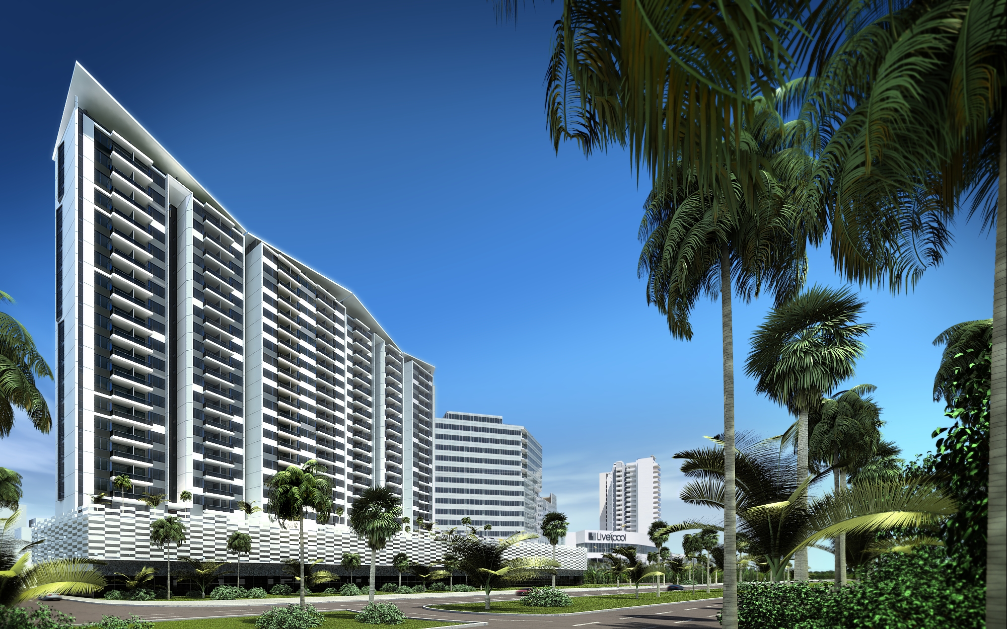
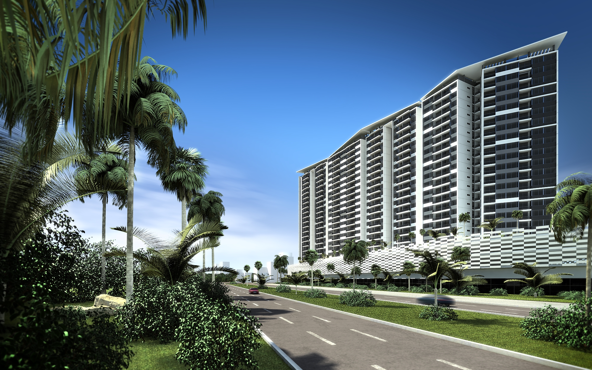
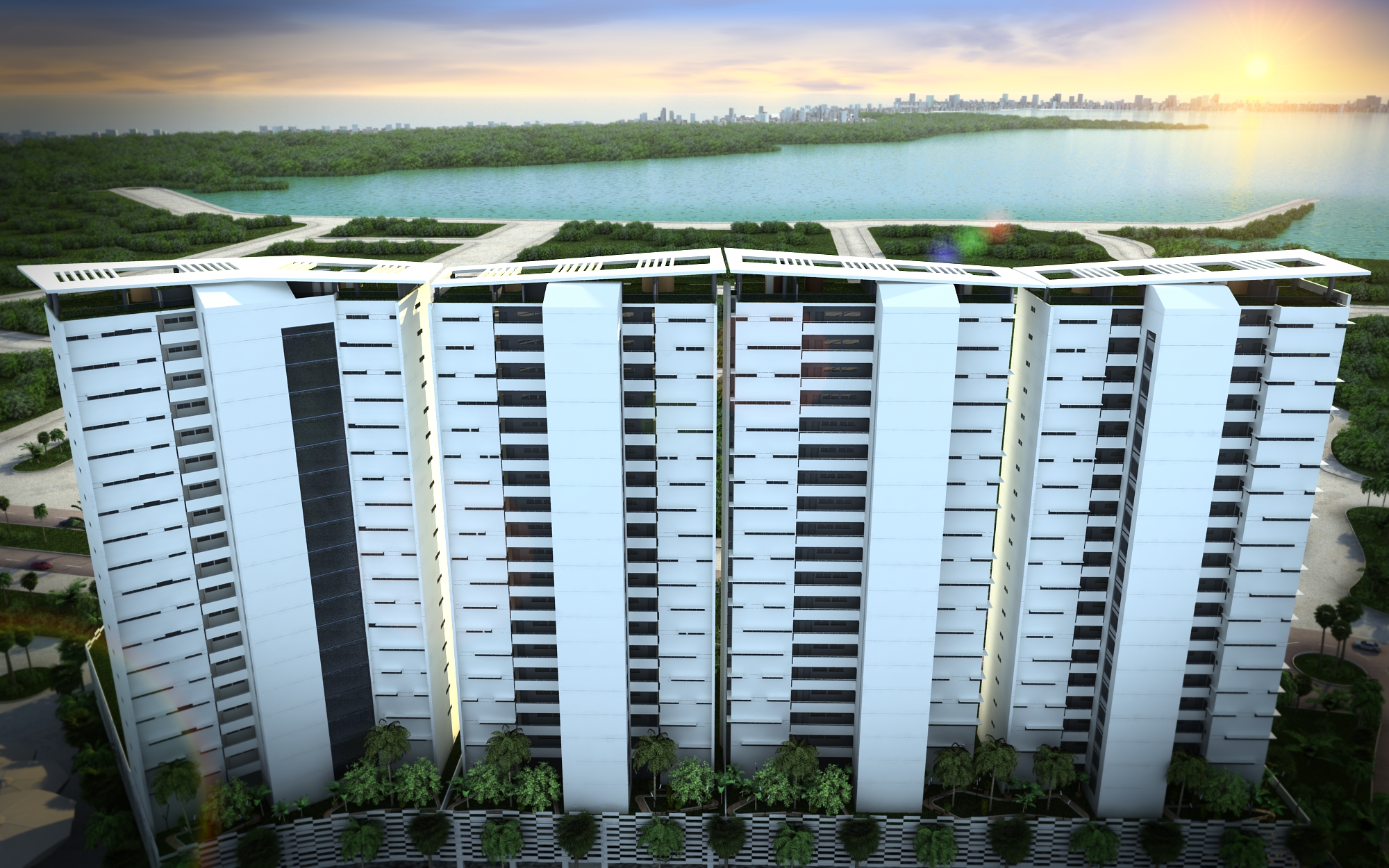
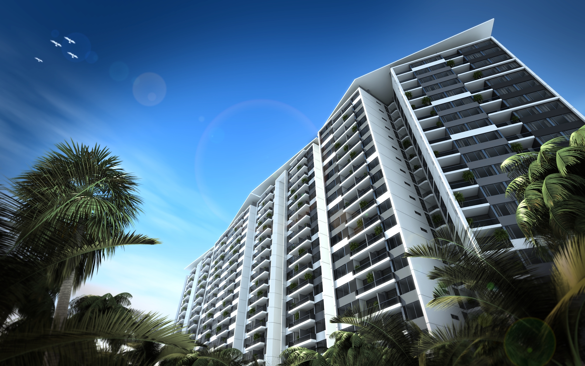
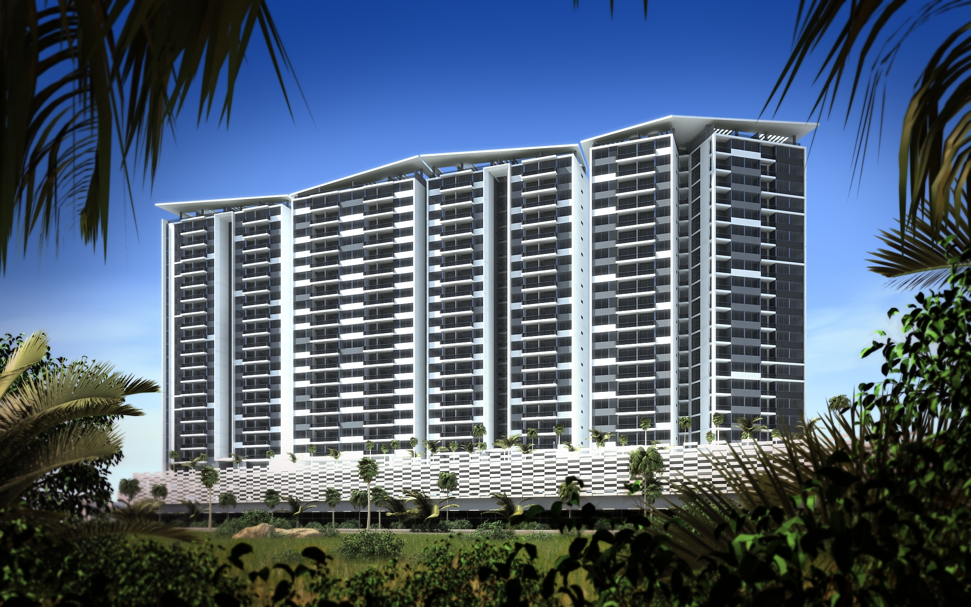
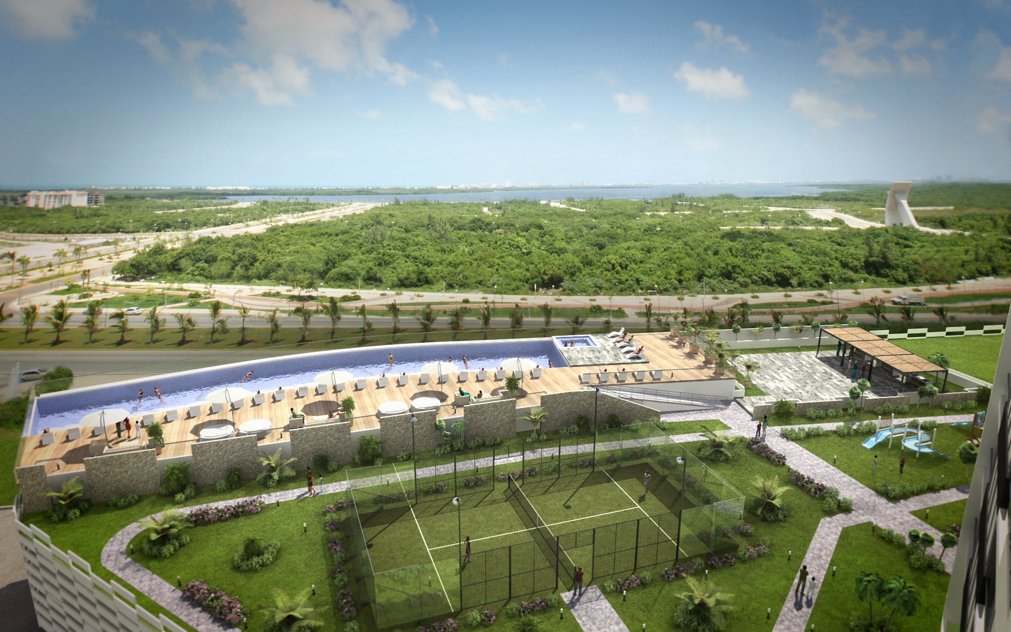


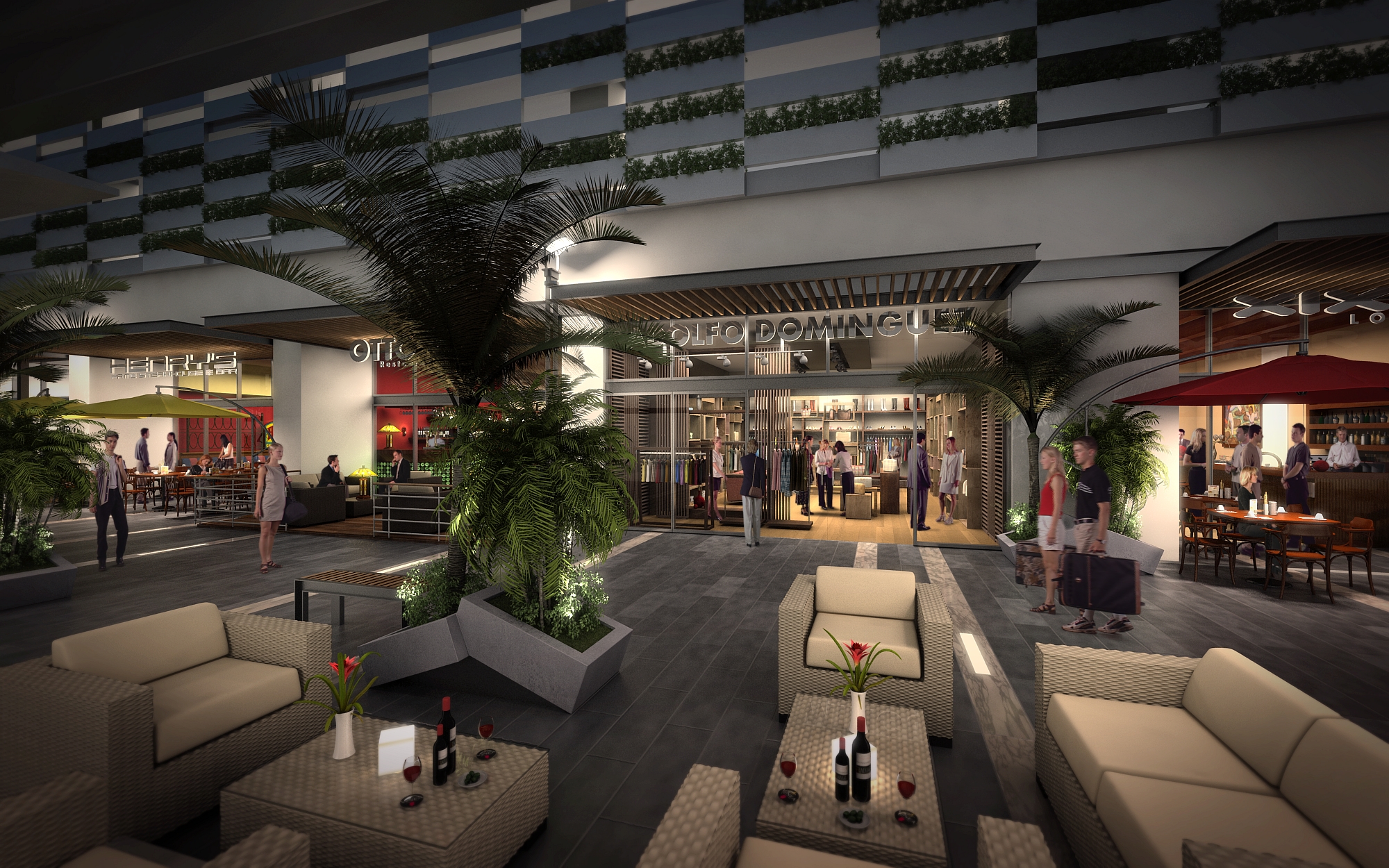
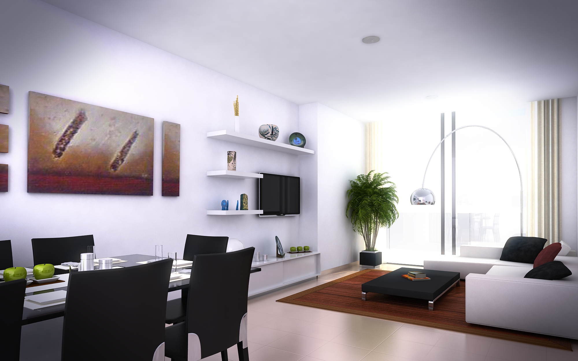
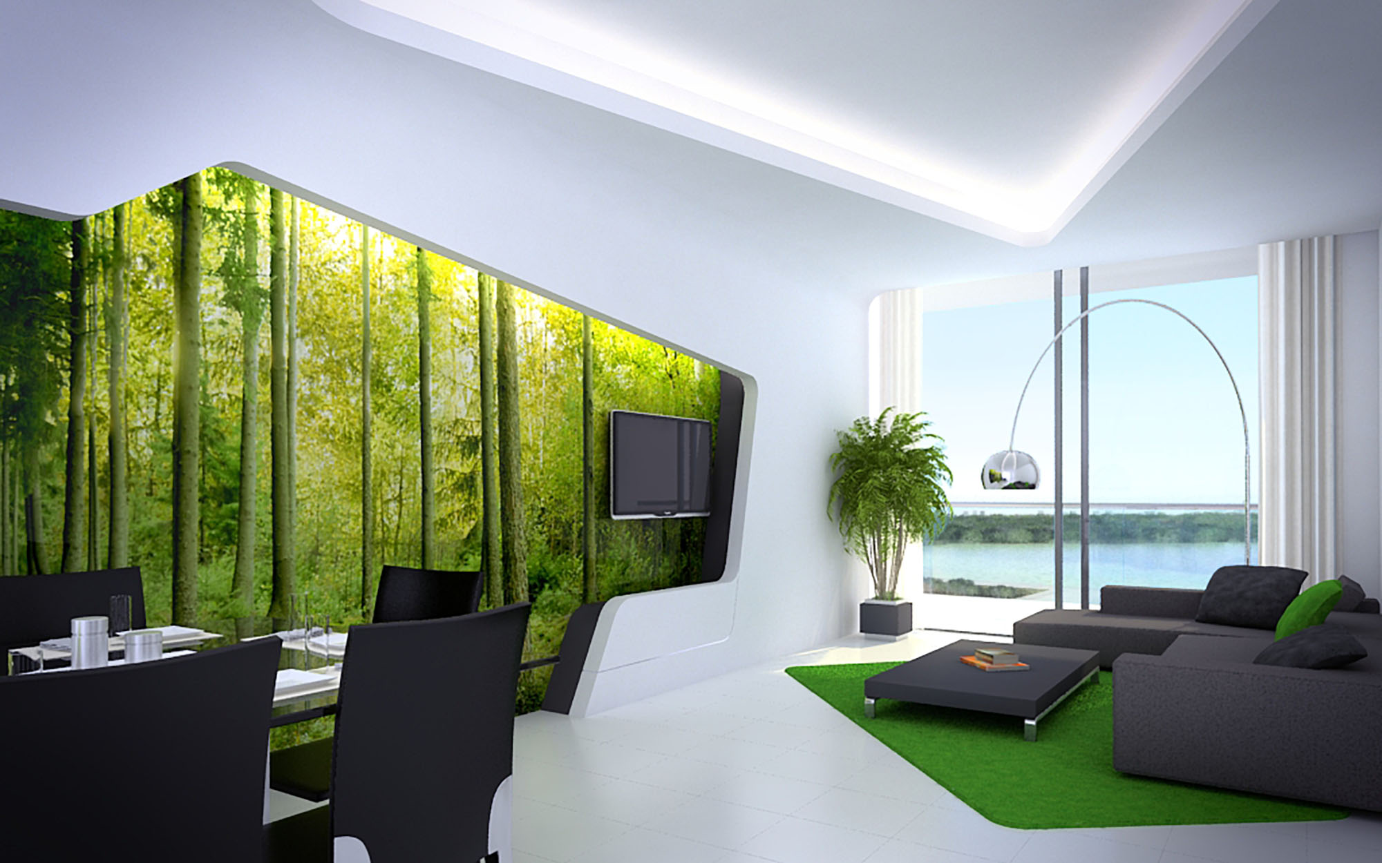
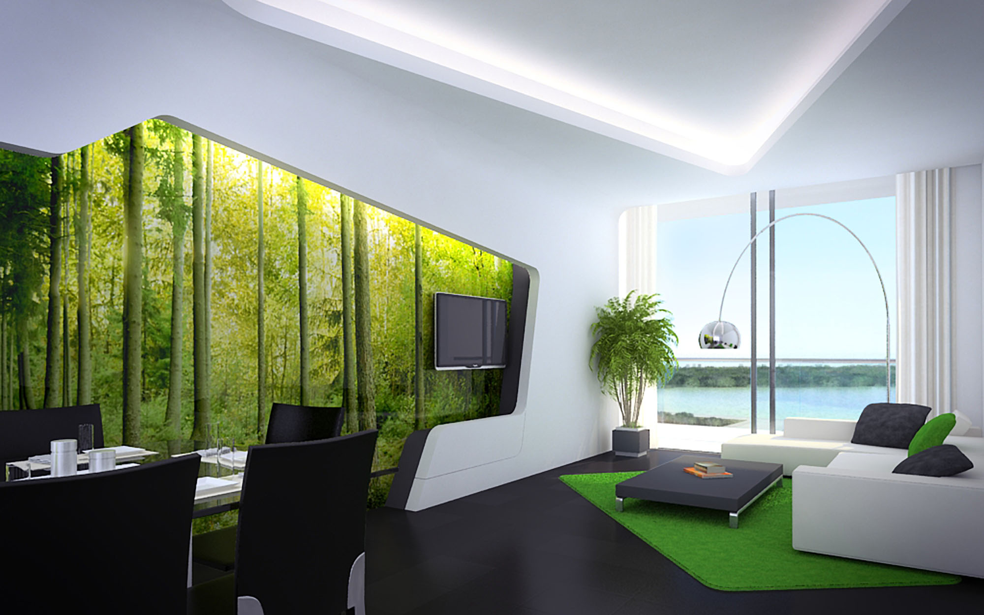
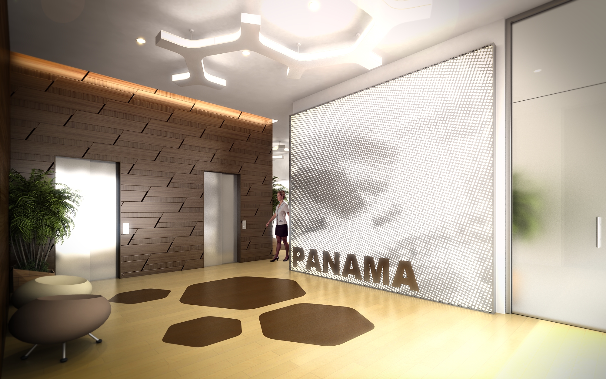

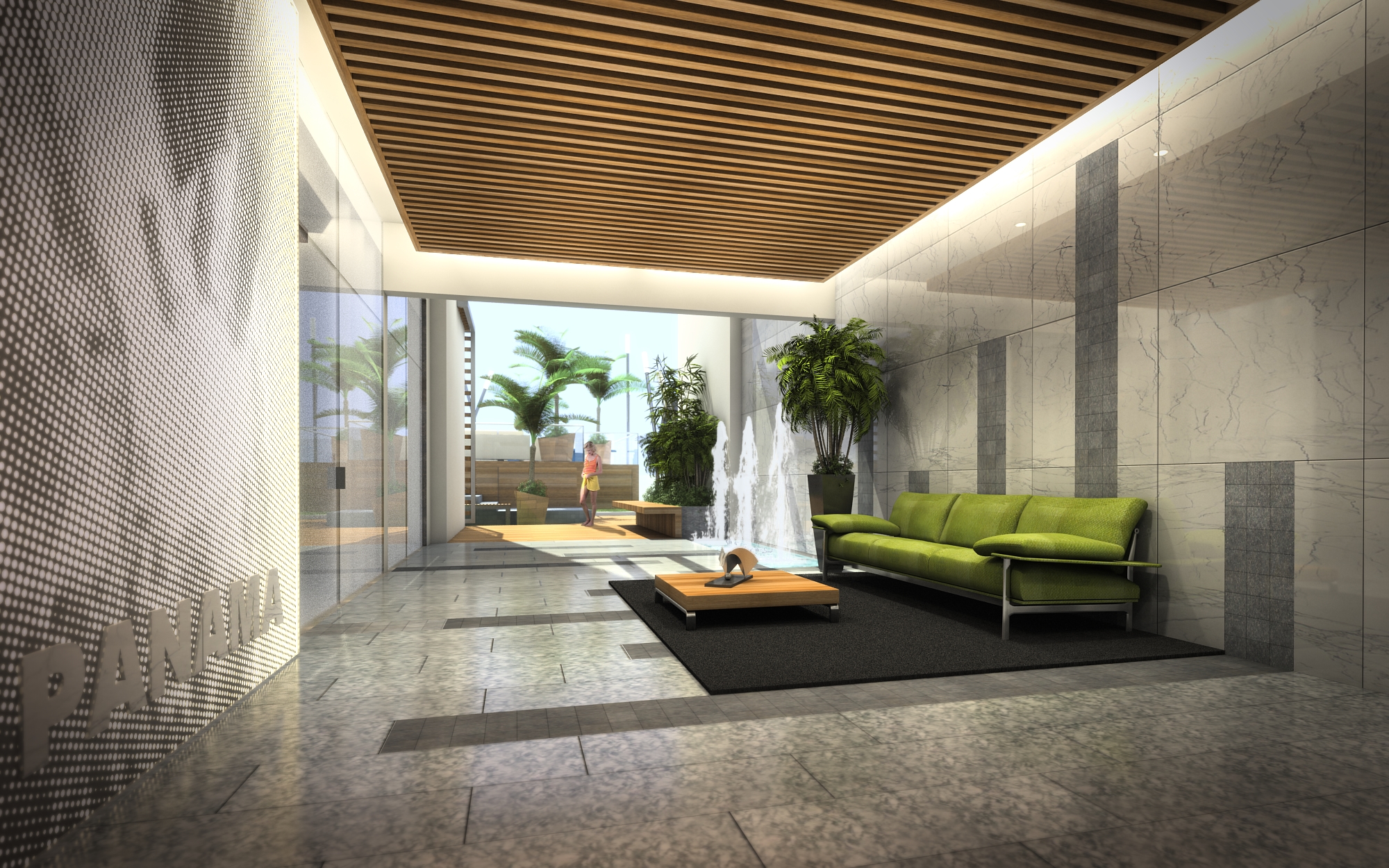

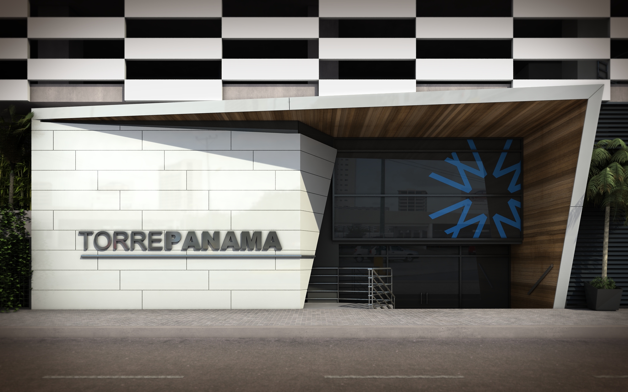
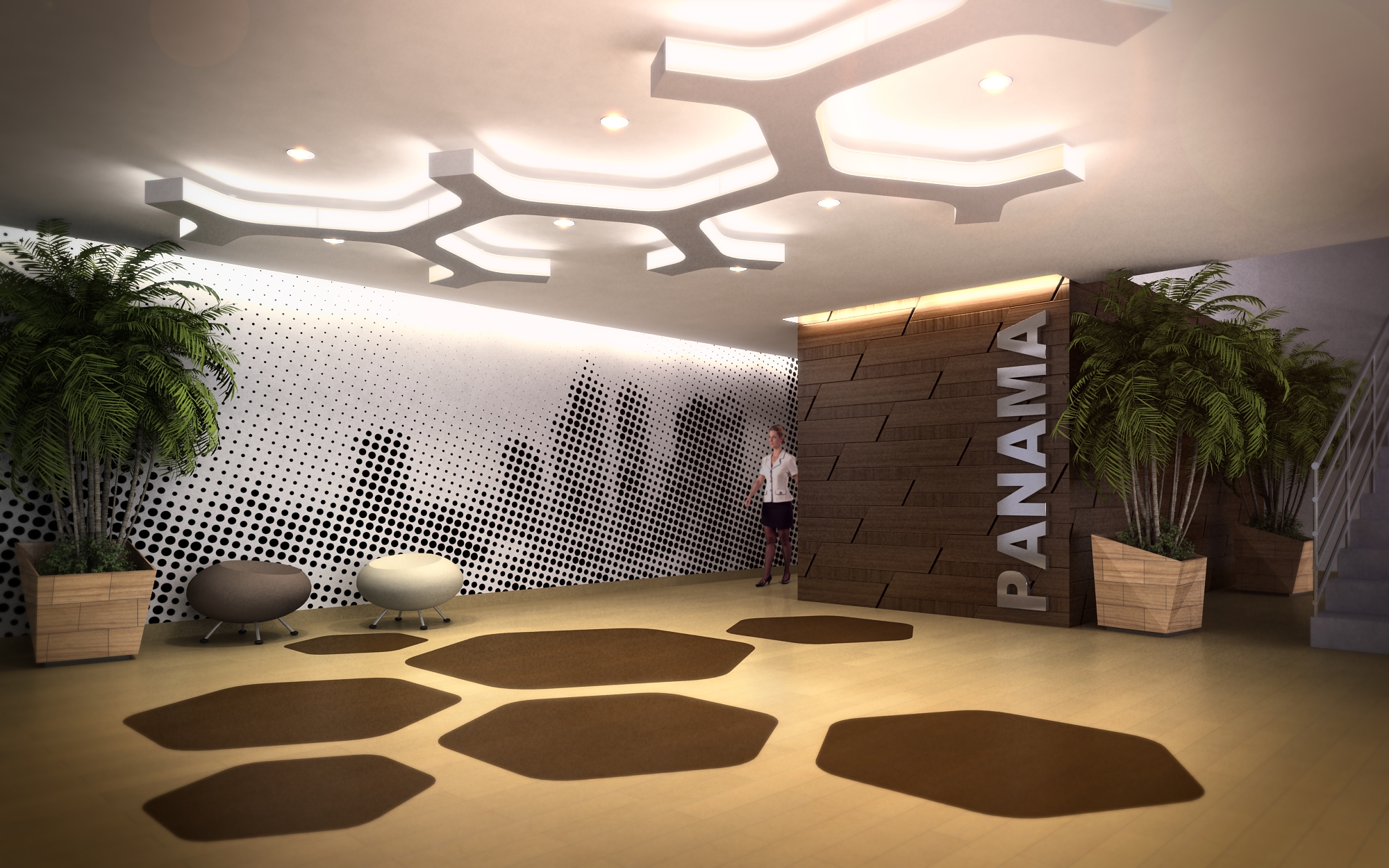

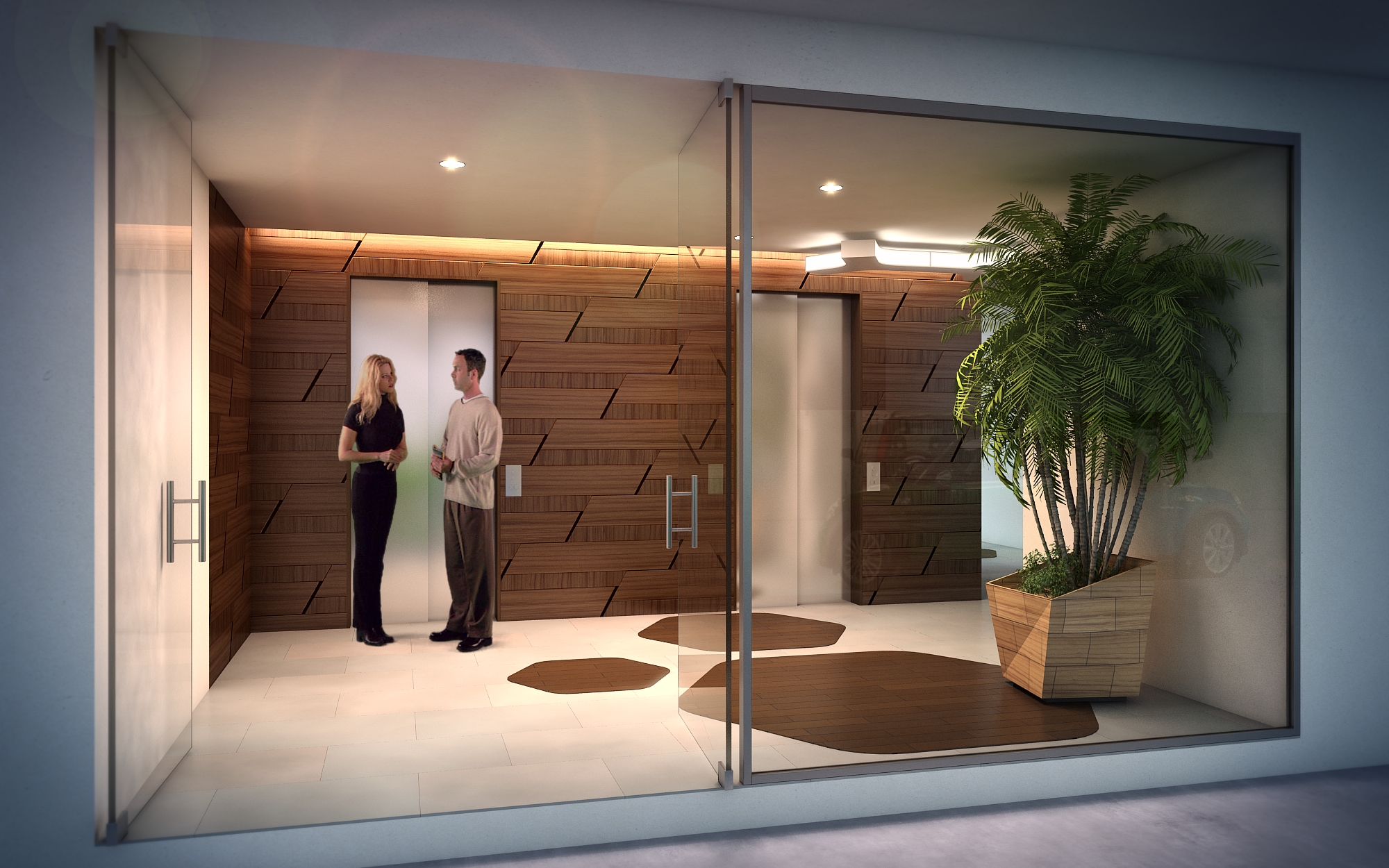
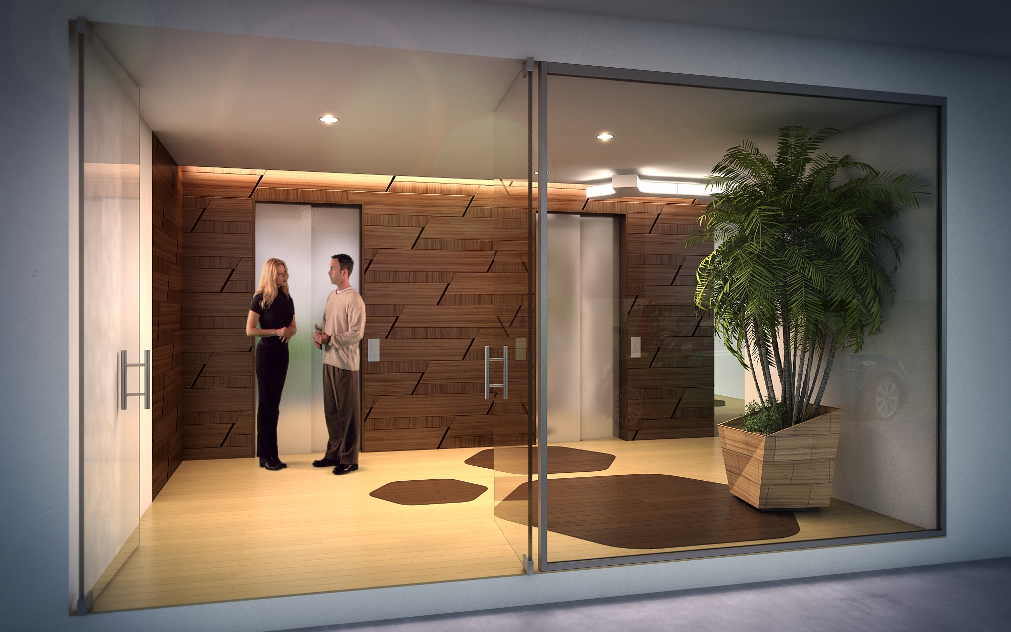

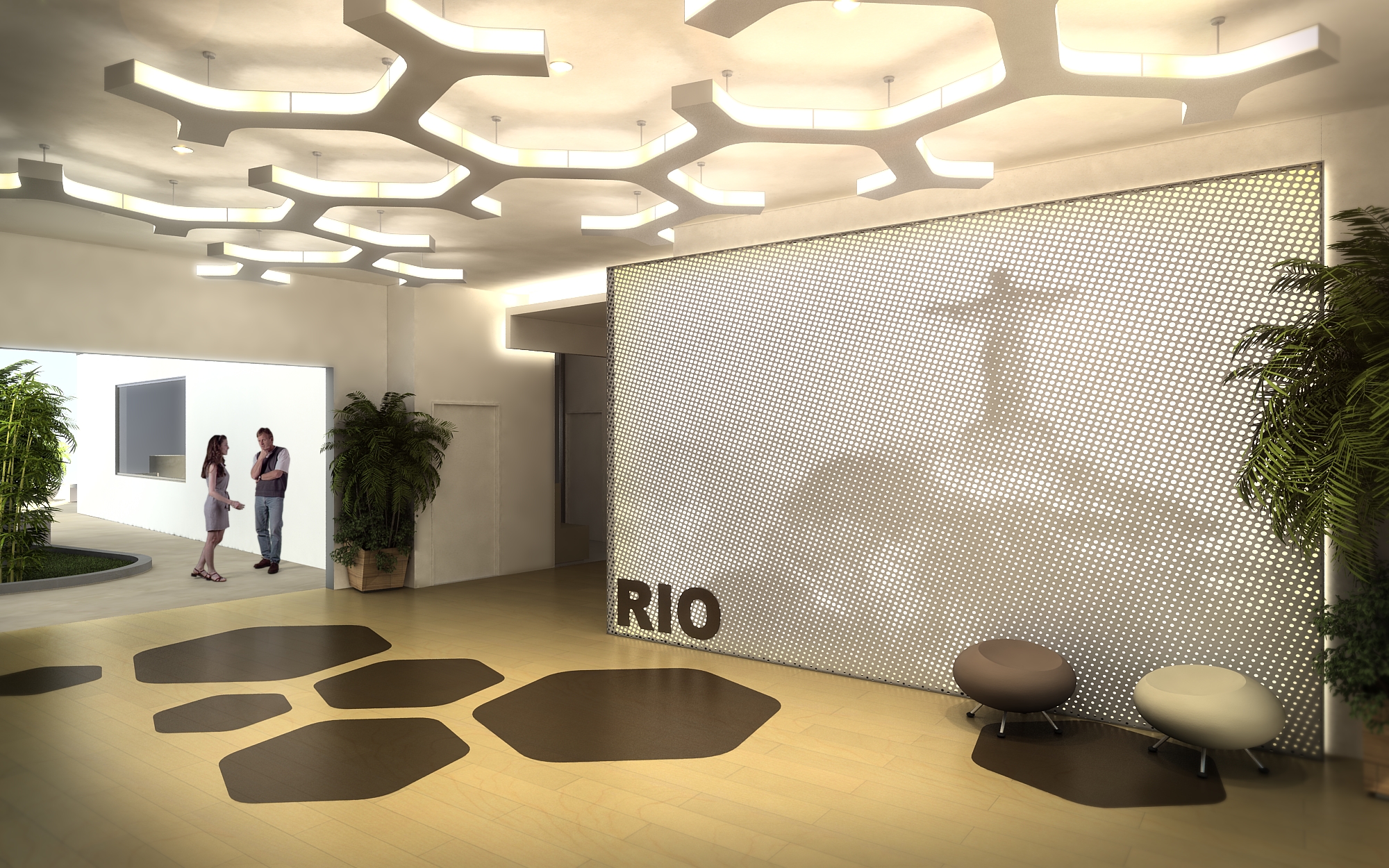
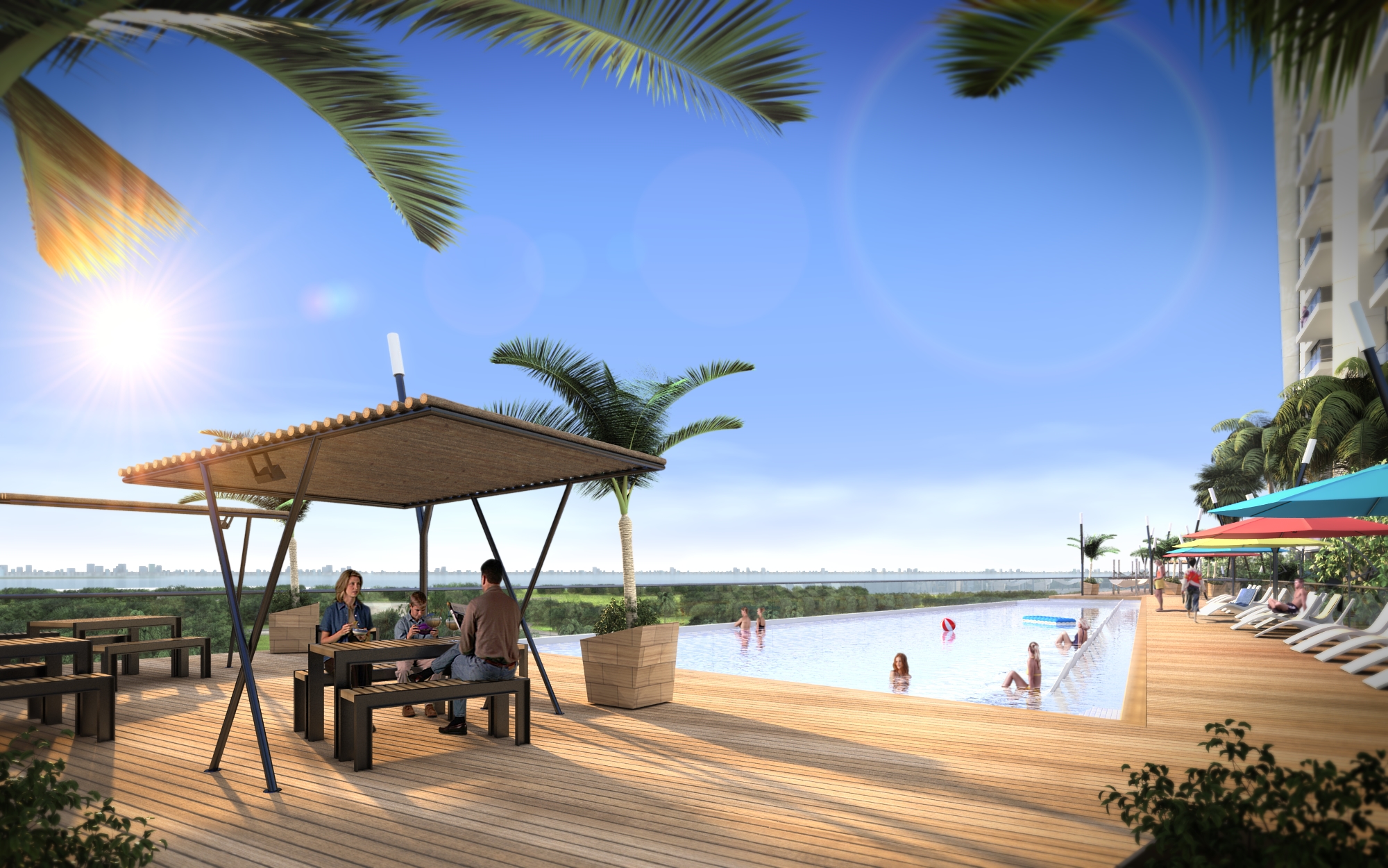
MALECON AMERICAS is conceived as a contemporary residential landmark that reinforces the urban skyline of Cancún while maintaining a strong connection with the coastal landscape. The volumetry is based on a sequence of slender towers joined by subtle inflections, creating a dynamic façade that responds to the movement of the sun and prevailing breezes. This configuration maximizes ocean-oriented views and cross-ventilation for the greatest number of units.
The architectural language is intentionally clean and orthogonal, emphasizing horizontality through continuous balconies and verticality through structural blades. The interplay of these elements produces a rhythm that visually lightens the mass of the building and expresses the modular nature of the residential typologies.
The project occupies a strategic front along an important urban corridor, acting as a transition between dense city fabric and the more open coastal landscape. The plinth aligns with the street grid, consolidating commercial and lobby functions and activating the public realm at ground level. Above this base, the residential volumes slightly withdraw, generating a clear separation between public, semi-public, and private domains.
Open landscaped setbacks and pedestrian promenades at the base connect to existing sidewalks and green areas, promoting permeability and walkability. The elevated platform accommodates parking and service areas, allowing the ground plane to remain visually open and planted, contributing to an improved microclimate along the avenue.
The towers are articulated through a faceted geometry, with subtle bends that orient the façades toward key views while reducing direct solar gain on the most exposed orientations. Vertical white frames and fins define the structural grid and provide shading to the balconies, while darker infill panels and glazing recede to emphasize depth and shadow.
At the podium, a textured horizontal banding creates a strong base condition and visually anchors the complex. This patterning introduces a human scale at street level and conceals parking ventilation through integrated perforations. The upper crown of the building is resolved with extended roof planes and recessed mechanical zones, giving a crisp, controlled silhouette against the sky.
The residential floors are organized on efficient double-loaded corridors that prioritize corner units and long, panoramic façades. Each apartment enjoys generous balconies, conceived as outdoor living rooms that expand the interior space and frame views of the city and coastline. Sliding glazed doors enable a fluid relationship between inside and outside, adapting to different climatic conditions.
Common amenities are strategically located at podium and intermediate levels to encourage social interaction among residents. These shared spaces, combined with visual continuity toward the surrounding greenery, build a resort-like living atmosphere while maintaining the privacy expected in an urban residence.
The material palette emphasizes durability and low maintenance, essential in the saline and humid environment of Cancún. Reinforced concrete structure, high-performance glazing, and aluminum balcony railings provide robustness and longevity. The predominant white and light gray tones reflect solar radiation and enhance thermal comfort, while darker accents mark the voids of terraces and recessed volumes.
Daylight plays a central role in the design. Large openings and continuous balcony fronts capture natural light throughout the day, while vertical fins, overhangs, and balcony slabs control glare and heat gain. Nighttime illumination highlights the vertical blades and the rhythmic balcony edges, turning the complex into a recognizable reference point along the urban waterfront.
The landscape design draws from the native coastal vegetation of the Yucatán Peninsula, using palms, shrubs, and groundcovers adapted to the local climate and low water consumption. Planting is concentrated around the base, terraces, and communal areas, forming green buffers that filter noise and improve air quality. Permeable surfaces and controlled drainage help manage stormwater, mitigating runoff during heavy tropical rains.
Passive design strategies are fundamental to the project’s sustainability approach. Building orientation and façade shaping reduce solar exposure on critical faces, while continuous balconies and shading elements minimize cooling loads. Cross-ventilation is encouraged through unit layout and operable windows, reducing dependence on mechanical systems. High-reflectance finishes, efficient lighting, and the potential integration of solar technologies on roof surfaces further contribute to lower operational energy demand and long-term environmental performance.
© 2021 by sanzpont [arquitectura] . Webpage by sanzpont [digital] . Innovative Digital Experiences
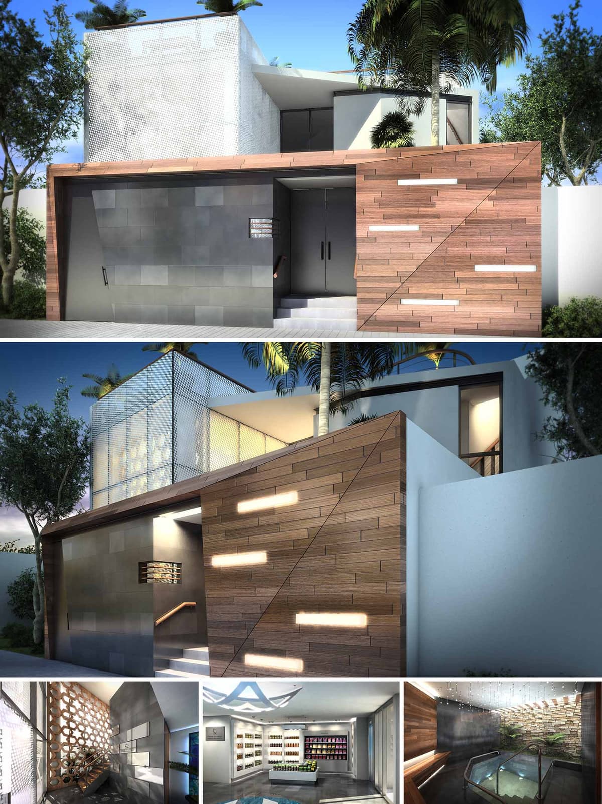
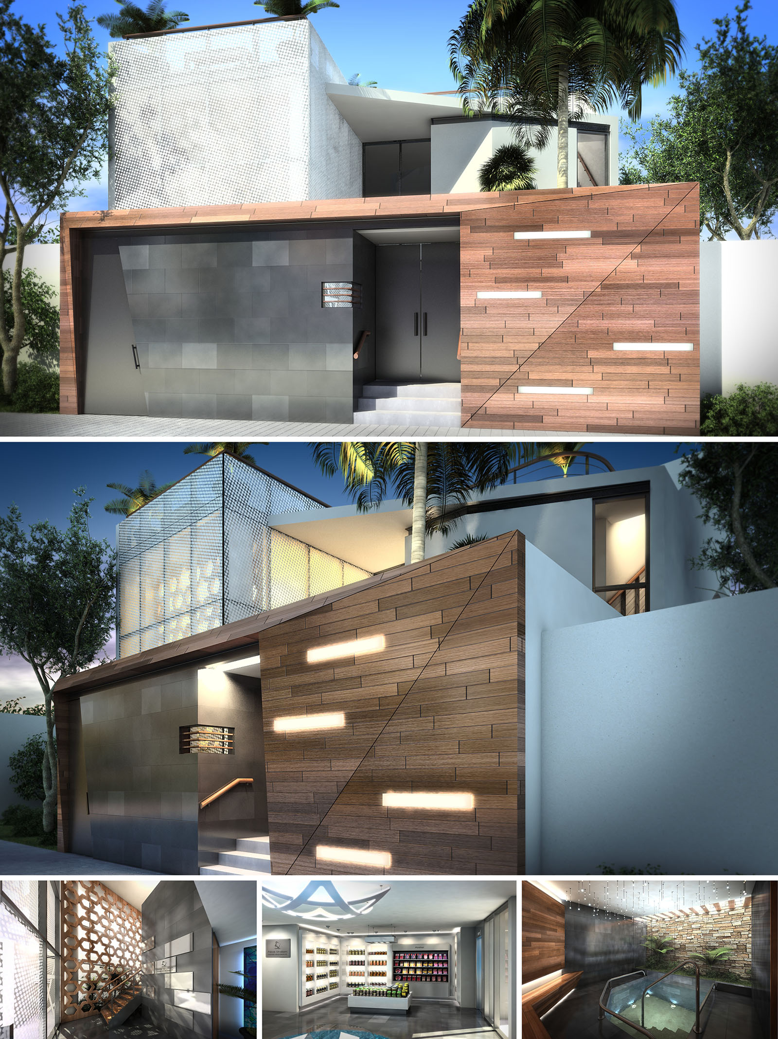
The Neve Shalom Temple in Cancún is conceived as a compact urban sanctuary that filters the intensity of the city and the Caribbean climate into a calm, introspective interior. The architectural language merges contemporary minimalism with symbolic elements of light, enclosure, and layered thresholds, expressing the idea of protection and spiritual ascent within a restrained, cubic volume. The building operates as both a religious and community space, with a façade that is reserved toward the street and increasingly permeable as visitors move inward.
The composition articulates a clear base–middle–crown hierarchy: an opaque plinth anchors the project to the street, a warm timber band creates a human-scale interface, and a luminous perforated upper volume signals the sacred space. This tripartite reading allows the temple to be recognizable in the urban fabric while maintaining an intimate scale appropriate to the local community.
The main façade is organized as a horizontal bar that screens the interior from direct views while subtly announcing the entrance through a recessed portal. Large-format dark panels form a solid, tectonic base, contrasted by a diagonally articulated timber cladding that introduces dynamism and visually extends the volume along the street front. Linear light slots integrated into the wood create a discreet nocturnal identity and echo the idea of prayers as beams of light emerging from within.
Above this grounded base, the upper sanctuary volume is wrapped in a perforated metallic skin. This translucent enclosure transforms the interior lighting into a soft lantern effect at night, while by day it filters sunlight and frames silhouettes of palm trees and sky. The interplay of wood, metal, and smooth white plaster surfaces creates a precise, contemporary palette that withstands the tropical climate yet feels warm and approachable.
The interior journey is choreographed as a gradual transition from compression to openness. Entry occurs through a contained vestibule, moving into a double-height hall defined by latticed wood screens and controlled overhead light. These perforated elements modulate views and acoustics, guiding the eye toward the central worship or gathering space while preserving a sense of privacy.
Within the main hall, surfaces are handled with a balance of solidity and reflection. Timber cladding, stacked in horizontal bands, is juxtaposed with polished dark flooring that subtly mirrors light fixtures and water elements. Circulation is clear and legible, with stairs and ramps carefully integrated along the perimeter to maintain a central, uninterrupted devotional or assembly area suitable for flexible programming.
Material selection focuses on tactile warmth and controlled luminosity. Exterior timber is used in calibrated strips, emphasizing horizontality and guiding natural ventilation joints. The dark stone or porcelain cladding grounds the building while offering durability against humidity and saline air. The perforated metal mesh of the upper volume acts as a climatic and visual veil, generating dappled light patterns that recall traditional screens while remaining distinctly contemporary.
Artificial lighting is conceived as an extension of the architecture. Integrated linear fixtures within the façade boards and interior walls create soft washes rather than direct glare, reinforcing the meditative character of the spaces. In select areas, clusters of suspended luminaires simulate a starry canopy, emphasizing verticality and enhancing the ceremonial dimension without resorting to overt ornamentation.
The project accommodates worship functions alongside educational and community activities, organized around a clear zoning strategy. Public and semi-public areas occupy the lower level, ensuring direct access from the street, while more contemplative spaces are located above, buffered from noise and urban distractions. Service zones and storage are compactly arranged along blind walls, maximizing usable area for gathering and circulation.
Sustainability is addressed through passive and material strategies appropriate to Cancún’s tropical climate. The perforated upper skin acts as a brise-soleil, reducing solar gain while allowing cross-ventilation and lowering reliance on mechanical cooling. High-performance glazing, insulated roof assemblies, and the use of durable, low-maintenance finishes extend the building’s life cycle. Where possible, locally sourced timber and stone reduce transportation impacts, while the careful orientation of openings optimizes natural light, minimizing artificial lighting loads and ensuring that the temple remains both energy-efficient and comfortable throughout the year.
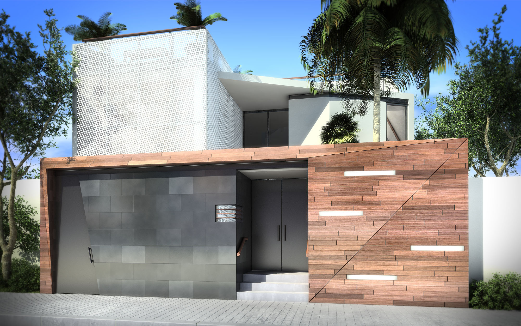
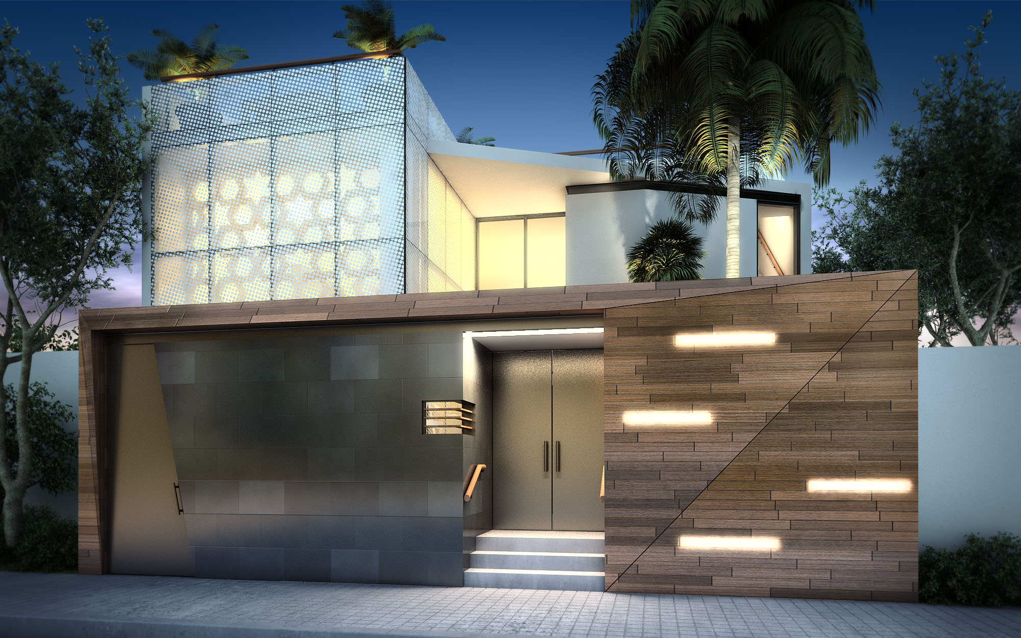
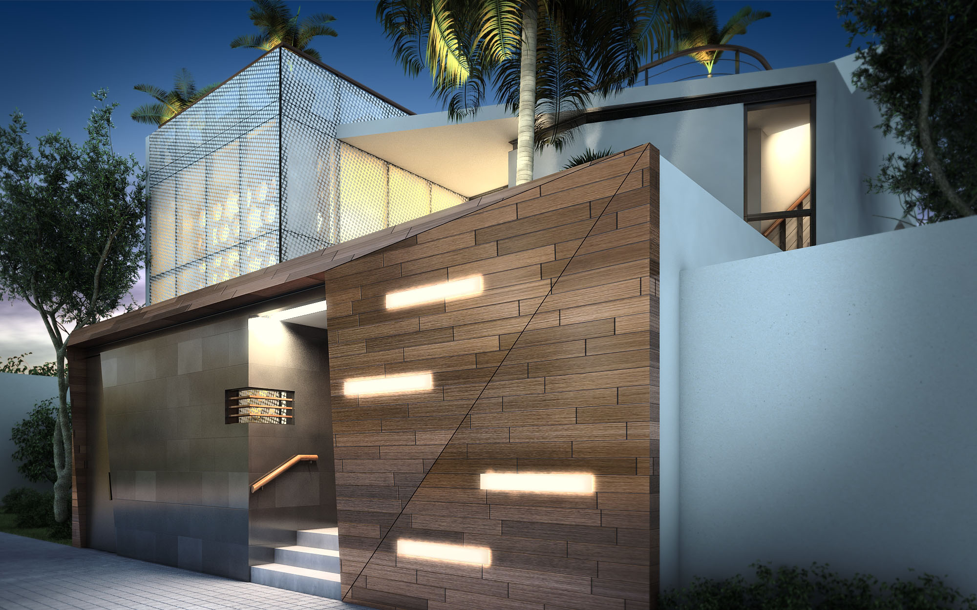
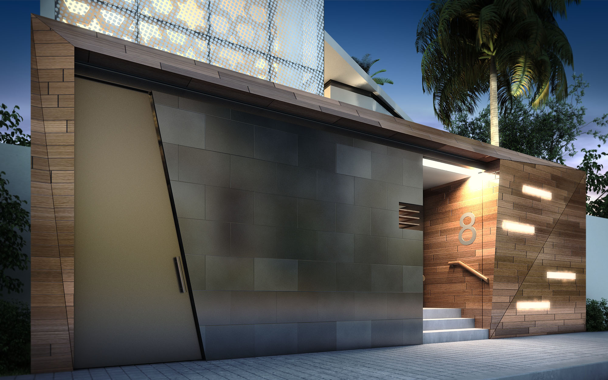
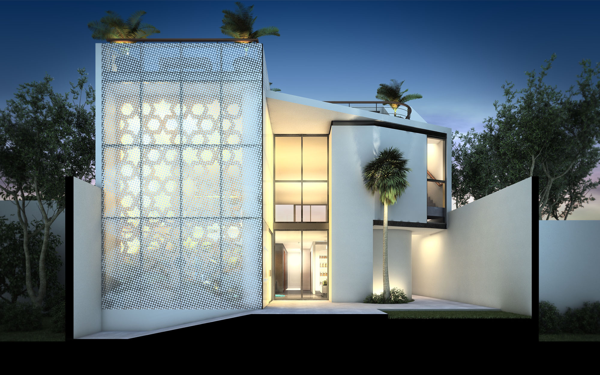
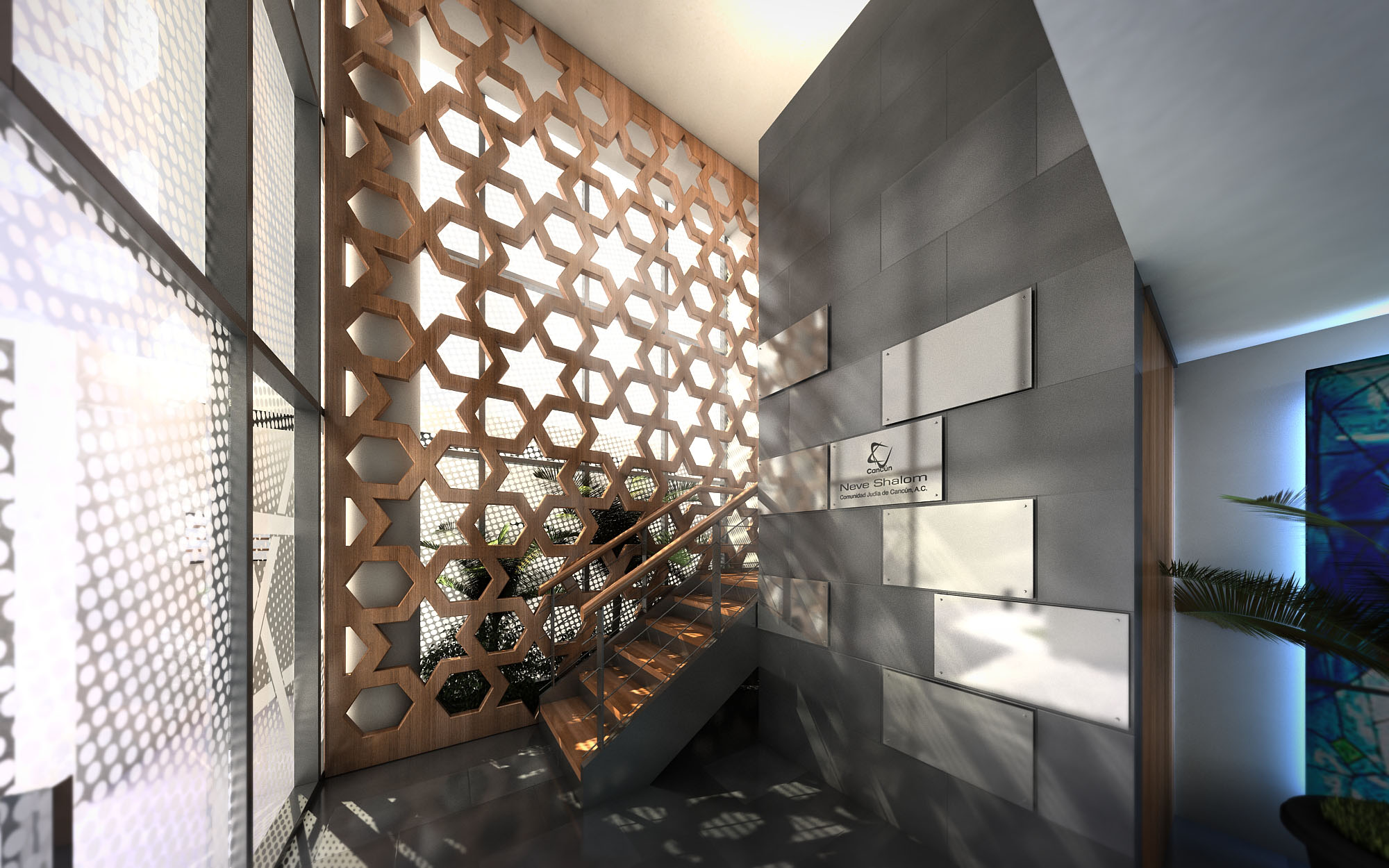

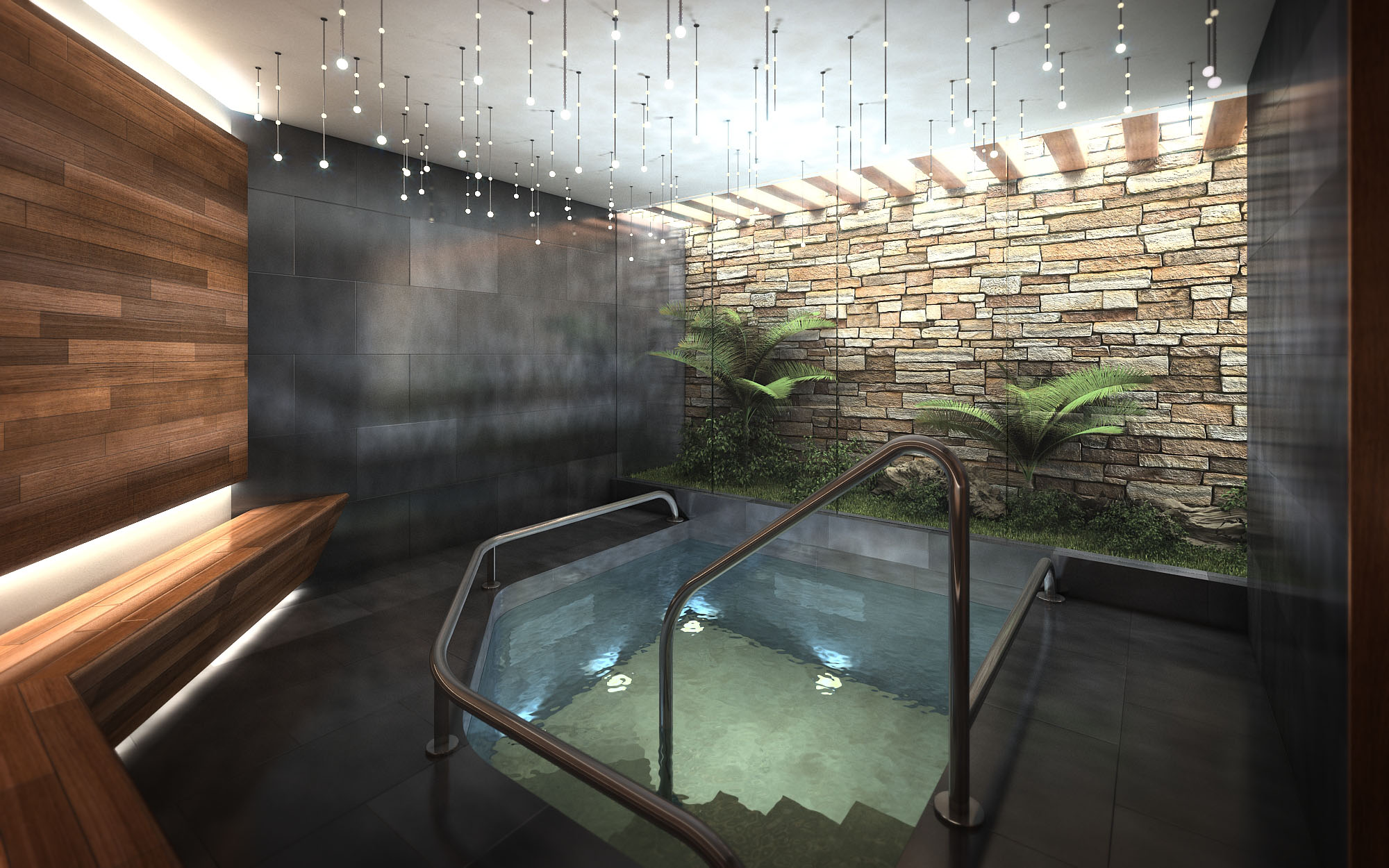
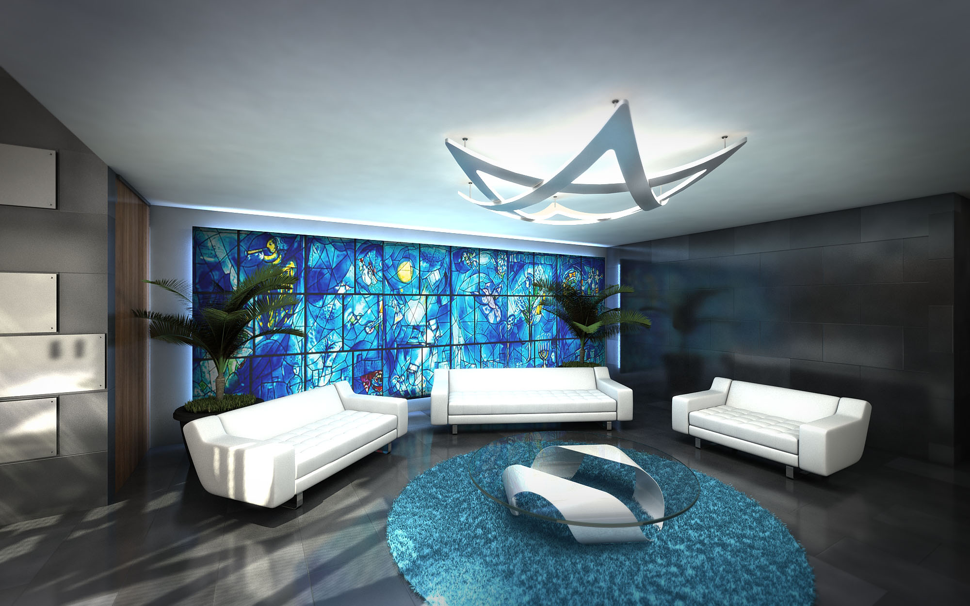
The Neve Shalom Temple in Cancún is conceived as a compact urban sanctuary that filters the intensity of the city and the Caribbean climate into a calm, introspective interior. The architectural language merges contemporary minimalism with symbolic elements of light, enclosure, and layered thresholds, expressing the idea of protection and spiritual ascent within a restrained, cubic volume. The building operates as both a religious and community space, with a façade that is reserved toward the street and increasingly permeable as visitors move inward.
The composition articulates a clear base–middle–crown hierarchy: an opaque plinth anchors the project to the street, a warm timber band creates a human-scale interface, and a luminous perforated upper volume signals the sacred space. This tripartite reading allows the temple to be recognizable in the urban fabric while maintaining an intimate scale appropriate to the local community.
The main façade is organized as a horizontal bar that screens the interior from direct views while subtly announcing the entrance through a recessed portal. Large-format dark panels form a solid, tectonic base, contrasted by a diagonally articulated timber cladding that introduces dynamism and visually extends the volume along the street front. Linear light slots integrated into the wood create a discreet nocturnal identity and echo the idea of prayers as beams of light emerging from within.
Above this grounded base, the upper sanctuary volume is wrapped in a perforated metallic skin. This translucent enclosure transforms the interior lighting into a soft lantern effect at night, while by day it filters sunlight and frames silhouettes of palm trees and sky. The interplay of wood, metal, and smooth white plaster surfaces creates a precise, contemporary palette that withstands the tropical climate yet feels warm and approachable.
The interior journey is choreographed as a gradual transition from compression to openness. Entry occurs through a contained vestibule, moving into a double-height hall defined by latticed wood screens and controlled overhead light. These perforated elements modulate views and acoustics, guiding the eye toward the central worship or gathering space while preserving a sense of privacy.
Within the main hall, surfaces are handled with a balance of solidity and reflection. Timber cladding, stacked in horizontal bands, is juxtaposed with polished dark flooring that subtly mirrors light fixtures and water elements. Circulation is clear and legible, with stairs and ramps carefully integrated along the perimeter to maintain a central, uninterrupted devotional or assembly area suitable for flexible programming.
Material selection focuses on tactile warmth and controlled luminosity. Exterior timber is used in calibrated strips, emphasizing horizontality and guiding natural ventilation joints. The dark stone or porcelain cladding grounds the building while offering durability against humidity and saline air. The perforated metal mesh of the upper volume acts as a climatic and visual veil, generating dappled light patterns that recall traditional screens while remaining distinctly contemporary.
Artificial lighting is conceived as an extension of the architecture. Integrated linear fixtures within the façade boards and interior walls create soft washes rather than direct glare, reinforcing the meditative character of the spaces. In select areas, clusters of suspended luminaires simulate a starry canopy, emphasizing verticality and enhancing the ceremonial dimension without resorting to overt ornamentation.
The project accommodates worship functions alongside educational and community activities, organized around a clear zoning strategy. Public and semi-public areas occupy the lower level, ensuring direct access from the street, while more contemplative spaces are located above, buffered from noise and urban distractions. Service zones and storage are compactly arranged along blind walls, maximizing usable area for gathering and circulation.
Sustainability is addressed through passive and material strategies appropriate to Cancún’s tropical climate. The perforated upper skin acts as a brise-soleil, reducing solar gain while allowing cross-ventilation and lowering reliance on mechanical cooling. High-performance glazing, insulated roof assemblies, and the use of durable, low-maintenance finishes extend the building’s life cycle. Where possible, locally sourced timber and stone reduce transportation impacts, while the careful orientation of openings optimizes natural light, minimizing artificial lighting loads and ensuring that the temple remains both energy-efficient and comfortable throughout the year.
© 2021 by sanzpont [arquitectura] . Webpage by sanzpont [digital] . Innovative Digital Experiences
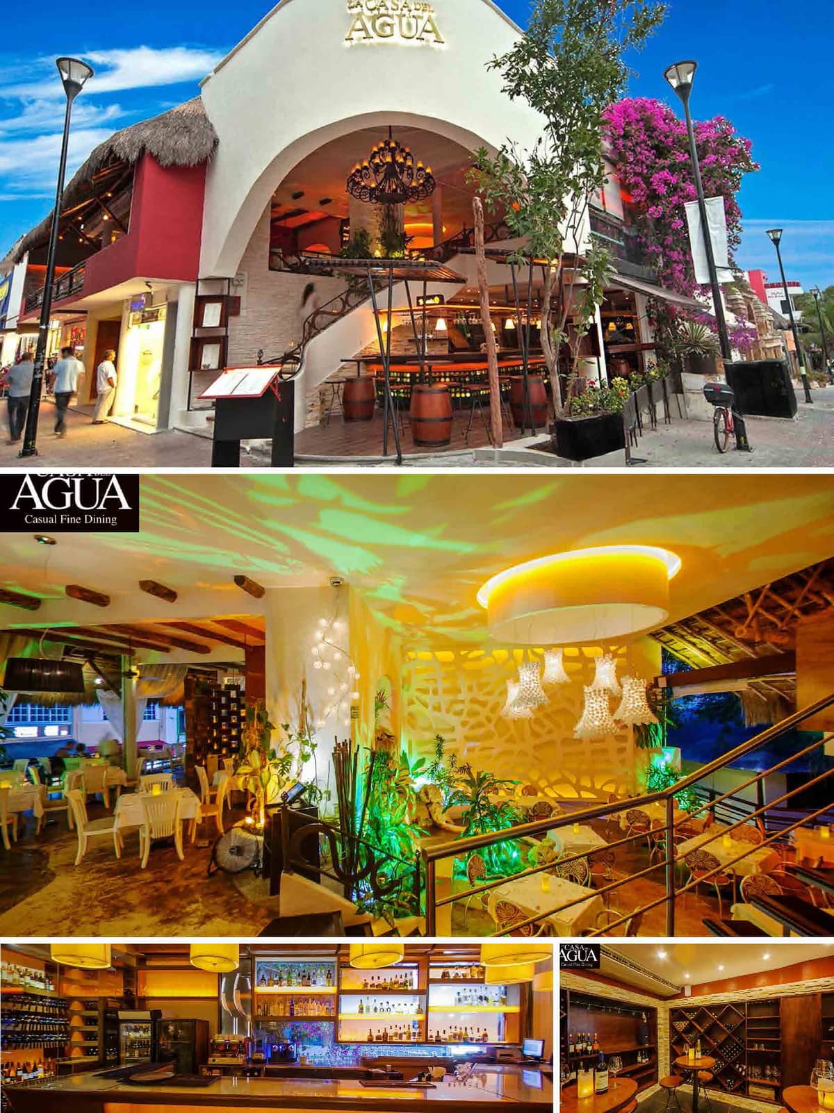

Proposal: Bar + Roof Lounge Bar. Concept. 5th Avenue, Playa del Carmen, Mexico.


Proposal: Bar + Roof Lounge Bar. Concept. 5th Avenue, Playa del Carmen, Mexico.
© 2021 by sanzpont [arquitectura] . Webpage by sanzpont [digital] . Innovative Digital Experiences
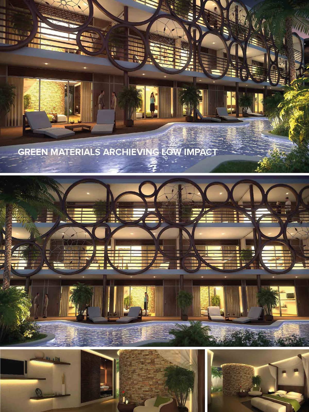

Proposal: Eco Hotel. Concept. 5th Avenue, Playa del Carmen, Mexico


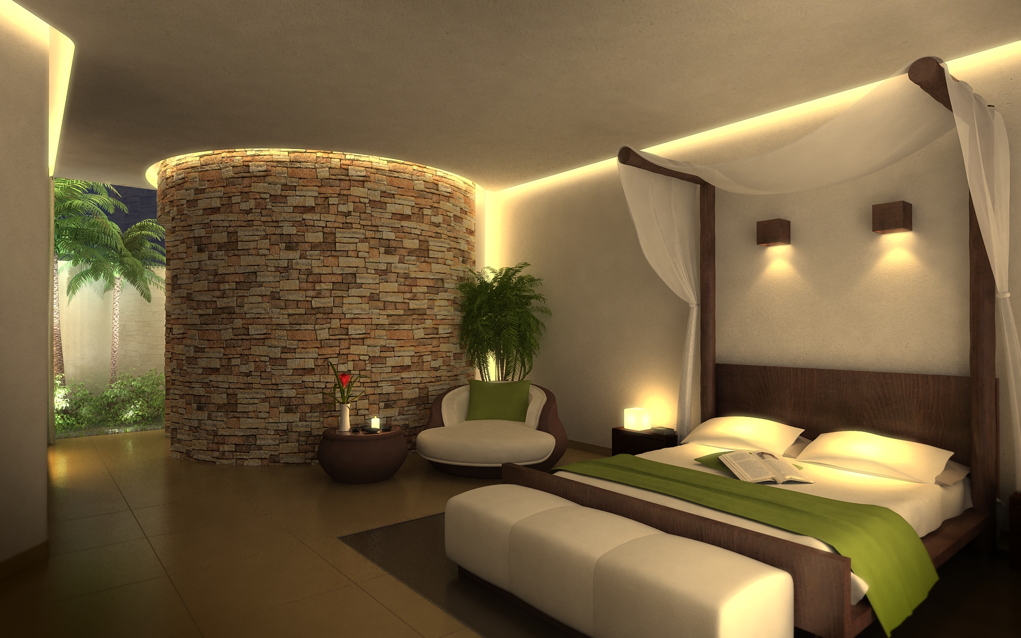

Proposal: Eco Hotel. Concept. 5th Avenue, Playa del Carmen, Mexico
© 2021 by sanzpont [arquitectura] . Webpage by sanzpont [digital] . Innovative Digital Experiences
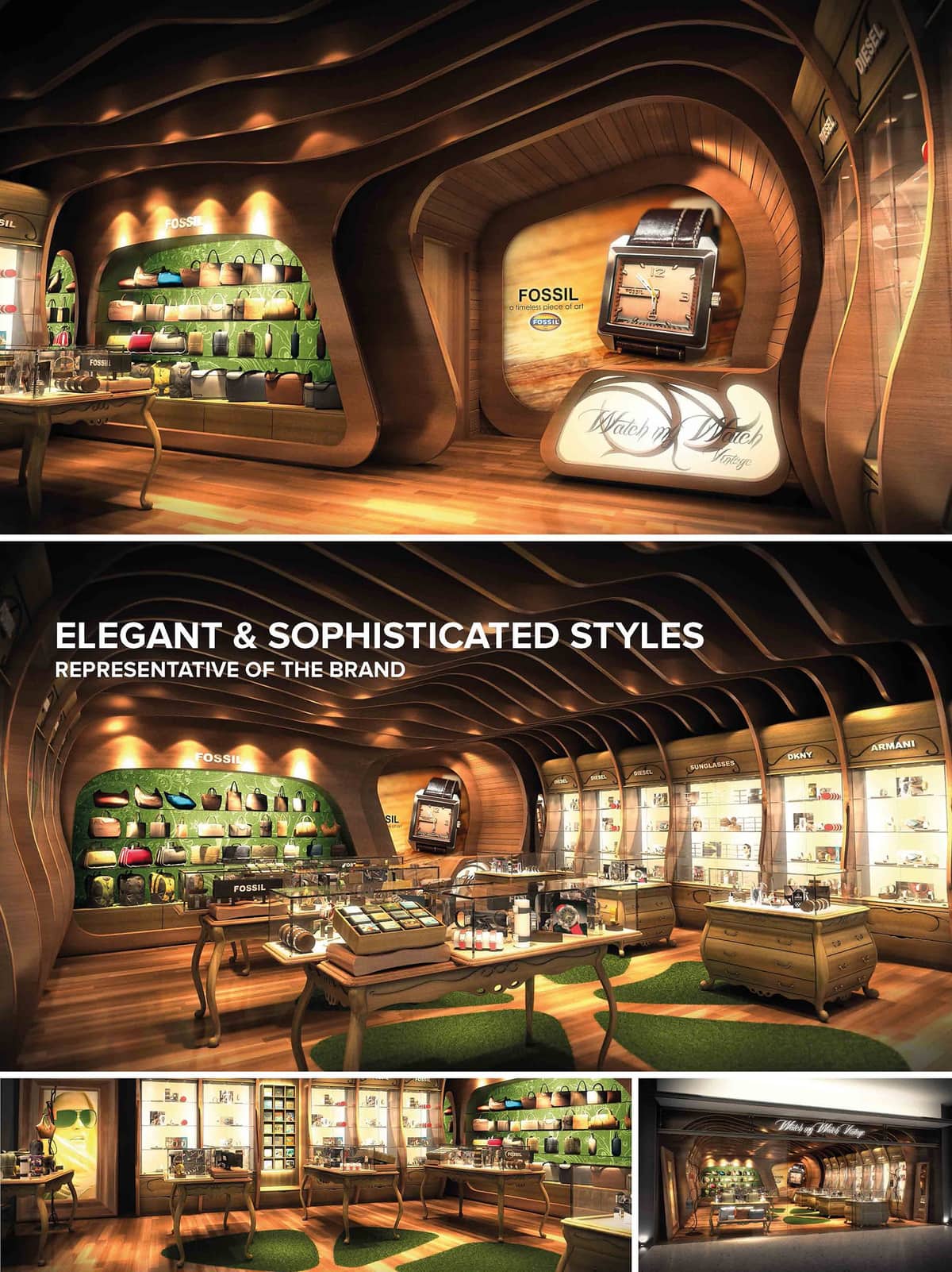
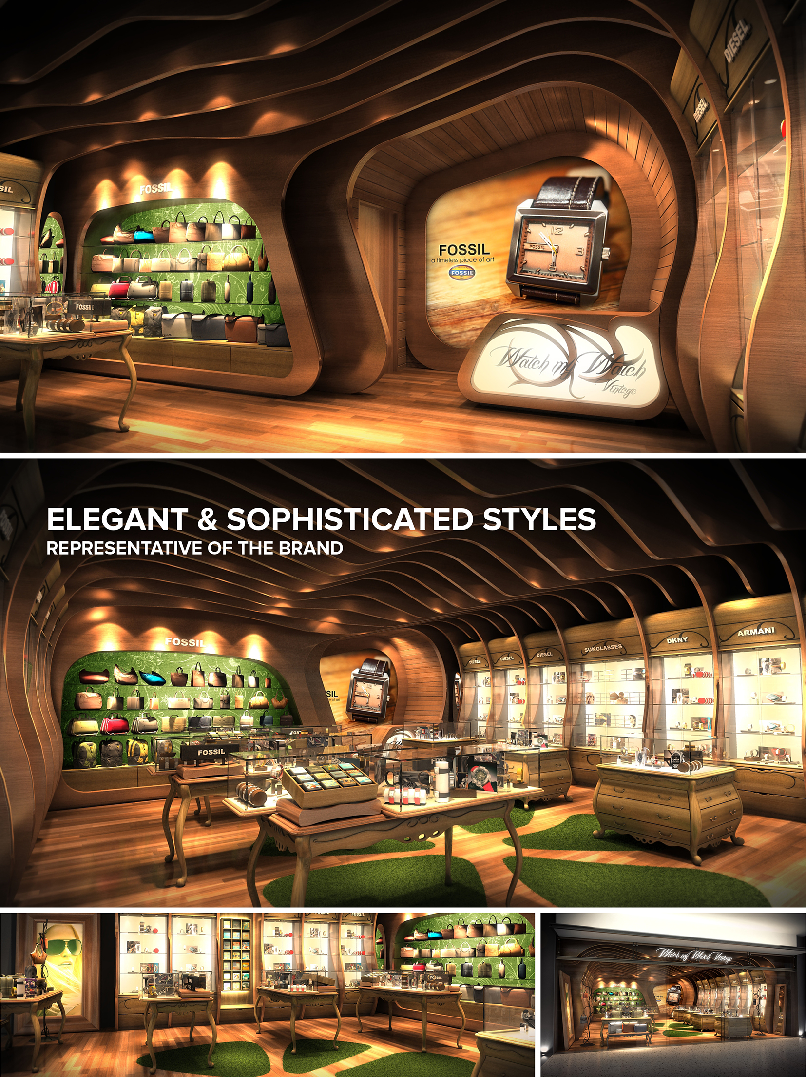
Concept For Official Store. Watch My Watch. Cancun, Mexico.

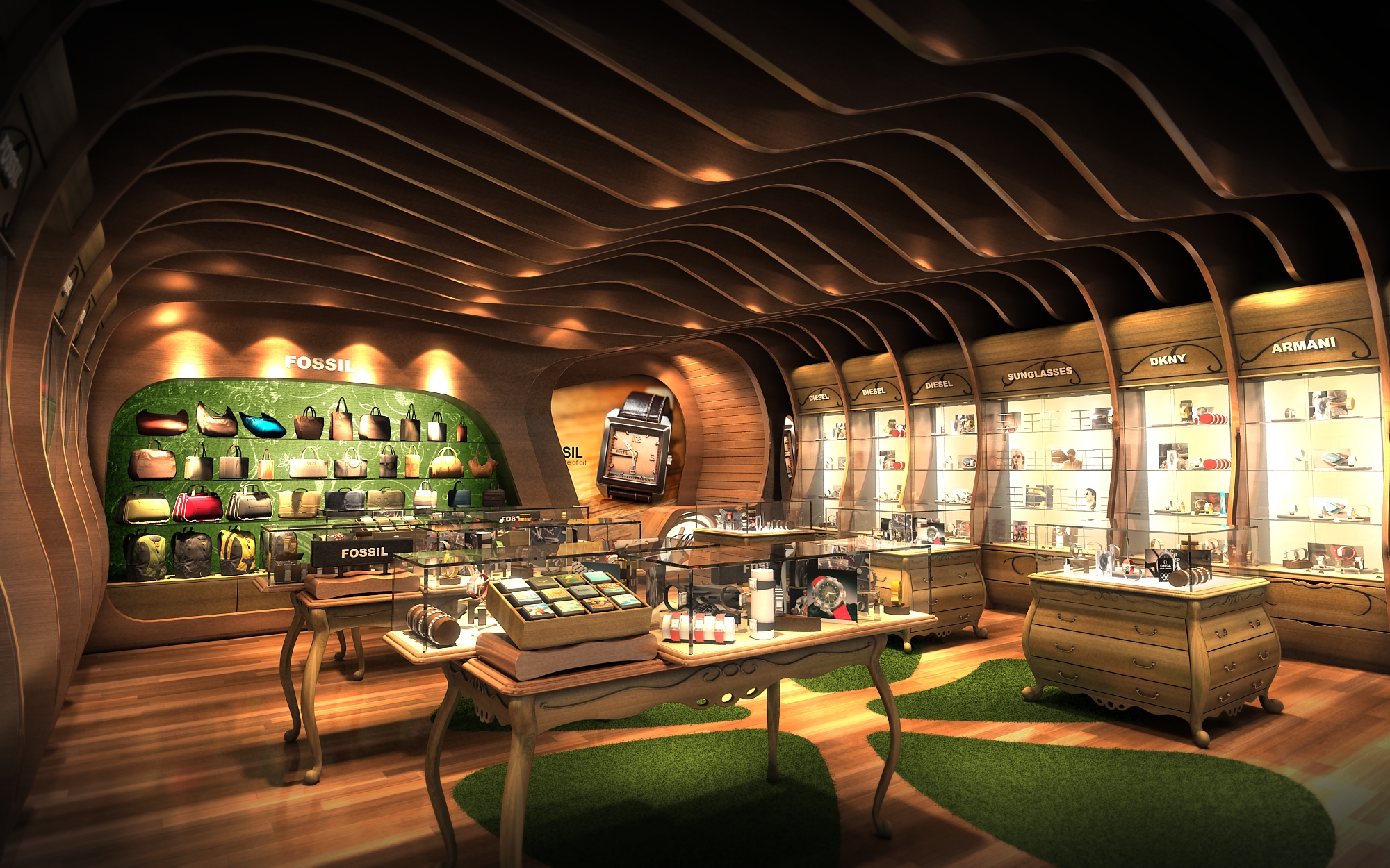
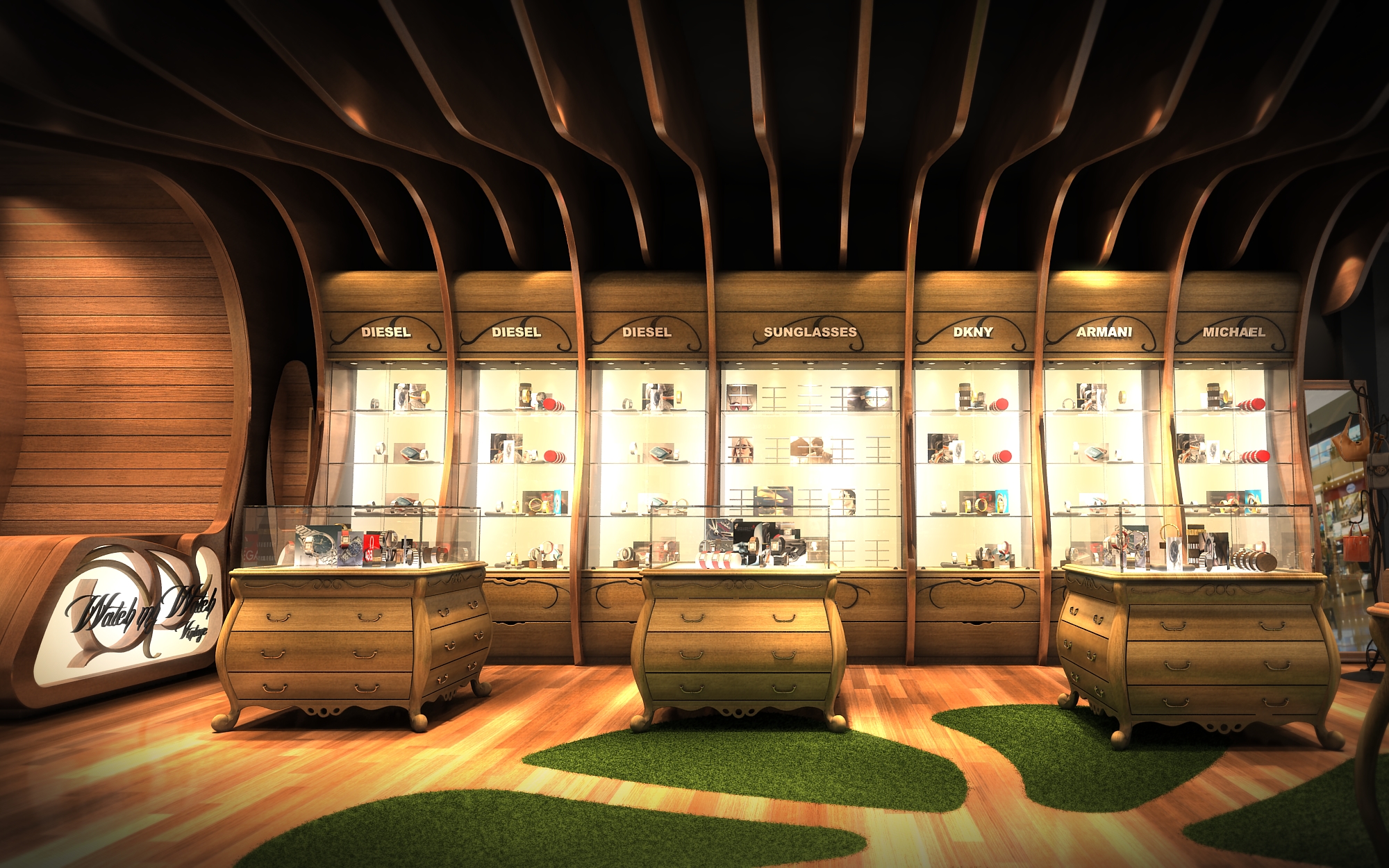
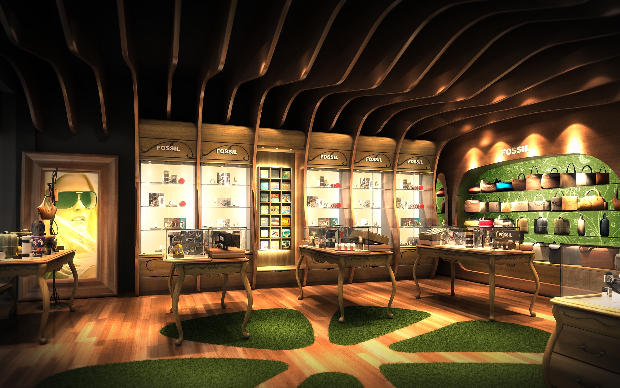
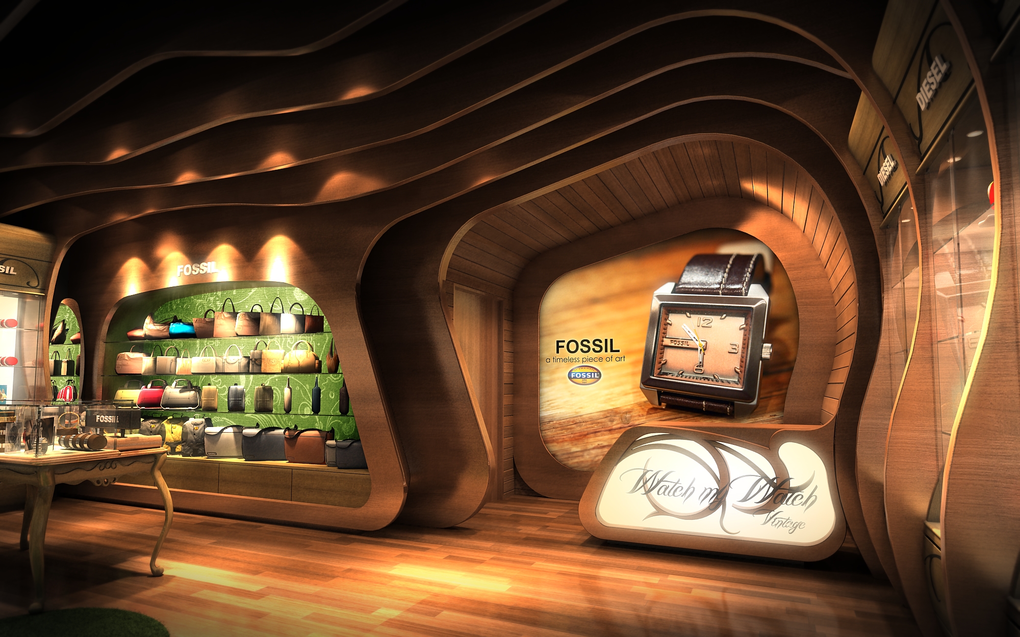
Concept For Official Store. Watch My Watch. Cancun, Mexico.
© 2021 by sanzpont [arquitectura] . Webpage by sanzpont [digital] . Innovative Digital Experiences
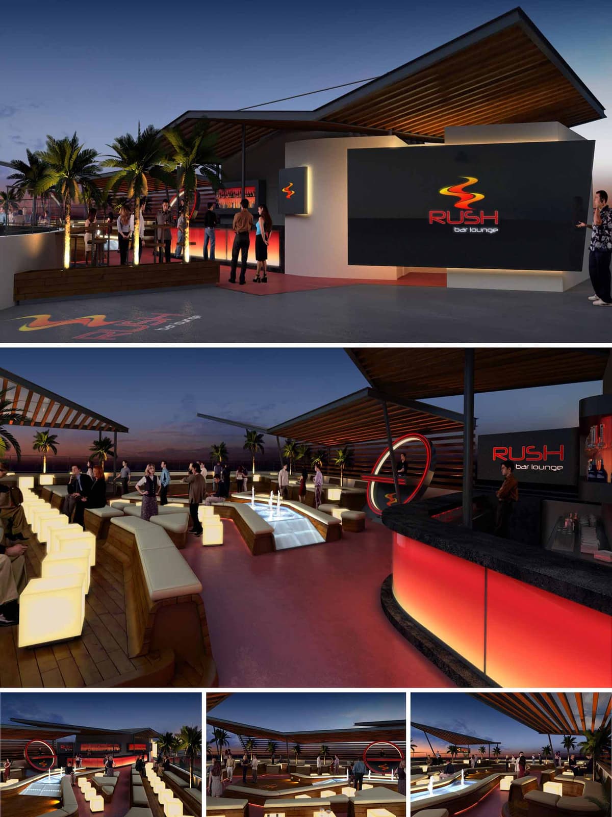
RUSH Lounge Bar is conceived as an elevated sunset observatory and social stage, set on a rooftop in Cancún. The design merges the dynamism of nightlife with the horizontality of the Caribbean horizon, using light, color and geometry to evoke movement and energy. The brand’s identity, based on a fluid “rush” line, is translated into sweeping roof planes, curved bar fronts and illuminated graphic elements that guide the visitor through the space.
The project proposes an open-air lounge that blurs the boundary between interior and exterior. Instead of closed volumes, a sequence of canopies, platforms and furniture islands defines functional zones, allowing continuous visual connections to the sea and the sky. The atmosphere seeks to feel simultaneously exclusive and relaxed, responding to the resort context while offering a contemporary urban character.
The access is resolved through a generous forecourt that acts as a threshold between the vertical circulation core of the building and the rooftop environment. A backlit façade plane with the RUSH logo marks the entry, working as both signage and light beacon visible from a distance. Once inside, circulation follows a linear axis parallel to the edge of the terrace, creating a promenade that gradually reveals the bar, lounge and central water feature.
The main bar is positioned laterally, protected under a cantilevered roof and aligned with the principal views. Opposite to it, a series of stepped lounge platforms with integrated seating generates an informal amphitheater around a central sunken deck, where a luminous water mirror and fountains become the focal point. This configuration encourages social interaction and multiplies the number of privileged viewpoints toward the landscape.
The material palette alternates warm and cool sensations to reinforce the nocturnal experience. Timber decking and slatted wooden ceilings introduce a tactile, natural layer that softens the overall composition, while dark stone or composite countertops provide robustness to the service areas. Smooth plastered planes in neutral tones act as backdrops for the intense chromatic accents of the brand.
Color is strategically concentrated in the bar front, signage and floor inlays, using reds and ambers that recall the tones of the sunset and the energy of nightlife. The contrast between matte structural elements and glossy or back-painted glass surfaces enhances reflections and depth, amplifying the perception of space after dusk.
Artificial lighting is the main instrument for constructing the nocturnal identity of RUSH. Linear LED strips concealed under bar counters, benches and fascia boards create a floating effect, detaching volumes from the floor. The central water feature integrates submerged lighting that transforms the pool into a luminous runway, visually organizing the lounge and drawing guests toward the center.
Accent lighting is directed toward vertical elements such as the brand wall, structural columns and perimeter palms, ensuring legibility without resorting to excessive brightness. The general illumination remains at low levels to preserve the perception of the night sky and the surrounding urban glow. The use of programmable RGB systems allows the atmosphere to shift from a relaxed early-evening ambience to a more vibrant late-night scene.
Furniture is designed as an extension of the architectural language, with continuous wooden bases and upholstered cushions defining longitudinal lounges that encourage group seating. Modular luminous cubes operate as both stools and side tables, providing flexible arrangements for different capacities and events. The combination of fixed platforms and movable elements ensures adaptability to changing operational needs.
Ergonomic considerations guide seat heights, backrest inclinations and circulation clearances, optimizing comfort during prolonged stays. The semi-open roof structures provide shade in daytime use and act as a visual frame for the sky at night, while their orientation is calibrated to capture prevailing breezes and enhance natural ventilation, crucial in Cancún’s tropical climate.
Although centered on an experiential nightlife concept, the project integrates several sustainable strategies appropriate to its coastal context. The open-air configuration minimizes the need for mechanical cooling, relying on cross-ventilation and the stack effect generated by the elevated position. Roof overhangs and slatted pergolas are dimensioned to mitigate solar gain on key surfaces while permitting filtered natural light.
LED technology is used throughout the lighting system to reduce energy consumption, particularly relevant given the extensive use of colored illumination. Where possible, materials such as wood are specified from certified sources resistant to humidity and saline environments, extending life cycle and reducing maintenance. The elevated decking allows for concealed drainage and potential rainwater capture, decreasing runoff and protecting the waterproofing layer of the rooftop slab in the long term.
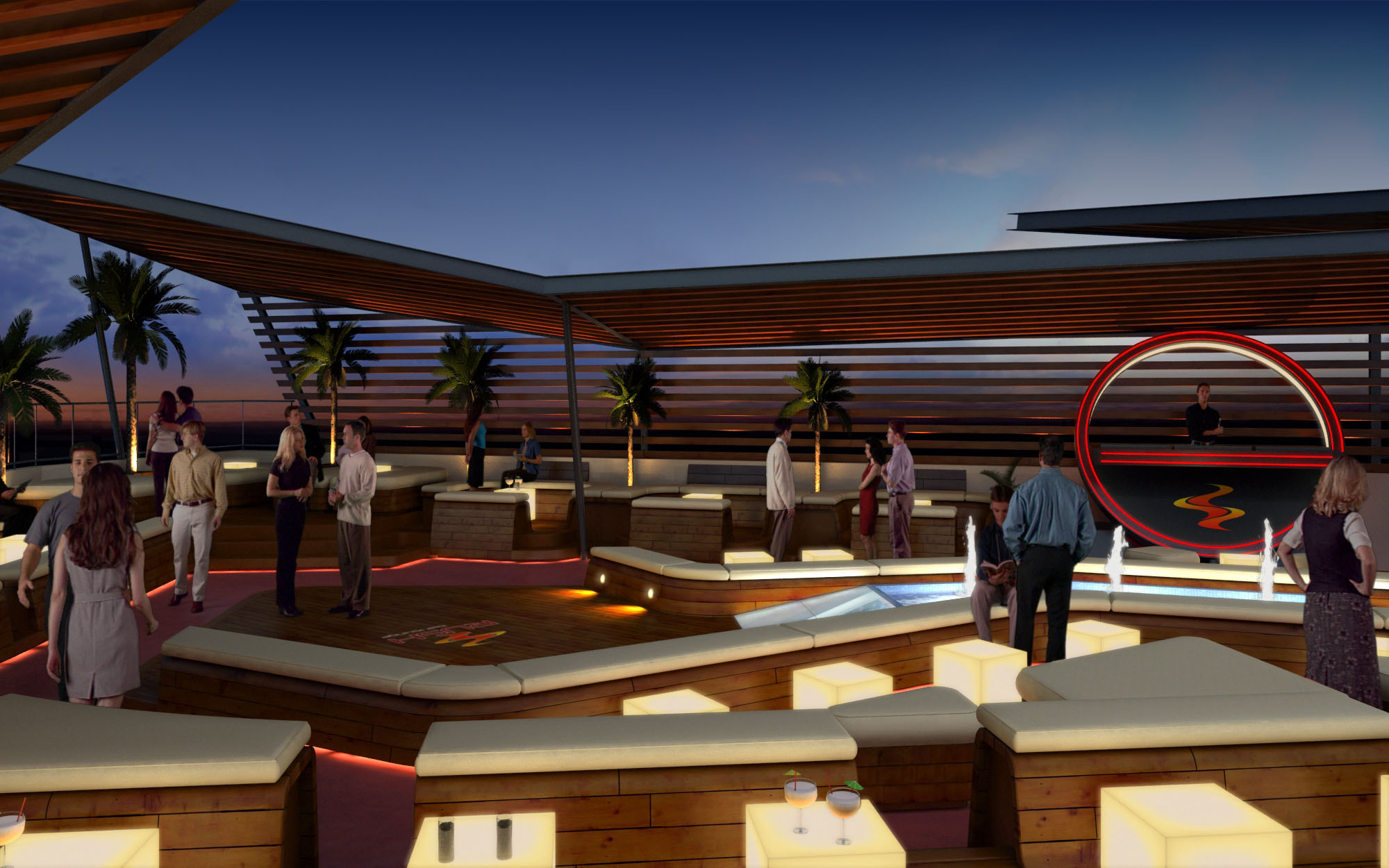
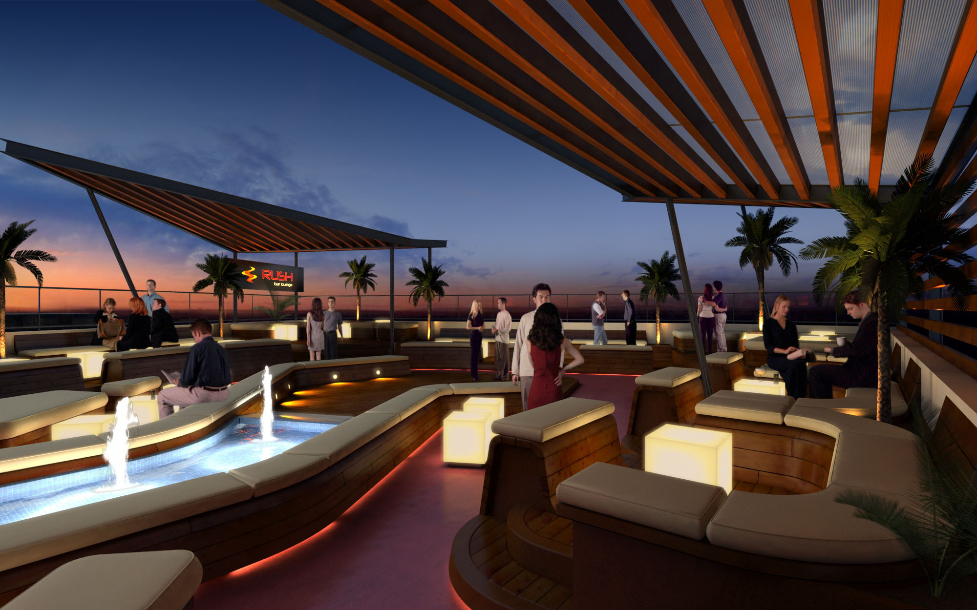
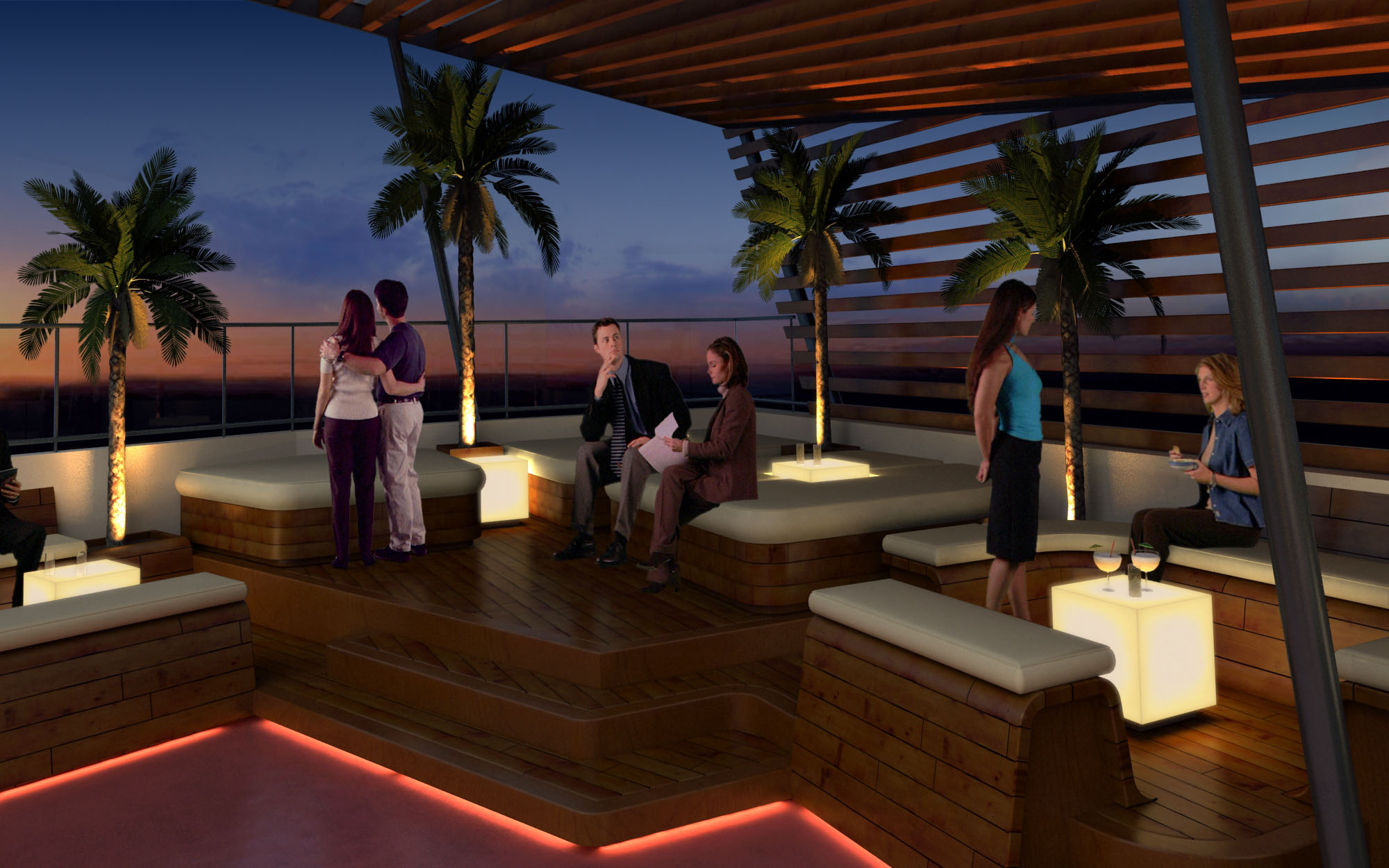
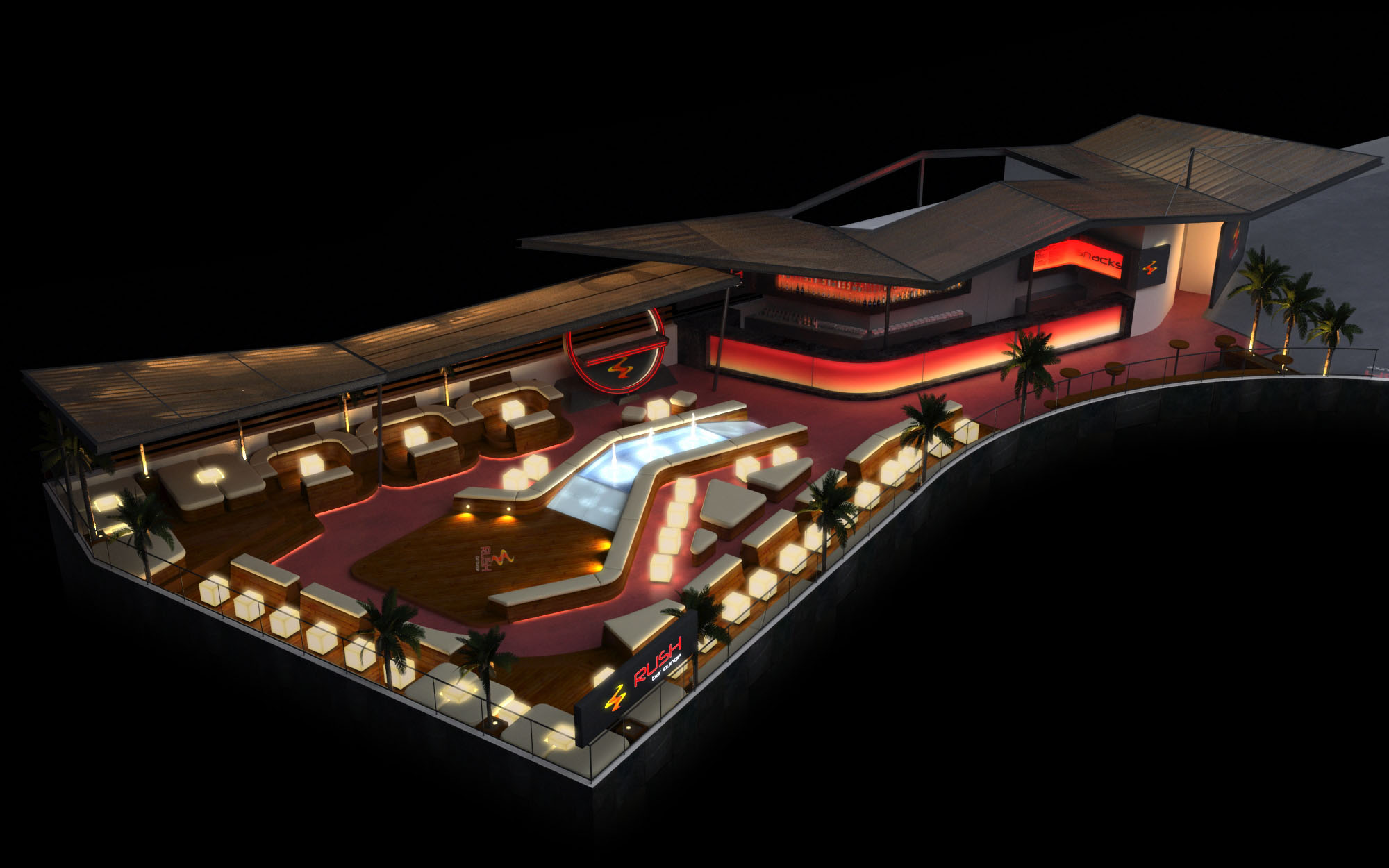
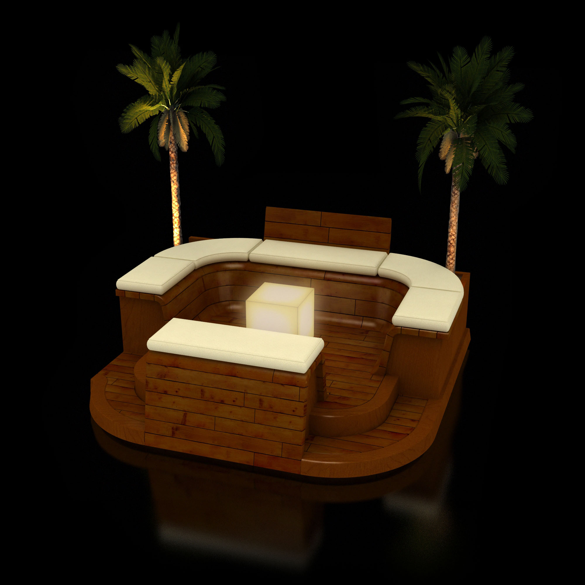
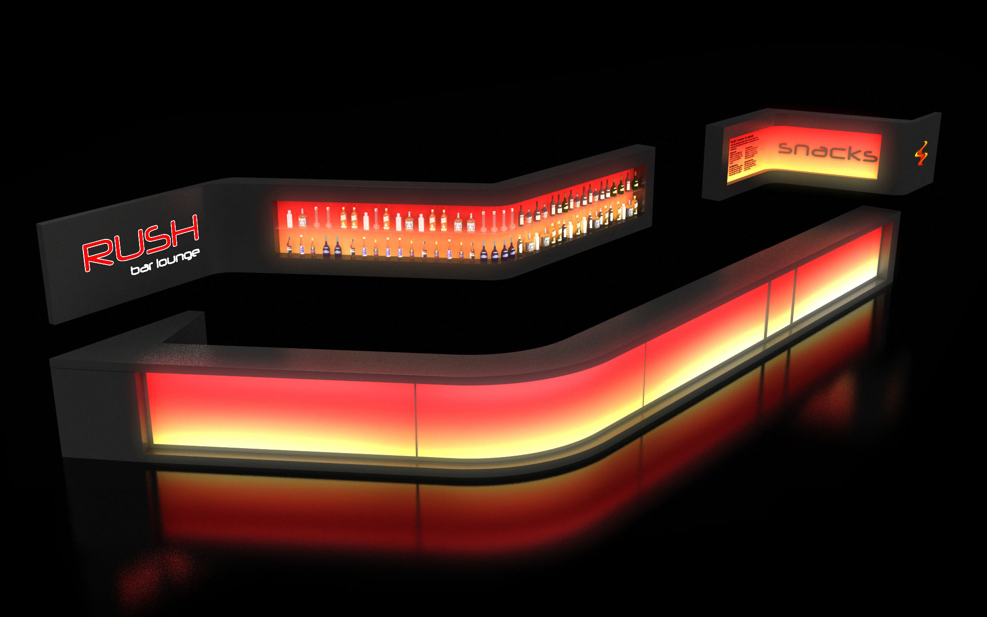
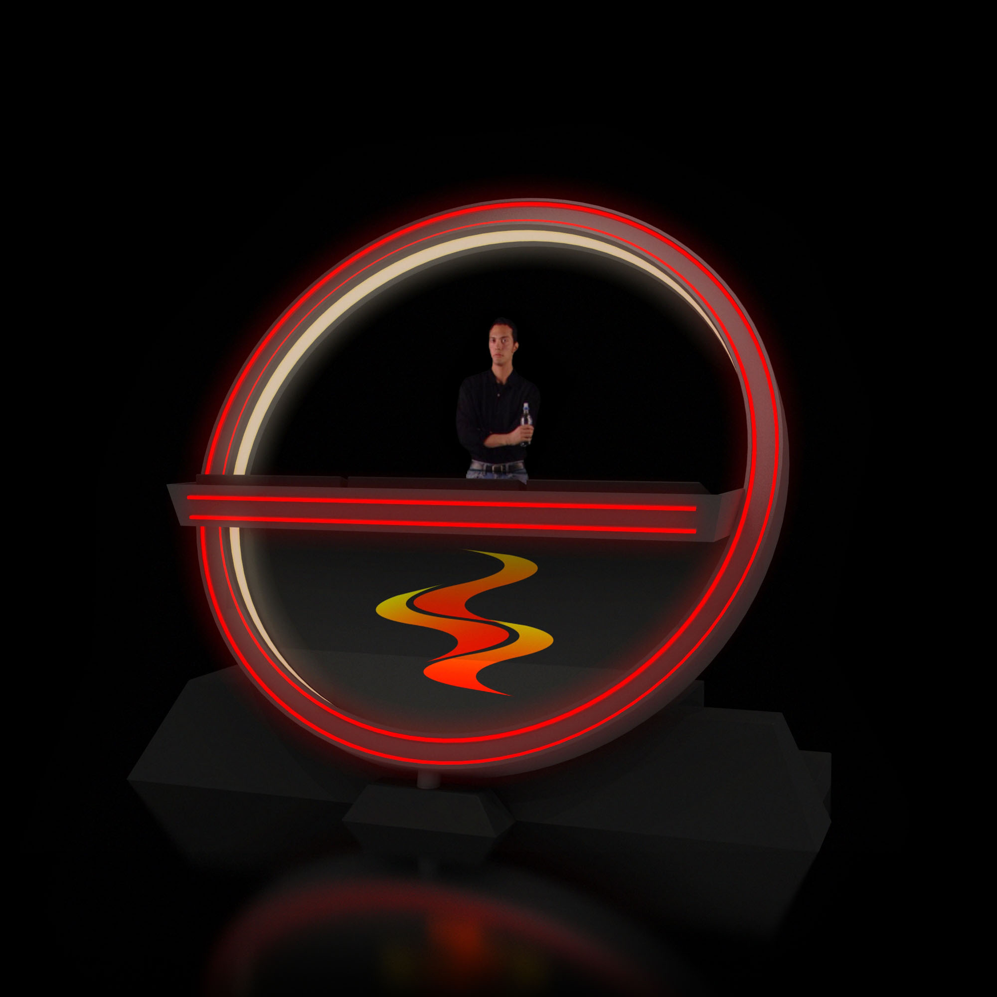
RUSH Lounge Bar is conceived as an elevated sunset observatory and social stage, set on a rooftop in Cancún. The design merges the dynamism of nightlife with the horizontality of the Caribbean horizon, using light, color and geometry to evoke movement and energy. The brand’s identity, based on a fluid “rush” line, is translated into sweeping roof planes, curved bar fronts and illuminated graphic elements that guide the visitor through the space.
The project proposes an open-air lounge that blurs the boundary between interior and exterior. Instead of closed volumes, a sequence of canopies, platforms and furniture islands defines functional zones, allowing continuous visual connections to the sea and the sky. The atmosphere seeks to feel simultaneously exclusive and relaxed, responding to the resort context while offering a contemporary urban character.
The access is resolved through a generous forecourt that acts as a threshold between the vertical circulation core of the building and the rooftop environment. A backlit façade plane with the RUSH logo marks the entry, working as both signage and light beacon visible from a distance. Once inside, circulation follows a linear axis parallel to the edge of the terrace, creating a promenade that gradually reveals the bar, lounge and central water feature.
The main bar is positioned laterally, protected under a cantilevered roof and aligned with the principal views. Opposite to it, a series of stepped lounge platforms with integrated seating generates an informal amphitheater around a central sunken deck, where a luminous water mirror and fountains become the focal point. This configuration encourages social interaction and multiplies the number of privileged viewpoints toward the landscape.
The material palette alternates warm and cool sensations to reinforce the nocturnal experience. Timber decking and slatted wooden ceilings introduce a tactile, natural layer that softens the overall composition, while dark stone or composite countertops provide robustness to the service areas. Smooth plastered planes in neutral tones act as backdrops for the intense chromatic accents of the brand.
Color is strategically concentrated in the bar front, signage and floor inlays, using reds and ambers that recall the tones of the sunset and the energy of nightlife. The contrast between matte structural elements and glossy or back-painted glass surfaces enhances reflections and depth, amplifying the perception of space after dusk.
Artificial lighting is the main instrument for constructing the nocturnal identity of RUSH. Linear LED strips concealed under bar counters, benches and fascia boards create a floating effect, detaching volumes from the floor. The central water feature integrates submerged lighting that transforms the pool into a luminous runway, visually organizing the lounge and drawing guests toward the center.
Accent lighting is directed toward vertical elements such as the brand wall, structural columns and perimeter palms, ensuring legibility without resorting to excessive brightness. The general illumination remains at low levels to preserve the perception of the night sky and the surrounding urban glow. The use of programmable RGB systems allows the atmosphere to shift from a relaxed early-evening ambience to a more vibrant late-night scene.
Furniture is designed as an extension of the architectural language, with continuous wooden bases and upholstered cushions defining longitudinal lounges that encourage group seating. Modular luminous cubes operate as both stools and side tables, providing flexible arrangements for different capacities and events. The combination of fixed platforms and movable elements ensures adaptability to changing operational needs.
Ergonomic considerations guide seat heights, backrest inclinations and circulation clearances, optimizing comfort during prolonged stays. The semi-open roof structures provide shade in daytime use and act as a visual frame for the sky at night, while their orientation is calibrated to capture prevailing breezes and enhance natural ventilation, crucial in Cancún’s tropical climate.
Although centered on an experiential nightlife concept, the project integrates several sustainable strategies appropriate to its coastal context. The open-air configuration minimizes the need for mechanical cooling, relying on cross-ventilation and the stack effect generated by the elevated position. Roof overhangs and slatted pergolas are dimensioned to mitigate solar gain on key surfaces while permitting filtered natural light.
LED technology is used throughout the lighting system to reduce energy consumption, particularly relevant given the extensive use of colored illumination. Where possible, materials such as wood are specified from certified sources resistant to humidity and saline environments, extending life cycle and reducing maintenance. The elevated decking allows for concealed drainage and potential rainwater capture, decreasing runoff and protecting the waterproofing layer of the rooftop slab in the long term.
© 2021 by sanzpont [arquitectura] . Webpage by sanzpont [digital] . Innovative Digital Experiences


Nuestras oficinas están en Barcelona, Cancún, Chicago y Santo Domingo, pero gracias a la tecnología podemos desarrollar proyectos en cualquier parte del mundo.
Barcelona
Bac de Roda 136
08020, Barcelona
Spain
Madrid
Av. de Buendía 11
19005 Guadalajara (Madrid)
Spain
Chicago
373 Hazel Ave, Apt A1
60022, Glencoe, Illinois
United States