




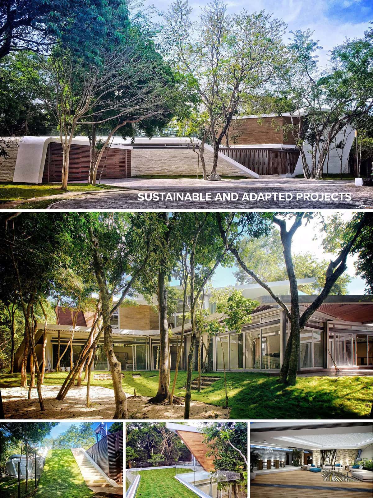
PLY Villa in Playa del Carmen is conceived as a low, elongated structure that merges with the surrounding jungle rather than dominating it. The central concept is to transform the house into an inhabitable piece of terrain, allowing the natural ground plane to rise and become a green roof. Architecture and landscape are treated as a single continuous system, enabling living spaces to extend fluidly between interior and exterior while remaining protected from the intense tropical climate.
The villa is located on a densely vegetated plot within the Riviera Maya, characterized by mature trees, filtered light and a relatively flat topography. The layout is drawn around existing trunks, creating patios and open courts that preserve native vegetation and the local ecosystem. This careful positioning maintains the natural shade structure of the site, stabilizes the microclimate and visually anchors the building to its forest context, giving the impression that the house has grown out of the terrain.
The project is composed of interlocking horizontal volumes with strategic double-height areas. These bodies slide beneath generous roof overhangs and form deep verandas that serve as climatic buffers. A key volumetric gesture is the grass-covered ramp that ascends from the garden to the roof, complemented by a sharply inclined wooden volume that cantilevers above the green surface. Together, these elements generate a dynamic silhouette and reinforce the idea of carved landscape rather than conventional built mass.
Material choices emphasize lightness and thermal performance. Smooth white envelopes frame the composition, reflecting solar radiation and creating soft, curved transitions between walls and roofs. Local stone is used as a robust base, providing thermal inertia and a tactile link to the region. Warm timber cladding defines the main cantilevered volume, while full-height glass panes open the interiors to the garden. Vertical wooden louvers and slatted fences modulate privacy and daylight, casting layered shadows that respond to the movement of the sun through the trees.
The interior organization follows a clear hierarchy: a central social spine houses living, dining and kitchen areas, all visually and physically connected to the garden through large sliding doors. Bedrooms and more private functions are distributed in lateral wings, each with direct access to terraces or patios. Circulation takes place along glazed galleries that act as transitional verandas, always maintaining visual contact with vegetation. Neutral flooring and restrained finishes allow natural light, greenery and timber ceilings to define a calm, resort-like atmosphere.
Landscape design forms the structural backbone of the project. The accessible green roof, reached by a planted ramp parallel to a sculpted stair, extends the garden onto the roof plane and functions as an elevated lookout and social platform. This vegetated surface restores permeable area, enhances biodiversity and becomes a visual continuation of the lawn below. Glass balustrades minimize visual interruption while ensuring safety, allowing the green plane to read as a continuous carpet framed by forest canopy and architectural volumes.
Sustainability is approached primarily through passive means. Building orientation, preserved trees and generous overhangs create deep shade, limiting solar gain on glazed surfaces. Cross-ventilation is promoted by operable windows on opposite façades and by open-ended galleries that behave as breezeways. The green roof improves thermal insulation, reduces heat island effect and aids in rainwater management. Local stone and regional timber reduce transportation impact and support local economies, while systems such as solar water heating further decrease operational energy demand, resulting in a climate-adapted, low-impact villa integrated with its environment.


PLY Villa in Playa del Carmen is conceived as a low, elongated structure that merges with the surrounding jungle rather than dominating it. The central concept is to transform the house into an inhabitable piece of terrain, allowing the natural ground plane to rise and become a green roof. Architecture and landscape are treated as a single continuous system, enabling living spaces to extend fluidly between interior and exterior while remaining protected from the intense tropical climate.
The villa is located on a densely vegetated plot within the Riviera Maya, characterized by mature trees, filtered light and a relatively flat topography. The layout is drawn around existing trunks, creating patios and open courts that preserve native vegetation and the local ecosystem. This careful positioning maintains the natural shade structure of the site, stabilizes the microclimate and visually anchors the building to its forest context, giving the impression that the house has grown out of the terrain.
The project is composed of interlocking horizontal volumes with strategic double-height areas. These bodies slide beneath generous roof overhangs and form deep verandas that serve as climatic buffers. A key volumetric gesture is the grass-covered ramp that ascends from the garden to the roof, complemented by a sharply inclined wooden volume that cantilevers above the green surface. Together, these elements generate a dynamic silhouette and reinforce the idea of carved landscape rather than conventional built mass.
Material choices emphasize lightness and thermal performance. Smooth white envelopes frame the composition, reflecting solar radiation and creating soft, curved transitions between walls and roofs. Local stone is used as a robust base, providing thermal inertia and a tactile link to the region. Warm timber cladding defines the main cantilevered volume, while full-height glass panes open the interiors to the garden. Vertical wooden louvers and slatted fences modulate privacy and daylight, casting layered shadows that respond to the movement of the sun through the trees.
The interior organization follows a clear hierarchy: a central social spine houses living, dining and kitchen areas, all visually and physically connected to the garden through large sliding doors. Bedrooms and more private functions are distributed in lateral wings, each with direct access to terraces or patios. Circulation takes place along glazed galleries that act as transitional verandas, always maintaining visual contact with vegetation. Neutral flooring and restrained finishes allow natural light, greenery and timber ceilings to define a calm, resort-like atmosphere.
Landscape design forms the structural backbone of the project. The accessible green roof, reached by a planted ramp parallel to a sculpted stair, extends the garden onto the roof plane and functions as an elevated lookout and social platform. This vegetated surface restores permeable area, enhances biodiversity and becomes a visual continuation of the lawn below. Glass balustrades minimize visual interruption while ensuring safety, allowing the green plane to read as a continuous carpet framed by forest canopy and architectural volumes.
Sustainability is approached primarily through passive means. Building orientation, preserved trees and generous overhangs create deep shade, limiting solar gain on glazed surfaces. Cross-ventilation is promoted by operable windows on opposite façades and by open-ended galleries that behave as breezeways. The green roof improves thermal insulation, reduces heat island effect and aids in rainwater management. Local stone and regional timber reduce transportation impact and support local economies, while systems such as solar water heating further decrease operational energy demand, resulting in a climate-adapted, low-impact villa integrated with its environment.
© 2021 by sanzpont [arquitectura] . Webpage by sanzpont [digital] . Innovative Digital Experiences
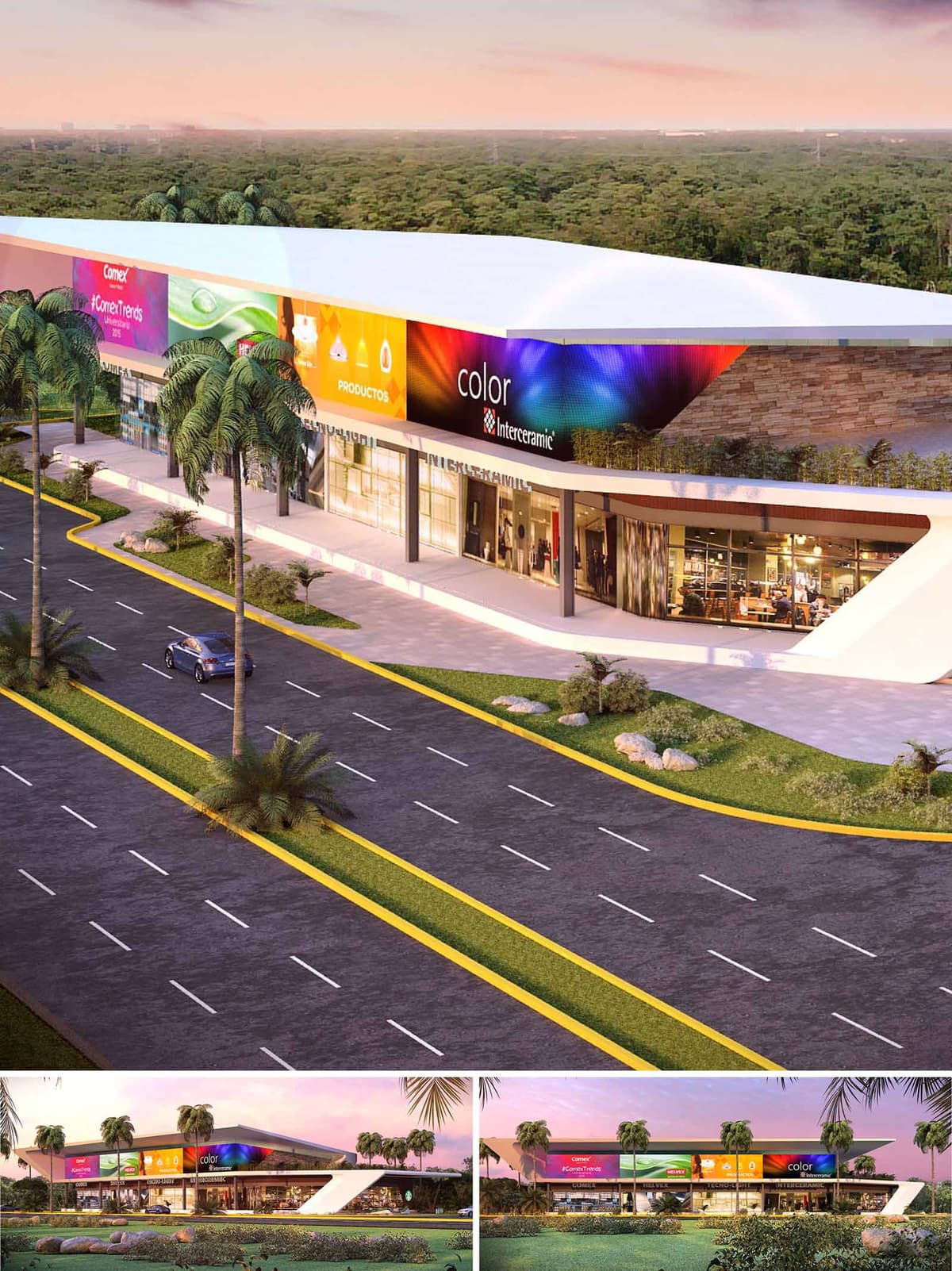

San Antonio Plaza is conceived as a linear commercial hub that acts as a colorful urban façade along one of Cancún’s main access roads. The design emphasizes horizontality and movement, using a continuous canopy and a vibrant graphic band to frame retail activity while creating a recognizable landmark. The architecture operates as an urban screen, capturing attention from fast vehicular flows and transforming it into a welcoming, pedestrian-oriented experience at ground level.
The project articulates a clear contrast between a calm, white structural envelope and a dynamic, chromatic upper zone dedicated to branding and communication. This dual reading allows the building to accommodate changing tenants and campaigns while preserving a coherent architectural identity anchored in clean, contemporary lines.
The plaza is organized as a single elongated volume, protected by a cantilevered roof that projects significantly towards the avenue, emphasizing linearity and providing deep shade to the storefronts. Structural supports are minimized and expressed as slender, dark-colored columns, enhancing transparency and visual continuity across the ground floor.
The façade is resolved with large-format glazing, creating a visual dialogue between interior retail spaces and the exterior public realm. Above this transparent base, a continuous band accommodates digital or printed signage, conceived as a controlled “media façade.” A stone-clad backdrop and vegetated strip on the upper level offer a warm counterpoint to the technological character of the graphic band, rooting the building in the local material context.
The interior is organized as a sequence of flexible commercial modules aligned along a continuous circulation spine parallel to the avenue. The open structural grid allows for different tenant sizes, from large anchor stores to smaller specialty shops, ensuring long-term adaptability to evolving commercial needs.
At ground level, generous overhangs and a widened sidewalk create an intermediate climatic buffer zone functioning as a covered gallery. This semi-exterior strip encourages window-shopping, supports outdoor displays, and provides shaded waiting and meeting areas without obstructing the visual field of the storefronts.
Located between the dense green landscape of Cancún and a high-traffic roadway, the plaza mediates between natural and urban environments. The building’s low profile respects the horizontal character of the surroundings and preserves long views toward the vegetation beyond.
Landscaped parterres with palms and low shrubs structure the setback between roadway and commercial strip, softening the transition from asphalt to architecture. The curved geometry of the sidewalks and planted islands echoes the fluidity of traffic, while integrating stormwater infiltration areas into the landscape design.
The material palette combines white plastered surfaces, large glass panes, natural stone, and metallic framing. The white and neutral tones enhance daylight reflection, contributing to a bright yet controlled interior ambience. At night, the building transforms through integrated LED lighting in the signage band and warm interior illumination, turning the plaza into a luminous beacon along the avenue.
The absence of excessive façade ornamentation leaves prominence to light, graphics, and merchandise as the main protagonists. This approach enables a contemporary and adaptable aesthetic, where the architecture functions as an elegant and efficient support for commercial expression.
The project responds to Cancún’s tropical climate through passive design measures. The extended roof overhang and the recessed shopfronts reduce direct solar gain on glazing, lowering cooling demands while enhancing user comfort in the shaded exterior gallery. Clear zoning between conditioned interiors and semi-open circulation areas optimizes energy use.
Landscape elements along the road and building perimeter are designed to aid stormwater management, using permeable surfaces and planting beds to facilitate infiltration and reduce runoff. The selection of durable, low-maintenance materials such as stone cladding and aluminum framing supports longevity in a saline coastal environment, while the modular structure and flexible floor plans allow future reconfiguration without significant demolition, contributing to the plaza’s long-term environmental and economic sustainability.


San Antonio Plaza is conceived as a linear commercial hub that acts as a colorful urban façade along one of Cancún’s main access roads. The design emphasizes horizontality and movement, using a continuous canopy and a vibrant graphic band to frame retail activity while creating a recognizable landmark. The architecture operates as an urban screen, capturing attention from fast vehicular flows and transforming it into a welcoming, pedestrian-oriented experience at ground level.
The project articulates a clear contrast between a calm, white structural envelope and a dynamic, chromatic upper zone dedicated to branding and communication. This dual reading allows the building to accommodate changing tenants and campaigns while preserving a coherent architectural identity anchored in clean, contemporary lines.
The plaza is organized as a single elongated volume, protected by a cantilevered roof that projects significantly towards the avenue, emphasizing linearity and providing deep shade to the storefronts. Structural supports are minimized and expressed as slender, dark-colored columns, enhancing transparency and visual continuity across the ground floor.
The façade is resolved with large-format glazing, creating a visual dialogue between interior retail spaces and the exterior public realm. Above this transparent base, a continuous band accommodates digital or printed signage, conceived as a controlled “media façade.” A stone-clad backdrop and vegetated strip on the upper level offer a warm counterpoint to the technological character of the graphic band, rooting the building in the local material context.
The interior is organized as a sequence of flexible commercial modules aligned along a continuous circulation spine parallel to the avenue. The open structural grid allows for different tenant sizes, from large anchor stores to smaller specialty shops, ensuring long-term adaptability to evolving commercial needs.
At ground level, generous overhangs and a widened sidewalk create an intermediate climatic buffer zone functioning as a covered gallery. This semi-exterior strip encourages window-shopping, supports outdoor displays, and provides shaded waiting and meeting areas without obstructing the visual field of the storefronts.
Located between the dense green landscape of Cancún and a high-traffic roadway, the plaza mediates between natural and urban environments. The building’s low profile respects the horizontal character of the surroundings and preserves long views toward the vegetation beyond.
Landscaped parterres with palms and low shrubs structure the setback between roadway and commercial strip, softening the transition from asphalt to architecture. The curved geometry of the sidewalks and planted islands echoes the fluidity of traffic, while integrating stormwater infiltration areas into the landscape design.
The material palette combines white plastered surfaces, large glass panes, natural stone, and metallic framing. The white and neutral tones enhance daylight reflection, contributing to a bright yet controlled interior ambience. At night, the building transforms through integrated LED lighting in the signage band and warm interior illumination, turning the plaza into a luminous beacon along the avenue.
The absence of excessive façade ornamentation leaves prominence to light, graphics, and merchandise as the main protagonists. This approach enables a contemporary and adaptable aesthetic, where the architecture functions as an elegant and efficient support for commercial expression.
The project responds to Cancún’s tropical climate through passive design measures. The extended roof overhang and the recessed shopfronts reduce direct solar gain on glazing, lowering cooling demands while enhancing user comfort in the shaded exterior gallery. Clear zoning between conditioned interiors and semi-open circulation areas optimizes energy use.
Landscape elements along the road and building perimeter are designed to aid stormwater management, using permeable surfaces and planting beds to facilitate infiltration and reduce runoff. The selection of durable, low-maintenance materials such as stone cladding and aluminum framing supports longevity in a saline coastal environment, while the modular structure and flexible floor plans allow future reconfiguration without significant demolition, contributing to the plaza’s long-term environmental and economic sustainability.
© 2021 by sanzpont [arquitectura] . Webpage by sanzpont [digital] . Innovative Digital Experiences
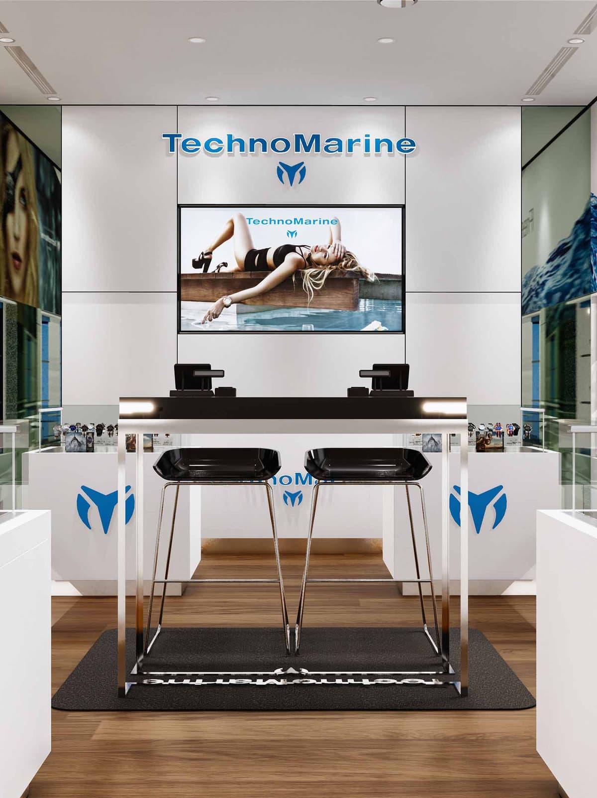

The Technomarine Store in Cancún is conceived as a compact yet immersive brand pavilion, where the world of nautical-inspired watchmaking meets a refined urban aesthetic. The interior expresses a dialogue between precision technology and coastal leisure, translating the maritime DNA of the brand into a clean, contemporary retail environment. Visual communication, product display and customer interaction are orchestrated along a central axis that immediately directs the gaze toward the illuminated brand wall and large digital screen at the back of the space.
The design prioritizes clarity and legibility: neutral planes, high contrast accents and carefully framed visual merchandising concentrate attention on the timepieces while reinforcing brand recognition. The store behaves as an elegant “showcase from within,” where every surface and reflection amplifies the product rather than competing with it.
The spatial layout is organized around a longitudinal promenade leading from the mall corridor into the heart of the store. A central bar-height consultation table with two stools operates as both a point of sale and a place for personalized product presentation. This dual-function furniture piece structures the circulation, allowing visitors to skirt around it to reach the lateral vitrines and then converge again at the rear counter.
Peripheral glass display cases along the sides create a continuous exhibition strip, encouraging exploratory movement while maintaining clear sightlines to the branding focal point. The rear wall, dominated by the logo and digital imagery, acts as a visual anchor that compresses perspective and gives depth to a relatively compact footprint.
The material palette is deliberately restrained: warm-toned wooden flooring grounds the space and introduces a subtle reference to yacht decks, while satin white wall panels and furniture provide a neutral backdrop for merchandise. High-gloss and glass surfaces on the displays deliver crisp reflections that enhance the perception of precision and craftsmanship in the watches.
Brand blue appears in the Technomarine logotype and iconography, strategically placed on counters and vertical planes to punctuate the white envelope with a fresh, aquatic accent. Black elements, such as the central table surface, stools and entrance mat, add visual weight and sophistication, framing the products and preventing light tones from feeling clinically cold.
Lighting is integrated through recessed ceiling fixtures and local accent illumination on the displays. The approach favors a uniform, glare-free ambient light enhanced by targeted spotlights that highlight key product clusters and the large digital screen, ensuring the merchandise remains the brightest element within the visual field.
Furniture is designed with minimal profiles and precise detailing, aligning with the technological character of the brand. The main consultation table uses slender metallic legs and a monolithic top, conveying structural lightness while preserving a robust presence in the center of the store. Bar stools with angular, faceted seats echo the geometry of watch cases, reinforcing the product narrative.
Display units are predominantly low, transparent vitrines that keep the horizon line open and unobstructed. This allows the large-scale brand imagery on the walls to remain visible from multiple vantage points, creating a strong graphic backdrop for the timepieces. The merchandising strategy favors clear, orderly arrangements, using modular watch stands to enable rapid reconfiguration of collections and seasonal stories.
The store is conceived as an experiential micro-flagship, relying on immersive visual content and tactile engagement with the products. The large digital panel at the rear allows dynamic storytelling about lifestyle, technical features and new releases, reducing the need for printed campaign materials and enabling rapid, low-waste updates. The overall chromatic restraint amplifies these narratives without visual noise.
Sustainability considerations are integrated primarily through lighting and material strategies. High-efficiency LED fixtures with long life cycles minimize energy consumption and maintenance, while the high reflectance of white interior surfaces reduces the number of luminaires required to achieve optimal brightness. The preference for durable, easily cleanable finishes such as glass, metal and engineered wood extends the lifespan of the fit-out, decreasing replacement frequency and associated embodied carbon. Wherever possible, loose furniture and modular displays are conceived for disassembly and reuse in future brand configurations, supporting a circular approach to retail design.


The Technomarine Store in Cancún is conceived as a compact yet immersive brand pavilion, where the world of nautical-inspired watchmaking meets a refined urban aesthetic. The interior expresses a dialogue between precision technology and coastal leisure, translating the maritime DNA of the brand into a clean, contemporary retail environment. Visual communication, product display and customer interaction are orchestrated along a central axis that immediately directs the gaze toward the illuminated brand wall and large digital screen at the back of the space.
The design prioritizes clarity and legibility: neutral planes, high contrast accents and carefully framed visual merchandising concentrate attention on the timepieces while reinforcing brand recognition. The store behaves as an elegant “showcase from within,” where every surface and reflection amplifies the product rather than competing with it.
The spatial layout is organized around a longitudinal promenade leading from the mall corridor into the heart of the store. A central bar-height consultation table with two stools operates as both a point of sale and a place for personalized product presentation. This dual-function furniture piece structures the circulation, allowing visitors to skirt around it to reach the lateral vitrines and then converge again at the rear counter.
Peripheral glass display cases along the sides create a continuous exhibition strip, encouraging exploratory movement while maintaining clear sightlines to the branding focal point. The rear wall, dominated by the logo and digital imagery, acts as a visual anchor that compresses perspective and gives depth to a relatively compact footprint.
The material palette is deliberately restrained: warm-toned wooden flooring grounds the space and introduces a subtle reference to yacht decks, while satin white wall panels and furniture provide a neutral backdrop for merchandise. High-gloss and glass surfaces on the displays deliver crisp reflections that enhance the perception of precision and craftsmanship in the watches.
Brand blue appears in the Technomarine logotype and iconography, strategically placed on counters and vertical planes to punctuate the white envelope with a fresh, aquatic accent. Black elements, such as the central table surface, stools and entrance mat, add visual weight and sophistication, framing the products and preventing light tones from feeling clinically cold.
Lighting is integrated through recessed ceiling fixtures and local accent illumination on the displays. The approach favors a uniform, glare-free ambient light enhanced by targeted spotlights that highlight key product clusters and the large digital screen, ensuring the merchandise remains the brightest element within the visual field.
Furniture is designed with minimal profiles and precise detailing, aligning with the technological character of the brand. The main consultation table uses slender metallic legs and a monolithic top, conveying structural lightness while preserving a robust presence in the center of the store. Bar stools with angular, faceted seats echo the geometry of watch cases, reinforcing the product narrative.
Display units are predominantly low, transparent vitrines that keep the horizon line open and unobstructed. This allows the large-scale brand imagery on the walls to remain visible from multiple vantage points, creating a strong graphic backdrop for the timepieces. The merchandising strategy favors clear, orderly arrangements, using modular watch stands to enable rapid reconfiguration of collections and seasonal stories.
The store is conceived as an experiential micro-flagship, relying on immersive visual content and tactile engagement with the products. The large digital panel at the rear allows dynamic storytelling about lifestyle, technical features and new releases, reducing the need for printed campaign materials and enabling rapid, low-waste updates. The overall chromatic restraint amplifies these narratives without visual noise.
Sustainability considerations are integrated primarily through lighting and material strategies. High-efficiency LED fixtures with long life cycles minimize energy consumption and maintenance, while the high reflectance of white interior surfaces reduces the number of luminaires required to achieve optimal brightness. The preference for durable, easily cleanable finishes such as glass, metal and engineered wood extends the lifespan of the fit-out, decreasing replacement frequency and associated embodied carbon. Wherever possible, loose furniture and modular displays are conceived for disassembly and reuse in future brand configurations, supporting a circular approach to retail design.
© 2021 by sanzpont [arquitectura] . Webpage by sanzpont [digital] . Innovative Digital Experiences
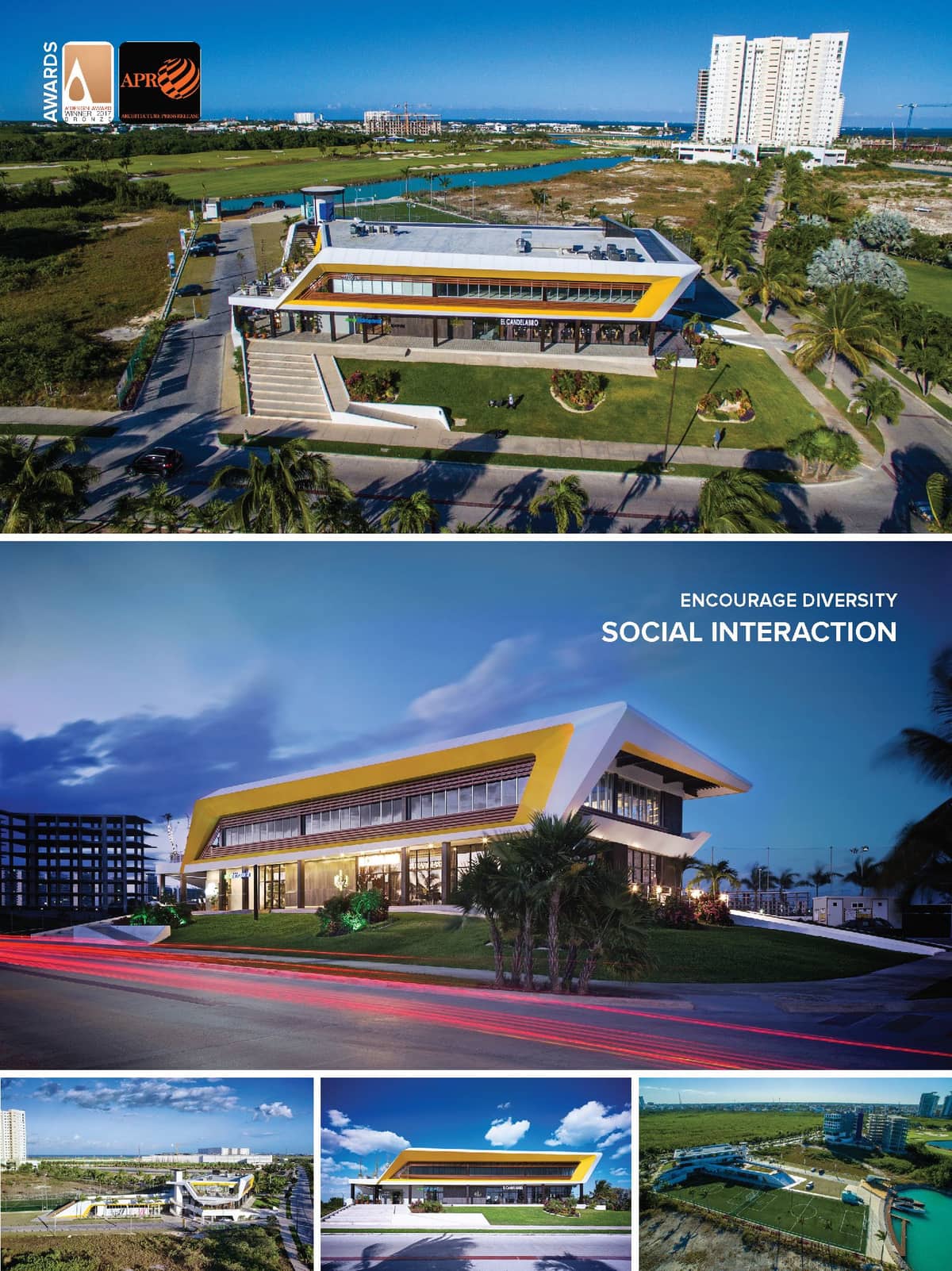

Awards: Bronze A' Design Award Winner in Architecture, Building and Structure Design Category 2016 - 2017 - Puerto Cancún - Cancún. México.
Inspiration: The Design Concept is inspired by the aerodynamic lines and elegance of VanDutch yachts and the natural elements of the Caribbean, with the main objective as Recreational, Sports Integration spaces with Social Activities within the views of the canal and the golf course, inspired by boat and marina lifestyle.
Van Dutch Yachts: Design Concept The elegance and aerodynamic lines of the Van Dutch yachts were the main source of inspiration for the design concept of the complex, focusing on the main views of the surrounding environment.
Digital Design: Latest BIM technology: This project was developed using the latest BIM technology for digital project design. The working methodology is completely three-dimensional because it does not create drawings, but rather creates intelligent digital models of the design. These models also contain a constructive database capable of generating any kind of digital information depending on the project phase in such a way that advancing the development of a project is equivalent to advancing the level of detail of the model. The information generated through a BIM work system is reliable, visual and of the best quality, since all the elements are connected to the same model. This system allows you to create a stunning 3D visual model of the project through each of its execution phases.
Production, Realization Technology: Design was developed entirely with BIM (Building Information Modeling) Technology. From the design phase, documentation and fabrication. iPhone/iPad A360 cloud 3D model was always on site for better people understanding about construction phases, from steel structure, MEP, and aluminum clading facade.
Solar Geometry Analysis The site contained an existing metallic structure; a single-level showroom that was surveyed and digitalized into a 3D model. With the help of Autodesk Revit, a preliminary volumetric study was conducted to analyze the solar geometry to determine the bioclimatic response of the future sports facility.
Conceptual Design The site, the existing building and the future installations were now reflected in a 3D model environment. Conceptual design sketches were drawn on the volumetric images in digital sketch on iPad with Autodesk Sketchbook Pro software. Later we proceeded to elaborate the 3D model and the solution of the integral project in BIM in Autodesk Revit.
Immersive Visualization Photorealistic renders were created with Autodesk 3Dsmax using the same BIM model, with the objective of visualizing the project in the form of digital images and creating more realistic worksheets. The same model was transferred to a specialized video game software, UnReal Engine, to immerse the client in a virtual reality experience using 3D Oculus goggles, allowing a complete understanding of the project before being built.
Documentation The technical information and documentation of the executive project was created entirely in BIM in Autodesk Revit, allowing a more thorough understanding of the project and a better coordination of each worksheet as the real-time representation of the 3D BIM model. Because the information continues to develop during the process of design and the level of detail required increases, it allows information to be more efficient and easy to coordinate when different disciplines share the same 3D model.
Digital Fabrication The production of the aluminum panel facades is based on the 3D model, generating its digital display in the industrial design software Rhinoceros 3D. This allows the panels to be created piece by piece, cut using CNC cutting machinery, then labeled numerically to facilitate a perfect assembly. Likewise, the entire metal structure was manufactured in a workshop and then assembled on-site.
On-Site Building Coordination Autodesk a360, a cloud-based software, allowed the visualization and coordination of the digital BIM model, containing all the construction information. This model, with all its layers of architecture, installations and structure, was always available on-site using an iPad and/or an iPhone, which allowed for better communication with each contractor and a more thorough understanding of the project through each phase. Being able to isolate each piece of work in context and see it in 3D through a digital medium, allowed for a successful execution.
Social Infrastructure and Public Space The Van Dutch Recreation Center will provide Cancun with a new social infrastructure facility, promoting the use of public, sporting and recreational space.
Recreational and sporting integration:
Conceived as a new space to bring people together with the goal of integrating society. Van Dutch features the following- Sports spaces Green roof and elevated square Outdoor recreation and exhibition spaces Terrace and pier with canal view Themed restaurants Landscape integration
The project offers a unique and contemporary avant-garde design developed with the latest technologies. Accessibility and Pedestrian Circulation Conceived for its accessibility and designed for all the public, the pedestrian use creates city and welcomes the user from the outside. Conversion of Previous Spaces (Use-Cycling) Sustainability is promoted by recycling the use of previous spaces, generating an intelligent conversion of construction, and adapting and adding new elements to the architectural program.
Commercial (Conversion of Prior Building) Sports Recreational Services Social Integration Retail (Yacht Showroom)


Awards: Bronze A' Design Award Winner in Architecture, Building and Structure Design Category 2016 - 2017 - Puerto Cancún - Cancún. México.
Inspiration: The Design Concept is inspired by the aerodynamic lines and elegance of VanDutch yachts and the natural elements of the Caribbean, with the main objective as Recreational, Sports Integration spaces with Social Activities within the views of the canal and the golf course, inspired by boat and marina lifestyle.
Van Dutch Yachts: Design Concept The elegance and aerodynamic lines of the Van Dutch yachts were the main source of inspiration for the design concept of the complex, focusing on the main views of the surrounding environment.
Digital Design: Latest BIM technology: This project was developed using the latest BIM technology for digital project design. The working methodology is completely three-dimensional because it does not create drawings, but rather creates intelligent digital models of the design. These models also contain a constructive database capable of generating any kind of digital information depending on the project phase in such a way that advancing the development of a project is equivalent to advancing the level of detail of the model. The information generated through a BIM work system is reliable, visual and of the best quality, since all the elements are connected to the same model. This system allows you to create a stunning 3D visual model of the project through each of its execution phases.
Production, Realization Technology: Design was developed entirely with BIM (Building Information Modeling) Technology. From the design phase, documentation and fabrication. iPhone/iPad A360 cloud 3D model was always on site for better people understanding about construction phases, from steel structure, MEP, and aluminum clading facade.
Solar Geometry Analysis The site contained an existing metallic structure; a single-level showroom that was surveyed and digitalized into a 3D model. With the help of Autodesk Revit, a preliminary volumetric study was conducted to analyze the solar geometry to determine the bioclimatic response of the future sports facility.
Conceptual Design The site, the existing building and the future installations were now reflected in a 3D model environment. Conceptual design sketches were drawn on the volumetric images in digital sketch on iPad with Autodesk Sketchbook Pro software. Later we proceeded to elaborate the 3D model and the solution of the integral project in BIM in Autodesk Revit.
Immersive Visualization Photorealistic renders were created with Autodesk 3Dsmax using the same BIM model, with the objective of visualizing the project in the form of digital images and creating more realistic worksheets. The same model was transferred to a specialized video game software, UnReal Engine, to immerse the client in a virtual reality experience using 3D Oculus goggles, allowing a complete understanding of the project before being built.
Documentation The technical information and documentation of the executive project was created entirely in BIM in Autodesk Revit, allowing a more thorough understanding of the project and a better coordination of each worksheet as the real-time representation of the 3D BIM model. Because the information continues to develop during the process of design and the level of detail required increases, it allows information to be more efficient and easy to coordinate when different disciplines share the same 3D model.
Digital Fabrication The production of the aluminum panel facades is based on the 3D model, generating its digital display in the industrial design software Rhinoceros 3D. This allows the panels to be created piece by piece, cut using CNC cutting machinery, then labeled numerically to facilitate a perfect assembly. Likewise, the entire metal structure was manufactured in a workshop and then assembled on-site.
On-Site Building Coordination Autodesk a360, a cloud-based software, allowed the visualization and coordination of the digital BIM model, containing all the construction information. This model, with all its layers of architecture, installations and structure, was always available on-site using an iPad and/or an iPhone, which allowed for better communication with each contractor and a more thorough understanding of the project through each phase. Being able to isolate each piece of work in context and see it in 3D through a digital medium, allowed for a successful execution.
Social Infrastructure and Public Space The Van Dutch Recreation Center will provide Cancun with a new social infrastructure facility, promoting the use of public, sporting and recreational space.
Recreational and sporting integration:
Conceived as a new space to bring people together with the goal of integrating society. Van Dutch features the following- Sports spaces Green roof and elevated square Outdoor recreation and exhibition spaces Terrace and pier with canal view Themed restaurants Landscape integration
The project offers a unique and contemporary avant-garde design developed with the latest technologies. Accessibility and Pedestrian Circulation Conceived for its accessibility and designed for all the public, the pedestrian use creates city and welcomes the user from the outside. Conversion of Previous Spaces (Use-Cycling) Sustainability is promoted by recycling the use of previous spaces, generating an intelligent conversion of construction, and adapting and adding new elements to the architectural program.
Commercial (Conversion of Prior Building) Sports Recreational Services Social Integration Retail (Yacht Showroom)
© 2021 by sanzpont [arquitectura] . Webpage by sanzpont [digital] . Innovative Digital Experiences


Conceptual Design: Natural Environment Integration. Small 1,000 sq. ft green house, built only with the needed space, set at the back of a 19,375 sq. ft property. This home is self-conscious of its natural environment and blends with its surroundings through its green roof. During the conceptual phase of the project, a debate about the controversy that architects have to stand out on every project arose, finally opting for a house concept that would become totally immersed on its natural environment, hidden by its surroundings. The house is situated at the back of the property for privacy purposes, placed on an area where no trees existed, transforming the daily coming and going to the house on a pleasant and relaxing walkway.
Open and Flexible Space. The house is designed as an open and flexible loft style space, based on the premise of organizing the different spaces in such a way that they can be visually connected to the exterior landscape. Its architectural program consists of a basic house program, optimizing mono-spacing and using just a small area of the property. Being self-conscious and using only the needed living space in harmony with the surrounding environment and its preservation is a way of optimizing resources and a sustainable way of living.
Bioclimatic Design: Energy Efficient Concept. The design is conceived through strict climate criteria, covering the comfort needs with the less possible energy consumption; this is achieved through a passive solar design that optimize natural renewable energy, energy used to generate comfort by means of sustainable design.
Green-Roofed House: Natural Thermal Insulation. Besides replacing the green space used for construction, the green roof helps retain dust and pollutants, improve the climate by reducing the “Heat Island” effect and conforming an excellent interior thermal insulation, providing more comfort to the user.
Sustainable Design: Smallest Footprint Possible. Passive Solar Design: How sunlight affects the facades was also taken into account into the design, using eaves and louvers for the windows, avoiding solar heat gain and saving energy.
Natural Cross Ventilation: Windows are designed facing each other and oriented to the prevailing winds, naturally refreshing the spaces without the use of air conditioning on a very hot climate.
Evaporative Cooling: Air temperature lowers as it passes through the evaporating water of the humid green roof just before entering through the window.
Solar Protection: The shadows generated by the “Perene” leaf trees are used to avoid solar west radiation. 26 to 33 ft tall trees of abundant foliage.
Reducing the “Heat Island” Effect: A green roof reduces heat absorption as far as 84%, relieving the urban “Heat Island” effect.
Natural Illumination: The house has big openings to optimize natural illumination, providing excellent daylight and reducing energy consumption.
Preserving Existing Vegetation: The house is integrated to the site preserving the existing trees to take advantage of the natural shadows they generate, being more ecologically conscious.
Waste Treatment: An ecological waste treatment is integrated to the design, using a biodigestor that converts 90% of treated water into an irrigation channel.
Compost: Compost is integrated to transform organic kitchen waste, dry leaves and mowed grass into usable soil for garden use.
Hurricane-proof Design: The house is designed 5 ft above the street level to prevent flooding and the closing mechanism of all windows is made of steel, preventing projectile risk during hurricanes.
Energy Saving . Energy Consumption: All the electric appliances and the low consumption light bulbs were carefully selected. The average monthly energy consumption is of 260 pesos, about 19 American dollars.


Conceptual Design: Natural Environment Integration. Small 1,000 sq. ft green house, built only with the needed space, set at the back of a 19,375 sq. ft property. This home is self-conscious of its natural environment and blends with its surroundings through its green roof. During the conceptual phase of the project, a debate about the controversy that architects have to stand out on every project arose, finally opting for a house concept that would become totally immersed on its natural environment, hidden by its surroundings. The house is situated at the back of the property for privacy purposes, placed on an area where no trees existed, transforming the daily coming and going to the house on a pleasant and relaxing walkway.
Open and Flexible Space. The house is designed as an open and flexible loft style space, based on the premise of organizing the different spaces in such a way that they can be visually connected to the exterior landscape. Its architectural program consists of a basic house program, optimizing mono-spacing and using just a small area of the property. Being self-conscious and using only the needed living space in harmony with the surrounding environment and its preservation is a way of optimizing resources and a sustainable way of living.
Bioclimatic Design: Energy Efficient Concept. The design is conceived through strict climate criteria, covering the comfort needs with the less possible energy consumption; this is achieved through a passive solar design that optimize natural renewable energy, energy used to generate comfort by means of sustainable design.
Green-Roofed House: Natural Thermal Insulation. Besides replacing the green space used for construction, the green roof helps retain dust and pollutants, improve the climate by reducing the “Heat Island” effect and conforming an excellent interior thermal insulation, providing more comfort to the user.
Sustainable Design: Smallest Footprint Possible. Passive Solar Design: How sunlight affects the facades was also taken into account into the design, using eaves and louvers for the windows, avoiding solar heat gain and saving energy.
Natural Cross Ventilation: Windows are designed facing each other and oriented to the prevailing winds, naturally refreshing the spaces without the use of air conditioning on a very hot climate.
Evaporative Cooling: Air temperature lowers as it passes through the evaporating water of the humid green roof just before entering through the window.
Solar Protection: The shadows generated by the “Perene” leaf trees are used to avoid solar west radiation. 26 to 33 ft tall trees of abundant foliage.
Reducing the “Heat Island” Effect: A green roof reduces heat absorption as far as 84%, relieving the urban “Heat Island” effect.
Natural Illumination: The house has big openings to optimize natural illumination, providing excellent daylight and reducing energy consumption.
Preserving Existing Vegetation: The house is integrated to the site preserving the existing trees to take advantage of the natural shadows they generate, being more ecologically conscious.
Waste Treatment: An ecological waste treatment is integrated to the design, using a biodigestor that converts 90% of treated water into an irrigation channel.
Compost: Compost is integrated to transform organic kitchen waste, dry leaves and mowed grass into usable soil for garden use.
Hurricane-proof Design: The house is designed 5 ft above the street level to prevent flooding and the closing mechanism of all windows is made of steel, preventing projectile risk during hurricanes.
Energy Saving . Energy Consumption: All the electric appliances and the low consumption light bulbs were carefully selected. The average monthly energy consumption is of 260 pesos, about 19 American dollars.
© 2021 by sanzpont [arquitectura] . Webpage by sanzpont [digital] . Innovative Digital Experiences
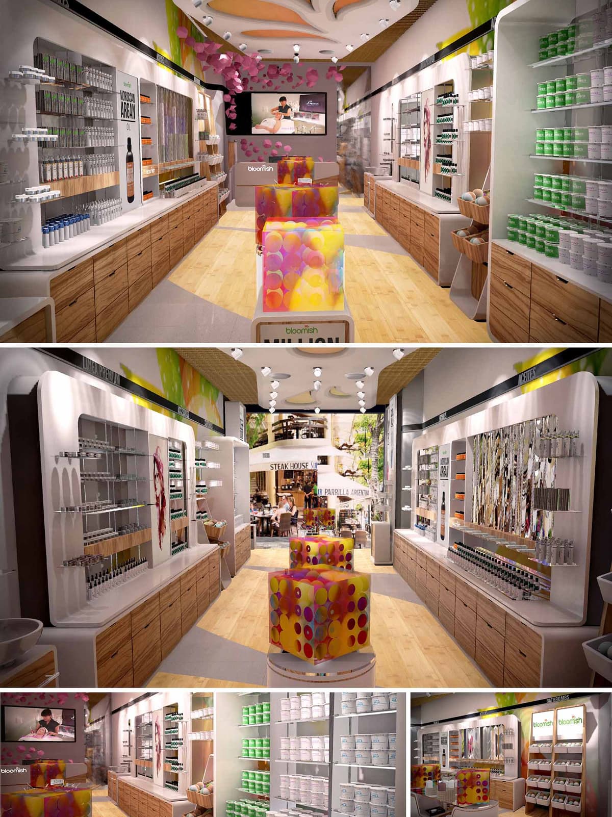

Bloomish is conceived as a sensorial retail experience that merges wellness, color and tropical vibrancy within a compact linear layout. The concept translates the freshness of skincare and beauty products into an immersive interior, where floating elements, dynamic lighting and chromatic accents guide the visitor from entrance to checkout. The store functions as an urban oasis in Playa del Carmen, framing the pedestrian flow of Quinta Avenida and drawing users inside through transparency, depth and a strong central axis.
The design balances a clean, almost clinical display language with playful volumes and textures. Neutral shells and continuous cabinetry create visual calm, while vivid cubes, ceiling petals and graphic panels introduce the brand’s youthful identity. The result is a space that feels both professional and approachable, encouraging exploration and extended dwell time.
The store is organized as a double-loaded gallery with a central promenade. Long lateral counters host the main product ranges, ensuring continuous visibility and easy accessibility. High-capacity drawers below and transparent shelving above optimize vertical storage, maintaining a clutter-free merchandising plane at eye level.
At the center, a sequence of colorful cubic displays works as both sculptural focal point and flexible island for seasonal or promotional items. This spine subtly narrows and widens the path, regulating speed and creating moments of pause without obstructing circulation. The cash desk and digital screen are located at the back wall, using perspective to pull customers through the entire depth of the space.
Material selection emphasizes warmth, hygiene and durability. The floor combines a light wood finish in the main path with neutral inserts that zone key areas. Continuous timber cabinetry with horizontal grain brings a natural, spa-like character, contrasting with the smooth white corian-style countertops and wall claddings that communicate cleanliness and precision.
The color palette is intentionally restrained in the envelope to highlight the merchandise and the brand’s chromatic interventions. Translucent cubes with multicolored circular patterns, vivid graphic bands and suspended pink elements add energy and visual rhythm. These saturated accents float over a base of whites, beiges and light woods, ensuring that color is perceived as fresh rather than overwhelming.
Lighting strategy combines focused retail illumination with experiential effects. Linear tracks with adjustable spotlights provide uniform, high-CRI lighting over product shelves, guaranteeing accurate color rendition of cosmetics and packaging. Integrated LED strips within displays emphasize vertical surfaces, enhancing product legibility and creating a sense of depth.
The ceiling incorporates sculpted recesses and organic cut-outs that host indirect lighting, softening contrasts and visually lifting the height of the space. The interplay between bright task lighting at the perimeter and a slightly warmer ambient tone at the center generates a welcoming, intimate atmosphere appropriate for personal care and testing.
Sustainability is addressed through both material choice and operational efficiency. Timber elements are envisaged from certified or locally sourced species, reducing transport impact and rooting the project in the Yucatán context. The predominance of durable finishes, modular shelving and replaceable panels extends the lifecycle of the fit-out, minimizing waste during future rebranding or layout adjustments.
The lighting system relies on LED technology with dimmable drivers and zoning controls, reducing energy consumption in response to natural light entering from the storefront. High reflectance surfaces amplify this daylight, allowing lower artificial lighting levels during daytime. Where possible, low-VOC paints and finishes are prioritized to maintain healthy indoor air quality, aligning the built environment with the wellness values expressed by the Bloomish brand.


Bloomish is conceived as a sensorial retail experience that merges wellness, color and tropical vibrancy within a compact linear layout. The concept translates the freshness of skincare and beauty products into an immersive interior, where floating elements, dynamic lighting and chromatic accents guide the visitor from entrance to checkout. The store functions as an urban oasis in Playa del Carmen, framing the pedestrian flow of Quinta Avenida and drawing users inside through transparency, depth and a strong central axis.
The design balances a clean, almost clinical display language with playful volumes and textures. Neutral shells and continuous cabinetry create visual calm, while vivid cubes, ceiling petals and graphic panels introduce the brand’s youthful identity. The result is a space that feels both professional and approachable, encouraging exploration and extended dwell time.
The store is organized as a double-loaded gallery with a central promenade. Long lateral counters host the main product ranges, ensuring continuous visibility and easy accessibility. High-capacity drawers below and transparent shelving above optimize vertical storage, maintaining a clutter-free merchandising plane at eye level.
At the center, a sequence of colorful cubic displays works as both sculptural focal point and flexible island for seasonal or promotional items. This spine subtly narrows and widens the path, regulating speed and creating moments of pause without obstructing circulation. The cash desk and digital screen are located at the back wall, using perspective to pull customers through the entire depth of the space.
Material selection emphasizes warmth, hygiene and durability. The floor combines a light wood finish in the main path with neutral inserts that zone key areas. Continuous timber cabinetry with horizontal grain brings a natural, spa-like character, contrasting with the smooth white corian-style countertops and wall claddings that communicate cleanliness and precision.
The color palette is intentionally restrained in the envelope to highlight the merchandise and the brand’s chromatic interventions. Translucent cubes with multicolored circular patterns, vivid graphic bands and suspended pink elements add energy and visual rhythm. These saturated accents float over a base of whites, beiges and light woods, ensuring that color is perceived as fresh rather than overwhelming.
Lighting strategy combines focused retail illumination with experiential effects. Linear tracks with adjustable spotlights provide uniform, high-CRI lighting over product shelves, guaranteeing accurate color rendition of cosmetics and packaging. Integrated LED strips within displays emphasize vertical surfaces, enhancing product legibility and creating a sense of depth.
The ceiling incorporates sculpted recesses and organic cut-outs that host indirect lighting, softening contrasts and visually lifting the height of the space. The interplay between bright task lighting at the perimeter and a slightly warmer ambient tone at the center generates a welcoming, intimate atmosphere appropriate for personal care and testing.
Sustainability is addressed through both material choice and operational efficiency. Timber elements are envisaged from certified or locally sourced species, reducing transport impact and rooting the project in the Yucatán context. The predominance of durable finishes, modular shelving and replaceable panels extends the lifecycle of the fit-out, minimizing waste during future rebranding or layout adjustments.
The lighting system relies on LED technology with dimmable drivers and zoning controls, reducing energy consumption in response to natural light entering from the storefront. High reflectance surfaces amplify this daylight, allowing lower artificial lighting levels during daytime. Where possible, low-VOC paints and finishes are prioritized to maintain healthy indoor air quality, aligning the built environment with the wellness values expressed by the Bloomish brand.
© 2021 by sanzpont [arquitectura] . Webpage by sanzpont [digital] . Innovative Digital Experiences
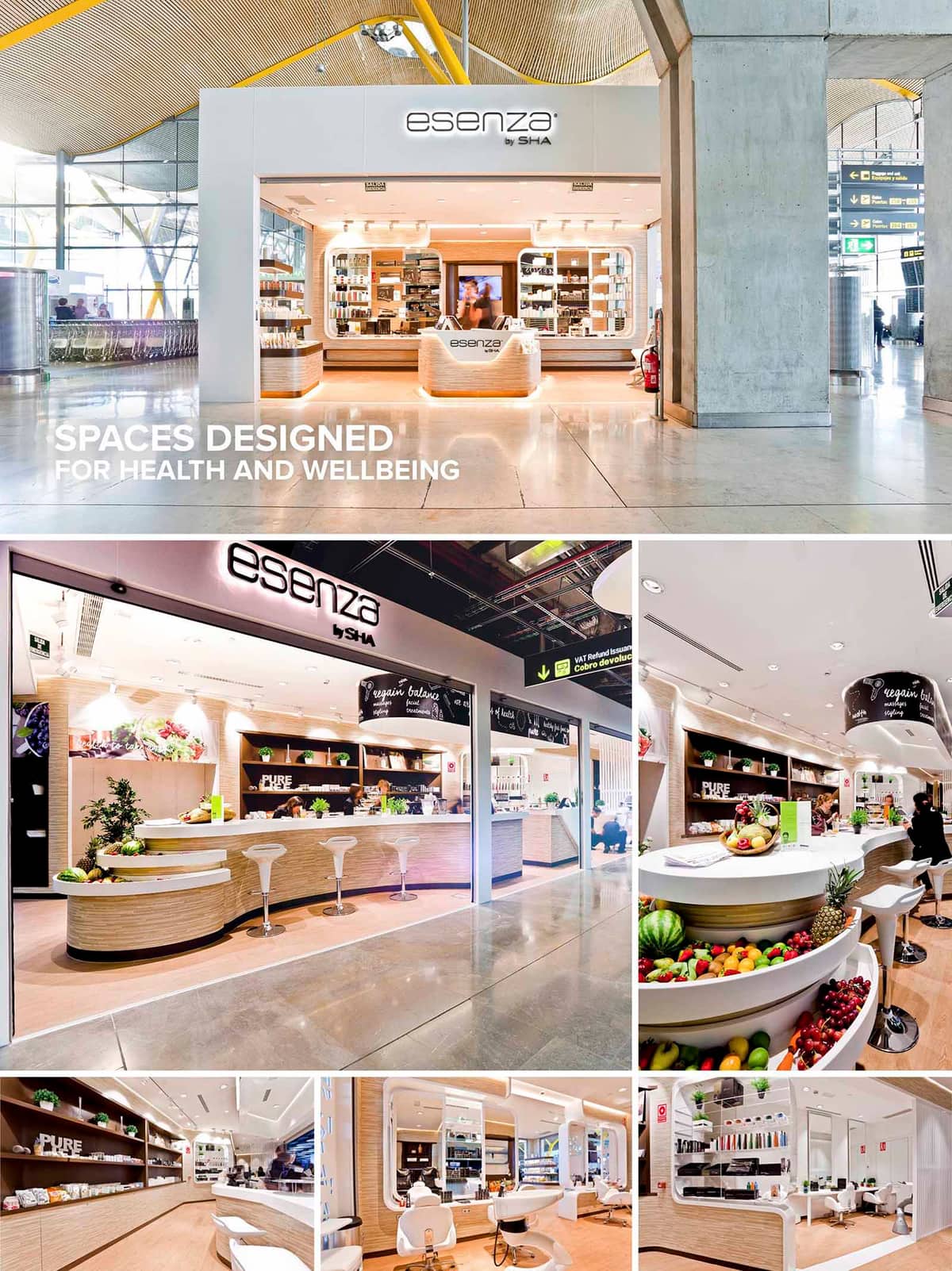

From the creators of The Best Medical Spa, the concept of the airport Wellness Center was born; easily accessible, located inside the Madrid International Airport, developed on a single level and divided among three main areas: Public Area: Refreshment Table, Refrigerators, Boutique, Counter and Information Semi-Public Area: Hair Salon, Make-up Salon, Beauty Salon and Massages
Madrid Airport T4 / T4S. Spain, Madrid - Design Concept: Tranquility and Well-being Based on the experience and knowledge of Sha Wellness Clinic, recognized as the Best International Medical Spa, Esenza by SHA aims to bring health and well-being to those who aim to make this their lifestyle.
Private Area: Massage and Nursing Room: The objective of this project is to create a bubble of tranquility within the chaos and bustle of the airport and to provide the passenger with a comfortable space and an image of avant-garde innovation, while simultaneously transmitting a sense of tranquility and security; a place where you can trust the facilities, equipment and highly qualified personnel.
Materials Used: Warmth and Luminosity Uniform materials and soft colors were used to amplify the calm interior which create unity and amplitude in the space. Fabric finishes and wooden floors were used for a warm feel.
The public areas are more illuminated and blend in with the surrounding airport. The other areas where quietude and relaxation are required, offer more darkness and intimacy. This was achieved by using indirect light in more tranquil areas and more direct light spots in the public areas.
Subtle lighting was used to convey a sense of peace and tranquility, accompanied by seating areas with light colored material to provide comfort.
Digital Manufacturing: Latest BIM Technology: The team of architects was able to design the facade using parametric digital experimentation techniques, in which the structural supports and the white Aluminum Composite Panels are resolved by means of a 3D model. All the different pieces of assembly are extracted, as if it were a puzzle.
LIST OF PROJECTS EXPERIENCE
Designed, Executed and/or Built Projects
SPAIN
1. Esenza MAD.T4
2. Esenza MAD.T4S


From the creators of The Best Medical Spa, the concept of the airport Wellness Center was born; easily accessible, located inside the Madrid International Airport, developed on a single level and divided among three main areas: Public Area: Refreshment Table, Refrigerators, Boutique, Counter and Information Semi-Public Area: Hair Salon, Make-up Salon, Beauty Salon and Massages
Madrid Airport T4 / T4S. Spain, Madrid - Design Concept: Tranquility and Well-being Based on the experience and knowledge of Sha Wellness Clinic, recognized as the Best International Medical Spa, Esenza by SHA aims to bring health and well-being to those who aim to make this their lifestyle.
Private Area: Massage and Nursing Room: The objective of this project is to create a bubble of tranquility within the chaos and bustle of the airport and to provide the passenger with a comfortable space and an image of avant-garde innovation, while simultaneously transmitting a sense of tranquility and security; a place where you can trust the facilities, equipment and highly qualified personnel.
Materials Used: Warmth and Luminosity Uniform materials and soft colors were used to amplify the calm interior which create unity and amplitude in the space. Fabric finishes and wooden floors were used for a warm feel.
The public areas are more illuminated and blend in with the surrounding airport. The other areas where quietude and relaxation are required, offer more darkness and intimacy. This was achieved by using indirect light in more tranquil areas and more direct light spots in the public areas.
Subtle lighting was used to convey a sense of peace and tranquility, accompanied by seating areas with light colored material to provide comfort.
Digital Manufacturing: Latest BIM Technology: The team of architects was able to design the facade using parametric digital experimentation techniques, in which the structural supports and the white Aluminum Composite Panels are resolved by means of a 3D model. All the different pieces of assembly are extracted, as if it were a puzzle.
LIST OF PROJECTS EXPERIENCE
Designed, Executed and/or Built Projects
SPAIN
1. Esenza MAD.T4
2. Esenza MAD.T4S
© 2021 by sanzpont [arquitectura] . Webpage by sanzpont [digital] . Innovative Digital Experiences
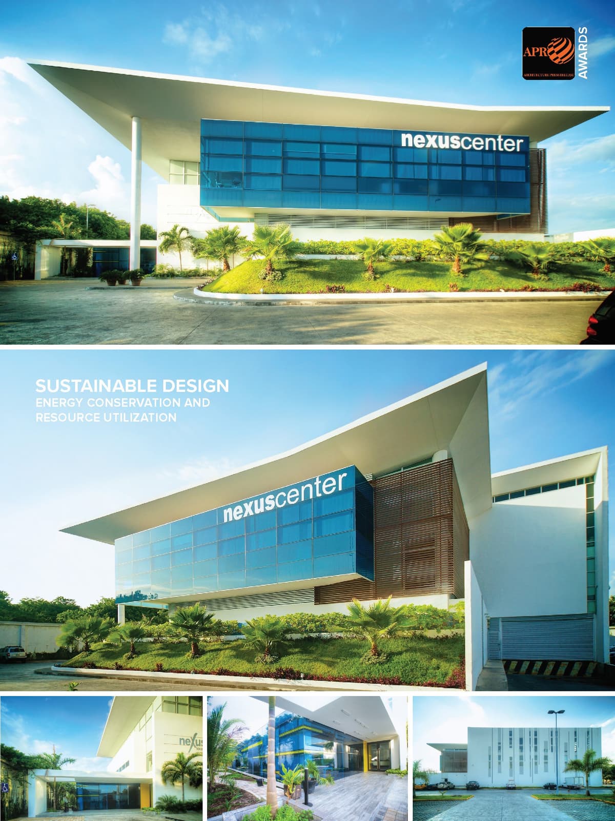

The design concept is based in the functional pyramid scheme. The formal idea of the building is based on the functional concept of integration of the levels with the general management shape at the middle level between the two. Being north facade, this body management is proposed as a floating glass box. The blind skin facing west and the large overhangs are to prevent direct sunlight inland from the other directions. The Scheme of the company is a "pyramid" with the area of product storage and distribution infrastructure as a base, followed by the management and administration of the company and at the top of the pyramid of the hierarchy of the steering.
Hierarchical space distribution. Corporate building of three companies, "Sunglass Island", "Watch My Watch" and "Nexus Center". The surface of 3,976 sqm on 113'375 sqm developed on 3 levels with a hierarchical front apparently floating cube housing management offices. The ground floor is occupied by the storage area of products for 3 companies and has platforms for loading and unloading. The first floor has the company offices and on the second floor are the "Watch My Watch" and "Nexus offices. "The front of the building has a glass volume, "Floating Cube" in the middle level between the first and second floor. The exterior of the building has parking for 190 cars.
The "Floating Cube" is facing north and therefore avoid direct sunlight and only receives incoming diffuse daylight. Large overhangs provide shade to all windows while allowing sunlight into the interior. Artificial light low power LED gives a more dramatic effect at night.
Functional analysis according to the organizational chart. Considering this analysis, we develop a project in which the function of the building scheme reflect and solve spaces according to the scheme of the business group.
Energy Conservation and Resource Utilization. The building is designed and conceived through the weather, meeting the needs of comfort with minimum energy expenditure. This is accomplished through a passive solar design that takes advantage of renewable natural energy to achieve greater comfort with respect for the environment through sustainable design.
• Optimal Design: Workspaces and Recreation.
• Natural lighting: Windows are designed to capture natural light to provide optimal daytime lighting and electricity costs are reduced.
• Sunlighting protection: The sunlight is considered for the design of facades, covering frilly, eaves or window louvers type elements, to avoid heat gain and energy savings in air conditioning.
• Directive functionality: The scheme function of this project is based on the policy side is located at an intermediate level between the two companies to better management.
• Open spaces: Very large spaces are created in the work areas to have a free organization of spaces and cubicles, thus providing a better workplace.
• Warehouses and workshops: The building has a large storage area and workshops located on the ground floor with optimal access and logistics.
• Surveillance and Security: The corporate has a restricted access to protect it from the outside, the entrance is guarded 24 hours a day to control entry and exit, also has a closed loop system.
• Employees dining: Having a place to eat in peace and rest your food is important, spacious, well lit and with all the necessary services eaters.
• Parking: It has a large area around the building with green areas and ample parking inside.


The design concept is based in the functional pyramid scheme. The formal idea of the building is based on the functional concept of integration of the levels with the general management shape at the middle level between the two. Being north facade, this body management is proposed as a floating glass box. The blind skin facing west and the large overhangs are to prevent direct sunlight inland from the other directions. The Scheme of the company is a "pyramid" with the area of product storage and distribution infrastructure as a base, followed by the management and administration of the company and at the top of the pyramid of the hierarchy of the steering.
Hierarchical space distribution. Corporate building of three companies, "Sunglass Island", "Watch My Watch" and "Nexus Center". The surface of 3,976 sqm on 113'375 sqm developed on 3 levels with a hierarchical front apparently floating cube housing management offices. The ground floor is occupied by the storage area of products for 3 companies and has platforms for loading and unloading. The first floor has the company offices and on the second floor are the "Watch My Watch" and "Nexus offices. "The front of the building has a glass volume, "Floating Cube" in the middle level between the first and second floor. The exterior of the building has parking for 190 cars.
The "Floating Cube" is facing north and therefore avoid direct sunlight and only receives incoming diffuse daylight. Large overhangs provide shade to all windows while allowing sunlight into the interior. Artificial light low power LED gives a more dramatic effect at night.
Functional analysis according to the organizational chart. Considering this analysis, we develop a project in which the function of the building scheme reflect and solve spaces according to the scheme of the business group.
Energy Conservation and Resource Utilization. The building is designed and conceived through the weather, meeting the needs of comfort with minimum energy expenditure. This is accomplished through a passive solar design that takes advantage of renewable natural energy to achieve greater comfort with respect for the environment through sustainable design.
• Optimal Design: Workspaces and Recreation.
• Natural lighting: Windows are designed to capture natural light to provide optimal daytime lighting and electricity costs are reduced.
• Sunlighting protection: The sunlight is considered for the design of facades, covering frilly, eaves or window louvers type elements, to avoid heat gain and energy savings in air conditioning.
• Directive functionality: The scheme function of this project is based on the policy side is located at an intermediate level between the two companies to better management.
• Open spaces: Very large spaces are created in the work areas to have a free organization of spaces and cubicles, thus providing a better workplace.
• Warehouses and workshops: The building has a large storage area and workshops located on the ground floor with optimal access and logistics.
• Surveillance and Security: The corporate has a restricted access to protect it from the outside, the entrance is guarded 24 hours a day to control entry and exit, also has a closed loop system.
• Employees dining: Having a place to eat in peace and rest your food is important, spacious, well lit and with all the necessary services eaters.
• Parking: It has a large area around the building with green areas and ample parking inside.
© 2021 by sanzpont [arquitectura] . Webpage by sanzpont [digital] . Innovative Digital Experiences
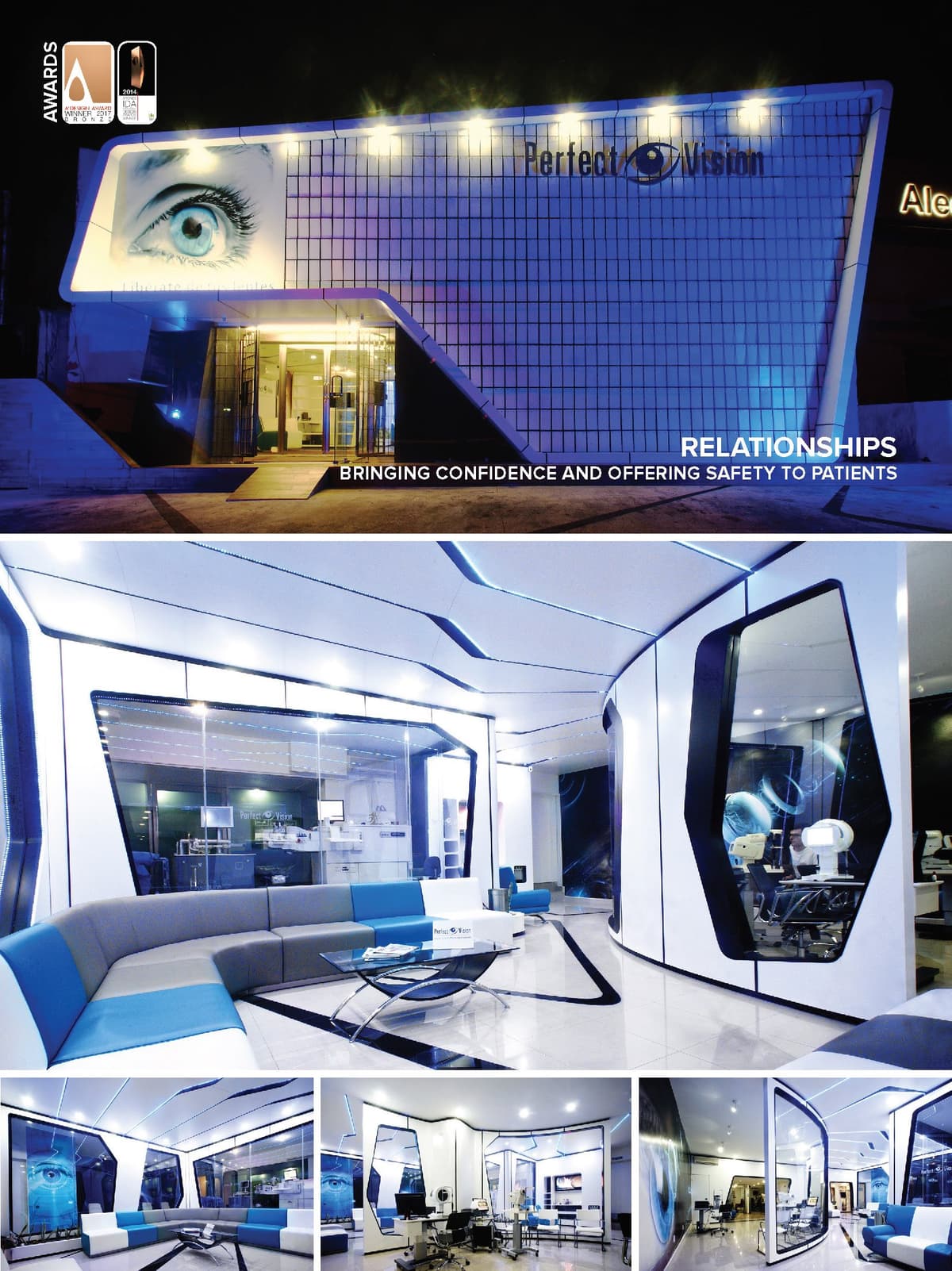

Perfect Vision is a Laser Ophthalmology Institute dedicated to advanced treatments with the latest technology equipment. The entrusted objective for his remodeling was being able to transmit across the design, the confidence and safety with technology and vanguard to the clients who come to the clinic. To offer an innovation and perfection image and at the same time to offer safety and tranquility. To transmit the sensation of cleanliness we use futuristic lines, pure white colors with subtle blue lighting to bring peace and calm, accompanied by a comfortable waiting area with seating in various shades of relaxing tones.
Concept Design and Remodeling Purpose To entrust in the individual health is a fear that every person must confront in certain moment and to feel the tranquility of being in the right hands for any clinical procedure is a real relief. - Cancún, México. sanzpont [arquitectura]
The concept of design was generated from the inside to the outside, it was to create a spaceship interior environment, with the last generation technology, where across the glass transparency it could watch the different procedures that are realized by the suitable machines and the highly qualified staff. Those areas are defined by windows that delimit every space, complemented with images designed specifically for every zone, as wallpapers to give this galactic sensation of being inside a spaceship.
The exterior remodeling should reflect what happens on the inside, so a new aluminum skin façade was made with a futuristic aspect, inspired on an aerospace design. A white unfolded envelope was made to create the façade silhouette that complement itself with a graphical ocular image and a several white aluminum panels which are sensitive to the wind movement, generating soft waves inspired by Ned Khan work, with his invention of Kinetic Façades.
For the development of the project, we entrusted in the last generation BIM methodology (Building Information Modeling) and Digital Fabrication, where every piece was modeled in 3D with his information, measures and materials in Autodesk Revit, to be digitally made through a Computer Numerical Control in different materials like wood, aluminum and PVC, to be assembled in the correct place. The use of the technology was the solution to realize with perfection and exigency every element.
INTERNATIONAL ARCHITECTURE AWARDS
• IDA Design Awards, Los Angeles, USA : Bronze Medal - Interior Renovation Design : Perfect Vision, Cancún (2015)
• A’ Design Awards, Milán, Italy : Bronze Medal - Certificate of Excellence in World Interior Design & Exhibition Spaces : Perfect Vision (2015)


INTERNATIONAL ARCHITECTURE AWARDS
• IDA Design Awards, Los Angeles, USA : Bronze Medal - Interior Renovation Design : Perfect Vision, Cancún (2015)
• A’ Design Awards, Milán, Italy : Bronze Medal - Certificate of Excellence in World Interior Design & Exhibition Spaces : Perfect Vision (2015)
Perfect Vision is a Laser Ophthalmology Institute dedicated to advanced treatments with the latest technology equipment. The entrusted objective for his remodeling was being able to transmit across the design, the confidence and safety with technology and vanguard to the clients who come to the clinic. To offer an innovation and perfection image and at the same time to offer safety and tranquility. To transmit the sensation of cleanliness we use futuristic lines, pure white colors with subtle blue lighting to bring peace and calm, accompanied by a comfortable waiting area with seating in various shades of relaxing tones.
Concept Design and Remodeling Purpose To entrust in the individual health is a fear that every person must confront in certain moment and to feel the tranquility of being in the right hands for any clinical procedure is a real relief. - Cancún, México. sanzpont [arquitectura]
The concept of design was generated from the inside to the outside, it was to create a spaceship interior environment, with the last generation technology, where across the glass transparency it could watch the different procedures that are realized by the suitable machines and the highly qualified staff. Those areas are defined by windows that delimit every space, complemented with images designed specifically for every zone, as wallpapers to give this galactic sensation of being inside a spaceship.
The exterior remodeling should reflect what happens on the inside, so a new aluminum skin façade was made with a futuristic aspect, inspired on an aerospace design. A white unfolded envelope was made to create the façade silhouette that complement itself with a graphical ocular image and a several white aluminum panels which are sensitive to the wind movement, generating soft waves inspired by Ned Khan work, with his invention of Kinetic Façades.
For the development of the project, we entrusted in the last generation BIM methodology (Building Information Modeling) and Digital Fabrication, where every piece was modeled in 3D with his information, measures and materials in Autodesk Revit, to be digitally made through a Computer Numerical Control in different materials like wood, aluminum and PVC, to be assembled in the correct place. The use of the technology was the solution to realize with perfection and exigency every element.
© 2021 by sanzpont [arquitectura] . Webpage by sanzpont [digital] . Innovative Digital Experiences
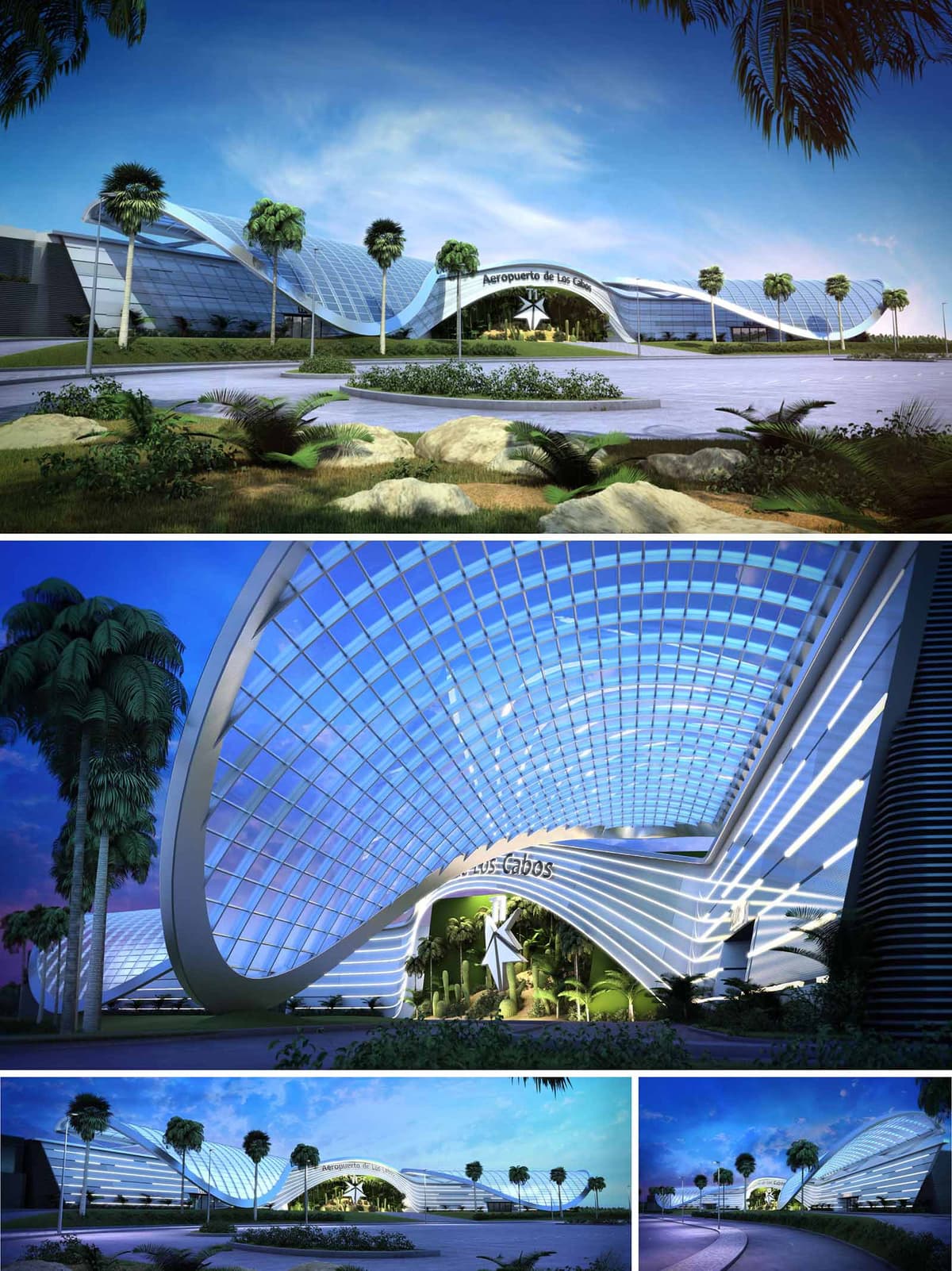

The architectural concept for SJD Airport T1 is conceived as a fluid coastal landscape, translating the motion of sea waves and desert dunes into an iconic terminal façade. The envelope acts as a continuous ribbon that rises, folds, and descends, framing the main entrance and creating a memorable urban gateway for Los Cabos. This gesture synthesizes infrastructure performance with a strong territorial image, positioning the terminal as both transportation hub and regional landmark.
The building’s geometry is based on sweeping, parametric curves that generate a lightweight, transparent shell. This shell mediates between the intense exterior climate and the controlled interior environment, while allowing travelers to experience the sky, light, and vegetation that characterize the Baja California peninsula. The result is a contemporary, expressive architecture that remains rooted in its natural and cultural context.
The main volume is defined by an undulating steel space frame that spans large distances with minimal vertical supports, ensuring uncluttered circulation zones beneath. This structural grid supports a mixed envelope of high-performance glazing and opaque insulated panels, organized in ribbons that reinforce the sense of horizontal movement along the terminal front.
The glazed surfaces form a continuous skylight vault over the forecourt, transforming the drop-off area into a semi-interior plaza. The curvature of the shell is carefully calibrated to channel wind loads and optimize solar exposure, while its double curvature expresses structural efficiency and dynamism. The primary arches frame the access portal and create a monumental canopy that is legible from the approach road and the airfield.
The landside approach is designed as a gradual transition from desert landscape to shaded oasis. Native rocks, low-water groundcovers, and sculptural cacti anchor the arrival sequence, while palm trees punctuate the perspective and dialogue with the vertical rhythm of the structure. Planting is arranged in layered bands that echo the façade’s flowing lines.
At the terminal entrance, a protected garden court is integrated beneath the largest structural loop. This microclimate, combining dense vegetation and water-efficient planting, creates a visual focal point and immediate sense of place for passengers. At night, integrated linear lighting amplifies the façade’s curvature, turning the structure into a luminous wave that orients visitors and enhances security.
Although the images focus on the exterior, the envelope is conceived to define a bright, legible interior. The large glazed vault filters daylight deep into the check-in and arrivals halls, reducing reliance on artificial lighting and supporting intuitive wayfinding. The main circulation axes run parallel to the façade, benefiting from long visual corridors that connect landside, security filters, and gates.
Interior finishes are envisioned as a restrained palette of light-toned surfaces, polished concrete or stone flooring, and warm accents in wood or textured panels, all reflecting natural light and emphasizing clarity. The structural rhythm and façade ribs are expressed internally as guiding lines, orienting movement while integrating signage, lighting, and mechanical systems in a coherent architectural language.
The project addresses Los Cabos’ intense sun and heat through a combination of passive and active strategies. The curved canopy creates extensive shaded zones over the forecourt and primary façades, significantly reducing solar gains on transparent areas. High-performance glazing with selective coatings, combined with external overhangs and frit patterns, ensures ample daylight with controlled glare and optimized thermal comfort.
The landscape strategy prioritizes native and adaptive species, minimizing irrigation needs and promoting biodiversity. Permeable surfaces and planted swales are integrated along the access roads to manage stormwater on site. The structural shell is conceived to support photovoltaic panels on selected opaque segments, enabling on-site renewable energy generation and offsetting a portion of the terminal’s electrical demand. Together, these measures transform the terminal from a purely functional infrastructure into a responsible, climate-conscious landmark.


The architectural concept for SJD Airport T1 is conceived as a fluid coastal landscape, translating the motion of sea waves and desert dunes into an iconic terminal façade. The envelope acts as a continuous ribbon that rises, folds, and descends, framing the main entrance and creating a memorable urban gateway for Los Cabos. This gesture synthesizes infrastructure performance with a strong territorial image, positioning the terminal as both transportation hub and regional landmark.
The building’s geometry is based on sweeping, parametric curves that generate a lightweight, transparent shell. This shell mediates between the intense exterior climate and the controlled interior environment, while allowing travelers to experience the sky, light, and vegetation that characterize the Baja California peninsula. The result is a contemporary, expressive architecture that remains rooted in its natural and cultural context.
The main volume is defined by an undulating steel space frame that spans large distances with minimal vertical supports, ensuring uncluttered circulation zones beneath. This structural grid supports a mixed envelope of high-performance glazing and opaque insulated panels, organized in ribbons that reinforce the sense of horizontal movement along the terminal front.
The glazed surfaces form a continuous skylight vault over the forecourt, transforming the drop-off area into a semi-interior plaza. The curvature of the shell is carefully calibrated to channel wind loads and optimize solar exposure, while its double curvature expresses structural efficiency and dynamism. The primary arches frame the access portal and create a monumental canopy that is legible from the approach road and the airfield.
The landside approach is designed as a gradual transition from desert landscape to shaded oasis. Native rocks, low-water groundcovers, and sculptural cacti anchor the arrival sequence, while palm trees punctuate the perspective and dialogue with the vertical rhythm of the structure. Planting is arranged in layered bands that echo the façade’s flowing lines.
At the terminal entrance, a protected garden court is integrated beneath the largest structural loop. This microclimate, combining dense vegetation and water-efficient planting, creates a visual focal point and immediate sense of place for passengers. At night, integrated linear lighting amplifies the façade’s curvature, turning the structure into a luminous wave that orients visitors and enhances security.
Although the images focus on the exterior, the envelope is conceived to define a bright, legible interior. The large glazed vault filters daylight deep into the check-in and arrivals halls, reducing reliance on artificial lighting and supporting intuitive wayfinding. The main circulation axes run parallel to the façade, benefiting from long visual corridors that connect landside, security filters, and gates.
Interior finishes are envisioned as a restrained palette of light-toned surfaces, polished concrete or stone flooring, and warm accents in wood or textured panels, all reflecting natural light and emphasizing clarity. The structural rhythm and façade ribs are expressed internally as guiding lines, orienting movement while integrating signage, lighting, and mechanical systems in a coherent architectural language.
The project addresses Los Cabos’ intense sun and heat through a combination of passive and active strategies. The curved canopy creates extensive shaded zones over the forecourt and primary façades, significantly reducing solar gains on transparent areas. High-performance glazing with selective coatings, combined with external overhangs and frit patterns, ensures ample daylight with controlled glare and optimized thermal comfort.
The landscape strategy prioritizes native and adaptive species, minimizing irrigation needs and promoting biodiversity. Permeable surfaces and planted swales are integrated along the access roads to manage stormwater on site. The structural shell is conceived to support photovoltaic panels on selected opaque segments, enabling on-site renewable energy generation and offsetting a portion of the terminal’s electrical demand. Together, these measures transform the terminal from a purely functional infrastructure into a responsible, climate-conscious landmark.
© 2021 by sanzpont [arquitectura] . Webpage by sanzpont [digital] . Innovative Digital Experiences
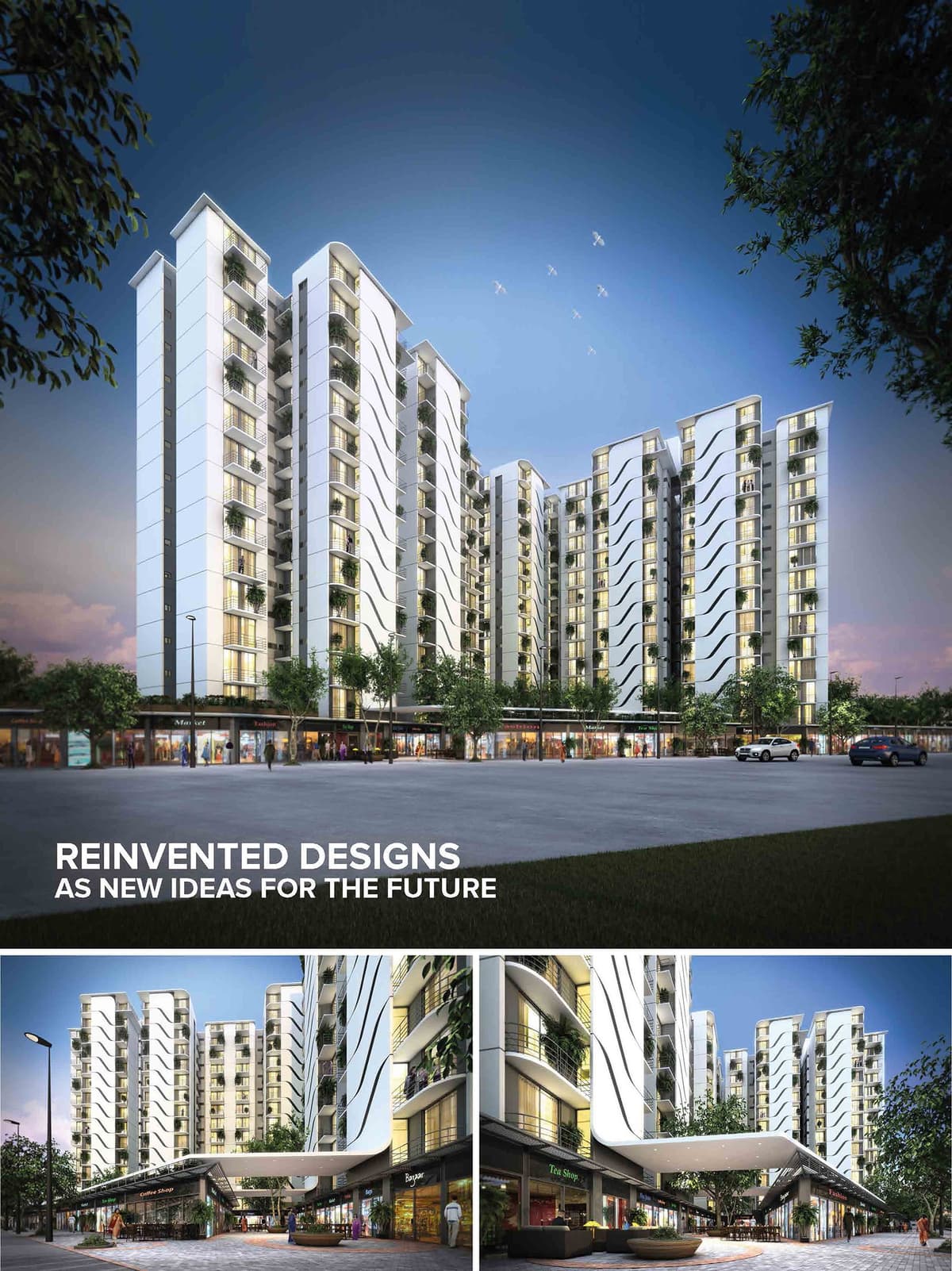

SKI Sector in Gurgaon is conceived as a contemporary mid-rise residential ensemble resting on an active commercial plinth. The architectural intention is to create a vertical neighborhood that merges urban vibrancy at ground level with calm, light-filled homes above. Curved facade lines and slender tower proportions soften the massing, ensuring the complex reads as a fluid, unified composition rather than a series of isolated blocks.
The design language is deliberately clean and minimal, using a restrained palette of light tones and linear elements to highlight volume, shadow, and rhythm. The towers frame a sequence of semi-urban courtyards and pedestrian passages, enabling residents to transition gradually from the public commercial realm to semi-public plazas and private residential zones.
The project is organized as a set of parallel towers rising from a continuous podium, establishing a strong urban edge along the street while opening internal vistas between the buildings. Verticality is emphasized through uninterrupted facade planes, recessed balcony bands, and corner glazing, giving the towers a slim, elegant profile against the skyline.
Gently undulating balcony fronts generate a wave-like pattern, animating the facade and breaking down the scale of the elevation. This rhythmic movement allows each tower to maintain an individual identity while remaining part of a coherent architectural family. Subtle step-backs at higher levels reduce visual bulk and improve access to daylight and views.
The envelope combines light-colored cladding with dark linear accents, producing a high-contrast yet refined aesthetic. Smooth, off-white panels form the primary surface, reflecting Gurgaon’s strong sunlight and moderating heat gain, while darker horizontal bands define balcony slabs and slab edges, reinforcing the building’s stratification.
Continuous glass balustrades and corner glazing panels enhance transparency, visually extending the living spaces outward. The wavy balcony fronts are expressed as thin, layered ribbons, providing both shading and a dynamic shadow play throughout the day. Integrated planter boxes at selected levels soften the vertical surfaces with greenery, subtly blurring the boundary between architecture and landscape.
The ground plane is activated by a continuous line of high-street retail, creating an animated frontage along the main access road. Generous canopies and soffits form sheltered walkways, protecting pedestrians from sun and rain while visually linking the various commercial units into a single urban arcade.
Double-height entrance zones and recessed lobbies mark the transition from public retail to residential circulation. Paving patterns, street furniture, and carefully positioned trees organize the pedestrian realm, guiding movement and encouraging lingering. The podium acts as a social condenser, offering everyday amenities at doorstep distance and contributing to a safer, lively streetscape.
Between the towers, landscaped courts and semi-covered plazas provide communal gathering areas that balance privacy with openness. These spaces are designed as extensions of the residential environment, featuring seating niches, soft planting, and shaded walkways that encourage informal interaction among residents.
Vertical landscaping on balconies and at podium edges complements ground-level planting, creating visual continuity from street to skyline. The arrangement of towers ensures view corridors to the surrounding cityscape while maintaining adequate buffer zones, resulting in a comfortable density that supports community life without overcrowding.
Sustainability in SKI Sector is approached through passive design, efficient building envelopes, and landscape-driven microclimate control. The light-toned facade reduces solar absorption, while the projecting balconies and wave-shaped ribbons act as horizontal brise-soleil, shading glass surfaces and reducing cooling demand. Deep overhangs at the commercial level further limit heat gain and glare for the shops and pedestrian areas.
Cross-ventilation is promoted through linear floor plates and strategically placed openings, enabling natural airflow across apartments and shared corridors. Integrated planters and tree-lined walkways help mitigate urban heat island effects and improve air quality. Space for potential rooftop solar installations and provisions for water-efficient landscaping and rainwater management support a holistic, future-ready sustainability framework aligned with the project’s tagline of “reinvented designs as new ideas for the future.”


SKI Sector in Gurgaon is conceived as a contemporary mid-rise residential ensemble resting on an active commercial plinth. The architectural intention is to create a vertical neighborhood that merges urban vibrancy at ground level with calm, light-filled homes above. Curved facade lines and slender tower proportions soften the massing, ensuring the complex reads as a fluid, unified composition rather than a series of isolated blocks.
The design language is deliberately clean and minimal, using a restrained palette of light tones and linear elements to highlight volume, shadow, and rhythm. The towers frame a sequence of semi-urban courtyards and pedestrian passages, enabling residents to transition gradually from the public commercial realm to semi-public plazas and private residential zones.
The project is organized as a set of parallel towers rising from a continuous podium, establishing a strong urban edge along the street while opening internal vistas between the buildings. Verticality is emphasized through uninterrupted facade planes, recessed balcony bands, and corner glazing, giving the towers a slim, elegant profile against the skyline.
Gently undulating balcony fronts generate a wave-like pattern, animating the facade and breaking down the scale of the elevation. This rhythmic movement allows each tower to maintain an individual identity while remaining part of a coherent architectural family. Subtle step-backs at higher levels reduce visual bulk and improve access to daylight and views.
The envelope combines light-colored cladding with dark linear accents, producing a high-contrast yet refined aesthetic. Smooth, off-white panels form the primary surface, reflecting Gurgaon’s strong sunlight and moderating heat gain, while darker horizontal bands define balcony slabs and slab edges, reinforcing the building’s stratification.
Continuous glass balustrades and corner glazing panels enhance transparency, visually extending the living spaces outward. The wavy balcony fronts are expressed as thin, layered ribbons, providing both shading and a dynamic shadow play throughout the day. Integrated planter boxes at selected levels soften the vertical surfaces with greenery, subtly blurring the boundary between architecture and landscape.
The ground plane is activated by a continuous line of high-street retail, creating an animated frontage along the main access road. Generous canopies and soffits form sheltered walkways, protecting pedestrians from sun and rain while visually linking the various commercial units into a single urban arcade.
Double-height entrance zones and recessed lobbies mark the transition from public retail to residential circulation. Paving patterns, street furniture, and carefully positioned trees organize the pedestrian realm, guiding movement and encouraging lingering. The podium acts as a social condenser, offering everyday amenities at doorstep distance and contributing to a safer, lively streetscape.
Between the towers, landscaped courts and semi-covered plazas provide communal gathering areas that balance privacy with openness. These spaces are designed as extensions of the residential environment, featuring seating niches, soft planting, and shaded walkways that encourage informal interaction among residents.
Vertical landscaping on balconies and at podium edges complements ground-level planting, creating visual continuity from street to skyline. The arrangement of towers ensures view corridors to the surrounding cityscape while maintaining adequate buffer zones, resulting in a comfortable density that supports community life without overcrowding.
Sustainability in SKI Sector is approached through passive design, efficient building envelopes, and landscape-driven microclimate control. The light-toned facade reduces solar absorption, while the projecting balconies and wave-shaped ribbons act as horizontal brise-soleil, shading glass surfaces and reducing cooling demand. Deep overhangs at the commercial level further limit heat gain and glare for the shops and pedestrian areas.
Cross-ventilation is promoted through linear floor plates and strategically placed openings, enabling natural airflow across apartments and shared corridors. Integrated planters and tree-lined walkways help mitigate urban heat island effects and improve air quality. Space for potential rooftop solar installations and provisions for water-efficient landscaping and rainwater management support a holistic, future-ready sustainability framework aligned with the project’s tagline of “reinvented designs as new ideas for the future.”
© 2021 by sanzpont [arquitectura] . Webpage by sanzpont [digital] . Innovative Digital Experiences
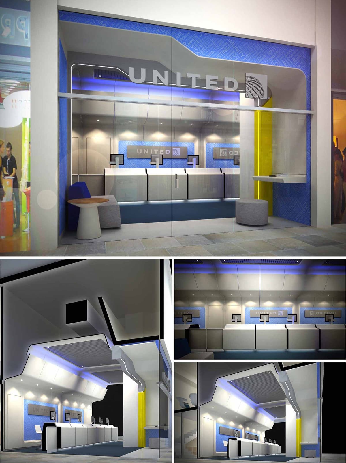

The United Airlines CTO space in Santa Fe is conceived as a three-dimensional translation of the airline experience, bringing the language of aircraft cabins and jetways into a compact commercial front. The design emphasizes dynamism, clarity of orientation, and a sense of technological precision, reflecting the identity of an international carrier while responding to the high-traffic context of a corporate and retail hub.
The envelope is treated as a continuous fuselage-like shell that folds from ceiling to façade and frames the check-in counters in a single gesture. This sculpted geometry guides the eye from the public corridor into the service area, reinforcing a narrative of movement, boarding, and connection. The overall image projects efficiency and reliability, while remaining approachable and human-scaled.
The plan is organized as a linear sequence parallel to the storefront, optimizing visibility and user flow. A generous front zone behind the glass façade acts as a transition foyer, allowing users to read information, queue comfortably, or wait, without obstructing circulation in the mall.
The check-in line is set back slightly from the glass, creating a clear queueing corridor that intuitively orients passengers toward the service desks. Counters are modular and rhythmically repeated, allowing flexible staffing levels and easy reconfiguration. Peripheral niches integrate seating, informal work surfaces, and secondary services, making efficient use of the narrow depth of the unit.
The dominant volumetric element is a folded canopy that originates at the storefront and extends deep into the space. Its sharp, faceted geometry recalls the aerodynamic profiles of an aircraft wing, while also concealing technical systems such as air conditioning, cabling, and indirect lighting.
Recessed linear LED strips and perimeter cove lighting wash the ceiling planes, emphasizing the broken, angular forms and producing a floating effect over the counters. Accent blue lighting introduces a subtle chromatic gradient that reinforces brand recognition and contributes to a calm, travel-oriented atmosphere. Downlights over the work surfaces ensure optimal visual comfort and task illumination, reducing glare on screens and documents.
The material palette combines high-performance laminates, back-painted glass, and metal finishes in a controlled range of whites, grays, and blues. This restrained composition produces a clean, technical aesthetic aligned with aeronautical engineering and contemporary corporate architecture.
Blue wall panels with subtle graphic patterns form a continuous backdrop for the counters, integrating the airline’s visual identity without resorting to excessive signage. White and light gray surfaces maximize light diffusion and maintain visual clarity, while a contrasting yellow vertical plane at the side introduces a single, vivid accent that anchors the entrance and aids wayfinding. Upholstered seating elements and a small timber side table introduce tactile warmth within the otherwise sleek environment.
The counters are designed as hybrid analog-digital stations, with integrated monitors and equipment concealed within minimalist volumes to avoid visual clutter. The height and depth of the worktops are calibrated for ergonomic interaction between staff and passengers, facilitating document handling, device placement, and accessibility for people with reduced mobility.
Wall-mounted screens behind the counters act as both branding devices and dynamic information carriers, capable of displaying destinations, promotions, or operational messages. This layered information strategy ensures that essential content is legible from the corridor as well as from within the space, enhancing communication and operational flexibility.
Sustainability is approached through efficient systems, durable materials, and adaptable design. LED lighting throughout the project minimizes energy consumption and maintenance, while the indirect lighting strategy reduces the number of fixtures required to achieve uniform illumination. The bright, reflective interior surfaces contribute to higher light efficacy, allowing lower installed wattage.
Materials are selected for longevity and ease of cleaning in a high-traffic commercial environment, reducing replacement cycles and associated environmental impact. Modular counter components and demountable wall panels enable future reconfiguration, extending the service life of the fit-out and minimizing construction waste. The fully glazed façade optimizes visual connection and relies on the mall’s existing climate control, reducing the need for extensive additional HVAC equipment within the unit.


The United Airlines CTO space in Santa Fe is conceived as a three-dimensional translation of the airline experience, bringing the language of aircraft cabins and jetways into a compact commercial front. The design emphasizes dynamism, clarity of orientation, and a sense of technological precision, reflecting the identity of an international carrier while responding to the high-traffic context of a corporate and retail hub.
The envelope is treated as a continuous fuselage-like shell that folds from ceiling to façade and frames the check-in counters in a single gesture. This sculpted geometry guides the eye from the public corridor into the service area, reinforcing a narrative of movement, boarding, and connection. The overall image projects efficiency and reliability, while remaining approachable and human-scaled.
The plan is organized as a linear sequence parallel to the storefront, optimizing visibility and user flow. A generous front zone behind the glass façade acts as a transition foyer, allowing users to read information, queue comfortably, or wait, without obstructing circulation in the mall.
The check-in line is set back slightly from the glass, creating a clear queueing corridor that intuitively orients passengers toward the service desks. Counters are modular and rhythmically repeated, allowing flexible staffing levels and easy reconfiguration. Peripheral niches integrate seating, informal work surfaces, and secondary services, making efficient use of the narrow depth of the unit.
The dominant volumetric element is a folded canopy that originates at the storefront and extends deep into the space. Its sharp, faceted geometry recalls the aerodynamic profiles of an aircraft wing, while also concealing technical systems such as air conditioning, cabling, and indirect lighting.
Recessed linear LED strips and perimeter cove lighting wash the ceiling planes, emphasizing the broken, angular forms and producing a floating effect over the counters. Accent blue lighting introduces a subtle chromatic gradient that reinforces brand recognition and contributes to a calm, travel-oriented atmosphere. Downlights over the work surfaces ensure optimal visual comfort and task illumination, reducing glare on screens and documents.
The material palette combines high-performance laminates, back-painted glass, and metal finishes in a controlled range of whites, grays, and blues. This restrained composition produces a clean, technical aesthetic aligned with aeronautical engineering and contemporary corporate architecture.
Blue wall panels with subtle graphic patterns form a continuous backdrop for the counters, integrating the airline’s visual identity without resorting to excessive signage. White and light gray surfaces maximize light diffusion and maintain visual clarity, while a contrasting yellow vertical plane at the side introduces a single, vivid accent that anchors the entrance and aids wayfinding. Upholstered seating elements and a small timber side table introduce tactile warmth within the otherwise sleek environment.
The counters are designed as hybrid analog-digital stations, with integrated monitors and equipment concealed within minimalist volumes to avoid visual clutter. The height and depth of the worktops are calibrated for ergonomic interaction between staff and passengers, facilitating document handling, device placement, and accessibility for people with reduced mobility.
Wall-mounted screens behind the counters act as both branding devices and dynamic information carriers, capable of displaying destinations, promotions, or operational messages. This layered information strategy ensures that essential content is legible from the corridor as well as from within the space, enhancing communication and operational flexibility.
Sustainability is approached through efficient systems, durable materials, and adaptable design. LED lighting throughout the project minimizes energy consumption and maintenance, while the indirect lighting strategy reduces the number of fixtures required to achieve uniform illumination. The bright, reflective interior surfaces contribute to higher light efficacy, allowing lower installed wattage.
Materials are selected for longevity and ease of cleaning in a high-traffic commercial environment, reducing replacement cycles and associated environmental impact. Modular counter components and demountable wall panels enable future reconfiguration, extending the service life of the fit-out and minimizing construction waste. The fully glazed façade optimizes visual connection and relies on the mall’s existing climate control, reducing the need for extensive additional HVAC equipment within the unit.
© 2021 by sanzpont [arquitectura] . Webpage by sanzpont [digital] . Innovative Digital Experiences
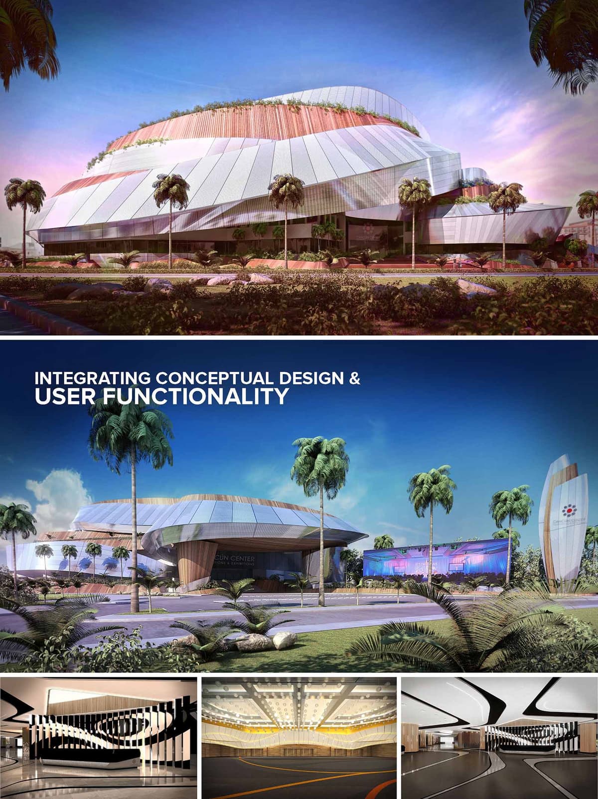

Cancún Center is conceived as a sculptural civic landmark that translates the fluidity of the Caribbean coastline into an iconic conference and events infrastructure. The building mass is modeled as a stratified geological formation, where overlapping shells and terraces evoke cliffs carved by wind and water. This organic volumetry softens the scale of a large convention complex and creates a dynamic silhouette that shifts throughout the day with the movement of the sun.
The architectural language blends resort-like informality with the rigor of high-performance event spaces. Exterior forms are intentionally faceted and folded to modulate light, shade and views, while framing generous public plazas that welcome both international visitors and local communities. The overall composition reinforces Cancún’s identity as a global destination, projecting an image of innovation, culture and hospitality.
The center is positioned as a hinge between the urban fabric and the surrounding landscape, with a forecourt that extends the public realm into the building. Palm-lined promenades guide visitors from drop-off zones to shaded plazas, integrating soft landscaping, water features and native planting to mediate the transition from street to lobby. The porous ground floor opens visually to the exterior, encouraging permeability and informal gathering.
Vehicular circulation is clearly separated from pedestrian flows, ensuring efficient access for large events while preserving a calm, resort-like pedestrian experience. Outdoor terraces and balconies at upper levels orient toward prevailing breezes and key vistas, allowing breakout activities to spill outside and reinforcing the connection to the Caribbean environment.
The envelope is articulated through layered, sloping planes of metal cladding combined with warmer timber-like surfaces. These contrasting materials emphasize the reading of the building as a sequence of geological strata, with metallic facets reflecting the sky and timber volumes grounding the composition. Select volumes are carved back to form deep overhangs, providing shade and creating generous canopies at the main entrances.
Vertical rhythm is introduced by slender structural elements and façade fins that regulate solar gain while adding texture to the building skin. At night, integrated LED lighting animates the outer shell, allowing the center to function as an urban beacon whose color and intensity can be tuned to different events, reinforcing its identity as a dynamic cultural platform.
Internally, the plan is organized around a clear circulation spine that links main lobbies, exhibition halls and conference rooms. This spine operates as an interior boulevard, designed to absorb large visitor flows while maintaining intuitive wayfinding and visual continuity. Flexibility is a primary driver: divisible halls, operable partitions and modular seating systems allow rapid reconfiguration from conventions and trade fairs to concerts and gala events.
Key public spaces are characterized by expressive ceiling geometries and integrated lighting, translating the exterior’s dynamism into the interior. Feature walls composed of vertical fins, sweeping lines and contrasting colors guide movement and create memorable nodes for orientation and social interaction. The interior palette combines light neutrals with warm wood finishes and accent lighting, producing a contemporary yet welcoming ambiance.
Natural light is carefully orchestrated through clerestories and controlled openings, bringing daylight into lobbies and circulation areas while maintaining blackout capability in performance and exhibition spaces. Indirect LED lighting systems with adjustable color temperature respond to different event typologies, enhancing atmosphere and supporting audiovisual requirements.
Acoustic performance is addressed through suspended ceiling baffles, perforated wall panels and sound-absorbing finishes integrated into the aesthetic language. These elements ensure clarity for speech, music and multimedia presentations while containing noise transmission between adjacent halls. Generous volumes, controlled reverberation and effective air distribution contribute to overall user comfort and event quality.
Sustainability is embedded through passive and active design strategies optimized for Cancún’s tropical climate. The building form, with its deep overhangs and faceted façades, reduces direct solar exposure and mitigates heat gain. High-performance glazing, ventilated façade systems and selective use of locally available materials lower the building’s environmental footprint and operational energy demand.
Landscaping employs native and drought-tolerant species, minimizing irrigation needs while enhancing biodiversity and microclimate comfort. Shaded outdoor areas, natural cross-ventilation in semi-open spaces and the potential integration of rainwater harvesting support resource efficiency. Provisions for efficient HVAC systems, LED lighting and building management controls complete a holistic approach that balances iconic architecture with responsible, long-term performance.
.jpg)


Cancún Center is conceived as a sculptural civic landmark that translates the fluidity of the Caribbean coastline into an iconic conference and events infrastructure. The building mass is modeled as a stratified geological formation, where overlapping shells and terraces evoke cliffs carved by wind and water. This organic volumetry softens the scale of a large convention complex and creates a dynamic silhouette that shifts throughout the day with the movement of the sun.
The architectural language blends resort-like informality with the rigor of high-performance event spaces. Exterior forms are intentionally faceted and folded to modulate light, shade and views, while framing generous public plazas that welcome both international visitors and local communities. The overall composition reinforces Cancún’s identity as a global destination, projecting an image of innovation, culture and hospitality.
The center is positioned as a hinge between the urban fabric and the surrounding landscape, with a forecourt that extends the public realm into the building. Palm-lined promenades guide visitors from drop-off zones to shaded plazas, integrating soft landscaping, water features and native planting to mediate the transition from street to lobby. The porous ground floor opens visually to the exterior, encouraging permeability and informal gathering.
Vehicular circulation is clearly separated from pedestrian flows, ensuring efficient access for large events while preserving a calm, resort-like pedestrian experience. Outdoor terraces and balconies at upper levels orient toward prevailing breezes and key vistas, allowing breakout activities to spill outside and reinforcing the connection to the Caribbean environment.
The envelope is articulated through layered, sloping planes of metal cladding combined with warmer timber-like surfaces. These contrasting materials emphasize the reading of the building as a sequence of geological strata, with metallic facets reflecting the sky and timber volumes grounding the composition. Select volumes are carved back to form deep overhangs, providing shade and creating generous canopies at the main entrances.
Vertical rhythm is introduced by slender structural elements and façade fins that regulate solar gain while adding texture to the building skin. At night, integrated LED lighting animates the outer shell, allowing the center to function as an urban beacon whose color and intensity can be tuned to different events, reinforcing its identity as a dynamic cultural platform.
Internally, the plan is organized around a clear circulation spine that links main lobbies, exhibition halls and conference rooms. This spine operates as an interior boulevard, designed to absorb large visitor flows while maintaining intuitive wayfinding and visual continuity. Flexibility is a primary driver: divisible halls, operable partitions and modular seating systems allow rapid reconfiguration from conventions and trade fairs to concerts and gala events.
Key public spaces are characterized by expressive ceiling geometries and integrated lighting, translating the exterior’s dynamism into the interior. Feature walls composed of vertical fins, sweeping lines and contrasting colors guide movement and create memorable nodes for orientation and social interaction. The interior palette combines light neutrals with warm wood finishes and accent lighting, producing a contemporary yet welcoming ambiance.
Natural light is carefully orchestrated through clerestories and controlled openings, bringing daylight into lobbies and circulation areas while maintaining blackout capability in performance and exhibition spaces. Indirect LED lighting systems with adjustable color temperature respond to different event typologies, enhancing atmosphere and supporting audiovisual requirements.
Acoustic performance is addressed through suspended ceiling baffles, perforated wall panels and sound-absorbing finishes integrated into the aesthetic language. These elements ensure clarity for speech, music and multimedia presentations while containing noise transmission between adjacent halls. Generous volumes, controlled reverberation and effective air distribution contribute to overall user comfort and event quality.
Sustainability is embedded through passive and active design strategies optimized for Cancún’s tropical climate. The building form, with its deep overhangs and faceted façades, reduces direct solar exposure and mitigates heat gain. High-performance glazing, ventilated façade systems and selective use of locally available materials lower the building’s environmental footprint and operational energy demand.
Landscaping employs native and drought-tolerant species, minimizing irrigation needs while enhancing biodiversity and microclimate comfort. Shaded outdoor areas, natural cross-ventilation in semi-open spaces and the potential integration of rainwater harvesting support resource efficiency. Provisions for efficient HVAC systems, LED lighting and building management controls complete a holistic approach that balances iconic architecture with responsible, long-term performance.
© 2021 by sanzpont [arquitectura] . Webpage by sanzpont [digital] . Innovative Digital Experiences
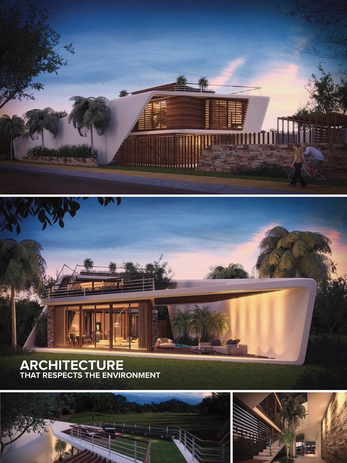

sanzpont [arquitectura] has recently won 1st Place in an International Private Competition to design a unique concept in residential development at the Riviera Maya surrounded by the Golf Course at Grand Coral. The challenge was to create a housing model to harmonize with the actual development of Grand Coral, but turning out as a new product in a set of 500m2 lots fronting the golf course, with contemporary design, adapted to the site and it´s natural context, which maximize the main views and to create an attractive and unique concept for the vacation home market.
Bioclimatic Design. The project takes Sustainability and Bioclimatic Design into account for the main design concept. The study of climate, weather comfort charts, geometry solar study and prevailing winds direction, suggest the use of sun protection, cross ventilation, passive solar design and main bioclimatic design strategy for maximum thermal comfort by natural means.
Concept / Architectural Scheme. The main idea is based on designing an opened home to the outside, as if it were a yacht concept, with a consecutive series of terraces, displacing the upper volume of the rooms backwards to generate views and outdoor areas to enjoy free and living together at different levels.
Main floor opens at the middle to locate the pool area creating an open courtyard living together among all surrounding areas: living room, kitchen and TV room.
Sustainable Design. All spaces are designed with natural cross ventilation. All covers are used as green roofs landscaped terraces resulting in a natural insulation and recovers rainwater for use in irrigation.


sanzpont [arquitectura] has recently won 1st Place in an International Private Competition to design a unique concept in residential development at the Riviera Maya surrounded by the Golf Course at Grand Coral. The challenge was to create a housing model to harmonize with the actual development of Grand Coral, but turning out as a new product in a set of 500m2 lots fronting the golf course, with contemporary design, adapted to the site and it´s natural context, which maximize the main views and to create an attractive and unique concept for the vacation home market.
Bioclimatic Design. The project takes Sustainability and Bioclimatic Design into account for the main design concept. The study of climate, weather comfort charts, geometry solar study and prevailing winds direction, suggest the use of sun protection, cross ventilation, passive solar design and main bioclimatic design strategy for maximum thermal comfort by natural means.
Concept / Architectural Scheme. The main idea is based on designing an opened home to the outside, as if it were a yacht concept, with a consecutive series of terraces, displacing the upper volume of the rooms backwards to generate views and outdoor areas to enjoy free and living together at different levels.
Main floor opens at the middle to locate the pool area creating an open courtyard living together among all surrounding areas: living room, kitchen and TV room.
Sustainable Design. All spaces are designed with natural cross ventilation. All covers are used as green roofs landscaped terraces resulting in a natural insulation and recovers rainwater for use in irrigation.
© 2021 by sanzpont [arquitectura] . Webpage by sanzpont [digital] . Innovative Digital Experiences
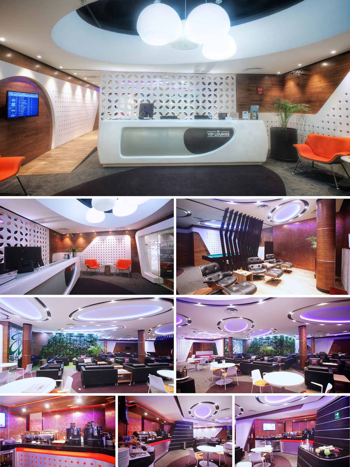

The VIP lounges for GAP Airports in SJD, TIJ and GDL redefine the waiting experience as a fluid, contemporary interior landscape. The concept is inspired by the dynamics of air travel: continuous flow, soft transitions and a perception of time that becomes more relaxed and diffuse. Organic geometries, perforated partitions and circular ceiling features evoke movement and lightness, while warm tones and tactile materials counterbalance the technological character of the airport environment.
The design establishes a recognizable brand language across different locations, using recurring elements such as sculpted reception desks, backlit feature walls and circular luminaires. These components create a cohesive identity that passengers can intuitively associate with comfort, privacy and premium service, regardless of the specific terminal.
The spatial organization is based on a clear sequence from public to private. The reception zone acts as a transitional filter between the hectic concourse and the controlled atmosphere of the lounge. Behind this threshold, the layout fragments into multiple seating typologies: individual workstations, informal lounge clusters, semi-private relaxation zones and dining areas.
Curved partitions, changes in flooring texture and variations in ceiling height subtly guide circulation while avoiding rigid corridors. Visual permeability is maintained through perforated screens and low furniture, allowing staff supervision and intuitive orientation, yet providing enough enclosure for guests to feel protected from the main concourse. Service areas such as buffet lines, bars and coffee stations are positioned centrally to reduce staff travel distances and to activate the social heart of each lounge.
The material palette combines warm woods, high-gloss solid surfaces and perforated composite panels. Timber cladding on walls and columns brings a sense of hospitality and continuity, while the white, sculpted reception counters and partitions add a precise, almost aerodynamic character reminiscent of aircraft interiors. The perforated panels create depth and texture, becoming a unifying skin that wraps walls and occasionally integrates lighting.
The chromatic strategy relies on a base of neutral grays and whites, enriched by copper and burgundy tones on accent walls. Strategic pops of orange in seating pieces and controlled LED color washes introduce energy without overwhelming the space. Upholstery choices balance durability with comfort, using easy-to-clean, fire-rated textiles and leathers suitable for intensive airport use.
Lighting design is central to the project’s identity. Large circular ceiling coves with integrated RGB LEDs generate a soft, indirect glow that can be tuned to different color temperatures throughout the day. These luminous rings visually anchor seating areas and reinforce the theme of movement and concentric trajectories associated with flight paths.
Task lighting is discreetly integrated into coves and furniture edges, avoiding glare and preserving a calm ambiance. Accent lighting highlights the reception desk, bar fronts and the vertical garden wall, creating focal points that help organize the visual field. The overall result is an interior that feels simultaneously high-tech and relaxing, where lighting becomes both functional infrastructure and key aesthetic element.
Furniture selection supports a wide range of passenger needs, from short business stops to longer layovers. Ergonomic lounge chairs with integrated footrests occupy quieter corners, while modular sofas and armchairs create flexible groupings in the main hall. Dining tables and bar-height counters respond to users who wish to work or eat while remaining connected to the activity of the lounge.
Curved millwork elements define coffee bars and self-service areas, facilitating efficient circulation during peak hours. Integrated power outlets and data connections are discreetly embedded into tables and partitions, allowing users to work without visible clutter of cables. Acoustical comfort is enhanced through soft finishes, carpets and the strategic placement of furniture to break sound propagation.
Sustainable criteria are incorporated through material selection, efficient systems and biophilic elements. High-durability, low-maintenance finishes reduce the need for replacement and minimize lifecycle impacts, while low-VOC paints and adhesives contribute to better indoor air quality. LED lighting with dimming and zoning significantly reduces energy consumption compared to conventional airport interiors.
The introduction of a green wall and abundant planters not only improves acoustics and visual comfort but also establishes a connection with nature in an otherwise highly artificial environment. Controlled natural light, where available, is balanced with shading and indirect artificial illumination to reduce glare and thermal gain. Together, these measures create a lounge environment that prioritizes passenger well-being while aligning with contemporary sustainability standards for commercial interiors.


The VIP lounges for GAP Airports in SJD, TIJ and GDL redefine the waiting experience as a fluid, contemporary interior landscape. The concept is inspired by the dynamics of air travel: continuous flow, soft transitions and a perception of time that becomes more relaxed and diffuse. Organic geometries, perforated partitions and circular ceiling features evoke movement and lightness, while warm tones and tactile materials counterbalance the technological character of the airport environment.
The design establishes a recognizable brand language across different locations, using recurring elements such as sculpted reception desks, backlit feature walls and circular luminaires. These components create a cohesive identity that passengers can intuitively associate with comfort, privacy and premium service, regardless of the specific terminal.
The spatial organization is based on a clear sequence from public to private. The reception zone acts as a transitional filter between the hectic concourse and the controlled atmosphere of the lounge. Behind this threshold, the layout fragments into multiple seating typologies: individual workstations, informal lounge clusters, semi-private relaxation zones and dining areas.
Curved partitions, changes in flooring texture and variations in ceiling height subtly guide circulation while avoiding rigid corridors. Visual permeability is maintained through perforated screens and low furniture, allowing staff supervision and intuitive orientation, yet providing enough enclosure for guests to feel protected from the main concourse. Service areas such as buffet lines, bars and coffee stations are positioned centrally to reduce staff travel distances and to activate the social heart of each lounge.
The material palette combines warm woods, high-gloss solid surfaces and perforated composite panels. Timber cladding on walls and columns brings a sense of hospitality and continuity, while the white, sculpted reception counters and partitions add a precise, almost aerodynamic character reminiscent of aircraft interiors. The perforated panels create depth and texture, becoming a unifying skin that wraps walls and occasionally integrates lighting.
The chromatic strategy relies on a base of neutral grays and whites, enriched by copper and burgundy tones on accent walls. Strategic pops of orange in seating pieces and controlled LED color washes introduce energy without overwhelming the space. Upholstery choices balance durability with comfort, using easy-to-clean, fire-rated textiles and leathers suitable for intensive airport use.
Lighting design is central to the project’s identity. Large circular ceiling coves with integrated RGB LEDs generate a soft, indirect glow that can be tuned to different color temperatures throughout the day. These luminous rings visually anchor seating areas and reinforce the theme of movement and concentric trajectories associated with flight paths.
Task lighting is discreetly integrated into coves and furniture edges, avoiding glare and preserving a calm ambiance. Accent lighting highlights the reception desk, bar fronts and the vertical garden wall, creating focal points that help organize the visual field. The overall result is an interior that feels simultaneously high-tech and relaxing, where lighting becomes both functional infrastructure and key aesthetic element.
Furniture selection supports a wide range of passenger needs, from short business stops to longer layovers. Ergonomic lounge chairs with integrated footrests occupy quieter corners, while modular sofas and armchairs create flexible groupings in the main hall. Dining tables and bar-height counters respond to users who wish to work or eat while remaining connected to the activity of the lounge.
Curved millwork elements define coffee bars and self-service areas, facilitating efficient circulation during peak hours. Integrated power outlets and data connections are discreetly embedded into tables and partitions, allowing users to work without visible clutter of cables. Acoustical comfort is enhanced through soft finishes, carpets and the strategic placement of furniture to break sound propagation.
Sustainable criteria are incorporated through material selection, efficient systems and biophilic elements. High-durability, low-maintenance finishes reduce the need for replacement and minimize lifecycle impacts, while low-VOC paints and adhesives contribute to better indoor air quality. LED lighting with dimming and zoning significantly reduces energy consumption compared to conventional airport interiors.
The introduction of a green wall and abundant planters not only improves acoustics and visual comfort but also establishes a connection with nature in an otherwise highly artificial environment. Controlled natural light, where available, is balanced with shading and indirect artificial illumination to reduce glare and thermal gain. Together, these measures create a lounge environment that prioritizes passenger well-being while aligning with contemporary sustainability standards for commercial interiors.
© 2021 by sanzpont [arquitectura] . Webpage by sanzpont [digital] . Innovative Digital Experiences
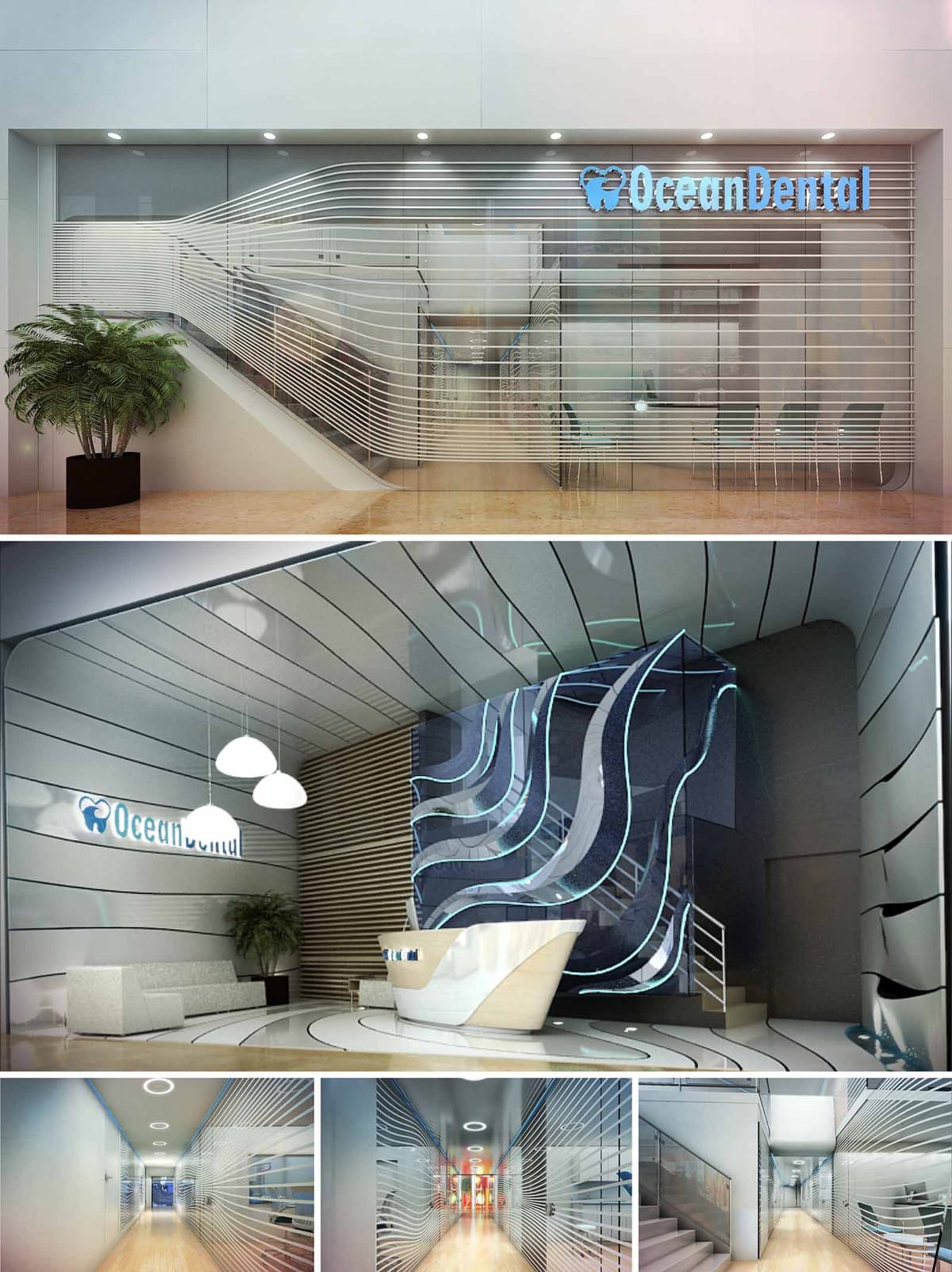

The Ocean Dental clinic in Cancún is conceived as an immersive spatial metaphor of the sea, translating waves, currents and transparency into built form. The design uses continuous flowing lines to guide users from the street into the treatment areas, evoking a calm and fluid journey that counteracts the anxiety often associated with healthcare environments. The architecture aims to merge branding, spatial orientation, and emotional comfort into one coherent, ocean-inspired narrative.
The overall composition is based on the repetition and deformation of horizontal bands that behave like abstracted wave fronts. These bands shape the façade, define ceilings and walls, and visually connect circulation spaces, creating a strong identity that is instantly recognizable from the public realm.
The main façade is a fully glazed plane behind a field of slender horizontal fins that undulate across the entire front. These white linear elements act simultaneously as sun-screening louvers, visual filters and a dynamic graphic layer that communicates movement and depth. The louvers thicken and compress near the stair area, subtly announcing the vertical circulation behind the glass and drawing the eye inward.
Transparency is carefully calibrated: the public can visually access the lobby while interior users are protected from direct street exposure. The Ocean Dental logo and signage are integrated into the glazing and fin system, reinforcing brand visibility without adding clutter to the composition.
Upon entry, visitors encounter a double-height reception space dominated by a sculptural wave wall in deep blue tones, traversed by illuminated curvilinear lines. This element anchors the interior and visually continues the façade language, creating a sense of continuity between outside and inside. Indirect LED lighting traces the curves, producing a tranquil, aquatic glow that defines the clinic’s atmosphere.
The reception desk, with its soft, carved geometry in white and light wood, recalls a boat hull resting on the shore. Seating areas are organized to maintain clear visual axes to the desk and vertical circulation, simplifying wayfinding. Surfaces in neutral grays and whites are contrasted with warm timber elements, balancing a clinical perception of cleanliness with a more residential sense of comfort.
Circulation corridors extend the motif of parallel bands, now rendered as semi-transparent wall cladding and glass partitions. This strategy generates a rhythmic perspective, elongating the space and visually unifying different functional zones. The linear LED lighting and circular ceiling fixtures provide both orientation and visual punctuation along the corridors.
The layout separates public waiting, administrative areas, and treatment zones while keeping them visually connected through glazed partitions. This promotes staff efficiency and passive supervision while preserving acoustic privacy in clinical rooms. Vertical movement through the stair is highlighted by clear balustrades and continuous handrails, reinforcing the light, floating character of the interior.
The material palette is intentionally restrained: glass, painted plaster, white solid surfaces, and warm wood floors. The high reflectance of finishes enhances the penetration of natural light and reduces the need for artificial lighting during the day. Soft blue accents, integrated into feature walls and light strips, reintroduce the marine concept without overwhelming the neutral clinical base.
Lighting design is predominantly indirect, avoiding glare for patients and staff. Recessed linear fixtures wash walls and ceilings, while pendant luminaires above the reception and seating areas create more intimate, human-scaled zones within the larger volume.
Sustainability is approached through passive and active strategies embedded in the architecture. The external horizontal fins act as shading devices, limiting solar gain on the fully glazed façade and reducing cooling loads in Cancún’s warm climate. High-performance glazing and airtight framing systems contribute to thermal efficiency and acoustic comfort.
Inside, the extensive use of glass partitions maximizes daylight penetration, decreasing reliance on artificial lighting and supporting circadian well-being. Energy-efficient LED fixtures with controlled color temperature ensure low consumption and visual comfort. Durable, low-maintenance materials are selected for high-traffic healthcare use, minimizing replacement cycles and associated environmental impacts. The biophilic integration of plants in the lobby completes the experience, providing natural reference points that reinforce patient relaxation and enhance indoor air quality.


The Ocean Dental clinic in Cancún is conceived as an immersive spatial metaphor of the sea, translating waves, currents and transparency into built form. The design uses continuous flowing lines to guide users from the street into the treatment areas, evoking a calm and fluid journey that counteracts the anxiety often associated with healthcare environments. The architecture aims to merge branding, spatial orientation, and emotional comfort into one coherent, ocean-inspired narrative.
The overall composition is based on the repetition and deformation of horizontal bands that behave like abstracted wave fronts. These bands shape the façade, define ceilings and walls, and visually connect circulation spaces, creating a strong identity that is instantly recognizable from the public realm.
The main façade is a fully glazed plane behind a field of slender horizontal fins that undulate across the entire front. These white linear elements act simultaneously as sun-screening louvers, visual filters and a dynamic graphic layer that communicates movement and depth. The louvers thicken and compress near the stair area, subtly announcing the vertical circulation behind the glass and drawing the eye inward.
Transparency is carefully calibrated: the public can visually access the lobby while interior users are protected from direct street exposure. The Ocean Dental logo and signage are integrated into the glazing and fin system, reinforcing brand visibility without adding clutter to the composition.
Upon entry, visitors encounter a double-height reception space dominated by a sculptural wave wall in deep blue tones, traversed by illuminated curvilinear lines. This element anchors the interior and visually continues the façade language, creating a sense of continuity between outside and inside. Indirect LED lighting traces the curves, producing a tranquil, aquatic glow that defines the clinic’s atmosphere.
The reception desk, with its soft, carved geometry in white and light wood, recalls a boat hull resting on the shore. Seating areas are organized to maintain clear visual axes to the desk and vertical circulation, simplifying wayfinding. Surfaces in neutral grays and whites are contrasted with warm timber elements, balancing a clinical perception of cleanliness with a more residential sense of comfort.
Circulation corridors extend the motif of parallel bands, now rendered as semi-transparent wall cladding and glass partitions. This strategy generates a rhythmic perspective, elongating the space and visually unifying different functional zones. The linear LED lighting and circular ceiling fixtures provide both orientation and visual punctuation along the corridors.
The layout separates public waiting, administrative areas, and treatment zones while keeping them visually connected through glazed partitions. This promotes staff efficiency and passive supervision while preserving acoustic privacy in clinical rooms. Vertical movement through the stair is highlighted by clear balustrades and continuous handrails, reinforcing the light, floating character of the interior.
The material palette is intentionally restrained: glass, painted plaster, white solid surfaces, and warm wood floors. The high reflectance of finishes enhances the penetration of natural light and reduces the need for artificial lighting during the day. Soft blue accents, integrated into feature walls and light strips, reintroduce the marine concept without overwhelming the neutral clinical base.
Lighting design is predominantly indirect, avoiding glare for patients and staff. Recessed linear fixtures wash walls and ceilings, while pendant luminaires above the reception and seating areas create more intimate, human-scaled zones within the larger volume.
Sustainability is approached through passive and active strategies embedded in the architecture. The external horizontal fins act as shading devices, limiting solar gain on the fully glazed façade and reducing cooling loads in Cancún’s warm climate. High-performance glazing and airtight framing systems contribute to thermal efficiency and acoustic comfort.
Inside, the extensive use of glass partitions maximizes daylight penetration, decreasing reliance on artificial lighting and supporting circadian well-being. Energy-efficient LED fixtures with controlled color temperature ensure low consumption and visual comfort. Durable, low-maintenance materials are selected for high-traffic healthcare use, minimizing replacement cycles and associated environmental impacts. The biophilic integration of plants in the lobby completes the experience, providing natural reference points that reinforce patient relaxation and enhance indoor air quality.
© 2021 by sanzpont [arquitectura] . Webpage by sanzpont [digital] . Innovative Digital Experiences
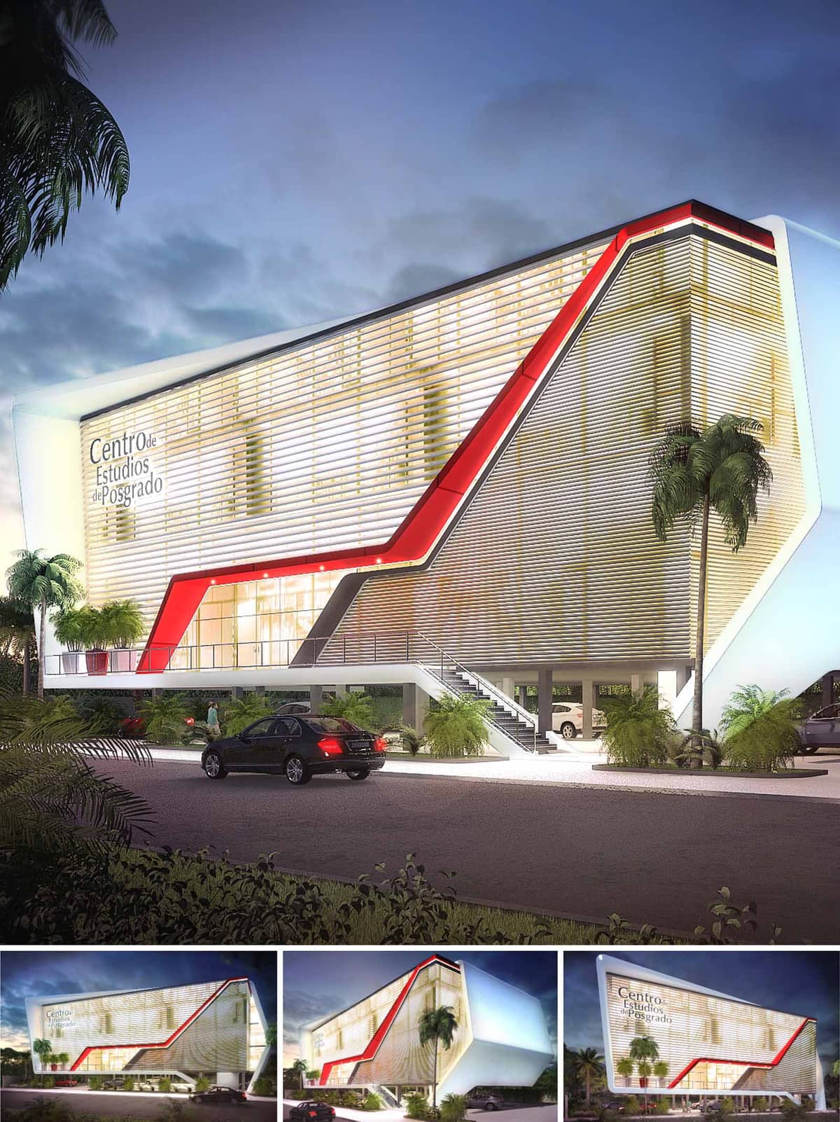

The Postgraduate Building in Cancún is conceived as a compact, iconic volume that projects the institutional identity of an advanced education center. Its pure prismatic form is subtly twisted and enveloped by a continuous skin, emphasizing horizontality and dynamism. A bold red gesture cuts diagonally across the façade, functioning simultaneously as a wayfinding element and as a graphic representation of academic progression and growth. The building is raised above ground level, providing a permeable base that visually lightens the mass and creates an urban porch that welcomes students and visitors.
The concept seeks to reconcile the clarity and efficiency of a commercial building with the symbolic presence required by a postgraduate institution. The resulting architecture is recognizable from a distance, acting as an urban landmark along the vehicular corridors of Cancún while maintaining a human-scale interface at the entrance level.
The project is organized as a three- to four-level volume occupying a compact footprint, responding to the limited plot size and the surrounding vehicular context. The elevated main body allows for shaded parking and drop-off areas underneath, improving circulation on site and freeing the ground plane for landscaping and pedestrian flows. A frontal stair and ramp system, clearly highlighted within the red frame, guide users to the main lobby level, establishing an intuitive arrival sequence.
Inside, the plan is arranged along a central circulation spine, with teaching spaces, seminar rooms and support offices positioned along the façades to maximize natural light. Public and semi-public functions are oriented to the front, engaging with the street, while more private academic and administrative areas are placed towards the quieter sides. The compact plan reduces internal travel distances and allows for flexible reconfiguration of classrooms over time.
The architectural expression is dominated by a double façade composed of horizontal louvers, behind which a glazed curtain wall defines the climatic envelope. This layered system governs the building’s image by day, with soft, filtered reflections, and by night, when the interior illumination converts the volume into a luminous lantern. The louvers create a continuous, almost ethereal skin that visually unifies the different elevations and conceals structural elements.
The red structural-cladding band is introduced as a deliberate contrast to the neutral palette of whites and light metallic tones. It underlines circulation paths, frames the main entrance, and traces a diagonal movement that reinforces the dynamic academic character of the institution. The base structure and circulation cores are expressed in exposed concrete and steel, chosen for durability in the coastal environment and to minimize maintenance.
Natural light is the primary organizer of interior spaces. The horizontal louvers modulate solar incidence, producing evenly lit classrooms that avoid glare, which is crucial for digital projections and prolonged study sessions. Behind the screened façade, transparent and translucent glass panels are combined to balance outward views with privacy, depending on the function of each space.
The interior color strategy is derived from the façade: predominantly neutral surfaces in white and light gray serve as a calm background for learning activities, while controlled accents of red appear in handrails, signage and furniture pieces to reinforce orientation and institutional identity. At night, warm artificial lighting activates the façade and undercroft, ensuring visual comfort and security without excessive energy consumption.
The building employs a regular structural grid in reinforced concrete, optimized for open-plan academic floors that can evolve with changing pedagogical needs. The elevated volume not only creates sheltered parking but also promotes cross-ventilation at ground level, reducing heat accumulation around the building. The compact massing minimizes exposed envelope area relative to usable floor space, supporting energy-efficient operation.
Given Cancún’s tropical climate, the environmental strategy centers on passive measures. The ventilated double skin of louvers acts as a solar filter, reducing direct heat gain while allowing daylight penetration, which lowers dependence on artificial lighting. The orientation of the main façades and the depth of overhangs are calibrated to protect from intense sun and rain. Landscape areas around and beneath the building incorporate native and low-maintenance vegetation, improving microclimate and stormwater absorption. Provision is made for high-efficiency HVAC systems, low-consumption lighting, and the future integration of rooftop photovoltaic panels, aligning the project with contemporary sustainable campus standards.


The Postgraduate Building in Cancún is conceived as a compact, iconic volume that projects the institutional identity of an advanced education center. Its pure prismatic form is subtly twisted and enveloped by a continuous skin, emphasizing horizontality and dynamism. A bold red gesture cuts diagonally across the façade, functioning simultaneously as a wayfinding element and as a graphic representation of academic progression and growth. The building is raised above ground level, providing a permeable base that visually lightens the mass and creates an urban porch that welcomes students and visitors.
The concept seeks to reconcile the clarity and efficiency of a commercial building with the symbolic presence required by a postgraduate institution. The resulting architecture is recognizable from a distance, acting as an urban landmark along the vehicular corridors of Cancún while maintaining a human-scale interface at the entrance level.
The project is organized as a three- to four-level volume occupying a compact footprint, responding to the limited plot size and the surrounding vehicular context. The elevated main body allows for shaded parking and drop-off areas underneath, improving circulation on site and freeing the ground plane for landscaping and pedestrian flows. A frontal stair and ramp system, clearly highlighted within the red frame, guide users to the main lobby level, establishing an intuitive arrival sequence.
Inside, the plan is arranged along a central circulation spine, with teaching spaces, seminar rooms and support offices positioned along the façades to maximize natural light. Public and semi-public functions are oriented to the front, engaging with the street, while more private academic and administrative areas are placed towards the quieter sides. The compact plan reduces internal travel distances and allows for flexible reconfiguration of classrooms over time.
The architectural expression is dominated by a double façade composed of horizontal louvers, behind which a glazed curtain wall defines the climatic envelope. This layered system governs the building’s image by day, with soft, filtered reflections, and by night, when the interior illumination converts the volume into a luminous lantern. The louvers create a continuous, almost ethereal skin that visually unifies the different elevations and conceals structural elements.
The red structural-cladding band is introduced as a deliberate contrast to the neutral palette of whites and light metallic tones. It underlines circulation paths, frames the main entrance, and traces a diagonal movement that reinforces the dynamic academic character of the institution. The base structure and circulation cores are expressed in exposed concrete and steel, chosen for durability in the coastal environment and to minimize maintenance.
Natural light is the primary organizer of interior spaces. The horizontal louvers modulate solar incidence, producing evenly lit classrooms that avoid glare, which is crucial for digital projections and prolonged study sessions. Behind the screened façade, transparent and translucent glass panels are combined to balance outward views with privacy, depending on the function of each space.
The interior color strategy is derived from the façade: predominantly neutral surfaces in white and light gray serve as a calm background for learning activities, while controlled accents of red appear in handrails, signage and furniture pieces to reinforce orientation and institutional identity. At night, warm artificial lighting activates the façade and undercroft, ensuring visual comfort and security without excessive energy consumption.
The building employs a regular structural grid in reinforced concrete, optimized for open-plan academic floors that can evolve with changing pedagogical needs. The elevated volume not only creates sheltered parking but also promotes cross-ventilation at ground level, reducing heat accumulation around the building. The compact massing minimizes exposed envelope area relative to usable floor space, supporting energy-efficient operation.
Given Cancún’s tropical climate, the environmental strategy centers on passive measures. The ventilated double skin of louvers acts as a solar filter, reducing direct heat gain while allowing daylight penetration, which lowers dependence on artificial lighting. The orientation of the main façades and the depth of overhangs are calibrated to protect from intense sun and rain. Landscape areas around and beneath the building incorporate native and low-maintenance vegetation, improving microclimate and stormwater absorption. Provision is made for high-efficiency HVAC systems, low-consumption lighting, and the future integration of rooftop photovoltaic panels, aligning the project with contemporary sustainable campus standards.
© 2021 by sanzpont [arquitectura] . Webpage by sanzpont [digital] . Innovative Digital Experiences
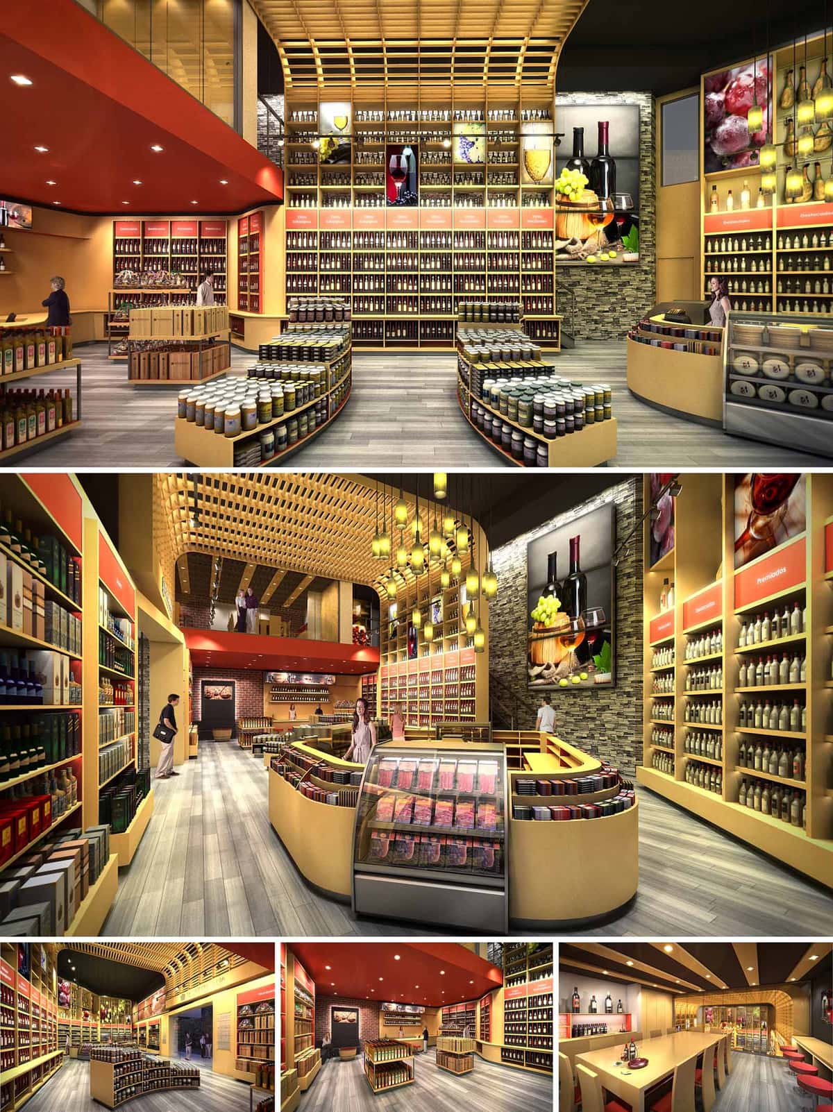

The “Viña del Mar” store is conceived as a contemporary urban wine cellar, where retail merges with an immersive gastronomic experience. The design evokes the warmth of traditional wineries while adopting a clean, modern language suitable for a high-traffic commercial setting. A sweeping central gesture of curved counters and shelving organizes the space and intuitively guides visitors through a narrative of wine, preserves, and gourmet products. Overhead, a timber lattice ceiling recalls crates and barrels, visually stitching the different areas together and creating a recognizable spatial identity that reinforces the brand’s connection to the wine culture of the region.
The layout is structured through a clear perimeter–core strategy. Tall shelving lines the walls, providing high-density display for bottles and packaged products, while lower, curved gondolas occupy the center, favoring visibility and easy access. From the entrance, visitors are naturally drawn along a main axis that opens into a double-height space, encouraging full exploration of the store. Service functions such as checkout counters and refrigerated display cases are positioned to maintain continuous sightlines and avoid visual barriers. A tasting and social area at the rear acts as the experiential climax of the journey, transitioning from quick purchasing to slower, more contemplative consumption.
Material choices blend warmth, durability, and brand expression. Light-toned wood dominates the gondolas, ceiling lattice, and framing elements, delivering a welcoming ambience while visually unifying the composition. Stone-clad feature walls introduce a tactile reference to winery architecture and vineyard landscapes, adding depth and texture. The chromatic base of beige and gray is punctuated by strategic accents of deep red and warm orange on bulkheads, signage bands, and seating; these tones subtly reference wine hues without overwhelming the eye. The continuous gray flooring, with a linear pattern, reinforces directionality and withstands intense use, simplifying maintenance in an environment with constant product handling.
Lighting is designed as both a functional tool and a storytelling element. Recessed downlights in the red ceiling plane provide uniform ambient illumination, ensuring safe and comfortable navigation. A cluster of pendant luminaires descends from the timber lattice, creating a luminous focal point over the central area and emphasizing the double-height volume. Linear LED strips integrated into wall shelving highlight bottles and labels, improving product legibility while giving the merchandise a refined, gallery-like presence. Large-scale food and wine graphics, framed within illuminated niches, reinforce the brand narrative and bring color and texture to vertical surfaces without adding physical clutter.
Sustainability is addressed through material selection, lighting strategy, and efficient planning. The predominance of engineered and certified woods reduces environmental impact and allows for modular fabrication, minimizing waste during construction and facilitating future reconfiguration of the store. LED technology is used throughout, combining low energy consumption with long service life and reduced heat emission, which in turn lowers cooling loads. Lighting is zoned to allow partial operation during off-peak hours. The compact arrangement of storage and service areas behind the main floor shortens internal logistics routes, improving staff efficiency and reducing the need for additional conditioned back-of-house space, thereby optimizing both operational and environmental performance.


The “Viña del Mar” store is conceived as a contemporary urban wine cellar, where retail merges with an immersive gastronomic experience. The design evokes the warmth of traditional wineries while adopting a clean, modern language suitable for a high-traffic commercial setting. A sweeping central gesture of curved counters and shelving organizes the space and intuitively guides visitors through a narrative of wine, preserves, and gourmet products. Overhead, a timber lattice ceiling recalls crates and barrels, visually stitching the different areas together and creating a recognizable spatial identity that reinforces the brand’s connection to the wine culture of the region.
The layout is structured through a clear perimeter–core strategy. Tall shelving lines the walls, providing high-density display for bottles and packaged products, while lower, curved gondolas occupy the center, favoring visibility and easy access. From the entrance, visitors are naturally drawn along a main axis that opens into a double-height space, encouraging full exploration of the store. Service functions such as checkout counters and refrigerated display cases are positioned to maintain continuous sightlines and avoid visual barriers. A tasting and social area at the rear acts as the experiential climax of the journey, transitioning from quick purchasing to slower, more contemplative consumption.
Material choices blend warmth, durability, and brand expression. Light-toned wood dominates the gondolas, ceiling lattice, and framing elements, delivering a welcoming ambience while visually unifying the composition. Stone-clad feature walls introduce a tactile reference to winery architecture and vineyard landscapes, adding depth and texture. The chromatic base of beige and gray is punctuated by strategic accents of deep red and warm orange on bulkheads, signage bands, and seating; these tones subtly reference wine hues without overwhelming the eye. The continuous gray flooring, with a linear pattern, reinforces directionality and withstands intense use, simplifying maintenance in an environment with constant product handling.
Lighting is designed as both a functional tool and a storytelling element. Recessed downlights in the red ceiling plane provide uniform ambient illumination, ensuring safe and comfortable navigation. A cluster of pendant luminaires descends from the timber lattice, creating a luminous focal point over the central area and emphasizing the double-height volume. Linear LED strips integrated into wall shelving highlight bottles and labels, improving product legibility while giving the merchandise a refined, gallery-like presence. Large-scale food and wine graphics, framed within illuminated niches, reinforce the brand narrative and bring color and texture to vertical surfaces without adding physical clutter.
Sustainability is addressed through material selection, lighting strategy, and efficient planning. The predominance of engineered and certified woods reduces environmental impact and allows for modular fabrication, minimizing waste during construction and facilitating future reconfiguration of the store. LED technology is used throughout, combining low energy consumption with long service life and reduced heat emission, which in turn lowers cooling loads. Lighting is zoned to allow partial operation during off-peak hours. The compact arrangement of storage and service areas behind the main floor shortens internal logistics routes, improving staff efficiency and reducing the need for additional conditioned back-of-house space, thereby optimizing both operational and environmental performance.
© 2021 by sanzpont [arquitectura] . Webpage by sanzpont [digital] . Innovative Digital Experiences
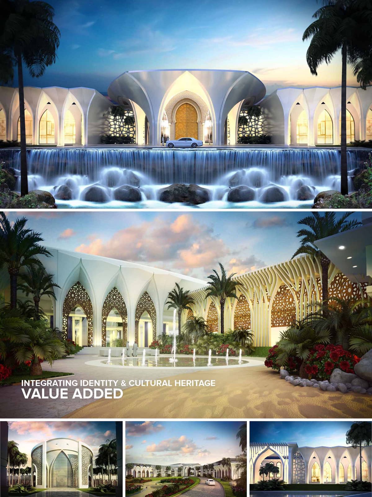

Al Rayyan Palace is conceived as a contemporary reinterpretation of the Qatari palace typology, fusing classical Islamic geometry with a sculptural, resort-like architectural language. The design organizes the residence around a ceremonial arrival axis, framed by a sequence of arches and water features that extend the landscape into the built form. Architecture, light and water are choreographed to announce a luxurious yet culturally rooted domestic environment. The palace functions as both private residence and representative space, allowing formal receptions to coexist with intimate family life while preserving privacy and hierarchy.
The architectural vocabulary is built on a repeated pointed-arch module, stretched vertically to create a series of elegant white “petals” that read as both columns and shells. These elements form a rhythmic arcade enclosing the main façades, while the central volume projects forward as a grand, double-height portal. The smooth, continuous roofline gently undulates, recalling desert dunes and creating a soft silhouette against the sky. Solid and void alternate through deep reveals, screens and glazed infills, resulting in a façade that is simultaneously monumental and permeable. At night, concealed lighting transforms the white shells into luminous lanterns, emphasizing the three-dimensional curvature of the envelope.
The palette is intentionally restrained to highlight form and light. Exterior surfaces employ high-performance white render or stone cladding, selected for its thermal reflectivity and timeless appearance. Large, gilded entrance doors and finely perforated metal mashrabiya panels introduce a warm golden accent that resonates with traditional craftsmanship. Glazing is generously used yet always recessed within arches or screened, mitigating glare while preserving transparency. The water features and lush planting provide rich blue and green counterpoints to the predominantly white architecture, creating a cool micro-oasis effect that reinforces the palace’s sense of exclusivity and serenity.
The arrival sequence is articulated through layered landscape experiences: a long approach drive framed by palm trees, a circular fountain forecourt, and a dramatic linear water cascade aligned with the main entrance. The elevated plinth of the palace allows water to fall in terraces, visually grounding the building while enhancing its ceremonial presence. Reflecting pools amplify the façade through mirrored images, doubling the perception of space and contributing to passive cooling. Dense planting with tropical and regional species softens the geometry, filters views, and forms a buffer between public arrival zones and private garden courts.
The design draws from Islamic architectural heritage through pointed arches, geometric tracery and layered thresholds while avoiding literal historicism. The structural rhythm of columns recalls the hypostyle hall, reinterpreted in a fluid, contemporary manner. Public reception spaces align along the main axis facing the primary water features, while private residential wings are discreetly set back, accessed through controlled circulation routes that respect local privacy norms. Transitional semi-open loggias mediate between interior and exterior, supporting social gatherings in shaded, naturally ventilated spaces that are integral to the region’s lifestyle.
Sustainability is embedded through climate-responsive form, material selection and landscape design. The deep arches and overhanging shells act as self-shading devices, reducing direct solar gain on glazed surfaces. High-reflectance façade finishes and insulated envelopes contribute to thermal comfort and lower cooling loads. Water bodies and dense planting assist microclimate regulation through evaporative cooling and shading, while the orientation of major openings promotes cross ventilation in transitional spaces. The use of screens and filtered daylight minimizes reliance on artificial lighting during the day. Provision for high-efficiency MEP systems, potential grey-water reuse for irrigation and integration of LED lighting further enhance the project’s environmental performance while maintaining the palace’s luxurious character.


Al Rayyan Palace is conceived as a contemporary reinterpretation of the Qatari palace typology, fusing classical Islamic geometry with a sculptural, resort-like architectural language. The design organizes the residence around a ceremonial arrival axis, framed by a sequence of arches and water features that extend the landscape into the built form. Architecture, light and water are choreographed to announce a luxurious yet culturally rooted domestic environment. The palace functions as both private residence and representative space, allowing formal receptions to coexist with intimate family life while preserving privacy and hierarchy.
The architectural vocabulary is built on a repeated pointed-arch module, stretched vertically to create a series of elegant white “petals” that read as both columns and shells. These elements form a rhythmic arcade enclosing the main façades, while the central volume projects forward as a grand, double-height portal. The smooth, continuous roofline gently undulates, recalling desert dunes and creating a soft silhouette against the sky. Solid and void alternate through deep reveals, screens and glazed infills, resulting in a façade that is simultaneously monumental and permeable. At night, concealed lighting transforms the white shells into luminous lanterns, emphasizing the three-dimensional curvature of the envelope.
The palette is intentionally restrained to highlight form and light. Exterior surfaces employ high-performance white render or stone cladding, selected for its thermal reflectivity and timeless appearance. Large, gilded entrance doors and finely perforated metal mashrabiya panels introduce a warm golden accent that resonates with traditional craftsmanship. Glazing is generously used yet always recessed within arches or screened, mitigating glare while preserving transparency. The water features and lush planting provide rich blue and green counterpoints to the predominantly white architecture, creating a cool micro-oasis effect that reinforces the palace’s sense of exclusivity and serenity.
The arrival sequence is articulated through layered landscape experiences: a long approach drive framed by palm trees, a circular fountain forecourt, and a dramatic linear water cascade aligned with the main entrance. The elevated plinth of the palace allows water to fall in terraces, visually grounding the building while enhancing its ceremonial presence. Reflecting pools amplify the façade through mirrored images, doubling the perception of space and contributing to passive cooling. Dense planting with tropical and regional species softens the geometry, filters views, and forms a buffer between public arrival zones and private garden courts.
The design draws from Islamic architectural heritage through pointed arches, geometric tracery and layered thresholds while avoiding literal historicism. The structural rhythm of columns recalls the hypostyle hall, reinterpreted in a fluid, contemporary manner. Public reception spaces align along the main axis facing the primary water features, while private residential wings are discreetly set back, accessed through controlled circulation routes that respect local privacy norms. Transitional semi-open loggias mediate between interior and exterior, supporting social gatherings in shaded, naturally ventilated spaces that are integral to the region’s lifestyle.
Sustainability is embedded through climate-responsive form, material selection and landscape design. The deep arches and overhanging shells act as self-shading devices, reducing direct solar gain on glazed surfaces. High-reflectance façade finishes and insulated envelopes contribute to thermal comfort and lower cooling loads. Water bodies and dense planting assist microclimate regulation through evaporative cooling and shading, while the orientation of major openings promotes cross ventilation in transitional spaces. The use of screens and filtered daylight minimizes reliance on artificial lighting during the day. Provision for high-efficiency MEP systems, potential grey-water reuse for irrigation and integration of LED lighting further enhance the project’s environmental performance while maintaining the palace’s luxurious character.
© 2021 by sanzpont [arquitectura] . Webpage by sanzpont [digital] . Innovative Digital Experiences
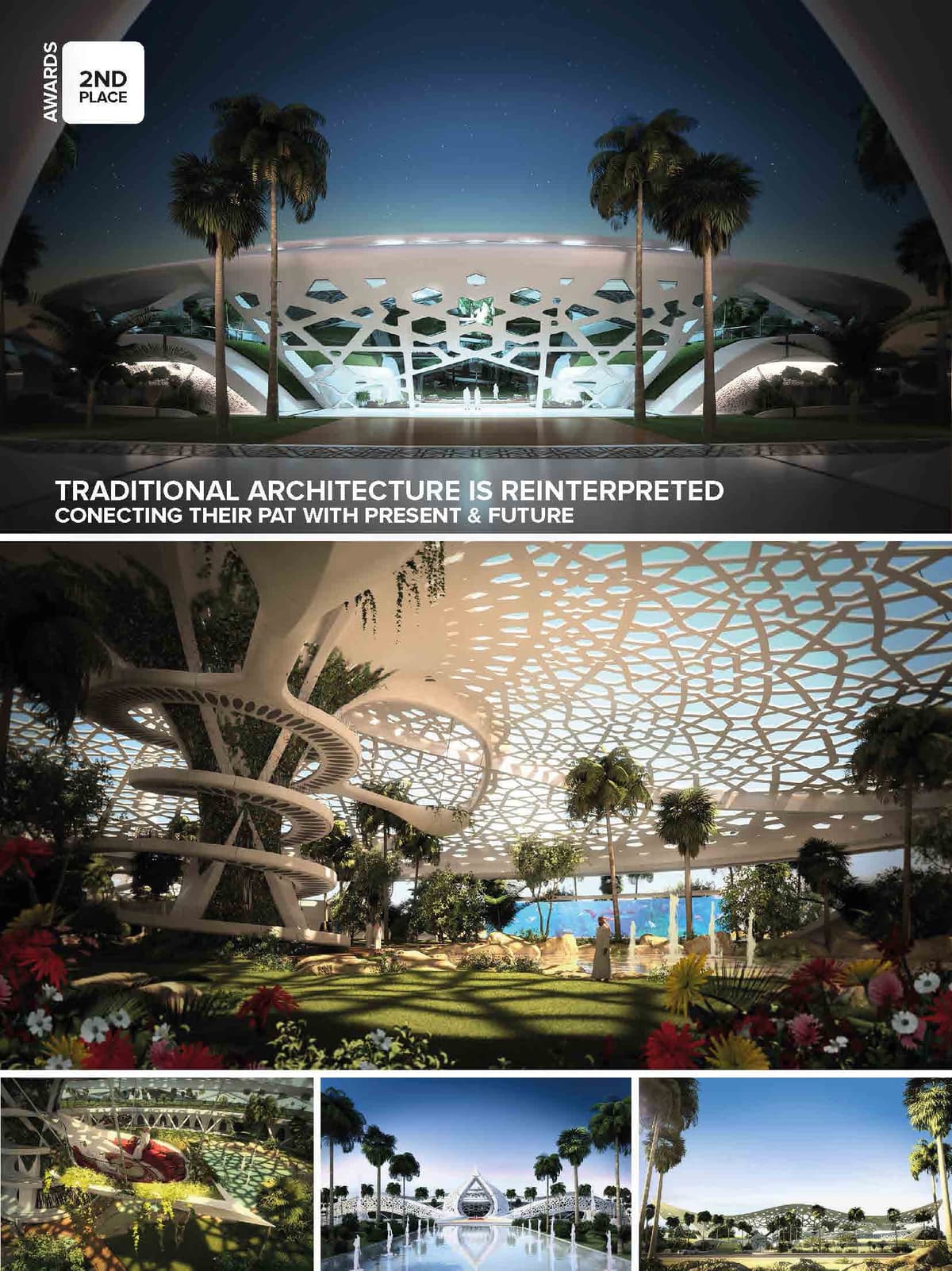

“An Oasis is a miracle of life in the desert.” sanzpont [arquitectura] has being awarded 3rd place in an international restricted competition for a VIP Palace in Qatar for its innovative and ecologic response to the project brief of this private residence: "The purpose of the competition was to stimulate innovative and creative ideas to create high end luxurious Palace to achieve relaxation and luxury for its VIP users."
This Palace reinvents the simple idea of creating luxury into something meaningful, creating life and nature through a self-sustainable botanical oasis in the desert. The microclimate needed for botanical species is created by a mist irrigation system located in the inner skin of the palace central dome. Water is obtained from an underground aquifer and sustainable desalinated by an electrodialysis system that is powered by solar renewable sources. Photovoltaic panels are integrated into the outer skin of the dome and building roofs, water is stored in the landscaping lakes featuring various thematic gardens and picnic areas.
“Architecture design should be integrated with its surrounding environment should reflect its culture in time, so we studied their historical typologies and architectural language to evolve it into innovative vanguard design plenty of cultural heritage.”
The heart of the palace is an oasis covered by a central dome, its unique design is inspired by the Sidra Tree, which is native to Qatar and is a symbol for perseverance, solidarity and determination.
Historically, this tree unifies people looking shade in the desert, meeting and talking bellow its spreading branches. These branches are symbolized with a leaf-shaped seating spaces hanging inside the Sidra Tree Dome, these seating spaces for calm and relaxation are called “Floating Majlis”.
Traditional Qatari architecture is reinterpreted connecting their past with present and future.
Sustainable Design. Photovoltaic Energy: The tensile skin incorporates Foldable Photovoltaic Solar Panels capturing energy from the sun to generate and supply electricity from a clean and sustainable energy. This makes the bridge self-sustainable.
Air-Cleaning Plants: To go beyond green, the design includes Plants that clean and purify the air, transforming the pollution of the city in pure oxygen. Plants and the Breathable Membrane make a greener environment and a clean pedestrian tunnel.
LED RGB Technology: Linear LED technology glow the structure of the bridge at night, creating art with light of low power consumption. This emphasizes the fluid and organic forms and creates different sensations.
INTERNATIONAL ARCHITECTURE AWARDS
• A’ Design Awards, Milán, Italy: Silver Medal - Certificate of Excellence in World Landscape & Planning Design : A Palace for Nature (2015)


INTERNATIONAL ARCHITECTURE AWARDS
• A’ Design Awards, Milán, Italy: Silver Medal - Certificate of Excellence in World Landscape & Planning Design : A Palace for Nature (2015)
“An Oasis is a miracle of life in the desert.” sanzpont [arquitectura] has being awarded 3rd place in an international restricted competition for a VIP Palace in Qatar for its innovative and ecologic response to the project brief of this private residence: "The purpose of the competition was to stimulate innovative and creative ideas to create high end luxurious Palace to achieve relaxation and luxury for its VIP users."
This Palace reinvents the simple idea of creating luxury into something meaningful, creating life and nature through a self-sustainable botanical oasis in the desert. The microclimate needed for botanical species is created by a mist irrigation system located in the inner skin of the palace central dome. Water is obtained from an underground aquifer and sustainable desalinated by an electrodialysis system that is powered by solar renewable sources. Photovoltaic panels are integrated into the outer skin of the dome and building roofs, water is stored in the landscaping lakes featuring various thematic gardens and picnic areas.
“Architecture design should be integrated with its surrounding environment should reflect its culture in time, so we studied their historical typologies and architectural language to evolve it into innovative vanguard design plenty of cultural heritage.”
The heart of the palace is an oasis covered by a central dome, its unique design is inspired by the Sidra Tree, which is native to Qatar and is a symbol for perseverance, solidarity and determination.
Historically, this tree unifies people looking shade in the desert, meeting and talking bellow its spreading branches. These branches are symbolized with a leaf-shaped seating spaces hanging inside the Sidra Tree Dome, these seating spaces for calm and relaxation are called “Floating Majlis”.
Traditional Qatari architecture is reinterpreted connecting their past with present and future.
Sustainable Design. Photovoltaic Energy: The tensile skin incorporates Foldable Photovoltaic Solar Panels capturing energy from the sun to generate and supply electricity from a clean and sustainable energy. This makes the bridge self-sustainable.
Air-Cleaning Plants: To go beyond green, the design includes Plants that clean and purify the air, transforming the pollution of the city in pure oxygen. Plants and the Breathable Membrane make a greener environment and a clean pedestrian tunnel.
LED RGB Technology: Linear LED technology glow the structure of the bridge at night, creating art with light of low power consumption. This emphasizes the fluid and organic forms and creates different sensations.
© 2021 by sanzpont [arquitectura] . Webpage by sanzpont [digital] . Innovative Digital Experiences
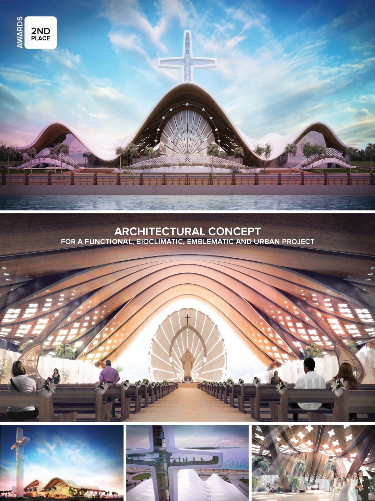

DESIGN CONCEPT
Santa Maria del Mar is one of the oldest virgin avocations. She isn’t related to any apparition; instead she relates with the need that marines and their families who stay on land feel for having the highest protection from heaven. Stella Maris, Star of the Sea is how they call her since ancient times.
Cancun, Sun and Beach. Cancun is a city of sun, beach and tourism. The architectural project though of religious character must respond to these 3 key elements and their correspondent transcendence. The city owes its foundation to the Caribbean architecture, composed of: open and green spaces, latticeworks, etc. which provides natural comfort to the user.
Esthetic and Harmonic Beauty. When designing a basilica one must offer an official religious public building for the liturgical celebration and the adoration of the lord, a sacred space that provides purity, protection and serenity which by tradition is achieved by a standard of identity, top esthetic beauty, symmetry and proportion.
The Sea as Identity. Inspiration for the concept comes from the strength and softness of the Caribbean ocean waves and the white sand of its beach. The rhythm of the ocean and the sensation of peace and harmony serve as design principles to provide a unique identity with a strong relation to the region and the project site.
The Mantle as Inspiration. The project is composed of a big public-religious (Catholic) space that can receive hundreds of people for mass inside a space of purity that radiates protection, harmony, softness and peace, all this simulating the protecting mantle of Santa Maria del Mar as maternal inspiration.
Integration to the Public Space. The project is located in a new public sector of recreation in front of the Nichupte lagoon. The project must integrate, relate and complement the public space throughout a strong pedestrian connection with the new walkways, generating a plaza with green areas that invite the user to enter to the religious center.
ARCHITECTURAL CONCEPT
For a functional, bioclimatic, emblematic and urban project. The virgin's mantle inspires the project's form as a maternal protection symbol. The ocean waves underline the roof's silhouette in search for rhythm, harmony and balance. The perfection and balance of marine life also serves as inspiration in the design line.
Religious architecture is the reflection and evidence of culture through time. Religious-Cultural Walkways. Historic Exterior Walkway: The project's façade functions as an exterior museum; it has a timeline board with the history of American evangelization. Virgin Mary Walkway: The patios and public areas house the Virgin Mary walkway which surrounds the main nave through fountains, discovering the 20 mysteries. Religious Tourism: Cultural Attractive.
BIOCLIMATIC DESIGN
Minimizing Environmental Impact. The project counts with bioclimatic strategies to achieve an adequate comfort using natural renewable energy; this includes natural cross ventilation, solar protection and thermal isolation. Because of its bioclimatic design oriented to energy savings it avoids the use of mechanical cooling equipment that would imply excessive consumption of energy without even taking into account if the basilica were at its maximum or minimum capacity; By these means the environmental impact and the carbon footprint are reduced. The design responds to a correct and constant flow of ventilation, favoring the pressure difference that generates wind movement throughout all the spaces.
CONSTRUCTION METHOD
Structural System, Based in Traditional Arches. The structural concept is based on the traditional arches system that has been used in churches for centuries. This system transfers the loads from the roof to the foundations through elements that create big open spaces.
The project is solved with a mixed structural system. The foundation is solved by reinforced concrete pilings which will transfer loads to the rocky subsoil in accordance to soil mechanics studies in depth, capacity and load.
The parking slab that serves as the nave's and plaza's floor is a lightweight reinforced concrete grid slab supported by reinforced concrete columns. The lateral structures are made up of two levels of one-way joist and joist filler block slabs supported by reinforced concrete frames.
The main structure is supported by six multiple rigid arches made up of steel trusses with welded box profiles. The roof has a complex form that responds in a dynamic way to the wind's action, therefore it's solved by a three-dimensional truss of structural steel profiles covered with double-sheeted aluminum panels with low-density thermoplastic polyurethane core which has thermal isolation properties.
The roof's surface must allow for an adequate preventive and corrective maintenance without compromising the structure's integrity both for vibrations as for highly humid and saline weather conditions.
FINISH CRITERIA
Low Cost Maintenance. Pavement: Regional rock floors or stone quarry for exteriors and porcelain floor tiles for interiors. Facades: Tempered glass, block walls and paint. Lining: PVC faux wood stave or aluminum faux wood and thermal isolation multipanel deck.
MEP CRITERIA
Low Cost Use. Electrical Installation: micro-turbine energy cogeneration capstone system, 3 pieces of equipment 65 KW each; synchronism and parallelism electric board of simultaneous consumption and low-consumption LED based illumination. Air Conditioning: Partial, only Museum-Cafeteria and services buildings, 2 chillers 100 Ton each, located on basement. The residual heat produced by the micro-turbines is used for its function. Pluvial Installation: Rainwater will be collected and storage for irrigation.
INTERNATIONAL ARCHITECTURE AWARDS
• 2nd Place, Competition by Invitation - Malecon Tajamar, Cancun, México.


INTERNATIONAL ARCHITECTURE AWARDS
• 2nd Place, Competition by Invitation - Malecon Tajamar, Cancun, México.
DESIGN CONCEPT
Santa Maria del Mar is one of the oldest virgin avocations. She isn’t related to any apparition; instead she relates with the need that marines and their families who stay on land feel for having the highest protection from heaven. Stella Maris, Star of the Sea is how they call her since ancient times.
Cancun, Sun and Beach. Cancun is a city of sun, beach and tourism. The architectural project though of religious character must respond to these 3 key elements and their correspondent transcendence. The city owes its foundation to the Caribbean architecture, composed of: open and green spaces, latticeworks, etc. which provides natural comfort to the user.
Esthetic and Harmonic Beauty. When designing a basilica one must offer an official religious public building for the liturgical celebration and the adoration of the lord, a sacred space that provides purity, protection and serenity which by tradition is achieved by a standard of identity, top esthetic beauty, symmetry and proportion.
The Sea as Identity. Inspiration for the concept comes from the strength and softness of the Caribbean ocean waves and the white sand of its beach. The rhythm of the ocean and the sensation of peace and harmony serve as design principles to provide a unique identity with a strong relation to the region and the project site.
The Mantle as Inspiration. The project is composed of a big public-religious (Catholic) space that can receive hundreds of people for mass inside a space of purity that radiates protection, harmony, softness and peace, all this simulating the protecting mantle of Santa Maria del Mar as maternal inspiration.
Integration to the Public Space. The project is located in a new public sector of recreation in front of the Nichupte lagoon. The project must integrate, relate and complement the public space throughout a strong pedestrian connection with the new walkways, generating a plaza with green areas that invite the user to enter to the religious center.
ARCHITECTURAL CONCEPT
For a functional, bioclimatic, emblematic and urban project. The virgin's mantle inspires the project's form as a maternal protection symbol. The ocean waves underline the roof's silhouette in search for rhythm, harmony and balance. The perfection and balance of marine life also serves as inspiration in the design line.
Religious architecture is the reflection and evidence of culture through time. Religious-Cultural Walkways. Historic Exterior Walkway: The project's façade functions as an exterior museum; it has a timeline board with the history of American evangelization. Virgin Mary Walkway: The patios and public areas house the Virgin Mary walkway which surrounds the main nave through fountains, discovering the 20 mysteries. Religious Tourism: Cultural Attractive.
BIOCLIMATIC DESIGN
Minimizing Environmental Impact. The project counts with bioclimatic strategies to achieve an adequate comfort using natural renewable energy; this includes natural cross ventilation, solar protection and thermal isolation. Because of its bioclimatic design oriented to energy savings it avoids the use of mechanical cooling equipment that would imply excessive consumption of energy without even taking into account if the basilica were at its maximum or minimum capacity; By these means the environmental impact and the carbon footprint are reduced. The design responds to a correct and constant flow of ventilation, favoring the pressure difference that generates wind movement throughout all the spaces.
CONSTRUCTION METHOD
Structural System, Based in Traditional Arches. The structural concept is based on the traditional arches system that has been used in churches for centuries. This system transfers the loads from the roof to the foundations through elements that create big open spaces.
The project is solved with a mixed structural system. The foundation is solved by reinforced concrete pilings which will transfer loads to the rocky subsoil in accordance to soil mechanics studies in depth, capacity and load.
The parking slab that serves as the nave's and plaza's floor is a lightweight reinforced concrete grid slab supported by reinforced concrete columns. The lateral structures are made up of two levels of one-way joist and joist filler block slabs supported by reinforced concrete frames.
The main structure is supported by six multiple rigid arches made up of steel trusses with welded box profiles. The roof has a complex form that responds in a dynamic way to the wind's action, therefore it's solved by a three-dimensional truss of structural steel profiles covered with double-sheeted aluminum panels with low-density thermoplastic polyurethane core which has thermal isolation properties.
The roof's surface must allow for an adequate preventive and corrective maintenance without compromising the structure's integrity both for vibrations as for highly humid and saline weather conditions.
FINISH CRITERIA
Low Cost Maintenance. Pavement: Regional rock floors or stone quarry for exteriors and porcelain floor tiles for interiors. Facades: Tempered glass, block walls and paint. Lining: PVC faux wood stave or aluminum faux wood and thermal isolation multipanel deck.
MEP CRITERIA
Low Cost Use. Electrical Installation: micro-turbine energy cogeneration capstone system, 3 pieces of equipment 65 KW each; synchronism and parallelism electric board of simultaneous consumption and low-consumption LED based illumination. Air Conditioning: Partial, only Museum-Cafeteria and services buildings, 2 chillers 100 Ton each, located on basement. The residual heat produced by the micro-turbines is used for its function. Pluvial Installation: Rainwater will be collected and storage for irrigation.
© 2021 by sanzpont [arquitectura] . Webpage by sanzpont [digital] . Innovative Digital Experiences


Nuestras oficinas están en Barcelona, Cancún, Chicago y Santo Domingo, pero gracias a la tecnología podemos desarrollar proyectos en cualquier parte del mundo.
Barcelona
Bac de Roda 136
08020, Barcelona
Spain
Madrid
Av. de Buendía 11
19005 Guadalajara (Madrid)
Spain
Chicago
373 Hazel Ave, Apt A1
60022, Glencoe, Illinois
United States