


Lorem ipsum dolor sit amet, consectetur adipiscing elit. Suspendisse varius enim in eros elementum tristique. Duis cursus, mi quis viverra ornare, eros dolor interdum nulla, ut commodo diam libero vitae erat.
Our Corporate and Office Design Department is committed to designing workspaces that focus on attracting success and talent, adopting an environment that reflects excellence and innovation. The approach focuses on enhancing your company's image, setting it apart as a leader in modernity and forward-thinking design. Your office becomes more than just a physical space; it stands as the pivotal reference point and primary contact for both your team and clients. This strategic environment fosters meaningful connections and positions your business at the forefront of industry standards, directly influencing perception and encouraging sustained growth.
ARCHITECTURE DESIGN
Strategic corporate buildings that enhances efficiency, strengthens brand perception, and creates a lasting impression.
INTERIOR DESIGN
Brand-driven environments where materials, lighting, and spatial storytelling inspire your team and impress your clients.
Ensure that your workspace is not only practical but also exudes success. A well-designed office is a powerful marketing tool that attracts and retains high-caliber clients. Every detail in your office should reflect a commitment to quality. Opt for a design that impresses at first glance and builds a reputation for leadership and trust.
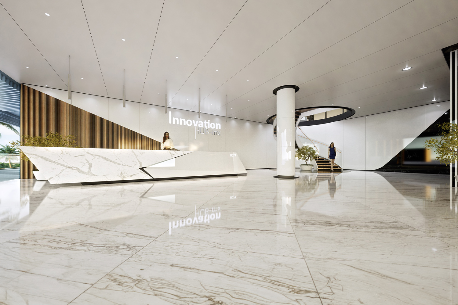
We have designed +50 corporative and office projects across the world.
Over the years, we've participated in numerous projects at various stages, from conception to completion. Some cannot be showcased in our portfolio due to client confidentiality, but each has enriched our experience. Below is a list of projects we have been involved with in various capacities.
• Acrópolis Business Mall N4, Sto Domingo, D. Republic • Boulder Industry and Arts Center, Denver, USA • CMC Offices, Miami, USA • Corporative Campus, Cancún, México • Cosm Tower, México City, México • Design an External Solar Shade, Phoenix, USA • Diagonal 197, Barcelona, Spain • Diagonal 525, Barcelona, Spain • GSI Tower, Cancún, México • H2 Center, Cancún, México • Huawei Office, Kingston, Jamaica • Huawei Office, Sto Domingo, Dominican Republic • Hunter Douglas, Cancún, México • Idea International Office, New Delhi, India • Indiba Headquarters, Barcelona, Spain • Indiba Offices, Barcelona, Spain • Innovation Hub Offices, Cancún, México • Innovation Hub, Cancún, México • Integra Power Offices, Sto Domingo, D. Republic • Integra Solar, Sto. Dom., D. Republic • Invicta Headquarters, Miami, USA • L123 Office, Cancún, México • L36 Office, Cancún, México • LL331, Barcelona, Spain • Margaleff Offices, Cancún, México • Meet Point, Cancún, México • Menzies Aviation Offices, Cancún, México • Naturgy AME38, Madrid, Spain • Naturgy D525, Barcelona, Spain • Nexus Center, Cancún, México • PE21 Lobby, Barcelona, Spain • PE34, Barcelona, Spain • PE34 Offices, Barcelona, Spain • Punk Offices, Cancún, México • Rodmar Offices, Cancún, México • SAC Offices Building, Cancún, México • SA110 Barcelona, Barcelona, Spain • SA110 Lobby, Barcelona, Spain • Sanzpont Office, Cancún, México • Sanzpont Office, Barcelona, Spain • Sunglass Island Building, Cancún, México • Sunglass Island Offices, Cancún, México • TDS Offices, Cancún, México • TG47, Barcelona, Spain • The Social Diagonal, Barcelona, Spain • TLL Lobby, Barcelona, Spain • TMN Auditorium, Barcelona, Spain • TMN Plazoleta, Barcelona, Spain • TMN Portaviones Lobby, Barcelona, Spain • TMN Tower Lobby, Barcelona, Spain • Tropical Plaza, Cancún, México • TP Offices, Cancún, México • VM2 Master Plan, Sabadell, Spain • Wartsila Offices, Sto Domingo, D. Republic • WMW Corporative Offices, Cancún, México
Experience the breadth of our capabilities and the depth of our dedication as you navigate through our Published Projects Portfolio. Here, we're not just showcasing our projects; we're inviting you to understand the passion and precision that we bring to every design we create.
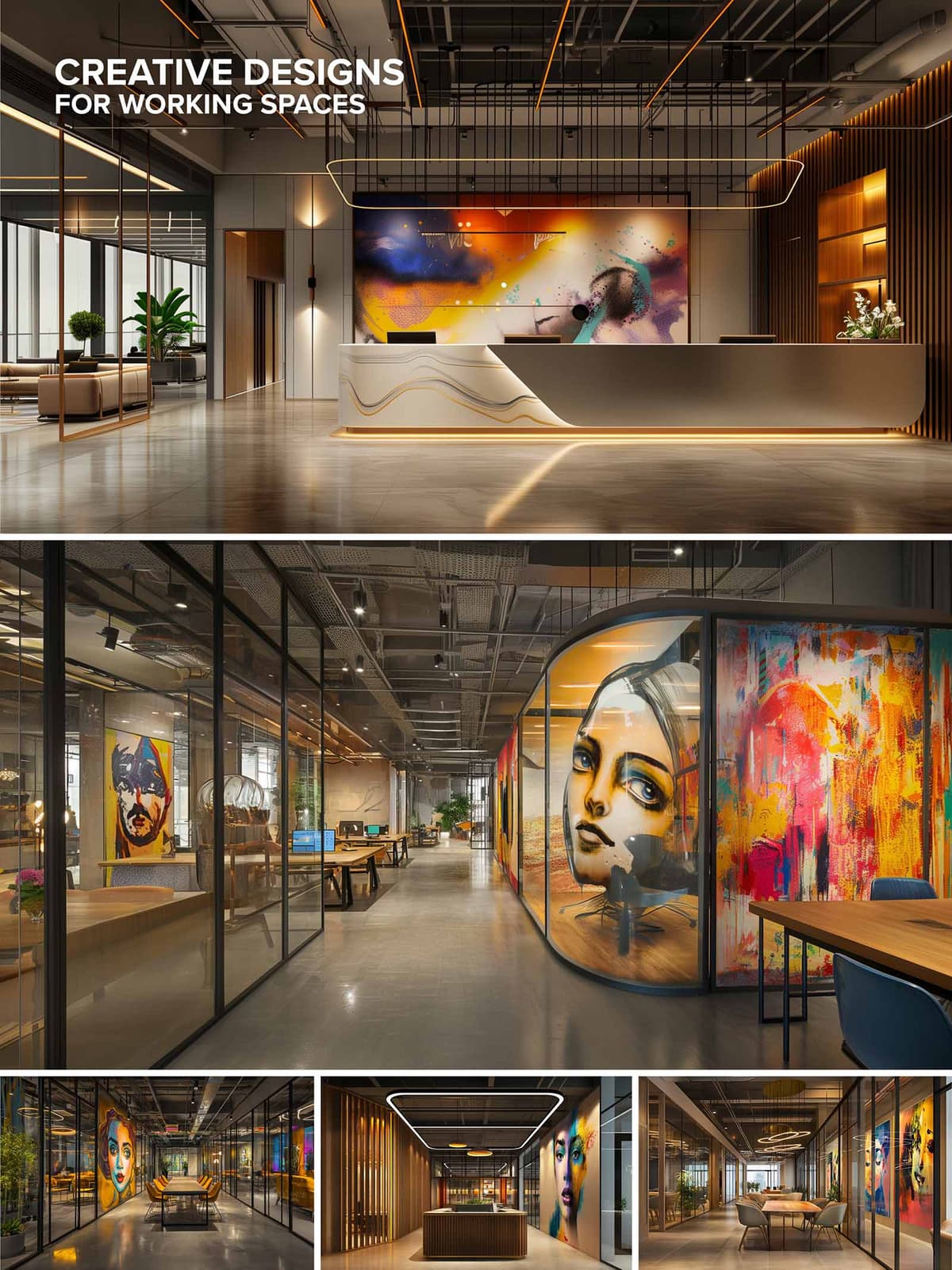
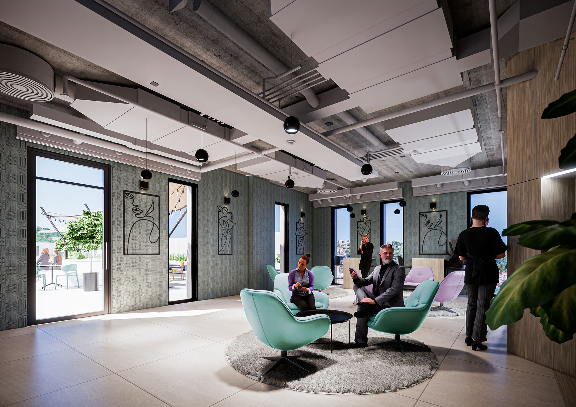
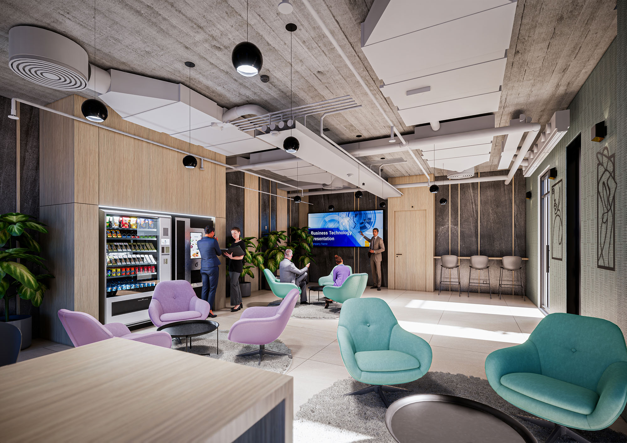
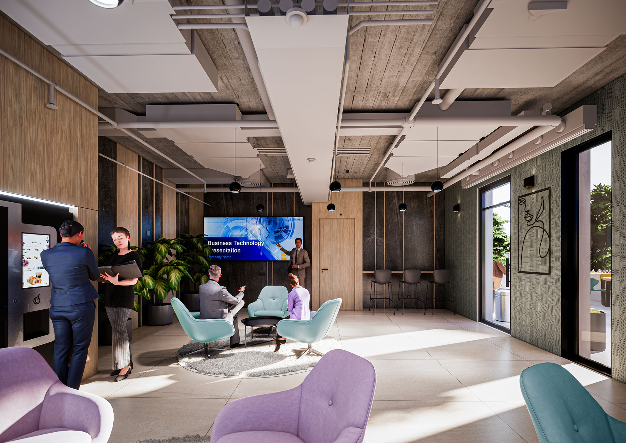
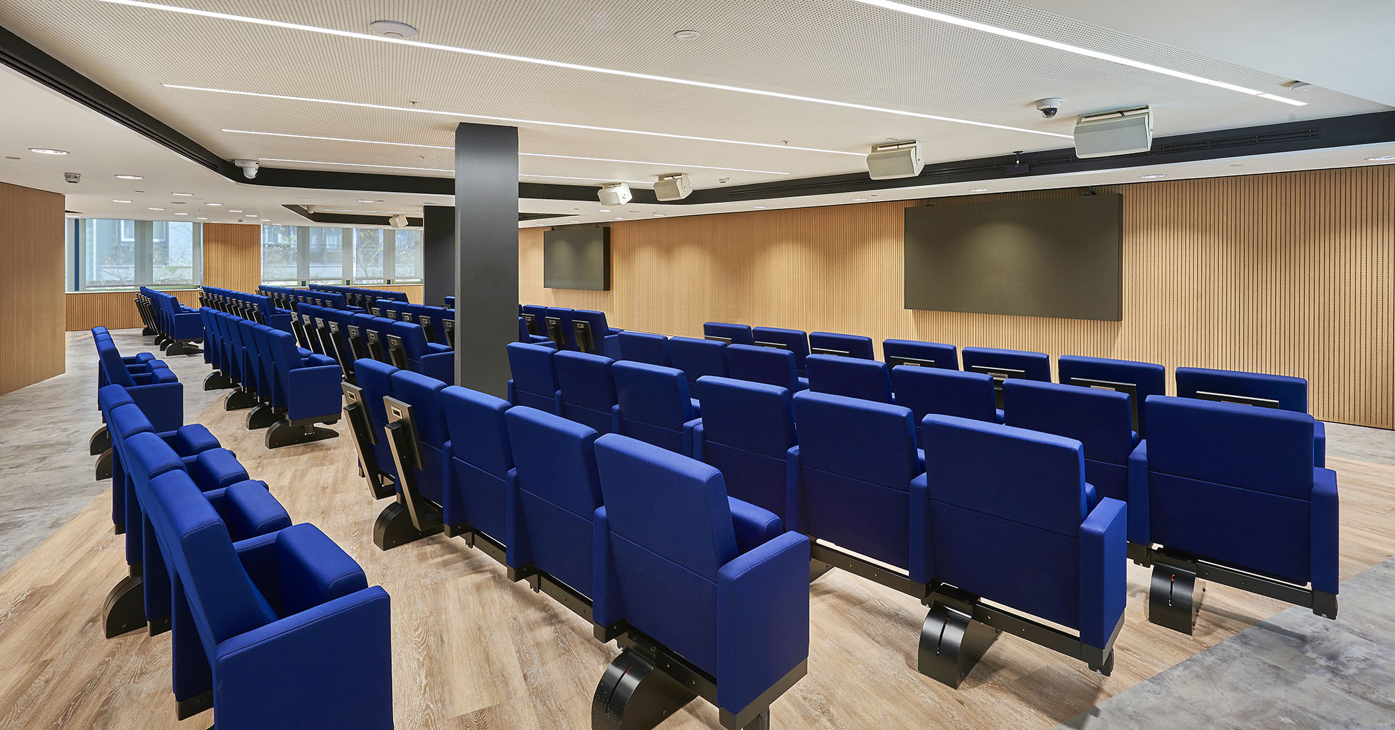
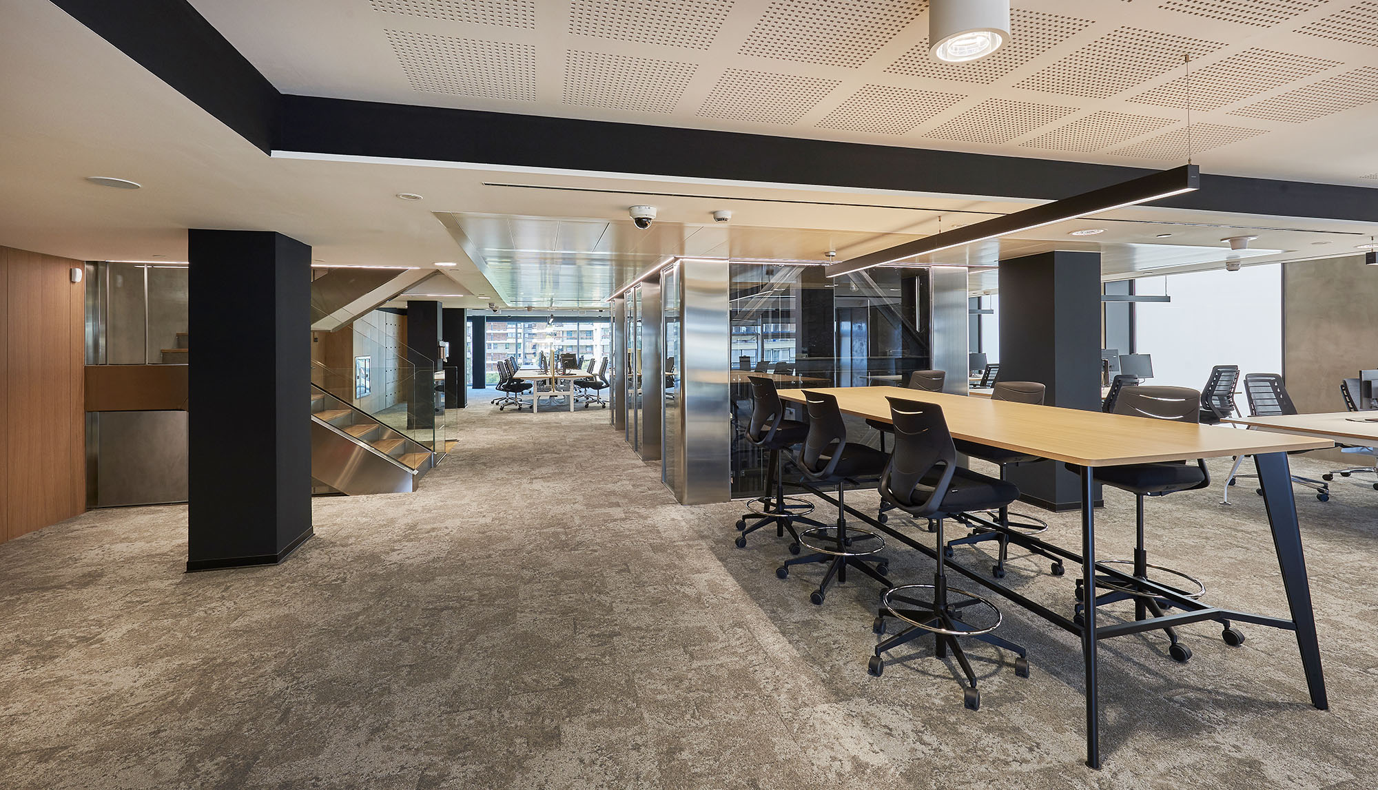
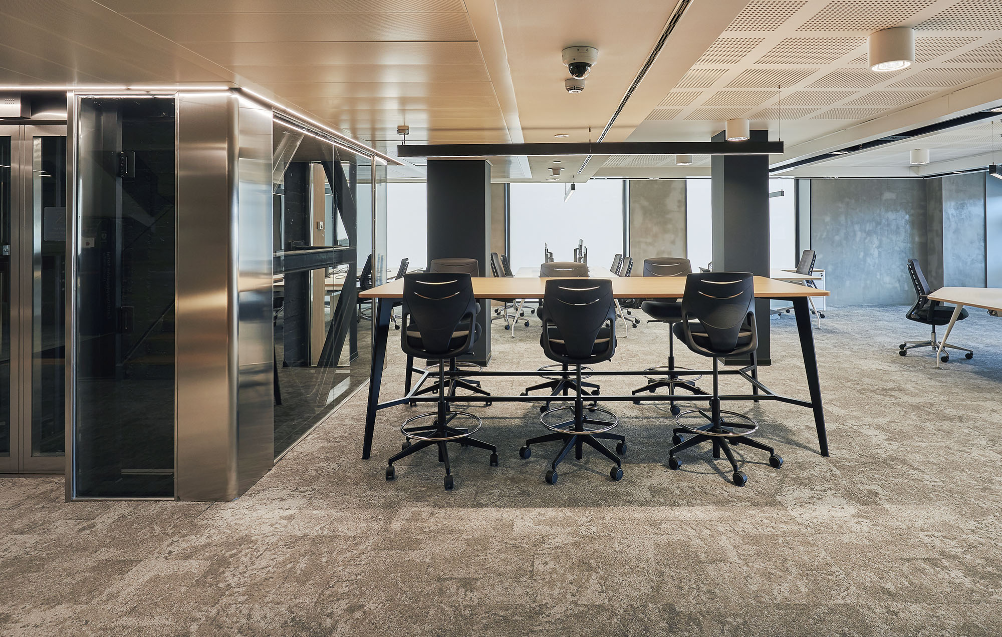
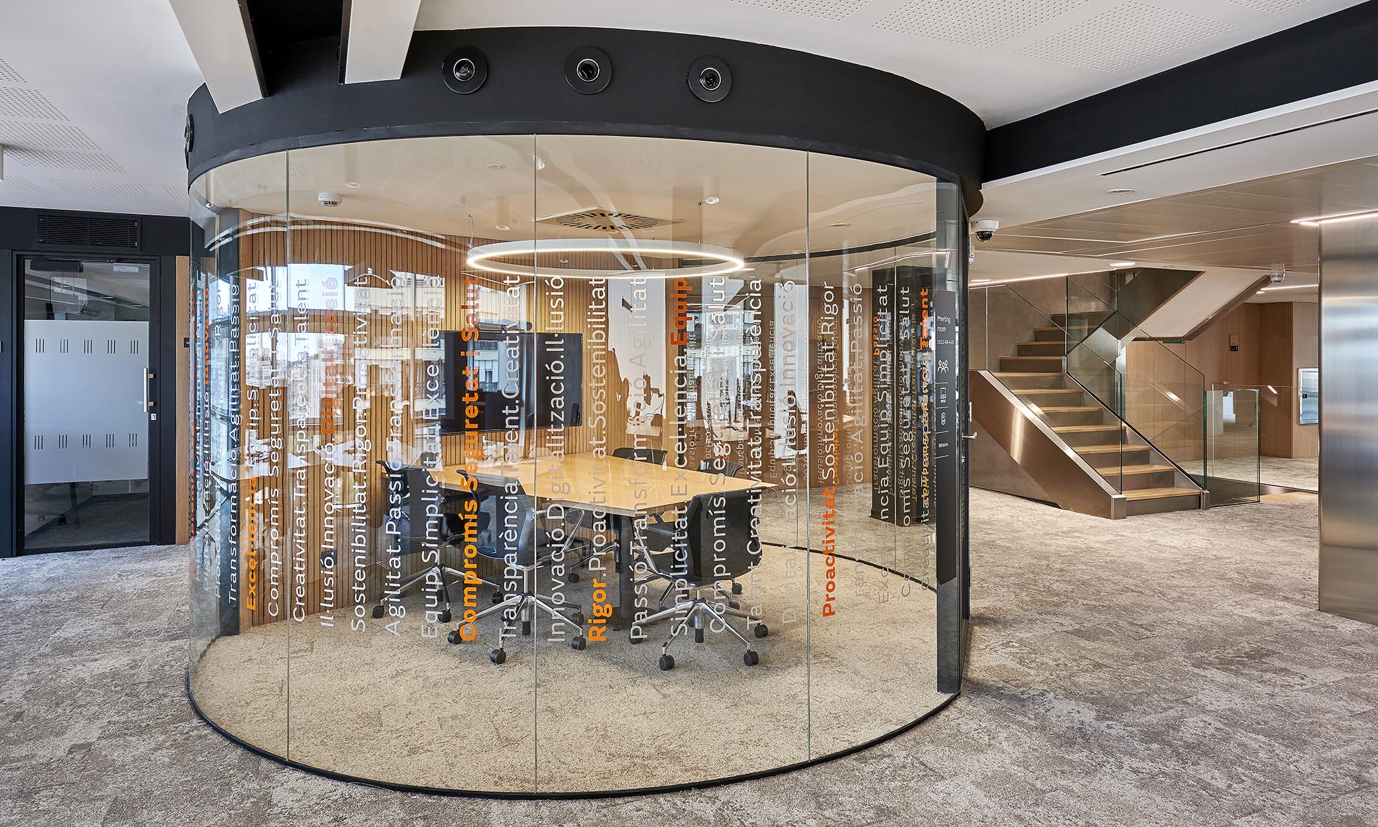
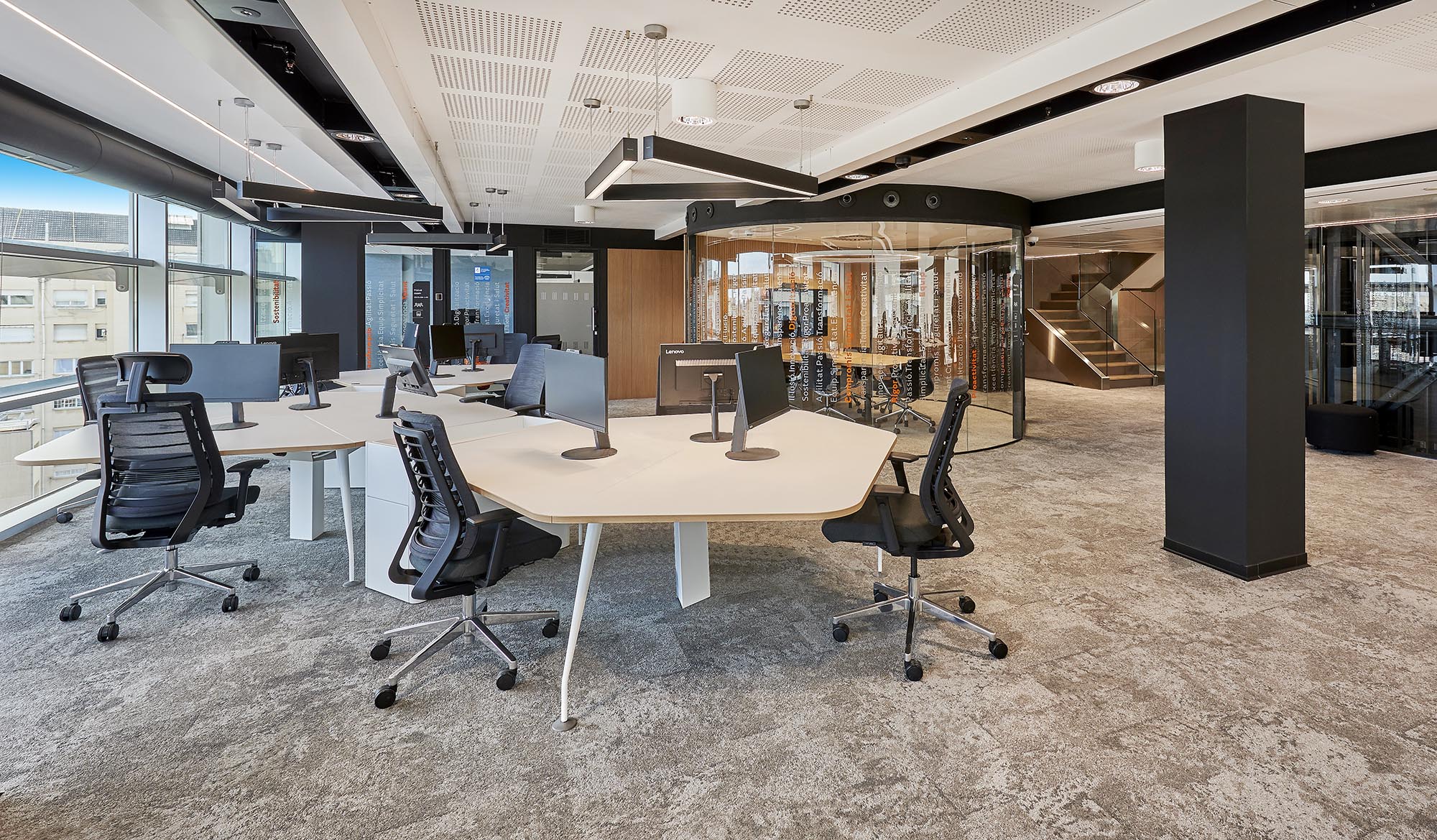
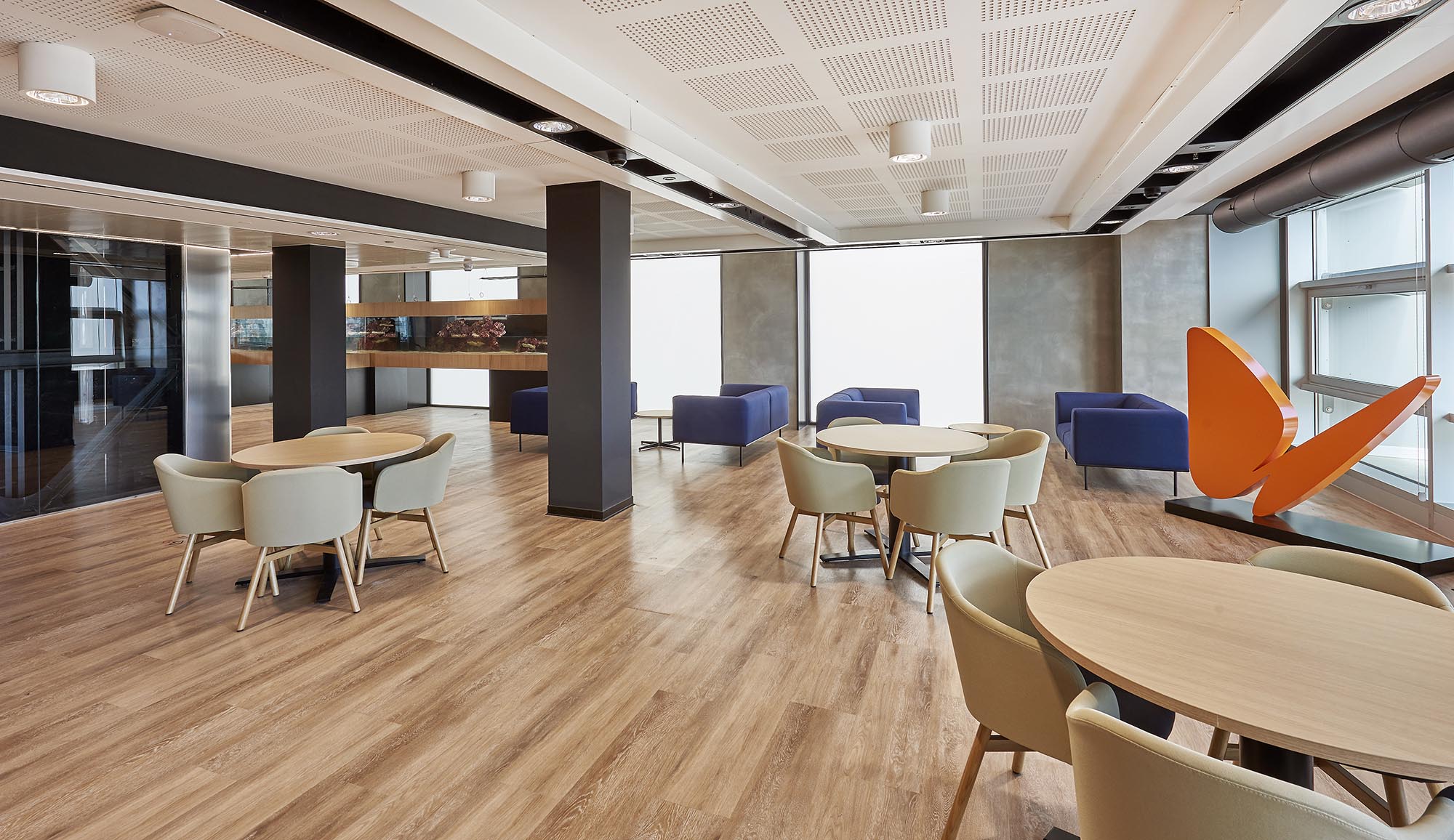
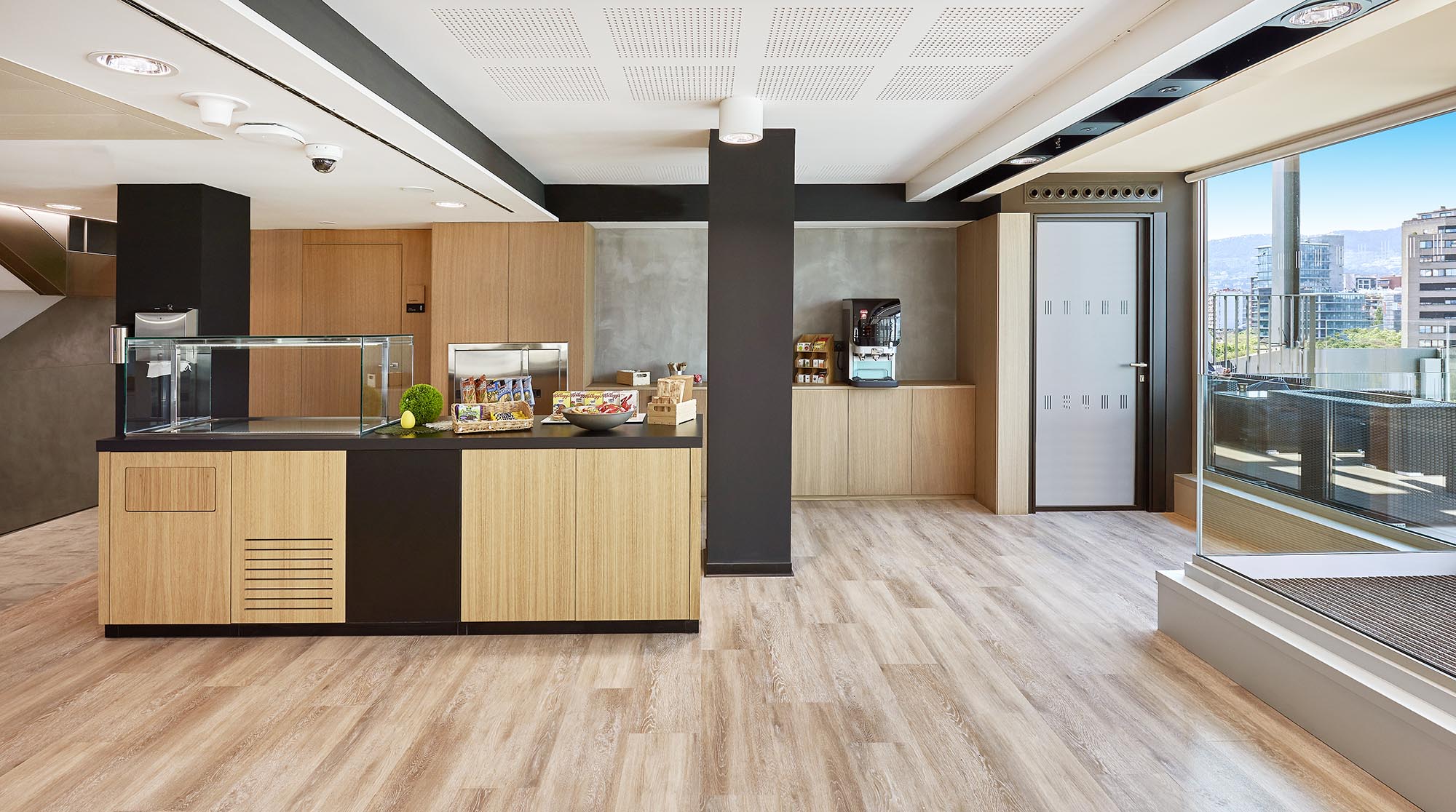
This interior design project for a modern workspace exemplifies a vibrant and dynamic approach that blends contemporary art with functional design. The central theme revolves around the integration of large, expressive art installations within various functional areas of the office, creating a stimulating and inspiring environment. The use of expansive murals and artistically significant pieces serves to enhance creative thinking and provide visual interest in areas typically characterized by conventional office aesthetics.
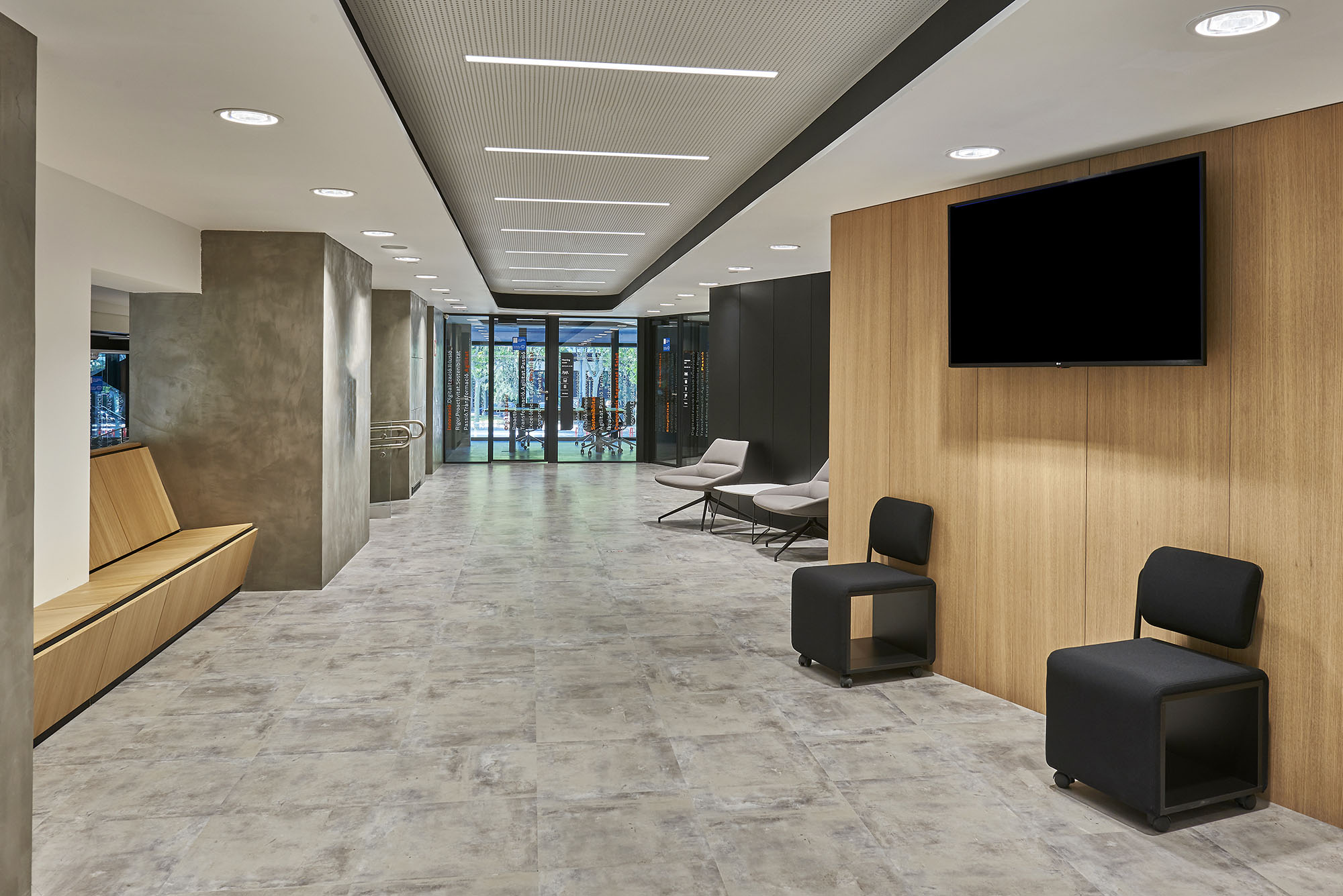
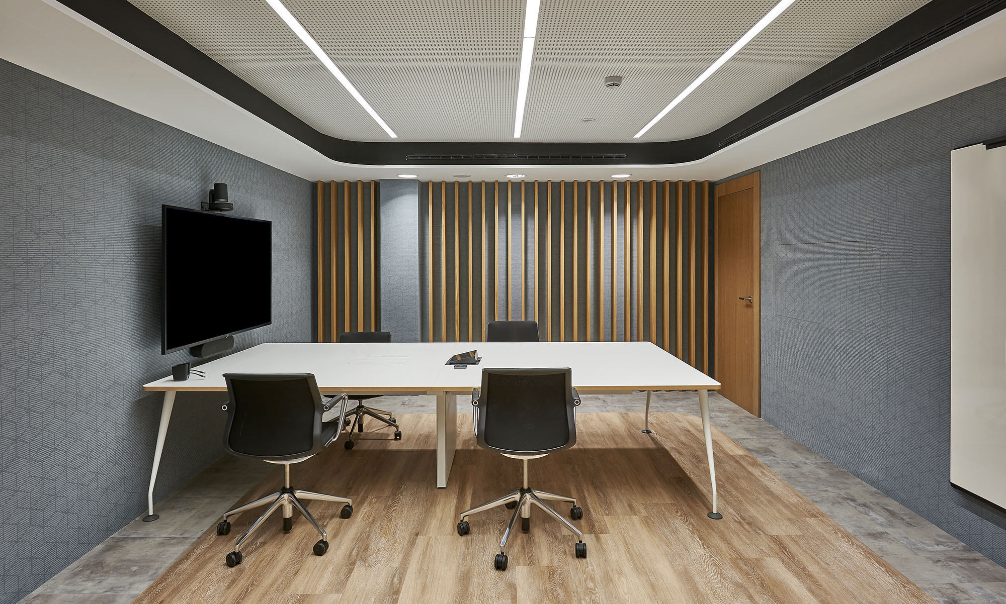
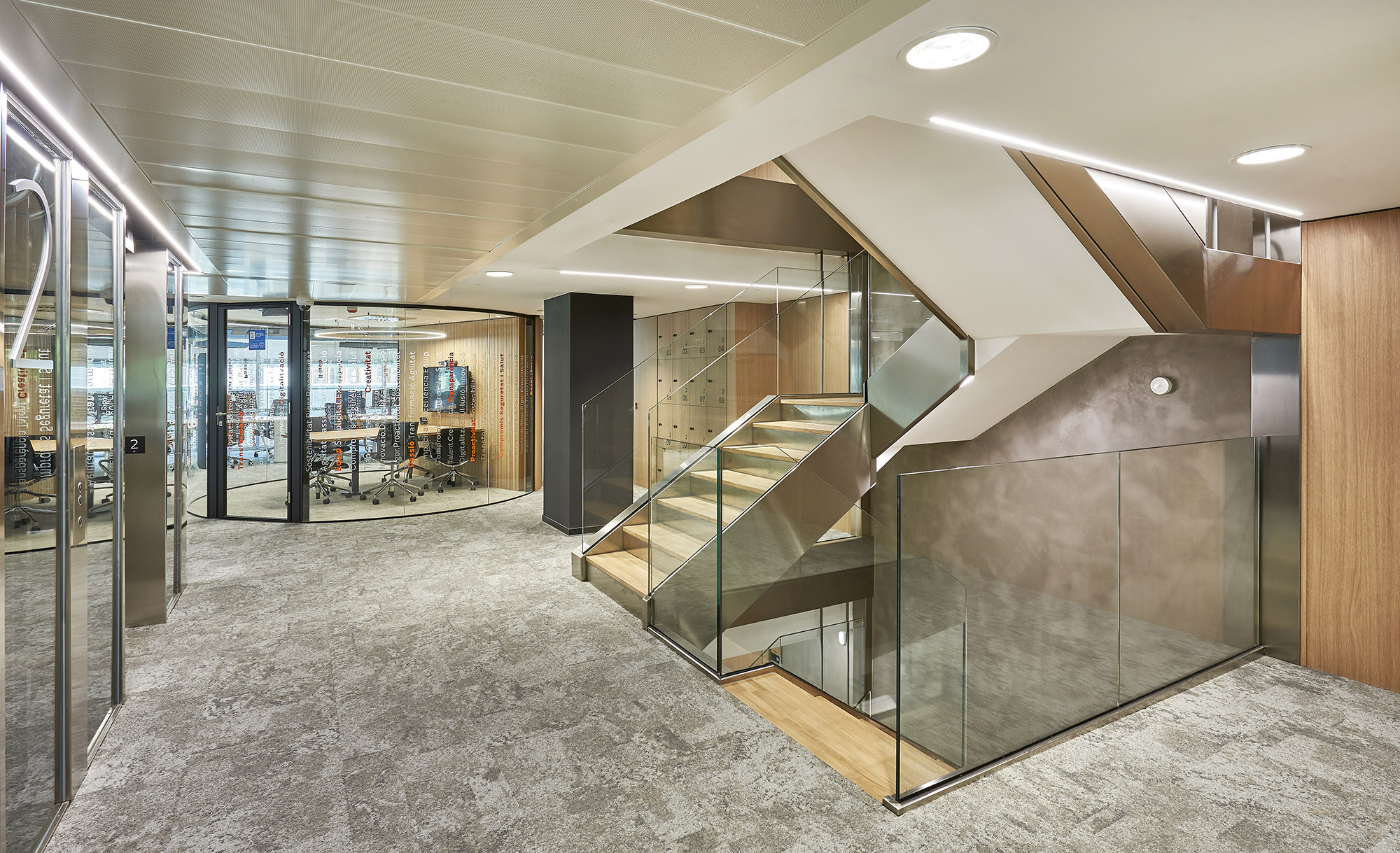
The office layout is strategically designed to accommodate both collaborative and individual work settings. Open-plan spaces are complemented by enclosed glass pods that offer privacy without sacrificing transparency. The fluid arrangement of workstations alongside communal areas encourages interaction while also allowing for concentration and solitude when needed. Pathways and corridors are wide and uncluttered, promoting an easy flow of movement and accessibility throughout the workspace.
A sophisticated palette of materials is used to reinforce the artistic theme of the workspace. Polished concrete floors provide a sleek, industrial feel that contrasts with the warm wooden accents seen in slatted wall panels and furniture. Metal finishes on lighting fixtures and railings add a modern touch, while glass walls enhance the openness of the space. The art pieces themselves are likely printed on high-quality canvas or fabricated from mixed media, adding texture and depth to the walls they adorn.
The color scheme is predominantly neutral, featuring shades of gray, black, and wood tones that serve as a backdrop to the vivid artwork. This choice allows the colorful murals and paintings to stand out, drawing attention and serving as focal points in the design. Accents in furniture and fixtures, such as blues and oranges, subtly echo the hues found in the artwork, creating a cohesive and thoughtfully curated environment.
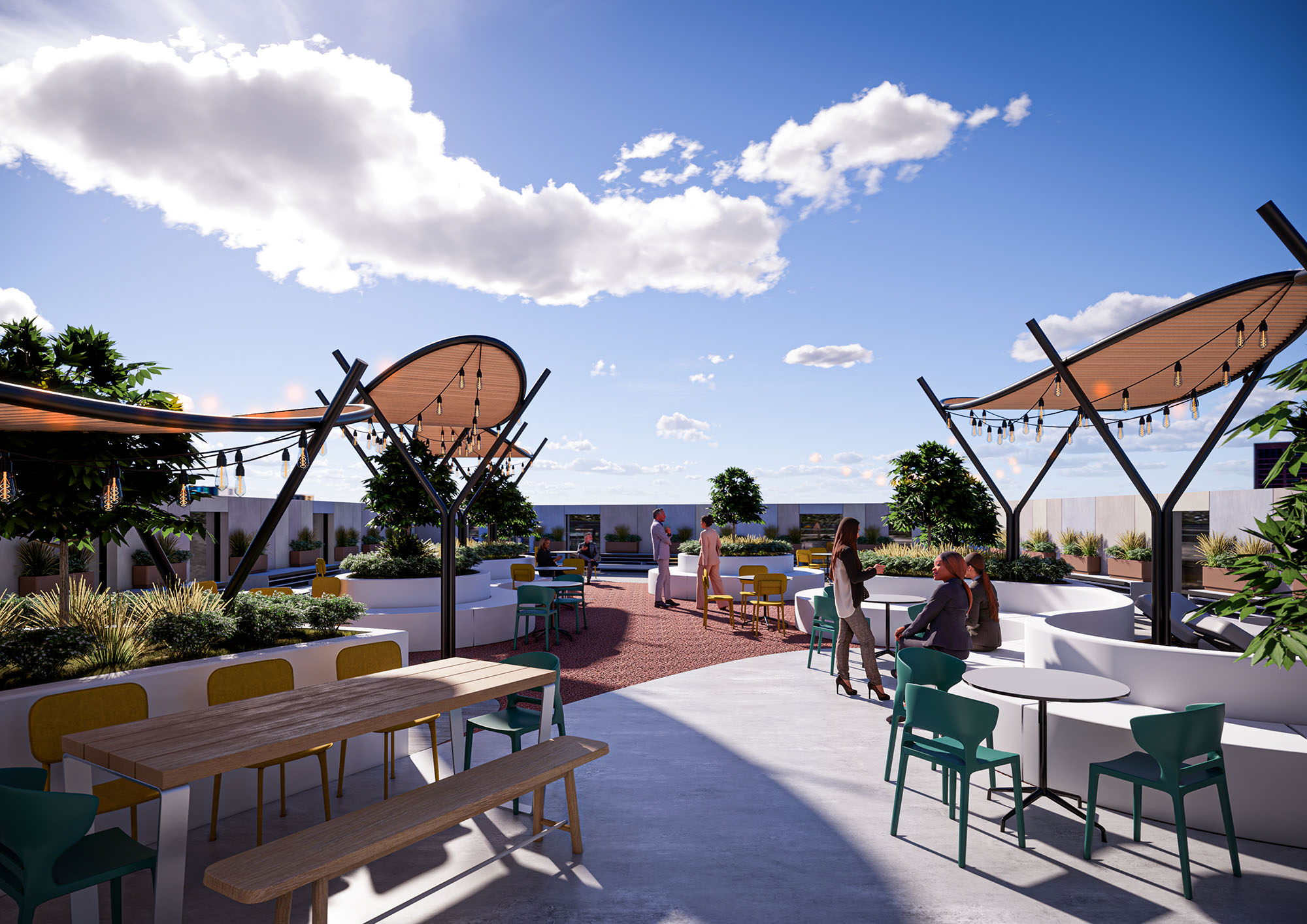
Sustainability is considered through the implementation of energy-efficient lighting and climate control systems. LED strip lighting and spotlights not only highlight the artworks but also provide adjustable ambient lighting to suit different times of the day and work requirements. Large windows allow for ample natural light, reducing the reliance on artificial sources and promoting a healthy, environmentally friendly workplace.
Modern technology is seamlessly integrated into the design to enhance functionality and efficiency. State-of-the-art communication systems in conference areas, wireless charging stations at workstations, and smart climate controls are just a few examples of how technology is employed to create a workspace that is not only visually appealing but also highly adaptive to the needs of its users.


This interior design project for a modern workspace exemplifies a vibrant and dynamic approach that blends contemporary art with functional design. The central theme revolves around the integration of large, expressive art installations within various functional areas of the office, creating a stimulating and inspiring environment. The use of expansive murals and artistically significant pieces serves to enhance creative thinking and provide visual interest in areas typically characterized by conventional office aesthetics.
The office layout is strategically designed to accommodate both collaborative and individual work settings. Open-plan spaces are complemented by enclosed glass pods that offer privacy without sacrificing transparency. The fluid arrangement of workstations alongside communal areas encourages interaction while also allowing for concentration and solitude when needed. Pathways and corridors are wide and uncluttered, promoting an easy flow of movement and accessibility throughout the workspace.
A sophisticated palette of materials is used to reinforce the artistic theme of the workspace. Polished concrete floors provide a sleek, industrial feel that contrasts with the warm wooden accents seen in slatted wall panels and furniture. Metal finishes on lighting fixtures and railings add a modern touch, while glass walls enhance the openness of the space. The art pieces themselves are likely printed on high-quality canvas or fabricated from mixed media, adding texture and depth to the walls they adorn.
The color scheme is predominantly neutral, featuring shades of gray, black, and wood tones that serve as a backdrop to the vivid artwork. This choice allows the colorful murals and paintings to stand out, drawing attention and serving as focal points in the design. Accents in furniture and fixtures, such as blues and oranges, subtly echo the hues found in the artwork, creating a cohesive and thoughtfully curated environment.
Sustainability is considered through the implementation of energy-efficient lighting and climate control systems. LED strip lighting and spotlights not only highlight the artworks but also provide adjustable ambient lighting to suit different times of the day and work requirements. Large windows allow for ample natural light, reducing the reliance on artificial sources and promoting a healthy, environmentally friendly workplace.
Modern technology is seamlessly integrated into the design to enhance functionality and efficiency. State-of-the-art communication systems in conference areas, wireless charging stations at workstations, and smart climate controls are just a few examples of how technology is employed to create a workspace that is not only visually appealing but also highly adaptive to the needs of its users.
© 2021 by sanzpont [arquitectura] . Webpage by sanzpont [digital] . Innovative Digital Experiences

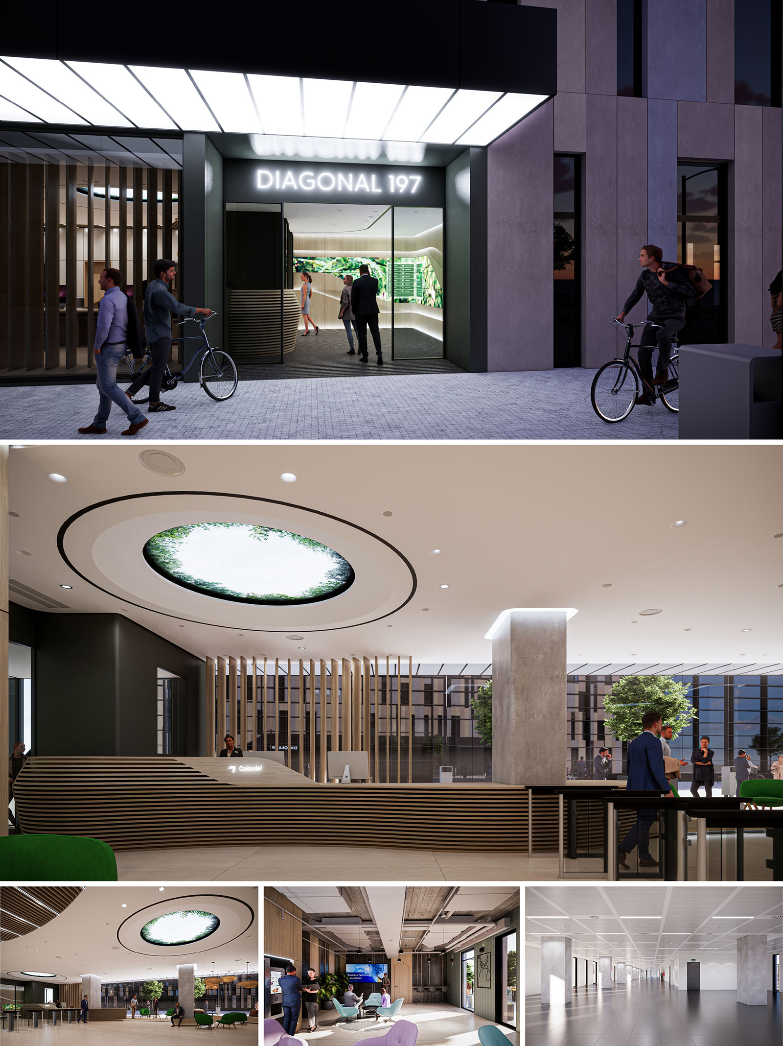
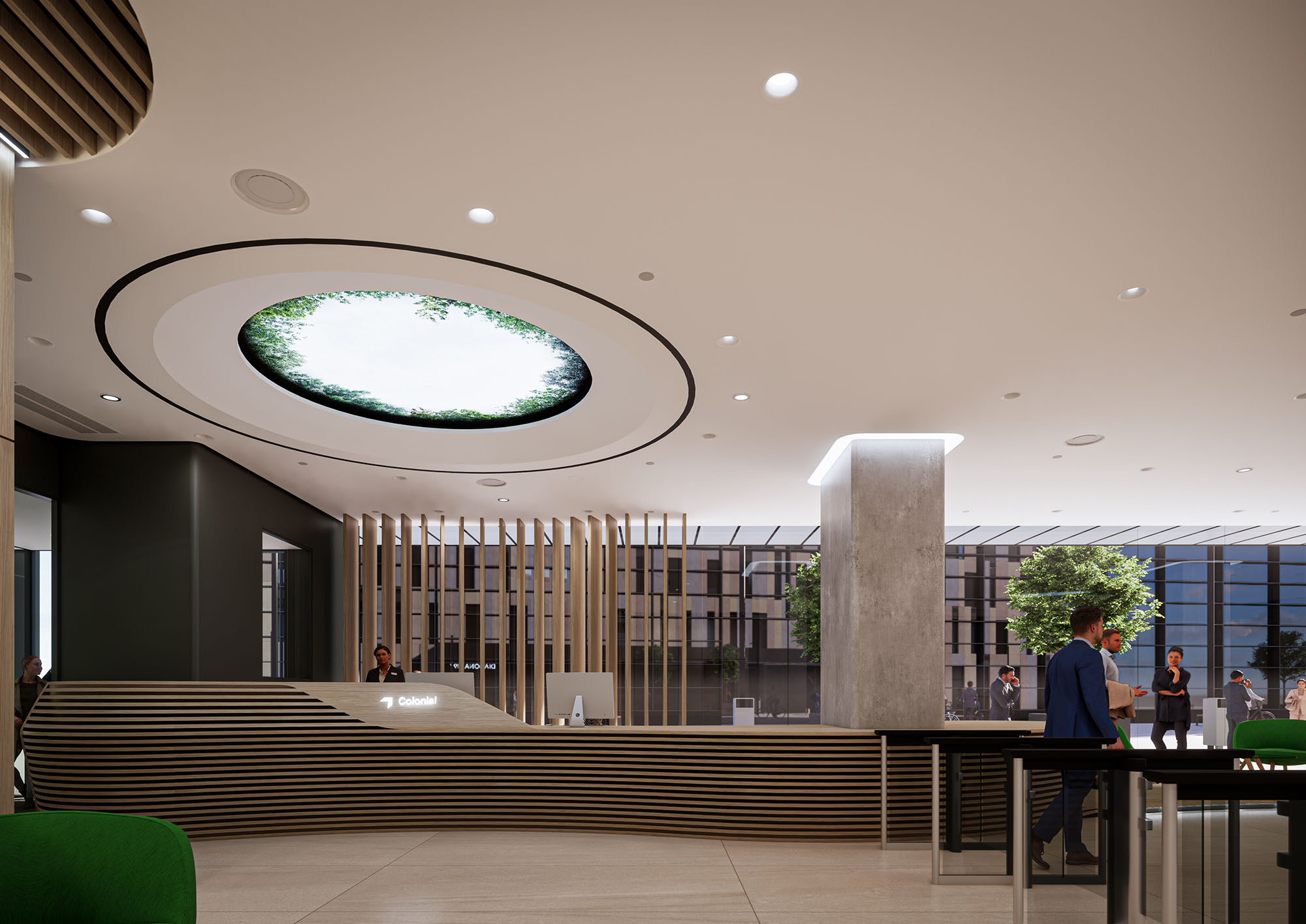
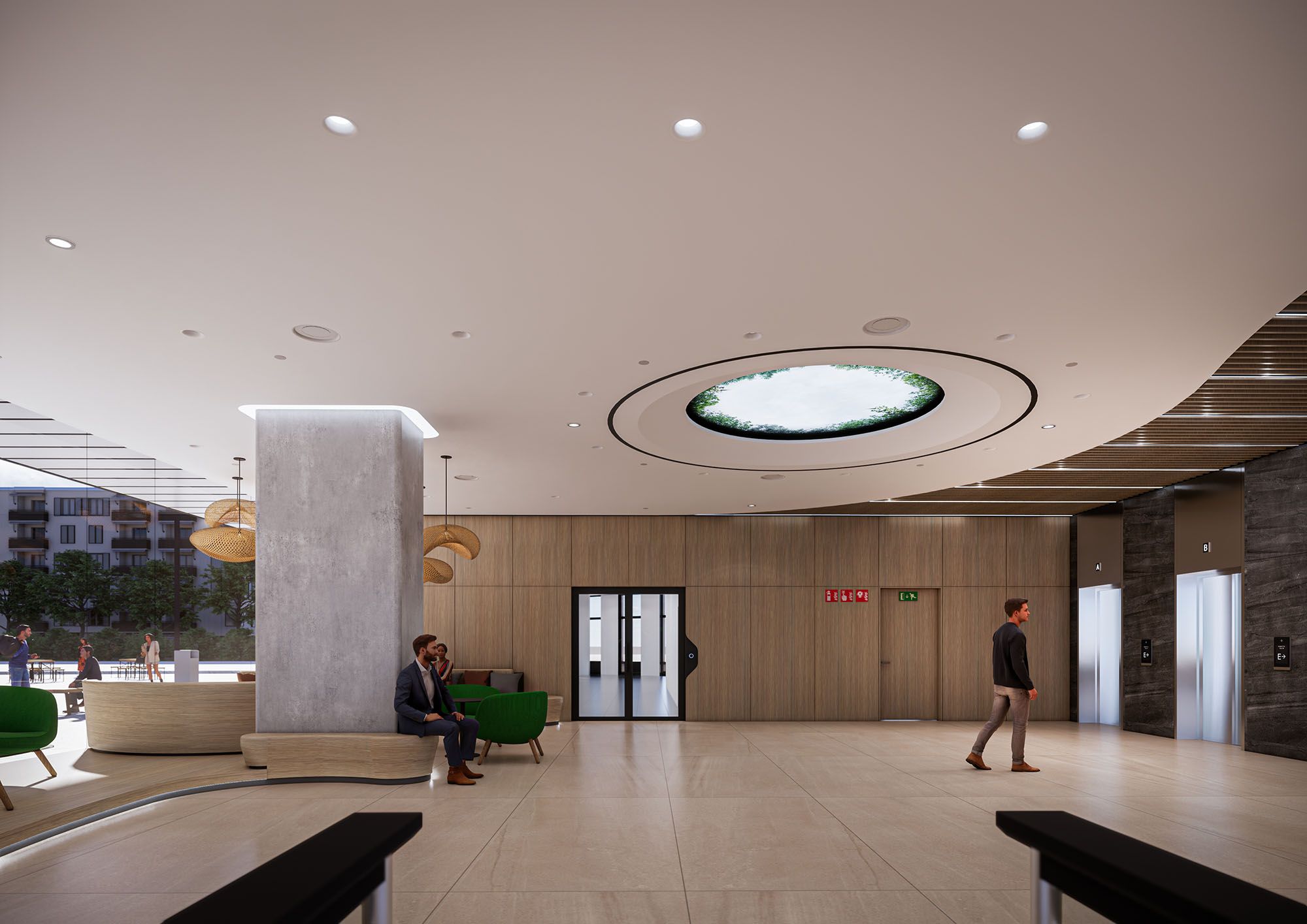
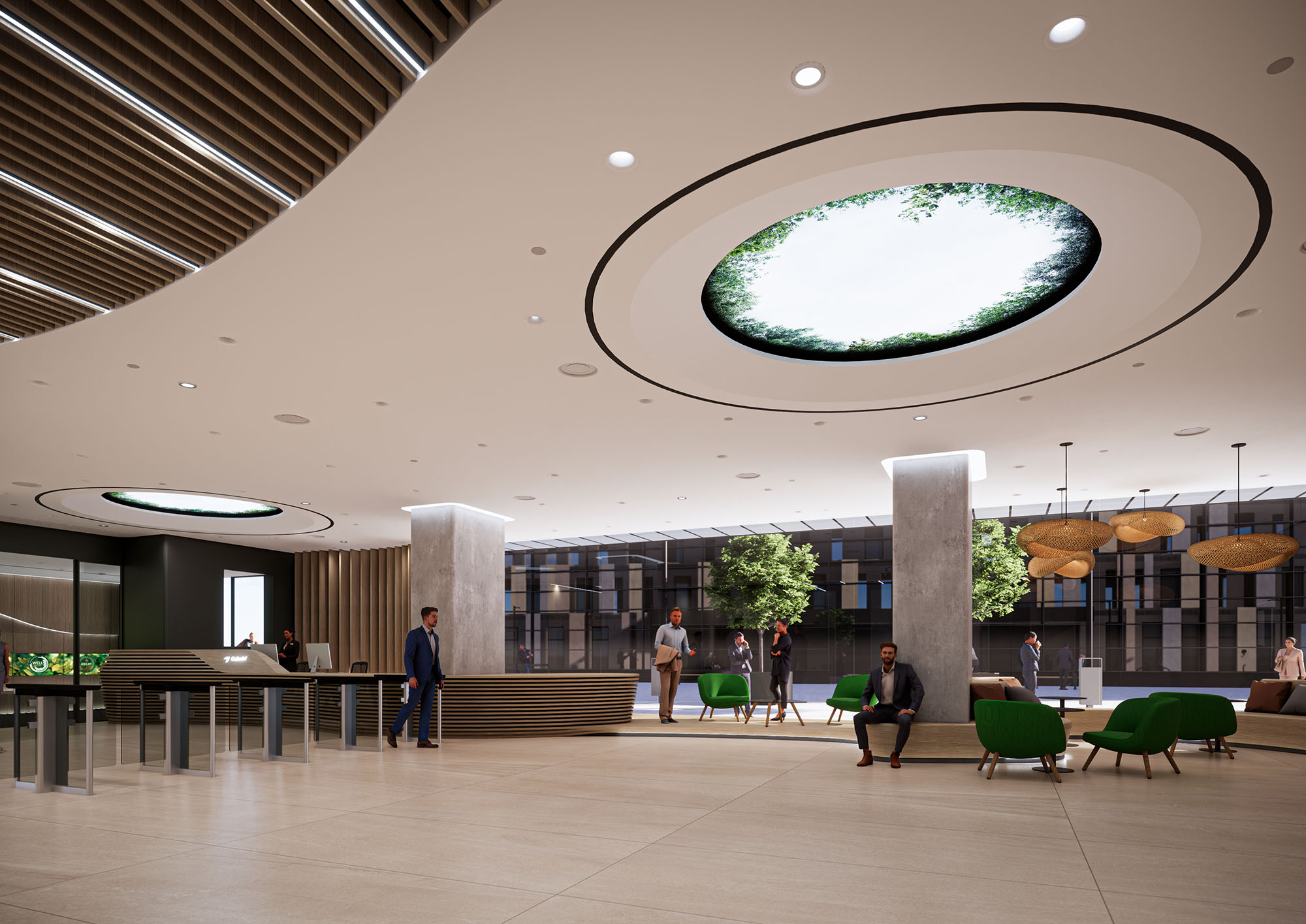
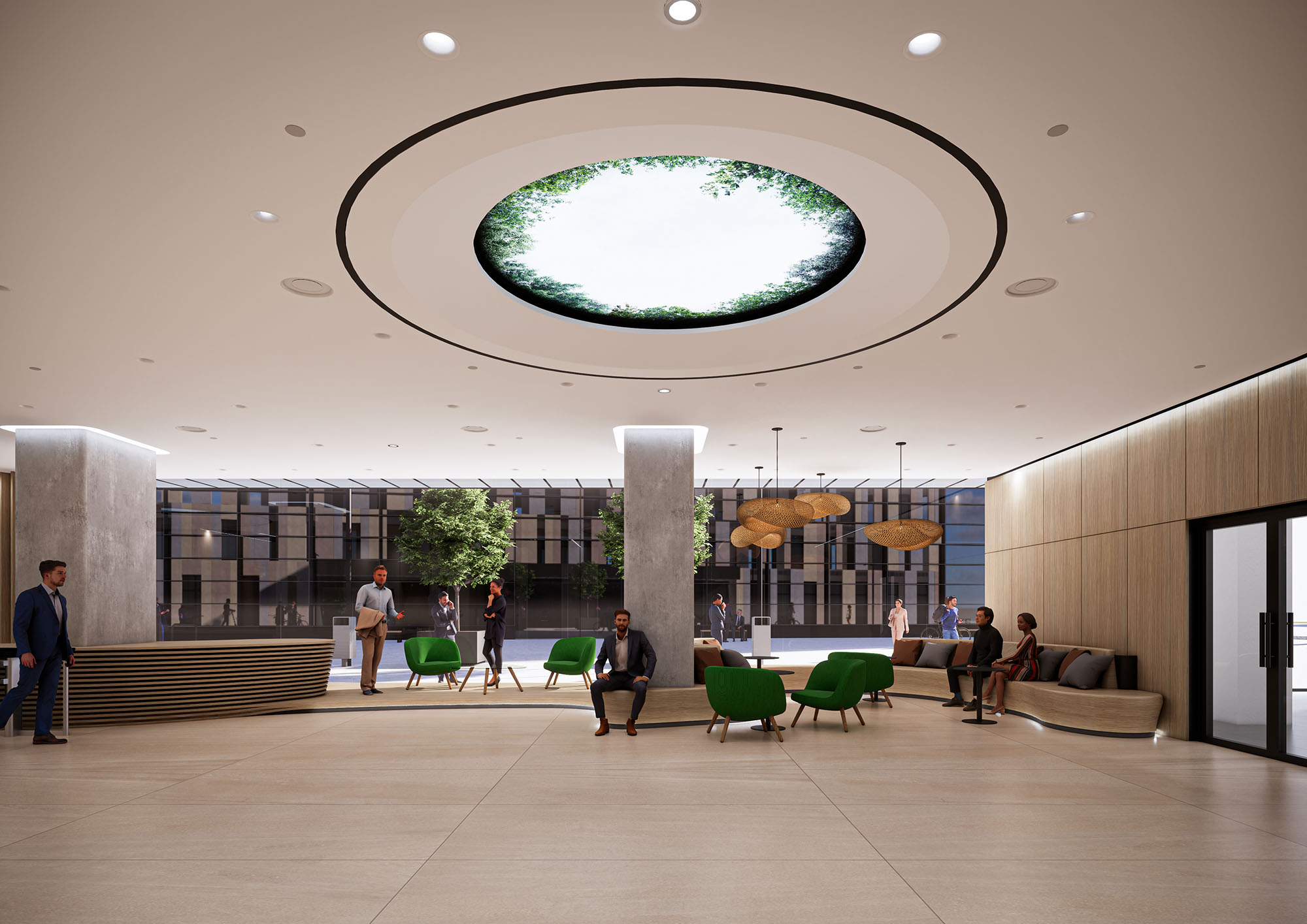
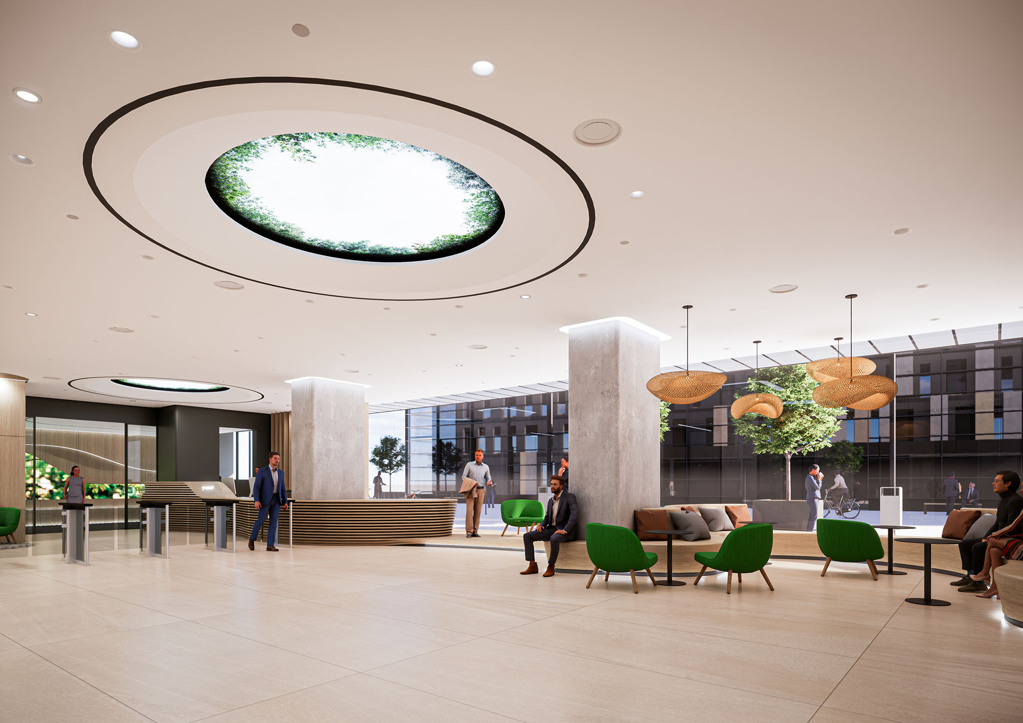
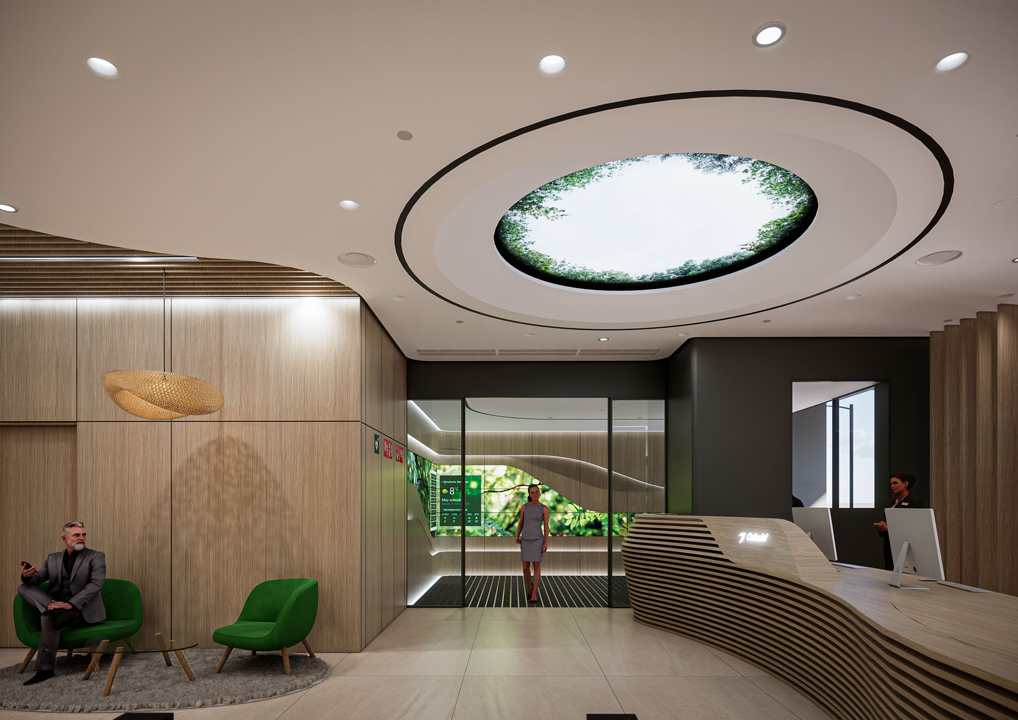
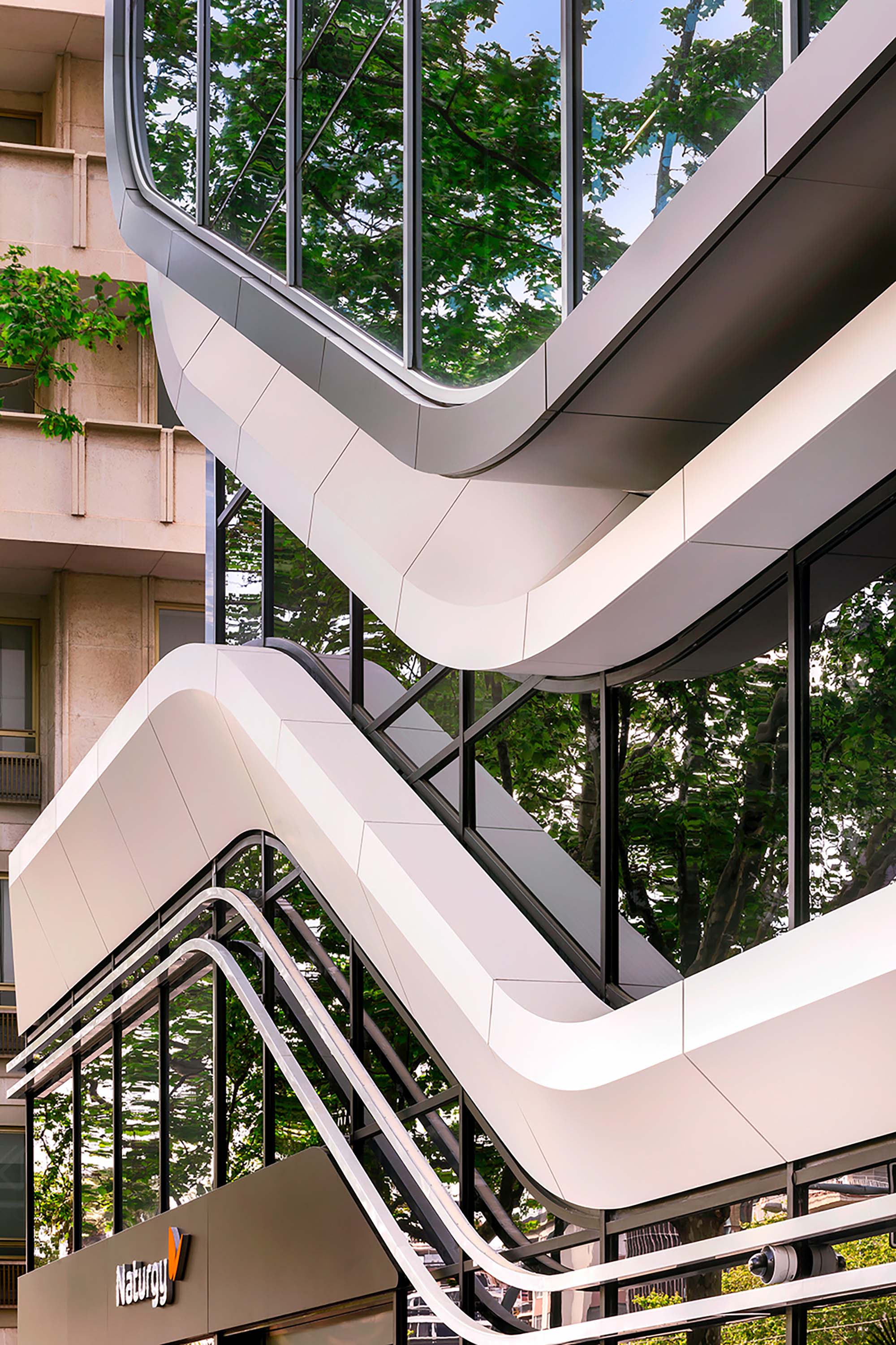
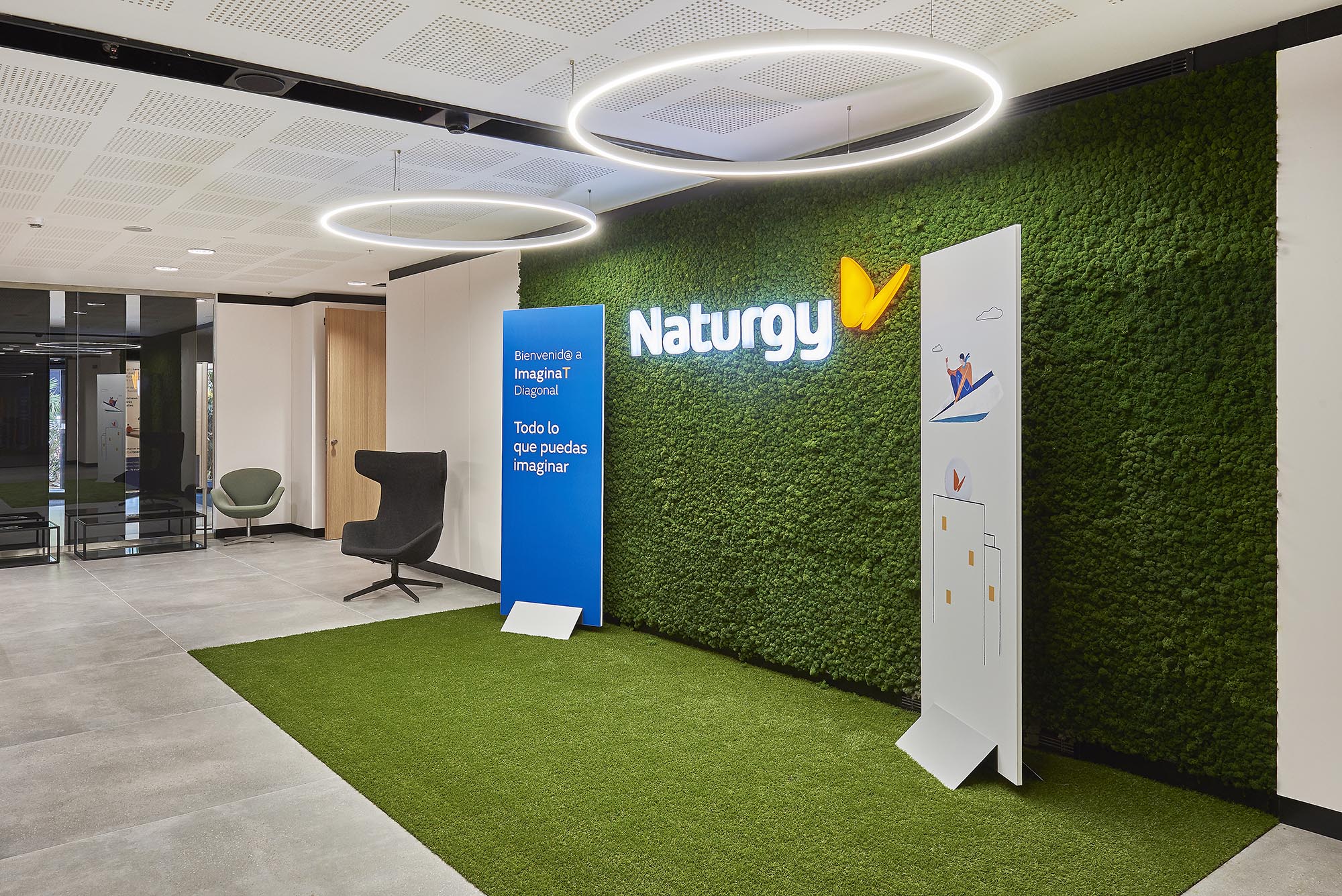
The D197 project redefines a corporate building in Barcelona as an open, permeable and contemporary workplace. The design concept is based on three key ideas: visibility towards the city, fluidity of circulation and incorporation of biophilic elements as a generator of well-being. The access, lobby and workspaces are conceived as a continuous spatial sequence where reception, informal meeting and circulation overlap, dissolving the traditional thresholds of a corporate building.
The architecture seeks a sober and timeless image, while the interior design introduces warmth and material richness. Neutral envelopes act as a backdrop for sculptural elements such as the curved reception desk, the vertical wooden slats and the large luminous oculus, which become identity milestones of the project and articulate the user experience from the street to the workspace.
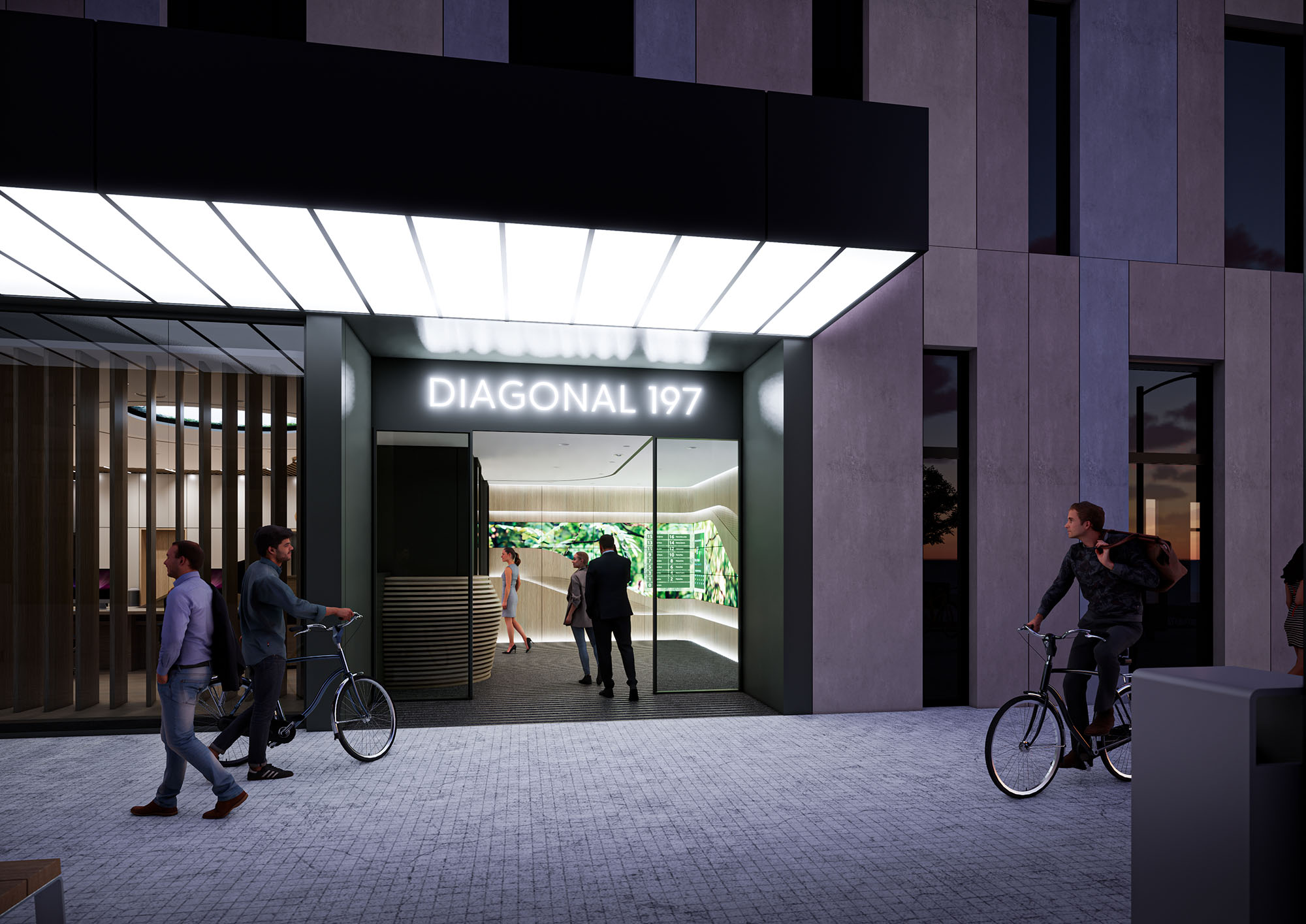
The entrance on Diagonal is configured as a deep, illuminated porch that acts as a transition between the public sidewalk and the interior lobby. A generous canopy of diffuse light emphasizes the access and improves nighttime safety, while the clear and legible signage “Diagonal 197” strengthens the urban identity of the building. Large transparent panes visually connect the interior green wall with the exterior, projecting the image of an active and open ground floor.
The façade of vertical stone or composite panels provides rhythm and scale, aligning with the avenue’s corporate context. The ground floor setback generates a semi-public filter space where pedestrians and cyclists coexist, favoring soft mobility and encouraging access by bicycle, in line with sustainable mobility strategies in Barcelona.
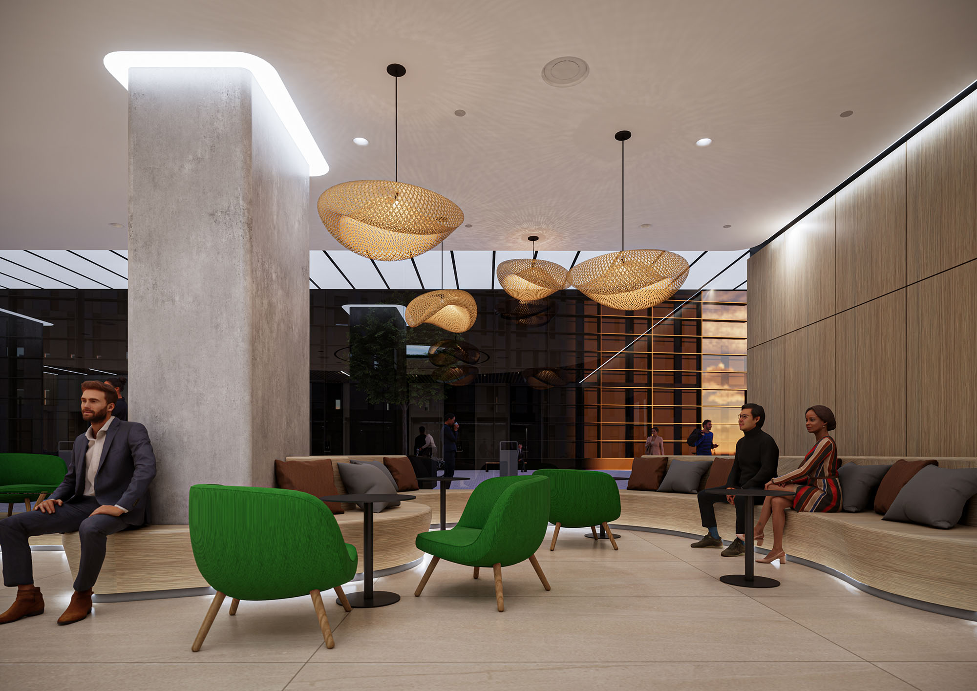
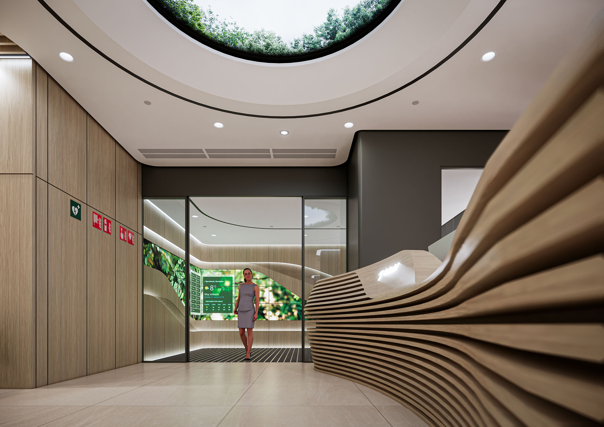
The lobby is conceived as a large, flexible and representative space. A suspended circular oculus integrates a digital or backlit image of tree canopies, bringing an abstract fragment of nature to the interior and reinforcing biophilic design. This element, combined with indirect perimeter lighting, produces a calm and homogeneous illumination suitable for reception and waiting uses.
The reception desk is a continuous sculptural volume formed by horizontal wooden slats, whose sinuous geometry accompanies the main circulation and softens the perception of scale. Behind it, a screen of vertical slats filters the view towards the courtyard and offers a sense of depth without losing visual continuity. The material palette in the lobby alternates warm wood, exposed concrete and neutral surfaces, generating a balanced dialogue between corporate sobriety and domestic comfort.
The upper floors are designed as open-plan plates with a highly regular structural grid, which facilitates flexible partitioning and future reconfiguration of uses. Continuous ceilings with integrated linear lighting and technical grids allow an efficient distribution of HVAC, sprinklers and acoustic panels. The large perimeter glazing ensures abundant natural light and panoramic views, improving user comfort and reducing the need for artificial lighting during daytime hours.
Common areas and collaboration hubs are located near the façades and vertical cores, promoting chance encounters and interdisciplinary exchanges. Finishes in these zones become more informal, incorporating visible installations, textured ceilings and varied seating typologies that support agile work, short meetings and relaxed breaks within the same floor.
The project prioritizes durable and low-maintenance materials, such as ceramic or composite cladding on the façade, high-resistance flooring and FSC-certified wood for interior elements. The strategic integration of greenery in the access and interior courtyard improves microclimatic conditions, favors air quality and provides visual relief in a dense urban environment. The biophilic resources, together with the generous ceiling heights, contribute to psychological comfort and occupant well-being.
From an environmental standpoint, the building envelope is optimized to control solar gain, while the deep plan is compensated by atriums and transparent partitions that favor daylight penetration. LED lighting with presence and daylight sensors, efficient HVAC systems and the possibility of natural ventilation in certain areas help reduce energy consumption. The design also contemplates bicycle parking and facilities to encourage sustainable mobility, reinforcing the building’s commitment to a responsible and contemporary corporate architecture.


The D197 project redefines a corporate building in Barcelona as an open, permeable and contemporary workplace. The design concept is based on three key ideas: visibility towards the city, fluidity of circulation and incorporation of biophilic elements as a generator of well-being. The access, lobby and workspaces are conceived as a continuous spatial sequence where reception, informal meeting and circulation overlap, dissolving the traditional thresholds of a corporate building.
The architecture seeks a sober and timeless image, while the interior design introduces warmth and material richness. Neutral envelopes act as a backdrop for sculptural elements such as the curved reception desk, the vertical wooden slats and the large luminous oculus, which become identity milestones of the project and articulate the user experience from the street to the workspace.
The entrance on Diagonal is configured as a deep, illuminated porch that acts as a transition between the public sidewalk and the interior lobby. A generous canopy of diffuse light emphasizes the access and improves nighttime safety, while the clear and legible signage “Diagonal 197” strengthens the urban identity of the building. Large transparent panes visually connect the interior green wall with the exterior, projecting the image of an active and open ground floor.
The façade of vertical stone or composite panels provides rhythm and scale, aligning with the avenue’s corporate context. The ground floor setback generates a semi-public filter space where pedestrians and cyclists coexist, favoring soft mobility and encouraging access by bicycle, in line with sustainable mobility strategies in Barcelona.
The lobby is conceived as a large, flexible and representative space. A suspended circular oculus integrates a digital or backlit image of tree canopies, bringing an abstract fragment of nature to the interior and reinforcing biophilic design. This element, combined with indirect perimeter lighting, produces a calm and homogeneous illumination suitable for reception and waiting uses.
The reception desk is a continuous sculptural volume formed by horizontal wooden slats, whose sinuous geometry accompanies the main circulation and softens the perception of scale. Behind it, a screen of vertical slats filters the view towards the courtyard and offers a sense of depth without losing visual continuity. The material palette in the lobby alternates warm wood, exposed concrete and neutral surfaces, generating a balanced dialogue between corporate sobriety and domestic comfort.
The upper floors are designed as open-plan plates with a highly regular structural grid, which facilitates flexible partitioning and future reconfiguration of uses. Continuous ceilings with integrated linear lighting and technical grids allow an efficient distribution of HVAC, sprinklers and acoustic panels. The large perimeter glazing ensures abundant natural light and panoramic views, improving user comfort and reducing the need for artificial lighting during daytime hours.
Common areas and collaboration hubs are located near the façades and vertical cores, promoting chance encounters and interdisciplinary exchanges. Finishes in these zones become more informal, incorporating visible installations, textured ceilings and varied seating typologies that support agile work, short meetings and relaxed breaks within the same floor.
The project prioritizes durable and low-maintenance materials, such as ceramic or composite cladding on the façade, high-resistance flooring and FSC-certified wood for interior elements. The strategic integration of greenery in the access and interior courtyard improves microclimatic conditions, favors air quality and provides visual relief in a dense urban environment. The biophilic resources, together with the generous ceiling heights, contribute to psychological comfort and occupant well-being.
From an environmental standpoint, the building envelope is optimized to control solar gain, while the deep plan is compensated by atriums and transparent partitions that favor daylight penetration. LED lighting with presence and daylight sensors, efficient HVAC systems and the possibility of natural ventilation in certain areas help reduce energy consumption. The design also contemplates bicycle parking and facilities to encourage sustainable mobility, reinforcing the building’s commitment to a responsible and contemporary corporate architecture.
© 2021 by sanzpont [arquitectura] . Webpage by sanzpont [digital] . Innovative Digital Experiences
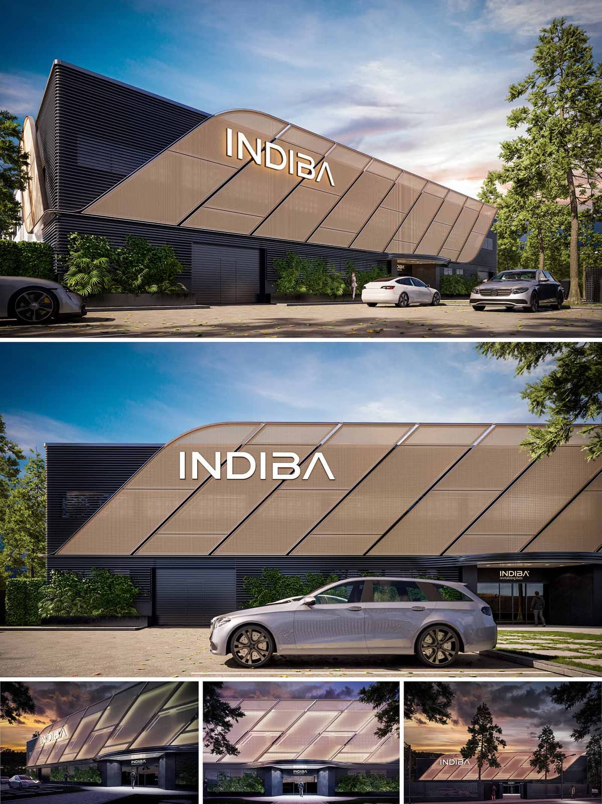

The renovation project proposal for the INDIBA Headquarters building is primarily focused on enhancing the visual impact and modernity of the existing structure while adhering to a stringent budget. This goal is achieved through a clever facade redesign that layers new, cost-effective materials over the original building elements to create a dynamic and contemporary appearance. The primary intent is to transform a conventional building into a visually striking landmark that aligns with the innovative spirit of the brand it houses.
The facade is revamped using two main materials: aluminum louvers and stretch fabric. These materials are chosen for their affordability, durability, and aesthetic flexibility. The aluminum louvers, serve not only as a visual highlight but also functionally, as they help in controlling natural light and enhancing the building’s thermal performance. Behind these louvers, the existing walls are painted in a dark gray hue, which provides a neutral backdrop that accentuates the metallic sheen of the aluminum. The stretch fabric, used selectively, adds a textural contrast and is illuminated for dramatic night-time effect, emphasizing the building’s branding.
The entrance of the building is redesigned to evoke a more sophisticated and welcoming atmosphere. The new design introduces a sleek, modern canopy that projects over the entrance, providing shelter and a strong visual frame. This canopy is supported by minimalistic structures that complement the linear expressions of the aluminum louvers. The entrance itself is made more prominent by enhanced lighting and clear signage, making it immediately recognizable and accessible.
In keeping with contemporary architectural practices, the renovation proposal considers not just aesthetic improvement but also environmental impact. The aluminum louvers provide passive cooling by shading the building’s interior from direct sunlight, thus reducing the reliance on air conditioning and lowering energy consumption. The choice of materials like aluminum, which is highly recyclable, and the decision to retain and refurbish existing structures rather than demolishing them, are reflective of a commitment to sustainability. Additionally, the use of low-VOC paint helps in maintaining air quality.
Overall, the project strikes a balance between aesthetic appeal and functional improvements. The design leverages simple yet effective architectural elements to revitalize an older building, enhancing its presence in the urban landscape while promoting environmental responsibility. The approach demonstrates how thoughtful material selection and design can be merged to achieve significant transformations even within limited budget constraints. This renovation not only redefines the building’s visual identity but also improves its operational efficiency and sustainability profile.
© 2021 by sanzpont [arquitectura] . Webpage by sanzpont [digital] . Innovative Digital Experiences
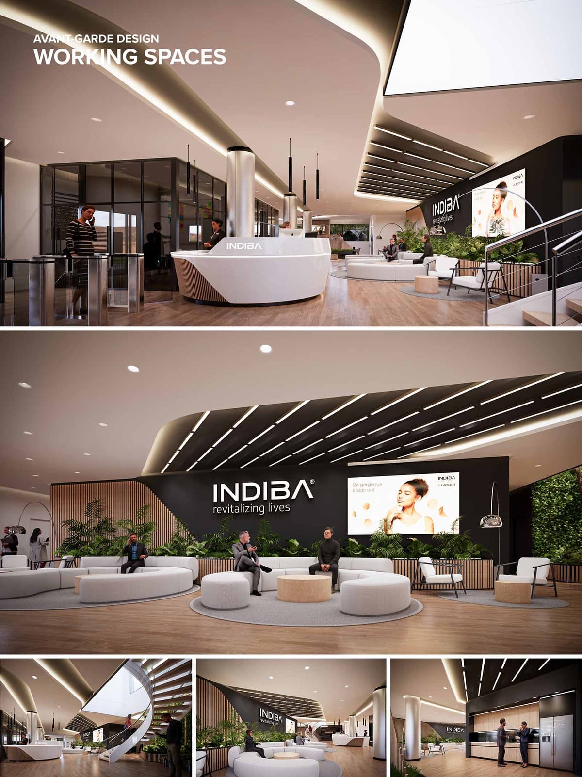

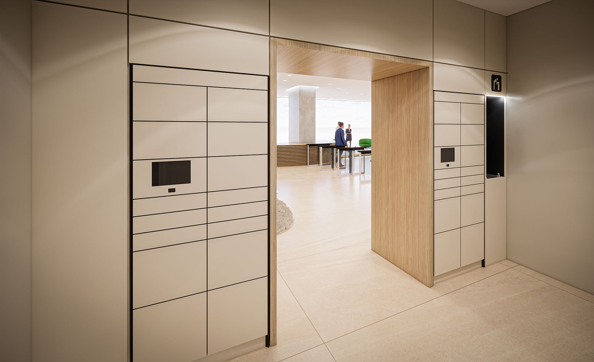
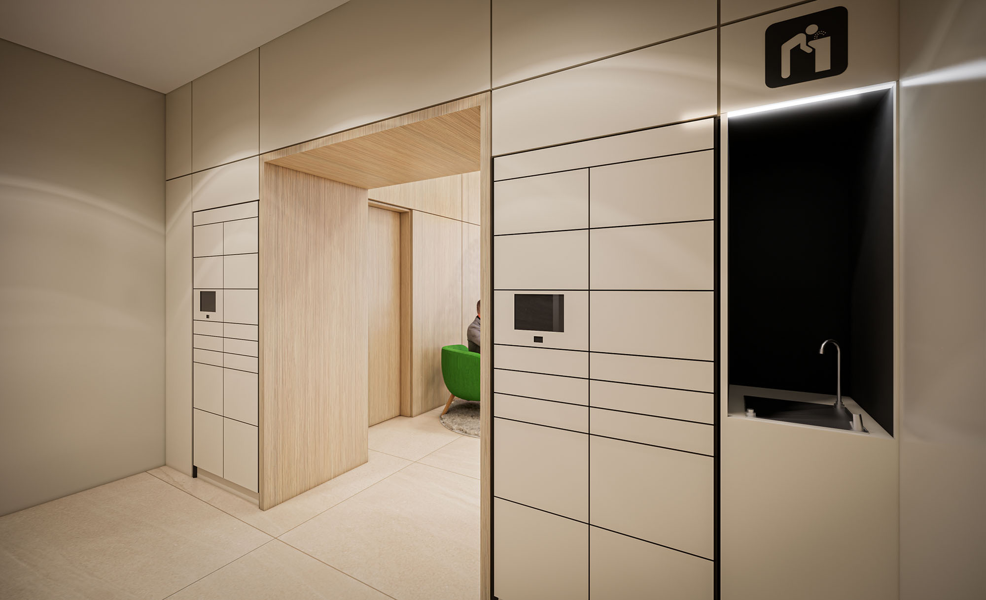
This renovation proposal for an existing office lobby space embraces an avant-garde approach to rejuvenate and transform the environment into a dynamic, brand-centric area for INDIBA. The design strategically incorporates modern elements and a sense of openness to reflect the company's commitment to revitalization and wellness. By integrating organic curves and a cohesive aesthetic, the space is reimagined to serve not only as a transitional area but as a vital part of the workplace that enhances brand identity and user experience.
The proposed design redefines the existing lobby by introducing a fluid layout that maximizes the use of space and encourages interaction. The central feature is a sleek, curved reception desk that acts as a focal point, while various seating arrangements offer both casual and formal waiting areas. The design ensures a logical flow from the entrance to other parts of the office, facilitating easy navigation and an inviting atmosphere. By maintaining visual connectivity across the lobby, the space promotes a collaborative and inclusive environment.
In the renovation, high-quality, sustainable materials are prioritized to align with the brand’s ethos. The use of polished wood for wall cladding and furniture brings warmth, while the matte finishes on composite materials offer a modern touch without overpowering the senses. The neutral color palette, enriched with natural green accents from plants, creates a calming and welcoming atmosphere. Such choices not only enhance the aesthetic value but also ensure durability and maintenance ease in a high-traffic lobby area.
The lighting design is crucial in transforming the existing lobby into a vibrant space. Recessed LED lighting strips follow the curved lines of the ceiling, enhancing the architectural features while providing uniform, ambient lighting that adapts to different times of the day. Task lighting over the reception desk and strategic placement of pendant lights in seating areas create layers of illumination, which are essential for both functionality and ambiance. This layered lighting approach supports varied activities, from relaxed waiting to informal meetings, contributing to a versatile environment.
Sustainability is a key component of the renovation proposal. Energy-efficient lighting solutions reduce electricity usage, while materials selected for their recycled content and low environmental impact underscore a commitment to green building practices. The integration of indoor plants not only beautifies the space but also improves air quality, enhancing the overall workplace environment. These sustainable practices demonstrate a forward-thinking design approach that aligns with current architectural trends and corporate responsibility.
The renovation proposal for the INDIBA office lobby is designed to transform an ordinary entry area into an extraordinary space that communicates the brand’s values and enhances user experience. Through thoughtful design elements, sustainable practices, and a focus on functionality, the project sets a new standard for office lobby spaces, making it not just a passageway but a key component of the workplace’s social and professional fabric. This transformation speaks to a modern, health-oriented brand, aiming to inspire both employees and visitors by revitalizing their everyday interactions with the space.
© 2021 by sanzpont [arquitectura] . Webpage by sanzpont [digital] . Innovative Digital Experiences
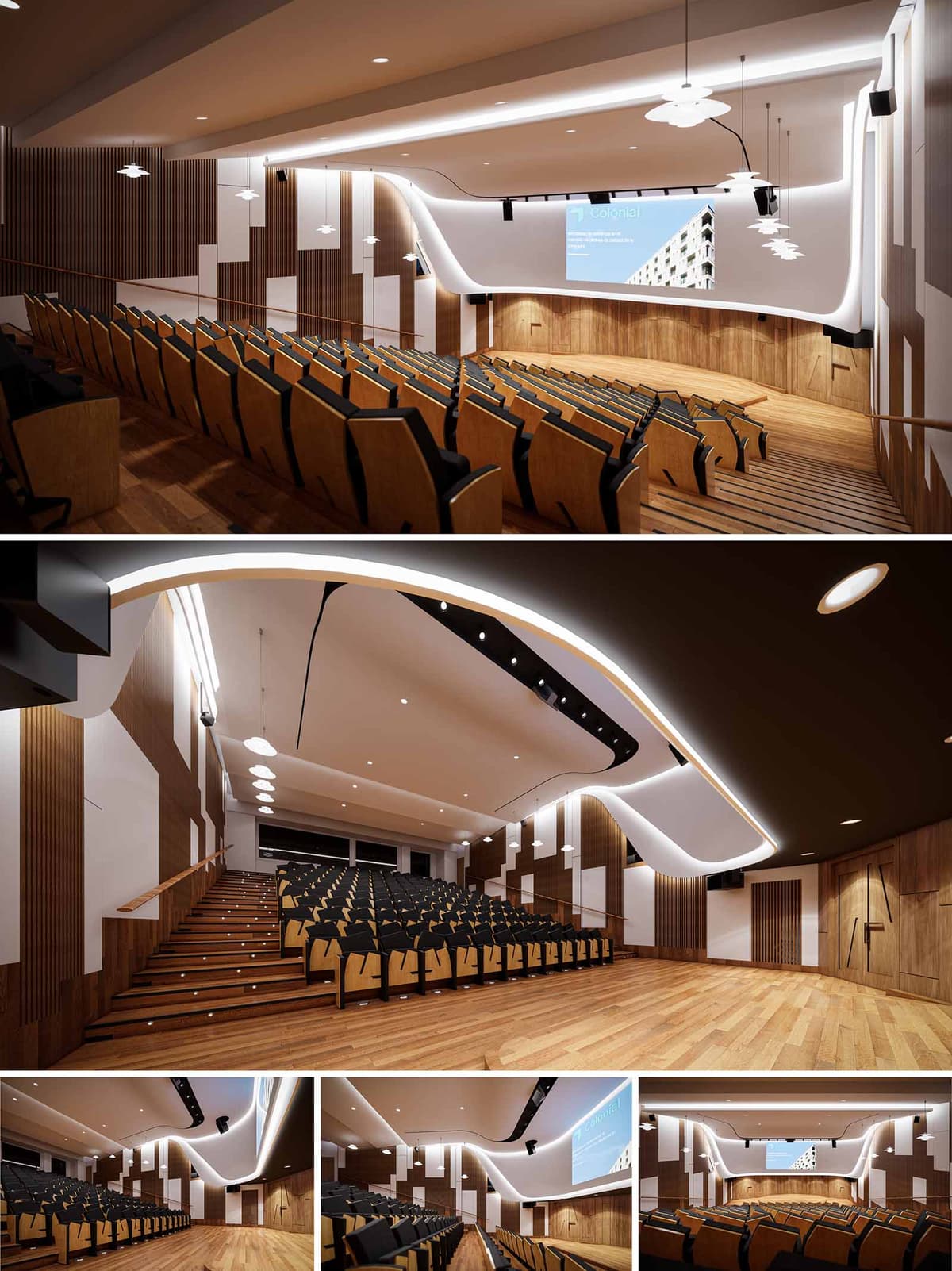

The concept for this auditorium renovation centered on redefining spatial dynamics through a synthesis of acoustics, visual identity, and ergonomic experience. The primary design intent was to modernize the space while reinforcing its function as a high-performance, multi-use presentation hall. We envisioned a space where sculptural fluidity meets technical precision—manifested in the reimagined stage, ceiling geometry, and integrated lighting strategy. The overall aesthetic expresses continuity between architectural form and performance utility, utilizing dynamic lines and warm materials to create an immersive and cohesive environment.
The ceiling was conceived as a continuous sculptural element, characterized by an undulating, wave-like form that enhances both acoustics and visual rhythm. This surface is treated with high-performance acoustic plaster, with integrated LED cove lighting tracing its organic contours. The asymmetrical curvature emphasizes forward motion toward the stage, subtly directing the audience's gaze. Suspended pendant lights are tactically placed along the central axis to create balanced illumination while contributing to the ceiling’s spatial rhythm. These are supplemented by focused downlights and linear wash lights to accommodate variable use-cases—ranging from lectures to multimedia events. The layered lighting system supports dynamic scene-setting and energy efficiency.
The stage front and proscenium wall underwent a complete transformation to enhance both technical performance and visual integration. A large-scale digital screen is recessed into a newly clad front wall, seamlessly bordered by vertical wood paneling and matte white acoustic baffles. The curvature from the ceiling transitions fluidly into the front wall, echoing the auditorium’s flowing language. Timber paneling in warm oak tones wraps the stage and lower walls, offering tactile warmth and supporting sound diffusion. The stage flooring continues the same material language, ensuring material coherence and visual continuity.
The interior palette is grounded in natural finishes—primarily oak wood and acoustic fabric panels. Vertical timber slats line side walls to soften reverberation and add rhythm to the wall composition. Contrasting white acoustic panels are interspersed in irregular patterns to break visual monotony while optimizing sound diffusion. Seating was custom-designed in laminated plywood with black upholstered inserts to balance comfort, durability, and formal simplicity. The staggered layout ensures optimal sightlines and circulation flow, with subtle LED strips embedded in stair risers for safe navigation.
The redesign features a complete upgrade to the audio-visual infrastructure. A new surround audio system is integrated into the ceiling and wall architecture, supported by concealed wiring and acoustic treatments that minimize echo and sound leakage. The projection and audio systems are controlled via a centralized console, hidden within a technical cabinet integrated into the rear wall. Ceiling curvature and material selections were carefully calculated to minimize flutter echoes and optimize spoken word clarity, essential for both live and recorded presentations.
Sustainability was addressed through the use of FSC-certified timber and low-VOC finishes, ensuring reduced environmental impact. LED lighting, motion-sensor systems, and zoned lighting controls were implemented to reduce energy consumption. Materials were sourced locally where possible, and modular design solutions were prioritized to simplify future maintenance or upgrade cycles. The acoustic panels are fabricated from recycled PET felt, offering both ecological and acoustic performance. The seating system, while visually refined, is engineered for disassembly and recyclability at end-of-life.
© 2021 by sanzpont [arquitectura] . Webpage by sanzpont [digital] . Innovative Digital Experiences

The design of the Marenostrum Tower lobby in Barcelona seeks to create a dialogue between natural forms and modern architecture, encapsulating the essence of the Mediterranean environment. The central pillar, transformed into a sculptural element reminiscent of a tree, serves as the nucleus of the space. This design choice is not only a functional necessity but also a bold artistic statement, where the pillar branches upwards into the ceiling, integrating the structural with the ornamental. The branching forms extend across the ceiling, reminiscent of a tree’s canopy, providing a sheltering presence and a focal point that draws the eye upward and outward, emphasizing the spaciousness of the lobby.
Further enhancing the central motif, the top of the pillar is designed with subtle nuances that evoke the wings of a butterfly. This addition introduces an element of delicate beauty and symbolizes transformation, resonating with the dynamic nature of the space. This design is particularly poignant in a corporate setting, suggesting the potential for growth and evolution within the professional environment.
The ceiling beyond the central tree-inspired pillar continues the narrative of natural inspiration with its design reminiscent of gentle Mediterranean waves. This element of the design moves fluidly across the space, culminating in a figure that abstractly represents a manta ray. This feature not only complements the marine-inspired aesthetic but also adds a layer of complexity to the ceiling's architecture, inviting those entering the building to pause and reflect on the interplay of form and function.
The overarching concept is anchored in creating an environment that transcends the traditional utilitarian function of a lobby by imbuing it with a sense of calm and inspiration drawn from nature. Through the use of sweeping lines, organic forms, and a nuanced palette of materials and lights, the lobby of the Marenostrum Tower becomes more than just an entrance; it transforms into an experiential journey that starts at the threshold of the building and continues within, influenced by the serene and invigorating spirit of the Mediterranean landscape.
The ceiling design draws from the undulating waves of the Mediterranean Sea, with soft, flowing forms that suggest calm and continuity. This design gradually transitions into a figure representing a manta ray, extending the nature-inspired theme into the marine realm. The integration of ambient lighting enhances these features, casting soft shadows that mimic the natural light filtering through water, further emphasizing the aquatic motif.
The walls are adorned with patterns inspired by coral reefs, crafted with precision to incorporate ambient lighting. These engravings are not merely decorative but are designed to emit a soft, indirect blue light, reminiscent of light penetrating deep underwater scenes. This lighting technique not only illuminates the space but also brings the walls to life, creating a dynamic interaction between light and structure that evokes the feeling of a living, breathing entity.
The reception area is designed with an aesthetic inspired by the elegance and fluidity of a swan. The desk features smooth, flowing lines that wrap around the space, guiding movement and interaction within the lobby. This design choice reinforces the theme of fluidity and movement, resonating with the gentle yet powerful grace of the swan.
In line with contemporary architectural practices, the project prioritizes environmental sustainability. The choice of materials reflects a commitment to eco-friendly solutions, ensuring that every element of the design contributes to a sustainable outcome. The project's execution utilized Building Information Modeling (BIM) technology, enabling precise coordination across various disciplines. This integration ensured that the virtual models for finishes, furniture, and installations were meticulously aligned with the physical construction, optimizing both aesthetic and functional outcomes.
This lobby is not just a passageway but a destination in itself, offering a tranquil retreat that invites reflection and appreciation of its intricate design inspired by the natural world. Through careful planning and innovative design, the Marenostrum Tower lobby becomes a testament to the possibilities of modern architecture to create spaces that are both functional and profoundly inspiring.
• APR International Interior Design Awards : Gold Award Winner : TMN Lobby (2022)
• Golden Trezzini Awards : Honorable Mention in Best Implemented Interior Design Project for Public Space Category : TMN Lobby (2022)
• Archframe Design Awards : Gold Winner : TMN Lobby (2022)
• The Architecture Community World Design Awards 2022 : Winner : TMN Lobby (2022)
• APR Global Future Design Awards: Gold Award Winner : TMN Lobby (2022)
• Loop Design Awards : Honorable Mention - Interior Offices : TMN Lobby (2022)
• World Architecture Awards 10+5+X Honorary Members : Interior Design Category, 41th Cycle : TMN Lobby (2022)
• Novum Design Awards, Helsinki, Finland : Gold Award Winner : TMN Lobby (2022)
The design of the Marenostrum Tower lobby in Barcelona seeks to create a dialogue between natural forms and modern architecture, encapsulating the essence of the Mediterranean environment. The central pillar, transformed into a sculptural element reminiscent of a tree, serves as the nucleus of the space. This design choice is not only a functional necessity but also a bold artistic statement, where the pillar branches upwards into the ceiling, integrating the structural with the ornamental. The branching forms extend across the ceiling, reminiscent of a tree’s canopy, providing a sheltering presence and a focal point that draws the eye upward and outward, emphasizing the spaciousness of the lobby.
Further enhancing the central motif, the top of the pillar is designed with subtle nuances that evoke the wings of a butterfly. This addition introduces an element of delicate beauty and symbolizes transformation, resonating with the dynamic nature of the space. This design is particularly poignant in a corporate setting, suggesting the potential for growth and evolution within the professional environment.
The ceiling beyond the central tree-inspired pillar continues the narrative of natural inspiration with its design reminiscent of gentle Mediterranean waves. This element of the design moves fluidly across the space, culminating in a figure that abstractly represents a manta ray. This feature not only complements the marine-inspired aesthetic but also adds a layer of complexity to the ceiling's architecture, inviting those entering the building to pause and reflect on the interplay of form and function.
The overarching concept is anchored in creating an environment that transcends the traditional utilitarian function of a lobby by imbuing it with a sense of calm and inspiration drawn from nature. Through the use of sweeping lines, organic forms, and a nuanced palette of materials and lights, the lobby of the Marenostrum Tower becomes more than just an entrance; it transforms into an experiential journey that starts at the threshold of the building and continues within, influenced by the serene and invigorating spirit of the Mediterranean landscape.
The ceiling design draws from the undulating waves of the Mediterranean Sea, with soft, flowing forms that suggest calm and continuity. This design gradually transitions into a figure representing a manta ray, extending the nature-inspired theme into the marine realm. The integration of ambient lighting enhances these features, casting soft shadows that mimic the natural light filtering through water, further emphasizing the aquatic motif.
The walls are adorned with patterns inspired by coral reefs, crafted with precision to incorporate ambient lighting. These engravings are not merely decorative but are designed to emit a soft, indirect blue light, reminiscent of light penetrating deep underwater scenes. This lighting technique not only illuminates the space but also brings the walls to life, creating a dynamic interaction between light and structure that evokes the feeling of a living, breathing entity.
The reception area is designed with an aesthetic inspired by the elegance and fluidity of a swan. The desk features smooth, flowing lines that wrap around the space, guiding movement and interaction within the lobby. This design choice reinforces the theme of fluidity and movement, resonating with the gentle yet powerful grace of the swan.
In line with contemporary architectural practices, the project prioritizes environmental sustainability. The choice of materials reflects a commitment to eco-friendly solutions, ensuring that every element of the design contributes to a sustainable outcome. The project's execution utilized Building Information Modeling (BIM) technology, enabling precise coordination across various disciplines. This integration ensured that the virtual models for finishes, furniture, and installations were meticulously aligned with the physical construction, optimizing both aesthetic and functional outcomes.
This lobby is not just a passageway but a destination in itself, offering a tranquil retreat that invites reflection and appreciation of its intricate design inspired by the natural world. Through careful planning and innovative design, the Marenostrum Tower lobby becomes a testament to the possibilities of modern architecture to create spaces that are both functional and profoundly inspiring.
© 2021 by sanzpont [arquitectura] . Webpage by sanzpont [digital] . Innovative Digital Experiences
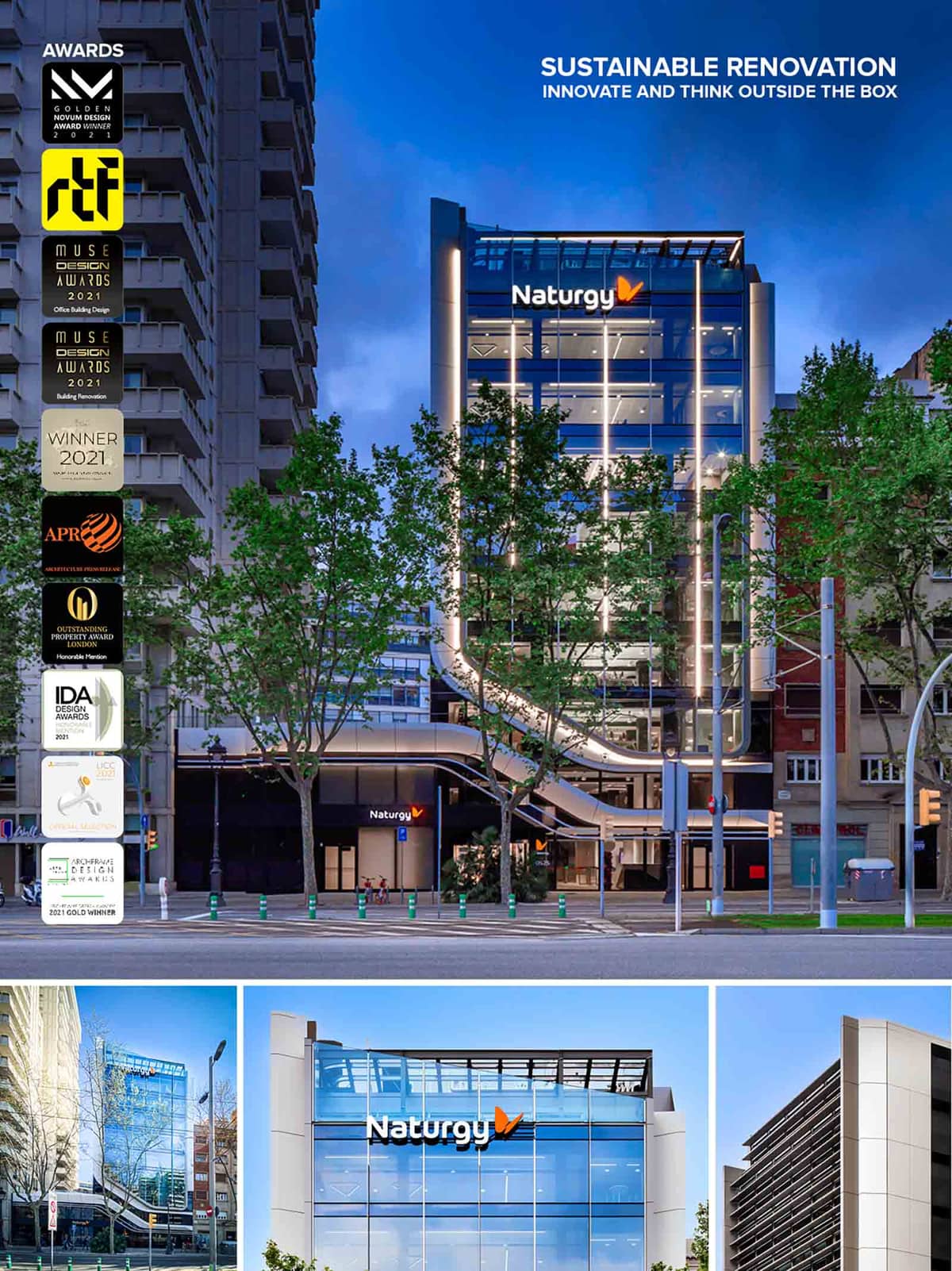

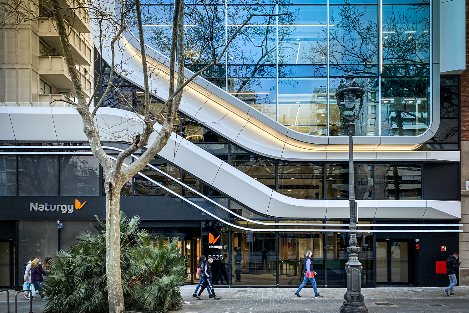
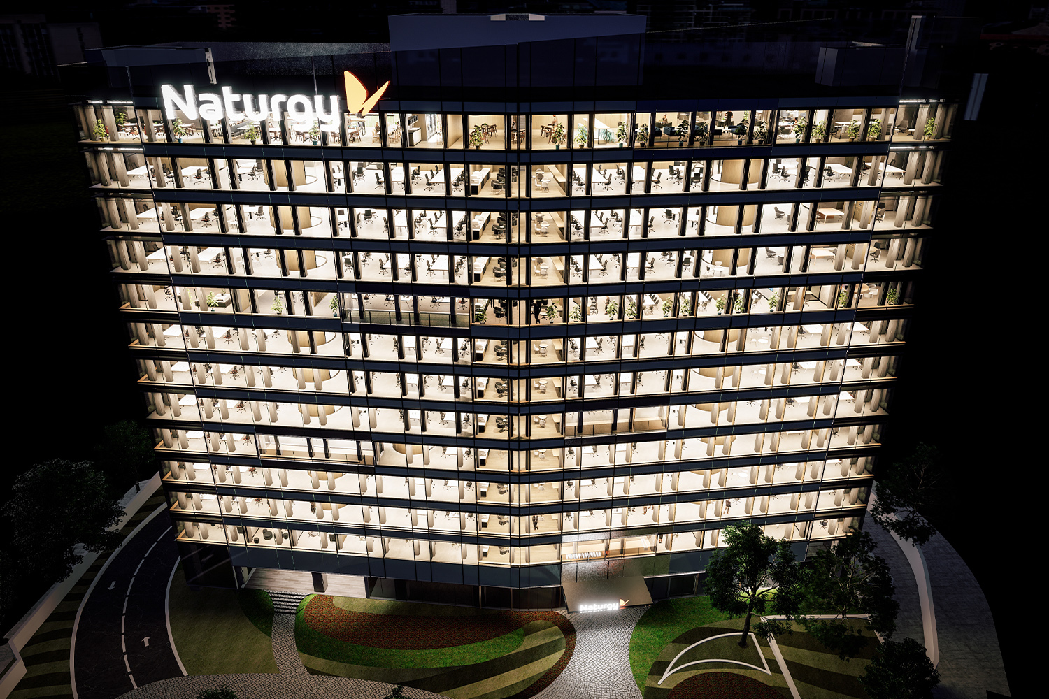
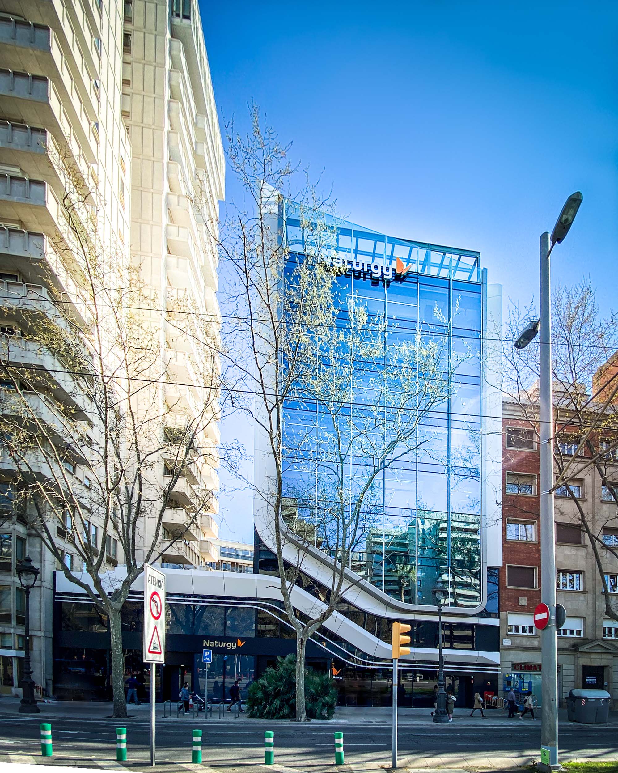
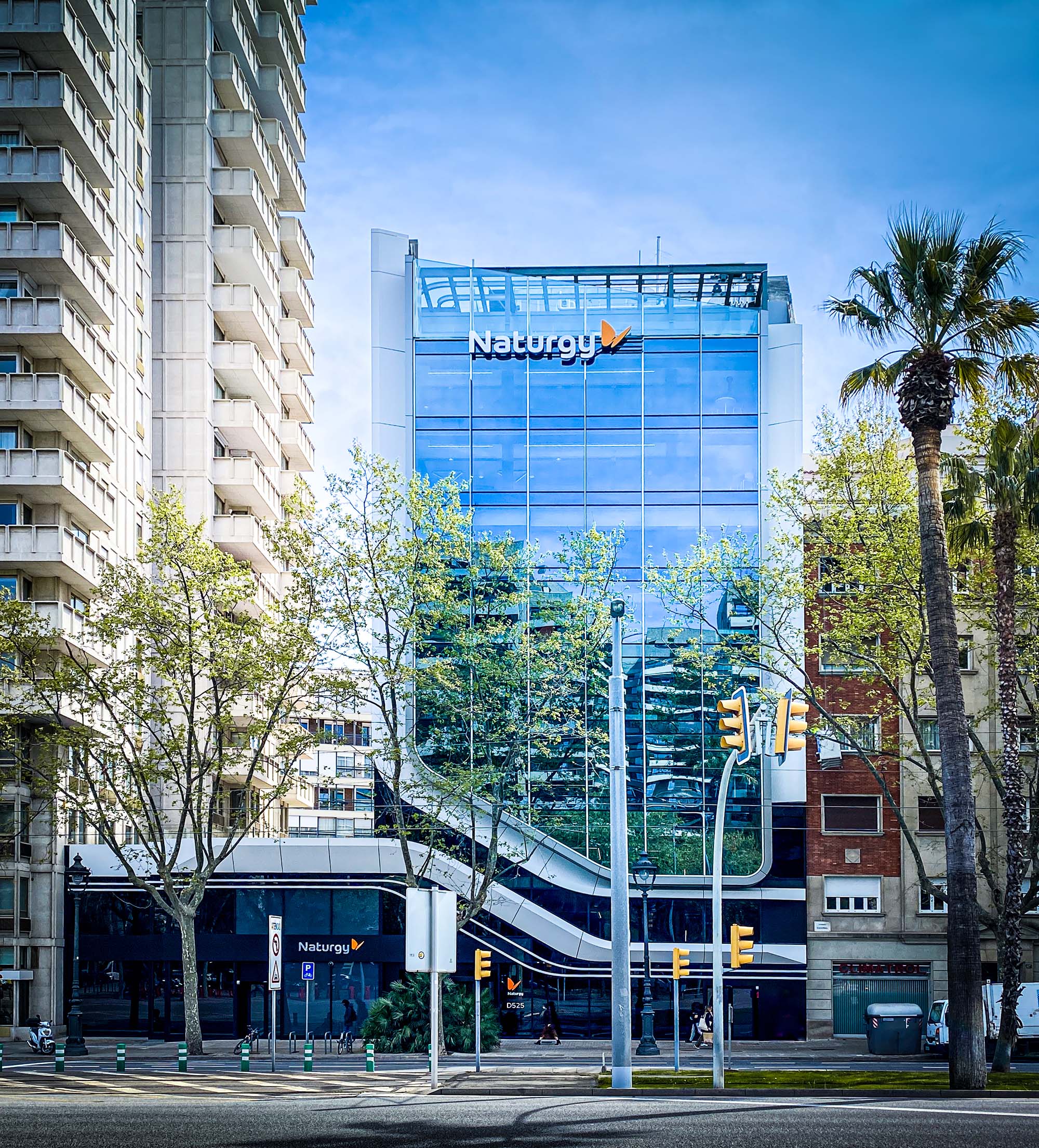
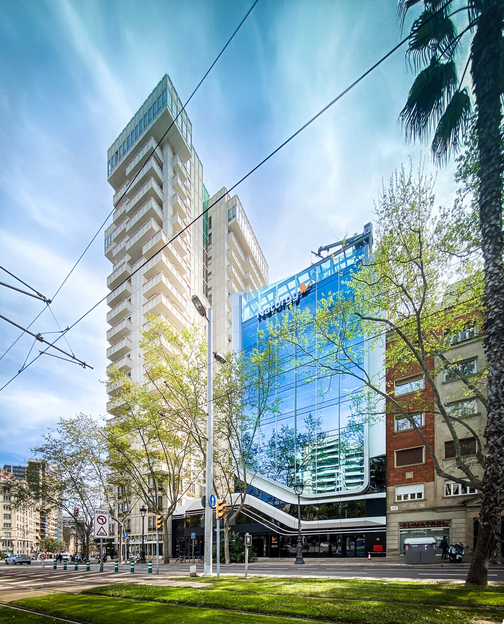
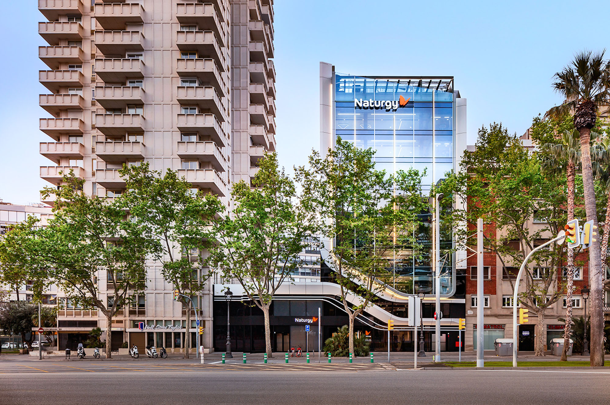
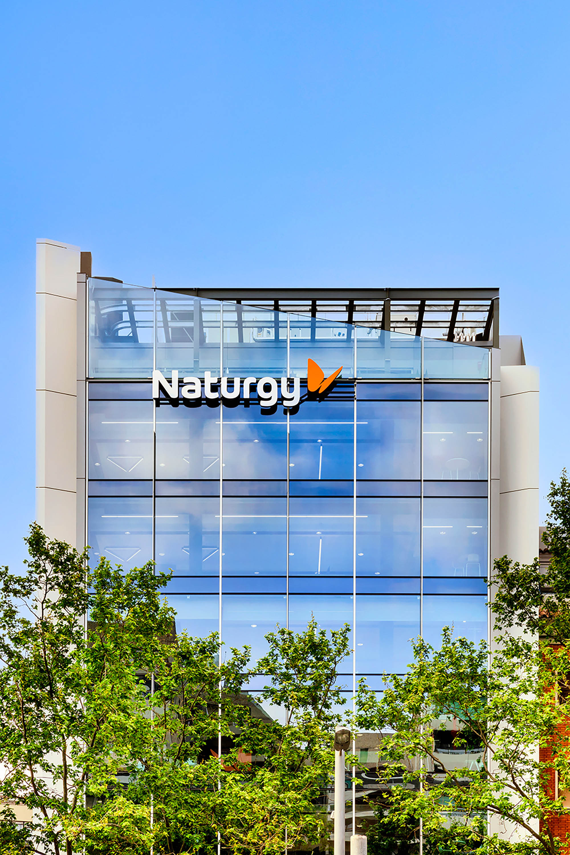
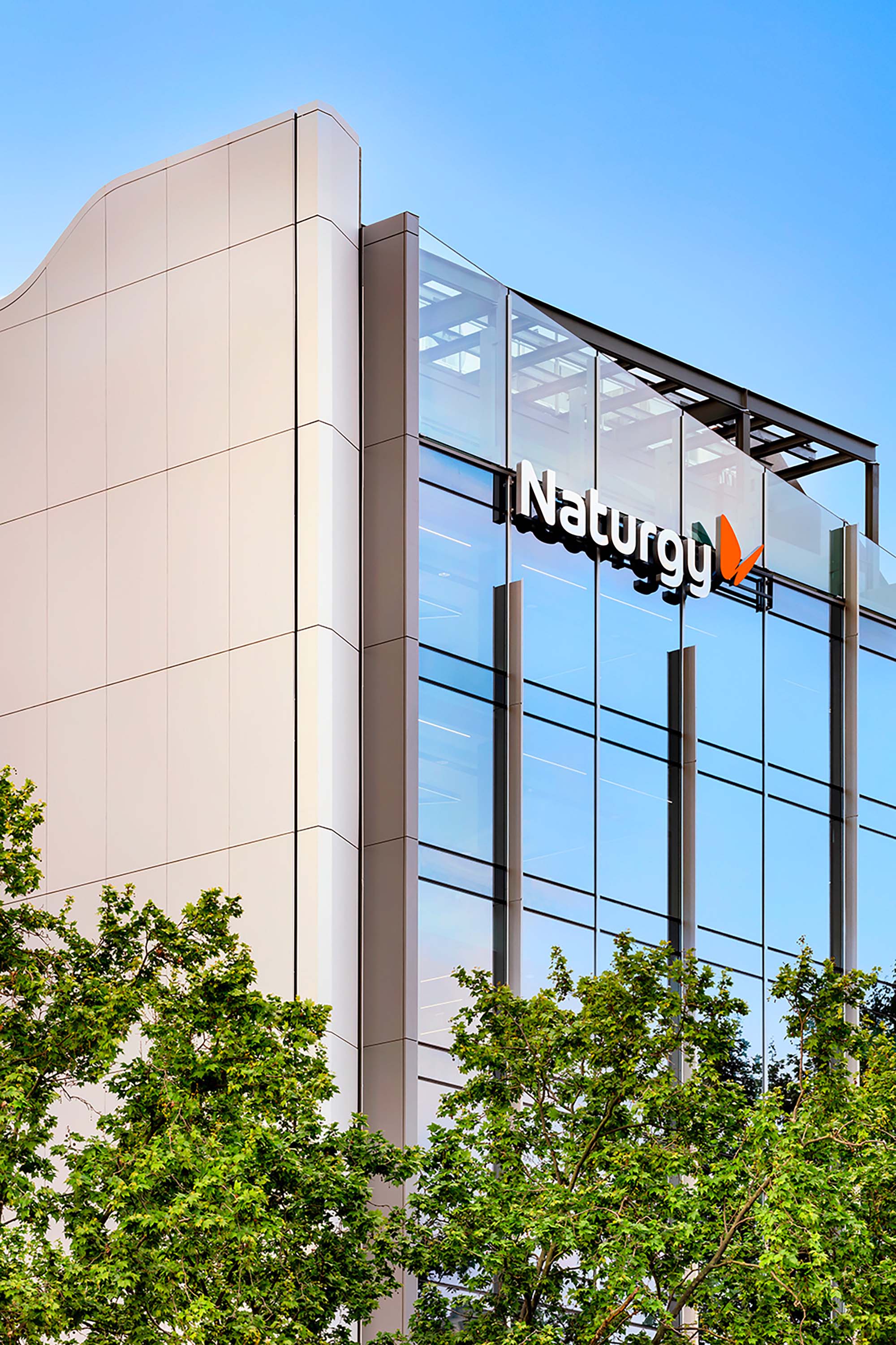
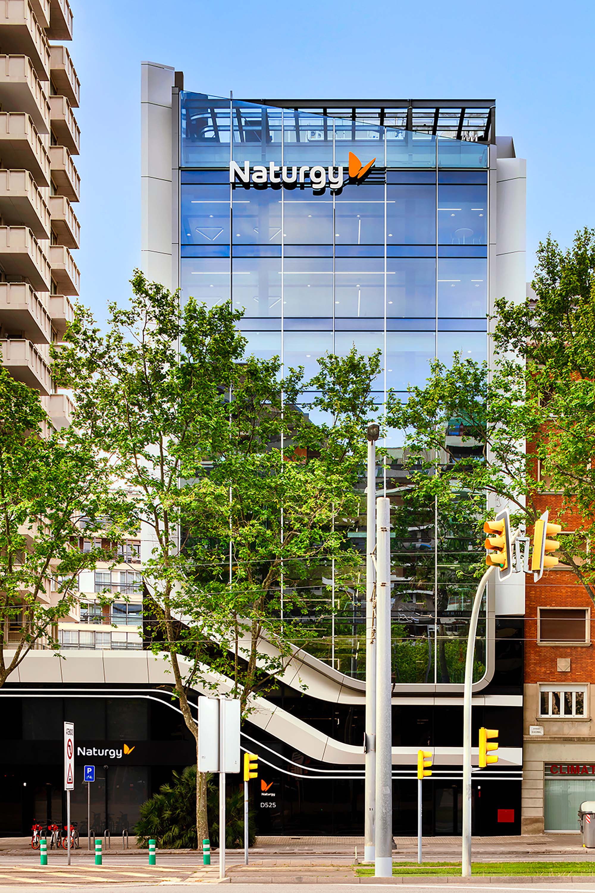
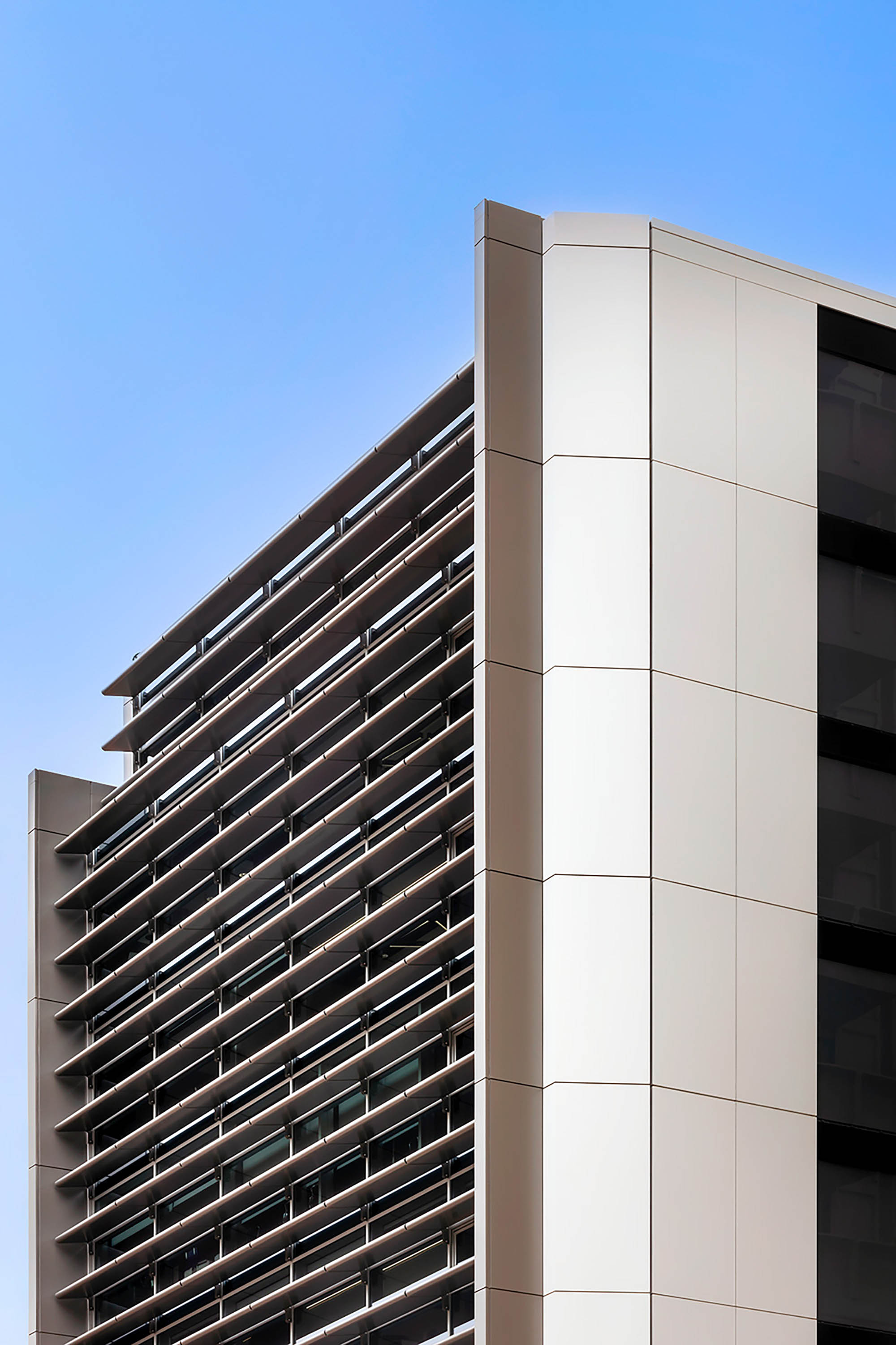
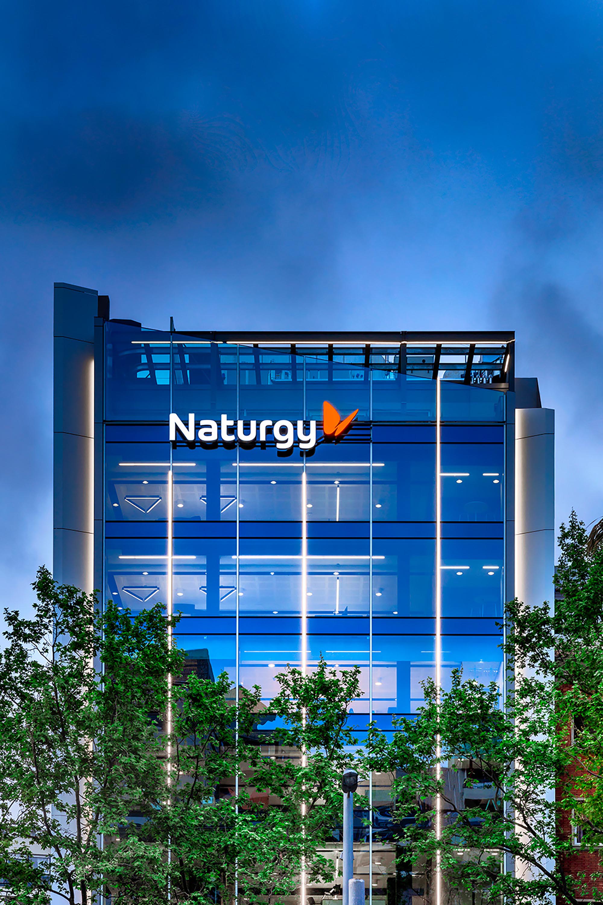
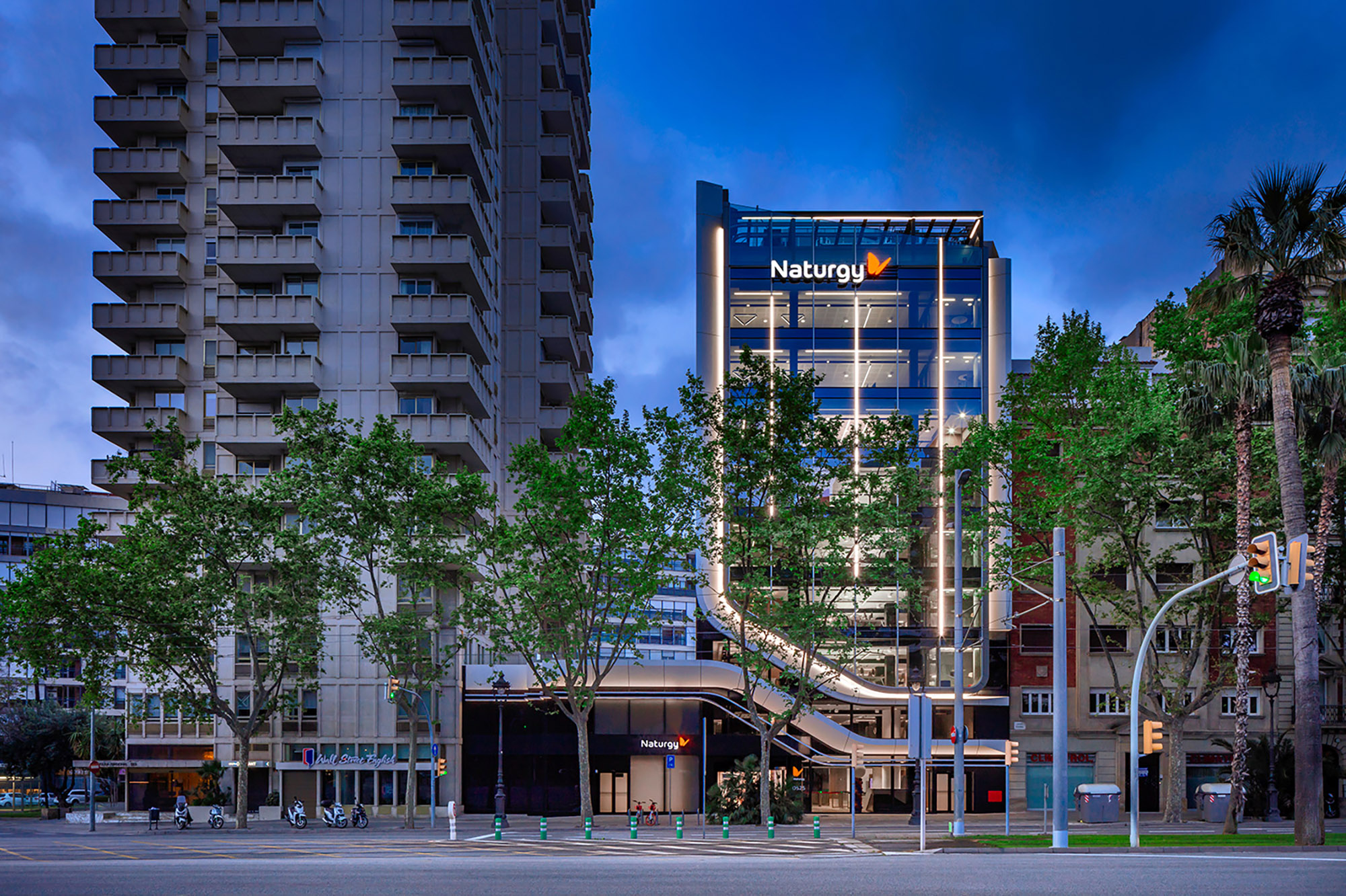
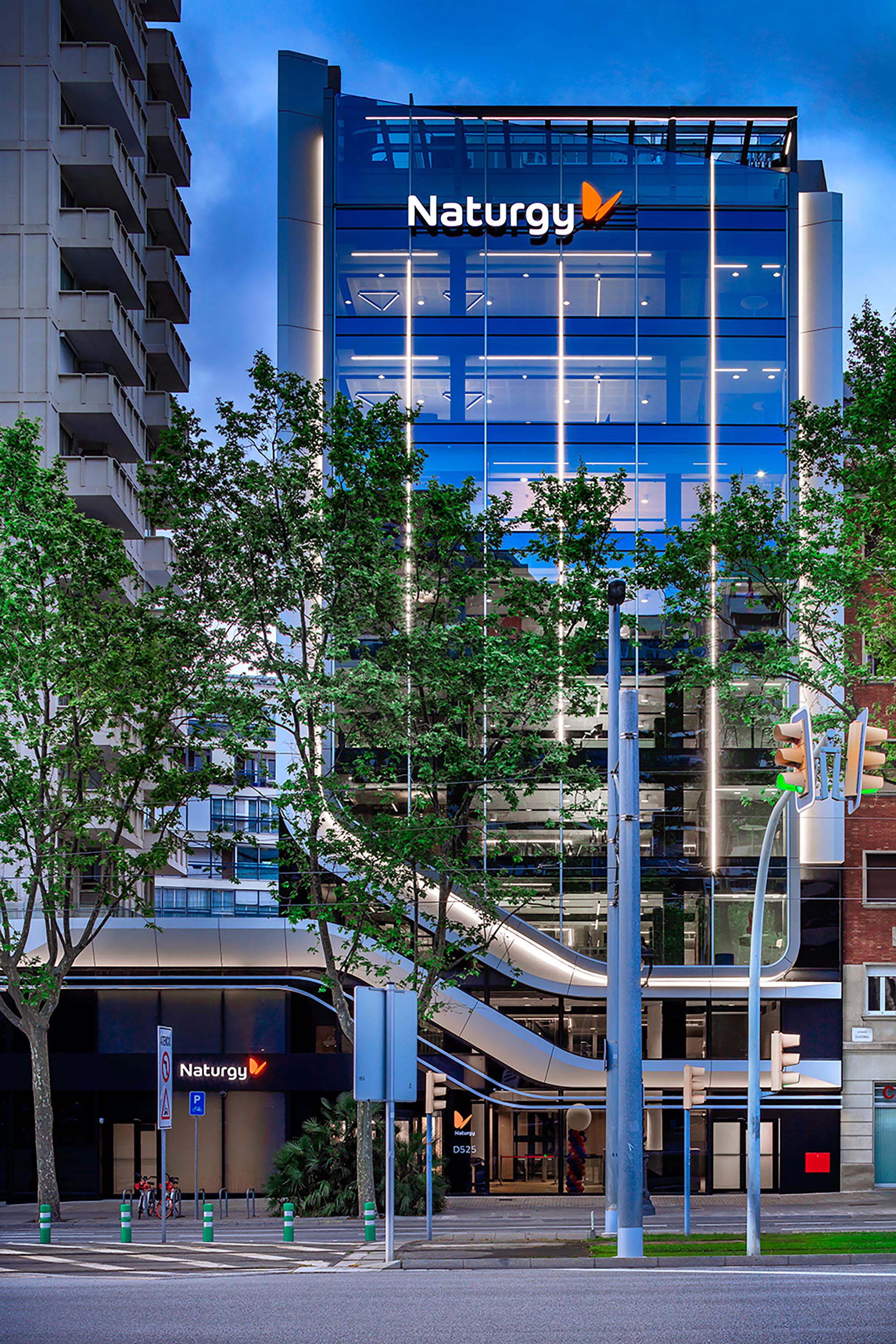
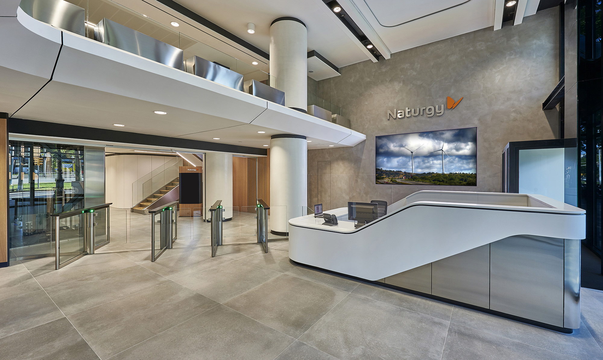
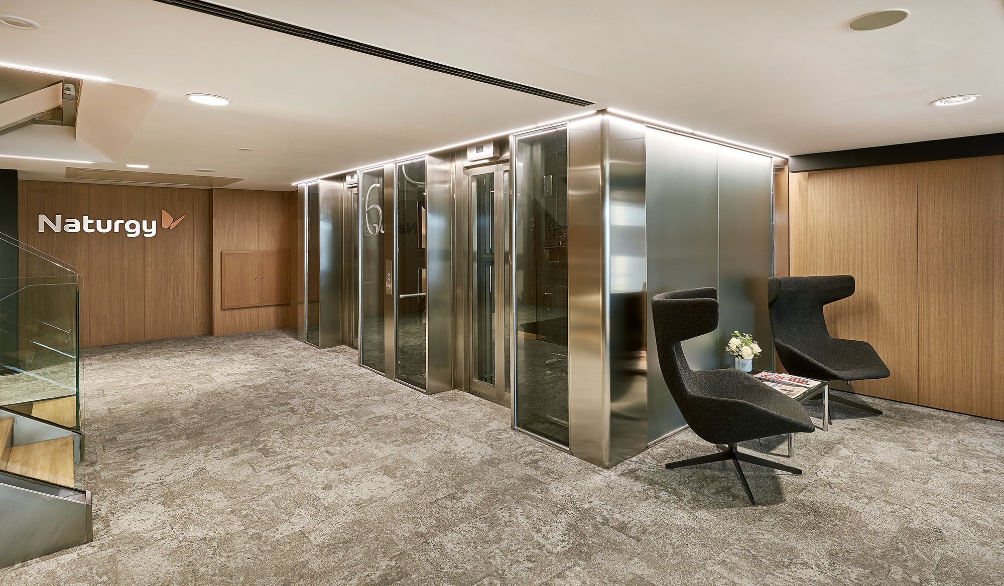
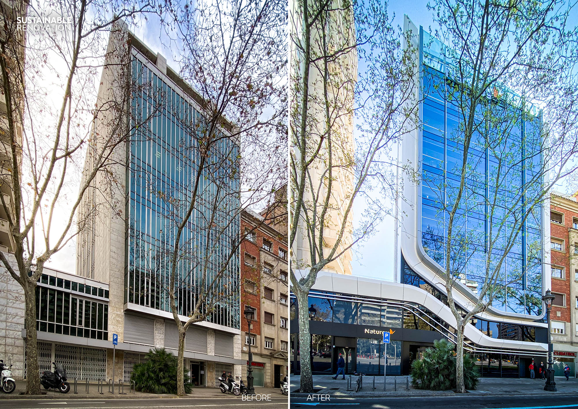
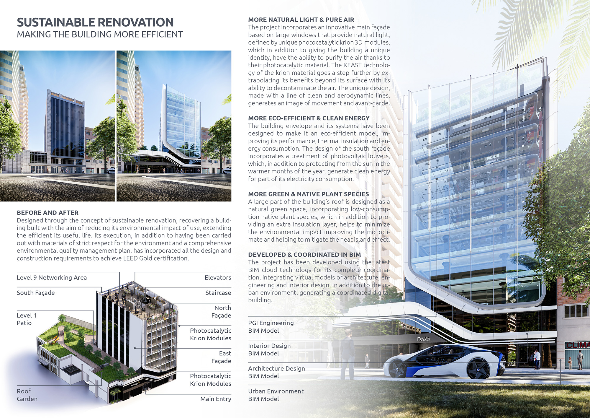
The building of the new headquarters of Naturgy group in Barcelona, a building property of Inmobiliaria Colonial, is located at Av. Diagonal 525. The project has been designed by Sanzpont Arquitectura through the concept of sustainable renovation, recovering a building built with the aim of reducing its environmental impact of use, extending the efficient its useful life. Its execution, in addition to having been carried out with materials of strict respect for the environment and a comprehensive environmental quality management plan, has incorporated all the design and construction requirements to achieve LEED Gold certification.
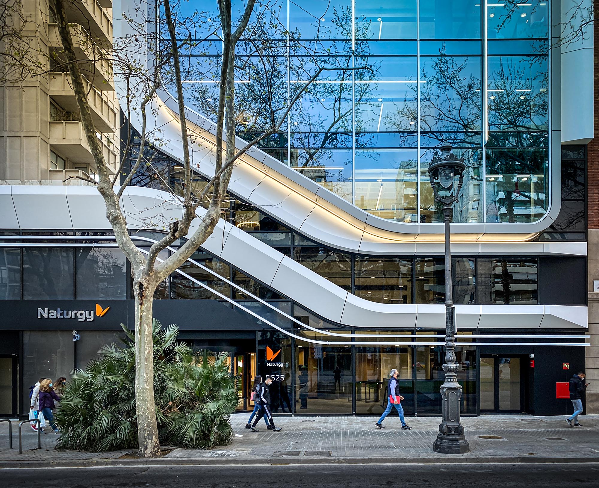
The project incorporates an innovative main façade based on large windows that provide natural light, defined by unique photocatalytic krion 3D modules, which in addition to giving the building a unique identity, have the ability to purify the air thanks to their photocatalytic material. The KEAST technology of the krion material goes a step further by extrapolating its benefits beyond its surface with its ability to decontaminate the air. The unique design, made with a line of clean and aerodynamic lines, generates an image of movement and avant-garde.
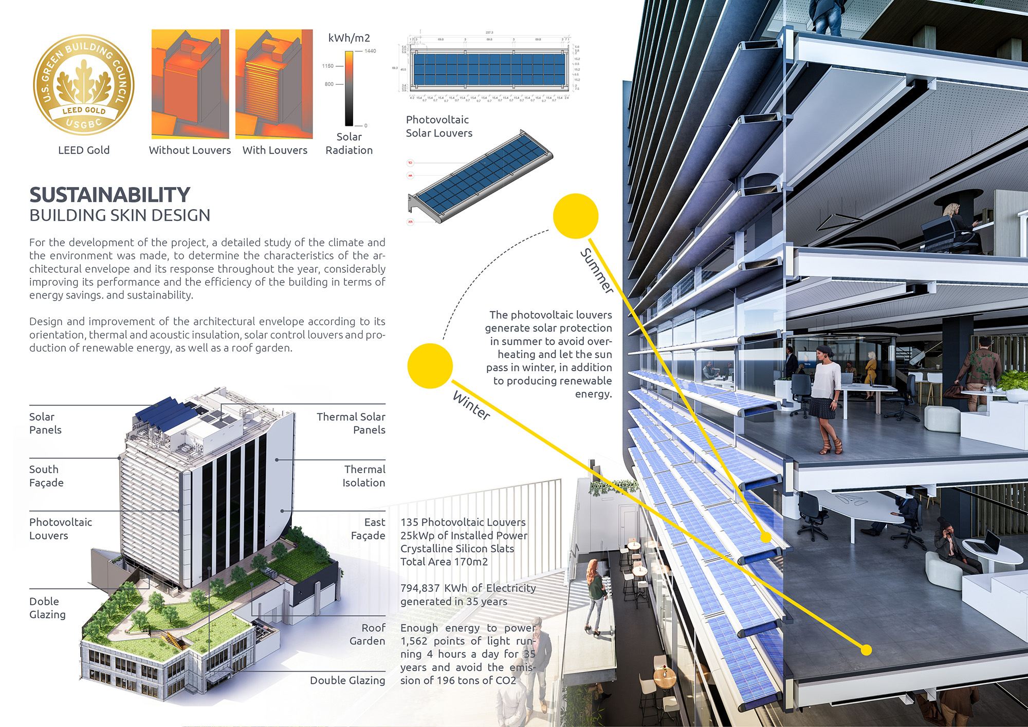
The building envelope and its systems have been designed to make it an eco-efficient model, improving its performance, thermal insulation and energy consumption. The design of the south façade incorporates a treatment of photovoltaic louvers, which, in addition to protecting from the sun in the warmer months of the year, generate clean energy for part of its electricity consumption.
A large part of the building’s roof is designed as a natural green space, incorporating low-consumption native plant species, which in addition to providing an extra insulation layer, helps to minimize the environmental impact improving the microclimate and helping to mitigate the heat island effect.
For the development of the project, a detailed study of the climate and the environment was made, to determine the characteristics of the architectural envelope and its response throughout the year, considerably improving its performance and the efficiency of the building in terms of energy savings. and sustainability. Design and improvement of the architectural envelope according to its orientation, thermal and acoustic insulation, solar control louvers and production of renewable energy, as well as a roof garden.
The project has been developed using the latest BIM cloud technology for its complete coordination, integrating virtual models of architecture, engineering and interior design, in addition to the urban environment, generating a coordinated digital building.
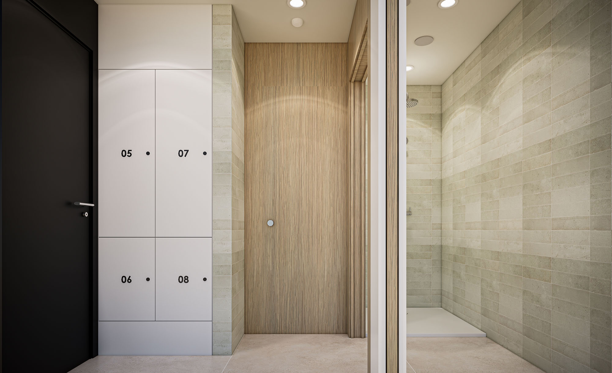
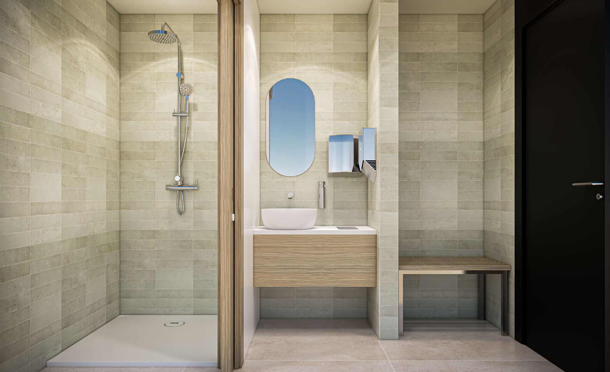
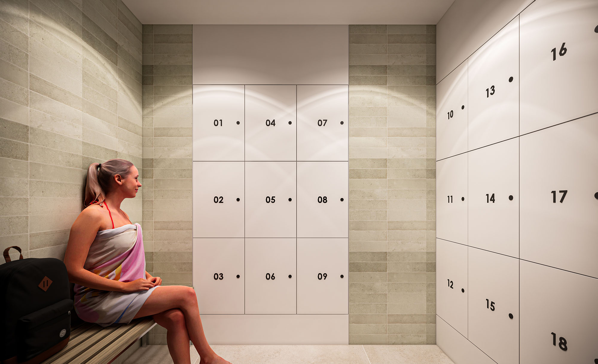
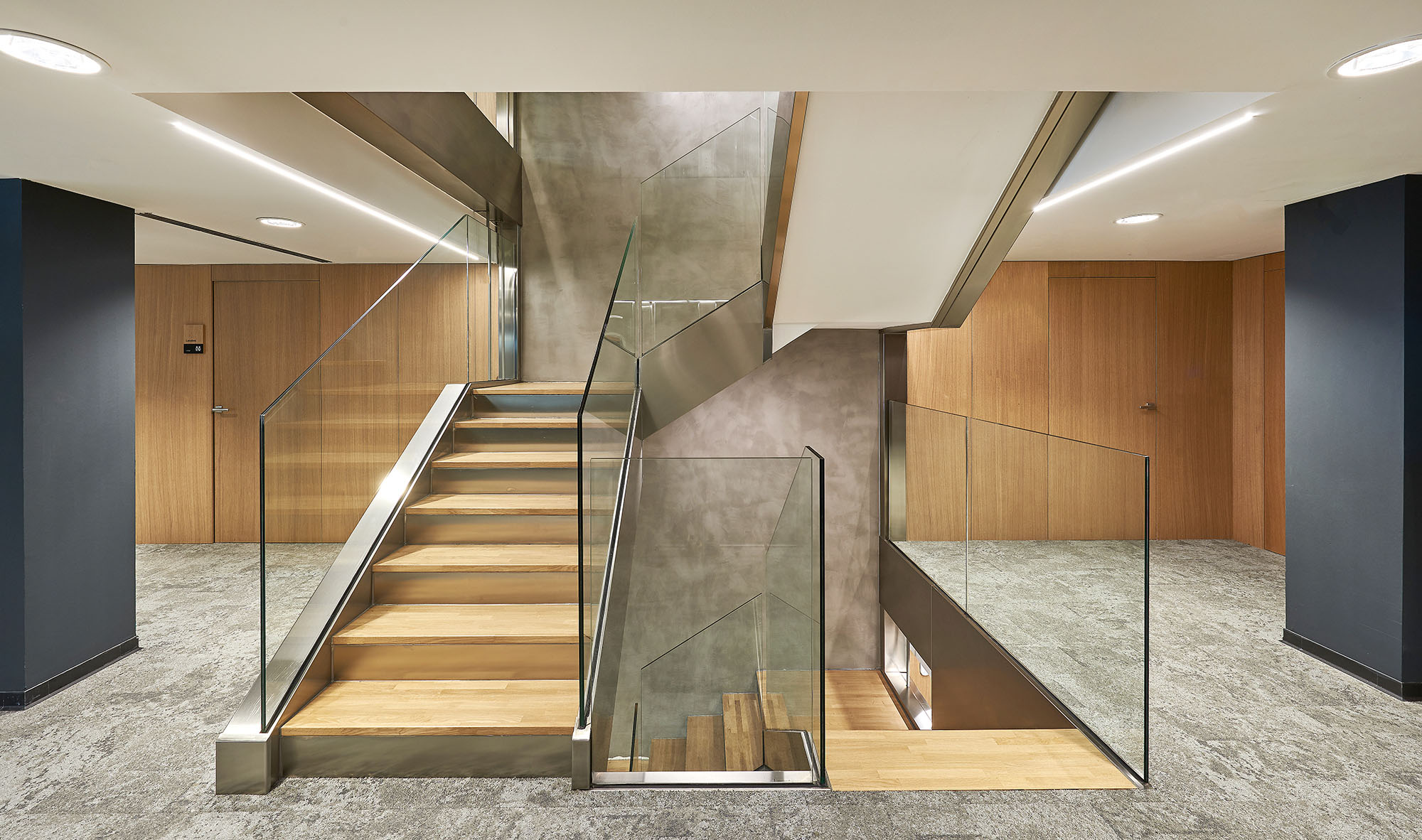
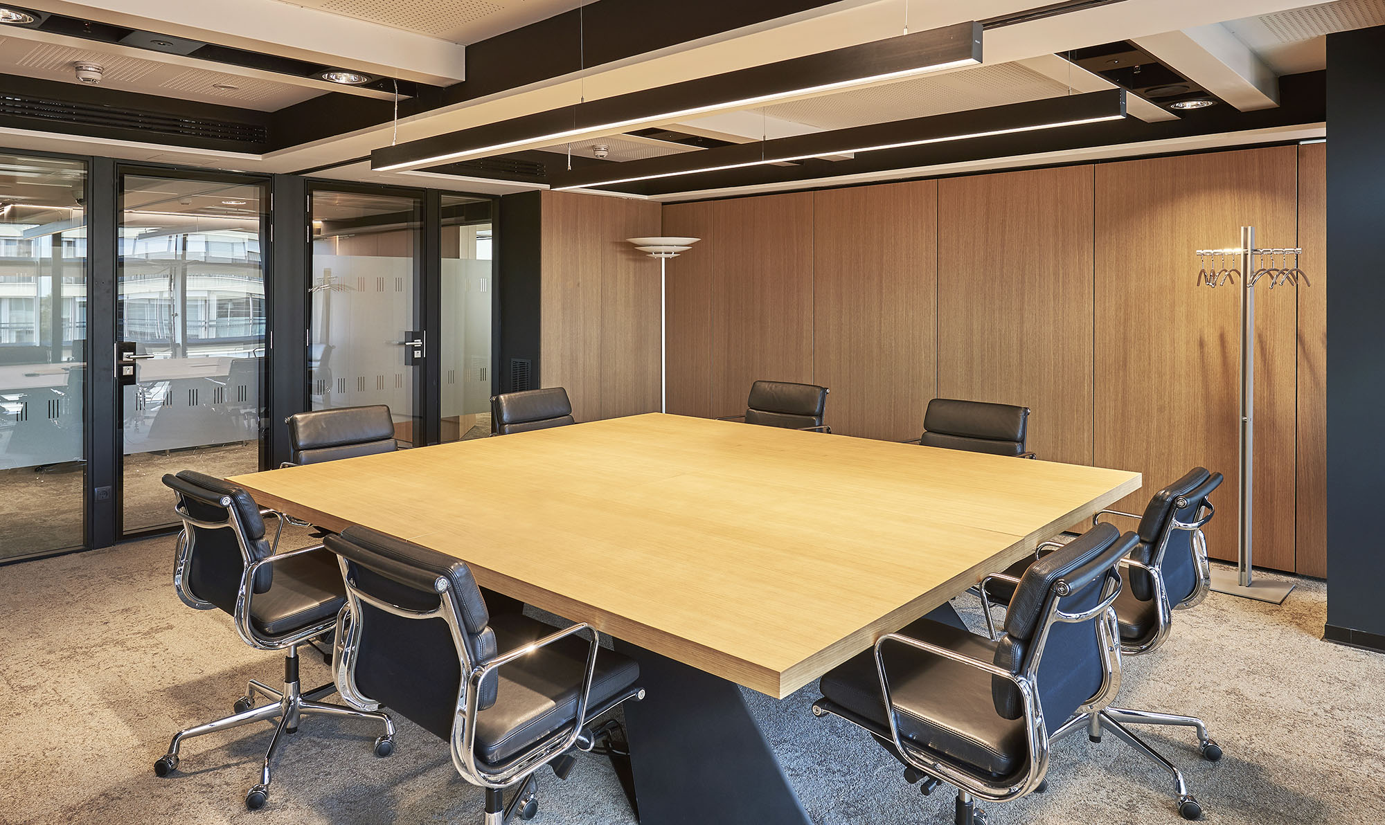
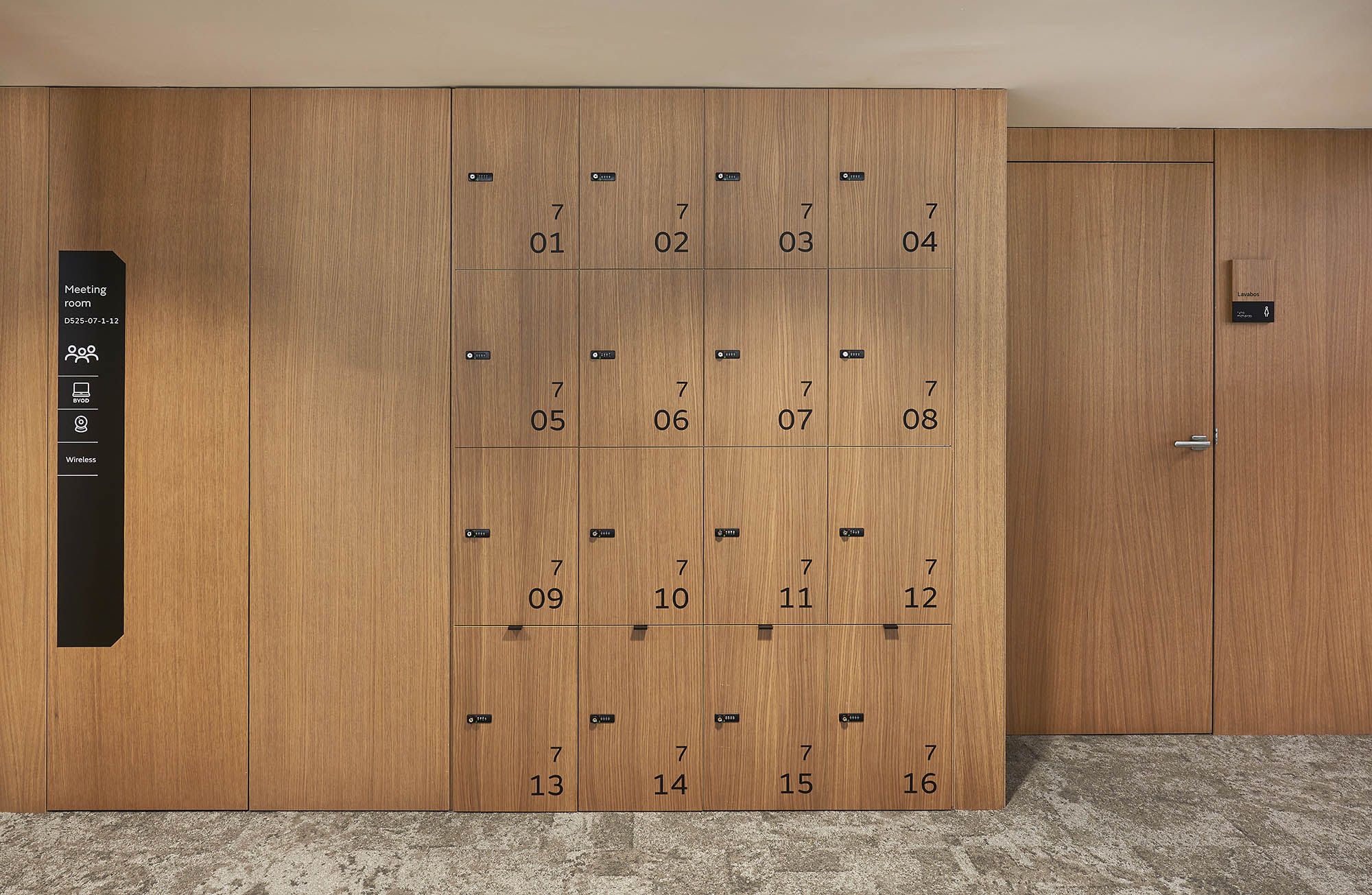
The original design and space planning concept implemented by CBRE and later developed by SANZPONT, is based on generating a clean and open space, with an open and continuous workspace that encourages collaboration and teamwork. Both team and managers coexist equally in the same space, where the jobs aerodynamic in such a way that they are exchanged according to the needs and work teams, offering persona lockers and formal and informal meeting rooms, as well as personal spaces to talk by phone.
THE STRUCTURAL CHALLENGE
Reinforcement with Carbon Fiber
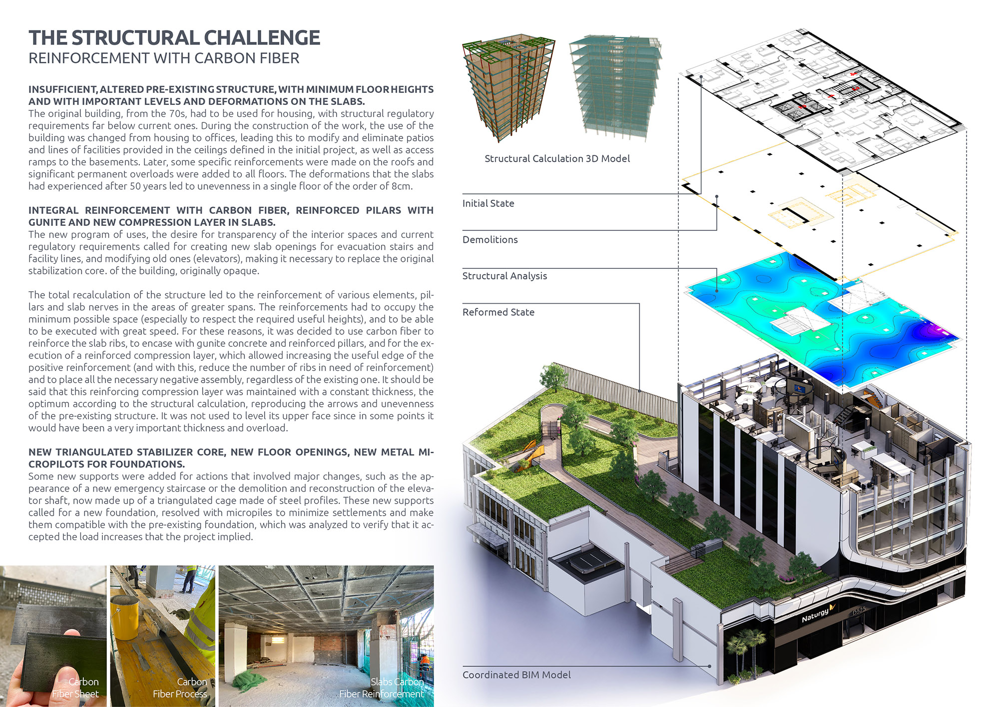
The original building, from the 70s, had to be used for housing, with structural regulatoryrequirements far below current ones. During the construction of the work, the use of thebuilding was changed from housing to offices, leading this to modify and eliminate patiosand lines of facilities provided in the ceilings defined in the initial project, as well as accessramps to the basements. Later, some specific reinforcements were made on the roofs andsignificant permanent overloads were added to all floors. The deformations that the slabshad experienced after 50 years led to unevenness in a single floor of the order of 8cm.
The new program of uses, the desire for transparency of the interior spaces and currentregulatory requirements called for creating new slab openings for evacuation stairs andfacility lines, and modifying old ones (elevators), making it necessary to replace the originalstabilization core. of the building, originally opaque.
The total recalculation of the structure led to the reinforcement of various elements, pil-lars and slab nerves in the areas of greater spans. The reinforcements had to occupy theminimum possible space (especially to respect the required useful heights), and to be ableto be executed with great speed. For these reasons, it was decided to use carbon fiber toreinforce the slab ribs, to encase with gunite concrete and reinforced pillars, and for the ex-ecution of a reinforced compression layer, which allowed increasing the useful edge of thepositive reinforcement (and with this, reduce the number of ribs in need of reinforcement)and to place all the necessary negative assembly, regardless of the existing one. It should besaid that this reinforcing compression layer was maintained with a constant thickness, theoptimum according to the structural calculation, reproducing the arrows and unevennessof the pre-existing structure. It was not used to level its upper face since in some points itwould have been a very important thickness and overload.
Some new supports were added for actions that involved major changes, such as the ap-pearance of a new emergency staircase or the demolition and reconstruction of the eleva-tor shaft, now made up of a triangulated cage made of steel profiles. These new supportscalled for a new foundation, resolved with micropiles to minimize settlements and makethem compatible with the pre-existing foundation, which was analyzed to verify that it ac-cepted the load increases that the project implied.
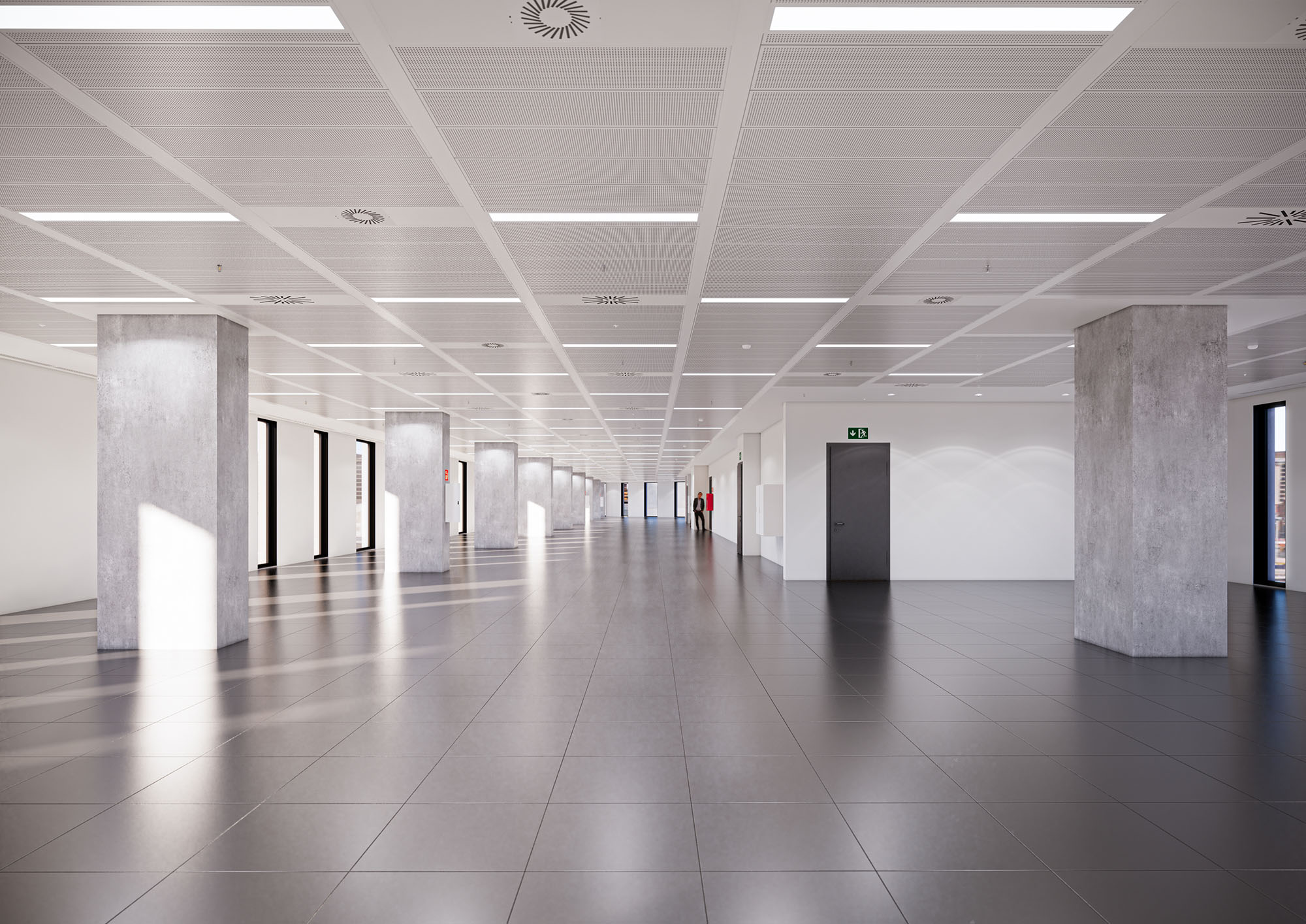
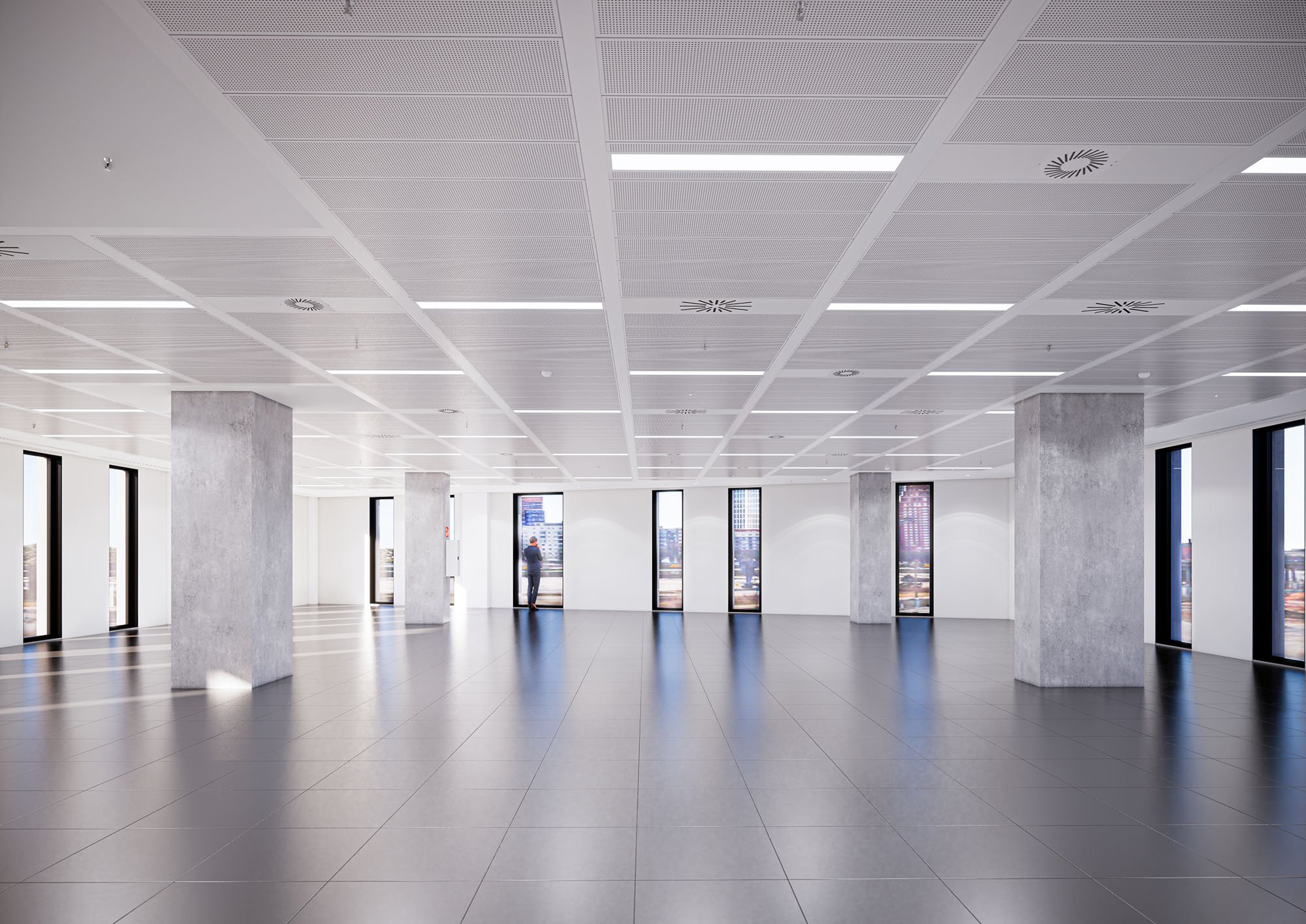
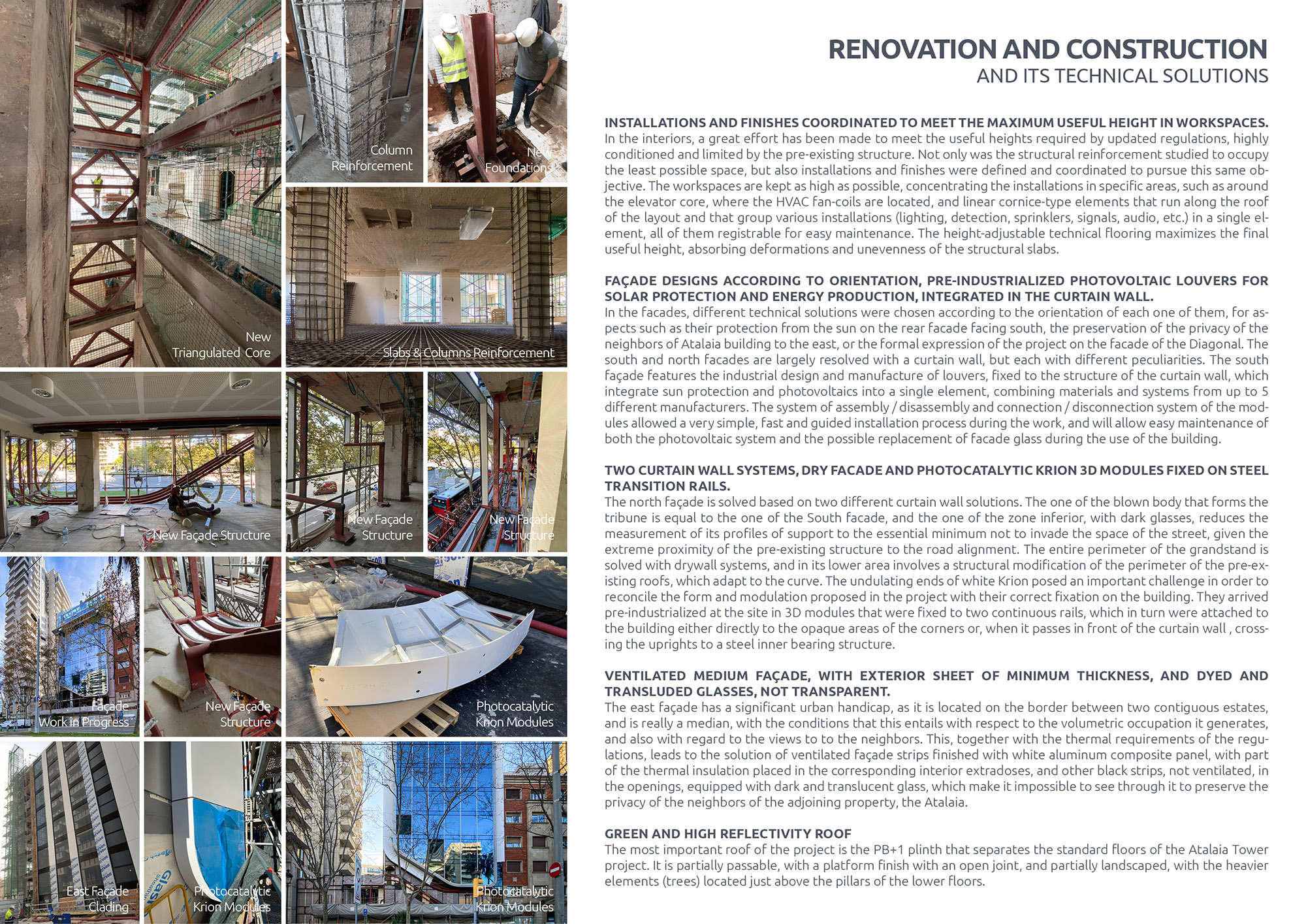
In the interiors, a great effort has been made to meet the useful heights required by updated regulations, highly conditioned and limited by the pre-existing structure. Not only was the structural reinforcement studied to occupy the least possible space, but also installations and finishes were defined and coordinated to pursue this same objective. The workspaces are kept as high as possible, concentrating the installations in specific areas, such as around the elevator core, where the HVAC fan-coils are located, and linear cornice-type elements that run along the roof of the layout and that group various installations (lighting, detection, sprinklers, signals, audio, etc.) in a single element, all of them registrable for easy maintenance. The height-adjustable technical flooring maximizes the final useful height, absorbing deformations and unevenness of the structural slabs.
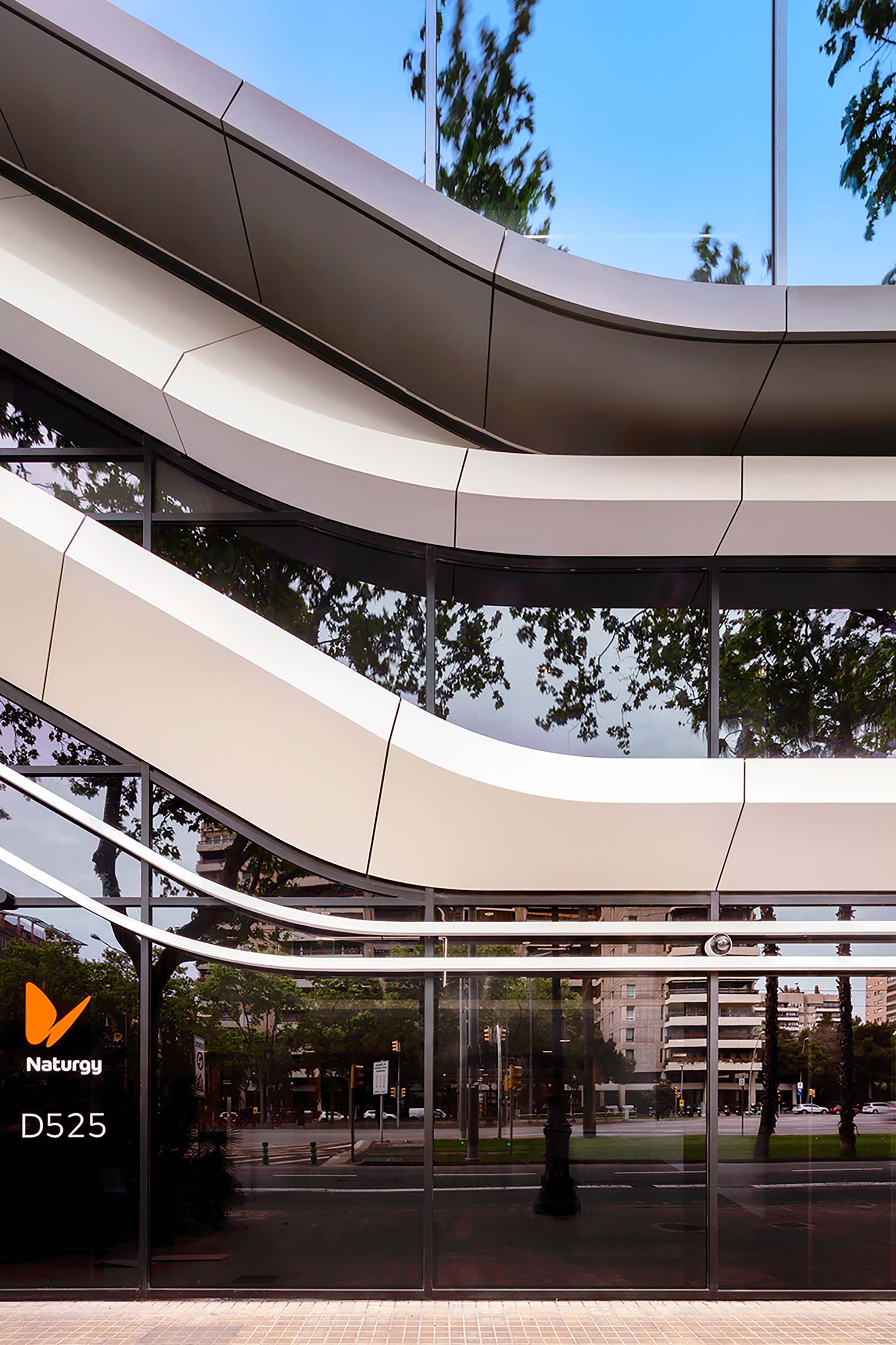
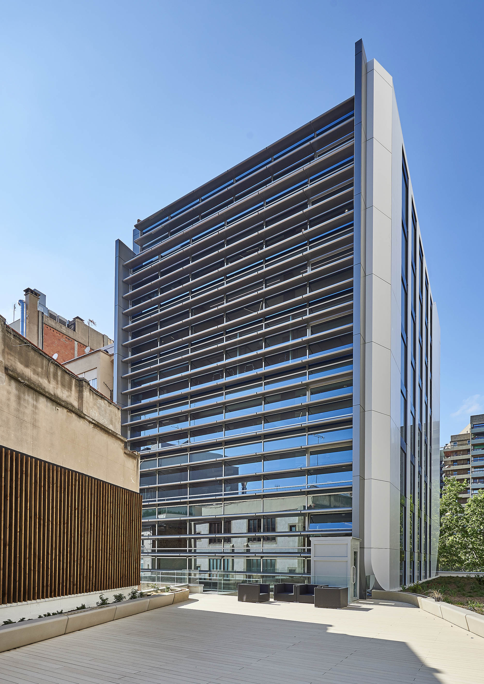
In the facades, different technical solutions were chosen according to the orientation of each one of them, for aspects such as their protection from the sun on the rear facade facing south, the preservation of the privacy of the neighbours of Atalaya building to the east, or the formal expression of the project on the facade of the Diagonal. The south and north facades are largely resolved with a curtain wall, but each with different peculiarities. The south façade features the industrial design and manufacture of louvers, fixed to the structure of the curtain wall, which integrate sun protection and photovoltaics into a single element, combining materials and systems from up to 5different manufacturers. The system of assembly / disassembly and connection / disconnection system of the modules allowed a very simple, fast and guided installation process during the work, and will allow easy maintenance of both the photovoltaic system and the possible replacement of facade glass during the use of the building.
The north façade is solved based on two different curtain wall solutions. The one of the blown body that forms the tribune is equal to the one of the South facade, and the one of the zone inferior, with dark glasses, reduces the measurement of its profiles of support to the essential minimum not to invade the space of the street, given the extreme proximity of the pre-existing structure to the road alignment. The entire perimeter of the grandstand issolved with drywall systems, and in its lower area involves a structural modification of the perimeter of the pre-existing roofs, which adapt to the curve. The undulating ends of white Krion posed an important challenge in order to reconcile the form and modulation proposed in the project with their correct fixation on the building. They arrived pre-industrialized at the site in 3D modules that were fixed to two continuous rails, which in turn were attached to the building either directly to the opaque areas of the corners or, when it passes in front of the curtain wall , cross-ing the uprights to a steel inner bearing structure.
The east façade has a significant urban handicap, as it is located on the border between two contiguous estates, and is really a median, with the conditions that this entails with respect to the volumetric occupation it generates, and also with regard to the views to to the neighbours. This, together with the thermal requirements of the regulations, leads to the solution of ventilated façade strips finished with white aluminum composite panel, with part of the thermal insulation placed in the corresponding interior extradoses, and other black strips, not ventilated, in the openings, equipped with dark and translucent glass, which make it impossible to see through it to preserve the privacy of the neighbours of the adjoining property, the Atalaya.
The most important roof of the project is the PB+1 plinth that separates the standard floors of the Atalaya Tower project. It is partially passable, with a platform finish with an open joint, and partially landscaped, with the heavier elements (trees) located just above the pillars of the lower floors.
Time Lapse Video by Voxel Studios (Courtesy of Colonial)
"Diagonal 525 office building, located within the Prime CBD area of Barcelona at the confluence with Avenida Sarriá, has a surface area of 5,800 m2 above ground and 1,200 m2 below ground, divided into a ground floor and nine floors. It has recently undergone a comprehensive refurbishment, resulting in one of the most emblematic office buildings in the central business hub of Barcelona, standing out for its high performance in terms of Sustainability."
- Inmobiliaria Colonial
PROJECT: D525 | Diagonal 525, Barcelona
CLIENT: Inmobiliaria Colonial & Naturgy Group
ARCHITECTURE DESIGN: sanzpont [arquitectura]
INTERIOR DESIGN: CBRE + sanzpont [arquitectura]
ARCHITECTS + CONSTRUCTION MANAGEMENT: Sergio Sanz, Victor Sanz, Oriol Vidal, Xevi Prat, Carles Campanyà, Guillem Armengol
STRUCTURAL DESIGN + CEM: Campanyà i Vinyeta Arquitectes
MEP DESIGN + LEED CONSULTANTS: PGI Engineering
PROJECT MANAGEMENT: Projects & Facilities Management
SECURITY & HEALTH: Tulpan Intermediació
GENERAL CONTRACTOR: OIC - Penta
MAIN CONTRACTORS: Suris (MEP), Garcia Faura (Façade), Butech (Krion)
PHOTOS: David Cardelús (Courtesy of Naturgy), Dani Rovira (Courtesy of Colonial), Sergio Sanz (Courtesy of Sanzpont)
TIME LAPSE: Voxel Studios
• A’ Design Awards, Milan, Italy : Silver Award - Certificate Of Excellence in Architecture, Building and Structure Design Category : D525 Barcelona (2022)
• APR Urban Design & Architecture Design Awards : Gold Award Winner : D525 Barcelona (2022)
• Archframe Design Awards : Gold Winner : D525 Barcelona (2022)
• The Chicago Athenaeum International Architecture Awards 2022, Chicago, USA : Honorable Mention : D525 Barcelona (2022)
• Golden Trezzini Awards 2021 : Special Mention in Best Implemented Project of Public Building or Facility Category : D525 Barcelona (2021)
• Architecture MasterPrize, Los Angeles, USA : Honorable Mention in Architectural Design / Restoration & Renovation : D525 Barcelona (2021)
• London International Creative Competition : Official Selection : D525 Barcelona (2021)
• IDA Design Awards, Los Angeles, USA : Honorable Mention - Architecture : D525 Barcelona (2021)
• Outstanding Property Award London : Honorable Mention : D525 Barcelona (2021)
• Global Future Design Awards 2021 : Third Award : D525 Barcelona (2021)
• TAC World Design Awards 2021 : Office Building Design (Built) Winner : D525 Barcelona (2021)
• Muse Design Awards, New York, USA : Gold Award Winner - Building Renovation : D525 Barcelona (2021)
• Muse Design Awards, New York, USA : Gold Award Winner - Office Building Design : D525 Barcelona (2021)
• Rethinking the Future Global Architecture Design Awards, New Delhi, India : First Award Winner - Office Building (Built) : D525 Barcelona (2021)
• Novum Design Awards, Helsinki, Finland: Golden Award in Architecture Design : D525 Barcelona (2021)
The building of the new headquarters of Naturgy group in Barcelona, a building property of Inmobiliaria Colonial, is located at Av. Diagonal 525. The project has been designed by Sanzpont Arquitectura through the concept of sustainable renovation, recovering a building built with the aim of reducing its environmental impact of use, extending the efficient its useful life. Its execution, in addition to having been carried out with materials of strict respect for the environment and a comprehensive environmental quality management plan, has incorporated all the design and construction requirements to achieve LEED Gold certification.
The project incorporates an innovative main façade based on large windows that provide natural light, defined by unique photocatalytic krion 3D modules, which in addition to giving the building a unique identity, have the ability to purify the air thanks to their photocatalytic material. The KEAST technology of the krion material goes a step further by extrapolating its benefits beyond its surface with its ability to decontaminate the air. The unique design, made with a line of clean and aerodynamic lines, generates an image of movement and avant-garde.
The building envelope and its systems have been designed to make it an eco-efficient model, improving its performance, thermal insulation and energy consumption. The design of the south façade incorporates a treatment of photovoltaic louvers, which, in addition to protecting from the sun in the warmer months of the year, generate clean energy for part of its electricity consumption.
A large part of the building’s roof is designed as a natural green space, incorporating low-consumption native plant species, which in addition to providing an extra insulation layer, helps to minimize the environmental impact improving the microclimate and helping to mitigate the heat island effect.
For the development of the project, a detailed study of the climate and the environment was made, to determine the characteristics of the architectural envelope and its response throughout the year, considerably improving its performance and the efficiency of the building in terms of energy savings. and sustainability. Design and improvement of the architectural envelope according to its orientation, thermal and acoustic insulation, solar control louvers and production of renewable energy, as well as a roof garden.
The project has been developed using the latest BIM cloud technology for its complete coordination, integrating virtual models of architecture, engineering and interior design, in addition to the urban environment, generating a coordinated digital building.
The original design and space planning concept implemented by CBRE and later developed by SANZPONT, is based on generating a clean and open space, with an open and continuous workspace that encourages collaboration and teamwork. Both team and managers coexist equally in the same space, where the jobs aerodynamic in such a way that they are exchanged according to the needs and work teams, offering persona lockers and formal and informal meeting rooms, as well as personal spaces to talk by phone.
THE STRUCTURAL CHALLENGE
Reinforcement with Carbon Fiber
The original building, from the 70s, had to be used for housing, with structural regulatoryrequirements far below current ones. During the construction of the work, the use of thebuilding was changed from housing to offices, leading this to modify and eliminate patiosand lines of facilities provided in the ceilings defined in the initial project, as well as accessramps to the basements. Later, some specific reinforcements were made on the roofs andsignificant permanent overloads were added to all floors. The deformations that the slabshad experienced after 50 years led to unevenness in a single floor of the order of 8cm.
The new program of uses, the desire for transparency of the interior spaces and currentregulatory requirements called for creating new slab openings for evacuation stairs andfacility lines, and modifying old ones (elevators), making it necessary to replace the originalstabilization core. of the building, originally opaque.
The total recalculation of the structure led to the reinforcement of various elements, pil-lars and slab nerves in the areas of greater spans. The reinforcements had to occupy theminimum possible space (especially to respect the required useful heights), and to be ableto be executed with great speed. For these reasons, it was decided to use carbon fiber toreinforce the slab ribs, to encase with gunite concrete and reinforced pillars, and for the ex-ecution of a reinforced compression layer, which allowed increasing the useful edge of thepositive reinforcement (and with this, reduce the number of ribs in need of reinforcement)and to place all the necessary negative assembly, regardless of the existing one. It should besaid that this reinforcing compression layer was maintained with a constant thickness, theoptimum according to the structural calculation, reproducing the arrows and unevennessof the pre-existing structure. It was not used to level its upper face since in some points itwould have been a very important thickness and overload.
Some new supports were added for actions that involved major changes, such as the ap-pearance of a new emergency staircase or the demolition and reconstruction of the eleva-tor shaft, now made up of a triangulated cage made of steel profiles. These new supportscalled for a new foundation, resolved with micropiles to minimize settlements and makethem compatible with the pre-existing foundation, which was analyzed to verify that it ac-cepted the load increases that the project implied.
In the interiors, a great effort has been made to meet the useful heights required by updated regulations, highly conditioned and limited by the pre-existing structure. Not only was the structural reinforcement studied to occupy the least possible space, but also installations and finishes were defined and coordinated to pursue this same objective. The workspaces are kept as high as possible, concentrating the installations in specific areas, such as around the elevator core, where the HVAC fan-coils are located, and linear cornice-type elements that run along the roof of the layout and that group various installations (lighting, detection, sprinklers, signals, audio, etc.) in a single element, all of them registrable for easy maintenance. The height-adjustable technical flooring maximizes the final useful height, absorbing deformations and unevenness of the structural slabs.
In the facades, different technical solutions were chosen according to the orientation of each one of them, for aspects such as their protection from the sun on the rear facade facing south, the preservation of the privacy of the neighbours of Atalaya building to the east, or the formal expression of the project on the facade of the Diagonal. The south and north facades are largely resolved with a curtain wall, but each with different peculiarities. The south façade features the industrial design and manufacture of louvers, fixed to the structure of the curtain wall, which integrate sun protection and photovoltaics into a single element, combining materials and systems from up to 5different manufacturers. The system of assembly / disassembly and connection / disconnection system of the modules allowed a very simple, fast and guided installation process during the work, and will allow easy maintenance of both the photovoltaic system and the possible replacement of facade glass during the use of the building.
The north façade is solved based on two different curtain wall solutions. The one of the blown body that forms the tribune is equal to the one of the South facade, and the one of the zone inferior, with dark glasses, reduces the measurement of its profiles of support to the essential minimum not to invade the space of the street, given the extreme proximity of the pre-existing structure to the road alignment. The entire perimeter of the grandstand issolved with drywall systems, and in its lower area involves a structural modification of the perimeter of the pre-existing roofs, which adapt to the curve. The undulating ends of white Krion posed an important challenge in order to reconcile the form and modulation proposed in the project with their correct fixation on the building. They arrived pre-industrialized at the site in 3D modules that were fixed to two continuous rails, which in turn were attached to the building either directly to the opaque areas of the corners or, when it passes in front of the curtain wall , cross-ing the uprights to a steel inner bearing structure.
The east façade has a significant urban handicap, as it is located on the border between two contiguous estates, and is really a median, with the conditions that this entails with respect to the volumetric occupation it generates, and also with regard to the views to to the neighbours. This, together with the thermal requirements of the regulations, leads to the solution of ventilated façade strips finished with white aluminum composite panel, with part of the thermal insulation placed in the corresponding interior extradoses, and other black strips, not ventilated, in the openings, equipped with dark and translucent glass, which make it impossible to see through it to preserve the privacy of the neighbours of the adjoining property, the Atalaya.
The most important roof of the project is the PB+1 plinth that separates the standard floors of the Atalaya Tower project. It is partially passable, with a platform finish with an open joint, and partially landscaped, with the heavier elements (trees) located just above the pillars of the lower floors.
Time Lapse Video by Voxel Studios (Courtesy of Colonial)
"Diagonal 525 office building, located within the Prime CBD area of Barcelona at the confluence with Avenida Sarriá, has a surface area of 5,800 m2 above ground and 1,200 m2 below ground, divided into a ground floor and nine floors. It has recently undergone a comprehensive refurbishment, resulting in one of the most emblematic office buildings in the central business hub of Barcelona, standing out for its high performance in terms of Sustainability."
- Inmobiliaria Colonial
PROJECT: D525 | Diagonal 525, Barcelona
CLIENT: Inmobiliaria Colonial & Naturgy Group
ARCHITECTURE DESIGN: sanzpont [arquitectura]
INTERIOR DESIGN: CBRE + sanzpont [arquitectura]
ARCHITECTS + CONSTRUCTION MANAGEMENT: Sergio Sanz, Victor Sanz, Oriol Vidal, Xevi Prat, Carles Campanyà, Guillem Armengol
STRUCTURAL DESIGN + CEM: Campanyà i Vinyeta Arquitectes
MEP DESIGN + LEED CONSULTANTS: PGI Engineering
PROJECT MANAGEMENT: Projects & Facilities Management
SECURITY & HEALTH: Tulpan Intermediació
GENERAL CONTRACTOR: OIC - Penta
MAIN CONTRACTORS: Suris (MEP), Garcia Faura (Façade), Butech (Krion)
PHOTOS: David Cardelús (Courtesy of Naturgy), Dani Rovira (Courtesy of Colonial), Sergio Sanz (Courtesy of Sanzpont)
TIME LAPSE: Voxel Studios
© 2021 by sanzpont [arquitectura] . Webpage by sanzpont [digital] . Innovative Digital Experiences
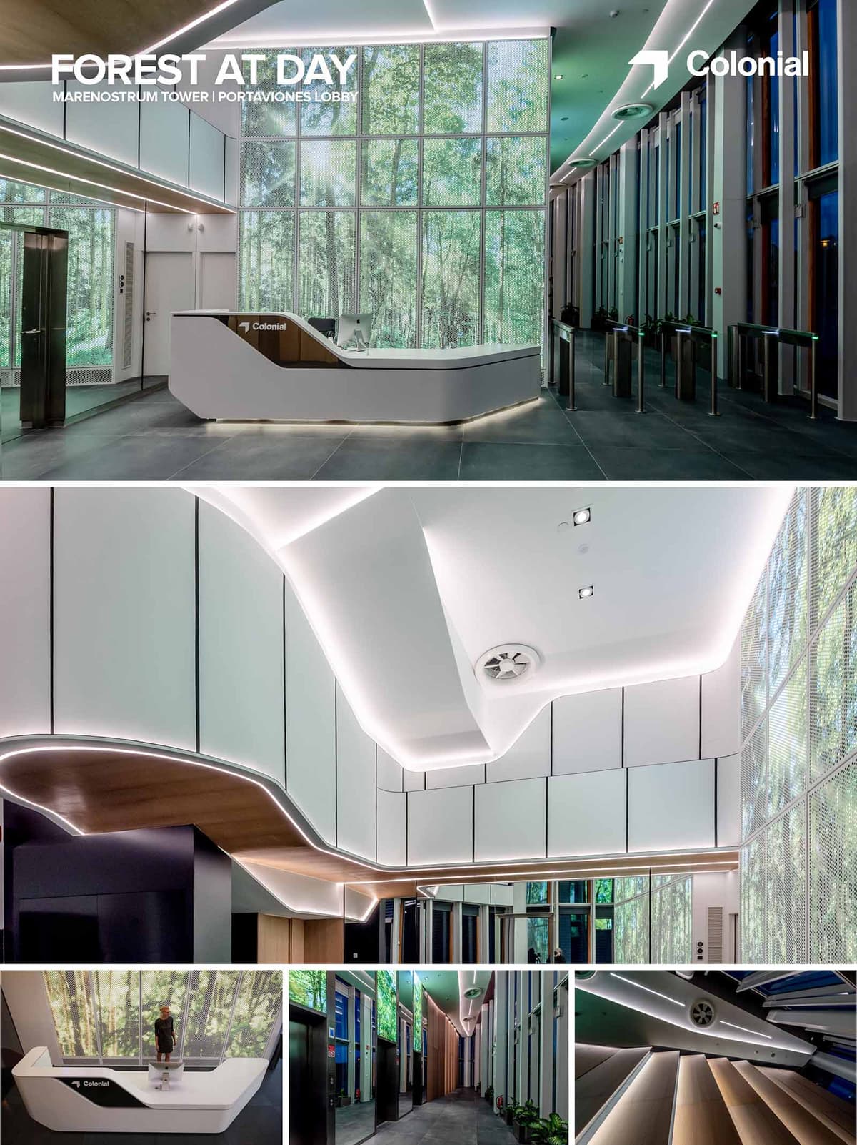

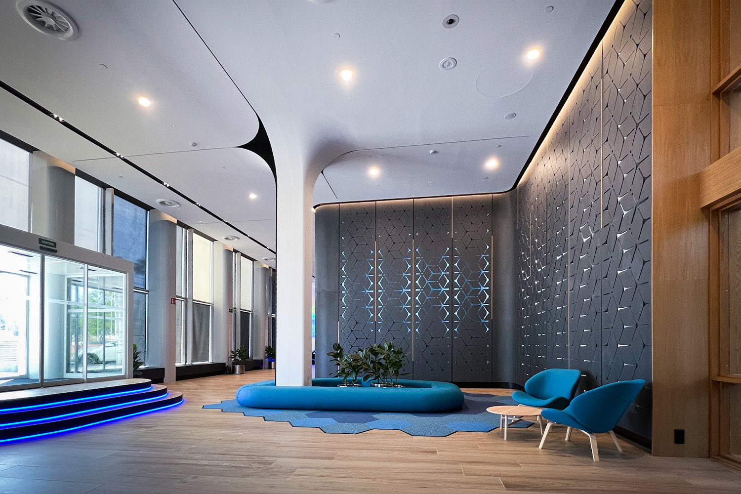
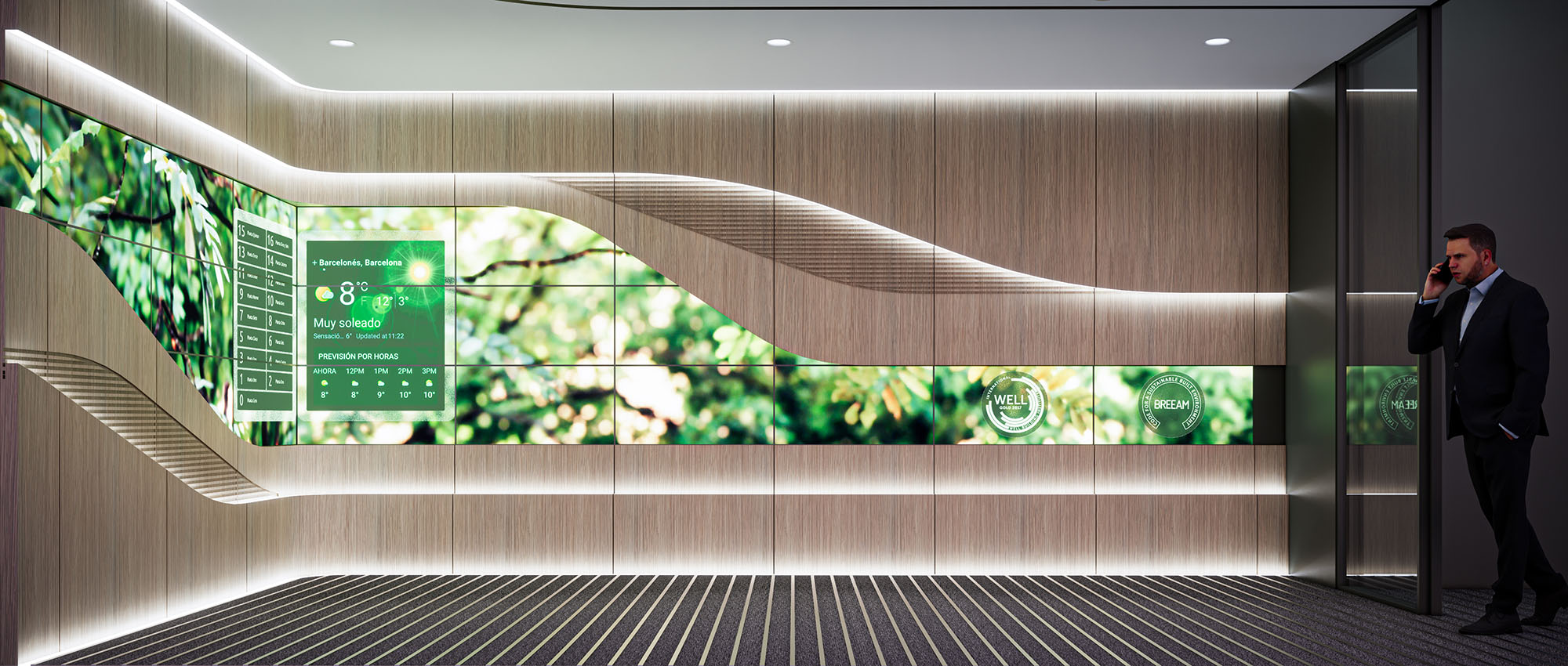
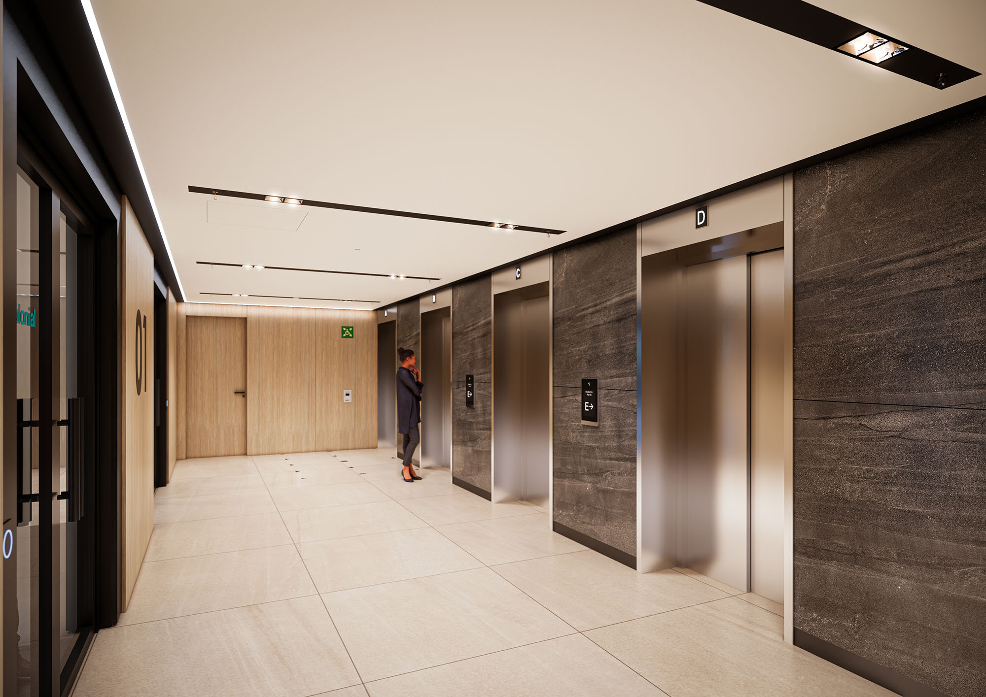
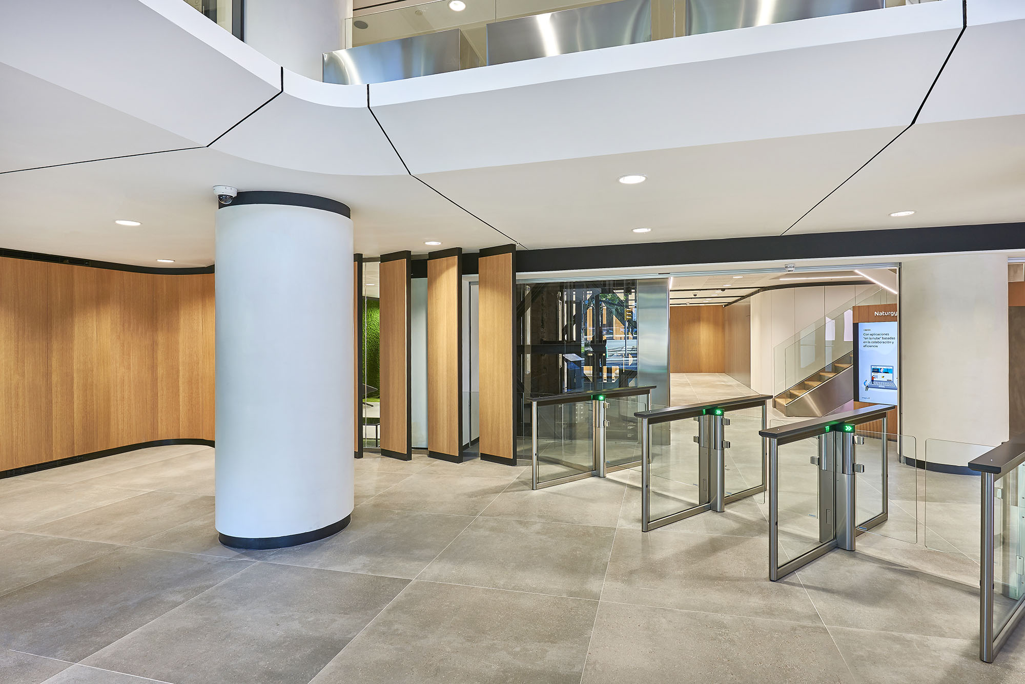
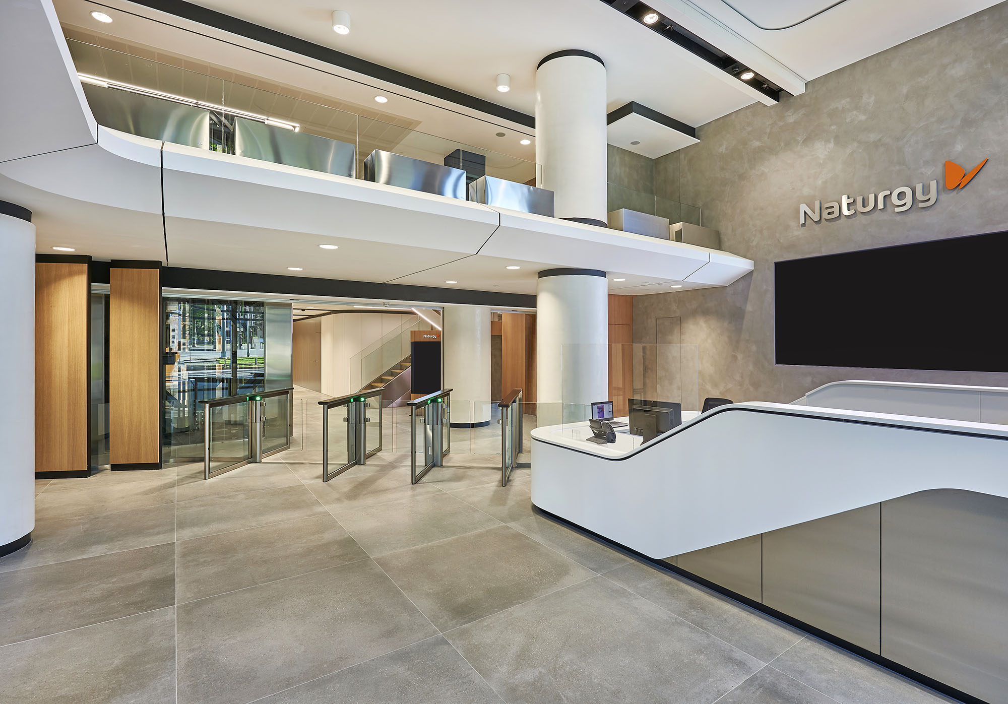
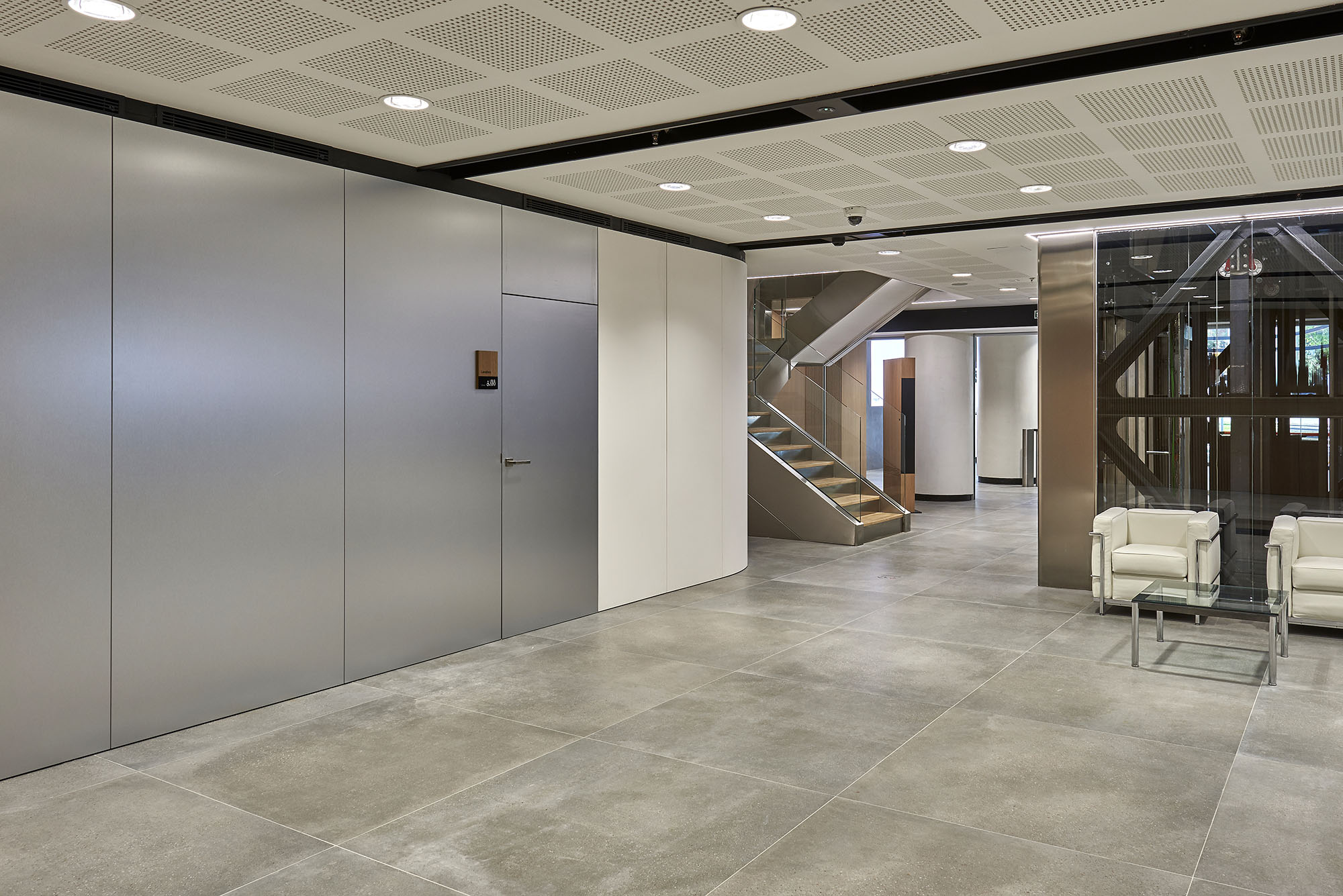
The lobby of TMN Portaviones in Barcelona is conceived as an urban clearing: a transitional space where the intensity of the city dissolves into the calm of a digital forest. The design merges high-tech corporate precision with biophilic immersion, using large-scale media façades and continuous light lines to evoke the experience of walking through a forest at daytime. Every gesture in plan, volume and lighting is oriented toward softening the threshold between exterior and interior, public street and corporate tower.
The project addresses the lobby not only as a reception, but as a spatial interface between users and building systems. Access control, wayfinding, security and branding are integrated into a single fluid landscape. Visual continuity and controlled reflections extend the perceived dimensions of the hall, amplifying the sense of openness while maintaining a clear functional hierarchy.
The lobby develops as a linear nave parallel to the façade, guiding visitors from the main entrance towards the elevator core. Turnstiles, reception desk and waiting areas are aligned along this axis, ensuring intuitive circulation and optimal visibility. The double-height volume at the entrance reinforces the sense of arrival, while the progressive narrowing of the space creates a subtle gradient from public to semi-private zones.
Vertical surfaces are articulated through tall glazed modules and backlit panels that rhythmically echo the trunks of a forest. The access-control line is positioned so as to maintain visual continuity across the entire hall, allowing guests and employees to share the same spatial experience while preserving security protocols.
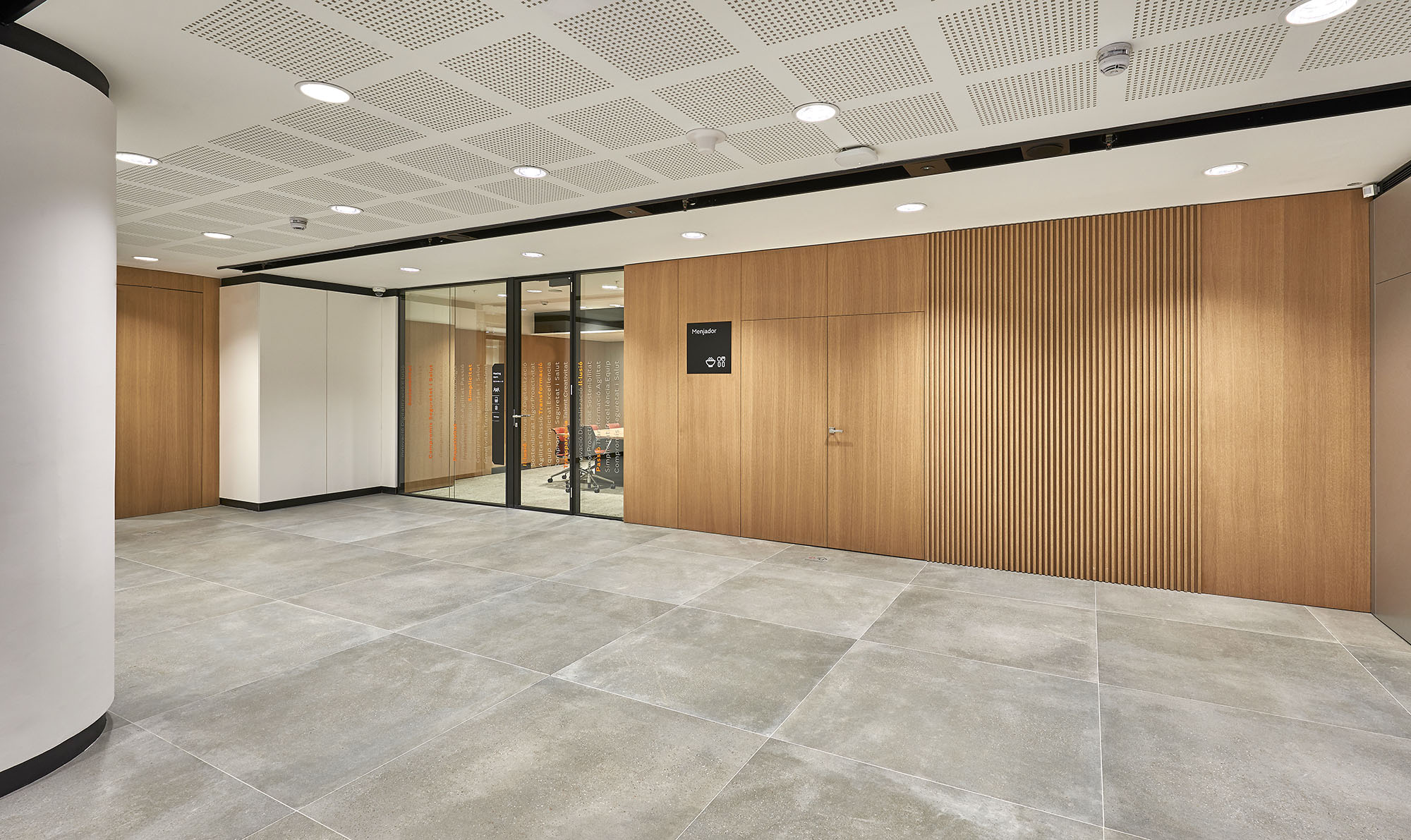
The material palette balances technological rigor with warm tactility. Large-format stone or porcelain tiles in neutral grey form a robust and continuous floor, while white solid-surface elements sculpt the reception desk and ceiling volumes with sharp, precise edges. These monolithic elements are contrasted by warm timber soffits and cladding, which introduce a natural grain reminiscent of tree canopies and forest floors.
Joints, reveals and shadow gaps are carefully controlled to enhance the perception of floating planes. The reception counter integrates lighting and signage in a single folded volume, eliminating visual noise. Metal finishes on elevator doors and turnstiles are kept in a satin tone, reflecting light softly without generating glare, complementing the digital forest imagery instead of competing with it.
Lighting acts as the main narrative tool of the project. Continuous LED profiles trace the edges of ceilings and walls, describing sinuous lines that recall pathways of light filtering through foliage. Indirect illumination accentuates the sculptural ceiling geometry, avoiding harsh contrasts and promoting visual comfort in a space with extensive glass and reflective surfaces.
The key feature is the large-scale digital façade displaying high-resolution images of a forest in daylight. This media surface operates as an artificial horizon, bringing depth and movement into the lobby. Programmable content allows subtle variations in luminosity and color temperature throughout the day, aligning the interior ambience with circadian rhythms and reinforcing user well-being.
The chromatic palette is purposefully restrained: whites, greys and natural wood tones create a neutral, timeless backdrop. Against this quiet base, the green hues of the digital forest become the true protagonist, infusing the lobby with a vivid yet non-invasive presence. The overall effect is calming and legible, avoiding visual fatigue despite the intensity of the digital content.
Corporate identity is integrated with discretion. Logos and graphic elements appear as part of the architectural composition, embedded in the reception desk and media surfaces rather than superimposed. This approach reinforces a perception of the brand as technologically advanced yet respectful of the environment and user experience.
The project adopts sustainability as a design driver through both active and passive strategies. Extensive use of high-efficiency LEDs with digital control systems reduces energy consumption and allows adaptation of lighting levels to occupancy patterns and natural daylight. The digital forest content is calibrated to operate within low-brightness parameters, minimizing energy demand and light pollution while maintaining visual impact.
Biophilic design principles are central: large-scale natural imagery, warm natural materials and a balanced acoustic treatment collectively support user comfort and psychological well-being. Durable, low-maintenance finishes extend the life cycle of the lobby, reducing the need for replacements and associated embodied energy. Integration of ventilation diffusers within the ceiling geometry ensures uniform air distribution without visual clutter, reinforcing both environmental quality and the overall coherence of the space.


The lobby of TMN Portaviones in Barcelona is conceived as an urban clearing: a transitional space where the intensity of the city dissolves into the calm of a digital forest. The design merges high-tech corporate precision with biophilic immersion, using large-scale media façades and continuous light lines to evoke the experience of walking through a forest at daytime. Every gesture in plan, volume and lighting is oriented toward softening the threshold between exterior and interior, public street and corporate tower.
The project addresses the lobby not only as a reception, but as a spatial interface between users and building systems. Access control, wayfinding, security and branding are integrated into a single fluid landscape. Visual continuity and controlled reflections extend the perceived dimensions of the hall, amplifying the sense of openness while maintaining a clear functional hierarchy.
The lobby develops as a linear nave parallel to the façade, guiding visitors from the main entrance towards the elevator core. Turnstiles, reception desk and waiting areas are aligned along this axis, ensuring intuitive circulation and optimal visibility. The double-height volume at the entrance reinforces the sense of arrival, while the progressive narrowing of the space creates a subtle gradient from public to semi-private zones.
Vertical surfaces are articulated through tall glazed modules and backlit panels that rhythmically echo the trunks of a forest. The access-control line is positioned so as to maintain visual continuity across the entire hall, allowing guests and employees to share the same spatial experience while preserving security protocols.
The material palette balances technological rigor with warm tactility. Large-format stone or porcelain tiles in neutral grey form a robust and continuous floor, while white solid-surface elements sculpt the reception desk and ceiling volumes with sharp, precise edges. These monolithic elements are contrasted by warm timber soffits and cladding, which introduce a natural grain reminiscent of tree canopies and forest floors.
Joints, reveals and shadow gaps are carefully controlled to enhance the perception of floating planes. The reception counter integrates lighting and signage in a single folded volume, eliminating visual noise. Metal finishes on elevator doors and turnstiles are kept in a satin tone, reflecting light softly without generating glare, complementing the digital forest imagery instead of competing with it.
Lighting acts as the main narrative tool of the project. Continuous LED profiles trace the edges of ceilings and walls, describing sinuous lines that recall pathways of light filtering through foliage. Indirect illumination accentuates the sculptural ceiling geometry, avoiding harsh contrasts and promoting visual comfort in a space with extensive glass and reflective surfaces.
The key feature is the large-scale digital façade displaying high-resolution images of a forest in daylight. This media surface operates as an artificial horizon, bringing depth and movement into the lobby. Programmable content allows subtle variations in luminosity and color temperature throughout the day, aligning the interior ambience with circadian rhythms and reinforcing user well-being.
The chromatic palette is purposefully restrained: whites, greys and natural wood tones create a neutral, timeless backdrop. Against this quiet base, the green hues of the digital forest become the true protagonist, infusing the lobby with a vivid yet non-invasive presence. The overall effect is calming and legible, avoiding visual fatigue despite the intensity of the digital content.
Corporate identity is integrated with discretion. Logos and graphic elements appear as part of the architectural composition, embedded in the reception desk and media surfaces rather than superimposed. This approach reinforces a perception of the brand as technologically advanced yet respectful of the environment and user experience.
The project adopts sustainability as a design driver through both active and passive strategies. Extensive use of high-efficiency LEDs with digital control systems reduces energy consumption and allows adaptation of lighting levels to occupancy patterns and natural daylight. The digital forest content is calibrated to operate within low-brightness parameters, minimizing energy demand and light pollution while maintaining visual impact.
Biophilic design principles are central: large-scale natural imagery, warm natural materials and a balanced acoustic treatment collectively support user comfort and psychological well-being. Durable, low-maintenance finishes extend the life cycle of the lobby, reducing the need for replacements and associated embodied energy. Integration of ventilation diffusers within the ceiling geometry ensures uniform air distribution without visual clutter, reinforcing both environmental quality and the overall coherence of the space.
© 2021 by sanzpont [arquitectura] . Webpage by sanzpont [digital] . Innovative Digital Experiences
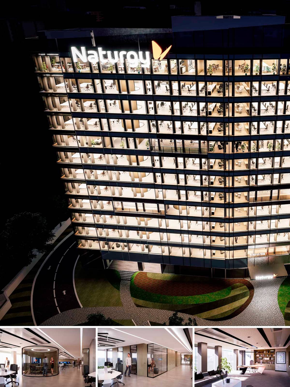

The AME38 project reinterprets the corporate tower as a luminous, permeable lantern in the Madrid skyline. The design proposes an open, layered workplace where transparency, flexibility and biophilia define the daily experience of users. The façade works as a continuous, rhythmical grid that reveals the interior life of the offices, emphasizing collaboration and movement rather than static, closed-off floors.
The architectural language is deliberately calm and neutral, allowing the corporate identity to appear through light, graphics and subtle color accents. Horizontal floor plates, slender vertical supports and large glass panes create a clean, contemporary image aligned with international corporate standards while remaining rooted in the Mediterranean light conditions of Madrid.
The base of the tower delicately lifts from the ground, generating a shaded, recessed entrance that marks the threshold between urban space and corporate interior. Curved vehicular access and pedestrian paths gently guide users towards the lobby, while landscaped bands of grass and paving create a soft transition from the street to the building.
Nighttime illumination transforms the tower into a visible urban reference, yet the lighting strategy is carefully modulated at lower levels to preserve comfort at the pedestrian scale. The ground floor is conceived as a semi-public interface that can accommodate reception, informal meeting areas and shared amenities, reinforcing the role of the building as a corporate hub open to visitors and collaborators.
Each office floor is designed as an open-plan platform organized around a central structural spine. Workstations are arranged in flexible clusters, optimizing daylight penetration from the fully glazed perimeter. The regular structural grid ensures efficient planning while allowing for future reconfiguration without major interventions.
Support spaces—meeting rooms, focus pods and service cores—are placed strategically to break the depth of the floor plate and generate clear circulation loops. The circular meeting capsule visible in the interior images exemplifies this approach: a freestanding, acoustically controlled volume that introduces a sculptural element within the open workspace while providing privacy for concentrated work or confidential conversations.
The interior palette is based on warm neutrals: light-toned flooring, white ceilings and timber accents on furniture and wall cladding. This restrained scheme highlights natural light and enhances visual continuity between different departments. Linear recessed lighting integrated into the ceiling system reinforces perspective and guides movement along the corridors.
Glass partitions are extensively used to separate meeting rooms and managerial offices, maintaining acoustic control without sacrificing visual openness. Soft furnishings, indoor plants and curated shelving systems in lounge areas bring domestic comfort into the corporate environment, encouraging informal interaction and longer, more pleasant stays in the workspace.
Sustainability criteria are integrated from the envelope to the interior fit-out. The fully glazed façade, while visually transparent, is understood as a high-performance skin with selective coatings, solar control and optimized insulation to reduce HVAC loads in Madrid’s climate. Floor-to-ceiling glazing maximizes natural daylight, decreasing reliance on artificial lighting during daytime hours.
Interior layouts favour cross-ventilation and visual connection to the exterior, supporting employee well-being. The use of durable, low-maintenance materials extends the life cycle of finishes, while modular furniture and demountable partitions allow floors to be adapted with minimal waste generation. Plant integration, access to light and the provision of diverse work settings—formal, informal, individual and collaborative—contribute to a healthier, more sustainable corporate culture for AME38.
© 2021 by sanzpont [arquitectura] . Webpage by sanzpont [digital] . Innovative Digital Experiences


The Naturgy AME38 Auditorium is meticulously crafted to embody a sophisticated yet functional design ethos, tailored for corporate presentations and large-scale meetings. The concept revolves around creating an engaging environment that fosters communication and collaboration. The design leverages clean lines and integrated technology to create a modern and efficient space that promotes user comfort and interaction.
The auditorium is designed with a tiered seating layout to optimize sightlines and acoustics, ensuring that each attendee has an unobstructed view and can hear presentations without echo or distortion. The strategic placement of the stage and dual screens facilitates seamless presentations, catering to both in-person and remote audiences. The incorporation of adjustable lighting and acoustic panels enhances the adaptability of the space to various event types, from lectures to multimedia presentations.
A harmonious blend of natural wood and textile elements characterizes the material palette, promoting a sense of warmth and elegance. The wood paneling on the walls not only serves as an aesthetic feature but also enhances the room's acoustics. High-quality, durable carpeting in the seating areas provides comfort and noise reduction, while the blue upholstered chairs add a vibrant pop of color that contrasts effectively with the subdued tones of the wood and carpet.
Lighting plays a pivotal role in the design of the Naturgy AME38 Auditorium. The use of continuous LED strips embedded in the ceiling creates a futuristic and dynamic ambiance. These lighting elements are not only decorative but functional, offering various illumination levels to suit different types of events and presentations. The overall lighting scheme is designed to reduce eye strain and improve the audience's focus.
The design incorporates several sustainability features to minimize environmental impact while maximizing energy efficiency. LED lighting fixtures are used throughout the auditorium, significantly reducing power consumption compared to traditional lighting solutions. The choice of materials, such as sustainably sourced wood and recyclable carpet tiles, reflects a commitment to eco-friendly design principles. Additionally, the HVAC system is optimized for energy efficiency, featuring advanced filtration and ventilation mechanisms to ensure optimal air quality with minimal energy use.
The auditorium is equipped with state-of-the-art audiovisual technology, including high-resolution screens, digital interfaces, and wireless connectivity options that support a wide range of multimedia formats and remote conferencing tools. This integration ensures that the space is well-suited for today’s digital and global business environment, facilitating effective communication and collaboration across different platforms and locations.
In conclusion, the Naturgy AME38 Auditorium exemplifies a modern approach to corporate space design, blending aesthetic appeal with functional excellence and sustainability. Its thoughtful layout, material selection, and technological features make it a leading example of contemporary interior design in a corporate context.
© 2021 by sanzpont [arquitectura] . Webpage by sanzpont [digital] . Innovative Digital Experiences
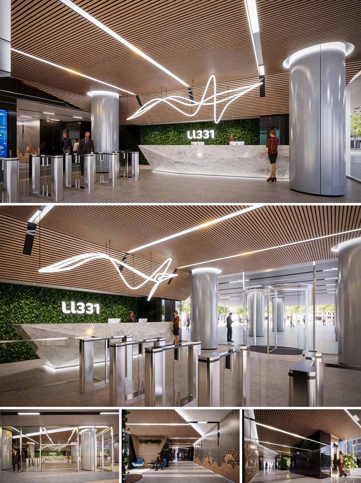

The LL331 Lobby in Barcelona is conceived as a contemporary corporate threshold that merges technology, material warmth and urban permeability. The design seeks to express the identity of a high-performance office building through a clear, sculptural composition of elements: a monolithic reception desk, luminous ceiling lines and cylindrical structural volumes. The lobby acts as a calibrated filter between city and workplace, orchestrating flows of people with an architecture that communicates precision, innovation and openness.
The spatial narrative is built around three layers: the urban front with its transparent revolving doors, the security and access-control core, and the reception and waiting areas framed by a green backdrop. These layers are visually unified by a continuous timber slatted ceiling and an expressive light sculpture that traces a dynamic trajectory above the central axis, evoking data flows or sound waves.
The layout prioritizes efficient circulation and intuitive wayfinding. A fully glazed entrance zone maximizes visual continuity with the street, inviting users into a generous vestibule before transitioning into the controlled lobby interior. The cylindrical cores operate as both structural and spatial anchors, subtly guiding visitor movement around them and framing direct lines of sight toward the reception desk.
The access-control gates are aligned orthogonally with the main facade, forming a clear, linear threshold that separates public and semi-public domains. Their positioning in front of the reception ensures supervision while preserving a sense of openness. Secondary waiting and informal meeting pockets are located to the sides, where circulation slows down and acoustic comfort increases.
The material palette combines tactile natural finishes with refined metallic and glass surfaces to balance warmth and corporate sophistication. The continuous timber slat ceiling introduces a domestic scale overhead, improving acoustics and visually elongating the space. Its linear geometry is echoed in the integrated lighting tracks, reinforcing depth and direction.
The reception desk is executed in a light grey stone with a faceted geometry, producing a crystalline, sculptural presence. Underlit plinths and recessed base details create a floating effect that reduces the perceived mass of the element. Brushed stainless steel in the access gates and column claddings adds a technical, precise character, while large-format porcelain or stone flooring ensures durability and easy maintenance.
Lighting plays a central role in articulating the brand identity of LL331. A custom, sinuous light sculpture suspended above the reception axis becomes the visual signature of the lobby, translating the company’s dynamism into a three-dimensional luminous gesture. Integrated linear luminaires in the ceiling slats and column crowns provide uniform ambient light without visual clutter.
Vertical surfaces are carefully illuminated to emphasize depth: the green wall behind the desk receives grazing light that accentuates texture, while the black glossy volumes at the perimeter reflect and multiply light, amplifying the perceived space. The LL331 logotype appears as a backlit element embedded within the green wall, clearly legible from the entrance and reinforcing orientation.
Sustainability is addressed through both visible and invisible strategies. The vertical green wall behind the reception contributes to improved indoor air quality, microclimatic regulation and acoustic absorption, while also introducing a biophilic component that softens the technological character of the lobby. Plant species are selected for low maintenance and adaptability to interior conditions.
Energy-efficient LED lighting, presence and daylight sensors reduce consumption by adapting levels to real occupancy and natural light. The high degree of facade transparency optimizes daylight penetration, decreasing reliance on artificial illumination during daytime. Durable, low-emission materials are specified for floors, wall claddings and sealants, supporting a healthy indoor environment and reducing life-cycle impacts. The overall design is conceived to age gracefully, minimizing the need for future replacements and associated resource use.
© 2021 by sanzpont [arquitectura] . Webpage by sanzpont [digital] . Innovative Digital Experiences
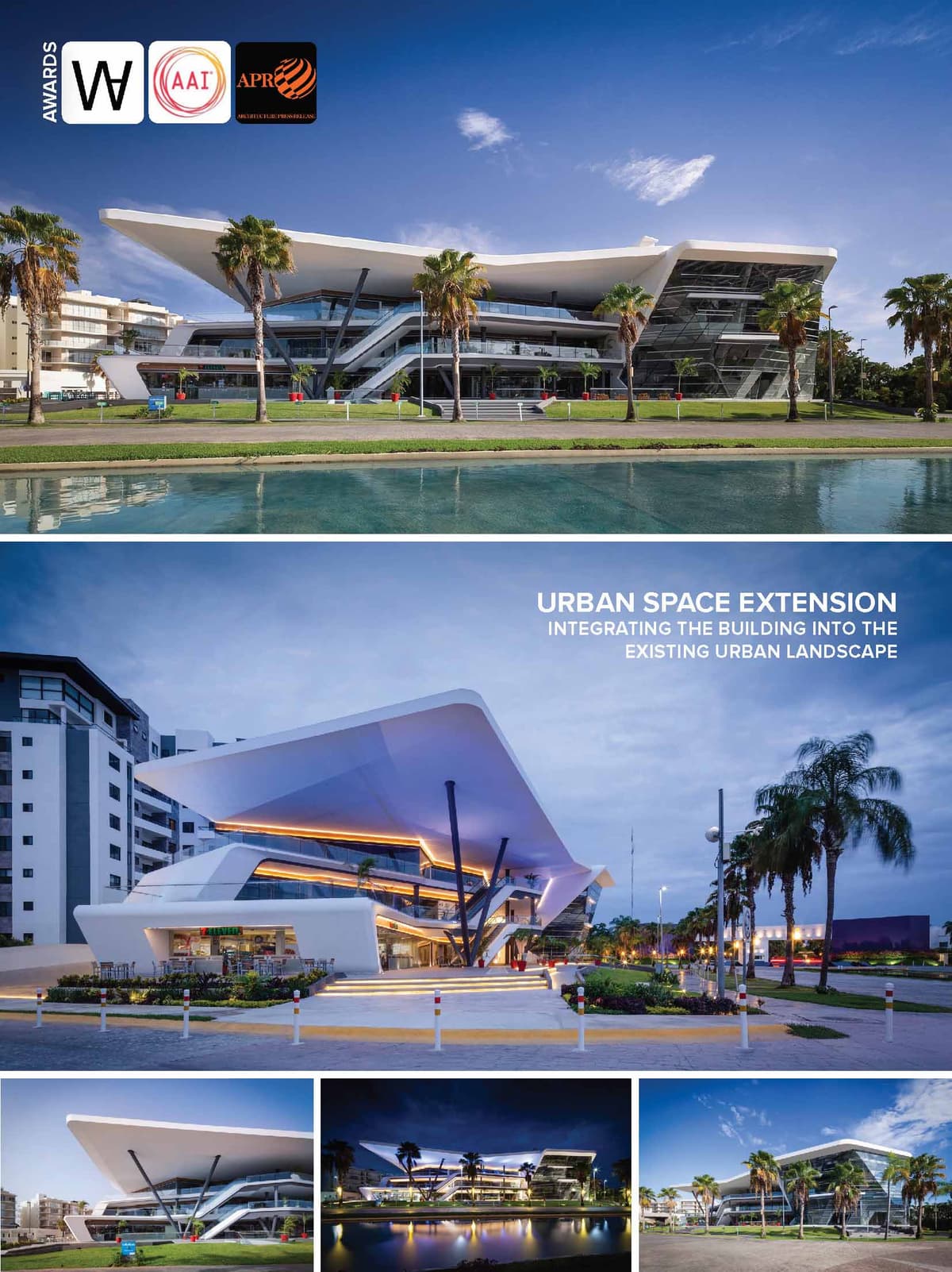

Residencial Cumbres is one of the most successful housing developments in Cancun, located in a commercial area between the airport and the city center. In addition to the neighborhood’s steady growth, the complex offers various amenities to its residents, such as service and commercial areas and an important urban corridor for its users. Our critical analysis stems from the city’s lack of public walking space, which due to the climate, must be shaded so the users are comfortable. For this reason, all commercial spaces were built at the sidewalk level and the complex features an immense system of walkways, bringing commerce and life to the pedestrian.
DESIGN CONCEPT
Our proposal goes beyond any initiative, by promoting the expansion of public space through a pedestrian plaza, and by complying with land occupation guidelines, the building is set back from the sidewalk as much as possible, expanding the public space to create a city. The shaded space extends from the sidewalk an additional 20 meters, inviting pedestrians to use the space for living, rest and recreation, designed with universal accessibility.
URBAN DESIGN
A market study conducted by the property owner determined that the project would consist of a power center building with a mix of commercial storefronts and corporate office space, offering accessible commerce and convenience to the patrons. While this business model is relatively common, we wanted to take it a step further and proposed to create a public space available to all. This took the form of a public, shaded recreational space for pedestrians and even non-consumers to enjoy. This urban terrace immediately adds value to the surrounding context.
FUNCTIONALITY
The project had to accommodate the typical commercial storefront layout, rectangular and in battery. In order to avoid one of the most common problems in commercial centers, the lack of interest and desire to access the upper floors, it was decided to give prominence to the escalators and place them in the center as a focal point, providing greater accessibility to the users. Continuous walkways propose various routes to access the three different levels, reaching urban terraces which are oriented toward the dominant winds. These terraces are perfect for retail and coffee shops connected to elevators and escalators via the main walkways. The large overhangs invite users to stay and enjoy the space. To complement the commercial area, there is a different volume containing the corporate office spaces. This volume has a different function and language than the first, generating a “glass box” structure typical of corporate buildings. The spaces are more private and conducive to offices. Internal circulations have high efficiency causing the rented space to be more cost effective. Rental spaces for modular “self service” offices to be rented and subdivided according to the needs of each company.
TECHNOLOGY
While it can be a challenge to stay within budget when constructing a building of “normal” design and cost, it can be even more challenging for an atypical building with an irregular structure such as Meet Point. In this case, it was imperative to effectively utilize 3D BIM (Building Information Modeling) technology to develop all design and construction documents, allowing the team to fabricate digital models and collaborate across all disciplines, effectively avoiding construction errors. Another great challenge was the execution of the metal structure, due to its inclined columns and angled joints. This was addressed by designing, manufacturing and cutting the pieces digitally, then assembling them on site using screws. The other major challenge was the angled glass facade of the corporate office area, which was also solved by digitally designing, fabricating and manufacturing the parts.
5 INTERNATIONAL ARCHITECTURE AWARDS
• III Bienal Arquitectura del Caribe Mexicano : Mención Honorífica Categoría Uso Mixto : Meet Point Plaza (2020)
• World Architecture Awards 10+5+X Honorary Members : Architecture Realised Category - 33rd Cycle, Category : Meet Point Plaza (2020)
• World Architecture Awards 10+5+X Community Members : Architecture Realised Category - 33rd Cycle : Meet Point Plaza (2020)
• Urban Design & Architecture Design Awards 2019 - 1st Place - Commercial Built Category : Meet Point Plaza (2019)
• Peninsula Award For Architecture and Interior Design AA/Mexico : 3rd Place - Architecture Category : Meet Point Plaza (2019)
SOLAR RADIATION STUDY
To develop the project, a study of solar thermal radiation was made to determine the architectural solution of the envelope and materials to be used, in order to guarantee adequate comfort with the minimum of energy resources. Through the study, it was seen the need to generate solar protection overhangs in order to avoid direct sun radiation into interior spaces.


5 INTERNATIONAL ARCHITECTURE AWARDS
• III Bienal Arquitectura del Caribe Mexicano : Mención Honorífica Categoría Uso Mixto : Meet Point Plaza (2020)
• World Architecture Awards 10+5+X Honorary Members : Architecture Realised Category - 33rd Cycle, Category : Meet Point Plaza (2020)
• World Architecture Awards 10+5+X Community Members : Architecture Realised Category - 33rd Cycle : Meet Point Plaza (2020)
• Urban Design & Architecture Design Awards 2019 - 1st Place - Commercial Built Category : Meet Point Plaza (2019)
• Peninsula Award For Architecture and Interior Design AA/Mexico : 3rd Place - Architecture Category : Meet Point Plaza (2019)
Residencial Cumbres is one of the most successful housing developments in Cancun, located in a commercial area between the airport and the city center. In addition to the neighborhood’s steady growth, the complex offers various amenities to its residents, such as service and commercial areas and an important urban corridor for its users. Our critical analysis stems from the city’s lack of public walking space, which due to the climate, must be shaded so the users are comfortable. For this reason, all commercial spaces were built at the sidewalk level and the complex features an immense system of walkways, bringing commerce and life to the pedestrian.
DESIGN CONCEPT
Our proposal goes beyond any initiative, by promoting the expansion of public space through a pedestrian plaza, and by complying with land occupation guidelines, the building is set back from the sidewalk as much as possible, expanding the public space to create a city. The shaded space extends from the sidewalk an additional 20 meters, inviting pedestrians to use the space for living, rest and recreation, designed with universal accessibility.
URBAN DESIGN
A market study conducted by the property owner determined that the project would consist of a power center building with a mix of commercial storefronts and corporate office space, offering accessible commerce and convenience to the patrons. While this business model is relatively common, we wanted to take it a step further and proposed to create a public space available to all. This took the form of a public, shaded recreational space for pedestrians and even non-consumers to enjoy. This urban terrace immediately adds value to the surrounding context.
FUNCTIONALITY
The project had to accommodate the typical commercial storefront layout, rectangular and in battery. In order to avoid one of the most common problems in commercial centers, the lack of interest and desire to access the upper floors, it was decided to give prominence to the escalators and place them in the center as a focal point, providing greater accessibility to the users. Continuous walkways propose various routes to access the three different levels, reaching urban terraces which are oriented toward the dominant winds. These terraces are perfect for retail and coffee shops connected to elevators and escalators via the main walkways. The large overhangs invite users to stay and enjoy the space. To complement the commercial area, there is a different volume containing the corporate office spaces. This volume has a different function and language than the first, generating a “glass box” structure typical of corporate buildings. The spaces are more private and conducive to offices. Internal circulations have high efficiency causing the rented space to be more cost effective. Rental spaces for modular “self service” offices to be rented and subdivided according to the needs of each company.
TECHNOLOGY
While it can be a challenge to stay within budget when constructing a building of “normal” design and cost, it can be even more challenging for an atypical building with an irregular structure such as Meet Point. In this case, it was imperative to effectively utilize 3D BIM (Building Information Modeling) technology to develop all design and construction documents, allowing the team to fabricate digital models and collaborate across all disciplines, effectively avoiding construction errors. Another great challenge was the execution of the metal structure, due to its inclined columns and angled joints. This was addressed by designing, manufacturing and cutting the pieces digitally, then assembling them on site using screws. The other major challenge was the angled glass facade of the corporate office area, which was also solved by digitally designing, fabricating and manufacturing the parts.
SOLAR RADIATION STUDY
To develop the project, a study of solar thermal radiation was made to determine the architectural solution of the envelope and materials to be used, in order to guarantee adequate comfort with the minimum of energy resources. Through the study, it was seen the need to generate solar protection overhangs in order to avoid direct sun radiation into interior spaces.
© 2021 by sanzpont [arquitectura] . Webpage by sanzpont [digital] . Innovative Digital Experiences
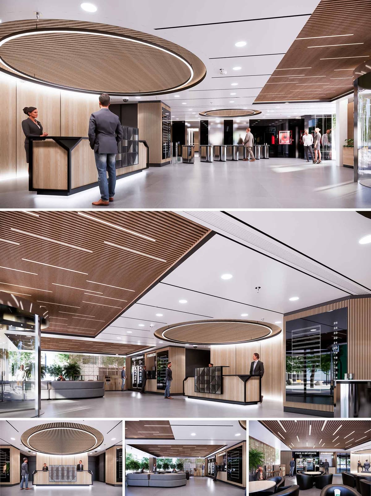

This interior design project proposal presents a comprehensive street level overall renovation of a modern office building in Barcelona, incorporating a series of functionally distinct spaces that harmonize aesthetic elegance with practical utility. The design philosophy embraces open, flowing layouts enhanced by natural materials and strategic lighting, aiming to boost employee wellbeing and productivity while ensuring sustainable practices.
The chosen materials underscore a commitment to sustainability and natural aesthetics. Wood plays a predominant role, evident in slatted ceilings, sleek wall panels, and elegant furnishings that add warmth and organic appeal. Contrasting this are the cool, polished concrete floors and marble textures in the bathrooms, providing a durable and low-maintenance surface that complements the wooden elements. Strategic use of glass enhances transparency and encourages a connection with the outdoor environment, visually expanding the spaces.
Lighting is a crucial element throughout the design, with an emphasis on energy-efficient LED fixtures that mimic natural light, reducing the building's energy consumption. Overhead lighting in linear arrangements and embedded in circular wooden elements ensures balanced illumination that enhances both functionality and mood. Accent lighting in the lockers and gym areas highlights textures and creates a dynamic environment conducive to activity and relaxation.
Lobby and Reception: The entrance lobby sets a tone of welcoming sophistication, highlighted by a striking circular overhead wooden feature that naturally draws the eye and centers the space. The reception desk is minimalist yet fully functional, framed by secure, access-controlled entry points that ensure safety without sacrificing style.
Lounge and Eating Areas: These areas serve as multifunctional spaces where employees can relax, dine, or conduct informal meetings. The furniture is modular and plush, adaptable to various configurations as needed. An integrated digital aquarium in a feature wall introduces a serene, biophilic element to the space, promoting relaxation and mental well-being.
Gym: Equipped with state-of-the-art fitness machinery and accented by energetic color contrasts, the gym area is designed to inspire and engage. Natural light floods the space, while mirrored walls visually expand the area and enhance the dynamic atmosphere, encouraging active use throughout the day.
Offices and Workspaces: Designed for adaptability, the management offices and general workspaces feature ergonomic furniture and plentiful natural light. Privacy is achievable without isolation through the use of smart glass partitions, and writable wall surfaces are integrated to foster creativity and teamwork.
Bathrooms and Locker Rooms: Combining practicality with design, these facilities use premium materials and fixtures. The locker room is spacious, outfitted with bespoke wooden lockers and seamless seating solutions, whereas the bathrooms boast sophisticated stone finishes and contemporary fixtures, ensuring durability and style.
Elevator Lobbies: The design of the elevator lobbies is streamlined to enhance user experience and efficiency. Circular overhead elements in wood are replicated here, maintaining design consistency and providing a sense of continuity throughout the building. The floor signage is clearly visible, aiding navigation, while the wooden panels and indirect lighting create a calm, inviting waiting area that alleviates the typically utilitarian feel of elevator spaces.
Sustainability is integrated into every aspect of the design through the use of recycled materials, energy-efficient systems, and indoor plants that improve air quality. The project also includes advanced HVAC systems with smart controls to minimize energy use and optimize indoor climate year-round.
Overall, this renovation project reflects a forward-thinking approach to office design, focusing on creating spaces that promote well-being, facilitate collaboration, and respect the environment.
© 2021 by sanzpont [arquitectura] . Webpage by sanzpont [digital] . Innovative Digital Experiences
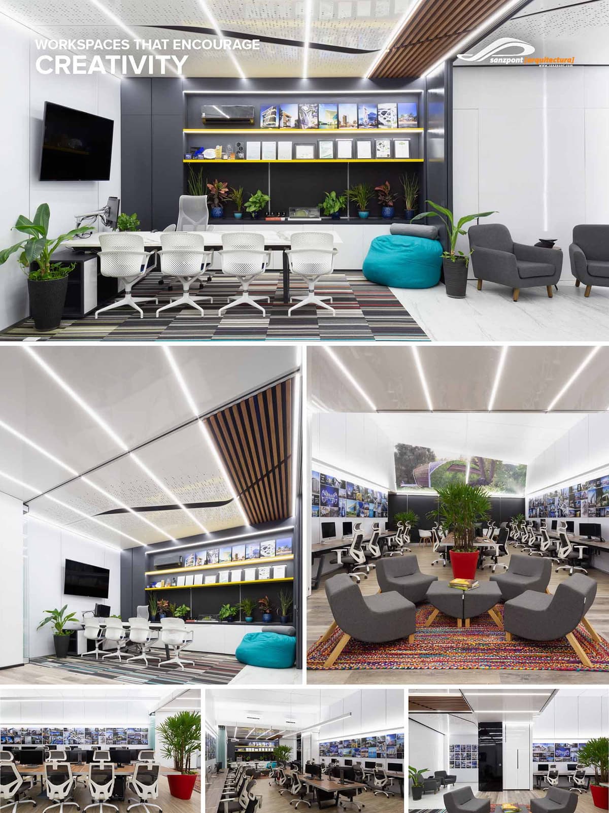

Our architecture and design studio is crafted with an innovative approach that marries functionality with an inspiring environment, essential for creative professions such as architecture and design. The concept hinges on creating a versatile and adaptive workspace that encourages both concentrated individual work and collaborative projects.
The design philosophy embraces an open-plan layout to foster a sense of community and transparency among team members. By reducing physical barriers, the space promotes easier communication and fluid exchange of ideas, which are vital for a creative workflow. The inclusion of distinct zones—ranging from focused work areas to relaxed gathering spots—ensures that the studio can cater to various activities and work styles throughout the day.
Biophilic design principles play a crucial role in the overall aesthetic and functional approach, integrating natural elements into the workplace to boost well-being and productivity. This is achieved through strategic placement of plant life, which also enhances the visual appeal of the space, and the use of natural materials that bring an element of the outdoors inside.
The design also considers the modern need for technological integration within the workspace. Areas are equipped with state-of-the-art presentation tools and digital interfaces, making it a forward-thinking setup that supports both digital and physical modes of architectural and design endeavors.
By blending these elements, the design concept aims not only to create a workspace that is efficient and adaptable but also one that serves as a source of inspiration for the creative individuals who use it. The space is intended to evolve as the needs of its users change, emphasizing flexibility and sustainability in design.
The workspace is segmented into various functional zones characterized by seamless transitions between individual workstations, collaborative areas, and informal meeting spaces. The top image displays a hybrid area combining workstations with a casual lounge, equipped with a large, wall-mounted screen for presentations and reviews. This multipurpose zone ensures that the space adapts to different work needs, promoting both focus and interaction.
The central part of the studio, highlights a communal area distinguished by a striking ceiling design and integrated lighting solutions. This area acts as a nerve center, facilitating larger gatherings and discussions, making it ideal for team collaborations and client presentations.
In the lower part of the image, the conventional workspace is designed with a high density of desks, optimized for space efficiency. The layout provides each staff member with personal space while maintaining openness for communication and visual connection across the team.
Incorporating advanced technology is a key aspect of the studio’s design, reflecting the architectural firm’s commitment to cutting-edge tools that enhance creativity and efficiency. The studio is equipped with a variety of technological features designed to streamline the design process and facilitate innovative collaboration and presentation methods.
A prominent feature in the lounge area is the digital collaboration board. This large, wall-mounted digital screen is pivotal for interactive sessions, allowing team members to showcase digital sketches, architectural plans, and multimedia presentations seamlessly. The screen's high resolution and touch capabilities enable real-time editing and brainstorming, making it an invaluable tool for dynamic and engaging project development.
The studio also harnesses the power of Virtual Reality (VR) and Augmented Reality (AR) technologies, which are essential tools to visualize and communicate our designs. These tools allow our clients and colleagues to step into the virtual models of our projects, providing an immersive experience that enhances understanding and feedback. VR and AR are particularly useful in the review stages of our projects, allowing for a virtual walk-through of architectural spaces and potential modifications before actual construction begins.
The integration of these technologies in the lounge and meeting areas not only facilitates a more interactive and participatory approach to project reviews but also positions the studio at the forefront of technological advancements in architecture. This technological setup not only involves clients experience but also significantly aids in decision-making processes, ensuring that all stakeholders can visualize and engage with design concepts in the most interactive and realistic manner possible.
The material palette is a sophisticated mix of modern and sustainable materials. High-reflective white surfaces dominate, enhancing the brightness of the space, complemented by dark grey tones that add a professional and sharp contrast. Strategic use of wood elements, particularly in the ceiling design, introduces warmth and organic texture, balancing the modernity of the metal and glass components.
The color scheme is minimalistic, primarily utilizing whites and grays to maintain a clean and uncluttered look. Pops of color are introduced through furnishings such as the blue bean bags and multi-colored rugs, which not only add vibrancy but also demarcate different zones within the open-plan layout.
Sustainability is carefully integrated into the design through the choice of materials and the incorporation of green plants throughout the workspace. The use of LED lighting, low-emission paints, and recycled materials contributes to a reduced environmental footprint. Furthermore, the biophilic design elements, including plant installations in various areas, improve air quality and connect the inhabitants to nature, supporting mental and physical health.
Overall, this interior design project not only reflects the architectural ethos of modernity, functionality, and sustainability but also creates a stimulating environment that encourages creativity and collaboration among the professionals working within.
© 2021 by sanzpont [arquitectura] . Webpage by sanzpont [digital] . Innovative Digital Experiences
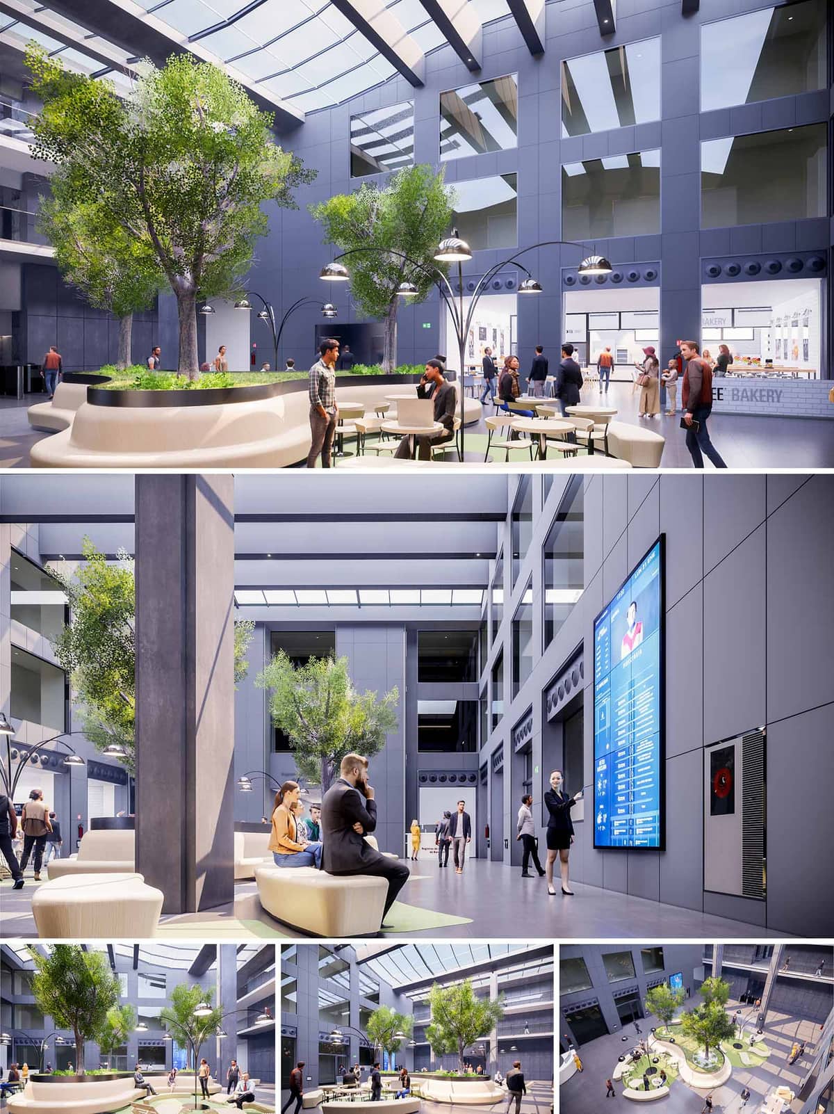

The TLL Lobby in Barcelona is conceived as a contemporary corporate atrium that blurs the limits between workplace, public plaza and interior garden. The intervention transforms a previously neutral circulation void into a dynamic lobby-landscape where people can meet, work informally, or simply pass through. The design organizes space around sculptural, sinuous seating islands that integrate generous planters and trees, turning the center of the lobby into a green topography that activates all surrounding levels.
The architectural language is intentionally minimal and technological, providing a calm, neutral background to highlight vegetation and human activity. Large vertical surfaces and voids frame the atrium as an interior urban canyon, while the organic geometry of the furniture introduces softness and informality, encouraging spontaneous occupation and longer dwell times.
The lobby operates as a central node for the building’s corporate ecosystem. Circulation is structured as a perimeter loop along the ground floor, complemented by bridges and balconies on upper levels that visually connect different departments. The void of the atrium becomes a primary orientation device: from any point, users maintain clear visual references to exits, lifts and common services such as the café and information counters.
The plan is organized around several main islands. These elements subtly choreograph movement, creating varied passages—some more direct and linear, others slower and more meandering. Seating edges open strategically toward entrances, retail fronts and digital information walls, ensuring that resting areas always relate to flows of people without obstructing them. The result is a hierarchy of micro-spaces: quick waiting zones, informal meeting pockets and more relaxed working corners.
The architectural envelope uses a restrained palette of cool grey panels and glass, emphasizing precision and corporate clarity. This neutral shell is contrasted by the soft, warm tonality of the seating surfaces, which appear as continuous, carved volumes. The light beige tones of the benches, combined with pale green floor accents around the planters, subtly reference Barcelona’s Mediterranean context without resorting to overt color.
Metallic finishes on lighting structures and handrails echo the technological character of the building. The high-gloss digital screens punctuate the façade-like inner walls, introducing a dynamic layer of content and wayfinding. At ground level, flooring is specified with a durable, low-sheen finish to diffuse reflections from the skylight above, providing visual comfort and reducing glare.
A large overhead skylight spans the atrium, functioning as the principal atmospheric device. The roof structure is articulated with linear beams that modulate sunlight, creating a rhythmic pattern of shadows across the interior plaza. This controlled daylight reduces the need for artificial lighting during daytime while maintaining a balanced luminance suitable for digital displays and laptop use.
Vegetation is curated as a series of compact urban groves. Medium-height trees rise from the central islands, providing vertical scale and partial shading at seating level. Planter rims are integrated seamlessly with the benches, allowing users to sit in close contact with greenery. This proximity enhances acoustic comfort, improves indoor air quality and introduces seasonal variations in color and density, giving the lobby a subtle temporal dimension.
The custom benches are conceived as continuous, fluid elements, alternating between generous backrests and open, 360-degree seating edges. Their freeform geometry supports multiple postures—from quick, upright waiting to more relaxed, collaborative uses. Movable café tables and chairs complement the fixed elements, enabling reconfiguration for events, informal meetings or temporary workstations.
Lighting combines large-scale ambient fixtures with focused, pedestrian-scale luminaires. The arc-shaped floor lamps hover above the benches, generating intimate pools of warm light that contrast with the cooler, uniform illumination of the general atrium. This dual system allows the lobby to adapt from bright daytime conditions to a more atmospheric evening scenario while preserving a coherent visual identity.
Integrated digital totems and large-format screens provide wayfinding, corporate information and real-time building data, turning the atrium into an interface between physical and digital environments. The façade of devices is recessed into the wall cladding to maintain a flush, calm surface, and technical equipment is discretely incorporated in ventilation grilles and service panels.
Sustainability is addressed through passive and active strategies. The extensive skylight maximizes natural lighting, significantly reducing reliance on artificial sources during office hours. Glazing incorporates solar control to minimize heat gain, complemented by a high-performance building envelope that stabilizes interior temperatures. The selection of durable, low-maintenance finishes extends the life cycle of the lobby, while the substantial indoor planting contributes to improved indoor air quality and occupant well-being. The combination of efficient LED lighting, intelligent controls and the biophilic design approach positions the TLL Lobby as a contemporary, environmentally conscious corporate interior.
© 2021 by sanzpont [arquitectura] . Webpage by sanzpont [digital] . Innovative Digital Experiences
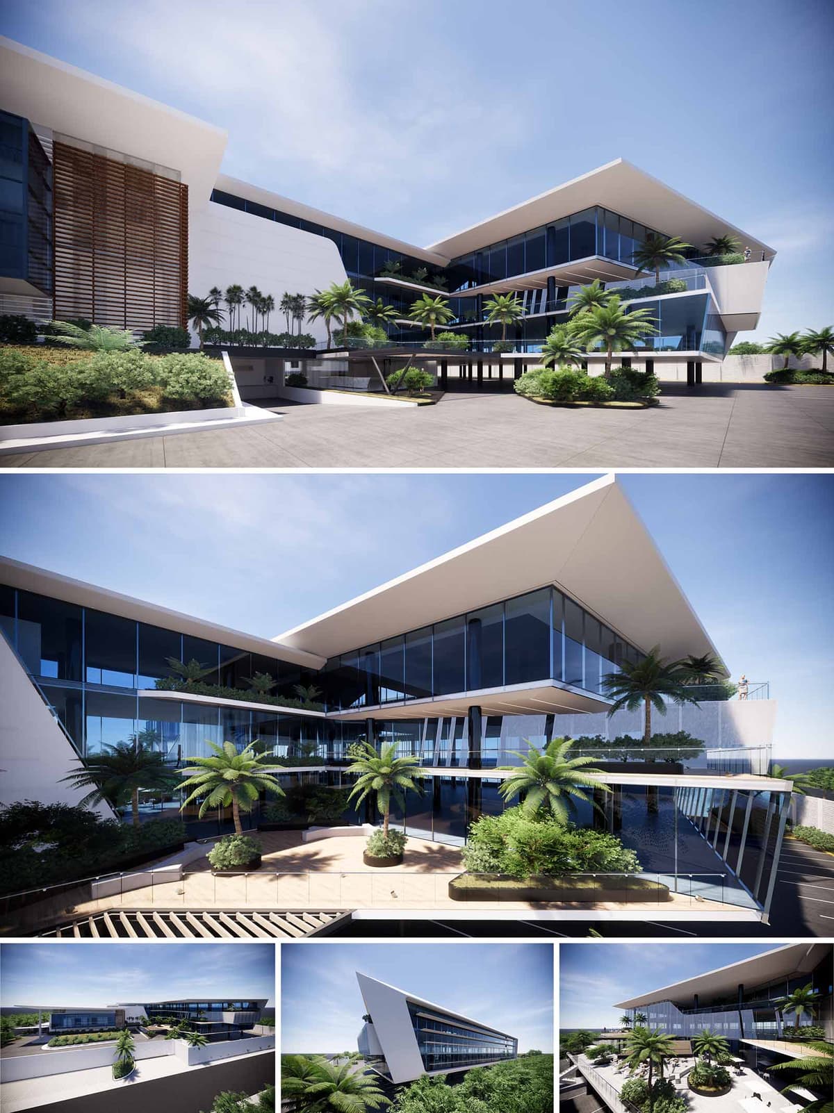

The Corporative Campus in Cancún is conceived as a horizontal landmark that opens toward the Caribbean horizon while embracing a lush interior courtyard. The architecture is defined by two dynamic, angular wings that appear to slide past each other, framing a central void that operates as the social and climatic heart of the complex. Large overhanging roofs, sharp edges and transparent façades emphasize lightness and horizontality, creating a corporate environment strongly connected with its tropical context.
The project balances iconic presence along the urban front with a more intimate internal world of vegetation, terraces and water. The composition is guided by the idea of a “floating garden campus,” where workspaces are visually extended into exterior platforms and green balconies, dissolving conventional boundaries between interior office life and the surrounding landscape.
The building is organized as an elongated bar parallel to the main access road, with its most expressive façade facing the city. The massing steps back toward the interior patio, generating a sequence of terraced levels that reduce the perceived scale and allow natural light to penetrate deeply into the complex. This strategy creates a clear front–back relationship: an urban, representative face and a more relaxed, garden-oriented side.
The angular planes of the envelope, particularly the sloping end wall and pronounced roof, function as a volumetric gesture that anchors the campus in the landscape. The elevated access canopy and recessed ground floor give the impression that the upper volumes float above a shaded plinth, easing pedestrian circulation and separating vehicular flows from the main corporate lobby.
The architectural expression relies on a controlled palette of white, glass and dark metallic elements, producing a contemporary, almost aerodynamic aesthetic. Continuous curtain-wall façades provide panoramic views while mirroring the sky and surrounding greenery, visually lightening the mass. White, sharply cut slabs define horizontal lines and deep eaves, giving rhythm to the composition and providing essential sun protection.
Vertical wooden or metal screens appear in selected zones, such as the main elevation, adding texture and a sense of warmth. These lattices filter light, protect from direct solar gains and contribute to a more intimate scale when perceived from the interior. Planters integrated into slab edges and terraces soften the geometry and introduce a constant dialogue between the built envelope and vegetation.
The campus is structured around an open-air courtyard that acts as a central plaza. Circulation balconies and bridges overlook this void, encouraging visual connectivity between departments and promoting informal encounters. Office floors are arranged as flexible, open-plan plates along the perimeter, benefitting from abundant natural light and dual orientations.
Vertical circulation cores are strategically placed to optimize evacuation routes and distribute flows between parking, lobby and work levels. A generous drop-off zone under a projecting volume provides a sheltered transition from exterior to interior. Roof terraces and intermediate decks operate as breakout spaces, offering outdoor meeting areas and rest zones that complement formal offices and conference rooms.
The landscape strategy reinforces the sensation of a tropical campus rather than a conventional office block. Dense ground-level planting, elevated gardens and palm trees on terraces create multiple green layers that visually connect to the surrounding jungle and coastal environment. The courtyard is designed as a microclimate with abundant shade, water reflections and native species adapted to the Yucatán peninsula.
Generous glazing and sliding openings link interior common areas directly with exterior decks, encouraging users to occupy the outdoor environment throughout the day. The result is a work setting that privileges natural light, cross-ventilation potential and constant visual contact with vegetation, supporting employee wellbeing and productivity.
The architectural form itself is a primary environmental device. The deep overhangs and inclined façades are calculated to reduce direct solar radiation on glazing, mitigating cooling loads in Cancún’s warm-humid climate. The courtyard configuration favors cross-ventilation corridors, promoting natural air movement and reducing dependence on mechanical systems in semi-open areas.
High-performance glazing, shading louvers and insulated roof assemblies contribute to thermal efficiency, while the extensive green areas help combat the heat island effect and enhance stormwater retention. The planting scheme prioritizes native and low-maintenance species, decreasing irrigation requirements. Roof terraces are envisioned as potential locations for photovoltaic panels, while the structural and spatial grid is designed to allow future adaptation of interior layouts, extending the building’s life cycle and improving its long-term sustainability profile.
© 2021 by sanzpont [arquitectura] . Webpage by sanzpont [digital] . Innovative Digital Experiences
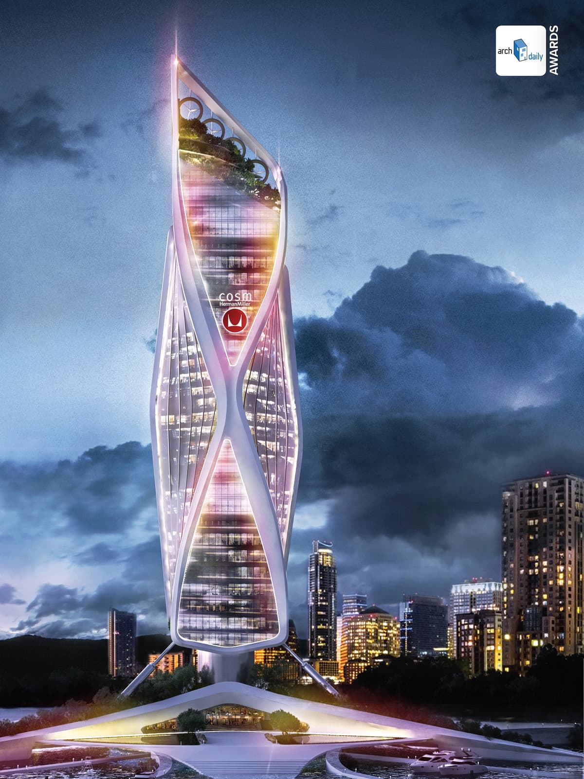

The design of the Cosm tower is inspired by the spectacular design of Studio 7.5 for Herman Miller.
The design of the structure of the building is inspired by the Cosm chair, with an earthquake-dynamic system that works intelligently against oscillating and trepidatory movements of earthquakes, providing maximum stability to the building.
The skin of the building is inspired by the Cosm fabric, and is composed of a Serge Ferrari solar control bioclimatic textile façade, an innovative material that offers thermal and visual protection, freedom of design and maximum visibility to the outside.
The design of the building structure, similar to the Cosm chair, dynamically stiffens the facade of the building, forming a seismic-resistant diaphragm of structural diagonal bracing that provides strength and ductility to the design.
The Colors of Cosm | RGB LED Technology: The color in the design of the building is created digitally by means of RGB LED low consumption lighting, bathing the neutral surface of the building skin with light that dynamizes the aesthetics and offers a more technological aspect.
The functional, technical, energetic and sustainable performance of the building are also reflected in its aesthetic design, creating an icon that highlights the values of the brand.
The selection of responsible and local materials is proposed to minimize the amount of waste in the construction, as well as materials with recycled components and of low environmental impact. The facades propose the use of extra-clear solar control glass "SGG COOL LITE" to regulate the temperature, save energy and reduce the consumption of air conditioning, improving visual comfort by reducing solar glare.
The design of the Cosm Tower is focused on Sustainability and Bioclimatic design, taking advantage of renewable energy while minimizing its environmental impact.
Photovoltaic Panels: The skin of the building integrates a solar control membrane with photovoltaic cells to take advantage of the sun as renewable natural energy.
Plants that Clean the Air: The skin of the building integrates plants that filter the air to help eliminate environmental pollution.
Innovation: The construction of the building is conceived by means of the Holedeck innovative construction system, which is considered to be the most sustainable concrete structure in the world, as it reduces the weight and volume of the building by minimizing the use of resources.
Water Filtration: A water filtration system reduces environmental pollution and an irrigation system treats and utilizes gray water.
Water Efficiency: It promotes a more intelligent use of drinking water, both inside and outside the building, using technologies to reduce consumption through controlling and measuring the amount used, efficient facilities and water recycling.
Use of Stormwater: Collection of rainwater to reduce the consumption of the urban hydraulic network.
Accessibility and Function: Easy urban accessibility, bicycle parking, with an adequate functional design that intelligently integrates uses and spaces.
Connection with Nature: Access plaza, terraces and spaces with natural vegetation and fountains that promote a peaceful moment in the environment, in addition to increasing the exterior / interior connection.
Comfort: Holistic and efficient design focused on the user. The maximum possible natural lighting and comfort to the user is provided in all interior spaces in addition to the use of materials that promote wellness.
Interior Environmental Quality: Proper natural lighting is achieved through the facade of extra-clear solar control glass, promoting the best use of natural light during the day creating an adequate thermal environment. Air renewal systems maintain the quality of the environment.
Location and Transportation: In direct connection with the public transportation network, which links the user with the city and its urban mobility network.
Amenities: Generate the maximum possible spaces for public use that create social cohesion, such as a bicycle paths, pedestrian walks, terraces and a viewpoint.
Expansion of Public Space: Public use of spaces that integrate the building with its urban context is promoted.
Sports Port: In addition to the pedestrian urban space, a maritime-sporting connection is generated that promotes an additional point of social interaction.
• World Architecture Awards 10+5+X: Architecture Designed Category, 31st Cycle : COSM Tower (2019)


• World Architecture Awards 10+5+X: Architecture Designed Category, 31st Cycle : COSM Tower (2019)
The design of the Cosm tower is inspired by the spectacular design of Studio 7.5 for Herman Miller.
The design of the structure of the building is inspired by the Cosm chair, with an earthquake-dynamic system that works intelligently against oscillating and trepidatory movements of earthquakes, providing maximum stability to the building.
The skin of the building is inspired by the Cosm fabric, and is composed of a Serge Ferrari solar control bioclimatic textile façade, an innovative material that offers thermal and visual protection, freedom of design and maximum visibility to the outside.
The design of the building structure, similar to the Cosm chair, dynamically stiffens the facade of the building, forming a seismic-resistant diaphragm of structural diagonal bracing that provides strength and ductility to the design.
The Colors of Cosm | RGB LED Technology: The color in the design of the building is created digitally by means of RGB LED low consumption lighting, bathing the neutral surface of the building skin with light that dynamizes the aesthetics and offers a more technological aspect.
The functional, technical, energetic and sustainable performance of the building are also reflected in its aesthetic design, creating an icon that highlights the values of the brand.
The selection of responsible and local materials is proposed to minimize the amount of waste in the construction, as well as materials with recycled components and of low environmental impact. The facades propose the use of extra-clear solar control glass "SGG COOL LITE" to regulate the temperature, save energy and reduce the consumption of air conditioning, improving visual comfort by reducing solar glare.
The design of the Cosm Tower is focused on Sustainability and Bioclimatic design, taking advantage of renewable energy while minimizing its environmental impact.
Photovoltaic Panels: The skin of the building integrates a solar control membrane with photovoltaic cells to take advantage of the sun as renewable natural energy.
Plants that Clean the Air: The skin of the building integrates plants that filter the air to help eliminate environmental pollution.
Innovation: The construction of the building is conceived by means of the Holedeck innovative construction system, which is considered to be the most sustainable concrete structure in the world, as it reduces the weight and volume of the building by minimizing the use of resources.
Water Filtration: A water filtration system reduces environmental pollution and an irrigation system treats and utilizes gray water.
Water Efficiency: It promotes a more intelligent use of drinking water, both inside and outside the building, using technologies to reduce consumption through controlling and measuring the amount used, efficient facilities and water recycling.
Use of Stormwater: Collection of rainwater to reduce the consumption of the urban hydraulic network.
Accessibility and Function: Easy urban accessibility, bicycle parking, with an adequate functional design that intelligently integrates uses and spaces.
Connection with Nature: Access plaza, terraces and spaces with natural vegetation and fountains that promote a peaceful moment in the environment, in addition to increasing the exterior / interior connection.
Comfort: Holistic and efficient design focused on the user. The maximum possible natural lighting and comfort to the user is provided in all interior spaces in addition to the use of materials that promote wellness.
Interior Environmental Quality: Proper natural lighting is achieved through the facade of extra-clear solar control glass, promoting the best use of natural light during the day creating an adequate thermal environment. Air renewal systems maintain the quality of the environment.
Location and Transportation: In direct connection with the public transportation network, which links the user with the city and its urban mobility network.
Amenities: Generate the maximum possible spaces for public use that create social cohesion, such as a bicycle paths, pedestrian walks, terraces and a viewpoint.
Expansion of Public Space: Public use of spaces that integrate the building with its urban context is promoted.
Sports Port: In addition to the pedestrian urban space, a maritime-sporting connection is generated that promotes an additional point of social interaction.
© 2021 by sanzpont [arquitectura] . Webpage by sanzpont [digital] . Innovative Digital Experiences
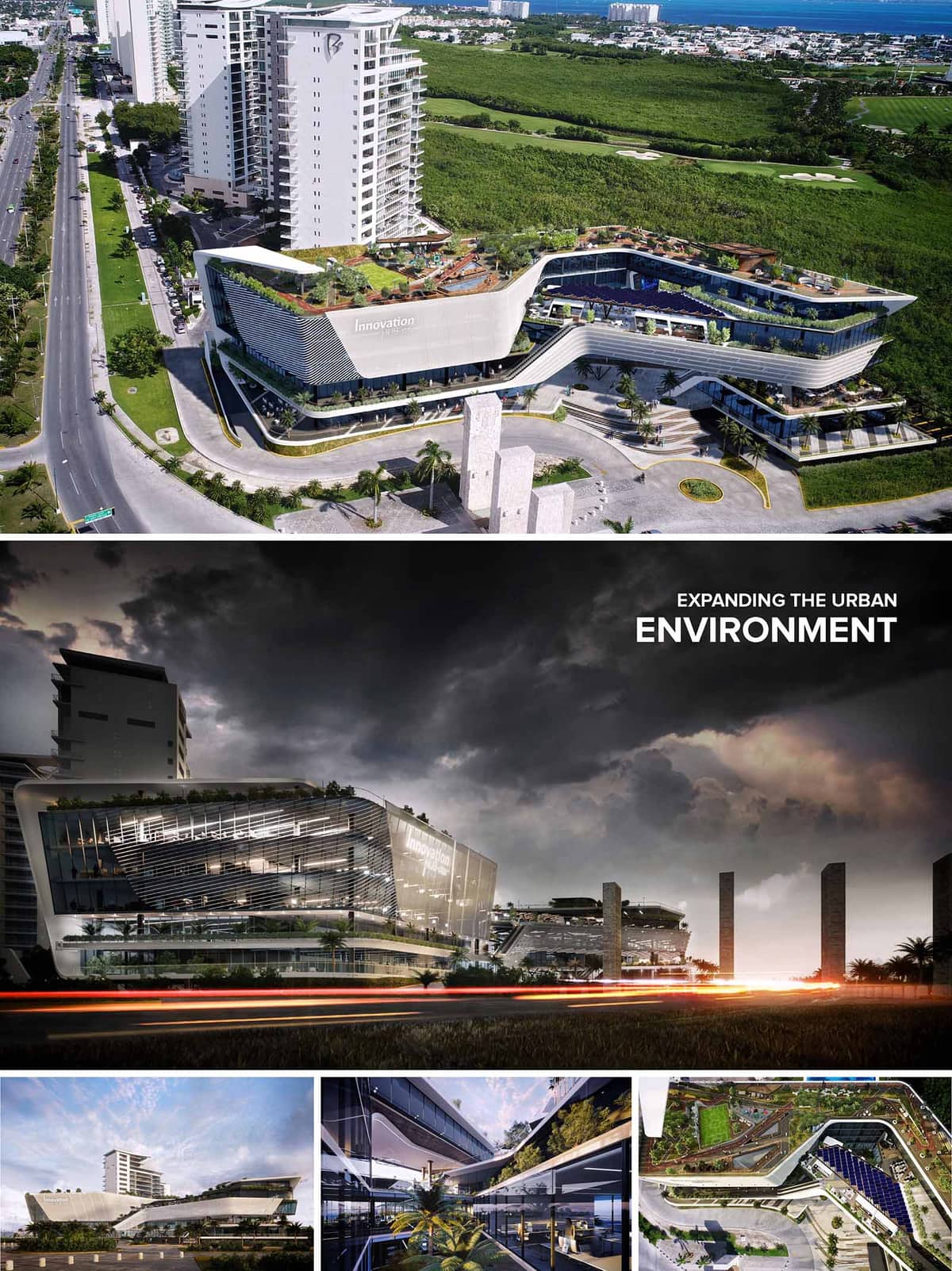

Innovation Hub is conceived as a dynamic urban catalyst, a hybrid building that fuses corporate, commercial and leisure functions into a single continuous architectural landscape. The volume emerges as a sculpted horizontal podium that extends the city fabric towards the mangrove reserve, softening the threshold between the dense avenue and the natural territory. Fluid lines, cantilevered platforms and generous terraces translate the idea of innovation into a built form that is constantly opening, overlapping and connecting.
The project operates as an elevated urban ground. Instead of a conventional closed block, the mass is fractured into stepped plates that generate plazas, paseos and belvederes at different levels. These terraces act as extensions of office spaces, retail programs and restaurants, promoting an informal interaction between work, commerce and public life while framing panoramic views to the Caribbean landscape.
The building occupies a strategic corner along a primary urban corridor, responding with a clear gesture: a curved façade that accompanies the movement of vehicles and pedestrians and defines a generous setback. This setback becomes a forecourt with drop-off areas, landscaped islets and vertical stone elements that evoke local Mayan references, marking the corporate entrance and creating a strong urban presence.
Multiple access points articulate a porous ground floor. Retail premises open directly to the sidewalks, while covered arcades and double-height lobbies provide climatic shelter and visual continuity. Vehicular circulation is organized in a perimeter loop that separates service and parking flows from the main pedestrian promenades, ensuring safe and intuitive navigation throughout the complex.
The architectural language is based on superposed horizontal slabs that slide and cantilever to create overhangs, balconies and sky gardens. The resulting expression is aerodynamic and contemporary, resonating with the coastal context of Cancún while clearly differentiating the corporate plates from the retail plinth. Large cantilevers protect the glazed areas from direct sun, reinforcing both the environmental and spatial performance.
The façades combine high-performance curtain wall systems with a second skin of horizontal louvers and perforated panels. On the main avenue, the louvers are denser and more sculptural, forming a kinetic surface that changes with the angle of view and the incidence of light. On the upper levels, the second skin opens to allow unobstructed views from executive offices and terraces, while still providing controlled shading and glare reduction.
The internal organization is structured around linear atriums and open galleries that visually connect several levels and orient the circulation. These interior voids act as climatic buffers, introducing natural light deep into the floor plates and creating visual relationships between corporate spaces, collaborative areas and the commercial program. Green planters, water features and exposed vegetation blur the boundary between interior and exterior.
Office floors are configured with flexible, large-span layouts, allowing a variety of fit-out scenarios for corporate tenants and co-working environments. Meeting rooms and informal lounges open onto terraces, encouraging outdoor work and social interaction in a climate-responsive manner. In the commercial zones, double-height shopfronts, escalators and bridges create a vertical retail experience, while the continuous roof garden operates as a communal park above the city.
The material palette is defined by light-toned concrete, glass, aluminum and local stone, producing a clean, luminous image that reduces heat absorption under tropical sun. The rounded edges and white envelope minimize thermal bridges and reflect solar radiation, while the extensive use of greenery cools the microclimate and contributes to visual comfort. Interior finishes favor neutral colors and natural materials, allowing corporate and commercial brands to personalize their spaces without compromising the architectural coherence.
Sustainability is addressed through an integrated strategy. The building orientation and overhangs optimize solar control, complemented by high-performance glazing and operable elements that promote cross ventilation where feasible. The roofscape is conceived as an active ecological layer, with native and adaptive species that reduce irrigation needs, support biodiversity and improve stormwater management. Photovoltaic panels can be integrated on selected roof areas and pergolas, contributing to on-site energy generation. Efficient LED lighting, smart building management systems and water-saving fixtures complete the environmental approach, positioning Innovation Hub as a contemporary, responsible landmark within Cancún’s evolving urban fabric.
© 2021 by sanzpont [arquitectura] . Webpage by sanzpont [digital] . Innovative Digital Experiences
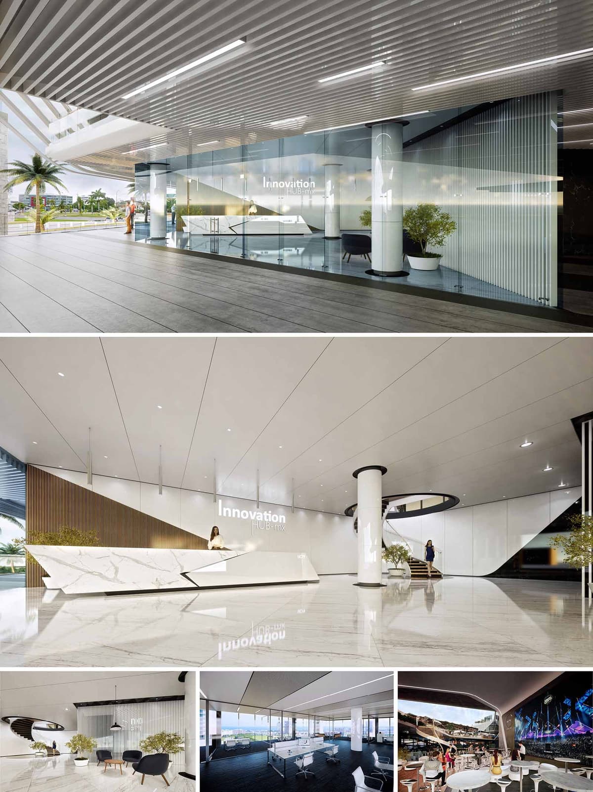

The Innovation Hub Offices in Cancún are conceived as a luminous, open and flexible corporate environment that celebrates technology and collaboration while framing the tropical landscape. The design strategy is based on clean, continuous planes and precise geometric cuts that evoke digital interfaces, giving the interior a contemporary and dynamic character. Transparency, reflection and controlled light are used to create an atmosphere where innovation is perceived from the arrival sequence to the workspaces.
The project seeks to function as a connector between the urban context and the companies that inhabit the building, turning the lobby and shared areas into a ceremonial threshold. The composition emphasizes horizontality and visual depth, allowing long perspectives across glass partitions and open floors. Curved elements, such as the sculptural stair and large radius corners, soften the overall rigor and generate a fluid circulation that encourages encounter and interaction.
The access level is conceived as a transparent plinth. A fully glazed envelope reveals the reception and internal lobby to the exterior portico, generating a visual continuity with the public realm. The entrance plane is free of visual noise, directing attention to the reception desk and double-height void, which operate as a central orientation point. Structural columns are integrated as vertical anchors that organize movement around them.
Circular and linear circulations intersect in the main lobby. A spiral stair articulates vertical connectivity, functioning as a sculptural element that visually links different levels of the hub. Open-plan workspaces are arranged along the façade, taking advantage of natural light and panoramic views, while enclosed support areas and meeting rooms occupy the core. This layout ensures efficient flows, short travel distances and a clear hierarchy between public, semi-public and private zones.
The palette is dominated by white, light neutrals and high-gloss finishes, chosen to amplify natural light and create an abstract, technology-driven atmosphere. Large-format marble-effect surfaces in floors and reception counter provide a continuous, monolithic base that enhances the perception of spaciousness and elegance. These planes are contrasted with warm vertical elements, such as slatted wood panels, which introduce texture and a human scale to the corporate environment.
Glass plays a fundamental role, both as façade and as internal partition, allowing daylight penetration and maintaining visual connectivity between different programmatic areas. Black and dark metallic accents define frames, furniture pieces and ceiling details, giving depth and precision to the composition. Upholstered seating and indoor landscaping in generous planters introduce softness and color, balancing the overall minimalism with comfort and informality.
The interior design strategy prioritizes flexibility and collaborative work. Workstations are configured in open layouts with light, movable furniture that permits future reconfiguration without major interventions. Meeting areas and lounges are defined through ceiling planes, changes in flooring texture and transparent partitions, preserving visual openness while providing acoustic separation.
Special attention is given to representative and immersive spaces. The main lobby operates as a brand statement, with integrated lighting and signage that reinforce the identity of the Innovation Hub. A multimedia room with enveloping screens is designed for presentations, events and virtual experiences, allowing companies to showcase content in a high-impact environment. Throughout the project, neutral backgrounds are intentionally kept simple so that digital media and user activity become the protagonists.
The lighting concept combines abundant natural light with a precise system of linear recessed luminaires and spotlights. Daylight enters through the glazed façades, reducing the need for artificial lighting during most of the day. Interior surfaces with high reflectance coefficients help distribute light evenly, minimizing glare and energy consumption. Artificial lighting is resolved with efficient LED technology, integrated into ceilings and vertical elements to emphasize geometry and circulation paths.
Sustainability is addressed through passive and active strategies. The extensive glazing is complemented by exterior overhangs and sun-control elements that mitigate solar gain in Cancún’s tropical climate. High-performance glass improves thermal comfort and reduces cooling loads. Interior materials are selected for durability and low maintenance, extending life cycles and minimizing waste. The open layout promotes cross-ventilation opportunities and shared conditioned zones, optimizing energy use. Indoor vegetation contributes to improved air quality and offers biophilic reference points, reinforcing user well-being within the corporate environment.
© 2021 by sanzpont [arquitectura] . Webpage by sanzpont [digital] . Innovative Digital Experiences
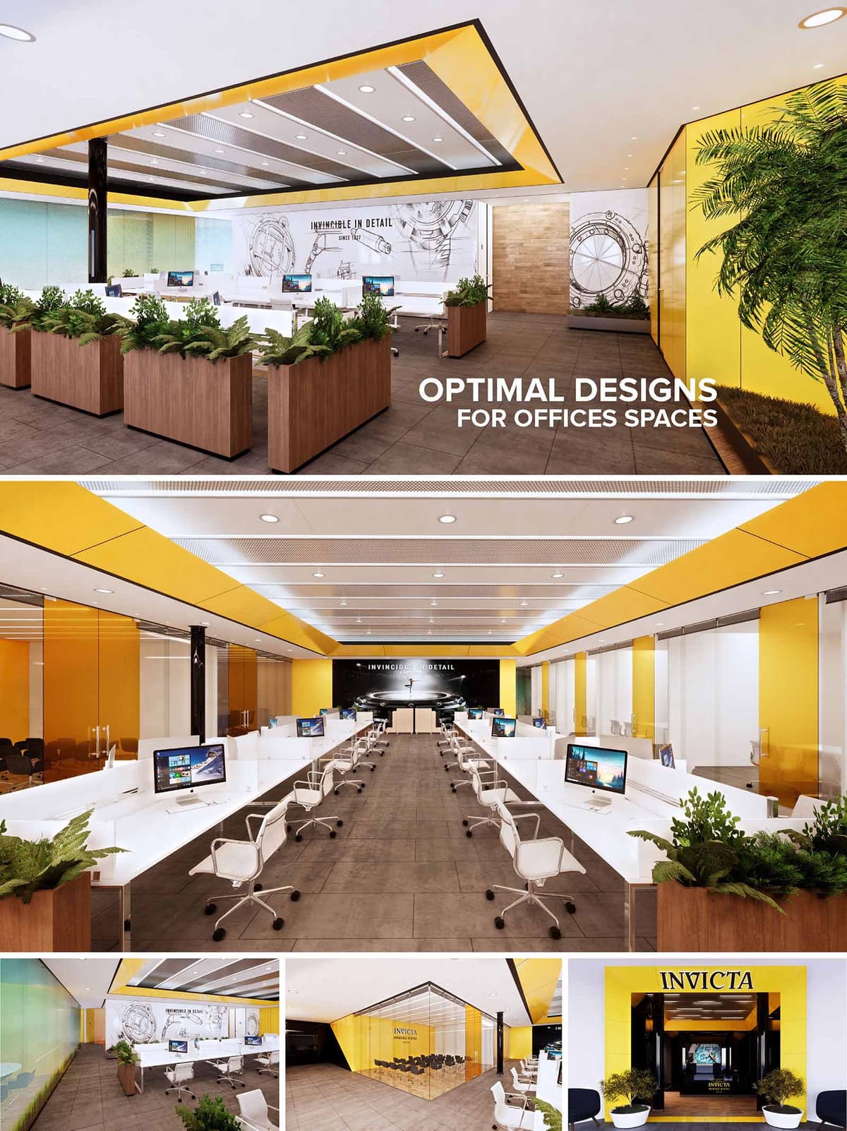

INVICTA Headquarters in Miami is conceived as a luminous corporate interior that translates the precision of timepieces into spatial design. The concept revolves around clarity, rhythm, and transparency, mirroring the mechanical rigor of watchmaking. A vibrant yellow brand color becomes the primary visual anchor, contrasted against white, warm timber, and neutral stone, to produce an energetic yet controlled work environment. The space privileges linearity and axial perspectives, guiding visitors from the lobby through open-plan workstations toward a focal brand wall that acts as the visual climax of the interior sequence.
The design language favors clean planes, minimal detailing, and integrated lighting elements that emphasize horizontality. Strategic use of glass partitions preserves visual continuity while defining functional zones such as meeting areas, private offices, and collaborative spaces. The overall result is a corporate landscape that feels open, bright, and highly legible, aligning architecture, interior design, and brand identity in a cohesive narrative.
The project is structured around a central open-office spine, flanked by enclosed rooms and circulation corridors. Workstations are arranged in longitudinal rows, maximizing visual depth and ensuring that every desk benefits from balanced artificial lighting and peripheral daylight. The linear configuration supports clear work processes, easy supervision, and intuitive wayfinding.
At the perimeter, full-height glazed partitions define conference rooms and support areas without interrupting the perception of a single, continuous space. The entrance lobby operates as a compression zone that quickly expands into the main work hall, reinforcing a sense of arrival and openness. Breakout zones and informal seating pockets are subtly integrated near green planters, providing moments of pause within the otherwise highly efficient office grid.
The material palette combines robust, low-maintenance finishes with warm, tactile elements. Large-format porcelain tiles in a stone-like gray finish form a continuous floor surface, ensuring durability and easy cleaning for high-traffic corporate use. Vertical surfaces alternate between smooth yellow panels, clear glass, and textured stone accent walls, creating a balanced interplay between solid and transparent planes.
Custom millwork in natural wood tones appears in planter boxes, reception elements, and some wall cladding, adding warmth and counterbalancing the more technical atmosphere of glass and metal. The dominant yellow ceiling bands frame the central space and align with perimeter wall panels, creating a cohesive chromatic ribbon that guides movement and reinforces the brand’s visual identity. White workstations and chairs provide a neutral background, ensuring that technology and personal items do not visually overload the environment.
Lighting design relies on an extensive grid of recessed downlights and linear fixtures integrated into the ceiling coffers. This arrangement delivers uniform illumination across work surfaces, minimizing glare on computer screens and enhancing visual comfort. The metallic perforated ceiling panels likely conceal acoustic insulation and technical services, aiding reverberation control in the open-plan setting.
Ergonomic task chairs, generous workstation dimensions, and well-considered circulation widths collectively improve user comfort and accessibility. The presence of translucent colored glass and fabric-lined zones helps diffuse sound and mitigate the acoustic challenges typical of large open offices. The overall aim is a calm, productive soundscape that still allows for informal interaction.
Brand communication is intentionally architectural rather than merely graphic. The yellow corporate color is deployed at an architectural scale in ceilings, portals, and façade elements, ensuring instant recognizability from the exterior and continuity into the interior. Feature walls with large-scale watch imagery and the “Invincible in Detail” tagline position the workspace as an immersive brand environment.
The main axis terminates at a dramatic black backdrop with illuminated branding, forming a visual anchor that emphasizes the company’s core product line. Meeting rooms and the showroom-like conference area are fully glazed, transforming internal corporate activities into part of the brand exhibition visible from circulation paths and, in some areas, from outside the building envelope.
Sustainability is addressed through both passive and active strategies, integrated seamlessly into the design. The extensive use of glass partitions maximizes the distribution of available natural light, reducing reliance on artificial lighting during the day. Where daylight access is limited, energy-efficient LED fixtures and lighting controls can help reduce consumption, particularly in work areas and meeting rooms with predictable occupation patterns.
Indoor planting plays a significant role, with continuous planter boxes delineating workstation clusters and adding biophilic value. These green elements assist in improving indoor air quality and contribute to staff wellbeing, helping to reduce stress and support productivity. Durable, low-VOC finishes and modular furniture systems favor longevity and potential reconfiguration, aligning with sustainable life-cycle thinking. The design’s emphasis on timeless, clean lines over short-lived trends is itself a strategy to extend the useful life of the interior and minimize future material waste.
© 2021 by sanzpont [arquitectura] . Webpage by sanzpont [digital] . Innovative Digital Experiences
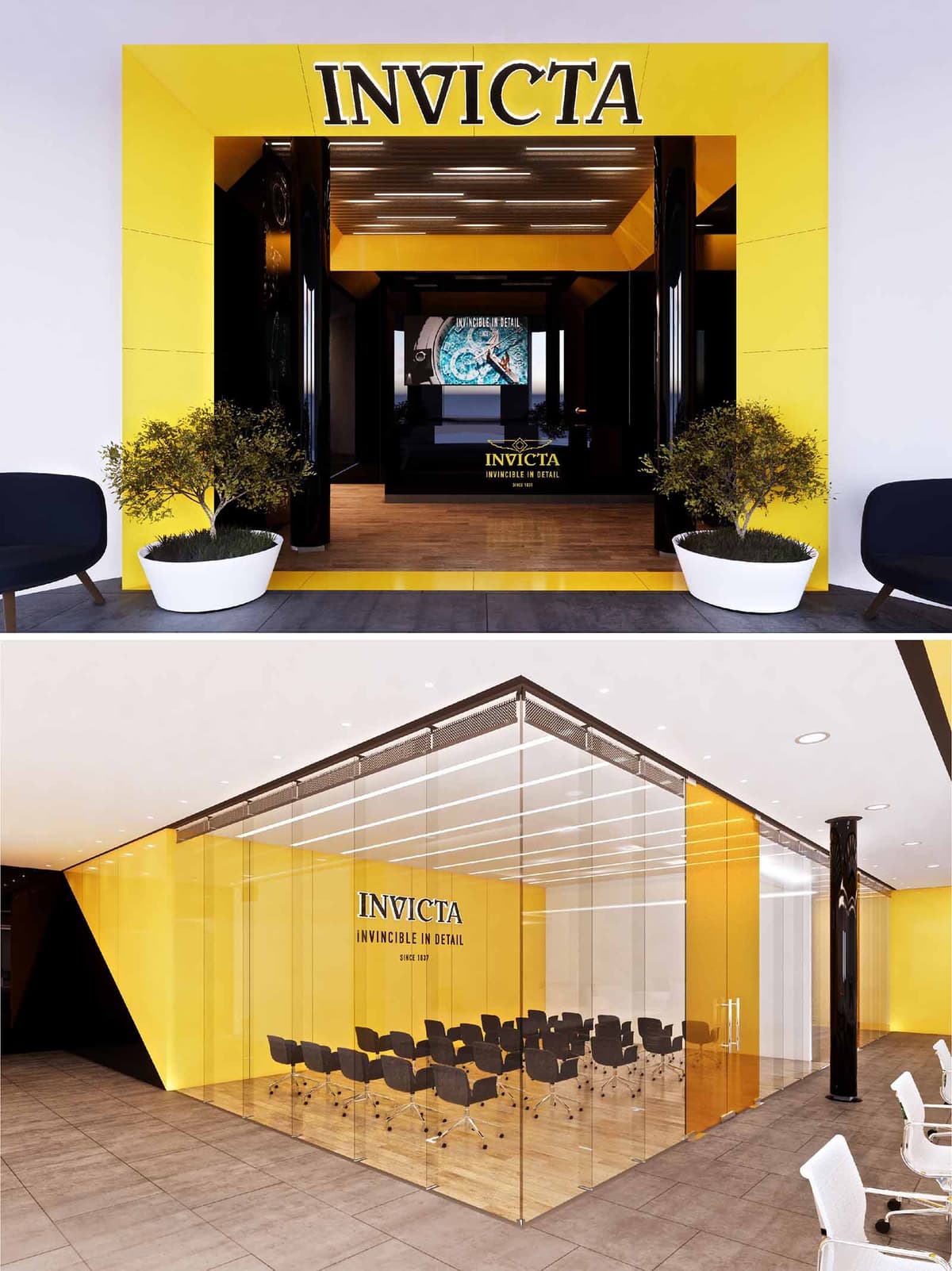
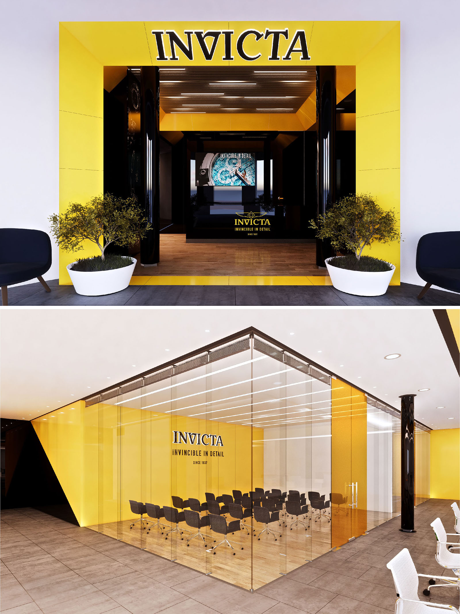
The Invicta Offices in Miami are conceived as an immersive brand environment where corporate workspace and showroom coexist. The project translates the precision and robustness associated with the brand into an architectural language based on sharp geometries, bold chromatic contrasts and controlled lighting. The spatial narrative is designed as a sequence: a strong, iconic entrance that compresses perception, followed by an interior that opens into transparent, flexible and luminous work areas. This creates a visitor journey that moves from impact to clarity, mirroring the experience of discovering the meticulous detail of a timepiece.
The overall composition is guided by a simple but powerful diagram: a black core that houses circulation and services, wrapped by yellow planes that frame the most representative public and collaborative spaces. This duality of core and envelope is constantly visible and becomes a visual guide through the interior landscape, reinforcing orientation and identity.
The main entrance operates as an urban façade within the building, using a large, three-dimensional yellow portal that projects outward and frames the reception threshold. The saturated yellow surface, combined with deep black recesses, creates a strong figure-ground relationship that captures attention and marks a clear transition from common areas to the Invicta universe. The logo is integrated at architectural scale, not as applied signage but as part of the composition, ensuring immediate recognition.
The vestibule is treated as a gallery-like tunnel, where a linear wooden floor draws the eye inward toward a digital feature wall. Black lacquered side surfaces and ceiling panels intensify depth perception and heighten contrast, while the controlled lighting rhythm emphasizes the perspective. Carefully placed planters with low-maintenance greenery soften the geometry and introduce a biophilic note right at the threshold.
The interior planning prioritizes visual connectivity and flexibility. A central glazed volume houses the main conference and training area, functioning as a transparent “box within the box.” This intervention clearly articulates the open plan without sacrificing openness, allowing activities inside to be visually present and reinforcing the collaborative culture of the office. Circulation flows around this core, ensuring intuitive wayfinding and multiple access points.
The periphery of the floor plate accommodates workstations and support spaces, while the central glass enclosure becomes a visual anchor. Black structural elements and selected columns are emphasized rather than hidden, acting as vertical markers that structure the open space. The result is a clear, legible layout that balances collective areas with quieter work zones, all under a cohesive aesthetic language.
The material palette is intentionally reduced to align with the brand’s identity: Invicta yellow, deep black, warm natural wood and neutral greys. Yellow is applied as continuous wall planes and ceiling facets, generating a luminous backdrop and reinforcing brand memorability. Black appears in high-gloss finishes on portals, columns and select furniture elements, providing a sense of depth and sophistication. The wooden flooring in the main areas introduces warmth and tactility, offsetting the intensity of the color contrast.
Extensive glass partitions create a sense of permeability and allow natural and artificial light to be shared across the floor. Ceiling-integrated linear luminaires run in parallel bands, echoing the precision of watch mechanisms. The lighting design works predominantly with indirect and diffused sources, minimizing glare on glass surfaces and enhancing visual comfort during long working periods and presentations.
Sustainability strategies focus on efficient resource use, occupant comfort and long-term adaptability. The open-plan configuration and continuous glazing maximize daylight penetration, reducing dependence on artificial lighting during daytime hours. High-efficacy LED fixtures with dimming controls and zoning enable precise energy management according to occupancy and task requirements. The simple, modular layout allows for future reconfiguration of work areas with minimal demolition, extending the life cycle of the fit-out.
Low-VOC paints and finishes are specified to improve indoor air quality, and the presence of interior plants contributes to a more balanced microclimate and offers a visual connection to nature. The restrained material palette favors durable, easy-to-maintain surfaces, lowering maintenance and replacement needs. Together, these strategies ensure that the Invicta offices not only express the brand in an iconic way, but also operate as a healthy, efficient and resilient workplace environment.
© 2021 by sanzpont [arquitectura] . Webpage by sanzpont [digital] . Innovative Digital Experiences
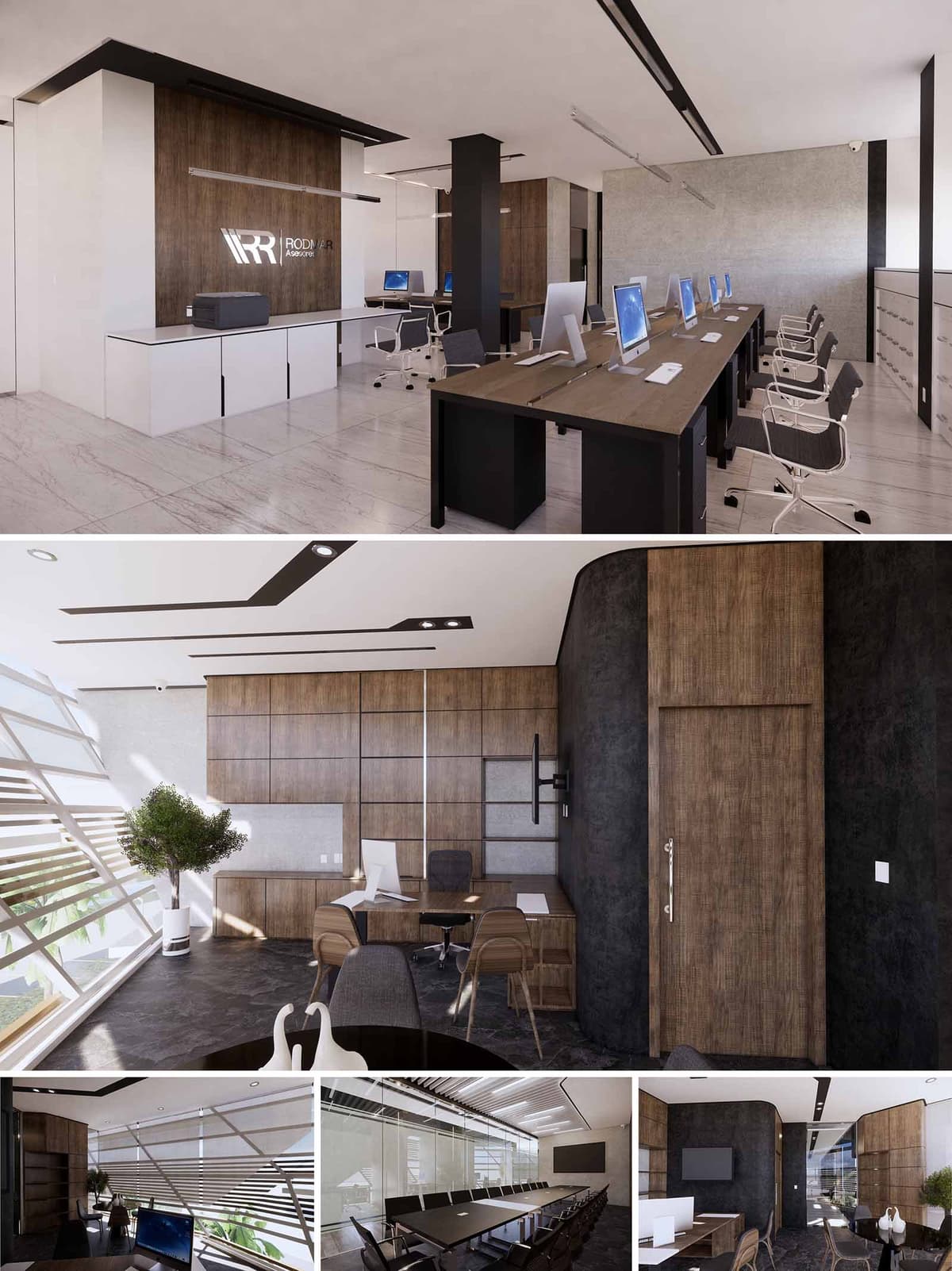

RODMAR Offices in Cancún is conceived as a contemporary corporate space that balances transparency, warmth, and efficiency. The design articulates a clear contrast between light and dark surfaces, where white planes and glass elements emphasize brightness, while wood and dark textured panels provide intimacy and gravitas. The overall spatial narrative promotes an image of solidity and reliability, aligned with the corporate identity, yet remains flexible and open to future changes in workplace dynamics.
The project organizes the offices as a sequence of open workstations, private offices, and collaborative areas, visually connected through continuous ceilings and longitudinal furniture lines. This continuity reinforces teamwork and visual permeability while preserving acoustic control and privacy where required. The identity wall with the illuminated logo acts as a focal point, marking the transition from reception to the main operative area.
The layout is based on a clear axial circulation that runs parallel to the main work cluster. Open-plan benching systems accommodate multiple workstations, allowing for easy reconfiguration and growth. Private offices and meeting rooms are placed along the perimeter or behind glazed partitions, ensuring natural light penetration deep into the floor plate.
Curved partitions in dark finishes soften corners and help articulate transitions between public and semi-private zones. This gesture avoids rigid corridors and instead creates fluid movement and subtle visual expansions. The large boardroom is positioned as a terminal space along the main axis, with full-height glazing that reinforces its importance and allows controlled visual connection to adjacent areas.
The material palette combines warm wood veneers, light marble-effect flooring, and dark textured wall finishes. Wood surfaces are used in cabinetry, wall cladding, and desk planes, adding a tactile, human scale to the corporate environment. These wooden planes are frequently framed by thin metallic profiles, providing rhythm and precision to the elevations.
Floors in light-toned stone or porcelain increase reflectance and contribute to a luminous, airy atmosphere, which is especially relevant in Cancún’s intense natural light conditions. Dark plaster or cementitious finishes on curved walls create a background that visually anchors the space and highlights the lighter planes in front. Neutral upholstery in greys and taupes keeps the environment sober, while white worktops and built-in elements reinforce cleanliness and order.
Workstations use shared linear desks with integrated cable management, reducing visual clutter and facilitating collaborative work. Ergonomic chairs with neutral fabrics support long working periods without distracting from the overall aesthetic. In executive areas, desks and meeting tables adopt more robust proportions, emphasizing hierarchy while maintaining a coherent material language.
Lighting is resolved through linear recessed fixtures and strategically positioned downlights that emphasize circulation paths and focal points. Ceiling elements follow the geometry of the layout, reinforcing directionality and giving the ceilings a dynamic character. Integrated screens, wall-mounted supports, and hidden infrastructure allow technology to be present yet visually discreet, supporting presentations, videoconferencing, and digital workflows.
The façade incorporates horizontal louvers that filter sunlight and generate a play of shadows in the interior. This brise-soleil system mitigates solar gain, reduces glare on workstations, and improves visual comfort while maintaining outward views. The large glazed surfaces maximize daylight, decreasing the dependence on artificial lighting during working hours.
From a sustainability standpoint, the project privileges durable, low-maintenance finishes such as high-pressure laminates, porcelain tiles, and composite panels that resist humidity and coastal conditions characteristic of Cancún. The open-plan layout optimizes air distribution and reduces the need for compartmentalized climate control. The combination of daylighting strategies, efficient LED lighting, and long-lasting materials creates a workspace with reduced energy consumption, extended lifecycle, and a comfortable environment for users.
© 2021 by sanzpont [arquitectura] . Webpage by sanzpont [digital] . Innovative Digital Experiences
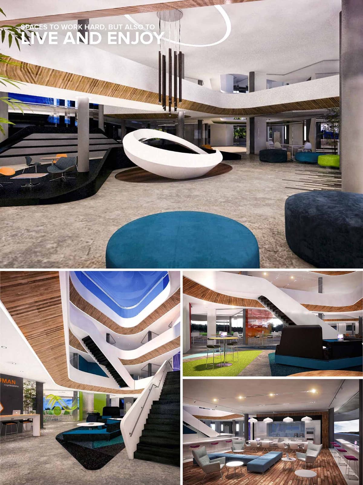

The BI Offices in Boulder are conceived as a contemporary corporate habitat where work, social life and relaxation coexist in a single fluid environment. The design prioritizes spatial continuity and visual transparency, dissolving traditional boundaries between lobby, workstations, meeting areas and leisure zones. A central multi‑level atrium acts as the heart of the building, promoting interaction across floors and offering strong visual connections that enhance a sense of community. The architectural language combines soft, curvilinear forms with bold volumetric gestures, reflecting the innovative culture of the company.
The project is structured around the atrium, which organizes horizontal and vertical circulation. Open staircases and sculpted balconies stitch together different levels, encouraging movement and informal encounters. Workspaces and meeting rooms are distributed around this void, benefiting from borrowed light and views into the communal core. At ground level, reception, lounge and collaborative areas flow into each other without rigid partitions, using changes of floor finish, ceiling height and furniture layout to define functional zones. Peripheral glazed façades open the interior to the landscape, reinforcing the continuity between inside and outside.
The interior form is characterized by dynamic white ribbons that wrap the atrium edges and stair flights, creating a continuous architectural element that guides the eye vertically. These sleek surfaces contrast with warm timber cladding on soffits and floor bands, which provide tactile richness and acoustic comfort. Polished concrete or large‑format stone tiles on the main floors give durability and a neutral backdrop. The furniture palette introduces saturated accents—turquoise, lime, and deep blue—through upholstered poufs, sofas and carpets, signaling different activity zones and reinforcing brand identity. Black platforms and stair treads ground the composition, providing visual weight and anchoring the lighter elements above.
The atmosphere is deliberately informal and hospitality‑inspired, with lounge seating, café areas and high‑top tables interspersed among more traditional workpoints. This hybridization of office and living room typologies supports a variety of postures and work styles, from focused individual tasks to collaborative workshops. The kitchen and bar‑like areas function as social condensers, encouraging spontaneous meetings and fostering a culture of openness. Lighting fixtures—circular LED rings, linear pendants and sculptural clusters—are carefully positioned to emphasize key spaces, articulate height changes and create a warm, even illumination without glare.
Sustainability is addressed through both environmental performance and user well‑being. The generous atrium and extensive glazing maximize natural daylight penetration, reducing reliance on artificial lighting and improving circadian comfort. Open floor plates facilitate cross‑ventilation strategies, and the use of exposed structural elements limits superfluous finishes, minimizing material consumption. Timber surfaces are specified from certified sources, while long‑life materials such as concrete and high‑quality textiles extend the fit‑out’s durability. Biophilic principles are introduced through indoor planting and views to the surrounding Boulder landscape, supporting mental health and productivity. Energy‑efficient LED lighting, low‑flow fixtures and an adaptable, modular furniture system complete a sustainable approach that anticipates future changes in workplace needs.
© 2021 by sanzpont [arquitectura] . Webpage by sanzpont [digital] . Innovative Digital Experiences
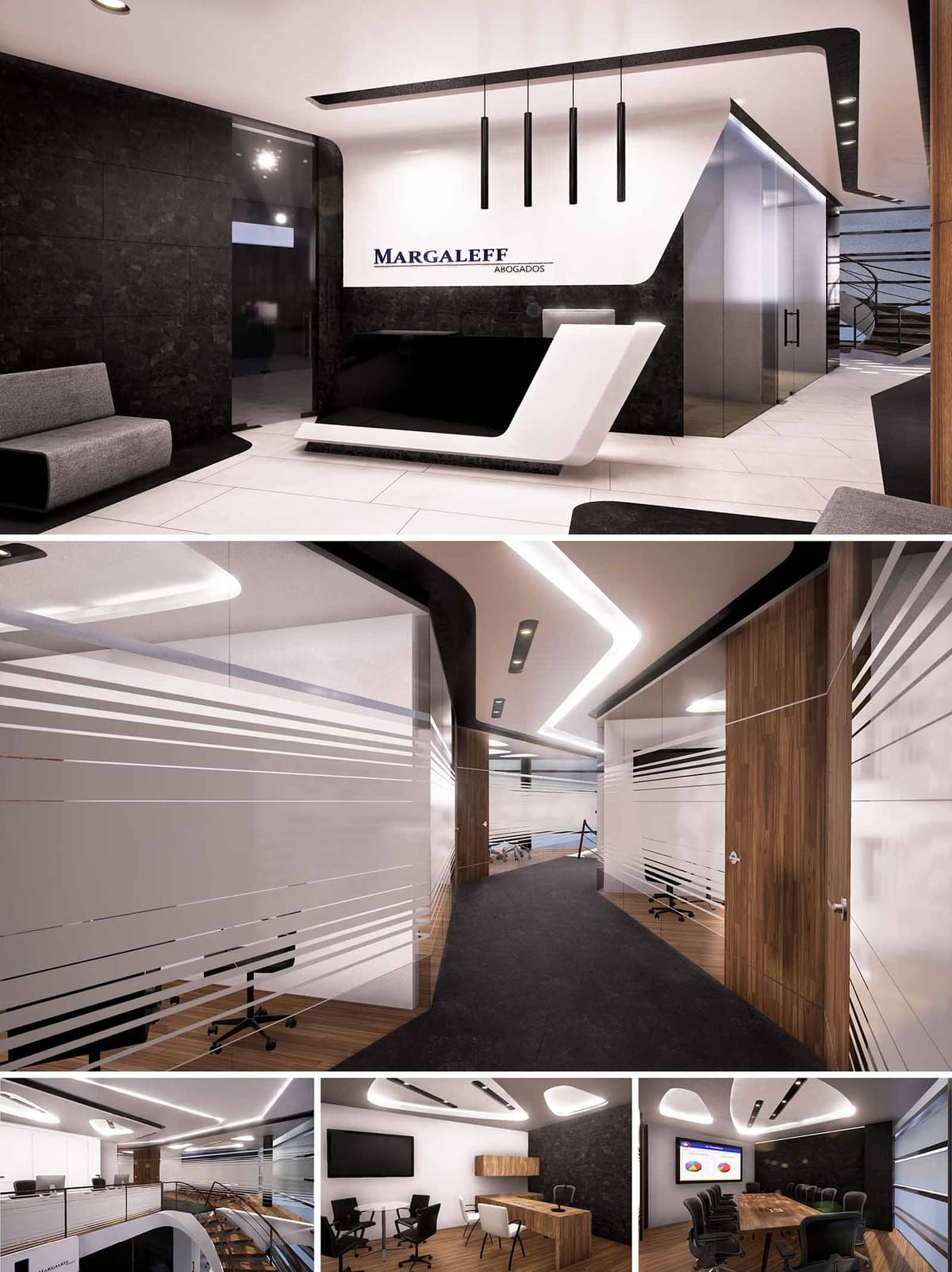

MARGALEFF OFFICES is conceived as a contemporary corporate space for a law firm in Cancún, where precision and clarity define both the image and the experience. The design language uses clean, dynamic lines to convey trust, rigor and forward-thinking practice, avoiding excessive ornament in favor of a controlled, almost sculptural minimalism. Circulation, light and material transitions are orchestrated to guide visitors intuitively from reception to meeting areas, reinforcing the idea of a seamless, transparent legal process.
The overall composition balances contrasting elements: black and white planes, opaque and transparent surfaces, straight lines and softened curves. This duality reflects the legal profession’s need for both firmness and flexibility, while giving the office a distinctive identity within a competitive corporate landscape.
The reception acts as a visual manifesto of the project. A monolithic counter in black and white lacquered finishes emerges as a sculpted volume that anchors the entrance. Its angular geometry and cantilevered gesture introduce a strong architectural statement, complemented by vertical linear pendants that emphasize height and mark the front-desk area. Behind, a dark textured wall forms an elegant backdrop for the firm’s signage, enhancing legibility and brand presence.
The lobby is resolved with light porcelain flooring and dark wall cladding, creating a calm contrast that frames the seating islands. Furniture remains low and orthogonal, allowing the architectural envelope and lighting to take protagonism. The ceiling features an integrated lighting profile that extends toward the circulation core, subtly directing visitors toward the inner offices and meeting rooms.
The main corridor is conceived as a dynamic spine that structures the office layout. A continuous black floor strip runs along the passage, while the ceiling follows it with a sinuous recessed light line, generating a sense of motion and orientation. On both sides, full-height glass partitions with horizontal frosted bands provide controlled privacy, allowing visual permeability while protecting confidential activities within offices and meeting rooms.
Warm wood panels articulate doorways and solid partitions, softening the contrast between black and white and introducing a tactile, human dimension into the corporate environment. Beyond the enclosed offices, a double-height space with perimeter circulation and metal railings opens visual connections between levels, encouraging collaboration and visual interaction among teams.
The private offices and meeting rooms continue the same material language but with more intimate proportions. Executive offices combine dark accent walls with white ceilings and integrated indirect lighting, ensuring uniform illumination free of glare for prolonged work sessions. Built-in wood cabinetry and desks create a seamless integration between architecture and furniture, reducing visual noise and emphasizing order.
The main boardroom features a long wooden table as a central element, surrounded by ergonomic seating and equipped with large-format display technology. Acoustic control is supported by the use of soft finishes, articulated ceiling elements and controlled lighting levels, allowing clear communication and comfortable environments for negotiations and presentations.
The material palette is intentionally concise: porcelain tiles, textured dark stone-effect panels, warm wood veneers and high-performance glass. This restrained selection simplifies maintenance, ensures durability in Cancún’s humid climate and supports a timeless aesthetic less susceptible to rapid obsolescence. Glass partitions maximize natural light penetration, reducing dependence on artificial lighting during daytime hours.
LED linear fixtures and recessed luminaires are specified throughout the project for their low energy consumption and long lifespan. The lighting strategy is based on layered illumination, allowing scenes to be adjusted according to time of day and activity, thus optimizing energy use. Where possible, finishes are chosen from regional suppliers and with low-VOC content to improve indoor air quality. The open visual connections and transparent boundaries reduce the need for expansive enclosed spaces, optimizing the overall footprint and promoting a more efficient use of conditioned areas.
© 2021 by sanzpont [arquitectura] . Webpage by sanzpont [digital] . Innovative Digital Experiences
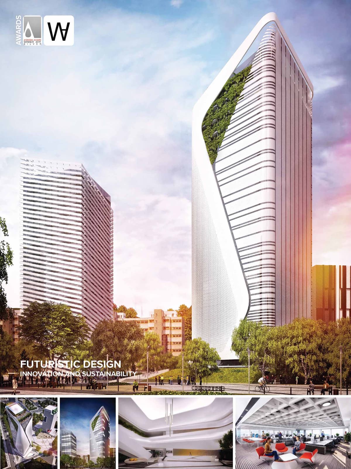

The futuristic design evokes concepts such as innovation and sustainability with the intention of creating a unique building. It stands with a clean and elegant skin and glass facade that opens into vertical gardens on some levels. The overall volume of the tower is conceived to engage in a dialogue with Rafael Moneo's "Puig Tower" which is located across the street. PE34 uses a similar color and material scheme as Moneo's tower, creating a visual balance between the two structures to be understand as a single entity.
PE34 is a new office tower in "Plaza de Europa" Barcelona, Spain. Designed by sanzpont [arquitectura], it will feature 22 stories with a total height of 92.80 meters from street level and more than 14,000 built square meters. Scale and Adaptation to the site: The building responds to the site by integrating itself into its surroundings, but highlighting its formal purity and intention. It stands in a dialogue with the "Puig Tower" both in maximum height allowed and facade scheme. It responds to an appropriate pedestrian scale by using a perimeter cantilever that gives hierarchy to the main entrance and its gardens.
The diagonal zigzag design in the facade accentuates the verticality of a curved smooth structure while creating a futuristic look. By integrating vertical gardens alongside solar controlled glass, the skin facade of the building is able to reduce energy consumption by being environmentally friendly.
CONSTRUCTION SYSTEM
The structure is conceived as a simple pillar system with a concrete core. The two-way slab (Holedeck) is a system of voided concrete slabs that can be pierced through their thickness by services and plumbing systems, drastically reducing up to 20% the height required to accommodate these building components.
By reducing the necessary height of each floor, fewer materials are required to achieve the same floor area as in a typical high-rise building. The spatial efficiency of floor decking systems has a dramatic effect on how tall buildings are planned, designed, and constructed.
The geometry of the floor provides excellent acoustic performance which absorbs a wide range of the sound spectrum.
CORPORATIVE IMAGE
Elegance: PE34 cutting edge image, is achieved by a sustainable design, with a high value of environmental responsibility, an elegance aesthetic resulting in a high level of comfort for its users and promoting the image of the business.
Designed to improve the life quality of the user: Design to follow architectural hedonism to create different experiences and comfort before, during and after the workday of all users.
Easy urban accessibility and bicycle parking. Access square with fountains, vegetation and relaxation areas. Flexible and comfortable diaphanous working spaces. Bistro and gardens to take breaks and rest. Ideal Lighting and thermal comfort to enhance work productivity. Fitness center to promote healthy living and a Roof top bar for social gatherings after the work day.
SUSTAINABILITY
The project contemplates proposals of sustainability that respect the natural environment, take advantage of the renewable energies and contribute well-being and health of the professionals who make use of the building in a daily way. The architecture is conditioned to the sunning and its design uses strategically solar control elements allowing a clear visual to the outside with a better thermal comfort.
NZEB is the acronym for Nearly Zero Energy Building or building with almost zero energy consumption. The European Energy Efficiency Directives establish a regulation whose objective is to promote the use of renewable energies, energy efficient constructive strategies and solutions of lighting and conditioning that reduce consumption to the maximum.
LOCATION & TRANSPORT
In direct connection with public transportation - Bicycle parking.
SUSTAINABLE SITES
The project considers aspects of sustainable use in terms of respect for local habitats and storm water management, and also generates green spaces to mitigate the heat island effect.
WATER EFFICIENCY
A smarter use of potable water, both inside and outside the building, is encouraged by using technologies to reduce consumption, efficient facilities, water recycling, as well as its control and measurement.
ENERGY & ATMOSPHERE
Strategies are considered to reduce energy consumption and increase the efficiency of the building, making use of renewable energy for natural lighting and the generation of energy, through solar photovoltaic panels, located on the roof. Efficient installations are also very important, as well as the artificial lighting system, which is posed with high efficiency LED system.
MATERIALS & RESOURCES
The selection of responsible and local materials minimizes the amount of waste in the construction process, as well as materials with recycled components and of low environmental impact. The facades propose the use of extra-stable solar control glass "SGG COOL LITE" to regulate the temperature, save energy and reduce the consumption of air conditioning, improving visual comfort by reducing the sun glare.
2 INTERNATIONAL ARCHITECTURE AWARDS
• A’ Design Awards, Milan, Italy : Gold Medal - Certificate Of Excellence in Building and Structure Design Category : PE34 (2018-2019)
• World Architecture Awards 10+5+X : Designed Category : PE34 (2018)


2 INTERNATIONAL ARCHITECTURE AWARDS
• A’ Design Awards, Milan, Italy : Gold Medal - Certificate Of Excellence in Building and Structure Design Category : PE34 (2018-2019)
• World Architecture Awards 10+5+X : Designed Category : PE34 (2018)
The futuristic design evokes concepts such as innovation and sustainability with the intention of creating a unique building. It stands with a clean and elegant skin and glass facade that opens into vertical gardens on some levels. The overall volume of the tower is conceived to engage in a dialogue with Rafael Moneo's "Puig Tower" which is located across the street. PE34 uses a similar color and material scheme as Moneo's tower, creating a visual balance between the two structures to be understand as a single entity.
PE34 is a new office tower in "Plaza de Europa" Barcelona, Spain. Designed by sanzpont [arquitectura], it will feature 22 stories with a total height of 92.80 meters from street level and more than 14,000 built square meters. Scale and Adaptation to the site: The building responds to the site by integrating itself into its surroundings, but highlighting its formal purity and intention. It stands in a dialogue with the "Puig Tower" both in maximum height allowed and facade scheme. It responds to an appropriate pedestrian scale by using a perimeter cantilever that gives hierarchy to the main entrance and its gardens.
The diagonal zigzag design in the facade accentuates the verticality of a curved smooth structure while creating a futuristic look. By integrating vertical gardens alongside solar controlled glass, the skin facade of the building is able to reduce energy consumption by being environmentally friendly.
CONSTRUCTION SYSTEM
The structure is conceived as a simple pillar system with a concrete core. The two-way slab (Holedeck) is a system of voided concrete slabs that can be pierced through their thickness by services and plumbing systems, drastically reducing up to 20% the height required to accommodate these building components.
By reducing the necessary height of each floor, fewer materials are required to achieve the same floor area as in a typical high-rise building. The spatial efficiency of floor decking systems has a dramatic effect on how tall buildings are planned, designed, and constructed.
The geometry of the floor provides excellent acoustic performance which absorbs a wide range of the sound spectrum.
CORPORATIVE IMAGE
Elegance: PE34 cutting edge image, is achieved by a sustainable design, with a high value of environmental responsibility, an elegance aesthetic resulting in a high level of comfort for its users and promoting the image of the business.
Designed to improve the life quality of the user: Design to follow architectural hedonism to create different experiences and comfort before, during and after the workday of all users.
Easy urban accessibility and bicycle parking. Access square with fountains, vegetation and relaxation areas. Flexible and comfortable diaphanous working spaces. Bistro and gardens to take breaks and rest. Ideal Lighting and thermal comfort to enhance work productivity. Fitness center to promote healthy living and a Roof top bar for social gatherings after the work day.
SUSTAINABILITY
The project contemplates proposals of sustainability that respect the natural environment, take advantage of the renewable energies and contribute well-being and health of the professionals who make use of the building in a daily way. The architecture is conditioned to the sunning and its design uses strategically solar control elements allowing a clear visual to the outside with a better thermal comfort.
NZEB is the acronym for Nearly Zero Energy Building or building with almost zero energy consumption. The European Energy Efficiency Directives establish a regulation whose objective is to promote the use of renewable energies, energy efficient constructive strategies and solutions of lighting and conditioning that reduce consumption to the maximum.
LOCATION & TRANSPORT
In direct connection with public transportation - Bicycle parking.
SUSTAINABLE SITES
The project considers aspects of sustainable use in terms of respect for local habitats and storm water management, and also generates green spaces to mitigate the heat island effect.
WATER EFFICIENCY
A smarter use of potable water, both inside and outside the building, is encouraged by using technologies to reduce consumption, efficient facilities, water recycling, as well as its control and measurement.
ENERGY & ATMOSPHERE
Strategies are considered to reduce energy consumption and increase the efficiency of the building, making use of renewable energy for natural lighting and the generation of energy, through solar photovoltaic panels, located on the roof. Efficient installations are also very important, as well as the artificial lighting system, which is posed with high efficiency LED system.
MATERIALS & RESOURCES
The selection of responsible and local materials minimizes the amount of waste in the construction process, as well as materials with recycled components and of low environmental impact. The facades propose the use of extra-stable solar control glass "SGG COOL LITE" to regulate the temperature, save energy and reduce the consumption of air conditioning, improving visual comfort by reducing the sun glare.
© 2021 by sanzpont [arquitectura] . Webpage by sanzpont [digital] . Innovative Digital Experiences
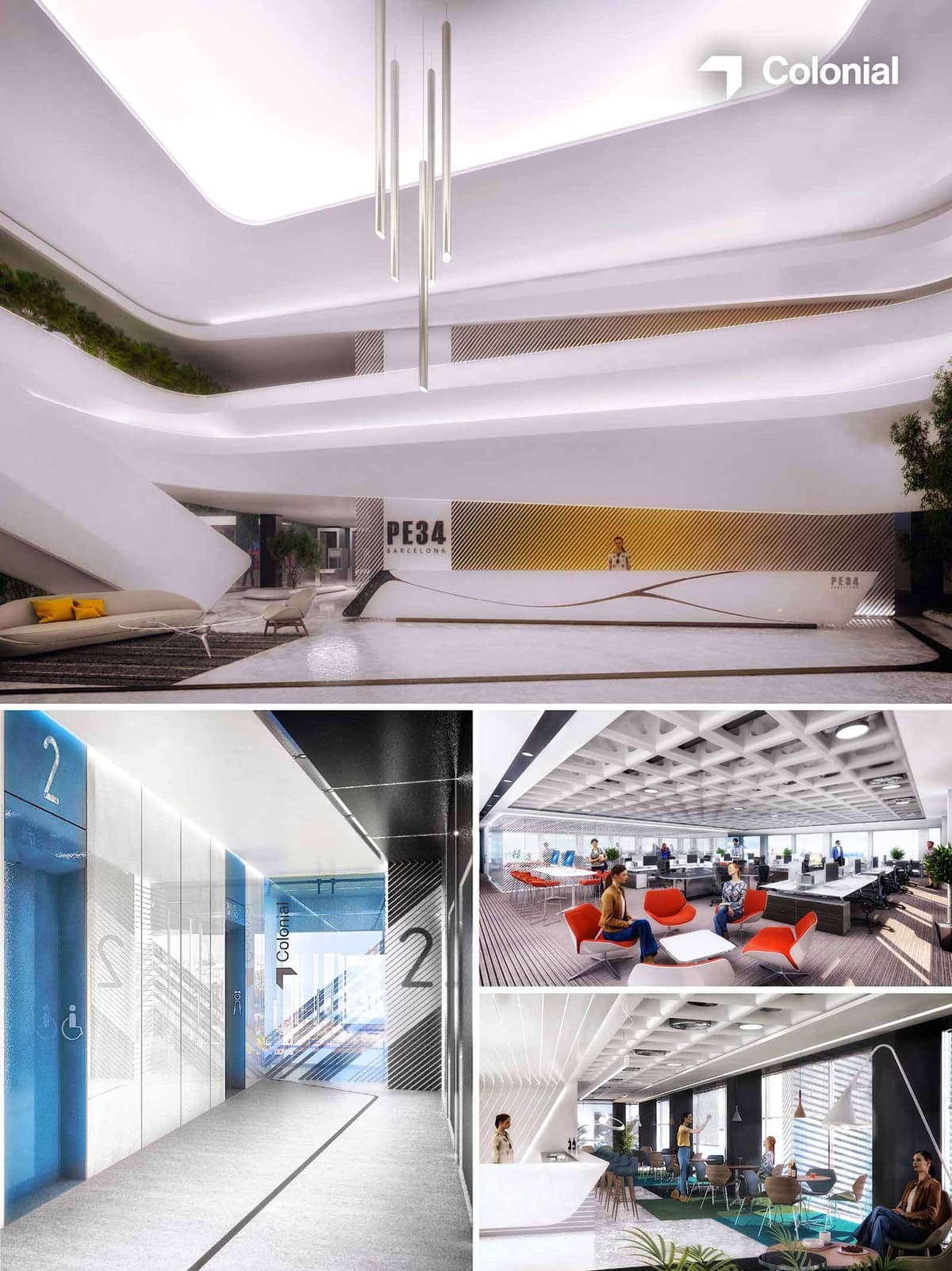

PE34 OFFICES proposes a contemporary corporate environment where fluidity, light and comfort articulate a new workplace paradigm in Barcelona. The project transforms the traditional office into a continuous landscape of interaction, dissolving rigid boundaries between lobby, circulation and workspace. Large sculpted surfaces, controlled lighting and a calibrated color palette build a strong identity for the building, supporting both the institutional character of the client and the dynamism of the users.
The concept is based on three main ideas: a sinuous ground-floor lobby acting as an interior urban plaza; legible and vibrant circulation cores as orientation landmarks; and flexible, high-performance office floors organized around collaboration hubs. These three strata are visually connected by a common language of linear light, diagonal textures and soft-radius geometries.
The entrance lobby unfolds as a multi-height atrium where balconies, ramps and voids interlock to create a sense of sculptural continuity. Horizontal white bands wrap the space, hiding technical elements and integrating indirect lighting, while the reception desk and vertical cores anchor the composition. Generous setbacks around the perimeter allow the integration of greenery, soft seating and informal waiting areas, turning circulation into a place of stay.
On the standard office floors, the layout prioritizes open-plan workstations with clear transversal views. Work islands are interspersed with lounges and touchdown points, encouraging spontaneous exchanges. The ceiling grid and lighting lines emphasize longitudinal perspectives, facilitating orientation. Perimeter zones alternate between focused work niches and social areas, adapting to varying degrees of privacy.
The palette combines warm minimalism with precise graphic accents. Continuous white surfaces in plaster and lacquered finishes generate a neutral envelope that magnifies natural light. Against this background, metallic meshes and ribbed panels introduce depth and subtly reflect movement, especially in the lobby front desk where a gradient from gold to silver underlines the corporate image of PE34.
Color is applied in concentrated fields to mark uses and transitions. Intense blues identify vertical cores and elevator lobbies, while orange and red seating pieces animate meeting points and waiting areas. Carpets and vinyl flooring in greys and charcoal define circulation carpets, reinforcing spatial hierarchy. Linear pendant luminaires and recessed LED profiles ensure uniform illumination while accentuating the curvature of walls and soffits, giving the building a distinctive nighttime presence.
The work environment is designed to support multiple modes of activity, from concentrated individual tasks to collaborative sessions and informal meetings. Desking systems are arranged in bench configurations for maximum flexibility, allowing quick reconfiguration as teams evolve. Acoustic performance is addressed through the exposed coffered slabs combined with absorptive panels and textile elements, ensuring comfort in open-plan areas.
Furniture selection combines ergonomic task chairs with more domestic lounge elements, softening the corporate atmosphere. Low tables, upholstered armchairs and bar-height counters provide alternative postures and foster a sense of community. In the break-out and café zones, lighter chairs and playful colors suggest a more relaxed rhythm, contributing to well-being and promoting informal interaction between different departments.
Sustainability is approached through the integration of passive and active measures, targeting both environmental performance and user comfort. The building envelope and interior layout are conceived to maximize daylight penetration, reducing artificial lighting demand while carefully controlling glare with external louvers and adjustable internal screens. High-efficiency LED systems, presence detectors and daylight sensors further limit energy consumption in circulation and office areas.
Material choices prioritize durability and low maintenance, with an emphasis on recyclable metals, long-life floor finishes and modular ceiling systems that facilitate adaptation over time, extending the life cycle of the fit-out. Interior planting and green walls in the lobby and common areas improve air quality and create a biophilic connection in an urban context. Generous visual openness, access to shared amenities and the provision of varied work settings all contribute to a healthier, more resilient working environment aligned with contemporary sustainability and ESG standards.
© 2021 by sanzpont [arquitectura] . Webpage by sanzpont [digital] . Innovative Digital Experiences
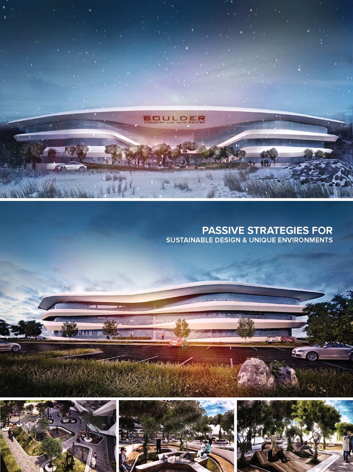

DESIGN CONCEPT
Ground Breaking and Iconic building for todays nexus of creativity, technology and arts for Collaborative and Creative Work Spaces at Boulder Colorado. Housing open and strategically planned spaces for professionals bringing a node of productivity and creativity hub for business, recreation, modern living, dining, and offering a connected sense of community and network. Boulder Industry and Arts Center will be located across street of new Google campus at Boulder Colorado. The design of the building is based on the premise of passive design and low energy consumption.
© 2021 by sanzpont [arquitectura] . Webpage by sanzpont [digital] . Innovative Digital Experiences
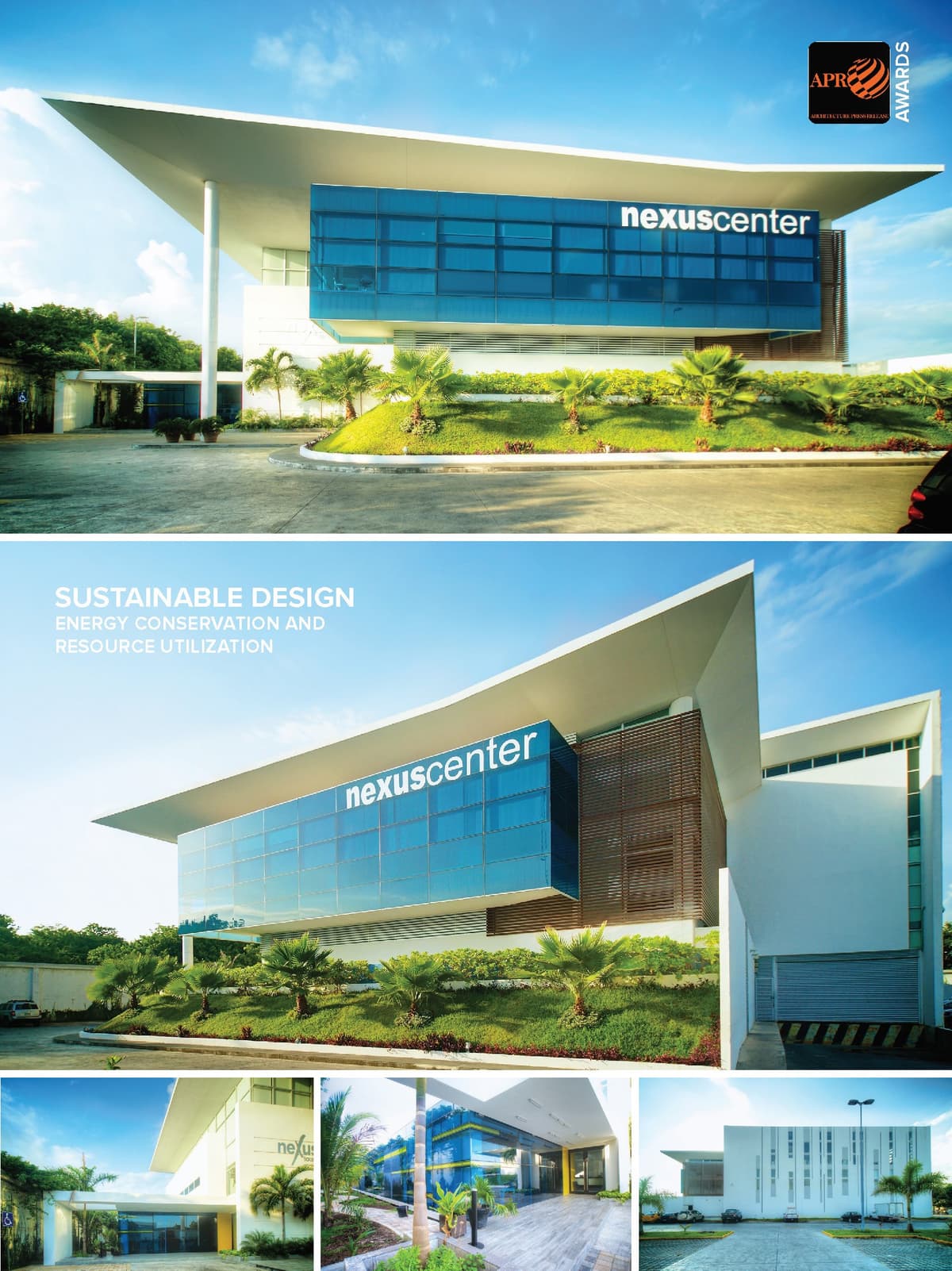

The design concept is based in the functional pyramid scheme. The formal idea of the building is based on the functional concept of integration of the levels with the general management shape at the middle level between the two. Being north facade, this body management is proposed as a floating glass box. The blind skin facing west and the large overhangs are to prevent direct sunlight inland from the other directions. The Scheme of the company is a "pyramid" with the area of product storage and distribution infrastructure as a base, followed by the management and administration of the company and at the top of the pyramid of the hierarchy of the steering.
Hierarchical space distribution. Corporate building of three companies, "Sunglass Island", "Watch My Watch" and "Nexus Center". The surface of 3,976 sqm on 113'375 sqm developed on 3 levels with a hierarchical front apparently floating cube housing management offices. The ground floor is occupied by the storage area of products for 3 companies and has platforms for loading and unloading. The first floor has the company offices and on the second floor are the "Watch My Watch" and "Nexus offices. "The front of the building has a glass volume, "Floating Cube" in the middle level between the first and second floor. The exterior of the building has parking for 190 cars.
The "Floating Cube" is facing north and therefore avoid direct sunlight and only receives incoming diffuse daylight. Large overhangs provide shade to all windows while allowing sunlight into the interior. Artificial light low power LED gives a more dramatic effect at night.
Functional analysis according to the organizational chart. Considering this analysis, we develop a project in which the function of the building scheme reflect and solve spaces according to the scheme of the business group.
Energy Conservation and Resource Utilization. The building is designed and conceived through the weather, meeting the needs of comfort with minimum energy expenditure. This is accomplished through a passive solar design that takes advantage of renewable natural energy to achieve greater comfort with respect for the environment through sustainable design.
• Optimal Design: Workspaces and Recreation.
• Natural lighting: Windows are designed to capture natural light to provide optimal daytime lighting and electricity costs are reduced.
• Sunlighting protection: The sunlight is considered for the design of facades, covering frilly, eaves or window louvers type elements, to avoid heat gain and energy savings in air conditioning.
• Directive functionality: The scheme function of this project is based on the policy side is located at an intermediate level between the two companies to better management.
• Open spaces: Very large spaces are created in the work areas to have a free organization of spaces and cubicles, thus providing a better workplace.
• Warehouses and workshops: The building has a large storage area and workshops located on the ground floor with optimal access and logistics.
• Surveillance and Security: The corporate has a restricted access to protect it from the outside, the entrance is guarded 24 hours a day to control entry and exit, also has a closed loop system.
• Employees dining: Having a place to eat in peace and rest your food is important, spacious, well lit and with all the necessary services eaters.
• Parking: It has a large area around the building with green areas and ample parking inside.
© 2021 by sanzpont [arquitectura] . Webpage by sanzpont [digital] . Innovative Digital Experiences
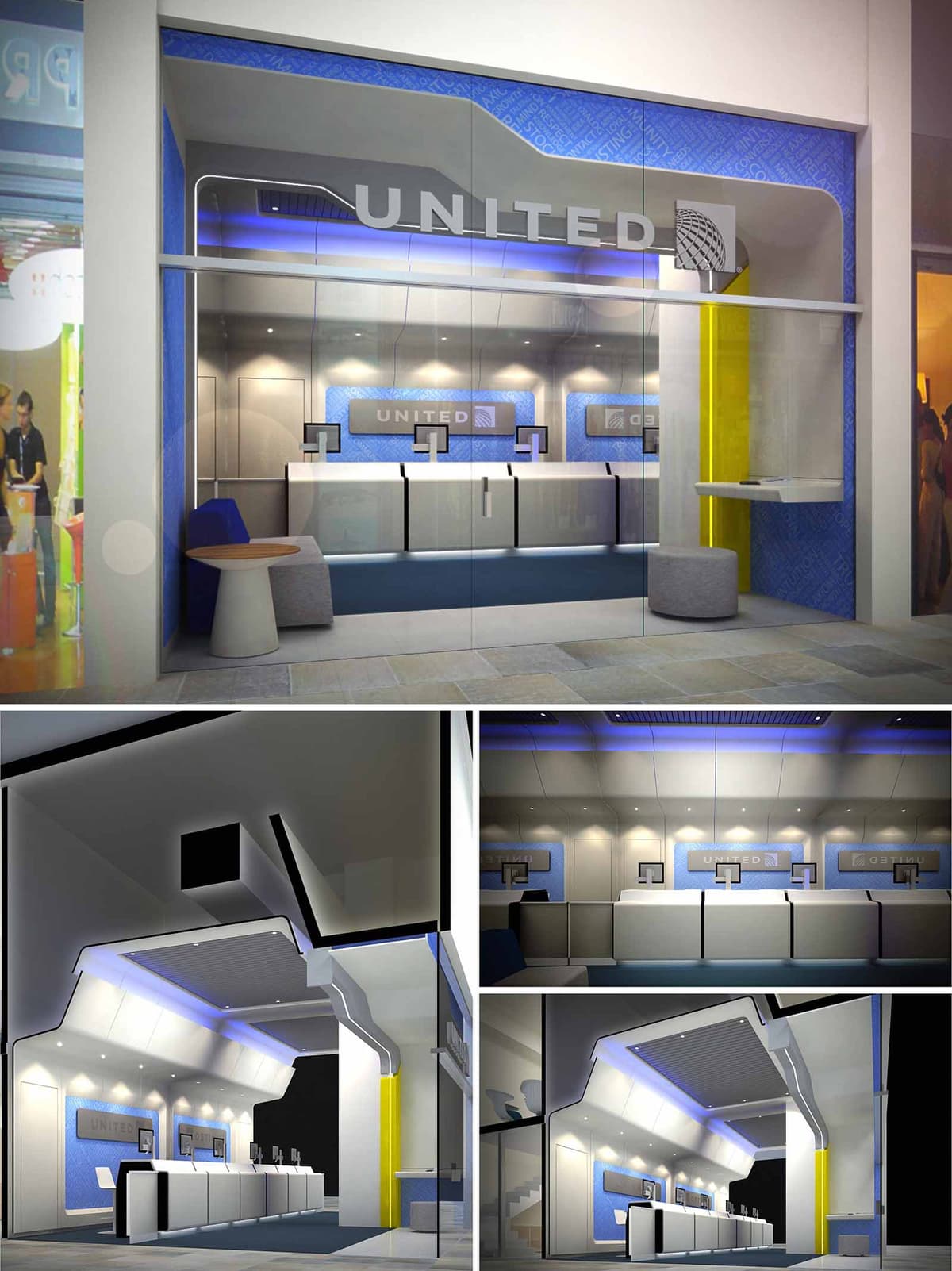

The United Airlines CTO space in Santa Fe is conceived as a three-dimensional translation of the airline experience, bringing the language of aircraft cabins and jetways into a compact commercial front. The design emphasizes dynamism, clarity of orientation, and a sense of technological precision, reflecting the identity of an international carrier while responding to the high-traffic context of a corporate and retail hub.
The envelope is treated as a continuous fuselage-like shell that folds from ceiling to façade and frames the check-in counters in a single gesture. This sculpted geometry guides the eye from the public corridor into the service area, reinforcing a narrative of movement, boarding, and connection. The overall image projects efficiency and reliability, while remaining approachable and human-scaled.
The plan is organized as a linear sequence parallel to the storefront, optimizing visibility and user flow. A generous front zone behind the glass façade acts as a transition foyer, allowing users to read information, queue comfortably, or wait, without obstructing circulation in the mall.
The check-in line is set back slightly from the glass, creating a clear queueing corridor that intuitively orients passengers toward the service desks. Counters are modular and rhythmically repeated, allowing flexible staffing levels and easy reconfiguration. Peripheral niches integrate seating, informal work surfaces, and secondary services, making efficient use of the narrow depth of the unit.
The dominant volumetric element is a folded canopy that originates at the storefront and extends deep into the space. Its sharp, faceted geometry recalls the aerodynamic profiles of an aircraft wing, while also concealing technical systems such as air conditioning, cabling, and indirect lighting.
Recessed linear LED strips and perimeter cove lighting wash the ceiling planes, emphasizing the broken, angular forms and producing a floating effect over the counters. Accent blue lighting introduces a subtle chromatic gradient that reinforces brand recognition and contributes to a calm, travel-oriented atmosphere. Downlights over the work surfaces ensure optimal visual comfort and task illumination, reducing glare on screens and documents.
The material palette combines high-performance laminates, back-painted glass, and metal finishes in a controlled range of whites, grays, and blues. This restrained composition produces a clean, technical aesthetic aligned with aeronautical engineering and contemporary corporate architecture.
Blue wall panels with subtle graphic patterns form a continuous backdrop for the counters, integrating the airline’s visual identity without resorting to excessive signage. White and light gray surfaces maximize light diffusion and maintain visual clarity, while a contrasting yellow vertical plane at the side introduces a single, vivid accent that anchors the entrance and aids wayfinding. Upholstered seating elements and a small timber side table introduce tactile warmth within the otherwise sleek environment.
The counters are designed as hybrid analog-digital stations, with integrated monitors and equipment concealed within minimalist volumes to avoid visual clutter. The height and depth of the worktops are calibrated for ergonomic interaction between staff and passengers, facilitating document handling, device placement, and accessibility for people with reduced mobility.
Wall-mounted screens behind the counters act as both branding devices and dynamic information carriers, capable of displaying destinations, promotions, or operational messages. This layered information strategy ensures that essential content is legible from the corridor as well as from within the space, enhancing communication and operational flexibility.
Sustainability is approached through efficient systems, durable materials, and adaptable design. LED lighting throughout the project minimizes energy consumption and maintenance, while the indirect lighting strategy reduces the number of fixtures required to achieve uniform illumination. The bright, reflective interior surfaces contribute to higher light efficacy, allowing lower installed wattage.
Materials are selected for longevity and ease of cleaning in a high-traffic commercial environment, reducing replacement cycles and associated environmental impact. Modular counter components and demountable wall panels enable future reconfiguration, extending the service life of the fit-out and minimizing construction waste. The fully glazed façade optimizes visual connection and relies on the mall’s existing climate control, reducing the need for extensive additional HVAC equipment within the unit.
© 2021 by sanzpont [arquitectura] . Webpage by sanzpont [digital] . Innovative Digital Experiences
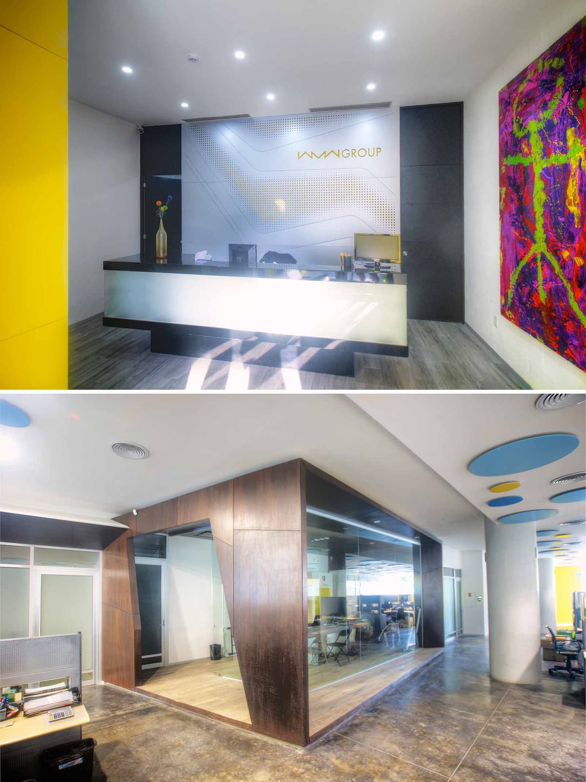

The WMW Corporative Offices in Cancún are conceived as a contemporary and dynamic workplace that reflects the energy of a growing corporate group in a Caribbean context. The design language combines precise geometric lines with bold color accents to express innovation, agility and transparency. Public and private zones are articulated through clear volumetric gestures and contrasting materials, generating a legible hierarchy from reception to work areas.
The concept prioritizes openness and visual continuity, using glass enclosures and large interior windows to maintain connection between teams while preserving acoustic control. The overall spatial narrative moves from a solid, representative reception front to lighter, permeable office and meeting spaces, echoing the firm’s evolution from stability to forward-looking flexibility.
The reception area operates as the main branding device of the project. A backlit counter with a translucent front panel floats above a dark plinth, creating a strong horizontal datum that anchors the entrance. Behind it, a custom graphic wall integrates the corporate logo with a perforated and layered pattern inspired by digital interfaces, emphasizing the company’s technological profile.
Vertical planes in intense yellow act as visual beacons that guide visitors from the main access to the reception desk. These color fields are balanced by neutral walls and a light-toned wood-effect floor, avoiding visual saturation while framing the artwork and corporate elements. A large-format, vibrant painting introduces an artistic and human dimension, softening the corporate atmosphere and reinforcing the creative character of the company.
The interior plan is structured around a central sequence of enclosed meeting rooms, conceived as “boxes within the box” that organize the surrounding open workstations. These central volumes free the perimeter for circulation and work areas, ensuring fluid movement and good visual control. The meeting rooms are predominantly glazed, allowing natural light to penetrate deep into the floor plate and maintaining a sense of openness.
Circulation paths are intuitively defined by the alignment of glass partitions, material changes on the floor and ceiling accents. The workspace is set up as a flexible open-plan environment, with modular furniture that can be reconfigured according to team needs. The transparent corners of the meeting volumes encourage informal interaction and visual contact, avoiding isolated or opaque enclosures.
The project combines a restrained base palette with deliberate chromatic interventions. Polished concrete and vinyl or laminate floors provide durability and easy maintenance suitable for intensive corporate use. Dark wood cladding wraps the meeting-room volumes, introducing warmth and a sense of gravitas that contrasts with the lighter reception area.
Ceilings incorporate circular acoustic elements in blue and yellow, functioning both as visual markers and as sound-absorbing components. Recessed downlights and linear fixtures create uniform ambient illumination, while accent lighting over the reception counter and artwork emphasizes key focal points. The controlled use of reflective glass and light-colored surfaces helps to distribute natural light, reducing the need for artificial lighting during daytime.
Sustainability is addressed through passive and active strategies focused on energy efficiency and user well-being. The predominance of interior glazing optimizes the distribution of daylight, minimizing reliance on artificial lighting in the open work areas. LED luminaires with high efficiency and long life cycles reduce energy consumption and maintenance demands.
Material selection favors durable finishes that age well in the humid climate of Cancún, reducing the frequency of replacement and associated waste. The polished concrete floors and high-pressure laminates are low-maintenance and compatible with environmentally responsible cleaning products. Acoustic panels in the ceiling improve sound quality in open-plan zones, enhancing comfort and productivity. The spatial transparency, visual connection to collaborative areas and integration of art and color contribute to a healthy, stimulating work environment aligned with contemporary sustainable office standards.
© 2021 by sanzpont [arquitectura] . Webpage by sanzpont [digital] . Innovative Digital Experiences
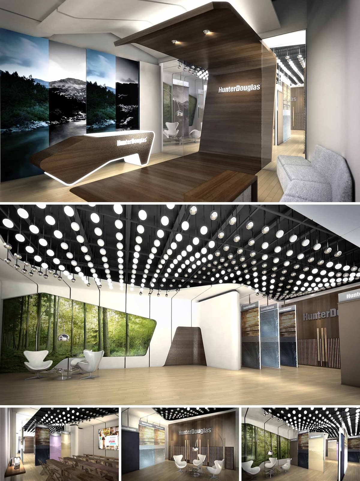

The Hunter Douglas corporate space in Cancún is conceived as an immersive brand gallery where architecture, product and landscape imagery converge. The design revolves around fluid, folded planes that grow from floor to ceiling to form reception desks, display backdrops and soffits, expressing the company’s expertise in surface modulation and envelope systems. A neutral architectural shell is activated with strong longitudinal perspectives, guiding visitors through a curated sequence of experiences that move from reception to exhibition, meeting zones and training areas.
The conceptual language balances precision and warmth. Clean geometries, sharp edges and backlit profiles evoke technological rigor, while wood finishes and large-format nature graphics introduce a human, tactile dimension. This duality underscores the brand’s positioning between innovation and comfort in interior shading and façade solutions.
The layout operates as a linear promenade. Upon entering, visitors encounter a sculptural reception desk that extends seamlessly into a ceiling plane, establishing an immediate sense of direction and hierarchy. From here, circulation flows along the perimeter, keeping the central area open and flexible to accommodate demonstrations, small events or temporary product installations.
Programmatic zones are layered in depth: an initial welcome and waiting area, followed by consultation niches, a main product gallery, and finally a training and presentation space. Glass partitions and large, continuous wall surfaces keep visual connections open, allowing users to understand the overall configuration at a glance while maintaining acoustical and functional separation where needed.
The predominant material is a warm-toned wood veneer, used on horizontal and vertical surfaces to craft monolithic volumes. This is complemented by light-colored vinyl or engineered wood flooring that enhances continuity and reflects light. The neutral gray seating and white display elements act as quiet counterparts, ensuring that Hunter Douglas products and the large-scale nature graphics remain the primary visual focus.
Strategically placed high-gloss and glass panels introduce reflection and depth, amplifying the perceived scale of the interior. Dark structural elements in the ceiling, combined with the grid of circular luminaires, generate a strong visual canopy that both frames and contrasts with the bright exhibition surfaces below.
The ceiling is treated as a luminous field, composed of a dense matrix of recessed and pendant circular fixtures. This configuration provides uniform ambient lighting while creating a recognizable signature element that reinforces the brand experience. The grid is modulated in density over key areas, accentuating the main gallery and reception zones.
Task and accent lighting are integrated into the wooden folds and display walls, using concealed linear LEDs to highlight textures and products without visible sources. The combination of warm white general light with selective, cooler accents allows precise color rendering of fabrics, slats and finishes, essential in a commercial specification environment.
Large-format photographic panels of forests and natural landscapes establish a visual narrative that links the brand with themes of daylight, views and environmental connection. These images are framed by angular, faceted edges that echo the geometry of blinds and louvers, subtly referencing core products without literal representation.
Brand signage is integrated into the architecture, backlit within wooden planes or aligned with product displays to maintain coherence. Comfortable seating clusters with iconic modern chairs invite informal discussions, while a more structured classroom-style area supports training sessions for designers, installers and clients, reflecting the space’s dual role as showroom and learning hub.
The design emphasizes responsible material selection and optimized lighting. Engineered wood products and veneers are specified with preference for certified or low-emission sources, reducing reliance on solid timber and improving dimensional stability in the humid Cancún climate. High-reflectance interior surfaces maximize the efficiency of the lighting system, allowing lower wattage fixtures while achieving required illumination levels.
The extensive use of LED technology significantly reduces energy consumption and maintenance, particularly important for a commercial space with long operating hours. Daylight, filtered through Hunter Douglas shading systems, can be modulated to control glare and heat gain, serving both as a live demonstration of product performance and as a genuine strategy for thermal and visual comfort. Flexible, demountable display structures enable reconfiguration and reuse, extending the life cycle of the fit-out and minimizing future waste.
© 2021 by sanzpont [arquitectura] . Webpage by sanzpont [digital] . Innovative Digital Experiences
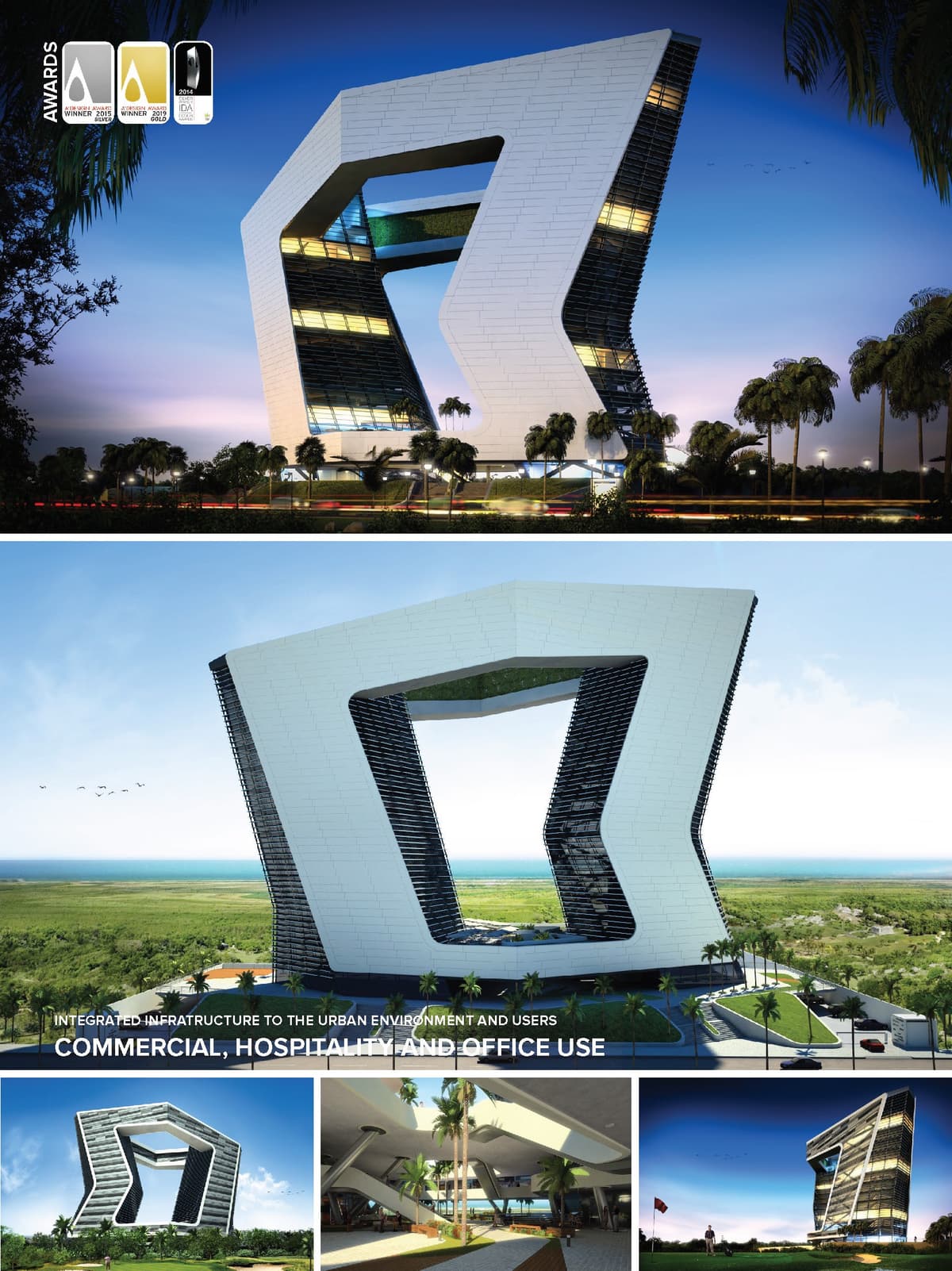

20 story tower, destinated for commercial, hospitality and office use. The building consists in 2 vertical bodies that meet at the top by 2 habitable bridges with an interior garden to form a large frame of the natural landscape. The building is protected from the sun in its west side by a "ventilated facade" of Alucobond flaky and indirect light is filtered inside between the horizontal slats of its outline.
On the Eastern front, the skin of the building is designed with a set of silkscreened, and transparent crystals sandblasteados advantage of the views of the golf course in Cancun and the Caribbean Sea. It has 2 parking levels integrated vegetated slope and high public square that generates a large urban balcony.
The interior design of the Mall in the early levels, expresses dynamism and spatial continuity invite another climb even higher to sit and have a coffee and enjoy the view terrace. In addition, the building opened to the public the opportunity to rise further, as it has a gazebo lounge restaurant on the top level. Thus, this vertical infrastructure with the inhabitant of the city and its urban environment is integrated.
• A’ Design Awards, Milán, Italy : Bronze Medal - Certificate of Excellence in World Architecture & Structure Design: GSI Tower (2015)
• IDA Design Awards, Los Angeles, USA : Silver Medal - Conceptual Architecture Design : GSI Tower, Cancún (2014)


• A’ Design Awards, Milán, Italy : Bronze Medal - Certificate of Excellence in World Architecture & Structure Design: GSI Tower (2015)
• IDA Design Awards, Los Angeles, USA : Silver Medal - Conceptual Architecture Design : GSI Tower, Cancún (2014)
20 story tower, destinated for commercial, hospitality and office use. The building consists in 2 vertical bodies that meet at the top by 2 habitable bridges with an interior garden to form a large frame of the natural landscape. The building is protected from the sun in its west side by a "ventilated facade" of Alucobond flaky and indirect light is filtered inside between the horizontal slats of its outline.
On the Eastern front, the skin of the building is designed with a set of silkscreened, and transparent crystals sandblasteados advantage of the views of the golf course in Cancun and the Caribbean Sea. It has 2 parking levels integrated vegetated slope and high public square that generates a large urban balcony.
The interior design of the Mall in the early levels, expresses dynamism and spatial continuity invite another climb even higher to sit and have a coffee and enjoy the view terrace. In addition, the building opened to the public the opportunity to rise further, as it has a gazebo lounge restaurant on the top level. Thus, this vertical infrastructure with the inhabitant of the city and its urban environment is integrated.
© 2021 by sanzpont [arquitectura] . Webpage by sanzpont [digital] . Innovative Digital Experiences
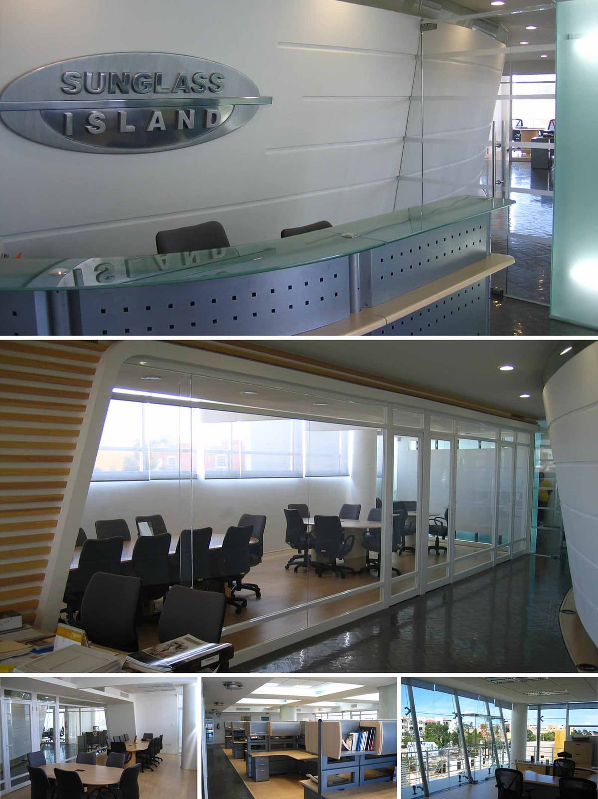

The Sunglass Island Offices in Cancún are conceived as a contemporary corporate landscape that evokes the brand’s association with light, clarity and coastal horizons. The interior language is guided by fluid, aerodynamic forms and a predominantly white envelope, contrasting with metal and glass elements that suggest precision and innovation. Curved surfaces, floating planes and transparent partitions create an office environment that feels simultaneously dynamic and serene, in tune with the coastal context of the city.
The reception area becomes a sculptural statement, where the company’s identity is embedded in a large metallic logo set against a subtly modelled white wall. This front desk and wall act as a visual anchor, establishing a clean, luminous aesthetic that is continued throughout the workspaces and meeting rooms.
The project is structured around a central circulation spine that visually connects reception, meeting rooms and open office areas. This spine is emphasized by a continuous, gently curving wall and a polished dark floor finish that guides movement while reflecting natural and artificial light. The space unfolds progressively from more public to more private zones, ensuring a clear hierarchy of access and acoustic control.
Glazed partitions define meeting rooms and enclosed offices along the corridor, maintaining openness and visual continuity. Workstations are placed in open-plan clusters, improving communication and flexibility. Perimeter glazing with generous windows allows the main work areas to enjoy expansive views towards Cancún’s urban landscape, reinforcing employee connection to the exterior environment.
The material palette combines white plastered walls, laminated glass, perforated metal panels and light-toned wood floors. White surfaces serve as a neutral backdrop, amplifying natural light and creating a sense of cleanliness and corporate rigor. Metal and glass elements provide a high-tech character, while wood introduces warmth and tactile comfort to balance the overall atmosphere.
Artificial lighting is integrated through recessed downlights and linear fixtures carefully positioned to avoid glare on workstations while highlighting circulation and feature walls. In the meeting rooms, indirect lighting built into ceiling coves emphasizes the curved geometry of the interior envelope. The extensive use of transparent and translucent glass optimizes daylight penetration deep into the plan, reducing the reliance on artificial lighting during daytime hours.
Furniture solutions are modular and ergonomic, with generously dimensioned workstations that accommodate storage and technology needs. Task chairs and conference chairs are selected for long-term comfort, featuring neutral upholstery that harmonizes with the overall color scheme. The front desk, with its curved glass countertop and perforated metal fascia, becomes a functional sculpture that synthesizes the brand’s contemporary and coastal identity.
Meeting rooms are designed to be flexible, using large tables and mobile furniture layouts that can support collaborative work, training sessions and formal presentations. The tone-on-tone color composition—greys, whites and light woods—ensures a timeless aesthetic, allowing the brand logo and signage elements to stand out as primary accents.
Sustainability is addressed through an emphasis on natural light, energy efficiency and durable materials. The extensive perimeter glazing is oriented and shaded to capture daylight while controlling heat gain, reducing the dependence on artificial lighting and mechanical cooling in Cancún’s warm climate. Glass partitions inside the office transmit this daylight further into the core, diminishing the number of luminaires needed during working hours.
Materials have been selected for longevity and low maintenance, including robust floor finishes, high-quality laminates and metal components that resist corrosion in a coastal environment. The open-plan configuration encourages future adaptability, extending the lifecycle of the interior by allowing reconfiguration without major demolition. Combined with efficient lighting fixtures and an HVAC system sized according to real occupation patterns, these strategies contribute to a responsible, resource-conscious corporate workspace.
© 2021 by sanzpont [arquitectura] . Webpage by sanzpont [digital] . Innovative Digital Experiences
Client involvement and co-design are central to our approach, ensuring that each project reflects the unique needs and visions of those we serve. By actively engaging clients throughout the design process, we foster a collaborative environment where ideas flourish, resulting in spaces that are not only functional but also deeply personalized.
A project is not only about the result, is about enjoying the journey with the client.
At our firm, tailoring your dream workspace is our specialty. We meticulously craft each design to align with your specific business needs and aesthetic preferences. Our process is interactive and client-focused, ensuring that every element of your workspace supports productivity and embodies your corporate identity perfectly.
Sustainable and bioclimatic design focuses on environmental responsibility and energy efficiency. By integrating natural elements and innovative technologies, these designs enhance comfort, reduce energy consumption, and promote a healthier workplace, aligning modern office environments with ecological principles.
Our designs are user-focused, logical, and functional, tailored to meet the specific needs of those who inhabit the spaces we create. We prioritize intuitive layouts and smart solutions that enhance usability and efficiency. Every design decision is driven by a deep understanding of user interaction and operational flow, ensuring optimal functionality.
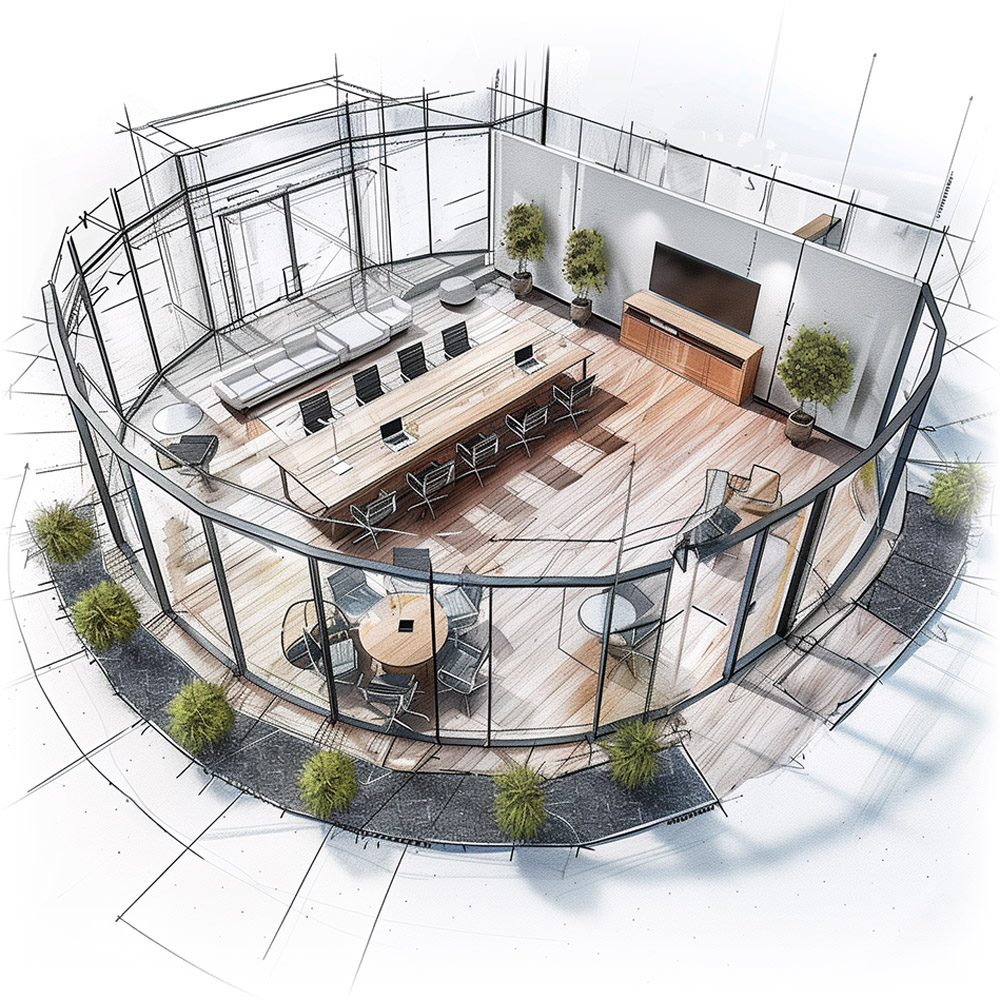
Our BIM (Building Information Modeling) projects workflow integrates advanced technology to streamline and enhance the design process. This method allows for precise, efficient planning and execution, enabling better coordination, cost management, and project visualization. With BIM, we ensure a seamless, collaborative, and high-quality construction process.
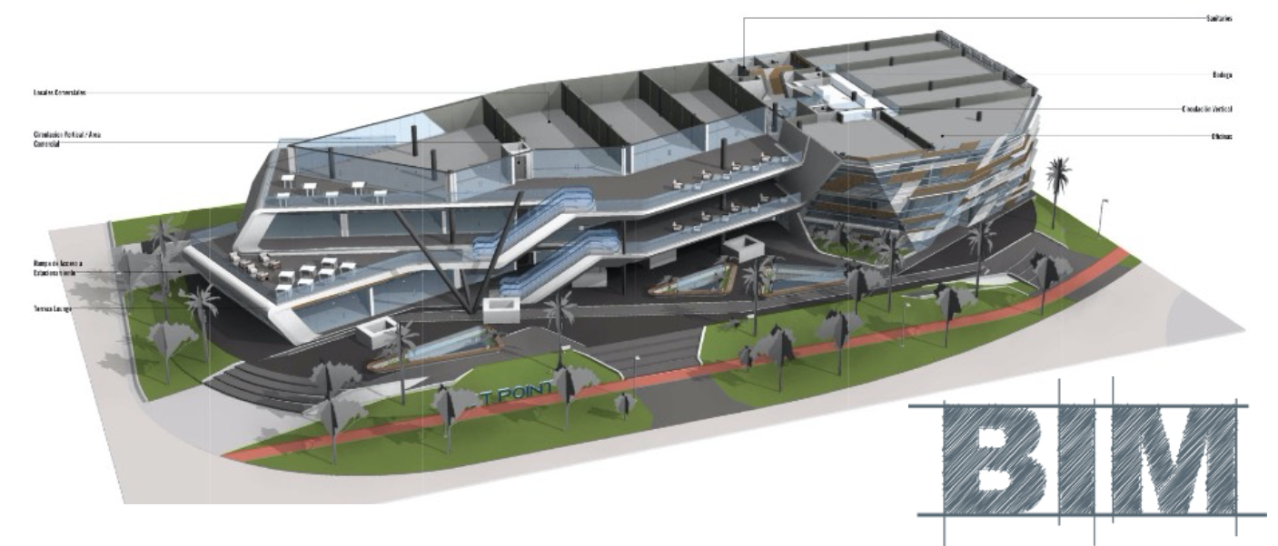
Our interactive visualizations bring your project to life before construction begins, offering a dynamic and immersive experience. These advanced tools enable you to explore design options and modifications in real-time, ensuring the final outcome perfectly aligns with your vision. This technology fosters deeper understanding and engagement throughout the design process.

Virtual Reality (VR) visualization lets you experience and refine your project before it's built, providing a clear sense of space and design. This real-time capability ensures accuracy, saves time, and prevents expensive modifications, enhancing decision-making and deepening your connection to the project's final vision.

At our core, we are a collective of creative minds, constantly pushing the boundaries of design and innovation. Our team thrives on challenging conventions and exploring new possibilities to create spaces that are not only functional but also artistically inspiring. We transform visions into realities, crafting environments that resonate and inspire.
We are acutely sensitive to project budgets, ensuring that our designs align with your financial parameters without compromising quality or functionality. Our strategic approach involves meticulous planning and resource management, allowing us to deliver exceptional workspaces that respect your budget and maximize your investment.
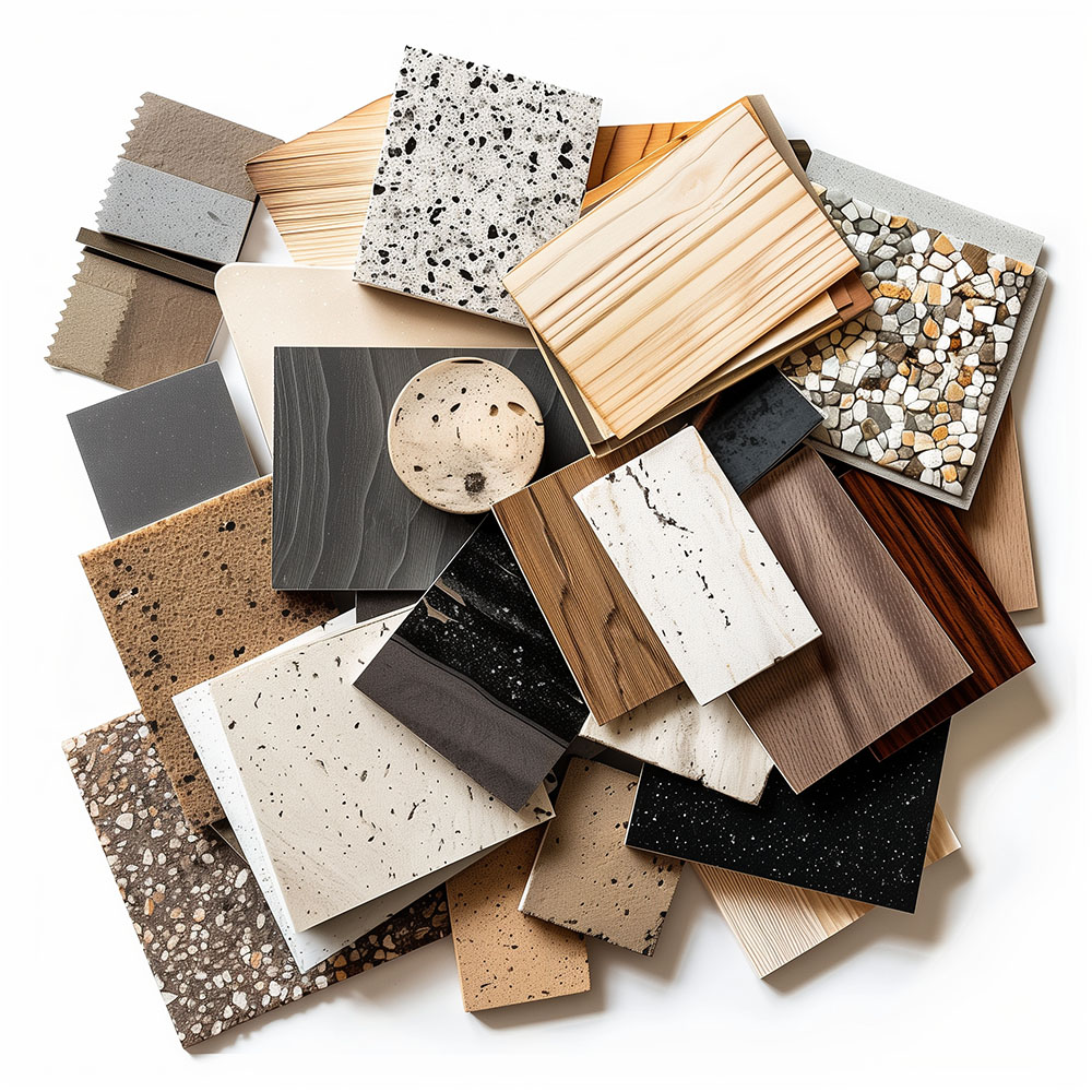
Our expertise in international designs allows us to create exceptional workspaces anywhere in the world. With a global perspective and adaptable strategies, we tailor designs to local cultures and environments while meeting universal standards of excellence. No matter where your business is located, we can craft your ideal workspace.
We prioritize local collaboration, working closely as a team with regional consultants to ensure our designs meet local regulations and community standards. This approach enriches our projects with local expertise and insight, guaranteeing that each project is not only compliant but also contextually integrated.
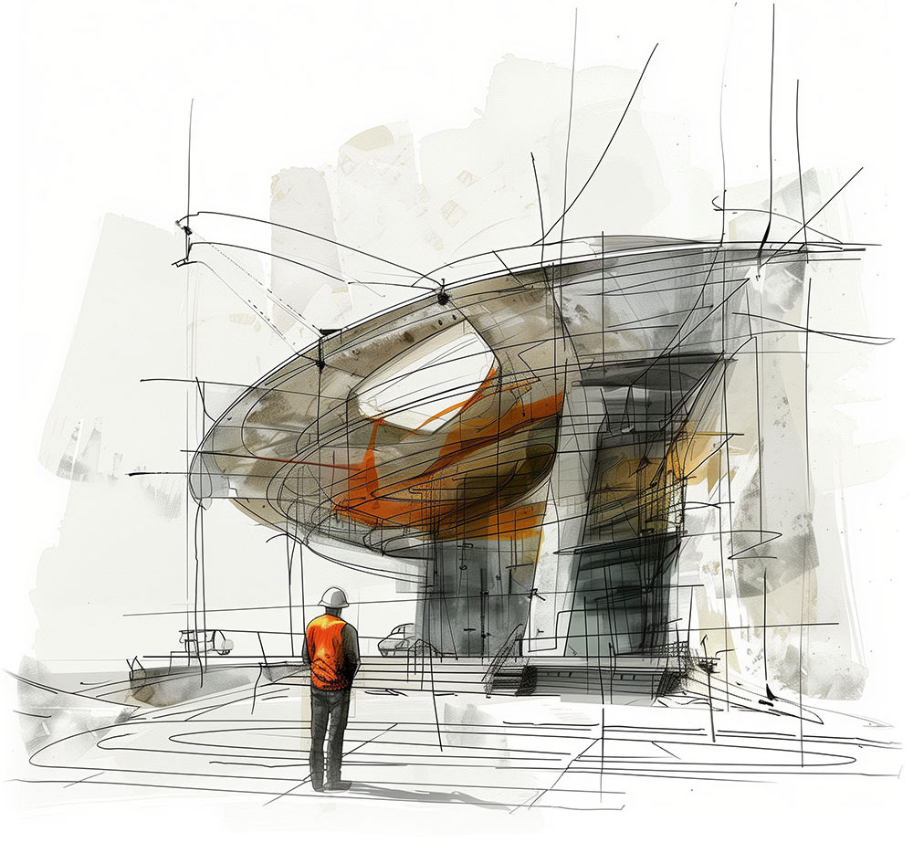


Nuestras oficinas están en Barcelona, Cancún, Chicago y Santo Domingo, pero gracias a la tecnología podemos desarrollar proyectos en cualquier parte del mundo.
Barcelona
Bac de Roda 136
08020, Barcelona
Spain
Madrid
Av. de Buendía 11
19005 Guadalajara (Madrid)
Spain
Chicago
373 Hazel Ave, Apt A1
60022, Glencoe, Illinois
United States