




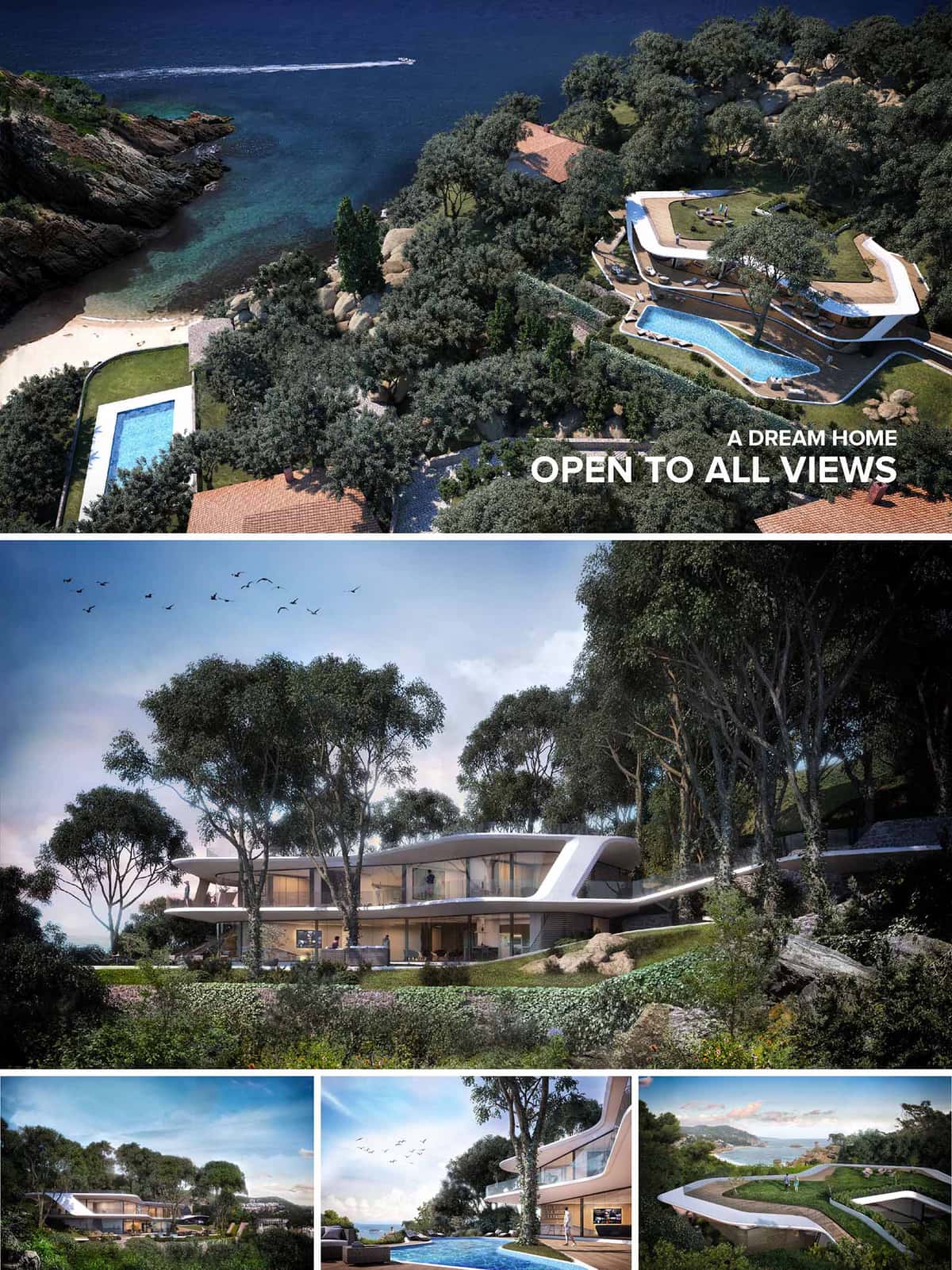
The TDM Villa is conceived as a coastal retreat that dissolves the boundary between architecture and Mediterranean landscape. The design responds to the steep topography of Tossa de Mar, unfolding as a series of fluid, terraced volumes that follow the natural contour lines. The villa orients every main space toward the sea, transforming the residence into a panoramic belvedere open to all views while remaining discreetly embedded within the pine and cork oak forest.
The architectural language is defined by soft, continuous curves and horizontal white bands that wrap façades, eaves, and terraces in a single gesture. This ribbon-like element emphasizes the villa’s horizontality, echoes the coastal cliffs, and frames wide glass surfaces that maximize daylight and visual connection with the bay. The result is a sculptural yet understated presence that privileges landscape over object.
The building is organized in stepped platforms, minimizing cut-and-fill and allowing direct access to the garden from multiple levels. The upper volume accommodates the most private functions, such as bedrooms and intimate lounges, while the intermediate and lower terraces host social spaces including living areas, kitchen, and outdoor leisure decks.
The plan follows a broken, elongated curve that opens like a fan toward the sea. This geometry creates a sequence of variable-depth terraces, offering both generous open decks and more sheltered outdoor rooms. Circulation is conceived as a promenade architecturale: covered walkways skim along the slope, linking interior and exterior spaces and providing shaded transitions between different programmatic areas.
The façades combine large-format glazing with slender structural elements and pronounced horizontal slabs. The continuous white bands function both as shading canopies and as structural diaphragms, reducing the need for intermediate supports and allowing panoramic openings. This structural clarity enhances transparency and ensures that the sea and forest remain the main protagonists.
Materially, the project juxtaposes warm tones and tactile surfaces against the crisp white envelope. Natural stone cladding anchors the base to the terrain, while timber accents bring domestic scale to terraces and soffits. High-performance glazing with selective coatings controls solar gain, and minimalist aluminum frames maintain the continuity of the exterior ribbon. The combination delivers a refined coastal character that is durable in a marine environment.
Interior spaces are designed as extensions of the surrounding landscape, with floor finishes and ceiling lines that flow virtually uninterrupted to the exterior decks. Open-plan living areas emphasize axial views toward the horizon, while curved partitions subtly guide movement and frame specific vistas of the rocky coves and open sea.
The color palette prioritizes neutral, sandy tones complemented by natural timber and stone surfaces, creating a calm, resort-like atmosphere. Built-in furniture and integrated storage follow the geometry of the outer shell, reinforcing the sense of continuity. Large sliding panels allow spaces to shift from fully open, breezy environments to more enclosed and intimate settings depending on season and time of day.
The garden strategy focuses on preserving and enhancing the existing Mediterranean ecosystem. Native trees and shrubs weave around the built volumes, softening edges and ensuring that the villa appears to emerge from the forest canopy. Terraced gardens with low retaining walls of local stone mediate between constructed platforms and natural rock outcrops.
Outdoor living areas are articulated around an infinity pool that visually merges with the sea. Sun decks, lounge platforms, and shaded pergolas are distributed along the main façade, providing a variety of microclimates for different times of day. Roof surfaces are treated as accessible green roofs, offering additional belvedere points and contributing to the perception of architecture as an elevated landscape rather than a discrete object.
Sustainability is addressed through both passive and active strategies carefully adapted to the Mediterranean climate. The curved orientation and generous overhangs optimize solar exposure in winter while providing effective shading in summer. Cross-ventilation is enabled by dual-aspect rooms and operable façades, reducing reliance on mechanical cooling during temperate months.
Green roofs increase thermal inertia, mitigate heat-island effect, and improve rainwater management, while native planting minimizes irrigation needs. High-performance insulation, low-emissivity glazing, and airtight detailing reduce energy consumption, making the villa compatible with high-efficiency HVAC and potential photovoltaic integration on less visible roof segments. Local materials and preserved vegetation limit the project’s ecological footprint, ensuring that the TDM Villa remains harmoniously integrated within the coastal landscape of Tossa de Mar.


The TDM Villa is conceived as a coastal retreat that dissolves the boundary between architecture and Mediterranean landscape. The design responds to the steep topography of Tossa de Mar, unfolding as a series of fluid, terraced volumes that follow the natural contour lines. The villa orients every main space toward the sea, transforming the residence into a panoramic belvedere open to all views while remaining discreetly embedded within the pine and cork oak forest.
The architectural language is defined by soft, continuous curves and horizontal white bands that wrap façades, eaves, and terraces in a single gesture. This ribbon-like element emphasizes the villa’s horizontality, echoes the coastal cliffs, and frames wide glass surfaces that maximize daylight and visual connection with the bay. The result is a sculptural yet understated presence that privileges landscape over object.
The building is organized in stepped platforms, minimizing cut-and-fill and allowing direct access to the garden from multiple levels. The upper volume accommodates the most private functions, such as bedrooms and intimate lounges, while the intermediate and lower terraces host social spaces including living areas, kitchen, and outdoor leisure decks.
The plan follows a broken, elongated curve that opens like a fan toward the sea. This geometry creates a sequence of variable-depth terraces, offering both generous open decks and more sheltered outdoor rooms. Circulation is conceived as a promenade architecturale: covered walkways skim along the slope, linking interior and exterior spaces and providing shaded transitions between different programmatic areas.
The façades combine large-format glazing with slender structural elements and pronounced horizontal slabs. The continuous white bands function both as shading canopies and as structural diaphragms, reducing the need for intermediate supports and allowing panoramic openings. This structural clarity enhances transparency and ensures that the sea and forest remain the main protagonists.
Materially, the project juxtaposes warm tones and tactile surfaces against the crisp white envelope. Natural stone cladding anchors the base to the terrain, while timber accents bring domestic scale to terraces and soffits. High-performance glazing with selective coatings controls solar gain, and minimalist aluminum frames maintain the continuity of the exterior ribbon. The combination delivers a refined coastal character that is durable in a marine environment.
Interior spaces are designed as extensions of the surrounding landscape, with floor finishes and ceiling lines that flow virtually uninterrupted to the exterior decks. Open-plan living areas emphasize axial views toward the horizon, while curved partitions subtly guide movement and frame specific vistas of the rocky coves and open sea.
The color palette prioritizes neutral, sandy tones complemented by natural timber and stone surfaces, creating a calm, resort-like atmosphere. Built-in furniture and integrated storage follow the geometry of the outer shell, reinforcing the sense of continuity. Large sliding panels allow spaces to shift from fully open, breezy environments to more enclosed and intimate settings depending on season and time of day.
The garden strategy focuses on preserving and enhancing the existing Mediterranean ecosystem. Native trees and shrubs weave around the built volumes, softening edges and ensuring that the villa appears to emerge from the forest canopy. Terraced gardens with low retaining walls of local stone mediate between constructed platforms and natural rock outcrops.
Outdoor living areas are articulated around an infinity pool that visually merges with the sea. Sun decks, lounge platforms, and shaded pergolas are distributed along the main façade, providing a variety of microclimates for different times of day. Roof surfaces are treated as accessible green roofs, offering additional belvedere points and contributing to the perception of architecture as an elevated landscape rather than a discrete object.
Sustainability is addressed through both passive and active strategies carefully adapted to the Mediterranean climate. The curved orientation and generous overhangs optimize solar exposure in winter while providing effective shading in summer. Cross-ventilation is enabled by dual-aspect rooms and operable façades, reducing reliance on mechanical cooling during temperate months.
Green roofs increase thermal inertia, mitigate heat-island effect, and improve rainwater management, while native planting minimizes irrigation needs. High-performance insulation, low-emissivity glazing, and airtight detailing reduce energy consumption, making the villa compatible with high-efficiency HVAC and potential photovoltaic integration on less visible roof segments. Local materials and preserved vegetation limit the project’s ecological footprint, ensuring that the TDM Villa remains harmoniously integrated within the coastal landscape of Tossa de Mar.
© 2021 by sanzpont [arquitectura] . Webpage by sanzpont [digital] . Innovative Digital Experiences
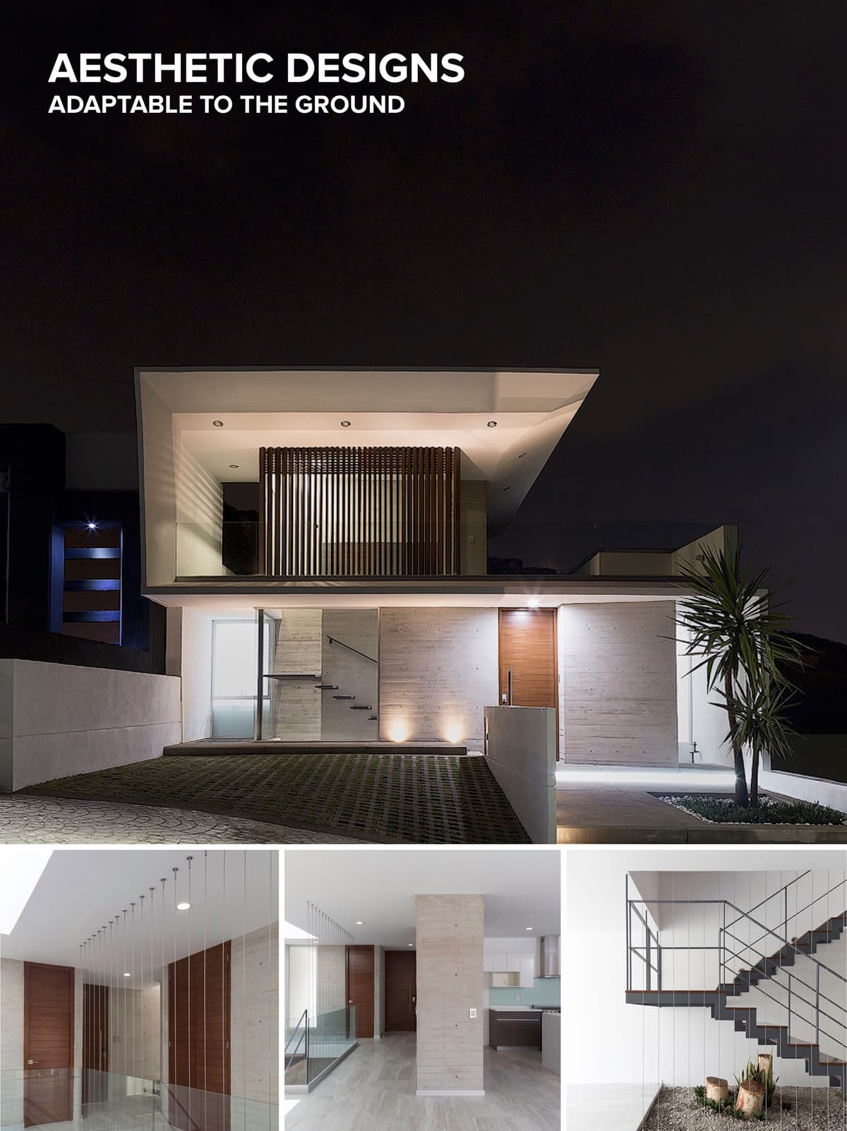

VAZ32 house in Mexico City was created to meet the needs of the client- a development company looking for a unique and contemporary product that could compete in the current real estate market of Mexico City. At the same time, the design is a result of the site and its unique building restrictions put in place by the subdivision- a 31-foot-wide by 63-foot-deep rectangular lot, with 10-foot setbacks in both the front and back, in close proximity to surrounding houses on three sides, and a steep slope down -34 feet from street level.
Taking advantage of the natural shape of the land, it was decided to design the private spaces below street level, creating a sense of security and privacy in the bedrooms while occupying most of the slope of the land. By cutting into the land and constructing with the site’s natural topography, we were able to save money by avoiding excessive filling costs. At the lowest level, where the master bedroom is located, the setback restrictions set forth by the subdivision were used to our advantage to create a private garden that is also accessed by the family room.
The public spaces were designed at street level and create the main façade of the house, which is crowned by a light, white cover that opens to the sky like a screen. This light cover becomes a building envelope that embraces the house and at the same time, creates contrast with the concrete walls.
This same building envelope transforms into a half wall that serves as division between the pedestrian access and the parking area. Conceptually, this feature represents a continuous line from roof, to façade, to the front of the property and continues infinitely.
A large retaining wall passes through the entire width of the house on all four levels, including the roof garden, and functions as the backbone of the project. In addition to its structural importance, this feature becomes an architectural aesthetic element as well. In the staircase, the natural light coming in from the skylight showcases the texture of the bare concrete which plays perfectly off the other textural elements- steel, wood and tempered glass.
The VAZ32 house achieves the goal of being a contemporary and unique project through its aesthetic value and use of current materials. Most importantly for the client, the house provides a thoughtful design at a competitive price for the location.
The VAZ32 house is aesthetically pleasing because of its functionality and context, as well as compliant with the sustainability guidelines that are the basis of sanzpont [arquitectura]


VAZ32 house in Mexico City was created to meet the needs of the client- a development company looking for a unique and contemporary product that could compete in the current real estate market of Mexico City. At the same time, the design is a result of the site and its unique building restrictions put in place by the subdivision- a 31-foot-wide by 63-foot-deep rectangular lot, with 10-foot setbacks in both the front and back, in close proximity to surrounding houses on three sides, and a steep slope down -34 feet from street level.
Taking advantage of the natural shape of the land, it was decided to design the private spaces below street level, creating a sense of security and privacy in the bedrooms while occupying most of the slope of the land. By cutting into the land and constructing with the site’s natural topography, we were able to save money by avoiding excessive filling costs. At the lowest level, where the master bedroom is located, the setback restrictions set forth by the subdivision were used to our advantage to create a private garden that is also accessed by the family room.
The public spaces were designed at street level and create the main façade of the house, which is crowned by a light, white cover that opens to the sky like a screen. This light cover becomes a building envelope that embraces the house and at the same time, creates contrast with the concrete walls.
This same building envelope transforms into a half wall that serves as division between the pedestrian access and the parking area. Conceptually, this feature represents a continuous line from roof, to façade, to the front of the property and continues infinitely.
A large retaining wall passes through the entire width of the house on all four levels, including the roof garden, and functions as the backbone of the project. In addition to its structural importance, this feature becomes an architectural aesthetic element as well. In the staircase, the natural light coming in from the skylight showcases the texture of the bare concrete which plays perfectly off the other textural elements- steel, wood and tempered glass.
The VAZ32 house achieves the goal of being a contemporary and unique project through its aesthetic value and use of current materials. Most importantly for the client, the house provides a thoughtful design at a competitive price for the location.
The VAZ32 house is aesthetically pleasing because of its functionality and context, as well as compliant with the sustainability guidelines that are the basis of sanzpont [arquitectura]
© 2021 by sanzpont [arquitectura] . Webpage by sanzpont [digital] . Innovative Digital Experiences
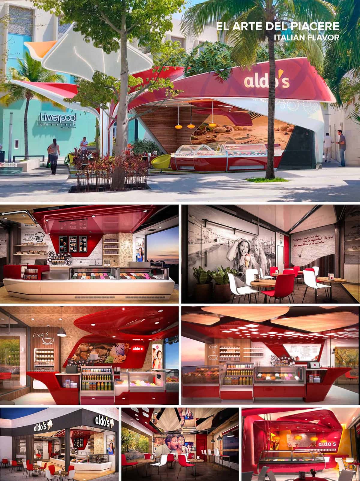

Aldo's Gelato is conceived as an urban pavilion of pleasure, translating the fluidity of Italian gelato into an architectural language of curves, layers and light. The concept explores the idea of “melting volumes”: shells and canopies appear to dissolve and overlap, creating a dynamic, welcoming threshold between city and interior. This design is replicated and adapted in 13 locations across Mexico, ensuring a recognizable brand identity while responding to each specific urban context.
Color becomes a key narrative device. The intense red of the brand is used as a continuous ribbon that folds from façade to ceiling to counter, guiding the eye and generating a sense of movement and energy. Neutral tones in beige, wood and soft greys balance this vibrancy, offering a calm background that celebrates the chromatic richness of the gelato itself.
The plan is structured around a clear linear axis: entrance, exhibition counter, and seating area. Generous openings and transparent façades blur interior and exterior, inviting passersby to visually connect with the product from the public realm. In open-mall locations, the kiosk typology adopts a free-standing, sculptural envelope that orients the main counter toward the highest pedestrian flows.
Circulation is intuitive and efficient. Customer movement naturally follows the display of flavors, while staff routes remain compact and ergonomic behind the counter, minimizing cross-traffic. Seating zones are fragmented into small clusters—two- and four-seat groupings—encouraging short stays but allowing easy reconfiguration for larger groups.
The material palette combines high-gloss, hygienic surfaces with warm, tactile elements. Solid surfaces and polished laminates in red and white define the food-handling areas, ensuring durability and easy cleaning. These are complemented by textured wall panels and faux-stone or brick finishes, evoking artisanal production and Italian café culture.
Ceilings are treated as sculptural elements: red lacquered canopies, perforated panels and suspended wooden blades create depth and acoustical comfort while integrating linear and recessed LED lighting. Warm white light above seating areas contrasts with cooler light at the display vitrines, where accurate color rendering is crucial to present the gelato and pastries.
The architecture operates as a three-dimensional brand envelope. Logos are integrated into volumetric signage, canopies, and corner elements, making each location instantly recognizable. Large-scale photographic murals and typographic phrases reinforce an emotional, convivial narrative, positioning the spaces as places to share moments rather than merely consume a product.
Furniture follows an informal, contemporary café vocabulary. Chairs in red and white with slender black legs echo the brand colors without overwhelming the space. Timber-look flooring and tabletops ground the composition, while full-height glazing frames exterior views, enhancing the perception of openness and lightness.
Sustainability is addressed through modular design, material selection and energy efficiency. The kiosk and interior elements are conceived as repeatable modules, reducing waste in fabrication, optimizing transport, and enabling partial reuse when relocating or updating units across the 13 sites. Durable laminates, LED lighting, and high-efficiency refrigeration equipment help reduce operational energy consumption and maintenance.
Large glazed fronts maximize natural daylight, decreasing reliance on artificial lighting during daytime. In open-air locations, canopy geometries provide shade to both customers and equipment, mitigating solar gain and improving thermal comfort in Mexico’s warm climates. Where possible, landscaping and existing trees are integrated to enhance microclimate, promote urban biodiversity and reinforce the sense of place around each Aldo's Gelato pavilion.
LIST OF PROJECTS EXPERIENCE
Designed, Executed and/or Built Projects
MEXICO
1. Aldos - Cancun - La Gran Plaza
2. Aldos - Cancun - La Isla
3. Aldos - Cancun - Malecon Americas
4. Aldos - Cancun - Malecón Américas - Kiosko
5. Aldos - Cancun - Plaza la Isla
6. Aldos - Playa del Carmen - 5ta Avenida - 2
7. Aldos - Playa del Carmen - 5ta Avenida - 3
8. Aldos - Playa del Carmen - 5ta Avenida - 4
9. Aldos - Playa del Carmen - 5ta Avenida - 5
10. Aldos - Playa del Carmen - 5ta Avenida - 6
11. Aldos - Playa del Carmen - 5ta Avenida - 7
12. Aldos - Playa del Carmen - 5ta Avenida - 8
13. Aldos - Playa del Carmen - Pza Las Americas


Aldo's Gelato is conceived as an urban pavilion of pleasure, translating the fluidity of Italian gelato into an architectural language of curves, layers and light. The concept explores the idea of “melting volumes”: shells and canopies appear to dissolve and overlap, creating a dynamic, welcoming threshold between city and interior. This design is replicated and adapted in 13 locations across Mexico, ensuring a recognizable brand identity while responding to each specific urban context.
Color becomes a key narrative device. The intense red of the brand is used as a continuous ribbon that folds from façade to ceiling to counter, guiding the eye and generating a sense of movement and energy. Neutral tones in beige, wood and soft greys balance this vibrancy, offering a calm background that celebrates the chromatic richness of the gelato itself.
The plan is structured around a clear linear axis: entrance, exhibition counter, and seating area. Generous openings and transparent façades blur interior and exterior, inviting passersby to visually connect with the product from the public realm. In open-mall locations, the kiosk typology adopts a free-standing, sculptural envelope that orients the main counter toward the highest pedestrian flows.
Circulation is intuitive and efficient. Customer movement naturally follows the display of flavors, while staff routes remain compact and ergonomic behind the counter, minimizing cross-traffic. Seating zones are fragmented into small clusters—two- and four-seat groupings—encouraging short stays but allowing easy reconfiguration for larger groups.
The material palette combines high-gloss, hygienic surfaces with warm, tactile elements. Solid surfaces and polished laminates in red and white define the food-handling areas, ensuring durability and easy cleaning. These are complemented by textured wall panels and faux-stone or brick finishes, evoking artisanal production and Italian café culture.
Ceilings are treated as sculptural elements: red lacquered canopies, perforated panels and suspended wooden blades create depth and acoustical comfort while integrating linear and recessed LED lighting. Warm white light above seating areas contrasts with cooler light at the display vitrines, where accurate color rendering is crucial to present the gelato and pastries.
The architecture operates as a three-dimensional brand envelope. Logos are integrated into volumetric signage, canopies, and corner elements, making each location instantly recognizable. Large-scale photographic murals and typographic phrases reinforce an emotional, convivial narrative, positioning the spaces as places to share moments rather than merely consume a product.
Furniture follows an informal, contemporary café vocabulary. Chairs in red and white with slender black legs echo the brand colors without overwhelming the space. Timber-look flooring and tabletops ground the composition, while full-height glazing frames exterior views, enhancing the perception of openness and lightness.
Sustainability is addressed through modular design, material selection and energy efficiency. The kiosk and interior elements are conceived as repeatable modules, reducing waste in fabrication, optimizing transport, and enabling partial reuse when relocating or updating units across the 13 sites. Durable laminates, LED lighting, and high-efficiency refrigeration equipment help reduce operational energy consumption and maintenance.
Large glazed fronts maximize natural daylight, decreasing reliance on artificial lighting during daytime. In open-air locations, canopy geometries provide shade to both customers and equipment, mitigating solar gain and improving thermal comfort in Mexico’s warm climates. Where possible, landscaping and existing trees are integrated to enhance microclimate, promote urban biodiversity and reinforce the sense of place around each Aldo's Gelato pavilion.
LIST OF PROJECTS EXPERIENCE
Designed, Executed and/or Built Projects
MEXICO
1. Aldos - Cancun - La Gran Plaza
2. Aldos - Cancun - La Isla
3. Aldos - Cancun - Malecon Americas
4. Aldos - Cancun - Malecón Américas - Kiosko
5. Aldos - Cancun - Plaza la Isla
6. Aldos - Playa del Carmen - 5ta Avenida - 2
7. Aldos - Playa del Carmen - 5ta Avenida - 3
8. Aldos - Playa del Carmen - 5ta Avenida - 4
9. Aldos - Playa del Carmen - 5ta Avenida - 5
10. Aldos - Playa del Carmen - 5ta Avenida - 6
11. Aldos - Playa del Carmen - 5ta Avenida - 7
12. Aldos - Playa del Carmen - 5ta Avenida - 8
13. Aldos - Playa del Carmen - Pza Las Americas
© 2021 by sanzpont [arquitectura] . Webpage by sanzpont [digital] . Innovative Digital Experiences
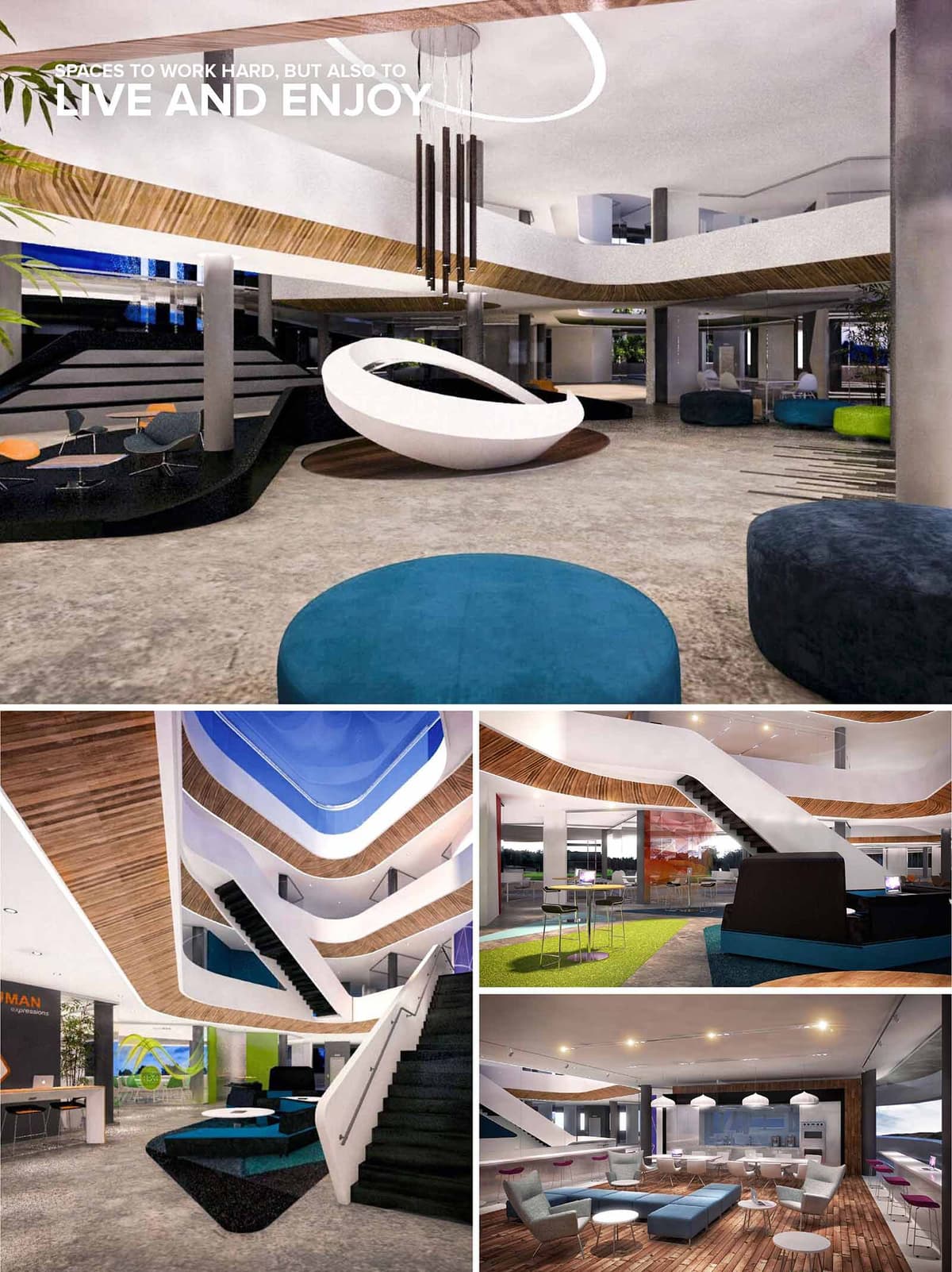

The BI Offices in Boulder are conceived as a contemporary corporate habitat where work, social life and relaxation coexist in a single fluid environment. The design prioritizes spatial continuity and visual transparency, dissolving traditional boundaries between lobby, workstations, meeting areas and leisure zones. A central multi‑level atrium acts as the heart of the building, promoting interaction across floors and offering strong visual connections that enhance a sense of community. The architectural language combines soft, curvilinear forms with bold volumetric gestures, reflecting the innovative culture of the company.
The project is structured around the atrium, which organizes horizontal and vertical circulation. Open staircases and sculpted balconies stitch together different levels, encouraging movement and informal encounters. Workspaces and meeting rooms are distributed around this void, benefiting from borrowed light and views into the communal core. At ground level, reception, lounge and collaborative areas flow into each other without rigid partitions, using changes of floor finish, ceiling height and furniture layout to define functional zones. Peripheral glazed façades open the interior to the landscape, reinforcing the continuity between inside and outside.
The interior form is characterized by dynamic white ribbons that wrap the atrium edges and stair flights, creating a continuous architectural element that guides the eye vertically. These sleek surfaces contrast with warm timber cladding on soffits and floor bands, which provide tactile richness and acoustic comfort. Polished concrete or large‑format stone tiles on the main floors give durability and a neutral backdrop. The furniture palette introduces saturated accents—turquoise, lime, and deep blue—through upholstered poufs, sofas and carpets, signaling different activity zones and reinforcing brand identity. Black platforms and stair treads ground the composition, providing visual weight and anchoring the lighter elements above.
The atmosphere is deliberately informal and hospitality‑inspired, with lounge seating, café areas and high‑top tables interspersed among more traditional workpoints. This hybridization of office and living room typologies supports a variety of postures and work styles, from focused individual tasks to collaborative workshops. The kitchen and bar‑like areas function as social condensers, encouraging spontaneous meetings and fostering a culture of openness. Lighting fixtures—circular LED rings, linear pendants and sculptural clusters—are carefully positioned to emphasize key spaces, articulate height changes and create a warm, even illumination without glare.
Sustainability is addressed through both environmental performance and user well‑being. The generous atrium and extensive glazing maximize natural daylight penetration, reducing reliance on artificial lighting and improving circadian comfort. Open floor plates facilitate cross‑ventilation strategies, and the use of exposed structural elements limits superfluous finishes, minimizing material consumption. Timber surfaces are specified from certified sources, while long‑life materials such as concrete and high‑quality textiles extend the fit‑out’s durability. Biophilic principles are introduced through indoor planting and views to the surrounding Boulder landscape, supporting mental health and productivity. Energy‑efficient LED lighting, low‑flow fixtures and an adaptable, modular furniture system complete a sustainable approach that anticipates future changes in workplace needs.


The BI Offices in Boulder are conceived as a contemporary corporate habitat where work, social life and relaxation coexist in a single fluid environment. The design prioritizes spatial continuity and visual transparency, dissolving traditional boundaries between lobby, workstations, meeting areas and leisure zones. A central multi‑level atrium acts as the heart of the building, promoting interaction across floors and offering strong visual connections that enhance a sense of community. The architectural language combines soft, curvilinear forms with bold volumetric gestures, reflecting the innovative culture of the company.
The project is structured around the atrium, which organizes horizontal and vertical circulation. Open staircases and sculpted balconies stitch together different levels, encouraging movement and informal encounters. Workspaces and meeting rooms are distributed around this void, benefiting from borrowed light and views into the communal core. At ground level, reception, lounge and collaborative areas flow into each other without rigid partitions, using changes of floor finish, ceiling height and furniture layout to define functional zones. Peripheral glazed façades open the interior to the landscape, reinforcing the continuity between inside and outside.
The interior form is characterized by dynamic white ribbons that wrap the atrium edges and stair flights, creating a continuous architectural element that guides the eye vertically. These sleek surfaces contrast with warm timber cladding on soffits and floor bands, which provide tactile richness and acoustic comfort. Polished concrete or large‑format stone tiles on the main floors give durability and a neutral backdrop. The furniture palette introduces saturated accents—turquoise, lime, and deep blue—through upholstered poufs, sofas and carpets, signaling different activity zones and reinforcing brand identity. Black platforms and stair treads ground the composition, providing visual weight and anchoring the lighter elements above.
The atmosphere is deliberately informal and hospitality‑inspired, with lounge seating, café areas and high‑top tables interspersed among more traditional workpoints. This hybridization of office and living room typologies supports a variety of postures and work styles, from focused individual tasks to collaborative workshops. The kitchen and bar‑like areas function as social condensers, encouraging spontaneous meetings and fostering a culture of openness. Lighting fixtures—circular LED rings, linear pendants and sculptural clusters—are carefully positioned to emphasize key spaces, articulate height changes and create a warm, even illumination without glare.
Sustainability is addressed through both environmental performance and user well‑being. The generous atrium and extensive glazing maximize natural daylight penetration, reducing reliance on artificial lighting and improving circadian comfort. Open floor plates facilitate cross‑ventilation strategies, and the use of exposed structural elements limits superfluous finishes, minimizing material consumption. Timber surfaces are specified from certified sources, while long‑life materials such as concrete and high‑quality textiles extend the fit‑out’s durability. Biophilic principles are introduced through indoor planting and views to the surrounding Boulder landscape, supporting mental health and productivity. Energy‑efficient LED lighting, low‑flow fixtures and an adaptable, modular furniture system complete a sustainable approach that anticipates future changes in workplace needs.
© 2021 by sanzpont [arquitectura] . Webpage by sanzpont [digital] . Innovative Digital Experiences
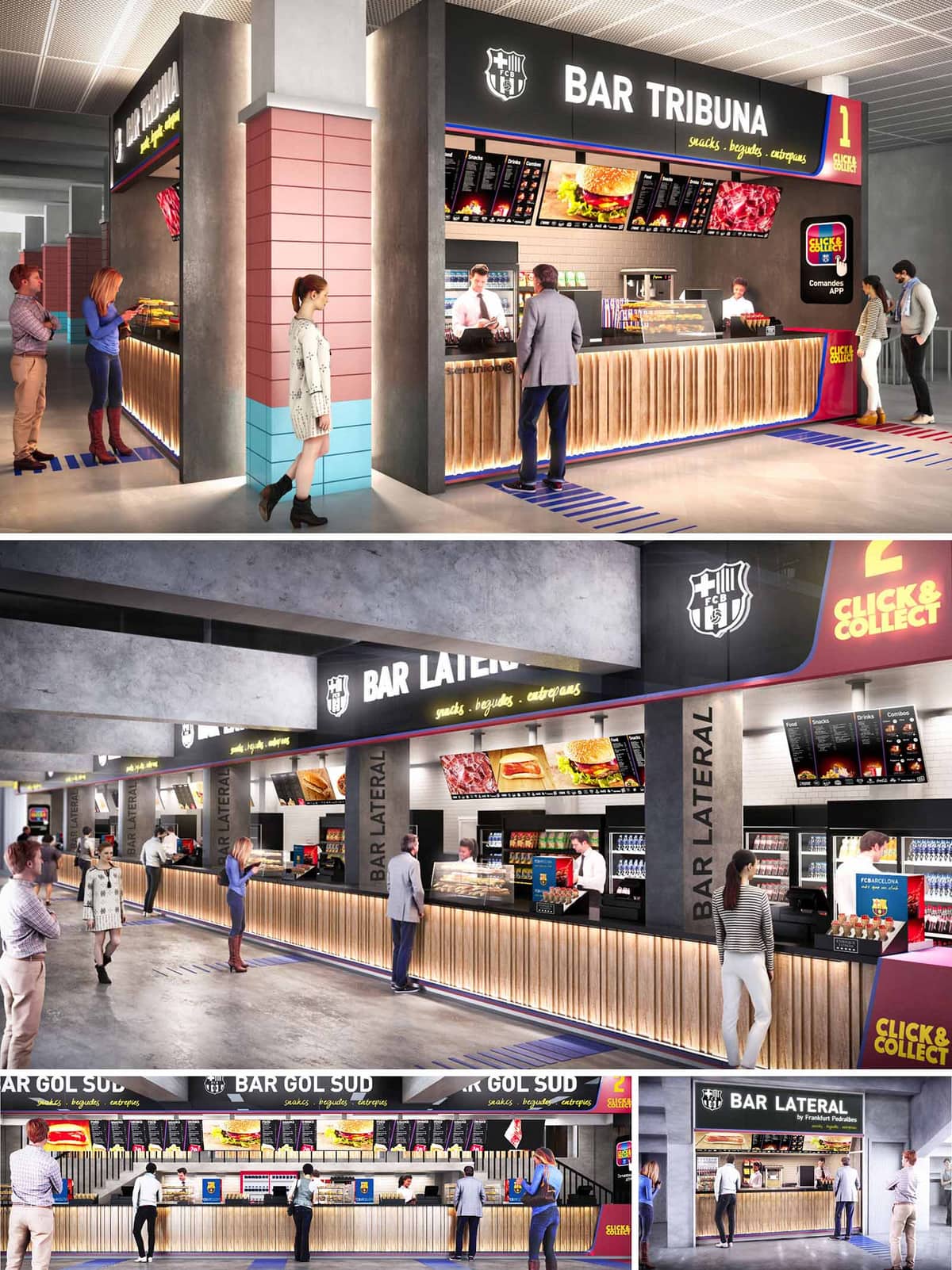
The kiosk system at Camp Nou is conceived as a continuous gastronomic boulevard that integrates with the stadium’s circulation areas, transforming waiting and transit spaces into an active food and beverage experience. The design emphasizes clarity of use, speed of service, and strong brand presence, aligning the match-day ritual with a contemporary hospitality environment. Each bar—Tribuna, Lateral and Gol Sud—is visually unified yet differentiated through graphic and chromatic cues, creating a legible wayfinding system inside the concourse.
The architecture works as a robust infrastructural backdrop while the frontal planes, signage, and lighting provide the emotional and commercial layer. The kiosks are treated as elongated urban façades: a rhythm of vertical slats, structural piers, and illuminated bands organizes the long counters into recognizable modules, ensuring that the experience remains coherent even at peak crowd densities.
The layout prioritizes linearity and visibility. Long continuous counters run parallel to the circulation corridors, allowing multiple service points and minimizing cross-traffic. Customers queue along clearly defined lanes on the floor, while the open counter front enables intuitive reading of product offerings and available pick-up areas. Structural columns are absorbed into the composition of the kiosk fronts, becoming wayfinding anchors instead of obstacles.
Each kiosk integrates dedicated zones for ordering, payment, and “click & collect” digital pick-up, reducing congestion and supporting omnichannel service. The counters are set at a height that balances ergonomic comfort for both staff and users, with generous overhangs to protect equipment and merchandise. Back-of-house storage and refrigeration are compact and aligned along the rear wall, ensuring that staff workflow is short, direct, and efficient.
The material palette contrasts the raw character of the existing stadium structure with warm, tactile finishes at the customer interface. Exposed concrete beams and columns frame a front layer of vertical wooden slats, whose natural tone softens the environment and provides a domestic touch in a highly infrastructural context. These slats are subtly backlit at the base, generating a floating effect and visually lightening the long counter volumes.
Ceiling lighting is uniform and technical, while accent lighting focuses on the menu boards, branding panels, and product displays. LED strips trace the lower edge of the counters and the upper cornices, reinforcing horizontality and guiding visitors along the kiosk line. The use of durable laminates, metal profiles, and easy-to-clean solid surfaces at worktops ensures resistance to intensive use and simplifies maintenance, critical in a high-traffic stadium environment.
Color is employed as a functional and emotional tool. The dominant neutral base of concrete grey and natural wood is contrasted with the club’s signature palette: deep blues, reds, and accent yellows. These colors appear in fascia bands, click & collect modules, floor graphics, and column cladding, ensuring immediate association with the club identity while aiding orientation across different bars and service areas.
Large-scale typography and illuminated logos on the fascia define each kiosk as a distinct destination, while menu boards combine imagery and clear typographic hierarchy to facilitate rapid decision-making. Floor markings in club colors organize the queues and subtly choreograph movement. The combination of architecture, environmental graphics, and digital displays turns the kiosks into immersive brand devices without compromising legibility or operational clarity.
The kiosk modules are conceived as repeatable and adaptable units that can be extended or reconfigured according to event requirements. Service equipment is organized in standardized bays, allowing future technological upgrades or changes in product offering with minimal intervention on the architectural envelope. Wide, obstruction-free front zones accommodate fluctuating crowd volumes, from regular league matches to major international events.
Sustainability is supported through several strategies: the extensive use of LED lighting with dimming capabilities reduces energy consumption; durable and low-maintenance materials extend the life cycle of finishes; and the modular construction facilitates off-site fabrication and potential reuse of elements. Where possible, finishes favor certified wood products and recyclable metal components. The efficient spatial layout, which minimizes back-of-house circulation and optimizes refrigeration clustering, also contributes to lowering operational energy demand and overall environmental impact.
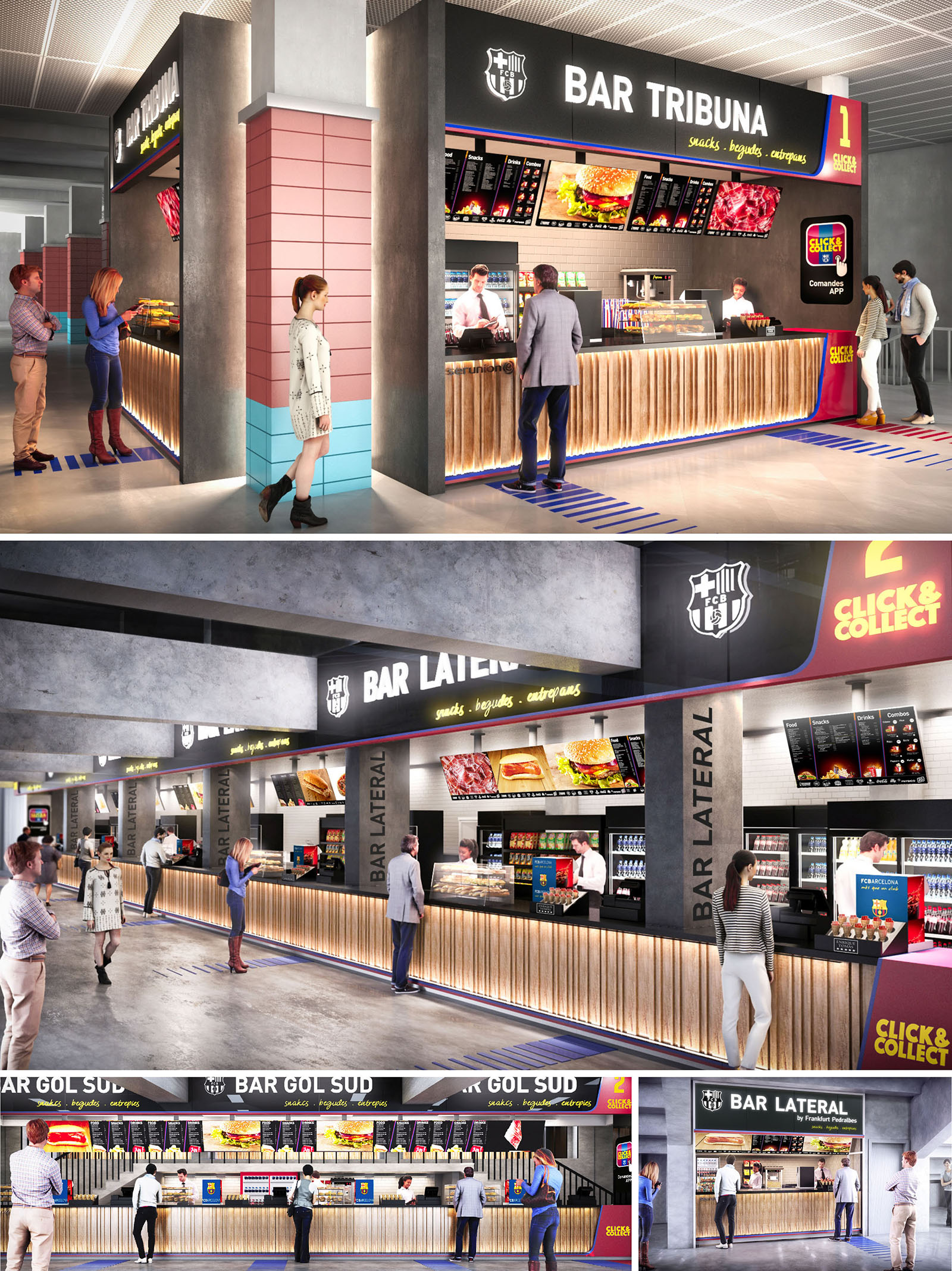
The kiosk system at Camp Nou is conceived as a continuous gastronomic boulevard that integrates with the stadium’s circulation areas, transforming waiting and transit spaces into an active food and beverage experience. The design emphasizes clarity of use, speed of service, and strong brand presence, aligning the match-day ritual with a contemporary hospitality environment. Each bar—Tribuna, Lateral and Gol Sud—is visually unified yet differentiated through graphic and chromatic cues, creating a legible wayfinding system inside the concourse.
The architecture works as a robust infrastructural backdrop while the frontal planes, signage, and lighting provide the emotional and commercial layer. The kiosks are treated as elongated urban façades: a rhythm of vertical slats, structural piers, and illuminated bands organizes the long counters into recognizable modules, ensuring that the experience remains coherent even at peak crowd densities.
The layout prioritizes linearity and visibility. Long continuous counters run parallel to the circulation corridors, allowing multiple service points and minimizing cross-traffic. Customers queue along clearly defined lanes on the floor, while the open counter front enables intuitive reading of product offerings and available pick-up areas. Structural columns are absorbed into the composition of the kiosk fronts, becoming wayfinding anchors instead of obstacles.
Each kiosk integrates dedicated zones for ordering, payment, and “click & collect” digital pick-up, reducing congestion and supporting omnichannel service. The counters are set at a height that balances ergonomic comfort for both staff and users, with generous overhangs to protect equipment and merchandise. Back-of-house storage and refrigeration are compact and aligned along the rear wall, ensuring that staff workflow is short, direct, and efficient.
The material palette contrasts the raw character of the existing stadium structure with warm, tactile finishes at the customer interface. Exposed concrete beams and columns frame a front layer of vertical wooden slats, whose natural tone softens the environment and provides a domestic touch in a highly infrastructural context. These slats are subtly backlit at the base, generating a floating effect and visually lightening the long counter volumes.
Ceiling lighting is uniform and technical, while accent lighting focuses on the menu boards, branding panels, and product displays. LED strips trace the lower edge of the counters and the upper cornices, reinforcing horizontality and guiding visitors along the kiosk line. The use of durable laminates, metal profiles, and easy-to-clean solid surfaces at worktops ensures resistance to intensive use and simplifies maintenance, critical in a high-traffic stadium environment.
Color is employed as a functional and emotional tool. The dominant neutral base of concrete grey and natural wood is contrasted with the club’s signature palette: deep blues, reds, and accent yellows. These colors appear in fascia bands, click & collect modules, floor graphics, and column cladding, ensuring immediate association with the club identity while aiding orientation across different bars and service areas.
Large-scale typography and illuminated logos on the fascia define each kiosk as a distinct destination, while menu boards combine imagery and clear typographic hierarchy to facilitate rapid decision-making. Floor markings in club colors organize the queues and subtly choreograph movement. The combination of architecture, environmental graphics, and digital displays turns the kiosks into immersive brand devices without compromising legibility or operational clarity.
The kiosk modules are conceived as repeatable and adaptable units that can be extended or reconfigured according to event requirements. Service equipment is organized in standardized bays, allowing future technological upgrades or changes in product offering with minimal intervention on the architectural envelope. Wide, obstruction-free front zones accommodate fluctuating crowd volumes, from regular league matches to major international events.
Sustainability is supported through several strategies: the extensive use of LED lighting with dimming capabilities reduces energy consumption; durable and low-maintenance materials extend the life cycle of finishes; and the modular construction facilitates off-site fabrication and potential reuse of elements. Where possible, finishes favor certified wood products and recyclable metal components. The efficient spatial layout, which minimizes back-of-house circulation and optimizes refrigeration clustering, also contributes to lowering operational energy demand and overall environmental impact.
© 2021 by sanzpont [arquitectura] . Webpage by sanzpont [digital] . Innovative Digital Experiences
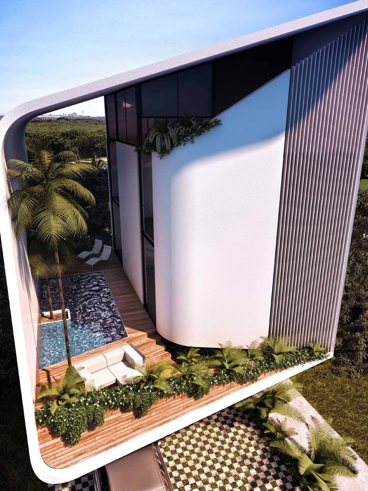

The JSH Villa is conceived as a sculptural tropical refuge, a compact urban villa that opens inward to its own elevated garden rather than to the street. The gesture is a continuous white shell that folds up from the ground, wraps the habitable volume and frames a generous open void where vegetation, water and light become the main protagonists. The architecture aims to express calm and lightness while providing strong climatic protection for the intense sun of Cancún.
The composition is based on two main elements: the outer shell and the inner prism. The outer shell, with its soft radiused corners, tilts forward and creates a deep canopy that shades the upper terrace and pool. Behind it, a pure vertical volume houses the main living spaces. The offset between these two geometries generates dynamic shadows and a sense of movement, making the house read as a single fluid object from the street while preserving a compact, efficient footprint.
The façade combines smooth white plastered surfaces with vertical aluminum fins and warm timber cladding. The continuous white skin provides a monolithic, almost carved appearance, whereas the slender fins introduce rhythm, privacy and solar control on the more exposed eastern side. The timber planter band softens the transition between architecture and landscape, anchoring the floating shell. Large glazed panels are recessed behind the envelope to reduce direct solar gain, while dark frames visually dissolve to highlight the sculptural massing.
The project organizes daily life around an elevated tropical terrace carved within the shell. Here, a linear pool, timber deck and lounge area become an outdoor living room suspended above the garden level. Double-height glazing stitches interior spaces to this terrace, enabling cross-views and natural ventilation. From the street, the house appears introspective; once inside, it opens fully to sky, water and vegetation, offering privacy from the neighborhood while maintaining an intense connection with the climate and landscape.
The inclined roof and deep overhangs function as an environmental device, reducing incident solar radiation on the glazed surfaces and creating a permanently shaded microclimate for the terrace. Vertical fins on the side façade act as a brise-soleil, filtering low-angle sun and allowing controlled airflow. The narrow floor plate favors cross-ventilation, reducing the need for mechanical cooling. The solid stair and service core are positioned toward the harsher solar orientations, protecting the more transparent living areas and bedrooms.
Vegetation is integrated as a continuous green layer that wraps the perimeter of the terrace and spills over the timber planter edge, visually merging the villa with the surrounding trees. Palm trees rise through openings in the deck and pool, reinforcing the sensation of inhabiting a suspended garden. This green buffer helps cool the envelope, retains rainwater in the soil substrate and improves local biodiversity. The combination of passive shading, cross-ventilation, reduced footprint and layered planting strategy contributes to a more sustainable, climate-responsive villa appropriate for the coastal context of Cancún.


The JSH Villa is conceived as a sculptural tropical refuge, a compact urban villa that opens inward to its own elevated garden rather than to the street. The gesture is a continuous white shell that folds up from the ground, wraps the habitable volume and frames a generous open void where vegetation, water and light become the main protagonists. The architecture aims to express calm and lightness while providing strong climatic protection for the intense sun of Cancún.
The composition is based on two main elements: the outer shell and the inner prism. The outer shell, with its soft radiused corners, tilts forward and creates a deep canopy that shades the upper terrace and pool. Behind it, a pure vertical volume houses the main living spaces. The offset between these two geometries generates dynamic shadows and a sense of movement, making the house read as a single fluid object from the street while preserving a compact, efficient footprint.
The façade combines smooth white plastered surfaces with vertical aluminum fins and warm timber cladding. The continuous white skin provides a monolithic, almost carved appearance, whereas the slender fins introduce rhythm, privacy and solar control on the more exposed eastern side. The timber planter band softens the transition between architecture and landscape, anchoring the floating shell. Large glazed panels are recessed behind the envelope to reduce direct solar gain, while dark frames visually dissolve to highlight the sculptural massing.
The project organizes daily life around an elevated tropical terrace carved within the shell. Here, a linear pool, timber deck and lounge area become an outdoor living room suspended above the garden level. Double-height glazing stitches interior spaces to this terrace, enabling cross-views and natural ventilation. From the street, the house appears introspective; once inside, it opens fully to sky, water and vegetation, offering privacy from the neighborhood while maintaining an intense connection with the climate and landscape.
The inclined roof and deep overhangs function as an environmental device, reducing incident solar radiation on the glazed surfaces and creating a permanently shaded microclimate for the terrace. Vertical fins on the side façade act as a brise-soleil, filtering low-angle sun and allowing controlled airflow. The narrow floor plate favors cross-ventilation, reducing the need for mechanical cooling. The solid stair and service core are positioned toward the harsher solar orientations, protecting the more transparent living areas and bedrooms.
Vegetation is integrated as a continuous green layer that wraps the perimeter of the terrace and spills over the timber planter edge, visually merging the villa with the surrounding trees. Palm trees rise through openings in the deck and pool, reinforcing the sensation of inhabiting a suspended garden. This green buffer helps cool the envelope, retains rainwater in the soil substrate and improves local biodiversity. The combination of passive shading, cross-ventilation, reduced footprint and layered planting strategy contributes to a more sustainable, climate-responsive villa appropriate for the coastal context of Cancún.
© 2021 by sanzpont [arquitectura] . Webpage by sanzpont [digital] . Innovative Digital Experiences
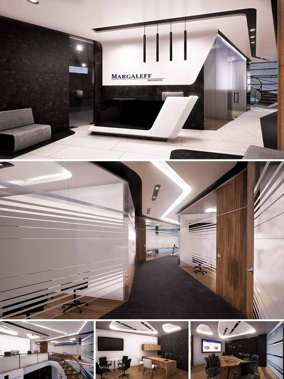

MARGALEFF OFFICES is conceived as a contemporary corporate space for a law firm in Cancún, where precision and clarity define both the image and the experience. The design language uses clean, dynamic lines to convey trust, rigor and forward-thinking practice, avoiding excessive ornament in favor of a controlled, almost sculptural minimalism. Circulation, light and material transitions are orchestrated to guide visitors intuitively from reception to meeting areas, reinforcing the idea of a seamless, transparent legal process.
The overall composition balances contrasting elements: black and white planes, opaque and transparent surfaces, straight lines and softened curves. This duality reflects the legal profession’s need for both firmness and flexibility, while giving the office a distinctive identity within a competitive corporate landscape.
The reception acts as a visual manifesto of the project. A monolithic counter in black and white lacquered finishes emerges as a sculpted volume that anchors the entrance. Its angular geometry and cantilevered gesture introduce a strong architectural statement, complemented by vertical linear pendants that emphasize height and mark the front-desk area. Behind, a dark textured wall forms an elegant backdrop for the firm’s signage, enhancing legibility and brand presence.
The lobby is resolved with light porcelain flooring and dark wall cladding, creating a calm contrast that frames the seating islands. Furniture remains low and orthogonal, allowing the architectural envelope and lighting to take protagonism. The ceiling features an integrated lighting profile that extends toward the circulation core, subtly directing visitors toward the inner offices and meeting rooms.
The main corridor is conceived as a dynamic spine that structures the office layout. A continuous black floor strip runs along the passage, while the ceiling follows it with a sinuous recessed light line, generating a sense of motion and orientation. On both sides, full-height glass partitions with horizontal frosted bands provide controlled privacy, allowing visual permeability while protecting confidential activities within offices and meeting rooms.
Warm wood panels articulate doorways and solid partitions, softening the contrast between black and white and introducing a tactile, human dimension into the corporate environment. Beyond the enclosed offices, a double-height space with perimeter circulation and metal railings opens visual connections between levels, encouraging collaboration and visual interaction among teams.
The private offices and meeting rooms continue the same material language but with more intimate proportions. Executive offices combine dark accent walls with white ceilings and integrated indirect lighting, ensuring uniform illumination free of glare for prolonged work sessions. Built-in wood cabinetry and desks create a seamless integration between architecture and furniture, reducing visual noise and emphasizing order.
The main boardroom features a long wooden table as a central element, surrounded by ergonomic seating and equipped with large-format display technology. Acoustic control is supported by the use of soft finishes, articulated ceiling elements and controlled lighting levels, allowing clear communication and comfortable environments for negotiations and presentations.
The material palette is intentionally concise: porcelain tiles, textured dark stone-effect panels, warm wood veneers and high-performance glass. This restrained selection simplifies maintenance, ensures durability in Cancún’s humid climate and supports a timeless aesthetic less susceptible to rapid obsolescence. Glass partitions maximize natural light penetration, reducing dependence on artificial lighting during daytime hours.
LED linear fixtures and recessed luminaires are specified throughout the project for their low energy consumption and long lifespan. The lighting strategy is based on layered illumination, allowing scenes to be adjusted according to time of day and activity, thus optimizing energy use. Where possible, finishes are chosen from regional suppliers and with low-VOC content to improve indoor air quality. The open visual connections and transparent boundaries reduce the need for expansive enclosed spaces, optimizing the overall footprint and promoting a more efficient use of conditioned areas.


MARGALEFF OFFICES is conceived as a contemporary corporate space for a law firm in Cancún, where precision and clarity define both the image and the experience. The design language uses clean, dynamic lines to convey trust, rigor and forward-thinking practice, avoiding excessive ornament in favor of a controlled, almost sculptural minimalism. Circulation, light and material transitions are orchestrated to guide visitors intuitively from reception to meeting areas, reinforcing the idea of a seamless, transparent legal process.
The overall composition balances contrasting elements: black and white planes, opaque and transparent surfaces, straight lines and softened curves. This duality reflects the legal profession’s need for both firmness and flexibility, while giving the office a distinctive identity within a competitive corporate landscape.
The reception acts as a visual manifesto of the project. A monolithic counter in black and white lacquered finishes emerges as a sculpted volume that anchors the entrance. Its angular geometry and cantilevered gesture introduce a strong architectural statement, complemented by vertical linear pendants that emphasize height and mark the front-desk area. Behind, a dark textured wall forms an elegant backdrop for the firm’s signage, enhancing legibility and brand presence.
The lobby is resolved with light porcelain flooring and dark wall cladding, creating a calm contrast that frames the seating islands. Furniture remains low and orthogonal, allowing the architectural envelope and lighting to take protagonism. The ceiling features an integrated lighting profile that extends toward the circulation core, subtly directing visitors toward the inner offices and meeting rooms.
The main corridor is conceived as a dynamic spine that structures the office layout. A continuous black floor strip runs along the passage, while the ceiling follows it with a sinuous recessed light line, generating a sense of motion and orientation. On both sides, full-height glass partitions with horizontal frosted bands provide controlled privacy, allowing visual permeability while protecting confidential activities within offices and meeting rooms.
Warm wood panels articulate doorways and solid partitions, softening the contrast between black and white and introducing a tactile, human dimension into the corporate environment. Beyond the enclosed offices, a double-height space with perimeter circulation and metal railings opens visual connections between levels, encouraging collaboration and visual interaction among teams.
The private offices and meeting rooms continue the same material language but with more intimate proportions. Executive offices combine dark accent walls with white ceilings and integrated indirect lighting, ensuring uniform illumination free of glare for prolonged work sessions. Built-in wood cabinetry and desks create a seamless integration between architecture and furniture, reducing visual noise and emphasizing order.
The main boardroom features a long wooden table as a central element, surrounded by ergonomic seating and equipped with large-format display technology. Acoustic control is supported by the use of soft finishes, articulated ceiling elements and controlled lighting levels, allowing clear communication and comfortable environments for negotiations and presentations.
The material palette is intentionally concise: porcelain tiles, textured dark stone-effect panels, warm wood veneers and high-performance glass. This restrained selection simplifies maintenance, ensures durability in Cancún’s humid climate and supports a timeless aesthetic less susceptible to rapid obsolescence. Glass partitions maximize natural light penetration, reducing dependence on artificial lighting during daytime hours.
LED linear fixtures and recessed luminaires are specified throughout the project for their low energy consumption and long lifespan. The lighting strategy is based on layered illumination, allowing scenes to be adjusted according to time of day and activity, thus optimizing energy use. Where possible, finishes are chosen from regional suppliers and with low-VOC content to improve indoor air quality. The open visual connections and transparent boundaries reduce the need for expansive enclosed spaces, optimizing the overall footprint and promoting a more efficient use of conditioned areas.
© 2021 by sanzpont [arquitectura] . Webpage by sanzpont [digital] . Innovative Digital Experiences
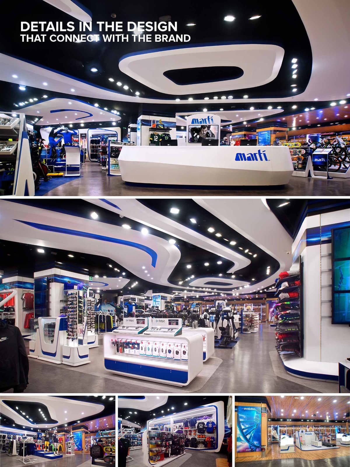

The MARTI flagship store in Mexico City is conceived as an immersive sports experience where architecture, lighting, and product layout act as extensions of the brand. The design draws inspiration from the dynamic movement of athletes, translating speed, fluidity, and energy into continuous curves on the ceiling, counters, and display modules. This unified language creates a strong visual identity that customers recognize immediately upon entering the space.
The project prioritizes clarity of circulation and product visibility. The central axis is defined by a sculptural cash desk and surrounding islands that guide the user naturally through different product universes. The perimeter walls function as a continuous merchandising ribbon, integrating graphics, digital media, and storage while maintaining a clean and future‑ready image.
The floor plan operates as an open field with low display fixtures that preserve long visual perspectives across the entire store. Primary paths radiate from the main entrance, allowing intuitive orientation without the need for explicit signage. Each sports category is emphasized through subtle variations in color accents, lighting, and fixture density rather than rigid partitions.
The cash desk is treated as a central sculptural object, with faceted white planes and integrated branding that anchor the space. Around it, modular gondolas and freestanding elements define micro‑zones for accessories, apparel, and equipment. The generous circulation between fixtures accommodates high visitor flows and facilitates ADA‑compliant accessibility, while clear perimeter zones support wall merchandising of larger or more technical products.
The dominant formal gesture is the continuous, flowing ceiling that alternates black and white bands with integrated lighting. These sinuous shapes echo running tracks and cycling velodromes, reinforcing the sports narrative while visually leading customers deeper into the store. Softly rounded corners on furniture and displays enhance the sense of motion and avoid visual clutter.
The material palette is intentionally streamlined: high‑gloss white solid surfaces for counters and fixtures, durable vinyl or epoxy flooring in neutral gray, and high‑pressure laminates in white and MARTI blue. Strategic use of timber on selected ceiling planes and wall areas introduces warmth and a tactile counterpoint to the otherwise high‑tech environment. The color scheme is firmly anchored in the brand identity—white as a neutral backdrop for products, blue for recognition and wayfinding, and black for depth and contrast in the ceiling plane.
Lighting is designed as a key architectural component rather than a mere technical layer. LED downlights are embedded in the black ceiling bands, producing a star‑like pattern that emphasizes the curves and adds rhythm to the space. Continuous linear LEDs highlight product walls and create vertical light that enhances colors and textures of merchandise.
Large digital screens are flush‑mounted into architectural surfaces, acting as dynamic façades within the interior. Their integration is carefully framed by white and blue panels so that technology appears as a natural continuation of the spatial composition. This allows real‑time content updates—campaigns, events, or product launches—without physical alterations to the built environment.
The design transforms the store into a three‑dimensional representation of the MARTI brand. Typography, logo, and corporate colors are embedded in counters, shelving edges, and vertical totems, while graphic murals and sports imagery reinforce the emotional connection with athletic performance. The store layout encourages exploration, with focal points such as mannequins and feature displays staged along the main route to maintain visual excitement.
Sustainability is addressed through several strategies. The exclusive use of LED lighting significantly reduces energy consumption and maintenance while limiting heat gain in the interior. Durable, low‑VOC materials and finishes are selected for their long lifespan in a high‑traffic retail environment, minimizing replacement cycles. Modular display systems extend the useful life of fixtures, allowing reconfiguration for new collections without generating construction waste. Together, these measures create a high‑impact retail space that aligns environmental responsibility with commercial performance.


The MARTI flagship store in Mexico City is conceived as an immersive sports experience where architecture, lighting, and product layout act as extensions of the brand. The design draws inspiration from the dynamic movement of athletes, translating speed, fluidity, and energy into continuous curves on the ceiling, counters, and display modules. This unified language creates a strong visual identity that customers recognize immediately upon entering the space.
The project prioritizes clarity of circulation and product visibility. The central axis is defined by a sculptural cash desk and surrounding islands that guide the user naturally through different product universes. The perimeter walls function as a continuous merchandising ribbon, integrating graphics, digital media, and storage while maintaining a clean and future‑ready image.
The floor plan operates as an open field with low display fixtures that preserve long visual perspectives across the entire store. Primary paths radiate from the main entrance, allowing intuitive orientation without the need for explicit signage. Each sports category is emphasized through subtle variations in color accents, lighting, and fixture density rather than rigid partitions.
The cash desk is treated as a central sculptural object, with faceted white planes and integrated branding that anchor the space. Around it, modular gondolas and freestanding elements define micro‑zones for accessories, apparel, and equipment. The generous circulation between fixtures accommodates high visitor flows and facilitates ADA‑compliant accessibility, while clear perimeter zones support wall merchandising of larger or more technical products.
The dominant formal gesture is the continuous, flowing ceiling that alternates black and white bands with integrated lighting. These sinuous shapes echo running tracks and cycling velodromes, reinforcing the sports narrative while visually leading customers deeper into the store. Softly rounded corners on furniture and displays enhance the sense of motion and avoid visual clutter.
The material palette is intentionally streamlined: high‑gloss white solid surfaces for counters and fixtures, durable vinyl or epoxy flooring in neutral gray, and high‑pressure laminates in white and MARTI blue. Strategic use of timber on selected ceiling planes and wall areas introduces warmth and a tactile counterpoint to the otherwise high‑tech environment. The color scheme is firmly anchored in the brand identity—white as a neutral backdrop for products, blue for recognition and wayfinding, and black for depth and contrast in the ceiling plane.
Lighting is designed as a key architectural component rather than a mere technical layer. LED downlights are embedded in the black ceiling bands, producing a star‑like pattern that emphasizes the curves and adds rhythm to the space. Continuous linear LEDs highlight product walls and create vertical light that enhances colors and textures of merchandise.
Large digital screens are flush‑mounted into architectural surfaces, acting as dynamic façades within the interior. Their integration is carefully framed by white and blue panels so that technology appears as a natural continuation of the spatial composition. This allows real‑time content updates—campaigns, events, or product launches—without physical alterations to the built environment.
The design transforms the store into a three‑dimensional representation of the MARTI brand. Typography, logo, and corporate colors are embedded in counters, shelving edges, and vertical totems, while graphic murals and sports imagery reinforce the emotional connection with athletic performance. The store layout encourages exploration, with focal points such as mannequins and feature displays staged along the main route to maintain visual excitement.
Sustainability is addressed through several strategies. The exclusive use of LED lighting significantly reduces energy consumption and maintenance while limiting heat gain in the interior. Durable, low‑VOC materials and finishes are selected for their long lifespan in a high‑traffic retail environment, minimizing replacement cycles. Modular display systems extend the useful life of fixtures, allowing reconfiguration for new collections without generating construction waste. Together, these measures create a high‑impact retail space that aligns environmental responsibility with commercial performance.
© 2021 by sanzpont [arquitectura] . Webpage by sanzpont [digital] . Innovative Digital Experiences
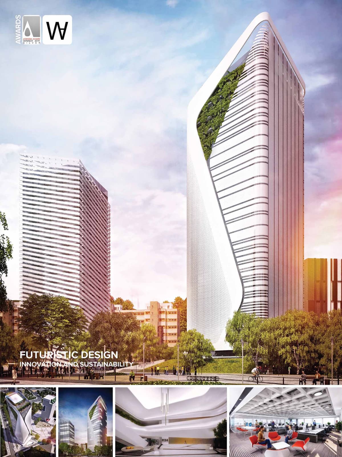

The futuristic design evokes concepts such as innovation and sustainability with the intention of creating a unique building. It stands with a clean and elegant skin and glass facade that opens into vertical gardens on some levels. The overall volume of the tower is conceived to engage in a dialogue with Rafael Moneo's "Puig Tower" which is located across the street. PE34 uses a similar color and material scheme as Moneo's tower, creating a visual balance between the two structures to be understand as a single entity.
PE34 is a new office tower in "Plaza de Europa" Barcelona, Spain. Designed by sanzpont [arquitectura], it will feature 22 stories with a total height of 92.80 meters from street level and more than 14,000 built square meters. Scale and Adaptation to the site: The building responds to the site by integrating itself into its surroundings, but highlighting its formal purity and intention. It stands in a dialogue with the "Puig Tower" both in maximum height allowed and facade scheme. It responds to an appropriate pedestrian scale by using a perimeter cantilever that gives hierarchy to the main entrance and its gardens.
The diagonal zigzag design in the facade accentuates the verticality of a curved smooth structure while creating a futuristic look. By integrating vertical gardens alongside solar controlled glass, the skin facade of the building is able to reduce energy consumption by being environmentally friendly.
CONSTRUCTION SYSTEM
The structure is conceived as a simple pillar system with a concrete core. The two-way slab (Holedeck) is a system of voided concrete slabs that can be pierced through their thickness by services and plumbing systems, drastically reducing up to 20% the height required to accommodate these building components.
By reducing the necessary height of each floor, fewer materials are required to achieve the same floor area as in a typical high-rise building. The spatial efficiency of floor decking systems has a dramatic effect on how tall buildings are planned, designed, and constructed.
The geometry of the floor provides excellent acoustic performance which absorbs a wide range of the sound spectrum.
CORPORATIVE IMAGE
Elegance: PE34 cutting edge image, is achieved by a sustainable design, with a high value of environmental responsibility, an elegance aesthetic resulting in a high level of comfort for its users and promoting the image of the business.
Designed to improve the life quality of the user: Design to follow architectural hedonism to create different experiences and comfort before, during and after the workday of all users.
Easy urban accessibility and bicycle parking. Access square with fountains, vegetation and relaxation areas. Flexible and comfortable diaphanous working spaces. Bistro and gardens to take breaks and rest. Ideal Lighting and thermal comfort to enhance work productivity. Fitness center to promote healthy living and a Roof top bar for social gatherings after the work day.
SUSTAINABILITY
The project contemplates proposals of sustainability that respect the natural environment, take advantage of the renewable energies and contribute well-being and health of the professionals who make use of the building in a daily way. The architecture is conditioned to the sunning and its design uses strategically solar control elements allowing a clear visual to the outside with a better thermal comfort.
NZEB is the acronym for Nearly Zero Energy Building or building with almost zero energy consumption. The European Energy Efficiency Directives establish a regulation whose objective is to promote the use of renewable energies, energy efficient constructive strategies and solutions of lighting and conditioning that reduce consumption to the maximum.
LOCATION & TRANSPORT
In direct connection with public transportation - Bicycle parking.
SUSTAINABLE SITES
The project considers aspects of sustainable use in terms of respect for local habitats and storm water management, and also generates green spaces to mitigate the heat island effect.
WATER EFFICIENCY
A smarter use of potable water, both inside and outside the building, is encouraged by using technologies to reduce consumption, efficient facilities, water recycling, as well as its control and measurement.
ENERGY & ATMOSPHERE
Strategies are considered to reduce energy consumption and increase the efficiency of the building, making use of renewable energy for natural lighting and the generation of energy, through solar photovoltaic panels, located on the roof. Efficient installations are also very important, as well as the artificial lighting system, which is posed with high efficiency LED system.
MATERIALS & RESOURCES
The selection of responsible and local materials minimizes the amount of waste in the construction process, as well as materials with recycled components and of low environmental impact. The facades propose the use of extra-stable solar control glass "SGG COOL LITE" to regulate the temperature, save energy and reduce the consumption of air conditioning, improving visual comfort by reducing the sun glare.
2 INTERNATIONAL ARCHITECTURE AWARDS
• A’ Design Awards, Milan, Italy : Gold Medal - Certificate Of Excellence in Building and Structure Design Category : PE34 (2018-2019)
• World Architecture Awards 10+5+X : Designed Category : PE34 (2018)


2 INTERNATIONAL ARCHITECTURE AWARDS
• A’ Design Awards, Milan, Italy : Gold Medal - Certificate Of Excellence in Building and Structure Design Category : PE34 (2018-2019)
• World Architecture Awards 10+5+X : Designed Category : PE34 (2018)
The futuristic design evokes concepts such as innovation and sustainability with the intention of creating a unique building. It stands with a clean and elegant skin and glass facade that opens into vertical gardens on some levels. The overall volume of the tower is conceived to engage in a dialogue with Rafael Moneo's "Puig Tower" which is located across the street. PE34 uses a similar color and material scheme as Moneo's tower, creating a visual balance between the two structures to be understand as a single entity.
PE34 is a new office tower in "Plaza de Europa" Barcelona, Spain. Designed by sanzpont [arquitectura], it will feature 22 stories with a total height of 92.80 meters from street level and more than 14,000 built square meters. Scale and Adaptation to the site: The building responds to the site by integrating itself into its surroundings, but highlighting its formal purity and intention. It stands in a dialogue with the "Puig Tower" both in maximum height allowed and facade scheme. It responds to an appropriate pedestrian scale by using a perimeter cantilever that gives hierarchy to the main entrance and its gardens.
The diagonal zigzag design in the facade accentuates the verticality of a curved smooth structure while creating a futuristic look. By integrating vertical gardens alongside solar controlled glass, the skin facade of the building is able to reduce energy consumption by being environmentally friendly.
CONSTRUCTION SYSTEM
The structure is conceived as a simple pillar system with a concrete core. The two-way slab (Holedeck) is a system of voided concrete slabs that can be pierced through their thickness by services and plumbing systems, drastically reducing up to 20% the height required to accommodate these building components.
By reducing the necessary height of each floor, fewer materials are required to achieve the same floor area as in a typical high-rise building. The spatial efficiency of floor decking systems has a dramatic effect on how tall buildings are planned, designed, and constructed.
The geometry of the floor provides excellent acoustic performance which absorbs a wide range of the sound spectrum.
CORPORATIVE IMAGE
Elegance: PE34 cutting edge image, is achieved by a sustainable design, with a high value of environmental responsibility, an elegance aesthetic resulting in a high level of comfort for its users and promoting the image of the business.
Designed to improve the life quality of the user: Design to follow architectural hedonism to create different experiences and comfort before, during and after the workday of all users.
Easy urban accessibility and bicycle parking. Access square with fountains, vegetation and relaxation areas. Flexible and comfortable diaphanous working spaces. Bistro and gardens to take breaks and rest. Ideal Lighting and thermal comfort to enhance work productivity. Fitness center to promote healthy living and a Roof top bar for social gatherings after the work day.
SUSTAINABILITY
The project contemplates proposals of sustainability that respect the natural environment, take advantage of the renewable energies and contribute well-being and health of the professionals who make use of the building in a daily way. The architecture is conditioned to the sunning and its design uses strategically solar control elements allowing a clear visual to the outside with a better thermal comfort.
NZEB is the acronym for Nearly Zero Energy Building or building with almost zero energy consumption. The European Energy Efficiency Directives establish a regulation whose objective is to promote the use of renewable energies, energy efficient constructive strategies and solutions of lighting and conditioning that reduce consumption to the maximum.
LOCATION & TRANSPORT
In direct connection with public transportation - Bicycle parking.
SUSTAINABLE SITES
The project considers aspects of sustainable use in terms of respect for local habitats and storm water management, and also generates green spaces to mitigate the heat island effect.
WATER EFFICIENCY
A smarter use of potable water, both inside and outside the building, is encouraged by using technologies to reduce consumption, efficient facilities, water recycling, as well as its control and measurement.
ENERGY & ATMOSPHERE
Strategies are considered to reduce energy consumption and increase the efficiency of the building, making use of renewable energy for natural lighting and the generation of energy, through solar photovoltaic panels, located on the roof. Efficient installations are also very important, as well as the artificial lighting system, which is posed with high efficiency LED system.
MATERIALS & RESOURCES
The selection of responsible and local materials minimizes the amount of waste in the construction process, as well as materials with recycled components and of low environmental impact. The facades propose the use of extra-stable solar control glass "SGG COOL LITE" to regulate the temperature, save energy and reduce the consumption of air conditioning, improving visual comfort by reducing the sun glare.
© 2021 by sanzpont [arquitectura] . Webpage by sanzpont [digital] . Innovative Digital Experiences
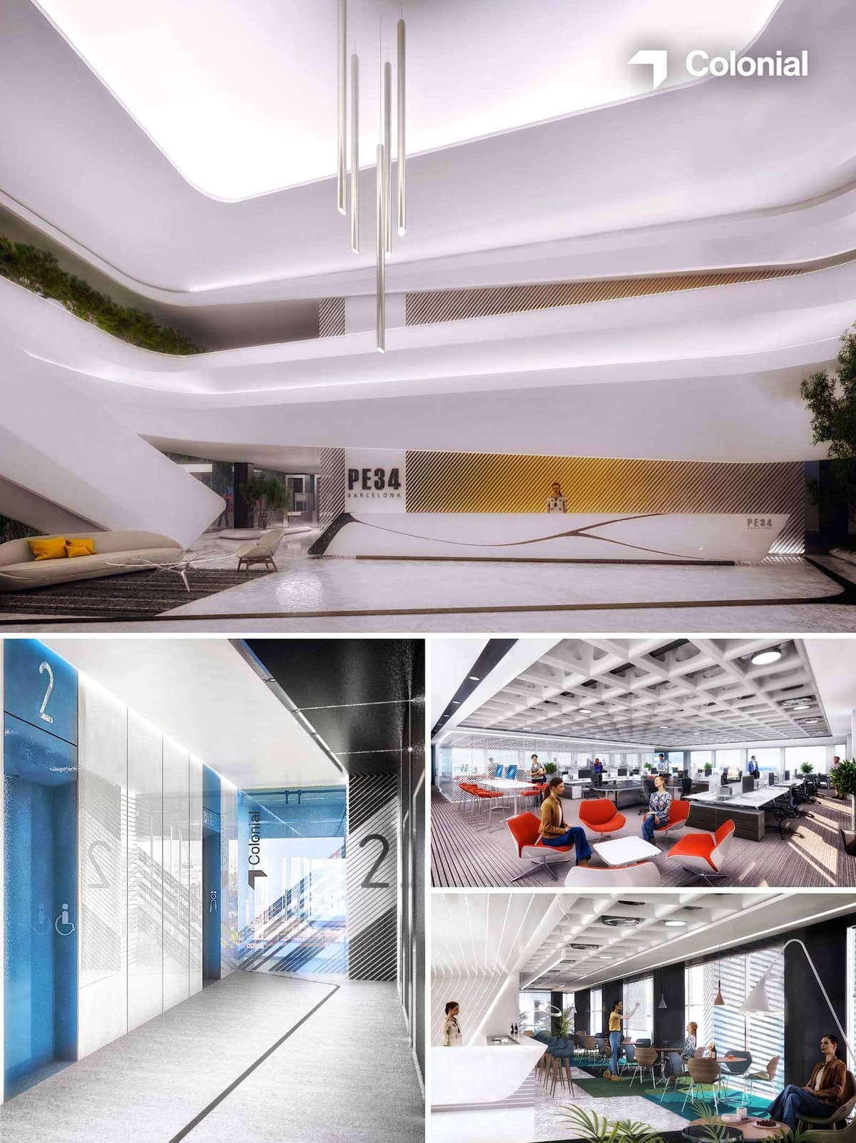

PE34 OFFICES proposes a contemporary corporate environment where fluidity, light and comfort articulate a new workplace paradigm in Barcelona. The project transforms the traditional office into a continuous landscape of interaction, dissolving rigid boundaries between lobby, circulation and workspace. Large sculpted surfaces, controlled lighting and a calibrated color palette build a strong identity for the building, supporting both the institutional character of the client and the dynamism of the users.
The concept is based on three main ideas: a sinuous ground-floor lobby acting as an interior urban plaza; legible and vibrant circulation cores as orientation landmarks; and flexible, high-performance office floors organized around collaboration hubs. These three strata are visually connected by a common language of linear light, diagonal textures and soft-radius geometries.
The entrance lobby unfolds as a multi-height atrium where balconies, ramps and voids interlock to create a sense of sculptural continuity. Horizontal white bands wrap the space, hiding technical elements and integrating indirect lighting, while the reception desk and vertical cores anchor the composition. Generous setbacks around the perimeter allow the integration of greenery, soft seating and informal waiting areas, turning circulation into a place of stay.
On the standard office floors, the layout prioritizes open-plan workstations with clear transversal views. Work islands are interspersed with lounges and touchdown points, encouraging spontaneous exchanges. The ceiling grid and lighting lines emphasize longitudinal perspectives, facilitating orientation. Perimeter zones alternate between focused work niches and social areas, adapting to varying degrees of privacy.
The palette combines warm minimalism with precise graphic accents. Continuous white surfaces in plaster and lacquered finishes generate a neutral envelope that magnifies natural light. Against this background, metallic meshes and ribbed panels introduce depth and subtly reflect movement, especially in the lobby front desk where a gradient from gold to silver underlines the corporate image of PE34.
Color is applied in concentrated fields to mark uses and transitions. Intense blues identify vertical cores and elevator lobbies, while orange and red seating pieces animate meeting points and waiting areas. Carpets and vinyl flooring in greys and charcoal define circulation carpets, reinforcing spatial hierarchy. Linear pendant luminaires and recessed LED profiles ensure uniform illumination while accentuating the curvature of walls and soffits, giving the building a distinctive nighttime presence.
The work environment is designed to support multiple modes of activity, from concentrated individual tasks to collaborative sessions and informal meetings. Desking systems are arranged in bench configurations for maximum flexibility, allowing quick reconfiguration as teams evolve. Acoustic performance is addressed through the exposed coffered slabs combined with absorptive panels and textile elements, ensuring comfort in open-plan areas.
Furniture selection combines ergonomic task chairs with more domestic lounge elements, softening the corporate atmosphere. Low tables, upholstered armchairs and bar-height counters provide alternative postures and foster a sense of community. In the break-out and café zones, lighter chairs and playful colors suggest a more relaxed rhythm, contributing to well-being and promoting informal interaction between different departments.
Sustainability is approached through the integration of passive and active measures, targeting both environmental performance and user comfort. The building envelope and interior layout are conceived to maximize daylight penetration, reducing artificial lighting demand while carefully controlling glare with external louvers and adjustable internal screens. High-efficiency LED systems, presence detectors and daylight sensors further limit energy consumption in circulation and office areas.
Material choices prioritize durability and low maintenance, with an emphasis on recyclable metals, long-life floor finishes and modular ceiling systems that facilitate adaptation over time, extending the life cycle of the fit-out. Interior planting and green walls in the lobby and common areas improve air quality and create a biophilic connection in an urban context. Generous visual openness, access to shared amenities and the provision of varied work settings all contribute to a healthier, more resilient working environment aligned with contemporary sustainability and ESG standards.


PE34 OFFICES proposes a contemporary corporate environment where fluidity, light and comfort articulate a new workplace paradigm in Barcelona. The project transforms the traditional office into a continuous landscape of interaction, dissolving rigid boundaries between lobby, circulation and workspace. Large sculpted surfaces, controlled lighting and a calibrated color palette build a strong identity for the building, supporting both the institutional character of the client and the dynamism of the users.
The concept is based on three main ideas: a sinuous ground-floor lobby acting as an interior urban plaza; legible and vibrant circulation cores as orientation landmarks; and flexible, high-performance office floors organized around collaboration hubs. These three strata are visually connected by a common language of linear light, diagonal textures and soft-radius geometries.
The entrance lobby unfolds as a multi-height atrium where balconies, ramps and voids interlock to create a sense of sculptural continuity. Horizontal white bands wrap the space, hiding technical elements and integrating indirect lighting, while the reception desk and vertical cores anchor the composition. Generous setbacks around the perimeter allow the integration of greenery, soft seating and informal waiting areas, turning circulation into a place of stay.
On the standard office floors, the layout prioritizes open-plan workstations with clear transversal views. Work islands are interspersed with lounges and touchdown points, encouraging spontaneous exchanges. The ceiling grid and lighting lines emphasize longitudinal perspectives, facilitating orientation. Perimeter zones alternate between focused work niches and social areas, adapting to varying degrees of privacy.
The palette combines warm minimalism with precise graphic accents. Continuous white surfaces in plaster and lacquered finishes generate a neutral envelope that magnifies natural light. Against this background, metallic meshes and ribbed panels introduce depth and subtly reflect movement, especially in the lobby front desk where a gradient from gold to silver underlines the corporate image of PE34.
Color is applied in concentrated fields to mark uses and transitions. Intense blues identify vertical cores and elevator lobbies, while orange and red seating pieces animate meeting points and waiting areas. Carpets and vinyl flooring in greys and charcoal define circulation carpets, reinforcing spatial hierarchy. Linear pendant luminaires and recessed LED profiles ensure uniform illumination while accentuating the curvature of walls and soffits, giving the building a distinctive nighttime presence.
The work environment is designed to support multiple modes of activity, from concentrated individual tasks to collaborative sessions and informal meetings. Desking systems are arranged in bench configurations for maximum flexibility, allowing quick reconfiguration as teams evolve. Acoustic performance is addressed through the exposed coffered slabs combined with absorptive panels and textile elements, ensuring comfort in open-plan areas.
Furniture selection combines ergonomic task chairs with more domestic lounge elements, softening the corporate atmosphere. Low tables, upholstered armchairs and bar-height counters provide alternative postures and foster a sense of community. In the break-out and café zones, lighter chairs and playful colors suggest a more relaxed rhythm, contributing to well-being and promoting informal interaction between different departments.
Sustainability is approached through the integration of passive and active measures, targeting both environmental performance and user comfort. The building envelope and interior layout are conceived to maximize daylight penetration, reducing artificial lighting demand while carefully controlling glare with external louvers and adjustable internal screens. High-efficiency LED systems, presence detectors and daylight sensors further limit energy consumption in circulation and office areas.
Material choices prioritize durability and low maintenance, with an emphasis on recyclable metals, long-life floor finishes and modular ceiling systems that facilitate adaptation over time, extending the life cycle of the fit-out. Interior planting and green walls in the lobby and common areas improve air quality and create a biophilic connection in an urban context. Generous visual openness, access to shared amenities and the provision of varied work settings all contribute to a healthier, more resilient working environment aligned with contemporary sustainability and ESG standards.
© 2021 by sanzpont [arquitectura] . Webpage by sanzpont [digital] . Innovative Digital Experiences
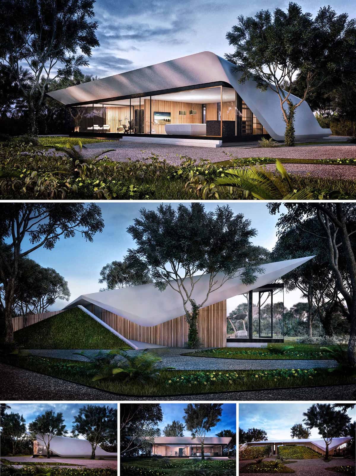

The PLY Villa Expansion is conceived as a light, sculptural pavilion dedicated to wellness, spa and fitness, extending the original villa’s idea of inhabitable landscape. The new volume acts as a calm sanctuary in the jungle, where architecture, body and nature are integrated. A continuous white shell wraps and protects transparent interiors, generating soft, indirect light and a sense of floating above the ground, ideal for relaxation and mindful exercise.
The expansion is positioned as a complementary wing to the first phase, connected through garden paths and visual alignments rather than heavy built links. While the main villa is embedded in the terrain with green roofs, this new piece hovers more visibly, reading as a refined object in the landscape. Both phases share materials, proportions and the language of topographic roofs, ensuring a coherent ensemble that can be perceived as a single compound.
The defining gesture is a continuous, folded roof-skin that rises from the ground, curves over the glazed perimeter and descends again to meet the landscape. This element unifies roof and walls into one fluid silhouette, protecting the program from sun and rain while opening strategic views toward the surrounding trees. The shell’s pointed and lifted corners create dynamic perspectives from every approach, reinforcing the impression of a gently tensioned canvas above a transparent base.
The lower band of the building is almost entirely glazed, framed by slender dark profiles that visually dematerialize the structure. Behind the glass, warm vertical timber panels establish a soft and tactile interior backdrop. The opaque shell is finished in a light, high-performance coating that reflects heat and subtly captures the changing sky tones throughout the day. On one flank, the roof folds down to meet a planted green slope, merging the pavilion back into the ground plane.
The interior is organized as a sequence of open and semi-open wellness spaces. A central gym area runs along the main façade, fully transparent to the garden, allowing exercise to take place in constant visual contact with nature. More intimate spa and treatment rooms are located toward the solid ends, benefiting from filtered light and controlled privacy. The layout encourages slow movement along a clear axis, with framed views, niches for stretching or meditation and direct exits to outdoor terraces.
The landscape around the expansion is designed as a soft buffer of native planting, low shrubs and permeable paths. Approaching the building, visitors read the green slope and planted roof as an extension of the existing villa’s topography. This green plane visually anchors the pavilion and provides an elevated, contemplative garden above the wellness spaces. Night lighting is discreet and warm, accentuating the folded roof and tree trunks while protecting the dark sky and surrounding fauna.
Sustainability is integrated through passive and active measures aligned with the spa’s health-oriented nature. The large overhangs of the shell and the preserved trees reduce direct solar gain on the glazing, significantly limiting cooling demand. Cross-ventilation can be enabled by opening opposite façades during mild periods, while the green slope and roof add thermal mass and stormwater retention. Materials prioritize low maintenance and regional sourcing, particularly timber cladding and local aggregates. Provision for solar thermal or photovoltaic systems on less visible surfaces supports renewable energy use, ensuring that the pursuit of wellness is inseparable from a responsible, low-impact architectural response.


The PLY Villa Expansion is conceived as a light, sculptural pavilion dedicated to wellness, spa and fitness, extending the original villa’s idea of inhabitable landscape. The new volume acts as a calm sanctuary in the jungle, where architecture, body and nature are integrated. A continuous white shell wraps and protects transparent interiors, generating soft, indirect light and a sense of floating above the ground, ideal for relaxation and mindful exercise.
The expansion is positioned as a complementary wing to the first phase, connected through garden paths and visual alignments rather than heavy built links. While the main villa is embedded in the terrain with green roofs, this new piece hovers more visibly, reading as a refined object in the landscape. Both phases share materials, proportions and the language of topographic roofs, ensuring a coherent ensemble that can be perceived as a single compound.
The defining gesture is a continuous, folded roof-skin that rises from the ground, curves over the glazed perimeter and descends again to meet the landscape. This element unifies roof and walls into one fluid silhouette, protecting the program from sun and rain while opening strategic views toward the surrounding trees. The shell’s pointed and lifted corners create dynamic perspectives from every approach, reinforcing the impression of a gently tensioned canvas above a transparent base.
The lower band of the building is almost entirely glazed, framed by slender dark profiles that visually dematerialize the structure. Behind the glass, warm vertical timber panels establish a soft and tactile interior backdrop. The opaque shell is finished in a light, high-performance coating that reflects heat and subtly captures the changing sky tones throughout the day. On one flank, the roof folds down to meet a planted green slope, merging the pavilion back into the ground plane.
The interior is organized as a sequence of open and semi-open wellness spaces. A central gym area runs along the main façade, fully transparent to the garden, allowing exercise to take place in constant visual contact with nature. More intimate spa and treatment rooms are located toward the solid ends, benefiting from filtered light and controlled privacy. The layout encourages slow movement along a clear axis, with framed views, niches for stretching or meditation and direct exits to outdoor terraces.
The landscape around the expansion is designed as a soft buffer of native planting, low shrubs and permeable paths. Approaching the building, visitors read the green slope and planted roof as an extension of the existing villa’s topography. This green plane visually anchors the pavilion and provides an elevated, contemplative garden above the wellness spaces. Night lighting is discreet and warm, accentuating the folded roof and tree trunks while protecting the dark sky and surrounding fauna.
Sustainability is integrated through passive and active measures aligned with the spa’s health-oriented nature. The large overhangs of the shell and the preserved trees reduce direct solar gain on the glazing, significantly limiting cooling demand. Cross-ventilation can be enabled by opening opposite façades during mild periods, while the green slope and roof add thermal mass and stormwater retention. Materials prioritize low maintenance and regional sourcing, particularly timber cladding and local aggregates. Provision for solar thermal or photovoltaic systems on less visible surfaces supports renewable energy use, ensuring that the pursuit of wellness is inseparable from a responsible, low-impact architectural response.
© 2021 by sanzpont [arquitectura] . Webpage by sanzpont [digital] . Innovative Digital Experiences
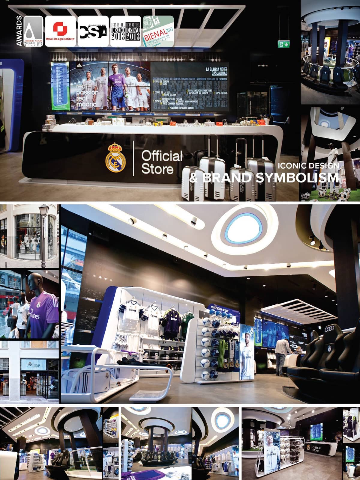

After winning a Restricted International Competition, sanzpont [arquitectura] was selected for the design of the Real Madrid Official Store. The project includes Concept Design and Commercial Implementation, Branding, Packaging, Graphic Line and Industrial Furniture Design. The club Real Madrid, Adidas and Areas opt for a very innovative and cutting-edge design, focused on the shopping experience and the creation of impression. Led by the multinational company Areas, the first store was opened at Goya, 77 in the center of Madrid, and this flagship store is located at Gran Via 31, in the Spanish capital. In the basement of the store we find a Special Corner, a thematic space that changes over time. Currently this space is themed as a Real Madrid bathroom, in the near future it will be a bedroom and even a full equip kitchen.
Cutting Edge BIM Technology The project was developed using cutting edge design tools from start to end based in a BIM system. “The working methodology in sanzpont is fully three-dimensional with BIM technology, we do not create drawings of a design, we create intelligent digital models of the design itself. Such models contain a digital constructive database capable of generating any type of digital information depending on the current phase of the project, in a way that to progress in the development of a project, is to advance the level of detail of the model.”
“The information generated through a BIM system is totally reliable and very rich in visual quality, since all the elements and views are connected to the same model. This system allows you to create stunning 3D visual information of a project related in 4D timeline and its implementation phases.”
Experience the Santiago Bernabéu The design concept of the store is based on an experience at the Santiago Bernabeu, all the walls are lined with images that make you teleport to the center of the field, in game action. The central marquee of the stadium is reinterpreted to highlight the store cash-wrap, accompanied by a media wall and a panel lined with victories that shows all the glory of the club.
Glory is not by Chance The Creative Concept is based on representing the required effort to achieve glory. It is the justification of a majestic sport career, only own by the best soccer team in history. Is a concept that at the same time it honors, praises and immortalizes the club, it states that achievements have been the result of talent, effort, struggle, dedication and determination. The fighting spirit identifies the club with his followers, is what makes us great, is what leads us to win.
LEDs are integrated in the images of the walls to create the effects of the public taking pictures with flash. These LEDs are synchronized with the in-store multimedia system, and activated when a goal happens in the media wall screens, all these while listening to the crowded stadium. The players reflected on the walls of the store are legends that have been indispensable for the greatness and immortality in the club.
Modular Vanguard Design The store is divided into three exhibition areas: Textile Zone (Official Gear and Training), Merchandising Zone and Adidas Zone. All the furniture is modular and is designed with the concept of “Ready to Assemble Modular Design”, which is designed from the minimum piece to its intelligent assembly system. This allows maximum flexibility and versatility of distribution, a more sustainable transportation by optimizing the dimensions and logistics for international expansion.
Equipment Efficiency An important factor in the concept design is energy saving and a serious commitment for sustainability, that is why 100% of the store is made with last generation LED luminaries with a maximum energy efficiency. In addition to intelligent lighting, the HVAC systems are optimized for maximum performance to minimize energy consumption. The store entrance is designed with double HVAC sealing system, besides having an automated gate that opens only when the customer enters or leaves, it has an air curtain that works intelligently.
DESIGN SCOPE
Concept Design, Brand Image, Graphic Design, Store Packaging, Construction Documents, Construction Supervision.
EXECUTED & BUILT PROJECTS
Real Madrid Official Store Experience
SPAIN
1. Madrid, Arenal 6
2. Madrid, Bus
3. Madrid, Carmen 3
4. Madrid, Goya 77
5. Madrid, Gran Via 31
6. Madrid, Las Rozas Village
7. Madrid, MAD Airport T4
8. Madrid, MAD Airport T4S
9. Madrid, San Sebastián de Los Reyes
10. Mallorca, Plaza Cort 6
11. Barcelona, Ferran 36
12. Barcelona, Las Ramblas 114
13. Barcelona, Maremagnum
14. Barcelona, BCN Airport T2
MÉXICO
15. CDMX, Centro Santa Fé
16. CDMX, Horacio 232
17. CDMX, Satélite
18. CDMX, Venustiano Carranza
QATAR
19. Doha, Gulf Mall
20. Doha,Tawar Mall
21. Doha,The Pearl
• IDA Design Awards, Los Angeles, USA : Honorable Mention - Interior Design Commercial : Real Madrid Official Store (2014)
• A’ Design Awards, Milán, Italy : Silver Medal - Certificado de Excelencia en Diseño de Espacios Interiores y de Exhibición del Mundo : Real Madrid Official Store (2014)
• Chain Store Age, NY, USA : 1st Place Softline Specialty Store Category : Real Madrid Official Store (2013)
• Chain Store Age, NY, USA : 1st Place Cashwrap Design Category: Real Madrid Official Store (2013)
• International Store Design Awards, Retail Design Institute, NY, USA : Award of Merit : Real Madrid Official Store (2013)
• Iconos del Diseño AD 2013, Architectural Digest México : Best Comercial Architecture : Real Madrid Official Store (2013)
• Tercera Bienal de Arquitectura Mexicana, Cancún : 1st Place Technical Innovation Category : Real Madrid Official Store (2013)


• IDA Design Awards, Los Angeles, USA : Honorable Mention - Interior Design Commercial : Real Madrid Official Store (2014)
• A’ Design Awards, Milán, Italy : Silver Medal - Certificado de Excelencia en Diseño de Espacios Interiores y de Exhibición del Mundo : Real Madrid Official Store (2014)
• Chain Store Age, NY, USA : 1st Place Softline Specialty Store Category : Real Madrid Official Store (2013)
• Chain Store Age, NY, USA : 1st Place Cashwrap Design Category: Real Madrid Official Store (2013)
• International Store Design Awards, Retail Design Institute, NY, USA : Award of Merit : Real Madrid Official Store (2013)
• Iconos del Diseño AD 2013, Architectural Digest México : Best Comercial Architecture : Real Madrid Official Store (2013)
• Tercera Bienal de Arquitectura Mexicana, Cancún : 1st Place Technical Innovation Category : Real Madrid Official Store (2013)
After winning a Restricted International Competition, sanzpont [arquitectura] was selected for the design of the Real Madrid Official Store. The project includes Concept Design and Commercial Implementation, Branding, Packaging, Graphic Line and Industrial Furniture Design. The club Real Madrid, Adidas and Areas opt for a very innovative and cutting-edge design, focused on the shopping experience and the creation of impression. Led by the multinational company Areas, the first store was opened at Goya, 77 in the center of Madrid, and this flagship store is located at Gran Via 31, in the Spanish capital. In the basement of the store we find a Special Corner, a thematic space that changes over time. Currently this space is themed as a Real Madrid bathroom, in the near future it will be a bedroom and even a full equip kitchen.
Cutting Edge BIM Technology The project was developed using cutting edge design tools from start to end based in a BIM system. “The working methodology in sanzpont is fully three-dimensional with BIM technology, we do not create drawings of a design, we create intelligent digital models of the design itself. Such models contain a digital constructive database capable of generating any type of digital information depending on the current phase of the project, in a way that to progress in the development of a project, is to advance the level of detail of the model.”
“The information generated through a BIM system is totally reliable and very rich in visual quality, since all the elements and views are connected to the same model. This system allows you to create stunning 3D visual information of a project related in 4D timeline and its implementation phases.”
Experience the Santiago Bernabéu The design concept of the store is based on an experience at the Santiago Bernabeu, all the walls are lined with images that make you teleport to the center of the field, in game action. The central marquee of the stadium is reinterpreted to highlight the store cash-wrap, accompanied by a media wall and a panel lined with victories that shows all the glory of the club.
Glory is not by Chance The Creative Concept is based on representing the required effort to achieve glory. It is the justification of a majestic sport career, only own by the best soccer team in history. Is a concept that at the same time it honors, praises and immortalizes the club, it states that achievements have been the result of talent, effort, struggle, dedication and determination. The fighting spirit identifies the club with his followers, is what makes us great, is what leads us to win.
LEDs are integrated in the images of the walls to create the effects of the public taking pictures with flash. These LEDs are synchronized with the in-store multimedia system, and activated when a goal happens in the media wall screens, all these while listening to the crowded stadium. The players reflected on the walls of the store are legends that have been indispensable for the greatness and immortality in the club.
Modular Vanguard Design The store is divided into three exhibition areas: Textile Zone (Official Gear and Training), Merchandising Zone and Adidas Zone. All the furniture is modular and is designed with the concept of “Ready to Assemble Modular Design”, which is designed from the minimum piece to its intelligent assembly system. This allows maximum flexibility and versatility of distribution, a more sustainable transportation by optimizing the dimensions and logistics for international expansion.
Equipment Efficiency An important factor in the concept design is energy saving and a serious commitment for sustainability, that is why 100% of the store is made with last generation LED luminaries with a maximum energy efficiency. In addition to intelligent lighting, the HVAC systems are optimized for maximum performance to minimize energy consumption. The store entrance is designed with double HVAC sealing system, besides having an automated gate that opens only when the customer enters or leaves, it has an air curtain that works intelligently.
DESIGN SCOPE
Concept Design, Brand Image, Graphic Design, Store Packaging, Construction Documents, Construction Supervision.
EXECUTED & BUILT PROJECTS
Real Madrid Official Store Experience
SPAIN
1. Madrid, Arenal 6
2. Madrid, Bus
3. Madrid, Carmen 3
4. Madrid, Goya 77
5. Madrid, Gran Via 31
6. Madrid, Las Rozas Village
7. Madrid, MAD Airport T4
8. Madrid, MAD Airport T4S
9. Madrid, San Sebastián de Los Reyes
10. Mallorca, Plaza Cort 6
11. Barcelona, Ferran 36
12. Barcelona, Las Ramblas 114
13. Barcelona, Maremagnum
14. Barcelona, BCN Airport T2
MÉXICO
15. CDMX, Centro Santa Fé
16. CDMX, Horacio 232
17. CDMX, Satélite
18. CDMX, Venustiano Carranza
QATAR
19. Doha, Gulf Mall
20. Doha,Tawar Mall
21. Doha,The Pearl
© 2021 by sanzpont [arquitectura] . Webpage by sanzpont [digital] . Innovative Digital Experiences
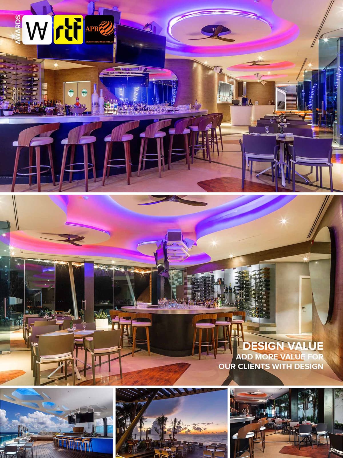

TCH Restaurant is conceived as a fluid transition between the Caribbean waterfront and a contemporary lounge atmosphere. The project fuses the dynamism of nightlife with the openness of a seaside terrace, creating a continuous spatial narrative from day to night. Organic ceiling forms, reflective surfaces and a central bar island structure orchestrate the experience, framing views towards the sea while generating an intimate interior landscape. The concept emphasizes movement and energy, expressed through curved geometries, layered lighting and carefully choreographed circulation around the bar.
The restaurant operates as both destination and viewpoint. Large glazed façades dissolve the physical limit between interior and exterior, allowing the vivid sky and sunset to become an active component of the design. During the day, natural light and the ocean horizon dominate; at night, chromatic LED lighting reconfigures the space, transforming it into a vibrant, immersive environment.
The plan is structured around a central bar island that functions as the spatial and social core. Seating radiates from this nucleus in concentric layers: high stools at the bar, followed by low dining tables, and finally the perimeter terrace that opens to the sea. This arrangement ensures clear sightlines, easy service circulation, and equal access to views for most tables.
Interior and exterior platforms are subtly differentiated by changes in floor material and level rather than by solid partitions. Sliding glass panels on the façade enable the dining area to operate either as a controlled indoor climate zone or as an open-air extension of the terrace. Circulation routes are intuitive, guiding guests from entry to bar, and then naturally out towards the oceanfront deck, where the sunset-oriented seating is maximized.
The material palette balances local warmth with contemporary precision. Polished concrete floors provide durability and thermal mass, while curved timber wall claddings and bar fronts introduce tactile comfort and visual softness. Wood is used in bar stools, tabletops, and pergola structures, creating a cohesive language that echoes the tones of sand and palm trunks.
Neutral base colors—beige floors, white ceilings, and dark bar volumes—are intentionally restrained to serve as a canvas for dynamic lighting. Metallic accents on bottle displays and mirrors enhance depth and reflection, multiplying views of both the interior and the exterior landscape. Exterior areas use more weather-resistant finishes and decking, maintaining continuity of tone without compromising performance in the coastal climate.
Lighting design is central to the identity of TCH Restaurant. Sculpted ceiling coves integrate RGB LED strips that wash the undulating surfaces with gradients of magenta, violet and blue, evoking the chromatic intensity of Caribbean sunsets. These indirect lights are complemented by warm white downlights that provide functional illumination for tables and the bar counter.
The combination of reflected colored light and strategic accenting on the bottle racks, bar surfaces and perimeter glazing generates a layered atmosphere. Lighting scenes are programmable, allowing smooth transition from a relaxed daytime ambience to a more theatrical nightlife setting. Exterior terraces rely on discreet, low-glare fixtures that preserve views of the night sky and the sea while ensuring guest comfort and safety.
Furniture is designed with ergonomic comfort and visual simplicity, using clean lines that do not compete with the expressive ceiling. High stools around the bar emphasize social interaction and flexibility, while dining chairs and tables are lightweight and easily reconfigurable for different group sizes or events. The central bar’s rounded geometry minimizes dead corners and optimizes service efficiency.
Custom wine displays and mirrored niches serve both as storage and as sculptural elements, articulating the back-bar wall. Large ceiling fans provide perceptible air movement, reinforcing comfort in the tropical climate and reducing the dependence on mechanical cooling when façades are open. The detailing of edges, junctions and transitions aims for a seamless reading of the space, enhancing the overall guest experience.
The project responds to the coastal context of Playa del Carmen by maximizing natural ventilation, visual permeability and orientation towards prevailing breezes. Extensive glazing is protected by overhangs and pergolas, mitigating direct solar gain while preserving panoramic views. The openable façade system allows the restaurant to operate in a hybrid indoor–outdoor mode, reducing reliance on air conditioning during temperate hours.
Sustainability strategies include the use of LED lighting throughout, significantly lowering energy consumption, and the selection of durable, locally appropriate materials that withstand saline air and humidity, reducing maintenance and replacement cycles. The predominance of wood from responsibly managed sources, combined with the thermal mass of concrete floors, supports a balanced indoor climate. By integrating bioclimatic principles with a high-impact aesthetic, the restaurant aligns environmental responsibility with a memorable guest experience.


TCH Restaurant is conceived as a fluid transition between the Caribbean waterfront and a contemporary lounge atmosphere. The project fuses the dynamism of nightlife with the openness of a seaside terrace, creating a continuous spatial narrative from day to night. Organic ceiling forms, reflective surfaces and a central bar island structure orchestrate the experience, framing views towards the sea while generating an intimate interior landscape. The concept emphasizes movement and energy, expressed through curved geometries, layered lighting and carefully choreographed circulation around the bar.
The restaurant operates as both destination and viewpoint. Large glazed façades dissolve the physical limit between interior and exterior, allowing the vivid sky and sunset to become an active component of the design. During the day, natural light and the ocean horizon dominate; at night, chromatic LED lighting reconfigures the space, transforming it into a vibrant, immersive environment.
The plan is structured around a central bar island that functions as the spatial and social core. Seating radiates from this nucleus in concentric layers: high stools at the bar, followed by low dining tables, and finally the perimeter terrace that opens to the sea. This arrangement ensures clear sightlines, easy service circulation, and equal access to views for most tables.
Interior and exterior platforms are subtly differentiated by changes in floor material and level rather than by solid partitions. Sliding glass panels on the façade enable the dining area to operate either as a controlled indoor climate zone or as an open-air extension of the terrace. Circulation routes are intuitive, guiding guests from entry to bar, and then naturally out towards the oceanfront deck, where the sunset-oriented seating is maximized.
The material palette balances local warmth with contemporary precision. Polished concrete floors provide durability and thermal mass, while curved timber wall claddings and bar fronts introduce tactile comfort and visual softness. Wood is used in bar stools, tabletops, and pergola structures, creating a cohesive language that echoes the tones of sand and palm trunks.
Neutral base colors—beige floors, white ceilings, and dark bar volumes—are intentionally restrained to serve as a canvas for dynamic lighting. Metallic accents on bottle displays and mirrors enhance depth and reflection, multiplying views of both the interior and the exterior landscape. Exterior areas use more weather-resistant finishes and decking, maintaining continuity of tone without compromising performance in the coastal climate.
Lighting design is central to the identity of TCH Restaurant. Sculpted ceiling coves integrate RGB LED strips that wash the undulating surfaces with gradients of magenta, violet and blue, evoking the chromatic intensity of Caribbean sunsets. These indirect lights are complemented by warm white downlights that provide functional illumination for tables and the bar counter.
The combination of reflected colored light and strategic accenting on the bottle racks, bar surfaces and perimeter glazing generates a layered atmosphere. Lighting scenes are programmable, allowing smooth transition from a relaxed daytime ambience to a more theatrical nightlife setting. Exterior terraces rely on discreet, low-glare fixtures that preserve views of the night sky and the sea while ensuring guest comfort and safety.
Furniture is designed with ergonomic comfort and visual simplicity, using clean lines that do not compete with the expressive ceiling. High stools around the bar emphasize social interaction and flexibility, while dining chairs and tables are lightweight and easily reconfigurable for different group sizes or events. The central bar’s rounded geometry minimizes dead corners and optimizes service efficiency.
Custom wine displays and mirrored niches serve both as storage and as sculptural elements, articulating the back-bar wall. Large ceiling fans provide perceptible air movement, reinforcing comfort in the tropical climate and reducing the dependence on mechanical cooling when façades are open. The detailing of edges, junctions and transitions aims for a seamless reading of the space, enhancing the overall guest experience.
The project responds to the coastal context of Playa del Carmen by maximizing natural ventilation, visual permeability and orientation towards prevailing breezes. Extensive glazing is protected by overhangs and pergolas, mitigating direct solar gain while preserving panoramic views. The openable façade system allows the restaurant to operate in a hybrid indoor–outdoor mode, reducing reliance on air conditioning during temperate hours.
Sustainability strategies include the use of LED lighting throughout, significantly lowering energy consumption, and the selection of durable, locally appropriate materials that withstand saline air and humidity, reducing maintenance and replacement cycles. The predominance of wood from responsibly managed sources, combined with the thermal mass of concrete floors, supports a balanced indoor climate. By integrating bioclimatic principles with a high-impact aesthetic, the restaurant aligns environmental responsibility with a memorable guest experience.
© 2021 by sanzpont [arquitectura] . Webpage by sanzpont [digital] . Innovative Digital Experiences
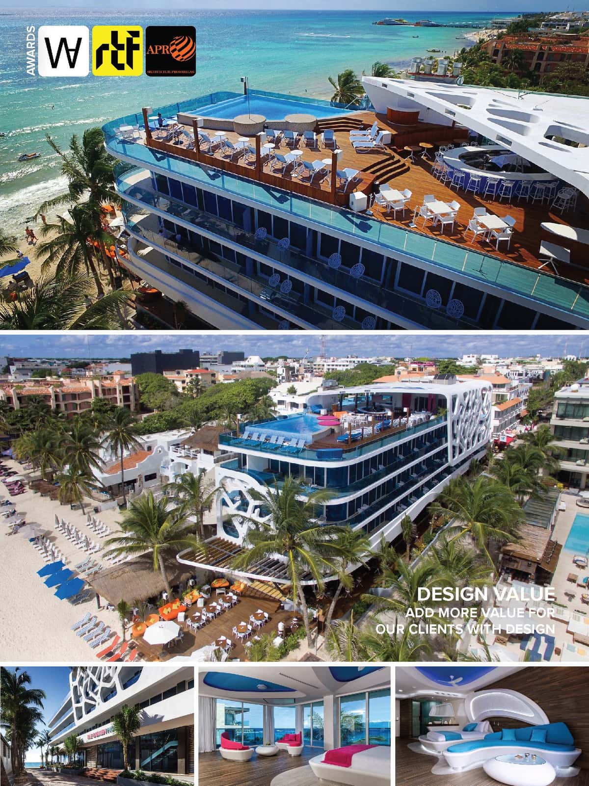

DESIGN CONCEPT
Inspiration: Exotic and vanguard Design was inspired by Caribbean Coral Reef. The concept design was based on creating an experience to visitors with a unique and contemporary ambiance.
Design Concept inspired by the Coral Reef of the Caribbean Sea. Exotic, sustainable and avant-garde design, inspired by the coral reef of the Caribbean Sea. The design concept is focused on representing an experience for each of its visitors through a natural, unique and contemporary environment.
MODULAR STRUCTURE & HIGH THERMAL EFFICIENCY
Modular structure and high thermal efficiency: The structure of the building is totally regulated through the constructive system based on frames, which makes a logical, simple and economical structure. The entire building uses the Novidesa construction system (high density polyurethane), which is highly efficient in thermal and acoustic insulation.
Functionality and a view from every room
This project’s first principle, which is functionality, was resolved by best utilizing the space. Secondly, since the site offered a short façade overlooking the sea and a long façade facing the street, the solution was to rotate the building 30 degrees to ensure all rooms featured an ocean-view. The project was developed across three levels of rooms, in addition to the following on each level: a basement level with utilities, a ground floor with reception and a restaurant, and a roof pool on the third level.
SUSTAINABILITY
High Efficiency with Low Energy Consumption.
The whole building is built using a high density polyurethane construction system, which prevents solar radiation heating, and integrates double glazed windows, achieving a completely isolated system when the use of air conditioning is required. The design features a highly efficient use of cross ventilation of natural air which keeps the consumption of air conditioner to the very minimum. In addition, the heat emitted works to heat the water.
The water system is divided into sewage and gray, independently treated. In terms of lighting, the entire building has LED technology with low energy consumption.
CLIMATE ANALYSIS
The hotel is located on one of the most paradisiacal beaches of the Caribbean Sea, on Calle 8 in Playa del Cármen, Quintana Roo. The climate of the region is warm and sub-humid. The movements and angles of the sun were analyzed with solar geometry, which allowed us to implement effective architectural shading elements. Overhangs and lattices were put in place to prevent the penetration of direct sunlight into the interiors and to block the South and West facades.
Sundown: The average annual temperature ranges between 28º C and 32º C (82º F and 90º F) in summer; and from 26º C to 27º C (78º F and 80º F) in winter. Isolating the building was essential to create comfortable interior temperatures. The thermal gain that the building would undergo was calculated using a thermal digital analytical model, obtaining a greater gain in the roofs, South and West façades, all of which dictate the choice of materials.
ENERGY SAVINGS
The building is conditioned to reduce energy consumption by the efficient design of constructive, hydraulic, electrical, electronic and refrigeration systems, which have a fundamental role in the energy efficiency of the building.
The 100% of the building is made with state-of-the-art LED luminaires with the highest energy efficiency of very low consumption.
The use of efficient refrigeration equipment reduced CO2 emissions by 30%.
The energy consumption of the building is reduced due to the care in the choice of all its systems, which leads to a saving in its consumption and a reduction of the pollution during its life cycle.
Each room has presence detectors and door and window opening sensors in order to reduce and control the air conditioning system and avoid waste of energy.
INNOVATIVE MATERIALS
To avoid the passage of heat through thermal conductivity to spaces, innovative materials were used. The entire building, both its slabs, exterior and interior walls were made with high density polystyrene insulation materials. All windows are made of triple-pane glass with argon gas with very low thermal conductivity.
NATURAL CROSS VENTILATION
Knowing that the dominant winds in the Caribbean come from the Southeast and East, it was decided to turn the rooms 30 degrees to capture the wind and extract it through a duct in the ceiling of the corridor, creating natural ventilation in each space.
USER EXPERIENCE THROUGH ART
Having solved the principles of utility and logic, we then focused on aesthetics. After analyzing the context, we concluded that because of the hotel’s location on the coast of Playa del Carmen, and the extensive number of competing hotels in the same prince range, the only way to stand out against the competition was to create a boutique hotel that gives added value to the client. In this case, the added value is a building that offers a relaxing experience, in harmony with nature, art and elegance for each of its users. The primary objective of the client is to compete commercially with quality offering a sustainable, unique and iconic product in the area.
INTERNATIONAL ARCHITECTURE AWARDS
• Silver A' Design Award Winner in Architecture, Building and Structure Design Category 2016 - 2017
• First Place in Hotel Category: Peninsula Award For Architecture and Interior Design AAI México AAI 2017


INTERNATIONAL ARCHITECTURE AWARDS
• Silver A' Design Award Winner in Architecture, Building and Structure Design Category 2016 - 2017
• First Place in Hotel Category: Peninsula Award For Architecture and Interior Design AAI México AAI 2017
DESIGN CONCEPT
Inspiration: Exotic and vanguard Design was inspired by Caribbean Coral Reef. The concept design was based on creating an experience to visitors with a unique and contemporary ambiance.
Design Concept inspired by the Coral Reef of the Caribbean Sea. Exotic, sustainable and avant-garde design, inspired by the coral reef of the Caribbean Sea. The design concept is focused on representing an experience for each of its visitors through a natural, unique and contemporary environment.
MODULAR STRUCTURE & HIGH THERMAL EFFICIENCY
Modular structure and high thermal efficiency: The structure of the building is totally regulated through the constructive system based on frames, which makes a logical, simple and economical structure. The entire building uses the Novidesa construction system (high density polyurethane), which is highly efficient in thermal and acoustic insulation.
Functionality and a view from every room
This project’s first principle, which is functionality, was resolved by best utilizing the space. Secondly, since the site offered a short façade overlooking the sea and a long façade facing the street, the solution was to rotate the building 30 degrees to ensure all rooms featured an ocean-view. The project was developed across three levels of rooms, in addition to the following on each level: a basement level with utilities, a ground floor with reception and a restaurant, and a roof pool on the third level.
SUSTAINABILITY
High Efficiency with Low Energy Consumption.
The whole building is built using a high density polyurethane construction system, which prevents solar radiation heating, and integrates double glazed windows, achieving a completely isolated system when the use of air conditioning is required. The design features a highly efficient use of cross ventilation of natural air which keeps the consumption of air conditioner to the very minimum. In addition, the heat emitted works to heat the water.
The water system is divided into sewage and gray, independently treated. In terms of lighting, the entire building has LED technology with low energy consumption.
CLIMATE ANALYSIS
The hotel is located on one of the most paradisiacal beaches of the Caribbean Sea, on Calle 8 in Playa del Cármen, Quintana Roo. The climate of the region is warm and sub-humid. The movements and angles of the sun were analyzed with solar geometry, which allowed us to implement effective architectural shading elements. Overhangs and lattices were put in place to prevent the penetration of direct sunlight into the interiors and to block the South and West facades.
Sundown: The average annual temperature ranges between 28º C and 32º C (82º F and 90º F) in summer; and from 26º C to 27º C (78º F and 80º F) in winter. Isolating the building was essential to create comfortable interior temperatures. The thermal gain that the building would undergo was calculated using a thermal digital analytical model, obtaining a greater gain in the roofs, South and West façades, all of which dictate the choice of materials.
ENERGY SAVINGS
The building is conditioned to reduce energy consumption by the efficient design of constructive, hydraulic, electrical, electronic and refrigeration systems, which have a fundamental role in the energy efficiency of the building.
The 100% of the building is made with state-of-the-art LED luminaires with the highest energy efficiency of very low consumption.
The use of efficient refrigeration equipment reduced CO2 emissions by 30%.
The energy consumption of the building is reduced due to the care in the choice of all its systems, which leads to a saving in its consumption and a reduction of the pollution during its life cycle.
Each room has presence detectors and door and window opening sensors in order to reduce and control the air conditioning system and avoid waste of energy.
INNOVATIVE MATERIALS
To avoid the passage of heat through thermal conductivity to spaces, innovative materials were used. The entire building, both its slabs, exterior and interior walls were made with high density polystyrene insulation materials. All windows are made of triple-pane glass with argon gas with very low thermal conductivity.
NATURAL CROSS VENTILATION
Knowing that the dominant winds in the Caribbean come from the Southeast and East, it was decided to turn the rooms 30 degrees to capture the wind and extract it through a duct in the ceiling of the corridor, creating natural ventilation in each space.
USER EXPERIENCE THROUGH ART
Having solved the principles of utility and logic, we then focused on aesthetics. After analyzing the context, we concluded that because of the hotel’s location on the coast of Playa del Carmen, and the extensive number of competing hotels in the same prince range, the only way to stand out against the competition was to create a boutique hotel that gives added value to the client. In this case, the added value is a building that offers a relaxing experience, in harmony with nature, art and elegance for each of its users. The primary objective of the client is to compete commercially with quality offering a sustainable, unique and iconic product in the area.
© 2021 by sanzpont [arquitectura] . Webpage by sanzpont [digital] . Innovative Digital Experiences
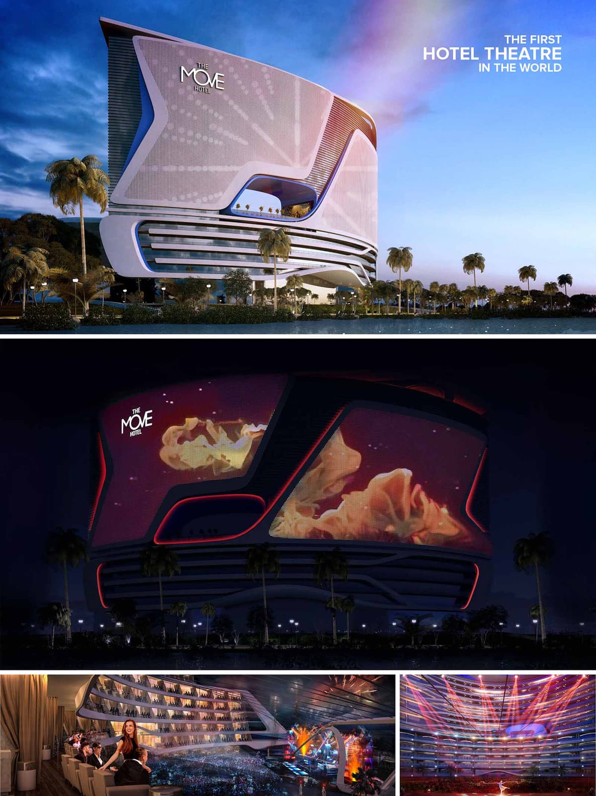

The proposed "Theatre Hotel" is a pioneering venture in the world of architecture and hospitality, blending the enchanting world of theatre with the luxury and comfort of modern hotel accommodations. By adopting a unique "U"-shaped layout, the design ingeniously transforms traditional hotel terraces into private theatre balconies, offering guests a privileged and immersive experience of stage performances directly from their accommodations. This architectural strategy enhances the building's functionality, turning each room into an interactive viewing space that bridges the gap between public entertainment and private luxury.
This concept goes beyond design; it embodies a cultural and social innovation, aiming to create a vibrant hub where the arts and hospitality intersect. The intention is to craft not just a building, but a destination—a place where the drama and spectacle of theatre can be enjoyed in an entirely new and personalized context. The design is conceived as a dynamic canvas, where every element from the facade to the interior details contributes to a holistic narrative of engagement and excitement.
The inclusion of a grand LED screen on the hotel’s facade is a testament to its innovative spirit. This feature not only enhances the hotel's external visual appeal but also functions as a dynamic interface for cultural expression. It sets the mood and theme of the performances within, creating an inviting and ever-changing exterior that captivates and draws in audiences and guests alike. This thoughtful integration of technology and design ensures that the Theatre Hotel stands out as a beacon of contemporary architectural thought, offering a fresh perspective on how buildings can engage with their urban and cultural landscapes.
The building's "U" shape is designed to encapsulate the central stage area, ensuring that all rooms have unobstructed views of the performances. This open arrangement maximizes both visibility and acoustic delivery, allowing guests to experience the full intensity of theatrical productions from the comfort of their suites. The use of a grand LED screen on the front façade serves as both an innovative design element and a dynamic communication tool, mood-setting with visuals that invite both guests and passersby into the world of theatre that lies within.
Within the hotel, the spatial organization prioritizes optimal sightlines and acoustic considerations. The rooms and public spaces are adorned with thematic elements that reflect the dramatic flair of theatre—deep, rich colors, luxurious textures, and subtle lighting to enhance both the mystique and the comfort of the environment. Each room is designed to not only serve as luxurious accommodation but also as a private viewing box, reminiscent of old-world theatre balconies, complete with VIP amenities and personalized services.
The design incorporates sustainable practices, focusing on energy-efficient materials and systems. The structure’s orientation and the strategic placement of the LED screen and glass elements are considered to reduce energy consumption by maximizing natural light during the day and minimizing heat gain. The integration of smart technologies for lighting, heating, and cooling systems further ensures that the hotel’s environmental impact is kept to a minimum. The use of sustainable materials in construction and finishes underscores the commitment to environmental stewardship while maintaining aesthetic and functional standards.
For construction, the project employs advanced materials that are both eco-friendly and acoustically beneficial. The use of high-performance glass not only ensures excellent sound insulation but also contributes to thermal efficiency. The exterior, equipped with an LED façade, is supported by a framework of steel and reinforced concrete, providing structural integrity and flexibility in design. This combination of materials and technology showcases a forward-thinking approach to integrating sustainability with architectural innovation.
In summary, the Theatre Hotel is envisioned as a landmark project that redefines the hospitality and entertainment industries, offering a unique fusion of luxury, performance art, and innovative design tailored to deliver an unparalleled guest experience.
ARCHITECTURE DESIGN: sanzpont [arquitectura]
INTERIOR DESIGN: Tomás Alia
ORIGINAL IDEA & CONCEPT: R&C / Marco Mendoza


The proposed "Theatre Hotel" is a pioneering venture in the world of architecture and hospitality, blending the enchanting world of theatre with the luxury and comfort of modern hotel accommodations. By adopting a unique "U"-shaped layout, the design ingeniously transforms traditional hotel terraces into private theatre balconies, offering guests a privileged and immersive experience of stage performances directly from their accommodations. This architectural strategy enhances the building's functionality, turning each room into an interactive viewing space that bridges the gap between public entertainment and private luxury.
This concept goes beyond design; it embodies a cultural and social innovation, aiming to create a vibrant hub where the arts and hospitality intersect. The intention is to craft not just a building, but a destination—a place where the drama and spectacle of theatre can be enjoyed in an entirely new and personalized context. The design is conceived as a dynamic canvas, where every element from the facade to the interior details contributes to a holistic narrative of engagement and excitement.
The inclusion of a grand LED screen on the hotel’s facade is a testament to its innovative spirit. This feature not only enhances the hotel's external visual appeal but also functions as a dynamic interface for cultural expression. It sets the mood and theme of the performances within, creating an inviting and ever-changing exterior that captivates and draws in audiences and guests alike. This thoughtful integration of technology and design ensures that the Theatre Hotel stands out as a beacon of contemporary architectural thought, offering a fresh perspective on how buildings can engage with their urban and cultural landscapes.
The building's "U" shape is designed to encapsulate the central stage area, ensuring that all rooms have unobstructed views of the performances. This open arrangement maximizes both visibility and acoustic delivery, allowing guests to experience the full intensity of theatrical productions from the comfort of their suites. The use of a grand LED screen on the front façade serves as both an innovative design element and a dynamic communication tool, mood-setting with visuals that invite both guests and passersby into the world of theatre that lies within.
Within the hotel, the spatial organization prioritizes optimal sightlines and acoustic considerations. The rooms and public spaces are adorned with thematic elements that reflect the dramatic flair of theatre—deep, rich colors, luxurious textures, and subtle lighting to enhance both the mystique and the comfort of the environment. Each room is designed to not only serve as luxurious accommodation but also as a private viewing box, reminiscent of old-world theatre balconies, complete with VIP amenities and personalized services.
The design incorporates sustainable practices, focusing on energy-efficient materials and systems. The structure’s orientation and the strategic placement of the LED screen and glass elements are considered to reduce energy consumption by maximizing natural light during the day and minimizing heat gain. The integration of smart technologies for lighting, heating, and cooling systems further ensures that the hotel’s environmental impact is kept to a minimum. The use of sustainable materials in construction and finishes underscores the commitment to environmental stewardship while maintaining aesthetic and functional standards.
For construction, the project employs advanced materials that are both eco-friendly and acoustically beneficial. The use of high-performance glass not only ensures excellent sound insulation but also contributes to thermal efficiency. The exterior, equipped with an LED façade, is supported by a framework of steel and reinforced concrete, providing structural integrity and flexibility in design. This combination of materials and technology showcases a forward-thinking approach to integrating sustainability with architectural innovation.
In summary, the Theatre Hotel is envisioned as a landmark project that redefines the hospitality and entertainment industries, offering a unique fusion of luxury, performance art, and innovative design tailored to deliver an unparalleled guest experience.
ARCHITECTURE DESIGN: sanzpont [arquitectura]
INTERIOR DESIGN: Tomás Alia
ORIGINAL IDEA & CONCEPT: R&C / Marco Mendoza
© 2021 by sanzpont [arquitectura] . Webpage by sanzpont [digital] . Innovative Digital Experiences
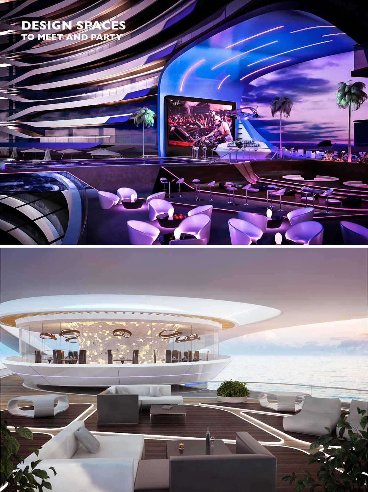

TMH Restaurant is conceived as a futuristic social landscape that merges gastronomy, nightlife and the Caribbean horizon into a single experiential sequence. The architectural language is fluid and aerodynamic, echoing the curves of waves and wind shaping the shoreline of Cancún. Rather than a conventional enclosed restaurant, the project operates as an open platform for meeting, partying and contemplating the sea, with overlapping terraces and sculpted canopies that frame views while choreographing light and sound.
The design alternates between two atmospheres: an immersive, club-like interior saturated with dynamic lighting, and an ethereal, elevated deck that appears to float over the water. This duality allows the venue to transition from day to night, from fine dining to performance space, without losing spatial coherence. All elements—furniture, ceilings, balustrades and lighting—are treated as continuous ribbons, creating a strong visual identity recognizable from afar.
The project is structured in clearly legible layers. The lower platforms accommodate lounge seating, bar areas and circulation, while upper tiers host the main dining room and stage. This terraced configuration guarantees uninterrupted sea views and direct visual connection with the central performance zone. The spatial sequence begins at an arrival promenade that gradually opens toward the ocean, culminating in the panoramic decks that project outward over the water.
In the more introverted club area, the stage is framed by a sweeping shell-like proscenium that integrates LED screens, lighting rails and acoustic treatments. Seating is arranged in concentric arcs around this focal point, optimizing sightlines for shows and DJ performances. The more diaphanous upper restaurant is enclosed by curved glass, operating as a glowing “lantern” over the deck. External lounges with low furniture and integrated planters soften the perimeter and foster informal gathering.
The interior design is driven by contrast between dark, reflective surfaces and luminous, softly curved elements. In the nightlife zone, chromatic LED lighting washes ceilings and walls, shifting between violet, blue and magenta tones to intensify the immersive club atmosphere. Integrated floor lighting subtly traces circulation routes and defines seating islands without the need for intrusive physical barriers.
Furniture pieces are sculptural and monolithic, often in glossy white or muted neutrals that act as canvases for changing light. Armchairs and lounge modules adopt ergonomic, organic forms, reinforcing the futuristic narrative. In the upper restaurant, the atmosphere is more serene: warm indirect lighting, textured wall panels perforated with star-like apertures, and suspended luminaires with fluid outlines create a refined dining environment that still echoes the dynamic language of the lower levels.
The material palette combines high-performance composites, glass and timber to withstand the marine environment while maintaining a refined aesthetic. Exterior shells and soffits use smooth, light-colored composite cladding to reflect solar radiation and reduce heat gain. Generous glass enclosures maximize transparency and visual continuity across interior and exterior spaces, while strategic fritting and overhangs mitigate glare.
The color strategy revolves around whites, soft grays and deep charcoals, punctuated by the programmable lighting spectrum. Decking surfaces employ durable tropical hardwood or composite slats, providing tactile warmth underfoot and referencing nautical decks. Detailing favors hidden fixings, integrated LED profiles and continuous edges to maintain the impression of seamless, aerodynamically carved surfaces, emphasizing the building as an object in motion facing the sea breeze.
Sustainability considerations focus on climate responsiveness and efficient resource use in a coastal, high-humidity context. The generous canopies and projecting eaves act as passive shading devices, protecting glazed areas from direct solar gain while enabling natural daylight and views. Open-sided lounges encourage cross-ventilation, reducing reliance on mechanical cooling for large portions of the occupied areas, particularly during milder evenings.
LED technology, dimmable controls and zoning strategies minimize energy consumption from the extensive lighting systems. Materials are selected for durability and low maintenance in a saline environment, extending lifecycle and reducing replacement frequency. Where possible, locally sourced plant species are integrated into planters and green pockets, contributing to microclimate regulation and reinforcing a connection to the native coastal landscape of Cancún.


TMH Restaurant is conceived as a futuristic social landscape that merges gastronomy, nightlife and the Caribbean horizon into a single experiential sequence. The architectural language is fluid and aerodynamic, echoing the curves of waves and wind shaping the shoreline of Cancún. Rather than a conventional enclosed restaurant, the project operates as an open platform for meeting, partying and contemplating the sea, with overlapping terraces and sculpted canopies that frame views while choreographing light and sound.
The design alternates between two atmospheres: an immersive, club-like interior saturated with dynamic lighting, and an ethereal, elevated deck that appears to float over the water. This duality allows the venue to transition from day to night, from fine dining to performance space, without losing spatial coherence. All elements—furniture, ceilings, balustrades and lighting—are treated as continuous ribbons, creating a strong visual identity recognizable from afar.
The project is structured in clearly legible layers. The lower platforms accommodate lounge seating, bar areas and circulation, while upper tiers host the main dining room and stage. This terraced configuration guarantees uninterrupted sea views and direct visual connection with the central performance zone. The spatial sequence begins at an arrival promenade that gradually opens toward the ocean, culminating in the panoramic decks that project outward over the water.
In the more introverted club area, the stage is framed by a sweeping shell-like proscenium that integrates LED screens, lighting rails and acoustic treatments. Seating is arranged in concentric arcs around this focal point, optimizing sightlines for shows and DJ performances. The more diaphanous upper restaurant is enclosed by curved glass, operating as a glowing “lantern” over the deck. External lounges with low furniture and integrated planters soften the perimeter and foster informal gathering.
The interior design is driven by contrast between dark, reflective surfaces and luminous, softly curved elements. In the nightlife zone, chromatic LED lighting washes ceilings and walls, shifting between violet, blue and magenta tones to intensify the immersive club atmosphere. Integrated floor lighting subtly traces circulation routes and defines seating islands without the need for intrusive physical barriers.
Furniture pieces are sculptural and monolithic, often in glossy white or muted neutrals that act as canvases for changing light. Armchairs and lounge modules adopt ergonomic, organic forms, reinforcing the futuristic narrative. In the upper restaurant, the atmosphere is more serene: warm indirect lighting, textured wall panels perforated with star-like apertures, and suspended luminaires with fluid outlines create a refined dining environment that still echoes the dynamic language of the lower levels.
The material palette combines high-performance composites, glass and timber to withstand the marine environment while maintaining a refined aesthetic. Exterior shells and soffits use smooth, light-colored composite cladding to reflect solar radiation and reduce heat gain. Generous glass enclosures maximize transparency and visual continuity across interior and exterior spaces, while strategic fritting and overhangs mitigate glare.
The color strategy revolves around whites, soft grays and deep charcoals, punctuated by the programmable lighting spectrum. Decking surfaces employ durable tropical hardwood or composite slats, providing tactile warmth underfoot and referencing nautical decks. Detailing favors hidden fixings, integrated LED profiles and continuous edges to maintain the impression of seamless, aerodynamically carved surfaces, emphasizing the building as an object in motion facing the sea breeze.
Sustainability considerations focus on climate responsiveness and efficient resource use in a coastal, high-humidity context. The generous canopies and projecting eaves act as passive shading devices, protecting glazed areas from direct solar gain while enabling natural daylight and views. Open-sided lounges encourage cross-ventilation, reducing reliance on mechanical cooling for large portions of the occupied areas, particularly during milder evenings.
LED technology, dimmable controls and zoning strategies minimize energy consumption from the extensive lighting systems. Materials are selected for durability and low maintenance in a saline environment, extending lifecycle and reducing replacement frequency. Where possible, locally sourced plant species are integrated into planters and green pockets, contributing to microclimate regulation and reinforcing a connection to the native coastal landscape of Cancún.
© 2021 by sanzpont [arquitectura] . Webpage by sanzpont [digital] . Innovative Digital Experiences
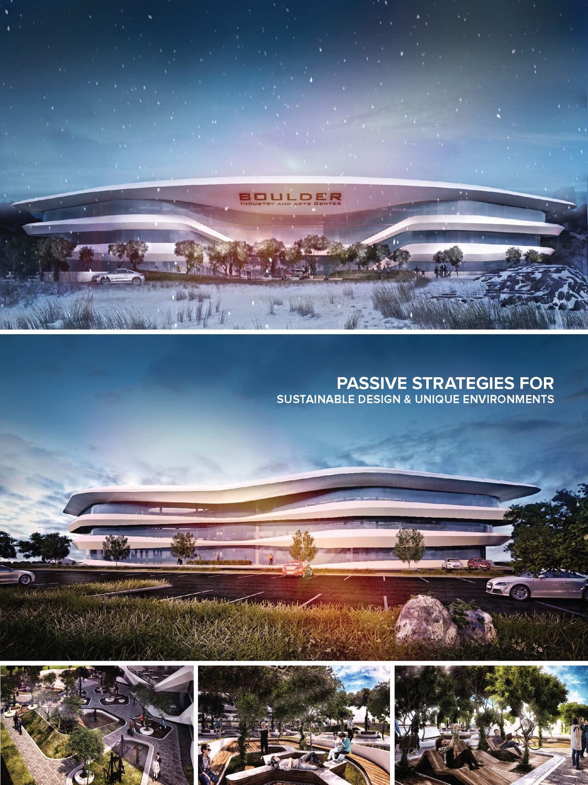

DESIGN CONCEPT
Ground Breaking and Iconic building for todays nexus of creativity, technology and arts for Collaborative and Creative Work Spaces at Boulder Colorado. Housing open and strategically planned spaces for professionals bringing a node of productivity and creativity hub for business, recreation, modern living, dining, and offering a connected sense of community and network. Boulder Industry and Arts Center will be located across street of new Google campus at Boulder Colorado. The design of the building is based on the premise of passive design and low energy consumption.


DESIGN CONCEPT
Ground Breaking and Iconic building for todays nexus of creativity, technology and arts for Collaborative and Creative Work Spaces at Boulder Colorado. Housing open and strategically planned spaces for professionals bringing a node of productivity and creativity hub for business, recreation, modern living, dining, and offering a connected sense of community and network. Boulder Industry and Arts Center will be located across street of new Google campus at Boulder Colorado. The design of the building is based on the premise of passive design and low energy consumption.
© 2021 by sanzpont [arquitectura] . Webpage by sanzpont [digital] . Innovative Digital Experiences
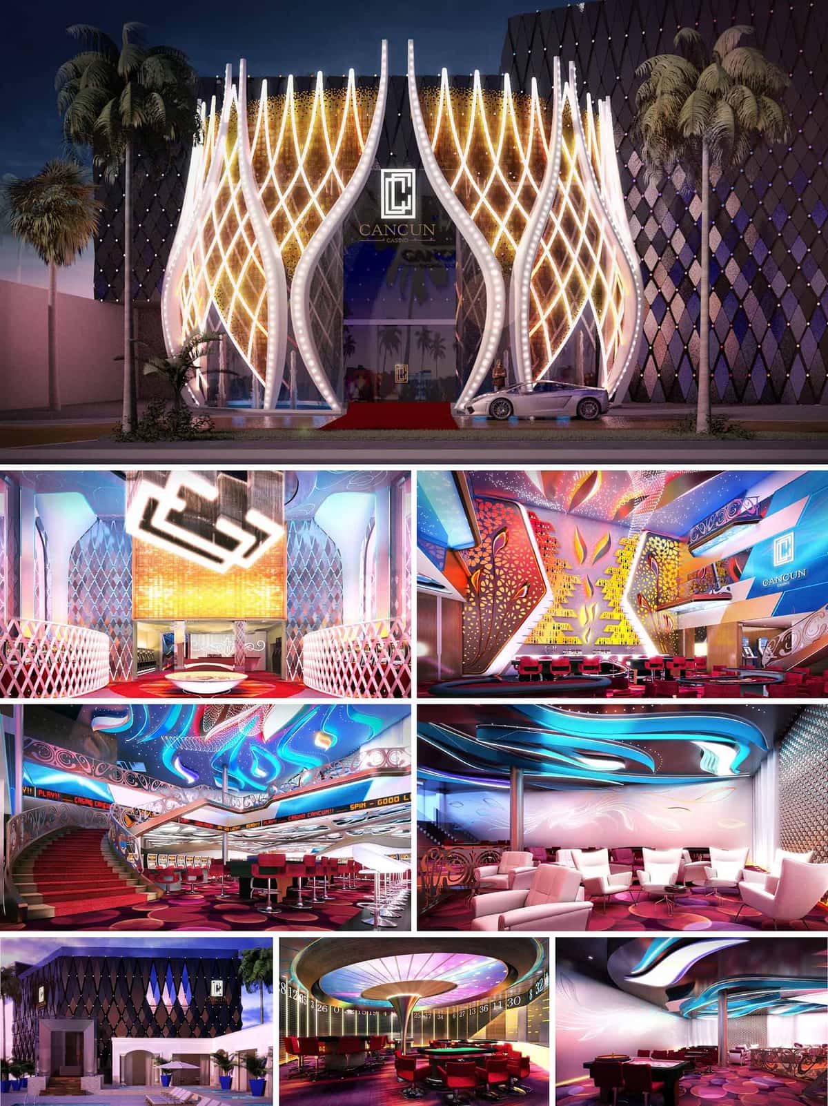

CASINO CANCUN is conceived as an immersive, nocturnal landmark that fuses the exuberance of Cancún’s nightlife with the fluid geometry of the Caribbean Sea. The architectural language draws inspiration from waves, palm fronds and luminescent marine creatures, translating them into a dynamic envelope and interior scenography that celebrates movement, light and color. The project positions the casino as a contemporary icon on the urban strip, a glowing lantern that announces entertainment while offering a controlled, theatrical interior universe.
The overall concept is based on layering: a solid, almost monolithic black volume acts as a backdrop, while a series of curvilinear, illuminated shells peel away from the façade and extend inward, guiding visitors through a sequence of increasingly intense spatial experiences. This strategy creates a strong identity visible from a distance and a coherent narrative from arrival to gaming floors and lounges.
The main façade is defined by tall, petal-like structural ribs that curve outward from the base and converge toward the sky. These ribs, integrated with LED lines and point lights, form a luminous lattice reminiscent of woven reeds or coral structures. Behind this translucent veil, a darker diamond-patterned cladding reinforces the sense of depth and frames the bright entry portal. The contrast between glossy black polygons and vibrant, warm light accentuates the verticality and creates a refined backdrop for branding.
The entrance is emphasized by a double-height, recessed portal finished with reflective materials and golden gradients, creating a visually magnetic threshold. The red carpet and low, sculpted landscape elements direct the flow of vehicles and pedestrians. Palm trees and minimal planting soften the perimeter without competing with the sculptural façade, while the controlled overhang provides partial shading and weather protection for arrivals.
The spatial organization is anchored by a clear north-south circulation spine that aligns with the entrance axis, allowing visual continuity from the lobby through to the main gaming floor. Visitors enter a double-height hall where staircases and balconies reveal the upper levels and invite exploration. Curved balustrades and perforated screens subtly guide circulation, while maintaining sightlines across the entire volume to reinforce orientation and excitement.
The gaming floor unfolds around central feature elements, such as sculptural ceilings and illuminated columns, while peripheral zones accommodate slot machines, table games, and VIP areas. Secondary lounges and bar zones are positioned as quieter pockets along the main circulation, offering acoustic and visual relief. Vertical connections through grand staircases and elevators link to private rooms, administration, and entertainment platforms, ensuring operational efficiency and differentiated experiences.
The interior design employs a rich but controlled palette: high-gloss metallics, lacquered surfaces, patterned carpets and upholstered seating in crimson, fuchsia and deep violet. These are contrasted with white and cream-toned armchairs that create visual pauses within the chromatic intensity. The floor patterns reference casino chips and abstracted wave forms, helping to zone functions while unifying the whole environment.
Ceilings act as primary expressive surfaces. Undulating, backlit panels integrate RGB LED systems that wash the space with programmable gradients of blues, magentas and cyans, evoking aquatic motion. Perforated metal panels and translucent stretch membranes filter and diffuse light, concealing technical equipment and improving acoustic absorption. Feature walls with cut-out leaf and flame motifs are backlit to produce a layered, luminous effect that animates the gaming areas and lounge zones.
Furniture is tailored to the extended-stay nature of casino use. Gaming chairs combine ergonomic back support, rotary bases and durable upholstery, while VIP lounges feature deeper, lounge-style seating with generous armrests and side tables. The layout of seating and tables ensures clear circulation paths for guests and staff, minimizing congestion and enhancing service efficiency.
Color temperature and light levels are carefully calibrated: brighter, more saturated lighting emphasizes gaming areas to maintain alertness, while warmer, dimmer scenes characterize bars and relaxation pockets to promote comfort and social interaction. Acoustic treatments in ceilings and walls reduce noise reverberation, creating an environment that is vibrant yet not overwhelming, thus supporting long-term user comfort.
Despite its high-impact visual language, the project integrates sustainable design measures appropriate to Cancún’s tropical climate. The dark, insulated outer volume acts as a thermal shield, while the ventilated cavity behind the decorative façade reduces direct solar gain on the main envelope. High-performance glazing and selective openings limit heat infiltration, lowering cooling loads in a building type that operates primarily at night.
LED technology is used almost exclusively for both exterior and interior lighting, significantly reducing energy consumption and maintenance compared to conventional systems. Centralized lighting controls and scene programming optimize power use throughout the day and adapt to different occupancy levels. Interior finishes favor durable, low-maintenance materials, extending life cycles in this high-traffic environment. Where possible, locally sourced materials and regional contractors are prioritized, decreasing transportation impacts and supporting the local economy, aligning the casino’s expressive architecture with responsible environmental and social performance.


CASINO CANCUN is conceived as an immersive, nocturnal landmark that fuses the exuberance of Cancún’s nightlife with the fluid geometry of the Caribbean Sea. The architectural language draws inspiration from waves, palm fronds and luminescent marine creatures, translating them into a dynamic envelope and interior scenography that celebrates movement, light and color. The project positions the casino as a contemporary icon on the urban strip, a glowing lantern that announces entertainment while offering a controlled, theatrical interior universe.
The overall concept is based on layering: a solid, almost monolithic black volume acts as a backdrop, while a series of curvilinear, illuminated shells peel away from the façade and extend inward, guiding visitors through a sequence of increasingly intense spatial experiences. This strategy creates a strong identity visible from a distance and a coherent narrative from arrival to gaming floors and lounges.
The main façade is defined by tall, petal-like structural ribs that curve outward from the base and converge toward the sky. These ribs, integrated with LED lines and point lights, form a luminous lattice reminiscent of woven reeds or coral structures. Behind this translucent veil, a darker diamond-patterned cladding reinforces the sense of depth and frames the bright entry portal. The contrast between glossy black polygons and vibrant, warm light accentuates the verticality and creates a refined backdrop for branding.
The entrance is emphasized by a double-height, recessed portal finished with reflective materials and golden gradients, creating a visually magnetic threshold. The red carpet and low, sculpted landscape elements direct the flow of vehicles and pedestrians. Palm trees and minimal planting soften the perimeter without competing with the sculptural façade, while the controlled overhang provides partial shading and weather protection for arrivals.
The spatial organization is anchored by a clear north-south circulation spine that aligns with the entrance axis, allowing visual continuity from the lobby through to the main gaming floor. Visitors enter a double-height hall where staircases and balconies reveal the upper levels and invite exploration. Curved balustrades and perforated screens subtly guide circulation, while maintaining sightlines across the entire volume to reinforce orientation and excitement.
The gaming floor unfolds around central feature elements, such as sculptural ceilings and illuminated columns, while peripheral zones accommodate slot machines, table games, and VIP areas. Secondary lounges and bar zones are positioned as quieter pockets along the main circulation, offering acoustic and visual relief. Vertical connections through grand staircases and elevators link to private rooms, administration, and entertainment platforms, ensuring operational efficiency and differentiated experiences.
The interior design employs a rich but controlled palette: high-gloss metallics, lacquered surfaces, patterned carpets and upholstered seating in crimson, fuchsia and deep violet. These are contrasted with white and cream-toned armchairs that create visual pauses within the chromatic intensity. The floor patterns reference casino chips and abstracted wave forms, helping to zone functions while unifying the whole environment.
Ceilings act as primary expressive surfaces. Undulating, backlit panels integrate RGB LED systems that wash the space with programmable gradients of blues, magentas and cyans, evoking aquatic motion. Perforated metal panels and translucent stretch membranes filter and diffuse light, concealing technical equipment and improving acoustic absorption. Feature walls with cut-out leaf and flame motifs are backlit to produce a layered, luminous effect that animates the gaming areas and lounge zones.
Furniture is tailored to the extended-stay nature of casino use. Gaming chairs combine ergonomic back support, rotary bases and durable upholstery, while VIP lounges feature deeper, lounge-style seating with generous armrests and side tables. The layout of seating and tables ensures clear circulation paths for guests and staff, minimizing congestion and enhancing service efficiency.
Color temperature and light levels are carefully calibrated: brighter, more saturated lighting emphasizes gaming areas to maintain alertness, while warmer, dimmer scenes characterize bars and relaxation pockets to promote comfort and social interaction. Acoustic treatments in ceilings and walls reduce noise reverberation, creating an environment that is vibrant yet not overwhelming, thus supporting long-term user comfort.
Despite its high-impact visual language, the project integrates sustainable design measures appropriate to Cancún’s tropical climate. The dark, insulated outer volume acts as a thermal shield, while the ventilated cavity behind the decorative façade reduces direct solar gain on the main envelope. High-performance glazing and selective openings limit heat infiltration, lowering cooling loads in a building type that operates primarily at night.
LED technology is used almost exclusively for both exterior and interior lighting, significantly reducing energy consumption and maintenance compared to conventional systems. Centralized lighting controls and scene programming optimize power use throughout the day and adapt to different occupancy levels. Interior finishes favor durable, low-maintenance materials, extending life cycles in this high-traffic environment. Where possible, locally sourced materials and regional contractors are prioritized, decreasing transportation impacts and supporting the local economy, aligning the casino’s expressive architecture with responsible environmental and social performance.
© 2021 by sanzpont [arquitectura] . Webpage by sanzpont [digital] . Innovative Digital Experiences
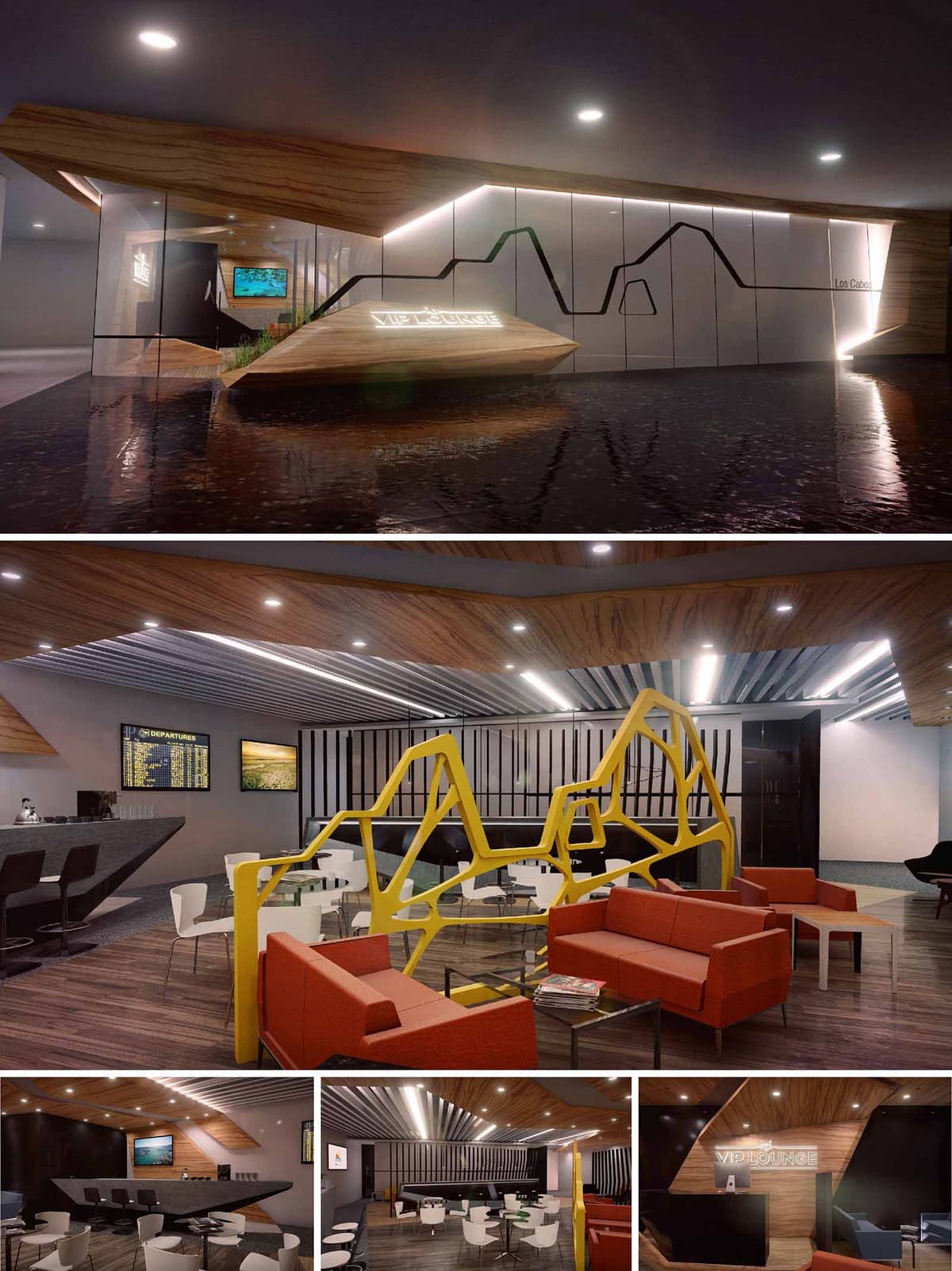

The GAP Airport VIP Lounge SJD is conceived as an urban oasis that translates the dynamism of air travel into a calm and controlled interior landscape. The design draws inspiration from flight trajectories and topographic lines, abstracted into sharp, faceted volumes and continuous graphic lines that guide the passenger’s journey from concourse to lounge. The envelope is composed of folded planes in warm wood and glossy white panels, intersected by a black line that evokes both skyline and route map, creating a strong identity visible from the public circulation.
Inside, the project balances business efficiency with resort-like comfort, referencing the Mexican Pacific context through textures, colors, and an emphasis on horizontality. The spatial narrative moves from an expressive, sculptural reception toward more intimate and acoustically controlled seating zones, offering a gradual decompression from airport stress.
The reception lobby acts as a threshold space, defined by a floating, angular desk set within a reflective surface that suggests water and visually amplifies the volume. From this point, circulation branches into different functional areas: bar, workstations, lounge seating, and dining. The plan is organized in open bands rather than enclosed rooms, allowing clear sightlines to flight information displays and service points while maintaining distinct atmospheres.
A central sculptural yellow screen partitions the main salon, providing visual separation between lounge seating and dining without blocking natural light or supervision. Perimeter seating zones are oriented to take advantage of views and media walls, while central furniture clusters support social interaction and short-stay users. Service areas such as bar, buffet, and back-of-house are consolidated along one side to optimize operations and reduce staff circulation.
The material strategy contrasts the efficiency of contemporary aviation infrastructure with the warmth of hospitality environments. Ceilings and key vertical planes are clad in wood veneer with pronounced grain, generating a continuous envelope that visually “folds” around guests and reinforces the faceted geometry. This is balanced by metallic linear panels and neutral walls that reflect and distribute artificial light in a controlled manner.
The furniture palette introduces bold chromatic accents: vivid orange seating elements convey energy and brand differentiation, while the bright yellow partition becomes a sculptural focal point. Tables and bar counters in dark stone or solid surfaces introduce a sense of robustness and durability, essential for high-traffic airport conditions. Monochromatic white and black elements, including chairs and vertical slats, anchor the composition and prevent visual overload.
The lighting design emphasizes linearity and direction, echoing the concept of runways and flight paths. Recessed linear LED fixtures run parallel to the corrugated ceiling panels, reinforcing perspective and guiding movement through the lounge. Integrated lighting in the reception desk and wall panels highlights the VIP Lounge signage and enhances the perception of floating volumes.
Ambient lighting is uniformly distributed to support reading and work activities, while accent lighting is used to mark the bar, artwork, and key architectural gestures. Warm color temperatures complement the timber finishes, creating a comfortable atmosphere that counterbalances the cooler tones of metal and glass typically found in airport environments.
Sustainability is addressed through durable, low-maintenance materials and an efficient lighting strategy. The use of LED technology reduces energy consumption and maintenance frequency, critical in 24/7 operational contexts. Light-colored reflective surfaces on ceilings and walls optimize luminance levels, allowing lower overall wattage while maintaining visual comfort.
High-wear finishes, such as composite surfaces for counters and engineered flooring, extend lifecycle and reduce the need for replacement, thereby minimizing material waste over time. Where possible, certified wood veneers and low-VOC finishes are specified to improve indoor air quality. The open-plan configuration promotes flexible furniture arrangements, enabling future reconfiguration without significant construction waste, ensuring the lounge can adapt to evolving passenger needs and operational demands across SJD, TIJ, and GDL airports.
The GAP Airport VIP Lounge SJD is conceived as an urban oasis that translates the dynamism of air travel into a calm and controlled interior landscape. The design draws inspiration from flight trajectories and topographic lines, abstracted into sharp, faceted volumes and continuous graphic lines that guide the passenger’s journey from concourse to lounge. The envelope is composed of folded planes in warm wood and glossy white panels, intersected by a black line that evokes both skyline and route map, creating a strong identity visible from the public circulation.
Inside, the project balances business efficiency with resort-like comfort, referencing the Mexican Pacific context through textures, colors, and an emphasis on horizontality. The spatial narrative moves from an expressive, sculptural reception toward more intimate and acoustically controlled seating zones, offering a gradual decompression from airport stress.
The reception lobby acts as a threshold space, defined by a floating, angular desk set within a reflective surface that suggests water and visually amplifies the volume. From this point, circulation branches into different functional areas: bar, workstations, lounge seating, and dining. The plan is organized in open bands rather than enclosed rooms, allowing clear sightlines to flight information displays and service points while maintaining distinct atmospheres.
A central sculptural yellow screen partitions the main salon, providing visual separation between lounge seating and dining without blocking natural light or supervision. Perimeter seating zones are oriented to take advantage of views and media walls, while central furniture clusters support social interaction and short-stay users. Service areas such as bar, buffet, and back-of-house are consolidated along one side to optimize operations and reduce staff circulation.
The material strategy contrasts the efficiency of contemporary aviation infrastructure with the warmth of hospitality environments. Ceilings and key vertical planes are clad in wood veneer with pronounced grain, generating a continuous envelope that visually “folds” around guests and reinforces the faceted geometry. This is balanced by metallic linear panels and neutral walls that reflect and distribute artificial light in a controlled manner.
The furniture palette introduces bold chromatic accents: vivid orange seating elements convey energy and brand differentiation, while the bright yellow partition becomes a sculptural focal point. Tables and bar counters in dark stone or solid surfaces introduce a sense of robustness and durability, essential for high-traffic airport conditions. Monochromatic white and black elements, including chairs and vertical slats, anchor the composition and prevent visual overload.
The lighting design emphasizes linearity and direction, echoing the concept of runways and flight paths. Recessed linear LED fixtures run parallel to the corrugated ceiling panels, reinforcing perspective and guiding movement through the lounge. Integrated lighting in the reception desk and wall panels highlights the VIP Lounge signage and enhances the perception of floating volumes.
Ambient lighting is uniformly distributed to support reading and work activities, while accent lighting is used to mark the bar, artwork, and key architectural gestures. Warm color temperatures complement the timber finishes, creating a comfortable atmosphere that counterbalances the cooler tones of metal and glass typically found in airport environments.
Sustainability is addressed through durable, low-maintenance materials and an efficient lighting strategy. The use of LED technology reduces energy consumption and maintenance frequency, critical in 24/7 operational contexts. Light-colored reflective surfaces on ceilings and walls optimize luminance levels, allowing lower overall wattage while maintaining visual comfort.
High-wear finishes, such as composite surfaces for counters and engineered flooring, extend lifecycle and reduce the need for replacement, thereby minimizing material waste over time. Where possible, certified wood veneers and low-VOC finishes are specified to improve indoor air quality. The open-plan configuration promotes flexible furniture arrangements, enabling future reconfiguration without significant construction waste, ensuring the lounge can adapt to evolving passenger needs and operational demands across SJD, TIJ, and GDL airports.
© 2021 by sanzpont [arquitectura] . Webpage by sanzpont [digital] . Innovative Digital Experiences
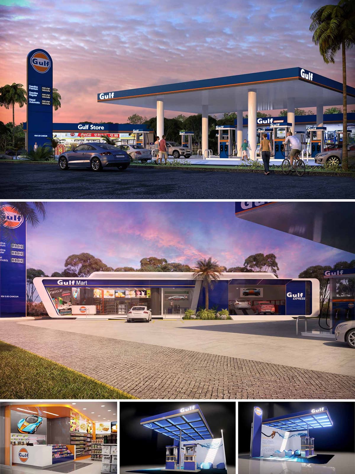

The GULF service station in Cancún is conceived as a contemporary mobility hub that merges efficiency, brand visibility and comfort within a tropical coastal context. The architecture translates the corporate identity into a sequence of dynamic blue and orange surfaces, creating a recognizable urban landmark along the highway while remaining visually light and open to the landscape. The composition balances the horizontal emphasis of the canopies with the sculpted volume of the convenience store, generating a cohesive ensemble that frames the flow of vehicles and pedestrians.
The project reinterprets the traditional gas station typology by integrating fueling, retail and quick-service functions into a single, legible layout. Generous overhangs, transparent façades and clear circulation lines promote intuitive use, prioritizing safety and rapid orientation for users arriving by car, bicycle or on foot.
The masterplan organizes the forecourt as a broad, unobstructed platform where the fuel islands are aligned perpendicularly to the main access, facilitating direct entry and exit movements. The canopy is dimensioned to maximize shade during the hottest hours, while maintaining sufficient free height for various vehicle types. Perimeter landscaping softens the interface with the surrounding vegetation, framing views towards the dense tree line characteristic of the region.
The convenience store and ancillary volumes are placed laterally, generating a clear separation between fueling operations and retail parking. This arrangement allows pedestrians to move safely from parked vehicles to the store through marked walkways, without crossing the main circulation lanes. Service areas and deliveries are concealed to the rear, preserving the clean, branded front elevation.
The architectural language is defined by elongated horizontal lines, rounded transitions and a precise chromatic contrast between white structural frames, deep blue infill panels and orange highlights. The main store volume is articulated as a streamlined bar with cantilevered corners, suggesting movement and echoing automotive aesthetics. Large glass fronts dissolve the boundary between interior and exterior, transforming the store into a luminous showcase, especially during evening hours.
Materials are selected for durability and low maintenance in a humid, saline environment: steel and aluminum claddings with baked enamel finishes, high-reflectance composite panels on soffits, and non-slip concrete paving with integral expansion joints. The canopy underside employs reflective, easy-to-clean surfaces that amplify artificial lighting and enhance perceived security at night.
Inside the Gulf Mart, the layout is organized around a central service counter with clear merchandising corridors radiating from it. Warm white lighting, combined with accent strips in brand colors, guides customers through snacks, beverages and automotive accessories. Tall refrigerated walls, low gondolas and transparent product displays ensure maximum visibility while maintaining comfortable sightlines across the store.
The interior palette balances bright corporate tones with neutral flooring and ceilings, avoiding visual fatigue and enabling rapid product identification. Finishes prioritize robustness and hygiene: vinyl or porcelain tile floors with high abrasion resistance, laminated cabinetry and impact-resistant wall panels in high-traffic zones. The overall ambience is that of a compact, efficient mini-market that invites brief but pleasant stays.
Artificial lighting plays a strategic role in transforming the station into a safe, attractive node after dusk. LED luminaires integrated into the canopy perimeter generate a continuous luminous band that reinforces the station’s silhouette from a distance. Vertical signs and totems are backlit to ensure visibility while avoiding glare towards the roadway.
Within the retail volume, controlled brightness levels create hierarchy between the facade display and the interior shelves, functioning as an illuminated “urban showcase.” Accent lighting on structural frames and signage underlines the architectural geometry and maintains coherence between the forecourt and interior spaces.
Sustainability strategies are embedded in the morphology and technical specification of the project. The extended canopies and deep overhangs substantially reduce direct solar gain on vehicles and glazed surfaces, improving user comfort and diminishing cooling loads inside the store. High-performance glazing combined with external shading optimizes natural daylight while limiting heat transmission.
LED lighting with smart controls is proposed throughout the complex, reducing energy consumption and maintenance. The canopy offers potential integration of photovoltaic panels, transforming the large roof surface into an energy-generating plane. Permeable or semi-permeable paved areas and perimeter planting beds contribute to rainwater infiltration, mitigate surface temperatures and visually connect the station with Cancún’s lush tropical environment.


The GULF service station in Cancún is conceived as a contemporary mobility hub that merges efficiency, brand visibility and comfort within a tropical coastal context. The architecture translates the corporate identity into a sequence of dynamic blue and orange surfaces, creating a recognizable urban landmark along the highway while remaining visually light and open to the landscape. The composition balances the horizontal emphasis of the canopies with the sculpted volume of the convenience store, generating a cohesive ensemble that frames the flow of vehicles and pedestrians.
The project reinterprets the traditional gas station typology by integrating fueling, retail and quick-service functions into a single, legible layout. Generous overhangs, transparent façades and clear circulation lines promote intuitive use, prioritizing safety and rapid orientation for users arriving by car, bicycle or on foot.
The masterplan organizes the forecourt as a broad, unobstructed platform where the fuel islands are aligned perpendicularly to the main access, facilitating direct entry and exit movements. The canopy is dimensioned to maximize shade during the hottest hours, while maintaining sufficient free height for various vehicle types. Perimeter landscaping softens the interface with the surrounding vegetation, framing views towards the dense tree line characteristic of the region.
The convenience store and ancillary volumes are placed laterally, generating a clear separation between fueling operations and retail parking. This arrangement allows pedestrians to move safely from parked vehicles to the store through marked walkways, without crossing the main circulation lanes. Service areas and deliveries are concealed to the rear, preserving the clean, branded front elevation.
The architectural language is defined by elongated horizontal lines, rounded transitions and a precise chromatic contrast between white structural frames, deep blue infill panels and orange highlights. The main store volume is articulated as a streamlined bar with cantilevered corners, suggesting movement and echoing automotive aesthetics. Large glass fronts dissolve the boundary between interior and exterior, transforming the store into a luminous showcase, especially during evening hours.
Materials are selected for durability and low maintenance in a humid, saline environment: steel and aluminum claddings with baked enamel finishes, high-reflectance composite panels on soffits, and non-slip concrete paving with integral expansion joints. The canopy underside employs reflective, easy-to-clean surfaces that amplify artificial lighting and enhance perceived security at night.
Inside the Gulf Mart, the layout is organized around a central service counter with clear merchandising corridors radiating from it. Warm white lighting, combined with accent strips in brand colors, guides customers through snacks, beverages and automotive accessories. Tall refrigerated walls, low gondolas and transparent product displays ensure maximum visibility while maintaining comfortable sightlines across the store.
The interior palette balances bright corporate tones with neutral flooring and ceilings, avoiding visual fatigue and enabling rapid product identification. Finishes prioritize robustness and hygiene: vinyl or porcelain tile floors with high abrasion resistance, laminated cabinetry and impact-resistant wall panels in high-traffic zones. The overall ambience is that of a compact, efficient mini-market that invites brief but pleasant stays.
Artificial lighting plays a strategic role in transforming the station into a safe, attractive node after dusk. LED luminaires integrated into the canopy perimeter generate a continuous luminous band that reinforces the station’s silhouette from a distance. Vertical signs and totems are backlit to ensure visibility while avoiding glare towards the roadway.
Within the retail volume, controlled brightness levels create hierarchy between the facade display and the interior shelves, functioning as an illuminated “urban showcase.” Accent lighting on structural frames and signage underlines the architectural geometry and maintains coherence between the forecourt and interior spaces.
Sustainability strategies are embedded in the morphology and technical specification of the project. The extended canopies and deep overhangs substantially reduce direct solar gain on vehicles and glazed surfaces, improving user comfort and diminishing cooling loads inside the store. High-performance glazing combined with external shading optimizes natural daylight while limiting heat transmission.
LED lighting with smart controls is proposed throughout the complex, reducing energy consumption and maintenance. The canopy offers potential integration of photovoltaic panels, transforming the large roof surface into an energy-generating plane. Permeable or semi-permeable paved areas and perimeter planting beds contribute to rainwater infiltration, mitigate surface temperatures and visually connect the station with Cancún’s lush tropical environment.
© 2021 by sanzpont [arquitectura] . Webpage by sanzpont [digital] . Innovative Digital Experiences
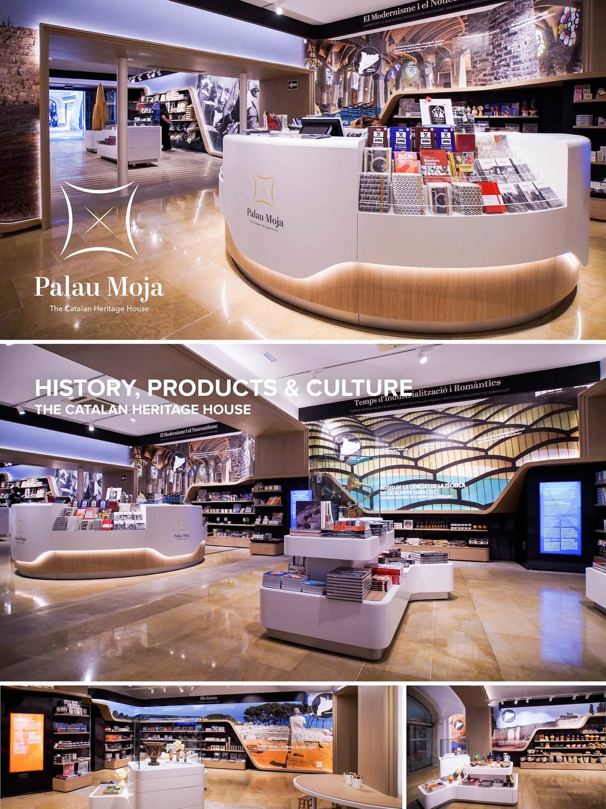

The Palau Moja, The Catalan Heritage House is a place where you will be able to travel across Catalan history, discover genuine Catalan products, learn about Catalan culture, explore Catalan heritage and how it uniquely relates to the territory, and also buy tour ticket for visiting the main cultural and historical sites of the country. At the Catalan Heritage House, technology plays a fundamental role. At the Catalan Heritage House, technology plays a fundamental role. The visitor can navigate through Catalan history via tablet and interactive screens where they will find information about Catalan heritage from their origins up to modern times. This way visitors may discover previously unknown areas of Catalan culture that they now want to explore further.


The Palau Moja, The Catalan Heritage House is a place where you will be able to travel across Catalan history, discover genuine Catalan products, learn about Catalan culture, explore Catalan heritage and how it uniquely relates to the territory, and also buy tour ticket for visiting the main cultural and historical sites of the country. At the Catalan Heritage House, technology plays a fundamental role. At the Catalan Heritage House, technology plays a fundamental role. The visitor can navigate through Catalan history via tablet and interactive screens where they will find information about Catalan heritage from their origins up to modern times. This way visitors may discover previously unknown areas of Catalan culture that they now want to explore further.
© 2021 by sanzpont [arquitectura] . Webpage by sanzpont [digital] . Innovative Digital Experiences


Nuestras oficinas están en Barcelona, Cancún, Chicago y Santo Domingo, pero gracias a la tecnología podemos desarrollar proyectos en cualquier parte del mundo.
Barcelona
Bac de Roda 136
08020, Barcelona
Spain
Madrid
Av. de Buendía 11
19005 Guadalajara (Madrid)
Spain
Chicago
373 Hazel Ave, Apt A1
60022, Glencoe, Illinois
United States