

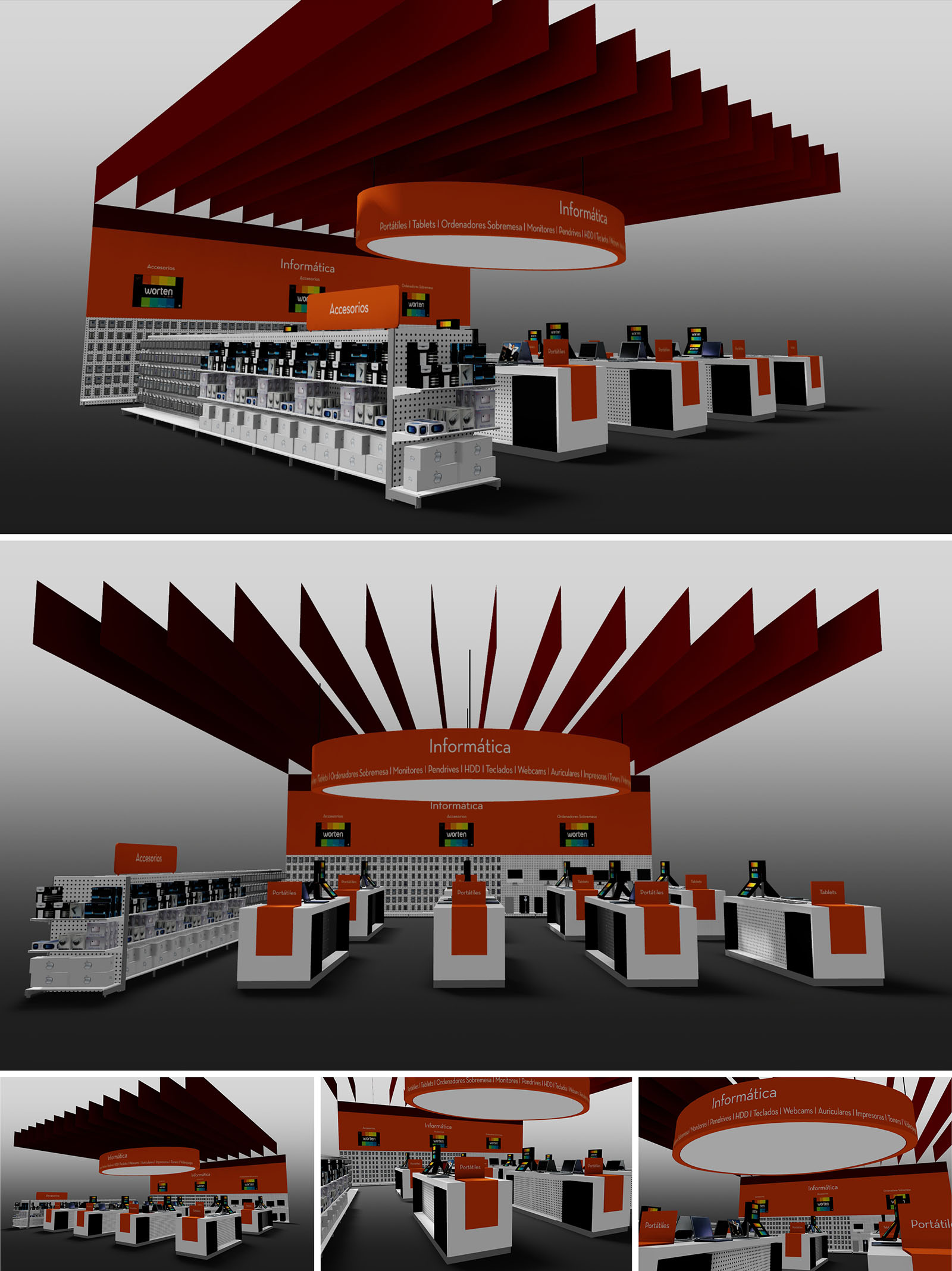
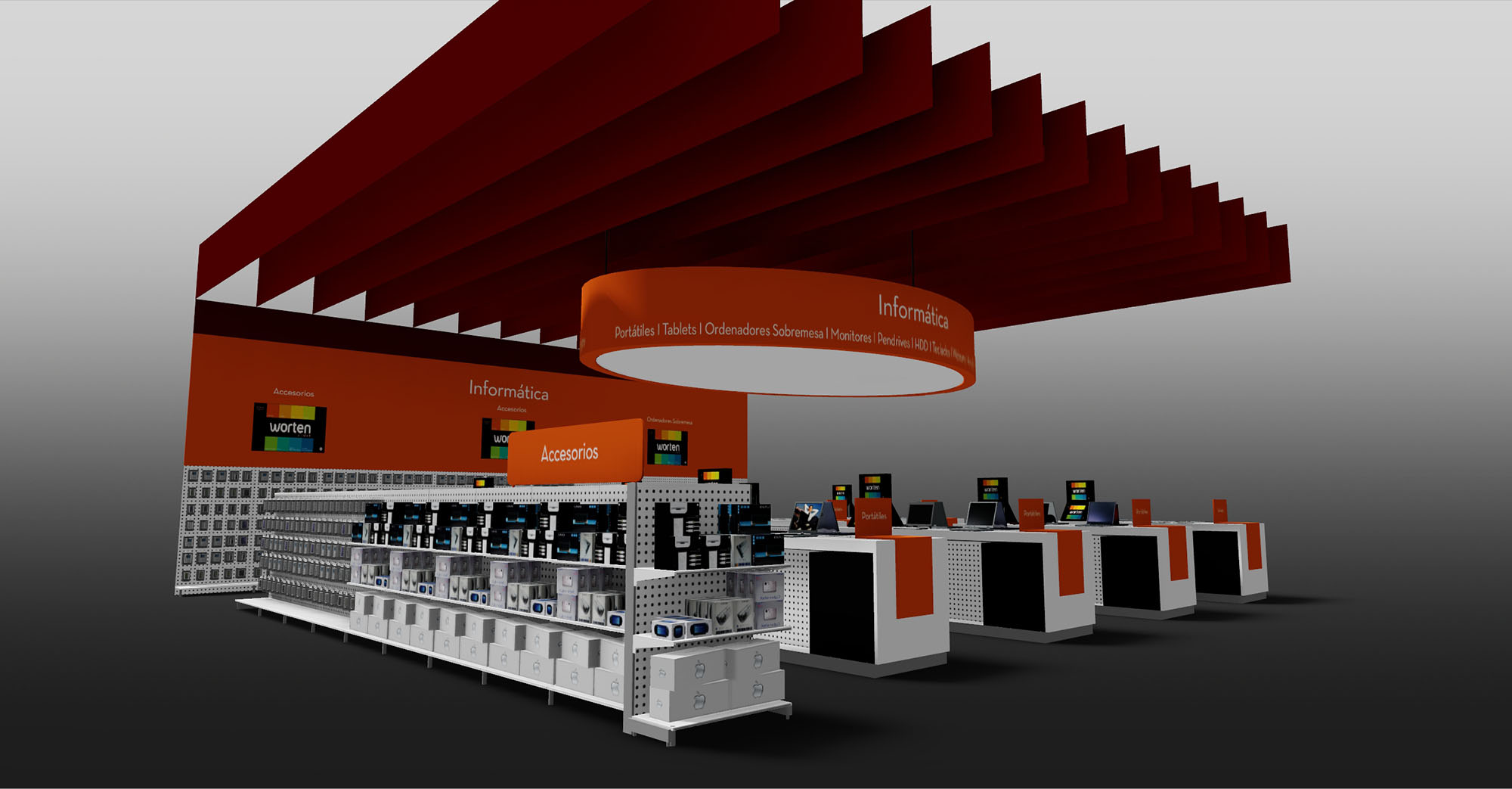
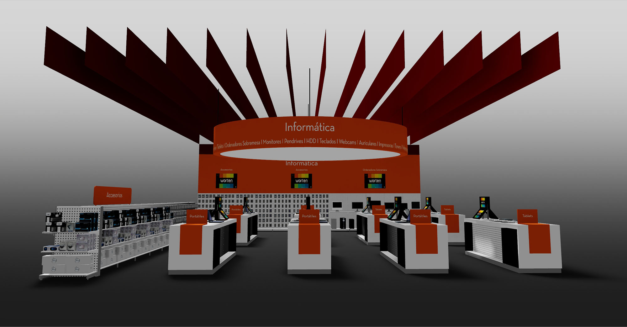
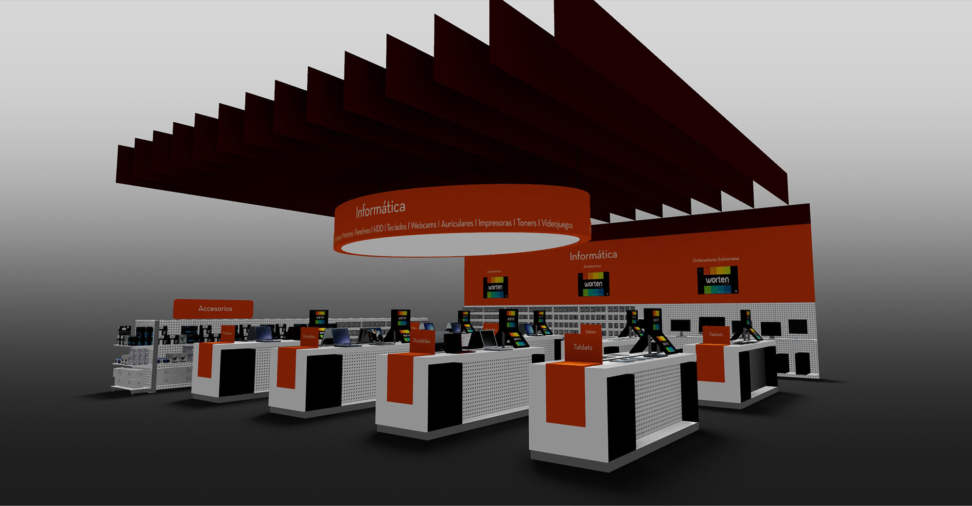
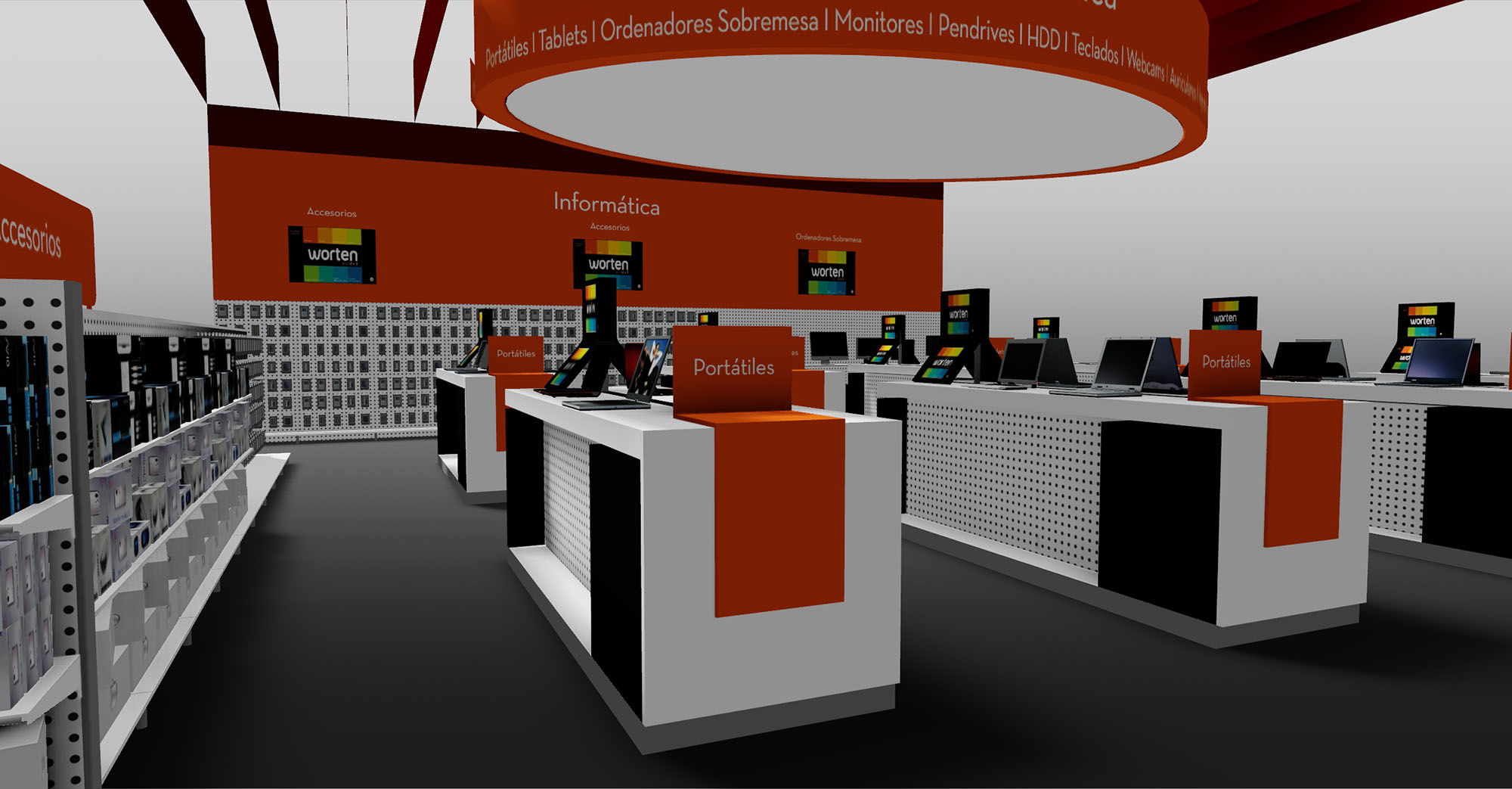
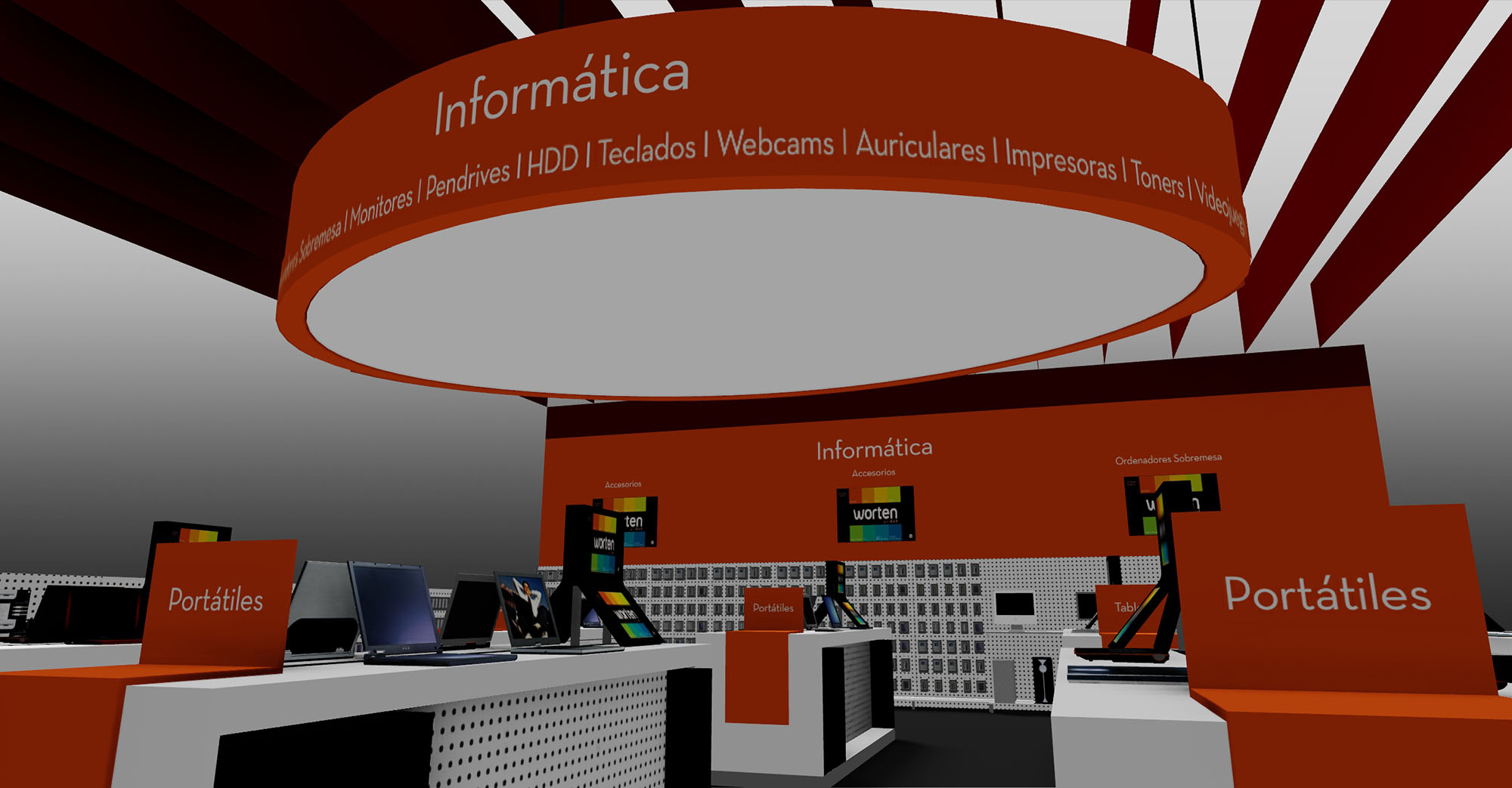
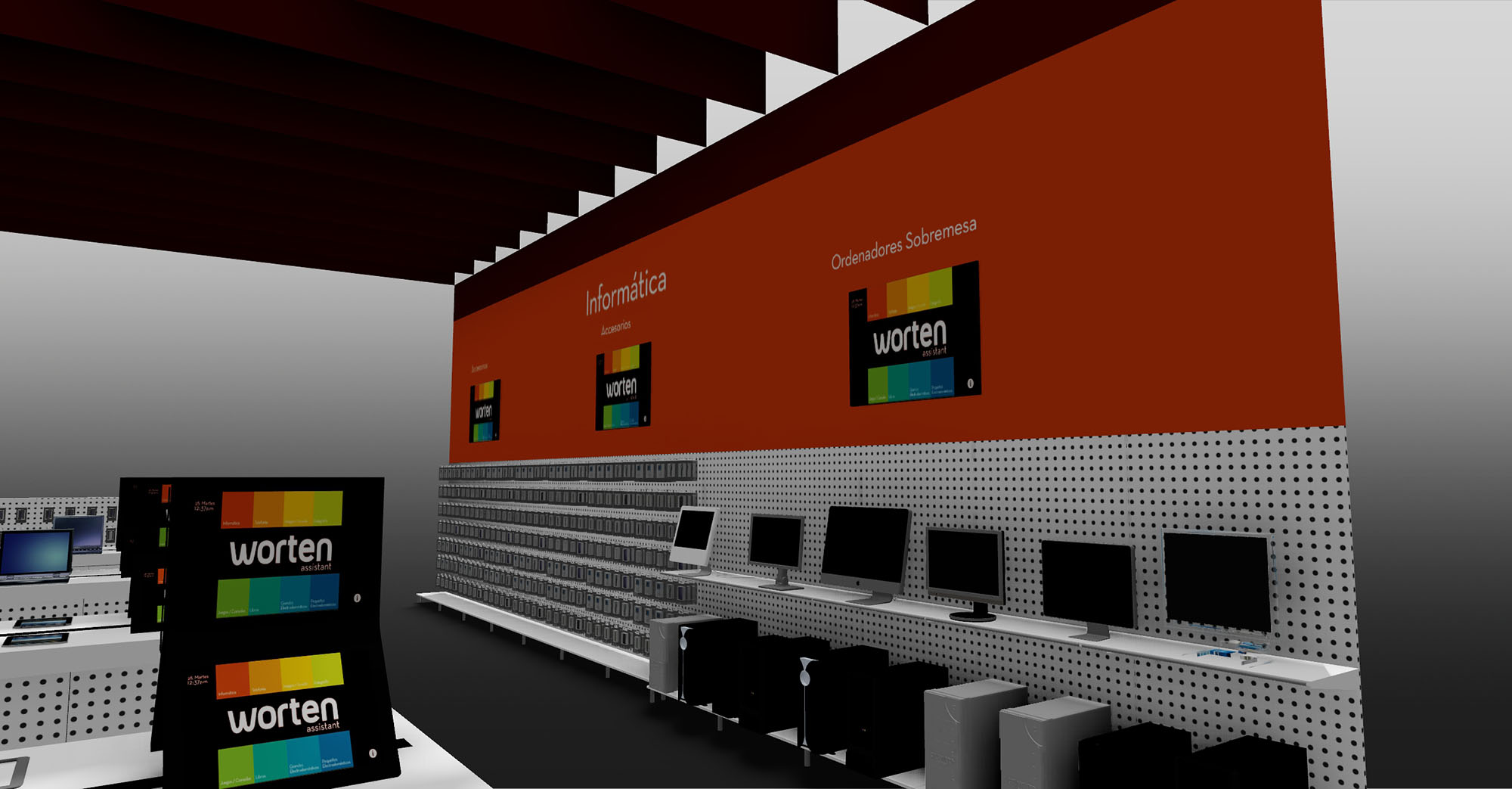
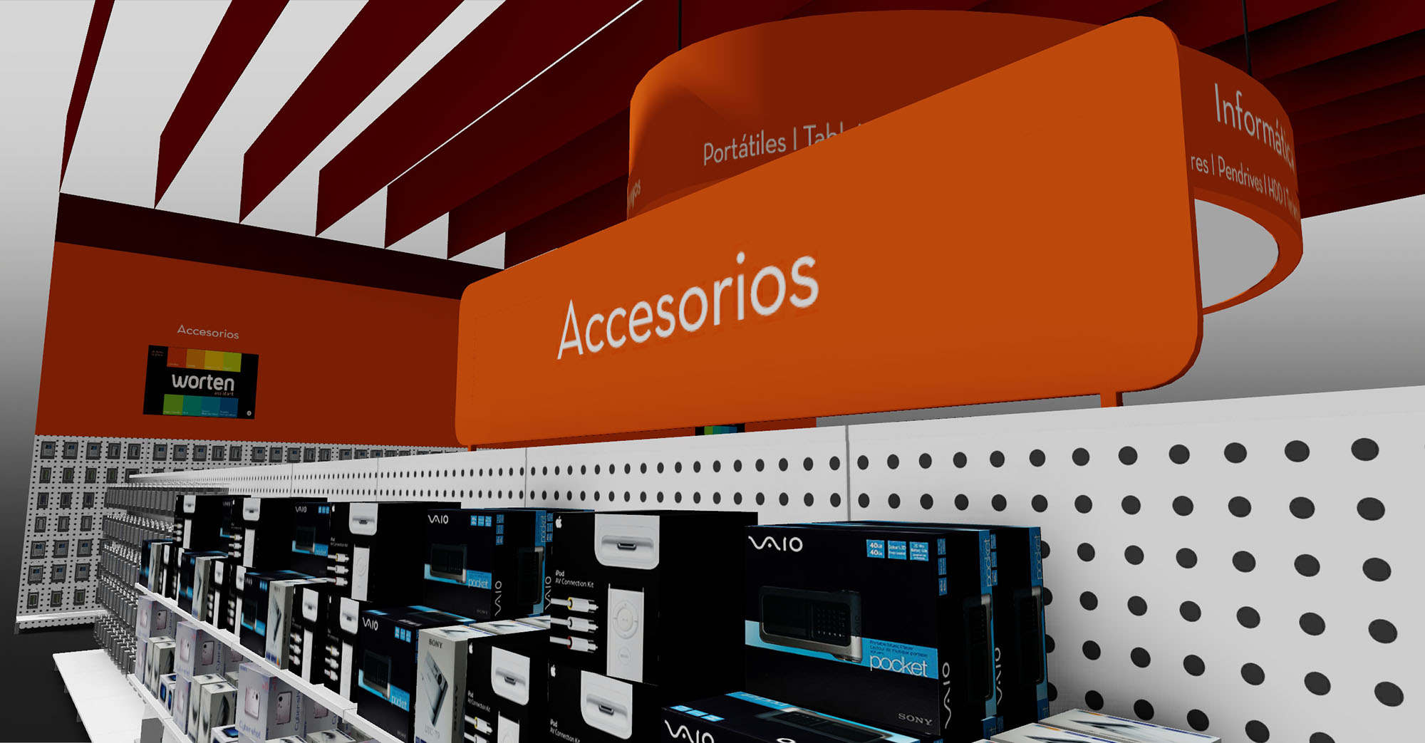
The design of Worten Stores in Madrid is conceived as an immersive technological landscape where architecture, product and brand converge into a single spatial gesture. The space is organized around a central circular hub dedicated to computing, articulated by a suspended luminous ring that clearly marks the “Informática” universe and becomes a strong visual landmark in the store. From this center, the layout radiates in an orderly grid of workstations and product islands, ensuring both legibility and flexibility for future upgrades of the technological offer.
The intervention emphasizes clarity and orientation: long perspectives, aligned gondolas and a powerful overhead structure guide the customer intuitively through the different categories, from laptops to accessories. The abstract language of the ceiling blades and the sculptural ring conveys innovation and speed, aligning the architectural image with the digital character of the products on display.
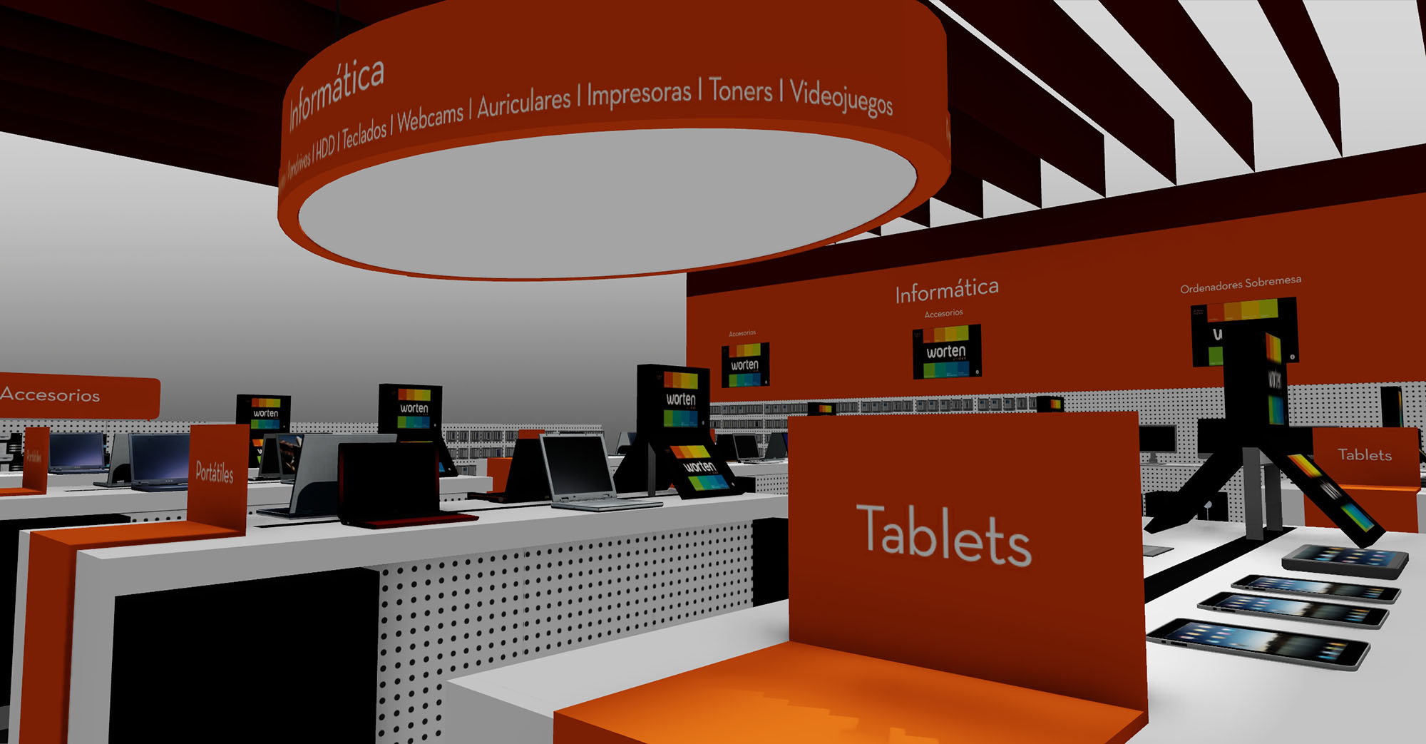
The floor plan is structured as a sequence of parallel bands: perimeter shelving for boxed goods and accessories, and a central spine of demonstration counters where customers can experience laptops, tablets and peripherals. The access points are aligned with visual corridors that lead directly to the main hub, minimizing decision points and avoiding congestion in high-traffic zones.
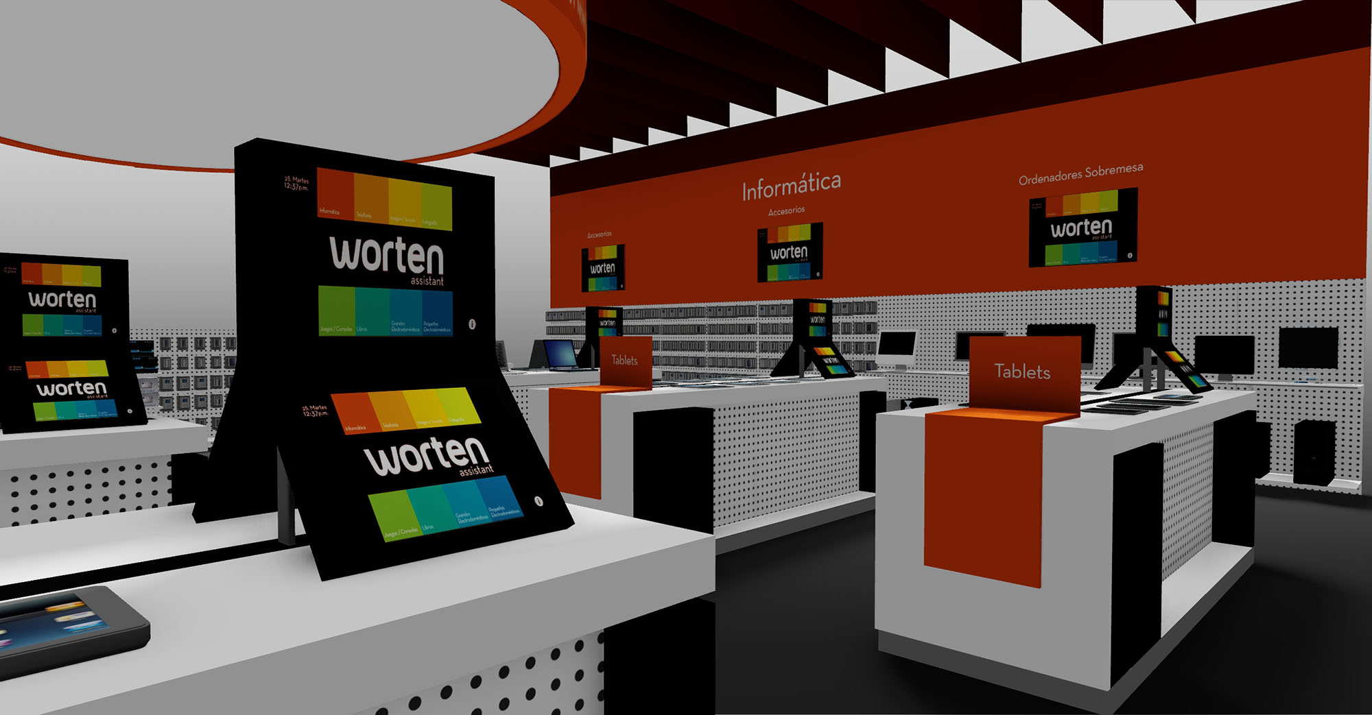
Each workstation is dimensioned as a compact “micro‑store” with its own frontal presentation area, interaction zone and storage plinth, allowing staff to attend multiple customers efficiently. The modularity of the elements supports rapid reconfiguration according to seasonal campaigns or new product lines, while maintaining a consistent navigation logic throughout the department.
The architectural expression relies on a controlled palette of geometric volumes: orthogonal counters and shelving are contrasted with the large circular canopy and dynamic ceiling fins. These horizontal and radial elements frame the space without resorting to full-height partitions, preserving visual continuity across the store.
Brand identity is reinforced through the chromatic contrast between the neutral base—white and light gray surfaces—and the corporate orange fields that mark key touchpoints: category totems, counter fronts and the circular ring. Signage is integrated into the architecture, using continuous bands of text that wrap the central element, making product categories visible from a distance and reducing reliance on secondary graphic supports.
The project adopts robust retail materials: laminated board for counters and shelving, perforated metal back panels for flexible hook-on display systems, and high-resistance flooring suitable for intensive use and easy maintenance. The suspended blades are conceived in lightweight composite or painted metal, allowing long spans with minimal structural impact.
Lighting is layered to enhance perception of products: a uniform ambient wash ensures comfortable global illumination, while accent lighting along the ring and above the workstations highlights screens and keyboards without causing glare. The combination of deep red blades, orange signage bands and neutral fixtures creates a calm but strongly branded environment, where the eye naturally gravitates to the illuminated central ring and the active sales points.
Sustainability is addressed through a rational use of resources and a design strategy focused on longevity and reusability. The modular furniture system reduces material waste during installation and facilitates future relocation or reconfiguration of elements, extending the lifecycle of each component. Preference is given to recyclable materials such as steel and standardized laminated boards, enabling responsible end-of-life management.
On the environmental performance side, the scheme is compatible with high-efficiency LED lighting, controlled by zoning and dimming systems that adapt intensity to occupancy and daylight contribution, thus lowering energy consumption. The open ceiling concept minimizes the need for secondary finishes, exposing only essential elements and reducing embodied carbon. Combined, these measures produce a technologically expressive retail space that remains resource-conscious and operationally efficient over time.
The design of Worten Stores in Madrid is conceived as an immersive technological landscape where architecture, product and brand converge into a single spatial gesture. The space is organized around a central circular hub dedicated to computing, articulated by a suspended luminous ring that clearly marks the “Informática” universe and becomes a strong visual landmark in the store. From this center, the layout radiates in an orderly grid of workstations and product islands, ensuring both legibility and flexibility for future upgrades of the technological offer.
The intervention emphasizes clarity and orientation: long perspectives, aligned gondolas and a powerful overhead structure guide the customer intuitively through the different categories, from laptops to accessories. The abstract language of the ceiling blades and the sculptural ring conveys innovation and speed, aligning the architectural image with the digital character of the products on display.
The floor plan is structured as a sequence of parallel bands: perimeter shelving for boxed goods and accessories, and a central spine of demonstration counters where customers can experience laptops, tablets and peripherals. The access points are aligned with visual corridors that lead directly to the main hub, minimizing decision points and avoiding congestion in high-traffic zones.
Each workstation is dimensioned as a compact “micro‑store” with its own frontal presentation area, interaction zone and storage plinth, allowing staff to attend multiple customers efficiently. The modularity of the elements supports rapid reconfiguration according to seasonal campaigns or new product lines, while maintaining a consistent navigation logic throughout the department.
The architectural expression relies on a controlled palette of geometric volumes: orthogonal counters and shelving are contrasted with the large circular canopy and dynamic ceiling fins. These horizontal and radial elements frame the space without resorting to full-height partitions, preserving visual continuity across the store.
Brand identity is reinforced through the chromatic contrast between the neutral base—white and light gray surfaces—and the corporate orange fields that mark key touchpoints: category totems, counter fronts and the circular ring. Signage is integrated into the architecture, using continuous bands of text that wrap the central element, making product categories visible from a distance and reducing reliance on secondary graphic supports.
The project adopts robust retail materials: laminated board for counters and shelving, perforated metal back panels for flexible hook-on display systems, and high-resistance flooring suitable for intensive use and easy maintenance. The suspended blades are conceived in lightweight composite or painted metal, allowing long spans with minimal structural impact.
Lighting is layered to enhance perception of products: a uniform ambient wash ensures comfortable global illumination, while accent lighting along the ring and above the workstations highlights screens and keyboards without causing glare. The combination of deep red blades, orange signage bands and neutral fixtures creates a calm but strongly branded environment, where the eye naturally gravitates to the illuminated central ring and the active sales points.
Sustainability is addressed through a rational use of resources and a design strategy focused on longevity and reusability. The modular furniture system reduces material waste during installation and facilitates future relocation or reconfiguration of elements, extending the lifecycle of each component. Preference is given to recyclable materials such as steel and standardized laminated boards, enabling responsible end-of-life management.
On the environmental performance side, the scheme is compatible with high-efficiency LED lighting, controlled by zoning and dimming systems that adapt intensity to occupancy and daylight contribution, thus lowering energy consumption. The open ceiling concept minimizes the need for secondary finishes, exposing only essential elements and reducing embodied carbon. Combined, these measures produce a technologically expressive retail space that remains resource-conscious and operationally efficient over time.


Nuestras oficinas están en Barcelona, Cancún, Chicago y Santo Domingo, pero gracias a la tecnología podemos desarrollar proyectos en cualquier parte del mundo.
Barcelona
Bac de Roda 136
08020, Barcelona
Spain
Madrid
Av. de Buendía 11
19005 Guadalajara (Madrid)
Spain
Chicago
373 Hazel Ave, Apt A1
60022, Glencoe, Illinois
United States