

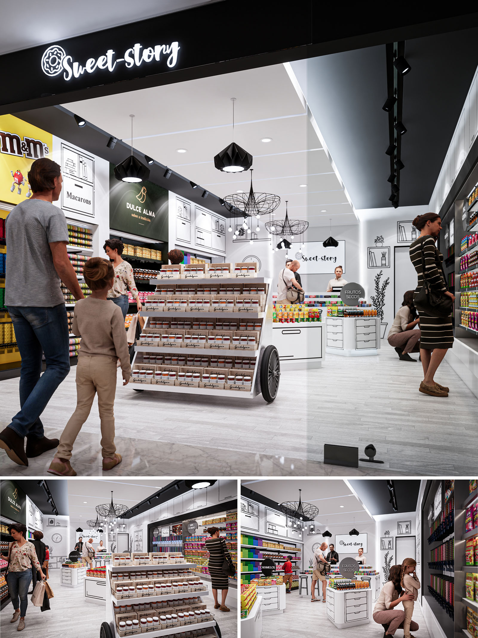
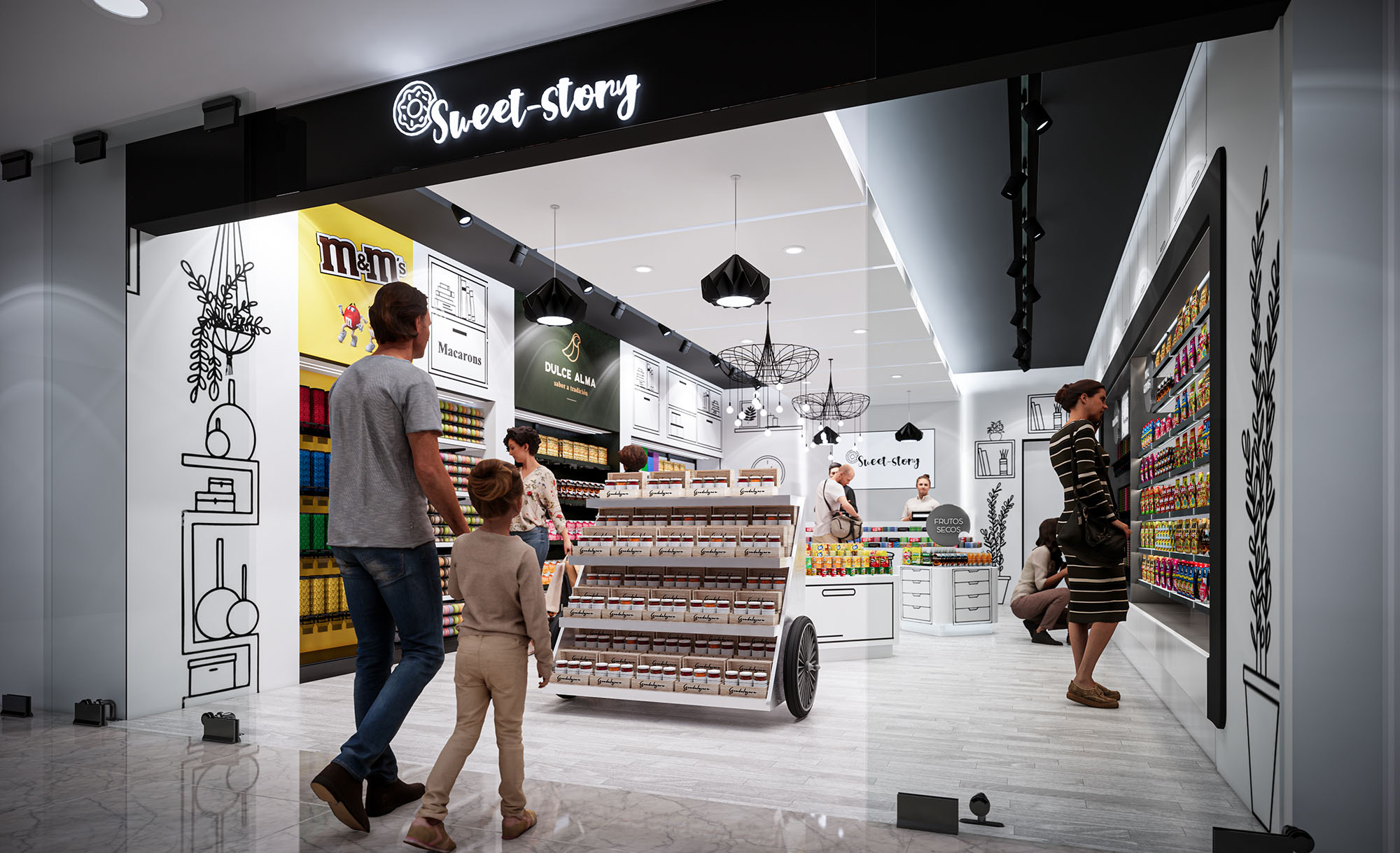
The design of SWEET STORY in Guadalajara is conceived as an immersive candy boutique, where the narrative of sweets is translated into a playful yet highly organized spatial experience. The concept merges the warmth of a neighborhood “dulcería” with the precision of contemporary retail design, generating an environment that is both familiar and visually stimulating. A monochrome architectural envelope acts as a neutral stage on which color, contained in the products themselves, becomes the protagonist.
The project seeks to create a clear and legible story from the entrance: an inviting portal with illuminated signage leads the customer into a luminous interior, where circulation flows intuitively around central display elements. The atmosphere aims to evoke a stylized graphic novel, using line drawings and black contours over white surfaces to suggest cupboards, shelves and domestic scenes that expand the perceived volume of the small footprint.
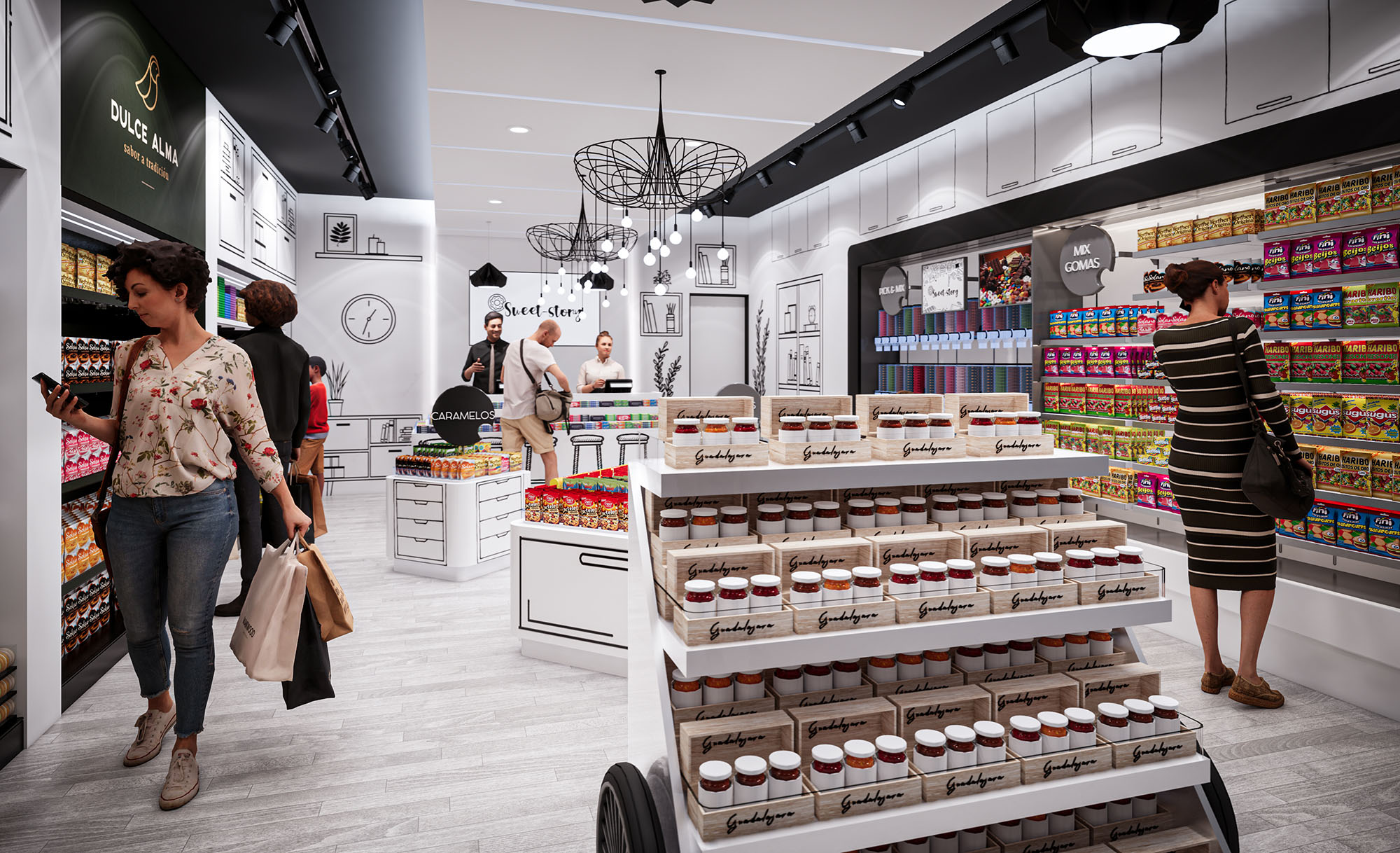
The floor plan is organized along a central spine that directs movement from the storefront threshold to the service counter at the back. A mobile cart-like gondola placed in the middle of the space structures circulation into a loop, encouraging customers to circulate around it and along the perimeter shelving. This arrangement maximizes linear display area while preserving a generous central aisle and clear sightlines from the mall corridor into the entire store.
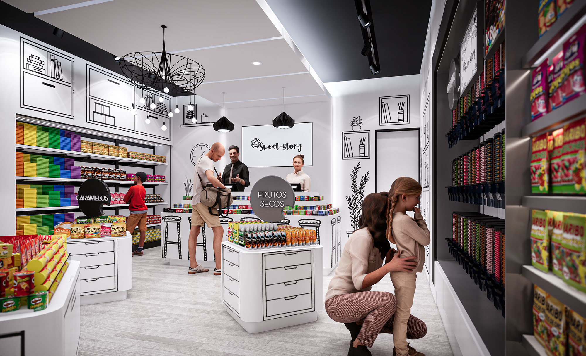
Perimeter walls are dedicated to high-density shelving for packaged products, while the rear counter consolidates cashier, service, and specialty bulk items. The low central furniture maintains the visual continuity of the store and allows supervision by staff. The design intentionally places the most colorful and impulse-purchase products at eye level along the circulation ring, while premium or specialty brands occupy framed niches highlighted with accent lighting.
The material palette is deliberately restrained: white lacquered furniture, light wood-effect flooring, and black metal accents. This neutral composition emphasizes cleanliness and order, simultaneously providing a timeless background for constantly changing product collections. The floor uses a high-resistance porcelain or vinyl finish with a light grain, suitable for high traffic and easy maintenance.
Color is introduced almost exclusively through the merchandise and through strategic brand graphics. Black linear drawings on white walls simulate cabinets, bookshelves and domestic objects, reinforcing the “story” concept and providing depth without adding physical volume. The ceiling and some vertical planes are painted in matte black to frame the luminaires and signage, creating a contrast that guides the gaze toward the displays.
The lighting strategy combines general uniform illumination with accent and decorative fixtures. Recessed downlights and linear LED tracks provide homogeneous lighting that ensures accurate color rendition of the sweets. Adjustable projectors along the tracks highlight vertical shelving, increasing perceived brightness at the product plane and enhancing legibility of packaging.
Decorative pendants with geometric wireframe shades introduce a sculptural element over the central area and the service counter. Their black silhouettes echo the graphic drawings on the walls, reinforcing the visual identity of the brand. All luminaires are specified with energy-efficient LED technology and warm-neutral color temperature, balancing visual comfort with vivid product display.
Built-in cabinets and modular gondolas are designed with clear ergonomic criteria: optimal reach heights, rounded edges for safety, and integrated storage drawers for stock. The central cart, with visible wheels, references traditional street vendors and functions as a flexible display that can be reconfigured according to seasonal campaigns or promotions.
Branding elements are seamlessly integrated into the architecture: the illuminated “Sweet Story” sign at the entrance, the logo on the rear wall, and the subtle presence of partner brands in dedicated panels. The user experience is oriented toward families, with clear visibility for children, inviting colors, and a welcoming service counter that encourages interaction rather than rapid, purely transactional shopping.
Sustainability is approached through material selection, energy efficiency and operational flexibility. The predominant use of light-colored surfaces enhances the reflection of artificial light, allowing a reduction in installed lighting power without compromising visual comfort. LED technology, combined with potential dimming and time-control systems, significantly decreases energy consumption over the store’s life cycle.
Furniture is designed as modular and demountable, enabling reuse and reconfiguration rather than replacement when the brand evolves. Preference is given to durable finishes and substrates with low VOC emissions, improving indoor air quality. The compact footprint, high-density display and emphasis on long-lasting materials reduce the environmental impact per unit of product sold, aligning the sweet, playful character of the project with responsible resource use.
The design of SWEET STORY in Guadalajara is conceived as an immersive candy boutique, where the narrative of sweets is translated into a playful yet highly organized spatial experience. The concept merges the warmth of a neighborhood “dulcería” with the precision of contemporary retail design, generating an environment that is both familiar and visually stimulating. A monochrome architectural envelope acts as a neutral stage on which color, contained in the products themselves, becomes the protagonist.
The project seeks to create a clear and legible story from the entrance: an inviting portal with illuminated signage leads the customer into a luminous interior, where circulation flows intuitively around central display elements. The atmosphere aims to evoke a stylized graphic novel, using line drawings and black contours over white surfaces to suggest cupboards, shelves and domestic scenes that expand the perceived volume of the small footprint.
The floor plan is organized along a central spine that directs movement from the storefront threshold to the service counter at the back. A mobile cart-like gondola placed in the middle of the space structures circulation into a loop, encouraging customers to circulate around it and along the perimeter shelving. This arrangement maximizes linear display area while preserving a generous central aisle and clear sightlines from the mall corridor into the entire store.
Perimeter walls are dedicated to high-density shelving for packaged products, while the rear counter consolidates cashier, service, and specialty bulk items. The low central furniture maintains the visual continuity of the store and allows supervision by staff. The design intentionally places the most colorful and impulse-purchase products at eye level along the circulation ring, while premium or specialty brands occupy framed niches highlighted with accent lighting.
The material palette is deliberately restrained: white lacquered furniture, light wood-effect flooring, and black metal accents. This neutral composition emphasizes cleanliness and order, simultaneously providing a timeless background for constantly changing product collections. The floor uses a high-resistance porcelain or vinyl finish with a light grain, suitable for high traffic and easy maintenance.
Color is introduced almost exclusively through the merchandise and through strategic brand graphics. Black linear drawings on white walls simulate cabinets, bookshelves and domestic objects, reinforcing the “story” concept and providing depth without adding physical volume. The ceiling and some vertical planes are painted in matte black to frame the luminaires and signage, creating a contrast that guides the gaze toward the displays.
The lighting strategy combines general uniform illumination with accent and decorative fixtures. Recessed downlights and linear LED tracks provide homogeneous lighting that ensures accurate color rendition of the sweets. Adjustable projectors along the tracks highlight vertical shelving, increasing perceived brightness at the product plane and enhancing legibility of packaging.
Decorative pendants with geometric wireframe shades introduce a sculptural element over the central area and the service counter. Their black silhouettes echo the graphic drawings on the walls, reinforcing the visual identity of the brand. All luminaires are specified with energy-efficient LED technology and warm-neutral color temperature, balancing visual comfort with vivid product display.
Built-in cabinets and modular gondolas are designed with clear ergonomic criteria: optimal reach heights, rounded edges for safety, and integrated storage drawers for stock. The central cart, with visible wheels, references traditional street vendors and functions as a flexible display that can be reconfigured according to seasonal campaigns or promotions.
Branding elements are seamlessly integrated into the architecture: the illuminated “Sweet Story” sign at the entrance, the logo on the rear wall, and the subtle presence of partner brands in dedicated panels. The user experience is oriented toward families, with clear visibility for children, inviting colors, and a welcoming service counter that encourages interaction rather than rapid, purely transactional shopping.
Sustainability is approached through material selection, energy efficiency and operational flexibility. The predominant use of light-colored surfaces enhances the reflection of artificial light, allowing a reduction in installed lighting power without compromising visual comfort. LED technology, combined with potential dimming and time-control systems, significantly decreases energy consumption over the store’s life cycle.
Furniture is designed as modular and demountable, enabling reuse and reconfiguration rather than replacement when the brand evolves. Preference is given to durable finishes and substrates with low VOC emissions, improving indoor air quality. The compact footprint, high-density display and emphasis on long-lasting materials reduce the environmental impact per unit of product sold, aligning the sweet, playful character of the project with responsible resource use.


Nuestras oficinas están en Barcelona, Cancún, Chicago y Santo Domingo, pero gracias a la tecnología podemos desarrollar proyectos en cualquier parte del mundo.
Barcelona
Bac de Roda 136
08020, Barcelona
Spain
Madrid
Av. de Buendía 11
19005 Guadalajara (Madrid)
Spain
Chicago
373 Hazel Ave, Apt A1
60022, Glencoe, Illinois
United States