

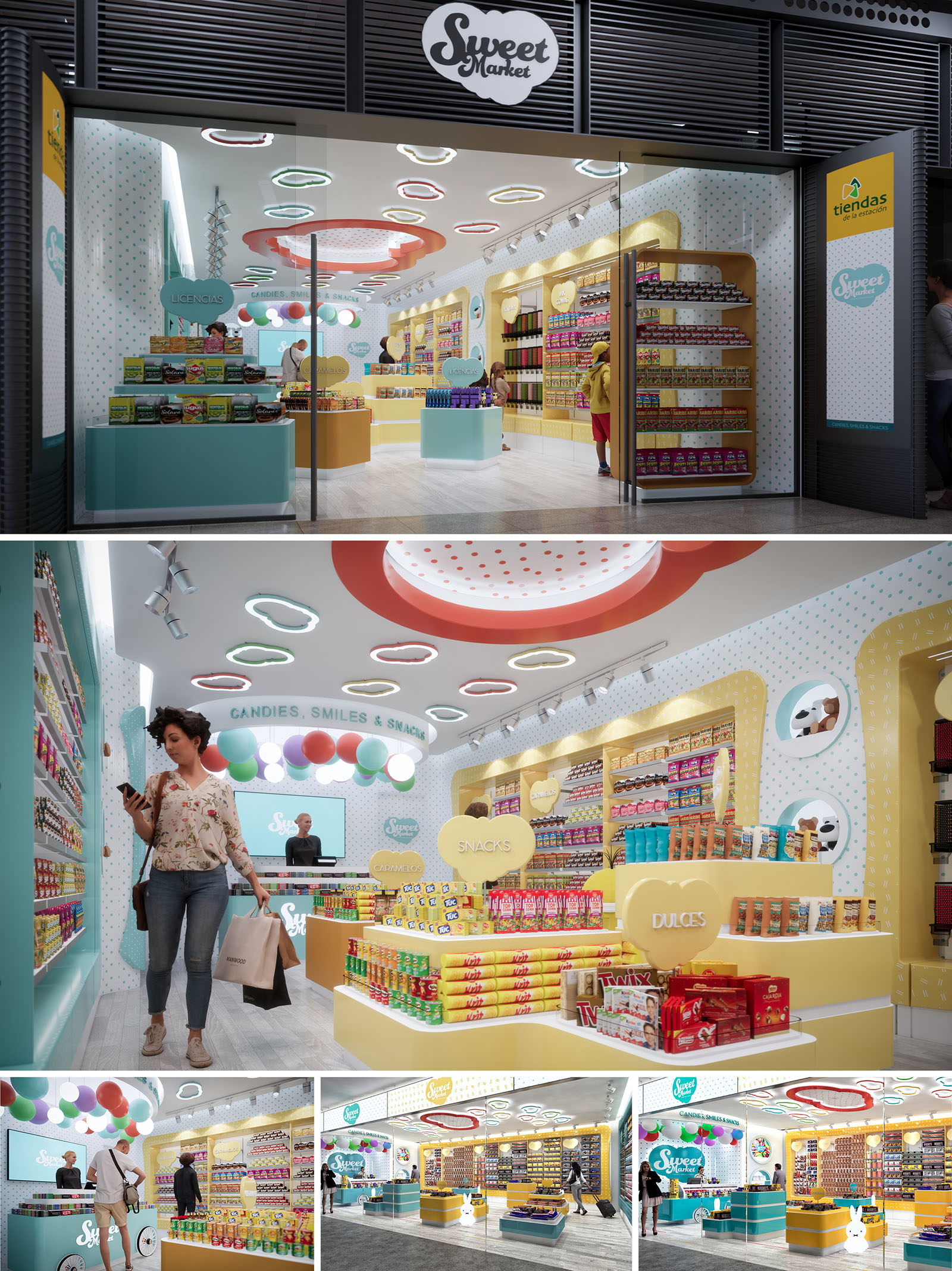
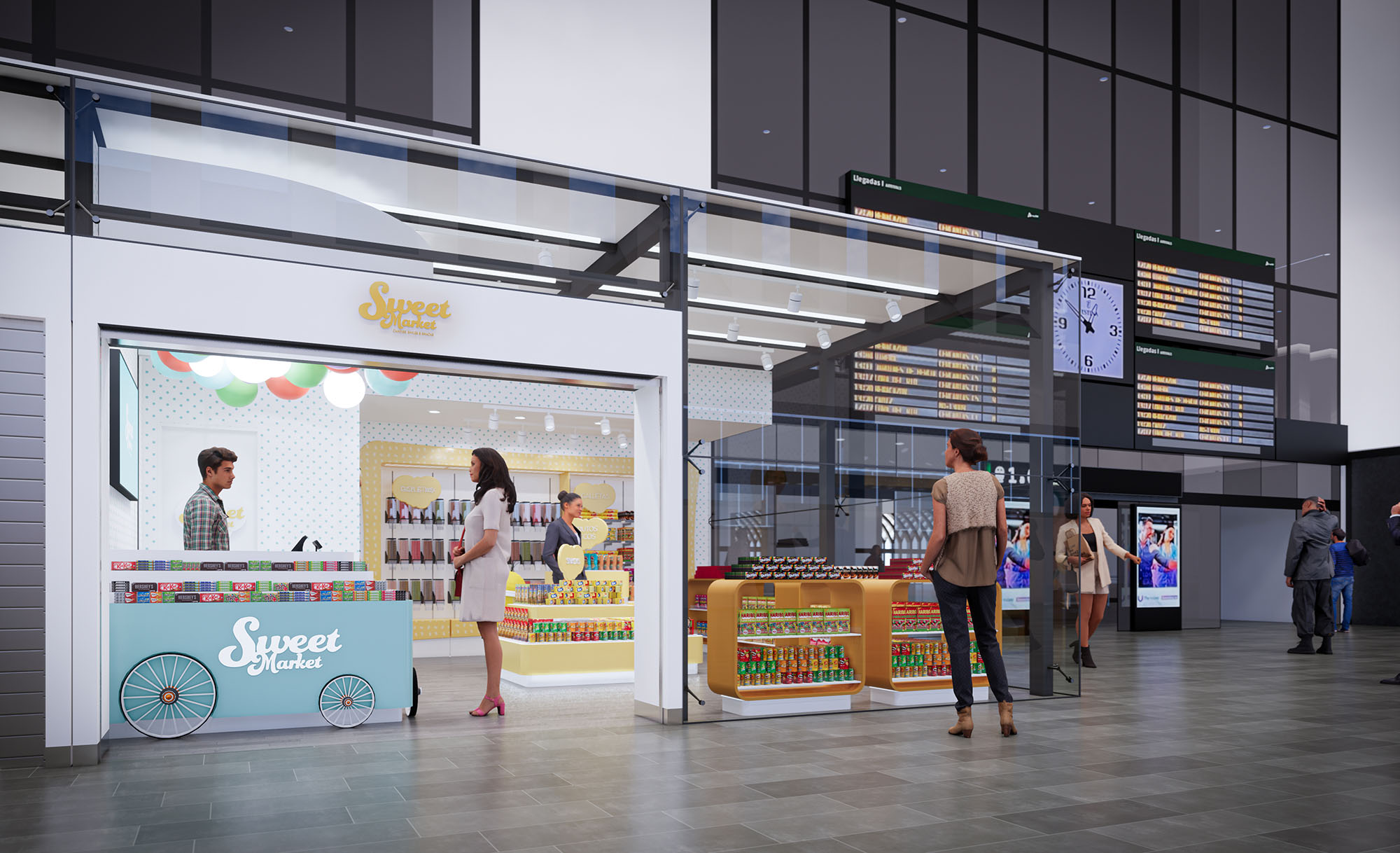
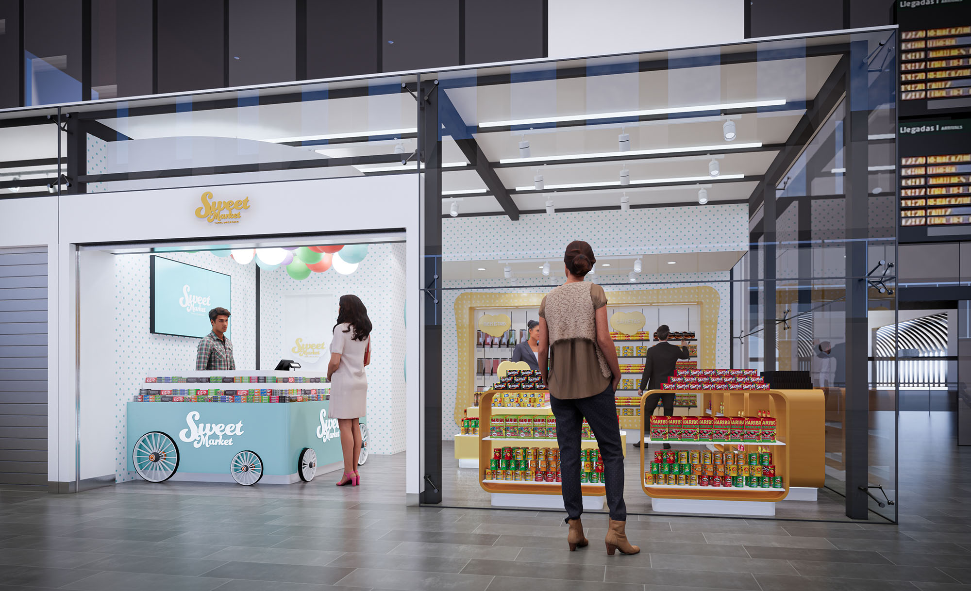
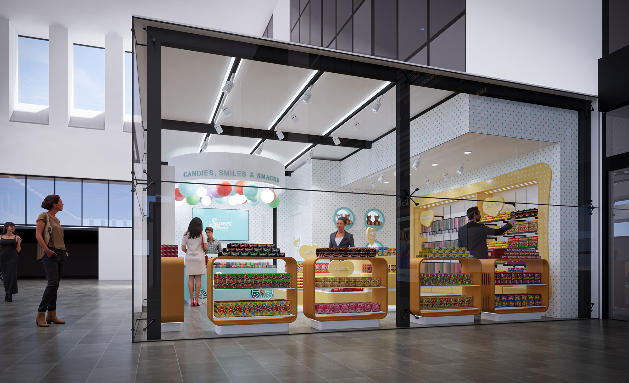
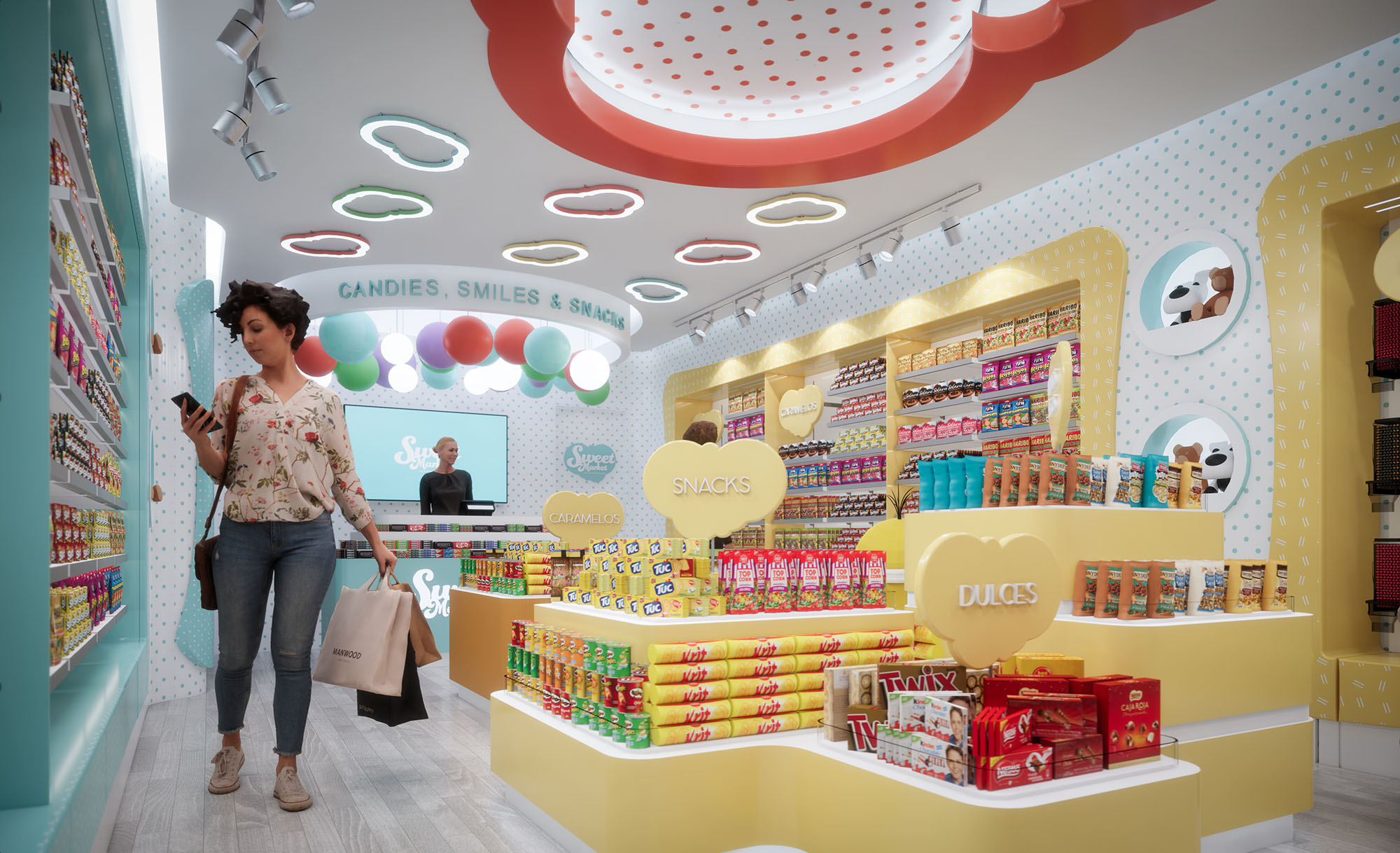
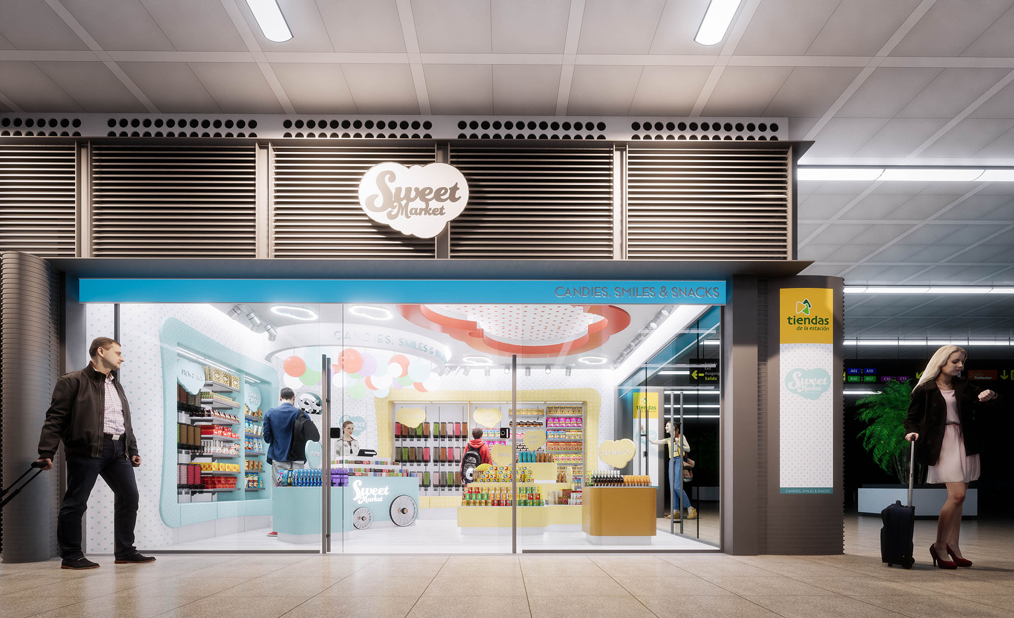
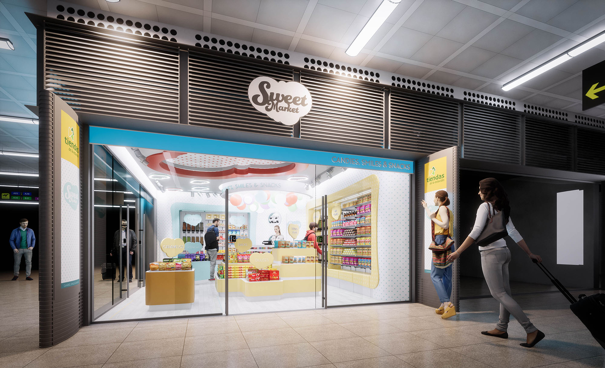
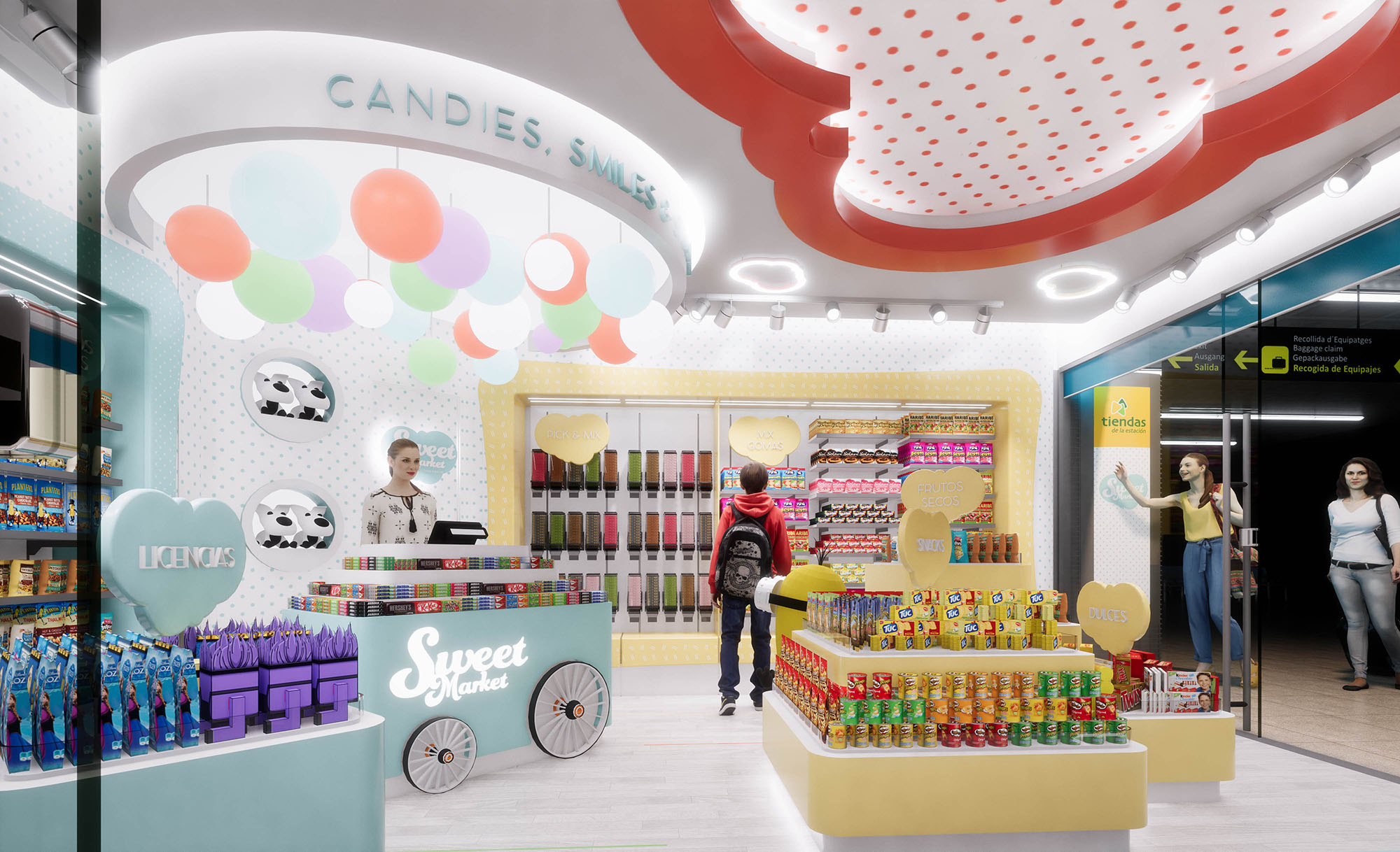
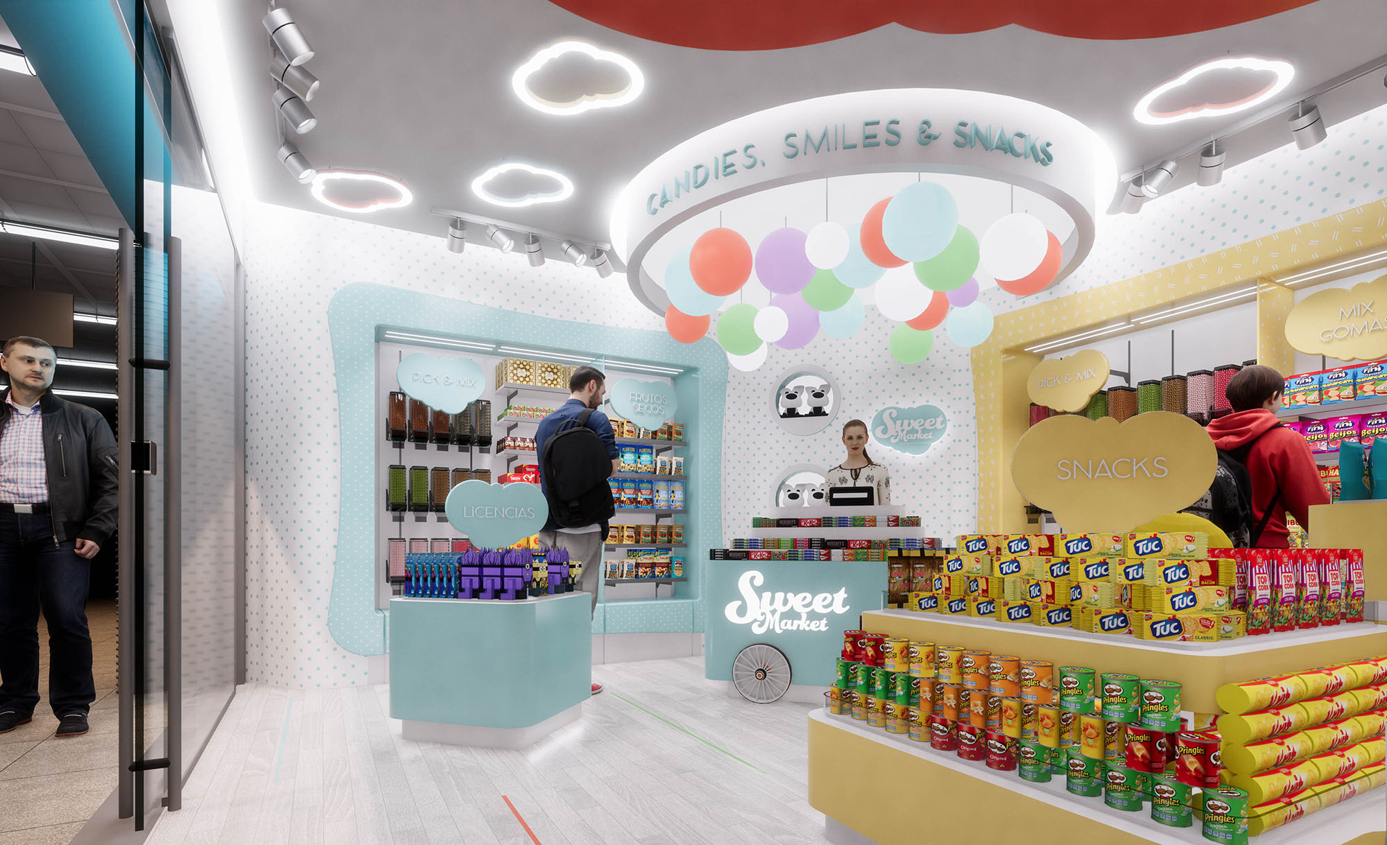
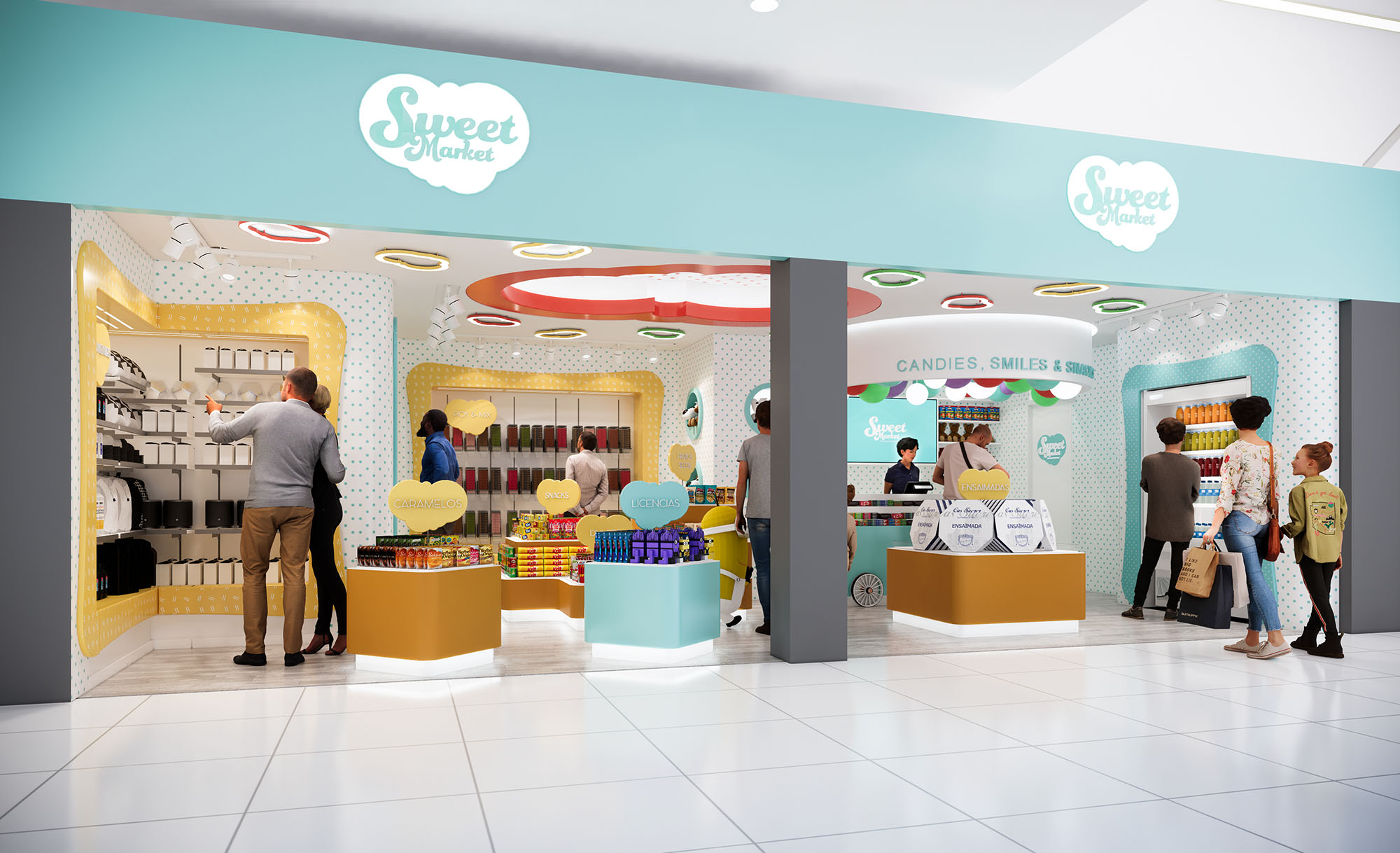
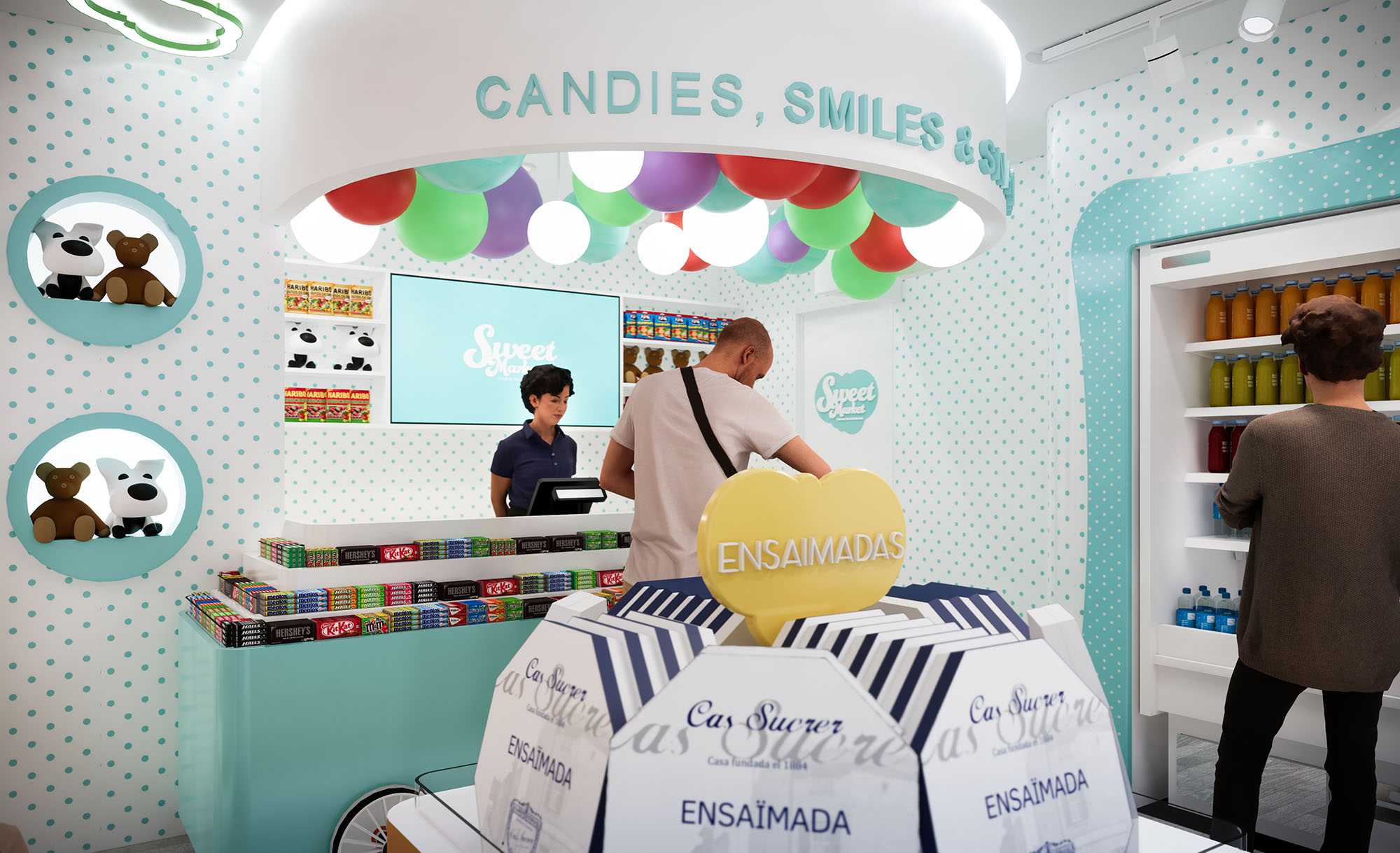
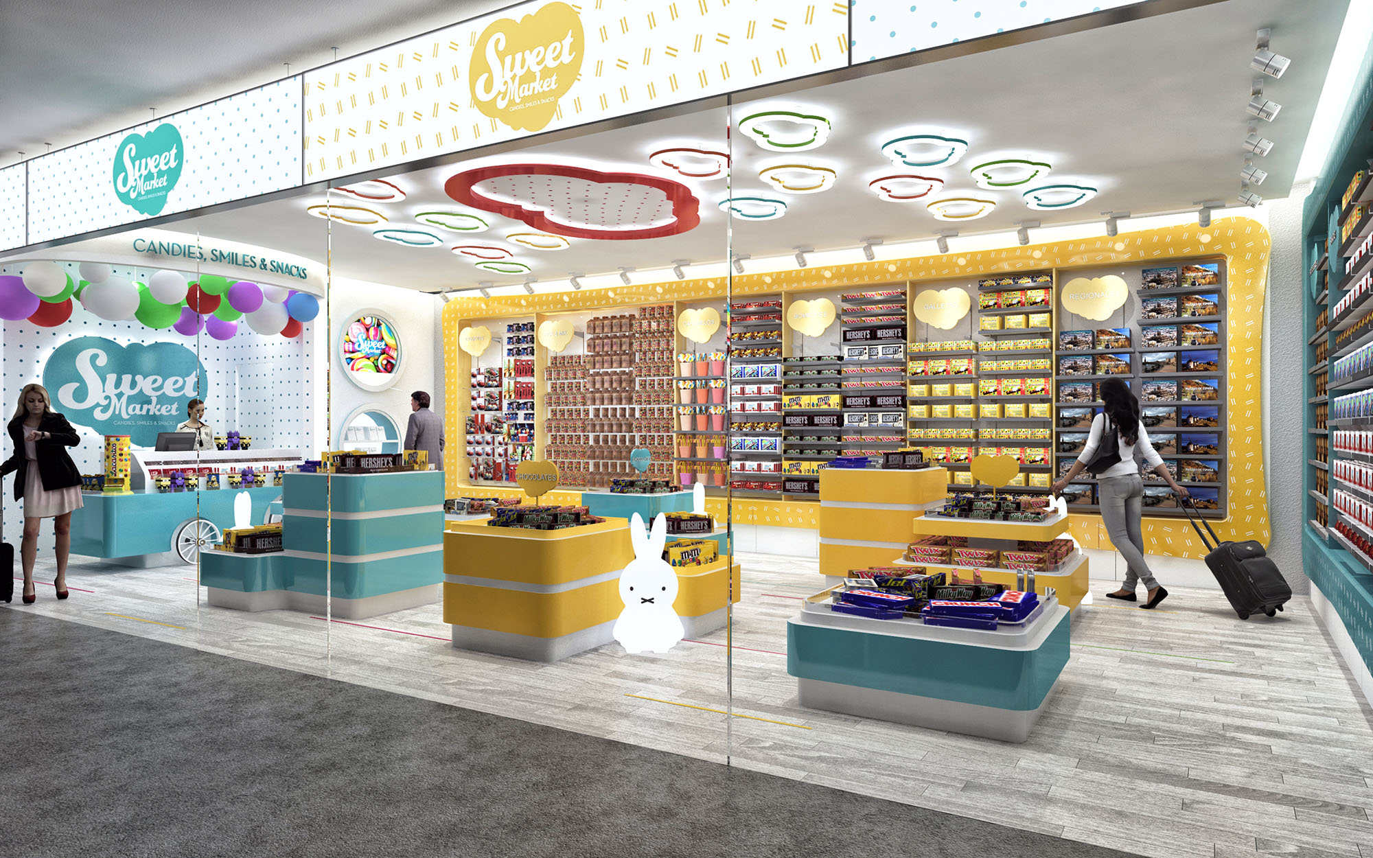
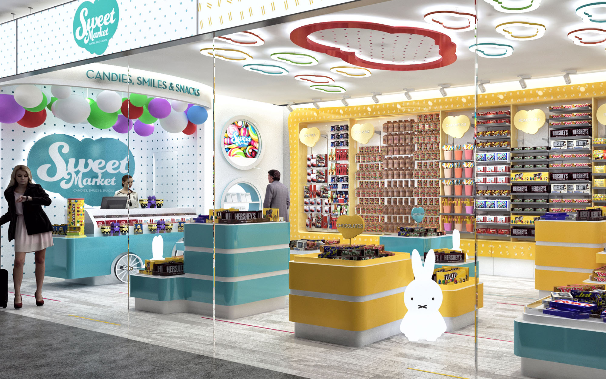
The Sweet Market concept translates the emotional universe of childhood confectionery into a contemporary retail language. The space is conceived as an immersive “candy cloud” where soft geometries, luminous color and playful graphics build a memorable brand experience. Each element is designed to be immediately legible from the mall corridor, turning the store into a luminous showcase that communicates abundance, joy and accessibility.
The design is modular and replicable across 29 locations in Spain, ensuring a strong, cohesive identity while allowing small adjustments to respond to different footprints and circulation constraints. The overall strategy combines high-density product display with generous visual permeability, so that the merchandise itself becomes a key part of the interior scenography.
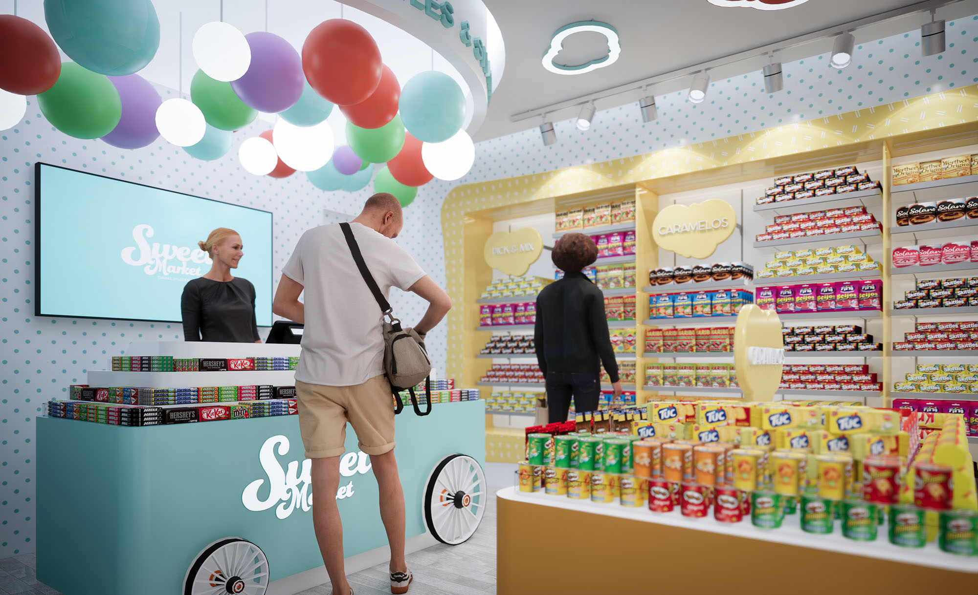
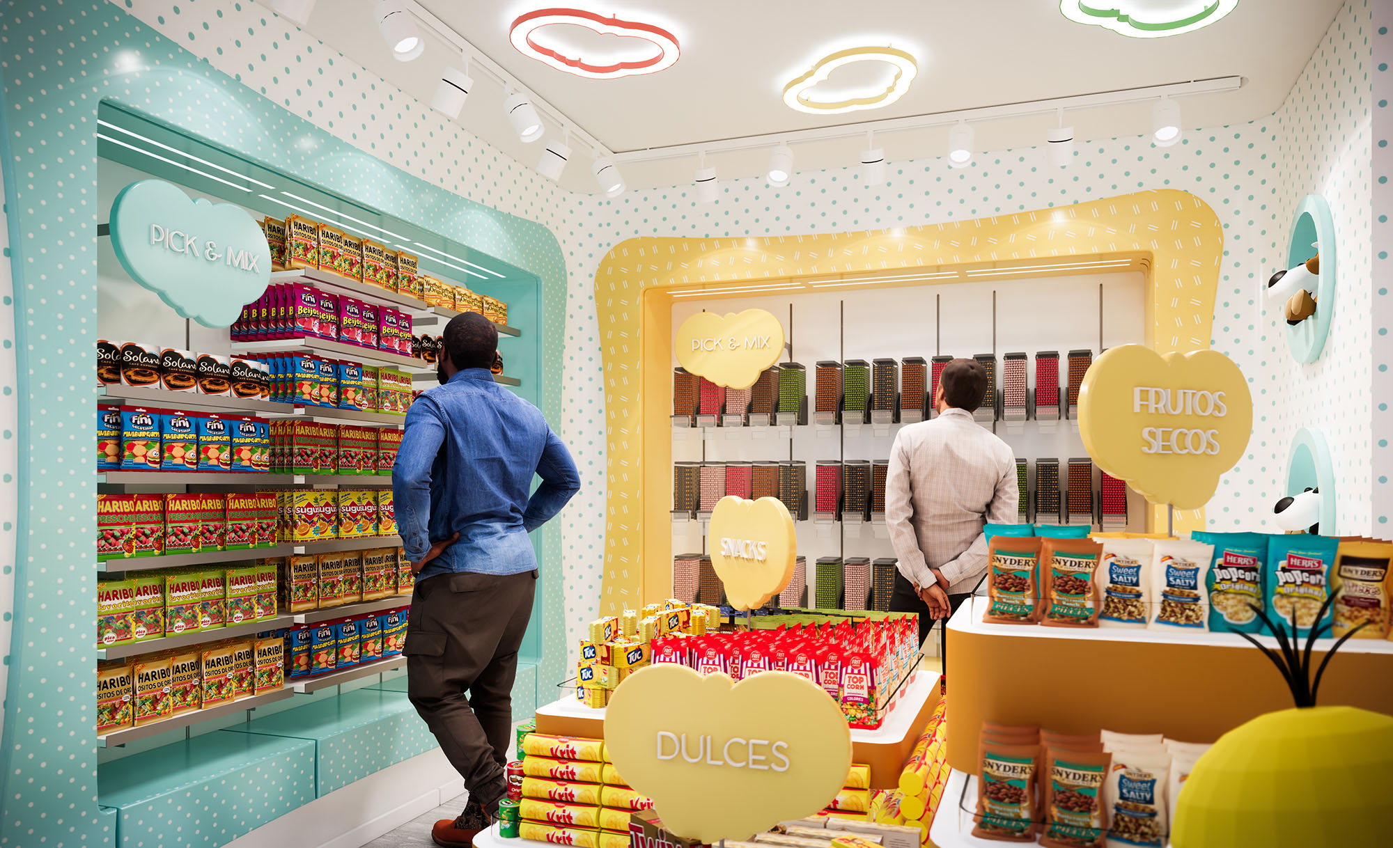
The store layout follows a perimeter-and-island scheme. Linear shelving along the walls offers maximum storage capacity and clear product categorization, while central islands organize impulse purchasing and highlight seasonal or promotional items. This arrangement maintains open sightlines from the entrance to the back counter, supporting intuitive orientation and shop security.
Upon entering, customers are guided by a subtle funneling effect: the curved front counters and islands gently narrow the access zone and then open towards the rear cashier and brand wall. This sequence creates a short but deliberate journey, encouraging browsing while ensuring quick turnover for high-traffic mall locations. Circulation loops allow customers to walk around each central module, facilitating interaction with products at child and adult heights.
The material palette is intentionally simple and robust, relying on lacquered MDF, high-pressure laminates and powder-coated metal structures, all selected for durability and ease of maintenance. Warm light wood tones on shelving plinths are combined with smooth pastel finishes in yellow, aqua and blush, evoking classic candy tones without becoming visually overwhelming.
Branding is fully integrated into the architecture: polka-dot graphic patterns wrap walls and vertical frames, while oversized heart and cloud silhouettes function as both signage and display backdrops. Edge lighting highlights these shapes, reinforcing the identity even when shelves are fully stocked. The storefront glazing acts as a transparent showcase; the suspended logo and backlit interior ceiling elements make the store instantly recognizable from a distance.
Artificial lighting is a key driver of the experience. A continuous ambient layer is provided by recessed linear fixtures and indirect light coves that wash the upper walls, creating a bright, shadow-free background. Accentuated spotlights on track systems allow flexible focusing on vertical merchandising, ensuring uniform color rendering of diverse packaging.
The ceiling features playful cloud-shaped LED luminaires and a central circular recess with perforated diffuser, referencing candy dots. This sculpted ceiling not only becomes a brand signature across locations but also visually lowers the scale, making relatively deep or tall units feel more intimate while maintaining functional luminance levels compliant with retail standards.
Display furniture is designed as a kit-of-parts, with modular bases and interchangeable upper elements. Radiused corners enhance safety and encourage smooth circulation, particularly for children. Different counter heights accommodate varied product typologies and age groups, from low-access bins for candies to higher shelves for snacks and licensed products.
Integrated signage totems and heart-shaped category markers are conceived as removable elements that slide into dedicated slots, allowing rapid reconfiguration as product mixes evolve. Storage zones concealed within the base of central islands help minimize back-of-house requirements, improving operational efficiency in small units.
Sustainability is addressed through both material choices and operational efficiency. Wherever possible, furniture uses certified wood-based panels with low-emission finishes, and metal components are specified with durable powder coatings to extend lifecycle and facilitate recycling at end of use. The modular design minimizes waste during fabrication and allows components to be reused across different premises as leases or locations change.
The lighting system relies entirely on LED technology with high efficacy and long service life, significantly reducing energy consumption and maintenance in comparison to traditional retail schemes. The bright, predominantly light-colored interior enhances daylight penetration through the large glazed shopfront, allowing lower artificial lighting levels during daytime. Easy-clean surfaces and robust edges reduce the need for frequent replacement, aligning the playful, emotional character of the brand with responsible, long-term resource use across the 29-store rollout.
LIST OF PROJECTS EXPERIENCE
Designed, Executed and/or Built Projects
SPAIN
1. Sweet Market - Alicante - L88
2. Sweet Market - Alicante - L06
3. Sweet Market - Concept Design
4. Sweet Market - Barcelona T2 - L0101401301
5. Sweet Market - Barcelona TSUD - L13
6. Sweet Market - RENFE - Plaza Catalunya
7. Sweet Market - RENFE Ciudad Real - L00
8. Sweet Market - RENFE Cordoba - L00
9. Sweet Market - Fuerteventura - Local 02
10. Sweet Market - Ibiza - L269
11. Sweet Market - Ibiza - LB4
12. Sweet Market - Lanzarote - LC02
13. Sweet Market - RENFE Madrid Atocha - L00
14. Sweet Market - RENFE Madrid Chamartin - L00
15. Sweet Market - Madrid - T35
16. Sweet Market - RENFE Madrid Atocha - L6969
17. Sweet Market - RENFE Madrid Atocha - L6657-6658
18. Sweet Market - Madrid - T17.1
19. Sweet Market - Malaga - L.O207
20. Sweet Market - Malaga - Local D.37.20.00.788
21. Sweet Market - Malaga - Local D.37.20.00.887
22. Sweet Market - Mallorca - Local N413
23. Sweet Market - Menorca - L173
24. Sweet Market - Sevilla - L306
25. Sweet Market - RENFE Sevilla - L6223
26. Sweet Market - RENFE Sevilla Sta Justa - L00
27. Sweet Market - Sevilla - L002.07
28. Sweet Market - Tenerife Sur - L06
29. Sweet Market - Tenerife Sur - L0809

The Sweet Market concept translates the emotional universe of childhood confectionery into a contemporary retail language. The space is conceived as an immersive “candy cloud” where soft geometries, luminous color and playful graphics build a memorable brand experience. Each element is designed to be immediately legible from the mall corridor, turning the store into a luminous showcase that communicates abundance, joy and accessibility.
The design is modular and replicable across 29 locations in Spain, ensuring a strong, cohesive identity while allowing small adjustments to respond to different footprints and circulation constraints. The overall strategy combines high-density product display with generous visual permeability, so that the merchandise itself becomes a key part of the interior scenography.
The store layout follows a perimeter-and-island scheme. Linear shelving along the walls offers maximum storage capacity and clear product categorization, while central islands organize impulse purchasing and highlight seasonal or promotional items. This arrangement maintains open sightlines from the entrance to the back counter, supporting intuitive orientation and shop security.
Upon entering, customers are guided by a subtle funneling effect: the curved front counters and islands gently narrow the access zone and then open towards the rear cashier and brand wall. This sequence creates a short but deliberate journey, encouraging browsing while ensuring quick turnover for high-traffic mall locations. Circulation loops allow customers to walk around each central module, facilitating interaction with products at child and adult heights.
The material palette is intentionally simple and robust, relying on lacquered MDF, high-pressure laminates and powder-coated metal structures, all selected for durability and ease of maintenance. Warm light wood tones on shelving plinths are combined with smooth pastel finishes in yellow, aqua and blush, evoking classic candy tones without becoming visually overwhelming.
Branding is fully integrated into the architecture: polka-dot graphic patterns wrap walls and vertical frames, while oversized heart and cloud silhouettes function as both signage and display backdrops. Edge lighting highlights these shapes, reinforcing the identity even when shelves are fully stocked. The storefront glazing acts as a transparent showcase; the suspended logo and backlit interior ceiling elements make the store instantly recognizable from a distance.
Artificial lighting is a key driver of the experience. A continuous ambient layer is provided by recessed linear fixtures and indirect light coves that wash the upper walls, creating a bright, shadow-free background. Accentuated spotlights on track systems allow flexible focusing on vertical merchandising, ensuring uniform color rendering of diverse packaging.
The ceiling features playful cloud-shaped LED luminaires and a central circular recess with perforated diffuser, referencing candy dots. This sculpted ceiling not only becomes a brand signature across locations but also visually lowers the scale, making relatively deep or tall units feel more intimate while maintaining functional luminance levels compliant with retail standards.
Display furniture is designed as a kit-of-parts, with modular bases and interchangeable upper elements. Radiused corners enhance safety and encourage smooth circulation, particularly for children. Different counter heights accommodate varied product typologies and age groups, from low-access bins for candies to higher shelves for snacks and licensed products.
Integrated signage totems and heart-shaped category markers are conceived as removable elements that slide into dedicated slots, allowing rapid reconfiguration as product mixes evolve. Storage zones concealed within the base of central islands help minimize back-of-house requirements, improving operational efficiency in small units.
Sustainability is addressed through both material choices and operational efficiency. Wherever possible, furniture uses certified wood-based panels with low-emission finishes, and metal components are specified with durable powder coatings to extend lifecycle and facilitate recycling at end of use. The modular design minimizes waste during fabrication and allows components to be reused across different premises as leases or locations change.
The lighting system relies entirely on LED technology with high efficacy and long service life, significantly reducing energy consumption and maintenance in comparison to traditional retail schemes. The bright, predominantly light-colored interior enhances daylight penetration through the large glazed shopfront, allowing lower artificial lighting levels during daytime. Easy-clean surfaces and robust edges reduce the need for frequent replacement, aligning the playful, emotional character of the brand with responsible, long-term resource use across the 29-store rollout.


Nuestras oficinas están en Barcelona, Cancún, Chicago y Santo Domingo, pero gracias a la tecnología podemos desarrollar proyectos en cualquier parte del mundo.
Barcelona
Bac de Roda 136
08020, Barcelona
Spain
Madrid
Av. de Buendía 11
19005 Guadalajara (Madrid)
Spain
Chicago
373 Hazel Ave, Apt A1
60022, Glencoe, Illinois
United States