

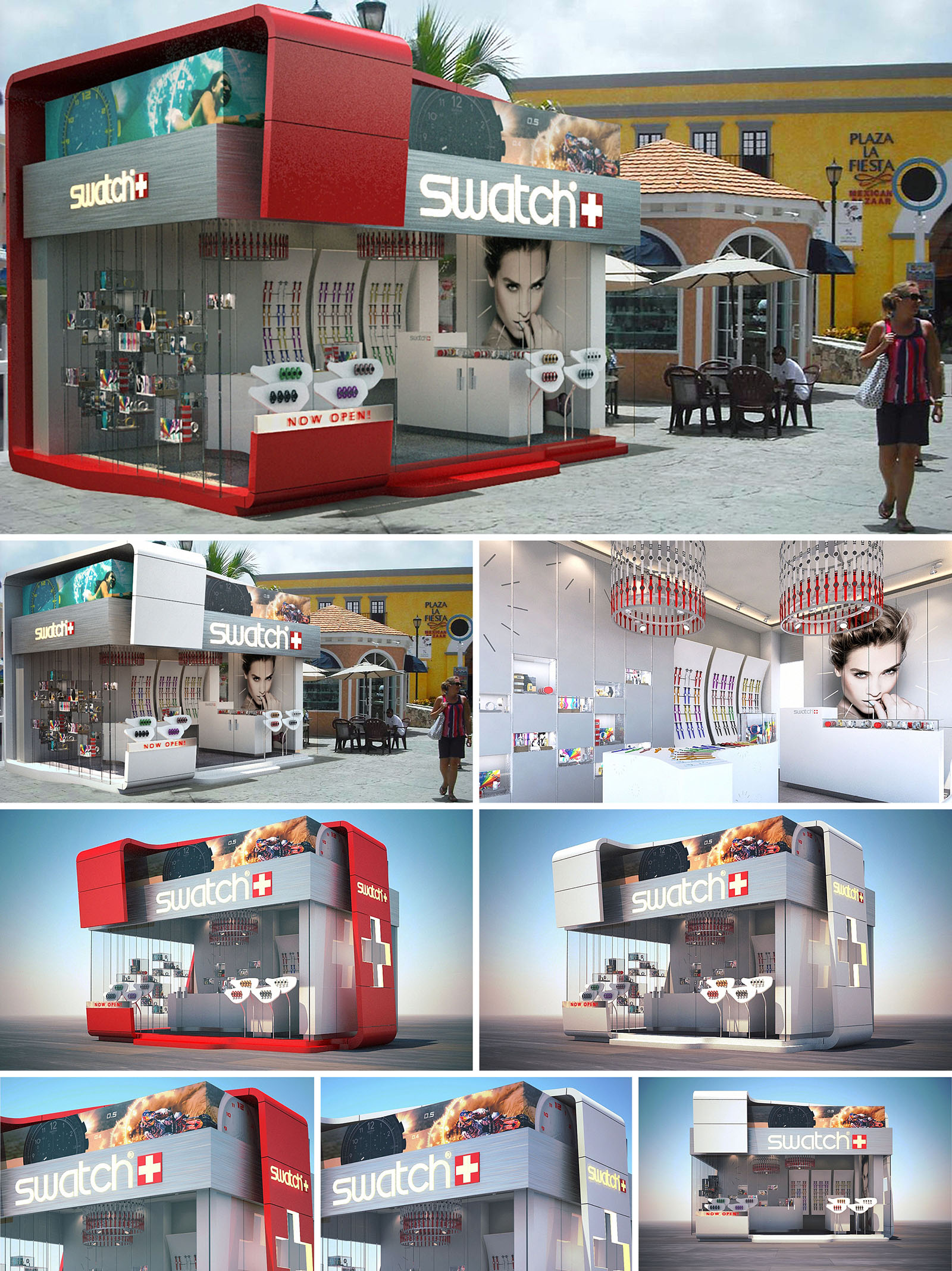
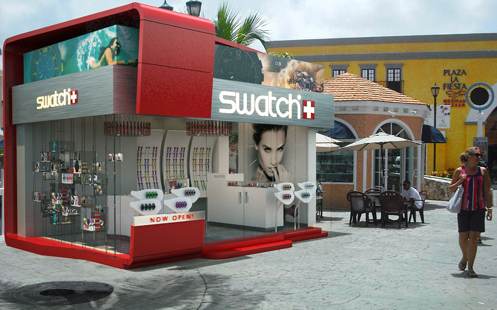
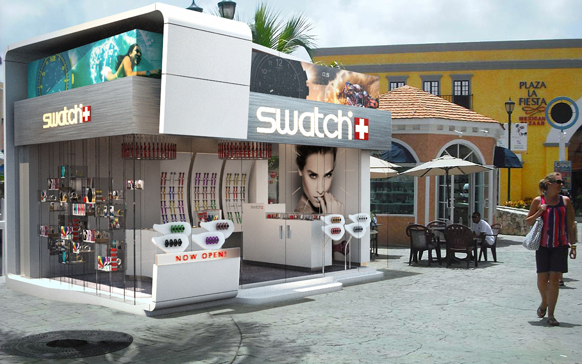
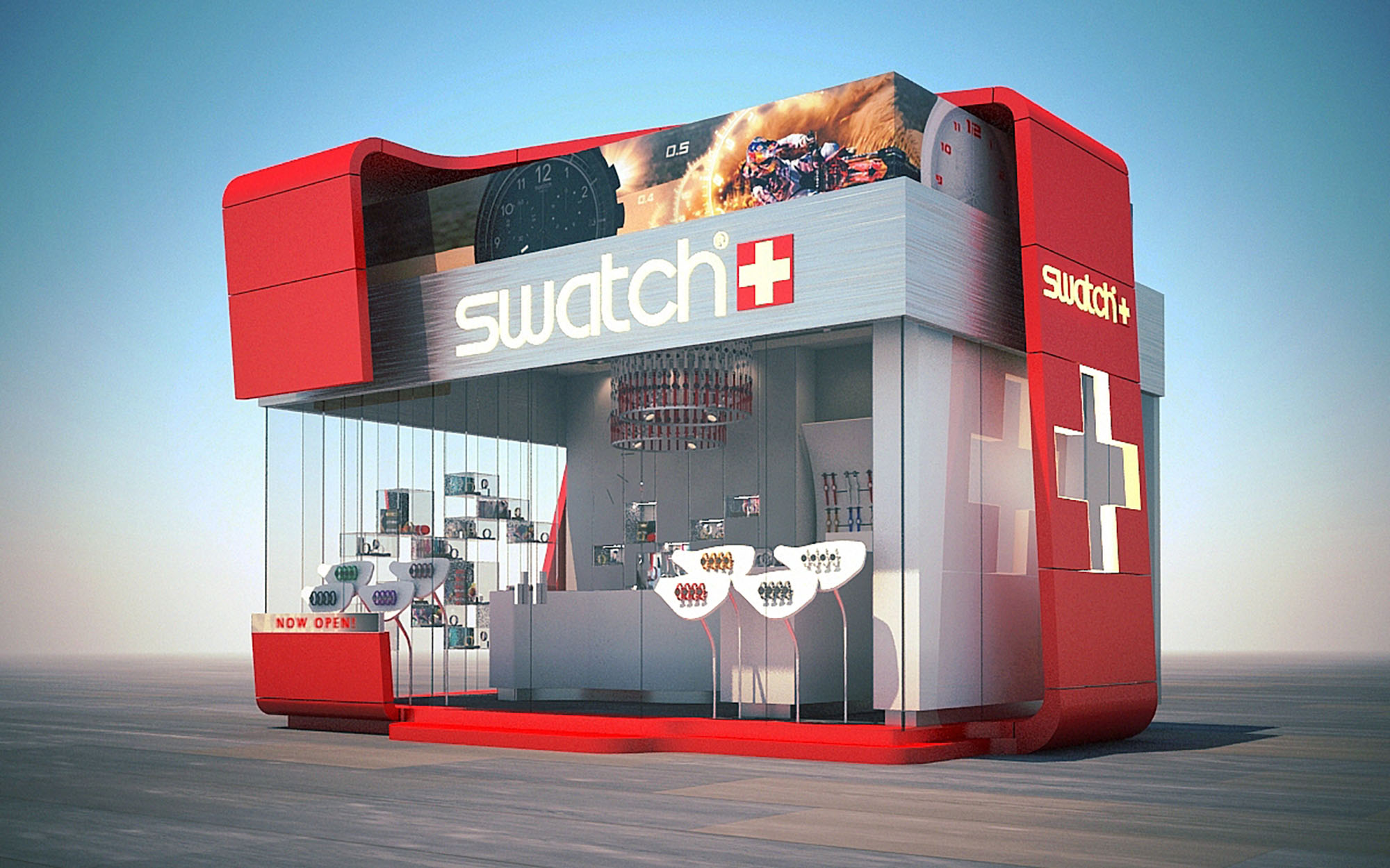
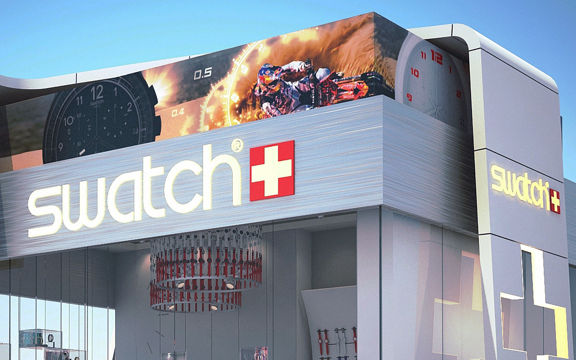
The SWATCH retail pavilion in Cancún is conceived as an urban “time capsule” that compresses the brand’s playful precision into a compact, freestanding volume. The architectural language is based on a bold, aerodynamic box that appears to float over a fully transparent base, embodying lightness, speed and the dynamic character of the watches on display. The design establishes a strong visual contrast with the surrounding colonial-inspired context, using contemporary geometry and color blocking to create an immediate landmark within the plaza.
The envelope abstracts the Swiss cross and the iconic SWATCH logotype into architectural elements, transforming branding into three-dimensional form. Large-format graphics wrap the upper volume like an illuminated bezel, while the recessed ground floor is conceived as a showcase in permanent motion, where merchandise and customers become part of a living display visible from every side.
The pavilion is organized as a double-height rectangular prism, rounded at the corners to evoke the soft contours of a watch case. A projecting upper “hood” cantilevers over the perimeter, providing shade and enhancing the sense of levitation. This upper band works as an integrated lightbox for high-resolution imagery and branding, transforming the building into an oversized advertising surface without adding separate signage structures.
The ground plane is wrapped almost entirely in frameless glass, emphasizing permeability and blurring the boundary between interior and exterior. Vertical display fins and minimal mullions are carefully aligned to avoid visual noise, allowing the colored watches to become the primary façade texture. A solid side wall incorporates an oversized Swiss cross in relief, acting simultaneously as structural stiffener, brand marker, and night-time lantern when backlit.
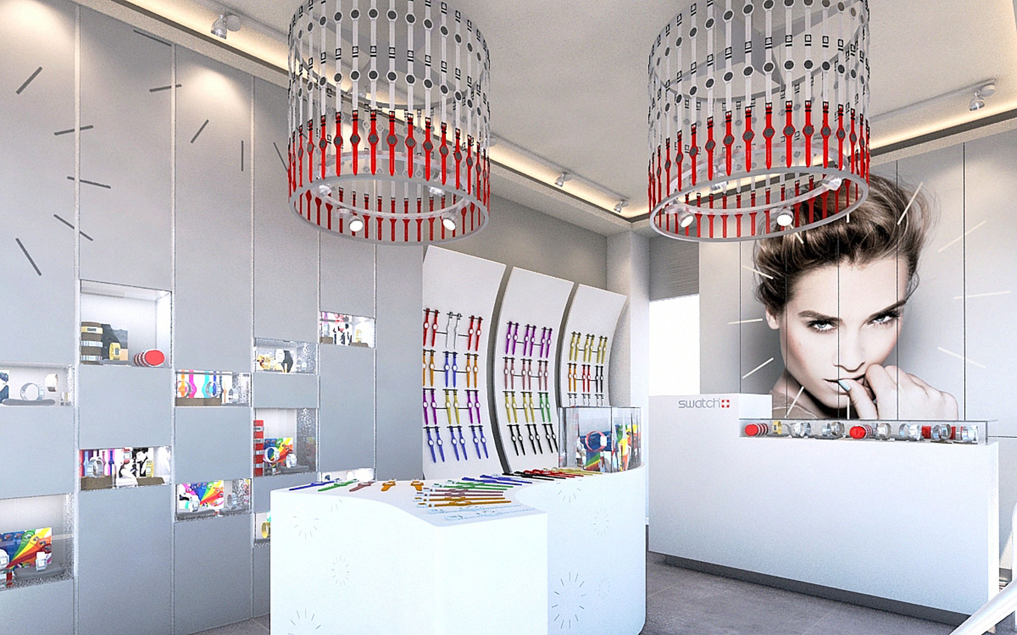
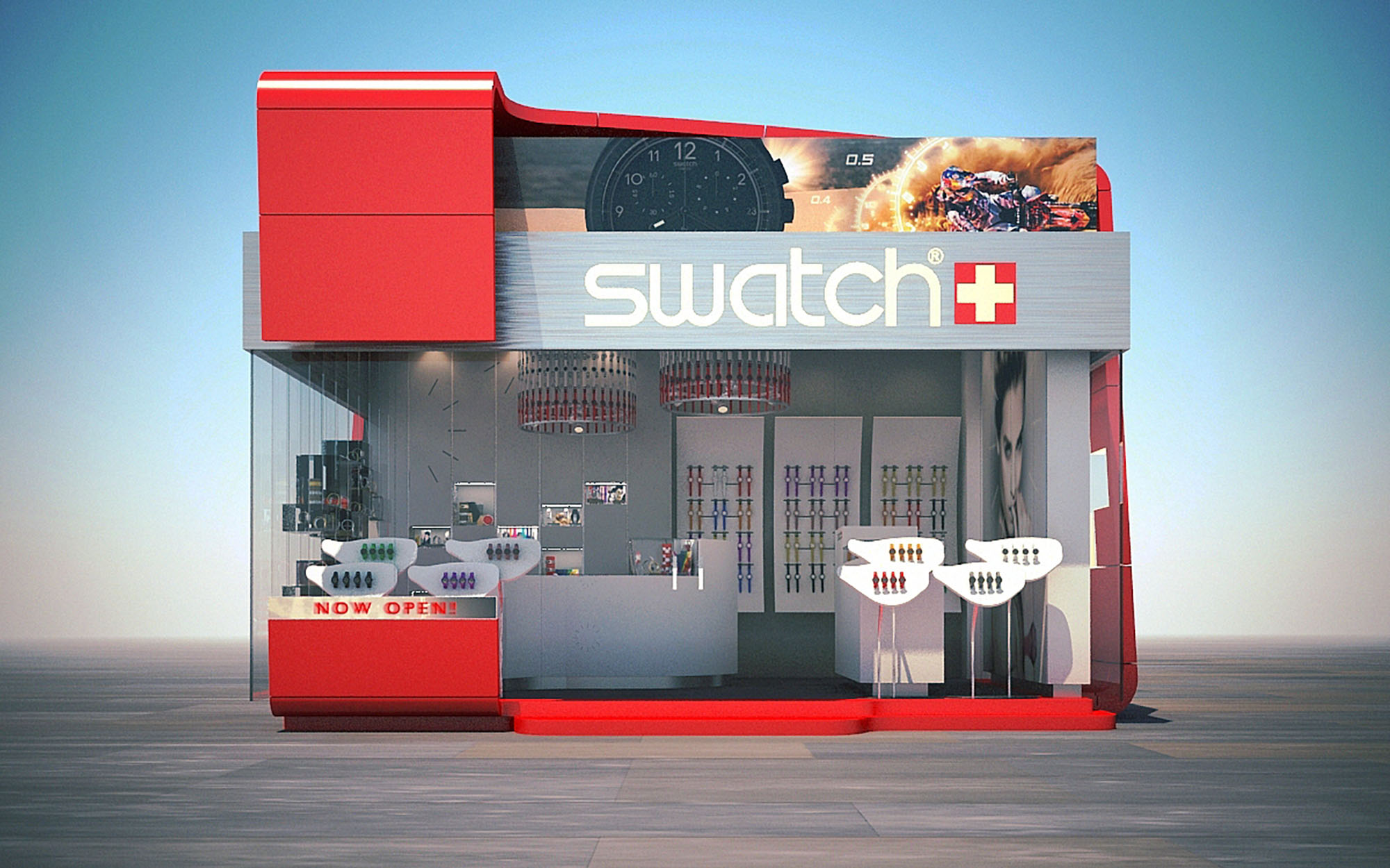
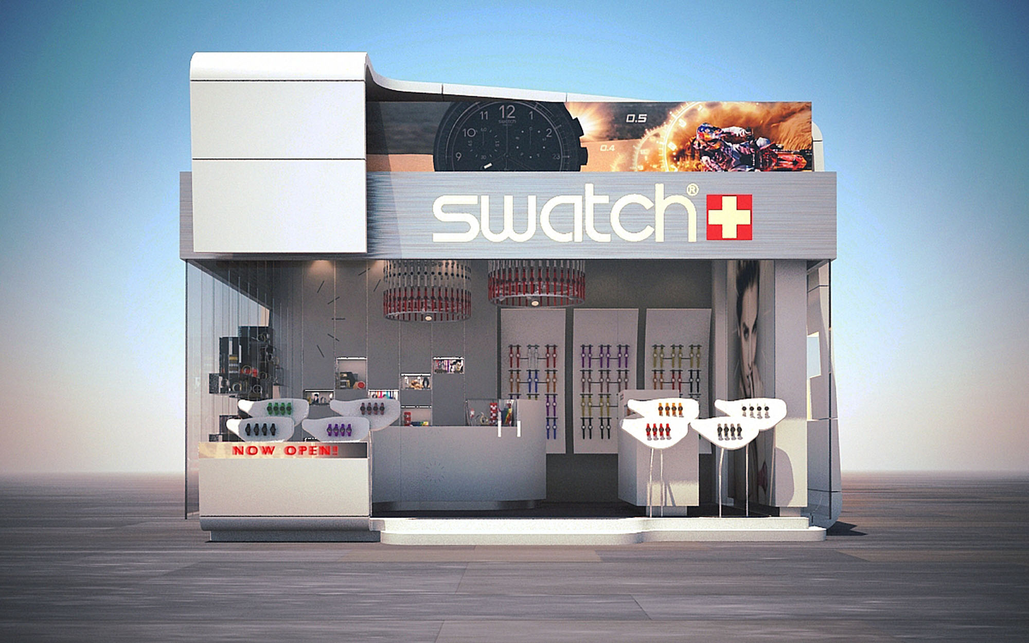
The interior is designed as a fluid loop, encouraging customers to move freely around the compact footprint. The main access is chamfered at the corner, naturally drawing visitors into a central reception and service counter aligned with a large-format portrait graphic, which acts as visual anchor for the space. From this point, circulation flows along the glazed perimeter where linear display bands and curved panels present the product in a continuous timeline.
Wall-mounted systems are complemented by freestanding islands and cantilevered trays that keep the central area visually open while maximizing linear merchandising length. The ceiling is treated as a fifth façade, incorporating circular feature elements that reference watch dials and subtly organize the space beneath. The layout ensures clear sightlines from outside, with the most colorful product zones strategically located at the corners to attract attention from different approach angles.
The interior palette is deliberately restrained, using predominantly white and light grey finishes to produce a luminous, gallery-like background. This neutrality amplifies the chromatic diversity of the watches, which effectively become the primary color accents. High-gloss lacquered surfaces, seamless solid-surface counters, and precise junctions between planes reinforce the perception of technical refinement associated with Swiss engineering.
Suspended circular luminaires composed of modular colored elements reinterpret the idea of a watch bracelet, bringing brand identity into the lighting design. These fixtures provide both ambient and focal light, supplemented by recessed linear LEDs integrated into ceiling coves and display shelves. The result is a homogeneous, glare-controlled lighting environment that enhances product legibility and ensures consistent color rendering throughout the day.
The architecture acts as a three-dimensional extension of the SWATCH graphic universe. Typography, color and iconography are embedded into the construction logic instead of being applied superficially. The white, gray and red triad structures the entire composition, from macro elements like the cantilevered red base and upper volume to micro details such as edge profiles and display trims.
Customer experience is built around immediacy and accessibility: products are always within arm’s reach, displayed at ergonomic heights and organized by families along intuitive trajectories. The transparency of the kiosk encourages casual browsing and visual interaction even from outside, aligning with the brand’s democratic and youthful positioning. Visual merchandising is designed to be reconfigurable, allowing rapid adaptation to new collections or collaborations.
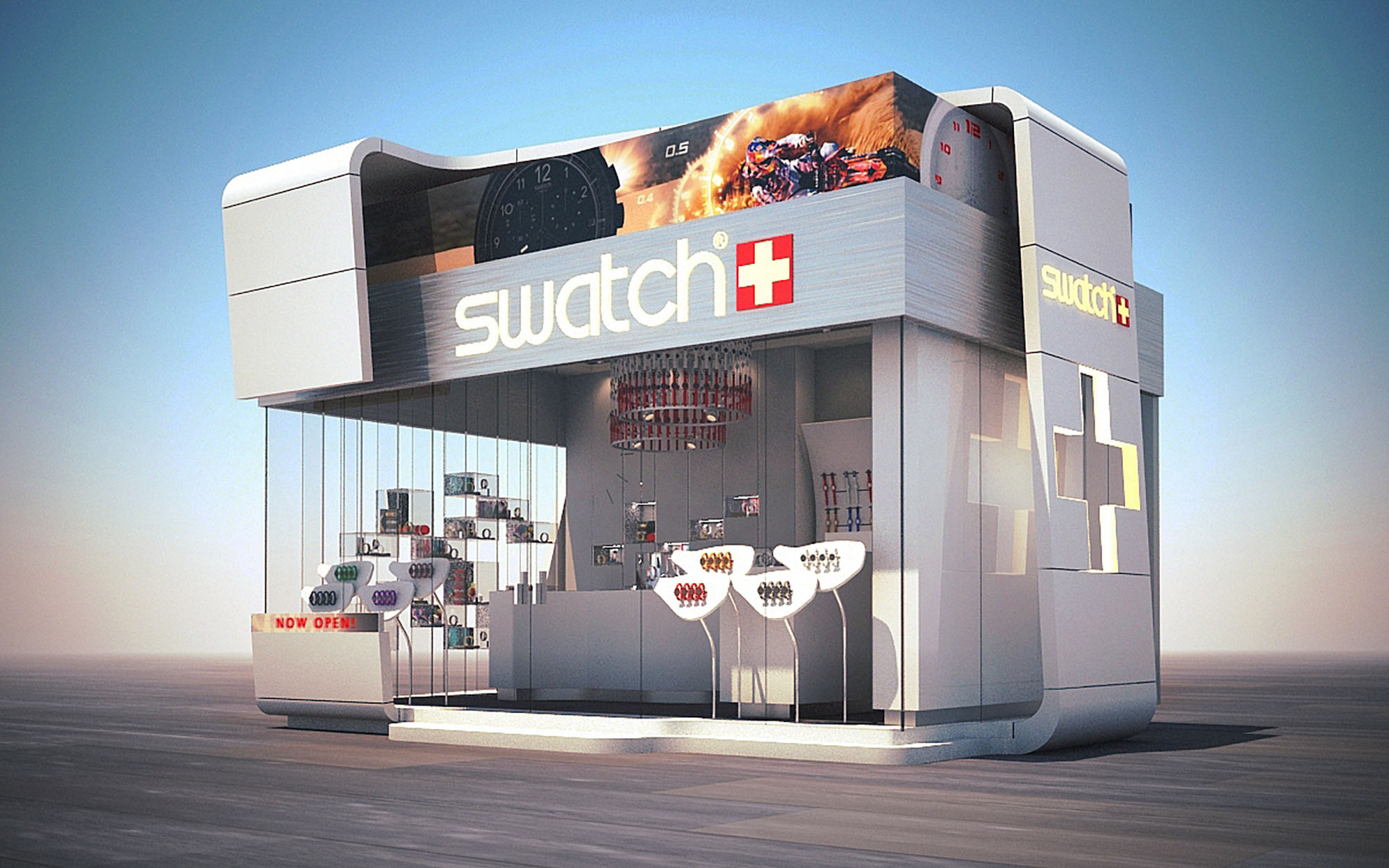
The compact footprint and kiosk typology inherently reduce material consumption and site impact. The use of a lightweight steel frame with modular cladding panels facilitates off-site prefabrication, minimizing construction waste and assembly time on the plaza. Glazed surfaces are composed of high-performance tempered glass, and large cantilevers on the upper volume act as brise-soleil, limiting direct solar gain on the display zones while maintaining full transparency.
LED technology is employed exclusively for both interior and exterior lighting, significantly reducing energy demand and heat emission, a key factor in Cancún’s tropical climate. The neutral interior palette and reflective finishes contribute to daylight diffusion, lowering the need for artificial lighting during daytime operation. The modular interior systems are designed for disassembly and reuse, allowing the pavilion to be relocated or reconfigured in future locations, extending its lifecycle and reducing the environmental footprint associated with single-use retail structures.

The SWATCH retail pavilion in Cancún is conceived as an urban “time capsule” that compresses the brand’s playful precision into a compact, freestanding volume. The architectural language is based on a bold, aerodynamic box that appears to float over a fully transparent base, embodying lightness, speed and the dynamic character of the watches on display. The design establishes a strong visual contrast with the surrounding colonial-inspired context, using contemporary geometry and color blocking to create an immediate landmark within the plaza.
The envelope abstracts the Swiss cross and the iconic SWATCH logotype into architectural elements, transforming branding into three-dimensional form. Large-format graphics wrap the upper volume like an illuminated bezel, while the recessed ground floor is conceived as a showcase in permanent motion, where merchandise and customers become part of a living display visible from every side.
The pavilion is organized as a double-height rectangular prism, rounded at the corners to evoke the soft contours of a watch case. A projecting upper “hood” cantilevers over the perimeter, providing shade and enhancing the sense of levitation. This upper band works as an integrated lightbox for high-resolution imagery and branding, transforming the building into an oversized advertising surface without adding separate signage structures.
The ground plane is wrapped almost entirely in frameless glass, emphasizing permeability and blurring the boundary between interior and exterior. Vertical display fins and minimal mullions are carefully aligned to avoid visual noise, allowing the colored watches to become the primary façade texture. A solid side wall incorporates an oversized Swiss cross in relief, acting simultaneously as structural stiffener, brand marker, and night-time lantern when backlit.
The interior is designed as a fluid loop, encouraging customers to move freely around the compact footprint. The main access is chamfered at the corner, naturally drawing visitors into a central reception and service counter aligned with a large-format portrait graphic, which acts as visual anchor for the space. From this point, circulation flows along the glazed perimeter where linear display bands and curved panels present the product in a continuous timeline.
Wall-mounted systems are complemented by freestanding islands and cantilevered trays that keep the central area visually open while maximizing linear merchandising length. The ceiling is treated as a fifth façade, incorporating circular feature elements that reference watch dials and subtly organize the space beneath. The layout ensures clear sightlines from outside, with the most colorful product zones strategically located at the corners to attract attention from different approach angles.
The interior palette is deliberately restrained, using predominantly white and light grey finishes to produce a luminous, gallery-like background. This neutrality amplifies the chromatic diversity of the watches, which effectively become the primary color accents. High-gloss lacquered surfaces, seamless solid-surface counters, and precise junctions between planes reinforce the perception of technical refinement associated with Swiss engineering.
Suspended circular luminaires composed of modular colored elements reinterpret the idea of a watch bracelet, bringing brand identity into the lighting design. These fixtures provide both ambient and focal light, supplemented by recessed linear LEDs integrated into ceiling coves and display shelves. The result is a homogeneous, glare-controlled lighting environment that enhances product legibility and ensures consistent color rendering throughout the day.
The architecture acts as a three-dimensional extension of the SWATCH graphic universe. Typography, color and iconography are embedded into the construction logic instead of being applied superficially. The white, gray and red triad structures the entire composition, from macro elements like the cantilevered red base and upper volume to micro details such as edge profiles and display trims.
Customer experience is built around immediacy and accessibility: products are always within arm’s reach, displayed at ergonomic heights and organized by families along intuitive trajectories. The transparency of the kiosk encourages casual browsing and visual interaction even from outside, aligning with the brand’s democratic and youthful positioning. Visual merchandising is designed to be reconfigurable, allowing rapid adaptation to new collections or collaborations.
The compact footprint and kiosk typology inherently reduce material consumption and site impact. The use of a lightweight steel frame with modular cladding panels facilitates off-site prefabrication, minimizing construction waste and assembly time on the plaza. Glazed surfaces are composed of high-performance tempered glass, and large cantilevers on the upper volume act as brise-soleil, limiting direct solar gain on the display zones while maintaining full transparency.
LED technology is employed exclusively for both interior and exterior lighting, significantly reducing energy demand and heat emission, a key factor in Cancún’s tropical climate. The neutral interior palette and reflective finishes contribute to daylight diffusion, lowering the need for artificial lighting during daytime operation. The modular interior systems are designed for disassembly and reuse, allowing the pavilion to be relocated or reconfigured in future locations, extending its lifecycle and reducing the environmental footprint associated with single-use retail structures.


Nuestras oficinas están en Barcelona, Cancún, Chicago y Santo Domingo, pero gracias a la tecnología podemos desarrollar proyectos en cualquier parte del mundo.
Barcelona
Bac de Roda 136
08020, Barcelona
Spain
Madrid
Av. de Buendía 11
19005 Guadalajara (Madrid)
Spain
Chicago
373 Hazel Ave, Apt A1
60022, Glencoe, Illinois
United States