

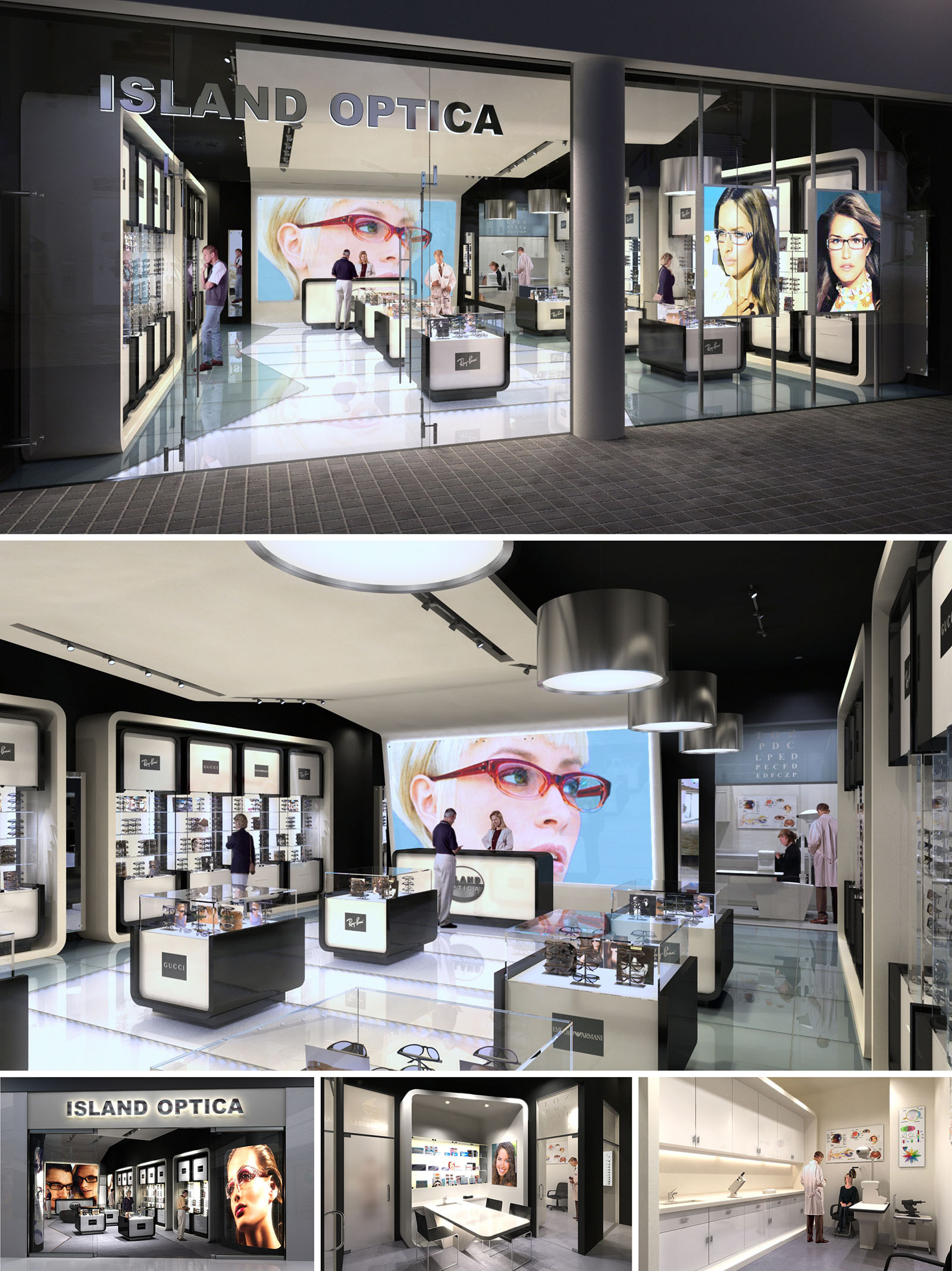
The concept for Island Optica is based on the idea of the eyewear boutique as a luminous viewing device, where architecture, lighting and display systems work together like the internal mechanism of a camera. The stores are conceived as transparent boxes that reveal their contents to the street, turning the product into an illuminated landscape of precision and clarity. This notion is consistent across the three locations in México, generating a recognizable brand identity while allowing each space to respond to its specific urban context.
The design aligns the medical rigor of optometry with the emotional world of fashion retail. Clean lines, controlled geometries and a restrained color palette evoke clinical accuracy, while large-format images and illuminated showcases introduce a sensorial and aspirational dimension. The result is a hybrid environment where consultation, diagnosis and purchase occur seamlessly within a single coherent spatial narrative.
The plan is structured around a central exhibition spine composed of freestanding display islands. These low-height elements preserve visual continuity across the interior, allowing clear sightlines from the façade to the consulting areas at the rear. Circulation flows naturally around these islands, encouraging browsing while avoiding congestion in peak hours.
The perimeter houses tall wall displays framed as deep, backlit niches. These frames articulate the store envelope, giving rhythm to the walls and simultaneously maximizing vertical merchandising capacity. At the far end, the examination and consulting rooms are organized as a calmer, more private zone separated by translucent partitions. This maintains acoustic and visual comfort for patients while keeping the professional aspect of the practice visually linked to the retail floor.
The material strategy relies on a high-contrast black-and-white scheme, reinforcing the ideas of clarity and precision associated with vision. Glossy white flooring and display surfaces amplify light and reflections, creating a sense of weightlessness around the products. Black lacquered elements and a dark ceiling plane frame the space, sharpening perspectives and visually suspending the luminous showcases.
Display modules combine lacquered MDF, clear and low-iron glass, and fine metallic profiles in brushed aluminum. These elements are dimensioned with minimal joints and thin edges to give an almost laboratory-like sense of refinement. In the clinical zones, finishes transition to more matte, tactile materials such as vinyl flooring and satin paint, providing a softer and more controlled background for medical equipment.
Lighting is treated as the main architectural tool for both branding and functional clarity. Linear tracks with adjustable projectors provide accent lighting on the merchandise, ensuring correct color rendering for frame selection. Large circular pendants introduce a softer, atmospheric light that balances the more technical spots and anchors the central axis of the shop.
Backlit wall niches and integrated LEDs within the display furniture provide uniform, shadow-free illumination of the eyewear, turning each frame into an object of precision. The façade uses full-height glazing and internally illuminated graphic panels to create strong street visibility. Oversized photographic portraits act as luminous beacons, communicating the fashion-driven aspect of the brand and making each store immediately recognizable in its urban setting.
The customer journey is designed to be intuitive and comfortable. Entry from the street brings visitors directly into the main display zone, where circulation is unobstructed and products are reachable without assistance. Consultation desks are strategically located in the mid-zone, forming a transition between open retail and private examination rooms. This sequencing supports a gradual shift from informal browsing to focused diagnostic interaction.
Back-of-house areas, including laboratories and storage, are planned along linear worktops with continuous upper and lower cabinetry. This arrangement optimizes workflow for lens preparation, adjustment and repairs, ensuring that technical operations remain efficient yet visually discreet from the public area.
The design incorporates sustainability through both material selection and operational strategies. Durable finishes such as high-pressure laminates, long-life LED systems and modular aluminum profiles reduce the need for frequent replacement, extending the store’s life cycle. The predominance of light-colored interior surfaces increases reflectivity, allowing general illumination levels to be achieved with lower energy consumption.
Display furniture is conceived as a modular system: shelves, light boxes and support structures can be reconfigured or expanded without structural work. This adaptability supports evolving product lines and changing brand campaigns, minimizing construction waste over time. The extensive use of glass not only promotes visual permeability and natural daylight penetration from the frontage, but also facilitates end-of-life recycling, reinforcing a responsible and future-oriented approach to retail design.
LIST OF PROJECTS EXPERIENCE
Designed, Executed and/or Built Projects
MEXICO
1. Island Optica - Cancun - Malecon Americas
2. Island Optica - Cozumel - Plaza Punta Langosta
3. Island Optica - Playa del Carmen - 5ta Av_Burguer King
The concept for Island Optica is based on the idea of the eyewear boutique as a luminous viewing device, where architecture, lighting and display systems work together like the internal mechanism of a camera. The stores are conceived as transparent boxes that reveal their contents to the street, turning the product into an illuminated landscape of precision and clarity. This notion is consistent across the three locations in México, generating a recognizable brand identity while allowing each space to respond to its specific urban context.
The design aligns the medical rigor of optometry with the emotional world of fashion retail. Clean lines, controlled geometries and a restrained color palette evoke clinical accuracy, while large-format images and illuminated showcases introduce a sensorial and aspirational dimension. The result is a hybrid environment where consultation, diagnosis and purchase occur seamlessly within a single coherent spatial narrative.
The plan is structured around a central exhibition spine composed of freestanding display islands. These low-height elements preserve visual continuity across the interior, allowing clear sightlines from the façade to the consulting areas at the rear. Circulation flows naturally around these islands, encouraging browsing while avoiding congestion in peak hours.
The perimeter houses tall wall displays framed as deep, backlit niches. These frames articulate the store envelope, giving rhythm to the walls and simultaneously maximizing vertical merchandising capacity. At the far end, the examination and consulting rooms are organized as a calmer, more private zone separated by translucent partitions. This maintains acoustic and visual comfort for patients while keeping the professional aspect of the practice visually linked to the retail floor.
The material strategy relies on a high-contrast black-and-white scheme, reinforcing the ideas of clarity and precision associated with vision. Glossy white flooring and display surfaces amplify light and reflections, creating a sense of weightlessness around the products. Black lacquered elements and a dark ceiling plane frame the space, sharpening perspectives and visually suspending the luminous showcases.
Display modules combine lacquered MDF, clear and low-iron glass, and fine metallic profiles in brushed aluminum. These elements are dimensioned with minimal joints and thin edges to give an almost laboratory-like sense of refinement. In the clinical zones, finishes transition to more matte, tactile materials such as vinyl flooring and satin paint, providing a softer and more controlled background for medical equipment.
Lighting is treated as the main architectural tool for both branding and functional clarity. Linear tracks with adjustable projectors provide accent lighting on the merchandise, ensuring correct color rendering for frame selection. Large circular pendants introduce a softer, atmospheric light that balances the more technical spots and anchors the central axis of the shop.
Backlit wall niches and integrated LEDs within the display furniture provide uniform, shadow-free illumination of the eyewear, turning each frame into an object of precision. The façade uses full-height glazing and internally illuminated graphic panels to create strong street visibility. Oversized photographic portraits act as luminous beacons, communicating the fashion-driven aspect of the brand and making each store immediately recognizable in its urban setting.
The customer journey is designed to be intuitive and comfortable. Entry from the street brings visitors directly into the main display zone, where circulation is unobstructed and products are reachable without assistance. Consultation desks are strategically located in the mid-zone, forming a transition between open retail and private examination rooms. This sequencing supports a gradual shift from informal browsing to focused diagnostic interaction.
Back-of-house areas, including laboratories and storage, are planned along linear worktops with continuous upper and lower cabinetry. This arrangement optimizes workflow for lens preparation, adjustment and repairs, ensuring that technical operations remain efficient yet visually discreet from the public area.
The design incorporates sustainability through both material selection and operational strategies. Durable finishes such as high-pressure laminates, long-life LED systems and modular aluminum profiles reduce the need for frequent replacement, extending the store’s life cycle. The predominance of light-colored interior surfaces increases reflectivity, allowing general illumination levels to be achieved with lower energy consumption.
Display furniture is conceived as a modular system: shelves, light boxes and support structures can be reconfigured or expanded without structural work. This adaptability supports evolving product lines and changing brand campaigns, minimizing construction waste over time. The extensive use of glass not only promotes visual permeability and natural daylight penetration from the frontage, but also facilitates end-of-life recycling, reinforcing a responsible and future-oriented approach to retail design.


Nuestras oficinas están en Barcelona, Cancún, Chicago y Santo Domingo, pero gracias a la tecnología podemos desarrollar proyectos en cualquier parte del mundo.
Barcelona
Bac de Roda 136
08020, Barcelona
Spain
Madrid
Av. de Buendía 11
19005 Guadalajara (Madrid)
Spain
Chicago
373 Hazel Ave, Apt A1
60022, Glencoe, Illinois
United States