

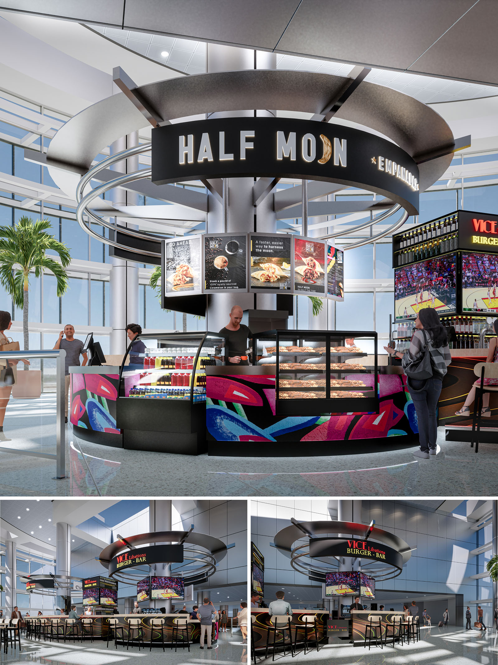
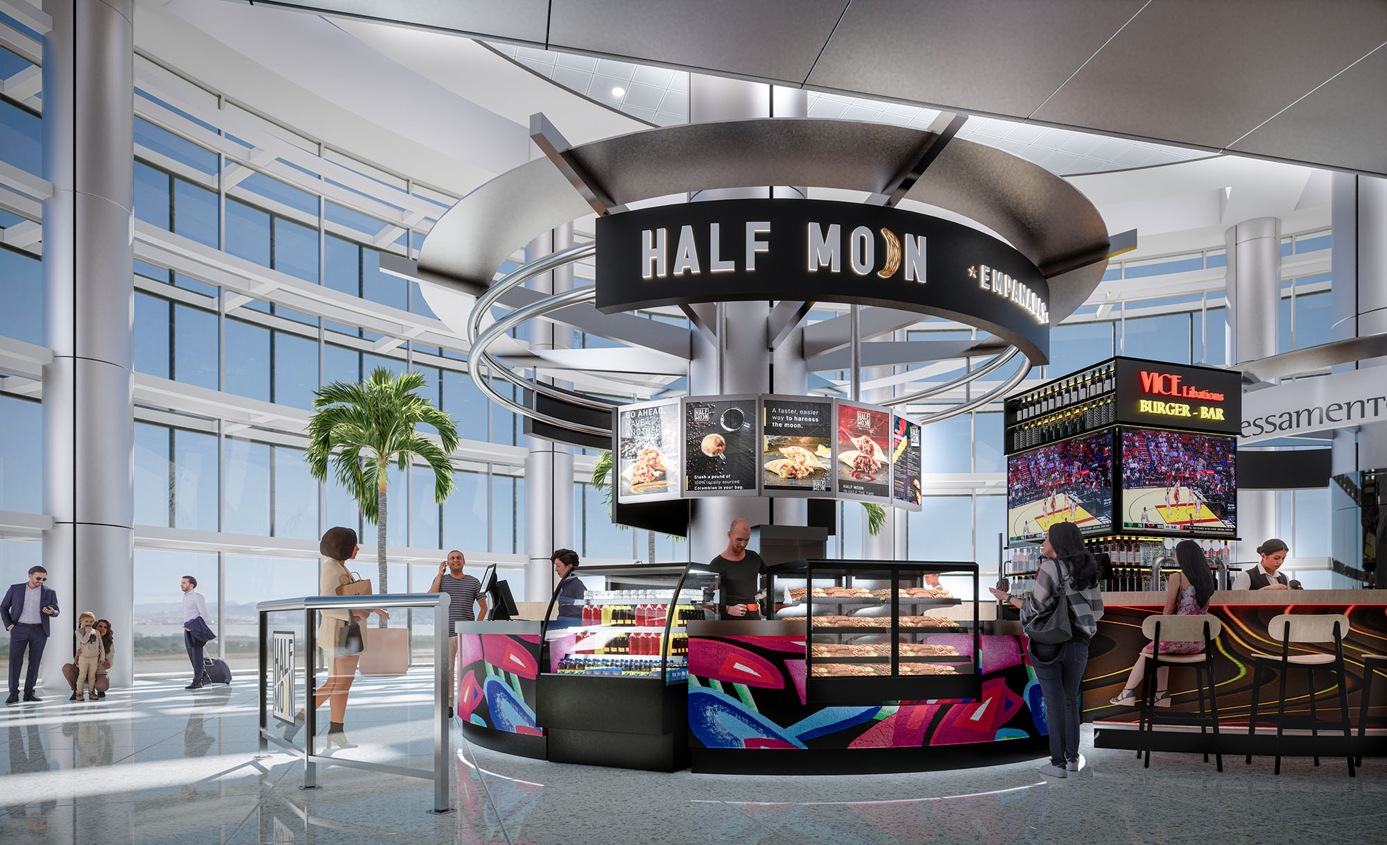
Half Moon Empanadas is conceived as a brightly illuminated island pavilion within the dynamic environment of Miami’s airport. The design emphasizes circular geometry and a bold graphic identity to attract passengers moving quickly through the concourse. The kiosk operates as a sculptural object in the terminal, with concentric metal rings floating above a central core, echoing the brand’s “half moon” name and the curved form of the empanada itself.
The project merges fast-casual efficiency with a theatrical food presentation. By placing the preparation and display cases on the perimeter of the island, service becomes highly visible and intuitive from all directions. The architecture becomes signage: form, light, and color work together to announce the presence of the brand long before passengers reach the counter.
The kiosk is organized as a 360-degree service hub with multiple points of access, minimizing congestion in the high-traffic terminal. The front arc is dedicated to grab-and-go display cases and beverages, while the adjacent segments accommodate ordering, payment, and order pick-up. This radial planning ensures that passengers can quickly identify their next step and navigate the space without confusion.
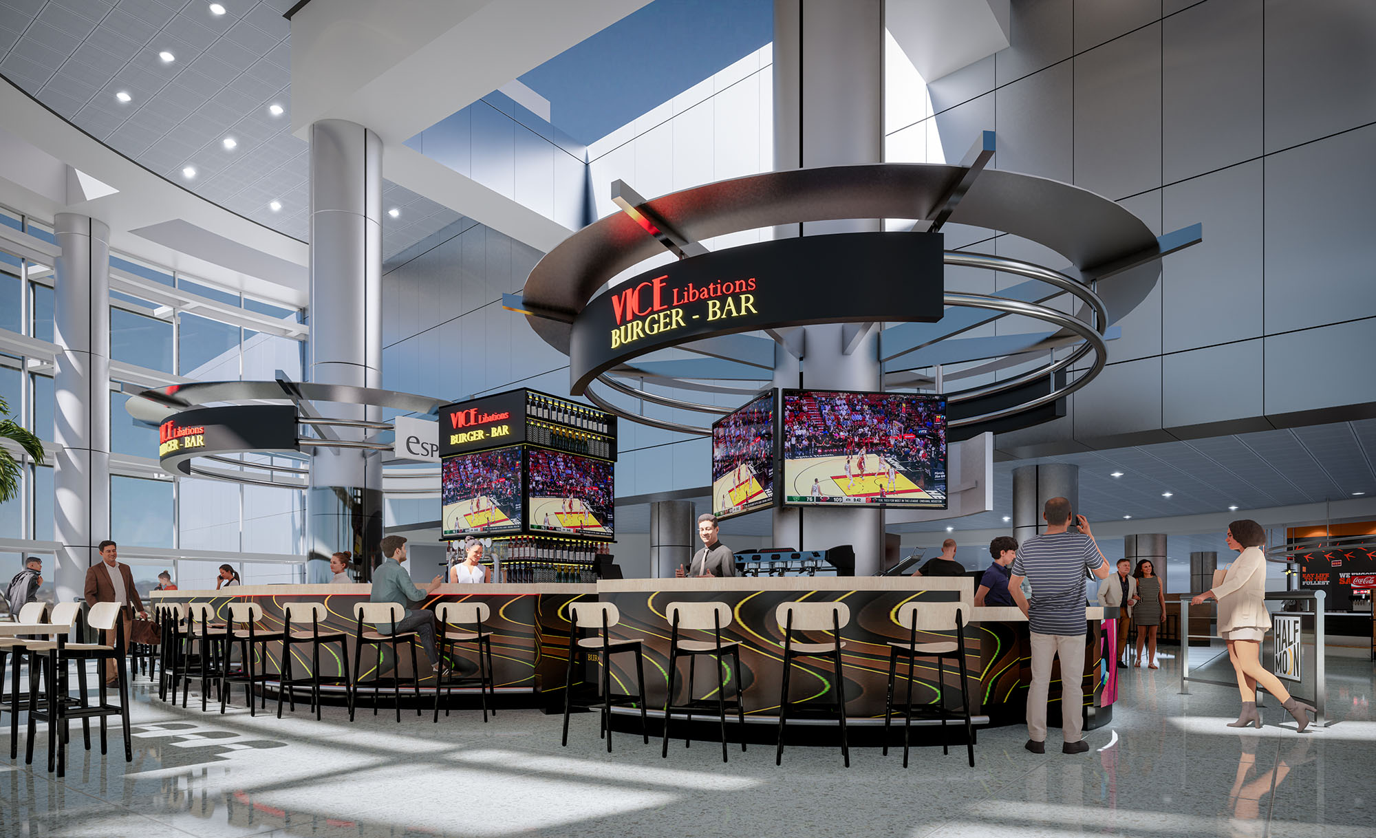
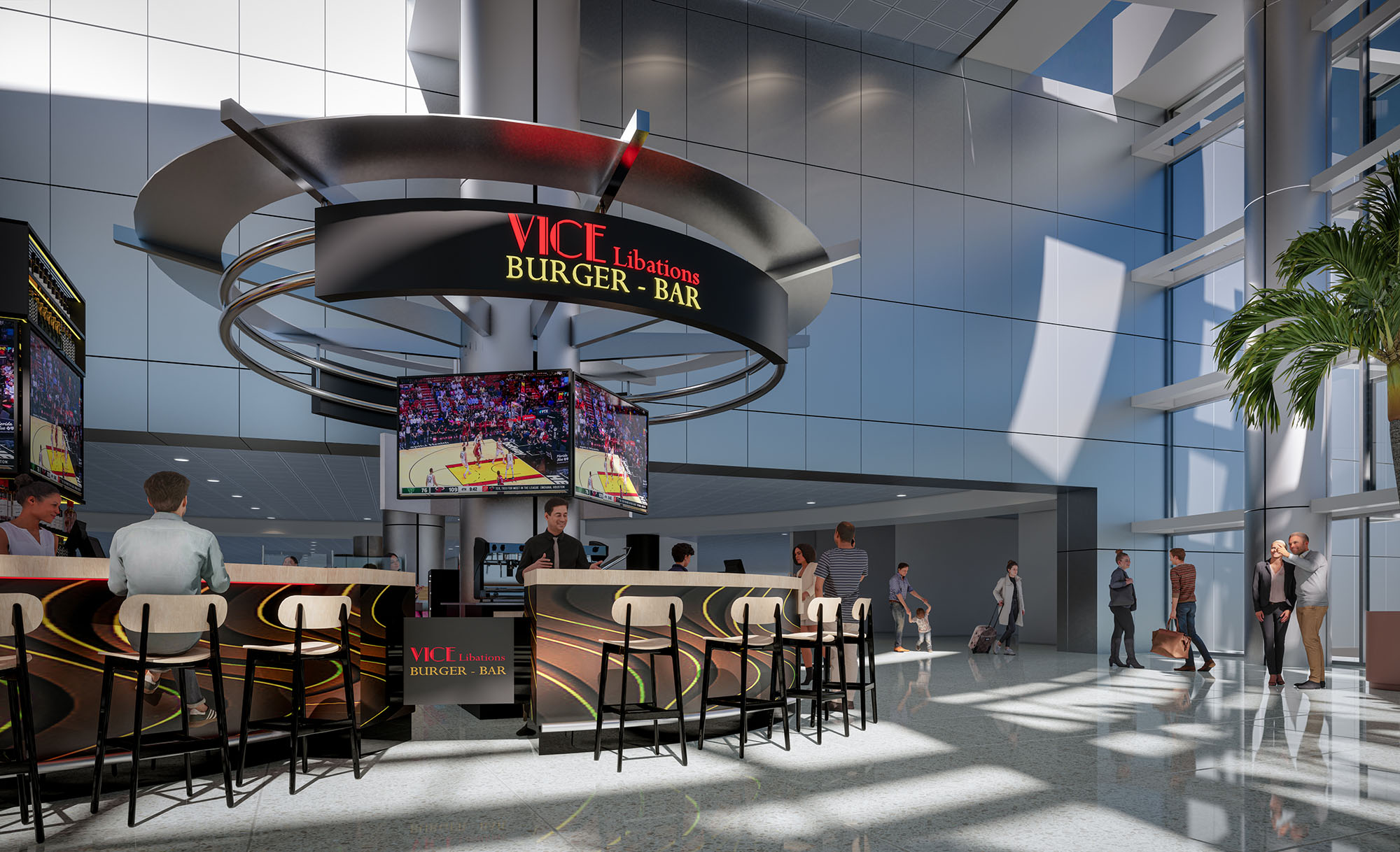
A central structural column consolidates utilities, storage, and technical infrastructure, freeing the perimeter for uninterrupted customer interaction. Seating is positioned in an encompassing horseshoe around the adjacent burger bar volume, visually linked through similar circular canopies and shared finishes. This creates a cohesive micro-district of food options while maintaining clear circulation corridors around the island.
The material palette combines dark, matte base elements with vivid graphic overlays. Black metal cladding and glass display cases form a neutral frame that highlights the colorful abstract artwork applied to the lower panels. These graphics reference Miami’s vibrant street art culture, tropical tones, and night-life energy, projecting a distinctly local character even within the global context of the airport.
Overhead, the suspended rings and continuous fascia carry the primary brand signage, using backlit lettering and a luminous crescent icon. The metallic finishes of the canopy reflect ambient daylight from the terminal’s glazed façades, enhancing the kiosk’s presence without overwhelming the surrounding architecture. Warm internal lighting within the pastry cases accentuates product freshness and creates a welcoming glow at eye level.
The lighting strategy is layered to support both visibility and atmosphere. Integrated LED strips in the canopy rings define the circular form and provide even general illumination to the counter line. Focused spotlights highlight menu boards and key signage, guiding customer attention to information and brand messages.
At floor level, subtle perimeter lighting beneath the counter edge visually lifts the kiosk and delineates the service zone. This creates a soft halo on the terrazzo-like airport flooring, reinforcing the island concept and improving orientation for travelers approaching from different directions.
The kiosk is carefully scaled to sit comfortably beneath the terminal’s generous ceiling height, using the vertical dimension to create impact while remaining permeable to long sightlines. The circular canopy aligns with existing structural bays and avoids obstructing views to boarding gates and wayfinding signage.
The transparent character of the surrounding terminal—large glass façades, high clerestories and visible palm trees—is echoed by the kiosk’s open perimeter and minimal solid walls. This maintains visual continuity across the concourse and ensures that the intervention feels integrated rather than inserted.
Sustainability is addressed primarily through compact planning, energy-conscious lighting, and durable materials. The centralized core allows for short utility runs, reducing energy loss and simplifying maintenance. LED lighting with high-efficiency drivers minimizes electrical consumption, while the reflective metal canopy enhances daylight distribution, reducing the need for excessive artificial light during daytime hours.
Finishes are selected for longevity in a high-traffic environment: metal, glass, and high-pressure laminates resist wear, reducing replacement cycles and associated resource use. The open layout supports natural cross-ventilation from the terminal and facilitates efficient cleaning routines, limiting the need for intensive mechanical systems and harsh chemicals. Together, these strategies align the kiosk’s bold commercial presence with responsible, long-term operation.
Half Moon Empanadas is conceived as a brightly illuminated island pavilion within the dynamic environment of Miami’s airport. The design emphasizes circular geometry and a bold graphic identity to attract passengers moving quickly through the concourse. The kiosk operates as a sculptural object in the terminal, with concentric metal rings floating above a central core, echoing the brand’s “half moon” name and the curved form of the empanada itself.
The project merges fast-casual efficiency with a theatrical food presentation. By placing the preparation and display cases on the perimeter of the island, service becomes highly visible and intuitive from all directions. The architecture becomes signage: form, light, and color work together to announce the presence of the brand long before passengers reach the counter.
The kiosk is organized as a 360-degree service hub with multiple points of access, minimizing congestion in the high-traffic terminal. The front arc is dedicated to grab-and-go display cases and beverages, while the adjacent segments accommodate ordering, payment, and order pick-up. This radial planning ensures that passengers can quickly identify their next step and navigate the space without confusion.
A central structural column consolidates utilities, storage, and technical infrastructure, freeing the perimeter for uninterrupted customer interaction. Seating is positioned in an encompassing horseshoe around the adjacent burger bar volume, visually linked through similar circular canopies and shared finishes. This creates a cohesive micro-district of food options while maintaining clear circulation corridors around the island.
The material palette combines dark, matte base elements with vivid graphic overlays. Black metal cladding and glass display cases form a neutral frame that highlights the colorful abstract artwork applied to the lower panels. These graphics reference Miami’s vibrant street art culture, tropical tones, and night-life energy, projecting a distinctly local character even within the global context of the airport.
Overhead, the suspended rings and continuous fascia carry the primary brand signage, using backlit lettering and a luminous crescent icon. The metallic finishes of the canopy reflect ambient daylight from the terminal’s glazed façades, enhancing the kiosk’s presence without overwhelming the surrounding architecture. Warm internal lighting within the pastry cases accentuates product freshness and creates a welcoming glow at eye level.
The lighting strategy is layered to support both visibility and atmosphere. Integrated LED strips in the canopy rings define the circular form and provide even general illumination to the counter line. Focused spotlights highlight menu boards and key signage, guiding customer attention to information and brand messages.
At floor level, subtle perimeter lighting beneath the counter edge visually lifts the kiosk and delineates the service zone. This creates a soft halo on the terrazzo-like airport flooring, reinforcing the island concept and improving orientation for travelers approaching from different directions.
The kiosk is carefully scaled to sit comfortably beneath the terminal’s generous ceiling height, using the vertical dimension to create impact while remaining permeable to long sightlines. The circular canopy aligns with existing structural bays and avoids obstructing views to boarding gates and wayfinding signage.
The transparent character of the surrounding terminal—large glass façades, high clerestories and visible palm trees—is echoed by the kiosk’s open perimeter and minimal solid walls. This maintains visual continuity across the concourse and ensures that the intervention feels integrated rather than inserted.
Sustainability is addressed primarily through compact planning, energy-conscious lighting, and durable materials. The centralized core allows for short utility runs, reducing energy loss and simplifying maintenance. LED lighting with high-efficiency drivers minimizes electrical consumption, while the reflective metal canopy enhances daylight distribution, reducing the need for excessive artificial light during daytime hours.
Finishes are selected for longevity in a high-traffic environment: metal, glass, and high-pressure laminates resist wear, reducing replacement cycles and associated resource use. The open layout supports natural cross-ventilation from the terminal and facilitates efficient cleaning routines, limiting the need for intensive mechanical systems and harsh chemicals. Together, these strategies align the kiosk’s bold commercial presence with responsible, long-term operation.


Nuestras oficinas están en Barcelona, Cancún, Chicago y Santo Domingo, pero gracias a la tecnología podemos desarrollar proyectos en cualquier parte del mundo.
Barcelona
Bac de Roda 136
08020, Barcelona
Spain
Madrid
Av. de Buendía 11
19005 Guadalajara (Madrid)
Spain
Chicago
373 Hazel Ave, Apt A1
60022, Glencoe, Illinois
United States