

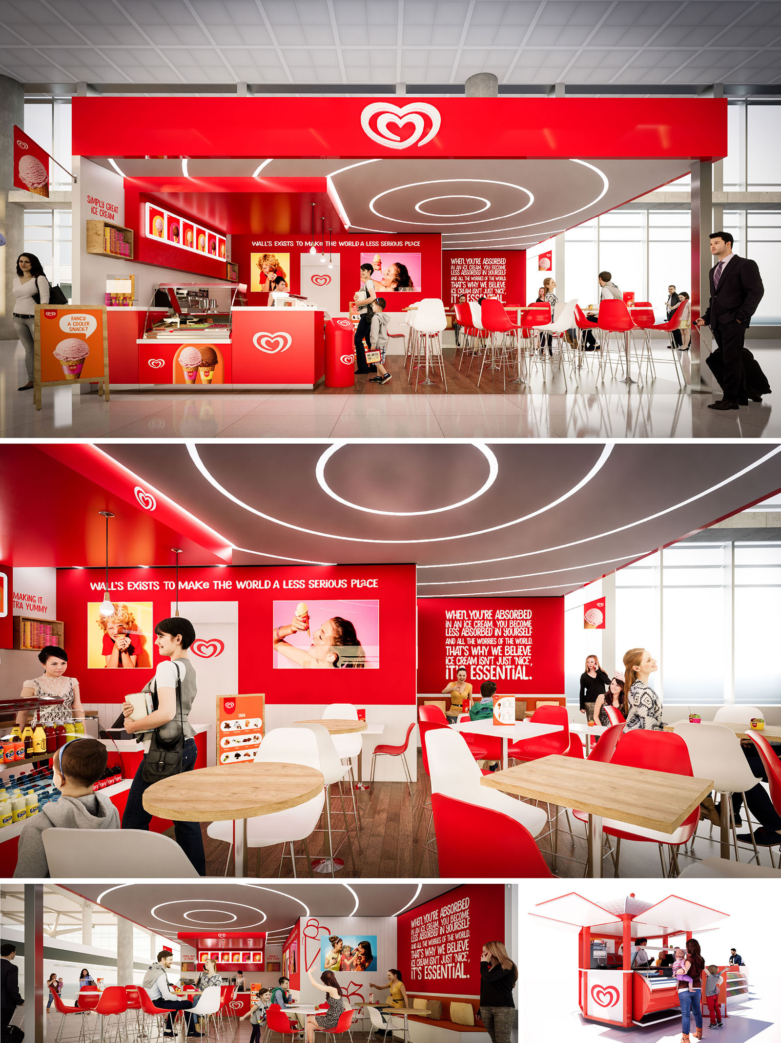
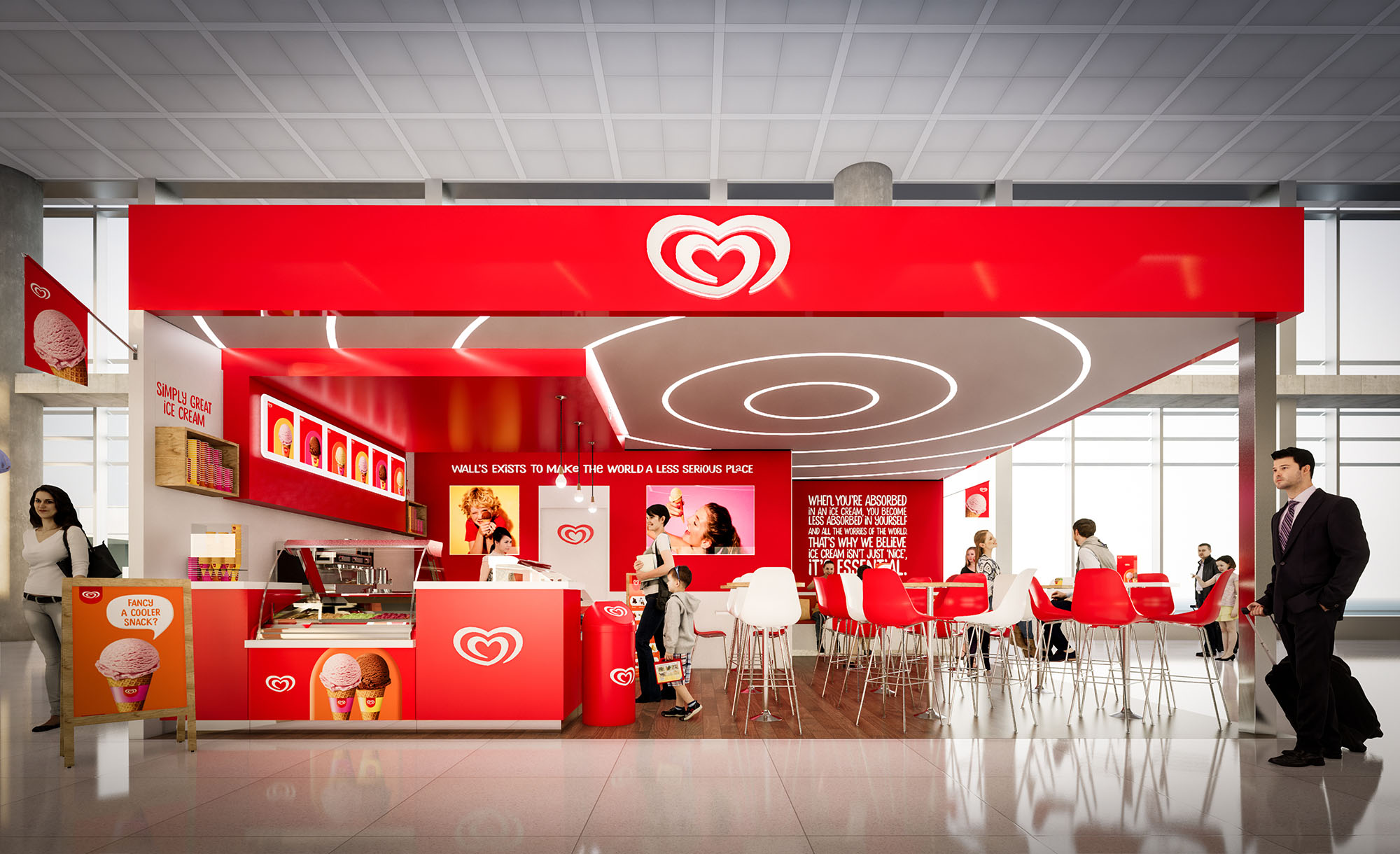
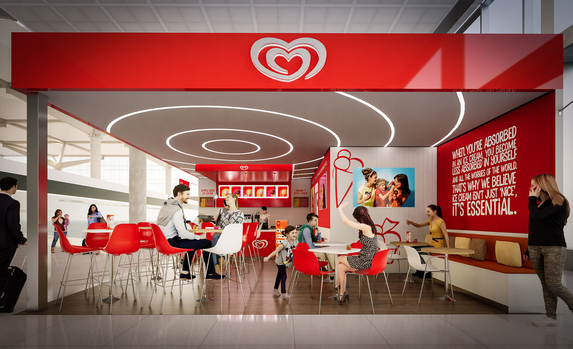
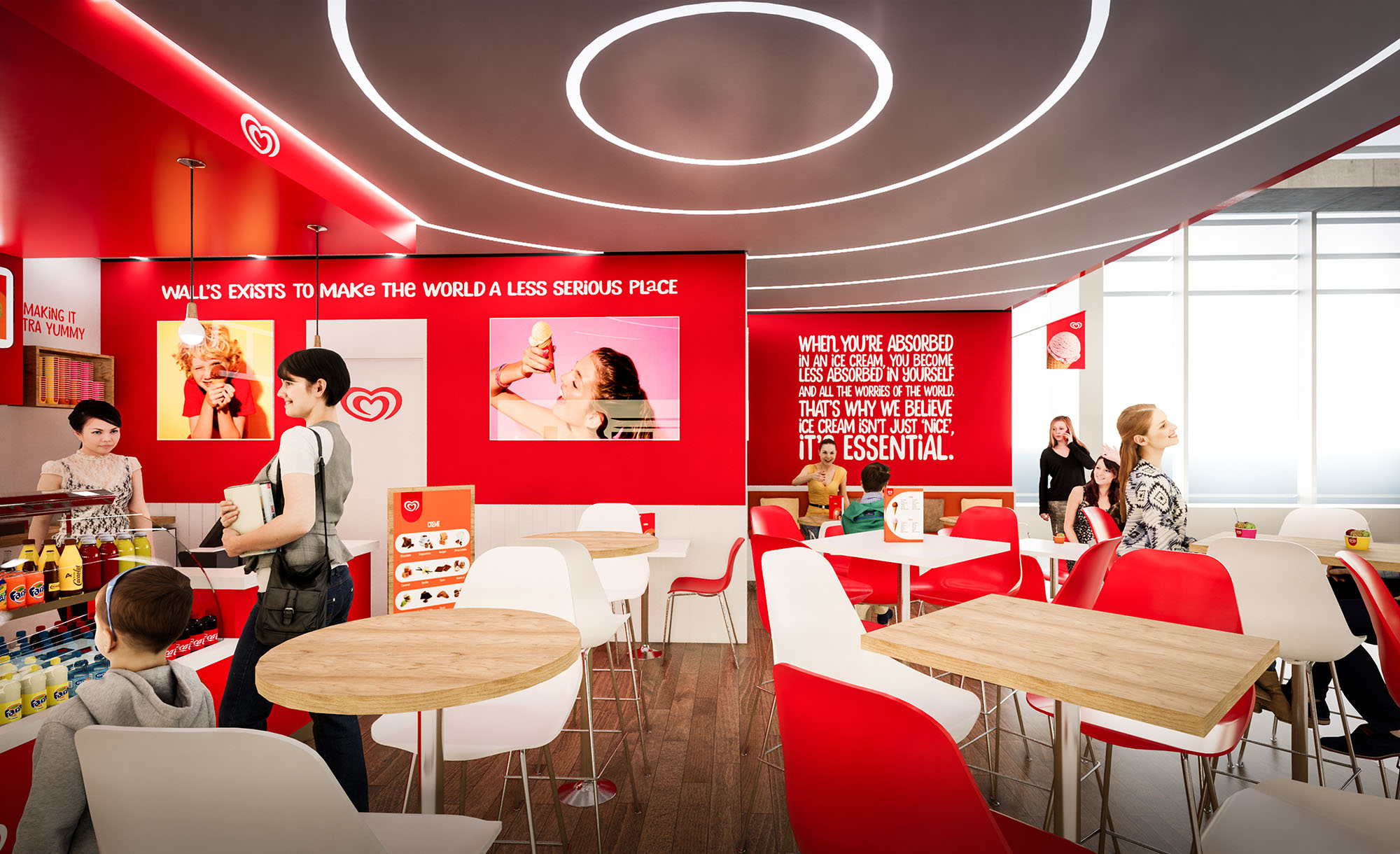
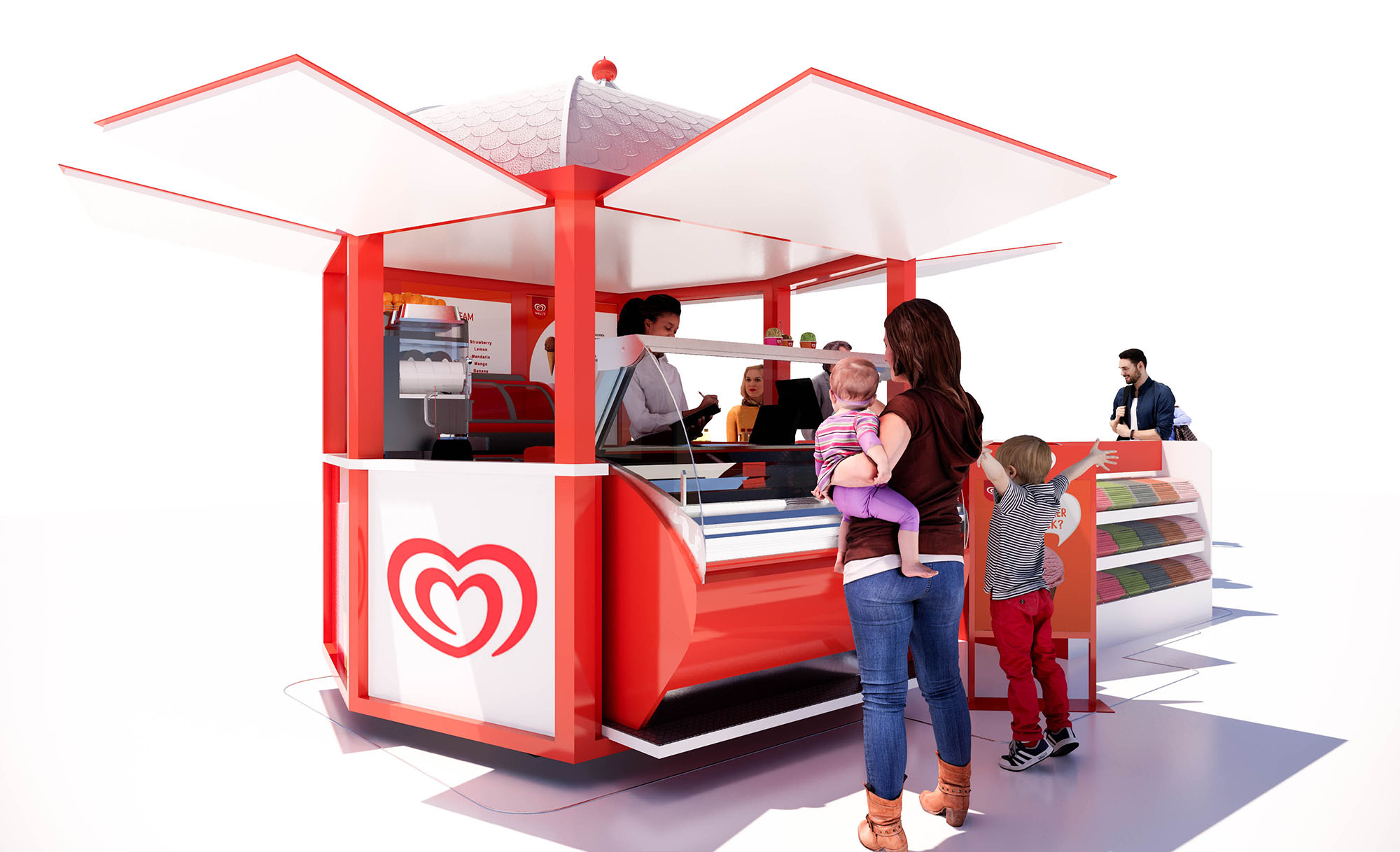
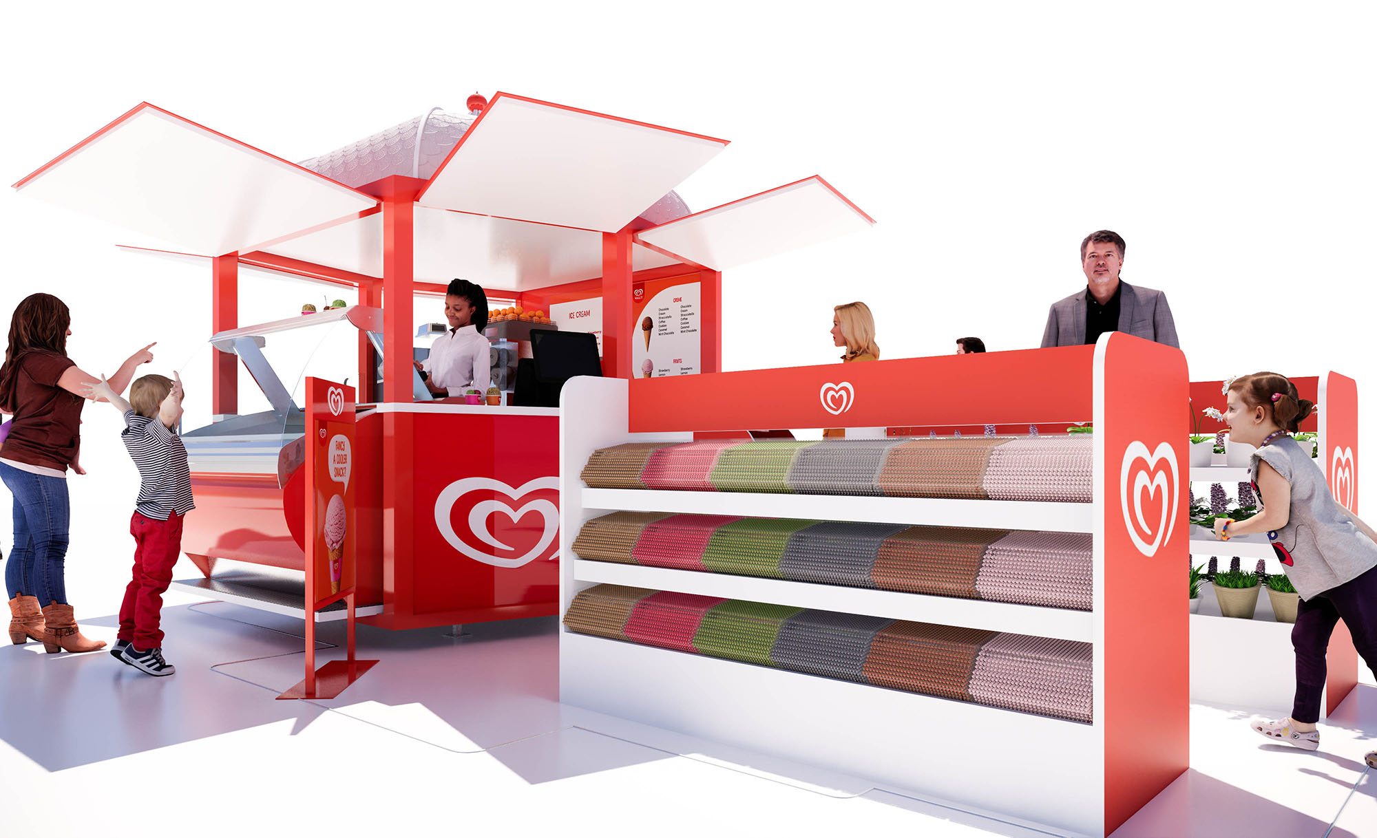
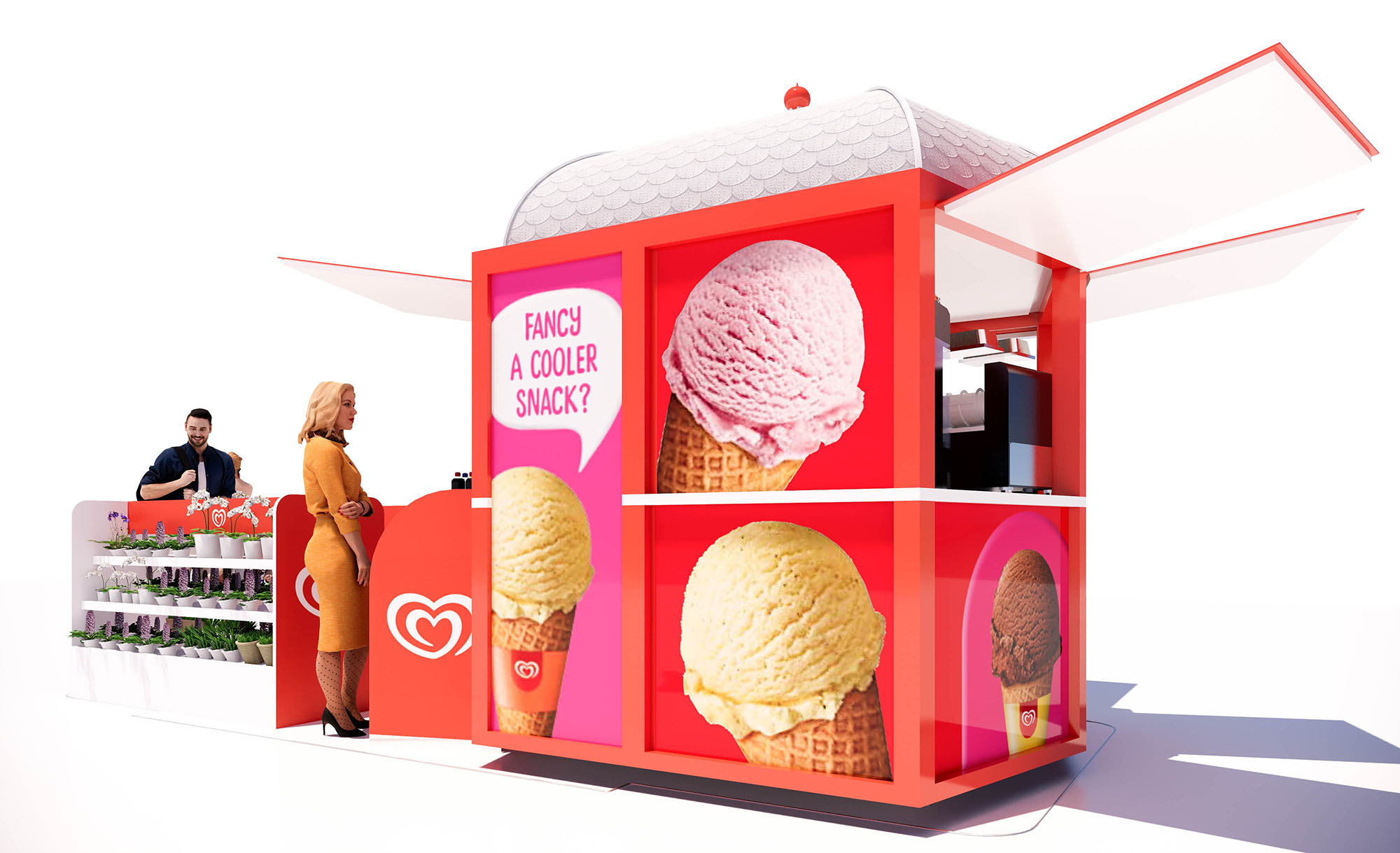
The FRIGO project is conceived as a recognizable, modular ice-cream environment that can be replicated across different sites in Spain and Portugal, from airports to malls and outdoor plazas. The design translates the brand’s playful character into a clear architectural language based on bold geometry, intense color fields and immersive graphics. The space is understood as a compact, high-visibility pavilion that radiates energy and warmth, turning the act of buying an ice cream into a short but memorable spatial experience.
The concept revolves around a strong red envelope that frames the service counter, seating area and ceiling, contrasted with white elements to maintain luminosity and visual balance. The architecture of the kiosk and the interior bar is reduced to essential volumes, allowing the brand iconography, digital media and the product itself to occupy center stage.
The layout is organized around a linear serving counter that anchors the main façade, ensuring maximum exposure to passing flows. This counter concentrates preparation, display and payment functions, reducing back-of-house requirements and optimizing staff movement. In front of it, a generous clear zone allows queuing without obstructing the general circulation of the host building.
Beyond the counter, a compact seating area with a mix of bar stools and standard-height tables creates different modes of occupation: quick consumption at the high counter and more relaxed, social use at the timber-topped tables. The open-plan configuration, free of visual barriers, supports direct supervision by staff and a strong sense of safety and transparency—an important aspect for family-oriented environments.
The interior design is driven by a coherent chromatic strategy where the brand red acts as the primary hue, paired with white and light wood to soften and humanize the atmosphere. The seating alternates red and white shells, generating a dynamic yet orderly rhythm. Timber tabletops introduce a natural texture that offsets the otherwise glossy, graphic surfaces.
Large-scale wall graphics and integrated digital screens reinforce storytelling and seasonal campaigns. Typography and imagery are architecturally framed within red planes, functioning almost as illuminated murals. The result is a seamless fusion of interior design and communication design, where messages are not applied superficially but structurally embedded in walls, soffits and counter faces.
The ceiling becomes a key expressive component. Concentric luminous rings in recessed LED profiles define the central area, guiding the eye inward and emphasizing the convivial core of the space. This circular motif echoes the brand’s logo, translating it into a three-dimensional, spatial gesture.
Functional lighting is resolved through energy-efficient LED systems with a neutral-white temperature, ensuring accurate color rendering of products while maintaining a fresh ambiance. The combination of halo-like feature lighting and discreet linear illumination ensures visual comfort, depth and a strong nighttime identity without unnecessary energy consumption.
Materials are selected for durability, ease of cleaning and fast installation. High-pressure laminates and lacquered MDF in red and white finish the main volumes, while compact, non-porous countertops support intensive food-service use. The floor is a hard-wearing smooth surface, facilitating quick maintenance and hygienic operation.
Furniture consists of lightweight, stackable chairs and bar stools in molded plastic with metal bases, allowing flexibility in layout and simplified logistics across multiple locations. The outdoor kiosk version uses similar material logic—powder-coated metal framing and robust cladding panels—to ensure weather resistance and a cohesive image between interior and exterior formats.
The project integrates sustainability through a modular construction strategy, allowing components to be prefabricated, transported flat and assembled on site with minimal waste. Standardized counters, ceiling modules and signage systems reduce material offcuts and facilitate future reconfiguration or relocation as commercial needs evolve.
High-efficiency refrigeration equipment, LED lighting and smart control of illuminated surfaces help lower operational energy consumption. Where possible, finishes prioritize long lifecycle and recyclability, favoring metal, laminates and plastics that can be separated at end-of-use. By combining intensive use of space with adaptable, repeatable elements, FRIGO maximizes commercial performance while limiting environmental impact across its multiple Iberian locations.
LIST OF PROJECTS EXPERIENCE
Designed, Executed and/or Built Projects
SPAIN
1. Frigo - Málaga - L133C
PORTUGAL
11. Frigo - Lisboa - Arrivals
The FRIGO project is conceived as a recognizable, modular ice-cream environment that can be replicated across different sites in Spain and Portugal, from airports to malls and outdoor plazas. The design translates the brand’s playful character into a clear architectural language based on bold geometry, intense color fields and immersive graphics. The space is understood as a compact, high-visibility pavilion that radiates energy and warmth, turning the act of buying an ice cream into a short but memorable spatial experience.
The concept revolves around a strong red envelope that frames the service counter, seating area and ceiling, contrasted with white elements to maintain luminosity and visual balance. The architecture of the kiosk and the interior bar is reduced to essential volumes, allowing the brand iconography, digital media and the product itself to occupy center stage.
The layout is organized around a linear serving counter that anchors the main façade, ensuring maximum exposure to passing flows. This counter concentrates preparation, display and payment functions, reducing back-of-house requirements and optimizing staff movement. In front of it, a generous clear zone allows queuing without obstructing the general circulation of the host building.
Beyond the counter, a compact seating area with a mix of bar stools and standard-height tables creates different modes of occupation: quick consumption at the high counter and more relaxed, social use at the timber-topped tables. The open-plan configuration, free of visual barriers, supports direct supervision by staff and a strong sense of safety and transparency—an important aspect for family-oriented environments.
The interior design is driven by a coherent chromatic strategy where the brand red acts as the primary hue, paired with white and light wood to soften and humanize the atmosphere. The seating alternates red and white shells, generating a dynamic yet orderly rhythm. Timber tabletops introduce a natural texture that offsets the otherwise glossy, graphic surfaces.
Large-scale wall graphics and integrated digital screens reinforce storytelling and seasonal campaigns. Typography and imagery are architecturally framed within red planes, functioning almost as illuminated murals. The result is a seamless fusion of interior design and communication design, where messages are not applied superficially but structurally embedded in walls, soffits and counter faces.
The ceiling becomes a key expressive component. Concentric luminous rings in recessed LED profiles define the central area, guiding the eye inward and emphasizing the convivial core of the space. This circular motif echoes the brand’s logo, translating it into a three-dimensional, spatial gesture.
Functional lighting is resolved through energy-efficient LED systems with a neutral-white temperature, ensuring accurate color rendering of products while maintaining a fresh ambiance. The combination of halo-like feature lighting and discreet linear illumination ensures visual comfort, depth and a strong nighttime identity without unnecessary energy consumption.
Materials are selected for durability, ease of cleaning and fast installation. High-pressure laminates and lacquered MDF in red and white finish the main volumes, while compact, non-porous countertops support intensive food-service use. The floor is a hard-wearing smooth surface, facilitating quick maintenance and hygienic operation.
Furniture consists of lightweight, stackable chairs and bar stools in molded plastic with metal bases, allowing flexibility in layout and simplified logistics across multiple locations. The outdoor kiosk version uses similar material logic—powder-coated metal framing and robust cladding panels—to ensure weather resistance and a cohesive image between interior and exterior formats.
The project integrates sustainability through a modular construction strategy, allowing components to be prefabricated, transported flat and assembled on site with minimal waste. Standardized counters, ceiling modules and signage systems reduce material offcuts and facilitate future reconfiguration or relocation as commercial needs evolve.
High-efficiency refrigeration equipment, LED lighting and smart control of illuminated surfaces help lower operational energy consumption. Where possible, finishes prioritize long lifecycle and recyclability, favoring metal, laminates and plastics that can be separated at end-of-use. By combining intensive use of space with adaptable, repeatable elements, FRIGO maximizes commercial performance while limiting environmental impact across its multiple Iberian locations.


Nuestras oficinas están en Barcelona, Cancún, Chicago y Santo Domingo, pero gracias a la tecnología podemos desarrollar proyectos en cualquier parte del mundo.
Barcelona
Bac de Roda 136
08020, Barcelona
Spain
Madrid
Av. de Buendía 11
19005 Guadalajara (Madrid)
Spain
Chicago
373 Hazel Ave, Apt A1
60022, Glencoe, Illinois
United States