

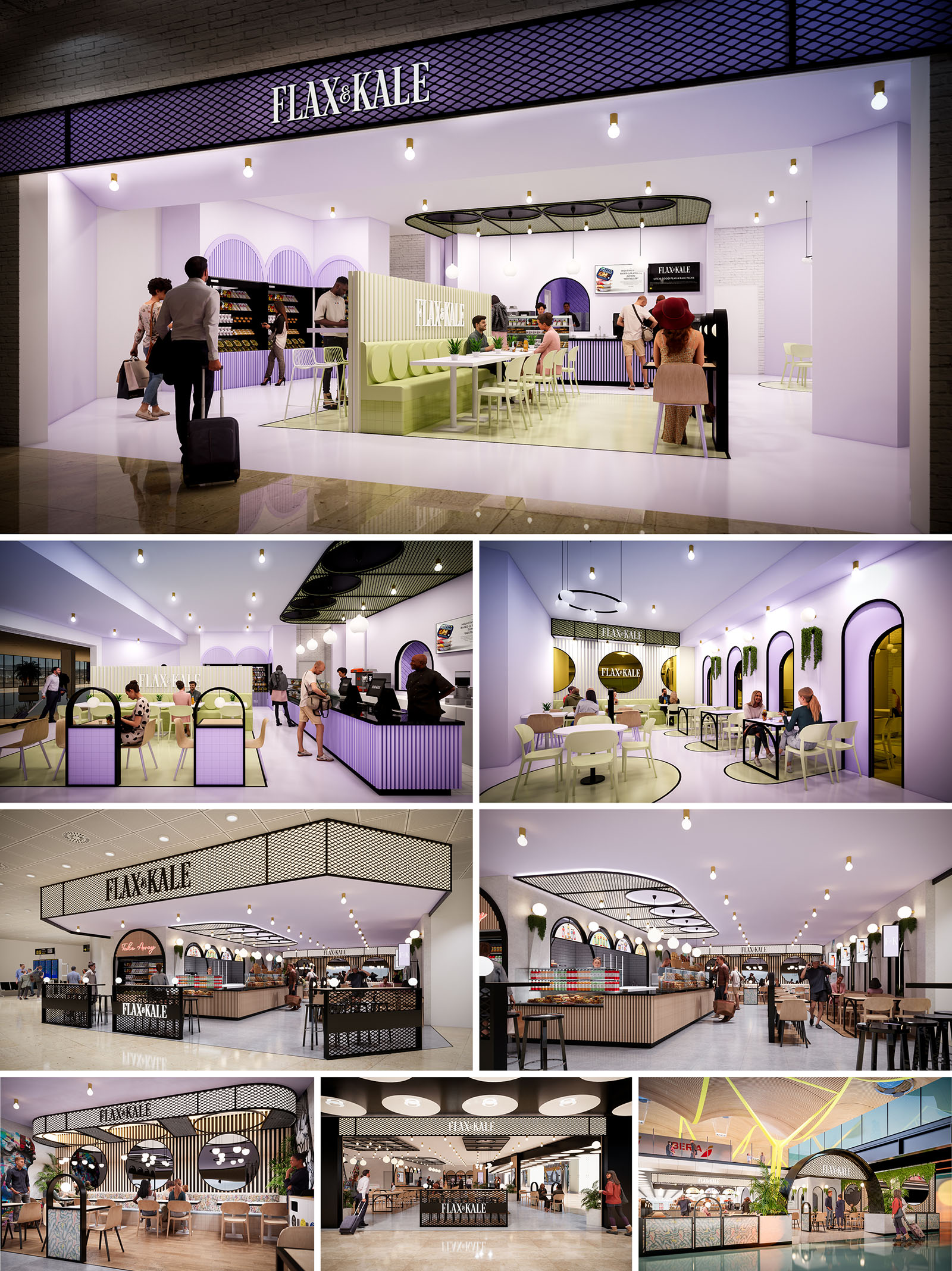
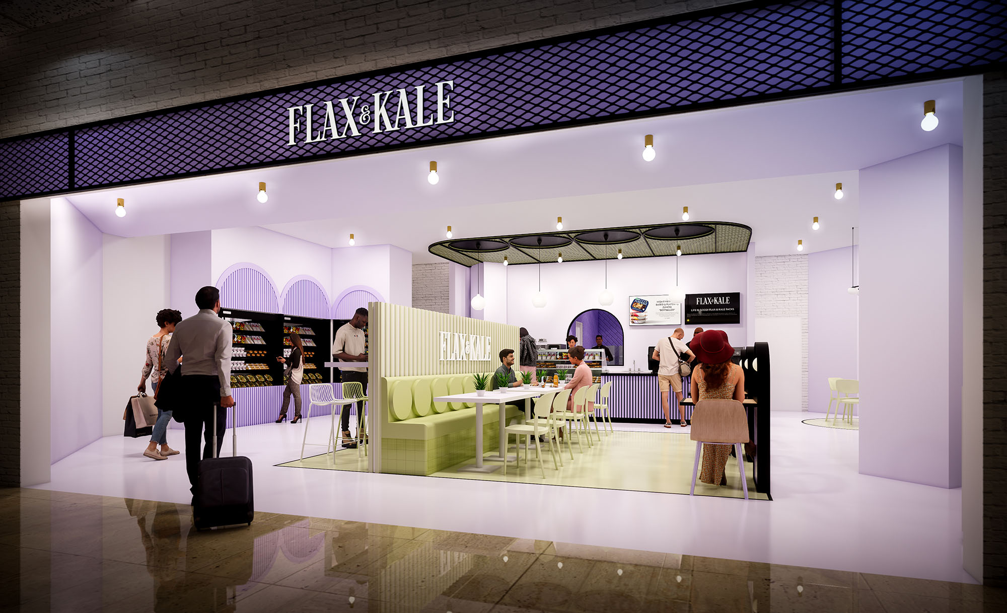
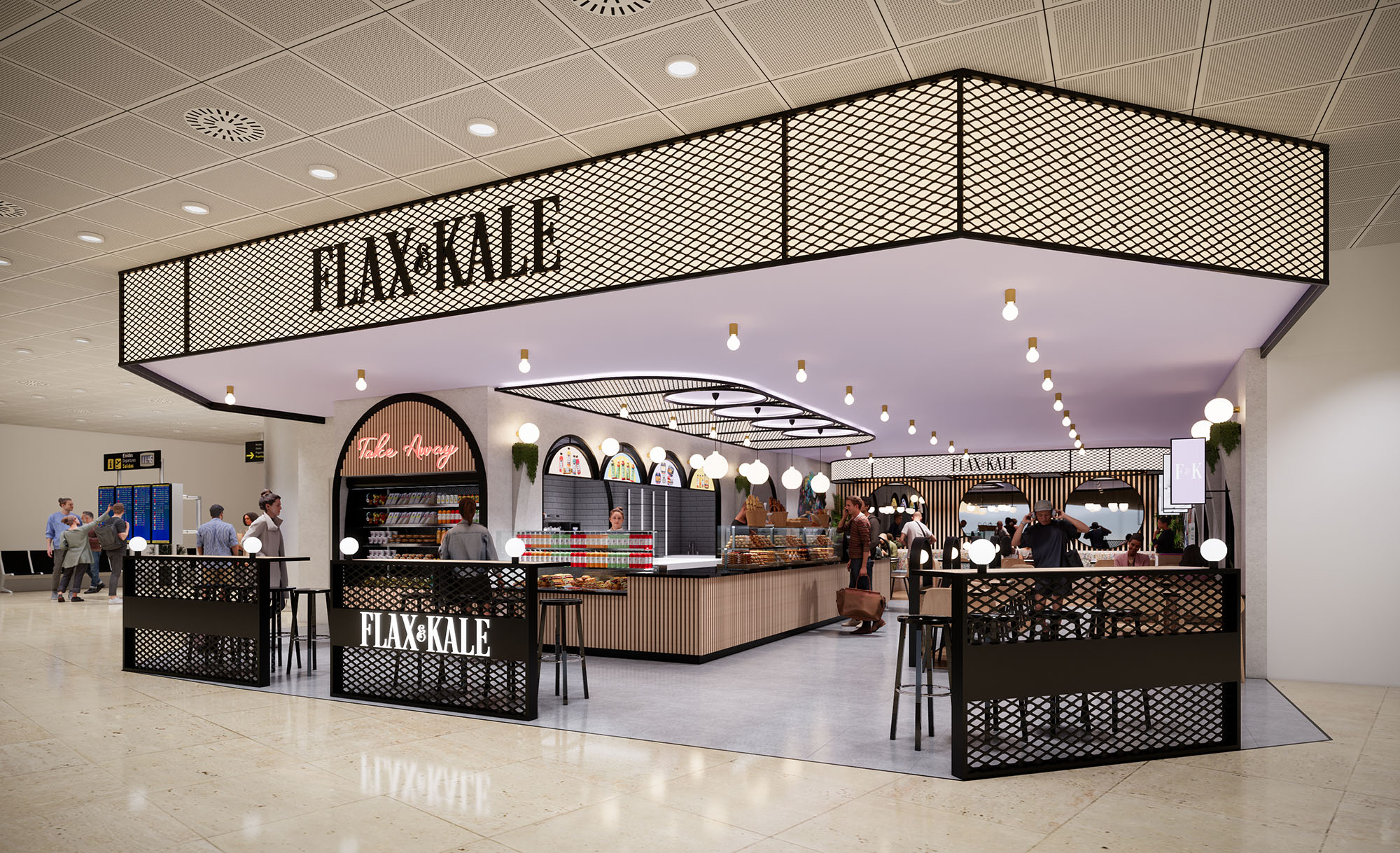
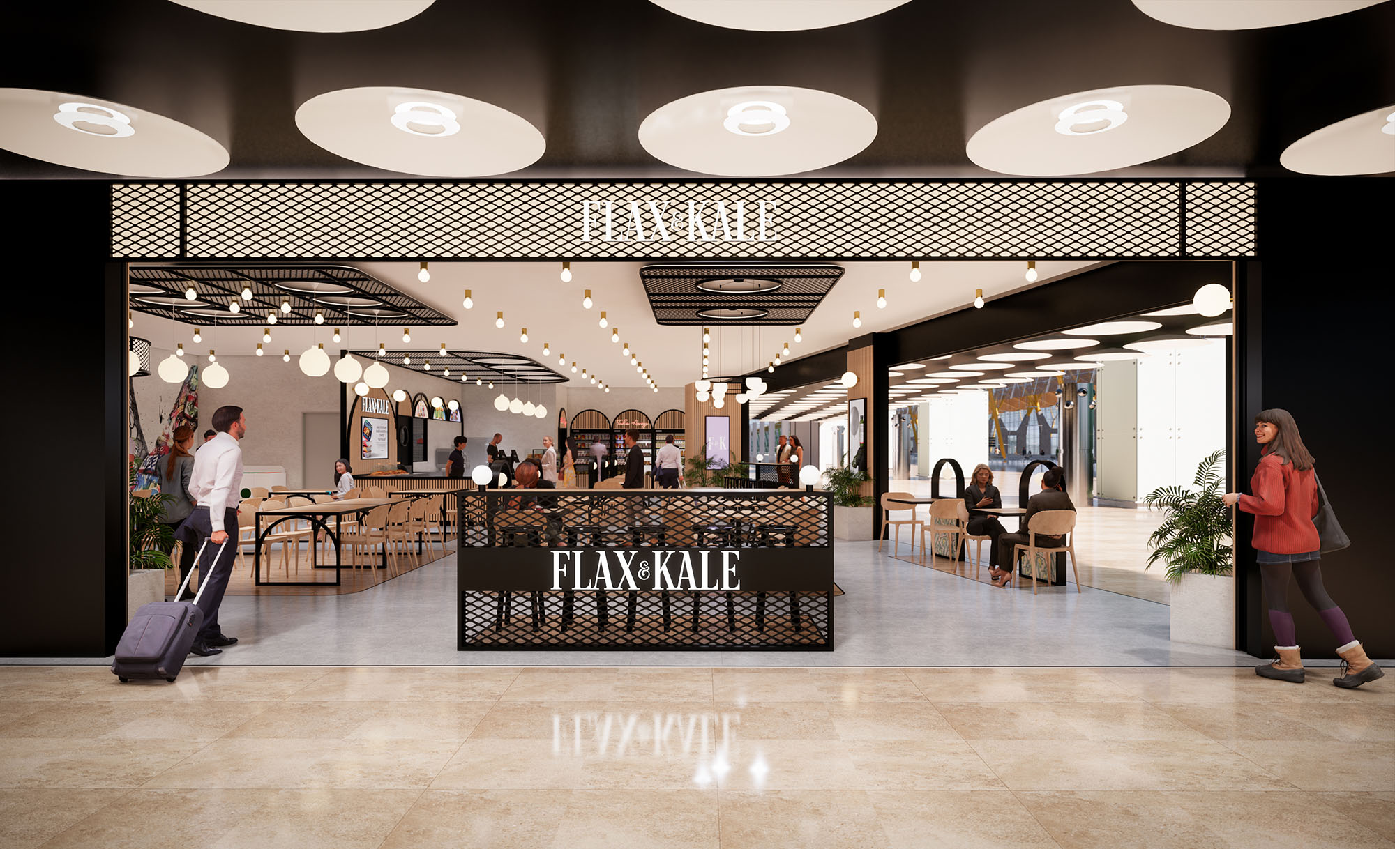
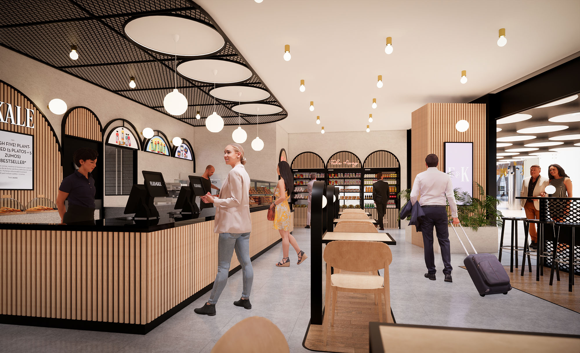
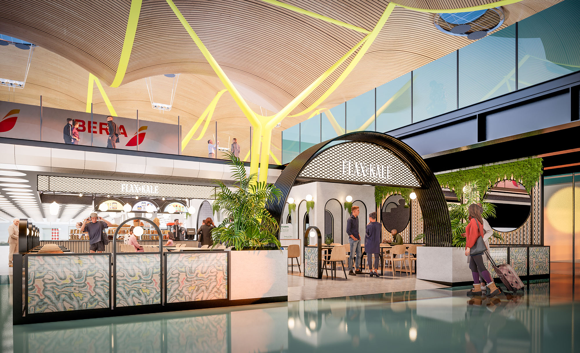
The design of FLAX & KALE in Madrid translates the brand’s flexitarian philosophy into a spatial experience that is fresh, playful and highly legible within the commercial context. The concept works with a soft‑toned, almost pastel chromatic palette contrasted by precise black outlines and metallic details, creating a graphic, contemporary identity that is recognizable from a distance. The restaurant is conceived as an open pavilion inside the mall, dissolving the boundary between corridor and interior to invite spontaneous access throughout the day.
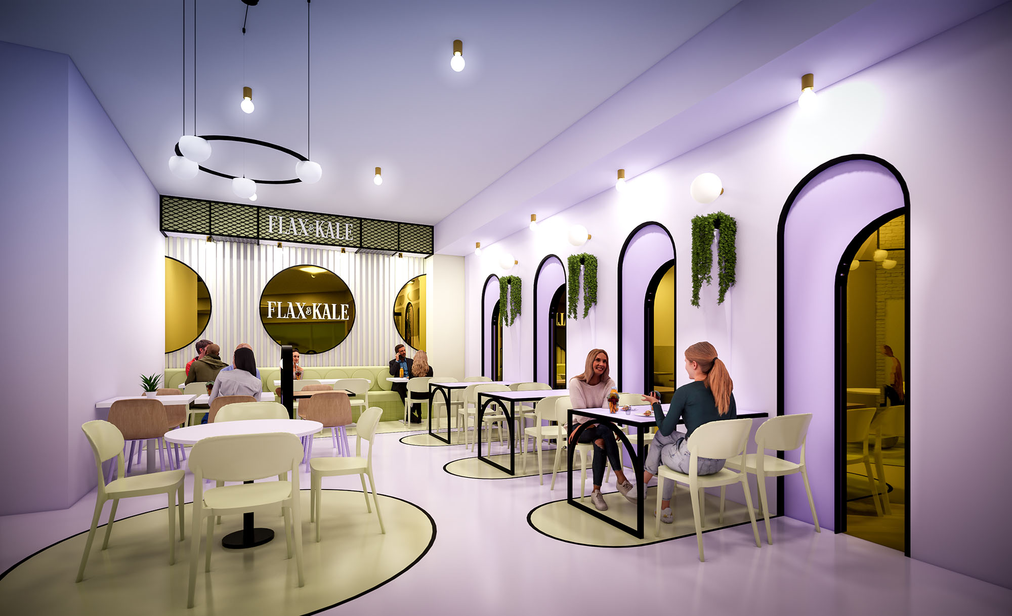
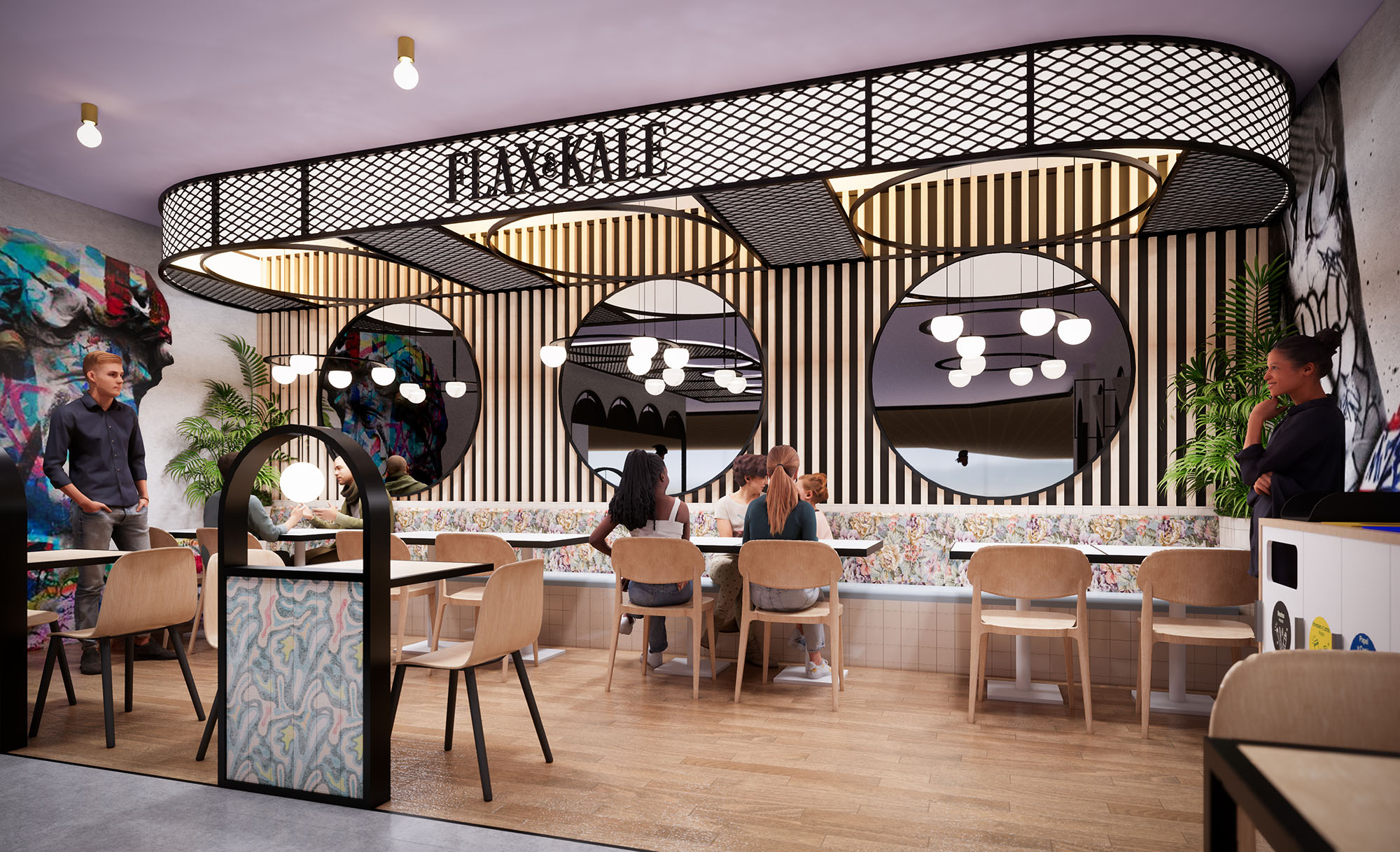
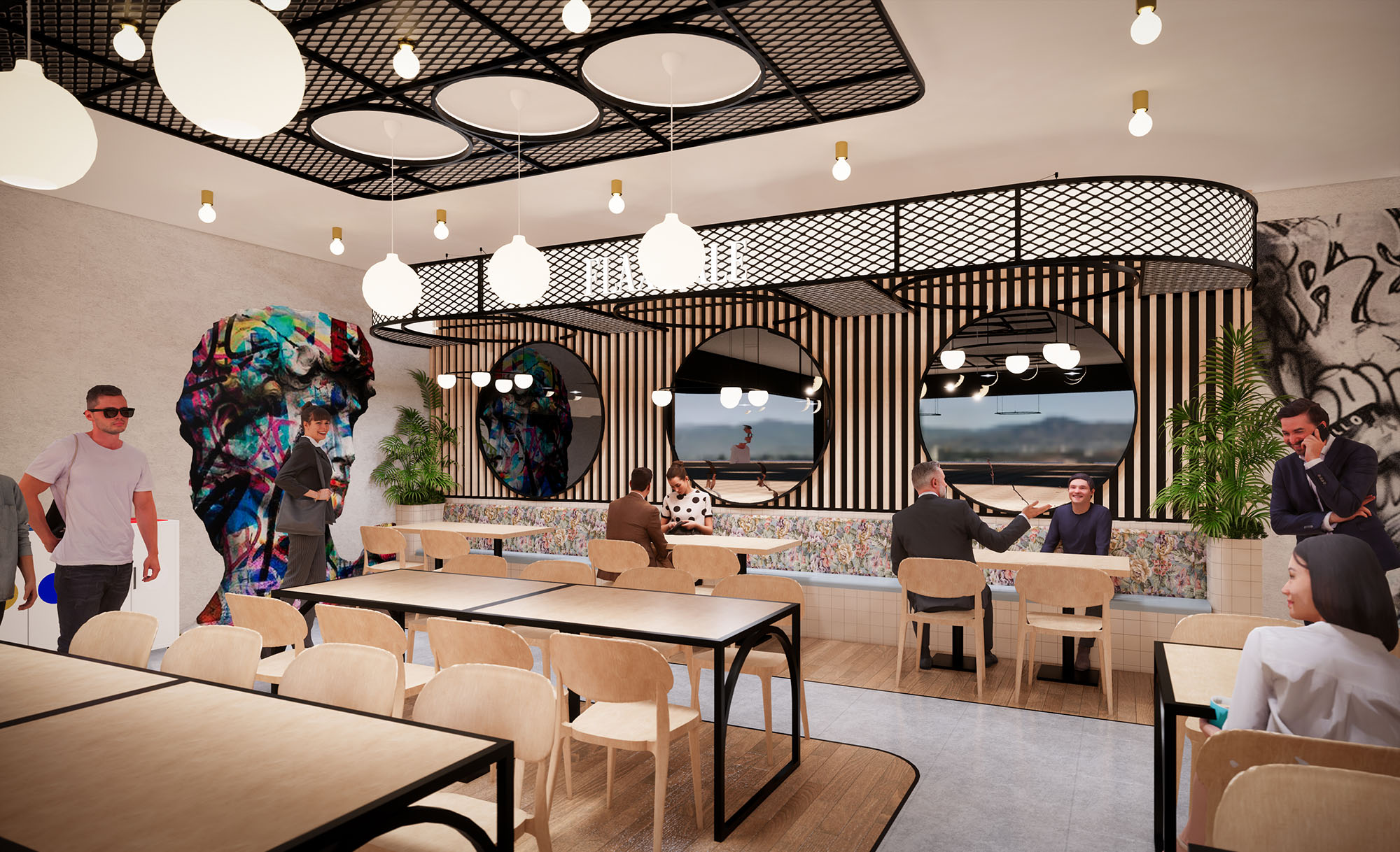
The architecture uses a sequence of arcs and rounded geometries as a unifying motif, suggesting a welcoming and human‑scaled environment. These curved forms appear in façade openings, banquette backs, ceiling contours and floor inlays, generating continuity between volumes, surfaces and circulation lines. The result is a fluid, visually coherent landscape that supports both quick service and relaxed dining.
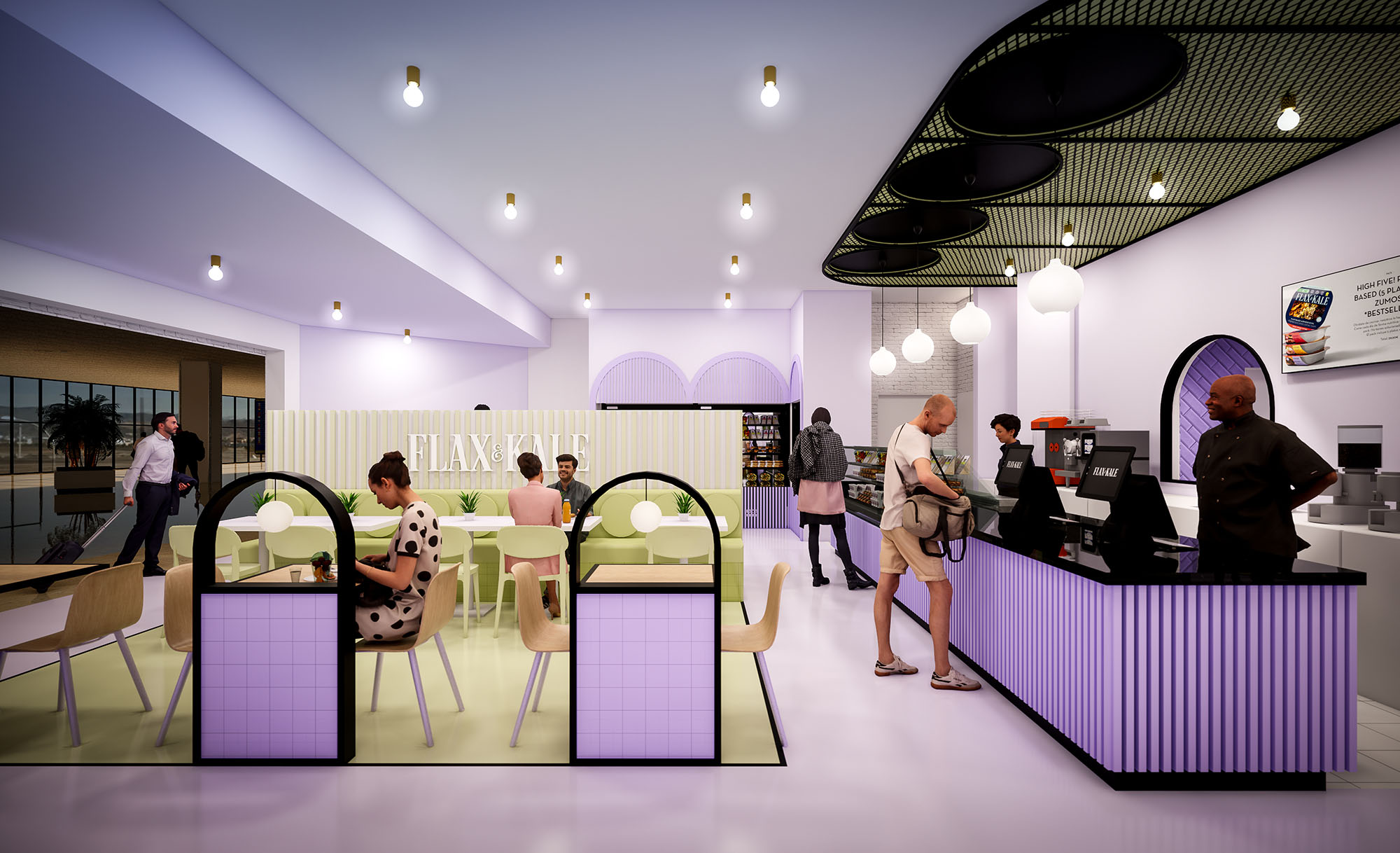
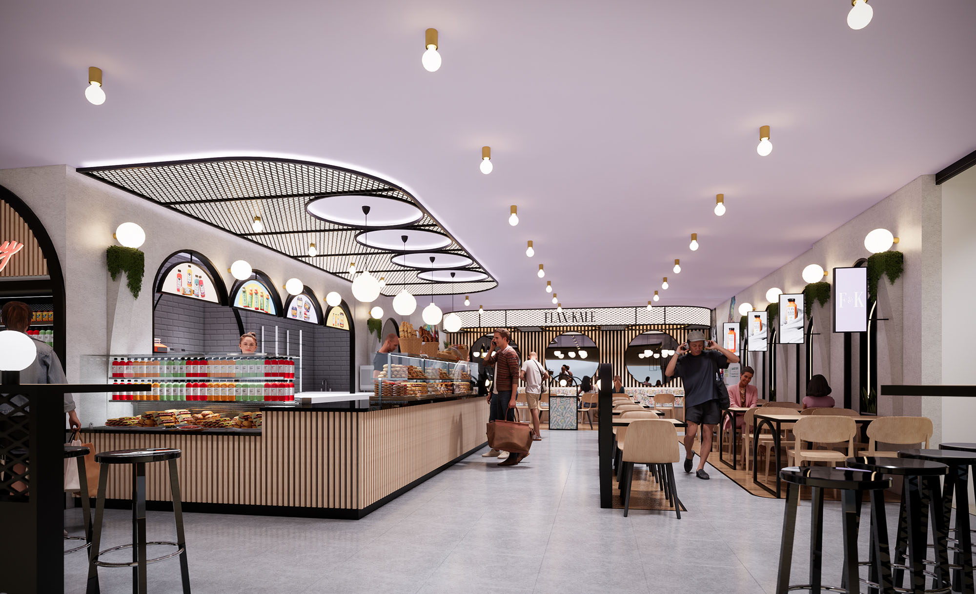
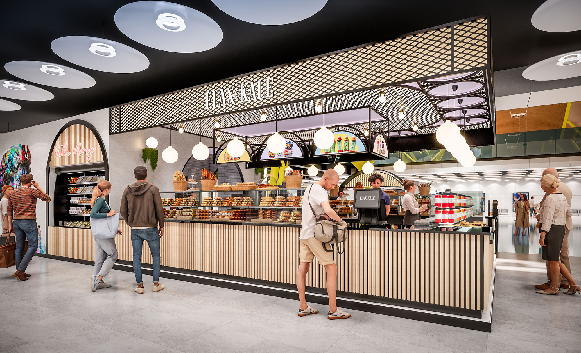
The spatial layout is organized around a central service core that integrates bar, kitchen front, and quick pick‑up counter. This nucleus is wrapped by a perimeter of seating typologies that range from high‑turnover individual tables to more intimate booth configurations. The open edges facing the mall maintain visual permeability while low partitions and planters subtly define the restaurant’s footprint without building solid walls.
Circulation follows a simple and intuitive scheme: guests enter from the most visible corner, align along the counter for ordering, and then move laterally toward the dining zones. A combination of longitudinal banquettes and freestanding tables allows flexible reconfiguration depending on peak hours. The design also incorporates generous aisles to accommodate luggage and prams, acknowledging the transient nature of mall users and ensuring universal accessibility.
The material palette emphasizes tactile contrast and visual clarity. Smooth, high‑performance resin or large‑format porcelain flooring in light tones creates a continuous, easy‑to‑clean base plane. Vertical elements such as counters and low walls use ribbed or fluted paneling in desaturated greens and lilacs, introducing rhythm and a subtle play of shadows. These striated surfaces reinforce the brand’s visual identity while providing robustness against daily wear.
Ceilings feature suspended mesh canopies and curved light coves in black and white, articulating the different functional areas without heavy construction. Powder‑coated steel frames in dark tones outline arches, shelving and railings, giving structural clarity and accentuating the graphic aesthetic. Tabletops and chair shells appear in neutral whites and light woods, balancing the more saturated planes and ensuring a calm backdrop for the food offering.
Lighting is conceived as a key element in defining atmosphere and guiding orientation. A combination of warm white pendant bulbs, circular ceiling fixtures and integrated LED strips in the mesh canopies ensures uniform illumination with localized accents on the counter and product displays. The warm color temperature offsets the coolness of the pastel palette, producing a welcoming, human‑centred ambience.
Indirect light embedded in the arches and behind vertical slats creates depth and highlights the curved geometry, particularly visible from the mall corridors. This layered strategy avoids glare, enhances perception of height, and makes the restaurant visually active during both daytime and evening trading hours, reinforcing its role as a focal point within the commercial environment.
Furniture is lightweight yet durable, chosen to support fast casual operation while maintaining a distinct aesthetic. Stackable chairs, slender metal frames and compact tables enable rapid reconfiguration for groups of different sizes. Banquettes with upholstered seats in muted greens anchor the main seating fields and offer comfort for longer stays. Integrated shelving and product walls display retail items, extending the brand narrative beyond the immediate dining experience.
Branding is seamlessly embedded in the architecture through backlit logos, patterned mesh fascias and color zoning on floors and walls. Each view line from the mall reveals a combination of signage, arches and illuminated counters, ensuring strong recognizability. The overall user experience prioritizes clarity of use, spatial generosity and a memorable visual language that aligns with a contemporary, health‑driven gastronomic proposal.
Sustainability is addressed through material selection, operational efficiency and adaptability. Preference is given to durable, low‑maintenance finishes such as powder‑coated steel, compact laminates and high‑resistance flooring, extending the lifecycle of the fit‑out and reducing the need for frequent replacement. Where possible, finishes can incorporate recycled content, particularly in metal elements and composite boards.
Energy performance is improved by an all‑LED lighting system with dimmable circuits that adjust intensity according to natural light levels in the mall. Open, wall‑free perimeter design enhances natural cross‑ventilation within the mall’s overall HVAC strategy and minimizes the need for additional mechanical partitions. Modular furniture and non‑load‑bearing partitions allow future reconfiguration or partial reuse of components in other locations, aligning the project with circular economy principles and reducing waste over time.

The design of FLAX & KALE in Madrid translates the brand’s flexitarian philosophy into a spatial experience that is fresh, playful and highly legible within the commercial context. The concept works with a soft‑toned, almost pastel chromatic palette contrasted by precise black outlines and metallic details, creating a graphic, contemporary identity that is recognizable from a distance. The restaurant is conceived as an open pavilion inside the mall, dissolving the boundary between corridor and interior to invite spontaneous access throughout the day.
The architecture uses a sequence of arcs and rounded geometries as a unifying motif, suggesting a welcoming and human‑scaled environment. These curved forms appear in façade openings, banquette backs, ceiling contours and floor inlays, generating continuity between volumes, surfaces and circulation lines. The result is a fluid, visually coherent landscape that supports both quick service and relaxed dining.
The spatial layout is organized around a central service core that integrates bar, kitchen front, and quick pick‑up counter. This nucleus is wrapped by a perimeter of seating typologies that range from high‑turnover individual tables to more intimate booth configurations. The open edges facing the mall maintain visual permeability while low partitions and planters subtly define the restaurant’s footprint without building solid walls.
Circulation follows a simple and intuitive scheme: guests enter from the most visible corner, align along the counter for ordering, and then move laterally toward the dining zones. A combination of longitudinal banquettes and freestanding tables allows flexible reconfiguration depending on peak hours. The design also incorporates generous aisles to accommodate luggage and prams, acknowledging the transient nature of mall users and ensuring universal accessibility.
The material palette emphasizes tactile contrast and visual clarity. Smooth, high‑performance resin or large‑format porcelain flooring in light tones creates a continuous, easy‑to‑clean base plane. Vertical elements such as counters and low walls use ribbed or fluted paneling in desaturated greens and lilacs, introducing rhythm and a subtle play of shadows. These striated surfaces reinforce the brand’s visual identity while providing robustness against daily wear.
Ceilings feature suspended mesh canopies and curved light coves in black and white, articulating the different functional areas without heavy construction. Powder‑coated steel frames in dark tones outline arches, shelving and railings, giving structural clarity and accentuating the graphic aesthetic. Tabletops and chair shells appear in neutral whites and light woods, balancing the more saturated planes and ensuring a calm backdrop for the food offering.
Lighting is conceived as a key element in defining atmosphere and guiding orientation. A combination of warm white pendant bulbs, circular ceiling fixtures and integrated LED strips in the mesh canopies ensures uniform illumination with localized accents on the counter and product displays. The warm color temperature offsets the coolness of the pastel palette, producing a welcoming, human‑centred ambience.
Indirect light embedded in the arches and behind vertical slats creates depth and highlights the curved geometry, particularly visible from the mall corridors. This layered strategy avoids glare, enhances perception of height, and makes the restaurant visually active during both daytime and evening trading hours, reinforcing its role as a focal point within the commercial environment.
Furniture is lightweight yet durable, chosen to support fast casual operation while maintaining a distinct aesthetic. Stackable chairs, slender metal frames and compact tables enable rapid reconfiguration for groups of different sizes. Banquettes with upholstered seats in muted greens anchor the main seating fields and offer comfort for longer stays. Integrated shelving and product walls display retail items, extending the brand narrative beyond the immediate dining experience.
Branding is seamlessly embedded in the architecture through backlit logos, patterned mesh fascias and color zoning on floors and walls. Each view line from the mall reveals a combination of signage, arches and illuminated counters, ensuring strong recognizability. The overall user experience prioritizes clarity of use, spatial generosity and a memorable visual language that aligns with a contemporary, health‑driven gastronomic proposal.
Sustainability is addressed through material selection, operational efficiency and adaptability. Preference is given to durable, low‑maintenance finishes such as powder‑coated steel, compact laminates and high‑resistance flooring, extending the lifecycle of the fit‑out and reducing the need for frequent replacement. Where possible, finishes can incorporate recycled content, particularly in metal elements and composite boards.
Energy performance is improved by an all‑LED lighting system with dimmable circuits that adjust intensity according to natural light levels in the mall. Open, wall‑free perimeter design enhances natural cross‑ventilation within the mall’s overall HVAC strategy and minimizes the need for additional mechanical partitions. Modular furniture and non‑load‑bearing partitions allow future reconfiguration or partial reuse of components in other locations, aligning the project with circular economy principles and reducing waste over time.


Nuestras oficinas están en Barcelona, Cancún, Chicago y Santo Domingo, pero gracias a la tecnología podemos desarrollar proyectos en cualquier parte del mundo.
Barcelona
Bac de Roda 136
08020, Barcelona
Spain
Madrid
Av. de Buendía 11
19005 Guadalajara (Madrid)
Spain
Chicago
373 Hazel Ave, Apt A1
60022, Glencoe, Illinois
United States