

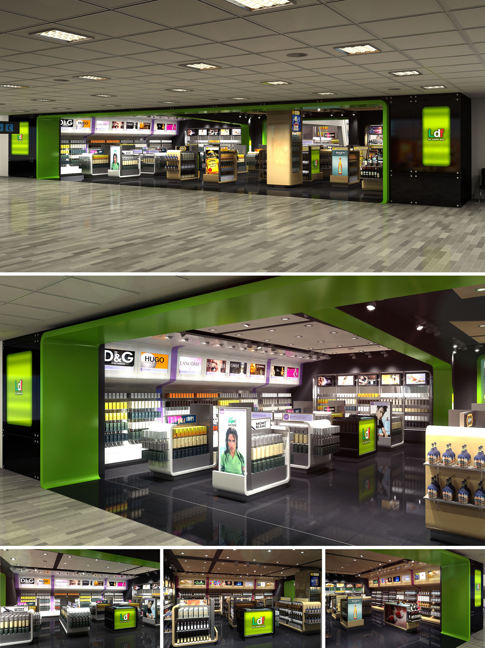
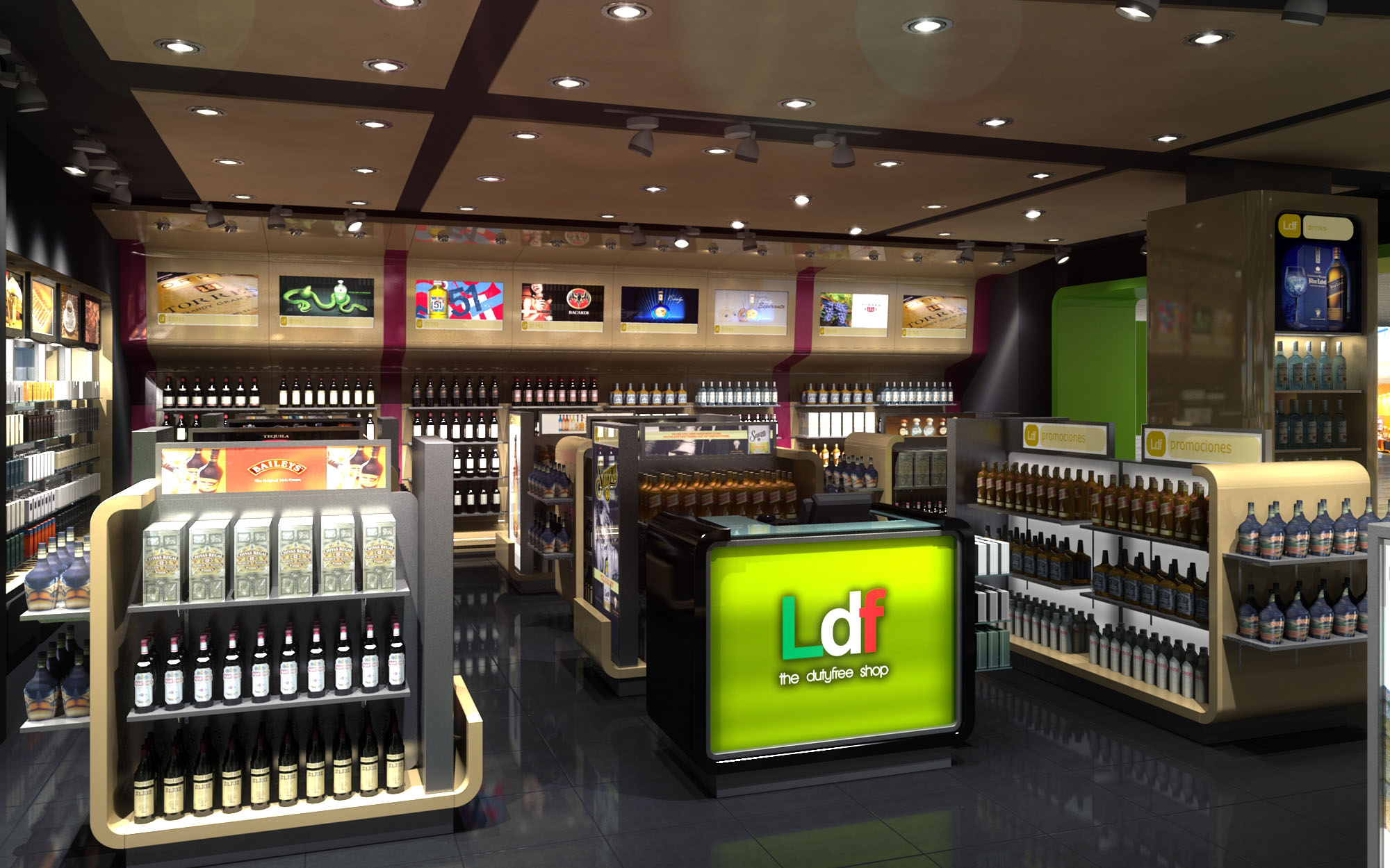
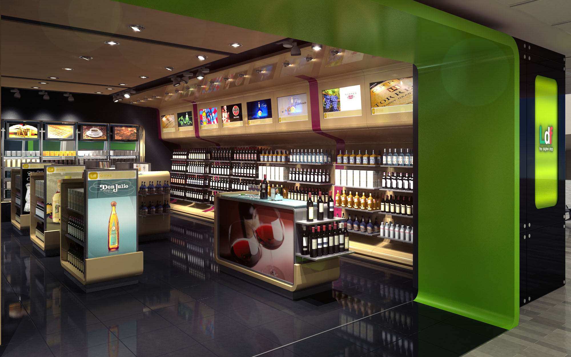
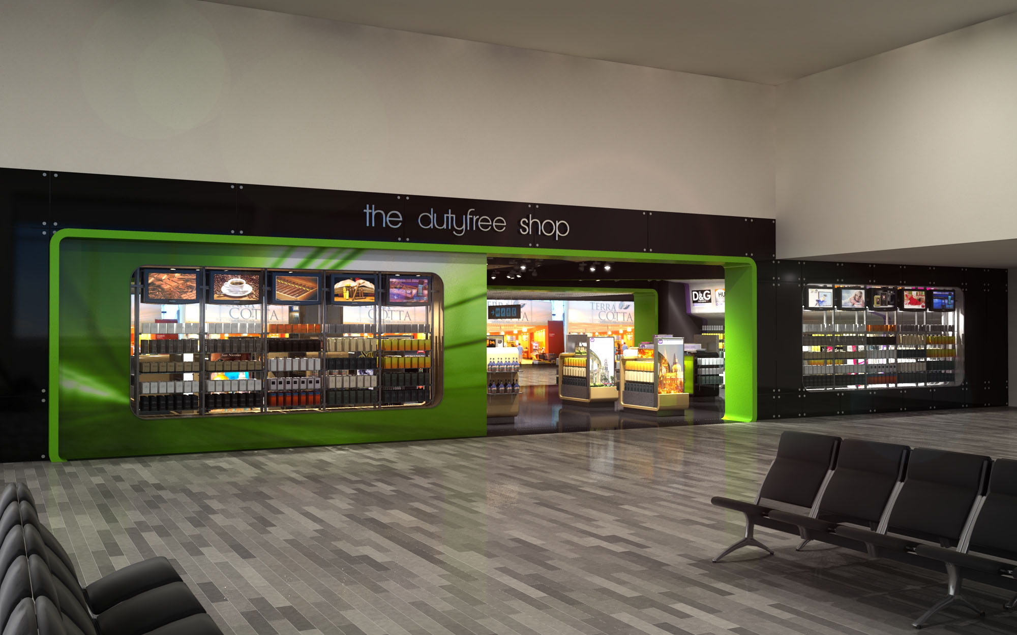
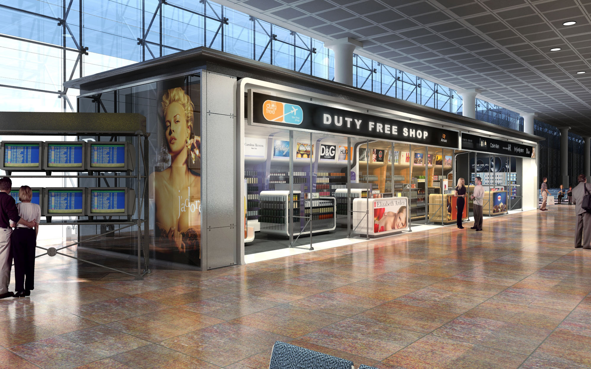
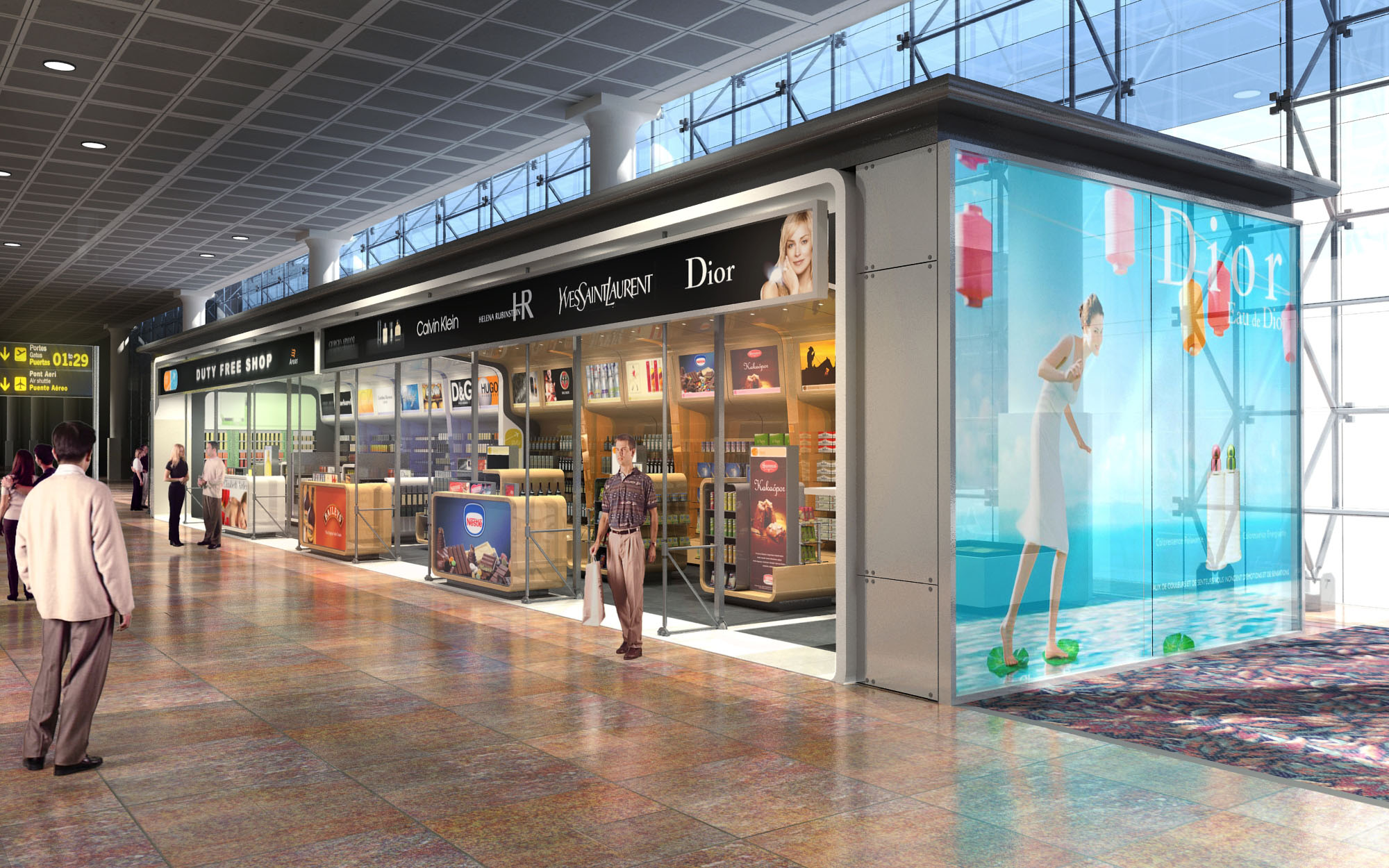
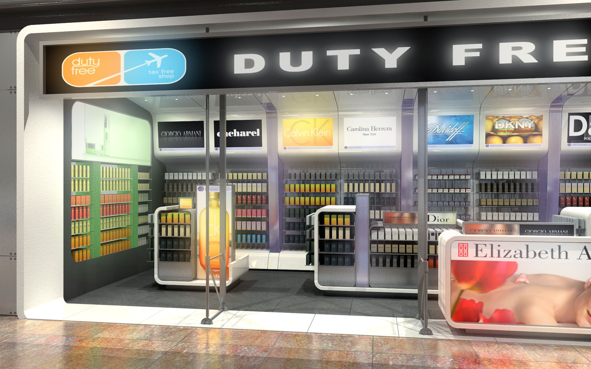
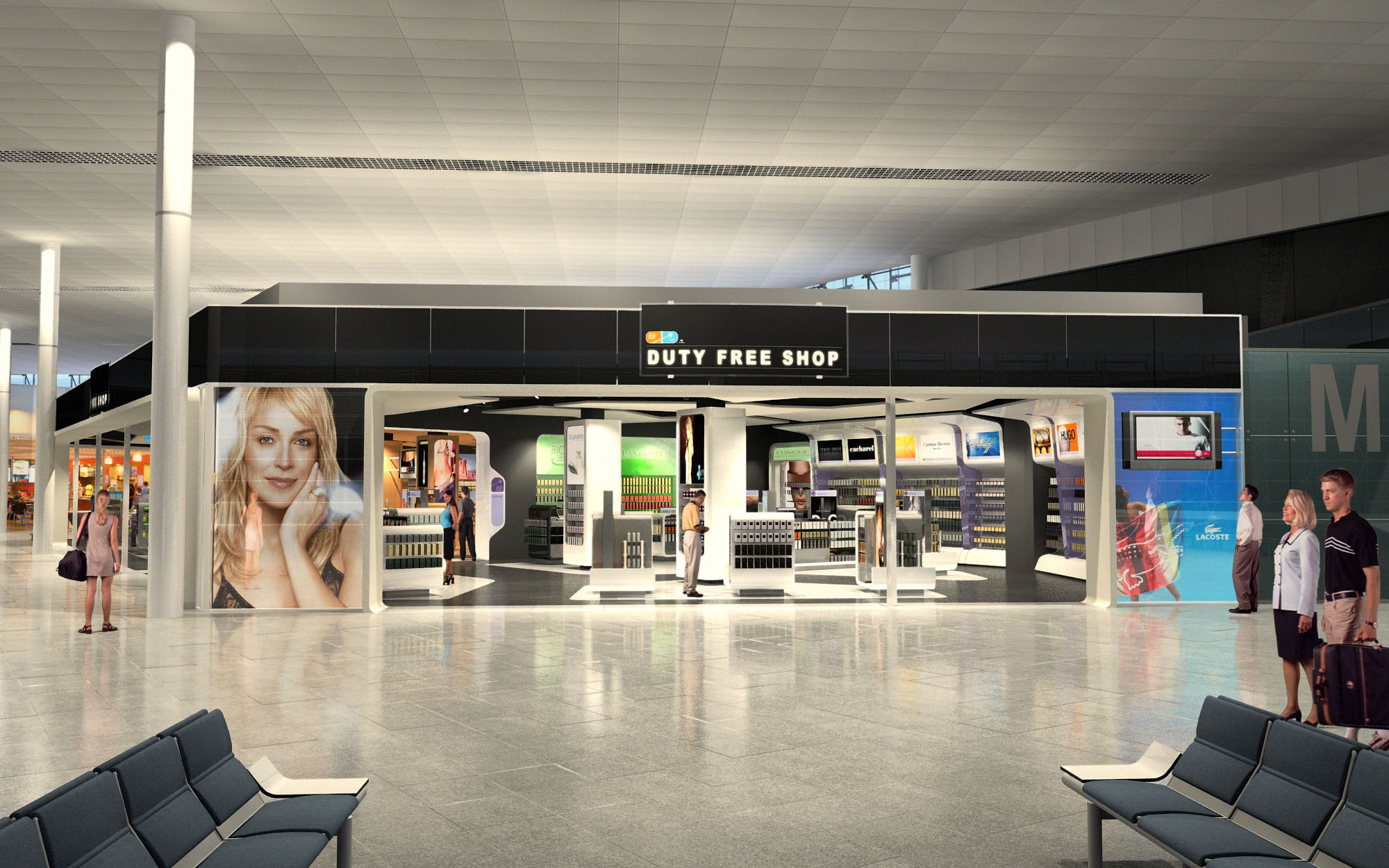
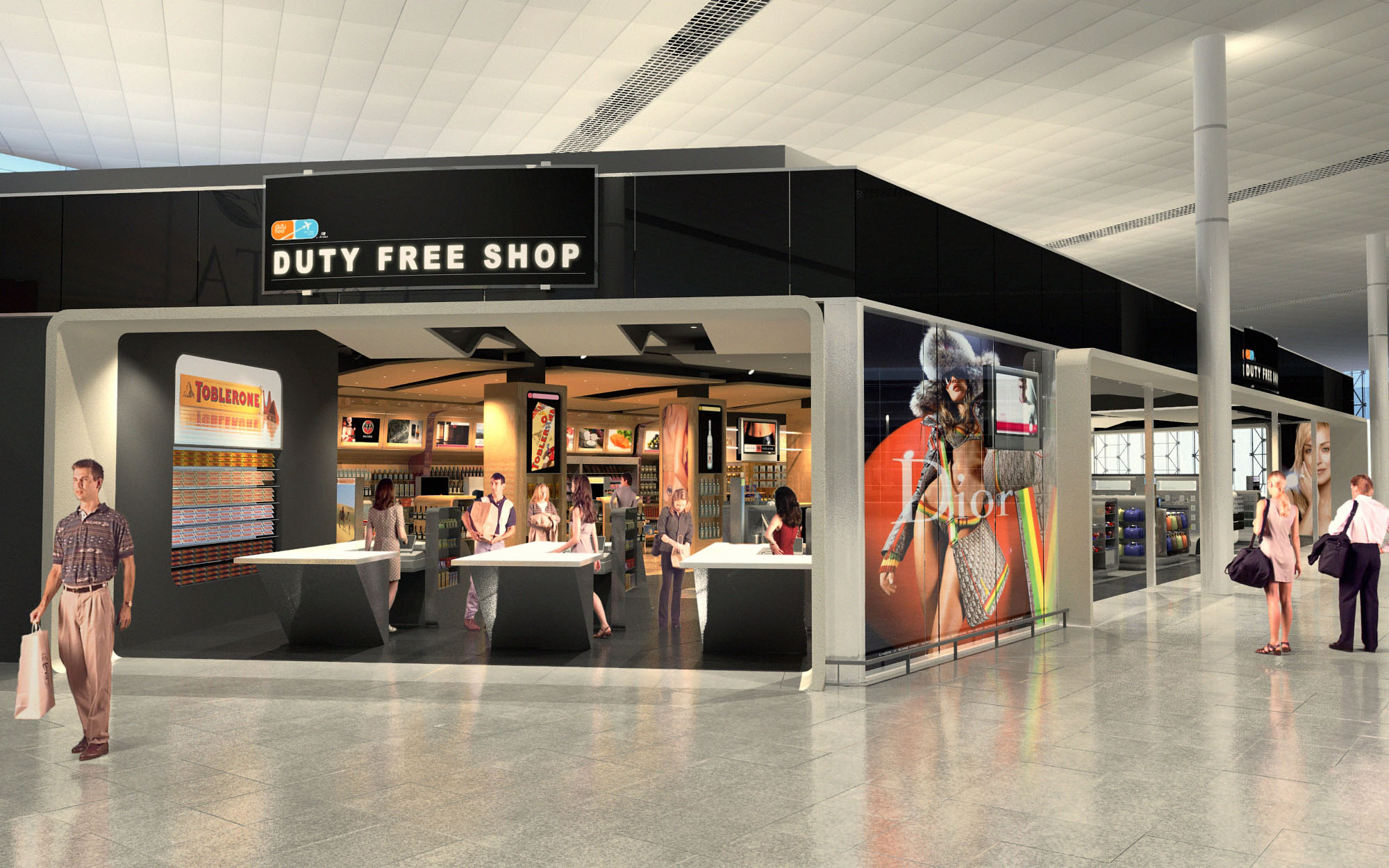
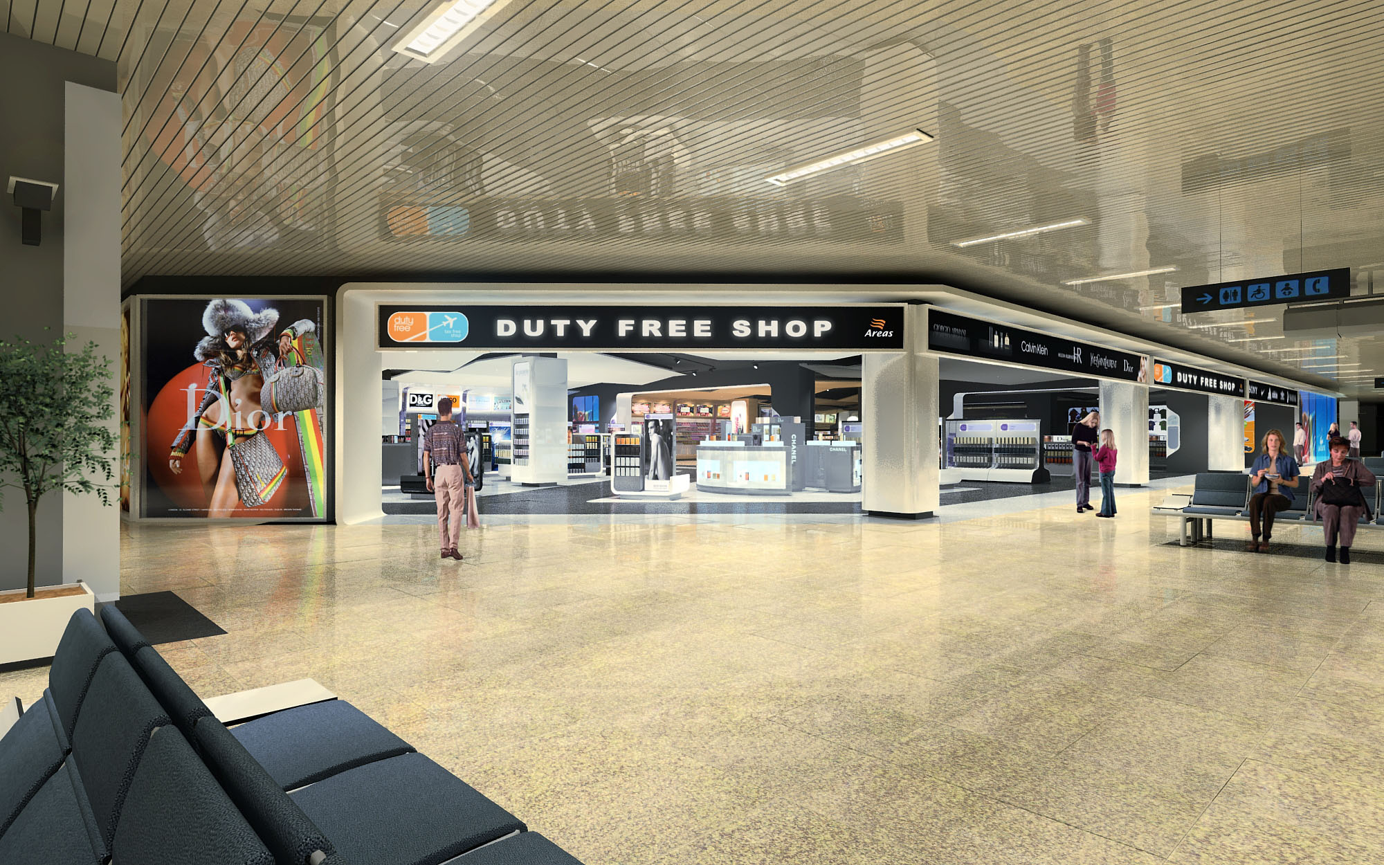
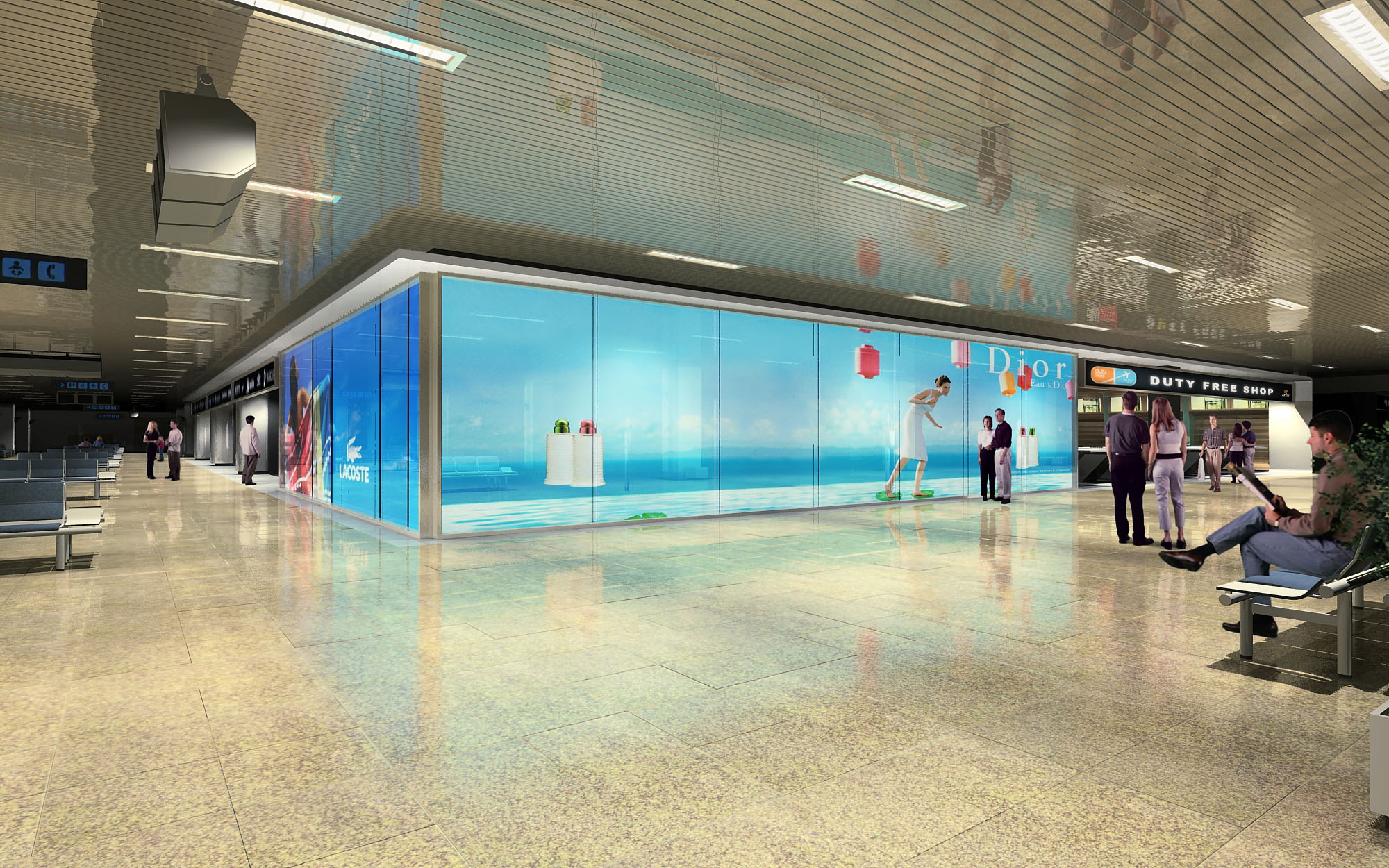
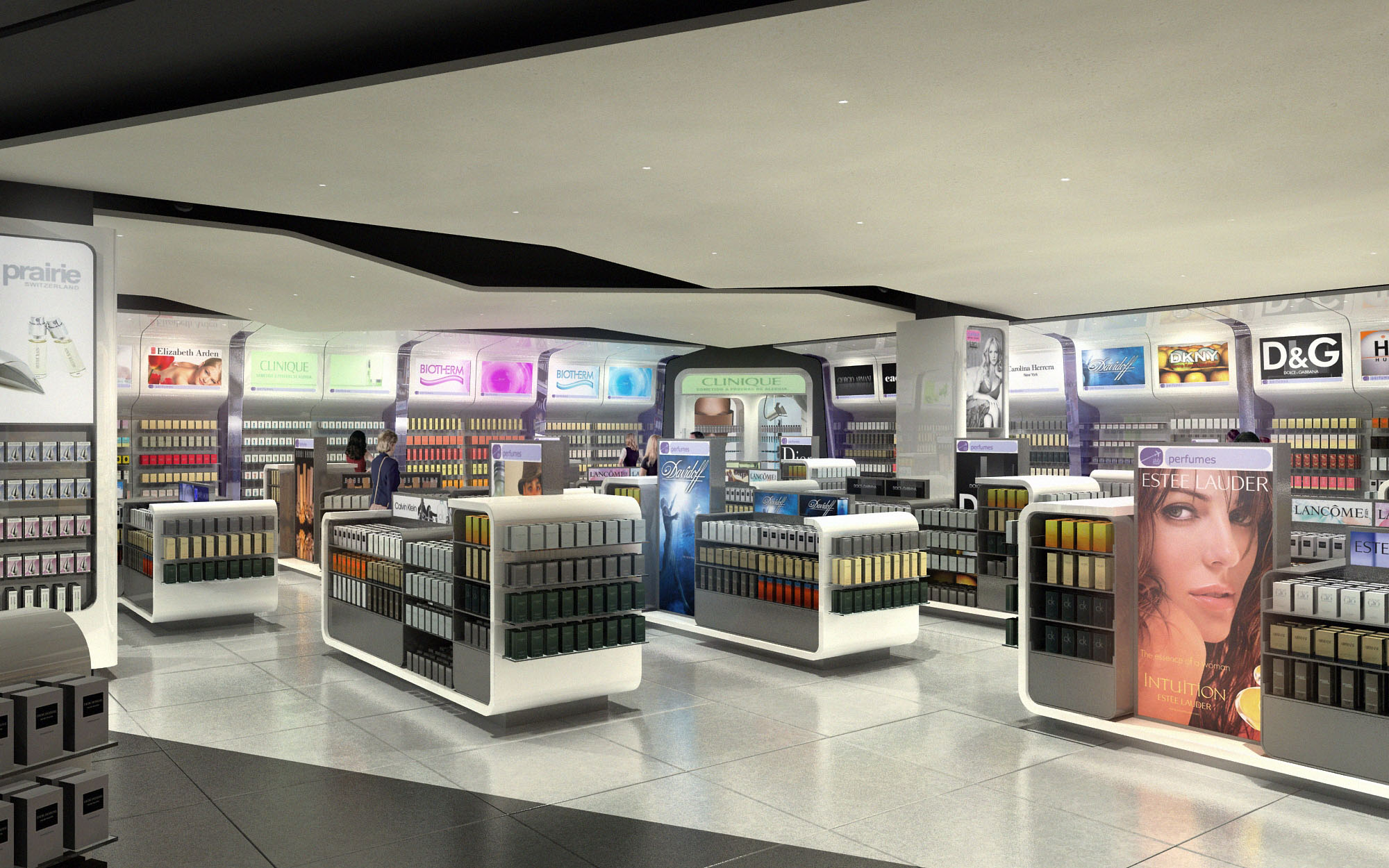
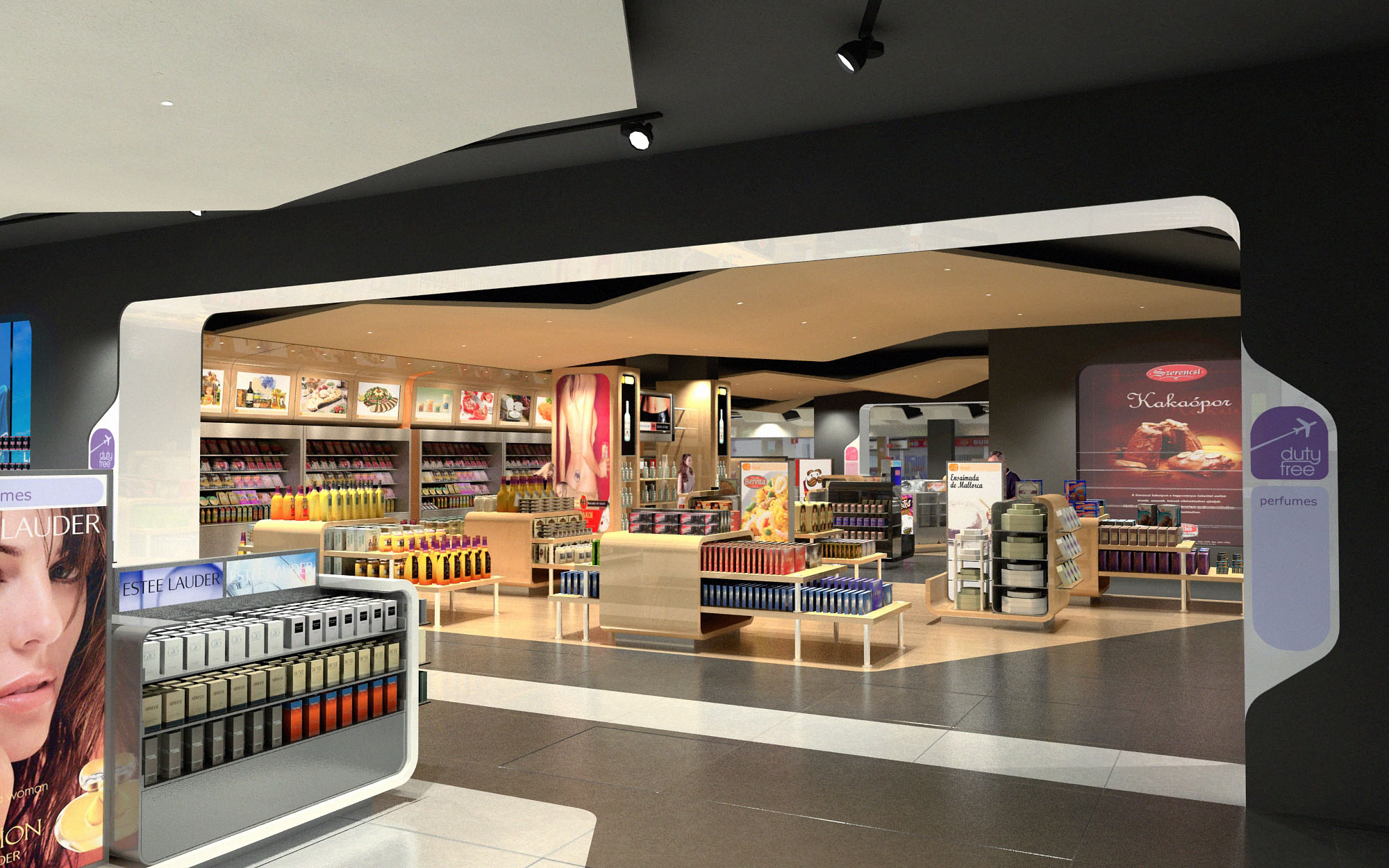
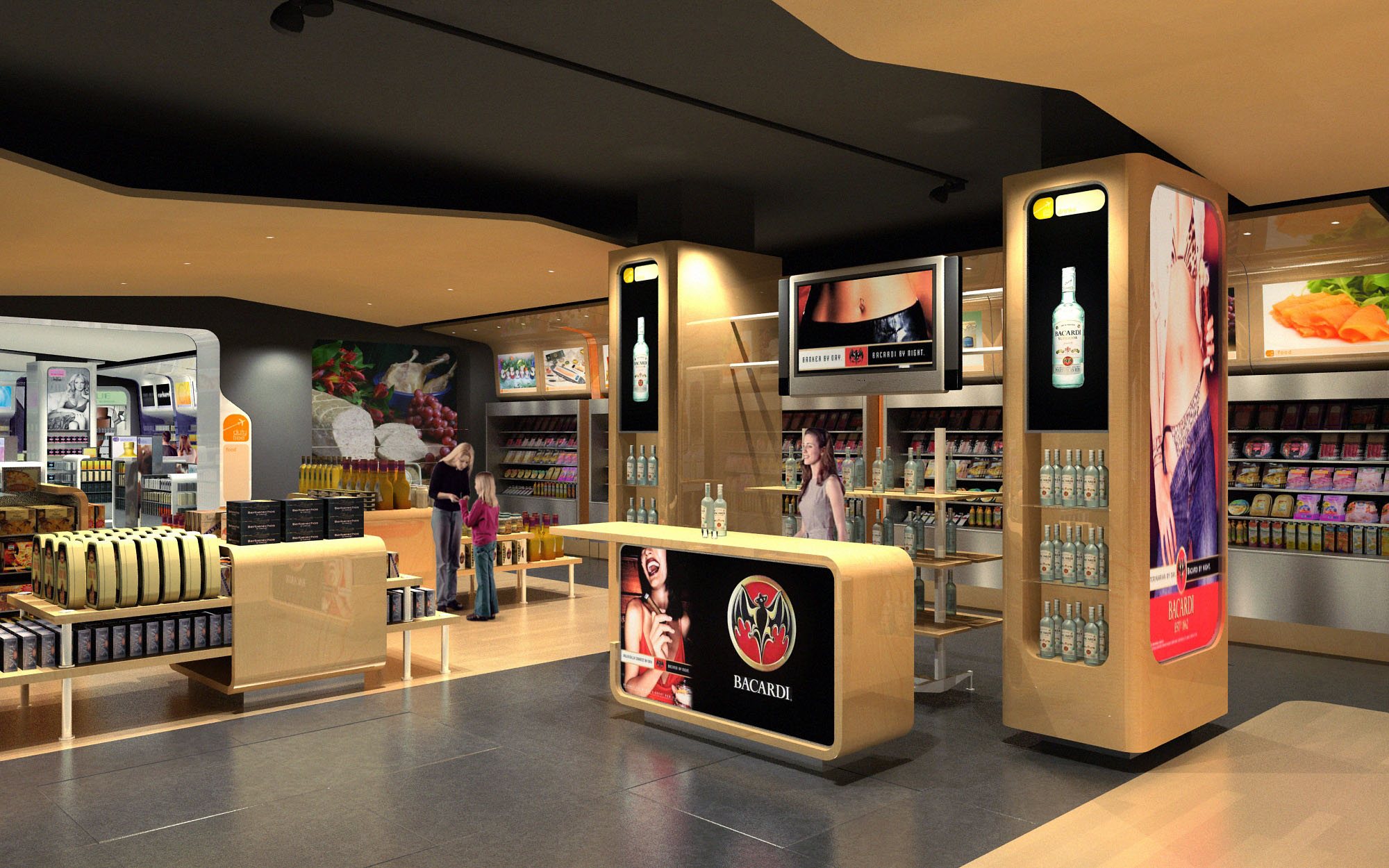
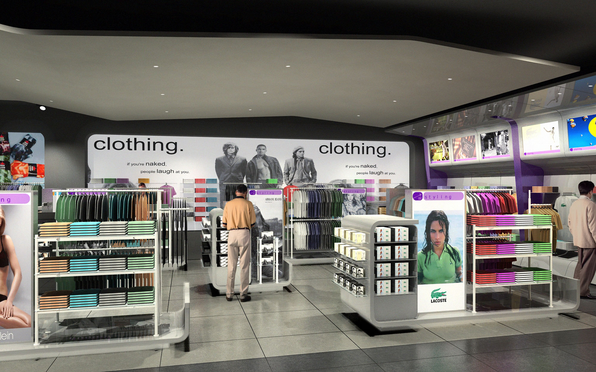
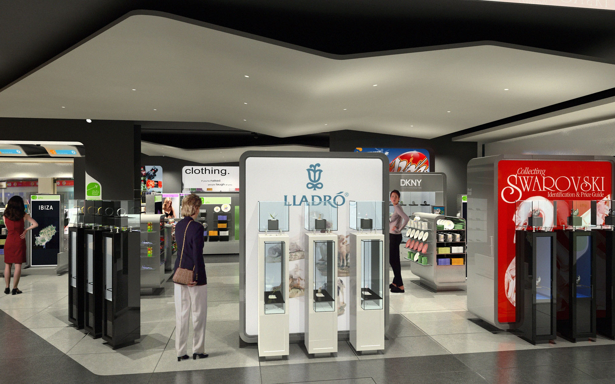
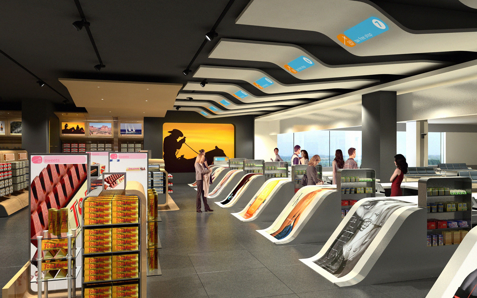
The duty free shops are conceived as a continuous, highly legible commercial landscape that links various airport terminals in Spain and Mexico through a unified visual identity. The concept is based on framing and highlighting the product as the protagonist, while the architecture acts as a flexible backdrop that can adapt to different footprints and passenger flows. The design emphasizes openness and transparent sightlines, allowing travelers to understand the entire offer at a glance and to move intuitively between the different product categories.
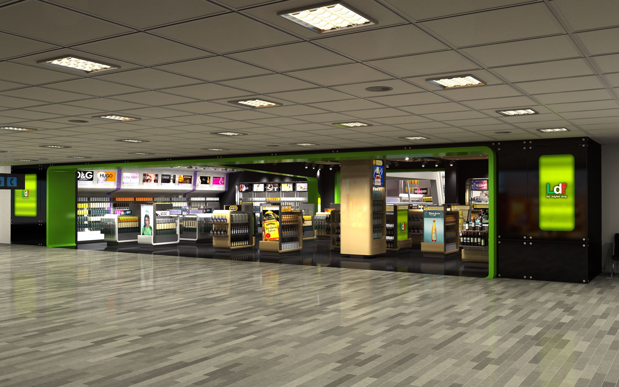
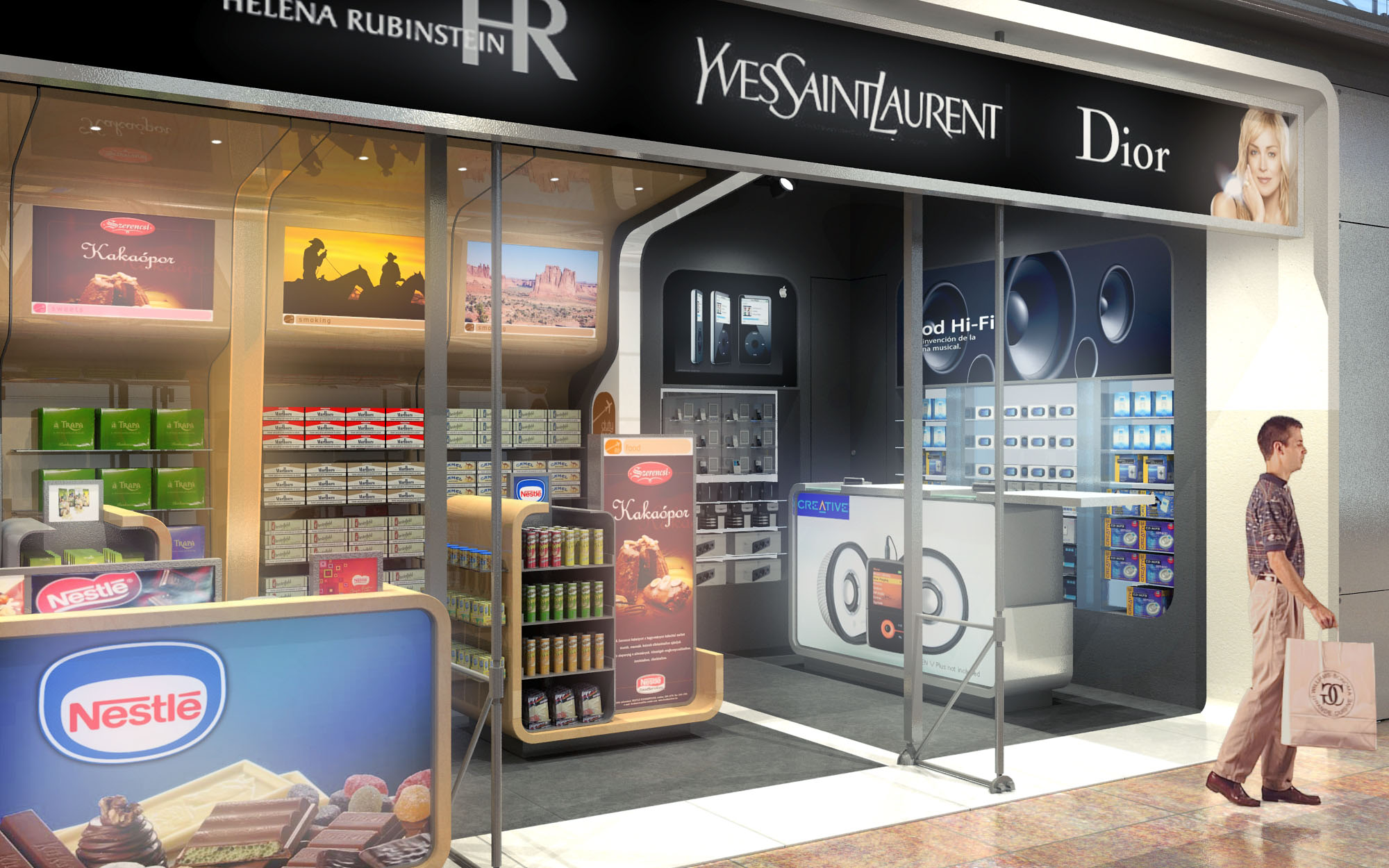
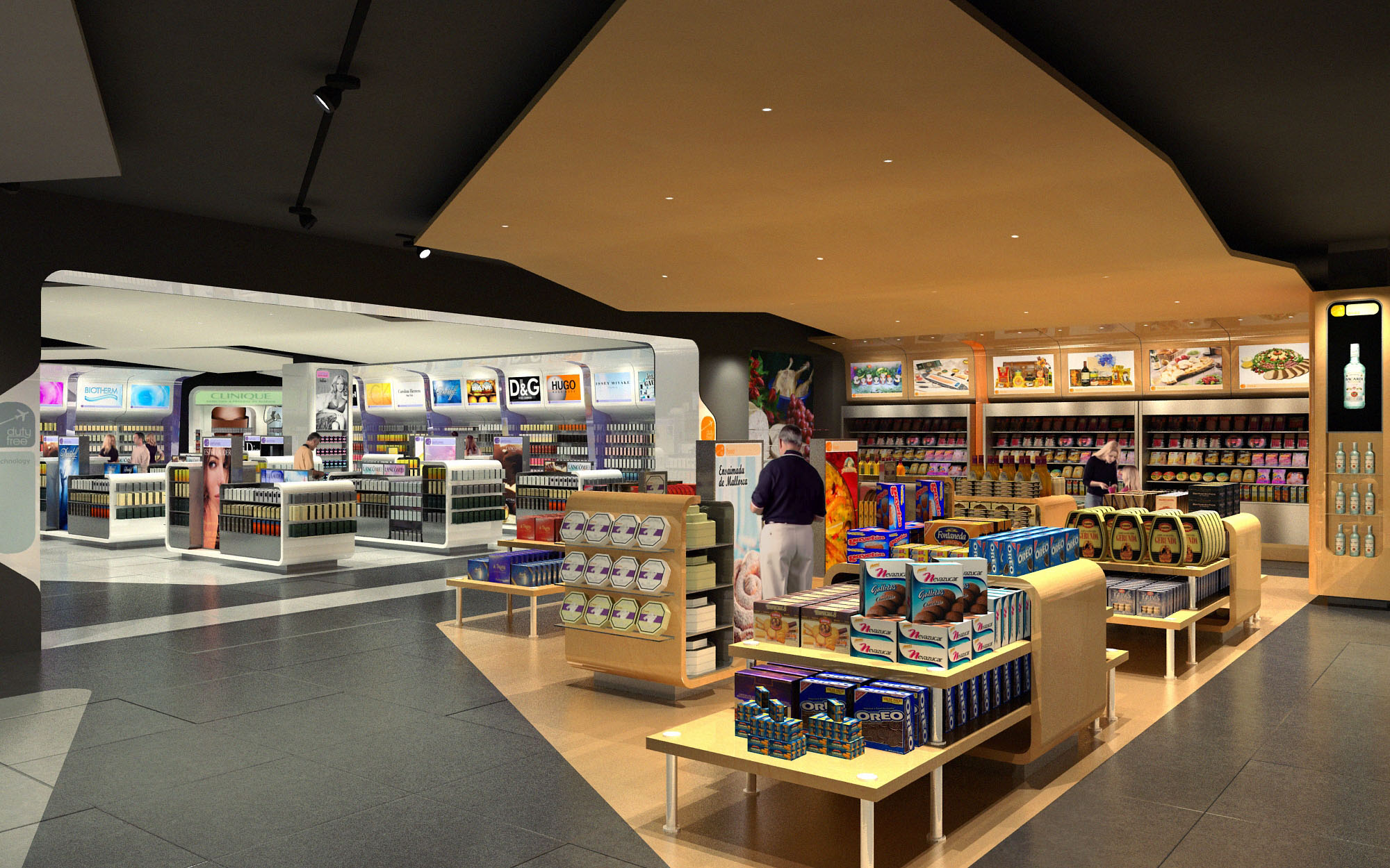
A strong chromatic code, based on a vivid green paired with black and neutral tones, defines the perimeter of each shop as a recognizable “gateway” in the airport environment. This continuous frame organizes the interior volumes, guiding circulation and creating a clear entrance threshold without the need for physical doors. The shops function as luminous islands within the terminal, deliberately porous and inviting from all sides.
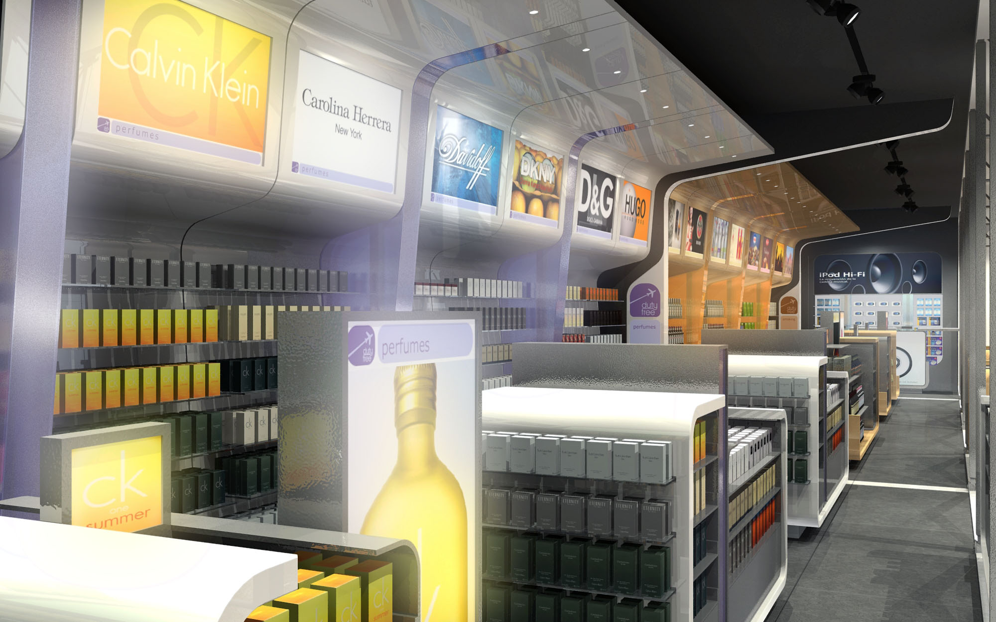
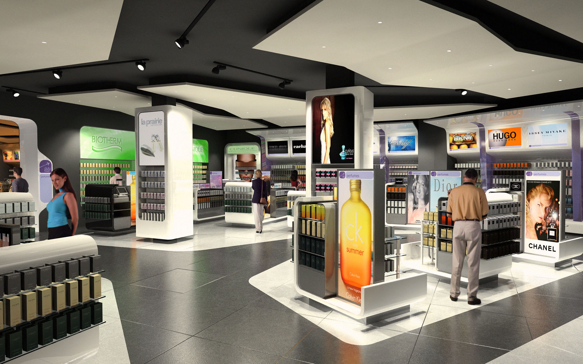
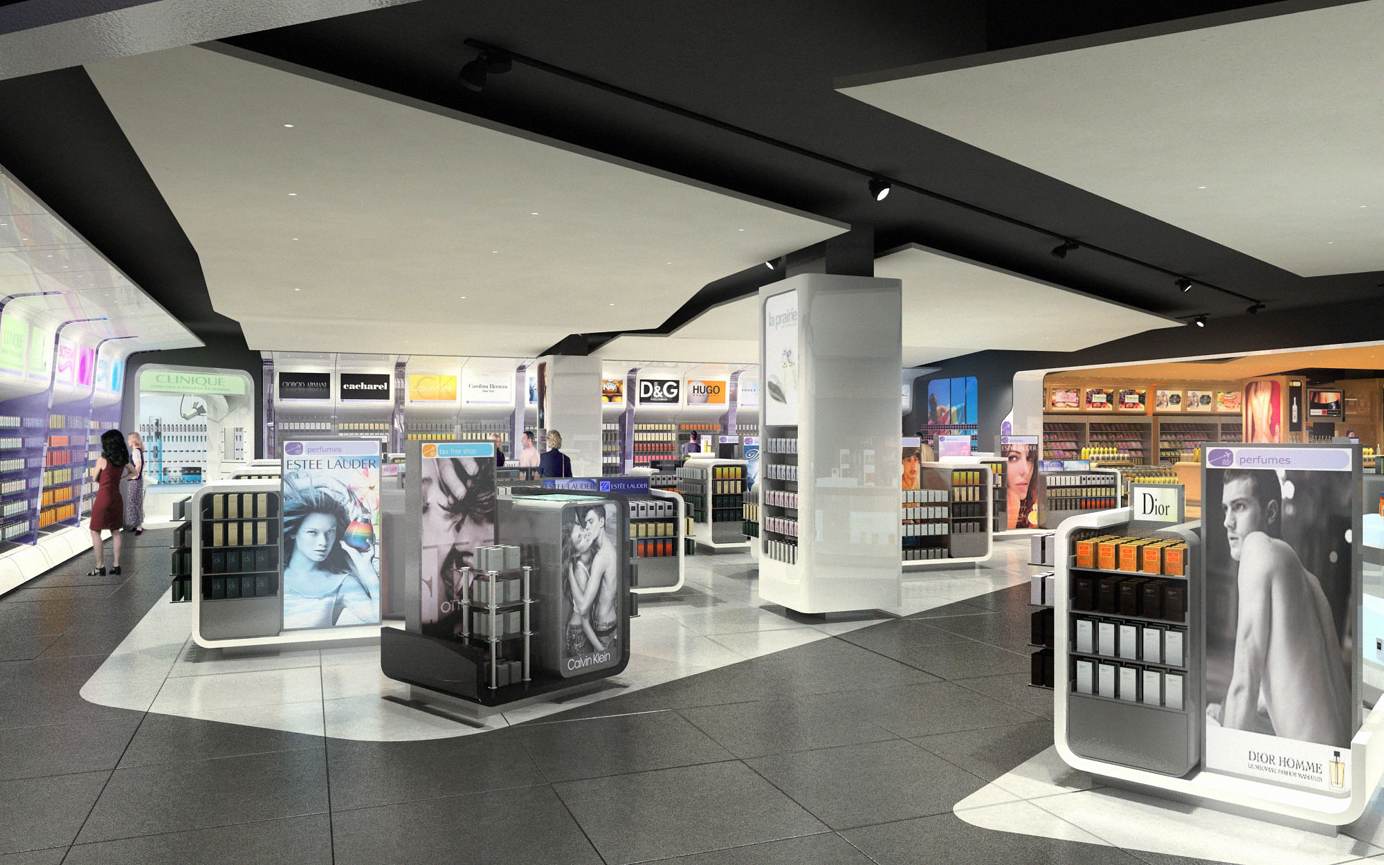
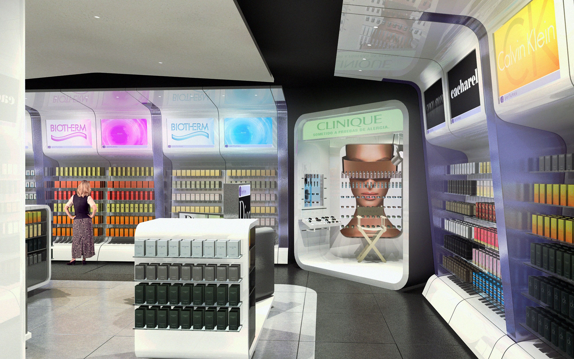
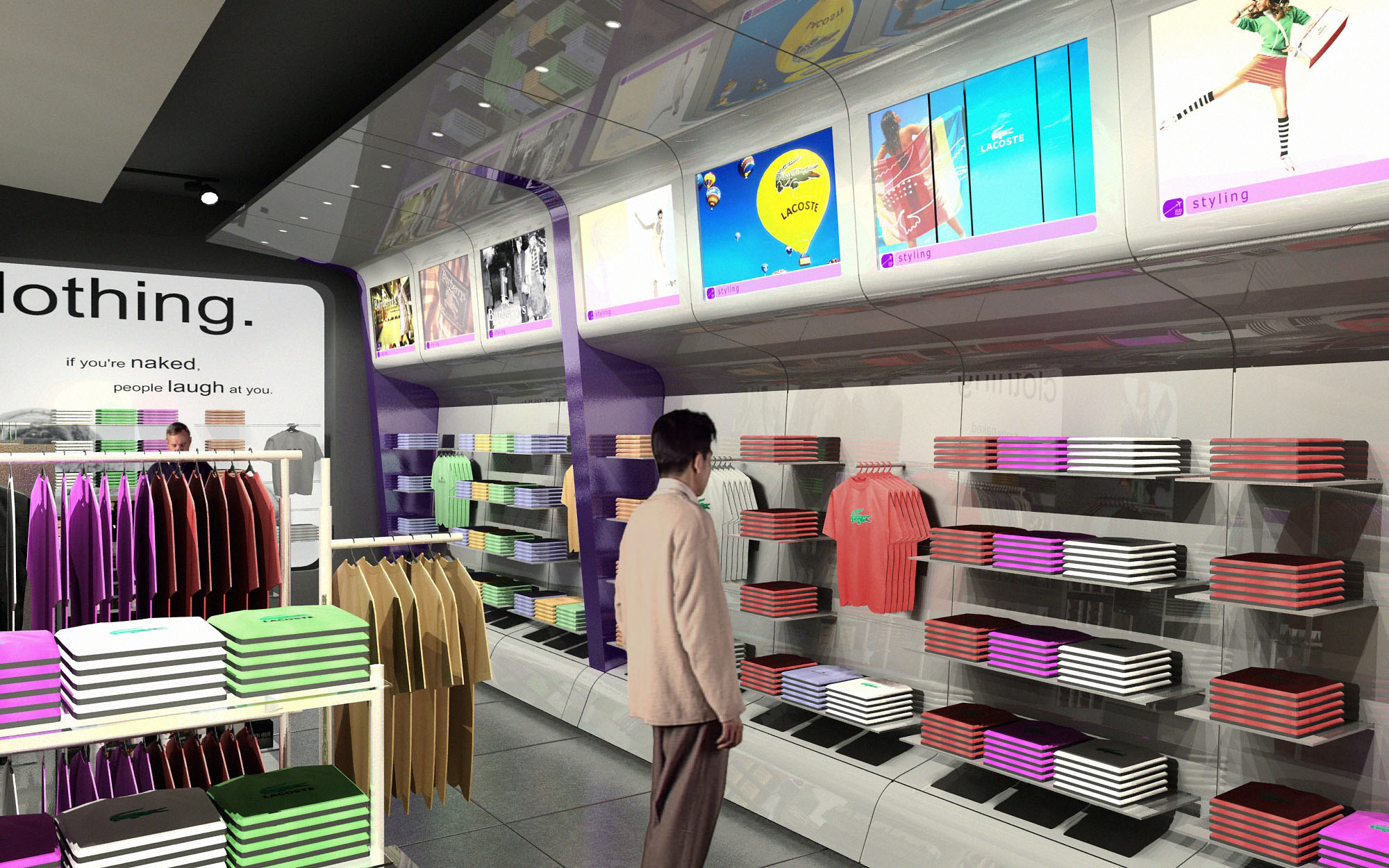
The interior layout follows a loop strategy that encourages a fluid, non-linear visit. Freestanding gondolas of controlled height structure transversal paths, while longitudinal aisles run parallel to the storefront, ensuring constant visual contact with boarding gates and wayfinding elements. The perimeter walls are dedicated to backlit shelving and brand zones, maximizing vertical merchandising surface and freeing the central area for flexible arrangements.
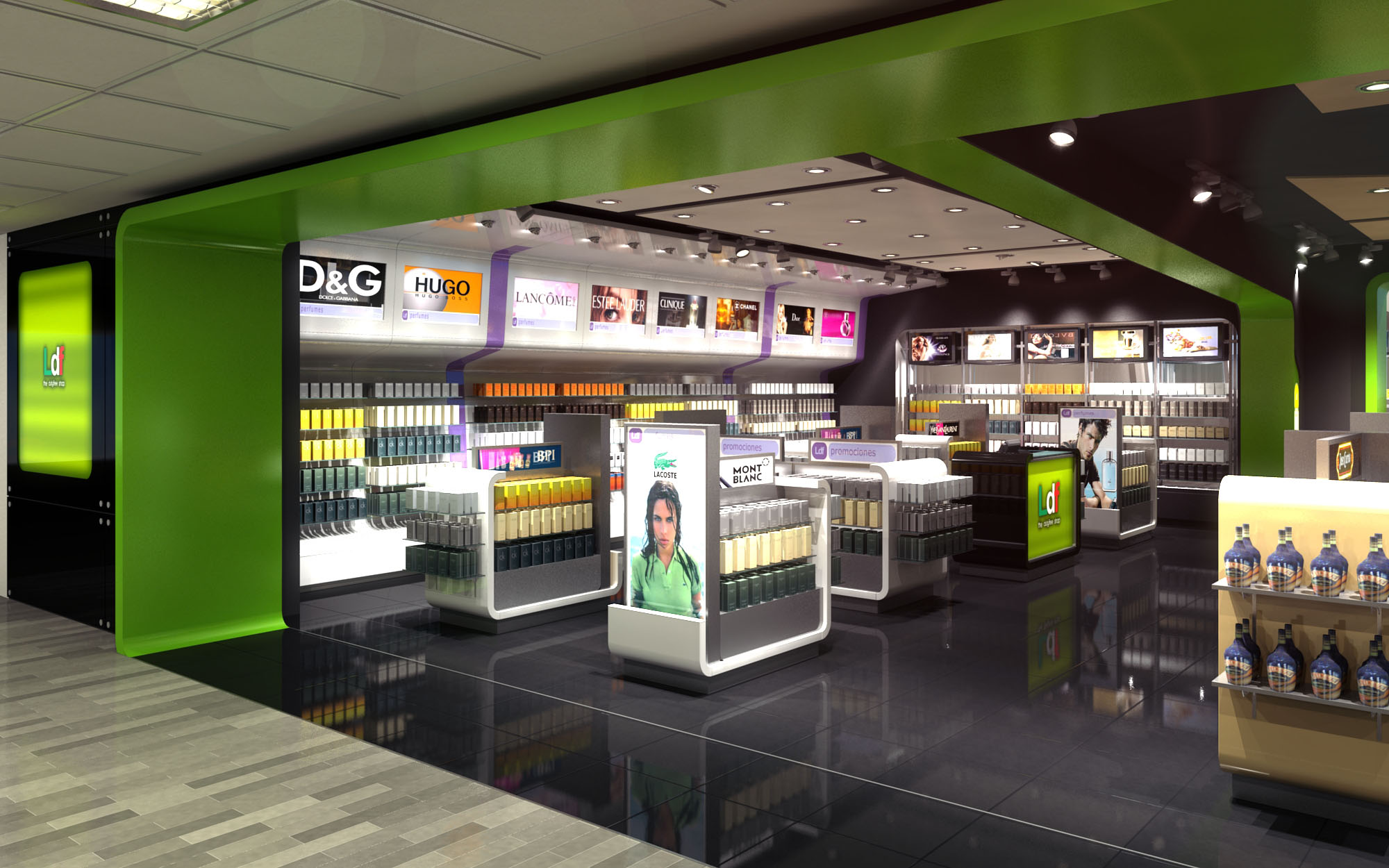
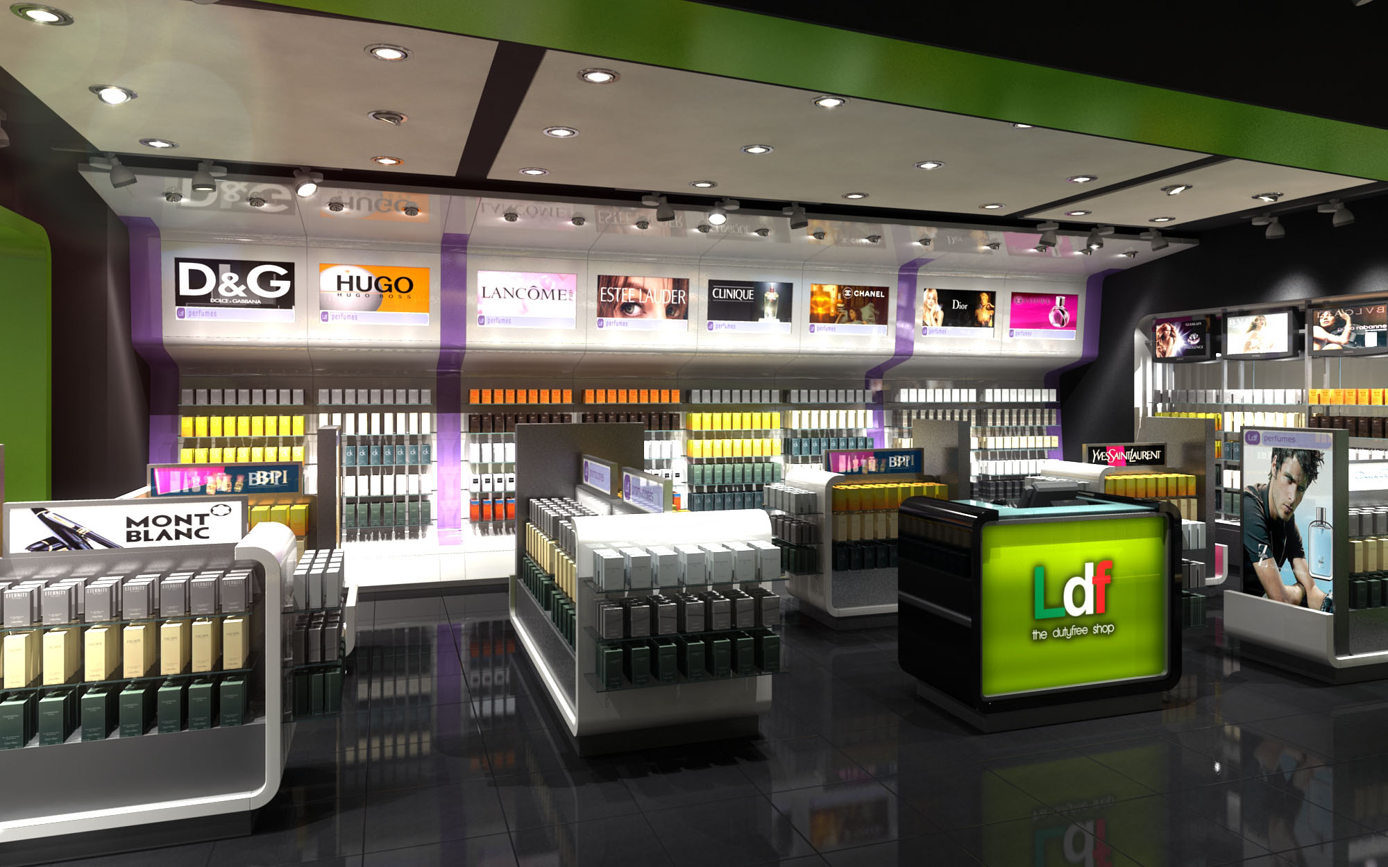
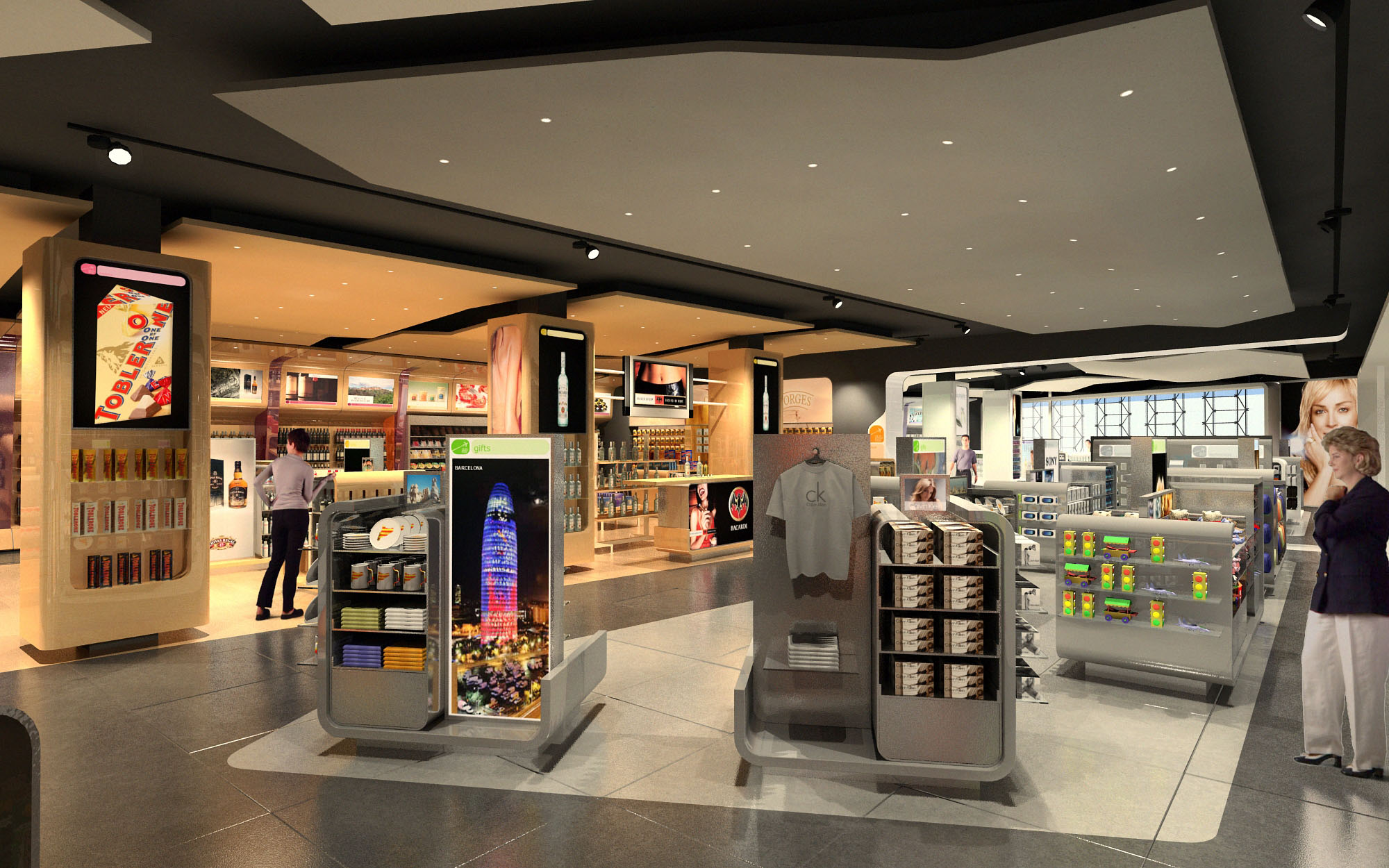
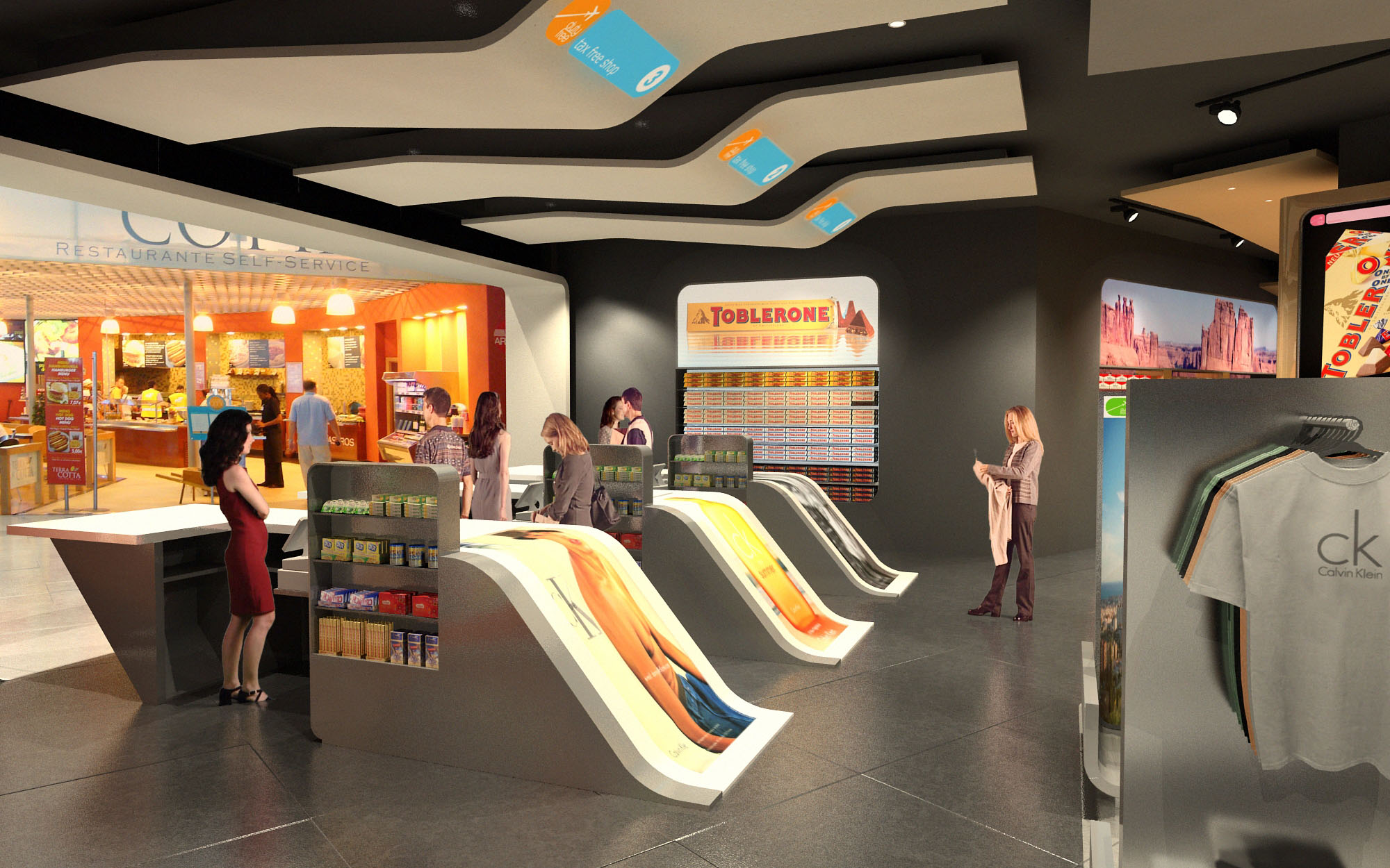
Special attention is given to dwell-time hotspots such as fragrance and cosmetics, positioned near the main entrance to capture immediate attention, while spirits and gifts are gradually revealed deeper inside the shop. This zoning responds to different buying behaviors: impulse purchases near the circulation edges and more deliberate selections in the inner core. Clear circulation spines avoid dead ends, facilitating quick transit for hurried passengers and comfortable browsing for those with more time.
The material palette contrasts a dark, reflective floor finish with the luminous white of the display fixtures and the bright green of the architectural frames. The high-gloss flooring amplifies light and merchandise reflections, intensifying the perception of abundance and sophistication. Wall claddings in black and deep grey act as a neutral canvas, allowing brand graphics and illuminated logos to stand out with high legibility.
Display furniture is predominantly white with rounded edges, emphasizing cleanliness and contemporary precision. Integrated light-boxes and digital imagery are calibrated to achieve uniform brightness and avoid glare. The repetition of the green portal motif along the perimeter reinforces brand recognition across the different locations, while also helping passengers quickly identify the tax-free areas within the terminal’s complex visual context.
Lighting is designed as a multilayered system that combines general ambient illumination with highly targeted accent lighting. Recessed downlights in the ceiling grid provide homogeneous base lighting, ensuring comfort and safety, while adjustable projectors focus on key product lines and promotional islands. The color temperature is selected in a neutral-white range to render skin tones and packaging faithfully, critical for cosmetics and premium beverages.
Continuous backlit panels above the shelving produce a luminous horizon line that visually expands the space and supports brand storytelling through interchangeable graphics. The interplay between indirect perimeter light and the glossy floor creates subtle reflections, making the shop visible from a distance. The lighting control system allows for energy-efficient dimming and scenario changes according to daytime, passenger peaks, and promotional campaigns.
The design integrates sustainable criteria through the specification of long-life LED lighting, reducing energy consumption and maintenance needs across the four projects. Modular ceiling grids facilitate access to technical installations and allow for progressive upgrades without invasive works. Where possible, finishes are selected for durability and easy cleaning, extending their lifecycle in a high-traffic environment.
Display units are conceived as modular, demountable elements that can be reconfigured as product ranges evolve or as different brands occupy the space. This approach reduces waste and supports circular use of furniture across multiple locations. The consistent architectural language across Spain and Mexico ensures that future expansions or refurbishments can reuse components and construction systems, optimizing logistics and minimizing the environmental footprint of subsequent phases.
LIST OF PROJECTS EXPERIENCE
Designed, Executed and/or Built Projects
SPAIN
1. DutyFree Shops - Barcelona - Local 100m2
2. DutyFree Shops - Barcelona - Local 600m2
3. DutyFree Shops - Ibiza - Local 1200m2
MEXICO
4. DutyFree Shops - Guadalajara - L46 - 185m2
The duty free shops are conceived as a continuous, highly legible commercial landscape that links various airport terminals in Spain and Mexico through a unified visual identity. The concept is based on framing and highlighting the product as the protagonist, while the architecture acts as a flexible backdrop that can adapt to different footprints and passenger flows. The design emphasizes openness and transparent sightlines, allowing travelers to understand the entire offer at a glance and to move intuitively between the different product categories.
A strong chromatic code, based on a vivid green paired with black and neutral tones, defines the perimeter of each shop as a recognizable “gateway” in the airport environment. This continuous frame organizes the interior volumes, guiding circulation and creating a clear entrance threshold without the need for physical doors. The shops function as luminous islands within the terminal, deliberately porous and inviting from all sides.
The interior layout follows a loop strategy that encourages a fluid, non-linear visit. Freestanding gondolas of controlled height structure transversal paths, while longitudinal aisles run parallel to the storefront, ensuring constant visual contact with boarding gates and wayfinding elements. The perimeter walls are dedicated to backlit shelving and brand zones, maximizing vertical merchandising surface and freeing the central area for flexible arrangements.
Special attention is given to dwell-time hotspots such as fragrance and cosmetics, positioned near the main entrance to capture immediate attention, while spirits and gifts are gradually revealed deeper inside the shop. This zoning responds to different buying behaviors: impulse purchases near the circulation edges and more deliberate selections in the inner core. Clear circulation spines avoid dead ends, facilitating quick transit for hurried passengers and comfortable browsing for those with more time.
The material palette contrasts a dark, reflective floor finish with the luminous white of the display fixtures and the bright green of the architectural frames. The high-gloss flooring amplifies light and merchandise reflections, intensifying the perception of abundance and sophistication. Wall claddings in black and deep grey act as a neutral canvas, allowing brand graphics and illuminated logos to stand out with high legibility.
Display furniture is predominantly white with rounded edges, emphasizing cleanliness and contemporary precision. Integrated light-boxes and digital imagery are calibrated to achieve uniform brightness and avoid glare. The repetition of the green portal motif along the perimeter reinforces brand recognition across the different locations, while also helping passengers quickly identify the tax-free areas within the terminal’s complex visual context.
Lighting is designed as a multilayered system that combines general ambient illumination with highly targeted accent lighting. Recessed downlights in the ceiling grid provide homogeneous base lighting, ensuring comfort and safety, while adjustable projectors focus on key product lines and promotional islands. The color temperature is selected in a neutral-white range to render skin tones and packaging faithfully, critical for cosmetics and premium beverages.
Continuous backlit panels above the shelving produce a luminous horizon line that visually expands the space and supports brand storytelling through interchangeable graphics. The interplay between indirect perimeter light and the glossy floor creates subtle reflections, making the shop visible from a distance. The lighting control system allows for energy-efficient dimming and scenario changes according to daytime, passenger peaks, and promotional campaigns.
The design integrates sustainable criteria through the specification of long-life LED lighting, reducing energy consumption and maintenance needs across the four projects. Modular ceiling grids facilitate access to technical installations and allow for progressive upgrades without invasive works. Where possible, finishes are selected for durability and easy cleaning, extending their lifecycle in a high-traffic environment.
Display units are conceived as modular, demountable elements that can be reconfigured as product ranges evolve or as different brands occupy the space. This approach reduces waste and supports circular use of furniture across multiple locations. The consistent architectural language across Spain and Mexico ensures that future expansions or refurbishments can reuse components and construction systems, optimizing logistics and minimizing the environmental footprint of subsequent phases.


Nuestras oficinas están en Barcelona, Cancún, Chicago y Santo Domingo, pero gracias a la tecnología podemos desarrollar proyectos en cualquier parte del mundo.
Barcelona
Bac de Roda 136
08020, Barcelona
Spain
Madrid
Av. de Buendía 11
19005 Guadalajara (Madrid)
Spain
Chicago
373 Hazel Ave, Apt A1
60022, Glencoe, Illinois
United States