

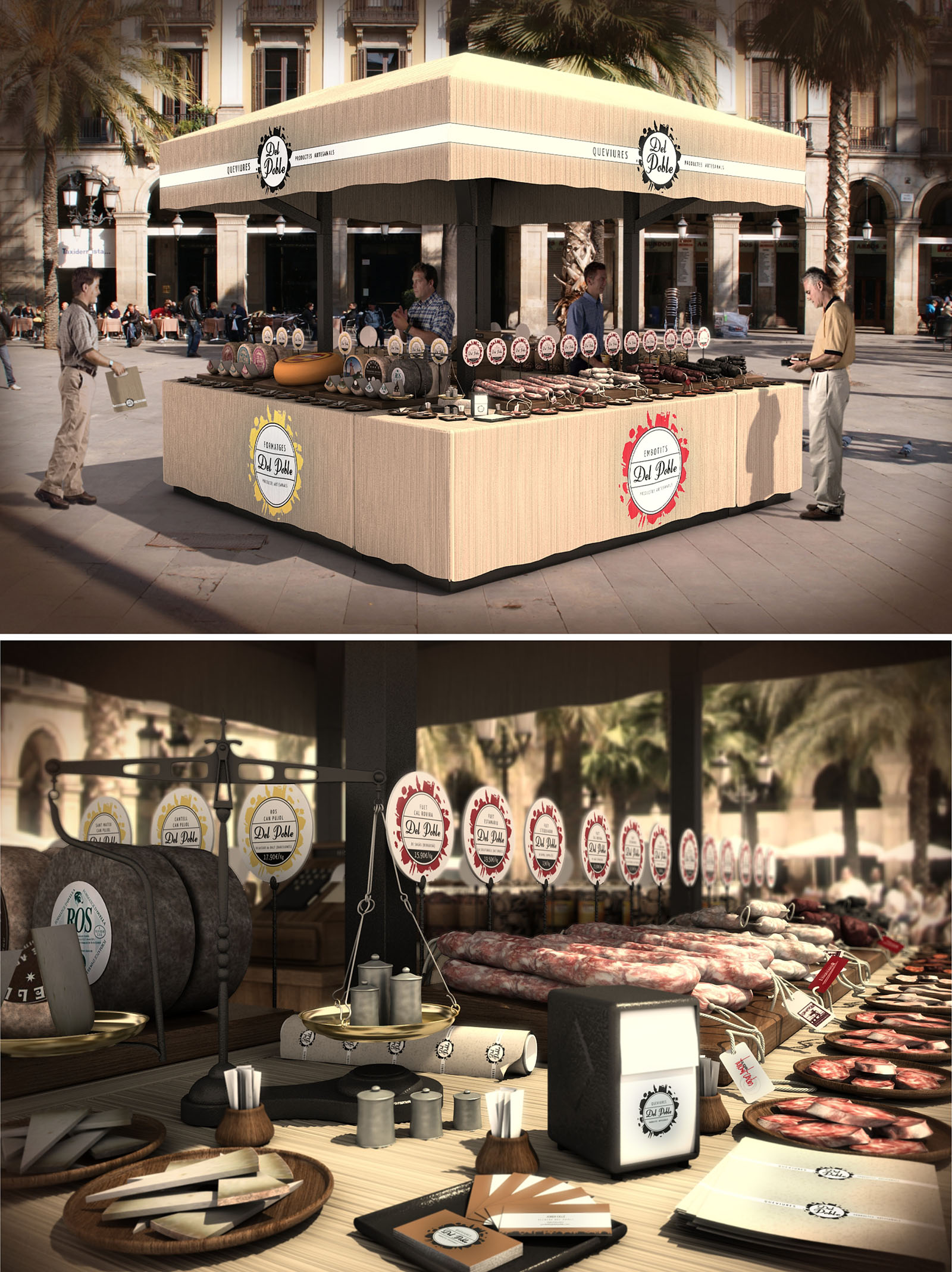
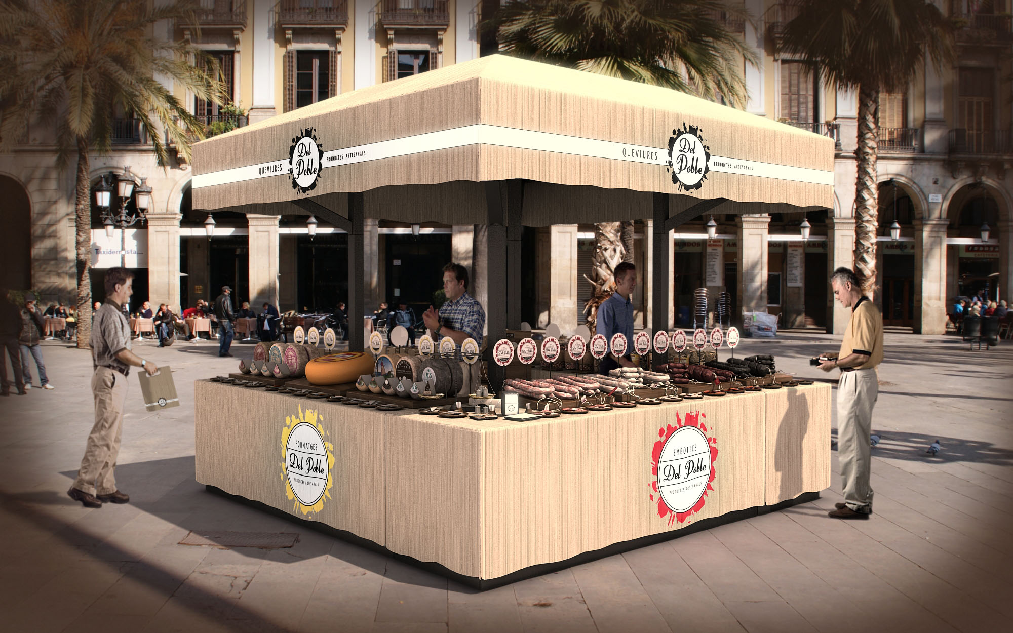
The Del Poble kiosk is conceived as a contemporary reinterpretation of the traditional market stall, designed to anchor itself in the urban life of Barcelona’s historic squares. The project emphasizes openness on all four sides, transforming the kiosk into a permeable island that invites approach from every direction and encourages direct interaction between vendor and visitor. The design merges the informality of a street market with a clear, recognizable visual identity, reinforcing the artisanal character of the products on display.
The volumetric composition is deliberately simple: a solid base, a lighter intermediate band, and a generous canopy that frames the kiosk as a civic object rather than a temporary stand. This tripartite structure ensures the kiosk is legible from a distance, functioning as a small urban landmark while remaining respectful to the surrounding historic façades and palm-lined plaza.
The kiosk is positioned as a freestanding cube, allowing continuous circulation around its perimeter and avoiding any visual obstruction of existing pedestrian flows. Its height and proportions are carefully calibrated to stay below the cornice lines of neighboring buildings and lampposts, maintaining a balanced relationship with the surrounding public space. The open-plan configuration removes physical barriers between interior and exterior, effectively extending the public realm onto the display counters.
The layout is organized through four continuous counter lines that form a perimeter ring. This arrangement maximizes display surface while keeping the center uncluttered for storage, preparation and staff circulation. Strategic corner openings generate natural access points for staff, enabling efficient movement between the service zone and each façade of the kiosk. This 360-degree service approach enhances visibility of the products and distributes customer queues evenly around the stand.
The kiosk uses a restrained material palette that draws on the tactile memory of traditional markets. The base counters are clad in a light, wood-textured surface that provides warmth and a neutral background for the intense colors of cured meats and cold cuts. This wood finish continues onto the horizontal worktops, where a higher-resistance laminate or sealed timber is proposed to withstand daily cleaning and heavy use.
Dark metal uprights and frames create a clear structural rhythm and visually anchor the canopy. The contrast between the warm wooden planes and the dark metallic elements underlines the crafted yet robust character of the kiosk. Edge detailing is kept clean and flush, avoiding unnecessary ornamentation and allowing the branding elements to stand out as the primary graphic layer.
The identity of Del Poble is integrated architecturally rather than applied superficially. Circular logos and color-coded labels form a continuous horizon line along the inner side of the canopy and above the product displays. This repetitive graphic system functions both as signage and as wayfinding, assisting the customer in reading product typologies and origins at a glance.
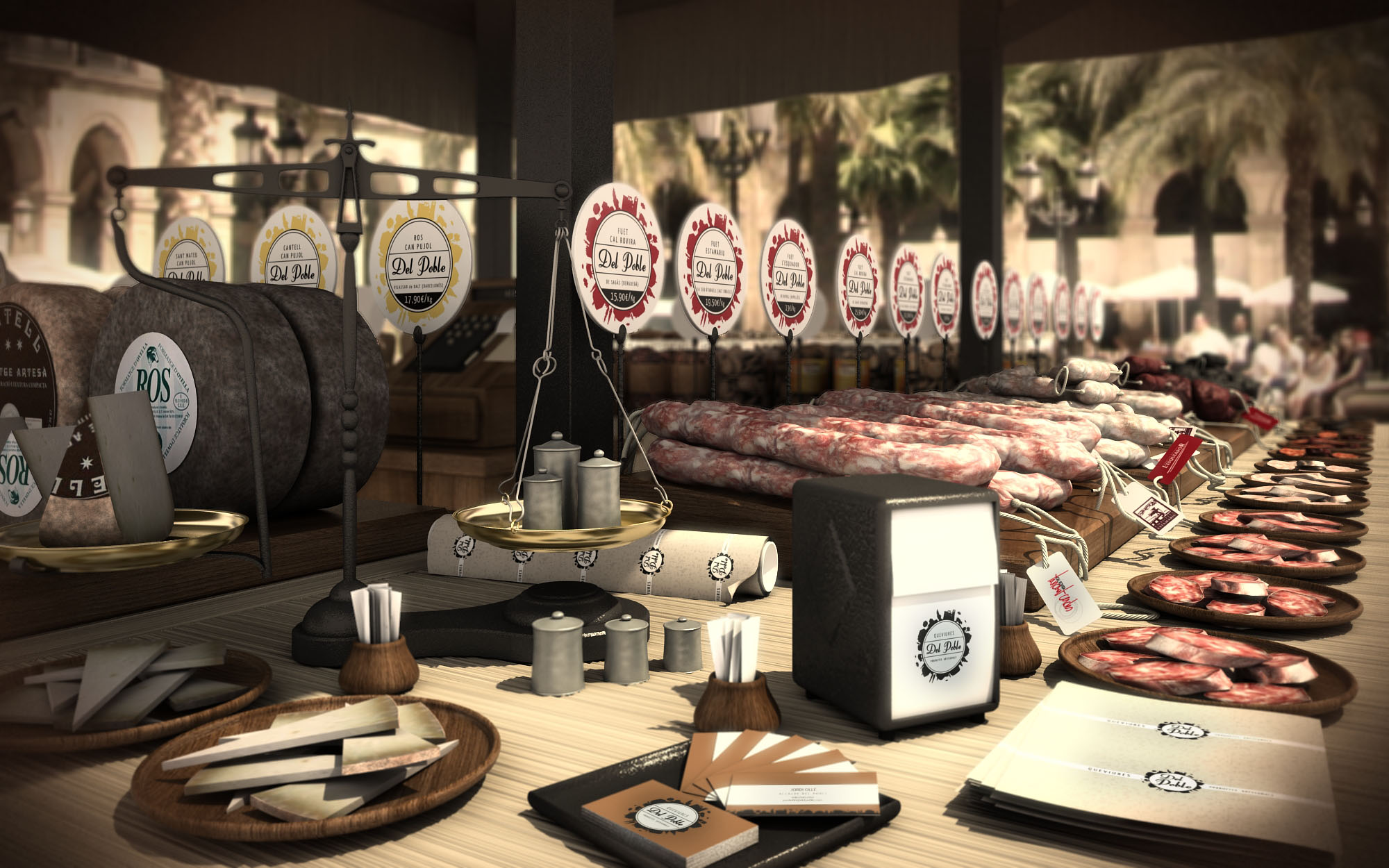
Products are arranged on tiered wooden platters and boards, emphasizing horizontality and abundance. The almost museum-like alignment of sausages, hams and sliced meats elevates everyday food into curated objects while still retaining an approachable, market atmosphere. Auxiliary elements such as scales, napkin dispensers and packaging have been designed or selected to echo the same palette and graphic language, ensuring visual coherence across every touchpoint.
The kiosk prioritizes ergonomics and operational efficiency. Counter heights are calibrated for both comfortable service and clear visibility of the displayed goods, allowing customers to observe textures and cuts without bending or stretching. The central working area is conceived as a compact back-of-house, with under-counter storage for refrigerated units, packaging, tools and waste separation systems.
The open edges facilitate informal interaction, enabling staff to engage with customers across short distances and maintain visual contact even during peak periods. The large overhanging canopy offers shade and reduces glare on the product surfaces, improving color perception and comfort for users standing around the kiosk.
Sustainability is addressed through the kiosk’s compact footprint, material selection and potential for reusability. The design favors durable, replaceable cladding panels over disposable decorative elements, extending the service life of the structure and minimizing maintenance interventions. Wood-based components are envisaged from certified sources, using finishes with low volatile organic compounds to reduce environmental impact and improve air quality for staff.
The open-air configuration reduces the need for mechanical ventilation and artificial lighting during daytime, relying instead on natural cross-ventilation and daylight. Integrated LED strips can be added beneath the canopy for low-energy evening illumination, highlighting the products without producing excessive heat. The kiosk’s modular structure allows for disassembly, relocation or future adaptation to different public spaces, supporting a circular approach to urban furniture and ephemeral retail architecture.
The Del Poble kiosk is conceived as a contemporary reinterpretation of the traditional market stall, designed to anchor itself in the urban life of Barcelona’s historic squares. The project emphasizes openness on all four sides, transforming the kiosk into a permeable island that invites approach from every direction and encourages direct interaction between vendor and visitor. The design merges the informality of a street market with a clear, recognizable visual identity, reinforcing the artisanal character of the products on display.
The volumetric composition is deliberately simple: a solid base, a lighter intermediate band, and a generous canopy that frames the kiosk as a civic object rather than a temporary stand. This tripartite structure ensures the kiosk is legible from a distance, functioning as a small urban landmark while remaining respectful to the surrounding historic façades and palm-lined plaza.
The kiosk is positioned as a freestanding cube, allowing continuous circulation around its perimeter and avoiding any visual obstruction of existing pedestrian flows. Its height and proportions are carefully calibrated to stay below the cornice lines of neighboring buildings and lampposts, maintaining a balanced relationship with the surrounding public space. The open-plan configuration removes physical barriers between interior and exterior, effectively extending the public realm onto the display counters.
The layout is organized through four continuous counter lines that form a perimeter ring. This arrangement maximizes display surface while keeping the center uncluttered for storage, preparation and staff circulation. Strategic corner openings generate natural access points for staff, enabling efficient movement between the service zone and each façade of the kiosk. This 360-degree service approach enhances visibility of the products and distributes customer queues evenly around the stand.
The kiosk uses a restrained material palette that draws on the tactile memory of traditional markets. The base counters are clad in a light, wood-textured surface that provides warmth and a neutral background for the intense colors of cured meats and cold cuts. This wood finish continues onto the horizontal worktops, where a higher-resistance laminate or sealed timber is proposed to withstand daily cleaning and heavy use.
Dark metal uprights and frames create a clear structural rhythm and visually anchor the canopy. The contrast between the warm wooden planes and the dark metallic elements underlines the crafted yet robust character of the kiosk. Edge detailing is kept clean and flush, avoiding unnecessary ornamentation and allowing the branding elements to stand out as the primary graphic layer.
The identity of Del Poble is integrated architecturally rather than applied superficially. Circular logos and color-coded labels form a continuous horizon line along the inner side of the canopy and above the product displays. This repetitive graphic system functions both as signage and as wayfinding, assisting the customer in reading product typologies and origins at a glance.
Products are arranged on tiered wooden platters and boards, emphasizing horizontality and abundance. The almost museum-like alignment of sausages, hams and sliced meats elevates everyday food into curated objects while still retaining an approachable, market atmosphere. Auxiliary elements such as scales, napkin dispensers and packaging have been designed or selected to echo the same palette and graphic language, ensuring visual coherence across every touchpoint.
The kiosk prioritizes ergonomics and operational efficiency. Counter heights are calibrated for both comfortable service and clear visibility of the displayed goods, allowing customers to observe textures and cuts without bending or stretching. The central working area is conceived as a compact back-of-house, with under-counter storage for refrigerated units, packaging, tools and waste separation systems.
The open edges facilitate informal interaction, enabling staff to engage with customers across short distances and maintain visual contact even during peak periods. The large overhanging canopy offers shade and reduces glare on the product surfaces, improving color perception and comfort for users standing around the kiosk.
Sustainability is addressed through the kiosk’s compact footprint, material selection and potential for reusability. The design favors durable, replaceable cladding panels over disposable decorative elements, extending the service life of the structure and minimizing maintenance interventions. Wood-based components are envisaged from certified sources, using finishes with low volatile organic compounds to reduce environmental impact and improve air quality for staff.
The open-air configuration reduces the need for mechanical ventilation and artificial lighting during daytime, relying instead on natural cross-ventilation and daylight. Integrated LED strips can be added beneath the canopy for low-energy evening illumination, highlighting the products without producing excessive heat. The kiosk’s modular structure allows for disassembly, relocation or future adaptation to different public spaces, supporting a circular approach to urban furniture and ephemeral retail architecture.


Nuestras oficinas están en Barcelona, Cancún, Chicago y Santo Domingo, pero gracias a la tecnología podemos desarrollar proyectos en cualquier parte del mundo.
Barcelona
Bac de Roda 136
08020, Barcelona
Spain
Madrid
Av. de Buendía 11
19005 Guadalajara (Madrid)
Spain
Chicago
373 Hazel Ave, Apt A1
60022, Glencoe, Illinois
United States