

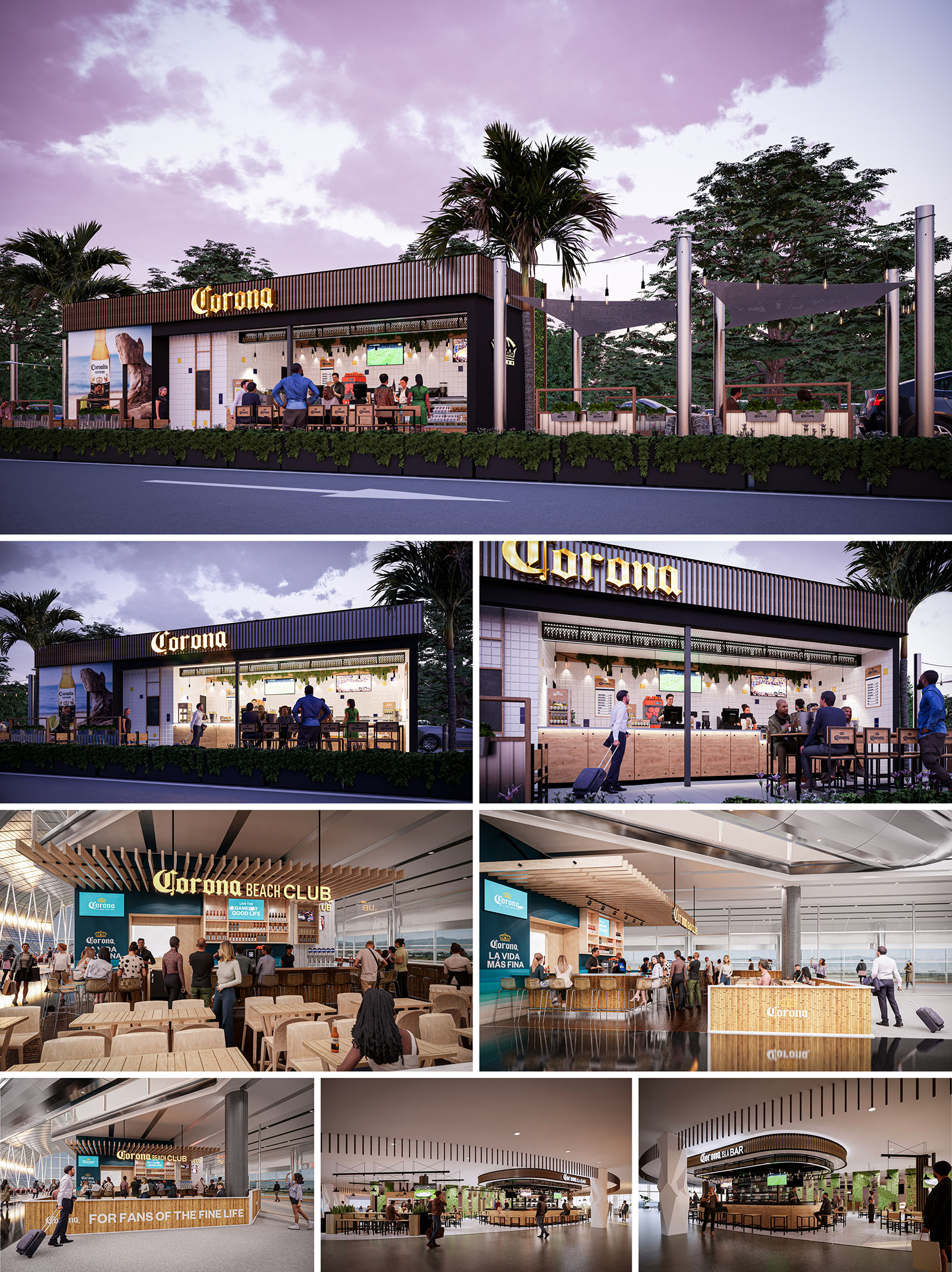
The CORONA project establishes a unified architectural language for a family of bar and restaurant formats deployed across Mexico, Spain and the USA. The concept translates the brand’s beach heritage into a contemporary, modular system capable of adapting to roadside locations, airport terminals and interior commercial settings. Each venue is conceived as an open, permeable pavilion that blurs the boundary between bar, street and concourse, promoting visual connection and a relaxed, resort-like atmosphere within urban and transit environments.
The design narrative is built around three core ideas: an honest expression of materials, a clear and legible façade that functions as large-scale signage, and a flexible interior landscape where bar, kitchen and seating can reconfigure according to local requirements. This combination allows the image of a beach club to be consistently recognizable while remaining sensitive to different scales and contexts.
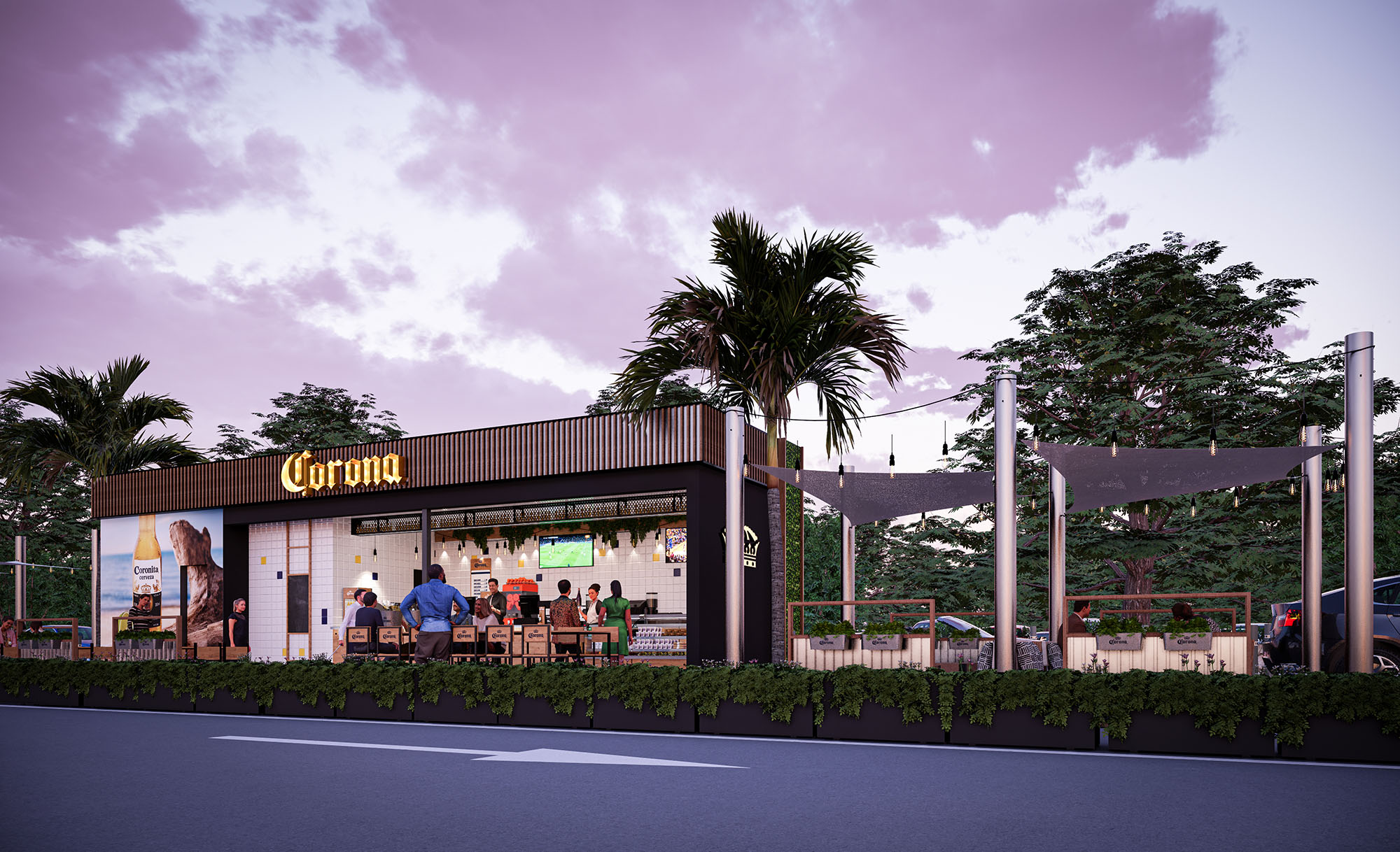
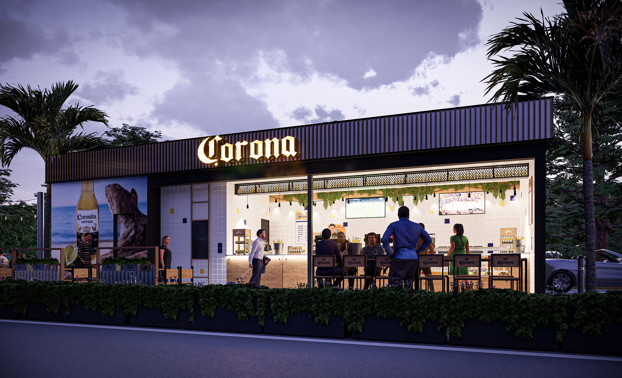
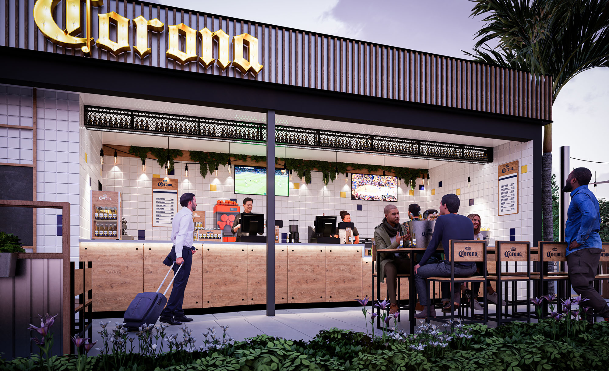
The roadside typology is conceived as a linear bar volume with a strong street-facing elevation. A deep canopy and a fully openable front façade create a shaded transitional terrace, functioning as an intermediate zone between the interior counter and the exterior seating. The bar line runs parallel to the façade to maximize visibility of preparation areas and product displays from the road, turning the service zone into a dynamic, animated showcase.
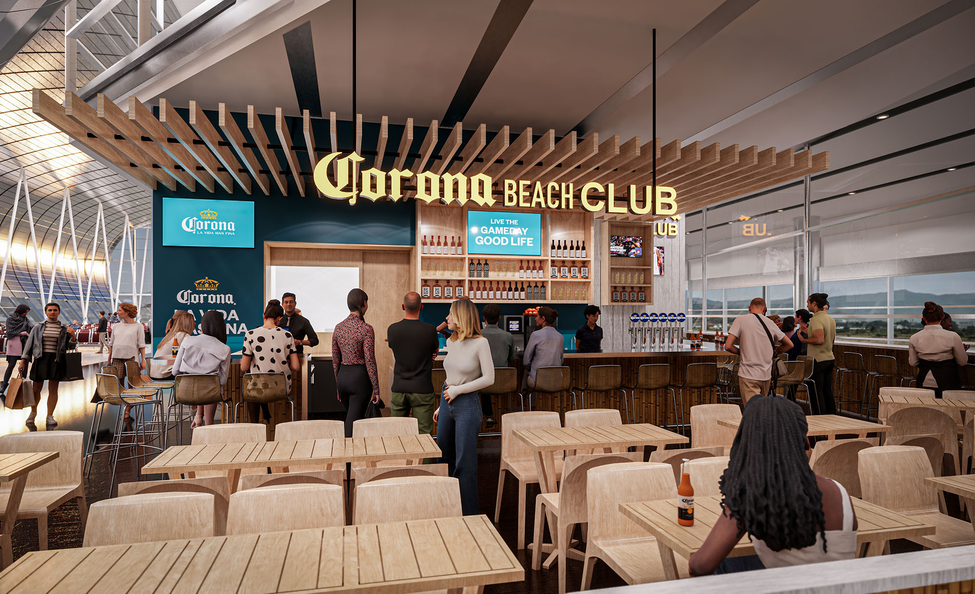
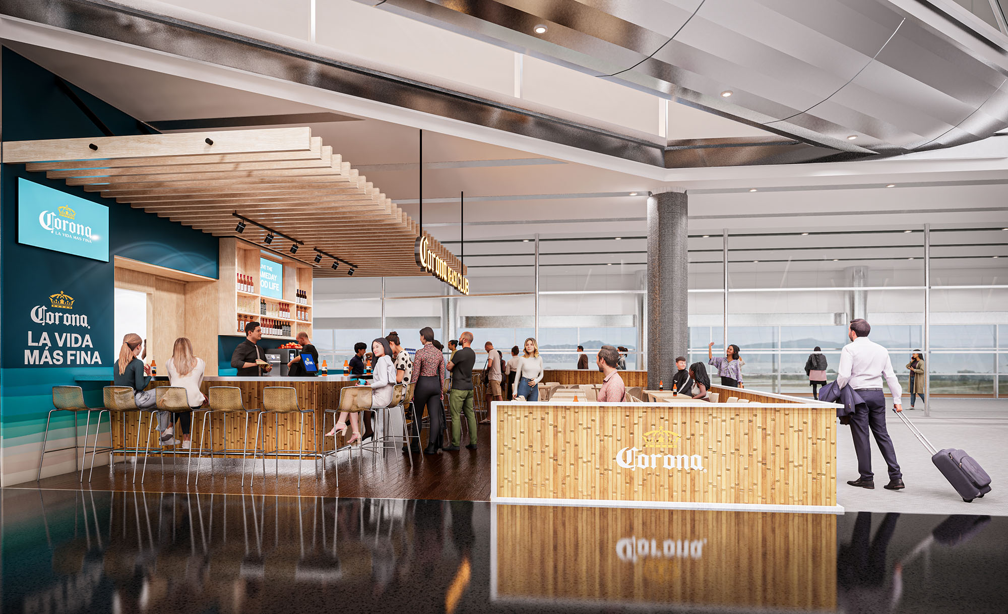
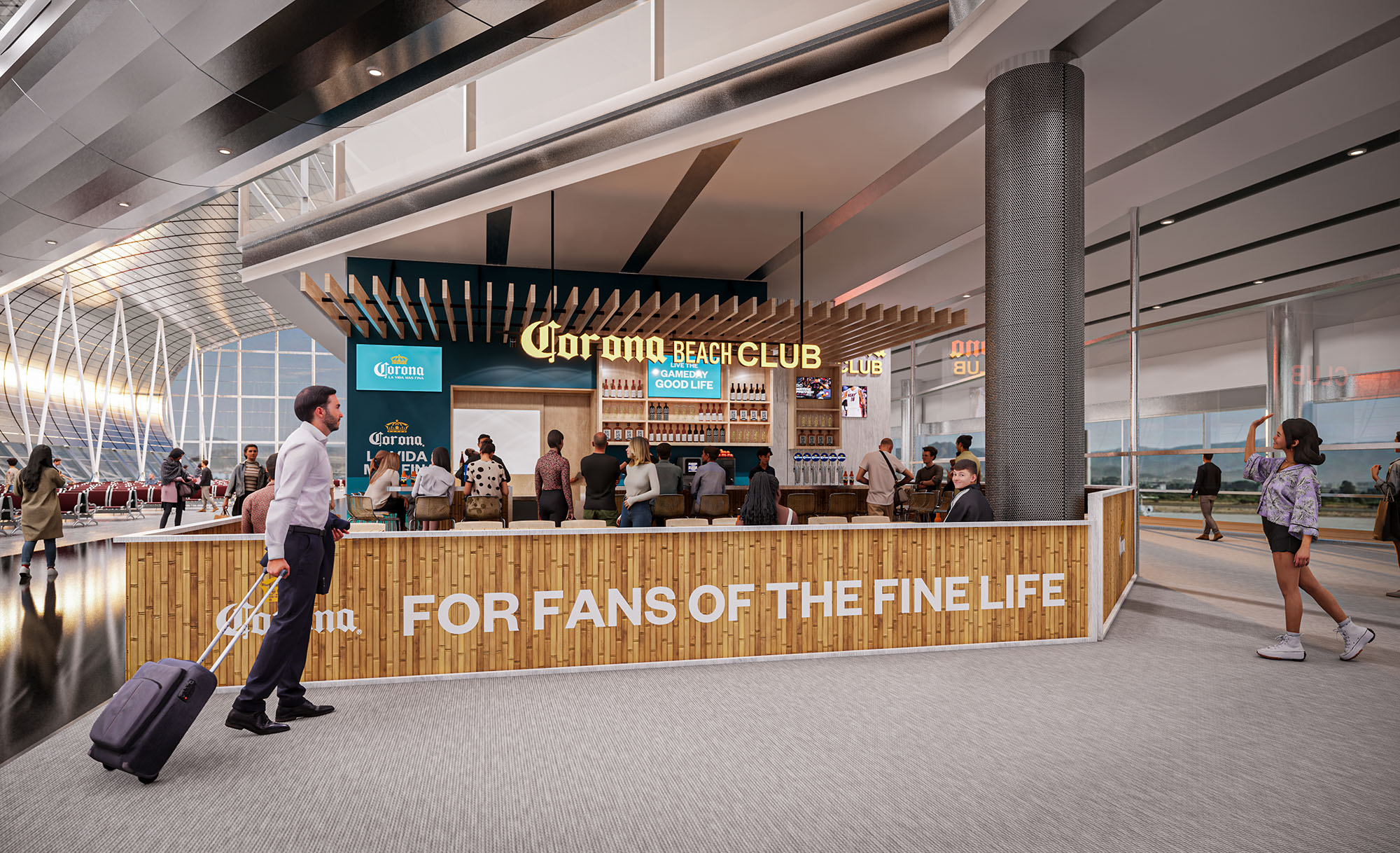
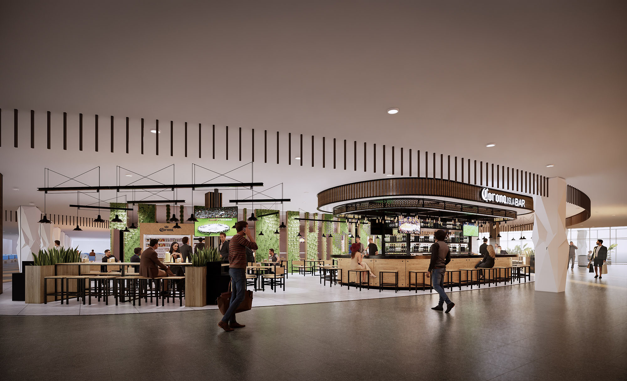
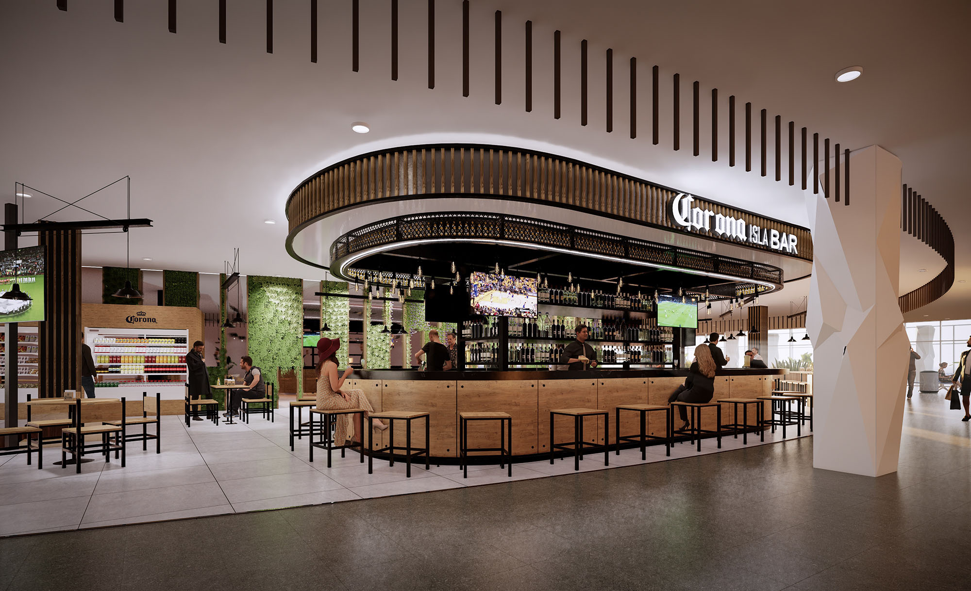
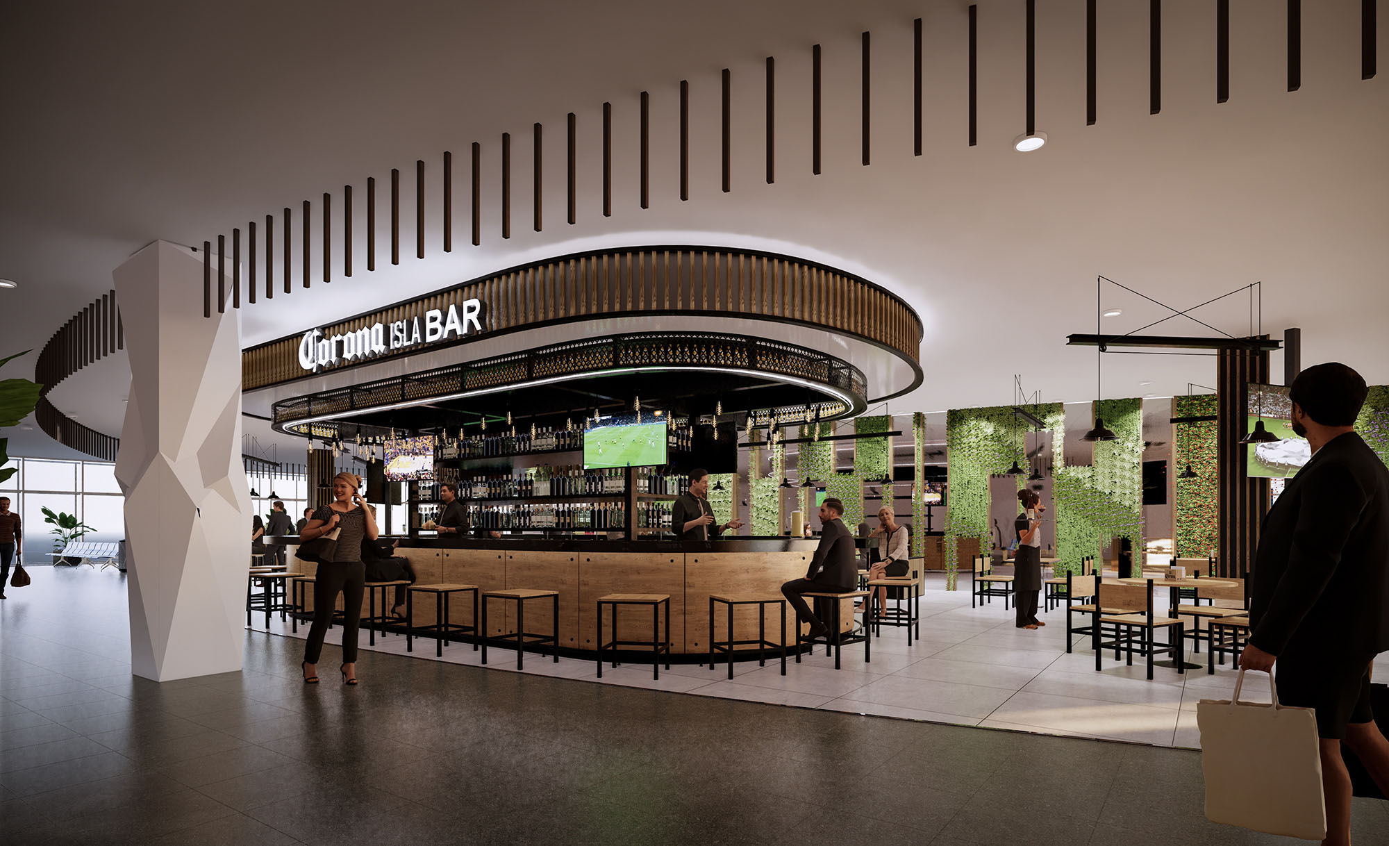
In airport locations the layout becomes insular and radial. Bars are often positioned as islands within the concourse, with 360-degree visibility and multiple approach points, or as open-fronted units anchored to a linear storefront. Seating radiates outward in concentric bands of high stools at the bar, communal tables and then more relaxed perimetral seating. This hierarchy ensures efficient circulation around the unit while maintaining clear sightlines to departure gates and wayfinding elements.
The material palette is deliberately warm and tactile, dominated by light-toned woods, white ceramic tiles and black metal framing. Timber is used for bar fronts, soffits, ceiling slats and loose furniture, evoking beach deck structures and boardwalks. White tiling provides a clean, hygienic backdrop for the preparation areas, enhancing brightness and reflecting natural and artificial light deep into the space. Black steel profiles frame openings and signage, adding precision and durability.
The color strategy centers on the brand’s iconic tones: sandy neutrals, turquoise accents and signature yellow logotypes. Illuminated signage is carefully integrated into the architecture, often floating above the bar in three-dimensional letters or embedded into linear canopies. Large-scale graphic panels and digital screens provide flexibility for campaigns while maintaining a consistent visual identity. The result is an environment that reads simultaneously as a recognizable brand space and as a coherent piece of interior architecture.
The interior design emphasizes informality and sociability. Furniture is predominantly loose and modular, with a mix of high communal tables, individual stools and more intimate two- and four-top settings. Simple timber chairs and stools with metal bases are chosen for robustness and ease of maintenance, while their repetition across locations reinforces the family identity. Bar counters are expressed as solid, monolithic volumes with clear working fronts and recessed toe spaces for ergonomic comfort.
Lighting plays a key role in generating atmosphere. Warm, low-glare pendant fixtures and integrated linear LEDs beneath shelves and canopies create a golden, sunset-like ambience that contrasts with the often neutral lighting of airport concourses. In outdoor venues, string lights and minimal pole-mounted luminaires articulate terraces and emphasize the evening character of the spaces. Illuminated backbars highlight product displays, turning bottles into luminous vertical textures that act as both décor and signage.
In exterior formats, landscaped planters define the edge between public road or parking areas and the bar terrace, acting as both protective buffer and biophilic element. Shade is provided by tensile fabric sails and extended canopies, reducing direct solar gain and increasing user comfort in warm climates. The terraces remain deliberately permeable, enabling natural cross-ventilation and maintaining visual continuity with surrounding greenery.
Sustainability criteria inform material selection and operational strategies. Preference is given to durable, easily replaceable components arranged in modular systems, which facilitates maintenance and reduces waste across multiple locations. Timber elements are designed for repeatable fabrication, optimizing cutting patterns and minimizing offcuts. LED lighting and energy-efficient equipment are specified to reduce operational consumption, while the open layouts maximize the use of natural light and ventilation wherever climate allows, decreasing reliance on mechanical conditioning.
LIST OF PROJECTS EXPERIENCE
Designed, Executed and/or Built Projects
MEXICO
1. Corona - Los Cabos - PB3
SPAIN
2. Corona - Ibiza - L058
USA
3. Corona - Houston - F06
4. Corona - Miami
The CORONA project establishes a unified architectural language for a family of bar and restaurant formats deployed across Mexico, Spain and the USA. The concept translates the brand’s beach heritage into a contemporary, modular system capable of adapting to roadside locations, airport terminals and interior commercial settings. Each venue is conceived as an open, permeable pavilion that blurs the boundary between bar, street and concourse, promoting visual connection and a relaxed, resort-like atmosphere within urban and transit environments.
The design narrative is built around three core ideas: an honest expression of materials, a clear and legible façade that functions as large-scale signage, and a flexible interior landscape where bar, kitchen and seating can reconfigure according to local requirements. This combination allows the image of a beach club to be consistently recognizable while remaining sensitive to different scales and contexts.
The roadside typology is conceived as a linear bar volume with a strong street-facing elevation. A deep canopy and a fully openable front façade create a shaded transitional terrace, functioning as an intermediate zone between the interior counter and the exterior seating. The bar line runs parallel to the façade to maximize visibility of preparation areas and product displays from the road, turning the service zone into a dynamic, animated showcase.
In airport locations the layout becomes insular and radial. Bars are often positioned as islands within the concourse, with 360-degree visibility and multiple approach points, or as open-fronted units anchored to a linear storefront. Seating radiates outward in concentric bands of high stools at the bar, communal tables and then more relaxed perimetral seating. This hierarchy ensures efficient circulation around the unit while maintaining clear sightlines to departure gates and wayfinding elements.
The material palette is deliberately warm and tactile, dominated by light-toned woods, white ceramic tiles and black metal framing. Timber is used for bar fronts, soffits, ceiling slats and loose furniture, evoking beach deck structures and boardwalks. White tiling provides a clean, hygienic backdrop for the preparation areas, enhancing brightness and reflecting natural and artificial light deep into the space. Black steel profiles frame openings and signage, adding precision and durability.
The color strategy centers on the brand’s iconic tones: sandy neutrals, turquoise accents and signature yellow logotypes. Illuminated signage is carefully integrated into the architecture, often floating above the bar in three-dimensional letters or embedded into linear canopies. Large-scale graphic panels and digital screens provide flexibility for campaigns while maintaining a consistent visual identity. The result is an environment that reads simultaneously as a recognizable brand space and as a coherent piece of interior architecture.
The interior design emphasizes informality and sociability. Furniture is predominantly loose and modular, with a mix of high communal tables, individual stools and more intimate two- and four-top settings. Simple timber chairs and stools with metal bases are chosen for robustness and ease of maintenance, while their repetition across locations reinforces the family identity. Bar counters are expressed as solid, monolithic volumes with clear working fronts and recessed toe spaces for ergonomic comfort.
Lighting plays a key role in generating atmosphere. Warm, low-glare pendant fixtures and integrated linear LEDs beneath shelves and canopies create a golden, sunset-like ambience that contrasts with the often neutral lighting of airport concourses. In outdoor venues, string lights and minimal pole-mounted luminaires articulate terraces and emphasize the evening character of the spaces. Illuminated backbars highlight product displays, turning bottles into luminous vertical textures that act as both décor and signage.
In exterior formats, landscaped planters define the edge between public road or parking areas and the bar terrace, acting as both protective buffer and biophilic element. Shade is provided by tensile fabric sails and extended canopies, reducing direct solar gain and increasing user comfort in warm climates. The terraces remain deliberately permeable, enabling natural cross-ventilation and maintaining visual continuity with surrounding greenery.
Sustainability criteria inform material selection and operational strategies. Preference is given to durable, easily replaceable components arranged in modular systems, which facilitates maintenance and reduces waste across multiple locations. Timber elements are designed for repeatable fabrication, optimizing cutting patterns and minimizing offcuts. LED lighting and energy-efficient equipment are specified to reduce operational consumption, while the open layouts maximize the use of natural light and ventilation wherever climate allows, decreasing reliance on mechanical conditioning.


Nuestras oficinas están en Barcelona, Cancún, Chicago y Santo Domingo, pero gracias a la tecnología podemos desarrollar proyectos en cualquier parte del mundo.
Barcelona
Bac de Roda 136
08020, Barcelona
Spain
Madrid
Av. de Buendía 11
19005 Guadalajara (Madrid)
Spain
Chicago
373 Hazel Ave, Apt A1
60022, Glencoe, Illinois
United States