

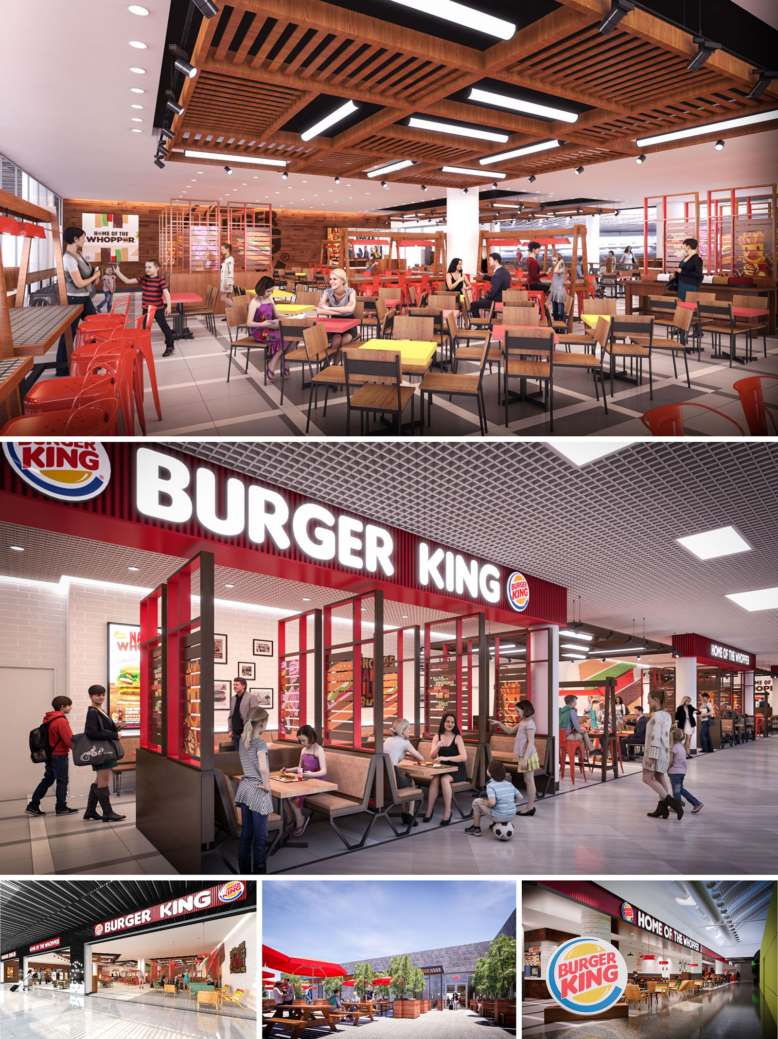
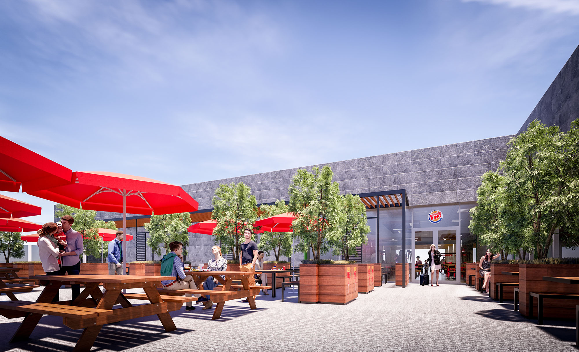
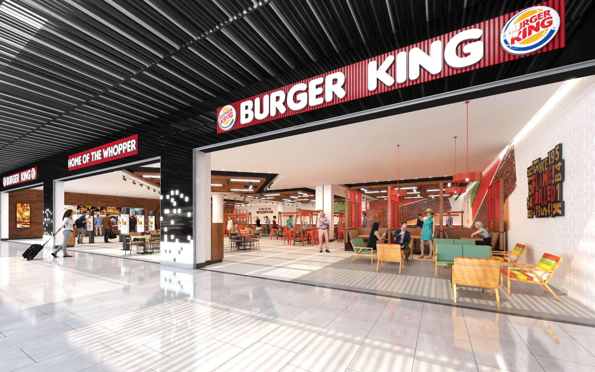
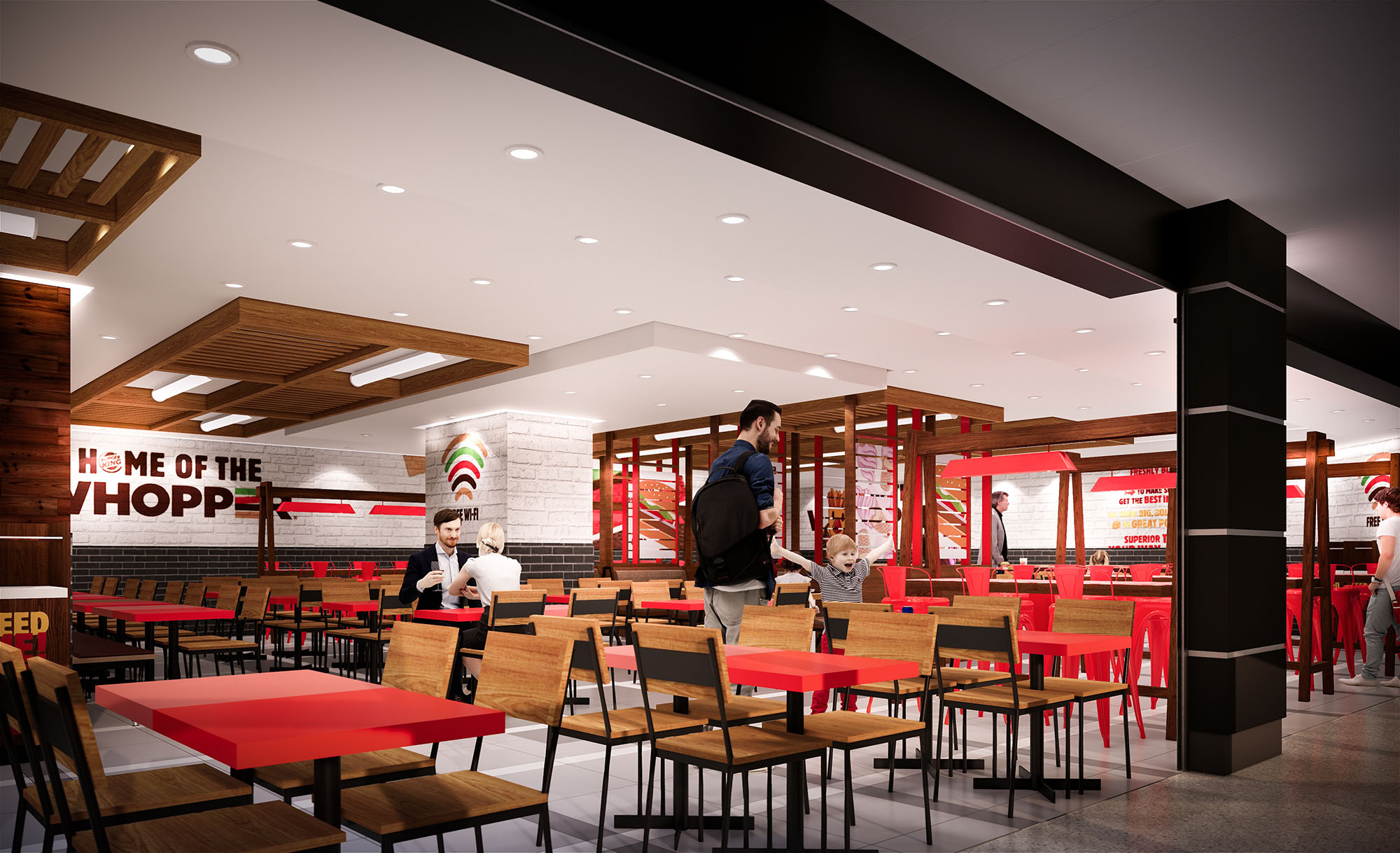
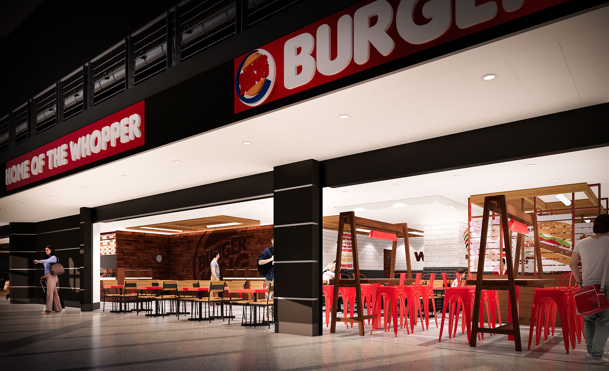
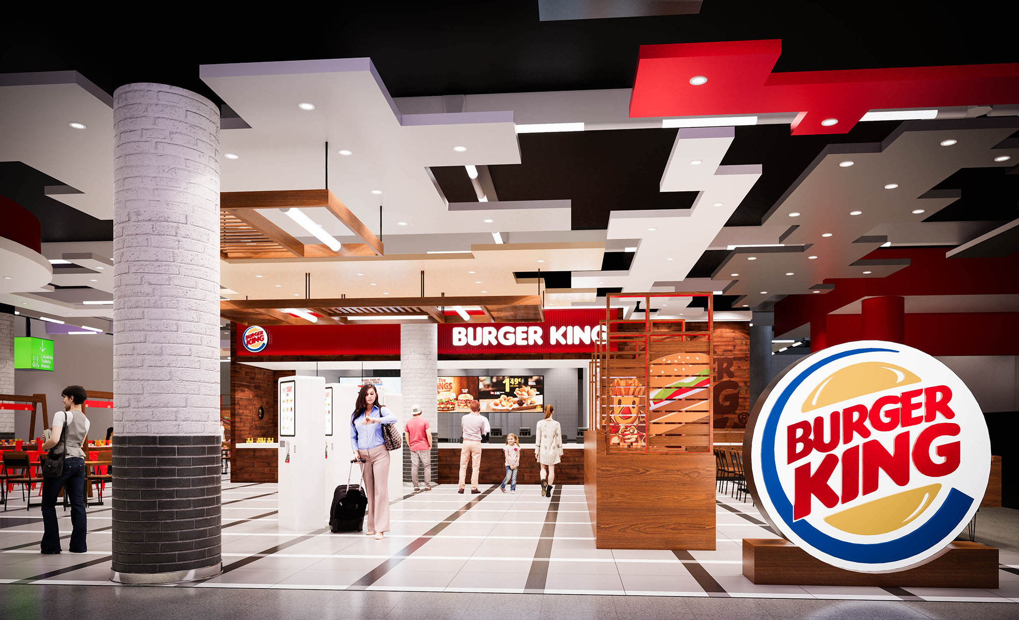
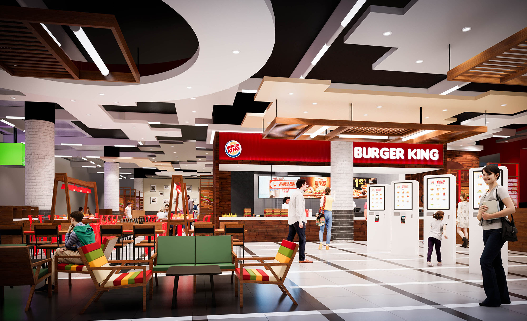
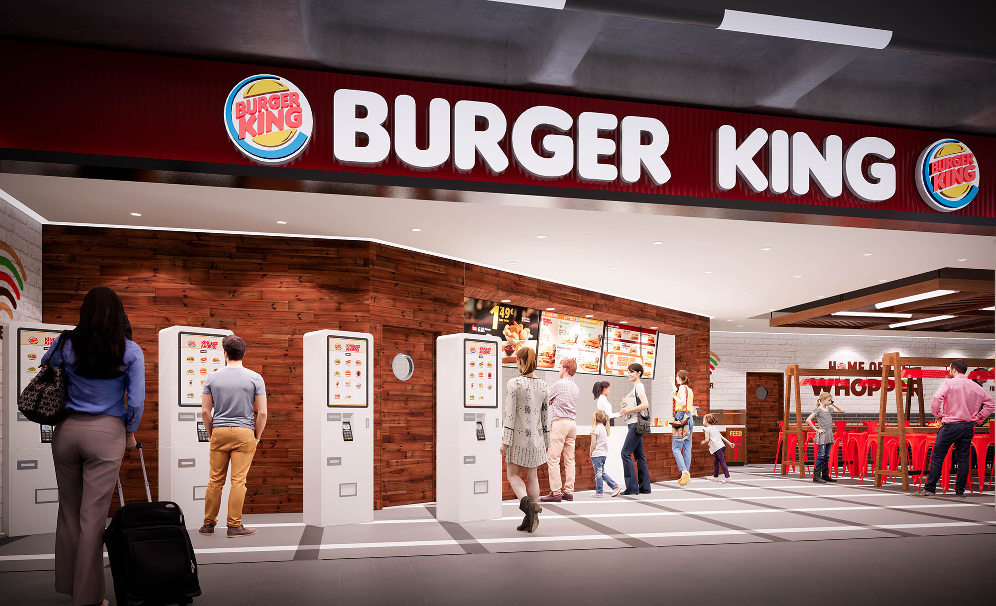
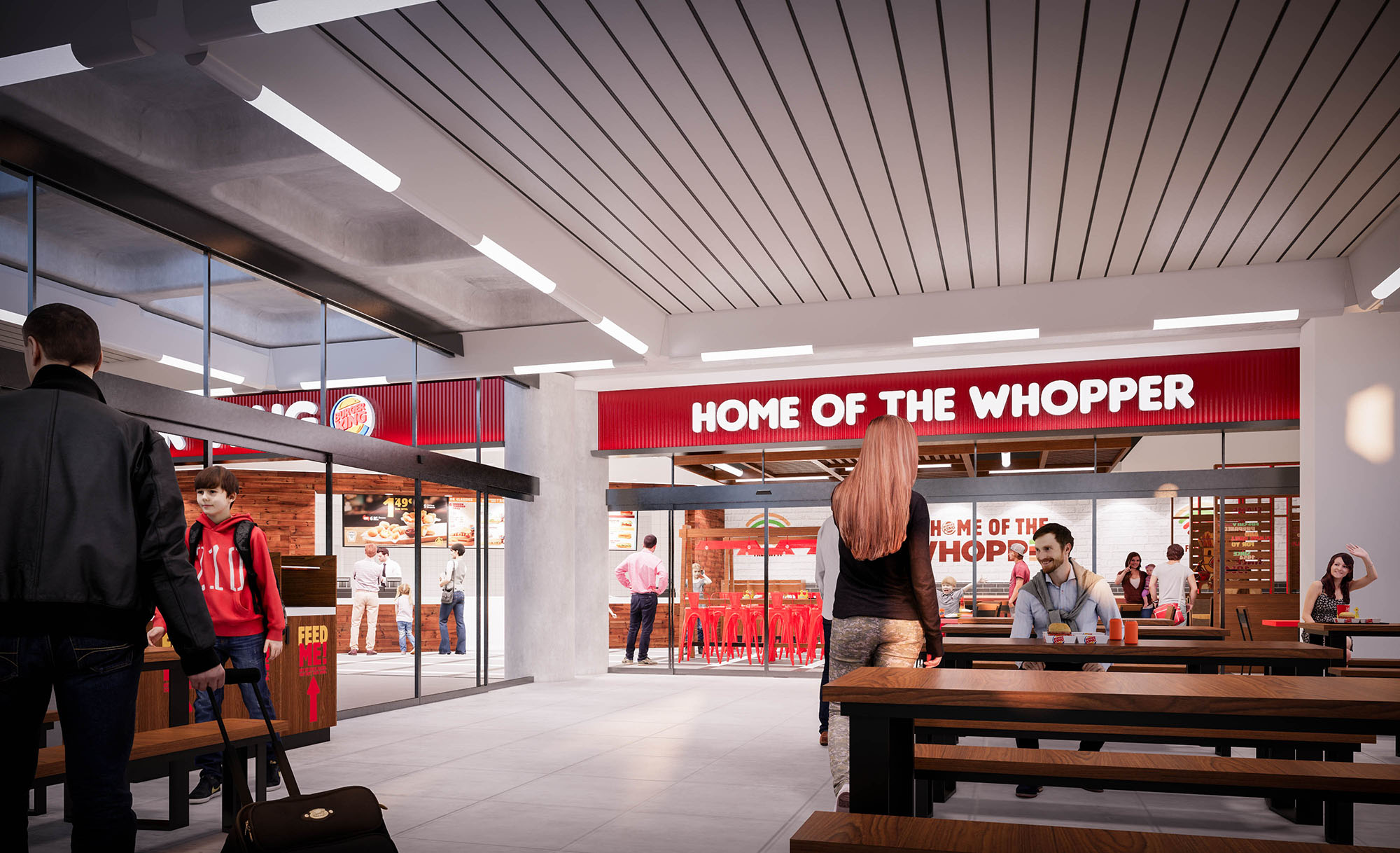
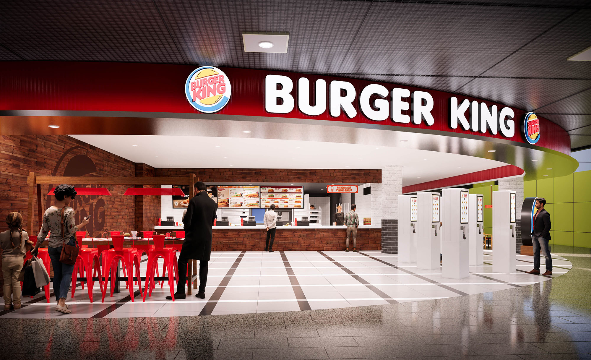
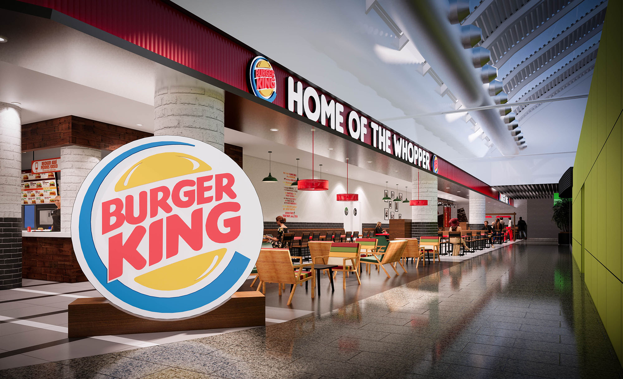
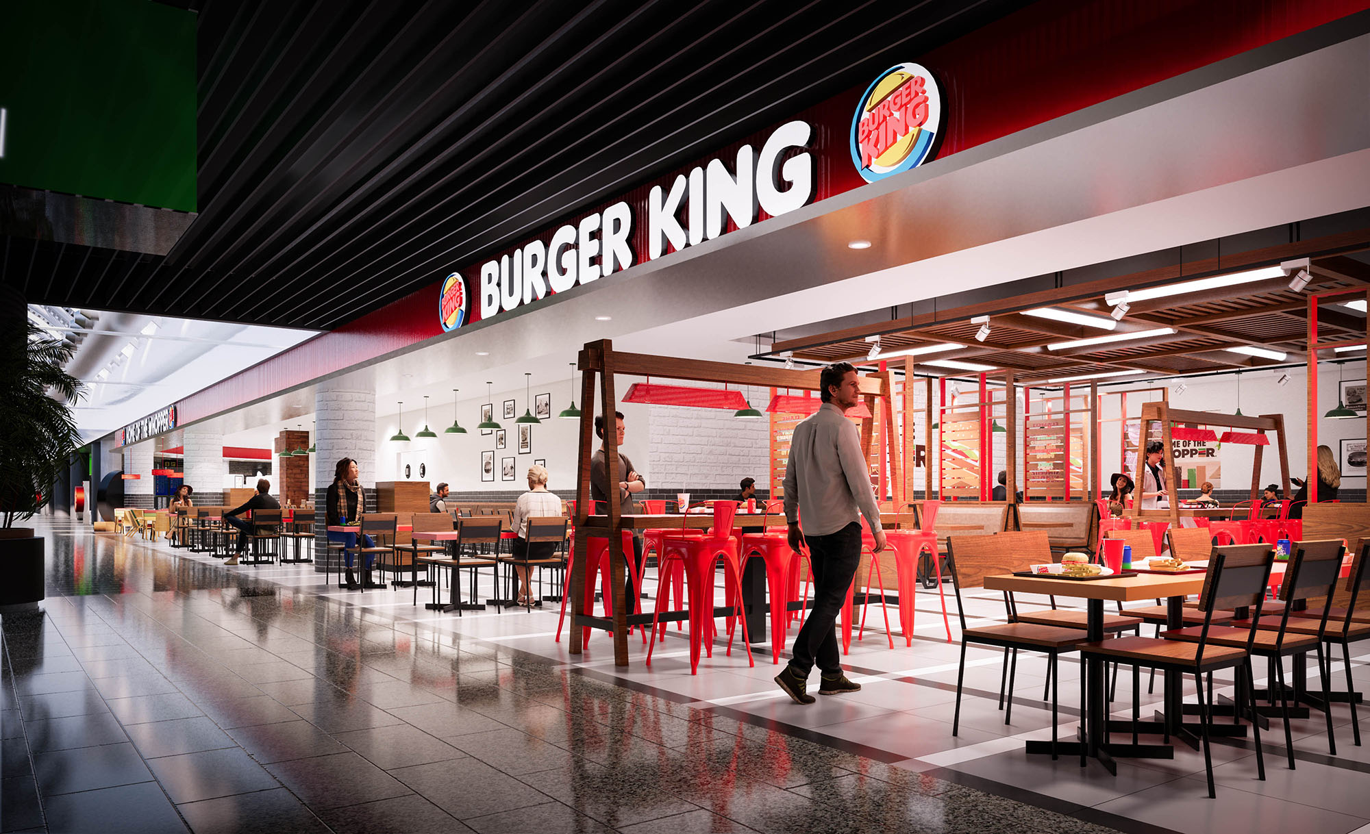
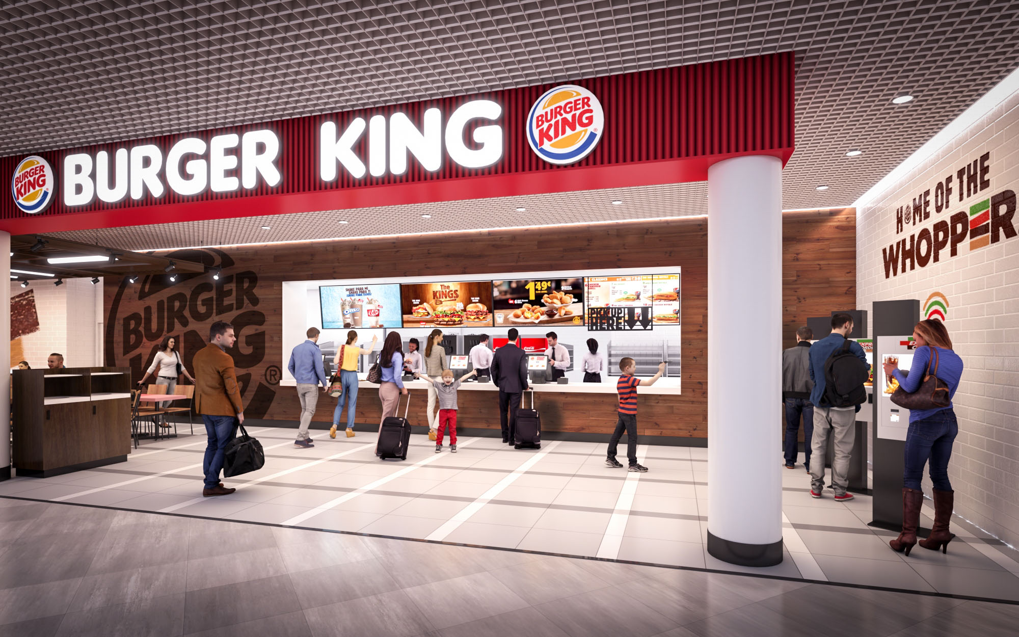
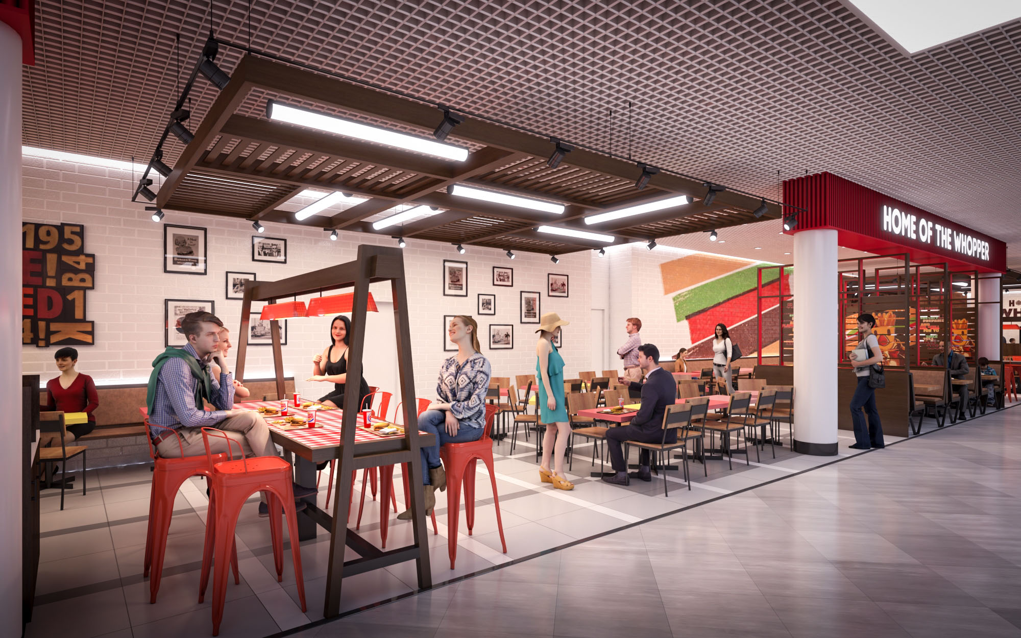
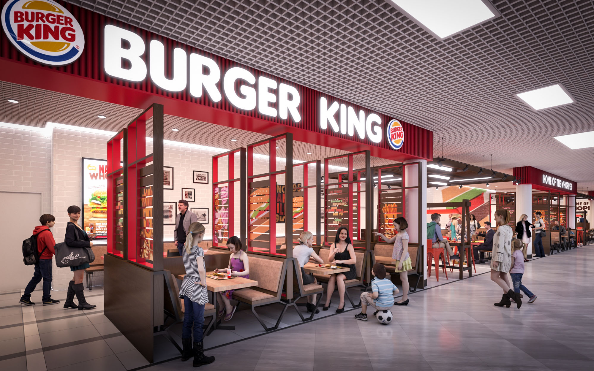
The Burger King restaurants in Spain and Portugal are conceived as contemporary urban eateries that translate the brand’s identity into a warm, approachable architectural language. The design moves away from purely standardized fast‑food imagery to create spaces that feel like everyday social hubs, combining robust materials, graphic clarity and flexible seating to accommodate families, groups of friends and individual diners. The concept emphasizes openness and visual permeability, inviting passersby to intuitively understand the interior atmosphere from the exterior frontage.
The scheme incorporates a consistent visual vocabulary across all 11 locations, yet allows for local adaptation. Outdoor terraces, mall units and stand‑alone restaurants share a common palette of wood, metal and brand colors, but each site negotiates its own context through specific façade treatments, lighting strategies and spatial layouts.
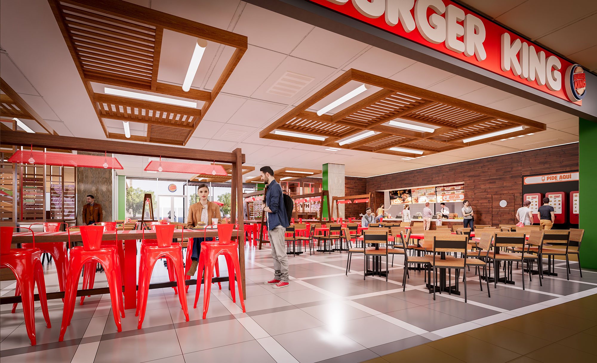
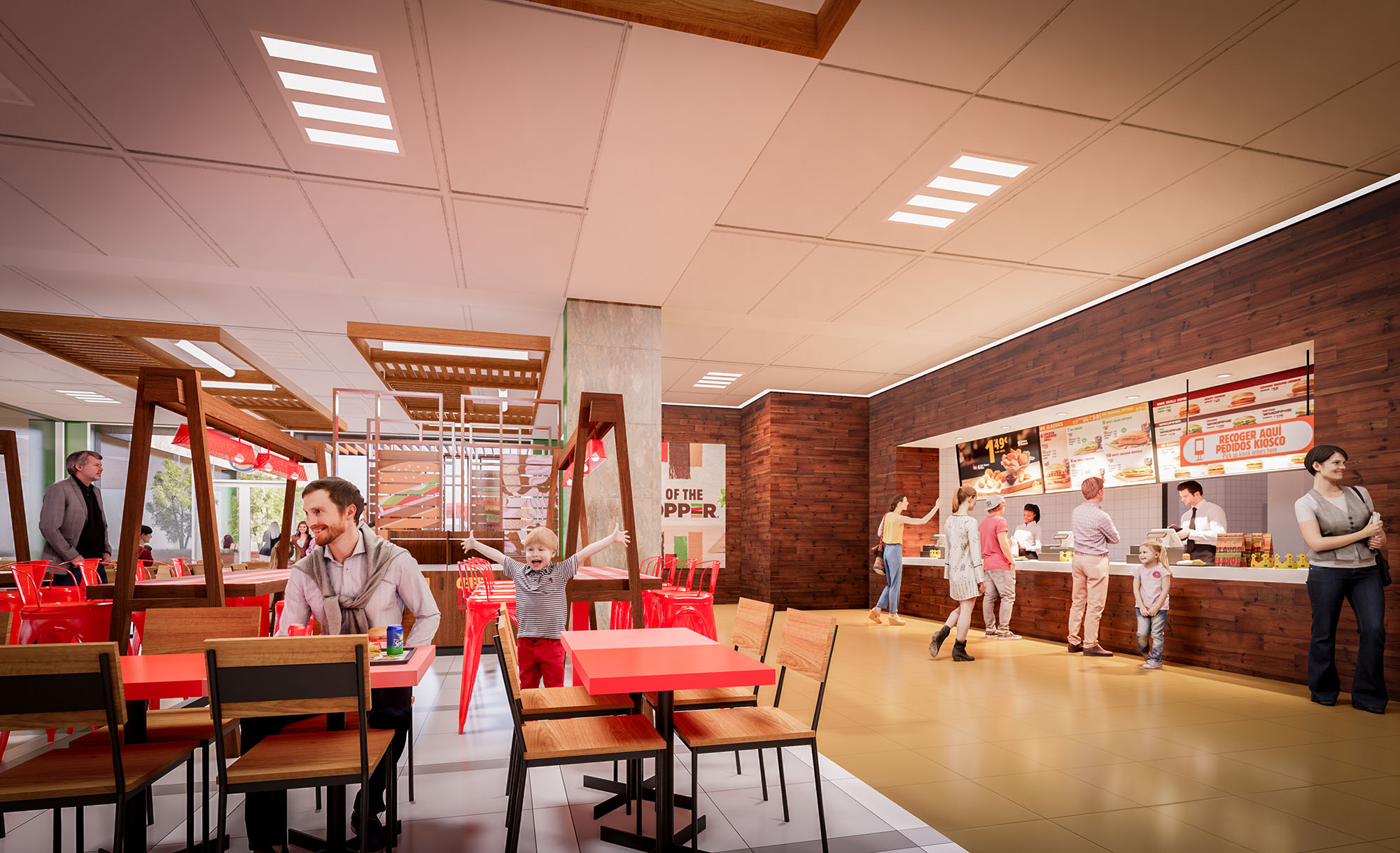
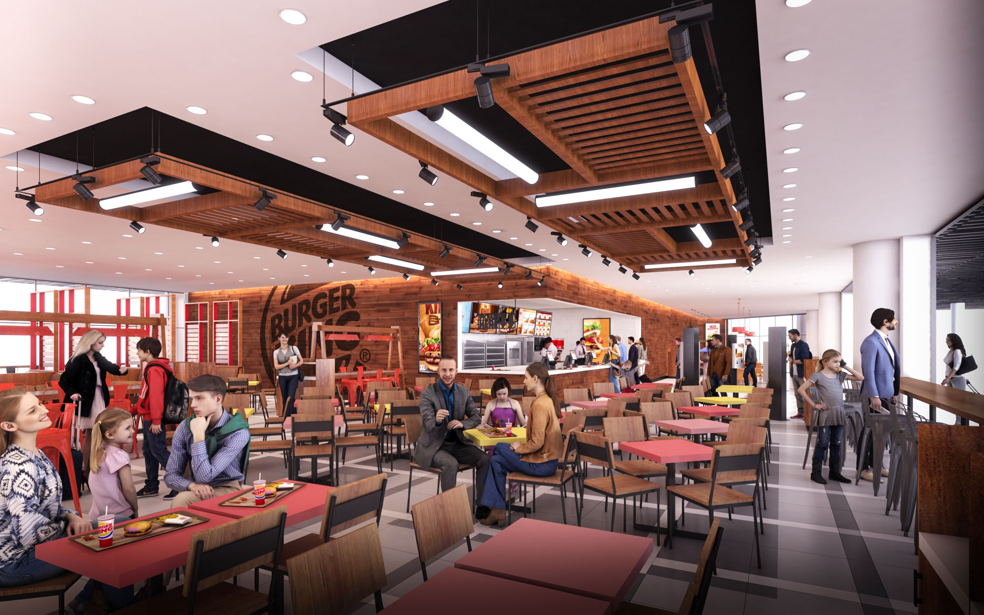
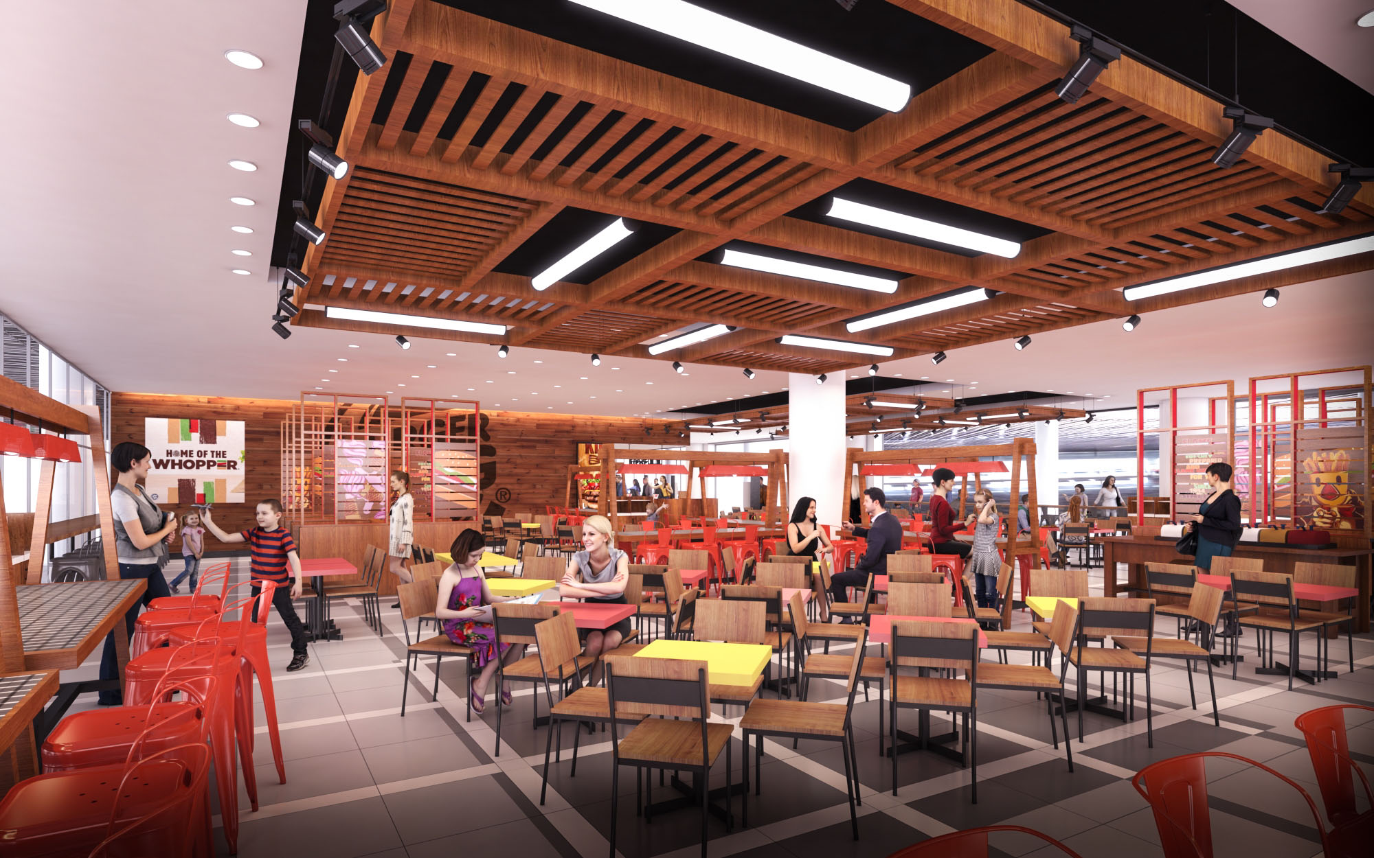
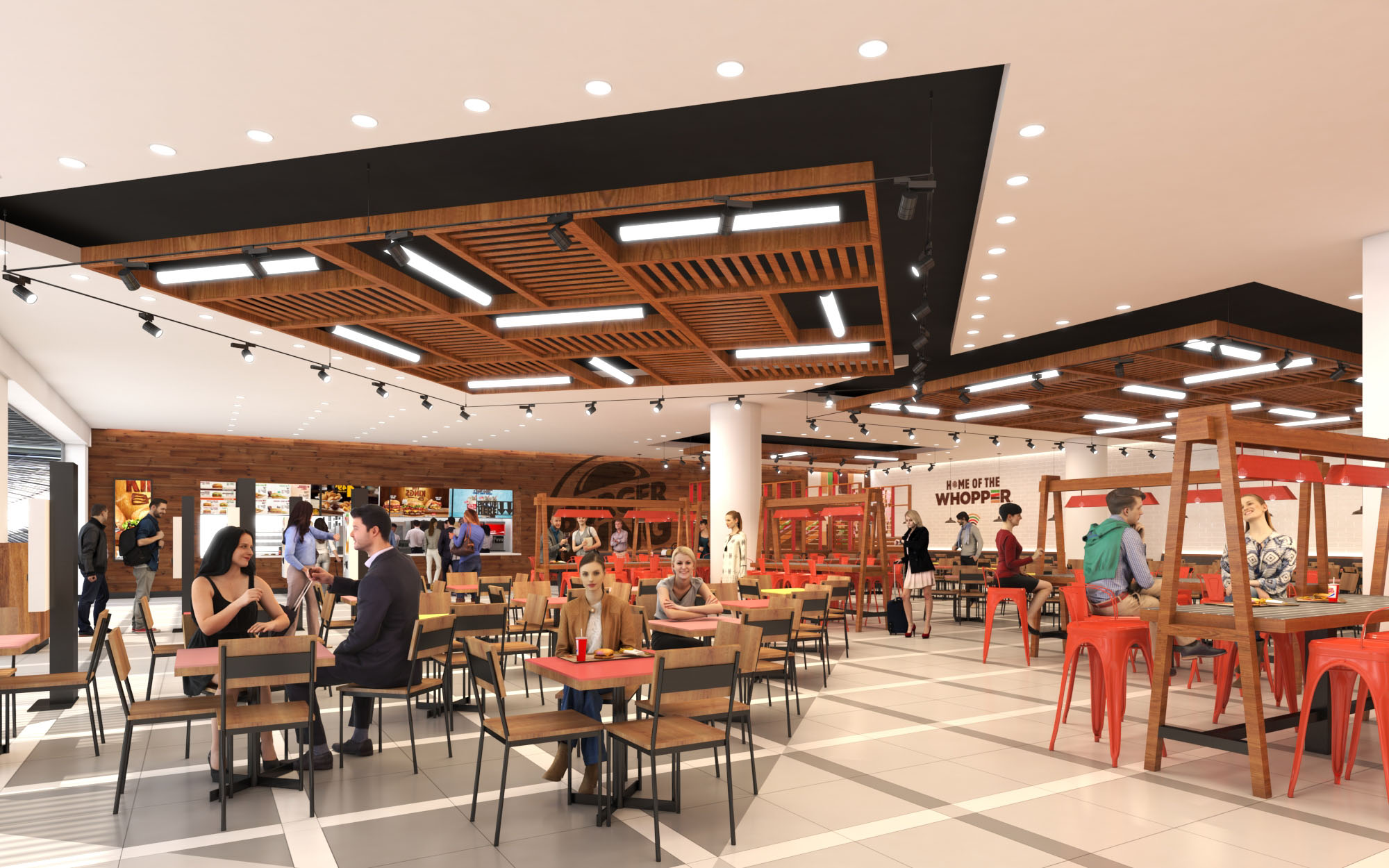
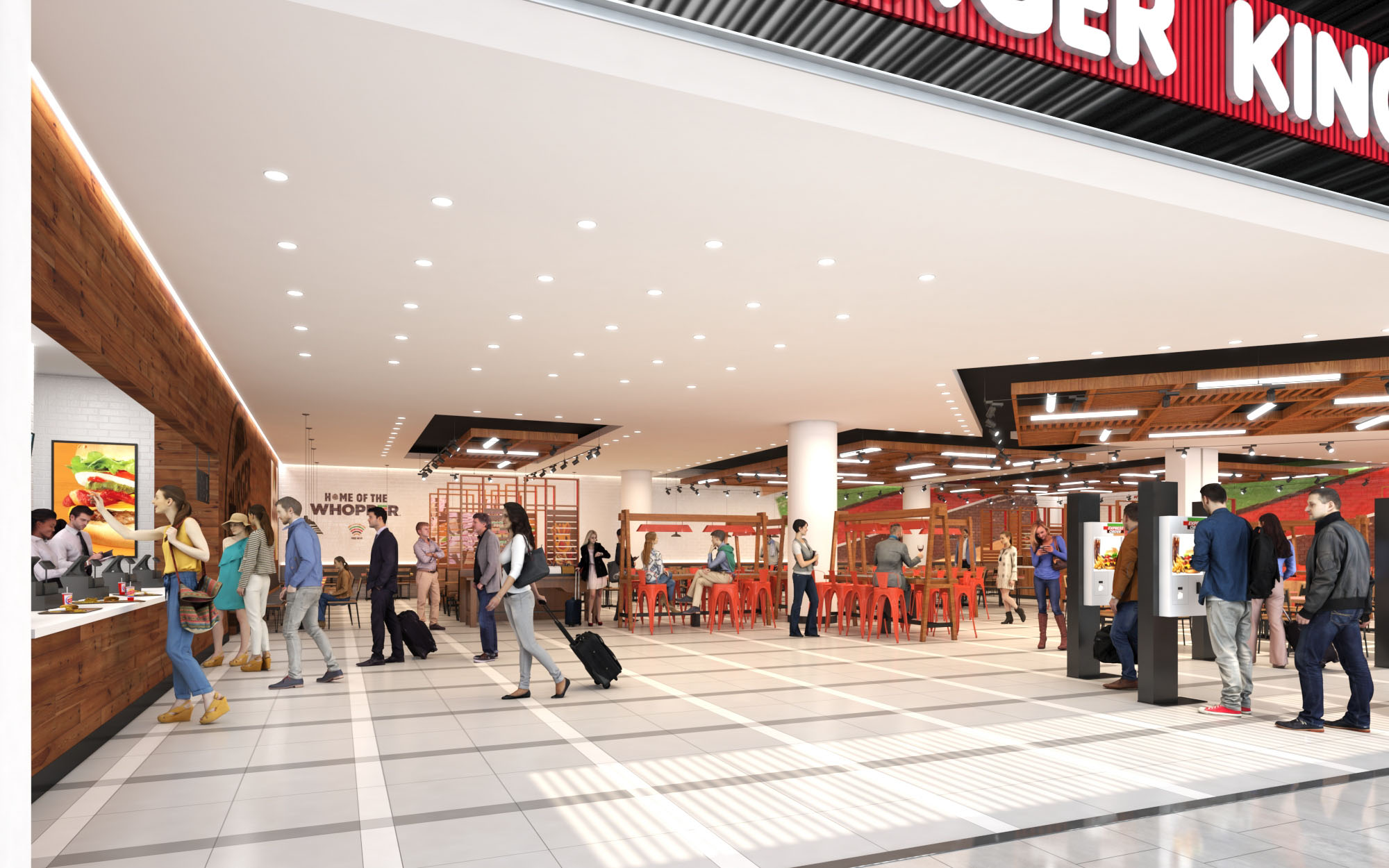
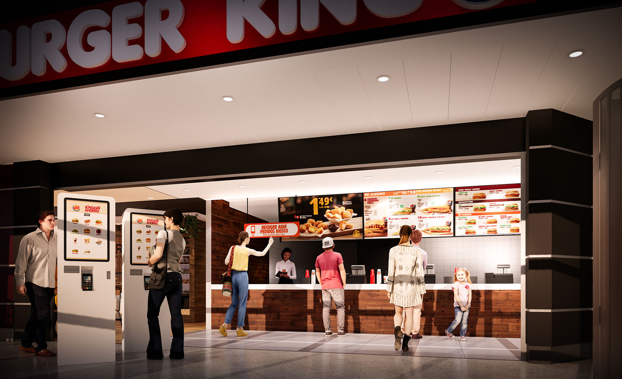
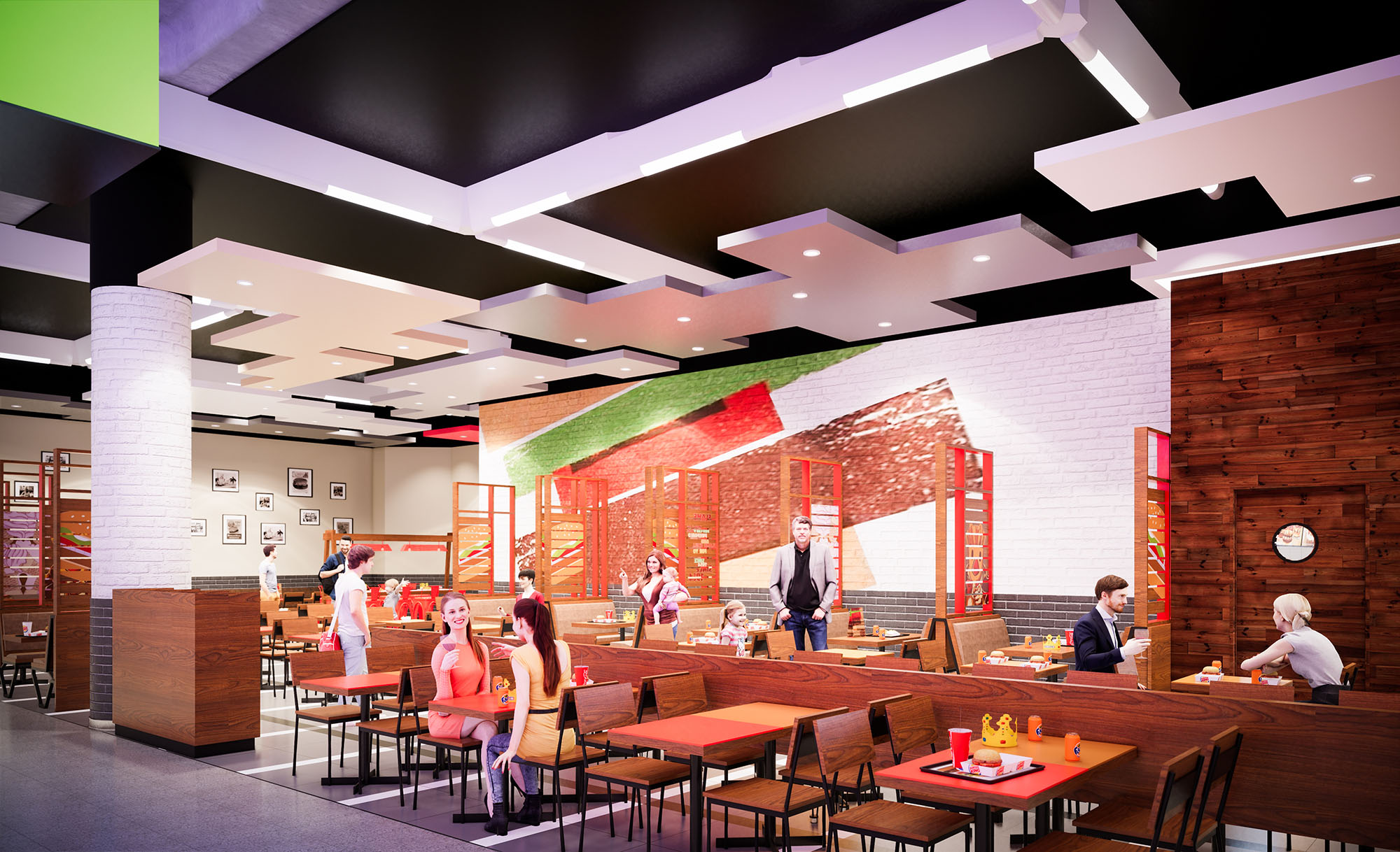
The plan is structured around a central dining field, framed by the service counter, kitchen block and perimeter seating. Circulation is deliberately fluid: clear axial views guide customers from the entrance to the order point and then to the seating area, minimizing crossflows and congestion. The main dining room uses a grid of tables and chairs to maximize capacity while still enabling straightforward reconfiguration for different peak‑hour patterns.
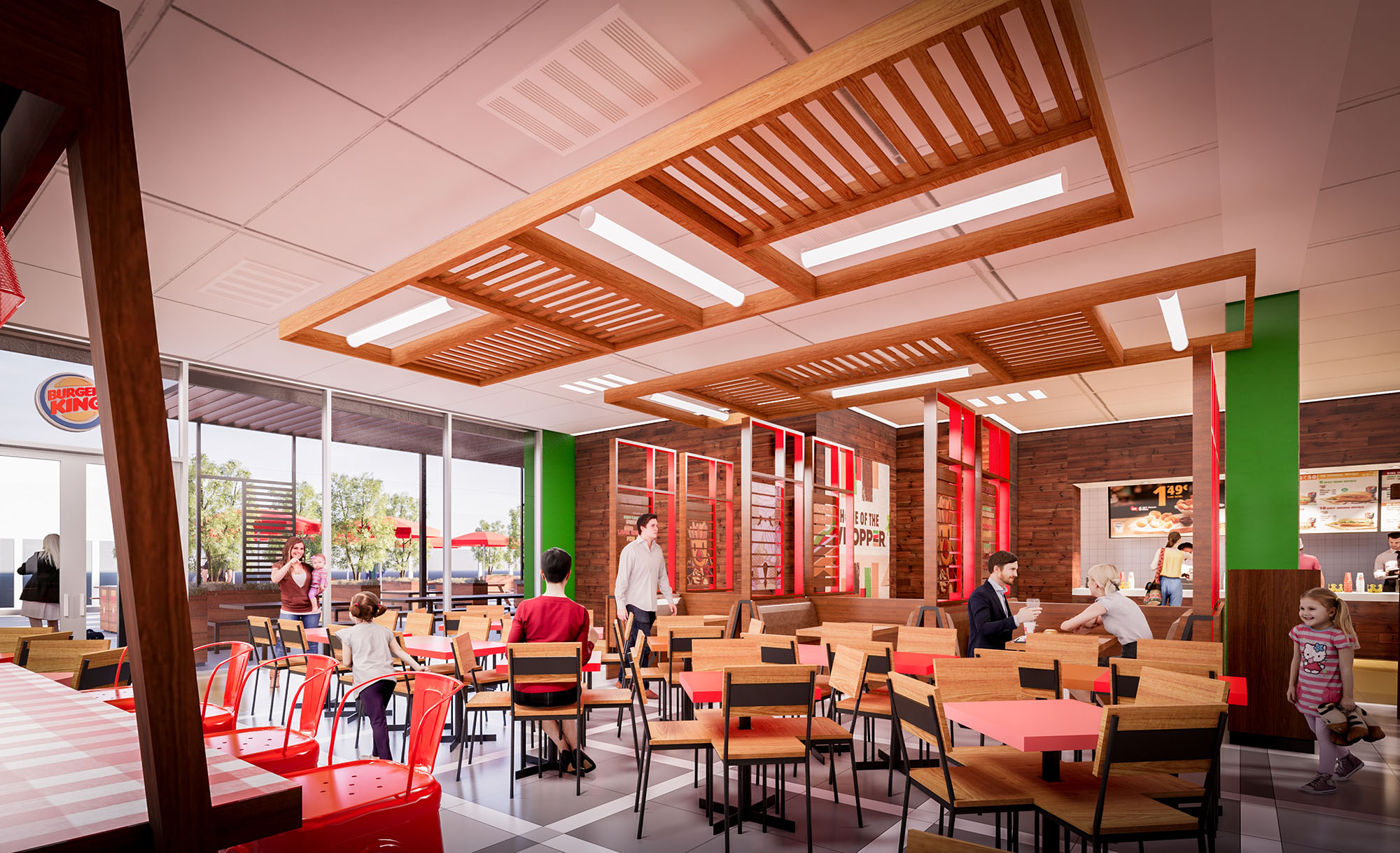
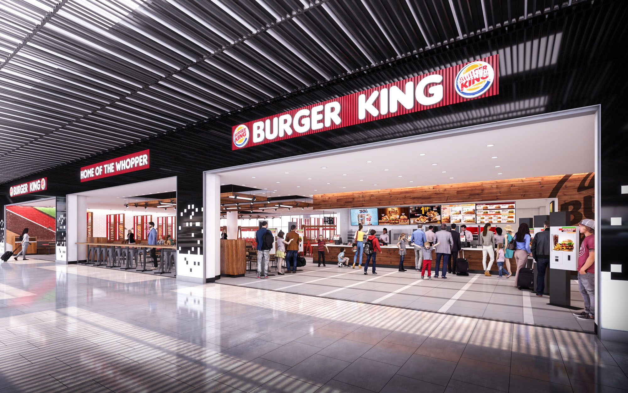
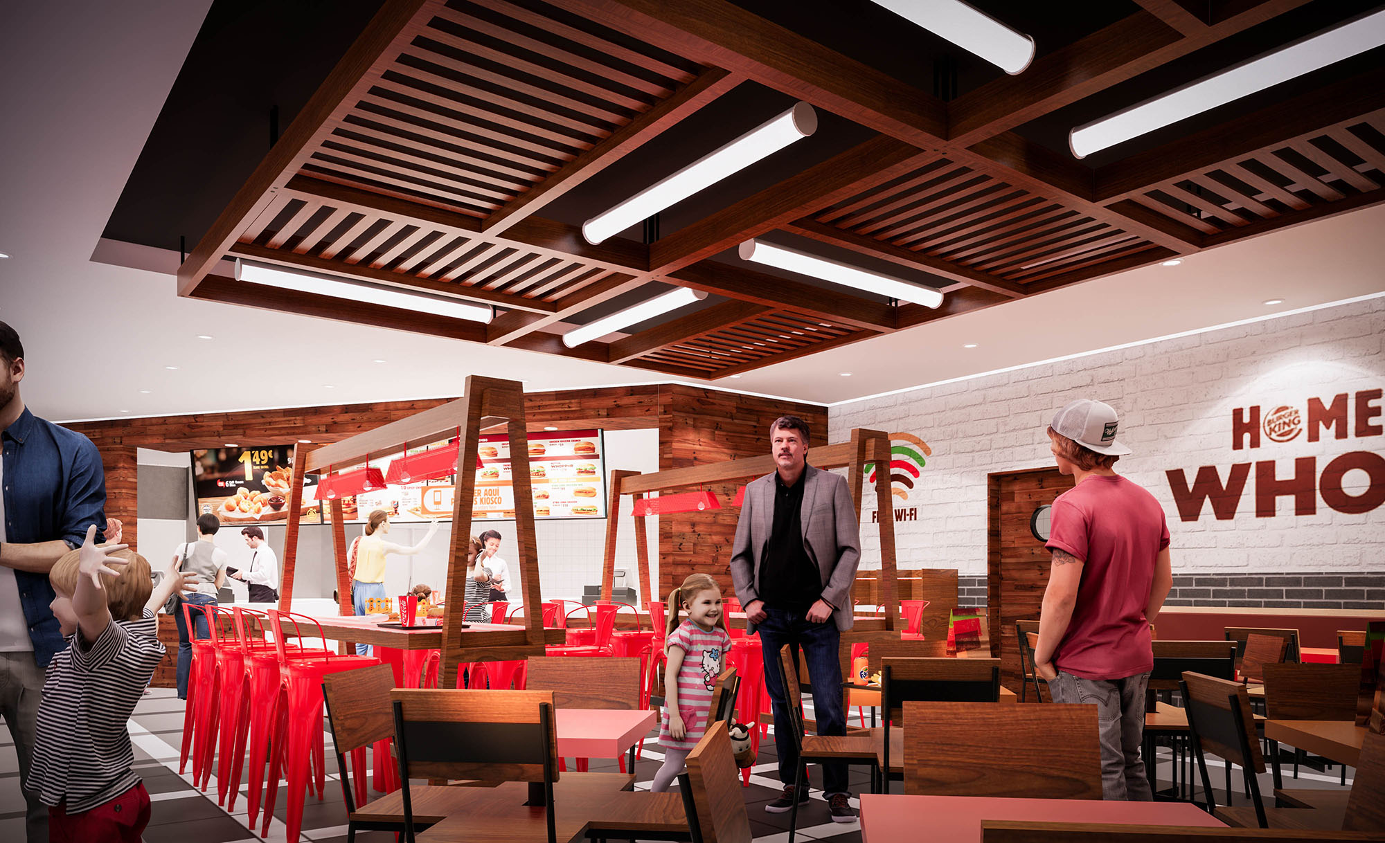
Perimeter booths and semi‑enclosed niches provide more intimate zones, using low partitions, glazed screens and suspended elements to create subtle boundaries without sacrificing transparency. In mall locations, the storefront opens almost entirely to the gallery, extending the interior visually and functionally into the public concourse. Outdoor restaurants feature generous terraces with picnic‑style tables, creating an intermediate zone between street and interior and reinforcing the brand’s informal, communal character.
The material palette balances industrial robustness with domestic warmth. Timber—both in solid elements and high‑pressure laminates—is used on ceilings, wall cladding and furniture to soften the atmosphere and counteract the hard surfaces typical of high‑traffic environments. Steel structures, painted metal chairs and exposed ceiling components introduce an urban loft sensibility, while ceramic and porcelain floor tiles ensure high durability and ease of maintenance.
The color strategy is anchored in the brand’s red, deployed in controlled accents across façades, framing elements, chairs and graphic bands. This is contrasted with neutral greys, off‑white tiles and natural wood tones, allowing the vivid hues to remain legible without overwhelming the space. Occasional yellow tabletops and graphic panels add a playful note, enhancing the perception of light and energy, especially in deep interior mall units.
The lighting design integrates linear LED fixtures with decorative elements to articulate different spatial layers. In several units, wooden slatted ceiling canopies host recessed linear luminaires, generating a rhythm that both defines the dining field and visually lowers the scale in tall retail envelopes. Track lighting is selectively used to accent feature walls, menu boards and brand graphics, supporting wayfinding and merchandising.
Uniform ambient lighting in the public areas is calibrated to avoid glare while ensuring a bright, safe environment suited to family use. In contrast, booths and perimeter zones receive slightly warmer and more focused lighting, creating a sense of comfort and encouraging longer stays. Outdoor terraces rely on a combination of façade lighting, low‑glare fixtures and natural daylight, extending the usability of these spaces throughout the day and evening.
Architectural and graphic elements are closely coordinated to reinforce the Burger King identity without resorting to excessive signage. Large illuminated logotypes and red cornices define the storefronts, acting as beacons within busy shopping centers. Inside, wall graphics, framed imagery and typography narrate the brand’s association with flame‑grilling and casual enjoyment, turning otherwise blank surfaces into storytelling devices.
Glazed partitions with colored mullions, branded feature walls near the counter and distinctive furniture silhouettes function as spatial markers. These components allow guests to recognize the brand immediately while still experiencing each location as a specific place rather than a generic outlet.
Sustainability is addressed through a combination of material selection, energy performance and operational planning. Priority is given to long‑life finishes such as high‑durability tiles, laminates and powder‑coated metals, reducing the frequency of replacement and associated waste. Timber elements are specified, where possible, from certified sources, and modular furniture systems facilitate repair and reuse across the 11 restaurants.
Energy‑efficient LED lighting, optimized lighting control and the use of natural light in street‑front and terrace areas contribute to reduced energy consumption. Compact kitchen footprints and rational back‑of‑house circulation support efficient workflows, which in turn minimize idle equipment time and energy waste. Trash and recycling areas are integrated into the layout to encourage proper waste segregation, while outdoor landscaping in terrace locations introduces shade and improves microclimate conditions for guests, further diminishing reliance on mechanical cooling.
LIST OF PROJECTS EXPERIENCE
Designed, Executed and/or Built Projects
SPAIN
1. Burger King - Barcelona - L007
2. Burger King - Easy Order Concept
3. Burger King - Girona - L64
4. Burger King - Gran Canaria - L661
5. Burger King - Gran Canaria - L662
6. Burger King - Mallorca - L4.01
7. Burger King - Mallorca - L4.02
8. Burger King - Mallorca - L12.01
9. Burger King - Mallorca - L159
10. Burger King - Sevilla - L230
PORTUGAL
11. Burger King - Oporto - Aire Schengen
The Burger King restaurants in Spain and Portugal are conceived as contemporary urban eateries that translate the brand’s identity into a warm, approachable architectural language. The design moves away from purely standardized fast‑food imagery to create spaces that feel like everyday social hubs, combining robust materials, graphic clarity and flexible seating to accommodate families, groups of friends and individual diners. The concept emphasizes openness and visual permeability, inviting passersby to intuitively understand the interior atmosphere from the exterior frontage.
The scheme incorporates a consistent visual vocabulary across all 11 locations, yet allows for local adaptation. Outdoor terraces, mall units and stand‑alone restaurants share a common palette of wood, metal and brand colors, but each site negotiates its own context through specific façade treatments, lighting strategies and spatial layouts.
The plan is structured around a central dining field, framed by the service counter, kitchen block and perimeter seating. Circulation is deliberately fluid: clear axial views guide customers from the entrance to the order point and then to the seating area, minimizing crossflows and congestion. The main dining room uses a grid of tables and chairs to maximize capacity while still enabling straightforward reconfiguration for different peak‑hour patterns.
Perimeter booths and semi‑enclosed niches provide more intimate zones, using low partitions, glazed screens and suspended elements to create subtle boundaries without sacrificing transparency. In mall locations, the storefront opens almost entirely to the gallery, extending the interior visually and functionally into the public concourse. Outdoor restaurants feature generous terraces with picnic‑style tables, creating an intermediate zone between street and interior and reinforcing the brand’s informal, communal character.
The material palette balances industrial robustness with domestic warmth. Timber—both in solid elements and high‑pressure laminates—is used on ceilings, wall cladding and furniture to soften the atmosphere and counteract the hard surfaces typical of high‑traffic environments. Steel structures, painted metal chairs and exposed ceiling components introduce an urban loft sensibility, while ceramic and porcelain floor tiles ensure high durability and ease of maintenance.
The color strategy is anchored in the brand’s red, deployed in controlled accents across façades, framing elements, chairs and graphic bands. This is contrasted with neutral greys, off‑white tiles and natural wood tones, allowing the vivid hues to remain legible without overwhelming the space. Occasional yellow tabletops and graphic panels add a playful note, enhancing the perception of light and energy, especially in deep interior mall units.
The lighting design integrates linear LED fixtures with decorative elements to articulate different spatial layers. In several units, wooden slatted ceiling canopies host recessed linear luminaires, generating a rhythm that both defines the dining field and visually lowers the scale in tall retail envelopes. Track lighting is selectively used to accent feature walls, menu boards and brand graphics, supporting wayfinding and merchandising.
Uniform ambient lighting in the public areas is calibrated to avoid glare while ensuring a bright, safe environment suited to family use. In contrast, booths and perimeter zones receive slightly warmer and more focused lighting, creating a sense of comfort and encouraging longer stays. Outdoor terraces rely on a combination of façade lighting, low‑glare fixtures and natural daylight, extending the usability of these spaces throughout the day and evening.
Architectural and graphic elements are closely coordinated to reinforce the Burger King identity without resorting to excessive signage. Large illuminated logotypes and red cornices define the storefronts, acting as beacons within busy shopping centers. Inside, wall graphics, framed imagery and typography narrate the brand’s association with flame‑grilling and casual enjoyment, turning otherwise blank surfaces into storytelling devices.
Glazed partitions with colored mullions, branded feature walls near the counter and distinctive furniture silhouettes function as spatial markers. These components allow guests to recognize the brand immediately while still experiencing each location as a specific place rather than a generic outlet.
Sustainability is addressed through a combination of material selection, energy performance and operational planning. Priority is given to long‑life finishes such as high‑durability tiles, laminates and powder‑coated metals, reducing the frequency of replacement and associated waste. Timber elements are specified, where possible, from certified sources, and modular furniture systems facilitate repair and reuse across the 11 restaurants.
Energy‑efficient LED lighting, optimized lighting control and the use of natural light in street‑front and terrace areas contribute to reduced energy consumption. Compact kitchen footprints and rational back‑of‑house circulation support efficient workflows, which in turn minimize idle equipment time and energy waste. Trash and recycling areas are integrated into the layout to encourage proper waste segregation, while outdoor landscaping in terrace locations introduces shade and improves microclimate conditions for guests, further diminishing reliance on mechanical cooling.


Nuestras oficinas están en Barcelona, Cancún, Chicago y Santo Domingo, pero gracias a la tecnología podemos desarrollar proyectos en cualquier parte del mundo.
Barcelona
Bac de Roda 136
08020, Barcelona
Spain
Madrid
Av. de Buendía 11
19005 Guadalajara (Madrid)
Spain
Chicago
373 Hazel Ave, Apt A1
60022, Glencoe, Illinois
United States