

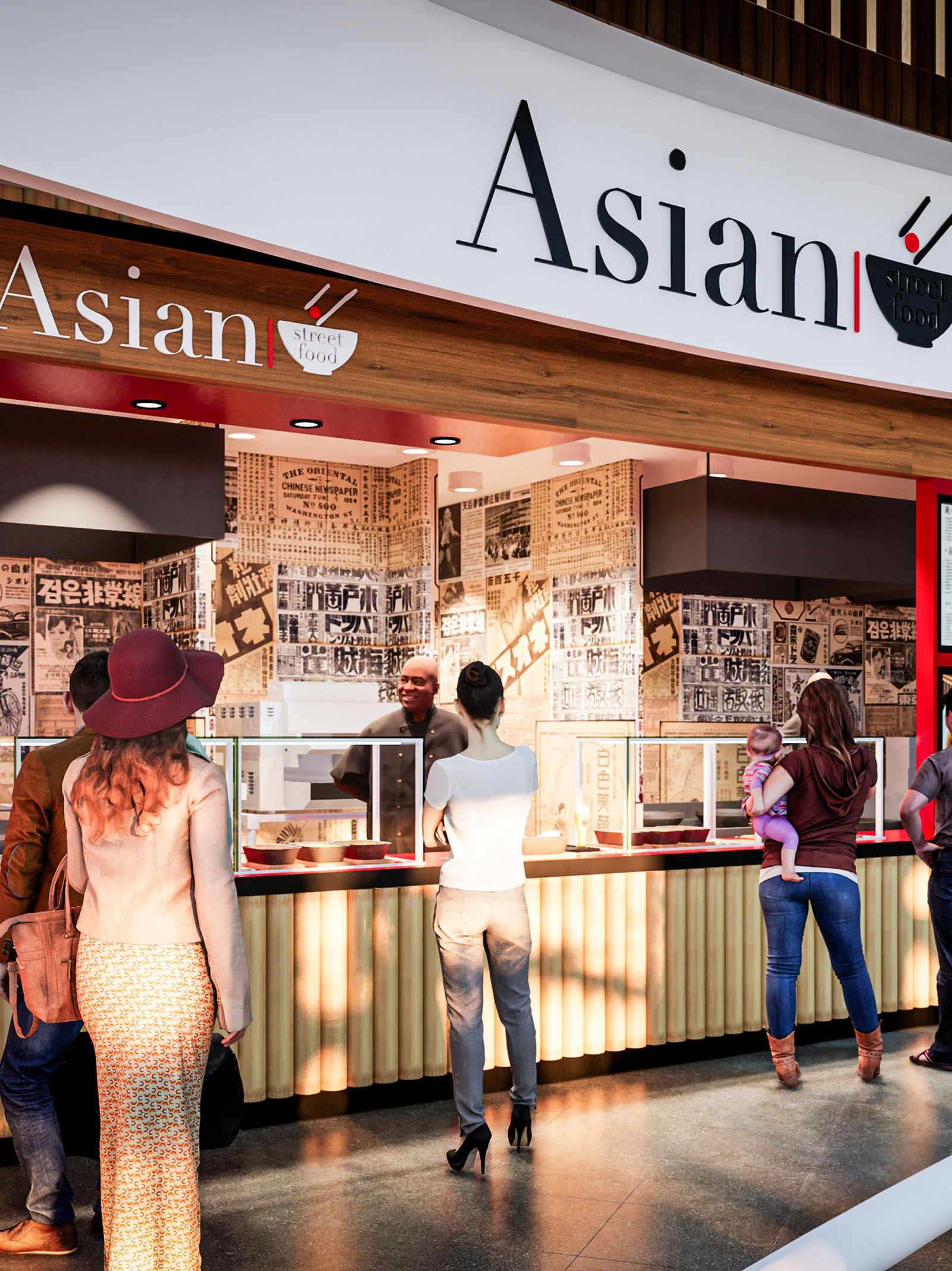
The Asian Street Food project in Los Cabos is conceived as a compact, contemporary interpretation of the bustling food alleys found across major Asian cities. The design translates the spontaneity and graphic intensity of street markets into a controlled, efficient retail module suitable for a high-traffic commercial environment. A clear, bold brand identity anchors the space, combining minimal architectural volumes with a rich visual narrative built from typography, texture, and light.
The concept balances immediacy and clarity: from a distance, the facade reads as a simple, legible storefront; at close range, layers of graphic detail and material warmth invite guests to explore the offer. The result is a stall that feels both urban and approachable, integrating seamlessly into the architectural context of Los Cabos while evoking a distinctly Asian atmosphere.
The layout is organized as a linear service counter with a clear front-of-house / back-of-house separation. Customers approach from the mall concourse along a straight trajectory, guided by the strong horizontal of the canopy and the extended counter line. This linear arrangement allows high throughput during peak hours while maintaining direct visual contact between staff and guests.
The service front is subtly articulated into ordering, preparation view, and collection zones, unified by continuous glazing that ensures hygiene without compromising interaction. Behind the counter, the working strip is planned as an efficient production line, with cooking, plating, and handover functions aligned to minimize backtracking. Vertical surfaces are fully utilized for storage, menu display, and brand communication, maximizing performance in a compact footprint.
The material palette blends warm woods, graphic wall treatments, and clean, durable surfaces. A wood-like soffit and fascia frame the storefront, introducing a natural tone that softens the otherwise graphic composition. The counter front features vertically ribbed elements that reference traditional bamboo stalls and rolling shutters, adding depth and shadow play along the base.
The back wall is wrapped in a collage of newspaper-inspired graphics and Asian typography, functioning as both a cultural backdrop and a dynamic textural surface. This monochrome base is punctuated by strategic accents of red, a color associated with energy and good fortune across many Asian cultures, and used here to highlight the brand logo, canopy underside, and select trim details. The countertop and floor employ darker, low-reflectance finishes to withstand heavy use and to visually anchor the lighter upper volumes.
Lighting is designed to emphasize both the freshness of the food and the vibrancy of the brand. Recessed downlights integrated into the canopy create a bright, even wash across the service line, eliminating shadows at the transaction point and enhancing the perception of cleanliness. The underside of the canopy, accented in red, reflects warm light onto the counter, subtly enriching skin tones and food colors.
Interior task lighting in the back-of-house is calibrated to higher lux levels to support precise preparation, while the guest-facing area maintains a warmer, more theatrical tone. The contrast between the illuminated graphics wall and the darker floor zone generates depth in a relatively shallow space, making the stall feel more immersive and visually engaging from the circulation areas.
The architectural envelope functions as an extension of the brand. The main signage utilizes an elegant, contemporary typeface with a simplified bowl-and-chopsticks icon, clearly communicating the culinary focus at a glance. The long, continuous sign band ensures visibility across the concourse, while the clean white background enhances legibility and contrasts with the wooden fascia.
At eye level, the wallpaper-like collage of Asian scripts and newspaper clippings evokes the layered visual culture of street markets, posters, and food stalls. This graphic layer is intentionally dense, creating a sense of authenticity and urban intensity without excessive physical ornamentation. The coordination between architectural elements and graphic design ensures that every surface contributes to storytelling, from the smallest label to the largest facade component.
The project prioritizes materials and systems that respond to both environmental and operational sustainability. High-traffic surfaces such as the countertop and flooring are specified in robust, easy-to-clean finishes to extend lifecycle and reduce the need for frequent replacement. Where possible, wood elements are designed to be realized in certified or engineered products, minimizing the use of solid timber while preserving a warm tactile quality.
Energy-efficient LED lighting is employed throughout, lowering energy consumption and maintenance costs while allowing precise control over color temperature and intensity. The compact footprint and linear equipment layout optimize ventilation and reduce unnecessary duct runs, contributing to more efficient HVAC performance. Finishes are selected with an emphasis on low-maintenance coatings and, where available, low-VOC products, supporting a healthier indoor environment for both staff and guests.
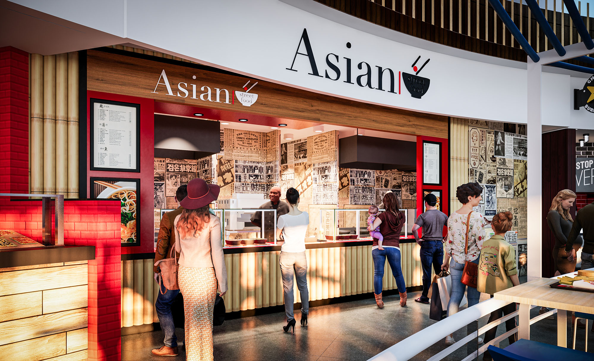


Nuestras oficinas están en Barcelona, Cancún, Chicago y Santo Domingo, pero gracias a la tecnología podemos desarrollar proyectos en cualquier parte del mundo.
Barcelona
Bac de Roda 136
08020, Barcelona
Spain
Madrid
Av. de Buendía 11
19005 Guadalajara (Madrid)
Spain
Chicago
373 Hazel Ave, Apt A1
60022, Glencoe, Illinois
United States