

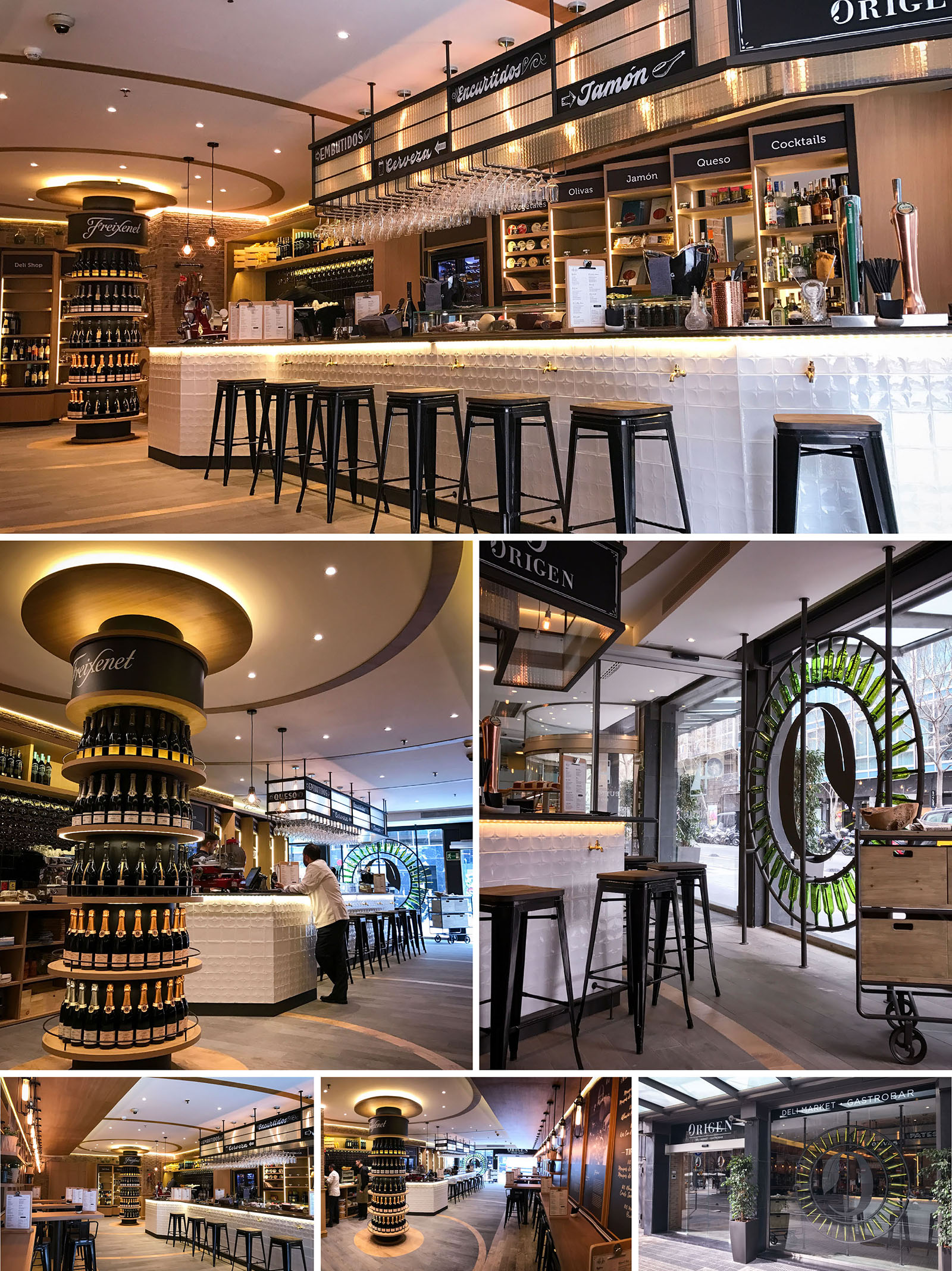
The GASTROBAR in Barcelona is conceived as a contemporary reinterpretation of the traditional Spanish tapas bar, merging market atmosphere with wine cellar identity. The interior expresses a strong narrative around origin and product, where wine, cava and charcuterie become both protagonists of the gastronomic offer and core elements of the architectural language. Circular geometries, warm lighting and continuous counters invite the user to move informally, emphasizing social interaction and visual connection between bar, kitchen and street.
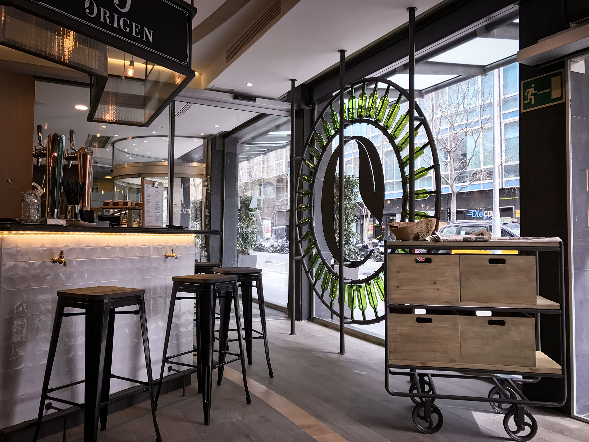
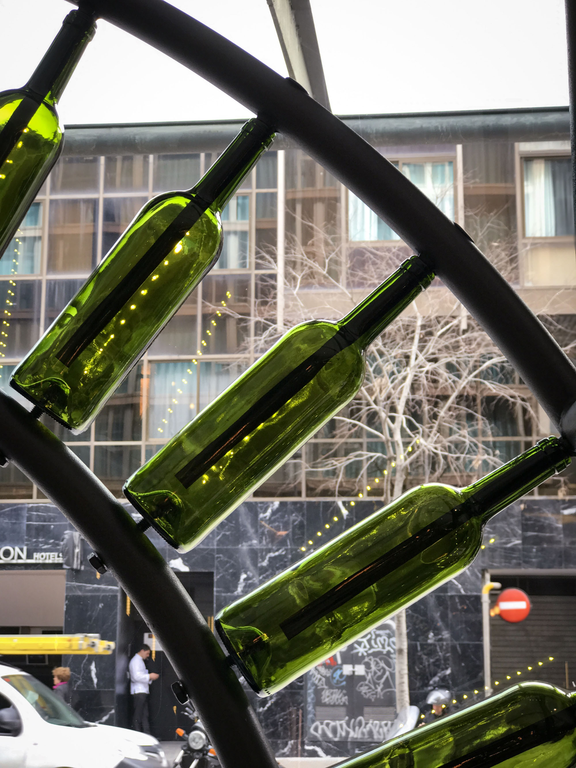
The design seeks to create an open, permeable space that extends the urban sidewalk into the interior. Large glazed façades, combined with a sculptural bottle installation at the entrance, turn the GASTROBAR into an urban showcase, announcing from outside the experience that unfolds within. The atmosphere balances industrial accents with crafted details to transmit quality, authenticity and a relaxed, cosmopolitan character.
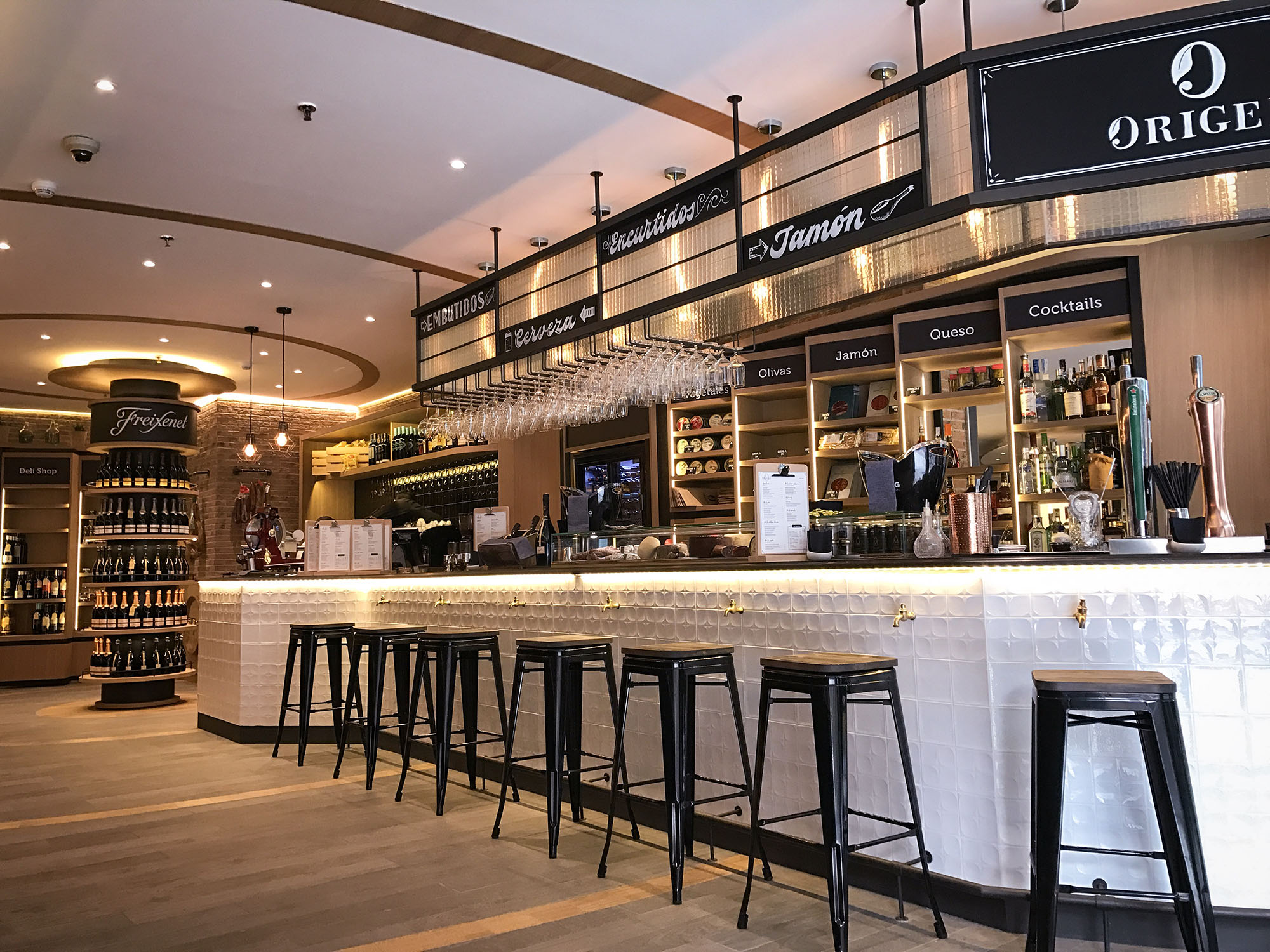
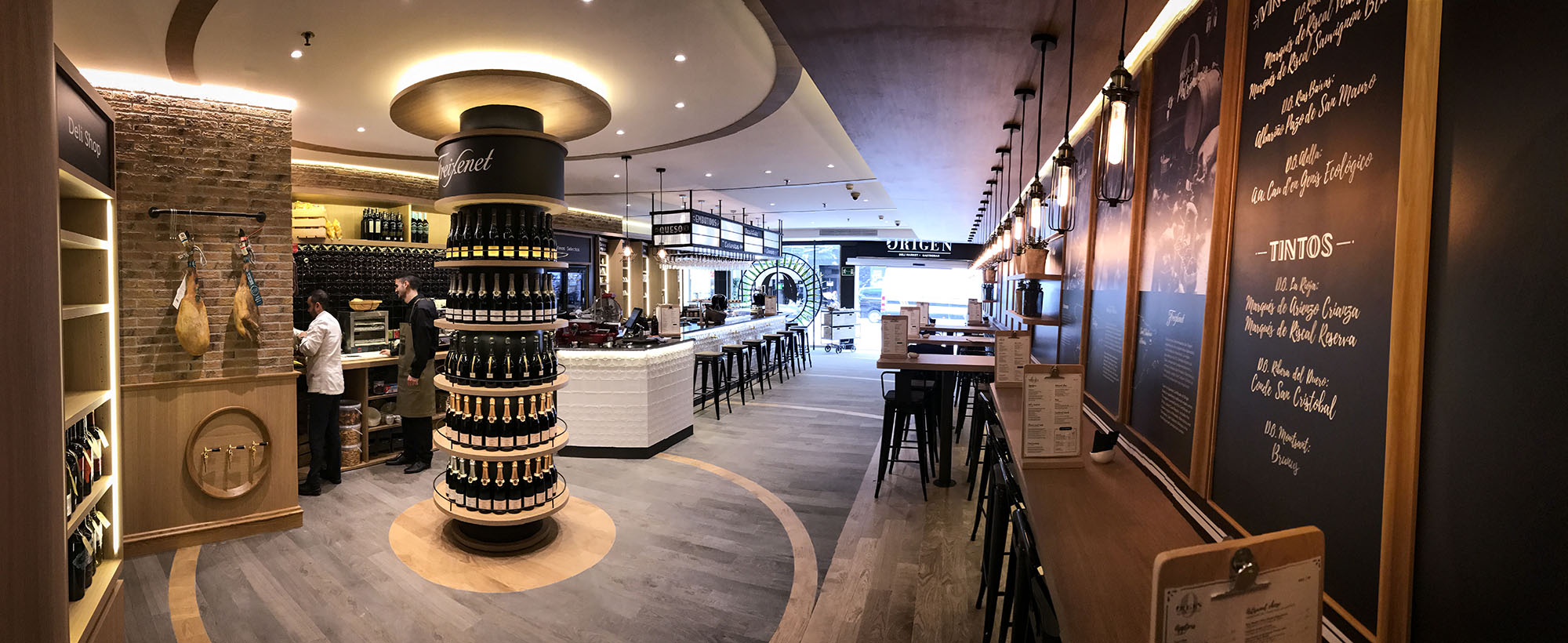
The layout is essentially longitudinal, structured around a central bar that organizes the circulation and anchors the different functional areas. The main counter runs parallel to the façade, ensuring visual continuity between street and interior, while a generous aisle on the inner side facilitates fluid movement of staff and patrons. Bar stools along the counter promote fast, informal consumption, while peripheral zones accommodate more relaxed, stay-longer seating.
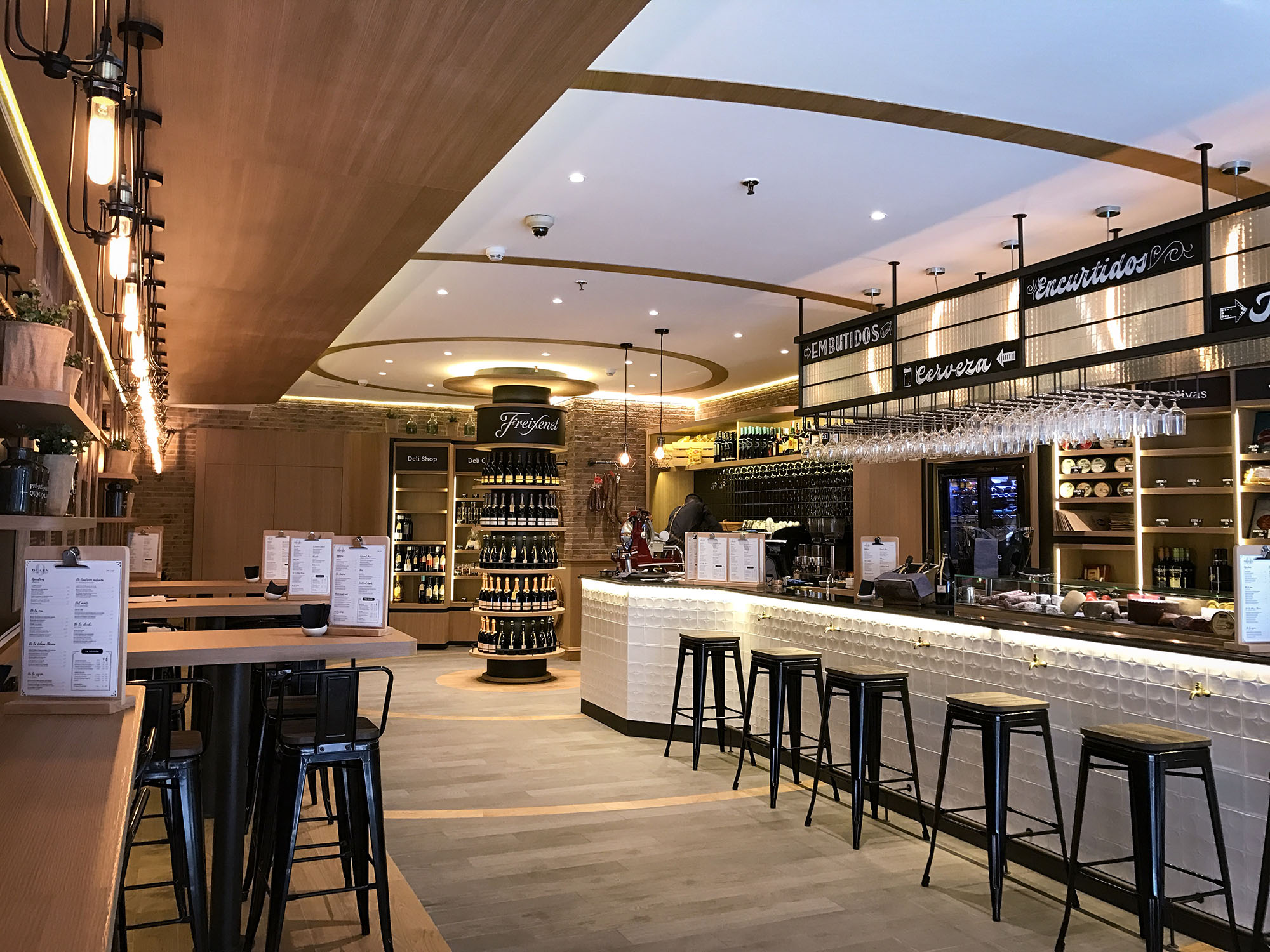
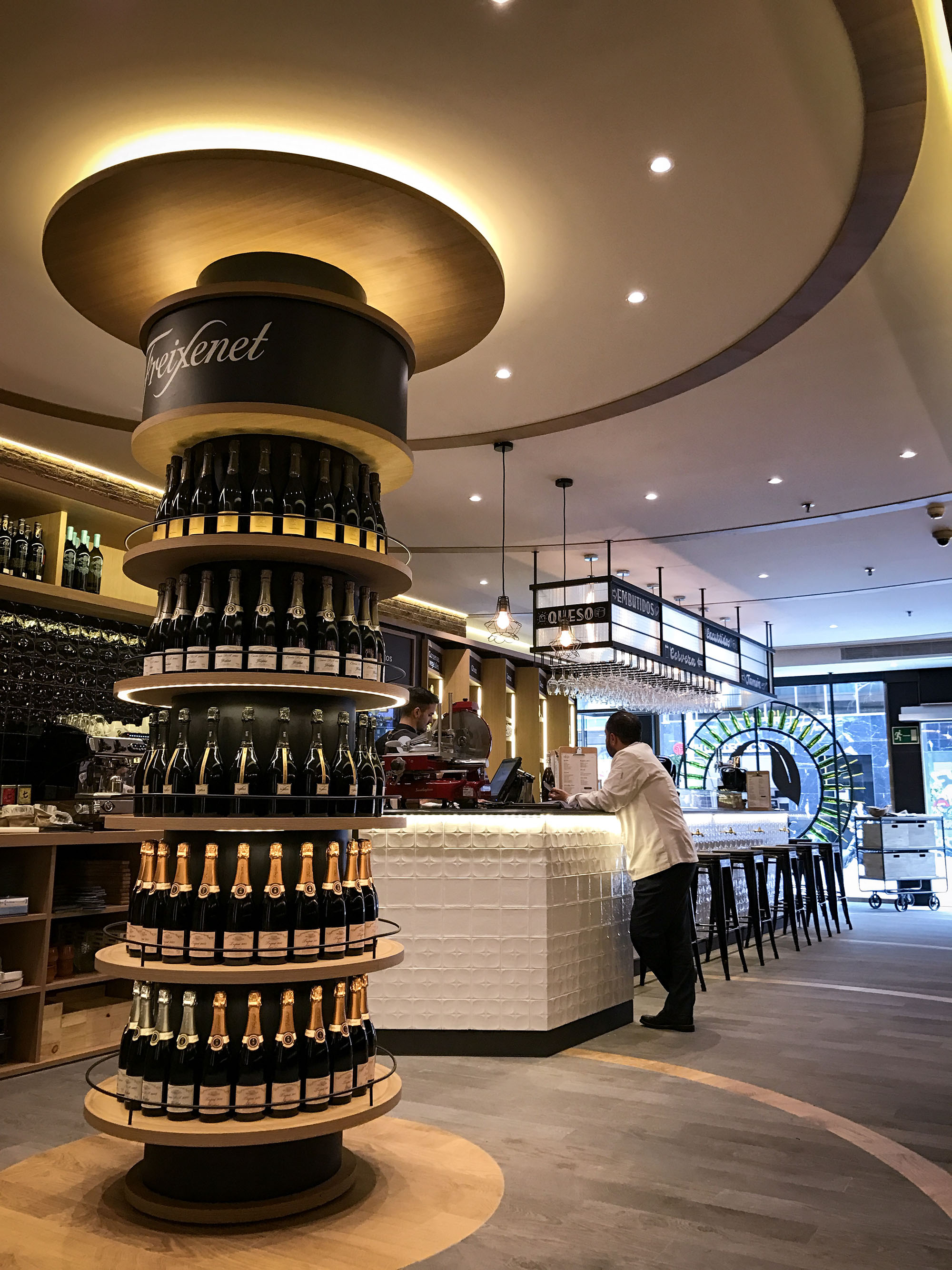
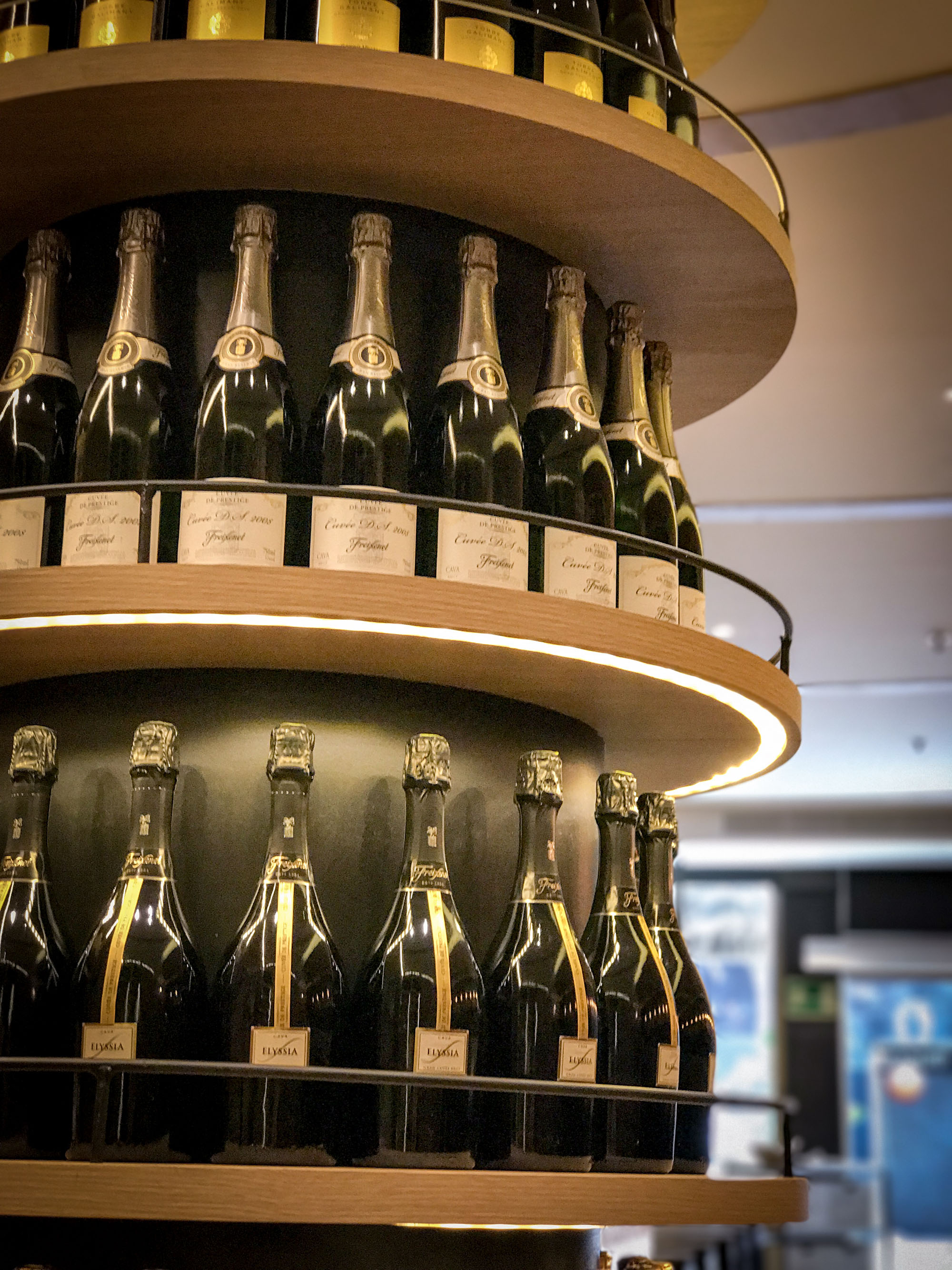
A circular wine-and-cava tower acts as a central node and wayfinding landmark. This vertical element subtly divides zones without the need for solid partitions, allowing views to filter across the entire space. Entry is through a broad threshold immediately facing the bottle installation, which directs the visitor naturally toward the bar. Service routes behind the counter and around the central tower are optimized to avoid crossings with customer flows, enhancing operational efficiency during peak hours.
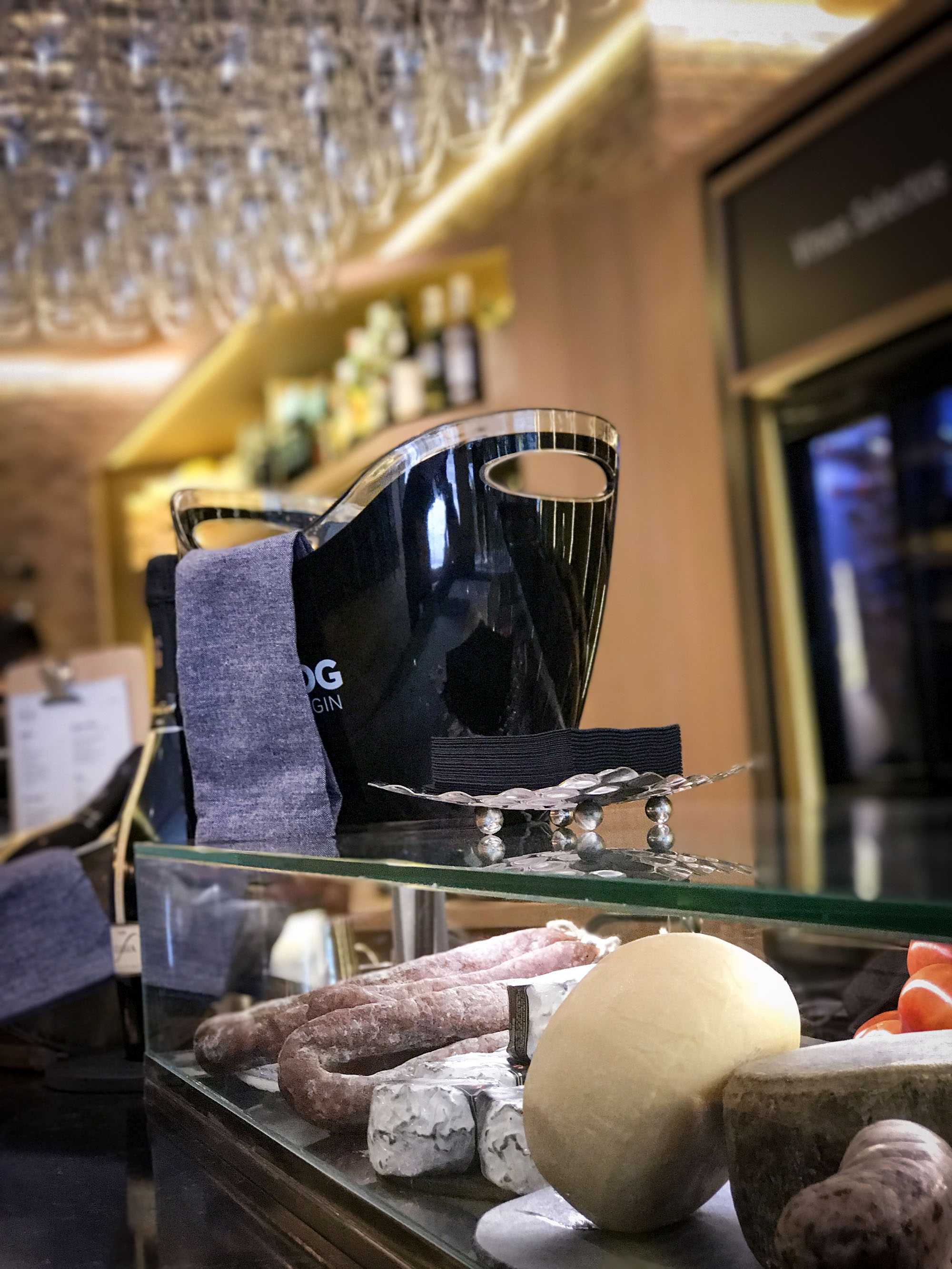
The material palette combines warm woods, textured ceramics and black metal profiles, creating a dialogue between warmth and industrial precision. The bar front is clad in white relief tiles that reflect light and add a tactile quality, contrasting with the dark metal stools and upper shelving. Timber flooring and cabinetry in honey tones provide continuity and comfort, evoking the atmosphere of traditional bodegas and markets.
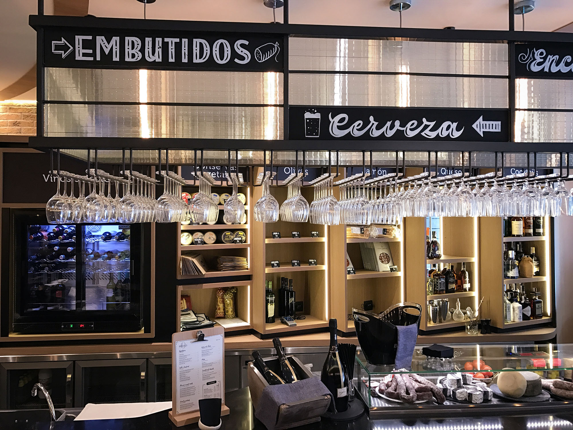
Metal mesh and framed signage in matte black introduce a graphic, almost urban layer that structures the elevation of the bar and back-of-house shelves. The circular bottle tower and ceiling rings are finished in wood with integrated LED bands, generating a refined yet approachable identity. The chromatic range remains deliberately restrained—natural wood, white, black and the green of the bottles—so the products become the main chromatic accent throughout the space.
Lighting strategy is centered on warm color temperatures to emphasize material richness and create a welcoming ambience. Continuous LED strips integrated under shelving and bar overhangs wash the ceramics and timber, accentuating textures and generating depth. Ceiling-recessed downlights provide general illumination, while pendant fixtures above the counter introduce a more intimate scale and rhythm.
The circular ceiling cove around the bottle tower functions as a luminous halo, visually anchoring the vertical element and drawing attention to the core of the space. The combination of direct and indirect lighting enables different atmospheres, from daytime market-like brightness to evening bar mood, without altering the basic layout. Light is carefully controlled to avoid glare on glass bottles while enhancing their reflective qualities.
The façade is conceived as a transparent membrane, framed by a minimalist metal structure that supports the iconic circular bottle installation. This large ring of green bottles works simultaneously as signage, sculptural element and light filter, projecting a characteristic pattern both inward and outward. It reinforces the brand’s identity and acts as a recognizable landmark within the urban context.
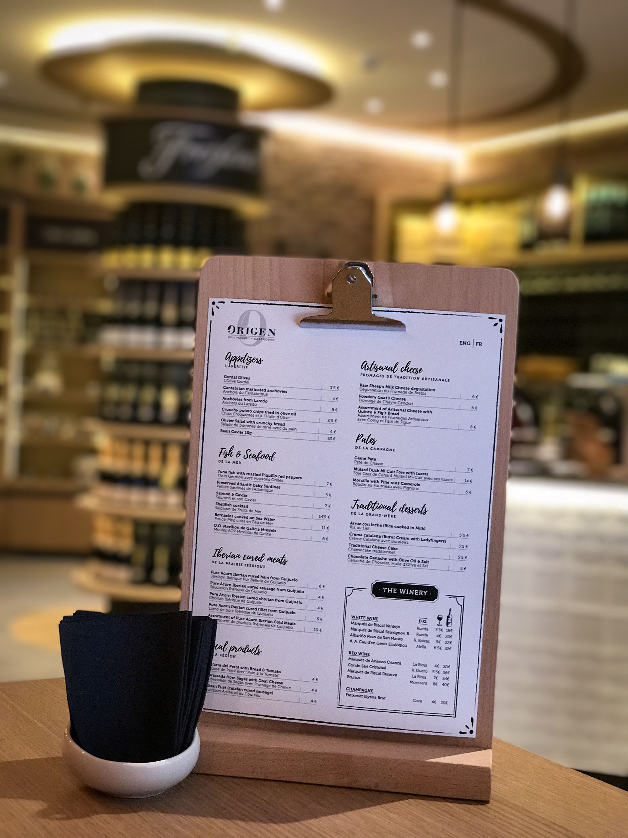
Interior graphics are integrated architecturally rather than applied superficially. Blackboards, suspended signs and menu bands over the bar use a consistent typographic language, referencing traditional market stalls while retaining a contemporary look. The combination of physical product display and graphic information turns the ceiling-height shelving and bottle towers into communicative devices that explain the gastronomic offer spatially.
Sustainability is expressed mainly through material selection, lighting efficiency and the reuse of product elements as part of the architecture. The structure and furniture prioritize durable materials—solid wood, metal and ceramic—that guarantee longevity and reduce the need for frequent replacement. The extensive use of glass in the façade maximizes natural daylight penetration, reducing dependence on artificial lighting during daytime hours.
The bottle installations, besides their aesthetic value, exemplify circular design by extending the lifecycle of glass containers as permanent architectural components. LED technology is used throughout, minimizing energy consumption and allowing precise control over luminosity levels. The open-plan layout favors natural cross-ventilation when the façade openings are fully slid or folded, enhancing interior comfort and decreasing mechanical cooling demand during milder seasons in Barcelona’s Mediterranean climate.

The GASTROBAR in Barcelona is conceived as a contemporary reinterpretation of the traditional Spanish tapas bar, merging market atmosphere with wine cellar identity. The interior expresses a strong narrative around origin and product, where wine, cava and charcuterie become both protagonists of the gastronomic offer and core elements of the architectural language. Circular geometries, warm lighting and continuous counters invite the user to move informally, emphasizing social interaction and visual connection between bar, kitchen and street.
The design seeks to create an open, permeable space that extends the urban sidewalk into the interior. Large glazed façades, combined with a sculptural bottle installation at the entrance, turn the GASTROBAR into an urban showcase, announcing from outside the experience that unfolds within. The atmosphere balances industrial accents with crafted details to transmit quality, authenticity and a relaxed, cosmopolitan character.
The layout is essentially longitudinal, structured around a central bar that organizes the circulation and anchors the different functional areas. The main counter runs parallel to the façade, ensuring visual continuity between street and interior, while a generous aisle on the inner side facilitates fluid movement of staff and patrons. Bar stools along the counter promote fast, informal consumption, while peripheral zones accommodate more relaxed, stay-longer seating.
A circular wine-and-cava tower acts as a central node and wayfinding landmark. This vertical element subtly divides zones without the need for solid partitions, allowing views to filter across the entire space. Entry is through a broad threshold immediately facing the bottle installation, which directs the visitor naturally toward the bar. Service routes behind the counter and around the central tower are optimized to avoid crossings with customer flows, enhancing operational efficiency during peak hours.
The material palette combines warm woods, textured ceramics and black metal profiles, creating a dialogue between warmth and industrial precision. The bar front is clad in white relief tiles that reflect light and add a tactile quality, contrasting with the dark metal stools and upper shelving. Timber flooring and cabinetry in honey tones provide continuity and comfort, evoking the atmosphere of traditional bodegas and markets.
Metal mesh and framed signage in matte black introduce a graphic, almost urban layer that structures the elevation of the bar and back-of-house shelves. The circular bottle tower and ceiling rings are finished in wood with integrated LED bands, generating a refined yet approachable identity. The chromatic range remains deliberately restrained—natural wood, white, black and the green of the bottles—so the products become the main chromatic accent throughout the space.
Lighting strategy is centered on warm color temperatures to emphasize material richness and create a welcoming ambience. Continuous LED strips integrated under shelving and bar overhangs wash the ceramics and timber, accentuating textures and generating depth. Ceiling-recessed downlights provide general illumination, while pendant fixtures above the counter introduce a more intimate scale and rhythm.
The circular ceiling cove around the bottle tower functions as a luminous halo, visually anchoring the vertical element and drawing attention to the core of the space. The combination of direct and indirect lighting enables different atmospheres, from daytime market-like brightness to evening bar mood, without altering the basic layout. Light is carefully controlled to avoid glare on glass bottles while enhancing their reflective qualities.
The façade is conceived as a transparent membrane, framed by a minimalist metal structure that supports the iconic circular bottle installation. This large ring of green bottles works simultaneously as signage, sculptural element and light filter, projecting a characteristic pattern both inward and outward. It reinforces the brand’s identity and acts as a recognizable landmark within the urban context.
Interior graphics are integrated architecturally rather than applied superficially. Blackboards, suspended signs and menu bands over the bar use a consistent typographic language, referencing traditional market stalls while retaining a contemporary look. The combination of physical product display and graphic information turns the ceiling-height shelving and bottle towers into communicative devices that explain the gastronomic offer spatially.
Sustainability is expressed mainly through material selection, lighting efficiency and the reuse of product elements as part of the architecture. The structure and furniture prioritize durable materials—solid wood, metal and ceramic—that guarantee longevity and reduce the need for frequent replacement. The extensive use of glass in the façade maximizes natural daylight penetration, reducing dependence on artificial lighting during daytime hours.
The bottle installations, besides their aesthetic value, exemplify circular design by extending the lifecycle of glass containers as permanent architectural components. LED technology is used throughout, minimizing energy consumption and allowing precise control over luminosity levels. The open-plan layout favors natural cross-ventilation when the façade openings are fully slid or folded, enhancing interior comfort and decreasing mechanical cooling demand during milder seasons in Barcelona’s Mediterranean climate.


Our offices are located in Barcelona, Cancún, Chicago and Santo Domingo, but thanks to technology we can do projects on all over the world.
Barcelona
Bac de Roda 136
08020, Barcelona
Spain
Madrid
Av. de Buendía 11
19005 Guadalajara (Madrid)
Spain
Chicago
373 Hazel Ave, Apt A1
60022, Glencoe, Illinois
United States